analysing digipaks and advertisment material
TRANSCRIPT

ANALYSIN
G DIG
IPAKS A
ND
ADVERTIS
MENT MAT
ERIAL
DJ A
ME
L AM
I RO
UC
HE

CHERYL COLE: A MILLION LIGHTS
Same font adopted for artist name and main title on advert, represents
the synergous link between both materials
There is a very similar palette of colours being used for the colour scheme. Purple, pink, and subtle
touches of limey yellow
On both materials, we can see a ‘one-eye covered’ concept
running through both. This is symbolic, as with the tattoo on
her hand which is visible in both materials
Clear release dates for both single and album
availability, letting consumers know when they can pick up a copy
Options to share the word with friends on
social networks, word of mouth
promotion for the album and single
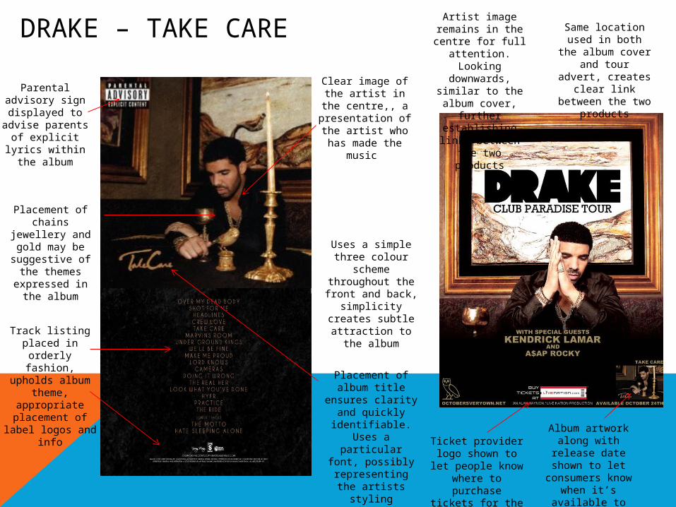
DRAKE – TAKE CARE
Parental advisory sign displayed to advise parents of
explicit lyrics within the album
Clear image of the artist in the
centre,, a presentation of the artist who has made the
music
Placement of chains jewellery and gold may be suggestive of the
themes expressed in the
album
Uses a simple three colour
scheme throughout the front and back,
simplicity creates subtle attraction
to the albumTrack listing placed in orderly fashion, upholds album theme, appropriate
placement of label logos and
info
Placement of album title
ensures clarity and quickly
identifiable. Uses a particular font,
possibly representing the
artists styling preference
Same location used in both the album cover and
tour advert, creates clear link between the two
products
Album artwork along with
release date shown to let
consumers know when it’s
available to buy
Ticket provider logo shown to let
people know where to
purchase tickets for the tour
Artist image remains in the centre for full
attention. Looking
downwards, similar to the album cover,
further establishing links between the two
products

DISCLOSURE - SETTLE
Album cover clearly displayed on advert, along with same font
title
Clear, simple font, introducing artist name and title of album.
Note the contrasting colours to
separate both artist name and
album title
Titles of three singles that
consumers may already know or have heard of to increase artist awareness and familiarisation.
Album release date in enlarged
font to emphasise the more important information in terms of the
promotion and release
Image of the two artists, making clear they work as a duo. It is an image of them as they were young,
possibly suggesting their
youth in the music industry
aswell
White markings on the faces; a
way of the artists creating unique
symbolism