an alternative view of global warming by daniel p johnston...
TRANSCRIPT

An Alternative View of Global Warming
by
Daniel P Johnston May, 2008

© 2008 Daniel P. Johnston All Rights Reserved 2
The other night I was watching one of the innumerable specials on global warming when I heard what can only be described as one of the most arrogant statements ever made by man. The speaker was being interviewed about the causes of global warming and said something to the effect-“We know what causes global warming-CO2
and other human generated pollution going into the atmosphere and trapping heat energy. There is no longer any debate on this issue.” I was somewhat taken aback by this certitude and had to wonder whether if this gentleman had lived during the time of Copernicus he would have been a member of the Flat Earth Society. I decided to look into the facts behind global warming more deeply and see if the theory of consensus on global warming is correct. The first thing I did was to venture onto the web in search of information supporting the anthropogenic greenhouse gas cause for global warming. I have to admit, on the face of it, the graph comparing global temperature change to the rise in atmospheric CO2 as measured at Mauna Loa is convincing. Figure 1 below shows the correlation.
-80
-60
-40
-20
0
20
40
60
80
1870 1880 1890 1900 1910 1920 1930 1940 1950 1960 1970 1980 1990 2000 2010
Year
Tem
pera
ture
Ano
mal
y (0 C
X 1
00)
0
50
100
150
200
250
300
350
400
CO
2 Con
cent
ratio
n (p
pmv)
Global TemperatureAnomaly
CO2
5 per. Mov. Avg.(Global TemperatureAnomaly)
Figure 1 Global temperature anomaly and atmospheric CO2 concentration versus year.
Since about 1970, the global temperature anomaly and the atmospheric CO2 concentration appear in lockstep and this correlation has been assumed to represent a causal relationship where the CO2, a notorious greenhouse gas is trapping heat energy that would otherwise reflect back into space and causing Earth’s temperature to rise. Conceivably, such a mechanism is a juggernaut that can not be stopped but only slowed down by reducing anthropogenic CO2 and other greenhouse gas emissions. Such is the basis for the Kyoto Accords and the Green Movement worldwide.

© 2008 Daniel P. Johnston All Rights Reserved 3
Reducing air pollution and greenhouse gas emissions is a laudable effort even without a tie-in to Global Warming and should continue because of its ultimate benefit to the planet and future generations. That being said, will it help to alleviate and moderate the devastating effects on the global economy, food production and human existence being predicted by numerous adherents of the theory? Only if reducing CO2 and other greenhouse gases derived from human activity is truly the primary solution to problem. To understand how global warming manifests in terms of actual increases in average temperatures both globally and from a zonal perspective I went to the excellent NASA GISS website http://data.giss.nasa.gov/gistemp/maps/ and generated a surface temperature anomalies map covering the period from 1970-2007 shown below as Figure 2. The website also generates a zonal means distribution for latitudinal variation shown in Figure 3. The first thing apparent about this graphic is the concentration of the greatest warming in the higher latitudes of the northern and southern hemispheres as well as the significant differences between north and south. This is confirmed by the zonal distribution where the maximum warming is clearly at polar latitudes. The melting of the Arctic sea ice, threatening animals like polar bears, and the detachment of a Delaware-sized chunk of Ronne Ice Shelf off Antarctica in the early 1990’s have plainly demonstrated this effect.
Figure 2 Surface temperature anomalies 1970-2007

© 2008 Daniel P. Johnston All Rights Reserved 4
Figure 3 Zonal means distribution for latitudinal variation.
From a purely theoretical point of view, the augmented heating of the polar regions compared to the rest of the planet is diametrically opposite of what would be expected if the increasing surface temperatures were solely due to the greenhouse gas effect. Under this type of warming, the Equator should be the zone of maximum temperature increase and the poles at a minimum due to the high albedo of the ice caps and the seasonal lack of sunshine. The equator, on the other hand, receives a maximum of solar irradiance and also has abundant water vapor in the atmosphere, another greenhouse gas. In fact, much of the effort to “prove” the anthropogenic hypothesis for global warming has been directed at debunking other mechanisms that might explain global warming such as the Milanković Cycles and solar forcing due to sunspot cycles. The Milanković Cycles are the changes in the earth’s orbital parameters such as precession, obliquity and eccentricity that drive the Ice Ages. Unfortunately for anthropogenic skeptics, these cycles clearly put the Earth in a cooling stage and, until the last two decades, many scientists supported the Earth’s being on the verge of the next Ice Age. The 22 year sunspot cycle as a source of global warming has also been discounted, primarily due to the estimated current 0.1% variation of solar output measured by satellite. The lack of corroborative evidence for any other known mechanism capable of explaining global warming has put the greenhouse gas adherents in the enviable position of saying “It’s got to be anthropogenic because there are no other feasible explanations and, no matter how poorly this theory explains all the “inconvenient” facts which don’t support the greenhouse effect being the only source, we can assume these unexpected variations are the result of the sheer complexity of our climate.” Hence the arrogant statement that drove me to look into this question for myself. Since we know that the degree of warming varies across latitude, it might be interesting to compare the zonal rate of temperature increase since 1970 across latitudinal zones. Figure 4 below does just that by using linear regression on each latitudinal band in the

© 2008 Daniel P. Johnston All Rights Reserved 5
Northern Hemisphere Southern Hemisphere
y = 5.1x - 10091R2 = 0.6451
y = 2.773x - 5480.4R2 = 0.7514
-60
-40
-20
0
20
40
60
80
100
120
140
160
180
200
220
240
1965 1970 1975 1980 1985 1990 1995 2000 2005 2010
Tem
pera
ture
Ano
mal
y (0 C
X 1
00)
90N-64N 44N-24N Linear (90N-64N) Linear (44N-24N)
A
y = 0.0217x - 10.029R2 = 4E-05
y = 0.6978x - 1369.6R2 = 0.3629
-60
-40
-20
0
20
40
60
80
100
120
140
160
180
200
220
240
1965 1970 1975 1980 1985 1990 1995 2000 2005 2010
Year
Tem
pera
ture
Ano
mal
y (0 C
X 1
00)
90S-64N 44S-24S Linear (90S-64N) Linear (44S-24S)
C
Figure 4 Zonal temperature anomaly versus year regression plots. A-90N-64N & 44N-24N; B-64N-44N & 24N-Equator; C- 90S-64S & 44S-24S; B-64S-44S & 24S-Equator.
GISS Zonal Database. Each plot is identically scaled to illustrate the marked reduction in heating going from the North Pole southwards. Figure 5 shows plots of the slopes of these best fit lines versus the median latitude for each zone and the average temperature anomaly for each zone. Included in these plots is a curve showing the average geomagnetic field strength F (in nanotesla) across latitudes based on averaging F across the median latitudes at 10o longitude intervals using the 2005 World Magnetic Model 2005 Calculator from the British Geological Survey website (http://www.geomag.bgs.ac.uk/gifs/wmm_calc.html). The reason for including this parameter in the graph is simply the fact that the first thing that comes to mind in terms of a significant difference between the polar regions and the equator is the Earth’s magnetic field which is strongest at the poles and weakest at the equator. There seems to be some correspondence in the graphs, especially for the northern hemisphere. Could there be some change in the geomagnetic field which could possibly be contributing, at least in part, to the global warming phenomena?
y = 3.7529x - 7413.3R2 = 0.696
y = 2.1228x - 4190.8R2 = 0.7063
-60
-40
-20
0
20
40
60
80
100
120
140
160
180
200
220
240
1965 1970 1975 1980 1985 1990 1995 2000 2005 2010
Tem
pera
ture
Ano
mal
y (0 C
X 1
00)
64N-44N 24N-Eq Linear (64N-44N) Linear (24N-Eq)
B
y = 0.7156x - 1396.4R2 = 0.1694
y = 1.7816x - 3516.2R2 = 0.5758
-60
-40
-20
0
20
40
60
80
100
120
140
160
180
200
220
240
1965 1970 1975 1980 1985 1990 1995 2000 2005 2010
Year
Tem
pera
ture
Ano
mal
y (0 C
X 1
00)
64S-44N 24S-Eq Linear (64S-44N) Linear (24S-Eq)
D

© 2008 Daniel P. Johnston All Rights Reserved 6
Table 1 presents a tabulation of the zonal temperature anomaly data from 1970 to 2007. The first thing noticeable is the total lack of correlation for the southernmost zones where the correlation coefficients indicate that the linear regression model is inappropriate, the next is the much better correspondence of the average temperature anomalies against
30000
35000
40000
45000
50000
55000
60000
-90 -80 -70 -60 -50 -40 -30 -20 -10 0 10 20 30 40 50 60 70 80 90
Latitude ( 0 )
Tota
l Mag
netic
Fie
ld S
tren
gth
( nT
)
0.00
1.00
2.00
3.00
4.00
5.00
6.00
7.00
Tem
pera
ture
Ano
mal
y Sl
ope
Total Field Temperature Anomaly Slope
Figure 4 Plots of temperature anomaly slope and average anomaly vs latitude 1970-2007.
Table 1 Regression and Descriptive Statistical Parameters for Zonal Temperature Anomalies
Zone
Median Latitude
( 0 )
Temperature Anomaly
Slope
Correlation Coefficient
(R2) Mean
(0C x 100) Standard Deviation
Minimum (0C x 100)
Maximum (0C x 100)
90N-64N 77 5.10 0.65 50.50 70.57 -63 227 64N-44N 54 3.75 0.70 49.42 49.99 -60 140 44N-24N 34 2.77 0.75 33.58 35.55 -33 97 24N-Eq 12 2.12 0.71 30.32 28.07 -29 87 Eq-24S -12 1.78 0.58 26.53 26.09 -27 88 24S-44S -34 0.70 0.70 17.97 12.87 -15 41 44S-64S -54 0.72 0.17 26.63 19.32 -18 58 64S-90S -77 0.02 0.00 33.05 38.89 -35 131
the magnetic field strengths for the same latitudes. A possible explanation of the difference lies in the nature of the geomagnetic field. In the northern hemisphere, the field is relatively consistent with latitude. In the southern hemisphere, on the other hand, the field distribution is warped by the South Atlantic Anomaly, clearly visible in Figure 6, where the inner Van Allen belt makes its closest approach to the Earth and the geomagnetic field is much weaker than expected. In other words, if some effect due to the properties of the Earth’s magnetic field is contributing to global warming, the response to the effect should be much more apparent for the northern hemisphere. In fact, when the question is raised of what is changing that corresponds to the onset of global warming, one change that qualifies is the gradual weakening of the Earth’s magnetic field. The field has been weakening for some time, as long as humanity has known of its existence, and this change, which reflects an internal change in the dynamics of the iron core of the Earth, certainly qualifies as significant enough to have profound
30000
35000
40000
45000
50000
55000
60000
-90 -80 -70 -60 -50 -40 -30 -20 -10 0 10 20 30 40 50 60 70 80 90
Latitude ( 0 )
Tota
l Mag
netic
Fie
ld S
tren
gth
( nT
)
0
10
20
30
40
50
60
Ave
rage
Tem
pera
ture
Ano
mal
y ( 0 C
x 1
00)
Total Field Average Temperature Anomaly

© 2008 Daniel P. Johnston All Rights Reserved 7
Figure 5 Total field strength F isodynamic Chart as of 2005.
y = -0.0036x + 15.156R2 = 0.999
7.5
8
8.5
9
9.5
10
1550 1600 1650 1700 1750 1800 1850 1900 1950 2000Year
Dip
ole
Mom
ent (
x 1
015
T m
3 )
Dipole 1950+ Linear (Pre-1950)
Figure 6 Dipole moment decay over time. Note the ~1937 slope change

© 2008 Daniel P. Johnston All Rights Reserved 8
effects. One problem is the fact that, as far as we know, the weakening has been underway since 1550, the earliest year where data with regard to the principle measure of the geomagnetic field is available. This parameter is called the dipole moment. It is effectively the same as the north and south poles of any bar magnet except, in this case, the magnet is the Earth and the core is the generator of the dipole and resultant magnetic field. Figure 7 is a plot of the strength of the Earth’s dipole moment versus time since 1550 based on data from the British Geological Survey. What is interesting is the fact that the dipole moment decreased linearly for almost 400 years before sharply diverging and accelerating sometime before 1937, based on optimal regression fits to the data. This is intriguing and raises the question of whether or not the change in the geomagnetic field could possibly coincide with the onset of global warming. One of the numerous barbs aimed at the anthropogenic global warming camp is the anomalous warming which occurred during the 1920’s and lasted until the early forties. Figure 8 is from an interesting summary of the debate from the web A Skeptical Layman’s Guide to Anthropogenic Global Warming by Warren Meyer at http://www.coyoteblog.com/coyote_blog/2007/07/a-skeptical-lay.html . The issue raised by this graphic, produced from data provided by Sayun-Ichi Akasofu at the International Arctic Research Center University of Alaska at Fairbanks, illustrates one of the greatest barriers to acceptance of greenhouse gases being the sole source of global warming. Essentially, the Earth warmed briefly, especially in the Arctic, before the levels of CO2 in the atmosphere had risen sufficiently to be clearly defined as a causative agent.
Figure 7 Anomalous warming of the arctic beginning in the 1920’s.
The similarity of this earlier concentrated warming effect in the Arctic to today’s situation is striking and begs the question, again, of whether the same agent could be behind this warming as well as our current crisis. Figure 9 is a plot of dipole moment decrease and global temperature anomaly increase from 1970-2007. There is an extremely strong correlation (R2 = 0.786), especially considering the inherent variability

© 2008 Daniel P. Johnston All Rights Reserved 9
of the global temperature anomaly from year to year. This could be considered a coincidence except for the much more localized correlations obtained from using geomagnetic observatory station data. These plots are shown in Figures 9 (northern hemisphere) and 10 (southern hemisphere) and illustrate essentially the same thing. The correlations were obtained by using the same zonal temperature data mentioned previously and running linear regressions against total field strength data for two stations in each zone. The predictive temperature anomaly results for all stations except M’Bour in the northern hemisphere and those between 64S and the South Pole are consistent with the dipole moment results.
Temp Anom = 2.0254*Year - 3996.4R2 = 0.782
-40
-20
0
20
40
60
80
100
1965 1970 1975 1980 1985 1990 1995 2000 2005 2010
7.65
7.70
7.75
7.80
7.85
7.90
7.95
8.00
Global TemperatureAnomaly
PredictedTemperatureAnomalyMagnetic Dipole
Linear (GlobalTemperatureAnomaly)
Temp Anom = -259.8*Dipole + 2068.1R2 = 0.786; p = 1.32E-13
Figure 8 Plot comparing global temperature anomaly and geomagnetic dipole moment 1970-2007.
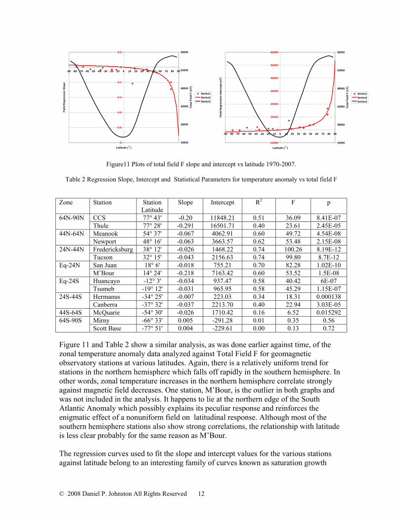
Figure 11 and Table 2 show a similar analysis of the zonal temperature anomaly data analyzed against Total Field F for geomagnetic observatory stations at various latitudes. Again, there is a relatively uniform trend for stations in the northern hemisphere which falls off rapidly in the southern hemisphere. In other words, zonal temperature increases in the northern hemisphere correlate strongly against magnetic field decreases. One station, M’Bour, is the outlier in both graphs and was not included in the analysis. It happens to lie at the northern edge of the South Atlantic Anomaly which possibly explains its peculiar response and reinforces the enigmatic effect of a nonuniform field on latitudinal response. Although most of the southern hemisphere stations also show strong correlations, the relationship with latitude is less clear probably for the same reason as M’Bour.

© 2008 Daniel P. Johnston All Rights Reserved 10
Figure 9 Northern hemisphere zonal correlation plots. Total field F and temperature anomaly versus year. A- 90N-64N; B-64N-44N; C-44N-24N; D-24N-Equator
57800
58000
58200
58400
58600
58800
59000
59200
59400
1965 1970 1975 1980 1985 1990 1995 2000 2005 2010
Tota
l Fie
ld S
tren
gth
F ( n
T )
-70
-20
30
80
130
180
230
Tem
pera
ture
Ano
mal
y ( 0 C
x 1
00 )
Resolute CCS Thule Temp Anom Alesun Resolute Prediction CCS Prediction
A
55500
56000
56500
57000
57500
58000
58500
59000
59500
60000
60500
1965 1970 1975 1980 1985 1990 1995 2000 2005 2010
Tota
l Fie
ld S
tren
gth
F ( n
T )
-100
-50
0
50
100
150
Tem
pert
ure
Ano
mal
y ( 0 C
x 1
00 )
Meanook Newport Temp Anom Meanok Prediction Newport Prediction
B
32000
34000
36000
38000
40000
42000
44000
1965 1970 1975 1980 1985 1990 1995 2000 2005 2010Year
Tota
l Fie
ld S
tren
gth
F (n
T)
-40
-20
0
20
40
60
80
100
Tem
pera
ture
Ano
mal
y ( 0 C
x 1
00)
M'Bour San Juan Temp Anom M'Bour Prediction San Juan Prediction
D
48000
49000
50000
51000
52000
53000
54000
55000
56000
57000
1965 1970 1975 1980 1985 1990 1995 2000 2005 2010Year
Tota
l Fie
ld S
tren
gth
F (n
T)
-100
-50
0
50
100
150
Tem
pera
ture
Ano
mal
y ( 0 C
x 1
00)
Fredericksburg Tucson Temp Anom Fredericksburg Prediction Tucson Prediction
C

© 2008 Daniel P. Johnston All Rights Reserved 11
Figure 10 Southern hemisphere zonal correlation plots. Total field F and temperature anomaly versus year. A- 90S-64S; B-64S-44S; C-44S-24S; D-24S-Equator.
64200
64400
64600
64800
65000
65200
65400
65600
1965 1970 1975 1980 1985 1990 1995 2000 2005 2010
Tota
l Fie
ld S
tren
gth
F (n
T)
-20
-10
0
10
20
30
40
50
60
Tem
pera
ture
Ano
mal
y ( 0
C x
100
)
McQuarie Temp Anom McQuarie Prediction
B
25000
26000
27000
28000
29000
30000
31000
32000
1965 1970 1975 1980 1985 1990 1995 2000 2005 2010Year
Tota
l Fie
ld S
tren
gth
F (n
T)
-30
-10
10
30
50
70
90
Tem
pera
ture
Ano
mal
y ( 0
C x
100
)
Tsumeb Huancayo Temp Anom Huancayo Prediction Tsumeb Prediction
D
58000
60000
62000
64000
66000
68000
70000
1965 1970 1975 1980 1985 1990 1995 2000 2005 2010
Tota
l Fie
ld S
tren
gth
F ( n
T )
-60
-40
-20
0
20
40
60
80
100
120
140
Tem
pera
ture
Ano
mal
y ( 0 C
x 1
00 )
Scott Base Mirny Temp Anom Scott Prediction Mirny Prediction
A
25000
30000
35000
40000
45000
50000
55000
60000
1965 1970 1975 1980 1985 1990 1995 2000 2005 2010Year
Tota
l Fie
ld S
reng
th F
(nT)
-15
-5
5
15
25
35
45
Tem
pera
ture
Ano
mal
y ( 0
C x
100
)
Canberra Hermanus Temp Anom Canberra Prediction Hermanus Prediction
C
© 2008 Daniel P. Johnston All Rights Reserved 12
-1
-0.8
-0.6
-0.4
-0.2
0
0.2
-90 -80 -70 -60 -50 -40 -30 -20 -10 0 10 20 30 40 50 60 70 80 90
Latitude ( 0 )
Fiel
d R
egre
ssio
n Sl
ope
33000
38000
43000
48000
53000
58000
Tota
l Fie
ld F
(nT)
Series1Series2Series3
Figure11 Plots of total field F slope and intercept vs latitude 1970-2007.
Table 2 Regression Slope, Intercept and Statistical Parameters for temperature anomaly vs total field F Zone Station Station
Latitude Slope Intercept R2 F p
CCS 77° 43' -0.20 11848.21 0.51 36.09 8.41E-07 64N-90N Thule 77° 28' -0.291 16501.71 0.40 23.61 2.45E-05 Meanook 54° 37' -0.067 4062.91 0.60 49.72 4.54E-08 44N-64N Newport 48° 16' -0.063 3663.57 0.62 53.48 2.15E-08 Fredericksburg 38° 12' -0.026 1468.22 0.74 100.26 8.19E-12 24N-44N Tucson 32° 15' -0.043 2156.63 0.74 99.80 8.7E-12 San Juan 18° 6' -0.018 755.21 0.70 82.28 1.02E-10 Eq-24N M’Bour 14° 24' -0.218 7163.42 0.60 53.52 1.5E-08 Huancayo -12° 3' -0.034 937.47 0.58 40.42 6E-07 Eq-24S Tsumeb -19° 12' -0.031 965.95 0.58 45.29 1.15E-07 Hermanus -34° 25' -0.007 223.03 0.34 18.31 0.000138 24S-44S Canberra -37° 32' -0.037 2213.70 0.40 22.94 3.03E-05
44S-64S McQuarie -54° 30' -0.026 1710.42 0.16 6.52 0.015292 Mirny -66° 33' 0.005 -291.28 0.01 0.35 0.56 64S-90S Scott Base -77° 51' 0.004 -229.61 0.00 0.13 0.72
Figure 11 and Table 2 show a similar analysis, as was done earlier against time, of the zonal temperature anomaly data analyzed against Total Field F for geomagnetic observatory stations at various latitudes. Again, there is a relatively uniform trend for stations in the northern hemisphere which falls off rapidly in the southern hemisphere. In other words, zonal temperature increases in the northern hemisphere correlate strongly against magnetic field decreases. One station, M’Bour, is the outlier in both graphs and was not included in the analysis. It happens to lie at the northern edge of the South Atlantic Anomaly which possibly explains its peculiar response and reinforces the enigmatic effect of a nonuniform field on latitudinal response. Although most of the southern hemisphere stations also show strong correlations, the relationship with latitude is less clear probably for the same reason as M’Bour. The regression curves used to fit the slope and intercept values for the various stations against latitude belong to an interesting family of curves known as saturation growth
-10000
0
10000
20000
30000
40000
50000
60000
-90 -80 -70 -60 -50 -40 -30 -20 -10 0 10 20 30 40 50 60 70 80 90
Latitude ( 0 )
Fiel
d R
egre
ssio
n In
terc
ept (
nT)
33000
38000
43000
48000
53000
58000
Tota
l Fie
ld F
(nT)
Series1Series2Series3

© 2008 Daniel P. Johnston All Rights Reserved 13
curves. All station results except M’Bour were used in the analysis. The correlation coefficient for the slope (R2 = 0.86) indicates a systematic relationship. If there is a relationship between the slope obtained by linear regression analysis of the zonal temperature anomaly versus time over the period 1970-2007 and the zonal temperature anomaly versus Total Geomagnetic Field strength F this would indicate a potential causal relationship between the changing geomagnetic field strength and global warming. Such is the case, as Figure 12 below strongly indicates. Because the actual station latitudes do not correspond to the median zonal latitudes, the regression fit for the Total Field slopes versus latitude was used to interpolate slope data for the station locations. The results are
-0.5
-0.4
-0.3
-0.2
-0.1
0
0.1
0 1 2 3 4 5 6
Slope Temperature Anomaly Vs Time
Slop
e Te
mpe
ratu
e A
nom
aly
Vs T
otal
Fie
ld F
Slopes
ExponentialAssociationRegression
Total Field Slope=a*(b-exp(-c*Temperature Anomaly Slope))R2 - 0.998
Figure 12 Plot of Total Field F slope Vs time slope versus zonal temperature anomaly
Table 3 Summary Data for Median Zonal Latitudes
Zone
Median Latitude
( 0 )
Temperature Anomaly
Slope
Total Field
F Slope
Average Total Field
F (nT)
Average Secular
Variation (nT)
Average Temperature Anomaly
(°C x 100) 90N-64N 77 5.10 -0.23084 56947 47.26 50.5064N-44N 54 3.75 -0.05448 54490 1.75 49.4244N-24N 34 2.77 -0.02175 45604 -12.35 33.5824N-Eq 12 2.12 -0.00547 35730 -8.90 30.32Eq-24S -12 1.78 0.004169 34994 -6.20 26.5324S-44S -34 0.70 0.009693 39747 -21.75 17.9744S-64S -54 0.72 0.013237 46135 -44.28 26.6364S-90S -77 0.02 0.016255 54080 -57.56 33.05

© 2008 Daniel P. Johnston All Rights Reserved 14
shown in Table 3. The extremely strong connection between the slopes of these regression fits (R2 = 1 is perfect, R2 = 0.998, close enough) where the zonal temperature anomaly is on the Y axis and either the year or the Total Field Strength F on the X axis explains the excellent correlations for station data in Figures 10 and 11. The odds of the gradual decay of the geomagnetic field strength being coincidental have been reduced to such a degree that they become insignificant. The changing geomagnetic field has to be a major contributor to the current global warming. This raises the question of how this reduction, underway for the entire period we’ve been aware of its existence, could be affecting our climate. This is especially pertinent with regard to the relatively cool period known as the “Little Ice Age” when the dipole moment of the Earth’s geomagnetic field was also decreasing. The difference lies in the accelerated field decay which began sometime prior to 1937. Close scrutiny of chart A in Figure 10 reveals a shift in the total field strength F for the 64N-90N latitudinal zone stations shown from increasing to decreasing centered around 1978. A review of the literature concerning what may have caused this change revealed that a “geomagnetic jerk” occurred at this time. A geomagnetic jerk is mysterious phenomena related to the Earth’s core dynamics and is speculated to be caused by torsional oscillations of the Earth’s core with the jerk being a magnetic marker of the sudden acceleration of metallic fluid flow at the boundary of the outer core. Jerks were discovered by Courtillot et al in 1978 after one which occurred in 1969 showed up in the east component Y of magnetic observatory data. Subsequent analysis of geomagnetic observatory data revealed that jerks occurred in 1901, 1913, 1925, 1932, 1949, 1958, 1969, 1978, 1986, 1991 and 1999. Four of these geomagnetic jerks were of global reach (1969, 1978, 1991 and 1999) and three others were probably global (1901, 1913 and 1925) and the rest were localized event not affecting the entire Earth. It is intriguing that the global event of 1969 roughly corresponds to the onset of recent global warming and that the subsequent geomagnetic jerks of 1978, 1991 and 1999 all correspond to an ongoing warming process. What is even more remarkable is the fact that there is a response time lag effect apparent in the jerks which delays the expression of the jerk effects in the southern hemisphere for 4 to 6 years after it has manifested in the northern hemisphere. This could explain some of the discrepancies in the data, notably near the South Pole. Could it be that, in addition to anthropogenic-induced warming, these core-related jerks are causing warming of the Earth’s surface? The first thing to look at with regard to this possibility is the dipole moment and how the acceleration in its decline that began sometime before 1937 corresponds to global temperature rise. Figure 12 shows this clearly with a cooling period evident in the gap between about 1940 and 1969 and a rapid acceleration of warming beginning just after the 1969 jerk and continuing unabated through the succeeding jerks. The blue lines added to the graph are linear fits for the intervals 1880-1900, 1900-1920, 1920-1940, 1940-1970 and 1970-2007. Though this, again, may be coincidence, the association is, indeed, striking.

© 2008 Daniel P. Johnston All Rights Reserved 15
Temp Anom = 0.6043*Year - 1173.5R2 = 0.6512
Dipole = -0.0036*Year + 15.156R2 = 0.999
7.5
7.7
7.9
8.1
8.3
8.5
1880 1890 1900 1910 1920 1930 1940 1950 1960 1970 1980 1990 2000 2010Year
Dip
ole
Mom
ent (
x 1
015
T m
3 )
-60
-40
-20
0
20
40
60
80
Dipole 1950+ Geomagnetic Jerk Temp Anom Linear (Temp Anom) Linear (Pre-1950)
Figure 13 Dipole moment and global temperature anomaly compared to geomagnetic jerks.
In keeping with the comparison of dipole moment and warming on a global scale and individual station data on a zonal latitudinal level, Figure 14 presents essentially the same picture on a more localized scale as the secular variation of the Total Field plateaus in the gap between jerks with a decreasing field apparent on either side of the gap. Again, the blue lines added to the graph are linear fits for the intervals 1880-1900, 1900-1920, 1920-1940, 1940-1970 and 1970-2007. The ramifications of this indicate that somehow these jerks are triggering a warming of the Earth with the strong possibility that the warming will not continue but may subside or reverse with a lack of further jerks as occurred in the 1940’s. If this is truly the case, it offers some hope of the current global warming crisis moderating in the near future, as long as another geomagnetic jerk des not occur. There is also a distinct possibility that the current, extremely pessimistic models for future warming may not be accurate, as they assign all the responsibility for temperatures increasing to greenhouse gases. A combination approach involving both geomagnetic field influences and anthropogenic causes may provide a much more optimistic picture and give humanity a little breathing room to clean up its act without having to resort to draconic measures.

© 2008 Daniel P. Johnston All Rights Reserved 16
53000
55000
57000
59000
61000
63000
65000
1880 1890 1900 1910 1920 1930 1940 1950 1960 1970 1980 1990 2000 2010Year
Tota
l Fie
ld S
tren
gth
F (n
T)
-100
-50
0
50
100
150
Tem
pera
ture
Ano
mal
y ( 0
C x
100
)
Abincourt/Ottawa Cheltenham/Fredericksburg 24N-44N 44N-64N
Figure 14 Total field strength F and zonal temperature anomaly compared to geomagnetic jerks.
Courtillot speculated that the geomagnetic jerks were affecting the decadal length of day variation of the Earth and actually noted a correlation between geomagnetic declination and global temperatures as expanded by Michelis in Geomagnetic jerks: observation and theoretical modeling (2005). This figure is reproduced as Figure 14 below. Though the length of day variation may not be sufficient to explain a magnetic field forcing of global temperatures, it does fall directly in line with all of the above discussion. It does not take a great leap of faith to think that something as critically fundamental to the complex energy balance of the Earth as the core could influence surface temperatures when it hiccups. If nothing else, a weakening magnetic field could allow the deeper penetration of radiation from cosmic rays and the solar wind, if not actually allowing more direct solar irradiance. Speaking of changes, the Earth is in the throes of one of the most profound geomagnetic field changes that can occur. Every so often, geologically speaking, the Earth’s magnetic poles flip in what is known as a magnetic reversal. The last one, called the Brunhes-Matuyama Reversal, occurred about 780,000 years ago based on extensive geochronological dating of lavas and sediments. Needless to say, humanity has never experienced this event before and can only speculate on how it might go down.

© 2008 Daniel P. Johnston All Rights Reserved 17
Figure 15 Secular variation of the geomagnetic declination for CLF observatory (*); excess length of the day (o); global temperature (◊).
Numerous geophysicists speculate that we are a geological blink away from the next reversal which could occur within the next few thousand years or tomorrow, for all we know. The sun, which is also a dipole due to the currents generated by its plasma, reverses poles every 11 years, on average, and the overall 22 year cycle of solar activity is just a combination of these two dipole subcycles. Many have speculated that these geomagnetic reversals mark the onset of another Ice Age and, if that is truly the case, the current global warming problem could become a global cooling one in the not to distant future. Be that as it may, the proxy temperature evidence from ocean sediment cores such as GIK 16415-1, obtained in the Atlantic about 100 north of the equator (Pflaumann, 1986), and ODP820, from the Coral Sea about 160 south of the equator (Lawrence, 2005), suggests strongly that this same warming effect prior to the occurrence of a reversal may have happened before. The data was obtained from the World Data Center for Paleoclimatology website at http://www.ncdc.noaa.gov/paleo/data.html . Planktonic foraminifera are used to estimate temperature based on the ratio of O18 to O16 in their shells which varies with temperature. The sediment from which the foraminifera were extracted is dated and the combination yields a temperature- time curve going back as far as the Brunhes event. Figure 15 illustrates the results and shows a sharp temperature increase just before the reversal in both cores followed by extreme cooling beginning within a few thousand years, possibly very similar to our current situation.

© 2008 Daniel P. Johnston All Rights Reserved 18
12
14
16
18
20
22
24
26
28
30
32
0 200 400 600 800 1000
Age (ka)
Fo
ram
inife
ra T
em
pe
ratu
re (
0C
)
26.6
26.8
27
27.2
27.4
27.6
27.8
28
28.2
28.4
Atlantic Summer Atlantic Winter Brunhes/Matuyama Coral
Figure 16 Plot of proxy ocean temperatures versus age from ocean sediment cores
This warming event just prior to the Brunhes reversal is further supported by evidence from a paper Paleomagnetic records of the Brunhes/Matuyama polarity transition from ODP Leg 124 (Celebes and Sulu seas) (Oda et al, 2000). Figure 16 is taken from that paper and shows the O18 distribution for hole 769A with the equivalent temperatures in 0C shown as labels. Clearly the temperature dropped off from a higher level as the transition approached (the transition period lasted in excess of 4000 years) just as may be happening in the not too distant future. I am a chemist by training and a Transportation Research Engineer by title, so what gives me the right to venture into an arena where I really don’t know enough to even be dangerous? The answer is simply that I have dealt with real world data for 30 years and honed what skills I possess into the ability to look at data and derive the best understanding possible from it. I went into this adventure with the idea of seeing for myself whether the anthropogenic position was the only credible explanation based on the available evidence. I still must admit to a strong relationship between atmospheric CO2 and global warming since 1970 but feel, based on the above, that it is only one potential contributor to global warming and that the changing geomagnetic field is another major player in what has occurred during this same period. I find this, overall, somewhat reassuring since, to me, it offers some hope with regard to the future unlike the gloom and doom prognostications being promulgated based on the increasing CO2 models. Though there is little mankind can do about the Earth’s geomagnetic field and any effects due to its changes, we can and should factor it into any future scenarios with regard to where the world’s climate is going.

© 2008 Daniel P. Johnston All Rights Reserved 19
Figure 17 Oxygen isotope record for hole 769A and determination of age.

© 2008 Daniel P. Johnston All Rights Reserved 20
There is a pressing need to begin a concerted effort to take the data we already have, collect the necessary additional data we need and figure out the implications of future climate change with as clear and full an understanding of what factors are behind it as is humanly possible so that we can make the right decisions and develop the correct strategies to deal with what is coming most effectively. With the future of humanity at stake and all the other pressing problems of our world, allowing agendas and media science to drive the future is misguided and immoral. As the grandfather of three small boys, I feel a compelling need to try and draw attention to what I consider to be a grievous error on our part where we let understanding wilt under the unrelenting glare of well-meaning ignorance.