9 amazingly simple data presentation tips
TRANSCRIPT

AN EXHAUSTIVE LIST OFpresentationDELIVERY
TIPS
DataPresenta
tionTips

DATA CAN BE
PERSUASIVE,
ENGAGING
AND EVEN
SHOCKING

If you have a compellingdata story to tell,then present it in a way that isengaging, clear and
powerful

Data Presentations Are Stories.
Stories will stay in the minds of
the audience long after the
presentation has ended

CHOOSE THE
RIGHT TYPE OF
CHARTFOR YOUR DATA
Nothing hurts your
credibility - and your
message - more than
misrepresented data.
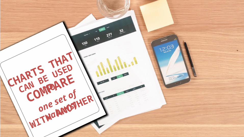
CHARTS THAT
CAN BE USED TO
COMPARE
one set of value(s)
WITH ANOTHER

CHARTS THAT
CAN BE USED TO
COMPAR
E
one set of value(s)
WITH ANOTHER
Eg. Performance of Product A vs. Product B in 5 regions
Category 1
Category 2
Category 3
0 0.5 1 1.5 2 2.5 3 3.5 4 4.5 5
Bar Chart
Category 1 Category 2 Category 3
0
1
2
3
4
5
Column Chart
Pie Chart
0.5 1 1.5 2 2.5 3 3.5
0
1
2
3
4
5
Scatter Plots
Category 1 Category 2 Category 3
0
1
2
3
4
5
Line Charts

distribution of a
CHARTS THAT CAN BE USED TO
SHOW THE
set of values

distribution of a
CHARTS THAT CAN BE USED TO
SHOW THE
set of values
Eg. Distribution of Call waiting times in a call center
Category 1 Category 2 Category 3
0
1
2
3
4
5
Column Chart
0.5 1 1.5 2 2.5 3 3.5
0
1
2
3
4
5
Scatter Plots
Category 1 Category 2 Category 3
0
1
2
3
4
5
Line Charts
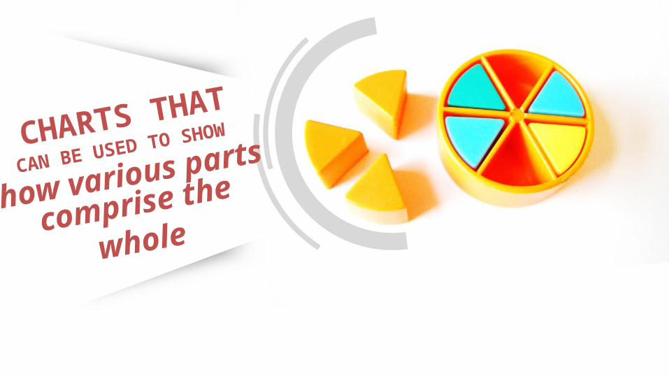
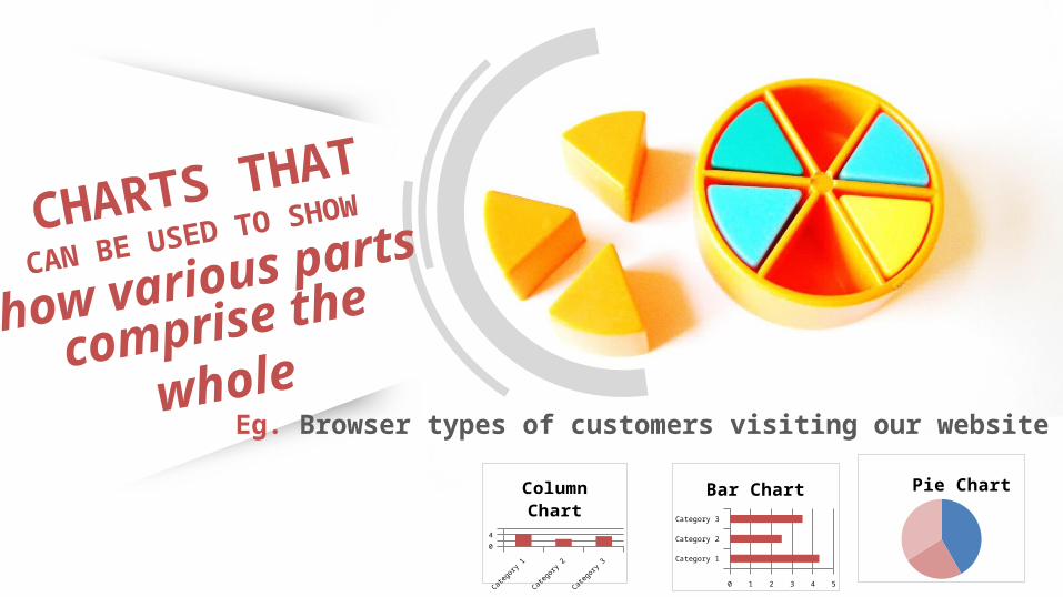
how various parts CHARTS THAT
CAN BE USED TO SHOW
comprise the whole
how various parts CHARTS THAT
CAN BE USED TO SHOW
comprise the whole
Eg. Browser types of customers visiting our website
Category 1 Category 2 Category 3
0
1
2
3
4
5
Column Chart
Category 1
Category 2
Category 3
0 0.5 1 1.5 2 2.5 3 3.5 4 4.5 5
Bar Chart Pie Chart

trend over
CHARTS THAT CANBE USED TO SHOW THE
timeOF SOMEVARIABLE(S)

trend over
CHARTS THAT CANBE USED TO SHOW THE
time OF SOMEVARIABLE(S)
Eg. Share Price Of Google In Last
50 Trading Sessions
Category 1 Category 2 Category 3
0
1
2
3
4
5
Column Chart
Category 1 Category 2 Category 3
0
1
2
3
4
5
Line Charts

relationship
CHARTS THATSHOWS THE
BETWEEN 2 (OR MORE)
VARIABLES

relationship
CHARTS THATSHOWS THE
BETWEEN 2 (OR MORE)
VARIABLES
Eg. . Relationship between Search Phrases and Product Purchases in
your website0.5 1 1.5 2 2.5 3 3.5
0
1
2
3
4
5
Scatter Plots
Category 1 Category 2 Category 3
0
1
2
3
4
5
Line Charts

titleADD A DESCRIPTIVE
Tip 1

Head
DON’T
Tip 2
MAKEPEOPLE
tilt

Physicia
ns and Den
tists
Residen
ts or In
terns
Other Tra
inees
Regist
ered Nurse
s
Other Nurse
s
Nursing a
ssisti
ve pers
onnel
Radiologo
y Tech
nicians
Lab Pers
onnel
Pharmaci
st
Respira
tory Th
erapist
s
Housekee
ping0
2
4
6
8
10
12 Have you ever seen a chart
that does this?

Phys
icia
ns a
nd D
entis
ts
Resi
dent
s or
Inte
rns
Oth
er T
rain
ees
Regi
ster
ed N
urse
s
Oth
er N
urse
s
Nur
sing
ass
istiv
e pe
rson
nel
Radi
olog
oy T
echn
icia
ns
Lab
Pers
onne
l
Phar
mac
ist
Resp
irato
ry T
hera
pist
s
Hous
ekee
ping
0
2
4
6
8
10
12
Or worse… this?

Physicians and Dentists
Residents or Interns
Other Trainees
Registered Nurses
Other Nurses
Nursing assistive personnel
Radiologoy Technicians
Lab Personnel
Pharmacist
Respiratory Therapists
Housekeeping
0 2 4 6 8 10 12
All other similar facility Your Facility
IT’S BETTER TO EXPAND YOUR CHART ENOUGH TOmake room forThe axis labels
TO BE DISPLAYED
horizontally or (even better) use
a bar chart instead of acolumn chartlike so:

Sales A Sales B
Sales c
52% 48%
37%
X
52% Sales A
48% Sales B
37%% Sales C
✓
ALLOW FOR
easyCOMPARISON
Showing the relationships between different data points makes each
point much more valuable
Tip 3

Hierarchy
ORDER DATA SETS
USING A
LOGICAL
Tip 4
Present data
alphabetically,
sequentially, or by
value to allow for
more natural
navigation
PHONE
SOCIAL
PHONE
SOCIAL
X
✓

DATA USAGE
Youtube
gmailSkype
Whatsapp 29
28
23
137
Data Usage
WhatsappSkypeGmailFacebookYoutube
X ✓ Keep itSimple
While clean visuals can help comprehension, unnecessary elements can detract
Tip 5

15
4018
27
Sales
1st quarter2nd quarter3rd quarter4th quarter YOUR INFERENCE
Highlight
Most of your audience expect you to do the math and tell them the inference. Highlight the inference so clearly that there is no scope of confusion for your audience.
Tip 6

USE Visual representation
OF NUMBERSTip 7
Energy
Improvements After Use
45% 60% 80% 95%
Time1 Week 3 Week 5 Week 8 Week
You can make your column charts
and pie charts come to
life by using small icons to act
as units for your chart

Memorable
USE IMAGESTO MAKE YOURMESSAGE MORE
Tip 8
Using relevant images
can make your information
more inviting

EXPLAIN, EXPLAIN , EXPLAIN Tip 9
Explain Your Axes
don’t assume that your audience can digest your data visualization
Use Labels Wisely
don’t distract from the visualization but don’t forego labels either, trusting that the audience is following only your verbal explanations.
