6. global warming may lead to a permanent or semi
TRANSCRIPT

6. Global warming may lead to a permanent or semi-permanent El Nino Our friends at the METSUL in Brazil reminded us that in 1997 - Gore and a atmospheric scientist from the Mauna Loa Observatory foresee a permanent El Niño in the near future (here and here) and the BBC announced scientists saw a future with a permanent El Niño. This was based on the observance of increased El Nino and decreased La Nina frequency in the 1979-1998 time frame. Also though climate models could not resolve the short term ENSO oscillations they depicted increasingly warm tropical sea surface temperatures with global warming that would have suggested this outcome. Based on the increased frequency and strength and length of El Ninos in those decades, some scientists speculated that we might head into a permanent El Nino state like appears to have occurred in the early Pliocene. But now in 2011 - Global warming will not cause permanent El Niño (here). Indeed forecasters and climate scientists who look at data rather than models see the tendency for clustering of El Ninos and their cooler sisters La Nina due to large scale multidecadal scale, flip flops of ocean temperature patterns in the Pacific Basin, a pattern known as the Pacific decadal Oscillation. . PACIFIC DECADAL OSCILLATION Like the Atlantic Ocean temperature patterns tend to oscillate on a multi decadal scale in the Pacific, a phenomena known as the Pacific Decadal Oscillation or PDO. Even though the IPCC AR4 chapter 3 did note the existence of a “ decadal variability in the Pacific (the Pacific Decadal Oscillation or PDO”, most global warming scientists ignore this because it opens up the possibility that natural variability could account for the warming from 1979-1998. The PDO and ENSO frequency strength and duration go hand in hand. Warm modes are characterized by more frequent, stronger and longer lasting El Ninos and cold modes by more frequent, stronger and long lasting La Ninas. Note the similarity in the mean of the ocean temperatures in the positive PDO and El Nino and negative PDO and La Nina.

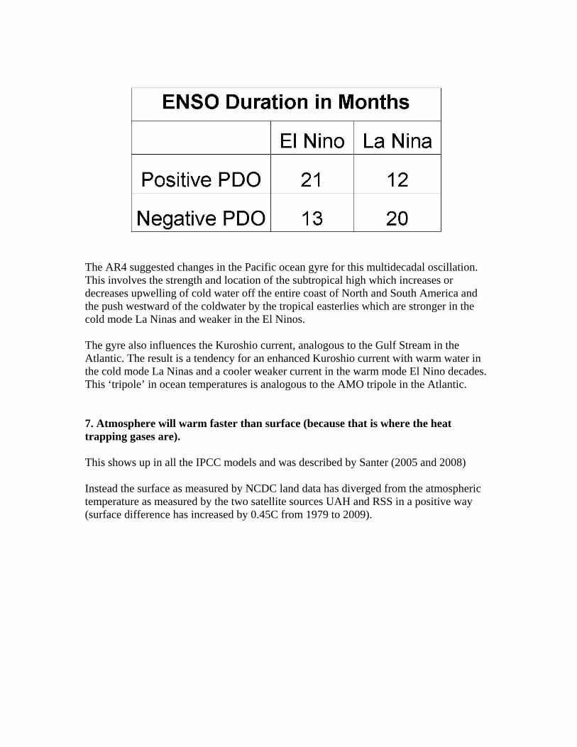
The AR4 suggested changes in the Pacific ocean gyre for this multidecadal oscillation. This involves the strength and location of the subtropical high which increases or decreases upwelling of cold water off the entire coast of North and South America and the push westward of the coldwater by the tropical easterlies which are stronger in the cold mode La Ninas and weaker in the El Ninos. The gyre also influences the Kuroshio current, analogous to the Gulf Stream in the Atlantic. The result is a tendency for an enhanced Kuroshio current with warm water in the cold mode La Ninas and a cooler weaker current in the warm mode El Nino decades. This ‘tripole’ in ocean temperatures is analogous to the AMO tripole in the Atlantic. 7. Atmosphere will warm faster than surface (because that is where the heat trapping gases are). This shows up in all the IPCC models and was described by Santer (2005 and 2008) Instead the surface as measured by NCDC land data has diverged from the atmospheric temperature as measured by the two satellite sources UAH and RSS in a positive way (surface difference has increased by 0.45C from 1979 to 2009).

-0.60-0.40-0.200.000.200.400.600.801.001.20
1979
1981
1983
1985
1987
1989
1991
1993
1995
1997
1999
2001
2003
2005
2007
NCDC Surface UAH Lower Top RSS Lower Trop
The Klotzbach et al suggested the divergence between surface and lower-tropospheric trends is consistent with evidence of a warm bias in the surface temperature record but not in the satellite data. Klotzbach et al described an ‘amplification’ factor for the lower troposphere as suggested by Santer et al (2005) and Santer et al (2008) due to greenhouse gas trapping relative to the warming at the surface. Santer refers to the effect as "tropospheric amplification of surface warming". This effect is a characteristic of all of the models used in the UNIPCC and the USGRCP "ensemble" of models by Karl, et.al. (2006) which was the source for Karl et al (2009) which in turn was relied upon by EPA in its recent Endangerment Finding.( Federal Register / Vol. 74, No. 239 / Tuesday, December 15, 2009 / Rules and Regulations at 66510 ) The amplification factor was calculated from the mean and median of the 19 GCMs that were in the CCSP SAP 1.1 report (Karl et al, 2006). As John Christy describes it “The amplification factor is a direct calculation from model simulations that show over 30 year periods that the upper air warms at a faster rate than the surface - generally 1.2 times faster for global averages. This is the so-called “lapse rate feedback” in which the lapse rate seeks to move toward the moist adiabat as the surface temperature rises. In models, the convective adjustment is quite rigid, so this vertical response in models is forced to happen. The real world is much less rigid and has ways to allow heat to escape rather than be retained as models show.” This latter effect has been documented by Chou and Lindzen (2005) and Lindzen and Choi (2009). The amplification factor was calculated from the mean and median of the 19 GCMs that were in the CCSP SAP 1.1 report (Karl et al, 2006). The divergence can be seen in this graph from Klotzbach (et al) 2009).

NOAA surface temperature data has been increasing faster than satellite lower troposphere temperatures since 1979. In 2009 the difference had grown to over 0.45 C. However, greenhouse theory and IPCC models predict the lower troposphere should be warming 1.2 times faster than surface, not slower. This data suggests that either greenhouse theory is incorrect and/or that NOAA’s surface temperature data has been contaminated – e.g. by its treatment of factors like land use changes or urbanization. We believe both are true. 8. Record highs and heat waves are increasing In congressional Energy and commerce hearings, Dr Somerville, Dr. Zwiers and Dr Field indicated heat extremes are occurring more rapidly and Dr Field even linked it to potential reduction in yield improvements because of temperatures exceeding the threshold for crops. He made no mention of CO2 benefits for plant growth.

Dr. Christy correctly pointed out that corn was grown from Minnesota to Alabama and temperatures varied considerably over those areas with little impact on corn. Temperatures in places like Des Moines are not showing extremes as the models and the testifiers claimed. In fact since 1988, no record highs were set in Des Moines during the critical months of June and July.
Dr Field suggested a loss of $5 billion/year. Yale professor Robert Mendehlson testified to congress in 2000, climate change as projected then by IPCC would result in benefits of up to $23B/year to agriculture and forestry. The alarmists have linked future heat waves to increased health risks and mortality. Historical analyses show cold kills more than heat. We have written on the health issues here citing work by Dr. Goklany. Models show more heat , data doesn’t. The EPA, NOAA CCSP, IPCC and NCAR have all stated that with an overall warming of the Earth’s climate, heat waves are said to becoming more frequent, longer, and more intense in places where they already occurred. For one example from EPA and NOAA see The EPA “Climate Change Indicators in the United States” from the NOAA CCSP U.S. Climate Change Science Program. 2009.

(Updated version of the U.S. Climate Change Science Program’s 2008 report: Synthesis and Assessment Product 3.3: Weather and climate extremes in a changing climate), page 24 . Also Meehl, G.A., Byun, H.R., Tebaldi, C., Walton, G., Easterling, T., McDaniel, L., 2009, The relative increase of record high maximum temperatures compared to record low minimum temperatures in the U.S., Geophysical Research Letters, 36, L23701, doi:10.1029/2009GL040736 Meehl etal opined based on models “Spurred by a warming climate, daily record high temperatures occurred twice as often as record lows over the last decade across the continental United States, new research shows. The ratio of record highs to lows is likely to increase dramatically in coming decades if emissions of greenhouse gases continue to climb.” The CCSP devised a Heat Wave Indicator Index to measure the changes since 1895 for the United States. The data for this indicator were provided by the National Oceanic and Atmospheric Administration’s National Climatic Data Center. Surface temperature anomalies were calculated based on monthly values from a network of long-term monitoring stations. Satellite data were analyzed by two independent groups, resulting in the slightly different “UAH” and “RSS” trend lines. The indicator showed very clearly that heat waves occurred with high frequency in the 1930s, and these remain the most severe heat waves in the U.S. historical record (see Figure 1).

NOAA notes “Many years of intense drought (the “Dust Bowl”) contributed to these heat waves by depleting soil moisture and reducing the moderating effects of evaporation. There is no clear trend over the entire period tracked by the index. Although it is hard to see in Figure 1 (because of the extreme events of the 1930s), heat wave frequency decreased in the 1960s and 1970s but has risen since then.”
These results in figure 1 were generally consistent with an analysis of monthly record highs and lows for the states since 1895 (source Bruce Hall from NOAA NCDC) although the 2000s was unusually benign with fewer state records than any decade since the 1880s.
Hall showed using NCAR historical data for state record highs and lows the 1930s peak and a second minor peak in the 1990s but a decline in heat records after. It also shows record lows peaking in the 1960s and 1980s with a decline after.
We should note with increased urbanization, we would expect fewer overnight low records since nighttime temperatures are most affected by urban heat island.
Dr. John Christy in his testimony to congress March 8 noted “For each of the 50 states, there are records kept for the extreme high and low temperatures back to the late 19th century. In examining the years in which these extremes occurred (and depending on how one deals with “repeats” of events) we find about 80 percent of the states recorded their hottest temperature prior to 1955. And, about 60 percent of the states experienced their record cold temperatures prior to that date too. One could conclude, if they were so inclined, that the climate of the US is becoming less extreme because the occurrence of state extremes of hot and cold has diminished dramatically since 1955…
Then, one might look at the more recent record of extremes and learn that no state has achieved a record high temperature in the last 15 years (though one state has tied theirs.) However, five states have observed their all-time record low temperature in these past 15 years (plus one tie.) This includes last month’s record low of 31F below zero in Oklahoma, breaking their previous record by a rather remarkable 4F. If one were so inclined, one could conclude that the weather that people worry about (extreme cold) is getting worse in the US. (Note: this lowering of absolute cold temperature records is nowhere forecast in climate model projections, nor is a significant drop in the occurrence of extreme high temperature records.)

State Monthly heat and cold records 1895-2010. Note when new records are set, the count is adjusted down accordingly in the prior record decade
The same heat wave pattern can be seen in city decadal records all over the country as shown from NOAA city records below.


New York City experienced two 100F days this past summer, a year after June and July averaged the third coldest in the entire record. There was only 1 such day in the 2000s. In a similar sine wave like oscillation, one can see the 1930s to 1950s peak with a second peak in the hot days of two 1980 summers. The frequency the last two decades is the lowest since the early record in the 1880s though the 1920s.
By Dr. Richard Keen
OH MANN IS IT EVER GOING TO GET HOT
Although I’ve lived in Colorado for 40+ years, Philadelphia is my ancestral home and I keep track of the weather there. Of course, I’m excited about any event that sets records there, and last week’s heat wave set several. Apparently Michael Mann is excited, too, and in his “Victory and Vindication” interview, he said: “Record heat wave in the US that’s part of a larger picture of early summer temperatures that are the warmest on record, which is part of a larger picture of a globe that is running warmer than ever before...”
So is Philadelphia getting more heat waves? Here’s a chart of annual maximum temperatures for Philadelphia since 1873, when the Weather Bureau installed self-registering max-min thermometers. Earlier records
New York City 100F Days/Decade
01880s 1900s 1920s 1940s 1960s 1980s 2000s
12
6
8
10
2
4
14

For Philadelphia, before 1942, the mid-point of the data, there were 9 years in which the maximum temperature exceeded 100 degrees. For the second half of the record, since 1942, there were, well, 9 years. Not much of an increase. If that trend continues, I would expect another 9 years with 100+ degree temperatures by 2060.
In viewing the data above, it is clear that any increases in heat records are unremarkable compared to the early 20th century, most notably the 1930s. The changes in the heat to cold record ratios computed by Meehl et al was more due to the diminished cold record the last two decades, consistent with the urban heat island expansion. The number of records, both low and high have diminished in recent years. Indeed the last decade was unusually benign and by this measure certainly not increasingly extreme.
One must conclude from the data that heat waves are not increasing at an alarming rate as reported by the IPCC, NOAA, NASA, and NCAR and Drs. Somerville, Zwiers and Field. Indeed, elevated nighttime temperatures which show up in the data are actually better correlated with urban heat island contamination. Greenhouse warming should result in elevated daytime and nighttime temperature and logically more record highs. Knute NadelHoffer in his testimony discussed the warming of the last 30 years in Michigan including Lake Superior. NCDC’s Temperature for the upper Midwest and Great Lakes region (MI, WI, IA, MN) show cyclical trends that show that warming is just one leg of a multidecdal cycle of temperatures and not a catastrophic warming as Nadelhoffer suggested. Indeed for the annual temperatures, no long term trend was seen.

9. Sea levels are rising at an increasing rate We heard claims in the meeting about the perils of sea level rises which were said to be increasing at an alarming rate, at or above the highest rate claimed by the IPCC. This is patently false. The ‘scientists’ who make that claim live in a virtual world within computer models. Holgate (2007) has shown a deceleration below the lowest rate of the range specified by the IPCC.

The islands of the Pacific are claimed to be the most threatened by the IPCC. Dr. Cliff Ollier reviews sea level rise for “Tuvalu, the favourite island to be doomed by sea level rise driven by global warming, allegedly caused by anthropogenic carbon dioxide. If you look up Tuvalu on the internet you are inundated with articles about its impending fate. Tuvalu has become the touchstone for alarm about global warming and rising sea level. He shows the data from the Australian BOM shows no changes for 20 years.”

More generally, Dr. Vincent Gray in this analysis wrote: “The SEAFRAME sea-level study on 12 Pacific Islands is the most comprehensive study of sea level and local climate ever carried out there. The sea level records obtained have all been assessed by the anonymous authors of the official reports as indicating positive trends in sea level over all 12 Pacific Islands involved since the study began in 1993 until the latest report in June 2010. In almost all cases the positive upward trends depend almost exclusively on the depression of the ocean in 1997 and 1998 caused by two tropical cyclones. If these and other similar disturbances are ignored, almost all of the islands have shown negligible change in sea level from 1993 to 2010, particularly after the installation of GPS leveling equipment in 2000.” Gray notes that the claimed trends of 3.7 to 9.2 mm/year do not match the measured trends which are zero for up to 18 years.

NASA JPL team led by Eric Rignot has also again with models has again made the claim that increasing polar ice melt was resulting in rising sea levels (see). Of course polar ice is floating and could all melt with no rise in sea level. Somerville extended this to include Greenland and global glaciers but the science is mixed on the Greenland ice melt and many glaciers have actually slowed or reversed the last few years with more snow in winter and colder summers. See how sea level rises have actually slowed in recent years as this has taken place and as oceans cooled and contracted. (source NOAA lab at UCO) with a only a brief pop with the El Nino of 2009/10).

Somerville and committee mentioned the thawing of the permafrost in polar areas when inhabited. Any engineer will tell you putting a structure on the ground will transfer heat into the ground and melt ice. The last two winters have been brutally cold in Russia, the prior two in Canada. Even where winter have been above normal due to the arctic oscillation, above normal is still below zero F in most areas. 10. Droughts and floods will worsen in places like Australia Dr. Somerville and others mentioned the Australian flooding as evidence of increasing extremes they attributed to global warming. John Christy correctly put on the record the flooding there was not unprecedented and could be explained by a change in the Pacific PDO and La Nina. The droughts in recent years were due to the dominance of El Ninos in the warm PDO phase.
Heavy rains and floods this summer in eastern Australia followed many years of warnings of worsening, semi-permanent drought from global warming. Verdon et al. (2004) demonstrated that the flooding is tied to La Nina events especially during the cold PDO (negative IPO) multidecadal periods, both of which conditions existed this year much as they did in 1974, when the last great flooding took place.

In fact, taking all cold PDO and IPO years with La Nina, and we find a signal for a wet Queensland (top right).
This was the case in 2010/11.

As in 1973/74.
Heavy rain and drought frequency in the United States shows cyclical patterns but no trends.

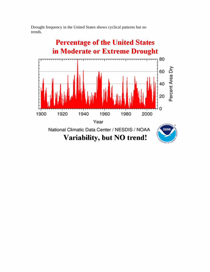
Drought frequency in the United States shows cyclical patterns but no trends.