43456034 project report on indian capital market and trading techniques
TRANSCRIPT

A Report on
Indian Capital Market and Trading Techniques
A Project report submitted in partial fulfillment for the award of
POST GRADUATE PROGRAM IN BUSINESS MANAGEMENT
Submitted by: Biplove Kumar
9210
KOHINOOR BUSINESS SCHOOL
KHANDALA
April 2010 - June 2010
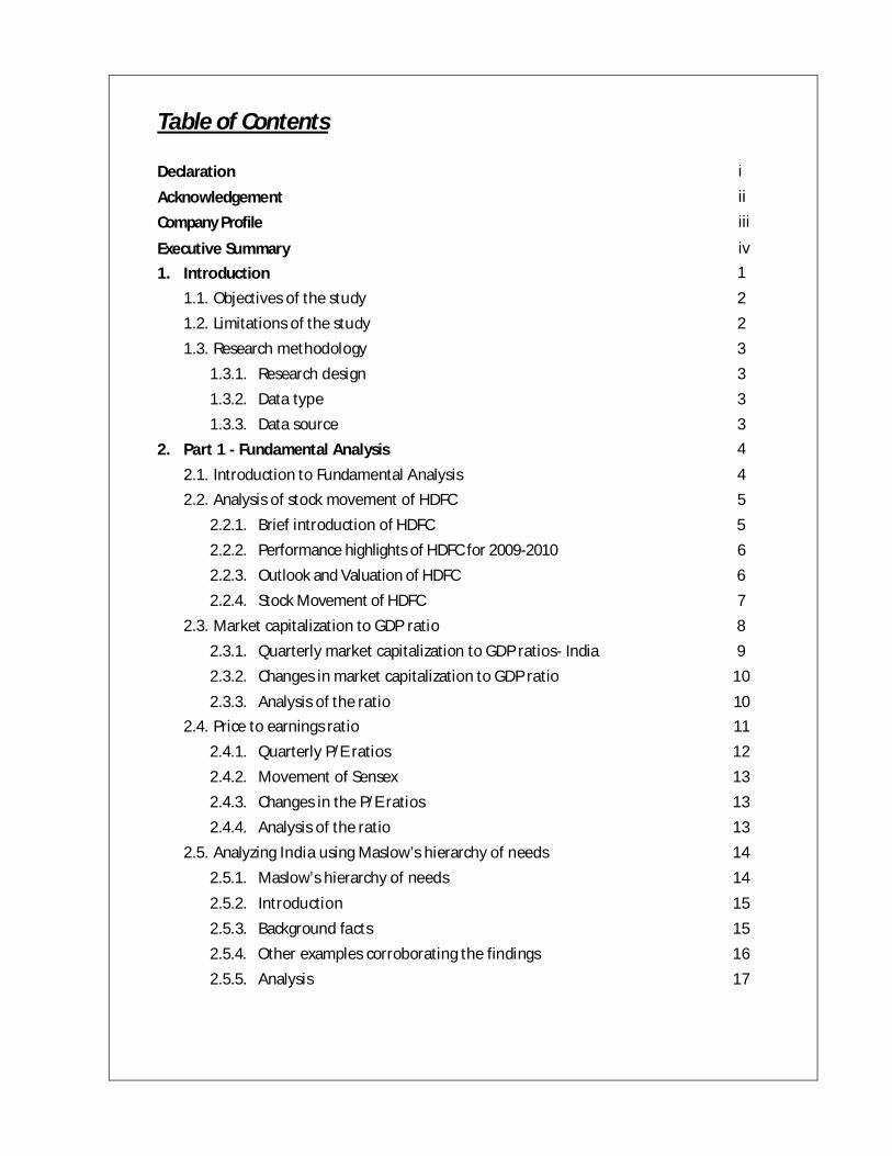
Table of Contents Declaration i
Acknowledgement ii Company Profile iii
Executive Summary iv 1. Introduction 1 1.1. Objectives of the study 2 1.2. Limitations of the study 2 1.3. Research methodology 3 1.3.1. Research design 3 1.3.2. Data type 3 1.3.3. Data source 3 2. Part 1 - Fundamental Analysis
2.1. Introduction to Fundamental Analysis
4
4 2.2. Analysis of stock movement of HDFC 5 2.2.1. Brief introduction of HDFC 5 2.2.2. Performance highlights of HDFC for 2009-2010 6 2.2.3. Outlook and Valuation of HDFC 6 2.2.4. Stock Movement of HDFC 7 2.3. Market capitalization to GDP ratio 8 2.3.1. Quarterly market capitalization to GDP ratios- India 9 2.3.2. Changes in market capitalization to GDP ratio 10 2.3.3. Analysis of the ratio 10 2.4. Price to earnings ratio 11 2.4.1. Quarterly P/E ratios 12 2.4.2. Movement of Sensex 13 2.4.3. Changes in the P/E ratios 13 2.4.4. Analysis of the ratio 13 2.5. Analyzing India using Maslow’s hierarchy of needs 14 2.5.1. Maslow’s hierarchy of needs 14 2.5.2. Introduction 15 2.5.3. Background facts 15 2.5.4. Other examples corroborating the findings 16 2.5.5. Analysis 17

2.6. Correlation between Sensex and Nifty 18 2.6.1. Analysis 19
3. Part 2 - Technical Analysis 3.1. Introduction to Technical Analysis
20
20 3.1.1. Price Fields 20 3.1.2. Chart Styles 21 3.2. Candlestick Pattern 23 3.2.1. Bullish Pattern 23 3.2.2. Bearish Pattern 24 3.2.3. Reversal Pattern 25 3.2.4. Neutral Pattern 26 3.3. Key Technical Indicators 27 3.3.1. Moving Averages 27 3.3.2. Relative Strength Index (RSI) 29 3.3.3. Larry William’s %R 30 3.3.4. Moving Average Convergence Divergence (MACD) 31 3.3.5. Fibonacci Tools 32 3.4. Trading Strategy 33 3.4.1. Process for the Study 34 3.4.2. Findings 34 3.4.3. Analysis 35 3.4.4. Study of Nifty Futures 37 3.4.5. Conclusion of the Study 38
3.5. Nifty Fifty Stock Futures Analysis 39 3.5.1. Findings 39
3.5.2. Analysis of the long calls 41 3.5.3. Analysis of the short calls 42
4. Conclusion 43
5. References 44

List of Illustrations List of charts
1.1.Stock movements of HDFC 7 1.2.Changes in stock market capitalization to GDP ratio 10 1.3.Movement of BSE Sensex 13 1.4.Changes in the Sensex P/E ratio 13 1.5.Maslow’s hierarchy of needs 14 1.6.Movement of Sensex and Nifty 18 2.1.Example of Bar Charts 21 2.2. Example of Line Charts 22 2.3. Example of Candlestick 22 2.4. Illustration of Candlestick Charts 22 2.5. Illustration of Moving Average using 20 day and 10 day EMA. 27 2.6. Illustration of RSI 29 2.7. Illustration of Larry William’s % R 30 2.8. Illustration of MACD 31 2.9. Illustration of Fibonacci Tools. 32 3.1. Illustration of trading strategies 33 3.2. Illustration of Bhushan Steel 35 3.3. Illustration of Reliance Capital 35 3.4. Illustration of DLF 36 3.5. Illustration of Ansal Properties 36 3.6. Illustration of Nifty Futures 37 3.7. Illustration of Tata Motors 41 3.8. Illustration of Ambuja Cements 41 3.9. Illustration of Suzlon Energy 42 3.10. Illustration of Cipla 42
List of Tables
1.1.Details of HDFC 5 1.2.Quarterly stock market capitalization to GDP ratio 9 1.3.Quarterly PE ratio of Sensex 12 2.1.Outcome showing returns and accuracy for both strategies 34 2.2.Outcome of Nifty Futures showing returns and accuracy 37 2.3.Outcome showing returns and accuracy for long and short calls 39

Declaration
I, the undersigned, hereby declare that the stated work, a study on Indian Capital Market and Trading Techniques, is my own work. The report has been prepared in partial fulfillment of requirements towards the Summer Internship Project at DreamGains Financials India Pvt. Ltd., Bangalore. I further declare that this dissertation has not been submitted earlier to any other university or institution for the award of any other degree or diploma.
Place – Bangalore
(i)
Biplove Kumar

Acknowledgement
With immense gratitude I acknowledge all those, whose guidance & encouragement served as a platform to stand firmly and complete the project successfully. On such an occasion, I would like to thank all the people who helped me reach this milestone with relative ease.
I express my sincere thanks to Mr. Suraj Sreenath, DreamGains Financials India Pvt. Ltd. for giving me the opportunity to work with this organization.
I express my sincere thanks to my company guide Mr. Kunal K Shah, DreamGains Financials India Pvt. Ltd. for his wholehearted support, inspiring guidance and encouragement throughout the project work.
I express my sincere thanks to my faculty guide, Prof. Milind Dalvi for his guidance, moral support and continuous encouragement throughout the project.
I also thank our professors at Kohinoor Business School for their guidance, support and understanding. Finally I thank all my friends for their indirect support in completing this project.
(ii)
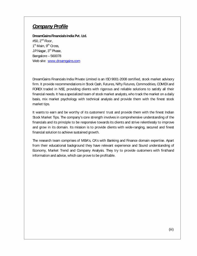
Company Profile
DreamGains Financials India Pvt. Ltd. #50, 2nd Floor, 1st Main, 9th Cross, J.P.Nagar, 3rd Phase, Bangalore – 560078 Web site: www.dreamgains.com
DreamGains Financials India Private Limited is an ISO 9001-2008 certified, stock market advisory firm. It provide recommendations in Stock Cash, Futures, Nifty Futures, Commodities, COMEX and FOREX traded in NSE, providing clients with rigorous and reliable solutions to satisfy all their financial needs. It has a specialized team of stock market analysts, who track the market on a daily basis, mix market psychology with technical analysis and provide them with the finest stock market tips.
It wants to earn and be worthy of its customers’ trust and provide them with the finest Indian Stock Market Tips. The company’s core strength involves in comprehensive understanding of the financials and its principle to be responsive towards its clients and strive relentlessly to improve and grow in its domain. Its mission is to provide clients with wide-ranging, secured and finest financial solution to achieve sustained growth.
The research team comprises of MBA's, CA's with Banking and Finance domain expertise. Apart from their educational background they have relevant experience and Sound understanding of Economy, Market Trend and Company Analysis. They try to provide customers with firsthand information and advice, which can prove to be profitable.
(iii)
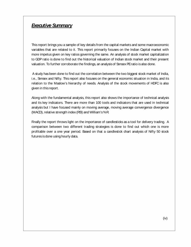
Executive Summary
This report brings you a sample of key details from the capital markets and some macroeconomic variables that are related to it. This report primarily focuses on the Indian Capital market with more impetus given on key ratios governing the same. An analysis of stock market capitalization to GDP ratio is done to find out the historical valuation of Indian stock market and their present valuation. To further corroborate the findings, an analysis of Sensex PE ratio is also done. A study has been done to find out the correlation between the two biggest stock market of India, i.e., Sensex and Nifty. This report also focuses on the general economic situation in India, and its relation to the Maslow’s hierarchy of needs. Analysis of the stock movements of HDFC is also given in this report. Along with the fundamental analysis, this report also shows the importance of technical analysis and its key indicators. There are more than 100 tools and indicators that are used in technical analysis but I have focused mainly on moving average, moving average convergence divergence (MACD), relative strength index (RSI) and William’s % R. Finally the report throws light on the importance of candlesticks as a tool for delivery trading. A comparison between two different trading strategies is done to find out which one is more profitable over a one year period. Based on that a candlestick chart analysis of Nifty 50 stock futures is done using hourly data. (iv)

INTRODUCTION
Indian Capital Market since liberalization has undergone tremendous changes and ha s evolved as a vibrant system of investment flows. A dynamic capital market is an important segment of the financial system of any country as it plays a significant role in mobilizing savings and channeling them for productive purposes. The efficient fund allocation depends on the stock market efficiency in pricing the different securities traded in it.
The project has been divided into two parts- fundamental analysis and technical analysis. This has been done because it has often been said that an ideal trading system would be to use both fundamental and technical analysis in tandem prior to making an investment.
The first part of the project deals with fundamental analysis and certain key macroeconomic variables that are important prior to making an investment. The first of these ratios is the market capitalization to GDP ratio which indicates the overall condition of the market. It is a ratio that is used to find out if the market is undervalued or overvalued. The second important ratio is the price to earnings ratio of Sensex, which indicates how much the investor is willing to pay per rupee earning of the company. The next part of fundamental analysis deals with Maslow’s hierarchy of needs and its importance in making investment decisions. This part of the project deals specifically with the Indian population and where they lie on the Maslow’s hierarchy of needs level.
The second part of the project deals with technical analysis and its importance to generate buy and sell signals at key points. A One year study of 15 scrips is done using an important technical indicator i.e., Exponential Moving Averages through two different strategies to generate delivery based calls. Similarly, a one year study is done on Nifty 50 scrips to generate long and short calls for Delivery trading.
1
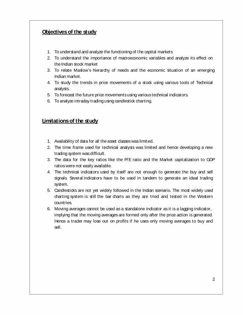
Objectives of the study
1. To understand and analyze the functioning of the capital markets 2. To understand the importance of macroeconomic variables and analyze its effect on
the Indian stock market 3. To relate Maslow’s hierarchy of needs and the economic situation of an emerging
Indian market. 4. To study the trends in price movements of a stock using various tools of Technical
analysis. 5. To forecast the future price movements using various technical indicators. 6. To analyze intraday trading using candlestick charting.
Limitations of the study
1. Availability of data for all the asset classes was limited. 2. The time frame used for technical analysis was limited and hence developing a new
trading system was difficult. 3. The data for the key ratios like the P/E ratio and the Market capitalization to GDP
ratios were not easily available. 4. The technical indicators used by itself are not enough to generate the buy and sell
signals. Several indicators have to be used in tandem to generate an ideal trading system.
5. Candlesticks are not yet widely followed in the Indian scenario. The most widely used charting system is still the bar charts as they are tried and tested in the Western countries.
6. Moving averages cannot be used as a standalone indicator as it is a lagging indicator, implying that the moving averages are formed only after the price action is generated. Hence a trader may lose out on profits if he uses only moving averages to buy and sell.
2

Research Methodology
Research in common parlance refers to a search for knowledge. One can also define research as a scientific and systematic search for pertinent information on a specific topic. Research Design
Research Design is the conceptual structure within which research is conducted. It constitutes the blueprint for collection, measurement and analysis of data. The design used for carrying out this research is Exploratory.
Data type
In this research the type of data used is
Secondary data
Data source
The sources of collection of data are:
Websites
Books
3

4
Part 1.Fundamental Analysis Introduction to Fundamental Analysis
Fundamental analysis is a process of looking at a business at the basic or fundamental financial level. The primary assumption of fundamental analysis is that the all the factors are not discounted in the current market price. There is something called the intrinsic value of the stock which is its true value. Fundamental analysis also assumes that the market will reach its true intrinsic value in the long term and hence the market value and the intrinsic value will reach equilibrium. Hence if the market value at present is lower than its intrinsic value, then it is good time to invest and vice versa. The steps involved in fundamental analysis are:
1. Macroeconomic analysis, which involves considering currencies, commodities and indices. 2. Industry sector analysis, which involves the analysis of companies that are a part of the sector. 3. Situational analysis of a company. 4. Financial analysis of the company. 5. Valuation
Fundamental Analysis Tools
There are several tools used for fundamental analysis. Some of the most popular are:
1. Earnings per Share 2. Price to Earnings 3. Projected Earning Growth (PEG) 4. Price to Sales (P/S) 5. Price to Book (P/B) 6. Dividend Payout ratio 7. Dividend yield 8. Book value 9. Return on Equity (ROE) 10. Ratio analysis
5
Analysis of the stock movement of HDFC Brief introduction of HDFC Housing Development Finance Corporation Limited, more popularly known as HDFC Bank Ltd, was established in the year 1994, as a part of the liberalization of the Indian Banking Industry by Reserve Bank of India (RBI). It was one of the first banks to receive an 'in principle' approval from RBI, for setting up a bank in the private sector. The bank was incorporated with the name 'HDFC Bank Limited', with its registered office in Mumbai. The following year, it started its operations as a Scheduled Commercial Bank. Today, the bank boasts of as many as 1412 branches and over 3275 ATMs across India.
AMALGAMATIONS In 2002, HDFC Bank witnessed its merger with Times Bank Limited (a private sector bank promoted by Bennett, Coleman & Co. / Times Group). With this, HDFC and Times became the first two private banks in the New Generation Private Sector Banks to have gone through a merger. In 2008, RBI approved the amalgamation of Centurion Bank of Punjab with HDFC Bank. With this, the Deposits of the merged entity became Rs. 1,22,000 crores, while the Advances were Rs. 89,000 crores and Balance Sheet size was Rs. 1,63,000 crores.
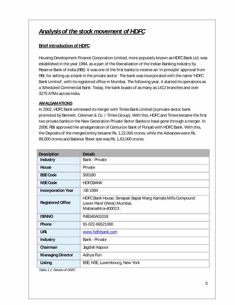
Table 1.1: Details of HDFC
Description Details Industry Bank - Private
House Private
BSE Code 500180
NSE Code HDFCBANK
Incorporation Year -08 1994
Registered Office HDFC Bank House, Senapati Bapat Marg, Kamala Mills Compound Lower Parel (West) Mumbai, Maharashtra-400013 .
ISINNO INE040A01018
Phone 91-022-66521000
URL www.hdfcbank.com
Industry Bank - Private
Chairman Jagdish Kapoor
Managing Director Aditya Puri
Listing BSE, NSE, Luxembourg, New York
6
PERFORMANCE HIGHLIGHTS
For the year ended March 31, 2010, the Bank earned total income of Rs. 19,980.5 crores. Net revenues (net interest income plus other income) for the year ended March 31, 2010 were Rs. 12,194.2 crores, up by 13.8% over Rs. 10,711.8 crores for the year ended March 31, 2009.
The Bank’s net profit for year ended March 31, 2010 was Rs. 2,948.7 crores, up 31.3%,over the year ended March 31, 2009. Consolidated net profit for the Bank increased by 33.6% to Rs. 3,003.7 crores for the year ended March 31, 2010.
The Bank’s total Capital Adequacy Ratio (CAR) as at March 31, 2010 (computed as per Basel II guidelines) stood at 17.4% as against 15.7% as of March 31, 2009
The core CASA ratio was at 50% of total deposits as at March 31, 2010 as compared to 45% as of March 31, 2009.
Net profit has grown 31.3% to 2948.7cr in 2010 from 2245 in 2009.
P/E ratio is in 30.42% in 2010 as compared to 28.38% in 2009.
OUTLOOK AND VALUATION
I believe that HDFC Bank is among the most competitive banks in the Banking Sector and is poised to maintain its profitable growth over the long term. I believe that the Bank’s competitive advantages, driving gains in CASA market share and traction in multiple Fee Revenue streams, can support up to 5% higher core sustainable RoEs vis-à-vis sectoral averages over the long term, creating a material margin of safety in our Target valuation multiples.
We should maintain our view that the substantial inorganic and organic network expansion since 3rd Quarter FY 2009 will enable the Bank regain strong traction in CASA Deposits and Fee Income market share gains over the next 1-2 years, especially once the macro-environment starts improving, progressively restoring financial parameters like CASA ratio and RoE back to pre-merger levels. As HR and IT integration of the CBoP(Centurion Bank of Punjab) branches is completed, it is likely to take the Bank 12-18 months for productivity improvements to scale up closer to levels of its own branches, so that merger benefits start accruing to its Bottom-line.
7
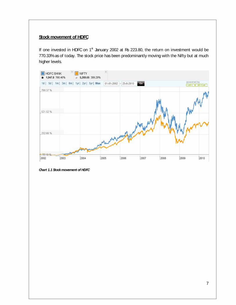
Stock movement of HDFC If one invested in HDFC on 1st January 2002 at Rs 223.80, the return on investment would be 770.33% as of today. The stock price has been predominantly moving with the Nifty but at much higher levels.
Chart 1.1 Stock movement of HDFC
8
Stock Market Capitalization to GDP ratio
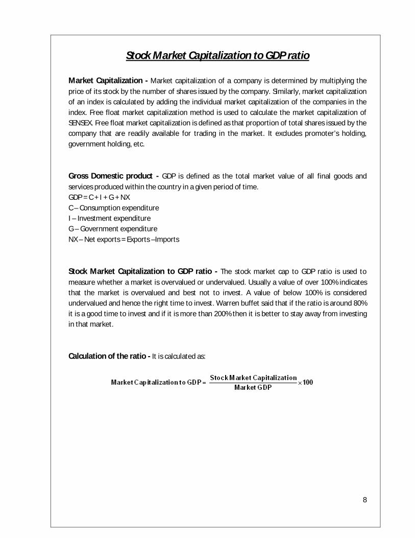
Market Capitalization - Market capitalization of a company is determined by multiplying the price of its stock by the number of shares issued by the company. Similarly, market capitalization of an index is calculated by adding the individual market capitalization of the companies in the index. Free float market capitalization method is used to calculate the market capitalization of SENSEX. Free float market capitalization is defined as that proportion of total shares issued by the company that are readily available for trading in the market. It excludes promoter’s holding, government holding, etc. Gross Domestic product - GDP is defined as the total market value of all final goods and services produced within the country in a given period of time. GDP = C + I + G + NX C – Consumption expenditure I – Investment expenditure G – Government expenditure NX – Net exports = Exports –Imports Stock Market Capitalization to GDP ratio - The stock market cap to GDP ratio is used to measure whether a market is overvalued or undervalued. Usually a value of over 100% indicates that the market is overvalued and best not to invest. A value of below 100% is considered undervalued and hence the right time to invest. Warren buffet said that if the ratio is around 80% it is a good time to invest and if it is more than 200% then it is better to stay away from investing in that market. Calculation of the ratio - It is calculated as:

9
Quarterly Stock Market Capitalization to GDP ratios of India
Year Q1 Q2 Q3 Q4 1979-80 0.01 0.01 0.01 0.01 1980-81 0.01 0.01 0.01 0.01 1981-82 0.01 0.01 0.01 0.01 1982-83 0.01 0.01 0.01 0.01 1983-84 0.01 0.01 0.01 0.01 1984-85 0.02 0.02 0.02 0.02 1985-86 0.02 0.02 0.02 0.02 1986-87 0.03 0.03 0.03 0.03 1987-88 0.03 0.04 0.04 0.05 1988-89 0.05 0.05 0.05 0.05 1989-90 0.05 0.05 0.06 0.06 1990-91 0.06 0.07 0.07 0.08 1991-92 0.12 0.17 0.22 0.27 1992-93 0.24 0.21 0.18 0.15 1993-94 0.18 0.21 0.25 0.28 1994-95 0.28 0.29 0.30 0.31 1995-96 0.32 0.33 0.34 0.34 1996-97 0.33 0.31 0.30 0.28 1997-98 0.29 0.31 0.32 0.33 1998-99 0.32 0.31 0.31 0.30 1999-00 0.34 0.39 0.43 0.47 2000-01 0.42 0.37 0.32 0.28 2001-02 0.28 0.28 0.28 0.28 2002-03 0.27 0.27 0.26 0.25 2003-04 0.32 0.38 0.44 0.50 2004-05 0.55 0.58 0.62 0.66 2005-06 0.77 0.88 0.99 1.09 2006-07 1.11 1.13 1.15 1.17 2007-08 1.46 1.36 1.46 1.54 2008-09 1.36 1.18 1.02 0.85 2009-10 1.00 1.13 1.24 1.29 2010-11 1.21
Table 1.2: Quarterly Market Cap to GDP ratio
10
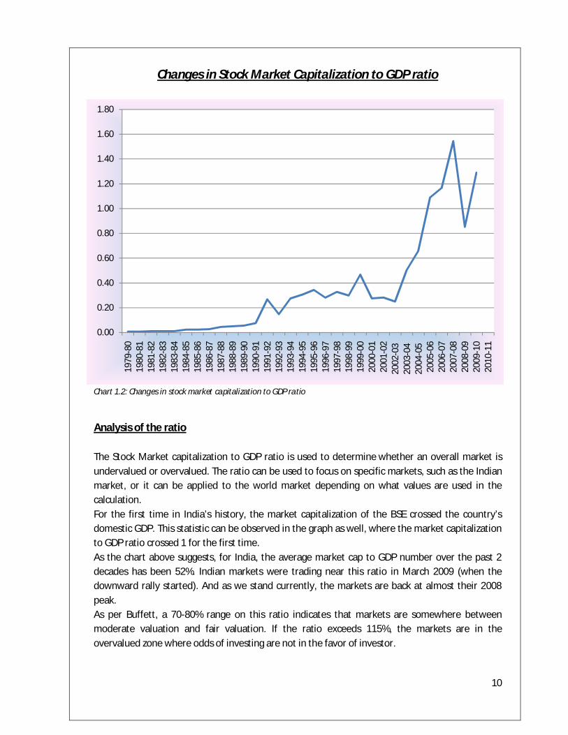
Changes in Stock Market Capitalization to GDP ratio
Chart 1.2: Changes in stock market capitalization to GDP ratio
Analysis of the ratio The Stock Market capitalization to GDP ratio is used to determine whether an overall market is undervalued or overvalued. The ratio can be used to focus on specific markets, such as the Indian market, or it can be applied to the world market depending on what values are used in the calculation. For the first time in India’s history, the market capitalization of the BSE crossed the country’s domestic GDP. This statistic can be observed in the graph as well, where the market capitalization to GDP ratio crossed 1 for the first time. As the chart above suggests, for India, the average market cap to GDP number over the past 2 decades has been 52%. Indian markets were trading near this ratio in March 2009 (when the downward rally started). And as we stand currently, the markets are back at almost their 2008 peak. As per Buffett, a 70-80% range on this ratio indicates that markets are somewhere between moderate valuation and fair valuation. If the ratio exceeds 115%, the markets are in the overvalued zone where odds of investing are not in the favor of investor.
0.00
0.20
0.40
0.60
0.80
1.00
1.20
1.40
1.60
1.80
1979
-80
1980
-81
1981
-82
1982
-83
1983
-84
1984
-85
1985
-86
1986
-87
1987
-88
1988
-89
1989
-90
1990
-91
1991
-92
1992
-93
1993
-94
1994
-95
1995
-96
1996
-97
1997
-98
1998
-99
1999
-00
2000
-01
2001
-02
2002
-03
2003
-04
2004
-05
2005
-06
2006
-07
2007
-08
2008
-09
2009
-10
2010
-11
11
Price To Earnings Ratio of the SENSEX P/E ratio - The price to earnings ratio is an important indicator used by several fundamental analysts. The P/E of a company tells us how much the investor is willing to pay, based on the earnings of the company. The P/E ratio also tells us how much the market is willing to pay the investor per rupee earning of the company. The P/E ratio is calculated as P/E= Stock price/Earnings per share The stock price is the current market value of the stock. The EPS can be calculated in three ways. EPS is calculated as the net earnings divided by the outstanding shares. If the EPS is calculated based on the net earnings of the previous four quarters, it is called trailing P/E. If the EPS is calculated based on the estimated earnings of the next four quarters, it is called a forward P/E. Sometimes the EPS is calculated using the net earnings of the previous two quarters and the next two quarters. Hence there are types of P/E ratio. Significance of the ratio - The P/E ratio cannot be the only indicator to base one’s investment. There are two ways to read the P/E ratio. One method is to compare the P/E of the company to the industry P/E. If the P/E of the company is higher than the P/E of the industry it means that the market is expecting some positive events from the company as far as earnings are concerned. This can be interpreted in two ways. It could mean that the company is outperforming the market and hence is overheated or it could mean that there are some positive events associated with the company and hence a good time to invest. The second method to read the P/E is to compare the P/E of the company with its competitors in the same industry. This gives a general idea as to whether the stock price is undervalued or overvalued.
12
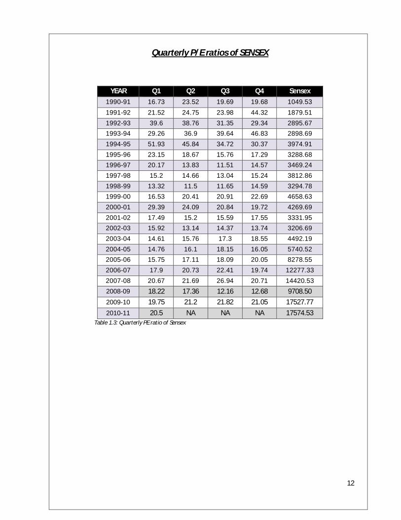
Quarterly P/E ratios of SENSEX
YEAR Q1 Q2 Q3 Q4 Sensex 1990-91 16.73 23.52 19.69 19.68 1049.53 1991-92 21.52 24.75 23.98 44.32 1879.51 1992-93 39.6 38.76 31.35 29.34 2895.67 1993-94 29.26 36.9 39.64 46.83 2898.69 1994-95 51.93 45.84 34.72 30.37 3974.91 1995-96 23.15 18.67 15.76 17.29 3288.68 1996-97 20.17 13.83 11.51 14.57 3469.24 1997-98 15.2 14.66 13.04 15.24 3812.86 1998-99 13.32 11.5 11.65 14.59 3294.78 1999-00 16.53 20.41 20.91 22.69 4658.63 2000-01 29.39 24.09 20.84 19.72 4269.69 2001-02 17.49 15.2 15.59 17.55 3331.95 2002-03 15.92 13.14 14.37 13.74 3206.69 2003-04 14.61 15.76 17.3 18.55 4492.19 2004-05 14.76 16.1 18.15 16.05 5740.52 2005-06 15.75 17.11 18.09 20.05 8278.55 2006-07 17.9 20.73 22.41 19.74 12277.33 2007-08 20.67 21.69 26.94 20.71 14420.53 2008-09 18.22 17.36 12.16 12.68 9708.50 2009-10 19.75 21.2 21.82 21.05 17527.77 2010-11 20.5 NA NA NA 17574.53
Table 1.3: Quarterly PE ratio of Sensex
13
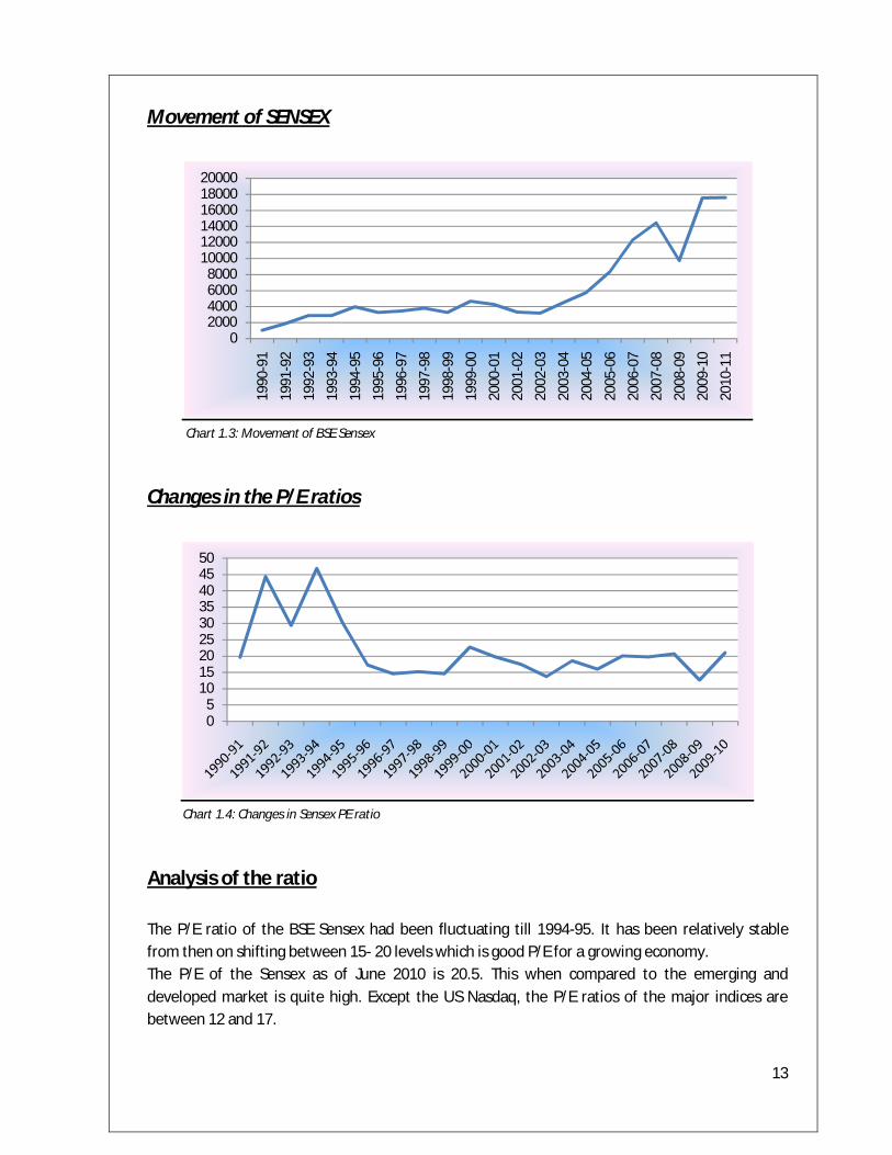
Movement of SENSEX
Chart 1.3: Movement of BSE Sensex
Changes in the P/E ratios
Chart 1.4: Changes in Sensex PE ratio
Analysis of the ratio The P/E ratio of the BSE Sensex had been fluctuating till 1994-95. It has been relatively stable from then on shifting between 15- 20 levels which is good P/E for a growing economy. The P/E of the Sensex as of June 2010 is 20.5. This when compared to the emerging and developed market is quite high. Except the US Nasdaq, the P/E ratios of the major indices are between 12 and 17.
02000400060008000
100001200014000160001800020000
1990
-91
1991
-92
1992
-93
1993
-94
1994
-95
1995
-96
1996
-97
1997
-98
1998
-99
1999
-00
2000
-01
2001
-02
2002
-03
2003
-04
2004
-05
2005
-06
2006
-07
2007
-08
2008
-09
2009
-10
2010
-11
05
101520253035404550

14
Analyzing India Using Maslow’s Hierarchy of Needs
Chart 1.5: Maslow’s hierarchy of needs
Physiological needs- These are the basic needs that are required to sustain life. They include food, water, air, etc. According to Maslow’s theory, if these fundamental needs are not satisfied then one will surely be motivated to satisfy them. Higher needs such as social needs and esteem needs are not recognized until one satisfies the needs basic to existence. Safety needs- Once basic needs are satisfied the attention turns to safety and security needs of the individual. The various safety and security needs include housing security, insurance, job security, financial security, etc. Social needs- This, according to Maslow’s, is the first level of higher level needs. Social needs are those related to interaction with others and they include friendship, belonging to a group, etc. Esteem needs- Esteem needs can be internal esteem needs or external esteem needs. The esteem needs include self-respect, achievement, attention, recognition and reputation. The first two are internal esteem needs where as the last three are external esteem needs. Self-actualization- Self-actualization is the summit of Maslow’s hierarchy of needs. It is the quest of reaching one’s full potential as a person. The needs associated with self-actualization include truth, justice, wisdom, etc.
15
Introduction Despite the economic reforms of 1991, India’s economic growth has been slow compared to the levels achieved by the other Asian economies in the past. From 1991 – when the economic reforms began – till 2000 end, India’s GDP per capita has grown at 4.2% a year. Up to the early 1980s, GDP per capita grew at only 1.6% a year. From the mid 1980s to 1991, GDP per capita grew to around 2.6% a year. Currently the growth rate hovers around 6% to 9%. The growth patterns of the Indian economy are an indicator of not just the economic scope in the country but societal pattern as well. The further study analyses specific indicators of the Indian economy relative to the GDP growth, which may support the positioning of the Indian people on Maslow’s Hierarchy of Needs. Through the findings, it seems most probable that India has the majority of its population lying in the Security and Social Needs of Maslow’s Hierarchy. Subsequent passages show examples from the demographics of the country which may corroborate this position of the Indian population on the Hierarchy of Needs. Background Facts Population: 1.18 Billion Demography (Age):
0-14 years – 31.1% 15-64 years – 63.6% 65 & above – 5.3%
Average age: 24.9 years Poverty: The following figures show the percentage of population below poverty line
2000 – 26% 2006 – 22%
Literacy:
2001 - 65.38% 2007 - 64.8% 2009 - 61%
Infant Mortality rates:
2007 – 34.61 per 1000 babies 2008 – 32.31 per 1000 babies 2009 – 30.15 per 1000 babies
Life expectancy:
2006 – 63 years 2009 – 69.89 years
16
Findings The demography pattern of India shows that the majority of the population lies in the 15 – 64 years age bracket. This by itself can lead to an assumption that the majority of the population fall in the Security and Social needs of Maslow’s Hierarchy. If we look at the average age of the population we notice that India is by and large a young nation, which further substantiates the finding. The poverty figures have been declining over the years. From 26% in 2000, the population below the poverty line by 2006 estimates dropped to 22%. The literacy rates of India are unimpressive at a mere 61% and have decreased over the years, which is not a promising sign. The decreasing mortality rates and increasing life expectancy show that healthcare in India has been bettering over the years. As such, even on the healthcare front Security needs of the Indian people even though improving, need substantial improvement. Other examples corroborating the findings The following specifics of India have been used to substantiate our findings:
Household Insurance Telecom
A majority of Indians have per capita space equivalent to or less than a 10 feet x 10 feet room for their living, sleeping, cooking, washing and toilet needs. The average is 103 sq ft per person in rural areas and 117 sq ft per person in urban areas. It may then be inferred that most of the population are somehow satisfying the physiological need of housing. Though the number of companies providing insurance is being increasing but the contrasting fact is only 1% of the population is insured for life. The insurance sector is still highly untapped. On the telecommunications front, more than half of the population own mobile phones. In absolute numbers this translates into 600 million mobile users in the country. In comparison, land lines are only a meager 150 million. Consequently we assume that with the shift of preference to mobile phones over the years, the Indian people are addressing their social needs as well. However, this does not indicate that the majority of the population may have surpassed the social needs status on Maslow’s hierarchy.

17
Analysis From the GDP growth it can be understood that India is an emerging growing economy. The average age of the Indian population is 24.9 years and hence by and large a relatively young population. Also a majority of the population fall under the 15-64 years age bracket which substantiates the finding that majority of the Indian population lie in the Social and Security needs of Maslow’s hierarchy. What this indicates is that the Indian government needs to address the security needs of the Indian population through more reforms in the insurance sector, more impetus on rural education and finally more investment in the rural household sector. The last of the three is substantiated by the fact that the poverty figures in India are very disheartening and there is an urgent requirement from the government to spend heavily on the rural household sector. The poverty figures indicate that 22% of the population is struggling to address their physiological needs. Only about 30% of the population is urbanized and hence this further substantiates the findings that majority of the population falls in the security needs of Maslow’s hierarchy. To further confirm the above findings it is important to note that only 1% of the population is insured for life and 0.2% is covered under mediclaim. With the increasing number of insurance companies, Indian population is trying to fulfill their security needs. I would also like to add that though most of the Indian people are carrying cell phones with them, they cannot be placed on the social needs of Maslow’s hierarchy. The fact that a large section of the population are still struggling to meet their security needs cannot be ruled out. The research also led me to believe, albeit inconclusively, that not more than 5% of the population of India has surpassed the social needs stage. Hence it may easily be concluded that Indians lie on the Security needs stage of the Maslow’s hierarchy.
18
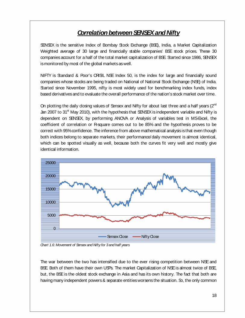
Correlation between SENSEX and Nifty
SENSEX is the sensitive Index of Bombay Stock Exchange (BSE), India, a Market Capitalization Weighted average of 30 large and financially stable companies’ BSE stock prices. These 30 companies account for a half of the total market capitalization of BSE. Started since 1986, SENSEX is monitored by most of the global markets as well.
NIFTY is Standard & Poor’s CRISIL NSE Index 50, is the index for large and financially sound companies whose stocks are being traded on National of National Stock Exchange (NSE) of India. Started since November 1995, nifty is most widely used for benchmarking index funds, index based derivatives and to evaluate the overall performance of the nation’s stock market over time.
On plotting the daily closing values of Sensex and Nifty for about last three and a half years (2nd Jan 2007 to 31st May 2010), with the hypothesis that SENSEX is independent variable and Nifty is dependent on SENSEX, by performing ANOVA or Analysis of variables test in MS-Excel, the coefficient of correlation or R-square comes out to be 85% and the hypothesis proves to be correct with 95% confidence. The inference from above mathematical analysis is that even though both indices belong to separate markets, their performance/daily movement is almost identical, which can be spotted visually as well, because both the curves fit very well and mostly give identical information.
Chart 1.6: Movement of Sensex and Nifty for 3 and half years
The war between the two has intensified due to the ever rising competition between NSE and BSE. Both of them have their own USPs. The market Capitalization of NSE is almost twice of BSE, but, the BSE is the oldest stock exchange in Asia and has its own history. The fact that both are having many independent powers & separate entities worsens the situation. So, the only common
0
5000
10000
15000
20000
25000
Sensex Close Nifty Close
19
link between them now is SEBI, which has a totally different role, as it’s a regulatory authority to watch and control the legal and ethical aspects of the market and protect the interests of shareholders. Hence, no one, not even the SEBI is an intermediary between the two, thereby, intensifying the competition between them to become the preferred exchange for top companies. Even though the competition is healthy for any company to emerge stronger, provide more value added services and work smarter, it becomes totally unhealthy and destructive when there are price wars and a red ocean causing them to put their riches in advertising and other undue marketing/brand building expenses.
So, whom to track? Whom to believe and follow? Which of them is a better indicator of the market? Who is better in gauging the Indian stocks? Ironically, it doesn’t matter at all. Both SENSEX and Nifty are well diversified and contains many similar companies’ stocks. So, even though Nifty has got 20 more companies, that’s 67% more variety, both SENSEX and Nifty moves in the same direction and the trend seems like totally correlated. There is a definite difference in scale or magnitude, but, after scaling and equalizing both to similar bases, there will be hardly any difference in both indices. So, the choice is based only on convenience and not on the performance. The global markets prefer SENSEX because that was the only option with them earlier and they don’t want to switch to other without any clear reason for that sudden change.
20
Part 2.Technical Analysis Introduction to Technical Analysis Technical analysis is the study of market action, primarily through the use of charts, for the purpose of forecasting future price trends. For technical analysts, the term market action includes three sources of information. They are price, volume and open interest. Open interest is used only in futures and options.
There are three premises on which technical analysis is based. They are
1) Market action discounts everything - Anything and everything that affects the price is actually reflected in the price of that market. Hence a technical analyst will only study the price action and not the reasons behind the change in the price.
2) Prices move in trends - There are three types of trends. They are uptrend, downtrend and sideways trend. The assumption of technical analysis is that a trend in motion is more likely to continue than reverse or a trend in motion will continue in the same direction until it reverses.
3) History repeats itself - The meaning of the phrase history repeats itself is that the key to understanding the future lies in the study of the past, or that the future is just a repetition of the past.
Usually the following tools & instruments are used to do the technical analysis:
Price Fields
Technical analysis is based almost entirely on the analysis of price and volume. The fields which define a security's price and volume are explained below.
Open - This is the price of the first trade for the period (e.g., the first trade of the day). When analyzing daily data, the Open is especially important as it is the consensus price after all interested parties were able to "sleep on it."
High - This is the highest price that the security traded during the period. It is the point at which there were more sellers than buyers (i.e., there are always sellers willing to sell at higher prices, but the High represents the highest price buyers were willing to pay).
Low - This is the lowest price that the security traded during the period. It is the point at which there were more buyers than sellers (i.e., there are always buyers willing to buy at lower prices, but the Low represents the lowest price sellers were willing to accept).
21
Close - This is the last price that the security traded during the period. Due to its availability, the Close is the most often used price for analysis. The relationship between the Open (the first price) and the Close (the last price) are considered significant by most technicians. This relationship is emphasized in candlestick charts.
Volume - This is the number of shares (or contracts) that were traded during the period. The relationship between prices and volume (e.g., increasing prices accompanied with increasing volume) is important.
Open Interest - This is the total number of outstanding contracts (i.e., those that have not been exercised, closed, or expired) of a future or option. Open interest is often used as an indicator.
Bid - This is the price a market maker is willing to pay for a security (i.e., the price you will receive if you sell).
Ask - This is the price a market maker is willing to accept (i.e., the price you will pay to buy the security).
Chart Styles
Price in a chart can be displayed in following styles:
1. Bar Chart. 2. Line Chart. 3. Candlestick Chart.
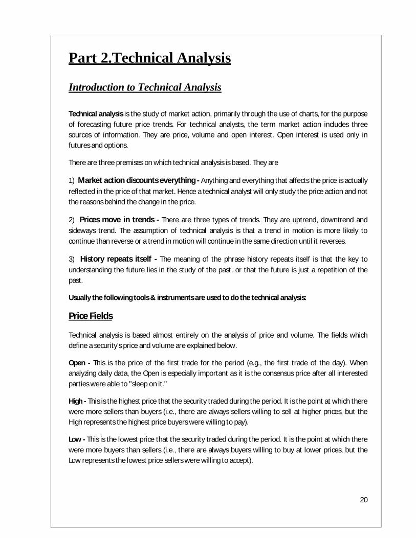
1) Bar Charts:
The highs and lows of a stock are plotted in a diagram and the points are joined with vertical lines (bars). A small horizontal tick to the left denotes the opening level while a small horizontal tick to the right represents the closing price of each interval.
Chart 2.1: Example of Bar chart
22
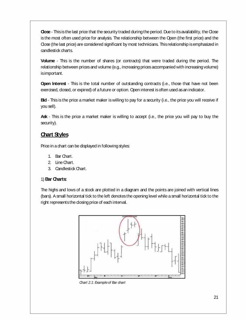
2) Line Chart
It gives the detailed information about every aspect. The stock prices for each time period are plotted in a diagram and the points are joined. Prices on the y-axis and time on the x-axis.
The line chart chooses for example the closing price of consecutive time periods, but can also work with daily, official fixings.
Chart 2.2: Example of Line Chart
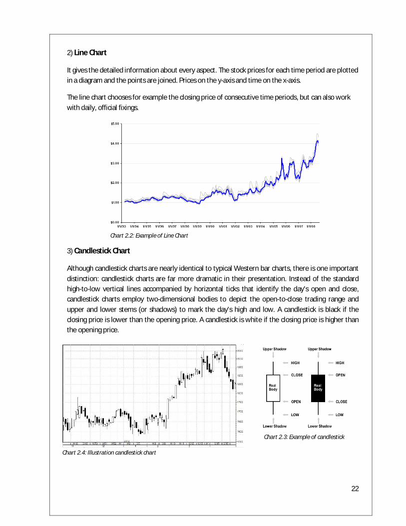
3) Candlestick Chart
Although candlestick charts are nearly identical to typical Western bar charts, there is one important distinction: candlestick charts are far more dramatic in their presentation. Instead of the standard high-to-low vertical lines accompanied by horizontal ticks that identify the day's open and close, candlestick charts employ two-dimensional bodies to depict the open-to-close trading range and upper and lower stems (or shadows) to mark the day's high and low. A candlestick is black if the closing price is lower than the opening price. A candlestick is white if the closing price is higher than the opening price.
Chart 2.3: Example of candlestick
Chart 2.4: Illustration candlestick chart

23
Candlestick Patterns
Bullish Patterns
1) Long white (empty) line. This is a bullish line. It occurs when prices open near the low and close significantly higher near the period's high.
2) Hammer. This is a bullish line if it occurs after a significant downtrend. If the line occurs after a significant up-trend, it is called a Hanging Man. A Hammer is identified by a small real body (i.e., a small range between the open and closing prices) and a long lower shadow (i.e., the low is significantly lower than the open, high, and close). The body can be empty or filled-in.
3) Piercing line. This is a bullish pattern and the opposite of a dark cloud cover. The first line is a long black line and the second line is a long white line. The second line opens lower than the first line's low, but it closes more than halfway above the first line's real body.
4) Bullish engulfing lines. This pattern is strongly bullish if it occurs after a significant downtrend (i.e., it acts as a reversal pattern). It occurs when a small bearish (filled-in) line is engulfed by a large bullish (empty) line.
5) Morning star. This is a bullish pattern signifying a potential bottom. The "star" indicates a possible reversal and the bullish (empty) line confirms this. The star can be empty or filled-in.
6) Bullish doji star. A "star" indicates a reversal and a doji indicates indecision. Thus, this pattern usually indicates a reversal following an indecisive period. You should wait for a confirmation (e.g., as in the morning star, above) before trading a doji star. The first line can be empty or filled in.

24
Bearish Patterns
1) Long black (filled-in) line. This is a bearish line. It occurs when prices open near the high and close significantly lower near the period's low.
2) Hanging Man. These lines are bearish if they occur after a significant uptrend. If this pattern occurs after a significant downtrend, it is called a Hammer. They are identified by small real bodies (i.e., a small range between the open and closing prices) and a long lower shadow (i.e., the low was significantly lower than the open, high, and close). The bodies can be empty or filled-in.
3) Dark cloud cover. This is a bearish pattern. The pattern is more significant if the second line's body is below the center of the previous line's body (as illustrated).
4) Bearish engulfing lines. This pattern is strongly bearish if it occurs after a significant uptrend (i.e., it acts as a reversal pattern). It occurs when a small bullish (empty) line is engulfed by a large bearish (filled-in) line.
5) Evening star. This is a bearish pattern signifying a potential top. The "star" indicates a possible reversal and the bearish (filled-in) line confirms this. The star can be empty or filled in.
5) Doji star. A star indicates a reversal and a doji indicates indecision. Thus, this pattern usually indicates a reversal following an indecisive period. You should wait for a confirmation (e.g., as in the evening star illustration) before trading a doji star.

25
6) Shooting star. This pattern suggests a minor reversal when it appears after a rally. The star's body must appear near the low price and the line should have a long upper shadow.
Reversal Patterns
1) Long-legged doji. This line often signifies a turning point. It occurs when the open and close are the same, and the range between the high and low is relatively large.
2) Dragon-fly doji. This line also signifies a turning point. It occur when the open and close are the same, and the low is significantly lower than the open, high, and closing prices.
3) Gravestone doji. This line also signifies a turning point. It occurs when the open, close, and low are the same, and the high is significantly higher than the open, low, and closing prices.
4) Star. Stars indicate reversals. A star is a line with a small real body that occurs after a line with a much larger real body, where the real bodies do not overlap. The shadows may overlap.
5) Doji star. A star indicates a reversal and a doji indicates indecision. Thus, this pattern usually indicates a reversal following an indecisive period. You should wait for a confirmation (e.g., as in the evening star illustration) before trading a doji star.

26
Neutral Patterns
1) Spinning tops. These are neutral lines. They occur when the distance between the high and low, and the distance between the open and close, are relatively small.
2) Doji. This line implies indecision. The security opened and closed at the same price. These lines can appear in several different patterns. Double doji lines (two adjacent doji lines) imply that a forceful move will follow a breakout from the current indecision.
3) Harami ("pregnant" in English). This pattern indicates a decrease in momentum. It occurs when a line with a small body falls within the area of a larger body. In this example, a bullish (empty) line with a long body is followed by a weak bearish (filled in) line. This implies a decrease in the bullish momentum.
4) Harami cross. This pattern also indicates a decrease in momentum. The pattern is similar to a harami, except the second line is a doji (signifying indecision).

27
Key Technical Indicators
There are several indicators that are used in technical analysis. But I have chosen to highlight the following indicators as I have used some of these further in the project.
1. Moving average 2. Relative Strength Index (RSI) 3. Larry William’s % R 4. Moving average Convergence Divergence (MACD) 5. Fibonacci tools
1) Moving average - The moving average essentially a trend following indicator or a lagging indicator as it is formed after the price movement occurs. Its purpose is to identify or signal that a new trend has begun or that an old trend has ended or reversed. Its purpose is to track the progress of the trend.
Chart 2.5: Illustration of Moving average
There are three types of moving averages that are used by technical analysts. They are
a) Simple moving average - It is calculated by taking the average of the previous 10 or 15 closing prices. The weights given to each day is the same i.e. in a 10 day simple moving average, the

28
weight given for the 10th day closing price is the same as the weight given for the 1st day closing price. The disadvantage of the simple moving average is that it reacts slower to the price movement when compared to an exponential moving average.
b) Linearly weighted moving average - In this type of moving average weights are given in a linear proportion to each day’s closing price i.e. the 10th day closing price is multiplied with 10, the 9th day with 9, and so on. The greater weight is given to the most recent closing.
c) Exponential moving average - The exponential moving average assigns greater weight to more recent data and it includes in its calculation all of the data in the life of the instrument. The advantage of using exponential moving averages is that it reacts quicker to the price movement than a simple moving average.
Analyzing moving averages - There are two ways to analyze moving averages. They are as follows:
a) Single moving average and price - A single moving average is used to generate buy and sell signals. When the price line moves above the moving average, a buy signal is generated. Conversely, when the price line moves below the moving average, a sell signal is generated.
b) Double crossover method - In this case two moving averages are used. One is a shorter moving average and the other a longer moving average. When the shorter moving average crosses above the longer moving average, a buy signal is generated. Conversely, when the shorter moving average crosses below the longer moving average, a sell signal is generated.

29
2) Relative Strength Index (RSI) - Relative strength generally means a ratio line comparing two different entities. A ratio of a stock or industry group to the Sensex is one way of gauging relative strength of different stocks or industry groups against one objective benchmark. Relative strength index solves the problem of erratic movement and the need for constant upper and lower boundary.
The formula used for calculating RSI is
RSI=100-100/1+RS
RS=Average of x days’ up close/ Average of x days’ down close
Chart 2.6: Illustration of RSI
Analyzing Relative Strength Index - RSI is plotted on a vertical scale of 0 to 100. Movements above 70 are considered overbought while an oversold condition would be move under 30. Because of shifting that takes place in bull and bear market, the 80 level usually becomes overbought level in bull market and the 20 level the oversold level in bear market.
30
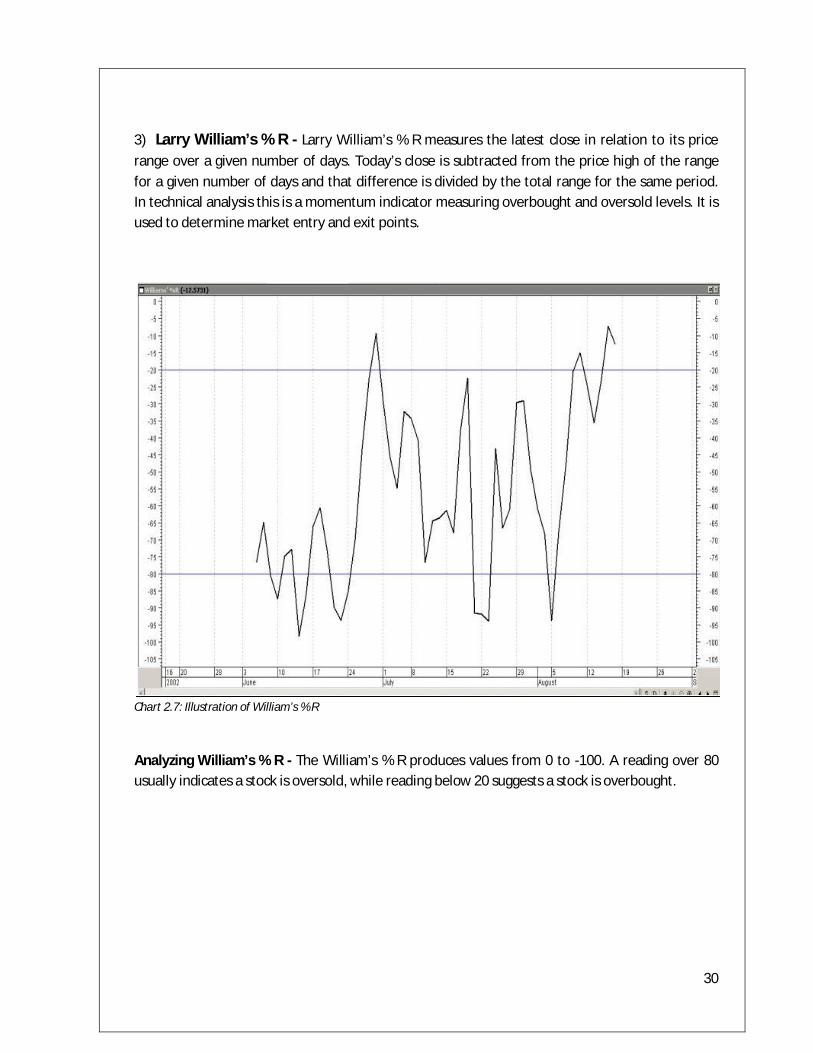
3) Larry William’s % R - Larry William’s % R measures the latest close in relation to its price range over a given number of days. Today’s close is subtracted from the price high of the range for a given number of days and that difference is divided by the total range for the same period. In technical analysis this is a momentum indicator measuring overbought and oversold levels. It is used to determine market entry and exit points.
Chart 2.7: Illustration of William’s % R
Analyzing William’s % R - The William’s % R produces values from 0 to -100. A reading over 80 usually indicates a stock is oversold, while reading below 20 suggests a stock is overbought.

31
4) Moving Average Convergence Divergence (MACD) - MACD is comprised of two sets of line. One is called the faster line and the other the slower line. The faster line is the difference between two exponential moving averages (usually 12 and 26). It is also called the MACD line.
The slower line is usually a 9 day exponential moving average of the MACD line. It is also called the signal line. The buy and sell signals are based on the crossovers between the two lines. Hence it is very similar to the double crossover method of moving averages.
Chart 2.8: Illustration of MACD
Analyzing MACD - When the MACD line (faster line) crosses above the signal line (slower line), a buy signal is generated. Conversely, when the MACD line crosses below the signal line, a sell signal is generated.
Another way of interpretation using MACD is by comparing it with the zero line to indicate overbought or oversold conditions. An overbought condition is when the lines are well above the zero line and hence indicating a sell signal. An oversold condition is when the lines are well below the zero line and hence indicating a buy signal.
32
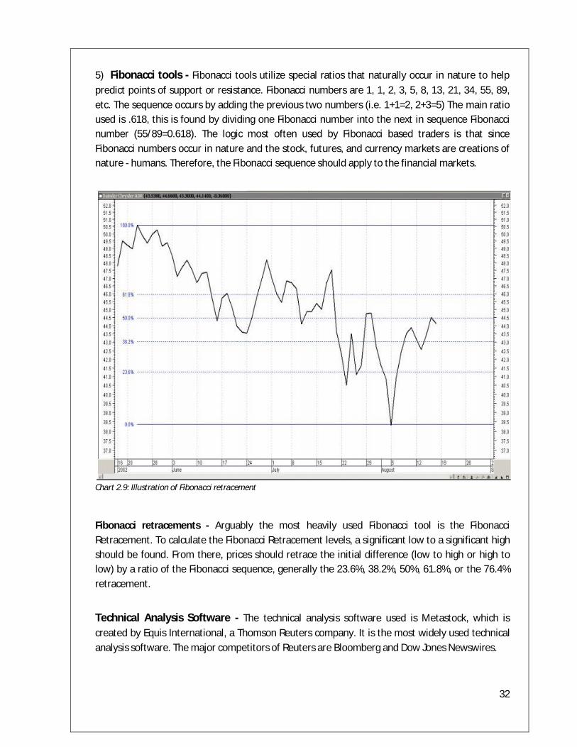
5) Fibonacci tools - Fibonacci tools utilize special ratios that naturally occur in nature to help predict points of support or resistance. Fibonacci numbers are 1, 1, 2, 3, 5, 8, 13, 21, 34, 55, 89, etc. The sequence occurs by adding the previous two numbers (i.e. 1+1=2, 2+3=5) The main ratio used is .618, this is found by dividing one Fibonacci number into the next in sequence Fibonacci number (55/89=0.618). The logic most often used by Fibonacci based traders is that since Fibonacci numbers occur in nature and the stock, futures, and currency markets are creations of nature - humans. Therefore, the Fibonacci sequence should apply to the financial markets.
Chart 2.9: Illustration of Fibonacci retracement
Fibonacci retracements - Arguably the most heavily used Fibonacci tool is the Fibonacci Retracement. To calculate the Fibonacci Retracement levels, a significant low to a significant high should be found. From there, prices should retrace the initial difference (low to high or high to low) by a ratio of the Fibonacci sequence, generally the 23.6%, 38.2%, 50%, 61.8%, or the 76.4% retracement.
Technical Analysis Software - The technical analysis software used is Metastock, which is created by Equis International, a Thomson Reuters company. It is the most widely used technical analysis software. The major competitors of Reuters are Bloomberg and Dow Jones Newswires.
33
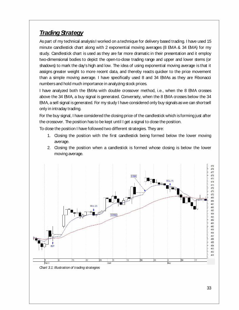
Trading Strategy As part of my technical analysis I worked on a technique for delivery based trading. I have used 15 minute candlestick chart along with 2 exponential moving averages (8 EMA & 34 EMA) for my study. Candlestick chart is used as they are far more dramatic in their presentation and it employ two-dimensional bodies to depict the open-to-close trading range and upper and lower stems (or shadows) to mark the day's high and low. The idea of using exponential moving average is that it assigns greater weight to more recent data, and thereby reacts quicker to the price movement than a simple moving average. I have specifically used 8 and 34 EMAs as they are Fibonacci numbers and hold much importance in analyzing stock prices.
I have analyzed both the EMAs with double crossover method, i.e., when the 8 EMA crosses above the 34 EMA, a buy signal is generated. Conversely, when the 8 EMA crosses below the 34 EMA, a sell signal is generated. For my study I have considered only buy signals as we can shortsell only in intraday trading.
For the buy signal, I have considered the closing price of the candlestick which is forming just after the crossover. The position has to be kept until I get a signal to close the position.
To close the position I have followed two different strategies. They are:
1. Closing the position with the first candlestick being formed below the lower moving average.
2. Closing the position when a candlestick is formed whose closing is below the lower moving average.
Chart 3.1: Illustration of trading strategies
34
Process for the study
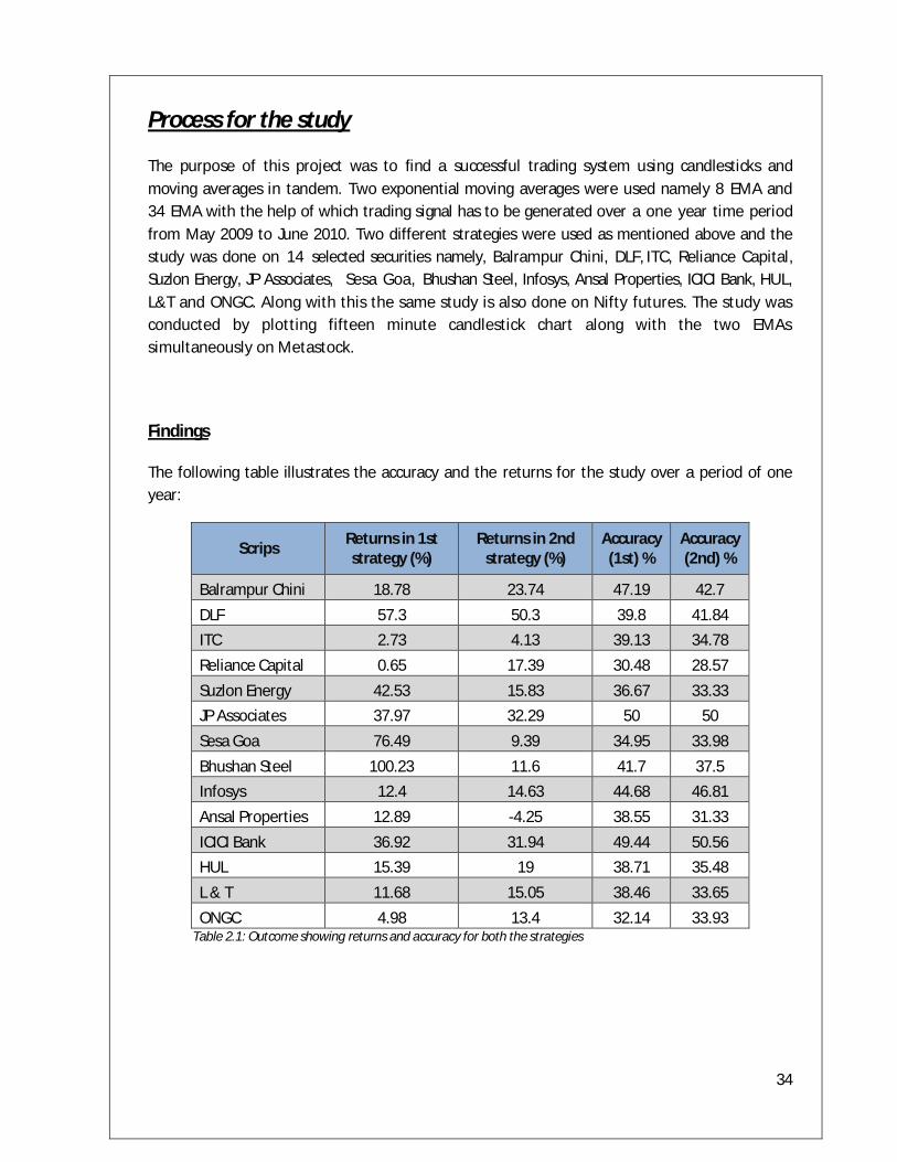
The purpose of this project was to find a successful trading system using candlesticks and moving averages in tandem. Two exponential moving averages were used namely 8 EMA and 34 EMA with the help of which trading signal has to be generated over a one year time period from May 2009 to June 2010. Two different strategies were used as mentioned above and the study was done on 14 selected securities namely, Balrampur Chini, DLF, ITC, Reliance Capital, Suzlon Energy, JP Associates, Sesa Goa, Bhushan Steel, Infosys, Ansal Properties, ICICI Bank, HUL, L&T and ONGC. Along with this the same study is also done on Nifty futures. The study was conducted by plotting fifteen minute candlestick chart along with the two EMAs simultaneously on Metastock.
Findings
The following table illustrates the accuracy and the returns for the study over a period of one year:
Scrips Returns in 1st strategy (%)
Returns in 2nd strategy (%)
Accuracy (1st) %
Accuracy (2nd) %
Balrampur Chini 18.78 23.74 47.19 42.7 DLF 57.3 50.3 39.8 41.84 ITC 2.73 4.13 39.13 34.78 Reliance Capital 0.65 17.39 30.48 28.57 Suzlon Energy 42.53 15.83 36.67 33.33 JP Associates 37.97 32.29 50 50 Sesa Goa 76.49 9.39 34.95 33.98 Bhushan Steel 100.23 11.6 41.7 37.5 Infosys 12.4 14.63 44.68 46.81 Ansal Properties 12.89 -4.25 38.55 31.33 ICICI Bank 36.92 31.94 49.44 50.56 HUL 15.39 19 38.71 35.48 L & T 11.68 15.05 38.46 33.65 ONGC 4.98 13.4 32.14 33.93
Table 2.1: Outcome showing returns and accuracy for both the strategies
35
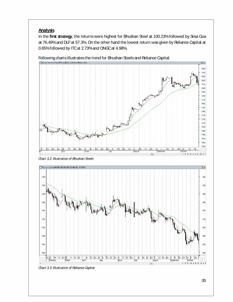
Analysis In the first strategy, the returns were highest for Bhushan Steel at 100.23% followed by Sesa Goa at 76.49% and DLF at 57.3%. On the other hand the lowest return was given by Reliance Capital at 0.65% followed by ITC at 2.73% and ONGC at 4.98%.
Following charts illustrates the trend for Bhushan Steels and Reliance Capital:
Chart 3.2: Illustration of Bhushan Steels
Chart 3.3: Illustration of Reliance Capital
36
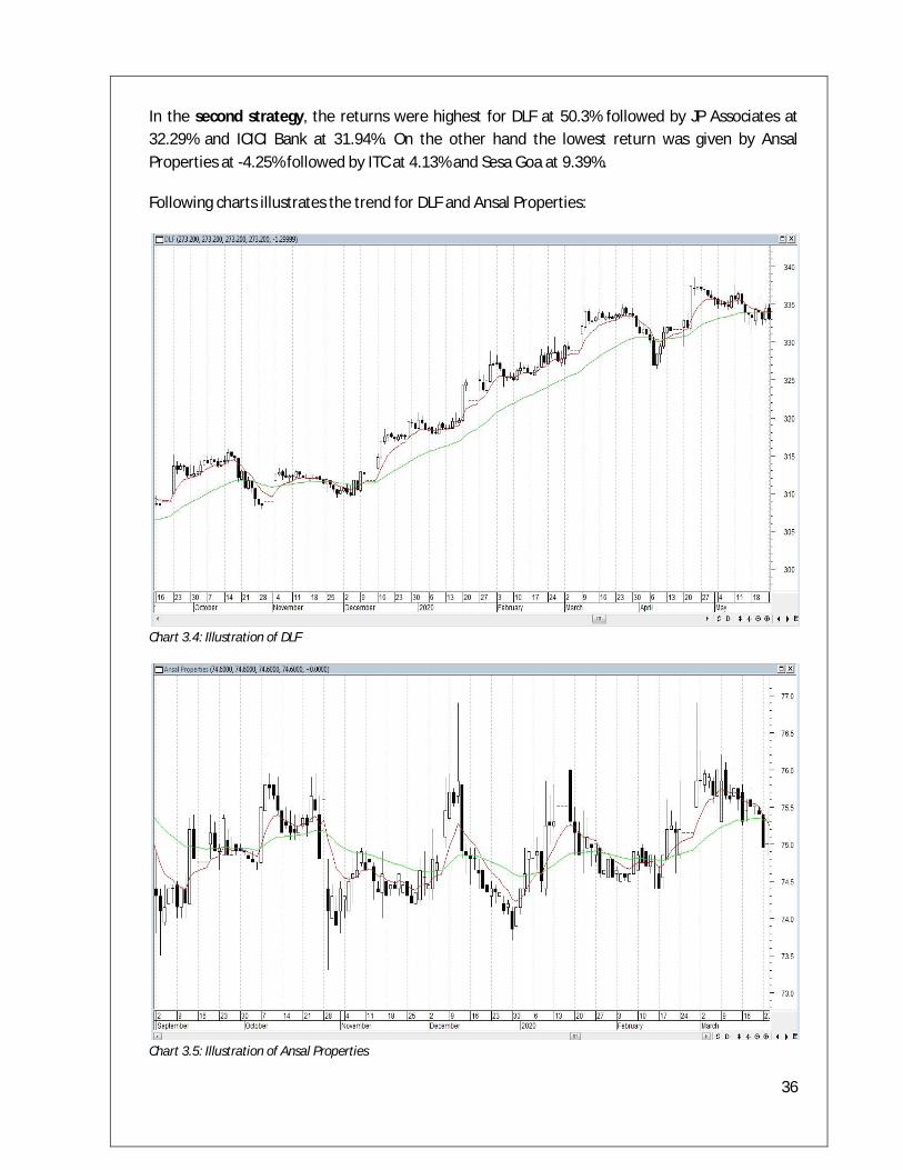
In the second strategy, the returns were highest for DLF at 50.3% followed by JP Associates at 32.29% and ICICI Bank at 31.94%. On the other hand the lowest return was given by Ansal Properties at -4.25% followed by ITC at 4.13% and Sesa Goa at 9.39%.
Following charts illustrates the trend for DLF and Ansal Properties:
Chart 3.4: Illustration of DLF
Chart 3.5: Illustration of Ansal Properties
37
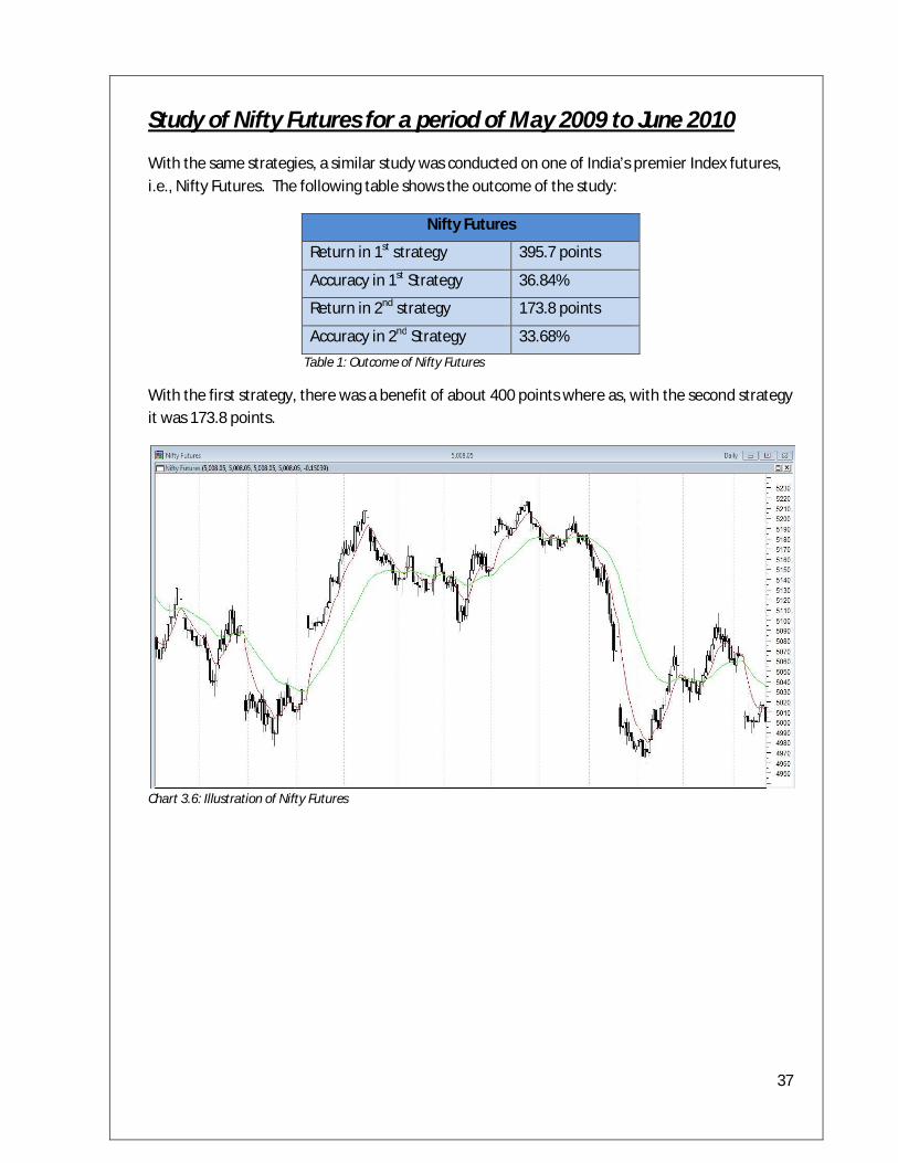
Study of Nifty Futures for a period of May 2009 to June 2010
With the same strategies, a similar study was conducted on one of India’s premier Index futures, i.e., Nifty Futures. The following table shows the outcome of the study:
Nifty Futures
Return in 1st strategy 395.7 points
Accuracy in 1st Strategy 36.84%
Return in 2nd strategy 173.8 points
Accuracy in 2nd Strategy 33.68% Table 1: Outcome of Nifty Futures
With the first strategy, there was a benefit of about 400 points where as, with the second strategy it was 173.8 points.
Chart 3.6: Illustration of Nifty Futures

38
Conclusion of the study of both the trading strategies
With the study of 14 different scrips and an Index future on both the trading strategies, it was observed that the first strategy was comparatively better than the second strategy.
For most of the scrips the returns were higher if trading is done with the first strategy. The return for all the 14 scrips taken together comes to 430.94% and 254.44% taking the first and the second strategies respectively. For Nifty futures also, the returns were higher with the first trading strategy.
From the above study, it can be clearly concluded that the first strategy stands ahead in comparison with the second.
Based on this conclusion, a further study is conducted for the futures contract of the entire 50 scrips comprising Nifty.
39
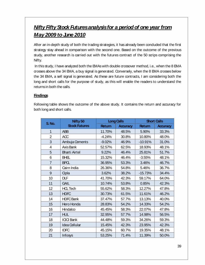
Nifty Fifty Stock Futures analysis for a period of one year from May 2009 to June 2010
After an in-depth study of both the trading strategies, it has already been concluded that the first strategy stay ahead in comparison with the second one. Based on the outcome of the previous study, another research is carried out with the futures contract of the 50 scrips comprising the Nifty.
In this study, I have analyzed both the EMAs with double crossover method, i.e., when the 8 EMA crosses above the 34 EMA, a buy signal is generated. Conversely, when the 8 EMA crosses below the 34 EMA, a sell signal is generated. As these are future contracts, I am considering both the long and short calls for the purpose of study, as this will enable the readers to understand the returns in both the calls.
Findings
Following table shows the outcome of the above study. It contains the return and accuracy for both long and short calls.
S. No. Nifty 50 Stock Futures
Long Calls Short Calls Return Accuracy Return Accuracy
1 ABB 11.70% 48.5% 5.90% 33.3% 2 ACC -4.24% 30.8% 10.80% 48.0% 3 Ambuja Cements -9.02% 46.9% -10.91% 31.0% 4 Axis Bank 52.57% 62.5% 18.93% 48.1% 5 Bharti Airtel 9.22% 46.4% 25.81% 51.7% 6 BHEL 15.32% 46.4% -3.55% 48.1% 7 BPCL 36.95% 53.3% 3.46% 46.7% 8 Cairn India 26.36% 54.8% 5.46% 36.7% 9 Cipla 3.62% 38.2% -15.73% 34.4%
10 DLF 41.70% 42.3% 59.17% 64.0% 11 GAIL 10.74% 53.8% 0.85% 42.3% 12 HCL Tech 55.62% 58.3% 12.27% 47.8% 13 HDFC 30.73% 61.5% 11.61% 46.2% 14 HDFC Bank 37.47% 57.7% 13.13% 40.0% 15 Hero Honda 28.83% 54.2% 14.33% 54.2% 16 Hindalco 45.45% 58.3% 22.07% 47.8% 17 HUL 32.95% 57.7% 14.98% 56.5% 18 ICICI Bank 44.48% 59.3% 34.26% 59.3% 19 Idea Cellular 15.45% 42.3% 23.95% 42.3% 20 IDFC 45.15% 60.7% 19.35% 48.1% 21 Infosys 53.25% 71.4% 11.39% 50.0%
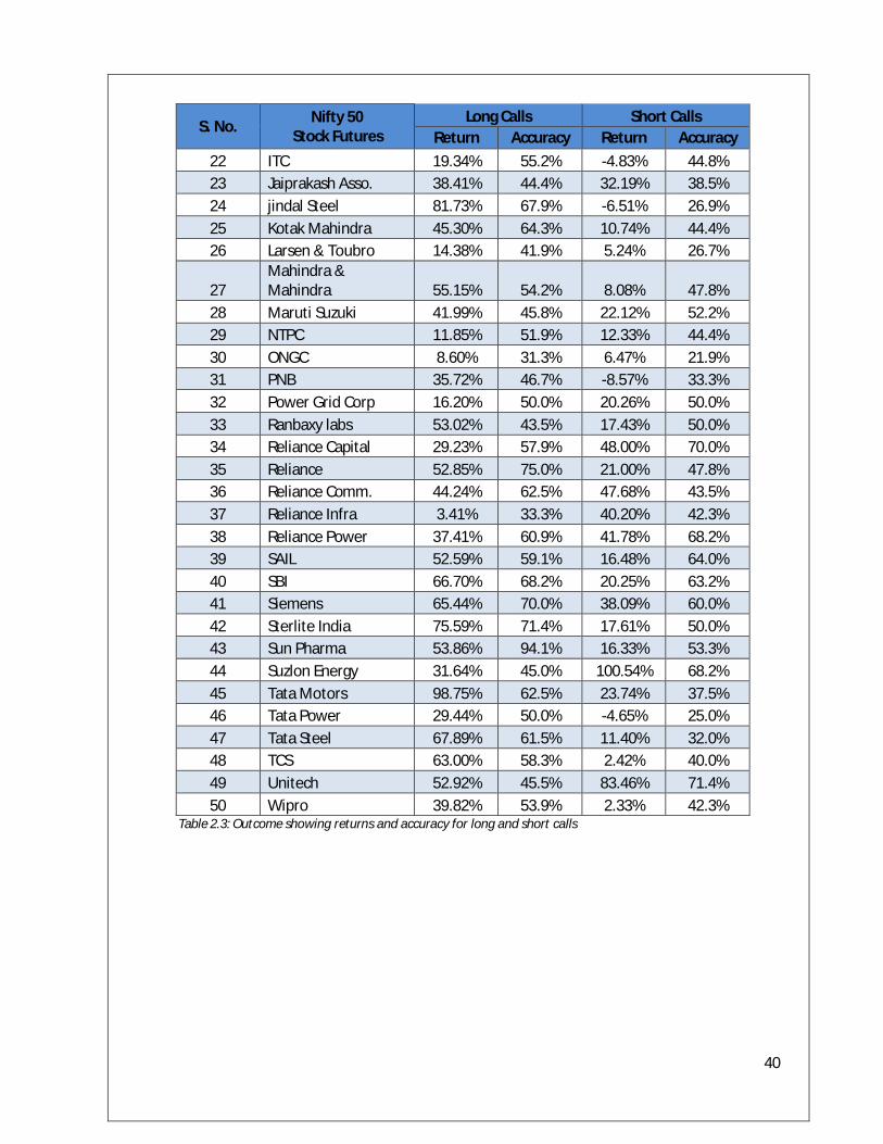
40
S. No. Nifty 50 Stock Futures
Long Calls Short Calls Return Accuracy Return Accuracy
22 ITC 19.34% 55.2% -4.83% 44.8% 23 Jaiprakash Asso. 38.41% 44.4% 32.19% 38.5% 24 jindal Steel 81.73% 67.9% -6.51% 26.9% 25 Kotak Mahindra 45.30% 64.3% 10.74% 44.4% 26 Larsen & Toubro 14.38% 41.9% 5.24% 26.7%
27 Mahindra & Mahindra 55.15% 54.2% 8.08% 47.8%
28 Maruti Suzuki 41.99% 45.8% 22.12% 52.2% 29 NTPC 11.85% 51.9% 12.33% 44.4% 30 ONGC 8.60% 31.3% 6.47% 21.9% 31 PNB 35.72% 46.7% -8.57% 33.3% 32 Power Grid Corp 16.20% 50.0% 20.26% 50.0% 33 Ranbaxy labs 53.02% 43.5% 17.43% 50.0% 34 Reliance Capital 29.23% 57.9% 48.00% 70.0% 35 Reliance 52.85% 75.0% 21.00% 47.8% 36 Reliance Comm. 44.24% 62.5% 47.68% 43.5% 37 Reliance Infra 3.41% 33.3% 40.20% 42.3% 38 Reliance Power 37.41% 60.9% 41.78% 68.2% 39 SAIL 52.59% 59.1% 16.48% 64.0% 40 SBI 66.70% 68.2% 20.25% 63.2% 41 Siemens 65.44% 70.0% 38.09% 60.0% 42 Sterlite India 75.59% 71.4% 17.61% 50.0% 43 Sun Pharma 53.86% 94.1% 16.33% 53.3% 44 Suzlon Energy 31.64% 45.0% 100.54% 68.2% 45 Tata Motors 98.75% 62.5% 23.74% 37.5% 46 Tata Power 29.44% 50.0% -4.65% 25.0% 47 Tata Steel 67.89% 61.5% 11.40% 32.0% 48 TCS 63.00% 58.3% 2.42% 40.0% 49 Unitech 52.92% 45.5% 83.46% 71.4% 50 Wipro 39.82% 53.9% 2.33% 42.3%
Table 2.3: Outcome showing returns and accuracy for long and short calls
41
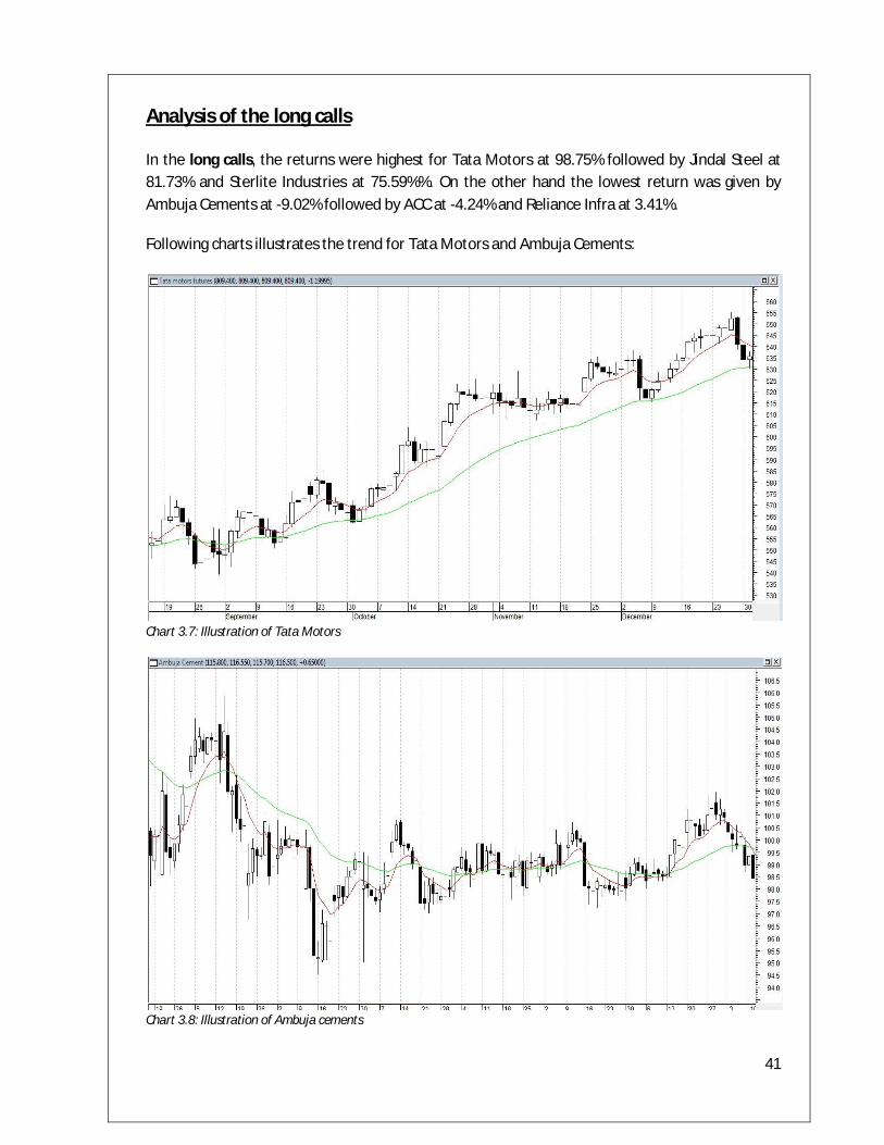
Analysis of the long calls
In the long calls, the returns were highest for Tata Motors at 98.75% followed by Jindal Steel at 81.73% and Sterlite Industries at 75.59%%. On the other hand the lowest return was given by Ambuja Cements at -9.02% followed by ACC at -4.24% and Reliance Infra at 3.41%.
Following charts illustrates the trend for Tata Motors and Ambuja Cements:
Chart 3.7: Illustration of Tata Motors
Chart 3.8: Illustration of Ambuja cements
42
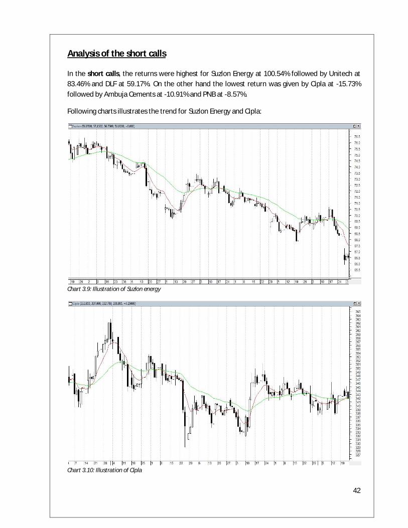
Analysis of the short calls
In the short calls, the returns were highest for Suzlon Energy at 100.54% followed by Unitech at 83.46% and DLF at 59.17%. On the other hand the lowest return was given by Cipla at -15.73% followed by Ambuja Cements at -10.91% and PNB at -8.57%.
Following charts illustrates the trend for Suzlon Energy and Cipla:
Chart 3.9: Illustration of Suzlon energy
Chart 3.10: Illustration of Cipla
43
Conclusion
A study has been made which shows the relationship between different economic variables and the market variables and the interrelationship between them. Thus it has been observed that there is not a single factor that affects the movement in the stock market but a number of variables like GDP, P/E, etc. influence a market to a great extent. Any investor before making an investment should analyze the general economic conditions prevailing in the economy and should make a suitable framework for investment decisions. In the Maslow’s hierarchy we learnt that before a company goes for overseas expansion it tries to study in which state of Maslow’s hierarchy the desired country(India) is in. This makes the prediction of the various variables accurate to some extent. Along with the fundamental analysis mentioned above an educated investor would always emphasize the importance of technical analysis as a tool to maximize profits and minimize risk. It is a common view of experts that fundamental or technical analysis by itself are strong indicators to use before investing, however, an educated investor should always use technical and fundamental analysis in tandem before making an investment. This would give the investor a holistic view and hence a more informed view of the investment.
44
References
Books Technical analysis of the financial markets, Murphy, John J, pg 195-213, pg 239 -255
Technical analysis from A to Z, Achelis, Steven
Candlestick charting explained, Morris, Greg L, pg 19-141
Websites http://www.hinduonnet.com/archives.htm
http://www.abrahammaslow.com/m_motivation/Hierarchy_of_Needs.asp
http://www.investopedia.com/terms/p/price-earningsratio.asp
http://stockcharts.com/
http://www.candlecharts.com/
http://www.sebi.com/
http://www.moneycontrol.com/
http://www.nseindia.com/
http://www.bseindia.com/
http://dbie.rbi.org.in/