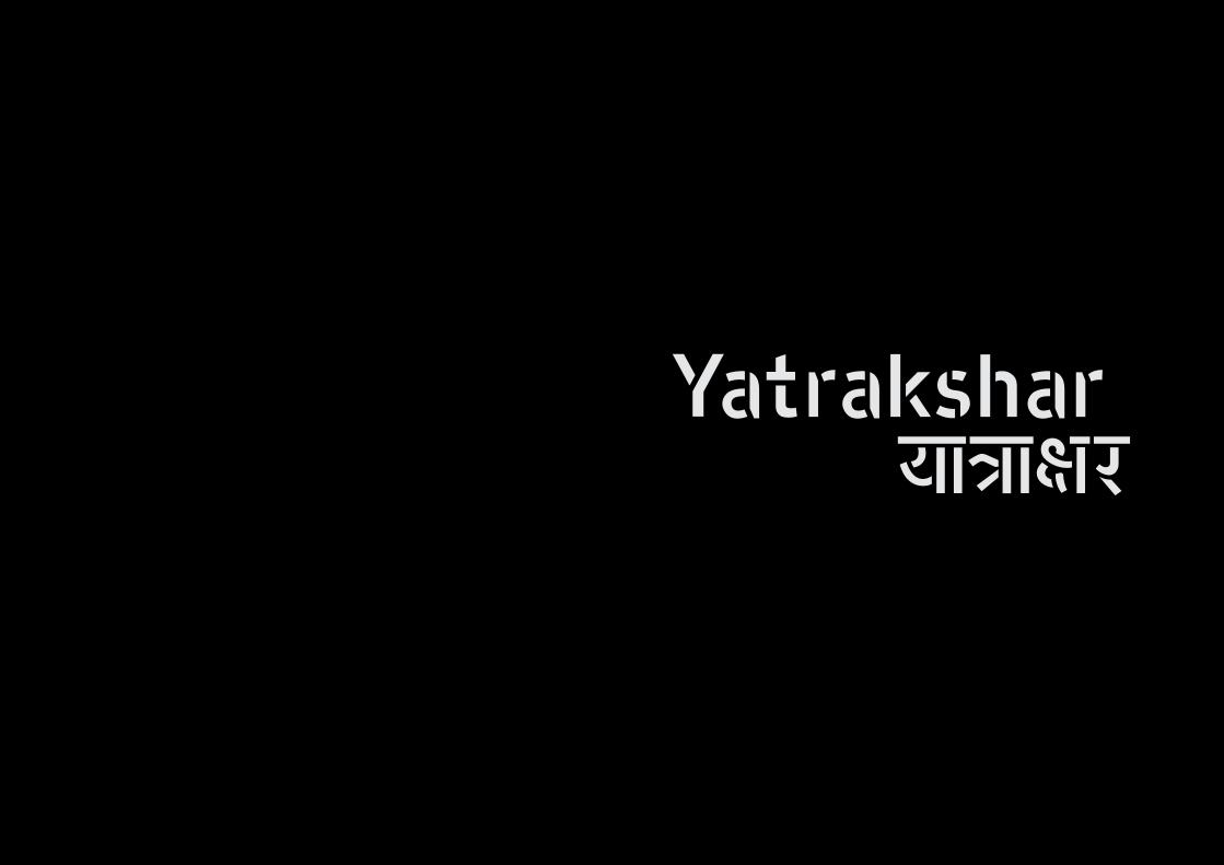
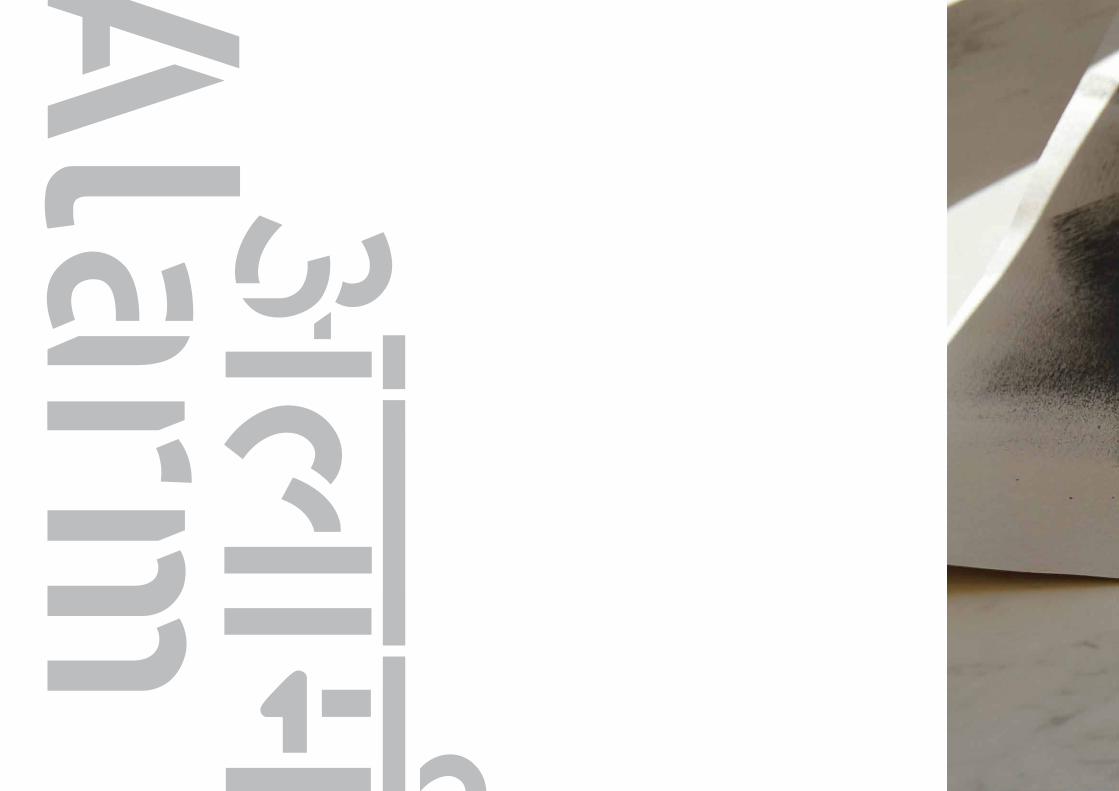
yatrakshar | major project outcome
DESCRIPTION
Yatrakshar is my MA Graphic Design's Major Project Outcome done at London College of Communication.TRANSCRIPT
MA Graphic Design |London College of Communication, 2012

| Visual Summary Manosij Sarkar

MA Graphic Design |London College of Communication, 2012
Major Project Outcome
Manosij SarkarMA Graphic Design
Tutor: Paul McNeilLondon College of Communication, 2012
Yatrakshar means a set of letters for the journey.It is derived from the Hindi words, “Yatra” and “Akshar”.
Yatra means journey and akshar is letter.

| Visual Summary Manosij Sarkar

MA Graphic Design |London College of Communication, 2012
05 Introduction
07 Anatomy
19 The complete typeface
37 Guidelines & Application
07 Anatomy
19 The complete typeface
37 Guidelines & Application

| Major Project Outcome Manosij Sarkar

MA Graphic Design |London College of Communication, 2012
Introduction
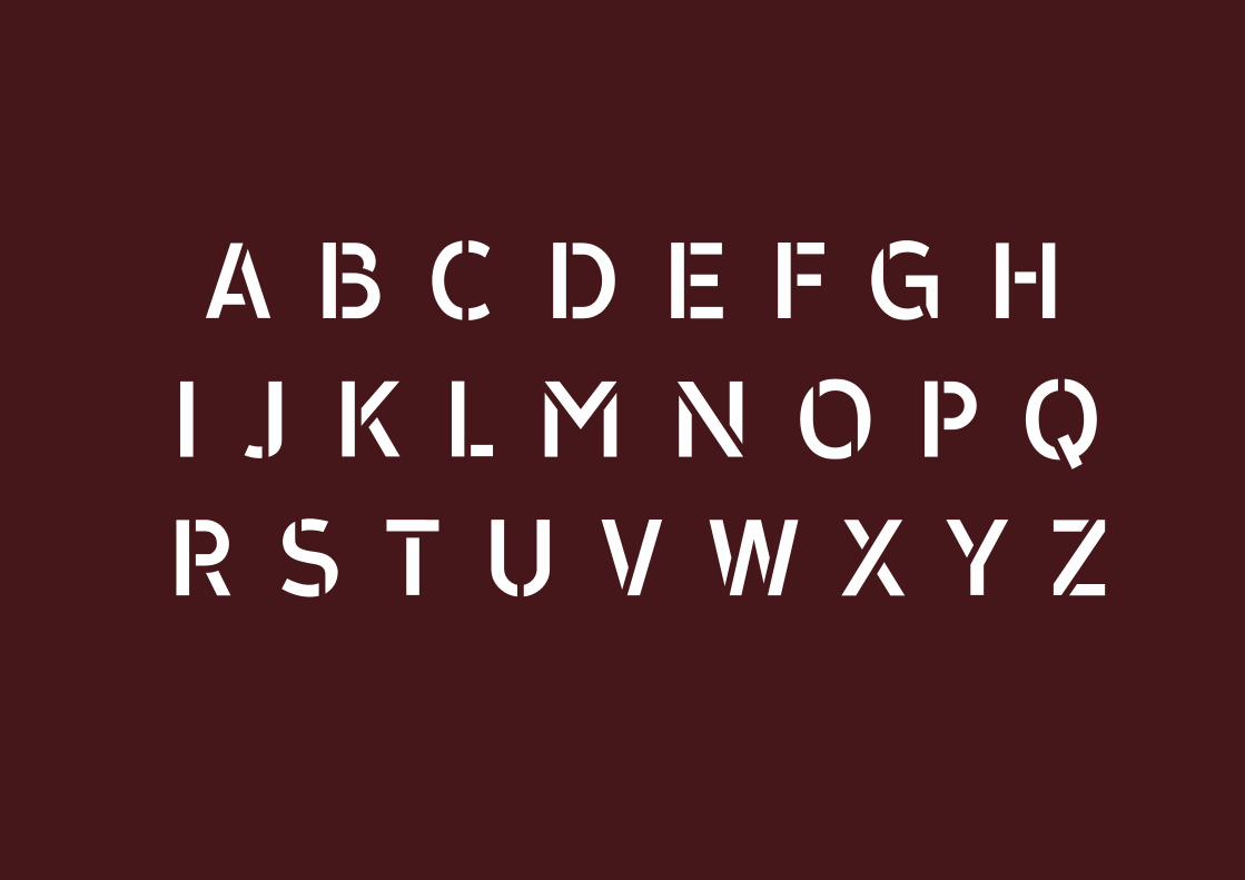
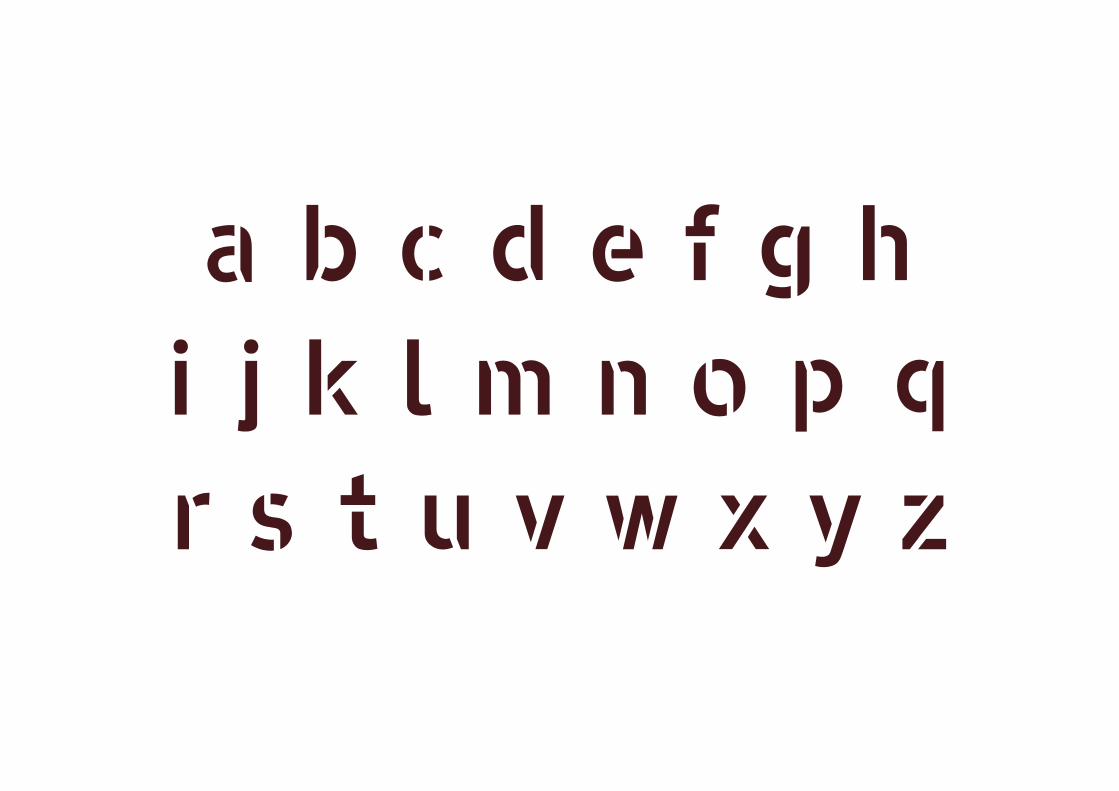
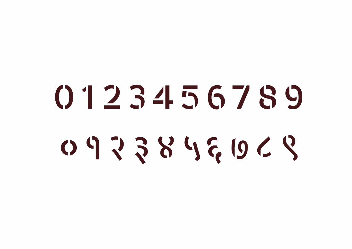
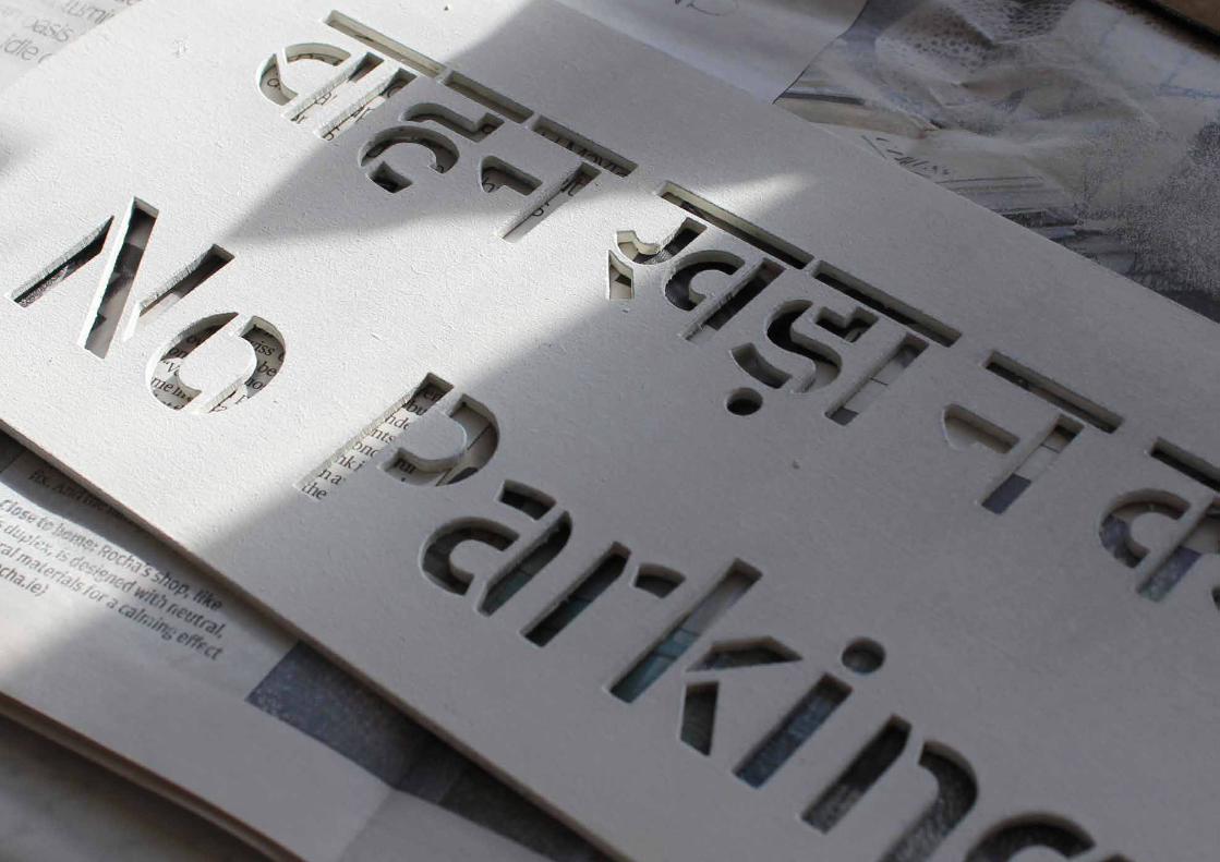
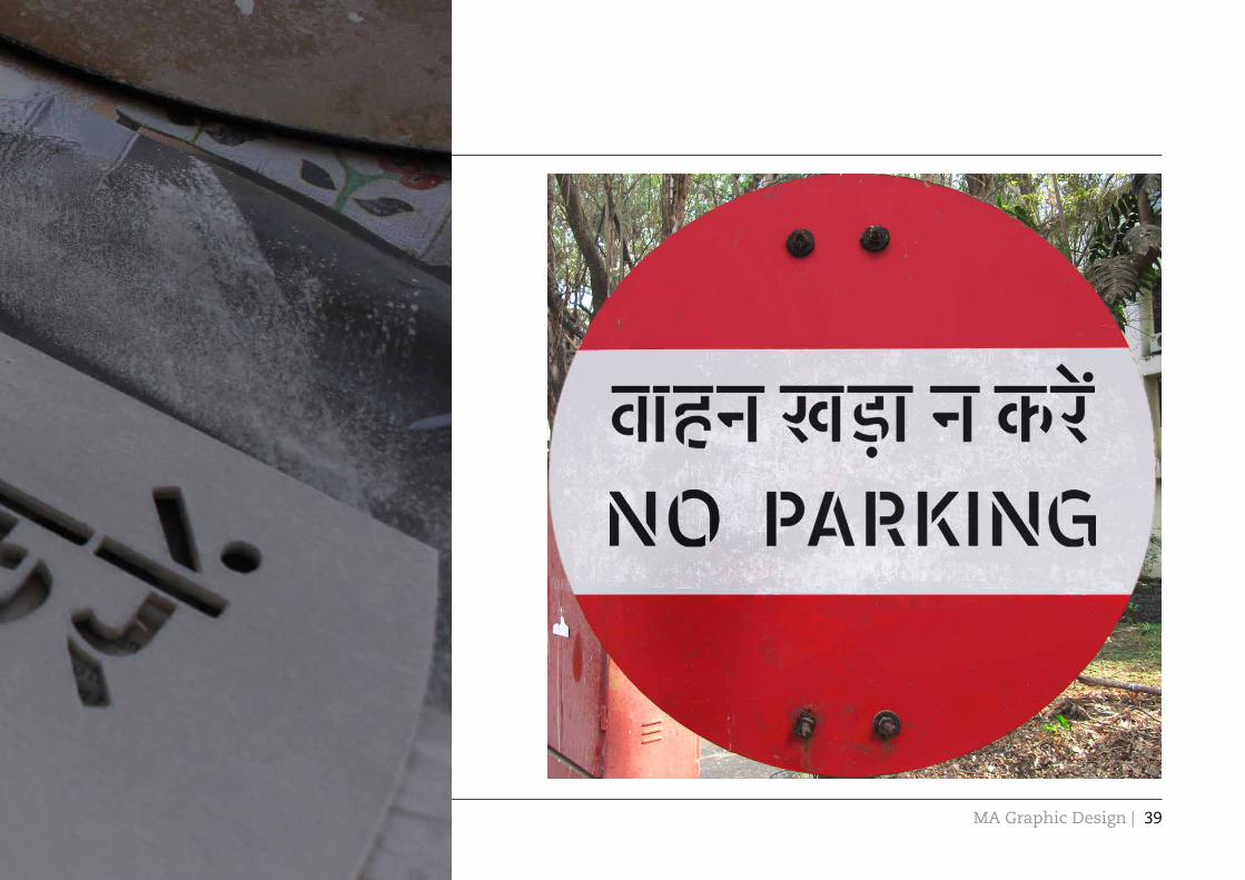
Yatrakshar is a prototype of a set of bilingual stenciled typeface for the transport system in Maharashtra (a state in western India). It supports Latin and Devanagari script. Maharashtra being a state with Marathi as its regional language which is written in the Devanagari script, the typeface cover the three main languages that are used here; English, Hindi and Marathi.
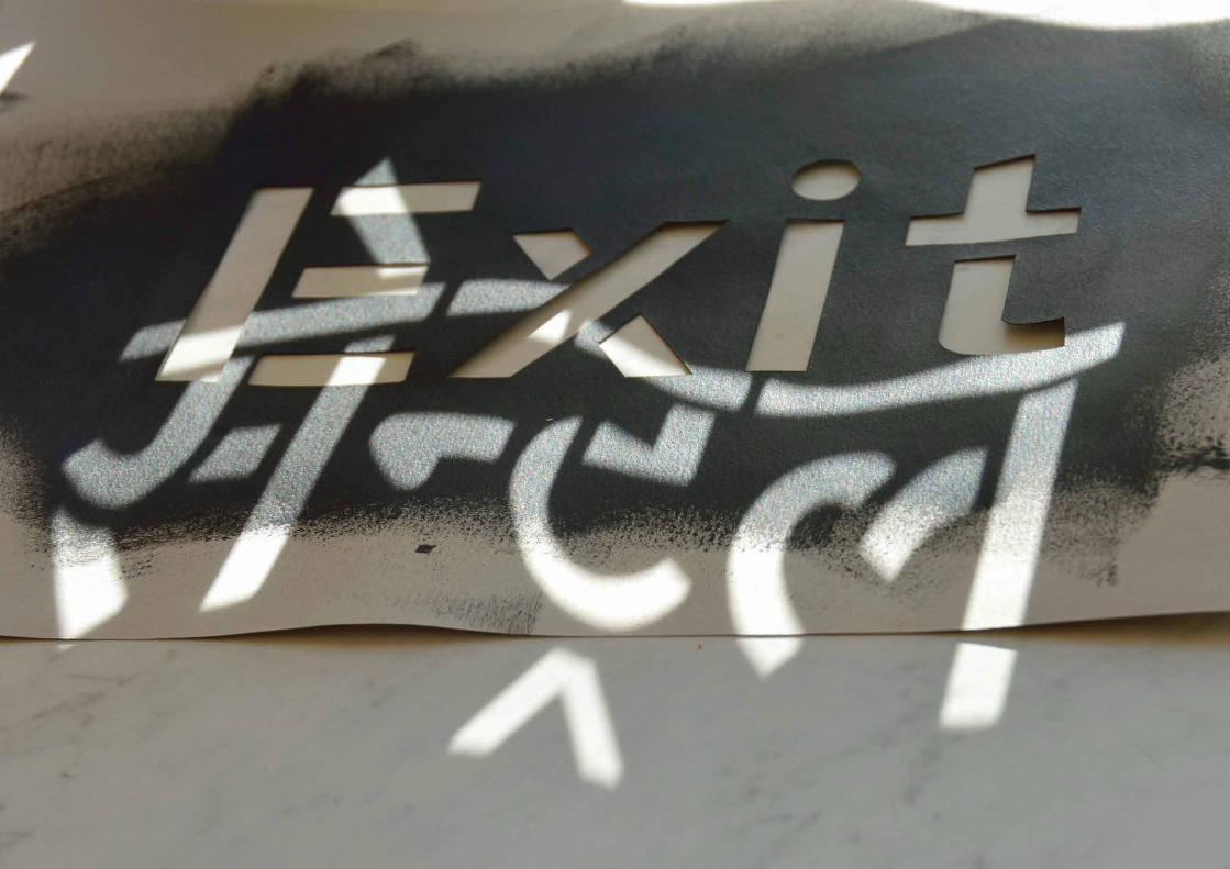
The main goal of the project is to find a definite solution to standardize the random, vernacular and multilingual typography that are used in transport system in Maharashtra. The places which tend to use hand painted signs in the transport system because of the lack of required technology, poor financial condition and lack of proper design awareness can use the stencil. It can be used as a digital typeface and also as a physical stencil depending on the requirement. The aim was also to come up with a typeface that can carry a certain flavor for the place and work as an identity for Mumbai and Maharashtra.
The Latin typeface of Yatrakshar has been developed from the widely
used “Transport” typeface designed by Margaret Calvert and Jock Kinneir. The main reason to pick Transport as the basic typeface is this is the most used typeface in transport system* and also been developed further into other typefaces for transport system in many countries.
The Devanagari typeface has been developed on “Shree Dev 0715”. Although there is no specific typeface for transport system in Devanagari, Shree Dev 0715 was more close to the transport visually. It was developed further to make it more legible.
The intention was to make the stencil very easy to use and also make it as legible as possible. Legibility becomes the most critical issue when working on the typeface for transport system and stenciled letters generally are less legible than non-stenciled. So the challenge in keeping a balance between the usability and legibility is a major aspect of the project. This book is a walkthrough of the prototype of the typeface, its anatomy & development and the execution on the streets with guidelines.
05

| Major Project Outcome Manosij Sarkar
Minor changes were made on the Transport typeface; especially the counters were opened up more and some changes on detailing were done. Similar changes on Devanagari typeface were made.
08

MA Graphic Design |London College of Communication, 2012
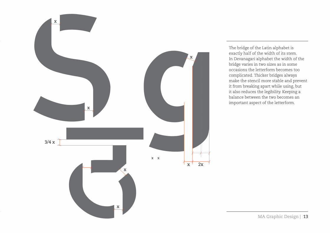
Arrangement of the bridges for the stencil is been broadly based on the hand movement of the hand written Devanagari script. Later they were placed evenly on the letterform on the basis of usability. It matches with the flow of the letter form and also gives a different flavor to it. Similar process was then followed on the Latin alphabets also.
The structure of the bridges
09

| Major Project Outcome Manosij Sarkar10
MA Graphic Design |London College of Communication, 2012
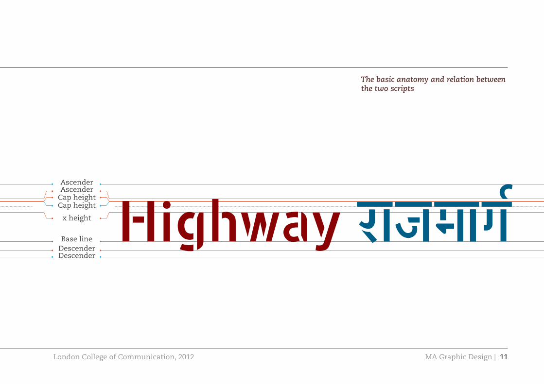
The basic anatomy and relation between the two scripts
Cap heightCap height
x height
Base lineDescender
AscenderAscender
Descender
11

6%smaller
Minor details between the two scripts:
The width of the stem of Latin alphabet is 6% thicker than the Devanagari alphabet.
MA Graphic Design |London College of Communication, 2012
2xx
x
x
3/4 x
x
x
x
x x
The bridge of the Latin alphabet is exactly half of the width of its stem. In Devanagari alphabet the width of the bridge varies in two sizes as in some occasions the letterform becomes too complicated. Thicker bridges always make the stencil more stable and prevent it from breaking apart while using, but it also reduces the legibility. Keeping a balance between the two becomes an important aspect of the letterform.
13

| Major Project Outcome Manosij Sarkar
Slightly tilted bridges have been used in some of the Latin alphabets which emphasize on the minor details of the basic letterform and hence increase legibility

MA Graphic Design |London College of Communication, 2012
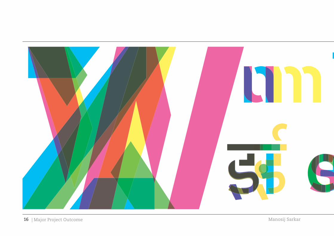
The relation between the basic letterforms and their stenciled versions in both scripts. It also features the minor changes in the letterform that comes after applying the bridges.
15
| Major Project Outcome Manosij Sarkar16

MA Graphic Design |London College of Communication, 2012 17


| Major Project Outcome Manosij Sarkar
MA Graphic Design |London College of Communication, 2012 39


| Major Project Outcome Manosij Sarkar

MA Graphic Design |London College of Communication, 2012
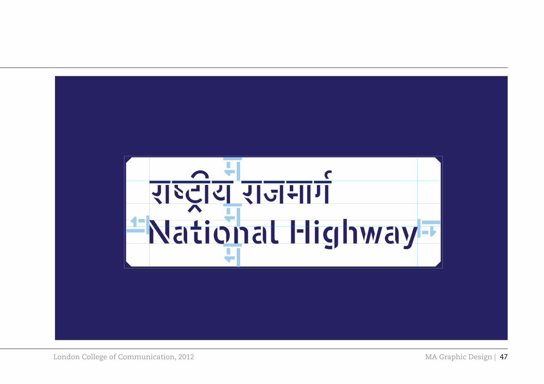
General guidelines
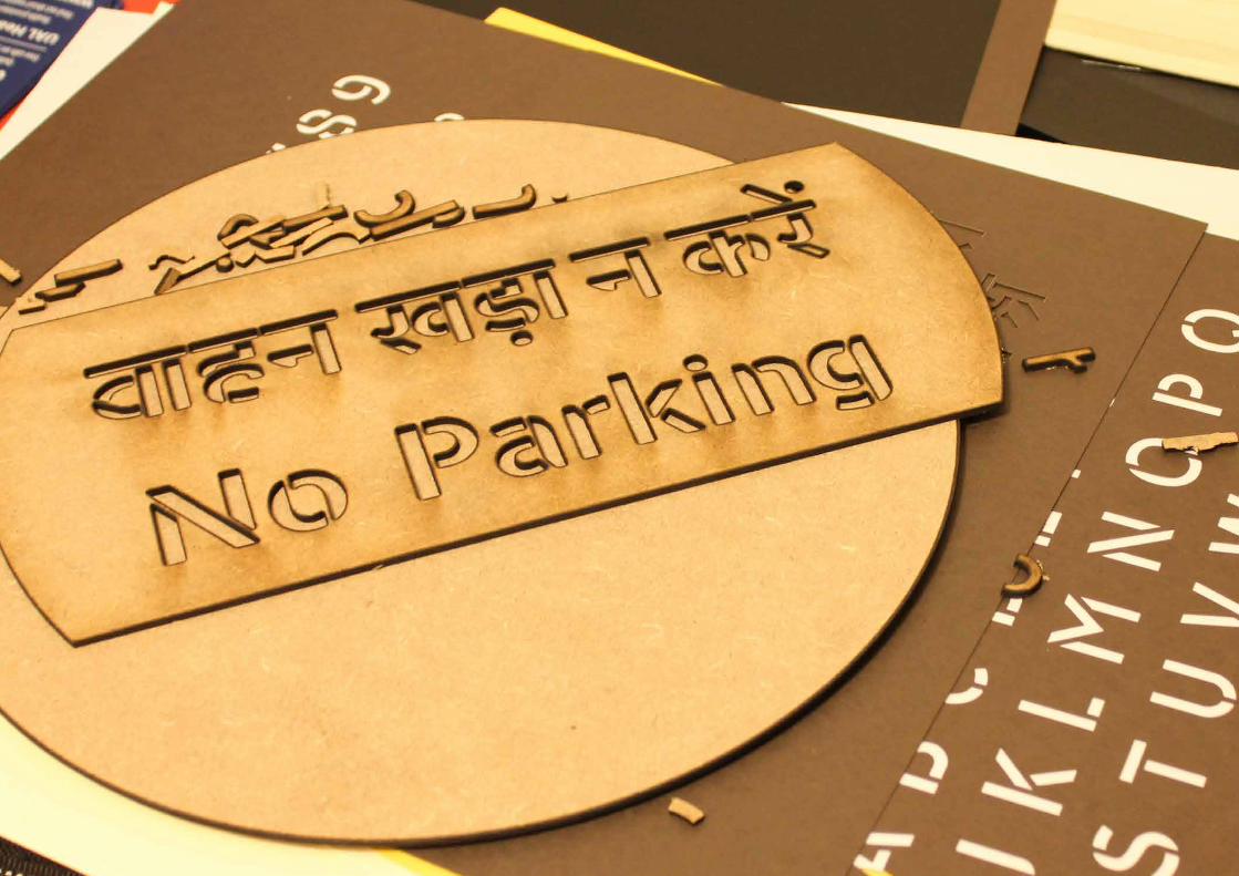
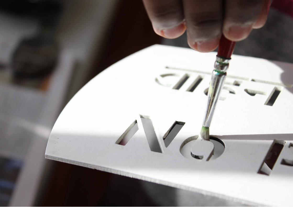
Yatrakshar can be used as a digital typeface and also as a piece of stencil depending on the requirement. When used as a stencil, using a spray paint is recommended for the best result. If not possible, a sponge roller can be used. Use of brushes should be avoided.
Yatrakshar is a display typeface. Using it in less than 2 cm x-height may affect readability.
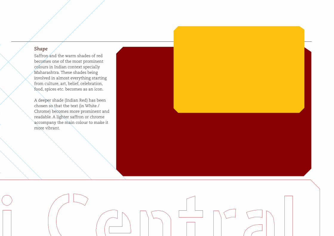
Colour
A deeper shade (Indian Red) has been chosen so that the text (in White / Chrome) becomes more prominent and readable. A lighter saffron or chrome accompany the main colour to make it more vibrant.
To make the bus and railway services look visually different, a different shade will be used.
In bus services, the bus stop sign will have a black text with a chrome background.
C 0M 100Y 100K 50
C 0M 40Y 100K 0
C 0M 25Y 100K 0
text text
43

| Major Project Outcome Manosij Sarkar
MA Graphic Design |London College of Communication, 2012
Saffron and the warm shades of red becomes one of the most prominent colours in Indian context specially Maharashtra. These shades being involved in almost everything starting from culture, art, belief, celebration, food, spices etc. becomes as an icon.
A deeper shade (Indian Red) has been chosen so that the text (in White / Chrome) becomes more prominent and readable. A lighter saffron or chrome accompany the main colour to make it more vibrant.
Shape

| Major Project Outcome Manosij Sarkar
Marathi being the most common language in Maharashtra and also the mother tongue of the major people staying in this state, Marathi will have more priority and will be on the top followed by English and Hindi. Same sequence will be followed when any two or only one language is used.
(Facing page) Cap height of a Devanagari character should be the minimum length to be left around each line.
46
MA Graphic Design |London College of Communication, 2012 47
| Major Project Outcome Manosij Sarkar
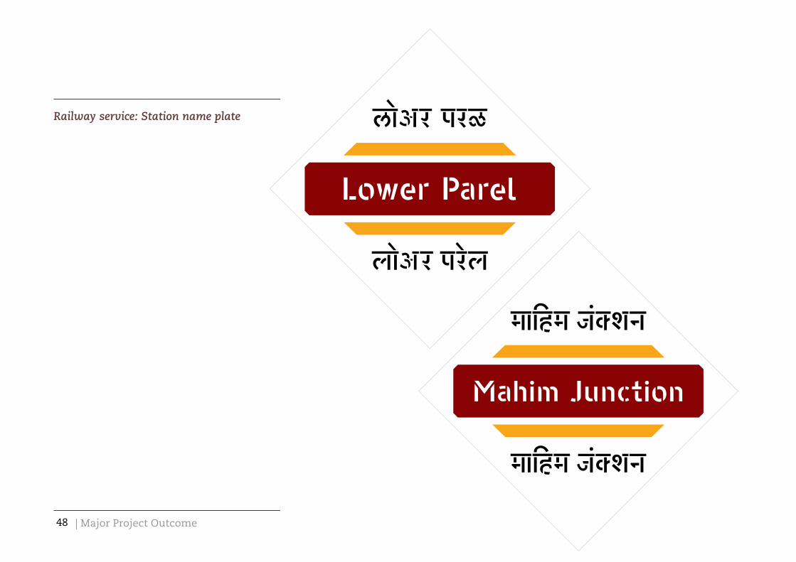
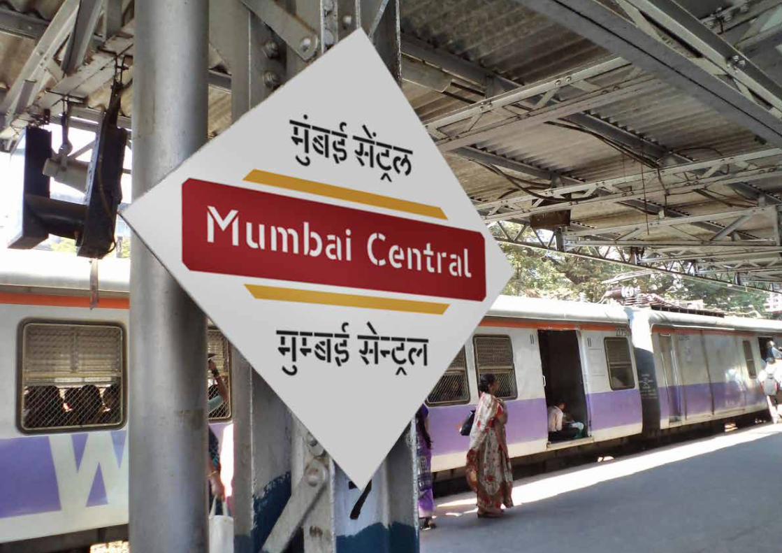
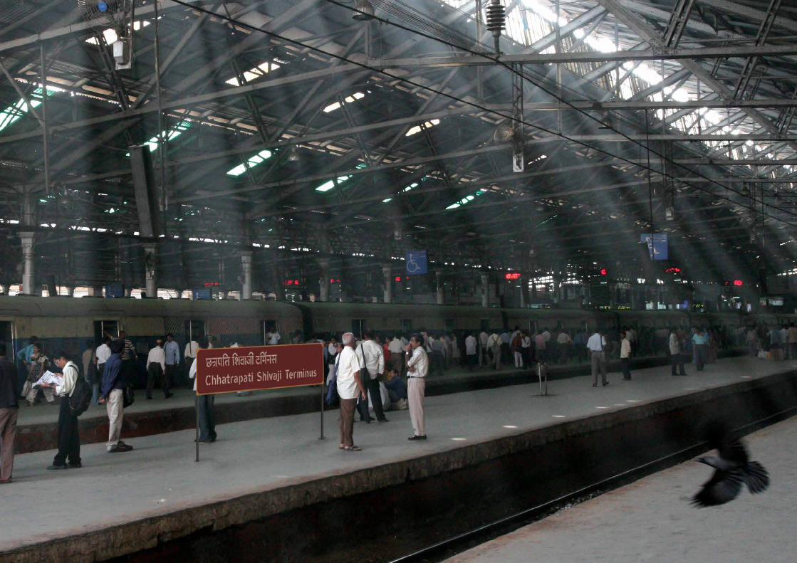
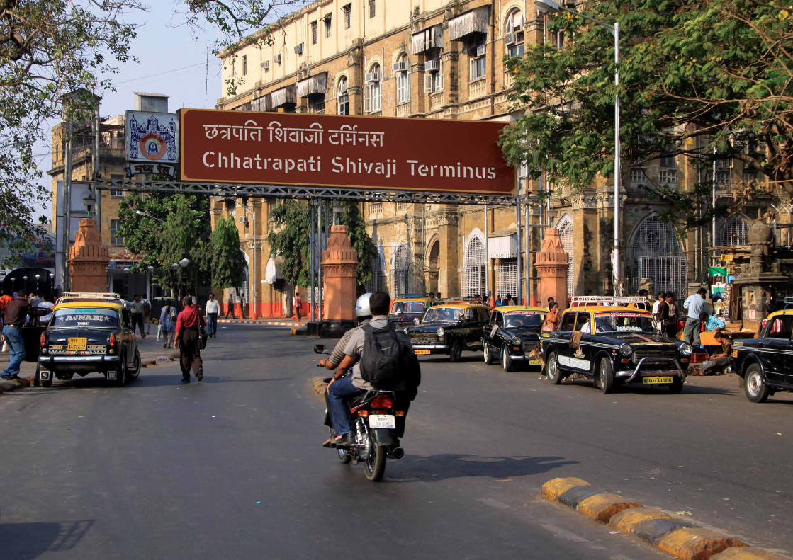
Railway service: Station name plate
48

MA Graphic Design |London College of Communication, 2012
80 cm
1 m / 100 cm16 cm
6 cm
5 cm4 cm
Not less than 8 cm
Not less than 6 cm
55 cm
1.2 m / 120 cm from the ground
Station name plate 1


The second station name plate
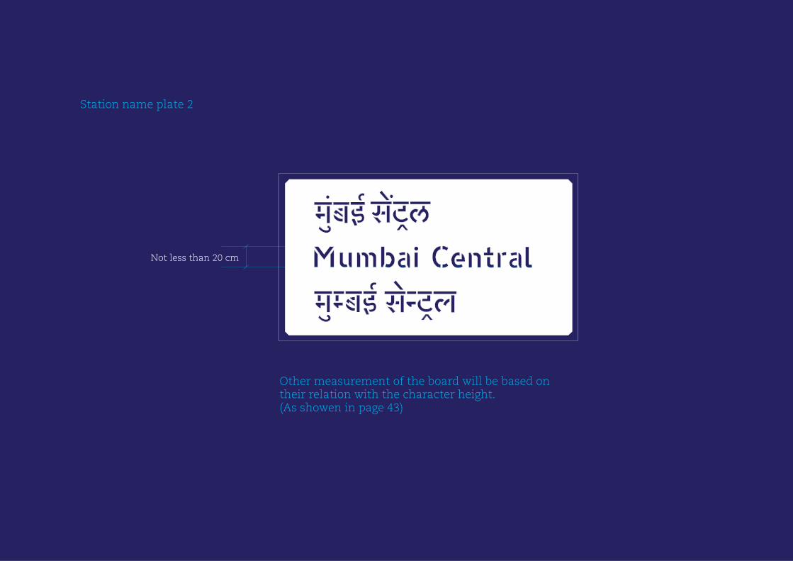
Not less than 20 cm
Station name plate 2
Other measurement of the board will be based on their relation with the character height. (As showen in page 43)
| Visual Summary Manosij Sarkar54
MA Graphic Design |London College of Communication, 2012

| Major Project Outcome Manosij Sarkar

MA Graphic Design |London College of Communication, 2012
Other information signs in railways
57

| Major Project Outcome Manosij Sarkar58

MA Graphic Design |London College of Communication, 2012


| Visual Summary Manosij Sarkar62

MA Graphic Design |London College of Communication, 2012

| Major Project Outcome Manosij Sarkar
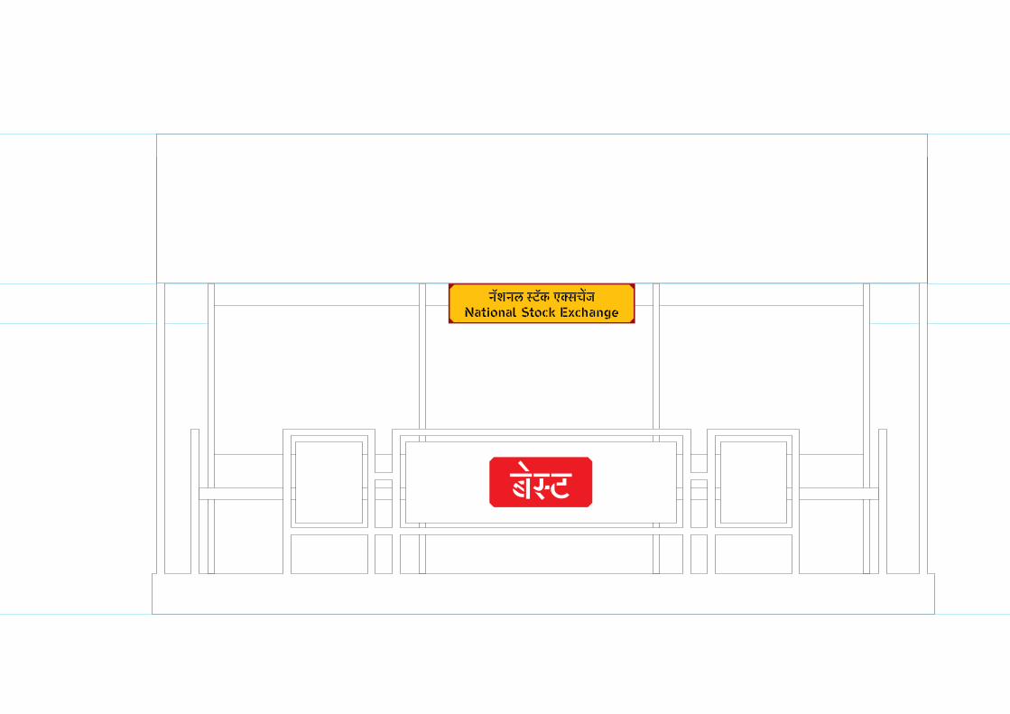
Bus service (BEST): bus-stop signs
64

MA Graphic Design |London College of Communication, 2012
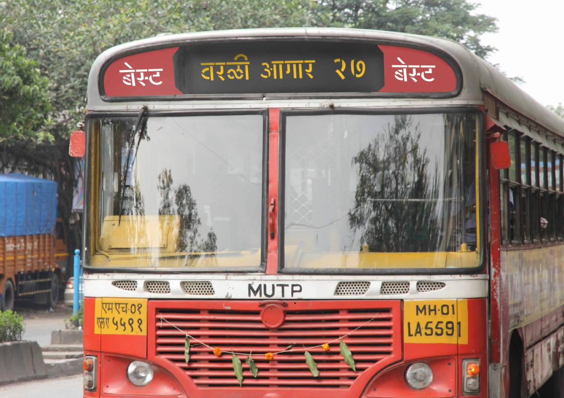
BEST identity and route name on buses
65

| Major Project Outcome Manosij Sarkar
40 cm
37 cm
3 cm
3 cm
3 cm3 cm
8 cm
2 cm
Not less than 5 cm
Bus stop sign 1

MA Graphic Design |London College of Communication, 2012
100 cm / 1 m
22 cmNot less than 5 cm
Bus stop sign 2


| Visual Summary Manosij Sarkar72
MA Graphic Design |London College of Communication, 2012
| Major Project Outcome Manosij Sarkar
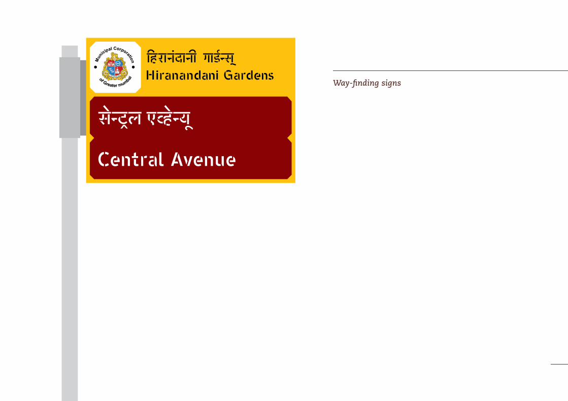
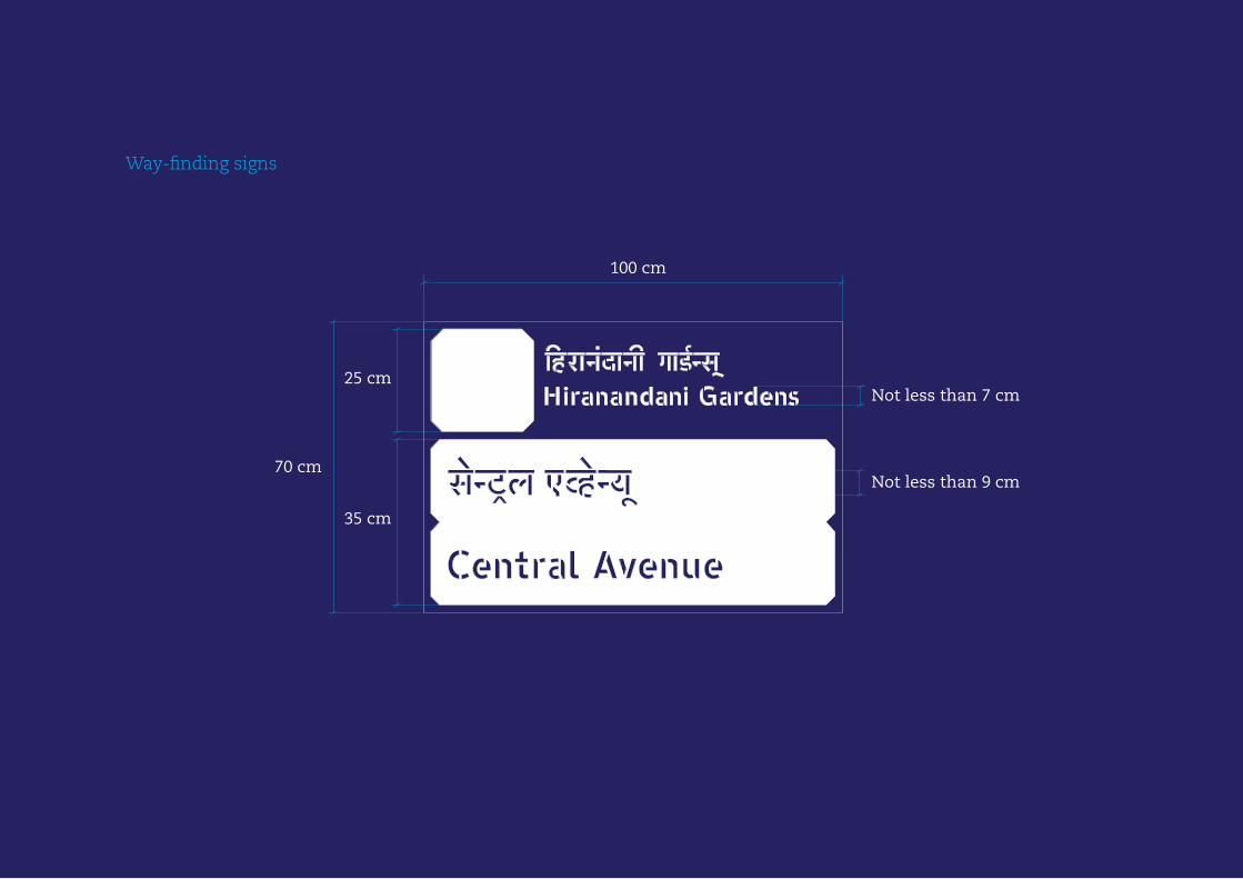
Way-finding signs
MA Graphic Design |London College of Communication, 2012
100 cm
70 cm
35 cm
Not less than 9 cm
Not less than 7 cm25 cm
Way-finding signs

| Visual Summary Manosij Sarkar76

MA Graphic Design |London College of Communication, 2012

| Visual Summary Manosij Sarkar78
MA Graphic Design |London College of Communication, 2012
These were a few examples of the usability of the typeface Yatrakshar through proper standardized guidelines. Although the examples were taken from limited areas of Mumbai, the typeface can be used in other areas also with the same general guidelines.
79
| Visual Summary Manosij Sarkar
MA Graphic Design |London College of Communication, 2012
| Visual Summary Manosij Sarkar
University of the Arts London
2012