watch out! what the $20 billion dollar watch industry can teach us about desirability
TRANSCRIPT

Watch Out!What the $20 Billion Watch Industry Teaches Us About
Desirability
Presented at Big Design 2017, in Dallas, Texas on Sept. 15 #bigd17

Utility
Usability
Brand Experience
Desirability
Relationship between Usability and User Experience
nnGroup Conference Amsterdam
To talk about desirability, let’s talk about the relationship between Usability and User Experience.
I’m often working with large complex organizations that want to improve their process around UX, development, business, testing, etc. They often need the partnership of a consulting company to better incorporate UX.

Utility
Usability
Brand Experience
Desirability
nnGroup Conference Amsterdam
Relationship between Usability and User Experience
Many of the applications I work on are internal products that are centered primarily on functionality.
Utility
Usability
Brand Experience
Desirability
Relationship between Usability and User Experience
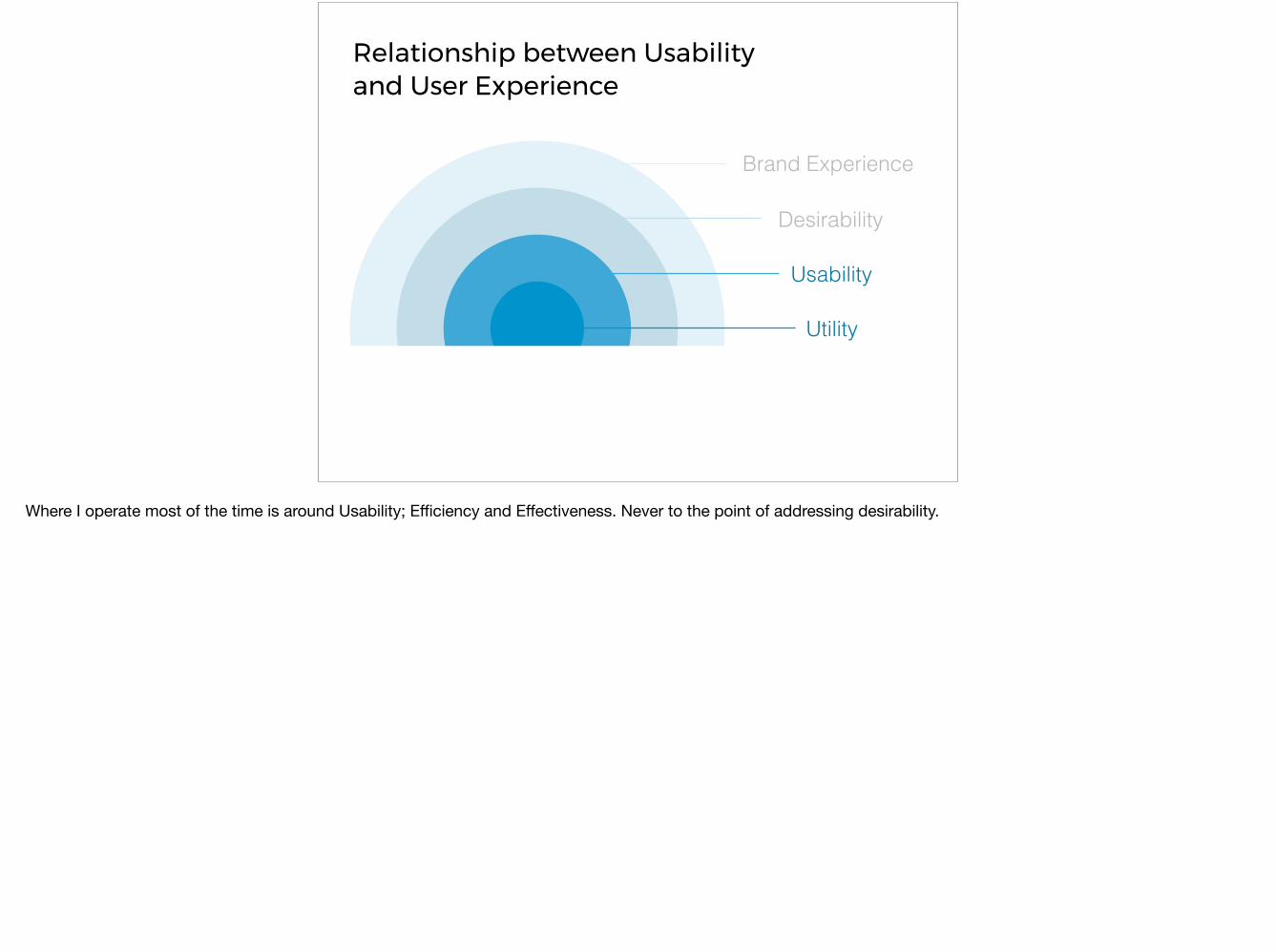
Where I operate most of the time is around Usability; Efficiency and Effectiveness. Never to the point of addressing desirability.

“…not when there is nothing left to add, but when there is nothing left to take away.”
-Antoine de Saint-Exupery
My typical design approach.
Excite Google
google.comexcite.com
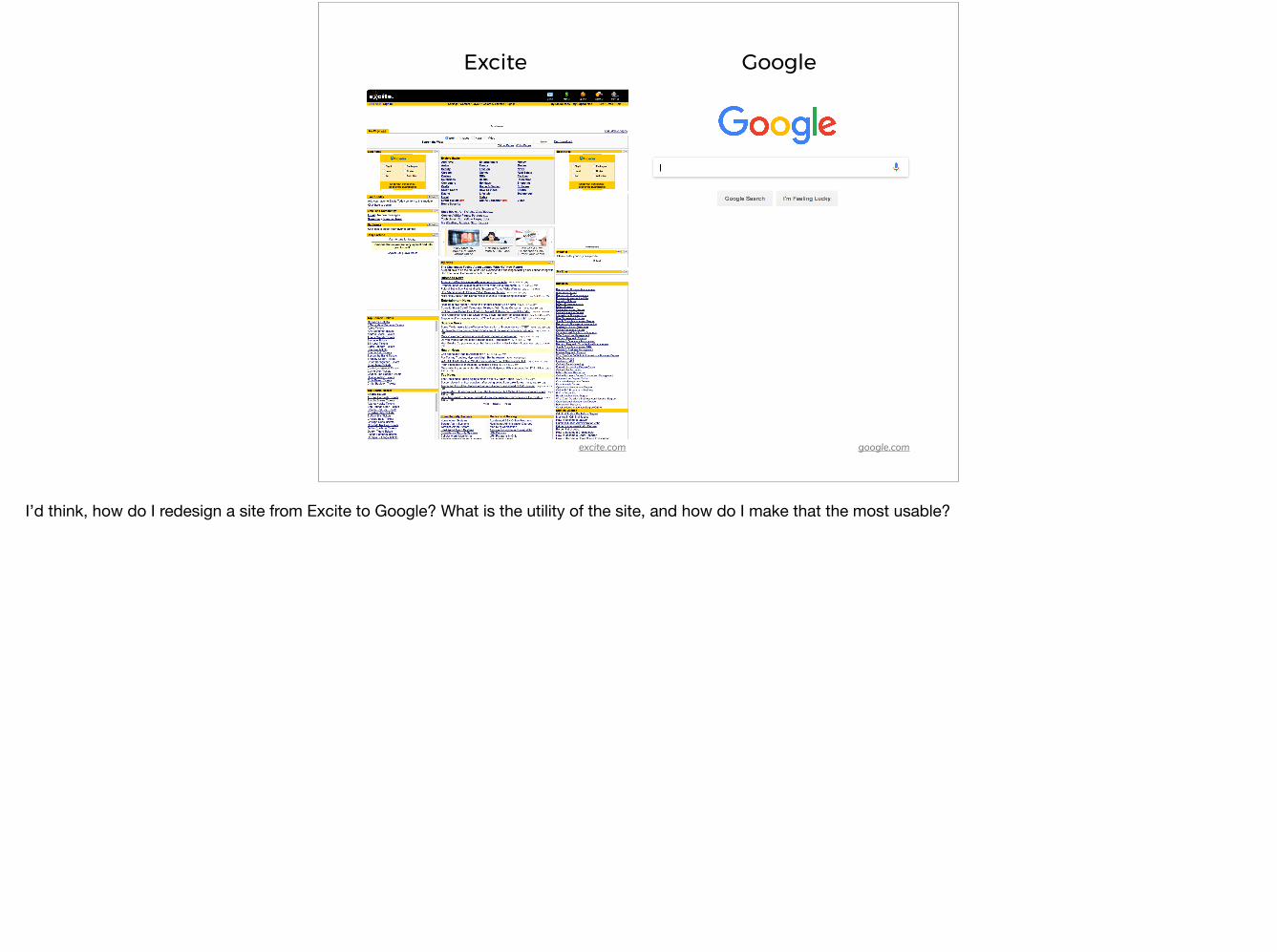
I’d think, how do I redesign a site from Excite to Google? What is the utility of the site, and how do I make that the most usable?

theclockspot.com
A friend sparked my recent interest in watches; particularly wrist watches. I had no idea there were so many different types and styles.

Diesel
diesel.com
?What’s the equivalent for wrist watches? What watch design has the highest utility and usability? That would be the best watch…
Watch A Watch B
Legibility of the watch face ✓ Faster to read,
with less mistakesSlower to read,with more mistakes
Precision of the movement ✓ +/- 1 second a day +/- 2 seconds a day
Servicing ✓Every 7 years,Done at home.Under 5 minutes.
Every 7 years,Requires mailing the watch. Takes about a month.
Resistance 3 bar“Suitable for Everyday Use” ✓
30 bar“Suitable for Underwater Exploration and Diving”
Cost of Ownership ✓ ~$25 over 30 years ~$12,500 over 30 years
✓
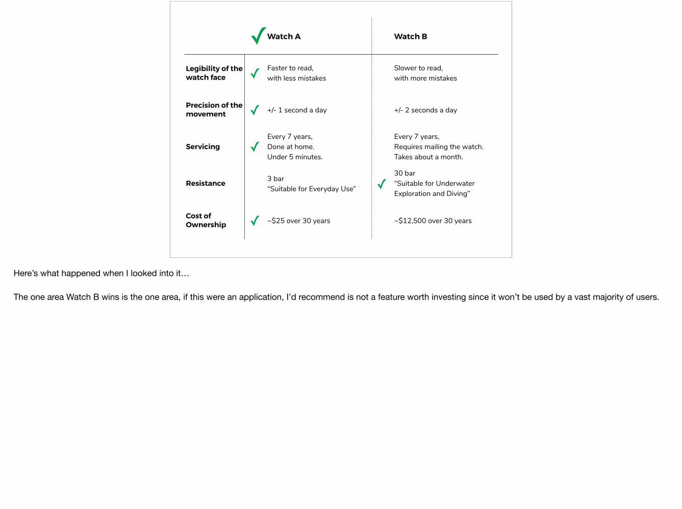
Here’s what happened when I looked into it…
The one area Watch B wins is the one area, if this were an application, I’d recommend is not a feature worth investing since it won’t be used by a vast majority of users.

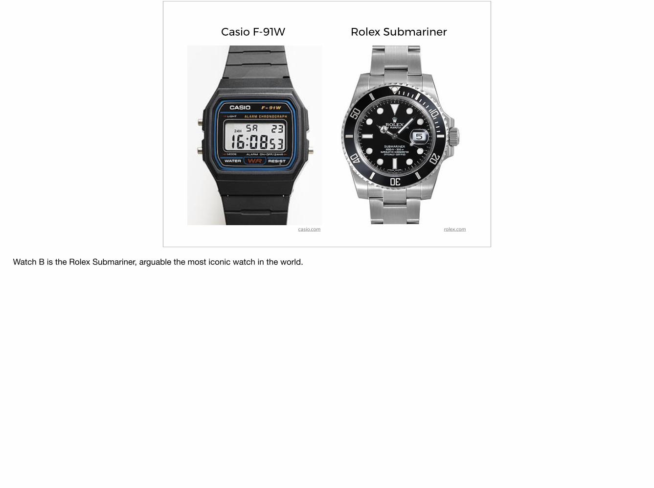
Casio F-91W Rolex Submariner
rolex.comcasio.com
Watch B is the Rolex Submariner, arguable the most iconic watch in the world.
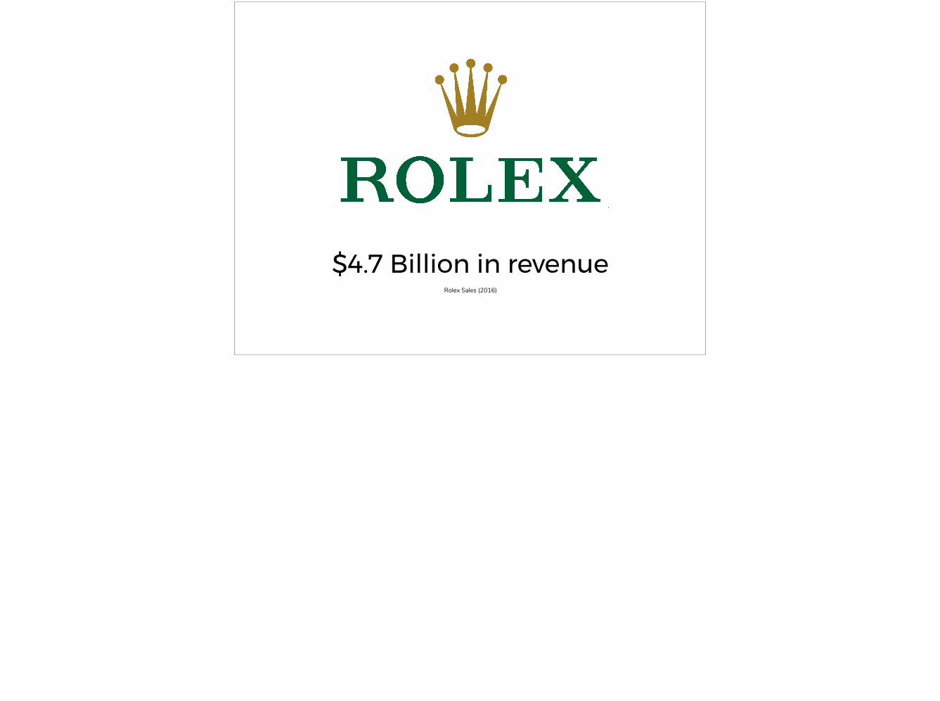
$4.7 Billion in revenueRolex Sales (2016)

Casio F-91W Rolex Submariner
rolex.comcasio.com
✓
So which watch is the winner?
The point isn’t which watch is selling more, but the fact that people are willing to pay so much more for a watch that in many regards has less utility than its cheaper alternative.

Three Levels of Processing
Visceral The subconscious reaction based on appearance.
Behavioral The reaction that stems for the difficulty or ease of use.
Reflective The reaction that derives from self-image, experience, and memories.
Emotional Design by Don Norman
I started exploring what defines desirability.
And you can clearly see how this relates to wrist watches; particularly about self expression and fashion.

Utility
Usability
Brand Experience
Desirability
But I wanted to look at it from the lens of what I do, which is more digital interface and interaction design.

Utility
Usability
Brand Experience
Desirability
Maybe there are lessons we can learn from the watch industry to move ourselves into Desirability.

15 Ways the Watch Industry Creates Desirability
My Opinions as someone trying to better understand how desirability works.
This is not a comprehensive list by any means. I wanted to focus on the 15 that I think has direct application to what many of us in the room do which is digital interface design.
In fact, this talk originally had a few more ways including:Personalization vs customization - People aren’t designers so don’t let them customize with too many choices, but allowing few key choices lets the user have more pride in ownership.
The Human Touch - People buy into the craft maker. People enjoy mechanical watches because there’s an impression that a human hand assembled the watch (even if that’s not the case). It’s not enough to connect a person to a digital interface. If you can connect them to the person on the other side of that interface, that human connection is a key to desirability.
Exclusivity - Through unattainable quantities or materials. When it comes to collecting something, there is a level of elitism; such as having the knowledge, social connections, finances, etc. to owning something limited.
To an uproar from current owners, the Rolex Sky Dweller previously only released in precious metals will now be released in Stainless Steel.
60th Anniversary Omega 1957 Trilogy limited to 557 pieces at a price of $21.6kPre-orders sold out in 4 hours. That’s over $12mil of revenue in 4 hours.

15 Ways the Watch Industry Creates Desirability
Musings of a Watch Enthusiast Experience Designer
As this comes from my perspective, you may or may not agree. I encourage you to see if this applies to yourself.

‘Wristlet’ for Pocket Watches
mkleathers.pl
Wrist Watches began as a Reflective tool tied to particular experiences. It started as a fashion accessory for women. Then it became a tool for Soldiers and Pilots to use to coordinate battle efforts without requiring pulling out a pocket watch.
The idea that a watch is a tool central to an event is a concept we’ll explore in more detail towards the end of this presentation.

Broad types of watch designs
Jomashop
There’s a variety of different designs and additional technologies/complications for different Utilities including:Thin dress watchesPilot watches with usually matte dials, tegimented cases, and slightly domed crystals for reducing reflections against the sun.Chronograph watches for finite legibility for timing races.Dive watches with large lume and oversized rotating timing bezels to be legible underwater and manipulated by thick gloves.And beefy tool watches for the ultimate in durability.
This is just scratching the surface as well. There are other utilities that wrist watches are designed and sub categories within each as well.
Most of these watches focus on telling you the time, but how they do it is vastly different because the intended user is so different.

Simplicity is not the goal.
-Don Norman
The idea that started this talk for me…
Before, I’d think about what’s the minimum visual information necessary to accomplish a utility. I might think, well all I really need is the hour hand, minute hand, and some indicator of context like the gem at the 12 o’clock mark in this Movado.

“…not when there is nothing left to add, but when there is nothing left to take away.”
-Antoine de Saint-Exupery
My typical design approach

“Why do we have much less informationon a much bigger screen?”
-Jakob Nielson, NNGroup
SIMPLICITY IS NOT THE GOAL
In an effort to reduce complexity we may have gone too far in reducing the information density.
Web UX 2016 vs 2004 (Jakob Nielsen)https://www.youtube.com/watch?v=xKOlga_xkKA&t=180s

“I don’t think your homepage should be3 cows and 4 icons”
-Jakob Nielson, NNGroup
SIMPLICITY IS NOT THE GOAL
In an effort to reduce complexity we may have gone too far in reducing the information density.
Web UX 2016 vs 2004 (Jakob Nielsen)https://www.youtube.com/watch?v=xKOlga_xkKA&t=180s

SIMPLICITY IS NOT THE GOAL
As an example, the hamburger icon is an example of simplicity mis-aligned with the goal.
We know from the Nielson Norman Group’s study thatHidden navigation led to a 20% drop in discoverability on desktop and users were 39% slower when the navigation was hidden

“Complexity is never reduced, only moved.”https://www.slideshare.net/cxpartners/secrets-of-simplicity
SIMPLICITY IS NOT THE GOAL
By removing too much visual information, we may actually be reducing the usability because we are just moving the visual/information processing from the UI into the user’s brain.

Too simple seems complex
Image Source
Similar to the problems with over minimalization, if you reduce too far, it might confuse the users mental model.
I own a Meistersinger similar to this, and there is a charm to it which I love, but it is a one-handed watch. So again, in an effort to simplify, maybe we don’t need 3 hands, what if we told time with just one? Well the problem is, when I show this watch to people, they are immediately confused because they are so used to seeing a distinct hour and second hand.

“Thoughtful reduction is about ‘core’ and ‘alignment’”https://www.slideshare.net/cxpartners/secrets-of-simplicity
SIMPLICITY IS NOT THE GOAL

Stowa Antea KS Nomos Tangente
nomos.com
SIMPLICITY IS NOT THE GOAL
stowa.de
Although nearly identical in design, the NOMOS thoughtfully reduced the complexity of the design, without sacrificing the core. This leads to what I think is a more beautiful, easier to read dial with less clutter and a larger font.
It’s about thoughtful reduction.
Also, I wanted to show off these watches. As Bauhaus designs, it may appeal to many of the designers in the room.

Design to a themeThe theme should be tied to a utility.
Forbes
How do you define what is core?

Vacheron Constantin Grand OeuvreVacheron Constantin
DESIGN TO A THEME
The most complicated pocket watch in the world.Complicated for the sake of complication. Sure, it’s a nicely balanced dial. But it does nothing for me.

Vacheron Constantin Celestia Astronomicalhttps://www.youtube.com/watch?v=297-ovrU3UM
DESIGN TO A THEME
Released a year later from the same company, this watch I think is the most beautiful watch in the world by blending expert engineering with thoughtful design around a central core.
By the way, it costs around $1million. It has to be built based on your particular longitude and latitude.
Complications:TimeMoonphaseSunrise/SunsetLength of day and nightZodiacEquinoxes and SolsticesEquation of TimePerpetual Calendar with leap year indication3D Mareoscope, showing the relationship between the sun, moon, and tides.
That’s just the front!On the back:Stars currently above the horizonThe position of the Milky Way
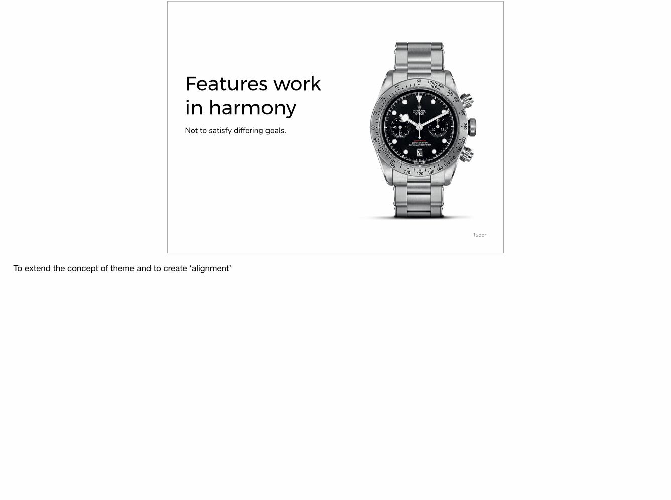
Features work in harmonyNot to satisfy differing goals.
Tudor
To extend the concept of theme and to create ‘alignment’

Tudor Black Bay ChronographTudor
FEATURES WORK IN HARMONY
This watch, revealed this year (2017), is a disaster of a design. It confuses the detailed precision of a chronograph timing race cars with the distance legibility of a dive watch; the snowflake hands.

Tudor Black Bay Chronograph Complication
OmegaTudor
FEATURES WORK IN HARMONY
+
Both are used for timing, but the use case is very different.
The one on the left is a dive watch; for scuba diving underwater. The core is about legibility underwater. And it does so well with a large rotating bezel for timing which can be manipulated with a wetsuit. Large hands fully lumed to be legible in the dark underwater.
Compared to a chronometer which has skinny hands for precise timing; intended use is for timing races.

Tudor Black Bay Chronograph
FEATURES WORK IN HARMONY
You can’t be all things to all people.

It’s okay to live in an ecosystemOne product doesn’t have to do it all.
salmonia, forum.tz-uk.com
Avoid unnecessary features by understanding…
Often times I work at a client that wants to add ‘chat’ or other functionality. They may want to recreate excell, in a web app, with a team of 5 people in 3 months…But it’s okay for our application to exist as a part of a process that includes other apps.

Watches exist as part of a ‘collection’orientalwatchsite.com
IT’S OKAY TO LIVE IN AN ECOSYSTEM
There’s a diver for heavy duty work. There’s a gold/white dialed dress watch. There’s a field watch for casual wear. There’s a silver dialed dressy chorono for business casual work. The point is, one watch doesn’t have to be worn everyday in every environment. It’s okay to share that role.

Aesthetics can be the utilityUsability may not always be the goal.
professionalwatches.com
With a background in game design, now doing information architecture/interaction design, I often focus on the ‘How’ of design and not the ‘Look and feel’
I need to learn that…

Black Tie EventThe Kater Shop
AESTHETICS CAN BE THE UTILITY
Historically it was considered rude to the host to check your watch at a black/white tie event because you should be caught up in the ‘Soiree’
Often times dress watches have poor contrast, silver hands on a silver dial, but that’s okay. Because the utility of a dress watch at a social event is not to tell the time.

Seiko Presage Laco Pilot Watch
laco.comseiko.com
AESTHETICS CAN BE THE UTILITY
Previously, if you were to ask me I’d say every watch should have elements of a Pilot’s watch; optimum legibility. But this watch would not look good on a suit at a black tie event. There, a lower contrast dress watch looks more formal.
The lack of practicality is precisely what makes it dressy and is what makes the Seiko Pressage beautiful.
As an interaction design with a background in video game system design, I look at design more from the standpoint of ‘How it works.’ Sometimes I have to realize that there are certain pages, like possibly a home page, to where the ‘look and feel’ IS how it works.

Accessibility can be delightful
ablogtowatch.com
Lume! Lume, was designed for accessibility for tool watches; primarily the explorer and diver type watches. Lume is beautiful and good lume is sought after.
Don’t think, ‘What do I have to sacrifice to make my design accessible?’Instead think, ‘What can I do to help accessibility which all my users will love?’

http://leaverou.github.io/contrast-ratio
ACCESSIBILITY CAN BE DELIGHTFUL
Often working with Visual Designers, accessibility seems to be an after thought.Only after they produce a beautiful design with an orange text on white background do I then have to come in and tell them that their design won’t look good for anyone with a visual impairment.
And the visual designer has to ‘sacrifice’ parts of their design to meet accessibility standards.

Ball Spacemaster Glow Ball One Hundred Twenty
Make Accessibility a core aspect of your design, and you may establish a features that is delightful for everyone.
These Ball watches, using tritium tubes which always glow throughout the night, is their key selling point. It is beautiful and delightful even for users where the accessibility that drove its design is unnecessary.

Embrace your inspiration
tudor.com
“Great artists steal” so don’t try to hide that inspiration.
If you are inspired by something, make it clear. Other people that appreciate that same inspiration, will appreciate your item more.
Especially as part of an ecosystem, this inspiration can be a differentiator.

Tudor ‘Montecarlo’ Monte Carlo Roulette Wheel
EMBRACE YOUR INSPIRATION
http://fashionreverie.com/tudor.com
The desirable Tudor ‘Montecarlo’ is inspired by the Casino Roulette Wheel.It was the community that termed the watch the ‘Montecarlo’ because they could understand the inspiration.

Hublot CarandDriver.com
Bremont wheelsage.com
Hublot MP-05 LaFerrari Ferrari LaFerrari
Bremont Jaguar MkIII Jaguar E-Type
Other examples of direct inspiration.

Design for LongevityHow will your design age?
dsio, rolexforums.com
But aesthetics doesn’t mean trendy.
Patina is a desirable quality in a watch and is the result of intended usage.Age gracefully.

dsio, rolexforums.comkeepthetime.com
DESIGN FOR LONGEVITY
Compared to a new submariner, both are beautiful,
How will your application look after years of use? What happens if the data set is no longer 30, but 3000? And if there are data points with unconventional character lengths. How will the design look?

Peer Under the HoodTechnology itself is desirable so showcase it.
Omega De Ville - Tourbillon
I’m not saying expose unnecessary features, but transparency into what’s happening behind the scenes can enhance the desirability of a product. People even buy skeleton watches when they don’t know how they work.
If your engineers created a cool piece of technology, like being able to find 2 matches in a search result out of a database of 2mil in 5 seconds. Show that off.
Normally, I’d try to minimize the perception of those 5 seconds; using progress indicators or skeleton pages. How can I make those 5 seconds only feel like 3?Now I might think to showcase what’s happening behind the scenes. ex: “Searching through 500,000 of 2,000,000,000 to find the 2 perfect matches for you”

CitizenM, watchuseek forums
PEER UNDER THE HOOD
It’s why ‘decorated movements’ are a desirable trait in a watch. It’s on the underside of the watch (the open caseback), yet people enjoy having a watch that showcases the movement aesthetically. The Blued screws and golden gears have no utility, for example. But the simple fact the internal mechanics are shown off, makes the entire watch more desirable.

Niche Features for Niche ProductsAmplify what people like.
Christopher Ward Trident-Pro
What do you showcase?
The CW Trident-Pro (their best selling watch) has 2000ft water resistance. Nobody realistically needs that, but those that are interested in big chunky dive watches, like the 13mm thick watch that has a particular extreme utility.

Ar-dehumidifying on the Sinn 856nebulight, forums.watchuseek.com
NICHE FEATURES FOR NICHE PRODUCTS
Sinn, a german brand used by the GSP (German Special Police) and first responder/emergency services, is known for german over-engineering.This capsule pulls moisture out of the watch movement so condensation doesn’t interfere with the oils in the movement. Necessary? No. Super cool for people that like engineering technology like this? Absolutely.

Users define the UtilityEven when they are wrong.
bobswatches.com
Pictured: the Two-tone Rolex Submariner which features gold centerlinks.

bobswatches.comalphahistory.com
USERS DEFINE THE UTILITY
The Rolex was a watch worn by soldiers who purchased it at the cost of 1 month’s salary.
Yet, people associate the high quality with expensive and you wear expensive things when you wear a suit. See David Beckham.
Wearing a diver with a suit is like wearing a high quality hiking boot with a suit. It doesn’t match the need of the outfit. Typically, with a suit you’d want a more discrete looking dress watch. That notion has changed.
As a result they’ve offered it in softer metals, like gold, which wouldn’t make sense with the original utility. The price of a Rolex Submariner has dramatically increased as they’ve realized that the utility of their watch has changed.

Tied to Significant EventsSymbolic artifact whether personal or historical
Bob’s Watches
There is a particular moment the watch is tied.
Dominoes had a ‘Rolex Challenge’ for top performing stores meeting a sales quota for an extended period of time. Smartly tying this watch with a major personal accomplishment is an excellent way to add desirability to a product.
Facebook has tied itself to significant events. One of the first things people do when they get married is update their relationship status on FaceBook, even before the reception starts!

Image Source
TIED TO SIGNIFICANT EVENTS
Nomos has an entire collection of unique colored watches, the Club Campus, which includes free engravement to celebrate a particular moment.
Omega ad via appnova.com
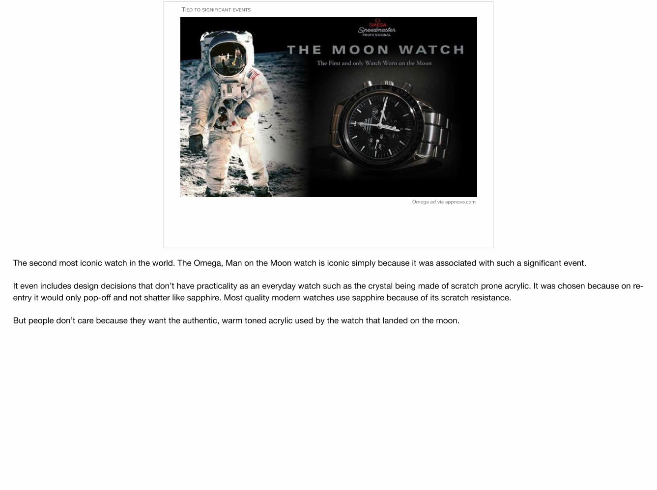
TIED TO SIGNIFICANT EVENTS
The second most iconic watch in the world. The Omega, Man on the Moon watch is iconic simply because it was associated with such a significant event.
It even includes design decisions that don’t have practicality as an everyday watch such as the crystal being made of scratch prone acrylic. It was chosen because on re-entry it would only pop-off and not shatter like sapphire. Most quality modern watches use sapphire because of its scratch resistance.
But people don’t care because they want the authentic, warm toned acrylic used by the watch that landed on the moon.

Tied to peoplePeople with cultural and social capital
Bob’s Watches
Like events, tying the watch to significant people has a similar effect.
The Paul Newman (famous race car driver) Daytona became popular after (allegedly) a similar photo to this appeared on an Italian Magazine.

Hodinkee
TIED TO PEOPLE
In fact, the more colorful look of the Rolex Daytona was not popular with the clientele. However now, the Daytona on the left currently sells for ~$25k while the ‘Paul Newman’ Daytona sells for ~$100k.
His actual watch was found and will be up for auction in October.

Omega Ad via guestlist.com
TIED TO PEOPLE
This applies even to fictional characters. Omega has brilliantly featured a new ‘James Bond Omega Seamaster’ watch every movie recently.

Tied to familyDesigns are powerful when tied to people you know.
Image Source
Pictured is one of my all time favorite marketing slogans of any brand, ever.
Another slogan of theirs: “Something truly precious holds its beauty forever.”
There are many applications, movies, and other designed experiences I consume primarily because I know it’s something my friends and family consume.
If you can get your application/product not just in the hands of your user, but in the hands of people your user cares about, it could perpetuate itself, like WhatsApp spreading as a way for family all over the world to communicate. I gladly paid the $.99 to continue using WhatsApp since the rest of my family uses it.

UGWC, Facebook
TIED TO FAMILY
Many people in the room probably received their first watch from their parents or grandparents.
At the end of the day, if someone you respect does something, you’ll want to do it too.

Execution QualityThe executional quality is as important as the quality of the design. Designers are not the only ones responsible for desirability.
ablogtowatch.com
It’s important to realize that designers aren’t the only ones that are responsible for desirability.
Everyone is responsible for desirability.

IDEO Innovation Model
EXECUTION QUALITY
This model is incomplete.
It’s easy to say, I want a search that can be done in 10 milliseconds. But you need to empower your engineers to want to accomplish this as they are responsible for that desirable outcome.

Seiko SARB033 Grand Seiko SBGV
Timeless Luxury Watches
EXECUTION QUALITY
amazon.com
The SARB costs ~$400.The Seiko Grand Seiko costs about ~3000.Their designs are very similar and from the same company; Dauphine hands, black dial, applied indices w/double at 12, framed date window, etc. But the quality is vastly different. For example, the GS uses a ‘black polish’ technique to achieve a true mirror shine and the ‘engine’ inside, the movement, is far superior. There’s a level of quality control that creates a desirability that people are willing to pay to experience.

ConclusionJunghans Max Bill Chronograph
Simplicity is not the goal because too simple actually seems complex.Instead, design to a theme, where features work in harmony.You also don’t need every feature, because it’s okay to live in an ecosystem.Aesthetics itself can be the utility needed, but don’t sacrifice Accessibility otherwise. Embrace your Inspiration, but Design for longevity.Showcase the technology because people with niche interests enjoy niche products.Remember, the user is always right in defining what the utility is for them.Tie your design to significant events and significant people; whether cultural or personal.Finally work with your entire team to build designs of exceptional quality.And, that’s how you can incorporate what the wrist watch industry is doing to create desirability.
Also, I wanted to end with this watch designed by Max Bill. If there was ever a watch that would convince a group of designers to buy a watch, it would be this one.
