user centered design of visual analytics and its
TRANSCRIPT

The Pennsylvania State University
The Graduate School
College of Engineering
USER CENTERED DESIGN OF VISUAL ANALYTICS
AND ITS APPLICATIONS IN HEALTHCARE
A Dissertation in
Industrial Engineering
by
Hui Yang
2014 Hui Yang
Submitted in Partial Fulfillment
of the Requirements
for the Degree of
Doctor of Philosophy
December 2014

The dissertation of Hui Yang was reviewed and approved* by the following:
Soundar R.T. Kumara
Allen E. Pearce/Allen M. Pearce Professor of Industrial Engineering
Dissertation Co-Advisor
Co-Chair of Committee
Ling Rothrock
Associate Professor of Industrial and Manufacturing Engineering
Dissertation Co-Advisor
Co-Chair of Committee
Andris Freivalds
Professor of Industrial and Manufacturing Engineering
Istvan Albert
Associate Professor of Bioinformatics
Ravi Singareddy
Associate Professor of Department of Psychiatry
Special Member
Paul Griffin
Professor of Industrial Engineering
Peter and Angela Dal Pezzo Department Head Chair
*Signatures are on file in the Graduate School

iii
ABSTRACT
In the era of big data, healthcare practitioners are increasingly generating and analyzing
data. The huge volume of data provides opportunities for evidence based medicine to answer
research and practical questions, and for individuals to make better informed, smarter decision. Yet,
making sense of massive healthcare datasets remains a fundamental challenge.
In order to make inferences on the data, an effective visual representations of the data is
needed. We propose visualization as a means to derive inferences on healthcare data. Design of
visual analytics tools, therefore, becomes important in the healthcare domain. Healthcare is a broad
area involving users with high variation in roles, expertise, and background. The diverse
characteristics of users and their shifting contexts makes it a challenge to process and to present
healthcare data in appropriate visual representations that is directly relevant to the analytics tasks.
We advocate using the User-Centered Design (UCD) approach in designing and
developing visual analytics tools in healthcare. The core research question is how a user centered
approach should be adopted in designing visual analytics tools. We address the question by bringing
the user centered design process and visual analytics process together, and by applying
interdisciplinary methods, such as data mining, information visualization and network analytics.
In particular, the dissertation looks to three studies in the healthcare domain where
practitioners follow UCD to design visual analytics in healthcare domain. We emphasis the role of
user involvement in the entire iterative design lifecycle. The users spanning these studies include
patients, physicians, nanomaterial scientists, biomedical professionals, and healthcare policy
makers.
The three studies are:
1. Developing a visual web-based tool called VisOSA to interpret and explore medical
records of patients with sleep apnea. For physicians, the ClinicView provides an interactive tool to

iv
have an overview of the entire medical record of patients including anomalies, and therefore help
with generating research hypothesis. For patients, the PatientView allows the lay individual -
without any medical background - to understand their health conditions under treatment at a glance.
We also defined medical dashboard in this study. We conducted a supporting quantitative
behavioral research to examine the effect of multiple monitors on people’s performance. Results
suggested that the medical dashboard needs to be arranged as that the most important information
is in a single screen.
2. Studying the nanomaterial environmental impact (NEI) is a critical task in nano-health
and safety. The information visualization module for NEIMiner is a visual analytic tool that can
efficiently query and present large-scale bibliography meta-data, NEI characterizations and
nanomaterial toxicity. It supports nanomaterial scientists and analysts to explore the concepts and
relationships in studying nanomaterial toxicity and its impact on health.
3. Translating research findings into effective clinical care is another overwhelming task.
VATS is a scalable multi-scale visual analytical tool for advancing translational sciences. The
system integrates the data of National Center for Advancing Translational Science (NCATS) funded
projects and publications from NIH Research Portfolio Online Reporting Tools (RePORTER) and
PubMed, and helps healthcare policy makers to understand the big picture of translational science
and to evaluate the impact of NCATS funded projects through publicly available data sources.
Through these studies, we discuss how innovative visual analytics techniques and
capabilities with help users understand and act on various type of data. The results and applications
demonstrate what purposes visualizations are used for each problem, how the design and
development team make decisions around datasets, and the different visual representations
healthcare practitioners use to explore and gain insight of data.
The research contributions are (1) a joint model of UCD and visual analytics process that
overcomes the design challenges, (2) a justification of how existing data mining and visualization

v
techniques can be usefully combined to support analytics task in healthcare, (3) the approaches to
integrate and enrich the dataset, and turn the data into reliable and provable information, (4) the
visual encoding and interaction mechanisms to present complex information, (5) three visual
analytics system built are beneficial to healthcare community and society.
The design guidelines and recommendations generated from these studies are applicable to
various domains. We hope this work inspire more innovations and conversations at the intersection
of user centered design and visual analytics.

vi
TABLE OF CONTENTS
List of Figures .......................................................................................................................... ix
List of Tables ........................................................................................................................... xiii
Table of Abbreviations ............................................................................................................ xv
Acknowledgements .................................................................................................................. xvii
Chapter 1 Introduction ............................................................................................................. 1
1.1 Motivation .................................................................................................................. 1 1.2 Research Problem ...................................................................................................... 2 1.3 Dissertation Organization........................................................................................... 5
Chapter 2 Background and Literature ...................................................................................... 6
2.1 Medical Informatics ................................................................................................... 6 2.2 Visualization in Healthcare ........................................................................................ 8
2.2.1 The state of the art ........................................................................................... 8 2.2.2 Existing Visualization Tools for Data Exploration ......................................... 13
2.3 Network Science in Healthcare .................................................................................. 14 2.4 Challenges .................................................................................................................. 16 2.5 Summary .................................................................................................................... 17
Chapter 3 Methodology ........................................................................................................... 18
3.1 The Scope of Study .................................................................................................... 18 3.2 User Centered Design of Visual Analytics ................................................................ 20
3.2.1 Overview ......................................................................................................... 20 3.2.2 User Centered Design Lifecycle...................................................................... 21 3.2.3 Visual Analytics Process ................................................................................. 22 3.2.4 Bridge User Centered Design with Visual Analytics ...................................... 23
3.3 The Key Principles of UCD ....................................................................................... 30 3.4 Frame Visual Analytics Applications in UCD process .............................................. 32 3.5 Summary .................................................................................................................... 35
Chapter 4 VisOSA: Visualizing Obstructive Sleep Apnea Symptoms and Comorbidities ..... 36
4.1 Introduction ................................................................................................................ 36 4.2 Medical dashboard ..................................................................................................... 39 4.3 Data and Tasks ........................................................................................................... 42
4.3.1 Data ................................................................................................................. 42 4.3.2 Tasks ............................................................................................................... 47

vii
4.4 VisOSA Design .......................................................................................................... 48 4.4.1 Overview ......................................................................................................... 48 4.4.2 Requirements analysis ..................................................................................... 49 4.4.3 Visual Encoding .............................................................................................. 52 4.4.4 Implementation................................................................................................ 57
4.5 Case Studies ............................................................................................................... 57 4.5.1 Discovery and hypothesis construction ........................................................... 58 4.5.2 Day-to-day care ............................................................................................... 60
4.6 Summary .................................................................................................................... 62
Chapter 5 Why Dashboard Need Arrange Information in a single Screen? A Behavioral
Study ................................................................................................................................ 64
5.1 Introduction ................................................................................................................ 65 5.2 Related Work ............................................................................................................. 67
5.2.1 Fitts' Law ......................................................................................................... 67 5.2.2 Multiple Monitors ........................................................................................... 69 5.2.3 Mouse cursor tracking in multi-monitors ........................................................ 70
5.3 Methodology .............................................................................................................. 71 5.3.1 Research Hypotheses ....................................................................................... 71 5.3.2 Participants ...................................................................................................... 71 5.3.3 Apparatus ........................................................................................................ 72
3.3 Tasks Design and Procedure ...................................................................................... 75 5.4 Results and Discussion ............................................................................................... 78
5.4.1 Pre-questionnaire results ................................................................................. 78 5.4.2 Data Preparation .............................................................................................. 79 5.4.3 Movement Time Hypothesis Testing .............................................................. 80 5.4.4 Modeling ......................................................................................................... 85 5.4.5 Discussion ....................................................................................................... 88 5.4.6 Limitations and future work ............................................................................ 89
5.5 Summary .................................................................................................................... 91
Chapter 6 NEIMiner InfoVis Module: Visual Analytics for NanoHealth ............................... 92
6.1 Introduction and background ..................................................................................... 92 6.2 Related Work ............................................................................................................. 95 6.3 User Centered Design of InfoVis Module ................................................................. 96
6.3.1 Overview ......................................................................................................... 96 6.3.2 Understand the context of use and requirements ............................................. 97 6.3.3 Data Collection and Preprocessing .................................................................. 98 6.3.4 Design of the Visualization Solution............................................................... 107 6.3.5 Interactive features .......................................................................................... 117
6.4 Insights from Network Analytics ............................................................................... 121 6.4.1 Insight from co-authorship network ................................................................ 121 6.4.2 Insight from keywords co-occurrence network ............................................... 125
6.5 Summary .................................................................................................................... 128
Chapter 7 VATS: Visual Analytics for Advancing Translational Sciences............................. 130
viii
7.1 Background ................................................................................................................ 130 7.2 Identify the Context and Requirements with Use Scenario ....................................... 134
7.2.1 Overview ......................................................................................................... 134 7.2.2 Use Scenario 1: Clinical Decision Making: Intraoperative Transfusion. ........ 135 7.2.3 User Scenario 2: Mining and visualizing citation network to identify the
short translational path ..................................................................................... 138 7.3 Designing VATS ........................................................................................................ 141
7.3.1 System Overview and Architecture ................................................................. 141 7.3.2 Data Collection ................................................................................................ 144 7.3.3 Data Enrichment .............................................................................................. 145
7.4 Results ........................................................................................................................ 153 7.4.1 System Implementation ................................................................................... 153 7.4.2 Cube-based analysis and visualization for structured data .............................. 155 7.4.3 Heterogeneous network visualization and analysis ......................................... 158
7.5 Summary .................................................................................................................... 170
Chapter 8 Contributions and Future Work ............................................................................... 172
8.1 Contributions .............................................................................................................. 172 8.2 Future Directions ........................................................................................................ 175
8.2.1 Evaluation of Visual Analytics........................................................................ 176 8.2.2 Embedding social data into visual analytics for healthcare ............................. 177 8.2.3 Future work on visual representation of medical record ................................. 185 8.2.4 Further study on work setting with heterogeneous monitors .......................... 187 8.2.5 Future work on VATS ..................................................................................... 188
8.3 Closing Remarks ........................................................................................................ 189 8.4 Author Contributions ................................................................................................. 189
Bibliography ............................................................................................................................ 192
Appendix A Institutional Review Board (IRB) Applications .......................................... 212 Appendix B IRB Approval Letters .................................................................................. 213 Appendix C IRB Approval Confidentiality ..................................................................... 217 Appendix D Supplementary for Chapter 5 ....................................................................... 220 Appendix E Experiment Design....................................................................................... 240

ix
LIST OF FIGURES
Figure 2-1. Lifeflow visualized an overview of event sequences (Tao et al. 2012). ............... 9
Figure 2-2. EventFlow: Visual Analysis of Temporal Event Sequences and Advanced
Strategies for Healthcare Discovery (Monroe and Wongsuphasawat 2012) ................... 9
Figure 2-3. Drug facts box - a tabular representation quantifying drug benefits and side
effects. (Schwartz, Woloshin, and Welch 2009) .............................................................. 10
Figure 2-4. HealthCyberMap: a semantic visual browser of medical Internet resources
(Boulos, Maged, and Roudsari 2002). ............................................................................. 11
Figure 2-5. MatrixFlow enable users to discover patterns in clinical event sequences
(Perer and Sun 2012). ....................................................................................................... 12
Figure 2-6. Patient Encounter dashboard at the Children’s Hospital of Philadelphia
(Simpao et al. 2014). ........................................................................................................ 12
Figure 3-1. Scope of this study. ............................................................................................... 19
Figure 3-2. Interdependence of human-centered design activities (ISO 2010)........................ 21
Figure 3-3. Visual analytics process (Keim et al. 2008). ......................................................... 22
Figure 3-5. Visual encoding and data taxonomy map analytics tasks into visual
representations. ................................................................................................................ 28
Figure 4-1. CPAP therapy (PruebasBMA 2014). .................................................................... 37
Figure 4-2. IT Infrastructure for Patient Collaborative Networks. .......................................... 39
Figure 4-3. Design pipeline of medical dashboard .................................................................. 42
Figure 4-4. Review Electronic Health Records on Cerner PowerChart. .................................. 44
Figure 4-5. Health data collected from individual patient. ...................................................... 45
Figure 4-6. Categorizing variables into related groups. ........................................................... 46
Figure 4-7. User-centered design for medial dashboard. ......................................................... 48
Figure 4-8. Wireframe from scratch illustrate the concept model of Group Panel and
Individual Panel. .............................................................................................................. 50
Figure 4-9. Wireframe mockups. ............................................................................................. 51
Figure 4-10. ClinicView: support exploration of the potential multivariate patterns within
the medical records. ......................................................................................................... 52

x
Figure 4-11. Interactive features: (a) filter by drawing a rectangle; (b) multiple-criteria
filters; (c) customizing variables. ..................................................................................... 53
Figure 4-12. PatientView helps patient to understand their conditions and thus inspire the
adherence. ........................................................................................................................ 55
Figure 4-13. Using bullet chart to show value and its reference. ............................................. 55
Figure 4-14. Encoding quantitative and qualitative ranges into visual representations. .......... 56
Figure 4-15. Encoding Epworth Sleep Scales. ......................................................................... 56
Figure 4-16. Patients with total sleep time over 400 minutes have relative high sleep
efficiency and low sleep latency. ..................................................................................... 58
Figure 4-17. (a) Exploring the relationship via bubble chart, (b) Detecting outlier
detection lead to further attention. ................................................................................... 59
Figure 4-18. An example using content-based publish/subscribe in CPAP Patient
Network ............................................................................................................................ 61
Figure 5-1. One-dimensional Pointing Tasks. ......................................................................... 68
Figure 5-2. Two-dimensional pointing tasks. .......................................................................... 68
Figure 5-3. Multiple monitors in financial analysis and crisis monitoring (Dontworry
2011; Center 2011). .......................................................................................................... 69
Figure 5-4. (a) Apparatus setup. (b) Participant performing the experiment ........................... 72
Figure 5-5. Distance between work spaces of monitor screens ............................................... 75
Figure 5-6. Interface of the experimental software and key variables. .................................... 76
Figure 5-7. Previous experience of using computers with multiple monitors. ........................ 78
Figure 5-8. MTs across all conditions. ..................................................................................... 81
Figure 5-9. Means Plots of MTs across targets’ width. ........................................................... 82
Figure 5-10. Means Plots of MTs across targets’ amplitude. .................................................. 83
Figure 5-11. Means plots of MTs across targets with different level of gap distance. ............ 85
Figure 5-12. Plot of means movement time across targets with different level of obstacle. ... 86
Figure 5-13. Mean observed movement time as a function of the ID with obstacle, where
D is movement distance in pixels, OP is obstacle intrusion in pixels, and W is target
width in pixels .................................................................................................................. 87

xi
Figure 5-14. One observed learning curve effect of clicking task. .......................................... 90
Figure 6-1. User centered design lifecycle for developing Infovis module of NEI studies. .... 97
Figure 6-2. An example of bibliography entry. ....................................................................... 100
Figure 6-3. Degree distribution of co-authorship network follows a scale-free pattern. ......... 102
Figure 6-4. Degree distribution of keywords network less fits the power-law. ....................... 103
Figure 6-5. Betweenness value vs. degree for keywords network. .......................................... 104
Figure 6-6. Pipeline of information extraction from nanotoxicity publications. ..................... 105
Figure 6-7. Database scheme design. ....................................................................................... 106
Figure 6-8. User interface in constructing co-authorship network for the author
“Weissleder, Ralph”. ........................................................................................................ 108
Figure 6-9. Network View for Co-authorship Network. .......................................................... 110
Figure 6-10. Treemap view for co-occurrence of material and receptors. ............................... 111
Figure 6-11. Clicking the area of interests enable user to access detailed information. .......... 112
Figure 6-12. Tree View of Nanoparticle Ontology. ................................................................. 113
Figure 6-13. Interactive navigation features (expanding) allow users to explore the
NanoParticle Ontology in both overview and detailed insights. ...................................... 114
Figure 6-14. Hive Plot View for Nano-Toxicity Type, Material and Particle Size. ................ 115
Figure 6-15. Users hover edge and explore the information of connected two dots. ............... 115
Figure 6-16. Visual simplification of nano-material keywords network reduces network
complexity by hidden unnecessary details, and thus supports users better exploring
overall cluster structures in different scales. .................................................................... 119
Figure 6-17. Zooming, and details-on-demand allow users to investigate the keyword and
author network and gain valuable insights in details. SVG supports a detailed view
by zooming without sacrificing the resolution. ................................................................ 120
Figure 6-18. Clustering of author network............................................................................... 123
Figure 6-19. Cluster size distribution of author network. ........................................................ 123
Figure 6-20. Dynamic change of Ralph Weissleder’s collaboration network. ........................ 124
Figure 6-21. Clustering of Keywords. ..................................................................................... 126

xii
Figure 6-22. Evolution of top 10 keywords from 2006 to 2009. Red arrow indicates the
new added keywords. ....................................................................................................... 127
Figure 7-3. Use scenario: Mining and visualizing citation network to identify the short
translational path .............................................................................................................. 138
Figure 7-4. The VATS system architecture ............................................................................. 142
Figure 7-5. Collecting NCATS-funded projects and publications acknowledging CTSA
grants. ............................................................................................................................... 144
Figure 7-6. An example in the human disease ontology. ......................................................... 148
Figure 7-7. The conceptual diagram for the assembled dataset of translational research
impact analysis. ................................................................................................................ 152
Figure 7-8. User Interface of VATS. ....................................................................................... 154
Figure 7-9. Multiple views of VATS interface. ....................................................................... 155
Figure 7-10. Exploration and visualization of translational research project cube and
publication cube from various perspectives. .................................................................... 156
Figure 7-11. Mined research topic change over time. .............................................................. 158
Figure 7-12. Network visualization of NCATS active projects grouped by study type. ......... 159
Figure 8-1. Screen shot of Flu Cloud. ...................................................................................... 184
Figure 8-2. 2-D point-and-clicking tasks across monitors with gap distance under
heterogeneous resolutions. ............................................................................................... 187

xiii
LIST OF TABLES
Table 2-1. Selected visualizations tools for data exploration .................................................. 13
Table 3-1. The role of users and analytic tasks. ....................................................................... 33
Table 3-2. Data resource, collection and pre-process method. ................................................ 33
Table 3-3. Visual representations and analytics tasks .............................................................. 33
Table 4-1. Anthropometric Variables. ..................................................................................... 46
Table 4-2. Polysomnographic variables ................................................................................... 46
Table 4-3. Blood test variables ................................................................................................ 47
Table 4-4. Questionnaire variables .......................................................................................... 47
Table 5-1. Configuration of Computer .................................................................................... 73
Table 5-2. Configuration of Monitor ....................................................................................... 73
Table 5-3. Display Modes Setting of Monitors ........................................................................ 74
Table 5-4. Physical Characteristics of Monitor ....................................................................... 74
Table 5-5. Summary of the control variables ........................................................................... 77
Table 5-6. Casewise diagnostics to detect outliers cases ......................................................... 80
Table 5-7. Coefficients of regression model ............................................................................ 80
Table 5-8. ANOVA for groups with different widths .............................................................. 81
Table 5-9. Test of Homogeneity of Variances. ........................................................................ 82
Table 5-10. ANOVA for groups with different amplitudes. .................................................... 82
Table 5-11. Multiple comparisons for groups with different amplitudes. ............................... 83
Table 5-12. ANOVA for groups with different gap distance................................................... 84
Table 5-13. Multiple comparisons for groups with different gap distance. ............................. 84
Table 6-1. Comparison of Graph Visualization Tools ............................................................. 117
Table 6-2. Top 10 prominent authors....................................................................................... 122
Table 6-3. Top 10 keywords through 1977-2011. ................................................................... 125

xiv
Table 6-4. Top Keywords in Three Major Clusters. ................................................................ 126
Table 6-5. Top ten keywords from 2007 to 2011. ................................................................... 128
Table 7-1. Categorizing NCATS Research Interests. .............................................................. 139
Table 7-2. Topics of NCATS funded projects. ........................................................................ 146
Table 7-3. Mined topic summary and keywords for publications. .......................................... 147
Table 7-4. Disease entity recognition results with ontological parent-child relationships. ..... 149
Table 7-5. Categories for Card Sorting. ................................................................................... 150
Table 7-6. Visual encoding for NCATS active projects network. ........................................... 160
Table 7-7. Visual encoding the nodes in NCATS active projects network.............................. 160
Table 7-8. Summary of awards in NCATS and all NIH in Fiscal Year 2013 .......................... 164
Table 8-1. Third-party applications for online social network data retrieval........................... 181
Table A-1. IRB protocol ID, PI, title, and expiry date for the applications supporting the
dissertation. ...................................................................................................................... 212

xv
TABLE OF ABBREVIATIONS
AHI Apnea Hypopnea Index
API Application Programming Interface
BMI Body Mass Index
CDS Clinical Decision Support
CHF Congestive Heart Failure
CMS Content Management System
COPD Chronic Obstructive Pulmonary Disease
CPAP Continuous Positive Airway Pressure
CPOE Computerized Provider Order Entry
CTSA Clinical and Translational Science Awards
EHR Electronic Health Record
ESS Epworth Sleepiness Scale
GERD Gastroesophageal Reflux Disease
GUI Graphical User Interfaces
HCI Human Computer Interaction
HIPAA Health Insurance Portability and Accountability Act
ICON International Council on Nanotechnology
ILI Influenza-Like Illness
JRE Java Runtime Environment
LDA Latent Dirichlet Allocation
NCATS National Center for Advancing Translational Science
NCRR National Center for Research Resources
NEI Nanomaterial Environmental Impact

xvi
NER Named Entity Recognition
NIH National Institute of Health
NRC National Research Council
NSF National Science Foundation
OSA Obstructive Sleep Apnea
PCH Patient Collaborative Healthcare
PCP Proximity Compatibility Principle
RePORT Research Portfolio Online Reporting Tools
SVG Scalable Vector Graphics
UCD User-Centered Design

xvii
ACKNOWLEDGEMENTS
I am indebted and very grateful to my advisor, Dr. Soundar Kumara, for his incredible
support and guidance. The wisdom and flexibility he gave was crucial to my growth as a researcher,
and as an individual. I always remember years ago when we were driving back from a meeting and
discussed questions along the way at sunset. Golden sunshine landed on his face. I am not a
Buddhist, but at that moment, I suddenly realized that he is the Manjushri in my life.
I appreciate my co-advisor Dr. Ling Rothrock for getting me started on the path of human
factors during a cognitive engineering course. Dr. Rothrock guided me with terrific insights and
advice throughout my years at Penn State.
I would like to thank the rest of my doctoral committee: Dr. Andris Freivalds, Dr. Istvan
Albert, and Dr. Ravi Singareddy, for their supervision, insightful comments, and all the meaningful
interactions from diverse perspectives to help me think both deeply and broadly.
The research on Chapter 4, 5 was supported by the National Institute of Standards and
Technology (NIST) under Grant No. 60NANB11D026. I thanks Dr. Mats Lind at Uppsala
University, Dr. David Rosenbaum at Penn State for their comments and discussion of the work.
The work on Chapter 6, 7 was conducted during my internship at Intelligent Automation, Inc. (IAI).
I’d like to thank the principle investigators Dr. Kaizhi Tang and Dr. Chunlei Liu granted the
permission of including parts of the work into my dissertation. I credit the contribution of my
colleagues at IAI: Dr. Xiong Liu, Dr. Zheng Chen, Ms. Leimin Xiao, Mr. Aleksandr Rudenko for
the success of the projects. I am thankful to academic collaborators Dr. HongfangLiu at Mayo
Clinic, Dr. Katy Börner at Indiana University, and Dr. Richard P. Dutton at Anesthesia Quality
Institute for their efforts and insights. I wish to thank U.S. army corps of engineers for their support
the work on Chapter 6 under research contract No.W912HZ-LLP-0009 and W912HZ-12-C-0004.

xviii
I thanks National Institutes of Health for their support on work on Chapter 7 through grant
HHSN271201300008C for Small Business Innovation Research Project.
I appreciate all the labmates in Laboratory for Intelligent Systems and Analytics, and
classmates and friends at Penn State. I am very pleased and honored to be one of them.
I dedicate this dissertation to my family. Studying abroad is a journey of a thousand miles.
I am deeply grateful for the love and support of my parents, Yang Kesong and Tan Bin, throughout
all the years of my life. I am deeply grateful to my fiancée, Wang Zhe, for her love and
encouragement during these years.

1
Chapter 1
Introduction
1.1 Motivation
In the era of big data, healthcare applications are generating and consuming large
volume data to collect evidences and to answer research and practical questions. Growing
healthcare costs, coupled with the advances in data science and network services are fueling the
transformation of healthcare from a hospital-centric to a patient-centric process where patients,
hospitals, healthcare providers and the community form a collaborative. Major medical informatics
initiatives are also increasingly driven by data across all healthcare sectors. With meaningful data,
patients will have an increasing role in managing their own healthcare. Yet, how to make sense of
massive datasets remains a fundamental challenge.
Visual Analytics is the science of analytical reasoning facilitated by interactive visual
interfaces (J. J. Thomas and Cook 2005). Visual analytics tools enable users to access massive
amounts of data in a meaningful way for data exploration and hypothesis generation, and thus help
the understanding and problem solving (Keim et al. 2010; Fisher et al. 2012).
Building interactive visual analytics tools is an integral approach involving
interdisciplinary research teams. To make collaboration work, it is critical that visual designers,
software engineers and data scientists are able to fully understand the high-level goal of domain
tasks. It is also a great challenge for domain experts and stakeholders to understand the interactive
features of various visual representations in practice.
Many models have been adopted to guide the design and development of visualization
tools, such as architecture models (Card, Mackinlay, and Shneiderman 1999), process models

2
(Sedlmair, Meyer, and Munzner 2012), and nested model (M. Meyer et al. 2013). Since creating
visual analytics tools is an innovative design process, sometimes even the domain experts can have
difficulty defining the best way to present information from the very beginning stage. Therefore,
those models of software design do not adequately capture the users’ and stakeholders’ needs.
Originally introduced by Norman and Draper (Norman and Draper 1986) in software engineering,
the user-centered design (UCD) is a broad term that emphasized the significance of a deep
understanding of the users. Gulliksen et al. (Gulliksen et al. 2003) identified a set of principles for
UCD in practical system development. Prior surveys (Hussain, Slany, and Holzinger 2009; Mao et
al. 2005; Vredenburg et al. 2002) have been conducted reflecting the need and empirical basis for
UCD practice. International Organization for Standardization (ISO) includes the UCD process as
standards in interactive systems design (ISO 2010). However, neither the concept itself nor these
principles are particularly proposed for the design of visual analytics tools.
We advocate using the user-centered approach in designing and developing visual
analytics tools in healthcare. The main goal of the user-centered approach is to consider the
domain analysis tasks from the user’s perspective, to be able to select the most suitable visual
representations and interactive techniques, to iteratively collect user’s feedback and thus to
continuously improve the system features and meet the user’s and stakeholder’s expectations.
1.2 Research Problem
This thesis focuses on the central problem of why and how a user centered approach is
needed in designing visual analytics tools to facilitate healthcare domain tasks. In particular,
we examine the applications of building visual analytics for healthcare.
The broad research question is broken down into supporting questions
Q1: How do we bridge the UCD process with visual analytics process?

3
Q2: How do we design visualization solutions to present meaningful information for a
better patient experience and clinical research support?
Q3: How do we integrate publicly available data from multiple sources to analyze the
impact of funding on healthcare research?
To address these problems, we apply interdisciplinary methods, such as user centered
design, information visualization and network analysis. As we elaborate in subsequent chapters,
the dissertation looks to three studies where practitioners follow UCD to design visual analytics
system.
The first study (Chapter 4) introduces VisOSA - a web-based medical dashboard- designed
following a user centered design lifecycle to visually interpret and explore medical records of
patients with sleep apnea (Yang, Singareddy, et al. 2013). In healthcare practice, the roles of the
medical dashboard are twofold: (1) for the clinicians, it provides an interactive tool to have an
overview of the entire medical record of patients including anomalies (ClinicView); (2) for the
patients, it allows the lay individual - without any medical background - to understand their health
conditions under treatment (PatientView). Addressing these tasks require the medical dashboard to
present, monitor, explore, and summarize the medical records for users in different roles with a
diverse background and knowledge. We also defined medical dashboard in this study. We
conducted a supporting quantitative behavioral research to examine the effect of multiple
monitors on people’s performance (Chapter 5). Results suggested that a medical dashboard
needed to be arranged as the most important information is located in a single screen.
The second study (Chapter 6) focuses on designing and developing a web-based
information visualization module for NEIMiner – an integrated information system for studying
the nanomaterial environmental impact (NEI) (Yang, Kumara, et al. 2013). This module provide
near real-time interaction with scalable visual summaries of large-scale heterogeneous data and

4
highlighting of eNM characterization of interest. We first describe how user centered design
approach adopted to identify the analysis tasks, to select suitable visual representations, and to
iteratively validate and improve the development. We then show that how existing techniques, such
as graph simplification, enriched visualization algorithms and interactive features, can be usefully
combined to aid users in gaining insights. We demonstrate the utility of InfoVis through scenarios
of constructing a co-authorship network, bibliography keywords network, and nanomaterial terms
co-occurrence network. The design is supportive for analysts and researchers to identify concepts
and relationships in studying environmental impact of nanomaterial.
For the third study (Chapter 7), we design and prototype VATS – a Scalable Multi-Scale
Visual Analytical Tool for Advancing Translational Sciences – to study the impact of translational
research. It aims to answer the question of “how to analyze the impact of NCATS funded projects
on improving public health using publicly available data sources?” The system integrates the data
of 2000 NCATS/CTSA projects and 5000 publications from NIH Research Portfolio Online
Reporting Tools (RePORTER) and PubMed. We enrich the dataset by text analytics including topic
modeling and named entity recognition to discover the hidden information related to translational
science stages and research topics. We develop systematic data mining and visual analysis methods
to understand the big picture of National Center for Advancing Translational Science (NCATS)
funded projects, the evidence behind the knowledge about human health, and the interdisciplinary
communication of complex scientific information. Study results also demonstrate the possibility to
evaluate impact of NCATS funded projects through publicly available data sources.
Through these applications, we aim to discuss how innovative visual analytics techniques
and capabilities with help users understand and act on various type of data. We also aim to reveal
what purposes visualizations are used for each problem, how the design and development team
5
make decisions around datasets, and what different visual representations practitioners use to
explore and gain insight of data. We hope these studies provoke new ideas and conversations.
1.3 Dissertation Organization
The dissertation is organized as follows: Chapter 2 provides a literature review of
background and related work; Chapter 3 describes the user centered approach of designing visual
analytics, and briefly discusses three studies in the context of healthcare. We present each of these
studies in details in the following Chapters. Chapter 4 describes the design of VisOSA, a web based
medical dashboard to interpret and explore medical records of patients with sleep apnea; Chapter
5 describes a quantitative behavioral study to examine the definition of medical dashboard; Chapter
6 presents the design and development of information visualization module for NEIMiner. Chapter
7 presents VATS, a scalable multi-scale visual analytical tool for advancing translational sciences.
Chapter 8 concludes the dissertation with a discussion of the research contributions, design
guidelines and recommendations.

6
Chapter 2
Background and Literature
This chapter reviews the background work framing this dissertation. The purpose of this
chapter is to better understand the state of the art and challenges, and to provide the stage for the
discussion for developing visual analytics tools to support health related tasks. The chapter
reviews literature on health IT, practices of visualizing health data, and social networks in
healthcare. This chapter selectively reviews systems and techniques developed for visual data
analysis and exploration. Detailed background and related work specific to a particular domain is
introduced in individual chapters.
2.1 Medical Informatics
Medical informatics is “the field that concerns itself with the cognitive, information
processing, and communication tasks of medical practice, education, and research.” (Greenes and
Shortliffe 1990) The scope of medical informatics initially focuses on developing applications for
health professionals (Shortiffe and Cimino 1990), and later integrates consumers’ needs for
information (Eysenbach 2000). Health Information Technology (Health IT) systems have been
widely used in U.S. hospitals (Jha et al. 2009) and ambulatory care (DesRoches et al. 2008).
Health professionals are increasingly creating and obtaining patients records and scientific
literature in clinical practice and evidence-based medical research (Shortliffe and Cimino 2006).
The broad objectives of health IT are to develop, adopt and actively use Electronic Health
Records (EHR), Clinical Decision Support (CDS), Computerized Provider Order Entry (CPOE),

7
and Bar Coded Medication Administration (BCMA) to better manage health information (HHS,
2012).
The past two decades has witnessed the fact that the computer-based patient record is an
essential technology for healthcare in information age (Dick, Steen, and Detmer 1997). It
facilitates the storage, retrieval, persistence, and sharing of patient data. Buntin and colleagues
(Buntin et al. 2011) systematically reviewed the articles from July 2007 to February 2010, and
found that health IT was associated with improvement in one or more aspects of care on both
effectiveness and efficiency.
One the negative side, healthcare providers cited unsatisfactory technology or technology
support as major barriers for adopting and realizing the benefits of health IT (Bates 2005;
Bowens, Frye, and Jones 2010; Houser and Johnson 2008). National Research Council (NRC)
reported that current health IT does not provide sufficient cognitive support for health-care
providers (Lin and Stead 2009).
To achieve meaningful innovative healthcare system, US government focused on health
IT and structured Economic and Clinical Health (HITECH) Act, as a part of the American
Recovery and Reinvestment Act (ARRA) of 2009 (Blumenthal 2010). The act announced nearly
$20 billion to modernize nationwide health information technology systems. It also provides
investment to support prevention and wellness activities targeting obesity, smoking, and other
risk factors for chronic diseases (Steinbrook 2009). In addition, the act took several critical steps
to protect individual’s health information and limit the unauthorized use of personally controlled
electronic health data in the market. For instance, the act required the individually identifiable
health information to be encrypted when it is transmitted or physically transported. The
Department of Health and Human Services (HHS) is involved in various aspects of achieving
nationwide use of electronic medical records by 2014 (Health and Human Services 2005).

8
2.2 Visualization in Healthcare
2.2.1 The state of the art
Visualization is “the process of transforming data, information and knowledge into visual
form making use of humans’ natural visual capabilities” (Gershon, Eick, and Card 1998). In
short, it can offer technologies of using vision to think(Card, Mackinlay, and Shneiderman 1999).
As an emerging discipline, information visualization and interactive visual analytics have
revolutionized health IT. Recently, the (US Institute of Medicine 2012) advocates the idea of
improving patient safety through “cross-disciplinary research” on “user-centered design and
human factors applied to health IT.”
Research has shown many efforts of using interactive visualization tools to explore
electronic health records. (Rind et al. 2011) reviewed 14 interactive visualization system and 32
EHR visualization system, and found that effective information visualization can facilitate
analysis of EHRs for patient treatment and clinical research. For instance, Lifelines2 enabled
discovery and exploration of temporal categorical data across multiple electronic health
records (Wang et al. 2010; Wang et al. 2009). Similan helped users locate similar medical records
from temporal categorical data (Wongsuphasawat and Shneiderman 2009). Lifeflow (Figure 2-1)
visualized an overview of event sequences, such as doctor visits, lab results, medication orders,
and transfer among hospital departments (Wongsuphasawat and Gotz 2012; Wongsuphasawat et
al. 2011). EventFlow (Figure 2-2) extended its predecessors and supported both point-based and
interval-based events (Monroe and Wongsuphasawat 2012). Most of these efforts were aiming to
present novel solutions for displaying interval events and meaningful queries in healthcare.

9
Figure 2-1. Lifeflow visualized an overview of event sequences (Tao et al. 2012).
Figure 2-2. EventFlow: Visual Analysis of Temporal Event Sequences and Advanced Strategies
for Healthcare Discovery (Monroe and Wongsuphasawat 2012)
Another challenge is that current EHR standards still lack enough flexibility to support
user friendly visualization of medical data (G Kopanitsa et al. 2013). (Z. Zhang et al. 2013)
advocate a framework composed of five Ws (who – the patient, where – patient’s body, when,
what, and why – reasoning chain) for information visualization with application to healthcare

10
informatics. (van der Corput, Arends, and van Wijk 2014) introduces an approach to visualize
prescription data from four different perspectives: physician, patient, medicine, and prescription.
Figure 2-3. Drug facts box - a tabular representation quantifying drug benefits and side effects.
(Schwartz, Woloshin, and Welch 2009)
The presentation of medical record can affect decision making processes by varying the
form, organization, and sequence of the information(Reyna et al. 2009). A clear and
comprehensible presentation of health information facilitates patients and doctors understand
medical information(Blumenthal and Tavenner 2010). For instance, (Schwartz, Woloshin, and
Welch 2009) developed a drug facts box—a table quantifying drug benefits and side effects . The
researchers performed two controlled trials and found that, compared with a standard brief

11
summary, drug facts box improves consumers’ knowledge and affects judgments about
prescription medications. (Hildon, Allwood, and Black 2011) systematically review and compare
the impact of compositional format and content of quantitative data displays on people’s
comprehension, choice and preference in healthcare setting. The findings in this study enrich our
understanding and could serves as design guideline in practice in selecting suitable visual display
to better convey healthcare data.
Figure 2-4. HealthCyberMap: a semantic visual browser of medical Internet resources (Boulos,
Maged, and Roudsari 2002).
Visual analytics tools support research oriented investigation analysis by helping user
locate useful information, highlighting the connections between documents and entities, and
reviewing hypotheses (Kang, Gorg, and Stasko 2011). Visual analytics tools are becoming one of
the most innovative spots in health informatics system. HealthCyberMap (Figure 2-4) encodes
parts of the health information resources in cyberspace in ontology-based views to improve
retrieval and navigation (Boulos, Maged, and Roudsari 2002). (Perer and Sun 2012) develop
MatrixFlow (Figure 2-5) - a visual analytic system providing insights for the evolution of clinical
events to help medical professionals improve disease diagnosis. Physiological and Anatomical
Visual Analytics tool (PAVA) aids scientists understand systems biology or manage chemical

12
risk by visually representing and mining of complex Physiologically-Annotated Data (PAD)
relationships (Goldsmith et al. 2010). StratomeX (Streit et al. 2014) compared and correlated
multiple patient sets with clinical and genomic information to explore genomic stratifications in
cancer. Patient Encounter dashboard at the Children’s Hospital of Philadelphia allows the user to
view hospital-wide patient data in aggregated way (Simpao et al. 2014).
Figure 2-5. MatrixFlow enable users to discover patterns in clinical event sequences (Perer and Sun
2012).
Figure 2-6. Patient Encounter dashboard at the Children’s Hospital of Philadelphia (Simpao et al.
2014).

13
2.2.2 Existing Visualization Tools for Data Exploration
Table 2-1 summarized several existing visualizations tools for data exploration. Of
course, the list of information visualization tools is endless. We only selected popular and most
representative ones that more or less inspired our design work in this study.
Table 2-1. Selected visualizations tools for data exploration
Tools Technique C/O Key Features
Processing 2 Processing.js using HTML5 Canvas
and WebGL for rendering
O OpenGL integration for accelerated 3D
D3: Data-Driven
Documents
JavaScript library; using HTML,
SVG and CSS.
O Bind arbitrary data to DOM; interactive SVG
charts
Arbor.js JavaScript library using web
workers and jQuery
O Efficient, force-directed layout algorithm with
screen refresh handling
Lumify A single-page web application;
Backend is written in Java; Front-
end is JavaScript and CSS
O Aggregates structured and unstructured data
into a single graph-based model; Custom
Ontology
Google Charts JavaScript embed in web page;
Charts render: HTML5/SVG
O Cross-browser compatibility; Cross-platform
portability
Gephi Desktop application O Complex analysis of networks
Cytoscape Open API based on Java; Plugins
for domain analysis
O Network visualization; supports a lot of
standard Network and annotation file formats
NetworkX Python package O Study the structure, dynamics and functions of
complex networks
The R Project R runs on UNIX, Windows, Mac
OS
O Designed for statistical computing and
graphics
Prefuse Java 2D graphics library O ActionScript and Adobe Flash Player
Flare ActionScript library run in Adobe
Flash Player
O Adapted from its predecessor prefuse
Many Eyes Java and Flash O Multitude of ways to display data
Polymaps JavaScript library O Display complex data sets over maps
Flot JavaScript plotting library for
jQuery
O Common browsers compatible
SAS Visual
Analytics
Desktop application, support mobile
device
C Non-technical users friendly. Deploy on-
premise or in a public or private cloud
Microsoft Excel Desktop application, online version
with reduced functionality
C Perform data analysis and create visualizations
in the same program; Compatible with
Microsoft Office products
Tableau Public Desktop application with data stored
on a public server
C Drag-and-drop interface; no programming
skills required
CartoDB Cloud based web application C Geospatial analysis
TIBCO Spotfire Multiple platform for cloud,
desktop, and mobile
C Business Intelligence Analytics
* C/O: Commercial or Open Source

14
Based on the techniques and key features, we observed the increasing trends of
developing open source and web-oriented tools or packages with multiple platform support and
cross browser compatibility. For instance, visualization packages built in early years, such as
Prefuse (Heer, Card, and Landay 2005), Many Eyes (Viegas et al. 2007), Flare, are no longer
been updated continuously. In contract, as a broader range of services delivered through
browsers, web-based applications and JavaScript packages such as Processing 2 (Fry 2007), D3
(Bostock, Ogievetsky, and Heer 2011) and CartoDB (de la Torre 2013), become increasingly
popular and powerful in terms of the application areas and the number of contributors.
Network visualization tools, such as Gephi (Bastian, Heymann, and Jacomy 2009),
Cytoscape (Shannon et al. 2003; Smoot et al. 2011), Pajek (Batagelj and Mrvar 1998; Batagelj
and Mrvar 2011), NetworkX (Hagberg, Schult, and Swart 2013), are increasingly used in
complex analysis of networks. On the other hand, commercial ventures targeting enterprise users
and applications such as Spotfire (Ahlberg 1996), Tableau (Peck 2014), SAS Visual Analytics
(Institute 2012) are playing important role of supporting business intelligence and decision
making.
2.3 Network Science in Healthcare
In the past few years, the lure of online social network services has already drawn
scientists and engineer to use in facilitating the collaboration, sharing, and other kinds of
interactions among individuals. Sociologists have long understood that an individual's behavior is
significantly affected by their social interactions. It is also proved that network phenomena have
increasing impacts on research in the sociology of health and medicine (A.-L. Barabási 2007;
Ediger et al. 2010; Funk, Salathé, and Jansen 2010).

15
The scientific need to understand domain knowledge through large-scale related
bibliography and keywords calls for an approach based on network science. Network science is
an interdisciplinary research area that develop approaches to increase our understanding of large-
scale connected data (Börner, Sanyal, and Vespignani 2007). It has received considerable
attention in sociology, economics, communication (Cui, Kumara, and Albert 2010), biology
(Albert 2005) and genetics (Jeong et al. 2000). Researchers have discovered unexpected
similarities and universal laws by studying the structure and dynamics of networks across
application domains (Barabási, Albert, and Jeong 2000). Many published studies have examined
the co-authorship patterns among scientists (Martin et al. 2013) and citation patterns among
scientific papers (Newman 2001)(Barabási, Song, and Wang 2012) in the field of physics,
biomedical research, and computer science.
Researchers begin to apply statistical models and network analytic methods towards
population-based, longitudinal, observational network linkage dataset to analyze the health
related problems within social networks. Nicholas Christakis and his colleagues, using the
Framingham Heart Study-Network data set (FHS-Net), analyze the role social networks play in
health and healthcare, such as the spread of obesity in a large social network over 32 years
(Christakis and Fowler 2007), smoking behavior (Christakis and Fowler 2008), the spread of
happiness (Fowler and Christakis 2008), individual’s loneliness (Cacioppo, Fowler, and
Christakis 2009), and alcohol consumption (Rosenquist et al. 2010). The authors argue that the
spread of obesity, happiness, alcohol consumption and smoking behaviors are network
phenomenon, and are observed to cluster in groups of people that extend up to three degrees of
separation. Similarly, the longitudinal network analytic method has also been used with National
Longitudinal Study of Adolescent Health data to explore the sleep and drug use (Mednick,
Christakis, and Fowler 2010). Mednick et al. (2010) also suggests that the spread of one behavior
in social networks influences the spread of another.

16
These studies about health behaviors spreading within social networks develop an insight
understanding of health phenomena in a wide range. However, most of the findings in this
category are based on historical dataset. It is possible that the phenomenon found is likely due to
the network attributes of the dataset itself, instead of the characters of the human behaviors. To
overcome the limitations using historical dataset, an active area of current research in social
network is to use the data gathered from the online social media application to measure people’s
behaviors and their health (Gibbons et al. 2011; Hackworth and Kunz 2010). (Merchant, Elmer,
and Lurie 2011) discussed the significance and challenges of using emerging social media in
public emergency management. It is claimed that over 61% of American adults seek health
information online(S Fox and Jones 2009). The psychiatrist Michael Lara (Liebert, 2009)
categorize the roles of online social media for physician and medicine into three aspect, (1) to
communicate with other physician, (2) to gather medical information, and (3) to acquire general
updates of conference information. Social networking health sites, such as PatientsLikeMe
(Wicks et al. 2010) and CureTogether (Huh, Patel, and Pratt 2012), enable users to share
condition, treatment, and symptom information. This technology is changing the way in which
patients interact and communicate (Frost and Massagli 2008; C. A. Smith and Wicks 2008).
2.4 Challenges
From the foregoing discussion, it may be inferred that there are several factors that
complicate the visual analytics into healthcare. These factors constitute challenges that call for
further research into better representations and innovative tools managing personal health and
wellness. We summarized these challenges as follows.
1. Extracting and presenting meaningful information from medical records for a better
patient experience.

17
2. Integrating medical data across multiple platforms and providing clinical decision
support.
3. Communication barriers between patient and doctors, and patients’ adherence to the
long-term treatment.
4. Interpreting large volume of complex data from heterogeneous resources and gaining
insights.
5. Lack of effective design process and guidelines to build visual analytics that address
user’s needs.
The work in the dissertation aims to address these challenges by applying
interdisciplinary methods, including user centered design, visual analytics and network analysis.
2.5 Summary
This chapter reviewed the related literature in the area of health informatics, information
visualization and network analysis. The following chapter will discuss the details of domain-
specific research.

18
Chapter 3
Methodology
This chapter discusses the user centered approach to design visual analytics for healthcare.
We first give a complete description of the design lifecycle. The process begins with a complete
requirement analysis and then incorporates the resulting goals and constraints in a highly structured,
iterative design and development process. Next, we look to three studies in the healthcare domain,
and how innovative visual analytics techniques and capabilities help users understand and act on
various types of data. The objective is to determine how visualizations are used for each problem,
how the design and development team make decisions around datasets, and what different visual
representations are used to gain insight on data.
3.1 The Scope of Study
The field of visual analytics encompasses a vast scope, including techniques in analytical
reasoning, visual representations and interaction (Herman, Melançon, and Marshall 2000), and data
transformation. Information visualization is a critical part of a data-driven process (Pike et al. 2009;
Card, Mackinlay, and Shneiderman 1999). By encoding data attribute into meaningful visual
properties, information visualization provides a powerful way to help users to explore and interpret
patterns in data (Fayyad, Wierse, and Grinstein 2002). Although visualization is important, it’s only
a part of how visual analytics can assist uses in medical settings and clinical studies. Before
visualizing the data, critical steps of visual reasoning are to collect, preprocess and transform the
data, where data mining and statistical analytics are widely deployed (Lucas 2004). Network
analysis is an important method to explore the patterns within the linked dataset. To support the

19
decision-making, the areas of cognition and perception play a significant role in the
communications between the human and the computer (Heer and Shneiderman 2012). Combing
the strength of these fields, visual analytics aims to facilitate interactive exploration and
understanding of large data sets, and therefore to produce, present and communicate the insights of
analysis results. The ultimate goal is to make sense of data (Few 2009).
Information Visualization
Medical Informatics
Network analysis
Statistical analysis
User Centered Design
Human Computer Interaction
Data Mining
Scope of this research
Figure 3-1. Scope of this study.
Visual analytics overlaps goals and techniques with information visualization, scientific
visualization, and geographic visualization (Keim et al. 2008). Scientific visualization concerns
with visualization of three dimensional objects, such as models of molecules and microbiological
entities, in the field of bioinformatics and cheminformatics. This dissertation focuses on
information visualization of abstract data in healthcare, such as medical record, research
publication, and connected network data.

20
3.2 User Centered Design of Visual Analytics
3.2.1 Overview
Building interactive visual analytics tools is an integral approach involving
interdisciplinary research teams. To make collaboration work, it is critical that visual designers,
software engineers and data scientists are able to fully understand the high-level goal of domain
tasks. It is also a great challenge for domain experts and stakeholders to understand the interactive
features of various visual representations in practice.
Many models have been adopted to guide the design and development of visualization
tools, such as architecture models (Card, Mackinlay, and Shneiderman 1999), process models
(Sedlmair, Meyer, and Munzner 2012), and nested model (M. Meyer et al. 2013). Since creating
visual analytics tools is an innovative design process, sometimes even domain experts can have
difficulty in defining deliverables and expect the best way to present information at the very
beginning stage. Therefore, those models of software design do not adequately capture the users’
and stakeholders’ needs. Originally introduced by (Norman and Draper 1986) in software
engineering, the user-centered design (UCD) is a broad term that emphasized the significance of a
deep understanding of the users. (Gulliksen et al. 2003) identified a set of principles for UCD in
practical system development. Prior surveys (Hussain, Slany, and Holzinger 2009; Mao et al. 2005;
Vredenburg et al. 2002) have been conducted reflecting the need and empirical basis for UCD
practice. International Organization for Standardization (ISO) includes the UCD process as
standards in interactive systems design (ISO 2010). However, neither the concept itself nor these
principles are particularly proposed for the design of visual analytics tools.
We advocate using the user-centered approach in designing and developing visual analytics
tools in healthcare. The core research question is how and why UCD is needed and adopted in

21
designing visual analytics tools to facilitate healthcare domain tasks. The main goal of the user-
centered approach is to consider the domain analysis tasks from the user’s perspective, to be able
to select the most suitable visual representations and interactive techniques, to iteratively collect
user’s feedback and thus to continuously improve the system features and meet the user’s and
stakeholder’s expectations.
3.2.2 User Centered Design Lifecycle
A complete user-centered design lifecycle consists of four linked activities: (1)
understanding and specifying the context of use, (2) specifying the user requirement, (3) producing
design solutions, and (4) Evaluating the design. These four steps are general activities that could
be applied to design any interactive system (ISO 2010). The user-centered approach is an iterative
process, where a sequence of step - at different design levels - repeat until a desired outcomes is
achieved. Figure 3-2 shows the interdependence of human-centered design activities.
Understand and specify the context of use
Produce design solutions to meet user requirements
Specify the user requirements
Evaluate the designs against requirement
Plan the human-centered design process
Designed solution meets user requirement
Iterate where appropriate
Figure 3-2. Interdependence of human-centered design activities (ISO 2010).

22
3.2.3 Visual Analytics Process
The data-driven visual reasoning is interactive iteration process (Keim et al. 2008). The
four major components of visual analytics are:
S: heterogeneous data sources,
V: set of visualization,
H: set of hypotheses,
I: insight I.
Figure 3-3 shows these key stages and their transitions. Arrows represent the transitions
from one set to another one.
Figure 3-3. Visual analytics process (Keim et al. 2008).
The visual analytics process is a transformation :F S I , where F is concatenation of
functions , , ,W X Y Zf D V H U .
WD Describes a set of basic data pre-processing functionality with :WD S S , and
, , ,W T C SL I . To apply data analysis on the dataset, the pre-processing stage includes data

23
transformation function TD , data cleaning function CD , data selection function SLD , and data
integration function ID .
, ,XV X S H represents the visualization functions, where :SSV V visualizing
data or : HHV V visualizing hypotheses.
, ,YH Y S V describes the process of hypothesis generation, where hypothesis is
generated either from data :SH S H or from visualization : VVH H .
, Z {V,H,CV,CH}ZU symbolizes the user interactions. Users directly interact with
the visualization : VVU V , or refine the hypotheses :HU H H . The interaction between
user and visualization provides insight : VCVU I , and automatic analysis of hypotheses lead
to insight as well : HCHU I . The ultimate goal of this process is to conclude the evidence into
insight.
3.2.4 Bridge User Centered Design with Visual Analytics
We find it is rational and possible to bridge these two processes for several reasons. First,
UCD is a general process that is applicable to design interactive system, which visual analytics
largely rely on interactive interface. Second, both process is based upon an explicit understanding
of user, tasks, and context. Third, users are involved throughout design and development in both
processes. Last but not lease, both processes are iterative in marco /micro levels.
This study aims to bridge the user centered design process with visual analytics process.
Our model embeds Keim et al.’s process (Keim et al. 2008) to user centered design process. In
this iterative design process, major components of visual analytics – data, hypotheses/analytics

24
tasks, visualization – are produced as an output of each UCD phase. They are continuously
refined by validating with each other. Figure 3-4 illustrates how and when each of the key
components in visual analytics is generated along with conducting user centered design activities.
Understanding and specifying
the context of use
Specifying the user requirement
Producing the design solution
Evaluating the design against requirement
Insight
Domain Knowledge
and Data
Analytics tasks /
Hypotheses
Visualization
Pre-processingTransformation
Refine
Visual Encoding
User interaction
FeedbackRefine the knowledgeIterative
Validate
User Centered Design Visual Analytics
Designed solution meets user requirement
Iterate where
appropriate
Data Mining
Figure 3-4. Bridging User-Centered Design process with Visual Analytics process.
Design Activities
The USD process begins with studying the context of user, a complete requirement
analysis and then incorporates the resulting goals and constraints in a highly structured, iterative
design and development process. The process aims to address two core question in design:
finding the right problem, and fulfilling user needs. To design visual analytics system using UCD,
we clarify the major activities and corresponding deliverables for each stage.

25
1. Understand the context of use
The objective of this step is to identify the users and other stakeholder groups, the
characteristics of the users or groups of users, the goals and task of the users, and the
environments of the system.
Healthcare is broad area that involving users with high variation in roles, expertise,
background. The diverse characteristics of users and their shifting contexts also makes it a
challenge to identify the objective of system to build. To capture sufficient views and different
concepts, it is beneficial to consider a variety of user and stakeholder’s perspective into the
conversation.
To build the right system, it is important to understanding user behavior, needs, and
motivations through observation techniques, task analysis, and other user feedback. A variety of
methodology and techniques can be used to specifying the context of use and data collection.
Common methods include interview, contextual inquiry, participation in meeting, questionnaires,
reviewing document, automatic collecting from public available data.
The deliverable of this stage is the domain knowledge and data sources. In the reminder
of the Chapter, we presented the heterogeneous data sources and data collection methodology
used for each study.
2. Specifying the user requirement
This step focus on finding out what problem the user intend to solve using the visual
analytics tools.
At the beginning of design and development stage, it is hard to specify completely and
accurately every detail of every aspect of the user requirement. However, as designers iteratively

26
present the design work, user are able to refine the understanding and clarify more of their needs
in response to potential solutions.
On this stage, the design team need work closely with the target users and stakeholders
and find out the availability of data recourse. Many efforts should focus on whether the available
or accessible data resource are sufficient to support addressing the analytics tasks in user scenario
or persona proposed in previous stage. If the data resource are not directly available, whether
there is any way to obtain by data collection and data transformation.
Next, the team consider whether some problems can be solved directly with data mining
and network analysis. If applicable, it is possible to solve the problem using data analysis
methods, such as statistical analysis, data mining, network analysis, and then present the results in
a graphic way. For exploring tasks, the design team needs to find out a series of questions
regarding the dataset. Those question may include: what patterns, relationship, or trends are
useful for users’ tasks, what data parameters to be compared, which group of data need to be
integrated.
A number of analysis tools, such as personas, scenarios, and use cases, are useful to
capture the characteristics of users and tasks (Garrett 2010). Reflection and discussion of use
scenarios facilitate creative design reasoning, along with understanding of the system and their
relationships with user and visual analytics tasks.
The deliverable of this stage is refined hypotheses and domain tasks. Those hypotheses
and tasks provide the measureable criteria in context of use to evaluate the performance of the
later design solution.

27
3. Producing the design solution - visual analytics
Once captured a deep understanding of the user requirement, we could start to explore
innovative solution to proposed analytics tasks. In the context of designing visual analytics,
producing the design solution means transforming data parameters and hypotheses into visual
representations.
In practice, there are usually many visual ways to present one information. The design
challenge of the stage is selecting most suitable visualization and interaction techniques for the
overall goal and user interaction with the system. The design decision relies on how well the
information contained in the visual representation can support users to complete real analysis
tasks.
Once conceptual visual design is created and refined they are shared with stakeholders.
The design team validate the design and expectations by receiving feedbacks, and finally design
algorithms to instantiate those techniques. Again, the process is iterative at both macro-level and
micro-level. This iterative process is driven by explicit understanding of users, tasks and
environments.
In practice, there are usually more than one visualization to represent the same data.
Considering the context of use, decisions on the selection of visual representations relies on both
the nature of the domain analytics tasks and data taxonomy. Figure 3-5 illustrates the interactive
relationships of how domain tasks are encoded into visualization representation.

28
Visual Encoding
Visual RepresentationsDomain Tasks
shape
size
orientation
color ...Compare a set of values
Analyze a text
Parts of a whole
See relationships
Track rises and falls
…SemanticsSpatialTemporalKey-valueContinuousDiscreteTime-seriesStatic
...
TypeCategorical
OrdinalSequential
HierarchicalCount
NetworkText/Log
Stream
...
Data Taxonomy
Figure 3-5. Visual encoding and data taxonomy map analytics tasks into visual representations.
Complex domain-specific analytic tasks can be decomposed into elementary tasks, such as
comparing a set of values, analyzing a text, showing parts of a whole, seeing relationships, and
tracking trend over time. Data taxonomy summarizes data types and semantics apply at both
individual attributes level and dataset level. The core visualization design relies on selecting,
transforming and representing abstract data in a form that facilitates data exploration and gains
insight into the tasks.
Given types and semantics of data field, various visual properties (shape, size, orientation,
color) can be used to encode fields of the data. These visual encoding properties can be extended
into different level according the complexity of the data and tasks. For instance, color channel can
be further divided into luminance, saturation, hue channels. Visual representations are charts that
combining visual properties to provide high level view of dataset. Some charts are more effective
than others for presenting certain analytic tasks. For example, scatterplots are good at
characterizing distributions and detecting outliners, while node-edge network is more suitable for
analyzing connected data and clusters.

29
Designing interactive visual analytics tools is an integral approach involving team
members in a diversity of disciplinary. To make the collaboration smoothly, it is critical that
visual designers, software engineers and data scientists are able to fully understand the high-level
goal of system. By working closely with each other, domain experts and stakeholders will better
understand the interactive features of various visual representations, as the same time, designers
will gain increasing domain knowledge to guide their design solutions. Sometime, the design
work can benefit from both disciplines joining forces, and that the solution lies at their
intersection.
In the healthcare domain, it is critical that the system follow the routine work flow and
guidelines in the context of use to guarantee personal privacy and information security (Georgy
Kopanitsa 2011; Pratt et al. 2006; Blumenthal 2009).
The deliverable of this stage is wireframe design, mockup design, lo-fi prototypes of the
visualization, which provide the context for further evaluation.
4. Evaluating the design
The visualization will be iteratively validated through users’ interaction with the analytic
system and generated hypotheses. The objective is to find out that how much and how well the
visual analytics address users’ hypotheses and support the completion of proposed domain tasks.
The goal of the visual reasoning process is to obtain insight from the set of visualization
or through confirmation of hypotheses. The design solution of visualization allows user to enter
the loop of interactively exploring the data for problem solving and knowledge discovery.
Making sense of data is an iterative process. The feedback loop allows users to change the input
parameters or switch data sources to validate the visual analytics tools for making sense of the

30
data and gain insights. The results data and refined knowledge will also enrich the original dataset
and the scope of domain knowledge for further analysis.
Given the explorative nature of visual analytics, evaluation can hardly be embedded into
one general framework. The usability evaluation of visual analytics can be achieved by the
methodology such as expert review, usability testing, and field study. User acceptance is
important indicator of the system performance. Theoretically founded evaluation methods are
needed to measure the visualization insight.
3.3 The Key Principles of UCD
We summarize three core UCD principles that serves as the guidelines for designing
visual analytics.
1. The design and development process should be performed by multidisciplinary
collaborative teams.
2. Focus on users and analytics tasks.
3. Creation of visual prototypes to communicate ideas and evaluate design solutions.
An explanation of these UCD principles are discussed in detail below.
1. The design and development process should be performed by multidisciplinary
collaborative teams. Building visual analytics tools is an integrated approach that requires
different sets of skills and expertise.
The team and their responsibilities include: domain experts (to clarify the context of use
and background knowledge in specific field, and extract insight from information assets),
usability experts (to collect user requirements and conduct iterative expert review and usability
evaluation), visual and interaction designers (to create user interface and meaningful visualization
and), data scientists (to conduct information extraction, process the relevant dataset used for the

31
analysis, and build data modeling and analytics), system architects ( to design infrastructure of
information system), and software engineers (to prototype the ideas and implement mockups and
algorithms into products).
Turning user requirements into visual analytics tools is an iterative group effort that
needs the entire team to work closely with each other. Sometimes, team members need to take
multiple roles and responsibilities from understanding the problem to finding the solution. Due to
differences in background, members of the multidisciplinary team may experience a language
gap. It’s critical to optimize the communication so that, for instance, medical terms are
comprehensible to the members with technical background, and the motivations of data
manipulation and analysis are well addressed across the team. It’s important that all parties have a
shared understanding of what’s being built and of the common goals.
2. Focus on users and analytics tasks. The primary concern and effort of the UCD for
visual analytics is to understand the end-users, the context of use, and the health-related analytics
to be performed. The useful approaches for obtaining the user’s needs and analytics tasks include
interview, use scenarios, and field observation. Each of these methods has its strengths and
limitations. A task analysis is a continuous iterative process throughout the design lifecycle.
Design team can consider selecting and combining multiple methods at different design stages.
In addition, once the analytics tasks are proposed, it is necessary to consider the
availability of data resource. If the data for the tasks is not directly accessible, extra data pre-
processing techniques can be used to form raw data into the most useful information. The
iterative evaluation and balancing of analytics tasks and data resources help the team understand
the nature of the tasks, system capacity, and stakeholders’ interests. It is worth notice that
switching direction at early stage is quite common and may save time and resource at this change
than at later stages.

32
3. Creation of visual prototypes to communicate ideas and evaluate design solutions.
Building prototypes is an important way to validate design decisions within the team, and to
facilitate communication among team, end-users and all stakeholders. The main advantage of
prototype is that it translates abstract high-level concept model into tangible and testable artifacts,
so that users and design teams can interact with the system.
Prototypes do not have to be pixel-perfect. Sometime, it’s easier to depict concepts and
compare design alternatives with even simple low-fidelity prototype, such as post-it notes,
cardboard, and paper sketch. We will show the role of sketches and wireframe prototypes in
designing medical dashboard in Chapter 4.
Good visual prototypes enhance understanding and problem solving, and also help fill the
language gap among multidisciplinary team. With a set of lo-fi and high-fi prototypes in different
design stages, the team could conduct interactive heuristic evaluation, continuously revise and
choose the right one to carry forward to the next stage.
3.4 Frame Visual Analytics Applications in UCD process
UCD process can tend to be abstract. In Chapter 1, we have introduced these visual
analytics tools. This section aims to frame those applications into the joint model of UCD and
visual analytics process.
Table 3-1 to Table 3-3 summarize and compare these studies in terms of the role of users,
analytic tasks, types of data, analytic methods for data collection, pre-processing, and
transformation. Such diversity reveals the complexity and broad subjects of the visual analytics in
healthcare domain.

33
Table 3-1. The role of users and analytic tasks.
Chapter Study Users System Level Tasks
4 VisOSA Physicians;
Patients
For physicians, how to explore patients’ medical
records at both individual and group levels?
How visual queries of patterns may help
researchers form hypothesis?
For chronically ill patients, how to interpret the
laboratory test reports and thus to perform self-
assessment?
6 NEIMiner Nano-material
Scientists;
Bioinformatics
researchers
How to understand nanomaterial toxicity through
large-scale related bibliography and keywords?
7 VATS Researchers;
Health Policymakers
How to analyze the impact of NCATS funded
projects on improving public health using
publicly available data sources?
Table 3-2. Data resource, collection and pre-process method.
Chapter Study Data Resource Method
4 VisOSA Medical records of patients with
severe sleep apnea
Interview with physicians
Observations
Questionnaires
EHR review
6 NEIMiner Publications on nanomaterial
toxicity
Web crawler
Ontology-based entity recognition
Network analysis
7 VATS Description of NCATS/CTSA
funded projects; Publications
from NIH Research Portfolio
Online Reporting Tools
(RePORT) and PubMed
Web crawler
Topic modeling
Ontology-based entity recognition
Statistical and network analysis
Table 3-3. Visual representations and analytics tasks
Chapter Study Visualization Analytics Tasks
4 VisOSA Bullet chart Interpret the results of blood test,
Polysomnographic variables
Risk indicator Identify abnormal variables
Bubble chart Exploration of the relationships (clusters
and correlations) among variables
Parallel coordinates graph Analyze multidimensional attributes
associated with a patient’s medical record
Grid squares matrix Identify the patterns of the co-morbidities
among the patients

34
Bubble chart + parallel
coordinates graph
Generate new research hypothesis
6 NEIMiner Co-authorship network Find top prominent authors
Keyword network The co-occurrence pattern of material and
receptors; find top influence keywords
Collapsible tree Making sense of the hierarchical structure
of nanoparticle Ontology
Hive plot Identify relationships among nano-toxicity,
nano-material and particle sizes
Dynamic keyword network Explore how the top keywords evolve over
years
Dynamic co-authorship
network
How the collaboration relationship changes
over the years
7 VATS Pie chart The proportion of the cost spent on each of
the four translational stages
Line chart The trend of cost on cancer study in every
translational stage over years
Heat map How research topic change over time
Project Network by Stages Overview of the relationship among
NCATS funded active project by
translational science stages and study type
Project network by study
type
Co-studied Disease
Network
Understand interactions among different
disease types discussed in the publications
Organization collaboration
network
Understand collaboration among different
CTSA funded organization
Histogram Organizations with top contributions
At a high level, designing activities correspond to four major components: (1) user, (2)
data, (3) model, (4) visualization, and the interactions among them. Each component uses outputs
from others. However, the context of use in healthcare can be highly diverse. On a more detailed
level, users with distinct roles, expertise, and domain knowledge have different views and
expectations towards the system, which lead to how they ask questions, make sense, and
communicate with the visual analytics. Further, specific design process and deliverables vary
according to the natural of the domain tasks.
Each of these case studies have emphasis on different stages of user centered design.
Specifically, VisOSA focuses on the design solution that balances two groups of users with diverse
of backgrounds and domain knowledge. InfoVis Module of NEIMiner emphasizes the process of
information extraction from unstructured data. VATS focuses on the discussion of context of use

35
and integrate data from heterogeneous resources. We hope these application from different
perspectives inspire more innovations and conversations at the intersection of user centered design
and visual analytics.
3.5 Summary
This chapter identified the scope of this dissertation, and discussed the user centered
approach to design visual analytics for healthcare. Through a series of studies in healthcare
domain, it is shown that where and how practitioners currently follow this process to design
visual analytics. These studies also reveal the nature of complexity and the breadth of subjects in
healthcare. We will present each of these studies in details in the following chapters.

36
Chapter 4
VisOSA: Visualizing Obstructive Sleep Apnea Symptoms and Comorbidities
This chapter presents the user centered process in designing medical dashboard.
Following a UCD lifecycle, we designed and implemented VisOSA - a web-based prototype – to
support exploration of medical data realted to Obstructive Sleep Apnea (OSA). It allows
healthcare providers to explore patients’ medical records at both individual and group levels, in
addition, supports chronically ill patients to interpret the laboratory test reports and thus to
perform self-assessment using appropriate devices. A series of case studies justify VisOSA’s
viability in clinical disease management.
4.1 Introduction
Healthcare needs a serious paradigm shift. Growing healthcare costs, coupled with the
advances in wireless communications and network services are fueling the transformation of
healthcare from a hospital-centric to a patient-centric process where patients, hospitals, healthcare
providers and the community form a collaborative. Healthcare does not always have to be
provided at a doctor’s office or in the hospital. With this shift, chronically ill patients should be
enabled to perform self-assessment using appropriate devices and push the data to the healthcare
providers (doctors, nurses and staff) and pull advice from them. Patients thus become nodes in a
network, and collaborate with care providers to sustain their wellbeing. At the same time, care
providers can track patients for intervention by looking at individuals or at the entire network in a
location and environmental context.

37
OSA is a common chronic disorder associated with significant morbidity and mortality.
Moderate to severe sleep apnea afflicts 12-18 million Americans every year (Altevogt and Colten
2006). Patients with OSA commonly complain of headaches, daytime fatigue/sleepiness,
difficulty concentrating, irritability and other mood symptoms (Singareddy, Bixler, and Vgontzas
2010; Peppard et al. 2000). They are also at increased risk of accidents while driving or operating
heavy machinery (Bixler et al. 2009; Parish, Adam, and Facchiano 2007). In addition to the costs
of diagnosis and treatment, OSA causes substantial additional economic burden to the society,
such as the costs related to increased risk of motor vehicle accidents, poor quality of life,
cardiovascular and metabolic sequelae, and occupational losses.
Figure 4-1. CPAP therapy (PruebasBMA 2014).
Continuous Positive Airway Pressure (CPAP) therapy is the most effective and
predominantly used treatment for OSA. CPAP reduces excessive daytime sleepiness and
decreases motor-vehicle accidents in patients with OSA. Similar to the other treatments with high
non-compliance for chronic diseases, the compliance with CPAP therapy is poor (Weaver and
Grunstein 2008). Most of the poor compliance is a result of the side effects such as dryness in the
mouth/nose, sleep disturbance, due to uncomfortable mask and unwanted excessive air leakage.
In the current clinical practice patients are followed in the clinics to resolve CPAP related

38
problems and assess response. However, such a practice requires both patient and physician staff
time and resources, and it is likely to be delayed due to resource and time constraints.
Providing up-to-the-minute performance assessment is expected to ultimately help
improve compliance to CPAP. In addition, close monitoring of CPAP parameters and timely
symptom assessment lead to better control of OSA symptoms and decreased cardiovascular and
metabolic risks. Recently, some CPAP machines are designed to have the ability to transmit
essential data to the therapy management software. This provides the possibility in creating
network systems to continuously monitor data directly from CPAP. However, these primitive
systems are limited in functionality and do not directly address the architecture of the healthcare
system. Moreover, the communications between the system and patients or healthcare
professionals is not considered. Overcoming these weaknesses will help to improve the overall
experience associated with the usage of CPAP.
To address these challenges, we propose an innovative Patient Collaborative Healthcare
(PCH) – an integrated paradigm in which patients, hospitals, healthcare providers and the
community form integrated collaborating entities (Kumara, Cui, and Zhang 2011). The
fundamental paradigm shift is that patients will be an integral part of the healthcare team. Both
patients and the healthcare providers have the access the medical data. One of the goals of
building PCH is to visually present and monitor patient’s health status under the treatment leading
to the development of a medical dashboard.

39
Figure 4-2. IT Infrastructure for Patient Collaborative Networks.
As a first step, we have collected data about patients with severe sleep apnea to develop
digital visualization methods. We reviewed medical records of 20 patients with severe OSA and
collected data on symptoms and vitals. Further, these data was used to generate digital visual
patterns for presenting sleep apnea. We then present VisOSA - a web-based prototype application
that facilitates rapid access to the medical record of real patients with sleep apnea. Generating
such digital visual patterns will provide the basis for developing “Medical Dashboards” for real-
time monitoring.
4.2 Medical dashboard
The term ‘information dashboard’ was first introduced and defined by Stephen Few,
an expert in the field of data visualization, in the following paragraph:
“A dashboard is a visual display of the most important information needed to
achieve one or more objectives; consolidated and arranged on a single screen so
the information can be monitored at a glance.”(Few 2006)

40
The last decade has witnessed the power of deploying information dashboards in
Business Intelligence applications, which allows the stakeholders to monitor, analyze and manage
organizational performance (Watson and Wixom 2007). Featured by visual nature and integration
capability, information dashboards bring data together within eye span which enable the users to
make quick observations and gain situation awareness (Few 2006).
In clinical settings, information dashboards are playing increasingly important role.
Zaydfudim et al. (Zaydfudim et al. 2009) implemented a real-time electronic dashboard to
advance compliance with bundle parameters, and thus significantly reducing ventilator-associated
pneumonia rates in surgical intensive care units. The virtual dashboard used in California Nursing
Outcomes Coalition provides member hospitals with the capacity to visually compare the nursing
quality (Henriksen et al. 2008). Frith et al. (Frith, Anderson, and Sewell 2010) pointed out that
dashboards can support the nurse leaders to make staffing decisions and to assess patient
outcomes. Riedel (Riedel 2007) presented the Health and Productivity Dashboard , a health and
productivity management tool, to measure and track the costs of employee health. Dashboards are
also found useful as decision support tools for blood supply management (Sloane et al. 2006), and
medical material logistics management (Meyer and Erraguntla 2007). However, most of these
works employ information dashboard to support operational practices and to develop
organizational management strategies in the medical domain.
Information dashboards, on the other hand, support data exploration and analysis in
monitoring illness and the spread of disease. Cheng et al. (Cheng et al. 2011) presented an
influenza surveillance digital dashboard to display multiple-source surveillance data streams.
Koopman et al. (Koopman et al. 2011) used a diabetes dashboard, as a decision support tool, to
help increase the efficiency and accuracy of acquiring data for ambulatory diabetes care,
compared with the conventional approach of viewing multiple electronic health records. The
American Telemedicine Association estimates that nearly 200 companies are working in the

41
booming field of developing consumer electronics with dashboard, and this number will rise
dramatically in the next decade (Terry 2009a).
Considering Few’s definition (Few 2006), more specifically, this study defines medical
dashboard as follows:
A medical dashboard is a visual display of the most important medical
information, arranged on a single screen, which effectively and efficiently conveys
patients’ health conditions to support healthcare practitioners’ clinical decision making
and to inform patients themselves.
This definition has several contribution:
(1) Narrows the objectives of information dashboards in healthcare.
(2) Clarifies the content of the medical dashboard: patients’ medical information (not to
include the healthcare providers’ operational information, they belong to management dashboard
within business intelligence).
(3) Details the target users: healthcare practitioners and patients. Physicians need the
information to make diagnosis and to monitor patient’s present symptoms, electronic health
records, and treatment progress. Patients with different cultures and different intellectual abilities
should understand their up-to-date health condition easily.
(4) Introduces two major evaluation criteria of measuring usability of a well-designed
medical dashboard: effectiveness and efficiency.
Most of the patients with chronic illness get treated at home. Patients’ adherence to the
treatment (compliance) is a significant factor during the long term progress of treatment. Other
than the term ‘clinical dashboard’ that merely focuses on providing the information to clinicians
and critical care nurses, the definition of Medical Dashboard extends the scope of healthcare by
emphasizing the role of the patients.

42
In this chapter we focus on the design and development of VisOSA a medical dashboard
for OSA. Figure 4-3 shows the key stage of the design pipeline. We will describe each of these
stages in details.
Figure 4-3. Design pipeline of medical dashboard
4.3 Data and Tasks
This section describes the data collection, the process of transforming raw information
into a well-structured format, and the resulting data sets. We also identify the design context for
exploring, understanding, and comparing the patient’s medical records in sleep apnea treatment
and clinical management.
4.3.1 Data
4.3.1.1 Subjects
We have selected 20 consecutive medical records of adult patients with severe sleep
apnea, with Apnea Hypopnea Index (AHI) of greater than or equal to 40 events per hour, as
indicated by the overnight polysomnogram done at Sleep Research &Treatment Center, Penn
State Hershey Medical Center, from January 2011 through March 2012. Both participating

43
hospital and university obtained institutional review board approval with informed consent and
authorization waived for retrospective protected health information review.
4.3.1.2 Anthropometric variables
Body weight (kg) and height (cm) were recorded for all subjects. The Body Mass Index
was then calculated as body weight/ height2. In addition, the neck circumference (cm) and waist
circumference (cm) were measured and was taken as representative body measurements related to
sleep apnea.
4.3.1.3 Medical histories
The medical histories of patients have significant impact on the diagnosis and treatment
of OSA. Besides patients’ age, gender, and racial backgrounds, various medical records are
included in this study, such as reports of diagnostic sleep test, self-reported questionnaires and/or
bed partner-reported questionnaires. We have selected data from multiple sources before
incorporating them into our analysis.
The most recent results of the diagnostic sleep test were obtained by viewing electronic
health records (EMR) in varying formats via the laboratory information system - Cerner
PowerChart® (Cerner Corporation). We have collected the data pertaining to symptoms of sleep
apnea in particular, snoring, witnessed apneas, sleep quality, sleep disturbances, excessive
daytime sleepiness, Epworth Sleepiness Scale (ESS) score, and mood symptoms.
We have also consulted available physician’s notes to investigate the previous medical
history and co-morbidities. The selection of variables was based on clinical guideline for
evaluation and management of OSA (Force and Medicine 2009; Marcus et al. 2012). In addition,

44
we conducted a series of interviews with physicians during the early stage of requirement
analysis. We considered some of the variables to be beyond the scope of the ordinary monitoring
of patients with OSA. The involvement of these medical professionals helped us to identify which
co-morbidities should be presented in clinical practices.
Figure 4-4. Review Electronic Health Records on Cerner PowerChart.
The iterative data collection resulted in a final set of co-morbidities, particularly the
presence of hypertension, diabetes, dyslipidemia, stroke, myocardial infarction, congestive heart
failure (CHF), cognitive disturbance, depression, gastro esophageal reflux disease (GERD),
chronic obstructive pulmonary disease (COPD), asthma, chronic pain, and other psychiatric
disorders. The raw data was then transcribed into spreadsheets so that the medical records could
be sorted using computational methods. The spreadsheet will be also flexible to transform the
dataset into other formats, such as xml, json, cvs, in design and implement of the prototypes.

45
Figure 4-5. Health data collected from individual patient.
4.3.1.4 Categorizing the data
With the help of clinical guidelines (Sharma et al. 2004; Force and Medicine 2009), we
categorized these variables into six groups based on their roles in clinical evaluation and
management. These include: (1) Demographic variables, (2) Anthropometric variables, (3)
Polysomnographic variables, (4) Blood Test variables, (5) Questionnaire, and (6) Co-morbidities.
A detailed description of the classified key variables (group 2-5) is summarized in tables 1- 4.

46
Demographic Variables
MRN Patient Gender Date of Birth Age Race PSG DOS
Anthropometric Variables
MRN Body weight Height BMI neck circumference waist circumference
Polysomnographic Variables
PSG AHI score Arousal index Total sleep time Sleep Efficiency Stage 1 sleep Stage 2 sleep Stage 3 sleep REM Sleep Sleep Latency REM Latency Low NREM Low REM Mean Low SA02<90% SA02<89%
Questionnaires
EDS DIS DMS ESS Snoring Witnessed Apneas
Blood Test
Systolic BP Diastolic BP HbA1c Blood Glucose Fasting Blood Glucose RDI Total Cholesterol Level* HDL LDL
Co-morbidities
Hypertension Diabetes Dyslipidemia Stroke Myocardial Infarction Congestive Heart Failure Cognitive Disturbance Depression Bipolar COPD Asthma GERD Other psych d/o
Figure 4-6. Categorizing variables into related groups.
Table 4-1. Anthropometric Variables.
Variables Type Unit Descriptions
Weight float kg Body weight
Height float cm Height
BMI float kg/m2 Body Mass Index
Neck float cm Neck circumference
Waist float cm Waist circumference
Table 4-2. Polysomnographic variables
Variable Units Normal Description
PSG AHI score events/hr <5 The average number of apneas plus hypopneas per hour
of sleep.
Arousal Index events/hr 0 Average number of arousals per hour of sleep
Total Sleep Time min - The total of all REM and non-REM sleep in a sleep
episode.
Sleep Efficiency % >85 Proportion of time in bed spent asleep
Stage N1/2/3/REM % 0-100 Proportion of Stage 1/2/3/Rapid-eye-movement sleep
Sleep Latency min <30 Time interval between "lights out" to sleep onset
REM Latency min 90-110 Time Interval between sleep onset and REM sleep onset
Low NREM % >89% Lowest oxygen saturation during NREM sleep
Low REM % >89% Lowest oxygen saturation during REM sleep
Mean Low % >89% Lowest oxygen saturation during sleep
SA02<90% % 0 Proportion of the time spent during sleep at a Sa02
below 90%
SA02<89% % 0 Proportion of the time spent during sleep at a Sa02
below 89%

47
Table 4-3. Blood test variables
Variables Type Unit Normal Descriptions
Systolic BP int mmHg <120 Maximum blood pressure
Diastolic BP int mmHg <80 Minimum blood pressure
HbA1c float % <6.0 Glycated hemoglobin
Total Cholesterol Level int mg/dl <200 Total cholesterol level
HDL int mg/dl >40 High-density lipoprotein cholesterol
LDL int mg/dl <100 Low-density lipoprotein cholesterol level
Fasting Blood Glucose int mg/dl <100 The amount of glucose present in the blood
Table 4-4. Questionnaire variables
Variable Type Range Description
EDS int 0-3 Excessive daytime sleepiness
DIS int 0-3 Difficulty initiating sleep
DMS int 0-3 Difficulty maintaining sleep
ESS int 0-24 Epworth Sleepiness Scale(>/=10 is considered abnormal)
Snoring int 0-3 Reported by partner, if existed; otherwise, self-reported
Witnessed Apneas int 0-3 Reported by partner, if existed; otherwise, self-reported 0-No/never; 1-Mild/occasionally; 2-Moderate/often; 3-Severe/always
4.3.2 Tasks
In healthcare practice, the roles of the proposed medical dashboard (VisOSA) are twofold:
(1) for the clinicians, it provides an interactive tool to have an overview of the entire medical record
of patients including anomalies (ClinicView); (2) for the patients, it allows the lay individual -
without any medical background - to understand their health conditions under treatment
(PatientView). Addressing these tasks require the medical dashboard to present, monitor, explore,
and summarize the medical records for users in different roles with a diverse background and
knowledge.

48
4.4 VisOSA Design
4.4.1 Overview
The design process followed a complete requirements analysis and then incorporates the
resulting goals and constraints in a highly structured, iterative design and development process.
Throughout the entire design lifecycle, medical professionals were involved in the design and
development process. The process is both iterative and incremental. Each evaluation results were
confirmed by team members, physicians as well as all the other stakeholders before going to the
next phase. Figure 4-7 summarizes a specific user-centered design process for the medical
dashboard.
Patientsprofile
Clinical parameters
analysis
Platform Capabilities/Constranints
Design Goals
Conceptual Model(CM)
Design
LEVEL 1
Screen Design Standards
(SDS)SDS Prototyping
Iterative SDS Expert Review
Eliminated Major Flaws?Meet Usability and Desgin
Goal?
No
YesDesign Guide
Detailed User Interface
Design
Iterative DUID Evaluation
Meet Design Goal?
No
Yes
LEVEL 2
LEVEL 3
Design Guide
All Functionality Addressed?
Yes
Stakeholder confirmation
Stakeholder confirmation
Stakeholder confirmation
refine
Design Guide
REQUIREMENTS ANALYSIS
NO
All issuesResolved ?
UserFeedback
Yes
No Enhancements
USER CENTERD DESIGN
SYSTEM RELEASE
Beta Version
Clinical Guideline
Figure 4-7. User-centered design for medial dashboard.

49
User-centered design and innovation focused on understanding the interactions between
people, products, services and environments. To address the challenge in presenting the medical
data, we proposed a user-centered design process for medical dashboard. The design process
followed a complete requirements analysis and then incorporates the resulting goals and
constraints in a highly structured, iterative design and development process.
4.4.2 Requirements analysis
As a first step towards designing visualization, requirements analysis process involved a
board certified physician, who had more than eight years of experience in internal medicine,
psychiatry and sleep medicine. The physician described the characteristics relevant to clinical
diagnosis, and helped identifying the role of the proposed visualization tool in acquiring that
information.
Interviews and meetings at early stages generated GUI wireframes from scratch. These
lo-fi prototypes are starting points that effectively communicate the conceptual model between
the users and designers. Wireframes also help the team to focus on the most important questions
upfront: What is the medical dashboard supposed to accomplish? What information will be
needed? What elements should be on which page? What navigation elements do we need? Early
scratch design (Figure 4-8) showed that the medical dashboard needed to provide information at
different levels from Group Panel through the Individual Panel.

50
Figure 4-8. Wireframe from scratch illustrate the concept model of Group Panel and Individual
Panel.
One general principle in visualization design is that only a relatively small portion of the
full data set consumes the entire display (Salvendy 2012). Considering the large number of data
attributes and the available screen space, we prioritized the importance of the variables in clinical
practice using a five-point scale, where number one represents the lowest priority and five the

51
highest priority. As a result, twelve variables were selected through iterative cycles of design and
user-centered evaluation. These variables helped to reduce the data volume while maintaining a
reasonable representation of the original data. The design team then refine the early scratch into
wireframe mockups using Balsamiq (Guilizzoni 2010).
+
Figure 4-9. Wireframe mockups.

52
In addition, a combination of methods including interviews and observations helped us
identify the visual thinking strategy. A typical visual exploration consists of the following steps:
(1) exploring the pattern of interest via parallel coordinates; (2) studying the relationship via bubble
chart; (3) exploring detailed views of selected patient records. The ClinicView supports the overall
insight of the dataset, addressing steps 1 and 2, while the PatientView attempts to guide step3.
4.4.3 Visual Encoding
4.4.3.1 ClinicView
The ClinicView is designed to support doctors exploring the potential multivariate
patterns within the medical records. It consists of a parallel coordinates graph, a bubble chart and
a detailed view of comorbidities (Figure 4-10). Next we present the features of these components
and discuss the visual design decision.
Figure 4-10. ClinicView: support exploration of the potential multivariate patterns within the
medical records.

53
In the ClinicView, as shown in Figure 4-10, parallel coordinates graph is used. Parallel
coordinates graph is an effective visual representation to analyze multidimensional attributes
(Inselberg 2009). Multiple vertical axes are arranged from left to right along the X-axis. Each line
connects a series of values with the highest one at the top and the lowest at the bottom. Each
value associated with a patient’s medical record, such as sleep efficiency, sleep latency and ESS,
which represents patient’s condition in different aspects during the sleep study.
The bubble chart is on the lower left of the view (Figure 4-10) for supporting the
exploration of the relationships (clusters and correlations) among variables. Bubble chart is
another widely-used visual representation to analyze multidimensional data (Rosling, Rosling,
and Rosling 2005; Robertson et al. 2008). It is a variation of the scatter plot that allows users to
customize the representations of the variables into four visual dimensions (horizontal and vertical
spatial position, size, and color). To convey variables in four dimensions, an early idea is to use
3D scatter plot. However, we ultimately chose bubble chart as it uses space more effectively for
the single page medical dashboard.
Figure 4-11. Interactive features: (a) filter by drawing a rectangle; (b) multiple-criteria filters; (c)
customizing variables.
As a starting point of multivariate analytical process, the parallel coordinates graph
allows users to explore predominant patterns from a higher level of abstraction. It also allow users
to select lines, which results in highlighted representation, and filter the range of values in each
variable by drawing a rectangle (Figure 4-11a) to narrow the information of interest. The filter in
one variable is independent with that in another axis. The graph also supports users to set multiple

54
criteria in exploring multivariate data (Figure 4-11b). Colors are also used to enhance the
perception. In this case, only the lines that fulfill all the criteria are highlighted which represent
the medical record of interest in certain relationship. In addition, the interactive features
encourage the users to explore meaningful multivariate patterns from the data.
In the traditional medical records, the outputs cannot be directly compared or
computationally integrated because the variables are expressed in different qualitative units.
However, sometimes multiple variables share the same higher level goal, and thus need to be
mentally integrated and have close mental proximity. In this interface, individual medical records
are drawn as bubbles. Users are allowed to select the variables of interest from ComboBox and
actively manipulating the chart to investigate the relationships (Figure 4-11c).
To identify the patterns of the co-morbidities among the patients, we constructed grid
squares showing the co-morbidities verse patients’ ID. Each square was colored blue if an
individual has a certain condition, otherwise, it was colored grey. Furthermore, we add interactive
features to support the exploration of the data. For example, once hovered, the cell turns into a
complementary color and the corresponding texts become red, which provide a cue of the data of
interest. In addition, users are allowed to order the cells by patients’ ID or by the frequency of co-
morbidities. With the grouping and ordering, the medical doctors are able to find, for instance, the
most common comorbidities among patients with OSA. Clicking specific patient’s ID leads to a
detailed view for individual’s data in PatientView.
4.4.3.2 PatientView
PatientView encodes the medical record into meaning visual representation. The
objective of this view is to help the patient understand their conditions and thus motivate their
adherence to the treatment.

55
Figure 4-12. PatientView helps patient to understand their conditions and thus inspire the
adherence.
To show the value and its reference, we believe that bullet chart (Figure 4-13) is the best
choice in terms of data-ink ratio i.e., the length of bar encodes the measured value. A thin vertical
bar indicates approximate location of the value on its reference. Qualitative ranges are encoded as
varying hue to represent abnormal, mildly high/low, normal, and optimal values situations for
specific clinical variables. Figure 4-14 shows the visual encoding process. In addition, varying
saturation of a single hue was added to make it readable for color blind users. The saturation
sequences to encode the numerical quantity are limited to four values. We add thin border lines
(0.75pt) with large luminance differences to help define the shapes.
Values Indictors of riskReference
33Medical variable
BMI5 15 30
Figure 4-13. Using bullet chart to show value and its reference.

56
Figure 4-14. Encoding quantitative and qualitative ranges into visual representations.
Bullet graphs in various formats are incorporated into medical dashboards according to
the contexts of use. For instance, Body Mass Index (BMI) has four qualitative ranges, while
Epworth Sleep Scales (ESS) just has two ranges where a number in the 0–9 range is considered to
be normal, and a number in the 10–24 range indicates that expert medical advice should be
sought (Figure 4-15).
ESS240 9
13
Figure 4-15. Encoding Epworth Sleep Scales.
The overall layout design of the PatientView considers the proximity compatibility
principle (PCP). PCP claims that information displayed in close proximity will support the
performance of a task, if it requires the integration of multiple sources of information (Wickens
and Andre 1990). This principle supports the idea that grouped display items provide an easier
perceived processing to detect the relationships and differences for the tasks featured in the
integration of various pieces information. Display proximity of relevant information is imposed
through spatial proximity, chromatic distance and code homogeneity. Therefore, in this case, the

57
variables belonging to the same group in the requirement analysis are organized closely (Figure
4-12). With regard to the design decisions about colors, we selected a slightly off-white
background color to avoid the stark contrast between foregrounds against the background. Bright
colors (red) are only used as an indicator to support awareness of the abnormal.
Besides the general design patterns above, we customize the visual representations for
some variables with unique features. For instance, we use the larger water-drop shaped icon for
the subjective variables to make them easily touchable or clickable on the screen, since patient
may use this chart to report their condition using a PC or tablet in the future. Another example is
that, we integrate the Total Sleep Time with the proportion of four Sleep Stages into a stack bar,
which supports meaningful comparisons. In addition, it dramatically reduced the screen space
compared with the 3D pie chart, originally used in the sleep study report, which contains too little
information but requires too much space.
4.4.4 Implementation
We have implemented VisOSA using several open-source JavaScript libraries (D3.js,
jQuery UI), Google Chart API and front-end toolkit Bootstrap. The prototype of web application
aims to be compatible with major browsers and tablets. Additional cross-browser compatibility
check will be conducted in future. We are continuing the iterative refinement in close
collaboration with expert users.
4.5 Case Studies
We present two case studies to provide evidence for the effectiveness of VisOSA. The
cases studies involved the observation and interview with a board certified physician, who used

58
the latest prototype with real medical data and then provided feedback. The first case study
discusses how the system helps physicians to discover the patterns in sleep apnea patient data and
thus construct research hypothesis. The second case study demonstrates how the visualization of
sleep apnea patient data can be used in day-to-day care.
4.5.1 Discovery and hypothesis construction
Better visualization of data helps in discovering unknown and hitherto unseen patterns,
leading to unearthing new associations between data items. Medical dashboards in general and
the parallel coordinates graph and the bubble chart methods of visualization in particular could
reveal patterns in data from patients with a specific disorder. The interactive features help the
users in adjusting to numeric ranges and receiving immediate display of the feedback. This direct-
manipulation of dynamic queries provides for further exploration. For example, exploring
multidimensional medical records using parallel coordinates lead to the findings such as:
Patients who sleep less also experience relatively lower sleep efficiency.
Patients with total sleep time over 400 minutes have relative high sleep efficiency and
low sleep latency. (Figure 4-16)
Patients with a higher AHI are found to be having a high ESS.
Figure 4-16. Patients with total sleep time over 400 minutes have relative high sleep efficiency and
low sleep latency.

59
Similarly, bubble chart is useful in exploring the relationship between two to four
selected variables. For instance, the target user defined four variables in the bubble chart as
follows: (1) x-axis: total sleep time; (2) y-axis: sleep efficiency; (3) size: BMI; (4) color: sleep
latency. The manipulation is shown in Figure 4-17.
(a)
(b)
Figure 4-17. (a) Exploring the relationship via bubble chart, (b) Detecting outlier detection lead to
further attention.

60
First, the shape of the bubble clusters implies a positive correlation between the sleep
efficiency and the total sleep time during the sleep study. Second, in terms of the color patterns,
we can also find that the bubbles with warm colors (red, orange, yellow) are likely to cluster in
the bottom left of the chart, which is separated from those with cold colors (green, light blue, dark
blue). It provides a clue to the patients who have less efficient and short sleep experience and at
the same time have less sleep latency. These observations promote hypothesis construction, and
lead to further investigation of the dependence among variables.
Another advantage of the VisOSA is the ability to sort and group data. The visual queries
of patterns may help researchers form hypothesis. For example, one could see a pattern of how
irrespective of severity (based on AHI), the patients with shorter sleep latency had relatively
longer total sleep time and higher sleep efficiency. This pattern is somewhat counter-intuitive to
what is expected. Clinically, patients with severe sleep apnea are expected to have more
fragmented sleep and poor sleep efficiency irrespective of sleep latency. Such pattern recognition
could help in designing exploratory research to evaluate clinical symptoms or disease
mechanisms, which might in-turn, lead to better diagnostic methods or interventions.
4.5.2 Day-to-day care
Clinically, dashboards could be useful to closely monitor sleep apnea patients remotely
on a real-time basis. It provides not only objective information such as blood pressure, pulse,
blood glucose, etc., but also subjective feedback by the patient (sleep quality, daytime sleepiness,
headaches, etc.). Such a capability will provide data to care givers for early intervention, if
necessary. In the traditional practice of medicine, this information is obtained when the patient
returns for a follow-up in the clinic and thus may not come to the clinician’s attention until an
appointment occurs. This delay could potentially worsen the symptoms overtime and possibly

61
increase the chances of complications of poorly controlled sleep apnea. Thus the capability to
remotely monitor patients with real-time data will have the advantage to obtain relevant data as
and when the underlying condition is worsening and will result in early intervention.
Additionally, visual feedback to the patient is likely to be more effective in motivating
the patient to implement healthy behaviors to prevent unwanted consequences. With the help of
such medical dashboards it is possible to provide real time feedback to the patient by depicting
the data in a format that is understandable to the patient (PatientView). Providing such visual
feedback could potentially help the patient take various measures to avoid unhealthy behaviors
and implement healthy measures or call the providers’ office with their concern.
Polysomnography DataBase
P S
m2m1
m1:{ , polysomnography: blood oxygen levels, value:95%}m2:{ , polysomnography: blood oxygen levels, value:88%}
m2
Publish
Subscrible
Deliver
Figure 4-18. An example using content-based publish/subscribe in CPAP Patient Network
In the Patient Collaborative Network, we can apply the content-based publish/subscribe
paradigm to send triggers on anomalies (Figure 4-18). From the healthcare service providers’
point of view, all the data collected by the CPAP machines would be the data they need to pay
attention to and subscribed. The healthcare service provider might be one subscriber and the
insurance company who also need the data about the treatment period might be another
subscriber. The patients’ CPAP machines are the publishers of this health information. From the
patients’ point of view, the report and follow-up suggestions would be the information they

62
subscribed. And this information would come from the healthcare service provider, for instance,
the sleep disorder research and treatment center.
The physician might merely need to pay attention to certain abnormal data other than all
the monitored data. It can be achieved by setting a threshold value for specific relevant
parameters (for e.g., parameters from polysomnogram/CPAP machine or perceived
symptoms/complaints that patient inputs through hand held devices). The information about the
parameter will pop up only if the value is out of the range of normal values. In this way, the
workload of the physician will greatly decrease.
For instance, an oxygen level between 90-100% will be considered to be healthy.
Abnormal blood oxygen levels would be indicators of many possible conditions on patients.
When monitoring patients’ polysomnography parameter, a physician may subscribe an abnormal
value for displaying on the dashboard. If the CPAP machine publishes a value within the normal
range, the data would transmit to the database but not deliver to the physician and neither display
on the dashboard. Only if the value below the health status, it will trigger the alarm and draw
physician’s attention.
4.6 Summary
We have introduced VisOSA, a fully implemented prototype of a medical dashboard
which is able to use the advanced features of intelligent visualization to support exploration of
sleep apnea dataset and to help interpreting the medical results. We describe the requirement
analysis, user centered design process, and discuss the design decisions made considering
perceptual principles and visual design guidelines. Developing the digital visualization will be
useful for future development of medical dashboards to monitor sleep apnea patients on a real
time basis using dynamic information technology based networks.

63
Further work is to conduct the expert review and usability study of the interface. We have
created a research proposal to validate the usability of bullet chart in presenting medical data and
lab test report. The objective of the proposed behavior test is to quantitatively compare the
performance of visual representation and tabular format in presenting medical record. We will
discuss the experiment design in Chapter 8.

64
Chapter 5
Why Dashboard Need Arrange Information in a single Screen? A Behavioral
Study
Researchers in user centered design advocate the idea that making things visible helps
bridge the gulfs of evaluation and execution (Norman 2002). Besides addressing what is
perceived, we also study the link relationship between the ability to control and the results in the
real situation.
In Chapter 4, we have introduced the terms of medical dashboard, and advocated the
importance of arranging information on a single screen. To support this finding, we conducted a
well-designed experiment. The primary goal of this chapter is to examine the effect of multiple
monitors on people’s performance of a set of point-and-click tasks. Also, we wanted to find out if
and how the pointing tasks completed differently on a computer with multiple monitors in given
configurations.
Another research objective of this chapter is to see that how Fitts' law can be applied to
model the movement time of mouse cursor across the multiple monitors in work environment.
The long-term research goals include test the factors that affect tracking mouse curse in multi-
monitor system, evaluate the potential obstacles within the multi-monitor work places, and extend
Fitts’ law in multiple monitors and extend its impacts on related application area.
To accomplish these goals, we proposed the following three objectives:
Research objective #1: Describe how movement time (MT) is affected by target objects’
width, the distance between the objects, and the gap distance between multiple monitors
Research objective #2: Compare different regression models of mouse cursor MT over
the across-screen targets across multiple monitors.

65
Research objective #3: Evaluate whether the Fitts' law can be applied to or confined to
predict the MT of mouse cursor across multiple monitors.
To achieve this, a pilot within subject experiment was designed and conducted. The
experiment consists of a series of one dimensional point-and-clicking task, which explored how
the objects’ width, distance and gap distance between dual monitors affect MT of mouse cursor in
one dimensional pointing-and-clicking task. The results indicated that: First, compared with the
targets with larger width, the MTs is longer for the targets with smaller width. Second, as
expected from Fitts’ Law, we found that larger-amplitude movement takes longer than smaller-
amplitude movement. Third, if the obstacle distance on the direct of path is larger, the MTs are
longer.
5.1 Introduction
Computers that include dual or multiple monitor displays are becoming prevalent
throughout the computer-based working environment. A multiple monitor setup increases display
area of a system and thus expand the workspace. Computer-based workers in content creation,
general office use, gaming, and design, are primary applications users who expect to benefit from
multi-displays (Displaylink 2008). These workers realize increased productivity by including
more screen space in their electronic working environment. According to a survey about
multidisplay system by Jon Peddie Research,
“whether you measure your productivity in facts researched, alien spaceships
vaporized, or articles written, adding an extra monitor will give your output a
considerable boost — 20 percent to 30 percent.” (Jon Peddie Research (JPR)
2006)
However, the configurations and the arrangement of the multiple monitors affect people’s
performance in their daily work. In practice, the working environment typically contains monitors

66
with different sizes, separated layout and various configurations. These barriers might make it
harder to concentrate one's attention on a specific task during the work. Therefore, how to
identify the obstacles in multi-monitor computer-based working environments is a challenge for
Human Computer Interaction (HCI) researchers in order to improve performance and reduce
human error.
The primary goal of this research is to examine the effect of multiple monitors on
people’s performance of a set of point-and-click tasks. Also, we wanted to find out if and how the
pointing tasks completed differently on a computer with multiple monitors in given
configurations. The research objective is to prove that the Fitts' law can be applied to model the
movement time of mouse cursor across the multiple monitors in work environment.
To achieve this, a pilot experiment in one dimensional point-and-clicking task is designed
to provide opportunity for discussion of its impacts before conducting the full-scale experiment.
The pilot experiment is conducted for two objectives: (1) to check the feasibility of the
experimental software, (2) to improve the design of the research before large scale quantitative
research. Through this experimentation, people’s behaviors will be captured and evaluated.
The specific research objectives are:
Describe how movement time (MT) is affected by target objects’ width, the distance
between the objects, and the gap distance between multiple monitors.
Compare different regression models of mouse cursor MT over the across-screen targets
across multiple monitors.
Evaluate whether the Fitts' law can be applied to or confined to predict the MT of mouse
cursor across multiple monitors.
The rest of this work is organized as follows. We begin by reviewing literature on Fitts'
Law, multiple monitors and mouse cursor tracking problem in multi-monitors. Then, we describe

67
the methodology and detailed experimental design. We report experiment that evaluate people’s
performance under different settings of monitors. Next, the problem is quantitatively defined. We
discuss the key components in building the model. Finally, we summarize our contribution and
outlines directions for future research.
5.2 Related Work
In this section, we give the related background of the study. We look at related work on
Fitts' Law, multiple monitors and the mouse cursor tracking problem, which provide the context
of discussion.
5.2.1 Fitts' Law
Fitts' Law is basically an empirical model that explains speed-accuracy tradeoff
characteristics of human muscle movement time with some analogy to Shannon’s channel
capacity theorem (Fitts 1954; Fitts and Peterson 1964).
IDMT a b (1)
MT represents the movement time to hit the target, a and b are empirically determined
constants. In the point tasks, the values for a and b are determined by the specific conditions of
pointing tasks. In mouse cursor tracking tasks, the difference in the constants can be caused by
both the feature of the specific device and the customers’ capability towards using the devices.
2 log ( + 1)D
IDW
(2)

68
Fitts defined the term ID (index of difficulty) as a measure of the task difficulty. D is the
distance from the starting position to the center of target. W is the width of the target. The above
expression of ID is suggested by Mackenzie for a better prediction (MacKenzie 1992).
With the development of different graphical user interfaces (GUIs), Fitts’ Law has an
increasing importance than ever before. Fitts’ Law gives us a way to compare tasks and devices
both in manual as well as in computer pointing action (Zhai 2004). Fitts’ law is often applied to
pointing actions in user interfaces (Accot and Zhai 2003). In these tasks, Fitts' experiment and the
Fitts’ Law equation reflect the important roles of pointing speed, target distance, target size and
the accuracy. The mouse movements implemented on a computer has been regarded as typical
two-dimensional pointing tasks (Figure 5-2) that applied Fitts’ law to interactive computing
systems (Epps 1986; MacKenzie and Buxton 1992; MacKenzie, Sellen, and Buxton 1991; Radix,
Robinson, and Nurse 1999).
D
W
X axis
Figure 5-1. One-dimensional Pointing Tasks.
D
W
X axis
Y axis
H
Figure 5-2. Two-dimensional pointing tasks.

69
Over the past few decades, several research efforts extended the original Fitts' Law into a
broader field of application and thus strengthen its impact. MacKenzie (MacKenzie 1992)
extends Fitts' Law to two-dimensional tasks. (Murata and Iwase 2001) extend Fitts’ law to a
three-dimensional pointing task by incorporating a directional parameter into the model. Jax et al.
(Jax, Rosenbaum, and Vaughan 2007) apply it to manual obstacle avoidance. Vaughan et al.
(Vaughan et al. 2010) apply Fitts' Law to three-dimensional obstacle-avoidance by adding an
obstacle intrusion term.
5.2.2 Multiple Monitors
Figure 5-3. Multiple monitors in financial analysis and crisis monitoring (Dontworry 2011; Center
2011).
It is common to use two or three displays in computer based work environments. Added
desktop space should be beneficial to computer based work. Several research efforts focused on
the use and potential benefits of multiple monitor systems. Compared with traditional one
monitor computer, multiple monitors enlarge the physical display area, present information across
much wider visual angles (Czerwinski et al. 2003). (Grudin 2001) described the benefits of
multiple monitor system qualitatively and this study indicated that an additional monitor helps the
user maintain awareness to display information relevant to the current task, or to keep

70
communication applications visible. (Kang and Stasko 2008) conducted a study comparing
people’s performance in lightweight task with one monitor versus two. The study found that
multiple monitors benefited productivity in online trip planning task with respect of task
completion time, workload and subjective preference. On the other hand, however, multi- monitor
system bring the problem, such as dividing users attention (Swanson, Couvillion, and Garcia
2001), and made it more difficult to visually track the cursor (Ni et al. 2006; Robertson et al.
2005).
Little research has been done to examine people’s performance using a computer mouse,
such as movement time and accuracy in utilizing multiple monitors on daily computer based
tasks. (Tan and Czerwinski 2003) reported a study examining separation and physical
discontinuities on information across multiple displays and they found no effects of physical
discontinuities on performance.
5.2.3 Mouse cursor tracking in multi-monitors
A mouse cursor is a standard interface element in pointing, selecting and manipulating. It
is also a crucial visual feedback on a display that keeps track of the location of the cursor (Badillo
et al. 2006). It is more difficult to visually track the mouse cursor on large displays (Ni et al.
2006). (Robertson et al. 2005) identified six categories of usability issues that reduced users’ task
efficiency and satisfaction when interacting with large displays, including losing the cursor,
window management problem and task management problems. (Khan et al. 2005) claimed that it
was even challenging to find the location of the stationary cursor on a large size of displays under
certain circumstances.
The problem of tracking the cursor on large display might also occur in the multi-
monitors work environments since increasing the number of monitors enlarge the display in other
71
ways. In addition, the cursor appears to jump from one monitor to another and it may lead to the
loss of visual tracking.
5.3 Methodology
This section provides the methodology used in this study, which includes the participants,
the apparatus, the experiment design and procedure.
5.3.1 Research Hypotheses
The following hypotheses are formulated based on the research objectives:
Hypothesis 1: Besides the display objects with same screen width and amplitude, longer
physical gap distance between monitors is another factor that has an effect on the
movement time in 2D mouse pointing-and-clicking tasks.
Hypothesis 2: Physical gap distance between dual monitors is a potential obstacle in the
multi-monitor work place.
Hypothesis 3: The modified Fitts’ law model with obstacle component quantifies the
delay, caused by the gap obstacle, better than the traditional Fitts’ law model.
5.3.2 Participants
Five graduate students (1 female, 4 males, and aged between 18-34 years) participated in
the experiment after being given informed consent. The subjects were all self-reported right-
handed, and performed the pilot experiment with right hand.

72
An online pre-test questionnaire is designed and sent to participants before conducting
the test. We assume that the previous experiences of working with computer and using multi-
monitors will greatly affect their performances during the experiment. Therefore, the
questionnaire contains 14 questions to learn the participants’ background information and, more
importantly, their previous experience with computer-based work with multi-monitors. The pre-
test questionnaire was analyzed using Qualtrics survey research suite.
5.3.3 Apparatus
Figure 5-4 shows the experimental setup. Participants sat in front of an office desk on
which one PC was connected to two monitors.
Figure 5-4. (a) Apparatus setup. (b) Participant performing the experiment

73
Response time of the monitors and the process speed of the computer will greatly affect
the performance parameter during the experiment. We try to minimize the hardware delay by
using the computer and monitors with relatively high performance; however, they are still normal
PCs that will be used in office for daily work. Table 5-1 shows the configuration of the computer
used in this experiment.
Table 5-1. Configuration of Computer
Processor
Intel(R) Pentium(R) 4 CPU 3.00GHz
2.99GHz
Installed memory
(RAM) 1.00 GB
OS Windows 7 Enterprise
System type 32-bit Operating System
The computer contains a single video card with two ports (VGA, DVI). One of the
common ways to connect multiple monitors with a single computer is to take advantage of the
single video card with multiple connector ports. Two homogeneous LCD monitors are therefore
connected to this video card via VGA connector and DVI connector separately. The resolutions
of both of monitors are adjusted to the highest present resolution: 1680 x 1050 at 60 Hz. The
configuration of monitors is another feature that affects the subjects’ performance. Table 5-2 to
Table 5-4 show the technical parameters of the two monitors, such as physical characteristics,
configuration and display settings.
Table 5-2. Configuration of Monitor
Name Dell™ 2007WFP Flat Panel Monitor
Screen dimensions 20.1-inch viewable image size
Preset display area
Horizontal: 433.4 mm (17.0 inches)
Vertical: 270.9 mm (10.7 inches)
Pixel pitch 0.258 mm
Viewing angle
+/- 89° (vertical) typ, +/- 89°
(horizontal) typ
Luminance output 300 cd/m ²(typ)
Contrast ratio 800:1 (typ)

74
Response Time 16ms typical
Table 5-3. Display Modes Setting of Monitors
Monitor 1 Monitor 2
Connector VGA, 15pin, DVI , 24pin
Display Mode VESA, 1680 x
1050 (Digital)
ESA, 1680 x 1050
(Analog)
Horizontal
Frequency (kHz)
64.6 65.3
Vertical Frequency
(Hz)
59.9 60.0
Pixel Clock (MHz) 119 146.25
Sync Polarity
(Horizontal/Vertical)
-/+ -/+
Connector D-sub, Analog,
15pin
DVI-D, Digital,
24pin
Table 5-4. Physical Characteristics of Monitor
Height (fully extended in portrait mode) 513.0 mm (20.2 inches)
Height (compressed/locked in landscape mode) 332.0 mm (13.1 inches)
Width 472.7 mm (18.6 inches)
Depth 177.7 mm ( 7.0 inches)
Frame width 18 mm
The physical characteristic of monitor is another important factor that affects the relative
distance when the monitors are placed side by side. In this experiment, the width of the frame is
18mm for each monitor. The two monitors are placed closely without visual distance, the frame
of the side still prevent seamlessly transit between work spaces of two screens. The distance
between two screens is 36 mm (Figure 5-5).

75
36mm
Figure 5-5. Distance between work spaces of monitor screens
In the real computer-based work environments, the monitors are not always placed side
by side closely. Thus, we also include one scenario of tasks conducted using a pair of monitors
with a gap distance of 38 mm. The total gap in the last case between the two working spaces of
the screens are 74 mm (38 mm + 36 mm) considering the gap provided by the frame of the
monitors.
Another scenario of the seamlessly connecting two monitors is two monitors without any
gap. We use one monitor to conduct the tasks and to simulate this scenario.
3.3 Tasks Design and Procedure
The experiment consisted of a series of point-and-click tasks, which is derived from the
original Fitts’ experiment. It doesn’t strictly follow the ISO 9241- 9, because the goal is to
assessing the effects of user’s performance under various display, rather than evaluating the
pointing devices. The experiment employed a within-subjects design.
Prior to the beginning, participants were asked to sign a consent form and complete an
online pre-experiment questionnaire. During the instruction session, participants were allowed to
adjust the chair to a preferred height that they are comfortable with during the daily computer-

76
based work. The subjects’ posture during experiment was a crucial factor in the task performance,
because people’s performance was affected by different muscles and joints that employed in
different movements or movement strategies (Rosenbaum et al. 1993). Therefore, the subjects
were told to keep their position constant during the remaining tasks.
The experiment began with a training session which aims to minimize the learning
effects. Participants were instructed to undergo a training point-and-clicking task to fully
familiarize themselves with the experimental software, input device, monitors and other physical
settings. The subjects were also instructed to carry out the task as accurately and as quickly as
possible.
Width
Amplitude
Figure 5-6. Interface of the experimental software and key variables.
An experiment software recorded the parameters, including the targets’ width in pixel,
amplitude in pixel and MT in millisecond between clicks. Figure 5-6 shows a screen snap of the
application and key experimental variables. During the experiment, two rectangles objects appear
as a pair of targets for clicking. The participant were instructed to move the mouse cursor from
the start point to click the green target, and then the blue one. After each clicking, the objects

77
switches colors with each other which indicates the direction of next clicking. The movement
time is recorded as the duration between two mouse clicking (button-down events). The
participant repeats the point-and-clicking tasks continuously until the end of the session.
Table 5-5. Summary of the control variables
Variable (unit) Description Level
Control
Variable
Width (pixel) The display width of the object 20, 50, 100
Amplitude (pixel) Display distance between the central
axis of the two objects
200, 400, 600
Gap distance (mm) The physical distance between two
effective working spaces (screen) of
the two monitors
0,36,74
Response Movement time (msec) Time interval between mouse clicks
Each session contained one block of back-and-forth 20 clicks for each combination of
target objects width and amplitude. Three levels target width (20, 50 and 100 pixels) and three
levels amplitude between starting point and target (200, 400, 600 pixels) gave 180 clicks. Three
sessions (One monitor, two closed placed monitors with frame width 18mm x 2, and two
monitors with a gap distance of 38mm) collected 540 clicks from each participant.
The target width and distance were counterbalanced within each session. The order of
performing the each block of experiment was selected across subjects randomly. Within each
target size by distance combination, the order of clicking each pair of target objects was also
randomly selected. Some of the participants began the clicking tasks on the left target, and the
others on the right, with counterbalanced order across participants. A short break was scheduled
after the each session to mitigate subjects’ frustration and fatigue. The entire procedure took
approximately 30 minutes for each participant.
The experiment software was implemented in C # and .NET 4.0. The experimental
parameters and the performance of each participant are recorded into separated spreadsheet files.
Those recordings are then needed into SPSS for further analysis.

78
5.4 Results and Discussion
This section investigates the patterns in the data collected across all conditions in order to
indicate the effects of movement time under multi-monitors work spaces. We first provide several
key features of results from the pre-questionnaire. The analysis of variance (ANOVA) provides
a statistical test of whether or not the means of movement time under several scenarios are equal.
We also build regression models using different forms of predictor variables. The fitness of these
models are compared and discussed.
5.4.1 Pre-questionnaire results
First, as graduate students, all of the participants use computers more than 4 hours every
day (Survey question 5). In their daily work, top computer-based activities include searching,
writing document, and checking email, where keyboard and mouse are most frequently used input
devices (5 out of 5). The previous experience of using computers with multiple monitors varies
among participants (Figure 5-7). Two of five participants never use multiple display, and one
participant was frequent user. It represents the conditions of general computer users towards
multi-monitors computers.
Figure 5-7. Previous experience of using computers with multiple monitors.

79
5.4.2 Data Preparation
Counterbalancing is used in this experiment for each participant in various sessions
which aims to minimize the learning effect and carryout effect. However, the diversification of
orders brings the complexity and potential risks for further analysis of the data. Before the
analysis, we conduct data cleaning, data merging and outlier detection. These procedures aim to
pre-process data in order to remove the irrelevant or redundant data.
Individual’s data is merged into a dataset with corresponding attribute, such as target
distance, width, and obscure distance (gap between work spaces of the screens). All movement
time is set to be a floating point with two decimals points.
As we discussed in the previous sections, each experimental session had one block of 20
clicks for each combination of target objects width and distance. The time period between two
clicks is regarded as the movement time from one object to the target object. The time from the
last click of one block to the first click of the next block is removed, because the change in
distance and width greatly prolong the reaction time. Thus, each block contributes 19 trials of
movement time. On the whole, there were 5 participants x 3 widths x 3 amplitudes x 3 gap
distances x 19 trials = 2565 trials.
For each participant, the mean value of the 19 trials in each block represents the
movement time for each combination of target objects width and distance. 135 trials of mean
MTs (3 widths, 3 amplitudes, 3 gap distances, and 5 subjects) are collected under all conditions.
In general, a faster movement speed leads to less accuracy. In some cases, the
participants have to conduct the second click in order to click the target objects currently. This
action will increase the MTs recorded in the dataset. Therefore, the data for double click have to
be removed in order to reflect a reliable value of movement time for each block.

80
The Index of Difficulty (ID) is used as a predictor variable for movement time. We apply
linear regression with casewise diagnostics to detect the outliers. In linear regression, an outlier is
an observation with large residual. In our experiment, the outliers are defined as the cases where
the prediction is outside 2 standard deviations from the mean value of the dependent. These cases
reflect measurement errors and will be dropped from analysis.
One example of the outlier detection using casewise diagnostics for one of the participant
in one session is as follows. Table 5-6 indicates that 6 cases in this session are outside 2 times
standard deviation from the mean and will be ruled out as outliers.
Table 5-6. Casewise diagnostics to detect outliers cases
Case Number Std. Residual MT(p2s2) Predicted Value Residual
70 2.050 1187.48 804.9356 382.54922
76 2.720 1312.48 804.9356 507.54762
85 2.459 1312.48 853.7257 458.75754
87 3.045 1421.86 853.7257 568.13114
113 6.550 1796.85 574.6575 1222.19452
155 6.039 2234.35 1107.5382 1126.80817
Dependent Variable: MT in p2s2
Table 5-7. Coefficients of regression model
Model
Unstandardized Coefficients
Standardized
Coefficients
t P>|t| B Std. Error Beta
1 (Constant) 104.603 47.414 2.206 .029
DI 202.442 14.173 .740 14.283 .000
Dependent Variable: MT in p2s2
5.4.3 Movement Time Hypothesis Testing
The mean MT across all conditions was 708 msec (range 296–1181 msec) with standard
deviation 179 msec. Figure 5-8 shows the observed mean MT for each participant (A to E) in
three sessions of the experiment respectively.

81
Figure 5-8. MTs across all conditions.
There was a statistically significant difference between groups as determined by one-way
analysis of variance (ANOVA). First, compared with the targets with larger width, the MTs is
longer for the targets with smaller width. It is observed under all conditions, including the
scenarios of three amplitude and three gap distance, F (2, 132) = 67.108, p<0.001, which is
consistent with the Fitts’ law that it will take longer to move a resting position over a smaller
target. Figure 5-8 illustrates the mean MTs decrease across the objects with increasing widths.
Table 5-8. ANOVA for groups with different widths
MT
Sum of Squares df Mean Square F Pr > F
Between Groups* 2161804.905 2 1080902.453 67.108 .000
Within Groups** 2126111.553 132 16106.906
Total 4287916.459 134
*between three conditions of objects with width: 20, 50 and 100 pixels
**135 trials of mean MT under three sessions

82
Figure 5-9. Means Plots of MTs across targets’ width.
In addition, test of homogeneity of variances (Table 5-9) indicates that the variance of
groups are similar (Sig=.797 >0.05).
Table 5-9. Test of Homogeneity of Variances.
MT
Levene Statistic df1 df2 Sig.
.227 2 132 .797
Similarly, as expected from Fitts’ Law, we found that larger-amplitude moves took
longer than smaller-amplitude moves. The results of ANOVA (Table 5-10) showed that the effect
was significant, F (2, 132) = 11.190, p<0.001.
Table 5-10. ANOVA for groups with different amplitudes.
MT
Sum of Squares df Mean Square F Pr > F
Between Groups* 621605.960 2 310802.980 11.190 .000
Within Groups** 3666310.499 132 27775.080
Total 4287916.459 134
*between three conditions with amplitudes: 200, 400 and 600 pixels
**135 trials of mean MT under three sessions

83
Further, post hoc tests are conducted for multiple comparisons. Table 5-11indicates that
the difference between the amplitude of 200 and 600 is significant compared with the difference
of any other pairs (p<0.001, less than 0.035 and 0.071).
Table 5-11. Multiple comparisons for groups with different amplitudes.
MT- Tukey HSD
(I) Distance (J) Distance
Mean Difference
(I-J) Std. Error Sig.
95% Confidence Interval
Lower
Bound
Upper
Bound
200 400 -88.10508* 35.13471 .035 -171.3900 -4.8202
600 -166.11121* 35.13471 .000 -249.3961 -82.8263
400 200 88.10508* 35.13471 .035 4.8202 171.3900
600 -78.00613 35.13471 .071 -161.2911 5.2788
600 200 166.11121* 35.13471 .000 82.8263 249.3961
400 78.00613 35.13471 .071 -5.2788 161.2911
*. The mean difference is significant at the 0.05 level.
Figure 5-10 continues to illustrate the mean MTs across pairs of target objects with
different amplitudes.
Figure 5-10. Means Plots of MTs across targets’ amplitude.

84
Finally, if the obstacle distance on the direct of path is larger, the MTs are longer, F (2,
132) = 4.004, p=0.021.
Table 5-12. ANOVA for groups with different gap distance.
MT
Sum of Squares df Mean Square F Pr > F
Between Groups* 245241.906 2 122620.953 4.004 .021
Within Groups** 4042674.553 132 30626.322
Total 4287916.459 134
*between three conditions of gap distance: 0 mm, 36 mm, 74 mm
**135 trials of mean MT under three sessions
A similar post hoc test is also conducted in these groups for multiple comparisons. Table
5-13 indicates that the difference between single monitor and dual monitor with a gap distance of
38mm is significant (p=0.015, less than .353 and .320).
Table 5-13. Multiple comparisons for groups with different gap distance.
MT- Tukey HSD
(I) OB (J) OB
Mean Difference
(I-J) Std. Error Sig.
95% Confidence Interval
Lower Bound Upper Bound
0 36 -53.41416 36.89404 .320 -140.8695 34.0412
74 -104.39187* 36.89404 .015 -191.8472 -16.9366
36 0 53.41416 36.89404 .320 -34.0412 140.8695
74 -50.97771 36.89404 .353 -138.4330 36.4776
74 0 104.39187* 36.89404 .015 16.9366 191.8472
36 50.97771 36.89404 .353 -36.4776 138.4330
*. The mean difference is significant at the 0.05 level.
In addition, Figure 5-11 illustrates the mean MTs across the three scenarios with different
level of gap distance, which includes the single monitor, closed placed dual monitors and dual
monitors with gap.

85
Figure 5-11. Means plots of MTs across targets with different level of gap distance.
5.4.4 Modeling
We applies the original Fitts’ law equation model to single monitor’s conditions. In this
case, the traditional model predicts the MT well (R2 = .793) by predictor ID, where
2ID log (2 / )D W , D is the distance between the axis of the objects, W is the width of two
target objects. The Coefficients are significant (constant p =0.003, ID p<.001). The regression
model is as follows,
2
2132.34 131.77 log ( )
DMT
W (3)
We apply the same predictor ID for data under all conditions (Figure 5-12), including
single monitor, dual monitors (closely placed and with gap).
2
2218.85 123.23 log ( )
DMT
W (4)

86
Figure 5-12. Plot of means movement time across targets with different level of obstacle.
However, the second model does not fit the data as well (R2=.637) when all obstacle
conditions are included. The amplitude and width in this experiment are recorded in pixels. Three
levels of gap distance are 0 mm, 36 mm, and 74 mm. We convert the gap distance in millimeters
to the obstacle distance in pixels using the pixel pitch setting of the monitors. The monitor in this
experiment provides1 0.258 mmpixel , therefore, the obstacle distance in pixels (OP) is as
follows,
Gap distance (mm)OP = obstacle distance in pixel
Pixel pitch /mm pixel
Because the obstacle distance is within the path of the two target objects, we supplement
the total visual distance in work space of the screens by adding the obstacle distance. One form of
the regression model with the obstacle distance in pixels is as follows:
2
2( )123.88 131.93 log ( )
D OPMT
W
(5)

87
The modified model with obstacle distance fits the data of both single monitors and dual
monitor conditions with higher precision compared to the traditional equation (R2=.706 over
.637) as shown in the equation 4.
Further, a multi-regression model is built using 2ID log (2 / )D W and OP as two
predictor variables.
2
2167.15 123.23 log ( ) 0.364
DMT OP
W (6)
Equation 6 is then applied to the data of all conditions that contain the MT in three levels
of obstacle distance. The value of R2 (.694) reflects that the model fits the MT data relatively at
the same level as the third model (equation 5). However, this model needs one additional
predictor which brings more complexity for expression and computing.
Figure 5-13 shows the observed mean, and observed movement time under all conditions
by obstacle distance in pixels and ID.
Figure 5-13. Mean observed movement time as a function of the ID with obstacle, where D is
movement distance in pixels, OP is obstacle intrusion in pixels, and W is target width in pixels

88
5.4.5 Discussion
We observed that if the gap distance between monitors on the direct of path is larger, the
MTs are longer. In fact, the actual displayed movement of the cursor is constant no matter how
far two monitors are away from each other. The cursor immediately appears on the other display
as soon as it disappears from one display. The hand movement is also constant over different
conditions, since the actual physical movement of the hand by manipulation mouse is
proportional with the movement of displayed cursor. This poses a question: what affects the
people’s performance and prolongs the movement time when there is a gap distance between dual
monitors?
The primary mechanisms of Fitts’s law rely heavily on the visual feedback aspects of
controlled aiming (Wickens, Gordon, and Liu 1998). We believe that the physical gap between
two monitors is the obstacle that delays the visual feedback. This obstacle increases both
perceptual load and motor load. Facing such visual gap, people need more working memory to
complete the aiming tasks, even if it doesn't actually block any hand movement. On the other
hand, the physical layout of the display also influence people’s performance. In particular, if the
distance of screen targets is beyond the normal viewing angle, head movements may occur while
tracking back and forth between targets. Therefore, although the hand movements are the same,
wider screen targets requires longer time to track and achieve. While this pilot study is not aiming
to address those mechanisms, answering those questions require further large scale studies.
Some evidences in the experiment lead us to a few guidelines to support computer based
work with multiple monitors. First, we suggest that, multiple monitors should be placed as close
as possible to minimize any information access cost. Slight performance delay might be
affordable in normal office works, such as typing, sending emails, and reading news. But it is
very critical in time-sensitive tasks requiring speed and accuracy such as air traffic control.

89
Second, we also advocate applying proximity compatibility principles in multiple monitors
settings. For example, user interface elements related to the same task should be placed with close
display proximity on a single display. When pointing and positioning is required for domain
tasks, interface design should avoid the back and forth tracking movement across displays.
5.4.6 Limitations and future work
First, the pilot experiment has limited numbers of participants with similar background.
All participants have high education level and the experience of longer time (more than 4 hours)
computer-based work daily. These backgrounds might allow them to get involved in an
environment they are familiar with. Therefore, the previous experience may shorten their reaction
time and further decrease the movement time of input devices. However, it is also necessary to
notice that the original Fitts’ experiment regards participants as trained subjects. The well trained
skill of computer based work is one of the important features the subjects need for this
experiment. To overcome this limitation, we plan to recruit increasing numbers of participants
with various educational backgrounds. The specific number of people will be decided by power
law to reach significant results.
Second, the movement time is recorded using the software implemented in C# and. NET
4 components. The current data not only includes the movement time from one object to another,
but also contains the time to click the mouse and the processing time for the application. Thus,
the input device affects the performance of the subjects. For example, a computer mouse with
higher performance and lower reaction time may decrease the current results. Further, the process
time may decrease if the experiment software application is refined to minimize the programming
statements between two message-and-reaction functions.

90
Third, a learning curve was found for some subjects corresponding to their performance
on task completion time and accuracy. For task completion time, a decreasing trend of movement
time is found for certain subjects at the beginning of each session, as well as each block of a
combination of width and distance.
Figure 5-14. One observed learning curve effect of clicking task.
One example of observed learning curve effect is given in Figure 5-14. The 19 trials of
MT are collected for four subjects when the objects have width of 100 pixels and distance of 600
pixels. Subject C’s task completion time reflects a decreasing trend as learning curve effect. The
similar curve can be found from the subject D’s data. However, the effect is not obvious for
subject B in this case.
In this pilot study, all of the observed data are kept in analysis, because the effects were
found based on individuals and cases. In the future, the performance characteristics for the task
learning should be taken into consideration in full-scale experiments. The general power model
might be used to fit the learning curves and performance characteristics. And several data at the
beginning of the each block might be ruled out of the analysis and only flattened out trials will be
used in the calculation of mean movement time in steady performance.

91
5.5 Summary
We have describe the behavior study to investigating the factors that affect movement
time of mouse cursor in computer-based work environment with multi-monitors. In the study, we
presented the design and setup of a one-dimensional pointing-and-click experiment. The
experiment aims to explore how the object width, distance and gap distance between dual
monitors affect MT of computer mouse. A pilot experiment evaluated the feasibility of the
software implemented and suggested the possibility of full-scale study. Results indicate the
physical gap distance is a potential obstacle within the multi-monitor work places of screens. In
addition, the modified Fitts’ law model with obstacle component provides a better fit for the
movement time in all presented levels of gaps between the dual monitors. These observations
lead to two design guidelines for work station and user interaction design in multiple monitors
settings. Our main contributions are summarized in this section, along with directions for future
work.

92
Chapter 6
NEIMiner InfoVis Module: Visual Analytics for NanoHealth
Studying the nanomaterial environmental impact (NEI) is a critical task in nano-health
and safety. However, there is a lack of visual analytic tools that can efficiently query and present
large-scaled bibliography meta-data, NEI characterizations and nanomaterial toxicity. This
chapter presents the user-centered design and implementation efforts of developing the
information visualization (InfoVis) module for NEI studies. We first describe a user-centered
design approach to task analysis, visual representation selection, and iterative validation and
improvement. We then show that how existing techniques, such as graph simplification, enriched
visualization algorithms and interactive features, can be usefully combined to aid users gaining
insights. We implement our techniques as a Drupal module, and demonstrate the utility of InfoVis
through scenarios of constructing co-authorship network, nanomaterial terms co-occurrence
network, nanoparticle ontology tree, and nanomaterial toxicity plot. Our design is supportive for
analysts and researchers to identify concepts and relationships in studying environmental impact
of nanomaterial.
6.1 Introduction and background
The last decade has witnessed the popularity of nanomaterials used in a wide variety of
commercial products. Researchers and organization, such as United States National Institute for
Occupational Safety and Health and Japan's Ministry of Health, have raised the questions about
Nanomaterial Toxicity – the consequences of nanoparticles on human health and environment
(Monteiro-Riviere and Tran 2007; Nel et al. 2006). As increasing engineered nanomaterials

93
(eNM) are being developed, it is imperative to minimize the potentially toxic impacts (Sharifi et
al. 2012).
Raising awareness and effective exploration of nanomaterial toxicity has long-term
benefits to healthcare practice. For nanomaterial researchers, understanding the toxicity of
nanoparticles at the early stage helps to minimize harm caused by nanoparticles in later industrial
development. In healthcare practice, it is known that many adverse health effects and diseases –
such as asthma, lung cancer, Parkinson’s and Alzheimer’s diseases - are associated with inhalation,
ingestion, and exposure to nanoparticles (Buzea, Blandino, and Robbie 2007). For patients with
nanoparticles exposure, the system is critical for healthcare practitioners to identify the nature of
an illness and exam the affected organs in diagnosis and treatment.
One major goal for the nanoinformatics community is to develop innovative systems that
allow for data integration, standardization, verification, and data sharing. NEIMiner is one such
information system for studying the nanomaterial environmental impact (NEI) (Tang et al. 2013).
Researchers and policymakers have benefited from its advanced data-mining and aggregation
capabilities in evaluating the environmental fate of engineered nanomaterial (eNM) (Liu and
Webster 2013; Liu et al. 2013).
As an increasing amount of data is incorporated into NEIMiner, large-scaled NEI
characterization and network data impose challenges for interactive analytics and efficient queries.
On the one hand, large amounts of records can overwhelm users’ perceptual and cognitive
capacities. Failure to effectively deliver users the valuable information will finally make the
previous efforts of data mining meaningless. On the other hand, querying big data can incur high
latency, which is a barrier to timely response in data exploration. These limitations have inhibitive
impacts on the performance of the NEIMiner system.
Beside these barriers at system level capability, another challenge is to make sense of
nanomaterial toxicity publication and keywords data through quantitative metrics. The scientific

94
need to understand nanomaterial toxicity through large-scale related bibliography and keywords
calls for a combined approach of network analysis and visual analytics. Topological features such
as the average degree, degree distributions and clustering coefficient are critical in understating the
characteristics of nanomaterial toxicity.
To analyze the co-authorship and keywords networks using the bibliography data exported
from NEIMiner (Tang et al. 2013; Liu et al. 2013), more specifically, we are interested in finding:
What are the characteristics of the networks?
Who are the most active authors in the area of nanomaterial toxicity?
Whether there are dense clusters of authors showing intensive collaboration?
What are the hottest keywords about nanomaterial toxicity over the years?
How do the top hot keywords change over the years?
What is role of these keywords for interdisciplinary research?
To address these questions, we have adapted a combined approach based on network
science, co-occurrence analysis, clustering analysis and visual analytics to characterize important
relational properties of connected publications and keywords on nanomaterial toxicity. By
adopting the user centered approach, we are able to address the complex domain challenges by
iteratively designing and improving the information visualization (InfoVis) module for NEI
knowledge discovery. This component aims to:
Present the NEIMiner data in a meaningful way to support users’ interpretation of the
results.
Provide users an overview and valuable insights into data distributions.
Augment human cognition by highlighting of eNM characterization of interest.
Support visual query by interactive features such as sampling, aggregating, and filtering.

95
Provide exploratory data analysis tools for finding potential patterns and relationships and
facilitating hypothesis formation.
Considering the above objectives, we have started designing and developing a web-based
component for near real-time interaction with scalable visual summaries of large-scale
heterogeneous data and highlighting of eNM characterization of interest. In the information system
framework, the major goal of the InfoVis module is to facilitate users to directly access and interact
with three information layers (integration, management, and discovery) of the system. The intended
result is that the InfoVis module helps researchers achieve their analysis goals while at the same
time increasing the efficiency of the NEIMiner development.
6.2 Related Work
Much work has been done on developing methods to visualize scientific literature data
(Shibata et al. 2008). VOSviewer (Van Eck and Waltman 2009) provides comprehensive views
(collaboration maps, citation density maps, disciplinary profile maps) to support strategic
decision making on scientific performance. CiteSpace (Chen 2010) supports identifying the fast-
growth or unique research areas, finding citation hotspots and geospatial patterns of collaboration.
Enriched with user interaction features, Apolo (Chau et al. 2011) allows users to explore graphs
and make sense of scientific literatures. However, most of these Java-based applications rely on
Java Runtime Environment (JRE) installed, and thus could restrict flexible integration with web-
based platforms.
Several open source tools aim to support users gaining insights of network data through
visualization, such as Pajek (Batagelj and Mrvar 1998), NodeXL (Hansen, Shneiderman, and
Smith 2010), Cytoscape (Shannon et al. 2003), and NetDraw (Borgatti 2002). The interactive
features of our module build on these well-developed and proven approaches, while still

96
providing users the level of customization to explore new ideas and features. Also, we adopt
Drupal as our design platform due to its flexibility, customization and robustness in managing
eNM characterization and NEI bibliography data (Tang et al. 2013). Such InfoVis module will be
compatible with the other existing modules, including Nano characterization, NEI bibliography,
Ontology Annotation, Faced Search, and Risk Assessment Querying, to help users investigate
NEI related information effectively.
6.3 User Centered Design of InfoVis Module
In this section, we describe in details how we design the information visualization
module applying user-centered approach.
6.3.1 Overview
We follow the user centered approach for the visual analytics design and development
which involves target users from the very beginning stage throughout the entire design process
(Mayhew 1999; Yang, Kumara, et al. 2013). Figure 6-1 provides a complete description of each
of the design lifecycle.

97
Module Prototyping
Iterative Evaluation
Meet Analysis Task
Goal?
Detailed Interactive
Feature Design
Iterative Evaluation
Meet Project Goal?
All Analytics Addressed?
Stakeholder
All issuesResolved ?
User Feedback
Yes No
VISUALIZATION DESIGN RELEASE
Beta Version
Expert Review
Layout Design
Design Guide Enhancements
Yes
NoNo
YesStakeholder
No
No
YesStakeholder
Yes
Expert Review
Individual visual components
Design
Meet Sub-Task
Goal?
Conceptual Model Design
Individual Components Prototyping
Data Resource
Information Extraction
Nanomaterial
Toxicity Data
Design Goals
refine
CONTEXT OF USE & REQUIREMENTS
Platform Capabilities/Constranints
eNM characterization
Analytic Tasks
NEI-related bibliography
Analysis Processes
Network Entity
Network Metrics
DATA
Data Set
Figure 6-1. User centered design lifecycle for developing Infovis module of NEI studies.
The following sections contain a complete detailed description of each component in this
process.
6.3.2 Understand the context of use and requirements
The design process begins with a requirement analysis customized for nanomaterial
toxicity. At this stage, the design team conducted a series of interviews and participated meetings
with experts. We focus on understanding the core questions of nanomaterial toxicity, and what
data and characterization are needed. Considering the platform capabilities and the data resource
available, the design team and stakeholders confirmed the analytic path of using large-scale
bibliography to study nanomaterial toxicity.
In order to design, develop and evaluate the InfoVis module supporting higher level
analysis goals, we carry out a close collaboration with HCI researchers, data scientists, and
nanoinformatics experts. After initial meetings and interview, we identified the need to explore
the patterns and model the complex data structure for NEI related bibliography and
characterization data. In specific, we are interested in finding:
Who are the most active authors (i.e., many connections with other authors)?

98
Whether there are collaboration clouds i.e., dense clusters of authors showing intensive
collaboration?
What are the hottest keywords over the years?
How do the top K hot keywords change over the years?
What is the relationship among nano-toxicity, material type, and particle size?
Further step towards answering those questions is to abstract the task and the unit of
analysis (data). We first summarize common visual analysis tasks that analysts carry out based on
an in-depth review of the domain literature. To better understand the tasks, this stage involves
multiple analysis tools such as persona, scenarios, and use cases. In the end, we identified the
following visual analytics tasks:
Compare the co-occurrence patterns of publications;
Detect the semantic features in co-authorship network;
Track the trends of eNM keywords over time;
Rank the impact of author or hot keywords in specific field;
Identify the co-occurrence patterns of toxicity type, material, and particle size.
These questions and analytics questions help the team continue to collect and pre-
processing data. Many efforts have been made on information extraction, network construction,
and network analysis.
6.3.3 Data Collection and Preprocessing
In this section, we introduce the information network data and entity-relational database
scheme used by the InfoVis module. We first define the data collection and raw publications
obtained. We then discuss how information network data is transformed from bibliography
entries.

99
6.3.3.1 Data resource and data collection
The raw data from experimental laboratory and manufacturing workplaces are usually
noisy and difficult to understand. Identifying useful datasets is usually conducted by researchers
and scientists manually. For instance, the Army Engineer Research and Development Center
(ERDC) hired consultants to review through many Nanomaterial Environmental Impact (NEI)
related articles and they found 80 papers with associated datasets. Such manual identification is
usually labor intensive and time consuming.
Considering the effort of data processing and interpretation, it is a good and reasonable
strategy to start from published articles and their meta-data. We use NEIMiner’s automatic web
crawling and text understanding capabilities to scan through the available publications, identify
datasets, evaluate datasets in quality, and calculate the correlation related to Nanomaterial
Toxicity (Tang et al. 2013).
With the help of domain experts, we identify three data sources related to nanomaterial
toxicity including International Council on Nanotechnology (ICON), cancer Nanotechnology
Laboratory (caNanoLab) and Nanomaterial-Biological Interactions Knowledgebase (NBI). We
also create multiple queries with the keywords such as “nanomaterial AND toxicity”,
“nanomaterial AND environmental”, “nanomaterial AND impact”, “nanomaterial AND health”,
to systematically collect the publications on PubMed.
As a result, we obtain 19,514 articles from these resources. Data for each publication
include paper title, published types, date of publication, author names, affiliations of the authors,
keywords, abstract, DOI and citation key.
100
6.3.3.2 Nanoinformatics Meta-data Extraction
To explore NEI characteristics, we focus on the metadata abstracted from NEI-related
publications. An automatic web crawling tool allows us to scan through the available
publications. With text understanding capabilities, it helps to identify datasets, evaluate the
quality, and calculate the correlation related to NEI characteristics. Compared with labor
intensive and time consuming manual process of data collection, the automatic approach
significantly saves time and effort upon identifying useful datasets. Tang et al. (Tang et al. 2013)
described the data sources and extraction process in details.
Figure 6-2. An example of bibliography entry.
The InfoVis module obtains article’s meta-information by tagging the bibliography
entries. An example bibliography entry is shown in Figure 6-2. Selection of metadata relies on the
analytic tasks of interest. For instance, to construct a co-authorship network, we only abstract
author’s name from those lines starting with “%A”. While, key words (%K) are critical in
building keywords network.

101
6.3.3.3 Network construction
To analyze the trend of this domain, we conduct network analysis and obtain metrics to
characterize the networks. We construct co-authorship network, and keywords co-occurrence
network to explore the top prominent authors and influence keywords. From network science
point of view, both co-authorship and co-occurrence relationship are collaboration graphs. In this
study, co-authorship forms an undirected weighted networks where each node represents an
author. Authors are considered connected if they have coauthored a paper. The edge weight
indicates the total number of co-authored papers between the two authors. Similarly, keywords
are regarded as linked nodes in keyword co-occurrence network (undirected) if they are included
in the same publication.
Graph metrics
Graph metrics provide quantitative measures that characterize various aspects of a graph.
We use the following metrics to investigate the characteristics of co-authorship and keyword
network:
Centrality reflects the relative weight of individual nodes in the entire network, which is
critical in understanding the network structure.
The Degree of a node (Degree Centrality) is a count of the number of edges that are
connected to it. Degree Distribution ( )P k of an undirected graph is defined as the
probability that any random node has degree k .
Betweenness Centrality measures how often a node appears on shortest paths between
nodes in the network (M. A. Smith et al. 2009). In the evolution of research collaboration
networks, betweenness centrality can be regarded as an indicator of the interdisciplinary
(A.-L. Barabási, Song, and Wang 2012).

102
Closeness Centrality indicates how close each author is to the other researcher in the
network
Clustering coefficient measures how connected a vertex’s neighbors are to one another
(Börner, Sanyal, and Vespignani 2007). More specifically, it is the number of edges connecting a
vertex’s neighbors divided by the total number of possible edges between the vertex’s neighbors.
For undirected network, the clustering coefficient is defined as 2 / (k (k 1))i i n nC n , whereik is
the number of neighbors of I and in is the number of connected pairs between all neighbors of i .
1) Co-authorship network
The co-authorship network contains 64,753 nodes (authors) and 257,158 edges (co-
authorship). The degree distribution of co-authorship network (Figure 6-3) follows a power law
where = 2.511. The fact that γ is in the range of 2 3 suggests the nanomaterial co-
authorship network’s scale-free feature. The similar topology of large networks has been widely
found in various fields including www and citations network (Barabási, Albert, and Jeong 2000).
The average clustering coefficient is 0.902.
Figure 6-3. Degree distribution of co-authorship network follows a scale-free pattern.

103
2) Keywords co-occurrence network
We construct the keyword network that contains information of keywords through all the
years from 1977 to 2011. The keywords network has 7,308 nodes (keywords) and 394,090 edges
(co-occurrence of keywords in at least one publication). The degree distribution of keywords
network (Figure 6-4) also follows a power law where = 1.131. But, unlike co-authorship
network, keywords networks are less fit with power law (R2=0.8186). In addition, the value of
is out of the range of 2 to 3, which means that it lacks the scale-free property. The average
clustering coefficient is 0.749. Compared with authorship network, nodes in keywords network
are less connected with their neighborhood.
Figure 6-4. Degree distribution of keywords network less fits the power-law.
In addition, we found that the betweenness centrality of nodes have positive correlation
with degree of nodes (Figure 6-5). Since betweenness centrality can be used as an indicator of the
interdisciplinarity, it suggests that the more popular of a keyword (degree), the more it contributes
to the collaboration across research fields.

104
Figure 6-5. Betweenness value vs. degree for keywords network.
6.3.3.4 Nanomaterial Toxicity Data
Besides the bibliography meta-data, we also extract and obtain the nanomaterial toxicity
data from nanotoxicity related unstructured data. We designed an information extraction system
that can automatically extract interesting and useful information on nanotoxicity through
scanning full text of publications. The information extraction process follows an ontology-based
named entity recognition and rule-based numerical attribute extraction approach.
The system consists of five components: corpus construction, data preprocessing, named
entity recognition, attribute extraction, and relation extraction. The pipeline of the information
extraction system we designed is shown in Figure 6-6 (Xiao et al. 2013) describe each component
in details.

105
Corpus Construction
Data Preprocessing
Named Entity Recognition
Attributes Extraction
Relation Extraction
Convert PDF Documents into XML Format Convert XML Documents into TXT Format
Sentence Splitting Tokenization Part of Speech Tagging Chunking Parsing
Material Type Shape Capping Agent Receptor Toxicity Class
Particle Size Exposure Time Concentration
Extraction Relations among Entities and Attributes
Store Related Attributes and Entities in one line in a table
Publications
Nanomaterial
Toxicity Data
Figure 6-6. Pipeline of information extraction from nanotoxicity publications.
With the help with domain expert and nanotoxicological ontology, we defined and
capture six key nanotoxicity entities
Nanomaterial Type: type of nanomaterial, e.g., silver nanoparticle, copper nanoparticle.
Shape: shape of nanomaterial, e.g., spherical, polyhedral.
Capping Agent: a strongly absorbed monolayer of usually organic molecules used to aid
stabilization of nanoparticles, such as citrate, polyvinylpyrrolidone.
Receptor: a living thing that nanomaterial may have impact on, such as zebrafish, medaka.
Route of Exposure: route of human, animal or environmental exposure to nanoparticles, such
as inhalation, dermal.
Toxicity Class: toxicity type, such as cytotoxicity, genotoxicity.

106
Besides, we also extract three numerical attributes: particle size, exposure time, and
concentration. These parameters are the key dimensions have large impact on studying
nanomaterial environmental impact. The extracted data was stored into tables according to
relations among the data.
The methods and techniques of information extrication are not our emphasis in the thesis.
However, it is worthy to know that data pre-processing is a critical step sometime requiring much
efforts, in particular, when the data source are unstructured or valuable information are not
directly accessible.
6.3.3.5 Database Scheme Design
We construct database scheme (Figure 6-7) to efficiently store and retrieve large amounts
of metadata for further development and visualization on the web platform.
content_node
nidPK
node_properties
Infonode_idPK
startdate
enddate
clusters_membership
infonode_cluster_idPK
info_net_toxonomy_term
toxonmy_termPK
info_net_info_node
idPK
Name
Type
toxonomy_term
tidPK
info_node_idPK
info_net_network
netidPK
name
description
network_netid
Reference
infonode_member_idPK
info_net_edge
infonode_sourceidPK
weight
type
info_net_rank
criterionPK
rank
infonode_idPK
infonode_targetidPK
network_netid
create_time
update_time
net_node_content_association
infonode_idPK
contentnode_idPK
Figure 6-7. Database scheme design.
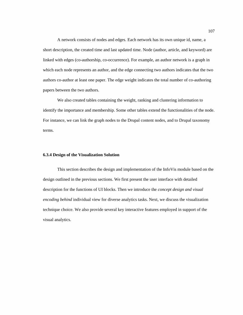
107
A network consists of nodes and edges. Each network has its own unique id, name, a
short description, the created time and last updated time. Node (author, article, and keyword) are
linked with edges (co-authorship, co-occurrence). For example, an author network is a graph in
which each node represents an author, and the edge connecting two authors indicates that the two
authors co-author at least one paper. The edge weight indicates the total number of co-authoring
papers between the two authors.
We also created tables containing the weight, ranking and clustering information to
identify the importance and membership. Some other tables extend the functionalities of the node.
For instance, we can link the graph nodes to the Drupal content nodes, and to Drupal taxonomy
terms.
6.3.4 Design of the Visualization Solution
This section describes the design and implementation of the InfoVis module based on the
design outlined in the previous sections. We first present the user interface with detailed
description for the functions of UI blocks. Then we introduce the concept design and visual
encoding behind individual view for diverse analytics tasks. Next, we discuss the visualization
technique choice. We also provide several key interactive features employed in support of the
visual analytics.
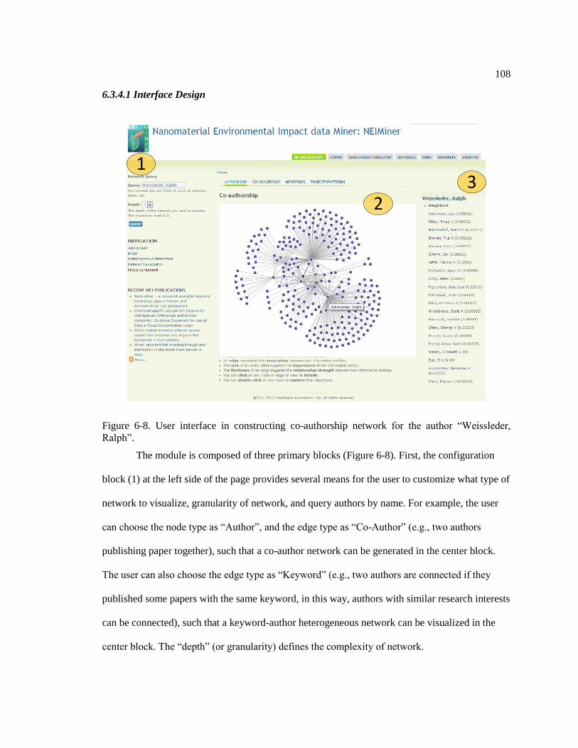
108
6.3.4.1 Interface Design
13
2
Figure 6-8. User interface in constructing co-authorship network for the author “Weissleder,
Ralph”.
The module is composed of three primary blocks (Figure 6-8). First, the configuration
block (1) at the left side of the page provides several means for the user to customize what type of
network to visualize, granularity of network, and query authors by name. For example, the user
can choose the node type as “Author”, and the edge type as “Co-Author” (e.g., two authors
publishing paper together), such that a co-author network can be generated in the center block.
The user can also choose the edge type as “Keyword” (e.g., two authors are connected if they
published some papers with the same keyword, in this way, authors with similar research interests
can be connected), such that a keyword-author heterogeneous network can be visualized in the
center block. The “depth” (or granularity) defines the complexity of network.

109
The visualization views are located in the center block (2). The multiple tabs, on the top
of center block, allow users to switch among various views and thus explore the data from
different visual perspectives. We have designed and implemented four views of information
visualization and will continue providing more options for further analysis tasks. Most visual
components in these views are clickable. For example, in authorship network view, users are able
to click node and edge for further exploring the details. Once one node is clicked, a list of
neighbor nodes will display on the right block (3) ranked based on their weight scores or
PageRank values.
The infovis module is available online via http://neiminer.i-a-i.com/?q=info_net/vis
6.3.4.2 Design of Multiple Information Visualization Views
Considering the complexity and diversity of analytic tasks, we decide to apply multiple
views to the information visualization problem. Previous studies has shown the benefits of
multiple views in terms of improving user performance and discovery of unforeseen relationship
(Wang Baldonado, Woodruff, and Kuchinsky 2000). The design decision relies on how well the
each view contained in the visual representation can support users to complete real analysis tasks.
To support exploration of the data from different perspectives, we design (1) network
view of co-authorship/keyword relationship, (2) treemap view of nanomaterial terms co-
occurrence, (3) collapsible tree view of nanoparticle ontology, and (4) hive plot view of nano-
toxicity. This session discuss the design choice and features for each view in details.

110
6.3.4.3 Network view of co-authorship and keywords relationships
Understanding the structure of co-occurrence patterns requires presenting connected data
in a meaningful way. One most common approach is to show the connectivity data as a 2D node-
link diagram (graph) with force-directed layout where the node represents the unit of analysis and
the edge represents their connections (Figure 6-9). This method uses spatial connections to
indicate the relationships between items.
Figure 6-9. Network View for Co-authorship Network.
We also encode the characteristics of analysis units (ranking, degree, cluster, closeness
coefficient) into visual representations (spatial position, color, size, shape and others). It provides
an overview of coauthorship and keyword network with high information density. The interactive
features, such as graph simplification, zoom-in, zoom-out and hover, will be discussed later.

111
6.3.4.4 Treemap view of co-occurrence of material and receptors
In general, the 2D diagram is suitable for tasks that involve understanding topology of the
connected data. However, it also suffers from two major weaknesses: scalability and visual
complexity. An alternative popular approach is to use Treemaps with color-marked cell and co-
occurrence word pair labels. Treemaps are a popular visualization method that displays large
hierarchical data sets as a set of nested rectangles. The benefit is that visually encoding
quantitative data using small cell is very compact.
Figure 6-10. Treemap view for co-occurrence of material and receptors.
We categorize nanomaterial toxicity into seven types, including antibacterial toxicity,
physical toxicity, cytotoxicity, aquatic toxicity, characterization toxicity, genotoxicity and general
toxicity. These categories are encoded as different colors in the treemap. The size of rectangles
represents the frequency of co-occurrence of material and receptors.

112
For instance, Figure 6-10 shows that general toxicity is the most common toxicity type.
Furthermore, the bottom right rectangles in treemap is larger than those above ones, which
indicates that “silver nanoparticles and escherichia coli” appears as a pair more frequently than
others such as “copper and yeast” and “copper and escherichia coli”.
Figure 6-11. Clicking the area of interests enable user to access detailed information.
The treemap is featured as an interactive chart. Users are able to click specific rectangle
to show the detail components within corresponding area. A drop-down menu at the right-bottom
corner enables two ranking algorithms – by material or by receptor – to explore the same data set
from different dimensions. The interactive features will be reported later.

113
6.3.4.5 Collapsible Tree View of Nanoparticle Ontology
Figure 6-12. Tree View of Nanoparticle Ontology.
NanoParticle Ontology (D. G. Thomas, Pappu, and Baker 2011) provides a unifying
knowledge that facilitates the semantic integration and the characterization of nanomaterials
toxicity. Figure 6-12 demonstrates the visualization of NanoParticle Ontology in an expandable
tree layout. This compacted tree layout aids users making sense of the hierarchical structure of
NanoParticle Ontology with multiple levels of aggregations, as well as give users a feeling of
control in exploring the NanoParticle Ontology.

114
Figure 6-13. Interactive navigation features (expanding) allow users to explore the NanoParticle
Ontology in both overview and detailed insights.
To support the exploration of big data, we apply interactive navigation techniques that
allow users to change what is shown dynamically. The interactive features will be reported later.
6.3.4.6 Hive Plot View of Nano-Toxicity Type, Material and Particle Size
In practice, analysts and researchers need to identify relationships among nano-toxicity,
nano-material and particle sizes in studying environmental impact of nanomaterials. To support
this task, we design and implement Hive Plot View - a rational and rational visual representation
where nodes are placed on radially oriented linear axes according to three coordinates (nano-
toxicity, nano-material and particle size). As an alternative layout of force-directed network, hive
plot assigns nodes to axes and draw curves as edges to indicate the connections.

115
Figure 6-14. Hive Plot View for Nano-Toxicity Type, Material and Particle Size.
Figure 6-15. Users hover edge and explore the information of connected two dots.

116
We encode different categories of items as various colors of nodes along each axis. For
particle size, nodes are organized into groups with linear position from left to right representing
minimum, middle and maximum size of nanoparticles. Edges will be highlighted once users
hover the corresponding node. Similarly, if users hover an edge, the edge itself and corresponding
two nodes are highlighted. The description automatic updated as user interact with the
visualization. For example, Figure 6-14 shows the patterns of materials and particle size on
characterization toxicity. Figure 6-15 shows one particle has physical toxicity with a size of
100nm.
6.3.4.7 Visualization Technique Choice
At the technical level, prior approaches on information visualization extensively focused
on network analytics. Visualization tools, such as Google visualization API and Gephi (Bastian,
Heymann, and Jacomy 2009) , initially helped the team to gain characterizations of author
network and keywords network.
However, we identified their potential limitations with respect to integration,
compatibility and usability. For example, even though Google visualization API claims its cross-
browser compatibility, we found some interactive features of the motion chart are rendered within
the browser using Flash. Due to security reasons, flash-based visualizations are inappropriate
when accessed from a file location in the browser. Additionally, we believe that bringing network
visualization to the web is a key feature and future direction of big data analytics. While, Gephi,
as a client-side software, lacks such ability to work with web-based platform.

117
In an attempt to show data to the user meaningfully, we have looked at a number of
JavaScript visualization tools. We review these tools by their characteristics with respect to
effectiveness, types, interactive feature and scalability.
Table 6-1. Comparison of Graph Visualization Tools
Name Type Interactive Limit
Arbor.js Dynamic Yes ≈500
JIT Static Yes ≈1000
Gephi Seadragon Static No Infinite
D3.js Dynamic Yes >2500
Arbor and JIT are relatively weak among these toolkits. Although ideal with small
datasets, they slow down as the amount of dataset grows. Gephi’s SeaDragon module is able to
rendering graphs in any size, but its outputs - static image - can hardly be manipulated or
changed. D3.js (Data-Driven Documents) (Bostock, Ogievetsky, and Heer 2011) is the most
balanced and the best suited for automation. It is versatile, fast, and best of all it allows the nodes
to be both added and removed while running. As a result, these findings clarified our direction of
using web-based technology, including D3, HTML5 and jQuery, to support visual analytics of
NEI data.
6.3.5 Interactive features
This section summarizes the features for near real time interaction with scalable visual
summaries of large-scale heterogeneous data and highlighting of eNM characterization of
interest. These features include (1) graph simplification; (2) enriched visualization algorithms,
and (3) interactive navigation.

118
6.3.5.1 Graph simplification
Gaining insights on the relationships between entities is critical for making sense of
scalable complex nano-material keywords network. However, human’s perceptual and cognitive
capacities are limited in detecting patterns and relationships within large amounts of records
(Ware 2012). Traditional node-link diagrams are widely used visual representations, but are
difficult to effectively deliver users valuable information facing increasing complexity of graph.
The optimization of network attributes for better readability is NP-hard problem (Tollis et
al. 1998). Previous efforts on visualizing graph mostly focused on improving the layout
algorithms (Kobourov 2012)(Eades, Huang, and Hong 2010). However, the performances of
layout algorithms varied on different networks with various scales and metrics. In this paper, we
focus on applying and extending the efficient and general visualization methodologies by graph
simplification, such as color encoding, edge aggregation, and motif simplification (Dunne and
Shneiderman 2013).
We have demonstrated our approach step-by-step in a larger scale complex network
(Figure 6-16). The nano-material keywords network contains nanomaterial publication keywords
and their relationships (over 6k nodes and 30k edges) that might overwhelm users’ perceptual
capacities to interpret. To mining patterns within the complexity, applying spatial position and
color hue facilitates the detection of keywords clusters. However, using those techniques alone is
insufficient to produce understandable network structure. In this case, graph simplification allows
users to effectively discover the topology of the network which is originally inaccessible.
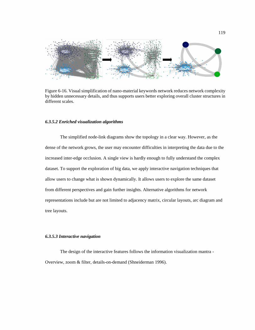
119
Figure 6-16. Visual simplification of nano-material keywords network reduces network complexity
by hidden unnecessary details, and thus supports users better exploring overall cluster structures in
different scales.
6.3.5.2 Enriched visualization algorithms
The simplified node-link diagrams show the topology in a clear way. However, as the
dense of the network grows, the user may encounter difficulties in interpreting the data due to the
increased inter-edge occlusion. A single view is hardly enough to fully understand the complex
dataset. To support the exploration of big data, we apply interactive navigation techniques that
allow users to change what is shown dynamically. It allows users to explore the same dataset
from different perspectives and gain further insights. Alternative algorithms for network
representations include but are not limited to adjacency matrix, circular layouts, arc diagram and
tree layouts.
6.3.5.3 Interactive navigation
The design of the interactive features follows the information visualization mantra -
Overview, zoom & filter, details-on-demand (Shneiderman 1996).

120
Figure 6-17. Zooming, and details-on-demand allow users to investigate the keyword and author
network and gain valuable insights in details. SVG supports a detailed view by zooming without
sacrificing the resolution.
To support the exploration of big data, we apply interactive navigation techniques such as
zooming, roll up, and drill down, that allow user to change what is shown dynamically (Figure
6-17). The research team replaced an early implementation of image-based nodes with Scalable
Vector Graphics (SVG) which is an XML-based vector format supporting interactivity and
animation. We also facilitate the direct arrangement of spatial layout by panning action. Those
efforts allow the users to modify the viewport to highlight the dataset elements of their research
interests at multiple levels of aggregations.
For exploring NanoParticle ontology, the advantages of including interactive features are
(1) overview aids users making sense of the hierarchical structure of NanoParticle ontology with
multiple levels of aggregations, (2) expandable detail view give users a feeling of control in
exploring the NanoParticle ontology, (3) compacted tree layout is more effective and efficient in
terms of display usage as only nodes of interest are expanded.
It is crucial to design a system to guarantee immediate response. Timely visual feedback
allows users to stay focused on analysis goals. To minimize the latency, we remove an early

121
implementation that presents all the titles of nodes at once. Our design enables mouse hover
actions. For example, in the co-authorship network view, the title of each node appears for a short
time when the cursor is placed over. Compared with plotting the entire information at once,
requesting individual information of each node with user’s manipulation is highly efficient with
respect to redrawing and loading time.
We believe these graph visualization techniques, including graph simplification, enriched
visualization algorithms and interactive features, will be greatly supportive for analysts to identify
concepts and relationships in studying environmental impact of nano-materials.
6.4 Insights from Network Analytics
The ultimate goal of visual analytics is to conclude the evidence into insight. Beside the
insight obtained from user interaction : VCVU I , some insight are from the automatics
analysis stage : HCHU I , for instance, network analytics on co-authorship network and
keyword network. This session shows some observations that lead to better understand the trends
of domain.
6.4.1 Insight from co-authorship network
6.4.1.1 Top Prominent Authors
We ranked the author nodes using various approaches or metrics, such as PageRank
(Page et al. 1999), eccentricity (M. Smith et al. 2010), closeness centrality, betweenness
centrality, degree and eigenvector centrality. Table 6-2 shows the top 10 authors that are sorted
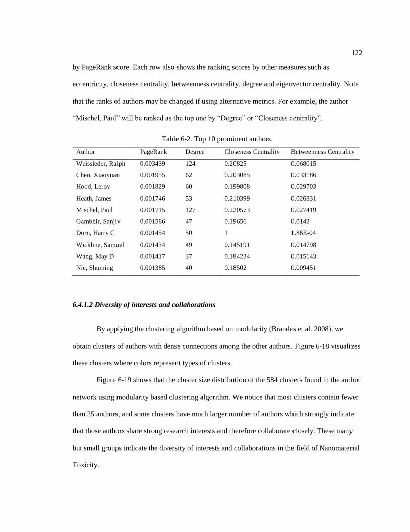
122
by PageRank score. Each row also shows the ranking scores by other measures such as
eccentricity, closeness centrality, betweenness centrality, degree and eigenvector centrality. Note
that the ranks of authors may be changed if using alternative metrics. For example, the author
“Mischel, Paul” will be ranked as the top one by “Degree” or “Closeness centrality”.
Table 6-2. Top 10 prominent authors.
Author PageRank Degree Closeness Centrality Betweenness Centrality
Weissleder, Ralph 0.003439 124 0.20825 0.068015
Chen, Xiaoyuan 0.001955 62 0.203085 0.033186
Hood, Leroy 0.001829 60 0.199808 0.029703
Heath, James 0.001746 53 0.210399 0.026331
Mischel, Paul 0.001715 127 0.220573 0.027419
Gambhir, Sanjiv 0.001586 47 0.19656 0.0142
Dorn, Harry C 0.001454 50 1 1.86E-04
Wickline, Samuel 0.001434 49 0.145191 0.014798
Wang, May D 0.001417 37 0.184234 0.015143
Nie, Shuming 0.001385 40 0.18502 0.009451
6.4.1.2 Diversity of interests and collaborations
By applying the clustering algorithm based on modularity (Brandes et al. 2008), we
obtain clusters of authors with dense connections among the other authors. Figure 6-18 visualizes
these clusters where colors represent types of clusters.
Figure 6-19 shows that the cluster size distribution of the 584 clusters found in the author
network using modularity based clustering algorithm. We notice that most clusters contain fewer
than 25 authors, and some clusters have much larger number of authors which strongly indicate
that those authors share strong research interests and therefore collaborate closely. These many
but small groups indicate the diversity of interests and collaborations in the field of Nanomaterial
Toxicity.

123
Figure 6-18. Clustering of author network.
Figure 6-19. Cluster size distribution of author network.

124
6.4.1.3 Dynamic Analysis on authorship network
A network is rarely static and normally dynamically changes, i.e., some new nodes
appear at one time, some nodes disappear at other time, and some edges only exist for some
periods. In the author network, we can add temporal information to each author node. The start
time of the node is the earliest year the author published his/her first paper, and the end time is the
latest year the author published a paper. Similarly, we can also add temporal information to
edges, the start time indicates the earliest year two authors started to collaborate while the end
time indicates the latest year the two authors coauthored a paper together.
Year 2002-2005(8 collaborators) Year 2002-2006(73 collaborators)
Year 2002-2007(168 collaborators) Year 2002-2008(213 collaborators)
Figure 6-20. Dynamic change of Ralph Weissleder’s collaboration network.
We take the author “Weissleder, Ralph” as an example. We constructed a dynamic graph
for him and Figure 6-20 shows how the collaboration relationship changes over the years. We can
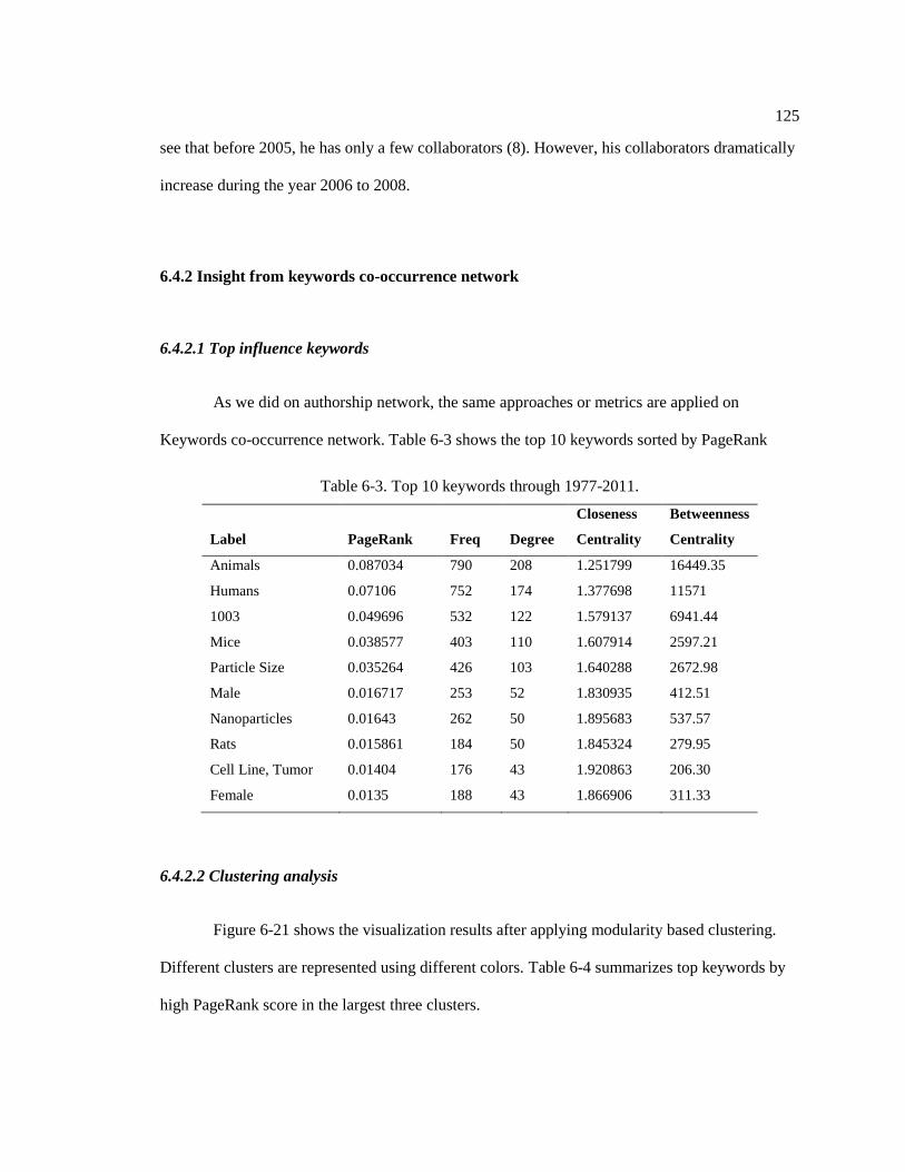
125
see that before 2005, he has only a few collaborators (8). However, his collaborators dramatically
increase during the year 2006 to 2008.
6.4.2 Insight from keywords co-occurrence network
6.4.2.1 Top influence keywords
As we did on authorship network, the same approaches or metrics are applied on
Keywords co-occurrence network. Table 6-3 shows the top 10 keywords sorted by PageRank
Table 6-3. Top 10 keywords through 1977-2011.
Label PageRank Freq Degree
Closeness
Centrality
Betweenness
Centrality
Animals 0.087034 790 208 1.251799 16449.35
Humans 0.07106 752 174 1.377698 11571
1003 0.049696 532 122 1.579137 6941.44
Mice 0.038577 403 110 1.607914 2597.21
Particle Size 0.035264 426 103 1.640288 2672.98
Male 0.016717 253 52 1.830935 412.51
Nanoparticles 0.01643 262 50 1.895683 537.57
Rats 0.015861 184 50 1.845324 279.95
Cell Line, Tumor 0.01404 176 43 1.920863 206.30
Female 0.0135 188 43 1.866906 311.33
6.4.2.2 Clustering analysis
Figure 6-21 shows the visualization results after applying modularity based clustering.
Different clusters are represented using different colors. Table 6-4 summarizes top keywords by
high PageRank score in the largest three clusters.

126
Figure 6-21. Clustering of Keywords.
Table 6-4. Top Keywords in Three Major Clusters.
Cluster 1 Cluster 2 Cluster 3
Animals
Mice
Cell Line, Tumor
Female
Tissue Distribution
Magnetic Resonance
Imaging
Quantum Dots
Mice, Nude
Polyethylene Glycols
Positron-Emission
Tomography
Transfection
Integrin alphaVbeta3
Microscopy, Fluorescence
Contrast Media
Fluorescent Dyes
1003
Particle Size
Male
Rats
Air Pollutants
Lung
Drug Carriers
Carbon
Inhalation Exposure
Polymers
Titanium
Humans
Nanoparticles
Cell Survival
Drug Delivery Systems
Cell Line
Gold
Metal Nanoparticles
Biocompatible Materials
DNA
Neoplasms
Microscopy, Electron,
Scanning
Reactive Oxygen Species
Cells, Cultured
Microscopy, Electron

127
6.4.2.3 Dynamic Analysis on keyword network
The objective of dynamic keyword network analysis is to explore how the top keywords
evolve over years. We are able to observe how researchers have changed their research interests
from one to the others. For each year, we calculate the top 10 keywords that were mostly used in
those papers published in that year. We visualize the dynamic evolution of keyword network
through 2007-2010 in Figure 6-22.
2006 2007
2008 2009
2007
Figure 6-22. Evolution of top 10 keywords from 2006 to 2009. Red arrow indicates the new
added keywords.
Table 6-5 summarizes the ranked top keywords from 2007 to 2011. We found that
although the top few keywords in 2007 are still popular in 2008, there are few keywords such as
“Contrast Media”, “Mice, Nude” in 2007 are replaced by “Magnetic Resonance Imaging” and
“Particle Size” in 2008. In 2009, three keywords become popular, “Female”, “Tissue

128
Distribution” and “Gold”. In 2010, the frequency of keywords significantly dropped, which may
be resulted from some reasons. In 2011, we notice that the frequency of keywords significantly
increased, and there are some new emerging keywords such as “Cell Survival”, “Metal
Nanoparticles”, “Nanotubes, Carbon” and “Microscopy, Electron, Transmission”.
Table 6-5. Top ten keywords from 2007 to 2011.
Rank 2007 2008 2009 2010 2011
1 Humans Humans Animals Animals Humans
2 Animals Animals Humans Mice Animals
3 Mice Mice Mice Cell Line, Tumor Nanoparticles
4 Nanoparticles Nanoparticles Nanoparticles Humans Cell Survival
5 Cell Line, Tumor Cell Line, Tumor Cell Line, Tumor Nanoparticles Particle Size
6 Nanotechnology
Drug Delivery
Systems Female Female Cell Line
7
Drug Delivery
Systems
Magnetic
Resonance
Imaging
Tissue
Distribution
Antineoplastic
Agents Mice
8 Neoplasms Nanotechnology Gold Liver
Metal
Nanoparticles
9 Contrast Media Neoplasms Neoplasms Male
Nanotubes,
Carbon
10 Mice, Nude Particle Size Particle Size Mice, SCID
Microscopy,
Electron,
Transmission
6.5 Summary
This chapter introduces the user centered design approach of building InfoVis module, an
information visualization component of NEIMiner for helping analysts and researchers explore
the nanomaterial environmental impact. The following are our major contributions.
First, we have applied the user centered approach to design the module. The entire design
lifecycle is driven by iteratively explicit understanding of users, tasks and environments. The
involvement of domain expert helps us validate the design and expectations. The current design is

129
supportive for analysts and researchers to identify concepts and relationships in studying
environmental impact of nano-materials.
Second, we demonstrated the utility through scenarios in constructing co-authorship
network, publication keywords network, and nanomaterial terms co-occurrence network. We
characterized important relational properties of the co-authorship network and keywords network.
The clustering analysis resulted the many but small clusters, which suggested the diversity of
research interests and communities in the field of nanomaterial toxicity. We identify the most
popular authors and keywords and the evolution over time. Uncovering these patterns is
important for our understanding of the research trends in the field of nanomaterial toxicity.
Third, we have shown that how existing techniques, such as graph simplification,
enriched visualization algorithms and interactive features, can be usefully combined to aids users’
gaining insights on the relationships between nano-material entities. The visual encoding schema
can be helpful for many other kinds of domains in visualizing large-scaled internal hierarchy data.

130
Chapter 7
VATS: Visual Analytics for Advancing Translational Sciences
This chapter introduce the design and development of VATS – a Scalable Multi-Scale
Visual Analytical Tool – to study the impact of translational sciences. We focus on introducing
user scenario development and data pre-processing and transformation in the user centered design
approach. VATS integrate the data of 2000 NCATS/CTSA projects and 5000 publications from
NIH Research Portfolio Online Reporting Tools (RePORT) and PubMed. We enrich the dataset
by text analytics including topic modeling and named entity recognition to discover the hidden
information related to translational science stages and research topics. We develop systematic
data mining and visual analysis methods to understand the big picture of National Center for
Advancing Translational Science (NCATS) funded projects, the evidence behind the knowledge
about human health, and the interdisciplinary communication of complex scientific information.
Study results demonstrate the possibility to evaluate impact of NCATS funded projects through
publicly available data sources.
7.1 Background
The past few decades of medical science have produced an explosion of knowledge, with
tens of thousands of peer-reviewed publications appearing every year. In addition, hundreds of
thousands of abstracts, case presentations, white papers, grant submissions, editorials, and
specialty-society guidelines are also generated, and tens of millions of cases are reported to
hundreds of medical registries. Patients themselves generate millions of bits of feedback on the

131
quality of healthcare through surveys, blogs, and other social media postings. Translating this
avalanche of information into effective clinical care is an overwhelming task. Even therapies that
are strongly supported in the literature may take years to reach routine clinical practice (Leshner
et al. 2013). For non-peer reviewed data, pre-clinical laboratory studies, and information from
social media, the lag time might be substantially longer.
The Clinical and Translational Science Awards (CTSA) program was initiated by the
National Institute of Health (NIH) in 2006. Since then more than 60 premier academic sites have
been chosen to enhance and advance the research of translational science at both regional and
national levels. This effort was further enhanced with the establishment of the National Center for
Advancing Translational Sciences (NCATS) in December 2011. The mission of NCATS is to
transform the translational science process so that new treatments and cures for disease can be
delivered to patients faster. CTSA has become a key program within NCATS and has been very
successful according to a recent National Academies report (Leshner et al. 2013). The success of
CTSA program suggests the great value (Trochim, Rubio, and Thomas 2013) of analyzing
translational research efforts in the pathway from basic laboratory research through patient-
oriented clinical research, clinical trials, and population-based clinical research. This analysis
must consider information from multiple data sources such as NIH funded project descriptions
(e.g., RePORTER), published scientific articles (e.g., PubMed), patents (e.g., Web of Science),
clinical trial reports (e.g., clinicaltrials.gov), news articles, license/product data, public health
guidelines, electronic health records, and social media messages. There is a critical need to
extract and analyze those relevant elements to get a comprehensive and systematic understanding
about the impact of translational research efforts.
Over the years, there have been several efforts to analyze the impact of translational
research. The Evaluation Key Function Committee of the CTSA Consortium presents an overall
framework for analyzing the NCTAS/CTSA program and offers policies to guide the analysis

132
work (Trochim, Rubio, and Thomas 2013). Pincus et al. summarized the “top ten” list of lessons
learned and insights gained through CTSA analysis processes (Pincus et al. 2013). Rubio et al.
proposed a multidimensional approach to analyze the CTSA which includes individual site
evaluation, national evaluation and cross-CTSA objectives and metrics (Rubio, Sufian, and
Trochim 2012). Westat, an external evaluator, conducted a national analysis on the progress of
the first 46 CTSAs that were funded during 2009 to 2012 to provide an early assessment of
whether, and in what ways, the program has succeeded in enhancing institutional capacity for
conducting clinical and translational research and advancing scientific knowledge (Frechtling et
al. 2012). However, the above efforts have limitation from several perspectives:
Manual analysis from a limited number of data sources: These analyses were
performed manually on a limited number of data sources from NIH reports and publications. A tool
with automated analysis capability is needed to integrate data from multiple sources corresponding
to different stages of translational pathways.
Lack of exploratory tool: The published results do not use any tool that can be re-used by
NCATS and other funding agencies to analyze impacts of investments on advancement of
translational science. A tool built upon quantitative and statistical data analysis framework that
provides interactive visualization of different stages of translational science segmented by
organization, authors, clinical support resources, topics of disease, treatment, and medication is
needed to track and analyze the advancement of translational research.
To address the limitation of analyzing the impact of translational research and embrace
the intrinsic value of visual analytics, we designed and prototyped a Scalable Multi-Scale Visual
Analytical Tool for Advancing Translational Sciences: VATS. The objective is to utilize data
mining and information visualization technology to understand the big picture of translational
science, the evidence behind the knowledge about human health, and the interdisciplinary
communication of complex scientific information. It aims to answer the question “how to analyze

133
the impact of NCATS funded projects on improving public health using publicly available data
sources?” We further broke the question into sub-questions from several aspects:
How to obtain more insights about NCATS projects and their supported publications?
How to study collaboration efforts among CTSA organizations?
How to rank NCATS/CTSA projects through their supported publications?
How to study interactions among NIH institutes on translational science?
How to analyze interactions among diseases focused in translational science?
The key contribution is to apply advanced text analytics and visualization techniques in
multiple scales of information dimensions (e.g. year, institutions, translational stages, etc.) and
hierarchies (10 years/5years/1 year) to analyze the impact of translational science research
through handling the massive structured and unstructured (text) data including project reports,
publications, clinical trial outcomes, patents, news articles, and social media messages. The
consideration of these data sources brought in significant values for integrated translational
pathway analysis in several aspects:
Discovering interactions between NCATS/CTSA and other NIH institutes through
historical co-funding patterns so that NCATS can further optimize the funding allocation.
Tracking the success levels of researchers and practitioners who are trained and educated
by CTSA organizations through mining the co-authorship and citation networks in
publications.
Linking clinical trials and NCATS/CTSA projects to understand NCATS/CTSA’s efforts
in promoting treatment information and to discover key events in the translation pathway
from basic laboratory research to population-based clinical research.

134
Obtaining valuable community feedbacks about drug, diseases, interventions, researchers,
publications and organizations from news and social media for promoting all stages of the
clinical and translational research.
In the reminding sessions, we discuss the modeling, design, and implementation of
VATS. We first discuss the system architecture of VATS. Then we present the efforts on data
integration and enrichment, heterogeneous information visualization and analysis, and multi-scale
visual analytics with the support of faceted search. Next we present the results of visual analytics
and provide insights on NCATS projects. Finally, we conclude the study and provide potential
directions for future research.
7.2 Identify the Context and Requirements with Use Scenario
7.2.1 Overview
Use scenarios are design tools to define concrete motivation, design goals and actions
(Bødker 2000). They are now widely employed in the design of interactive systems and
applications (Bishop, Hines, and Collins 2007). Good user scenarios are beneficial to turn
comprehensive textual descriptions of the context into which the team will be used later to create
visual solutions (Vredenburg et al. 2001). In this study, empirically derived use scenarios are used
as a starting point to promote communication among stakeholders.
We first conduct interviews and hold meetings with an anesthesiologist, two physicians
in clinical and translational science, two researchers in data analysis and visualization, and
stakeholders at the National Center for Advancing Translational Sciences (NCATS) at the
National Institutes of Health (NIH). As a result, high-level scenarios are created and discussed in

135
the phase of understanding context of use and user requirement. The stakeholder’s high level
objective is to build visual analytics tools to facilitate the translational science. Since the design
team include researchers and scientists with diverse background and expertise, developing use
scenarios are highly based upon their grounded understanding of the realistic practice. User
scenarios are created to raise question. Not all the use scenario turn into the design requirements.
But these use scenario enable designers to explore the system and technology constrains, and
clarify the data resources and what visual analytics tools to build next.
7.2.2 Use Scenario 1: Clinical Decision Making: Intraoperative Transfusion.
One possible direction is to build visual analytics as clinical decision making tools to
support the evidence-based medicine in clinical settings. We discussed the detailed process of
clinical decision making problem, and how a visual analytics could facilitate the transformation
of the idea from bench to bedside. The discussion helps the research team to design the user
scenario of information visualization tool for data-driven knowledge discovery on clinical data
and publication data to estimate surgical risks.
“A 72 year old man is undergoing radical cystectomy for invasive carcinoma of
the bladder. He has a past medical history significant for coronary artery disease, chronic
atrial fibrillation, hypertension, chronic obstructive pulmonary disease and Type-II
diabetes. He takes multiple medications on a regular basis, including a statin, a beta-
blocker, warfarin (an anticoagulant) and aspirin. Four hours into a planned 8 hour
procedure the patient becomes hypotensive, despite 3 liters of administered fluids, and
the rate of premature ventricular contractions seen on the electrocardiogram increases.
The patient’s starting hemoglobin level was 10.5 mg/dl, and intraoperative assay comes
back at 8.5 mg/dl. Should this patient receive one or more units of red blood cells?
Patients undergoing major surgeries frequently require transfusion to replace
blood lost during the procedure. The decision to transfuse is made by the
anesthesiologist, who must integrate multiple variables when assessing the relative risks
and benefits. Benefits of transfusion include preservation of tissue oxygen delivery and
support of coagulation. Risks include the cost of this therapy and consumption of a
precious resource, immediate allergic reactions, and adverse immune modification
leading to increased risk for postoperative infection, organ system failure, and prolonged

136
morbidity. The scientific literature on transfusion is copious, but divided on the value of
intraoperative transfusion for any individual patient.
The anesthesiologist must consider how fast the patient is losing blood and how
long this is likely to continue, how much fluid has already been administered, and how
deeply anesthetized the patient is. The anesthesiologist must integrate this knowledge
with input from direct examination of the patient, dialogue with the surgical team, and
trends in heart rate, blood pressure, oxygen saturation, end-tidal carbon dioxide, central
venous pressure, cardiac output, and cerebral function. These data in turn must be
synthesized with knowledge from 50 years of scientific literature bearing on the risks and
benefits of transfusion in specific patient populations, and with lay press articles and
social media that reflect patient attitudes towards transfusion. The goal is to make the
best possible decision for this individual in this situation.”
In this use scenario, the visual analytics system to build is a clinical decision making
system. To support the decision making, medical practitioners need obtain useful information
from research papers, white papers, clinical guidelines, unstructured clinical notes, drug
prescriptions and recorded allergies. For example, facing the decision making problem of
intraoperative, clinicians need to investigate the publication that mentions the blood transfusion
and corresponding outcomes. However, the process can be very information intensive due to the
large amount of data. Figure 7-1 and Figure 7-2 show the role of the system in the process of
evidence-based medicine.
Figure 7-1. Use scenario: Visual Reasoning in Clinical Settings.
Asking answerable
clinical questions
Finding the best
evidence
Appraising the
evidence
Making a decision
Evidence-based medicine
Outcomes Estimated Risk
Chance of Outcome Death Estimated Serious Complication
Predicted Length of Hospital Stay
Proposed action
publications reviewclinical trialswhite
paperswiki
Visual Reasoning VAT

137
The team found this system described in the use scenario are less realistic to build due to
limited data resource and capacity of information extraction. First, the decision making relies on
scientific literature, direct examination of the patients, and dialogue with the surgical team.
However, information such as patients’ medical history and condition are not directly accessible,
and may requires many user’s inputs into the proposed system. Second, domain expert suggested
that in practice users directly refer to Cochrane library for the results of clinical studies in
standardized reporting methods including: (1) Forest plot, (2) Kaplan–Meier estimator, and (3)
CONSORT and STROBE. The team systematically collected 255 review papers and protocols on
anesthesia from the Cochrane library, which includes the Cochrane Database of Systematic
Reviews, Cochrane Central Register of Controlled Trials, and Health Technology Assessment
Database. But we found that the required information are presented as figures in publications. The
current technique can hardly guarantee the accuracy of the quantitative information extracted
from the plots and figures. Those concerns were later being confirmed by the stakeholders.
Literature
ASA Practice parameters
Medline
Anesthesiology Annual Meeting Abstract White papers (ASA, Think Tanks)
Grant Submissions
National Registries: NACOR,AIRS,MPOG
Patient
Age
Gender
Past medical history
Disease
Medications
Decision making
Dialogue with the surgical team
Direct examination of the patient
Conditions
heart rate
blood pressure
oxygen saturation
end-tidal carbon dioxide
central venous pressure
cardiac output
cerebral function
Scientific Literature
Treatment
Information extraction NLP
Data mining
Info visualizaion
Data collection
patterns
relationships
Figure 7-2. The role of proposed system (green box) in clinical decision making.

138
However, this use scenario help the team define available data resources, and technical
ground of the system, including data collection, data mining, information extraction, natural
language processing, and information visualization.
7.2.3 User Scenario 2: Mining and visualizing citation network to identify the short
translational path
Doughert and Conway (Dougherty and Conway 2008) suggested a “3T’s” road map to
transform US healthcare, where T indicates translation. T1, T2, and T3 represent the 3 major
translational steps originating in basic biomedical science through clinical research and
eventually to widespread implementation through transformation of healthcare delivery. In
details, T1 tests what case works, T2 tests who benefits from promising case, and T3 focuses on
how to deliver high-quality care reliably and in all settings.
Basic biomedical
science
Clinical efficacy
knowledge
Clinical Effective
knowledge
T1 T2 T3
test who benefits
from promising case
how to deliver
high-quality care reliably
and in all settings
Improved health care
quality and value
and population health
T indicates translation. T1, T2, and T3 represent the
3 major translational steps
test what case
works
Translational
interface
Citation network
Tim
e
Figure 7-3. Use scenario: Mining and visualizing citation network to identify the short
translational path
The scientific need to understand translational science large-scale related bibliography
and keywords calls for an approach based on network science. Network science is an
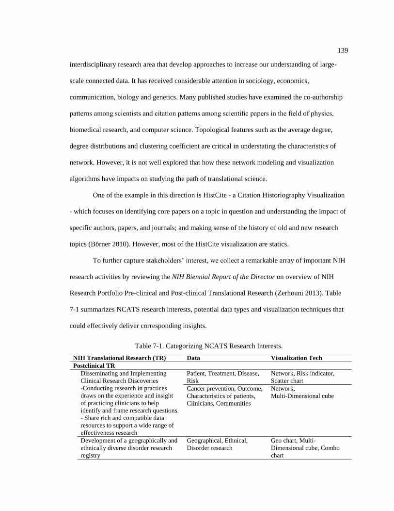
139
interdisciplinary research area that develop approaches to increase our understanding of large-
scale connected data. It has received considerable attention in sociology, economics,
communication, biology and genetics. Many published studies have examined the co-authorship
patterns among scientists and citation patterns among scientific papers in the field of physics,
biomedical research, and computer science. Topological features such as the average degree,
degree distributions and clustering coefficient are critical in understating the characteristics of
network. However, it is not well explored that how these network modeling and visualization
algorithms have impacts on studying the path of translational science.
One of the example in this direction is HistCite - a Citation Historiography Visualization
- which focuses on identifying core papers on a topic in question and understanding the impact of
specific authors, papers, and journals; and making sense of the history of old and new research
topics (Börner 2010). However, most of the HistCite visualization are statics.
To further capture stakeholders’ interest, we collect a remarkable array of important NIH
research activities by reviewing the NIH Biennial Report of the Director on overview of NIH
Research Portfolio Pre-clinical and Post-clinical Translational Research (Zerhouni 2013). Table
7-1 summarizes NCATS research interests, potential data types and visualization techniques that
could effectively deliver corresponding insights.
Table 7-1. Categorizing NCATS Research Interests.
NIH Translational Research (TR) Data Visualization Tech
Postclinical TR
Disseminating and Implementing
Clinical Research Discoveries
-Conducting research in practices
draws on the experience and insight
of practicing clinicians to help
identify and frame research questions.
- Share rich and compatible data
resources to support a wide range of
effectiveness research
Patient, Treatment, Disease,
Risk
Network, Risk indicator,
Scatter chart
Cancer prevention, Outcome,
Characteristics of patients,
Clinicians, Communities
Network,
Multi-Dimensional cube
Development of a geographically and
ethnically diverse disorder research
registry
Geographical, Ethnical,
Disorder research
Geo chart, Multi-
Dimensional cube, Combo
chart
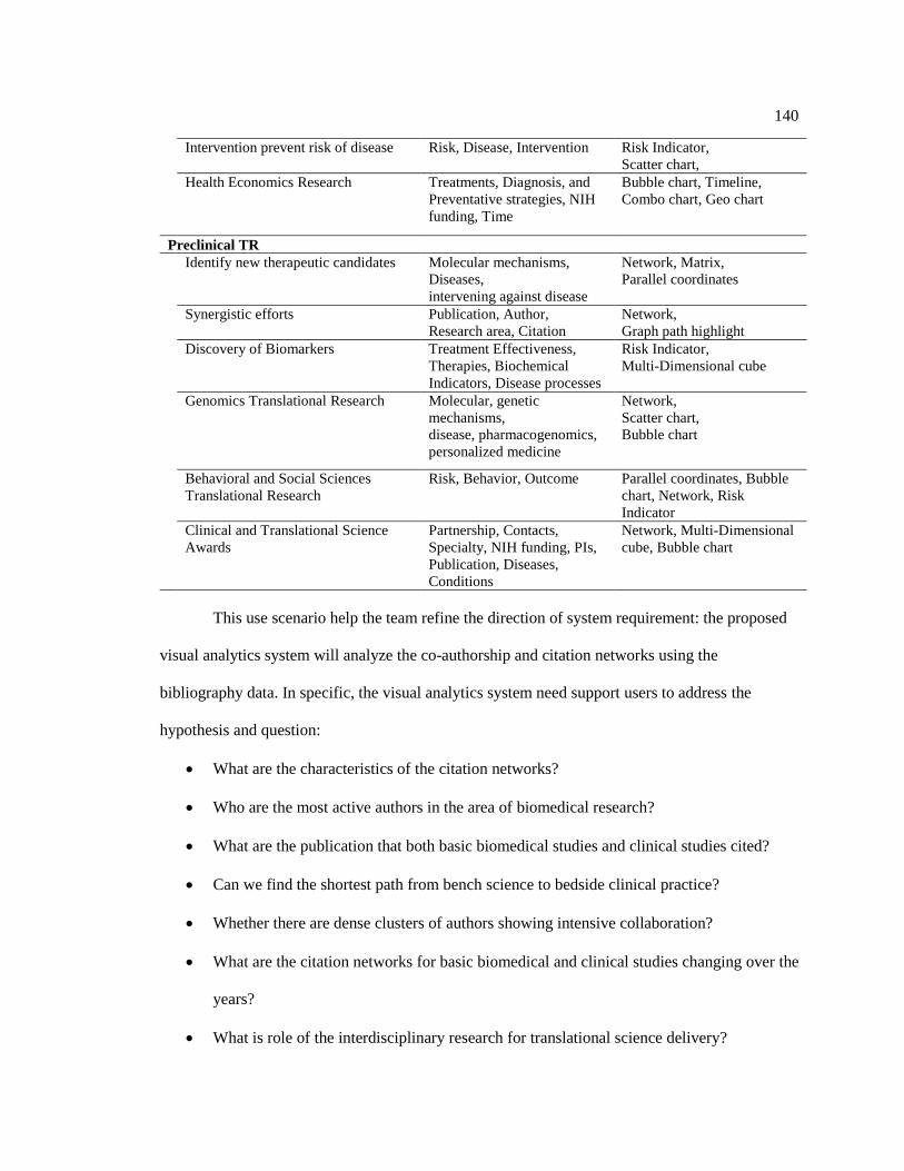
140
Intervention prevent risk of disease Risk, Disease, Intervention Risk Indicator,
Scatter chart,
Health Economics Research
Treatments, Diagnosis, and
Preventative strategies, NIH
funding, Time
Bubble chart, Timeline,
Combo chart, Geo chart
Preclinical TR
Identify new therapeutic candidates Molecular mechanisms,
Diseases,
intervening against disease
Network, Matrix,
Parallel coordinates
Synergistic efforts Publication, Author,
Research area, Citation
Network,
Graph path highlight
Discovery of Biomarkers Treatment Effectiveness,
Therapies, Biochemical
Indicators, Disease processes
Risk Indicator,
Multi-Dimensional cube
Genomics Translational Research Molecular, genetic
mechanisms,
disease, pharmacogenomics,
personalized medicine
Network,
Scatter chart,
Bubble chart
Behavioral and Social Sciences
Translational Research
Risk, Behavior, Outcome Parallel coordinates, Bubble
chart, Network, Risk
Indicator
Clinical and Translational Science
Awards
Partnership, Contacts,
Specialty, NIH funding, PIs,
Publication, Diseases,
Conditions
Network, Multi-Dimensional
cube, Bubble chart
This use scenario help the team refine the direction of system requirement: the proposed
visual analytics system will analyze the co-authorship and citation networks using the
bibliography data. In specific, the visual analytics system need support users to address the
hypothesis and question:
What are the characteristics of the citation networks?
Who are the most active authors in the area of biomedical research?
What are the publication that both basic biomedical studies and clinical studies cited?
Can we find the shortest path from bench science to bedside clinical practice?
Whether there are dense clusters of authors showing intensive collaboration?
What are the citation networks for basic biomedical and clinical studies changing over the
years?
What is role of the interdisciplinary research for translational science delivery?

141
The system described in this scenarios is realistic to build in terms of technical capability
and data resources available. On the one hand, the research team has expertise in web-based
network visualization with interactive features. In addition, data mining and graph search
algorithms can be used for searching shortest pathways. This could apply to enable us to conduct
and synthesize multiple such case studies in order to start getting at a more empirically grounded
and sophisticated. On the other hand, the resources for supporting this visual analysis are publicly
available. Initial datasets include ClinicalTrials.gov, MEDLINE Publications, U.S. Patent and
Trademark Office patents (USPTO), National Science Foundation (NSF) funding, and National
Institutes of Health (NIH) funding between 1983 and 2013. The stakeholders later introduced
additional dataset - NCATS Clinical and Translational Science Awards (CTSA). In addition, the
system meets stakeholders’ interests and the organization’s long term strategy.
7.3 Designing VATS
7.3.1 System Overview and Architecture
The architecture of VATS consists of three important components as shown in Figure
7-4: (1) intelligent and automatic data integration and enrichment to handle multiple translational
science related data sources, (2) scalable heterogeneous information visualization and analysis for
translational research impact, and (3) hybrid information retrieval for comprehensive question
answering.

142
Figure 7-4. The VATS system architecture
(1) Intelligent and automatic data integration and enrichment: With various
translational science related data sources identified, we designed a comprehensive schema and a
suite of preprocessing algorithms to integrate the data from these sources. Since translational
research impact starts from basic research in the laboratories, where information is recorded in the
NIH RePORTER, and propagates to publications in PubMed and ultimately to public discussions
such as news and social media, it is necessary to integrate multiple data sources at different levels
of the propagation path. In order to gain more insights into translational science that are mainly
expressed by natural language in the texts, we developed a set of text information extraction and
mining methods to reveal underlying knowledge like translational stages, diseases, or topics of a
project or a publication.
(2) Scalable heterogeneous information visualization and analysis: With the large
amount of integrated and enriched data about translational science, we developed systematic visual

143
analysis methods based on data cubing and heterogeneous information network technologies to
answer the question how the translational science research impact the public health at different
stages. We first developed a data cubing method for multi-dimensional (e.g. year, institutions,
translational stages, etc.) and multi-level (e.g. 10 years/5years/1 year) analysis of structured
translational science data that is intrinsically organized in multiple scales (Zhao, Deshpande, and
Naughton 1997). At different levels in the cube, we enabled many different kinds of visual analysis
corresponding to different analysis tasks, such as comparing a set of values, analyzing a text
document, showing parts of a whole, seeing relationships, and tracking trends over time. The multi-
scale and diversified visual analysis will enable the comprehensive impact analysis towards the
translational research. In parallel, to analyze the semi-structured data, we developed the
heterogeneous information network method (Sun and Han 2012), where the types of nodes (entities
such as projects, publications, and authors) and connecting edges (relationships such as author-
project relationship, and author-publication relationship) are explicitly modeled. We constructed
the information network using the associations among CTSA organizations, projects, core-projects,
publications, and studied diseases. We then developed advanced network-based data mining
approaches such as clustering and ranking to obtain highly abstracted knowledge and quantified
metrics.
(3) Hybrid information retrieval: With data cubes and their visualizations, information
networks and their visualizations, and unstructured text data, we developed an efficient way to
retrieve all these knowledge in a single platform. We developed a hybrid information retrieval
method that synchronizes the query results in different information spaces through sharing the
meta-data. Our hybrid information retrieval method will help our end users to connect dots and
understand the whole impact picture for speeding up the translational research.
In the following sections, we will describe each of these components in details.

144
7.3.2 Data Collection
We systematically collected all the NCATS-funded projects via the NIH Research
Portfolio Online Reporting Tools (RePORT) website. The RePORT provides a central point of
access to reports, data, and analyses of NIH research. For each project, we recorded its project title,
abstract, administering IC, project number, type, activity code, study section, contact PI / project
leader, department, organization, organization city, organization state, organization type, funding
mechanism, FY, funding IC, FY total cost, and NIH spending category. We also collected the
original URL of each project on the RePORT so that users would be able to access details about
the project, such as its description, results, history, and subprojects. Thirdly, we obtained the
publications related to the core project numbers on the RePORT website. For each publication, we
recorded the core project number, affiliation, authors, country, ISSN, journal issue, journal, journal
volume, page number, PubMed Central ID, PubMed ID, publication date, title, publication year,
articles cited from PubMed Central, articles cited from google scholar, clinical trials cited, and a
link to the PubMed abstract. Lastly, we automatically crawled publication abstracts on PubMed,
and assembled a dataset with a PHP program. Figure 7-5 shows the procedure of collecting
publications which acknowledge the CTSA grants.
Funding Projects
NIH Reporter
Publications
NIH Reporter
Publication Abstract
On PubMed
Figure 7-5. Collecting NCATS-funded projects and publications acknowledging CTSA grants.

145
As a result, 100 NCATS directly funded research projects were collected via the NIH
RePORTER website. To have a complete impact analysis of translational science research, we took
all the Clinical & Translational Science Awards (CTSA) projects into consideration (both those
projects funded by NCATS and those by the National Center for Research Resources (NCRR) with
a total number of about 2,000 CTSA projects). In order to reveal important science behind the
CTSA projects, we collected and analyzed publications acknowledging those CTSA projects (about
5,000 publications). We then automatically crawled publication abstracts on PubMed, and
assembled a dataset.
7.3.3 Data Enrichment
In order to gain deeper insights about how NCATS helps improve public health, the study
enriched the translational science datasets by multiple methods, including information extraction
and data mining. Structured data was extracted from the abstracts of the projects or publications by
applying topic modeling, NLP, and card sorting.
7.3.3.1 Research topics discovery via topic modeling
We extracted the title and abstract for all the publications supported by the NCATS
projects from the PubMed website. We preprocessed the obtained text data by removing stop
words and applying word lemmatization. We then applied topical modeling analysis and discover
some hidden topics.
The results of topic modeling contain a set of words with their proportions. Words with
higher proportion appear more often in the document. In this study, we apply the Latent Dirichlet
Allocation (LDA) model implemented both by ourselves and the Mallet package1. In LDA, each

146
document is treated as a mixture of topic, which is similar to Probabilistic Latent Semantic Analysis
(pLSA), except that LDA assumes the topic distribution follows a Dirichlet prior.
By arbitrarily selecting parameters (30 topics and 10 keywords), we obtained the following
topics with their top keywords, ranked by the proportion (Table 7-2).
Table 7-2. Topics of NCATS funded projects.
Topic Fraction(%) Top 10 keywords
1 5.84 risk, ci, ratio, age, factor, confidence, odds, adjust, interval, association
2 5.37
research, clinical, review, development, support, understand, study,
translational, improve, science
3 4.50
genetic, gene, variant, association, genotype, mutation, allele, control, snp,
study
4 4.31
cell, gene, expression, skin, disease, response, increase, pathway, immune,
mechanism
5 4.12 study, analysis, method, datum, model, result, time, size, perform, predict
6 4.05
hiv, woman, hivinfect, study, infection, heart, hivuninfect, participant, hcv,
women
7 3.99 cell, cd4, hiv, viral, count, rna, infection, art, hiv1, antiretroviral
8 3.79 patient, year, age, month, study, median, clinical, treatment, group, range
9 3.77 assay, compound, activity, inhibitor, drug, receptor, identify, target, small, cell
10 3.73
score, symptom, measure, cognitive, physical, activity, scale, function,
impairment, depressive
11 3.69
health, participant, adherence, report, care, adult, population, social, public,
share
12 3.52 fat, body, weight, control, vitamin, total, bmus, loss, increase, mass
13 3.32
dose, day, study, treatment, effect, pharmacokinetic, adverse, increase, receive,
week
14 3.18
patient, pain, report, care, physician, practice, intervention, clinic, primary,
assess
15 2.93 patient, increase, injury, cost, hospital, medical, trauma, event, state, acute
16 2.89 disease, kidney, ckd, chronic, renal, serum, participant, risk, egfr, level
17 2.86
trial, liver, group, placebo, transplant, compare, baseline, reduction, treatment,
patient
18 2.84 infant, brain, imaging, injury, outcome, volume, mrus, week, motor, compare
19 2.83
patient, disease, vasculitis, clinical, diagnosis, gca, active, manifestation, trial,
remission
20 2.77 woman, cancer, hpv, man, cervical, anal, infection, vaccine, type, result
21 2.76 disease, patient, stroke, therapy, treatment, group, clinical, mp, stent, disorder
22 2.74
level, higher, correlate, concentration, biomarker, exposure, plasma, measure,
inflammation, correlation
23 2.74 stress, age, subject, length, telomere, increase, control, depression, lung, iron
24 2.72
screening, test, positive, testing, result, negative, early, diagnostic, identify,
obtain
25 2.61 diabetes, glucose, insulin, type, resistance, fast, group, value, t1d, diagnosis

147
26 2.58
risk, cardiovascular, association, cvd, study, carotid, disease, artery, pressure,
factor
27 2.54 child, rights, elsevier, reserve, sleep, publish, study, clinical, food, asthma
28 2.47
breast, surgery, pregnancy, failure, woman, class, level, heart, significantly,
cancer
29 2.33 human, cell, mouse, functional, platelet, response, site, acid, vivo, enzyme
30 2.25 bone, study, bmd, density, male, growth, mineral, ae, low, hormone
This topic model captured the groups of key terms usage across NCATS supported
projects. With domain experts’ help, we then manually categorized these topic from the key
words in basis of research areas.
Table 7-3. Mined topic summary and keywords for publications.
Topic summary Top 10 key words of each topic
Breast Cancer breast, surgery, pregnancy, failure, woman, class, level, heart, significantly, cancer
Gene Mutation genetic, gene, variant, association, genotype, mutation, allele, control, snp, study
Children Asthma child, rights, elsevier, reserve, sleep, publish, study, clinical, food, asthma
HPV Infection woman, cancer, hpv, man, cervical, anal, infection, vaccine, type, result
Cardiovascular risk, cardiovascular, association, cvd, study, carotid, disease, artery, pressure, factor
Bone Study bone, study, bmd, density, male, growth, mineral, ae, low, hormone
Cell and Gene cell, gene, expression, skin, disease, response, increase, pathway, immune, mechanism
Inhibitor assay, compound, activity, inhibitor, drug, receptor, identify, target, small, cell
Cognitive Study score, symptom, measure, cognitive, physical, activity, scale, function, impairment,
depressive
Weight Control fat, body, weight, control, vitamin, total, bmus, loss, increase, mass
Stroke Therapy disease, patient, stroke, therapy, treatment, group, clinical, mp, stent, disorder
Pharmacokinetic dose, day, study, treatment, effect, pharmacokinetic, adverse, increase, receive, week
Kidney Disease disease, kidney, ckd, chronic, renal, serum, participant, risk, egfr, level
Cell Study human, cell, mouse, functional, platelet, response, site, acid, vivo, enzyme
Diabetes diabetes, glucose, insulin, type, resistance, fast, group, value, t1d, diagnosis
Liver Treatment trial, liver, group, placebo, transplant, compare, baseline, reduction, treatment, patient
7.3.3.2 Ontology-based named entity recognition on Translational Science
To address the question of what science has been done in a NCATS funded project, we
continued to extract biomedical information like disease, intervention, or infrastructure. We
surveyed translational science related ontologies, and then performed ontology-based named entity

148
recognition (NER) on descriptions of NCATS funding projects. The process resulted in a set of
research areas that NCATS funded projects focused on.
An ontology is an explicit, formal specification of a shared conceptualization of a domain
of interest (Mistry et al. 2013). It defines various relationships such as class-subclass, synonym,
relation, etc. that will help us grouping related terms.
We first investigated several ontologies on BioPortal (“BioPortal”) ,an ontology platform
supported by the National Center for Biomedical Ontology. However, most of the ontologies are
disease-based or about intervention and conditions, which less matches NCATS’s needs. For
demonstrative purpose, we adopted “Human Disease Ontology” (Schriml et al. 2012) - an open
source ontology for the integration of human disease associated biomedical data - in this study and
will explore more suitable ontology in future.
Figure 7-6 shows a term as an example of the human disease ontology.
Figure 7-6. An example in the human disease ontology.
We used the ontology-based approach to build our named entity recognizer. The
objective is to identify instances of diseases from descriptions of NCATS funded projects. This
method could be leveraged to extract any biomedical information if given the corresponding

149
ontology. We implemented the application of entity extraction in Java. If given a project
description as follows,
“Alzheimer's disease (AD) is the most common form of dementia and is the sixth
leading cause of death in the United States. The greatest known risk factor for AD is
increasing age; the majority of people with AD are age 65 and older. AD is a progressive
disease, with dementia symptoms gradually worsening over several years. Current AD
treatments cannot stop disease progression, but they can temporarily slow the
progression of dementia symptoms and improve quality of life for those with AD and their
caregivers. There is no diagnostic biomarker that can be used to predict the onset of AD,
nor is there a biomarker which can distinguish early AD from age-related dementia. Such
a discriminatory tool would be invaluable in guiding clinicians towards early
interventional efforts. The existence of extracellular RNAs in biofluids represents a fertile
molecular landscape from which diagnostic and prognostic biomarkers may be isolated,
characterized, and exploited. Accordingly, the identification of extracellular RNAs in the
cerebrospinal fluid (CSF) provides an opportunity to define important biomarkers for
clinical use in characterizing dementias such as AD. MicroRNAs are members of the
non-protein-coding family of RNAs that serve as regulators of post-transcriptional gene
expression. MicroRNAs are increasingly being identified in circulating fluids such as
CSF, plasma, serum, and placental tissue, where their expression is correlated with
several diseases including brain injury, degenerative diseases, and mental health
disorders. We propose to identify microRNAs in CSF to examine their utility as
diagnostic biomarkers for AD. To achieve this goal, we have established a highly
qualified, multidisciplinary investigative team with expertise AD, dementia, and CSF
biomarkers, advanced genomic methodologies, biostatistics, and clinical studies to
examine the clinical utility of microRNAs in CSF as diagnostic biomarkers for AD.”
Table 7-4 shows the results of disease entity recognition towards an abstract of NCATS
funded project on Alzheimer's disease.
Table 7-4. Disease entity recognition results with ontological parent-child relationships.
Mention Disease Level in DO
1 2 3 4 …
Alzheimer's
disease
disease of mental
health
cognitive
disorder
dementia Alzheimer's
disease
The disease ontology is represented as a hierarchical structure with parent-child
relationships. If a disease is extracted by our NER, it is traced back with its parent disease, its
grandparent disease, so on and so forth, till reaching the root (top level) of the ontology. In Table
7-4, the disease level 1 is the parent of disease level 2 in the ontology, and the disease level 2 is
the parent of disease level 3, and so forth, until the extracted disease appears in the ontology. For

150
instance, “Alzheimer’s disease” is the first disease extracted from the paragraph above. We also
extracted the following information together with the mention of “Alzheimer’s disease”:
Alzheimer’s disease is a dementia, dementia is a cognitive disorder, and cognitive disorder is a
disease of mental health. The disease annotation with DO can reach a 91% recall rate and 97%
precision rate as suggested in Osborne et al.’s work (Osborne et al. 2009). In this way, the public
health issues studied in the translational research are revealed.
7.3.3.3 Identifying Project Type
In addition to the automatic methods of extracting information from text, we also
performed card sorting (Nielsen 1995) to organize active projects into logical groupings, and
identified the category name for each grouping. The results were later analyzed to reveal patterns.
The three major categories were then detected and listed as in Table 7-5
Table 7-5. Categories for Card Sorting.
Category Project Type
By translational stage Basic laboratory Research
Patient-oriented clinical research
Clinical trials
Population-based clinical research
By study type Biomarker
Organ/Tissue model
Therapeutics
Treatment
System/tool/software
Drug
By disease type Tumor
Cancer
Rare disease
Pain
Multiple sclerosis
Cognitive Disease
Diabetes
Alzheimer’s Disease
Cardiovascular Disease
Brain Disease
Skin Disease
Intestinal Disease
Liver Disease
Kidney Disease
Lung Disease
Eye Disease
Stomach Disease
Prostate Disease
NCATS funded projects were tagged with translational stage, study type, and disease type.
For instance, the project of “3D Human Lung Model to Study Lung Disease and Formation of
Fibrosis” (5U18TR000560-02) intended to develop the engineered human lung tissue to use as a
151
model. Thus it was tagged with “patient-oriented clinical research”, “organ/tissue model” and “lung
disease”. Similarly, the project of “Targeted Delivery of Microrna-Loaded Microvesicle for
Cancer Therapy” was labeled as “patient-oriented clinical research”, “therapeutics”, and “cancer”.
7.3.3.4 Publication quality analysis
One important mission of the NCATS/CTSA program is to accelerate the pace of
scientific discoveries. Innovative and important research results in clinical and translational
science are often reviewed and published on peer-viewed academic journals. As an important
carrier of scientific research efforts, publications serve as a valuable way to analyze the research-
related efforts of the CTSA organizations, and indicators of knowledge breakthroughs along the
path of translational research. Besides simply counting the number of publications for each
corresponding organization, we propose to analyze the publication quality based on the following
three criteria:
Quality of the journal: The impact factor (IF) can be used to analyze the relative
importance of each journal within its field (Saha, Saint, and Christakis 2003), which represents
the average number of citations to recent articles published in that journal.
Quality of citations: Publications of good quality tend to have many citations. The
number of citations of a publication together with the number of citations of each paper that cites
it can be used to quantify the quality of a specific publication.
Author reputation: Authors who have better reputations in their fields tend to write
good publications. The reputation of an author can be quantified by the H-index, which attempts
to measure both the productivity and importance of a scholar’s published work. An author with an
H-index of ℎ has ℎ papers that have at least ℎ citations, and the remaining papers have no more
than ℎ citations each (Hirsch 2005).

152
For the preliminary study at early stage, we only obtained IF scores as the representatives
of the publication quality.
7.3.3.5 Summarized data schema
With the results of data integration and enrichment, we finally assembled a
comprehensive dataset for translational research impact analysis. Figure 7-7 shows the conceptual
diagram for the assembled dataset.
Heterogeneous network
OrganizationNon-NCATS
Project
Publication
Project
Core Project Disease
Apply Apply
Support
StudySupport
Belong to
Number
IC
Funding
Fiscal Year
Cost
Organization
Location
Translational Stage
Disease
PMID
Title
Journal
Affiliation
Author
Topic
Translational Stage
Disease
Quality
Data Enrichment
Subject Oriented Structured Data
Figure 7-7. The conceptual diagram for the assembled dataset of translational research impact
analysis.
The upper boxes in Figure 7-7 represent different types of data sources and edges
represent the potential relations between two data sources. For example, an individual CTSA
organization could apply project from NCATS or other NIH institutes, a CTSA project might be a
sub-project of a core project that extents a long time, a scientific publication could be supported
by both NCATS and non-NCATS funding and usually acknowledges the core project grant

153
number instead of a sub-project. Those complex interactions among different data types are
usually represented as the semi-structured data and further analyzed in a heterogeneous
information network. For each of the main type of data sources, we extract and enrich a number
of attributes, which form the subject oriented structured data, as shown in the bottom part of the
diagram.
7.4 Results
7.4.1 System Implementation
To provide flexibility in managing clinical publications and citation network bibliography
data, we used and extended a web Content Management System (CMS), Drupal, to store and
manage the related data. Key Drupal modules includes (1) web interfaces for manual data entry,
(2) management of NCATS projects and publications data, (3) data querying and search, (4) user
management in multiple levels with different permissions and (5) visualization management.
We also utilized Neo4j, one of the worlds’ leading graph database structures to store the
extracted network data for fast search and visualization in this project. An early prototype of
VATS is at http://vats.i-a-i.com.
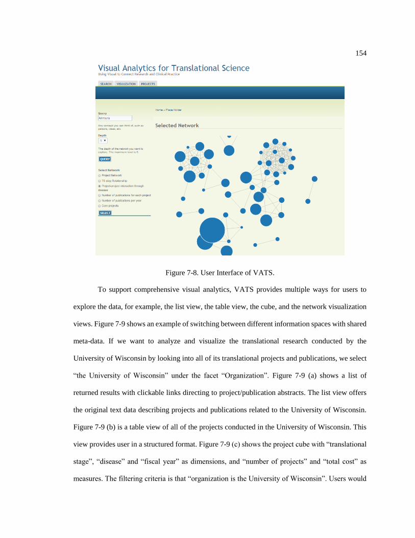
154
Figure 7-8. User Interface of VATS.
To support comprehensive visual analytics, VATS provides multiple ways for users to
explore the data, for example, the list view, the table view, the cube, and the network visualization
views. Figure 7-9 shows an example of switching between different information spaces with shared
meta-data. If we want to analyze and visualize the translational research conducted by the
University of Wisconsin by looking into all of its translational projects and publications, we select
“the University of Wisconsin” under the facet “Organization”. Figure 7-9 (a) shows a list of
returned results with clickable links directing to project/publication abstracts. The list view offers
the original text data describing projects and publications related to the University of Wisconsin.
Figure 7-9 (b) is a table view of all of the projects conducted in the University of Wisconsin. This
view provides user in a structured format. Figure 7-9 (c) shows the project cube with “translational
stage”, “disease” and “fiscal year” as dimensions, and “number of projects” and “total cost” as
measures. The filtering criteria is that “organization is the University of Wisconsin”. Users would

155
be able to explore data from different dimensions and visualize them as described in the previous
section. The project cube in Figure 7-9 (c) shows that the University of Wisconsin got the funding
of $1,081,694 for a patient-oriented clinical research project. Figure 7-9 (d) is a network
visualization showing that with the support of translational research project (core project number
RR025011) at the University of Wisconsin, two papers have been published in PubMed.
Figure 7-9. Multiple views of VATS interface.
7.4.2 Cube-based analysis and visualization for structured data
With the large amount of integrated and enriched data about translational science, we
developed a data cubing method for multi-dimensional and multi-level analysis of structured

156
translational science data. Data cubing is a way to organize data in multiple dimensions and
multiple hierarchies for efficient information querying and visualization (Zhao, Deshpande, and
Naughton 1997). We developed one cube to store, index and summarize NCATS research project
data (NCATS Project Cube), and another cube for publications acknowledging CTSA projects
(CTSA Publication Cube). The cubes help users analyze and visualize NCATS research projects
data and CTSA publications data in multi-dimensions and at multi-levels. This includes slicing,
dicing and drilling through cube cells, and visualizing different cube cells.
Figure 7-10. Exploration and visualization of translational research project cube and publication
cube from various perspectives.
Figure 7-10 shows an example of exploring and visualizing the NCATS project cube
from various perspectives to analyze how much funding has been spent to support cancer study in
each of the four translational steps (basic laboratory research, patient-oriented clinical research,
clinical trials, and population-based clinical research).
The center pane visualizes information summarization with “disease” and “translational
stage” as dimensions, and “total cost” as measure. A user can easily switch between different

157
dimensions and measures by clicking the top-left button, as shown in the left side of the figure.
The querying results in the center pane can also be visualized in different graphical charts such as
bar chart, pie chart and line chart, as shown in the top-right pane. The bar chart compares the cost
spent on cancer study in the four different translational stages in FY 2012, 2013, 2014,
respectively. The pie chart reads the approximate proportion of the cost spent on each of the four
translational stages. The stacked bar chart shows the exact values and approximate proportion at
the same time. And the line chart tracks the trend of cost on cancer study in every translational
stage over years. For instance, it shows whether NCATS invested more or not on patient-oriented
clinical research in FY 2013 than in FY 2012. Furthermore, the underlying data contributing to a
statistic in the center pane can be easily queried by clicking the corresponding cell as shown in
the bottom-right pane. Therefore, our tool will be able to help investigate the impact of
translational research on public health issues (cancer in this case).
By exploring the CTSA Publication Cube with “mined research topic” and “year” as
dimensions, and “the number of publications” as measure, the changes of the mined research
topics from these publications over time could be analyzed as shown in Figure 7-11. In such a
way, we can easily quantify translational research efforts in different research area at different
time, and identify underfunded or understudied research areas.

158
Figure 7-11. Mined research topic change over time.
Interactions between NCATS and other NIH institutes are observed through publications
which are supported by multiple grants. Using publication cube we discover that about 9.3% of
the publications are supported by one grant, about 14.7% are supported by two grants, and about
12.7% are supported by three grants. When a publication is supported by more than one grant
from different NIH ICs (Institutions & Centers), we consider that there exists collaborations
among the administrating ICs. The top 10 ICs co-occurring with NCATS or NCRR are HL, DK,
CA, HC, AG, AI, HD, MH, PHS HHS, and AR.
7.4.3 Heterogeneous network visualization and analysis
To analyze the semi-structured data, we developed heterogeneous information networks
(Sun and Han 2012), where the types of nodes (entities such as projects, publications, and
authors) and edges (relationships such as author-project relationship, and author-publication
relationship) are explicitly modeled. In specific, users are able to construct NCATS active

159
projects network, co-studied disease network, CTSA funded organization collaboration network
to explore the dataset. We also developed advanced network-based data mining approaches such
as clustering, and ranking to obtain highly abstracted knowledge.
7.4.3.1 NCATS funded active project network
1) Project network by study type
We construct the network based on the attributes of project and their relationships with
other projects (Figure 7-12).
System/tool/
software
Therapeutics
Drug discovery Pre-clinical research
Model
BiomarkerTreatment
Bedside Benchside
Figure 7-12. Network visualization of NCATS active projects grouped by study type.
For visual encoding, nodes present individual NCATS funded active project. Project are
linked with each other if they are focusing on a similar disease type. The size of nodes are
proportional with the amount of funding provided. For the shape of the nodes, solid square
represents based bench side studies, including pre-clinical research, biomarker, modeling work;
dot represents project on clinical side efforts, including therapeutics, treatment, drug discovery

160
and system/tool/software development, which could be directly benefit the clinical practice if
succeed. An edge from a square to a disk dot represents the translational efforts on specific
disease. Table 7-6 summarize the detailed visual encoding process from the project data to the
visual space information network visualization.
Table 7-6. Visual encoding for NCATS active projects network.
Entity Visual Representation
Clinical study project Shape: dot
Basic research project Shape: square
Project type Hue
Funding amount Size
Disease Co-occurrence Edge+ Text
Project ID Text
Projects are encoded into different color based on the category (Table 7-7).
Table 7-7. Visual encoding the nodes in NCATS active projects network.
Group Color Shape
Pre-clinical research 0, 176, 22 solid square
Biomarker 0, 100, 50 solid square
Model 230, 120, 0 solid square
Therapeutics 0, 136, 227 dot
Treatment 191, 0, 0 dot
System/tool/software 0, 12, 96 dot
Drug discovery 255, 191, 0 dot
The grouped cluster are expandable. Figure 7-13 shows the expanded the group of
projects on the group of biomarker study. Users are allowed to interactively explore the
relationships by clicking the node. Once being clicked, individual project and their links are
visible and highlighted. For example, project TR000355 connected with other project on the
subject of cancer (Figure 7-14), and Project TR000547 linked with other studies on the subject of

161
brain/neuro study (Figure 7-15). Similarly, expanding the pre-clinical research group enable users
to investigate how specific pre-clinical study connect with other group or individual biomarker
related projects (Figure 7-16).
Figure 7-13. Expandable cluster enable users to explore the nodes and their connections in details.
Figure 7-14. Project TR000355 connected with others on cancer.

162
Figure 7-15. Project TR000547 connected with others on brain/neuro study.
Figure 7-16. TR000902 is a pre-clinical research project that is related with other project on the
subject of cancer.

163
2) Project Network Clustered by Disease Type
Figure 7-17 shows another layout organized active project as clusters based on disease
type, such as tumor, cancer, cardiovascular, diabetic, rare disease etc. An edge connected square
and dot suggests a possible relationship between bench side research and clinical project.
Figure 7-17. Network visualization of NCATS active projects grouped by disease type.
As a glance, we can identify this pattern on skeletal, sclerosis and pain. But those patterns
are rarely found on the disease Alzheimer, which means that most of current funded projects are
basic research efforts that can hardly benefit the clinical practice directly in a short term. We thus
suggest that NCATS may need to sponsor more projects on clinical side studying Alzheimer in
future to balance the translational efforts on both sides and fill the gap.

164
Another observation is that the biggest funding were invested into the research efforts on
rare research. The project – “Therapeutics for Rare and Neglected Diseases – Science” – obtained
more than $46 million, which is 49.2% for the entire NCATS awards on specific disease. This
project aims to establish processes in advance of solicitation with diversity of project stage, type
of disease, and collaborators for six pilot projects on rare and neglected disease, including: (1)
Niemann-Pick C Disease, (2) Hereditary Inclusion Body Myopathy, (3) Giardiasis, (4)
Schistosomiasis, (5) Sickle Cell Disease, (6) Chronic Lymphocytic Leukemia.
In general, studies on cancer obtained the most research funding in entire NIH. The
studies in rare disease is NCATS’s own emphasis. A large proportion of NCATS funded projects
are to support establishing research centers or institutes in clinical and translational science. For
project on specific disease, the above project on area disease is the biggest investment besides the
funding to form organizations. The total cost of NCATS’s awards is only 2.32% of those of all
NIH (Table 7-8).
Table 7-8. Summary of awards in NCATS and all NIH in Fiscal Year 2013
All NIH NCATS
Application 61,627 129
Awards – average total cost $469,562 $2,374,412
Awards – funding (total cost) $20,115,564,346 $467,759,115
Success rate 18% 36%
* resources of data – NIH Funding Facts at RePORT
However, in terms of the number of awards, cancer is still the dominated research topic
among all the NCATS awarded projects (Figure 7-18). This pattern in NCATS is consistent with
the entire NIH.

165
Figure 7-18. Proportion of NCATS funded projects by disease type.
7.4.3.2 Co-studied Disease Network
This network is to understand interactions among different disease types discussed in the
publications. Many of the scientific research projects are supported by some CTSA funded
organizations for studying some specific disease types, which can be extracted and identified by
our data enrichment components.
In order to get the overall big picture of all the scientific work from the CTSA level, one
way is to study the disease co-study relationships through information network, where we identify
the path as “disease←publication→disease”. For each discovered path, we confirm that the two
diseases at the ends are co-studied by the same publication. As a result, we can identify the most
studied and less studied disease types and their mutual interactions by the scientific community.
The resulting visualization of co-studied disease map is shown in Figure 7-19, where Pagerank
score for each disease is calculated and represented by node size, and the number of times being
co-studied for every two diseases is represented by the size of the edge.

166
Figure 7-19. Co-studied Disease Network.
The top 10 important disease ranked by Pagerank score are Cancer, Noma, Carcinoma,
Hypertension, Obesity, Vascular disease, Hepatitis, Kidney disease, Arthritis, Liver disease. The
different interactions among diseases also provide a way to cluster them into different groups. We
apply the state-of-the-art spectral clustering algorithm on the network and group them into 20
groups, which is indicated by the color of the nodes in the figure. To better visualize the
interactions we are able to zoom in the network and see one of the groups as shown in Figure
7-20, where we can see caner, noma, cardinoma and breast cancer are some of the most
important diseases studied in this group.

167
Figure 7-20. Clusters of co-studied diseases network, where size of the node represents the
Pagerank score, and weight of the edges represents the number of co-studied times.
7.4.3.3 CTSA Funded Organization Collaboration Network
Organization Collaboration Network is built to understand collaboration among different
CTSA funded organization through the same publications they support. In order to detect such
interactions, we need to identify this path in the network as “organization→project→core-
project→publicaiton←core-project←project←organization”. Each discovered path indicates an
additional interactions among the two organizations at the two ends. The final yield of these
connections is an information network with all the actively collaborative CTSA funded
organizations and their interactions. The information network for collaboration is shown in Figure
7-21.

168
Figure 7-21. Collaboration Network among CTSA funded organizations through common
publications they support, where size of the node represents PageRank score and weight of the edge
represents number of project acknowledgements by publications they support together.
To quantify the importance of different organizations in terms of collaboration times and
quality among themselves, we applied Pagerank (Page et al. 1999) to the network and calculated
the Pagerank scores for all the nodes. The scores are visually represented as the sizes of the nodes
in the network. Figure 7-21 shows that Johns Hopkins University and University of Washington
are the two most important organizations in terms of collaboration. The size of the edges
connecting different organizations is proportional to the number of publications published by
those two organization together. For example, the thickest edge is the one between Johns Hopkins
University and University of Pennsylvania representing 13,826 times of project
acknowledgements by various publications.

169
Another important mission of the CTSA program is to promote scientific research in
translational science. To quantify the scientific research at individual CTSA organizations, we
rank them by publications which are supported by awarded CTSA projects. In the ranking
algorithm, we identified the path in the network as “organization→project →core-
project→publication”.
Figure 7-22. Top 10 CTSA organizations ranked by number of publications they support, where
blue histogram represents number of publications, and orange histogram represents quality
weighted number of publications.
As shown in Figure 7-22, we found the top 10 CTSA funded organizations in terms of
number of publications they support, where University of North Carolina Chapel Hill has
contributed 369 publications. With the consideration of the quality of individual publication, we
calculated the weighted number of publications by the publication qualities, we obtain a different
rank. In this rank, Johns Hopkins University arises from 5th place to 1st place.

170
7.5 Summary
In this study, we discuss the development and design of VATS, a visual analytics tool to
analyze the impact of translational research effort quantitatively from multiple data sources for
the purpose of impact analysis. We made the following contributions:
First, the system integrated two publically available data sources: (1) NCATS
administrated or funded projects data, and (2) Publications data from PubMed. The capability of
integrating multiple data sources will foster interesting and meaningful innovation through
interdisciplinary research. We successfully integrated a small set of NCATS research projects
data, about 2000 CTSA projects data and about 5000 CTSA publications data that could be used
to analyze CTSA program through shared attributes, and formed a comprehensive translational
science research impact analysis dataset. Analysis of the CTSA program impact using multiple
data sources is the first step for including more valuable data sources like social media data,
clinical trials data, and medical community feedback data towards more comprehensive analysis
of the CTSA program.
Second, we developed built a LDA topic modeling model to discover research topics
hidden behind NCATS research projects and CTSA publications. Learned without supervised
knowledge, these topics will provide a natural way to observe the impact of translational science
following the realistic scientific contribution and discussion in the text.
Third, we built an information network with several sub-networks and user query panel to
enable users view and visualize semi-structured data. We successfully ranked and clustered the
nodes in information network so that more information could be revealed with the network. The
success of introducing information networks enables analyzing and visualizing the massive semi-
structure scientific data in both local and global scale. The success also demonstrate the great
potential of discovery the insights of translation science impact from the complex connected data.

171
Finally, we have developed a web-based visual analytics software for users to explore the
dataset. We built a project cube and a publication cube to enable users view and analyze
structured data at multiple levels and from multiple dimension. These capabilities will encourage
users manipulate the data, get view of the results and visualization, and acquire more meaningful
insights.

172
Chapter 8
Contributions and Future Work
The main contributions of the research work presented are summarized in this section,
along with directions for future work.
8.1 Contributions
This dissertation advocates user centered approach of designing visual analytics to help
patients and healthcare practitioners to explore and make sense of health related data. The
contributions from this research are:
1. Bridge the user centered design process with visual analytics process. Our model
embeds visual analytics process to user centered design process, and clarifies how and when each
of the key components in visual analytics is generated along with conducting user centered design
activities. By looking to three studies where practitioners currently follow in the healthcare
domain, we show how innovative visual analytics techniques and capabilities help users
understand and act on various type of data. These studies reveal what purposes visualizations are
used for each problem, how the design and development team make decisions around datasets,
and what different visual representations practitioners use to explore and gain insight of data.
2. Interdisciplinary perspective to address the challenges in healthcare. The huge
volume of data provides opportunities for evidence based medicine to answer research and
practical questions, and for individuals to make better informed, smarter decision. Yet, making
sense of massive datasets remains a fundamental challenge. The dissertation address this

173
challenges by applying interdisciplinary methods, including user centered design, data mining,
information visualization and network analysis. The interdisciplinary approach will be beneficial
to evidence-based medicine and evidence-based practice in healthcare delivery.
3. Our application contributions are our design of three visual analytics systems
for healthcare users in various roles. VisOSA is a web based medical dashboard to benefit
physicians generating research hypothesis, and enable patients with sleep apnea to interpret
medical records. The information visualization module for NEIMiner supports nanomaterial
scientists and analysts to explore the concepts and relationships in studying nanomaterial toxicity
and the nanomaterial environmental impact (NEI). VATS integrates heterogeneous data resources
and helps healthcare stakeholders to have a big picture of how government funding supports
research in translational science.
4. The technical contributions of this research are the approaches that we integrate and
enrich the dataset, and turn the data into reliable and provable information. We apply topic
modeling and ontology-based named entity recognition to automatically derive semantics out of
large publication data, and thus discover the hidden information related to analytics interests. The
success of introducing information networks enables analyzing and visualizing the massive semi-
structure scientific data in both local and global scale. We demonstrate the possibility to evaluate
impact of interdisciplinary communication through publicly available data sources. Those
techniques are applicable to various domains in information extraction and transformation.
5. Visual encoding and interaction mechanisms. The study develops a specification
visualization design pathway that can be directly mapped domain tasks with various data types
and semantics to visual techniques for encoding data in a graphic. We present a well-reasoned
justification of how existing information visualization techniques can be used based on different
dataset and analytics tasks. We show that how graph simplification, enriched visualization
algorithms and interactive features, can be effectively combined to aid users gaining insights and

174
communicate the insights of analysis results. The visual encoding and interaction mechanisms of
comparing a given quantitative measurements against qualitative ranges, which is applicable to
various domains in presenting laboratory test results.
6. Define medical dashboard. This study extends the scope of information dashboard
into the field of medical informatics, and define the medical dashboard.
A medical dashboard is a visual display of the most important medical information,
arranged on a single screen, which effectively and efficiently conveys patients’ health conditions
to support healthcare practitioners’ clinical decision making and inform patients themselves.
This definition narrows the objectives of information dashboards in healthcare, clarify the
content of medical dashboard, details the target users, and introduces evaluation criteria.
7. Design recommendations for work settings with multiple monitors. We describe
the behavior study for investigating the factors that affect movement time of mouse cursor in
computer-based work environment with multi-monitors. The results of this study indicate the
physical gap distance is a potential obstacle within the multi-monitor work places of screens. In
addition, the modified Fitts’ law model with obstacle component provides a better fit for the
movement time in all presented levels of gaps between the dual monitors. These observations
lead to three design recommendations for work station and user interaction design in multiple
monitors settings:
In time-sensitive tasks requiring speed and accuracy, multiple monitors should be
placed as close as possible to minimize any information access cost.
Apply Proximity compatibility principles in multiple monitors settings. User
interface elements related to the same task should be placed with close display
proximity on a single display.
For tasks require pointing and positioning, interface design should avoid the back and
forth tracking movement across displays.

175
8. Impact to the research community and society. VisOSA advocates the
transformation of healthcare from a hospital-centric to a patient-centric process where patients,
hospitals, healthcare providers and the community form a collaborative. Providing performance
assessment and early self-awareness can give patients control of their health by acting early.
VATS contributes to NIH’s Phase II project - A Scalable Multi-Scale Visual Analytical Tool for
Advancing Translational Sciences - from July 2014 to July 2016 with a total research funding of
$1,000,000. The project will bring data scientists, bioinformatics researchers and healthcare
practitioners working together on visual analytics tools to facilitate the translational science
process and deliver innovative treatments to more patients quickly.
8.2 Future Directions
Safe practice is very important to promote the meaningful use of visual analytics as
informatics tool in healthcare. Evaluation of visual analytics in healthcare requires diverse
audiences - healthcare consumers and practitioners – under regulation and guidelines. It remains
an open research question to search for better evaluation methods.
Social media data become an increasingly important resource to study human behavior
and health. A trend is to embed social data directly with visual analytics system for gaining
progressive insight in larger scale. We will discuss the opportunity and challenges, such as
information retrieval, dataset quality, and privacy issue. Further effort is needed to understand
how we can make use of these data for healthcare.
To further study visual encoding and interaction mechanisms in presenting medical data,
we plan to conduct quantitative user study using crowdsourcing platform. The study aim to
evaluate the strength and weakness of visual representation comparing given quantitative
measurements against qualitative ranges, and therefore improve its usability.

176
We will also discuss the future work on the study multiple monitor and VATS.
8.2.1 Evaluation of Visual Analytics
Criteria for assessing performance of visual analytics tool in healthcare and the quality of
dataset have rarely been defined. Many prior studies and guidelines focus on the evaluation of the
usability of Electronic Health Records. The U.S. National Institute of Standards and Technology
(NIST) provide guide to the processes approach for better usability of electronic health records
(Schumacher and Lowry 2010). (Lowry et al. 2012) proposed three steps to test EHR application:
(1) application analysis, (2) interface expert review, and (3) user interface validation test. (J.
Zhang and Walji 2011) presents TURF - a unified framework of EHR usability - providing a set
of measureable dimensions of usability. American Medical Informatics Association (AMIA)
adapted this framework and propose 14 usability principles to guide the design and
implementation of EHR (Middleton et al. 2013). The Office of the National Coordinator for
Health Information Technology recently released the 2014 edition test method of Electronic
Health Records (EHRs). The test procedure in this edition emphasized the role of UCD as a first
step to improving EHR usability (ONC 2014). However, EHR is merely one of many data
resources for health visual analytics tools.
Many of these methods and guidelines can be adopted for evaluation of visual analytics.
Usability evaluations of information visualizations is based on three aspect: presentation of the
data, interaction with the data, and the usability of the data itself (Freitas et al. 2002). Beside the
usability of visualization, (Scholtz 2006) presented metrics and methodologies - situation
awareness, collaboration, interaction, creativity, and utility – need to be considered for evaluation
of visual analytics environments. Further work is needed on identifying validated metric for sense
making process, and method to collect these metrics.

177
Overall, the evaluation approach also need to be user centered, which fully address the
requirements and needs of the users in multiple role. One example in practice is (Rajwan et al.
2013), where they evaluated information visualization in healthcare by diverse audiences -
healthcare consumers and practitioners – with four criteria: clarity, functionality, usefulness, and
effectiveness. The ultimate goal is to improve the usability of the visual analytics application, and
safety and quality of healthcare.
8.2.2 Embedding social data into visual analytics for healthcare
8.2.2.1 Overview
Nowadays, the data collected by sensors and mobile technologies in a large scale is
providing unparalleled opportunities to detect and analysis the complex systems. The individuals’
health data within network will enable researchers to thoroughly explore the spread of health
problems across time. For example, electronic dataset including phone and emails logs, record
human communication patterns in details and also offer possibilities to examine the interaction of
communication and structure of social networks (Onnela et al. 2007).
In the past few years, the lure of online social network services has already drawn
scientists and engineer to use in facilitating the collaboration, sharing, and other kinds of
interactions among individuals. Social media have their irreplaceable strengths in information
exchanging and communication among or within groups and communities, and they are changing
the way in which people interact and communicate. It is claimed that over 61% of American
adults seek health information online (Susannah Fox and Jones 2009).
Beside its strength in communication, social media also have strong abilities in gathering
information which provides valuable resources for analyzing people’s behaviors and heath.

178
Sociologists have long understood that an individual's behavior is significantly affected by their
social interactions. It is also proved that network phenomena have increasing impacts on research
in the sociology of health and medicine (Barabási 2007; Ediger et al. 2010; Funk, Salathé, and
Jansen 2010). Web-based social media is generating large amount of representative dataset that
have great potential for improving healthcare research (Vance, Howe, and Dellavalle 2009;
Parameswaran 2007; Miller 2011). An active area of current research in social network is to use
the date gathered from the online social media application to measure people’s behaviors and
their health (Gibbons et al. 2011; Hackworth and Kunz 2011).
“…something has changed in the past few years. The driving force behind this
change can be condensed into a single word: data…. and it is fundamentally reshaping
our approach to complexity.” (A.-L. Barabási 2012)
The staggering growth of users’ size and the huge time users spend on online social
media, such as Facebook and Twitter, offer a valuable source of data about people and their well-
being (Swan 2009). People all over the world are creating digital data day by day. Consequently,
it has great impact for us to understand human behaviors in daily life.
Facebook is dominating social networking with 829 million daily active users on average
in June 2014 (Facebook 2014). This staggering growth of users’ size and the huge time they spent
provide a valuable source of data about people and their well-being (Swan 2009). Lewis et al.
introduced a public dataset based on Facebook which provided a starting point for scholars to
investigate its scientific and pedagogical potential. One important feature of the Facebook dataset
is that it is naturally occurred and thus avoids the interviewer effects and imperfections in recall
(Lewis et al. 2008). (Mayer and Puller 2008) documented the predictors of friendship using
administrative data and information from Facebook. Whitelaw et al. (2011) pointed out that
Facebook is an effective tool for participant retention by locating 19 nearly lost participants to
follow-up in a longitudinal research. (Jones et al. 2011) provides another study of using social

179
networking website to recruit adolescent girls into a follow-up study. These studies indicated that
contacting potential participants through Facebook minimized the loss to follow-up.
Twitter is an online microblogging site where users can post text-based posts of up to 140
characters named as "tweets". Twitter also works as a social and information network that allows
users to interact with each other through the operations such as following other users, forwarding
messages and sending private messages. Since it is released in 2006, Twitter currently has 271
million monthly active users, and produces 500 million Tweets are sent per day (Twitter 2014).
Twitter has been used in several healthcare practitioners and organizations. Terry (Terry
2009b) summarized a physician can use Twitter (1) to communicate with other physician, (2) to
gather medical information, and (3) to acquire general updates of conference information. (Shekar
et al. 2010) presents a method of applying text mining techniques and data mining tools for
pharmaceutical spam detection from Twitter data. Juárez Giménez et al. (Juárez Giménez et al.
2011) stated that Web 2.0 including Twitter offers user-friendly and cost-efficient implement
enabling participation in a Drug Information Centre at a Hospital Pharmacy Department
(CIMSF). Nearly one-third of these clinics host a social networking website such as Facebook,
Twitter, and/or a blog (Omurtag et al. 2011). The Centers for Disease Control & Prevention
(CDC) holds their Twitter feeds as a reliable, up-to-date source for the information of epidemic
disease and emergency health activities such as the H1N1 swine flu in 2009 and teen pregnancy
prevention efforts (CDC 2011). General audience benefits through CDC Twitter feeds for their
nonstop streaming quality and the huge volume of information traffic.
8.2.2.2 Social Data Retrieval
The increasing social network services produce large-scale social data for analyzing user
behaviors. At the same time, the rapid proliferation of these social network services also brings

180
more severe information overload and the difficulties in information retrieval and analysis. Cost
decreases and tool improvements have made data collection and manipulation more available to
the individual. Besides, several methods such as simple thresholds, regression analysis, quality
control measures and spatial clusters, are widely used in epidemiologic surveillance from medical
social media data (Dreesman and Denecke, 2011)
Twitter used a representational state transfer (REST) Application Programming Interface
(API) to provide data in the format of XML or JavaScript Object Notation (JSON). Streaming
API is designed to provide large amounts of data for content analysis. Many researchers use the
APIs to collect the tweets for their research works. Golder and Macy (Golder and Macy 2011)
identified individual-level diurnal and seasonal mood rhythms in cultures across the globe. Reips
and Garaizar (Reips and Garaizar 2011) proposed a Twitter content based Web applications -
named iScience Maps - to help researchers interested in social media analysis. iScience Maps
used Twitter Streaming API to gather and filters the worldwide geo-located tweets and then
analyze worldwide trends over time.
However, Twitter only allows each account collecting a small sampling of the Streaming
API (150 queries per hour for regular account, maximum 1,500 tweets per search). Another
weakness is that the data collection via the API connections is a time consuming process. If
researchers intend to capture tweet on certain subject over months or years, they have to maintain
the connection via API continuously over the same period. Twitter does not allow regular user to
access to history tweets in the past.
If the researchers require increased access for data gathering, the third party applications
provide the alternative option. Table 1 indicates several popular third party applications with their
own features.

181
Table 8-1. Third-party applications for online social network data retrieval.
Applications Features
Monitter Real time twitter search tool; enable to monitor a set of keywords
Gnip The first authorized reseller of Twitter data, polling and data fetching work,
push-based data.
Datasift Access historic social data and real-time data across multiple resources
Semiocast Support filtering with keyword, username, and location
IQSS Dataverse Virtual data archives , collection of social science research data
NodeXL Excel plugin, measuring and visualizing social digital networks
Twapperkeeper Archiving tweets with limited export and download
Topsy real time social search engine
Third-party applications have their unique strengths compared with data collection via
API, First, it enables user access to larger amount of historic data and real-time data. Second,
little programming is need for data collection. Research could focus on analysis and visualization,
and thus facilitate the development of visual analytics. However, most of these application are
pricing based on business needs. Though these applications claimed their powerful features in
collecting online network data, however, to the best of our knowledge, few research works were
found to utilize them directly.
8.2.2.3 Quality of the dataset
The quality of the data sets is extremely important for analytics. The research in the
health domain calls for more and higher quality data sets. However, the dataset collected from the
social media may be not representative. For example, the age and sex distribution by social
networking site platform are not perfectly in accordance with the distribution by the general
population (Hampton and Goulet 2011). In addition, the use of social technologies for health-
related activities is generalized among the adult population. The large-scale observational social

182
science studies nowadays still focus on English-speaking population around the world. It is
necessary to consider weighting balances sample demographics to population parameters.
Some health oriented social network such as Patientlikeme, Curetogether, and
RealMentalHealth, are another resource for conducting data-driven analytics on healthcare.
Unlike general social network, such as Twitter and Facebook, produce large-scale social data for
analyzing user behaviors day by day. These websites not only provide the information with health
but also promote the interaction with the people with the similar disease or under the same
treatment. The two-way interaction between the patient and healthcare providers are valuable in
investigating specific health problems.
8.2.2.4 Privacy issues
Privacy is another vital factor that has to be taken into account when using social media
data especially for health related research. Most of the social network enables the users to restrict
the access via privacy settings. However, how to effectively define the default publicly visible
options is still a big challenge for users’ privacy. Failing to provide restrictive privacy settings
may cause privacy leakage in online social networks. Third-party applications are another source
of privacy leakage. Similarly, some smart phone applications may be able to view users’
information privately without being granted access. Since the authorization is difficult to
determine, all of above factors limit the sources of data set that social scientists can reach.
Besides the patient side, physicians also face the privacy issues raised by social media. For
instance, as a physician, Jain (Jain 2009) expressed concerns about merging the professional and
personal lives before confirming friend requests from old patients on Facebook.
Laws and regulation, such as the Health Insurance Portability and Accountability Act
(HIPAA) of 1996, have been made to ensure patients’ health information confidential. U.S.

183
Justice Department and the Internal Revenue Service have developed education materials to
inform employees on how to utilize public profile information on social networking sites during
investigations (UCAN, 2011). Further effort should be made to extend the current privacy laws to
the field of online social media and thus protect the privacy of medical information online.
8.2.2.5 Our efforts on visual analytics embedded social data
As the first step on this direction, we collected tweets on the subject of sleep apnea from
September 27 to October 19, 2013 through Twitter Streaming APIs. The keywords set is as
follows:
{"sleep apnea", "hypopnea", "obstructive sleep apnea", "OSA", "snoring", "restless
sleep", "sleepiness", "sleepiness during the daytime", "home oximetry", "polysomnography",
"CPAP", "CPAP machine", "continuous positive airway pressure", "CPAP face mask"}
As a result, we obtained 987,188 tweets, where 413,806 tweets are in English, and 14,080
tweets hit the keyword “apnea” at least once. This dataset provide the opportunity to build visual
analytics tools for health using social media dataset. Further study is to apply topic modeling and
sentimental analysis to interpret the contents. We could also apply clustering analysis and
network analysis to explore the patterns and relationship between these tweets and disease.
Flu Cloud is such a visual analytics we developed earlier that embedded social data
(Figure 8-1). It is a spatial visualization of the results of density-based clustering on geo-tagged
tweets with keywords on Influenza-Like Illness (ILI).

184
Figure 8-1. Screen shot of Flu Cloud.
Like the weather map produced by satellites in weather forecasting, Flu Cloud maps the
flu related tweets with coordinates into density based clusters for the general population. Public
available tweets streaming provides the possibility of updating the Flu Cloud in near real time. In
the long term, detecting the movement of the Flu Cloud over time helps the understanding and
prediction of the dynamic trends of Influenza in high-resolution.
8.2.2.6 Summary
Social data contains meaningful information and are valuable resource embedded visual
analytics. We identify the opportunity and challenges, such as information retrieval, dataset
quality, and privacy issue. Further research is needed to understand how we can make use of
these data for healthcare.

185
8.2.3 Future work on visual representation of medical record
We proposed the study: A quantitative comparison of visual representation and tabular
format in presenting medical record.
8.2.3.1 Objective
A clear and comprehensible presentation of health information facilitates patients and
doctors understand medical information (Kumara, Cui, and Zhang 2011). Our study on VisOSA
visually presents and monitors patient’s health under treatment for Obstructive Sleep Apnea.
Results show that visual feedback to the patient is likely to be more effective in motivating the
patient to implement healthy behaviors to prevent unwanted consequences. Additionally,
providing such visual feedback help the patient take various actions to avoid unhealthy behaviors
or call the providers’ office with their concerns.
An expert review towards the system indicates that the visual encoding and interaction
mechanisms of comparing given quantitative measurements against qualitative ranges are
applicable to various domains in presenting laboratory test results. A further quantitative user
study will help us evaluate its strength and weakness and therefore improve its usability.
8.2.3.2 Hypotheses
The way in which medical information is provided may affect the ability of people to
understand and interpret the results (Schwartz, Woloshin, and Welch 2009). The research aims to
study how well a visual representation (V) works compared with a standard tabular report (T) in
helping people understand medical information.
We decompose the research objectives into the following hypotheses,
186
H1: More subjects in the V condition will perform with a faster response time for those
question requiring: (1) estimate the health condition; (2) detecting abnormal from
multiple records.
H2: More subjects in the V condition will perform with fewer error for those question
requiring: (1) estimate the health condition; (2) detecting abnormal value from multiple
records.
H3: More subjects in the T condition will perform with a faster response time and fewer
error for those question requiring: (1) Lookup individual value
H4: V has higher usability than T, in terms of ease of use.
8.2.3.2 Experiment
To achieve the objectives, we need to perform an experimental web-based evaluation of
user performance with medical information presented by tabular format (T) and visual
representations (V). Such a study will measure and compare performance variables, such as mean
completion time, error rate, and difficulty ratings. These three dependent variables map three
metrics of usability - effectiveness, efficiency and satisfaction.
The study aims to use ‘the wisdom of crowds’ via crowdsourcing platform to evaluate
and improve the visualization design for a better healthcare experience. A detailed experiment
design is shown in Appendix E.

187
8.2.4 Further study on work setting with heterogeneous monitors
In reality, the computer monitors that compose the multi-monitors computer environment
might be made up of heterogeneous monitors. Thus, optional monitors in experiments might be
not only in different size, but also be set into different resolutions (Figure 8-2). Future research in
this emerging area could usefully examine the two-dimensional pointing tasks as full-scaled
experiments in working environment under heterogeneous settings.
Figure 8-2. 2-D point-and-clicking tasks across monitors with gap distance under heterogeneous
resolutions.

188
8.2.5 Future work on VATS
First, we will expand the selection of relevant data sources by identifying their significant
values and define several interesting use cases in a broad scope. Our expanded data source list
includes: (1) NCATS/CTSA projects from NIH RePORTER, (2) scientific publications from
PubMed and their citation network from MEDLINE, Web of Science and Google Scholar, (3)
clinical trials related to NCATS/CTSA projects from ClinicTrials.gov, and (4) community
feedbacks mined from social media such as tweeter and PatientsLikeMe. We will also design
several interesting use cases with the consideration of potential linkages among these data sources
in order to discover the hidden values of translational research.
Second, we will keep enhancing visualization and analysis methods. Visualization
analytics serves as a novel and intuitive way to discover insights from the integrated and inter-
connected data from multiple sources covering the pathways of translational research. In specific,
we will (1) improve the data enrichment and integration method using machine learning and text
analytics algorithms, (2) enhance data mining and visualization methods utilizing the state-of-the-
art research accomplishments, and (3) further refine the hybrid information retrieval solution with
context-sensitive user interaction.
Third, we will integrate and implement the VATS software system together with our
academic partners, and conduct the corresponding system performance and usability tests for
technology verification.

189
8.3 Closing Remarks
We believe in the power of data. Almost the entire society, from the academia to the
government, begin to realize the important of data. Investigate oceans of data, people are seeking
the insights from different perspectives that leads to a better healthcare. The future of healthcare
depends on our ability to make good use of the massive amounts of data. User centered approach
helps us to design effective visual analytics tools, to communicate effectively and to make
smarter decision on healthcare. This dissertation hopes to inspire more innovations and
conversations at the intersection of user centered design and visual analytics.
8.4 Author Contributions
The dissertation is partially based on conjointly published or unpublished work. This
section summarizes the author contributions to the joint publications.
Chapter 4
Hui Yang, Ravi Singareddy, Ling Rothrock, Soundar Kumara. 2013. VisOSA: Visualizing
Obstructive Sleep Apnea Symptoms and Co-morbidities. Industrial and Systems Engineering
Research Conference (ISERC) 2013.
S.K., R.S. are co-PIs of the research. H.Y., S.K., R.S. designed research. H.Y. reviewed
the medical records and collected the data under R.S.’s guidance. H.Y. did the data analysis,
designed and implemented the web-based prototype. H.Y., R.S., L.R., S.K. wrote, reviewed, and
approved the manuscript.
Chapter 5
190
Hui Yang, Ling Rothrock, Ravi Singareddy, Soundar Kumara. 2014. Investigating the
Mouse Cursor Movement Time in Dual Monitors Work Environment, a Pilot Study. (working
paper)
H.Y., L.R., S.K. designed research. H.Y. recruited participants, conducted the
experiment, did the data analysis. H.Y., L.R., R.S., S.K. wrote, reviewed, and approved the
manuscript.
Chapter 6
Hui Yang, Kaizhi Tang, Xiong Liu, Lemin Xiao, Roger Xu, Soundar Kumara. 2013. A
User Centered Approach to Developing Information Visualization Module for NEIMiner. IEEE
International Conference on Bioinformatics and Biomedicine (BIBM) 2013
K.T. was the PI of the project. H.Y., K.T., X.L., R.X. designed and did the research on
NEIMiner. H.Y., K.T., L.X. collected the data and analysis. H.Y. designed and implemented the
Information Visualization Module. H.Y. was the lead writer of the manuscript. H.Y., K.T., X.L.,
S.K. L.X. reviewed, revised and approved the manuscript.
Hui Yang, Kaizhi Tang, Xiong Liu, Roger Xu, Soundar Kumara. 2013. Investigating
Nanomaterial Toxicity Bibliography: A Network Analysis Approach. IEEE International
Conference on Bioinformatics and Biomedicine (BIBM) 2013
K.T. was the PI of the project. H.Y., X.L. collected the data. H.Y. designed the research,
constructed the network and conducted network analysis. H.Y. was the lead writer of the
manuscript. H.Y., K.T., X.L., S.K. R.X. reviewed, revised and approved the manuscript.
Hui Yang, Kaizhi Tang, Xiong Liu, Roger Xu, Soundar Kumara. 2014. A User-Centered
Approach to Information Visualization in Nano-Health, Int. J. Bioinformatics Research and
Applications (submitted-under review).

191
H.Y. designed and conducted the research, designed and implemented the Information
Visualization Module, and wrote the manuscript. H.Y., K.T., X.L., S.K., R.X. reviewed, revised
and approved the manuscript.
Chapter 7
Chunlei Liu, Hui Yang, Kaizhi Tang, Lemin Xiao, Roger Xu, Soundar Kumara, Olga
Brazhnik. 2014. VATS: A Scalable Multi-Scale Visual Analytical Tool for Advancing
Translational Sciences (working paper)
K.T. was the PI of the Phase I project (Sep 2013- Feb 2014). C.L. led the Phase II project
(Started from Aug 2014). H.Y., K.T., L.X. defined research questions, created use scenario. H.Y.,
K.T. interviewed the users, designed the system architecture, constructed visualization and
network analysis on NCATS active project network. C.L., L.X. did the text mining and
publication quality analysis, visualized Disease and Collaboration Networks. H.Y. wrote the first
manuscript. H.Y., C.L., L.X., S.K., O.B. reviewed and revised the manuscript.

192
Bibliography
Accot, Johnny, and Shumin Zhai. 2003. “Refining Fitts’ Law Models for Bivariate Pointing.”
Proceedings of the Conference on Human Factors in Computing Systems - CHI ’03. New
York, New York, USA: ACM Press. doi:10.1145/642611.642646.
http://portal.acm.org/citation.cfm?doid=642611.642646.
Ahlberg, Christopher. 1996. “Spotfire: An Information Exploration Environment.” ACM
SIGMOD Record 25 (4): 25–29.
Albert, Reka. 2005. “Scale-Free Networks in Cell Biology.” Journal of Cell Science 118 (21):
4947–4957.
Altevogt, Bruce M, and Harvey R Colten. 2006. Sleep Disorders and Sleep Deprivation:: An
Unmet Public Health Problem. National Academies Press.
Badillo, Brian, Doug A Bowman, William McConnel, Tao Ni, and Mara G da Silva. 2006.
“Literature Survey on Interaction Techniques for Large Displays.”
http://eprints.cs.vt.edu/archive/00000925/.
Barabási, A.L., R. Albert, and Hawoong Jeong. 2000. “Scale-Free Characteristics of Random
Networks: The Topology of the World-Wide Web.” Physica A: Statistical Mechanics and
Its Applications 281 (1-4): 69–77.
http://www.sciencedirect.com/science/article/pii/S0378437100000182.
Barabási, Albert-László. 2007. “Network Medicine--from Obesity to the ‘Diseasome’.” The New
England Journal of Medicine 357 (4) (July 26): 404–7. doi:10.1056/NEJMe078114.
http://www.ncbi.nlm.nih.gov/pubmed/17652657.
———. 2012. “The Network Takeover.” Nature Physics 8 (1) (December 22): 14–16.
doi:10.1038/nphys2188. http://www.nature.com/doifinder/10.1038/nphys2188.
Barabási, Albert-László, Chaoming Song, and Dashun Wang. 2012. “Publishing: Handful of
Papers Dominates Citation.” Nature 491 (7422): 40.
Bastian, Mathieu, Sebastien Heymann, and Mathieu Jacomy. 2009. “Gephi: An Open Source
Software for Exploring and Manipulating Networks.” In ICWSM.
Batagelj, Vladimir, and Andrej Mrvar. 1998. “Pajek-Program for Large Network Analysis.”
Connections 21 (2): 47–57.
———. 2011. “Pajek:Program for Analysis and Visualization of Large Networks.” Reference
Manual.
Bates, David W. 2005. “Physicians and Ambulatory Electronic Health Records.” Health Affairs
24 (5): 1180–1189.

193
“BioPortal”. http://bioportal.bioontology.org/. http://bioportal.bioontology.org/.
Bishop, Peter, Andy Hines, and Terry Collins. 2007. “The Current State of Scenario
Development: An Overview of Techniques.” Foresight-The Journal of Future Studies,
Strategic Thinking and Policy 9 (1): 5–25.
Bixler, Edward O, Alexandros N Vgontzas, Hung-Mo Lin, Duanping Liao, Susan Calhoun,
Antonio Vela-Bueno, Fred Fedok, Vukmir Vlasic, and Gavin Graff. 2009. “Sleep
Disordered Breathing in Children in a General Population Sample: Prevalence and Risk
Factors.” Sleep 32 (6): 731.
Blumenthal, David. 2009. “Stimulating the Adoption of Health Information Technology.” New
England Journal of Medicine 360 (15): 1477–1479.
———. 2010. “Launching HITECH.” The New England Journal of Medicine 362 (5) (February
4): 382–5. doi:10.1056/NEJMp0912825. http://www.ncbi.nlm.nih.gov/pubmed/20042745.
Blumenthal, David, and Marilyn Tavenner. 2010. “The ‘meaningful Use’ Regulation for
Electronic Health Records.” New England Journal of Medicine 363 (6): 501–504.
Bødker, Susanne. 2000. “Scenarios in User-Centred Design—setting the Stage for Reflection and
Action.” Interacting with Computers 13 (1): 61–75.
Borgatti, S P. 2002. “NetDraw Software for Network Visualization.” Lexington, KY: Analytic
Technologies.
Börner, Katy. 2010. Atlas of Science. MIT Press.
Börner, Katy, Soma Sanyal, and Alessandro Vespignani. 2007. “Network Science.” Annual
Review of Information Science and Technology 41 (1): 537–607.
Bostock, Michael, Vadim Ogievetsky, and Jeffrey Heer. 2011. “D3 Data-Driven Documents.”
Visualization and Computer Graphics, IEEE Transactions on 17 (12): 2301–2309.
Boulos, Kamel, N Maged, and Abdul V. Roudsari. 2002. “HealthCyberMap: A Semantic Visual
Browser of Medical Internet Resources Based on Clinical Codes and the Human Body
Metaphor.” Health Information & Libraries Journal 19 (4) (December 1): 189–200.
doi:10.1046/j.1471-1842.2002.t01-1-00397.x. http://dx.doi.org/10.1046/j.1471-
1842.2002.t01-1-00397.x.
Bowens, Felicia M, Patricia A Frye, and Warren A Jones. 2010. “Health Information Technology:
Integration of Clinical Workflow into Meaningful Use of Electronic Health Records.”
Perspectives in Health Information Management/Ahima, American Health Information
Management Association 7 (Fall).

194
Brandes, Ulrik, Daniel Delling, Marco Gaertler, Robert Gorke, Martin Hoefer, Zoran Nikoloski,
and Dorothea Wagner. 2008. “On Modularity Clustering.” Knowledge and Data
Engineering, IEEE Transactions on 20 (2): 172–188.
Buntin, Melinda Beeuwkes, Matthew F Burke, Michael C Hoaglin, and David Blumenthal. 2011.
“The Benefits of Health Information Technology: A Review of the Recent Literature Shows
Predominantly Positive Results.” Health Affairs (Project Hope) 30 (3) (March): 464–71.
doi:10.1377/hlthaff.2011.0178. http://www.ncbi.nlm.nih.gov/pubmed/21383365.
Buzea, Cristina, Ivan I Pacheco Blandino, and Kevin Robbie. 2007. “Nanomaterials and
Nanoparticles : Sources and Toxicity” 2 (4): 1–103.
Cacioppo, John T, James H Fowler, and Nicholas a Christakis. 2009. “Alone in the Crowd: The
Structure and Spread of Loneliness in a Large Social Network.” Journal of Personality and
Social Psychology 97 (6) (December): 977–91. doi:10.1037/a0016076.
http://www.pubmedcentral.nih.gov/articlerender.fcgi?artid=2792572&tool=pmcentrez&ren
dertype=abstract.
Card, Stuart K, Jock D Mackinlay, and Ben Shneiderman. 1999. Readings in Information
Visualization: Using Vision to Think. Morgan Kaufmann.
CDC. 2011. “The Health Communicator’s Social Media Toolkit.” Electronic Media.
Center, National Weather Service’s Storm Prediction. 2011. “At the Center of the Storm Trackers
Stay on Guard.” http://www.npr.org/2011/05/28/136742749/at-the-center-of-the-storm-
trackers-stay-on-guard.
Chau, Duen Horng, Aniket Kittur, Jason I Hong, and Christos Faloutsos. 2011. “Apolo: Making
Sense of Large Network Data by Combining Rich User Interaction and Machine Learning.”
In Proceedings of the SIGCHI Conference on Human Factors in Computing Systems, 167–
176. ACM.
Chen, Chaomei. 2010. “CiteSpace: Visualizing Patterns and Trends in Scientific Literature.”
Retrieved January 27: 2010.
Cheng, Calvin K Y, Dennis K M Ip, Benjamin J Cowling, Lai Ming Ho, Gabriel M Leung, and
Eric H Y Lau. 2011. “Digital Dashboard Design Using Multiple Data Streams for Disease
Surveillance with Influenza Surveillance as an Example.” Journal of Medical Internet
Research 13 (4).
Christakis, Nicholas a, and James H Fowler. 2008. “The Collective Dynamics of Smoking in a
Large Social Network.” The New England Journal of Medicine 358 (21) (May 22): 2249–
58. doi:10.1056/NEJMsa0706154.
http://www.pubmedcentral.nih.gov/articlerender.fcgi?artid=2822344&tool=pmcentrez&ren
dertype=abstract.

195
Christakis, Nicholas a., and J H Fowler. 2007. “The Spread of Obesity in a Large Social Network
over 32 Years.” New England Journal of Medicine 357 (4): 370.
Cui, LiYing, S Kumara, and R. Albert. 2010. “Complex Networks: An Engineering View.”
Circuits and Systems Magazine,IEEE 10 (3) (July 15): 10–25. doi:10.1162/artl_e_00037.
http://www.ncbi.nlm.nih.gov/pubmed/21867266.
Czerwinski, M, G Smith, T Regan, B Meyers, G Robertson, and G Starkweather. 2003. “Toward
Characterizing the Productivity Benefits of Very Large Displays.” In Human-Computer
Interaction -- INTERACT’03, 9–16. IOS Press, (c) IFIP, 2003.
De la Torre, Javier. 2013. “Organising Geo-Temporal Data with CartoDB, an Open Source
Database on the Cloud.” In Biodiversity Informatics Horizons 2013.
DesRoches, Catherine M, Eric G Campbell, Sowmya R Rao, Karen Donelan, Timothy G Ferris,
Ashish Jha, Rainu Kaushal, et al. 2008. “Electronic Health Records in Ambulatory Care--a
National Survey of Physicians.” The New England Journal of Medicine 359 (1) (July 3):
50–60. doi:10.1056/NEJMsa0802005. http://www.ncbi.nlm.nih.gov/pubmed/18565855.
Dick, Richard S, Elaine B Steen, and Don E Detmer. 1997. The Computer-Based Patient
Record:: An Essential Technology for Health Care. National Academies Press.
Displaylink. 2008. “Multiple Monitor Energy Use.”
http://www.displaylink.com/pdf/dl_wp_energy_use.pdf.
Dontworry. 2011. “Deutsche-Boerse-Parkett-ffm008.”
http://commons.wikimedia.org/wiki/File:Deutsche-boerse-parkett-
ffm008.jpg#mediaviewer/File:Deutsche-boerse-parkett-ffm008.jpg.
Dougherty, Denise, and Patrick H Conway. 2008. “The ‘3T’s’ Road Map to Transform US Health
Care: The ‘how’ of High-Quality Care.” Jama 299 (19): 2319–2321.
Dunne, Cody, and Ben Shneiderman. 2013. “Motif Simplification: Improving Network
Visualization Readability with Fan, Connector, and Clique Glyphs.” In Proceedings of the
SIGCHI Conference on Human Factors in Computing Systems, 3247–3256. ACM.
Eades, Peter, Weidong Huang, and Seok-Hee Hong. 2010. “A Force-Directed Method for Large
Crossing Angle Graph Drawing.” arXiv Preprint arXiv:1012.4559.
Ediger, David, Karl Jiang, Jason Riedy, David a. Bader, and Courtney Corley. 2010. “Massive
Social Network Analysis: Mining Twitter for Social Good.” 2010 39th International
Conference on Parallel Processing (September): 583–593. doi:10.1109/ICPP.2010.66.
http://ieeexplore.ieee.org/lpdocs/epic03/wrapper.htm?arnumber=5599247.

196
Epps, BW. 1986. “Comparison of Six Cursor Control Devices Based on Fitts Law Models.”
Human Factors and Ergonomics Society Annual 30: 327–331.
http://www.ingentaconnect.com/content/hfes/hfproc/1986/00000030/00000004/art00003.
Eysenbach, Gunther. 2000. “Consumer Health Informatics.” Bmj 320 (7251): 1713–1716.
Facebook. 2014. “Company Info | Facebook Newsroom.” http://newsroom.fb.com/company-
info/.
Fayyad, Usama M, Andreas Wierse, and Georges G Grinstein. 2002. Information Visualization in
Data Mining and Knowledge Discovery. Morgan Kaufmann.
Few, Stephen. 2006. Information Dashboard Design. O’Reilly.
———. 2009. Now You See It: Simple Visualization Techniques for Quantitative Analysis.
Analytics Press.
Fisher, Danyel, Rob DeLine, Mary Czerwinski, and Steven Drucker. 2012. “Interactions with Big
Data Analytics.” Interactions 19 (3): 50–59.
Fitts, Paul M. 1954. “The Information Capacity of the Human Motor System in Controlling the
Amplitude of Movement.” Journal of Experimental Psychology 47 (6): 381.
http://psycnet.apa.org/journals/xge/47/6/381/.
Fitts, Paul M., and James R. Peterson. 1964. “Information Capacity of Discrete Motor
Responses.” Journal of Experimental Psychology 67 (2): 103.
http://psycnet.apa.org/journals/xge/67/2/103/.
Force, Adult Obstructive Sleep Apnea Task, and American Academy of Sleep Medicine. 2009.
“Clinical Guideline for the Evaluation, Management and Long-Term Care of Obstructive
Sleep Apnea in Adults.” Journal of Clinical Sleep Medicine: JCSM: Official Publication of
the American Academy of Sleep Medicine 5 (3): 263.
Fowler, J. H, and N. a Christakis. 2008. “Dynamic Spread of Happiness in a Large Social
Network: Longitudinal Analysis over 20 Years in the Framingham Heart Study.” Bmj 337
(dec04 2) (December 4): a2338–a2338. doi:10.1136/bmj.a2338.
http://www.bmj.com/cgi/doi/10.1136/bmj.a2338.
Fox, S, and S Jones. 2009. “The Social Life of Health Information.” Washington, DC: Pew
Internet & American Life Project 11. http://classweb.gmu.edu/gkreps/721/18._Fox-_The-
Social-Life-of-Health-Information[2].pdf.
Fox, Susannah, and Sydney Jones. 2009. “The Social Life of Health Information.” Washington,
DC: Pew Internet & American Life Project: 2009–2012.

197
Frechtling, Joy, Kimberly Raue, Joan Michie, Atsushi Miyaoka, and Maura Spiegelman. 2012.
“The CTSA National Evaluation Final Report.”
Freitas, Carla M D S, Paulo R G Luzzardi, Ricardo A Cava, Marco Winckler, Marcelo S Pimenta,
and Luciana P Nedel. 2002. “On Evaluating Information Visualization Techniques.” In
Proceedings of the Working Conference on Advanced Visual Interfaces, 373–374. ACM.
Frith, K.H., F. Anderson, and J.P. Sewell. 2010. “Assessing and Selecting Data for a Nursing
Services Dashboard.” Journal of Nursing Administration 40 (1): 10.
Frost, Jeana H, and Michael P Massagli. 2008. “Social Uses of Personal Health Information
within PatientsLikeMe, an Online Patient Community: What Can Happen When Patients
Have Access to One Another’s Data.” Journal of Medical Internet Research 10 (3).
Fry, Ben. 2007. Visualizing Data: Exploring and Explaining Data with the Processing
Environment. “ O’Reilly Media, Inc.”
Funk, Sebastian, Marcel Salathé, and Vincent a a Jansen. 2010. “Modelling the Influence of
Human Behaviour on the Spread of Infectious Diseases: A Review.” Journal of the Royal
Society, Interface / the Royal Society 7 (50) (September 6): 1247–56.
doi:10.1098/rsif.2010.0142.
http://www.pubmedcentral.nih.gov/articlerender.fcgi?artid=2894894&tool=pmcentrez&ren
dertype=abstract.
Garrett, Jesse James. 2010. Elements of User Experience, The: User-Centered Design for the Web
and Beyond. Pearson Education.
Gershon, Nahum, Stephen G Eick, and Stuart Card. 1998. “Information Visualization.”
Interactions 5 (2): 9–15.
Gibbons, M Chris, Linda Fleisher, Rachel E Slamon, Sarah Bass, Venk Kandadai, and J Robert
Beck. 2011. “Exploring the Potential of Web 2.0 to Address Health Disparities.” Journal of
Health Communication 16 Suppl 1 (November) (July 29): 77–89.
doi:10.1080/10810730.2011.596916. http://www.ncbi.nlm.nih.gov/pubmed/21843097.
Golder, S. a., and M. W. Macy. 2011. “Diurnal and Seasonal Mood Vary with Work, Sleep, and
Daylength Across Diverse Cultures.” Science 333 (6051) (September 29): 1878–1881.
doi:10.1126/science.1202775.
http://www.sciencemag.org/cgi/doi/10.1126/science.1202775.
Goldsmith, Michael-Rock, Thomas R Transue, Daniel T Chang, Rogelio Tornero-Velez, Michael
S Breen, and Curtis C Dary. 2010. “PAVA: Physiological and Anatomical Visual Analytics
for Mapping of Tissue-Specific Concentration and Time-Course Data.” Journal of
Pharmacokinetics and Pharmacodynamics 37 (3): 277–287.
Greenes, Robert A, and Edward H Shortliffe. 1990. “Medical Informatics: An Emerging
Academic Discipline and Institutional Priority.” Jama 263 (8): 1114–1120.

198
Grudin, J. 2001. “Partitioning Digital Worlds: Focal and Peripheral Awareness in Multiple
Monitor Use.” In Proceedings of the SIGCHI Conference on Human Factors in Computing
Systems, 458–465. ACM.
Guilizzoni, G. 2010. “Balsamiq Mockups.” Balsamiq, Http://www. Balsamiq. Com.
Gulliksen, Jan, Bengt Göransson, Inger Boivie, Stefan Blomkvist, Jenny Persson, and Åsa
Cajander. 2003. “Key Principles for User-Centred Systems Design.” Behaviour &
Information Technology 22 (6) (November): 397–409.
doi:10.1080/01449290310001624329.
http://www.tandfonline.com/doi/abs/10.1080/01449290310001624329.
Hackworth, Brittany A, and Michelle B Kunz. 2010. “Health Care and Social Media: Building
Relationships via Social Networks.” Academy of Health Care Management Journal 6 (1):
55–68.
———. 2011. “Health Care and Social Media: Building Relationships via Social Networks.”
Academy of Health Care Management Journal 7 (2): 1–15.
Hagberg, A, D Schult, and P Swart. 2013. “NetworkX.” URL Http://networkx. Github. Io/index.
Html.
Hampton, Keith N, and Lauren Sessions Goulet. 2011. “Social Networking Sites and Our Lives.”
Hansen, Derek, Ben Shneiderman, and Marc A Smith. 2010. Analyzing Social Media Networks
with NodeXL: Insights from a Connected World. Morgan Kaufmann.
Health and Human Services. 2005. Ending the Document Game: Connecting and Transforming
Your Healthcare through Information Technology. Vol. 1. National Library of Medicine.
Government Printing Office.
Heer, Jeffrey, Stuart K Card, and James A Landay. 2005. “Prefuse: A Toolkit for Interactive
Information Visualization.” In Proceedings of the SIGCHI Conference on Human Factors
in Computing Systems, 421–430. ACM.
Heer, Jeffrey, and Ben Shneiderman. 2012. “Interactive Dynamics for Visual Analysis.” Queue
10 (2): 30.
Henriksen, Kerm, James B Battles, Margaret A Keyes, Mary L Grady, Carolyn E Aydin, Linda
Burnes Bolton, Nancy Donaldson, Diane Storer Brown, and Ananta Mukerji. 2008.
“Beyond Nursing Quality Measurement: The Nation’s First Regional Nursing Virtual
Dashboard.”
Herman, Ivan, Guy Melançon, and M Scott Marshall. 2000. “Graph Visualization and Navigation
in Information Visualization: A Survey.” Visualization and Computer Graphics, IEEE
Transactions on 6 (1): 24–43.

199
Hildon, Zoe, Dominique Allwood, and Nick Black. 2011. “Impact of Format and Content of
Visual Display of Data on Comprehension, Choice and Preference: A Systematic Review.”
International Journal for Quality in Health Care (December 13).
doi:10.1093/intqhc/mzr072.
http://intqhc.oxfordjournals.org/content/early/2011/12/13/intqhc.mzr072.abstract.
Hirsch, Jorge E. 2005. “An Index to Quantify an Individual’s Scientific Research Output.”
Proceedings of the National Academy of Sciences of the United States of America 102 (46):
16569–16572.
Houser, Shannon H, and Lucretia A Johnson. 2008. “Perceptions Regarding Electronic Health
Record Implementation among Health Information Management Professionals in Alabama:
A Statewide Survey and Analysis.” Perspectives in Health Information
Management/AHIMA, American Health Information Management Association 5.
Huh, Jina, Rupa Patel, and Wanda Pratt. 2012. “Tackling Dilemmas in Supporting’the Whole
Person'in Online Patient Communities.” In Proceedings of the SIGCHI Conference on
Human Factors in Computing Systems, 923–926. ACM.
Hussain, Zahid, Wolfgang Slany, and Andreas Holzinger. 2009. Current State of Agile User-
Centered Design: A Survey. Springer.
Inselberg, Alfred. 2009. Parallel Coordinates. Springer.
Institute, SAS. 2012. SAS Visual Analytics 6. 1: User’s Guide. Sas Institute.
ISO. 2010. “ISO 9241-210: Ergonomics of Human-System Interaction– Part 210: Human-
Centred Design Process for Interactive Systems.”
Jain, Sachin H. 2009. “Practicing Medicine in the Age of Facebook.” New England Journal of
Medicine 361 (7): 649–651.
Jax, S A, D A Rosenbaum, and J Vaughan. 2007. “Extending Fitts’ Law to Manual Obstacle
Avoidance.” Experimental Brain Research 180 (4): 775–779.
Jeong, H, B Tombor, R Albert, Z N Oltvai, and a L Barabási. 2000. “The Large-Scale
Organization of Metabolic Networks.” Nature 407 (6804) (October 5): 651–4.
doi:10.1038/35036627. http://www.ncbi.nlm.nih.gov/pubmed/11034217.
Jha, Ashish K, Catherine M DesRoches, Eric G Campbell, Karen Donelan, Sowmya R Rao,
Timothy G Ferris, Alexandra Shields, Sara Rosenbaum, and David Blumenthal. 2009. “Use
of Electronic Health Records in US Hospitals.” New England Journal of Medicine 360 (16):
1628–1638.
Jon Peddie Research (JPR). 2006. “The Multiple Display Market and Consumer Attitudes.”
http://www.jonpeddie.com/special/MultDisp.shtml.

200
Jones, Lindsey, Brit I. Saksvig, Mira Grieser, and Deborah Rohm Young. 2011. “Recruiting
Adolescent Girls into a Follow-up Study: Benefits of Using a Social Networking Website.”
Contemporary Clinical Trials (November). doi:10.1016/j.cct.2011.10.011.
http://linkinghub.elsevier.com/retrieve/pii/S155171441100276X.
Juárez Giménez, J C, C Puyal González, C Valdivia Vadell, M E Palacio Palacio, J Vidal Otero,
and M J Cerqueira Dapena. 2011. “Application of the Technology Web 2.0 in a Drug
Information Centre.” Farmacia Hospitalaria : Organo Oficial de Expresion Cientifica de La
Sociedad Espanola de Farmacia Hospitalaria (xx) (October 27): 1–5.
doi:10.1016/j.farma.2011.07.001. http://www.ncbi.nlm.nih.gov/pubmed/22035600.
Kang, Youn-ah, Carsten Gorg, and John Stasko. 2011. “How Can Visual Analytics Assist
Investigative Analysis? Design Implications from an Evaluation.” Visualization and
Computer Graphics, IEEE Transactions on 17 (5): 570–583.
Kang, Youn-ah, and John Stasko. 2008. “Lightweight Task/application Performance Using Single
versus Multiple Monitors: A Comparative Study.” In Proceedings of Graphics Interface
2008, 17–24. Windsor, Ontario, Canada: Canadian Information Processing Society.
http://portal.acm.org/citation.cfm?id=1375718.
Keim, Daniel A, Jörn Kohlhammer, Geoffrey Ellis, and Florian Mansmann. 2010. Mastering The
Information Age-Solving Problems with Visual Analytics. Florian Mansmann.
Keim, Daniel A, Florian Mansmann, Jörn Schneidewind, Jim Thomas, and Hartmut Ziegler.
2008. Visual Analytics: Scope and Challenges. Springer.
Khan, A, J Matejka, G Fitzmaurice, and G Kurtenbach. 2005. “Spotlight: Directing Users’
Attention on Large Displays.” In SIGCHI Conference on Human Factors in Computing
Systems, 791–798. ACM.
Kobourov, Stephen G. 2012. “Spring Embedders and Force Directed Graph Drawing
Algorithms.” arXiv Preprint arXiv:1201.3011.
Koopman, Richelle J, Karl M Kochendorfer, Joi L Moore, David R Mehr, Douglas S Wakefield,
Borchuluun Yadamsuren, Jared S Coberly, Robin L Kruse, Bonnie J Wakefield, and Jeffery
L Belden. 2011. “A Diabetes Dashboard and Physician Efficiency and Accuracy in
Accessing Data Needed for High-Quality Diabetes Care.” The Annals of Family Medicine 9
(5): 398–405.
Kopanitsa, G, C Hildebrand, J Stausberg, and KH Englmeier. 2013. “Visualization of Medical
Data Based on EHR Standards.” Methods Inf Med 52 (1): 43–50.
Kopanitsa, Georgy. 2011. “Standard Based Multiclient Medical Data Visualization.” Studies in
Health Technology and Informatics 180: 199–203.

201
Kumara, Soundar, LiYing Cui, and Jie Zhang. 2011. “Sensors, Networks and Internet of Things:
Research Challenges in Health Care.” In Proceedings of the 8th International Workshop on
Information Integration on the Web: In Conjunction with WWW 2011, 2. ACM.
Leshner, Alan I, Sharon F Terry, Andrea M Schultz, and Catharyn T Liverman. 2013. The CTSA
Program at NIH:: Opportunities for Advancing Clinical and Translational Research.
National Academies Press.
Lewis, Kevin, Jason Kaufman, Marco Gonzalez, Andreas Wimmer, and Nicholas Christakis.
2008. “Tastes, Ties, and Time: A New Social Network Dataset Using Facebook.com.”
Social Networks 30 (4) (October): 330–342. doi:10.1016/j.socnet.2008.07.002.
http://linkinghub.elsevier.com/retrieve/pii/S0378873308000385.
Lin, Herbert S, and Willam W Stead. 2009. Computational Technology for Effective Health
Care:: Immediate Steps and Strategic Directions. National Academies Press.
Liu, Xiong, Kaizhi Tang, Stacey Harper, Bryan Harper, Jeffery A Steevens, and Roger Xu. 2013.
“Predictive Modeling of Nanomaterial Exposure Effects in Biological Systems.”
International Journal of Nanomedicine 8 (1): 31–43.
Liu, Xiong, and T J Webster. 2013. “Nanoinformatics for Biomedicine: Emerging Approaches
and Applications.” International Journal of Nanomedicine 8 (1): 1–5.
Lowry, Svetlana Z, Matthew T Quinn, Mala Ramaiah, Robert M Schumacher, Emily S Patterson,
Robert North, Jiajie Zhang, Michael C Gibbons, and Patricia Abbott. 2012. “Technical
Evaluation, Testing, and Validation of the Usability of Electronic Health Records.” National
Institute of Standards and Technology.
Lucas, Peter. 2004. “Bayesian Analysis, Pattern Analysis, and Data Mining in Health Care.”
Current Opinion in Critical Care 10 (5): 399–403.
MacKenzie, I Scott, Abigail Sellen, and William A S Buxton. 1991. “A Comparison of Input
Devices in Element Pointing and Dragging Tasks.” In Proceedings of the SIGCHI
Conference on Human Factors in Computing Systems, 161–166. New Orleans, Louisiana,
USA: ACM. doi:10.1145/108844.108868.
MacKenzie, I. Scott. 1992. “Fitts’; Law as a Research and Design Tool in Human-Computer
Interaction.” Human-Computer Interaction 7 (1): 91–139.
http://portal.acm.org/citation.cfm?id=1461857.
MacKenzie, I. Scott, and William Buxton. 1992. “Extending Fitts’ Law to Two-Dimensional
Tasks.” In Proceedings of the SIGCHI Conference on Human Factors in Computing
Systems - CHI ’92, 219–226. New York, New York, USA: ACM Press.
doi:10.1145/142750.142794. http://portal.acm.org/citation.cfm?doid=142750.142794.
Mao, Ji-Ye, Karel Vredenburg, Paul W Smith, and Tom Carey. 2005. “The State of User-
Centered Design Practice.” Communications of the ACM 48 (3): 105–109.

202
Marcus, Carole L, Lee Jay Brooks, Kari a Draper, David Gozal, Ann Carol Halbower, Jacqueline
Jones, Michael S Schechter, et al. 2012. “Diagnosis and Management of Childhood
Obstructive Sleep Apnea Syndrome.” Pediatrics (August 27). doi:10.1542/peds.2012-1671.
http://www.ncbi.nlm.nih.gov/pubmed/22926173.
Martin, Travis, Brian Ball, Brian Karrer, and M E J Newman. 2013. “Coauthorship and Citation
in Scientific Publishing.” arXiv Preprint arXiv:1304.0473.
Mayer, a, and S Puller. 2008. “The Old Boy (and Girl) Network: Social Network Formation on
University Campuses.” Journal of Public Economics 92 (1-2) (February): 329–347.
doi:10.1016/j.jpubeco.2007.09.001.
http://linkinghub.elsevier.com/retrieve/pii/S0047272707001181.
Mayhew, Deborah J. 1999. “The Usability Engineering Lifecycle.” In CHI’99 Extended Abstracts
on Human Factors in Computing Systems, 147–148. ACM.
Mednick, Sara C, Nicholas A Christakis, and James H Fowler. 2010. “The Spread of Sleep Loss
Influences Drug Use in Adolescent Social Networks.” PloS One 5 (3): e9775.
Merchant, Raina M, Stacy Elmer, and Nicole Lurie. 2011. “Integrating Social Media into
Emergency-Preparedness Efforts.” New England Journal of Medicine 365 (4): 289–291.
Meyer, M., M. Sedlmair, P. S. Quinan, and T. Munzner. 2013. “The Nested Blocks and
Guidelines Model.” Information Visualization (December 10).
doi:10.1177/1473871613510429.
http://ivi.sagepub.com/lookup/doi/10.1177/1473871613510429.
Meyer, Richard, and Madhav Erraguntla. 2007. “Medical Material Management Support Using
Data Mining and Analytics.” AMCIS 2007 Proceedings: 468.
Middleton, Blackford, Meryl Bloomrosen, Mark A Dente, Bill Hashmat, Ross Koppel, J Marc
Overhage, Thomas H Payne, S Trent Rosenbloom, Charlotte Weaver, and Jiajie Zhang.
2013. “Enhancing Patient Safety and Quality of Care by Improving the Usability of
Electronic Health Record Systems: Recommendations from AMIA.” Journal of the
American Medical Informatics Association 20 (e1): e2–e8.
Miller, Greg. 2011. “Social Scientists Wade Into The Tweet Stream.” Science 333 (September).
Mistry, Mijal, Dipti Shah, Pranav Pathak, and Abu Sarwar Zamani. 2013. “Ontologies: Need,
Usage and Attainment of Health Care System.” In Intelligent Systems and Signal Processing
(ISSP), 2013 International Conference on, 381–386. IEEE.
Monroe, Megan, and Krist Wongsuphasawat. 2012. “Exploring Point and Interval Event Patterns:
Display Methods and Interactive Visual Query.” hcil2.cs.umd.edu: 1–10. Accessed
September 24. http://hcil2.cs.umd.edu/trs/2012-06/2012-06.pdf.

203
Monteiro-Riviere, Nancy A, and C Lang Tran. 2007. Nanotoxicology: Characterization, Dosing
and Health Effects. CRC Press.
Murata, A, and H Iwase. 2001. “Extending Fitts’ Law to a Three-Dimensional Pointing Task.”
Human Movement Science 20 (6): 791–805.
Nel, Andre, Tian Xia, Lutz Mädler, and Ning Li. 2006. “Toxic Potential of Materials at the
Nanolevel.” Science 311 (5761): 622–627.
Newman, Mark E J. 2001. “The Structure of Scientific Collaboration Networks.” Proceedings of
the National Academy of Sciences 98 (2): 404–409.
Ni, Tao, Greg S Schmidt, Oliver G Staadt, Mark A Livingston, Robert Ball, and Richard May.
2006. “A Survey of Large High-Resolution Display Technologies, Techniques, and
Applications.” In Virtual Reality Conference, 2006, 223–236. IEEE.
Nielsen, Jakob. 1995. “Card Sorting to Discover the Users’ Model of the Information Space.”
Obtained from: Http://www. Useit. Com/papers/sun/cardsort. Html.
Norman, Donald A. 2002. The Design of Everyday Things. Basic books.
Norman, Donald A, and Stephen W Draper. 1986. User Centered System Design; New
Perspectives on Human-Computer Interaction. L. Erlbaum Associates Inc.
Omurtag, Kenan, Patricia T Jimenez, Valerie Ratts, Randall Odem, and Amber R Cooper. 2011.
“The ART of Social Networking: How SART Member Clinics Are Connecting with
Patients Online.” Fertility and Sterility (November 14).
doi:10.1016/j.fertnstert.2011.10.001. http://www.ncbi.nlm.nih.gov/pubmed/22088209.
ONC. 2014. “Electronic Health Record (EHR) Certification Criteria and the ONC HIT
Certification Program; Regulatory Flexibilities, Improvements, and Enhanced Health
Information Exchange.” http://www.healthit.gov/policy-researchers-implementers/2014-
edition-final-test-method.
Onnela, Jukka-Pekka, Jari Saramäki, Jörkki Hyvönen, Gábor Szabó, M Argollo De Menezes,
Kimmo Kaski, Albert-László Barabási, and János Kertész. 2007. “Analysis of a Large-Scale
Weighted Network of One-to-One Human Communication.” New Journal of Physics 9 (6)
(June 28): 179–179. doi:10.1088/1367-2630/9/6/179. http://stacks.iop.org/1367-
2630/9/i=6/a=179?key=crossref.4b2042be2cf152230f563503ba6af617.
Osborne, John D, Jared Flatow, Michelle Holko, Simon M Lin, Warren A Kibbe, Lihua J Zhu,
Maria I Danila, Gang Feng, and Rex L Chisholm. 2009. “Annotating the Human Genome
with Disease Ontology.” BMC Genomics 10 (Suppl 1): S6.
Page, Lawrence, Sergey Brin, Rajeev Motwani, and Terry Winograd. 1999. “The PageRank
Citation Ranking: Bringing Order to the Web.”

204
Parameswaran, Manoj. 2007. “Research Issues in Social Computing *.” Journal of the
Association for Informaiton Systems 8 (6): 336–350.
Parish, James M, Terrence Adam, and Lynda Facchiano. 2007. “Relationship of Metabolic
Syndrome and Obstructive Sleep Apnea.” Journal of Clinical Sleep Medicine: JCSM:
Official Publication of the American Academy of Sleep Medicine 3 (5): 467.
Peck, George E. 2014. Tableau 8: The Official Guide. McGraw-Hill Education.
Peppard, Paul E, Terry Young, Mari Palta, and James Skatrud. 2000. “Prospective Study of the
Association between Sleep-Disordered Breathing and Hypertension.” New England Journal
of Medicine 342 (19): 1378–1384.
Perer, Adam, and Jimeng Sun. 2012. “MatrixFlow: Temporal Network Visual Analytics to Track
Symptom Evolution during Disease Progression.” In AMIA Annual Symposium
Proceedings, 2012:716. American Medical Informatics Association.
Pike, William A, John Stasko, Remco Chang, and Theresa A O’Connell. 2009. “The Science of
Interaction.” Information Visualization 8 (4): 263–274.
Pincus, Harold Alan, Zainab Abedin, Arthur E Blank, and Paul E Mazmanian. 2013. “Evaluation
and the NIH Clinical and Translational Science Awards A ‘Top Ten’ List.” Evaluation &
the Health Professions 36 (4): 411–431.
Pratt, Wanda, Kenton Unruh, Andrea Civan, and Meredith M Skeels. 2006. “Personal Health
Information Management.” Communications of the ACM 49 (1): 51–55.
PruebasBMA. 2014. “CPAP Therapy.” Wikimedia Commons. Own work. Licensed under
Creative Commons Attribution-Share Alike 3.0 via Wikimedia Commons.
http://commons.wikimedia.org/wiki/File:CPAP.png#mediaviewer/File:CPAP.png.
Radix, CL, P Robinson, and P. Nurse. 1999. “Extension of Fitts’ Law to Modeling Motion
Performance in Man-Machine Interfaces.” Systems, Man and Cybernetics, Part A: Systems
and Humans, IEEE Transactions on 29 (2): 205–209.
http://ieeexplore.ieee.org/xpls/abs_all.jsp?arnumber=747855.
Rajwan, Yair G, Pamela W Barclay, Theressa Lee, I-Fong Sun, Catherine Passaretti, and Harold
Lehmann. 2013. “Visualizing Central Line–Associated Blood Stream Infection (CLABSI)
Outcome Data for Decision Making by Health Care Consumers and Practitioners—An
Evaluation Study.” Online Journal of Public Health Informatics 5 (2): 218.
Reips, Ulf-Dietrich, and Pablo Garaizar. 2011. “Mining Twitter: A Source for Psychological
Wisdom of the Crowds.” Behavior Research Methods (June 24): 635–642.
doi:10.3758/s13428-011-0116-6. http://www.ncbi.nlm.nih.gov/pubmed/21701948.

205
Reyna, Valerie F, Wendy L Nelson, Paul K Han, and Nathan F Dieckmann. 2009. “How
Numeracy Influences Risk Comprehension and Medical Decision Making.” Psychological
Bulletin 135 (6): 943.
Riedel, J. 2007. “Using a Health and Productivity Dashboard: A Case Example.” American
Journal of Health Promotion 22 (2): 1.
Rind, Alexander, Taowei David Wang, Wolfgang Aigner, Silvia Miksch, Krist Wongsuphasawat,
Catherine Plaisant, and Ben Shneiderman. 2011. “Interactive Information Visualization to
Explore and Query Electronic Health Records.” Foundations and Trends® in Human–
Computer Interaction 5 (3): 207–298.
Robertson, George, Mary Czerwinski, Patrick Baudisch, Brian Meyers, Daniel Robbins, Greg
Smith, and Desney Tan. 2005. “The Large-Display User Experience.” Computer Graphics
and Applications, IEEE 25 (4): 44–51.
Robertson, George, Roland Fernandez, Danyel Fisher, Bongshin Lee, and John Stasko. 2008.
“Effectiveness of Animation in Trend Visualization.” Visualization and Computer
Graphics, IEEE Transactions on 14 (6): 1325–1332.
Rosenbaum, D A, S E Engelbrecht, M M Bushe, and L D Loukopoulos. 1993. “Knowledge
Model for Selecting and Producing Reaching Movements.” Journal of Motor Behavior 25
(3): 217–227.
Rosenquist, J Niels, Joanne Murabito, James H Fowler, and Nicholas A Christakis. 2010. “The
Spread of Alcohol Consumption Behavior in a Large Social Network.” Annals of Internal
Medicine 152 (7): 426–433, W141. http://cat.inist.fr/?aModele=afficheN&cpsidt=22642850.
Rosling, Hans, Rönnlund A Rosling, and Ola Rosling. 2005. “New Software Brings Statistics
beyond the Eye.” Statistics, Knowledge and Policy: Key Indicators to Inform Decision
Making. Paris, France: OECD Publishing: 522–530.
Rubio, Doris McGartland, Meryl Sufian, and William M Trochim. 2012. “Strategies for a
National Evaluation of the Clinical and Translational Science Awards.” Clinical and
Translational Science 5 (2): 138.
Saha, Somnath, Sanjay Saint, and Dimitri A Christakis. 2003. “Impact Factor: A Valid Measure
of Journal Quality?” Journal of the Medical Library Association 91 (1): 42.
Salvendy, Gavriel. 2012. Handbook of Human Factors and Ergonomics. John Wiley & Sons.
Scholtz, Jean. 2006. “Beyond Usability: Evaluation Aspects of Visual Analytic Environments.”
2006 IEEE Symposium On Visual Analytics And Technology (October): 145–150.
doi:10.1109/VAST.2006.261416.
http://ieeexplore.ieee.org/lpdocs/epic03/wrapper.htm?arnumber=4035759.

206
Schriml, Lynn Marie, Cesar Arze, Suvarna Nadendla, Yu-Wei Wayne Chang, Mark Mazaitis,
Victor Felix, Gang Feng, and Warren Alden Kibbe. 2012. “Disease Ontology: A Backbone
for Disease Semantic Integration.” Nucleic Acids Research 40 (D1): D940–D946.
Schumacher, Robert M, and Svetlana Z Lowry. 2010. “NIST Guide to the Processes Approach
for Improving the Usability of Electronic Health Records.” National Institute of Standards
and Technology.
Schwartz, Lisa M, Steven Woloshin, and H Gilbert Welch. 2009. “Using a Drug Facts Box to
Communicate Drug Benefits and HarmsTwo Randomized Trials.” Annals of Internal
Medicine 150 (8): 516–527. doi:10.7326/0003-4819-150-8-200904210-00106. +.
Sedlmair, Michael, Miriah Meyer, and Tamara Munzner. 2012. “Design Study Methodology:
Reflections from the Trenches and the Stacks.” IEEE Transactions on Visualization and
Computer Graphics 18 (12) (December): 2431–2440. doi:10.1109/TVCG.2012.213.
http://ieeexplore.ieee.org/lpdocs/epic03/wrapper.htm?arnumber=6327248.
Shannon, Paul, Andrew Markiel, Owen Ozier, Nitin S Baliga, Jonathan T Wang, Daniel Ramage,
Nada Amin, Benno Schwikowski, and Trey Ideker. 2003. “Cytoscape: A Software
Environment for Integrated Models of Biomolecular Interaction Networks.” Genome
Research 13 (11): 2498–2504.
Sharifi, Shahriar, Shahed Behzadi, Sophie Laurent, M Laird Forrest, Pieter Stroeve, and Morteza
Mahmoudi. 2012. “Toxicity of Nanomaterials.” Chemical Society Reviews 41 (6): 2323–
2343.
Sharma, S K, S Kurian, V Malik, a Mohan, a Banga, R M Pandey, K K Handa, and S
Mukhopadhyay. 2004. “A Stepped Approach for Prediction of Obstructive Sleep Apnea in
Overtly Asymptomatic Obese Subjects: A Hospital Based Study.” Sleep Medicine 5 (4)
(July): 351–7. doi:10.1016/j.sleep.2004.03.004.
http://www.ncbi.nlm.nih.gov/pubmed/15222991.
Shekar, Chandra, Shruti Wakade, Kathy J Liszka, and Chien-chung Chan. 2010. “Mining
Pharmaceutical Spam from Twitter.” Design: 813–817.
Shibata, Naoki, Yuya Kajikawa, Yoshiyuki Takeda, and Katsumori Matsushima. 2008.
“Detecting Emerging Research Fronts Based on Topological Measures in Citation Networks
of Scientific Publications.” Technovation 28 (11): 758–775.
Shneiderman, Ben. 1996. “The Eyes Have It: A Task by Data Type Taxonomy for Information
Visualizations.” In Visual Languages, 1996. Proceedings., IEEE Symposium on, 336–343.
IEEE.
Shortiffe, E H, and J Cimino. 1990. “Medical Informatics. Computer Applications in Health
Care.” Medical Informatics: Computers Applications in Health Care.
Shortliffe, Edward H, and James J Cimino. 2006. Biomedical Informatics. Springer.

207
Simpao, Allan F, Luis M Ahumada, Jorge A Gálvez, and Mohamed A Rehman. 2014. “A Review
of Analytics and Clinical Informatics in Health Care.” Journal of Medical Systems 38 (4):
1–7.
Singareddy, Ravi, Edward O Bixler, and Alexandros N Vgontzas. 2010. “Fatigue or Daytime
Sleepiness?” Journal of Clinical Sleep Medicine : JCSM : Official Publication of the
American Academy of Sleep Medicine 6 (4) (August 15): 405.
http://www.ncbi.nlm.nih.gov/pubmed/23243405.
Sloane, Elliot B, Eric Rosow, Joe Adam, and Dave Shine. 2006. “JEDI-an Executive Dashboard
and Decision Support System for Lean Global Military Medical Resource and Logistics
Management.” In Engineering in Medicine and Biology Society, 2006. EMBS’06. 28th
Annual International Conference of the IEEE, 5440–5443. IEEE.
Smith, Catherine Arnott, and Paul J Wicks. 2008. “PatientsLikeMe: Consumer Health
Vocabulary as a Folksonomy.” In AMIA Annual Symposium Proceedings, 2008:682.
American Medical Informatics Association.
Smith, M, N Milic-Frayling, B Shneiderman, E Mendes Rodrigues, J Leskovec, and C Dunne.
2010. “NodeXL: A Free and Open Network Overview, Discovery and Exploration Add-in
for Excel 2007/2010.” Social Media Research Foundation.
Smith, Marc A, Ben Shneiderman, Natasa Milic-Frayling, Eduarda Mendes Rodrigues, Vladimir
Barash, Cody Dunne, Tony Capone, Adam Perer, and Eric Gleave. 2009. “Analyzing (social
Media) Networks with NodeXL.” In Proceedings of the Fourth International Conference on
Communities and Technologies, 255–264. ACM.
Smoot, Michael E, Keiichiro Ono, Johannes Ruscheinski, Peng-Liang Wang, and Trey Ideker.
2011. “Cytoscape 2.8: New Features for Data Integration and Network Visualization.”
Bioinformatics 27 (3): 431–432.
Steinbrook, Robert. 2009. “Health Care and the American Recovery and Reinvestment Act.” New
England Journal of Medicine 360 (11): 1057–1060.
Streit, Marc, Alexander Lex, Samuel Gratzl, Christian Partl, Dieter Schmalstieg, Hanspeter
Pfister, Peter J Park, and Nils Gehlenborg. 2014. “Guided Visual Exploration of Genomic
Stratifications in Cancer.” Nature Methods 11 (9): 884–885.
Sun, Yizhou, and Jiawei Han. 2012. “Mining Heterogeneous Information Networks: Principles
and Methodologies.” Synthesis Lectures on Data Mining and Knowledge Discovery 3 (2):
1–159.
Swan, Melanie. 2009. “Emerging Patient-Driven Health Care Models: An Examination of Health
Social Networks, Consumer Personalized Medicine and Quantified Self-Tracking.”
International Journal of Environmental Research and Public Health 6 (2) (February): 492–
525. doi:10.3390/ijerph6020492.

208
http://www.pubmedcentral.nih.gov/articlerender.fcgi?artid=2672358&tool=pmcentrez&ren
dertype=abstract.
Swanson, Tammy L, Warren Couvillion, and Luis Garcia. 2001. “Display Systems for VR-Based
Training: When Is Seeing Believing?” In The Interservice/Industry Training, Simulation &
Education Conference (I/ITSEC). Vol. 2001. NTSA.
Tan, Desney S, and Mary Czerwinski. 2003. “Effects of Visual Separation and Physical
Discontinuities When Distributing Information across Multiple Displays.” In Proc. Interact,
3:252–255.
Tang, Kaizhi, X Liu, S L Harper, J A Steevens, and R Xu. 2013. “NEIMiner: Nanomaterial
Environmental Impact Data Miner.” International Journal of Nanomedicine 8 (1): 15–29.
Tao, Cui, Krist Wongsuphasawat, Kimberly Clark, Catherine Plaisant, Ben Shneiderman, and
Christopher G Chute. 2012. “Towards Event Sequence Representation, Reasoning and
Visualization for EHR Data.” In Proceedings of the 2nd ACM SIGHIT International Health
Informatics Symposium, 801–806. ACM.
Terry, Mark. 2009a. “The Personal Health Dashboard: Consumer Electronics Is Growing in the
Health and Wellness Market.” Telemedicine and E-Health 15 (7): 642–645.
———. 2009b. “Twittering Healthcare: Social Media and Medicine.” Telemedicine and E-Health
15 (6): 507–510.
http://ezaccess.libraries.psu.edu/login?url=http://search.proquest.com/docview/622104675?a
ccountid=13158.
Thomas, Dennis G., Rohit V. Pappu, and Nathan A. Baker. 2011. “NanoParticle Ontology for
Cancer Nanotechnology Research.” Journal of Biomedical Informatics 44 (1): 59–74.
Thomas, James J, and Kristin A Cook. 2005. Illuminating the Path: The Research and
Development Agenda for Visual Analytics. IEEE Computer Society Press.
Tollis, Ioannis, Peter Eades, Giuseppe Di Battista, and Loannis Tollis. 1998. Graph Drawing:
Algorithms for the Visualization of Graphs. Vol. 1. Prentice Hall New York.
Trochim, William M, Doris M Rubio, and Veronica G Thomas. 2013. “Evaluation Guidelines for
the Clinical and Translational Science Awards (CTSAs).” Clinical and Translational
Science 6 (4): 303–309.
Twitter. 2014. “About Twitter, Inc.” https://about.twitter.com/company.
US Institute of Medicine. 2012. Health IT and Patient Safety: Building Safer Systems for Better
Care. National Academies Press. National Academies Press.

209
Van der Corput, Paul, Johan Arends, and Jarke J. van Wijk. 2014. “Visualization of Medicine
Prescription Behavior.” Computer Graphics Forum 33 (3) (June 12): 161–170.
doi:10.1111/cgf.12372. http://doi.wiley.com/10.1111/cgf.12372.
Van Eck, Nees Jan, and Ludo Waltman. 2009. “VOSviewer: A Computer Program for
Bibliometric Mapping.”
Vance, Karl, William Howe, and Robert P Dellavalle. 2009. “Social Internet Sites as a Source of
Public Health Information.” Dermatologic Clinics 27 (2) (May): 133–6, vi.
doi:10.1016/j.det.2008.11.010. http://www.ncbi.nlm.nih.gov/pubmed/19254656.
Vaughan, J, D A Barany, A W Sali, S A Jax, and D A Rosenbaum. 2010. “Extending Fitts’ Law
to Three-Dimensional Obstacle-Avoidance Movements: Support for the Posture-Based
Motion Planning Model.” Experimental Brain Research: 133–138.
Viegas, Fernanda B, Martin Wattenberg, Frank Van Ham, Jesse Kriss, and Matt McKeon. 2007.
“Manyeyes: A Site for Visualization at Internet Scale.” Visualization and Computer
Graphics, IEEE Transactions on 13 (6): 1121–1128.
Vredenburg, Karel, S Isensee, C Righi, and User-Centered Design. 2001. An Integrated
Approach. Prentice Hall Englewood Cliffs.
Vredenburg, Karel, Ji-Ye Mao, Paul W Smith, and Tom Carey. 2002. “A Survey of User-
Centered Design Practice.” In Proceedings of the SIGCHI Conference on Human Factors in
Computing Systems, 471–478. ACM.
Wang Baldonado, Michelle Q, Allison Woodruff, and Allan Kuchinsky. 2000. “Guidelines for
Using Multiple Views in Information Visualization.” In Proceedings of the Working
Conference on Advanced Visual Interfaces.
Wang, Taowei David, Catherine Plaisant, Ben Shneiderman, Neil Spring, David Roseman, Greg
Marchand, Vikramjit Mukherjee, and Mark Smith. 2009. “Temporal Summaries: Supporting
Temporal Categorical Searching, Aggregation and Comparison.” Visualization and
Computer Graphics, IEEE Transactions on 15 (6): 1049–1056.
Wang, Taowei David, Krist Wongsuphasawat, Catherine Plaisant, and Ben Shneiderman. 2010.
“Visual Information Seeking in Multiple Electronic Health Records: Design
Recommendations and a Process Model.” In Proceedings of the 1st ACM International
Health Informatics Symposium, 46–55. ACM.
Ware, Colin. 2012. Information Visualization: Perception for Design. Elsevier.
Watson, Hugh J, and Barbara H Wixom. 2007. “The Current State of Business Intelligence.”
Computer 40 (9): 96–99.

210
Weaver, Terri E, and Ronald R Grunstein. 2008. “Adherence to Continuous Positive Airway
Pressure Therapy: The Challenge to Effective Treatment.” Proceedings of the American
Thoracic Society 5 (2): 173–178.
Wickens, Christopher D, and Anthony D Andre. 1990. “Proximity Compatibility and Information
Display: Effects of Color, Space, and Objectness on Information Integration.” Human
Factors: The Journal of the Human Factors and Ergonomics Society 32 (1): 61–77.
Wickens, Christopher D, Sallie E Gordon, and Yili Liu. 1998. An Introduction to Human Factors
Engineering.
Wicks, Paul, Michael Massagli, Jeana Frost, Catherine Brownstein, Sally Okun, Timothy
Vaughan, Richard Bradley, and James Heywood. 2010. “Sharing Health Data for Better
Outcomes on PatientsLikeMe.” Journal of Medical Internet Research 12 (2).
Wongsuphasawat, Krist, and David Gotz. 2012. “Exploring Flow, Factors, and Outcomes of
Temporal Event Sequences with the Outflow Visualization.” Visualization and Computer
Graphics, IEEE Transactions on 18 (12): 2659–2668.
Wongsuphasawat, Krist, John Alexis Guerra Gómez, Catherine Plaisant, Taowei David Wang,
Meirav Taieb-Maimon, and Ben Shneiderman. 2011. “LifeFlow: Visualizing an Overview
of Event Sequences.” In Proceedings of the SIGCHI Conference on Human Factors in
Computing Systems, 1747–1756. ACM.
Wongsuphasawat, Krist, and Ben Shneiderman. 2009. “Finding Comparable Temporal
Categorical Records: A Similarity Measure with an Interactive Visualization.” In Visual
Analytics Science and Technology, 2009. VAST 2009. IEEE Symposium on, 27–34. IEEE.
Xiao, Lemin, Kaizhi Tang, Xiong Liu, Hui Yang, Zheng Chen, and Roger Xu. 2013.
“Information Extraction from Nanotoxicity Related Publications.” In IEEE International
Conference on Bioinformatics and Biomedicine Workshops (BIBMW).
Yang, Hui, S Kumara, K Tang, X Liu, L Xiao, and R Xu. 2013. “A User Centered Approach to
Developing Information Visualization Module for NEIMiner.” Bioinformatics and
Biomedicine (BIBM), 2013 IEEE International Conference on.
doi:10.1109/BIBM.2013.6732724.
Yang, Hui, Ravi Singareddy, Ling Rothrock, and Soundar Kumara. 2013. “VisOSA: Visualizing
Obstructive Sleep Apnea Symptoms and Comorbidities.” In Industrial and Systems
Engineering Research Conference (ISERC).
Zaydfudim, Victor, Lesly A Dossett, John M Starmer, Patrick G Arbogast, Irene D Feurer,
Wayne A Ray, Addison K May, and C Wright Pinson. 2009. “Implementation of a Real-
Time Compliance Dashboard to Help Reduce SICU Ventilator-Associated Pneumonia with
the Ventilator Bundle.” Archives of Surgery 144 (7): 656–662.

211
Zerhouni, E. 2013. “Biennial Report of the Director, National Institutes of Health, Fiscal Years
2011 & 2012.” URL: Http://report. Nih. Gov/biennialreport.
Zhai, Shumin. 2004. “Characterizing Computer Input with Fitts’ Law Parameters—the
Information and Non-Information Aspects of Pointing.” International Journal of Human-
Computer Studies 61 (6): 791–809.
Zhang, Jiajie, and Muhammad F Walji. 2011. “TURF: Toward a Unified Framework of EHR
Usability.” Journal of Biomedical Informatics 44 (6): 1056–1067.
Zhang, Zhiyuan, Bing Wang, Faisal Ahmed, I V Ramakrishnan, Rong Zhao, Asa Viccellio, and
Klaus Mueller. 2013. “The Five Ws for Information Visualization with Application to
Healthcare Informatics.” IEEE Transactions on Visualization and Computer Graphics 19
(11) (November): 1895–910. doi:10.1109/TVCG.2013.89.
http://www.ncbi.nlm.nih.gov/pubmed/24029909.
Zhao, Yihong, Prasad M Deshpande, and Jeffrey F Naughton. 1997. “An Array-Based Algorithm
for Simultaneous Multidimensional Aggregates.” In ACM SIGMOD Record, 26:159–170.
ACM.

212
Appendix A Institutional Review Board (IRB) Applications
Table A-1 summarizes the two IRB applications that supported the results in the dissertation.
Table A-1. IRB protocol ID, PI, title, and expiry date for the applications supporting the
dissertation.
Protocol
ID
Primary
Investigator Title Expires Review Type
38203EP Singareddy
Visualization of Sleep Apnea Symptoms
and Co-morbidities 10/31/2012 Expedited
38592 Rothrock
Investigating the mouse cursor movement
time in multiple monitors work
environment 12/03/2013 Expedited

1842078 An Equal Opportunity University
Vice President for Research Office for Research Protections
The Pennsylvania State University The 330 Building, Suite 205 University Park, PA 16802-3301
(814) 865-1775 Fax: (814) 863-8699 www.research.psu.edu/orp/
Date: January 4, 2012 From: Jodi L. Mathieu, Research Compliance Coordinator To: Ling Rothrock Subject: Results of Review of Proposal - Expedited (IRB #38592)
Approval Expiration Date: December 12, 2012 “Investigating the mouse cursor movement time in multiple monitors work environment”
The Institutional Review Board (IRB) has reviewed and approved your proposal for use of human participants in your research. By accepting this decision, you agree to obtain prior approval from the IRB for any changes to your study. Unanticipated participant events that are encountered during the conduct of this research must be reported in a timely fashion. Attached is/are the dated, IRB-approved informed consent(s) to be used when recruiting participants for this research. Participants must receive a copy of the approved informed consent form to keep for their records. If signed consent is obtained, the principal investigator is expected to maintain the original signed consent forms along with the IRB research records for this research at least three (3) years after termination of IRB approval. For projects that involve protected health information (PHI) and are regulated by HIPAA, records are to be maintained for six (6) years. The principal investigator must determine and adhere to additional requirements established by the FDA and any outside sponsors. If this study will extend beyond the above noted approval expiration date, the principal investigator must submit a completed Continuing Progress Report to the Office for Research Protections (ORP) to request renewed approval for this research. On behalf of the IRB and the University, thank you for your efforts to conduct your research in compliance with the federal regulations that have been established for the protection of human participants. Please Note: The ORP encourages you to subscribe to the ORP listserv for protocol and research-related information. Send a blank email to: [email protected] JLM/jlm Attachment cc: Hui Yang

2092498 An Equal Opportunity University
Vice President for Research Office for Research Protections
The Pennsylvania State University The 330 Building, Suite 205 University Park, PA 16802-3301
(814) 865-1775 Fax: (814) 863-8699 www.research.psu.edu/orp/
Date: December 4, 2012 From: Jodi L. Mathieu, Research Compliance Specialist To: Ling Rothrock Subject: Results of Review of Continuing Progress Report - Expedited (IRB #38592)
Approval Expiration Date: December 3, 2013 "Investigating the mouse cursor movement time in multiple monitors work environment"
The Continuing Progress Report for your project was reviewed and approved by the Institutional Review Board (IRB). By accepting this decision, you agree to obtain prior approval from the IRB for any changes to your study. Unanticipated participant events that are encountered during the conduct of this research must be reported in a timely fashion. Participants must receive a copy of the approved informed consent form to keep for their records. If signed consent is obtained, the principal investigator is expected to maintain the original signed consent forms along with the IRB research records for at least three (3) years after termination of IRB approval. For projects that involve protected health information (PHI) and are regulated by HIPAA, records are to be maintained for six (6) years. The principal investigator must determine and adhere to additional requirements established by the FDA and any outside sponsors. If your study will extend beyond the above noted approval expiration date, the principal investigator must submit a completed Continuing Progress Report to the Office for Research Protections (ORP) to request renewed approval for this research. On behalf of the committee and the University, thank you for your efforts to conduct research in compliance with the federal regulations that have been established for the protection of human participants. Please Note: The ORP encourages you to subscribe to the ORP listserv for protocol and research-related information. Send a blank email to: [email protected] JLM/jlm cc: Hui Yang

Date: November 30, 2011
To: Ravi K. Singareddy, M.D., Psychiatry (HERSHEY)
From: Patricia L. Gordon, M.D., Executive Chair Institutional Review Board
Subject: IRB Protocol No. 38203EP ‐ Visualization of Sleep Apnea Symptoms and Co‐morbidities
Thank you for your application to the Institutional Review Board (IRB). The above IRB protocol number was assigned for the research and should be included on all future correspondence and documentation. In accordance with Federal guidelines and institutional policy, the proposed research was determined to qualify for expedited review and was reviewed accordingly. Official approval: Official approval was granted for this research effective November 30, 2011 through October 31, 2012, at which time IRB reconsideration will be required. This approval includes the following:
Research Protocol ‐ Protocol summary (dated 11/29/11). Total entry ‐ 20 records. This research may not involve prisoners. Waiver of Consent ‐ Waiver of informed consent is granted, in accord with federal
regulation 45 CFR Part 46.116(d). Authorization to use protected health information (PHI) ‐ Waiver granted for authorization
to access PHI, in accord with federal regulation 45 CFR Part 164. Advertisement ‐ None Questionnaire – None IRB member exclusions from this review: No investigators for this research serve on the
IRB.
Clinical Trials Registration: Not required
Required Reports and Modification Requests: See instructions on the IRB web site,
http://pennstatehershey.org/web/irb, under Investigator Resources, to submit reports for this
research or requests for modifications.
Problem Reporting: Investigators are required to promptly report any events that may represent unanticipated problems involving risks to subjects or others. See the web for the IRB policy “Reporting of Unanticipated Problems Involving Risk to Participants or Others” and the applicable report form and tracking log.
Proposing Changes: Federal regulations require prompt reporting to the IRB of any proposed changes in a research activity and prior approval before changes are initiated,

November 30, 2011 Page 2 IRB Protocol No. 38203EP
except where necessary to eliminate apparent immediate hazards to the subject. Submit a request for a ‘Modification’ if changes are needed in the existing investigation.
Continuing Review: A progress report will be required for reapproval of this research. You will receive an e‐mail notice and instructions 8 weeks before the current approval expires.
The Institutional Review Board appreciates your efforts to conduct research in compliance
with the institutional policies and federal regulations that have been established to ensure the
protection of human subjects. Please feel free to communicate any future questions or
concerns regarding this research to the IRB via its administrative arm, the Human Subjects
Protection Office.
PG\sw

PENNSTATE IS The Milton S. Heabey • Medical Center
Confidentiality Agreement
I hereby agree that I will not discuss, reveal, copy, or in any manner disclose the contents of the [electronic or paper] medical record of any patient, who has received or is receiving healthcare services from The Penn State Milton S. Hershey Medical Center (PSHMC) or its associated facilities except as appropriate to my specific duties and responsibilities, and in accordance with the department of Health Information Services and PSHMC policies and procedures.
I understand that all patient information is confidential; that the information in a medical record is protected by both federal and Pennsylvania state laws and regulations, that I am permitted access to them only to the extent required to perform my specific duties and responsibilities, and that reading, discussing, copying, or otherwise using or disclosing the information within the record for other than legitimate healthcare purposes in connection with the duties of my employment or service, is strictly prohibited.
I understand that employee and business information is confidential to the extent that access must be restricted by reason of law, regulation, ethical standards or business necessity. I am aware that I must adhere to the requirements for the confidential access, possession, use, copying, modification, dissemination, and/or disclosure of such information.
I understand that failure to comply with any of the statements aforementioned in this document is grounds for immediate disciplinary action, which may include dismissal and legal action.
. :
HUI YANG Name (please print clearly)
Signature Date

Iication... lAssurance Statement - Application for Human Research.doc; Ver. 12/30/2010'';';;';;;~IOIEli~~=:..:..:..:=='B=N= For new studies - Obtain all signatures; then scan and upload with the eSubmission. (Retain originals in your file.)
For personnel additions - Obtain signatures for new personnel only Uust pg. 2, unless PI changes). Scan/submit
IRS # 38203 STUDY TITLE: Visualization of Sleep Apnea Symptoms and Co-morbidities
RESEARCH SPONSOR: National Institute of Standards and Technology
PRINCIPAL INVESTIGATOR'S ASSURANCE STATEMENT
I certify that the information provided in this application is complete and accurate. I understand that, as Principal Investigator, I have ultimate responsibility for the conduct of the study, the ethical performance of the project, the protection of the rights and welfare of human participants, and strict adherence to the study protocol and any stipulations imposed by the Penn State College of Medicine Institutional Review Board.
I understand that, should I use the project described in this application as a basis for a proposal for funding (either intramural or extramural), it is my responsibility to ensure that the human participants' involvement as described in the funding proposal(s), is consistent in principle, to that contained in this application. I will submit modi'fications and/or changes to the IRB as necessary, in the form of an amendment, to ensure these are consistent.
I agree to comply with PSU policy RA14 and applicable institutional policies and procedures for the protection of human participants in research, as well as applicable federal, state, and local laws, including but not limited to the following:* • Ensure that reports are made to the IRB and Conflict of Interest Review Committee (CIRC) for investigators and key
study personnel of the research who have any amount of financial or business interest for human research, as defined in the PSU policy RA20, Individual Conflict of Interest; (Reports to CIRC must be made via https:llcoins.psu.edu)
• Ensure all investigators and key study personnel have completed the PSU human subjects training program; • Ensure the project is conducted by qualified personnel following the approved IRB application and study protocol; • Implement no changes in the approved IRB application, study protocol, or informed consent document without prior IRB
approval in accordance with PSU IRB policy (except in an emergency, if necessary to safeguard the well-being of a human participant, and will report such emergency protocol deviations to the IRB in accordance with PSU IRB policies;
• Obtain the legally effective informed consent from human participants or their representative, using only the currently approved date-stamped informed consent documents, and providing acopy to the participant, if applicable;
• Ensure that only IRS-approved investigators for this study obtain informed consent from potential subjects; • Inform participants of any relevant new information regarding their participation in the research that becomes available; • Promptly report problems to IRB per policy, Reporting Unanticipated Problems Involving Risks to Participants or Others; • If unavailable to conduct this research personally, as when on sabbatical leave or vacation, I will arrange for another
IRB-approved investigator on this study to assume direct responsibility, or notify the IRB of alternate arrangements; • Promptly provide the IRB with any information requested relative to the project; • Promptly and completely comply with an IRB decision to suspend or withdraw approval for the project; • Obtain Continuing Review approval prior to the date the approval for the study expires, with the understanding that if I
fail to apply for continuing review approval for the study will automatically expire; • Maintain accurate and complete research records, including but not limited to original signed informed consent and
authorization documents, and retain these records according to IRB policy and the applicable regulatory retention terms; • Fully inform the PSU IRB of all locations in which human participants will be recruited for this project and being
responsible for obtaining and maintaining current IRB approvalslletters of cooperation when applicable.
Principal Investigator : Signature of PI's Department Chair*, or Dept. Research Vice-Chair Signature *Acting Dept. Chair accepted The re~earch advisor's chair must sign for astudent PI.)
Print name: Ravi Singareddy. Print name: Alan J. Gelenberg. MD MD To the best of my knowledge, the information in the attached application relating to members of my
__Ido ~ Ido not department is correct. The investigator(s) who are members of my departm t are q~ed to perform the roles proposed for them in this application. // 7 Any trainees from my department will be supervised bX . lfi in Igato/;$': . /' / This human resear hprotocol has undergone afor nte a~ "enti~vi~W.. . :_::ye(~No Date: \(:, (3 \ \ \ Signature:---,r....--rr-""7f-_#"_·_------
Note:Access IRS policies and federal regulations for human research (incl. 45CFR46; 21CFR5 .pennstatehershey.org/weblirb

Forms.. ,\Application .. ,\Assurance Statement - Application for Human Research,doc; Ver, 1213012010
KEY RESEARCH PERSONNEL INVOLVED IN THE RESEARCH STUDY· ASSURANCE STATEMENT
• I affirm that I will comply with Pennsylvania State University policy RA14 and applicable institutional policies and procedures for the protection of human participants in research, as well as applicable federal, state and locallaws.*
• I agree to keep the principal investigator (and study coordinator, if applicable) informed of any financial or business interest I may have regarding this research, and to report such interests to Conflict of Interest Review Committee). (Reports to eiRe must be made via https:llcoins,psu,edu) ;"
Note: Access IRS policies and federal regulations for human research (incl. 45CFR46; 21 CFR50 and 56) at www.pennstafehershev,org!weblirb
$fap:1ped $kniAiiDA~..t·ii2i~c~,'pjl.<i~ -------------------------------, KEY STUDY PERSONNEL Dept./Div. (Abbreviation) Signature and Date:Printed Name
.. -... .--_~,.J lnilliLone: _ _ J do _Ido not have a financi~1 nr hllsiness interest related to this research, Sign: Qi!l!:
/ . -------~~~
lnilliLone: __I 00 ~I do not have a financial a busin interest related to this research
~: ~~ i2itl:(i'4!),()t! ..- .'.-.- .-....- - .. -.-...--.-.-----+------------i-:-::::-;---'---;it:---;u~T_:_-_;__;__----j
Initial one: __I Clo do not have a financial or business interest related to this research
Sign:0~~ZL~ i2itl: Ic/ra 1/1 , I ----- •..---------+:--:-:-~----;-:---__;_-:-____:_--:------1'," lnilliLone: _-I do __I do not have aI ,,' : financial or business interest related to this research
~: t!m: ~• <J -·--·----·-..- -------+------------------+-:'In-:'it-:-ia-:"-on-e-:-_-_-_-:-,d-:-o--=--=--~-:I-:d:-o-n-ot:--:h-a-ve-a----i
. II r.. financial or business interest related to this research.. "Sign: !lim:
.. .. .. -.- --.. ---- -.- .. .--...-.-.--.----I-------.,..-------,-I-:--~--------------,-.,__------------1
1 U· lnilliLone: __I do __I do not have a .. financial or business interest related to this research.. ~: i2itl:
lnilliLone: __-' do , do not have a financial or business interest related to this research. ~: t!m:
lnilliLone: __I do __I do not have a financial or business interest related to this research.. ~: !lim:
lnilliLone: __I do __I do not have a financial or business interest related to this researCh. Sign: !lim:
lnilliLone: __I do __I do not havea financial or business interest related to this research..I ·"" ~: Qm:
L ________I

220
Appendix D Supplementary for Chapter 5
D-1 Results of Pre-test Questionnaire
Date Range: April 19 2011 - April 22 2011
1. What is your gender?
# Answer
Response %
1 Male
4 80%
2 Female
1 20%
Total 5 100%
2. What is your age? (U.S. Census, 9 Categories)
# Answer
Response %
1 Under 18 years
0 0%
2 18 to 24 years
1 20%
3 25 to 34 years
4 80%
4 35 to 44 years
0 0%
5 45 to 54 years
0 0%
6 55 to 64 years
0 0%
7 65 years or over
0 0%
Total 5 100%
3. You are
# Answer
Response %
1 Left Handed
0 0%
2 Right Handed
5 100%
Total 5 100%
4. What is the highest level of education you have completed?
# Answer
Response %
1 Less than High School
0 0%
2 High School / GED
0 0%
3 4-year College Degree
1 20%
4 Masters Degree
3 60%

221
5 Doctoral Degree
1 20%
6 Professional Degree (JD,
MD)
0 0%
Total 5 100%
5. How many hours approximately do you use computer a day?
# Answer
Response %
1 Less than 1 hour
0 0%
2 1~2hours
0 0%
3 3-4 hours
0 0%
4 more than 4 hours
5 100%
5 not sure
0 0%
Total 5 100%
6. Which of the following activities describe your computer-based work at work
places?
# Answer
Response %
1 Search
5 100%
2 Programming
2 40%
3 Video
1 20%
4 Reference
2 40%
5 Email
5 100%
6 Designing
0 0%
7 Document
5 100%
8 News
3 60%
9 Instant Message
0 0%
10 Social Net
2 40%
7. Which of the following places do you often use computers?
# Answer
Response %
1 Work place (office, computer lab)
5 100%
2 Home
5 100%
3 Others
1 20%

222
8. What kind of computer do you often use for computer-based work?
# Answer
Response %
1 Desktop PC
4 80%
2 Laptop
5 100%
3 Tablet PC
0 0%
4 Others(please specify)
0 0%
9. Which of the following types of input device do you use often for computer-based
work?
# Answer
Response %
1 Keyboard
5 100%
2 Mouse
5 100%
3 Stylus
0 0%
4 Touch pad
1 20%
5 Microphone
1 20%
6 Camera
0 0%
7 Graphics tablet
0 0%
8 Others(please specify)
0 0%
10. Which hand do you often use for computer mouse?
# Answer
Response %
1 Left
0 0%
2 Right
5 100%
3 Both
0 0%
Total 5 100%
11. How often do you use computers with multiple monitors?
# Answer
Response %
1 Never
2 40%
2 Less than Once a Month
1 20%
3 Once a Month
0 0%
4 Once a Week
1 20%
5 2-3 Times a Week
0 0%

223
6 Daily
1 20%
Total 5 100%
12. Which of the following places do you have a computer with a second or multiple
monitors?
# Answer
Response %
1 Work place (Office, Lab)
1 20%
2 Home
1 20%
3 None of above
3 60%
13. Do you have an extra monitor connected with laptop?
# Answer
Response %
1 Yes
2 40%
2 No
2 40%
3 Do not use laptop
1 20%
Total 5 100%
14. Any other experience related to multiple monitors, if any, please specify as
follows.
Text Response
Statistic Value
Total Responses 0

224
D-2 Observed Mean Movement Time Collected by the Experiment
People width distance obstacle log(2D/W) log(D/W+1) OBinpixel log(2(D+OP)/W) MT
A 100 200 0 2.000 1.585 0.000 2.000 349.81
A 100 400 0 3.000 2.322 0.000 3.000 449.43
A 100 600 0 3.585 2.807 0.000 3.585 517.25
A 50 200 0 3.000 2.322 0.000 3.000 495.04
A 50 400 0 4.000 3.170 0.000 4.000 647.17
A 50 600 0 4.585 3.700 0.000 4.585 696.15
A 20 200 0 4.322 3.459 0.000 4.322 622.37
A 20 400 0 5.322 4.392 0.000 5.322 761.25
A 20 600 0 5.907 4.954 0.000 5.907 848.92
A 100 200 36 2.000 1.585 139.535 2.764 421.82
A 100 400 36 3.000 2.322 139.535 3.432 562.49
A 100 600 36 3.585 2.807 139.535 3.887 559.89
A 50 200 36 3.000 2.322 139.535 3.764 555.91
A 50 400 36 4.000 3.170 139.535 4.432 638.15
A 50 600 36 4.585 3.700 139.535 4.887 715.06
A 20 200 36 4.322 3.459 139.535 5.085 656.24
A 20 400 36 5.322 4.392 139.535 5.754 815.77
A 20 600 36 5.907 4.954 139.535 6.209 859.22
A 100 200 74 2.000 1.585 286.822 3.283 479.35
A 100 400 74 3.000 2.322 286.822 3.780 528.69
A 100 600 74 3.585 2.807 286.822 4.149 548.42
A 50 200 74 3.000 2.322 286.822 4.283 586.70
A 50 400 74 4.000 3.170 286.822 4.780 694.78
A 50 600 74 4.585 3.700 286.822 5.149 778.35
A 20 200 74 4.322 3.459 286.822 5.605 730.95
A 20 400 74 5.322 4.392 286.822 6.102 805.92
A 20 600 74 5.907 4.954 286.822 6.471 980.52
B 100 200 0 2.000 1.585 0.000 2.000 443.25
B 100 400 0 3.000 2.322 0.000 3.000 560.76
B 100 600 0 3.585 2.807 0.000 3.585 625.00
B 50 200 0 3.000 2.322 0.000 3.000 512.33
B 50 400 0 4.000 3.170 0.000 4.000 625.81
B 50 600 0 4.585 3.700 0.000 4.585 816.84
B 20 200 0 4.322 3.459 0.000 4.322 738.97
B 20 400 0 5.322 4.392 0.000 5.322 879.10
B 20 600 0 5.907 4.954 0.000 5.907 940.97
B 100 200 36 2.000 1.585 139.535 2.764 500.87

225
B 100 400 36 3.000 2.322 139.535 3.432 571.17
B 100 600 36 3.585 2.807 139.535 3.887 623.35
B 50 200 36 3.000 2.322 139.535 3.764 686.58
B 50 400 36 4.000 3.170 139.535 4.432 702.26
B 50 600 36 4.585 3.700 139.535 4.887 837.31
B 20 200 36 4.322 3.459 139.535 5.085 833.63
B 20 400 36 5.322 4.392 139.535 5.754 916.36
B 20 600 36 5.907 4.954 139.535 6.209 1070.30
B 100 200 74 2.000 1.585 286.822 3.283 627.46
B 100 400 74 3.000 2.322 286.822 3.780 577.29
B 100 600 74 3.585 2.807 286.822 4.149 696.54
B 50 200 74 3.000 2.322 286.822 4.283 887.32
B 50 400 74 4.000 3.170 286.822 4.780 722.03
B 50 600 74 4.585 3.700 286.822 5.149 935.01
B 20 200 74 4.322 3.459 286.822 5.605 945.29
B 20 400 74 5.322 4.392 286.822 6.102 939.95
B 20 600 74 5.907 4.954 286.822 6.471 1013.87
C 100 200 0 2.000 1.585 0.000 2.000 515.61
C 100 400 0 3.000 2.322 0.000 3.000 682.55
C 100 600 0 3.585 2.807 0.000 3.585 694.35
C 50 200 0 3.000 2.322 0.000 3.000 701.37
C 50 400 0 4.000 3.170 0.000 4.000 765.61
C 50 600 0 4.585 3.700 0.000 4.585 894.71
C 20 200 0 4.322 3.459 0.000 4.322 828.10
C 20 400 0 5.322 4.392 0.000 5.322 984.34
C 20 600 0 5.907 4.954 0.000 5.907 952.11
C 100 200 36 2.000 1.585 139.535 2.764 708.24
C 100 400 36 3.000 2.322 139.535 3.432 700.56
C 100 600 36 3.585 2.807 139.535 3.887 721.33
C 50 200 36 3.000 2.322 139.535 3.764 755.66
C 50 400 36 4.000 3.170 139.535 4.432 798.50
C 50 600 36 4.585 3.700 139.535 4.887 941.28
C 20 200 36 4.322 3.459 139.535 5.085 833.77
C 20 400 36 5.322 4.392 139.535 5.754 1075.51
C 20 600 36 5.907 4.954 139.535 6.209 967.58
C 100 200 74 2.000 1.585 286.822 3.283 675.14
C 100 400 74 3.000 2.322 286.822 3.780 735.17
C 100 600 74 3.585 2.807 286.822 4.149 994.44
C 50 200 74 3.000 2.322 286.822 4.283 956.38
C 50 400 74 4.000 3.170 286.822 4.780 883.65

226
C 50 600 74 4.585 3.700 286.822 5.149 989.27
C 20 200 74 4.322 3.459 286.822 5.605 1019.06
C 20 400 74 5.322 4.392 286.822 6.102 1181.02
C 20 600 74 5.907 4.954 286.822 6.471 1082.26
D 100 200 0 2.000 1.585 0.000 2.000 346.20
D 100 400 0 3.000 2.322 0.000 3.000 519.82
D 100 600 0 3.585 2.807 0.000 3.585 571.66
D 50 200 0 3.000 2.322 0.000 3.000 496.68
D 50 400 0 4.000 3.170 0.000 4.000 657.86
D 50 600 0 4.585 3.700 0.000 4.585 706.01
D 20 200 0 4.322 3.459 0.000 4.322 691.12
D 20 400 0 5.322 4.392 0.000 5.322 833.86
D 20 600 0 5.907 4.954 0.000 5.907 904.36
D 100 200 36 2.000 1.585 139.535 2.764 465.42
D 100 400 36 3.000 2.322 139.535 3.432 520.52
D 100 600 36 3.585 2.807 139.535 3.887 587.08
D 50 200 36 3.000 2.322 139.535 3.764 648.38
D 50 400 36 4.000 3.170 139.535 4.432 639.75
D 50 600 36 4.585 3.700 139.535 4.887 734.32
D 20 200 36 4.322 3.459 139.535 5.085 726.52
D 20 400 36 5.322 4.392 139.535 5.754 839.35
D 20 600 36 5.907 4.954 139.535 6.209 893.85
D 100 200 74 2.000 1.585 286.822 3.283 513.94
D 100 400 74 3.000 2.322 286.822 3.780 519.06
D 100 600 74 3.585 2.807 286.822 4.149 617.55
D 50 200 74 3.000 2.322 286.822 4.283 612.62
D 50 400 74 4.000 3.170 286.822 4.780 633.18
D 50 600 74 4.585 3.700 286.822 5.149 756.52
D 20 200 74 4.322 3.459 286.822 5.605 732.58
D 20 400 74 5.322 4.392 286.822 6.102 875.77
D 20 600 74 5.907 4.954 286.822 6.471 941.10
E 100 200 0 2.000 1.585 0.000 2.000 296.05
E 100 400 0 3.000 2.322 0.000 3.000 430.09
E 100 600 0 3.585 2.807 0.000 3.585 504.33
E 50 200 0 3.000 2.322 0.000 3.000 511.02
E 50 400 0 4.000 3.170 0.000 4.000 583.87
E 50 600 0 4.585 3.700 0.000 4.585 659.91
E 20 200 0 4.322 3.459 0.000 4.322 612.65
E 20 400 0 5.322 4.392 0.000 5.322 822.59
E 20 600 0 5.907 4.954 0.000 5.907 792.75

227
E 100 200 36 2.000 1.585 139.535 2.764 421.87
E 100 400 36 3.000 2.322 139.535 3.432 468.74
E 100 600 36 3.585 2.807 139.535 3.887 578.13
E 50 200 36 3.000 2.322 139.535 3.764 509.05
E 50 400 36 4.000 3.170 139.535 4.432 625.81
E 50 600 36 4.585 3.700 139.535 4.887 773.43
E 20 200 36 4.322 3.459 139.535 5.085 681.07
E 20 400 36 5.322 4.392 139.535 5.754 806.75
E 20 600 36 5.907 4.954 139.535 6.209 944.84
E 100 200 74 2.000 1.585 286.822 3.283 418.19
E 100 400 74 3.000 2.322 286.822 3.780 508.22
E 100 600 74 3.585 2.807 286.822 4.149 593.74
E 50 200 74 3.000 2.322 286.822 4.283 579.76
E 50 400 74 4.000 3.170 286.822 4.780 650.49
E 50 600 74 4.585 3.700 286.822 5.149 725.17
E 20 200 74 4.322 3.459 286.822 5.605 713.53
E 20 400 74 5.322 4.392 286.822 6.102 867.59
E 20 600 74 5.907 4.954 286.822 6.471 933.81

228
D-3 Outlier Detection
Notation: PMSK – the data for the Mth participant in Kth session of the experiment
Casewise Diagnosticsa
Case Number Std. Residual p1s1 Predicted Value Residual
34 2.216 1156.20 803.9182 352.27998 70 3.483 1218.70 664.9699 553.72549 90 5.420 1562.43 700.8668 861.56323 106 4.352 1187.45 495.5449 691.90190 108 2.780 937.46 495.5449 441.91310 139 3.863 999.96 385.7778 614.17736 162 4.540 1609.30 887.6071 721.69584
a. Dependent Variable: p1s1
Casewise Diagnosticsa
Case Number Std. Residual p1s2 Predicted Value Residual
1 2.108 874.98 608.9352 266.04797 58 3.067 1093.73 706.7196 387.00945 92 2.904 1109.35 742.8607 366.49298 94 3.895 1234.35 742.8607 491.49058 104 2.437 843.73 536.1414 307.59235 154 4.508 1499.73 930.8719 568.85926 161 3.022 1312.26 930.8719 381.39286 162 3.146 1327.89 930.8719 397.01506 170 3.641 1390.38 930.8719 459.50386
a. Dependent Variable: p1s2
Casewise Diagnosticsa
Case Number Std. Residual p1s3 Predicted Value Residual
27 4.127 1484.11 899.6679 584.44106 32 3.686 1421.62 899.6679 521.95226 45 2.899 968.58 558.0941 410.48230 79 2.396 1124.80 785.5216 339.27678 87 2.727 1171.67 785.5216 386.14338 156 3.362 1468.49 992.3670 476.11980 158 3.362 1468.49 992.3670 476.11980
a. Dependent Variable: p1s3
Casewise Diagnosticsa
Case Number Std. Residual p2s1 Predicted Value Residual
1 2.065 1046.88 701.5779 345.29710 22 2.749 1375.00 915.2410 459.75905 39 2.082 984.38 636.1393 348.23573 40 2.269 1015.63 636.1393 379.48573 71 6.023 1796.88 789.4820 1007.39300 78 2.466 1234.38 821.9714 412.40357 108 5.446 1546.88 636.1393 910.73573 135 2.209 906.25 536.7916 369.45839 156 2.109 1343.75 990.9858 352.76419
a. Dependent Variable: p2s

229
Casewise Diagnosticsa
Case Number Std. Residual p2s2 Predicted Value Residual
70 2.050 1187.48 804.9356 382.54922 76 2.720 1312.48 804.9356 507.54762 85 2.459 1312.48 853.7257 458.75754 87 3.045 1421.86 853.7257 568.13114 113 6.550 1796.85 574.6575 1222.19452 155 6.039 2234.35 1107.5382 1126.80817
a. Dependent Variable: p2s2
Casewise Diagnosticsa
Case Number Std. Residual p2s3 Predicted Value Residual
58 6.063 2281.21 860.9834 1420.22283 59 6.063 2281.21 860.9834 1420.22283 71 2.594 1468.72 860.9834 607.73843
a. Dependent Variable: p2s3
Casewise Diagnosticsa
Case Number Std. Residual p3s1 Predicted Value Residual
7 3.872 1515.57 761.3290 754.23783 57 2.387 1140.60 675.6399 464.95590 72 4.484 1749.96 876.4356 873.51960 121 6.190 2031.20 825.3310 1205.86702 161 3.450 1812.45 1140.2962 672.15744 163 2.488 1624.96 1140.2962 484.66224
a. Dependent Variable: p3s1
Casewise Diagnosticsa
Case Number Std. Residual p3s2 Predicted Value Residual
133 3.283 1812.26 879.2391 933.01729 154 2.891 1999.73 1178.1287 821.60254 167 7.125 3202.69 1178.1287 2024.56584 170 5.310 2687.14 1178.1287 1509.01014
a. Dependent Variable: p3s2
Casewise Diagnosticsa
Case Number Std. Residual p3s3 Predicted Value Residual
13 2.039 1421.82 918.7811 503.03928 19 4.700 2078.05 918.7811 1159.26408 21 3.286 1937.43 1126.9658 810.45977 32 2.019 1624.94 1126.9658 497.97177 62 2.199 1546.82 1004.4313 542.38425 126 2.796 1656.19 966.4047 689.78173 164 2.923 1921.80 1200.7686 721.03262 168 3.050 1953.05 1200.7686 752.28142
a. Dependent Variable: p3s3

230
Casewise Diagnosticsa
Case Number Std. Residual p4s1 Predicted Value Residual
2 4.862 1359.30 610.8147 748.48203 4 2.020 921.82 610.8147 311.00723 61 2.081 1046.81 726.3979 320.41679 68 3.299 1234.30 726.3979 507.90599 73 2.081 1046.81 726.3979 320.41679 82 4.036 1390.54 769.1176 621.42733 95 4.747 1499.91 769.1176 730.79603 98 2.376 890.57 524.7708 365.80291 111 2.173 859.33 524.7708 334.55471 157 2.390 1359.30 991.3510 367.94569
a. Dependent Variable: p4s1
Casewise Diagnosticsa
Case Number Std. Residual p4s2 Predicted Value Residual
32 3.823 1296.68 843.0721 453.61203 33 3.823 1296.68 843.0721 453.61203 37 2.506 1140.46 843.0721 297.38503 57 2.212 828.06 565.5604 262.50100 74 4.219 1218.66 718.0296 500.62685 76 3.166 1093.67 718.0296 375.63645
a. Dependent Variable: p4s2
Casewise Diagnosticsa
Case Number Std. Residual p4s3 Predicted Value Residual
23 2.191 1156.16 867.8023 288.35889 58 7.221 1687.37 736.9787 950.39168 111 2.616 921.80 577.4605 344.34372 153 3.136 1359.27 946.5976 412.67299 157 2.423 1265.53 946.5976 318.93019
a. Dependent Variable: p4s3
Casewise Diagnosticsa
Case Number Std. Residual p5s1 Predicted Value Residual
3 3.278 953.11 546.2142 406.89857 33 3.879 1265.60 784.1498 481.45087 36 2.117 1046.85 784.1498 262.70507 43 3.110 859.36 473.3416 386.01686 45 2.229 749.99 473.3416 276.64396 81 2.072 937.48 680.2847 257.19730 86 3.079 1062.48 680.2847 382.19490 104 2.103 734.36 473.3416 261.01926 155 -2.088 609.36 868.4994 -259.13615
a. Dependent Variable: p5s1
Casewise Diagnosticsa
Case Number Std. Residual p5s2 Predicted Value Residual
65 3.990 1125.01 694.6346 430.37260 67 3.845 1109.38 694.6346 414.74750 83 2.153 968.74 736.5344 232.20325 153 3.319 1312.48 954.5025 357.98073 156 4.478 1437.48 954.5025 482.97913
a. Dependent Variable: p5s2

231
Casewise Diagnosticsa
Case Number Std. Residual p5s3 Predicted Value Residual
1 3.784 1062.49 623.0466 439.43982 76 4.261 1218.73 723.9202 494.81417 77 2.325 1031.24 761.2032 270.03358 80 2.460 1046.86 761.2032 285.65838 147 2.721 749.99 433.9474 316.04302 152 2.587 734.37 433.9474 300.41822 157 2.001 1187.48 955.1543 232.33046 162 2.808 1281.23 955.1543 326.07926 a. Dependent Variable: p5s3

232
D-4 Modeling
D-4.1 Regression Model 1
2
2132.34 131.77 log ( )
DMT
W
Variables Entered/Removedb
Model Variables Entered Variables Removed Method
1 log(2D/W)a . Enter
a. All requested variables entered.
b. Dependent Variable: MT
Model Summaryb
Model R R Square
Adjusted R
Square
Std. Error of the
Estimate
1 .890a .793 .788 79.58167
a. Predictors: (Constant), log(2D/W)
b. Dependent Variable: MT
ANOVAb
Model Sum of Squares df Mean Square F Sig.
1 Regression 1041226.916 1 1041226.916 164.407 .000a
Residual 272329.435 43 6333.243
Total 1313556.351 44
a. Predictors: (Constant), log(2D/W)
b. Dependent Variable: MT
Coefficientsa
Model
Unstandardized Coefficients
Standardized
Coefficients
t Sig. B Std. Error Beta
1 (Constant) 132.338 42.479 3.115 .003
log(2D/W) 131.771 10.277 .890 12.822 .000
a. Dependent Variable: MT
Residuals Statisticsa
Minimum Maximum Mean Std. Deviation N
Predicted Value 395.8809 910.6976 655.3341 153.83188 45
Residual -117.94966 173.71608 .00000 78.67214 45
Std. Predicted Value -1.687 1.660 .000 1.000 45
Std. Residual -1.482 2.183 .000 .989 45
a. Dependent Variable: MT

233

234
D-4.2 Regression Model 2
2
2218.85 123.23 log ( )
DMT
W
Variables Entered/Removedb
Model
Variables
Entered
Variables
Removed Method
1 log(2D/W)a . Enter
a. All requested variables entered.
b. Dependent Variable: MT
ANOVAb
Model Sum of Squares df Mean Square F Sig.
1 Regression 2731763.204 1 2731763.204 233.476 .000a
Residual 1556153.254 133 11700.400
Total 4287916.459 134
a. Predictors: (Constant), log(2D/W)
b. Dependent Variable: MT
Coefficientsa
Model
Unstandardized Coefficients
Standardized
Coefficients
t Sig. B Std. Error Beta
1 (Constant) 218.848 33.335 6.565 .000
log(2D/W) 123.228 8.065 .798 15.280 .000
a. Dependent Variable: MT
Model Summaryb
Model R R Square
Adjusted R
Square
Std. Error of the
Estimate
1 .798a .637 .634 108.16839
a. Predictors: (Constant), log(2D/W)
b. Dependent Variable: M
Residuals Statisticsa
Minimum Maximum Mean Std. Deviation N
Predicted Value 465.3046 946.7431 707.9361 142.78057 135
Residual -169.25760 367.84512 .00000 107.76402 135
Std. Predicted Value -1.699 1.673 .000 1.000 135
Std. Residual -1.565 3.401 .000 .996 135
a. Dependent Variable: MT

235

236
D-4.3 Regression Model 3
2
2( )123.88 131.93 log ( )
D OPMT
W
Obstacle distance (mm)
OP = obstacle distance in pixel Pixel pitch /mm pixel
Variables Entered/Removedb
Model
Variables
Entered
Variables
Removed Method
1 log(2(D+OP)/W) . Enter
a. All requested variables entered.
b. Dependent Variable: MT
Model Summaryb
Model R R Square
Adjusted R
Square
Std. Error of the
Estimate
1 .840a .706 .704 97.35195
a. Predictors: (Constant), log(2(D+OP)/W)
b. Dependent Variable: MT
ANOVAb
Model Sum of Squares df Mean Square F Sig.
1 Regression 3027421.885 1 3027421.885 319.436 .000a
Residual 1260494.573 133 9477.403
Total 4287916.459 134
a. Predictors: (Constant), log(2(D+OP)/W)
b. Dependent Variable: M
Coefficientsa
Model
Unstandardized Coefficients
Standardized
Coefficients
t Sig. B Std. Error Beta
1 (Constant) 123.881 33.736 3.672 .000
log(2(D+OP)/W) 131.925 7.381 .840 17.873 .000
a. Dependent Variable: MT
Residuals Statisticsa
Minimum Maximum Mean Std. Deviation N
Predicted Value 387.7309 977.5104 707.9361 150.30868 135
Residual -149.82979 323.25159 .00000 96.98802 135
Std. Predicted Value -2.130 1.793 .000 1.000 135
Std. Residual -1.539 3.320 .000 .996 135
a. Dependent Variable: MT
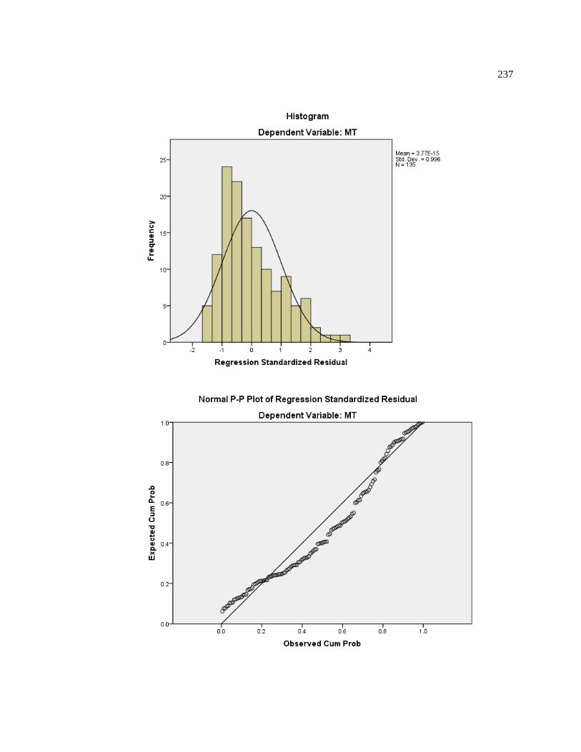
237

238
D-4.4 Regression Model 4
2
2167.15 123.23 log ( ) 0.364
DMT Op
W
Variables Entered/Removedb
Model
Variables
Entered
Variables
Removed Method
1 OBinpixel,
log(2D/W)
. Enter
a. All requested variables entered.
b. Dependent Variable: MT
Model Summaryb
Model R R Square
Adjusted R
Square
Std. Error of the
Estimate
1 .833a .694 .690 99.66302
a. Predictors: (Constant), OBinpixel, log(2D/W)
b. Dependent Variable: MT
ANOVAb
Model Sum of Squares df Mean Square F Sig.
1 Regression 2976797.823 2 1488398.912 149.848 .000a
Residual 1311118.635 132 9932.717
Total 4287916.459 134
a. Predictors: (Constant), OBinpixel, log(2D/W)
b. Dependent Variable: MT
Coefficientsa
Model
Unstandardized Coefficients
Standardized
Coefficients
t Sig. B Std. Error Beta
1 (Constant) 167.146 32.430 5.154 .000
log(2D/W) 123.228 7.431 .798 16.584 .000
OBinpixel .364 .073 .239 4.967 .000
a. Dependent Variable: MT
Residuals Statisticsa
Minimum Maximum Mean Std. Deviation N
Predicted Value 413.6023 999.3854 707.9361 149.04667 135
Residual -164.83723 315.20285 .00000 98.91647 135
Std. Predicted Value -1.975 1.955 .000 1.000 135
Std. Residual -1.654 3.163 .000 .993 135
a. Dependent Variable: MT

239
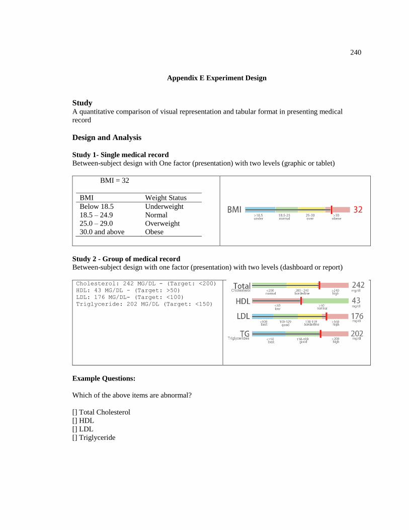
240
Appendix E Experiment Design
Study A quantitative comparison of visual representation and tabular format in presenting medical
record
Design and Analysis
Study 1- Single medical record
Between-subject design with One factor (presentation) with two levels (graphic or tablet)
BMI = 32
BMI Weight Status
Below 18.5 Underweight
18.5 – 24.9 Normal
25.0 – 29.0 Overweight
30.0 and above Obese
Study 2 - Group of medical record
Between-subject design with one factor (presentation) with two levels (dashboard or report)
Cholesterol: 242 MG/DL - (Target: <200)
HDL: 43 MG/DL - (Target: >50)
LDL: 176 MG/DL- (Target: <100)
Triglyceride: 202 MG/DL (Target: <150)
Example Questions:
Which of the above items are abnormal?
[] Total Cholesterol
[] HDL
[] LDL
[] Triglyceride

241
Dependent variables
Mean complete time (second)
Error rate for a set of questions (percentage)
Difficulty ratings / ease of use rating
Three variables map three metrics of usability: effectiveness, efficiency and satisfaction
Measures and Analysis
Outlier detection rule out data beyond mean ± 2SD
Mean trail completion time -> log transform -> ANOVA with repeated measures
Number of errors per block -> Wilcoxon signed-rank test
Subjective rating -> Single Ease Question(SEQ) -> SEQ score
Open feedback
Platform: Amazon Mechanical Turk + Qualtrics
Experiment flow
MTurk HIT – Qualtrics
Consent
Instructions + Practice
Experiment blocks – 10 questions
Demographics/experience
Subjective Feedback
Verification code - MTurk
Inclusion criteria
US,
English speaking
adult,
had at least a 95% rate for their previous HITs,
Had at least 50 pervious approved HITs.

242
How many subjects
Analysis: A priori: Compute required sample size
Input: Effect size f = 0.25
α err prob = 0.05
Power (1-β err prob) = 0.95
Number of groups = 2
Number of measurements = 10
Corr among rep measures = 0.5
Output: Noncentrality parameter λ = 13.4090909
Critical F = 3.9228794
Numerator df = 1.0000000
Denominator df = 116
Total sample size = 118
Actual power = 0.9526783
Considering outliers detection and rejected HITs, the experiment requires 80~100 for each group.
Thus, that is 320~400 total for the study

243

244
Survey Flow Design

245
Post on MTurk
Thanks for accepting this HIT.
This should take about 10 minutes to complete, but we have allotted 30 minutes to make sure
everybody can complete it in their own pace.
Please, read the following instructions attentively.
1. Copy the link below and paste it into a new browser window to start the
survey. Keep Amazon Mechanical Turk's window open until the end in order to submit
the HIT.
2. When you finish the survey, you will receive a completion code. Copy that code
and paste it in the "Completion Code" field below.
3. Only take the survey once.
4. If you find problems with the survey (e.g., question not displayed correctly),
please report them in the comments box below.
Survey address:
http://xxxxx
Completion Code: ________

246
Consent
PURPOSE OF RESEARCH:
To examine the how presentation of medical record can affect understanding.
WHAT YOU WILL DO:
You are invited to view mock medical record and then answer related questions.
TIME REQUIRED:
Participation will take approximately 10 minutes.
RISKS
There are no anticipated risked associated with participating in this study. The effects of
participating should be comparable to those you could experience from viewing a computer
monitor for 10 minutes and using a mouse.
COMPENSATION
Upon completion of this task, you will receive a code to enter on the Amazon Mechanical Turk
task page, and you will received the amount that was indicated on the task page.
Bonus for insight feedback and good performance (short completion time and low error rate)
BENEFIT
Understanding how to interpret medical test results helps the participants playing a more active
role in medical care.
CONFIDENTLITY:
Your participation in this study will remain confidential. Your responses will be assigned a code
number. You will NOT be asked provide your name. You will be asked to provide your age and
gender. Throughout the experiment, we may collect data such as browser type, operating system
version, completing time, mouse clicks, and error rate.
PARTCIPATION AND WITHDRAWAL
Your participation in this study is voluntarily, and you may withdraw and return the task to
Amazon Mechanical Turk at any time. You will receive compensation only if you complete the
task. You may withdraw at any time by closing the web page of the task.
AGREEMENT
I declare that I am 18 or over 18 and agree to participate in this research. The nature and purpose
of this research have been sufficiently explained and I agree to participant in this study. I
understand that I am free to withdraw at any time.
CONTACT

247
VITA
Hui Yang
Hui Yang is a Ph.D. Candidate in Industrial Engineering in the Harold and Inge Marcus
Department of Industrial and Manufacturing Engineering at the Pennsylvania State University.
He joined the Laboratory for Intelligent Systems and Analytics (LISA) in 2010, and worked on
the project of Design and Implementation of IT Infrastructure for Patient Collaborative Networks
sponsored by National Institute of Standards and Technology. During the Ph.D. studies, he was
involved in multiple SBIR projects in big data analytics and visualization sponsored by DoD and
NIH at Intelligent Automation, Inc.
He holds a Master's degree in Human Computer Interaction from the Uppsala University,
Sweden, and a M.S. and B.S. in engineering, with a concentration in Instrument Science and
Technology, from Harbin Institute of Technology, China. He is a member of the Institute of
Industrial Engineers (IIE), the Human Factors and Ergonomics Society (HFES), and serves as an
officer of the HFES Penn State Chapter.