unit 42, spreadsheet modelling
DESCRIPTION
Spreadsheet modelling is a 10-credit unit which builds on assumed basic spreadsheet skills to produce models to solve complex problems.TRANSCRIPT
Un
it 4
2: S
prea
dshe
eet m
odel
ling
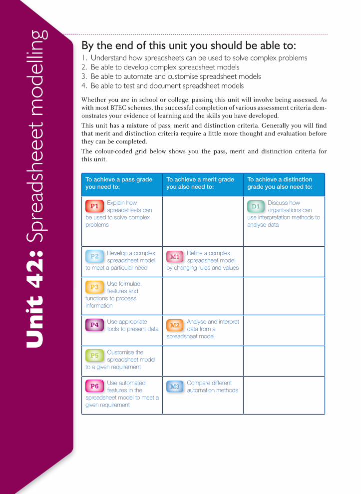
By the end of this unit you should be able to: 1. Understand how spreadsheets can be used to solve complex problems2. Be able to develop complex spreadsheet models3. Be able to automate and customise spreadsheet models4. Be able to test and document spreadsheet models
Whether you are in school or college, passing this unit will involve being assessed. As with most BTEC schemes, the successful completion of various assessment criteria dem-onstrates your evidence of learning and the skills you have developed.
This unit has a mixture of pass, merit and distinction criteria. Generally you will fi nd that merit and distinction criteria require a little more thought and evaluation before they can be completed.
The colour-coded grid below shows you the pass, merit and distinction criteria for this unit.
To achieve a pass grade you need to:
To achieve a merit grade you also need to:
To achieve a distinction grade you also need to:
P1 Explain how spreadsheets can
be used to solve complex problems
D1 Discuss how organisations can
use interpretation methods to analyse data
P2 Develop a complex spreadsheet model
to meet a particular need
M1 Refine a complex spreadsheet model
by changing rules and values
P3 Use formulae, features and
functions to process information
P4 Use appropriate tools to present data
M2 Analyse and interpret data from a
spreadsheet model
P5 Customise the spreadsheet model
to a given requirement
P6 Use automated features in the
spreadsheet model to meet a given requirement
M3 Compare different automation methods
Spreadsheet modelling
375
P7 Test a spreadsheet model to ensure that
it is fit for purpose
D2 Evaluate a spreadsheet model
incorporating feedback from others and make recommendations for improvements
P8 Export the contents of the spreadsheet
model to an alternative format
P9 Produce user documentation for a
spreadsheet model
M4 Produce technical documentation for a
spreadsheet model
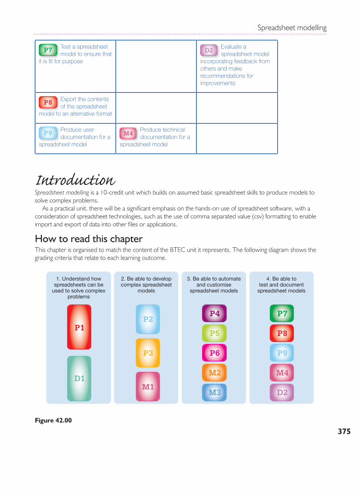
IntroductionSpreadsheet modelling is a 10-credit unit which builds on assumed basic spreadsheet skills to produce models to solve complex problems. As a practical unit, there will be a signifi cant emphasis on the hands-on use of spreadsheet software, with a consideration of spreadsheet technologies, such as the use of comma separated value (csv) formatting to enable import and export of data into other fi les or applications.
How to read this chapterThis chapter is organised to match the content of the BTEC unit it represents. The following diagram shows the grading criteria that relate to each learning outcome.
1. Understand howspreadsheets can be
used to solve complexproblems
2. Be able to developcomplex spreadsheet
models
3. Be able to automateand customise
spreadsheet models
P7
P8
P9
M4
D2
P4
P5
P6
M2
M3
P2
P3
M1
P1
D1
4. Be able totest and document
spreadsheet models
Figure 42.00
BTEC Level 3 National in IT
376
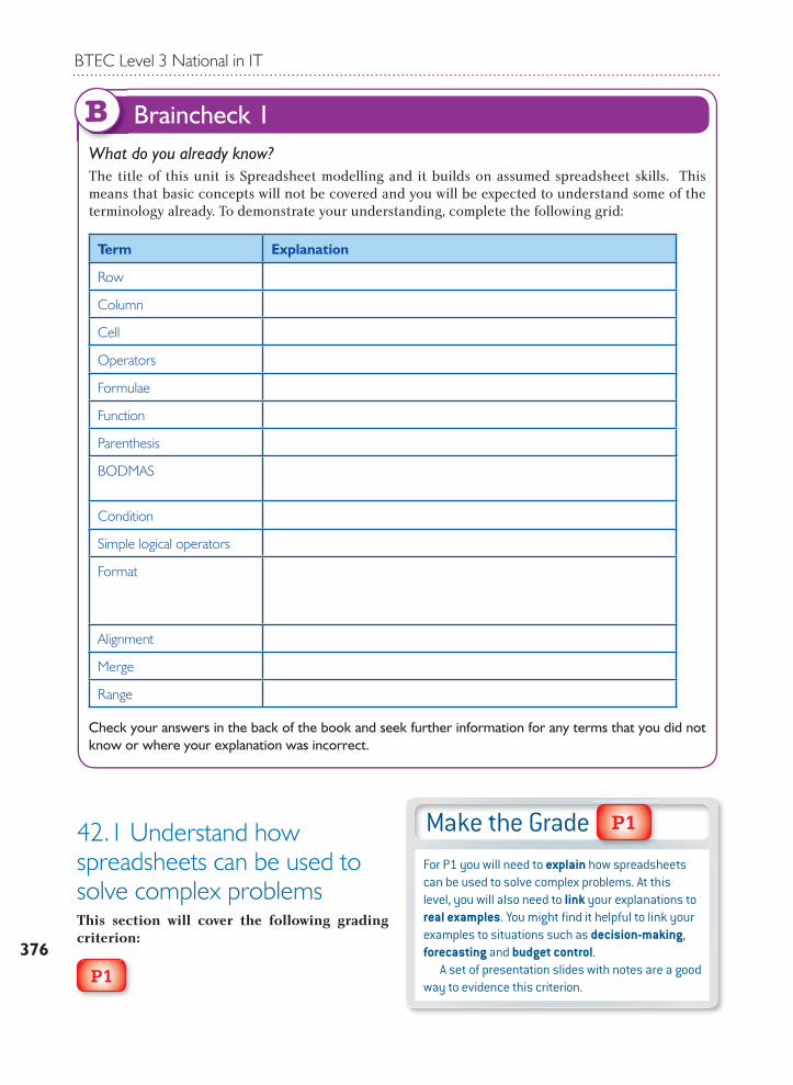
42.1 Understand how spreadsheets can be used to solve complex problemsThis section will cover the following grading criterion:
P1
What do you already know?The title of this unit is Spreadsheet modelling and it builds on assumed spreadsheet skills. This means that basic concepts will not be covered and you will be expected to understand some of the terminology already. To demonstrate your understanding, complete the following grid:
Term Explanation
Row
Column
Cell
Operators
Formulae
Function
Parenthesis
BODMAS
Condition
Simple logical operators
Format
Alignment
Merge
Range
Check your answers in the back of the book and seek further information for any terms that you did not know or where your explanation was incorrect.
Braincheck 1B
Make the GradeFor P1 you will need to explain how spreadsheets can be used to solve complex problems. At this level, you will also need to link your explanations to real examples. You might fi nd it helpful to link your examples to situations such as decision-making, forecasting and budget control. A set of presentation slides with notes are a good way to evidence this criterion.
P1
Spreadsheet modelling
377
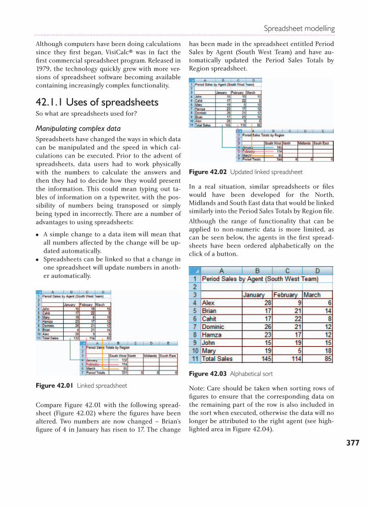
Although computers have been doing calculations since they first began, VisiCalc® was in fact the first commercial spreadsheet program. Released in 1979, the technology quickly grew with more ver-sions of spreadsheet software becoming available containing increasingly complex functionality.
42.1.1 Uses of spreadsheetsSo what are spreadsheets used for?
Manipulating complex dataSpreadsheets have changed the ways in which data can be manipulated and the speed in which cal-culations can be executed. Prior to the advent of spreadsheets, data users had to work physically with the numbers to calculate the answers and then they had to decide how they would present the information. This could mean typing out ta-bles of information on a typewriter, with the pos-sibility of numbers being transposed or simply being typed in incorrectly. There are a number of advantages to using spreadsheets:
MM A simple change to a data item will mean that all numbers affected by the change will be up-dated automatically.
MM Spreadsheets can be linked so that a change in one spreadsheet will update numbers in anoth-er automatically.
Compare Figure 42.01 with the following spread-sheet (Figure 42.02) where the figures have been altered. Two numbers are now changed – Brian’s figure of 4 in January has risen to 17. The change
has been made in the spreadsheet entitled Period Sales by Agent (South West Team) and have au-tomatically updated the Period Sales Totals by Region spreadsheet.
In a real situation, similar spreadsheets or files would have been developed for the North, Midlands and South East data that would be linked similarly into the Period Sales Totals by Region file.
Although the range of functionality that can be applied to non-numeric data is more limited, as can be seen below, the agents in the first spread-sheets have been ordered alphabetically on the click of a button.
Note: Care should be taken when sorting rows of figures to ensure that the corresponding data on the remaining part of the row is also included in the sort when executed, otherwise the data will no longer be attributed to the right agent (see high-lighted area in Figure 42.04).
Figure 42.01 Linked spreadsheet
Figure 42.02 Updated linked spreadsheet
Figure 42.03 Alphabetical sort
BTEC Level 3 National in IT
378
Presentation to requirements When preparing data using spreadsheets, it is the responsibility of the person generating the spread-sheet to ensure that the information is presented in such a way that it will suit the requirements of the audience.
In simplest terms, this might be adjusting font sizes to ensure that all the information is legible for someone with a visual impairment. It could re-quire that the data be presented as a comparative chart like the one shown in Figure 42.05.
Alternatively, the data users might wish to see a comparison of the total quantities sold between the various regions (see Figure 42.06).
Figure 42.06 Trend comparison chart
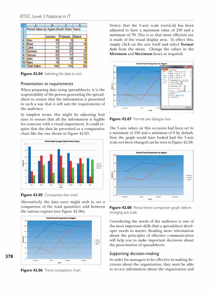
Notice that the Y-axis scale (vertical) has been adjusted to have a maximum value of 210 and a minimum of 70. This is so that more efficient use is made of the visual display area. To effect this, simply click on the axis itself and select Format Axis from the menu. Change the values in the Minimum and Maximum boxes as required.
The Y-axis values on this occasion had been set to a maximum of 250 and a minimum of 0 by default. How the graph would have looked had the Y-axis scale not been changed can be seen in Figure 42.08.
Considering the needs of the audience is one of the most important skills that a spreadsheet devel-oper needs to master. Reading more information about the principles of effective communication will help you to make important decisions about the presentation of spreadsheets.
Supporting decision-making In order for managers to be effective in making de-cisions about the organisation, they must be able to access information about the organisation and
Figure 42.04 Selecting the data to sort
Figure 42.05 Comparison bar chart
Figure 42.07 Format axis dialogue box
Figure 42.08 Period trend comparison graph before changing axis scale
Spreadsheet modelling
379
how it has been operating. They might also need to have information about the activities of competi-tors or stakeholders.
The types of decisions that the information will need to support are operational issues such as monitoring and controlling the organisation’s activities or helping the organisation analyse the past and plan for the future.
Whatever the intended use of the information, its preparation should have been timely (available for use at the right time) and accurate (correct and at an appropriate level of detail).
How can the use of a spreadsheet help in the process?
Analysis of dataBeing able to compare data sets from different op-erational periods, the same periods from different years or comparing performance against that of a competitor is vital in ensuring that an organisa-tion is able to stay ahead.
Viewing the data in different ways can highlight discrepancies in performance because unusual
occurrences can be easier to spot in a graph or chart than if they are merely numbers represented in a table. Look again at the table of data in Figure 42.03. Is it easy to spot that Mary had the lowest monthly quantity overall and Alex had the highest? Look again at the chart of the same data in Figure 42.05. Is it easier to spot this detail in the chart?
Being able to manipulate tables of data, whether this is making charts and graphs, ordering, sort-ing, filtering or summarising the data (see later in this unit), makes data analysis a relatively simple process and enables users to understand their in-formation in much more depth.
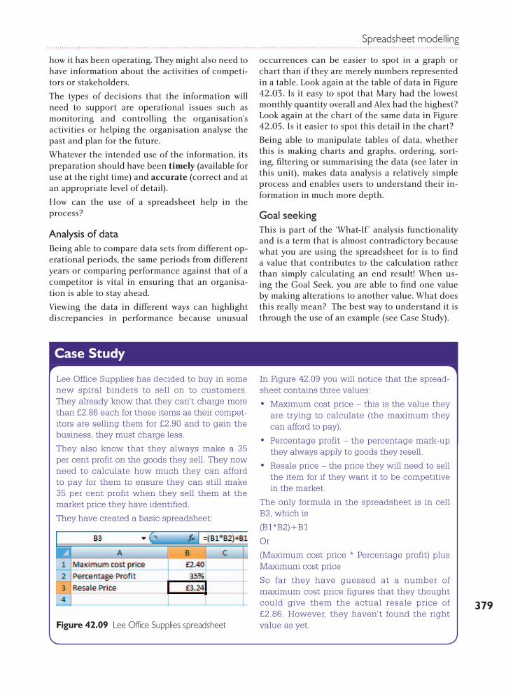
Goal seekingThis is part of the ‘What-If ’ analysis functionality and is a term that is almost contradictory because what you are using the spreadsheet for is to find a value that contributes to the calculation rather than simply calculating an end result! When us-ing the Goal Seek, you are able to find one value by making alterations to another value. What does this really mean? The best way to understand it is through the use of an example (see Case Study).
Lee Office Supplies has decided to buy in some new spiral binders to sell on to customers. They already know that they can’t charge more than £2.86 each for these items as their compet-itors are selling them for £2.90 and to gain the business, they must charge less.
They also know that they always make a 35 per cent profit on the goods they sell. They now need to calculate how much they can afford to pay for them to ensure they can still make 35 per cent profit when they sell them at the market price they have identified.
They have created a basic spreadsheet:
In Figure 42.09 you will notice that the spread-sheet contains three values:
• Maximum cost price – this is the value they are trying to calculate (the maximum they can afford to pay).
• Percentage profit – the percentage mark-up they always apply to goods they resell.
• Resale price – the price they will need to sell the item for if they want it to be competitive in the market.
The only formula in the spreadsheet is in cell B3, which is
(B1*B2)+B1
Or
(Maximum cost price * Percentage profit) plus Maximum cost price
So far they have guessed at a number of maximum cost price figures that they thought could give them the actual resale price of £2.86. However, they haven’t found the right value as yet.Figure 42.09 Lee Office Supplies spreadsheet
Case Study
BTEC Level 3 National in IT
380
They now decide to use the Goal Seek func-tion. To do this, click on Data then on What-If Analysis and then finally on Goal Seek. The fol-lowing dialogue box appears:
The figures and cell references now need to be completed. This is how to interpret the values to enter into the dialogue box:
Once these values have been input, click OK. The computer will now work incrementally through possible values until it finds a value for Maximum cost price that, when multiplied by
the Percentage profit, will give the desired Resale Price.
Click OK to leave the Maximum cost price that has been calculated visible in cell B1.
While there are other ways to calculate the missing value without using Goal Seek, this is an easy-to-use, user-friendly interface that can resolve these kinds of queries quickly.
Lee Office Supplies has been advised by its landlords that the rent on the business premises is set to rise by 20 per cent as from 1 April.
The company’s cash flow forecast spreadsheet, prior to the anticipated change, is shown in Figure 42.13.
As you can see, the previous projections show that the company will more or less break even if all goes as expected (without the increase in rent). Also, there is no evidence of a bank over-draft being required.
Figure 42.10 Goal Seek dialogue box
Figure 42.11 Inputting values into the dialogue box
Figure 42.13 Lee Office Supplies’ cash flow forecast
Figure 42.12 The solution found by the Goal Seek function
Spreadsheet modelling
381
ScenariosWhat if scenarios can also be modelled using spreadsheet software. In this instance the values on the spreadsheet can be changed in order to fore-cast what will happen as a result of values changing.
RegressionRegression is a statistical technique for examin-ing the relationship between two or more vari-ables. Using the data in the spreadsheet, it will es-tablish whether a variable will change as a direct result of a change in another variable. It is better explained as an example or a series of questions:
1. Do sales of DIY products go up if it is a wet summer?
2. If house prices go up, do the sales of holidays go down?
3. If the value of pound sterling falls in relation to other currencies, does that mean more people take holidays in the UK?
The regression analysis is done using historic data and the data is represented as a scatter graph. The line of best fit is added and the closeness of the
scatter points is judged in relation to the line. The closer the scatter points fall to this line, the great-er the relationship between the variables.
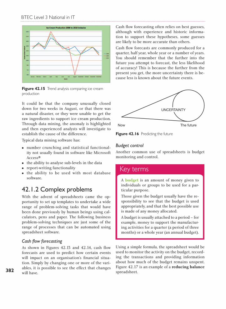
Data mining
The graph in Figure 42.15 was produced from or-ganisational data.
At a glance, it is possible to see that something very unusual happened in August 2009 when pro-duction seemed to fall uncharacteristically low – not good for an ice cream manufacturer!
Using data mining software, users are not only able to identify unusual events, but they can drill down into the data on increasing levels to find out why the data appeared to be so different from the ex-pected normal parameters.
Key termsData mining is a term applied to software applications that help users drill down into their data to find exceptional events.
Now we modify the spreadsheet to reflect the change in rent from April – with a 20% rise from £3,275 to £3,930.
The picture now is very different, with the company slipping into overdraft in July 2010. By the end of the financial year, the situation is far more serious, with a deficit of nearly £6,000. The organisation now has a number of choices:
• Sell more products
• Reduce expenditure (this could mean reduc-ing staff for example)
• Refuse to accept the 20 per cent rise in rent
• Look for alternative accommodation
Scenario-based forecasting is one of the most powerful tools to help managers make deci-sions about future actions.
Case Study
Figure 42.14 Lee Office Supplies’ revised cash flow forecast
BTEC Level 3 National in IT
382
Figure 42.15 Trend analysis comparing ice cream production
It could be that the company unusually closed down for two weeks in August, or that there was a natural disaster, or they were unable to get the raw ingredients to support ice cream production. Through data mining, the anomaly is highlighted and then experienced analysts will investigate to establish the cause of the difference.
Typical data mining software has:
MM number crunching and statistical functional-ity not usually found in software like Microsoft Access®
MM the ability to analyse sub-levels in the dataMM report-writing functionalityMM the ability to be used with most database
software.
42.1.2 Complex problemsWith the advent of spreadsheets came the op-portunity to set up templates to undertake a wide range of problem-solving tasks that would have been done previously by human beings using cal-culators, pens and paper. The following business problem-solving techniques are just some of the range of processes that can be automated using spreadsheet software.
Cash flow forecastingAs shown in Figures 42.13 and 42.14, cash flow forecasts are used to predict how certain events will impact on an organisation’s financial situa-tion. Simply by changing one or more of the vari-ables, it is possible to see the effect that changes will have.
Cash flow forecasting often relies on best guesses, although with experience and historic informa-tion to support these hypotheses, some guesses are likely to be more accurate than others.
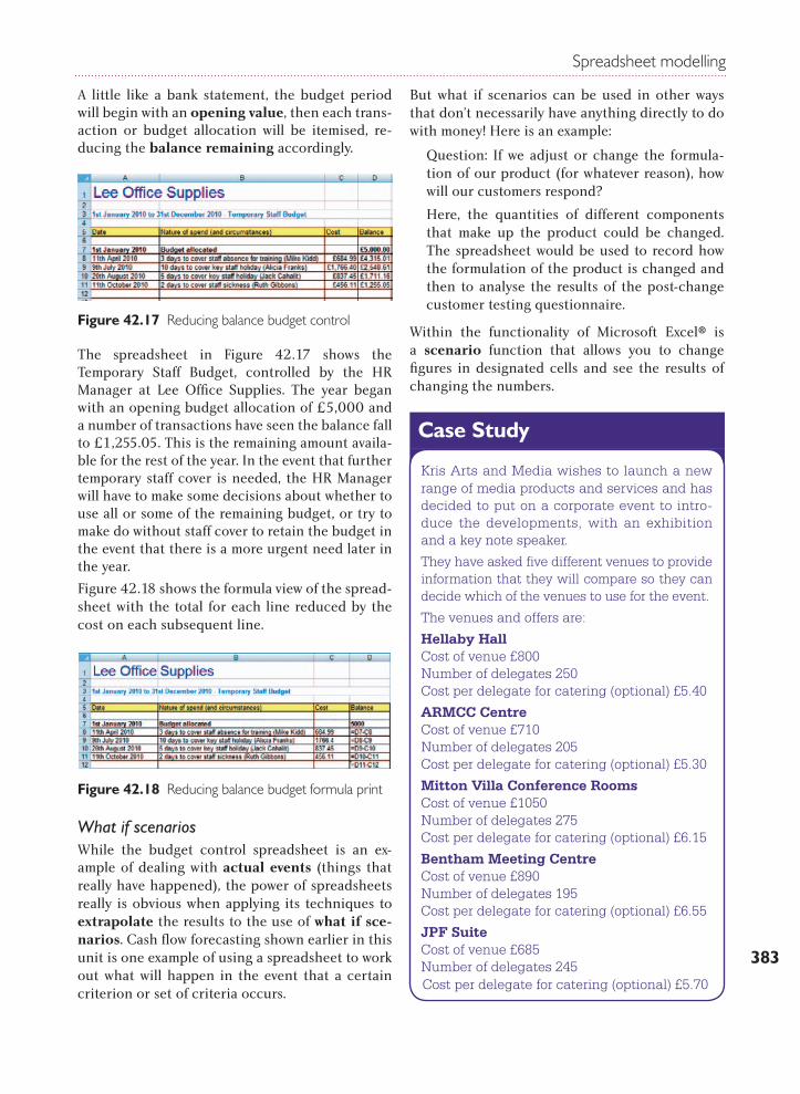
Cash flow forecasts are commonly produced for a quarter, half year, whole year or a number of years. You should remember that the further into the future you attempt to forecast, the less likelihood of accuracy! This is because the further from the present you get, the more uncertainty there is be-cause less is known about the future events.
Budget controlAnother common use of spreadsheets is budget monitoring and control.
Using a simple formula, the spreadsheet would be used to monitor the activity on the budget, record-ing the transactions and providing information about how much of the budget remains unspent. Figure 42.17 is an example of a reducing balance spreadsheet.
UNCERTAINTY
The futureNow
Figure 42.16 Predicting the future
Key termsA budget is an amount of money given to individuals or groups to be used for a par-ticular purpose.
Those given the budget usually have the re-sponsibility to see that the budget is used appropriately, and that the best possible use is made of any money allocated.
A budget is usually attached to a period – for example, money to support the manufactur-ing activities for a quarter (a period of three months) or a whole year (an annual budget).
Spreadsheet modelling
383
A little like a bank statement, the budget period will begin with an opening value, then each trans-action or budget allocation will be itemised, re-ducing the balance remaining accordingly.
The spreadsheet in Figure 42.17 shows the Temporary Staff Budget, controlled by the HR Manager at Lee Office Supplies. The year began with an opening budget allocation of £5,000 and a number of transactions have seen the balance fall to £1,255.05. This is the remaining amount availa-ble for the rest of the year. In the event that further temporary staff cover is needed, the HR Manager will have to make some decisions about whether to use all or some of the remaining budget, or try to make do without staff cover to retain the budget in the event that there is a more urgent need later in the year.
Figure 42.18 shows the formula view of the spread-sheet with the total for each line reduced by the cost on each subsequent line.
What if scenariosWhile the budget control spreadsheet is an ex-ample of dealing with actual events (things that really have happened), the power of spreadsheets really is obvious when applying its techniques to extrapolate the results to the use of what if sce-narios. Cash flow forecasting shown earlier in this unit is one example of using a spreadsheet to work out what will happen in the event that a certain criterion or set of criteria occurs.
But what if scenarios can be used in other ways that don’t necessarily have anything directly to do with money! Here is an example:
Question: If we adjust or change the formula-tion of our product (for whatever reason), how will our customers respond?
Here, the quantities of different components that make up the product could be changed. The spreadsheet would be used to record how the formulation of the product is changed and then to analyse the results of the post-change customer testing questionnaire.
Within the functionality of Microsoft Excel® is a scenario function that allows you to change figures in designated cells and see the results of changing the numbers.
Figure 42.17 Reducing balance budget control
Figure 42.18 Reducing balance budget formula print
Kris Arts and Media wishes to launch a new range of media products and services and has decided to put on a corporate event to intro-duce the developments, with an exhibition and a key note speaker.
They have asked five different venues to provide information that they will compare so they can decide which of the venues to use for the event.
The venues and offers are:
Hellaby HallCost of venue £800Number of delegates 250Cost per delegate for catering (optional) £5.40
ARMCC CentreCost of venue £710Number of delegates 205Cost per delegate for catering (optional) £5.30
Mitton Villa Conference RoomsCost of venue £1050Number of delegates 275Cost per delegate for catering (optional) £6.15
Bentham Meeting CentreCost of venue £890Number of delegates 195Cost per delegate for catering (optional) £6.55
JPF SuiteCost of venue £685Number of delegates 245Cost per delegate for catering (optional) £5.70
Case Study
BTEC Level 3 National in IT
384
When making a simple visual comparison, it is difficult to decide which offer would be the most beneficial to Kris Arts and Media. Initially, the JPF Suite is interesting because it has the lowest venue
cost. But it isn’t the lowest when it comes to the costs of catering.
Using the spreadsheet scenario functionality will help to compare these offers. This is how it’s done.
Activity 1
This activity will walk you through using the What If functionality.
1 Open a blank worksheet in Microsoft Excel®.
2 Now begin by entering the information for Hellaby Hall. See Figure 42.19.
3 In cell B8, calculate the Total Cost by taking B4 and adding the result of B5 multiplied by B6.
=B4+(B5*B6)
See Figure 42.20 showing the total cost for Hellaby Hall. Save the file.
Figure 42.20 Total cost for Hellaby Hall
4 You are now going to use the scenarios functionality. With the spreadsheet still open, click on Data then on What-If Analysis and finally on Scenarios as shown in Figure 42.21.
5 This activates the Scenario Manager shown in Figure 42.22.
Figure 42.21 Finding the Scenarios function
At present there are no defined scenarios, so we need to use this interface to process the details for each of the five offers from venues.
Figure 42.22 The Scenario Manager
6 You must now select Add so that you can begin to add each of the offers (including Hellaby Hall). The Add dialogue box is shown in Figure 42.23.
a) Give the Scenario a name (best practice would be to give it the venue name, e.g. Hellaby).
Figure 42.19 Details for Hellaby Hall
Spreadsheet modelling
385
Figure 42.23 Add Scenario dialogue box
b) You now need to click in the Changing cells box and click one by one into each of the cells that will change, separating them with a comma (remember the name of the venue will also be one of the values that will need to change and the total cost), see Figure 42.24.
7 Once you have done this, click on OK. The details for Hellaby Hall will appear. Click immediately on OK as you need to retain the details originally entered for this venue, see Figure 42.25.
Now click on OK.
8 The dialogue box will now change and will show the first of the scenarios you have added, as shown in Figure 42.26.
9 Repeat the process for the remaining four venues. The Scenario Manager will now look like the image in Figure 42.27.
Figure 42.27 All scenarios added
Figure 42.24 The first scenario is added (notice five cells will change)
Figure 42.25 Figures entered for Hellaby Hall
Figure 42.26 First scenario added
BTEC Level 3 National in IT
386
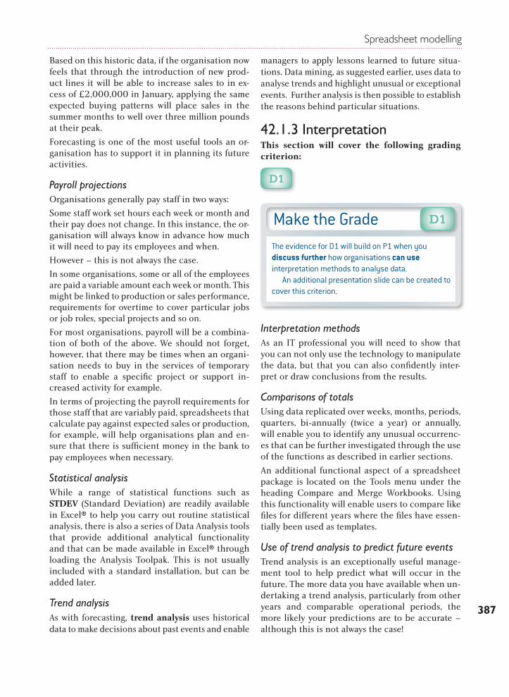
Sales forecastingTo forecast future sales it is usual to analyse his-torical data and use this to predict the future. The analysis could also incorporate the results of mar-keting activities or national statistics on anticipat-ed growth. The potential for activity in the hous-ing market, for example, is predicted based on how interest rates are expected to behave, which affects the cost of borrowing and thus the individual’s ability to get a mortgage.
Let’s consider a simpler example:
An ice cream manufacturer uses historic customer buying patterns to establish that the sale of ice cream is higher than the monthly average at Easter, again at Christmas, and is higher still in the summer
months of June to August (inclusive). The graph in Figure 42.30 shows how this might have looked.
Figure 42.30 Ice cream sales analysis 2010
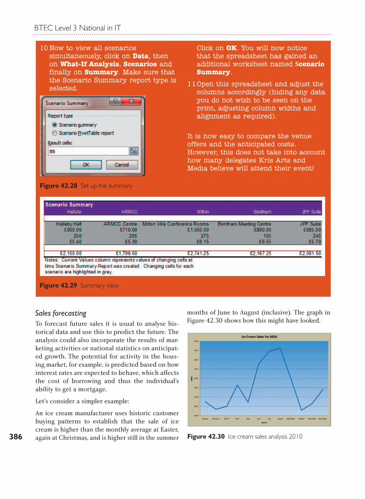
10 Now to view all scenarios simultaneously, click on Data, then on What-If Analysis, Scenarios and finally on Summary. Make sure that the Scenario Summary report type is selected.
Click on OK. You will now notice that the spreadsheet has gained an additional worksheet named Scenario Summary.
11 Open this spreadsheet and adjust the columns accordingly (hiding any data you do not wish to be seen on the print, adjusting column widths and alignment as required).
It is now easy to compare the venue offers and the anticipated costs. However, this does not take into account how many delegates Kris Arts and Media believe will attend their event!
Figure 42.28 Set up the summary
Figure 42.29 Summary view
Spreadsheet modelling
387
Based on this historic data, if the organisation now feels that through the introduction of new prod-uct lines it will be able to increase sales to in ex-cess of £2,000,000 in January, applying the same expected buying patterns will place sales in the summer months to well over three million pounds at their peak.
Forecasting is one of the most useful tools an or-ganisation has to support it in planning its future activities.
Payroll projectionsOrganisations generally pay staff in two ways:
Some staff work set hours each week or month and their pay does not change. In this instance, the or-ganisation will always know in advance how much it will need to pay its employees and when.
However – this is not always the case.
In some organisations, some or all of the employees are paid a variable amount each week or month. This might be linked to production or sales performance, requirements for overtime to cover particular jobs or job roles, special projects and so on.
For most organisations, payroll will be a combina-tion of both of the above. We should not forget, however, that there may be times when an organi-sation needs to buy in the services of temporary staff to enable a specifi c project or support in-creased activity for example.
In terms of projecting the payroll requirements for those staff that are variably paid, spreadsheets that calculate pay against expected sales or production, for example, will help organisations plan and en-sure that there is suffi cient money in the bank to pay employees when necessary.
Statistical analysis While a range of statistical functions such as STDEV (Standard Deviation) are readily available in Excel® to help you carry out routine statistical analysis, there is also a series of Data Analysis tools that provide additional analytical functionality and that can be made available in Excel® through loading the Analysis Toolpak. This is not usually included with a standard installation, but can be added later.
Trend analysisAs with forecasting, trend analysis uses historical data to make decisions about past events and enable
managers to apply lessons learned to future situa-tions. Data mining, as suggested earlier, uses data to analyse trends and highlight unusual or exceptional events. Further analysis is then possible to establish the reasons behind particular situations.
42.1.3 InterpretationThis section will cover the following grading criterion:
D1
Interpretation methods As an IT professional you will need to show that you can not only use the technology to manipulate the data, but that you can also confi dently inter-pret or draw conclusions from the results.
Comparisons of totalsUsing data replicated over weeks, months, periods, quarters, bi-annually (twice a year) or annually, will enable you to identify any unusual occurrenc-es that can be further investigated through the use of the functions as described in earlier sections.
An additional functional aspect of a spreadsheet package is located on the Tools menu under the heading Compare and Merge Workbooks. Using this functionality will enable users to compare like fi les for different years where the fi les have essen-tially been used as templates.
Use of trend analysis to predict future eventsTrend analysis is an exceptionally useful manage-ment tool to help predict what will occur in the future. The more data you have available when un-dertaking a trend analysis, particularly from other years and comparable operational periods, the more likely your predictions are to be accurate – although this is not always the case!
Make the GradeThe evidence for D1 will build on P1 when you discuss further how organisations can use interpretation methods to analyse data. An additional presentation slide can be created to cover this criterion.
D1
BTEC Level 3 National in IT
388
42.2 Be able to develop complex spreadsheet modelsThis section will cover the following grading criterion:
P2
42.2.1 ComplexityMultiple pages and cells linked between pagesEarlier in this unit we suggested that values in one spreadsheet could be linked dynamically to values in another spreadsheet in the same workbook or even with another workbook. In Figure 42.31 the formula for the North production totals is in fact a value that exists in a fi le named Linked Workbook 2.xls, on Sheet 1, in cell B15.
Any values that are linked within a workbook will be updated immediately when the values they are linked to change.
Complex formulaeOver the years there has been signifi cant disagree-ment about what constitutes a complex formula. In defi ning the word ‘complex’ you may fi nd any of the following words used: complicated, multiple parts, related components.
In general, a simple formula can be considered to be one or maybe two parts. A complex formula will have at least two parts.
Example of a simple formula:
Invoice total = Quantity purchased * price
+ VAT
The following example is a complex formula be-cause a number of steps must be carefully execut-ed to get the fi nal answer:
Invoice total = Quantity purchased * price – discount
(if more than 10 are purchased, discount is 10% otherwise discount is 0)
+ VAT
Large data setsWhen you consider that a single worksheet con-tains 256 columns and 65,536 rows, this multiplies out to 16,777,216 cells in a single worksheet! It is, however, unlikely that all of these cells would con-tain values as some columns and rows are left blank to enhance the appearance of the spreadsheet.
Examples of large data sets could include the following:
MM a sheet of wage calculations for 2,000 em-ployees in a factory including gross figures, deductions, etc.
MM a stock print-out for all items held in stock containing the current stock totals, cost price and overall stock values
MM sales information from a supermarket checkout at the end of each day
MM the results of marketing surveys.
The list is actually endless and in the real world you will fi nd many more examples.
Cells linkageCarefully linking cells within a spreadsheet and between spreadsheets will ensure that when a
Make the GradeAs a highly practical unit, evidence for P2 will be generated by creating a complex spreadsheet model, where ‘complex’ requires that the spreadsheet con-tains some aspects of the following range (these as-pects are covered in detail in subsequent sections, but you will need to consider using them in combina-tion to provide a spreadsheet model/solution):
MM multiple worksheets (with links) MM complex formulae, for example at least a two-step
process MM large data sets MM linked cells MM data entry forms, for example menu systems MM list boxes, drop-down boxes, event controls, data
validation and/or error trappingMM lookup tables and/or nested IF functions MM templates and activating cell protection.
P2
Figure 42.31 Spreadsheet drawing a value from a linked workbook
Spreadsheet modelling
389
value changes, any other numbers to which the value has contributed will change accordingly.
This will enhance the integrity of data because changes are automatically updated.
Data entry forms As with databases, modern spreadsheet software allows developers to create data entry forms.
An obvious example would be to use a worksheet as the basis for a menu, with command buttons to activate movement between worksheets.
Similarly, worksheets can be used to create mini applications. The example in Figure 42.32 uses list boxes, combo boxes and event controls to calculate the cost of a client project based on a number of variables.
Data validation and error trapping
Modern spreadsheet software includes Data Validation functionality on the Data menu, where for a cell or range of cells a developer can simply set up a validation routine to be applied for any data that is input. In the example shown in Figure 42.33, the developer has chosen that only a whole number between 17 and 21 can be input into the range of highlighted cells.
Using the Input Message tab, the developer can add a message to alert the user to the acceptable values or format, which is activated when the user accesses any of the validated cells.
Alternatively, the user can simply use the Error Alert to highlight the problem once the user has attempted to move out of the cell having input data (see Figure 42.34 below).
Lookup tablesLookup tables are really useful for accessing data stored in tables. Take the example in Figure 42.35. In the final system, the item information and pric-es would be hidden and the only part of the data that would be visible is highlighted.
The user would simply key in the item number and the system, using the VLOOKUP function, would check the input value then search the table to find the relevant matching item number and its associ-ated price.
The formula is shown at the top of the image. It means:
Figure 42.32 Form
Figure 42.33 Implementing validation
Figure 42.34 A customised error message alerting incorrect input!
Figure 42.35 VLOOKUP
BTEC Level 3 National in IT
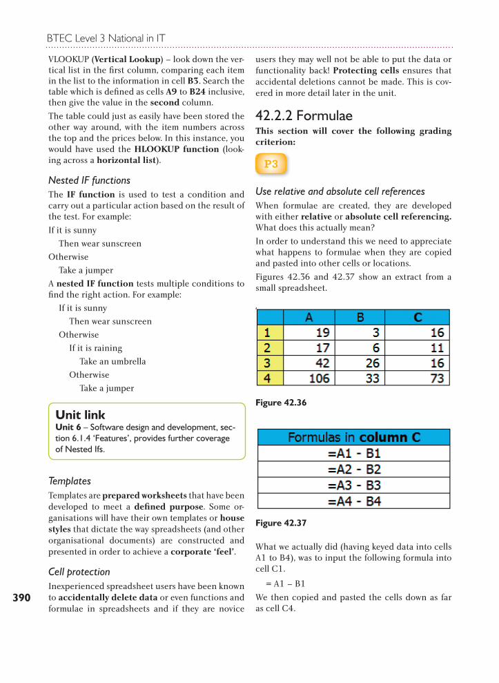
390
VLOOKUP (Vertical Lookup) – look down the ver-tical list in the fi rst column, comparing each item in the list to the information in cell B3. Search the table which is defi ned as cells A9 to B24 inclusive, then give the value in the second column.
The table could just as easily have been stored the other way around, with the item numbers across the top and the prices below. In this instance, you would have used the HLOOKUP function (look-ing across a horizontal list).
Nested IF functionsThe IF function is used to test a condition and carry out a particular action based on the result of the test. For example:
If it is sunny
Then wear sunscreen
Otherwise
Take a jumper
A nested IF function tests multiple conditions to fi nd the right action. For example:
If it is sunny
Then wear sunscreen
Otherwise
If it is raining
Take an umbrella
Otherwise
Take a jumper
TemplatesTemplates are prepared worksheets that have been developed to meet a defi ned purpose. Some or-ganisations will have their own templates or house styles that dictate the way spreadsheets (and other organisational documents) are constructed and presented in order to achieve a corporate ‘feel’.
Cell protectionInexperienced spreadsheet users have been known to accidentally delete data or even functions and formulae in spreadsheets and if they are novice
users they may well not be able to put the data or functionality back! Protecting cells ensures that accidental deletions cannot be made. This is cov-ered in more detail later in the unit.
42.2.2 FormulaeThis section will cover the following grading criterion:
P3
Use relative and absolute cell referencesWhen formulae are created, they are developed with either relative or absolute cell referencing. What does this actually mean?
In order to understand this we need to appreciate what happens to formulae when they are copied and pasted into other cells or locations.
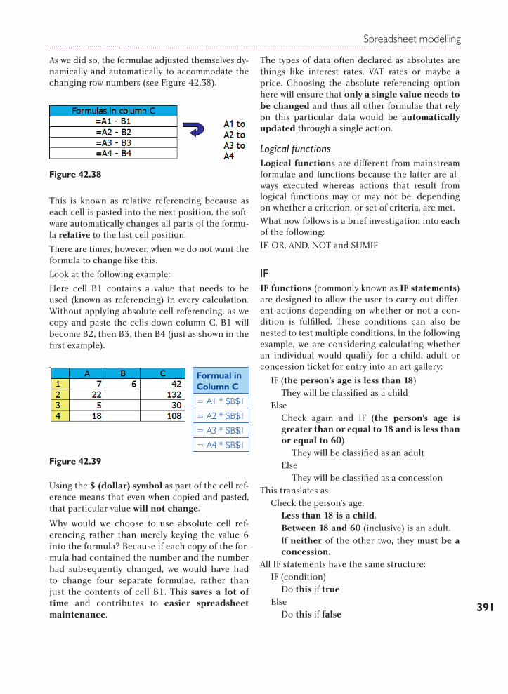
Figures 42.36 and 42.37 show an extract from a small spreadsheet.
What we actually did (having keyed data into cells A1 to B4), was to input the following formula into cell C1.
= A1 – B1
We then copied and pasted the cells down as far as cell C4.
Unit linkUnit 6 – Software design and development, sec-tion 6.1.4 ‘Features’, provides further coverage of Nested Ifs.
Figure 42.36
Figure 42.37
Spreadsheet modelling
391
As we did so, the formulae adjusted themselves dy-namically and automatically to accommodate the changing row numbers (see Figure 42.38).
Figure 42.38
This is known as relative referencing because as each cell is pasted into the next position, the soft-ware automatically changes all parts of the formu-la relative to the last cell position.
There are times, however, when we do not want the formula to change like this.
Look at the following example:
Here cell B1 contains a value that needs to be used (known as referencing) in every calculation. Without applying absolute cell referencing, as we copy and paste the cells down column C, B1 will become B2, then B3, then B4 (just as shown in the first example).
Using the $ (dollar) symbol as part of the cell ref-erence means that even when copied and pasted, that particular value will not change.
Why would we choose to use absolute cell ref-erencing rather than merely keying the value 6 into the formula? Because if each copy of the for-mula had contained the number and the number had subsequently changed, we would have had to change four separate formulae, rather than just the contents of cell B1. This saves a lot of time and contributes to easier spreadsheet maintenance.
The types of data often declared as absolutes are things like interest rates, VAT rates or maybe a price. Choosing the absolute referencing option here will ensure that only a single value needs to be changed and thus all other formulae that rely on this particular data would be automatically updated through a single action.
Logical functions Logical functions are different from mainstream formulae and functions because the latter are al-ways executed whereas actions that result from logical functions may or may not be, depending on whether a criterion, or set of criteria, are met.
What now follows is a brief investigation into each of the following:
IF, OR, AND, NOT and SUMIF
IFIF functions (commonly known as IF statements) are designed to allow the user to carry out differ-ent actions depending on whether or not a con-dition is fulfilled. These conditions can also be nested to test multiple conditions. In the following example, we are considering calculating whether an individual would qualify for a child, adult or concession ticket for entry into an art gallery:
IF (the person’s age is less than 18)They will be classified as a child
ElseCheck again and IF (the person’s age is greater than or equal to 18 and is less than or equal to 60)
They will be classified as an adultElse
They will be classified as a concessionThis translates as
Check the person’s age:Less than 18 is a child.Between 18 and 60 (inclusive) is an adult.If neither of the other two, they must be a concession.
All IF statements have the same structure:IF (condition)
Do this if trueElse
Do this if false
Figure 42.39
Formual in Column C
= A1 * $B$1
= A2 * $B$1
= A3 * $B$1
= A4 * $B$1
BTEC Level 3 National in IT
392
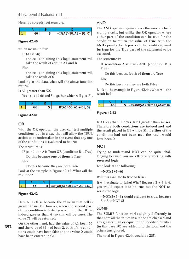
Here is a spreadsheet example:
which means in full:IF (A1 > 50)
the cell containing this logic statement will take the result of adding A1 and B1
Elsethe cell containing this logic statement will take the result of 0
Looking at the data, what will the above function return?Is A1 greater than 50?
Yes – so add 66 and 5 together, which will give 71.
ORWith the OR operator, the user can test multiple conditions but in a way that will allow the TRUE action to be undertaken in the event that any one of the conditions is evaluated to be true.
The structure is:IF (condition A is True) OR (condition B is True)
Do this because one of them is TrueElse
Do this because they are both FalseLook at the example in Figure 42.42. What will the result be?
Here A1 is false because the value in that cell is greater than 50. However, when the second part of the condition is tested you will find that B1 is indeed greater than 4 (so this will be true). The value 71 will be returned.
On the other hand, had the value of A1 been 66 and the value of B1 had been 2, both of the condi-tions would have been false and the value 0 would have been entered in C1.
ANDThe AND operator again allows the user to check multiple cells, but unlike the OR operator where either part of the condition can be true for the condition to return the value of True, with the AND operator both parts of the condition must be true for the True part of the statement to be executed.
The structure is:
IF (condition A is True) AND (condition B is True)
Do this because both of them are True
Else
Do this because they are both False
Look at the example in Figure 42.44. What will the result be?
Is A1 less than 50? Yes. Is B1 greater than 4? Yes. Therefore both conditions are indeed met and the result placed in C1 will be 51. If either of the conditions had not been met, the result would have been 0.
NOTTrying to understand NOT can be quite chal-lenging because you are effectively working with reversed logic!
Let’s look at the following:
=NOT(3+3=6)
Will this evaluate to true or false?
It will evaluate to false! Why? Because 3 + 3 is 6, you would expect it to be true, but the NOT re-verses the logic.
=NOT(3+3=8) would evaluate to true, because 3 + 3 is NOT 8!
SUMIFThe SUMIF function works slightly differently in that here all the values in a range are checked and any greater than or equal to the specified number (in this case 50) are added into the total and the others are ignored.
The total in Figure 42.44 would be 285.
Figure 42.40
Figure 42.41
Figure 42.42
Figure 42.43
Spreadsheet modelling
393
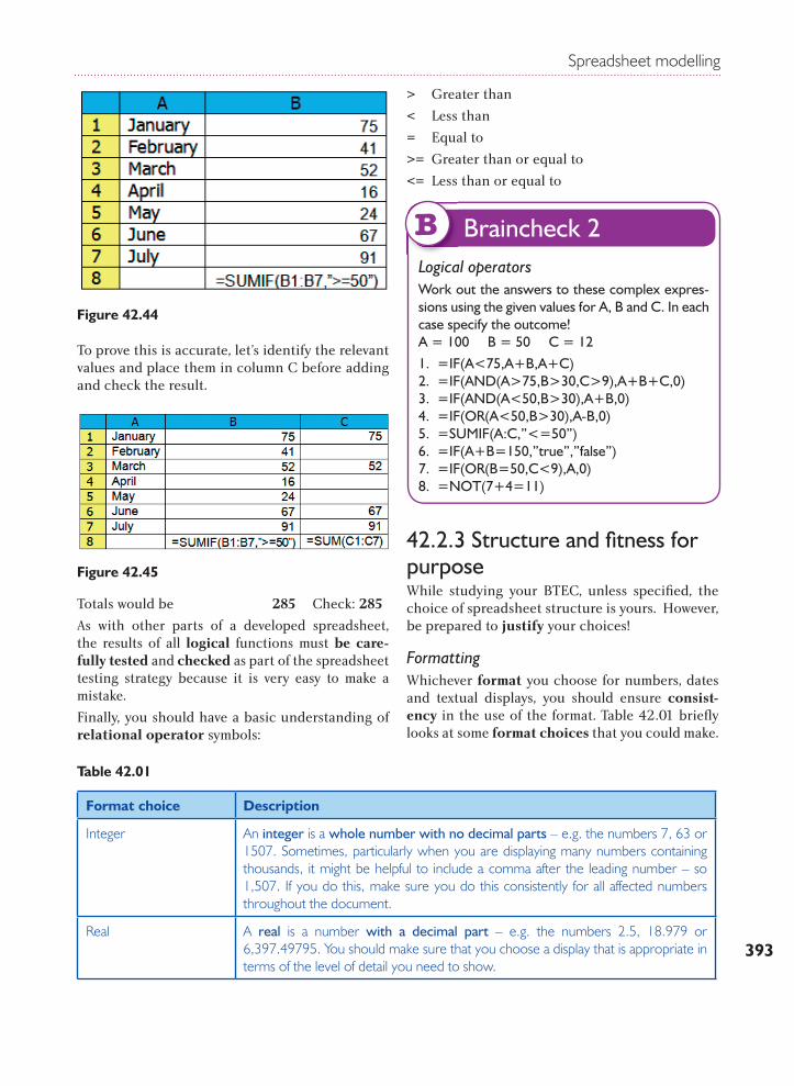
Figure 42.44
To prove this is accurate, let’s identify the relevant values and place them in column C before adding and check the result.
Totals would be 285 Check: 285
As with other parts of a developed spreadsheet, the results of all logical functions must be care-fully tested and checked as part of the spreadsheet testing strategy because it is very easy to make a mistake.
Finally, you should have a basic understanding of relational operator symbols:
> Greater than
< Less than
= Equal to
>= Greater than or equal to
<= Less than or equal to
42.2.3 Structure and fi tness for purposeWhile studying your BTEC, unless specifi ed, the choice of spreadsheet structure is yours. However, be prepared to justify your choices!
Formatting Whichever format you choose for numbers, dates and textual displays, you should ensure consist-ency in the use of the format. Table 42.01 briefl y looks at some format choices that you could make.
Figure 42.45
Logical operatorsWork out the answers to these complex expres-sions using the given values for A, B and C. In each case specify the outcome!A = 100 B = 50 C = 121. =IF(A<75,A+B,A+C)2. =IF(AND(A>75,B>30,C>9),A+B+C,0)3. =IF(AND(A<50,B>30),A+B,0)4. =IF(OR(A<50,B>30),A-B,0)5. =SUMIF(A:C,”<=50”)6. =IF(A+B=150,”true”,”false”)7. =IF(OR(B=50,C<9),A,0)8. =NOT(7+4=11)
Braincheck 2B
Table 42.01
Format choice Description
Integer An integer is a whole number with no decimal parts – e.g. the numbers 7, 63 or 1507. Sometimes, particularly when you are displaying many numbers containing thousands, it might be helpful to include a comma after the leading number – so 1,507. If you do this, make sure you do this consistently for all affected numbers throughout the document.
Real A real is a number with a decimal part – e.g. the numbers 2.5, 18.979 or 6,397.49795. You should make sure that you choose a display that is appropriate in terms of the level of detail you need to show.
BTEC Level 3 National in IT
394
Styling e.g. bold, italics, borders, shading, column alignment, consistencyAdditional formatting options are available to further enhance the presentation of a spreadsheet (see Table 42.02). These should be used carefully as the application of too many formats simultaneously can detract from the overall intention of the spreadsheet, which is to impart information.
Format choice Description
Date There are a number of date formats for you to use in the preparation of a spreadsheet. One aspect you should always remember, however, is that not all countries display day, month and year in the same order as in the UK. For example, in America and parts of Europe, the month precedes the day.
08/04/1960 08/04/601960-04-08 8-Apr-6008 April 1960
There are many different formats for dates – here are some examples:
Currency Currencies are usually preceded with a symbol that indicates what the currency actually is. For example a £ (pound sterling) sign precedes values to denote UK currency – £14.99.Dollars (American for example) will be preceded by $, although there are a number of other countries in the world that have adopted the dollar as their currency.The symbol for the Euro € is beginning to appear on many European keyboards, and can either be inserted through selecting a symbol in Excel® or through the Alt Gr + 4 key.
Text Text can be manipulated in many ways, some of which follow in the next section, but the choice of the font is also an important decision.Serif fonts are described as having embellishments and flourishes. These can be additional lines or curves.Sans serif fonts are those without embellishments.Text set in proportional fonts allows each character to occupy a different amount of space, depending on which character it is. For example, in the word Bristol, the character ‘i’ uses less space than the remaining letters. W and M usually take up most space.Using non-proportional fonts (often also referred to as fixed fonts) will ensure that each character is allowed to occupy the same amount of space. Let’s compare the two:
WiltshireWiltshire
The former is proportional, the latter non-proportional or fixed.
Table 42.02
Format choice Description
Bold This text has been emboldened. This means it has been thickened to make it stand out.
Italics Italicised text usually leans to the right. This draws the reader’s attention to particular words or phrases.
Spreadsheet modelling
395
Format choice Description
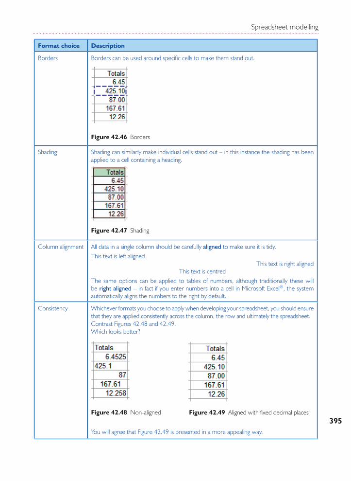
Borders Borders can be used around specific cells to make them stand out.
Figure 42.46 Borders
Shading Shading can similarly make individual cells stand out – in this instance the shading has been applied to a cell containing a heading.
Figure 42.47 Shading
Column alignment All data in a single column should be carefully aligned to make sure it is tidy.This text is left aligned
This text is right alignedThis text is centred
The same options can be applied to tables of numbers, although traditionally these will be right aligned – in fact if you enter numbers into a cell in Microsoft Excel®, the system automatically aligns the numbers to the right by default.
Consistency Whichever formats you choose to apply when developing your spreadsheet, you should ensure that they are applied consistently across the column, the row and ultimately the spreadsheet. Contrast Figures 42.48 and 42.49. Which looks better?
Figure 42.49 Aligned with fixed decimal placesFigure 42.48 Non-aligned
You will agree that Figure 42.49 is presented in a more appealing way.
BTEC Level 3 National in IT
396
To meet the needs of a particular contextAs the range of possible contexts will be extensive, it is clearly diffi cult to defi ne here! What would be most appropriate would be for you to look at examples of spreadsheets and decide how effective you think they are for the audience for which they are intended.
42.2.4 Features and functionsThis section will also cover the following grad-ing criterion:
P3
Using named ranges to identify areas of a spreadsheet As suggested earlier in this unit, most spreadsheet software also has limited database capabilities. This can be extremely useful if you need to insert values automatically based on other input values. Let’s look at an example from Lee Offi ce Supplies.
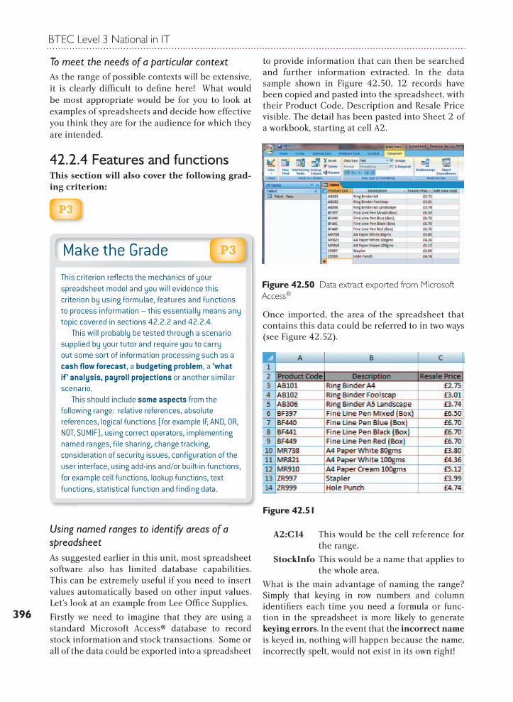
Firstly we need to imagine that they are using a standard Microsoft Access® database to record stock information and stock transactions. Some or all of the data could be exported into a spreadsheet
to provide information that can then be searched and further information extracted. In the data sample shown in Figure 42.50, 12 records have been copied and pasted into the spreadsheet, with their Product Code, Description and Resale Price visible. The detail has been pasted into Sheet 2 of a workbook, starting at cell A2.
Once imported, the area of the spreadsheet that contains this data could be referred to in two ways (see Figure 42.52).
A2:C14 This would be the cell reference for the range.
StockInfo This would be a name that applies to the whole area.
What is the main advantage of naming the range? Simply that keying in row numbers and column identifi ers each time you need a formula or func-tion in the spreadsheet is more likely to generate keying errors. In the event that the incorrect name is keyed in, nothing will happen because the name, incorrectly spelt, would not exist in its own right!
Make the GradeThis criterion refl ects the mechanics of your spreadsheet model and you will evidence this criterion by using formulae, features and functions to process information – this essentially means any topic covered in sections 42.2.2 and 42.2.4. This will probably be tested through a scenario supplied by your tutor and require you to carry out some sort of information processing such as a cash fl ow forecast, a budgeting problem, a ‘what if’ analysis, payroll projections or another similar scenario. This should include some aspects from the following range: relative references, absolute references, logical functions (for example IF, AND, OR, NOT, SUMIF), using correct operators, implementing named ranges, fi le sharing, change tracking, consideration of security issues, confi guration of the user interface, using add-ins and/or built-in functions, for example cell functions, lookup functions, text functions, statistical function and fi nding data.
P3
Figure 42.50 Data extract exported from Microsoft Access®
Figure 42.51
Spreadsheet modelling
397
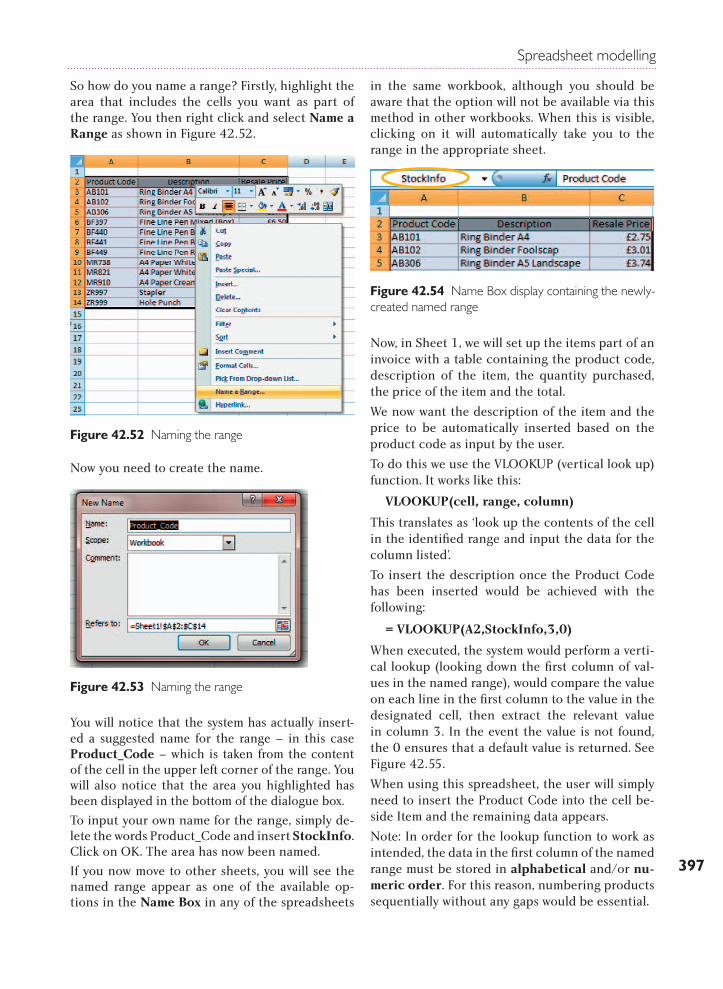
So how do you name a range? Firstly, highlight the area that includes the cells you want as part of the range. You then right click and select Name a Range as shown in Figure 42.52.
Now you need to create the name.
You will notice that the system has actually insert-ed a suggested name for the range – in this case Product_Code – which is taken from the content of the cell in the upper left corner of the range. You will also notice that the area you highlighted has been displayed in the bottom of the dialogue box.
To input your own name for the range, simply de-lete the words Product_Code and insert StockInfo. Click on OK. The area has now been named.
If you now move to other sheets, you will see the named range appear as one of the available op-tions in the Name Box in any of the spreadsheets
in the same workbook, although you should be aware that the option will not be available via this method in other workbooks. When this is visible, clicking on it will automatically take you to the range in the appropriate sheet.
Now, in Sheet 1, we will set up the items part of an invoice with a table containing the product code, description of the item, the quantity purchased, the price of the item and the total.
We now want the description of the item and the price to be automatically inserted based on the product code as input by the user.
To do this we use the VLOOKUP (vertical look up) function. It works like this:
VLOOKUP(cell, range, column)
This translates as ‘look up the contents of the cell in the identified range and input the data for the column listed’.
To insert the description once the Product Code has been inserted would be achieved with the following:
= VLOOKUP(A2,StockInfo,3,0)
When executed, the system would perform a verti-cal lookup (looking down the first column of val-ues in the named range), would compare the value on each line in the first column to the value in the designated cell, then extract the relevant value in column 3. In the event the value is not found, the 0 ensures that a default value is returned. See Figure 42.55.
When using this spreadsheet, the user will simply need to insert the Product Code into the cell be-side Item and the remaining data appears.
Note: In order for the lookup function to work as intended, the data in the first column of the named range must be stored in alphabetical and/or nu-meric order. For this reason, numbering products sequentially without any gaps would be essential.
Figure 42.52 Naming the range
Figure 42.53 Naming the range
Figure 42.54 Name Box display containing the newly-created named range
BTEC Level 3 National in IT
398
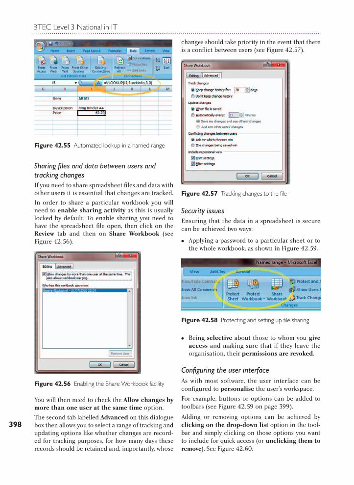
Sharing files and data between users and tracking changes If you need to share spreadsheet files and data with other users it is essential that changes are tracked.
In order to share a particular workbook you will need to enable sharing activity as this is usually locked by default. To enable sharing you need to have the spreadsheet file open, then click on the Review tab and then on Share Workbook (see Figure 42.56).
You will then need to check the Allow changes by more than one user at the same time option.
The second tab labelled Advanced on this dialogue box then allows you to select a range of tracking and updating options like whether changes are record-ed for tracking purposes, for how many days these records should be retained and, importantly, whose
changes should take priority in the event that there is a conflict between users (see Figure 42.57).
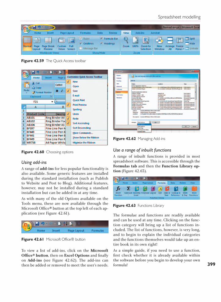
Security issuesEnsuring that the data in a spreadsheet is secure can be achieved two ways:
MM Applying a password to a particular sheet or to the whole workbook, as shown in Figure 42.59.
MM Being selective about those to whom you give access and making sure that if they leave the organisation, their permissions are revoked.
Configuring the user interfaceAs with most software, the user interface can be configured to personalise the user’s workspace.
For example, buttons or options can be added to toolbars (see Figure 42.59 on page 399).
Adding or removing options can be achieved by clicking on the drop-down list option in the tool-bar and simply clicking on those options you want to include for quick access (or unclicking them to remove). See Figure 42.60.
Figure 42.55 Automated lookup in a named range
Figure 42.56 Enabling the Share Workbook facility
Figure 42.57 Tracking changes to the file
Figure 42.58 Protecting and setting up file sharing
Spreadsheet modelling
399
Figure 42.60 Choosing options
Using add-insA range of add-ins for less popular functionality is also available. Some generic features are installed during the standard installation (such as Publish to Website and Post to Blog). Additional features, however, may not be installed during a standard installation but can be added in at any time.
As with many of the old Options available on the Tools menu, these are now available through the Microsoft Office® button at the top left of each ap-plication (see Figure 42.61).
To view a list of add-ins, click on the Microsoft Office® button, then on Excel Options and finally on Add-ins (see Figure 42.62). The add-ins can then be added or removed to meet the user’s needs.
Use a range of inbuilt functions A range of inbuilt functions is provided in most spreadsheet software. This is accessible through the Formulas tab and then the Function Library op-tion (Figure 42.63).
The formulae and functions are readily available and can be used at any time. Clicking on the func-tion category will bring up a list of functions in-cluded. The list of functions, however, is very long, and to begin to explain the individual categories and the functions themselves would take up an en-tire book in its own right!
As a simple guide, if you need to use a function, first check whether it is already available within the software before you begin to develop your own formula!
Figure 42.61 Microsoft Office® button
Figure 42.62 Managing Add-ins
Figure 42.63 Functions Library
Figure 42.59 The Quick Access toolbar
BTEC Level 3 National in IT
400
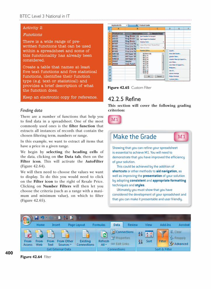
Finding dataThere are a number of functions that help you to fi nd data in a spreadsheet. One of the most commonly used ones is the fi lter function that extracts all instances of records that contain the chosen fi ltering term, numbers or range.
In this example, we want to extract all items that have a price in a given range.
We begin by selecting the heading cells of the data, clicking on the Data tab, then on the Filter icon. This will activate the AutoFilter (Figure 42.64).
We will then need to choose the values we want to display. To do this you would need to click on the Filter icon to the right of Resale Price. Clicking on Number Filters will then let you choose the criteria (such as a range with a maxi-mum and minimum value), on which to fi lter (Figure 42.65).
42.2.5 Refi neThis section will cover the following grading criterion:
M1
Activity 2
Functions
There is a wide range of pre-written functions that can be used within a spreadsheet and some of this functionality has already been considered.
Create a table that names at least five text functions and five statistical functions, identifies their function type (e.g. text or statistical) and provides a brief description of what the function does.
Keep an electronic copy for reference.
Figure 42.65 Custom Filter
Make the GradeShowing that you can refi ne your spreadsheet is essential to achieve M1. You will need to demonstrate that you have improved the effi ciency of your solution. This could be achieved by the addition of shortcuts or other methods to aid navigation, as well as improving the presentation of your solution by adopting consistent and appropriate formatting techniques and styles. Ultimately you must show that you have considered the development of your spreadsheet and that you can make it presentable and user friendly.
M1
Figure 42.64 Filter
Spreadsheet modelling
401
Refining a spreadsheet is essential to meet the Merit criteria in this unit. In order to do this you will have to show that you can improve the effi-ciency of your spreadsheet, format the data cor-rectly and show that you can print selectively.
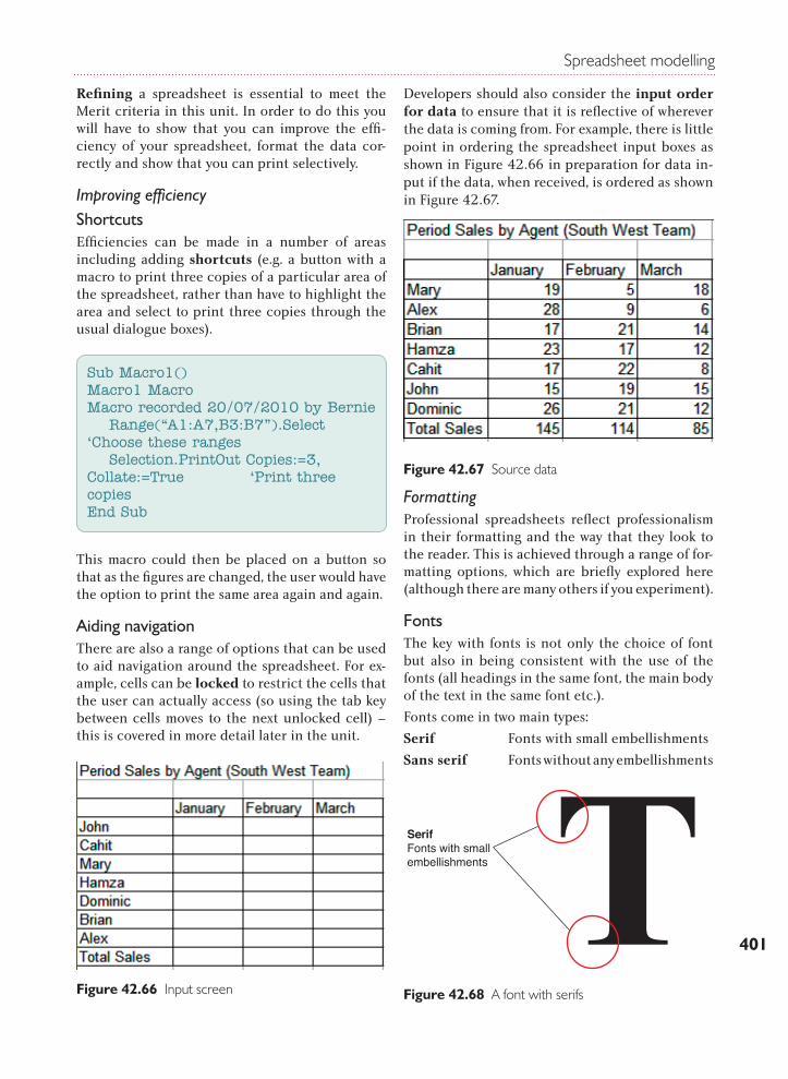
Improving efficiencyShortcutsEfficiencies can be made in a number of areas including adding shortcuts (e.g. a button with a macro to print three copies of a particular area of the spreadsheet, rather than have to highlight the area and select to print three copies through the usual dialogue boxes).
This macro could then be placed on a button so that as the figures are changed, the user would have the option to print the same area again and again.
Aiding navigationThere are also a range of options that can be used to aid navigation around the spreadsheet. For ex-ample, cells can be locked to restrict the cells that the user can actually access (so using the tab key between cells moves to the next unlocked cell) – this is covered in more detail later in the unit.
Developers should also consider the input order for data to ensure that it is reflective of wherever the data is coming from. For example, there is little point in ordering the spreadsheet input boxes as shown in Figure 42.66 in preparation for data in-put if the data, when received, is ordered as shown in Figure 42.67.
FormattingProfessional spreadsheets reflect professionalism in their formatting and the way that they look to the reader. This is achieved through a range of for-matting options, which are briefly explored here (although there are many others if you experiment).
FontsThe key with fonts is not only the choice of font but also in being consistent with the use of the fonts (all headings in the same font, the main body of the text in the same font etc.).
Fonts come in two main types:
Serif Fonts with small embellishments
Sans serif Fonts without any embellishments
Sub Macro1()Macro1 MacroMacro recorded 20/07/2010 by Bernie Range(“A1:A7,B3:B7”).Select ‘Choose these ranges Selection.PrintOut Copies:=3, Collate:=True ‘Print three copiesEnd Sub
Figure 42.66 Input screen
Figure 42.67 Source data
42_73 BTEC_L3_Nat. ITBarking Dog Art
SerifFonts with small embellishments
Figure 42.68 A font with serifs

BTEC Level 3 National in IT
402
‘Sans’, as you may be aware, is French for ‘without’, so sans serif literally means ‘without serifs’. Some studies have indicated that text written in sans serif fonts is considered to be less formal and aids reading and recollection.
Figure 42.69 shows some examples. To be able to see the difference clearly, look at the capital T in each example.
In addition, fonts are classified as proportional or non-proportional.
A proportional font uses up a different amount of space for each character – for example, an ‘I’, which is tall and thin would take up much less space than an ‘M’ (see Figures 42.70 and 42.71 for comparison).
In each case state whether the font is proportional or non-proportional.
Keep an electronic copy for reference.
Page orientationPaper can be used in two different ways (this is called its orientation): landscape and portrait (Figure 42.72).
Charts and graphs are often created in landscape view, particularly bar charts and trend charts, to ensure that the image is as clear as it can be. Printing on paper in the same landscape orienta-tion will ensure that the information is fully leg-ible. Squashing it into a portrait view could make some or all of the information illegible.
Header and footerJust as with Microsoft Word® documents, spread-sheets can be enhanced with headers or footers. A header appears in the white space at the top of a document or spreadsheet; a footer appears in the white space at the bottom. Inserting these is an option on the Insert tab, on the Text menu (see Figure 42.73).
Figure 42.69 Fonts
Figure 42.70 Times New Roman
This font is Courier New (14) and it is a serif,non-proportional font as it uses the same amountof space for an 'I' as it does for an 'M'. This
Figure 42.71 Courier New
Activity 3
Fonts
Investigate different font examples and identify five serif and five sans serif fonts.
42_77 BTEC_L3_Nat. ITBarking Dog Art
Landscape Portrait
Figure 42.72
Figure 42.73 Header and footer
Spreadsheet modelling
403
Activating the Text menu brings up an additional tab (in this case the Design tab), which contains an extensive list of header and footer options. If you have chosen to insert a header, the Header box appears and the cursor fl ashes for text entry.
Print areaThere will be instances where the user does not wish to print an entire spreadsheet, but instead decides to print a part of it. To do this, you need to highlight the area you want to print, then click on the Page Layout tab and the Print Area option. You can then set or clear a series of selected cells.
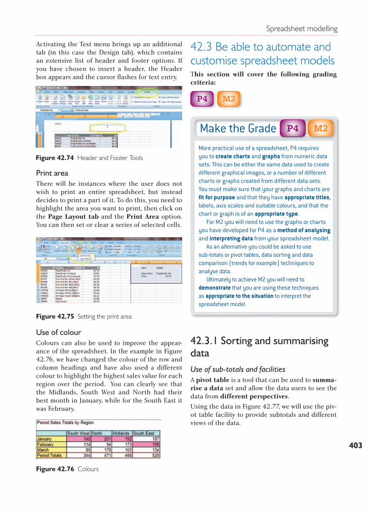
Use of colourColours can also be used to improve the appear-ance of the spreadsheet. In the example in Figure 42.76, we have changed the colour of the row and column headings and have also used a different colour to highlight the highest sales value for each region over the period. You can clearly see that the Midlands, South West and North had their best month in January, while for the South East it was February.
42.3 Be able to automate and customise spreadsheet modelsThis section will cover the following grading criteria:
P4
M2
42.3.1 Sorting and summarising dataUse of sub-totals and facilities A pivot table is a tool that can be used to summa-rise a data set and allow the data users to see the data from different perspectives.
Using the data in Figure 42.77, we will use the piv-ot table facility to provide subtotals and different views of the data.
Figure 42.74 Header and Footer Tools
Figure 42.75 Setting the print area
Figure 42.76 Colours
Make the GradeMore practical use of a spreadsheet, P4 requires you to create charts and graphs from numeric data sets. This can be either the same data used to create different graphical images, or a number of different charts or graphs created from different data sets. You must make sure that your graphs and charts are fi t for purpose and that they have appropriate titles, labels, axis scales and suitable colours, and that the chart or graph is of an appropriate type. For M2 you will need to use the graphs or charts you have developed for P4 as a method of analysing and interpreting data from your spreadsheet model. As an alternative you could be asked to use sub-totals or pivot tables, data sorting and data comparison (trends for example) techniques to analyse data. Ultimately to achieve M2 you will need to demonstrate that you are using these techniques as appropriate to the situation to interpret the spreadsheet model.
M2P4
BTEC Level 3 National in IT
404
Sorting data on multiple fieldsThe key issue with sorting data is ensuring that you select all the data across the rows and columns to be included when the records are moved. Failure to do this could result in data becoming mixed up and effectively useless.
In Figure 42.80 (on the next page) the data had been sorted in date order. We will now use the same data and sort it on multiple fields. See Activity 5 for details.
Filtering data sets With sorted or unsorted data there is also an autofilter Function. To activate the autofilter, highlight the headings at the top of the relevant data, click on Data and then on the Filter icon. The column headings will automatically become drop-down boxes. Selecting the drop-down menu beside Description, for example, will allow the user to choose which item to display and it will extract only those records from the list which match your
Activity 4
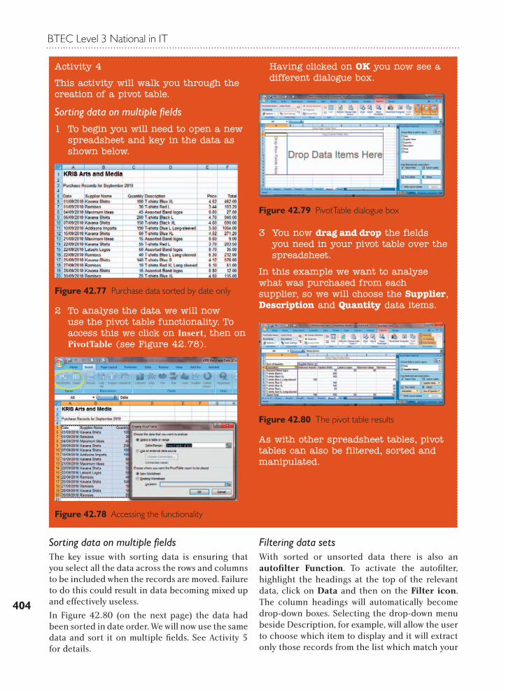
This activity will walk you through the creation of a pivot table.
Sorting data on multiple fields1 To begin you will need to open a new
spreadsheet and key in the data as shown below.
Figure 42.77 Purchase data sorted by date only
2 To analyse the data we will now use the pivot table functionality. To access this we click on Insert, then on PivotTable (see Figure 42.78).
Figure 42.78 Accessing the functionality
Having clicked on OK you now see a different dialogue box.
Figure 42.79 PivotTable dialogue box
3 You now drag and drop the fields you need in your pivot table over the spreadsheet.
In this example we want to analyse what was purchased from each supplier, so we will choose the Supplier, Description and Quantity data items.
Figure 42.80 The pivot table results
As with other spreadsheet tables, pivot tables can also be filtered, sorted and manipulated.
Spreadsheet modelling
405
selection. To demonstrate this function, we click on Description, as suggested, and then deacti-vate the Select All option in the list and click only Assorted Band Logos (Figure 42.84).
The filtered list now shows only those suppliers from whom Kris Arts and Media have purchased that particular product. Notice that the drop-down icon on the Description column has now changed to a Filter icon. This is very useful to the user as he or she can immediately see where a fil-ter has been applied (Figure 42.85).
Similarly, you could choose to filter for all the records for one particular supplier or for goods purchased on a single date. Usefully, the autofilter function can be switched on or off on demand.
Figure 42.84 Using the autofilter to filter data
Figure 42.85 Autofilter results
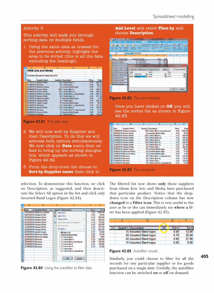
Activity 5
This activity will walk you through sorting data on multiple fields.
1 Using the same data as created for the previous activity, highlight the area to be sorted (this is all the data excluding the headings).
Figure 42.81 The data area
2 We will now sort by Supplier and then Description. To do this we will activate both options simultaneously. We now click on Data menu then on Sort to bring up the sorting dialogue box, which appears as shown in Figure 42.82.
3 From the drop-down list choose to Sort by Supplier name then click to
Add Level and select Then by and choose Description.
Figure 42.82 The sort interface
Once you have clicked on OK you will see the sorted list as shown in Figure 42.83.
Figure 42.83 The sorted list
BTEC Level 3 National in IT
406
Using these features and facilities will enable you to produce professional spreadsheets that meet user needs. If in doubt about what is required on a spreadsheet or how the audience requires the data presented – ASK!
42.3.2 ToolsCharts and graphsBeing able to create charts and graphs is an im-portant skill for anyone working with data through spreadsheets.
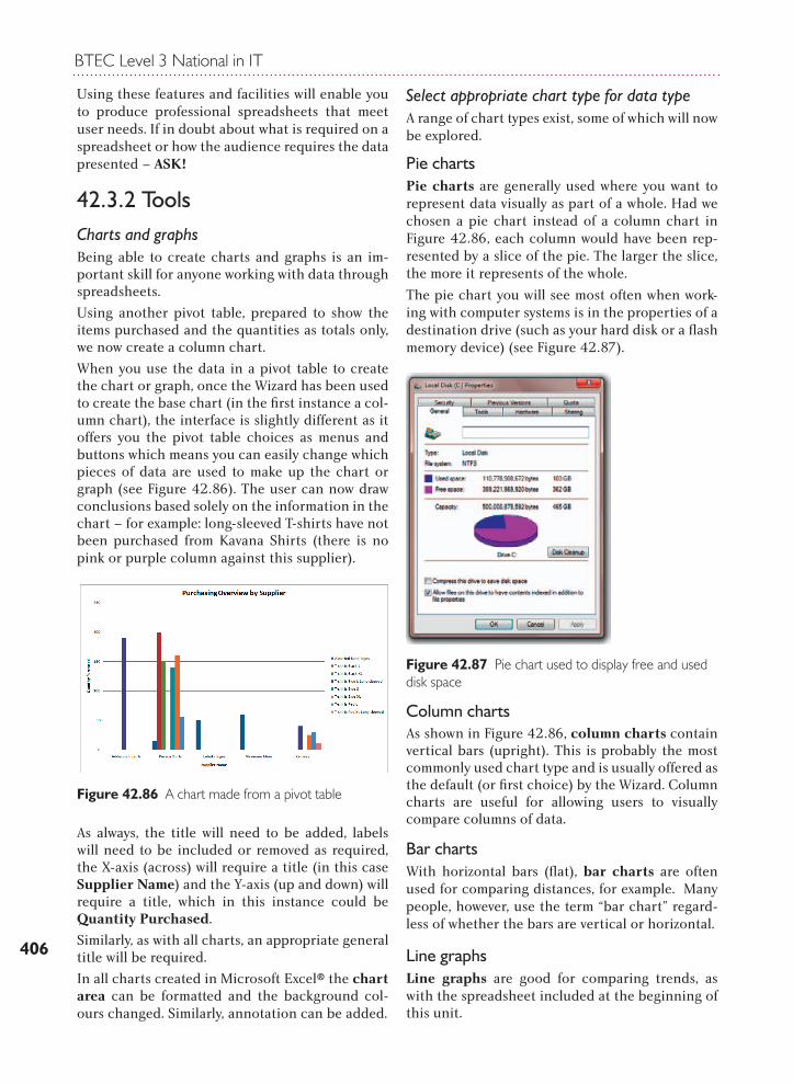
Using another pivot table, prepared to show the items purchased and the quantities as totals only, we now create a column chart.
When you use the data in a pivot table to create the chart or graph, once the Wizard has been used to create the base chart (in the first instance a col-umn chart), the interface is slightly different as it offers you the pivot table choices as menus and buttons which means you can easily change which pieces of data are used to make up the chart or graph (see Figure 42.86). The user can now draw conclusions based solely on the information in the chart – for example: long-sleeved T-shirts have not been purchased from Kavana Shirts (there is no pink or purple column against this supplier).
As always, the title will need to be added, labels will need to be included or removed as required, the X-axis (across) will require a title (in this case Supplier Name) and the Y-axis (up and down) will require a title, which in this instance could be Quantity Purchased.
Similarly, as with all charts, an appropriate general title will be required.
In all charts created in Microsoft Excel® the chart area can be formatted and the background col-ours changed. Similarly, annotation can be added.
Select appropriate chart type for data type A range of chart types exist, some of which will now be explored.
Pie charts Pie charts are generally used where you want to represent data visually as part of a whole. Had we chosen a pie chart instead of a column chart in Figure 42.86, each column would have been rep-resented by a slice of the pie. The larger the slice, the more it represents of the whole.
The pie chart you will see most often when work-ing with computer systems is in the properties of a destination drive (such as your hard disk or a flash memory device) (see Figure 42.87).
Column charts As shown in Figure 42.86, column charts contain vertical bars (upright). This is probably the most commonly used chart type and is usually offered as the default (or first choice) by the Wizard. Column charts are useful for allowing users to visually compare columns of data.
Bar charts With horizontal bars (flat), bar charts are often used for comparing distances, for example. Many people, however, use the term “bar chart” regard-less of whether the bars are vertical or horizontal.
Line graphs Line graphs are good for comparing trends, as with the spreadsheet included at the beginning of this unit.
Figure 42.86 A chart made from a pivot table
Figure 42.87 Pie chart used to display free and used disk space
Spreadsheet modelling
407
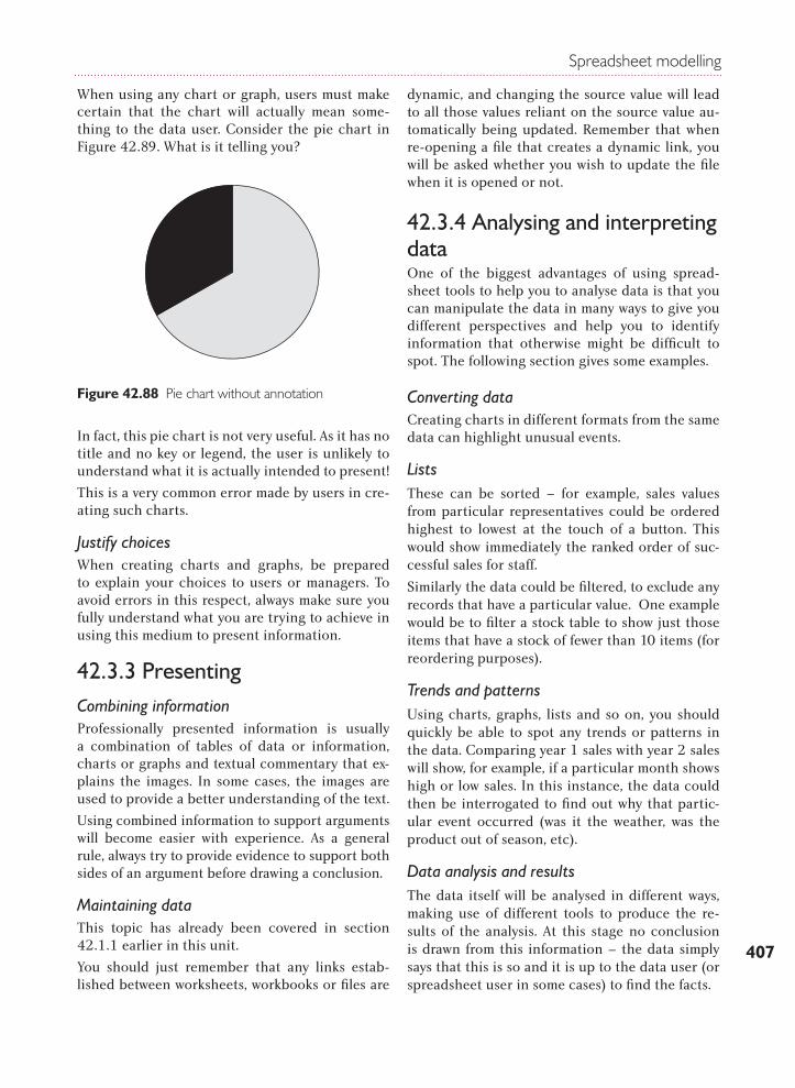
When using any chart or graph, users must make certain that the chart will actually mean some-thing to the data user. Consider the pie chart in Figure 42.89. What is it telling you?
In fact, this pie chart is not very useful. As it has no title and no key or legend, the user is unlikely to understand what it is actually intended to present!
This is a very common error made by users in cre-ating such charts.
Justify choicesWhen creating charts and graphs, be prepared to explain your choices to users or managers. To avoid errors in this respect, always make sure you fully understand what you are trying to achieve in using this medium to present information.
42.3.3 PresentingCombining information Professionally presented information is usually a combination of tables of data or information, charts or graphs and textual commentary that ex-plains the images. In some cases, the images are used to provide a better understanding of the text.
Using combined information to support arguments will become easier with experience. As a general rule, always try to provide evidence to support both sides of an argument before drawing a conclusion.
Maintaining data This topic has already been covered in section 42.1.1 earlier in this unit.
You should just remember that any links estab-lished between worksheets, workbooks or files are
dynamic, and changing the source value will lead to all those values reliant on the source value au-tomatically being updated. Remember that when re-opening a file that creates a dynamic link, you will be asked whether you wish to update the file when it is opened or not.
42.3.4 Analysing and interpreting dataOne of the biggest advantages of using spread-sheet tools to help you to analyse data is that you can manipulate the data in many ways to give you different perspectives and help you to identify information that otherwise might be difficult to spot. The following section gives some examples.
Converting dataCreating charts in different formats from the same data can highlight unusual events.
ListsThese can be sorted – for example, sales values from particular representatives could be ordered highest to lowest at the touch of a button. This would show immediately the ranked order of suc-cessful sales for staff.
Similarly the data could be filtered, to exclude any records that have a particular value. One example would be to filter a stock table to show just those items that have a stock of fewer than 10 items (for reordering purposes).
Trends and patternsUsing charts, graphs, lists and so on, you should quickly be able to spot any trends or patterns in the data. Comparing year 1 sales with year 2 sales will show, for example, if a particular month shows high or low sales. In this instance, the data could then be interrogated to find out why that partic-ular event occurred (was it the weather, was the product out of season, etc).
Data analysis and resultsThe data itself will be analysed in different ways, making use of different tools to produce the re-sults of the analysis. At this stage no conclusion is drawn from this information – the data simply says that this is so and it is up to the data user (or spreadsheet user in some cases) to find the facts.
Figure 42.88 Pie chart without annotation
BTEC Level 3 National in IT
408
ConclusionsConclusions are now drawn – the data is inter-preted and meaning is found in the results. This gets easier with experience. Although novice data/spreadsheet users are unlikely to have to draw these conclusions, to learn how conclusions are drawn from information following a data analysis, ask the data user to share his or her conclusions with you.
42.3.5 CustomisationThis section will cover the following grading criterion:
P5
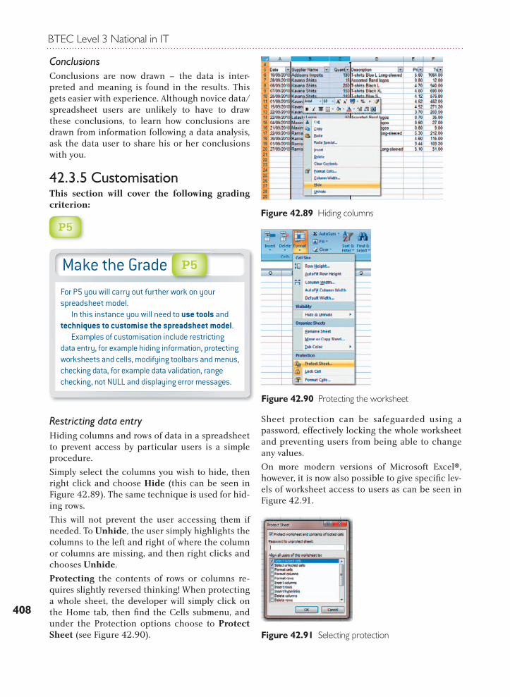
Restricting data entry Hiding columns and rows of data in a spreadsheet to prevent access by particular users is a simple procedure.
Simply select the columns you wish to hide, then right click and choose Hide (this can be seen in Figure 42.89). The same technique is used for hid-ing rows.
This will not prevent the user accessing them if needed. To Unhide, the user simply highlights the columns to the left and right of where the column or columns are missing, and then right clicks and chooses Unhide.
Protecting the contents of rows or columns re-quires slightly reversed thinking! When protecting a whole sheet, the developer will simply click on the Home tab, then fi nd the Cells submenu, and under the Protection options choose to Protect Sheet (see Figure 42.90).
Sheet protection can be safeguarded using a password, effectively locking the whole worksheet and preventing users from being able to change any values.
On more modern versions of Microsoft Excel®, however, it is now also possible to give specifi c lev-els of worksheet access to users as can be seen in Figure 42.91.
Make the GradeFor P5 you will carry out further work on your spreadsheet model. In this instance you will need to use tools and techniques to customise the spreadsheet model. Examples of customisation include restricting data entry, for example hiding information, protecting worksheets and cells, modifying toolbars and menus, checking data, for example data validation, range checking, not NULL and displaying error messages.
P5
Figure 42.89 Hiding columns
Figure 42.90 Protecting the worksheet
Figure 42.91 Selecting protection
Spreadsheet modelling
409
The developer might, on the other hand, wish to protect the important parts of the spreadsheet, such as headings and totals, and only enable (or leave accessible) those areas that are safe for a novice user to use.
To do this the developer will need to unlock (make accessible) those areas that the user is free to ac-cess, prior to protecting the worksheet.
In Figure 42.92, the area that the user will be able to key into has been identifi ed.
If the user now right clicks on the identifi ed cells, then clicks on Format Cells and fi nally on Protection, the dialogue box shown in Figure 42.93 will become visible. The user unchecks the Locked box in order to unlock those cells when the rest of the sheet becomes protected.
You will also notice that cells to be hidden can be identifi ed in the same way.
Once the cells to be kept active have been un-locked, the sheet is protected in the usual way (see Figures 42.90 and 42.91).
Modifying toolbars and menus Having already considered how data can be hid-den or locked and how whole worksheets can be protected, you might also wish to limit the func-tionality that a user has access to by removing buttons or menus.
Data validation, range checking and error messagesCustomising your spreadsheet to provide some data validation functionality is essential to main-tain the integrity of your data and some sugges-tions for this activity have already been covered in section 42.2.1, including validation, range check-ing and the use of customised error messages.
42.3.6 AutomationThis section will cover the following grading criteria:
P6
M3
MacrosMacros are mini programs that automate chosen functions in a spreadsheet. They can be stored within a particular workbook or stored globally so that they can be accessed by all workbooks.
Recording a macro is a very straightforward proc-ess. You can either select the View tab and then the Macro submenu, or you can use the Developer tab which contains many of the macro functions. This is not visible by default and may need to be added.
To add the Developer tab, click on the Microsoft Offi ce® icon, Excel® Options and check the box as shown in Figure 42.94.
Figure 42.92 Identifying the user access area
Figure 42.93 Unlocking cells
Make the GradeFor P6 you should develop the spreadsheet model further by implementing automated features, such as macros, ActiveX® controls, Control Toolbox or Microsoft Visual Basic®. M3 builds on P6 by requiring you to compare different automation methods including macros, ActiveX® control, Control Toolbox and Visual Basic®. This can be most effi ciently achieved by using a simple table of comparison.
M3P6
Figure 42.94 Adding the Developer tab

BTEC Level 3 National in IT
410
When you click on the Developer tab, you can then choose to Record a new macro (Figure 42.95).
Figure 42.95 Recording a macro
As soon as Record New Macro has been selected, the dialogue box shown in Figure 42.96 will ap-pear. Here you will have to give the macro a name, and you will select whether the macro will be vis-ible to the workbook open at the time it was creat-ed, a new workbook not yet created, or whether it should be placed in a Personal Macro Workbook. This is what effectively makes the macro global be-cause the Personal Macro Workbook is visible to all spreadsheets. This is called ‘scoping’.
Once you click on OK, the macro will begin re-cording and every action you undertake will be logged, until you click on the Stop Recording but-ton as shown in Figure 42.97.
Once the recording has been stopped, you can then add a button to the spreadsheet to activate the macro.
To do this you must select the Developer tab, click on the Controls submenu, click on Insert and then from the Form Controls click on the button icon.
Draw a button on your spreadsheet and when you release the mouse the Assign Macro dialogue box will appear. Choose the macro you wish to assign.
You can also change the caption on the button to describe what the button does (e.g. Print).
Macros you might like to record to enhance your spreadsheet could include:
MM a print macro to always print a specific number of copies of a whole spreadsheet
MM a macro to select a specific area in a spread-sheet for printing
MM a macro that ensures that all columns are of the correct width to accommodate the data
Figure 42.96 Scoping the macro
Figure 42.97 Stop recording
Figure 42.98 Adding a button
Figure 42.99 Assign a macro
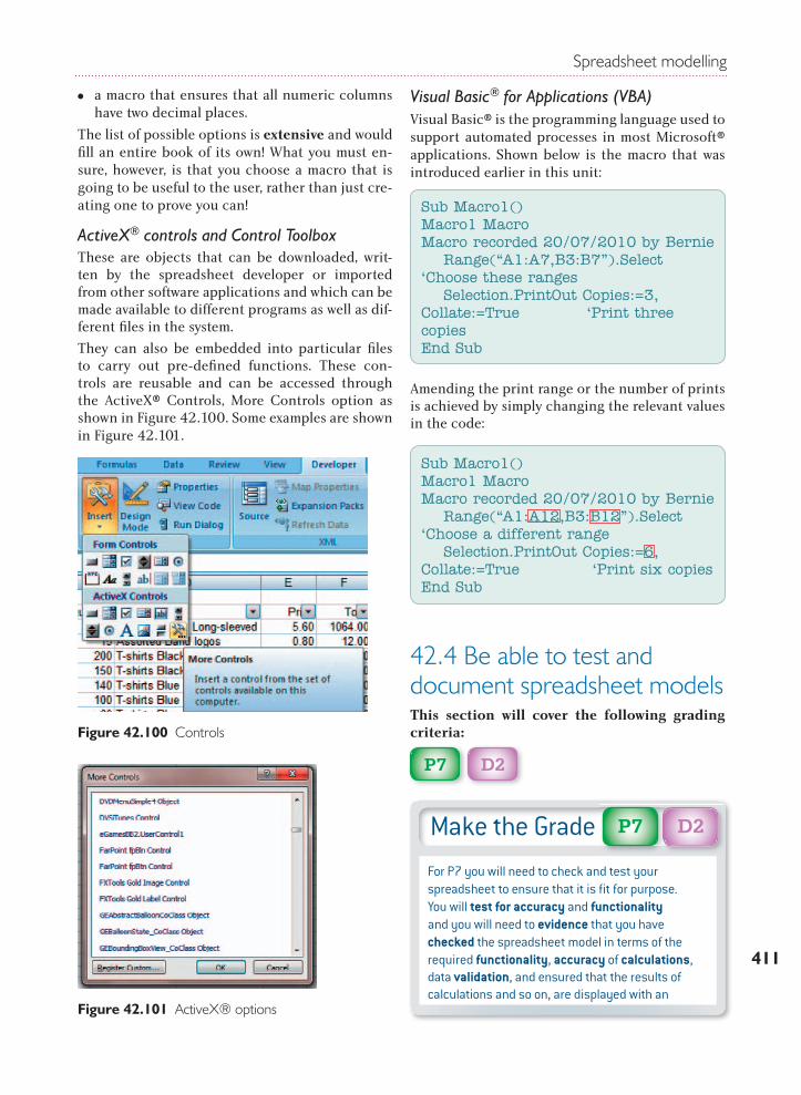
Spreadsheet modelling
411
MM a macro that ensures that all numeric columns have two decimal places.
The list of possible options is extensive and would fi ll an entire book of its own! What you must en-sure, however, is that you choose a macro that is going to be useful to the user, rather than just cre-ating one to prove you can!
ActiveX® controls and Control ToolboxThese are objects that can be downloaded, writ-ten by the spreadsheet developer or imported from other software applications and which can be made available to different programs as well as dif-ferent fi les in the system.
They can also be embedded into particular fi les to carry out pre-defi ned functions. These con-trols are reusable and can be accessed through the ActiveX® Controls, More Controls option as shown in Figure 42.100. Some examples are shown in Figure 42.101.
Visual Basic® for Applications (VBA)Visual Basic® is the programming language used to support automated processes in most Microsoft® applications. Shown below is the macro that was introduced earlier in this unit:
Amending the print range or the number of prints is achieved by simply changing the relevant values in the code:
42.4 Be able to test and document spreadsheet modelsThis section will cover the following grading criteria:
P7
D2
Figure 42.100 Controls
Figure 42.101 ActiveX® options
Sub Macro1()Macro1 MacroMacro recorded 20/07/2010 by Bernie Range(“A1:A7,B3:B7”).Select ‘Choose these ranges Selection.PrintOut Copies:=3, Collate:=True ‘Print three copiesEnd Sub
Sub Macro1()Macro1 MacroMacro recorded 20/07/2010 by Bernie Range(“A1:A12,B3:B12”).Select ‘Choose a different range Selection.PrintOut Copies:=6, Collate:=True ‘Print six copiesEnd Sub
Make the GradeFor P7 you will need to check and test your spreadsheet to ensure that it is fi t for purpose. You will test for accuracy and functionality and you will need to evidence that you have checked the spreadsheet model in terms of the required functionality, accuracy of calculations, data validation, and ensured that the results of calculations and so on, are displayed with an
D2P7
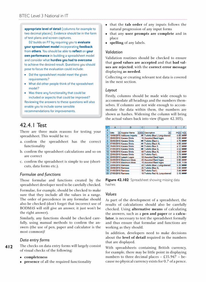
BTEC Level 3 National in IT
412
appropriate level of detail (columns for example to two decimal places). Evidence should be in the form of test plans and screen captures. D2 builds on P7 by requiring you to evaluate your spreadsheet model incorporating feedback from others. You should be able to refl ect on your own performance in building a spreadsheet model and consider what hurdles you had to overcome to achieve the desired result. Questions you should pose to focus the evaluation could include:
MM Did the spreadsheet model meet the given requirements?
MM What did other people think of the spreadsheet model?
MM Was there any functionality that could be included or aspects that could be improved?
Reviewing the answers to these questions will also enable you to include some sensible recommendations for improvements.
42.4.1 TestThere are three main reasons for testing your spreadsheet. This would be to:
a. confi rm the spreadsheet has the correct functionality
b. confi rm the spreadsheet calculations and so on are correct
c. confi rm the spreadsheet is simple to use (short-cuts, data forms etc.).
Formulae and functions Those formulae and functions created by the spreadsheet developer need to be carefully checked.
Formulae, for example, should be checked to make sure that they include all the values in a range. The order of precedence in any formulae should also be checked (don’t forget that incorrect use of BODMAS will still give an answer, it just won’t be the right answer).
Similarly, any functions should be checked care-fully, using manual methods to confi rm the an-swers (the use of pen, paper and calculator is the most common)!
Data entry formsThe checks on data entry forms will largely consist of visual checks of the following:
MM completeness MM presence of all the required functionality
MM that the tab order of any inputs follows the natural progression of any input forms
MM that any user prompts are complete and in place
MM spelling of any labels.
ValidationValidation routines should be checked to ensure that good values are accepted and that bad val-ues are rejected, with the correct error message displaying as needed.
Collecting or creating relevant test data is covered in the next section.
LayoutFirstly, columns should be made wide enough to accommodate all headings and the numbers them-selves. If columns are not wide enough to accom-modate the data within them, the numbers are shown as hashes. Widening the column will bring the actual values back into view (Figure 42.103).
ValuesAs part of the development of a spreadsheet, the results of calculations should also be carefully checked. Using alternative means of calculating the answers, such as a pen and paper or a calcu-lator, is necessary to test the spreadsheet formally and thus ensure that formulae and functions are working as they should.
In addition, developers need to make decisions about the level of detail required in the numbers that are displayed.
With spreadsheets containing British currency, for example, there may be little point in displaying numbers to three decimal places – £15.947 – be-cause no physical currency exists for 0.7 of a pence.
Figure 42.102 Spreadsheet showing missing data hashes
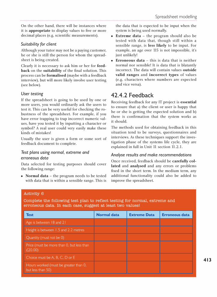
Spreadsheet modelling
413
On the other hand, there will be instances where it is appropriate to display values to five or more decimal places (e.g. scientific measurements).
Suitability for clientAlthough your tutor may not be a paying customer, he or she is still the person for whom the spread-sheet is being created.
Clearly it is necessary to ask him or her for feed-back on the suitability of the final solution. This process can be formalised (maybe with a feedback interview), but will more likely involve user testing (see below).
User testingIf the spreadsheet is going to be used by one or more users, you would ordinarily ask the users to test it. This can be very useful for checking the ro-bustness of the spreadsheet. For example, if you have error trapping to trap incorrect numeric val-ues, have you tested it by inputting a character or symbol? A real user could very easily make these kinds of mistakes!
Usually the user is given a form or some sort of feedback document to complete.
Test plans using normal, extreme and erroneous dataData selected for testing purposes should cover the following range:
MM Normal data – the program needs to be tested with data that is within a sensible range. This is
the data that is expected to be input when the system is being used normally.
MM Extreme data – the program should also be tested with data that, though still within a sensible range, is less likely to be input. For example, an age over 115 is not impossible, it’s just unlikely!
MM Erroneous data – this is data that is neither normal nor sensible! It is data that is blatantly incorrect. The data will contain values outside valid ranges and incorrect types of values (e.g. characters where numbers are expected and vice versa).
42.4.2 FeedbackReceiving feedback for any IT project is essential to ensure that a) the client or user is happy that he or she is getting the expected solution and b) there is confirmation that the system works as it should.
The methods used for obtaining feedback in this situation tend to be surveys, questionnaires and interviews. As these techniques support the inves-tigation phase of the systems life cycle, they are explained in full in Unit 11 section 11.2.1.
Analyse results and make recommendationsOnce received, feedback should be carefully col-lated and analysed and any errors or problems fixed in the short term. In the medium term, any additional functionality could also be added to improve the spreadsheet.
Activity 6
Complete the following test plan to reflect testing for normal, extreme and erroneous data. In each case, suggest at least two values!
Test Normal data Extreme Data Erroneous data
Age is between 18 and 21
Height is between 1.5 and 2.2 metres
Quantity (must not be 0)
Price (must be more than 0, but less than £20.00)
Choice must be A, B, C, D or E
Hours worked (must be greater than 0, but less than 50)
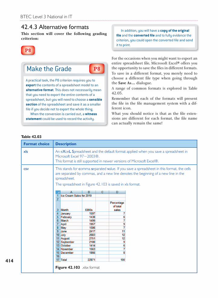
BTEC Level 3 National in IT
414
42.4.3 Alternative formatsThis section will cover the following grading criterion:
P8
In addition, you will have a copy of the original fi le and the converted fi le and to fully evidence the criterion, you could open the converted fi le and send it to print.
For the occasions when you might want to export an entire spreadsheet fi le, Microsoft Excel® offers you the opportunity to save the fi les in different formats. To save in a different format, you merely need to choose a different fi le type when going through the Save As… dialogue.A range of common formats is explored in Table 42.03.Remember that each of the formats will present the fi le in the fi le management system with a dif-ferent icon.What you should notice is that as the fi le exten-sions are different for each format, the fi le name can actually remain the same!
Make the GradeA practical task, the P8 criterion requires you to export the contents of a spreadsheet model to an alternative format. This does not necessarily mean that you need to export the entire contents of a spreadsheet, but you will need to choose a sensible section of the spreadsheet and save it as a smaller fi le if you decide not to export the whole thing. When the conversion is carried out, a witness statement could be used to record the activity.
P8
Table 42.03
Format choice Description
xls An eXceL Spreadsheet and the default format applied when you save a spreadsheet in Microsoft Excel 97~2003®.This format is still supported in newer versions of Microsoft Excel®.
csv This stands for comma separated value. If you save a spreadsheet in this format, the cells are separated by commas, and a new line denotes the beginning of a new line in the spreadsheet.The spreadsheet in Figure 42.103 is saved in xls format.
Figure 42.103 .xlsx format
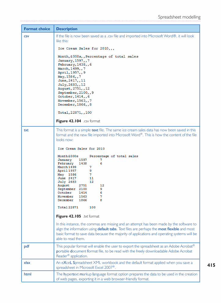
Spreadsheet modelling
415
Format choice Description
csv If the file is now been saved as a .csv file and imported into Microsoft Word®, it will look like this:
txt This format is a simple text file. The same ice cream sales data has now been saved in this format and the new file imported into Microsoft Word®. This is how the content of the file looks now:
In this instance, the commas are missing and an attempt has been made by the software to align the information using default tabs. Text files are perhaps the most flexible and most basic format to save data because the majority of applications and operating systems will be able to read them.
pdf This popular format will enable the user to export the spreadsheet as an Adobe Acrobat® portable document format file, to be read with the freely downloadable Adobe Acrobat Reader® application.
xlsx An eXceL Spreadsheet XML workbook and the default format applied when you save a spreadsheet in Microsoft Excel 2007®.
html The hypertext markup language format option prepares the data to be used in the creation of web pages, exporting it in a web browser-friendly format.
Figure 42.104 .csv format
Figure 42.105 .txt format
BTEC Level 3 National in IT
416
42.4.4 DocumentationThis section will cover the following grading criteria:
P9
M4
In order to make sure that any IT solution can be properly maintained (repaired if problems arise or enhanced if new functionality is needed) a range of documentation will need to be created that explains the solution from a number of per-spectives. The same will be true for a spreadsheet solution. The documents created may be printed, could be held electronically in a .doc fi le, or as a series of web pages for users to access when need-ed (e.g. on an organisation’s intranet).
User documentationThis documentation should be developed from a user perspective. It should contain:
MM a guide on the overall purpose of the spreadsheet
MM instructions on how to use the spreadsheet, in particular how to execute specific tasks
MM troubleshooting information on what the user should do if the spreadsheet does not function correctly.
Technical documentationThe technical documentation may be a section in the user documentation or could be a completely separate document or series of web pages. This in-formation will focus on:
MM Hardware resources – this will usually specify any particular hardware requirements that are needed to run the spreadsheet successfully.
MM Software resources – it is likely that the spreadsheet solution will have been created in a particular version of Microsoft Excel® and this should be recorded. This is because the spreadsheet might not be compatible with ear-lier versions of the software.
InstructionsAlthough modern software largely has electronic help fi les, many people still prefer books to sup-port the general use of software. The following URL provides a link to a series of Microsoft Excel® books that can be purchased on www.amazon.co.uk:
http://www.amazon.co.uk/s/ref=nb_sb_noss?url=search-alias%3Dstripbooks&fi eld-keywords=excel&x=14&y=17&fsc=-1
CalculationsAll calculations and functions used or created should be recorded. With spreadsheet solutions it is useful if the holding cell (cell where the for-mula is written), the formula itself and a descrip-tion of the formula or function is included (a print of the spreadsheet in formula view could also be included).
Formula
Cell A15 =A14*20% This formula
calculates VAT.
Functions used
Cell A14 =SUM(A1:A13) This function adds together the values on the invoice to provide a pre-VAT subtotal.
To display the formula view of a spreadsheet, click on the Formula tab, then on the Formula Editing sub-menu choose Show Formulas (see Figure 42.106).
Make the GradeFor P9 you will need to produce user documentation with instructions for users on how to use the spreadsheet model, especially when navigating the user interfaces. This can be achieved as a formal document or equally as a series of web pages. M4 builds on P9 by requiring you to add technical documentation, which includes the required hardware and software resources, instructions and an explanation of calculations used in the spreadsheet model. Again this could be a completely separate document or could be additional pages in a web-based help fi le. Screencast videos (see Unit 6, section 6.2.1 ‘Writing documentation’) could also be used.
M4P9
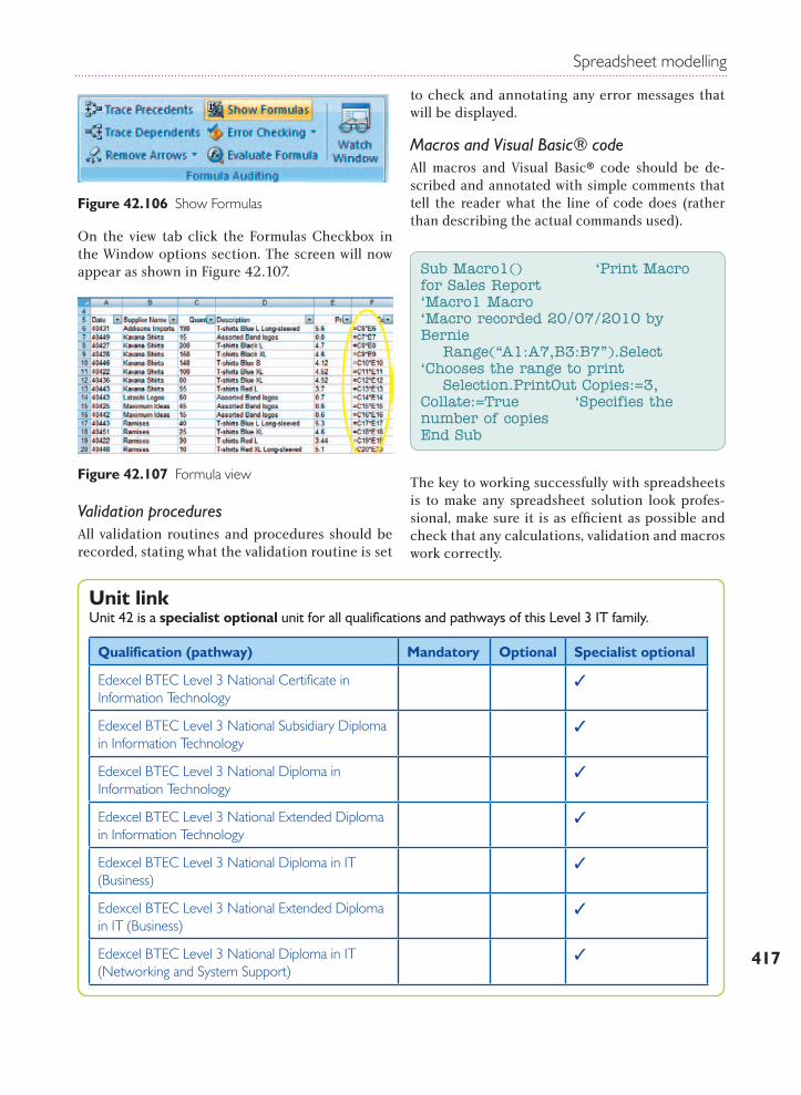
Spreadsheet modelling
417
On the View tab click the Formulas checkbox in
On the view tab click the Formulas Checkbox in the Window options section. The screen will now appear as shown in Figure 42.107.
Validation proceduresAll validation routines and procedures should be recorded, stating what the validation routine is set
to check and annotating any error messages that will be displayed.
Macros and Visual Basic® codeAll macros and Visual Basic® code should be de-scribed and annotated with simple comments that tell the reader what the line of code does (rather than describing the actual commands used).
The key to working successfully with spreadsheets is to make any spreadsheet solution look profes-sional, make sure it is as efficient as possible and check that any calculations, validation and macros work correctly.
Figure 42.106 Show Formulas
Figure 42.107 Formula view
Sub Macro1() ‘Print Macro for Sales Report‘Macro1 Macro ‘Macro recorded 20/07/2010 by Bernie Range(“A1:A7,B3:B7”).Select ‘Chooses the range to print Selection.PrintOut Copies:=3, Collate:=True ‘Specifies the number of copiesEnd Sub
Unit linkUnit 42 is a specialist optional unit for all qualifications and pathways of this Level 3 IT family.
Qualification (pathway) Mandatory Optional Specialist optional
Edexcel BTEC Level 3 National Certificate in Information Technology
Edexcel BTEC Level 3 National Subsidiary Diploma in Information Technology
Edexcel BTEC Level 3 National Diploma in Information Technology
Edexcel BTEC Level 3 National Extended Diploma in Information Technology
Edexcel BTEC Level 3 National Diploma in IT (Business)
Edexcel BTEC Level 3 National Extended Diploma in IT (Business)
Edexcel BTEC Level 3 National Diploma in IT (Networking and System Support)
BTEC Level 3 National in IT
418
Further readingDay, A. – Mastering Financial Mathematics with Excel (Financial Times Prentice Hall, 2005) ISBN 0764597809
Hart-Davis, G. – How to Do Everything with Microsoft Office Excel 2003 (McGraw-Hill Education, 2003) ISBN 0072230711
Heathcote, R. – Further Excel 2000–2003 (Payne-Gallway Publishers, 2004) ISBN 1904467768
Koneman, P. – Advanced Projects for Microsoft Excel 2000 (Prentice Hall, 2000) ISBN 0130885444
Simonn, J. – Excel Data Analysis, 2nd Edition (Hungry Minds Inc US, 2005) ISBN 0764597809
Zapawa, T. – Excel Advanced Report Development (Hungry Minds Inc US, 2005) ISBN 0764588117
Websiteswww.office.microsoft.com/en-us/excel/default.aspx
www.support.openoffice.org/index.html
www.free-training-tutorial.com
In order to achieve each unit, you will complete a series of coursework activities. Each time you hand in work, your tutor will return this to you with a record of your achievement.
This particular unit has 15 criteria to meet: 9 Pass, 4 Merit and 2 Distinction.
For a Pass: You must achieve all 9 Pass criteria.
For a Merit: You must achieve all 9 Pass and all 4 Merit criteria.
For a Distinction: You must achieve all 9 Pass, all 4 Merit and both Distinction criteria.
Achieving success
Qualification (pathway) Mandatory Optional Specialist optional
Edexcel BTEC Level 3 National Extended Diploma in IT(Networking and System Support)
Edexcel BTEC Level 3 National Diploma in IT (Software Development)
Edexcel BTEC Level 3 National Extended Diploma in IT(Software Development)