unit 2: stemplots - annenberg learner · unit 2: stemplots summary of video ... foot sizes in order...
TRANSCRIPT
Unit 2: Stemplots | Student Guide | Page 1
Unit 2: Stemplots
Summary of VideoStatistics is all about data. It is easy to get overwhelmed by an avalanche of numbers if we don’t figure out good ways to organize it.
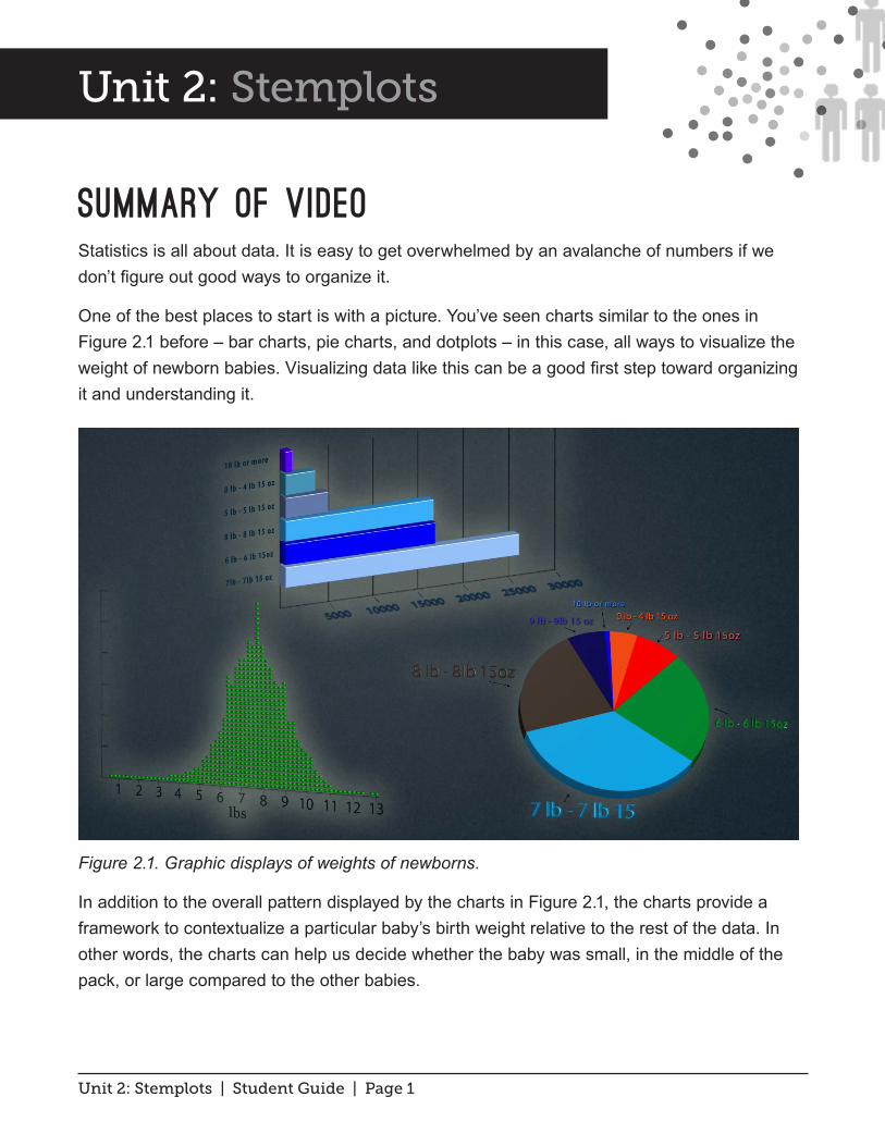
One of the best places to start is with a picture. You’ve seen charts similar to the ones in Figure 2.1 before – bar charts, pie charts, and dotplots – in this case, all ways to visualize the weight of newborn babies. Visualizing data like this can be a good first step toward organizing it and understanding it.
Figure 2.1. Graphic displays of weights of newborns.
In addition to the overall pattern displayed by the charts in Figure 2.1, the charts provide a framework to contextualize a particular baby’s birth weight relative to the rest of the data. In other words, the charts can help us decide whether the baby was small, in the middle of the pack, or large compared to the other babies.

Unit 2: Stemplots | Student Guide | Page 2
There are a variety of ways to visualize data and many real world datasets to work with. Let’s step into the Army’s boots to see the data it collected to help outfit each and every soldier with the right size uniform and gear. Soldiers’ measurements have changed over the years – over time, soldiers’ sizes have both increased and become more variable.
To better assess the outfitting needs of the soldiers, the Army periodically embarks on a measurement project in which many measurements – foot length, shoulder width, head size, and so forth – are taken on a large random sample of soldiers. With a better sense of the most frequently-found dimensions, the Army knows which sizes of uniforms to keep well-stocked, and which sizes are rare enough that it’s cheaper to custom order them. As an illustration, here are the foot lengths (cm) of thirty soldiers:
27.2 26.9 26.6 28.0 26.8 26.1 26.2 27.3 27.6 25.7 29.0 26.5 32.8 28.8 26.9 25.0 26.7 24.6 26.3 26.8 27.0 28.0 27.3 26.5 27.4 25.0 26.6 25.8 27.0 25.9
When you see a bunch of unorganized numbers, it is hard to determine whether or not there are any important patterns. But if we organize these numbers into a stemplot, we can get a better sense of how widely foot size varied. First, using technology or a calculator, we can sort the foot sizes in order from smallest to largest. The sorted data already give us a little better sense of soldiers’ foot sizes. The smallest is 24.6 centimeters and the largest is 32.8 centimeters.
Next, we separate each measurement into a stem (the first digits) and a leaf (the final digit). The stems are lined up vertically and then the leaves are filled in opposite the appropriate stems. Always include all possible stems in your data range, even those that don’t have leaves to go with them. The final step is to organize the leaves in numerical order. The result is the stemplot in Figure 2.2.

Unit 2: Stemplots | Student Guide | Page 3
Figure 2.2. Stemplot of soldiers’ foot lengths.
Displayed as a stemplot, we can see the overall pattern of our data: 26- centimeter values are the most common, and values on either side of that single peak are less common. A stemplot also lets you see at a glance how spread out the distribution is. The data points range from the smallest at 24.6 centimeters to the largest at 32.8 centimeters. Check out the overall shape – it looks pretty symmetric, except for the value of 32.8. An individual measurement like this one that falls outside the overall pattern of the data is called an outlier.
Next, let’s consider another dataset where a stemplot can help us visualize the numbers – fuel economy information (city mpg) on Toyota’s 2012 vehicle line. The data have been organized into the stemplot in Figure 2.3. This time, the stems have been arranged from highest at the top to lowest at the bottom. (Note: the 5|1 at the top is for 51 mpg.)
Figure 2.3 Stemplot for 2012 Toyota’s city mpg.
Take a look at the overall pattern of the stemplot (Figure 2.3). Most of the mpgs are clustered at the lower end of the plot. We can expand the stem to change the resolution of the picture.
Unit 2: Stemplots | Student Guide | Page 4
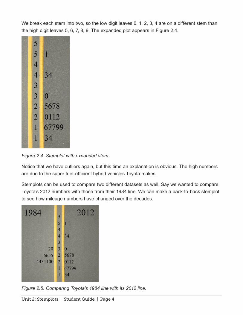
We break each stem into two, so the low digit leaves 0, 1, 2, 3, 4 are on a different stem than the high digit leaves 5, 6, 7, 8, 9. The expanded plot appears in Figure 2.4.
Figure 2.4. Stemplot with expanded stem.
Notice that we have outliers again, but this time an explanation is obvious. The high numbers are due to the super fuel-efficient hybrid vehicles Toyota makes.
Stemplots can be used to compare two different datasets as well. Say we wanted to compare Toyota’s 2012 numbers with those from their 1984 line. We can make a back-to-back stemplot to see how mileage numbers have changed over the decades.
Figure 2.5. Comparing Toyota’s 1984 line with its 2012 line.

Unit 2: Stemplots | Student Guide | Page 5
What is interesting is that in 2012 Toyota had more vehicles way down at the low end, and a few more up at the high end. These extremes are easy to explain when you think about what you see on the roads – modern car buyers are interested in not-so-efficient SUVs and trucks as well as uber-efficient hybrids.
So you can see how stemplots help to tease meaning out of the disorder of raw data. They are useful for visualizing the shape of your data’s distribution, and figuring out how frequently particular data classes pop up in your sea of numbers.
Later videos will show other ways to display data.

Unit 2: Stemplots | Student Guide | Page 6
Student Learning Objectives
A. Be able to differentiate between measurement or count data and categorical data.
B. Understand that the distribution of a variable shows what values the variable takes on and how often.
C. When presented with unorganized raw data, begin by making a graphical display of the data.
D. Be able to construct a stemplot to display the distribution of a variable for small datasets.
E. Be able to describe a graphical display such as a stemplot by first describing the overall pattern and then deviations from that pattern. Be able to identify outliers as important deviations from the overall pattern.
F. In terms of the overall shape of a distribution, recognize when it is roughly symmetric and approximate the center of the distribution.

Unit 2: Stemplots | Student Guide | Page 7
Content Overview
This unit on stemplots is the first in a series of units to focus on graphical representation of quantitative data. The emphasis in this unit is not simply to construct a stemplot but to use the plot to interpret the data’s story.
The clearest picture of the distribution of values of a variable is just that – a picture. A stemplot (or stem-and-leaf plot) is a simple kind of graph that is constructed using the numbers themselves. Here’s an example of head sizes in inches of 30 male soldiers. The head size was measured by putting a tape measure around each soldier’s forehead.
23.0 22.2 21.7 22.0 22.3 22.6 22.7 21.5 22.7 24.9 20.8 23.3 24.2 23.5 23.9 23.4 20.8 21.5 23.0 24.0 22.7 22.6 23.9 21.8 23.1 21.9 21.0 22.4 23.5 22.5
To make a stemplot of these measurements, we first separate each observation into a stem, which is the first digit or digits, and a leaf, the final digit. The stems can consist of any number of digits, but the leaves generally have only a single digit. For the head circumference data, the measurements range from about 21 inches to about 25 inches and are measured to tenths of an inch. We’ll take the whole inches as stems and the tenths as leaves.
First arrange the stems in order with a vertical line to their right as shown in Figure 2.6.
Figure 2.6. Setting up the stem of the stemplot.
2021222324

Unit 2: Stemplots | Student Guide | Page 8
Next, go through the list of observations, putting each leaf on the proper stem. The first soldier’s head size was 23.0 inches, so we put leaf 0 on stem 23. The second head size is 22.2, so we put leaf 2 on stem 22. When we are finished, we have the display in Figure 2.7.
Figure 2.7. Stemplot with unordered leaves.
As a final step, arrange the leaves in order from smallest to largest. Figure 2.8 shows the completed stemplot. (This final step is unnecessary if technology is used to order the data from smallest to largest.)
Figure 2.8. The completed stemplot.
If there are too many stems with no leaves or only one leaf, it often helps to truncate the numbers and then to make a stemplot of the truncated numbers. (Truncation is faster than rounding.) If the leaves are crowded onto too few stems, expand the stem. For example, each stem can be split into two, one for leaf digits 0, 1, 2, 3, 4 and the other for leaf digits 5, 6, 7, 8, 9. (Or split each stem into five, using leaf digits 0 and 1, 2 and 3, 4 and 5, 6 and 7, and 8 and 9 for the five stems.)
Splitting stems can often reveal new information, as was the case of the fuel economy of Toyota’s 2012 vehicles that was shown in Figures 2.3 and 2.4. Hence, don’t be afraid to experiment with different stems or truncation to see what additional information might be learned. Finally, placing stemplots back-to-back is a good way to compare two datasets. (See Figure 2.5.)
20 8821 05578922 023456677723 00134559924 029
20 8821 75589022 203677764523 03594091524 920

Unit 2: Stemplots | Student Guide | Page 9
Making the stemplot isn’t the end in itself. It is a tool to help unlock the data’s story. For example, the completed stemplot in Figure 2.8 gives a picture of the distribution of soldiers’ head sizes. From the stemplot, we learn that the smallest head size was 20.8 and the largest was 24.9. The shape of the distribution is mound shaped (one peak). Although the two sides of the stemplot would not line up exactly if we folded the plot along the 22 stem, they come pretty close. So, we can say that this distribution is roughly symmetric. A middle value is somewhere in the 22-inch range (in other words, somewhere between 22.0 and 22.7).
The art of looking at stemplots intelligently is as important as the skill of making them. In looking at any distribution, always look first for the overall pattern of the distribution and then for any striking deviations from that pattern. In sizing up the overall pattern, look for and try to describe the following:
• center and spread• one peak or several• a regular shape, such as symmetric
For now, identify a center by looking at the stemplot and selecting a number that appears to best measure the middle of the distribution. (In later units, we will cover specific measures of center such as the mean and median).
Unit 2: Stemplots | Student Guide | Page 10
Key Terms
A variable describes some characteristic of interest that can vary in value. Some variables are categorical (soldiers’ gender – male or female). Others are quantitative (soldiers’ head circumference or foot length).
The distribution of a variable describes the possible values the variable takes and how often it takes these values. Stemplots are one way to graph the distribution of a quantitative variable.
Shape, center, and spread describe the overall pattern of the distribution of a quantitative variable. Some distributions have simple shapes, such as unimodal (single peak) or symmetric (one side is the mirror image of the other).
Outliers are data values that lie outside the overall pattern of the distribution. Always look for gaps in the data and outliers and try to explain them.
A stemplot (or stem-and-leaf plot) is a useful tool for conveying the shape of relatively small datasets and identifying outliers. It consists of two columns, one for the stems and the other for the leaves (often separated by a vertical line).

Unit 2: Stemplots | Student Guide | Page 11
The Video
Take out a piece of paper and be ready to write down answers to these questions as you watch the video.
1. List some of the variables that were taken on soldiers for the sizing data bank.
2. What was the overall shape of the distribution of soldiers’ foot lengths? About where was the center of the distribution?
3. What variable was used to measure fuel economy on Toyota’s line of vehicles?
4. Focus on the stemplot of fuel economy for Toyota’s 2012 line. What new information became evident (or more clear) when the stem was expanded?
5. What was learned from back-to-back stemplots about the change in fuel economy in Toyota’s vehicle line from 1984 to 2012?

Unit 2: Stemplots | Student Guide | Page 12
Unit Activity: Using Stemplots to Analyze Data
Part I: Answer the questions on the following survey (or a survey distributed by your instructor). After completing the survey, hand it in to your instructor so that the data can be combined into a class dataset.
Survey Questionnaire
1. How long (in seconds) did you wait while your instructor was getting ready for this activity?
2. How much money in coins are you carrying with you right now?
3. To the nearest inch, how tall are you?
4. How long (in minutes) do you study, on average, for an exam?
5. On a typical day, how many minutes do you exercise?
6. Circle your gender: Male Female
Return your answers to your instructor.
Part II: Answer the following questions based on the class data.
1. Make stemplots for the data from questions 1 – 5. Describe the key features of each of your stemplots. (Don’t be afraid to experiment with expanding stems or truncating data values.)
2. How do estimates of waiting time compare for males and females? Make back-to-back stemplots of the data from question 1 for males and females.
3. Do males or females tend to carry more change? Make back-to-back stemplots of the data from question 2 for the males and females in this class. Analyze the results.
Unit 2: Stemplots | Student Guide | Page 13
Exercises
1. The video mentioned the fact that soldiers are bulking up along with the rest of America. Even so, soldiers are expected to be physically fit. Suggest several quantitative variables that you might use to measure fitness. Keep in mind that each of your variables must produce a number that represents fitness.
2. Below are the number of home runs that Babe Ruth hit in each of his 15 years with the New York Yankees, 1920 – 1934.
54 59 35 41 46 25 47 60 54 46 49 46 41 34 22
a. Make a stemplot of the home run data. Then use your stemplot to answer questions (b) and (c).
b. Describe the shape of the distribution. Is it roughly symmetric or not? Is it unimodal (single peak) or multimodal (more than one peak)?
c. What is the center (this is the number of home runs the Babe hit in a typical year)?
d. Ruth’s record of 60 home runs in 1927 stood for more than 30 years. Is 60 an observation that falls outside the pattern of the other observations and hence could be considered an outlier?
3. The SAT is a standardized test for college admissions that is widely used in the United States. Table 2.1 contains the average score for each state on the Critical Reading, Math, and Writing sections of the SAT for 2010-11.
(See table on next page...)

Unit 2: Stemplots | Student Guide | Page 14
Table 2.1: Average SAT Scores by State 2010-2011.
a. Make a stemplot of the 51 average SAT Critical Reading scores.
b. Based on your stemplot in (a), describe the overall shape of the distribution of SAT Critical Reading scores. Approximate the center. Are there any outliers?
c. Make a back-to-back stemplot of the SAT Math and SAT Writing scores.
d. Based on your stemplot in (c) compare the distributions of the SAT Math and SAT Writing scores. Compare shape, center, and spread.
4. A local television station gathered data on the ages of viewers of ACTION, a program aimed at a young audience. The ages in years as reported by the rating service were as follows:
35.3 17.0 23.7 6.4 5.6 12.1 50.4 14.7 10.555.5 23.7 33.4 11.2 22.7 20.4 12.6 9.8 14.8 10.1 65.2 52.3 9.8 16.2 19.7 18.6 24.7 120.0 15.3 48.6 26.3 21.4 12.1 17.3 60.9 6.2 13.131.5 20.9 16.6 8.1 30.9 42.0 50.9 27.7
Make a stemplot of the age distribution. As a first step, truncate the number by discarding the
digit after the decimal point. Then, describe the main features of the distribution.
State Critical Reading Math Writing Percent State Critical
Reading Math Writing Percent
Alabama 546 541 536 8 Montana 539 537 516 26Alaska 515 511 487 52 Nebraska 585 591 569 5Arizona 517 523 499 28 Nevada 494 496 470 47Arkansas 568 570 554 5 New Hampshire 523 525 511 77California 499 515 499 53 New Jersey 495 516 497 78Colorado 570 573 556 19 New Mexico 548 541 529 12Connecticut 509 513 513 87 New York 485 499 476 89Delaware 489 490 476 74 North Carolina 493 508 474 67District of Columbia 469 457 459 79 North Dakota 586 612 561 3Florida 487 489 471 64 Ohio 539 545 522 21Georgia 485 487 473 80 Oklahoma 571 565 547 6Hawaii 479 500 469 64 Oregon 520 521 499 56Idaho 542 539 517 20 Pennsylvania 493 501 479 73Illinois 599 617 591 5 Rhode Island 495 493 489 68Indiana 493 501 475 68 South Carolina 482 490 464 70Iowa 596 606 575 3 South Dakota 584 591 562 4Kansas 580 591 563 7 Tennessee 575 568 567 10Kentucky 576 572 563 6 Texas 479 502 465 58Louisiana 555 550 546 8 Utah 563 559 545 6Maine 469 469 453 93 Vermont 515 518 505 67Maryland 499 502 491 74 Virginia 512 509 495 71Massachusetts 513 527 509 89 Washington 523 529 508 57Michigan 583 604 573 5 West Virginia 514 501 497 17Minnesota 593 608 577 7 Wisconsin 590 602 575 5Mississippi 564 543 553 4 Wyoming 572 569 551 5Missouri 592 593 579 5
Table 2.1
Unit 2: Stemplots | Student Guide | Page 15
Review Questions
1. Return to Table 2.1 with data from SAT scores (Exercise 3).
a. Make a stemplot of the percentage of graduates from each state who took the SAT. Use an expanded stem that shows increments of 5. (In other words, each stem value should be repeated twice.) Leave room on the left side to add a second stemplot.
b. Describe the overall shape of the distribution. Identify any gaps in the data and possible outliers. What does this tell you about the percentage of students who take the SATs from various states?
c. The percentage of students who took the SAT in each state in 1990 is given below. Transform your stemplot from (a) into a back-to-back stemplot so that the 1990 percentages can be compared to the 2010/2011 percentages. Describe the similarities and differences between the percentages for the two years.
8 42 25 6 45 28 74 58 68 44 57 52 17 16 54 5 10 10 9 60 59 72 12 14 4 12 20 10 24 67 69 12 70 55 6 22 9 49 64 62 54 5 12 42 5 62 58 44 15 11 13
2. In determining the sizes of combat boots needed to outfit today’s soldiers, the Army measures the width of soldiers’ feet in addition to the length. Below are the width measurements (in millimeters) from a random sample of 40 male soldiers. Make a stemplot of these data. Expand the stem using increments of 2 (in other words, each stem value will be repeated 5 times). Based on your stemplot, what recommendations would you make to the Army about which boot widths need to be stocked and which widths are sufficiently rare that boots for that size foot should be specially ordered?
103 97 110 90 111 105 110 95 91 97 104 103 108 98 102 100 107 92 100 100 95 111 107 113 98 91 98 93 92 92 110 108 102 103 101 94 110 104 102 119
For question 3, you will need access to Stemplots from the Interactive Tools menu.

Unit 2: Stemplots | Student Guide | Page 16
3. Samples of 20 6-year-old boys and 20 6-year-old girls were selected from children who were participating in the Infant Growth Study. One purpose of the study was to look at factors leading to childhood obesity. Table 2.2 gives the body mass index (BMI) for each of the children in the two samples.
Table 2.2. BMI for 6-year-old boys and girls.
a. Use the Stemplots tool from the Interactive Tools menu to construct back-to-back stemplots for boys’ and girls’ BMIs. Here’s how:
• Launch Stemplots and select calculation mode. • Enter the boys’ BMIs into the box for Dataset #1. • Click Back-to-back Datasets. • Enter the girls’ BMIs into the box for Dataset #2. • Click Generate Stemplot.
Copy the output from the Stemplots interactive tool.
b. Describe the data on boys’ BMI. Begin with a description of the overall pattern and then describe deviations from that pattern.
BMI, 6-Year-Old Boys BMI, 6-Year-Old Girls22.8 26.914.0 14.717.5 25.213.2 15.813.5 15.113.7 14.414.4 15.815.5 14.214.5 13.424.5 15.315.4 14.014.8 14.420.6 14.717.6 16.317.3 14.915.7 15.916.0 15.915.5 16.516.3 14.115.7 15.5
Table 2.2

Unit 2: Stemplots | Student Guide | Page 17
c. Repeat (b) for the girls’ data.
d. Compare the distribution of 6-year-old girls’ BMI to the distribution of 6-year-old boys’ BMI.