turning innovation into a poster
TRANSCRIPT
Turning Innovation into a Poster
Deirdre O. Rea, MSN, RN, PMH-BC
Conflict of interest
Deirdre O. Rea, MSN, RN, PMH-BC has no conflicts of interest to declare.

Posters have three objectives
• Engage your colleagues for cross pollination of ideas
• Disseminate your research- getting your main message out to as many people as possible, as quickly as possible
• Promote your career
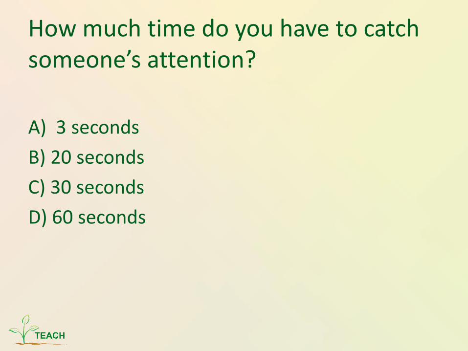
How much time do you have to catch someone’s attention?
A) 3 seconds
B) 20 seconds
C) 30 seconds
D) 60 seconds

How much time do you have to catch someone’s attention?
A) 3 seconds
B) 20 seconds
C) 30 seconds
D) 60 seconds

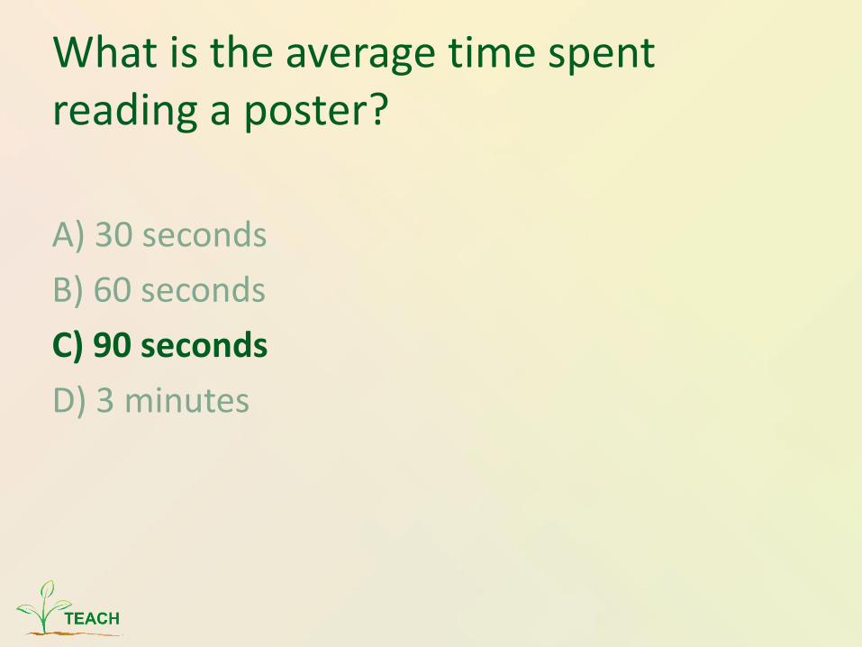
What is the average time spent reading a poster?
A) 30 seconds
B) 60 seconds
C) 90 seconds
D) 3 minutes
What is the average time spent reading a poster?
A) 30 seconds
B) 60 seconds
C) 90 seconds
D) 3 minutes
Structure of activity
• First language and “messaging,” then
• Visual communication
• Text content, sections, and layout
• Finally, presentation tips
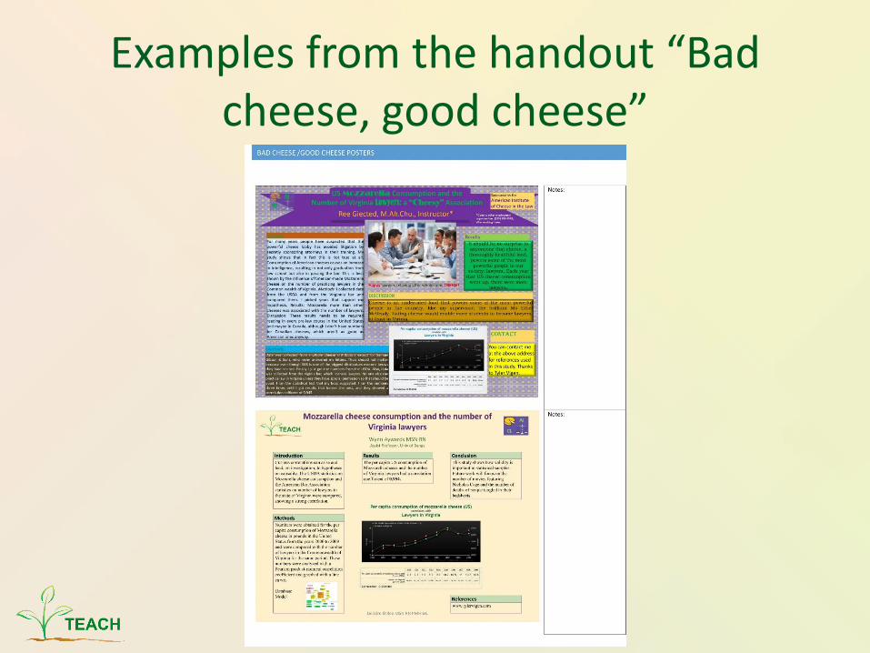
Examples from the handout “Bad cheese, good cheese”
What is a scientific poster?• Visual communication tool: an illustrated
abstract of your work
• Succinct but complete
• Includes:– Introduction/ background/ objective
– Method
– Results
– Discussion/ conclusion
– References
– Acknowledgements
Guiding principles
• Focus on a single message
• Let graphs and images tell the story--not text
• Keep the sequence well-ordered and obvious
Focus on a single message
• Say it all in a strong title – simple statements are memorable- Think newspaper headlines
• Headings should convey the key points – See it in a hurry
• Readable at a distance of 3-5 feet; major headings from 10-15 feet away
• Use the strongest language your research will allow-attention grabbing
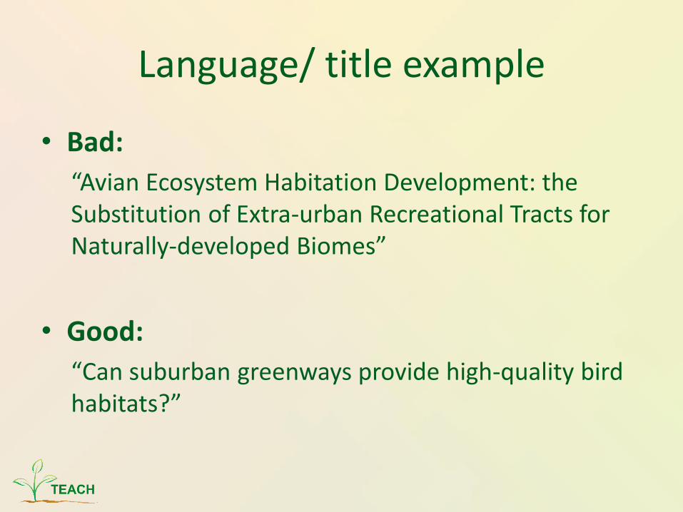
Language/ title example
• Bad:
“Avian Ecosystem Habitation Development: the Substitution of Extra-urban Recreational Tracts for Naturally-developed Biomes”
• Good:
“Can suburban greenways provide high-quality bird habitats?”

Visual communication
• Visuals should relate to the main point
• Extraneous information creates ‘noise’ that distracts
Example of excellent visual communication
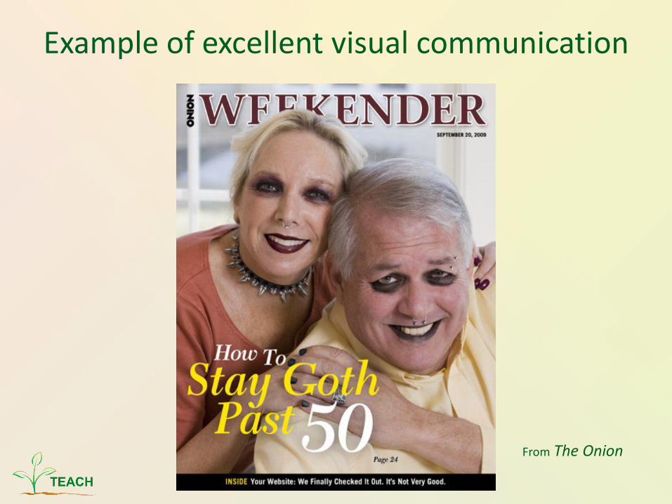
Example of excellent visual communication
From The Onion
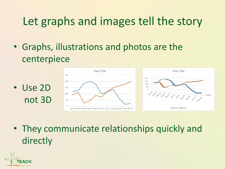
Let graphs and images tell the story
• Graphs, illustrations and photos are the centerpiece
• Use 2Dnot 3D
• They communicate relationships quickly and directly
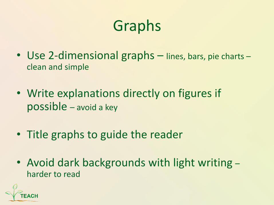
Graphs
• Use 2-dimensional graphs – lines, bars, pie charts –clean and simple
• Write explanations directly on figures if possible – avoid a key
• Title graphs to guide the reader
• Avoid dark backgrounds with light writing –harder to read
Keep the sequence well ordered and obvious
Visual Grammar• Guides readers through the poster with a
graphic hierarchy.
• Achieved through:• changes in font size
• Columns – from top down (reader gravity) and left to right
• Use of organizational cues – numbers, arrows,
letters
Balance with White Space
• Have sufficient white space to provide clear cues as to how the reader travels through the poster
• Make poster symmetrical along a horizontal, vertical or diagonal axis
Text
• Aim for roughly 800 words- total
• Use an active voice
• Use phrases and bullets rather than sentences and paragraphs
• Avoid jargon and unnecessary acronyms
Sections
• Title – 1-2 lines
• Introduction - about 200 words
• Method – about 200 words – show a picture of a set up and mention type of statistical analysis
• Results- about 200 words – state if the experiment worked and use charts and graphs
Sections--continued
• Conclusion/Relevance of findings- 200 words -not including legends for graphs
• Literature- 5 citations max
• Acknowledgment – 40 words- Include conflicts of interest
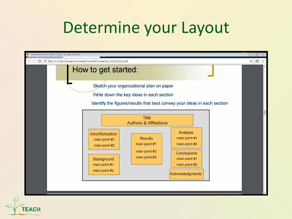
Determine your Layout
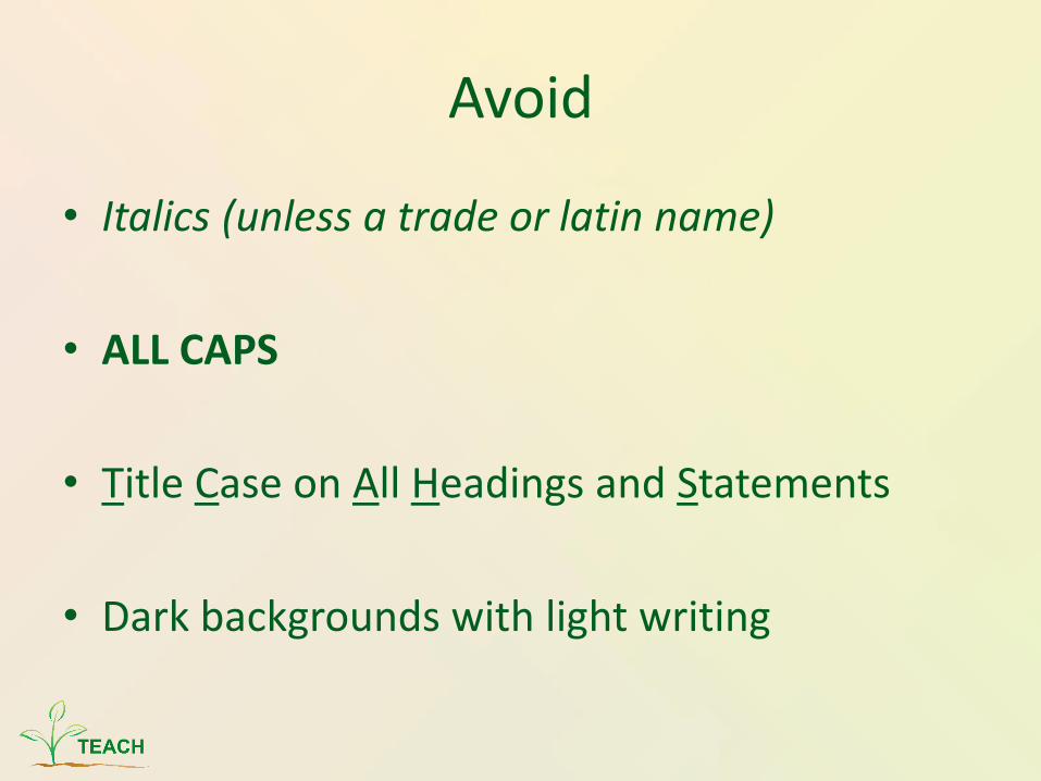
Avoid
• Italics (unless a trade or latin name)
• ALL CAPS
• Title Case on All Headings and Statements
• Dark backgrounds with light writing
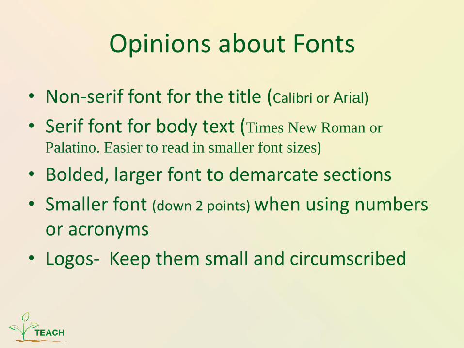
Opinions about Fonts
• Non-serif font for the title (Calibri or Arial)
• Serif font for body text (Times New Roman or
Palatino. Easier to read in smaller font sizes)
• Bolded, larger font to demarcate sections
• Smaller font (down 2 points) when using numbers or acronyms
• Logos- Keep them small and circumscribed

Color Considerations
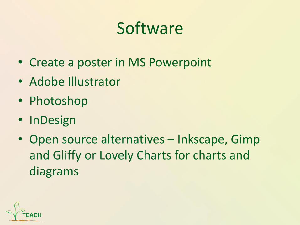
Software
• Create a poster in MS Powerpoint
• Adobe Illustrator
• Photoshop
• InDesign
• Open source alternatives – Inkscape, Gimp and Gliffy or Lovely Charts for charts and diagrams
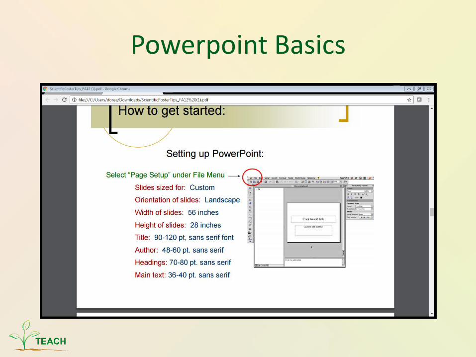
Powerpoint Basics
Presentation Tips
• Speak to the person, not the poster
• Give a 2 sentence overview of why your poster is interesting
• If new people come mid-explanation, finish your explanation to the first ones there
Tips--continued
• Bring business cards!
• Bring copies of either the abstract or the poster on 8 ½ X 11 paper and pin to the bottom of the board
• Bring paper and pen
• Best poster formats are paper (rollable and in a tube) or fabric (roll or foldable in luggage)
• Bring handouts and freebies- magnets, candy

Be Creative!
• Use a tablet or smartphone to show a video or provide an audio if the topic is related to something you hear
• Is the topic related to something you can see and bring… bring it!
• The more senses you can engage, the more interactive your viewers
• ALWAYS thank your viewers for stopping by
References
Websites
• http://colinpurrington.com/tips/poster-design
• https://www.ncsu.edu/project/posters
• http://guides.nyu.edu/posters
• http://www.owlnet.rice.edu/~cainproj/designing.html
• https://color.adobe.com
Templates
• https://carilionclinic.org/research-development
Videos
• YouTube- search “scientific poster powerpoint