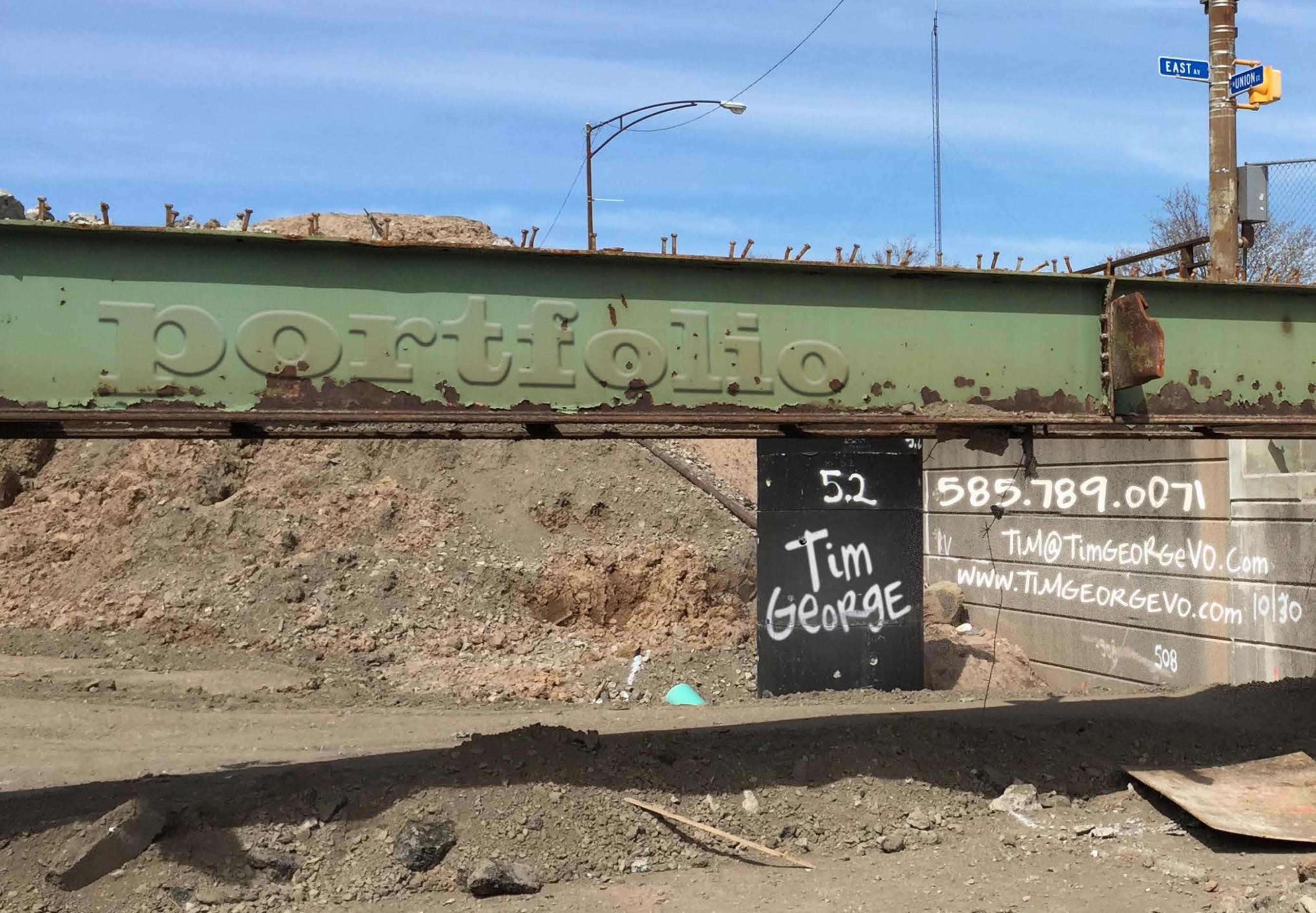
tim george portfolio v2
TRANSCRIPT
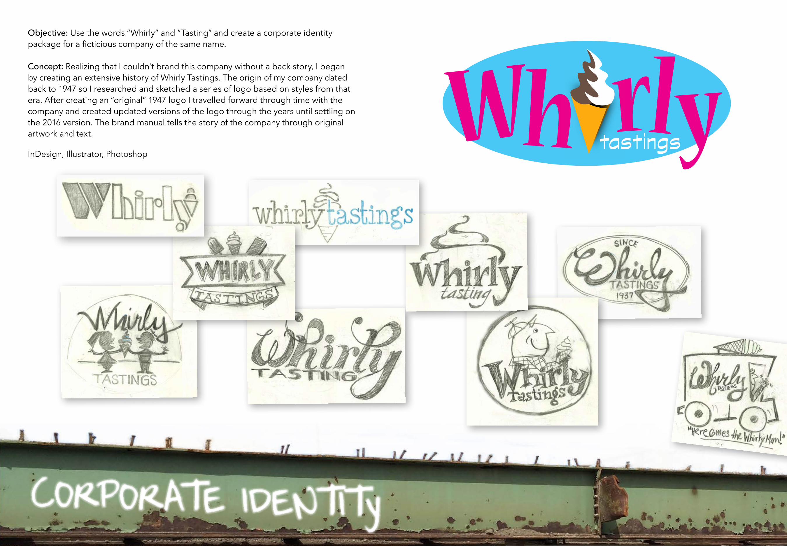
Wh rlytastings
Objective: Use the words “Whirly” and “Tasting” and create a corporate identity package for a ficticious company of the same name.
Concept: Realizing that I couldn't brand this company without a back story, I began by creating an extensive history of Whirly Tastings. The origin of my company dated back to 1947 so I researched and sketched a series of logo based on styles from that era. After creating an “original” 1947 logo I travelled forward through time with the company and created updated versions of the logo through the years until settling on the 2016 version. The brand manual tells the story of the company through original artwork and text.
InDesign, Illustrator, Photoshop
CORPORATE IDENTITy

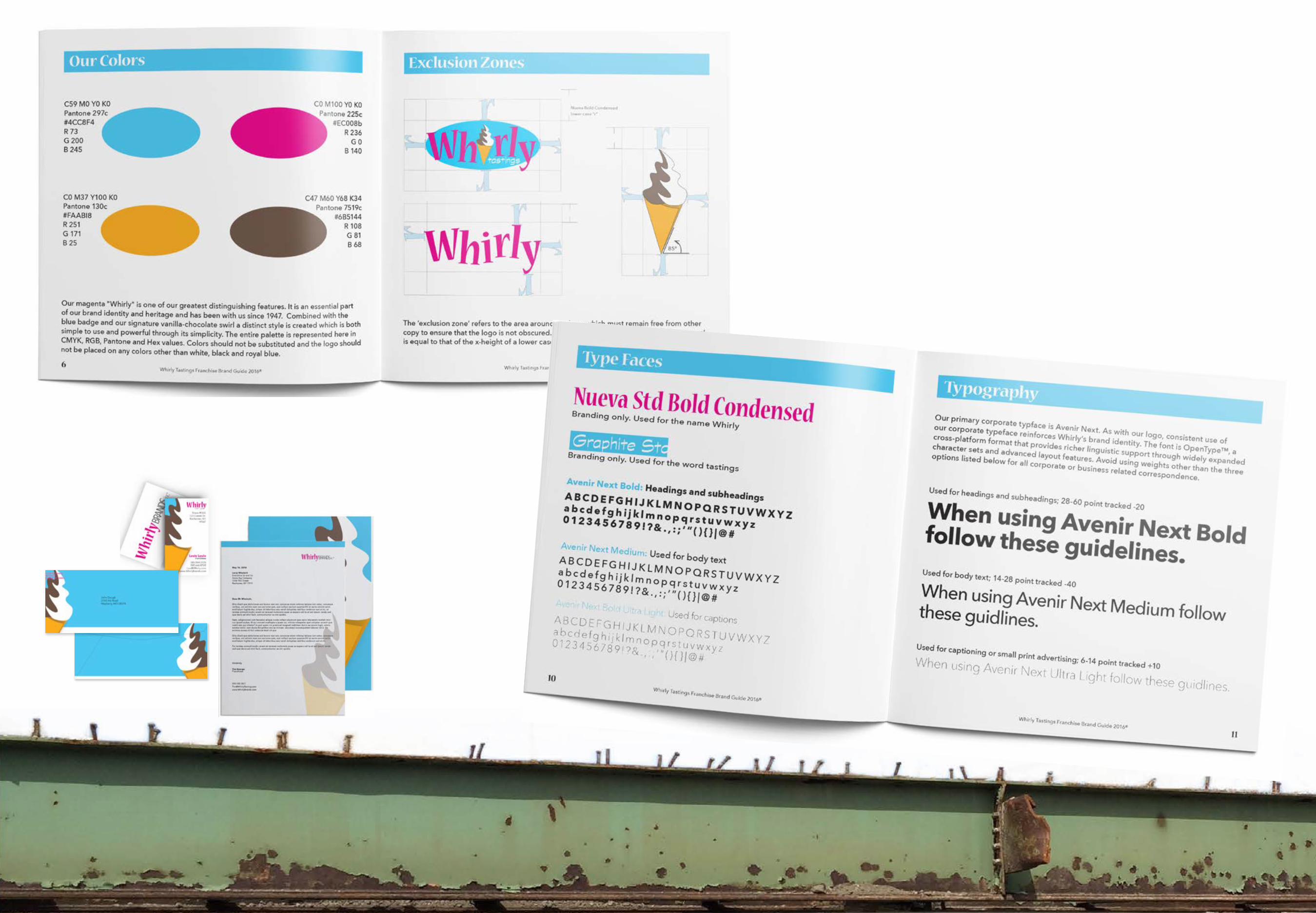
The story of Whirly Tastings Soft Serve begins in 1947 when brothers Harlin and Eugene Whirly decided that their bicycle shop was in danger of being marginalized by the automobile industry. The narrative continues with their discovery of soft serve ice cream and the transition from a small bicycle shop in East Bumberry NY to Whirly Brands Inc. operating a 400 unit franchise, a restaurant chain and line of bathroom wipes .
The brand manual was created as an introductory guide to new franchise owners. It defines the guidlines for logo, typography, and color usage as well as uniforms, merchandise and
The BACK STorY

The MANUal

Objective: Create a site specific or environmental art installation. I decided to create a multi-media satirical piece addressing our crumbling infrastructure — specifically bridges. I photographed an actual band aid, designed a false DOT logo then affixed the bandages to 15 dilapidated bridges in Rochester. Shot with an iPhone 6, the final piece was sewn together in Premiere Pro, set to music (permission pending), and narrated by yours truly.
Premiere Pro, Photoshop, Illustrator.
ViDEO
https://youtu.be/znbZok7rLbQWATCH THE VIDEO

Objective: Create packaging for a household object that also serves as a creative outlet for children.
Using a variety of weights and sizes of the Factoria typeface along with three accent fonts, I created a package that is intended to attract a younger, hipper parent demographic. The bold, black text on the white backgound creates energy and is aligned with the current trend of flat graphics.
The black box is designed with the more conservative parent in mind. It is a throwback to a generation or two ago but the black baground brings it forward to the 21st cetury.
Illustrator
PAcKAGING

Objective: Advocacy poster campaignMedia: Broken iPhone, iPhone 6Fonts: Ba WET PAINT, ARIAL BLACKSoftware: Photoshop, Indesign

Objective: Editorial Illustration.Concept: The art is derived from the discovery of an unknown species of human and its potential connection to the missing link. Media: Chalk pastels and acrylic paint on 18x24 paperFonts: IMPACT, HelveticaSoftware: Photoshop, Indesign

Objective: Editorial IllustrationMedia: Micron pen and gouache on 18x24 watercolor paper. Fonts: Balboa Plus, Minion ProSoftware: Photoshop, Indesign

Objective: Create a four part cohesive postage stamp.
Statement: As an original music, movement and lifestyle, Jazz has long been an integral part of our American culture. One of the more distinguishable eras in the history of Jazz is the Free Jazz movement of the 50’s and 60’s, recognized by it’s use of unconventional tempos, chord changes, instrumentation and technique. At the same time the jazz cats were pushing boundaries, many visual artists were also breaking conventions — experimenting with abstract shapes, vivid colors and a minimalist approach. The music and the art formed an alliance that left an indelible mark on the face of America. My original drawings, type face, and palette are inspired by a number of mid-century illustrations, specifically Cliff Roberts’ illustrations from Langston Hughes’ The First Book of Jazz.
Illustrator

Objective: PosterFonts: PHARMACY, M esquite S td, CochinSoftware: Illustrator

The design for my new business website combining design and fine art with my voiceover business. The goal was to create something bold, simple and not over-designed that would let the work speak for itself. The site is not live yet.
Illustrator, Dreamweaver, Photoshop
design
CREATIVEaboutvoiceover contactdesign
CREATIVEaboutvoiceover contactdesign
aboutvoiceover contactdesignCREATIVE
I am not trying to change the world with my work. Nor am I reconstructing, deconstructing,
bisecting or dissecting the American dream. Not that there’s anything wrong with that. It’s
just not my thing. My thing: Creating clean, quality work that conveys a message in a com-
pelling, useful, and beautiful way. I use bold, simple lines, and a limited palette of rich
muted color. I like space and silence and try to avoid creating noise. Functionality is crucial
in my design but I’m not a pure “form follows function” guy. Being a child of the 60’s, I am
heavily influenced by all things mid century; art, design, illustration architecture, and
literature. I’ll gladly borrow lines from the Bauhaus and abscond with a palette from the
atomic art era. Humor and irony are as important to me as coffee and air and they have a
tendency to show up at work, often unannounced. If they add value and behave they can stay.
If not, they are shown the door.
J (
[
{
Ly
(j(V
VV Vthe lipsthe
teeth the tip of the
tongue (V /VVV
( 1 (c Jv v
vv vv(((
((
(( ( (((( ( ( ( (( ( ((( ((((
V V V((v(v (v()(v (v
(v(v(v )(v(v l[ (
ijks--
linsldic-nianvaoin-
valsdkvnaso-invasld-kvnao-ievnalkd-vnaslkdvnasldkvnsald
vkansvoienvawlein
lasivndlzisnv
alwinv
iii iiiiiii i i i i
iiiiiiiiiii
ii
iii iiiiiiiiiiii iii iii i
iiiiiiiiiiiiiiiiiii
iiiiii
(
((((( ( (((( (( (((( (((( (((((( ((( ((
((((((( (((( (((
((((
(( ((
(
((
(
((((
(
((((
(
(((((((
uu jjbjjjjjjjjjjjbbb bbb uu
uud
wwwwwww fffffffffff
f ff
fff
fffff f fff
ff f ff
ffffffffffffff
VVVVVVVV VVVVVVVVVVVVVVVVV
(
(
})))
v
f
))
.tim george tim
geor ge tim
Y
(v
( (( (( (
thisis the shape of my headthis is the shape of my head....large fuzzy noggin...once upon a tim
e there was ha ir li vin g he re
and then all of a suden one day the hair was gone O
h well w
hat can y
ou d
o?
not much you can do. g
row
a b
eard
and
shave
(
the lipsthe
teeth the tip of the tongue
the lipsthe teeth
the tip of the tongue
the lips-
the teeth
thue
the lipsthe teeth
the tip of the
tonguelipslipslips- lips-lipslipslipslipslipslipslss zzzzz
the lipsthe teeth
the tip of the tongue
the lipsthe
teeth the tip of the
tongue
(
neckshadownecjshneckshadownecjsh
neckshadownecjsh
neckshadownecjsh
neckshad
ownecjsh
(aboutvoiceover contactdesign
CREATIVE
com
mer
ica
l demo
narration demo
recent work
to learn more about my voiceover work visitTimGeorgeVO.com
aboutvoiceover contactdesignCREATIVE
WEB DESIGN

This is the current website for my voiceover business WWW.TIMGEORGEVO.COM. My role: Concept and design.Branding: Guy next door, friendly with an edge, midwestern ironic, business casual. The Gary Larson Far Side inspired design not only identifies with my sense of humor but conveys the brand through the use of simple lines and a limited palette. The lone microphone in the window gives the impression that the guy you’ve hired to do your voiceover is going to give you what you want in a very straightforward fashion.

Pastels, Charcoals, Micron Pens, Water Color, Gouache, Ink
mIXED MEDIA

ACRYLIC

Objective: Build a chair from a found object with one type of non-adhesive fastener. After a good deal of dumpster diving and construction site raiding, I “found” these steel fence sections on an “abandoned” construction site. Using 3/8 aluminum round bar and a Bernzomatic propane torch, I bent the bars around the steel tubing. A cobalt drill bit and a lot of patience were used to drill through the steel.
3 DIMESIONAL