the principles of graphic design · pdf fileaims: 1. to understand the visual design...
TRANSCRIPT
THE PRINCIPLES OF GRAPHIC DESIGNHow to arrange elements to effectively communicate with the viewer
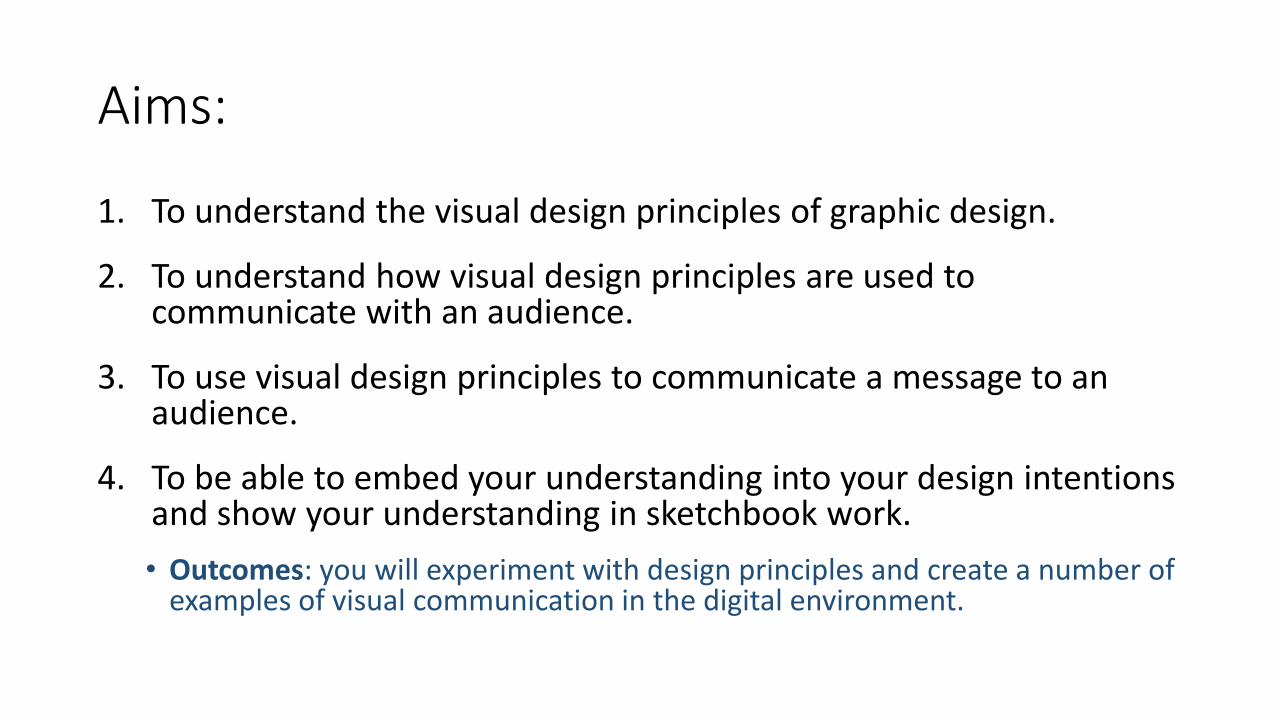
Aims:
1. To understand the visual design principles of graphic design.
2. To understand how visual design principles are used to communicate with an audience.
3. To use visual design principles to communicate a message to an audience.
4. To be able to embed your understanding into your design intentions and show your understanding in sketchbook work.
• Outcomes: you will experiment with design principles and create a number of examples of visual communication in the digital environment.
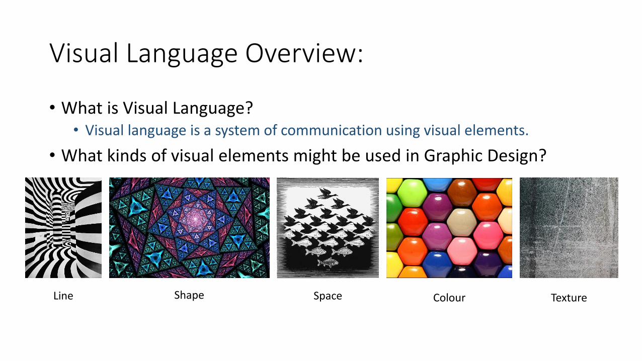
Visual Language Overview:
• What is Visual Language?• Visual language is a system of communication using visual elements.
• What kinds of visual elements might be used in Graphic Design?
Line Shape Space Colour Texture
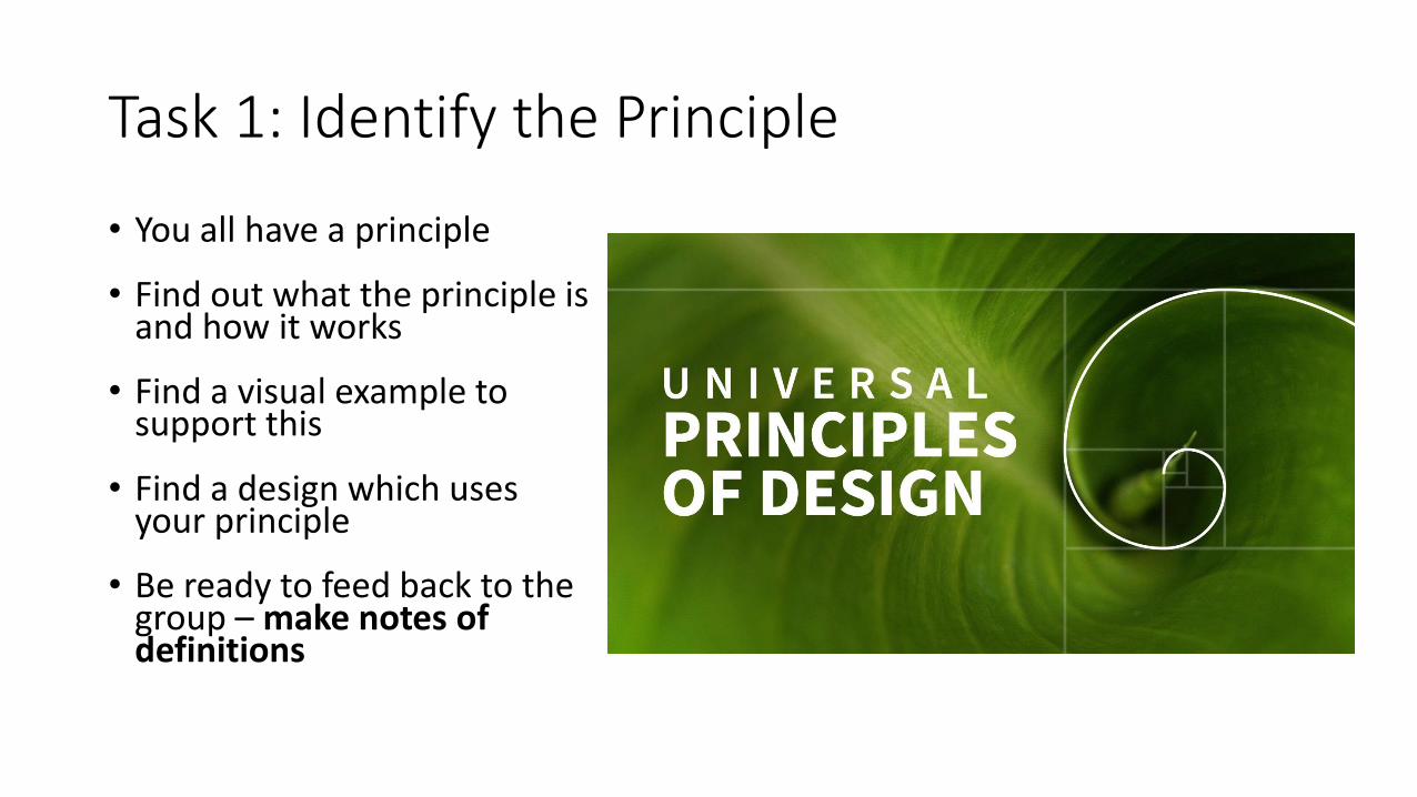
Task 1: Identify the Principle
• You all have a principle
• Find out what the principle is and how it works
• Find a visual example to support this
• Find a design which uses your principle
• Be ready to feed back to the group – make notes of definitions
Design Tasks:
• This task forms the beginning of your exploration of the principles of graphic design. You will create simple designs which explore each of the principles. In later sessions you will understand more about each principle and design more complex work using the elements we have explored.
• You will have approximately 5 minutes per task.
• You may use shapes, lines, colour, texture etc.
• Create each of the 13 principles as instructed using a number of different appropriate elements and formatting.
• Check if you are correct with your tutor and each other.
• Save each of the designs with the name of the principle.
• Add them to your sketchbook and annotate.
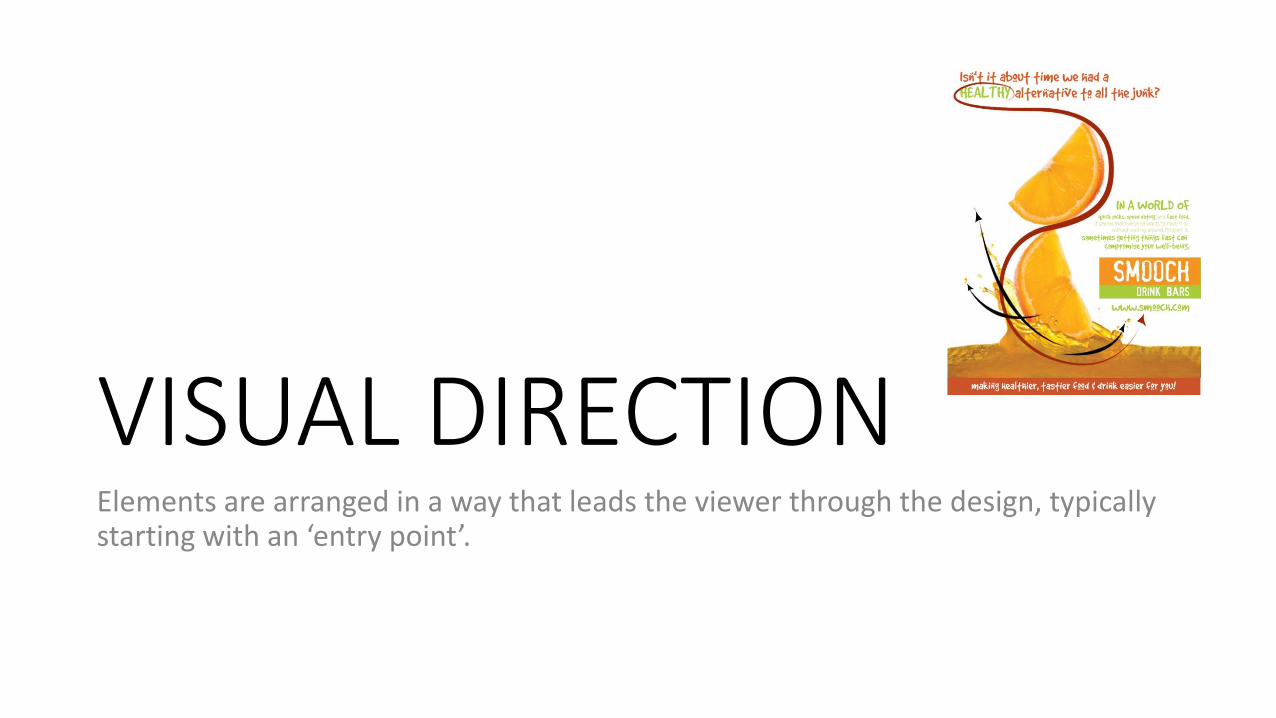
VISUAL DIRECTIONElements are arranged in a way that leads the viewer through the design, typically starting with an ‘entry point’.
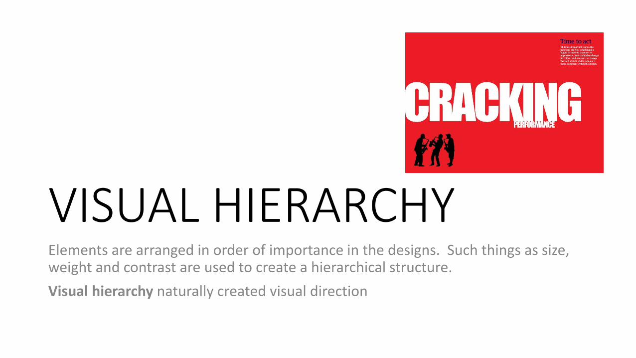
VISUAL HIERARCHYElements are arranged in order of importance in the designs. Such things as size, weight and contrast are used to create a hierarchical structure.
Visual hierarchy naturally created visual direction
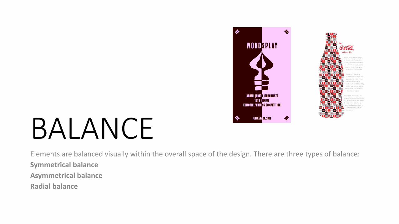
BALANCEElements are balanced visually within the overall space of the design. There are three types of balance:
Symmetrical balance
Asymmetrical balance
Radial balance
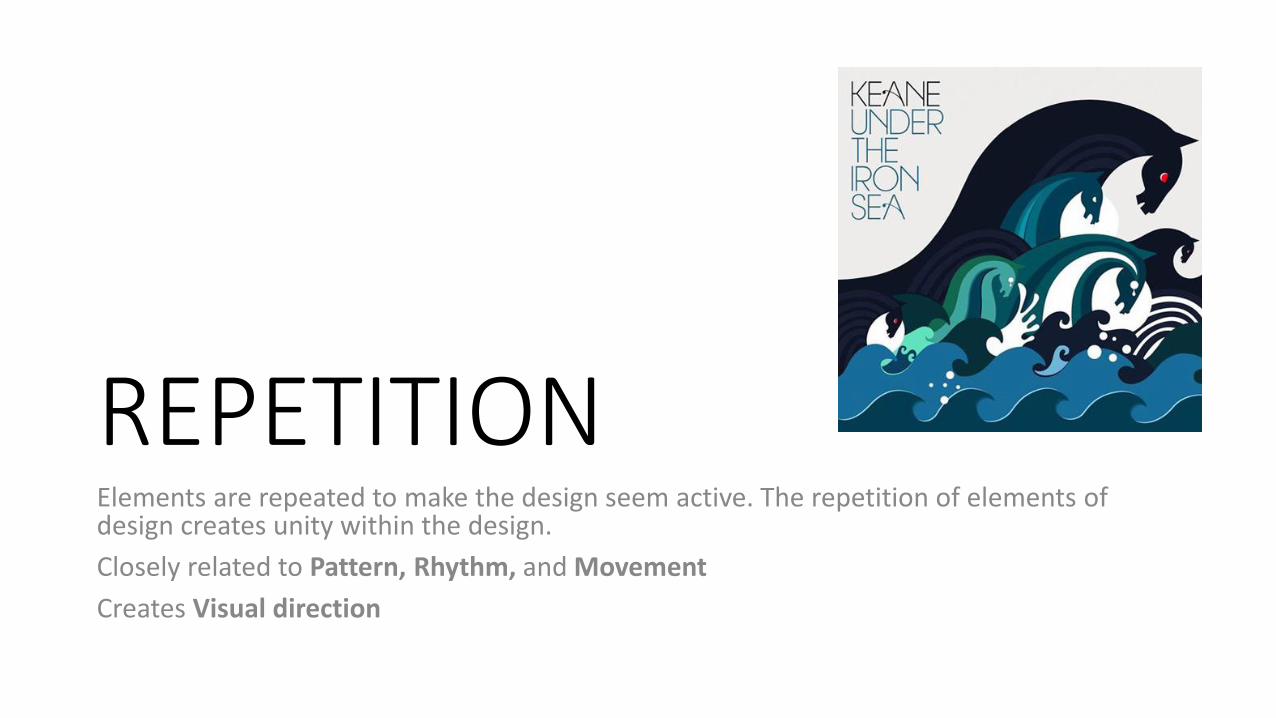
REPETITIONElements are repeated to make the design seem active. The repetition of elements of design creates unity within the design.
Closely related to Pattern, Rhythm, and Movement
Creates Visual direction
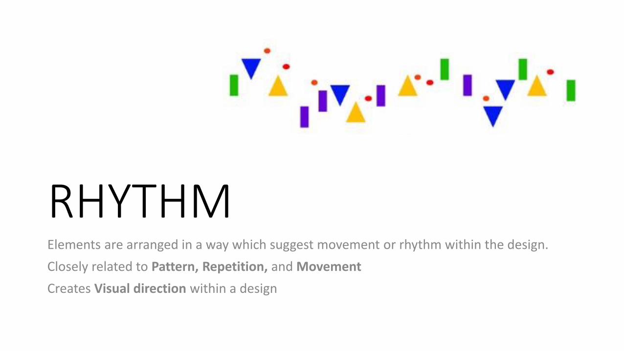
RHYTHMElements are arranged in a way which suggest movement or rhythm within the design.
Closely related to Pattern, Repetition, and Movement
Creates Visual direction within a design
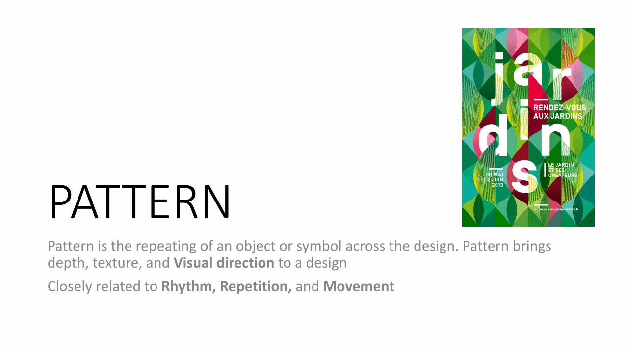
PATTERNPattern is the repeating of an object or symbol across the design. Pattern brings depth, texture, and Visual direction to a design
Closely related to Rhythm, Repetition, and Movement
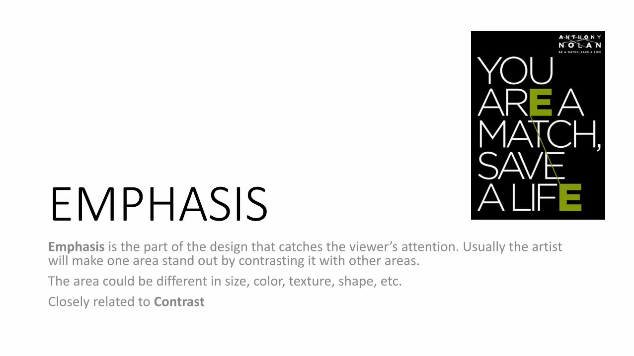
EMPHASISEmphasis is the part of the design that catches the viewer’s attention. Usually the artist will make one area stand out by contrasting it with other areas.
The area could be different in size, color, texture, shape, etc.
Closely related to Contrast
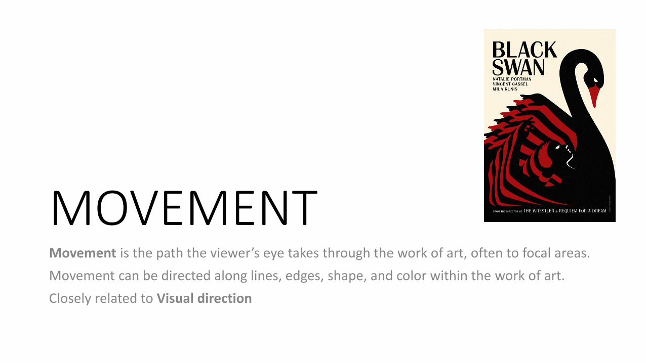
MOVEMENTMovement is the path the viewer’s eye takes through the work of art, often to focal areas.
Movement can be directed along lines, edges, shape, and color within the work of art.
Closely related to Visual direction
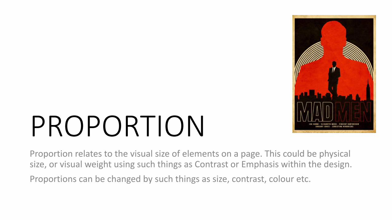
PROPORTIONProportion relates to the visual size of elements on a page. This could be physical size, or visual weight using such things as Contrast or Emphasis within the design.
Proportions can be changed by such things as size, contrast, colour etc.
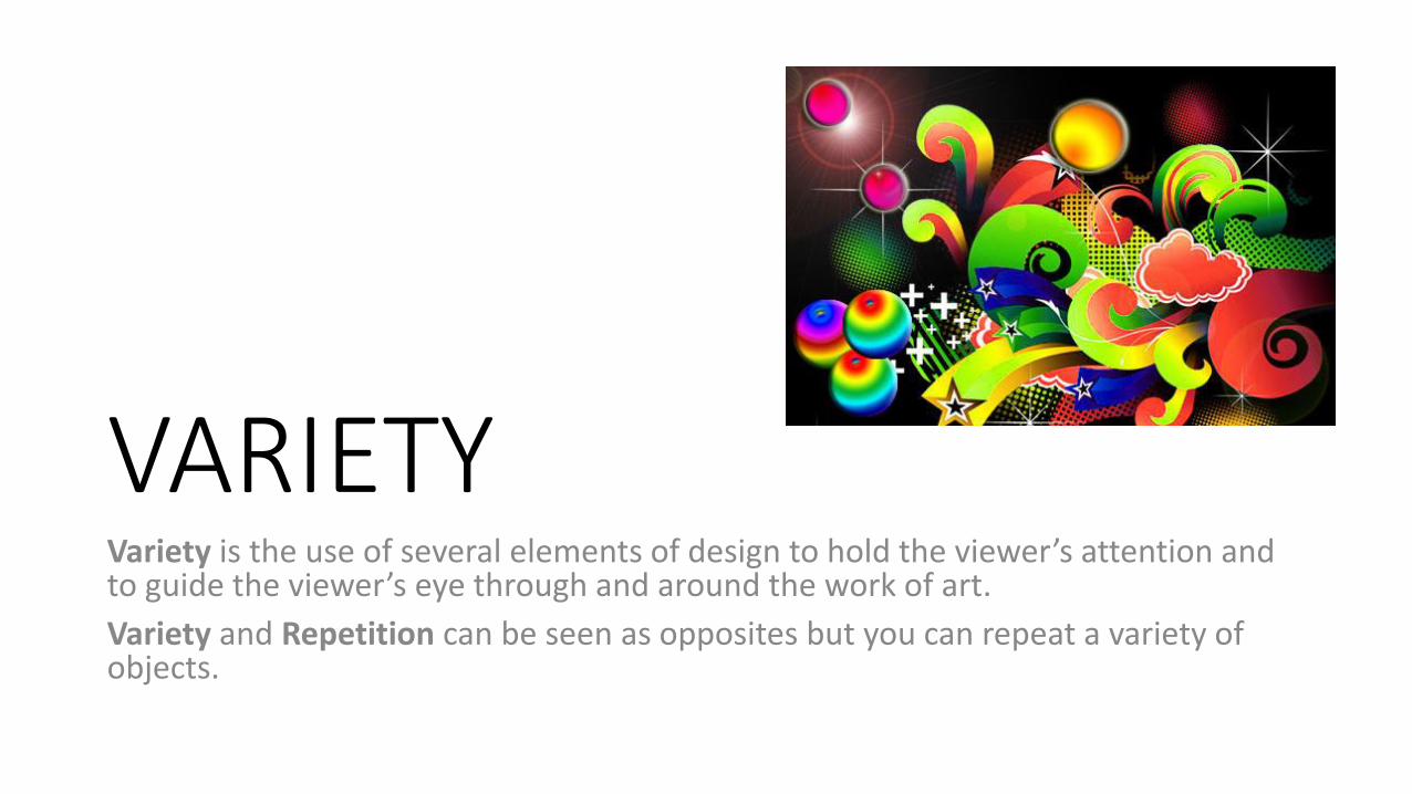
VARIETYVariety is the use of several elements of design to hold the viewer’s attention and to guide the viewer’s eye through and around the work of art.
Variety and Repetition can be seen as opposites but you can repeat a variety of objects.
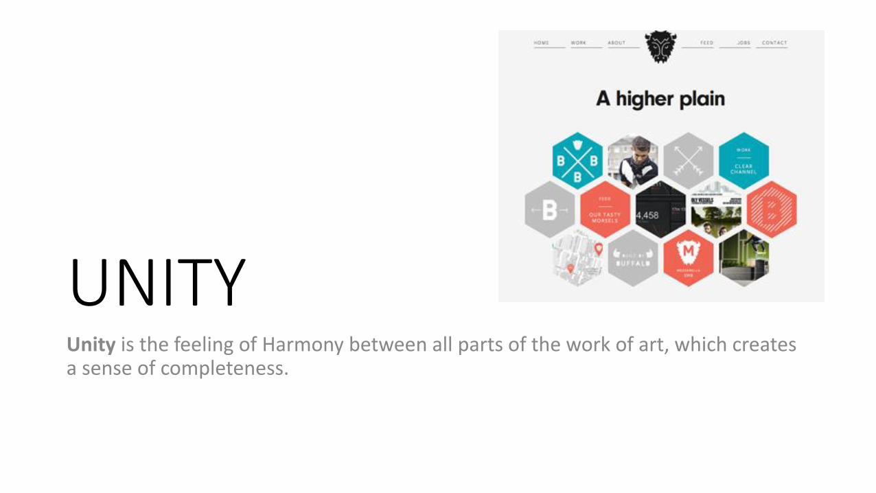
UNITYUnity is the feeling of Harmony between all parts of the work of art, which creates a sense of completeness.
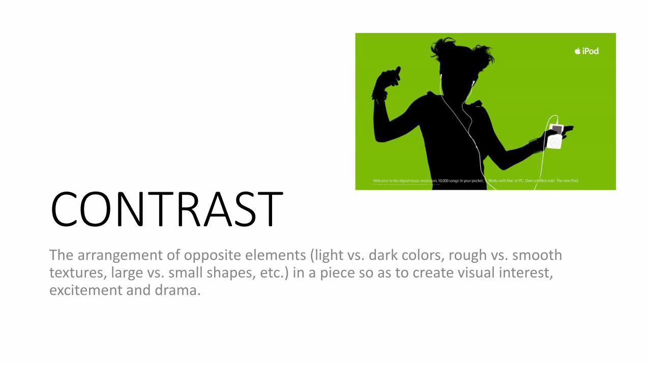
CONTRASTThe arrangement of opposite elements (light vs. dark colors, rough vs. smooth textures, large vs. small shapes, etc.) in a piece so as to create visual interest, excitement and drama.
ALIGNMENTElements are arranged on a page in alignment with each other or the edges of the page. Proper alignment in a design means that every element in it is visually connected to another element. Nothing feels out of place or disconnected when alignment has been handled well.”
Creates structure and accuracy within a design
Aims:
1. To understand the design principles of graphic design.
2. To understand how design principles are used to communicate with an audience.
3. To use design principles to communicate a message to an audience.
4. To be able to embed your understanding into your design intentions and show your understanding in sketchbook work.
• Outcomes: you will experiment with design principles and create a number of examples of visual communication in the digital environment.
Plenary:• I feel the most important thing I learnt today was?
• With the information I learnt today, I will now be able to…
• After today’s lesson I can now explain.
• Today I was able to make progress because…
• The part of the lesson I found easiest was…
• If was to set homework to build on today’s lesson I would…
• I am proud of myself today because….
• I think it is important to remember what I learnt today because…
• One thing I think I did really well was…
• Next time I would like to learn…