the graph template language and the statistical...
TRANSCRIPT

Paper 334-2010
The Graph Template Language and the Statistical Graphics Procedures:An Example-Driven Introduction
Warren F. Kuhfeld, SAS Institute Inc., Cary, NC
ABSTRACT
This paper provides a gentle, parallel, and example-driven introduction to the graph template language (GTL) and thestatistical graphics (SG) procedures. With the GTL and the SG procedures, you can easily create professional-lookingstatistical graphics and modify the graphs that the SAS® System automatically produces. Most graphs in this paper areproduced in two ways: one graph is produced with the GTL, PROC TEMPLATE, and PROC SGRENDER; the othergraph is produced more directly with PROC SGPLOT or one of the other SG procedures. Each example provides youwith prototype programs for getting started with the GTL and the SG procedures. Although you do not need to know theGTL to make many useful graphs, understanding the GTL enables you to create custom graphs that cannot be producedby the SG procedures.
INTRODUCTION
Effective graphics are indispensable for modern statistical analysis. They reveal patterns, differences, and uncertaintythat are not readily apparent in tabular output. Graphics provoke questions that stimulate deeper investigation, and theyadd visual clarity and rich content to reports and presentations. You can use statistical graphics in the following ways:
� Exploring your data: Many statistical analyses are begun by producing simple graphs of data such as scatterplots, histograms, and box plots.
� Analyzing your data: Graphical results are an integral part of the results of modern statistical analyses.
� Presenting your data: The final results of statistical analyses are often presented with graphs. Presentationgraphics might be the same as the graphical results of analyses, or they might be customized in various ways.
The SAS Output Delivery System (ODS) creates statistical graphs in three ways:
� Automatically created graphs: With the release of SAS 9.2, SAS/STAT® procedures use ODS Graphics toproduce graphs as automatically as they produce tables. You only need to enable ODS Graphics with the odsgraphics on statement to get default graphical output. Some graphs require you to additionally specify one ormore simple options.
� SG procedures: The SG (statistical graphics) procedures (SGPLOT, SGSCATTER, and SGPANEL) provide asimple and convenient syntax for producing many types of statistical graphs. They are particularly convenient forexploring and presenting data.
� The GTL: The GTL (graph template language) and PROC SGRENDER provide a powerful syntax for creatingcustom graphs. You can also modify the templates that the SAS System provides for use with SAS/STAT proceduresto create customized results.
The graphs that are automatically produced by SAS/STAT procedures are suitable for use in reports. However, you mightwant to customize them first (for example, by using the point-and-click ODS Graphics Editor; see the SAS/GRAPH: ODSGraphics Editor User’s Guide). This paper focuses primarily on the GTL and its use in creating customized graphs. Italso presents the SG procedures and shows how to make most graphs in multiple ways. The SG procedures are easierto use than the GTL, but although they are extremely powerful, they are less powerful and less flexible than the GTL.Both simple and complex examples are provided to help you get started creating modern statistical graphics with theGTL and SG procedures.1
1Emphasis is placed on the code and the graphs, instead of on the data or the results. Hence, simple data sets such as the Sashelp.Class data setare often used to illustrate the methods.
1
SAS PresentsSAS Global Forum 2010
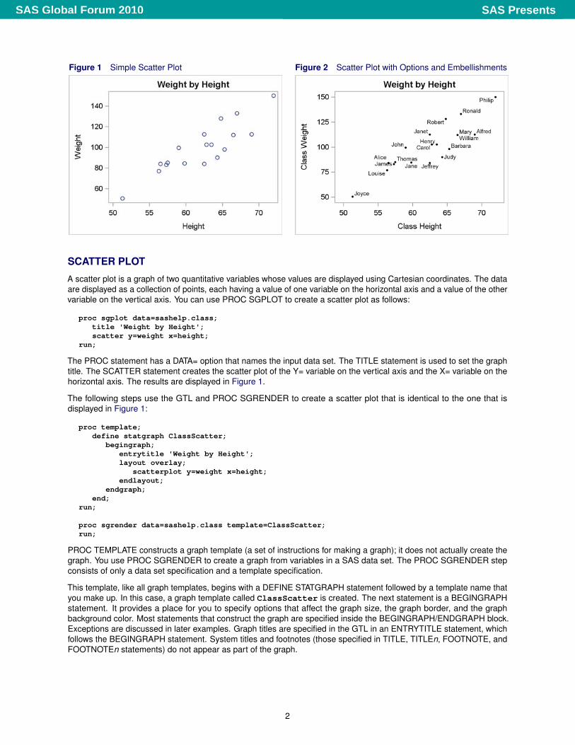
Figure 1 Simple Scatter Plot Figure 2 Scatter Plot with Options and Embellishments
SCATTER PLOT
A scatter plot is a graph of two quantitative variables whose values are displayed using Cartesian coordinates. The dataare displayed as a collection of points, each having a value of one variable on the horizontal axis and a value of the othervariable on the vertical axis. You can use PROC SGPLOT to create a scatter plot as follows:
proc sgplot data=sashelp.class;title 'Weight by Height';scatter y=weight x=height;
run;
The PROC statement has a DATA= option that names the input data set. The TITLE statement is used to set the graphtitle. The SCATTER statement creates the scatter plot of the Y= variable on the vertical axis and the X= variable on thehorizontal axis. The results are displayed in Figure 1.
The following steps use the GTL and PROC SGRENDER to create a scatter plot that is identical to the one that isdisplayed in Figure 1:
proc template;define statgraph ClassScatter;
begingraph;entrytitle 'Weight by Height';layout overlay;
scatterplot y=weight x=height;endlayout;
endgraph;end;
run;
proc sgrender data=sashelp.class template=ClassScatter;run;
PROC TEMPLATE constructs a graph template (a set of instructions for making a graph); it does not actually create thegraph. You use PROC SGRENDER to create a graph from variables in a SAS data set. The PROC SGRENDER stepconsists of only a data set specification and a template specification.
This template, like all graph templates, begins with a DEFINE STATGRAPH statement followed by a template name thatyou make up. In this case, a graph template called ClassScatter is created. The next statement is a BEGINGRAPHstatement. It provides a place for you to specify options that affect the graph size, the graph border, and the graphbackground color. Most statements that construct the graph are specified inside the BEGINGRAPH/ENDGRAPH block.Exceptions are discussed in later examples. Graph titles are specified in the GTL in an ENTRYTITLE statement, whichfollows the BEGINGRAPH statement. System titles and footnotes (those specified in TITLE, TITLEn, FOOTNOTE, andFOOTNOTEn statements) do not appear as part of the graph.
2
SAS PresentsSAS Global Forum 2010
For panels that display a single graph, the next statement is typically a LAYOUT OVERLAY statement. It is accompaniedby an ENDLAYOUT statement, and the statements that create the graph are in between. The LAYOUT OVERLAYstatement provides a place for you to specify options that control the ticks, tick labels, axes, axis type, axis labels, grids,and so on. In this case, no options are specified. The only graph statement is a SCATTERPLOT statement that plots thevariable Weight on the Y axis and the variable Height on the X axis.
The following steps use PROC SGPLOT to create a scatter plot of the same data while changing the default axes andother options:
proc sgplot data=sashelp.class;title 'Weight by Height';scatter y=weight x=height / datalabel=name
markerattrs=(symbol=circlefilled color=black size=3px);xaxis offsetmin=0.05 offsetmax=0.05 label='Class Height';yaxis offsetmin=0.05 offsetmax=0.05 label='Class Weight' values=(50 to 150 by 25);
run;
The following steps use PROC TEMPLATE and PROC SGRENDER to create the same scatter plot:
proc template;define statgraph ClassScatter;
begingraph;entrytitle 'Weight by Height';layout overlay /
xaxisopts=(offsetmin=0.05 offsetmax=0.05 label='Class Height')yaxisopts=(offsetmin=0.05 offsetmax=0.05 label='Class Weight'
linearopts=(tickvaluesequence=(start=50 end=150 increment=25)viewmin=50));
scatterplot y=weight x=height / datalabel=namemarkerattrs=(symbol=circlefilled color=black size=3px);
endlayout;endgraph;
end;run;
proc sgrender data=sashelp.class template=ClassScatter;run;
Axis options are specified in the XAXIS and YAXIS statements in PROC SGPLOT and in the LAYOUT OVERLAYstatement in the GTL. For both axes, offsets are specified so that the first 5% (OffSetMin=0.05) and the last 5%(OffSetMax=0.05) of each axis is left blank. Aesthetically, it is often nice to have a small amount of separation betweenthe axes and the points in the plot. Axis labels are specified for the X and Y axes by using the LABEL= option. Inthe GTL, the tick values are specified using the option LinearOpts=(TickValueSequence=(Start=50 End=150Increment=25) ViewMin=50)).2 This option produces ticks from 50 to 150 by 25. However, ODS Graphics doesnot automatically use all of the ticks if they are too far outside the range of the data. The option ViewMin=50 ensuresthat the smallest tick is displayed. Without this option, the first tick is not displayed for these data. (There is also aVIEWMAX= option that is not used in this example.) In the SCATTER statement in PROC SGPLOT, the same ticks arerequested with the option Values=(50 to 150 by 25). The option DataLabel=Name uses the Name variable tolabel the points. The option MarkerAttrs=(Symbol=CircleFilled Color=Black Size=3px) specifies blackfilled circle markers, three pixels in size. The two graphs from the two procedures are identical; one of the graphs isdisplayed in Figure 2.
2Options for linearly scaled axes are specified differently from options for axes with a log scaling. Hence, the GTL provides two options, LINEAROPTS=and LOGOPTS=.
3
SAS PresentsSAS Global Forum 2010
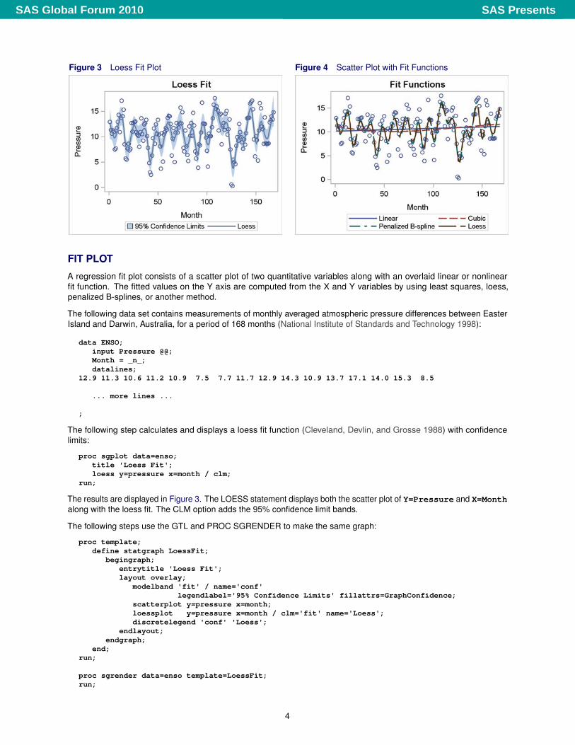
Figure 3 Loess Fit Plot Figure 4 Scatter Plot with Fit Functions
FIT PLOT
A regression fit plot consists of a scatter plot of two quantitative variables along with an overlaid linear or nonlinearfit function. The fitted values on the Y axis are computed from the X and Y variables by using least squares, loess,penalized B-splines, or another method.
The following data set contains measurements of monthly averaged atmospheric pressure differences between EasterIsland and Darwin, Australia, for a period of 168 months (National Institute of Standards and Technology 1998):
data ENSO;input Pressure @@;Month = _n_;datalines;
12.9 11.3 10.6 11.2 10.9 7.5 7.7 11.7 12.9 14.3 10.9 13.7 17.1 14.0 15.3 8.5
... more lines ...
;
The following step calculates and displays a loess fit function (Cleveland, Devlin, and Grosse 1988) with confidencelimits:
proc sgplot data=enso;title 'Loess Fit';loess y=pressure x=month / clm;
run;
The results are displayed in Figure 3. The LOESS statement displays both the scatter plot of Y=Pressure and X=Monthalong with the loess fit. The CLM option adds the 95% confidence limit bands.
The following steps use the GTL and PROC SGRENDER to make the same graph:
proc template;define statgraph LoessFit;
begingraph;entrytitle 'Loess Fit';layout overlay;
modelband 'fit' / name='conf'legendlabel='95% Confidence Limits' fillattrs=GraphConfidence;
scatterplot y=pressure x=month;loessplot y=pressure x=month / clm='fit' name='Loess';discretelegend 'conf' 'Loess';
endlayout;endgraph;
end;run;
proc sgrender data=enso template=LoessFit;run;
4
SAS PresentsSAS Global Forum 2010
The GTL specifications for the loess plot are more involved than the equivalent loess plot request in PROC SGPLOT. TheMODELBAND statement appears first in the LAYOUT OVERLAY, and so its results are drawn first, followed by the resultsof the SCATTERPLOT and then the LOESSPLOT statements. No Y=, X=, or fit options appear in the MODELBANDstatement. Instead, the confidence name ’fit’ appears, and it is also specified in the CLM= option in the LOESSPLOTstatement. Hence, the MODELBAND statement displays the 95% (by default) confidence limits for the loess fit plot. Thename of the statement is specified as Name=’conf’. This same name is the first name in the DISCRETELEGENDstatement, so the information about the MODELBAND statement appears first in the legend. The LEGENDLABEL=option in the MODELBAND statement provides the text that is displayed in the legend for the band plot. The colorand attributes of the confidence band are controlled by the GraphConfidence style element, which is specified inthe FILLATTRS= option. The GraphConfidence style element is used by default by PROC SGPLOT and the LOESSstatement.
The SCATTERPLOT statement produces the scatter plot of the Y axis variable Pressure and X axis variable Month. Thisstatement has no other options, so the default style is used and no entry for the scatter plot is added to the legend.
The LOESSPLOT statement calculates and displays the loess fit function for the Y axis variable Pressure and X axisvariable Month. The name of the statement is specified as Name=’Loess’. This same name is the second namein the DISCRETELEGEND statement, so the information about the LOESSPLOT statement appears second in thelegend. Since the LEGENDLABEL= option is not specified in the LOESSPLOT statement, the default legend label is thestatement name, ’Loess’. The DISCRETELEGEND statement uses information from the two named statements toprovide the legend for the graph.
The following step uses PROC SGPLOT to produce linear, cubic, penalized B-spline, and loess fits to the ENSO data set:
proc sgplot data=enso;title 'Fit Functions';reg y=pressure x=month / legendlabel='Linear';reg y=pressure x=month / legendlabel='Cubic' degree=3 nomarkers;pbspline y=pressure x=month / nomarkers;loess y=pressure x=month / nomarkers;
run;
In the interest of space, this example displays all functions simultaneously in Figure 4. The REG statement fits linearregression models. The first REG statement calculates and displays an ordinary linear fit. The second REG statementcalculates and displays a cubic polynomial fit due to the Degree=3 option. The PBSPLINE statement displays apenalized B-spline fit (Eilers and Marx 1996). The LOESS statement displays a loess fit. Both the PBSPLINE andLOESS statements find nonlinear fit functions and automatically choose their degree of smoothness. All of thesestatements automatically display both the fit function and the original data points. The NOMARKERS option is specifiedin three of the statements so that the markers or points are displayed only one time. A legend is automatically constructedusing the default labels for the PBSPLINE and LOESS statements and using the labels provided in the LEGENDLABEL=option for the other two statements. Each function is displayed using a different style element. Style elements controlthe overall appearance of graphs, including colors, markers, and lines. PROC SGPLOT automatically specifies a styleelement, GraphDatan, for each function, n. The next example explicitly specifies in the GTL the style elements thatPROC SGPLOT automatically specifies for you.
The following steps use the GTL (with GraphData1 through GraphData4 explicitly specified) and PROC SGRENDERto make the same graph:
proc template;define statgraph Fits;
begingraph;entrytitle 'Fit Functions';layout overlay ;
scatterplot y=pressure x=month;regressionplot y=pressure x=month / lineattrs=GraphData1 name='Linear';regressionplot y=pressure x=month / lineattrs=GraphData2 name='Cubic' degree=3;pbsplineplot y=pressure x=month / lineattrs=GraphData3 name='Penalized B-Spline';loessplot y=pressure x=month / lineattrs=GraphData4 name='Loess';discretelegend 'Linear' 'Cubic' 'Penalized B-Spline' 'Loess';
endlayout;endgraph;
end;run;
proc sgrender data=enso template=Fits;run;
5
SAS PresentsSAS Global Forum 2010
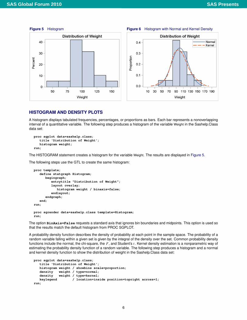
Figure 5 Histogram Figure 6 Histogram with Normal and Kernel Density
HISTOGRAM AND DENSITY PLOTS
A histogram displays tabulated frequencies, percentages, or proportions as bars. Each bar represents a nonoverlappinginterval of a quantitative variable. The following step produces a histogram of the variable Weight in the Sashelp.Classdata set:
proc sgplot data=sashelp.class;title 'Distribution of Weight';histogram weight;
run;
The HISTOGRAM statement creates a histogram for the variable Weight. The results are displayed in Figure 5.
The following steps use the GTL to create the same histogram:
proc template;define statgraph Histogram;
begingraph;entrytitle "Distribution of Weight";layout overlay;
histogram weight / binaxis=false;endlayout;
endgraph;end;
run;
proc sgrender data=sashelp.class template=Histogram;run;
The option BinAxis=False requests a standard axis that ignores bin boundaries and midpoints. This option is used sothat the results match the default histogram from PROC SGPLOT.
A probability density function describes the density of probability at each point in the sample space. The probability of arandom variable falling within a given set is given by the integral of the density over the set. Common probability densityfunctions include the normal, the chi-square, the F , and Student’s t . Kernel density estimation is a nonparametric way ofestimating the probability density function of a random variable. The following step produces a histogram and a normaland kernel density function to show the distribution of weight in the Sashelp.Class data set:
proc sgplot data=sashelp.class;title 'Distribution of Weight';histogram weight / showbins scale=proportion;density weight / type=normal;density weight / type=kernel;keylegend / location=inside position=topright across=1;
run;
6
SAS PresentsSAS Global Forum 2010
The results are displayed in Figure 6. The SHOWBINS option in the HISTOGRAM statement specifies that themidpoints of the bins are used to create the tick marks for the horizontal axis. By default, the tick marks are cre-ated at regular intervals based on the minimum and maximum values. The vertical axis displays proportions dueto the Scale=Proportions option; the default is percentages. The DENSITY statements use the specificationType=Normal and Type=Kernel to create the normal and kernel densities.3 The KEYLEGEND statement places thelegend in the inside of the plot in the top right. By default, the legend appears outside the plot. The Across=1 optioncreates a legend with one entry across each row of the legend, creating a legend with two rows. Without the Across=1option, the legend for this graph has one row and two columns.
The following steps create a plot that is identical to the one that is displayed in Figure 6:
proc template;define statgraph DensityPlot;
begingraph;entrytitle "Distribution of Weight";layout overlay;
histogram weight / scale=proportion;densityplot weight / lineattrs=GraphFit normal() name="Normal";densityplot weight / lineattrs=GraphFit2 kernel() name="Kernel";discretelegend "Normal" "Kernel" / location=inside across=1
autoalign=(topright topleft);endlayout;
endgraph;end;
run;
proc sgrender data=sashelp.class template=DensityPlot;run;
The DENSITYPLOT statements use the specifications NORMAL() and KERNEL() to create the normal and kerneldensities. The style of the normal density function is GraphFit, which matches the style used by PROC SGPLOT forthe first DENSITY statement. The style of the kernel density function is GraphFit2, which matches the style used byPROC SGPLOT for the second DENSITY statement. The NAME= option is specified in both DENSITYPLOT statements,and the two NAME= option values are specified in the DISCRETELEGEND statement to create the legend. The legendis placed inside the plot, with one entry in each row, and automatically aligned in the top-right position if there are nocollisions with the graph or in the top-left position otherwise. Although the two graphs are identical, this added flexibilityin legend placement in the template means that for other data sets these graphs could differ in legend placement.
By default, the KERNEL() option uses a bandwidth parameter that minimizes the approximate mean integrated squareerror. You can instead specify a standardized bandwidth parameter, 0 < b � 100, as follows: Kernel(C=b). By default,the NORMAL() option uses the mean and standard deviation of the data in the equation for the normal density function.You can instead specify your own parameters as follows: Normal(Mu=m Sigma=s).
The TMPLOUT= option in the PROC SGPLOT statement writes the generated template to a file. You can look at thattemplate and use it or modify it for use with PROC SGRENDER. The following step illustrates this option and createsFigure 7:
proc sgplot data=sashelp.class tmplout='fittmplt.sas';title 'Distribution of Weight';histogram weight;
run;
Figure 7 Generated Template
proc template;define statgraph sgplot;begingraph;EntryTitle "Distribution of Weight" /;layout overlay;
Histogram Weight / primary=true binaxis=false LegendLabel="Weight";;
endlayout;endgraph;end;run;
3More precisely, these functions are proportional to density functions because the area under the curve is not 1. True density functions would havemuch smaller values on the Y axis for these data. ODS Graphics automatically scales the density functions to match the histogram.
7
SAS PresentsSAS Global Forum 2010
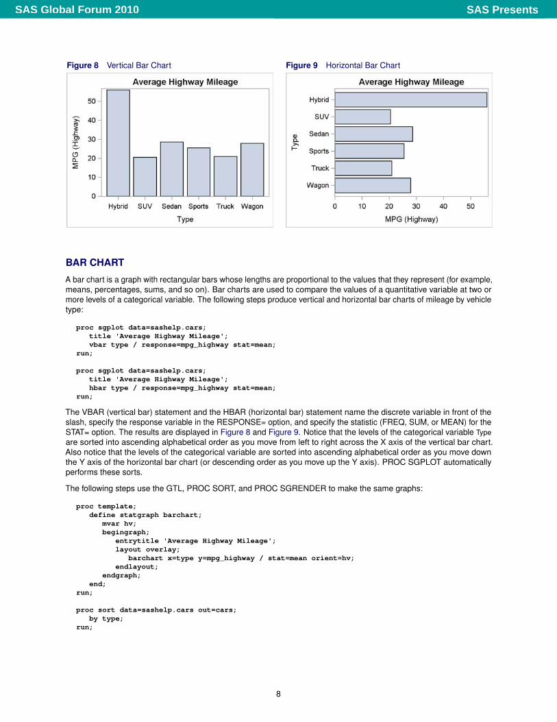
Figure 8 Vertical Bar Chart Figure 9 Horizontal Bar Chart
BAR CHART
A bar chart is a graph with rectangular bars whose lengths are proportional to the values that they represent (for example,means, percentages, sums, and so on). Bar charts are used to compare the values of a quantitative variable at two ormore levels of a categorical variable. The following steps produce vertical and horizontal bar charts of mileage by vehicletype:
proc sgplot data=sashelp.cars;title 'Average Highway Mileage';vbar type / response=mpg_highway stat=mean;
run;
proc sgplot data=sashelp.cars;title 'Average Highway Mileage';hbar type / response=mpg_highway stat=mean;
run;
The VBAR (vertical bar) statement and the HBAR (horizontal bar) statement name the discrete variable in front of theslash, specify the response variable in the RESPONSE= option, and specify the statistic (FREQ, SUM, or MEAN) for theSTAT= option. The results are displayed in Figure 8 and Figure 9. Notice that the levels of the categorical variable Typeare sorted into ascending alphabetical order as you move from left to right across the X axis of the vertical bar chart.Also notice that the levels of the categorical variable are sorted into ascending alphabetical order as you move downthe Y axis of the horizontal bar chart (or descending order as you move up the Y axis). PROC SGPLOT automaticallyperforms these sorts.
The following steps use the GTL, PROC SORT, and PROC SGRENDER to make the same graphs:
proc template;define statgraph barchart;
mvar hv;begingraph;
entrytitle 'Average Highway Mileage';layout overlay;
barchart x=type y=mpg_highway / stat=mean orient=hv;endlayout;
endgraph;end;
run;
proc sort data=sashelp.cars out=cars;by type;
run;
8
SAS PresentsSAS Global Forum 2010
%let hv=vertical;proc sgrender data=cars template=barchart;run;
proc sort data=sashelp.cars out=cars;by descending type;
run;
%let hv=horizontal;proc sgrender data=cars template=barchart;run;
The syntax of the BARCHART statement is based on a vertical bar chart, and the default for the ORIENT= option isOrient=Vertical. Based on this orientation, the X= option specifies the categorical variable, and the Y= optionspecifies the quantitative variable. When Orient=Horizontal is specified, the X= and Y= options specify thesame types of variables. This example could have used two templates, one with Orient=Vertical and one withOrient=Horizontal to make the two graphs. Instead, it uses one template and a macro variable to change theorientation.
The MVAR statement names the macro variable HV so that it can be used in other parts of the template. The optionOrient=HV sets the ORIENT= option to the value of the macro variable HV. Notice that the macro variable is specifiedin the template without an ampersand. Therefore, its value is not retrieved just before PROC TEMPLATE compiles thetemplate; rather, its value is retrieved at the time that PROC SGRENDER is run. This approach enables you to createthe template once and use it repeatedly for different analyses with different orientations. The macro variable does nothave to be defined at the time that the template is compiled, but it must be defined when the template is used with PROCSGRENDER. A macro variable named in the MVAR statement can contain values of options or variable names. It cannotcontain any arbitrary syntax fragment unless you are using a macro variable reference with an ampersand.
The data are sorted into ascending types for the vertical bar chart and descending types for the horizontal bar chart. Bydefault, PROC SGRENDER and the GTL do not sort the data. Bars are displayed in the order in which they occur in theinput data set.
The rest of this section uses PROC TEMPLATE and PROC SGRENDER with the BARCHARTPARM statement.Statements with a name that contains “PARM” do not perform computations to summarize the data. You provide adata set with one observation per group and the information that needs to be displayed. The advantage of using theBARCHARTPARM statement is that you can have precise control on how the groups are created. You can create thisdata set from the raw data by using a procedure such as PROC SUMMARY or PROC MEANS. The following steps usethe BARCHARTPARM statement to produce a bar chart that shows group means:
proc summary data=sashelp.cars nway;class type;var mpg_highway;output out=mileage mean=mean;
run;
proc template;define statgraph barchartparm;
begingraph;entrytitle 'Average Highway Mileage';layout overlay;
barchartparm x=type y=mean;endlayout;
endgraph;end;
run;
proc sgrender data=mileage template=barchartparm;run;
The results of these steps match Figure 8. A PROC SORT step is not necessary in these steps because PROCSUMMARY produces a sorted data set.
9
SAS PresentsSAS Global Forum 2010
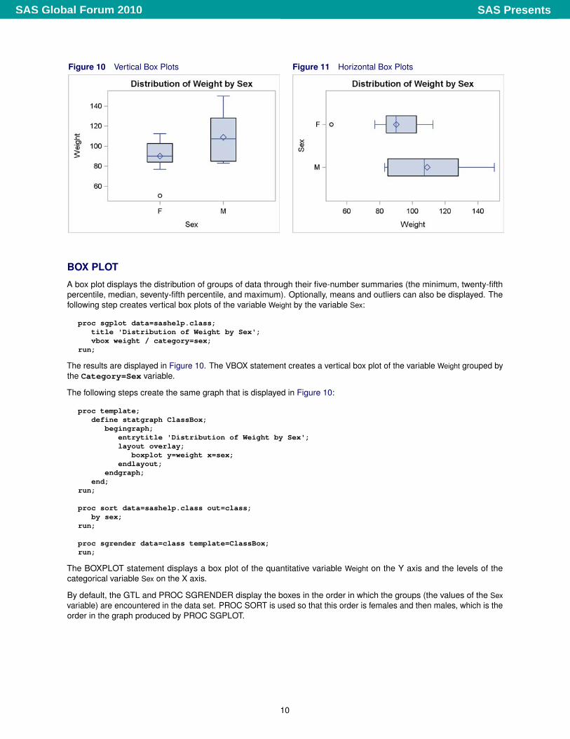
Figure 10 Vertical Box Plots Figure 11 Horizontal Box Plots
BOX PLOT
A box plot displays the distribution of groups of data through their five-number summaries (the minimum, twenty-fifthpercentile, median, seventy-fifth percentile, and maximum). Optionally, means and outliers can also be displayed. Thefollowing step creates vertical box plots of the variable Weight by the variable Sex:
proc sgplot data=sashelp.class;title 'Distribution of Weight by Sex';vbox weight / category=sex;
run;
The results are displayed in Figure 10. The VBOX statement creates a vertical box plot of the variable Weight grouped bythe Category=Sex variable.
The following steps create the same graph that is displayed in Figure 10:
proc template;define statgraph ClassBox;
begingraph;entrytitle 'Distribution of Weight by Sex';layout overlay;
boxplot y=weight x=sex;endlayout;
endgraph;end;
run;
proc sort data=sashelp.class out=class;by sex;
run;
proc sgrender data=class template=ClassBox;run;
The BOXPLOT statement displays a box plot of the quantitative variable Weight on the Y axis and the levels of thecategorical variable Sex on the X axis.
By default, the GTL and PROC SGRENDER display the boxes in the order in which the groups (the values of the Sexvariable) are encountered in the data set. PROC SORT is used so that this order is females and then males, which is theorder in the graph produced by PROC SGPLOT.
10
SAS PresentsSAS Global Forum 2010
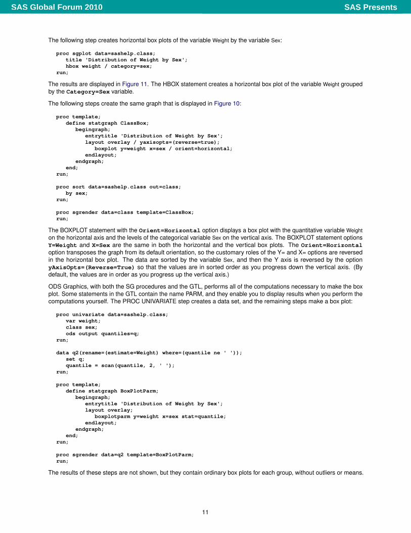
The following step creates horizontal box plots of the variable Weight by the variable Sex:
proc sgplot data=sashelp.class;title 'Distribution of Weight by Sex';hbox weight / category=sex;
run;
The results are displayed in Figure 11. The HBOX statement creates a horizontal box plot of the variable Weight groupedby the Category=Sex variable.
The following steps create the same graph that is displayed in Figure 10:
proc template;define statgraph ClassBox;
begingraph;entrytitle 'Distribution of Weight by Sex';layout overlay / yaxisopts=(reverse=true);
boxplot y=weight x=sex / orient=horizontal;endlayout;
endgraph;end;
run;
proc sort data=sashelp.class out=class;by sex;
run;
proc sgrender data=class template=ClassBox;run;
The BOXPLOT statement with the Orient=Horizontal option displays a box plot with the quantitative variable Weighton the horizontal axis and the levels of the categorical variable Sex on the vertical axis. The BOXPLOT statement optionsY=Weight and X=Sex are the same in both the horizontal and the vertical box plots. The Orient=Horizontaloption transposes the graph from its default orientation, so the customary roles of the Y= and X= options are reversedin the horizontal box plot. The data are sorted by the variable Sex, and then the Y axis is reversed by the optionyAxisOpts=(Reverse=True) so that the values are in sorted order as you progress down the vertical axis. (Bydefault, the values are in order as you progress up the vertical axis.)
ODS Graphics, with both the SG procedures and the GTL, performs all of the computations necessary to make the boxplot. Some statements in the GTL contain the name PARM, and they enable you to display results when you perform thecomputations yourself. The PROC UNIVARIATE step creates a data set, and the remaining steps make a box plot:
proc univariate data=sashelp.class;var weight;class sex;ods output quantiles=q;
run;
data q2(rename=(estimate=Weight) where=(quantile ne ' '));set q;quantile = scan(quantile, 2, ' ');
run;
proc template;define statgraph BoxPlotParm;
begingraph;entrytitle 'Distribution of Weight by Sex';layout overlay;
boxplotparm y=weight x=sex stat=quantile;endlayout;
endgraph;end;
run;
proc sgrender data=q2 template=BoxPlotParm;run;
The results of these steps are not shown, but they contain ordinary box plots for each group, without outliers or means.
11
SAS PresentsSAS Global Forum 2010
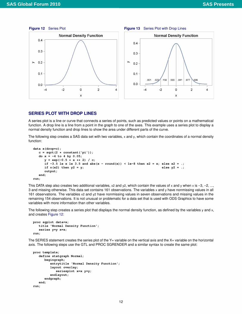
Figure 12 Series Plot Figure 13 Series Plot with Drop Lines
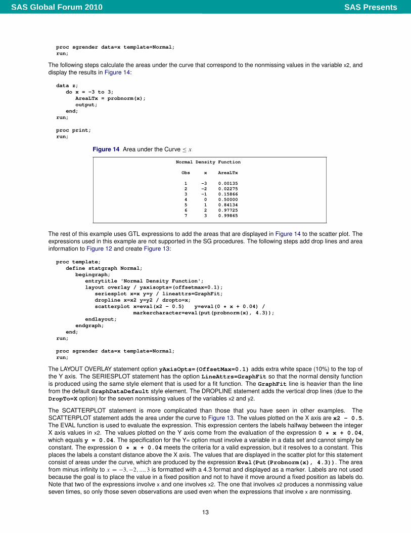
SERIES PLOT WITH DROP LINES
A series plot is a line or curve that connects a series of points, such as predicted values or points on a mathematicalfunction. A drop line is a line from a point in the graph to one of the axes. This example uses a series plot to display anormal density function and drop lines to show the area under different parts of the curve.
The following step creates a SAS data set with two variables, x and y, which contain the coordinates of a normal densityfunction:
data x(drop=c);c = sqrt(2 * constant('pi'));do x = -4 to 4 by 0.05;
y = exp(-0.5 * x ** 2) / c;if -3.5 le x le 3.5 and abs(x - round(x)) < 1e-8 then x2 = x; else x2 = .;if n(x2) then y2 = y; else y2 = .;output;
end;run;
This DATA step also creates two additional variables, x2 and y2, which contain the values of x and y when x is –3, –2, ...,3 and missing otherwise. This data set contains 161 observations. The variables x and y have nonmissing values in all161 observations. The variables x2 and y2 have nonmissing values in seven observations and missing values in theremaining 154 observations. It is not unusual or problematic for a data set that is used with ODS Graphics to have somevariables with more information than other variables.
The following step creates a series plot that displays the normal density function, as defined by the variables y and x,and creates Figure 12:
proc sgplot data=x;title 'Normal Density Function';series y=y x=x;
run;
The SERIES statement creates the series plot of the Y= variable on the vertical axis and the X= variable on the horizontalaxis. The following steps use the GTL and PROC SGRENDER and a similar syntax to create the same plot:
proc template;define statgraph Normal;
begingraph;entrytitle 'Normal Density Function';layout overlay;
seriesplot x=x y=y;endlayout;
endgraph;end;
run;
12
SAS PresentsSAS Global Forum 2010
proc sgrender data=x template=Normal;run;
The following steps calculate the areas under the curve that correspond to the nonmissing values in the variable x2, anddisplay the results in Figure 14:
data z;do x = -3 to 3;
AreaLTx = probnorm(x);output;
end;run;
proc print;run;
Figure 14 Area under the Curve � x
Normal Density Function
Obs x AreaLTx
1 -3 0.001352 -2 0.022753 -1 0.158664 0 0.500005 1 0.841346 2 0.977257 3 0.99865
The rest of this example uses GTL expressions to add the areas that are displayed in Figure 14 to the scatter plot. Theexpressions used in this example are not supported in the SG procedures. The following steps add drop lines and areainformation to Figure 12 and create Figure 13:
proc template;define statgraph Normal;
begingraph;entrytitle 'Normal Density Function';layout overlay / yaxisopts=(offsetmax=0.1);
seriesplot x=x y=y / lineattrs=GraphFit;dropline x=x2 y=y2 / dropto=x;scatterplot x=eval(x2 - 0.5) y=eval(0 * x + 0.04) /
markercharacter=eval(put(probnorm(x), 4.3));endlayout;
endgraph;end;
run;
proc sgrender data=x template=Normal;run;
The LAYOUT OVERLAY statement option yAxisOpts=(OffsetMax=0.1) adds extra white space (10%) to the top ofthe Y axis. The SERIESPLOT statement has the option LineAttrs=GraphFit so that the normal density functionis produced using the same style element that is used for a fit function. The GraphFit line is heavier than the linefrom the default GraphDataDefault style element. The DROPLINE statement adds the vertical drop lines (due to theDropTo=X option) for the seven nonmissing values of the variables x2 and y2.
The SCATTERPLOT statement is more complicated than those that you have seen in other examples. TheSCATTERPLOT statement adds the area under the curve to Figure 13. The values plotted on the X axis are x2 - 0.5.The EVAL function is used to evaluate the expression. This expression centers the labels halfway between the integerX axis values in x2. The values plotted on the Y axis come from the evaluation of the expression 0 * x + 0.04,which equals y = 0.04. The specification for the Y= option must involve a variable in a data set and cannot simply beconstant. The expression 0 * x + 0.04 meets the criteria for a valid expression, but it resolves to a constant. Thisplaces the labels a constant distance above the X axis. The values that are displayed in the scatter plot for this statementconsist of areas under the curve, which are produced by the expression Eval(Put(Probnorm(x), 4.3)). The areafrom minus infinity to x D �3;�2; :::; 3 is formatted with a 4.3 format and displayed as a marker. Labels are not usedbecause the goal is to place the value in a fixed position and not to have it move around a fixed position as labels do.Note that two of the expressions involve x and one involves x2. The one that involves x2 produces a nonmissing valueseven times, so only those seven observations are used even when the expressions that involve x are nonmissing.
13
SAS PresentsSAS Global Forum 2010
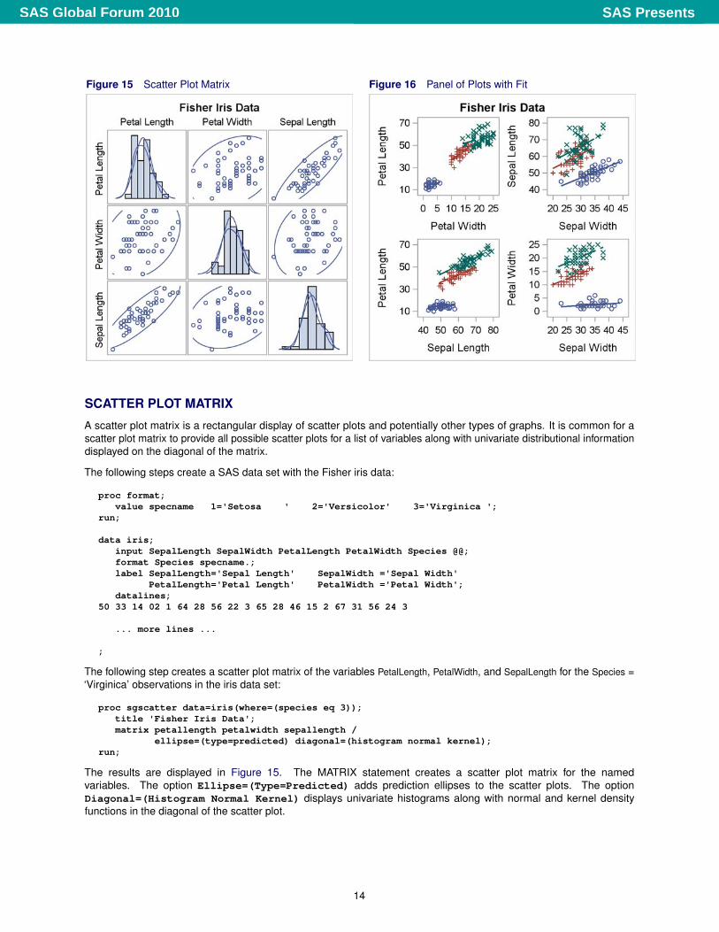
Figure 15 Scatter Plot Matrix Figure 16 Panel of Plots with Fit
SCATTER PLOT MATRIX
A scatter plot matrix is a rectangular display of scatter plots and potentially other types of graphs. It is common for ascatter plot matrix to provide all possible scatter plots for a list of variables along with univariate distributional informationdisplayed on the diagonal of the matrix.
The following steps create a SAS data set with the Fisher iris data:
proc format;value specname 1='Setosa ' 2='Versicolor' 3='Virginica ';
run;
data iris;input SepalLength SepalWidth PetalLength PetalWidth Species @@;format Species specname.;label SepalLength='Sepal Length' SepalWidth ='Sepal Width'
PetalLength='Petal Length' PetalWidth ='Petal Width';datalines;
50 33 14 02 1 64 28 56 22 3 65 28 46 15 2 67 31 56 24 3
... more lines ...
;
The following step creates a scatter plot matrix of the variables PetalLength, PetalWidth, and SepalLength for the Species =‘Virginica’ observations in the iris data set:
proc sgscatter data=iris(where=(species eq 3));title 'Fisher Iris Data';matrix petallength petalwidth sepallength /
ellipse=(type=predicted) diagonal=(histogram normal kernel);run;
The results are displayed in Figure 15. The MATRIX statement creates a scatter plot matrix for the namedvariables. The option Ellipse=(Type=Predicted) adds prediction ellipses to the scatter plots. The optionDiagonal=(Histogram Normal Kernel) displays univariate histograms along with normal and kernel densityfunctions in the diagonal of the scatter plot.
14
SAS PresentsSAS Global Forum 2010
The following steps create the same graph that is displayed in Figure 15:
proc template;define statgraph Matrix;
begingraph / designheight=defaultdesignwidth;entrytitle 'Fisher Iris Data';layout gridded;
scatterplotmatrix petallength petalwidth sepallength /ellipse=(type=predicted) diagonal=(histogram normal kernel);
endlayout;EndGraph;
end;run;
proc sgrender data=iris(where=(species eq 3)) template=Matrix;run;
The options in the SCATTERPLOTMATRIX statement in the GTL match the options in the MATRIX statement in PROCSGSCATTER.
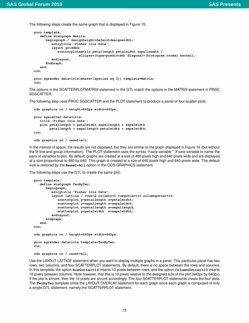
The following step uses PROC SGSCATTER and the PLOT statement to produce a panel of four scatter plots:
ods graphics on / height=640px width=640px;
proc sgscatter data=iris;title 'Fisher Iris Data';plot petallength * petalwidth sepallength * sepalwidth
petallength * sepallength petalwidth * sepalwidth;run;
ods graphics on / reset=all;
In the interest of space, the results are not displayed, but they are similar to the graph displayed in Figure 16 (but withoutthe fit line and group information). The PLOT statement uses the syntax Y-axis-variable * X-axis-variable to name thepairs of variables to plot. By default, graphs are created at a size of 480 pixels high and 640 pixels wide and are displayedat a size proportional to 480 by 640. This graph is created at a size of 640 pixels high and 640 pixels wide. The defaultsize is restored by the Reset=All option in the ODS GRAPHICS statement.
The following steps use the GTL to create the same plot:
proc template;define statgraph TwoByTwo;
begingraph;entrytitle "Fisher Iris Data";layout lattice / rows=2 columns=2 rowgutter=10 columngutter=10;
scatterplot y=petallength x=petalwidth;scatterplot y=sepallength x=sepalwidth;scatterplot y=petallength x=sepallength;scatterplot y=petalwidth x=sepalwidth;
endlayout;endgraph;
end;run;
ods graphics on / height=640px width=640px;
proc sgrender data=iris template=TwoByTwo;run;
ods graphics on / reset=all;
Use the LAYOUT LATTICE statement when you want to display multiple graphs in a panel. This particular panel has tworows, two columns, and four SCATTERPLOT statements. By default, there is no space between the rows and columns.In this template, the option RowGutter=10 inserts 10 pixels between rows, and the option ColumnGutter=10 inserts10 pixels between columns. Note however, that this is 10 pixels relative to the designed size of the plot (640px by 640px).If the plot is shrunk, then the 10 pixels are shrunk accordingly. The four SCATTERPLOT statements create the four plots.The TwoByTwo template omits the LAYOUT OVERLAY statement for each graph since each graph is composed of onlya single GTL statement, namely the SCATTERPLOT statement.
15
SAS PresentsSAS Global Forum 2010

The following template is equivalent, and it enables you to specify additional statements for each graph:
proc template;define statgraph TwoByTwo;
begingraph;entrytitle "Fisher Iris Data";layout lattice / rows=2 columns=2 rowgutter=10 columngutter=10;
layout overlay;scatterplot y=petallength x=petalwidth;
endlayout;layout overlay;
scatterplot y=sepallength x=sepalwidth;endlayout;layout overlay;
scatterplot y=petallength x=sepallength;endlayout;layout overlay;
scatterplot y=petalwidth x=sepalwidth;endlayout;
endlayout;endgraph;
end;run;
The following steps create a 2-by-2 panel of scatter plots with a separate fit function for each group:
proc template;define statgraph TwoByTwoFit;
begingraph;entrytitle "Fisher Iris Data";layout lattice / rows=2 columns=2 rowgutter=10 columngutter=10;
layout overlay;scatterplot y=petallength x=petalwidth / group=species;regressionplot y=petallength x=petalwidth / group=species;
endlayout;layout overlay;
scatterplot y=sepallength x=sepalwidth / group=species;regressionplot y=sepallength x=sepalwidth / group=species;
endlayout;layout overlay;
scatterplot y=petallength x=sepallength / group=species;regressionplot y=petallength x=sepallength / group=species;
endlayout;layout overlay;
scatterplot y=petalwidth x=sepalwidth / group=species;regressionplot y=petalwidth x=sepalwidth / group=species;
endlayout;endlayout;
endgraph;end;
run;
proc sort data=iris;by species;
run;
ods graphics on / height=640px width=640px;
proc sgrender data=iris template=TwoByTwoFit;run;
ods graphics on / reset=all;
The results are displayed in Figure 16. The GROUP= option is used to create separate fit functions for each group andto display each group by using a different set of markers and colors (from the style elements GraphData1 throughGraphData3). Options exist for making the same graph with PROC SGSCATTER.
16
SAS PresentsSAS Global Forum 2010
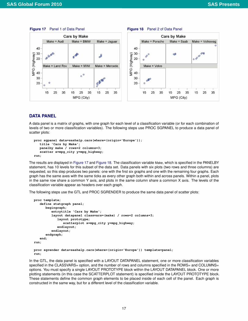
Figure 17 Panel 1 of Data Panel Figure 18 Panel 2 of Data Panel
DATA PANEL
A data panel is a matrix of graphs, with one graph for each level of a classification variable (or for each combination oflevels of two or more classification variables). The following steps use PROC SGPANEL to produce a data panel ofscatter plots:
proc sgpanel data=sashelp.cars(where=(origin='Europe'));title 'Cars by Make';panelby make / rows=2 columns=3;scatter x=mpg_city y=mpg_highway;
run;
The results are displayed in Figure 17 and Figure 18. The classification variable Make, which is specified in the PANELBYstatement, has 10 levels for this subset of the data set. Data panels with six plots (two rows and three columns) arerequested, so this step produces two panels: one with the first six graphs and one with the remaining four graphs. Eachgraph has the same axes with the same ticks as every other graph both within and across panels. Within a panel, plotsin the same row share a common Y axis, and plots in the same column share a common X axis. The levels of theclassification variable appear as headers over each graph.
The following steps use the GTL and PROC SGRENDER to produce the same data panel of scatter plots:
proc template;define statgraph panel;
begingraph;entrytitle 'Cars by Make';layout datapanel classvars=(make) / rows=2 columns=3;
layout prototype;scatterplot x=mpg_city y=mpg_highway;
endlayout;endlayout;
endgraph;end;
run;
proc sgrender data=sashelp.cars(where=(origin='Europe')) template=panel;run;
In the GTL, the data panel is specified with a LAYOUT DATAPANEL statement, one or more classification variablesspecified in the CLASSVARS= option, and the number of rows and columns specified in the ROWS= and COLUMNS=options. You must specify a single LAYOUT PROTOTYPE block within the LAYOUT DATAPANEL block. One or moreplotting statements (in this case the SCATTERPLOT statement) is specified inside the LAYOUT PROTOTYPE block.These statements define the common graph elements to be placed inside of each cell of the panel. Each graph isconstructed in the same way, but for a different level of the classification variable.
17
SAS PresentsSAS Global Forum 2010

Figure 19 Residual Panel
RESIDUAL PANEL
This example uses PROC GLM to fit a linear model and then uses PROC TEMPLATE, the GTL, and PROC SGRENDERto display the residuals as a function of each of the predictor variables. The power of the GTL is apparent in panels likethis, which are composed of multiple graphs that are constructed in more than one way. This example uses a LAYOUTLATTICE statement, and as a result the Y axes for the component graphs in Figure 19 are not created independently.The LAYOUT LATTICE statement works in this example only because the X axis for the box plot is not above or belowany other graph. If the X axis for the box plot were above or below the X axis for a continuous variable, this examplewould need to use a LAYOUT GRIDDED statement instead.
The following step uses PROC GLM to fit a linear model and create an output data set called Res that contains all of theanalysis variables along with a new variable, R, which contains the residuals:
proc glm data=sashelp.class;class sex;model weight = height age sex;output out=res r=r;
run;
The linear model has two quantitative and continuous predictor variables, Height and Age, and one categorical predictorvariable, Sex. Residuals are displayed in scatter plots for the continuous predictor variables and in box plots for thecategorical predictor variable.
18
SAS PresentsSAS Global Forum 2010
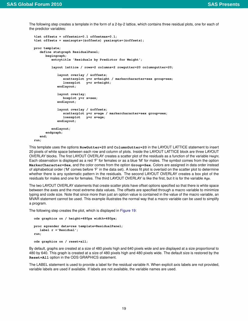
The following step creates a template in the form of a 2-by-2 lattice, which contains three residual plots, one for each ofthe predictor variables:
%let offsets = offsetmin=0.1 offsetmax=0.1;%let offsets = xaxisopts=(&offsets) yaxisopts=(&offsets);
proc template;define statgraph ResidualPanel;
begingraph;entrytitle 'Residuals by Predictor for Weight';
layout lattice / rows=2 columns=2 rowgutter=20 columngutter=20;
layout overlay / &offsets;scatterplot y=r x=height / markercharacter=sex group=sex;loessplot y=r x=height;
endlayout;
layout overlay;boxplot y=r x=sex;
endlayout;
layout overlay / &offsets;scatterplot y=r x=age / markercharacter=sex group=sex;loessplot y=r x=age;
endlayout;
endlayout;endgraph;
end;run;
This template uses the options RowGutter=20 and ColumnGutter=20 in the LAYOUT LATTICE statement to insert20 pixels of white space between each row and column of plots. Inside the LAYOUT LATTICE block are three LAYOUTOVERLAY blocks. The first LAYOUT OVERLAY creates a scatter plot of the residuals as a function of the variable Height.Each observation is displayed as a red ‘F’ for females or as a blue ‘M’ for males. The symbol comes from the optionMarkerCharacter=Sex, and the color comes from the option Group=Sex. Colors are assigned in data order insteadof alphabetical order (‘M’ comes before ‘F’ in the data set). A loess fit plot is overlaid on the scatter plot to determinewhether there is any systematic pattern in the residuals. The second LAYOUT OVERLAY creates a box plot of theresiduals for males and one for females. The third LAYOUT OVERLAY is like the first, but it is for the variable Age.
The two LAYOUT OVERLAY statements that create scatter plots have offset options specified so that there is white spacebetween the axes and the most extreme data values. The offsets are specified through a macro variable to minimizetyping and code size. Note that since more than just an option value is contained in the value of the macro variable, anMVAR statement cannot be used. This example illustrates the normal way that a macro variable can be used to simplifya program.
The following step creates the plot, which is displayed in Figure 19:
ods graphics on / height=480px width=480px;
proc sgrender data=res template=ResidualPanel;label r ='Residual';
run;
ods graphics on / reset=all;
By default, graphs are created at a size of 480 pixels high and 640 pixels wide and are displayed at a size proportional to480 by 640. This graph is created at a size of 480 pixels high and 480 pixels wide. The default size is restored by theReset=All option in the ODS GRAPHICS statement.
The LABEL statement is used to provide a label for the residual variable R. When explicit axis labels are not provided,variable labels are used if available. If labels are not available, the variable names are used.
19
SAS PresentsSAS Global Forum 2010
CONCLUSION
The GTL and the SG procedures provide alternative ways to produce modern statistical graphs. Both are powerful andflexible, but the GTL offers the greatest power, whereas the SG procedures have a simpler syntax. In particular, the GTLenables you to use expressions, compose panels of different types of graphs, modify the graphs that the SAS Systemautomatically produces, equate axes, produce three-dimensional graphs, contour plots, block plots, and do many otherthings that you cannot do with the SG procedures. Many more examples can be found in Kuhfeld (2010).
REFERENCES
Cleveland, W. S., Devlin, S. J., and Grosse, E. (1988), “Regression by Local Fitting,” Journal of Econometrics, 37,87–114.
Eilers, P. H. C. and Marx, B. D. (1996), “Flexible Smoothing with B-Splines and Penalties,” Statistical Science, 11, 89–121,with discussion.
Kuhfeld, W. F. (2009), “Modifying ODS Statistical Graphics Templates in SAS 9.2,” http://support.sas.com/rnd/app/papers/modtmplt.pdf.
Kuhfeld, W. F. (2010), Statistical Graphics in SAS—An Introduction to the Graph Template Language and the StatisticalGraphics Procedures, SAS Institute Inc.
National Institute of Standards and Technology (1998), “Statistical Reference Data Sets,” http://www.nist.gov/srd/index.htm, last accessed January 29, 2010.
RECOMMENDED READING
� For an introduction to the GTL and to the statistical graphics procedures, see Kuhfeld (2010).
� More information about ODS, ODS Graphics, the GTL, and SAS/STAT software is available on the Web at:http://support.sas.com/documentation/,http://support.sas.com/documentation/onlinedoc/base/index.html,http://support.sas.com/documentation/onlinedoc/graph/index.html,and http://support.sas.com/documentation/onlinedoc/stat/index.html.
� To learn more about ODS Graphics, see Chapter 21, “Statistical Graphics Using ODS” (SAS/STAT User’s Guide).
� For introductory information about ODS Graphics, see the documentation section “A Primer on ODS StatisticalGraphics” (Chapter 21, SAS/STAT User’s Guide).
� For complete GTL documentation, see the SAS/GRAPH: Graph Template Language User’s Guide andSAS/GRAPH: Graph Template Language Reference.
� For information about the statistical graphics procedures, see the SAS/GRAPH: Statistical Graphics ProceduresGuide.
� For information about modifying the templates that the SAS System provides, see Kuhfeld (2009).
� For complete documentation about the Graphics Editor, see the SAS/GRAPH: ODS Graphics Editor User’s Guide.
� To learn more about ODS, see Chapter 20, “Using the Output Delivery System” (SAS/STAT User’s Guide).
� For complete ODS documentation, see the SAS Output Delivery System: User’s Guide.
CONTACT INFORMATION
Warren F. KuhfeldSAS Institute Inc.S3018 SAS Campus DriveCary, NC, 27513(919) [email protected]://support.sas.com/publishing/authors/kuhfeld.html
SAS and all other SAS Institute Inc. product or service names are registered trademarks or trademarks of SAS InstituteInc. in the USA and other countries. ® indicates USA registration.
Other brand and product names are trademarks of their respective companies.
20
SAS PresentsSAS Global Forum 2010