new features and enhancements in sas 9.2...
TRANSCRIPT

1
New Features and Enhancements in SAS 9.2 SAS/GRAPH® Software
SAS/GRAPH includes many new features and enhancements in SAS 9.2 that you will want to know about. Some enhancements were designed to make your graphics output look better and make SAS/GRAPH easier to use, while others add totally new functionality.
ODS Statistical Graphics ODS Statistical Graphics (you might have also seen this referred to as 'ODS Graphics') is available for many procedures in SAS 9.2. In the past, the SAS/STAT procedures performed analytics and produced output data sets and tables, and sometimes basic text-based plots. Users then had to write their own SAS/GRAPH code to produce nice "publication-quality" plots of the results. In SAS 9.2, you can now specify the following statement, and graphical representations will be automatically created for you for many of the statistical procedures: ODS GRAPHICS ON; ODS Statistical Graphics uses Java graph rendering technology to create high quality graphs. A SAS/GRAPH license is required in order to take advantage of this new feature. Below is an example of PROC REG's old ASCII output.

2
The graphs below were created in SAS 9.2 using ODS Statistical Graphics. The graph in the top left corner represents the same data as in the ASCII plot above. In addition to higher-quality plots, ODS Statistical Graphics produces more types of plots, including more complex plots such as histograms with smooth overlaid lines.

3

4
Graph Template Language Graph Template Language (GTL) is the underlying language that makes ODS Statistical Graphics work. GTL syntax is part of PROC TEMPLATE, and can be used to create your own highly customized analytical graphics that are not available from traditional SAS/GRAPH procedures. GTL statements include plot statements, layout statements, and other statements to generate features like titles and legends. Following is an example of GTL code using PROC TEMPLATE. The new SGRENDER procedure (discussed later in this paper) is used to generate the graph, which is displayed below. PROC TEMPLATE; DEFINE STATGRAPH Graph.FitPlot1; BEGINGRAPH; ENTRYTITLE 'Model Weight by Height'; LAYOUT OVERLAY; SCATTERPLOT Y=weight X=height; REGRESSIONPLOT Y=weight X=height; ENDLAYOUT; ENDGRAPH; END; RUN; PROC SGRENDER DATA=sashelp.class TEMPLATE=Graph.FitPlot1; RUN;

5
New Procedures Several SAS/GRAPH procedures have been added in SAS 9.2 that provide exciting new graphical functionality. They provide an easy way to generate graphics that were out of reach for most SAS users in the past. PROC GKPI PROC GKPI (Graphical Key Performance Indicator) is a new procedure that produces several types of graphs for dashboards. PROC GKPI can produce Bullet and Slider graphs:
PROC GKPI can also generate Dial, Speedometer, and Traffic Light graphs:

6
PROC GTILE PROC GTILE creates Tile Charts (also known as Tree Maps). In these graphs, one variable controls the size of the rectangle, and another variable controls the color. The following example displays the year 2000 election results. The size of the rectangles represents the number of votes in each state, and the color represents the winner of the votes.
PROC GINSIDE PROC GINSIDE allows you to programmatically determine whether a given point is inside a given map area. This is very handy for doing geospatial analytics on topics such as your customers, tracking the spread of diseases, or performing environmental impact studies.

7
PROC GEOCODE PROC GEOCODE allows you to obtain the approximate latitude and longitude location of an address. PROC GEOCODE will currently only provide an address location at the city or ZIP code level. Using PROC GEOCODE to calculate the average centroid of a city's ZIP code is much easier than manually calculating the location using SQL queries or other SAS procedures. Quite literally, it only takes code like the following to perform city level geocoding:
PROC GEOCODE CITY DATA=teams OUT=teams; Street level geocoding will be added in a future release of SAS Software. Once you have the geocoded latitude and longitude coordinates, you can use an Annotate data set to place markers onto a map at those locations, illustrated by the map below:
PROC GEOCODE can also perform ZIP + 4 geocoding. Note that regular ZIP code level geocoding is a bit easier, because it uses the SASHELP.ZIPCODE file that ships with SAS. To perform ZIP + 4 geocoding, you must download a large lookup data set with the ZIP + 4's and their latitude and longitude centroids. You can download a ZIP + 4 data set derived from the Census Bureau 2006 Second Edition TIGER files from the SAS Maps Online web site. The two examples below demonstrate the difference between the ZIP code level geocoding and ZIP + 4 geocoding. The geocoded centroids of all of the 5-digit ZIP codes based in Wake county, NC, are plotted on a Wake county map on the first map, and the ZIP + 4 locations of the same ZIP codes are plotted on the second map. ZIP + 4 gives you more precision and granularity.

8

9
New Statistical Graphics Procedures There is a new family of Statistical Graphics (SG) procedures in SAS 9.2 that are built on top of the ODS Graphics system. These procedures use the Graph Template Language (GTL) behind the scenes to generate many graphs that are commonly used in data analysis. The syntax of these new procedures is very clear and concise, making it easier to create effective, sophisticated graphs. PROC SGPLOT The SGPLOT procedure produces single-celled graphs that support a wide variety of plot and chart types. Multiple plots and charts can easily be combined, or overlaid, on a common set of X and Y axes. The procedure supports plot types including scatter, histogram, band, needle, bar and box; and density, fit, and confidence graphs including Loess, regression, and penalized B-spline. There are also statements available for controlling insets, legends, axes, reference lines, ellipses, parametric lines, and more. The following code generates an overlaid graph containing a histogram, density curve, and kernel density curve. The graph is displayed below. PROC SGPLOT DATA=sashelp.heart; HISTOGRAM cholesterol; DENSITY cholesterol; DENSITY cholesterol / TYPE=KERNEL; RUN;

10
PROC SGSCATTER The SGSCATTER procedure produces graphs with grids of independent scatter plots, comparative plots, or scatter plot matrices. The COMPARE statement produces a grid of plots for each crossing of the X and Y variables using common axes. The PLOT statement creates independent plots for each Y*X pair in a panel. The MATRIX statement creates a scatter plot matrix from a list of variables. The code below generates a scatter plot matrix with confidence ellipses. The graph is displayed below. PROC SGSCATTER DATA=sashelp.iris; MATRIX sepalwidth sepallength petalwidth petallength / GROUP=species ELLIPSE=(ALPHA=.5); RUN;

11
PROC SGPANEL The SGPANEL procedure produces paneled graphs based on one or more classification variables. The plots and charts are constructed in the same way as those in PROC SGPLOT. The number of cells is determined by the classification variables listed in the PANELBY statement. The following code generates a paneled graph using the same statements as the SGPLOT output above, with the addition of the PANELBY statement. The graph is displayed below. PROC SGPANEL DATA=sashelp.heart; PANELBY sex / NOVARNAME; HISTOGRAM cholesterol; DENSITY cholesterol; DENSITY cholesterol / TYPE=KERNEL; RUN;
12
PROC SGRENDER The SGRENDER procedure creates graphical output from templates that are created using the Graph Template Language (GTL). The basic syntax for PROC SGRENDER follows: PROC SGRENDER TEMPLATE=statgraph-template-name DATA=data-set-name; RUN;
ODS Graphics Editor The ODS Graphics Editor is a new interactive GUI in SAS 9.2 for the easy customization of ODS graphs. You can use the editor to change the graph style and graph size; to edit, add, or delete titles and footnotes; reposition legends; and customize the visual properties of the plot. You can also add free-form annotations to the graph using the tools in the editor. Please note that the ODS Graphics Editor cannot be used to edit graphs generated with traditional SAS/GRAPH procedures.
Network Visualization Workshop SAS/GRAPH Network Visualization Workshop is a new interactive, graphics-oriented application in SAS 9.2 for visualizing and investigating data. The application uses visualization techniques that enable you to detect patterns and extract information that might be concealed, often in very large quantities of data. Network Visualization Workshop is particularly useful for examining network data, that is, data that is structured into nodes and links that connect the nodes.
Unicode characters Also new in SAS 9.2, Unicode character codes can be used to specify characters in a font. (Note that the Unicode support only applies to fonts, such as TrueType fonts, which support Unicode.) To see these characters, select Start => Programs => Accessories => System_Tools => Accessories => Character_Map on Windows systems, and select a font such as Arial. Scroll down in the list, and click on the desired character to see its associated four-digit hex code (see the screen capture below).

13
The example below illustrates the Arial/unicode 'Euro' symbol ('20AC'x) used in the axis label and footnote, and the 'smiley face' character ('263B'x) as the plot symbol. The code snippets below show how the Unicode values were specified in the SAS code:
AXIS1 LABEL=(FONT="Arial/bold" 'Sales ' FONT="Arial/bold/unicode" '20AC'x); FOOTNOTE "Sales plot - all values in " FONT="Arial/unicode" '20AC'x; SYMBOL1 FONT="Arial/unicode" VALUE='263B'x;

14
Annotate Enhancements In SAS 9.2, you can now specify a WIDTH variable in your annotate data set to control the outline width of circles drawn with the PIE function. The following example demonstrates the new WIDTH variable functionality, and also shows the new SAS 9.2 MAPS.WORLD data set, which now includes Cuba, Newfoundland, Tasmania, and Antarctica.

15
SAS/GRAPH also has a new ARROW annotate function in SAS 9.2 that allows you to easily draw arrows, similar to how you draw line segments using the MOVE and DRAW annotate functions. The new ARROW function is illustrated below.
Transparency Prior to SAS 9.2, the TRANSPARENCY graphics option did not work in many situations in SAS/GRAPH. In SAS 9.2, the TRANSPARENCY graphics option works exactly as you would hope and expect! The examples below demonstrate using the Annotate facility to place two pictures with transparent backgrounds onto a map. Notice in the SAS 9.2 output that the pictures blend smoothly with the map's gradient background, whereas in SAS 9.1.3, the pictures block off a rectangular area of white space.

16
Procedure Enhancements Several of the existing SAS/GRAPH procedures have been enhanced in SAS 9.2. These enhancements should help improve the quality of your graphs. PROC GBARLINE PROC GBARLINE includes several enhancements in SAS 9.2. You can now use multiple PLOT statements with different variables to graph separate lines. The SUBGROUP option was added to the BAR statement, which allows bars with stacked subgroups. This behavior is identical to the SUBGROUP= option in PROC GCHART's VBAR statement. Support for the LEGEND option was also added. You can use it on either the BAR or a PLOT statement, or on both. You cannot use it on more than one PLOT statement. The LEGEND option does not have to be on the first PLOT statement, but you are limited to one PLOT legend. You can position the BAR and PLOT legends independently. You can also put them in the same position and they are drawn as one legend.

17

18
PROC GMAP One simple, but very useful enhancement to PROC GMAP is the new CDEFAULT= option that allows you to specify the default fill color of the 'empty' map areas (those areas with no response data). Previously, the CEMPTY= option allowed you to control the outline color of the empty areas, but if you wanted to control the fill color, you had to insert dummy response values into your data for all those areas. The CDEFAULT= option is illustrated in the second map below.
Many of the larger map data sets that are shipped with SAS/GRAPH Software contain a DENSITY variable that can be used to subset a map data set to draw a simpler map with fewer boundary points. There is a new DENSITY option in PROC GMAP in SAS 9.2 that allows you to easily specify the level of density you desire in the map.

19
In the examples below, notice that in the SAS 9.1.3 map (which uses all the boundary data points), the data points are merging together and form a thick 'blob'. By comparison, in the SAS 9.2 map, which only uses the boundary data points with a DENSITY value of 1 or lower, the boundaries look much clearer.
20
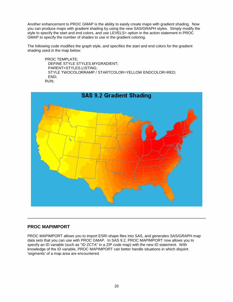
Another enhancement to PROC GMAP is the ability to easily create maps with gradient shading. Now you can produce maps with gradient shading by using the new SAS/GRAPH styles. Simply modify the style to specify the start and end colors, and use LEVELS= option in the action statement in PROC GMAP to specify the number of shades to use in the gradient coloring. The following code modifies the graph style, and specifies the start and end colors for the gradient shading used in the map below: PROC TEMPLATE; DEFINE STYLE STYLES.MYGRADIENT; PARENT=STYLES.LISTING; STYLE TWOCOLORRAMP / STARTCOLOR=YELLOW ENDCOLOR=RED; END; RUN;
PROC MAPIMPORT PROC MAPIMPORT allows you to import ESRI shape files into SAS, and generates SAS/GRAPH map data sets that you can use with PROC GMAP. In SAS 9.2, PROC MAPIMPORT now allows you to specify an ID variable (such as "ID ZCTA" in a ZIP code map) with the new ID statement. With knowledge of the ID variable, PROC MAPIMPORT can better handle situations in which disjoint 'segments' of a map area are encountered.

21
New Map-related Functions in Base SAS ZIPCITYDISTANCE Function The ZIPCITYDISTANCE function returns a straight-line distance between two ZIP codes. The ZIP code distance will be calculated using the coordinates from the ZIP code centroid data set that ships in SASHELP.
distance = ZIPCITYDISTANCE(zip1, zip2); GEODIST Function The GEODIST function calculates a straight-line distance between any two geographic coordinate pairs.
distance = GEODIST(lat1,long1,lat2,long2 [,options])
Options: D - lat/long are in degrees (default) R - lat/long are in radians M - distance given is in miles (default) K - distance given is in kilometers
ZIPCITY Function The ZIPCITY function returns the city for a given ZIP code. The returned information is based on the ZIPCODE data set shipped in SASHELP.
city = ZIPCITY(zipcode);