the development of a learning dashboard … lecturers: a case study on a student-centered e-learning...
TRANSCRIPT

JOURNAL OF EDUCATORS ONLINE
THE DEVELOPMENT OF A LEARNING DASHBOARD FOR LECTURERS: A CASE STUDY ON A STUDENT-
CENTERED E-LEARNING ENVIRONMENTHarry B. Santoso, Universitas Indonesia
Alivia Khaira Batuparan, Universitas Indonesia R. Yugo K. Isal, Universitas Indonesia
Wade H. Goodridge, Utah State University
ABSTRACTStudent Centered e-Learning Environment (SCELE) is a Moodle-based learning management system
(LMS) that has been modified to enhance learning within a computer science department curriculum offered by the Faculty of Computer Science of large public university in Indonesia. This Moodle provided a mechanism to record students’ activities when engaged in learning with e-Learning software. However, while the software captured the data and presented it adequately, there is room for enhancement and further refinement. The purpose of this research is to investigate and understand lecturer needs as they monitor student activities in SCELE and then develop a learning monitoring tool capable of visualizing and collecting data in a form that facilitates lecturer observation, analysis, and targeting of specific concepts. Theories found within information architecture and information visualization are used as a foundational approach in the development of the application. The result of the research focuses on developing a learning dashboard Moodle plugin that can be easily utilized by lecturers engaging SCELE.
Keywords: e-Learning, Dashboard, Information Architecture, Moodle, SCELE, Visualization.
INTRODUCTION New developments and inventions created
with technology are now utilized by almost all sectors, including education. Online learning popularity is steadily increasing and parallels the continual development and implementation of information and communication technology, especially as it penetrates into every aspect of education (Online Learning Consortium, 2017). To establish an effective educational system, a collaboration of four approaches to learning are required: learner-centered, knowledge-centered, assessment-centered, and community-centered (Anderson, 2004). A learner-centered educational system, or a Student-Centered Learning (SCL) approach, actively designs learning experiences based on a student’s pre-existing knowledge. This focus is used to promote the student’s learning
autonomy and independence (Anderson, 2004). In an SCL environment, students decide what, when, and how they will learn (Hannafin & Hannafin, 2008). To facilitate such an approach, lecturers are required to have knowledge and understanding of student needs. A traditional face-to-face learning environment allows lecturer’s to actively observe students’ learning experiences and their perceptions of delivered learning materials, but this is extremely challenging in distance learning because students and lecturers communicate ansynchronously (Anderson, 2004) without the ability to directly interpret physical elements of communication. However, a student’s learning status can be observed in an asynchronous online educational environment by evaluating behavior data collected and stored in a Learning Management System (LMS) (Macfadyen & Dawson, 2010;
JOURNAL OF EDUCATORS ONLINE
Moodle, 2014; Tobarra, Robles-Gómez, Ros, Hernández, & Caminero, 2014).
Previous studies have been conducted to evaluate the LMS user experience (Santoso, Schrepp, Isal, Utomo, & Priyogi, 2016) and their overall learning experience (Santoso, Cenka, Sadita, Fadhilah, Junus, Fadhilah, Prihandoko, & Goodridge, 2016). A lot of studies evaluate relationships between student LMS usage in a variety of activities and student performance (Campbell & Oblinger, 2007; Macfadyen & Dawson, 2012). With the emergence of more enhanced LMS systems, it becomes important for lecturers to monitor student LMS usage so they can utilize data-driven decision making within their course assess their lecture design (Dietz-Uhler & Hurn, 2013; Macfadyen & Dawson, 2012). Such processes are described as Learning Analytics. Properly defined, Learning Analytics can be understood as “the measurement, collection, analysis and reporting of data about learners and their contexts, for purposes of understanding and optimizing learning and the
environments in which it occurs” (SoLAR, 2011, p. 4).
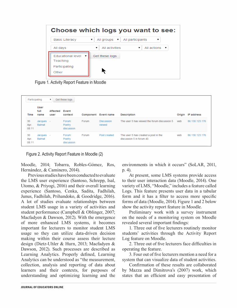
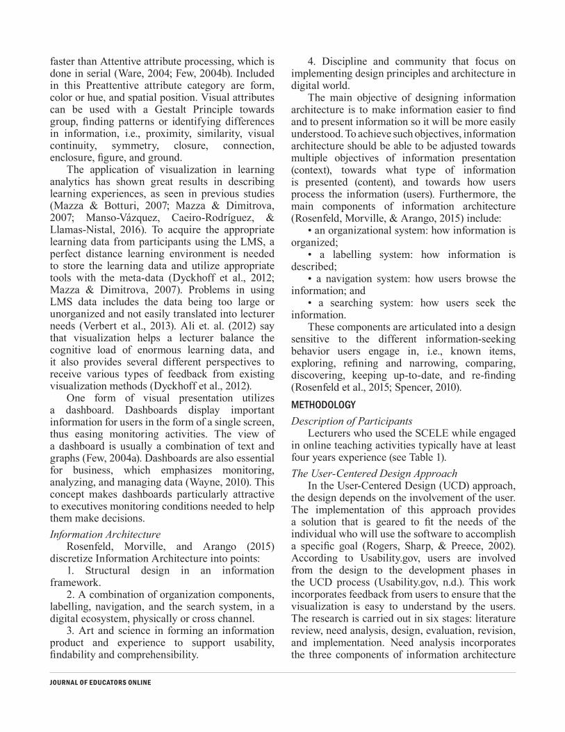
At present, some LMS systems provide access to their user interaction data (Moodle, 2014). One variety of LMS, “Moodle,” includes a feature called Logs. This feature presents user data in a tabular form and it has a filter to access more specific forms of data (Moodle, 2014). Figure 1 and 2 below show the activity report feature in Moodle.
Preliminary work with a survey instrument on the needs of a monitoring system on Moodle revealed several important findings:
1. Three out of five lecturers routinely monitor students’ activities through the Activity Report Log feature on Moodle.
2. Three out of five lecturers face difficulties in operating the feature.
3. Four out of five lecturers mention a need for a system that can visualize data of student activities.
Confirmation of these results are collaborated by Mazza and Dimitrova’s (2007) work, which states that an efficient and easy presentation of
Figure 1. Activity Report Feature in Moodle
Figure 2. Activity Report Feature in Moodle (2)

JOURNAL OF EDUCATORS ONLINE
student activity data requires a tool that is capable of visualizing the data. Previous studies also show other visualization tools that have succeeded in presenting learning data in Moodle (Einhardt, Tavares, & Cechinel, 2016; Hu, Hou, Lei, Yang, & Ng, 2017; Mazza & Dimitrova, 2007), but this paper will focus on representing, monitoring, analyzing, and assessing student learning activity data by using a User-Centered Design (UCD) approach.
The objective of this study is to develop a learning analytics tools for Moodle capable of providing an easy and efficient way to monitor students’ learning environments with a goal of ultimately improving learning effectiveness. By utilizing such technology, a teacher could improve student engagement and positively impact the student’s learning outcomes (McKnight et. al. 2016).
This paper reviews the relevant studies related to the development of a dashboard system within an e-Learning system and incorporates a discussion on using information architecture as an applied approach in the development process. It discusses the models that were applied in the research and the parameters used in developing the tool/dashboard system. After an analysis of the requirements and design of the dashboard system, it covers the evaluation process that was implemented and proposes recommendations to improve the dashboard system. The last section presents conclusions and future research.LITERATURE REVIEW
One of the benefits of e-Learning is that it enables students to learn in their preferred time and place (Anderson, 2004). However, effective learning can only be achieved if the lecturer designs and implements a good e-Learning concept, including a proper online instructional design. Good e-Learning environments emphasize authenticity, interactivity, and collaboration in the achievement process (Anderson, 2004). When we consider that e-Learning is becoming a powerful and equitable substitute for face-to-face learning, we need to develop within the e-Learning educational systems mechanisms that facilitate instructor assessment of student understanding and engagement that are as effective as constructs used in a traditional face-to-face learning environment.
Student Centered e-Learning Environment (SCELE)
Among the concepts that are frequently implemented in an e-Learning environment, a prominent one is Learner-Centered Learning/Student-Centered Learning. Student-Centered Learning focuses on the cognitive element and process of learning by students, with a directive that the learning process should facilitate students learning comprehension (Anderson, 2004; Hannafin & Hannafin, 2008; Wright, 2011). The Student-Centered Learning model emphasizes the importance of assessment, not only as feedback but also as a motivation mechanism for further learning (Wright, 2011).
Challenges in implementing the Student-Centered Learning model within an LMS include inherent difficulties faced by an instructor in monitoring the learning process and discovering the level of student comprehension. These are exacerbated when there is no face-to-face interaction between instructors and students. One of the solutions to such a challenge is to modify the LMS. Learning management systems are an e-Learning media that enables storage of content and the use of meta-data tools (Dyckhoff, Zielke, Bültmann, Chatti, & Ulrik, 2012; Mazza & Dimitrova, 2007). However, because of the large amount of available data that is unorganized and difficult to extract and interpret, visualization and information architecture concepts need to be implemented regarding student activity monitoring tools that can be seen and utilized by an instructor (Verbert, Duval, Klerkx, Govaerts, & Santos, 2013).Visualization
Visualization is described as an interface between the human brain, as a tool processing information sources, and the computer as an information reservoir. Visual representation is the channel with the highest “bandwidth” for communicating information from the computer to the human brain. Most of the visualization is implemented to help a person process information for making decisions because visualization can increase user capacity to recognize different information in a visual attribute (Ware, 2004).
This visual attribute consists of an Attentive attribute and Preattentive attribute. The brain can process Preattentive attributes in parallel, so it is
JOURNAL OF EDUCATORS ONLINE
faster than Attentive attribute processing, which is done in serial (Ware, 2004; Few, 2004b). Included in this Preattentive attribute category are form, color or hue, and spatial position. Visual attributes can be used with a Gestalt Principle towards group, finding patterns or identifying differences in information, i.e., proximity, similarity, visual continuity, symmetry, closure, connection, enclosure, figure, and ground.
The application of visualization in learning analytics has shown great results in describing learning experiences, as seen in previous studies (Mazza & Botturi, 2007; Mazza & Dimitrova, 2007; Manso-Vázquez, Caeiro-Rodríguez, & Llamas-Nistal, 2016). To acquire the appropriate learning data from participants using the LMS, a perfect distance learning environment is needed to store the learning data and utilize appropriate tools with the meta-data (Dyckhoff et al., 2012; Mazza & Dimitrova, 2007). Problems in using LMS data includes the data being too large or unorganized and not easily translated into lecturer needs (Verbert et al., 2013). Ali et. al. (2012) say that visualization helps a lecturer balance the cognitive load of enormous learning data, and it also provides several different perspectives to receive various types of feedback from existing visualization methods (Dyckhoff et al., 2012).
One form of visual presentation utilizes a dashboard. Dashboards display important information for users in the form of a single screen, thus easing monitoring activities. The view of a dashboard is usually a combination of text and graphs (Few, 2004a). Dashboards are also essential for business, which emphasizes monitoring, analyzing, and managing data (Wayne, 2010). This concept makes dashboards particularly attractive to executives monitoring conditions needed to help them make decisions.Information Architecture
Rosenfeld, Morville, and Arango (2015) discretize Information Architecture into points:
1. Structural design in an information framework.
2. A combination of organization components, labelling, navigation, and the search system, in a digital ecosystem, physically or cross channel.
3. Art and science in forming an information product and experience to support usability, findability and comprehensibility.
4. Discipline and community that focus on implementing design principles and architecture in digital world.
The main objective of designing information architecture is to make information easier to find and to present information so it will be more easily understood. To achieve such objectives, information architecture should be able to be adjusted towards multiple objectives of information presentation (context), towards what type of information is presented (content), and towards how users process the information (users). Furthermore, the main components of information architecture (Rosenfeld, Morville, & Arango, 2015) include:
• an organizational system: how information is organized;
• a labelling system: how information is described;
• a navigation system: how users browse the information; and
• a searching system: how users seek the information.
These components are articulated into a design sensitive to the different information-seeking behavior users engage in, i.e., known items, exploring, refining and narrowing, comparing, discovering, keeping up-to-date, and re-finding (Rosenfeld et al., 2015; Spencer, 2010).METHODOLOGYDescription of Participants
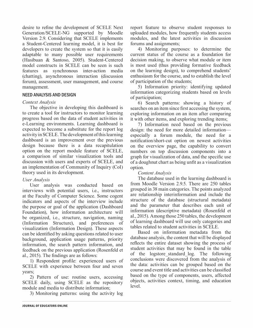
Lecturers who used the SCELE while engaged in online teaching activities typically have at least four years experience (see Table 1).The User-Centered Design Approach
In the User-Centered Design (UCD) approach, the design depends on the involvement of the user. The implementation of this approach provides a solution that is geared to fit the needs of the individual who will use the software to accomplish a specific goal (Rogers, Sharp, & Preece, 2002). According to Usability.gov, users are involved from the design to the development phases in the UCD process (Usability.gov, n.d.). This work incorporates feedback from users to ensure that the visualization is easy to understand by the users. The research is carried out in six stages: literature review, need analysis, design, evaluation, revision, and implementation. Need analysis incorporates the three components of information architecture
JOURNAL OF EDUCATORS ONLINE
(see Table 2).The design stage consists of three steps:
foundation, structure design, and information design. The foundation step defines specifications and the overall purpose of dashboard. The structure design step applies information architecture theories to the organization of the information. Output from this step include a sitemap and defined relationships between information components. The information design step applies visualization theories that are utilized in developing a graph or chart to visualize information components. Attention is paid to how the use of the graph/chart should be conducted. The final products for this stage are wireframes and prototypes.
The evaluation stage was conducted by interviewing potential users and lecturers of the Faculty of Computer Science at University of Indonesia. The interview applies a Quick and Dirty Evaluation approach (Hughes King, Rodden, & Andersen, 1995), which emphasizes a quick input instead of a more time intensive,
documented input. The implementation test process was
conducted by developing a new course in Moodle on the local host server used to accommodate the data collected from SCELE activities. Accessing the learning dashboard page for desired data requires the use of plug-in blocks formatting, which is provided by Moodle. These plug-in blocks are later available for incorporation in the desired course to be monitored. Furthermore, the display of the data in an easily visualized form is facilitated using various library js and css, such as bootstrap, jquery, morris.js, chart.js, as well as circliful.js.The Learning Environment
The Faculty of Computer Science in one of the large public universities in Indonesia applied the Student-Centered Learning concept as an application named Student Centered E-Learning Environment (SCELE) (Hasibuan & Santoso, 2005). The application was developed based on LMS Open Source Moodle with the
Table 1. Respondents of the Study
Respondent (Lecturer) Experience using SCELE Features have been used
Respondent 1 4 years Resource, Forum, Quiz, Assignment, Polling
Respondent 2 4 years Resource, Forum, Assignment
Respondent 3 6 years Resource, Forum, Quiz, Assignment
Respondent 4 5 years Resource, Forum, Assignment
Respondent 5 5 years Resource, Forum, Quiz, Assignment
Respondent 6 4 years Resource, Forum, Assignment
Respondent 7 4 years Resource, Forum, Assignment, Polling
Table 2. Three Components of Information Architecture
Component Analysis Tools Data
Context Background Research Literature review from the previous Learning Dashboard interface design
Content Metadata & Content Analysis Metadata and content analysis from Moodle database structure
Users User Interview Semi-Structured Interview with Lecturers
JOURNAL OF EDUCATORS ONLINE
desire to refine the development of SCELE Next Generation/SCELE-NG supported by Moodle Version 2.9. Considering that SCELE implements a Student-Centered learning model, it is best for developers to create the system so that it is easily adaptable to many possible user requirements (Hasibuan & Santoso, 2005). Student-Centered model constructs in SCELE can be seen is such features as synchronous inter-action media (chatting), asynchronous interaction (discussion forum), assessment, user management, and course management. NEED ANALYSIS AND DESIGNContext Analysis
The objective in developing this dashboard is to create a tool for instructors to monitor learning progress based on the data of student activities in e-Learning environments. Learning dashboard is expected to become a substitute for the report log activity in SCELE. The development of this learning dashboard is an improvement over the previous design because there is a data recapitulation option on the report module feature of SCELE, a comparison of similar visualization tools and discussion with users and experts of SCELE, and an implementation of Community of Inquiry (CoI) theory used in its development. User Analysis
User analysis was conducted based on interviews with potential users, i.e., instructors at the Faculty of Computer Science. Some cogent indicators and aspects of the interview include the purpose or goal of the application (Dashboard Foundation), how information architecture will be organized, i.e., structure, navigation, naming (Information Structure), and preferences of visualization (Information Design). These aspects can be identified by asking questions related to user background, application usage patterns, priority information, the search pattern information, and feedback on the previous application (Rosenfeld et al., 2015). The findings are as follows:
1) Respondent profile: experienced users of SCELE with experience between four and seven years;
2) Pattern of use: routine users, accessing SCELE daily, using SCELE as the repository module and media to distribute information;
3) Monitoring patterns: using the activity log
report feature to observe student responses to uploaded modules, how frequently students access modules, and the latest activities in discussion forums and assignments;
4) Monitoring purposes: to determine the current status of the course as a foundation for decision making, to observe what module or item is most used (thus providing formative feedback on the learning design), to comprehend students’ enthusiasm for the course, and to establish the level of participation of the students;
5) Information priority: identifying updated information categorizing students based on levels of participation;
6) Search patterns: showing a history of searches on an item since first accessing the system, exploring information on an item after comparing it with other items, and exploring trending items;
7) Information need based on the previous design: the need for more detailed information—especially a forum module, the need for a notification/short-cut option on newest activities on the overview page, the capability to convert numbers on top discussion components into a graph for visualization of data, and the specific use of a doughnut chart as being unfit as a visualization option.
Content Analysis The database used in the learning dashboard is
from Moodle Version 2.9.5. There are 250 tables grouped in 38 main categories. The points analyzed are relationship interinformation and include the structure of the database (structural metadata) and the parameter that describes each unit of information (descriptive metadata) (Rosenfeld et al., 2015). Among those 250 tables, the development of learning dashboard will use only categories and tables related to student activities in SCELE.
Based on information metadata from the database analysis, the content that will be displayed reflects the entire dataset showing the process of student activities that may be found in the table of the logstore_standard_log. The following conclusions were discovered from the analysis of the data: activities can be grouped based on the course and event title and activities can be classified based on the type of components, users, affected objects, activities context, timing, and education level.

JOURNAL OF EDUCATORS ONLINE
Design ProcessDashboard foundation. The learning dashboard
is designed based on the following specification:• Role: to help the decision-making process
by providing learning progress related to student activities in SCELE.
• Context: learning dashboard will be reviewed routinely to monitor the course when events occur or to evaluate the entire courses, students, or modules after the occurrence of the events.
• Information displayed: students’ responses to modules or when and how frequently the students access the course.
•Data comfort and skills: part of the users that are familiar in using the data.Dashboard Structure Design
The implemented structure and information were grouped based on similarities. This grouping was conducted by implementing organizational components from Information Architecture theory. In the information organization process delivered through the learning dashboard, the implemented organization scheme is a hybrid of a topical-organization scheme and a task-oriented scheme. The grouping based on topics was conducted based on the context analysis and content of data that will be displayed. Based on these topics, there are four main modules, i.e., resources, assignments, discussion, and quizzes (content analysis), as well as the special activity page for each student.
The grouping based on task orientation was conducted to enable users to obtain the objective of the learning dashboard (Rosenfeld et al., 2015; Spencer, 2010). The main tasks of the users are: (1) monitoring, the latest condition of the course; (2)
analyzing, to find a correlation for each item; and (3) evaluation, to identify a particular item. These groups have been made based on user interviews.
Monitoring is an activity where teachers routinely keep an eye on students’ activities that are of interest for information regarding learning. For example, a teacher may open the learning dashboard every day to monitor the number of visits by a student to the course or to see any of the last activities carried out. Another relevant example includes a teacher opening the dashboard after uploading a learning resource to obtain information on the percentage of students who have used it.
Analyzing is an activity where teachers investigate if there is a correlation between learning components that can be used in the future. The objective is to improve the learning process. Analyzing also includes the activities of the teacher in identifying information based on comparing metadata. For example, teachers may compare learning components, such as grades, between students.
Assessing or evaluating is an activity where teachers evaluate one item or specific learning component (students, modules) to reveal specific information about the item. For example, a teacher may want to evaluate a student’s activeness in discussion forums or activities in an open resource.The hierarchical structure used is supported by the principle of gradual reveal, which is how the information is arranged according to the needs of work. This sructure is used so uncomplicated information presentation can be delivered (Juice Analytics, 2009).
Hierarchical structure is utilized in the
Figure 3. Site Map

JOURNAL OF EDUCATORS ONLINE
development of a sitemap application as follows:Structure from the most outer to inner pages
was arranged based on the flow of work utilized by the users. Typically, routine tasks ensure that a monitoring task is placed on the outer page of the hierarchical structure. Task analysis indicators are placed one level below monitoring tasks because the task analysis will be completed when
an instructor locates a particular task through the monitoring-based event. Task item evaluation is placed sequentially after the task analysis.
Each information component on a page has a label that describes the component. The label is then extracted based on a user description of the related information (user based) or content (content based).
Figure 4. Spatial Position Attribute as a Grid
Figure 5. Form Attribute as Font Styles
JOURNAL OF EDUCATORS ONLINE
Dashboard Information DesignThe depiction of the category of each
information item will be clearly displayed using existing visualization theory, such as various preattentive attributes (Few, 2004b), as follows:
Spatial position. Arrangement of the pattern in which each grouping of the information category (proximity and symmetry) is done by the grid system. The implementation of visual perception strategies using spatial position is conducted based on the similarity principle where information that comes under the same category in different pages will be placed in the same position. This format also displayspast experience principles because each time a new page is opened, the user will not be forced to learn the layout and pattern of the page.
Form. The application of visual perception strategies for a form is to place a Preattentive attribute that has a bigger form for information
components so it will become the focus on the dashboard page. Other components using visual perception through a form include the form of a text font, which will be differentiated based on the need by modifying width, size, capital/normal (size), curvature, and added mark (underlined/not underlined).
Color. With the use of both the enclosure principle and different colors, the dashboard display can provide the perception that the page is divided into several information categories. Implementation of colors on a chart will highlight it and make it the focus of a page.
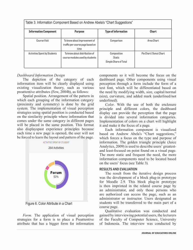
Each information component is visualized based on Andrew Abela’s “Chart suggestions,” which forces a focus on the type and purpose of information. The golden triangle principle (Juice Analytics, 2009) is used to describe users’ greatest- and least-focused on point found on a visual page. The more static and frequent the need, the more information components need to be located based on the users’ focus (see Table 3).RESULTS AND EVALUATION
The result from the iterative design process was the development of a block plug-in prototype for Moodle 2.9. This block plug-in prototype is then imprinted in the related course page by an administrator, and only those persons who are authorized can access the page, such as an administrator or instructor. Users designated as students will be transferred to the main part of a course page.
Qualitative evaluation was conducted and gained by interviewing potential users, the lecturers of the Faculty of Computer Science, University of Indonesia. The interview was conducted by
Figure 6. Color Attribute in a Chart
Table 3. Information Component Based on Andrew Abela’s “Chart Suggestions”
Information Component Purpose Type of information Chart
Course Visit To know about improvement of traffic per course page based on
time
Comparison Area Chart
Activities Spent by Students To know about distribution of course modules used by students
CompositionStatic
Simple Share of Total
Pie Chart/ Donut Chart

JOURNAL OF EDUCATORS ONLINE
focusing on two points, 1) how the prototype fulfills users’ previous needs; and, 2) what can be improved about the prototype. Table 4 shows users’ opinions about prototype usefulness.
Opinions from the user evaluation interviews vary, but they all nevertheless agree that this dashboard has fulfilled their needs. From these opinions, it appears that a primary objective of information architecture, “to help users to make information easier to find and understand,” have been successful. Sentences (1), (2), (4), (5), (6), (7), (10), (11), and (12) relate to the conclusion. Successful application of visualization principles can also be noticed based on sentences (3) and (8).
With regards to prototype improvement, users gave their opinions about problems that they faced when using the prototype. These problems have been categorized into three groups: problems of
information architecture practice, problems of visualization practice, and problems of utility.
Each problem mentioned regarding information architecture practice is listed along with researcher revision recommendations based on a Heuristic of Information Architecture (Resmini & Rosati, 2011). Meanwhile, for problems on visualization practice, revision recommendations have been made based on visual perception theories from the Gestalt Principle. Examples of revisions made are a course overview page, an assignments summary page, and a discussion detail page.
On the Overview page, Course Visit category, respondents revealed filters in the chart area for the Timeline is difficult to use (3 of 5 respondents). Therefore, revisions was made for the labelling part under course visit. This was conducted to clarify that they are a button and filter that give the
Table 4. Users’ Opinions About the Prototype
User Result
User 1 “I need notification of the newest activity displayed in the beginning, to make it easier to find (1). Student activities also have been grouped on the student page (2). All information I need is already displayed. Chart visualization based on timing helps me to draw conclusion
(3) because what I need is timing in general, not the exact time.”
User 2 “This already helps, one need that is already fulfilled is how to identify student activities per student (4), when they last time accessed the course, etc. I also can directly find a discussion using its title (5). Prior to that, it has to go through a forum list which is too
heavy and cannot be searched. The search feature is quite helpful (6).”
User 3 “This really helps, I can observe my student activities by searching their name (7). The visualization of activity course access (8) also helps me to identify how students respond to
the course. I feel supported by the existence of per day per week filter on chart (9).”
User 4 “This already quite helps; I can see which forum is mostly accessed by students and who’s the most active student in the forum. (10)”
User 5 “Yes, it has already provided layers of information (11) because I don’t need the whole appearing in the beginning. As an example, I don’t need information of a student who
doesn’t submit if I already know that all students have already submitted. The information becomes structured, not flat or parallel. Too much information will make confusion on how
to use it one by one (12).”

JOURNAL OF EDUCATORS ONLINE
course visit graphic definition. Respondents also experience similar problem with Activities Spent by Students chart. Therefore, the donut chart on the category of Activities Spent by Students has had a prominent revision that included information based on the color chart section being implemented for easier user understanding. These revision recommendations have been made based on the Place-making, where label used to inform user about where they are, what they can do and reduce users disorientation (Resmini & Rosati, 2011).
On the Recent Activity category, Respondents complained about being unfamiliar and ambiguous keyword for the information title (3 of 5 respondents). These problems are categorized within the Labelling category in Information Architecture. Revision was made to the information label : Latest Module Participation, so that it gives a different perception set apart from Recent Forum Posts and Recent Submissions, thereby eliminating any ambiguous meaning. Recommendations
for these revisions have been made based on the Principle of Consistency, where the use of a label is applied according to the feedback of the user in order to streamline the use of information (Resmini & Rosati, 2011).
On Assignments Summary page, respondents revealed that comparison between number of submission will be confusing, as assignment’s due date can also influence number of submissions (1 of 5 respondents). These problems are included in Information Architecture, the grouping category. Revisions on this page include adding due date information as a comparison parameter. Adding due date information also allows users to sort assignments based on the closing of the last slot. Revisions are made based on the Principle of Correlation—to group information that supports each other, to suggest relevant connections among pieces of information, to help users achieve their goal (Resmini & Rosati, 2011).
In the Discussion Detail page, there are some
Figure 7. Course Overview Page Result

JOURNAL OF EDUCATORS ONLINE
changes, such as adding filters based on View and Not View in the category of Participant Activities in This Discussion. Respondents claim they need to know not only those who posted but also those who view discussion, as some of forum posts were only meant to be read. These revisions are included in the utility of information category.
CONCLUSIONMoodle 2.9.1 as an e-Learning platform has
done a good job facilitating the learning data visualization dashboard. The user centered design approach used in this research helps the dashboard to adjust to user needs. It does so through features that can be improved after acquiring feedback from users. It also uses visualization principles, such as
Preattentive attribute and visual perception, to highlight the purpose of visual components in the dashboard. Information architecture is applied to organize information components in the dashboard system and to navigate between this information. These principles make it easier for the users to gain insights from data and choose the detailed information they require. Last but not least, the study also requires further iteration, for example evaluating dashboard through other constructs such as usability of the system and the effectiveness of the data structure design.
Figure 8. Assignments Summary Page Result
Figure 9. Discussion Detail Page Result
JOURNAL OF EDUCATORS ONLINE
REFERENCESAnderson, T. (2004). The theory and practice of online learning.
Edmonton, CA: Au Press. Campbell, J. P., & Oblinger, D. G. (2007). Academic analytics
[White paper]. Washington, D.C.: EDUCAUSE. Retrieved from www.educause.edu/ir/library/pdf/PUB6101.pdf
Dietz-Uhler, B., & Hurn, J. E. (2013). Using learning analytics to predict (and improve) student success: A faculty perspective. Journal of Interactive Online Learning, 12(1), 17–26.
Dyckhoff, A. L., Zielke, D., Bültmann, M., Chatti, M. A., & Ulrik. (2012). Design and implementation of a learning analytics toolkit for teachers. Educational Technology & Society, 15(3), 58–76.
Einhardt, L., Tavares, T. A., & Cechinel, C. (2016). Moodle analytics dashboard: A learning analytics tool to visualize users’ interactions in Moodle. 2016 XI Latin American Conference on Learning Objects and Technology (LACLO). IEEE Publications Database. doi:10.1109/LACLO.2016.7751805
Few, S. (2004a). Dashboard confusion. Perceptual Edge. Retrieved from http://www.perceptualedge.com/articles/ie/dashboard_confusion.pdf
Few, S. (2004b). Tapping the power of visual perception. Perceptual Edge. Retrieved from https://www.perceptualedge.com/articles/ie/visual_perception.pdf
Hannafin, M. J., & Hannafin, K. M. (2008). Cognition and student-centered, web-based learning: Issues and implications for research and theory. In Spector J., Ifenthaler D., Isaias P., Kinshuk, Sampson D. (Eds.), Learning and instruction in the Digital Age (pp. 11–23). Boston, MA: Springer. doi:10.1007/978-1-4419-1551-1_2
Hasibuan, Z. A., & Santoso, H. B. (2005). The use of e-Learning towards new learning paradigm: Case study student centered e-Learning environment at the Faculty of Computer Science-University of Indonesia. In P. Goodyear et al. (Eds.), Fifth IEEE International Conference on Advanced Learning Technologies (pp. 1026–1031). Los Alamitos, CA: IEEE Computer Society. doi:10.1109/ICALT.2005.279
Hu, X., Hou, X., Lei, C.-U., Yang, C., & Ng, J. (2017). An outcome-based dashboard for Moodle and Open edX. Proceedings of the Seventh International Learning Analytics & Knowledge Conference (pp. 604–605). New York, NY: ACM. doi:10.1145/3027385.3029483
Hughes, J., King, V., Rodden, T., & Andersen, H. (1995). The role of ethnography in an interactive systems design. Interactions, 2(2), 56–65. doi:10.1145/205350.205358
Juice Analytics. (2009). A guide to creating dashboards people love to use: Translating delicious data into a beautiful design
version 2.0. Nashville, TN: Juice Inc. Retrieved from http://www.juiceanalytics.com/white-papers-guides-and-more/
Macfadyen, D., & Dawson, S. (2010). Mining LMS data to develop an “early warning system” for educators: A proof of concept. Journal Computers & Education, 54(2), 588–599. doi:10.1016/j.compedu.2009.09.008
Manso-Vázquez, M., Caeiro-Rodríguez, M., & Llamas-Nistal, M. (2016). Tracking and visualizing time management for Self-Regulated Learners. In 2016 IEEE Frontiers in Education Conference (FIE) (pp. 1–5). Los Alamitos, CA: IEEE Computer Society. doi:10.1109/FIE.2016.7757411
Mazza, R., & Botturi, L. (2007). Monitoring an online course with the GISMO tool: A case study. Journal of Interactive Learning Research, 18(2), 251–265.
Mazza, R., & Dimitrova, V. (2007). CourseVis: A graphical student monitoring tool for supporting instructors in Web-based distance courses. International Journal Human-Computer Studies, 65(2), 125–139. doi:10.1016/j.ijhcs.2006.08.008
McKnight, K., O’Malley, K., Ruzic, R., Horsley, M. K., Franey, J. J., & Bassett, K. (2016). Teaching in a digital age: How educators use technology to improve student learning. Journal of Research on Technology in Education, 48(3), 194–211. doi:10.1080/15391523.2016.1175856.
Moodle. (2014). Logs – Moodle docs. Perth, Australia: Moodle Pty Ltd. Retrieved from https://docs.moodle.org/29/en/Logs
Online Learning Consortium (2017) 2016 annual report: A year of acceleration & growth in online learning. Newburyport, MA: Online Learning Consortium. Retrieved from https://urldefense.proofpoint.com/v2/url?u=https-3A__onlinelearningconsortium.org_about_2016-2Dannual-2Dreport_&d=DwIDaQ&c=h8tWSEopLyY-jufMqa6tqNiQLH-Hu55HVFAFe4cURDM&r=g72pgne0VAR6BjDMa9JMSN9Rg9KAnyVHzUAjDBevfdA&m=tsQ6NnJ6hy0ClmPeC1ev7PwjfqzvQw0126Vpq2H0c3c&s=dJ_na6szCtN29R-ZT92tnAzM0eRfCYR_niABPdsyzYM&e
Resmini, A., & Rosati, L. (2011). Heuristics for a Pervasive Information Architecture. In Pervasive Information Architecture: Designing Cross-Channel User Experiences (pp. 39–62). Retrieved from http://pervasiveia.com/wp/wp-content/uploads/2011/04/chapter3-heuristics.pdf
Rogers, Sharp, & Preece. (2002). Interaction design: Beyond human-computer interaction. New York, NY: John Wiley & Sons, Inc.
Rosenfeld, L., Morville, P., & Arango, J. (2015). Information architecture: For the Web and beyond (4th ed.). Sebastopol, CA: O’Reilly Media.
Santoso, H. B., Schrepp, M., Isal, R. Y. K., Utomo, A. Y., & Priyogi, B. (2016). Measuring user experience of the student-centered
JOURNAL OF EDUCATORS ONLINE
e-learning environment. Journal of Educators Online, 13(1), 58–79.
Santoso, H. B., Nan Cenka, B. A., Sadita, L., Junus, K., Fadhilah, S., Prihandoko, & Goodridge, W. (2016). Learning experience of IT lecturers enrolled in the Association of Higher Education in Informatics and Computer’s online degree program. Paper presented at the Educational Technology of World Conference 2016, Bali, Indonesia.
SoLAR. (2011). Open Learning Analytics: an integrated & modularized platform. Society for Learning Analytics Research. Retrieved from http://solaresearch.org/OpenLearningAnalytics.pdf
Spencer, D. (2010). Practical guide to information architecture. Penarth, Wales: Five Simple Steps.
Tobarra, L., Robles-Gomez, A., Salvador, R., Hernandez, R., & Caminero, A. C. (2014). Analyzing the students’ behavior and relevant topics in virtual learning communities. Journal Computers in Human Behavior, 31(1), 659–669. doi:10.1016/j.chb.2013.10.001
Usability.gov (n.d.). User-centered design process. Washington, DC: U.S. Department of Health & Human Services. Retrieved from https://www.usability.gov/what-and-why/user-centered-design.html
Verbert, K., Duval, E., Klerkx, J., Govaerts, S., & Santos, J. L. (2013). Learning analytics dashboard applications. American Behavioral Scientist, 57(10), 1500–1509. doi:10.1177/0002764213479363
Ware C. (2004). Information visualization: Perception for design (2nd ed.). San Fransisco, CA: Morgan Kaufmann Publishers, Inc.
Wayne, W. E. (2010). What are performance dashboards? In Performance dashboards: Measuring, monitoring, and managing your business. Hoboken, NJ: John Wiley & Sons. Retrieved from http://www.bpmpartners.com/documents/Chapter1Excerpt.pdf.
Wright, G. B. (2011). Student-centered learning in higher education. International Journal of Teaching and Learning in Higher Education, 23(1), 92–97.