the art of visualizing survey data steve wexler, director of research the elearning guild
TRANSCRIPT

The Art of Visualizing Survey Data
Steve Wexler, Director of ResearchThe eLearning Guild
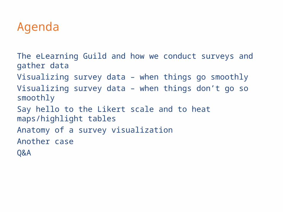
Agenda
The eLearning Guild and how we conduct surveys and gather data
Visualizing survey data – when things go smoothly
Visualizing survey data – when things don’t go so smoothly
Say hello to the Likert scale and to heat maps/highlight tables
Anatomy of a survey visualization
Another case
Q&A
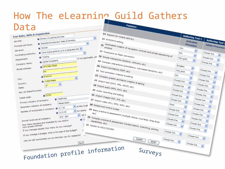
How The eLearning Guild Gathers Data
Foundation profile information Surveys
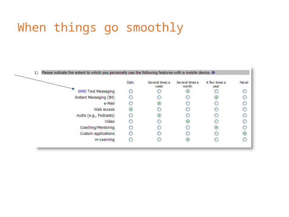
When things go smoothly
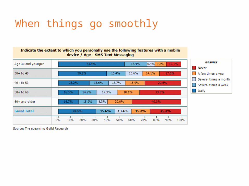
When things go smoothly

When things go not so smoothly

When things go not so smoothly
Are these items sorted correctly? It’s hard to tell.

Likert items ̶ example
Strongly agree = 5
Somewhat agree = 3
Somewhat disagree = 1
Strongly disagree = 0
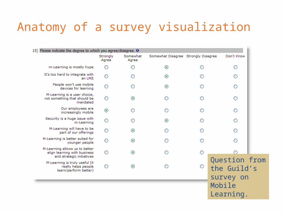
Anatomy of a survey visualization
Question from the Guild’s survey on Mobile Learning.

Anatomy, cont’d
Are these items sorted correctly? It’s hard to tell.

Anatomy, cont’d
Use a calculated field to weigh the responses.

Anatomy, cont’d
Now the sort order and relative relationships really pop out.

Anatomy, cont’d
Things get even uglier when you attempt to correlate with another survey answer. Here we break the data down by where members are with implementing Mobile Learning.
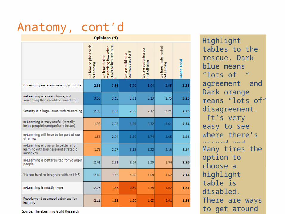
Anatomy, cont’dHighlight tables to the rescue. Dark blue means “lots of agreement” and Dark orange means “lots of disagreement.” It’s very easy to see where there’s accord and where there’s discord.
Many times the option to choose a highlight table is disabled. There are ways to get around that…

Another case

Another case, cont’d
So, which product has the best break-out rooms? It’s not so easy to tell.

Another case, cont’d
Weighted responses make it easy to see how to rank the products.

Another case, cont’d
Highlight tables. They rock. In this the best product is the one with the most dark blue.
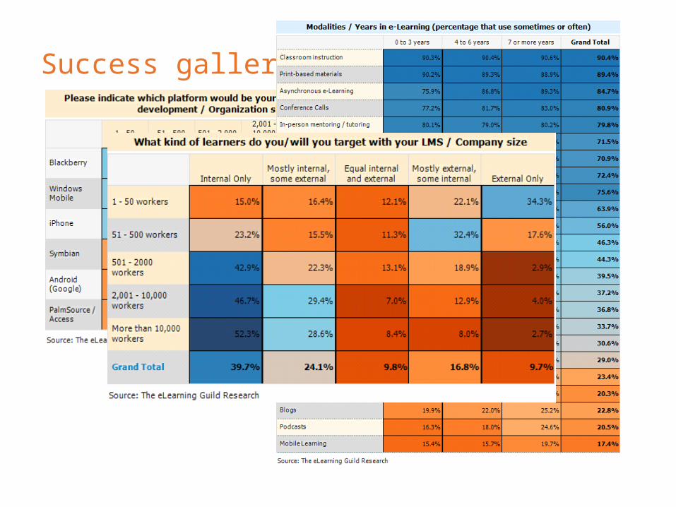
Success gallery

Q & A
Steve Wexler
The eLearning Guild
www.eLearningGuild.com