swiss design
DESCRIPTION
swiss designTRANSCRIPT
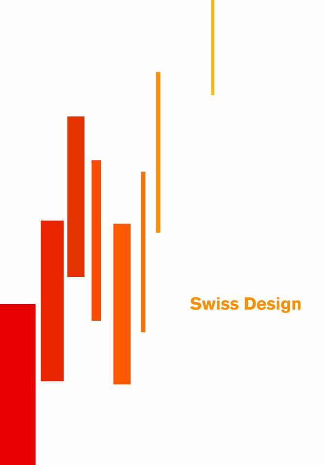
Swiss Design

History and philosophy of the Swiss style1

While Swiss design may seem
minimal, for a piece to be successful
with so few elements, everything about
the image has to be thought through. The
end result may be sparse or simple, but
there was likely a good deal of analysis
put into every aspect of what little is shown:
the typeface, the size, the placement on the
page, the margins, the line spacing, the
ascenders, descenders, spacing between
letters, spacing between lines of text.
Everything is taken into consideration in
order to make the text on a piece pleasing
and easy to read.
Swiss graphic design, also known as International style, arose in the
1950’s in Switzerland. This graphic design style focuses on clear,
easily readable text and a rational, systematic layout. Like the
rest of the International movement, it is economical and
focuses on the function of the product while still being
aesthetically pleasing. “Form follows function”— Focus
on the function of a product first, and then make it
beautiful.
2
Aside from being concerned
about readability, the Swiss style
of graphic design also sought to
present its content in an
objective manner without
pretense. The role of the
designer was to convey
information as effectively as
possible, with less of a focus on
originality or eccentricity.
Left: Josef Müller-Brockmann, “Beethoven”, 1955. Text is organized with size difference to emphasize importance. Very clear and organized text in one area. The rest of the space is activated by the semicircles. No color used, simply a black and white composition.
ww
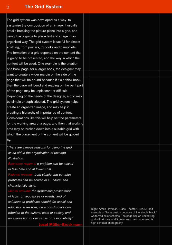
The grid system was developed as a way to
systemize the composition of an image. It usually
entails breaking the picture plane into a grid, and
using it as a guide to place text and image in an
organized way. The grid system is useful for almost
anything, from posters, to books and pamphlets.
The formation of a grid depends on the content that
is going to be presented, and the way in which the
content will be used. One example is the creation
of a book page. for a larger book, the designer may
want to create a wider margin on the side of the
page that will be bound because if it’s a thick book,
then the page will bend and reading on the bent part
of the page may be unpleasant or difficult.
Depending on the needs of the designer, a grid may
be simple or sophisticated. The grid system helps
create an organized image, and may help in
creating a hierarchy of importance of content.
Considerations like this will help set the parameters
for the working area of a page, and then that working
area may be broken down into a suitable grid with
which the placement of the content will be guided
by.
“There are various reasons for using the grid
as an aid in the organization of text and
illustration.
Economic reasons: a problem can be solved
in less time and at lower cost.
Rational reasons: both simple and complex
problems can be solved in a uniform and
characteristic style.
Mental attitude: the systematic presentation
of facts, of sequences of events, and of
solutions to problems should, for social and
educational reasons, be a constructive con-
tribution to the cultural state of society and
an expression of our sense of responsibility.”
3 The Grid System
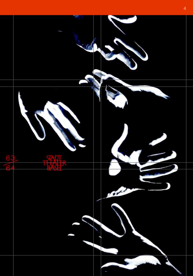
Right: Armin Hoffman, “Basel Theater”, 1963. Good example of Swiss design because of the simple black/white/red color scheme. The page has an underlying grid with 4 rows and 2 columns The image used is high contrast photography. Josef Müller-Brockmann
4

5 Sans-serif typefaces
The main typefaces used were Akzidenz Grotesk,
Helvetica and Univers because of their clear, legible
nature. Univers was created in 1954 by Adrian
Frutiger, and Helvetica was developed in 1957 by
Max Miedinger and Eduard Hoffmann. Sans-serif
fonts were preferred because they bring the letter
down to its bare essential, making the text clean and
legible without flourish. In the words of Massimo
Vignelli:
“I don’t think that type should be expressive
at all. I can write the word ‘dog’ with any
typeface and it doesn’t have to look like a
dog. But there are people that [think that]
when they write ‘dog’ it should bark.”
6
“Typography has one plain duty before
it and that is to convey information in
writing. No argument or consideration
can absolve typography from this duty.
A printed work which cannot be read
becomes a product without purpose.” —Emil Ruder
Since the goal of Swiss design is clear and effective
conveyance of information, the typography itself
has to take a humble backseat to the content it is
conveying. The typeface of Swiss design was prized
for being unobstructive and neutral. When a person
reads something, they are meant to read words, not
to dote over ascenders or serifs. This clear readabil-
ity has made Helvetica a popular font in things such
as road signage, and even today is one of the most
popular and well liked fonts.
Left: Josef Müller-Brockmann, “4 Junifestkonzert”, 1957. Very simple organization of text with use of size differences to establish hierarchies. Simple black/white/orange color palette with bars to activate space.

7 Limited color palette and photography

As with the use of simple, sans-serif typefaces,
the color palette of Swiss design also reflects
the idea of minimal embellishment to convey
an idea. The use of photography in design was
also popular, especially in terms of advertising
products, because what better way is there to
show a product than through a photograph of
it? Abstract geometrical designs were also used
during this period. For something other than type
to be included in an image, that thing had to
have a purpose, whether it be adding meaning
to the image, depicting something relevant to the
topic, or adding an element deemed necessary
to the composition.
8
Left: Josef Müller-Brockmann, “Auto Club of Switzerland”, 1955. Simple use of color with an emphasis on the photography and text to convey message
Armin Hoffman, “Giselle”, 1959. Simple black and white image with high contrast photograph of subject used.
Paul Rand, “Dancer on Orange Ground”, 1939. three color palette with simple geometric shapes and photography.
“Perfection is achieved, not when there is
nothing left to add, but when there is nothing
left to remove.”
Antoine de Saint-Exupéry

Brockmann, Josef. Grid systems in graphic design: a visual communication manual for
graphic designers, typographers, and three dimensional designers = Raster Systeme für die
visuelle Gestaltung : ein Handbuch für Grafiker, Typografen, und Ausstellungsgestalter. Nied-
erteufen: Verlag Arthur Niggli ;, 1981.
Hollis, Richard. Swiss graphic design: the origins and growth of an international style,
1920-1965. New Haven: Yale University Press, 2006.
Ryan, David. Letter perfect: the art of modernist typography, 1896-1953. San Francisco:
Pomegranate, 2001.
9 Bibliography
jiT

10
Designed by Taylor Grant,
Spring of 2013
AaAkzidenz-Grotesk typeface designed by
Günter Gerhard Lange in 1896
g
h
T
