stir 2011 print annual
DESCRIPTION
STIR print annual magazine from Sherwin-Williams, 2011.TRANSCRIPT

S H E R W I N - W I L L I A M S® J o i n t h e C o l o r C o n v e r s a t i o n S P E C I A L I S S U E • 2 0 1 1
PET PROJECTSIs custom technology a designer’s new best friend?
Color and Healing n Simon Doonan n 2012 Color Forecast
s t i r®

DESIGNING AT WEB SPEED
If, a couple of years ago, one of you
had told me I’d soon have my own
design blog, I would have laughed
and said, “No way. Not me!” Yet,
here I am, in 2011, posting to Jackie’s
Notebook on swstir.com — one of
several blogs STIR® hosts to create
inspiring “color conversation” for the
design community. I’m having a blast
using social media professionally —
and I’m not alone.
While design’s fundamentals — the use of color, texture, space — remain
relatively stable, the tools we use to design (and market ourselves!)
are changing fast. This year’s STIR print annual is dedicated to exploring
this shift.
On page 22, you’ll find the results of our exclusive “STIRvey,” which found
one-third of you are using laptops and tablets to offer clients virtual
walkthroughs, and more than half of you are using CAD software on the
job and Facebook to promote what you do professionally.
On page 14, you’ll find our annual colormix™ color trend forecast. I’m
once again grateful to my team for all of their insight: Becky Ralich Spak,
a color marketing expert; Kathy Andersson, a specialist in product finishes;
and Carol B. Derov, an expert in international color and design, all from
Sherwin-Williams. The team also included Christy Almond, operating
vice president, design and merchandise, from The Robert Allen Group.
Sherwin-Williams will continue to keep you at the forefront of new
technology in design. In fact, you can look for a very special tablet “app”
version of STIR magazine later this summer!
Sincerely,
Jackie Jordan
Director of Color Marketing The Sherwin-Williams Company
The trademarks and copyrights of Sherwin-Williams appearing in STIR are protected.
All other trademarks are the property of their respective owners.
The Sherwin-Williams Company
Director, Trade Communications:Tresa Makowski
Director of Color Marketing:Jackie Jordan
Hanley Wood Marketing
Creative Director:Dobby Gibson
Editor:Kim Palmer
Executive Art Director:Sandy Girard
Art Director: Cate Hubbard
Senior Editor:Mara Hess
Production Director:Pam Mundstock
Production Artist:Karen Wolcenski
Project Manager:Courtney Miner
Account Director:Dana Brink
STIR® magazine (ISSN 1937-2027) is published by Hanley Wood, LLC, on behalf of The Sherwin-Williams Company, for interior designers and architects.
Please direct correspondence to: Sherwin-Williams STIR magazineHanley Wood 430 1st Ave. N., Suite 550 Minneapolis, MN 55401 Phone: (612) 338-8300 Email: [email protected] Website: swstir.comPrinted in the United States, © 2011 Sherwin-Williams
STIR Advisory Board
Glen Boudreaux, ASID, RID, IDEC Glen Boudreaux & Associates Dallas, Texas
Kathy Davis, CID, IACC/NAKathy Davis Associates, Inc.Solana Beach, Calif.
Phillip Koski, AIA, LEED APKoski ArchitectureMinneapolis, Minn.
Michael Scott, IDS, Allied ASIDMichael L. Scott DesignDestin, Fla.
Zara Stender, CID, IDS, Allied ASID, CMGZaraDesignsLas Vegas, Nev.
Abby Suckle, FAIA, LEEDAbby Suckle ArchitectsNew York, N.Y.
Visit swcolor.com to:• Order color samples
• Download color palettes into virtual design tools
• Paint room scenes or upload your own photos in Color Visualizer
• Download ColorSnap®, a free color-matching app for smartphones
• View Sherwin-Williams Robert Allen® Fabric Collections
For product or compliance questions, call 800-321-8194
For green solutions, visit swgreenspecs.com
STIR Is Coming to Your iPad or TabletOur brand-new STIR app for iPads and tablets will launch later this summer, bringing you all the great content you’ve come to expect from STIR, plus behind-the-scenes videos, rich interactivity, direct links to color sample ordering, and much more. It’s fun, it’s fresh, and it’s totally free!
“Like” us on Facebook at facebook.com/SherwinWilliamsforDesignersArchitects and you’ll be one
of the first to know when the STIR app goes live.

C O N T E N T S
S P E C I A L I S S U E : D e s i g n a n d T e c h n o l o g y
COLOR CHIPS
HGTV® HOME by Sherwin-Williams enables you to deliver quick color solutions to your clients.
2
COLOR CONVERSATION
Rethink color and recharge creatively! We talk to fashion’s Trina Turk, Hollywood production designer Bob Shaw, and bon vivant Simon Doonan.
4
GOOD VIBRATIONS
Can a modern, eclectic color palette work inside an early 20th century home? Yes — and with stunning results.
10
COLORMIX
Sherwin-Williams colormix™ two-thousand-twelve surveys the landscape to find core palettes inspired by Mother Earth.
14
GOLDEN AGE
Stenciling, trompe l’oeil techniques, leaf-work and glazes bring a taste of Rome to this Midwestern cathedral.
16
COLOR TECH
ONE OF A KIND
Digital technology is creating new opportunities to create more personalized design.
19
STIRVEY
Discover how your design colleagues measure technology’s impact on their daily practice.
22
GOING GREEN
THE ART OF HEALING
The Ahuja Medical Center in Beachwood, Ohio, uses color with a bedside manner.
26
STUDENT DESIGN CONTEST
This year’s Sherwin-Williams STIR® Student Design Contest winners show off their award-winning work.
28
FINAL TOUCH
DON’T BET AGAINST RED
29
42 10
s t i rS H E R W I N - W I L L I A M S®
®
4 S H E R W I N - W I L L I A M S S t i r 1
Join the Color Conversation!

color chipsC O L O R N E W S A N D S O L U T I O N S F R O M S H E R W I N - W I L L I A M S
2 S H E R W I N - W I L L I A M S S t i r
A New Way to Bring Color Home
The HGTV® HOME by Sherwin-Williams line of coordinated
palettes, paints and tools has arrived in Sherwin-Williams
stores, instantly making a media splash. While the line was
designed for homeowners, you can use it to deliver quick
color solutions to your clients and help introduce them to
Sherwin-Williams products and coatings.
HGTV HOME by
Sherwin-Williams
includes eight unique
color collections;
durable, low odor
paint; and an array
of tools, including
paint brushes, paint rollers, tape, gloves and drop cloths. The
color collections, each composed of 20 coordinating colors, make
it easy to create harmonious room-to-room color transitions.
Look for HGTV HOME by Sherwin-Williams products and color
collections in your local Sherwin-Williams store.
NEW PRODUCTS
A COMPLETE INTERIOR SOLUTION
ProMar® 200 Interior Latex is now available in a zero VOC* formula. Available in four sheens and every color — including deep, vivid hues — it delivers maximum value, and outstanding durability and touch-up.
With almost no odor, it’s perfect for occupied spaces, and meets stringent environmental requirements.
EVEN MORE HARMONIOUS
Harmony® is a zero VOC*, silica-free paint that exceeds most environmental regulations, while delivering excellent coverage and a washable, durable finish. Virtually odor-free to help ensure better indoor air quality, Harmony uses new
technology to actually reduce odors in the air, helping dissipate unpleasant smells.
* Some colors may not be zero VOC
after tinting with conventional
colorants.
MAKE THE ‘FIFTH WALL’ SHINE
Ceilings can be a room’s most prominent feature. Brilliance® offers bright, one-coat coverage and self-priming performance. And for projects requiring color, Brilliance can be tinted to create light pastel hues. Best of all, Brilliance
is a low VOC coating — less than 50g/L.
HGTV® HOME is a trademark of Scripps Networks, LLC, used under license to The Sherwin-Williams Company.

S H E R W I N - W I L L I A M S S t i r 3
New for 2011, Sherwin-Williams Kids’ Color makes it a snap to design a fun, unique bedroom — one that both kids and their parents will want to call home. Kids’ Color is composed of five color collections, four created for distinct stages of childhood: Precious Baby, ABC’s and 123’s, InbeTweens, and Teen Space. A fifth collection was created in collaboration with Fisher-Price.
Beginning in September, you can pick up the color cards at your local Sherwin-Williams store or go to swcolorsamples.com.
KID-FRIENDLY PALETTES ARE HERE
Kids will love these
coordinating palettes as
much as your clients —
their parents — do.

4 S H E R W I N - W I L L I A M S S t i r
T rina Turk’s mother taught her to sew when she was 11, and from then on she was hooked. “I thought it was the most exciting thing ever,” she recalls. Her early designs for herself
eventually led to a career in fashion and, in 1995, to launching her own label (trinaturk.com), an empire that now includes ready-to-wear; swimwear; a residential line of rugs, pillows and tabletop textiles; and a home fabric collection, Trina Turk Indoor Outdoor for Schumacher.
STIR: How would you describe your brand’s color identity?TT: Color is just part of the DNA of our brand — strong clear color and strong graphic prints. My favorite patterns reference the late ’60s and early ’70s. What makes a print interesting is the play of colors against each other. There are no ugly colors, only bad combinations. You need something to ground it, neutrals and tonalities, so you have a high and low depth to the print.
Certain colors are my favorites. I always return to acid green chartreuse. It can make the difference between a print appearing dull or vibrant. I like hot pink, coral magenta, tomato red and pinky coral. Our business cards and shopping bags are an acid yellow color with a teeny tinge of green. Our first retail store was in Palm Springs — it’s very sunny. Glowing yellow evokes the bright sunlight you see in southern California.
STIR: How do you approach color when designing clothing vs. home products?TT: We started off as a women’s ready-to-wear collection and evolved into home products. It was very organic. The majority of the prints for our home collection were previously from our ready-to-wear collection, although scale is different on a bikini vs. a sofa. Bright colors are always present. Swimwear is the brightest, ready-to-wear is in between, and home furnishings are toned down a couple notches.
STIR: You’ve said you’re inspired by the architecture of California. What’s an example?TT: I love modern architecture. Living in LA and Palm Springs, I get the opportunity to see a lot of great buildings. We just did a group inspired by the Sea Ranch Lodge on the Mendocino Coast. There’s a lot
of weathered barnboard, and the forest comes up to the ocean. That group is more of an esoteric connection. One specific literal motif is the Palm Springs block, a concrete block square within a square. You see it in screen walls in front of houses. We’ve incorporated it into a million things: hardware on swimwear, jewelry, patterns on shopping bags. Sometimes it’s just one, sometimes it’s repeated, as it would be in a building.
STIR: Why did you choose pink for your flagship store?TT: The inspiration was the Art Deco Bullock’s department store in Los Angeles. It had a really ladylike, Old World vibe and a lot of pink blushy color. The mirrors were tinted peachy pink. It’s an extremely flattering color on people’s skin.
STIR: How has technology affected your designs?TT: In a million ways. When I first started, all prints were done and repeated by hand. The only way to print was screen or roller painting. Now everything is done on computer. With digital printing, we’ve gone from having limitations on color to no limit — a print could have 200 colors in it. Part of what defines our brand is the print style of the late ’60s to early ’70s, though. We want to embrace technology, but we don’t want to lose our brand identity.
STIR: How has technology changed your business in general? TT: In so many ways. You used to see physical samples of buttons; now it’s all through the Internet. It speeds everything up. The fashion business has always been notorious for its crazy pace, and now that cycle is even crazier. Change is inherent to our industry. We just have to embrace it. n
Kim Palmer is the editor of STIR.
C O L O R C O N V E R S A T I O N : T R I N A T U R K
Golden StateFashion designer Trina Turk channels the modern silhouettes and sun-drenched hues of her native state.
B y K I M P A L M E R
>> VIDEO: MEET TRINA TURK
See a Vogue TV interview with Turk
at swstir.com/videos.
PHO
TOG
RA
PHY
BY
JON
ATH
AN
SK
OW

S H E R W I N - W I L L I A M S S t i r 5
“�Color�is�just�part�of��
the�DNA�of�our�brand�—��
strong�clear�color�and�
strong�graphic�prints.”
For her home furnishings,
Turk reinterpreted the
scale and intensity of her
ready-to-wear prints.

“�I’ve�always�thought,�
make�a�list�of�what�
people�typically�do��
and�do�the�opposite.�
You’re�bound�to�get�
some�attention.”
Doonan builds his
window displays around
the merchandise, using
it as the base of his
color palette.
6 S H E R W I N - W I L L I A M S S t i r

S H E R W I N - W I L L I A M S S t i r 7
For more than two decades, Simon Doonan (simondoonan.net) has been putting a fresh, distinctive spin on displays for Barneys New York. Who else would dare to put rats or lumpy caricatures
of celebrities into a luxury retail store? Now Barneys’ creative ambassador at large — “ambassador of fun,” in his words — Doonan is also a style columnist and best-selling author.
STIR: What’s your recipe for a successful window display?SD: To be cheeky, have a sense of fun, be a little irreverent. I’ve always thought, make a list of what people typically do and do the opposite. You’re bound to get some attention.
STIR: What’s your process for working with color?SD: The starting point is the merchandise. With designers like Jil Sander and Yohji Yamamoto, there tends to be a lot of black, which gives you a lot more flexibility with color. You can go bananas.
STIR: You’ve said you built an entire career out of being inappropriate. What’s the most inappropriate thing you’ve done? SD: The typical window display is a pristine, meticulously clean environment. I’ve done messy windows, full of debris, almost like an episode of “Hoarders.” That is not expected.
STIR: Has Barneys ever vetoed one of your windows?SD: I’m pretty good at self-editing. It’s retail, and my goal is to sell things. I’m more interested in that than career-making provocation. My goal is to intrigue people, not appall them.
STIR: How has technology changed the art of window dressing? Are there things possible now that weren’t when you got started?SD: For me, window display remains a fairly craft-y thing. Technology is ubiquitous. That was never my way of approaching it. My way is a bit more “loving hands at home,” like old-fashioned dioramas.
STIR: How does being British affect your design sensibility?SD: British people of my generation tend to be irreverent and fun, with a camp sensibility. American culture is very playful, but Americans tend to be very serious about themselves. There’s a lot of Monty Python in my blood.
STIR: What were your earliest color influences?SD: My mum was a big color fiend, with a natural flair. She would paint walls different colors. Our dining-room ceiling was peacock blue. When I see that color, I always think of her.
STIR: You married designer Jonathan Adler in 2008. What did you wear? SD: He and I are such a couple of guys. I never thought twice about what I’d wear. I wore a brown velvet Thom Browne jacket.
STIR: Who does the designing at home?SD: I don’t believe in negotiation. It has to be somebody’s vision. He holds the remote when it comes to décor.
STIR: How would you describe your color palette at home?SD: Every color of the rainbow. It’s a gallery kind of setting. The apartment is white but we have orange tables, a yellow lamp and a big black foot. It’s rubber, an Italian found object, in the living room, next to the Ping-Pong table.
STIR: What’s your favorite spot in your home?SD: Diana Vreeland said she loved her bathroom. I’ve become that person. There’s an armchair, books and magazines, a place for drinking cups of tea. It’s all white with orange detailing … an orange shower … and lots of gold and gold ceramics. STIR: What color would you not be caught dead wearing?SD: Remember that book, Color Me Beautiful? Johnny and I joke about it. I’m an autumn; he’s a winter. Autumns look much better in warmer colors. I never wear black. He says, “I can’t believe I live with two low-contrast autumns.” Me and the dog. n
Kim Palmer is the editor of STIR.
C O L O R C O N V E R S A T I O N : S I M O N D O O N A N
Camp DoonanBarneys New York’s window dresser Simon Doonan is renowned for his unique blend of art, commerce and British whimsy.
B y K I M P A L M E R
>> VIDEO: GO INSIDE BARNEYS WINDOWS
Simon Doonan takes you inside Barneys
at swstir.com/videos.
PHO
TOG
RA
PHY
BY
PETE
R S
ERLI
NG

8 S H E R W I N - W I L L I A M S S t i r
Don Draper’s office in “Mad Men.” Tony Soprano’s Bada Bing strip club. The deco chic of “Boardwalk Empire.” Bob Shaw has created the look for some of the most iconic shows on
stage and TV. From the 1981 Tony-winning revival of “The Pirates of Penzance” with Kevin Kline and Linda Ronstadt, to ABC’s new ’60s airline drama “Pan Am,” Shaw is the go-to guy for period design. Here he talks color, computers and why some designers shouldn’t drive.
STIR: How did you reconstruct the palette for 1920s Atlantic City for “Boardwalk Empire”?BS: There’s no shortage of photos — but they’re all in black and white. Atlantic City has a different feel than New York or Chicago. There’s a lot of intricately carved woodwork and architectural detail; very rarely do you see things painted. My research was almost like archaeology. I found bits of old paint on old columns, color on tiles — there were a lot of blues and aquas. Certain colors weren’t part of this world, like heavy reds and burgundy. People who remember the boardwalk say we got it right.
STIR: How do you use color to help define character?BS: The lead character, Nucky, lives in a penthouse. His palette is the lightest and airiest. It’s all creams and blues, like floating in the clouds. Jimmy (Michael Pitt) and Margaret (Kelly Macdonald) live a more workaday existence. They have a beach-y palette with earthier tones. We also modify colors a lot. You pick the base color and then age it up with a liquid glaze, like a doughnut.
STIR: What impact does working in television have on your color choices?BS: We use darker colors than in everyday life, because it’s all about drawing attention to faces. Rooms shouldn’t pull focus.
STIR: Is there an app that would make your work easier?BS: I needed it last week! There are computer programs that translate colors into PMS, which are usually print colors. But I work basically in house paint. I would like an app that translates house paint into something I can pick on my screen. [Editor’s note: Sherwin-Williams ColorSnap® to the rescue!]
STIR: What’s the trickiest aspect of recreating period color?BS: You may think “Pan Am” just means teal, but the company used more than one blue. The aqua on the ticket folders is different than the blue of the flight bags, which are different from the uniforms. But you can’t have everything on screen be blue! We’ve used a lot of neutrals because the wrong interaction of colors really throws things off. When you put certain colors together, they start pushing each other in different directions. It’s kind of crazy.
Color theorist Mary Buckley told me she stopped driving because she kept trying to evaluate the shadows along the highway and nearly went off the road. The whole world was color for her. I’m a little more casual.
STIR: What colors do you live with at home?BS: The Pazzi Chapel in Florence is one of the most peaceful places I’ve ever been. It has these very pale, warm gray walls. The coloration of that space stuck in my mind, and my apartment in New York is a similar color.
STIR: Where do you get your color inspiration?BS: One of the exercises you have to do in art school is crumple a paper bag and paint it. Everybody reaches for black and gray to paint the shadows. But shadows are almost never gray. That was a revelation to me. At a certain point, you see the color in the shadow is blue. Or green. When something clicks, you suddenly start seeing differently. It’s almost like hallucinating. That’s why Mary Buckley stopped driving. n
Charlotte Stoudt is a Los Angeles–based freelance writer.
Set PieceProduction designer Bob Shaw recreates palettes of the past for stage and TV.
B y C H A R L O T T E S T O U D T
C O L O R C O N V E R S A T I O N : B O B S H A W
PORT
RA
IT P
HO
TOG
RA
PHY
BY
RO
GER
TU
LLY
>> VIDEO: ON SET WITH SHAW
Visit Bob Shaw on the “Boardwalk Empire”
set at swstir.com/videos.

“�Shadows�are�almost��
never�gray.�That�was��
a�revelation�to�me.”
Shaw’s period designs
maintain authenticity
while helping define and
showcase characters.
S H E R W I N - W I L L I A M S S t i r 9

10 S H E R W I N - W I L L I A M S S t i r
GOOD Vibrations

S H E R W I N - W I L L I A M S S t i r 11
B y A L Y S S A F O R D
ohdan Gernaga is an interior designer specializing in
color, but he won’t talk about color. At least not right
away. Instead, Gernaga prompts his clients to talk about
their feelings. How they feel when they go home. How they want
to feel when they, say, sit down for dinner in the dining room.
“The point isn’t the color,” says Gernaga of Tyme Design
(tymedesign.net). “It’s how the color and design affect the person.”
His methods may seem touchy-feely, but Gernaga’s emotion-
based take on color has brought him a cult following in the
Milwaukee area. Homeowners in the Brew City pass along his
name with the frank forewarning that, if you let him do his thing,
the results are worth it. Those willing to take the leap of faith are
rewarded with bold makeovers. For one house, Gernaga added
a pattern of random-width horizontal stripes around an old
fireplace in preppy oranges and greens. He refreshed another old
house exterior in a shimmery coat of copper.
But the residential work he’s most proud of is for two executive
search recruiters, Sara and Willie Coffou, who live on Milwaukee’s
East Side, near the lakefront, the marina and the University of
Wisconsin–Milwaukee campus. The project was so rewarding,
says Gernaga, because his unbridled color scheme not only
opened up a dramatic transformation for the house, but also for
the young family living there.
“I don’t know how to say it,” says Gernaga. “It was strange
because there was this vibrant, funny, interesting family. And
they were living in this old, dark, grandma-ish, aristocratic house.”
His clients’ wish for
a dining room that
welcomed guests to
laugh loudly and stay
late inspired Gernaga’s
energetic design.
High-spirited hues
breathe vibrant new
life into a vintage
Milwaukee home.
B
THE PALETTE
Friendly Yellow (SW 6680)
Dancing Green (SW 6716)
Pizazz Peach (SW 6888)
Flan (SW 6652)
Melange Green (SW 6710)
Marooned (SW 6020)
Waterfall (SW 6750)
Peppery (SW 6615)
RO
OM
PH
OTO
GR
APH
Y B
Y ER
IC O
XEN
DO
RF
GOOD Vibrations

12 S H E R W I N - W I L L I A M S S t i r
Beer baron’s giftInitially, that aristocratic history had attracted the Coffous. Their home is a Prairie-Mission mansion, built for a Uihlein daughter on the occasion of her marriage in 1886. (The Uihleins were the Milwaukee family who originally owned the Schlitz Brewing Company.)
“We liked that it was historic. We liked the idea of living near the university, in a kind of higher-ed village,” says Sara Coffou.
But the reality, after almost a decade of living in the house, was that it was kind of depressing. The formal foyer was painted in narrow vertical stripes, dull red and off-white. Other than that one dowdy embellishment, the house sported off-white or beige walls surrounded by foot after foot of dark, almost mahogany-stained, wood. The formal dining room had long ago been ceded to the four Coffou kids, who filled it with play tents and a shallow sea of discarded toys.
Though Willie Coffou was initially reluctant to sit around talking about his feelings with a color specialist, it was he who provided the greatest spark of inspiration for the dining room.
“He told me that he wanted a room that made him feel kind of like a kid,” says Gernaga. “A room where people laugh too loud, stay too late, and maybe drink one glass of wine too many, because they’re having such a good time just sitting around and telling stories.”
Festive huesWith inspiration in his sail, Gernaga specified Friendly Yellow (SW 6680) for the dining room’s upper walls, and Dancing Green (SW 6716) for the carved wood wainscoting, a hue infused with lime zest. Detail squares in the wainscoting host a range of other mood-lifting colors: Pizazz Peach (SW 6888), Flan (SW 6652), Melange Green (SW 6710), Marooned (SW 6020) and Waterfall (SW 6750). For the ceiling, Gernaga specified Peppery (SW 6615), a color edging toward terra cotta, but with a dash of hot sauce. The colors were applied in Sherwin-Williams Cashmere® Interior Acrylic Latex, chosen for its smooth application and superior hide.
The ironic thing about the kid-inspired makeover is that the dining room — once a den of Tickle-Me Elmos and plastic toy barns — was reclaimed by the grown-ups.
Mr. and Mrs. Coffou have hosted more dinner parties than ever before, they say, and people really do stay too late.
“It’s like this magnet,” says Sara Coffou. “People just gravitate to that room.”
The Coffous asked Gernaga to work his magic on the rest of the house, including the foyer, the great room, the stairwell and the lower level. (“We also added the kitchen a few months after the original job was done because we wanted the entire first floor to have the ‘Bohdan’ feel,” Sara said.) The great room posed a particularly interesting challenge for Gernaga’s trusted, longtime painting contractor, Todd Grunert, owner of TG Painting in Milwaukee.
Says Grunert: “When Bohdan called me about the Coffou job, he said, ‘You’re gonna have a lot of fun with this one.’” The plan called for an almost nautical array of squares, rectangles, triangles and three-layer flag shapes bordered in sharp Black Bean (SW 6006). Gernaga took his inspiration from the Mission style of the house, an antique glass panel in the room and Sara Coffou herself.
“Sara has this very unique personality,” says Gernaga. “She’s organized and structured in her thoughts, but in a creative way.”
The Coffous say they get immediate compliments from whoever crosses their threshold.
“Every time someone says something about all the colors, it’s like I’m seeing it all again with fresh eyes,” says Sara Coffou. “It’s amazing how simple paint can breathe new life into a whole house.” n
Writer Alyssa Ford specializes in architecture and
green design.
“It’s amazing how simple paint
can breathe new life into a
whole house.”
IN TOUCH WITH COLOR
To tap into his clients’ inner rainbow, color consultant Bohdan Gernaga administers this “Self Color Test”:
How do you feel when you walk into this room?
How would you like to feel?
What kind of activities do you want to do in this room?
What do you want this room to say to visitors?
What possessions or patterns in this house really speak to you on an aesthetic or emotional level?
>> VIDEO: MEET GERNAGA
Learn more about Gernaga’s approach
to color at swstir.com/videos.

S H E R W I N - W I L L I A M S S t i r 13
The structured, but creative,
geometric ceiling design
was inspired by the home’s
Mission style and the
owner’s personality.
ILLU
STR
ATI
ON
S B
Y A
ND
RE
DE
LOB
A
14 S H E R W I N - W I L L I A M S S t i r
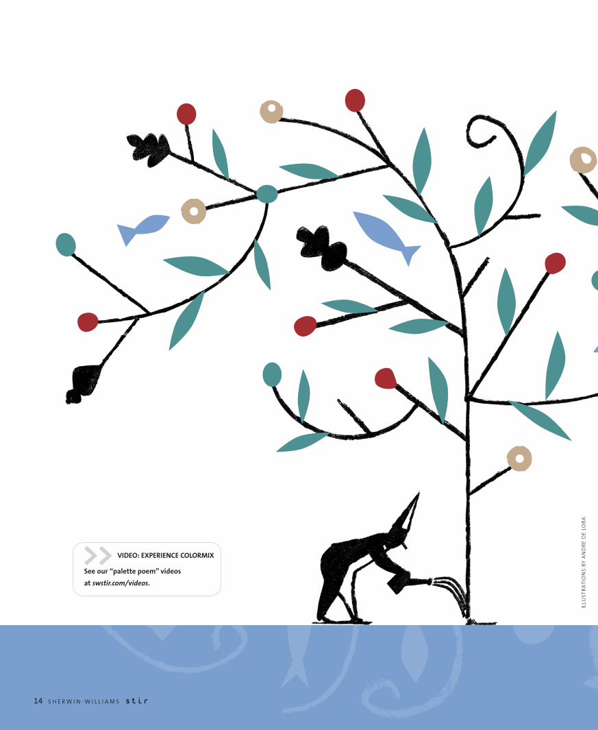
>> VIDEO: EXPERIENCE COLORMIX
See our “palette poem” videos
at swstir.com/videos.

B y K I M P A L M E R
You don’t have to look far on the color wheel to find a fresh combination. Just hone in on a hue that you love — its perfect complement might be right next door.
Analogous palettes that stay beautifully close to home are today’s dominant color story, according to Jackie Jordan, director of color marketing for Sherwin-Williams. “You can do so many great things within a single color family.”
But rather than traditional tone-on-tone, we’re experimenting with different values within color families to discover vibrant palettes that break the mold.
It’s a fashion-influenced direction, evoking the gradations found in ombré dyeing and color-washing. But on a deeper level, it speaks to our growing appreciation of our planet. Sustainability is no longer a niche or a fad. It’s an ingrained influence that shapes every facet of design — and of life itself.
That’s why we’re drawn to color schemes that reflect the Earth’s infinite variety: the rich reds within a flame; the shimmering blues of water; the varied greens of vegetation; and the organic neutrals of grains, woods and dried grasses.
We’re absorbing the natural spectrum around us and then making it our own, Jordan says. “From these hues, sculpt a bespoke palette, expressive of your style and mood.” n
C O L O R M I XTM two-thousand-twelve
Color is always on the move, and right now, it’s exploring its origins. Sherwin-Williams colormix™ two-thousand-twelve surveys the landscape to find monochrome palettes inspired by Mother Earth.
ELEMENTAL Journey
S H E R W I N - W I L L I A M S S t i r 15
MIX IT UP There are endless ways to put your unique, creative spin on colormix two-thousand-twelve.
And Sherwin-Williams offers color tools to make it easy:
• Order colormix color cards and large-size color swatches at swcolorsamples.com.
• Download colormix colors into virtual design tools or paint room scenes in the Online Color Visualizer at swcolor.com.
• Find these colors on the ColorSnap® app for smartphones. Download at swcolorsnap.com.

Blues: Flowing ForwardToday’s blues celebrate two essential basics:
water and denim. Clean water is becoming a
treasured commodity, from our oceans to our
taps, and our growing appreciation for this
resource is shading water-inspired palettes that
evoke rivers, lakes and seas. Meanwhile, as we
hope for economic blue skies, we’re rediscovering
denim, the fabric of the American worker. Hues
from darkest indigo to faded-jean blue, some
with violet undertones, are fresh and functional,
showing up in materials from glass to plastic to
actual fabric. And rugged workwear influences
are making their muscular presence felt.
Reds: Burning BrightFocus on a brilliant flower or a glowing ember.
You won’t see a single red; you’ll see a glorious
gradation of hues, from fuchsia to orange red
to violet to delicate pink. Red is the color of
fire, passion and the earth’s molten core, and it
strikes exotic notes ranging from the deepest
intensity to the softest femininity. With China
on the rise, and red products selling briskly,
the hue has new dominance. But the old rules
against mixing reds with oranges or purples no
longer apply. Today’s red-based palettes are as
passionate and free-spirited as the color itself.
SW 6477 Tidewater
SW 6223 Still Water
SW 6489
Really Teal
SW 6751
Refresh
SW 6467
Kendal Green
SW 6747
Argyle
SW 6480
Lagoon
SW 6194
Basil
SW 7641
Collonade G
ray
SW 6689
Overjoy
SW 6132
Relic Bronze SW 6108
Latte
SW 6115
Totally Tan
SW 7012
Creamy
SW 6074
Spalding Gray
SW 6150
Universal Khaki
SW 6120
Believable Buff
SW 6390
Bosc Pear
SW 6882 Daredevil
SW 6331 Smoky Salmon
SW 6626 Sunset
SW 6341 Red Cent
SW 6363
Gingery
SW 6321
Red Bay
SW 6
839
Kim
ono
Viole
t
SW 6
020
Mar
oone
d
SW 6
293
Fabu
lous
Gra
pe
SW 6
300
Burg
undy
SW 6
811
Hon
orab
le B
lue
SW 6
244
Nav
al SW
624
2 Br
acin
g Bl
ue SW
654
3 So
ulfu
l Blu
e
SW 6
523 Den
im
SW 6239
Upward
SW 6809
Lobelia
SW 6810
Lupine
SW 6958
Dynamic Blue
SW 6957
Undercool
SW 6939 Turquish
SW 6173 Cocoon
GREENS.
The
dep
ths
of s
ea a
nd fo
rest
, sea
wee
d, a
lgae and moss, ro
oftop gardens, and foliage motifs. NEUTRALS. A field of grain, a pile of pebbles, weathered wood, earthy clay and raw
organic materials. R
EDS. A
brilliant flower, a glow
ing ember, the colors of fire and passion, and the earth’s molten core. BLUES. Clear water, faded American denim
, rivers,
lake
s and se
as, w
orkw
ear,
and
cris
p bl
ue
skie
s.
C o l o r m i xTM two-thousand-twelve
NeuTRAls: Warming UpPicture a field of grain, a pile of pebbles, weathered
wood and earthy clay. Raw organic materials and
sustainability remain driving color influences. But
instead of the steely grays that have dominated
palettes of the recent past, today’s looks mix warm
and cool tones to create a temperature that’s
just right. Gold tones — reflecting the sun, dried
grasses and soft metallics — are subtly warming
up the palette. And textural elements, such as
linen, unfired porcelain and mixed woods,
contribute subtle tonal variations.
GReeNs: Diving DeepWe’re serious about going green these days, and
our greens reflect that. unlike the lighthearted
yellow-based greens of the recent past, today’s
greens are lush, moody and complex. They reflect
the depths of sea and forest, and take their cues
from seaweed, algae and moss. Green’s presence
is everywhere, even in the urban core, where
rooftop and kitchen gardens continue to sprout.
And we’re bringing old-growth influence into
our indoor surroundings, with big-leaf foliage
motifs and rough-hewn textures that celebrate
unspoiled nature.

16 S H E R W I N - W I L L I A M S S t i r
G O L D E N A G E
PHO
TOG
RA
PHY
BY
TER
RY
FAR
MER
PH
OTO
GR
APH
Y
B y J E N N I F E R B L A I S E K R A M E R
idden behind the stone walls of a church in Springfield, Ill., is a little slice of Italy.
From the outside, the Cathedral of the Immaculate Conception is a true model of American architecture, designed in keeping with the “American Church Plan” popularized by architect Asher Benjamin. The interior, however, draws inspiration from the Basilica di Santa Maria Maggiore in Rome, which dates from the 5th century and is considered one of the greatest ancient basilicas.
Built in 1927, the Springfield Cathedral once boasted a sanctuary worthy of its European ancestors. But the decades had dimmed its luster. It took a team of restoration experts to bring it back to its original splendor.
For help, the church called upon Wisconsin-based Conrad Schmitt Studios (conradschmitt.com), a family firm that’s been in the craftsman-ship business since 1889. Together with Springfield’s Graham and Hyde Architects, the team did a “color investigation” — removing layers of dirt and paint to expose the original colors and finishes.
Armed with that information, the team developed a sketch of what the interior once looked like, then created an on-site model to dramatically demonstrate the impact and vibrancy that a restoration would bring. Once the scaffolding was removed, the floor-to-ceiling mock-up literally glowed with gold.
“Our goal was to go back to the original inspiration of the Basilica di Santa Maria Maggiore,” says Heidi Emery, vice president of Conrad Schmitt Studios, who oversaw the 10,000-hour project.
The plan included a palette of 18 colors even more reflective of the Roman interior than the original Springfield one. When the cathedral was repainted in the 1950s, the gold disappeared, blue overtook the ceiling, and the entire color scheme was muted. Emery vowed that the new palette would still be subdued, but that the ceiling would be opulent and “pay homage” to the one in Rome.
Regal paletteFor the task, Conrad Schmitt used all custom-mixed colors, including warm gray, taupe and ivory tones, lavishly accented with 23-karat gold leaf — a palette very similar to the Santa Maria Maggiore. The colors complemented the existing finishes of the cathedral’s scagliola (plaster columns that resemble marble) and the marble features in the space.
Before anything could be primed or painted, the cathedral needed an extensive cleaning to remove dirt and candle soot. The team repaired deteriorated areas of plaster. The fluted scagliola columns also needed repair; large seams had split open and were carefully filled with matched pigment. Attention and repair were also given to low relief panels and griffins around the room — the latter a wink to Bishop James Griffin, under whose leadership the church was built.
The biggest undertaking was the ceiling, where 190 five-foot coffers each needed a nine-layer application, including stenciling, painting and carefully tinted aluminum leaf. New rosettes — based on the Roman interior, but not original to this cathedral — were made, using a technique known as trompe l’oeil (or “fool the eye”), to look three-dimensional.
To achieve an opulent Old World look, the team used multiple Sherwin-Williams coatings, including ProMar® 200, ProGreen® 200,
Duration Home® and a Faux Finish Glazing Liquid, which added depth and dimension to bas-relief panels and moldings.
Painting was intricate and complicated, made more so because the ceiling coffers also served a structural purpose: Many of them needed to hold lights or canvas acoustic panels.
“Our challenge was to contemporize the acoustic environment in the space,” says architect Jim Graham. The canvas panels (a combination of flat and concave surfaces all carefully disguised in the coffers) dramatically improved the quality of the organ music. “We needed to reflect and distribute sound, not absorb it.”
HA Midwestern cathedral returns to its gilded Roman roots.
The biggest undertaking
was the ceiling, where
190 five-foot coffers each
needed a nine-layer application,
including stenciling, painting
and carefully tinted
aluminum leaf.

S H E R W I N - W I L L I A M S S t i r 17
Many of the ceiling coffers
house canvas acoustic panels,
indistinguishably disguised
by an intricate nine-step
painting technique.

18 S H E R W I N - W I L L I A M S S t i r
‘Delighting in color’Creating and painting the ceiling coffers was such a multifaceted project that many of them were produced in studio and later installed on-site. Both Graham and Emery were gratified when they weren’t able to tell visually which ones had the acoustic panels. Even up close you can’t tell, Graham says, recalling the team huddling on scaffolding to inspect and instead marveling at the paint technique. “That’s what it’s all about — delighting in what color can do,” he says.
Fortunately, others marveled too. The finished project has won a handful of awards, including the Religious Architecture-Restoration Honor Award and the Painters and Decorators Contractors of America Commercial Restoration Award.
“We really wanted to emulate the gold feeling, just as the Roman church did,” Emery says. “It’s an elegant, holy place; the gold is opulent, but not overdone.”
The cathedral’s Father Peter Harman enjoys watching people’s reaction in his church. Some initially felt the restoration wasn’t necessary and pushed back. Now he says they all come in and just stand there, looking up.
“Without exception, everyone who came back and saw it said, ‘Oh, my heavens, this is what we remember and more so,’” Harman says. Since returning to the cathedral after 14 months of keeping his parish together at various local churches while the restoration took place, he appreciates how the large space has become both bright and warm. While it was always a beautiful space, he says, “This is the way it was supposed to be.” n
Jennifer Blaise Kramer is a Minneapolis-based writer and editor.
What’s Old Is New AgainThe ceiling treatment in the Cathedral of the Immaculate Conception was a careful nine-step process, designed to recreate the look of the Basilica di Santa Maria Maggiore in Rome. Each of the 190 coffers required sizing, stenciling and leaf, as well as an intricate trompe l’oeil technique to create the rosettes. Three different pigment tones added highlight and shadow. Final glazes were applied to add just the right amount of sheen.
Here is how Conrad Schmitt Studios achieved the look:
1. Base coat of Sherwin-Williams Duration Home®in matte finish.
2. Sizing (adhesive) for metallic leaf. (The sizing is stenciled on and allowed to dry to the appropriate tackiness).
3. Aluminum leaf (used to create dimension with gold-tinted varnishes).
4. Six applications of tinted varnishes and stencils, layered to create highlights and shadows.

C O L O R T E C H
S H E R W I N - W I L L I A M S S t i r 19
B y J E N N I F E R B L A I S E K R A M E R
An especially discriminating client used to be a challenge. Today, it can be a fun adventure, thanks to new technology that makes it easier to customize design materials of all kinds — from fabrics to wall coverings to flooring. The
digital design world is breaking down barriers to finding precise shades and putting a personalized stamp on projects, whether it’s branded carpeting in corporate colors for a commercial building or a pet’s likeness on upholstery fabric for a residential space.
When researching upholstery options, designers are increasingly turning to digital manufacturers for custom solutions. “It’s often the best way to help businesses express their logo and mission statement,” says Shawn Gaither, a designer with Studio Hive in Minneapolis
(studiohive.com), who has watched the industry expand “floor to ceiling” in recent years.
“The topic of brand has become so much more a part of the conversation now,” he says. “Technology has opened up the door for us to communicate our clients’ message and identity.”
Gaither, for example, recently designed the University of Minnesota’s TCF Bank football stadium in Minneapolis and used the school’s precise maroon-and-gold color scheme and trademark “M” throughout. He also worked the fight song lyrics into upholstery fabric for chairs. “It’s another way of connecting you to the game of football,” he says.
The desire to personally connect with something is often what drives people to create and print fabrics for their home as well. A homeowner
Digital technology opens up new design options for taking care of business or reflecting our clients’ personal vision.
One of a Kind
ILLU
STR
ATE
D P
ATT
ERN
S B
Y EL
EAN
OR
GR
OSC
H

20 S H E R W I N - W I L L I A M S S t i r
C O L O R T E C H
might want an image of their Yorkshire terrier on a chair or might want to reinterpret a classic design from their wallpaper for their new accent pillows. Rather than having to scour stores to find what their clients desire, designers can go online, where online retailers and manufacturers are making ideas and colors seemingly limitless.
“If [a client’s] particular passion is greyhounds, for example, you might be able to find one or two greyhound fabrics available for sale from regular fabric suppliers, but on Spoonflower we have 105 grey hound fabrics,” says Stephen Fraser, co-founder of Spoonflower.com, a digital textile printing company in North Carolina. “That opens up the options considerably for interior designers. And of course you can always design your own fabric if you can’t find one you like.”
Rysa Pitner, founder of Fabric on Demand (fabricondemand.com), another fabric and textile printing company based in Los Angeles, has seen everything created from a football-superhero jumpsuit to bacon-inspired patio furniture.
“People imprint their homes and fashions with what’s going on in their imaginations,” Pitner says. “[This technology] enables people to create a tangible product that is precisely what they imagined.”
Pitner works with a lot of DIYers, helping them figure out how to best put their own spin on the product and select the right color. By using a continuous color spectrum, printers like Pitner can dial into any color value. “It’s very similar to paint-matching,” she says, although digitally she can keep adjusting tones through strike-offs until the desired color (whether from a product or photograph) is matched to perfection.
“It’s wonderful to say ‘anything’s possible’ now,” Pitner says. “It’s really the tagline for the industry.”
And while digital technology has expanded the options for both designers and clients, it has also made the designer’s job more manageable.
“The digital industry has made things so much easier in many ways,” says Jackie Jordan, director of color marketing for Sherwin-Williams. “First and foremost, the opportunity for research to narrow down color and design options to present to a client can save enormous amounts of time and energy on the part of the designer.” n
Jennifer Blaise-Kramer is a Minneapolis-based writer and editor.
“�People�imprint�their�homes�and�
fashions�with�what’s�going�on��
in�their�imaginations.�[This�
technology]�enables�people�to�
create�a�tangible�product�that��
is�precisely�what�they�imagined.”
COLORSNAP FOR ANDROID IS HERE!
Thanks to technology, the power to pin down that perfect color is literally in your hands. Sherwin-Williams
ColorSnap® (swcolorsnap.com) for iPhone,® BlackBerry® and now Android™ enables designers to snap a
picture, zero in on a hue, and then find a coordinating palette.
“Although this type of technology is only as accurate as the digital image or photo graph,” says Jackie
Jordan, director of color marketing for Sherwin-Williams, “it still gets the designer to a color family
or color chip within the system, and they can make final tweaks from there.”
So next time you want to create a palette to match an object you’ve found, remember: There’s an
app for that.

S H E R W I N - W I L L I A M S S t i r 21
C O L O R T E C H
22 S H E R W I N - W I L L I A M S S t i r
B y K I M P A L M E R
W hat’s great about today’s relentless technological advance? What’s not so great? Where is technology taking us, and how can we keep pace? Since you’re in the
design trenches, we turned to you for answers to those questions. For the second year, STIR® has invited our readers to join the conversation, asking you to report on the technology you’re using right now and its impact on your work.
This spring, we invited some of our STIR® eExtra subscribers (you can subscribe to this free e-newsletter at swstir.com) to take our STIRvey. More than two-thirds (68 percent) of respondents were interior designers; 11.5 percent were arch itects; and the balance represented a combination of specialty painters/artists, color consultants, design students, educators and home stagers, in that order. A majority (58 percent) identified themselves primarily as residential designers, while 42 percent identified themselves as commercial.
THE RESULTS Overall, you’re a tech-savvy bunch. Among respondents, 62 percent now routinely design using CAD (computer-aided design) software. In addition, 35 percent now use an iPad or other tablet or laptop to offer clients virtual walkthroughs. But that’s just the tip of the tech iceberg. Read on for intriguing insights about your colleagues’ favorite new tools and resources:
DEEP INTO THE DIGITAL REVOLUTION,
DESIGN STANDS ON THE FRONT
LINE. WE’VE EXPERIMENTED WITH
NEW GADGETS AND TECHNIQUES AS
THEY’VE COME ALONG; MASTERED
THE ONES WE’VE FOUND VALUABLE;
AND MOVED FORWARD TO AWAIT
THE NEXT, INEVITABLE INNOVATIONS.
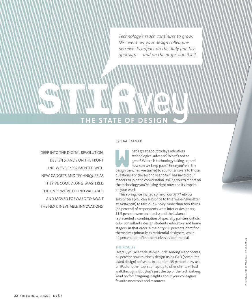
STIRvey
Technology’s reach continues to grow. Discover how your design colleagues perceive its impact on the daily practice of design — and on the profession itself.
T H E STAT E O F D E S I G N
PHO
TOG
RA
PHY
BY
MIC
HA
EL H
END
RIC
KSO
N

Which of the following social media channels do you use to promote your design practice? (Check all that apply.)
Blog/Tumblr
YouTube/Vimeo
Flickr/other photo sharing
2010 4030 60 7050 800
PERCENTAGE OF RESPONDENTS
Often Valuable Valuable Never Valuable
2010 4030 60 7050 800
PERCENTAGE OF RESPONDENTS
How valuable are these technological advantages for your design practice?
Ease of collaboration with other professional partners
Ease of sharing vision with clients
Greater access to more diverse sources of inspiration
Instant access to manufacturers’ color and specs
More visibility into what other design professionals are doing
Precision afforded by sophisticated digital design tools
Which of the following design blogs do you read regularly for design and color inspiration? (Check all that apply.)
105 2015 30 35250
PERCENTAGE OF RESPONDENTS
Elements of Style
Apartment Therapy
Design*Sponge
Design Milk
Tree Hugger
Remodelista
decor8

24 S H E R W I N - W I L L I A M S S t i r 24 S H E R W I N - W I L L I A M S S t i r
How frequently do you use the media below to research color and design trends?
Often
Sometimes
Never
2010 4030 60 70500
PERCENTAGE OF RESPONDENTS
Design blogs
Manufacturer’s websites
Other websites
Print magazines
Professional events/ networking
Social media
Not frustrating
Somewhat frustrating
Very frustrating
How frustrating are these technological challenges for your design practice?
CAD renderings still not “real” enough
2010 4030 60500
PERCENTAGE OF RESPONDENTS
Clients expecting design faster, better and cheaper
Clients getting “open source” access to professional tools
Keeping up with training and new developments
2010 4030 60500
PERCENTAGE OF RESPONDENTS
Lack of tactile experience with fabrics, coverings,
wall textures, etc.
Matching real-life color to on-screen/digital color

JOIN THE COLOR CONVERSATION!
“Like” our Facebook page at facebook.com/SherwinWilliamsforDesignersArchitects.

26 S H E R W I N - W I L L I A M S S t i r
G O I N G G R E E N
A new, patient-centered hospital discovers an identity it didn’t expect: ultra-green.
The art of HEALING
Hospitals weren’t always so antiseptic. The ancient Greco-Romans received health care while luxuriating at public baths. In fact many cultures — even as recently as the 20th century — were as likely to associate “medicine” with healing
mineral springs as they were with crisp hospital corridors in starch white and pistachio green.
But by the 1950s, hospitality was almost completely divorced from its linguistic cousins, hospital and hospice. During that era, many hotels became sensory delights, but health care took those concepts — sound, light, color, design — and excised them with a scalpel.
Today that’s changing in a big way, according to health-care design experts. The newest hospitals have private rooms with views of trees and vegetation; landscaped healing gardens; indirect, pleasant lighting; museum-quality artwork; and chef-created meals delivered only when the patient feels ready to eat.
At the brand-new Ahuja Medical Center in Beachwood, Ohio, for instance, “guests” are led through a series of “human touchpoints,” including a towering glass-enclosed lobby that overlooks gardens and walking paths. On the far wall is a 36-foot custom art piece — made up of 112 trumpet-shaped glass blooms in azure, citron and amber — by renowned glass artist Dale Chihuly. The patient floors are clad in sound-absorbent wood- and stone-look vinyl, meant to eliminate the irritating squeak of nurses’ shoes on buffed tile. Each private room has a separate
zone for family members, complete with a mini-fridge and a sleep sofa. Indirect, energy-efficient lighting in the corridors are positioned to bounce light off the ceiling, creating well-lit spaces that never feel harsh or glaring.
Healthier by design“The fact is, if people don’t feel like a commodity being pushed through the hospital, they heal faster, they feel better, they don’t get as many infections, and the doctors and nurses don’t make as many errors,” says Shannon Kraus, health-care practice leader at HKS Architects (hksinc.com) in Washington, D.C. “It’s that simple.”
With the new Ahuja Medical Center, Kraus expected to design a facility that would feel healing and humane. What he didn’t expect: that attending to the human needs of patients and staff would result in a building that would qualify for certification through the U.S. Green
Building Council’s prestigious LEED (Leadership in Energy and Environmental Design) program at essentially zero extra cost. HKS estimates that University Hospitals, the building’s owner, spent 0.1 percent more to make the building “green” under LEED standards.
To create a hospital where all 144 patient rooms have calming views of trees and green space, Kraus and his team designed a distinct concave building that required 70,000 square feet of glass. The design naturally incorporated a powerful passive solar system and a 17 percent reduction in energy use compared with other large hospitals.
From the time you approach the building, the massing and form is set to appeal to the human scale. A greeter immediately welcomes you to the medical center as you see through the lobby, past the fireplace and to the wetlands beyond.
B y A L Y S S A F O R D
“�The�fact�is,�if�people�don’t�feel�like�a�
commodity�being�pushed�through�the�
hospital,�they�heal�faster,�they�feel�better.”
PHO
TOG
RA
PHY
BY
SCO
TT P
EASE

To cultivate and care for those all-important green spaces, the team incorporated a system of bioswales filled with sand-soil mix, to naturally filter runoff from the parking lot. And they specified seeded-grass fire lanes (which actually helped to reduce the building’s heat index).
“We know from evidence-based design research that color, light, access to nature and control over one’s environment improves clinical outcomes and promotes a sense of calm,” adds Patricia Malick, an Evidence-Based Design Accredited Professional and Principal with Array Healthcare Facilities Solutions (arrayhfs.com) in King of Prussia, Pa., the Associate Architect and Interior Designer for the project.
“We utilized nature-inspired colors, textures and patterns that complement the exterior and provide strong visual cues to patients and visitors navigating the building,” Malick says. A variety of beautiful accent colors complement the use of rich wood tones and stone textures, and enhance the overall patient experience when entering the lobby.
Inside the bedrooms and hallways at Ahuja, color plays an important role in the overall experience that Array designed. Array used three and sometimes four colors in every patient room, focusing on soft greens, sunny saffrons and complex purples. The 27 colors include Tranquil Aqua (SW 7611), Empire Gold (SW 0012) and Exclusive Plum (SW 6263). Hues are more saturated in the physical therapy rooms, meant to energize patients and encourage them to physically push themselves. Every shade was mixed in zero VOC Sherwin-Williams Harmony®, which is the coating system of choice for interior surfaces and is a part of the UH interior sustainability standards program. (Editor’s note: Some colors may not be zero VOC after tinting with conventional colorants.)
“Our mission was to create a welcoming place that inspired confidence and encouraged healing and well-being,” says Malick. “So it was really important that we could draw on a rich and varied color palette, comple ment ing the beautiful surrounding environs, while specifying a very safe product.” n
Writer Alyssa Ford specializes in green architecture and interior design.
WHAT THE PROS KNOW
During the past 25 years, researchers have been exploring how
health and healing intersects with good design. Here are some
of the founding principles of evidence-based design (EBD) in
health care.
A GOOD VIEW COUNTS. Studies show that patients’ pain percent
and heart rates are lowered if they have a view of trees and
vegetation rather than a brick wall.
NATURE IS THE BEST ART. Art that depicts realistic and serene
images of nature calms patients. An art collection should be
designed to uplift, comfort and calm; to provoke thought and
curiosity; to encourage reflection; to delight in the moment;
and to inspire confidence and hope.
SEPARATE AREA FOR FAMILY. Researchers have noted that
patients, doctors and family members feel more at ease if
patient rooms have a distinct area for visiting family members.
PREDICTABLE PATIENT ROOMS. Studies have shown that if
patients’ rooms are laid out in exactly the same fashion,
with equipment stowed in exactly the same place, errors by
nurses and doctors drop dramatically.
ACOUSTICS MATTER. Research has demonstrated a strong
correlation between ambient noise and communication
errors. Many hospital designers have made an extra effort to
find materials and cleaning solutions that minimize noise in
hospitals. First on the list: no-wax flooring.
SELECTED PALETTE
Tranquil Aqua (SW 7611)
Empire Gold (SW 0012)
Exclusive Plum (SW 6263)
S H E R W I N - W I L L I A M S S t i r 27

The contest drew entries from 356 design students across North America. It was judged by Jackie Jordan, director of color marketing, Sherwin-Williams. First place winners received a $2,500 cash prize; second place winners received $1,000; and third place winners received $500.
Congratulations to the winners of our 2011 Sherwin-Williams® STIR® Student Design Contest.
STUDENT DESIGN contest
FIRST PLACE WINNER: RESIDENTIAL
Designer: Courtney Lautenschlager School: Iowa State University
Concept: Located within Mies Van Der Rohe’s Lakeshore Drive apartments in Chicago, Ill., this luxury condominium was designed with a primary triadic color scheme of red, blue and yellow with an accent of grey.
FIRST PLACE WINNER:COMMERCIAL
Designer: Jessica N. AndersonSchool: Valdosta State University
Concept: Flora & Fauna is a luxury skin and beauty clinic
located in Slade, Ky., that focuses on incorporating sustainable
materials into its interior. A blend of sophisticated natural
elements and clean, modern lines creates a soothing and
peaceful environment.
RUNNERS-UP
Second place, residential: Joanne N. Fields, Kansas State University
Second place, commercial: John Botello, Texas Tech University
Third place, residential: Donivan Noble, Ohio University
Third place, commercial: Christine Hee Roh, University of Nevada
SW 6430 Great Green
SW 6435 Gratifying Green
SW 6506 Vast Sky
SW 6148 Wool Skein
SW 6866 Heartthrob
SW 6239 Upward
SW 6942 Splashy
SW 6697 Nugget
SW 6900 Optimistic Yellow
SW 7075 Web Gray
SW 6770 Bubble
28 S H E R W I N - W I L L I A M S S t i r

F I N A L T O U C H
DON’T BET AGAINST REDWant to triumph over a competitor? Attract romantic attention? Wear red. Scientists have discovered that color tips many situations in the wearer’s favor. Athletes in red have a small but significant advantage over opponents in other colors, according to multiple studies. And a lady in red is more likely to be considered attractive by the opposite sex — and more likely to be asked on a date. Some speculate it’s because red is simply easier to see. Humans, like most primates, have a trichromatic visual system, which is believed to have evolved to help us spot ripe fruit. Others believe red influences the way someone is perceived because it signals dominance in other animal species. Whatever the reason, there’s no denying red’s pervasive power. n

Our color tools make you the star.Upload and paint your own photo, download our palettes into virtual design software, and design on the fly with ColorSnap,® our free color-matching app for smartphones. swcolor.com
laughingWhere will orange take you?
SW 6895
PRSTD STDUS Postage
PAIDGAC
Sherwin-Williams 3500 Holly Lane N., Suite 30Plymouth, MN 55447