sharing interpretive poster
TRANSCRIPT
Interpretive Sign Designs
By
Natalie Clark
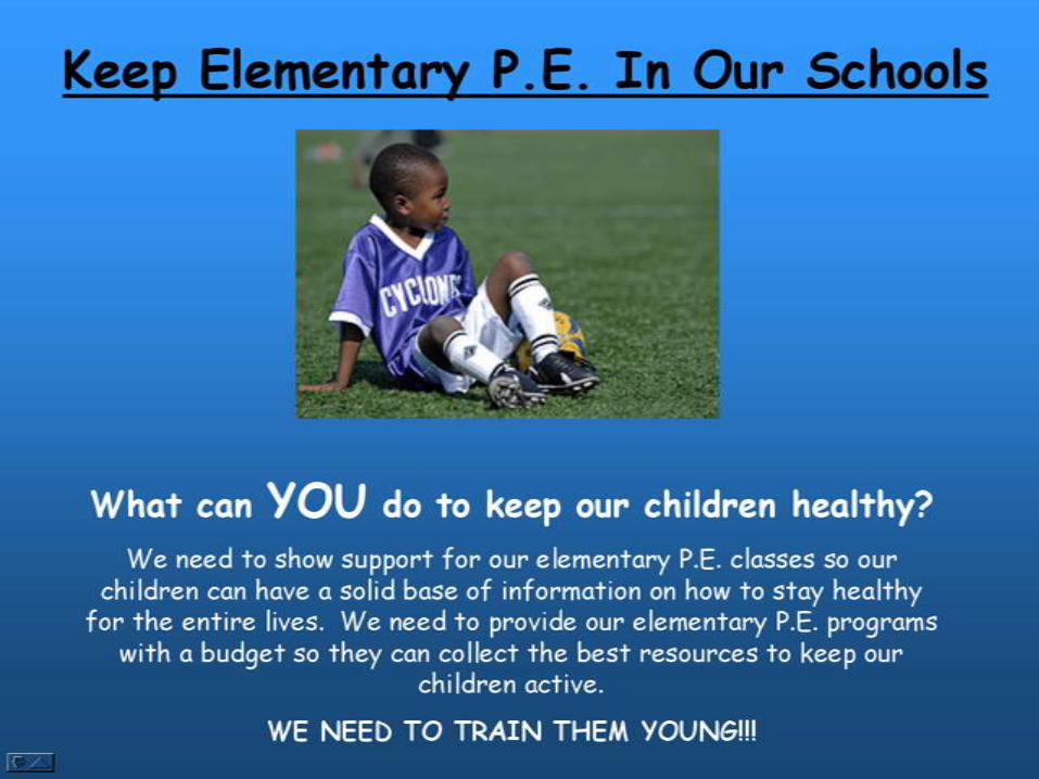
Goal:• To help the budget for public elementary school
physical education programs
Audience• Members of the local school board
Message• We need to show support for our elementary P.E.
classes so our children can have a solid base of information on how to stay healthy for the entire lives. We need to provide our elementary P.E. programs with a budget so they can collect the best resources to keep our children active. WE NEED TO TRAIN THEM YOUNG!!!
• Instead of just changing a few things I have created brand new signs each time
• I noticed that I had to much writing on my first sign. I wanted to make the next one more simple
• My alignment was off
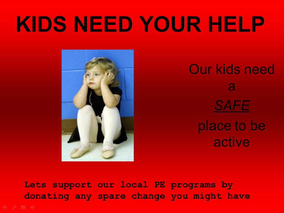
• I liked my main title
• The proximity of the writing to the right was to far away from the image
• I tried to decrease the amount of text from my first sign to my second one
• I kept the colors simple but I feel the red is a little to strong

• I felt the background image really set the mood for this sign
• I felt the color contrast was not the greatest on this sign
• I wanted my text to get feeling from the reader
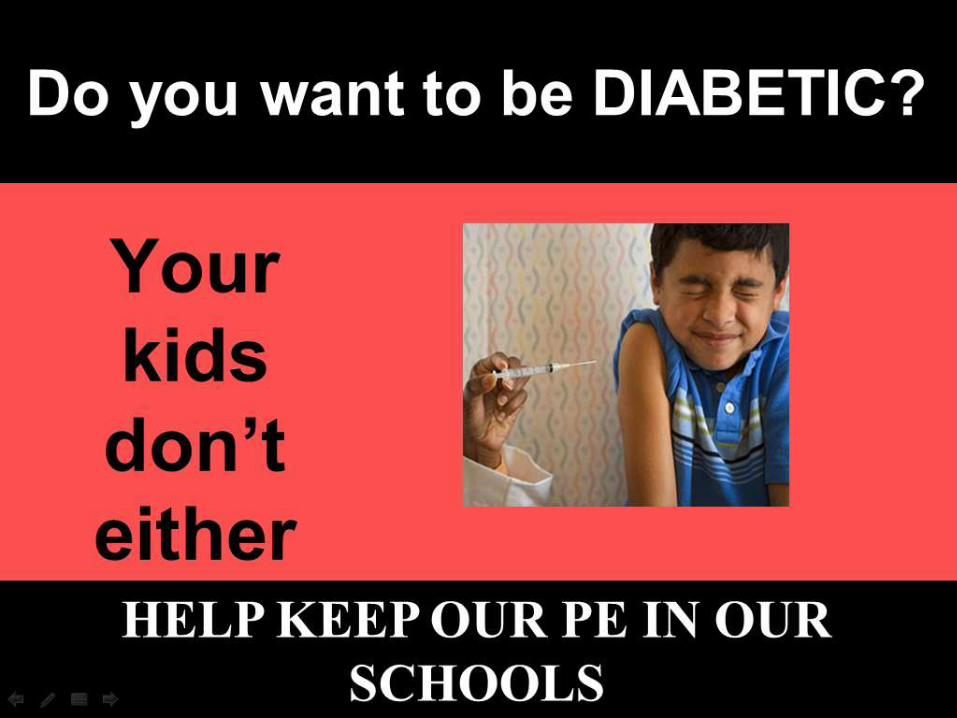
• I used strong color contrast in this poster
• My alignment was not real strong
• I felt my main title would catch someone’s eye if they walked by
• I should have not had the bottom line in all caps
• I liked the framing of the black on top and bottom
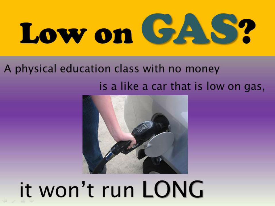
• This is my favorite one I have created so far
• I feel the word GAS stands out the most
• I tried to use analogies
• I have repetition of fonts and style
• My alignment is much better