research and production
DESCRIPTION
my as college magazine presentationTRANSCRIPT
AS coursework: preliminary exercise
Beckie carter :)
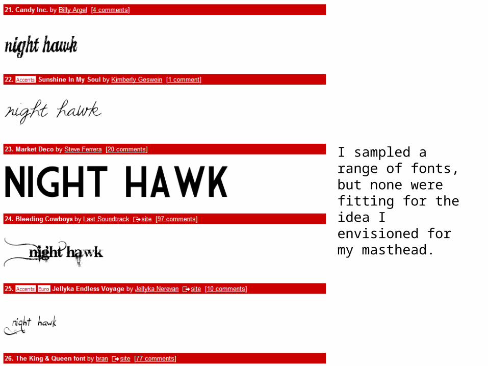
I sampled a range of fonts, but none were fitting for the idea I envisioned for my masthead.
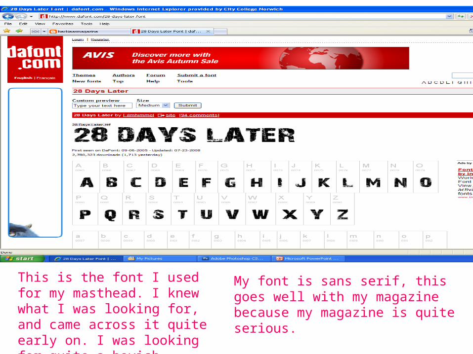
This is the font I used for my masthead. I knew what I was looking for, and came across it quite early on. I was looking for quite a boyish, street font.
My font is sans serif, this goes well with my magazine because my magazine is quite serious.
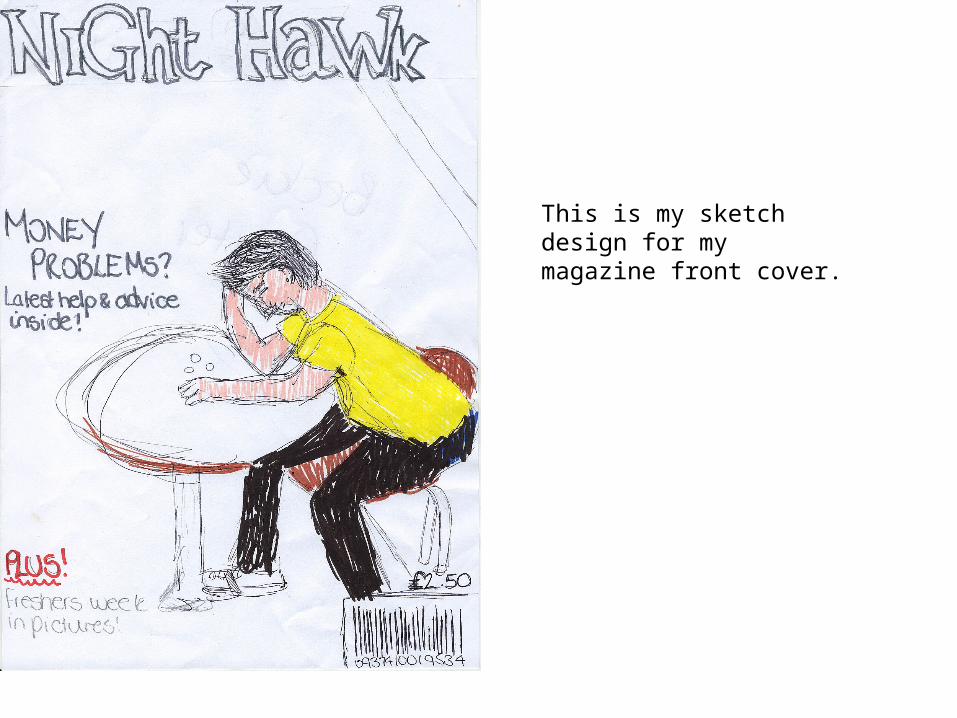
This is my sketch design for my magazine front cover.
•
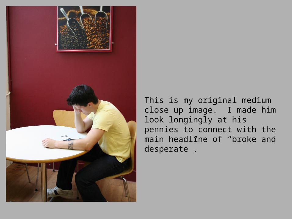
This is my original medium close up image. I made him look longingly at his pennies to connect with the main headline of “broke and desperate”.
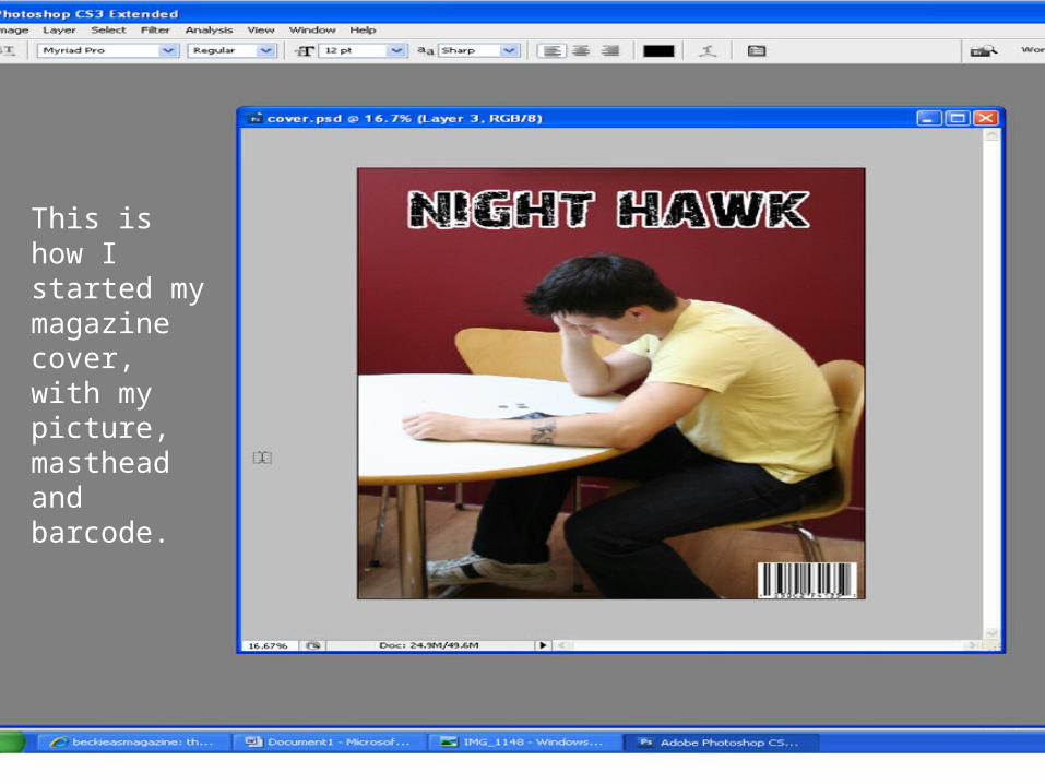
This is how I started my magazine cover, with my picture, masthead and barcode.
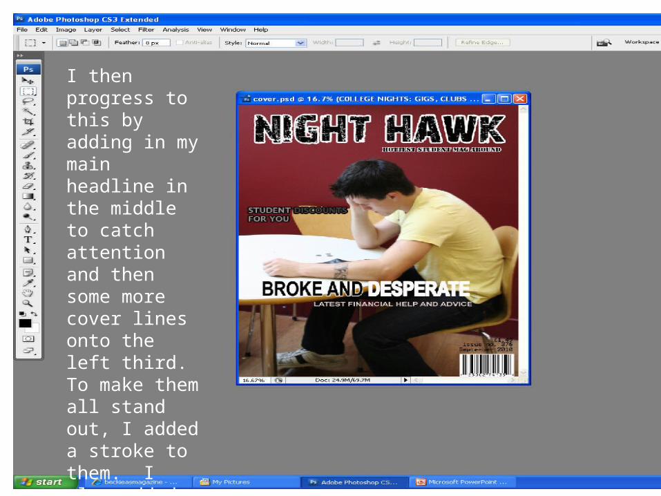
I then progress to this by adding in my main headline in the middle to catch attention and then some more cover lines onto the left third. To make them all stand out, I added a stroke to them. I also added a price, date and issue number.
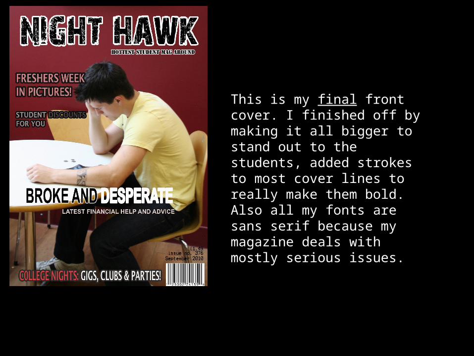
This is my finalfinal front cover. I finished off by making it all bigger to stand out to the students, added strokes to most cover lines to really make them bold. Also all my fonts are sans serif because my magazine deals with mostly serious issues.

This is the progression of my contents page.
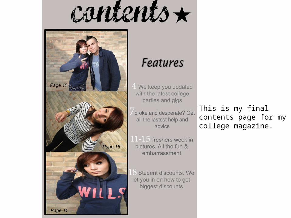
This is my final contents page for my college magazine.