recommendation report for welcoming week · recommendation report for welcoming week by: connie ......
TRANSCRIPT

1: Economos, Erickson, McCoy
Recommendation Report for Welcoming Week By: Connie Economos, David McCoy, and Mary Erickson
Contact: Connie Economos
David McCoy

2: Economos, Erickson, McCoy
Table of Contents
Introduction……………………………………………………………………………………..3
Prototype Recommendations…………………………………………………………………....3
Wireframe Resources……………………………………………………………………………3
Design - Prototypes for App…………………………………………………………………..3-5
Poster………………………………………………………………………………………….5-7
Recommended Design Principles……………………………………………………………..7-8
Recommended Logo…………………………………………………………………………….9
Recommended Photos…………………………………………………………………..….10-13
Conclusion: Recommendations……………………………………………………………13-14

3: Economos, Erickson, McCoy
As Welcoming Week Committee Members, you have built the foundation for a welcoming community.
However you have expressed concerns about how to communicate to a multilingual community that may
not comprehend computer technology. You have also developed a very complex, multifaceted task that
needs a calendar to coordinate 30 events in 9 days, and provide more complete event information. You
have also requested that the website or apps designed to communicate be simpler, yet organized, more
user-friendly and visually pleasing. You also stated that finding available, not legally-restricted
photographs, relevant to the Welcoming Week Event was an issue. This report details our
recommendations that address all of these issues.
Prototype Recommendations
The prototype is illustrated through a hand sketch to show as much potential for change as possible so
that the users of both the app and website will be able to utilize either feature as efficiently as possible.
Wireframe Resources
The first recommendation would be an application that can be slightly individualized, yet simple enough
to be easily and quickly learned. Clarification of the events should be top priority to make anyone
attending Welcoming Week understand locations, significance of the events and feel like he or she is an
important part of the welcoming community. This recommendation details features that make navigation
easier for the user, information easily accessible, photos in one section, and a modernized, intriguing and
identifiable logo.
Design- Prototypes for App
It is recommended that a mobile application be made to stick with Welcoming Week participants for not
just the event, but for future West Fargo, Fargo, and Moorhead events. An app will work to give free
advertising for the events, providing crucial information such as:
● Clear dates on events
● Locations for events around the tri-city area
● Clear contact information
● Multi-lingual presentation
These four areas are addressed with an easy to navigate design for all age-groups. Being available for
mobile phones does present the hurdle for an older audience, but by streamlining the information and
presentation to be most like the existing default Calendar app, minimal challenges should be present. The
following figures use a minimalist presentation to function as a suggest for style rather than a sample or
guide for specifics like word choice.

4: Economos, Erickson, McCoy
(Figure 1.1)
Figure 1.1 shows the title screen when the application is launched. A title for the app is recommended to
help ingrain into the user’s mind the Welcoming Week Event. For languages it is suggested to choose the
most prevalent languages of incoming immigrants. This means having the event details pre-translated in a
variety of languages before launching the app to the public.
For advertising and more traditional layouts, the user will be presented with a chance to go to the main
website via an image that acts as a link at the bottom right of the screen. Once users select their language
they will proceed to the main calendar screen.
Figure (1.2)
Figure 1.2 shows the main screen for users using the application. From here the Welcoming Week logo,
as designed further in this document, and title are displayed along with the month and year. This will
allow the app to be used across multiple years and event cycles. Below this is a calendar for the two
weeks the event runs for. In each cell of the calendar will be the date, and a colored line. Locked to the
view will be a space 1/5th the screen size. In this space it is suggested simply-worded directions are given
to users to help them use the app.

5: Economos, Erickson, McCoy
Figure (1.3)
As Figure 1.3 shows, if the user taps on a day this will bring up the events for then in the same space as
the instructions. Colored squares beside the events will let users see the correlation. Users can further tap
this square to see the full details for that specific event.
Figure (1.4)
In Figure 1.4 The full event details would be presented to the user. The inclusion of a map is crucial to
showing where events take place as well as showing a contact, preferably a universal email or phone
number to call is highly recommended. Beside the title of each event on this screen, the user can toggle an
alert for their phone as a reminder.
With this simple 4 screen app, it is expected to help streamline the important information for Welcoming
Week and allow it to be accessible to those with and without a smartphone.
Poster
The recommendations also include a prototype for a poster that inspires the reader to attend an event and
get involved. A scannable code allows users access to additional online features for more information
about Welcoming Week. Instructions for downloading the app will be displayed at the bottom of the
poster. These instructions would be done as pictures to reach the widest possible audience. In showcasing
the main idea of welcoming the refugees, the poster will be multilingual. The concept is to have multiple
posters each with a language of the country refugees have come from - the sample uses Nepali.

6: Economos, Erickson, McCoy
The logo is placed in the top left, as this traditional placement is most effective because the reader’s eye
will be drawn directly to the logo. The QR scannable code would be placed in the bottom right corner of
the poster, again to grab the reader’s attention. For the center two ideas to consider include: one with a
map of the FM area and the location of the Welcoming Week Events. Another idea would be including an
English translation in the same font below the main event instructions. Both ideas reach a wide audience
of varying levels of literacy.
A short passage with some information will inspire more users to get involved. A tangible poster is
absolutely necessary in addition to a website and app to reach the population that is not computer or smart
phone literate, as well as the New Americans who do not speak English fluently. The posters should also
be displayed at Nepali, Somali and Blue Nile (east African) grocery stores, as well as the WE Center and
Lutheran Social Services that help New Americans with translation. The posters should also be displayed
at the Fargo Public Library where people who do not use technology may be found. The recommended
features on the posters include:
- A photo of someone holding a phone to demonstrate the QR code’s purpose and to
implement the app idea
- A photo the features the Google Play option on the phone
- A photo displaying the option of tapping the download link for the app
- A photo of the app sign-in page

7: Economos, Erickson, McCoy
In addition to the poster, other ways of reaching those who are not able to be technologically connected,
would be using newspapers, magazines or utilizing free community calendars for Area Woman, High
Plains Reader, Fargo Monthly and Valley News Live. For those who are not literate or fluent in English, it
would be important to advertise by radio. A local, multi-lingual station would be optimal and is suggested
to consider.
Recommended Design Principles
Contrast: Logo
● A traditional white background
● Light green/blue/orange -aesthetically pleasing/striking
● Green - environment/agriculture/crops/grass
● Blue - environment/agriculture/sky/ocean
● Orange - environment/sun
● Ecology - community, networks, world, unity
Contrast: App
● Black Font to eliminate noise
● Green Headings
● Blue Frames
● Illuminate/Promote Logo
● Enhance Event’s Main Idea
Contrast: Website
● Black Font
● Green Headings
● Illuminate/Promote Logo
Contrast: Posters
● Green and Blue
Repetition: Logo
● Logo will identify the app, website and poster
● Logo placed on every prototype in upper left
● This results in familiarity, identification with the Event
● Building a welcoming community and unity
● “Welcoming Week” - title - exemplify main idea
Repetition: Design/Images
● Photos displayed consistently on Website/App
● Contact information shown consistently Website/App
● Short, concise sentences
● Same keywords and phrases to support event
● “Welcoming Week” - title - exemplify main idea

8: Economos, Erickson, McCoy
Alignment: Website/App
● Centering the main idea text
● Providing links to the main website
● Using tabs/links for the other features on the sides.
● Logo in the top left-hand corner will draw the reader’s eye
● A tab bar would complement alignment
● Scroll bar gallery underneath the main idea
Close Proximity: Website/App/Poster
● Photos in one section
● Logo near Main Event Title
● Calendar - Contact Representative close
● White space separating features
● Designated location for features
● Exemplify order and repetition
● Solidify the user’s understanding
● Aids contrast
9: Economos, Erickson, McCoy
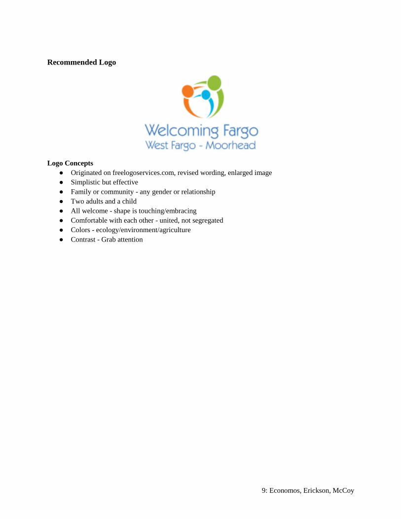
Recommended Logo
Logo Concepts
● Originated on freelogoservices.com, revised wording, enlarged image
● Simplistic but effective
● Family or community - any gender or relationship
● Two adults and a child
● All welcome - shape is touching/embracing
● Comfortable with each other - united, not segregated
● Colors - ecology/environment/agriculture
● Contrast - Grab attention
10: Economos, Erickson, McCoy
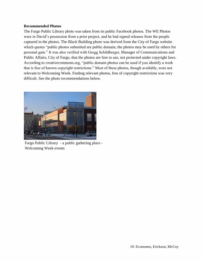
Recommended Photos
The Fargo Public Library photo was taken from its public Facebook photos. The WE Photos
were in David’s possession from a prior project, and he had signed releases from the people
captured in the photos. The Black Building photo was derived from the City of Fargo website
which quotes “public photos submitted are public domain; the photos may be used by others for
personal gain.” It was also verified with Gregg Schildberger, Manager of Communications and
Public Affairs, City of Fargo, that the photos are free to use, not protected under copyright laws.
According to creativecommons.org, “public domain photos can be used if you identify a work
that is free of known copyright restrictions.” Most of these photos, though available, were not
relevant to Welcoming Week. Finding relevant photos, free of copyright restrictions was very
difficult. See the photo recommendations below.
Fargo Public Library - a public gathering place -
Welcoming Week events

11: Economos, Erickson, McCoy
This Black Building located downtown is a historical landmark.
It would make an inviting gathering space for Welcoming Week.

12: Economos, Erickson, McCoy
WE Center Fargo North Dakota, also known as New American Consortium for Wellness &
Empowerment, helps New Americans begin their journey in Fargo
WE Center

13: Economos, Erickson, McCoy
Photo Recommendations:
● Request submission from the public of relevant, high quality, available (free of copyright
restrictions) or creative commons photos, such as a photo contest to recognize the talents of
community members, spread awareness and engage the community.
● Assign representatives to photograph relevant, original ideas or photos of people (heart and soul)
- instead of just old buildings. Photographers will be more immersed and engaged in choosing
ideas for the Event.
● Check on availability of photos from the Plains Art Museum, if they would be creative commons.
This is also a gathering place during Welcoming Week and its wonderful message would be good
marketing during Event promotion. The Plains Art Museum, according to its website,“connects
art, artists, and audiences to foster creative, resilient, and welcoming communities.” However
since it is a private establishment it is questionable if even public facebook photos are available
for the committee’s use.
Conclusion - Recommendations
App: Previously a user could not directly communicate or identify with the event.
● Full access to all the information for involvement
● Calendar of events
● Translations available
● Customizable
● Event details that include location and description
● Launch into Google Maps and the event website
● Easier for the user to become familiar with the event
Website: Organization, communication, simplicity and accuracy were prior issues.
● Making the main page less wordy and more logo-based
● More user friendly
● Implement recommended design elements
● Associate app with the website
Logo: The initial logo was more national than local.
● Local appeal - family, community, ecology, architecture
● Diverse enough to make everyone feel unified
● Colorful and simple
● Modernized, local feel
● Signifies the purpose of the event
● Influence users to get involved
Photos: The photos used before were good but not relevant.
● Images pertaining to the Fargo/Moorhead area
● Relevant to events taking place to showcase Welcoming Week

14: Economos, Erickson, McCoy
● More photos with heart and soul instead of soul-less buildings
● Photo submission by photo contest
● Assign photography to committee member for new ideas
● Check into the Plains Art Museum photo availability (creative commons)
Posters: Posters were not used previously.
● Necessary to reach those not technology connected
● Use of images and scannable code increase understanding
● Able to be read and translated