pdf' format. - progui
TRANSCRIPT
© 2013 Chris Deeney, Hash Design
ProGUI V1.39www.progui.co.uk

3Contents
3
© 2013 Chris Deeney, Hash Design
Table of Contents
Part I Introduction 10
Part II License 14
Part III Requirements 16
Part IV Installation & Usage 18
Part V BlitzMax Syntax 22
Part VI Reference Manual 24
................................................................................................................................... 261 General
.......................................................................................................................................................... 26ProGUIVersion
.......................................................................................................................................................... 26StartProGUI
.......................................................................................................................................................... 27ChangeListiconSubIcon
.......................................................................................................................................................... 27LoadFontEx
.......................................................................................................................................................... 28GetFontName
.......................................................................................................................................................... 28GetFontSize
.......................................................................................................................................................... 28SetWindowFont
.......................................................................................................................................................... 29FreeFontEx
.......................................................................................................................................................... 29HotKey
.......................................................................................................................................................... 30OpenWindowEx
.......................................................................................................................................................... 31LimitWindowSize
.......................................................................................................................................................... 31LWord
.......................................................................................................................................................... 31HWord
................................................................................................................................... 332 MenuEx
.......................................................................................................................................................... 34CreateMenuEx
.......................................................................................................................................................... 36CreatePopupMenuEx
.......................................................................................................................................................... 37DisplayPopupMenuEx
.......................................................................................................................................................... 37MenuExF10Disable
.......................................................................................................................................................... 37MenuExAutoHotKeyDisable
.......................................................................................................................................................... 38SetMenuExImageSize
.......................................................................................................................................................... 38SetMenuExStyle
.......................................................................................................................................................... 38SetMenuExFont
.......................................................................................................................................................... 39GetMenuExFont
.......................................................................................................................................................... 39MenuTitleEx
.......................................................................................................................................................... 39MenuItemEx
.......................................................................................................................................................... 41MenuBarEx
.......................................................................................................................................................... 41SetMenuExItemState
.......................................................................................................................................................... 42GetMenuExItemState
.......................................................................................................................................................... 42SetMenuItemEx
.......................................................................................................................................................... 42GetMenuItemExText
.......................................................................................................................................................... 43RemoveMenuItemEx
.......................................................................................................................................................... 43InsertMenuItemEx
.......................................................................................................................................................... 44DisableMenuItemEx
ProGUI V1.394
© 2013 Chris Deeney, Hash Design
.......................................................................................................................................................... 44MenuExID
.......................................................................................................................................................... 44CalcMenuItemWidth
.......................................................................................................................................................... 44GetMenuExBarHeight
.......................................................................................................................................................... 45FreeMenuEx
................................................................................................................................... 463 ToolBarEx
.......................................................................................................................................................... 46CreateToolBarEx
.......................................................................................................................................................... 47SetToolBarExStyle
.......................................................................................................................................................... 47ToolBarImageButtonEx
.......................................................................................................................................................... 48ToolBarButtonEx
.......................................................................................................................................................... 49ToolBarSeparatorEx
.......................................................................................................................................................... 49ToolBarDropdownImageButtonEx
.......................................................................................................................................................... 50ToolBarExAttachDropdownMenu
.......................................................................................................................................................... 50ToolBarExGadget
.......................................................................................................................................................... 50InsertToolBarButtonEx
.......................................................................................................................................................... 51InsertToolBarImageButtonEx
.......................................................................................................................................................... 51InsertToolBarSeparatorEx
.......................................................................................................................................................... 52InsertToolBarDropdownImageButtonEx
.......................................................................................................................................................... 52InsertToolBarExGadget
.......................................................................................................................................................... 53DisableToolbarExButton
.......................................................................................................................................................... 53SelectToolbarExButton
.......................................................................................................................................................... 53ChangeToolbarExButton
.......................................................................................................................................................... 54RemoveToolBarExButton
.......................................................................................................................................................... 54HideToolBarExButton
.......................................................................................................................................................... 54ToolBarExToolTip
.......................................................................................................................................................... 55ToolBarExToolTipDelay
.......................................................................................................................................................... 55ToolBarExButtonWidth
.......................................................................................................................................................... 56ToolBarExHeight
.......................................................................................................................................................... 56SetToolBarExButtonWidth
.......................................................................................................................................................... 56SetToolBarExHeight
.......................................................................................................................................................... 57DisableToolBarExButtonFade
.......................................................................................................................................................... 57ToolBarExID
.......................................................................................................................................................... 57ToolBarExGadgetID
.......................................................................................................................................................... 57FreeToolBarEx
................................................................................................................................... 594 Rebar
.......................................................................................................................................................... 59CreateRebar
.......................................................................................................................................................... 60SetRebarStyle
.......................................................................................................................................................... 60AddRebarGadget
.......................................................................................................................................................... 61InsertRebarGadget
.......................................................................................................................................................... 62ShowRebarBand
.......................................................................................................................................................... 62MoveRebarBand
.......................................................................................................................................................... 62DeleteRebarBand
.......................................................................................................................................................... 63RebarHeight
.......................................................................................................................................................... 63RebarID
.......................................................................................................................................................... 63RebarBandID
.......................................................................................................................................................... 63SaveRebarLayout
.......................................................................................................................................................... 64LoadRebarLayout
.......................................................................................................................................................... 64SetRebarUserCallback
.......................................................................................................................................................... 65FreeRebar
................................................................................................................................... 665 TextControlEx
.......................................................................................................................................................... 66TextControlEx
.......................................................................................................................................................... 68SetTextControlExPadding
.......................................................................................................................................................... 68SetTextControlExFont
.......................................................................................................................................................... 69SetTextControlExColour

5Contents
5
© 2013 Chris Deeney, Hash Design
.......................................................................................................................................................... 69SetTextControlExGradient
.......................................................................................................................................................... 69SetTextControlExLinePadding
.......................................................................................................................................................... 70SetTextControlExText
.......................................................................................................................................................... 70GetTextControlExText
.......................................................................................................................................................... 70SetTextControlExStyle
.......................................................................................................................................................... 71GetTextControlExStyle
.......................................................................................................................................................... 72SetTextControlExDimensions
.......................................................................................................................................................... 72TextControlExWidth
.......................................................................................................................................................... 72TextControlExHeight
.......................................................................................................................................................... 73TextControlExCalcSize
.......................................................................................................................................................... 73TextControlExID
.......................................................................................................................................................... 73FreeTextControlEx
................................................................................................................................... 746 PanelEx
.......................................................................................................................................................... 75CreatePanelEx
.......................................................................................................................................................... 76AddPanelExPage
.......................................................................................................................................................... 77AddPanelExImagePage
.......................................................................................................................................................... 78InsertPanelExPage
.......................................................................................................................................................... 79InsertPanelExImagePage
.......................................................................................................................................................... 80SetPanelExUsercallback
.......................................................................................................................................................... 81GetPanelExUsercallback
.......................................................................................................................................................... 81SetPanelExPageBackground
.......................................................................................................................................................... 83SetPanelExPageBorder
.......................................................................................................................................................... 84SetPanelExPageAlpha
.......................................................................................................................................................... 84SetPanelExPageScrolling
.......................................................................................................................................................... 85GetPanelExPageScrolling
.......................................................................................................................................................... 86SetPanelExPageCursor
.......................................................................................................................................................... 86GetPanelExBitmap
.......................................................................................................................................................... 86GetPanelExDC
.......................................................................................................................................................... 87RefreshPanelEx
.......................................................................................................................................................... 87ShowPanelExPage
.......................................................................................................................................................... 87PanelExWidth
.......................................................................................................................................................... 88PanelExHeight
.......................................................................................................................................................... 88PanelExID
.......................................................................................................................................................... 88PanelExPageIndex
.......................................................................................................................................................... 88FreePanelExPage
.......................................................................................................................................................... 89FreePanelEx
................................................................................................................................... 907 ButtonEx
.......................................................................................................................................................... 90ButtonEx
.......................................................................................................................................................... 91ImageButtonEx
.......................................................................................................................................................... 92ToggleButtonEx
.......................................................................................................................................................... 92RadioButtonEx
.......................................................................................................................................................... 93CheckButtonEx
.......................................................................................................................................................... 94SetButtonExSkin
.......................................................................................................................................................... 94GetButtonExSkin
.......................................................................................................................................................... 94ButtonExToolTip
.......................................................................................................................................................... 95GetButtonExText
.......................................................................................................................................................... 95SetButtonExText
.......................................................................................................................................................... 96ChangeButtonEx
.......................................................................................................................................................... 96DisableButtonEx
.......................................................................................................................................................... 96GetButtonExState
.......................................................................................................................................................... 97SetButtonExState
.......................................................................................................................................................... 97ButtonExID
.......................................................................................................................................................... 98FreeButtonEx
ProGUI V1.396
© 2013 Chris Deeney, Hash Design
.......................................................................................................................................................... 98Skin States & Properties
................................................................................................................................... 1028 SplitterEx
.......................................................................................................................................................... 104SplitterEx
.......................................................................................................................................................... 105SetSplitterExSkin
.......................................................................................................................................................... 105GetSplitterExSkin
.......................................................................................................................................................... 105SetSplitterExAttribute
.......................................................................................................................................................... 106GetSplitterExAttribute
.......................................................................................................................................................... 108SplitterExID
.......................................................................................................................................................... 108FreeSplitterEx
.......................................................................................................................................................... 108Skin States & Properties
................................................................................................................................... 1139 ExplorerBar
.......................................................................................................................................................... 115CreateExplorerBar
.......................................................................................................................................................... 115AddExplorerBarGroup
.......................................................................................................................................................... 116AddExplorerBarImageGroup
.......................................................................................................................................................... 116ExplorerBarItem
.......................................................................................................................................................... 117ExplorerBarImageItem
.......................................................................................................................................................... 117SetExplorerBarGroupState
.......................................................................................................................................................... 118GetExplorerBarGroupState
.......................................................................................................................................................... 118SetExplorerBarSkin
.......................................................................................................................................................... 118GetExplorerBarSkin
.......................................................................................................................................................... 119ExplorerBarID
.......................................................................................................................................................... 119FreeExplorerBar
.......................................................................................................................................................... 119Skin States & Properties
................................................................................................................................... 12610 Colours & Images
.......................................................................................................................................................... 126SetUIColourMode
.......................................................................................................................................................... 127GetUIColourMode
.......................................................................................................................................................... 128GetCurrentColourScheme
.......................................................................................................................................................... 128GetUIColour
.......................................................................................................................................................... 132SetUIColour
.......................................................................................................................................................... 135MakeColour
.......................................................................................................................................................... 135MakeRGB
.......................................................................................................................................................... 136AlphaBlendColour
.......................................................................................................................................................... 136CreateGradient
.......................................................................................................................................................... 136SetGradient
.......................................................................................................................................................... 137SetGradientColour
.......................................................................................................................................................... 137GetGradientColour
.......................................................................................................................................................... 137RemoveGradientColour
.......................................................................................................................................................... 138FreeGradient
.......................................................................................................................................................... 138LoadImg
.......................................................................................................................................................... 138ImgPath
.......................................................................................................................................................... 139ImgWidth
.......................................................................................................................................................... 139ImgHeight
.......................................................................................................................................................... 139ImgBlend
.......................................................................................................................................................... 140ImgHueBlend
.......................................................................................................................................................... 141FreeImg
................................................................................................................................... 14211 Skins
.......................................................................................................................................................... 143GetDefaultGlobalSkinColourTheme
.......................................................................................................................................................... 143SetGlobalSkinColourTheme
.......................................................................................................................................................... 143GetGlobalSkinColourTheme
.......................................................................................................................................................... 144CreateSkin
.......................................................................................................................................................... 144SetSkinPath
.......................................................................................................................................................... 144LoadSkin

7Contents
7
© 2013 Chris Deeney, Hash Design
.......................................................................................................................................................... 145SaveSkin
.......................................................................................................................................................... 145GetSkinName
.......................................................................................................................................................... 145SetSkinName
.......................................................................................................................................................... 146GetSkinHandle
.......................................................................................................................................................... 146SetSkinProperty
.......................................................................................................................................................... 146GetSkinProperty
.......................................................................................................................................................... 147GetSkinPropertyParam
.......................................................................................................................................................... 147SetSkinPropertyParam
.......................................................................................................................................................... 148GetSkinPropertySubParam
.......................................................................................................................................................... 148CountSkinPropertySubParams
.......................................................................................................................................................... 149GetSkinPropertyColour
.......................................................................................................................................................... 149GetSkinPropertySubParamColour
.......................................................................................................................................................... 149GetSkinPropertyData
.......................................................................................................................................................... 150GetSkinPropertyDataSize
.......................................................................................................................................................... 150SetSkinPropertyData
.......................................................................................................................................................... 151SetSkinPropertyDataSize
.......................................................................................................................................................... 151SetSkinAutoUpdate
.......................................................................................................................................................... 151GetSkinAutoUpdate
.......................................................................................................................................................... 152UpdateSkins
.......................................................................................................................................................... 152CopySkin
.......................................................................................................................................................... 153CopySkinComponent
.......................................................................................................................................................... 153MergeSkins
.......................................................................................................................................................... 153IsSkin
.......................................................................................................................................................... 153FreeSkin
Part VII Registering 156
Part VIII Contact 158
Part IX Credits 160
Part X History 162
Index 177

Introduction
Part
I
ProGUI V1.3910
© 2013 Chris Deeney, Hash Design
1 Introduction
Introduction
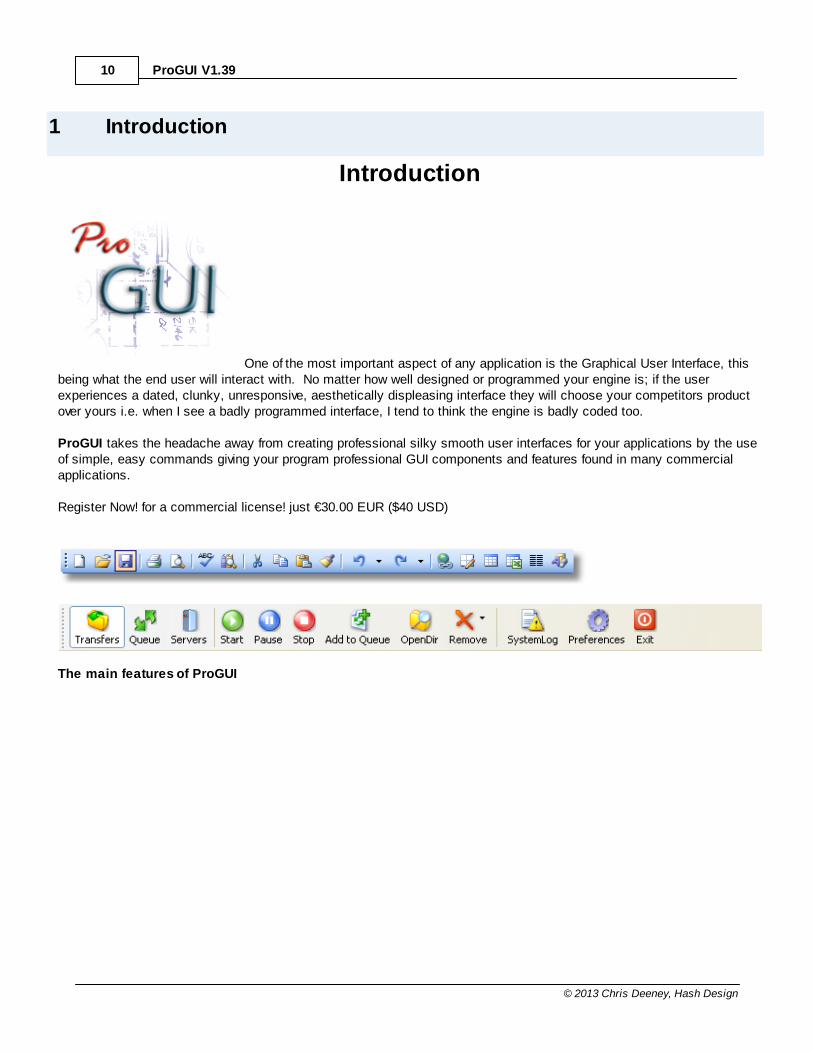
One of the most important aspect of any application is the Graphical User Interface, thisbeing what the end user will interact with. No matter how well designed or programmed your engine is; if the userexperiences a dated, clunky, unresponsive, aesthetically displeasing interface they will choose your competitors productover yours i.e. when I see a badly programmed interface, I tend to think the engine is badly coded too.
ProGUI takes the headache away from creating professional silky smooth user interfaces for your applications by the useof simple, easy commands giving your program professional GUI components and features found in many commercialapplications.
Register Now! for a commercial license! just €30.00 EUR ($40 USD)
The main features of ProGUI
Introduction 11
© 2013 Chris Deeney, Hash Design
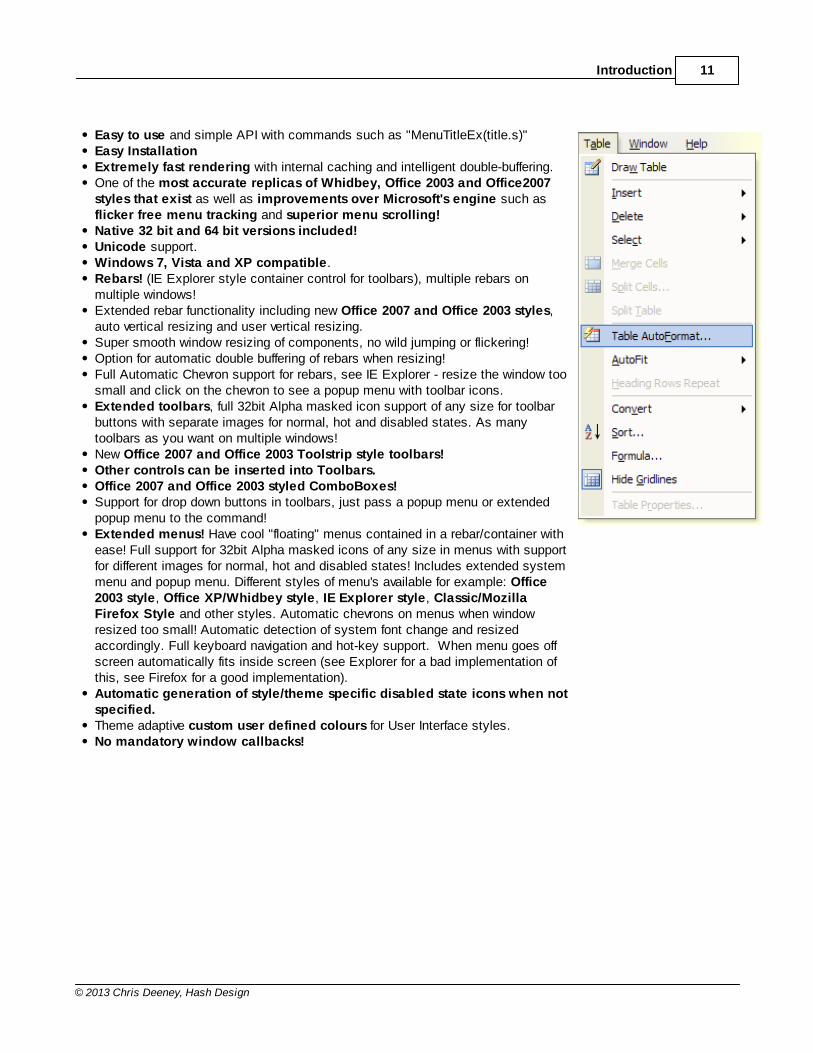
Easy to use and simple API with commands such as "MenuTitleEx(title.s)"Easy InstallationExtremely fast rendering with internal caching and intelligent double-buffering.One of the most accurate replicas of Whidbey, Office 2003 and Office2007styles that exist as well as improvements over Microsoft's engine such asflicker free menu tracking and superior menu scrolling!Native 32 bit and 64 bit versions included!Unicode support.Windows 7, Vista and XP compatible.Rebars! (IE Explorer style container control for toolbars), multiple rebars onmultiple windows!Extended rebar functionality including new Office 2007 and Office 2003 styles,auto vertical resizing and user vertical resizing.Super smooth window resizing of components, no wild jumping or flickering!Option for automatic double buffering of rebars when resizing!Full Automatic Chevron support for rebars, see IE Explorer - resize the window toosmall and click on the chevron to see a popup menu with toolbar icons.Extended toolbars, full 32bit Alpha masked icon support of any size for toolbarbuttons with separate images for normal, hot and disabled states. As manytoolbars as you want on multiple windows!New Office 2007 and Office 2003 Toolstrip style toolbars!Other controls can be inserted into Toolbars.Office 2007 and Office 2003 styled ComboBoxes!Support for drop down buttons in toolbars, just pass a popup menu or extendedpopup menu to the command!Extended menus! Have cool "floating" menus contained in a rebar/container withease! Full support for 32bit Alpha masked icons of any size in menus with supportfor different images for normal, hot and disabled states! Includes extended systemmenu and popup menu. Different styles of menu's available for example: Office2003 style, Office XP/Whidbey style, IE Explorer style, Classic/MozillaFirefox Style and other styles. Automatic chevrons on menus when windowresized too small! Automatic detection of system font change and resizedaccordingly. Full keyboard navigation and hot-key support. When menu goes offscreen automatically fits inside screen (see Explorer for a bad implementation ofthis, see Firefox for a good implementation).Automatic generation of style/theme specific disabled state icons when notspecified.Theme adaptive custom user defined colours for User Interface styles.No mandatory window callbacks!


License
Part
II
ProGUI V1.3914
© 2013 Chris Deeney, Hash Design
2 License
License
License agreement for ProGUI. You must read this License agreement before continuing with the installation of thissoftware. Continue with the installation only when you have read and accepted the terms of this license agreement.
This License agreement is made between Chris Deeney and the user of ProGUI. You must agree to the following:
1) No portion of the ProGUI binaries may be disassembled, reverse engineered, decompiled, modified or altered.
2) This package is supplied 'as is' and no liability will be accepted by Chris Deeney or any legal vendors of this software forany damage incurred by the use of this software.
3) The ProGUI binaries/package can be distributed freely and in anyway with your application/program.
4) Neither directly nor indirectly can you disclose, distribute, sell, rent, lease, lend, reproduce or copy your ProGUIregistration key codes to anyone.
5) The creation of DLLs/Libraries whose primary function is to serve as a 'wrapper' for ProGUI functions is explicitlyforbidden.
Copyright: ProGUI is copyright © 2005 - 2012 by Chris Deeney. All rights reserved. This computer program is protected by copyrightlaw and international treaties.
Disclaimer:This package is distributed 'as is' and no claims are made as to it's suitability for any purpose, if any. Chris Deeney doesnot assume any responsibility for lost or damaged files, memory, or registry entries. Users installing this software do soon such an understanding.
Requirements
Part
III
ProGUI V1.3916
© 2013 Chris Deeney, Hash Design
3 Requirements
System requirements
ProGUI can be used with any programming language that supports DLL calls, providing there is a wrapper include for thatparticular language.
Currently Purebasic, AutoIt and Blitzmax are the only languages that are officially supported.
Installation &Usage
Part
IV
ProGUI V1.3918
© 2013 Chris Deeney, Hash Design
4 Installation & Usage
Installation & Usage
Installation for PureBasic V5.20 LTS
In order to use ProGUI with your program you can use either the DLL version or the User Library version.
DLL Usage
Simply copy the ProGUI.dll (or ProGUI64.dll if your PureBasic installation is 64 bit) and ProGUI_PB.pb includefile from the archive into your working directory. Alternatively you can copy the ProGUI.dll/ProGUI64.dll to your"Windows\System32" directory and then it will be available to all applications and programs you write.
At the top of your code listing you should enter:
IncludeFile "ProGUI_PB.pb"
Note The ProGUI.dll/ProGUI64.dll must be distributed with your compiled application in order for yourprogram to access ProGUI functions.
User Library Installation
Simply copy the ProGUI (or ProGUI64 if your PureBasic installation is 64 bit) library file from the "UserLibrary\"directory of the archive to your "PureBasic\PureLibraries\UserLibraries" folder. Copy the ProGUI.res file from the"UserLibrary\" directory of the archive to your "PureBasic\Residents" folder. ProGUI will now be installed andready for use next time you start PureBasic.
The UserLibrary is a multi-library and includes Thread safe, Unicode and Unicode Thread Safe versions. Residentsource code is also supplied if in the unlikely event you encounter that some API constants have already beendefined.
Help File Installation
Copy this help file (ProGUI.chm) to your "PureBasic\Help\" directory for context hot-key help in your IDE.( Note if the Help directory in the PureBasic folder does not exist then simply create it. )
Before you can use any of the ProGUI commands (with the exception of ProGUIVersion) you must first initializeProGUI with the StartProGUI command:
StartProGUI("", 0, 0, 0, 0, 0, 0, 0)
Now you are ready to begin!
Installation for BlitzMax V1.41
In order to use ProGUI with your program you must distribute the DLL version with your program.
DLL Usage
Simply copy the ProGUI.dll and ProGUI_BlitzMax.bmx include file from the archive into your working directory.
Installation & Usage 19
© 2013 Chris Deeney, Hash Design
Alternatively you can copy the ProGUI.dll to your "Windows\System32" directory and then it will be available to allapplications and programs you write.
At the top of your code listing you should enter:
Include "ProGUI_BlitzMax.bmx"
Note The ProGUI.dll must be distributed with your compiled application in order for your program to accessProGUI functions.
Before you can use any of the ProGUI commands (with the exception of ProGUIVersion) you must first initializeProGUI with the StartProGUI command:
StartProGUI("", 0, 0, 0, 0, 0, 0, 0)
Now you are ready to begin!

BlitzMax Syntax
Part
V

ProGUI V1.3922
© 2013 Chris Deeney, Hash Design
5 BlitzMax Syntax
BlitzMax Syntax
PureBasic syntax is used to document all commands in this manual. Use the following chart to translate the BlitzMaxdata types:
Type PureBasic BlitzMax
Int variable.i variable:IntLong variable.l variable:IntString variable.s variable:String

ReferenceManual
Part
VI

ProGUI V1.3924
© 2013 Chris Deeney, Hash Design
6 Reference Manual
General
Various commands that aren't specificallycategorized.
MenuEx
Extended Menus are "floating" menussupporting full 32bit alpha masked icons, PNG,JPG and other image formats of any size,various styles (Office 2007, Office 2003, OfficeXP/Whidbey, ...), full keyboard navigation &automatic hot-key support, multi-monitorsupport and ability to be contained within arebar or container plus more!
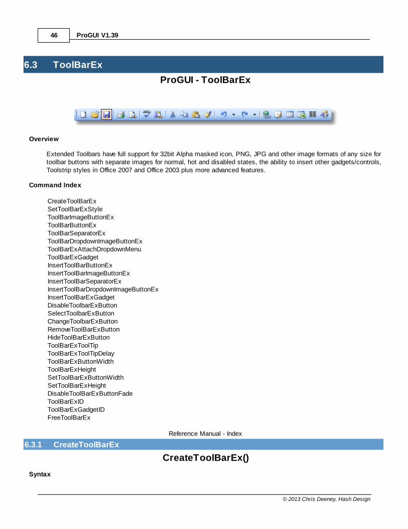
ToolBarEx
Extended Toolbars have full support for 32bitAlpha masked icon, PNG, JPG and otherimage formats of any size for toolbar buttonswith separate images for normal, hot anddisabled states, the ability to insert othergadgets/controls, Toolstrip styles in Office 2007and Office 2003 plus more advanced features.
Rebar
Rebars act as containers for other controlssuch as toolbars. The controls are containedin bands which can be resized and moved. ProGUI extends the functionality of rebars byadding automatic vertical resizing and manualresizing of bands with the mouse plus fullautomatic chevron support. Rebars alsosupport styles in Office 2007 and Office 2003.
TextControlEx
TextControlEx is an advanced static text/textbox control and allows your application todisplay text labels with the following features:Transparent background (no ugly solidbackground colour), coloured text andbackground, gradient coloured backgrounds,anti-aliased text, border padding, multi-linesupport, hyperlinks and "escape code" effectssuch as bold, italic, underline...
PanelEx
PanelEx is a fully nestable, powerful andversatile container control with multiple pages;ideal for displaying different sets of controlsdepending on user input such as a preferencessection in your application or can be easilyused as a building block for other morecomplex controls. Each page can have adifferent gradient/theme background and/orcombined with a background image, alphamasked image border and optional secondoverlay background and/or image combo, eachpage also supports automatic scrolling of pagecontents and automatic double buffering ofProGUI components inside including anygraphical alpha effects.
Reference Manual 25
© 2013 Chris Deeney, Hash Design
ButtonEx
ButtonEx, ImageButtonEx, ToggleButtonEx,RadioButtonEx and CheckButtonEx are easy touse skinned and borderless image button controlssupporting 32bit alpha transparent images/icons,separate images for various states (including:normal, hot/hover, pressed and disabled states)and tooltips.
ExplorerBar
The ExplorerBar is a highly customizable skinnednavigation/menu control used for displaying a list ofcategorized options/items by group which can becollapsed or un-collapsed (supporting smoothsliding animation with alpha fade transparency).The ExplorerBar has a default system skin and anOffice 2007 default skin.
SplitterEx
SplitterEx is a highly customizable skinned splittercontrol used for splitting up areas of your interface(which can be resized by dragging the splitter bar).The SplitterEx has 2 default system skins and anOffice 2007 default skin. The SplitterEx alsosupports an "anchoring" feature.
Colours & Images
Various commands for setting/retrievingrendering style colours/gradients and imagemanipulation and effects.
Skins
Skins allow ProGUI controls/components (and usermade controls) to be easily and quickly 'skinned' toa particular graphical style whilst being highlycustomizable. Includes various commands forcreating, loading, saving and manipulating skins.

ProGUI V1.3926
© 2013 Chris Deeney, Hash Design
6.1 General
ProGUI - General
Overview
Various commands that don't fit into a particular category.
Command Index
ProGUIVersionStartProGUIChangeListiconSubIconLoadFontExGetFontNameGetFontSizeSetWindowFontFreeFontExHotKeyOpenWindowExLimitWindowSizeLWordHWord
Reference Manual - Index
6.1.1 ProGUIVersion
ProGUIVersion()
Syntax
Version.f = ProGUIVersion()
Description
Returns the current version of ProGUI as a float, useful for making sure your application isn't using an outdatedversion of ProGUI.
General Index
6.1.2 StartProGUI
StartProGUI()
Syntax
StartProGUI(UserName$, KeyCode1, KeyCode2, KeyCode3, KeyCode4, KeyCode5, KeyCode6, KeyCode7)
Description
Initiates ProGUI for use. This must be the first command that is called with the exception of ProGUIVersion.ProGUI defaults to trial mode if incorrect keycodes are entered.
Reference Manual 27
© 2013 Chris Deeney, Hash Design
Example:
IncludeFile "ProGUI_PB.pb"
StartProGUI("", 0, 0, 0, 0, 0, 0, 0)
General Index
6.1.3 ChangeListiconSubIcon
ChangeListiconSubIcon()
Syntax
ChangeListiconSubIcon(Listicon.i, Itempos.l, Subitempos.l, *Image)
Description
Adds or changes a listview's sub icon.
Listicon.i is the ID of the listicon gadget to alter. Itempos.l specifies the row of the listview, Subitempos.l specifiesthe column and *Image is a pointer to the image data to add or replace the icon.
General Index
6.1.4 LoadFontEx
LoadFontEx()
Syntax
FontHandle (HFONT) = LoadFontEx(Name.s, PointSize.l, Flags.i)
Description
Loads a font ready for use. Name.s is the name of the font such as "Verdana" and PointSize.l is the desired size.
Flags.i can contain the following constants:
#Font_Bold Makes the font bold.
#Font_Italic Makes the font italic.
#Font_Underline Makes the font have an underline.
#Font_StrikeOut Makes the font have a strike-through line in the middle.
#Font_Antialiased The font is antialiased, or smoothed, if the font supportsit and the size of the font is not too small or too large.
#Font_NonAntialiased The font is never antialiased, that is, font smoothing isnot done.
#Font_Cleartype If set, text is rendered (when possible) using ClearTypeantialiasing method.
#Font_Draft For GDI raster fonts, scaling is enabled, which means
ProGUI V1.3928
© 2013 Chris Deeney, Hash Design
that more font sizes are available, but the quality may belower. Bold, italic, underline, and strikeout fonts aresynthesized, if necessary.
The font can later be freed when not needed anymore using the FreeFontEx command.
Returns a handle to the font (HFONT) or zero for failure.
General Index
6.1.5 GetFontName
GetFontName()
Syntax
FaceName.s = GetFontName(FontID.i)
Description
Returns the face name of a font. FontID.i is a Windows font object handle or ID.
General Index
6.1.6 GetFontSize
GetFontSize()
Syntax
PointSize.l = GetFontSize(FontID.i)
Description
Returns the point size of a font. FontID.i is a Windows font object handle or ID.
General Index
6.1.7 SetWindowFont
SetWindowFont()
Syntax
SetWindowFont(Hwnd.i, Font.i)
Description
Sets the font that a common control is to use when drawing text. Hwnd.i is the handle of the control's window andFont.i is the handle (HFONT) of the desired font.
General Index

Reference Manual 29
© 2013 Chris Deeney, Hash Design
6.1.8 FreeFontEx
FreeFontEx()
Syntax
Success = FreeFontEx(Font.i)
Description
Removes a font from memory. Font.i is the handle (HFONT) of the desired font.
Returns nonzero for success, zero for failure.
General Index
6.1.9 HotKey
HotKey()
Syntax
Success = HotKey(WindowID.i, ID.w, Key$)
Description
Associates or removes a keyboard hot-key combination with a WindowID (HWND). ID is the identifier of the #WM_COMMAND message that will be posted to WindowID's message queue or if WindowID is zero then the hot-keywill be an application global hot-key and will be posted to the thread's active root window. ID can also be '-1' toremove/disable the hot-key described in Key$.
Key$ is a text string describing the key combination that triggers the posted ID. Key$ can be written in practicallyany format, for example "Ctrl+S" would trigger ID to be posted when the Control key and 'S' keys are pressed. Thespace character and following list of characters are supported as key name delimiters:-
+ | - , . ~ ̂ / \ : ;
The Control key, Alt key and Shift key can be combined with any of the alphanumeric keys or following special keydescriptions: -
"back""tab""clear""return""ret""enter""ent""pause""capital""caps""capslock""escape""esc""space""prior"
"prtsc""insert""ins""delete""del""help""leftwindows""rightwindows""leftwin""rightwin""lwin""rwin""apps""numpad0""numpad1"
"num7""num8""num9""pad0""pad1""pad2""pad3""pad4""pad5""pad6""pad7""pad8""pad9""multiply""add"
"f12""f13""f14""f15""f16""f17""f18""f19""f20""f21""f22""f23""f24""numlock""scroll"
ProGUI V1.3930
© 2013 Chris Deeney, Hash Design
"next""pageup""pagedown""pgup""pgdn""end""home""left""up""right""down""select""print""execute""snapshot"
"numpad2""numpad3""numpad4""numpad5""numpad6""numpad7""numpad8""numpad9""num0""num1""num2""num3""num4""num5""num6"
"separator""subtract""decimal""divide""f1""f2""f3""f4""f5""f6""f7""f8""f9""f10""f11"
"plus""minus""comma""period"
If Key$ is an empty string then all the hot-keys for that window (or all global hot-keys if WindowID is equal to zero)will be cleared.
Returns true for success, zero for failure.
General Index
6.1.10 OpenWindowEx
OpenWindowEx()
Syntax
WindowID (HWND) = OpenWindowEx(Title$, x, y, InnerWidth, InnerHeight, Flags.i, Skin.i, ParentHwnd.i)
Description
Note this command is currently experimental and unsupported.
Opens/Creates a new window according to the specified parameters. Title$ is the text string that will be displayed inthe window's title bar. x and y are the coordinates of where the new window will be positioned on screen. InnerWidthand InnerHeight specify the required client area (without borders and window decorations).
The new window becomes the active window unless the window is created as invisible.
Skin.i is currently an inactive place-holder parameter there for future expansion.
ParentHwnd.i specifies the handle of the window that our new window will be contained inside and can be null.
Possible flags are: #Window_Minimize Adds the minimize control to the window title bar.#Window_Maximize Adds the maximize control to the window title bar.#Window_Size Adds the sizeable feature to a window.
Reference Manual 31
© 2013 Chris Deeney, Hash Design
#Window_Invisible Creates the window but won't display it.#Window_TitleBar Creates a window with a titlebar.#Window_Tool Creates a window with a smaller titlebar and no taskbar entry. #Window_BorderLess Creates a window without any borders.#Window_ScreenCentered Centers the window in the middle of the screen. x,y parameters are ignored.#Window_WindowCentered Centers the window in the middle of the parent window ('ParentHwnd.i' must bespecified). x,y parameters are ignored.#Window_OpenMaximized Opens the window maximized.#Window_OpenMinimized Opens the window minimized.
Returns a handle (HWND) to the new window or zero for failure.
General Index
6.1.11 LimitWindowSize
LimitWindowSize()
Syntax
LimitWindowSize(WindowID.i, MinWidth.l, MinHeight.l, MaxWidth.l, MaxHeight.l)
Description
Sets the minimum and maximum dimensions that a window (HWND) can be resized to.
General Index
6.1.12 LWord
LWord()
Syntax
LowWord.w = LWord(Long.l)
Description
Returns the low-order word from a 32-bit number.
General Index
6.1.13 HWord
HWord()
Syntax
HighWord.w = HWord(Long.l)
Description
Returns the high-order word from a 32-bit number.
ProGUI V1.3932
© 2013 Chris Deeney, Hash Design
General Index
Reference Manual 33
© 2013 Chris Deeney, Hash Design
6.2 MenuEx
ProGUI - MenuEx
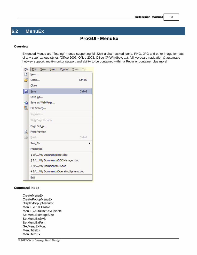
Overview
Extended Menus are "floating" menus supporting full 32bit alpha masked icons, PNG, JPG and other image formatsof any size, various styles (Office 2007, Office 2003, Office XP/Whidbey, ...), full keyboard navigation & automatichot-key support, multi-monitor support and ability to be contained within a Rebar or container plus more!
Command Index
CreateMenuExCreatePopupMenuExDisplayPopupMenuExMenuExF10DisableMenuExAutoHotKeyDisableSetMenuExImageSizeSetMenuExStyleSetMenuExFontGetMenuExFontMenuTitleExMenuItemEx
ProGUI V1.3934
© 2013 Chris Deeney, Hash Design
MenuBarExSetMenuExItemStateGetMenuExItemStateSetMenuItemExGetMenuItemExTextRemoveMenuItemExInsertMenuItemExDisableMenuItemExMenuExIDCalcMenuItemWidthGetMenuExBarHeightFreeMenuEx
Reference Manual - Index
6.2.1 CreateMenuEx
CreateMenuEx()
Syntax
WindowsID.i = CreateMenuEx(MenuID.l, WindowID.i, Style.l)
Description
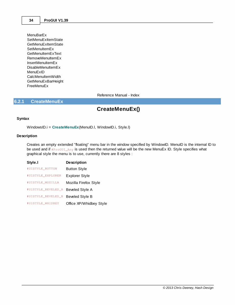
Creates an empty extended "floating" menu bar in the window specified by WindowID. MenuID is the internal ID tobe used and if #ProGUI_Any is used then the returned value will be the new MenuEx ID. Style specifies whatgraphical style the menu is to use, currently there are 8 styles :
Style.l Description
#UISTYLE_BUTTON Button Style
#UISTYLE_EXPLORER Explorer Style
#UISTYLE_MOZILLA Mozilla Firefox Style
#UISTYLE_BEVELED_A Beveled Style A
#UISTYLE_BEVELED_B Beveled Style B
#UISTYLE_WHIDBEY Office XP/Whidbey Style
Reference Manual 35
© 2013 Chris Deeney, Hash Design
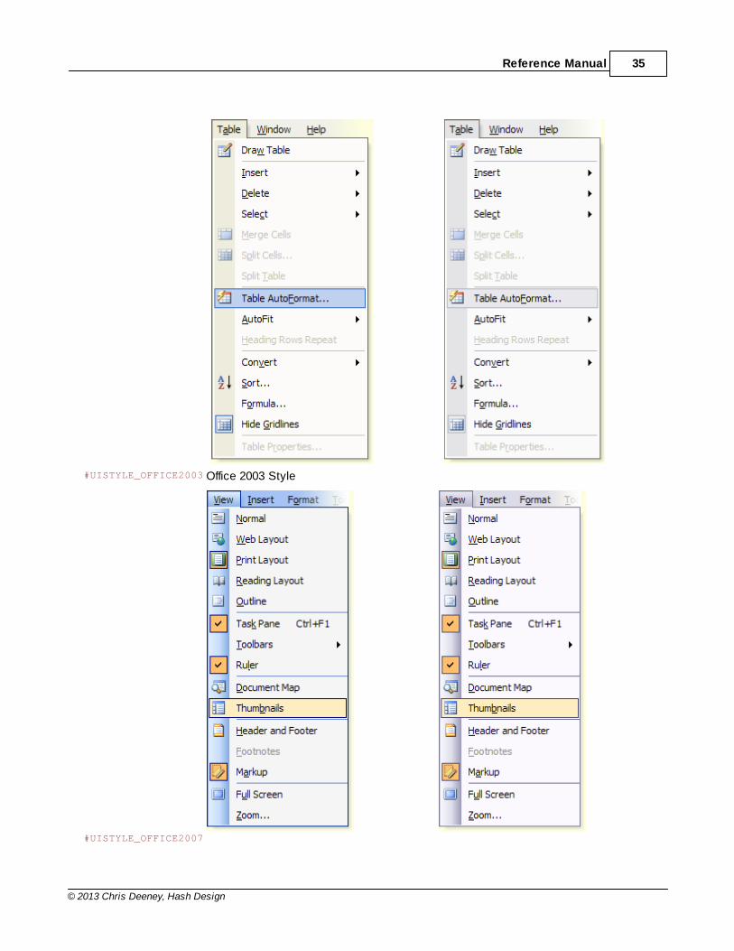
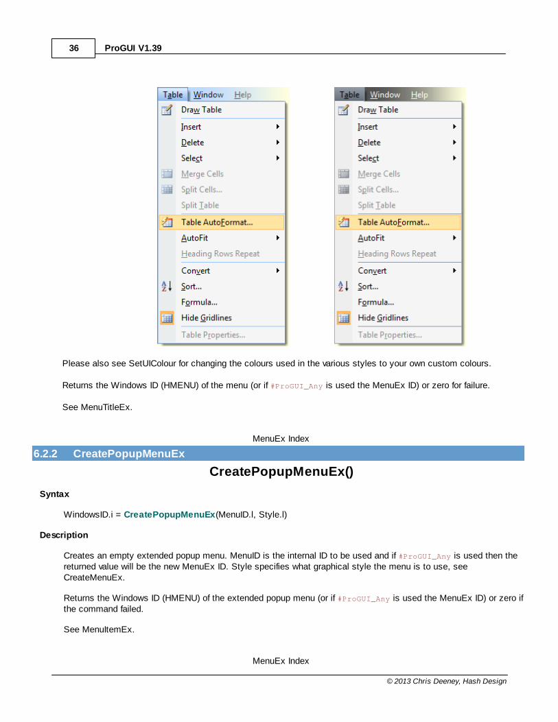
#UISTYLE_OFFICE2003 Office 2003 Style
#UISTYLE_OFFICE2007
ProGUI V1.3936
© 2013 Chris Deeney, Hash Design
Please also see SetUIColour for changing the colours used in the various styles to your own custom colours.
Returns the Windows ID (HMENU) of the menu (or if #ProGUI_Any is used the MenuEx ID) or zero for failure.
See MenuTitleEx.
MenuEx Index
6.2.2 CreatePopupMenuEx
CreatePopupMenuEx()
Syntax
WindowsID.i = CreatePopupMenuEx(MenuID.l, Style.l)
Description
Creates an empty extended popup menu. MenuID is the internal ID to be used and if #ProGUI_Any is used then thereturned value will be the new MenuEx ID. Style specifies what graphical style the menu is to use, seeCreateMenuEx.
Returns the Windows ID (HMENU) of the extended popup menu (or if #ProGUI_Any is used the MenuEx ID) or zero ifthe command failed.
See MenuItemEx.
MenuEx Index

Reference Manual 37
© 2013 Chris Deeney, Hash Design
6.2.3 DisplayPopupMenuEx
DisplayPopupMenuEx()
Syntax
Success = DisplayPopupMenuEx(Menu.i, WindowID.i, X.l, Y.l)
Description
Displays a previously created PopupMenuEx on screen.
Menu.i is the handle or ID of the PopupMenuEx. WindowID.i is the Windows ID of the window you wish the popup tosend the #WM_COMMAND (item's ID) to when an item has been selected. X.l and Y.l are the screen coordinates of thedesired popup position.
Returns true for success.
See CreatePopupMenuEx.
MenuEx Index
6.2.4 MenuExF10Disable
MenuExF10Disable()
Syntax
MenuExF10Disable(disable.b)
Description
Stops ProGUI from activating a MenuEx bar when F10 is pressed on the keyboard. Setting disable.b to true willdisable F10 menu activation.
MenuEx Index
6.2.5 MenuExAutoHotKeyDisable
MenuExAutoHotKeyDisable()
Syntax
MenuExAutoHotKeyDisable(disable.b)
Description
Disables or enables automatic hot-key creation and management of menu item text. Disable.b = True or False.
MenuEx Index
ProGUI V1.3938
© 2013 Chris Deeney, Hash Design
6.2.6 SetMenuExImageSize
SetMenuExImageSize()
Syntax
SetMenuExImageSize(Width.l, Height.l)
Description
Sets the Icon dimensions for Menu Items.
MenuEx Index
6.2.7 SetMenuExStyle
SetMenuExStyle()
Syntax
Success = SetMenuExStyle(Menu.i, Style.l)
Description
Sets a previously created menu's rendering style.
Menu.i is the handle/ID of the MenuEx you wish to change the style of. Style.l is a User Interface graphical styleconstant, see CreateMenuEx for available styles.
Returns true for success, zero for failure.
See CreateMenuEx, CreatePopupMenuEx.
MenuEx Index
6.2.8 SetMenuExFont
SetMenuExFont()
Syntax
Success = SetMenuExFont(FontID.i)
Description
Sets the current font for all Extended Menus.
FontID is a Windows handle or ID to a previously loaded font.
Returns true for success or zero for failure.
See CreateMenuEx, CreatePopupMenuEx, GetFontName, GetFontSize.
MenuEx Index
Reference Manual 39
© 2013 Chris Deeney, Hash Design
6.2.9 GetMenuExFont
GetMenuExFont()
Syntax
Font.i = GetMenuExFont()
Description
Returns a Windows handle to the current MenuEx font.
See SetMenuExFont, GetFontName, GetFontSize.
MenuEx Index
6.2.10 MenuTitleEx
MenuTitleEx()
Syntax
MenuTitleEx(Title$)
Description
Adds a top menu title to the current MenuEx.
If Title$ contains the ampersand character '&', the preceding letter will be underlined and used as the menu title'skeyboard accelerator.For example: "T&able" would be displayed as "Table".
See MenuItemEx.
MenuEx Index
6.2.11 MenuItemEx
MenuItemEx()
Syntax
MenuItemEx(MenuItemID.l, Text$, *NormalImageID, *HotImageID, *DisabledImageID, Submenu.i)
Description
Adds a menu item to the current MenuTitleEx or PopupMenuEx.
MenuItemID specifies the internal ID to be used and will be posted to the parent window's message queue whenselected. MenuItemID can also be #ProGUI_Any in which case the returned value will be the new automaticallygenerated MenuItemID. Text$ is displayed as the menu item's text. NormalImageID, HotImageID andDisabledImageID are pointers to image data that are used to display the menu item in the various states. If*DisabledImageID is null then the disabled state image will be rendered automatically based on *NormalImageID andthe current theme/style.SetMenuExImageSize must be called previously in order to set the dimensions of the menuitem's icon and will default to 16x16 otherwise. In order to make a submenu, simply specify Submenu as the ID or
ProGUI V1.3940
© 2013 Chris Deeney, Hash Design
handle of a previously defined PopupMenuEx.
If Text$ contains the ampersand character '&', the preceding letter will be underlined and used as the menu item'skeyboard accelerator.For example: "Save &As..." would be displayed as "Save As..." (pressing 'A' on the keyboard would then select thisitem).
A hot-key can be automatically displayed and created (see HotKey, MenuExAutoHotKeyDisable) at the right of theitem by including the dollar character '$' in the parameter Text$. Any text that precedes the '$' will be displayed asthe hot-key, for example: "&Save$Ctrl+S" would be displayed in the menu as "Save Ctrl+S" and beautomatically right aligned at the right of the menu with any other hot-keys.If you need to display a dollar character, a double dollar character "$$" will display a single dollar character.
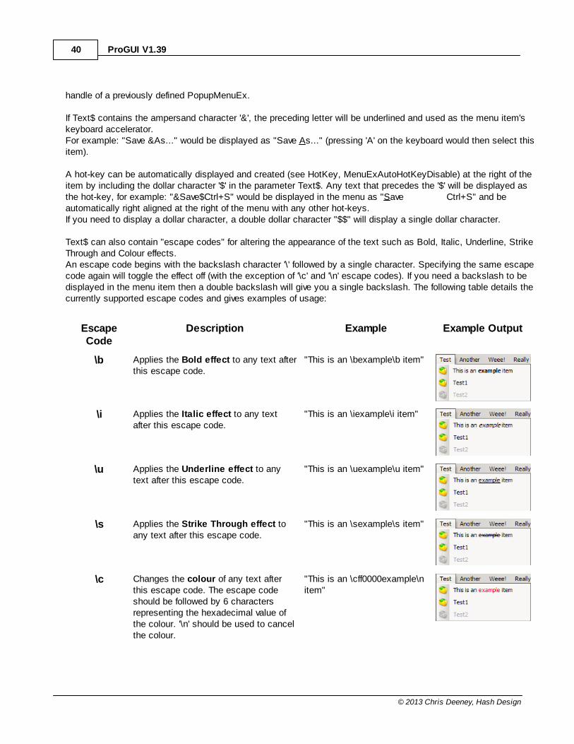
Text$ can also contain "escape codes" for altering the appearance of the text such as Bold, Italic, Underline, StrikeThrough and Colour effects.An escape code begins with the backslash character '\' followed by a single character. Specifying the same escapecode again will toggle the effect off (with the exception of '\c' and '\n' escape codes). If you need a backslash to bedisplayed in the menu item then a double backslash will give you a single backslash. The following table details thecurrently supported escape codes and gives examples of usage:
EscapeCode
Description Example Example Output
\b Applies the Bold effect to any text afterthis escape code.
"This is an \bexample\b item"
\i Applies the Italic effect to any textafter this escape code.
"This is an \iexample\i item"
\u Applies the Underline effect to anytext after this escape code.
"This is an \uexample\u item"
\s Applies the Strike Through effect toany text after this escape code.
"This is an \sexample\s item"
\c Changes the colour of any text afterthis escape code. The escape codeshould be followed by 6 charactersrepresenting the hexadecimal value ofthe colour. '\n' should be used to cancelthe colour.
"This is an \cff0000example\nitem"
Reference Manual 41
© 2013 Chris Deeney, Hash Design
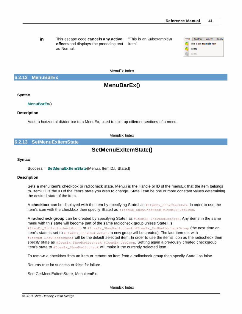
\n This escape code cancels any activeeffects and displays the preceding textas Normal.
"This is an \u\bexample\nitem"
MenuEx Index
6.2.12 MenuBarEx
MenuBarEx()
Syntax
MenuBarEx()
Description
Adds a horizontal divider bar to a MenuEx, used to split up different sections of a menu.
MenuEx Index
6.2.13 SetMenuExItemState
SetMenuExItemState()
Syntax
Success = SetMenuExItemState(Menu.i, ItemID.l, State.l)
Description
Sets a menu item's checkbox or radiocheck state. Menu.i is the Handle or ID of the menuEx that the item belongsto. ItemID.l is the ID of the item's state you wish to change. State.l can be one or more constant values determiningthe desired state of the item.
A checkbox can be displayed with the item by specifying State.l as #ItemEx_ShowCheckbox. In order to use theitem's icon with the checkbox then specify State.l as #ItemEx_ShowCheckbox|#ItemEx_UseIcon.
A radiocheck group can be created by specifying State.l as #ItemEx_ShowRadiocheck. Any items in the samemenu with this state will become part of the same radiocheck group unless State.l is #ItemEx_EndRadiocheckGroup or #ItemEx_ShowRadiocheck|#ItemEx_EndRadiocheckGroup (the next time anitem's state is set to #ItemEx_ShowRadiocheck a new group will be created). The last item set with#ItemEx_ShowRadiocheck will be the default selected item. In order to use the item's icon as the radiocheck thenspecify state as #ItemEx_ShowRadiocheck|#ItemEx_UseIcon. Setting again a previously created checkgroupitem's state to #ItemEx_ShowRadiocheck will make it the currently selected item.
To remove a checkbox from an item or remove an item from a radiocheck group then specify State.l as false.
Returns true for success or false for failure.
See GetMenuExItemState, MenuItemEx.
MenuEx Index

ProGUI V1.3942
© 2013 Chris Deeney, Hash Design
6.2.14 GetMenuExItemState
GetMenuExItemState()
Syntax
State = GetMenuExItemState(Menu.i, ItemID.l)
Description
Returns true if the item is checked or the item is the currently selected checkgroup item. Menu.i is the handle or IDof the menu that the item belongs to and ItemID.l is the ID of the desired item's state.
See SetMenuExItemState, MenuItemEx.
MenuEx Index
6.2.15 SetMenuItemEx
SetMenuItemEx()
Syntax
Success = SetMenuItemEx(Menu.i, ItemID.l, Text$, *NormalImageID, *HotImageID, *DisabledImageID, Submenu.i)
Description
Alters/updates a previously created menu item.
Menu.i is the handle/ID of the menu. ItemID.l is the ID of the item you wish to change. Text$ is the new text youwant the item to display and can contain rendering effect "escape codes" (see MenuItemEx). *NormalImageID,*HotImageID and *DisabledImageID are optional pointers to the new image data for the item and can be null.Submenu.i is the optional handle/ID of the new sub menu to be attached and can be null.
Any hot-key previously automatically created for this menu item will be removed, and a new one created if Text$contains a hot-key.
Returns true for success or false for failure.
See MenuItemEx.
MenuEx Index
6.2.16 GetMenuItemExText
GetMenuItemExText()
Syntax
Text$ = GetMenuItemExText(Menu.i, ItemID.l)
Description
Returns a menu item's text.
Menu.i is the handle/ID of the menu the item belongs to. ItemID.l is the desired item to retrieve the text from.
Reference Manual 43
© 2013 Chris Deeney, Hash Design
See SetMenuItemEx, MenuItemEx.
MenuEx Index
6.2.17 RemoveMenuItemEx
RemoveMenuItemEx()
Syntax
Success = RemoveMenuItemEx(Menu.i, ItemID.l, byPosition.b)
Description
Removes a menu item from a MenuEx.
Menu is the handle/ID of the menu you wish to remove the item from. If byPosition.b is false, ItemID.l is the ID of thedesired item to remove. If byPosition.b is true then ItemID.l is the index of the item to remove, zero being the firstitem in the menu.
Any hot-key automatically created for this menu item will also be removed.
Returns nonzero for success or zero for failure.
See InsertMenuItemEx, MenuItemEx.
MenuEx Index
6.2.18 InsertMenuItemEx
InsertMenuItemEx()
Syntax
Success = InsertMenuItemEx(Menu.i, Position.l, NewItemID.l, Text$, *NormalImageID, *HotImageID,*DisabledImageID, Submenu.i)
Description
Inserts a new menu item into a previously created MenuEx.
Menu.i is the handle/ID of the menu. Position.l is the index in the menu of where you would like the new item to beinserted (zero being the first item). Specifying '-1' for Position.l will place the new item at the end of the menu.NewItemID.l is the ID you would like to associate with the item. Text$ is the new text you want the item to displayand can contain rendering effect "escape codes" (see MenuItemEx). *NormalImageID, *HotImageID and*DisabledImageID are optional pointers to the icon image data for the item and can be null. Submenu.i is theoptional handle/ID of the new sub menu to be attached and can be null.
Returns true for success or false for failure.
See RemoveMenuItemEx, MenuItemEx, CreateMenuEx, CreatePopupMenuEx.
MenuEx Index
ProGUI V1.3944
© 2013 Chris Deeney, Hash Design
6.2.19 DisableMenuItemEx
DisableMenuItemEx()
Syntax
Success = DisableMenuItemEx(Menu.i, ItemID.l, State.b)
Description
Sets a menu item's disabled state. Menu specifies the MenuID/Handle of the menu containing the item to bedisabled/enabled. ItemID specifies the ID of the item. State can be none zero to disable the menu item or zero toenable the menu item.
Any hot-key automatically created for this menu item will also be disabled/enabled.
Returns none zero if successful.
MenuEx Index
6.2.20 MenuExID
MenuExID()
Syntax
WindowsID.i = MenuExID(MenuID.l)
Description
Returns the Windows ID of a MenuEx internal MenuID.
MenuEx Index
6.2.21 CalcMenuItemWidth
CalcMenuItemWidth()
Syntax
MenuWidth.l = CalcMenuItemWidth(Menu.i)
Description
Calculates and returns the width of a menu (in pixels) specified by Menu.i. Menu.i can be a WindowsID or MenuID.Useful for calculating dimensions before a menu is created.
MenuEx Index
6.2.22 GetMenuExBarHeight
GetMenuExBarHeight()
Syntax
Reference Manual 45
© 2013 Chris Deeney, Hash Design
Height.l = GetMenuExBarHeight(Menu.i)
Description
Returns the height of a MenuEx title bar.
Menu is the handle/ID of the menu title bar you wish to retrieve the height from.
MenuEx Index
6.2.23 FreeMenuEx
FreeMenuEx()
Syntax
Success = FreeMenuEx(Menu.i)
Description
Removes the specified MenuEx (or all) freeing any memory used. Menu.i can be a Handle/MenuID or -1 in order tofree all menus.
Returns True for success, zero for failure.
MenuEx Index
ProGUI V1.3946
© 2013 Chris Deeney, Hash Design
6.3 ToolBarEx
ProGUI - ToolBarEx
Overview
Extended Toolbars have full support for 32bit Alpha masked icon, PNG, JPG and other image formats of any size fortoolbar buttons with separate images for normal, hot and disabled states, the ability to insert other gadgets/controls,Toolstrip styles in Office 2007 and Office 2003 plus more advanced features.
Command Index
CreateToolBarExSetToolBarExStyleToolBarImageButtonExToolBarButtonExToolBarSeparatorExToolBarDropdownImageButtonExToolBarExAttachDropdownMenuToolBarExGadgetInsertToolBarButtonExInsertToolBarImageButtonExInsertToolBarSeparatorExInsertToolBarDropdownImageButtonExInsertToolBarExGadgetDisableToolbarExButtonSelectToolbarExButtonChangeToolbarExButtonRemoveToolBarExButtonHideToolBarExButtonToolBarExToolTipToolBarExToolTipDelayToolBarExButtonWidthToolBarExHeightSetToolBarExButtonWidthSetToolBarExHeightDisableToolBarExButtonFadeToolBarExIDToolBarExGadgetIDFreeToolBarEx
Reference Manual - Index
6.3.1 CreateToolBarEx
CreateToolBarEx()
Syntax

Reference Manual 47
© 2013 Chris Deeney, Hash Design
WindowsID = CreateToolBarEx(ID.l, WindowID.i, IconWidth.l, IconHeight.l, Style.l)
Description
Creates an empty extended toolbar in the window specified by WindowID. ID is the internal ID to be used and if#ProGUI_Any is used then the returned value will be the new ToolBarEx ID. IconWidth and IconHeight are thedimensions of the image buttons you would like (if any).
Style is optional and can contain the following flags:
#TBSTYLE_HIDECLIPPEDBUT
TONSHides the toolbar buttons when the containing window's edge obscures them.
#UISTYLE_OFFICE2003 Creates a Toolstrip Office 2003 style toolbar when contained within a rebar with thesame style applied.
#UISTYLE_OFFICE2007 Creates a Toolstrip Office 2007 style toolbar when contained within a rebar with thesame style applied.
#UISTYLE_IMAGE Removes all padding around the toolbar buttons and removes the button border.
Please also see SetUIColour for changing the colours used in the various styles to your own custom colours.
Style can also contain other flags, see Microsoft MSDN for details.
Returns the Windows ID of the toolbar ( or if #ProGUI_Any is used the ToolBarEx ID ) or zero for failure.
See ToolBarImageButtonEx, ToolBarButtonEx, ToolBarDropdownImageButtonEx.
ToolBarEx Index
6.3.2 SetToolBarExStyle
SetToolBarExStyle()
Syntax
Success = SetToolBarExStyle(Toolbar.i, Style.l)
Description
Used to change a previously created toolbar's graphical style.
Toolbar.i specifies the Handle/ToolbarID of the ToolBarEx. Style.l is a User Interface graphical style constant, seeCreateToolbarEx for details.
Returns True if successful, or False otherwise.
ToolBarEx Index
6.3.3 ToolBarImageButtonEx
ToolBarImageButtonEx()
Syntax

ProGUI V1.3948
© 2013 Chris Deeney, Hash Design
Success = ToolBarImageButtonEx(ButtonID.l, Text$, *NormalImageID, *HotImageID, *DisabledImageID, Style.l)
Description
Adds an image button to the current ToolBarEx.
ButtonID specifies the internal ID to be used and if #ProGUI_Any is used then the returned value will be the newButton ID. Text$ is displayed as the button's label and can contain escape-code effects (see MenuItemEx fordetails). *NormalImageID, *HotImageID and *DisabledImageID are pointers to image data that are used to display thebutton in the various states. If *DisabledImageID is null then the disabled state image will be rendered automaticallybased on *NormalImageID and the current theme/style.
Style.l specifies the optional Windows flags for the button and can include any of the following:
#BTNS_BUTTON
#BTNS_SEP
#BTNS_CHECK
#BTNS_GROUP
#BTNS_CHECKGROUP
#BTNS_DROPDOWN
#BTNS_AUTOSIZE
#BTNS_NOPREFIX
#BTNS_SHOWTEXT
#BTNS_WHOLEDROPDOWN
See Microsoft MSDN for details.
Returns zero for failure or the Button ID for success.
ToolBarEx Index
6.3.4 ToolBarButtonEx
ToolBarButtonEx()
Syntax
Success = ToolBarButtonEx(ButtonID.l, Text$, Style.l)
Description
Adds a text button to the current ToolBarEx.
ButtonID specifies the internal ID to be used and if #ProGUI_Any is used then the returned value will be the newButton ID. Text$ is displayed as the button's label and can contain escape-code effects (see MenuItemEx fordetails). Style.l specifies the optional Windows flags for the button and can include any of the following:
#BTNS_BUTTON
#BTNS_SEP
#BTNS_CHECK
#BTNS_GROUP
#BTNS_CHECKGROUP
#BTNS_DROPDOWN
#BTNS_AUTOSIZE
#BTNS_NOPREFIX
#BTNS_SHOWTEXT
#BTNS_WHOLEDROPDOWN

Reference Manual 49
© 2013 Chris Deeney, Hash Design
See Microsoft MSDN for details.
Returns zero for failure or the Button ID for success.
ToolBarEx Index
6.3.5 ToolBarSeparatorEx
ToolBarSeparatorEx()
Syntax
Success = ToolBarSeparatorEx()
Description
Adds a vertical separator to the current ToolBarEx being constructed.
Returns nonzero if successful.
ToolBarEx Index
6.3.6 ToolBarDropdownImageButtonEx
ToolBarDropdownImageButtonEx()
Syntax
Success = ToolBarDropdownImageButtonEx(ButtonID.l, MenuID.i, Text$, *NormalImageID, *HotImageID,*DisabledImageID, Style.l)
Description
Adds a drop-down image button to the current ToolBarEx. This is like a normal image button except when you clickon the button it displays a popup menu just below it.
This command defaults so that the button will be drawn with a drop-down arrow in a separate section, to the right ofthe button.
ButtonID specifies the internal ID to be used and if #ProGUI_Any is used then the returned value will be the newButton ID. MenuID is the handle/ID of the popup menu you want to attach to the button. Text$ is displayed as thebutton's label and can contain escape-code effects (see MenuItemEx for details). NormalImageID, HotImageID andDisabledImageID are pointers to image data that are used to display the button in the various states. Style.lspecifies the optional Windows flags for the button and can include any of the following:
#BTNS_WHOLEDROPDOWN - Specifies that the button will have a drop-down arrow, but not as a separate section.#BTNS_AUTOSIZE
#BTNS_NOPREFIX
#BTNS_SHOWTEXT
See Microsoft MSDN for details.
Returns zero for failure or the Button ID for success.
ProGUI V1.3950
© 2013 Chris Deeney, Hash Design
ToolBarEx Index
6.3.7 ToolBarExAttachDropdownMenu
ToolBarExAttachDropdownMenu()
Syntax
Success = ToolBarExAttachDropdownMenu(Toolbar.i, ButtonID.l, Menu.i)
Description
Attaches a drop-down popup menu to a ToolBarDropdownImageButtonEx.
Toolbar specifies the WindowsID/ToolbarID of the ToolBarEx. ButtonID specifies the internal ID of the button youwant to attach the menu to. Menu is the WindowsID/MenuID of the popup menu you want to attach to the button.
Returns nonzero if successful.
ToolBarEx Index
6.3.8 ToolBarExGadget
ToolBarExGadget()
Syntax
Success = ToolBarExGadget(ButtonID.l, GadgetID.i, LeftPadding.l, TopPadding.l, RightPadding.l, BottomPadding.l, ApplyUIStyle.b)
Description
Adds a gadget/control to the current ToolBarEx.
ButtonID specifies the internal ID to be used and if #ProGUI_Any is used then the returned value will be the newButton ID. GadgetID.i is the Windows handle (HWND) of the control and can be obtained using the PureBasiccommand GadgetID(). LeftPadding.l, TopPadding.l, RightPadding.l and BottomPadding.l adds padding around thegadget/control at the desired sides (if any). ApplyUIStyle.b if set to True will render the control in the ToolBarEx'sUIStyle if supported. Currently none-image ComboBoxes are supported.
Returns zero for failure or the Button ID for success.
ToolBarEx Index
6.3.9 InsertToolBarButtonEx
InsertToolBarButtonEx()
Syntax
Success = InsertToolBarButtonEx(Toolbar.i, Position.l, ButtonID.l, Text$, Style.l)
Description
Inserts a text button into a ToolBarEx.
Reference Manual 51
© 2013 Chris Deeney, Hash Design
Toolbar.i specifies the handle/ID of the ToolBarEx you want to insert the button into. Position.l is the zero-basedindex of where the button will be inserted and can be -1 in order to append the button to the end of the ToolBarEx.ButtonID specifies the internal ID to be used and if #ProGUI_Any is used then the returned value will be the newButton ID. Text$ is displayed as the button's label and can contain escape-code effects (see MenuItemEx fordetails). Style.l specifies the optional Windows flags for the button, please see ToolBarButtonEx for details.
Returns zero for failure or the Button ID for success.
ToolBarEx Index
6.3.10 InsertToolBarImageButtonEx
InsertToolBarImageButtonEx()
Syntax
Success = InsertToolBarImageButtonEx(Toolbar.i, Position.l, ButtonID.l, Text$, *NormalImageID, *HotImageID,*DisabledImageID, style.l)
Description
Inserts an image button into a ToolBarEx.
Toolbar.i specifies the handle/ID of the ToolBarEx you want to insert the button into. Position.l is the zero-basedindex of where the button will be inserted and can be -1 in order to append the button to the end of the ToolBarEx.ButtonID specifies the internal ID to be used and if #ProGUI_Any is used then the returned value will be the newButton ID. Text$ is displayed as the button's label and can contain escape-code effects (see MenuItemEx fordetails). *NormalImageID, *HotImageID and *DisabledImageID are pointers to image data that are used to display thebutton in the various states. Style.l specifies the optional Windows flags for the button, please see ToolBarImageButtonEx for details.
Returns zero for failure or the Button ID for success.
ToolBarEx Index
6.3.11 InsertToolBarSeparatorEx
InsertToolBarSeparatorEx()
Syntax
Success = InsertToolBarSeparatorEx(Toolbar.i, Position.l)
Description
Inserts a vertical separator into a ToolBarEx.
Toolbar.i specifies the handle/ID of the ToolBarEx you want to insert the separator into. Position.l is the zero-basedindex of where the separator will be inserted and can be -1 in order to append the separator to the end of theToolBarEx.
ProGUI V1.3952
© 2013 Chris Deeney, Hash Design
Returns nonzero if successful.
ToolBarEx Index
6.3.12 InsertToolBarDropdownImageButtonEx
InsertToolBarDropdownImageButtonEx()
Syntax
Success = InsertToolBarDropdownImageButtonEx(Toolbar.i, Position.l, ButtonID.l, MenuID.i, Text$,*NormalImageID, *HotImageID, *DisabledImageID, style.l)
Description
Inserts a drop-down image button into a ToolBarEx. This is like a normal image button except when you click on thebutton it displays a popup menu just below it.
This command defaults so that the button will be drawn with a drop-down arrow in a separate section, to the right ofthe button.
Toolbar.i specifies the handle/ID of the ToolBarEx you want to insert the button into. Position.l is the zero-basedindex of where the button will be inserted and can be -1 in order to append the button to the end of the ToolBarEx.ButtonID specifies the internal ID to be used and if #ProGUI_Any is used then the returned value will be the newButton ID. MenuID is the handle/ID of the popup menu you want to attach to the button. Text$ is displayed as thebutton's label and can contain escape-code effects (see MenuItemEx for details). *NormalImageID, *HotImageID and*DisabledImageID are pointers to image data that are used to display the button in the various states. Style.lspecifies the optional Windows flags for the button, please see ToolBarDropdownImageButtonEx for details.
Returns zero for failure or the Button ID for success.
ToolBarEx Index
6.3.13 InsertToolBarExGadget
InsertToolBarExGadget()
Syntax
Success = InsertToolBarExGadget(Toolbar.i, Position.l, ButtonID.l, GadgetID.i, LeftPadding.l, TopPadding.l,RightPadding.l, BottomPadding.l, ApplyUIStyle.b)
Description
Inserts a gadget/control into a ToolBarEx.
Toolbar.i specifies the handle/ID of the ToolBarEx you want to insert the button into. Position.l is the zero-basedindex of where the button will be inserted and can be -1 in order to append the button to the end of the ToolBarEx.ButtonID specifies the internal ID to be used and if #ProGUI_Any is used then the returned value will be the newButton ID. GadgetID.i is the Windows handle (HWND) of the control and can be obtained using the PureBasiccommand GadgetID(). LeftPadding.l, TopPadding.l, RightPadding.l and BottomPadding.l adds padding around thegadget/control at the desired sides (if any). ApplyUIStyle.b if set to True will render the control in the ToolBarEx'sUIStyle if supported. Currently none-image ComboBoxes are supported.
Reference Manual 53
© 2013 Chris Deeney, Hash Design
Returns zero for failure or the Button ID for success.
ToolBarEx Index
6.3.14 DisableToolbarExButton
DisableToolbarExButton()
Syntax
Success = DisableToolbarExButton(Toolbar.i, ButtonID.l, State)
Description
Disables or enables a ToolBarEx button.
Toolbar specifies the WindowsID/ToolbarID of the ToolBarEx. ButtonID specifies the internal ID of the button youwant to enable/disable. State can be True to disable the button or False to disable it.
Returns True if successful, or False otherwise.
ToolBarEx Index
6.3.15 SelectToolbarExButton
SelectToolbarExButton()
Syntax
Success = SelectToolbarExButton(Toolbar.i, ButtonID.l, State.b)
Description
Selects a ToolBarEx button in a checkgroup.
Toolbar specifies the WindowsID/ToolbarID of the ToolBarEx. ButtonID specifies the internal ID of the button youwant to select. State can be nonzero to select the button or zero to deselect the button.
Returns True if successful, or False otherwise.
ToolBarEx Index
6.3.16 ChangeToolbarExButton
ChangeToolbarExButton()
Syntax
Success = ChangeToolbarExButton(Toolbar.i, ButtonID.l, Text$, *NormalImageID, *HotImageID,*DisabledImageID)
Description
Changes the text and images of the specified button on a ToolBarEx.

ProGUI V1.3954
© 2013 Chris Deeney, Hash Design
Toolbar specifies the WindowsID/ToolbarID of the ToolBarEx. ButtonID specifies the internal ID of the button youwant to select. Text$ is displayed as the button's label and can contain escape-code effects (see MenuItemEx fordetails). NormalImageID, HotImageID and DisabledImageID are pointers to image data that are used to display thebutton in the various states (Specifying -1 will ignore the parameter and the original image data will be kept).
Returns True if successful, or False otherwise.
ToolBarEx Index
6.3.17 RemoveToolBarExButton
RemoveToolbarExButton()
Syntax
Success = RemoveToolbarExButton(Toolbar.i, ButtonID.l, byPosition.b)
Description
Removes a button from a ToolBarEx. If the button is a gadget/control then it will also be hidden and re-parented tothe root window.
Toolbar specifies the WindowsID/ToolbarID of the ToolBarEx. ButtonID specifies the ID or the zero-based index (ifbyPosition.b = True) of the button you want to remove.
Returns True if successful, or False otherwise.
ToolBarEx Index
6.3.18 HideToolBarExButton
HideToolbarExButton()
Syntax
Success = HideToolbarExButton(Toolbar.i, ButtonID.l, Hide.b)
Description
Hides/shows a button in a ToolBarEx (if the button is a gadget/control it will be hidden/shown).
Toolbar specifies the WindowsID/ToolbarID of the ToolBarEx. ButtonID specifies the ID of the button you want tohide or show. Hide.b can be True in order to hide the specified button or False to show.
Returns True if successful, or False otherwise.
ToolBarEx Index
6.3.19 ToolBarExToolTip
ToolBarExToolTip()
Syntax
Reference Manual 55
© 2013 Chris Deeney, Hash Design
Success = ToolBarExToolTip(Toolbar.i, ButtonID.l, Text$)
Description
Associates a tooltip with a toolbar button.
Toolbar specifies the WindowsID/ToolbarID of the ToolBarEx. ButtonID specifies the internal ID of the button youwant to associate the tooltip with. Text$ specifies the tooltip text you want to display. ToolbarExToolTip can becalled again on an already defined tooltip in order to replace the associated Text$. Specifying Text$ as an emptystring will remove the tooltip.
Returns True if successful, or False otherwise.
ToolBarEx Index
6.3.20 ToolBarExToolTipDelay
ToolBarExToolTipDelay()
Syntax
Success = ToolBarExToolTipDelay(toolbar.i, Initial.l, Autopop.l, Reshow.l)
Description
Sets the ToolTip delay values of a ToolbarEx (in milliseconds) specified by toolbar.i which can be a handle or ID.
Initial.l sets the amount of time the mouse pointer must remain stationary within the ToolBarEx's button before thetooltip window appears. To return the initial delay time to its default value, set Initial.l to -1.
Autotpop.l sets the amount of time a tooltip window remains visible if the mouse pointer is stationary within aToolBarEx's button. To return the autopop delay time to its default value, set Autopop.l to -1.
Reshow.l sets the amount of time it takes for subsequent tooltip windows to appear as the mouse pointer movesfrom one ToolbarEx button to another. To return the reshow delay time to its default value, set Reshow.l to -1.
Returns true for success or zero for failure.
ToolBarEx Index
6.3.21 ToolBarExButtonWidth
ToolBarExButtonWidth()
Syntax
Width.l = ToolBarExButtonWidth(Toolbar.i, ButtonID.l)
Description
Returns the width in pixels of a ToolbarEx button/gadget-space specified by Toolbar.i (which can be a handle or ID ofthe ToolBarEx) and ButtonID.l.
ToolBarEx Index
ProGUI V1.3956
© 2013 Chris Deeney, Hash Design
6.3.22 ToolBarExHeight
ToolBarExHeight()
Syntax
Height.l = ToolBarExHeight(Toolbar.i)
Description
Returns the height of a ToolbarEx in pixels specified by Toolbar.i which can be a handle or ID.
ToolBarEx Index
6.3.23 SetToolBarExButtonWidth
SetToolBarExButtonWidth()
Syntax
Success = SetToolBarExButtonWidth(Toolbar.i, ButtonID.l, Width.l)
Description
Sets the width of a ToolbarEx button/gadget.
Toolbar.i is the handle or ID of the ToolBarEx and ButtonID.l is the ID of the button you would like to set the widthfor. Width.l is the new width of the button in pixels.
Returns True for success, zero for failure.
ToolBarEx Index
6.3.24 SetToolBarExHeight
SetToolBarExHeight()
Syntax
Success = SetToolBarExHeight(Toolbar.i, Height.l)
Description
Sets the height of a ToolbarEx.
Toolbar.i is the handle or ID of the ToolBarEx. Height.l is the new height of all the buttons in pixels.
Returns True for success, zero for failure.
ToolBarEx Index
Reference Manual 57
© 2013 Chris Deeney, Hash Design
6.3.25 DisableToolBarExButtonFade
DisableToolBarExButtonFade()
Syntax
Success = DisableToolBarExButtonFade(Toolbar.i)
Description
Disables the fade animation of ToolBarEx buttons under Windows 7/Vista. Toolbar.i is the handle or ID of theToolBarEx.
Returns True if successful, or False otherwise.
ToolBarEx Index
6.3.26 ToolBarExID
ToolBarExID()
Syntax
WindowsID = ToolBarExID(ID.l)
Description
Returns the Windows ID of the specified ToolBarEx.
ToolBarEx Index
6.3.27 ToolBarExGadgetID
ToolBarExGadgetID()
Syntax
WindowsID = ToolBarExGadgetID(Toolbar.i, ButtonID.l)
Description
Returns the Windows ID (HWND) of the specified ToolBarEx gadget/control (ButtonID.l). Toolbar.i can be a handle orID of the ToolBarEx.
ToolBarEx Index
6.3.28 FreeToolBarEx
FreeToolBarEx()
Syntax
Success = FreeToolBarEx(Toolbar.i)
Description
ProGUI V1.3958
© 2013 Chris Deeney, Hash Design
Removes the specified ToolBarEx from memory freeing any memory used. If the ToolBarEx contains any gadgets/controls then they will also be hidden and re-parented to the root window. Toolbar.i can be a WindowsID orToolBarEx ID or -1 in order to free all ToolBarEx's.
Returns True if successful, or False otherwise.
ToolBarEx Index
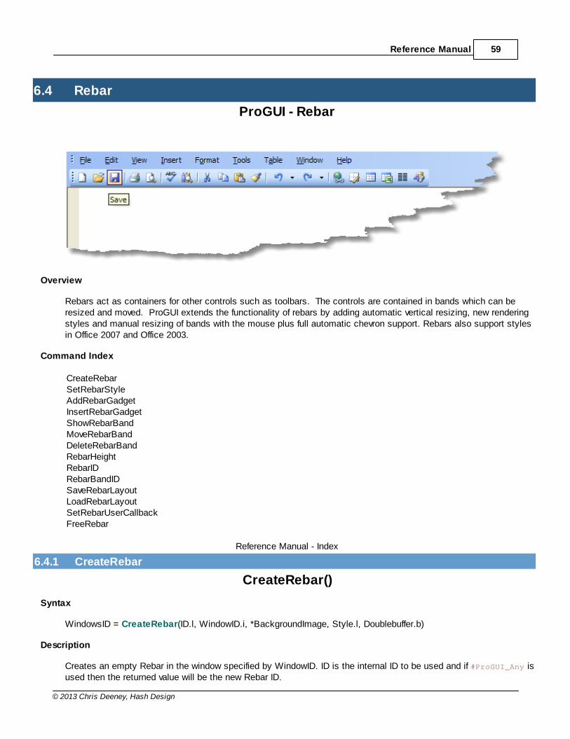
Reference Manual 59
© 2013 Chris Deeney, Hash Design
6.4 Rebar
ProGUI - Rebar
Overview
Rebars act as containers for other controls such as toolbars. The controls are contained in bands which can beresized and moved. ProGUI extends the functionality of rebars by adding automatic vertical resizing, new renderingstyles and manual resizing of bands with the mouse plus full automatic chevron support. Rebars also support stylesin Office 2007 and Office 2003.
Command Index
CreateRebarSetRebarStyleAddRebarGadgetInsertRebarGadgetShowRebarBandMoveRebarBandDeleteRebarBandRebarHeightRebarIDRebarBandIDSaveRebarLayoutLoadRebarLayoutSetRebarUserCallbackFreeRebar
Reference Manual - Index
6.4.1 CreateRebar
CreateRebar()
Syntax
WindowsID = CreateRebar(ID.l, WindowID.i, *BackgroundImage, Style.l, Doublebuffer.b)
Description
Creates an empty Rebar in the window specified by WindowID. ID is the internal ID to be used and if #ProGUI_Any isused then the returned value will be the new Rebar ID.
ProGUI V1.3960
© 2013 Chris Deeney, Hash Design
BackgroundImage is optional and can point to image data used as the Rebar's background.
If Style contains the flag #UISTYLE_OFFICE2003,#UISTYLE_OFFICE2007 the rebar is rendered in the new Office2003/2007 style.Please also see SetUIColour for changing the colours used in the various styles to your own custom colours.Style can also contain optional flags, see Microsoft MSDN for details: -
http://msdn.microsoft.com/en-us/library/bb774377(VS.85).aspx
Specify Doublebuffer as true in order to enable double buffering of rebars. Note bare in mind double buffering usesmore memory and large Rebars can be very slow at refreshing. Double buffering isn't really necessary unless youwant to eliminate all minor flickering.
Returns the Windows ID of the Rebar (or if #ProGUI_Any is used the Rebar ID) or zero for failure.
Whenever the Rebar is updated ProGUI will send a #REBAR_UPDATED event message to the main window's messagequeue. The wParam contains the new height of the Rebar and the lParam contains a handle to the Rebar thattriggered the event.Alternatively a user callback can be set instead with SetRebarUserCallback, this will also receive the#REBAR_UPDATED event message whenever the Rebar is updated.
Rebar Index
6.4.2 SetRebarStyle
SetRebarStyle()
Syntax
Success = SetRebarStyle(Rebar.i, Style.l)
Description
Used to change a previously created Rebar's graphical style.
Rebar.i is the ID or Handle of the rebar. Style.l specifies a User Interface graphical style constant, see CreateRebarfor details.
Returns true for success or false for failure.
Rebar Index
6.4.3 AddRebarGadget
AddRebarGadget()
Syntax
BandID = AddRebarGadget(GadgetID.l, Text$, Width.l, MinWidth.l, Height.l, *BackgroundImage, Style.l)
Description
Adds a gadget to the previously created Rebar.
Reference Manual 61
© 2013 Chris Deeney, Hash Design
GadgetID specifies the Windows ID of a gadget(control/window). Text$ specifies the label that will appear on theband. Width is the desired width of the band, MinWidth is the minimum width the band can be resized to and Heightis the desired height of the band.
BackgroundImage is optional and can point to image data used as the Rebar Band's background.
Style can contain optional flags, see Microsoft MSDN for details: http://msdn.microsoft.com/en-us/library/bb774393(VS.85).aspx
Also, Style can contain these ProGUI specific flags:
#RBBS_SIZEABLE - Automatically resizes the band to fit most of the window.
#RBBS_VERTICALRESIZEABLE - Allows manual user vertical resizing of the band.
#RBBS_FIXEDBMP - When BackgroundImage points to image data this flag will keep the background in a fixed position.
Returns the Band ID of the Rebar or -1 for failure.
Rebar Index
6.4.4 InsertRebarGadget
InsertRebarGadget()
Syntax
BandID = InsertRebarGadget(Rebar.i, Band.l, GadgetID.l, Text$, Width.l, MinWidth.l, Height.l, *BackgroundImage,Style.l)
Description
Inserts a gadget into a previously created Rebar.
Rebar.i is the ID/Handle of the Rebar you wish to insert the gadget into. Band.l is the Index/ID of the band you wishto insert the new gadget before and can be -1 in order to insert the gadget on a new band at the end of the Rebar.
GadgetID specifies the Windows ID of a gadget(control/window). Text$ specifies the label that will appear on theband. Width is the desired width of the band, MinWidth is the minimum width the band can be resized to and Heightis the desired height of the band.
BackgroundImage is optional and can point to image data used as the Rebar Band's background.
Style can contain optional flags, see Microsoft MSDN for details: http://msdn.microsoft.com/en-us/library/bb774393(VS.85).aspx
Also, Style can contain these ProGUI specific flags:
#RBBS_SIZEABLE - Automatically resizes the band to fit most of the window.
#RBBS_VERTICALRESIZEABLE - Allows manual user vertical resizing of the band.
#RBBS_FIXEDBMP - When BackgroundImage points to image data this flag will keep the background in a fixed position.
Returns the new Band ID of the rebar or -1 for failure.
Rebar Index

ProGUI V1.3962
© 2013 Chris Deeney, Hash Design
6.4.5 ShowRebarBand
ShowRebarBand()
Syntax
Success = ShowRebarBand(Rebar.i, Band.i, State)
Description
Shows or hides a Rebar band.
Rebar.i is the ID or Handle of the Rebar. Band.i specifies the band you want to show/hide and can be an index or ID.State specifies the visibility of the band and can be nonzero for visible or zero for hidden.
Returns zero for failure.
Rebar Index
6.4.6 MoveRebarBand
MoveRebarBand()
Syntax
Success = MoveRebarBand(Rebar.i, SourceBandIndex.l, DestinationBandIndex.l)
Description
Moves a Rebar band to a new zero based index position.
Rebar.i is the ID/Handle of the Rebar. SourceBandIndex.l is the zero based position of the band that you wish tomove. DestinationBandIndex.l is the destination zero based position.
Returns nonzero for success, zero for failure.
Rebar Index
6.4.7 DeleteRebarBand
DeleteRebarBand()
Syntax
Success = DeleteRebarBand(Rebar.i, Band.l)
Description
Deletes a Rebar band.
Rebar.i is the ID or Handle of the Rebar. Band.l specifies the band you want to delete and can be an index or ID.
Returns true for success or zero for failure.
Reference Manual 63
© 2013 Chris Deeney, Hash Design
Rebar Index
6.4.8 RebarHeight
RebarHeight()
Syntax
Height.l = RebarHeight(Rebar.i)
Description
Returns the height in pixels of a Rebar. Rebar.i can either be a handle to the Rebar or an internal ID.
Rebar Index
6.4.9 RebarID
RebarID()
Syntax
WindowsID.l = RebarID(ID.l)
Description
Returns the Windows ID of a Rebar's internal ID.
Rebar Index
6.4.10 RebarBandID
RebarBandID()
Syntax
BandID.l = RebarBandID(Rebar.i, Index.l)
Description
Returns the ID of a Rebar's band.
Rebar.i is the ID/Handle of the Rebar. Index.l is the zero based position of the band.
Rebar Index
6.4.11 SaveRebarLayout
SaveRebarLayout()
Syntax
Success = SaveRebarLayout(Rebar.i, Path.s)
ProGUI V1.3964
© 2013 Chris Deeney, Hash Design
Description
Saves the layout of a Rebar's bands in XML format to the file specified in Path.s
Rebar.i is the ID/Handle of the Rebar. Path.s specifies where and what the Rebar layout will be saved as.
Returns true for success, zero for failure.
Rebar Index
6.4.12 LoadRebarLayout
LoadRebarLayout()
Syntax
Success = LoadRebarLayout(Rebar.i, LayoutFilename.s)
Description
Loads a previously saved Rebar's layout.
Rebar.i is the ID/Handle of the Rebar to update. LayoutFilename.s specifies the Rebar layout file to be loaded.
Returns true for success, zero for failure.
Rebar Index
6.4.13 SetRebarUserCallback
SetRebarUserCallback()
Syntax
*oldCallback = SetRebarUserCallback(Rebar.i, *UserCallback)
Description
Sets a Rebar's user callback procedure, used for notification of when a Rebar is updated or height changes.
Rebar.i is the ID/Handle of the rebar. *UserCallBack must point to a procedure in your code with the followingstructure: - Procedure myRebarCallback(window, message, wParam, lParam)
Select message
Case #REBAR_UPDATED
ResizeGadget(gadget, 0, wParam, WindowWidth(#Window_0), WindowHeight(#Window_0)-wParam)
EndSelect
EndProcedure

Reference Manual 65
© 2013 Chris Deeney, Hash Design
Whenever the Rebar is updated ProGUI will send a #REBAR_UPDATED event message to the user callback. ThewParam contains the new height of the Rebar and the lParam contains a handle to the Rebar that triggered theevent.
Returns a pointer to the old user callback (zero if there wasn't one) or -1 for failure.
Rebar Index
6.4.14 FreeRebar
FreeRebar()
Syntax
Success = FreeRebar(Rebar.i)
Description
Frees a Rebar from memory.
Rebar.i is the ID or Handle of the Rebar you wish to free. Rebar.l can also be -1 in order to free all Rebars.
Returns true for success or zero for failure.
Rebar Index

ProGUI V1.3966
© 2013 Chris Deeney, Hash Design
6.5 TextControlEx
ProGUI - TextControlEx
Overview
TextControlEx is an advanced static text/textbox control and allows your application to display text labels with thefollowing features: Transparent background (no ugly solid background colour), coloured text and background,gradient coloured backgrounds, anti-aliased text, border padding, multi-line support, hyperlinks and "escape code"effects such as bold, italic, underline...
Command Index
TextControlExSetTextControlExPaddingSetTextControlExFontSetTextControlExColourSetTextControlExGradientSetTextControlExLinePaddingSetTextControlExTextGetTextControlExTextSetTextControlExStyleSetTextControlExDimensionsTextControlExWidthTextControlExHeightTextControlExCalcSizeTextControlExIDFreeTextControlEx
Reference Manual - Index
6.5.1 TextControlEx
TextControlEx()
Syntax
WindowsID = TextControlEx(Window.i, ID.l, X, Y, Width.l, Height.l, Text$, Flags.l)
Description
Displays a text label (transparent by default) in the specified Window.
ID specifies the internal ID of the text label and if #ProGUI_Any is used then the returned value will be the newTextControlEx ID. X, Y, Width and Height are the position and dimensions of the label in the window. If Width orHeight are null then the corresponding dimensions are calculated automatically. Text$ specifies what is displayed inthe label. Flags can include the following:
Flag Description
#TCX_BK_FILL background is a solid fill. see SetTextControlExColour
Reference Manual 67
© 2013 Chris Deeney, Hash Design
#TCX_BK_GRADIENT background is a gradient fill. see SetTextControlExGradient
#TCX_CENTRE text is centered horizontally
#TCX_RIGHT text is right aligned
#TCX_VCENTRE text is centered vertically
#TCX_END_ELLIPSIS if the end of a line of text does not fit in the specified width/height dimensions, it istruncated and ellipses are added.
#TCX_PATH_ELLIPSIS If a text line contains backslash ('\', escapecode: '\\') characters in a block (e.g. afile path), #TCX_PATH_ELLIPSIS preserves as much as possible of the text after thelast backslash by replacing characters in the middle of the line with ellipses so thatthe result fits in the specified width/height dimensions.
#TCX_DISABLE_ESCAPECODES disables processing and rendering of escape codes.
#TCX_IGNORE_COLOR_ESCAPECODEignores rendering of colour escape codes, useful for displaying all text as onecolour for example, a disabled state.
Text$ can also contain the following "escape code" effects: -
Escape Code Description Example
\b Applies the Bold effect to any text after this escapecode.
"This is an \bexample\b label"
\i Applies the Italic effect to any text after thisescape code.
"This is an \iexample\i label"
\u Applies the Underline effect to any text after thisescape code.
"This is an \uexample\u label"
\s Applies the Strike Through effect to any text afterthis escape code.
"This is an \sexample\s label"
\c Changes the colour of any text after this escapecode. The escape code should be followed by 6characters representing the hexadecimal value ofthe colour. '\n' should be used to cancel the colour.
"This is an \cff0000example\n label"
\n This escape code cancels any active effects anddisplays the preceding text as Normal.
"This is an \u\bexample\n label"
\| New line escape code, any preceding text is on anew line.
"This is the first line!\|Second line!"
\l The Link escape code allows you to includehyperlinks in the text. The escape code should beimmediately followed by a numeric ID which will beused to identify the link.
Any text following the ID will be displayed as the linkup until a single terminating "\l" link code isencountered. An optional "|" character can beplaced in the link text in order to "divide" the textinto text for normal state and text for the hover state.
When the link is clicked on or in the mouse hover
Basic blue link example: -
"\l123\c0000ffthis is a link\n\l"
Blue link with underline hover state: -
"\l123\c0000ffthis is a link\n|\c0000ff\uthis is a link\n\l"
ProGUI V1.3968
© 2013 Chris Deeney, Hash Design
state, ProGUI will send a #TCX_LINK_CLICK or#TCX_LINK_HOVER event message to theTextControlEx's parent window. The Wparam of theevent message is the ID of the link that was clickedon or in the hover state.
Returns the Windows ID of the TextControlEx (or if #ProGUI_Any is used the TextControlEx ID) or zero for failure.
Note: If a backslash ('\') needs to be displayed in Text$ then a double backslash ('\\') will display a single backslash.
TextControlEx Index
6.5.2 SetTextControlExPadding
SetTextControlExPadding()
Syntax
Success = SetTextControlExPadding(ID.i, LeftPadding.l, TopPadding.l, RightPadding.l, BottomPadding.l)
Description
Alters the border padding of a TextControlEx.
ID is the Handle/ID of a previously created TextControlEx or can be -1 in order to set the padding for allTextControlEx's created after this command.
Returns true for success or zero for failure.
TextControlEx Index
6.5.3 SetTextControlExFont
SetTextControlExFont()
Syntax
Success = SetTextControlExFont(ID.i, FontID.i, Antialiased.b)
Description
Sets the font and anti aliased state of a TextControlEx.
ID is the handle/ID of a previously created TextControlEx or can be -1 in order to set the font for all TextControlEx'screated after this command.
FontID must be the handle/ID of a previously loaded font. Antialiased specifies whether the text has smoothededges and can be 1 for active or 0 for inactive.
Returns true for success or zero for failure.
TextControlEx Index
Reference Manual 69
© 2013 Chris Deeney, Hash Design
6.5.4 SetTextControlExColour
SetTextControlExColour()
Syntax
Success = SetTextControlExColour(ID.i, TextColour.l, BackColour.l)
Description
Sets the foreground and background colour of a TextControlEx.
ID is the handle/ID of a previously created TextControlEx or can be -1 in order to set the colour for allTextControlEx's created after this command.
Returns true for success or zero for failure.
TextControlEx Index
6.5.5 SetTextControlExGradient
SetTextControlExGradient()
Syntax
Success = SetTextControlExGradient(ID.i, Gradient.i)
Description
Sets the gradient background colour fill of a TextControlEx.
ID is the handle/ID of a previously created TextControlEx or can be -1 in order to set the gradient for allTextControlEx's created after this command.Gradient.i is a handle to a previously created Gradient.
Returns true for success or zero for failure.
TextControlEx Index
6.5.6 SetTextControlExLinePadding
SetTextControlExLinePadding()
Syntax
Success = SetTextControlExLinePadding(ID.i, Padding.l)
Description
Sets the line padding of a multi-line TextControlEx.
ID is the handle/ID of a previously created TextControlEx or can be -1 in order to set the line padding for allTextControlEx's created after this command.
Returns true for success or zero for failure.
ProGUI V1.3970
© 2013 Chris Deeney, Hash Design
TextControlEx Index
6.5.7 SetTextControlExText
SetTextControlExText()
Syntax
Success = SetTextControlExText(ID.i, Text$)
Description
Alters the text of a previously created TextControlEx.
Returns true for success or zero for failure.
TextControlEx Index
6.5.8 GetTextControlExText
GetTextControlExText()
Syntax
Text$ = GetTextControlExText(ID.i)
Description
Returns the text of a TextControlEx.
ID.i is the handle/ID of the TextControlEx.
TextControlEx Index
6.5.9 SetTextControlExStyle
SetTextControlExStyle()
Syntax
Success = SetTextControlExStyle(ID.i, Style.l)
Description
Sets the style of a previously created TextControlEx. ID is the Handle or ID of a previously created TextControlEx.
Style.l can be any of the following flags: -
Flag Description
#TCX_BK_FILL background is a solid fill. see SetTextControlExColour
#TCX_BK_GRADIENT background is a gradient fill. see SetTextControlExGradient
#TCX_CENTRE text is centered horizontally
#TCX_RIGHT text is right aligned

Reference Manual 71
© 2013 Chris Deeney, Hash Design
#TCX_VCENTRE text is centered vertically
#TCX_END_ELLIPSIS if the end of a line of text does not fit in the specified width/height dimensions, it istruncated and ellipses are added.
#TCX_PATH_ELLIPSIS If a text line contains backslash ('\', escapecode: '\\') characters in a block (e.g. afile path), #TCX_PATH_ELLIPSIS preserves as much as possible of the text after thelast backslash by replacing characters in the middle of the line with ellipses so thatthe result fits in the specified width/height dimensions.
#TCX_DISABLE_ESCAPECODES disables processing and rendering of escape codes.
#TCX_IGNORE_COLOR_ESCAPECODEignores rendering of colour escape codes, useful for displaying all text as onecolour for example, a disabled state.
Returns true for success or zero for failure.
TextControlEx Index
6.5.10 GetTextControlExStyle
GetTextControlExStyle()
Syntax
StyleFlags.l = GetTextControlExStyle(ID.i)
Description
Returns the style flags of a previously created TextControlEx or zero for failure. ID is the Handle or ID of a previouslycreated TextControlEx.
StyleFlags.l can be any of the following flags: -
Flag Description
#TCX_BK_FILL background is a solid fill. see SetTextControlExColour
#TCX_BK_GRADIENT background is a gradient fill. see SetTextControlExGradient
#TCX_CENTRE text is centered horizontally
#TCX_RIGHT text is right aligned
#TCX_VCENTRE text is centered vertically
#TCX_END_ELLIPSIS if the end of a line of text does not fit in the specified width/height dimensions, it istruncated and ellipses are added.
#TCX_PATH_ELLIPSIS If a text line contains backslash ('\', escapecode: '\\') characters in a block (e.g. afile path), #TCX_PATH_ELLIPSIS preserves as much as possible of the text after thelast backslash by replacing characters in the middle of the line with ellipses so thatthe result fits in the specified width/height dimensions.
#TCX_DISABLE_ESCAPECODES disables processing and rendering of escape codes.
#TCX_IGNORE_COLOR_ESCAPECODEignores rendering of colour escape codes, useful for displaying all text as onecolour for example, a disabled state.
TextControlEx Index
ProGUI V1.3972
© 2013 Chris Deeney, Hash Design
6.5.11 SetTextControlExDimensions
SetTextControlExDimensions()
Syntax
Success = SetTextControlExDimensions(ID.i, Width.l, Height.l)
Description
Alters the width and/or height of a TextControlEx.
ID is the Handle/ID of a previously created TextControlEx. Width.l and/or Height.l can be null in order for the newdimensions to be automatically calculated and set.
Returns true for success or zero for failure.
TextControlEx Index
6.5.12 TextControlExWidth
TextControlExWidth()
Syntax
Width = TextControlExWidth(ID.i)
Description
Returns the width in pixels of a TextControlEx.
ID.i is the handle/ID of the TextControlEx.
TextControlEx Index
6.5.13 TextControlExHeight
TextControlExHeight()
Syntax
Height = TextControlExHeight(ID.i)
Description
Returns the height in pixels of a TextControlEx.
ID.i is the handle/ID of the TextControlEx.
TextControlEx Index
Reference Manual 73
© 2013 Chris Deeney, Hash Design
6.5.14 TextControlExCalcSize
TextControlExCalcSize()
Syntax
Success = TextControlExCalcSize(ID.i, Text.s, *Width, *Height)
Description
Calculates the width and height in pixels of a TextControlEx using the specified Text.s string.
ID.i is the handle/ID of the TextControlEx. *Width and *Height are pointers to variables that will receive the newdimensions.
Returns true for success or zero for failure.
TextControlEx Index
6.5.15 TextControlExID
TextControlExID()
Syntax
WindowsID = TextControlExID(ID.l)
Description
Returns the Windows handle of a previously created TextControlEx.
TextControlEx Index
6.5.16 FreeTextControlEx
FreeTextControlEx()
Syntax
Success = FreeTextControlEx(ID.i)
Description
Frees a TextControlEx from memory.
ID.i is the ID/Windows Handle of the TextControlEx you wish to free or -1 in order to free all TextControlEx's.
Returns true for success or zero for failure.
TextControlEx Index

ProGUI V1.3974
© 2013 Chris Deeney, Hash Design
6.6 PanelEx
ProGUI - PanelEx
Overview
PanelEx is a fully nestable, powerful and versatile container control with multiple pages; ideal for displayingdifferent sets of controls depending on user input such as a preferences section in your application or can beeasily used as a building block for other more complex controls. Each page can have a different gradient/themebackground and/or combined with a background image, alpha masked image border and optional second overlaybackground and/or image combo, each page also supports automatic scrolling of page contents and automaticdouble buffering of ProGUI components inside including any graphical alpha effects.
Command Index
CreatePanelExAddPanelExPageAddPanelExImagePageInsertPanelExPageInsertPanelExImagePage
Reference Manual 75
© 2013 Chris Deeney, Hash Design
SetPanelExUsercallbackGetPanelExUsercallbackSetPanelExPageBackgroundSetPanelExPageBorderSetPanelExPageAlphaSetPanelExPageScrollingGetPanelExPageScrollingSetPanelExPageCursorGetPanelExBitmapGetPanelExDCRefreshPanelExShowPanelExPagePanelExWidthPanelExHeightPanelExIDPanelExPageIndexFreePanelExPageFreePanelEx
Reference Manual - Index
6.6.1 CreatePanelEx
CreatePanelEx()
Syntax
WindowsID.i = CreatePanelEx(PanelID.l, WindowID.i, X.l, Y.l, Width.l, Height.l, *UserCallback)
Description
Creates an empty PanelEx container in the current WindowID.i at the specified coordinates and dimensions.
PanelID.l specifies the internal ID of the PanelEx and if #ProGUI_Any is used then the returned value will be the newPanelEx ID.
A page must then be added to the empty PanelEx after it is created using either AddPanelExPage,AddPanelExImagePage, InsertPanelExPage or InsertPanelExImagePage. Once a page has been added to thePanelEx, other controls can then be added/created to that page. To swap the currently displayed page in thePanelEx, use ShowPanelExPage.
*UserCallback is optional and if nonzero then it must point to a user defined procedure. The UserCallback getspassed all the PanelEx's Windows messages allowing you to use the PanelEx as a building block for creating othercontrols. The *UserCallBack procedure is defined by the following:
Procedure mypanelcallback(window, message, wParam, lParam)
The #WM_ERASEBKGND and #WM_PAINT messages work a bit differently in the UserCallback. The #WM_ERASEBKGNDmessage when processed allows you to draw after the PanelEx page background has been rendered and the #WM_PAINT message allows you to draw in the foreground of the PanelEx page (after all other controls inside thepage and background have been rendered). In both messages the window parameter contains a handle to the page,wParam contains the hdc buffer and lParam contains a handle to the PanelEx. Also, all user drawing in the callbackis automatically double-buffered.
An example of using the UserCallback feature is automatic resizing of a PanelEx contents when it's resized, the
ProGUI V1.3976
© 2013 Chris Deeney, Hash Design
following demonstrates automatic resizing of a ListIcon gadget inside a PanelEx Page when the PanelEx size ischanged: -
Procedure myPanelCallback(window, message, wParam, lParam)
Select message
Case #WM_SIZE
MoveWindow_(GadgetID(#ListIcon_1), 0, 0, LWord(lParam), HWord(lParam), #False)
EndSelect
EndProcedure
Returns the Windows ID (HWND) of the PanelEx (or if #ProGUI_Any is used the PanelEx ID) or zero for failure.
PanelEx Index
6.6.2 AddPanelExPage
AddPanelExPage()
Syntax
WindowsID.i = AddPanelExPage(Background.i)
Description
Adds an empty page to the current PanelEx container. Any gadgets created after this command will be added tothe page.
Background.i can be a gradient or a number from -1 to 11 which selects the style of the theme background for thepanel:
Background.l Theme-1 No theme background.0 Default tabbed background.1 Blue slight vertical gradient. 2 Blue horizontal gradient.3 Light blue solid.4 Light blue horizontal gradient.5 Light blue slight vertical gradient.6 Dark blue slight vertical gradient.7 Rebar background.8 System push button normal background.9 System push button hot background.10 System push button pressed background.11 System push button disabled background.
Note the theme descriptions are based on WindowsXP Blue visual Style and may vary in appearance depending on the user's theme settings.
Returns the Windows ID (HWND) of the newly created PanelEx page or zero for failure.
Reference Manual 77
© 2013 Chris Deeney, Hash Design
PanelEx Index
6.6.3 AddPanelExImagePage
AddPanelExImagePage()
Syntax
WindowsID.i = AddPanelExImagePage(Background.i, *BackgroundImg, ImageX.l, ImageY.l, ImageWidth.l,ImageHeight.l, Style.l)
Description
Adds an empty image page to the current PanelEx container. Any gadgets created after this command will beadded to the page.
Background.i can be a gradient or a number from -1 to 11 which selects the style of the theme background for thepanel:
Background.l Theme-1 No theme background.0 Default tabbed background.1 Blue slight vertical gradient. 2 Blue horizontal gradient.3 Light blue solid.4 Light blue horizontal gradient.5 Light blue slight vertical gradient.6 Dark blue slight vertical gradient.7 Rebar background.8 System push button normal background.9 System push button hot background.10 System push button pressed background.11 System push button disabled background.
Note the theme descriptions are based on WindowsXP Blue visual Style and may vary in appearance depending on the user's theme settings.
*BackgroundImg points to the image data you want to display.
ImageX.l, ImageY.l, ImageWidth.l and ImageHeight.l are the coordinates and dimensions of the image to bedisplayed on the page. If ImageWidth.l or ImageHeight.l are zero then they default to the dimensions of thePanelEx.
Style.l can be any of the following flags:
Flag Description
#PNLX_CENTRE centres the image horizontally on the page bypassing the ImageX.l value.
#PNLX_VCENTRE centres the image vertically on the page bypassing the ImageY.l value.
#PNLX_RIGHT aligns the image from the right of the panel.
#PNLX_BOTTOM aligns the image from the bottom of the panel.
#PNLX_HREPEAT repeats the image along the horizontal axis bypassing the ImageX.l value.
ProGUI V1.3978
© 2013 Chris Deeney, Hash Design
#PNLX_VREPEAT repeats the image along the vertical axis bypassing the ImageY.l value.
#PNLX_TILE tiles the image over the panel bypassing the ImageX.l and ImageY.l values.
#PNLX_STRETCH stretches the image to fill the panel bypassing the ImageX.l, ImageY.l,ImageWidth.l and ImageHeight.l values. Use sparingly as this style is prettyslow to render.
#PNLX_PERCENT positions the image as a percentage of the panel size, ImageX.l and ImageY.lmust be <= 100.
#PNLX_HPERCENT positions the image horizontally as a percentage of the panel size, ImageX.lmust be <= 100.
#PNLX_VPERCENT positions the image horizontally as a percentage of the panel size, ImageX.lmust be <= 100.
#PNLX_MASKED displays the image with colour white (#FFFFFF, RGB:255,255,255) astransparent, useful for displaying JPEG files with transparency or otherformats that don't have an alpha channel.
#PNLX_NOCLIP when inside another PanelEx, this flag disables render clipping of the page'scontents to the size of this PanelEx bounding rectangle.
#PNLX_TRANSPARENT if the PanelEx is inside another control this flag will make the page's mouseinput "transparent", meaning that the parent control receives all it's messageseven when the mouse is over the PanelEx.
#PNLX_NOGADGETLIST this is a PureBasic only flag and tells the PanelEx not to create a GadgetListfor the page.
Returns the Windows ID (HWND) of the newly created PanelEx page or zero for failure.
PanelEx Index
6.6.4 InsertPanelExPage
InsertPanelExPage()
Syntax
WindowsID.i = InsertPanelExPage(Panel.i, Page.i, Background.i)
Description
Inserts an empty page into the specified PanelEx container. Any gadgets created after this command will be addedto the page.
Panel.i is the ID/Handle of the PanelEx and Page.i is the Index/ID of the page that the new page will be insertedbefore. Page.l can also be -1 in order to add the new page after the last page.
Background.i can be a gradient or a number from -1 to 11 which selects the style of the theme background for thepanel:
Background.l Theme-1 No theme background.0 Default tabbed background.1 Blue slight vertical gradient. 2 Blue horizontal gradient.

Reference Manual 79
© 2013 Chris Deeney, Hash Design
3 Light blue solid.4 Light blue horizontal gradient.5 Light blue slight vertical gradient.6 Dark blue slight vertical gradient.7 Rebar background.8 System push button normal background.9 System push button hot background.10 System push button pressed background.11 System push button disabled background.
Note the theme descriptions are based on WindowsXP Blue visual Style and may vary in appearance depending on the user's theme settings.
Returns the Windows ID (HWND) of the newly created PanelEx page or zero for failure.
PanelEx Index
6.6.5 InsertPanelExImagePage
InsertPanelExImagePage()
Syntax
WindowsID.i = InsertPanelExImagePage(Panel.i, Page.i, Background.i, *BackgroundImg, ImageX.l, ImageY.l,ImageWidth.l, ImageHeight.l, Style.l)
Description
Inserts an empty image page into the current PanelEx container. Any gadgets created after this command will beadded to the page.
Panel.i is the ID/Handle of the PanelEx and Page.i is the Index/ID of the page that the new page will be insertedbefore. Page.l can also be -1 in order to add the new page after the last page.
Background.i can be a gradient or a number from -1 to 11 which selects the style of the theme background for thepanel:
Background.l Theme-1 No theme background.0 Default tabbed background.1 Blue slight vertical gradient. 2 Blue horizontal gradient.3 Light blue solid.4 Light blue horizontal gradient.5 Light blue slight vertical gradient.6 Dark blue slight vertical gradient.7 Rebar background.8 System push button normal background.9 System push button hot background.10 System push button pressed background.11 System push button disabled background.
Note the theme descriptions are based on WindowsXP Blue visual Style
ProGUI V1.3980
© 2013 Chris Deeney, Hash Design
and may vary in appearance depending on the user's theme settings.
*BackgroundImg points to the image data you want to display.
ImageX.l, ImageY.l, ImageWidth.l and ImageHeight.l are the coordinates and dimensions of the image to bedisplayed on the page. If ImageWidth.l or ImageHeight.l are zero then they default to the dimensions of thePanelEx.
Style.l can be any of the following flags:
Flag Description
#PNLX_CENTRE centres the image horizontally on the page bypassing the ImageX.l value.
#PNLX_VCENTRE centres the image vertically on the page bypassing the ImageY.l value.
#PNLX_RIGHT aligns the image from the right of the panel.
#PNLX_BOTTOM aligns the image from the bottom of the panel.
#PNLX_HREPEAT repeats the image along the horizontal axis bypassing the ImageX.l value.
#PNLX_VREPEAT repeats the image along the vertical axis bypassing the ImageY.l value.
#PNLX_TILE tiles the image over the panel bypassing the ImageX.l and ImageY.l values.
#PNLX_STRETCH stretches the image to fill the panel bypassing the ImageX.l, ImageY.l,ImageWidth.l and ImageHeight.l values. Use sparingly as this style is prettyslow to render.
#PNLX_PERCENT positions the image as a percentage of the panel size, ImageX.l and ImageY.lmust be <= 100.
#PNLX_HPERCENT positions the image horizontally as a percentage of the panel size, ImageX.lmust be <= 100.
#PNLX_VPERCENT positions the image horizontally as a percentage of the panel size, ImageX.lmust be <= 100.
#PNLX_MASKED displays the image with colour white (#FFFFFF, RGB:255,255,255) astransparent, useful for displaying JPEG files with transparency or otherformats that don't have an alpha channel.
#PNLX_NOCLIP when inside another PanelEx, this flag disables render clipping of the page'scontents to the size of this PanelEx bounding rectangle.
#PNLX_TRANSPARENT if the PanelEx is inside another control this flag will make the page's mouseinput "transparent", meaning that the parent control receives all it's messageseven when the mouse is over the PanelEx.
#PNLX_NOGADGETLIST this is a PureBasic only flag and tells the PanelEx not to create a GadgetListfor the page.
Returns the Windows ID (HWND) of the newly created PanelEx page or zero for failure.
PanelEx Index
6.6.6 SetPanelExUsercallback
SetPanelExUsercallback()
Syntax
Reference Manual 81
© 2013 Chris Deeney, Hash Design
Success = SetPanelExUsercallback(Panel.i, *UserCallback)
Description
Sets a PanelEx's usercallback.
Panel.i is the ID/Handle of the PanelEx and *UserCallback is the address of the new callback procedure.
Returns true for success or zero for failure.
PanelEx Index
6.6.7 GetPanelExUsercallback
SetPanelExUsercallback()
Syntax
*UserCallback = GetPanelExUsercallback(Panel.i)
Description
Gets a PanelEx's usercallback address.
Panel.i is the ID/Handle of the PanelEx.
Returns the *UserCallback procedure address or zero for failure / none set.
PanelEx Index
6.6.8 SetPanelExPageBackground
SetPanelExPageBackground()
Syntax
Success = SetPanelExPageBackground(Panel.i, Page.i, Background.i, *BackgroundImg, ImageX.l, ImageY.l,ImageWidth.l, ImageHeight.l, Style.l, noRefresh.b)
Description
Sets the background or second overlay background (use #PNLX_OVERLAY in Style.l) of a previously created PanelExpage.
Panel.i is the ID/Handle of the PanelEx and Page.i is the Index/ID of the page that you want to set the backgroundfor.
Background.i, *BackgroundImg, ImageX.l, ImageY.l, ImageWidth.l, ImageHeight.l and Style.l can be #PNLX_IGNOREin order to ignore the parameter and use the value already stored.
Background.i can be a gradient or a number from -1 to 11 which selects the style of the theme background for thepanel:
ProGUI V1.3982
© 2013 Chris Deeney, Hash Design
Background.l Theme-1 No theme background.0 Default tabbed background.1 Blue slight vertical gradient. 2 Blue horizontal gradient.3 Light blue solid.4 Light blue horizontal gradient.5 Light blue slight vertical gradient.6 Dark blue slight vertical gradient.7 Rebar background.8 System push button normal background.9 System push button hot background.10 System push button pressed background.11 System push button disabled background.
Note the theme descriptions are based on WindowsXP Blue visual Style and may vary in appearance depending on the user's theme settings.
*BackgroundImg points to the image data you want to display.
ImageX.l, ImageY.l, ImageWidth.l and ImageHeight.l are the coordinates and dimensions of the image to bedisplayed on the page. If ImageWidth.l or ImageHeight.l are zero then they default to the dimensions of thePanelEx.
Style.l can be any of the following flags:
Flag Description
#PNLX_OVERLAY the second overlay background is set instead of the page's defaultbackground.
#PNLX_CENTRE centres the image horizontally on the page bypassing the ImageX.l value.
#PNLX_VCENTRE centres the image vertically on the page bypassing the ImageY.l value.
#PNLX_RIGHT aligns the image from the right of the panel.
#PNLX_BOTTOM aligns the image from the bottom of the panel.
#PNLX_HREPEAT repeats the image along the horizontal axis bypassing the ImageX.l value.
#PNLX_VREPEAT repeats the image along the vertical axis bypassing the ImageY.l value.
#PNLX_TILE tiles the image over the panel bypassing the ImageX.l and ImageY.l values.
#PNLX_STRETCH stretches the image to fill the panel bypassing the ImageX.l, ImageY.l,ImageWidth.l and ImageHeight.l values. Use sparingly as this style is prettyslow to render.
#PNLX_PERCENT positions the image as a percentage of the panel size, ImageX.l and ImageY.lmust be <= 100.
#PNLX_HPERCENT positions the image horizontally as a percentage of the panel size, ImageX.lmust be <= 100.
#PNLX_VPERCENT positions the image horizontally as a percentage of the panel size, ImageX.lmust be <= 100.
#PNLX_MASKED displays the image with colour white (#FFFFFF, RGB:255,255,255) astransparent, useful for displaying JPEG files with transparency or otherformats that don't have an alpha channel.
#PNLX_NOCLIP when inside another PanelEx, this flag disables render clipping of the page'scontents to the size of this PanelEx bounding rectangle.
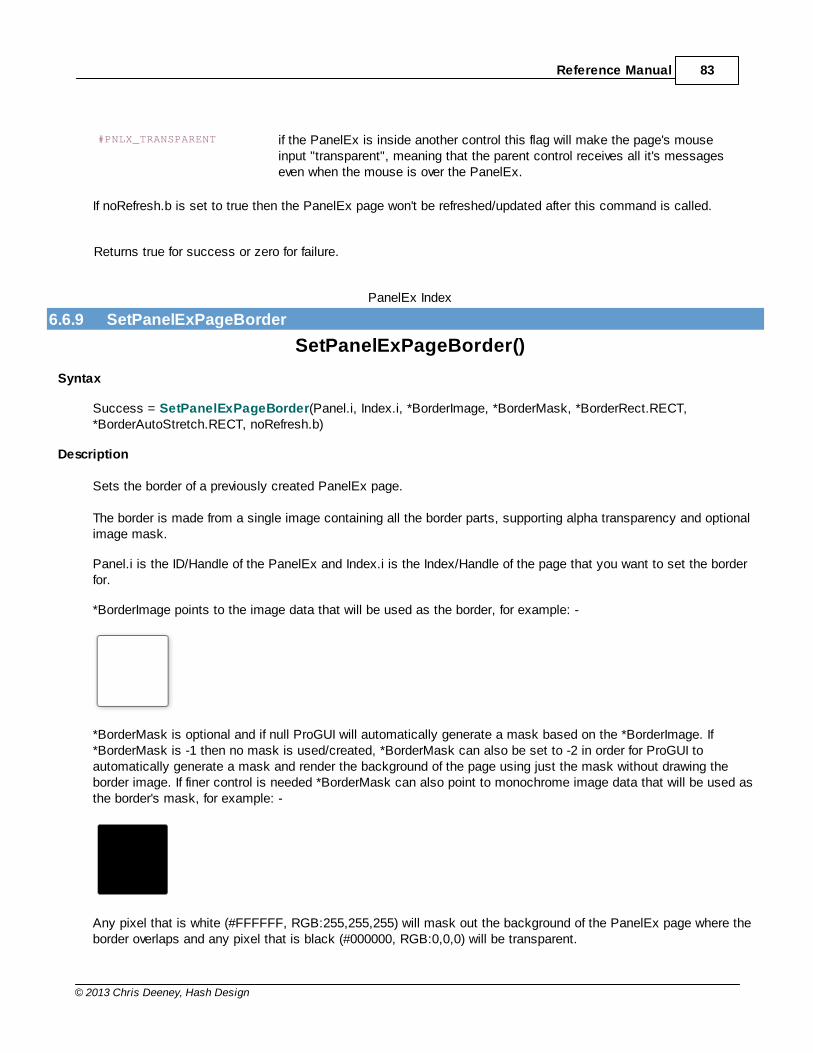
Reference Manual 83
© 2013 Chris Deeney, Hash Design
#PNLX_TRANSPARENT if the PanelEx is inside another control this flag will make the page's mouseinput "transparent", meaning that the parent control receives all it's messageseven when the mouse is over the PanelEx.
If noRefresh.b is set to true then the PanelEx page won't be refreshed/updated after this command is called.
Returns true for success or zero for failure.
PanelEx Index
6.6.9 SetPanelExPageBorder
SetPanelExPageBorder()
Syntax
Success = SetPanelExPageBorder(Panel.i, Index.i, *BorderImage, *BorderMask, *BorderRect.RECT,*BorderAutoStretch.RECT, noRefresh.b)
Description
Sets the border of a previously created PanelEx page.
The border is made from a single image containing all the border parts, supporting alpha transparency and optionalimage mask.
Panel.i is the ID/Handle of the PanelEx and Index.i is the Index/Handle of the page that you want to set the borderfor.
*BorderImage points to the image data that will be used as the border, for example: -
*BorderMask is optional and if null ProGUI will automatically generate a mask based on the *BorderImage. If*BorderMask is -1 then no mask is used/created, *BorderMask can also be set to -2 in order for ProGUI toautomatically generate a mask and render the background of the page using just the mask without drawing theborder image. If finer control is needed *BorderMask can also point to monochrome image data that will be used asthe border's mask, for example: -
Any pixel that is white (#FFFFFF, RGB:255,255,255) will mask out the background of the PanelEx page where theborder overlaps and any pixel that is black (#000000, RGB:0,0,0) will be transparent.
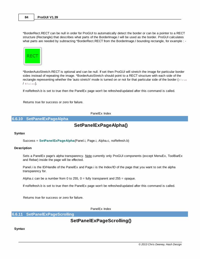
ProGUI V1.3984
© 2013 Chris Deeney, Hash Design
*BorderRect.RECT can be null in order for ProGUI to automatically detect the border or can be a pointer to a RECTstructure (Rectangle) that describes what parts of the BorderImage.l will be used as the border. ProGUI calculateswhat parts are needed by subtracting *BorderRect.RECT from the BorderImage.l bounding rectangle, for example : -
*BorderAutoStretch.RECT is optional and can be null. If set then ProGUI will stretch the image for particular bordersides instead of repeating the image. *BorderAutoStretch should point to a RECT structure with each side of therectangle representing whether the 'auto stretch' mode is turned on or not for that particular side of the border (#True/ #False).
If noRefresh.b is set to true then the PanelEx page won't be refreshed/updated after this command is called.
Returns true for success or zero for failure.
PanelEx Index
6.6.10 SetPanelExPageAlpha
SetPanelExPageAlpha()
Syntax
Success = SetPanelExPageAlpha(Panel.i, Page.i, Alpha.c, noRefresh.b)
Description
Sets a PanelEx page's alpha transparency. Note currently only ProGUI components (except MenuEx, ToolBarExand Rebar) inside the page will be effected.
Panel.i is the ID/Handle of the PanelEx and Page.i is the Index/ID of the page that you want to set the alphatransparency for.
Alpha.c can be a number from 0 to 255, 0 = fully transparent and 255 = opaque.
If noRefresh.b is set to true then the PanelEx page won't be refreshed/updated after this command is called.
Returns true for success or zero for failure.
PanelEx Index
6.6.11 SetPanelExPageScrolling
SetPanelExPageScrolling()
Syntax
Reference Manual 85
© 2013 Chris Deeney, Hash Design
Success = SetPanelExPageScrolling(Panel.i, Page.i, Flags.l, Value.l)
Description
Sets whether a PanelEx page's canvas is scrollable.
Panel.i is the ID/Handle of the PanelEx and Page.i is the Index/ID of the page that you want to set the scrolling for.
Currently the #PNLX_AUTOSCROLL flag is supported which means scrollbars at the bottom and/or right of the page willappear when any control inside the page is positioned outside of the viewable area. Value.l can be true or false toenable/disable the auto scroll feature.
The PanelEx is fully nestable and the scrollable area takes into account the border's mask if there is one.
Returns true for success or zero for failure.
PanelEx Index
6.6.12 GetPanelExPageScrolling
GetPanelExPageScrolling()
Syntax
Value = GetPanelExPageScrolling(Panel.i, Page.i, Flag.l)
Description
Returns the value of a PanelEx page's scrolling attribute.
Panel.i is the ID/Handle of the PanelEx and Page.i is the Index/ID of the page that you want to get the scrolling infofor.
Flag.l can be one of the following constants:
#PNLX_AUTOSCROLL Returns true if the auto-scroll feature is enabled for the page, false otherwise.
#PNLX_HSCROLL Returns true if the horizontal scrollbar is currently visible, false otherwise.
#PNLX_VSCROLL Returns true if the vertical scrollbar is currently visible, false otherwise.
#PNLX_HSCROLLHANDLE Returns the handle (HWND) of the horizontal scrollbar or zero if it hasn't beeninitialized.
#PNLX_VSCROLLHANDLE Returns the handle (HWND) of the vertical scrollbar or zero if it hasn't beeninitialized.
#PNLX_AUTOSCROLL_NOHORI
ZONTALReturns true if display of the horizontal scrollbar is disabled in auto-scroll mode,false otherwise.
#PNLX_AUTOSCROLL_NOVERT
ICALReturns true if display of the vertical scrollbar is disabled in auto-scroll mode, falseotherwise.
PanelEx Index
ProGUI V1.3986
© 2013 Chris Deeney, Hash Design
6.6.13 SetPanelExPageCursor
SetPanelExPageCursor()
Syntax
Success = SetPanelExPageCursor(Panel.i, Index.i, *Cursor)
Description
Sets the mouse cursor of a PanelEx page.
Panel.i is the ID/Handle of the PanelEx and Page.i is the Index/ID of the page that you want to set the backgroundfor.
*Cursor is a pointer to the new cursor (HCURSOR) or can be a WindowsAPI system cursor constant, please see http://msdn.microsoft.com/en-us/library/ms648391(VS.85).aspx for a list of the constants and their descriptions.
Returns the HCURSOR handle for success or zero for failure.
PanelEx Index
6.6.14 GetPanelExBitmap
GetPanelExBitmap()
Syntax
*bitmap = GetPanelExBitmap(Panel.i)
Description
Gets a PanelEx's image buffer.Panel.i is the ID/Handle of the PanelEx.
Returns the address of the bitmap data or zero for failure.
PanelEx Index
6.6.15 GetPanelExDC
GetPanelExBitmap()
Syntax
*bitmap = GetPanelExBitmap(Panel.i)
Description
Gets a PanelEx's image buffer device context.Panel.i is the ID/Handle of the PanelEx.
Returns the DC handle of the PanelEx or zero for failure.
Reference Manual 87
© 2013 Chris Deeney, Hash Design
PanelEx Index
6.6.16 RefreshPanelEx
RefreshPanelEx()
Syntax
Success = RefreshPanelEx(Panel.i)
Description
Refreshes/updates the currently displayed PanelEx page.Panel.i is the ID/Handle of the PanelEx.
Returns true for success or zero for failure.
PanelEx Index
6.6.17 ShowPanelExPage
ShowPanelExPage()
Syntax
Success = ShowPanelExPage(Panel.i, Index.l)
Description
Displays the desired page specified by Index in the specified Panel. Index ranges numerically from 0 in ascendingorder depending on how many pages have been created or can be a handle to a page.
Returns nonzero for success.
PanelEx Index
6.6.18 PanelExWidth
PanelExWidth()
Syntax
Width = PanelExWidth(Panel.i)
Description
Returns the width in pixels of a PanelEx. Panel.i is the handle/ID of the PanelEx.
PanelEx Index
ProGUI V1.3988
© 2013 Chris Deeney, Hash Design
6.6.19 PanelExHeight
PanelExHeight()
Syntax
Height = PanelExHeight(Panel.i)
Description
Returns the height in pixels of a PanelEx. Panel.i is the handle/ID of the PanelEx.
PanelEx Index
6.6.20 PanelExID
PanelExID()
Syntax
WindowsID.i = PanelExID(Panel.i, Index.l)
Description
Returns the Windows handle (HWND) of the specified panel or page index.
If Index.l is less than zero then the Windows handle (HWND) of the PanelEx is returned.
PanelEx Index
6.6.21 PanelExPageIndex
PanelExPageIndex()
Syntax
Index.l = PanelExPageIndex(Panel.i)
Description
Returns the index of the currently displayed page of a PanelEx (ID or handle) or if Panel.i is a handle to a page thenreturns the index of that page.
PanelEx Index
6.6.22 FreePanelExPage
FreePanelExPage()
Syntax
Success = FreePanelExPage(ID.i, Index.l)
Description

Reference Manual 89
© 2013 Chris Deeney, Hash Design
Frees and removes a PanelEx page from memory.
ID.i is the ID or Handle of the PanelEx you wish to remove the page from. Index.l is the index of the page you wishto remove and can be -1 in order to remove all pages.
Returns true for success and zero for failure.
PanelEx Index
6.6.23 FreePanelEx
FreePanelEx()
Syntax
Success = FreePanelEx(ID.i)
Description
Frees a PanelEx from memory.
ID.i is the ID or Handle of the PanelEx you wish to remove and can be -1 in order to remove all PanelEx's.
Returns true for success and zero for failure.
PanelEx Index
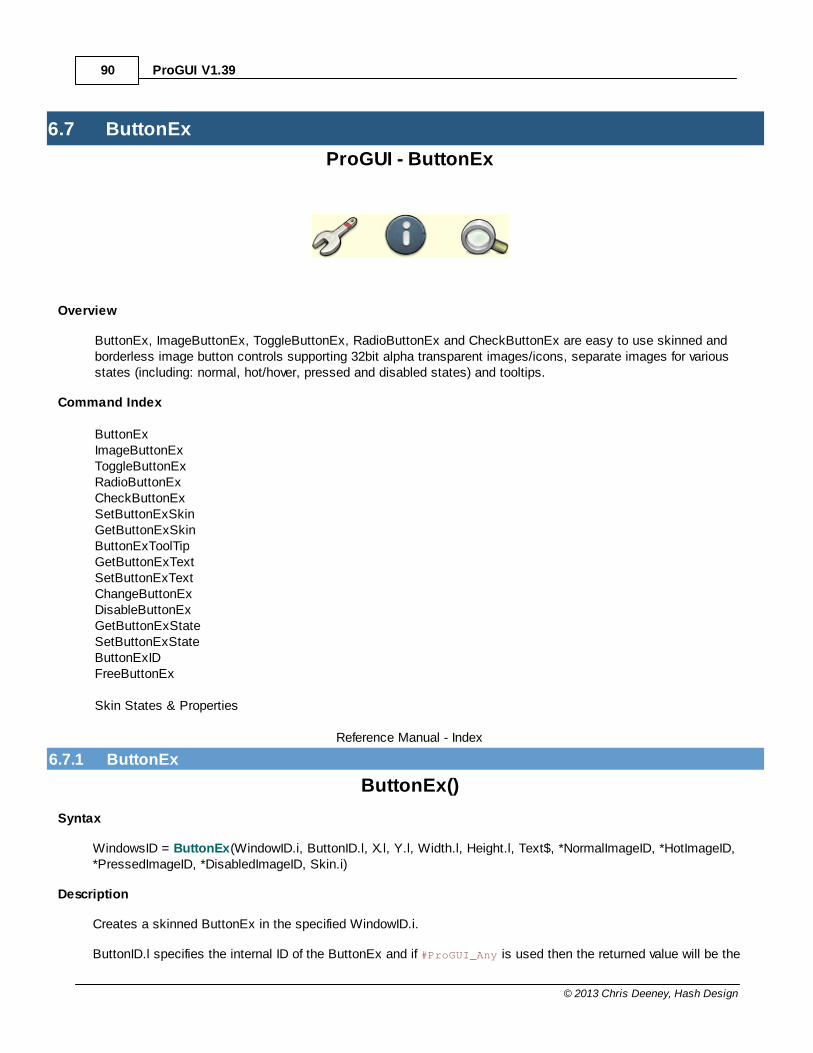
ProGUI V1.3990
© 2013 Chris Deeney, Hash Design
6.7 ButtonEx
ProGUI - ButtonEx
Overview
ButtonEx, ImageButtonEx, ToggleButtonEx, RadioButtonEx and CheckButtonEx are easy to use skinned andborderless image button controls supporting 32bit alpha transparent images/icons, separate images for variousstates (including: normal, hot/hover, pressed and disabled states) and tooltips.
Command Index
ButtonExImageButtonExToggleButtonExRadioButtonExCheckButtonExSetButtonExSkinGetButtonExSkinButtonExToolTipGetButtonExTextSetButtonExTextChangeButtonExDisableButtonExGetButtonExStateSetButtonExStateButtonExIDFreeButtonEx
Skin States & Properties
Reference Manual - Index
6.7.1 ButtonEx
ButtonEx()
Syntax
WindowsID = ButtonEx(WindowID.i, ButtonID.l, X.l, Y.l, Width.l, Height.l, Text$, *NormalImageID, *HotImageID,*PressedImageID, *DisabledImageID, Skin.i)
Description
Creates a skinned ButtonEx in the specified WindowID.i.
ButtonID.l specifies the internal ID of the ButtonEx and if #ProGUI_Any is used then the returned value will be the
Reference Manual 91
© 2013 Chris Deeney, Hash Design
new ButtonEx ID. X.l, Y.l, Width.l and Height.l are the position and dimensions of the ButtonEx.
Text$ is the text that will be displayed in the ButtonEx and can be an empty string.
*NormalImageID, *HotImageID, *PressedImageID and *DisabledImageID are pointers to the image data for thevarious states.
Skin.i specifies what skin the ButtonEx will use and can be either a handle to a skin or if zero will render theButtonEx using the default system button skin. Please see Skin States & Properties for creating/editing ButtonExskins.
When the ButtonEx is clicked, a #WM_COMMAND message will be posted to WindowID's message queue containingthe ButtonID, which can be detected as a PureBasic #PB_Event_Menu event.
Returns the WindowsID (HWND) of the ButtonEx (or if #ProGUI_Any is used the ButtonEx ID) or zero for failure.
ButtonEx Index
6.7.2 ImageButtonEx
ImageButtonEx()
Syntax
WindowsID = ImageButtonEx(WindowID.i, ButtonID.l, X.l, Y.l, ImageWidth.l, ImageHeight.l, *NormalImageID,*HotImageID, *PressedImageID, *DisabledImageID)
Description
Creates an ImageButtonEx in the specified WindowID.i.
ButtonID.l specifies the internal ID of the ImageButtonEx and if #ProGUI_Any is used then the returned value will bethe new ImageButtonEx ID. X.l, Y.l, ImageWidth.l and ImageHeight.l are the position and dimensions of theImageButtonEx. If ImageWidth.l or ImageHeight.l are null then the corresponding dimensions are calculatedautomatically.
*NormalImageID, *HotImageID, *PressedImageID and *DisabledImageID are pointers to the image data for thevarious states.
When the ImageButtonEx is clicked, a #WM_COMMAND message will be posted to WindowID's message queuecontaining the ButtonID, which can be detected as a PureBasic #PB_Event_Menu event.
Returns the WindowsID (HWND) of the ImageButtonEx (or if #ProGUI_Any is used the ImageButtonEx ID) or zero forfailure.
ButtonEx Index
ProGUI V1.3992
© 2013 Chris Deeney, Hash Design
6.7.3 ToggleButtonEx
ToggleButtonEx()
Syntax
WindowsID = ToggleButtonEx(WindowID.i, ToggleButtonID.l, X.l, Y.l, Width.l, Height.l, Text$, *NormalImageID,*HotImageID, *PressedImageID, *SelectedImageID, *HotSelectedImageID, PressedSelectedImageID,*DisabledImageID, Skin.i)
Description
Creates a skinned toggle state ButtonEx in the specified WindowID.i.
ToggleButtonID.l specifies the internal ID of the ToggleButtonEx and if #ProGUI_Any is used then the returned valuewill be the new ToggleButtonEx ID. X.l, Y.l, Width.l and Height.l are the position and dimensions of theToggleButtonEx.
Text$ is the text that will be displayed in the ToggleButtonEx and can be an empty string.
*NormalImageID, *HotImageID, *PressedImageID and *DisabledImageID are pointers to the image data for thevarious unselected states.
*SelectedImageID, *HotSelectedImageID and *PressedSelectedImageID are pointers to the image data for thevarious selected states.
Skin.i specifies what skin the ToggleButtonEx will use and can be a handle to a skin or one of the following values:zero will render the ToggleButtonEx using the default system button skin and #BUTTONEX_STICKYSKIN will alsorender using the system button skin except make the button stay pressed when selected. Please see Skin States& Properties for creating/editing ToggleButtonEx skins.
When the ToggleButtonEx is clicked, a #WM_COMMAND message will be posted to WindowID's message queuecontaining the ToggleButtonID, which can be detected as a PureBasic #PB_Event_Menu event.
The current "toggled" state can be retrieved or set using the GetButtonExState and SetButtonExState commands.
Returns the WindowsID (HWND) of the ToggleButtonEx (or if #ProGUI_Any is used the ToggleButtonEx ID) or zerofor failure.
ButtonEx Index
6.7.4 RadioButtonEx
RadioButtonEx()
Syntax
WindowsID = RadioButtonEx(WindowID.i, ButtonID.l, X.l, Y.l, Width.l, Height.l, Text$, Skin.i)
Description
Creates a skinned radio ButtonEx in the specified WindowID.i. All radio buttons that are created will be added to thesame group until RadioButtonEx is called with WindowID.i as null, in which case a new group will be created and all
Reference Manual 93
© 2013 Chris Deeney, Hash Design
subsequent new radio buttons will be added to it.
ButtonID.l specifies the internal ID of the RadioButtonEx and if #ProGUI_Any is used then the returned value will bethe new RadioButtonEx ID. X.l, Y.l, Width.l and Height.l are the position and dimensions of the RadioButtonEx.
Text$ is the text that will be displayed in the RadioButtonEx and can be an empty string.
Skin.i specifies what skin the RadioButtonEx will use and can be either a handle to a skin or if zero will render theRadioButtonEx using the default system radio button skin. Please see Skin States & Properties for creating/editingRadioButtonEx skins.
When the RadioButtonEx is clicked, a #WM_COMMAND message will be posted to WindowID's message queuecontaining the ButtonID, which can be detected as a PureBasic #PB_Event_Menu event.
The currently selected state can be retrieved or set using the GetButtonExState and SetButtonExState commands.
Returns the WindowsID (HWND) of the RadioButtonEx (or if #ProGUI_Any is used the RadioButtonEx ID) or zero forfailure.
ButtonEx Index
6.7.5 CheckButtonEx
CheckButtonEx()
Syntax
WindowsID = CheckButtonEx(WindowID.i, ButtonID.l, X.l, Y.l, Width.l, Height.l, Text$, Skin.i)
Description
Creates a skinned check box ButtonEx in the specified WindowID.i.
ButtonID.l specifies the internal ID of the CheckButtonEx and if #ProGUI_Any is used then the returned value will bethe new CheckButtonEx ID. X.l, Y.l, Width.l and Height.l are the position and dimensions of the CheckButtonEx.
Text$ is the text that will be displayed in the CheckButtonEx and can be an empty string.
Skin.i specifies what skin the CheckButtonEx will use and can be either a handle to a skin or if zero will render theCheckButtonEx using the default system check box button skin. Please see Skin States & Properties for creating/editing CheckButtonEx skins.
When the CheckButtonEx is clicked, a #WM_COMMAND message will be posted to WindowID's message queuecontaining the ButtonID, which can be detected as a PureBasic #PB_Event_Menu event.
The current checked state can be retrieved or set using the GetButtonExState and SetButtonExState commands.
The check button can also be set to an "inbetween" state by specifying #BUTTONEX_INBETWEEN usingSetButtonExState. The "inbetween" state is useful for representing multiple items that are not all of the same state(i.e. on or off), for example the installable features of an application where some features are not "ticked" by default.Clicking on the check button would then bring them from the "inbetween" state to be either all on or all off.
ProGUI V1.3994
© 2013 Chris Deeney, Hash Design
Returns the WindowsID (HWND) of the CheckButtonEx (or if #ProGUI_Any is used the CheckButtonEx ID) or zerofor failure.
ButtonEx Index
6.7.6 SetButtonExSkin
SetButtonExSkin()
Syntax
Success = SetButtonExSkin(ID.i, Skin.i, ComponentName$, noRefresh.b)
Description
Sets a ButtonEx's skin.
ID.i specifies the handle/ID of the button you want to set the skin for. Skin.i is the handle of the skin.
ComponentName$ is optional and can be an empty string. Specifying ComponentName$ will make the control usethe states and properties for that skin component name (if it exists in the skin) instead of the default (e.g."ButtonEx").
If noRefresh.b is set to true then the ButtonEx won't be refreshed/updated after this command is called.
Please see Skin States & Properties for creating/editing ButtonEx skins.
Returns true if successful, zero for failure.
ButtonEx Index
6.7.7 GetButtonExSkin
GetButtonExSkin()
Syntax
Skin.i = GetButtonExSkin(ID.i)
Description
Returns a handle to a ButtonEx's current skin or zero for failure.
ID.i specifies the handle/ID of the ButtonEx that you want to retrieve the skin for.
ButtonEx Index
6.7.8 ButtonExToolTip
ButtonExToolTip()
Syntax
Reference Manual 95
© 2013 Chris Deeney, Hash Design
Success = ButtonExToolTip(ID.i, Text.s)
Description
Associates a tooltip with a ButtonEx, ImageButtonEx, ToggleButtonEx, RadioButtonEx or CheckButtonEx.
ID.i specifies the handle/ID of the button you want to associate the tooltip with. Text.s specifies the tooltip text youwant to display. ButtonExToolTip can be called again on an already defined tooltip in order to replace the associatedText.s. Specifying Text.s as an empty string will remove the tooltip.
Returns true if successful.
ButtonEx Index
6.7.9 GetButtonExText
GetButtonExText()
Syntax
Text$ = GetButtonExText(ID.i)
Description
Returns the text contained in a ButtonEx, ToggleButtonEx, RadioButtonEx or CheckButtonEx.
ID.i specifies the handle/ID of the button that you want to retrieve the text for.
ButtonEx Index
6.7.10 SetButtonExText
SetButtonExText()
Syntax
Success = SetButtonExText(ID.i, Text$)
Description
Sets the text of a ButtonEx, ToggleButtonEx, RadioButtonEx or CheckButtonEx.
ID.i specifies the handle/ID of the button you want to set the text for.
Returns true if successful, zero for failure.
ButtonEx Index
ProGUI V1.3996
© 2013 Chris Deeney, Hash Design
6.7.11 ChangeButtonEx
ChangeButtonEx()
Syntax
Success = ChangeButtonEx(ID.i, *NormalImageID, *HotImageID, *PressedImageID, *SelectedImageID,*HotSelectedImageID, *PressedSelectedImageID, *DisabledImageID)
Description
Changes the associated image/s of a ButtonEx, ToggleButtonEx or ImageButtonEx, also using this command witha RadioButtonEx or CheckButtonEx will override the skin's default for that state image/icon.
ID.i specifies the handle/ID of the button you want to change the image/s for. *NormalImageID, *HotImageID,*PressedImageID, *SelectedImageID, *HotSelectedImageID, *PressedSelectedImageID and *DisabledImageID arepointers to the new image data for the various states and can be null in order to keep the previously defined imagedata for a particular state.
Returns true if successful.
ButtonEx Index
6.7.12 DisableButtonEx
DisableButtonEx()
Syntax
Success = DisableButtonEx(ID.i, Disable.b)
Description
Disables/enables a ButtonEx, ImageButtonEx, ToggleButtonEx, RadioButtonEx or CheckButtonEx.
ID.i specifies the handle/ID of the button you want to disable or enable. Specifying Disable.b as True will disable theImageButtonEx, or False will enable.
Returns true if successful.
ButtonEx Index
6.7.13 GetButtonExState
GetButtonExState()
Syntax
State = GetButtonExState(ID.i)
Description
Returns the selection state of a previously created ToggleButtonEx, RadioButtonEx or CheckButtonEx.
Reference Manual 97
© 2013 Chris Deeney, Hash Design
ID.i specifies the handle/ID of the button you want to retrieve the state for.
If the button is a ToggleButtonEx or RadioButtonEx and is currently toggled/selected then the state is returned astrue or false otherwise.
If the button is a CheckButtonEx and is currently "ticked" then the state is returned as true or false otherwise. If theCheckButtonEx is in the "inbetween" state then the state is returned as #BUTTONEX_INBETWEEN.
ButtonEx Index
6.7.14 SetButtonExState
SetButtonExState()
Syntax
Success = SetButtonExState(ID.i, State.b)
Description
Sets the current selection state of a previously created ToggleButtonEx, RadioButtonEx or CheckButtonEx.
ID.i specifies the handle/ID of the button you want to set the state for.
If the button is a ToggleButtonEx or RadioButtonEx and State is true then the button will be toggled/selected or iffalse, un-toggled/de-selected.
If the button is a CheckButtonEx and State is true then the button will be ticked/checked or if State is false then thebutton will be unchecked. If #BUTTONEX_INBETWEEN is specified as State then the CheckButtonEx will be in the"inbetween" state. The "inbetween" state is useful for representing multiple items that are not all of the same state(i.e. on or off), for example the installable features of an application where some features are not "ticked" by default.Clicking on the check button would then bring them from the "inbetween" state to be either all on or all off.
Returns true if successful, zero for failure.
ButtonEx Index
6.7.15 ButtonExID
ButtonExID()
Syntax
WindowsID = ButtonExID(ID.l)
Description
Returns the Windows ID (HWND) of a previously created ButtonEx, ImageButtonEx, ToggleButtonEx,RadioButtonEx or CheckButtonEx.

ProGUI V1.3998
© 2013 Chris Deeney, Hash Design
ButtonEx Index
6.7.16 FreeButtonEx
FreeButtonEx()
Syntax
Success = FreeButtonEx(ID.i)
Description
Frees a ButtonEx, ImageButtonEx, ToggleButtonEx, RadioButtonEx or CheckButtonEx from memory.
ID.i is the ID/Windows Handle of the button you wish to free or -1 in order to free all buttons.
Returns true for success or zero for failure.
ButtonEx Index
6.7.17 Skin States & Properties
ButtonEx Skin States & Properties
Component Names
ButtonEx, ToggleButtonEx, RadioButtonEx, CheckButtonEx
State Names
Name Description
Normal Normal button state.
Hot Hover state when the mouse pointer is over the button.
Pressed When the button is pressed.
Disabled The button is disabled.
ToggleButtonEx, CheckButtonEx and RadioButtonEx Only States
selected Normal selected toggle/check/radio button state.
selected hot Selected hover state when the mouse pointer is over the toggle/check/radio button.
selected pressed When the toggle/check/radio button is in the selected state and pressed.
CheckButtonEx only States
inbetween Normal "inbetween" state of a check button.
inbetween hot Hover state when the mouse pointer is over the "inbetween" state check button.
inbetween pressed When the check button is in the "inbetween" state and pressed.
Properties
Reference Manual 99
© 2013 Chris Deeney, Hash Design
Name Description Valid Value/s separated by semi-colon (';')
background image Displays a backgroundimage.
Can be an image or icon file path/name.
backgroundposition
Sets the position of thebackground image.
x: centre / repeat / <pixels> / <value>%y: centre / repeat / <pixels> / <value>%top: centre / repeat / <pixels> / <value>%bottom: centre / repeat / <pixels> / <value>%left: centre / repeat / <pixels> / <value>%right: centre / repeat / <pixels> / <value>%stretch: true / falsetile: true / falsemasked: true / false
background Sets the backgroundcolour, gradient ortheme.
Can be a colour, gradient or background theme constant (Pleasesee AddPanelExPage for a description of the possible values).
gradient: <start_colour>, <end_colour>gradient: <start_colour>, <end_colour>, <pos.f>, <colour>, <pos.f>,<colour>, ...gradient: vertical / rectangle / ellipse, <start_colour>, <end_colour>gradient: vertical / rectangle / ellipse, <start_colour>, <end_colour>, <pos.f>, <colour>, <pos.f>, <colour>, ...<colour><theme constant>
border image Sets the border image. Can be an image or icon file path/name.
The following optional parameters manually specify the borderrectangle used to create the border:
top: <pixels>bottom: <pixels>left: <pixels>right: <pixels>
border mask Sets the border mask. Can be an image/icon file path/name or null to automaticallygenerate mask from border image or -1 to not use a mask or -2 toautomatically generate mask from border image but not render theborder.
The following optional parameters manually specify the borderrectangle used to create the border mask:
top: <pixels>bottom: <pixels>left: <pixels>right: <pixels>
overlay image Sets the secondbackground overlayimage.
Can be an image or icon file path/name.
overlay position Sets the position of thesecond overlaybackground image.
x: centre / repeat / <pixels> / <value>%y: centre / repeat / <pixels> / <value>%top: centre / repeat / <pixels> / <value>%
ProGUI V1.39100
© 2013 Chris Deeney, Hash Design
bottom: centre / repeat / <pixels> / <value>%left: centre / repeat / <pixels> / <value>%right: centre / repeat / <pixels> / <value>%stretch: true / falsetile: true / falsemasked: true / false
overlay Sets the second overlaybackground colour,gradient or theme.
Can be a colour, gradient or background theme constant (Pleasesee AddPanelExPage for a description of the possible values).
gradient: <start_colour>, <end_colour>gradient: <start_colour>, <end_colour>, <pos.f>, <colour>, <pos.f>,<colour>, ...gradient: vertical / rectangle / ellipse, <start_colour>, <end_colour>gradient: vertical / rectangle / ellipse, <start_colour>, <end_colour>, <pos.f>, <colour>, <pos.f>, <colour>, ...<colour><theme constant>
image Sets the image to useas the button's icon.
Can be an image or icon file path/name.
noclip: true / false
image position Sets the position of thebutton's image/icon.
x: centre / <pixels> / <value>%y: centre / <pixels> / <value>%top: centre / <pixels> / <value>%bottom: centre / <pixels> / <value>%left: centre / <pixels> / <value>%right: centre / <pixels> / <value>%
image padding Sets the padding sizearound the button'simage.
top: <pixels>bottom: <pixels>left: <pixels>right: <pixels>
text Sets the button text fontand colour.
font: <name>, <point-size>font: <name>, <point-size>, italic / underline / bold /strikethrough, .. , ...colour: <colour>
text position Sets the position of thebutton text.
x: centre / <pixels> / <value>%y: centre / <pixels> / <value>%top: centre / <pixels> / <value>%bottom: centre / <pixels> / <value>%left: centre / <pixels> / <value>%right: centre / <pixels> / <value>%
text padding Sets the padding sizearound the button's text.
top: <pixels>bottom: <pixels>left: <pixels>right: <pixels>
cursor Sets the mouse pointer/cursor for the buttonstate.
appstartingarrowcrosshandhelpibeam
Reference Manual 101
© 2013 Chris Deeney, Hash Design
nosizesizeallsizeneswsizenssizenwsesizeweuparrowwait<HCURSOR>
ButtonEx Index
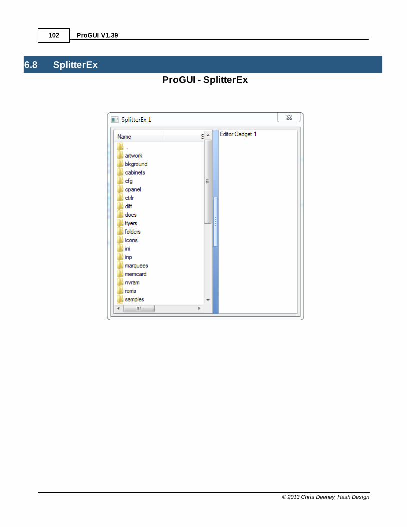
ProGUI V1.39102
© 2013 Chris Deeney, Hash Design
6.8 SplitterEx
ProGUI - SplitterEx
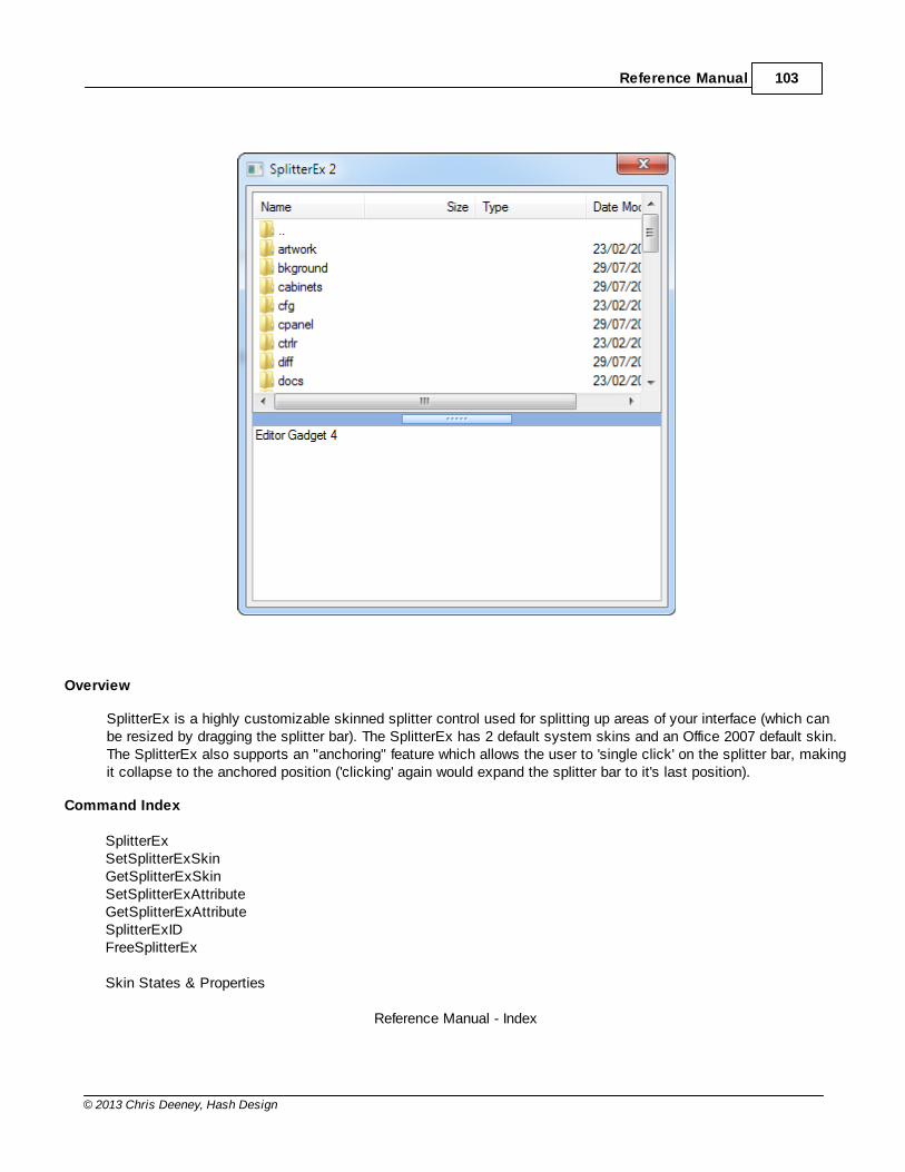
Reference Manual 103
© 2013 Chris Deeney, Hash Design
Overview
SplitterEx is a highly customizable skinned splitter control used for splitting up areas of your interface (which canbe resized by dragging the splitter bar). The SplitterEx has 2 default system skins and an Office 2007 default skin.The SplitterEx also supports an "anchoring" feature which allows the user to 'single click' on the splitter bar, makingit collapse to the anchored position ('clicking' again would expand the splitter bar to it's last position).
Command Index
SplitterExSetSplitterExSkinGetSplitterExSkinSetSplitterExAttributeGetSplitterExAttributeSplitterExIDFreeSplitterEx
Skin States & Properties
Reference Manual - Index

ProGUI V1.39104
© 2013 Chris Deeney, Hash Design
6.8.1 SplitterEx
SplitterEx()
Syntax
WindowsID = SplitterEx(WindowID.i, SplitterID.l, x.l, y.l, Width.l, Height.l, WindowID1.i, WindowID2.i, Skin.i, Flags.i)
Description
Creates a skinned SplitterEx in the specified WindowID.i.
SplitterID.l specifies the internal ID of the SplitterEx and if #ProGUI_Any is used then the returned value will be thenew SplitterEx ID. x.l, y.l, Width.l and Height.l are the position and dimensions of the SplitterEx.
WindowID1.i and WindowID2.i are the WindowsID (HWND) of the first and second controls to be split inside theSplitterEx.
Skin.i specifies what skin the SplitterEx will use and can be either a handle to a skin or one of the following defaultskins/styles:
#SPLITTEREX_DEFAULTSKIN Default system skin with no gripper box.
#SPLITTEREX_DEFAULTSKIN2 Default system skin with separate gripper box.
#UISTYLE_OFFICE2007 Office 2007 style skin.
Please see the SplitterEx Skin States & Properties for creating/editing skins.
Flags.i can be #SPLITTEREX_VERTICAL in order to split vertically instead of horizontally.
The SplitterEx can also have the "anchoring" feature enabled. This allows the user to 'single click' on the splitter bar,making it collapse to the anchored position ('clicking' again would expand the splitter bar to it's last position). Toenable this feature you need to specify one of the following constants in Flags.i :
#SPLITTEREX_ANCHOREDTOP The splitter bar is anchored to the top of the vertical SplitterEx.
#SPLITTEREX_ANCHOREDLEFT The splitter bar is anchored to the left of the horizontalSplitterEx.
#SPLITTEREX_ANCHOREDBOTTOM The splitter bar is anchored to the bottom of the verticalSplitterEx.
#SPLITTEREX_ANCHOREDRIGHT The splitter bar is anchored to the right of the horizontalSplitterEx.
To position the splitter bar in it's "anchored" state when the SplitterEx is first displayed then also specify #SPLITTEREX_ANCHOR in Flags.i as well.The "un-anchored" expanded position can also be set using SetSplitterExAttribute with#SPLITTEREX_ANCHORSIZETO.
Returns the WindowsID (HWND) of the SplitterEx (or if #ProGUI_Any is used the SplitterEx ID) or zero for failure.

Reference Manual 105
© 2013 Chris Deeney, Hash Design
SplitterEx Index
6.8.2 SetSplitterExSkin
SetSplitterExSkin()
Syntax
Success = SetSplitterExSkin(ID.i, Skin.i, ComponentName$, noRefresh.b)
Description
Sets a SplitterEx's skin.
ID.i specifies the handle/ID of the splitter you want to set the skin for. Skin.i is the handle of the skin.
ComponentName$ is optional and can be an empty string. Specifying ComponentName$ will make the control usethe states and properties for that skin component name (if it exists in the skin) instead of the default "SplitterEx".
If noRefresh.b is set to true then the SplitterEx won't be refreshed/updated after this command is called.
Please see Skin States & Properties for creating/editing SplitterEx skins.
Returns true if successful, zero for failure.
SplitterEx Index
6.8.3 GetSplitterExSkin
GetSplitterExSkin()
Syntax
Skin.i = GetSplitterExSkin(ID.i)
Description
Returns a handle to a SplitterEx's current skin or zero for failure.
ID.i specifies the handle/ID of the SplitterEx that you want to retrieve the skin for.
SplitterEx Index
6.8.4 SetSplitterExAttribute
SetSplitterExAttribute()
Syntax
Success = SetSplitterExAttribute(ID.i, Attribute.i, Value.i)
Description
Sets a SplitterEx's attribute.
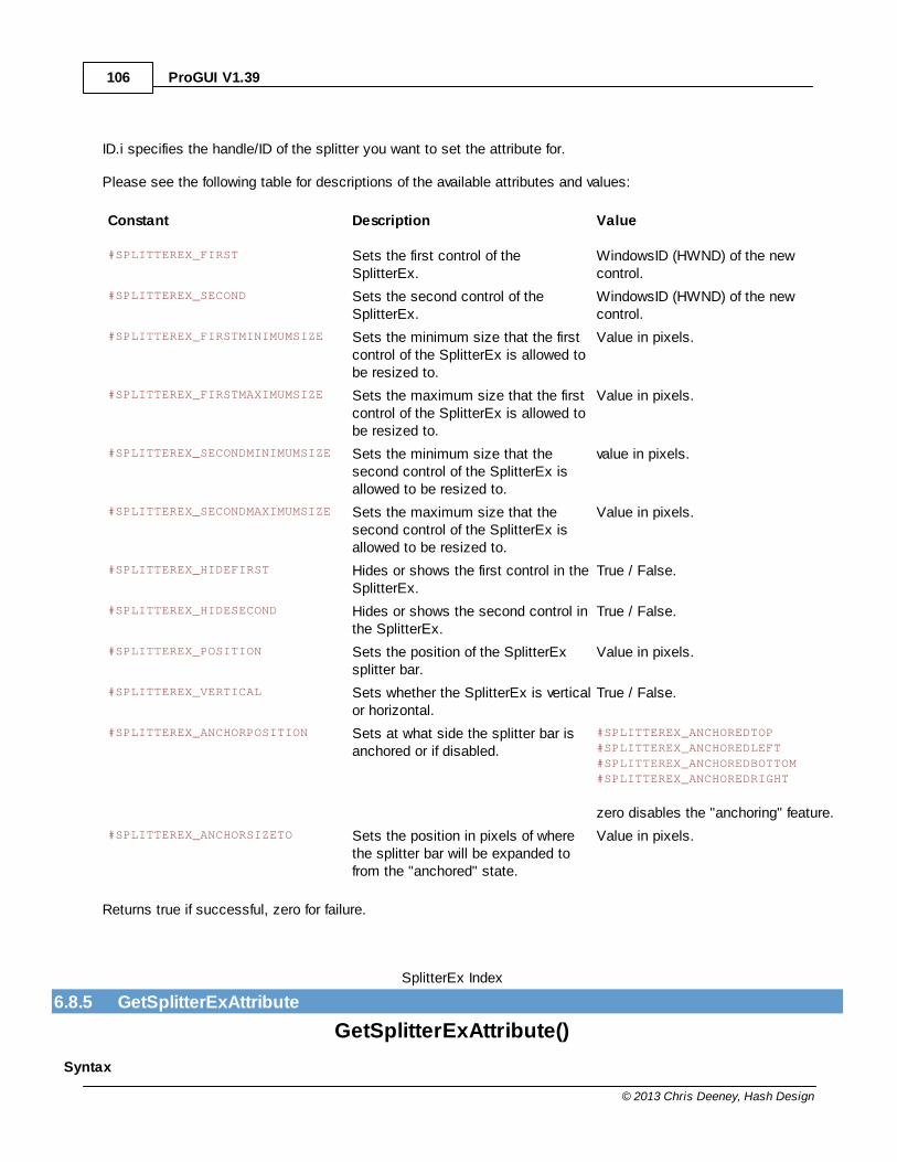
ProGUI V1.39106
© 2013 Chris Deeney, Hash Design
ID.i specifies the handle/ID of the splitter you want to set the attribute for.
Please see the following table for descriptions of the available attributes and values:
Constant Description Value
#SPLITTEREX_FIRST Sets the first control of theSplitterEx.
WindowsID (HWND) of the newcontrol.
#SPLITTEREX_SECOND Sets the second control of theSplitterEx.
WindowsID (HWND) of the newcontrol.
#SPLITTEREX_FIRSTMINIMUMSIZE Sets the minimum size that the firstcontrol of the SplitterEx is allowed tobe resized to.
Value in pixels.
#SPLITTEREX_FIRSTMAXIMUMSIZE Sets the maximum size that the firstcontrol of the SplitterEx is allowed tobe resized to.
Value in pixels.
#SPLITTEREX_SECONDMINIMUMSIZE Sets the minimum size that thesecond control of the SplitterEx isallowed to be resized to.
value in pixels.
#SPLITTEREX_SECONDMAXIMUMSIZE Sets the maximum size that thesecond control of the SplitterEx isallowed to be resized to.
Value in pixels.
#SPLITTEREX_HIDEFIRST Hides or shows the first control in theSplitterEx.
True / False.
#SPLITTEREX_HIDESECOND Hides or shows the second control inthe SplitterEx.
True / False.
#SPLITTEREX_POSITION Sets the position of the SplitterExsplitter bar.
Value in pixels.
#SPLITTEREX_VERTICAL Sets whether the SplitterEx is verticalor horizontal.
True / False.
#SPLITTEREX_ANCHORPOSITION Sets at what side the splitter bar isanchored or if disabled.
#SPLITTEREX_ANCHOREDTOP
#SPLITTEREX_ANCHOREDLEFT
#SPLITTEREX_ANCHOREDBOTTOM
#SPLITTEREX_ANCHOREDRIGHT
zero disables the "anchoring" feature.
#SPLITTEREX_ANCHORSIZETO Sets the position in pixels of wherethe splitter bar will be expanded tofrom the "anchored" state.
Value in pixels.
Returns true if successful, zero for failure.
SplitterEx Index
6.8.5 GetSplitterExAttribute
GetSplitterExAttribute()
Syntax
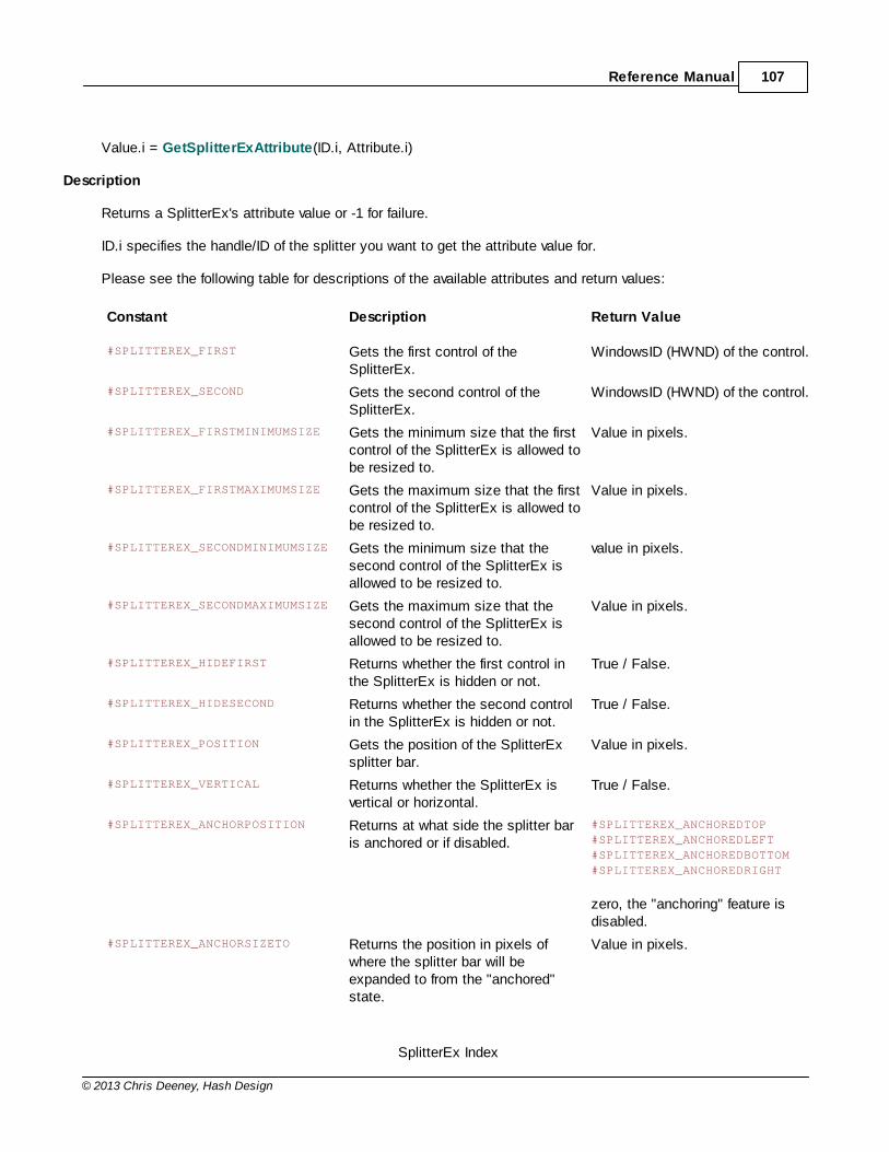
Reference Manual 107
© 2013 Chris Deeney, Hash Design
Value.i = GetSplitterExAttribute(ID.i, Attribute.i)
Description
Returns a SplitterEx's attribute value or -1 for failure.
ID.i specifies the handle/ID of the splitter you want to get the attribute value for.
Please see the following table for descriptions of the available attributes and return values:
Constant Description Return Value
#SPLITTEREX_FIRST Gets the first control of theSplitterEx.
WindowsID (HWND) of the control.
#SPLITTEREX_SECOND Gets the second control of theSplitterEx.
WindowsID (HWND) of the control.
#SPLITTEREX_FIRSTMINIMUMSIZE Gets the minimum size that the firstcontrol of the SplitterEx is allowed tobe resized to.
Value in pixels.
#SPLITTEREX_FIRSTMAXIMUMSIZE Gets the maximum size that the firstcontrol of the SplitterEx is allowed tobe resized to.
Value in pixels.
#SPLITTEREX_SECONDMINIMUMSIZE Gets the minimum size that thesecond control of the SplitterEx isallowed to be resized to.
value in pixels.
#SPLITTEREX_SECONDMAXIMUMSIZE Gets the maximum size that thesecond control of the SplitterEx isallowed to be resized to.
Value in pixels.
#SPLITTEREX_HIDEFIRST Returns whether the first control inthe SplitterEx is hidden or not.
True / False.
#SPLITTEREX_HIDESECOND Returns whether the second controlin the SplitterEx is hidden or not.
True / False.
#SPLITTEREX_POSITION Gets the position of the SplitterExsplitter bar.
Value in pixels.
#SPLITTEREX_VERTICAL Returns whether the SplitterEx isvertical or horizontal.
True / False.
#SPLITTEREX_ANCHORPOSITION Returns at what side the splitter baris anchored or if disabled.
#SPLITTEREX_ANCHOREDTOP
#SPLITTEREX_ANCHOREDLEFT
#SPLITTEREX_ANCHOREDBOTTOM
#SPLITTEREX_ANCHOREDRIGHT
zero, the "anchoring" feature isdisabled.
#SPLITTEREX_ANCHORSIZETO Returns the position in pixels ofwhere the splitter bar will beexpanded to from the "anchored"state.
Value in pixels.
SplitterEx Index
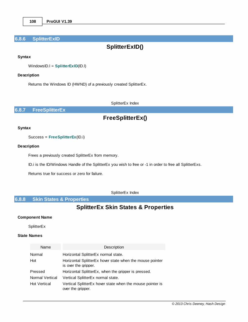
ProGUI V1.39108
© 2013 Chris Deeney, Hash Design
6.8.6 SplitterExID
SplitterExID()
Syntax
WindowsID.l = SplitterExID(ID.l)
Description
Returns the Windows ID (HWND) of a previously created SplitterEx.
SplitterEx Index
6.8.7 FreeSplitterEx
FreeSplitterEx()
Syntax
Success = FreeSplitterEx(ID.i)
Description
Frees a previously created SplitterEx from memory.
ID.i is the ID/Windows Handle of the SplitterEx you wish to free or -1 in order to free all SplitterExs.
Returns true for success or zero for failure.
SplitterEx Index
6.8.8 Skin States & Properties
SplitterEx Skin States & Properties
Component Name
SplitterEx
State Names
Name Description
Normal Horizontal SplitterEx normal state.
Hot Horizontal SplitterEx hover state when the mouse pointeris over the gripper.
Pressed Horizontal SplitterEx, when the gripper is pressed.
Normal Vertical Vertical SplitterEx normal state.
Hot Vertical Vertical SplitterEx hover state when the mouse pointer isover the gripper.
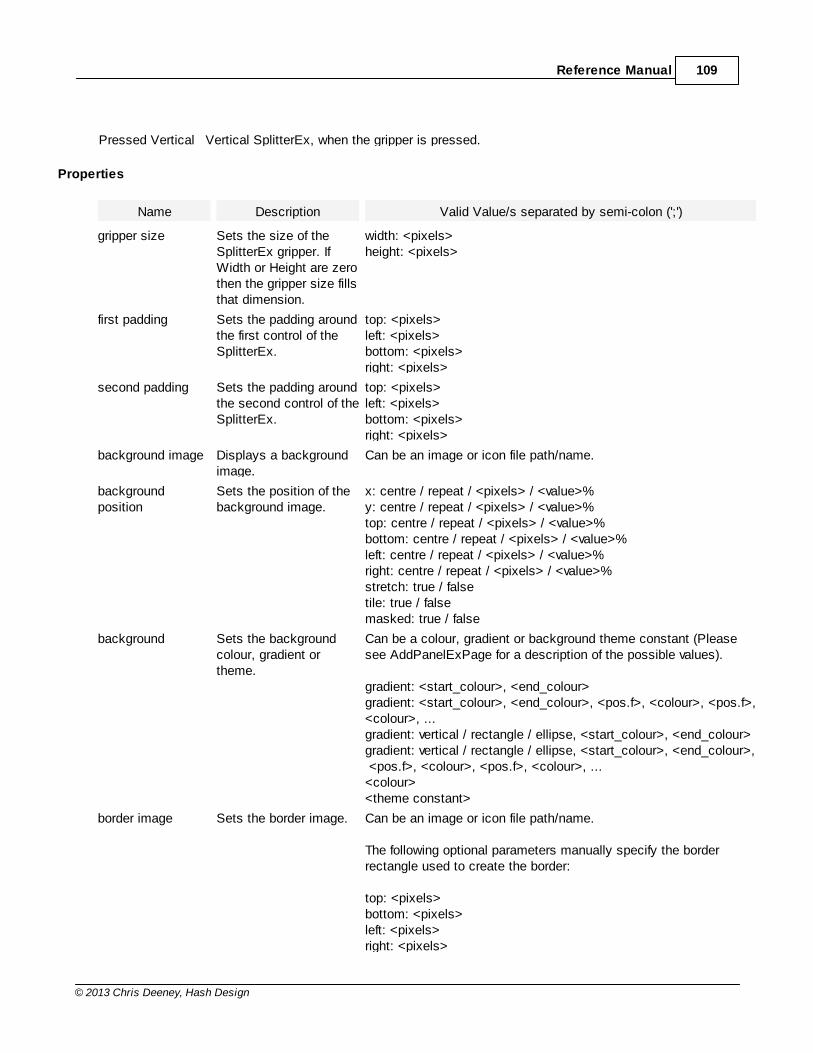
Reference Manual 109
© 2013 Chris Deeney, Hash Design
Pressed Vertical Vertical SplitterEx, when the gripper is pressed.
Properties
Name Description Valid Value/s separated by semi-colon (';')
gripper size Sets the size of theSplitterEx gripper. IfWidth or Height are zerothen the gripper size fillsthat dimension.
width: <pixels>height: <pixels>
first padding Sets the padding aroundthe first control of theSplitterEx.
top: <pixels>left: <pixels>bottom: <pixels>right: <pixels>
second padding Sets the padding aroundthe second control of theSplitterEx.
top: <pixels>left: <pixels>bottom: <pixels>right: <pixels>
background image Displays a backgroundimage.
Can be an image or icon file path/name.
backgroundposition
Sets the position of thebackground image.
x: centre / repeat / <pixels> / <value>%y: centre / repeat / <pixels> / <value>%top: centre / repeat / <pixels> / <value>%bottom: centre / repeat / <pixels> / <value>%left: centre / repeat / <pixels> / <value>%right: centre / repeat / <pixels> / <value>%stretch: true / falsetile: true / falsemasked: true / false
background Sets the backgroundcolour, gradient ortheme.
Can be a colour, gradient or background theme constant (Pleasesee AddPanelExPage for a description of the possible values).
gradient: <start_colour>, <end_colour>gradient: <start_colour>, <end_colour>, <pos.f>, <colour>, <pos.f>,<colour>, ...gradient: vertical / rectangle / ellipse, <start_colour>, <end_colour>gradient: vertical / rectangle / ellipse, <start_colour>, <end_colour>, <pos.f>, <colour>, <pos.f>, <colour>, ...<colour><theme constant>
border image Sets the border image. Can be an image or icon file path/name.
The following optional parameters manually specify the borderrectangle used to create the border:
top: <pixels>bottom: <pixels>left: <pixels>right: <pixels>
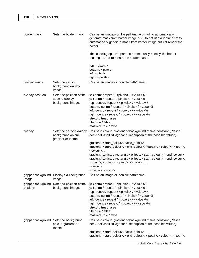
ProGUI V1.39110
© 2013 Chris Deeney, Hash Design
border mask Sets the border mask. Can be an image/icon file path/name or null to automaticallygenerate mask from border image or -1 to not use a mask or -2 toautomatically generate mask from border image but not render theborder.
The following optional parameters manually specify the borderrectangle used to create the border mask:
top: <pixels>bottom: <pixels>left: <pixels>right: <pixels>
overlay image Sets the secondbackground overlayimage.
Can be an image or icon file path/name.
overlay position Sets the position of thesecond overlaybackground image.
x: centre / repeat / <pixels> / <value>%y: centre / repeat / <pixels> / <value>%top: centre / repeat / <pixels> / <value>%bottom: centre / repeat / <pixels> / <value>%left: centre / repeat / <pixels> / <value>%right: centre / repeat / <pixels> / <value>%stretch: true / falsetile: true / falsemasked: true / false
overlay Sets the second overlaybackground colour,gradient or theme.
Can be a colour, gradient or background theme constant (Pleasesee AddPanelExPage for a description of the possible values).
gradient: <start_colour>, <end_colour>gradient: <start_colour>, <end_colour>, <pos.f>, <colour>, <pos.f>,<colour>, ...gradient: vertical / rectangle / ellipse, <start_colour>, <end_colour>gradient: vertical / rectangle / ellipse, <start_colour>, <end_colour>, <pos.f>, <colour>, <pos.f>, <colour>, ...<colour><theme constant>
gripper backgroundimage
Displays a backgroundimage
Can be an image or icon file path/name.
gripper backgroundposition
Sets the position of thebackground image.
x: centre / repeat / <pixels> / <value>%y: centre / repeat / <pixels> / <value>%top: centre / repeat / <pixels> / <value>%bottom: centre / repeat / <pixels> / <value>%left: centre / repeat / <pixels> / <value>%right: centre / repeat / <pixels> / <value>%stretch: true / falsetile: true / falsemasked: true / false
gripper background Sets the backgroundcolour, gradient ortheme.
Can be a colour, gradient or background theme constant (Pleasesee AddPanelExPage for a description of the possible values).
gradient: <start_colour>, <end_colour>gradient: <start_colour>, <end_colour>, <pos.f>, <colour>, <pos.f>,
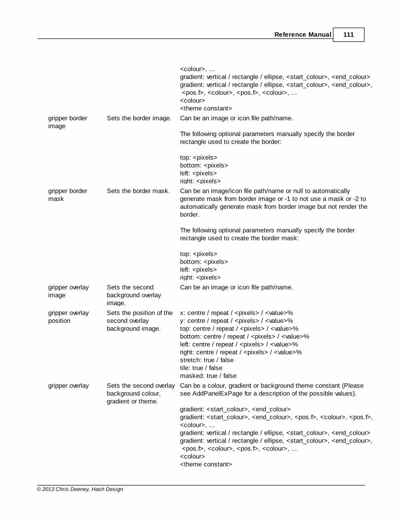
Reference Manual 111
© 2013 Chris Deeney, Hash Design
<colour>, ...gradient: vertical / rectangle / ellipse, <start_colour>, <end_colour>gradient: vertical / rectangle / ellipse, <start_colour>, <end_colour>, <pos.f>, <colour>, <pos.f>, <colour>, ...<colour><theme constant>
gripper borderimage
Sets the border image. Can be an image or icon file path/name.
The following optional parameters manually specify the borderrectangle used to create the border:
top: <pixels>bottom: <pixels>left: <pixels>right: <pixels>
gripper bordermask
Sets the border mask. Can be an image/icon file path/name or null to automaticallygenerate mask from border image or -1 to not use a mask or -2 toautomatically generate mask from border image but not render theborder.
The following optional parameters manually specify the borderrectangle used to create the border mask:
top: <pixels>bottom: <pixels>left: <pixels>right: <pixels>
gripper overlayimage
Sets the secondbackground overlayimage.
Can be an image or icon file path/name.
gripper overlayposition
Sets the position of thesecond overlaybackground image.
x: centre / repeat / <pixels> / <value>%y: centre / repeat / <pixels> / <value>%top: centre / repeat / <pixels> / <value>%bottom: centre / repeat / <pixels> / <value>%left: centre / repeat / <pixels> / <value>%right: centre / repeat / <pixels> / <value>%stretch: true / falsetile: true / falsemasked: true / false
gripper overlay Sets the second overlaybackground colour,gradient or theme.
Can be a colour, gradient or background theme constant (Pleasesee AddPanelExPage for a description of the possible values).
gradient: <start_colour>, <end_colour>gradient: <start_colour>, <end_colour>, <pos.f>, <colour>, <pos.f>,<colour>, ...gradient: vertical / rectangle / ellipse, <start_colour>, <end_colour>gradient: vertical / rectangle / ellipse, <start_colour>, <end_colour>, <pos.f>, <colour>, <pos.f>, <colour>, ...<colour><theme constant>
ProGUI V1.39112
© 2013 Chris Deeney, Hash Design
SplitterEx Index

Reference Manual 113
© 2013 Chris Deeney, Hash Design
6.9 ExplorerBar
ProGUI - ExplorerBar

ProGUI V1.39114
© 2013 Chris Deeney, Hash Design
Overview
The ExplorerBar is a highly customizable skinned navigation/menu control used for displaying a list of categorizedoptions/items by group which can be collapsed or un-collapsed (supporting smooth sliding animation with alphafade transparency). The ExplorerBar has a default system skin and an Office 2007 default skin.
Command Index
CreateExplorerBarAddExplorerBarGroupAddExplorerBarImageGroupExplorerBarItemExplorerBarImageItemSetExplorerBarGroupStateGetExplorerBarGroupStateSetExplorerBarSkinGetExplorerBarSkinExplorerBarIDFreeExplorerBar
Reference Manual 115
© 2013 Chris Deeney, Hash Design
Skin States & Properties
Reference Manual - Index
6.9.1 CreateExplorerBar
CreateExplorerBar()
Syntax
WindowsID = CreateExplorerBar(WindowID.i, ExplorerBarID.l, x.l, y.l, Width.l, Height.l, Skin.i)
Description
Creates an empty skinned ExplorerBar in the specified WindowID.i.
ExplorerBarID.l specifies the internal ID of the ExplorerBar and if #ProGUI_Any is used then the returned value will bethe new ExplorerBar ID. x.l, y.l, Width.l and Height.l are the position and dimensions of the ExplorerBar.
Skin.i specifies what skin the ExplorerBar will use and can be either a handle to a skin or if zero will render theExplorerBar using the default system skin or can be #UISTYLE_OFFICE2007 to use the default Office 2007 skin.Please see Skin States & Properties for creating/editing ExplorerBar skins.
Returns the WindowsID (HWND) of the ExplorerBar (or if #ProGUI_Any is used the ExplorerBar ID) or zero for failure.
See AddExplorerBarGroup, AddExplorerBarImageGroup.
ExplorerBar Index
6.9.2 AddExplorerBarGroup
AddExplorerBarGroup()
Syntax
WindowsID = AddExplorerBarGroup(Title$, isCollapsed.b)
Description
Adds an empty Group to the current previously created ExplorerBar.
Title$ is the text that will be displayed as the ExplorerBar Group's title/header. Specifying isCollapsed.b as true willinitially create and display the Group in it's collapsed state instead of the default un-collapsed.
Returns the WindowsID (HWND) of the ExplorerBar Group header or zero for failure.
See ExplorerBarItem, ExplorerBarImageItem.
ExplorerBar Index
ProGUI V1.39116
© 2013 Chris Deeney, Hash Design
6.9.3 AddExplorerBarImageGroup
AddExplorerBarImageGroup()
Syntax
WindowsID = AddExplorerBarImageGroup(Title$, *NormalImageID, *HotImageID, *PressedImageID,*SelectedImageID, *HotSelectedImageID, PressedSelectedImageID, *DisabledImageID, isCollapsed.b)
Description
Adds an empty Group with header icon/image to the current previously created ExplorerBar.
Title$ is the text that will be displayed as the ExplorerBar Group's title/header.
*NormalImageID, *HotImageID, *PressedImageID and *DisabledImageID are pointers to the image data for thevarious Group un-collapsed states.
*SelectedImageID, *HotSelectedImageID and *PressedSelectedImageID are pointers to the image data for thevarious Group collapsed states.
Specifying isCollapsed.b as true will initially create and display the Group in it's collapsed state instead of thedefault un-collapsed.
Returns the WindowsID (HWND) of the ExplorerBar Group header or zero for failure.
See ExplorerBarItem, ExplorerBarImageItem.
ExplorerBar Index
6.9.4 ExplorerBarItem
ExplorerBarItem()
Syntax
WindowsID = ExplorerBarItem(ItemID.l, Text$)
Description
Adds a new item to the current previously created ExplorerBar group.
ItemID.l specifies the internal ID of the group item and if #ProGUI_Any is used then the returned value will be the newitem ID. Text$ is the text that will be displayed as the group item's title/label.
When the item is clicked, a #WM_COMMAND message will be posted to the ExplorerBar's parent window messagequeue containing the ItemID, which can be detected as a PureBasic #PB_Event_Menu event.
Returns the WindowsID (HWND) of the ExplorerBar group item (or if #ProGUI_Any is used the item ID) or zero forfailure.
Reference Manual 117
© 2013 Chris Deeney, Hash Design
ExplorerBar Index
6.9.5 ExplorerBarImageItem
ExplorerBarImageItem()
Syntax
WindowsID = ExplorerBarImageItem(ItemID.l, Text$, *NormalImageID, *HotImageID, *PressedImageID,*DisabledImageID)
Description
Adds a new item with icon/image to the current previously created ExplorerBar group.
ItemID.l specifies the internal ID of the group item and if #ProGUI_Any is used then the returned value will be the newitem ID. Text$ is the text that will be displayed as the group item's title/label.
*NormalImageID, *HotImageID, *PressedImageID and *DisabledImageID are pointers to the image data for thevarious states.
When the item is clicked, a #WM_COMMAND message will be posted to the ExplorerBar's parent window messagequeue containing the ItemID, which can be detected as a PureBasic #PB_Event_Menu event.
Returns the WindowsID (HWND) of the ExplorerBar group item (or if #ProGUI_Any is used the item ID) or zero forfailure.
ExplorerBar Index
6.9.6 SetExplorerBarGroupState
SetExplorerBarGroupState()
Syntax
Success = SetExplorerBarGroupState(ID.i, Index.i, Collapse.b)
Description
Sets the ExplorerBar Group's collapsed state making it animate into either the collapsed or un-collapsed state.
ID.i is the ID/Windows Handle of the ExplorerBar. Index.i is the zero based index of the desired Group. Collapse.bcan be either true to collapse or false to un-collapse.
Returns true for success or zero for failure.
See GetExplorerBarGroupState, AddExplorerBarGroup, AddExplorerBarImageGroup.
ExplorerBar Index
ProGUI V1.39118
© 2013 Chris Deeney, Hash Design
6.9.7 GetExplorerBarGroupState
GetExplorerBarGroupState()
Syntax
State = GetExplorerBarGroupState(ID.i, Index.i)
Description
Returns the collapsed state of the specified ExplorerBar Group.
ID.i is the ID/Windows Handle of the ExplorerBar. Index.i is the zero based index of the desired Group.
Returns true if the specified ExplorerBar Group is collapsed, false otherwise.
See SetExplorerBarGroupState, AddExplorerBarGroup, AddExplorerBarImageGroup.
ExplorerBar Index
6.9.8 SetExplorerBarSkin
SetExplorerBarSkin()
Syntax
Success = SetExplorerBarSkin(ID.i, Skin.i, ComponentName$, noRefresh.b)
Description
Sets an ExplorerBar's skin.
ID.i specifies the handle/ID of the ExplorerBar you want to set the skin for. Skin.i is the handle of the skin.
ComponentName$ is optional and can be an empty string. Specifying ComponentName$ will make the control usethe states and properties for that skin component name (if it exists in the skin) instead of the default "ExplorerBar".
If noRefresh.b is set to true then the ExplorerBar won't be refreshed/updated after this command is called.
Please see Skin States & Properties for creating/editing ExplorerBar skins.
Returns true if successful, zero for failure.
ExplorerBar Index
6.9.9 GetExplorerBarSkin
GetExplorerBarSkin()
Syntax
Skin.i = GetExplorerBarSkin(ID.i)
Description
Reference Manual 119
© 2013 Chris Deeney, Hash Design
Returns a handle to an ExplorerBar's current skin or zero for failure.
ID.i specifies the handle/ID of the ExplorerBar that you want to retrieve the skin for.
ExplorerBar Index
6.9.10 ExplorerBarID
ExplorerBarID()
Syntax
WindowsID.l = ExplorerBarID(ID.l)
Description
Returns the Windows ID (HWND) of a previously created ExplorerBar.
ExplorerBar Index
6.9.11 FreeExplorerBar
FreeExplorerBar()
Syntax
Success = FreeExplorerBar(ID.i)
Description
Frees an ExplorerBar from memory.
ID.i is the ID/Windows Handle of the ExplorerBar you wish to free or -1 in order to free all ExplorerBars.
Returns true for success or zero for failure.
ExplorerBar Index
6.9.12 Skin States & Properties
ExplorerBar Skin States & Properties
Component Name
ExplorerBar
State Name
Name Description
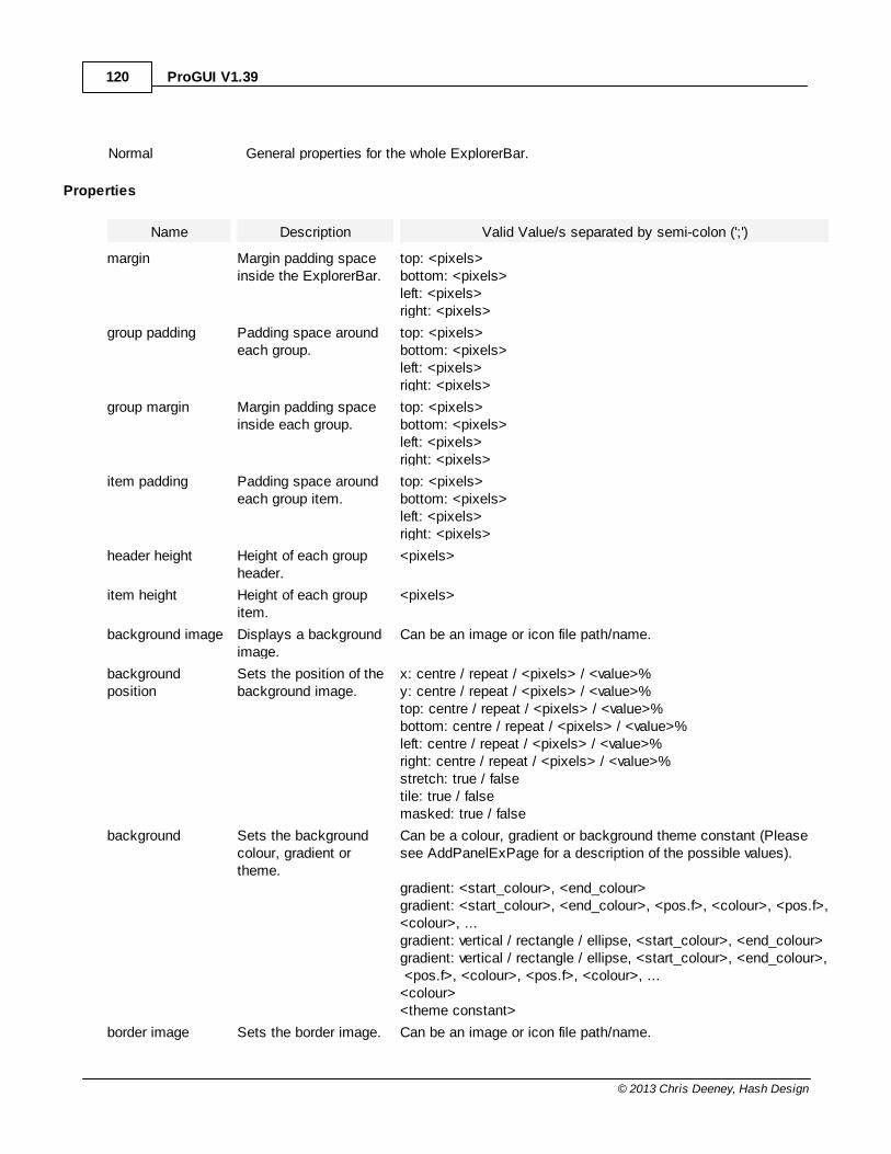
ProGUI V1.39120
© 2013 Chris Deeney, Hash Design
Normal General properties for the whole ExplorerBar.
Properties
Name Description Valid Value/s separated by semi-colon (';')
margin Margin padding spaceinside the ExplorerBar.
top: <pixels>bottom: <pixels>left: <pixels>right: <pixels>
group padding Padding space aroundeach group.
top: <pixels>bottom: <pixels>left: <pixels>right: <pixels>
group margin Margin padding spaceinside each group.
top: <pixels>bottom: <pixels>left: <pixels>right: <pixels>
item padding Padding space aroundeach group item.
top: <pixels>bottom: <pixels>left: <pixels>right: <pixels>
header height Height of each groupheader.
<pixels>
item height Height of each groupitem.
<pixels>
background image Displays a backgroundimage.
Can be an image or icon file path/name.
backgroundposition
Sets the position of thebackground image.
x: centre / repeat / <pixels> / <value>%y: centre / repeat / <pixels> / <value>%top: centre / repeat / <pixels> / <value>%bottom: centre / repeat / <pixels> / <value>%left: centre / repeat / <pixels> / <value>%right: centre / repeat / <pixels> / <value>%stretch: true / falsetile: true / falsemasked: true / false
background Sets the backgroundcolour, gradient ortheme.
Can be a colour, gradient or background theme constant (Pleasesee AddPanelExPage for a description of the possible values).
gradient: <start_colour>, <end_colour>gradient: <start_colour>, <end_colour>, <pos.f>, <colour>, <pos.f>,<colour>, ...gradient: vertical / rectangle / ellipse, <start_colour>, <end_colour>gradient: vertical / rectangle / ellipse, <start_colour>, <end_colour>, <pos.f>, <colour>, <pos.f>, <colour>, ...<colour><theme constant>
border image Sets the border image. Can be an image or icon file path/name.
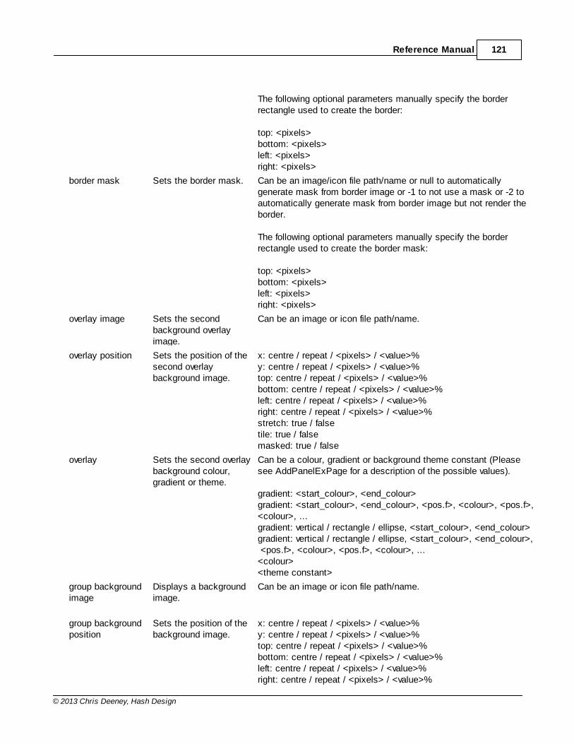
Reference Manual 121
© 2013 Chris Deeney, Hash Design
The following optional parameters manually specify the borderrectangle used to create the border:
top: <pixels>bottom: <pixels>left: <pixels>right: <pixels>
border mask Sets the border mask. Can be an image/icon file path/name or null to automaticallygenerate mask from border image or -1 to not use a mask or -2 toautomatically generate mask from border image but not render theborder.
The following optional parameters manually specify the borderrectangle used to create the border mask:
top: <pixels>bottom: <pixels>left: <pixels>right: <pixels>
overlay image Sets the secondbackground overlayimage.
Can be an image or icon file path/name.
overlay position Sets the position of thesecond overlaybackground image.
x: centre / repeat / <pixels> / <value>%y: centre / repeat / <pixels> / <value>%top: centre / repeat / <pixels> / <value>%bottom: centre / repeat / <pixels> / <value>%left: centre / repeat / <pixels> / <value>%right: centre / repeat / <pixels> / <value>%stretch: true / falsetile: true / falsemasked: true / false
overlay Sets the second overlaybackground colour,gradient or theme.
Can be a colour, gradient or background theme constant (Pleasesee AddPanelExPage for a description of the possible values).
gradient: <start_colour>, <end_colour>gradient: <start_colour>, <end_colour>, <pos.f>, <colour>, <pos.f>,<colour>, ...gradient: vertical / rectangle / ellipse, <start_colour>, <end_colour>gradient: vertical / rectangle / ellipse, <start_colour>, <end_colour>, <pos.f>, <colour>, <pos.f>, <colour>, ...<colour><theme constant>
group backgroundimage
Displays a backgroundimage.
Can be an image or icon file path/name.
group backgroundposition
Sets the position of thebackground image.
x: centre / repeat / <pixels> / <value>%y: centre / repeat / <pixels> / <value>%top: centre / repeat / <pixels> / <value>%bottom: centre / repeat / <pixels> / <value>%left: centre / repeat / <pixels> / <value>%right: centre / repeat / <pixels> / <value>%
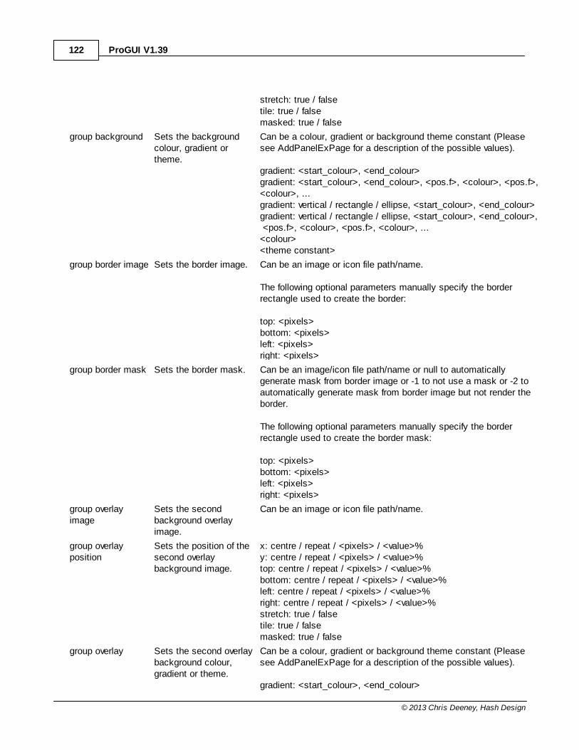
ProGUI V1.39122
© 2013 Chris Deeney, Hash Design
stretch: true / falsetile: true / falsemasked: true / false
group background Sets the backgroundcolour, gradient ortheme.
Can be a colour, gradient or background theme constant (Pleasesee AddPanelExPage for a description of the possible values).
gradient: <start_colour>, <end_colour>gradient: <start_colour>, <end_colour>, <pos.f>, <colour>, <pos.f>,<colour>, ...gradient: vertical / rectangle / ellipse, <start_colour>, <end_colour>gradient: vertical / rectangle / ellipse, <start_colour>, <end_colour>, <pos.f>, <colour>, <pos.f>, <colour>, ...<colour><theme constant>
group border image Sets the border image. Can be an image or icon file path/name.
The following optional parameters manually specify the borderrectangle used to create the border:
top: <pixels>bottom: <pixels>left: <pixels>right: <pixels>
group border mask Sets the border mask. Can be an image/icon file path/name or null to automaticallygenerate mask from border image or -1 to not use a mask or -2 toautomatically generate mask from border image but not render theborder.
The following optional parameters manually specify the borderrectangle used to create the border mask:
top: <pixels>bottom: <pixels>left: <pixels>right: <pixels>
group overlayimage
Sets the secondbackground overlayimage.
Can be an image or icon file path/name.
group overlayposition
Sets the position of thesecond overlaybackground image.
x: centre / repeat / <pixels> / <value>%y: centre / repeat / <pixels> / <value>%top: centre / repeat / <pixels> / <value>%bottom: centre / repeat / <pixels> / <value>%left: centre / repeat / <pixels> / <value>%right: centre / repeat / <pixels> / <value>%stretch: true / falsetile: true / falsemasked: true / false
group overlay Sets the second overlaybackground colour,gradient or theme.
Can be a colour, gradient or background theme constant (Pleasesee AddPanelExPage for a description of the possible values).
gradient: <start_colour>, <end_colour>

Reference Manual 123
© 2013 Chris Deeney, Hash Design
gradient: <start_colour>, <end_colour>, <pos.f>, <colour>, <pos.f>,<colour>, ...gradient: vertical / rectangle / ellipse, <start_colour>, <end_colour>gradient: vertical / rectangle / ellipse, <start_colour>, <end_colour>, <pos.f>, <colour>, <pos.f>, <colour>, ...<colour><theme constant>
Component Names
ExplorerBar Group Header, ExplorerBar Group Item
State Names
Name Description
Normal Normal header/item state.
Hot Hover state when the mouse pointer is over the header/item.
Pressed When the header/item is pressed.
Disabled The header/item is disabled.
ExplorerBar Group Header Only States
selected Normal collapsed state.
selected hot Collapsed hover state when the mouse pointer is over the header.
selected pressed When the header is in the collapsed state and pressed.
Properties
Name Description Valid Value/s separated by semi-colon (';')
background image Displays a backgroundimage.
Can be an image or icon file path/name.
backgroundposition
Sets the position of thebackground image.
x: centre / repeat / <pixels> / <value>%y: centre / repeat / <pixels> / <value>%top: centre / repeat / <pixels> / <value>%bottom: centre / repeat / <pixels> / <value>%left: centre / repeat / <pixels> / <value>%right: centre / repeat / <pixels> / <value>%stretch: true / falsetile: true / falsemasked: true / false
background Sets the backgroundcolour, gradient ortheme.
Can be a colour, gradient or background theme constant (Pleasesee AddPanelExPage for a description of the possible values).
gradient: <start_colour>, <end_colour>gradient: <start_colour>, <end_colour>, <pos.f>, <colour>, <pos.f>,<colour>, ...gradient: vertical / rectangle / ellipse, <start_colour>, <end_colour>gradient: vertical / rectangle / ellipse, <start_colour>, <end_colour>,
ProGUI V1.39124
© 2013 Chris Deeney, Hash Design
<pos.f>, <colour>, <pos.f>, <colour>, ...<colour><theme constant>
border image Sets the border image. Can be an image or icon file path/name.
The following optional parameters manually specify the borderrectangle used to create the border:
top: <pixels>bottom: <pixels>left: <pixels>right: <pixels>
border mask Sets the border mask. Can be an image/icon file path/name or null to automaticallygenerate mask from border image or -1 to not use a mask or -2 toautomatically generate mask from border image but not render theborder.
The following optional parameters manually specify the borderrectangle used to create the border mask:
top: <pixels>bottom: <pixels>left: <pixels>right: <pixels>
overlay image Sets the secondbackground overlayimage.
Can be an image or icon file path/name.
overlay position Sets the position of thesecond overlaybackground image.
x: centre / repeat / <pixels> / <value>%y: centre / repeat / <pixels> / <value>%top: centre / repeat / <pixels> / <value>%bottom: centre / repeat / <pixels> / <value>%left: centre / repeat / <pixels> / <value>%right: centre / repeat / <pixels> / <value>%stretch: true / falsetile: true / falsemasked: true / false
overlay Sets the second overlaybackground colour,gradient or theme.
Can be a colour, gradient or background theme constant (Pleasesee AddPanelExPage for a description of the possible values).
gradient: <start_colour>, <end_colour>gradient: <start_colour>, <end_colour>, <pos.f>, <colour>, <pos.f>,<colour>, ...gradient: vertical / rectangle / ellipse, <start_colour>, <end_colour>gradient: vertical / rectangle / ellipse, <start_colour>, <end_colour>, <pos.f>, <colour>, <pos.f>, <colour>, ...<colour><theme constant>
image Sets the image to useas the header/item icon.
Can be an image or icon file path/name.
noclip: true / false
Reference Manual 125
© 2013 Chris Deeney, Hash Design
image position Sets the position of theimage/icon.
x: centre / <pixels> / <value>%y: centre / <pixels> / <value>%top: centre / <pixels> / <value>%bottom: centre / <pixels> / <value>%left: centre / <pixels> / <value>%right: centre / <pixels> / <value>%
image padding Sets the padding sizearound the header/itemimage.
top: <pixels>bottom: <pixels>left: <pixels>right: <pixels>
text Sets the text font andcolour.
font: <name>, <point-size>font: <name>, <point-size>, italic / underline / bold /strikethrough, .. , ...colour: <colour>
text position Sets the position of thetext.
x: centre / <pixels> / <value>%y: centre / <pixels> / <value>%top: centre / <pixels> / <value>%bottom: centre / <pixels> / <value>%left: centre / <pixels> / <value>%right: centre / <pixels> / <value>%
text padding Sets the padding sizearound the text.
top: <pixels>bottom: <pixels>left: <pixels>right: <pixels>
cursor Sets the mouse pointer/cursor for the state.
appstartingarrowcrosshandhelpibeamnosizesizeallsizeneswsizenssizenwsesizeweuparrowwait<HCURSOR>
ExplorerBar Index
ProGUI V1.39126
© 2013 Chris Deeney, Hash Design
6.10 Colours & Images
ProGUI - Colours & Images
Overview
Various commands for setting/retrieving rendering style colours/gradients and image manipulation and effects.
Command Index
SetUIColourModeGetUIColourModeGetCurrentColourSchemeGetUIColourSetUIColourMakeColourMakeRGBAlphaBlendColourCreateGradientSetGradientSetGradientColourGetGradientColourRemoveGradientColourFreeGradientLoadImgImgWidthImgHeightImgBlendImgHueBlendFreeImg
Reference Manual - Index
6.10.1 SetUIColourMode
SetUIColourMode()
Syntax
Success = SetUIColourMode(Mode.l)
Description
Changes the current colour scheme rendering mode for styled components such as MenuEx, ToolbarEx and Rebars.This command also automatically updates all skinned controls to the equivalent colour theme name if supported(see UpdateSkins). Mode can be any of the following constants: -
#UICOLOURMODE_DEFAULT Automatically selects "best match" colour scheme based on user's Windowstheme colour.
#UICOLOURMODE_DEFAULT_BLUE Renders the User Interface using the default "blue" colour scheme.
#UICOLOURMODE_DEFAULT_OLIVE Renders the User Interface using the default "olive" colour scheme.
Reference Manual 127
© 2013 Chris Deeney, Hash Design
#UICOLOURMODE_DEFAULT_SILVER Renders the User Interface using the default "silver" colour scheme.
#UICOLOURMODE_DEFAULT_GREY Renders the User Interface using the default classic "grey" colour scheme.
#UICOLOURMODE_CUSTOM Automatically selects "best match" custom colour scheme based on user'sWindows theme colour.
#UICOLOURMODE_CUSTOM_BLUE Renders the User Interface using the custom "blue" colour scheme.
#UICOLOURMODE_CUSTOM_OLIVE Renders the User Interface using the custom "olive" colour scheme.
#UICOLOURMODE_CUSTOM_SILVER Renders the User Interface using the custom "silver" colour scheme.
#UICOLOURMODE_CUSTOM_GREY Renders the User Interface using the custom classic "grey" colour scheme.
Returns true if successful.
Colours & Images Index
6.10.2 GetUIColourMode
GetUIColourMode()
Syntax
UIColourMode = GetUIColourMode()
Description
Returns the current colour scheme rendering mode for styled components such as MenuEx, ToolbarEx and Rebars.The returned value can be any of the following constants: -
#UICOLOURMODE_DEFAULT Automatically selects "best match" colour scheme based on user's Windowstheme colour.
#UICOLOURMODE_DEFAULT_BLUE Renders the User Interface using the default blue colour scheme.
#UICOLOURMODE_DEFAULT_OLIVE Renders the User Interface using the default olive colour scheme.
#UICOLOURMODE_DEFAULT_SILVER Renders the User Interface using the default silver colour scheme.
#UICOLOURMODE_DEFAULT_GREY Renders the User Interface using the default classic grey colour scheme.
#UICOLOURMODE_CUSTOM Automatically selects "best match" custom colour scheme based on user'sWindows theme colour.
#UICOLOURMODE_CUSTOM_BLUE Renders the User Interface using the custom blue colour scheme.
#UICOLOURMODE_CUSTOM_OLIVE Renders the User Interface using the custom olive colour scheme.
#UICOLOURMODE_CUSTOM_SILVER Renders the User Interface using the custom silver colour scheme.
#UICOLOURMODE_CUSTOM_GREY Renders the User Interface using the custom classic grey colour scheme.
Colours & Images Index

ProGUI V1.39128
© 2013 Chris Deeney, Hash Design
6.10.3 GetCurrentColourScheme
GetCurrentColourScheme()
Syntax
UIColourScheme = GetCurrentColourScheme()
Description
Returns the currently active colour scheme for styled components such as MenuEx, ToolbarEx and Rebars.The returned value can be any of the following constants: -
#UICOLOURMODE_DEFAULT_BLUE The User Interface is currently using the default blue colour scheme.
#UICOLOURMODE_DEFAULT_OLIVE The User Interface is currently using the default olive colour scheme.
#UICOLOURMODE_DEFAULT_SILVER The User Interface is currently using the default silver colour scheme.
#UICOLOURMODE_DEFAULT_GREY The User Interface is currently using the default classic grey colour scheme.
#UICOLOURMODE_CUSTOM_BLUE The User Interface is currently using the custom blue colour scheme.
#UICOLOURMODE_CUSTOM_OLIVE The User Interface is currently using the custom olive colour scheme.
#UICOLOURMODE_CUSTOM_SILVER The User Interface is currently using the custom silver colour scheme.
#UICOLOURMODE_CUSTOM_GREY The User Interface is currently using the custom classic grey colour scheme.
Colours & Images Index
6.10.4 GetUIColour
GetUIColour()
Syntax
Colour.l = GetUIColour(Style.l, Component.l, ColourScheme.l)
Description
Returns an RGB colour from the specified style, component and colour scheme.
The following table shows the available styles and components contained within that style:-
#UISTYLE_WHIDBEY
#menuTitleTextColor
#menuTitleHotTextColor
#menuTitleHeldTextColor
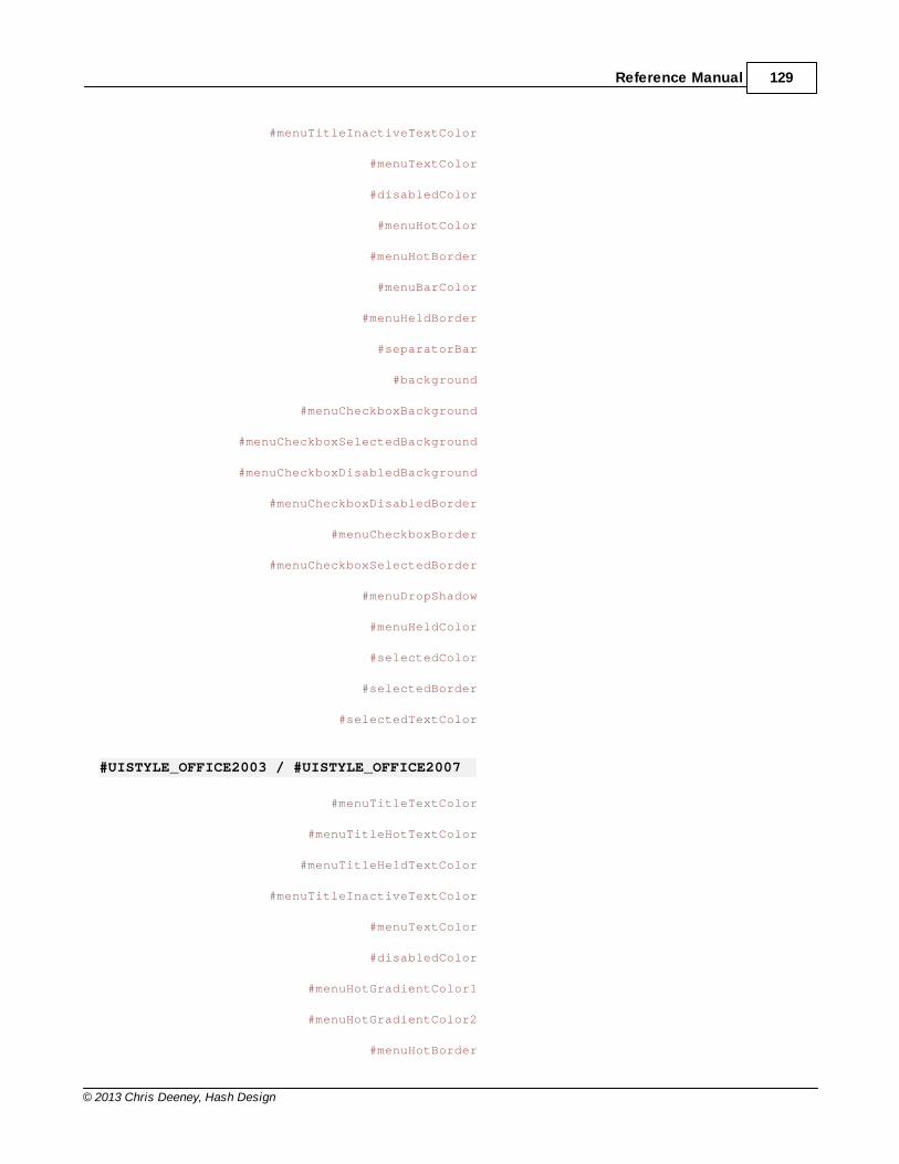
Reference Manual 129
© 2013 Chris Deeney, Hash Design
#menuTitleInactiveTextColor
#menuTextColor
#disabledColor
#menuHotColor
#menuHotBorder
#menuBarColor
#menuHeldBorder
#separatorBar
#background
#menuCheckboxBackground
#menuCheckboxSelectedBackground
#menuCheckboxDisabledBackground
#menuCheckboxDisabledBorder
#menuCheckboxBorder
#menuCheckboxSelectedBorder
#menuDropShadow
#menuHeldColor
#selectedColor
#selectedBorder
#selectedTextColor
#UISTYLE_OFFICE2003 / #UISTYLE_OFFICE2007
#menuTitleTextColor
#menuTitleHotTextColor
#menuTitleHeldTextColor
#menuTitleInactiveTextColor
#menuTextColor
#disabledColor
#menuHotGradientColor1
#menuHotGradientColor2
#menuHotBorder
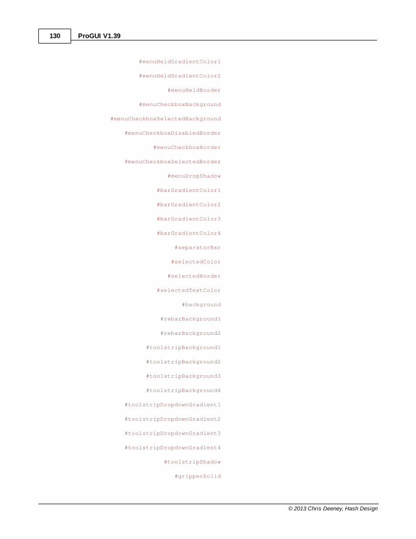
ProGUI V1.39130
© 2013 Chris Deeney, Hash Design
#menuHeldGradientColor1
#menuHeldGradientColor2
#menuHeldBorder
#menuCheckboxBackground
#menuCheckboxSelectedBackground
#menuCheckboxDisabledBorder
#menuCheckboxBorder
#menuCheckboxSelectedBorder
#menuDropShadow
#barGradientColor1
#barGradientColor2
#barGradientColor3
#barGradientColor4
#separatorBar
#selectedColor
#selectedBorder
#selectedTextColor
#background
#rebarBackground1
#rebarBackground2
#toolstripBackground1
#toolstripBackground2
#toolstripBackground3
#toolstripBackground4
#toolstripDropdownGradient1
#toolstripDropdownGradient2
#toolstripDropdownGradient3
#toolstripDropdownGradient4
#toolstripShadow
#gripperSolid
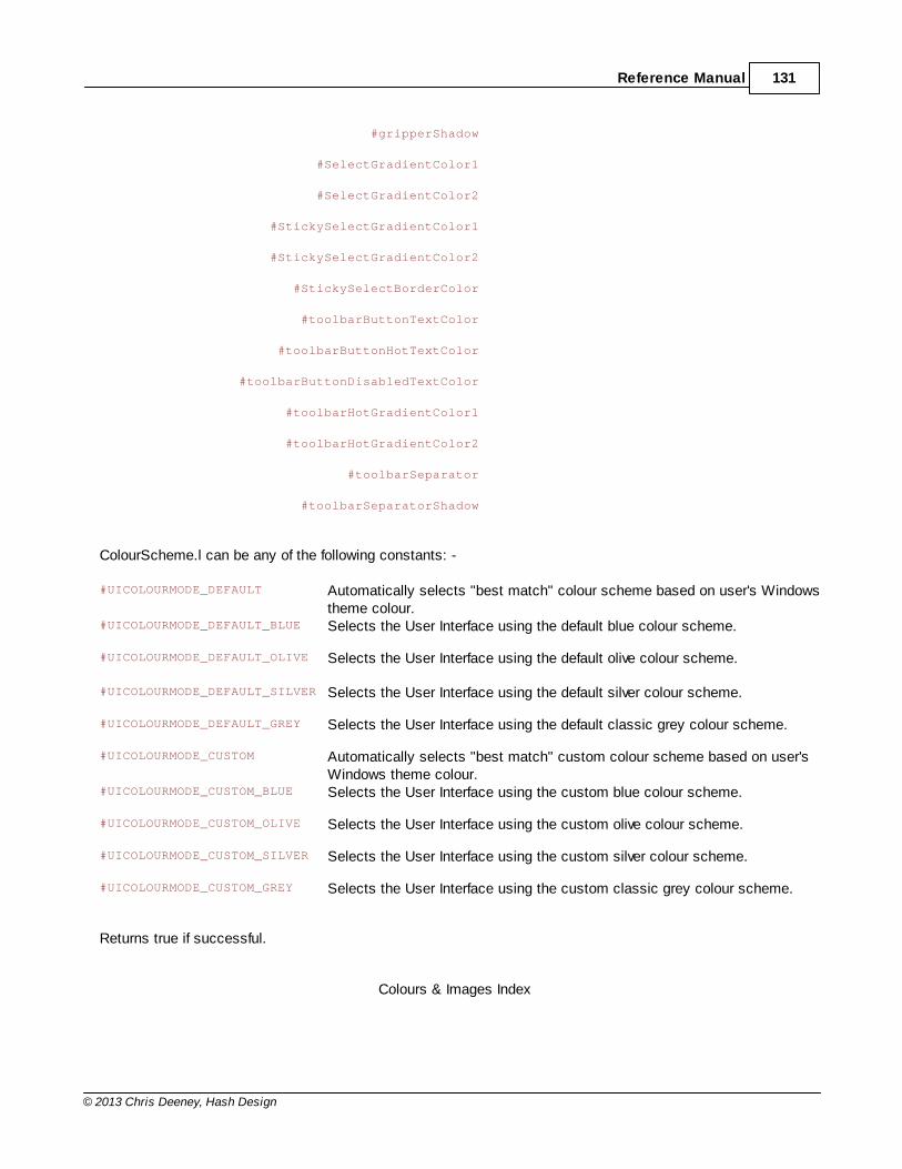
Reference Manual 131
© 2013 Chris Deeney, Hash Design
#gripperShadow
#SelectGradientColor1
#SelectGradientColor2
#StickySelectGradientColor1
#StickySelectGradientColor2
#StickySelectBorderColor
#toolbarButtonTextColor
#toolbarButtonHotTextColor
#toolbarButtonDisabledTextColor
#toolbarHotGradientColor1
#toolbarHotGradientColor2
#toolbarSeparator
#toolbarSeparatorShadow
ColourScheme.l can be any of the following constants: -
#UICOLOURMODE_DEFAULT Automatically selects "best match" colour scheme based on user's Windowstheme colour.
#UICOLOURMODE_DEFAULT_BLUE Selects the User Interface using the default blue colour scheme.
#UICOLOURMODE_DEFAULT_OLIVE Selects the User Interface using the default olive colour scheme.
#UICOLOURMODE_DEFAULT_SILVER Selects the User Interface using the default silver colour scheme.
#UICOLOURMODE_DEFAULT_GREY Selects the User Interface using the default classic grey colour scheme.
#UICOLOURMODE_CUSTOM Automatically selects "best match" custom colour scheme based on user'sWindows theme colour.
#UICOLOURMODE_CUSTOM_BLUE Selects the User Interface using the custom blue colour scheme.
#UICOLOURMODE_CUSTOM_OLIVE Selects the User Interface using the custom olive colour scheme.
#UICOLOURMODE_CUSTOM_SILVER Selects the User Interface using the custom silver colour scheme.
#UICOLOURMODE_CUSTOM_GREY Selects the User Interface using the custom classic grey colour scheme.
Returns true if successful.
Colours & Images Index
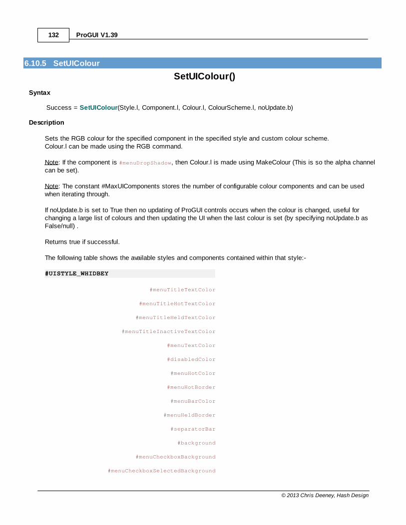
ProGUI V1.39132
© 2013 Chris Deeney, Hash Design
6.10.5 SetUIColour
SetUIColour()
Syntax
Success = SetUIColour(Style.l, Component.l, Colour.l, ColourScheme.l, noUpdate.b)
Description
Sets the RGB colour for the specified component in the specified style and custom colour scheme.Colour.l can be made using the RGB command.
Note: If the component is #menuDropShadow, then Colour.l is made using MakeColour (This is so the alpha channelcan be set).
Note: The constant #MaxUIComponents stores the number of configurable colour components and can be usedwhen iterating through.
If noUpdate.b is set to True then no updating of ProGUI controls occurs when the colour is changed, useful forchanging a large list of colours and then updating the UI when the last colour is set (by specifying noUpdate.b asFalse/null) .
Returns true if successful.
The following table shows the available styles and components contained within that style:-
#UISTYLE_WHIDBEY
#menuTitleTextColor
#menuTitleHotTextColor
#menuTitleHeldTextColor
#menuTitleInactiveTextColor
#menuTextColor
#disabledColor
#menuHotColor
#menuHotBorder
#menuBarColor
#menuHeldBorder
#separatorBar
#background
#menuCheckboxBackground
#menuCheckboxSelectedBackground

Reference Manual 133
© 2013 Chris Deeney, Hash Design
#menuCheckboxDisabledBackground
#menuCheckboxDisabledBorder
#menuCheckboxBorder
#menuCheckboxSelectedBorder
#menuDropShadow
#menuHeldColor
#selectedColor
#selectedBorder
#selectedTextColor
#UISTYLE_OFFICE2003 / #UISTYLE_OFFICE2007
#menuTitleTextColor
#menuTitleHotTextColor
#menuTitleHeldTextColor
#menuTitleInactiveTextColor
#menuTextColor
#disabledColor
#menuHotGradientColor1
#menuHotGradientColor2
#menuHotBorder
#menuHeldGradientColor1
#menuHeldGradientColor2
#menuHeldBorder
#menuCheckboxBackground
#menuCheckboxSelectedBackground
#menuCheckboxDisabledBorder
#menuCheckboxBorder
#menuCheckboxSelectedBorder
#menuDropShadow
#barGradientColor1
#barGradientColor2
ProGUI V1.39134
© 2013 Chris Deeney, Hash Design
#barGradientColor3
#barGradientColor4
#separatorBar
#selectedColor
#selectedBorder
#selectedTextColor
#background
#rebarBackground1
#rebarBackground2
#toolstripBackground1
#toolstripBackground2
#toolstripBackground3
#toolstripBackground4
#toolstripDropdownGradient1
#toolstripDropdownGradient2
#toolstripDropdownGradient3
#toolstripDropdownGradient4
#toolstripShadow
#gripperSolid
#gripperShadow
#SelectGradientColor1
#SelectGradientColor2
#StickySelectGradientColor1
#StickySelectGradientColor2
#StickySelectBorderColor
#toolbarButtonTextColor
#toolbarButtonHotTextColor
#toolbarButtonDisabledTextColor
#toolbarHotGradientColor1
#toolbarHotGradientColor2
Reference Manual 135
© 2013 Chris Deeney, Hash Design
#toolbarSeparator
#toolbarSeparatorShadow
ColourScheme.l can be any of the following constants: -
#UICOLOURMODE_CUSTOM Automatically selects "best match" custom colour scheme based on user'sWindows theme colour.
#UICOLOURMODE_CUSTOM_BLUE Selects the User Interface using the custom blue colour scheme.
#UICOLOURMODE_CUSTOM_OLIVE Selects the User Interface using the custom olive colour scheme.
#UICOLOURMODE_CUSTOM_SILVER Selects the User Interface using the custom silver colour scheme.
#UICOLOURMODE_CUSTOM_GREY Selects the User Interface using the custom classic grey colour scheme.
Colours & Images Index
6.10.6 MakeColour
MakeColour()
Syntax
Colour.l = MakeColour(Alpha.l, Red.l, Green.l, Blue.l)
Description
Returns a Windows compatible ABGR colour with alpha channel, useful for some Windows API calls.
Colours & Images Index
6.10.7 MakeRGB
MakeRGB()
Syntax
Colour.l = MakeRGB(Red.l, Green.l, Blue.l)
Description
Returns an RGB colour.
Colours & Images Index

ProGUI V1.39136
© 2013 Chris Deeney, Hash Design
6.10.8 AlphaBlendColour
AlphaBlendColour()
Syntax
Colour.l = AlphaBlendColour(LeftColour.l , RightColour.l, Alpha.l)
Description
Returns a 32bit RGB colour value with alpha channel that is the combination of LeftColour + (RightColour mixed byAlpha), Alpha can be from 0 to 255, 255 being opaque.
Colours & Images Index
6.10.9 CreateGradient
CreateGradient()
Syntax
Gradient.i = CreateGradient(Style.l, Colour1.l, Colour2.l)
Description
Creates a linear gradient from Colour1.l to Colour2.l. Colour1.l and Colour2.l are made with the MakeColourcommand. Style.l can be be #VerticalGRADIENT, #RectangleGRADIENT, #EllipseGRADIENT or zero for a horizontalgradient.
More blend colours can also be inserted into the gradient using the SetGradientColour command.
Returns a handle to the newly created gradient.
Colours & Images Index
6.10.10 SetGradient
SetGradient()
Syntax
Success = SetGradient(Gradient.i, Style.l)
Description
Sets the style/type of a previously created gradient.Gradient.i is a handle to a gradient. Style.l can be be #VerticalGRADIENT, #RectangleGRADIENT,#EllipseGRADIENT or 0 for a horizontal gradient.
Returns true for success.

Reference Manual 137
© 2013 Chris Deeney, Hash Design
Colours & Images Index
6.10.11 SetGradientColour
SetGradientColour()
Syntax
Success = SetGradientColour(Gradient.i, Position.f, Colour.l)
Description
Sets the colour of a previously created gradient at a certain position in that gradient.Gradient.i is a handle to a gradient. Position.f specifies at what position in the gradient the colour will be set andmust be a floating point number from 0 to 1, e.g. 0.5 would set the colour at halfway in the gradient.
Returns true for success.
Colours & Images Index
6.10.12 GetGradientColour
GetGradientColour()
Syntax
Colour.l = GetGradientColour(Gradient.i, Position.f)
Description
Returns the colour of a previously created gradient at a certain position in that gradient.Gradient.i is a handle to a gradient. Position.f specifies at what position in the gradient the colour will be retrievedfrom and must be a floating point number from 0 to 1, e.g. 0.5 would get the colour at halfway in the gradient.
Colours & Images Index
6.10.13 RemoveGradientColour
RemoveGradientColour()
Syntax
Success = RemoveGradientColour(Gradient.i, Position.f)
Description
Removes the colour of a previously created gradient at a certain position in that gradient.Gradient.i is a handle to a gradient. Position.f specifies at what position in the gradient the colour will be removedfrom and must be a floating point number from 0 to 1, e.g. 0.5 would remove the colour at halfway in the gradient ifexists.
Returns true for success.

ProGUI V1.39138
© 2013 Chris Deeney, Hash Design
Colours & Images Index
6.10.14 FreeGradient
FreeGradient()
Syntax
Success = FreeGradient(Gradient.i)
Description
Frees the memory allocated for a previously created gradient.Gradient.i is a handle to a gradient.
Returns true for success.
Colours & Images Index
6.10.15 LoadImg
LoadImg()
Syntax
*newImage = LoadImg(Path.s, Width.l, Height.l, Flags.i)
Description
Loads a PNG, JPG, BMP or Icon image.
Path.s specifies the path and file name of the image/icon that you would like to load (for loading multiple images fromthe same directory, ImgPath can be used). Width.l and Height.l are the desired dimensions of the image. If Path.spoints to an icon that has multiple resolution versions contained inside itself then the closest match version will beselected based on Width.l and Height.l, alternatively if Path.s is an image then the image will be resized to thespecified dimensions. Width.l and Height.l can also be NULL in order to use the image/icon dimension's actual size.
Flags.i can be #Img_ReturnIcon in order to automatically covert the returned *newImage to an icon (HICON) if inanother image format.
Returns a pointer to the new image data (HBITMAP) or icon (HICON), zero for failure.
The returned *newImage can later be destroyed when not needed anymore by using the FreeImg command.
Colours & Images Index
6.10.16 ImgPath
ImgPath()
Syntax
ImgPath(Path.s)
Description

Reference Manual 139
© 2013 Chris Deeney, Hash Design
Sets the default root path that LoadImg will use to load images.
Colours & Images Index
6.10.17 ImgWidth
ImgWidth()
Syntax
Pixels = ImgWidth(*Image)
Description
Returns the width of an image (HBITMAP) or icon (HICON) in pixels.
Colours & Images Index
6.10.18 ImgHeight
ImgHeight()
Syntax
Pixels = ImgHeight(*Image)
Description
Returns the height of an image (HBITMAP) or icon (HICON) in pixels.
Colours & Images Index
6.10.19 ImgBlend
ImgBlend()
Syntax
*newImage = ImgBlend(*SourceImage, AlphaChannel.f, Contrast.f, Brightness.f, BlendColor.l, BlendAmount.f,Flags.i)
Description
ImgBlend is a powerful and versatile image effect command for creating a new image/icon based on altering a sourceicon or image's alpha channel, contrast, brightness and/or blend with another colour. A common use for thiscommand is automatically generating images for hot and disabled states (based on one stored image) for use inother ProGUI commands.
*SourceImage is a pointer to the icon/image that you wish to manipulate. AlphaChannel.f specifies the newtransparency level (also taking into account the existing alpha channel data) and can be in the range of 0 to 255 (0 =fully transparent, 255 = solid). Contrast.f specifies the new contrast level and can be in the range of -255 to 255, this
ProGUI V1.39140
© 2013 Chris Deeney, Hash Design
parameter can also be Null (having no effect on contrast). Brightness.f specifies the new brightness level and can bein the range of -255 to 255, this parameter can also be Null (having no effect on brightness). BlendColor.l specifies anRGB colour value that will be used with BlendAmount.f (0 to 255) in order to blend the new image to that colour,BlendColor.l and BlendAmount.f can both be Null in order to have no effect. Flags.i can contain the followingconstants: -
#ImgBlend_Greyscale Converts the image to grey scale, taking effect before any of the other imageeffects are added (if any).#ImgBlend_ReturnIcon Returns an Icon (HICON) as *newImage instead of an image (HBITMAP).#ImgBlend_DestroyOriginal Destroys the original *SourceImage.
Returns a pointer to the new image/icon or zero for failure.
The returned *newImage can later be destroyed when not needed anymore by using the FreeImg command.
Colours & Images Index
6.10.20 ImgHueBlend
ImgHueBlend()
Syntax
*newImage = ImgHueBlend(*SourceImage, AlphaChannel.f, HueColor.l, Saturation.f, Lightness.f, BlendColor.l,BlendAmount.f, Flags.i)
Description
ImgHueBlend is a powerful and versatile image effect command for creating a new image/icon based on altering asource icon/image's alpha channel, colour hue and/or blend amount with another colour. A common use for thiscommand is automatically generating images for hot and disabled states (based on one stored image) for use inother ProGUI commands.
*SourceImage is a pointer to the icon/image that you wish to manipulate. AlphaChannel.f specifies the newtransparency level (also taking into account the existing alpha channel data) and can be in the range of 0 to 255 (0 =fully transparent, 255 = solid). HueColor.f specifies the new RGB colour hue (tint). Saturation.f adjusts the saturationof the image (range -1 to 1) and can be null. Lightness specifies the new luminance of the image (in the range of 0 to1). BlendColor.l specifies an RGB colour value that will be used with BlendAmount.f (0 to 255) in order to blend thenew image to that colour, Color.l and BlendAmount.f can both be Null in order to have no effect. Flags.i can containthe following constants: -
#ImgBlend_ReturnIcon Returns an Icon (HICON) as *newImage instead of an image (HBITMAP).#ImgBlend_DestroyOriginal Destroys the original *SourceImage.
Returns a pointer to the new image/icon or zero for failure.
The returned *newImage can later be destroyed when not needed anymore by using the FreeImg command.
Colours & Images Index
Reference Manual 141
© 2013 Chris Deeney, Hash Design
6.10.21 FreeImg
FreeImg()
Syntax
Success = FreeImg(*Image)
Description
Removes an image or icon from memory.
*Image is the handle of the HBITMAP or HICON that you want to destroy.
Returns nonzero for success, zero for failure.
Colours & Images Index
ProGUI V1.39142
© 2013 Chris Deeney, Hash Design
6.11 Skins
ProGUI - Skins
Overview
Skins allow ProGUI controls/components (and user made controls) to be easily and quickly 'skinned' to a particulargraphical style. Includes various commands for creating, loading, saving and manipulating skins.
The skin subsystem in ProGUI works on the principal that each skin can contain one or more components that havestates with properties that describe the component in each state. Skins are very flexible in ProGUI and components,states and properties can be easily created, added or retrieved simply by specifying a name for that component,state or property (as a text string). Skins can also have separate colour themes, please see SetSkinProperty.
The property's value is a text string that describes what a certain part of a control's appearance looks like in thatparticular state. The language used for describing a property in ProGUI is a simplified version of CSS (CascadingStyle Sheets): please refer to the documentation of each ProGUI component to see the states and properties that itsupports and the individual CSS property markup. Skins are stored as an XML file ('.skn') and can be easily editedwith a text editor (or can be saved as a single compressed '.sknz' package containing the XML file and all the skin'sdata resources).
Command Index
GetDefaultGlobalSkinColourThemeSetGlobalSkinColourThemeGetGlobalSkinColourThemeCreateSkinSetSkinPathLoadSkinSaveSkinGetSkinNameSetSkinNameGetSkinHandleSetSkinPropertyGetSkinPropertyGetSkinPropertyParamSetSkinPropertyParamGetSkinPropertySubParamCountSkinPropertySubParamsGetSkinPropertyColourGetSkinPropertySubParamColourGetSkinPropertyDataGetSkinPropertyDataSizeSetSkinPropertyDataSetSkinPropertyDataSizeSetSkinAutoUpdateGetSkinAutoUpdateUpdateSkinsCopySkinCopySkinComponentMergeSkinsIsSkinFreeSkin

Reference Manual 143
© 2013 Chris Deeney, Hash Design
Reference Manual - Index
6.11.1 GetDefaultGlobalSkinColourTheme
GetDefaultGlobalSkinColourTheme()
Syntax
ColourThemeName$ = GetDefaultGlobalSkinColourTheme()
Description
Returns the name (as a string) of the default system detected colour theme.
ColourThemeName$ can be: "blue", "silver", "olive" or "grey".
Skins Index
6.11.2 SetGlobalSkinColourTheme
SetGlobalSkinColourTheme()
Syntax
Success = SetGlobalSkinColourTheme(Name.s)
Description
Sets the global skin colour theme name that all skins will use if supported. Name.s specifies the name of the colourscheme.All previously created skinned controls will automatically update to the new colour theme (see UpdateSkins).
Returns true for success.
Skins Index
6.11.3 GetGlobalSkinColourTheme
GetGlobalSkinColourTheme()
Syntax
Name$ = GetGlobalSkinColourTheme()
Description
Gets the current global skin colour theme name that all skins will use if supported.
Returns the name of the colour scheme as a string.
Skins Index
ProGUI V1.39144
© 2013 Chris Deeney, Hash Design
6.11.4 CreateSkin
CreateSkin()
Syntax
Skin.i = CreateSkin(Name$)
Description
Creates an empty skin. Name$ specifies the name of the new skin.
Returns a handle to the newly created skin or zero for failure.
Skins Index
6.11.5 SetSkinPath
SetSkinPath()
Syntax
Success = SetSkinPath(Path$)
Description
Sets the default directory where ProGUI will load and save skins to. Path$ specifies the desired directory.
Returns true for success, zero for failure.
Skins Index
6.11.6 LoadSkin
LoadSkin()
Syntax
Skin.i = LoadSkin(Path$)
Description
Loads a skin. Path$ can be a full file path to the skin that you want to load or just the name of the skin, in whichcase ProGUI will search the default skin directory for the name.
Returns a handle to the newly loaded skin or zero for failure.
Skins Index
Reference Manual 145
© 2013 Chris Deeney, Hash Design
6.11.7 SaveSkin
SaveSkin()
Syntax
Success = SaveSkin(Skin.i, Path$, Flags.i)
Description
Saves a skin. Skin.i is the handle to the skin that you wish to save. Path$ is the optional destination path andfilename of where you want the skin to be saved (can be a full path to the skin or just the name of the skin, in whichcase ProGUI will save to the default skin directory). If a filename isn't specified in Path$ then the skin's internal namewill be used. Flags.i is optional and can be #SKIN_SAVE_PACKAGE in order to save the skin as a single compressed (.sknz) package containing all the skin's data resources. If Flags.i is zero then ProGUI will create a subdirectory underthe name of the skin containing the '.skn' XML file and copies of all the skin's data resources.
Returns true for success, zero for failure.
Skins Index
6.11.8 GetSkinName
GetSkinName()
Syntax
Name$ = GetSkinName(Skin.i)
Description
Returns the name of a skin specified by the skin handle Skin.i.
Skins Index
6.11.9 SetSkinName
SetSkinName()
Syntax
Success = SetSkinName(Skin.i, Name$)
Description
Sets the name of a skin specified by the skin handle Skin.i.
Returns true for success, zero for failure.
Skins Index
ProGUI V1.39146
© 2013 Chris Deeney, Hash Design
6.11.10 GetSkinHandle
GetSkinHandle()
Syntax
Skin.i = GetSkinHandle(Name$)
Description
Returns the handle of a previously created/loaded skin by Name$ (case insensitive) or false if the skin is not found.
Skins Index
6.11.11 SetSkinProperty
SetSkinProperty()
Syntax
Success = SetSkinProperty(Skin.i, Component$, State$, Property$, Value$)
Description
Sets a property of a skin component state. Skin.i specifies the handle of the skin. Component$ is the name of theskin's component (e.g. "ButtonEx") and can also specify that the property is for a specific colour theme by adding acolon and then the colour scheme name e.g. "ButtonEx : black". State$ is the name of the component's state (e.g."normal", "hot", "disabled", ...). Property$ is the name of the component state's property that you wish to set. Value$is the new value for that state's property.
If the property describes a file path, font or gradient then ProGUI will try and load/create the resource into memoryafter which the resource data can be accessed with GetSkinPropertyData.
By default, all previously created controls that use the specified skin will be automatically updated after thecommand is called (see UpdateSkins). If you're making a lot of calls to SetSkinProperty (for example modifying largeportions of an existing skin) then the SetSkinAutoUpdate command can be used to temporarily disable the realtimeupdating (which can be very slow).
Returns true for success, zero for failure.
Skins Index
6.11.12 GetSkinProperty
GetSkinProperty()
Syntax
Value$ = GetSkinProperty(Skin.i, Component$, State$, Property$)
Description
Reference Manual 147
© 2013 Chris Deeney, Hash Design
Returns the value of a skin component state's property. Skin.i specifies the handle of the skin. Component$ is thename of the skin's component (e.g. "ButtonEx") and can also specify that the property is for a specific colour themeby adding a colon and then the colour scheme name e.g. "ButtonEx : black". State$ is the name of the component'sstate (e.g. "normal", "hot", "disabled", ...). Property$ is the name of the component state's property that you wish toretrieve the value for.
If the property contains a colour then the RGB colour value is returned.
See GetSkinPropertyParam, GetSkinPropertySubParam, GetSkinPropertyData.
Skins Index
6.11.13 GetSkinPropertyParam
GetSkinPropertyParam()
Syntax
Value$ = GetSkinPropertyParam(Skin.i, Component$, State$, Property$, Parameter$)
Description
Returns the value of a skin component state's property parameter. A property parameter is defined by a name labelfollowed by a colon then the parameter's value followed by a terminating semicolon, e.g. "Colour: Red; Image: test.png;". Skin.i specifies the handle of the skin. Component$ is the name of the skin's component (e.g. "ButtonEx")and can also specify that the property is for a specific colour theme by adding a colon and then the colour schemename e.g. "ButtonEx : black". State$ is the name of the component's state (e.g. "normal", "hot", "disabled", ...).Property$ is the name of the component state's property. Parameter$ is the name of the property's parameter thatyou want to retrieve the value for.
If the property parameter contains a colour then the RGB colour value is returned.
See GetSkinPropertyColour, GetSkinPropertySubParam, CountSkinPropertySubParams.
Skins Index
6.11.14 SetSkinPropertyParam
SetSkinPropertyParam()
Syntax
Success = SetSkinPropertyParam(Skin.i, Component$, State$, Property$, Parameter$, Value$)
Description
Sets a property parameter of a skin component state. A property parameter is defined by a name label followed by acolon then the parameter's value followed by a terminating semicolon, e.g. "Colour: Red; Image: test.png;". Skin.ispecifies the handle of the skin. Component$ is the name of the skin's component (e.g. "ButtonEx") and can alsospecify that the property is for a specific colour theme by adding a colon and then the colour scheme name e.g."ButtonEx : black". State$ is the name of the component's state (e.g. "normal", "hot", "disabled", ...). Property$ isthe name of the component state's property that you wish to set. Value$ is the new value for that state's property.

ProGUI V1.39148
© 2013 Chris Deeney, Hash Design
If the property describes a file path, font or gradient then ProGUI will try and load/create the resource into memoryafter which the resource data can be accessed with GetSkinPropertyData.
By default, all previously created controls that use the specified skin will be automatically updated after thecommand is called (see UpdateSkins). If you're making a lot of calls to SetSkinPropertyParam (for examplemodifying large portions of an existing skin) then the SetSkinAutoUpdate command can be used to temporarilydisable the realtime updating (which can be very slow).
Returns true for success, zero for failure.
Skins Index
6.11.15 GetSkinPropertySubParam
GetSkinPropertySubParam()
Syntax
Value$ = GetSkinPropertySubParam(Skin.i, Component$, State$, Property$, Parameter$, Index.i)
Description
Returns the value of a skin component state property parameter's comma separated sub parameter. Skin.i specifiesthe handle of the skin. Component$ is the name of the skin's component (e.g. "ButtonEx") and can also specify thatthe property is for a specific colour theme by adding a colon and then the colour scheme name e.g. "ButtonEx :black". State$ is the name of the component's state (e.g. "normal", "hot", "disabled", ...). Property$ is the name ofthe component state's property. Parameter$ is the name of the property's parameter. Index is the desired commaseparated sub parameter.
If the property parameter sub parameter contains a colour then the RGB colour value is returned.
See CountSkinPropertySubParams, GetSkinPropertySubParamColour.
Skins Index
6.11.16 CountSkinPropertySubParams
CountSkinPropertySubParams()
Syntax
NumberOfSubParams = CountSkinPropertySubParams(Skin.i, Component$, State$, Property$, Parameter$)
Description
Returns the number of comma separated sub parameters in a skin component state property's parameter . Skin.ispecifies the handle of the skin. Component$ is the name of the skin's component (e.g. "ButtonEx") and can alsospecify that the property is for a specific colour theme by adding a colon and then the colour scheme name e.g."ButtonEx : black". State$ is the name of the component's state (e.g. "normal", "hot", "disabled", ...). Property$ isthe name of the component state's property. Parameter$ is the name of the property's parameter value that you wantto query.
Reference Manual 149
© 2013 Chris Deeney, Hash Design
Skins Index
6.11.17 GetSkinPropertyColour
GetSkinPropertyColour()
Syntax
Colour = GetSkinPropertyColour(Skin.i, Component$, State$, Property$)
Description
Returns the RGB colour value of a skin component state's property (if it contains a colour) otherwise -1. Skin.ispecifies the handle of the skin. Component$ is the name of the skin's component (e.g. "ButtonEx") and can alsospecify that the property is for a specific colour theme by adding a colon and then the colour scheme name e.g."ButtonEx : black". State$ is the name of the component's state (e.g. "normal", "hot", "disabled", ...). Property$ isthe name of the component state's property that you wish to retrieve the colour value from.
Skins Index
6.11.18 GetSkinPropertySubParamColour
GetSkinPropertySubParamColour()
Syntax
Colour = GetSkinPropertySubParamColour(Skin.i, Component$, State$, Property$, Parameter$, Index.i)
Description
Returns the RGB colour value of a skin component state property parameter's comma separated sub parameter (if itcontains a colour) otherwise -1. Skin.i specifies the handle of the skin. Component$ is the name of the skin'scomponent (e.g. "ButtonEx") and can also specify that the property is for a specific colour theme by adding a colonand then the colour scheme name e.g. "ButtonEx : black". State$ is the name of the component's state (e.g."normal", "hot", "disabled", ...). Property$ is the name of the component state's property. Parameter$ is the name ofthe property's parameter. Index is the desired comma separated sub parameter that you want to retrieve the colourvalue from.
Skins Index
6.11.19 GetSkinPropertyData
GetSkinPropertyData()
Syntax
*Data = GetSkinPropertyData(Skin.i, Component$, State$, Property$)
Description
Returns a pointer to a skin component state's property resource data. For example, if the property contains a path toan image then *Data would point to the image data (HBITMAP) in memory. Skin.i specifies the handle of the skin.
ProGUI V1.39150
© 2013 Chris Deeney, Hash Design
Component$ is the name of the skin's component (e.g. "ButtonEx") and can also specify that the property is for aspecific colour theme by adding a colon and then the colour scheme name e.g. "ButtonEx : black". State$ is thename of the component's state (e.g. "normal", "hot", "disabled", ...). Property$ is the name of the component state'sproperty that you wish to retrieve the data from.
See GetSkinPropertyDataSize, SetSkinPropertyData.
Skins Index
6.11.20 GetSkinPropertyDataSize
GetSkinPropertyDataSize()
Syntax
Size = GetSkinPropertyDataSize(Skin.i, Component$, State$, Property$)
Description
Returns the size of the skin component state's property resource data or zero if the property has no resource data.For example, if the property contains a path to an image then the command would return the image data's size inmemory. Skin.i specifies the handle of the skin. Component$ is the name of the skin's component (e.g. "ButtonEx")and can also specify that the property is for a specific colour theme by adding a colon and then the colour schemename e.g. "ButtonEx : black". State$ is the name of the component's state (e.g. "normal", "hot", "disabled", ...).Property$ is the name of the component state's property that you wish to retrieve the data size from.
Skins Index
6.11.21 SetSkinPropertyData
SetSkinPropertyData()
Syntax
Success = SetSkinPropertyData(Skin.i, Component$, State$, Property$, *ResourceData)
Description
Sets a skin component state's property resource data. Skin.i specifies the handle of the skin. Component$ is thename of the skin's component (e.g. "ButtonEx") and can also specify that the property is for a specific colour themeby adding a colon and then the colour scheme name e.g. "ButtonEx : black". State$ is the name of the component'sstate (e.g. "normal", "hot", "disabled", ...). Property$ is the name of the component state's property that you wish toset the resource data for. *ResourceData is a pointer to the resource data in memory.
Returns true for success, zero for failure.
See SetSkinPropertyDataSize.
Skins Index
Reference Manual 151
© 2013 Chris Deeney, Hash Design
6.11.22 SetSkinPropertyDataSize
SetSkinPropertyDataSize()
Syntax
Success = SetSkinPropertyDataSize(Skin.i, Component$, State$, Property$, Size.i)
Description
Sets a skin component state's property resource data size. Skin.i specifies the handle of the skin. Component$ isthe name of the skin's component (e.g. "ButtonEx") and can also specify that the property is for a specific colourtheme by adding a colon and then the colour scheme name e.g. "ButtonEx : black". State$ is the name of thecomponent's state (e.g. "normal", "hot", "disabled", ...). Property$ is the name of the component state's property thatyou wish to set the resource data size for. Size.i is the size of the resource data in memory.
Returns true for success, zero for failure.
Skins Index
6.11.23 SetSkinAutoUpdate
SetSkinAutoUpdate()
Syntax
Success = SetSkinAutoUpdate(Skin.i, State.b)
Description
Sets whether all the previously created controls using the specified Skin handle are automatically updated when theskin is changed. State can be true to enable or false to disable.
This command is useful when modifying/creating a skin with a lot of calls to SetSkinProperty as by default every callwill update in realtime every control using the edited skin (that's if the control handles the #WM_UPDATESKINmessage).
Returns true for success, zero for failure.
See GetSkinAutoUpdate.
Skins Index
6.11.24 GetSkinAutoUpdate
GetSkinAutoUpdate()
Syntax
State = GetSkinAutoUpdate(Skin.i)
Description

ProGUI V1.39152
© 2013 Chris Deeney, Hash Design
Returns true if all the previously created controls using the specified Skin handle are automatically updated when theskin is changed, false otherwise.
Skins Index
6.11.25 UpdateSkins
UpdateSkins()
Syntax
Success = UpdateSkins(Skin.i)
Description
Updates all the previously created controls that are using the specified Skin handle or if Skin is zero then everyskinned control is updated. Controls are only updated however, if it's skin has the SkinAutoUpdate feature enabled(by default every newly created skin has this feature turned on).
For creating your own user skinned control using the ProGUI skin subsystem:The control must handle the #WM_UPDATESKIN message that is sent to the control's message queue. All skinnedProGUI controls handle this message.If the passed lParam of the message is false you must update your control with it's current skin. If lParam is notfalse and equal to the handle of your skin then update your control with it's current skin otherwise ignore themessage.
Returns true for success, zero for failure.
See SetSkinAutoUpdate, SetSkinProperty, SetGlobalSkinColourTheme, SetUIColourMode.
Skins Index
6.11.26 CopySkin
CopySkin()
Syntax
NewSkin.i = CopySkin(Skin.i)
Description
Copies an existing skin into a new skin. Skin.i specifies the handle of the skin that you wish to copy.
Returns the handle of the new copied skin or zero for failure.
Skins Index
Reference Manual 153
© 2013 Chris Deeney, Hash Design
6.11.27 CopySkinComponent
CopySkinComponent()
Syntax
Success = CopySkinComponent(Skin.i, ComponentName.s, NewName.s)
Description
Creates a copy of the specified ComponentName.s as NewName.s. Skin.i is the handle of the skin that contains theComponentName.
Returns true for success or zero for failure.
Skins Index
6.11.28 MergeSkins
MergeSkins()
Syntax
Success = MergeSkins(SourceSkin.i, DestinationSkin.i)
Description
Merges the source skin into the destination skin.
Returns true for success or zero for failure.
Skins Index
6.11.29 IsSkin
IsSkin()
Syntax
Result = IsSkin(Skin.i)
Description
Returns true if the passed Skin.i handle is a valid skin, false otherwise.
Skins Index
6.11.30 FreeSkin
FreeSkin()
Syntax
ProGUI V1.39154
© 2013 Chris Deeney, Hash Design
Success = FreeSkin(Skin.i)
Description
Frees a skin from memory including any data resources that the skin uses. Skin.i specifies the handle of the skinthat you wish to free.
Returns true for success, zero for failure.
Skins Index
Registering
Part
VII
ProGUI V1.39156
© 2013 Chris Deeney, Hash Design
7 Registering
Register
ProGUI defaults to trial mode when incorrect Key Codes are entered:
- Will timeout at around 5 minutes per session, this is so you can test out your applications with ProGUI beforedeciding whether to purchase a license for the unrestricted version.
Full standard version of ProGUI:
Price for full standard version just: €30.00 EUR ($40 USD)
Registering the full version of ProGUI removes the timeout limit and gives you a license to use ProGUI in yourapplications commercially. The price includes minor updates free of charge.
Full version of ProGUI Gold (With full source code!):
Price for full gold version: €45.00 EUR ($60 USD)
Registering the gold version of ProGUI removes the timeout limit and gives you a license to use ProGUI in yourapplications commercially. Full source code to ProGUI! and a license to use it in your own projects is also includedin the package! The price includes minor updates free of charge!
Your support counts!
Payment by Paypal:
Please direct your browser to the following URL in order to purchase a license via Paypal:
http://www.progui.co.uk/register.html
Once payment has been made you will receive your personal Key Codes shortly via email also containing a downloadlink to the latest version of ProGUI (or ProGUI Gold zip archive if purchased).
Contact
Part
VIII

ProGUI V1.39158
© 2013 Chris Deeney, Hash Design
8 Contact
Contact
For support, suggestions, improvements and bug reports please visit the ProGUI Forums.
Please send general enquiries regarding ProGUI to the following email address: -
Chris Deeney (Developer of ProGUI)
Credits
Part
IX

ProGUI V1.39160
© 2013 Chris Deeney, Hash Design
9 Credits
Credits
Thanks to the following people! ...
Dedicated to the loving memory of my father Michael, thank you Dad for all the years of support and encouragement,I'll miss you always.
TS-Soft (Thomas Schulz) for modifying the ProGUI_PB.pb include file to be Unicode compatible! and "CompilerIfDefined" tip in examples source and other great code and tips, thanks mate!
Bug reporting and testing (In no particular order): TS-Soft (Thomas Schulz), Soner Boztas, Poshu (Poshu Mokona),GG (Gaëtan Gaume), Joaquin Fernandez, Thorsten Hoeppner, Rook Zimbabwe (rest in peace my friend), mrjiles, srod(Stephen Rodriguez), rsts, Trond, User_Russian, DoubleDutch (Anthony Ball), Kuo, Denis Labarre, Oliver Ebert, JensLuehmann, Zach Bartels, electrochrisso, ruslanx and to anyone else I've forgot! :D Thanks!
Special thanks to electrochrisso and blueb for posting good code examples! on the forums too :)
And to all those that have registered! you make it worth while :) thank you.

History
Part
X
ProGUI V1.39162
© 2013 Chris Deeney, Hash Design
10 History
History
30 September 2013 : Version 1.39
- Fixed bug with SetTextControlExFont where width and height wasn't updating.- Fixed bug with RefreshPanelEx, now updates scrollbars and page scrolling if autoscroll enabled.- Fixed bug with FreePanelEx and FreePanelExPage regarding child windows.- Fixed bug with certain common controls on PanelEx page rendering black pixels at corners.- Added new MergeSkins command.- Added new CopySkinComponent command.- Added new SetSkinPropertyParam command.- Added new SetSkinName command.- Added new SetPanelExUsercallback command.- Added new GetPanelExUsercallback command.- Added new GetPanelExBitmap command.- Added new GetPanelExDC command.- Added new TextControlExCalcSize command.- Changed / Improved the skin subsystem quite a bit internally and now uses ZIP to compress the skin packages.- Improved skin format by embedding none web-safe/standard fonts into skin. - Changed SetPanelExPageBorder command, added new BorderAutoStretch parameter.- Updated docs.
17 September 2012 : Version 1.38
- Fixed memory leak with FreePanelEx and FreePanelExPage due to some internal buffers not being freed correctly.(Reported by ruslanx, thanks!)- Updated docs.
18 August 2012 : Version 1.37
- Fixed bug with sub-menu width when menu scrollable.- Fixed ExplorerBar IMA on x86 when standard skin used under classic theme in UserLib version due to a bug withTailBite.- Fixed rendering bug with SetButtonExSkin not applying button's current state i.e. selected, inbetween, disabled.- Added new isCollapsed parameter to AddExplorerBarGroup and AddExplorerBarImageGroup.- Added new GetExplorerBarGroupState command.- Added new SetExplorerBarGroupState command.- Updated docs.
30 May 2012 : Version 1.36
- Fixed bug with UserLib version and GadgetList not being restored to none ProGUI GadgetList with TextControlExand other skinned controls.- Added new #PNLX_NOGADGETLIST style flag (PureBasic specific) to AddPanelExImagePage andInsertPanelExImagePage.- Updated docs.

History 163
© 2013 Chris Deeney, Hash Design
16 May 2012 : Version 1.35
- Fixed bug with UserLib version and alpha transparency causing a crash due to referencing a null pointer(GDIAlphaBlend not being imported correctly).- Fixed bug with Frame3DGadget not being aligned properly in nested PanelExs.- Fixed rendering bug with Frame3DGadget inside alpha transparent PanelEx page.- Fixed bug with UserLib version and skinned controls inside PanelEx page not restoring parent GadgetList whichcaused any PureBasic gadgets to be parented to the skinned control instead of the PanelEx page! *Oops!- Fixed bug with TextControlEx link ID's not being posted to parent window if not in PanelEx page.- Updated docs.
05 April 2012 : Version 1.34
- Fixed bug with GDI Plus notification hook/unhook under Windows XP (Microsoft bug).- Fixed rendering bug with ExplorerBar (Reported by Zach).- Fixed small device context handle leak on PanelEx resize.- Fixed bug with AddPanelExPage when skinned control created and then AddPanelExPage called again (whichadded the page to the created control!).- Fixed minor alignment bug with ButtonEx text and no icon.- Fixed border rendering bug with alpha transparent PanelEx pages.- Fixed bug with SetPanelExPageScrolling autoscroll not updating if called after controls created into page.- Fixed/Improved alpha channel rendering of text (GDI doesn't support the alpha channel so ProGUI has to calculateand add it based on the pixel data).- Changed behaviour of "Button" class with groupbox style (PB Frame3DGadget) when inside a PanelEx, nowrenders directly to PanelEx buffer (no longer flickers).- Further optimized rendering of PanelEx, none ProGUI controls are now significantly faster at rendering inside aPanelEx.- Changed rendering of alpha transparent PanelEx pages to use GDI AlphaBlend instead of GDI+, now considerablyfaster as hardware accelerated.- Changed ImageButtonEx and TextControlEx internally to be subclassed PanelEx, less code in core drawpanelroutine, smaller library size and more elegant design.- Changed ButtonEx, ToggleButtonEx, RadioButtonEx, CheckButtonE, ExplorerBar Header/Item, text labels nowsupport escape code effects and multiple lines!- Changed ButtonEx, ToggleButtonEx, RadioButtonEx, CheckButtonEx, ExplorerBar Header/Item text, now showsellipsis (...) when dimensions too small to contain all of the text. - Added new GetTextControlExStyle command.- Updated docs.
26 March 2012 : Version 1.33
- Fixed potential sporadic lock-up and IMA problems on start-up and exit, extremely stable now.- Fixed bug with RemoveMenuItemEx by ID.- Fixed rendering bug with PureBasic Panel gadget under Windows Server 2003.- Fixed missing system default ToggleButtonEx skin.- Fixed rendering bugs with nested alpha transparent PanelEx's and alpha transparency now works with the "root"PanelEx.- Fixed #PNLX_STRETCH in PanelEx page, now functional and uses GDI+ however is pretty slow so use sparingly.- Fixed grainy rendering of system default radio button skin by normalizing the alpha.- Fixed missing alpha channel of some components when using windows classic visual style and/or on XPmachines.
ProGUI V1.39164
© 2013 Chris Deeney, Hash Design
- Further optimized memory usage and start-up speed by initializing default skins/resources only when used(instead of everything being created on start-up).- Changed SetButtonExSkin, now has an extra noRefresh parameter.- Changed SetSplitterExSkin, now has an extra noRefresh parameter.- Changed SetGlobalSkinColourTheme, all controls previously created will now automatically update to the newcolour theme.- Changed SetUIColourMode, now automatically updates all skinned controls to the equivalent theme colour name ifsupported.- Changed SetSkinProperty, now by default automatically updates all previously created controls using the specifiedskin.- Added new #PNLX_TRANSPARENT flag to PanelEx page style.- Added new "inbetween" state to CheckButtonEx and corresponding skin state properties.- Added new GetExplorerBarSkin command.- Added new SetExplorerBarSkin command.- Added new SetSkinAutoUpdate command.- Added new GetSkinAutoUpdate command.- Added new UpdateSkins command.- Added new GetButtonExState command.- Added new SetButtonExState command.- Added new GetButtonExText command.- Added new SetButtonExText command.- Added new GetTextControlExText command.- Updated examples.- Updated docs.
16 February 2012 : Version 1.32
- Fixed huge private-bytes/virtual memory usage due to nested hash maps in skin subsystem, now uses linked lists.- Fixed CopySkin command in userlib version, now works due to not using maps anymore (tailbite bug).- Updated docs.
30 January 2012 : Version 1.31
- Fixed startup speed of DLL version, now almost instantaneous startup.- Fixed visible destroying of ProGUI child windows/controls on exit.- Fixed GDI+ copy buffer command that was left in by accident causing ProGUI to be twice as slow at rendering.- Fixed clipping of PanelEx tab theme background.- Fixed background rendering bug with some transparent areas of PanelEx themes on page change.- Fixed solid black rectangle bug with static controls on newly displayed PanelEx page.- Changed ShowPanelExPage, can now also accept page handle as index.- Changed PanelExPageIndex, now also if a handle to a page is passed instead of ID/Handle of PanelEx thenreturns index number of that page.- Changed MenuItemEx, can now also accept #ProGUI_Any as Item ID.- Updated examples.- Updated docs.
12 November 2011 : Version 1.30
- Fixed menu selection colours under XP classic with system menu styles.- Fixed small bug with ButtonEx skin image and text position when not normal state.- Fixed render bug under Windows Classic themes where gradients were not being displayed in PanelEx's.
History 165
© 2013 Chris Deeney, Hash Design
- Fixed rendering bug with ButtonEx system skin under Windows Classic themes.- Fixed bug with GetMenuExBarHeight(), was returning height by 3 pixels out.- Fixed bug with whole window moving when limit reached in LimitWindowResize() and fixed minimized/maximizedproblems.- Fixed bug with RebarHeight returning incorrect height with menu inside when main window minimized.- Fixed rendering bug with Rebar gripper under Windows 7 when main window minimized/maximized.- Changed ChangeButtonEx, now includes selectedImageID, hotSelectedImageID and pressedSelectedImageIDparameters.- Changed SetButtonExSkin, now has an extra optional ComponentName$ parameter.- Changed SetSplitterExSkin, now has an extra optional ComponentName$ parameter.- Changed SetPanelExPageCursor, default system cursor constants can now be passed as well as HCURSOR.- Changed ButtonEx, can now have different mouse cursors for each state in skins.- Changed ButtonEx, now has default "image" property with "noclip" parameter in skin. - Changed ButtonEx, can now have bold / italic / underline etc.. in font skin property.- Added new ExplorerBar control with smooth sliding animation and alpha fade transparency!- Added new CreateExplorerBar command.- Added new AddExplorerBarGroup command.- Added new AddExplorerBarImageGroup command.- Added new ExplorerBarItem command.- Added new ExplorerBarImageItem command.- Added new ExplorerBarID command.- Added new FreeExplorerBar command.- Added new #PNLX_HPERCENT, #PNLX_VPERCENT and #PNLX_NOCLIP style flags to AddPanelExImagePage.- Added new SetPanelExPageAlpha command.- Added new GetPanelExPageScrolling command.- Added new ToggleButtonEx command.- Added new RadioButtonEx command.- Added new CheckButtonEx command.- Added new IsSkin command.- Added new GetSkinHandle command.- Updated examples.- Updated docs.
16 August 2011 : Version 1.27
- Fixed rendering bug with ToolbarEx/MenuEx when inside a PanelEx/SplitterEx.- Fixed event notification bug with ToolbarEx/MenuEx inside PanelEx/SplitterEx.- Fixed small memory leak in ImgBlend and ImgHueBlend.- Fixed notification of #REBAR_UPDATED when size changed, now gets posted just before the Rebar is about to bechanged instead of after.- Added automatic HotKey/Keyboard Shortcut creation and management to MenuEx item text.- Added #ProGUI_Any (or #PB_Any) support to all controls, using the PureBasic Object Manager (Thanks Thomasand Poshu!).- Added automatic setting of parent window to #WS_CLIPCHILDREN when a control requires the parent to clip childrenfor flicker free rendering.- Added new #ImgBlend_DestroyOriginal flag to ImgBlend and ImgHueBlend.- Added new MenuExAutoHotKeyDisable command.- Added new HotKey command.- Added new LimitWindowSize command.- Added new LoadFontEx command.- Added new SetWindowFont command.- Added new FreeFontEx command.- Added new AlphaBlendColour command.

ProGUI V1.39166
© 2013 Chris Deeney, Hash Design
- Added new LoadImg command.- Added new ImgPath command.- Added new ImgWidth command.- Added new ImgHeight command.- Added new FreeImg command.- Added new LWord and HWord helper commands to general.- Updated examples.- Updated docs.
25 July 2011 : Version 1.26
- Fixed top PanelEx parent window brush alignment bug with semi-transparent PanelEx page background.- Fixed none posting of #SPLITTEREX_MOUSEDOWN event message.- Fixed #SPLITTEREX_POSITION bug with nested vertical SplitterEx.- Fixed SplitterEx bug with gripper being dragged when double-tap (when using trackpad) then released and thenmouse moved.- Fixed ToolBarExAttachDropdownMenu not working.- Fixed bug with #SPLITTEREX_ANCHOREDBOTTOM constant not being to the power of 2.- Fixed SplitterEx Anchoring bug when 'clicked' to anchor then 'clicked' to de-anchor and gripper not previouslydragged.- Fixed incorrect dwExtraInfo data type from long to int (pointer) in MSLLHOOKSTRUCT structure (Thanks for findingthis Denis! :))- Updated examples.- Updated docs.
20 July 2011 : Version 1.25
- Fixed PureBasic PanelGadget rendering bug inside SplitterEx under Windows XP.- Fixed SplitterEx lockup bug on 32bit machines.- Fixed vertical SplitterEx skin padding bug.- Fixed rendering bug of top PanelEx with semi-transparent gradient background.- Fixed position bug of Rectangle/Ellipse gradients in a nested PanelEx and TextControlEx.- Fixed bug with ToolBarEx dropdown lockup under x64 when no menu attached (found and fixed by Denis, thanks!)- Fixed missing constants in UserLibrary resident.- Updated examples.- Updated docs.
16 July 2011 : Version 1.24
- Fixed missing #TVM_SETITEMHEIGHT constant value in Preferences example.- Fixed bug with SplitterEx padding causing control border to be clipped.- Fixed bug with SplitterEx/PanelEx where PureBasic container control inside not erasing background.- Fixed flickering of Windows system scrollbars in none ProGUI controls inside PanelEx/SplitterEx.- Fixed bug with SetSplitterExAttribute and #SPLITTEREX_VERTICAL flag value being inverted.- Fixed bug with SetSplitterExAttribute and firstminimum/firstmaximum on vertical SplitterEx.- Fixed flickering of none ProGUI components inside SplitterEx/PanelEx and further optimized rendering.- Fixed vertical SplitterEx splitter alignment bug when resized.- Added new #SPLITTEREX_MOUSEDOWN, #SPLITTEREX_MOUSEUP and #SPLITTEREX_HOVER Windows Event notificationmessages for detecting SplitterEx gripper state.- Added new SplitterEx anchor feature.- Added new SplitterEx #SPLITTEREX_ANCHORSIZETO, #SPLITTEREX_ANCHORPOSITION, #SPLITTEREX_ANCHOR,
History 167
© 2013 Chris Deeney, Hash Design
#SPLITTEREX_ANCHOREDTOP, #SPLITTEREX_ANCHOREDLEFT, #SPLITTEREX_ANCHOREDBOTTOM and#SPLITTEREX_ANCHOREDRIGHT constants.- Added new CopySkin command.- Updated examples.- Updated docs.
07 July 2011 : Version 1.23
- Fixed parent background render bug of PanelEx page with -1 background.- Fixed bug with SetSkinPropertyData and SetSkinPropertyDataSize where if property not already created thenwouldn't set.- Fixed bug with ButtonEx not setting some properties from skin at state change.- Changed the Skin Sub-system, can now take an optional colour theme name in 'component' parameter separatedby a colon.- Changed SetGradient, now just changes gradient style.- Added special colour constants to skins for system window background etc..- Added new SplitterEx command.- Added new SetSplitterExSkin command.- Added new GetSplitterExSkin command.- Added new SetSplitterExAttribute command.- Added new GetSplitterExAttribute command.- Added new SplitterExID command.- Added new FreeSplitterEx command.- Added new SetGradientColour command.- Added new GetGradientColour command.- Added new RemoveGradientColour command.- Added new gradient styles and multiple blend colours.- Added new GetDefaultGlobalSkinColourTheme command.- Added new GetGlobalSkinColourTheme command.- Added new SetGlobalSkinColourTheme command.- Added new SetPanelExPageCursor command.- Updated docs.
22 May 2011 : Version 1.22
- Fixed ButtonEx IMA bug in 32bit Userlib.- Fixed bug in Mutex anti-deadlock code.- Fixed none de-selection of PopupMenuEx when clicked outside of menu's window.- Updated docs.
16 May 2011 : Version 1.21
- Fixed lockup bugs under Windows XP 32bit due to a bug in UnlockMutex.- Fixed various small bugs.- Fixed possible IMA on program exit with DLL version due to bug in DLL detach procedure.- Fixed alpha icon rendering bug with InsertToolBarExGadget() in Windows XP 32bit due to a bug in Windows APIImageList_Copy command.- Changed SaveRebarLayout/LoadRebarLayout now saves show state of each band.- Updated docs.
ProGUI V1.39168
© 2013 Chris Deeney, Hash Design
13 May 2011 : Version 1.20
- Fixed bug that caused an IMA with ToolBarEx and no MenuEx when ToolBarEx has dropdown button.- Fixed small rendering glitch of PanelEx border corners at certain sizes.- Fixed potential null buffer IMA bug in internal code.- Fixed rendering bug with ToolBarDropdownImageButtonEx menu containing sub menu.- Fixed submenu window alignment bug of menu in ToolBarDropdownImageButtonEx.- Fixed some rendering bugs under Windows XP.- Fixed bug where grid-lines not appearing in listicon gadget.- Fixed memory leak in FreeToolbarEx.- Fixed rendering bug with none masked border in nested PanelEx.- Changed CreatePanelEx UserCallback, now allows custom drawing inside the PanelEx page.- Changed AddPanelExPage, AddPanelExImagePage, InsertPanelExPage, InsertPanelExImagePage andSetPanelExPageBackground, now have more default background themes. - Changed SetPanelExPageBorder, can now also take a page handle as the index parameter, automaticallygenerate a mask/border rectangle based on the border image and the BorderBackgroundColor parameter has beendropped and replaced with noRefresh.- Changed SetPanelExPageBackground, now has an extra noRefesh parameter.- Changed AddRebarGadget and InsertRebarGadget, now return -1 for failure.- Changed GetToolBarExButtonWidth to ToolBarExButtonWidth and GetToolBarExHeight to ToolBarExHeight.- Changed ImageButtonExToolTip to ButtonExToolTip, ChangeImageButtonEx to ChangeButtonEx,DisableImageButtonEx to DisableButtonEx, ImageButtonExID to ButtonExID and FreeImageButtonEx toFreeButtonEx.- Added new Skin subsystem!- Added new skinned ButtonEx control!- Added new ButtonEx command.- Added new SetButtonExSkin command.- Added new GetButtonExSkin command.- Added new CreateSkin command.- Added new SetSkinPath command.- Added new LoadSkin command.- Added new SaveSkin command.- Added new GetSkinName command.- Added new SetSkinProperty command.- Added new GetSkinProperty command.- Added new GetSkinPropertyParam command.- Added new GetSkinPropertySubParam command.- Added new CountSkinPropertySubParams command.- Added new GetSkinPropertyColour command.- Added new GetSkinPropertySubParamColour command.- Added new GetSkinPropertyData command.- Added new GetSkinPropertyDataSize command.- Added new SetSkinPropertyData command.- Added new SetSkinPropertyDataSize command.- Added new FreeSkin command.- Added new RefreshPanelEx command.- Added new SaveRebarLayout command.- Added new LoadRebarLayout command.- Added new RebarBandID command.- Added new MoveRebarBand command.- Added new SetRebarUserCallback command.- Updated examples.- Updated docs.
History 169
© 2013 Chris Deeney, Hash Design
29 March 2011 : Version 1.18
- Fixed bug with menu drop shadows rendering more than once if contents of menu changed while open.- Fixed background rendering bug when static control inside nested PanelEx.- Fixed background alignment bug with static controls in PanelEx.- Significantly Improved rendering performance of background behind static controls in PanelEx.- Mutexed up a lot of thread critical code with automatic anti-deadlock recovery.- Changed MenuExID, now returns handle to menu's title toolbar window or HMENU handle if PopupMenuEx.- Changed ImgBlend and ImgHueBlend, can now also automatically handle a basic transparency mask (no alphachannel) in the source icon.- Added SetPanelExPageScrolling command, allows automatic scrolling support of PanelEx pages (fully nestable)when content is outside viewable area.- Updated examples.- Updated docs.
09 January 2011 : Version 1.17
- Fixed multiple ImageButtonEx posting wrong ID when clicked.- Fixed bug in SetPanelExPageBackground and SetPanelExPageBorder where PanelEx wasn't updated/re-drawn onchange.- Fixed nasty GDI handle leak bug with TextControlEx inside PanelEx.- Fixed incorrect ToolBarEx height in Office Example in Windows XP due to bug in DisableToolBarExButtonFade.- Changed SetUIColour, passing a "default" colour scheme constant will automatically select the correspondingcustom colour slot.- Added new #UISTYLE_IMAGE style constant to ToolBarEx.- Added new SetGradient command.- Added new DCC Manager User Interface example.- Added new PDF version of documentation for printing.- Updated examples.- Updated docs.
02 January 2011 : Version 1.16
- Fixed negative desktops bug (reported by Poshu).- Fixed menu tracking drop shadow flickering in desktop composite mode (Aero).- Fixed menu scrolling flickering in desktop composite mode (Aero).- Fixed/Significantly improved menu tracking flickering in desktop composite mode (Aero).- Fixed/Removed delayed drop shadow "feature" in desktop composite mode (Aero).- Fixed small bug in key-code decoding subroutines which might surface under unusual circumstances due toMandarin Unicode character set.- Fixed TextControlEx redraw on change bug in PanelEx.- Fixed TextControlEx hyper links sending duplicate messages to message queue.- Fixed various alignment, padding and hyper link bugs in TextControlEx.- Fixed IMA when TextControlEx has #TCX_BK_GRADIENT flag set and no gradient has been set before withSetTextControlExGradient.- Fixed ImageButtonEx redraw on change bug in PanelEx.- Fixed small bug in MenuEx item selection.- Fixed small alignment bug with upside down menu on ToolBarDropdownImageButtonEx.- Fixed default MenuEx disabled icon rendering in Office 2003 style on 64bit machines.- Fixed bug with hot display of menu item images under Windows 7/Vista classic style menus.- Fixed small resize rendering bug with Rebar under Windows 7/Vista.

ProGUI V1.39170
© 2013 Chris Deeney, Hash Design
- Fixed GetUIColour and SetUIColour, now working with #UISTYLE_WHIDBEY.- Fixed bug in DisableMenuItemEx whereby an item with submenu was being ignored.- Fixed rendering of disabled item submenu arrow, now uses #disabledColor.- Fixed bug in GetMenuItemExText whereby an item with submenu was being ignored.- Fixed bug with SetMenuItemEx deleting old submenu when new submenu specified (coded a workaround due toundocumented behaviour of Windows API SetMenuItemInfo, bloody Microsoft grr!).- Improved default disabled state icons/handling in visual styles.- Added new Office 2007 visual style!- Added escape-code effects to ToolBarEx button text.- Added drop-shadows to ToolBarDropdownImageButtonEx when menu active in Office 2003 style.- Added new #toolbarSeparator, #toolbarSeparatorShadow, #toolbarHotGradientColor1,#toolbarHotGradientColor2, #StickySelectBorderColor, #toolbarButtonTextColor,#toolbarButtonHotTextColor and #toolbarButtonDisabledTextColor colour constants to Office 2003/2007styles.- Added new #TCX_END_ELLIPSIS, #TCX_PATH_ELLIPSIS, #TCX_DISABLE_ESCAPECODES and#TCX_IGNORE_COLOR_ESCAPECODE flag constants to TextControlEx.- Added new Office 2003/2007 visual styles to ComboBoxes when inserted into a ToolBarEx with ToolBarExGadget/InsertToolBarExGadget.- Added #TBSTYLE_WRAPABLE support/functionality to ToolBarEx inside Rebars.- Added new PanelExWidth command.- Added new PanelExHeight command.- Added new ImgBlend command.- Added new ImgHueBlend command.- Added new ToolBarExGadget command.- Added new DisableToolBarExButtonFade command.- Added new RemoveToolBarExButton command.- Added new HideToolBarExButton command.- Added new InsertToolBarButtonEx command.- Added new InsertToolBarImageButtonEx command.- Added new InsertToolBarSeparatorEx command.- Added new InsertToolBarDropdownImageButtonEx command.- Added new InsertToolBarExGadget command.- Added new GetToolBarExButtonWidth command.- Added new SetToolBarExButtonWidth command.- Added new SetToolBarExHeight command.- Added new ToolBarExGadgetID command.- Added new DisableImageButtonEx command.- Added new SetTextControlExDimensions command.- Added new TextControlExWidth command.- Added new TextControlExHeight command.- Changed behaviour of MenuEx bar when main window resized too small, menu titles now wrap onto separate rows.- Changed SetUIColour, now has an extra "noUpdate" parameter.- Changed FreeMenuEx, now accepts -1 to free all menus and returns True for success.- Updated examples.- Updated docs.
11 November 2010 : Version 1.14
- Fixed Window close/re-open memory access violation (reported by GG and Poshu).- Fixed thread collision IMA with internal track window code. (reported by Joaquin Fernandez)- Fixed Office 2003 style rendering bug on Windows 7 (reported by Soner Boztas).- Fixed PureBasic Userlib version compiler errors with threadsafe/unicode.- Updated examples.
History 171
© 2013 Chris Deeney, Hash Design
- Updated docs.
02 October 2010 : Version 1.13
- Fixed PanelEx no background bug.- Fixed mouse tracking bug with ButtonEx and window border overlap.- Fixed mouse tracking bug with hyperlink in TextControlEx and window border overlap.- Fixed hover rendering bug with same ID hyperlinks in TextControlEx.- Fixed PanelEx inside PanelEx background re-draw bug.- Fixed bug with ToolBarEx when ToolBarButtonEx created before ImageButtonEx.- Fixed/Improved Rebar rendering.- Fixed Rebar double-buffer rendering bug with Office 2003 style.- Fixed bug with MenuEx cached buffer not re-rendering on Windows theme change.- Fixed bug with internal Rebar and ToolbarEx callback code when no menu attached/created.- Fixed rendering bug with ToolBarEx inside PanelEx.- Fixed various Windows Messages not being sent to PanelEx Usercallback.- Hugely optimized PanelEx/Nested PanelEx rendering and masked border rendering.- Added new 64 bit version of ProGUI!- Added/fixed PNG, JPG and other image format support to MenuEx.- Added/fixed PNG, JPG and other image format support to ToolbarEx.- Added #PB_Any to ToolBarButtonEx, ToolBarImageButtonEx and CreatePanelEx.- Changed StartProGUI, now requires 7 key codes.- Changed ChangeToolbarExButton, if normalImageID, hotImageID or disabledImageID are set to -1 the parameter isignored and the original image is kept.- Changed CreateRebar, can now accept image as parameter for custom background rendering of Rebar.- Changed AddRebarGadget, can now accept image as parameter for custom background rendering of band.- Changed InsertRebarGadget, can now accept image as parameter for custom background rendering of band.- Updated examples.- Updated docs.
01 September 2009 : Version 1.12
- Fixed ToolbarEx not displaying tooltip bug with DLL version and none Unicode executable.- Fixed missing #VerticalGRADIENT constant in res and include.- Fixed bug in SetTextControlExText where dimensions were calculated incorrectly.- Fixed AddPanelExImagePage auto calculated image dimensions when icon passed as image.- Fixed displaying of popup menus when no main toolbar or menu.- Fixed md5 check bug with incorrect path to ProGUI DLL.- Added double '$' escape code in MenuItemEx.- Added multi-line support to TextControlEx as escape code.- Added hyperlink support to TextControlEx as escape code.- Added new #TCX_LINK_HOVER window event notification.- Added new #TCX_LINK_CLICK window event notification.- Added new style flags #PNLX_PERCENT, #PNLX_STRETCH, #PNLX_HREPEAT, #PNLX_VREPEAT, #PNLX_RIGHT,#PNLX_BOTTOM, #PNLX_TILE to AddPanelExImagePage.- Added new command SetTextControlExStyle.- Added new command SetTextControlExLinePadding.- Added new command TextControlExID.- Added new command FreeTextControlEx.- Added new command ImageButtonEx.- Added new command ChangeImageButtonEx.- Added new command ImageButtonExToolTip.

ProGUI V1.39172
© 2013 Chris Deeney, Hash Design
- Added new command ImageButtonExID.- Added new command FreeImageButtonEx.- Added new command ToolBarExToolTipDelay.- Added new command ToolBarExID.- Added new command SetPanelExPageBorder.- Added new command SetPanelExPageBackground.- Added new command InsertPanelExPage.- Added new command InsertPanelExImagePage.- Added new command FreePanelEx.- Added new command FreePanelExPage.- Added new command InsertRebarGadget.- Added new command DeleteRebarBand.- Added new command FreeRebar.- Changed PanelEx, now double buffered, supports semi-transparent panels within panels and optional 2nd overlaybackground/image.- Changed TextControlEx, now draws directly to panel's buffer if in panel.- Changed PanelExID, if index is < 0 then returns handle to PanelEx- Changed AddPanelExPage and AddPanelExImagePage, can now take gradient as background.- Changed SetTextControlExPadding, now takes an ID as first parameter.- Changed SetTextControlExFont, now takes an ID as first parameter.- Changed SetTextControlExColour, now takes an ID as first parameter.- Changed SetTextControlExGradient, now takes an ID as first parameter.- Changed FreeToolBarEx, specifying toolbar.l as -1 will now free all ToolbarEx's.- Updated examples.- Updated docs.
22 May 2009 : Version 1.11
- Fixed all Vista/Windows 7 rendering bugs.- Fixed memory access violation on Vista/Windows 7 in Office Example (due to forgetting to allocate space forterminating null doh!)- Fixed bug with Unicode detection of theme colour scheme in Vista/Windows 7.- Fixed DisplayPopupMenuEx menu width bug in Vista/Windows 7.- Fixed DisplayPopupMenuEx edge of screen positioning bug.- Added detection of desktop composite mode (Full Aero) and automatically reverts to composite optimized menutracking if detected.- Added auto Vista/Windows 7 visual style adoption for classic style menus if common controls greater than version6 and themes enabled.- Added auto buffering of whole menu window (speed optimization for menu tracking).
12 May 2009 : Version 1.1
- Fixed all memory leaks and various minor bugs.- Fixed rendering bug with PanelEx static control background brushes on theme change.- Fixed rendering bug with Whidbey style menus on Windows Classic theme.- Fixed bug with Whidbey style keyboard navigation bellow separator bar when up cursor key pressed.- Fixed bug with menu keyboard navigation when item selected by pressing enter.- Fixed bug inside internal subroutine CalcMenuItemHeight.- Fixed bug with menu tracking on edge of screen when classic style menu contains a separator bar.- Fixed bug with clicking on same menu title re-activating menu when menu keyboard activated by Alt or F10.- Fixed bug with submenu item staying selected when mouse moved into parent menu item (Windows menu bug/quirk).
History 173
© 2013 Chris Deeney, Hash Design
- Fixed incorrect colours in #UISTYLE_OFFICE2003 classic grey rebar background.- Fixed bug with menu item disabled selection with keyboard navigation.- Fixed bug with double click and track mouse on menu bar.- Fixed rendering vertical position rounding bug with ToolbarEx on classic theme with Office 2003 style.- Fixed rendering position bugs with dropdown ToolbarEx button.- Fixed menu tracking bug when mouse moved rapidly and across a drop down activating.- Fixed hot MenuItemEx icon rendering, now working.- Fixed bug with upside down menu tracking when mouse in submenu over menu bar activating menu titleunderneath.- Fixed bug with different font sizes and menu at edge of screen positioning.- Fixed accidentally exported procedures Attach Process/Thread in Userlib version.- Fixed bug with Userlib version where dll's being opened with fixed library number.- Fixed bug with toolbarEx not displaying tooltips properly with #TBSTYLE_WRAPABLE.- Fixed bug with Vista menu tracking rendering.- Heavily Optimized rendering including new internal caching engine and intelligent DoubleBuffering, renderingperformance on par with original Microsoft Office! and certainly faster than any other competing product!- Added new flicker free menu tracking code, something that Microsoft were unable to implement in Office.- Added support for unicode: DLL version now all internally unicode and separate unicode Userlib version.- Added UIColourMode/Colour Scheme support for Whidbey style.- Added new component colour constants to UI Styles.- Added new text rendering engine to MenuEx and TextControlEx: supporting escape code colours, bold, italic,underline and strike through effects.- Added support for checkboxes and radiochecks in menus.- Added automatic right aligned shortcuts to menus, identical to Office 2003.- Added automatic scrolling of large menus that won't fit on screen, superior scrolling than Microsoft Office!- Added new command SetMenuExItemState.- Added new command GetMenuExItemState.- Added new command DisplayPopupMenuEx.- Added new command SetMenuItemEx.- Added new command GetMenuItemExText.- Added new command RemoveMenuItemEx.- Added new command InsertMenuItemEx.- Added new command SetMenuExStyle.- Added new command SetMenuExFont.- Added new command GetMenuExFont.- Added new command GetMenuExBarHeight.- Added new command SetToolBarExStyle.- Added new command GetToolBarExHeight.- Added new command SetRebarStyle.- Added new command GetUIColourMode.- Added new command GetCurrentColourScheme.- Added new command GetFontName.- Added new command GetFontSize.- Added new command MenuExF10Disable.- Changed/fixed rendering of menu item size in Whidbey and Office 2003 styles, now pixel perfect!- Changed/fixed large font size issues, can now handle high DPI.- Changed/fixed submenu aligning in Whidbey and Office 2003 styles, now like office 2003.- Changed/fixed menu item selection fade in Whidbey and Office 2003 styles, now disabled like Office 2003.- Changed/fixed drop-shadow sub-routines with custom colour/alpha support and internal caching, now identical toMicrosoft Office.- Changed/fixed menu item submenu arrow, now always rendered black in Whidbey and Office 2003 styles.- Changed/fixed popup submenu's style now conforms to parent's style when created with a different style.- Changed/fixed multi-monitor positioning of menus, now uses available workspace like Office.- Changed rendering of Extended Menu's default disabled item icon in Office 2003 style to greyed icon.
ProGUI V1.39174
© 2013 Chris Deeney, Hash Design
- Changed all internal instances of Set/GetWindowLong and Set/GetClassLong to Ptr versions for 64bit compatiblity.- Changed DisableMenuItemEx, can now also accept a returned handle from CreateMenuEx as input.- Changed MenuItemEx, can now also accept a MenuEx ID as submenu as well as menu handle.- Changed ShowRebarBand, can now also accept an ID as well as handle, band can also now be an index or ID.- Changed RebarHeight, can now also accept a handle or ID as input.- Changed ToolBarDropdownImageButtonEx, can now accept either menuEx handle or ID as menuID.- Changed ToolBarExToolTip, can now replace an already associated tooltip with new text or remove the tooltip.- Changed UIColourMode to SetUIColourMode.- Changed default menu icon size to 16x16 pixels- Improved classic style MenuEx rendering- Improved ease of custom UI colour setup by copying defaults into custom slots at start-up.- Corrected a few spelling typos on some of the commands and constants.- Updated examples.- Updated docs.
28 February 2009 : Version 1
- Fixed many minor bugs and rendering issues.- Fixed hot-tracking bug with menu multi-monitor support.- Added new Office 2003 style menus, Toolstrips and Rebars.- Added full support for menu keyboard navigation and hotkey support.- Added new command ToolBarSeperatorEx.- Added new command ToolBarExToolTip.- Added new command UIColourMode.- Added new command GetUIColour.- Added new command SetUIColour.- Added new command MakeColour.- Added new command CreateGradient.- Added new command FreeGradient.- Added new #REBAR_UPDATED window event notification.- Updated setTextControlExGradient command, now functional.- Updated CreateRebar command.- Updated examples.- Updated docs.
09 April 2008 : Version 0.60 Beta
- Fixed various minor bugs.- Added new command ChangeToolbarExButton.- Updated docs.
19 August 2007 : Version 0.59 Beta
- Fixed minor graphical bug with new menu styles.- Added style parameter to CreatePopupMenuEx.- Updated examples.- Updated docs.
31 May 2007 : Version 0.58 Beta

History 175
© 2013 Chris Deeney, Hash Design
- Fixed bug with DisableMenuItemEx().- Added new Office XP style menus!- Updated examples.- Updated docs.
04 December 2006 : Version 0.56 Beta
- Fixed memory access violation bug in Windows Vista.- Fixed chevron popup position bug when chevron behind left of screen.- Fixed multiple monitor menu position bug.- Fixed bug with submenus in CalcMenuItemWidth.- Simplified Rebar and ToolbarEx creation. - Improved Menu tracking.- Added RebarHeight command.- Added #TBSTYLE_HIDECLIPPEDBUTTONS flag to ToolbarEx Styles.- Updated ToolBarDropdownImageButtonEx command, defaults to drop-down arrow in a separate section.- Updated examples.- Updated docs.
17 November 2006 : Version 0.55 Beta
- Updated AddPanelExImagePage, now supports any image format of any size as a background image.- Updated PanelEx example.- Windows Vista redraw optimizations.- Updated docs.
29 October 2006 : Version 0.54 Beta
- Library updated to Pure Basic V4.0 code.- DLL version and new User Library version.- Many internal changes and bug fixes.- Reduced DLL size.- Now Windows Vista Beta compliant!- Updated docs.
25 February 2006 : Version 0.53 Beta
- Added AddPanelExImagePage command.- Added new PanelEx example.- Updated docs.
19 February 2006 : Version 0.52 Beta
- Fixed memory access violation bug with ToolbarEx on program exit.
14 February 2006 : Version 0.51 Beta
- Fixed DLL detach process bug.
ProGUI V1.39176
© 2013 Chris Deeney, Hash Design
- Added optional background gfx to PanelEx.
05 January 2006 : Version 0.5 Beta
- First public beta release of ProGUI.
Index 177
© 2013 Chris Deeney, Hash Design
Index- A -AddExplorerBarGroup ExplorerBar group 115
AddExplorerBarImageGroup ExplorerBar group imageicon 116
AddPanelExImagePage 77
AddPanelExPage 76
AddRebarGadget 60
AlphaBlendColour 136
- B -ButtonEx 90
ButtonEx Skin State Properties Property 98
ButtonExID 97
ButtonExToolTip 94
- C -CalcMenuItemWidth 44
ChangeButtonEx 96
changeListiconSubIcon 27
ChangeToolbarExButton 53
checkbox 41, 42
CheckButtonEx check box tick 93
checkgroup 42
copy skin component 153
CopySkin 152
CountSkinPropertySubParams 148
CreateExplorerBar Create Explorer Bar 115
CreateGradient 136
CreateMenuEx 34
CreatePanelEx 75
CreatePopupMenuEx 36
CreateRebar 59
CreateSkin 144
CreateToolBarEx 46
- D -DeleteRebarBand 62
DisableButtonEx 96
DisableMenuItemEx 44
DisableToolbarExButton 53
DisableToolBarExButtonFade 57
DisplayPopupMenuEx 37
- E -ExplorerBar Explorer Bar navigation collapse 113
ExplorerBarID 119
ExplorerBarImageItem image item option ExplorerBar 117
ExplorerBarItem ExplorerBar item option 116
- F -F10 37
FreeButtonEx 98
FreeExplorerBar ExplorerBar 119
FreeFontEx font free 29
FreeGradient 138
FreeImg 141
FreeMenuEx 45
FreePanelEx 89
FreePanelExPage 88
FreeRebar 65
FreeSkin 153
FreeSplitterEx 108
FreeTextControlEx 73
FreeToolBarEx 57
- G -GetButtonExSkin 94
GetButtonExState Get ButtonEx State Radio CheckToggle Button 96
GetButtonExText Get Button Text 95
GetCurrentColourScheme 128
GetDefaultGlobalSkinColourTheme 143
GetExplorerBarGroupState 118
GetExplorerBarSkin ExplorerBar Skin Get 118
GetFontName 28
GetFontSize 28
GetGlobalSkinColourTheme 143
GetGradientColour 137
GetMenuExBarHeight 44
GetMenuExFont 39
GetMenuExItemState 42
ProGUI V1.39178
© 2013 Chris Deeney, Hash Design
GetMenuItemExText 42
GetPanelExBitmap panelex bitmap image buffer 86
GetPanelExPageScrolling 85
GetPanelExUserCallback get panelex usercallback 81
GetSkinAutoUpdate Get Skin AutoUpdate State 151
GetSkinHandle skin handle 146
GetSkinName 145
GetSkinProperty 146
GetSkinPropertyColour 149
GetSkinPropertyData 149
GetSkinPropertyDataSize 150
GetSkinPropertyParam 147
GetSkinPropertySubParam 148
GetSkinPropertySubParamColour 149
GetSplitterExAttribute 106
GetSplitterExSkin 105
GetTextControlExStyle 71
GetTextControlExText Get TextControl text 70
GetUIColour 128
GetUIColourMode 127
- H -HideToolBarExButton 54
Hot Key Keyboard Accelerator Shortcut 29
HWord, HiWord, High Word 31
- I -ImageButtonEx 90, 91
ImgBlend 139
ImgHeight 139
ImgHueBlend 140
ImgPath 138
ImgWidth 139
InsertMenuItemEx 43
InsertPanelExImagePage 79
InsertPanelExPage 78
InsertRebarGadget 61
InsertToolBarButtonEx 50
InsertToolBarDropdownImageButtonEx 52
InsertToolBarExGadget 52
InsertToolBarImageButtonEx 51
InsertToolBarSeparatorEx 51
IsSkin 153
- L -LimitWindowSize limit window size resize 31
LoadFontEx Font 27
LoadImg 138
LoadRebarLayout 64
LoadSkin 144
LWord, LOWORD, Low Word 31
- M -MakeColour 135
MakeRGB RGB red green blue colour color 135
menu hot key keyboard accelerator disable enableshortcut 37
MenuBarEx 41
MenuExF10Disable 37
MenuExID 44
MenuItemEx 39
MenuTitleEx 39
merge skin 153
MoveRebarBand 62
- O -OpenWindowEx Open Window Create hwnd 30
- P -PanelExHeight 88
PanelExID 88
PanelExPageIndex 88
PanelExWidth 87
ProGUIVersion 26
- R -RadioButtonEx radio button option skin 92
radiocheck 41
RebarBandID 63
RebarHeight 63
RebarID 63
RefreshPanelEx 87
RemoveGradientColour 137
RemoveMenuItemEx 43
Index 179
© 2013 Chris Deeney, Hash Design
RemoveToolBarExButton 54
- S -SaveRebarLayout 63
SaveSkin 145
SelectToolbarExButton 53
set skin porperty param parameter 147
SetButtonExSkin 94
SetButtonExState Set ButtonEx State Radio CheckToggle Button 97
SetButtonExText Set Button Text 95
SetExplorerBarGroupState 117
SetExplorerBarSkin ExplorerBar Skin Set 118
SetGlobalSkinColourTheme 143
SetGradient 136
SetGradientColour 137
SetMenuExFont 38
SetMenuExImageSize 38
SetMenuExItemState 41
SetMenuExStyle 38
SetMenuItemEx 42
SetPanelExPageAlpha PanelEx Page AlphaTransparency Transparent 84
SetPanelExPageBackground 81
SetPanelExPageBorder 83
SetPanelExPageCursor 86
SetPanelExPageScrolling 84
SetPanelExUsercallback panelex usercallback 80
SetRebarStyle 60
SetRebarUserCallback 64
SetSkinAutoUpdate Skin AutoUpdate Update 151
SetSkinName set skin name 145
SetSkinPath 144
SetSkinProperty 146
SetSkinPropertyData 150
SetSkinPropertyDataSize 151
SetSplitterExAttribute 105
SetSplitterExSkin 105
setTextControlExColour 69
SetTextControlExDimensions 72
setTextControlExFont 68
setTextControlExGradient 69
SetTextControlExLinePadding 69
setTextControlExPadding 68
SetTextControlExStyle 70
setTextControlExText 70
SetToolBarExButtonWidth 56
SetToolBarExHeight 56
SetToolBarExStyle 47
SetUIColour 132
SetUIColourMode 126
ShowPanelExPage 87
ShowRebarBand 62
SplitterEx 102, 104
SplitterEx Skin State Properties Property 108
SplitterExID 108
StartProGUI 26
- T -TextControlEx 66
TextControlExCalcSize TextControlEx calculate sizestring text 73
TextControlExHeight 72
TextControlExID 73
TextControlExWidth 72
ToggleButtonEx toggle state button skin 92
ToolBarButtonEx 48
ToolBarDropdownImageButtonEx 49
ToolBarExAttachDropdownMenu 50
ToolBarExButtonWidth 55
ToolBarExGadget 50
ToolBarExGadgetID 57
ToolBarExHeight 56
ToolBarExID 57
ToolBarExToolTip 54
ToolBarExToolTipDelay 55
ToolBarImageButtonEx 47
ToolBarSeparatorEx 49
- W -Window Font SetWindowFont 28