partners in information access for public health ... · partners in information access for public...
TRANSCRIPT
Partners in Information Access for Public Health Professionals
Site Redesign
Report to Steering Committee
September 19, 2002
Partners Site Redesign Team:
Greg Bodin, NN/LM South Central Region Keith Cogdill, NLM Jennifer Marill, NLM Michael Miller, NN/LM Pacific Southwest Region Jocelyn Rankin, CDC Catherine Selden, NLM
Table of C ontents Executive summary ………………………………………………………………1 I. Site redesign team charge ……………………………………………….3 II. Redesign timeline and deliverables ……………………………………..3 III. Scope of site and depth of links………………… ……………………….3 IV. Site evaluation by team members………… …………………………….4 V. Proposed link categories………………………………………………….8 VI. Drafts of proposed site logo…….…..………………………………..….11 VII. Mock-ups of redesigned site...………………………………………..…12 VIII. Next steps …………………………………………………………………16 IX. Requests for r esponse from steering committee members ………….16 References………………………………………………………………………...18 Appendix A: Current Partners Site, Top Page ……………………………….19 Appendix B: Current Partners Site, Resources of Special Interest………….20 Appendix C: Current Partners Site, NN/LM Navigation Menu, Search Link and Search Feature ……………………………………………….21 Appendix D: Current Partners Site, Public Health Training Responses …...22
i

Acknowledgements
NLM’s Joe Fitzgerald developed the draft logos for the Partners site.
Laura Larsson from the University of Washington contributed a thoughtful review of the existing Partners site and provided suggestions for its improvement.
ii
Executive summary
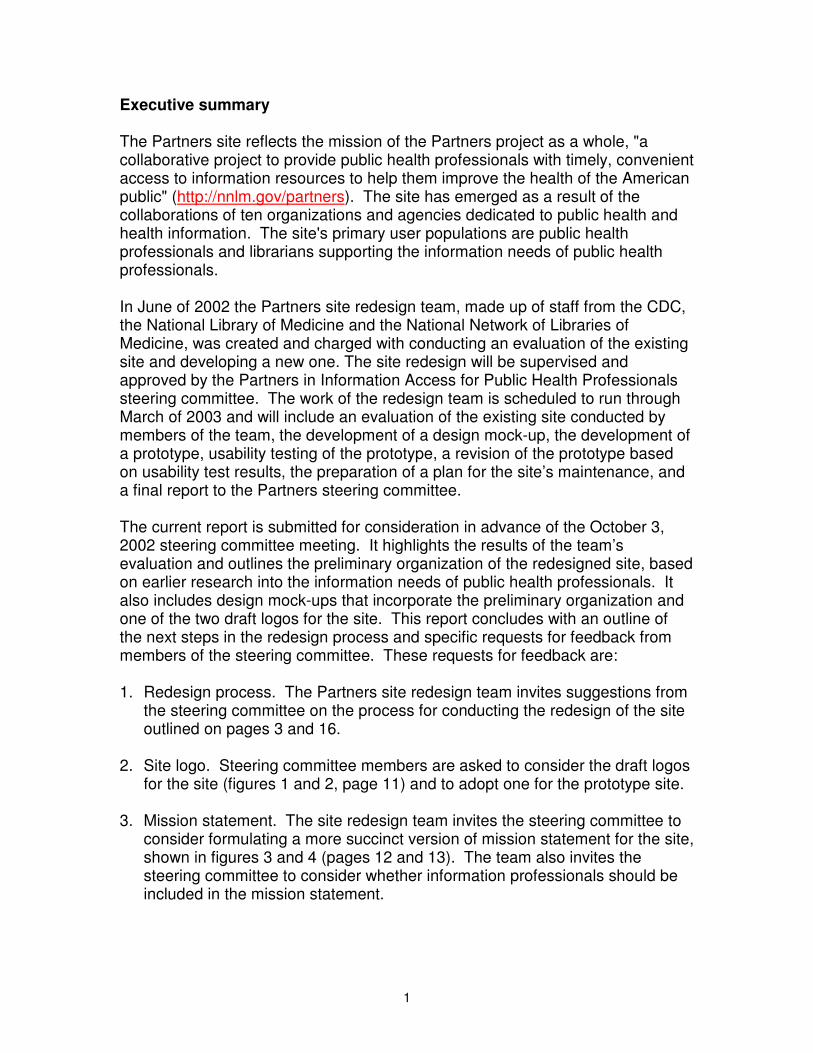
The Partners site reflects the mission of the Partners project as a whole, "a collaborative project to provide public health professionals with timely, convenient access to information resources to help them improve the health of the American public" (http://nnlm.gov/partners). The site has emerged as a result of the collaborations of ten organizations and agencies dedicated to public health and health information. The site's primary user populations are public health professionals and librarians supporting the information needs of public health professionals.
In June of 2002 the Partners site redesign team, made up of staff from the CDC, the National Library of Medicine and the National Network of Libraries of Medicine, was created and charged with conducting an evaluation of the existing site and developing a new one. The site redesign will be supervised and approved by the Partners in Information Access for Public Health Professionals steering committee. The work of the redesign team is scheduled to run through March of 2003 and will include an evaluation of the existing site conducted by members of the team, the development of a design mock-up, the development of a prototype, usability testing of the prototype, a revision of the prototype based on usability test results, the preparation of a plan for the site’s maintenance, and a final report to the Partners steering committee.
The current report is submitted for consideration in advance of the October 3, 2002 steering committee meeting. It highlights the results of the team’s evaluation and outlines the preliminary organization of the redesigned site, based on earlier research into the information needs of public health professionals. It also includes design mock-ups that incorporate the preliminary organization and one of the two draft logos for the site. This report concludes with an outline of the next steps in the redesign process and specific requests for feedback from members of the steering committee. These requests for feedback are:
1. Redesign process. The Partners site redesign team invites suggestions from the steering committee on the process for conducting the redesign of the site outlined on pages 3 and 16.
2. Site logo. Steering committee members are asked to consider the draft logos for the site (figures 1 and 2, page 11) and to adopt one for the prototype site.
3. Mission statement. The site redesign team invites the steering committee to consider formulating a more succinct version of mission statement for the site, shown in figures 3 and 4 (pages 12 and 13). The team also invites the steering committee to consider whether information professionals should be included in the mission statement.
1
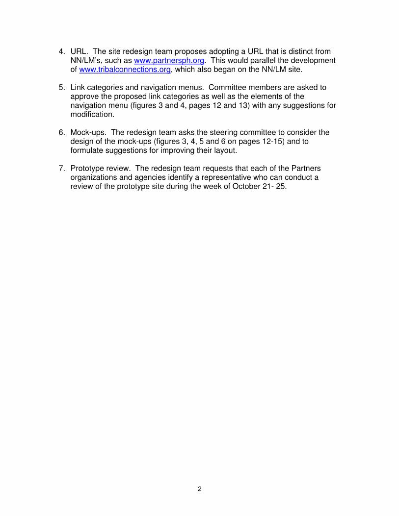
4. URL. The site redesign team proposes adopting a URL that is distinct from NN/LM’s, such as www.partnersph.org. This would parallel the development of www.tribalconnections.org, which also began on the NN/LM site.
5. Link categories and navigation menus. Committee members are asked to approve the proposed link categories as well as the elements of the navigation menu (figures 3 and 4, pages 12 and 13) with any suggestions for modification.
6. Mock-ups. The redesign team asks the steering committee to consider the design of the mock-ups (figures 3, 4, 5 and 6 on pages 12-15) and to formulate suggestions for improving their layout.
7. Prototype review. The redesign team requests that each of the Partners organizations and agencies identify a representative who can conduct a review of the prototype site during the week of October 21- 25.
2
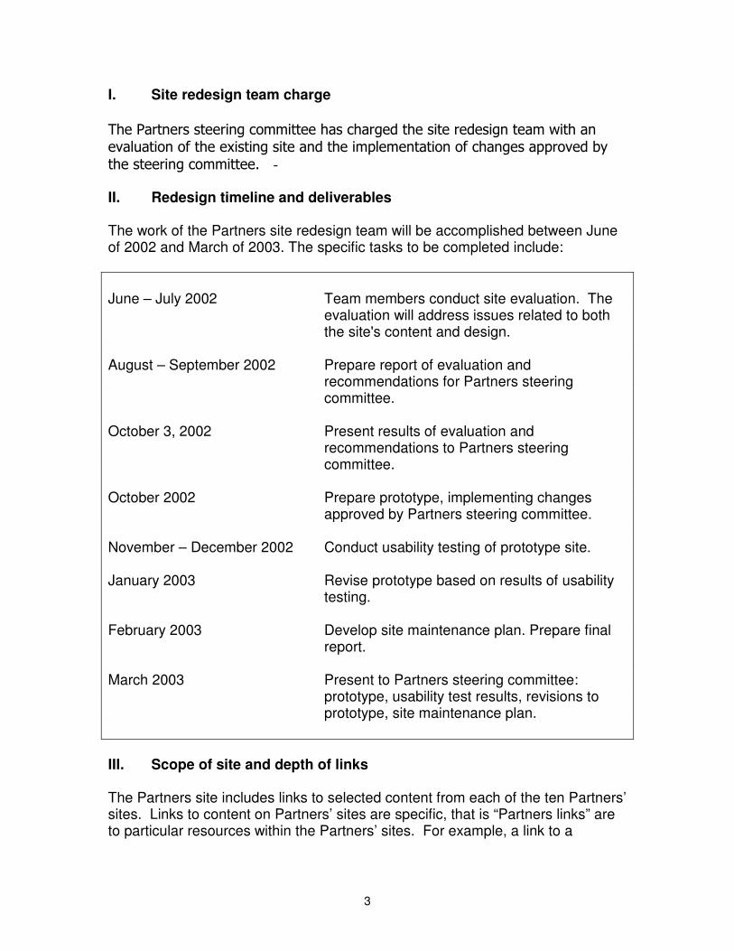
June – July 2002 Team members conduct site evaluation. The
evaluation will address issues related to both the site's content and design.
August – September 2 002 Prepare report of evaluation and
recommendations for Partners steering committee.
October 3 , 2002 Present results of evaluation and
recommendations to Partners steering committee.
October 2 002 Prepare prototype, implementing changes
approved by Partners steering committee. November – December 2 002 Conduct usability testing of prototype site. January 2003 Revise prototype based on results of usability
testing. February 2003 Develop site maintenance plan. Prepare final
report. March 2003 Present to Partners steering committee:
prototype, usability test results, revisions to prototype, site maintenance plan.
I. Site redesign team charge The Partners steering committee has charged the site redesign team with an evaluation of the existing site and the implementation of changes approved by the steering committe e. II. Redesign timeline and deliverables The work of the Partners site redesign team will be accomplished between June of 2002 and March of 2003. The specific tasks to be completed include:
III. Scope of site and depth of links
The Partners site includes links to selected content from each of the ten Partners’ sites. Links to content on Partners’ sites are specific, that is “Partners links” are to particular resources within the Partners’ sites. For example, a link to a
3
Partner’s conference takes the user directly to the page with information about the conference, not the Partner’s homepage.
“Non-Partners links” will also be added and removed over time with the approval of the steering committee. Non-Partners links will provide access to resources available at other sites, such as those maintained by the World Health Organization and the Pan-American Health Organization. Non-Partners links may not be at the same level of specificity as those to contents on Partners sites. That is, a non-Partners link may take the user to a non-Partner’s homepage with an indication of the resources available at that site.
IV. Site evaluation by team members
Team members conducted an evaluation of the current Partners site (Appendix A) in July of 2002. Each team member was asked to consider the existing site’s content as well as its design. When evaluating the design of the current site, team members were asked to consider a set of ten design heuristics. It should be noted that this evaluation is limited by team members’ lack of professional experience in public health.
Considering the content of the existing Partners site, team members reached consensus that the current content may not reflect the variety of information needs public health professionals experience. Team members agreed that the site’s content should be based on findings from previous research investigating the information needs of public health professionals (Rambo and Dunham, 2000). Further, team members agreed that the selection of categories for organizing the content should be informed by the results of this research.
Team members also conducted a heuristic evaluation of the existing site, adapting a protocol outlined by Nielsen (1994) and relying on ten heuristics formulated by Instone (1997). Each of Instone’s heuristics is described below, followed by team members’ observations of the current Partners’ site.
Visibility of system status
"The system should always keep users informed about what is going on, through appropriate feedback within reasonable time. Probably the two most important things that users need to know at your site are ‘Where am I?’ and ‘Where can I go next?’ Make sure each page is branded and that you indicate which section it belongs to. Links to other pages should be clearly marked. Since users could be jumping to any part of your site from somewhere else, you need to include this status on every page."
Team members agreed that the site should provide indicators of the user’s current location. One approach is to implement menus with options or tabs that provide a visual indication of the present location.
4
Match between system and the real world
"The system should speak the users'language, with words, phrases and concepts familiar to the user, rather than system-oriented terms. Follow real-world conventions, making information appear in a natural and logical order. On the Web, you have to be aware that users will probably be coming from diverse backgrounds, so figuring out their 'language'can be a challenge."
Team members noted that link titles should be as specific as possible to avoid misdirecting users. Brief annotations accompanying links may also assist the user’s navigation. The current site’s link categories were noted as problematic. For example, the “resources of special interest” category (Appendix B) may be too broad.
User control and freedom
"Users often choose system functions by mistake and will need a clearly marked 'emergency exit'to leave the unwanted state without having to go through an extended dialogue. Support undo and redo. Many of the 'emergency exits'are provided by the browser, but there is still plenty of room on your site to support user control and freedom. A 'home'button on every page is a simple way to let users feel in control of your site.
The current site’s search feature is limited in that it directs the user to NN/LM’s search page. This directs the user to search MEDLINEplus or the entire NN/LM site rather than the content of the Partners site (Appendix C). Reviewers also noted that the search feature might not be easy to find. While it may not be possible, it is desirable for the search engine to provide the user with the option of searching the separate sites maintained by the ten Partners as well as the Partners site.
5
Consistency and standards
"Users should not have to wonder whether different words, situations, or actions mean the same thing. Follow platform conventions. Within your site, use wording in your content and buttons consistently. One of the most common cases of inconsistent wording I see deals with links, page titles and page headers. Check the titles and headers for your pages against the links that point to them. Inconsistent wording here can confuse users who think they ended up in the wrong spot because the destination page had a title that differed vastly from the link that took them there. ‘Platform conventions’ on the Web means realizing your site is not an island. Users will be jumping onto (and off of) your site from others, so you need to fit in with the rest of the Web to some degree. Custom link colors is just one example where it may work well for your site but since it could conflict with the rest of the Web, it may make your site hard to use. And ‘standards’ on the Web means following HTML and other specifications. Deviations form the standards will be opportunities for unusable features to creep into your site."
Team members agreed that all pages in the site should be formatted consistently. The current site includes a sub-site on “public health training responses” with an interface that differs significantly from the larger site (Appendix D).
Error prevention
"Even better than good error messages is a careful design which prevents a problem from occurring in the first place. Because of the limitations of HTML forms, inputting information on the Web is a common source of errors for users."
Team members offered no feedback in response to this heuristic.
Recognition rather than recall
"Make objects, actions, and options visible. The user should not have to remember information from one part of the dialogue to another. Instructions for use of the system should be visible or easily retrievable whenever appropriate. For the Web, this heuristic is closely related to system status. If users can recognize where they are by looking at the current page, without having to recall their path from the home page, they are less likely to get lost.”
Team members offered no feedback in response to this heuristic apart from the previous observation about the need for menu options that indicate the user’s present location.
6
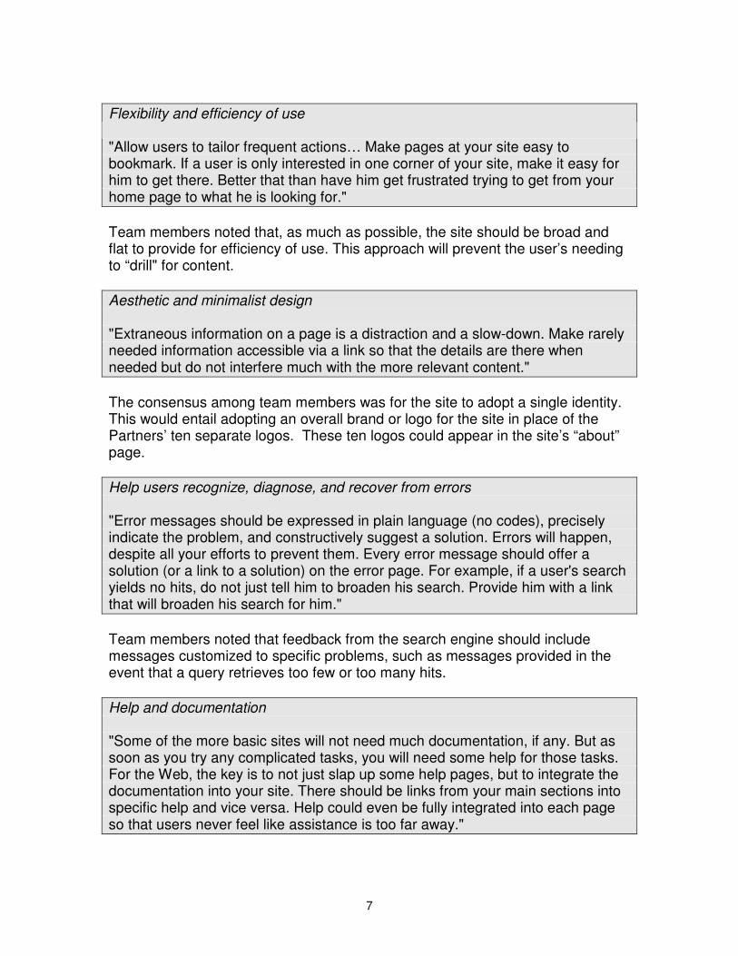
Flexibility and efficiency of use
"Allow users to tailor frequent actions… Make pages at your site easy to bookmark. If a user is only interested in one corner of your site, make it easy for him to get there. Better that than have him get frustrated trying to get from your home page to what he is looking for."
Team members noted that, as much as possible, the site should be broad and flat to provide for efficiency of use. This approach will prevent the user’s needing to “drill" for content.
Aesthetic and minimalist design
"Extraneous information on a page is a distraction and a slow-down. Make rarely needed information accessible via a link so that the details are there when needed but do not interfere much with the more relevant content."
The consensus among team members was for the site to adopt a single identity. This would entail adopting an overall brand or logo for the site in place of the Partners’ ten separate logos. These ten logos could appear in the site’s “about” page.
Help users recognize, diagnose, and recover from errors
"Error messages should be expressed in plain language (no codes), precisely indicate the problem, and constructively suggest a solution. Errors will happen, despite all your efforts to prevent them. Every error message should offer a solution (or a link to a solution) on the error page. For example, if a user's search yields no hits, do not just tell him to broaden his search. Provide him with a link that will broaden his search for him."
Team members noted that feedback from the search engine should include messages customized to specific problems, such as messages provided in the event that a query retrieves too few or too many hits.
Help and documentation
"Some of the more basic sites will not need much documentation, if any. But as soon as you try any complicated tasks, you will need some help for those tasks. For the Web, the key is to not just slap up some help pages, but to integrate the documentation into your site. There should be links from your main sections into specific help and vice versa. Help could even be fully integrated into each page so that users never feel like assistance is too far away."
7
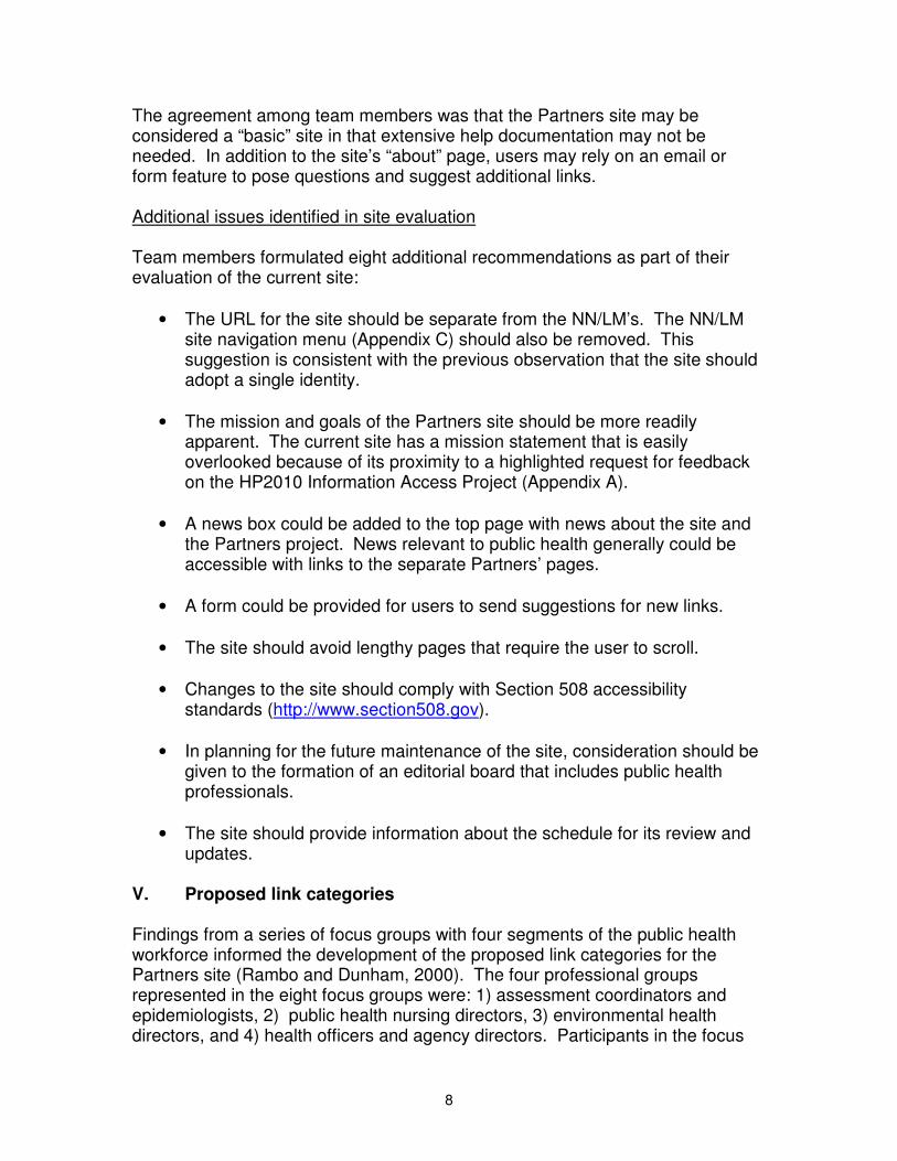
The agreement among team members was that the Partners site may be considered a “basic” site in that extensive help documentation may not be needed. In addition to the site’s “about” page, users may rely on an email or form feature to pose questions and suggest additional links.
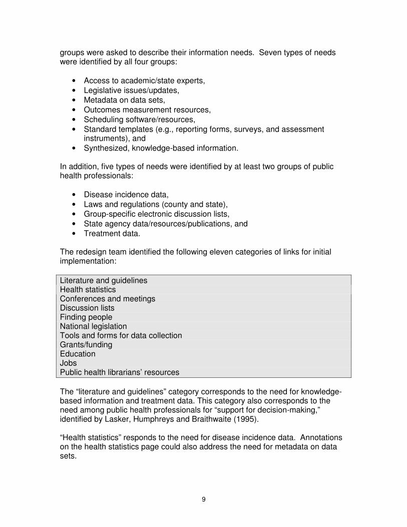
Additional issues identified in site evaluation
Team members formulated eight additional recommendations as part of their evaluation of the current site:
• The URL for the site should be separate from the NN/LM’s. The NN/LM site navigation menu (Appendix C) should also be removed. This suggestion is consistent with the previous observation that the site should adopt a single identity.
• The mission and goals of the Partners site should be more readily apparent. The current site has a mission statement that is easily overlooked because of its proximity to a highlighted request for feedback on the HP2010 Information Access Project (Appendix A).
• A news box could be added to the top page with news about the site and the Partners project. News relevant to public health generally could be accessible with links to the separate Partners’ pages.
• A form could be provided for users to send suggestions for new links.
• The site should avoid lengthy pages that require the user to scroll.
• Changes to the site should comply with Section 508 accessibility standards (http://www.section508.gov).
• In planning for the future maintenance of the site, consideration should be given to the formation of an editorial board that includes public health professionals.
• The site should provide information about the schedule for its review and updates.
V. Proposed link categories
Findings from a series of focus groups with four segments of the public health workforce informed the development of the proposed link categories for the Partners site (Rambo and Dunham, 2000). The four professional groups represented in the eight focus groups were: 1) assessment coordinators and epidemiologists, 2) public health nursing directors, 3) environmental health directors, and 4) health officers and agency directors. Participants in the focus
8
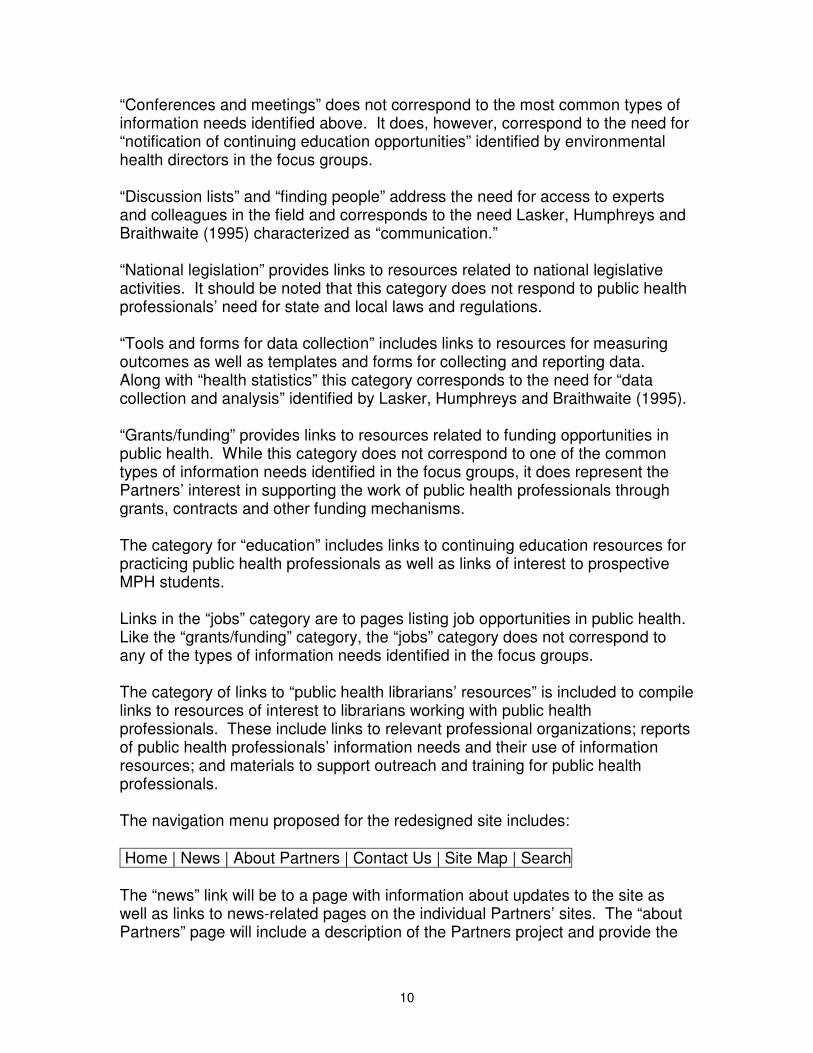
groups were asked to describe their information needs. Seven types of needs were identified by all four groups:
• Access to academic/state experts, • Legislative issues/updates, • Metadata on data sets, • Outcomes measurement resources, • Scheduling software/resources, • Standard templates (e.g., reporting forms, surveys, and assessment
instruments), and • Synthesized, knowledge-based information.
In addition, five types of needs were identified by at least two groups of public health professionals:
• Disease incidence data, • Laws and regulations (county and state), • Group-specific electronic discussion lists, • State agency data/resources/publications, and • Treatment data.
The redesign team identified the following eleven categories of links for initial implementation:
Literature and guidelines Health statistics Conferences and meetings Discussion lists Finding people National legislation Tools and forms for data collection Grants/funding Education Jobs Public health librarians’ resources
The “literature and guidelines” category corresponds to the need for knowledge-based information and treatment data. This category also corresponds to the need among public health professionals for “support for decision-making,” identified by Lasker, Humphreys and Braithwaite (1995).
“Health statistics” responds to the need for disease incidence data. Annotations on the health statistics page could also address the need for metadata on data sets.
9
“Conferences and meetings” does not correspond to the most common types of information needs identified above. It does, however, correspond to the need for “notification of continuing education opportunities” identified by environmental health directors in the focus groups.
“Discussion lists” and “finding people” address the need for access to experts and colleagues in the field and corresponds to the need Lasker, Humphreys and Braithwaite (1995) characterized as “communication.”
“National legislation” provides links to resources related to national legislative activities. It should be noted that this category does not respond to public health professionals’ need for state and local laws and regulations.
“Tools and forms for data collection” includes links to resources for measuring outcomes as well as templates and forms for collecting and reporting data. Along with “health statistics” this category corresponds to the need for “data collection and analysis” identified by Lasker, Humphreys and Braithwaite (1995).
“Grants/funding” provides links to resources related to funding opportunities in public health. While this category does not correspond to one of the common types of information needs identified in the focus groups, it does represent the Partners’ interest in supporting the work of public health professionals through grants, contracts and other funding mechanisms.
The category for “education” includes links to continuing education resources for practicing public health professionals as well as links of interest to prospective MPH students.
Links in the “jobs” category are to pages listing job opportunities in public health. Like the “grants/funding” category, the “jobs” category does not correspond to any of the types of information needs identified in the focus groups.
The category of links to “public health librarians’ resources” is included to compile links to resources of interest to librarians working with public health professionals. These include links to relevant professional organizations; reports of public health professionals’ information needs and their use of information resources; and materials to support outreach and training for public health professionals.
The navigation menu proposed for the redesigned site includes:
Home | News | About Partners | Contact Us | Site Map | Search
The “news” link will be to a page with information about updates to the site as well as links to news-related pages on the individual Partners’ sites. The “about Partners” page will include a description of the Partners project and provide the
10
logos of the projects’ ten institutional members as links to their separate web sites. “Contact us” will include a form for nominating a new link for addition to the site as well as a form for providing feedback or asking a question about the site. “Site map” will display the site’s organization, and “search” will provide a search functionality. It is hoped that a “quick search” box can be added to the navigation menu to prevent users from having to go to a search page before entering a query.
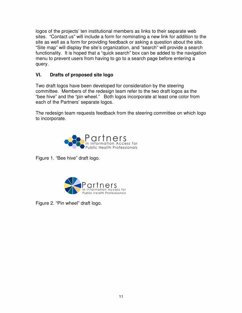
VI. Drafts of proposed site logo
Two draft logos have been developed for consideration by the steering committee. Members of the redesign team refer to the two draft logos as the “bee hive” and the “pin wheel.” Both logos incorporate at least one color from each of the Partners’ separate logos.
The redesign team requests feedback from the steering committee on which logo to incorporate.
Figure 1. “Bee hive” draft logo.
Figure 2. “Pin wheel” draft logo.
11

VII. Mock-ups of redesigned site
The redesign team has prepared mock-ups of the site that incorporate both of the draft logos as well as the proposed link categories and navigation menu.
Figure 3. Mock-up of Partners site top page with bee hive logo.
12
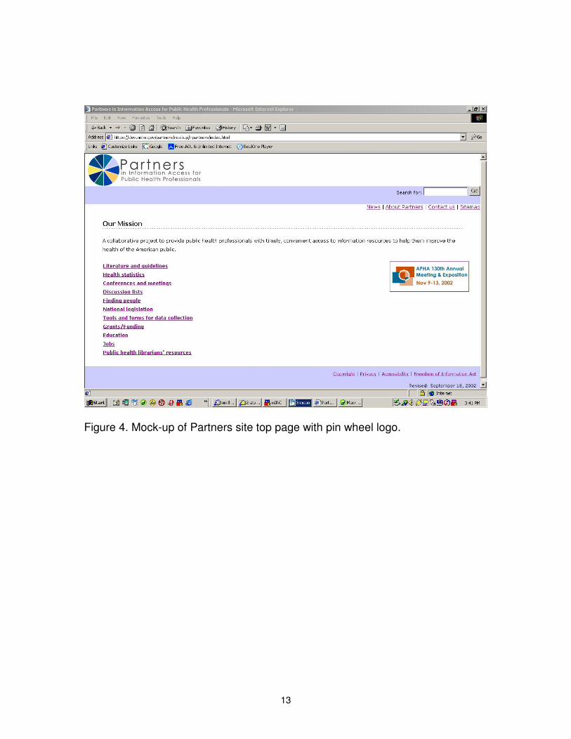
Figure 4. Mock-up of Partners site top page with pin wheel logo.
13
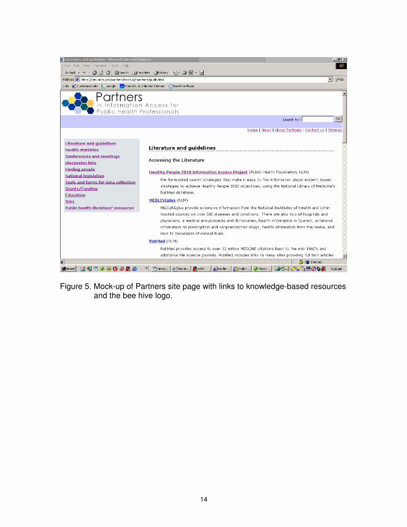
Figure 5. Mock-up of Partners site page with links to knowledge-based resources and the bee hive logo.
14
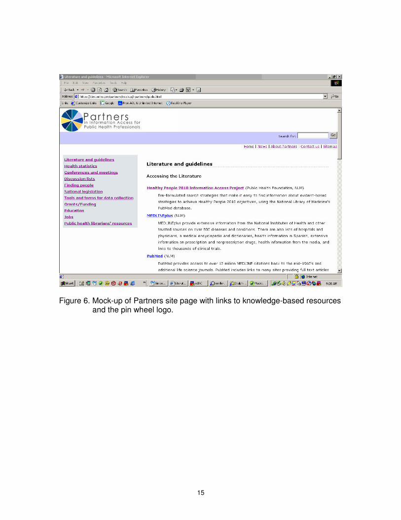
Figure 6. Mock-up of Partners site page with links to knowledge-based resources and the pin wheel logo.
15
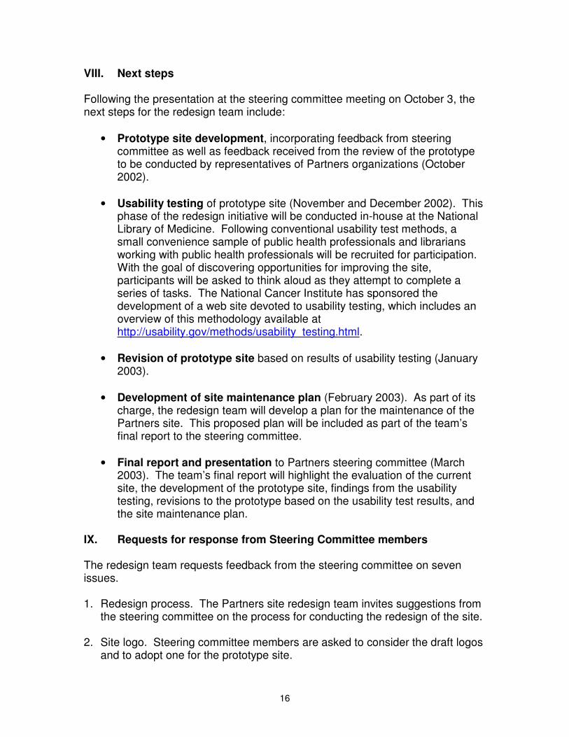
VIII. Next steps
Following the presentation at the steering committee meeting on October 3, the next steps for the redesign team include:
• Prototype site development, incorporating feedback from steering committee as well as feedback received from the review of the prototype to be conducted by representatives of Partners organizations (October 2002).
• Usability testing of prototype site (November and December 2002). This phase of the redesign initiative will be conducted in-house at the National Library of Medicine. Following conventional usability test methods, a small convenience sample of public health professionals and librarians working with public health professionals will be recruited for participation. With the goal of discovering opportunities for improving the site, participants will be asked to think aloud as they attempt to complete a series of tasks. The National Cancer Institute has sponsored the development of a web site devoted to usability testing, which includes an overview of this methodology available at http://usability.gov/methods/usability_testing.html.
• Revision of prototype site based on results of usability testing (January 2003).
• Development of site maintenance plan (February 2003). As part of its charge, the redesign team will develop a plan for the maintenance of the Partners site. This proposed plan will be included as part of the team’s final report to the steering committee.
• Final report and presentation to Partners steering committee (March 2003). The team’s final report will highlight the evaluation of the current site, the development of the prototype site, findings from the usability testing, revisions to the prototype based on the usability test results, and the site maintenance plan.
IX. Requests for response from Steering Committee members
The redesign team requests feedback from the steering committee on seven issues.
1. Redesign process. The Partners site redesign team invites suggestions from the steering committee on the process for conducting the redesign of the site.
2. Site logo. Steering committee members are asked to consider the draft logos and to adopt one for the prototype site.
16
3. Mission statement. The site redesign team invites the steering committee to consider adopting a more succinct mission statement for the site, shown in figures 3 and 4. The team also invites the steering committee to consider whether information professionals should be included in the mission statement.
4. URL. The site redesign team proposes adopting a URL that is distinct from NN/LM’s, such as www.partnersph.org. This would reflect the development of www.tribalconnections.org, which began on the NN/LM site.
5. Link categories and navigation menus. Committee members are asked to approve the proposed link categories as well as the elements of the navigation menu with any suggestions for modification.
6. Mock-ups. The redesign team asks the steering committee to consider the design of the site mock-ups and to formulate suggestions for improving their layout.
7. Prototype review. The redesign team requests that each of the Partners organizations and agencies identify a representative who can conduct a review of the prototype site during the week of October 21- 25.
17
References
Instone K. Site usability heuristics for the web. Webreview [Internet] 1997 Oct 10 [cited 2002 Sept 9]; Available from: http://www.webreview.com/1997/10_10/strategists/10_10_97_2.shtml
Lasker RD, Humphreys BL, Braithwaite W L. Making a powerful connection: The health of the public and the National Information Infrastructure. Report of the U.S. Public Health Service, Public Health Data Policy Coordinating Committee. [Internet]. Bethesda (MD): National Library of Medicine; 1995 [cited 2002 Sept 9]. Available from: http://www.nlm.nih.gov/pubs/staffpubs/lo/makingpd.html
Nielsen J. Heuristic evaluation. In: Nielsen J, Mack RL, editors. Usability inspection methods, 25-64. New York: John Wiley and Sons; 1994.
Rambo N, Dunham P. Information needs and uses of the public health workforce. MMWR. 20002;49(6):118-120.
18
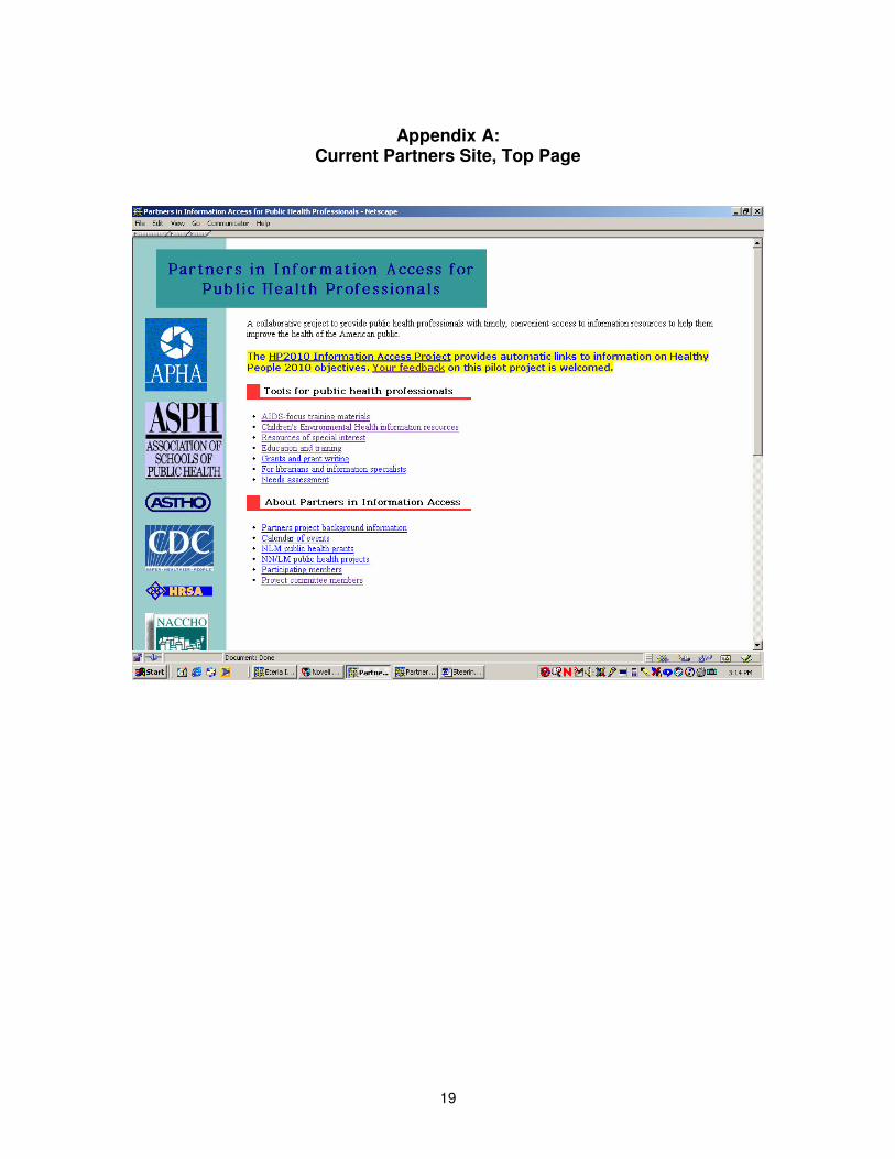
Appendix A: Current Partners Site, Top Page
19
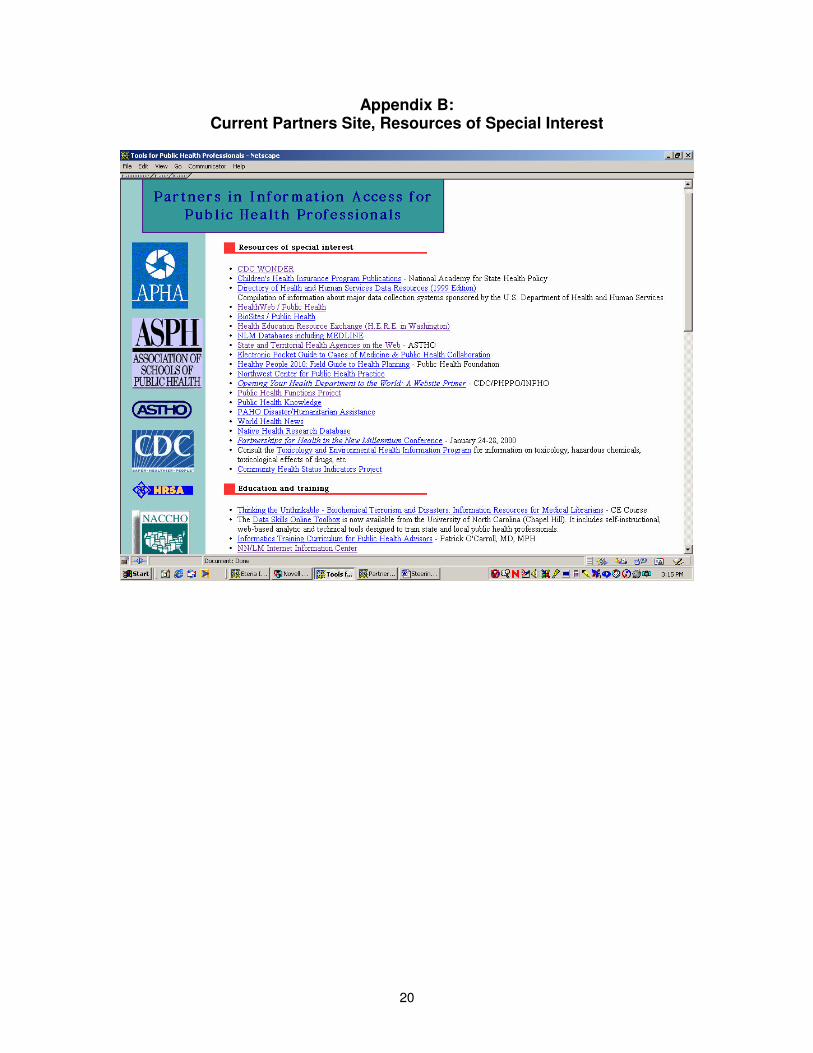
Appendix B: Current Partners Site, Resources of Special Interest
20
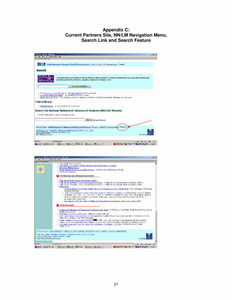
Appendix C: Current Partners Site, NN/LM Navigation Menu,
Search Link and Search Feature
21
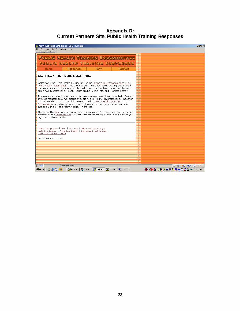
Appendix D: Current Partners Site, Public Health Training Responses
22