page design. i. guidelines of page design 3 i. guidelines definition: o refers to the creation of...
TRANSCRIPT

PAGE DESIGN
PAGE DESIGN
I. Guidelines of Page Design
3
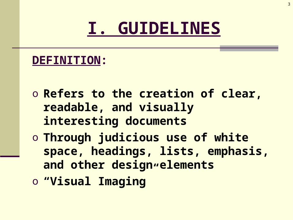
I. GUIDELINES
DEFINITION:
o Refers to the creation of clear, readable, and visually interesting documents
o Through judicious use of white space, headings, lists, emphasis, and other design elements
o “Visual Imaging”

4
I. GUIDELINES
PURPOSE: (to combat “reader indifference”)
A. ORGANIZATION:o gives information when readers want ito gives information where readers want it
B.PAGE DESIGN:o gets readers’ interesto keeps readers’ interest

5
I. GUIDELINES
IMPLEMENTATION: (Style Sheets)o allow employees to produce documents in
uniform, consistent formatso used for letters, memos, various reports,
proposalso save timeo reinforce the firm’s corporate imageo allow teams to work independently while
still adhering to format guidelineso allow readers to see a clear relationship
among ideas
6
I. GUIDELINES
IMPLEMENTATION: (Style Sheets)o cover elements of page design:
1) Paper
2) White Space
3) Headings
4) Lists
5) In-Text Emphasis
6) Fonts
7) Color

PAGE DESIGN
II. Elements of Page Design
8
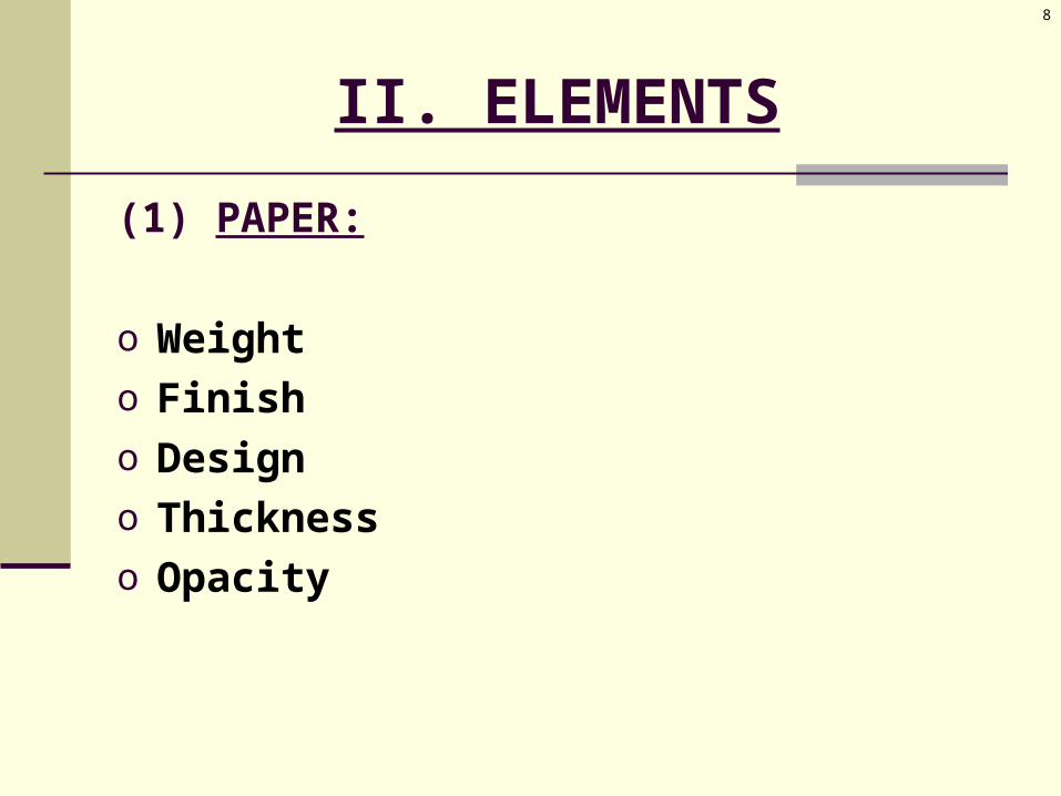
II. ELEMENTS
(1) PAPER:
o Weighto Finisho Designo Thicknesso Opacity

9
II. ELEMENTS
(1) PAPER:
o What is right for your document?o What are the needs of your printer?o Short documents = 1-sidedo Long documents = 2-sided
paper = thick enough? paper = opaque enough?

10
II. ELEMENTS
(2) WHITE SPACE:
o The open places on the document with no text, with no graphics.
o Connected to important information.o Attracts readers’ attention.o Guides the eyes to important information.o Helps readers organize information.

11
II. ELEMENTS
(2) WHITE SPACE:
o A. MARGINS: 1-1½” bounded margin =
larger than outside margin to account for the binding

12
II. ELEMENTS
(2) WHITE SPACE:
o B. COLUMNS: long lines =
boring strains on the eyes
columns = break up text reduce line length create “white space” between columns
13
II. ELEMENTS
(2) WHITE SPACE:
o C. HANGING INDENTS: headers & sub-headers
headers = on left margin text = indented an extra inch
force readers’ eyes & attention to the text block

14
II. ELEMENTS
(2) WHITE SPACE:
o D. LINE SPACING: Short documents = single-spaced
letters, memos, short reports read in 1 sitting
Long documents = double-spaced formal documents executive summaries, long reports
15
II. ELEMENTS
(2) WHITE SPACE:
o E. JUSTIFICATION: Ragged Edge =
aka, “left justification” adds variation to the page is less predictable for the eye
Justified Edge = aka, “block style” creates a professional look is used for formal documents

16
II. ELEMENTS
(2) WHITE SPACE:
o F. PARAGRAPH LENGTH: 6-10 lines vary lengths
o G. PARAGRAPH INDENTING: indent 1st line of each paragraph creates white space

17
II. ELEMENTS
(2) WHITE SPACE:
o H. IN-TEXT GRAPHICS: place near the TOP of the page place with ample white space between image and
the text allow for appropriate margins if graphic does not fit:
shrink it give it its own page
create page balance, with multicolumn or 2-page spreads
draw rough sketches of the document’s layout
18
II. ELEMENTS
(2) WHITE SPACE:
o I. PAGINATION: top, right
“thumb reading” bottom, centered longer documents:
section numbers 2-1 = section 2, page 1 saves time & money when editing

19
II. ELEMENTS
(2) WHITE SPACE:
o J. HEADING SPACE and RULING: place an extra space above headers
visually connects the header with what follows
perhaps draw horizontal lines after each section
20
II. ELEMENTS
(3) HEADINGS:
o “Signposts” regarding upcoming content tell readers what material follows

21
II. ELEMENTS
(3) HEADINGS:
o “Attention-Grabbers” draws readers’ eyes to important information
22
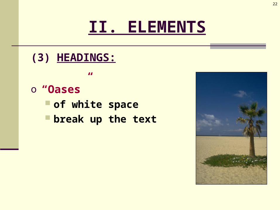
II. ELEMENTS
(3) HEADINGS:
o “Oases” of white space break up the text

23
II. ELEMENTS
(3) HEADINGS:
o WHEN use headers for every page with
documents beyond a single page use at least 2 subheadings (not just 1)
24
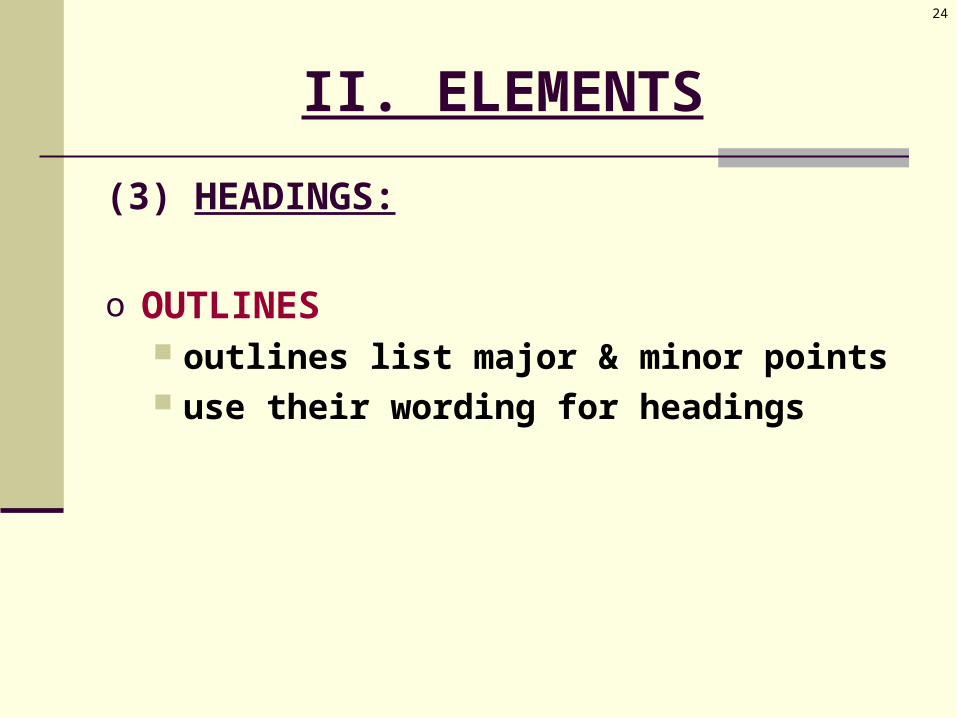
II. ELEMENTS
(3) HEADINGS:
o OUTLINES outlines list major & minor points use their wording for headings

25
II. ELEMENTS
(3) HEADINGS:
o DESCRIPTION be descriptive use substantive wording more than a single ambiguous word don’t be cute
26
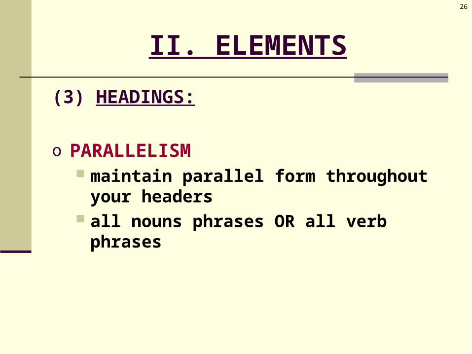
II. ELEMENTS
(3) HEADINGS:
o PARALLELISM maintain parallel form throughout your
headers all nouns phrases OR all verb phrases

27
II. ELEMENTS
(3) HEADINGS:
o HEADING HIERARCHY visual hierarchy of importance & heading
level the higher the heading, the more
demonstrative the heading
28
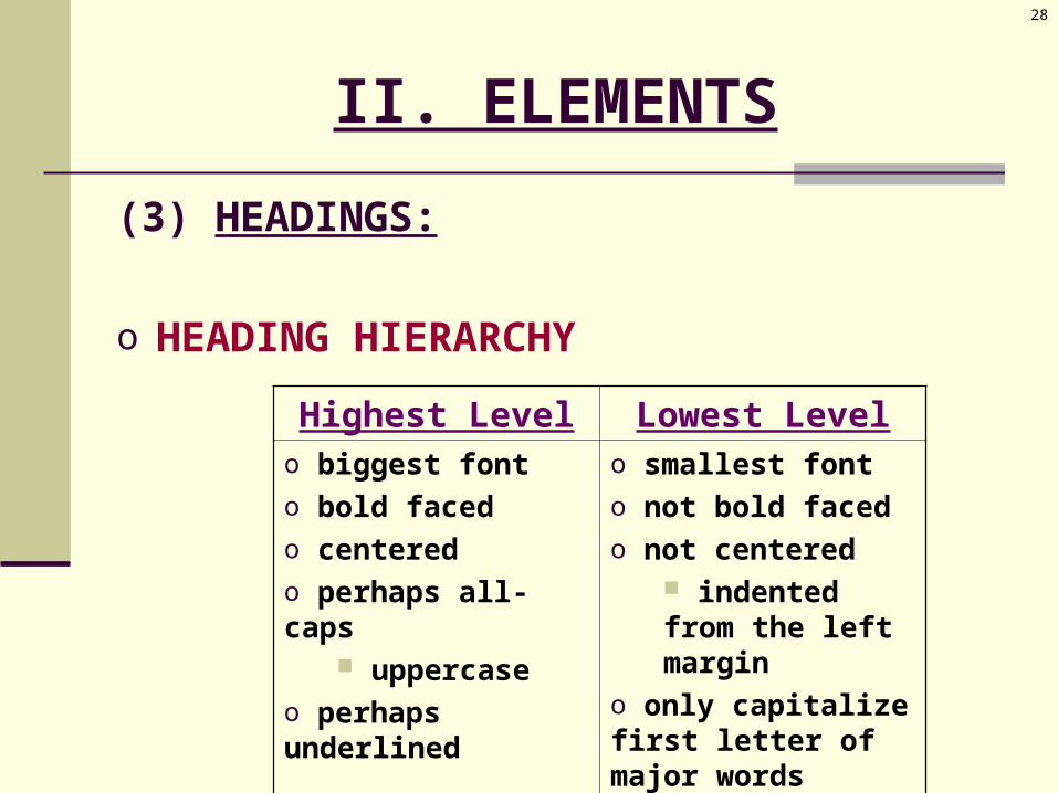
II. ELEMENTS
(3) HEADINGS:
o HEADING HIERARCHY
Highest Level Lowest Levelo biggest fonto bold facedo centeredo perhaps all-caps
uppercaseo perhaps underlined
o smallest fonto not bold facedo not centered
indented from the left margin
o only capitalize first letter of major words o not underlined

29
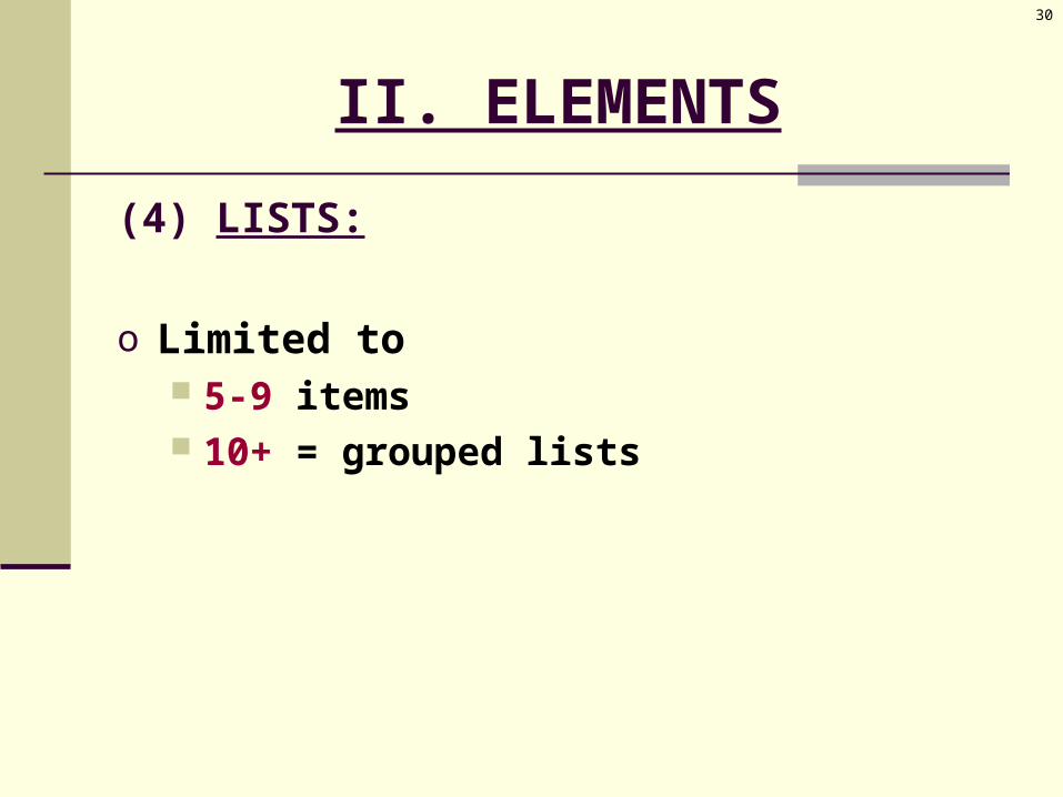
II. ELEMENTS
(4) LISTS:
o Reserved for -- Examples Reasons (for a decision) Conclusions Recommendations Steps (in a process) Cautions (warnings about a product) Limitations (restrictions on conclusions)
30
II. ELEMENTS
(4) LISTS:
o Limited to 5-9 items 10+ = grouped lists

31
II. ELEMENTS
(4) LISTS:
o Bullets vs. Numbers:
Bullets • 2-5 items
Numbers • 5+ items• steps• process•rankings

32
II. ELEMENTS
(4) LISTS:
o Indent the listo Leave a line space between items (white
space)o Maintain parallel form throughout the listo Introduce the list with a lead-in expression o Follow the lead-in with a colon (:)o Capitalize the first letter of the first word
33
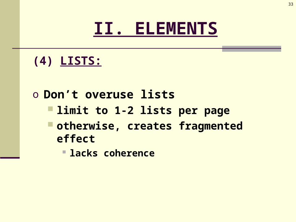
II. ELEMENTS
(4) LISTS:
o Don’t overuse lists limit to 1-2 lists per page otherwise, creates fragmented effect
lacks coherence

34
II. ELEMENTS
(5) IN-TEXT EMPHASIS:
o Highlighting techniqueso Use sparingly

35
II. ELEMENTS
(5) IN-TEXT EMPHASIS:
Most Effective: Least Effective:
o Boldfaceo Italicso Add emphasis o w/o distraction
o All-Capso Underliningo Distracting to the eyeo Difficult to read

36
II. ELEMENTS
(6) FONTS & COLOR:
A. FONTS:o Font Size = points per inch
72 pts. per inch
o Font Size = depends on font style different styles = different sizes letter thickness lowercase letter size

37
II. ELEMENTS
(6) FONTS & COLOR:
A. FONTS:o Font Type = depends upon
the type of your document the image you want to convey the reader’s preference
o WORD default = Times New Roman, 12”
38
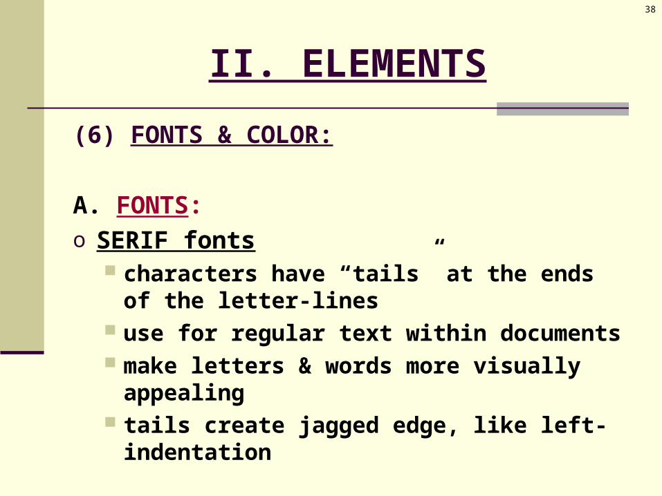
II. ELEMENTS
(6) FONTS & COLOR:
A. FONTS:o SERIF fonts
characters have “tails” at the ends of the letter-lines
use for regular text within documents make letters & words more visually
appealing tails create jagged edge, like left-
indentation
39
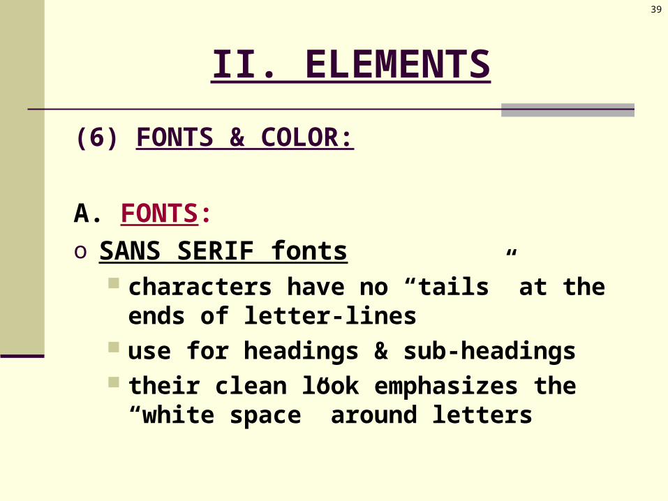
II. ELEMENTS
(6) FONTS & COLOR:
A. FONTS:o SANS SERIF fonts
characters have no “tails” at the ends of letter-lines
use for headings & sub-headings their clean look emphasizes the “white
space” around letters

40
II. ELEMENTS
(6) FONTS & COLOR:
A. FONTS:o Avoid too many font variations within a
document use only 2 font styles per document 1 for text 1 for headings

41
II. ELEMENTS
(6) FONTS & COLOR:
B. COLOR:o Used to reflect your document’s
tone mood image
o Draws readers’ attention to important information
42
II. ELEMENTS
(6) FONTS & COLOR:
B. COLOR:o Limit use of color
time: slows desktop printers money: costs more

PAGE DESIGN
III. Computers in the Writing Process
44
III. COMPUTERS
(1) PLAN:
o Researcho Outline

45
III. COMPUTERS
(2) DRAFT:
o Alternate passageso Collaborative writing
46
III. COMPUTERS
(3) REVISE:
o Additions & deletionso Cut-and-pasteo Search & changeo Saving texto Style & grammar checkers
BEWARE of their limits!