over the air 15: experience design for the iot: system ux & interusability 150924
TRANSCRIPT

Interusability: designing a coherent system UX
Claire Rowland - @clurr Image: Greg Williams via Flickr

Hello :)
- Independent UX and product consultant
- Lead author: “Designing Connected Products: UX for the consumer internet of things”

One person, one computer, one UI, probably doing work, low context
Conventional usability
Image: Radio Shack via scalzi.com

Things have changed…Mobile, specialized devices, cross-platform, multi-user, distributed, contextual awareness, embedded in the world
Images: Withings, Made by Many, Philips, Streetline, Evrythng/Diageo, Lockitron

- The fundamental heuristics of usability are still valid
- They relate to the capabilities of the human brain and brains haven’t changed
- But there are some new concerns to take into account
…(although we haven’t)
Image: Popular Science Monthly via Wikicommons

UX for IoT: not just UI & industrial design
Images: Nest

Users have to understand systems
- Functionality and interactions are distributed across multiple devices, often with different capabilities
- Systems are inherently harder to understand - We are much better at thinking about things than about
relationships between things
Images: Withings

Image: Nissim Farim
We don’t (yet) expect Things to behave like the Internet The average consumer is going to find it very strange when objects take time to respond, or lose instructions.

Facets of IoT UX
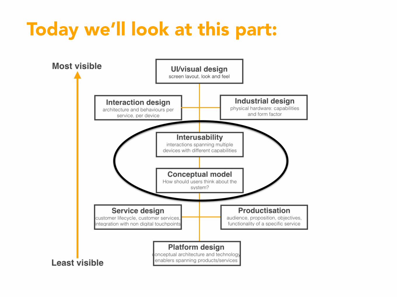
Today we’ll look at this part:

Conceptual models Understanding how it works

3 part diagram:
Value proposition
Conceptual model
Interaction model
What does it do? How does it work? How do I use it?
Image: Instructables Image: How It Works Daily

Non-connected products are often conceptually quite simple

Connected products are more complex
Product images: Philips

Connectedness requires users to think about system models
- Which bit does what? - Where does code run? - What fails/still works if
connectivity is lost?

It’s extra stuff to think about
Product images: LIFX, Philips, Cree
In addition to price, aesthetics and features, customers have to understand how a product connects and whether that meets their needs.

You can explain the system model...
BERG Cloud bridge: transparent network commsLowes Iris: showing the connection to the hub
Image: BERGImage: Lowes

…or simplify the conceptual model
…and iBeaconsAutomatic gearboxes…
Image: Estimote

What actually happens What the user needs to know
iBeacons

Interusability Creating a coherent system UX
Cross-Platform Service User Experience: A Field Study and an Initial Framework. Minna Wäljas, Katarina Segerståhl, Kaisa Väänänen-Vainio-Mattila, Harri Oinas-Kukkonen MobileHCI’10: http://bugi.oulu.fi/~ksegerst/publications/p219-waljas.pdf

Composition How functionality is distributed across devices

Distribute functionality to suit the context of use
(Nearly) all interactions via phone app Interactions mirrored on phone and thermostat
Image: Tado Images: British Gas

Another example:
Product images: BlueSpray, skydrop

Minimal elegance? Or missing features?
Product images: drop

Determining the right composition- What best fits the context of use?
What do users expect? - What devices do users already have
and what can they do? - How much should the hardware
cost? - How much do you need to upgrade
the system or change features over time?
- Do you need local control if connectivity is unavailable?
- Does the system need to work if some devices are unavailable?
- How accurate does sensing need to be? Product images: ring

Consistency Appropriate consistency across UIs and interactions

“Users should not have to worry whether different words, situations or actions mean the same thing. Follow platform conventions.”
- Words, data and actions - Aesthetic/visual design - Interaction architecture: how
functionality is organised - Interaction logic: how tasks
are structured, the types of control used
http://www.nngroup.com/articles/ten-usability-heuristics/
What is it…

Consistency != making everything the same
This: “Users should not have to worry whether different words, situations or actions mean the same thing.“
…may be in tension with this: “Follow platform conventions.” Image: Made by Many

Top priority: terminology
However different the UIs, identical functions must have the same name
Images: British Gas

Follow device platform conventions…
- …
Android contextual menu iOS separate screen
Images: Spotify

- e.g. Nest
A touchscreen does not need a fake bezel
A thermostat does not have to pretend to be an iPhone
Images: Nest
…be true to the device

Aesthetic styling
“Click”
Nest use visual and audio cues to tie the thermostat and phone app together
Images: Nest

Interaction architecture need not be the same- The logical structure of UI
features and controls is likely to be platform dependent
- Different features may be prioritised on different devices
- Devices with limited UIs may need deeper hierarchies Legacy hardware UIs may be less than ideal
(e.g. confusing modes) but that need not restrict other device UIs

Continuity Fluent cross-device interactions

What is it…
- The flow of interactions and data in a coherent sequence across devices
- Continuity helps the user feel as if they are interacting with the service, not a bunch of separate devices
Image: Kei Noguchi via CC licence
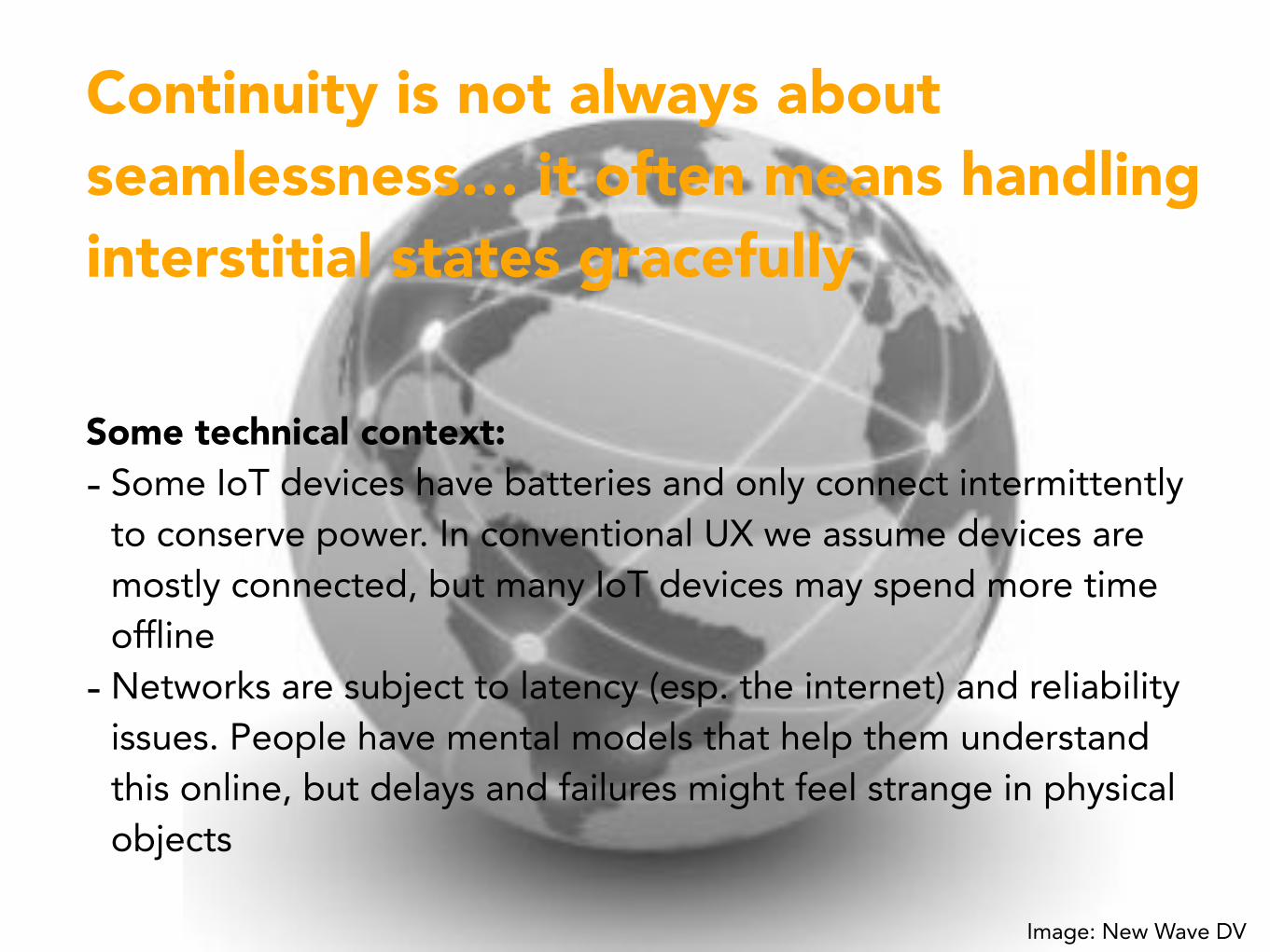
Continuity is not always about seamlessness… it often means handling interstitial states gracefully
Some technical context: - Some IoT devices have batteries and only connect intermittently
to conserve power. In conventional UX we assume devices are mostly connected, but many IoT devices may spend more time offline
- Networks are subject to latency (esp. the internet) and reliability issues. People have mental models that help them understand this online, but delays and failures might feel strange in physical objects
Image: New Wave DV

Latency and reliability
BERG Cloudwash prototype
Interactions won’t always be smooth and immediate

We expect switches to work like this- The switch both confirms the
user action and shows the state of the lamp
- But in reality, latency and reliability issues mean this can’t be guaranteed over a network
- The user can’t tell whether their action has been executed or whether it’s in progress

Option 1: the white lieConfirm action, backpedal if something goes wrong

Instagram do this
The photo is already shown as ‘liked’, even though the instruction is still being sent

Option 2: be transparent
- Acknowledge action, show that it is in progress
- Confirm only once it’s done

WeMo Switch does this subtly

Lowes Iris is more explicitImages: Lowes

Intermittency
19
2 min delay21
When some devices that only check into the network occasionally, there may be conflicting information about the status of the system. Data/actions may need to be timestamped.

Safety critical/urgent
Messages must get through quickly
Status information needs to be updated frequently, and clearly indicate how old it is
Need to know when instructions have been received and acted upon
Low touch/non-critical:
Assume it’s working unless notified of a problem
OK if data or instructions take time to get through (as long as they are timestamped)
Senior safety/intruder alarm
Energy monitorLightingBaby monitor
The ‘right’ approach depends on context
Images: MyLively, Efergy

A final thought
Good consumer UX for IoT is surprisingly hard

We have to get this stuff right for mass adoption
‘It’s a bit glitchy but it’s OK, you just have to be in the room at the same time’. Actual review of a connected home system

Tesler’s law of the conservation of complexity:
As you make the user interaction simpler you make things more complicated for the designer or engineer Larry Tesler, former VP of Apple
