ongestion charging central london - london underground · pdf fileongestion charging central...
TRANSCRIPT

Transport for LondonMAYOR OF LONDON
ongestion chargingCentral London
Impacts monitoringSecond Annual Report April 2004
Contents
OverviewThe story so far 1Congestion 2Traffic patterns 2Public transport 3Social and behavioural impacts 4Business and economic impacts 4Accidents, amenity and the environment 4Scheme operation 5Enforcement 6Monitoring programme 6
1. Introduction1.1 Purpose 71.2 The central London congestion charging scheme 71.3 Overview of the monitoring programme 81.4 Findings from the monitoring work so far 91.5 Report contents 91.6 Further information 10
2. Congestion2.1 Introduction 112.2 Key findings 112.3 Definitions and measurement of congestion 112.4 Moving car observer surveys 132.5 Congestion on the Inner Ring Road 142.6 Congestion on radial routes approaching the charging zone 162.7 Congestion on main roads in inner London 162.8 Effect of reduced congestion on driving speeds 172.9 Congestion monitoring using ANPR cameras 182.10 Panel survey of regular drivers 192.11 Perceptions of congestion 21
Contents
Impacts monitoring – Second Annual Report: April 2004
Impacts monitoring – Second Annual Report: April 2004
3. Traffic patterns 3.1 Introduction 233.2 Key findings 233.3 Monitoring framework 243.4 Settled traffic conditions 253.5 Traffic entering and leaving the charging zone 263.6 Traffic circulating within the charging zone 283.7 Traffic on the Inner Ring Road 313.8 Wider orbital traffic 333.9 Traffic on local roads 343.10 Radial traffic approaching the charging zone 363.11 Wider traffic trends in London 37
4. Public transport4.1 Introduction 394.2 Key findings 394.3 Background trends 404.4 Bus patronage 404.5 Bus journey time and reliability 464.6 Underground patronage 474.7 Underground service supply and reliability 484.8 National Rail 494.9 Railhead parking 514.10 Docklands Light Railway (DLR) 514.11 Passenger views 52
5. Social and behavioural impacts5.1 Introduction 555.2 Key findings 555.3 Structure 555.4 Survey framework 565.5 Assessing travel behaviour change 575.6 Aggregate changes to car travel to the charging zone 575.7 Individual behavioural change: charging zone residents 625.8 Individual behavioural change: inner London residents 645.9 Individual behavioural change: outer London residents 665.10 Impacts on individuals, households and neighbourhoods 675.11 Charging zone residents 675.12 Inner London residents 705.13 Outer London residents 725.14 Residents living beyond the M25 745.15 Attitudes of Londoners to congestion charging 76
Contents

6. Business and economic impacts 6.1 Introduction 776.2 Key findings 776.3 Transport for London’s business surveys 786.4 Retail in the congestion charging zone 856.5 Congestion charging and economic impacts: A TfL assessment 906.6 Cost-benefit analysis of congestion charging in central London 91
7. Accidents, amenity and the environment7.1 Introduction 937.2 Key findings 937.3 Accidents 947.4 Quality of the central London environment 967.5 Perceived environmental quality 977.6 Perceptions of air quality and noise 977.7 Impact of congestion charging on the locality 997.8 Air quality 1007.9 Emissions 1027.10 Air quality models 1047.11 Measured air quality 1047.12 Weather during 2003 1077.13 Fuel use and carbon dioxide (CO2) 1087.14 Noise 108
8. Scheme operation and enforcement8.1 Introduction 1118.2 Key findings 1118.3 Service provision 1118.4 Enforcement operations 115
Contents
Impacts monitoring – Second Annual Report: April 2004

Overview
Congestion charging was successfully introduced in central London on 17 February 2003. It contributes directly to four of the Mayor’s transport priorities:
• To reduce congestion;
• To make radical improvements in bus services;
• To improve journey time reliability for car users;
• To make the distribution of goods and services more efficient.
It also generates revenues to support the Mayor’s Transport Strategy more generally.
This is the second in a series of annual reports describing the impacts of congestion chargingin and around central London. It supersedes, updates and extends the material previouslypublished by Transport for London (TfL), in June and October 2003, and in February 2004.
In June 2003 TfL published the First Annual Monitoring Report. This described the scope of the monitoring work that had been put in place to ensure that the impacts of congestioncharging were comprehensively measured. Conditions applying before charging across arange of key indicators were set out, and information given describing how and when anychanges to these indicators would be measured.
Since the introduction of charging TfL has produced three shorter reports detailing key early results from the monitoring work. These were:
• Three Months On, June 2003;
• Congestion Charging: Six Months On, October 2003;
• Update on scheme impacts and operations, February 2004.
These reports have collectively provided a picture of the effects of the scheme to date. In general, congestion charging appears to be meeting its principal traffic and transportobjectives, and the various elements of the scheme are now operating satisfactorily.
The key traffic, transport and operational outcomes are described in this report. This reportalso covers the business, social, economic and environmental impacts of the scheme,drawing on newly-available data from surveys undertaken in the latter part of 2003.
The remainder of this report presents a summary of available findings from across themonitoring programme. There are six sections, focusing on each of the key areas of themonitoring work in turn, together with a section updating and extending the informationpreviously published relating to the operation of the scheme.
The story so far• Congestion charging was introduced successfully under world-wide scrutiny and without
the problems predicted by many commentators;
• New aggregate patterns of travel became established very quickly and have remainedstable since;
• Congestion within the charging zone has reduced by 30 percent, and the volume of trafficin the charging zone has reduced by 15 percent (vehicles with four or more wheels);
Overview
Impacts monitoring – Second Annual Report: April 2004 1
• Public transport is successfully accommodating displaced car users;
• There have been significant improvements to bus services in the zone and more widelythroughout London;
• Comparative analysis of the many influences on the central London economy throughout 2003 suggest that the direct impact of congestion charging on businessactivity has been small;
• There have been gains in environmental amenity, road traffic emissions and fossil fuelconsumption within the charging zone;
• The operation and enforcement of the scheme are now working well; noticeableimprovements in performance have followed the Supplemental Agreement with Capita, the scheme service provider.
CongestionCongestion within the zone has reduced by 30 percent.
• Measurements of congestion within the charging zone indicate reductions in congestionaveraging 30 percent since the start of congestion charging. These results are at the top end of TfL’s range of prior expectation;
• Reduced congestion means that the proportion of time that drivers spend stationary or moving slowly in queues in the charging zone has reduced by up to one-third;
• This translates into more reliable and more predictable journey times, which surveys of businesses and Londoners more generally suggest are being recognised.
The Inner Ring Road continues to operate satisfactorily, despite small increases in traffic.
• Measurements on the Inner Ring Road continue to show small reductions in congestioncompared to pre-charging levels, reflecting better operational management of this key route, despite slightly higher traffic flows.
Traffic patternsTraffic adjusted rapidly and smoothly to the introduction of charging.
• Drivers adjusted rapidly to the introduction of charging and there were very few trafficoperational problems. New patterns of travel became established at an early stage, and have been sustained throughout 2003 and into 2004.
Traffic entering the zone during charging hours has reduced by 18 percent; and trafficcirculating within the zone has reduced by 15 percent.
• Observed reductions of 18 percent in traffic (vehicles with four or more wheels) enteringthe zone, and 15 percent in traffic circulating within the zone (also vehicles with four ormore wheels), are towards the top end of the range of TfL’s prior expectation.
As predicted, there have been small increases in traffic on the Inner Ring Road, which is beingsatisfactorily managed.
• Although increased traffic has been observed on the Inner Ring Road, these increases aresomewhat smaller than expected and are not leading to significant operational problemson this key route.
Overview
Impacts monitoring – Second Annual Report: April 20042

There is no evidence of systematic increases in traffic outside the charging zone.
• There is no evidence of systematic increases in traffic outside of charging hours on weekdays or weekends in response to the introduction of the charge;
• There is no evidence of systematic increases in traffic on local roads outside the charging zone, during charging hours, in response to the introduction of the charge.
Public transportLarge scale improvements to the bus network have seen increased patronage, both in thecongestion charging zone and more widely throughout London.
• A total of 106,000 passengers entered the charging zone on 560 buses during a typical weekday morning peak in Autumn 2003;
• This represents a 38 percent increase in patronage and a 23 percent increase in service provision compared with 2002. About half of the increased patronage is estimatedto be due to congestion charging;
• Although average occupancies per bus have increased, the additional bus passengers are being accommodated.
The reliability of bus services has improved markedly, both within the charging zone andmore widely across London.
• Within the charging zone there were marked improvements in both the main indicators of bus service reliability: additional waiting time due to service irregularity fell by 30 percent; disruption due to traffic delays fell by 60 percent;
• Overall bus speeds within the charging zone improved by 6 percent; after allowing for time spent at bus stops, this is compatible with the improved speeds of general trafficwithin the charging zone. The improvement within the zone is greater than that observedin other areas of London.
Travel to central London by Underground has reduced during 2003.
• The Underground has experienced a reduction in the number of passengers exitingstations in and around the charging zone, a trend reflected across the network. In themorning peak period since charging was introduced there was a reduction in the averagenumber of station exits within the charging zone of 8 percent from 513,000 to 473,000;
• It is likely that a small shift of car users to Underground, because of charging, has been more than offset by overall reductions in Underground travel to central London for reasons unconnected with congestion charging.
Travel to central London by National Rail remained broadly static between 2002 and 2003.
• Transport for London has observed no significant net change to the number of passengers entering central London on the National Rail network between 2002 and 2003.It is possible that a shift of car users to rail, because of charging, has been masked bybackground changes in the use of rail for travel to central London;
• Transport for London has found no evidence of systematic increases in ‘railhead’ parkingat rail stations in inner and outer London associated with congestion charging.
Overview
Impacts monitoring – Second Annual Report: April 2004 3

Social and behavioural impactsTransport for London’s analysis of the available data allows a provisional assessment of howpeople have adapted to congestion charging.
• Of the 65,000 to 70,000 car trips that are no longer made to the charging zone duringcharging hours: between 50 and 60 percent have transferred to public transport, 20 to 30 percent now divert around the charging zone (these being trips with both origins and destinations outside of the zone), and 15 to 25 percent have made otheradaptations, such as changing the timing of trips.
Business and economic impactsComparative analysis of the many influences on the central London economy throughout2003 suggest that the direct impact of congestion charging has been small.
• London’s economy has been subject to a wide range of influences during 2003.Collectively, these have had a much greater impact on the central London economy than congestion charging. They have also made the task of identifying and quantifyingcongestion-charging-related impacts more difficult.
Key results from TfL’s survey of businesses in central London are now available.
• The TfL business surveys have shown that a number of factors are at work in generating responses to the congestion charge from the business community;
• A majority of businesses in the zone or close to the boundary state that they aregenerally supportive.
Further analysis of the impacts of congestion charging on the retail sector confirm that the direct effect is comparatively small.
• The scale of reduced travel to central London resulting directly from congestion charging is not compatible with the scale of effects claimed by some retailers. This strongly suggests the operation of other more pervasive factors in determining the economic performance of central London during 2003;
• The apparent resurgence of the retail market at the end of 2003/early 2004 indicatescongestion charging has had no long-term effect on the sector;
• Structural changes to the retail market and much broader economic and political factorshave been the prime drivers affecting retail performance within the charging zone duringthe first half of 2003.
Accidents, amenity and the environmentThe recent pattern of decreasing levels of accidents within the charging zone is continuing,and there is no evidence of detrimental change in road traffic accidents within or around the zone.
• The recent trend of overall year-on-year decreases in road traffic accidents seen acrossLondon is continuing. There is no evidence of disproportionate changes to the numbersof accidents involving two-wheeled vehicles as some had feared, and there is someevidence of an accelerated decline in accidents inside the charging zone.
Overview
Impacts monitoring – Second Annual Report: April 20044
Better amenity for central London.
• Surveys of Londoners ‘on-street’ in and around the charging zone suggest that thebeneficial effects of congestion charging and other initiatives on environmental quality are being recognised.
There has been reduced emissions from road traffic inside the charging zone and littlechange to emissions on the Inner Ring Road.
• By reducing the overall volumes of traffic within the charging zone, and increasing the efficiency with which it circulates, congestion charging has been directly responsiblefor reductions of approximately 12 percent in emissions of both oxides of nitrogen (NOx)and fine particles (PM10) from road traffic (based on 24-hour annual average day);
• Traffic changes on the Inner Ring Road are estimated to have resulted in very smallchanges to emissions of NOx and PM10 from road traffic, of less than plus/minus 2 percent respectively.
Valuable savings in greenhouse gases and fossil fuels.
• Traffic changes resulting from charging are estimated to have led to savings of 19 percentin traffic-related emissions of CO2 and 20 percent in fuel consumed by road transportwithin the charging zone (based on a 24-hour annual average day).
No evidence of changes to local noise levels.
• There is no evidence from sample noise measurements in and around the charging zoneof significant changes in the ambient noise climate.
Scheme operationApproximately 550,000 congestion charge payments are made each week.
• In a typical week, there are around 400,000 non-residential payments, 90,000 residentialpayments and 60,000 fleet payments;
• Chargepayer preferences for different payment methods were established within the first few weeks of operation and have shown only minor changes since. However, use of the text messaging (SMS) sales channel is slowly increasing, at the expense of the retailand call centre payment channels.
The Supplemental Agreement with Capita (the primary service provider for the scheme) has resulted in real improvements to customer service and scheme operation.
• During the first few months of the scheme TfL became aware that the quality of serviceprovided by the main contractor was below the standard required. The SupplementalAgreement with Capita defined an extensive programme of improvements across IT,management, process and staffing. Along with a tougher quality performancemanagement regime this has resulted in an increase in performance across a number of areas, particularly in relation to performance of the call centre, the number and quality of penalty charges being issued and the end to end enforcement process.
Overview
Impacts monitoring – Second Annual Report: April 2004 5
EnforcementThe scheme is being rigorously enforced, and the effectiveness of the process has benefited from improvements following from the Supplemental Agreement with Capita.
• Representations against Penalty Charge Notices (PCNs) have reduced as the accuracy ofPCNs issued has increased. Chargepayer and Capita errors in entering the correct vehicleand date of entry details have fallen and the effectiveness of the enforcement processhas increased;
• Since June 2003 TfL has been pursuing outstanding debts and persistent evaders throughall available channels. Several hundred vehicles have been immobilised or removed anddebt recovery is being followed through for all unpaid PCNs through bailiff action.
Monitoring programmeThe monitoring programme is proceeding to plan. A further comprehensive round of surveysand research are planned for 2004/5.
• This report contains summary results from all areas of the monitoring programme,reflecting one complete year of scheme operation;
• The material so far gathered is undergoing detailed analysis, and a range of technicalreports will be published on the TfL website over the coming months. This will include a series of case studies;
• The future monitoring programme for 2004/5 will proceed broadly along the linesdescribed in the First Annual Monitoring Report, with some minor changes of emphasisreflecting experiences since the introduction of charging.
Overview
Impacts monitoring – Second Annual Report: April 20046
Impacts monitoring – Second Annual Report: April 2004
1. Introduction
1.1 PurposeThis is the second in a series of comprehensive annual reports describing the impactsof congestion charging in central London. It sets out emerging findings from across the monitoring programme, reflecting approximately 12 months of scheme operation,and compares these to conditions applying before charging started and – whereappropriate – to Transport for London’s (TfL’s) expectations for the scheme. It alsoreports on the operation and enforcement of the scheme during its first 12 months.
The Mayor and TfL are committed to a comprehensive 5 year programme, one year before and four years after, of objective monitoring covering not only themore immediate traffic and transport effects of the scheme, but also the wider social,economic and environmental impacts. The programme consolidates information fromover 100 specially-designed surveys, while making use of already established surveysand data sources.
The scope and scale of the data and information now available to TfL exceed what ispossible to publish in a report of this nature. This report therefore concentrates onthose elements of the monitoring work that are likely to be of most general interest.
1.2 The central London congestion charging schemeThe central London congestion charging scheme was introduced on 17 February 2003.The primary aim of the scheme is to reduce traffic congestion in and around thecharging zone. The scheme was expected to contribute directly to four of the Mayor’s ten priorities for transport as set out in his Transport Strategy published in July 2001:
• To reduce congestion;
• To make radical improvements in bus services;
• To improve journey time reliability for car users;
• To make the distribution of goods and services more reliable, sustainable and efficient.
The scheme was also expected to generate net revenues to improve transport inLondon more generally.
The congestion charge is a £5 daily charge for driving or parking a vehicle on publicroads within the congestion charging zone between 0700 and 1830, Monday to Friday,excluding weekends and public holidays.
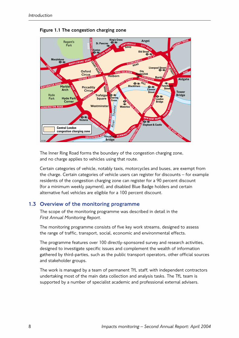
The central London congestion charging zone is shown in Figure 1.1. It covers 22 square kilometres in the heart of London, including centres of government, law, business, finance and entertainment.
Introduction
7
Impacts monitoring – Second Annual Report: April 2004
Figure 1.1 The congestion charging zone
The Inner Ring Road forms the boundary of the congestion charging zone, and no charge applies to vehicles using that route.
Certain categories of vehicle, notably taxis, motorcycles and buses, are exempt fromthe charge. Certain categories of vehicle users can register for discounts – for exampleresidents of the congestion charging zone can register for a 90 percent discount (for a minimum weekly payment), and disabled Blue Badge holders and certainalternative fuel vehicles are eligible for a 100 percent discount.
1.3 Overview of the monitoring programmeThe scope of the monitoring programme was described in detail in the First Annual Monitoring Report.
The monitoring programme consists of five key work streams, designed to assess the range of traffic, transport, social, economic and environmental effects.
The programme features over 100 directly-sponsored survey and research activities,designed to investigate specific issues and complement the wealth of informationgathered by third-parties, such as the public transport operators, other official sourcesand stakeholder groups.
The work is managed by a team of permanent TfL staff, with independent contractorsundertaking most of the main data collection and analysis tasks. The TfL team issupported by a number of specialist academic and professional external advisers.
Introduction
8
CLERKENWELL
OLDKENT ROAD
PICCADILLY
KENSINGTON ROAD
WATERLOO
ROAD
LUDGATEFLEET STREET
STRAND
CHEAPSIDE
HIGH HOLBORN
OXFORD STREET
BAYSWATER ROAD
ROAD
HA
MP
STEA
DTOTTEN
HAMCHARIN
GCROSS
MIL
LBA
NK
GROSVENOR ROAD
RO
AD
ROAD
HILL
ROAD
PARKLAN
E
ROAD
KENNINGTONLA
NE
NEW KENT ROAD
ROAD
STREET
CITY ROADPENTONVILLE
EUSTON ROAD
MARYLEBONE ROAD COMM
ERCIAL
TOWER
BRID
GE
VAUXHALL BRIDGE
EDGWARE
KENNIN
GTON
PARK
RD.
WHITECHAPEL
HACKNEY ROAD
ROAD
COURTROAD
ROA
D
BISH
OPSG
ATE
BO
ROUGHHI
GH
ST.
OLD ST.
OxfordCircus
Hyde ParkCorner
VauxhallBridge
Aldgate
Angel
Holborn Bank
PiccadillyCircus
Westminster
TrafalgarSquare
HydePark
Regent’sPark
Marylebone
Victoria
Elephant & Castle
Waterloo
CharingCross London
Bridge
Liverpool Street
FenchurchStreet
CityThameslink
Blackfriars
Old Street
King’s CrossSt. Pancras
Euston
Rive
rTh
ames
CannonStreet Tower
Bridge
MarbleArch
Central Londoncongestion charging zone
31.7.02
Impacts monitoring – Second Annual Report: April 2004
1.4 Findings from the monitoring work so farIn June 2003 TfL published the First Annual Monitoring Report. This described thescope of the monitoring work that had been put in place to ensure that the impacts of congestion charging were robustly and comprehensively measured. Conditionsapplying before charging across a range of key indicators were set out, and informationgiven describing how and when changes to these indicators would be measured.
Since the introduction of charging TfL has produced three reports detailing key earlyresults from the monitoring work. These are:
• Three Months On, June 2003;
• Congestion Charging: Six Months On, October 2003;
• Update on scheme impacts and operations, February 2004.
These reports have collectively provided a picture of the early effects of the scheme.In general, congestion charging appears to be meeting its principal traffic and transportobjectives, and the main elements of the scheme are operating satisfactorily.
The key traffic, transport and operational outcomes after one year are described in this report. This report also covers the business, social, economic and environmentalimpacts of the scheme, drawing on newly-available data from surveys undertaken inthe latter part of 2003.
1.5 Report contentsThe remainder of this report presents a summary of findings from across themonitoring programme. There are six sections, taking each of the key areas of the monitoring work in turn, together with a section updating and extending the information previously published relating to the operation and enforcement of the scheme:
• Congestion;
• Traffic patterns;
• Public Transport;
• Social and behavioural impacts;
• Business and economic impacts;
• Accidents, amenity and the environment;
• Scheme operation and enforcement.
Congestion charging was introduced against a backdrop of wider change to travelpatterns in London, brought about by economic and social change and theimplementation of the other elements of the Mayor’s Transport Strategy.
All of these will have had an effect on the measurements described in this report,which in general reflect the net out-turn of a combination of traffic, transport andother effects. For example, the overall level of travel to central London by car hasdeclined in recent years, and in 2003 there was a net decline in public transport travelto central London.
Introduction
9
Impacts monitoring – Second Annual Report: April 2004
It is therefore usually not possible to precisely identify the ‘congestion charging effect’,although in many cases the available evidence allows a reasonable estimate.
1.6 Further informationThe structure and content of the monitoring programme was fully described in theFirst Annual Monitoring Report (Appendix 3), as were the principles for access tofurther data and results from across the programme (Appendix 2).
During 2004 the TfL website will increasingly be used to publish a variety of technical reports and other materials from the monitoring work.
If you have any queries relating to this report or the wider impacts monitoringprogramme – please e-mail TfL at [email protected]
Introduction
10
Impacts monitoring – Second Annual Report: April 2004
2. Congestion
2.1 IntroductionThe main objective of congestion charging was to reduce traffic congestion in andaround the charging zone. Congestion charging would achieve this by reducing theamount of traffic attracted into the charging zone. This chapter examines the extent to which this objective has been achieved, drawing on the range of evidence nowavailable from the monitoring programme.
2.2 Key findings• Measurements of congestion within the charging zone indicate reductions in
congestion averaging 30 percent since the start of congestion charging. Theseresults are at the top end of Transport for London’s (TfL) range of prior expectation;
• Measurements on the Inner Ring Road continue to show small reductions incongestion compared to pre-charging levels, despite higher traffic flows, reflecting better operational management of this key route;
• Transport for London has found no statistically significant change to congestionlevels on major roads in the inner London area outside the charging zone duringcharging hours, although congestion on radial routes approaching the charging zoneappears to have reduced by up to 20 percent;
• Decongestion means that the proportion of time that drivers spend stationary or moving slowly in queues in the charging zone has reduced by up to one-third;
• Preliminary analysis of speed and congestion data from Automatic Number PlateRecognition (ANPR) enforcement cameras tends to corroborate findings from other surveys and the cameras are a valuable new data source for monitoring traffic conditions in London;
• Panel surveys of regular drivers travelling between other parts of London and thecharging zone, undertaken across the period when charging was implemented,demonstrated clear savings in journey times (averaging 14 percent) and an increasein the reliability (a measure of the variability of journey times reducing by 27 percentfor outward journeys and 34 percent for return journeys);
• Reduced congestion in and around the charging zone is being recognised bybusinesses and Londoners more generally.
2.3 Definitions and measurement of congestionA full definition of congestion (and the relevant indicators) was set out in the First Annual Monitoring Report. The approach adopted here follows that currently used by the Department for Transport. This defines ‘congestion’ as the ‘lost’ traveltime experienced by vehicle users on a road network. It relates to the lost timeelement of travel time spent over and above that under ‘uncongested’ or ‘free-flow’conditions. In broad terms, congestion in an urban road network equates to time spent in queues at junctions.
Congestion
11
Impacts monitoring – Second Annual Report: April 2004
For London, ‘uncongested’ conditions are taken as being those applying during theearly hours of the morning, when traffic flow is at its lightest and traffic is most able to move around the network at its ‘free-flow’ speed. Similar measurements taken atother times of the day, when traffic would generally be moving more slowly, are thencompared to ‘free-flow’ conditions and the difference is considered to be congestion.
In practical terms, the measurement of congestion involves gathering data describingaverage speeds of travel on the road network. Network speeds, expressed in terms of kilometres per hour (km/h), can be translated directly into the corresponding travelrate minutes per kilometre (min/km) and these are the units in which congestion ismost usually expressed. Congestion is therefore considered to be the difference inmin/km between the measured travel rate and the night-time travel rate, i.e. the excess travel rate.
Traditionally, average traffic speeds in London have been measured using Moving CarObserver surveys (MCO – also known as ‘Floating Car’ surveys). This method consistsof an instrumented car that travels around the network following a pre-definedschedule of routes and behaving in the same way as the generality of other traffic.
The routes are selected so as to be representative of traffic conditions across thenetwork. The car records time and distance covered and, over the course of any onesurvey will return an average speed for traffic on the survey network along with detailsof the variation in speed throughout the survey. The surveys of this type that had been put in place to monitor the impacts of congestion charging were outlined in the First Annual Monitoring Report and a full set of results from these surveys is described below.
The MCO method has certain shortcomings in this context. The monitoring worktherefore sought to strengthen the understanding of the congestion effects of thescheme by using data from two other sources. These are:
• A ‘panel’ survey of regular drivers, that monitored the changes in time taken for a selection of regular daily journeys between other parts of London and the charging zone;
• Data from the ANPR cameras that are used to enforce the scheme.
A summary of findings from each of these sources is presented, alongside someresults from ‘attitudinal’ surveys of businesses and Londoners, that provide insightsinto the way that the reduced levels of congestion have been recognised.
Congestion
12
Impacts monitoring – Second Annual Report: April 2004
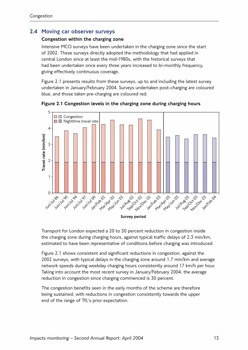
2.4 Moving car observer surveysCongestion within the charging zone
Intensive MCO surveys have been undertaken in the charging zone since the start of 2002. These surveys directly adopted the methodology that had applied in central London since at least the mid-1980s, with the historical surveys that had been undertaken once every three years increased to bi-monthly frequency, giving effectively continuous coverage.
Figure 2.1 presents results from these surveys, up to and including the latest surveyundertaken in January/February 2004. Surveys undertaken post-charging are colouredblue, and those taken pre-charging are coloured red.
Figure 2.1 Congestion levels in the charging zone during charging hours
Transport for London expected a 20 to 30 percent reduction in congestion inside the charging zone during charging hours, against typical traffic delays of 2.3 min/km,estimated to have been representative of conditions before charging was introduced.
Figure 2.1 shows consistent and significant reductions in congestion, against the 2002 surveys, with typical delays in the charging zone around 1.7 min/km and averagenetwork speeds during weekday charging hours consistently around 17 km/h per hour.Taking into account the most recent survey in January/February 2004, the averagereduction in congestion since charging commenced is 30 percent.
The congestion benefits seen in the early months of the scheme are therefore being sustained, with reductions in congestion consistently towards the upper end of the range of TfL’s prior expectation.
Congestion
13
0
1
2
3
4
5
Jun/J
ul 86
Jun/J
ul 90
Jun/J
ul 94
Jun/J
ul 97
Jun/J
ul 00
Jan/F
eb 02
Mar/Apr 0
2
May/Ju
n 02
Jul/A
ug 02
Sep/O
ct 02
Nov/Dec
02
Jan/F
eb 03
Mar/Apr 0
3
May/Ju
n 03
Jul/A
ug 03
Sep/O
ct 03
Nov/Dec
03
Jan/F
eb 04
Survey period
Trav
el r
ate
(min
/km
)
CongestionNighttime travel rate

Impacts monitoring – Second Annual Report: April 2004
Figure 2.2 shows how these improvements in congestion have been reflected by faster average journey speeds. Average travel speeds during charging hours are now around 17 km/h.
Figure 2.2 Average network speeds within the charging zone
2.5 Congestion on the Inner Ring RoadThe Inner Ring Road forms the boundary of the charging zone. No charge applies to vehicles using this route. Concerns were raised before the start of charging thattraffic diverting on to the Inner Ring Road to avoid the charge could lead to increasedcongestion. Transport for London expected that with the implementation of improvedtraffic management arrangements, there would be no overall increase in congestion on this route.
Congestion on the Inner Ring Road has been measured by dedicated two-monthlyMCO speed surveys. Four surveys have been completed following the start of chargingand these can be compared with equivalent surveys conducted during 2002.
Figure 2.3 shows that observed levels of congestion have reduced since theintroduction of charging. The latest three surveys all indicate a stable picture with typical all-day delays of between 1.5 and 1.7 min/km, compared to arepresentative pre-charging value of 1.9 min/km.
Congestion
14
0
5
10
15
20
25
30
AM shoulder AM peak AM off-peak
PM off-peak
PM peak
PM shoulder
Time period
Ave
rage
spe
ed (
km/h
)
Jan/Feb 2002 Mar/Apr 2002 May/Jun 2002Jul/Aug 2002 Sep/Oct 2002 Nov/Dec 2002Jan/Feb 2003 Mar/Apr 2003 May/Jun 2003Jul/Aug 2003 Sep/Oct 2003 Nov/Dec 2003Jan/Feb 2004

Impacts monitoring – Second Annual Report: April 2004
Figure 2.3 Congestion levels on the Inner Ring Road during charging hours
As with the charging zone, travel rates in the 2003 post-charging surveys are generallyfaster than during 2002. The uncongested travel rate on the Inner Ring Road is 1.8 min/km, and the actual levels of congestion experienced during 2002 fluctuatedconsiderably throughout the year.
Measurements of traffic volumes on the Inner Ring Road suggest overall increases intraffic of about 4 percent following the introduction of charging, towards the lower endof TfL’s range of expectations. It is therefore likely that the congestion improvementsreflect the better operational management of this key route and to a more limitedextent, the end of the disruptions connected with some roadworks around the Inner Ring Road area in 2002.
Congestion
15
0
1
2
3
4
5
Jun/J
ul 86
Jun/J
ul 90
Jun/J
ul 94
Jun/J
ul 97
Jun/J
ul 00
Jan/F
eb 02
Mar/Apr 0
2
Jun/J
ul 02
Sep/O
ct 02
Nov/Dec
02
Jan/F
eb 03
Mar/Apr 0
3
Jun/J
ul 03
Sep/O
ct 03
Nov/Dec
03
Survey period
Trav
el r
ate
(min
/km
)CongestionNighttime travel rate
Impacts monitoring – Second Annual Report: April 2004
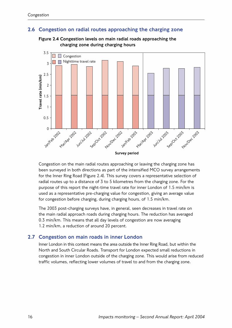
2.6 Congestion on radial routes approaching the charging zone
Figure 2.4 Congestion levels on main radial roads approaching the charging zone during charging hours
Congestion on the main radial routes approaching or leaving the charging zone hasbeen surveyed in both directions as part of the intensified MCO survey arrangementsfor the Inner Ring Road (Figure 2.4). This survey covers a representative selection ofradial routes up to a distance of 3 to 5 kilometres from the charging zone. For thepurpose of this report the night-time travel rate for inner London of 1.5 min/km isused as a representative pre-charging value for congestion, giving an average value for congestion before charging, during charging hours, of 1.5 min/km.
The 2003 post-charging surveys have, in general, seen decreases in travel rate on the main radial approach roads during charging hours. The reduction has averaged 0.3 min/km. This means that all day levels of congestion are now averaging 1.2 min/km, a reduction of around 20 percent.
2.7 Congestion on main roads in inner LondonInner London in this context means the area outside the Inner Ring Road, but within theNorth and South Circular Roads. Transport for London expected small reductions incongestion in inner London outside of the charging zone. This would arise from reducedtraffic volumes, reflecting lower volumes of travel to and from the charging zone.
Congestion
16
CongestionNighttime travel rate
0
0.5
1
1.5
2
2.5
3
3.5
Jan/F
eb 2002
Mar/Apr 2
002
Jun/J
ul 2002
Sep/O
ct 2002
Nov/Dec
2002
Jan/F
eb 2003
Mar/Apr 2
003
Jun/J
ul 2003
Sep/O
ct 2003
Nov/Dec
2003
Survey period
Trav
el r
ate
(min
/km
)
Impacts monitoring – Second Annual Report: April 2004
An MCO survey of network speeds on the more major roads in inner London wasconducted between March and June 2003. Transport for London estimated therepresentative all-day level of congestion before the introduction of charging to be 1.3 min/km on main roads in inner London. Transport for London has found nostatistically significant change in congestion levels on major roads in inner Londonduring charging hours.
It may be that reduced traffic levels across inner London resulting from congestioncharging, in combination with environmental traffic management schemes onresidential roads, have meant a transfer of traffic from minor to more major roads.Such roads are more likely to be covered in the congestion survey – so the survey may not reflect the full picture of congestion across inner London. Traffic managementschemes on the Inner Ring Road during 2002, at Vauxhall Cross and at Shoreditch – for purposes unconnected with congestion charging – are likely to have diverted traffic to main roads in inner London and hence may have increased congestion within this survey area.
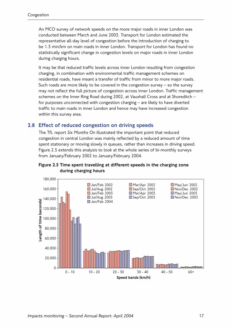
2.8 Effect of reduced congestion on driving speedsThe TfL report Six Months On illustrated the important point that reduced congestion in central London was mainly reflected by a reduced amount of time spent stationary or moving slowly in queues, rather than increases in driving speed.Figure 2.5 extends this analysis to look at the whole series of bi-monthly surveys from January/February 2002 to January/February 2004.
Figure 2.5 Time spent travelling at different speeds in the charging zone during charging hours
Congestion
17
0
20,000
40,000
60,000
80,000
100,000
120,000
140,000
160,000
180,000
0 - 10 10 - 20 20 - 30 30 - 40 40 - 50 60+Speed bands (km/h)
Leng
th o
f ti
me
(sec
ond
s)
Jan/Feb 2002 Mar/Apr 2002 May/Jun 2002Jul/Aug 2002 Sep/Oct 2002 Nov/Dec 2002Jan/Feb 2003 Mar/Apr 2003 May/Jun 2003Jul/Aug 2003 Sep/Oct 2003 Nov/Dec 2003Jan/Feb 2004
Impacts monitoring – Second Annual Report: April 2004
Figure 2.5 shows that decreased congestion in the charging zone is mainly reflected by a reduced amount of time spent stationary or moving slowly in queues, rather thanincreases in driving speed.
In all of the post charging surveys, the amount of time spent in the lowest speed band (0 to 10 km/h) has reduced by up to one third when compared to equivalent pre-charging surveys.
Whilst there are some small increases in the amount of time spent travelling at thehigher speeds up to 40 km/h, the gain is overwhelmingly in terms of reduced timespent in queues. This should mean better journey time reliability as periods oftemporary ‘gridlock’ are greatly reduced.
2.9 Congestion monitoring using ANPR camerasThe possible application of the ANPR enforcement cameras to monitoring congestionwas outlined in the First Annual Monitoring Report. This described how traffic speedscould be monitored by matching observations of the same vehicle moving betweenrelated pairs of cameras, where the time taken and distance covered were known.
A potential benefit of this approach would be the large volumes of data arising as a by-product of the scheme enforcement process. Cameras operate continuouslyduring charging hours. Such volumes of data would allow statistical treatment of issuessuch as travel time reliability (which is not currently possible using MCO data) and openup new research possibilities into various aspects of traffic behaviour.
Taking full account of Data Protection principles, a system was put in place to begin toexploit these data. Data from the cameras started coming ‘on-stream’ at the very startof 2003, providing a short ‘pre-charging’ dataset. However, since charging started, datahave been accumulating continuously and some initial analyses have been undertaken.
An important consideration for the future is the extent to which data from this sourceare comparable to those from the MCO speed surveys. This might allow greater use of this technology as a primary measure of changes in congestion, resulting in costsavings, as well as improving the robustness of conclusions and the rapidity with whichthey can be produced. However, it is recognised that differences in network coverageand other factors will inevitably mean that the estimates of network speeds from each source will differ.
Congestion
18
Impacts monitoring – Second Annual Report: April 2004
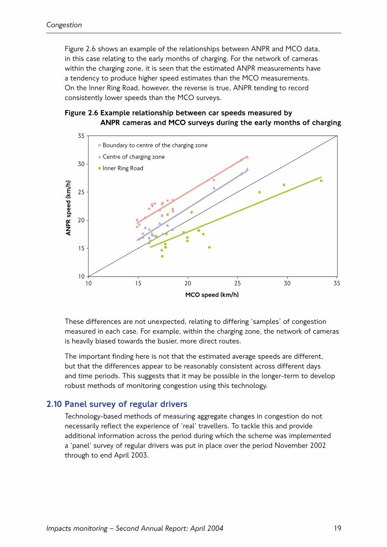
Figure 2.6 shows an example of the relationships between ANPR and MCO data, in this case relating to the early months of charging. For the network of cameras within the charging zone, it is seen that the estimated ANPR measurements have a tendency to produce higher speed estimates than the MCO measurements. On the Inner Ring Road, however, the reverse is true, ANPR tending to recordconsistently lower speeds than the MCO surveys.
Figure 2.6 Example relationship between car speeds measured by ANPR cameras and MCO surveys during the early months of charging
These differences are not unexpected, relating to differing ‘samples’ of congestionmeasured in each case. For example, within the charging zone, the network of camerasis heavily biased towards the busier, more direct routes.
The important finding here is not that the estimated average speeds are different, but that the differences appear to be reasonably consistent across different days and time periods. This suggests that it may be possible in the longer-term to developrobust methods of monitoring congestion using this technology.
2.10 Panel survey of regular driversTechnology-based methods of measuring aggregate changes in congestion do notnecessarily reflect the experience of ‘real’ travellers. To tackle this and provideadditional information across the period during which the scheme was implemented a ‘panel’ survey of regular drivers was put in place over the period November 2002through to end April 2003.
Congestion
19
10
15
20
25
30
35
10 15 20 25 30 35
MCO speed (km/h)
AN
PR s
peed
(km
/h)
Boundary to centre of the charging zone
Centre of charging zone
Inner Ring Road
Impacts monitoring – Second Annual Report: April 2004
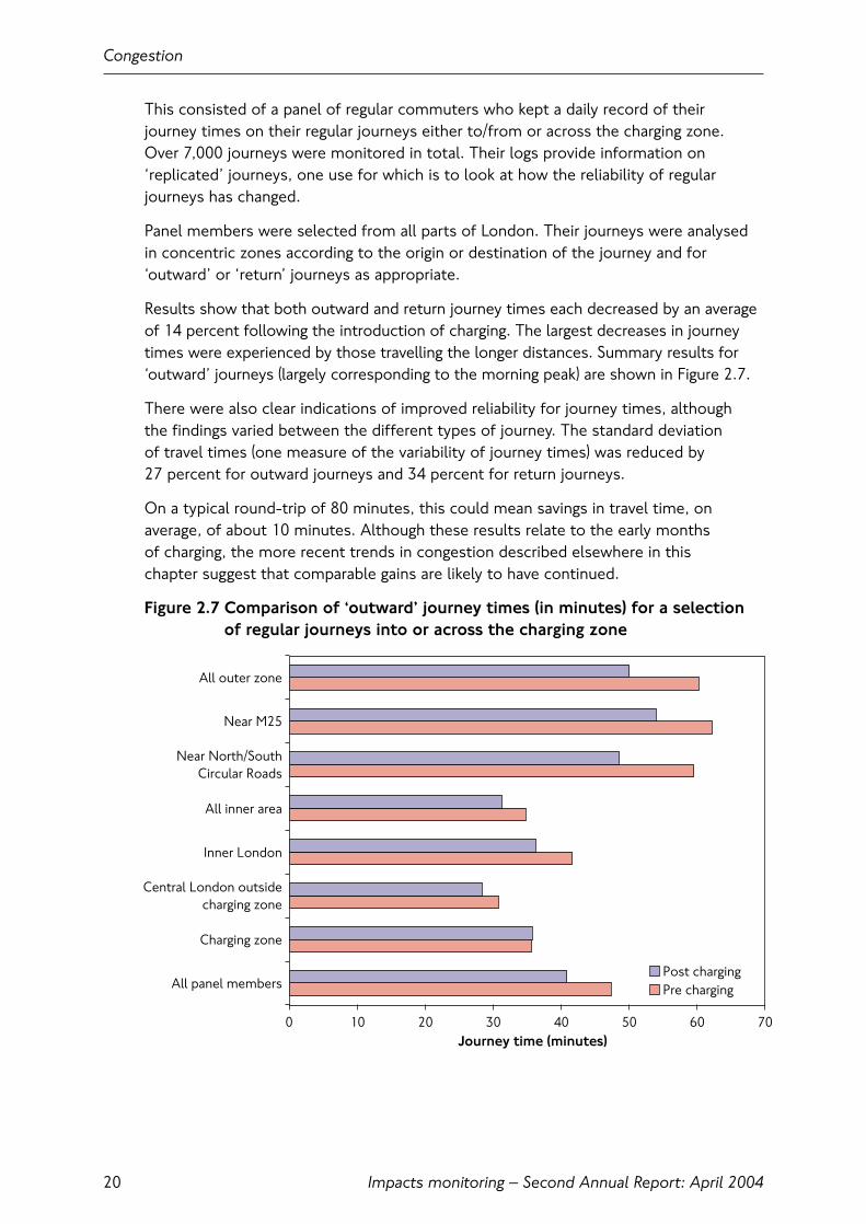
This consisted of a panel of regular commuters who kept a daily record of their journey times on their regular journeys either to/from or across the charging zone. Over 7,000 journeys were monitored in total. Their logs provide information on‘replicated’ journeys, one use for which is to look at how the reliability of regularjourneys has changed.
Panel members were selected from all parts of London. Their journeys were analysedin concentric zones according to the origin or destination of the journey and for‘outward’ or ‘return’ journeys as appropriate.
Results show that both outward and return journey times each decreased by an averageof 14 percent following the introduction of charging. The largest decreases in journeytimes were experienced by those travelling the longer distances. Summary results for‘outward’ journeys (largely corresponding to the morning peak) are shown in Figure 2.7.
There were also clear indications of improved reliability for journey times, although the findings varied between the different types of journey. The standard deviation of travel times (one measure of the variability of journey times) was reduced by 27 percent for outward journeys and 34 percent for return journeys.
On a typical round-trip of 80 minutes, this could mean savings in travel time, onaverage, of about 10 minutes. Although these results relate to the early months of charging, the more recent trends in congestion described elsewhere in this chapter suggest that comparable gains are likely to have continued.
Figure 2.7 Comparison of ‘outward’ journey times (in minutes) for a selectionof regular journeys into or across the charging zone
Congestion
20
0 10 20 30 40 50 60 70
All panel members
Charging zone
Central London outsidecharging zone
Inner London
All inner area
Near North/SouthCircular Roads
Near M25
All outer zone
Journey time (minutes)
Post chargingPre charging
Impacts monitoring – Second Annual Report: April 2004
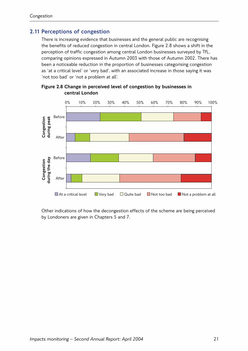
2.11 Perceptions of congestionThere is increasing evidence that businesses and the general public are recognising the benefits of reduced congestion in central London. Figure 2.8 shows a shift in theperception of traffic congestion among central London businesses surveyed by TfL,comparing opinions expressed in Autumn 2003 with those of Autumn 2002. There hasbeen a noticeable reduction in the proportion of businesses categorising congestion as ‘at a critical level’ or ‘very bad’, with an associated increase in those saying it was‘not too bad’ or ‘not a problem at all’.
Figure 2.8 Change in perceived level of congestion by businesses in central London
Other indications of how the decongestion effects of the scheme are being perceivedby Londoners are given in Chapters 5 and 7.
Congestion
21
0% 10% 20% 30% 40% 50% 60% 70% 80% 90% 100%
Before
After
Before
After
At a critical level Very bad Quite bad Not too bad Not a problem at all
Co
nges
tio
ndu
ring
pea
kC
ong
esti
on
duri
ng t
he d
ay

Impacts monitoring – Second Annual Report: April 2004
Congestion
22
3. Traffic patterns
3.1 IntroductionThis section describes the key changes to the volumes and characteristics of roadtraffic that have been observed in and around the charging zone during 2003. It buildson information already presented in earlier TfL reports, giving some further detail inrespect of indicators for which headline findings have already been published, andconsiders other data sources that have more recently become available.
Congestion charging was expected to deliver decongestion benefits by reducing thevolume of traffic entering and circulating within the charging zone during charginghours. The scheme was also expected to lead to several other changes to trafficpatterns around the charging zone. The key expected traffic changes were:
• A reduction of between 10 and 15 percent in traffic circulating within the charging zone (measured as vehicle-kilometres travelled by all vehicles with four or more wheels);
• A corresponding reduction in traffic entering and leaving the charging zone acrossthe boundary;
• Changes to the composition of traffic, as different types of vehicle are differentiallyattracted or deterred with respect to the charging zone;
• An increase in traffic on the Inner Ring Road, as drivers elect to avoid paying thecharge by diverting around the boundary of the charging zone;
• A reduction in traffic on the radial approaches to the charging zone, reflectingreduced vehicle-trips to and from the charging zone;
• A possible small increase in orbital traffic in inner London, from drivers also seekingto avoid paying the charge by diverting around the charging zone on roads beyondthe Inner Ring Road;
• Other possible changes to the pattern of trip-making, for example drivers changingthe timing of their trips so as to be outside of charging hours.
Information is now available that allow all of these expected effects within the first 12 months of charging to be assessed.
3.2 Key findingsThe key findings from the monitoring work are as follows:
• Traffic adjusted rapidly and with very few traffic operational problems. New patternsof travel became established at an early stage, and have been sustained throughout2003 and into 2004;
• Observed reductions of 18 percent in traffic (vehicles with four or more wheels) enteringthe zone, and 15 percent in traffic circulating within the zone (also vehicles with four or more wheels), are towards the top end of the range of TfL’s prior expectation;
• Responses of individual vehicle types tended to be slightly more pronounced thanexpected, with larger-than-expected decreases in cars, and greater than expectedincreases in taxis and two-wheeled vehicles;
Traffic patterns
Impacts monitoring – Second Annual Report: April 2004 23

Impacts monitoring – Second Annual Report: April 200424
Traffic patterns
• Although increased traffic has been observed on the Inner Ring Road, theseincreases are somewhat smaller than expected and are not leading to significantoperational problems on this key route;
• There is no evidence of systematic increases in traffic outside of charging hours on weekdays or weekends in response to the introduction of the charge;
• There is no evidence of systematic increases in traffic on local roads outside of the charging zone in response to the introduction of the charge;
• Reductions in radial traffic approaching the charging zone in inner London aretowards the low end of TfL’s range of prior expectation, but interpretation of this finding is difficult in the absence of further data describing recent traffic trends more widely in inner London.
3.3 Monitoring frameworkThe First Annual Monitoring Report described the range of indicators that would be measured, and set out a range of data describing traffic conditions as they wereobserved in 2002 before the scheme started. This information forms the starting pointfor the commentary below.
Surveys of all key indicators were undertaken during 2003 following the introduction of charging, and in most cases a direct comparison with 2002 is therefore possible.These are considered under the following headings:
• Traffic entering and leaving the charging zone;
• Traffic circulating within the charging zone;
• Traffic on the Inner Ring Road;
• Orbital traffic, and traffic on local roads beyond the Inner Ring Road;
• Radial traffic approaching the zone;
• Wider traffic trends in London.
Readers should be aware that there have been many other potential influences ontraffic patterns operating at the same time that congestion charging was introduced.These include longer-term ‘background’ trends in traffic across London, together with a variety of shorter-term temporary effects. Also pertinent are changes to thecentral London road network, which in some cases may affect the direct comparabilityof 2003 and 2002 measurements.
In the absence of longer-term information for many of the indicators that were only first measured in 2002, the following approaches have been used to ensurecomparability of estimates between 2002 and 2003:
• Where surveys were done at a particular time during 2002, these have beenreplicated as closely as possible during 2003;
• Where estimates of annual change are required, these have been derived from an average of counts taken during the Spring and Autumn ‘neutral’ traffic countingperiods; these being periods when traffic volumes most closely approximate to their annual average levels. These estimates are therefore not true annual averages.They are nevertheless a sound basis for measuring relative change, and are referredto as ‘annualised’ estimates throughout.

3.4 Settled traffic conditionsEarly feedback on the traffic impacts of the scheme was available from automatictraffic counters located at a selection of major-road entry points to the charging zone.These cover approximately 40 percent of inbound traffic during charging hours, and are therefore a good indicator of overall traffic trends. However, their location on major roads may tend to under-state the overall effects of the scheme as, withreduced overall traffic levels, the relative attractiveness of the more major roads may have increased.
Figure 3.1 compares traffic levels over a complete year of charging against levelsrecorded in the early weeks of 2003 just before charging was introduced.
The rapidity with which traffic levels adjusted to the charge is evident, as is the relativestability of traffic levels since. Also evident from the graph is the absence of significantchanges in weekend traffic corresponding with the introduction of the scheme.
Figure 3.1 Traffic entering the charging zone during charging hours on arepresentative selection of major entry points
Figure 3.1 makes an interesting comparison with Figure 8.1, which shows weekly levelsof charge payments over a similar timescale. Both traffic and payment trends continueto suggest the existence of stable travel patterns.
Traffic patterns
Impacts monitoring – Second Annual Report: April 2004 25
0
25
50
75
100
125
150
20/0
1/03
20/0
2/03
20/0
3/03
20/0
4/03
20/0
5/03
20/0
6/03
20/0
7/03
20/0
8/03
20/0
9/03
20/1
0/03
20/1
1/03
20/1
2/03
20/0
1/04
20/0
2/04
Week beginning
Veh
icle
s (e
xclu
ding
tw
o-w
heel
ers,
tho
usan
ds)
Post charging weekdayPost charging weekend & public holidayPre charging weekend & public holiday
Pre charging weekday
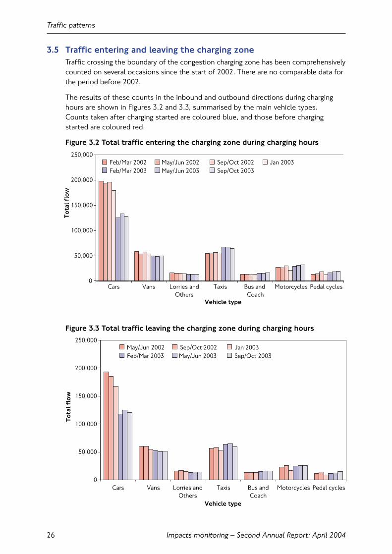
3.5 Traffic entering and leaving the charging zoneTraffic crossing the boundary of the congestion charging zone has been comprehensivelycounted on several occasions since the start of 2002. There are no comparable data forthe period before 2002.
The results of these counts in the inbound and outbound directions during charginghours are shown in Figures 3.2 and 3.3, summarised by the main vehicle types. Counts taken after charging started are coloured blue, and those before chargingstarted are coloured red.
Figure 3.2 Total traffic entering the charging zone during charging hours
Figure 3.3 Total traffic leaving the charging zone during charging hours
Traffic patterns
Impacts monitoring – Second Annual Report: April 200426
0
50,000
100,000
150,000
200,000
250,000
Cars Vans Lorries andOthers
Taxis Bus and Coach
Motorcycles Pedal cycles
Vehicle type
Tota
l flo
w
Feb/Mar 2002 May/Jun 2002 Sep/Oct 2002 Jan 2003Feb/Mar 2003 May/Jun 2003 Sep/Oct 2003
0
50,000
100,000
150,000
200,000
250,000
Cars Vans Lorries andOthers
Taxis Bus andCoach
Motorcycles Pedal cycles
Vehicle type
Tota
l flo
w
May/Jun 2002 Sep/Oct 2002 Jan 2003Feb/Mar 2003 May/Jun 2003 Sep/Oct 2003
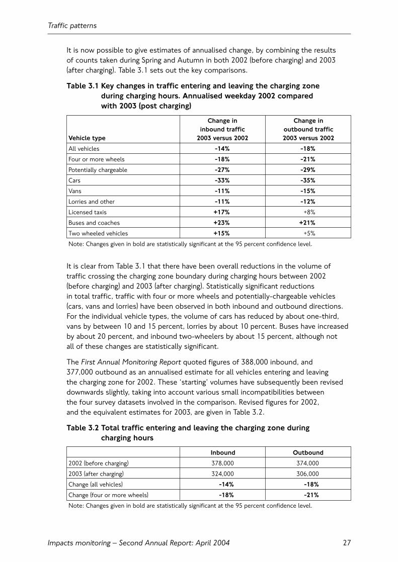
It is now possible to give estimates of annualised change, by combining the results of counts taken during Spring and Autumn in both 2002 (before charging) and 2003(after charging). Table 3.1 sets out the key comparisons.
Table 3.1 Key changes in traffic entering and leaving the charging zone during charging hours. Annualised weekday 2002 compared with 2003 (post charging)
Change in Change ininbound traffic outbound traffic
Vehicle type 2003 versus 2002 2003 versus 2002
All vehicles -14% -18%
Four or more wheels -18% -21%
Potentially chargeable -27% -29%
Cars -33% -35%
Vans -11% -15%
Lorries and other -11% -12%
Licensed taxis +17% +8%
Buses and coaches +23% +21%
Two wheeled vehicles +15% +5%
Note: Changes given in bold are statistically significant at the 95 percent confidence level.
It is clear from Table 3.1 that there have been overall reductions in the volume oftraffic crossing the charging zone boundary during charging hours between 2002 (before charging) and 2003 (after charging). Statistically significant reductions in total traffic, traffic with four or more wheels and potentially-chargeable vehicles(cars, vans and lorries) have been observed in both inbound and outbound directions. For the individual vehicle types, the volume of cars has reduced by about one-third,vans by between 10 and 15 percent, lorries by about 10 percent. Buses have increasedby about 20 percent, and inbound two-wheelers by about 15 percent, although not all of these changes are statistically significant.
The First Annual Monitoring Report quoted figures of 388,000 inbound, and 377,000 outbound as an annualised estimate for all vehicles entering and leaving the charging zone for 2002. These ‘starting’ volumes have subsequently been reviseddownwards slightly, taking into account various small incompatibilities between the four survey datasets involved in the comparison. Revised figures for 2002, and the equivalent estimates for 2003, are given in Table 3.2.
Table 3.2 Total traffic entering and leaving the charging zone during charging hours
Inbound Outbound
2002 (before charging) 378,000 374,000
2003 (after charging) 324,000 306,000
Change (all vehicles) -14% -18%
Change (four or more wheels) -18% -21%
Note: Changes given in bold are statistically significant at the 95 percent confidence level.
Traffic patterns
Impacts monitoring – Second Annual Report: April 2004 27
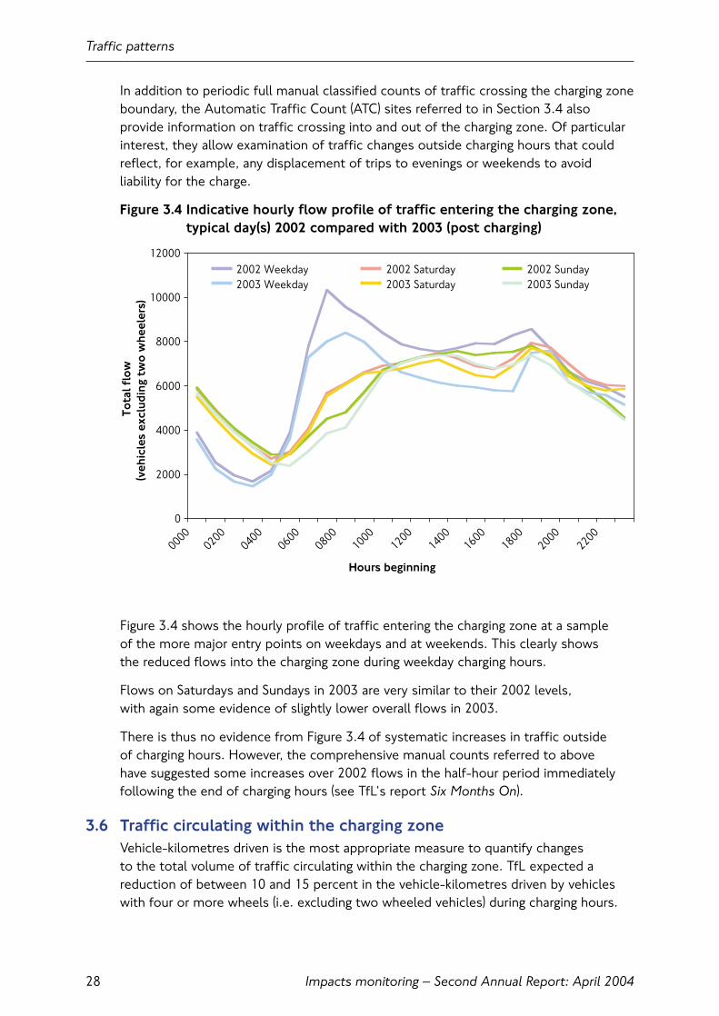
In addition to periodic full manual classified counts of traffic crossing the charging zoneboundary, the Automatic Traffic Count (ATC) sites referred to in Section 3.4 alsoprovide information on traffic crossing into and out of the charging zone. Of particularinterest, they allow examination of traffic changes outside charging hours that couldreflect, for example, any displacement of trips to evenings or weekends to avoidliability for the charge.
Figure 3.4 Indicative hourly flow profile of traffic entering the charging zone,typical day(s) 2002 compared with 2003 (post charging)
Figure 3.4 shows the hourly profile of traffic entering the charging zone at a sample of the more major entry points on weekdays and at weekends. This clearly shows the reduced flows into the charging zone during weekday charging hours.
Flows on Saturdays and Sundays in 2003 are very similar to their 2002 levels, with again some evidence of slightly lower overall flows in 2003.
There is thus no evidence from Figure 3.4 of systematic increases in traffic outside of charging hours. However, the comprehensive manual counts referred to above have suggested some increases over 2002 flows in the half-hour period immediatelyfollowing the end of charging hours (see TfL’s report Six Months On).
3.6 Traffic circulating within the charging zoneVehicle-kilometres driven is the most appropriate measure to quantify changes to the total volume of traffic circulating within the charging zone. TfL expected areduction of between 10 and 15 percent in the vehicle-kilometres driven by vehicleswith four or more wheels (i.e. excluding two wheeled vehicles) during charging hours.
Traffic patterns
Impacts monitoring – Second Annual Report: April 200428
0
2000
4000
6000
8000
10000
12000
00000200
04000600
08001000
12001400
16001800
20002200
Hours beginning
Tota
l flo
w(v
ehic
les
excl
udin
g tw
o w
heel
ers)
2002 Weekday 2002 Saturday 2002 Sunday2003 Weekday 2003 Saturday 2003 Sunday

The First Annual Monitoring Report estimated a total daily charging hours figure of 1.5 million vehicle kilometres for 2002. The estimate for vehicles with four or morewheels was given as 1.3 million vehicle-kilometres. It was stated that although theabsolute estimate of vehicle-kilometres would be subject to some uncertainty, acomparison between 2002 and 2003 made on the same basis should provide moreprecise estimates of relative change.
Again, there have been changes to the central London road network and availabletraffic count sites between 2002 and 2003. A computational error was also discovered in the 2002 dataset that had the effect of under-stating the absolute level of vehicle-kilometres driven in 2002. These have necessitated some adjustmentsto the ‘starting’ estimate for 2002; the net effect in this case is to revise the 2002 estimates upwards slightly from those originally published. In considering these adjustments, it is important to understand that the comparisons between 2002 and 2003 presented below have been made on a strictly like-for-like basis.
Table 3.3 Key changes in vehicle-kilometres driven within the charging zoneduring charging hours. Annualised weekday 2002 compared with 2003(post-charging)
2002 vkm 2003 vkm percentageVehicle type (millions) (millions) change
All vehicles 1.64 (100%) 1.45 (100%) -12%
Four or more wheels 1.44 (88%) 1.23 (85%) -15%
Potentially chargeable 1.13 (69%) 0.85 (58%) -25%
Cars 0.77 (47%) 0.51 (35%) -34%
Vans 0.29 (18%) 0.27 (19%) -5%
Lorries and other 0.07 (4%) 0.07 (5%) -7%
Licensed taxis 0.26 (16%) 0.31 (21%) +22%
Buses and coaches 0.05 (3%) 0.07 (5%) +21%
Two wheeled vehicles 0.20 (12%) 0.23 (16%) +14%
Note: Changes given in bold are statistically significant at the 95 percent confidence level. The percentage contribution to total charging zone traffic is also shown for each of 2002 and 2003.
These results are towards the top end of TfL’s prior expectations, and are consistentwith earlier findings previously reported, which were indicating traffic reductions within the 10 to 15 percent expected range.
When looked at in conjunction with the results for traffic entering the zone describedabove, they do suggest specific effects at the level of the individual vehicle type.These can be summarised as follows:
• The overall traffic decrease observed in the charging zone is of slightly smallermagnitude than that observed at the boundary. This would be expected as, for example, many vehicles already within the zone, such as residents’ vehicles, are less affected by the scheme;
• The observed decrease in cars entering the zone is above the top end of the range of TfL’s prior expectation;
Traffic patterns
Impacts monitoring – Second Annual Report: April 2004 29
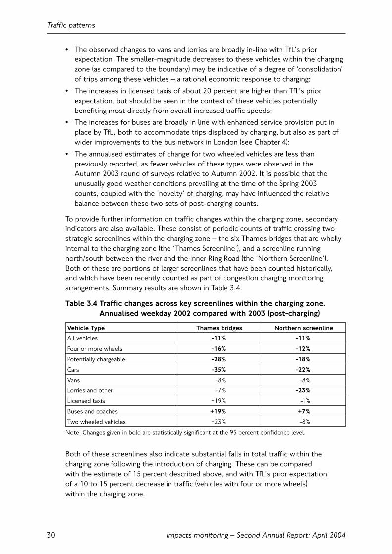
• The observed changes to vans and lorries are broadly in-line with TfL’s priorexpectation. The smaller-magnitude decreases to these vehicles within the chargingzone (as compared to the boundary) may be indicative of a degree of ‘consolidation’of trips among these vehicles – a rational economic response to charging;
• The increases in licensed taxis of about 20 percent are higher than TfL’s priorexpectation, but should be seen in the context of these vehicles potentiallybenefiting most directly from overall increased traffic speeds;
• The increases for buses are broadly in line with enhanced service provision put inplace by TfL, both to accommodate trips displaced by charging, but also as part ofwider improvements to the bus network in London (see Chapter 4);
• The annualised estimates of change for two wheeled vehicles are less thanpreviously reported, as fewer vehicles of these types were observed in the Autumn 2003 round of surveys relative to Autumn 2002. It is possible that theunusually good weather conditions prevailing at the time of the Spring 2003 counts, coupled with the ‘novelty’ of charging, may have influenced the relativebalance between these two sets of post-charging counts.
To provide further information on traffic changes within the charging zone, secondaryindicators are also available. These consist of periodic counts of traffic crossing twostrategic screenlines within the charging zone – the six Thames bridges that are whollyinternal to the charging zone (the ‘Thames Screenline’), and a screenline runningnorth/south between the river and the Inner Ring Road (the ‘Northern Screenline’). Both of these are portions of larger screenlines that have been counted historically,and which have been recently counted as part of congestion charging monitoringarrangements. Summary results are shown in Table 3.4.
Table 3.4 Traffic changes across key screenlines within the charging zone.Annualised weekday 2002 compared with 2003 (post-charging)
Vehicle Type Thames bridges Northern screenline
All vehicles -11% -11%
Four or more wheels -16% -12%
Potentially chargeable -28% -18%
Cars -35% -22%
Vans -8% -8%
Lorries and other -7% -23%
Licensed taxis +19% -1%
Buses and coaches +19% +7%
Two wheeled vehicles +23% -8%
Note: Changes given in bold are statistically significant at the 95 percent confidence level.
Both of these screenlines also indicate substantial falls in total traffic within thecharging zone following the introduction of charging. These can be compared with the estimate of 15 percent described above, and with TfL’s prior expectation of a 10 to 15 percent decrease in traffic (vehicles with four or more wheels) within the charging zone.
Traffic patterns
Impacts monitoring – Second Annual Report: April 200430

However, there are some differences between the two screenlines. The estimates for the Thames Bridges are based on annualised totals, combining counts taken inSpring and Autumn in both years. Those for the northern screenline are from manualcounts taken in January of each year only, and therefore are perhaps less reliable. They exclude the Inner Ring Road site on this screenline. The statistical confidencelimits applying to these counts are therefore comparatively wide, and seasonal factorsmay have been expected to affect, for example, the numbers of two wheeled vehiclesobserved. The differences between the changes at the two screenlines probably alsoreflect the fact that much of the economic activity inside the charging zone takes placeto the north of the Thames.
3.7 Traffic on the Inner Ring RoadThe Inner Ring Road forms the most obvious alternative route for through trafficwishing to avoid the charging zone. TfL expected that congestion charging would lead to increases in traffic on this route, but that these increases would be dealt with by better operational management, such that overall congestion levels wouldremain broadly unchanged.
Table 3.5 Key changes in vehicle-kilometres driven on the Inner Ring Roadduring charging hours. Annualised weekday 2002 compared with 2003post-charging
2002 vkm 2003 vkm percentageQuantity (millions) (millions) change
All vehicles 0.65 0.68 +4%
Four or more wheels 0.61 0.62 +1%
Potentially chargeable 0.51 0.50 -2%
Cars 0.37 0.35 -7%
Vans 0.10 0.12 +12%
Lorries and other 0.04 0.04 +7%
Licensed taxis 0.08 0.09 +16%
Buses and coaches 0.02 0.03 +24%
Two wheeled vehicles 0.04 0.06 +43%
Note: Changes given in bold are statistically significant at the 95 percent confidence level.
Table 3.5 shows the key changes in traffic on the Inner Ring Road between 2002 and 2003(post charging). Total vehicle kilometres on the Inner Ring Road are estimated to haveincreased by 4 percent overall. For vehicles with four or more wheels, the equivalent figure is 1 percent, a change that is not statistically significant. This aggregate changecomprises small reductions in cars, counterbalanced by increases in buses, taxis,commercial vehicles and two wheelers. It also takes into account changes to the Inner Ring Road in the Shoreditch area, which have had the effect of reducing the length of the clockwise alignment (only) by approximately 3 percent.
Traffic patterns
Impacts monitoring – Second Annual Report: April 2004 31
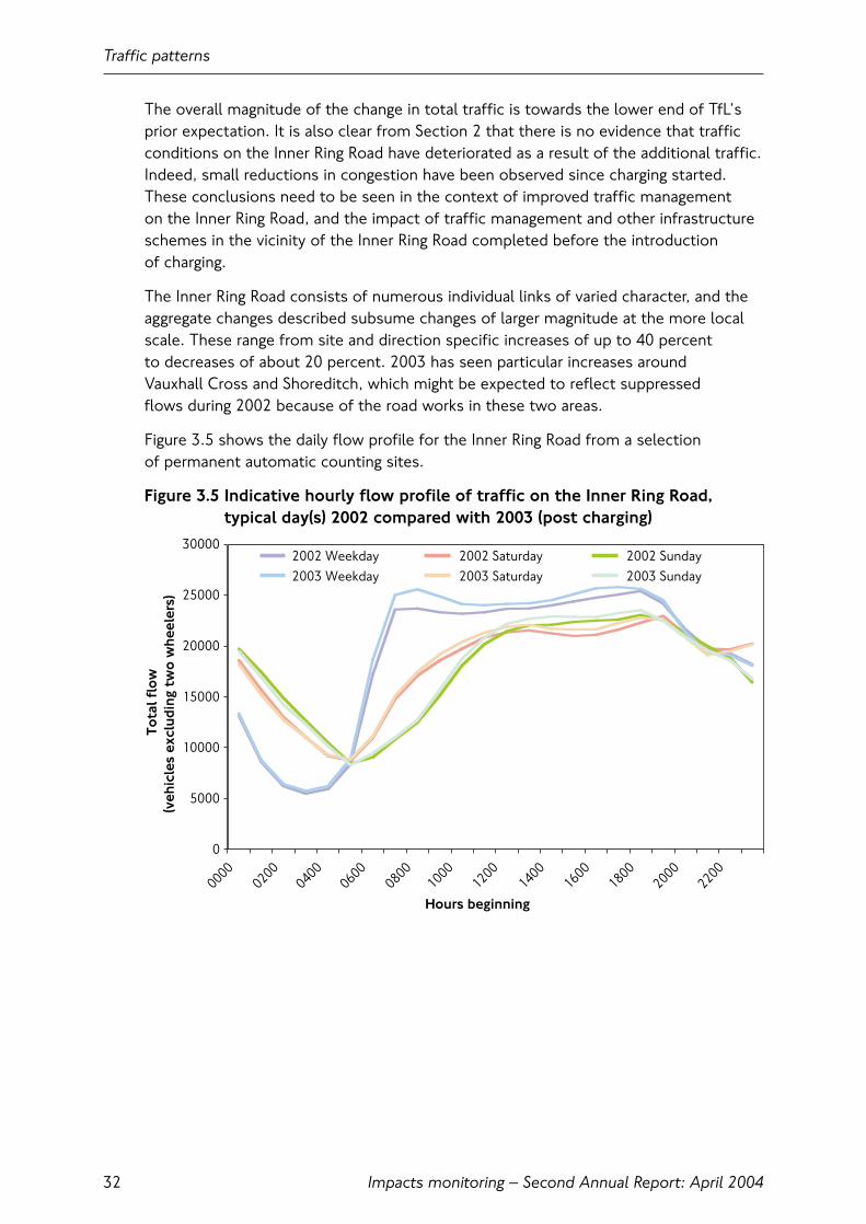
The overall magnitude of the change in total traffic is towards the lower end of TfL’sprior expectation. It is also clear from Section 2 that there is no evidence that trafficconditions on the Inner Ring Road have deteriorated as a result of the additional traffic.Indeed, small reductions in congestion have been observed since charging started.These conclusions need to be seen in the context of improved traffic management on the Inner Ring Road, and the impact of traffic management and other infrastructureschemes in the vicinity of the Inner Ring Road completed before the introduction of charging.
The Inner Ring Road consists of numerous individual links of varied character, and theaggregate changes described subsume changes of larger magnitude at the more localscale. These range from site and direction specific increases of up to 40 percent to decreases of about 20 percent. 2003 has seen particular increases around Vauxhall Cross and Shoreditch, which might be expected to reflect suppressed flows during 2002 because of the road works in these two areas.
Figure 3.5 shows the daily flow profile for the Inner Ring Road from a selection of permanent automatic counting sites.
Figure 3.5 Indicative hourly flow profile of traffic on the Inner Ring Road,typical day(s) 2002 compared with 2003 (post charging)
Traffic patterns
Impacts monitoring – Second Annual Report: April 200432
0
5000
10000
15000
20000
25000
30000
00000200
04000600
08001000
12001400
16001800
2000
2200
Hours beginning
Tota
l flo
w(v
ehic
les
excl
udin
g tw
o w
heel
ers)
2002 Weekday 2002 Saturday 2002 Sunday2003 Weekday 2003 Saturday 2003 Sunday
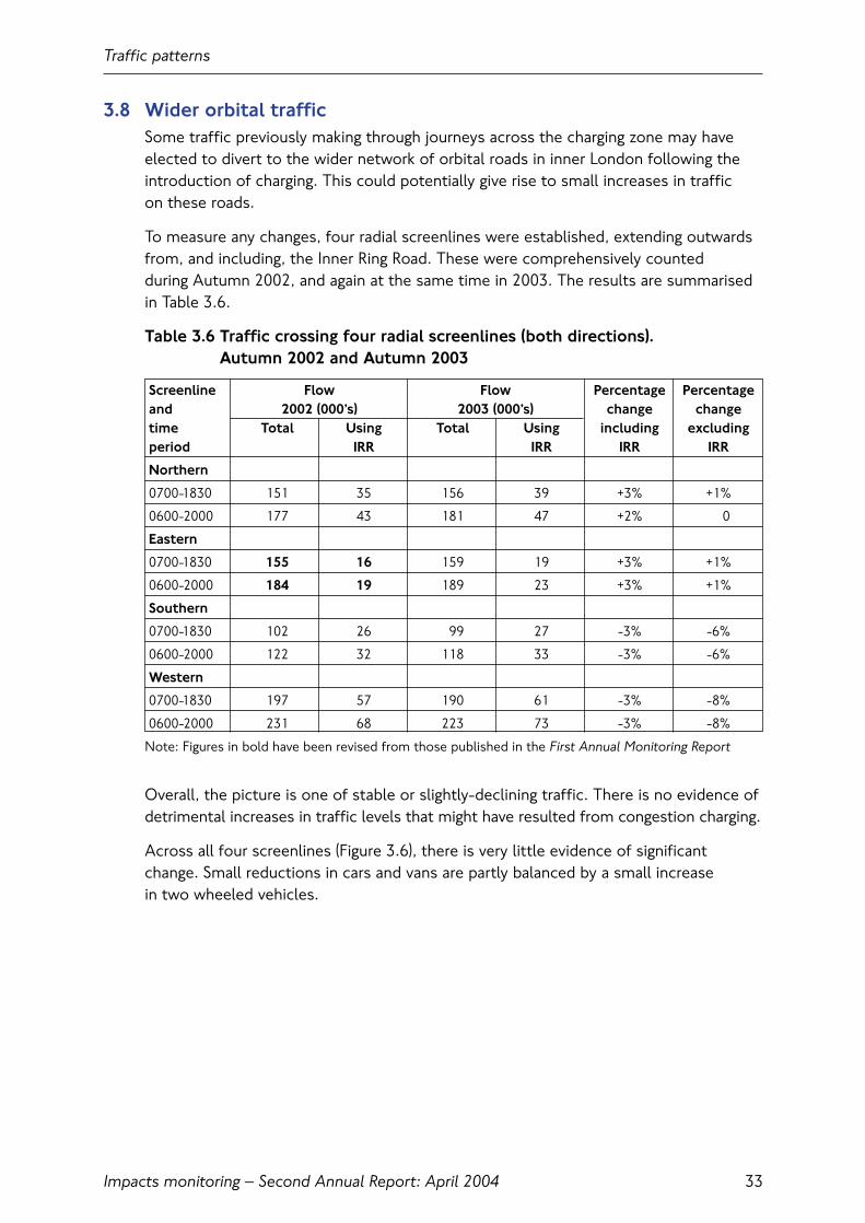
3.8 Wider orbital trafficSome traffic previously making through journeys across the charging zone may haveelected to divert to the wider network of orbital roads in inner London following theintroduction of charging. This could potentially give rise to small increases in traffic on these roads.
To measure any changes, four radial screenlines were established, extending outwardsfrom, and including, the Inner Ring Road. These were comprehensively counted during Autumn 2002, and again at the same time in 2003. The results are summarisedin Table 3.6.
Table 3.6 Traffic crossing four radial screenlines (both directions). Autumn 2002 and Autumn 2003
Screenline Flow Flow Percentage Percentageand 2002 (000’s) 2003 (000’s) change changetime Total Using Total Using including excludingperiod IRR IRR IRR IRR
Northern
0700-1830 151 35 156 39 +3% +1%
0600-2000 177 43 181 47 +2% 0
Eastern
0700-1830 155 16 159 19 +3% +1%
0600-2000 184 19 189 23 +3% +1%
Southern
0700-1830 102 26 99 27 -3% -6%
0600-2000 122 32 118 33 -3% -6%
Western
0700-1830 197 57 190 61 -3% -8%
0600-2000 231 68 223 73 -3% -8%
Note: Figures in bold have been revised from those published in the First Annual Monitoring Report
Overall, the picture is one of stable or slightly-declining traffic. There is no evidence ofdetrimental increases in traffic levels that might have resulted from congestion charging.
Across all four screenlines (Figure 3.6), there is very little evidence of significantchange. Small reductions in cars and vans are partly balanced by a small increase in two wheeled vehicles.
Traffic patterns
Impacts monitoring – Second Annual Report: April 2004 33

Figure 3.6 Observed change across four radial screenlines outside of thecharging zone (both directions) excluding the Inner Ring Road.Typical weekday, charging hours. Autumn 2002 compared withAutumn 2003
3.9 Traffic on local roadsTraffic on selected local roads surrounding the charging zone has been monitored atthe request of individual boroughs. 28 sites have been monitored continuously sincethe end of 2002, providing reliable and comparable data, and a further 28 have beenmonitored periodically.
Traffic levels at sites monitored continuously have previously been compared atdifferent times of the year, and therefore the changes that were observed may havebeen subject to seasonal effects. Traffic levels in January 2003 before charging andJanuary 2004 after charging can now also be compared. This gives a more directcomparison, although only for the month of January. The results of the year-on-yearcomparisons are presented in Table 3.7.
Although local sites do not provide a statistically-robust indicator of total traffic withina borough they are a useful gauge when grouped on a borough-wide basis. ComparingJanuary 2004 to January 2003, sites in the boroughs of Southwark and Kensington and Chelsea have seen no significant change overall, whereas overall reductions of 5 percent have been observed in Westminster, 11 percent in Tower Hamlets and 13 percent in Camden.
Traffic patterns
Impacts monitoring – Second Annual Report: April 200434
0
50,000
100,000
150,000
200,000
250,000
300,000
350,000
Cars andMinicabs
Taxis Twowheelers
Vans Lorries Buses
Vehicle type
Tota
l flo
w
Autumn 2002
Autumn 2003
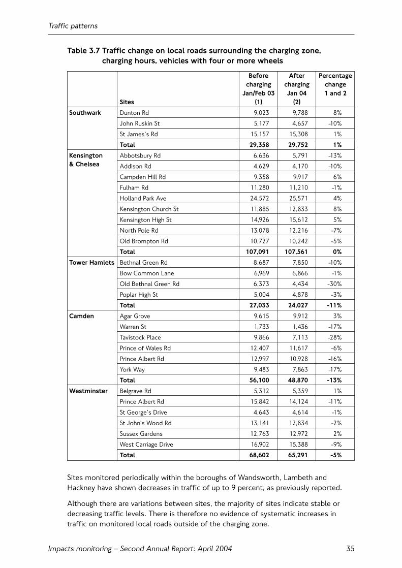
Table 3.7 Traffic change on local roads surrounding the charging zone, charging hours, vehicles with four or more wheels
Before After Percentagecharging charging change
Jan/Feb 03 Jan 04 1 and 2Sites (1) (2)
Southwark Dunton Rd 9,023 9,788 8%
John Ruskin St 5,177 4,657 -10%
St James’s Rd 15,157 15,308 1%
Total 29,358 29,752 1%
Kensington Abbotsbury Rd 6,636 5,791 -13%& Chelsea Addison Rd 4,629 4,170 -10%
Campden Hill Rd 9,358 9,917 6%
Fulham Rd 11,280 11,210 -1%
Holland Park Ave 24,572 25,571 4%
Kensington Church St 11,885 12,833 8%
Kensington High St 14,926 15,612 5%
North Pole Rd 13,078 12,216 -7%
Old Brompton Rd 10,727 10,242 -5%
Total 107,091 107,561 0%
Tower Hamlets Bethnal Green Rd 8,687 7,850 -10%
Bow Common Lane 6,969 6,866 -1%
Old Bethnal Green Rd 6,373 4,434 -30%
Poplar High St 5,004 4,878 -3%
Total 27,033 24,027 -11%
Camden Agar Grove 9,615 9,912 3%
Warren St 1,733 1,436 -17%
Tavistock Place 9,866 7,113 -28%
Prince of Wales Rd 12,407 11,617 -6%
Prince Albert Rd 12,997 10,928 -16%
York Way 9,483 7,863 -17%
Total 56,100 48,870 -13%
Westminster Belgrave Rd 5,312 5,359 1%
Prince Albert Rd 15,842 14,124 -11%
St George’s Drive 4,643 4,614 -1%
St John’s Wood Rd 13,141 12,834 -2%
Sussex Gardens 12,763 12,972 2%
West Carriage Drive 16,902 15,388 -9%
Total 68,602 65,291 -5%
Sites monitored periodically within the boroughs of Wandsworth, Lambeth andHackney have shown decreases in traffic of up to 9 percent, as previously reported.
Although there are variations between sites, the majority of sites indicate stable ordecreasing traffic levels. There is therefore no evidence of systematic increases intraffic on monitored local roads outside of the charging zone.
Traffic patterns
Impacts monitoring – Second Annual Report: April 2004 35

3.10 Radial traffic approaching the charging zoneTransport for London expected that charging would lead to a reduction in radial traffic on routes in inner London approaching the charging zone, particularly by cars.This would result from fewer journeys to and from the charging zone. Reductions intotal traffic of between 4 and 8 percent were expected at the extended central Londoncordon during charging hours (see Appendix 5 of the First Annual Monitoring Reportfor the location of this cordon).
The basic form of this cordon, for which a lengthy time-series of data exists, lies mostly just outside of the charging zone (except for a short distance south of the Thames where it runs inside the zone). The basic cordon has been extendedspecifically for congestion charging monitoring to lie wholly outside of the chargingzone, but the only available historical data for this modified cordon relates to 2002. All variants of this cordon were counted in both Autumn 2002 and 2003.
Table 3.8 Summary of traffic changes across the extended central Londoncordon. Weekday Autumn 2003 compared to Autumn 2002
Inbound Wholly outside CZ (% change)
All vehicles -5
Four or more wheels -6
Potentially chargeable -8
Cars -12
Outbound Wholly outside CZ (% change)
All vehicles -5
Four or more wheels -6
Potentially chargeable -10
Cars -12
Table 3.8 summarises observed traffic changes across the extended central Londoncordon. The net decreases in total traffic across this cordon are consistent with theexpected magnitude of congestion charging impacts. However, the recent historicaltrend at the original cordon has been for year-on-year decreases of between 6 and 7 percent during charging hours. This finding therefore needs to be interpreted in the context of recent traffic trends in inner London.
A secondary indicator for radial traffic approaching the charging zone is the TfL Central Area Peak Count survey (CAPC). This provides a count of vehicles(alongside person-trip estimates by private and public modes) crossing a similar cordon for the AM weekday peak period (inbound) only. Comparing provisional results for Autumn 2003 with Autumn 2002, 18 percent fewer cars were observedcrossing this cordon during the three hour weekday AM peak period.
Traffic patterns
Impacts monitoring – Second Annual Report: April 200436
3.11 Wider traffic trends in LondonThe First Annual Monitoring Report, and other reports published by TfL since the startof charging, have made reference to wider ‘background’ trends in traffic in London thathave needed to be taken into account when interpreting the key traffic changesobserved in response to the scheme.
The overall picture has been one of declining traffic over a number of years. This trendmainly affected cars, was particularly pronounced in central and inner London, andappeared to accelerate in 2002.
Comparisons of available indicators (as described in the First Annual Monitoring Report)suggested that traffic in the charging zone fell by about 6 percent between 2000 and2002, and there was evidence of greater falls from traffic surveys in the inner Londonarea outside the charging zone.
These trends probably reflected a combination of longer-term economic, road networkcapacity and modal shift factors, coupled with a possible temporary exaggerationcaused by exceptional network conditions in and around the charging zone during 2002.
A full set of information that will show the development of these trends after theintroduction of charging will not be available until Autumn 2004. There is neverthelesssome evidence emerging from provisional analysis of traffic counts throughout bothinner and outer London that the declines in traffic seen during 2002 were at leastpartly reversed during 2003.
Whatever the wider picture for traffic in London, the daily automatic traffic counts at the boundary of the charging zone have made it clear that the reductions in traffic in the charging zone directly coincided with the introduction of charging and weretherefore independent of these longer-term trends.
Traffic patterns
Impacts monitoring – Second Annual Report: April 2004 37

Traffic patterns
Impacts monitoring – Second Annual Report: April 200438

4. Public transport
4.1 IntroductionThis section summarises key changes to the public transport network in central London since the introduction of congestion charging.
Congestion charging was expected to result in a net increase in the use of publictransport to and from the charging zone as ex-car users shifted to public transport.There was also expected to be some transfer from short distance Underground and rail trips to bus as bus services became more attractive as a result of increasedservices and reduced congestion.
4.2 Key findings• In the morning three hour peak period in Autumn 2003 a total of 106,000 passengers
were observed entering the charging zone on all TfL buses, an increase of 29,000 (38 percent) on 2002;
• A total of nearly 3,000 buses were observed entering the zone in the morning peakperiod during Autumn 2003, 560 (23 percent) more than 2002;
• There has been some increase in the average number of passengers observed oneach bus, although these have generally been accommodated acceptably;
• The annual count of bus passengers entering central London at the Central AreaPeak Count (CAPC) cordon shows an increase from 88,000 in Autumn 2002 to104,000 in Autumn 2003 during the morning peak period, an increase of 18 percent.The lower rate of increase is explained by the geographical difference between thecount sites;
• Within the charging zone there were improvements in both the main indicators of bus service reliability: additional waiting time due to service irregularity fell by 30 percent; disruption due to traffic delays fell by 60 percent;
• Overall bus speeds within the charging zone improved by 6 percent, consistent with the improved traffic speeds;
• The Underground has seen a reduction in the number of passengers exiting stationsin and around the charging zone. On average, in the morning peak period sincecharging was introduced, there was a reduction in the number of people exitingstations of 8 percent from 513,000 to 473,000;
• There has been no significant change to the number of passengers entering central London on the National Rail network. In Spring 2003 447,000 passengerswere observed at 22 stations during the morning peak period compared to 451,000 in Spring 2002;
• On average there has been a 2 percent decrease in the number of passengers exiting Docklands Light Railway (DLR) stations in the charging zone.
Public transport
Impacts monitoring – Second Annual Report: April 2004 39

4.3 Background trendsBus patronage across London, increased by over 7 percent between 2001/02 and2002/03. Thus, there was a rising trend prior to the start of congestion charging. This background increase in passenger numbers was caused by: service enhancements;improved reliability due to investment in updated schedules; simplified fare levels,structures and ticketing arrangements; new vehicles; and better information. There have also been significant disruptions to Underground services, such as theCentral line closure from January to May 2003, and the Northern line disruption inOctober 2003. It is possible that some of those who transferred from Underground to bus services during these periods have been retained as bus passengers.
In parallel with this there have been events such as the Iraq war, the prolonged threatof terrorism, an economic downturn and unusually warm weather which have affectedthe number of visitors to London and hence the patronage of the public transportnetwork during 2003.
All these influences make it particularly difficult to separate the effects of congestioncharging from other factors.
4.4 Bus patronage Of all public transport modes the introduction of congestion charging was expected to have the greatest impact on buses. An increase was projected of up to 15,000additional bus passengers travelling to the zone during the 3 hour morning peak period,0700 to 1000. This compares with an expected increase of up to 5,000 additionalpassengers in the morning peak on Underground and rail services combined.
A detailed review of the inner London bus network was undertaken by TfL prior to the introduction of charging. This took into account the forecast increase inpatronage due to charging and increases due to other causes. This resulted infrequency enhancements on 53 routes; bigger buses on 10 routes; 15 servicesrestructured or extended; and seven new routes.
As part of the monitoring programme the number of passengers on all buses crossing the boundary of the charging zone were counted during Autumn 2002 and again in Autumn 2003.
Comparing Autumn 2003 with Autumn 2002 there has been an increase of 71,000 passengers (37 percent) observed entering the charging zone during charginghours, from 193,000 to 264,000. The number of passengers leaving the zone on buses during the same period increased by 48,000 (29 percent) from 163,000 to 211,000. The difference between the inbound and outbound figures is likely to be mainly due to passengers leaving central London after charging hours.
During the 3 hour morning peak period there were approximately 29,000 (38 percent)additional bus passengers observed, an increase from 77,000 to 106,000. Thisadditional demand is equivalent to around 14,000 additional passengers to the charging zone in the peak hour. The peak hour capacity supplied at the cordon had been increased by 13,500 bus places by February 2003; further enhancementssince then have brought the total increase in peak hour capacity to 14,500.
Public transport
Impacts monitoring – Second Annual Report: April 200440

It is estimated that around half of this increase is due to charging and the remainder dueto the factors described on the previous page. The change in bus passengers counted ateach crossing point of the charging zone boundary is shown in Figures 4.1 and 4.2.
Figure 4.1 Charging zone boundary, numbers of bus passengers by location,inbound, 0700 to 1000
Figure 4.2 Charging zone boundary, numbers of bus passengers, inbound andoutbound, 0700 to 1830
The impact of the service enhancements is apparent through the increase in thenumber of buses observed crossing the charging zone boundary. During charging hoursin Autumn 2003 there were 10,500 TfL buses observed entering the zone, an increaseof 2,230 (27 percent). There was a similar increase in buses observed leaving the zone of 2,060 (26 percent) to 9,900.
Public transport
Impacts monitoring – Second Annual Report: April 2004 41
0
5
10
15
20
25
Great D
over S
treet
Elepha
nt & C
astle
Kennin
gton R
oad
Albert Emban
kmen
t
Millban
k
John
Islip
Stree
t
Victoria
Stree
t
Piccad
illy
Oxford
Stree
t
Baker
Stree
t
Great P
ortlan
d Stree
t
Eusto
n Squa
re
Upper W
oburn Plac
e
King’s
Cross
Angel
Old Stree
t
Bishopsg
ate
Aldgate
Druid St
reet
Bus entry points to charging zone
Bus
pass
enge
rs (t
hous
ands
) Autumn 2002
Autumn 2003
0
50
100
150
200
250
300
Inbound Outbound
Direction at boundary
Bus
pass
enge
rs (t
hous
ands
)
Autumn 2002
Autumn 2003
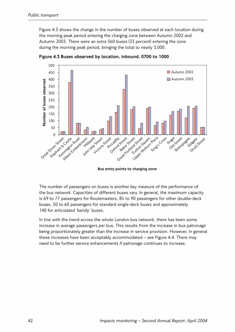
Figure 4.3 shows the change in the number of buses observed at each location duringthe morning peak period entering the charging zone between Autumn 2002 andAutumn 2003. There were an extra 560 buses (23 percent) entering the zone during the morning peak period, bringing the total to nearly 3,000.
Figure 4.3 Buses observed by location, inbound, 0700 to 1000
The number of passengers on buses is another key measure of the performance of the bus network. Capacities of different buses vary. In general, the maximum capacityis 69 to 77 passengers for Routemasters, 85 to 90 passengers for other double-deckbuses, 50 to 60 passengers for standard single-deck buses and approximately 140 for articulated ‘bendy’ buses.
In line with the trend across the whole London bus network, there has been someincrease in average passengers per bus. This results from the increase in bus patronagebeing proportionately greater than the increase in service provision. However, in generalthese increases have been acceptably accommodated – see Figure 4.4. There mayneed to be further service enhancements if patronage continues to increase.
Public transport
Impacts monitoring – Second Annual Report: April 200442
0
50
100
150
200
250
300
350
400
450
500
Great D
over S
treet
Elephan
t & C
astle
Kenningto
n Road
Albert Emban
kmen
t
Millban
k
John Is
lip St
reet
Victoria
Stree
t
Piccad
illy
Oxford St
reet
Baker
Stree
t
Great P
ortlan
d Stree
t
Euston Sq
uare
Upper W
oburn Place
King’s C
ross
Angel
Old Stree
t
Bishopsg
ate
Aldgate
Druid Stree
t
Bus entry points to charging zone
Num
ber
of
buse
s o
bser
ved
Autumn 2002
Autumn 2003
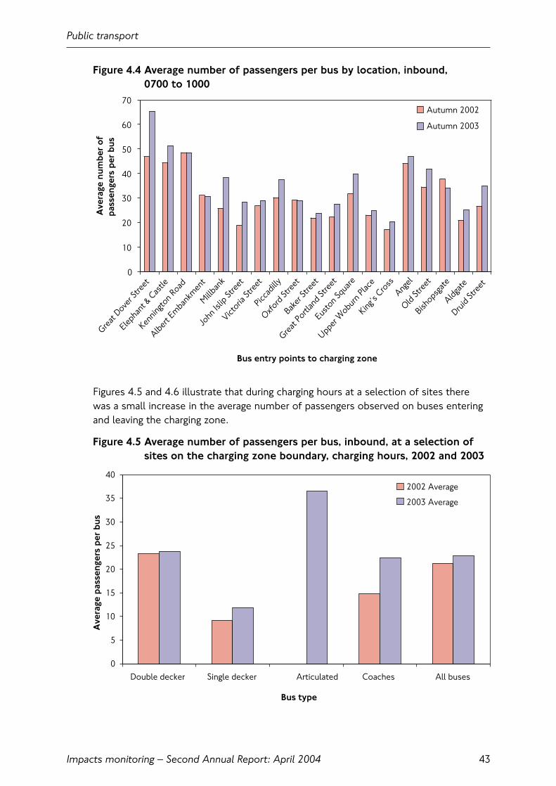
Figure 4.4 Average number of passengers per bus by location, inbound, 0700 to 1000
Figures 4.5 and 4.6 illustrate that during charging hours at a selection of sites there was a small increase in the average number of passengers observed on buses enteringand leaving the charging zone.
Figure 4.5 Average number of passengers per bus, inbound, at a selection ofsites on the charging zone boundary, charging hours, 2002 and 2003
Public transport
Impacts monitoring – Second Annual Report: April 2004 43
0
10
20
30
40
50
60
70
Great
Dover S
treet
Elepha
nt &
Castle
Kennin
gton R
oad
Albert
Emba
nkm
ent
Millban
k
John
Islip
Stre
et
Victoria
Stre
et
Picca
dilly
Oxford
Stre
et
Baker
Stre
et
Great
Portl
and S
treet
Eusto
n Squ
are
Upper
Wobu
rn Pl
ace
King’s
Cross
Angel
Old St
reet
Bishops
gate
Aldgate
Druid
Stre
et
Bus entry points to charging zone
Ave
rage
num
ber
ofpa
ssen
gers
per
bus
Autumn 2002
Autumn 2003
0
5
10
15
20
25
30
35
40
Double decker Single decker Articulated Coaches All buses
Ave
rage
pas
seng
ers
per
bus
2002 Average
2003 Average
Bus type

Figure 4.6 Average number of passengers per bus, outbound, at a selection ofsites on the charging zone boundary, charging hours, 2002 and 2003
Bus occupancy counts were also taken at a selection of sites within the zone. The results illustrated in Figure 4.7 demonstrate that there has been some increase in the average number of passengers on buses at those sites. Again, these have beenacceptably accommodated on the network and services will continue to be reviewed to determine if further service enhancements are required.
Figure 4.7 Average number of passengers on buses at selected sites within the charging zone, charging hours, 2002 and 2003
Public transport
Impacts monitoring – Second Annual Report: April 200444
0
5
10
15
20
25
Double decker Single decker Articulated Coaches All buses
Ave
rage
pas
seng
ers
per
bus
2002 Average
2003 Average
Bus type
0
5
10
15
20
25
30
Double decker Single decker Red arrow/articulated
Coaches All buses
Bus type
Ave
rage
pas
seng
ers
per
bus
2002 Average2003 Average

A separate count of bus passengers entering central London is undertaken by TfL annually.This is known as the Central Area Peak Count (CAPC). The results, shown in Figure 4.8,show differences between CAPC and the congestion charging cordon count.
The 2003 count indicates an increase of 16,000 bus passengers (18 percent) across the cordon in the 3 hour morning peak period, 0700 to 1000, from 88,000 to 104,000.This is substantially less than the increase recorded at the charging zone boundary.This difference is largely due to the geographical variation between the counts,particularly the location of several main rail terminals between the two count cordons.Around a quarter of all bus journeys in Greater London are passengers going to and from rail and Underground stations. It is likely that there has been increasedinterchange to bus for rail passengers making the final stage of their journey to thecharging zone or other parts of central London.
Figure 4.8 Bus Passengers, inbound, Central Area Peak Count, 0700 to 1000,Autumn counts, 1986 to 2003
As mentioned above it is estimated that around half the increase of passengers onbuses entering the zone is due to charging, and the rest to other factors. London Buseshave recently undertaken research to quantify the reasons for the general increase inpatronage on the bus network. Passengers cite the improved quality of the bus servicetogether with fare levels as the key reasons for using buses more. The number ofpeople who say they never use buses has fallen from 29 percent to 20 percent.
Public transport
Impacts monitoring – Second Annual Report: April 2004 45
0
20
40
60
80
100
120
19861987
19881989
19901991
19921993
19941995
19961997
19981999
20002001
20022003
Year
Bus
pass
enge
rs (t
hous
ands
)

4.5 Bus journey time and reliability In recent years improvements in reliability have been recorded across the London busnetwork. This has continued to be the case since the introduction of charging. Theseimprovements are due to a variety of factors including increased investment in robustschedules, enhanced route supervision and the introduction of Quality IncentiveContracts. Congestion charging has added a further dimension to improved busoperations in London. Around a fifth of London bus services operate in or around thezone, and reduced congestion means a significant source of disruption has been lessened.
Compared to the previous year across London there has been an improvement of over 20 percent in Excess Waiting Time (EWT), the additional wait time at bus stops experienced by passengers caused by service irregularity or missing buses.For passengers in and around the charging zone the improvement is considerablygreater with a reduction in EWT of over 30 percent.
London Buses sets the bus operators performance standards for EWT based on the characteristics of the route. Figure 4.9 shows decreases in actual EWT relative to the minimum standards.
Figure 4.9 Bus Excess Waiting Time (Monday to Friday, charging hours)difference between Excess Waiting Time standards and actualExcess Waiting Time
As with EWT, in the year since charging was introduced disruption to services caused by traffic congestion compared to the same periods last year has reduced byaround 40 percent. Routes that operate within the charging zone have seen a greaterimprovement with a reduction in congestion related delays of over 60 percent. Routesserving the Inner Ring Road experienced 50 percent less disruption due to traffic delays.
Public transport
Impacts monitoring – Second Annual Report: April 200446
-1.2
-1.0
-0.8
-0.6
-0.4
-0.2
0.0
0.2
0.4
0.6
05/0
1-01
/02
02/0
3-29
/03
27/0
4-24
/05
22/0
6-19
/07
17/0
8-13
/09
12/1
0-08
/11
07/1
2-03
/01
01/0
2-28
/02
29/0
3-25
/04
24/0
5-20
/06
19/0
7-15
/08
13/0
9-10
/10
08/1
1-05
/12
03/0
1-30
/01
Four-week period
Min
utes
CentralCentral (IRR)Other InnerOuterNetwork
Bett
erW
orse
2003/42002
Charging starts

As well as reliability improvements, the local reductions to traffic levels have beenreflected in improvements to overall bus journey speeds in the zone. Journey times are monitored between selected points across the network, as described in the First Annual Monitoring Report. The results include times when buses are stationary,for example at bus stops and junctions or in traffic queues. In the 3 hour morning peakperiod within the charging zone there has been an overall reduction in journey timessince charging began of around 6 percent, to an average journey speed of 11.6 km/h,compared to the same periods the previous year. The sampled sections of routeswithin the zone have seen greater improvements compared to other areas in London. Improvements on observed sections of radial and orbital roads close to thecharging zone are of 3 and 4 percent respectively. There has been no overall changeobserved on the Inner Ring Road where, on average, speeds have remained at 13.3 km/h.
4.6 Underground patronageThe decline due to the Central line closure took some time to recover, with anestimated 2 percent revenue loss for some months after the Central line came back into service. This is in addition to the estimated 2 percent loss due to better and faster bus services. There is some indication that the hot summer resulted in a loss of patronage and also tourist numbers on the Underground were down, by about 5 percent on the previous year. All these factors would tend to bear most on passengers travelling to or in the congestion charging zone.
With the partial exception of reduced patronage due to improved bus services, none of these factors are related to congestion charging. Analysis undertaken by the Underground, conducted very shortly after charging started, indicated around a 1 percent increase in Underground passenger numbers initially, probably beforetransfer to bus took place to any magnitude. The reductions mentioned here wouldmore than outweigh any small increases in passengers resulting directly fromcongestion charging.
Figure 4.10 shows estimates of passenger usage on the Underground from automaticticket barriers as well as ticket sales at stations inside the charging zone, around the charging zone and within the rest of Fare Zone 1. Both data sources are broadlycorroborative (although ticket sales data is more volatile), and patronage throughout2003 is noticeably down on equivalent months in 2002.
Reductions in morning peak period gate-based estimates of patronage are demonstratedby the trend-line in Figure 4.10 for stations in and around the charging zone. In the 12 four-week periods since charging started, compared to the same period the previousyear, the reduction in patronage of 8 percent is slightly greater than across the entirenetwork (6 percent). Prior to charging during this period, an average of 513,000 passengersexited stations in and around the zone, compared to 473,000 in the year following the introduction of charging. During charging hours patronage has reduced from1,275,000 passenger exits to 1,181,000 exits, a decrease of 94,000 exits (7 percent).
Public transport
Impacts monitoring – Second Annual Report: April 2004 47

The change in revenue taken at stations in and around the zone varied from reductionsof 15 percent to an increase of 5 percent comparing the 12 four-week periods beforeand after charging. The effect of the January 2004 fare rises are also visible. On averagesince charging started there has been a decrease of 1 percent in gross revenue takencompared to the same periods the previous year, which is comparable to the networkaverage reduction (2 percent).
Figure 4.10 Passengers exiting Underground stations in and around thecharging zone during the morning peak period (0700 to 1000)
4.7 Underground service supply and reliabilityIn the year since charging started there have been timetable changes to improveoperations but no increases to the number of peak hour trains in operation. Year-on-year changes to the performance of the network in terms of reliability isillustrated in Figure 4.11. For the majority of the year the Underground network has not been performing as reliably as it had the previous year. This may have contributedto the reduction in passengers and encouraged shorter distance trips to transfer to the bus network.
Public transport
Impacts monitoring – Second Annual Report: April 200448
0
100
200
300
400
500
6 Jan-
2 Feb
3 Mar-
30 Mar
28 Apr-2
5 May
23 Jun-
20 Jul
18 Aug
-14 Se
p
13 Oct-
9 Nov
8 Dec
-4 Ja
n
2 Feb-1
Mar
30 Mar-
26 Apr
25 May
-21 Ju
n
20 Jul-1
6 Aug
14 Sep-1
1 Oct
9 Nov-6
Dec
4 Jan-
31 Jan
Four-week period
Tota
l pas
seng
ers
(tho
usan
ds)
0
1
2
3
4
Ave
rage
wee
kly
tick
et s
ales
per
zo
ne
(£m
illio
n)
Inside zone Boundary Remainder of fare zone 1
Charging starts
20032002
Revenue Revenue Revenue
Trend-line

Figure 4.11 Underground network, year-on-year change in operated kilometresas a percentage of scheduled, 2003
4.8 National Rail Comprehensive passenger count surveys were undertaken at all 22 central Londonstations in Spring 2002 and 2003. They were intended to establish whether congestion charging was associated with any noticeable increases in rail travel.
In the 3 hour morning peak, 0700 to 1000, the number of passengers arriving byNational Rail at central London stations in 2003 decreased by 1 percent compared with 2002, from 451,000 to 447,000. During charging hours there was an increase of 1 percent, from 564,000 to 573,000 passengers, departing from stations in the charging zone. These changes are not considered statistically significant. The distribution of passengers across the day is illustrated in Figure 4.12.
Overall there is no evidence of systematic net changes in National Rail patronagecoinciding with the introduction of congestion charging.
Public transport
Impacts monitoring – Second Annual Report: April 2004 49
-16%
-14%
-12%
-10%
-8%
-6%
-4%
-2%
0%
2%
4%
5 Jan-
1 Feb
2 Feb-1
Mar
2 Mar-
29 Mar
30 Mar-
26 Apr
27 Apr-2
4 May
25 May
-21 Ju
ne
22 Jun-
19 Jul
20 Jul-1
6 Aug
17 Aug
-13 Se
p
14 Sep-1
1 Oct
12 Oct-
8 Nov
9 Nov-6
Dec
7 Dec
-3 Ja
n
Four-week period
Cha
nge
in o
pera
ted
kilo
met
res

Figure 4.12 National Rail passengers arriving at and departing from central London stations by time of day, Spring 2002 and 2003
Within the overall net stability of rail patronage across the network there are somegreater variations at individual stations, as can be seen in Figure 4.13. There is noparticular reason to associate this with congestion charging: for instance some of thechanges are explained by partial closure of Vauxhall Station during the 2002 surveyperiod, also affecting passenger levels at Waterloo. Likewise, increases at Victoria and London Bridge are counterbalanced by decreases at Charing Cross.
Figure 4.13 National Rail stations – morning peak passenger arrivals
Public transport
Impacts monitoring – Second Annual Report: April 200450
0
10
20
30
40
50
60
70
06000630
07000730
08000830
09000930
10001030
11001130
12001230
13001330
14001430
15001530
16001630
17001730
18001830
19001930
Half-hour beginning
Num
ber
of
pass
enge
rs (t
hous
ands
)
Arriving 2002 Arriving 2003Departing 2002 Departing 2003
0
10
20
30
40
50
60
70
80
90
Wate
rloo
Liverp
ool Stre
et
Victoria
Lond
on Brid
ge
Charin
g Cro
ss
Canno
n Stre
et
Fenc
hurch
Stree
t
Padding
ton
Eusto
n
King’s
Cross
Blackfr
iars
Moorgate
Wate
rloo Eas
t
Maryleb
one
Farri
ngdon
King’s
Cross
Thames
link
City Tha
meslin
k
Vauxh
all
St Pan
cras
Elepha
nt & C
astle
Old Stree
t
Barbica
n
Stations
Tota
l pas
seng
ers
(tho
usan
ds)
Spring 2002
Spring 2003
4.9 Railhead parkingA possible secondary effect of congestion charging was the prospect of a significantincrease in drivers avoiding the charge by diverting to rail stations outside of thecharging zone, and continuing their journey by rail, i.e. ‘railheading’. It was feared bysome that this might result in adverse changes to parking demand, at the stationsthemselves and in the surrounding roads, where these were not covered by acontrolled parking zone.
To test for this, surveys at a selection of stations where increased railhead parkingmight be feasible were undertaken in the early weeks following the introduction ofcharging. The results indicate that there has been little change in railheading followingthe introduction of congestion charging.
Of the nine stations surveyed, an overall net decrease of 1 percent in railheading was observed. Some passengers who were surveyed at these stations, and whopreviously drove to the charging zone, stated that they had begun railheading andmentioned congestion charging as a factor. However, these represented only 0.5 percent of passengers.
The changes observed are therefore within the range of what might be expected in the absence of charging, given the normal background ‘churn’ in people’s daily travel patterns.
4.10 Docklands Light Railway (DLR) Congestion charging was not expected to significantly affect patronage on the DLR.There are two DLR stations in the charging zone, Bank and Tower Gateway.
On average in the year since charging began there was a decrease from 9,900 to 9,700(2 percent) in the number of passengers exiting stations within the zone compared tothe same periods the previous year during the morning peak period. During the charging day there was an increase from 23,400 to 23,700 (1 percent) in passengers.These changes are not considered to be significant.
At Tower Gateway in the morning peak there was an 11 percent reduction, but duringcharging hours a 3 percent increase. This could be due to passengers transferring tobuses in the morning peak or part of a general shift in travel patterns. This is reflectedin the changes at Bank station where in the morning peak there was no change butacross the day there was an 8 percent reduction.
The year-on-year change in passenger exits from the two DLR stations within the zoneduring the morning peak period are shown in Figure 4.14. It illustrates that althoughthere are no trends noticeable at Bank station there does appear to be a decline inusage at Tower Gateway. Nevertheless, the change in passenger numbers on the DLR is considered minor in relation to changes noted on the bus and Underground.
Public transport
Impacts monitoring – Second Annual Report: April 2004 51
0
10
20
30
40
50
60
70
80
90
100
Jan-
Mar 2002
Apr-Jun
2002
Jul-S
ep 2002
Oct-Dec
2002
Jan-
Mar 2003
Apr-Jun
2003
Jul-S
ep 2003
Oct-Dec
2003
Survey period
Sati
sfac
tio
n sc
ore
Bus LUL DLR
Bus LUL DLR
Figure 4.14 Change in average weekday passenger exits within the charging zonecompared to the same period the previous year, 0700 to 1000
4.11 Passenger views Passengers on London’s public transport network are asked about their views onelements of their journey as well as their travel habits. Traditionally there is littlevariation in the overall results between survey periods. Figure 4.15 illustrates that there has not been a material change in the overall customer satisfaction rating across London between 2002 and 2003.
Figure 4.15 Overall customer satisfaction with public transport in London,2002 to 2003
Public transport
Impacts monitoring – Second Annual Report: April 200452
-30%
-20%
-10%
0%
10%
20%
30%
2 Mar-
31 Mar
1 Apr-2
6 Apr
27 Apr-2
4 May
25 May
-21 Ju
n
22 Jun-
19 Jul
20 Jul-1
6 Aug
18 Aug
-13 Se
p
14 Sep-1
1 Oct
12 Oct-
8 Nov
9 Nov-6
Dec
7 Dec
-3 Ja
n
4 Jan-
31 Jan
Four-week period
Perc
enta
ge c
hang
e in
pas
seng
er e
xits
Bank
Tower Gateway
2003 2004
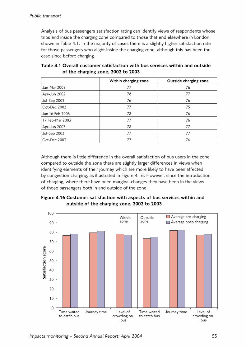
Analysis of bus passengers satisfaction rating can identify views of respondents whosetrips end inside the charging zone compared to those that end elsewhere in London,shown in Table 4.1. In the majority of cases there is a slightly higher satisfaction ratefor those passengers who alight inside the charging zone, although this has been thecase since before charging.
Table 4.1 Overall customer satisfaction with bus services within and outside of the charging zone, 2002 to 2003
Within charging zone Outside charging zone
Jan-Mar 2002 77 76
Apr-Jun 2002 78 77
Jul-Sep 2002 76 76
Oct-Dec 2002 77 75
Jan-16 Feb 2003 78 76
17 Feb-Mar 2003 77 76
Apr-Jun 2003 78 77
Jul-Sep 2003 77 77
Oct-Dec 2003 77 76
Although there is little difference in the overall satisfaction of bus users in the zonecompared to outside the zone there are slightly larger differences in views whenidentifying elements of their journey which are more likely to have been affected by congestion charging, as illustrated in Figure 4.16. However, since the introduction of charging, where there have been marginal changes they have been in the views of those passengers both in and outside of the zone.
Figure 4.16 Customer satisfaction with aspects of bus services within andoutside of the charging zone, 2002 to 2003
Public transport
Impacts monitoring – Second Annual Report: April 2004 53
0
10
20
30
40
50
60
70
80
90
100
Time waitedto catch bus
Journey time Level ofcrowding on
bus
Time waitedto catch bus
Journey time Level ofcrowding on
bus
Sati
sfac
tio
n sc
ore
Average pre-chargingAverage post-charging
Within zone
Outside zone

Public transport
Impacts monitoring – Second Annual Report: April 200454
5. Social and behavioural impacts
5.1 IntroductionPeople making changes, whether to their daily travel behaviour or to other aspects of their lives, lies at the heart of all of the other effects observed in relation tocongestion charging. This chapter looks at preliminary findings from TfL’s socialimpacts surveys, alongside other related TfL research, that describes the effects of congestion charging on Londoner’s travel behaviour and other aspects of their lives, as well as attitudes of Londoners towards the scheme before and after charging started.
A full consideration of these surveys, which are still at an early stage of analysis, isbeyond the scope of this report. Nevertheless the preliminary findings described belowbegin to assist wider appreciation of what congestion charging means for Londoners.
5.2 Key findings• Of the 65,000 to 70,000 car driver trips no longer crossing into the charging zone
per day, 50 to 60 percent have transferred to public transport. Between 20 and 30 percent have diverted around the charging zone and the remaining 15 to 25 percent have made a variety of other adaptations;
• London residents perceive fewer negative effects from the scheme than theyexpected in 2002. There is also widespread recognition of the benefits of thescheme in terms of reduced congestion and improved public transport;
• Over 40 percent of residents within the charging zone say their area as a place tolive has improved since the scheme was introduced. At least 30 percent say thatcrossing roads, pollution, noise, reliability of public transport, availability of public transport and congestion are now better in their local area;
• Surveys of Londoner’s attitudes towards congestion charging undertaken before andafter the scheme was introduced show an overall shift of opinion towards favouringthe scheme and its effects, with four-fifths of those who expressed an opinionconsidering that the scheme had been effective in achieving its primary objectives.
5.3 StructureThis chapter first looks at the evidence for travel behaviour change from across themonitoring programme. Material from the various surveys described here and otherrelated TfL research have been assessed alongside the evidence on aggregate travelchange covered in chapters 3 and 4 and used to arrive at a ‘best current assessment’ of the change to people’s travel behaviour in response to the scheme.
It then proceeds to look at some of the effects on individuals, travel behaviour and neighbourhoods. These take each of the three study areas in turn:
• Residents within the charging zone;
• Residents within inner London;
• Residents of outer London, and those living beyond the M25.
Social and behavioural impacts
Impacts monitoring – Second Annual Report: April 2004 55
Finally, as requested by the Mayor, attitudes of Londoners to the scheme have beensurveyed periodically since December 2002 in order to compare changes over time.Some key findings from these surveys are also summarised in this section.
5.4 Survey frameworkMain social impacts surveys
The methodology for the social impacts work programme was described in the First Annual Monitoring Report.
Two key surveys of Londoners were put in place. The first involved household-basedsurveys of residents of the charging zone and more widely in inner London. This surveyfocused on selected electoral wards, giving a strong ‘neighbourhood’ perspective ofeach survey area. The second involved a similar telephone-based interview of residentsof outer London and beyond. Both involved ‘before’ and ‘after’ surveys with the aim of re-visiting the same households and individuals (i.e. a ‘panel’ survey).
In both cases, an attitudinal questionnaire was used to investigate the expected and revealed effects of the scheme on individual travel behaviour and the localneighbourhood. In-depth consideration was given to the types of adaptations made by individuals, and the implications of these.
Results discussed below reflect preliminary analysis of emerging results from the‘after’ phase of both of these surveys compared to equivalent pre-charging surveysundertaken in 2002. Because of various causes of non-contact the total sample in2003 compared with 2002 has been reduced and additional ‘top-up’ surveys are also being conducted. Results from these ‘top-ups’ will be analysed alongside more in-depth consideration of the totality of the results in due course.
Recall survey
Transport for London commissioned a ‘recall’ survey into how trips to the chargingzone had changed several months after the introduction of charging. Over 4,000telephone interviews were carried out with Londoners who had made a journey into or around the charging zone since the introduction of the scheme.
This survey provides useful insights to assist with interpretation of the observedaggregate changes to travel behaviour described elsewhere in this report.
Attitudinal tracker survey
Surveys of Londoner’s attitudes towards congestion charging have been undertaken by TfL, on behalf of the Mayor. Each consisted of around 1,000 respondents, weighted so as to be representative of Londoners generally.
The surveys address behavioural change, attitudes to the scheme and knowledge of its operation. Three surveys were completed before charging started and furthersurveys have been conducted following the introduction of charging. Although therehave been some amendments to the questionnaire across the surveys, the majority ofquestions remained the same to allow comparability. Some results of this survey areshown in section 5.15.
Social and behavioural impacts
Impacts monitoring – Second Annual Report: April 200456
Future surveys
In addition to the analysis described below TfL will be undertaking analyses of the2001 Census and the 2001 London Area Travel Survey in the near future – the results of which have recently become available – in order to better understand these background changes. Roadside interviews are being arranged to replicatecomparable surveys prior to charging in 2001 and 2002; and further social surveys are being undertaken to strengthen the understanding of changes brought about by congestion charging.
The conclusions presented in this report, and the overview of behavioural changes set out in this section, are therefore provisional; they will be refined as furtherinformation becomes available.
5.5 Assessing travel behaviour changePreceding chapters have considered observed changes to the volumes and patterns oftravel by road or public transport to, from, or within and across the charging zone. Theseare net aggregate outcomes that reflect millions of individual decisions about how tooptimise travel to enable the conduct of daily life. Of the aggregate changes described,congestion charging will have been only one of a wide range of contributory factors.
The scale of the changes to travel by car into the charging zone, and its closecorrespondence with the introduction of charging, suggest that this effect was veryclosely associated with charging. However, these people did not simply disappear. The majority will have made adaptations, such as using public transport, which will have provided an alternative to enable most elements of daily life to continuelargely unchanged.
Those transferring to buses will be counted alongside the many others who are usingbuses more because of ‘background’ improvements to bus services London-wide. It is not straightforward to separate those new bus users who have transferred fromcars because of congestion charging, from those more generally attracted to the buses(particularly from the Underground) because buses are now more attractive.
Car occupants transferring to Underground have been more than offset by reducedoverall passenger numbers, resulting from a variety of ‘background’ local, national and international events during 2003.
In addition, over the course of any one year, a relatively high proportion of Londonerswill have moved house or job, or undergone other life changes that will have alteredtheir travel needs. Such ‘churn’ is a further complicating factor in any assessment.
5.6 Aggregate changes to car travel to the charging zoneWhilst it is clear that congestion charging has had a profound impact on the choice of travel to the charging zone, there have also been significant ‘background’ changes intravel to central London, not all of which are yet fully understood. It is neverthelesspossible to construct a provisional assessment of the aggregate changes in car drivertrips to the charging zone, based on traffic counts, surveys of public transportpatronage, and surveys of travel behaviour. Transport for London’s provisionalassessment of the behavioural impact of congestion charging is summarised in Table 5.1, and described more fully below.
Social and behavioural impacts
Impacts monitoring – Second Annual Report: April 2004 57

Table 5.1 Estimated reduction in car driver movements coming into thecharging zone
Total reduction in car movements at zone boundary 65,000 to 70,000
Through car movements – diverting around the charging zone, other changes 15,000 to 20,000
Terminating car movements – transfers to bus, underground rail 35,000 to 40,000
Terminating car movements – transfers to cycle, walk, motorcycle, taxi, car share 5,000 to 10,000
Terminating car movements – travelling outside charging hours Under 5,000
Terminating car movements – travel to other destinations, reduced frequency Under 5,000
Surveys of traffic entering and leaving the congestion charging zone (Chapter 3) indicatethat the number of car movements into the charging zone during charging hours havefallen from around 195,000 in 2002 to less than 130,000 in 2003 – a reduction ofapproximately 65,000 to 70,000 incoming car movements.
Through trips diverting around the charging zone
Some drivers entering the charging zone in 2002 will have been making longer-distancemovements that involve crossing the charging zone, for example from Kensington toDocklands, using the relatively attractive route alongside the Thames using Millbank,Embankment and Thames Street. Other ‘through’ movements will have been relativelyshorter, for example Baker Street to Bayswater Road, simply ‘cutting through’ a smallsection of the charging zone in the north west corner.
Although these cars were recorded as entering the future charging zone in 2002, they were not stopping at destinations within the zone – and in many cases it wouldhave been straightforward for drivers making these trips to divert to other routesaround the zone.
Prior to charging around 20-25 percent of car movements into the charging zone duringcharging hours were estimated to be ‘through movements’. From surveys of drivers’stated intentions it was expected that 40-60 percent of these movements woulddivert, suggesting a possible diversion of between 15,000 and 30,000 car movements.From surveys conducted after charging and observed changes in flows of cars on theroad network, TfL consider that the level of net diversion of incoming car movementsto the zone during charging hours is in the range 15,000 to 20,000.
This estimate of diverted incoming car movements indicates that car driver movementsto destinations within the charging zone (referred to as ‘terminating’ car drivermovements) have reduced by some 50,000 from a pre-charging total in 2002 of around150,000 – a reduction of about a third.
Terminating car movements – transfers to bus, underground and rail
The biggest change prompted by congestion charging is the transfer of car users to another mode of transport. Surveys indicate that for 40,000 to 45,000 terminating car movements, the drivers have transferred to another mode of transport – some 60 to 70 percent of those car movements that no longer enter or travel across the charging zone.
Social and behavioural impacts
Impacts monitoring – Second Annual Report: April 200458

The recall survey suggests that 35 to 40 percent of these car drivers have transferredto bus; 45 to 50 percent have transferred to Underground or rail; and 10 to 20 percenthave transferred to walk, cycle, motor cycle, taxi or minicab.
Transport for London considers that this survey understates the proportion that havetransferred to bus, but nevertheless yields a reasonable estimate of the aggregatemode shift of car drivers. For public transport – bus, underground and rail – thissuggests a transfer of 35,000 to 40,000 car driver movements, some 40,000 to 45,000 car occupants.
Terminating car trips – change to pedal cycle, motor cycle, walk, taxi, mini-cab, car share
The observed increase in incoming pedal cycle and motor cycles at the boundary of the charging zone amounts to about 6,000 movements during charging hours. While taxi movements into or across the zone have increased, the indications are that the numbers of taxi and mini-cab passengers to the zone have not changedsignificantly, probably by less than 1,000 car driver movements. These compare with an estimate of 4,000 to 8,000 additional pedal cycle, taxi, mini-cab, motor cycle andwalk trips by ex-car drivers derived from the recall survey.
The occupancy of cars coming through the charging zone has increased. There are twoeffects here: it is likely that cars with lower occupancies have changed behaviour morethan those with higher occupancies; and that some increase in car sharing has takenplace in response to the charge. The data suggests that the predominant effect is areduction in lower-occupancy cars. Surveys indicate that only small additional amountsof car sharing are taking place, perhaps equivalent to 1,000 fewer car driver movements.
Transport for London concludes that the net effect of the change to pedal cycle,motor cycle, walking, taxi, mini-cab and car share is a reduction of 5,000 to 10,000 car driver movements during charging hours.
Terminating car trips – change to travel outside of charging hours
Surveys indicate that around 10 percent of car drivers have responded to charging by changing the timing of their journey so that it is made outside charging hours. This response is more likely to apply to less-frequent trips so that the actual effect on car movements would be smaller. Assuming that 5 to 10 percent of terminating cardriver movements that have changed have adapted in this way would mean 2,500 to5,000 fewer car driver movements entering the charging zone during charging hours.
This can be indirectly confirmed by the observed increase of about 4,000 car drivermovements entering the charging zone in the periods immediately before and aftercharging: 0600 to 0700 and 1830 to 2000. Transport for London conclude that the net switching of terminating car driver movements to outside charging hours is lessthan 5,000 movements per day.
Social and behavioural impacts
Impacts monitoring – Second Annual Report: April 2004 59
Terminating car trips – change of destination; trips no longer made
Change of destination to locations outside the charging zone is the stated response of around 5 percent of car drivers who have changed their travel arrangements inresponse to the charge. This change is more likely to apply to less frequent trips and, assuming a figure of 3 percent of the reduced terminating car driver trips divertingto a destination outside the charging zone, yields a reduction of up to 1,500 fewerterminating car driver movements entering the zone.
Surveys suggest that the equivalent of up to 10 percent of car drivers to the zone prior to charging who have altered their travel arrangements in response to congestioncharging are also making fewer journeys to the zone. Assuming that these are makingonly half of their previous trips yields a reduction equivalent to 5 percent in terminatingcar driver trips, up to 2,500 per charging day.
The combined effect of these two adaptations – diverting to destinations outside of the charging zone, or making fewer trips to destinations in the charging zone – is less than 4,000 fewer car driver movements terminating in the charging zone. This combined figure represents car drivers who no longer travel to the charging zoneduring charging hours on a typical charging day as a result of congestion charging. With car passengers it is equivalent to up to 5,000 fewer people coming into the zone. This assessment corresponds to the estimate of up to 4,000 people no longertravelling to the zone given previously in Six Months On.
Summary of changes in car movements
To summarise the conclusions of this provisional assessment:
• Diverted car trips account for 15,000 to 20,000 fewer incoming car movements, 20 to 30 percent of the overall reduction across the charging zone boundary duringcharging hours;
• Transfers to public transport, i.e. bus, Underground and rail, account for 35,000 to40,000 fewer incoming car movements, 50 to 60 percent of the overall reductionacross the charging zone boundary during charging hours;
• Other adaptations account for around 15 to 25 percent of the reduction;
• Within the last category, less than 5,000 car driver movements represent trips to the charging zone that, as a result of charging, are made to other destinations or no longer made at all.
Further results from the recall survey
Figure 5.1 shows – for residents of inner London – changes to the share of all personaltrips by residents for various purposes to the charging zone that are made as a cardriver. It is seen, for example, that before charging around 10 percent of commutertrips to the charging zone during weekday charging hours were by car drivers. Followingthe introduction of charging, this reduced to 7 percent. The reductions in car use canbe seen for the other main trip purposes.
Social and behavioural impacts
Impacts monitoring – Second Annual Report: April 200460
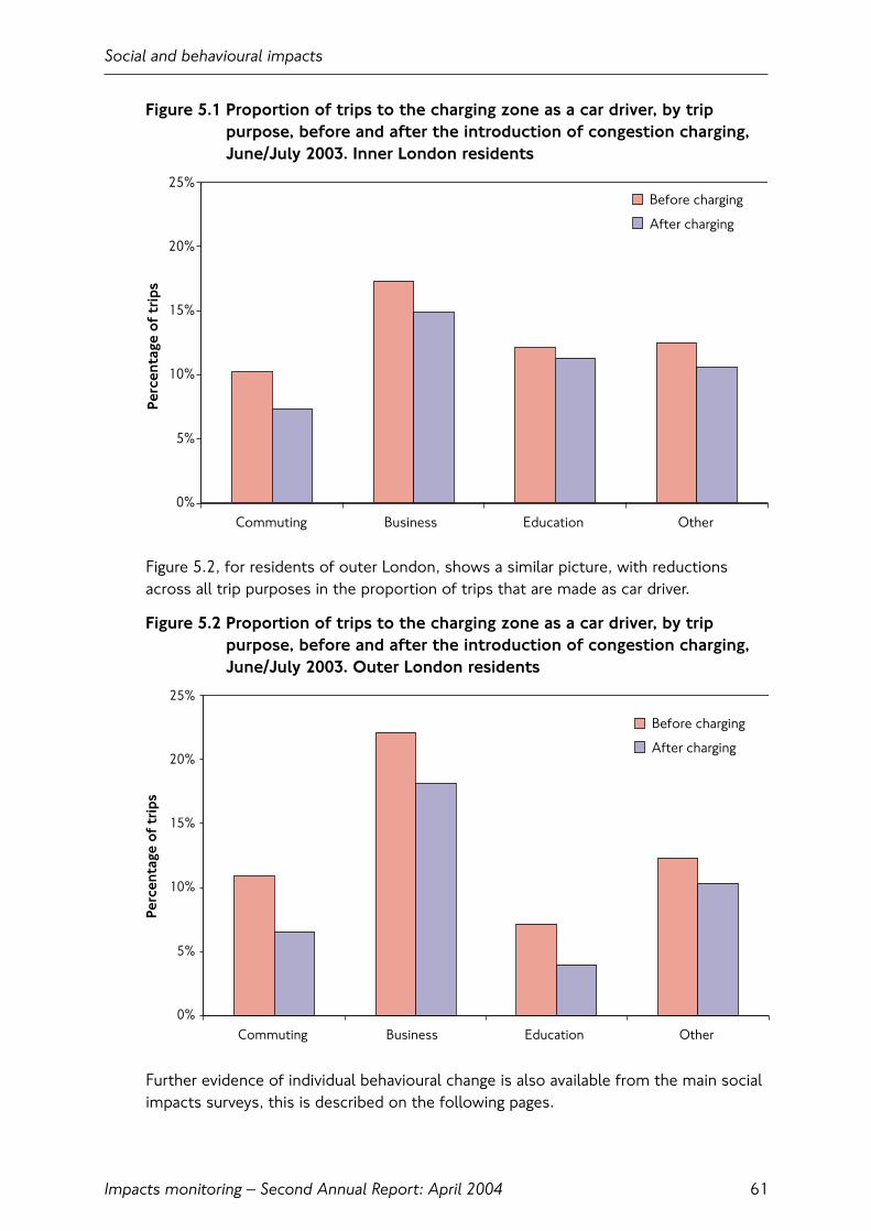
Figure 5.1 Proportion of trips to the charging zone as a car driver, by trippurpose, before and after the introduction of congestion charging,June/July 2003. Inner London residents
Figure 5.2, for residents of outer London, shows a similar picture, with reductionsacross all trip purposes in the proportion of trips that are made as car driver.
Figure 5.2 Proportion of trips to the charging zone as a car driver, by trippurpose, before and after the introduction of congestion charging,June/July 2003. Outer London residents
Further evidence of individual behavioural change is also available from the main socialimpacts surveys, this is described on the following pages.
Social and behavioural impacts
Impacts monitoring – Second Annual Report: April 2004 61
0%
5%
10%
15%
20%
25%
Commuting Business Education Other
Perc
enta
ge o
f tr
ips
Before charging
After charging
Before charging
After charging
0%
5%
10%
15%
20%
25%
Commuting Business Education Other
Perc
enta
ge o
f tr
ips

5.7 Individual behavioural change: charging zone residentsThe majority of charging zone residents have not changed their method of travel intoor within the zone since the charging scheme was introduced. Figure 5.3 illustrateschanges in travel behaviour for those charging zone residents who continue to drive inthe area during charging hours, compared with charging zone residents as a whole. Of those who continue to drive in the zone, 18 percent are doing so less often. Among all charging zone residents who took part in the survey in 2003, on balancemore are using buses (32 percent against 11 percent who claim to use them less), and are also walking and cycling more often.
Figure 5.3 Changed travel behaviour by charging zone residents. Travel to, from or within the charging zone: Autumn 2003
Social and behavioural impacts
Impacts monitoring – Second Annual Report: April 200462
* CAUTION: Very small base
NB: Sample sizes include responses that didn’t use that method of travel before and continue not to within the ‘same as before’ category
Less often Same as before More often
Motorbike(1)*
Bicycle(11)*
Walk(108)
Car Driver(117)
Carpassenger(63)
Bus(86)
Underground(63)
Train(57)
Taxi(44)
Motorbike(4)*
Bicycle(32)
Walk(309)
Percentage of residentswho drive in the zone,0700 to 1830
Car Driver(185)
Carpassenger(185)
Bus(288)
Underground(222)
Train(185)
Taxi(160)
9
0
0
12
84
0
64
64
16 63 21
11 78 11
7
100
36
24
716 77
18 1468
11 78 11
16
27
9
9
76
63
62
66
11 57 32
18 68 13
8
10
28
25
617 77
25 1460
15 75 10
Percentage of all chargingzone residents
Base: All respondents who gave an answer
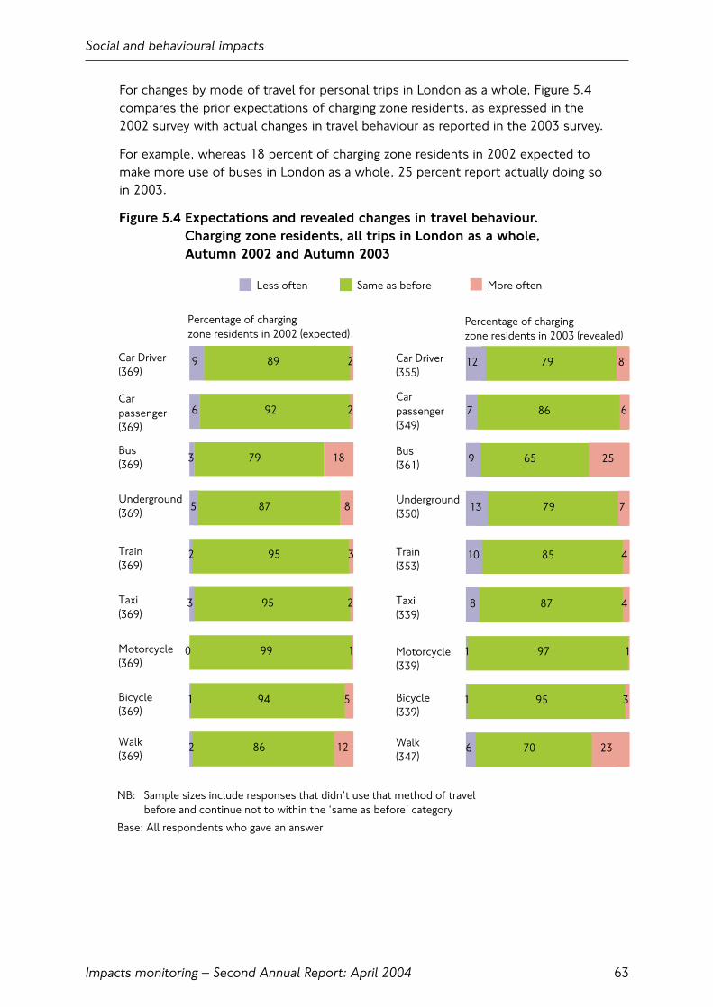
For changes by mode of travel for personal trips in London as a whole, Figure 5.4compares the prior expectations of charging zone residents, as expressed in the 2002 survey with actual changes in travel behaviour as reported in the 2003 survey.
For example, whereas 18 percent of charging zone residents in 2002 expected to make more use of buses in London as a whole, 25 percent report actually doing so in 2003.
Figure 5.4 Expectations and revealed changes in travel behaviour. Charging zone residents, all trips in London as a whole, Autumn 2002 and Autumn 2003
Social and behavioural impacts
Impacts monitoring – Second Annual Report: April 2004 63
NB: Sample sizes include responses that didn’t use that method of travel before and continue not to within the ‘same as before’ category
Less often Same as before More often
Percentage of chargingzone residents in 2003 (revealed)
9
6
3
5
3
0
1
2
92
79
87
95
99
94
86
2
18
8
3
2
1
5
12
2 95
89
2
Car Driver(369)
Carpassenger(369)
Bus(369)
Underground(369)
Train(369)
Taxi(369)
Motorcycle(369)
Bicycle(369)
Walk(369)
Car Driver(355)
Carpassenger(349)
Bus(361)
Underground(350)
Train(353)
Taxi(339)
Motorcycle(339)
Bicycle(339)
Walk(347)
Percentage of chargingzone residents in 2002 (expected)
12
7
9
13
8
1
1
6
86
65
79
87
97
95
70
8
25
7
4
4
1
3
23
10 85
79
6
Base: All respondents who gave an answer
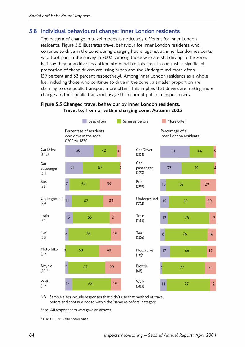
5.8 Individual behavioural change: inner London residentsThe pattern of change in travel modes is noticeably different for inner Londonresidents. Figure 5.5 illustrates travel behaviour for inner London residents whocontinue to drive in the zone during charging hours, against all inner London residentswho took part in the survey in 2003. Among those who are still driving in the zone, half say they now drive less often into or within this area. In contrast, a significantproportion of these drivers are using buses and the Underground more often (39 percent and 32 percent respectively). Among inner London residents as a whole (i.e. including those who continue to drive in the zone), a smaller proportion areclaiming to use public transport more often. This implies that drivers are making morechanges to their public transport usage than current public transport users.
Figure 5.5 Changed travel behaviour by inner London residents. Travel to, from or within charging zone: Autumn 2003
Social and behavioural impacts
Impacts monitoring – Second Annual Report: April 200464
* CAUTION: Very small base
NB: Sample sizes include responses that didn’t use that method of travel before and continue not to within the ‘same as before’ category
Less often Same as before More often
Percentage of residentswho drive in the zone,0700 to 1830
Percentage of all inner London residents
11 77 12
Car Driver(112)
Carpassenger(64)
Bus(85)
Underground(79)
Train(61)
Taxi(58)
Motorbike(5)*
Bicycle(21)*
Walk(99)
51
37
10
15
8
17
3
59
62
65
76
66
77
5
29
20
12
16
17
21
12 75
44
4
Car Driver(304)
Carpassenger(273)
Bus(399)
Underground(334)
Train(245)
Taxi(206)
Motorbike(18)*
Bicycle(68)
Walk(383)
50
31
7
11
5
0
5
13
67
54
57
76
60
67
68
8
39
32
21
19
40
29
19
13 65
42
2
Base: All respondents who gave an answer
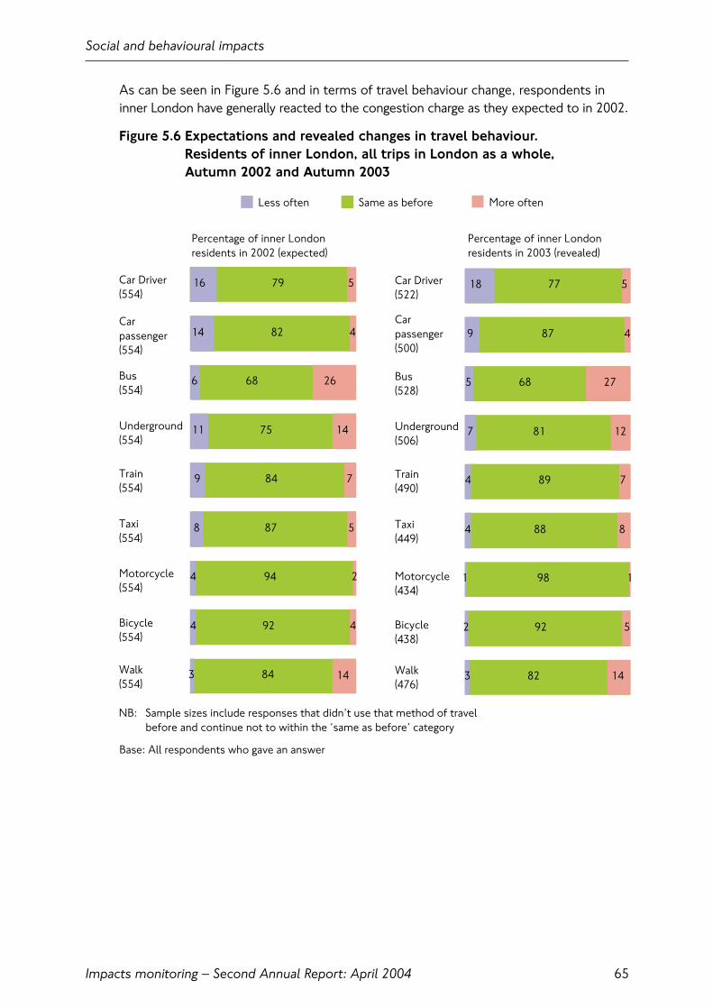
As can be seen in Figure 5.6 and in terms of travel behaviour change, respondents ininner London have generally reacted to the congestion charge as they expected to in 2002.
Figure 5.6 Expectations and revealed changes in travel behaviour. Residents of inner London, all trips in London as a whole, Autumn 2002 and Autumn 2003
Social and behavioural impacts
Impacts monitoring – Second Annual Report: April 2004 65
NB: Sample sizes include responses that didn’t use that method of travel before and continue not to within the ‘same as before’ category
Less often Same as before More often
Car Driver(554)
Carpassenger(554)
Motorcycle(554)
Percentage of inner London residents in 2003 (revealed)
Bus(554)
Underground(554)
Train(554)
Taxi(554)
Bicycle(554)
Walk(554)
16
14
6
11
8
4
4
3
82
68
75
87
94
92
84
5
26
14
14
7
5
2
4
9 84
79
4
Car Driver(522)
Carpassenger(500)
Bus(528)
Underground(506)
Train(490)
Taxi(449)
Motorcycle(434)
Bicycle(438)
Walk(476)
Percentage of inner London residents in 2002 (expected)
18
9
5
7
4
1
2
3
87
68
81
88
98
92
82
5
27
12
7
8
1
5
14
4 89
77
4
Base: All respondents who gave an answer

5.9 Individual behavioural change: outer London residentsFigure 5.7 illustrates changes in travel behaviour for those outer London residents whocontinue to drive in the charging zone during charging hours, compared with outer Londonresidents as a whole. The pattern is fairly similar to inner London whereby a considerable,if smaller, proportion of those who are still driving into or within the zone claim to bedoing so less often (33 percent). In addition, they are using the Underground, busesand trains more often (28 percent, 25 percent and 21 percent respectively).
Figure 5.7 Changed travel behaviour by outer London residents.Travel to, from or within the charging zone: Autumn 2003
Social and behavioural impacts
Impacts monitoring – Second Annual Report: April 200466
* CAUTION: Very small base
NB: Sample sizes include responses that didn’t use that method of travel before and continue not to within the ‘same as before’ category
Less often Same as before More often
Percentage of residentswho drive in the zone,0700 to 1830
Percentage of all outerLondon residents
33
31
18
14
15
32
25
12
61
55
57
71
27
50
67
8
25
28
21
14
32
25
20
13 66
58
4
Car Driver(212)
Carpassenger(84)
Bus(67)
Underground(143)
Train(119)
Taxi(65)
Motorbike(22)*
Bicycle(12)*
Walk(49)
Car Driver(326)
Carpassenger(219)
Bus(265)
Underground(422)
Train(394)
Taxi(204)
Motorbike(42)
Bicycle(40)
Walk(172)
36
29
13
15
14
12
25
12
65
63
64
75
55
53
72
5
24
21
15
11
26
23
16
10 73
56
14
Base: All respondents who gave an answer
5.10 Impacts on individuals, households and neighbourhoodsThis section summarises how respondents living in each of the survey areas considerthat aspects of their daily lives have changed since the implementation of congestioncharging. Aspects considered here include: perceived accessibility to the charging zone,effects on local neighbourhoods, and changes to the travel experience. These are asub-set of the information potentially available from the social impacts surveys, a full description of which is beyond the scope of the current report.
5.11 Charging zone residentsAccessibility
Respondents in the zone were asked in 2003 how they thought their sense ofaccessibility and mobility compared to conditions in 2002, before the scheme wasintroduced. With regard to access to shops, facilities, services and places to visit in the local area, three-quarters say that this is the same. Of those who report change,more residents in the zone believe access is better (19 percent) than worse (5 percent).
On the subject of visiting family and friends, twice as many residents expected this to be more difficult (26 percent) once the scheme was introduced rather than easier(13 percent). While the same proportion agrees that this is now easier, the proportionwho feel it is more difficult is now only 12 percent. However those who felt it is noweasier for family and friends to visit them within the zone is much smaller (2 percent).When asked about how their day has changed since charging, a significant proportionsay they are spending less time with family and friends directly as a result of thescheme, possibly related to the fact that some people are finding it more difficult to visit them in the zone.
Local area
Over 40 percent of residents living within the charging zone say their area as a place to live has improved since the scheme was introduced, as shown in Figure 5.8. At least 30 percent say that crossing roads, pollution, noise, reliability of publictransport, availability of public transport and congestion are now better in their local area.
Social and behavioural impacts
Impacts monitoring – Second Annual Report: April 2004 67
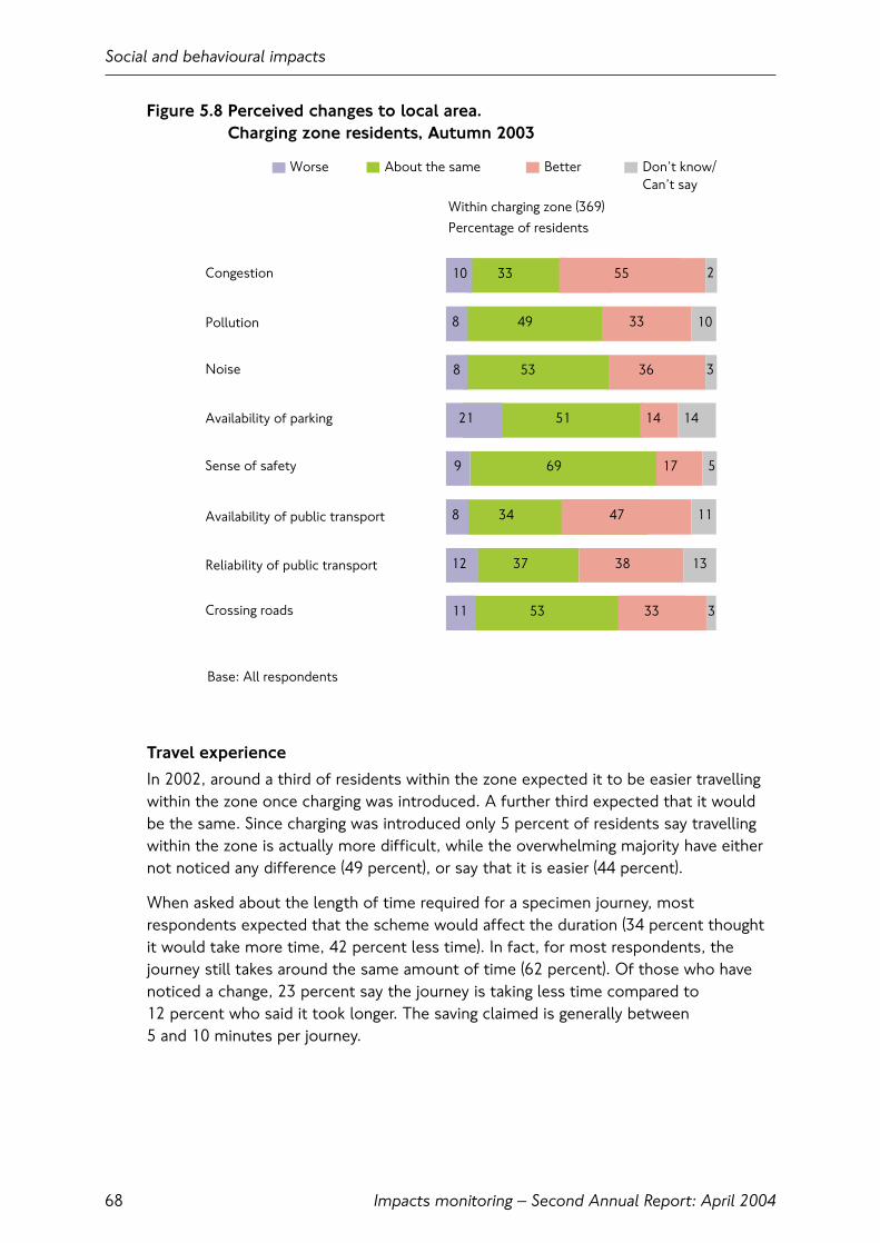
Figure 5.8 Perceived changes to local area. Charging zone residents, Autumn 2003
Travel experience
In 2002, around a third of residents within the zone expected it to be easier travellingwithin the zone once charging was introduced. A further third expected that it wouldbe the same. Since charging was introduced only 5 percent of residents say travellingwithin the zone is actually more difficult, while the overwhelming majority have eithernot noticed any difference (49 percent), or say that it is easier (44 percent).
When asked about the length of time required for a specimen journey, mostrespondents expected that the scheme would affect the duration (34 percent thoughtit would take more time, 42 percent less time). In fact, for most respondents, thejourney still takes around the same amount of time (62 percent). Of those who havenoticed a change, 23 percent say the journey is taking less time compared to 12 percent who said it took longer. The saving claimed is generally between 5 and 10 minutes per journey.
Social and behavioural impacts
Impacts monitoring – Second Annual Report: April 200468
Worse About the same Better Don’t know/Can’t say
Percentage of residentsWithin charging zone (369)
10
10
11
8
8
21
8
12 13
5
11 3
49
53
51
34
37
53
55
36
14 14
17
47
38
2
3
33
9 69
33
33
Congestion
Pollution
Noise
Availability of parking
Availability of public transport
Sense of safety
Reliability of public transport
Crossing roads
Base: All respondents
Only 6 percent of respondents within the zone now make fewer journeys than they did before charging. Of those around 40 percent spontaneously say that it is due tothe scheme and 10 percent because they have changed their working pattern.
Almost two-thirds of residents believe the scheme has been effective in reducingtraffic congestion. As shown in Figure 5.9 the majority of charging zone residentsbelieve the quality of various elements of their journey is comparable to or better thanconditions before the scheme was introduced.
Figure 5.9 Perceived changes to journey experience. Charging zone residents, Autumn 2003
Social and behavioural impacts
Impacts monitoring – Second Annual Report: April 2004 69
10
3
31
3
12
12
12
12
2
42
16
12
10
14
10
13
54
60
69
47
62
56
29
25
16
22
33
24
29
12 63
57
26
Predictability(323)
Crowding(322)
Hassle, stress,fatigue(322)
Safety(322)
Comfort(243)
Time spentwaiting(243)
Ease ofplanning(243)
Ease oftravel(243)
Worse Same as before Better
Percentage of chargingzone residents
Base: All respondents who have travelled to or within the zone since the scheme has been introduced
Don’t know/Can’t say
Partly better/Partly worse
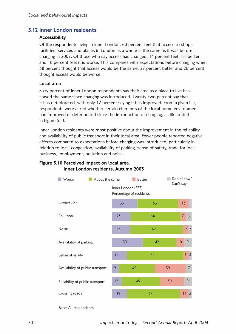
Base: All respondents
Worse About the same Better
Inner London (533)Percentage of residents
Congestion
Pollution
Noise
Availability of parking
Availability of public transport
Sense of safety
Reliability of public transport
Crossing roads
33
23
23
39
9 7
12
19
64
67
42
45
49
67
13
7
10 9
9
6 3
3
39
30
2
1
6
11
19 72
53
7
Don’t know/Can’t say
5.12 Inner London residentsAccessibility
Of the respondents living in inner London, 60 percent feel that access to shops,facilities, services and places in London as a whole is the same as it was beforecharging in 2002. Of those who say access has changed, 14 percent feel it is better and 18 percent feel it is worse. This compares with expectations before charging when 38 percent thought that access would be the same, 27 percent better and 26 percentthought access would be worse.
Local area
Sixty percent of inner London respondents say their area as a place to live has stayed the same since charging was introduced. Twenty-two percent say that it has deteriorated, with only 12 percent saying it has improved. From a given list,respondents were asked whether certain elements of the local home environment had improved or deteriorated since the introduction of charging, as illustrated in Figure 5.10.
Inner London residents were most positive about the improvement in the reliabilityand availability of public transport in their local area. Fewer people reported negativeeffects compared to expectations before charging was introduced, particularly inrelation to local congestion, availability of parking, sense of safety, trade for localbusiness, employment, pollution and noise.
Figure 5.10 Perceived Impact on local area. Inner London residents, Autumn 2003
Social and behavioural impacts
Impacts monitoring – Second Annual Report: April 200470

Travel experience
Regarding travel to the zone over a third of inner London residents expected it to beeasier, and just over a quarter expected it to be harder before charging was introduced.The perceived reality of the scheme is somewhat different, as 19 percent now say it is easier and another 19 percent now say it is harder. The softening of opinion inboth directions has resulted in half of residents claiming access is the same as before,compared to just over a quarter who expected it to be the same. Encouragingly, 41 percent of inner London residents say it is now easier to travel within the zone, with a further 35 percent say that it is the same as before (Figure 5.11).
Nearly 30 percent of inner London residents travel into the zone less than they did before charging. When asked why, two thirds spontaneously say it has somethingto do with congestion charging and 10 percent say it has to do with change of work.This is partly counterbalanced by other residents making more trips.
Figure 5.11 Perceived changes to journey experience. Inner London residents, Autumn 2003
Social and behavioural impacts
Impacts monitoring – Second Annual Report: April 2004 71
Worse Same as before Better
Percentage of inner London residents
Predictability(323)
Crowding on public transport(322)
Hassle, stress, fatigue(322)
Safety(322)
Comfort(243)
Time spent waiting for public transport(243)
Ease of planning(243)
Ease of travel(243)
Base: All respondents who have travelled to or within the zone since the scheme has been introduced
15
26
27
18
19
12
19
54
56
67
52
68
59
27
17
12
16
27
18
21
20 62
56
18
Don’t know/Can’t say
Partly better/Partly worse
2
2
2
1 2
1
1
1

Worse Same as before Better
Outer London (551)Percentage of residents
Base: All respondents
37
23
19
36
10
20
67
76
56
66
58
4
3
5
4
16 8
12 10
15 80
58
3
Congestion
Pollution
Noise
Availability of parking
Availability of public transport
Sense of safety
Reliability of public transport
Don’t know/Can’t say
7
2
2
3
1
5.13 Outer London residentsAccessibility
Overall, nearly half of respondents in outer London feel that the zone is a better placeto visit since the introduction of congestion charging, with only 9 percent feeling it hasdeteriorated and a third saying that there has been no change. The scheme is widelyacknowledged (87 percent) to be a significant factor contributing to this improvement,with 66 percent feeling that traffic congestion is better, and 23 percent acknowledgingan improvement in public transport.
Local area
When asked to consider their local environment, around two-thirds believe there tohave been no change compared to a year ago, as illustrated in Figure 5.12. However, 37 percent of those living in outer London feel that local congestion has got worse,and 36 percent have more difficulty in parking locally. There has been some improvementin the perception of both the availability of public transport.
Figure 5.12 Perceived impact on local area. Outer London residents, Autumn 2003
Social and behavioural impacts
Impacts monitoring – Second Annual Report: April 200472

Travel experience
The majority of outer London residents (60 percent) find travelling to the zone nodifferent than before the scheme was introduced, 19 percent find it more difficult and 20 percent easier. A third feel that journeys to and from the zone are quicker.Opinions of drivers are slightly more polarised, with a quarter stating that it is eithereasier or more difficult. Nearly half think that travelling within the zone itself is easier,with only 7 percent believing it to be more difficult. In particular, two thirds feel thatcongestion has eased and 23 percent that public transport has improved.
The majority (77 percent) make the same number of journeys to the zone as before thescheme, with 17 percent making fewer trips. Of those making fewer trips, 45 percentclaim to have done so to avoid paying the congestion charge, whilst 40 percent ofthose making fewer trips no longer work in the charging zone. The most noticedbenefit of the scheme is reduction in traffic congestion (34 percent), more than those expecting this outcome a year ago (23 percent).
Considering different aspects of their journeys, residents of outer London have seenthe most benefit in terms of the general ease of travel and predictability of theirjourney time as shown in Figure 5.13.
Figure 5.13 Perceived changes to journey experience. Outer London residents, Autumn 2003
Social and behavioural impacts
Impacts monitoring – Second Annual Report: April 2004 73
Worse Same as before Better
Percentage of outer London residents 2003
Base: All respondents who have travelled to or within the zone since the scheme has been introduced
24
46
34
20
27
12
21
31
50
66
40
68
50
20 11
11
21
21
21
3
1 15
13
11
10
18
17
27
33 55
53
7
Predictability(525)
Crowding on public transport(525)
Hassle, stress, fatigue(525)
Safety(525)
Comfort(525)
Time spent waitingfor public transport(525)
Ease of planning(525)
Ease of travel(525)
Don’t know/Can’t say
Partly better/Partly worse
1 14

5.14 Residents living beyond the M25Accessibility
Around 60 percent of interviewed residents living beyond the M25 believe thattravelling into the zone is the same as before, with 18 percent finding it either easier or more difficult. Travelling within the zone itself is thought to be easier by around half of respondents, with 72 percent feeling that congestion has eased and 24 percentthat public transport has improved. This is in line with what respondents expectedprior to the introduction of the scheme in 2002. Just over half felt that the zone is abetter place to visit since the introduction of congestion charging, with only 6 percentfeeling it has deteriorated and a third that there has been no change.
Local area
When asked to consider elements of their local environment, fewer residents livingbeyond the M25 felt that their area has deteriorated over the past year in comparisonwith those who live in outer London. As shown in Figure 5.14, around 30 percent ofresidents feel that congestion and parking has worsened in their area. The greatestimprovements were seen in relation to public transport, but not to the same extent as in outer London. Experiences of those travelling into the zone from outside the M25 mirror those living in outer London, with non-drivers more likely to say it hasimproved (55 percent).
Figure 5.14 Perceived impact on local area. Residents living beyond the M25, Autumn 2003
Social and behavioural impacts
Impacts monitoring – Second Annual Report: April 200474
Worse About the same Better
Beyond M25 (226) Percentage of residents
Base: All respondents
Congestion
Pollution
Noise
Availability of parking
Availability of public transport
Sense of safety
Reliability of public transport
31
16
16
29
14
19
74
77
61
68
63
5
5
6
486
12
8 9
7
62
5 5
3
4
2
6
Don’t know/Can’t say
1
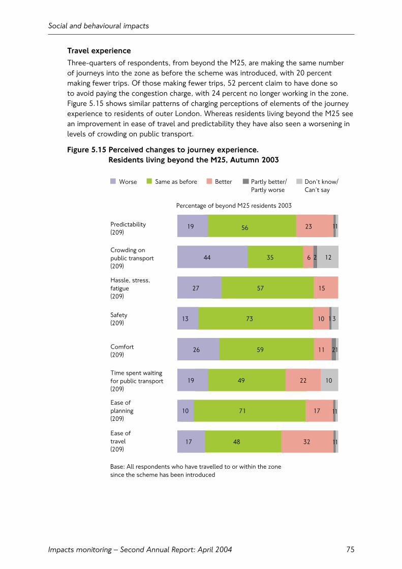
Travel experience
Three-quarters of respondents, from beyond the M25, are making the same number of journeys into the zone as before the scheme was introduced, with 20 percentmaking fewer trips. Of those making fewer trips, 52 percent claim to have done so to avoid paying the congestion charge, with 24 percent no longer working in the zone.Figure 5.15 shows similar patterns of charging perceptions of elements of the journeyexperience to residents of outer London. Whereas residents living beyond the M25 seean improvement in ease of travel and predictability they have also seen a worsening inlevels of crowding on public transport.
Figure 5.15 Perceived changes to journey experience. Residents living beyond the M25, Autumn 2003
Social and behavioural impacts
Impacts monitoring – Second Annual Report: April 2004 75
Worse Same as before Better
Percentage of beyond M25 residents 2003
Base: All respondents who have travelled to or within the zone since the scheme has been introduced
19
44
27
13
19
10
17
35
57
73
49
71
48
23
15
10
11
22 10
17
32
26 59
56
6
Predictability(209)
Crowding on public transport(209)
Hassle, stress,fatigue(209)
Safety(209)
Comfort(209)
Time spent waitingfor public transport(209)
Ease of planning(209)
Ease oftravel (209)
11
11
11
Don’t know/Can’t say
Partly better/Partly worse
1 3
2
2 12
1
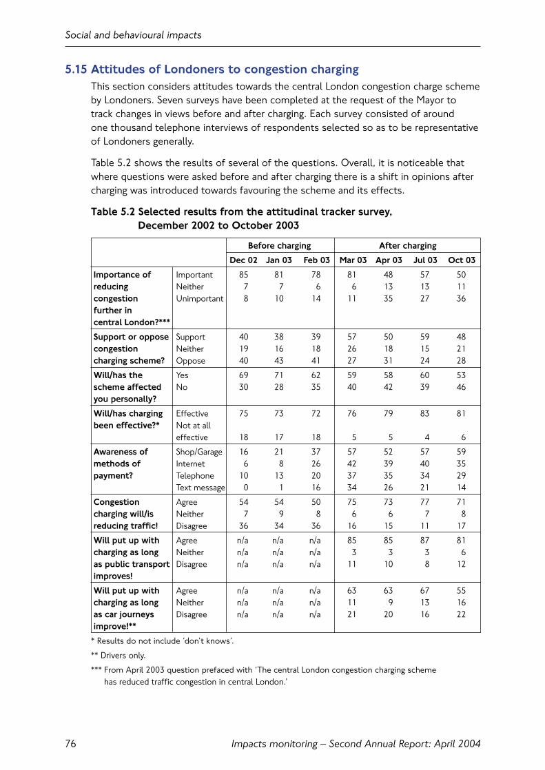
5.15 Attitudes of Londoners to congestion chargingThis section considers attitudes towards the central London congestion charge schemeby Londoners. Seven surveys have been completed at the request of the Mayor totrack changes in views before and after charging. Each survey consisted of around one thousand telephone interviews of respondents selected so as to be representative of Londoners generally.
Table 5.2 shows the results of several of the questions. Overall, it is noticeable thatwhere questions were asked before and after charging there is a shift in opinions aftercharging was introduced towards favouring the scheme and its effects.
Table 5.2 Selected results from the attitudinal tracker survey, December 2002 to October 2003
Before charging After charging
Dec 02 Jan 03 Feb 03 Mar 03 Apr 03 Jul 03 Oct 03
Importance of Important 85 81 78 81 48 57 50reducing Neither 7 7 6 6 13 13 11congestion Unimportant 8 10 14 11 35 27 36further in central London?***
Support or oppose Support 40 38 39 57 50 59 48congestion Neither 19 16 18 26 18 15 21charging scheme? Oppose 40 43 41 27 31 24 28
Will/has the Yes 69 71 62 59 58 60 53scheme affected No 30 28 35 40 42 39 46you personally?
Will/has charging Effective 75 73 72 76 79 83 81been effective?* Not at all
effective 18 17 18 5 5 4 6
Awareness of Shop/Garage 16 21 37 57 52 57 59methods of Internet 6 8 26 42 39 40 35payment? Telephone 10 13 20 37 35 34 29
Text message 0 1 16 34 26 21 14
Congestion Agree 54 54 50 75 73 77 71charging will/is Neither 7 9 8 6 6 7 8reducing traffic! Disagree 36 34 36 16 15 11 17
Will put up with Agree n/a n/a n/a 85 85 87 81charging as long Neither n/a n/a n/a 3 3 3 6as public transport Disagree n/a n/a n/a 11 10 8 12improves!
Will put up with Agree n/a n/a n/a 63 63 67 55charging as long Neither n/a n/a n/a 11 9 13 16as car journeys Disagree n/a n/a n/a 21 20 16 22improve!**
* Results do not include ‘don’t knows’.
** Drivers only.
*** From April 2003 question prefaced with ‘The central London congestion charging scheme has reduced traffic congestion in central London.’
Social and behavioural impacts
Impacts monitoring – Second Annual Report: April 200476
6. Business and economic impacts
6.1 IntroductionThis chapter considers the impacts of congestion charging on business activities in andaround the charging zone and the wider economy of London. Information is presentedfrom Transport for London’s (TfL’s) own surveys of businesses in central London; andthis is assessed in the context of the larger body of evidence that has accumulatedfollowing the introduction of congestion charging.
It has been difficult to achieve consensus on the impact of charging on economicactivity in London, particularly in view of the range of other exceptional local, nationaland international factors that have operated throughout 2003.
This chapter first reviews key findings from TfL’s own surveys of businesses and otherorganisations in and immediately around the charging zone, conducted in Autumn 2003.
It then focuses on the retail sector, where various commentators have suggested thatcharging has been directly responsible for the downturn in activity during 2003.
It is concluded that charging has had a relatively minor effect on the London economy,albeit that there are some sectors and activities that experience negative effects. It isfurther concluded that the negative trends reported by certain business sectors during2003 are largely due to wider economic factors.
6.2 Key findings• London’s economy has been subject to a variety of specific and longer-term
local, national and international factors during 2003. Collectively, these have had a much greater impact on economic performance than congestion charging.They have also made more difficult the task of identifying and quantifyingcongestion charging related impacts;
• The TfL business surveys have shown that a number of factors are at work ingenerating responses to the congestion charge from the business community.Overall, the response to the charge has been neutral, with businesses in the zone or close to the boundary remaining generally supportive;
• Attitudes towards the charge vary when viewed at the business sector level. The finance and business services sector is enthusiastic about the charge, citingreduced journey times and an increased ease of movement within the zone;
• Retail and leisure suffered through the first half of 2003 for a number of reasonsunrelated to congestion charging. Extracting the individual influences from theoverall picture is difficult, particularly at a quantitative level;
• The magnitudes of the factors affecting retail are such that congestion charging can only have had very minor effects on sales over the first half of 2003.Furthermore, the resurgence of the retail market at the end of 2003/early 2004indicates the influencing factors have not had a long-term effect on the sector.Structural changes to the retail market and much broader economic and politicalfactors have been the prime drivers of retail performance during 2003.
Business and economic impacts
Impacts monitoring – Second Annual Report: April 2004 77

6.3 Transport for London’s business surveysTransport for London undertook interview surveys with over 700 businesses across the congestion charging zone and the immediate area surrounding it (defined as within500 metres of the boundary) in Autumn 2003. These can be compared with similarsurveys carried out in 2002.
Despite the largely qualitative nature of these surveys, the TfL surveys have a number of attributes that distinguish them from other surveys carried out over the last 12 months:
• A comparatively large survey sample;
• A sample structure that reflects the make up of central London’s economy;
• Fieldwork timed to capture a view of the effects of congestion charging after 8 months of operation;
• Response rates of approximately 40 percent for the initial contact phase of allsurveys and a successful re-contact rate of nearly 80 percent for the in-depthinterview survey.
It is, however, important to consider the wealth of information published by otherorganisations regarding the effect of congestion charging on businesses and theLondon economy. For instance, the London Chamber of Commerce and Industry, the Freight Transport Association, London First and the Chartered Institute of Management Accountants are amongst those organisations that have publishedsurveys on various aspects of congestion charging. In general these surveys do notpossess the same advantages as the TfL business surveys (outlined above).
To allow analysis of the differential effects of factors such as tourism trends andcongestion charging on different businesses, the respondents to the TfL surveys weresplit into the following six sectors:
• Services – essentially offices, mainly involved in financial and business services;
• Retail – shops and other high street sites such as travel agents, estate agents orhairdressers;
• Leisure – restaurants, cafes, hotels, pubs, cinemas etc.;
• Distribution – a small but highly relevant sector;
• Production – since there is almost no manufacturing activity inside central London,this is mainly the media industry plus some workshop-based activity;
• Public Sector – all non-commercial activities such as government offices, also includes charities.
Business and economic impacts
Impacts monitoring – Second Annual Report: April 200478

Figure 6.1 shows central London employment by business sector. The relativeimportance of the various business sectors to the central London economy is reflectedin the sample structure of TfL’s business surveys carried out in 2002 and 2003.
Figure 6.1 Central London employment by business sector, 2003
The following sections present some results from the 2003 surveys, with comparisonto the 2002 surveys where relevant.
Business performance
Figure 6.2 Overall business performance as measured by change in sales
Figure 6.2 shows that the majority of respondents reported little or no change tooverall business performance in the first half of 2003 when compared to the sameperiod in 2002. Marginally more respondents saw a decrease in performance than saw growth, indicative of a relatively weak economic performance overall during theperiod in question.
Business and economic impacts
Impacts monitoring – Second Annual Report: April 2004 79
0
10
20
30
40
50
60
over 15%increase
11-15%increase
6-10%increase
1-5%increase
Nochange
1-5%decrease
6-10%decrease
11-15%decrease
over 15%decrease
Perc
enta
ge o
f re
spo
nden
ts
Note: 14 percent of respondents replied ‘don’t know’ or refused to answer the question.
Production10%
Distribution5%
Retail17%
Leisure10%
Services42%
Public sector16%

Viewing the average change in sales by sector Figure 6.3 reveals the difference between the services sector, which grew by an average of 1 percent, and the retail,leisure and distribution sectors, which reported a decline of up to 3 percent (retail) in the same period.
Figure 6.3 Average business performance during the first half of 2003 by business sector
This is consistent with the broader economic picture across the UK in 2003, arelatively poor year for certain sectors balanced by a resurgent financial servicesindustry. The magnitudes of the reported changes however are relatively small.
When asked what had influenced business performance over the period in question, a number of key factors were identified. General economic factors were cited in 46 percent of responses, with tourism trends representing a further 10 percent,seasonal factors 15 percent and the congestion charge receiving a mention in 12 percent of responses.
Business and economic impacts
Impacts monitoring – Second Annual Report: April 200480
-4% -3% -2% -1% 0% 1%
Services
Retail
Leisure
Distribution
Production
Public sector
Total
Average percentage change
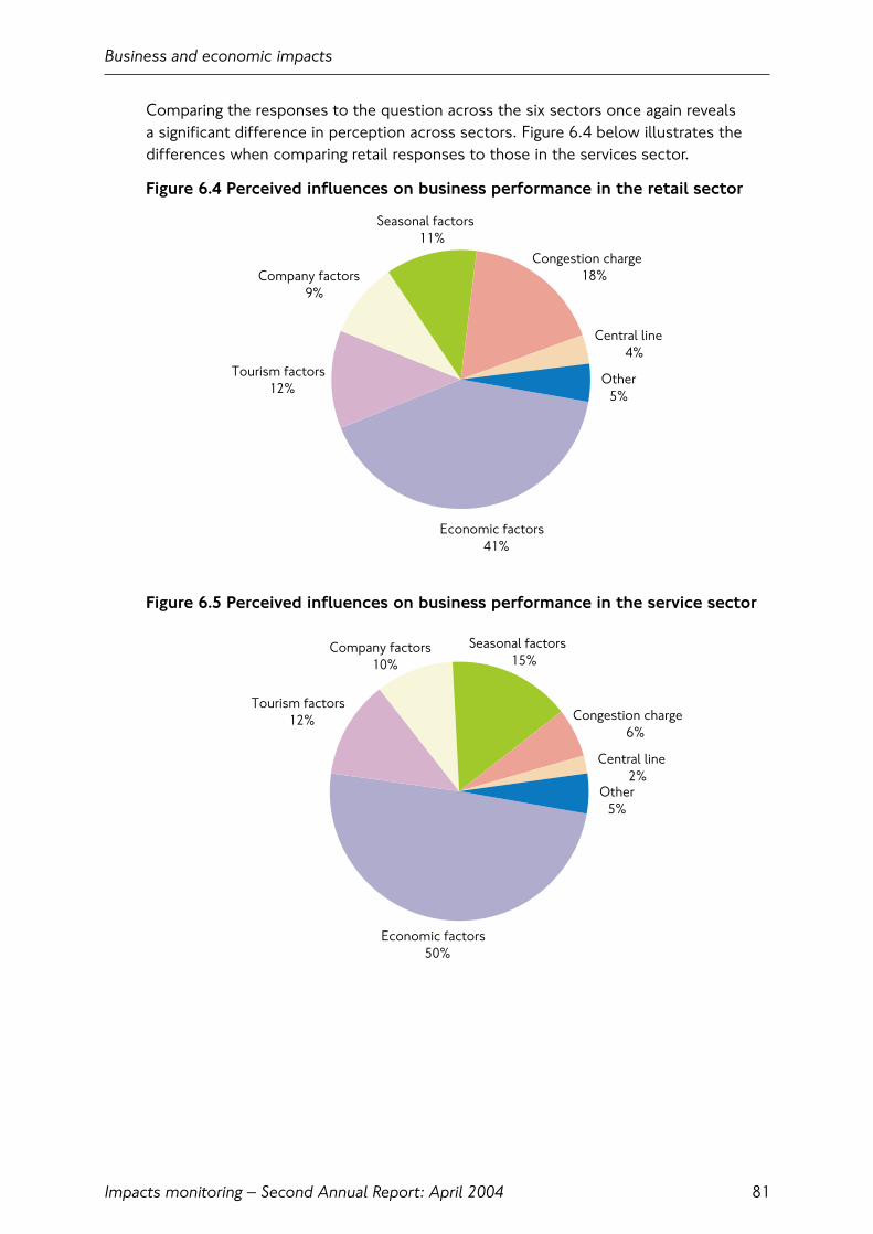
Comparing the responses to the question across the six sectors once again reveals a significant difference in perception across sectors. Figure 6.4 below illustrates thedifferences when comparing retail responses to those in the services sector.
Figure 6.4 Perceived influences on business performance in the retail sector
Figure 6.5 Perceived influences on business performance in the service sector
Business and economic impacts
Impacts monitoring – Second Annual Report: April 2004 81
Tourism factors12%
Company factors9%
Seasonal factors11%
Congestion charge18%
Central line4%
Other5%
Economic factors41%
Tourism factors12%
Company factors10%
Seasonal factors15%
Congestion charge6%
Central line2%
Other5%
Economic factors50%
Given the relative performances of the sectors in question, Figures 6.4 and 6.5 reveal a different attitude towards congestion charging. Most influences are viewedconsistently across the two sectors, the only real differences being congestion charging and economic factors. Eighteen percent of retailers regarded congestioncharging as an influence on their businesses that have, on average, declined by 3 percent over the period concerned.
With services, 6 percent of respondents cite the congestion charge as an influence on their business while the sector has, on average, experienced growth over the period in question. In contrast, economic factors were cited by 41 percent of retailers,compared to 50 percent of service firms.
In contrast to some external indicators, the business surveys suggest that the overallperformance of the London economy has been similar to that of the UK as a whole.Roughly equal proportions of respondents reported London performing better andworse than the rest of the UK (13 percent and 15 percent respectively, see Figure 6.6.)
Figure 6.6 Central London business performance compared to other UK locations
Once again the difference in performance between the retail/leisure sectors and theservices sector is apparent, though it is more prevalent in the leisure sector. Since theretail sector reports performance both better and worse than the UK as a whole, itwould suggest that retail performance over the early part of 2003 did not conform to acoherent pattern. This has implications for analysis of the effect of congestion chargingon the retail sector as consensus and clarity will be harder to achieve.
Business and economic impacts
Impacts monitoring – Second Annual Report: April 200482
0% 10% 20% 30% 40% 50% 60% 70% 80% 90% 100%
Services
Retail
Leisure
Distribution
Production
Public sector
Total
Central London worse No difference Central London better Don’t know/Not applicable
Effects of congestion charging on company policy
Businesses experiencing significant changes as a result of the congestion charge arelikely to introduce or refine policies to cope with the new situation. Nevertheless, it is clear from the Figure 6.7 that in almost all cases, only a very small percentage of respondents have felt it necessary to make changes to the way they operate.
Businesses were asked whether they had ‘changed or started the process of changingits policy or practices in any of the following areas in the last six months’. While notspecifically linked to the congestion charge, the question would draw out changesinfluenced by the introduction of congestion charging.
Logically, the area having seen the highest degree of change is the timing of deliveries,either to avoid the congestion charge or to take advantage of the reduced congestionwithin the zone. This is particularly prevalent in the retail and distribution sectors, aswould be expected.
Of equal interest are the very small numbers of respondents considering an office orsite change. Only production and services exceed a 5 percent positive response,despite the concerns expressed elsewhere that the charge would drive businesses outof the charging zone.
Figure 6.7 Policy changes in response to congestion charging
Additional questioning regarding how long the respondent had been established intheir current site indicates that the sample has a ‘churn’ rate of around 10 percent; that is 10 percent of businesses will leave the area they are currently located each year, to be replaced by a new business in most cases. This suggests the levels oflocation change implied by the policy change question are within the naturallyoccurring levels of business churn.
Business and economic impacts
Impacts monitoring – Second Annual Report: April 2004 83
0% 5% 10% 15% 20%
Office/site location
Logistical operations
Timing of deliveries
Home working andteleworking
Working/operating/openinghours
Company car policy
Use of public transport TotalPublic sectorProductionDistributionLeisureRetailServices
Figure 6.8 Effect of congestion charging on the cost of running the site/office
Figure 6.8 shows the majority of respondents view the congestion charge as havinglittle or no effect on the cost of running their office/site.
Figure 6.9 indicates the change in overall attitudes towards the charge.
Overall, and based on the premise that congestion charging is accompanied by continued investment in public transport, support for the congestion charge hasincreased from 54 percent to 58 percent.
Figure 6.9 Support for congestion charging before and after the introduction ofthe scheme
Business and economic impacts
Impacts monitoring – Second Annual Report: April 200484
0% 20% 40% 60% 80% 100%
Services
Retail
Leisure
Distribution
Production
Public sector
Total
+ 10% + 5-10% + 3-5% + 1 or 2% No impact- 1 or 2% - 3-5% - 5-10% - over 10% Don’t know
0% 20% 40% 60% 80% 100%
Before
After
Do not support the scheme Neither/not sure Support the scheme

6.4 Retail in the congestion charging zoneFigure 6.10 Percentage change in year-on-year retail sales value, 2002 to 2004
It is evident from Figure 6.10 that:
• trends in central London were different to those of the UK as a whole, whichshowed a stable, if relatively sluggish growth trend
• the decline in central London retail sales growth appears to have started in quarter 4 2002, before the introduction of charging
• data for recent months suggests that retail growth in central London has now re-converged with the UK as a whole, despite the continued operation ofcongestion charging.
A relative under-performance in retail sales in central London is consistent with theoverall economic performance of London during the period under consideration. As Figure 6.11 shows, total economic growth in London fell below the UK average in early 2002 and remained there through 2003. Annual percentage change in Gross Value Add (GVA) is approximately half a percent for much of 2003, well below the UK value of nearly 2 percent.
Business and economic impacts
Impacts monitoring – Second Annual Report: April 2004 85
-6
-4
-2
0
2
4
6
8
10
Oct02
Nov Dec Jan03
Feb Mar Apr May Jun Jul Aug Sep Oct Nov Dec Jan04
Feb
Perc
enta
ge c
hang
e
Central London like-for-like sales
UK like-for-like sales
Trend (central London like-for-like sales)
Source: LRC London Retail Sales Monitor, February 2003

Figure 6.11 UK and London GVA growth 2000-2003
According to the SPSL Retail Traffic Index for the charging zone (see Figure 6.12), retail performance within the charging zone was well below that of the rest of the UK from before the introduction of charging and for much of 2003. The latter half of the year however saw the charging zone outperforming the rest of the UK andreturning to a pattern of year-on-year growth. Indeed, the SPSL index indicates that retail activity has reached the levels previously seen in 2002.
Figure 6.12 SPSL Retail Trade Index – charging zone against rest of UK
Business and economic impacts
Impacts monitoring – Second Annual Report: April 200486
-1
0
1
2
3
4
5
6
7
2000 q1
2000 q2
2000 q3
2000 q4
2001 q1
2001 q2
2001 q3
2001 q4
2002 q1
2002 q2
2002 q3
2002 q4
2003 q1
2003 q2
2003 q3
Yea
r-o
n-ye
ar p
erce
ntag
e ch
ange
London UK
Source: Experian Business Strategies
-15%
-10%
-5%
0%
5%
10%
15%
Jan03
Feb Mar Apr May Jun Jul Aug Sep Oct Nov Dec Jan04
Feb
Yea
r-o
n-ye
ar p
erce
ntag
e ch
ange
Charging zone UK
Source: SPSL Retail Trade Index. The index remains provisional until confirmation of sample representation

In contrast, the Footfall index for the congestion charging zone1 shows 2003 retailactivity to be below that seen in 2002 for almost the entire year and does not show thesame growth during the last quarter of 2003 as exhibited by the RSM or SPSL indices.
Footfall data can be further broken down to illustrate the relative performance of thecongestion charging zone during the week and at weekends. Figure 6.13 below showsseparate indices for weekday and weekend performance for the zone. As can be seen,both indices exhibit the same general behaviour over an extended period of time andfrom well before the introduction of congestion charging.
Figure 6.13 Footfall London congestion charging zone index, weekends and weekdays
The comparable performance of the two indices suggests that factors affecting theretail performance of the congestion charging zone apply equally to weekdays andweekends. Since the congestion charge does not apply at the weekend, the Footfallindices appear to demonstrate that congestion charging has had minimal effect onretail performance and that other factors apart from charging are primarily responsible.
In addition, Chapter 3 reveals no significant changes to traffic patterns at weekendsthat might be attributable to congestion charging, again suggesting that retailperformance and road traffic levels in central London are not strongly interrelated.
Further information on shoppers is available from a TfL survey undertaken at the start of 2004. This looked at the characteristics of shoppers in the Oxford Street andRegent Street area of central London, as well as locations outside of the charging zone.The survey focused on the nature of shopping in the context of people’s other dailyactivities, such as work.
Business and economic impacts
Impacts monitoring – Second Annual Report: April 2004 87
0
20
40
60
80
100
120
140
160
180
200
07/0
1/02
04/0
2/02
04/0
3/02
01/0
4/02
29/0
4/02
27/0
5/02
24/0
6/02
22/0
7/02
19/0
8/02
16/0
9/02
14/1
0/02
11/1
1/02
09/1
2/02
06/0
1/03
03/0
2/03
03/0
3/03
31/0
3/03
28/0
4/03
26/0
5/03
23/0
6/03
21/0
7/03
18/0
8/03
15/0
9/03
13/1
0/03
10/1
1/03
08/1
2/03
05/0
1/04
02/0
2/04
01/0
3/04
29/0
3/04
Foo
tfal
l ret
ail i
ndex
Charging zone weekendCharging zone weekday
Source: Footfall London Congestion Charging Zone Index, April 2003
1 Source: London Congestion Zone Footfall Index 26/01/04

Insights from this survey again confirm that congestion charging is unlikely to have had a significant adverse effect on retail in central London. For example:
• Around one-half of the people in Oxford Street and Regent Street are visitors, i.e. non London residents. Up to one-third are UK or overseas tourists, illustratingthe importance of visitors to retail performance in these locations;
• Only 40 percent of people in Oxford Street and Regent Street are there primarilyfor shopping. About 45 percent are there for shopping as a secondary purpose, for example in conjunction with work (about one-quarter of all people);
• Public transport dominated access to central London. Only three percent of people(Oxford Street) or 8 percent (Regent Street) used car as their main mode of access.Around one-fifth of people in both locations walked all the way from their previousactivity (e.g. work);
• The average shopping spend by car users in central London was only around 20 percent higher than those who used other modes. In addition, if car-borneshoppers were less likely to shop in central London, this would be expected toprimarily affect those intending to spend less.
Assessment
The weak performance of the retail sector in the first half of 2003 can be attributed to a number of factors, notably the Central line closure, the Iraq war and theassociated increase in the threat of terrorism, the most noticeable effect of which was a reduction in overseas tourists.
Visit Britain estimates that up to 26 percent of total spending by overseas visitors tothe UK is retail expenditure. Office of National Statistics data reports that overseasvisitors’ spending was down by £100 million in the second quarter of 2003 comparedto 2002. When coupled with the likely deterrence of domestic tourists due to similarconcerns, it is apparent that a significant value of retail expenditure, perhaps 5 percentof sales over this period, was absent from central London during quarter two, 2003.
The nature of this effect can be illustrated by overlaying the central London retail datawith UK wide tourist information (Figure 6.14). While the relationship is not directlycausal, much of UK tourism activity is focused on central London and central Londonretailers rely heavily on tourism expenditure. Other data shows that higher-spendingNorth American visitors dipped substantially further than overall visitor numbers andhave taken longer to recover.
Business and economic impacts
Impacts monitoring – Second Annual Report: April 200488

Figure 6.14 Retail sales in central London against tourist visits and touristspending in the UK
Travel behaviour through 2003 has been discussed extensively elsewhere in this report,but Figure 6.15 below is revealing in demonstrating the clearer nature of the relationshipbetween the decline in Underground travel and the performance of the retail sector.
Figure 6.15 Underground journeys against central London retail sales
This chart superimposes the Retail Sales Monitor sales index over year-on-year networkwide patronage growth. The large decline in Underground travel through the Spring of 2003(including the Central line closure) coincides with the period of negative sales growth.
Business and economic impacts
Impacts monitoring – Second Annual Report: April 2004 89
-20%
-10%
0%
10%
20%
30%
40%
October
November
Decem
ber
Janu
ary
Februa
ry
March
AprilMay
June Ju
ly
Augus
t
Septe
mber
October
November
UK Tourist VisitsUK Tourist SpendingCentral London Retail Sales
2002 2003
Source: ONS, LRC Retail Sales Monitor
Yea
r-o
n-ye
ar p
erce
ntag
e ch
ange
-10%
-8%
-6%
-4%
-2%
0%
2%
4%
6%
8%
OctNov
Dec Jan
Feb
March
AprilMay
June Ju
ly
Augus
tSe
ptOct
NovDec
Underground Journeys Central London Retail Sales
Source: TfL Revenue Report, LRC London Retail Sales Monitor
Yea
r-o
n-ye
ar p
erce
ntag
e ch
ange
2002 2003
This is not a direct relationship since a number of factors are at play; some of thereduction in travel will be due to the reduction in tourism identified earlier, otherjourneys will have been transferred to alternative means of transport (including buses)and will still be made.
While it remains impossible to precisely quantify the effect of congestion charging on retailers within the charging zone it is clear that the influences outlined above are likely key factors for recent retail trends in central London and they are – for allpractical purposes – independent of congestion charging.
External influences
On the domestic front, retailers faced other pressures throughout 2003. An unusuallywarm Summer kept shoppers of all kinds from the stores, while an exceedingly wetNovember may be, in part, to blame for the poor performance that month.
The retail sector also faces a number of structural changes, the effects of which have become increasingly apparent over the last 12 months. The continued rise of out-of-town shopping venues, such as Bluewater to the south east of London, has impacted high street retailers across the UK. Furthermore, new prestige locations outside London have enhanced the appeal of regional shopping centres in comparison to London.
Also increasing in importance is ‘e-tailing’ or internet shopping. Expenditure via these non-traditional outlets has increased in recent years as the market matures. The Interactive Media In Retailing Group quote an annual growth rate of 70 percentacross 80 retailers surveyed and a monthly spend of around £1.3 billion nationally(December 2003), representing about 7 percent of all retail sales. While the proportionof retail expenditure via these channels is still small, the impact on traditional retailersis not insignificant, particularly where longer journeys might previously have been madeto source items not available locally.
2003 was undoubtedly a tough year for retailers nationally and in central London but external factors independent of the introduction of congestion charging werepredominant in driving retail performance through this period within the charging zone.
6.5 Congestion charging and economic impacts: A TfL assessmentPrevious chapters of this report have assessed the behavioural change caused by the introduction of congestion charging and the net effect on travel into the charging zone. Of some 65,000 to 70,000 daily car trips that are no longer being made, it has been estimated that only 5,000 individuals are no longer visiting the chargingzone as a result of congestion charging, with the majority of ex-car trips having beenswitched to public transport.
A reduction of 5,000 individuals in the central London daily population of more than 1.5 million people is negligible.
Business and economic impacts
Impacts monitoring – Second Annual Report: April 200490
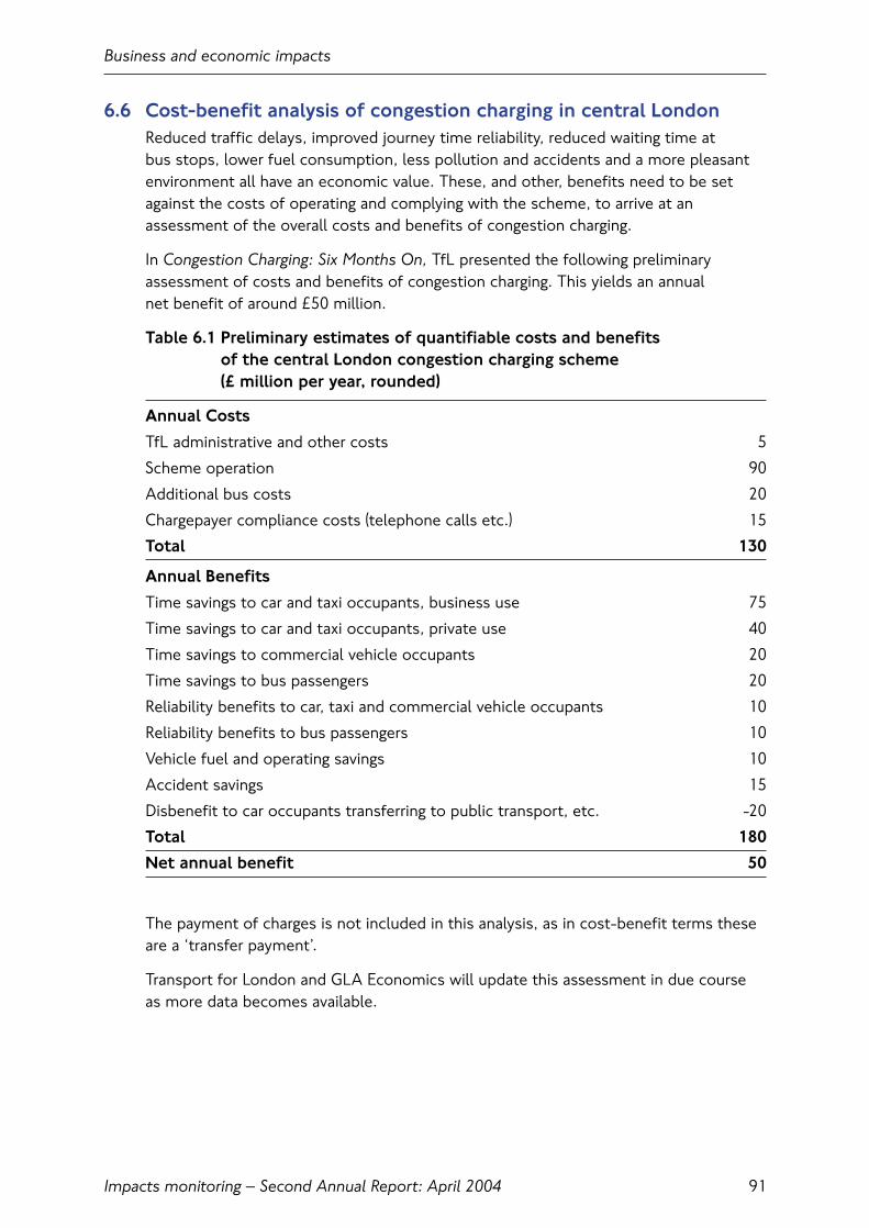
6.6 Cost-benefit analysis of congestion charging in central LondonReduced traffic delays, improved journey time reliability, reduced waiting time at bus stops, lower fuel consumption, less pollution and accidents and a more pleasantenvironment all have an economic value. These, and other, benefits need to be setagainst the costs of operating and complying with the scheme, to arrive at anassessment of the overall costs and benefits of congestion charging.
In Congestion Charging: Six Months On, TfL presented the following preliminaryassessment of costs and benefits of congestion charging. This yields an annual net benefit of around £50 million.
Table 6.1 Preliminary estimates of quantifiable costs and benefits of the central London congestion charging scheme (£ million per year, rounded)
Annual Costs
TfL administrative and other costs 5
Scheme operation 90
Additional bus costs 20
Chargepayer compliance costs (telephone calls etc.) 15
Total 130
Annual Benefits
Time savings to car and taxi occupants, business use 75
Time savings to car and taxi occupants, private use 40
Time savings to commercial vehicle occupants 20
Time savings to bus passengers 20
Reliability benefits to car, taxi and commercial vehicle occupants 10
Reliability benefits to bus passengers 10
Vehicle fuel and operating savings 10
Accident savings 15
Disbenefit to car occupants transferring to public transport, etc. -20
Total 180
Net annual benefit 50
The payment of charges is not included in this analysis, as in cost-benefit terms theseare a ‘transfer payment’.
Transport for London and GLA Economics will update this assessment in due course as more data becomes available.
Business and economic impacts
Impacts monitoring – Second Annual Report: April 2004 91

Business and economic impacts
Impacts monitoring – Second Annual Report: April 200492

7. Accidents, amenity and the environment
7.1 IntroductionThis section first considers recent trends in road traffic accidents since theintroduction of charging. It then looks at some key results from the on-street publicspace surveys describing how Londoners and others perceive the general amenity andenvironment of central London. Finally it examines the impacts of congestion chargingon air quality and ambient noise.
The expected environmental impacts of congestion charging were outlined in the First Annual Monitoring Report. It was considered that the effects on air quality and noise arising directly from congestion charging would be relatively small.Methodologies for tracking these effects were described, potential difficultiesexplained, and conditions applying before charging summarised.
7.2 Key findings• The recent trend of overall year-on-year decreases in road traffic accidents seen
across London is to be continuing. There is no evidence of disproportionate changes to the numbers of accidents involving two-wheeled vehicles, and there is some evidence of an accelerated decline in accidents inside the charging zone;
• Surveys of Londoners ‘on-street’ in and around the charging zone suggest that thebeneficial effects of congestion charging and other initiatives on environmentalquality are being recognised. However, the relationships between these ‘perceptual’indicators and the more ‘scientific’ evidence is not clear-cut;
• By reducing the overall volumes of traffic within the charging zone, and increasingthe efficiency with which it circulates, congestion charging has been directlyresponsible for reductions of approximately 12 percent in emissions of NOxand PM10 from road traffic within the zone (24-hour annual average day);
• Traffic changes on the Inner Ring Road are estimated to have resulted in very smallchanges to emissions of NOx and PM10 from road traffic, of less than plus/minus 2 percent respectively. Both here and in the charging zone, beneficial changes to the emissions performance of the vehicle fleet between 2002 and 2003 provideadditional ‘background’ benefits;
• Measurements of actual air quality across London strongly reflect the statistically-unusual weather patterns that prevailed for much of 2003, overwhelming anysmaller-scale effects that might have been caused by congestion charging. It istherefore not possible to identify ‘congestion charging’ effects in the availabledataset, either for the charging zone or the Inner Ring Road;
Accidents, amenity and the environment
Impacts monitoring – Second Annual Report: April 2004 93
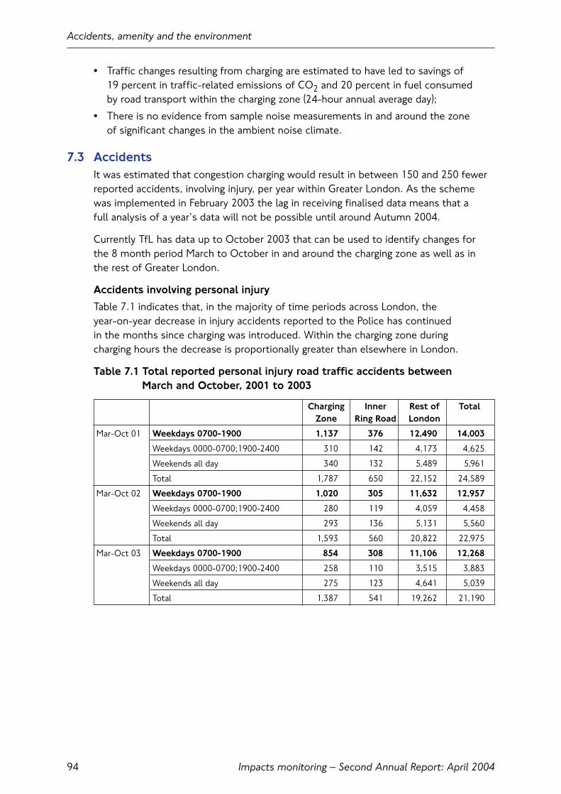
Impacts monitoring – Second Annual Report: April 200494
Accidents, amenity and the environment
• Traffic changes resulting from charging are estimated to have led to savings of 19 percent in traffic-related emissions of CO2 and 20 percent in fuel consumed by road transport within the charging zone (24-hour annual average day);
• There is no evidence from sample noise measurements in and around the zone of significant changes in the ambient noise climate.
7.3 AccidentsIt was estimated that congestion charging would result in between 150 and 250 fewerreported accidents, involving injury, per year within Greater London. As the schemewas implemented in February 2003 the lag in receiving finalised data means that a full analysis of a year’s data will not be possible until around Autumn 2004.
Currently TfL has data up to October 2003 that can be used to identify changes for the 8 month period March to October in and around the charging zone as well as in the rest of Greater London.
Accidents involving personal injury
Table 7.1 indicates that, in the majority of time periods across London, the year-on-year decrease in injury accidents reported to the Police has continued in the months since charging was introduced. Within the charging zone during charging hours the decrease is proportionally greater than elsewhere in London.
Table 7.1 Total reported personal injury road traffic accidents between March and October, 2001 to 2003
Charging Inner Rest of TotalZone Ring Road London
Mar-Oct 01 Weekdays 0700-1900 1,137 376 12,490 14,003
Weekdays 0000-0700;1900-2400 310 142 4,173 4,625
Weekends all day 340 132 5,489 5,961
Total 1,787 650 22,152 24,589
Mar-Oct 02 Weekdays 0700-1900 1,020 305 11,632 12,957
Weekdays 0000-0700;1900-2400 280 119 4,059 4,458
Weekends all day 293 136 5,131 5,560
Total 1,593 560 20,822 22,975
Mar-Oct 03 Weekdays 0700-1900 854 308 11,106 12,268
Weekdays 0000-0700;1900-2400 258 110 3,515 3,883
Weekends all day 275 123 4,641 5,039
Total 1,387 541 19,262 21,190
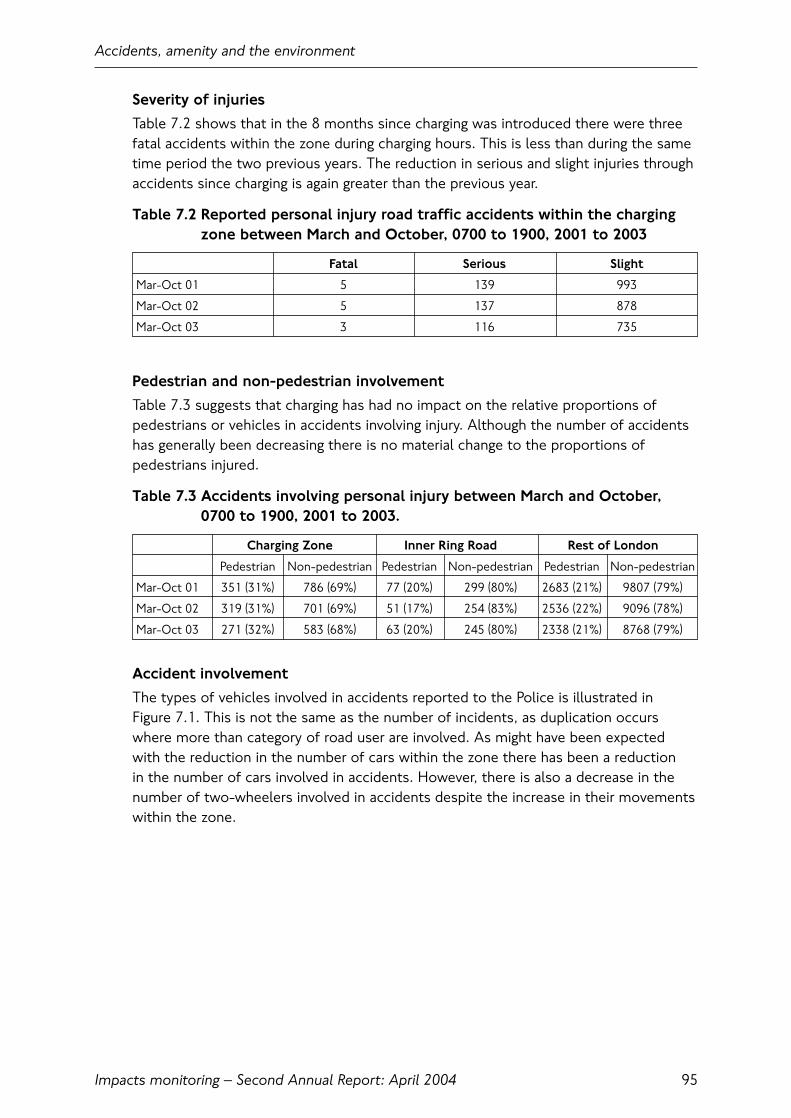
Severity of injuries
Table 7.2 shows that in the 8 months since charging was introduced there were threefatal accidents within the zone during charging hours. This is less than during the sametime period the two previous years. The reduction in serious and slight injuries throughaccidents since charging is again greater than the previous year.
Table 7.2 Reported personal injury road traffic accidents within the chargingzone between March and October, 0700 to 1900, 2001 to 2003
Fatal Serious Slight
Mar-Oct 01 5 139 993
Mar-Oct 02 5 137 878
Mar-Oct 03 3 116 735
Pedestrian and non-pedestrian involvement
Table 7.3 suggests that charging has had no impact on the relative proportions ofpedestrians or vehicles in accidents involving injury. Although the number of accidentshas generally been decreasing there is no material change to the proportions ofpedestrians injured.
Table 7.3 Accidents involving personal injury between March and October,0700 to 1900, 2001 to 2003.
Charging Zone Inner Ring Road Rest of London
Pedestrian Non-pedestrian Pedestrian Non-pedestrian Pedestrian Non-pedestrian
Mar-Oct 01 351 (31%) 786 (69%) 77 (20%) 299 (80%) 2683 (21%) 9807 (79%)
Mar-Oct 02 319 (31%) 701 (69%) 51 (17%) 254 (83%) 2536 (22%) 9096 (78%)
Mar-Oct 03 271 (32%) 583 (68%) 63 (20%) 245 (80%) 2338 (21%) 8768 (79%)
Accident involvement
The types of vehicles involved in accidents reported to the Police is illustrated in Figure 7.1. This is not the same as the number of incidents, as duplication occurswhere more than category of road user are involved. As might have been expected with the reduction in the number of cars within the zone there has been a reduction in the number of cars involved in accidents. However, there is also a decrease in thenumber of two-wheelers involved in accidents despite the increase in their movementswithin the zone.
Accidents, amenity and the environment
Impacts monitoring – Second Annual Report: April 2004 95

Figure 7.1 Accident involvement by vehicle type within the charging zone, 0700 to 1900, March to October, 2001 to 2003
Although it is too early to fully understand the impact of charging on accidents in London, the data that are available show a continuing decrease within the zone and in London overall.
It is worth noting that despite concerns that there could be increases in theinvolvement of powered two-wheelers due to greater numbers of these vehicles, this has not materialised. Neither has an increase in fatalities or serious injuries due to increased average network traffic speeds.
7.4 Quality of the central London environmentBy reducing the amount of traffic in and around the charging zone, congestion charging was expected to contribute to improving the general environmental amenity in the zone. This cannot be measured objectively, but perceptual surveys of individualLondoners ‘on the street’ can provide a range of feedback through which these effectscan be assessed.
This section looks at some results from two large-scale interview surveys of Londonersconducted at various shopping, tourist, leisure and business locations in and aroundthe charging zone (see First Annual Monitoring Report). Surveys were conducted duringthe Autumn of 2002 and 2003 and included a variety of questions, several of whichrelate to perceived environmental amenity. Other areas covered by these surveysincluded:
• Indicative measures of pedestrian activity;
• Access to location;
• Activity at location (e.g. spend);
• Quality of transport;
• Perceived effects of congestion charging.
Accidents, amenity and the environment
Impacts monitoring – Second Annual Report: April 200496
0
100
200
300
400
500
600
Pedestrian Pedalcycle
Poweredtwo-wheeler
Car Taxi Bus orcoach
Goodsvehicles
Other
Mode
Veh
icle
s in
volv
ed in
acc
iden
ts
2001 2002 2003
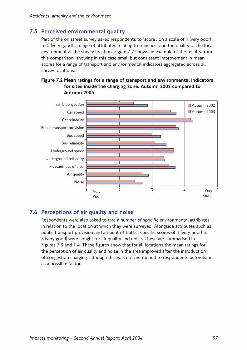
7.5 Perceived environmental qualityPart of the on street survey asked respondents to ‘score’, on a scale of 1 (very poor) to 5 (very good), a range of attributes relating to transport and the quality of the localenvironment at the survey location. Figure 7.2 shows an example of the results fromthis comparison, showing in this case small but consistent improvement in meanscores for a range of transport and environmental indicators aggregated across allsurvey locations.
Figure 7.2 Mean ratings for a range of transport and environmental indicatorsfor sites inside the charging zone. Autumn 2002 compared toAutumn 2003
7.6 Perceptions of air quality and noiseRespondents were also asked to rate a number of specific environmental attributes in relation to the location at which they were surveyed. Alongside attributes such aspublic transport provision and amount of traffic, specific scores of 1 (very poor) to 5 (very good) were sought for air quality and noise. These are summarised in Figures 7.3 and 7.4. These figures show that for all locations the mean ratings for the perception of air quality and noise in the area improved after the introduction of congestion charging, although this was not mentioned to respondents beforehandas a possible factor.
Accidents, amenity and the environment
Impacts monitoring – Second Annual Report: April 2004 97
Noise
Air quality
Pleasantness of area
Underground reliability
Underground speed
Bus reliability
Bus speed
Public transport provision
Car reliability
Car speed
Traffic congestion Autumn 2002
Autumn 2003
VeryPoor
VeryGood
1 2 3 4 5
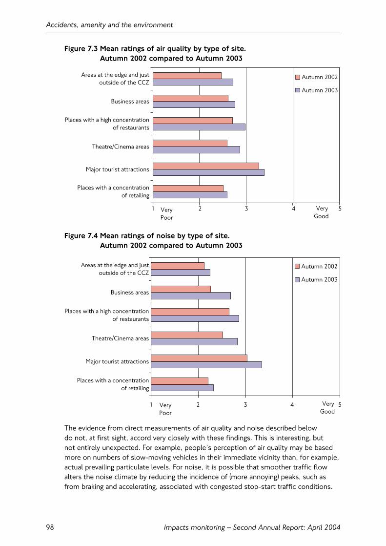
Figure 7.3 Mean ratings of air quality by type of site. Autumn 2002 compared to Autumn 2003
Figure 7.4 Mean ratings of noise by type of site. Autumn 2002 compared to Autumn 2003
The evidence from direct measurements of air quality and noise described below do not, at first sight, accord very closely with these findings. This is interesting, but not entirely unexpected. For example, people’s perception of air quality may be basedmore on numbers of slow-moving vehicles in their immediate vicinity than, for example,actual prevailing particulate levels. For noise, it is possible that smoother traffic flowalters the noise climate by reducing the incidence of (more annoying) peaks, such asfrom braking and accelerating, associated with congested stop-start traffic conditions.
Accidents, amenity and the environment
Impacts monitoring – Second Annual Report: April 200498
Places with a concentrationof retailing
Major tourist attractions
Theatre/Cinema areas
Places with a high concentrationof restaurants
Business areas
Areas at the edge and justoutside of the CCZ
Autumn 2002
Autumn 2003
VeryPoor
VeryGood
1 2 3 4 5
1 2 3 4 5
Places with a concentrationof retailing
Major tourist attractions
Theatre/Cinema areas
Places with a high concentrationof restaurants
Business areas
Areas at the edge and justoutside of the CCZ
Autumn 2002
Autumn 2003
VeryPoor
VeryGood
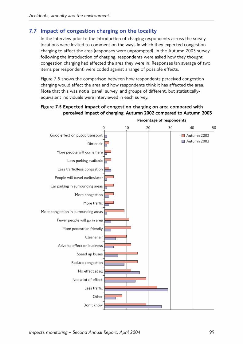
7.7 Impact of congestion charging on the localityIn the interview prior to the introduction of charging respondents across the surveylocations were invited to comment on the ways in which they expected congestioncharging to affect the area (responses were unprompted). In the Autumn 2003 surveyfollowing the introduction of charging, respondents were asked how they thoughtcongestion charging had affected the area they were in. Responses (an average of twoitems per respondent) were coded against a range of possible effects.
Figure 7.5 shows the comparison between how respondents perceived congestioncharging would affect the area and how respondents think it has affected the area.Note that this was not a ‘panel’ survey, and groups of different, but statistically-equivalent individuals were interviewed in each survey.
Figure 7.5 Expected impact of congestion charging on area compared withperceived impact of charging. Autumn 2002 compared to Autumn 2003
Accidents, amenity and the environment
Impacts monitoring – Second Annual Report: April 2004 99
0 10 20 30 40 50
Good effect on public transport
Dirtier air
More people will come here
Less parking available
Less traffic/less congestion
People will travel earlier/later
Car parking in surrounding areas
More congestion
More traffic
More congestion in surrounding areas
Fewer people will go in area
More pedestrian friendly
Cleaner air
Adverse effect on business
Speed up buses
Reduce congestion
No effect at all
Not a lot of effect
Less traffic
Other
Don’t know
Percentage of respondents
Autumn 2002Autumn 2003
As might be expected, these results show a fairly mixed picture. One generalisationthat can be made is that the percentage of respondents reporting ‘negative’ effectswas less in the 2003 surveys compared with those who expected potentially negativeeffects in 2002, before charging.
7.8 Air qualityCongestion charging has changed the volumes and patterns of traffic in and around thecharging zone. The main changes have been described in Chapter 3. The key effectsduring weekday charging hours can be summarised:
• Reduced volumes of traffic within the charging zone moving faster and more efficiently;
• Relatively small traffic impacts on the Inner Ring Road and more widely outside of the charging zone;
• Changes to the composition of traffic, with fewer cars, vans and lorries and morebuses, taxis and two-wheelers.
These changes may be expected to affect air quality in the following ways:
• Reduced volume of traffic means that less fuel will be consumed and less polluting emissions produced;
• Faster vehicle speeds and reduced congestion means that the (reduced) volumes of traffic is moving around more efficiently, generating less emissions per unitdistance travelled;
• Different vehicle types produce different levels of emissions per unit distance travelled.This means that the impact of changes to cars will be smaller, in relative terms, ascompared to equivalent changes in heavier vehicles such as buses and lorries.
As well as these direct effects, changes brought about by charging happen against a backdrop of changes to all other factors affecting air quality. Key examples are:
• Improvements to vehicle technologies and emission/fuel standards that impact as the vehicle fleet is progressively renewed over time; this particularly affects the bus fleet;
• The weather, which can significantly affect the way in which primary emissions from road traffic are ‘translated’ into air pollution that is measured at air qualitymonitoring sites;
• Changes to emissions from other sources, for example domestic and commercialheating, both within London and further afield.
Accidents, amenity and the environment
Impacts monitoring – Second Annual Report: April 2004100
The relationship between traffic changes and air quality is therefore not a direct one. It is quite possible, for example, for beneficial changes in emissions to be ‘masked’ by weather patterns that are particularly conducive to the build-up of pollution or‘importing’ pollution from elsewhere, creating temporary ‘episodes’ or longer-termelevated levels. The problem of detection is further compounded by the fact thatcongestion charging operates for only about one-third of the hours in the one year.Therefore, the attributable impact of congestion charging on air quality objectives thatare framed in terms of running annual means or ‘exceedence days’ will be further diluted.
To deal with this complexity, a three-stage approach has been adopted.
The first stage is to calculate the impact of charging on vehicle emissions. This takes the observed traffic changes in and around the charging zone, and calculates the changes to emissions in terms of the changing volumes of the main vehicle typesand the changing speed profile of the traffic. These calculations take account ofaggregate changes to vehicle technologies over the comparison period. Alongside this, parallel calculations look at changes to other quantifiable sources of localemissions, resulting in maps describing changes to emissions that can be disaggregatedat various geographic scales. It is therefore possible to quantify aggregate changes toemissions, and to attribute components of the aggregate change to specific causes.
This then provides input data for air quality computer models, which simulate the dispersion and chemical transformation of emissions in the atmosphere. These provide, as output, and according to assumptions about meteorology, ‘contour maps’ describing pollutant concentrations in terms of the relevant air qualityobjectives (e.g. annual average concentrations). These can be compared against actualmeasurements obtained from air quality monitoring sites across London. In this way,progress towards meeting national air quality objectives can be assessed.
Finally, the monitored data itself provides a continuous record of ‘actual’ air qualityexperienced by individuals in different locations. For this reason it is often used as the first point of reference for air quality impacts. However, the aggregate change at these sites reflects a combination of many factors, and will not necessarily be agood indicator of changes brought about by any one intervention such as congestioncharging. Nor does it readily characterise the overall pollution experienced by anindividual who lives in, say, inner London and who works in central London.
The following sections summarise some provisional results from two of these three strands of work in relation to the two pollutants of most interest in London, fine particulate matter (PM10) and nitrogen dioxide (NO2) with its precursor NOx(oxides of nitrogen). The present analysis is confined to the charging zone and Inner Ring Road, as the London Atmospheric Emissions Inventory has not yet been updated in respect of changes to emissions in inner and outer London.
Accidents, amenity and the environment
Impacts monitoring – Second Annual Report: April 2004 101

7.9 EmissionsThis preliminary assessment of emissions changes is based on observed changes to traffic following the introduction of congestion charging in the charging zone andboundary route (Inner Ring Road). The updating cycle for the London AtmosphericEmissions Inventory (on which this analysis is based) is not yet complete in respect of emissions from non-traffic sources, and for areas outside the charging zone.
An incremental approach has been used to identify changes separately attributable to each of the three main influences: changes to traffic flow, changes to speeds andchanges to the vehicle stock (reflecting ‘turnover’ in the vehicle fleet and concomitantimprovements to the emissions performance of vehicles). The following four scenarioshave therefore been generated (Table 7.4):
Table 7.4 Emissions scenarios
Case Flows Speeds Vehicle stock
Pre-charging 2002 2002 2002
Intermediate 1 2003 2002 2002
Intermediate 2 2003 2003 2002
Post-charging 2003 2003 2003
*Between 2002 (pre-charging) and 2003 (post-charging), total primary emissions ofnitrogen oxides in the charging zone from road traffic fell from 810 to 680 tonnes/annum,a total reduction of 16 percent (24-hour annual average day). The equivalent figures for PM10 were 47 and 40 tonnes/annum, also a reduction of 16 percent.
*On the Inner Ring Road between 2002 and 2003, total primary emissions of nitrogen oxides from road traffic fell by 4 percent (from 400 to 383 tonnes). For PM10 the equivalent figure was a 7 percent decrease (from 22.4 to 20.8 tonnes).
These changes are net effects. It is estimated that traffic changes brought about bycharging are responsible for about 75 percent of the reductions in the charging zone for both NOx and PM10. The remaining 25 percent arises from changes to the vehicletechnology mix between 2002 and 2003; the extent to which these are ‘relevant’ tothe charging zone of course being affected by the differential effects of charging on the various vehicle types.
On the Inner Ring Road the effect of vehicle technology changes is more pervasive.Removing these effects from the calculations shows that the traffic and speed changes between 2002 and 2003 results in a small overall increase in emissions of NOx of 1.5 percent, and a small decrease in emissions of PM10 of 1.4 percent.
*Note the absolute emissions values have been revised from the previous version(corrected 28 July 2004). Percentage changes remain unaffected.
Accidents, amenity and the environment
Impacts monitoring – Second Annual Report: April 2004102

Table 7.5 uses each of the scenarios described in Table 7.4, and ‘steps through’ the main effects, quantifying their contribution to the overall change.
Table 7.5 Principal changes to traffic and their effect on total primary traffic emissions of NOx and PM10
Percentage change in relation to Charging Charging Inner Innerpre-charging base (100%) zone zone Ring Road Ring Road
NOx PM10 NOx PM10
Volume change – motorcycles 0 +1 0 +1
Volume change – taxis +1 +3 0 0
Volume change – car -6 -4 +1 +1
Volume change – bus and coach +4 0 +3 0
Volume change – light goods -1 -2 +1 +2
Volume change – rigid goods -2 -1 +1 0
Volume change – articulated heavy goods 0 0 0 0
Speed changes (all vehicles) -8 -9 -4 -5
Percentage change due to traffic and speed changes -12 -12 +2 -1
Emissions factors (fleet turnover and technology mix) -4 -4 -6 -5
Overall traffic emissions change -16 -16 -4 -7
These changes are generally intuitive, bearing in mind that they reflect annual averageconditions, rather than charging hours specifically. In addition, it is the case that increasedemissions from increased numbers of some vehicle types are counterbalanced bydecreases in emissions per vehicle because of the speed changes (within the speedranges being considered, vehicles perform more efficiently at higher speeds).
This is particularly so for taxis and buses, although it is likely that limitationsassociated with the calculations have over-represented this effect for buses, as theextent to which they can ‘gain’ from increases in overall traffic speed is limited byscheduling considerations.
Gains arising from changes to vehicle technology and fleet renewal are to be expected,given the various statutory and voluntary initiatives that have been put in place as partof the Air Quality Strategy for England, Wales and Northern Ireland, and also theMayor’s Air Quality Strategy Cleaning London’s Air. These are reflected in updatedemissions factors and the overall effect is to reduce total emissions of both NOxand PM10 by about 4-5 percent, in the absence of any changes to vehicle numbers or speeds.
Accidents, amenity and the environment
Impacts monitoring – Second Annual Report: April 2004 103
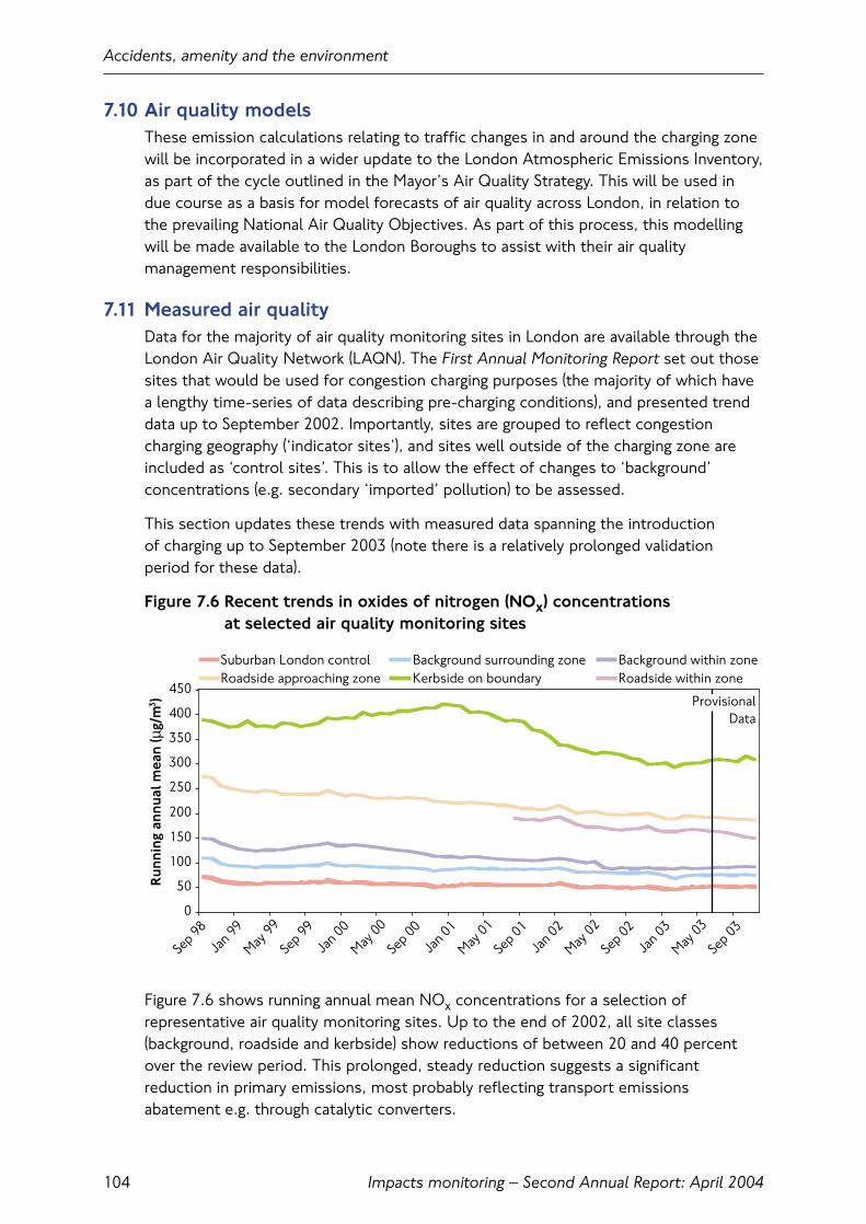
7.10 Air quality modelsThese emission calculations relating to traffic changes in and around the charging zonewill be incorporated in a wider update to the London Atmospheric Emissions Inventory,as part of the cycle outlined in the Mayor’s Air Quality Strategy. This will be used indue course as a basis for model forecasts of air quality across London, in relation tothe prevailing National Air Quality Objectives. As part of this process, this modellingwill be made available to the London Boroughs to assist with their air qualitymanagement responsibilities.
7.11 Measured air qualityData for the majority of air quality monitoring sites in London are available through theLondon Air Quality Network (LAQN). The First Annual Monitoring Report set out thosesites that would be used for congestion charging purposes (the majority of which havea lengthy time-series of data describing pre-charging conditions), and presented trenddata up to September 2002. Importantly, sites are grouped to reflect congestioncharging geography (‘indicator sites’), and sites well outside of the charging zone areincluded as ‘control sites’. This is to allow the effect of changes to ‘background’concentrations (e.g. secondary ‘imported’ pollution) to be assessed.
This section updates these trends with measured data spanning the introduction of charging up to September 2003 (note there is a relatively prolonged validation period for these data).
Figure 7.6 Recent trends in oxides of nitrogen (NOx) concentrations at selected air quality monitoring sites
Figure 7.6 shows running annual mean NOx concentrations for a selection ofrepresentative air quality monitoring sites. Up to the end of 2002, all site classes(background, roadside and kerbside) show reductions of between 20 and 40 percentover the review period. This prolonged, steady reduction suggests a significantreduction in primary emissions, most probably reflecting transport emissionsabatement e.g. through catalytic converters.
Accidents, amenity and the environment
Impacts monitoring – Second Annual Report: April 2004104
0
50
100
150
200
250
300
350
400
450
Sep 98
Jan 9
9
May 99
Sep 99
Jan 0
0
May 00
Sep 00
Jan 0
1
May 01
Sep 01
Jan 0
2
May 02
Sep 02
Jan 0
3
May 03
Sep 03
Run
ning
ann
ual m
ean
(µg/
m )
3
Suburban London control Background surrounding zone Background within zoneRoadside approaching zone Kerbside on boundary Roadside within zone
ProvisionalData

The overall picture since March 2003 (the first running annual mean to include a full month of post-charging data) is interesting in several respects. Relatively stableconcentrations have been observed at the three ‘background’ site classes and, as this trend has been observed throughout London, it is reasonable to attribute it to ‘background’ meteorological effects, as described below.
Concentrations at inner London sites and the within charging zone roadside site(Shaftesbury Avenue) have continued their downward trend, overriding this slightincrease in background levels. Indeed, the rate of reduction at Shaftesbury Avenueappears to have accelerated, which may be evidence of decreased NOx concentrationsclose to busy roads within the charging zone due to congestion charging-related trafficchanges. However, the lack of other available sites means that this cannot beconfirmed or generalised across the charging zone at this stage.
The Inner Ring Road site was affected by the introduction of bus lanes in late 2001.The picture here has been of stable or slightly increasing NOx concentrationsthroughout 2003.
Figure 7.7 Recent trends in nitrogen dioxide (NO2) concentrations at selected air quality monitoring sites.
Accidents, amenity and the environment
Impacts monitoring – Second Annual Report: April 2004 105
ProvisionalData
0
20
40
60
80
100
120
Sep 98
Jan 9
9
May 99
Sep 99
Jan 0
0
May 00
Sep 00
Jan 0
1
May 01
Sep 01
Jan 0
2
May 02
Sep 02
Jan 0
3
May 03
Sep 03
Suburban outer London Inner London - Background Within charging zone - BackgroundInner London - Roadside Inner Ring Road - Roadside Within charging zone - Roadside
2005 air quality objective level (40µg/m ) 3
R
unni
ng a
nnua
l mea
n (µ
g/m
)
3
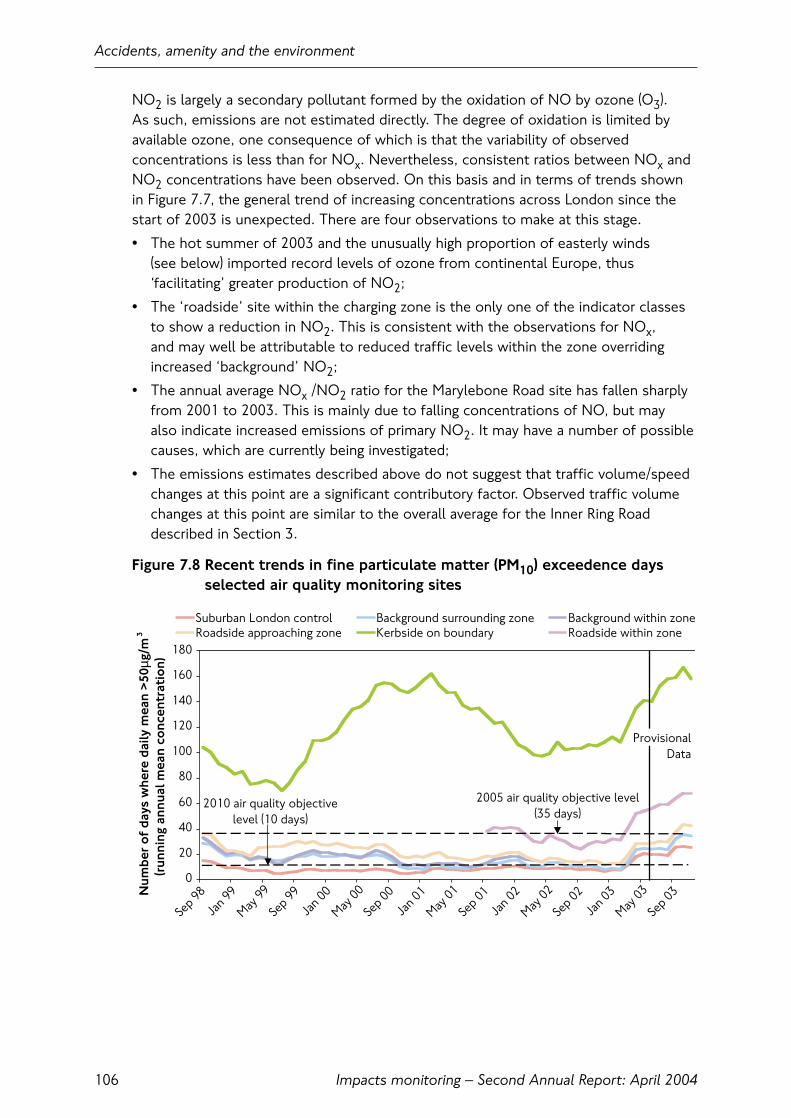
NO2 is largely a secondary pollutant formed by the oxidation of NO by ozone (O3). As such, emissions are not estimated directly. The degree of oxidation is limited byavailable ozone, one consequence of which is that the variability of observedconcentrations is less than for NOx. Nevertheless, consistent ratios between NOx andNO2 concentrations have been observed. On this basis and in terms of trends shownin Figure 7.7, the general trend of increasing concentrations across London since thestart of 2003 is unexpected. There are four observations to make at this stage.
• The hot summer of 2003 and the unusually high proportion of easterly winds (see below) imported record levels of ozone from continental Europe, thus‘facilitating’ greater production of NO2;
• The ‘roadside’ site within the charging zone is the only one of the indicator classesto show a reduction in NO2. This is consistent with the observations for NOx, and may well be attributable to reduced traffic levels within the zone overridingincreased ‘background’ NO2;
• The annual average NOx /NO2 ratio for the Marylebone Road site has fallen sharplyfrom 2001 to 2003. This is mainly due to falling concentrations of NO, but may also indicate increased emissions of primary NO2. It may have a number of possiblecauses, which are currently being investigated;
• The emissions estimates described above do not suggest that traffic volume/speedchanges at this point are a significant contributory factor. Observed traffic volumechanges at this point are similar to the overall average for the Inner Ring Roaddescribed in Section 3.
Figure 7.8 Recent trends in fine particulate matter (PM10) exceedence daysselected air quality monitoring sites
Accidents, amenity and the environment
Impacts monitoring – Second Annual Report: April 2004106
0
20
40
60
80
100
120
140
160
180
Jan 9
9
May 99
Sep 99
Sep 98
Jan 0
0
May 00
Sep 00
Jan 0
1
May 01
Sep 01
Jan 0
2
May 02
Sep 02
Jan 0
3
May 03
Sep 03N
umbe
r o
f da
ys w
here
dai
ly m
ean
>50
µg/m
(run
ning
ann
ual m
ean
conc
entr
atio
n)
3
Suburban London control Background surrounding zone Background within zoneRoadside approaching zone Kerbside on boundary Roadside within zone
2005 air quality objective level(35 days)
2010 air quality objectivelevel (10 days)
ProvisionalData

2003 was a remarkable year for PM10 episodes. Prolonged and widespread PM10episodes occurred during February, March, April and August and caused sharp increasesin the number of days that measured levels exceeded the air quality Objective acrossall indicator site classes. This is reflected in the running annual mean trends ofexceedence days in Figure 7.8, which show a sharp upwards profile from the start of 2003. There is no evidence of any differential effect for the charging zone or Inner Ring Road indicator sites, suggesting that congestion charging is not a significantfactor in explaining these trends.
It is known that a large proportion of PM10 in London originates from distant regionalsources (‘secondary’ PM10). At times, this can dwarf the locally-emitted component, to the point that it is likely that each of the major episodes observed in London during2003 would have occurred to some extent even in the absence of all road traffic.Emissions changes arising from congestion charging can only affect the locally-emittedcomponent during charging hours, and isolating these (relatively small) changes againstsuch a volatile backdrop is not straightforward.
Established analytical techniques have been applied to these data and the followingpreliminary observations are made:
• The elevated levels of PM10 during 2003 are largely due to climatic conditions, these being particularly conducive to high levels of secondary PM10;
• It is not, at present, possible to detect a ‘congestion charging’ effect (either positiveor negative) from these data at any of the indicator site classes;
• Although the emissions calculations above suggest a small positive effect within the zone, this is overwhelmingly obscured in terms of measured air quality by themagnitude of non-charging-related influences.
7.12 Weather during 2003The trends described above need to be understood in the wider context of thestatistically-unusual weather patterns that prevailed for much of 2003, together with the changes to primary emissions described above.
Figure 7.9 is a wind-rose displaying the proportion of time that winds originated fromthe different points of the compass. The data comes from a continuous monitoringsite in the London Borough of Bexley and covers the period March to November for2001, 2002 and 2003. During 2003, the proportion of time that winds originated from the east was approximately double that of 2001 and 2002 – a statistically unusual occurrence.
Accidents, amenity and the environment
Impacts monitoring – Second Annual Report: April 2004 107
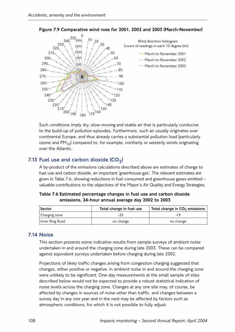
Figure 7.9 Comparative wind rose for 2001, 2002 and 2003 (March-November)
Such conditions imply dry, slow-moving and stable air that is particularly conducive to the build-up of pollution episodes. Furthermore, such air usually originates overcontinental Europe, and thus already carries a substantial pollution load (particularlyozone and PM10) compared to, for example, northerly or westerly winds originating over the Atlantic.
7.13 Fuel use and carbon dioxide (CO2)A by-product of the emissions calculations described above are estimates of change tofuel use and carbon dioxide, an important ‘greenhouse gas’. The relevant estimates aregiven in Table 7.6, showing reductions in fuel consumed and greenhouse gases emitted –valuable contributions to the objectives of the Mayor’s Air Quality and Energy Strategies.
Table 7.6 Estimated percentage changes in fuel use and carbon dioxide emissions, 24-hour annual average day 2002 to 2003
Sector Total change in fuel use Total change in CO2 emissions
Charging zone -20 -19
Inner Ring Road no change no change
7.14 NoiseThis section presents some indicative results from sample surveys of ambient noiseundertaken in and around the charging zone during late 2003. These can be comparedagainst equivalent surveys undertaken before charging during late 2002.
Projections of likely traffic changes arising from congestion charging suggested thatchanges, either positive or negative, in ambient noise in and around the charging zonewere unlikely to be significant. One-day measurements at the small sample of sitesdescribed below would not be expected to provide a robust statistical indication ofnoise levels across the charging zone. Changes at any one site may, of course, beaffected by changes in sources of noise other than traffic, and changes between asurvey day in any one year and in the next may be affected by factors such asatmospheric conditions, for which it is not possible to fully adjust.
Accidents, amenity and the environment
Impacts monitoring – Second Annual Report: April 2004108
010 20
3040
5060
70
80
90
100
110
120130
140150
160170180190200210
220230
240
250
260
270
280
290300
310320
330340
350
March to November 2001
March to November 2002
March to November 2003
Wind direction histogram(count of readings in each 10 degree bin)
3000
0
500
1000
1500
2000
2500

Table 7.7 updates a similar table in the First Annual Monitoring Report to include datafrom surveys undertaken in late 2003/4. Lden values for all three years have beenadded, these incorporating differential weightings for evening and night-time noise, toreflect greater noise sensitivity at these times.
The changes shown are inconclusive. None of the observed differences would beconsidered to be statistically significant, or within the conscious perceptual range ofmost people under most circumstances. Certainly, there is no evidence from thesedata of detrimental change.
Table 7.7 Sample noise measurements dB(A)(1). Congestion charging monitoringsites, winter 2001/2, 2002/3 and 2003/4 compared
Site number Index 2001/2 2002/3 2003/4 DifferencedB(A) 2003 vs. average 2001/2 and
2002/3
Site 5 LAeq, 16 hour Day 73.0 74.4 73.8 +0.1
LAeq, 8 hour Night 71.1 72.9 71.1 -0.9
Lden, normalised 80.4 82.0 81.1 -0.1
Lden, free-field 77.9 79.5 78.6 -0.1
Site 6 LAeq, 16 hour Day 70.2 69.6 69.1 -0.8
LAeq, 8 hour Night 66.9 65.2 66.7 +0.7
Lden, normalised 76.3 74.9 75.9 +0.3
Lden, free-field 76.3 74.9 75.9 +0.3
Site 7 LAeq, 16 hour Day 57.4 61.0 58.7 -0.5
LAeq, 8 hour Night 50.9 52.2 51.1 -0.5
Lden, normalised 65.1 67.4 65.9 -0.4
Lden, free-field 62.6 64.9 63.4 -0.4
Site 16 LAeq, 16 hour Day 71.7 72.5 72.5 +0.4
LAeq, 8 hour Night 72.3 71.5 71.5 -0.4
Lden, normalised 79.1 79.2 79.2 0.0
Lden, free-field 79.1 79.2 78.8 -0.4
Site 19 LAeq, 16 hour Day 62.6 63.4 62.2 -0.8
LAeq, 8 hour Night 57.6 59.1 57.2 -1.2
Lden, normalised 71.1 72.4 70.8 -1.0
Lden, free-field 68.6 69.9 68.3 -1.0
(1) The LAeq values quoted in Table 7.7 are free-field values normalised to a distance of 10 metres from the kerb
Site 5: Marylebone Road (Inner Ring Road)Site 6: Farringdon Street (within charging zone)Site 7: Central Street (within charging zone – ‘background’ site)Site 16: New Kent Road (radial road approaching Inner Ring Road)Site 19: Berkley Square (within charging zone)
Accidents, amenity and the environment
Impacts monitoring – Second Annual Report: April 2004 109

Accidents, amenity and the environment
Impacts monitoring – Second Annual Report: April 2004110
8. Scheme operation and enforcement
8.1 IntroductionThis section provides an overview of the operation and enforcement of the congestion charging scheme through the first year of the scheme. The effect of the Supplemental Agreement with Capita is also examined.
8.2 Key findings• Congestion charging launched successfully under world-wide scrutiny and without
the operational or technology problems predicted by many commentators;
• Chargepayer preferences for different payment methods were established within the first few weeks of operation and have shown only slow changes since.Use of text messaging (SMS) is increasing at the expense of the retail and call centrepayment channels;
• During the first few months of the scheme TfL became aware that the quality of service provided by the main contractor was below the required standard. The Supplemental Agreement with Capita defined an extensive programme ofimprovements across IT, management, processes and staffing. Along with a tougherquality performance management regime this has resulted in a significant increase in performance across a number of areas, particularly in relation to performance of the call centre, the number and quality of penalty charges being issued and theend to end enforcement process;
• The proportion of recoverable Penalty Charge Notices (PCNs) has increasedsubstantially in line with requirements set out in the Supplemental Agreement;
• Representations against PCNs have reduced as the accuracy of issued PCNs hasincreased. Chargepayer and Capita errors in entering the correct vehicle, customerand date of entry details have fallen and the effectiveness and quality of theenforcement process has increased;
• Since June 2003 TfL has been increasingly pursuing outstanding debts andpersistent evaders. Several hundred vehicles have been immobilised or removed and debt recovery is being pursued for all unpaid PCNs through bailiff action.
8.3 Service provisionCongestion charging launched on 17 February 2003 with no major operational or technology difficulties. During the first few months of the scheme however, TfL became aware that the quality of service provided by the main contractor wasbelow the required standard. For example: callers were not always able to get through to the call centre in a reasonable period of time or were frequently receiving a message stating that the service was busy and to try again later; the number of PCNs being issued did not fully reflect the number of vehicles for which no paymenthad been received and there were deficiencies in the provision of evidence to appeals.
Scheme operation and enforcement
Impacts monitoring – Second Annual Report: April 2004 111

A Supplemental Agreement was agreed with Capita in August 2003 which, along with an ongoing programme of continuous improvement, sought to address theseproblems. A phased programme of IT, process, management, training and staffingimprovements were agreed. All three phases of the agreed measures were delivered as planned in October 2003, January 2004, and March 2004.
The changes made as a result of the Supplemental Agreement have improved thequality of service provision and enforcement although it will not be until at leastsummer of 2004 that the full effects will be experienced, given the lengthy enforcementprocess. TfL will continue to monitor the standard of service provision and take steps as required to ensure performance and quality remain at the necessary level.
Congestion charge payments
Charge payments average in the region of 550,000 payments per week.
Figure 8.1 Weekly congestion charge payments
In a typical week, payments comprise around 400,000 non-residential payments,90,000 residential payments and 60,000 fleet payments.
Seasonal effects are clearly identifiable in Figure 8.1; no charges apply on Public Holidays and the effects of these are also readily apparent.
Scheme operation and enforcement
Impacts monitoring – Second Annual Report: April 2004112
0
100,000
200,000
300,000
400,000
500,000
600,000
23/02/0
3
16/03/0
3
06/04/0
3
27/04/0
3
18/05/0
3
08/06/0
3
29/06/0
3
20/07/0
3
10/08/0
3
31/08/0
3
21/09/0
3
12/10/0
3
02/11/0
3
23/11/0
3
14/12/0
3
04/01/0
4
25/01/0
4
15/02/0
4
07/03/0
4
Num
ber
of
paym
ents
per
wee
k
Fleet (no data prior to 22 June 2003)ResidentNon-Resident
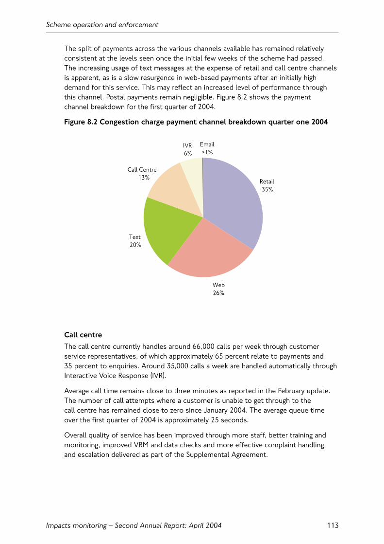
The split of payments across the various channels available has remained relativelyconsistent at the levels seen once the initial few weeks of the scheme had passed. The increasing usage of text messages at the expense of retail and call centre channelsis apparent, as is a slow resurgence in web-based payments after an initially highdemand for this service. This may reflect an increased level of performance throughthis channel. Postal payments remain negligible. Figure 8.2 shows the payment channel breakdown for the first quarter of 2004.
Figure 8.2 Congestion charge payment channel breakdown quarter one 2004
Call centre
The call centre currently handles around 66,000 calls per week through customerservice representatives, of which approximately 65 percent relate to payments and 35 percent to enquiries. Around 35,000 calls a week are handled automatically throughInteractive Voice Response (IVR).
Average call time remains close to three minutes as reported in the February update.The number of call attempts where a customer is unable to get through to the call centre has remained close to zero since January 2004. The average queue timeover the first quarter of 2004 is approximately 25 seconds.
Overall quality of service has been improved through more staff, better training andmonitoring, improved VRM and data checks and more effective complaint handling and escalation delivered as part of the Supplemental Agreement.
Scheme operation and enforcement
Impacts monitoring – Second Annual Report: April 2004 113
Email>1%
Text20%
Web26%
Retail35%
IVR6%
Call Centre13%
Registrations
The number of payment registrations to the end of February 2004 is shown below:
Table 8.1 Payment registrations
Automated fleet accounts 900Notification fleet accounts 800Text messaging (SMS) 255,400Fast track (excluding SMS) 394,600 (includes certain discounts)
The total number of registered fleet vehicles has declined by around 3,000 vehiclesover the last few months and at the end of February stood at approximately 122,000.
Registered chargepayer transactions which include those by text messaging (SMS),interactive voice response and those by call centre, web and post where a ‘customernumber’ has been provided, account for 40 percent of payment transactions. Non registered transactions where no ‘customer number’ is used account for theremaining 60 percent.
Registration for discounts
Cumulative registration totals up to the week ending 7 March are as follows:
Table 8.2 Discount registrations
Blue Badge holders 119,600Residents of the zone 29,200Alternative fuel vehicles 5,900Vehicles with 9+ seats 11,500Other discounts 1,300
On a typical daily basis, the use of these discounts by vehicles in the congestioncharging zone is as follows:
Table 8.3 Typical daily discount usage
Residents of the zone 18,000Blue Badge holders 8,000All other discounted vehicles 2,500Exempt vehicles 7,300
Since most applications for discounts were made between December 2002 and Go-Live, renewals of annual discounts have been staggered across a three-monthperiod in 2004 to ensure quality of service can be maintained. In addition, improvedfraud prevention and management has been built in for the future.
Scheme operation and enforcement
Impacts monitoring – Second Annual Report: April 2004114

8.4 Enforcement operationsThere are no tollbooths or barriers around the congestion charging zone and nophysical tickets or licences. Instead, drivers or vehicle operators pay to register theirvehicle registration number on a database for journeys within the charging zone.Receipts (or receipt numbers) are available through all payment channels as proof of charge payment.
Fixed and mobile cameras capture images of vehicles entering, driving within or leavingthe congestion charging zone, and the registration number plates are interpreted byAutomatic Number Plate Recognition (ANPR) computer systems.
Once a registration number captured by the cameras has been matched, showing that the appropriate charge for the vehicle has been paid or the vehicle is exempt or100 percent discounted, the images of the vehicle and related details are automaticallydeleted from the database in line with data protection legislation. The day followingcapture, all images of vehicles where no charge has been paid are manually checkedagainst the vehicle make and model details returned by the DVLA before any PenaltyCharge Notice (PCN) is issued.
Failure to pay the congestion charge results in a PCN of £80 being issued to theregistered keeper of the vehicle. This is reduced to £40 for prompt payment within 14 days. Failure to pay the penalty charge within 28 days results in a charge certificatebeing issued and the penalty being increased to £120.
Enforcement improvements
Part of the Supplemental Agreement with the service provider, Capita, concerned anextensive programme of phased improvements to the enforcement service, the finalelement of which was completed on time at the end of March 2004.
Better enforcement processes, additional staff and system improvements weredesigned to ensure that as many PCNs as possible are issued to those not paying the charge. The enhancements were also designed to improve efficiency and quality in the processing of representations and appeals and to improve compliance. The revised performance regime of Quality Performance Indicators (QPIs) further links payments and penalties to contractual performance with increased focus on the quality of service provided.
Penalty charge payments
As shown in Figure 8.3, the number of PCNs issued per week has increased over the course of the first twelve months of congestion charging, in line with therequirements of the Supplemental Agreement. In the first quarter of 2004, around 35,000 PCNs have been issued each week.
The overall percentage of PCNs paid has improved in line with the delivery ofimprovements from the Supplemental Agreement. Some 63 percent of all PCNs issued have been paid; from a ‘low’ of around 35 percent payment of PCNs issued in February and March 2003, to a current ‘high’ of around 70 percent payment inSeptember 2003.
Scheme operation and enforcement
Impacts monitoring – Second Annual Report: April 2004 115
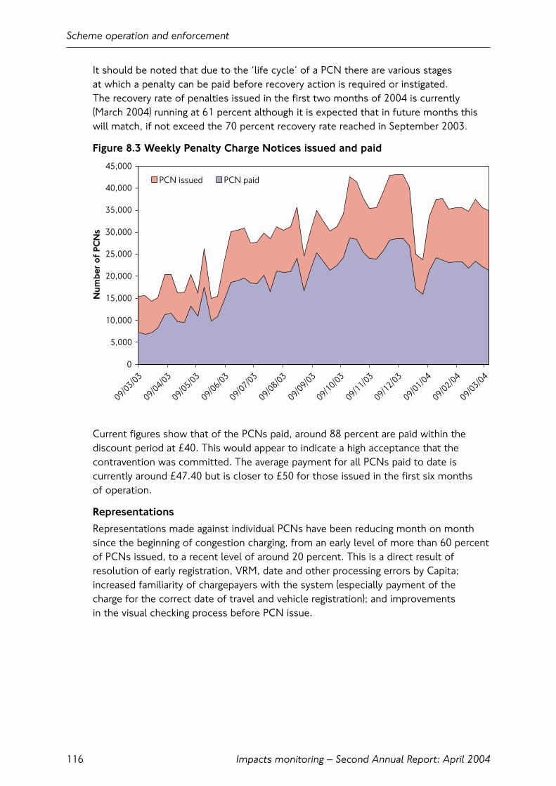
It should be noted that due to the ‘life cycle’ of a PCN there are various stages at which a penalty can be paid before recovery action is required or instigated. The recovery rate of penalties issued in the first two months of 2004 is currently(March 2004) running at 61 percent although it is expected that in future months thiswill match, if not exceed the 70 percent recovery rate reached in September 2003.
Figure 8.3 Weekly Penalty Charge Notices issued and paid
Current figures show that of the PCNs paid, around 88 percent are paid within thediscount period at £40. This would appear to indicate a high acceptance that thecontravention was committed. The average payment for all PCNs paid to date iscurrently around £47.40 but is closer to £50 for those issued in the first six months of operation.
Representations
Representations made against individual PCNs have been reducing month on monthsince the beginning of congestion charging, from an early level of more than 60 percentof PCNs issued, to a recent level of around 20 percent. This is a direct result ofresolution of early registration, VRM, date and other processing errors by Capita;increased familiarity of chargepayers with the system (especially payment of the charge for the correct date of travel and vehicle registration); and improvements in the visual checking process before PCN issue.
Scheme operation and enforcement
Impacts monitoring – Second Annual Report: April 2004116
0
5,000
10,000
15,000
20,000
25,000
30,000
35,000
40,000
45,000
09/03/0
3
09/04/0
3
09/05/0
3
09/06/0
3
09/07/0
3
09/08/0
3
09/09/0
3
09/10/0
3
09/11/0
3
09/12/0
3
09/01/0
4
09/02/0
4
09/03/0
4
Num
ber
of
PCN
s
PCN issued PCN paid
The majority of representations being received in the first quarter of 2004 are fromthose who have received PCNs but who have recently sold or purchased a vehiclewhich has subsequently or previously incurred a congestion charging penalty. Suchrepresentations are not uncommon with parking and bus lane enforcement and arenormally as a result of failure by the vendor of a vehicle to update DVLA with the new keeper details in accordance with legal requirements. Assuming the new orprevious keeper details are available and the details are updated the representation is accepted and the penalty charge notice is re-issued.
Another major cause of representations is from vehicle hire companies. Legislationprovides for circumstances under which vehicle hire companies can transfer liability for charges for vehicles hired on agreements under six months in length to the person hiring the vehicle at the time of the charge. Proposed changes to the relevantregulations are expected to allow the transfer of liability to lease companies whocurrently are unable to transfer liability in this way. If this were introduced it wouldallow a further increase in the number of PCNs being reissued to transfer liability to the lessee of the vehicle.
In the early months of operation the key reasons for representations were mainlychargepayer and Capita errors in the processing of payment or discount registrations.Representations made and accepted, where there has been an error by Capita with the issue of a PCN, now account for less than 2 percent of all representations. Work continues to further reduce these and chargepayer errors.
Appeals
Any vehicle keeper who has received a penalty and has had a representation rejectedby TfL has the right to appeal to an independent adjudicator. To date, less than 20 percent of those who have had a representation rejected have taken up this facility. The total number of congestion charge related appeals registered with theParking and Traffic Appeals Service (PATAS) at the end of February 2004 was 39,000,amounting to about 2 percent of all PCNs issued.
To date, TfL has processed some 35,500 appeals received from PATAS. In the earlymonths many of these were not contested by TfL. However, over 8,000 appeals havenow been heard by the adjudicators, of which 57 percent have been found in favour of TfL. Increased staff, training, monitoring and performance management, togetherwith improvements to systems and representations processing are expected tocontinue to reduce the proportion of PCNs that reach appeal.
Scheme operation and enforcement
Impacts monitoring – Second Annual Report: April 2004 117
Debt collection
Where PCNs remain unpaid and where no successful representation or appeal is madethey become classed as outstanding. TfL then register the debt at County Court andpass the case to bailiffs for recovery action. This does not result in a County CourtJudgement against the debtor.
As at March 2004 approximately 67,000 warrants of execution had been issued tobailiffs since mid-June 2003. This represents some 26 percent of cases where a debthas been registered with the County Court. So far around 8 percent of warrants issuedhave resulted in payment. This figure is expected to increase over the rest of 2004.
Persistent evasion
Transport for London has powers to remove or immobilise vehicles of persistentevaders, defined as drivers who have failed to pay three or more outstanding PCNs,with no representation or appeal pending. This is additional enforcement aimed atimproving compliance that functions in conjunction with the debt recovery processdescribed above.
In order to allow the scheme to settle down, TfL delayed exercising the full powers to clamp and/or remove and impound vehicles for a number of months. However,between September 2003 and the February 2004, over 350 persistent evaders have had their vehicle clamped or removed.
Scheme operation and enforcement
Impacts monitoring – Second Annual Report: April 2004118

© Transport for London 2004All rights reserved. Reproduction permitted for research, private study and internal circulationwithin an organisation. Extracts may be reproduced provided the source is acknowledged.
DisclaimerThis publication is intended to provide accurate information. However, Transport for Londonand the authors accept no liability or responsibility for any errors or omissions or for anydamage or loss arising from use of the information provided.