of colours & textures - antaryaantarya.org/assets/issue03.pdf · chairperson iiid brc, 2012 –...
TRANSCRIPT

ISSUE 03 JUN–JUL 2013 AN IIID BANGALORE REGIONAL CHAPTER PUBLICATION
of colours & texturesSPECIAL FEATURECOLOUR ESCAPADES WITH ASIAN PAINTS
MASTER STROKES ITTY ZACHARIAHCONVERSATIONSPRAKASH MANKAR & SANJAY MOHESPECIAL FEATUREBUILD IT WITH MUD

CHAIRPERSON’S FOREWORD
Dear IIID Bangalore members,
A year has passed by and it was my focused attempt to be connected to all the members of Bangalore Regional Chapter through the year. With this objective, many opportunities were created during the course of this year to facilitate members to meet, in the form of fellowship events, workshop.
IIID is an interface between people and product with the members offered ample opportunities to be around both. Active participation from members would add value to these opportunities
and do justice to the common design interests shared. I appeal to members to participate more actively to realize this objective.
The current issue of Antarya focuses on Colours and Textures, displaying the Indian style and culture opening up in all its vibrancy and character in its colourful feature. Enjoy reading this issue on colours and textures which like its theme is a virtual visual treat while continuing to be a rich food for design and mind.
BINDI SAOLAPURKAR Chairperson IIID BRC, 2012 – [email protected]

I M A G I N A T I O N U N L I M I T E D
Interior Designer seeks for a perfect balance in different forms and shapes for all wall furnishings and fittings.
Myrah Series is available in a wide range of style, texture and colours to match these walls. The Edge Range in Liquid Glass
with diamond-cut corners, presented in the rectangular form brings out the geometric perfection giving Myrah the
charm of transparency. Available in spectrum of shades i.e. Liquid White, Liquid Green, Liquid Ivory,
Liquid Amber etc. to blend with different interiors.
A Jadavjibhai Lalji Anchorwala Enterprise
9.25 x 11.75 inch
GreatWhite Global Pvt. Ltd., Mumbai - 400013.
email - [email protected], visit: www.myanchor.in
13th Floor, B-Wing, Peninsula Business Park, Senapati Bapat Marg, Lower Parel (W), T. (9122) 30036565, Fax: (9122) 3003 6564,
EDITOR’S NOTE
More pats on the back...
The pats on our back have been abundant and non-stop, giving us more encouragement to continue introducing new features that would add both flavour and information to the magazine. The good reviews received have further pumped up our adrenalin, enthusing us to keep up the high energy levels and come up with more features that are spectacular in both visual and content.
I would like to take this opportunity to thank all those who sent in their reviews and invite more
such reviews as well as critical appraisals. This would help us address any lacunae and improve the content of Antarya.
The current issue carries colours and textures as the theme with projects of designers having been presented. The forthcoming issues will carry themes such as Fabric, Metal, Glass, stone. The next issue will focus on Fabric as the theme. We welcome members to share their work where they have used Fabric in an innovative manner.
Success of Antarya being dependent on the active involvement of its readers, we would like greater participation from the members in terms of sharing their projects, achievements as well as critical views on the content of our magazine. We welcome feedback from all our members to make Antarya the best design magazine in the country in the coming months.
Please address all correspondence to:
DINESH VERMA Managing Editor [email protected]
ISSUE 02 APR–MAY 2013
REVIEWS...
“Youthful. Interesting. Refreshing. Kudos to the team! ” Architect Minu Surana
“Very thorough. Would be interesting if Antarya could spread its reach to feature craftsmen and karigars, stressing on the local crafts of Bangalore. To understand the designers role in promoting craft.” Akshitakaur Bhatia, Interior Designer, Ahmedabad
Exemplary design and enriching content. Antarya is a treat for all us architects. This magazine has surely raised the bar of architectural journalism in the country. Pratyusha Suryakant, Architect
The magazine reflects the relentless passion towards architecture and interior design by the IIID fraternity in Bangalore. The team that puts this magazine together deserves a big pat on their backs. Kshitija Venkatesh, Architect

MASTER STROKESArchitect Itty Zachariah 26
YOUNG TURKSParatecture 30 | White Shadows Design Studio 32
CONVERSATIONSPrakash Mankar 34 | Sanjay Mohe 38
GREEN SENSE A Draconian Journey in the Retail Space 46 K Jaisim
INNOVATIVE IDEAS 3D to Design the Future 48Vikrant Chandragiri
DESIGN CUES The ‘Pop Up’ Culture 50Ekta Raheja
ACADEMIA Experiential Learning: The Need of the Hour 52 Dr. Rama R Subrahmanian
INDUSTRY FEATURE CPG Consultants Chaithanya Smaran 54Archventure Chaithanya Swojas 55
GREEN INITIATIVE LEED Rating & Sustainability 56
DESIGN PRACTICALITIES Why Services are so Important 59 B H Rathi
TRAVELOGUE Defined by Colour 60Akshara Verma
PRODUCT PRESENTATIONGodrej Interio 64
EVENTS Fluid Workspaces with Godrej Interio 66June 18th 2013
COVER STORY of colours & textures 06 Featuring:
Indraneel Dutta & Brinda K Dutta
Ashoak PaatilRohan Rathi Gunjan Das
Renu & Siraj Hassan
ISSUE 03 JUN–JUL 2013
MANAGING EDITOR Dinesh Verma
CHIEF CORRESPONDENTNandhini Sundar
ART DIRECTIONKumkum Nadig
DESIGNKena Design, Bangalore www.kenadesign.com | [email protected]
PRINTGaptech Press, Bangalorewww.daxgap.com | [email protected]
PUBLISHED BYIIID BANGALORE REGIONAL CHAPTER‘Shree’, No. 1765, 7th Cross, 18th Main, 2nd Phase, JP Nagar, Bangalore 560078 | Tel: +91 80 26494159
COPYRIGHTIIID Bangalore Chapter has the copyright on design, pictures and editorial content used in this magazine, unless otherwise specified. No part of this magazine can be reproduced without the written permission of the publisher.*For Private Circulation Only
Cover Photograph: Akshara Verma Hotel Hisperia Bilbao, a contemporary building along the river Nervión in Bilbao, Spain characterized by its coloured glass balconies.
SPECIAL FEATURE
colour escAPADes WItH AsIAN PAINts 18
GREEN SENSESPECIAL FEATURE: BUILD IT WITH MUD 42
GREEN INITIATIVESPOTLIGHT: INDUSTRY FOCUS: BCIL 57

Wherever used, colours have the effect of transforming the ambience or even the space on which it is featured. Even the most mundane spaces appear vibrant and inviting with use of colour. Down the ages, colours as well as textures have played a significant role in the way buildings have been decorated, both inside and outside.
COVER STO
RY07ANTARYAANTARYA
COVE
R ST
ORY
ANTARYA06
of colours & textures
01 5th century frescoes from Sigiriya, Sri Lanka. Known for their bold tonality and intense colouration.02 Uncovered mosaics of Hagia Sophia, Istanbul. Originally illustrated during the Byzantine empire, these mosaics lay covered in plaster for over 400 years and were rediscovered in the mid 1800s.
01
02
Photographs by Akshara Verma

ANTARYAANTARYA08CO
VER
STO
RY
As old as the cavesHistorically the cave dwellings reflected the natural textures seen on rock formations through sedimentation, the natural colours of the rocks lending character to the dwellings. These evolved to display vibrant frescos on the cave entrances as well as within, the dyes used coming from natural vegetation. Interestingly, the paintings were explicitly done not just to give vent to artistic inclinations, but also specifically to energise the spaces through colours.
Over the years, these frescos found their way into public buildings such as churches, the internal domes displaying vibrant colours and spectacular artwork. Besides frescos, colours again were depicted in the form of mosaic, displaying an arresting blending of colours and textures. Antonio Gaudi is famous for his
mosaic work, transforming the interiors with their brilliant features.
The natural colours and textures of stone formations too found their way into these physically erected structures where exquisite sculptures brought in dimensions to the walls while showcasing varied colour streams. The stone forts of Rajasthan are a case in point where the colours of the fort is lent purely by the stone used.
Yet another element that has been extensively used historically to bring in colour into buildings is the stained glass, almost omnipresent in the ancient churches and palaces. Here again, art and colour came together along with the coloured natural light that diffused into the interiors through the glass, to totally transform the ambience.
Replacing natureThe colours that found their way into structures initially were clay, stone, bricks, wood and natural dyes that were sourced from plants, turmeric, lime and such others. While hotter areas typically opted for lighter shades, with most preferring white such as Greek architecture, colder areas showed leaning towards darker colours and earthier tones. Some of the colours from natural materials used were olive green, orange, rust and yellow amongst others.
Over the years, these natural dyes have given way to artificial colours that can be tempered to suit particular interiors. Strong as well as exotic pastel shades have evolved along with textures, literally transforming the aura of the space where it is depicted. These colours are no more extracted from vegetable dyes but are synthetically produced keeping in mind environment related aspects such as VOC content.
Mood enhancersColours have a major impact on mood, the effects of the different shades ranging from being energetic to being cosy to having a calming influence on the nerves. The light blues, a reminder of the sea, can be totally calming while the vibrant reds, oranges can be energising. White can be both cool and expansive on the mind.
The mood of the spaces are effectively toned and spelt when the same colour it strung through the entire expanse of the interiors that is visually connected. The demarcation of functional spaces and the specific moods of each of these spaces are brought in again by the play of colours which can be strong, complementing, contrasting, textured, to mark the difference. But the mood of the entire interior is still kept in tune if the colours used in segments naturally evolve and are not imposed.
03
04 0507
06
03 Unusual rock formations at Cappadocia.04 16th century fresco at the Duomo, Florence. 3600 sqm of painted surface that took nearly 10 years to complete.05 Stained glass windows at the Sultan Ahmed Mosque, Istanbul.06 The Mehrangarh Fort, Jodhpur. Made of red sandstone, the imposing structure is known as the Citadel of the Sun.07 Surface relief work in marble, Ephesus. Beginnings of intense sculptural texturing on surfaces.
Photographs by Akshara Verma

010 antarya
Addressing themeThe colours ultimately chosen for each function, individual or theme is geared to meet specific requirements. These automatically come alive with the right choice of colours, complementing the rest of the décor. Thus a Spanish theme would command vibrant rust while Mediterranean would veer towards aqua blue, white and an English décor attracts pastels. A kid’s room would likewise opt for simple basic colours in lieu of mature colours. Colours also bring in geometry by giving the visual effect of dimensions. If dimensions already exist, they serve to accentuate the same. Contrasting colours also serve as focal points in décor, drawing the eye easily to the specific space. Depth as well as an illusion of an expanse of space is again created by the deft play of colours.
Focus through textures Textures typically reduce maintenance besides adding a third dimension. They replace wallpaper and last longer besides serving as a focal point of the room by their sheer representation. Textured walls also serve as excellent backgrounds for artworks and paintings, enhancing the focal element as well as highlighting the zone of display.
Geography has a sayThe type of colours used is not only dictated by functionality, theme or focal features but geography too. Geography can be totally local pertaining to merely the location of a space, be it green facing or receiver of flooding sunlight where the colours feature in accordance. Cities again have colour leanings, based on the stones used historically, the colours taken forward to retain this heritage. The cities of Jaipur, Udaipur, Jodhpur are a case in point.
08
COVE
R ST
ORY
08 A bird’s eye view of the city of Jodhpur also known as the Blue City. 09 Mexican themed interiors in bright vibrant colours.10 Marble finish textured wall paint by Asian Paints.11 Hotel Hisperia Bilbao, a contemporary building along the river Nervión in Bilbao, Spain characterized by its coloured glass balconies.
10
11
COVER STO
RY011ANTARYA
Image Source – Top Image: www.top-interior-design.net; Middle Image: www.asianpaints.com; Bottom Image: N H Hotels: www.flickr.com/photos/nh_hotelesImage Source: Thomas: www.flickr.com/photos/madamasu
09

012 antaryaCO
VER
STO
RY
Architects Indraneel Dutta and Brinda Kannan Dutta
of Dutta Kannan Architects turn a minimalist structure into
a vibrant statement by merely accentuating its structural
elements with colours. They further accentuate a totally
toned down pastel interior into an arresting ambience with
the deft accent of colours.
AcceNtuAtINg WItH coloursLeft: The Dyanand Sagar Technology Institute shows the minimalist style used in the structure accentuated by the use of a dark tone of colour in the staircase which acts as an arresting element, changing the minimalist, toned down ambience into a rich tone. The red patch of colour again transforms the steel and glass structure, lending vibrancy to an otherwise stark institutional structure.
Bottom left: The Kumar Urban-Ecovale project shows the white bedroom accentuated by an arresting backdrop of black and white in exquisite patterns. The backdrop not only serves as a highlight but also acts as accentuating element, transforming the ambience of the room. The character of the room is set by the colour and patterns displayed in the backdrop.
Bottom right: The coloured dark glass features not just behind the television unit but also in the ceiling as the stunning element in the room, altering the ambience through the coloured highlights.
Architects Renu and Siraj Hasan of Siraj & Renu - Architects & Interior Designers
showcase how the ambience of an interior can be transformed by using a strong highlight
colour amongst toned down shades to lend a unique character. He uses one vibrant
shade against a background of warmer as well as pastel shades where the warm
shades complement the strong highlight colour while the lighter shades contrast and
accentuate it.
VIBrANt Hues & texturesLeft: “The Southern Aromas” restaurant, Chennai, inspired from Chettinad homes infuses plenty of colour in the form of exotic and colourful patterned flooring that serve as a charming contrast to the rich wooden columns. The contrasting black and white checked flooring placed alongside further accentuates this vibrant Chettinad flooring, lending flavours of the place it relates to. The red tiled roof further add colour against the pastel backdrop of the walls.
Middle left: Splashes of red and green lend vibrancy into this warm predominantly woody interior of “Bike N Barrel”, Residency, Coimbatore.
Bottom: The play of the vibrant red against the background of dark wood and cream coloured flooring in “Ruchi And Idoni” restaurant, Hyderabad, stands out in stark contrast, bringing in a lot of energy and cheer into the space. The feature of the red highlight spots literally transforms the ambience into a lively space against what otherwise would have been a warm toned down, opulent yet lusterless décor. The yellow light fixtures further add to this liveliness.

ANTARYA014
Architect Gunjan Das of NG Associates uses colours and textures effectively to create
an arresting décor. The language of the space alters purely by the play of colours,
the ambience literally dictated by it. Colours and textures in her projects feature as strong
highlights in an expanse of wall or as strips of elements structured to define the
character of the space.
tuNINg It WItH coloursLeft: The Acharya Residence showcases the wire cut brick wall with its niches serving as a vibrant colour feature in the courtyard, an earthy contrast to the fine dark wooden pillars and yellow Jaisalmar stone floors. The burnt orange wall leading to the courtyard further accentuates the play of colours, energising the space.
Bottom left & right: The Kenko Fish Park displays a vibrant red wall in its lobby, the oriental theme heightened by the presence of the dark coloured Buddha sculpture. The two-layered trellis showcasing oriental patterns contrast with the inlay on the floor which reflects an Indian theme. The colour palate fuses in the oriental and Indian themes, offering a stunning décor. The mustard and yellow patches on the wall against a cream background further define the spa area.
COVE
R ST
ORY
Architect Rohan Rathi of Rathi Associates uses colours to define spaces as well as to
bring out the beauty of structural elements where they appear more as a feature
of art. He uses colours as an accent in a pristine white or pastel shaded interior where
the splash of colours in the highlight zone totally transforms the space, defines an
element that needs to be focused or accentuated.
DefININg WItH coloursLeft: The Wipro Experience Centre serves as splash of white in a free flowing space that is defined by geometry and dashes of colours featuring in each vertical. The theme of the Centre showcasing a single company with many verticals is skilfully brought out through the colour scheme of accent colours featuring in each vertical amidst an expansive white free flowing interior.
Bottom left: The colours used on the staircase and column in Rajesh Residence totally transform this structural element into a piece of art. While the staircase incorporates an artistic structure, the colours depicted in different tones to define the structural element eliminate the solid structure, accentuating the form, transforming it into a delicate piece of art.
Bottom right: The model apartment in Satva Senorita sports totally neutral colours that do not impose on anyone. Yet the vibrant orange defining the accent wall totally alters the ambience, bringing in a vibrancy and character that is both contrasting and energising against the pristine white background.

016 antaryaCO
VER
STO
RY
Architect Ashoak Paatil of Corridor, brings out the character of a space through a deft
play of contrasting colours, accentuating the dimensions as well lending charm to the
structure. His penchant for defining a structure, be it interiors or exteriors with colours,
keeping the rest minimal is evident in the projects showcased here.
coNtrAstINg tHrougH coloursLeft: The contrasting colours and textures in this residence, Payodha, are brought out purely by the brick walls, lime concrete block piers and exposed concrete slab. The red wire-cut bricks, while defining the space, bring in vibrancy, infusing an earthy charm.
Middle left: This clutter free residence, Anugraha, decorated on simple lines draws its character and charm purely by the strikingly contrasting colour palate used on the walls. While the rich tones like bold green and metallic copper coloured walls serve as a charming contrast against the dark Oak wood, the black and white stripes lend variety to the space. Bottom left: The toned yellow and bottle green colours contrast with the stained glass railings in the staircase while adding depth and dimension to the staircase. The purple colour accentuates the dimensions in the façade while serving as a soothing contrast to the green landscape.
Bottom right: The RCC louvers in this Emphasis corporate building have been painted in colours of red blue and yellow to give an arresting façade as well as lend a charming dimension to the elevation. The character of the façade here stands transformed by the play of colours. On demand delivery of
a range of shade cards, product catalogues, colour guides and in-house magazines.
Order large swatches painted with the shades you like. Choose from over 1800 colours and a range of textures and the painted swatch shall be delivered at your doorstep.
Get on-site technical assistance and obtain an expert view on surfaces and products used.
Send us a picture of your project and let our experts suggest colours through our colour visualization service.
Please note that this service is available in the following cities North: New Delhi and Chandigarh West: Mumbai, Pune, Ahmedabad, Vadodara andSurat South: Hyderabad, Bengaluru, Chennai and Kochi East: Kolkata
Find out more on
asianpaints.com/pro
Exclusive services for Architects & Interior Designers.
Connect with your
Asian Paints Relationship Officer
to avail the following services
at your doorstep.
Toll Free Helpline
1800-200-3335
Learn Everything About Paints through a session delivered in your office. Get answers to all your queries you had on paint products, application procedures and problems associated with painting
Get a comprehensive presentation on newly launched products, tools or services at your convenience.

018 019ANTARYAANTARYASP
ECIA
L FE
ATU
RESPECIAL FEATU
RECO
VER STORYCO
VER
STO
RY Wall fashion
With themes
Royale Play Wall Fashion
comes in a range of designs
that are created with
stencilling and masking
techniques. Cost effective,
they come in a range of 24
varied motifs designed to
evoke the right mood and
experience.
For instance, a vertical or diagonal motif offers a chic international look while a scattering of butterflies on a mist-blue wall would satisfy a little girl’s dream, with the randomly falling leaves of a delicate fern bringing in the freshness of outdoors.
If ethnicity is desired, the Mudra, Zari themes or the white Diya motifs on an accent wall of plum would be the perfect answer while a music lover could opt for the Raga theme. If glamour is in the air, lay it thick with metallic shades. The stencil concept also offers the advantage of creating these patterns just about anywhere, be it around pillars, staircases, alleys or pepping up surfaces that have been overlooked to lend that unique style statement.
But that is an old story. Current trends that prevail in interiors have amply shown the major role colours play in altering the décor, lending it the desired character that is distinct from the furnishings selected. Colours and textures have evolved where they replicate the looks and feel of stone, metals, bring in art and shades that were never thought possible.
The result, walls are no more a backdrop for furniture and accessories but serve as high-light zones and a canvas of self-expression that can be unique, captivating as well as dramatic depending on the representation.
Thus, from pristine white, to the sombre pastel shades, to inventive feature walls that reflect creativity, colours enable you to see and feel. The touch and feel of the textures further adds another dimension to the wall surface besides offering more durability to paints.
A décor is essentially dictated by furniture, accessories
and lighting elements with colours playing a minor
role. So it seemed not too far back, when an interior
design was meticulously planned. That was a time when
colours and textures were not experimented enough,
explored enough to offer options that are not only
mind boggling, but totally transforming of an interior.
colour escAPADes WItH AsIAN PAINts
Wall Fashion (Summer Bloom)
Royale Play Special Effects (Weaving) Royale Play Special Effects (Crinkle) Wall Fashion (Gypsy Beads)

020 021ANTARYAANTARYASP
ECIA
L FE
ATU
RESPECIAL FEATU
RECO
VER STORYCO
VER
STO
RY textile your Walls
A cloth wall can be totally
unique, extending a distinct
character to a room. The
Royale Play Textile range
offered replicates the
qualities of six types of
fabrics, bringing the sensual
evocative character of a
fabric wall.
The Denim range brings with it the same attitude and confidence that a pair of denim trousers offers, making it a strong style statement in interiors addressing bachelor pads to retail stores.
The Kora Grass finish is both soothing and calming on the mind, inducing a laid back comfort feel to the décor. The Yarn range is a wonderfully playful finish, replicating the whimsical, almost unruly state of countless balls of wool intertwined to offer a chaotic yet carefree feel to the décor. The Jute range is earthy in its finish, fitting for its natural golden fibre that is an integral part of the Indian culture. Given its versatile finish, the resulting effect can be both modern as in a contemporary setting as well as rustic to suit a country style décor.
The Crushed Silk range breathes elegance, grandeur and fittingly it prevails to alter an ambience into a regal space, enhancing the luxurious displays, the ultra-chic furnishings and accessories. Totally opposite is the Leather range, sauve and understated, yet sophisticated in depiction, drawing in the classic timelessness into the décor while retaining luxury and elegance.
Royale Play Textile (Yarn)
Royale Play Textile (Leather)
Royale Play Textile (Crushed Silk)
Royale Play Textile (Jute)
Royale Play Textile (Denim)

022 023ANTARYAANTARYASP
ECIA
L FE
ATU
RESPECIAL FEATU
RECO
VER STORYCO
VER
STO
RY a slice of italy
With stucco
Capturing the flavor of
Italy’s monoliths and
structures, the Stucco
range adorns the walls
with a touch of ‘stone’,
replicating the stones
that played a decisive role
in the Italian sculptural
masterpieces.
Coming in five different ranges of Marble, Quartz, Slate, Igneous and Cobbled textures, these offer a dash of art and opulence to the living rooms, ceilings, pillars, patios, bedrooms as well as commercial spaces. Interestingly, while they capture the charm of a bygone era, the global aesthetic appeal is still retained.
While Marble texture offers a smooth finish, replicating the natural stone features, the Quartz texture serves to be an attention grabber. Eloquent in its simplicity, it exudes a pure clear stately feel, displaying a quiet grandeur. Slate texture captures the royal beauty of slate with its velvety soft and delicate finish, emanating vitality and strength. Offered in a range of soothing tones, it creates a discrete charm and understated elegance.
Igneous texture, an inspiration of the fiery volcanoes, makes a grand presentation while the Cobbled texture replicates the quaint beauty of the old cobble stones that still pave the streets of Italy. All the five textures come in a range of shades to suit the individual pallete, infusing luxury and opulence into the décor.
Royale Play Stucco (Marble) Royale Play Stucco (Igneous)
Royale Play Stucco (Quartz)
Royale Play Stucco (Slate)

024 025ANTARYAANTARYASP
ECIA
L FE
ATU
RESPECIAL FEATU
RECO
VER STORYCO
VER
STO
RY magic With metallic
Best on feature walls with
good lighting around as well
as adjacent walls supporting
pale or neutral shades, the
Royale Play Metallics lend a
rich feel to the décor, fitting
very well into a living room
and even bedroom if used
thoughtfully.
The Royale Play Metallics range comes in 10 different effects: Dapple, Crinkle, Weaving, Canvas, Ragging, Spatula, Sponging, Combing, Colourwash and Brushing, played out on the surfaces as dense abstracts. The luxury collection comes in the form of Dune, Safari and Stucco range.
The Dune range of subtle metallic dual tones is inspired by the sand dunes of Africa. Available in three distinctive patterns of Whirl, Drizzle and Halo, it offers classic old world grandeur or a strongly contemporary feel. While the Whirl comes in simple strokes, the Drizzle brings in the shower effect across a vast arid zone. The Halo on the other hand lightens the ambience with its gentle yet effective mood elevator.
The Safari brings in the soul of Africa with never-before seen effects. Some of the metallic shades here come with a grainy texture that resembles islands. There is also a unique water based metallic textures collection that lends a subtle sophistication. Yet others open up a new world of mystique with their exquisite textures, taking one on a fascinating journey through the myriad worlds of Africa.
Besides interiors, metallic options prevail for exteriors too in the form of Asian Paints Apex Ultima Metallics, which can be used in small doses to add a dash of magic. This can be used to highlight decorative architectural elements or accent portions of the façade.
it is a Kids World
Kids’ World comes with
twenty themes designed
to ignite their imagination.
Be it on camels on a Desert
Safari or a camping trip with
Rock Climbers, becoming
a star with Princess of
POP, or a stroll in the Wild
West with Cowboy Farms,
the themes range from
sports to concerts, from
outer space to the depths
of the sea, chirpy birds to
prehistoric dinosaurs. All
themes are interplay of
vibrant colours and ‘glow in
the dark’ elements.
Four themes have been assigned specifically for ceilings, where mystical creatures appear beautiful during day and magical at night. The range here includes Outer Space that offers the child an astronaut’s peep into outer space, Magical Mermaids providing a residence with the underworld mythical creatures, unfolding a child’s imagination.
While the glow paints glow in the dark, the fluorescent paints come in bright colourful cheerful themes adding shine to the walls.
Safety being paramount, all Asian paints products do not have any added lead content while the VOC content is within internationally acceptable limits.
Royale Play Safari (Classic) Kids’ World (Bird Time Stories)
Royale Play Safari (Sleet)
Kids’ World (Fun at Circus Night View)
Kids’ World (Fun at Circus)
Kids’ World (Bird Time Stories Night View)

MAS
TER
STRO
KES M
ASTER STROKES
026 ANTARYA
Young Zachariah first started working in the city of Mumbai, where after a couple of years he felt the urge to move to the nearby city Pune. Here again he lent his magical strokes for the next two years when the moving bug caught up with him again.
And move he certainly did, this time permanently, to settle down in the city of Bangalore which was to serve as the seat of his creations, the next four decades seeing a deluge of his designs in its various arteries. Given the number of his structures featuring in the city centre and arterial areas, his name soon became synonymous with architecture and designs.
Some of the noted landmarks that prevailed in the city not too long ago and some of which that continue to prevail are Hulkul Residence, Tiffany’s, Raheja Residency, Raheja Towers, Duparc Trinity to name a few.
His very first project was a Colonial type bungalow, which needed remodelling, keeping
Architect Itty Zachariah
027ANTARYA
Creating landmarksHe is extremely soft spoken, diminutive in stature, his bearing self-effacing, belying his tall feats that serve as landmarks not just in the city of Bangalore, but across the country, etching his name in stone amidst the very structures he has designed. Meet Architect Itty Zachariah, Sr. Principal Architect, Zachariah Consultants, a master designer who would rather let his designs speak for him, his structures standing tall, proclaiming loudly his master strokes.
Proposed design for Trinity Circle Metro
Villas at Forest HillsBrigade Hulkul Residences

MAS
TER
STRO
KES the main structure intact. “Those were the
days when readymade kitchens did not prevail yet the client was given one very similar to those lines, with all the modern cabinets and accessories”, says Zachariah.
Zachariah is one of the early architects in the city to opt for coffered slabs in the structure. His project Tiffany’s used coffered slab to increase the interior spaces. His philosophy is to ensure the structural elements are not hidden. “It should be emphasised and displayed on the façade as an aesthetic element”, he says, adding “don’t use a false façade to enhance the aesthetics but work on the existing structural elements to achieve the same.”
Zachariah also lent his designs to one of the earliest apartments in Bangalore. Though the structure was very simple in representation, it was designed to ensure the rooms harvested the maximum natural light and ventilation. Raheja Residency, one of the early apartment complexes to incorporate club house and common entertainment spaces and also the first to have a free flowing basement for car park, was again not surprisingly using Zachariah’s services.
His tendency to have free flowing spaces makes him also angle the structures in unconventional orientations to address unique site dimensions. Thus, when he was offered to work on an unusually elongated site for a residence where he had the option of either having a longish villa or reconciling to a smaller footprint of the site, he came up with a diagonal plan.
The structure that came up was placed diagonally on the site to make the maximum use of space, retain the aesthetics, and offer a larger footprint without sacrificing the green spaces. Thus, each of the rooms gets a portion of the garden in the form of a triangle, further adding an expanse to the interiors.
“The diagonal positioning of the structure also affords it greater privacy in terms of windows not overlooking into the neighbour’s”, avers Zachariah.
In yet another site, he designed the villa in a manner where the foyer, shaped as a pentagon, connects to all the rooms, precluding the need
028 ANTARYA
to enter the living space. Each of the ensuing spaces were also designed to overlook a green patch.
Interestingly Zachariah’s style, which is mainly contemporary, leaning towards free flowing spaces that afford copious natural light and ventilation, is very simple in its line and representation. Yet the emerging structure is so detailed in addressing functionality and aesthetics that the simple lines transform into a stunning piece of architecture.
“Style can be simple but the representation needs to be authentic, addressing minute details where there are no short cuts or shortcomings”, he opines. “Clients need to get what they are looking for and this can be achieved by understanding in detail their requirements.”
His buildings also reflect his leaning towards use of natural materials like stone, wire-cut bricks that require no plastering or painting. This leaning of his is amply borne out in his design of Chitra Kala Parikshat, where the influence of temple architecture is evident in the design of the portico which reflects corbelling of stones.
Contending that the most challenging of designs is addressing the requirements of a client who is not clear on what is required yet ‘wants the best’, Zachariah says, “The design has to address the manner of usage of the space. Design cannot be done simply to create landmarks.”
He further adds “the most difficult thing is to copy something as it can never replicate the original structure. Instead of following a trend or replicating a structure, it is important to be original. Landmarks get created if the building answers the essential elements of functionality and aesthetics.”
Not surprisingly, his team is repeatedly taught, ‘form follows function’. In his office which is more like a studio in work approach rather than a commercial work space, this mantra is followed to the hilt.
Incubation Center
Office space at Necklace Pride, Hyderabad
ETA Verde
Sheraton at Brigade Gateway
Elm Park

030 antaryaYO
UN
G T
URK
S
Firmly endorsing the view that architecture extends beyond the life within the building to encompass elements of life and art between structures, the four young architects from Dyanandsagar College of Architecture believe in addressing the ‘ground realities’ threadbare so as to bring the integral elements of functionality of the building into the design.
A fact borne out by the manner in which they handled the design of one of their first projects, Shanaya design boutique, a sari showroom. Given the task of designing the store in a style where the elements could feature as a label to be replicated in other branches of the store, the team got down to the nitty-gritty of the product to be showcased. Thus was born the concept of manifesting the patterns created by slits in a fabric into the design of the space. “We tried to map the geometric patterns in which a fabric tears and transferred this into the design of the display shelves”, says Zuzar.
Essentially, the design manifests as the skeletal part of a torn fabric structured in metal, forming the façade of the display rack. “This also serves as the trademark design to be replicated in other branches”, adds Zuzar. The design of the display tables too has been fashioned to incorporate a matching geometry to appear exclusive.
The unique design details have further been carried over to the jewellery display shelves where over turned glass cube pendants house the jewellery pieces. To lend an expanse of space as well as highlight the design elements, the colour scheme of the showroom has been kept black and white.
Their project in Coimbatore, CMMM, which is a commercial space, was themed to reflect a rugged manly façade to match the hardware sold within. With the sides of the building requiring to be sealed, any working on the façade had to be confined to the front elevation.
But the unique identity desired was certainly created, with the front elevation displaying plenty of geometry in the form of juxtaposition of cubes, while an odd projection in the site was turned into an attractive warehouse. The façade also reflects interlocking of walls at different
levels with the front wall displaying a slicing in two parts while the roof incorporates a gradual incline from left to right.
The interiors of this commercial space too reflect intelligent designing with the central double height ceiling incorporating slit skylight that is not visible yet affords plenty of natural light coming in.
Their interior design project, Raju Residence, involved a renovated structure where the challenge was to accommodate the needs of a seven member family. Given the fact that the building was a renovated structure, some of the rooms did not conform to ideal sizes, requiring them to be re-modelled to lend the illusion of well-designed spaces.
For instance, the master bedroom with its unusually lengthy dimensions had to be sized down by segregating spaces through subtle elements such as flooring, furnishings and wall textures. Unique elements such as cantilevered cots further find their way into these bedrooms.
The team also put across a workable design in a competition held by the Bangalore International Airport for the central public space between the existing terminal and second terminal which is under construction, where their proposal was adjudged amongst the top ten best designs. The design forwarded offered the swanky terminal with an arresting public space in between the terminals, addressing both micro and macro elements. While the design features accomplished the visual linking of the two terminals through the ensuing public space in between, the physical link was established through tunnels.
Shanaya Design Boutique.
Raju Residence
BIAL Competiotion
ParatectureIt is a young team of four, knit together in the world of design by their sheer passion for creating the unconventional, thinking and visualising out of the box. Their concept and mode of design speak volumes of this inclination and passion for detail. Meet Architects Zuzar Mustafa, C V Lochana, C M Prabhu and H U Ajay of Paratecture. Three members of the team, Zuzar, Lochana and Ajay also have a master’s degree, with Zuzar and Ajay acquiring it in England.
031ANTARYAYO
UN
G TU
RKS
CMMM, Commercial Space, Coimbatore. Front Elevation, CMMM, Commercial Space, Coimbatore.

032 antaryaYO
UN
G T
URK
S
Given his firm belief of designing, keeping in tune the functionality of the structure yet offering an arresting aesthetic, Siddharth displays a strong leaning towards geometry, with his buildings incorporating a subtle yet multi-dimensional façade. His project Mayya’s Residence is an excellent example, with plenty of geometry playing on the structure and façade.
The simple lines of the structure display strong dimensions and character, with the brick walls contrasting charmingly against the slate pathways and green landscape. The interiors too feature intelligent planning with a clever incorporation of green spaces where the setback areas designed with pergolas, greenery and brick clad walls, serve as charming extension of the interiors. Greenery finds its way into the shower spaces too, with an open to sky concept incorporated.
Similar clever design elements are seen in his other project, Rashmi Nursing Home, which essentially is a renovation of a commercial structure to accommodate a nursing home. Given the exacting as well as unique requirements of a nursing home, the existing structure needed to be restructured to accommodate the larger internal spaces as well as create well defined smaller slots without disturbing the structural elements.
Interestingly, Siddharth has brought in the play of dimensions into its elevation too by bringing in a cement board cladding on the façade, juxtaposed with textured wall. “Since it is an existing structure, any element of dimension can be brought in only by treating the existing walls differently”, he adds.
For Siddharth, dimensions feature not just on the physical structure of the building but also on the soft spaces of the interiors and this belief is amply borne out in the manner in which he has handled the décor of the Krishvi Club House. Here, the internal spaces in the bar area showcase a play of CNC cut patterns on Corian, used to achieve the play of light.
Glass is used to reflect the space to lend an all-round effect. The false ceiling incorporated too has levels with the shades alternated to bring in variety. Again, plenty of wood finds its way in with the pastel shades
accentuating its presence. The suite rooms display contemporary theme with the simple lines ensuring there is copious amount of ventilation and natural light.
His interior project Kruthi and Balaji Residence likewise showcases subtle flavours, the colours being monotone, the warmth brought in merely by the presence of wood. Fabric lights in the form of raw silk, paper lanterns, subtle textures on the wall, all harmoniously exist to lend an airy soothing charm to the interiors.
Interestingly in this project, by merely designing the space cleverly, Siddharth has brought in a visual feel of an expanse of space where none exists. His sized down minimal furniture and clutter free interiors, further add to this visual volume. Even the kitchen, an expanse of space has been provided with the walls opened while ceramic tiles on the splash back give way to lacquered glass which is easy maintenance as well as lends an illusion of space.
His Hubli Villa development project likewise incorporates an idea to achieve two different facades on the same street, to break the monotony or similarity of houses, but with the challenge of using the same plan to accommodate Vaastu concerns. “The front elevation of a villa would appear like the rear elevation of the neighbouring villa”, says Siddharth. Essentially, this Villa development project packs in an array of flipped houses that replicate the rest on both sides, while the set of villas were given the choice of five dimensions to choose from.
Given his passion for design as well as geometric representations of the buildings, it is not surprising that he was the recipient of ‘Academic Excellence’ award for his architectural thesis. He is also the recipient of ‘Proficiency Award’ from Cadd Centre for a design competition.
Mayya’s Residence
Krishvi Club House
Kruthi and Balaji Residence
Rashmi Nursing HomeHubli Villa
033ANTARYAYO
UN
G TU
RKS
White ShadoWS deSign StudioHis design firm is barely a year old yet he already has a dozen projects to his credit with two already completed. Architect Siddharth Ramesh of White Shadows Design Studio passed out of Dayanand Sagar College of Architecture less than four years back, with the passion to start his own design firm at the earliest. He certainly realised his dream soon, after having worked briefly with renowned architect firms, Ochre Architects and Architecture Paradigm.

034 antaryaCO
NVE
RSAT
ION
S Q. What in your view is the essence of a good design?Design needs to be approached in a holistic manner. Other than being visually appealing design needs to be practical too. A good design revolves around factors like sense of space, usage, and capturing the quintessence and bringing the space to life by the use of colours, patterns and textures. Good design is the right balance of aesthetics and functionality. Q. Technology is having a powerful influence on designs. Is this leading to the creation of exotic structures that are more iconic than practical and sustainable?Technology and software’s only help is to enhance the architects thought process. It does not create design on its own when used as a guiding tool in the design process.
Technology can help create landmark structures. However, if used only for the sake of adding ornamentation it will not be a practical solution. One must remember that certain technologies and software also help improve sustainability and in no way rob the structure of practicality.
Q. Your buildings are predominantly hospitality segment. Is it because you feel there is greater scope for detail and representation, a larger span to implement exotic yet warm designs, colours, patterns in contrast to commercial complexes which are more cold and toned down in décor?We have been branded as Hotel designers, as I was trained to be a professional in Hospitality industry by an iconic Indian Hotel Company at the very early stage of my career, and we haven’t looked back since. Over the years it has given me immense pleasure to see our designs bearing fruit and appreciated by many discerning travellers who insist on nothing but the best when staying away from their respective homes.
Hotel industry allows you to indulge in all aspects of design such as Residences, Restaurants, Bars, and Discotheque, Conference and Banquet Hall, Health club and Spa, Shopping Arcades, Offices, the works, and deal in multiple choices of materials be it stones, woods, plaster, paints, millwork and furniture and soft furnishings not to forget the art management.
Of designs, cOlOurs and design philOsOphy
IN CONVERSATION WITH
Architect Prakash Mankar of Prakash Mankar Designs, in a lengthy chat with Antarya, talks on the nuances of design, the role of technology and the play of colours and textures in interiors. Renowned for his extensive work in the hospitality segment, Mankar speaks about the versatility of the range of designs that can be dealt with in the hotel industry, allowing one to explore multiple avenues of representations under one roof.
praKash ManKar

036 antarya
Q. Your designs exhibit a strong inclination for colours, patterns and textures, with spaces defined by these, complementing the architecture. Yet the choice is such that even the strong patterns and colours are not loud while lending individuality and character. How do you choose them right so as to define and make a statement without being harsh?There are always numerous options available to a designer to choose from while conceptualising particular designs for a project. The points to consider are the location, the brief provided by clients and last but not the least allocation of budget. With practice
and experience it is not very difficult to seek harmony in ones designs to take it to its legitimate pinnacle. Q. Would use of contrasting colours in small spaces crowd the area further and ruin the ambience. If not, how can it be used to bring in character?Contrasting bold colours will always be welcomed in a space big or small. This being said one needs to bear in mind the proportion and amount of bold colours that are being introduced into a space. Contrasting colours can always be introduced as long as there is
another element to offset it and bring balance to the space. Judicious use of colours, textures and mirrors can throw open small places to create desired atmosphere which is appealing to masses. Q. Most contemporary designs tend to use minimal or nil patterns while strong colours are still used. Is that the right approach or would you advocate patterns into this theme to tone down the straight lines?Minimalistic approach is the mantra in today’s design philosophy. It should be like story telling without uttering a word. Straight or curvilinear will totally depend on the space that one is about to tackle. Every design concept deserves to have a little discipline. Colours, patterns, and design trends can always be mixed and matched as long as they marry well. Introducing a completely alien element in a space can make or break the décor or the language of the design.
Q. There is also a strong play of natural light through jaalis in your projects with exotic patterns in the form of shadows thrown in. How in your view can this element be effectively used to transform the ambience of the interior?A prominent designer once said: “I want to see India through Jaali”. Intricate filigre or Frêt work used in iconic buildings and palaces of past had a reason for it, be it for protection against harsh sun, semi-privacy or plain ornamental use. Introduction of this element definitely enhances the ambience if judiciously used. The play and use of light in a space allows shadows to have these appealing ways of forming patterns on surfaces. Allowing light to pass through slits and perforations on a plane permit these interesting patterns to be created and introduction to these interesting shadows add intensity, bringing the space to life.
Q. One of your projects uses the vibrant colour from wire-cut bricks to lend character to the space. Is the charm of an interior better brought out through deft use of different materials or is it through fabrics, paints and accessories?Interior design is a make belief process. If the space permits, we definitely would want to use materials like stone, bricks, wood, metal to create a rustic ambience in order to make a statement.
“a good deSign revolveS around factorS like SenSe of SPace, uSage, and caPturing the quinteSSence and bringing the SPace to life by the uSe of colourS, PatternS and textureS. ”
CON
VERS
ATIO
NS

038 antarya
addressing the sOul Of design
Q. What in your view is the essence of a good design?A good design embodies a great idea. It is one that is not complex but simple yet has multiple applications. A good design should be versatile, effectively addressing factors such as local materials, climate, technology, trends, cultural elements and aesthetics. It should accommodate changes where its uses can be multiple, based on the manner of handling without sacrificing its essence, akin to a sari or dhoti or turban that is essentially a piece of cloth but can be folded to fashion multiple representations or cast to fulfill multiple uses. Good designs do not look designed.
Q. Your design style affords plenty of geometry and rustic appeal, something evident even in residences. Is it a result of thinking and designing outside conventional lines? We do not start designing with a deliberate attempt to create geometry but start with a feel of the space, addressing its functionality. The idea is not to create sculpture in structure
CON
VERS
ATIO
NS
but keep it simple yet effectively arresting where the geometry automatically evolves to create required ambience. Even a quietest building can make a significant statement without appearing different.
Any structure should infuse nature into design wherever possible. In a place like India where the climate permits outdoor living and activities, bringing in the outdoors is very pertinent. Traditionally the same was reflected in the manner of design of residences, with the central courtyard and verandahs. The built form should essentially breathe where the natural life forms are lived and experienced. Q. Your designs lean heavily towards water bodies and fluid spaces, seamless blending of interiors and exteriors, minimal presence of walls. Do spaces become more effective in the presence of volume and fluidity?Play of volumes and fluidity of space give the eyes freedom to move, creating a sense of comfort when the volumes are larger and
unhindered. Water likewise has a soothing presence, addressing all the five senses. When used in moderation, the sound of water and its visual effect can be astounding, besides bringing in dynamism into the structure.
Q. What inspires you--nature, history, a challenging site?One has to compliment the past and contribute towards the future. Inspiration however comes from the site, the rocks in there, the slope, undulations, the wind movements, sun path, the neighboring spaces. The building cannot be designed in isolation but needs to address the micro and macro elements. Yet, nature is most inspiring, its myriad representations serving as a fountain of creativity and stimulation. Replicating the effortless way in which factors are represented in nature is not an easy task. Structural cantilevers can draw inspiration from the manner in which the branches extend from a tree yet its final representation in a structure would be vastly different.
IN CONVERSATION WITH
Architect Sanjay Mohe of Mind Space strongly espouses the need for designs to be in tune with nature where sustainability is the key language. Speaking at length to Antarya on the need to focus on function rather than form which is increasingly resorted given the technological possibilities, he avers that a good design is one that is simple yet effective and has multiple applications.
sanJay MOhe
039ANTARYACO
NVERSATIO
NS

040 antarya
Q. One of your projects draws inspiration from temple architecture. How have you translated this inspiration into design?South Indian temples have a series of layers in the structure where one needs to pass through before reaching the core of the temple. These layers start from a large expanse, both vertically and horizontally, yet leave the exterior influences outside as the progression from one outer layer to the inner layer proceeds, until the core of the structure is reached.
The movement from this outer to inner layer happens with a gradual transition that addresses all senses, starting from what is seen, smelt, heard, felt and tasted. This kind of transition interestingly is prevalent in the traditional houses, where large verandahs, columns, and other architectural elements create porosity of form. This philosophy of traditional architecture has been incorporated into all our projects.
CON
VERS
ATIO
NS
Q. How do you use natural light effectively to transform the ambience and aesthetics of a space? Light is the most exciting tool to create amazing spaces. It is essentially an emotional response to a space, the spaces reflecting moods which can effectively be controlled by the manner of design and play of natural light. The infiltration of light needs to be optimum, not too harsh, not too dim. The play of shadows creating exquisite patterns is again a mood enhancing factor. However, for lighting to be effective and to transform the interiors, the materials and colours used in space need to be chosen with care as some materials and colours absorb light while others reflect it.
Q. Is technology leading to emergence of bizarre creations that are not practical or sustainable?Technology should be appropriate to the context. Technology should not lead to
creation of forms that are merely iconic without addressing practicalities. Architecture combines both form and function. The focus should not be only on the form, sacrificing function. It is important to know where to draw that fine line. It is more pertinent to be fairly quiet about the form yet create high quality spaces that inspire, motivate and are timeless in expression.
Q. What is your philosophy on green buildings? Sustainability should be the language of design. The philosophy of the building should be to address the sensitivities of nature, be sustainable. Traditionally structures were naturally sustainable and green. Elements such as wind tunnelling, solar path were effectively incorporated, allowing buildings to breathe. But without allowing structures to breathe, adopting designs that are not conducive to local conditions and later using technology such as double insulated glass to address green elements is impractical.
“a good deSign Should be verSatile, effectively addreSSing factorS Such aS local materialS, climate, technology, trendS, cultural elementS and aeStheticS”
041ANTARYACO
NVERSATIO
NS

042
While in most cases masonry structure is resorted, Chitra also opines that the stabilised mud blocks are more versatile compared to conventional bricks since they can be stabilised differently to suit specific needs of span and loads. For instance the stabilisation can be reduced as one goes higher in a building which cannot be the case when using other conventional building materials since they come with a certain load bearing capacity.
Typically the mud used for the stabilisation comes from what is dug out to make the basement. Interestingly, the even mortar used in the stone walls of the basement is mud based. Plastic waste in and around the site is collected and used underneath the foundation. “This adds to the water-proofing of the foundation while the household pays back its debt to the environment”, avers Chitra.
Their construction methodology does not confine to stabilised mud blocks alone but rammed earth too. “Depending on the nature of the soil which becomes evident after scientific testing, the climate factors, the load bearing requirement and aesthetics, the type of construction technique to be used is decided, be it Stabilised Mud Blocks, Rammed Earth, Cob, or Wattle & Daub”, says Chitra. Essentially, the soil should compose less clay for use in construction. “If more clayish in nature, it can be circumvented by adding sand or quarry dust”, she adds. The sun cured mud blocks are left unplastered in her buildings to expose the raw beauty.
All of Biome’s designs specifically speak of an integral connect with nature and all that is sustainable. Their designs lean heavily towards double spaces, mezzanine floors, skylights, elements that breathe of sustainability in terms of thermal insulation, plenty of natural light and ventilation, with optimum use of spaces. The brown hued mud blocks send out an earthy appeal in the ambience, lending a cool, cosy aura.
Their interiors are also free flowing, seamless in design, offering the feel of a larger expanse of space while effective demarcation occurs for the functional spaces through appropriate level changes. Their roofs are both flat and sloping, depending on the requirements of the design, but are effectively insulated to protect from harsh weather.
For instance, the design of O’land Estate in Coonoor has its villas structured in stone and stabilised mud blocks. While the villas incorporate multi-levels, a portion of the mud walls that serve as accents, pack in a unique feature of colours rendered not through conventional paints but one brought in by the blending of the clothes washing indigo powder.
build it with mud
GRE
EN S
ENSE
SPEC
IAL
FEAT
URE
Sustainability in architecture is currently focused on the use of plantation wood, water efficiency, the right kind of glass which would bring in daylight yet not heat up the interiors, use of gadgets with ratings of efficiency, besides also imbibing a few lessons from Vernacular like right orientation of buildings and use of materials. As for materials, it is limited mostly to the distance from where it is sourced, addressing transportation costs. But how about using the mud excavated from the site and using merely that for construction?
Biome Environmental Solutions, a vociferous propagator of sustainable
building methods, has for the last two decades used exactly this for their
structures that span the different corners of the country. With over 500 projects
under their belt, their structures, speaking loudly of the endless green options
available, feature as far away as Kolkata, Delhi, Mumbai to down South in Chennai
with not surprisingly a wide presence in Bangalore and rest of Karnataka. Their
buildings not only address residences but also schools and resorts, with the
latest one being a 30,000 Sq ft retreat for ISKCON near Mumbai. Typically their
buildings do not use a framed structure. “They are not really needed if the
condition of the soil is such that it can bear the load”, says Chitra Viswanath,
Principal Architect, Biome Environmental Solutions.
043ANTARYA

ANTARYA044G
REEN
SEN
SE
The high footfall reception area has flooring with iron chips while the rest showcases yellow oxide, again elements that go back in time, to an era when sustainability was an integral and natural part of any building design. To bring in an element of interest into the sustainable features, leaf imprints of Silver Oak find their way into the oxide flooring. Again, Silver Oak was picked for the leaf imprints because of it residing in the site.
The residence of Hamsa, located in Bangalore however showcases the use of not stabilised mud blocks but rammed earth and exposed concrete, offering a totally urban character. If misconceptions regarding the versatile use of mud blocks in creating unique designs prevail, the residence of Mini Satheesh is structured to put all such to rest. For, the structure here is designed in the form of a conch with its sloped roofs reaching up to half of the first floor.
The walls made of both stabilised mud blocks and rammed earth, house a picturesque central courtyard while the staircase and the skylight seeping in through the courtyard, deftly flows into the basement, affording it plenty of natural light. The clay and cement tiled flooring lend both earthy and rustic charm to the interiors.
The bedroom situated on the upper level also incorporates another element in design in the form of high volume and coloured glass windows that let natural light seep in through them to reflect the multiple colours.
SPEC
IAL
FEAT
URE
This is reality zone, a builders’ dream which is an architects’ night mare. Yes, you have to catch the horses running amok to make sense of the direction in order to create spaces for someone else to release the despair into an observed ecstasy.
The other evening, not so long ago, I spent sipping expensive single malt in the company of a half a dozen entrepreneurs in one of the exclusive business clubs in the city of Bangalore dialoguing the future of retail interiors at the level beyond the clouds. I thought I was the wrong coin, being the oldest amongst these, but all eyes and ears where upon me as I stuttered between sips, thoughts of the Rich and Ugly.
Now, Interiors is a profession of design that has a band width from instant to timeless. The sustainable factor is crucial at both ends. The instant when executed with involved imaginative design detail is metamorphic in character.
The timeless, very carefully detailed, involves not just dedicated craftsmanship but integrates with dedicated experienced imaginative design. In between is a hoard of definitions. This rainbow can be very individualistic or a coordinated effort of a group.
Take the first instance, these can be observed in cinematic and theatrical expressions. If you notice a film bill board of a large size, it does catch the attention of passersby. While they convey their message with definite clarity, it does not stay in one’s memory for too long; it is easily over impressed by another new bill board. This imagery is true of many a commercial retail interior space, like eateries and fabric shops. These may sway a little towards the sustainable but not for very long.
On the other hand, there are many spaces of interior design which do not make an impact
at first notice but demand an observation and involved attention. But once they make a mark, they remain etched not just for decades but even beyond time zones.
A few days ago I had the opportunity to have dinner with an exciting architect visiting Bangalore for a few days. Although I had missed his talk and lecture in two forums, something drew me to accept his invitation to dinner. We met and walked down to a fish grill bar, which had sustained time and change, and with Fish and mashed potatoes washed down with a pitcher, the architectural dialog crossed many frontiers. This space embraced both of us with its simple timeless form.
Materials of different character fuse with one another to invoke the spirit. A plain column is dressed with not just a skin but from a choice wardrobe. The selection is a tedious studied process. This demands direction and decision. Design matters.
But why draconian? Interior
design seems to be anybody’s
game. Housewives, film stars
and any celebrity when their
run in the original profession
begins waning, takes over
without any effort the career
of an interior designer,
nay decorator. Why? Easy
to perceive, the client is
enamoured. His coffee table is
subscribed.
Now, what can make the difference? Decor must be differentiated from Design. Decor thrives on popular vocabulary. Design can
A DrAconiAn Journey in the retAil SpAce
This article traces the run of a designer within the spaces created
by another architect in some other time and context. k JaiSim
only thrive on Detail. And that is not easy. It demands a lot of hard inputs. Learned inputs and a sense of sensual talent not everyone can possess.
A good design education in interiors can take a minimum of three to five years, plus an internship of intensive five years. Not easy. Today there are innumerable centres that claim to teach interior design and décor in a week. That is the weakness.
I shall only touch one example. After the architect delivers the exciting spaces in a commercial environment and the client is called in, what happens? The client takes an appraisal walk of the space and the wallet, then comments after a pause and a flurry of sketches, like a creator imagining and innovating an expression or a mass of cut and paste from the photo shop decorator. The Second type breaks what is built and change the color, whereas the first type, with patience and detail, walk around and work with it.
The challenge to change and
give expression to a bare space
a spectacular feel or cliché is
the difference between design
and decor. This is a journey
India and IIID must accept to
take and make a mark in this
exciting world of interior design.
045ANTARYAG
REEN SEN
SE
INN
OVA
TIVE
IDEA
S
On seeing a 3D printer in action first time, the initial reaction is an awe-struck ‘WOW.’ In a fraction of a second, their minds begin churning out fantastical ideas, forms and concepts they would not have believed possible.
3D printing or Additive Manufacturing is a relatively old concept with the first ever 3D printer assembled in a small lab in 1984, by Chuck Hull. The process involves laying successive layers of material along with a binding agent to form/print a solid form generated from any computer. It has taken the world of design by storm in recent years when the technique was further improved and printing costs greatly reduced. It has captured the imagination of designers far and wide. With the cost of this science fictional technology reducing every year, it will also soon be accessible across the world.
Designers have begun churning out a variety of products using 3D printing technology, from the first 3D printed dress launched in March this year to the controversial working gun. The technology allows for an infinite variation in texture and by adding a pigment to the
material, any version of colour can be derived. The first industry to lap up this technology was ironically the industry that is most valued for craftsmanship. Jewellery designers are taking intricacy to dazzling new heights with the help of a little gold dust and epoxy.
Product designers have been next to capture and maximise the potential in 3D printed products, with the recently opened gallery Digital Natives, where designer Matthew Fernandes scanned everyday objects, applied a distortion and reprinted them in rich vibrant colours. He used colourless sand particles and tainted resin to achieve the brightly coloured finished products. These experiments will lead to an era where every piece of furniture, household accessory from door knobs to toilet seats, will be custom built to custom fit our homes, our personalities and the way we want to live our lives.
To Enrico Dini, Italian inventor and leading researcher in the field of 3D printing dreams of impossible structures and fantastical built landscapes, thinking about having to build with concrete and brick with the required use
3D to DeSign the future BY ARCHITECT vikrant chandragiri
of scaffolding and manpower is outdated and inefficient. Rather than accept the constraints of the current building methods, in 2004 he invented and patented a full scale 3D printing method that used epoxy to bind sand. Enrico could now 3D print buildings. His new real scale printing machine, the D-Shape, can easily print 6m x 6m x 1m parts that can be shipped and assembled at site. They are comparable to regular reinforced concrete in strength and use a binding agent and any type of sand.
Materials here may cost more than concrete, but much less manpower is needed, with no scaffolding. Thus overall building cost is much lower than traditional building methods. The goal to literally print an entire building does not seem very farfetched. In fact, the race to build the first ever 3D printed house has kicked off, with Dutch studio Universe Architecture unveiling plans in January to print a looping two storey house that resembles a mobius strip, using concrete. UK Studio SoftKill has also announced plans to build a single storey structure which will be printed in parts in a factory and assembled on site. DUS Architects in Amsterdam plans on printing a project room by room, using a homemade portable printer.
All these approaches are completely untried at this scale. And there’s a certain amount of scepticism regarding the viability of scaling up a technology that, until now, has only been used to make relatively small objects – objects that do not demand the structural or environmental performance of a house. But architects working in this area are convinced it won’t be long before additive manufacturing transforms their discipline.
That 3D printing and parametric designs are two major technologies leading to the innovation and reinvention of various aspects of the building industry can only be felt in the emerging applications being made in the new trend towards sustainability and adaptability to climate. Recent years have seen real advancements in climate change issues, many of which have been directly related to the built environment.
Consider, for example, using parametric design to calculate and design the way our windows make use of sunlight at any given time during the day. Next, consider we begin manufacturing elements to apply the design
gleaned from the above process and we print these elements to suit the exact standards and requirements of the specific design. Many architects the world over have begun applying these processes throughout their work to achieve sustainability without any compromise due to lack of calculability or product availability.
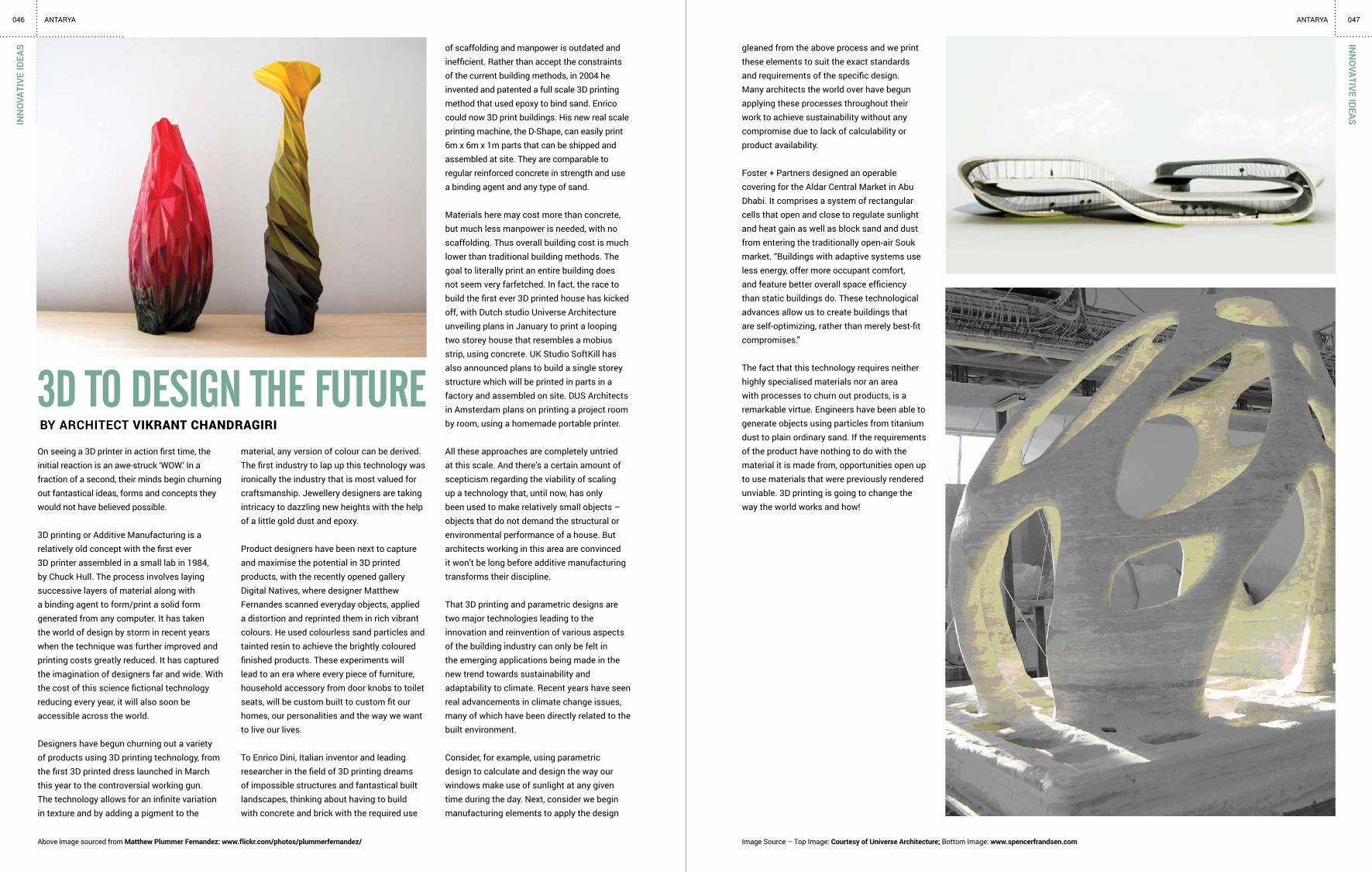
Foster + Partners designed an operable covering for the Aldar Central Market in Abu Dhabi. It comprises a system of rectangular cells that open and close to regulate sunlight and heat gain as well as block sand and dust from entering the traditionally open-air Souk market. “Buildings with adaptive systems use less energy, offer more occupant comfort, and feature better overall space efficiency than static buildings do. These technological advances allow us to create buildings that are self-optimizing, rather than merely best-fit compromises.”
The fact that this technology requires neither highly specialised materials nor an area with processes to churn out products, is a remarkable virtue. Engineers have been able to generate objects using particles from titanium dust to plain ordinary sand. If the requirements of the product have nothing to do with the material it is made from, opportunities open up to use materials that were previously rendered unviable. 3D printing is going to change the way the world works and how!
INN
OVATIVE IDEAS
Image Source – Top Image: Courtesy of Universe Architecture; Bottom Image: www.spencerfrandsen.comAbove image sourced from Matthew Plummer Fernandez: www.flickr.com/photos/plummerfernandez/
046 ANTARYA 047ANTARYA

If you haven’t heard about it already, here’s a brief for you -A pop-up space is a venue that is temporary — the space could be a sample sale one day and host a private party the next evening. The trend involves “popping-up” one day, then disappearing anywhere from one day to several weeks later. These spaces, while small and temporary, can build up interest by consumer exposure.
Pop-up stores, also referred to as “flash retail,” began first sprouting up in cities in Europe and the U.S. in 2003. The first generation of stores took on a consciously makeshift quality, often occupying vacant mall spaces and abandoned storefronts. A tumbling commercial real estate market, and soaring vacancy rates, accelerated the trend as accommodating landlords became more willing to negotiate short-term leases to help cover their mortgages. Even though it began as a solution for businesses with minimum budget to market their products, it certainly has escalated into a huge marketing strategy. These pop-retail stores are now all the rage among some of the biggest brands in the retail industry.
Not only does this, ‘pop up design culture’ lend itself to retail spaces but has also been used in offices, restaurants, cafe’s, stage sets and the likes. Dubbeldam Architecture + design, a Toronto based design firm, developed an office space concept using the pop up trend. They attempted to answer the question ‘How do you work?’ as part of Toronto’s Interior Design Show 2013 (IDS13).They believe that there has been a radical shift in the way we work, when all we need is a surface to work on and a place to plug in, the working environment is no longer static. The pop up office is an
the ‘pop up’ cultureBY ekta raheJa, ARCHITECT ‘STUDIO EKKO’
048DE
SIG
N C
UES
ANTARYA
installation using modular units that can be combined in different ways. Built out of reclaimed wood palette boards, separate modules collectively form the modern work place, facilitating both individual work and collaboration. The result is a workspace that is flexible and yet suits and individual’s requirements. In sinuous forms, the reclaimed boards morph from wall and floor planes into furniture elements. Stripping away the superfluous, the pop up office embodies adaptability.
Closer to home, Maia Design in Bangalore has used the pop up trend to create a backdrop for ‘Conversations with Namu Kini’, a talk show recorded in front of a live audience for the urban Indian women. The set is a temporary structure with Hexagonal walls to achieve enhanced camera views from various angles ensuring there are no dead corners that are typical to rectangular sets and is engineered in plywood with steel inserts by Kynkyny homes. The set comes up and down every month each time the show takes place and is assembled in less than a span of three hours. The entire décor is movable and all accessories are numbered to fit in like pieces of a puzzle.
The Pop-up culture is not only taking over the retail world but is also rethinking traditional brick-and-mortar and big-box spaces. It is an improved way to launch new products, generate awareness, move inventory, and increase the ‘cool’ factor of a space. Pop ups are without doubt the most convenient way to connect with a target audience, sell more, and build awareness at a cheaper cost. It is a trend that allows experimentation with new light weight materials to form disappearing spaces.
DESIGN
CUES
049ANTARYA
Above images sourced from Retail Design Blog: www.retaildesignblog.netAbove images sourced from Maia Design: www.maiadesign.in

THE YEARS OF THE NEW MILLENNIUM
HAVE BEEN A REVELATION TO ARCHITECTS.
THE IMMENSE CHANGES IN TECHNOLOGY,
COMMUNICATIONS, SCIENCE AND
ENGINEERING HAVE BROUGHT ABOUT
A MAJOR TRANSFORMATION IN THE
LIFESTYLE OF PEOPLE GLOBALLY. THE
TRANSFORMATION OF CULTURE, CONTExT,
PROFESSION AND CLIENTELE REQUIRE
CHANGES IN THE SCHOOL STUDIO SYSTEM
AS WELL AS THE ARCHITECTS OFFICE
AND PRACTICE.
The existing drawing board system is witnessing a metamorphosis. The latest upgraded software is an indispensable requirement – the new medium of expression. The Laptop & Virtual Reality are the key to effective client presentations. The language of Architecture has suddenly increased its vocabulary, moving from Formal to Symbolic Aesthetics with varied developments.
Most cities now have an array of contemporary public buildings, residential towers, and retail architecture. The layman is exposed to well designed buildings and good architecture by direct experience and by travel. There is a sea change in clients’ perceptions.
CURRENT PRACTICES Presently, most Architectural Education Methods in India are based on Western influences. The curriculum and course content are generic in nature and not tailored to the needs of the sub continent. In fact our country is so diverse as to merit regional variations in the curriculum, considering cultural, climatic and other factors.
Metropolises like Mumbai, Delhi, Bangalore and Chennai act as transfer nodes of western ideas and influences. Most reference books and design standards are written by foreign authors and have no relevance to Indian needs and choices. Few books on Indian conditions are available to explain how to design for Indian climate, culture, needs and life style. There has been a break in the cultural continuum due to our colonial past and we need a concerted effort to pick up the vernacular strands of thought. Very recently, some books have been written with regard to Indian conditions and this is a heartening development.
Teaching in Architecture is a nascent area that is still relatively undeveloped and not adequately formatted (in the Indian context). Dedicated teachers with vast exposure to the profession and sound theory base are few and far between. The thrust of the Council of Architecture in facilitating conducting of regular QIP programs which aid in the dissemination of information/skill required for effective teaching provides light at the end of the tunnel.
experientiAl leArning: the neeD of the hour BY DR. RAMA R SUBRAHMANIAN
PROFESSOR AND HEAD OF DEPT
ARCHITECTURE, DSCE, BANGALORE
ACADEMIA
051ANTARYA050AC
ADEM
IAANTARYA
PROFESSIONALISM AND GLOBALIZATION NEEDEDIt is apparent that Schools of Architecture should adapt and evolve to meet the changing conditions in the profession. Active ‘learning by doing’ where students, in partnership with their tutor gain insight into specific areas is more effective rather than ‘teaching’ disembodied skills and facts. The ordinary life processes of contemporary society and issues concerning architects that arise should be prioritized, and their potential solutions reached by logic and analysis. We need to experiment with roving studios that stress experiential learning not classroom learning.
What is important is that the students’ questions and responses develop in an engaged way so as to achieve a specific understanding. This way the student may develop an iterative and rigorous way of questioning his or her own work that is grounded in context, precedent and technical performance. THEORY AND RESEARCH Also, the existing approach undervalues the importance of strong theoretical and research foundations for the profession. Innovations in building materials / construction techniques are not percolating fast enough to the Studios. As with all other applied sciences, strong theoretical underpinnings and relevant research are of utmost importance in taking the profession forward in addressing the varied needs of the people.
EMERGING DESIGN STUDIOS In future we can expect that the studio will house workstations and sophisticated projection systems, while students will change over to the laptop and dispense with all traditional drawing tools. The studio will shrink with the advent of such tools, while video conferences and other such communication systems become the norm. Theory Lectures may well be available on demand to the students and not as fixed schedule delivery like is done presently. Studios abroad already incorporate features like 3D printers, which will make traditional model making by cutting and pasting obsolete.
• Educational establishments need to create systems for self-evaluation and peer review, conducted at regular intervals. Such reviews can be made instructive by including in the panel faculty from other schools and practicing architects.
• Facilities for research, advanced studies, documentation and data exchange must be made available.
•The creation of a network between various schools, their students and staff, which aids in the dissemination of knowledge, is necessary to raise the level of Architectural Education.
• Individual project work with regular one to one student teacher dialogue must form a substantial part of the duration of learning.

CPG CONSULTANTS, SINGAPORECHAITHANYA SMARAN: TROPICAL LEANINGS ARCHVENTURE
CHAITHANYA SWOJAS: MExICAN LEANINGSSpread over 30 acres, Chaithanya Smaran houses 122 villas around a central landscape park that is spread over 2.5 acres. This central landscape park is designed to split the project into four quarters where the ‘fingers’ of linkage green penetrates deep into the villa layout while the leafy pathways from each of these quarters connect seamlessly to this central feature. The independent clusters are slightly curved in shape to enhance functionality and aesthetics.
Winner of the NDTV Property Awards for the Best Residential Villas for the year 2012-13, Chaithanya Smaran also accommodates 13 landscaped parks that incline towards a tropical theme.
Displaying a delicate blend of the hardscapes with greenery, the tropical themed villas typically incorporate a seamless integration of the inner and outer spaces. Interestingly the project before finalization of the design, went through a relentless exploration for a unique character and fine tuning of details, resulting in 127 schemes of master plans and more than 50 schemes of house designs before moving on to design development. The finally evolved design aimed to show-case modernity, richness yet lightness in the choice of materials, breathtaking space quality, while maintaining strong proportion and composition. The façade of each villa features two tones of materials, with a coarse stone finish at the lower level and a fine texture finish at the top level, distinguished by two strong bands tying the building and breaking down the vertical stack.
The seemingly floating roof of the pavilion is supported with column stubs to allow natural light between the carrying beam and the roof, thus giving a sense of lightness to the overall space. There is also intentional mixing of façade of the villas to ensure the view is not monotonous. All efforts put in the above processes were guided by one factor, “The Family”.
The project is a four acre gated community housing close to 30 villas within its boundaries. The challenge here was to create a luxury villa in a smaller sized plot of 3000 Sq feet, offering the expanse of space and greenery befitting a larger sized site.
The smaller size of the site was worked around by coming up with a design that would effectively integrate the open yard spaces with the built up spaces, encouraging a seamless spill over of activities into the outdoors. The structure thus begins with an archway that incorporates a charming large wooden door, transforming the private front garden into the entrance of the villa. This physically expands the internal spaces of the villa, lending it a refreshing green feel while offering a novel entrance into the house through a green patch that forms visually as part of the interior.
A further integration of the green spaces is done in the dining space where a family hub is created beside the open kitchen and dining. Here, the family area that serves as a continuation of the open kitchen and dining, opens on to a lush green patch that integrates seamlessly within, expanding physically the interior spaces, while offering a luxurious visual expanse of space that belies the smallness of the site.
Given the integration of the green spaces into the interiors, the style of the villas is rustic, leaning towards the Mexican, complemented by bold textured walls and smoothened corners. The dramatic slopes of the wooden roof contrast with the arched gateway to the villas, the earthy tones of the colour palette, stone walls and the striking wood clad walls.
053IN
DUSTRY FEATU
RE052
INDU
STRY
FEA
TURE

054 ANTARYA 055ANTARYAG
REEN
INIT
IATI
VE
The Leadership in Energy and Environmental Design (LEED) is based on a Green Building LEED rating system created by the United States Green Building Council (USGBC). LEED offers a set of guidelines based on which the environment viability of projects constructed is gauged.
The purpose of LEED is to keep an eye over aspects such as efficiency in water use, energy saving measures opted, indoor environment quality, carbon emissions, conservation of resources. LEED rating addresses commercial buildings with the above mentioned aspects keyed in right from the stage of design and implemented during construction. Further, the manner of usage as well as maintenance after occupation is also gauged. Based on the points earned during the rating, the building earns a Silver, Gold or Platinum tag.
While LEED certified buildings incorporate technologies that offer water and energy savings and better indoor air quality because of the orientation offering natural ventilation as well as use of environment friendly materials, they also end up with lower maintenance issues such as no painting every three to five years. An added advantage is the higher return on investment made on the building.
Yet they do come with shortcomings such as high initial cost in terms of installing green initiatives which can be recovered only over time. Elements such as natural cooling can at times prove to be a feature that cannot controlled in terms of interior ambient temperature which can fluctuate based on the outside variations. The presence of elements such as a green roof requires provision for handling a heavier roof besides ensuring the presence of good water drainage system to accommodate the greenery.
IGBC LAUNCHES RATING SYSTEM Recently, in a conference held by the CII, the Indian Green Building Council (IGBC) launched the pilot version of ‘IGBC Green Existing Buildings Operations and Maintenance Rating System’. The rating system, the first developed in India exclusively for existing building stock, addresses existing buildings and aids them to gauge the greenness of their structure.
It addresses key factors such as water conservation, energy efficiency, waste management, reduction in use of fossil fuels and virgin materials. The operation savings in energy and water use to be achieved from adopting the rating system is stipulated to be around 15 to 30 per cent. Essentially the rating system focuses on sustained performance of the buildings in terms of green strategies adopted.
DEBATE OVER RATING SYSTEMInterestingly, while the LEED rating system gives an incentive for buildings to go green and flaunt not just the accredited green tag but also the specific rating certified, giving them the advantage of both a higher return on investment in terms of lower future maintenance cost and also a higher marketability vis a vis a non-certified building, opinions on the relevance or the need for such a rating prevail aplenty to the point of being vociferous in their questioning.
Strong references are made to the sustainability features of traditionally constructed structures where not only locally available materials are used but the design of the building too is tuned to address local climatic and geographical conditions, thus making them naturally green. This debate will be further explored in the coming issue with opinions from experts adding credibility
TURNING SELF-RELIANT IN ENERGY AND WATERBCIL, promoted by Dr. Chandrashekar Hariharan has some of its projects operating grid free as well as independent of public water supply. All his projects focus on reducing carbon footprint, with most displaying absence of bricks, vitrified or ceramic tiles which use high energy in their production. What is used instead is soil stabilised blocks, cement hollow blocks, fly ash blocks which incidentally are not only sustainable in terms of production methods but are also low on embodied energy and significantly help reduce the total weight of the building thereby reducing consumption of concrete and steel.
Flooring and wall cladding comes from locally available stones while the wood is sourced from plantations. Sand too is artificial as river bed sand can again impact environment. Driveways are laid with construction debris to offer a sustainable mode of disposal of construction waste.
The copious light and ventilation received by the interiors is complemented by a unique natural air-conditioning system in some of his recent projects, which is based on natural air and geothermal cooling to regulate the ambient temperature. This air-conditioning system incidentally consumes one-fifth of the energy of a conventional air-conditioner.
Each building complex ensures 68 procedures that can prevent misuse of natural wealth, air and water. Each complex is covered with thick vegetation that act as carbon sinks.
ZED Earth, a villa project of BCIL has come up with a grid free option where the external source of power merely serves as a back-up. All the electrical appliances used here are customised to reduce energy consumption.
GREEN
INITIATIVE
SPOTLIG
HT
leeD rAting & SuStAinAbility
inDuStry focuS bcil

056 ANTARYAG
REEN
INIT
IATI
VESP
OTL
IGH
T
Innovative plumbing techniques that minimise the use of water complements the waste water recycling unit and the intelligent rainwater harvesting system in place. As in the case of power, not only ZED Earth, most of the projects of BCIL are totally self-reliant with regard to water needs. There is zero import of fresh water and zero export of waste water.
The extension of green concept permeates to the landscaping too, with the type and nature of grass and vegetation opted and the innovative use of waste products such as discarded tyres and used paint buckets for planter boxes. The embanked walls in the common areas reflect merely stones craftily glued in through a sealant. Cement here is conspicuous in its absence. The waste generated during construction too has been craftily used to lay the roads within the campus. Broken granite and powdered granite have been used as decorative elements on walls, making these walls maintenance free. The wet waste generated within the campus is likewise put to good use in the form of composting and manure for landscaping.
Speaking on the green initiatives adopted in all his projects, Dr Hariharan says, “It is essentially about sensitive stewardship of land; of offering our apologies to Earth for taking from her what we need for our living.”
GREEN PRODUCTS ON OFFERBCIL has also developed a range of products starting from portable air conditioners and wall mounted air conditioners that save close to 70 per cent of power against conventional air conditioners. High energy efficient fans consume as little as 20 watts power against normal fans that consume 75 watts.
The ZED geyser likewise uses induction water heater technology which maximises the heating process and delivers hot water in a third of the time that a conventional geyser gives while using just 500 watts as against the normal geysers’ 2 to 3 KW consumption. Another energy saving notable product developed is the eco-friendly sewage treatment plant ideal for homes where the area required for its installation is a mere 75 Sq ft.
The company’s three-pronged power system where a wind and solar hybrid system is tied to an external grid, saves 70 to 80 per cent of grid power. The power inverter used here optimises the load coming from solar and wind and automatically switches the power source to the external grid when a heavy draw on the current is done. An investment of 1 lakh in the ZED Sun product yields a saving of 2 lakhs on energy bills over a 10 year period.
Sustainable as well as environment friendly wood products are offered by the company. ZEDEnvi offers solid wood furniture from sustainably harvested FSC certified plantation timber. The furniture is free from formaldehyde resins that emit toxins, in turn improving the indoor air quality.
Architecture as well as interiors has seen a sea change in perception and application over the last few decades, the emerging structures showcasing this metamorphosis in design and materials used. While history is still revisited, with many structures reflecting a strain of nostalgia in their design inclinations, the traditional features either emerging as an amalgamation of modern design or some manifesting as bold representations of a glorious past that is timeless in concept, many modern structures that are iconic, reflect the physical form of an inspiration that can almost be perceived to be intangible.
Interestingly, whatever be the final emergence of the physical form of a structure, the design addressed in any building would need to address certain practical facets that can greatly impinge on the functionality if not attended right. Practical design aspects then become an imperative factor that need tackling in any structure, however simple or complex the design may be.
Why ServiceS Are So importAnt
057ANTARYADESIG
N PRACTICALITIES
Incidentally, these practical
design aspects are invariably
linked to services given the
emerging new technologies
as well as the luxurious living
that this technology currently
offers. Be it electrical elements,
plumbing, security, home
automation, the services are
all oriented towards the play
of advanced technology which
in turn is connected to design
elements of the building.
With networking playing a huge role in building management techniques, the need for a centralised system that addresses all manner of leakages, be it figurative or in actual sense, enabling easy monitoring and control along with practical placements has become an imperative feature of any structure. Addressing the nuances of these services as well as varied design elements that are bent to cater to newer representations or replicate the traditional in a modern scenario, can pose a challenge in terms of minute detailing.
This column proposes to take up such issues relating to design practicalities as well as services, where the commonly faced problems and easy practical solutions on offer are explored while challenges that come up in fusing the modern technological strides into exiting as well as newer structures is also attempted to address. Each issue proposes to take up one element of design or service and explore in detail the commonly encountered concerns and practical solutions on offer.
I also request the readers to share their experiences and practical solutions on the design or service explored in these pages through [email protected] to make this a mutually learning and enriching journey.
b h rathi

DefineD by colour
Architect AkshArA VermA showcAses cities Across the world
where the structures displAy A riot of colours And determine
not just the chArActer of the city but Also hAve some of them
nAmed After the colours displAyed by the buildings.
TRAV
ELO
GU
EANTARYA058
The island of Santorini is a labyrinth of whitewashed settlements tucked into cliffs.
Passing through the quaint streets and arresting rooftops, the alabaster walls stand out against the
island’s dark rugged terrain. Blue church domes pop up amidst this pristine white idyllic background.
Golden city of Jaisalmer gets its name from the golden hue displayed by the yellow stone that predominates most of the buildings in the city. The majestic Jaisalmar Fort is no exception. The colour of this stone changes when exposed to the sun, becoming a glowing amber by day and a deep honey colour after dusk.
The pink city of Jaipur, gets its name from the locally available pink sandstone. The famous Jaipur Fort displays pink sandstone and marble, the picturesque Jaalis and windows lined with marble adding a stunning dimension to the Fort’s façade. The entire city replicates this pink in its façade.
059TRAVELO
GU
E

TRAV
ELO
GU
E060
The city of Venice, replete with its picturesque canals intertwining with the buildings, is a complex maze of clay clad rooftops. The terracotta hue of the rooftops extends to the façade which is predominantly textured brick walls.
061TRAVELO
GU
EANTARYA ANTARYA
The city of Burano is nothing short of a riot of colours, vibrant in feature, the deeply contrasting colours in the buildings reigning in harmony in contrast to the serene canals meandering their way through them. Not only do these buildings reflect a unique combination of strong hues, the elevation too displays meticulous coordinating accents that are equally strong in tones but reflect elements such as objects, flowers that feature in perfect contrast in colour and texture.

063ANTARYAPR
ODU
CT P
RESE
NTA
TIO
N Godrej Interio: InterIo wIth a Global touch
Roger Carr, an international designer from Radar Design Studio, UK jointly with Godrej Interio (GI) has developed a cutting edge solution in corporate furniture in the form of a spectacularly designed work station “Reason”, “an open-ended product, that allows the facility to grow by addition, giving not only a longer product life, but suiting the demands of a fast changing organization.” The unique design of the work station addresses the changing as well as demanding needs of the current corporate scene as well as specifically the dynamic Indian market that is currently moving at a dramatic pace.
The work station, designed in an extremely sleek fashion, packing in all the aesthetics possible, comes in a highly flexible form that accommodates the multiple requirements of a demanding work environment while the back end facilities such as cables et al are tucked away neatly out of sight.
Reason, ‘a global product with an Indian heart’, packs into its design aspects such as work top height adjustability as per individual physical requirement, greener, smaller work spaces along with overhead
personal storage areas, pin up boards and glass screens for making notes. While the table top is kept totally clean with all wires tucked away and enough storage to put away files.
The tray under the table top can be neatly tucked away while not in use same as the design of the table is flexible enough to be changed into a meeting table on requirement. Interestingly, the work station is designed with two conventional legs while the rear legs are dynamic, structured to allow customisation as in a screen that can permit different manner of use.
The multi-faceted yet simple-in-design Reason is available both in clusters as well as in linear versions to address the varying needs of the Indian market. The colours have been kept neutral, as totally white, to suit any kind of corporate décor. The colours if required are introduced as strips on the legs and pin up board to lend the difference.
Reason works equally well for the most advanced global corporates and Hi-tech companies as well as regional and local offices that are more traditional in their furniture inclinations. Not only is it highly adaptable, it also addresses a range of budget operations. Given its design not conforming to any strict discipline as is the case in most work stations, it does get the user to think to extract the maximum benefit from its use. Godrej Interio is India’s premium furniture brand in both home and institutional segments with a strong commitment to sustainability with centres of excellence in design, manufacturing and retail. GI’s design
PRODU
CT PRESENTATIO
N
focus is chiefly on aesthetics, functionality and technology, with special focus on health and ergonomics.
GI ensures that all its products are manufactured with minimal effects on environment, reducing carbon footprint through measures such as usage of eco-friendly materials, setting up of less polluting and consuming processes, eco-friendly packaging and transportation, recycling of used furniture and scrap.
GI has 49 exclusive showrooms in 20 cities across India and operates through 800 dealers. GI is one of the largest divisions of Godrej and Boyce Mfg. Co. Ltd., part of the Godrej Group - one of India’s largest engineering and consumer product groups.
062 ANTARYA

065ANTARYA064 ANTARYAEVEN
TSEVEN
TS
suiting the demands of a fast changing organization”, is designed to
change the very perception of work spaces, offering a multi-faceted
option that truly makes a work space pleasurable, adaptable, most
convenient as well as aesthetic.
The presentation held in Vivanta by Taj, MG Road, was followed by
cocktails and dinner.
Fluid Workspaces with Godrej Interio, June 18th 2013
IIID BRC along with Godrej Interio, held a presentation on futuristic
design options in office spaces where the focus is on fluid work spaces
that accommodate multiple work requirements. The evening saw Mr.
Roger Carr, Director, Radar Furniture Design Consultants, London,
launching “Reason”, a cutting edge solution in corporate furniture in
the form of a spectacularly designed work station, developed jointly
with Godrej Interio. Reason, “an open-ended product, that allows the
facility to grow by addition, giving not only a longer product life, but
IIID Bangalore Chapter members at the Godrej Interio presentation
Roger Carr, Director, Radar Furniture Design Consultants, speaking at the Godrej Interio presentation
Architect Nitin Saolapurkar presenting the Palette-Pro
Roger Carr, Director, Radar Furniture Design Consultants
Architect Siraj Hassan presenting a momento to Mr Anil Mathur
Releasing the second issue of the IIID Design Magazine, Antarya
Anil Mathur, Chief Operating Officer, Godrej Interio, addressing the audience
Architect Leena Kumar, presenting a momento to Mr Roger Carr
Sameer Joshi, Asst. Vice President, Marketing, Godrej Interio, addressing the audience

067ANTARYA066 ANTARYAN
OTESN
OTE
S

068 ANTARYAN
OTE
S
