name sanobar nishat (113052001) mtp : interactive method ... · name sanobar nishat (113052001) mtp...
TRANSCRIPT
MTP – Stage 2 Content Visualization Issues
Name Sanobar Nishat (113052001)
MTP : Interactive method of Data Visualization on Small screen devices
Report: Summary Report 6 (week 18)
Date: 14 – May – 13
Summary:
Information visualization on small screen devices has always been a huge challenge in research community. This work discusses issues and modification in transporting the existing information visualization technique on small screen device particularly on Tablet PCs. An experimental approach is used to compare four well-known visualization techniques includes space tree, hyperbolic tree, Icicle tree and treemap for displaying hierarchical data. The designs are evaluated on three criteria I) task completion time, ii) task correctness, iii) user interaction and satisfaction and iv) understanding of overall topology. The result suggested that space tree visualization is preferred over other
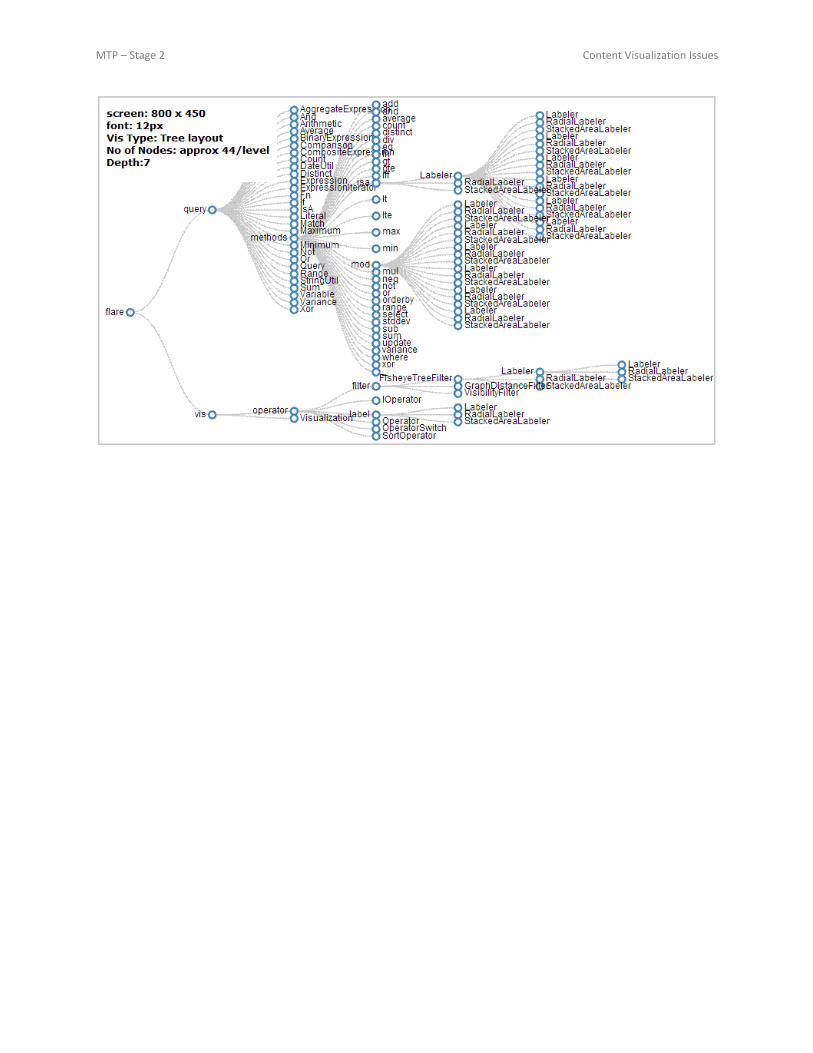
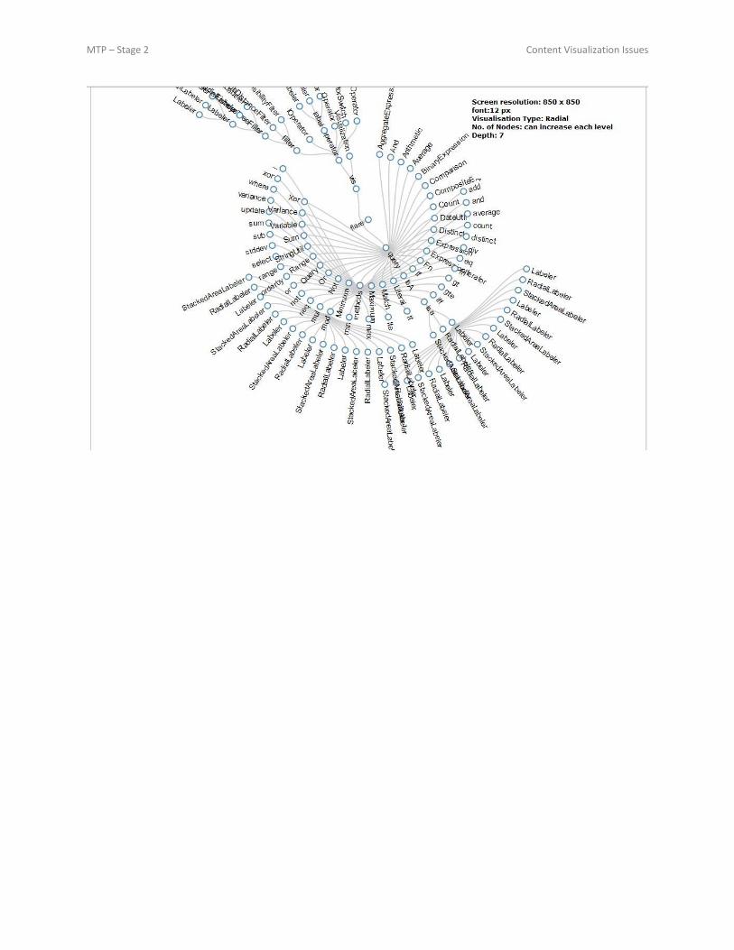
visualization method for hierarchical data. Experiments are conducted to learn the usability and effectiveness of these layouts in performing information searching tasks. Experimental Setup In the experiment, 4 tree-browsing layouts were compared: Hyperbolic tree, Icicle tree, Space tree and treemap. All the experiments are done on an Datawind UbiSlate 7Ci tablet PC of 800x480 screen resolution with 1GHz CPU 512MB of RAM running Android 4.0.3. It is 7-inches touch-screen device with finger touch (or stylus) as a primary mean of control. Each visualisations occupied 800x380 pixels on display area. The layouts were developed using Javascript Infoviz toolkit (JIT) [17], an open source library for interactive data visualisation on web. The application was resided in user tablet to avoid delay due to network connection and providing uniform means for comparison.
Design The experiment set-up was consisted of 4(layout)x13(tasks) with different set of data to each layout. The analysis is based on repeated-measure design with tree layout as a variant factor. Each dataset is repeated equal number of times with all four tree layouts; hence provides equal basis for comparison. Data is collected from online data repository in four different category: (i) online shopping database, (ii) data on different spoken languages in the world, (iii) World top universities ranking in last three years and (iv) Film awards database. Variable structure and size of datasets were used to analyse the performance of each layout. Table II lists the variations in size and topology of each database. The text of the labels was kept smaller to avoid clustering of nodes. User could navigate through the tree by tabbing on the node?s label. To increase readability and interactivity, the font size of the label is set to 12 pt. All the dataset were of feasible size to avoid overlapping of the nodes. Automatic adjustment technique was provided to balance the spacing between the nodes at same or different levels of hierarchy. Only upto four levels of tree hierarchy was visible to the user at one time to avoid showing bulk of data.
Tasks
Users were asked to perform thirteen different tasks for each tool. Tasks were divided into following four categories: 1) Tree Overview: User understanding about the topology of the layout was tested with four different tasks. _ Balanced/Unbalanced Tree Participants were asked to find if the tree is balanced or unbalanced. They were explained that all the leaf node in a balanced tree will be at the same level or two consecutive levels while this is not the condition in unbalanced tree. Height of the Tree Participants was told to find the maximum number of hierarchical levels in the tree. _ Bushiest Child node Test users were asked to find a node with most number of leaf nodes. 2) Data Search: Participants were given three data searching task for each layout. _ Find Parent Node Given a node, users were asked to find the parent of the node.

MTP – Stage 2 Content Visualization Issues
_ Depth of a Node Participants were given a node in the hierarchy, they were asked to find the level at which the node was presented. 3) Data Comparison: Participants were explained different layout to find highest or smallest value node. In the case of treemap and Icicle, the area of the node corresponds the value of the node. While in hyperbolic tree and space tree, the label contains the value of the node. 4) Data Counting: Participants were given multiple tasks for counting child nodes of a given node at different levels of hierarchy.
Previous work User Friendly Layout Application
Type
Fit for tab
TreeMap
http://newsmap.jp/
http://www.smartmone
y.com/map-of-the-
market/
http://www.cs.umd.edu
/hcil/treemap-history/
Requires explanation Too much data
at first glance,
clumsy
Large Similar
type of data. Ex
author and
books
Yes. Better
utilization of
space
SpaceTree Intuitive, self explanatory Only relevant
data shows
through
navigation
Suited for Deep
hierarchal
structure
Yes.
Hypertree Intuitive, self explanatory Only relevant
data shows
through
navigation
Able to show
many nodes
compare to
tree but
overlaps if
multiple nodes
of the same
level open
No. Requires a
square area to
display
Icicle Intuitive, self explanatory Only relevant
data shows
through
navigation.
Unlike
spacetree, the
rectangular
area can e
utilize to
display brief
data
information
Suited for Deep
hierarchal
structure. The
size of
rectangular
area shows the
count of data.
Yes. Better
utilization of
space
CirclePacking Intuitive, self explanatory Layout shows
relation or
Feasible for
data showing
No, wastage of
area due to

MTP – Stage 2 Content Visualization Issues
hierarchy but
overlap data
information is
infeasible to
read.
size or can be
represent able
by different
color scheme.
circular region;
not feasible
due to overlap
technique
Summary:
Graphical data visualization is used to display data in a comprehensive way in form of various types of graphs. There are many different toolkits to choose from and there is a broad range of technologies being used for visualizing information using Javascript. These technologies include HTML5 (Canvas elements and DOM manipulation), CSS3 and vector graphic formats (SVG, VML). These libraries simplify the development process of custom visualization tools and provides basic types of graphs like: Pie charts, Line charts, Area charts as well as some special graphs like: Sunburst (with Highcharts), Gauges (with RGraph). There are certain benefits and trade-offs between SVG and Canvas. It also allows for control of elements via the DOM and CSS and has much better support for interactivity (i.e. every visual object can have event listeners). D3 creator Mike Bostock shows that D3 performance can render 500 animated circles in SVG at a resolution of 960×500 at about ~40 FPS in Chrome, whereas rendering the same via the Canvas element was closer to ~30 FPS.
JIT - JavaScript InfoVis Toolkit
JIT is an OpenSource JavaScript library used for creation of some special kinds of visualisation graphics.
Customization and changes on the examples are not easy to do because of very complex data set and local settings coded in JavaScript.
Technology: It is based on HTML5 canvas element.
Browser Compatibility: Supported in all modern browser, not supported on IE 8 and below and Aakash browser (i.e. UbiSurfer browser or Android 4.0.4 [discussion required])
Layouts: o Layout with basic charts: Area, Bar and Pie charts o Special graphs: Sunburst, Icicle, ForceDirected, TreeMap, RGraph
Data Driven Documents - D3
D3 is the successor of Protovis. It is more flexible than JIT. If a browser does not support the standards W3C DOM, SVG and CSS (or CSS3 Transitions) D3 won’t compensate the missing support.
Technology: D3 binds data to DOM using JavaSctript, CSS3, HTML5 and SVG, combining powerful visualization components and a data-driven approach to DOM manipulation.
Browser Compatibility: o Firefox, Internet Explorer 9, Google Chrome, Opera, and Safari support SVG. o IE8 and earlier needs a plug-in [source: http://www.w3schools.com/svg/svg_intro.asp]
Layout: Hierarchical edge bundling, Node-Link Tree, Treemap, Zoomable Pack Layout, Zoomable Sunburst

MTP – Stage 2 Content Visualization Issues
MTP – Stage 2 Content Visualization Issues

MTP – Stage 2 Content Visualization Issues

MTP – Stage 2 Content Visualization Issues

MTP – Stage 2 Content Visualization Issues
MTP – Stage 2 Content Visualization Issues

MTP – Stage 2 Content Visualization Issues
Comparison of the technology: SVG CANVAS
SVG stands for Scalable Vector Graphics defines vector-based graphics for the Web in XML format.
It also allows for control of elements via the DOM and CSS and has much better support for interactivity (i.e. every visual object can have event listeners).
SVG performance instead scales with the complexity and size of the scenegraph.
Best suited for applications with large rendering areas (Google Maps)
Slow rendering if complex (anything that uses the DOM a lot will be slow)
In SVG, each drawn shape is remembered as an object. If attributes of an SVG object are changed, the browser can automatically re-render the shape.
Canvas has performance that scales with the size of the image area. Resolution dependent
No support for event handlers
Poor text rendering capabilities
Well suited for graphic-intensive games
Canvas is rendered pixel by pixel.
In canvas, once the graphic is drawn, it is forgotten by the browser. If its position should be changed, the entire scene needs to be redrawn, including any objects that might have been covered by the graphic.
Experiment: render 500 animated circles
1280 x 800 resolution and 2GB RAM: (http://en.akihabaranews.com/19898/legacy-unused/pc/sony-unveils-their-new-vaio-type-c-the-vgn-cs60b)
To & Fro movement of rectangular box: 199 - 200 fps (http://techblog.floorplanner.com/)
800 x 480 resolution and 512 MB RAM (http://aakash.org.in/355/can-i-still-book-an-aakash-tablet-pc)
To & Fro movement of rectangular box: 34 - 41 fps
1280 x 800 resolution and 2GB RAM:
To & Fro movement of rectangular box: 150 - 160 fps
800 x 480 resolution and 512 MB RAM
To & Fro movement of rectangular box: 34 - 41 fps
Experiment: To & Fro movement of rectangular box
1280 x 800 resolution and 2GB RAM:
500 circles = 20 fps
1000 circles=11 fps
9000 circles=1 fps (.90 sec)
100 circles=60 fps
50 circles = 63 fps
1 circle = 63 fps
800 x 480 resolution and 512 MB RAM
500 circles=3 fps
100 circles=8fps
1000 circles=2 fps (.54 s)
50 circles=12fps
1280 x 800 resolution and 2GB RAM:
500 circles = 12 fps
1000 circles=7 fps
9000 circles=1 fps (.142 sec)
100 circles=35 fps
50 circles = 35-55 fps
1 circle = 55-75 fps
800 x 480 resolution and 512 MB RAM
500 circles=3 fps
100 circles=10 fps
1000 circles=2 fps (.70 s)
50 circles=12fps
Conclusion:
Knowing what we know about how canvas scales, if the image area were less than 960 x 500, then canvas
performance would increase, whereas SVG performance would not change or decrease.

MTP – Stage 2 Content Visualization Issues
ACTION PLAN
Week
#
Date Description of Work Work Completed
1– 2 6– 19 Jan Study of the open source data
visualization tools.
e.g. JavaScript InfoVis Toolkit, D3.js ,
Slider .
Studied working of JIT and D3 toolkit with 2
different layout (node-link tree, hyperbolic
tree)
3 20 – 26 Jan Test the compatibility of the tools on
Aakash Tablet PC
JIT is not supported on Aakash default browser
(because it uses Canvas element). Installed
Chrome. Both the toolkit is compatible.
4 27, Jan – 2,
Feb
Study different visualization technique
on Aakash tablet
5 3 – 9 Feb Analysis of Visualization technique and
suggest appropriate parameters for each
suitable technique for Aakash tablet.
6 10 – 16
Feb.
7 17 – 23
Feb.
Design Data (XML or JSON format) to
check the usability of the design
parameters of choosed visualization
technique
8 24 – 28 Feb
9 - 14 1 – 31 Mar Design a browser based tool to view the
and share the data using interative
visualisation
Motivation for Tool Development:
The motivation behind the development of a browsing data visualization tool has come from an online tool,
developed by IBM for users to share and discuss data, and learn and explore different aspects in the data. It allows
user to upload data through external formatted file e.g. excel file. We have imported the similar idea in our work in
addition to some other features, to provide a better data sharing among students and teacher in a more
interactive and impressive way. In a running system, database is the main storage for the entire academic and
students’ data. This tool is aimed to provide users e.g. teachers and students, to see the data according to their
needs and interest in a more interactive way.
Features:
Upload Excel File
View Previous Uploaded Files
View Data from Database using Query
View Data from Previously Created Query
View Data with Interactivity

MTP – Stage 2 Content Visualization Issues
Purpose:
Treemap is pie chart's big brother. Treemaps divide up a rectangle into hierarchical categories, letting you see
relationships among large numbers of components. This lets you get an overview of a complex whole -- and drill
down. If you want to map a comparison of now vs. then? City vs. highway? Decaf vs. regular? The treemap lets you
directly compare two different takes on a set of categorized items.
It helps students to search the required data in more interactive way. The tool will provide a way to the teachers to
provide more information to the students using interactive queries. It also helps teachers to compare the
performance of each students. Treemap technique is considered to provide such comparison among data at a
glance.
Visualisation technique can be modify to include incorporating other file format within visualization e.g. pdf, audio,
video. It will help student to search the relevant information from a well structured hierarchical data.