my.sims project by: mukesh darke, krista gettle, and diana stepner
Post on 21-Dec-2015
222 views
TRANSCRIPT

My.SIMSMy.SIMS
Project by:
Mukesh Darke, Krista Gettle, and Diana Stepner

Presentation Overview
• My.SIMS refresher• Heuristic feedback• Current design compared
with 1st interactive prototype• Demo of current design• Usability test results• Plans for final iteration• Lessons learned
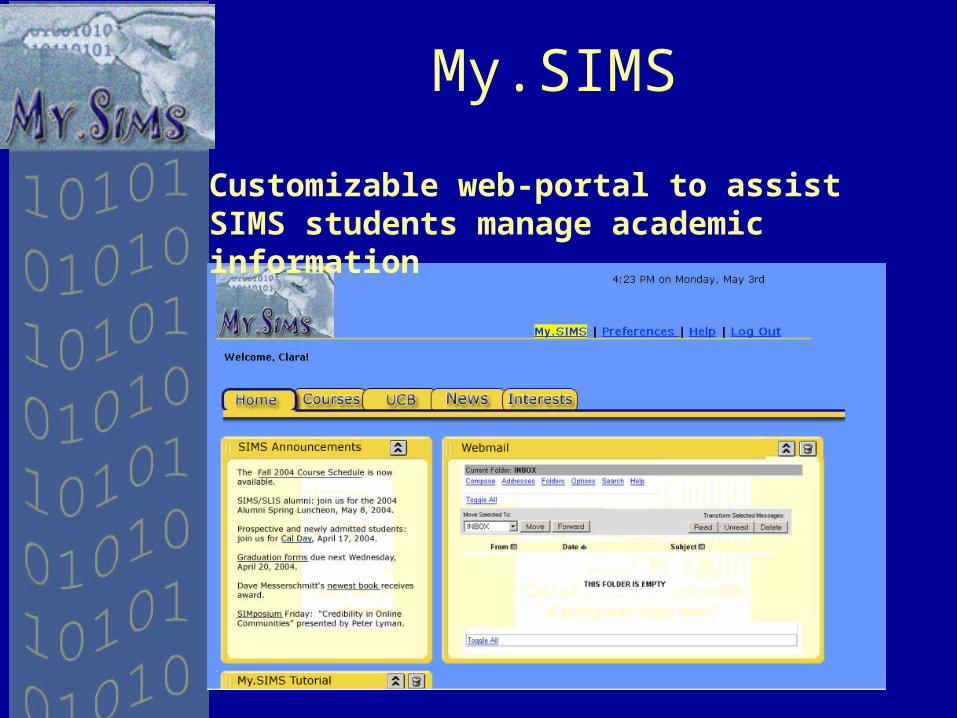
My.SIMS
Customizable web-portal to assist SIMS students manage academic information
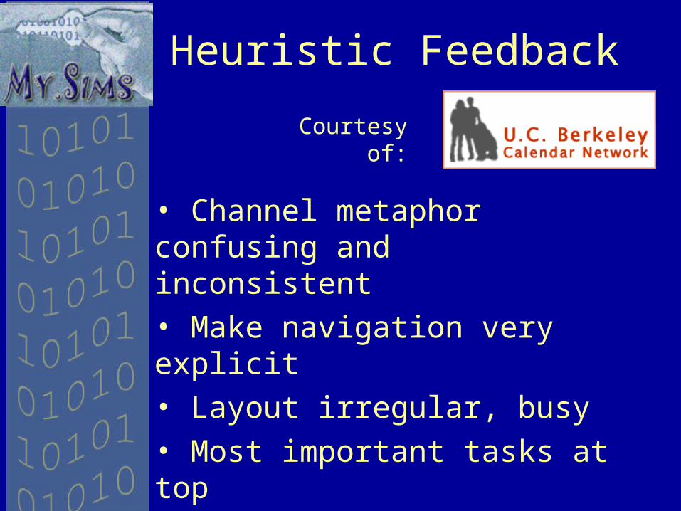
Heuristic Feedback
• Channel metaphor confusing and inconsistent• Make navigation very explicit• Layout irregular, busy• Most important tasks at top • Dragging and dropping more difficult than clicking
Courtesy of:

Then – Explicit Navigation
• Current location in application not intuitive

Now – Explicit Navigation• Added help and registration for
guest user• Changed color to make current
location more explicit

Then – Channel metaphor
• Introduction described purpose of my.SIMS not how to use
• Users did not read the block of text

Then – Channel metaphor
• Some channels self-contained, others acted upon outside channels

Now – Channel metaphor
• Added help• Bulleted
examples of ‘Channels’
• All channels self-contained

Then – Content set-up
• Grid layout cumbersome• Dragging and dropping counter
intuitive

Now – Content Set-up
• Made locations for content more explicit and clickable
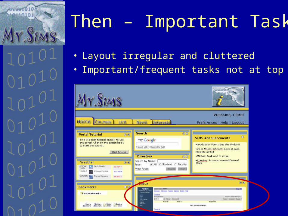
Then – Important Tasks
• Layout irregular and cluttered• Important/frequent tasks not at top

Now – Important Tasks
• Simplified default layout• Made important tasks bigger and
moved to the top

Second Interactive Prototype Demo
Link to demo

Pilot Usability Study
• Testing Goals• Do users complete tasks
successfully? • What paths do they take in
trying?• Is terminology and help
intuitive?
• Participants• 2 – 2nd year masters students• 1 – 1st year masters student

Pilot Usability Findings
• Channel metaphor clearer, but still needs work– Users looked at new help
section, but did not find information they were seeking
– Usage of What’s This links based on user profile
• Navigation and icons much more intuitive– Users easily navigated through
tasks

Pilot Usability Findings
• Link between Interests and Content needs to be more transparent– User’s want to see what ‘channels’
are available for each interest• Users like the functionality of
application– One place to go for course
information• Calendar Display more
important than ‘Quick Add’

Next Iteration
• Clarify Channel metaphor– Alter Help according to feedback– Explicitly highlight ‘What’s This’
information on profile page• Clarify link between Interests
and Content– Ability to preview or sub-select
the channels available in an interest area.
• Display Calendar in Channel, make ‘Quick Add’ a link

Lessons Learned
• Medium used for testing influences feedback
• No one is a ‘blank slate’; everyone comes with some expectations and preferred vocabulary
• Even if users reject at first, a metaphor can be massaged into acceptance

Questions?