module 1: chee 209 - chemical...
TRANSCRIPT

T.J. Harris
Module 1: CHEE 209
Graphical & Numerical Description of Data
Text: Chapter 2 pg 12-45
CHEE 209 - Fall 2017

CHEE 209 - Fall 2017 T.J. Harris
Types of Data
1. Discrete
– number of defective items, number of people
– colours
– taste
2. Continuous
– temperature
– pressure
– composition
3. Combination discrete &
continuous
2

Types / Features of Data
1. May be collected with respect to time, i.e.
composition measurements every hour, minute or
second
2. Spatial component
– Collected with respect to distance
– 2 or 3 D
CHEE 209 - Fall 2017 T.J. Harris 3

CHEE 209 - Fall 2017 T.J. Harris
Data Collection
1. Passive Collection
– record results without actively intervening in the operation of the process
– historical databases of operational or geophysical data
2. Active Collection – Intervention
– do a planned experiment
– guarantees a cause and effect relationship
4
Sample or Population Quantities
• Often cannot record measurements or observations
from all possible samples that may exist.
– N denotes # observations in population
• Take a ‘random sample’ from this population.
– n denotes # observations in sample
• A statistic is any function of observations in a random
sample
CHEE 209 - Fall 2017 T.J. Harris 5

T.J. Harris
Graphical Methods for Presenting and
Analyzing Data
• Why do we use graphical methods?
– Difficult if not impossible to see patterns & features in
tabular data
» Cycles, trends, outliers
– First step in more comprehensive analysis
– Usually part of an effective communication strategy
CHEE 209 - Fall 2017 6

T.J. Harris
Graphical Methods for Presenting and
Analyzing Data
• Pareto Charts
• Time series plots
• Scatter Plots
• Histograms –frequency distributions
• Box plots – graphical presentation of descriptive
statistics
• ….CHEE 209 - Fall 2017
Quality Improvement/Investigation
Programs
7

T.J. Harris
Graphical Methods for Quality Investigations
• Primary purpose is to organize and present
information and ideas in a quality investigation
• Pareto Charts
• Fishbone diagrams - Ishikawa diagrams (not covered
in class)
CHEE 209 - Fall 2017 8

Pareto Chart (pg 14)
• used to rank factors by significance
• typically presented as a bar chart, listing in
descending order of significance
• significance can be determined
» number count
» by cost
» often reveals 80 /20 rule
CHEE 209 - Fall 2017
http://www.mnl.com/ourideas/opensource/8020_rule_in_software_developm_1.php
T.J. Harris 9

http://www.dmaictools.com/dmaic-analyze/pareto-chartCHEE 209 - Fall 2017 T.J. Harris 10

http://www.dmaictools.com/dmaic-analyze/pareto-chart
80% lineSignificant few
Insignificant many
CHEE 209 - Fall 2017 T.J. Harris 11

T.J. Harris
Time Series Plot
Basis weight is a measure of paper ‘density’. Units are g/m^2.
It is an important quality measure.
CHEE 209 - Fall 2017 12

T.J. Harris
Time Sequence Plot
- What can we see from this plot? excursions - sudden
shift in operation
CHEE 209 - Fall 2017 13

T.J. Harris
Graphical Methods for Analyzing Data
Quality Control Charts
– time sequence plots with upper and lower control limit
lines
» Used to detect abnormal variation
» look for data points outside the usual range of variability
» if a point is outside the limits, stop and look for the cause
CHEE 209 - Fall 2017 14

T.J. Harris
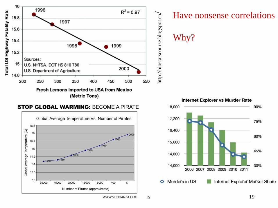
Scatter Plots
• Plot values of one variable against another
• Look for systematic trend in data
– nature of trend
» linear?
» curved?
» does variability increase or decrease over range?
• Don’t mistake correlation with causation!
CHEE 209 - Fall 2017 15

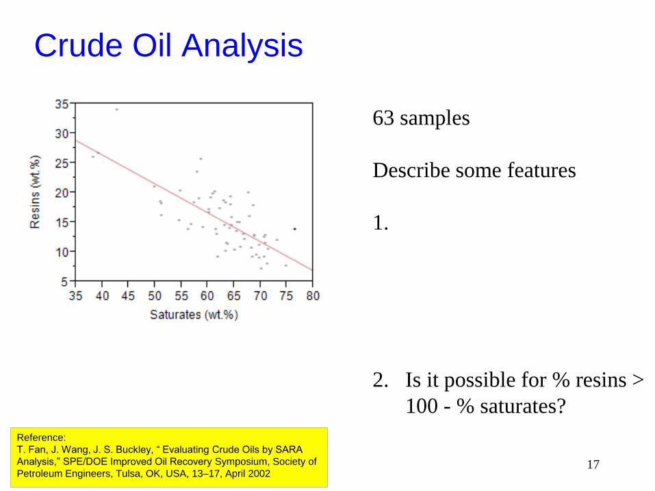
Crude Oil Analysis
• Crude Oil is a complex mixture
• Hydrocarbons of different molecular weights & small
amounts of non-hydrocarbons
• No single molecular weight
General Hydrocarbon Analysis
Saturates (wt.%) Aromatics (wt.%) Resins (wt.%) Asphaltenes (wt.%)
Reference:
T. Fan, J. Wang, J. S. Buckley, “ Evaluating Crude Oils by SARA
Analysis,” SPE/DOE Improved Oil Recovery Symposium, Society of
Petroleum Engineers, Tulsa, OK, USA, 13–17, April 2002
Saturate, Aromatic, Resin and Asphaltene (SARA) is an
analysis method that divides crude oil components according
to their polarizability and polarity. The saturate fraction
consists of nonpolar material including linear, branched, and
cyclic saturated hydrocarbons (paraffins). Aromatics, which
contain one or more aromatic rings, are slightly more
polarizable. The remaining two fractions, resins
and asphaltenes, have polar substituents. The distinction
between the two is that asphaltenes are insoluble in an
excess of heptane (or pentane) whereas resins are miscible
with heptane (or pentane).
16
Crude Oil Analysis
Reference:
T. Fan, J. Wang, J. S. Buckley, “ Evaluating Crude Oils by SARA
Analysis,” SPE/DOE Improved Oil Recovery Symposium, Society of
Petroleum Engineers, Tulsa, OK, USA, 13–17, April 2002
63 samples
Describe some features
1.
2. Is it possible for % resins >
100 - % saturates?
17

Reference:
T. Fan, J. Wang, J. S. Buckley, “ Evaluating Crude Oils by SARA
Analysis,” SPE/DOE Improved Oil Recovery Symposium, Society of
Petroleum Engineers, Tulsa, OK, USA, 13–17, April 2002
Visualize relationship
among all variables
Ignore pink
What variables have
‘strongest’ relationship?
What variables have
‘weakest’ relationship?
General Hydrocarbon Analysis
Saturates (wt.%) Aromatics (wt.%)
Resins (wt.%) Asphaltenes (wt.%)18
CHEE 209 - Fall 2017 T.J. Harris
htt
p:/
/bio
stat
sco
urs
e.blo
gsp
ot.
ca/
Have nonsense correlations
Why?
19

T.J. Harris
Histograms (pg 14-20)
• Summarize the frequency with which certain ranges or
categories of values occur
• Lose information about individual observations as we re-
organize the data into categories
– may be numerical or categorical, i.e. some quality or
descriptive characteristics
Provide important link to many concepts in statistics
CHEE 209 - Fall 2017 20

Histogram - categorical data
CHEE 209 - Fall 2017 T.J. Harris
http://www.adweek.com/socialtimes/social-media-age-study/493831
21

T.J. Harris
Histogram
defects #
0 22
1 23
2 11
3 1
4 2
5 1
6 0
Consider # inclusions or defects in a sheet of glassOgunnaike, B.A., (2010), Random Phenomena, CRC Press
CHEE 209 - Fall 2017 22

T.J. Harris
Histograms
• Must choose classes (usually obvious with categorical
data) & class limits
• With numerical classes, usually choose between 5 and
15 classes
» Classes do not overlap
» Accommodate all of the data
» Most often are of same width - often referred to as bin size
• Choice of bin size influences ability to recognize
patterns
CHEE 209 - Fall 2017 23
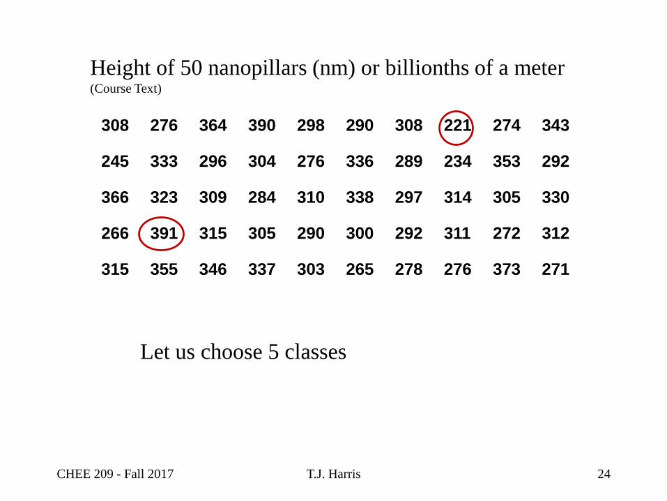
T.J. Harris
308 276 364 390 298 290 308 221 274 343
245 333 296 304 276 336 289 234 353 292
366 323 309 284 310 338 297 314 305 330
266 391 315 305 290 300 292 311 272 312
315 355 346 337 303 265 278 276 373 271
Height of 50 nanopillars (nm) or billionths of a meter(Course Text)
Let us choose 5 classes
CHEE 209 - Fall 2017 24

T.J. Harris
Height of 50 nanopillars (nm) or billionths of a meter
Limits of Classes Frequency
206-245 3
246-285 10
286-325 23
326-365 10
366-405 4
Total 50
Class interval is width of class size
Must have endpoint conventions to accommodate a value
that is on the boundary
CHEE 209 - Fall 2017 25

Histograms
T.J. Harris
To construct frequency count and histogram in Excel
http://www.vertex42.com/ExcelArticles/mc/Histogram.html
0
5
10
15
20
25
206-245 246-285 286-325 326-365 366-405
Frequency for Nanopillar Heights
CHEE 209 - Fall 2017 26
T.J. Harris
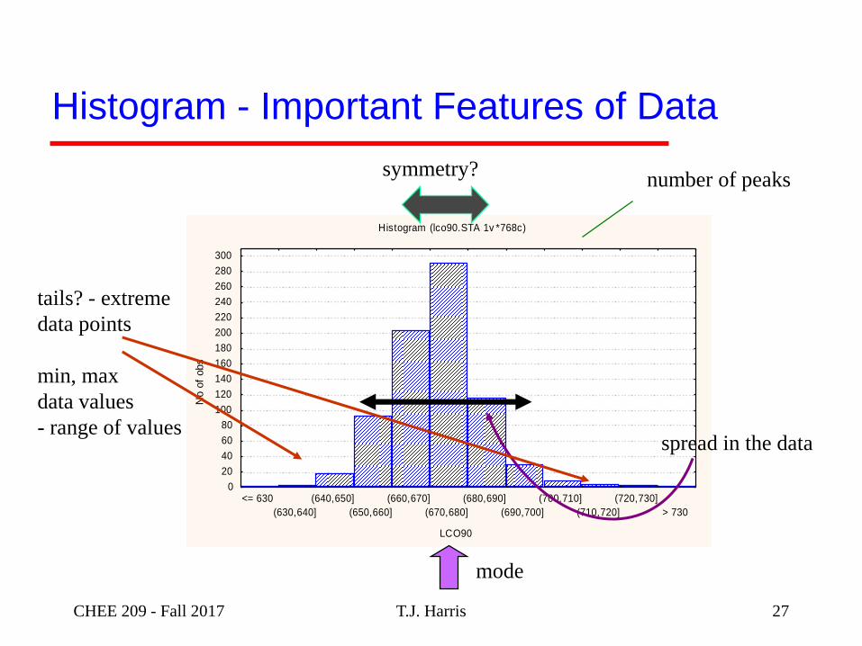
Histogram (lco90.STA 1v *768c)
LCO90
No o
f obs
0
20
40
60
80
100
120
140
160
180
200
220
240
260
280
300
<= 630
(630,640]
(640,650]
(650,660]
(660,670]
(670,680]
(680,690]
(690,700]
(700,710]
(710,720]
(720,730]
> 730
Histogram - Important Features of Data
number of peaks
mode
spread in the data
tails? - extreme
data points
min, max
data values
- range of values
symmetry?
CHEE 209 - Fall 2017 27

Histogram
• As # observations increase, interesting detail may
emerge
– Uni-modal or bi-modal
– Skewed left or right
– Try and assign physical interpretation to results
http://www.renewableenergyworld.com/rea/news/print/article/2011/08/an-eye-on-
www.handprint.com/HP/WCL/pigmt3.html 28
Distribution of pigment particles in paint

Histogram
CHEE 209 - Fall 2017 T.J. Harris
http://www.nature.com/srep/2017/140612/srep05265/images/srep05265-f2.jpg
29

Histogram
T.J. Harris
Sketch a mark histogram, where half the class gets
above average on mid-term , and where half the class
gets below average
CHEE 209 - Fall 2017 30

Histogram - variations
• Relative Frequency Histogram
– Plot relative frequency vs category
Only valid when all classes have same width
• Cumulative or “Less Than Histogram”
– instead of plotting # observations in a given category,
plot total # observations (or relative frequency) up to
class frequency - total area =1
# in categoryRelative Frequency Category =
total # counts
ii
31

Histogram - variations
• Density Histogram
– Scale the vertical axis so that histogram area = 1
– Calculate & plot density vs category
– Useful when category width not uniform
– Can also plot cumulative density histogram
T.J. HarrisCHEE 209 - Fall 2017
# in categoryDensity Category = width of category
total # countsi
i i
32

Histogram – “Mystery Data Set”
• ‘Bend ‘the rules when tremendous range for data
• Choose unequal bin widths
T.J. Harris 33

Alternate Method of Display
• Calculate Total $ value in class and plot % of total $
from each class vs class
T.J. Harris 34

Histogram - exercise
1. Construct the density
histogram for the glass
inclusion data
2. What fraction of the
sheets of glass have 2 or
more defects?
3. Construct the cumulative
density histogram
Glass Inclusion Data
CHEE 209 - Fall 2017 T.J. Harris 35

Histogram Exercise
Density Histogram Cumulative Density Histogram
CHEE 209 - Fall 2017 T.J. Harris 36

Describing Data Quantitatively
Use a few statistics to summarize large data sets
Measures of Central Tendency:
• average, also called sample mean or arithmetic mean
• median – divides the data set in half
• mode - most commonly observed value (if it exists)
Measures of Variability or Dispersion:
• sample variance
• sample standard deviation
• quartiles, percentiles
• “A statistic is any function of the observations in a random
sample.” T.J. Harris
Central
Tendency
Variability
Dispersion
37

Sample or Population Quantities
• Often cannot record measurements or observations
from all possible samples that may exist.
– N denotes # observations in population
• Take a ‘random sample’ from this population.
– n denotes # observations in sample
• A statistic is any function of observations in a random
sample
CHEE 209 - Fall 2017 T.J. Harris 38

T.J. Harris
Sample Mean (or Average)
Given n observations xi :
Be careful:
» The sample mean is sensitive to outliers or extreme
observation values
n
iix
nx
1
1
Note: observed values denoted
by lower case letters
Note: Always used Roman letters for
statistics
CHEE 209 - Fall 2017 39

T.J. Harris
• Arrange the data from smallest to largest
- n data points xi, i=1,…n
- sorted data denoted by x(1),x(2),…x(n)
• if n is odd,
» median is observation is
• if n is even, we have to interpolate between two
middle values
» median is
((n 1)/2)x
Median – “middle of data”
(n/2) (n/2 1)
2
x x
CHEE 209 - Fall 2017 40
Central Tendency in Data
• What is better measure – mean, median, mode?
• Locate these on histograms (roughly)
http://www.renewableenergyworld.com/rea/news/print/article/2011/08/an-eye-on-quality
www.handprint.com/HP/WCL/pigmt3.html 41
Distribution of pigment particles in paint

Central Tendency in Data
CHEE 209 - Fall 2017 T.J. Harris
http://www.nature.com/srep/2017/140612/srep05265/images/srep05265-f2.jpg
42

Central Tendency in Data
• Suppose the histogram, or distribution of data is
essentially symmetric.
• Do the mean, median and mode coincide?
http://durofy.com/tutorial-8-mode-merits-demerits/ 43

Bill Gates visits your restaurant*
Situation: You are surveying customers’ salary so that
you can ‘price’ your menu.
You have 10 salaries recorded and he walks in.
Do you re-price your menu?
Vickers, A. (2010), What is a p-value anyway? 34 stories to Help you Actually Understand Statistics,Pearson

Exploration Costs
Situation: You are determining budget for next year’s
geological exploration budget.
10 projects cost 1M each
1 project cost 5M
Would you recommend the mean and median for
forecasting your exploration budget?
Vickers, A. (2010), What is a p-value anyway? 34 stories to help you actually understand statistics, Pearson

Sample Variance
• Data with identical or similar means can have very different
variability or dispersion characteristics
• As an indicator of variability or dispersion, might examine the
differences from the mean
• Why not take average of these values?
• This term sums to 0, therefore not useful as indicator of
variabilityCHEE 209 - Fall 2017 T.J. Harris
ix x
1
1( )
n
i
i
x xn
46

T.J. Harris
Sample Variance
• We will examine squared differences
• Compute what looks similar to the average of these squared
differences
n
ii xx
ns
1
22 )(1
1
Note: Always used Roman letters for
statistics
CHEE 209 - Fall 2017
2
ix x
47
T.J. Harris
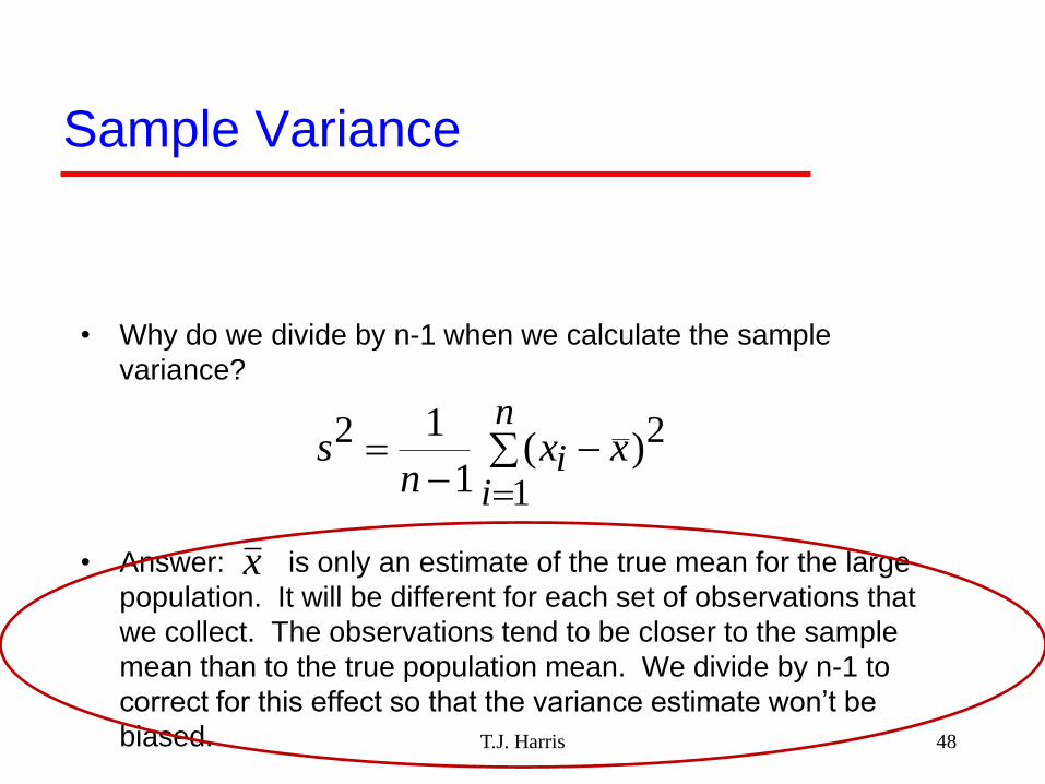
Sample Variance
• Why do we divide by n-1 when we calculate the sample
variance?
• Answer: is only an estimate of the true mean for the large
population. It will be different for each set of observations that
we collect. The observations tend to be closer to the sample
mean than to the true population mean. We divide by n-1 to
correct for this effect so that the variance estimate won’t be
biased.
n
ii xx
ns
1
22 )(1
1
x
48

T.J. Harris
Sample Standard Deviation
– Units of s are the same as those of x
– If the observations are from a Normal distribution:
• Approximately 95% of the observations will lie within 2
standard deviations of the mean
• Approximately 99% of the observations will lie within 3
standard deviations of the mean
2ss
CHEE 209 - Fall 2017 49

T.J. Harris
Coefficient of Variation
• Allows for computing relative preciseness
100%s
Vx
Statistic Nanopillar data Mystery Data
Mean 307.6 $11,176
Median 305.0 $180
Std deviation 36.8 $676,474
Coefficient of
variation 12.0% 6052%
CHEE 209 - Fall 2017
Exam
ple
of
import
ance
in c
hem
ical
anal
ysi
s
50

T.J. Harris
Range
maximum data value - minimum data value
• Be careful: the range is sensitive to outliers or
extreme data values
• Range is used in some quality control charts to see if
process variability is changing
CHEE 209 - Fall 2017 51

T.J. Harris
Percentiles and Quantiles
Median
– Divides ordered (sorted – smallest to largest) data into
equal halves
– Another measure of central tendency in data
Quartiles
– Divide the ordered data in quarters
Deciles
– Divide the ordered data in tenths
CHEE 209 - Fall 2017 52

T.J. Harris
Percentiles and Quantiles (Johnson, pg 29)
The sample 100 pth percentile is a value such that at
least 100p% of the observations are at or below this
value, and at least 100(1-p)% are at or above this
value.
median ≡ Q2 = P0.5
first quartile ≡ Q1 = P0.25
third quartile ≡ Q3 = P0.75
CHEE 209 - Fall 2017 53
If median is “middle” of data, then
Q1 is “middle” of the 1st half &
Q3 is “middle” of the 2nd half.

T.J. HarrisCHEE 209 - Fall 2017
Calculation of Percentiles
Order the data from smallest to largest & denote this ordered set by
𝑥(1), 𝑥(2), . . . 𝑥(𝑛)
For given value of p (i.e. to determine pth percentile) calculate
1. k=np
2. if k is not integer, round up to the next integer and take
corresponding ordered value as percentile value. (if decimal
part is 0.5, round up)
3. If k is integer, percentile value is average of kth and (k+1)th
ordered values
54

CHEE 209 - Fall 2017 T.J. Harris
First 11 observations of nanopillar thickness sorted from low to high
1 2 3 4 5 6 7 8 9 10
276 245 266 276 308 315 323 333 364 366
Where is median located?
Where is Q1 located?
Where is Q3 located?
First 10 observations of nanopillar thickness sorted from low to high
1 2 3 4 5 6 7 8 9 10 11
276 245 266 276 308 315 323 333 364 366 391
Where is median located?
Where is Q1 located?
Where is Q3 located?
55

Example – Crude Oil (Saturates)
Observations of Saturates
42.8 39.1 38.3 56.2 60.1 51.0 64.3 58.3 61.2 58.6 57.9 64.3
Ordered Observations
38.3 39.1 42.8 51.0 56.2 57.9 58.3 58.6 60.1 61.2 64.3 64.3
Median: p = 0.5, np = 12 x 0.5 = 6→ Q2 = 1
257.9 + 58.3 = 58.1
Q1: p = 0.25, np = 12 x 0.25 = 3 → Q1 = 1
242.8 + 51.0 = 46.9
Q3: p = 0.75, np = 12 x 0.75 = 9 → Q3= 1
260.1 + 61.2 = 60.7
CHEE 209 - Fall 2017 T.J. Harris 56

Questions – provide explanations!
• For all 2nd year course, half of the marks will be below
the mean. True of False?
• Is the sample mean always equal to one of the
values in the sample?
• Is the sample median always equal to one of the
values in the sample?
• For a list of positive numbers, is it possible for the
standard deviation to exceed the mean?T.J. HarrisCHEE 209 - Fall 2017 57

T.J. Harris
Box Plots – combine graphical & descriptive statistics
• Illustrates the median and quartiles for a data set, as
well as information about extreme data values
– Plot mean & median as well as
interquartile range = Q3 - Q1
CHEE 209 - Fall 2017
Box Plots
58
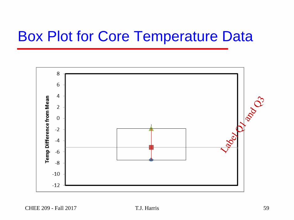
T.J. Harris
Box Plot for Core Temperature Data
CHEE 209 - Fall 2017 59

Box Plots – combine graphical & descriptive statistics
– Whiskers extend to smallest and largest data values
within a “reasonable” range
» upper quartile + 1.5 * interquartile range
» lower quartile - 1.5 * interquartile range
Notes:
• We will use these formulas for whiskers. Khan uses
max and min data points.
• If upper whisker exceeds max value, use max value
for upper whisker
• If lower whisker less than min value, use min value for
lower whiskerCHEE 209 - Fall 2017 T.J. Harris 60

T.J. Harris
Box Plot for Core Temperature Data
CHEE 209 - Fall 2017
“Whisker”
Interpretation
61
Box Plots – combine graphical & descriptive statistics
– Whiskers extend to smallest and largest data values
within a “reasonable” range
» upper quartile + 1.5 * interquartile range
» lower quartile - 1.5 * interquartile range
– When outliers are included, they are plotted as points
– Painful to plot with Excel
» be able to construct box plots with small data sets by
hand
» use good stats software – including Excel add-ins for
larger-scale applicationsCHEE 209 - Fall 2017 T.J. Harris 62

T.J. Harris
Box Plots in JMP
whisker
whisker
Q3
Q1
Q2 (Median)
Sample average (mid-point of
diamond), and confidence interval
for mean
Shortest interval
containing 50% of
the dataCHEE 209 - Fall 2017 63
T.J. Harris
5
10
15
20
25
30
35
40
45
Box Plots in JMP
Extreme data point (outlier)
whisker
whisker
Q3
Q1
Q2 (Median)
Sample average (mid-point of
diamond), and confidence interval
for mean
Shortest interval
containing 50% of
the dataCHEE 209 - Fall 2017 64

CHEE 209 - Fall 2017 65
Observations
1. Shape of Histograms
2. What do box plots indicate?
3. Why do saturates have
extreme low values and
resins extreme high values?

T.J. Harris
Robustness
… refers to whether a given descriptive statistic is
sensitive to extreme data points
Examples
• sample mean
» is sensitive to extreme points - extreme value pulls
average toward the extreme
• sample variance
» is sensitive to extreme points - large deviation from the
sample mean leads to inflated variance
• median, quartiles
» relatively insensitive to extreme data points
CHEE 209 - Fall 2017 66

CHEE 209 - Fall 2017 T.J. Harris 67
http://www.azom.com/article.aspx?
ArticleID=6019
Particle Size Analysis of
Pigments Using Laser
Diffraction

CHEE 209 - Fall 2017 T.J. Harris 68
Characterization of poly-
{trans-[RuCl2(vpy)4 ]-styrene-
4-vinylpyridine} impregnated
with silver nanoparticles in
non aqueous medium
. Braz. Chem.
Soc. vol.17 no.8 São
Paulo Nov./Dec. 2006

CHEE 209 - Fall 2017 T.J. Harris 69
http://www.handprint.com/HP/WC
L/pigmt3.html
http://www.pcimag.com/articles/98
837-new-titanium-dioxide-process