modeling and multivariate methods - sas
TRANSCRIPT

Version 10
JMP, A Business Unit of SASSAS Campus DriveCary, NC 27513 10.0.2
“The real voyage of discovery consists not in seeking newlandscapes, but in having new eyes.”
Marcel Proust
Modeling and MultivariateMethods

The correct bibliographic citation for this manual is as follows: SAS Institute Inc. 2012. JMP® 10 Modeling and Multivariate Methods. Cary, NC: SAS Institute Inc.
JMP® 10 Modeling and Multivariate Methods
Copyright © 2012, SAS Institute Inc., Cary, NC, USA
ISBN 978-1-61290-198-5
All rights reserved. Produced in the United States of America.
For a hard-copy book: No part of this publication may be reproduced, stored in a retrieval system, or transmitted, in any form or by any means, electronic, mechanical, photocopying, or otherwise, without the prior written permission of the publisher, SAS Institute Inc.
For a Web download or e-book: Your use of this publication shall be governed by the terms established by the vendor at the time you acquire this publication.
The scanning, uploading, and distribution of this book via the Internet or any other means without the permission of the publisher is illegal and punishable by law. Please purchase only authorized electronic editions and do not participate in or encourage electronic piracy of copyrighted materials. Your support of others’ rights is appreciated.
U.S. Government Restricted Rights Notice: Use, duplication, or disclosure of this software and related documentation by the U.S. government is subject to the Agreement with SAS Institute and the restrictions set forth in FAR 52.227-19, Commercial Computer Software-Restricted Rights (June 1987).
SAS Institute Inc., SAS Campus Drive, Cary, North Carolina 27513.
1st printing, March 2012
2nd printing, July 2012
3rd printing, November 2012
SAS® Publishing provides a complete selection of books and electronic products to help customers use SAS software to its fullest potential. For more information about our e-books, e-learning products, CDs, and hard-copy books, visit the SAS Publishing Web site at support.sas.com/publishing or call 1-800-727-3228.
SAS® and all other SAS Institute Inc. product or service names are registered trademarks or trademarks of SAS Institute Inc. in the USA and other countries. ® indicates USA registration.
Other brand and product names are registered trademarks or trademarks of their respective companies.
Technology License Notices
Scintilla is Copyright © 1998-2003 by Neil Hodgson <[email protected]>. NEIL HODGSON DISCLAIMS ALL WARRANTIES WITH REGARD TO THIS SOFTWARE, INCLUDING ALL IMPLIED WARRANTIES OF MERCHANTABILITY AND FITNESS, IN NO EVENT SHALL NEIL HODGSON BE LIABLE FOR ANY SPECIAL,

INDIRECT OR CONSEQUENTIAL DAMAGES OR ANY DAMAGES WHATSOEVER RESULTING FROM LOSS OF USE, DATA OR PROFITS, WHETHER IN AN ACTION OF CONTRACT, NEGLIGENCE OR OTHER TORTIOUS ACTION, ARISING OUT OF OR IN CONNECTION WITH THE USE OR PERFORMANCE OF THIS SOFTWARE.
XRender is Copyright © 2002 Keith Packard. KEITH PACKARD DISCLAIMS ALL WARRANTIES WITH REGARD TO THIS SOFTWARE, INCLUDING ALL IMPLIED WARRANTIES OF MERCHANTABILITY AND FITNESS, IN NO EVENT SHALL KEITH PACKARD BE LIABLE FOR ANY SPECIAL, INDIRECT OR CONSEQUENTIAL DAMAGES OR ANY DAMAGES WHATSOEVER RESULTING FROM LOSS OF USE, DATA OR PROFITS, WHETHER IN AN ACTION OF CONTRACT, NEGLIGENCE OR OTHER TORTIOUS ACTION, ARISING OUT OF OR IN CONNECTION WITH THE USE OR PERFORMANCE OF THIS SOFTWARE.
ImageMagick software is Copyright © 1999-2011, ImageMagick Studio LLC, a non-profit organization dedicated to making software imaging solutions freely available.
bzlib software is Copyright © 1991-2009, Thomas G. Lane, Guido Vollbeding. All rights reserved.
FreeType software is Copyright © 1996-2002, The FreeType Project (www.freetype.org). All rights reserved.
Get the Most from JMP®
Whether you are a first-time or a long-time user, there is always something to learn about JMP.
Visit JMP.com to find the following:
• live and recorded Webcasts about how to get started with JMP
• video demos and Webcasts of new features and advanced techniques
• schedules for seminars being held in your area
• success stories showing how others use JMP
• a blog with tips, tricks, and stories from JMP staff
• a forum to discuss JMP with other users
http://www.jmp.com/getstarted/

ContentsJMP Modeling and Multivariate Methods
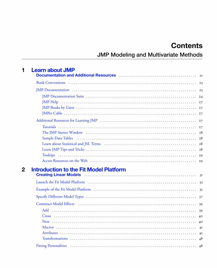
1 Learn about JMPDocumentation and Additional Resources . . . . . . . . . . . . . . . . . . . . . . . . . . . . . . . . . . . . . . . 21
Book Conventions . . . . . . . . . . . . . . . . . . . . . . . . . . . . . . . . . . . . . . . . . . . . . . . . . . . . . . . . . . . . . . . . 23
JMP Documentation . . . . . . . . . . . . . . . . . . . . . . . . . . . . . . . . . . . . . . . . . . . . . . . . . . . . . . . . . . . . . . 23
JMP Documentation Suite . . . . . . . . . . . . . . . . . . . . . . . . . . . . . . . . . . . . . . . . . . . . . . . . . . . . . . . 24
JMP Help . . . . . . . . . . . . . . . . . . . . . . . . . . . . . . . . . . . . . . . . . . . . . . . . . . . . . . . . . . . . . . . . . . . . 27
JMP Books by Users . . . . . . . . . . . . . . . . . . . . . . . . . . . . . . . . . . . . . . . . . . . . . . . . . . . . . . . . . . . . 27
JMPer Cable . . . . . . . . . . . . . . . . . . . . . . . . . . . . . . . . . . . . . . . . . . . . . . . . . . . . . . . . . . . . . . . . . . 27
Additional Resources for Learning JMP . . . . . . . . . . . . . . . . . . . . . . . . . . . . . . . . . . . . . . . . . . . . . . . . 27
Tutorials . . . . . . . . . . . . . . . . . . . . . . . . . . . . . . . . . . . . . . . . . . . . . . . . . . . . . . . . . . . . . . . . . . . . . 27
The JMP Starter Window . . . . . . . . . . . . . . . . . . . . . . . . . . . . . . . . . . . . . . . . . . . . . . . . . . . . . . . 28
Sample Data Tables . . . . . . . . . . . . . . . . . . . . . . . . . . . . . . . . . . . . . . . . . . . . . . . . . . . . . . . . . . . . 28
Learn about Statistical and JSL Terms . . . . . . . . . . . . . . . . . . . . . . . . . . . . . . . . . . . . . . . . . . . . . . 28
Learn JMP Tips and Tricks . . . . . . . . . . . . . . . . . . . . . . . . . . . . . . . . . . . . . . . . . . . . . . . . . . . . . . . 28
Tooltips . . . . . . . . . . . . . . . . . . . . . . . . . . . . . . . . . . . . . . . . . . . . . . . . . . . . . . . . . . . . . . . . . . . . . 29
Access Resources on the Web . . . . . . . . . . . . . . . . . . . . . . . . . . . . . . . . . . . . . . . . . . . . . . . . . . . . . 29
2 Introduction to the Fit Model PlatformCreating Linear Models . . . . . . . . . . . . . . . . . . . . . . . . . . . . . . . . . . . . . . . . . . . . . . . . . . . . . . . . 31
Launch the Fit Model Platform . . . . . . . . . . . . . . . . . . . . . . . . . . . . . . . . . . . . . . . . . . . . . . . . . . . . . . 33
Example of the Fit Model Platform . . . . . . . . . . . . . . . . . . . . . . . . . . . . . . . . . . . . . . . . . . . . . . . . . . . 35
Specify Different Model Types . . . . . . . . . . . . . . . . . . . . . . . . . . . . . . . . . . . . . . . . . . . . . . . . . . . . . . . 37
Construct Model Effects . . . . . . . . . . . . . . . . . . . . . . . . . . . . . . . . . . . . . . . . . . . . . . . . . . . . . . . . . . . 39
Add . . . . . . . . . . . . . . . . . . . . . . . . . . . . . . . . . . . . . . . . . . . . . . . . . . . . . . . . . . . . . . . . . . . . . . . . 39
Cross . . . . . . . . . . . . . . . . . . . . . . . . . . . . . . . . . . . . . . . . . . . . . . . . . . . . . . . . . . . . . . . . . . . . . . . 40
Nest . . . . . . . . . . . . . . . . . . . . . . . . . . . . . . . . . . . . . . . . . . . . . . . . . . . . . . . . . . . . . . . . . . . . . . . . 40
Macros . . . . . . . . . . . . . . . . . . . . . . . . . . . . . . . . . . . . . . . . . . . . . . . . . . . . . . . . . . . . . . . . . . . . . . 41
Attributes . . . . . . . . . . . . . . . . . . . . . . . . . . . . . . . . . . . . . . . . . . . . . . . . . . . . . . . . . . . . . . . . . . . . 45
Transformations . . . . . . . . . . . . . . . . . . . . . . . . . . . . . . . . . . . . . . . . . . . . . . . . . . . . . . . . . . . . . . . 48
Fitting Personalities . . . . . . . . . . . . . . . . . . . . . . . . . . . . . . . . . . . . . . . . . . . . . . . . . . . . . . . . . . . . . . . 48
6
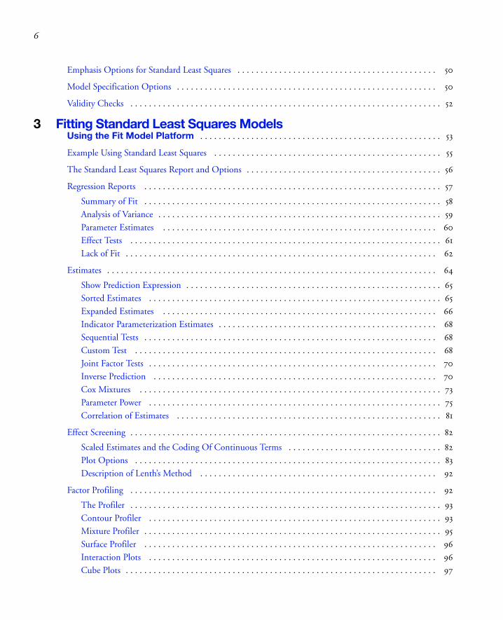
Emphasis Options for Standard Least Squares . . . . . . . . . . . . . . . . . . . . . . . . . . . . . . . . . . . . . . . . . . . 50
Model Specification Options . . . . . . . . . . . . . . . . . . . . . . . . . . . . . . . . . . . . . . . . . . . . . . . . . . . . . . . . 50
Validity Checks . . . . . . . . . . . . . . . . . . . . . . . . . . . . . . . . . . . . . . . . . . . . . . . . . . . . . . . . . . . . . . . . . . . 52
3 Fitting Standard Least Squares ModelsUsing the Fit Model Platform . . . . . . . . . . . . . . . . . . . . . . . . . . . . . . . . . . . . . . . . . . . . . . . . . . . . 53
Example Using Standard Least Squares . . . . . . . . . . . . . . . . . . . . . . . . . . . . . . . . . . . . . . . . . . . . . . . . . 55
The Standard Least Squares Report and Options . . . . . . . . . . . . . . . . . . . . . . . . . . . . . . . . . . . . . . . . . . 56
Regression Reports . . . . . . . . . . . . . . . . . . . . . . . . . . . . . . . . . . . . . . . . . . . . . . . . . . . . . . . . . . . . . . . . 57
Summary of Fit . . . . . . . . . . . . . . . . . . . . . . . . . . . . . . . . . . . . . . . . . . . . . . . . . . . . . . . . . . . . . . . . 58
Analysis of Variance . . . . . . . . . . . . . . . . . . . . . . . . . . . . . . . . . . . . . . . . . . . . . . . . . . . . . . . . . . . . . 59
Parameter Estimates . . . . . . . . . . . . . . . . . . . . . . . . . . . . . . . . . . . . . . . . . . . . . . . . . . . . . . . . . . . 60
Effect Tests . . . . . . . . . . . . . . . . . . . . . . . . . . . . . . . . . . . . . . . . . . . . . . . . . . . . . . . . . . . . . . . . . . . 61
Lack of Fit . . . . . . . . . . . . . . . . . . . . . . . . . . . . . . . . . . . . . . . . . . . . . . . . . . . . . . . . . . . . . . . . . . . 62
Estimates . . . . . . . . . . . . . . . . . . . . . . . . . . . . . . . . . . . . . . . . . . . . . . . . . . . . . . . . . . . . . . . . . . . . . . . 64
Show Prediction Expression . . . . . . . . . . . . . . . . . . . . . . . . . . . . . . . . . . . . . . . . . . . . . . . . . . . . . . . 65
Sorted Estimates . . . . . . . . . . . . . . . . . . . . . . . . . . . . . . . . . . . . . . . . . . . . . . . . . . . . . . . . . . . . . . . 65
Expanded Estimates . . . . . . . . . . . . . . . . . . . . . . . . . . . . . . . . . . . . . . . . . . . . . . . . . . . . . . . . . . . 66
Indicator Parameterization Estimates . . . . . . . . . . . . . . . . . . . . . . . . . . . . . . . . . . . . . . . . . . . . . . . 68
Sequential Tests . . . . . . . . . . . . . . . . . . . . . . . . . . . . . . . . . . . . . . . . . . . . . . . . . . . . . . . . . . . . . . . 68
Custom Test . . . . . . . . . . . . . . . . . . . . . . . . . . . . . . . . . . . . . . . . . . . . . . . . . . . . . . . . . . . . . . . . . 68
Joint Factor Tests . . . . . . . . . . . . . . . . . . . . . . . . . . . . . . . . . . . . . . . . . . . . . . . . . . . . . . . . . . . . . . 70
Inverse Prediction . . . . . . . . . . . . . . . . . . . . . . . . . . . . . . . . . . . . . . . . . . . . . . . . . . . . . . . . . . . . . 70
Cox Mixtures . . . . . . . . . . . . . . . . . . . . . . . . . . . . . . . . . . . . . . . . . . . . . . . . . . . . . . . . . . . . . . . . . 73
Parameter Power . . . . . . . . . . . . . . . . . . . . . . . . . . . . . . . . . . . . . . . . . . . . . . . . . . . . . . . . . . . . . . . 75
Correlation of Estimates . . . . . . . . . . . . . . . . . . . . . . . . . . . . . . . . . . . . . . . . . . . . . . . . . . . . . . . . . 81
Effect Screening . . . . . . . . . . . . . . . . . . . . . . . . . . . . . . . . . . . . . . . . . . . . . . . . . . . . . . . . . . . . . . . . . . . 82
Scaled Estimates and the Coding Of Continuous Terms . . . . . . . . . . . . . . . . . . . . . . . . . . . . . . . . . 82
Plot Options . . . . . . . . . . . . . . . . . . . . . . . . . . . . . . . . . . . . . . . . . . . . . . . . . . . . . . . . . . . . . . . . . . 83
Description of Lenth’s Method . . . . . . . . . . . . . . . . . . . . . . . . . . . . . . . . . . . . . . . . . . . . . . . . . . . 92
Factor Profiling . . . . . . . . . . . . . . . . . . . . . . . . . . . . . . . . . . . . . . . . . . . . . . . . . . . . . . . . . . . . . . . . . . 92
The Profiler . . . . . . . . . . . . . . . . . . . . . . . . . . . . . . . . . . . . . . . . . . . . . . . . . . . . . . . . . . . . . . . . . . . 93
Contour Profiler . . . . . . . . . . . . . . . . . . . . . . . . . . . . . . . . . . . . . . . . . . . . . . . . . . . . . . . . . . . . . . . 93
Mixture Profiler . . . . . . . . . . . . . . . . . . . . . . . . . . . . . . . . . . . . . . . . . . . . . . . . . . . . . . . . . . . . . . . . 95
Surface Profiler . . . . . . . . . . . . . . . . . . . . . . . . . . . . . . . . . . . . . . . . . . . . . . . . . . . . . . . . . . . . . . . 96
Interaction Plots . . . . . . . . . . . . . . . . . . . . . . . . . . . . . . . . . . . . . . . . . . . . . . . . . . . . . . . . . . . . . . 96
Cube Plots . . . . . . . . . . . . . . . . . . . . . . . . . . . . . . . . . . . . . . . . . . . . . . . . . . . . . . . . . . . . . . . . . . . 97
7
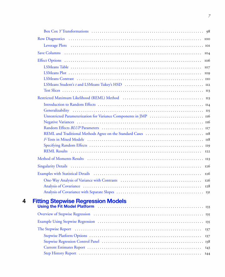
Box Cox Y Transformations . . . . . . . . . . . . . . . . . . . . . . . . . . . . . . . . . . . . . . . . . . . . . . . . . . . . . . 98
Row Diagnostics . . . . . . . . . . . . . . . . . . . . . . . . . . . . . . . . . . . . . . . . . . . . . . . . . . . . . . . . . . . . . . . . 100
Leverage Plots . . . . . . . . . . . . . . . . . . . . . . . . . . . . . . . . . . . . . . . . . . . . . . . . . . . . . . . . . . . . . . . . 101
Save Columns . . . . . . . . . . . . . . . . . . . . . . . . . . . . . . . . . . . . . . . . . . . . . . . . . . . . . . . . . . . . . . . . . . 104
Effect Options . . . . . . . . . . . . . . . . . . . . . . . . . . . . . . . . . . . . . . . . . . . . . . . . . . . . . . . . . . . . . . . . . . 106
LSMeans Table . . . . . . . . . . . . . . . . . . . . . . . . . . . . . . . . . . . . . . . . . . . . . . . . . . . . . . . . . . . . . . . 107
LSMeans Plot . . . . . . . . . . . . . . . . . . . . . . . . . . . . . . . . . . . . . . . . . . . . . . . . . . . . . . . . . . . . . . . . 109
LSMeans Contrast . . . . . . . . . . . . . . . . . . . . . . . . . . . . . . . . . . . . . . . . . . . . . . . . . . . . . . . . . . . . . 110
LSMeans Student’s t and LSMeans Tukey’s HSD . . . . . . . . . . . . . . . . . . . . . . . . . . . . . . . . . . . . . . 112
Test Slices . . . . . . . . . . . . . . . . . . . . . . . . . . . . . . . . . . . . . . . . . . . . . . . . . . . . . . . . . . . . . . . . . . . . 113
Restricted Maximum Likelihood (REML) Method . . . . . . . . . . . . . . . . . . . . . . . . . . . . . . . . . . . . . . . 113
Introduction to Random Effects . . . . . . . . . . . . . . . . . . . . . . . . . . . . . . . . . . . . . . . . . . . . . . . . . . . 114
Generalizability . . . . . . . . . . . . . . . . . . . . . . . . . . . . . . . . . . . . . . . . . . . . . . . . . . . . . . . . . . . . . . . 115
Unrestricted Parameterization for Variance Components in JMP . . . . . . . . . . . . . . . . . . . . . . . . . . 116
Negative Variances . . . . . . . . . . . . . . . . . . . . . . . . . . . . . . . . . . . . . . . . . . . . . . . . . . . . . . . . . . . . . 116
Random Effects BLUP Parameters . . . . . . . . . . . . . . . . . . . . . . . . . . . . . . . . . . . . . . . . . . . . . . . . . 117
REML and Traditional Methods Agree on the Standard Cases . . . . . . . . . . . . . . . . . . . . . . . . . . . . 118
F-Tests in Mixed Models . . . . . . . . . . . . . . . . . . . . . . . . . . . . . . . . . . . . . . . . . . . . . . . . . . . . . . . . 118
Specifying Random Effects . . . . . . . . . . . . . . . . . . . . . . . . . . . . . . . . . . . . . . . . . . . . . . . . . . . . . . . 119
REML Results . . . . . . . . . . . . . . . . . . . . . . . . . . . . . . . . . . . . . . . . . . . . . . . . . . . . . . . . . . . . . . . 122
Method of Moments Results . . . . . . . . . . . . . . . . . . . . . . . . . . . . . . . . . . . . . . . . . . . . . . . . . . . . . . . . 123
Singularity Details . . . . . . . . . . . . . . . . . . . . . . . . . . . . . . . . . . . . . . . . . . . . . . . . . . . . . . . . . . . . . . . 126
Examples with Statistical Details . . . . . . . . . . . . . . . . . . . . . . . . . . . . . . . . . . . . . . . . . . . . . . . . . . . . 126
One-Way Analysis of Variance with Contrasts . . . . . . . . . . . . . . . . . . . . . . . . . . . . . . . . . . . . . . . 126
Analysis of Covariance . . . . . . . . . . . . . . . . . . . . . . . . . . . . . . . . . . . . . . . . . . . . . . . . . . . . . . . . . 128
Analysis of Covariance with Separate Slopes . . . . . . . . . . . . . . . . . . . . . . . . . . . . . . . . . . . . . . . . . . 131
4 Fitting Stepwise Regression ModelsUsing the Fit Model Platform . . . . . . . . . . . . . . . . . . . . . . . . . . . . . . . . . . . . . . . . . . . . . . . . . . . 133
Overview of Stepwise Regression . . . . . . . . . . . . . . . . . . . . . . . . . . . . . . . . . . . . . . . . . . . . . . . . . . . . . 135
Example Using Stepwise Regression . . . . . . . . . . . . . . . . . . . . . . . . . . . . . . . . . . . . . . . . . . . . . . . . . . . 135
The Stepwise Report . . . . . . . . . . . . . . . . . . . . . . . . . . . . . . . . . . . . . . . . . . . . . . . . . . . . . . . . . . . . . 137
Stepwise Platform Options . . . . . . . . . . . . . . . . . . . . . . . . . . . . . . . . . . . . . . . . . . . . . . . . . . . . . . 137
Stepwise Regression Control Panel . . . . . . . . . . . . . . . . . . . . . . . . . . . . . . . . . . . . . . . . . . . . . . . . . 138
Current Estimates Report . . . . . . . . . . . . . . . . . . . . . . . . . . . . . . . . . . . . . . . . . . . . . . . . . . . . . . . 143
Step History Report . . . . . . . . . . . . . . . . . . . . . . . . . . . . . . . . . . . . . . . . . . . . . . . . . . . . . . . . . . . 144

8
Models with Crossed, Interaction, or Polynomial Terms . . . . . . . . . . . . . . . . . . . . . . . . . . . . . . . . . . . 144
Example Using Interaction Terms . . . . . . . . . . . . . . . . . . . . . . . . . . . . . . . . . . . . . . . . . . . . . . . . . 144
Models with Nominal and Ordinal Terms . . . . . . . . . . . . . . . . . . . . . . . . . . . . . . . . . . . . . . . . . . . . . . 146
Example of a Model with a Nominal Term . . . . . . . . . . . . . . . . . . . . . . . . . . . . . . . . . . . . . . . . . . 146
Using the Make Model Command for Hierarchical Terms . . . . . . . . . . . . . . . . . . . . . . . . . . . . . . . . . 147
Example Using the Make Model Command for Hierarchical Terms . . . . . . . . . . . . . . . . . . . . . . . 148
Performing Logistic Stepwise Regression . . . . . . . . . . . . . . . . . . . . . . . . . . . . . . . . . . . . . . . . . . . . . . . 148
Example Using Logistic Stepwise Regression . . . . . . . . . . . . . . . . . . . . . . . . . . . . . . . . . . . . . . . . . 149
The All Possible Models Option . . . . . . . . . . . . . . . . . . . . . . . . . . . . . . . . . . . . . . . . . . . . . . . . . . . . . 149
Example Using the All Possible Models Option . . . . . . . . . . . . . . . . . . . . . . . . . . . . . . . . . . . . . . . 149
The Model Averaging Option . . . . . . . . . . . . . . . . . . . . . . . . . . . . . . . . . . . . . . . . . . . . . . . . . . . . . . . 151
Example Using the Model Averaging Option . . . . . . . . . . . . . . . . . . . . . . . . . . . . . . . . . . . . . . . . . 151
Using Validation . . . . . . . . . . . . . . . . . . . . . . . . . . . . . . . . . . . . . . . . . . . . . . . . . . . . . . . . . . . . . . . . . 152
5 Fitting Multiple Response ModelsUsing the Fit Model Platform . . . . . . . . . . . . . . . . . . . . . . . . . . . . . . . . . . . . . . . . . . . . . . . . . . . 155
Example of a Multiple Response Model . . . . . . . . . . . . . . . . . . . . . . . . . . . . . . . . . . . . . . . . . . . . . . . . 157
The Manova Report . . . . . . . . . . . . . . . . . . . . . . . . . . . . . . . . . . . . . . . . . . . . . . . . . . . . . . . . . . . . . . 159
The Manova Fit Options . . . . . . . . . . . . . . . . . . . . . . . . . . . . . . . . . . . . . . . . . . . . . . . . . . . . . . . . . . . 159
Response Specification . . . . . . . . . . . . . . . . . . . . . . . . . . . . . . . . . . . . . . . . . . . . . . . . . . . . . . . . . . . . . 160
Choose Response Options . . . . . . . . . . . . . . . . . . . . . . . . . . . . . . . . . . . . . . . . . . . . . . . . . . . . . . . 160
Custom Test Option . . . . . . . . . . . . . . . . . . . . . . . . . . . . . . . . . . . . . . . . . . . . . . . . . . . . . . . . . . . 161
Multivariate Tests . . . . . . . . . . . . . . . . . . . . . . . . . . . . . . . . . . . . . . . . . . . . . . . . . . . . . . . . . . . . . . . . 165
The Extended Multivariate Report . . . . . . . . . . . . . . . . . . . . . . . . . . . . . . . . . . . . . . . . . . . . . . . . 166
Comparison of Multivariate Tests . . . . . . . . . . . . . . . . . . . . . . . . . . . . . . . . . . . . . . . . . . . . . . . . . 167
Univariate Tests and the Test for Sphericity . . . . . . . . . . . . . . . . . . . . . . . . . . . . . . . . . . . . . . . . . . 168
Multivariate Model with Repeated Measures . . . . . . . . . . . . . . . . . . . . . . . . . . . . . . . . . . . . . . . . . . . . 169
Repeated Measures Example . . . . . . . . . . . . . . . . . . . . . . . . . . . . . . . . . . . . . . . . . . . . . . . . . . . . . 170
Example of a Compound Multivariate Model . . . . . . . . . . . . . . . . . . . . . . . . . . . . . . . . . . . . . . . . . . . 171
Discriminant Analysis . . . . . . . . . . . . . . . . . . . . . . . . . . . . . . . . . . . . . . . . . . . . . . . . . . . . . . . . . . . . . 173
Example of the Save Discrim Option . . . . . . . . . . . . . . . . . . . . . . . . . . . . . . . . . . . . . . . . . . . . . . . 174
6 Fitting Generalized Linear ModelsUsing the Fit Model Platform . . . . . . . . . . . . . . . . . . . . . . . . . . . . . . . . . . . . . . . . . . . . . . . . . . . 177
Overview of Generalized Linear Models . . . . . . . . . . . . . . . . . . . . . . . . . . . . . . . . . . . . . . . . . . . . . . . 179

9
The Generalized Linear Model Personality . . . . . . . . . . . . . . . . . . . . . . . . . . . . . . . . . . . . . . . . . . . . . 180
Examples of Generalized Linear Models . . . . . . . . . . . . . . . . . . . . . . . . . . . . . . . . . . . . . . . . . . . . . . . 180
Model Selection and Deviance . . . . . . . . . . . . . . . . . . . . . . . . . . . . . . . . . . . . . . . . . . . . . . . . . . . 182
Examples . . . . . . . . . . . . . . . . . . . . . . . . . . . . . . . . . . . . . . . . . . . . . . . . . . . . . . . . . . . . . . . . . . . . . . . 183
Poisson Regression . . . . . . . . . . . . . . . . . . . . . . . . . . . . . . . . . . . . . . . . . . . . . . . . . . . . . . . . . . . . . 183
Poisson Regression with Offset . . . . . . . . . . . . . . . . . . . . . . . . . . . . . . . . . . . . . . . . . . . . . . . . . . . 186
Normal Regression, Log Link . . . . . . . . . . . . . . . . . . . . . . . . . . . . . . . . . . . . . . . . . . . . . . . . . . . . 189
Platform Commands . . . . . . . . . . . . . . . . . . . . . . . . . . . . . . . . . . . . . . . . . . . . . . . . . . . . . . . . . . . . . 192
7 Performing Logistic Regression on Nominal and Ordinal ResponsesUsing the Fit Model Platform . . . . . . . . . . . . . . . . . . . . . . . . . . . . . . . . . . . . . . . . . . . . . . . . . . 197
Introduction to Logistic Models . . . . . . . . . . . . . . . . . . . . . . . . . . . . . . . . . . . . . . . . . . . . . . . . . . . . . 199
The Logistic Fit Report . . . . . . . . . . . . . . . . . . . . . . . . . . . . . . . . . . . . . . . . . . . . . . . . . . . . . . . . . . . 200
Logistic Plot . . . . . . . . . . . . . . . . . . . . . . . . . . . . . . . . . . . . . . . . . . . . . . . . . . . . . . . . . . . . . . . . . 200
Iteration History . . . . . . . . . . . . . . . . . . . . . . . . . . . . . . . . . . . . . . . . . . . . . . . . . . . . . . . . . . . . . 201
Whole Model Test . . . . . . . . . . . . . . . . . . . . . . . . . . . . . . . . . . . . . . . . . . . . . . . . . . . . . . . . . . . . 201
Lack of Fit Test (Goodness of Fit) . . . . . . . . . . . . . . . . . . . . . . . . . . . . . . . . . . . . . . . . . . . . . . . . 203
Parameter Estimates . . . . . . . . . . . . . . . . . . . . . . . . . . . . . . . . . . . . . . . . . . . . . . . . . . . . . . . . . . . 204
Likelihood Ratio Tests . . . . . . . . . . . . . . . . . . . . . . . . . . . . . . . . . . . . . . . . . . . . . . . . . . . . . . . . . 205
Logistic Fit Platform Options . . . . . . . . . . . . . . . . . . . . . . . . . . . . . . . . . . . . . . . . . . . . . . . . . . . . . . . 206
Plot Options . . . . . . . . . . . . . . . . . . . . . . . . . . . . . . . . . . . . . . . . . . . . . . . . . . . . . . . . . . . . . . . . 206
Likelihood Ratio Tests . . . . . . . . . . . . . . . . . . . . . . . . . . . . . . . . . . . . . . . . . . . . . . . . . . . . . . . . . 206
Wald Tests for Effects . . . . . . . . . . . . . . . . . . . . . . . . . . . . . . . . . . . . . . . . . . . . . . . . . . . . . . . . . . 206
Confidence Intervals . . . . . . . . . . . . . . . . . . . . . . . . . . . . . . . . . . . . . . . . . . . . . . . . . . . . . . . . . . 206
Odds Ratios (Nominal Responses Only) . . . . . . . . . . . . . . . . . . . . . . . . . . . . . . . . . . . . . . . . . . . 207
Inverse Prediction . . . . . . . . . . . . . . . . . . . . . . . . . . . . . . . . . . . . . . . . . . . . . . . . . . . . . . . . . . . . . 208
Save Commands . . . . . . . . . . . . . . . . . . . . . . . . . . . . . . . . . . . . . . . . . . . . . . . . . . . . . . . . . . . . . . . 211
ROC Curve . . . . . . . . . . . . . . . . . . . . . . . . . . . . . . . . . . . . . . . . . . . . . . . . . . . . . . . . . . . . . . . . . 212
Lift Curve . . . . . . . . . . . . . . . . . . . . . . . . . . . . . . . . . . . . . . . . . . . . . . . . . . . . . . . . . . . . . . . . . . . 213
Confusion Matrix . . . . . . . . . . . . . . . . . . . . . . . . . . . . . . . . . . . . . . . . . . . . . . . . . . . . . . . . . . . . . 214
Profiler . . . . . . . . . . . . . . . . . . . . . . . . . . . . . . . . . . . . . . . . . . . . . . . . . . . . . . . . . . . . . . . . . . . . . 214
Validation . . . . . . . . . . . . . . . . . . . . . . . . . . . . . . . . . . . . . . . . . . . . . . . . . . . . . . . . . . . . . . . . . . . . . . 214
Example of a Nominal Logistic Model . . . . . . . . . . . . . . . . . . . . . . . . . . . . . . . . . . . . . . . . . . . . . . . . 214
Example of an Ordinal Logistic Model . . . . . . . . . . . . . . . . . . . . . . . . . . . . . . . . . . . . . . . . . . . . . . . . 218
Example of a Quadratic Ordinal Logistic Model . . . . . . . . . . . . . . . . . . . . . . . . . . . . . . . . . . . . . . . . 224
Stacking Counts in Multiple Columns . . . . . . . . . . . . . . . . . . . . . . . . . . . . . . . . . . . . . . . . . . . . . . . . 226

10
8 Analyzing Screening DesignsUsing the Screening Platform . . . . . . . . . . . . . . . . . . . . . . . . . . . . . . . . . . . . . . . . . . . . . . . . . . 229
Overview of the Screening Platform . . . . . . . . . . . . . . . . . . . . . . . . . . . . . . . . . . . . . . . . . . . . . . . . . . 231
When to Use the Screening Platform . . . . . . . . . . . . . . . . . . . . . . . . . . . . . . . . . . . . . . . . . . . . . . . 231
Comparing Screening and Fit Model . . . . . . . . . . . . . . . . . . . . . . . . . . . . . . . . . . . . . . . . . . . . . . . 231
Launch the Screening Platform . . . . . . . . . . . . . . . . . . . . . . . . . . . . . . . . . . . . . . . . . . . . . . . . . . . . . . 234
The Screening Report . . . . . . . . . . . . . . . . . . . . . . . . . . . . . . . . . . . . . . . . . . . . . . . . . . . . . . . . . . . . . 234
Contrasts . . . . . . . . . . . . . . . . . . . . . . . . . . . . . . . . . . . . . . . . . . . . . . . . . . . . . . . . . . . . . . . . . . . . 234
Half Normal Plot . . . . . . . . . . . . . . . . . . . . . . . . . . . . . . . . . . . . . . . . . . . . . . . . . . . . . . . . . . . . . 235
Tips on Using the Platform . . . . . . . . . . . . . . . . . . . . . . . . . . . . . . . . . . . . . . . . . . . . . . . . . . . . . . . . . 235
Additional Examples . . . . . . . . . . . . . . . . . . . . . . . . . . . . . . . . . . . . . . . . . . . . . . . . . . . . . . . . . . . . . . 235
Analyzing a Plackett-Burman Design . . . . . . . . . . . . . . . . . . . . . . . . . . . . . . . . . . . . . . . . . . . . . . . 236
Analyzing a Supersaturated Design . . . . . . . . . . . . . . . . . . . . . . . . . . . . . . . . . . . . . . . . . . . . . . . . 237
Statistical Details . . . . . . . . . . . . . . . . . . . . . . . . . . . . . . . . . . . . . . . . . . . . . . . . . . . . . . . . . . . . . . . . . 238
9 Performing Nonlinear RegressionUsing the Nonlinear Platform . . . . . . . . . . . . . . . . . . . . . . . . . . . . . . . . . . . . . . . . . . . . . . . . . . . 241
Introduction to the Nonlinear Platform . . . . . . . . . . . . . . . . . . . . . . . . . . . . . . . . . . . . . . . . . . . . . . . 243
Example of Nonlinear Fitting . . . . . . . . . . . . . . . . . . . . . . . . . . . . . . . . . . . . . . . . . . . . . . . . . . . . . . . 243
Launch the Nonlinear Platform . . . . . . . . . . . . . . . . . . . . . . . . . . . . . . . . . . . . . . . . . . . . . . . . . . . . . . 245
Nonlinear Fitting with Fit Curve . . . . . . . . . . . . . . . . . . . . . . . . . . . . . . . . . . . . . . . . . . . . . . . . . . . . 246
Fit Curve Models and Options . . . . . . . . . . . . . . . . . . . . . . . . . . . . . . . . . . . . . . . . . . . . . . . . . . 247
Fit Curve Report . . . . . . . . . . . . . . . . . . . . . . . . . . . . . . . . . . . . . . . . . . . . . . . . . . . . . . . . . . . . . . 251
Model Options . . . . . . . . . . . . . . . . . . . . . . . . . . . . . . . . . . . . . . . . . . . . . . . . . . . . . . . . . . . . . . . 252
Fit a Custom Model . . . . . . . . . . . . . . . . . . . . . . . . . . . . . . . . . . . . . . . . . . . . . . . . . . . . . . . . . . . . . . 256
Create a Model Column . . . . . . . . . . . . . . . . . . . . . . . . . . . . . . . . . . . . . . . . . . . . . . . . . . . . . . . . 257
Nonlinear Fit Report . . . . . . . . . . . . . . . . . . . . . . . . . . . . . . . . . . . . . . . . . . . . . . . . . . . . . . . . . . . 259
Nonlinear Fit Options . . . . . . . . . . . . . . . . . . . . . . . . . . . . . . . . . . . . . . . . . . . . . . . . . . . . . . . . . . 261
Use the Model Library . . . . . . . . . . . . . . . . . . . . . . . . . . . . . . . . . . . . . . . . . . . . . . . . . . . . . . . . . 264
Additional Examples . . . . . . . . . . . . . . . . . . . . . . . . . . . . . . . . . . . . . . . . . . . . . . . . . . . . . . . . . . . . . . 268
Maximum Likelihood: Logistic Regression . . . . . . . . . . . . . . . . . . . . . . . . . . . . . . . . . . . . . . . . . . 268
Probit Model with Binomial Errors: Numerical Derivatives . . . . . . . . . . . . . . . . . . . . . . . . . . . . . 269
Poisson Loss Function . . . . . . . . . . . . . . . . . . . . . . . . . . . . . . . . . . . . . . . . . . . . . . . . . . . . . . . . . 270
Statistical Details . . . . . . . . . . . . . . . . . . . . . . . . . . . . . . . . . . . . . . . . . . . . . . . . . . . . . . . . . . . . . . . . . 271
Profile Likelihood Confidence Limits . . . . . . . . . . . . . . . . . . . . . . . . . . . . . . . . . . . . . . . . . . . . . . 271

11
How Custom Loss Functions Work . . . . . . . . . . . . . . . . . . . . . . . . . . . . . . . . . . . . . . . . . . . . . . . 272
Notes Concerning Derivatives . . . . . . . . . . . . . . . . . . . . . . . . . . . . . . . . . . . . . . . . . . . . . . . . . . . 273
Notes on Effective Nonlinear Modeling . . . . . . . . . . . . . . . . . . . . . . . . . . . . . . . . . . . . . . . . . . . . 275
10 Creating Neural NetworksUsing the Neural Platform . . . . . . . . . . . . . . . . . . . . . . . . . . . . . . . . . . . . . . . . . . . . . . . . . . . . . 277
Overview of Neural Networks . . . . . . . . . . . . . . . . . . . . . . . . . . . . . . . . . . . . . . . . . . . . . . . . . . . . . . 279
Launch the Neural Platform . . . . . . . . . . . . . . . . . . . . . . . . . . . . . . . . . . . . . . . . . . . . . . . . . . . . . . . . 279
The Neural Launch Window . . . . . . . . . . . . . . . . . . . . . . . . . . . . . . . . . . . . . . . . . . . . . . . . . . . . 280
The Model Launch . . . . . . . . . . . . . . . . . . . . . . . . . . . . . . . . . . . . . . . . . . . . . . . . . . . . . . . . . . . 281
Model Reports . . . . . . . . . . . . . . . . . . . . . . . . . . . . . . . . . . . . . . . . . . . . . . . . . . . . . . . . . . . . . . . . . . 286
Training and Validation Measures of Fit . . . . . . . . . . . . . . . . . . . . . . . . . . . . . . . . . . . . . . . . . . . . 286
Confusion Statistics . . . . . . . . . . . . . . . . . . . . . . . . . . . . . . . . . . . . . . . . . . . . . . . . . . . . . . . . . . . 287
Model Options . . . . . . . . . . . . . . . . . . . . . . . . . . . . . . . . . . . . . . . . . . . . . . . . . . . . . . . . . . . . . . . . . . 287
Example of a Neural Network . . . . . . . . . . . . . . . . . . . . . . . . . . . . . . . . . . . . . . . . . . . . . . . . . . . . . . 289
11 Modeling Relationships With Gaussian ProcessesUsing the Gaussian Process Platform . . . . . . . . . . . . . . . . . . . . . . . . . . . . . . . . . . . . . . . . . . 293
Launching the Platform . . . . . . . . . . . . . . . . . . . . . . . . . . . . . . . . . . . . . . . . . . . . . . . . . . . . . . . . . . . 295
The Gaussian Process Report . . . . . . . . . . . . . . . . . . . . . . . . . . . . . . . . . . . . . . . . . . . . . . . . . . . . . . . 296
Actual by Predicted Plot . . . . . . . . . . . . . . . . . . . . . . . . . . . . . . . . . . . . . . . . . . . . . . . . . . . . . . . . 297
Model Report . . . . . . . . . . . . . . . . . . . . . . . . . . . . . . . . . . . . . . . . . . . . . . . . . . . . . . . . . . . . . . . . 297
Marginal Model Plots . . . . . . . . . . . . . . . . . . . . . . . . . . . . . . . . . . . . . . . . . . . . . . . . . . . . . . . . . . 299
Platform Options . . . . . . . . . . . . . . . . . . . . . . . . . . . . . . . . . . . . . . . . . . . . . . . . . . . . . . . . . . . . . . . . 299
Borehole Hypercube Example . . . . . . . . . . . . . . . . . . . . . . . . . . . . . . . . . . . . . . . . . . . . . . . . . . . . . . 300
12 Fitting Dispersion Effects with the Loglinear Variance ModelUsing the Fit Model Platform . . . . . . . . . . . . . . . . . . . . . . . . . . . . . . . . . . . . . . . . . . . . . . . . . . 303
Overview of the Loglinear Variance Model . . . . . . . . . . . . . . . . . . . . . . . . . . . . . . . . . . . . . . . . . . . . . 305
Model Specification . . . . . . . . . . . . . . . . . . . . . . . . . . . . . . . . . . . . . . . . . . . . . . . . . . . . . . . . . . . 305
Notes . . . . . . . . . . . . . . . . . . . . . . . . . . . . . . . . . . . . . . . . . . . . . . . . . . . . . . . . . . . . . . . . . . . . . . 305
Example Using Loglinear Variance . . . . . . . . . . . . . . . . . . . . . . . . . . . . . . . . . . . . . . . . . . . . . . . . . . . 306
The Loglinear Report . . . . . . . . . . . . . . . . . . . . . . . . . . . . . . . . . . . . . . . . . . . . . . . . . . . . . . . . . . . . . 308
Loglinear Platform Options . . . . . . . . . . . . . . . . . . . . . . . . . . . . . . . . . . . . . . . . . . . . . . . . . . . . . . . . 310
Save Columns . . . . . . . . . . . . . . . . . . . . . . . . . . . . . . . . . . . . . . . . . . . . . . . . . . . . . . . . . . . . . . . 310
Row Diagnostics . . . . . . . . . . . . . . . . . . . . . . . . . . . . . . . . . . . . . . . . . . . . . . . . . . . . . . . . . . . . . . 311
12
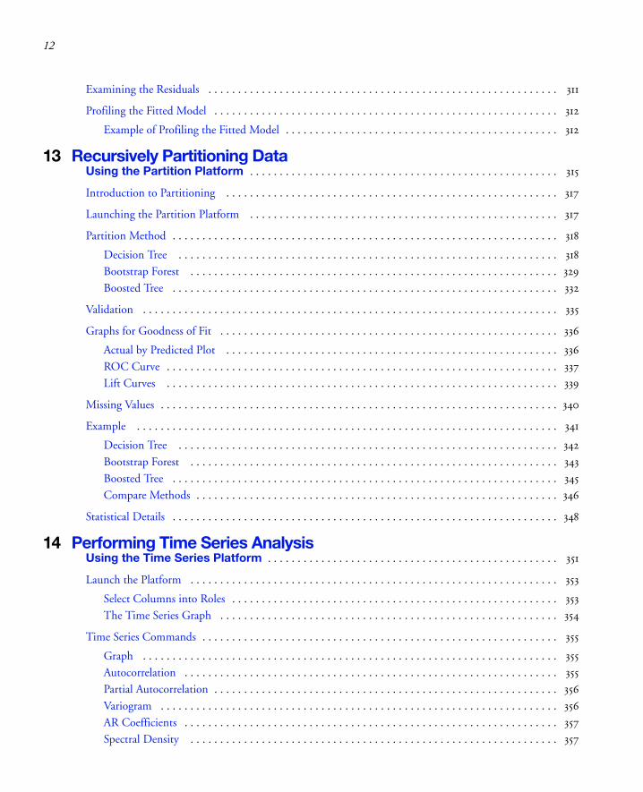
Examining the Residuals . . . . . . . . . . . . . . . . . . . . . . . . . . . . . . . . . . . . . . . . . . . . . . . . . . . . . . . . . . . 311
Profiling the Fitted Model . . . . . . . . . . . . . . . . . . . . . . . . . . . . . . . . . . . . . . . . . . . . . . . . . . . . . . . . . . 312
Example of Profiling the Fitted Model . . . . . . . . . . . . . . . . . . . . . . . . . . . . . . . . . . . . . . . . . . . . . . 312
13 Recursively Partitioning DataUsing the Partition Platform . . . . . . . . . . . . . . . . . . . . . . . . . . . . . . . . . . . . . . . . . . . . . . . . . . . . 315
Introduction to Partitioning . . . . . . . . . . . . . . . . . . . . . . . . . . . . . . . . . . . . . . . . . . . . . . . . . . . . . . . . 317
Launching the Partition Platform . . . . . . . . . . . . . . . . . . . . . . . . . . . . . . . . . . . . . . . . . . . . . . . . . . . . 317
Partition Method . . . . . . . . . . . . . . . . . . . . . . . . . . . . . . . . . . . . . . . . . . . . . . . . . . . . . . . . . . . . . . . . . 318
Decision Tree . . . . . . . . . . . . . . . . . . . . . . . . . . . . . . . . . . . . . . . . . . . . . . . . . . . . . . . . . . . . . . . . 318
Bootstrap Forest . . . . . . . . . . . . . . . . . . . . . . . . . . . . . . . . . . . . . . . . . . . . . . . . . . . . . . . . . . . . . . 329
Boosted Tree . . . . . . . . . . . . . . . . . . . . . . . . . . . . . . . . . . . . . . . . . . . . . . . . . . . . . . . . . . . . . . . . . 332
Validation . . . . . . . . . . . . . . . . . . . . . . . . . . . . . . . . . . . . . . . . . . . . . . . . . . . . . . . . . . . . . . . . . . . . . . 335
Graphs for Goodness of Fit . . . . . . . . . . . . . . . . . . . . . . . . . . . . . . . . . . . . . . . . . . . . . . . . . . . . . . . . . 336
Actual by Predicted Plot . . . . . . . . . . . . . . . . . . . . . . . . . . . . . . . . . . . . . . . . . . . . . . . . . . . . . . . . 336
ROC Curve . . . . . . . . . . . . . . . . . . . . . . . . . . . . . . . . . . . . . . . . . . . . . . . . . . . . . . . . . . . . . . . . . . 337
Lift Curves . . . . . . . . . . . . . . . . . . . . . . . . . . . . . . . . . . . . . . . . . . . . . . . . . . . . . . . . . . . . . . . . . . 339
Missing Values . . . . . . . . . . . . . . . . . . . . . . . . . . . . . . . . . . . . . . . . . . . . . . . . . . . . . . . . . . . . . . . . . . . 340
Example . . . . . . . . . . . . . . . . . . . . . . . . . . . . . . . . . . . . . . . . . . . . . . . . . . . . . . . . . . . . . . . . . . . . . . . 341
Decision Tree . . . . . . . . . . . . . . . . . . . . . . . . . . . . . . . . . . . . . . . . . . . . . . . . . . . . . . . . . . . . . . . . 342
Bootstrap Forest . . . . . . . . . . . . . . . . . . . . . . . . . . . . . . . . . . . . . . . . . . . . . . . . . . . . . . . . . . . . . . 343
Boosted Tree . . . . . . . . . . . . . . . . . . . . . . . . . . . . . . . . . . . . . . . . . . . . . . . . . . . . . . . . . . . . . . . . . 345
Compare Methods . . . . . . . . . . . . . . . . . . . . . . . . . . . . . . . . . . . . . . . . . . . . . . . . . . . . . . . . . . . . . 346
Statistical Details . . . . . . . . . . . . . . . . . . . . . . . . . . . . . . . . . . . . . . . . . . . . . . . . . . . . . . . . . . . . . . . . . 348
14 Performing Time Series AnalysisUsing the Time Series Platform . . . . . . . . . . . . . . . . . . . . . . . . . . . . . . . . . . . . . . . . . . . . . . . . . 351
Launch the Platform . . . . . . . . . . . . . . . . . . . . . . . . . . . . . . . . . . . . . . . . . . . . . . . . . . . . . . . . . . . . . . 353
Select Columns into Roles . . . . . . . . . . . . . . . . . . . . . . . . . . . . . . . . . . . . . . . . . . . . . . . . . . . . . . . 353
The Time Series Graph . . . . . . . . . . . . . . . . . . . . . . . . . . . . . . . . . . . . . . . . . . . . . . . . . . . . . . . . . 354
Time Series Commands . . . . . . . . . . . . . . . . . . . . . . . . . . . . . . . . . . . . . . . . . . . . . . . . . . . . . . . . . . . . 355
Graph . . . . . . . . . . . . . . . . . . . . . . . . . . . . . . . . . . . . . . . . . . . . . . . . . . . . . . . . . . . . . . . . . . . . . . 355
Autocorrelation . . . . . . . . . . . . . . . . . . . . . . . . . . . . . . . . . . . . . . . . . . . . . . . . . . . . . . . . . . . . . . . 355
Partial Autocorrelation . . . . . . . . . . . . . . . . . . . . . . . . . . . . . . . . . . . . . . . . . . . . . . . . . . . . . . . . . . 356
Variogram . . . . . . . . . . . . . . . . . . . . . . . . . . . . . . . . . . . . . . . . . . . . . . . . . . . . . . . . . . . . . . . . . . . 356
AR Coefficients . . . . . . . . . . . . . . . . . . . . . . . . . . . . . . . . . . . . . . . . . . . . . . . . . . . . . . . . . . . . . . . 357
Spectral Density . . . . . . . . . . . . . . . . . . . . . . . . . . . . . . . . . . . . . . . . . . . . . . . . . . . . . . . . . . . . . . 357

13
Save Spectral Density . . . . . . . . . . . . . . . . . . . . . . . . . . . . . . . . . . . . . . . . . . . . . . . . . . . . . . . . . . 358
Number of Forecast Periods . . . . . . . . . . . . . . . . . . . . . . . . . . . . . . . . . . . . . . . . . . . . . . . . . . . . . 359
Difference . . . . . . . . . . . . . . . . . . . . . . . . . . . . . . . . . . . . . . . . . . . . . . . . . . . . . . . . . . . . . . . . . . 359
Modeling Reports . . . . . . . . . . . . . . . . . . . . . . . . . . . . . . . . . . . . . . . . . . . . . . . . . . . . . . . . . . . . . . . 360
Model Comparison Table . . . . . . . . . . . . . . . . . . . . . . . . . . . . . . . . . . . . . . . . . . . . . . . . . . . . . . . 360
Model Summary Table . . . . . . . . . . . . . . . . . . . . . . . . . . . . . . . . . . . . . . . . . . . . . . . . . . . . . . . . . 361
Parameter Estimates Table . . . . . . . . . . . . . . . . . . . . . . . . . . . . . . . . . . . . . . . . . . . . . . . . . . . . . . 363
Forecast Plot . . . . . . . . . . . . . . . . . . . . . . . . . . . . . . . . . . . . . . . . . . . . . . . . . . . . . . . . . . . . . . . . . 364
Residuals . . . . . . . . . . . . . . . . . . . . . . . . . . . . . . . . . . . . . . . . . . . . . . . . . . . . . . . . . . . . . . . . . . . 364
Iteration History . . . . . . . . . . . . . . . . . . . . . . . . . . . . . . . . . . . . . . . . . . . . . . . . . . . . . . . . . . . . . 365
Model Report Options . . . . . . . . . . . . . . . . . . . . . . . . . . . . . . . . . . . . . . . . . . . . . . . . . . . . . . . . . 365
ARIMA Model . . . . . . . . . . . . . . . . . . . . . . . . . . . . . . . . . . . . . . . . . . . . . . . . . . . . . . . . . . . . . . . . . . 365
Seasonal ARIMA . . . . . . . . . . . . . . . . . . . . . . . . . . . . . . . . . . . . . . . . . . . . . . . . . . . . . . . . . . . . . . . . 367
ARIMA Model Group . . . . . . . . . . . . . . . . . . . . . . . . . . . . . . . . . . . . . . . . . . . . . . . . . . . . . . . . . . . . 368
Transfer Functions . . . . . . . . . . . . . . . . . . . . . . . . . . . . . . . . . . . . . . . . . . . . . . . . . . . . . . . . . . . . . . . 368
Report and Menu Structure . . . . . . . . . . . . . . . . . . . . . . . . . . . . . . . . . . . . . . . . . . . . . . . . . . . . . 369
Diagnostics . . . . . . . . . . . . . . . . . . . . . . . . . . . . . . . . . . . . . . . . . . . . . . . . . . . . . . . . . . . . . . . . . 370
Model Building . . . . . . . . . . . . . . . . . . . . . . . . . . . . . . . . . . . . . . . . . . . . . . . . . . . . . . . . . . . . . . 371
Transfer Function Model . . . . . . . . . . . . . . . . . . . . . . . . . . . . . . . . . . . . . . . . . . . . . . . . . . . . . . . 372
Model Reports . . . . . . . . . . . . . . . . . . . . . . . . . . . . . . . . . . . . . . . . . . . . . . . . . . . . . . . . . . . . . . . 374
Model Comparison Table . . . . . . . . . . . . . . . . . . . . . . . . . . . . . . . . . . . . . . . . . . . . . . . . . . . . . . . 376
Fitting Notes . . . . . . . . . . . . . . . . . . . . . . . . . . . . . . . . . . . . . . . . . . . . . . . . . . . . . . . . . . . . . . . . 376
Smoothing Models . . . . . . . . . . . . . . . . . . . . . . . . . . . . . . . . . . . . . . . . . . . . . . . . . . . . . . . . . . . . . . . 376
Simple Moving Average . . . . . . . . . . . . . . . . . . . . . . . . . . . . . . . . . . . . . . . . . . . . . . . . . . . . . . . . 377
Smoothing Model Dialog . . . . . . . . . . . . . . . . . . . . . . . . . . . . . . . . . . . . . . . . . . . . . . . . . . . . . . . 378
Simple Exponential Smoothing . . . . . . . . . . . . . . . . . . . . . . . . . . . . . . . . . . . . . . . . . . . . . . . . . . 379
Double (Brown) Exponential Smoothing . . . . . . . . . . . . . . . . . . . . . . . . . . . . . . . . . . . . . . . . . . . 379
Linear (Holt) Exponential Smoothing . . . . . . . . . . . . . . . . . . . . . . . . . . . . . . . . . . . . . . . . . . . . . 380
Damped-Trend Linear Exponential Smoothing . . . . . . . . . . . . . . . . . . . . . . . . . . . . . . . . . . . . . . 380
Seasonal Exponential Smoothing . . . . . . . . . . . . . . . . . . . . . . . . . . . . . . . . . . . . . . . . . . . . . . . . . 380
Winters Method (Additive) . . . . . . . . . . . . . . . . . . . . . . . . . . . . . . . . . . . . . . . . . . . . . . . . . . . . . . 381
15 Performing Categorical Response AnalysisUsing the Categorical Platform . . . . . . . . . . . . . . . . . . . . . . . . . . . . . . . . . . . . . . . . . . . . . . . . 383
The Categorical Platform . . . . . . . . . . . . . . . . . . . . . . . . . . . . . . . . . . . . . . . . . . . . . . . . . . . . . . . . . . 385
Launching the Platform . . . . . . . . . . . . . . . . . . . . . . . . . . . . . . . . . . . . . . . . . . . . . . . . . . . . . . . . . . . 385
Failure Rate Examples . . . . . . . . . . . . . . . . . . . . . . . . . . . . . . . . . . . . . . . . . . . . . . . . . . . . . . . . . . . . 388
14
Response Frequencies . . . . . . . . . . . . . . . . . . . . . . . . . . . . . . . . . . . . . . . . . . . . . . . . . . . . . . . . . . 388
Indicator Group . . . . . . . . . . . . . . . . . . . . . . . . . . . . . . . . . . . . . . . . . . . . . . . . . . . . . . . . . . . . . . 389
Multiple Delimited . . . . . . . . . . . . . . . . . . . . . . . . . . . . . . . . . . . . . . . . . . . . . . . . . . . . . . . . . . . . 389
Multiple Response By ID . . . . . . . . . . . . . . . . . . . . . . . . . . . . . . . . . . . . . . . . . . . . . . . . . . . . . . . 390
Multiple Response . . . . . . . . . . . . . . . . . . . . . . . . . . . . . . . . . . . . . . . . . . . . . . . . . . . . . . . . . . . . . 391
Categorical Reports . . . . . . . . . . . . . . . . . . . . . . . . . . . . . . . . . . . . . . . . . . . . . . . . . . . . . . . . . . . . . . . 391
Report Content . . . . . . . . . . . . . . . . . . . . . . . . . . . . . . . . . . . . . . . . . . . . . . . . . . . . . . . . . . . . . . . 391
Report Format . . . . . . . . . . . . . . . . . . . . . . . . . . . . . . . . . . . . . . . . . . . . . . . . . . . . . . . . . . . . . . . . 393
Statistical Commands . . . . . . . . . . . . . . . . . . . . . . . . . . . . . . . . . . . . . . . . . . . . . . . . . . . . . . . . . . 395
Save Tables . . . . . . . . . . . . . . . . . . . . . . . . . . . . . . . . . . . . . . . . . . . . . . . . . . . . . . . . . . . . . . . . . . 398
16 Performing Choice ModelingUsing the Choice Platform . . . . . . . . . . . . . . . . . . . . . . . . . . . . . . . . . . . . . . . . . . . . . . . . . . . . . 401
Introduction to Choice Modeling . . . . . . . . . . . . . . . . . . . . . . . . . . . . . . . . . . . . . . . . . . . . . . . . . . . . 403
Choice Statistical Model . . . . . . . . . . . . . . . . . . . . . . . . . . . . . . . . . . . . . . . . . . . . . . . . . . . . . . . . 403
Product Design Engineering . . . . . . . . . . . . . . . . . . . . . . . . . . . . . . . . . . . . . . . . . . . . . . . . . . . . . . . . 403
Data for the Choice Platform . . . . . . . . . . . . . . . . . . . . . . . . . . . . . . . . . . . . . . . . . . . . . . . . . . . . . . 404
Example: Pizza Choice . . . . . . . . . . . . . . . . . . . . . . . . . . . . . . . . . . . . . . . . . . . . . . . . . . . . . . . . . . . . 405
Launch the Choice Platform and Select Data Sets . . . . . . . . . . . . . . . . . . . . . . . . . . . . . . . . . . . . . . . 406
Choice Model Output . . . . . . . . . . . . . . . . . . . . . . . . . . . . . . . . . . . . . . . . . . . . . . . . . . . . . . . . . 409
Subject Effects . . . . . . . . . . . . . . . . . . . . . . . . . . . . . . . . . . . . . . . . . . . . . . . . . . . . . . . . . . . . . . . . 410
Utility Grid Optimization . . . . . . . . . . . . . . . . . . . . . . . . . . . . . . . . . . . . . . . . . . . . . . . . . . . . . . . 412
Platform Options . . . . . . . . . . . . . . . . . . . . . . . . . . . . . . . . . . . . . . . . . . . . . . . . . . . . . . . . . . . . . . . . 414
Example: Valuing Trade-offs . . . . . . . . . . . . . . . . . . . . . . . . . . . . . . . . . . . . . . . . . . . . . . . . . . . . . . . . 414
One-Table Analysis . . . . . . . . . . . . . . . . . . . . . . . . . . . . . . . . . . . . . . . . . . . . . . . . . . . . . . . . . . . . . . 420
Example: One-Table Pizza Data . . . . . . . . . . . . . . . . . . . . . . . . . . . . . . . . . . . . . . . . . . . . . . . . . . 421
Segmentation . . . . . . . . . . . . . . . . . . . . . . . . . . . . . . . . . . . . . . . . . . . . . . . . . . . . . . . . . . . . . . . . . . . 423
Special Data Rules . . . . . . . . . . . . . . . . . . . . . . . . . . . . . . . . . . . . . . . . . . . . . . . . . . . . . . . . . . . . . . . 427
Default choice set . . . . . . . . . . . . . . . . . . . . . . . . . . . . . . . . . . . . . . . . . . . . . . . . . . . . . . . . . . . . 427
Subject Data with Response Data . . . . . . . . . . . . . . . . . . . . . . . . . . . . . . . . . . . . . . . . . . . . . . . . . 428
Logistic Regression . . . . . . . . . . . . . . . . . . . . . . . . . . . . . . . . . . . . . . . . . . . . . . . . . . . . . . . . . . . . 428
Transforming Data . . . . . . . . . . . . . . . . . . . . . . . . . . . . . . . . . . . . . . . . . . . . . . . . . . . . . . . . . . . . . . . 431
Transforming Data to Two Analysis Tables . . . . . . . . . . . . . . . . . . . . . . . . . . . . . . . . . . . . . . . . . . 431
Transforming Data to One Analysis Table . . . . . . . . . . . . . . . . . . . . . . . . . . . . . . . . . . . . . . . . . . . 436
Logistic Regression for Matched Case-Control Studies . . . . . . . . . . . . . . . . . . . . . . . . . . . . . . . . . . . . 438

15
17 Correlations and Multivariate TechniquesUsing the Multivariate Platform . . . . . . . . . . . . . . . . . . . . . . . . . . . . . . . . . . . . . . . . . . . . . . . . 441
Launch the Multivariate Platform . . . . . . . . . . . . . . . . . . . . . . . . . . . . . . . . . . . . . . . . . . . . . . . . . . . 443
Estimation Methods . . . . . . . . . . . . . . . . . . . . . . . . . . . . . . . . . . . . . . . . . . . . . . . . . . . . . . . . . . . 443
The Multivariate Report . . . . . . . . . . . . . . . . . . . . . . . . . . . . . . . . . . . . . . . . . . . . . . . . . . . . . . . . . . . 445
Multivariate Platform Options . . . . . . . . . . . . . . . . . . . . . . . . . . . . . . . . . . . . . . . . . . . . . . . . . . . . . . 446
Nonparametric Correlations . . . . . . . . . . . . . . . . . . . . . . . . . . . . . . . . . . . . . . . . . . . . . . . . . . . . . 449
Scatterplot Matrix . . . . . . . . . . . . . . . . . . . . . . . . . . . . . . . . . . . . . . . . . . . . . . . . . . . . . . . . . . . . 449
Outlier Analysis . . . . . . . . . . . . . . . . . . . . . . . . . . . . . . . . . . . . . . . . . . . . . . . . . . . . . . . . . . . . . . . 451
Item Reliability . . . . . . . . . . . . . . . . . . . . . . . . . . . . . . . . . . . . . . . . . . . . . . . . . . . . . . . . . . . . . . 453
Impute Missing Data . . . . . . . . . . . . . . . . . . . . . . . . . . . . . . . . . . . . . . . . . . . . . . . . . . . . . . . . . . 453
Examples . . . . . . . . . . . . . . . . . . . . . . . . . . . . . . . . . . . . . . . . . . . . . . . . . . . . . . . . . . . . . . . . . . . . . . 453
Example of Item Reliability . . . . . . . . . . . . . . . . . . . . . . . . . . . . . . . . . . . . . . . . . . . . . . . . . . . . . 453
Computations and Statistical Details . . . . . . . . . . . . . . . . . . . . . . . . . . . . . . . . . . . . . . . . . . . . . . . . . 454
Estimation Methods . . . . . . . . . . . . . . . . . . . . . . . . . . . . . . . . . . . . . . . . . . . . . . . . . . . . . . . . . . . 454
Pearson Product-Moment Correlation . . . . . . . . . . . . . . . . . . . . . . . . . . . . . . . . . . . . . . . . . . . . . 455
Nonparametric Measures of Association . . . . . . . . . . . . . . . . . . . . . . . . . . . . . . . . . . . . . . . . . . . . 455
Inverse Correlation Matrix . . . . . . . . . . . . . . . . . . . . . . . . . . . . . . . . . . . . . . . . . . . . . . . . . . . . . . 457
Distance Measures . . . . . . . . . . . . . . . . . . . . . . . . . . . . . . . . . . . . . . . . . . . . . . . . . . . . . . . . . . . . 457
Cronbach’s α . . . . . . . . . . . . . . . . . . . . . . . . . . . . . . . . . . . . . . . . . . . . . . . . . . . . . . . . . . . . . . . . 458
18 Clustering DataUsing the Cluster Platform . . . . . . . . . . . . . . . . . . . . . . . . . . . . . . . . . . . . . . . . . . . . . . . . . . . . 459
Introduction to Clustering Methods . . . . . . . . . . . . . . . . . . . . . . . . . . . . . . . . . . . . . . . . . . . . . . . . . . 461
The Cluster Launch Dialog . . . . . . . . . . . . . . . . . . . . . . . . . . . . . . . . . . . . . . . . . . . . . . . . . . . . . . . . 462
Hierarchical Clustering . . . . . . . . . . . . . . . . . . . . . . . . . . . . . . . . . . . . . . . . . . . . . . . . . . . . . . . . . . . 463
Hierarchical Cluster Options . . . . . . . . . . . . . . . . . . . . . . . . . . . . . . . . . . . . . . . . . . . . . . . . . . . . 466
Technical Details for Hierarchical Clustering . . . . . . . . . . . . . . . . . . . . . . . . . . . . . . . . . . . . . . . . 467
K-Means Clustering . . . . . . . . . . . . . . . . . . . . . . . . . . . . . . . . . . . . . . . . . . . . . . . . . . . . . . . . . . . . . . 469
K-Means Control Panel . . . . . . . . . . . . . . . . . . . . . . . . . . . . . . . . . . . . . . . . . . . . . . . . . . . . . . . . 470
K-Means Report . . . . . . . . . . . . . . . . . . . . . . . . . . . . . . . . . . . . . . . . . . . . . . . . . . . . . . . . . . . . . . 471
Normal Mixtures . . . . . . . . . . . . . . . . . . . . . . . . . . . . . . . . . . . . . . . . . . . . . . . . . . . . . . . . . . . . . . . . 473
Robust Normal Mixtures . . . . . . . . . . . . . . . . . . . . . . . . . . . . . . . . . . . . . . . . . . . . . . . . . . . . . . . 475
Platform Options . . . . . . . . . . . . . . . . . . . . . . . . . . . . . . . . . . . . . . . . . . . . . . . . . . . . . . . . . . . . . 476
Details of the Estimation Process . . . . . . . . . . . . . . . . . . . . . . . . . . . . . . . . . . . . . . . . . . . . . . . . . 476
Self Organizing Maps . . . . . . . . . . . . . . . . . . . . . . . . . . . . . . . . . . . . . . . . . . . . . . . . . . . . . . . . . . . . . 477
16
19 Analyzing Principal Components and Reducing DimensionalityUsing the Principal Components Platform . . . . . . . . . . . . . . . . . . . . . . . . . . . . . . . . . . . . . . . 481
Principal Components . . . . . . . . . . . . . . . . . . . . . . . . . . . . . . . . . . . . . . . . . . . . . . . . . . . . . . . . . . . . . 483
Launch the Platform . . . . . . . . . . . . . . . . . . . . . . . . . . . . . . . . . . . . . . . . . . . . . . . . . . . . . . . . . . . . . . 483
Report . . . . . . . . . . . . . . . . . . . . . . . . . . . . . . . . . . . . . . . . . . . . . . . . . . . . . . . . . . . . . . . . . . . . . . . . . 484
Platform Options . . . . . . . . . . . . . . . . . . . . . . . . . . . . . . . . . . . . . . . . . . . . . . . . . . . . . . . . . . . . . . . . 484
Factor Analysis . . . . . . . . . . . . . . . . . . . . . . . . . . . . . . . . . . . . . . . . . . . . . . . . . . . . . . . . . . . . . . . 487
20 Performing Discriminant AnalysisUsing the Discriminant Platform . . . . . . . . . . . . . . . . . . . . . . . . . . . . . . . . . . . . . . . . . . . . . . . . 491
Introduction . . . . . . . . . . . . . . . . . . . . . . . . . . . . . . . . . . . . . . . . . . . . . . . . . . . . . . . . . . . . . . . . . . . . 493
Discriminating Groups . . . . . . . . . . . . . . . . . . . . . . . . . . . . . . . . . . . . . . . . . . . . . . . . . . . . . . . . . . . . 493
Discriminant Method . . . . . . . . . . . . . . . . . . . . . . . . . . . . . . . . . . . . . . . . . . . . . . . . . . . . . . . . . 494
Stepwise Selection . . . . . . . . . . . . . . . . . . . . . . . . . . . . . . . . . . . . . . . . . . . . . . . . . . . . . . . . . . . . . 495
Canonical Plot . . . . . . . . . . . . . . . . . . . . . . . . . . . . . . . . . . . . . . . . . . . . . . . . . . . . . . . . . . . . . . . 497
Discriminant Scores . . . . . . . . . . . . . . . . . . . . . . . . . . . . . . . . . . . . . . . . . . . . . . . . . . . . . . . . . . 497
Commands and Options . . . . . . . . . . . . . . . . . . . . . . . . . . . . . . . . . . . . . . . . . . . . . . . . . . . . . . . . . . . 498
Validation . . . . . . . . . . . . . . . . . . . . . . . . . . . . . . . . . . . . . . . . . . . . . . . . . . . . . . . . . . . . . . . . . . . . . . 503
21 Fitting Partial Least Squares ModelsUsing the Partial Least Squares Platform . . . . . . . . . . . . . . . . . . . . . . . . . . . . . . . . . . . . . . . 505
Overview of the Partial Least Squares Platform . . . . . . . . . . . . . . . . . . . . . . . . . . . . . . . . . . . . . . . . . . 507
Example of Partial Least Squares . . . . . . . . . . . . . . . . . . . . . . . . . . . . . . . . . . . . . . . . . . . . . . . . . . . . . 507
Launch the Partial Least Squares Platform . . . . . . . . . . . . . . . . . . . . . . . . . . . . . . . . . . . . . . . . . . . . . . 510
Launch through Multivariate Methods . . . . . . . . . . . . . . . . . . . . . . . . . . . . . . . . . . . . . . . . . . . . . 510
Launching through Fit Model . . . . . . . . . . . . . . . . . . . . . . . . . . . . . . . . . . . . . . . . . . . . . . . . . . . . 511
Centering and Scaling . . . . . . . . . . . . . . . . . . . . . . . . . . . . . . . . . . . . . . . . . . . . . . . . . . . . . . . . . . 511
Impute Missing Data . . . . . . . . . . . . . . . . . . . . . . . . . . . . . . . . . . . . . . . . . . . . . . . . . . . . . . . . . . . 511
Model Launch Control Panel . . . . . . . . . . . . . . . . . . . . . . . . . . . . . . . . . . . . . . . . . . . . . . . . . . . . . . . 512
The Partial Least Squares Report . . . . . . . . . . . . . . . . . . . . . . . . . . . . . . . . . . . . . . . . . . . . . . . . . . . . . 513
Model Fit Options . . . . . . . . . . . . . . . . . . . . . . . . . . . . . . . . . . . . . . . . . . . . . . . . . . . . . . . . . . . . . . . . 514
Partial Least Squares Options . . . . . . . . . . . . . . . . . . . . . . . . . . . . . . . . . . . . . . . . . . . . . . . . . . . . . . . 520
Statistical Details . . . . . . . . . . . . . . . . . . . . . . . . . . . . . . . . . . . . . . . . . . . . . . . . . . . . . . . . . . . . . . . . . 520

17
22 Scoring Tests Using Item Response TheoryUsing the Item Analysis Platform . . . . . . . . . . . . . . . . . . . . . . . . . . . . . . . . . . . . . . . . . . . . . . 523
Introduction to Item Response Theory . . . . . . . . . . . . . . . . . . . . . . . . . . . . . . . . . . . . . . . . . . . . . . . 525
Launching the Platform . . . . . . . . . . . . . . . . . . . . . . . . . . . . . . . . . . . . . . . . . . . . . . . . . . . . . . . . . . . 528
Item Analysis Output . . . . . . . . . . . . . . . . . . . . . . . . . . . . . . . . . . . . . . . . . . . . . . . . . . . . . . . . . . . . . 530
Characteristic Curves . . . . . . . . . . . . . . . . . . . . . . . . . . . . . . . . . . . . . . . . . . . . . . . . . . . . . . . . . . 530
Information Curves . . . . . . . . . . . . . . . . . . . . . . . . . . . . . . . . . . . . . . . . . . . . . . . . . . . . . . . . . . . . 531
Dual Plots . . . . . . . . . . . . . . . . . . . . . . . . . . . . . . . . . . . . . . . . . . . . . . . . . . . . . . . . . . . . . . . . . . . 531
Platform Commands . . . . . . . . . . . . . . . . . . . . . . . . . . . . . . . . . . . . . . . . . . . . . . . . . . . . . . . . . . . . . . 533
Technical Details . . . . . . . . . . . . . . . . . . . . . . . . . . . . . . . . . . . . . . . . . . . . . . . . . . . . . . . . . . . . . . . . 534
23 Plotting SurfacesUsing the Surface Plot Platform . . . . . . . . . . . . . . . . . . . . . . . . . . . . . . . . . . . . . . . . . . . . . . . . 535
Surface Plots . . . . . . . . . . . . . . . . . . . . . . . . . . . . . . . . . . . . . . . . . . . . . . . . . . . . . . . . . . . . . . . . . . . . 537
Launching the Platform . . . . . . . . . . . . . . . . . . . . . . . . . . . . . . . . . . . . . . . . . . . . . . . . . . . . . . . . . . . 537
Plotting a Single Mathematical Function . . . . . . . . . . . . . . . . . . . . . . . . . . . . . . . . . . . . . . . . . . . 538
Plotting Points Only . . . . . . . . . . . . . . . . . . . . . . . . . . . . . . . . . . . . . . . . . . . . . . . . . . . . . . . . . . 539
Plotting a Formula from a Column . . . . . . . . . . . . . . . . . . . . . . . . . . . . . . . . . . . . . . . . . . . . . . . 540
Isosurfaces . . . . . . . . . . . . . . . . . . . . . . . . . . . . . . . . . . . . . . . . . . . . . . . . . . . . . . . . . . . . . . . . . . 542
The Surface Plot Control Panel . . . . . . . . . . . . . . . . . . . . . . . . . . . . . . . . . . . . . . . . . . . . . . . . . . . . . 544
Appearance Controls . . . . . . . . . . . . . . . . . . . . . . . . . . . . . . . . . . . . . . . . . . . . . . . . . . . . . . . . . . 544
Independent Variables . . . . . . . . . . . . . . . . . . . . . . . . . . . . . . . . . . . . . . . . . . . . . . . . . . . . . . . . . 545
Dependent Variables . . . . . . . . . . . . . . . . . . . . . . . . . . . . . . . . . . . . . . . . . . . . . . . . . . . . . . . . . . 546
Plot Controls and Settings . . . . . . . . . . . . . . . . . . . . . . . . . . . . . . . . . . . . . . . . . . . . . . . . . . . . . . . . . 547
Rotate . . . . . . . . . . . . . . . . . . . . . . . . . . . . . . . . . . . . . . . . . . . . . . . . . . . . . . . . . . . . . . . . . . . . . 547
Axis Settings . . . . . . . . . . . . . . . . . . . . . . . . . . . . . . . . . . . . . . . . . . . . . . . . . . . . . . . . . . . . . . . . . 548
Lights . . . . . . . . . . . . . . . . . . . . . . . . . . . . . . . . . . . . . . . . . . . . . . . . . . . . . . . . . . . . . . . . . . . . . . 549
Sheet or Surface Properties . . . . . . . . . . . . . . . . . . . . . . . . . . . . . . . . . . . . . . . . . . . . . . . . . . . . . . 549
Other Properties and Commands . . . . . . . . . . . . . . . . . . . . . . . . . . . . . . . . . . . . . . . . . . . . . . . . . 550
Keyboard Shortcuts . . . . . . . . . . . . . . . . . . . . . . . . . . . . . . . . . . . . . . . . . . . . . . . . . . . . . . . . . . . . . . . 551
24 Visualizing, Optimizing, and Simulating Response SurfacesUsing the Profiler Platforms . . . . . . . . . . . . . . . . . . . . . . . . . . . . . . . . . . . . . . . . . . . . . . . . . . . . 553
Introduction to Profiling . . . . . . . . . . . . . . . . . . . . . . . . . . . . . . . . . . . . . . . . . . . . . . . . . . . . . . . . . . . 555
Profiling Features in JMP . . . . . . . . . . . . . . . . . . . . . . . . . . . . . . . . . . . . . . . . . . . . . . . . . . . . . . . . 555
The Profiler . . . . . . . . . . . . . . . . . . . . . . . . . . . . . . . . . . . . . . . . . . . . . . . . . . . . . . . . . . . . . . . . . . . . 557

18
Interpreting the Profiles . . . . . . . . . . . . . . . . . . . . . . . . . . . . . . . . . . . . . . . . . . . . . . . . . . . . . . . . . 558
Profiler Options . . . . . . . . . . . . . . . . . . . . . . . . . . . . . . . . . . . . . . . . . . . . . . . . . . . . . . . . . . . . . . 562
Desirability Profiling and Optimization . . . . . . . . . . . . . . . . . . . . . . . . . . . . . . . . . . . . . . . . . . . . . 567
Special Profiler Topics . . . . . . . . . . . . . . . . . . . . . . . . . . . . . . . . . . . . . . . . . . . . . . . . . . . . . . . . . . . . . 571
Propagation of Error Bars . . . . . . . . . . . . . . . . . . . . . . . . . . . . . . . . . . . . . . . . . . . . . . . . . . . . . . . 571
Customized Desirability Functions . . . . . . . . . . . . . . . . . . . . . . . . . . . . . . . . . . . . . . . . . . . . . . . . 573
Mixture Designs . . . . . . . . . . . . . . . . . . . . . . . . . . . . . . . . . . . . . . . . . . . . . . . . . . . . . . . . . . . . . . 574
Expanding Intermediate Formulas . . . . . . . . . . . . . . . . . . . . . . . . . . . . . . . . . . . . . . . . . . . . . . . . . 575
Linear Constraints . . . . . . . . . . . . . . . . . . . . . . . . . . . . . . . . . . . . . . . . . . . . . . . . . . . . . . . . . . . . . 575
Contour Profiler . . . . . . . . . . . . . . . . . . . . . . . . . . . . . . . . . . . . . . . . . . . . . . . . . . . . . . . . . . . . . . . . . 577
Contour Profiler Pop-up Menu . . . . . . . . . . . . . . . . . . . . . . . . . . . . . . . . . . . . . . . . . . . . . . . . . . . 578
Mixtures . . . . . . . . . . . . . . . . . . . . . . . . . . . . . . . . . . . . . . . . . . . . . . . . . . . . . . . . . . . . . . . . . . . . 578
Constraint Shading . . . . . . . . . . . . . . . . . . . . . . . . . . . . . . . . . . . . . . . . . . . . . . . . . . . . . . . . . . . . 579
Mixture Profiler . . . . . . . . . . . . . . . . . . . . . . . . . . . . . . . . . . . . . . . . . . . . . . . . . . . . . . . . . . . . . . . . . . 579
Explanation of Ternary Plot Axes . . . . . . . . . . . . . . . . . . . . . . . . . . . . . . . . . . . . . . . . . . . . . . . . . . 580
More than Three Mixture Factors . . . . . . . . . . . . . . . . . . . . . . . . . . . . . . . . . . . . . . . . . . . . . . . . . 581
Mixture Profiler Options . . . . . . . . . . . . . . . . . . . . . . . . . . . . . . . . . . . . . . . . . . . . . . . . . . . . . . . . 582
Linear Constraints . . . . . . . . . . . . . . . . . . . . . . . . . . . . . . . . . . . . . . . . . . . . . . . . . . . . . . . . . . . . . 583
Examples . . . . . . . . . . . . . . . . . . . . . . . . . . . . . . . . . . . . . . . . . . . . . . . . . . . . . . . . . . . . . . . . . . . . 583
Surface Profiler . . . . . . . . . . . . . . . . . . . . . . . . . . . . . . . . . . . . . . . . . . . . . . . . . . . . . . . . . . . . . . . . . . 591
The Custom Profiler . . . . . . . . . . . . . . . . . . . . . . . . . . . . . . . . . . . . . . . . . . . . . . . . . . . . . . . . . . . . . . 591
Custom Profiler Options . . . . . . . . . . . . . . . . . . . . . . . . . . . . . . . . . . . . . . . . . . . . . . . . . . . . . . . . 591
The Simulator . . . . . . . . . . . . . . . . . . . . . . . . . . . . . . . . . . . . . . . . . . . . . . . . . . . . . . . . . . . . . . . . . . . 592
Specifying Factors . . . . . . . . . . . . . . . . . . . . . . . . . . . . . . . . . . . . . . . . . . . . . . . . . . . . . . . . . . . . . 593
Specifying the Response . . . . . . . . . . . . . . . . . . . . . . . . . . . . . . . . . . . . . . . . . . . . . . . . . . . . . . . . . 594
Run the Simulation . . . . . . . . . . . . . . . . . . . . . . . . . . . . . . . . . . . . . . . . . . . . . . . . . . . . . . . . . . . . 595
The Simulator Menu . . . . . . . . . . . . . . . . . . . . . . . . . . . . . . . . . . . . . . . . . . . . . . . . . . . . . . . . . . . 595
Using Specification Limits . . . . . . . . . . . . . . . . . . . . . . . . . . . . . . . . . . . . . . . . . . . . . . . . . . . . . . . 596
Simulating General Formulas . . . . . . . . . . . . . . . . . . . . . . . . . . . . . . . . . . . . . . . . . . . . . . . . . . . . 597
The Defect Profiler . . . . . . . . . . . . . . . . . . . . . . . . . . . . . . . . . . . . . . . . . . . . . . . . . . . . . . . . . . . 600
Notes . . . . . . . . . . . . . . . . . . . . . . . . . . . . . . . . . . . . . . . . . . . . . . . . . . . . . . . . . . . . . . . . . . . . . . 602
Defect Profiler Example . . . . . . . . . . . . . . . . . . . . . . . . . . . . . . . . . . . . . . . . . . . . . . . . . . . . . . . . 602
Stochastic Optimization Example . . . . . . . . . . . . . . . . . . . . . . . . . . . . . . . . . . . . . . . . . . . . . . . . 606
Noise Factors (Robust Engineering) . . . . . . . . . . . . . . . . . . . . . . . . . . . . . . . . . . . . . . . . . . . . . . . . . . . 615
Profiling Models Stored in Excel . . . . . . . . . . . . . . . . . . . . . . . . . . . . . . . . . . . . . . . . . . . . . . . . . . . . . 622
Running the JMP Profiler . . . . . . . . . . . . . . . . . . . . . . . . . . . . . . . . . . . . . . . . . . . . . . . . . . . . . . . 622
Example of an Excel Model . . . . . . . . . . . . . . . . . . . . . . . . . . . . . . . . . . . . . . . . . . . . . . . . . . . . . . 622
19
Using the Excel Profiler From JMP . . . . . . . . . . . . . . . . . . . . . . . . . . . . . . . . . . . . . . . . . . . . . . . 625
Fit Group . . . . . . . . . . . . . . . . . . . . . . . . . . . . . . . . . . . . . . . . . . . . . . . . . . . . . . . . . . . . . . . . . . . . . . 625
Statistical Details . . . . . . . . . . . . . . . . . . . . . . . . . . . . . . . . . . . . . . . . . . . . . . . . . . . . . . . . . . . . . . . . 625
25 Comparing Model PerformanceUsing the Model Comparison Platform . . . . . . . . . . . . . . . . . . . . . . . . . . . . . . . . . . . . . . . . . 627
Example of Model Comparison . . . . . . . . . . . . . . . . . . . . . . . . . . . . . . . . . . . . . . . . . . . . . . . . . . . . . 629
Launch the Model Comparison Platform . . . . . . . . . . . . . . . . . . . . . . . . . . . . . . . . . . . . . . . . . . . . . . 632
The Model Comparison Report . . . . . . . . . . . . . . . . . . . . . . . . . . . . . . . . . . . . . . . . . . . . . . . . . . . . . 633
Model Comparison Platform Options . . . . . . . . . . . . . . . . . . . . . . . . . . . . . . . . . . . . . . . . . . . . . . . . 634
Additional Example of Model Comparison . . . . . . . . . . . . . . . . . . . . . . . . . . . . . . . . . . . . . . . . . . . . 635
A Statistical DetailsModels in JMP . . . . . . . . . . . . . . . . . . . . . . . . . . . . . . . . . . . . . . . . . . . . . . . . . . . . . . . . . . . . . . . 651
The Response Models . . . . . . . . . . . . . . . . . . . . . . . . . . . . . . . . . . . . . . . . . . . . . . . . . . . . . . . . . . . . 653
Continuous Responses . . . . . . . . . . . . . . . . . . . . . . . . . . . . . . . . . . . . . . . . . . . . . . . . . . . . . . . . . 653
Nominal Responses . . . . . . . . . . . . . . . . . . . . . . . . . . . . . . . . . . . . . . . . . . . . . . . . . . . . . . . . . . . 653
Ordinal Responses . . . . . . . . . . . . . . . . . . . . . . . . . . . . . . . . . . . . . . . . . . . . . . . . . . . . . . . . . . . . 655
The Factor Models . . . . . . . . . . . . . . . . . . . . . . . . . . . . . . . . . . . . . . . . . . . . . . . . . . . . . . . . . . . . . . . 656
Continuous Factors . . . . . . . . . . . . . . . . . . . . . . . . . . . . . . . . . . . . . . . . . . . . . . . . . . . . . . . . . . . 656
Nominal Factors . . . . . . . . . . . . . . . . . . . . . . . . . . . . . . . . . . . . . . . . . . . . . . . . . . . . . . . . . . . . . . 657
Ordinal Factors . . . . . . . . . . . . . . . . . . . . . . . . . . . . . . . . . . . . . . . . . . . . . . . . . . . . . . . . . . . . . . 666
The Usual Assumptions . . . . . . . . . . . . . . . . . . . . . . . . . . . . . . . . . . . . . . . . . . . . . . . . . . . . . . . . . . . 672
Assumed Model . . . . . . . . . . . . . . . . . . . . . . . . . . . . . . . . . . . . . . . . . . . . . . . . . . . . . . . . . . . . . . 673
Relative Significance . . . . . . . . . . . . . . . . . . . . . . . . . . . . . . . . . . . . . . . . . . . . . . . . . . . . . . . . . . . 673
Multiple Inferences . . . . . . . . . . . . . . . . . . . . . . . . . . . . . . . . . . . . . . . . . . . . . . . . . . . . . . . . . . . 673
Validity Assessment . . . . . . . . . . . . . . . . . . . . . . . . . . . . . . . . . . . . . . . . . . . . . . . . . . . . . . . . . . . 673
Alternative Methods . . . . . . . . . . . . . . . . . . . . . . . . . . . . . . . . . . . . . . . . . . . . . . . . . . . . . . . . . . . 674
Key Statistical Concepts . . . . . . . . . . . . . . . . . . . . . . . . . . . . . . . . . . . . . . . . . . . . . . . . . . . . . . . . . . . 674
Uncertainty, a Unifying Concept . . . . . . . . . . . . . . . . . . . . . . . . . . . . . . . . . . . . . . . . . . . . . . . . . 674
The Two Basic Fitting Machines . . . . . . . . . . . . . . . . . . . . . . . . . . . . . . . . . . . . . . . . . . . . . . . . . 675
Leverage Plot Details . . . . . . . . . . . . . . . . . . . . . . . . . . . . . . . . . . . . . . . . . . . . . . . . . . . . . . . . . . . . . 678
Multivariate Details . . . . . . . . . . . . . . . . . . . . . . . . . . . . . . . . . . . . . . . . . . . . . . . . . . . . . . . . . . . . . . 680
Multivariate Tests . . . . . . . . . . . . . . . . . . . . . . . . . . . . . . . . . . . . . . . . . . . . . . . . . . . . . . . . . . . . . 681
Approximate F-Test . . . . . . . . . . . . . . . . . . . . . . . . . . . . . . . . . . . . . . . . . . . . . . . . . . . . . . . . . . . 681
Canonical Details . . . . . . . . . . . . . . . . . . . . . . . . . . . . . . . . . . . . . . . . . . . . . . . . . . . . . . . . . . . . . 682

20
Discriminant Analysis . . . . . . . . . . . . . . . . . . . . . . . . . . . . . . . . . . . . . . . . . . . . . . . . . . . . . . . . . . 683
Power Calculations . . . . . . . . . . . . . . . . . . . . . . . . . . . . . . . . . . . . . . . . . . . . . . . . . . . . . . . . . . . . . . . 683
Computations for the LSV . . . . . . . . . . . . . . . . . . . . . . . . . . . . . . . . . . . . . . . . . . . . . . . . . . . . . . 683
Computations for the LSN . . . . . . . . . . . . . . . . . . . . . . . . . . . . . . . . . . . . . . . . . . . . . . . . . . . . . 684
Computations for the Power . . . . . . . . . . . . . . . . . . . . . . . . . . . . . . . . . . . . . . . . . . . . . . . . . . . . . 685
Computations for Adjusted Power . . . . . . . . . . . . . . . . . . . . . . . . . . . . . . . . . . . . . . . . . . . . . . . . . 685
Inverse Prediction with Confidence Limits . . . . . . . . . . . . . . . . . . . . . . . . . . . . . . . . . . . . . . . . . . . . 686
Details of Random Effects . . . . . . . . . . . . . . . . . . . . . . . . . . . . . . . . . . . . . . . . . . . . . . . . . . . . . . . . . 687
IndexJMP Modeling and Multivariate Methods . . . . . . . . . . . . . . . . . . . . . . . . . . . . . . . . . . . . . . . 689

Chapter 1Learn about JMP
Documentation and Additional Resources
This chapter covers the following information:
• book conventions
• JMP documentation
• JMP Help
• additional resources, such as the following:
– other JMP documentation
– tutorials
– indexes
– Web resources
Figure 1.1 The JMP Help Home Window

Contents
Book Conventions. . . . . . . . . . . . . . . . . . . . . . . . . . . . . . . . . . . . . . . . . . . . . . . . . . . . . . . . . . . . . . . . . . .23
JMP Documentation . . . . . . . . . . . . . . . . . . . . . . . . . . . . . . . . . . . . . . . . . . . . . . . . . . . . . . . . . . . . . . . . .23
JMP Documentation Suite . . . . . . . . . . . . . . . . . . . . . . . . . . . . . . . . . . . . . . . . . . . . . . . . . . . . . . . . 24
JMP Help . . . . . . . . . . . . . . . . . . . . . . . . . . . . . . . . . . . . . . . . . . . . . . . . . . . . . . . . . . . . . . . . . . . . . 27
JMP Books by Users . . . . . . . . . . . . . . . . . . . . . . . . . . . . . . . . . . . . . . . . . . . . . . . . . . . . . . . . . . . . . 27
JMPer Cable . . . . . . . . . . . . . . . . . . . . . . . . . . . . . . . . . . . . . . . . . . . . . . . . . . . . . . . . . . . . . . . . . . . 27
Additional Resources for Learning JMP. . . . . . . . . . . . . . . . . . . . . . . . . . . . . . . . . . . . . . . . . . . . . . . . . . 27
Tutorials . . . . . . . . . . . . . . . . . . . . . . . . . . . . . . . . . . . . . . . . . . . . . . . . . . . . . . . . . . . . . . . . . . . . . . 27
The JMP Starter Window . . . . . . . . . . . . . . . . . . . . . . . . . . . . . . . . . . . . . . . . . . . . . . . . . . . . . . . . . .28
Sample Data Tables . . . . . . . . . . . . . . . . . . . . . . . . . . . . . . . . . . . . . . . . . . . . . . . . . . . . . . . . . . . . . . .28
Learn about Statistical and JSL Terms . . . . . . . . . . . . . . . . . . . . . . . . . . . . . . . . . . . . . . . . . . . . . . . . .28
Learn JMP Tips and Tricks . . . . . . . . . . . . . . . . . . . . . . . . . . . . . . . . . . . . . . . . . . . . . . . . . . . . . . . . .28
Tooltips . . . . . . . . . . . . . . . . . . . . . . . . . . . . . . . . . . . . . . . . . . . . . . . . . . . . . . . . . . . . . . . . . . . . . . . 29
Access Resources on the Web. . . . . . . . . . . . . . . . . . . . . . . . . . . . . . . . . . . . . . . . . . . . . . . . . . . . . . . 29

Chapter 1 Learn about JMP 23Book Conventions
Book Conventions
The following conventions help you relate written material to information that you see on your screen.
• Sample data table names, column names, path names, file names, file extensions, and folders appear in Helvetica font.
• Code appears in Lucida Sans Typewriter font.
• Code output appears in Lucida Sans Typewriter italic font and is indented further than the preceding code.
• The following items appear in Helvetica bold:
– buttons
– check boxes
– commands
– list names that are selectable
– menus
– options
– tab names
– text boxes
• The following items appear in italics:
– words or phrases that are important or have definitions specific to JMP
– book titles
– variables
• Features that are for JMP Pro only are noted with the JMP Pro icon .
Note: Special information and limitations appear within a Note.
Tip: Helpful information appears within a Tip.
JMP Documentation
The JMP documentation suite is available by selecting Help > Books. You can also request printed documentation through the JMP Web site:
http://support.sas.com/documentation/onlinedoc/jmp/index.html
JMP Help is context-sensitive and searchable.
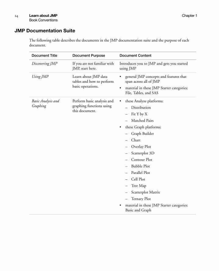
24 Learn about JMP Chapter 1Book Conventions
JMP Documentation Suite
The following table describes the documents in the JMP documentation suite and the purpose of each document.
Document Title Document Purpose Document Content
Discovering JMP If you are not familiar with JMP, start here.
Introduces you to JMP and gets you started using JMP
Using JMP Learn about JMP data tables and how to perform basic operations.
• general JMP concepts and features that span across all of JMP
• material in these JMP Starter categories: File, Tables, and SAS
Basic Analysis and Graphing
Perform basic analysis and graphing functions using this document.
• these Analyze platforms:
– Distribution
– Fit Y by X
– Matched Pairs
• these Graph platforms:
– Graph Builder
– Chart
– Overlay Plot
– Scatterplot 3D
– Contour Plot
– Bubble Plot
– Parallel Plot
– Cell Plot
– Tree Map
– Scatterplot Matrix
– Ternary Plot
• material in these JMP Starter categories: Basic and Graph

Chapter 1 Learn about JMP 25Book Conventions
Modeling and Multivariate Methods
Perform advanced modeling or multivariate methods using this document.
• these Analyze platforms:
– Fit Model
– Screening
– Nonlinear
– Neural
– Gaussian Process
– Partition
– Time Series
– Categorical
– Choice
– Model Comparison
– Multivariate
– Cluster
– Principal Components
– Discriminant
– Partial Least Squares
– Item Analysis
• these Graph platforms:
– Profilers
– Surface Plot
• material in these JMP Starter categories: Model, Multivariate, and Surface
Document Title Document Purpose Document Content

26 Learn about JMP Chapter 1Book Conventions
In addition, the New Features document is available at http://www.jmp.com/support/downloads/documentation.shtml.
Note: The Books menu also contains two reference cards that can be printed: The Menu Card describes JMP menus, and the Quick Reference describes JMP keyboard shortcuts.
Quality and Reliability Methods
Perform quality control or reliability engineering using this document.
• these Analyze platforms:
– Control Chart Builder
– Measurement Systems Analysis
– Variability / Attribute Gauge Chart
– Capability
– Control Charts
– Pareto Plot
– Diagram (Ishikawa)
– Life Distribution
– Fit Life by X
– Recurrence Analysis
– Degradation
– Reliability Forecast
– Reliability Growth
– Survival
– Fit Parametric Survival
– Fit Proportional Hazards
• material in these JMP Starter window categories: Reliability, Measure, and Control
Design of Experiments Design experiments using this document.
• everything related to the DOE menu
• material in this JMP Starter window category: DOE
Scripting Guide Learn about the JMP Scripting Language (JSL) using this document.
reference guide for using JSL commands
Document Title Document Purpose Document Content

Chapter 1 Learn about JMP 27Additional Resources for Learning JMP
JMP Help
JMP Help is an abbreviated version of the documentation suite providing targeted information. You can access the full-length PDF files from within the Help.
You can access JMP Help in several ways:
• Press the F1 key.
• Get help on a specific part of a data table or report window. Select the Help tool from the Tools menu and then click anywhere in a data table or report window to see the Help for that area.
• Within a window, click a Help button.
• Search and view JMP Help on Windows using the Help > Contents, Search, and Index options. On Mac, select Help > JMP Help.
JMP Books by Users
Additional books about using JMP that are written by JMP users are available on the JMP Web site:
http://www.jmp.com/support/books.shtml
JMPer Cable
The JMPer Cable is a yearly technical publication targeted to users of JMP. The JMPer Cable is available on the JMP Web site:
http://www.jmp.com/about/newsletters/jmpercable/
Additional Resources for Learning JMP
In addition to JMP documentation and JMP Help, you can also learn about JMP using the following resources:
• Tutorials (see “Tutorials on page 27)
• JMP Starter (see “The JMP Starter Window on page 28)
• Sample data tables (see “Sample Data Tables on page 28)
• Indexes (see “Learn about Statistical and JSL Terms on page 28)
• Tip of the Day (see “Learn JMP Tips and Tricks on page 28)
• Web resources (see “Access Resources on the Web on page 29)
Tutorials
You can access JMP tutorials by selecting Help > Tutorials. The first item on the Tutorials menu is Tutorials Directory. This opens a new window with all the tutorials grouped by category.

28 Learn about JMP Chapter 1Additional Resources for Learning JMP
If you are not familiar with JMP, then start with the Beginners Tutorial. It steps you through the JMP interface and explains the basics of using JMP.
The rest of the tutorials help you with specific aspects of JMP, such as creating a pie chart, using Graph Builder, and so on.
The JMP Starter Window
The JMP Starter window is a good place to begin if you are not familiar with JMP or data analysis. Options are categorized and described, and you launch them by clicking a button. The JMP Starter window covers many of the options found in the Analyze, Graph, Tables, and File menus.
• To open the JMP Starter window, select View (Window on the Macintosh) > JMP Starter.
• To display the JMP Starter automatically when you open JMP, select File > Preferences > General, and then select JMP Starter from the Initial JMP Window list.
Sample Data Tables
All of the examples in the JMP documentation suite use sample data. Select Help > Sample Data to do the following actions:
• Open the sample data directory.
• Open an alphabetized list of all sample data tables.
• Open sample scripts.
• Find a sample data table within a category.
Sample data tables are installed in the following directory:
On Windows: C:\Program Files\SAS\JMP\<version_number>\Samples\Data
On Macintosh: \Library\Application Support\JMP\<version_number>\Samples\Data
Learn about Statistical and JSL Terms
The Help menu contains the following indexes:
Statistics Index Provides definitions of statistical terms.
Scripting Index Lets you search for information about JSL functions, objects, and display boxes. You can also run sample scripts from the Scripting Index.
Learn JMP Tips and Tricks
When you first start JMP, you see the Tip of the Day window. This window provides tips for using JMP.
To turn off the Tip of the Day, clear the Show tips at startup check box. To view it again, select Help > Tip of the Day. Or, you can turn it off using the Preferences window. See the Using JMP book for details.

Chapter 1 Learn about JMP 29Additional Resources for Learning JMP
Tooltips
JMP provides descriptive tooltips when you place your cursor over items, such as the following:
• Menu or toolbar options
• Labels in graphs
• Text results in the report window (move your cursor in a circle to reveal)
• Files or windows in the Home Window
• Code in the Script Editor
Tip: You can hide tooltips in the JMP Preferences. Select File > Preferences > General (or JMP > Preferences > General on Macintosh) and then deselect Show menu tips.
Access Resources on the Web
To access JMP resources on the Web, select Help > JMP.com or Help > JMP User Community.
The JMP.com option takes you to the JMP Web site, and the JMP User Community option takes you to JMP online user forums, file exchange, learning library, and more.

30 Learn about JMP Chapter 1Additional Resources for Learning JMP

Chapter 2Introduction to the Fit Model Platform
Creating Linear Models
The Fit Model platform constructs linear models that can have complex effects. You can select from the following fitting personalities:
• Standard least squares fit one or more continuous responses (multiple regression)
• Stepwise regression selects important model effects
• Multivariate analysis of variance (MANOVA) for multiple continuous responses
• Loglinear variance fits both means and variances
• Logistic regression for nominal or ordinal responses
• Proportional hazard and parametric survival fits for censored survival data
• Generalized linear models for various distributions and link functions
Figure 2.1 Examples of Fit Model Plots

Contents
Launch the Fit Model Platform . . . . . . . . . . . . . . . . . . . . . . . . . . . . . . . . . . . . . . . . . . . . . . . . . . . . . . . . . 33
Example of the Fit Model Platform . . . . . . . . . . . . . . . . . . . . . . . . . . . . . . . . . . . . . . . . . . . . . . . . . . . . . . 35
Specify Different Model Types. . . . . . . . . . . . . . . . . . . . . . . . . . . . . . . . . . . . . . . . . . . . . . . . . . . . . . . . . .37
Construct Model Effects . . . . . . . . . . . . . . . . . . . . . . . . . . . . . . . . . . . . . . . . . . . . . . . . . . . . . . . . . . . . . .39
Add . . . . . . . . . . . . . . . . . . . . . . . . . . . . . . . . . . . . . . . . . . . . . . . . . . . . . . . . . . . . . . . . . . . . . . . . . . .39
Cross . . . . . . . . . . . . . . . . . . . . . . . . . . . . . . . . . . . . . . . . . . . . . . . . . . . . . . . . . . . . . . . . . . . . . . . . . 40
Nest. . . . . . . . . . . . . . . . . . . . . . . . . . . . . . . . . . . . . . . . . . . . . . . . . . . . . . . . . . . . . . . . . . . . . . . . . . 40
Macros . . . . . . . . . . . . . . . . . . . . . . . . . . . . . . . . . . . . . . . . . . . . . . . . . . . . . . . . . . . . . . . . . . . . . . . .41
Attributes . . . . . . . . . . . . . . . . . . . . . . . . . . . . . . . . . . . . . . . . . . . . . . . . . . . . . . . . . . . . . . . . . . . . . .45
Transformations . . . . . . . . . . . . . . . . . . . . . . . . . . . . . . . . . . . . . . . . . . . . . . . . . . . . . . . . . . . . . . . . 48
Fitting Personalities . . . . . . . . . . . . . . . . . . . . . . . . . . . . . . . . . . . . . . . . . . . . . . . . . . . . . . . . . . . . . . . . . 48
Emphasis Options for Standard Least Squares . . . . . . . . . . . . . . . . . . . . . . . . . . . . . . . . . . . . . . . . . . . . . 50
Model Specification Options . . . . . . . . . . . . . . . . . . . . . . . . . . . . . . . . . . . . . . . . . . . . . . . . . . . . . . . . . . 50
Validity Checks . . . . . . . . . . . . . . . . . . . . . . . . . . . . . . . . . . . . . . . . . . . . . . . . . . . . . . . . . . . . . . . . . . . . .52
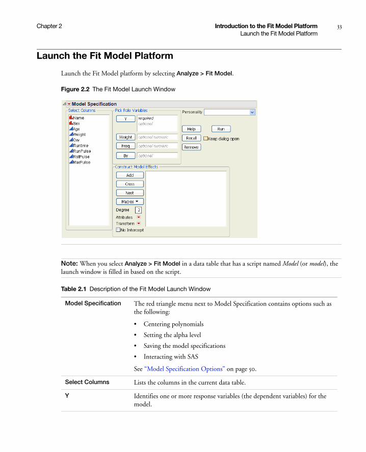
Chapter 2 Introduction to the Fit Model Platform 33Launch the Fit Model Platform
Launch the Fit Model Platform
Launch the Fit Model platform by selecting Analyze > Fit Model.
Figure 2.2 The Fit Model Launch Window
Note: When you select Analyze > Fit Model in a data table that has a script named Model (or model), the launch window is filled in based on the script.
Table 2.1 Description of the Fit Model Launch Window
Model Specification The red triangle menu next to Model Specification contains options such as the following:
• Centering polynomials
• Setting the alpha level
• Saving the model specifications
• Interacting with SAS
See “Model Specification Options” on page 50.
Select Columns Lists the columns in the current data table.
Y Identifies one or more response variables (the dependent variables) for the model.

34 Introduction to the Fit Model Platform Chapter 2Launch the Fit Model Platform
Weight (Optional) Identifies one column whose values supply weights for the response. The corrected sum of squares is the number of observations minus 1.
Freq (Optional) Identifies one column whose values assign a frequency to each row for the analysis. The corrected sum of squares in the number of frequencies minus one. Fractional frequencies (Freq values below 1) are included in the analysis.
By Performs a separate analysis for each level of the variable.
Add Adds effects to the model. See “Add” on page 39.
Cross Creates an interaction effect by crossing two or more variables. See “Cross” on page 40.
Nest Creates a nested effect. See “Nest” on page 40.
Macros Automatically generates effects for commonly used models. See “Macros” on page 41.
Degree Enter the desired degree for factorials or polynomials.
Attributes Specify the attributes that you want to assign to an effect in a model. See “Attributes” on page 45.
Transform (Standard Least Squares only) Transforms selected continuous effects or Y columns. See “Transformations” on page 48.
Only supported for continuous main effects.
No Intercept Excludes the intercept term from the model.
Personality Specifies a fitting method. See “Fitting Personalities” on page 48.
Emphasis (Standard Least Squares only) Controls the types of plots and reports that appear in the initial report window. See “Emphasis Options for Standard Least Squares” on page 50.
Method (Standard Least Squares with random effects only) Applies one of the following methods to the model:
• REML. See “Restricted Maximum Likelihood (REML) Method” on page 113.
• EMS. Also called the Method of Moments. See “Method of Moments Results” on page 123.
Table 2.1 Description of the Fit Model Launch Window (Continued)
Chapter 2 Introduction to the Fit Model Platform 35Example of the Fit Model Platform
Example of the Fit Model Platform
You have data resulting from an aerobic fitness study, and you want to predict the oxygen uptake from several continuous variables.
1. Open the Fitness.jmp sample data table.
Unbounded Variance Components
(Standard Least Squares REML method only) Constrains the estimate to be non-negative. This option should remain selected if you are interested in fixed effects, since constraining the variance estimates leads to bias in the tests for the fixed effects. See “Negative Variances” on page 116.
Estimate Only Variance Components
(Standard Least Squares REML method only) Hides negative variance components. Select this option if you are interested only in variance components. See “Negative Variances” on page 116.
Distribution (Generalized Linear Model only) Assigns the appropriate response probability distribution to the model. See “Examples of Generalized Linear Models” on page 180.
Link Function (Generalized Linear Model only) A link function relates the linear model to the response variable. See “Examples of Generalized Linear Models” on page 180.
Overdispersion Tests and Intervals
(Generalized Linear Model only) Fits a model that includes an overdispersion parameter.
Firth Bias-adjusted Estimates
(Generalized Linear Model only) This MLE method has been shown to produce better estimates and tests than MLEs without bias correction. In addition, bias-corrected MLEs ameliorate separation problems that tend to occur in logistic-type models. Refer to Heinze and Schemper (2002) for a discussion of the separation problem in logistic regression.
Distrib (Parametric Survival only) Choose the desired response distribution. See the Quality and Reliability Methods book.
Help Takes you to the help for the Fit Model launch window.
Recall Populates the launch window with the last analysis that you performed.
Remove Removes the selected variable from the assigned role. Alternatively, press the Backspace key.
Run Fits the specified model and generates the report window.
Keep dialog open Keeps the launch window open after you run the analysis, enabling you to alter and re-run the analysis at any time.
Table 2.1 Description of the Fit Model Launch Window (Continued)
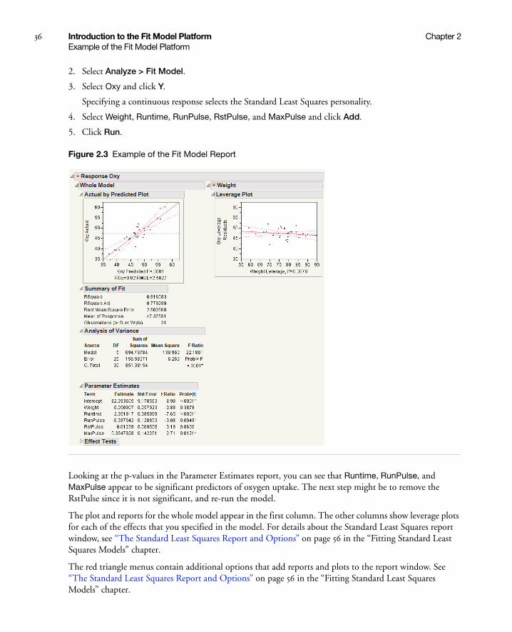
36 Introduction to the Fit Model Platform Chapter 2Example of the Fit Model Platform
2. Select Analyze > Fit Model.
3. Select Oxy and click Y.
Specifying a continuous response selects the Standard Least Squares personality.
4. Select Weight, Runtime, RunPulse, RstPulse, and MaxPulse and click Add.
5. Click Run.
Figure 2.3 Example of the Fit Model Report
Looking at the p-values in the Parameter Estimates report, you can see that Runtime, RunPulse, and MaxPulse appear to be significant predictors of oxygen uptake. The next step might be to remove the RstPulse since it is not significant, and re-run the model.
The plot and reports for the whole model appear in the first column. The other columns show leverage plots for each of the effects that you specified in the model. For details about the Standard Least Squares report window, see “The Standard Least Squares Report and Options” on page 56 in the “Fitting Standard Least Squares Models” chapter.
The red triangle menus contain additional options that add reports and plots to the report window. See “The Standard Least Squares Report and Options” on page 56 in the “Fitting Standard Least Squares Models” chapter.

Chapter 2 Introduction to the Fit Model Platform 37Specify Different Model Types
Specify Different Model Types
Table 2.2 describes different model types that you can specify using the Construct Model Effects panel in the Fit Model platform. Note the following about Table 2.2:
• The model effects X and Z represent continuous values.
• The model effects A, B, and C represent nominal or ordinal values.
• This list might not be exhaustive.
Table 2.2 Types of Models
Model Type Launch Window Actions Model Effects
Simple regression Add one continuous effect. X
Polynomial (x) to degree 2 1. Type 2 next to Degree.
2. In the Select Columns list, click on a continuous effect and click Macros > Polynomial to Degree.
X
X*X
Polynomial (x, z) to degree 2 1. Type 2 next to Degree.
2. In the Select Columns list, click on two continuous effects and click Macros > Polynomial to Degree.
X
X*X
Z
Z*Z
Cubic polynomial (x) 1. Type 3 next to Degree.
2. In the Select Columns list, click on a continuous effect and click Macros > Polynomial to Degree.
X
X*X
X*X*X
Multiple regression Add multiple continuous effects. X, Z, and so on
One-way analysis of variance Add one nominal or ordinal effect. A
Two-way analysis of variance without interaction
Add two nominal or ordinal effects. A, B
Two-way analysis of variance with interaction
1. In the Select Columns list, click on two nominal or ordinal effects.
2. Select Macros > Full Factorial.
or
If the effects are already added, click on them and click Cross.
A
B
A*B

38 Introduction to the Fit Model Platform Chapter 2Specify Different Model Types
Three-way full factorial 1. In the Select Columns list, click on three nominal or ordinal effects.
2. Select Macros > Full Factorial.
A
B
C
A*B
A*C
B*C
A*B*C
Analysis of covariance, same slopes
Add one continuous and one nominal or ordinal effect.
A, X
Analysis of covariance, separate slopes
1. In the Select Columns list, click on one continuous effect and one nominal or ordinal effect.
2. Select Macros > Full Factorial.
Or, if the effects are already added, click them then click Cross.
A
X
A*X
Simple nested model 1. Add two nominal or ordinal effects.
2. In the Construct Model Effects list, click on the second effect. In the Select Columns list, click on the first effect. The two effects should be highlighted.
3. Click Nest.
A
B[A]
Compound nested model 1. Follow the instructions for a simple nested model.
2. Add a third nominal or ordinal effect.
3. In the Construct Model Effects list, click on the third effect. In the Select Columns list, click on the first and second effect. The three effects should be highlighted.
4. Click Nest.
A
B[A]
C[A B]
Table 2.2 Types of Models (Continued)
Model Type Launch Window Actions Model Effects

Chapter 2 Introduction to the Fit Model Platform 39Construct Model Effects
Construct Model Effects
The following sections describe in detail the options that you use to enter effects into your model.
Add
The Add button adds effects to the model. The modeling type of the variable determines how the variable is treated in the model:
• Variables with continuous modeling type are treated as regressors.
• Variables with nominal or ordinal modeling types are treated as main effects.
Note: To remove an effect from the Construct Model Effects list, double-click the effect, or select it and click Remove.
Simple split-plot or repeated measure
1. Follow the instructions for a simple nested model.
2. In the Construct Model Effects list, click on the nested effect.
3. Select Attributes > Random Effect.
4. Add a third nominal or ordinal effect.
5. In the Construct Model Effects list, click on the third effect. In the Select Columns list, click on the first effect. Both effects should be highlighted.
6. Click Cross.
A
B[A]&Random
C
C*A
Response surface (x) model 1. In the Select Columns list, click on a continuous effect.
2. Select Macros > Response Surface.
X&RS
X*X
Response surface (x, z) model 1. In the Select Columns list, click on two continuous effects.
2. Select Macros > Response Surface.
X&RS
Z&RS
X*X
Z*Z
X*Z
Table 2.2 Types of Models (Continued)
Model Type Launch Window Actions Model Effects

40 Introduction to the Fit Model Platform Chapter 2Construct Model Effects
Cross
The Cross button creates interaction or polynomial effects. Select two or more variables in the Select Columns list and click Cross.
See the appendix “Statistical Details” on page 651 in the “Statistical Details” appendix, for a discussion of how crossed effects are parameterized and coded.
Note: JMP allows up to ten terms to be combined as crossed and nested.
Explanation of Crossed Effects
As an illustration of what the Cross button does, consider a cell phone manufacturer that wants to experiment to determine the effect of two factors: plastic types and rubber types. The manufacturer is examining two types of plastics (p1 and p2) and two types of rubber (r1 and r2). In the experiments, both levels of plastic are combined with both levels of rubber, producing the following combinations:
• p1*r1
• p1*r2
• p2*r1
• p2*r2
Since there are no restrictions on combining the levels of plastic and rubber, you can add a crossed term to your model. In the Construct Model Effects panel, you would add the following effects: P, R, P*R.
Nest
The Nest button creates nested effects. If the levels of one effect (B) occur only within a single level of another effect (A), then B is said to be nested within A. A is called the outside effect and B is called the inside effect. The notation B[A] is read as B within A.
For example, in the Fit Model launch window, proceed as follows:
1. Add both A and B to the Construct Model Effects panel.
2. In the Construct Model Effects panel, click on B.
3. In the Select Columns list, click on A.
4. Click Nest.
Note: The nesting terms must be specified in order from outer to inner. For example, if B is nested within A, and C is nested within B, then the model is specified as: A, B[A], C[B,A]. JMP allows up to ten terms to be combined as crossed and nested.

Chapter 2 Introduction to the Fit Model Platform 41Construct Model Effects
Explanation of Nested Effects
As an illustration of what the Nest button does, consider two schools with three teachers in each. School A has the following teachers: Sandy, Greg, and Richard. School B has the following teachers: Brad, Amy, and Sheila. Because the teachers in School A are not the same as the teachers in School B, the teacher effect is nested in the school effect.
Macros
Commands that are launched from the Macros button automatically generate the effects for commonly used models.
Table 2.3 Descriptions of the Macros Options
Full Factorial Creates all main effects and interactions for the selected columns.
Factorial to Degree Creates all main effects and interactions to a specified degree. Specify the degree in the Degree box.
Factorial Sorted Creates the same set of effects as the Full Factorial option but lists them in order of degree. All main effects are listed first, followed by all two-way interactions, then all three-way interactions, and so on.
Response Surface Creates main effects, two-way interactions, and quadratic terms. Main effects have the response surface attribute, which generates reports that are specific to response surface models.
In a response surface model, the object is to find the values of the terms that produce a maximum or minimum expected response. This is done by fitting a collection of terms in a quadratic model. The critical values for the surface are calculated from the parameter estimates and presented with a report on the shape of the surface. See “Response Surface Curvature” on page 42.
See also Response Surface Effect in “Attributes” on page 45.
Mixture Response Surface
Creates main effects and two-way interactions. Main effects have the response surface and mixture attributes, which generates reports that are specific to mixture models.
See the Design of Experiments book. See also Mixture Effect in “Attributes” on page 45.
Polynomial to Degree Creates main effects and polynomial terms to a specified degree. Specify the degree in the Degree box.

42 Introduction to the Fit Model Platform Chapter 2Construct Model Effects
Response Surface Curvature
Often in industrial experiments, the goal is to find values for one or more factors that maximize or minimize the response. JMP provides surface modeling with special reports that show the critical values, the surface curvature, and a response contour plot.
The Response Surface selection in the Effect Macros popup menu automatically constructs all the linear, quadratic, and cross product terms needed for a response surface model.
The same model can be specified using the Add and Cross buttons to create model effects in the Fit Model dialog. You then select a model term and assign it the Response Surface effect attribute found in the Attributes popup menu. The response surface effects show with &RS after their name in the Construct Model Effects list, as shown in Figure 2.4.
Note: Curvature analysis is not shown for response surface designs of more than 20 factors in the Fit Model platform. No error message or alert is given. All other analyses contained within the report are valid and are shown. For additional information about response surface designs, see Design of Experiments.
Scheffé Cubic Creates main effects, interactions, and Scheffé Cubic terms.
When you fit a 3rd degree polynomial model to a mixture, you need to take special care not to introduce even-powered terms because they are not estimable. When you get up to a cubic model, this means that you cannot specify an effect like X1*X1*X2. However, it turns out that a complete polynomial specification of the surface should introduce terms of the form:
X1*X2*(X1 – X2)
which we call Scheffé Cubic terms.
In the Fit Model window, this macro creates a complete cubic model. The Scheffé Cubic terms are included if you either (a) enter a 3 in the Degree box, then do a “Mixture Response Surface” command on a set of mixture columns, or (b) use the Scheffe Cubic command in the Macro button.
Radial Fits a radial smoother using the selected variables. The number of knots is the number of unique values of the smoothing variable. The smoother is based on the automatic smoother in Ruppert, Wand, and Carroll (2003, Chapter 13.4–13.5).
The GLIMMIX procedure in SAS/STAT can produce the same results if the following options are included in the RANDOM statement:
• TYPE = RSMOOTH
• KNOTMETHOD = DATA
Table 2.3 Descriptions of the Macros Options (Continued)
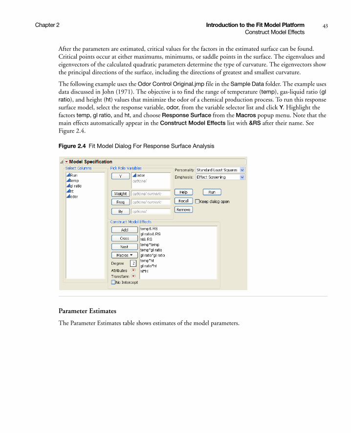
Chapter 2 Introduction to the Fit Model Platform 43Construct Model Effects
After the parameters are estimated, critical values for the factors in the estimated surface can be found. Critical points occur at either maximums, minimums, or saddle points in the surface. The eigenvalues and eigenvectors of the calculated quadratic parameters determine the type of curvature. The eigenvectors show the principal directions of the surface, including the directions of greatest and smallest curvature.
The following example uses the Odor Control Original.jmp file in the Sample Data folder. The example uses data discussed in John (1971). The objective is to find the range of temperature (temp), gas-liquid ratio (gl ratio), and height (ht) values that minimize the odor of a chemical production process. To run this response surface model, select the response variable, odor, from the variable selector list and click Y. Highlight the factors temp, gl ratio, and ht, and choose Response Surface from the Macros popup menu. Note that the main effects automatically appear in the Construct Model Effects list with &RS after their name. See Figure 2.4.
Figure 2.4 Fit Model Dialog For Response Surface Analysis
Parameter Estimates
The Parameter Estimates table shows estimates of the model parameters.

44 Introduction to the Fit Model Platform Chapter 2Construct Model Effects
Figure 2.5 Parameter Estimates Table
If you use the Prediction Formula option in the Save Columns submenu, a new data table column called Pred Formula odor saves the prediction formula using the coefficients from the Parameter Estimates table.
The probability value of 0.0657 in the Analysis of Variance table indicates that the three-variable response surface model is only marginally better than the sample mean.
Figure 2.6 Analysis of Variance Table
The response surface analysis also displays the Response Surface table and the Solution table (Figure 2.7). The Solution table shows the critical values for the surface variables and indicates that the surface solution point is a minimum for this example.
Canonical Curvature Table
The Canonical Curvature report, found under the Response Surface title, shows the eigenstructure (Figure 2.7), which is useful for identifying the shape and orientation of the curvature, and results from the eigenvalue decomposition of the matrix of second-order parameter estimates. The eigenvalues (given in the first row of the Canonical Curvature table) are negative if the response surface shape curves back from a maximum. The eigenvalues are positive if the surface shape curves up from a minimum. If the eigenvalues are mixed, the surface is saddle shaped, curving up in one direction and down in another direction.
The eigenvectors listed beneath the eigenvalues show the orientations of the principal axes. In this example the eigenvalues are positive, which indicates that the curvature bends up from a minimum. The direction where the curvature is the greatest corresponds to the largest eigenvalue (48.8588) and the variable with the largest component of the associated eigenvector (gl ratio). The direction with the eigenvalue of 31.1035 is loaded more on temp, which has nearly as much curvature as that for gl ratio.
Sometimes a zero eigenvalue occurs. This means that along the direction described by the corresponding eigenvector, the fitted surface is flat.

Chapter 2 Introduction to the Fit Model Platform 45Construct Model Effects
Figure 2.7 Basic Reports for Response Surface Model
Attributes
Table 2.4 describes the attributes that you can assign to an effect in the Construct Model Effects list.
Table 2.4 Descriptions of the Attributes Options
Random Effect Assigns the random attribute to an effect. For details about random effects, see “Specifying Random Effects” on page 119 in the “Fitting Standard Least Squares Models” chapter.
Response Surface Effect Assigns the response surface attribute to an effect. The Response Surface option in the Macros list automatically assigns the attribute to the effects. To fit a Response Surface model, interaction and polynomial terms do not need to have the Response Surface Effect attribute assigned to them. Only assign this attribute to main effects.
LogVariance Effect Assigns the Log Variance attribute to an effect. A Log Variance effect models the variability in the response as a function of the effect.
To model both the mean and variability of the response, you must specify the effect twice, once with the LogVariance Effect attribute, and then once without the LogVariance Effect attribute.
Mixture Effect Assigns the Mixture attribute to an effect. The Mixture Response Surface option in the Macros list automatically assigns the attribute to the effects. To fit a Mixture model, interaction and polynomial terms do not need to have the Mixture Response Surface attribute assigned to them. Only assign this attribute to main effects.
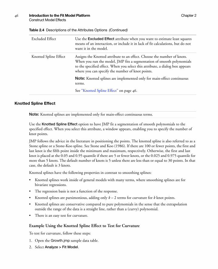
46 Introduction to the Fit Model Platform Chapter 2Construct Model Effects
Knotted Spline Effect
Note: Knotted splines are implemented only for main-effect continuous terms.
Use the Knotted Spline Effect option to have JMP fit a segmentation of smooth polynomials to the specified effect. When you select this attribute, a window appears, enabling you to specify the number of knot points.
JMP follows the advice in the literature in positioning the points. The knotted spline is also referred to as a Stone spline or a Stone-Koo spline. See Stone and Koo (1986). If there are 100 or fewer points, the first and last knot is the fifth point inside the minimum and maximum, respectively. Otherwise, the first and last knot is placed at the 0.05 and 0.95 quantile if there are 5 or fewer knots, or the 0.025 and 0.975 quantile for more than 5 knots. The default number of knots is 5 unless there are less than or equal to 30 points. In that case, the default is 3 knots.
Knotted splines have the following properties in contrast to smoothing splines:
• Knotted splines work inside of general models with many terms, where smoothing splines are for bivariate regressions.
• The regression basis is not a function of the response.
• Knotted splines are parsimonious, adding only k – 2 terms for curvature for k knot points.
• Knotted splines are conservative compared to pure polynomials in the sense that the extrapolation outside the range of the data is a straight line, rather than a (curvy) polynomial.
• There is an easy test for curvature.
Example Using the Knotted Spline Effect to Test for Curvature
To test for curvature, follow these steps:
1. Open the Growth.jmp sample data table.
2. Select Analyze > Fit Model.
Excluded Effect Use the Excluded Effect attribute when you want to estimate least squares means of an interaction, or include it in lack of fit calculations, but do not want it in the model.
Knotted Spline Effect Assigns the Knotted attribute to an effect. Choose the number of knots. When you run the model, JMP fits a segmentation of smooth polynomials to the specified effect. When you select this attribute, a dialog box appears where you can specify the number of knot points.
Note: Knotted splines are implemented only for main-effect continuous terms.
See “Knotted Spline Effect” on page 46.
Table 2.4 Descriptions of the Attributes Options (Continued)

Chapter 2 Introduction to the Fit Model Platform 47Construct Model Effects
3. Select ratio and click Y.
4. Select age and click Add.
5. In the Construct Model Effects box, click age, then select Attributes > Knotted Spline Effect.
6. Specify the number of knots as 5 and click OK.
7. Click Run.
When the report appears:
8. Select Estimates > Custom Test.
Notice that there is only one column. You want three columns.
9. Click the Add Column button twice to produce a total of three columns.
10. Fill in the three knotted columns. See Figure 2.8.
Figure 2.8 Values for the Custom Test for Curvature
11. Click Done.
The report in Figure 2.9 appears. The low Prob > F value indicates that there is indeed curvature to the data.
Figure 2.9 Curvature Report
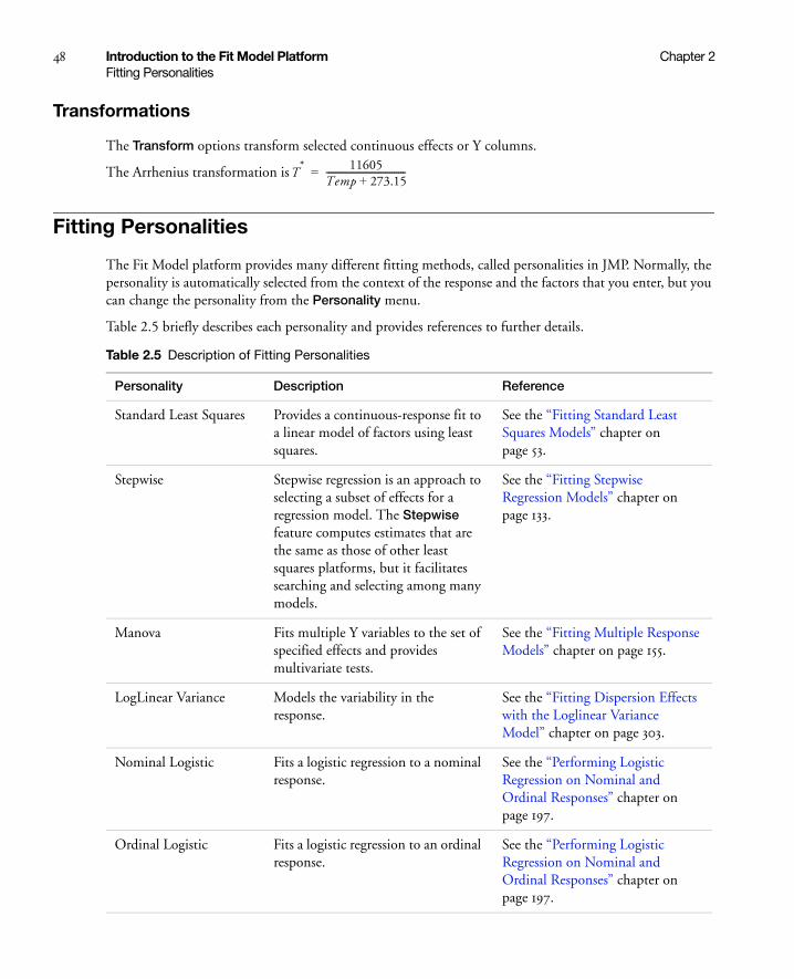
48 Introduction to the Fit Model Platform Chapter 2Fitting Personalities
Transformations
The Transform options transform selected continuous effects or Y columns.
The Arrhenius transformation is
Fitting Personalities
The Fit Model platform provides many different fitting methods, called personalities in JMP. Normally, the personality is automatically selected from the context of the response and the factors that you enter, but you can change the personality from the Personality menu.
Table 2.5 briefly describes each personality and provides references to further details.
T* 11605
Temp 273.15+------------------------------------=
Table 2.5 Description of Fitting Personalities
Personality Description Reference
Standard Least Squares Provides a continuous-response fit to a linear model of factors using least squares.
See the “Fitting Standard Least Squares Models” chapter on page 53.
Stepwise Stepwise regression is an approach to selecting a subset of effects for a regression model. The Stepwise feature computes estimates that are the same as those of other least squares platforms, but it facilitates searching and selecting among many models.
See the “Fitting Stepwise Regression Models” chapter on page 133.
Manova Fits multiple Y variables to the set of specified effects and provides multivariate tests.
See the “Fitting Multiple Response Models” chapter on page 155.
LogLinear Variance Models the variability in the response.
See the “Fitting Dispersion Effects with the Loglinear Variance Model” chapter on page 303.
Nominal Logistic Fits a logistic regression to a nominal response.
See the “Performing Logistic Regression on Nominal and Ordinal Responses” chapter on page 197.
Ordinal Logistic Fits a logistic regression to an ordinal response.
See the “Performing Logistic Regression on Nominal and Ordinal Responses” chapter on page 197.

Chapter 2 Introduction to the Fit Model Platform 49Fitting Personalities
Proportional Hazard The proportional hazard (Cox) model is a special fitting personality that lets you specify models where the response is time-to-failure. The data might include right-censored observations and time-independent covariates. The covariate of interest might be specified as a grouping variable that defines sub populations or strata.
You can alternatively launch this personality by selecting Analyze > Reliability and Survival > Fit Proportional Hazards.
See the Quality and Reliability Methods book.
Parametric Survival Fits a general linear regression model to survival times. Use this option if you have survival times that can be expressed as a function of one or more variables.
You can alternatively launch this personality by selecting Analyze > Reliability and Survival > Fit Parametric Survival.
See the Quality and Reliability Methods book.
Generalized Linear Model
Fits generalized linear models with various distribution and link functions.
See the “Fitting Generalized Linear Models” chapter on page 177.
Partial Least Squares The Partial Least Squares platform fits linear models using partial least squares instead of ordinary least squares.
You can also do a partial least squares analysis by selecting Analyze > Multivariate Methods > Partial Least Squares.
See the “Fitting Partial Least Squares Models” chapter on page 505.
Table 2.5 Description of Fitting Personalities (Continued)

50 Introduction to the Fit Model Platform Chapter 2Emphasis Options for Standard Least Squares
Emphasis Options for Standard Least Squares
The options in the Emphasis menu control the type of plots that you see as part of the initial analysis report for the Standard Least Squares personality.
Model Specification Options
Table 2.7 describes the options in the red triangle menu next to Model Specification.
Table 2.6 Description of the Emphasis Options
Effect Leverage Starts by showing leverage and residual plots for the whole model. You can then request effect details and other statistical reports. This is the most detailed option.
Effect Screening Shows whole model information followed by a sorted parameter estimates report with a graph and the Prediction Profiler. This option can be appropriate when you have many effects and do not want to see details until you discover which effects are stronger and which are weaker. This is the recommended method for screening designs, where there are many effects and few observations, and the quest is to find the strong effects, rather than to test significance.
Minimal Report Suppresses all plots except the regression plot. You request the options that you want from the platform red triangle menu. This is the least detailed option.
Table 2.7 Descriptions of the Model Specification Options
Center Polynomials Causes a continuous term participating in a crossed term to be centered by its mean. Exceptions to centering are effects with coded or mixture properties. This option is important to make main effects tests be meaningful hypotheses in the presence of continuous crossed effects.
Set Alpha Level Sets the alpha level for confidence intervals in the Fit Model analysis.
Save to Data Table Saves your specifications in the Fit Model launch window as a script that is attached to the data table. The script is named Model.
For details about JSL scripting, see the JMP Scripting Guide.
Save to Script Window Outputs your specifications in the Fit Model launch window to a script window. You can save the script window and recreate the model at any time by running the script.

Chapter 2 Introduction to the Fit Model Platform 51Model Specification Options
Create SAS job Creates a SAS program in a script window that can recreate the current analysis in SAS. Once created, you have several options for submitting the code to SAS.
1. Copy and paste the resulting code into the SAS Program Editor. This method is useful if you are running an older version of SAS (pre-version 8.2).
2. Select Edit > Submit to SAS.
3. Save the file and double-click it to open it in a local copy of SAS. This method is useful if you would like to take advantage of SAS ODS options, such as generating HTML or PDF output from the SAS code.
See the Using JMP book.
Submit to SAS Submits code to SAS and displays the results in JMP. If you are not connected to a SAS server, prompts guide you through the connection process.
See the Using JMP book.
Load Version 3 Model Opens a text file that contains JMP version 3 model statements into the Fit Model platform. You can save the model as the current version.
Convergence Settings Note: This option appears only if your model includes a random effect.
If your model includes a Random Effect, or if you select Generalized Linear Model as the personality, and REML is selected as the method in the launch window, a new menu called Convergence Settings appears in the red triangle menu next to Model Specification. The Convergence Settings menu includes the following options:
• Maximum Iterations
• Convergence Limit
Default values for the Maximum Iterations and Convergence Limit are 100 and .00000001, respectively. When you click on either of these options, you are able to enter new values for these limits. If you have a very large data set or a complicated model, you might want to limit the number of iterations. If your model does not readily converge, you might want to either increase the Maximum Iterations or increase the Convergence Limit.
Note: JMP only creates design columns for those combinations that actually occur in the data.
Table 2.7 Descriptions of the Model Specification Options (Continued)

52 Introduction to the Fit Model Platform Chapter 2Validity Checks
Validity Checks
Fit Model checks your model for errors such as duplicate effects or missing effects in a hierarchy. If you get an alert message, you can either Continue the fitting despite the situation, or click Cancel in the alert message to stop the fitting process.
If your data has missing values, you have the following options:
• Fit Separately uses all the nonmissing rows when fitting the model for a particular Y variable.
• Fit Together uses only those rows that are nonmissing for all of the Y variables.
When Y variables are fit separately, the results for the individual analyses are given in a Fit Group report. This allows all the Y variables to be profiled in the same Profiler. See “Fit Group” on page 625.
Note: The alert message only appears when you are fitting the model using JMP, not a script. Scripts use the Fit Together option, unless you specify otherwise.

Chapter 3Fitting Standard Least Squares Models
Using the Fit Model Platform
The Standard Least Squares personality within the Fit Model platform fits many different types of models, such as regression, analysis of variance, analysis of covariance, and mixed models. Use the Standard Least Squares personality for a continuous-response fit to a linear model of factors using least squares. Results include leverage plots, parameter estimates, effect tests, and summary of fit reports.
Figure 3.1 Example of the Standard Least Squares Report Window

Contents
Example Using Standard Least Squares . . . . . . . . . . . . . . . . . . . . . . . . . . . . . . . . . . . . . . . . . . . . . . . . . . . 55
The Standard Least Squares Report and Options. . . . . . . . . . . . . . . . . . . . . . . . . . . . . . . . . . . . . . . . . . . .56
Regression Reports . . . . . . . . . . . . . . . . . . . . . . . . . . . . . . . . . . . . . . . . . . . . . . . . . . . . . . . . . . . . . . . . . .57
Estimates . . . . . . . . . . . . . . . . . . . . . . . . . . . . . . . . . . . . . . . . . . . . . . . . . . . . . . . . . . . . . . . . . . . . . . . . . 64
Effect Screening. . . . . . . . . . . . . . . . . . . . . . . . . . . . . . . . . . . . . . . . . . . . . . . . . . . . . . . . . . . . . . . . . . . . .82
Factor Profiling . . . . . . . . . . . . . . . . . . . . . . . . . . . . . . . . . . . . . . . . . . . . . . . . . . . . . . . . . . . . . . . . . . . . 92
Row Diagnostics . . . . . . . . . . . . . . . . . . . . . . . . . . . . . . . . . . . . . . . . . . . . . . . . . . . . . . . . . . . . . . . . . . .100
Save Columns . . . . . . . . . . . . . . . . . . . . . . . . . . . . . . . . . . . . . . . . . . . . . . . . . . . . . . . . . . . . . . . . . . . . .104
Effect Options . . . . . . . . . . . . . . . . . . . . . . . . . . . . . . . . . . . . . . . . . . . . . . . . . . . . . . . . . . . . . . . . . . . . .106
Restricted Maximum Likelihood (REML) Method . . . . . . . . . . . . . . . . . . . . . . . . . . . . . . . . . . . . . . . . . 113
Method of Moments Results . . . . . . . . . . . . . . . . . . . . . . . . . . . . . . . . . . . . . . . . . . . . . . . . . . . . . . . . . . 123
Singularity Details . . . . . . . . . . . . . . . . . . . . . . . . . . . . . . . . . . . . . . . . . . . . . . . . . . . . . . . . . . . . . . . . . . 126
Examples with Statistical Details . . . . . . . . . . . . . . . . . . . . . . . . . . . . . . . . . . . . . . . . . . . . . . . . . . . . . . . 126
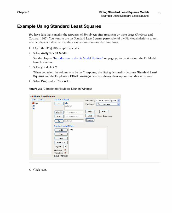
Chapter 3 Fitting Standard Least Squares Models 55Example Using Standard Least Squares
Example Using Standard Least Squares
You have data that contains the responses of 30 subjects after treatment by three drugs (Snedecor and Cochran 1967). You want to use the Standard Least Squares personality of the Fit Model platform to test whether there is a difference in the mean response among the three drugs.
1. Open the Drug.jmp sample data table.
2. Select Analyze > Fit Model.
See the chapter “Introduction to the Fit Model Platform” on page 31, for details about the Fit Model launch window.
3. Select y and click Y.
When you select the column y to be the Y response, the Fitting Personality becomes Standard Least Squares and the Emphasis is Effect Leverage. You can change these options in other situations.
4. Select Drug and x. Click Add.
Figure 3.2 Completed Fit Model Launch Window
5. Click Run.
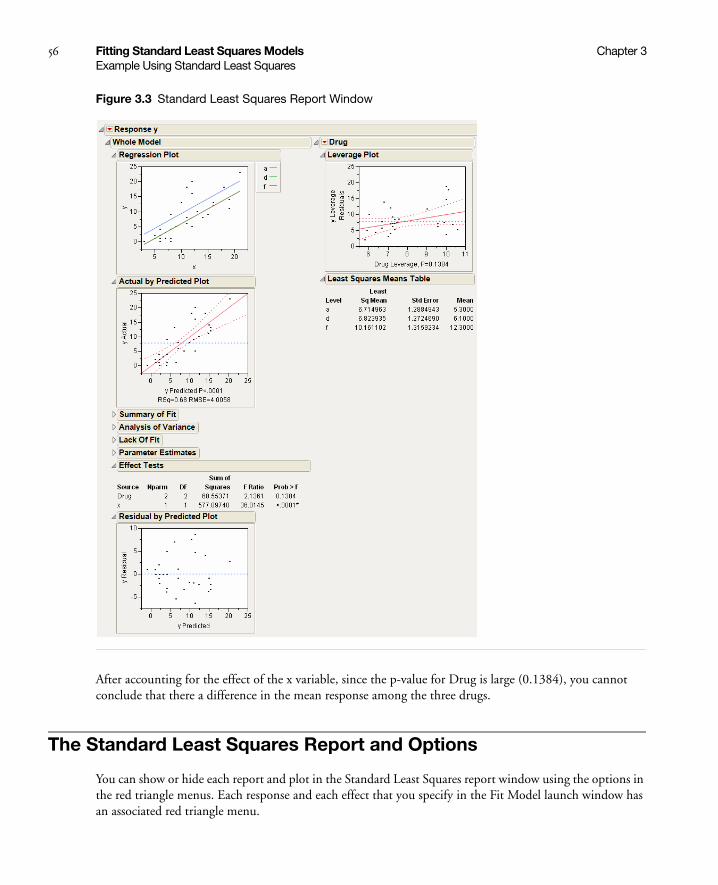
56 Fitting Standard Least Squares Models Chapter 3Example Using Standard Least Squares
Figure 3.3 Standard Least Squares Report Window
After accounting for the effect of the x variable, since the p-value for Drug is large (0.1384), you cannot conclude that there a difference in the mean response among the three drugs.
The Standard Least Squares Report and Options
You can show or hide each report and plot in the Standard Least Squares report window using the options in the red triangle menus. Each response and each effect that you specify in the Fit Model launch window has an associated red triangle menu.
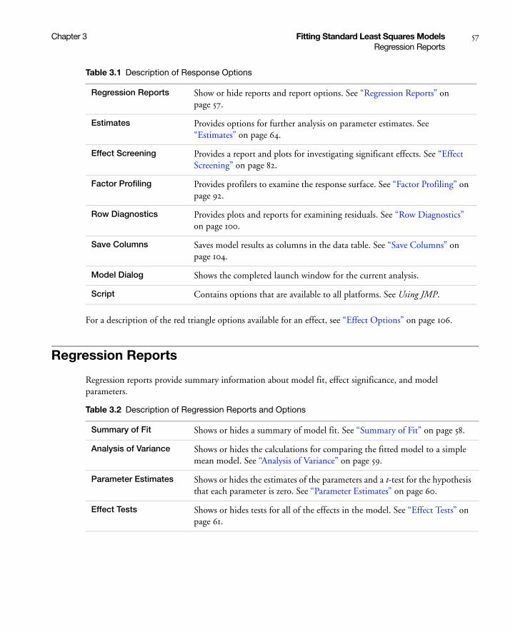
Chapter 3 Fitting Standard Least Squares Models 57Regression Reports
For a description of the red triangle options available for an effect, see “Effect Options” on page 106.
Regression Reports
Regression reports provide summary information about model fit, effect significance, and model parameters.
Table 3.1 Description of Response Options
Regression Reports Show or hide reports and report options. See “Regression Reports” on page 57.
Estimates Provides options for further analysis on parameter estimates. See “Estimates” on page 64.
Effect Screening Provides a report and plots for investigating significant effects. See “Effect Screening” on page 82.
Factor Profiling Provides profilers to examine the response surface. See “Factor Profiling” on page 92.
Row Diagnostics Provides plots and reports for examining residuals. See “Row Diagnostics” on page 100.
Save Columns Saves model results as columns in the data table. See “Save Columns” on page 104.
Model Dialog Shows the completed launch window for the current analysis.
Script Contains options that are available to all platforms. See Using JMP.
Table 3.2 Description of Regression Reports and Options
Summary of Fit Shows or hides a summary of model fit. See “Summary of Fit” on page 58.
Analysis of Variance Shows or hides the calculations for comparing the fitted model to a simple mean model. See “Analysis of Variance” on page 59.
Parameter Estimates Shows or hides the estimates of the parameters and a t-test for the hypothesis that each parameter is zero. See “Parameter Estimates” on page 60.
Effect Tests Shows or hides tests for all of the effects in the model. See “Effect Tests” on page 61.

58 Fitting Standard Least Squares Models Chapter 3Regression Reports
Summary of Fit
The Summary of Fit report provides a summary of model fit.
Effect Details Shows or hides the Effect Details report when Effect Screening or Minimal Report is selected in Fit Model launch window. See “Effect Options” on page 106.
Note: If you select the Effect Leverage Emphasis option, each effect has its own report at the top of the report window.
Lack of Fit Shows or hides a test assessing if the model has the appropriate effects. See “Lack of Fit” on page 62.
Show All Confidence Intervals
Shows or hides confidence intervals for the following:
• Parameter estimates in the Parameter Estimates report
• Least squares means in the Least Squares Means Table
AICc Shows or hides AICc and BIC values in the Summary of Fit report.
Table 3.2 Description of Regression Reports and Options (Continued)
Table 3.3 Description of the Summary of Fit Report
RSquare Estimates the proportion of variation in the response that can be attributed to the model rather than to random error. Using quantities from the corresponding Analysis of Variance table, R2 is calculated as follows:
An R2 closer to 1 indicates a better fit. An R2 closer to 0 indicates that the fit predicts the response no better than the overall response mean.
Rsquare Adj Adjusts R2 to make it more comparable between models with different numbers of parameters. The computation uses the degrees of freedom, and is the ratio of mean squares instead of sums of squares.
The mean square for Error appears in the Analysis of Variance report. The mean square for C. Total is computed as the C. Total sum of squares divided by its respective degrees of freedom.
Root Mean Square Error Estimates the standard deviation of the random error. It is the square root of the Mean Square for Error in the Analysis of Variance report.
Note: Root Mean Square Error (RMSE) is commonly denoted as s.
Sum of Squares(Model)Sum of Squares(C. Total)-----------------------------------------------------------
1 Mean Square(Error)
Mean Square(C. Total)------------------------------------------------------–

Chapter 3 Fitting Standard Least Squares Models 59Regression Reports
Analysis of Variance
The Analysis of Variance report provides the calculations for comparing the fitted model to a simple mean model.
Mean of Response Overall mean of the response values.
Observations (or Sum Wgts)
Records the number of observations used in the model. If there are no missing values and no excluded rows, this is the same as the number of rows in the data table. If there is a column assigned to the role of weight, this is the sum of the weight column values.
AICc Note: Appears only if you have the AICc option selected.
Shows or hides the corrected Akaike Information Criterion value, which is a measure of model fit that is helpful when comparing different models.
BIC Note: Appears only if you have the AICc option selected.
Shows or hides the Bayesian Information Criterion value, which is a measure of model fit that is helpful when comparing different models.
Table 3.3 Description of the Summary of Fit Report (Continued)
Table 3.4 Description of the Analysis of Variance Report
Source Lists the three sources of variation: Model, Error, and C. Total (Corrected Total).
DF Records an associated degrees of freedom (DF) for each source of variation.
• The C. Total DF is always one less than the number of observations.
• The total DF are partitioned into the Model and Error terms:
– The Model degrees of freedom is the number of parameters (except for the intercept) used to fit the model.
– The Error DF is the difference between the C. Total DF and the Model DF.
Sum of Squares Records an associated sum of squares (SS) for each source of variation. The SS column accounts for the variability measured in the response.
• The total (C. Total) SS is the sum of squared distances of each response from the sample mean.
• The Error SS is the sum of squared differences between the fitted values and the actual values. This corresponds to the unexplained variability after fitting the model.
• The Model SS is the difference between the C. Total SS and the Error SS.
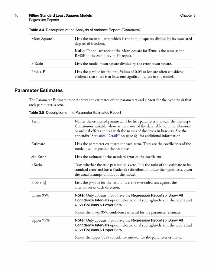
60 Fitting Standard Least Squares Models Chapter 3Regression Reports
Parameter Estimates
The Parameter Estimates report shows the estimates of the parameters and a t-test for the hypothesis that each parameter is zero.
Mean Square Lists the mean squares, which is the sum of squares divided by its associated degrees of freedom.
Note: The square root of the Mean Square for Error is the same as the RMSE in the Summary of Fit report.
F Ratio Lists the model mean square divided by the error mean square.
Prob > F Lists the p-value for the test. Values of 0.05 or less are often considered evidence that there is at least one significant effect in the model.
Table 3.4 Description of the Analysis of Variance Report (Continued)
Table 3.5 Description of the Parameter Estimates Report
Term Names the estimated parameter. The first parameter is always the intercept. Continuous variables show as the name of the data table column. Nominal or ordinal effects appear with the names of the levels in brackets. See the appendix “Statistical Details” on page 651 for additional information.
Estimate Lists the parameter estimates for each term. They are the coefficients of the model used to predict the response.
Std Error Lists the estimate of the standard error of the coefficient.
t Ratio Tests whether the true parameter is zero. It is the ratio of the estimate to its standard error and has a Student’s t-distribution under the hypothesis, given the usual assumptions about the model.
Prob > |t| Lists the p-value for the test. This is the two-tailed test against the alternatives in each direction.
Lower 95% Note: Only appears if you have the Regression Reports > Show All Confidence Intervals option selected or if you right-click in the report and select Columns > Lower 95%.
Shows the lower 95% confidence interval for the parameter estimate.
Upper 95% Note: Only appears if you have the Regression Reports > Show All Confidence Intervals option selected or if you right-click in the report and select Columns > Upper 95%.
Shows the upper 95% confidence interval for the parameter estimate.

Chapter 3 Fitting Standard Least Squares Models 61Regression Reports
Note: For reports that do not appear by default, you can set them to always appear. Select File > Preferences > Platforms > Fit Least Squares.
Effect Tests
The effect tests are joint tests in which all parameters for an individual effect are zero. If an effect has only one parameter, as with simple regressors, then the tests are no different from the t-tests in the Parameter Estimates report.
Note: Parameterization and handling of singularities are different from the SAS GLM procedure. For details about parameterization and handling of singularities, see the “Statistical Details” on page 651 appendix.
Std Beta Note: Only appears if you right-click in the report and select Columns > Std Beta.
Shows parameter estimates that would have resulted from the regression if all of the variables had been standardized to a mean of 0 and a variance of 1.
VIF Note: Only appears if you right-click in the report and select Columns > VIF.
Shows the variance inflation factors. High VIFs indicate a collinearity problem.
The VIF is defined as follows:
where Ri 2 is the coefficient of multiple determination for the regression of xi
as a function of the other explanatory variables.
Design Std Error Note: Only appears if you right-click in the report and select Columns > Design Std Error.
Shows standard error without being scaled by sigma (RMSE). Design Std Error is equal to the following:
Table 3.5 Description of the Parameter Estimates Report (Continued)
VIF1
1 Ri2–
---------------=
diag X 'X( ) 1–

62 Fitting Standard Least Squares Models Chapter 3Regression Reports
Lack of Fit
The Lack of Fit report shows or hides a test assessing if the model has the appropriate effects. In the following situations, the Lack of Fit report does not appear:
• There are no exactly replicated points with respect to the X data, and therefore there are no degrees of freedom for pure error.
• The model is saturated, meaning that the model itself has a degree of freedom for each different x value. Therefore, there are no degrees of freedom for lack of fit.
When observations are exact replicates of each other in terms of the X variables, you can estimate the error variance whether you have the right form of the model. The error that you can measure for these exact replicates is called pure error. This is the portion of the sample error that cannot be explained or predicted by the form that the model uses for the X variables. However, a lack of fit test is not very useful if it has only a few degrees of freedom (not many replicated x values).
The difference between the residual error from the model and the pure error is called the lack of fit error. The lack of fit error can be significantly greater than pure error if you have the wrong functional form of a regressor, or if you do not have enough interaction effects in an analysis of variance model. In that case, you
Table 3.6 Description of the Effect Tests Report
Source Lists the names of the effects in the model.
Nparm Shows the number of parameters associated with the effect. Continuous effects have one parameter. Nominal and Ordinal effects have one less parameter than the number of levels. Crossed effects multiply the number of parameters for each term.
DF Shows the degrees of freedom for the effect test. Ordinarily Nparm and DF are the same. They are different if there are linear combinations found among the regressors so that an effect cannot be tested to its fullest extent. Sometimes the DF is zero, indicating that no part of the effect is testable. Whenever DF is less than Nparm, the note Lost DFs appears to the right of the line in the report.
Sum of Squares Lists the SS for the hypothesis that the listed effect is zero.
F Ratio Lists the F statistic for testing that the effect is zero. It is the ratio of the mean square for the effect divided by the mean square for error. The mean square for the effect is the sum of squares for the effect divided by its degrees of freedom.
Prob > F Lists the p-value for the Effect test.
Mean Square Only appears if you right-click in the report and select Columns > Mean Square.
Shows the mean square for the effect, which is the SS divided by the DF.

Chapter 3 Fitting Standard Least Squares Models 63Regression Reports
should consider adding interaction terms, if appropriate, or try to better capture the functional form of a regressor.
Table 3.7 shows information about the calculations in the Lack of Fit report.
Table 3.7 Description of the Lack of Fit Report
Source Lists the three sources of variation: Lack of Fit, Pure Error, and Total Error.
DF Records an associated DF for each source of error:
• The DF for Total Error are also found on the Error line of the Analysis of Variance table. It is the difference between the C. Total DF and the Model DF found in that table. The Error DF is partitioned into degrees of freedom for lack of fit and for pure error.
• The Pure Error DF is pooled from each group where there are multiple rows with the same values for each effect. For example, in the sample data, Big Class.jmp, there is one instance where two subjects have the same values of age and weight (Chris and Alfred are both 14 and have a weight of 99). This gives 1(2 - 1) = 1 DF for Pure Error. In general, if there are g groups having multiple rows with identical values for each effect, the pooled DF, denoted DFp, can be calculated as follows:
where ni is the number of replicates in the ith group.
• The Lack of Fit DF is the difference between the Total Error and Pure Error DFs.
Sum of Squares Records an associated sum of squares (SS) for each source of error:
• The Total Error SS is the sum of squares found on the Error line of the corresponding Analysis of Variance table.
• The Pure Error SS is pooled from each group where there are multiple rows with the same values for each effect. This estimates the portion of the true random error that is not explained by model effects. In general, if there are g groups having multiple rows with like values for each effect, the pooled SS, denoted SSp, is calculated as follows:
where SSi is the sum of squares for the ith group corrected for its mean.
• The Lack of Fit SS is the difference between the Total Error and Pure Error sum of squares. If the lack of fit SS is large, it is possible that the model is not appropriate for the data. The F-ratio described below tests whether the variation due to lack of fit is small, relative to the Pure Error.
DFp ni 1–( )i 1=
g
=
SSp SSii 1=
g
=
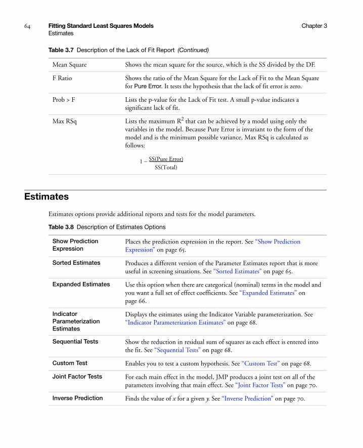
64 Fitting Standard Least Squares Models Chapter 3Estimates
Estimates
Estimates options provide additional reports and tests for the model parameters.
Mean Square Shows the mean square for the source, which is the SS divided by the DF.
F Ratio Shows the ratio of the Mean Square for the Lack of Fit to the Mean Square for Pure Error. It tests the hypothesis that the lack of fit error is zero.
Prob > F Lists the p-value for the Lack of Fit test. A small p-value indicates a significant lack of fit.
Max RSq Lists the maximum R2 that can be achieved by a model using only the variables in the model. Because Pure Error is invariant to the form of the model and is the minimum possible variance, Max RSq is calculated as follows:
Table 3.7 Description of the Lack of Fit Report (Continued)
1 SS(Pure Error)SS(Total)
----------------------------------–
Table 3.8 Description of Estimates Options
Show Prediction Expression
Places the prediction expression in the report. See “Show Prediction Expression” on page 65.
Sorted Estimates Produces a different version of the Parameter Estimates report that is more useful in screening situations. See “Sorted Estimates” on page 65.
Expanded Estimates Use this option when there are categorical (nominal) terms in the model and you want a full set of effect coefficients. See “Expanded Estimates” on page 66.
Indicator Parameterization Estimates
Displays the estimates using the Indicator Variable parameterization. See “Indicator Parameterization Estimates” on page 68.
Sequential Tests Show the reduction in residual sum of squares as each effect is entered into the fit. See “Sequential Tests” on page 68.
Custom Test Enables you to test a custom hypothesis. See “Custom Test” on page 68.
Joint Factor Tests For each main effect in the model, JMP produces a joint test on all of the parameters involving that main effect. See “Joint Factor Tests” on page 70.
Inverse Prediction Finds the value of x for a given y. See “Inverse Prediction” on page 70.
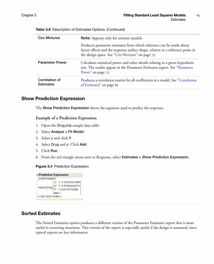
Chapter 3 Fitting Standard Least Squares Models 65Estimates
Show Prediction Expression
The Show Prediction Expression shows the equation used to predict the response.
Example of a Prediction Expression
1. Open the Drug.jmp sample data table.
2. Select Analyze > Fit Model.
3. Select y and click Y.
4. Select Drug and x. Click Add.
5. Click Run.
6. From the red triangle menu next to Response, select Estimates > Show Prediction Expression.
Figure 3.4 Prediction Expression
Sorted Estimates
The Sorted Estimates option produces a different version of the Parameter Estimates report that is more useful in screening situations. This version of the report is especially useful if the design is saturated, since typical reports are less informative.
Cox Mixtures Note: Appears only for mixture models.
Produces parameter estimates from which inference can be made about factor effects and the response surface shape, relative to a reference point in the design space. See “Cox Mixtures” on page 73.
Parameter Power Calculates statistical power and other details relating to a given hypothesis test. The results appear in the Parameter Estimates report. See “Parameter Power” on page 75.
Correlation of Estimates
Produces a correlation matrix for all coefficients in a model. See “Correlation of Estimates” on page 81.
Table 3.8 Description of Estimates Options (Continued)
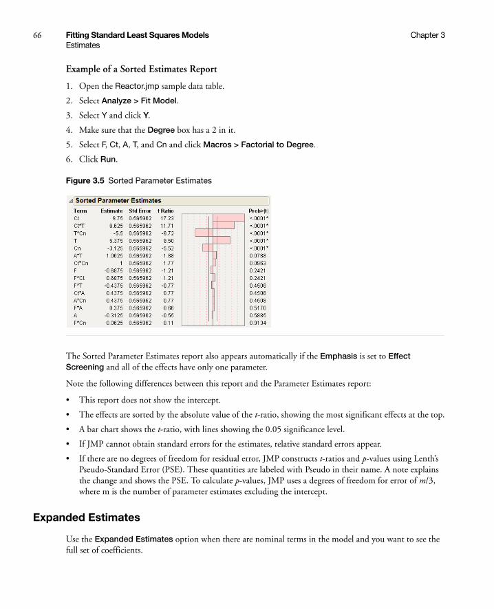
66 Fitting Standard Least Squares Models Chapter 3Estimates
Example of a Sorted Estimates Report
1. Open the Reactor.jmp sample data table.
2. Select Analyze > Fit Model.
3. Select Y and click Y.
4. Make sure that the Degree box has a 2 in it.
5. Select F, Ct, A, T, and Cn and click Macros > Factorial to Degree.
6. Click Run.
Figure 3.5 Sorted Parameter Estimates
The Sorted Parameter Estimates report also appears automatically if the Emphasis is set to Effect Screening and all of the effects have only one parameter.
Note the following differences between this report and the Parameter Estimates report:
• This report does not show the intercept.
• The effects are sorted by the absolute value of the t-ratio, showing the most significant effects at the top.
• A bar chart shows the t-ratio, with lines showing the 0.05 significance level.
• If JMP cannot obtain standard errors for the estimates, relative standard errors appear.
• If there are no degrees of freedom for residual error, JMP constructs t-ratios and p-values using Lenth’s Pseudo-Standard Error (PSE). These quantities are labeled with Pseudo in their name. A note explains the change and shows the PSE. To calculate p-values, JMP uses a degrees of freedom for error of m/3, where m is the number of parameter estimates excluding the intercept.
Expanded Estimates
Use the Expanded Estimates option when there are nominal terms in the model and you want to see the full set of coefficients.
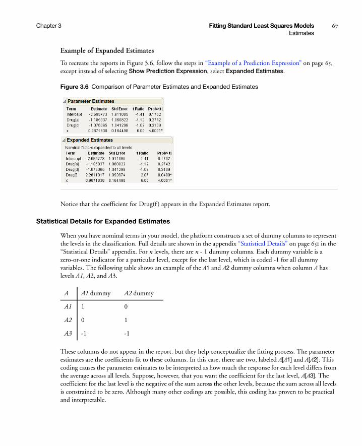
Chapter 3 Fitting Standard Least Squares Models 67Estimates
Example of Expanded Estimates
To recreate the reports in Figure 3.6, follow the steps in “Example of a Prediction Expression” on page 65, except instead of selecting Show Prediction Expression, select Expanded Estimates.
Figure 3.6 Comparison of Parameter Estimates and Expanded Estimates
Notice that the coefficient for Drug(f ) appears in the Expanded Estimates report.
Statistical Details for Expanded Estimates
When you have nominal terms in your model, the platform constructs a set of dummy columns to represent the levels in the classification. Full details are shown in the appendix “Statistical Details” on page 651 in the “Statistical Details” appendix. For n levels, there are n - 1 dummy columns. Each dummy variable is a zero-or-one indicator for a particular level, except for the last level, which is coded -1 for all dummy variables. The following table shows an example of the A1 and A2 dummy columns when column A has levels A1, A2, and A3.
These columns do not appear in the report, but they help conceptualize the fitting process. The parameter estimates are the coefficients fit to these columns. In this case, there are two, labeled A[A1] and A[A2]. This coding causes the parameter estimates to be interpreted as how much the response for each level differs from the average across all levels. Suppose, however, that you want the coefficient for the last level, A[A3]. The coefficient for the last level is the negative of the sum across the other levels, because the sum across all levels is constrained to be zero. Although many other codings are possible, this coding has proven to be practical and interpretable.
A A1 dummy A2 dummy
A1 1 0
A2 0 1
A3 -1 -1
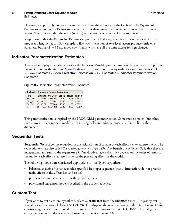
68 Fitting Standard Least Squares Models Chapter 3Estimates
However, you probably do not want to hand calculate the estimate for the last level. The Expanded Estimates option in the Estimates menu calculates these missing estimates and shows them in a text report. You can verify that the mean (or sum) of the estimates across a classification is zero.
Keep in mind that the Expanded Estimates option with high-degree interactions of two-level factors produces a lengthy report. For example, a five-way interaction of two-level factors produces only one parameter but has 25 = 32 expanded coefficients, which are all the same except for sign changes.
Indicator Parameterization Estimates
This option displays the estimates using the Indicator Variable parameterization. To re-create the report in Figure 3.7, follow the steps in “Show Prediction Expression” on page 65 with one exception: instead of selecting Estimates > Show Prediction Expression, select Estimates > Indicator Parameterization Estimates.
Figure 3.7 Indicator Parameterization Estimates
This parameterization is inspired by the PROC GLM parameterization. Some models match, but others, such as no-intercept models, models with missing cells, and mixture models, will most likely show differences.
Sequential Tests
Sequential Tests show the reduction in the residual sum of squares as each effect is entered into the fit. The sequential tests are also called Type I sums of squares (Type I SS). One benefit of the Type I SS is that they are independent and sum to the regression SS. One disadvantage is that they depend on the order of terms in the model; each effect is adjusted only for the preceding effects in the model.
The following models are considered appropriate for the Type I hypotheses:
• balanced analysis of variance models specified in proper sequence (that is, interactions do not precede main effects in the effects list, and so on)
• purely nested models specified in the proper sequence
• polynomial regression models specified in the proper sequence.
Custom Test
If you want to test a custom hypothesis, select Custom Test from the Estimates menu. To jointly test several linear functions, click on Add Column. This displays the window shown to the left in Figure 3.8 for constructing the test in terms of all the parameters. After filling in the test, click Done. The dialog then changes to a report of the results, as shown on the right in Figure 3.8.

Chapter 3 Fitting Standard Least Squares Models 69Estimates
The space beneath the Custom Test title bar is an editable area for entering a test name. Use the Custom Test dialog as follows:
Parameter lists the names of the model parameters. To the right of the list of parameters are columns of zeros corresponding to these parameters. Click a cell here, and enter a new value corresponding to the test that you want.
Add Column adds a column of zeros so that you can test jointly several linear functions of the parameters. Use the Add Column button to add as many columns to the test as you want.
The last line in the Parameter list is labeled =. Enter a constant into this box to test the linear constraint against. For example, to test the hypothesis β0=1, enter a 1 in the = box. In Figure 3.8, the constant is equal to zero.
When you finish specifying the test, click Done to see the test performed. The results are appended to the bottom of the dialog.
When the custom test is done, the report lists the test name, the function value of the parameters tested, the standard error, and other statistics for each test column in the dialog. A joint F-test for all columns shows at the bottom.
Caution: The test is always done with respect to residual error. If you have random effects in your model, this test might not be appropriate if you use EMS instead of REML.
Note: If you have a test within a classification effect, consider using the contrast dialog (which tests hypotheses about the least squares means) instead of a custom test.
Figure 3.8 The Custom Test Dialog and Test Results for Age Variable
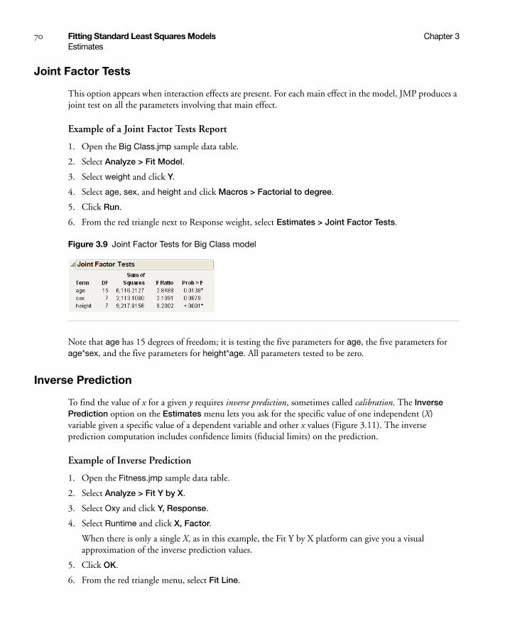
70 Fitting Standard Least Squares Models Chapter 3Estimates
Joint Factor Tests
This option appears when interaction effects are present. For each main effect in the model, JMP produces a joint test on all the parameters involving that main effect.
Example of a Joint Factor Tests Report
1. Open the Big Class.jmp sample data table.
2. Select Analyze > Fit Model.
3. Select weight and click Y.
4. Select age, sex, and height and click Macros > Factorial to degree.
5. Click Run.
6. From the red triangle next to Response weight, select Estimates > Joint Factor Tests.
Figure 3.9 Joint Factor Tests for Big Class model
Note that age has 15 degrees of freedom; it is testing the five parameters for age, the five parameters for age*sex, and the five parameters for height*age. All parameters tested to be zero.
Inverse Prediction
To find the value of x for a given y requires inverse prediction, sometimes called calibration. The Inverse Prediction option on the Estimates menu lets you ask for the specific value of one independent (X) variable given a specific value of a dependent variable and other x values (Figure 3.11). The inverse prediction computation includes confidence limits (fiducial limits) on the prediction.
Example of Inverse Prediction
1. Open the Fitness.jmp sample data table.
2. Select Analyze > Fit Y by X.
3. Select Oxy and click Y, Response.
4. Select Runtime and click X, Factor.
When there is only a single X, as in this example, the Fit Y by X platform can give you a visual approximation of the inverse prediction values.
5. Click OK.
6. From the red triangle menu, select Fit Line.

Chapter 3 Fitting Standard Least Squares Models 71Estimates
Use the crosshair tool to approximate inverse prediction.
7. Select Tools > Crosshairs.
8. Click on the Oxy axis at about 50 and then drag the cursor so that the crosshairs intersect with the prediction line.
Figure 3.10 Bivariate Fit for Fitness.jmp
Figure 3.10 shows which value of Runtime gives an Oxy value of 50, intersecting the Runtime axis at about 9.779, which is an approximate inverse prediction. However, to see the exact prediction of Runtime, use the Fit Model dialog as follows:
1. From the Fitness.jmp sample data table, select Analyze > Fit Model.
2. Select Oxy and click Y.
3. Add Runtime as the single model effect.
4. Click Run.
5. From the red triangle menu next to Response Oxy, select Estimates > Inverse Prediction.
Figure 3.11 Inverse Prediction Given by the Fit Model Platform
6. Type the values for Oxy as shown in Figure 3.11.
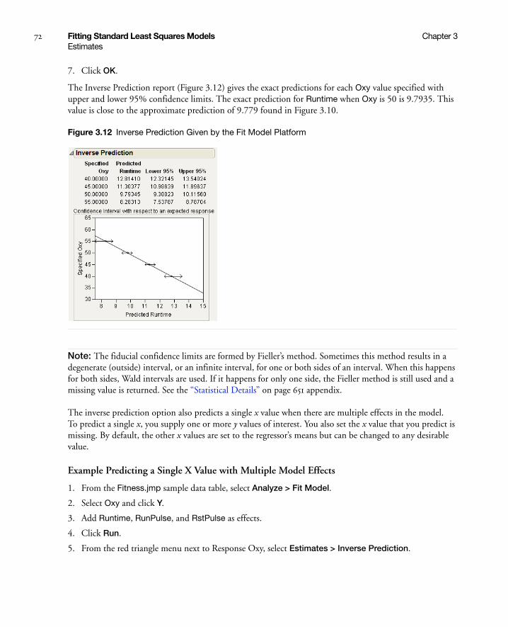
72 Fitting Standard Least Squares Models Chapter 3Estimates
7. Click OK.
The Inverse Prediction report (Figure 3.12) gives the exact predictions for each Oxy value specified with upper and lower 95% confidence limits. The exact prediction for Runtime when Oxy is 50 is 9.7935. This value is close to the approximate prediction of 9.779 found in Figure 3.10.
Figure 3.12 Inverse Prediction Given by the Fit Model Platform
Note: The fiducial confidence limits are formed by Fieller’s method. Sometimes this method results in a degenerate (outside) interval, or an infinite interval, for one or both sides of an interval. When this happens for both sides, Wald intervals are used. If it happens for only one side, the Fieller method is still used and a missing value is returned. See the “Statistical Details” on page 651 appendix.
The inverse prediction option also predicts a single x value when there are multiple effects in the model. To predict a single x, you supply one or more y values of interest. You also set the x value that you predict is missing. By default, the other x values are set to the regressor’s means but can be changed to any desirable value.
Example Predicting a Single X Value with Multiple Model Effects
1. From the Fitness.jmp sample data table, select Analyze > Fit Model.
2. Select Oxy and click Y.
3. Add Runtime, RunPulse, and RstPulse as effects.
4. Click Run.
5. From the red triangle menu next to Response Oxy, select Estimates > Inverse Prediction.
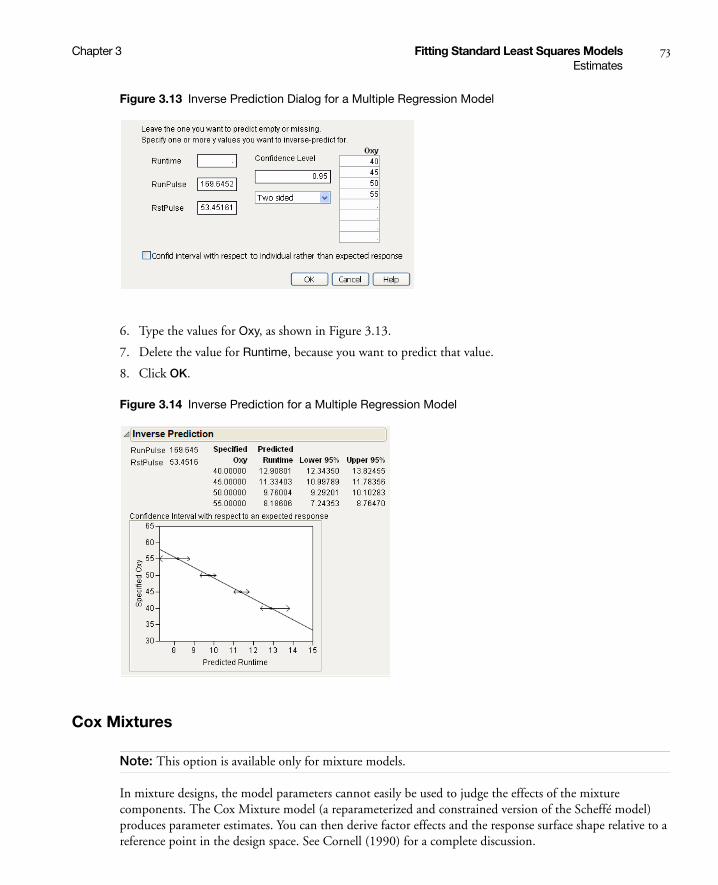
Chapter 3 Fitting Standard Least Squares Models 73Estimates
Figure 3.13 Inverse Prediction Dialog for a Multiple Regression Model
6. Type the values for Oxy, as shown in Figure 3.13.
7. Delete the value for Runtime, because you want to predict that value.
8. Click OK.
Figure 3.14 Inverse Prediction for a Multiple Regression Model
Cox Mixtures
Note: This option is available only for mixture models.
In mixture designs, the model parameters cannot easily be used to judge the effects of the mixture components. The Cox Mixture model (a reparameterized and constrained version of the Scheffé model) produces parameter estimates. You can then derive factor effects and the response surface shape relative to a reference point in the design space. See Cornell (1990) for a complete discussion.
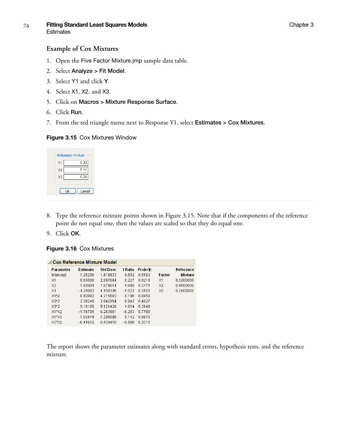
74 Fitting Standard Least Squares Models Chapter 3Estimates
Example of Cox Mixtures
1. Open the Five Factor Mixture.jmp sample data table.
2. Select Analyze > Fit Model.
3. Select Y1 and click Y.
4. Select X1, X2, and X3.
5. Click on Macros > Mixture Response Surface.
6. Click Run.
7. From the red triangle menu next to Response Y1, select Estimates > Cox Mixtures.
Figure 3.15 Cox Mixtures Window
8. Type the reference mixture points shown in Figure 3.15. Note that if the components of the reference point do not equal one, then the values are scaled so that they do equal one.
9. Click OK.
Figure 3.16 Cox Mixtures
The report shows the parameter estimates along with standard errors, hypothesis tests, and the reference mixture.

Chapter 3 Fitting Standard Least Squares Models 75Estimates
Parameter Power
Suppose that you want to know how likely it is that your experiment will detect some difference at a given α-level. The probability of getting a significant test result is called the power. The power is a function of the unknown parameter values tested, the sample size, and the unknown residual error variance.
Alternatively, suppose that you already did an experiment and the effect was not significant. You think that the effect might have been significant if you had more data. How much more data do you need?
JMP offers the following calculations of statistical power and other details related to a given hypothesis test:
• LSV, the least significant value, is the value of some parameter or function of parameters that would produce a certain p-value alpha.
• LSN, the least significant number, is the number of observations that would produce a specified p-value alpha if the data has the same structure and estimates as the current sample.
• Power values are also available. See “The Power” on page 81 for details.
The LSV, LSN, and power values are important measuring sticks that should be available for all test statistics, especially when the test statistics are not significant. If a result is not significant, you should at least know how far from significant the result is in the space of the estimate (rather than in the probability). YOu should also know how much additional data is needed to confirm significance for a given value of the parameters.
Sometimes a novice confuses the role of the null hypotheses, thinking that failure to reject the null hypothesis is equivalent to proving it. For this reason, it is recommended that the test be presented in these other aspects (power and LSN) that show the test’s sensitivity. If an analysis shows no significant difference, it is useful to know the smallest difference that the test is likely to detect (LSV).
The power details provided by JMP are for both prospective and retrospective power analyses. In the planning stages of a study, a prospective analysis helps determine how large your sample size must be to obtain a desired power in tests of hypothesis. During data analysis, however, a retrospective analysis helps determine the power of hypothesis tests that have already been conducted.
Technical details for power, LSN, and LSV are covered in the section “Power Calculations” on page 683 in the “Statistical Details” appendix.
Calculating retrospective power at the actual sample size and estimated effect size is somewhat non-informative, even controversial [Hoenig and Heisey, 2001]. The calculation does not provide additional information about the significance test, but rather shows the test in a different perspective. However, we believe that many studies fail to detect a meaningful effect size due to insufficient sample size. There should be an option to help guide for the next study, for specified effect sizes and sample sizes.
For more information, see John M. Hoenig and Dinnis M. Heisey, (2001) “The Abuse of Power: The Pervasive Fallacy of Power Calculations for Data Analysis.”, American Statistician (v55 No 1, 19-24).

76 Fitting Standard Least Squares Models Chapter 3Estimates
Power Options
Power options are available only for continuous-response models. Power and other test details are available in the following contexts:
• If you want the 0.05 level details for all parameter estimates, select Estimates > Parameter Power from the report’s red triangle menu. This option produces the LSV, LSN, and adjusted power for an alpha of 0.05 for each parameter in the linear model.
• If you want the details for an F-test for a certain effect, select Power Analysis from the effect’s red triangle menu.
• If you want the details for a Contrast, create the contrast and then select Power Analysis from the effect’s red triangle menu.
• If you want the details for a custom test, create the test that you want with the Custom Test option from the platform popup menu and then select Power Analysis option in the popup menu next to the Custom Test.
In all cases except the first, you enter information in the Power Details window for the calculations that you want.
Example of Power Analysis
The Power Details window (Figure 3.17) shows the contexts and options for test detailing. After you fill in the values, the results are added to the end of the report.
1. Open the Big Class.jmp sample data table.
2. Select Analyze > Fit Model.
3. Select weight and click Y.
4. Add age, sex, and height as the effects.
5. Click Run.
6. From the red triangle next to age, select Power Analysis.
Figure 3.17 Power Details Window

Chapter 3 Fitting Standard Least Squares Models 77Estimates
7. Replace the Delta values with 3,6, and 1 as shown in Figure 3.17.
8. Replace the Number values with 20, 60, and 10 as shown in Figure 3.17.
9. Select Solve for Power and Solve for Least Significant Number.
10. Click Done.
For details about the power results shown in Figure 3.17, see “Text Reports for Power Analysis” on page 78. For details about the Power Details options, see “Power Details Window” on page 77.
Power Details Window
In the Alpha, Sigma, Delta, and Number columns, you can enter a single value, two values, or the start, stop, and increment for a sequence of values. Power calculations are done on all possible combinations of the values that you specify.
Table 3.9 Description of the Power Details Window
Alpha (α) Represents the significance level between 0 and 1, usually 0.05, 0.01, or 0.10. Initially, Alpha automatically has a value of 0.05. Click in one of the three boxes to enter one, two, or a sequence of values.
Sigma (σ) Represents the standard error of the residual error in the model. Initially, RMSE (the square root of the mean square error) is in the first box. Click in one of the three boxes to enter one, two, or a sequence of values.
Delta (δ) Represents the raw effect size. See “Effect Size” on page 78, for details. Initially, the square root of the sum of squares for the hypothesis divided by n is in the first box. Click in one of the three boxes to enter or edit one, two, or a sequence of values.
Number (n) Represents the sample size. Initially, the actual sample size is in the first box. Click in one of the three boxes to enter or edit one, two, or a sequence of values.
Solve for Power Solves for the power (the probability of a significant result) as a function of α, σ, δ, and n.
Solve for Least Significant Number
Solves for the number of observations expected to achieve significance alpha given α, σ, and δ.
Solve for Least Significant Value
Solves for the value of the parameter or linear test that produces a p-value of alpha. This is a function of α, σ, and n.This option is available only for one-degree-of-freedom tests and is used for individual parameters.

78 Fitting Standard Least Squares Models Chapter 3Estimates
Effect Size
The power is the probability that an F achieves its α-critical value given a noncentrality parameter related to the hypothesis. The noncentrality parameter is zero when the null hypothesis is true (that is, when the effect size is zero). The noncentrality parameter λ can be factored into the three components that you specify in the JMP Power window as
λ = (nδ2)/σ2 .
Power increases with λ. This means that the power increases with sample size n and raw effect size δ, and decreases with error variance σ2. Some books (Cohen 1977) use standardized rather than raw Effect Size, Δ = δ/σ, which factors the noncentrality into two components: λ = nΔ2.
Delta (δ) is initially set to the value implied by the estimate given by the square root of SSH/n, where SSH is the sum of squares for the hypothesis. If you use this estimate for delta, you might want to correct for bias by asking for the Adjusted Power.
In the special case for a balanced one-way layout with k levels:
Because JMP uses parameters of the following form:
with
the delta for a two-level balanced layout appears as follows:
Text Reports for Power Analysis
The Power Analysis option calculates power as a function of every combination of α, σ, δ, and n values that you specify in the Power Details window.
• For every combination of α, σ, and δ, the least significant number is calculated.
Adjusted Power and Confidence Interval
To look at power retrospectively, you use estimates of the standard error and the test parameters. Adjusted power is the power calculated from a more unbiased estimate of the noncentrality parameter.
The confidence interval for the adjusted power is based on the confidence interval for the noncentrality estimate. Adjusted power and confidence limits are computed only for the original δ where the random variation is.
Table 3.9 Description of the Power Details Window (Continued)
δ2 αi α–( )2
k
-----------------------------=
βi αi α–( )= βk αmm 1=
k 1–
–=
δ2 β12 β1–( )2+
2----------------------------- β1
2= =
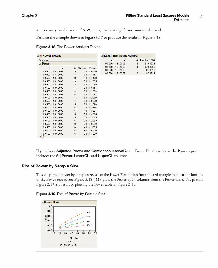
Chapter 3 Fitting Standard Least Squares Models 79Estimates
• For every combination of α, σ, and n, the least significant value is calculated.
Perform the example shown in Figure 3.17 to produce the results in Figure 3.18.
Figure 3.18 The Power Analysis Tables
If you check Adjusted Power and Confidence Interval in the Power Details window, the Power report includes the AdjPower, LowerCL, and UpperCL columns.
Plot of Power by Sample Size
To see a plot of power by sample size, select the Power Plot option from the red triangle menu at the bottom of the Power report. See Figure 3.18. JMP plots the Power by N columns from the Power table. The plot in Figure 3.19 is a result of plotting the Power table in Figure 3.18.
Figure 3.19 Plot of Power by Sample Size

80 Fitting Standard Least Squares Models Chapter 3Estimates
The Least Significant Value (LSV)
After a single-degree-of-freedom hypothesis test is performed, you often want to know how sensitive the test was. In other words, you want to know how small would a significant effect be at some p-value alpha.
The LSV provides a significant measuring stick on the scale of the parameter rather than on a probability scale. It shows the sensitivity of the design and data. LSV also encourages proper statistical intuition concerning the null hypothesis by highlighting how small a value would be detected as significant by the data.
• The LSV is the value that the parameter must be greater than or equal to in absolute value, in order to give the p-value of the significance test a value less than or equal to alpha.
• The LSV is the radius of the confidence interval for the parameter. A 1–alpha confidence interval is derived by taking the parameter estimate plus or minus the LSV.
• The absolute value of the parameter or function of the parameters tested is equal to the LSV, if and only if the p-value for its significance test is exactly alpha.
Compare the absolute value of the parameter estimate to the LSV. If the absolute parameter estimate is bigger, it is significantly different from zero. If the LSV is bigger, the parameter is not significantly different from zero.
The Least Significant Number (LSN)
The LSN or least significant number is the number of observations needed to decrease the variance of the estimates enough to achieve a significant result with the given values of alpha, sigma, and delta (the significance level, the standard deviation of the error, and the effect size, respectively).If you need more data points (a larger sample size) to achieve significance, the LSN indicates how many more data points are necessary.
Note: LSN is not a recommendation of how large a sample to take because the probability of significance (power) is only about 0.5 at the LSN.
The LSN has these characteristics:
• If the LSN is less than the actual sample size n, then the effect is significant. This means that you have more data than you need to detect the significance at the given alpha level.
• If the LSN is greater than n, the effect is not significant. In this case, if you believe that more data will show the same standard errors and structural results as the current sample, the LSN suggests how much data you would need to achieve significance.
• If the LSN is equal to n, then the p-value is equal to the significance level alpha. The test is on the border of significance.
• Power (described next) calculated when n = LSN is always greater than or equal to 0.5.

Chapter 3 Fitting Standard Least Squares Models 81Estimates
The Power
The power is the probability of getting a significant result. It is a function of the sample size n, the effect size δ, the standard deviation of the error σ, and the significance level α. The power tells you how likely your experiment will detect a difference at a given α-level.
Power has the following characteristics:
• If the true value of the parameter is the hypothesized value, the power should be alpha, the size of the test. You do not want to reject the hypothesis when it is true.
• If the true value of the parameters is not the hypothesized value, you want the power to be as great as possible.
• The power increases with the sample size, as the error variance decreases, and as the true parameter gets farther from the hypothesized value.
The Adjusted Power and Confidence Intervals
You typically substitute sample estimates in power calculations, because power is a function of unknown population quantities (Wright and O’Brien 1988). If you regard these sample estimates as random, you can adjust them to have a more proper expectation.
You can also construct a confidence interval for this adjusted power. However, the confidence interval is often very wide. The adjusted power and confidence intervals can be computed only for the original δ, because that is where the random variation is. For details about adjusted power see “Computations for Adjusted Power” on page 685 in the “Statistical Details” appendix
Correlation of Estimates
The Correlation of Estimates command on the Estimates menu creates a correlation matrix for all parameter estimates.
Example of Correlation of Estimates
1. Open the Tiretread.jmp data table.
2. Select Analyze > Fit Model.
3. Select ABRASION and click Y.
4. Select SILICA and SILANE and click Add.
5. Select SILICA and SILANE and click Cross.
6. Click Run.
7. From the Response red triangle menu, select Estimates > Correlation of Estimates.
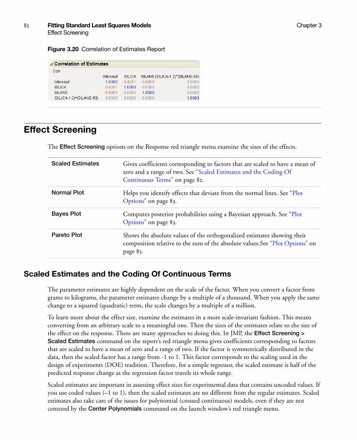
82 Fitting Standard Least Squares Models Chapter 3Effect Screening
Figure 3.20 Correlation of Estimates Report
Effect Screening
The Effect Screening options on the Response red triangle menu examine the sizes of the effects.
Scaled Estimates and the Coding Of Continuous Terms
The parameter estimates are highly dependent on the scale of the factor. When you convert a factor from grams to kilograms, the parameter estimates change by a multiple of a thousand. When you apply the same change to a squared (quadratic) term, the scale changes by a multiple of a million.
To learn more about the effect size, examine the estimates in a more scale-invariant fashion. This means converting from an arbitrary scale to a meaningful one. Then the sizes of the estimates relate to the size of the effect on the response. There are many approaches to doing this. In JMP, the Effect Screening > Scaled Estimates command on the report’s red triangle menu gives coefficients corresponding to factors that are scaled to have a mean of zero and a range of two. If the factor is symmetrically distributed in the data, then the scaled factor has a range from -1 to 1. This factor corresponds to the scaling used in the design of experiments (DOE) tradition. Therefore, for a simple regressor, the scaled estimate is half of the predicted response change as the regression factor travels its whole range.
Scaled estimates are important in assessing effect sizes for experimental data that contains uncoded values. If you use coded values (–1 to 1), then the scaled estimates are no different from the regular estimates. Scaled estimates also take care of the issues for polynomial (crossed continuous) models, even if they are not centered by the Center Polynomials command on the launch window’s red triangle menu.
Scaled Estimates Gives coefficients corresponding to factors that are scaled to have a mean of zero and a range of two. See “Scaled Estimates and the Coding Of Continuous Terms” on page 82.
Normal Plot Helps you identify effects that deviate from the normal lines. See “Plot Options” on page 83.
Bayes Plot Computes posterior probabilities using a Bayesian approach. See “Plot Options” on page 83.
Pareto Plot Shows the absolute values of the orthogonalized estimates showing their composition relative to the sum of the absolute values.See “Plot Options” on page 83.

Chapter 3 Fitting Standard Least Squares Models 83Effect Screening
You also do not need scaled estimates if your factors have the Coding column property. In that case, they are converted to uncoded form when the model is estimated and the results are already in an interpretable form for effect sizes.
Example of Scaled Estimates
1. Open the Drug.jmp sample data table.
2. Select Analyze > Fit Model.
3. Select y and click Y.
4. Add Drug and x as the effects.
5. Click Run.
6. From the red triangle menu next to Response y, select Effect Screening > Scaled Estimates.
As noted in the report, the estimates are parameter-centered by the mean and scaled by range/2.
Figure 3.21 Scaled Estimates
Plot Options
The Normal, Bayes, and Pareto Plot options correct for scaling and for correlations among the estimates. These three Effect Screening options point out the following:
1. The process of fitting can be thought of as converting one set of realizations of random values (the response values) into another set of realizations of random values (the parameter estimates). If the design is balanced with an equal number of levels per factor, these estimates are independent and identically distributed, just as the responses are.
2. If you are fitting a screening design that has many effects and only a few runs, you expect that only a few effects are active. That is, a few effects have a sizable impact and the rest of them are inactive (they are estimating zeros). This is called the assumption of effect sparsity.
3. Given points 1 and 2 above, you can think of screening as a way to determine which effects are inactive with random values around zero and which ones are outliers (not part of the distribution of inactive effects).
Therefore, you treat the estimates themselves as a set of data to help you judge which effects are active and which are inactive. If there are few runs, with little or no degrees of freedom for error, then there are no classical significance tests, and this approach is especially needed.

84 Fitting Standard Least Squares Models Chapter 3Effect Screening
The final Effect Screening options provide more reports:
• The Effect Screening report contains the Lenth PSE (pseudo-standard error) value.
• The Parameter Estimate Population report highlights significant factors.
You can also look at the model parameters from different angles using scaled estimates and three plots. See “Parameter Estimate Population Report” on page 88 for details.
Normal Plot
The Normal Plot option displays a Parameter Estimate Population report (see “Parameter Estimate Population Report” on page 88) and shows a normal plot of these parameter estimates (Daniel 1959). The estimates are on the vertical axis, and the normal quantiles on the horizontal axis.
Example of a Normal Plot
1. Open the Reactor.jmp sample data table.
2. Select Analyze > Fit Model.
3. Select Y and click Y.
4. Make sure that the Degree box has a 2 in it.
5. Select F, Ct, A, T, and Cn and click Macros > Factorial to Degree.
6. Click Run.
7. From the red triangle menu next to Response Y, select Effect Screening > Normal Plot.
Figure 3.22 Normal Plot
If all effects are due to random noise, they tend to follow a straight line with slope σ, the standard error. In the plot, the line with slope equal to the Lenth’s PSE estimate is blue.
The Normal plot helps you identify effects that deviate from the normal lines. Estimates that deviate substantially are labeled.
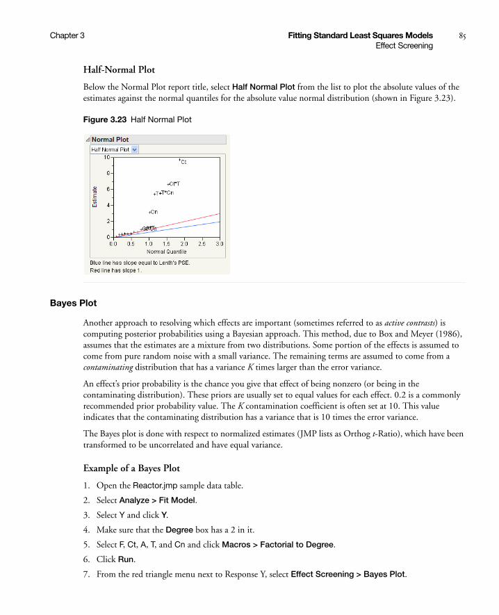
Chapter 3 Fitting Standard Least Squares Models 85Effect Screening
Half-Normal Plot
Below the Normal Plot report title, select Half Normal Plot from the list to plot the absolute values of the estimates against the normal quantiles for the absolute value normal distribution (shown in Figure 3.23).
Figure 3.23 Half Normal Plot
Bayes Plot
Another approach to resolving which effects are important (sometimes referred to as active contrasts) is computing posterior probabilities using a Bayesian approach. This method, due to Box and Meyer (1986), assumes that the estimates are a mixture from two distributions. Some portion of the effects is assumed to come from pure random noise with a small variance. The remaining terms are assumed to come from a contaminating distribution that has a variance K times larger than the error variance.
An effect’s prior probability is the chance you give that effect of being nonzero (or being in the contaminating distribution). These priors are usually set to equal values for each effect. 0.2 is a commonly recommended prior probability value. The K contamination coefficient is often set at 10. This value indicates that the contaminating distribution has a variance that is 10 times the error variance.
The Bayes plot is done with respect to normalized estimates (JMP lists as Orthog t-Ratio), which have been transformed to be uncorrelated and have equal variance.
Example of a Bayes Plot
1. Open the Reactor.jmp sample data table.
2. Select Analyze > Fit Model.
3. Select Y and click Y.
4. Make sure that the Degree box has a 2 in it.
5. Select F, Ct, A, T, and Cn and click Macros > Factorial to Degree.
6. Click Run.
7. From the red triangle menu next to Response Y, select Effect Screening > Bayes Plot.
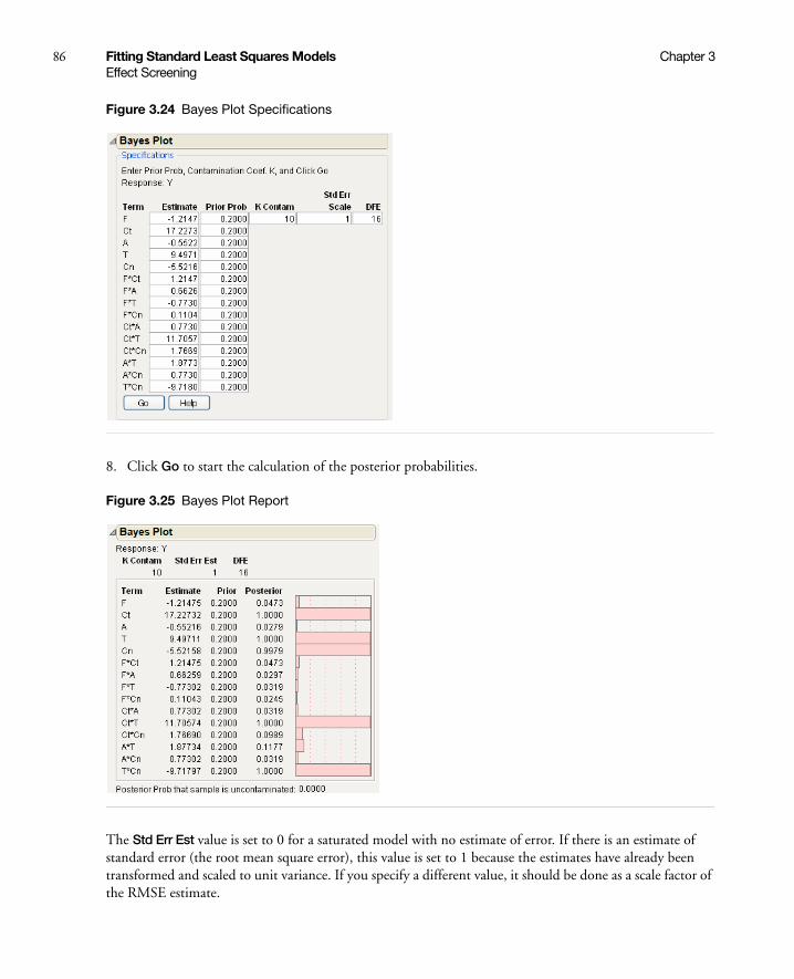
86 Fitting Standard Least Squares Models Chapter 3Effect Screening
Figure 3.24 Bayes Plot Specifications
8. Click Go to start the calculation of the posterior probabilities.
Figure 3.25 Bayes Plot Report
The Std Err Est value is set to 0 for a saturated model with no estimate of error. If there is an estimate of standard error (the root mean square error), this value is set to 1 because the estimates have already been transformed and scaled to unit variance. If you specify a different value, it should be done as a scale factor of the RMSE estimate.

Chapter 3 Fitting Standard Least Squares Models 87Effect Screening
The resulting posterior probabilities are listed and plotted with bars as shown in Figure 3.25. An overall posterior probability is also shown for the outcome that the sample is uncontaminated.
Bayes Plot for Factor Activity
JMP includes a script that helps you determine which factors are active in the design.
1. Open the Reactor.jmp sample data table.
1. Open the BayesPlotforFactors.jsl file in the Sample Scripts folder.
2. Select Edit > Run Script.
3. Select Y and click Y, Response.
4. Select F, Ct, A, T, and Cn and click X, Factor.
5. Click OK.
Figure 3.26 Bayes Plot for Factor Activity
In this case, we specified that the highest order interaction to consider is two. Therefore, all possible models that include (up to) second-order interactions are constructed. Based on the value assigned to Prior Probability (see the Controls section of the plot), a posterior probability is computed for each of the possible models. The probability for a factor is the sum of the probabilities for each of the models where it was involved.
In this example, we see that Ct, T, and Cn are active and that A and F are not. These results match those of the Bayes Plot shown in Figure 3.25.
Note: If the ridge parameter were zero (not allowed), all the models would be fit by least squares. As the ridge parameter gets large, the parameter estimates for any model shrink toward zero. Details on the ridge parameter (and why it cannot be zero) are explained in Box and Meyer (1993).

88 Fitting Standard Least Squares Models Chapter 3Effect Screening
Pareto Plot
The Pareto Plot selection gives plots of the absolute values of the orthogonalized estimates showing their composition relative to the sum of the absolute values. The estimates are orthogonalized to be uncorrelated and standardized to have equal variances by default. If your data set has estimates that are correlated and/or have unequal variances, then your data is transformed, by default, to have equal variances and to be uncorrelated. However, you have the option of undoing the transformations. (See “Parameter Estimate Population Report” on page 88.) In this case, the Pareto Plot represents your selection of equal variances or unequal variances and uncorrelated or correlated estimates.
Example of a Pareto Plot
1. Open the Reactor.jmp sample data table.
For this data set, the estimates have equal variances and are not correlated.
2. Select Analyze > Fit Model.
3. Select Y and click Y.
4. Make sure that the Degree box has a 2 in it.
5. Select F, Ct, A, T, and Cn and click Macros > Factorial to Degree.
6. Click Run.
7. From the red triangle menu next to Response Y, select Effect Screening > Pareto Plot.
Figure 3.27 Pareto Plot for Reactor.jmp
Parameter Estimate Population Report
Most inferences about effect size first assume that the estimates are uncorrelated and have equal variances. This is true for fractional factorials and many classical experimental designs. However, these assumptions are not true for some designs.

Chapter 3 Fitting Standard Least Squares Models 89Effect Screening
The last three Effect Screening options in the report’s red triangle menu show a plot and the Parameter Estimate Population report. The Parameter Population report finds the correlation of the estimates and tells you whether the estimates are uncorrelated and have equal variances.
• If the estimates are correlated, a normalizing transformation can be applied make them uncorrelated and have equal variances.
• If an estimate of error variance is unavailable, the relative standard error for estimates is calculated by setting the error variance to one.
• If the estimates are uncorrelated and have equal variances, then the following notes appear under the Effect Screening report title:
– The parameter estimates have equal variances.
– The parameter estimates are not correlated.
If the estimates are correlated and/or have unequal variances, then each of these two notes can appear as list items. The selected list item shows that JMP has transformed the estimates.
To undo both transformations, click these list items.
The transformation to uncorrelate the estimates is the same as that used to calculate sequential sums of squares. The estimates measure the additional contribution of the variable after all previous variables have been entered into the model.
Example of Data with Equal Variances and Uncorrelated Estimates
1. Open the Reactor.jmp sample data table.
2. Select Analyze > Fit Model.
3. Select Y and click Y.
4. Make sure that the Degree box has a 2 in it.
5. Select Ct, A, T, and Cn and click Macros > Factorial to Degree.
6. Click Run.
7. From the red triangle menu next to Response Y, select Effect Screening > Normal Plot.
8. Open the Parameter Estimate Population report.
Figure 3.28 Parameter Estimate Population Report for Reactor.jmp

90 Fitting Standard Least Squares Models Chapter 3Effect Screening
Saturated Models
Screening experiments often involve fully saturated models, where there are not enough degrees of freedom to estimate error. Because of this, neither standard errors for the estimates, nor t-ratios, nor p-values can be calculated in the traditional way.
For these cases, JMP uses the relative standard error, corresponding to a residual standard error of 1. In cases where all the variables are identically coded (say, [–1,1] for low and high levels), these relative standard errors are identical.
JMP also displays a Pseudo-t-ratio, calculated as follows:
Estimate Lists the parameter estimates for the fitted linear model. These estimates can be compared in size only if the X variables are scaled the same.
t Ratio The t-test associated with this parameter.
Orthog Coded Note: This column appears only for unequal variances and correlated estimates.
Contains the orthogonalized estimates. These estimates are shown in the Pareto plot because this plot partitions the sum of the effects, which requires orthogonality. The orthogonalized values are computed by premultiplying the column vector of the Original estimates by the Cholesky root of X´X. These estimates depend on the model order unless the original design is orthogonal.
If the design was orthogonal and balanced, then these estimates are identical to the original estimates. Otherwise, each effect’s contribution is measured after it is made orthogonal to the effects before it.
Orthog t-Ratio Lists the parameter estimates after a transformation that makes them independent and identically distributed. These values are used in the Normal plot (discussed next), which requires uncorrelated estimates of equal variance. The p-values associated with Orthog t-ratio estimates (given in the Prob>|t| column) are equivalent to Type I sequential tests. This means that if the parameters of the model are correlated, the estimates and their p-values depend on the order of terms in the model.
The Orthog t-ratio estimates are computed by dividing the orthogonalized estimates by their standard errors. The Orthog t-ratio values let JMP treat the estimates as if they were from a random sample for use in Normal plots or Bayes plots.
Prob>|t| Significance level or p-value associated with the values in the Orthog t-Ratio column.
Pseudo testimate
relative std error PSE×------------------------------------------------------=

Chapter 3 Fitting Standard Least Squares Models 91Effect Screening
using Lenth’s PSE (pseudo standard-error) and degrees of freedom for error (DFE) equal to one-third the number of parameters. The value for Lenth’s PSE is shown at the bottom of the report.
Example of a Saturated Model
1. Open the Reactor.jmp sample data table.
2. Select Analyze > Fit Model.
3. Select Y and click Y.
4. Select the following five columns: F, Ct, A, T, and Cn.
5. Click on the Macros button and select Full Factorial.
6. Click Run.
The parameter estimates are presented in sorted order, with smallest p-values listed first. The sorted parameter estimates are presented in Figure 3.29.
Figure 3.29 Saturated Report
92 Fitting Standard Least Squares Models Chapter 3Factor Profiling
In cases where the relative standard errors are different (perhaps due to unequal scaling), a similar report appears. However, there is a different value for Lenth’s PSE for each estimate.
Description of Lenth’s Method
An estimate of standard error is calculated using the method of Lenth (1989) and shows in the Effect Screening report (shown above). This estimate, called the pseudo standard error, is formed by taking 1.5 times the median absolute value of the estimates after removing all the estimates greater than 3.75 times the median absolute estimate in the complete set of estimates.
Factor Profiling
Assuming that the prediction equation is estimated well, you still must explore the equation itself to answer a number of questions:
• What type of curvature does the response surface have?
• What are the predicted values at the corners of the factor space?
• Would a transformation on the response produce a better fit?
The tools described in this section explore the prediction equation to answer these questions assuming that the equation is correct enough to work with.
Profiler Shows prediction traces for each X variable. See “The Profiler” on page 93.
Interaction Plots Shows a matrix of interaction plots when there are interaction effects in the model. See “Interaction Plots” on page 96.
Contour Profiler Provides an interactive contour profiler, which is useful for optimizing response surfaces graphically. See “Contour Profiler” on page 93.
Mixture Profiler Note: This option appears only if you specify the Macros > Mixture Response Surface option for an effect.
Shows response contours of mixture experiment models on a ternary plot. Select this option when three or more factors in the experiment are components in a mixture. See “Mixture Profiler” on page 95.
Cube Plots Shows a set of predicted values for the extremes of the factor ranges. The values are laid out on the vertices of cubes. See “Cube Plots” on page 97.
Box Cox Y Transformation
Finds a power transformation of the response that fits the best. See “Box Cox Y Transformations” on page 98.
Surface Profiler Shows a three-dimensional surface plot of the response surface. See “Surface Profiler” on page 96.

Chapter 3 Fitting Standard Least Squares Models 93Factor Profiling
The Profiler
Note: For details about using the Profiler, see the “Visualizing, Optimizing, and Simulating Response Surfaces” chapter on page 553.
The Profiler (or Prediction Profiler) shows prediction traces for each X variable (Figure 3.30). The vertical dotted line for each X variable shows its current value or current setting. Use the Profiler to change one variable at a time and examine the effect on the predicted response.
Figure 3.30 Illustration of Prediction Traces
If the variable is nominal, the x-axis identifies categories.
For each X variable, the value above the factor name is its current value. You change the current value by clicking in the graph or by dragging the dotted line where you want the new current value to be.
• The horizontal dotted line shows the current predicted value of each Y variable for the current values of the X variables.
• The black lines within the plots show how the predicted value changes when you change the current value of an individual X variable. The 95% confidence interval for the predicted values is shown by a dotted curve surrounding the prediction trace (for continuous variables) or an error bar (for categorical variables).
Contour Profiler
Note: For details about using the Contour Profiler, see the “Visualizing, Optimizing, and Simulating Response Surfaces” chapter on page 553.
Use the interactive Contour Profiler for optimizing response surfaces graphically. The Contour Profiler shows contours for the fitted model for two factors at a time. The report also includes a surface plot.
current predicted value of response, changes by dragging a factor value
95% confidence interval on the mean response
current factor values prediction trace, lines, and error bars show predicted values
current value of response, factor changes by dragging the dotted line
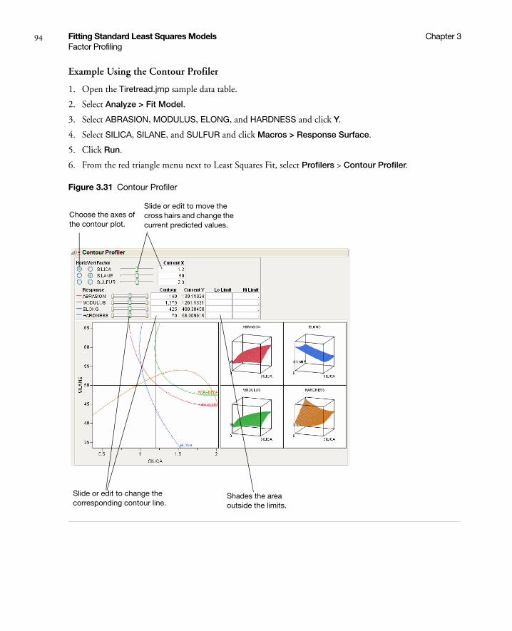
94 Fitting Standard Least Squares Models Chapter 3Factor Profiling
Example Using the Contour Profiler
1. Open the Tiretread.jmp sample data table.
2. Select Analyze > Fit Model.
3. Select ABRASION, MODULUS, ELONG, and HARDNESS and click Y.
4. Select SILICA, SILANE, and SULFUR and click Macros > Response Surface.
5. Click Run.
6. From the red triangle menu next to Least Squares Fit, select Profilers > Contour Profiler.
Figure 3.31 Contour Profiler
Choose the axes of the contour plot.
Slide or edit to move the cross hairs and change the current predicted values.
Slide or edit to change the corresponding contour line.
Shades the area outside the limits.

Chapter 3 Fitting Standard Least Squares Models 95Factor Profiling
Mixture Profiler
Note: This option appears only if you specify the Macros > Mixture Response Surface option for an effect. For details about using the Mixture Profiler, see the “Visualizing, Optimizing, and Simulating Response Surfaces” chapter on page 553.
The Mixture Profiler shows response contours of mixture experiment models on a ternary plot. Use the Mixture Profiler when three or more factors in your experiment are components in a mixture. The Mixture Profiler enables you to visualize and optimize the response surfaces of your experiment.
Example Using the Mixture Profiler
1. Open the Plasticizer.jmp sample data table.
2. Select Analyze > Fit Model.
The response (Y) and predictor variables (p1, p2, and p3) are automatically populated. The predictor variables use the Macros > Mixture Response Surface option.
3. Click Run.
4. From the red triangle menu next to Response Y, select Factor Profiling > Mixture Profiler.
Figure 3.32 Mixture Profiler
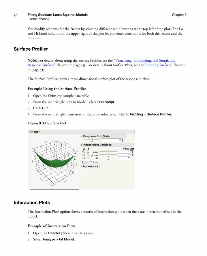
96 Fitting Standard Least Squares Models Chapter 3Factor Profiling
You modify plot axes for the factors by selecting different radio buttons at the top left of the plot. The Lo and Hi Limit columns at the upper right of the plot let you enter constraints for both the factors and the response.
Surface Profiler
Note: For details about using the Surface Profiler, see the “Visualizing, Optimizing, and Simulating Response Surfaces” chapter on page 553. For details about Surface Plots, see the “Plotting Surfaces” chapter on page 535.
The Surface Profiler shows a three-dimensional surface plot of the response surface.
Example Using the Surface Profiler
1. Open the Odor.jmp sample data table.
2. From the red triangle next to Model, select Run Script.
3. Click Run.
4. From the red triangle menu next to Response odor, select Factor Profiling > Surface Profiler.
Figure 3.33 Surface Plot
Interaction Plots
The Interaction Plots option shows a matrix of interaction plots when there are interaction effects in the model.
Example of Interaction Plots
1. Open the Reactor.jmp sample data table.
2. Select Analyze > Fit Model.

Chapter 3 Fitting Standard Least Squares Models 97Factor Profiling
3. Select Y and click Y.
4. Make sure that the Degree box has a 2 in it.
5. Select Ct, A, T, and Cn and click Macros > Factorial to Degree.
6. Click Run.
7. From the red triangle menu next to Response Y, select Factor Profiling > Interaction Plots.
Figure 3.34 Interaction Plots
In an Interaction Plot, evidence of interaction shows as nonparallel lines. For example, in the T*Cn plot in the bottom row of plots, the effect of Cn is very small at the low values of temperature. However, the Cn effect diverges widely for the high values of temperature.
Cube Plots
The Cube Plots option displays a set of predicted values for the extremes of the factor ranges. These values appear on the vertices of cubes (Figure 3.35). If a factor is nominal, then the vertices are the first and last level.
Example of Cube Plots
1. Open the Reactor.jmp sample data table.
2. Select Analyze > Fit Model.
3. Select Y and click Y.
4. Make sure that the Degree box has a 2 in it.
5. Select Ct, A, T, and Cn and click Macros > Factorial to Degree.
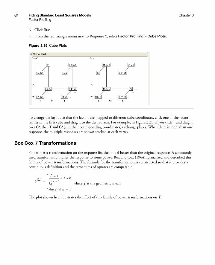
98 Fitting Standard Least Squares Models Chapter 3Factor Profiling
6. Click Run.
7. From the red triangle menu next to Response Y, select Factor Profiling > Cube Plots.
Figure 3.35 Cube Plots
To change the layout so that the factors are mapped to different cube coordinates, click one of the factor names in the first cube and drag it to the desired axis. For example, in Figure 3.35, if you click T and drag it over Ct, then T and Ct (and their corresponding coordinates) exchange places. When there is more than one response, the multiple responses are shown stacked at each vertex.
Box Cox Y Transformations
Sometimes a transformation on the response fits the model better than the original response. A commonly used transformation raises the response to some power. Box and Cox (1964) formalized and described this family of power transformations. The formula for the transformation is constructed so that it provides a continuous definition and the error sums of squares are comparable.
where is the geometric mean
The plot shown here illustrates the effect of this family of power transformations on Y.
Yλ( )
yλ
1–
λy·λ 1–
----------------- if λ 0≠
y· y( )ln if λ 0=
= y·

Chapter 3 Fitting Standard Least Squares Models 99Factor Profiling
Figure 3.36 Power Transformations on Y
The Box-Cox Y Transformation option fits transformations from λ = –2 to 2 in increments of 0.2. This transformation also plots the sum of squares error (SSE) across the λ power.
Example of Box-Cox Y Transformation
1. Open the Reactor.jmp sample data table.
2. Select Analyze > Fit Model.
3. Select Y and click Y.
4. Make sure that the Degree box has a 2 in it.
5. Select F, Ct, A, T, and Cn and click Macros > Factorial to Degree.
6. Click Run.
7. From the red triangle menu next to Response Y, select Factor Profiling > Box Cox Y Transformation.
Figure 3.37 Box Cox Y Transformation
Figure 3.37 shows the best fit when λ is between 1.0 and 1.5. The best transformation is found on the plot by finding the lowest point on the curve.
Save Best Transformation
Creates a new column in the data table and saves the formula for the best transformation.

100 Fitting Standard Least Squares Models Chapter 3Row Diagnostics
Row Diagnostics
Save Specific Transformation
Prompts you for a lambda value and then does the same thing as the Save Best Transformation.
Table of Estimates Creates a new data table containing parameter estimates and SSE for all values of λ from -2 to 2.
Plot Regression Produces a regression plot of the response and the continuous X variable. If there is exactly one continuous term in a model, and no more than one categorical term, then JMP plots the regression line (or lines).
Plot Actual by Predicted
Displays the observed values by the predicted values of Y. This is the leverage plot for the whole model. See “Leverage Plots” on page 101.
Plot Effect Leverage Produces a leverage plot for each effect in the model showing the point-by-point composition of the test for that effect. See “Leverage Plots” on page 101.
Plot Residual By Predicted
Displays the residual values by the predicted values of Y. You typically want to see the residual values scattered randomly about zero.
Plot Residual By Row Displays the residual value by the row number of its observation.
Press Displays a Press statistic, which computes the residual sum of squares where the residual for each row is computed after dropping that row from the computations. The Press statistic is the total prediction error sum of squares and is given by
where n is the number of variables in the model, yi is the observed response value of the ith observation, and
is the predicted response value of the omitted observation.
The Press RMSE is defined as .
The Press statistic is useful when comparing multiple models. Models with lower Press statistics are favored.
Press y i( ) yi–( )2
i 1=
n
=
y i( )Press n⁄

Chapter 3 Fitting Standard Least Squares Models 101Row Diagnostics
Leverage Plots
To graphically view the significance of the model or focus attention on whether an effect is significant, you want to display the data by focusing on the hypothesis for that effect. You might say that you want more of an X-ray picture showing the inside of the data rather than a surface view from the outside. The leverage plot gives this view of your data; it offers maximum insight into how the fit carries the data.
The effect in a model is tested for significance by comparing the sum of squared residuals to the sum of squared residuals of the model with that effect removed. Residual errors that are much smaller when the effect is included in the model confirm that the effect is a significant contribution to the fit.
The graphical display of an effect’s significance test is called a leverage plot. See Sall (1990). This type of plot shows for each point what the residual would be both with and without that effect in the model. Leverage plots are found in the Row Diagnostics submenu of the Fit Model report.
A leverage plot is constructed as illustrated in Figure 3.38. The distance from a point to the line of fit shows the actual residual. The distance from the point to the horizontal line of the mean shows what the residual error would be without the effect in the model. In other words, the mean line in this leverage plot represents the model where the hypothesized value of the parameter (effect) is constrained to zero.
Historically, leverage plots are referred to as a partial-regression residual leverage plot by Belsley, Kuh, and Welsch (1980) or an added variable plot by Cook and Weisberg (1982).
The term leverage is used because a point exerts more influence on the fit if it is farther away from the middle of the plot in the horizontal direction. At the extremes, the differences of the residuals before and after being constrained by the hypothesis are greater and contribute a larger part of the sums of squares for that effect’s hypothesis test.
The fitting platform produces a leverage plot for each effect in the model. In addition, there is one special leverage plot titled Whole Model that shows the actual values of the response plotted against the predicted values. This Whole Model leverage plot dramatizes the test that all the parameters (except intercepts) in the model are zero. The same test is reported in the Analysis of Variance report.
Durbin-Watson Test Displays the Durbin-Watson statistic to test whether the errors have first-order autocorrelation. The autocorrelation of the residuals is also shown. The Durbin-Watson table has a popup option that computes and displays the exact probability associated with the statistic. This Durbin-Watson table is appropriate only for time series data when you suspect that the errors are correlated across time.
Note: The computation of the Durbin-Watson exact probability can be time-intensive if there are many observations. The space and time needed for the computation increase with the square and the cube of the number of observations, respectively.
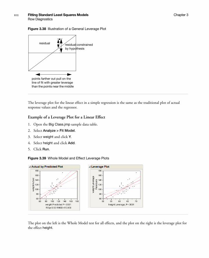
102 Fitting Standard Least Squares Models Chapter 3Row Diagnostics
Figure 3.38 Illustration of a General Leverage Plot
The leverage plot for the linear effect in a simple regression is the same as the traditional plot of actual response values and the regressor.
Example of a Leverage Plot for a Linear Effect
1. Open the Big Class.jmp sample data table.
2. Select Analyze > Fit Model.
3. Select weight and click Y.
4. Select height and click Add.
5. Click Run.
Figure 3.39 Whole Model and Effect Leverage Plots
The plot on the left is the Whole Model test for all effects, and the plot on the right is the leverage plot for the effect height.
residual constrained by hypothesis
residual
points farther out pull on the line of fit with greater leverage than the points near the middle
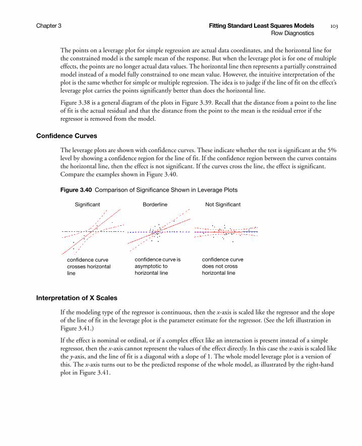
Chapter 3 Fitting Standard Least Squares Models 103Row Diagnostics
The points on a leverage plot for simple regression are actual data coordinates, and the horizontal line for the constrained model is the sample mean of the response. But when the leverage plot is for one of multiple effects, the points are no longer actual data values. The horizontal line then represents a partially constrained model instead of a model fully constrained to one mean value. However, the intuitive interpretation of the plot is the same whether for simple or multiple regression. The idea is to judge if the line of fit on the effect’s leverage plot carries the points significantly better than does the horizontal line.
Figure 3.38 is a general diagram of the plots in Figure 3.39. Recall that the distance from a point to the line of fit is the actual residual and that the distance from the point to the mean is the residual error if the regressor is removed from the model.
Confidence Curves
The leverage plots are shown with confidence curves. These indicate whether the test is significant at the 5% level by showing a confidence region for the line of fit. If the confidence region between the curves contains the horizontal line, then the effect is not significant. If the curves cross the line, the effect is significant. Compare the examples shown in Figure 3.40.
Figure 3.40 Comparison of Significance Shown in Leverage Plots
Interpretation of X Scales
If the modeling type of the regressor is continuous, then the x-axis is scaled like the regressor and the slope of the line of fit in the leverage plot is the parameter estimate for the regressor. (See the left illustration in Figure 3.41.)
If the effect is nominal or ordinal, or if a complex effect like an interaction is present instead of a simple regressor, then the x-axis cannot represent the values of the effect directly. In this case the x-axis is scaled like the y-axis, and the line of fit is a diagonal with a slope of 1. The whole model leverage plot is a version of this. The x-axis turns out to be the predicted response of the whole model, as illustrated by the right-hand plot in Figure 3.41.
Significant Borderline Not Significant
confidence curve crosses horizontal line
confidence curve is asymptotic to horizontal line
confidence curve does not cross horizontal line

104 Fitting Standard Least Squares Models Chapter 3Save Columns
Figure 3.41 Leverage Plots for Simple Regression and Complex Effects
The influential points in all leverage plots are the ones far out on the x-axis. If two effects in a model are closely related, then these effects as a whole do not have much leverage. This problem is called collinearity. By scaling regressor axes by their original values, collinearity is shown by shrinkage of the points in the x direction.
See the appendix “Statistical Details” on page 651 for the details of leverage plot construction.
Save Columns
Each Save Columns option generates one or more new columns in the current data table, where <colname> is the name of the response variable.
{ {{ {residual residual to the mean
residual residual to the mean
45 degree line
Table 3.10 Description of the Save Columns Options
Prediction Formula Creates a new column called Pred Formula colname that contains the predicted values computed by the specified model. It differs from the Predicted colname column, because it contains the prediction formula. This is useful for predicting values in new rows or for obtaining a picture of the fitted model.
Use the Column Info option and click the Edit Formula button to see the prediction formula. The prediction formula can require considerable space if the model is large. If you do not need the formula with the column of predicted values, use the Save Columns > Predicted Values option. For information about formulas, see the Using JMP book.
Note: When using this option, an attempt is first made to find a Response Limits property containing desirability functions. The desirability functions are determined from the profiler, if that option has been used. Otherwise, the desirability functions are determined from the response columns. If you reset the desirabilities later, it affects only subsequent saves. (It does not affect columns that has already been saved.)
Predicted Values Creates a new column called Predicted colname that contains the predicted values computed by the specified model.

Chapter 3 Fitting Standard Least Squares Models 105Save Columns
Residuals Creates a new column called Residual colname that contains the residuals, which are the observed response values minus predicted values.
Mean Confidence Interval
Creates two new columns called Lower 95% Mean colname and Upper 95% Mean colname. The new columns contain the lower and upper 95% confidence limits for the line of fit.
Note: If you hold down the SHIFT key and select the option, you are prompted to enter an α-level for the computations.
Indiv Confidence Interval
Creates two new columns called Lower 95% Indiv colname and Upper 95% Indiv colname. The new columns contain lower and upper 95% confidence limits for individual response values.
Note: If you hold down the SHIFT key and select the option, you are prompted to enter an α-level for the computations.
Studentized Residuals Creates a new column called Studentized Resid colname. The new column values are the residuals divided by their standard error.
Hats Creates a new column called h colname. The new column values are the diagonal values of the matrix , sometimes called hat values.
Std Error of Predicted Creates a new column called StdErr Pred colname that contains the standard errors of the predicted values.
Std Error of Residual Creates a new column called StdErr Resid colname that contains the standard errors of the residual values.
Std Error of Individual Creates a new column called StdErr Indiv colname that contains the standard errors of the individual predicted values.
Effect Leverage Pairs Creates a set of new columns that contain the values for each leverage plot. The new columns consist of an X and Y column for each effect in the model. The columns are named as follows. If the response column name is R and the effects are X1 and X2, then the new column names are:
X Leverage of X1 for R Y Leverage of X1 for R
X Leverage of X2 for R Y Leverage of X2 for R
Cook’s D Influence Saves the Cook’s D influence statistic. Influential observations are those that, according to various criteria, appear to have a large influence on the parameter estimates.
StdErr Pred Formula Creates a new column called PredSE colname that contains the standard error of the predicted values. It is the same as the Std Error of Predicted option, but it saves the formula with the column. Also, it can produce very large formulas.
Table 3.10 Description of the Save Columns Options (Continued)
X X'X( )1–X'

106 Fitting Standard Least Squares Models Chapter 3Effect Options
Note: If you are using the Graph option to invoke the Profiler, then you should first save the columns Prediction Formula and StdErr Pred Formula to the data table. Then, place both of these formulas into the Y,Prediction Formula role in the Profiler launch window. The resulting window asks whether you want to use the PredSE colname to make confidence intervals for the Pred Formula colname, instead of making a separate profiler plot for the PredSE colname.
Effect Options
Use the red triangle options next to an effect to request reports, plots, and tests for the effect. You can close results or dismiss the results by deselecting the item in the menu.
Mean Confidence Limit Formula
Creates a new column in the data table containing a formula for the mean confidence intervals.
Note: If you hold down the SHIFT key and select the option, you are prompted to enter an α-level for the computations.
Indiv Confidence Limit Formula
creates a new column in the data table containing a formula for the individual confidence intervals.
Note: If you hold down the SHIFT key and select the option, you are prompted to enter an α-level for the computations.
Save Coding Table Produces a new data table showing the intercept, all continuous terms, and coded values for nominal terms.
Table 3.10 Description of the Save Columns Options (Continued)
Table 3.11 Description of Effect Options
LSMeans Table Shows the statistics that are compared when effects are tested. See “LSMeans Table” on page 107.
LSMeans Plot Plots least squares means for nominal and ordinal main effects and for interactions. See “LSMeans Plot” on page 109.
LSMeans Contrast Note: This option is enabled only for pure classification effects.
Specify contrasts for pure classification effects to compare levels. See “LSMeans Contrast” on page 110.
LSMeans Student’s t Computes individual pairwise comparisons of least squares means in the model using Student’s t-tests. This test is sized for individual comparisons. If you make many pairwise tests, there is no protection across the inferences. Thus, the alpha-size (Type I) error rate across the hypothesis tests is higher than that for individual tests.
See the Basic Analysis and Graphing book.

Chapter 3 Fitting Standard Least Squares Models 107Effect Options
LSMeans Table
Least squares means are predicted values from the specified model across the levels of a categorical effect where the other model factors are controlled by being set to neutral values. The neutral values are the sample means (possibly weighted) for regressors with interval values, and the average coefficient over the levels for unrelated nominal effects.
Least squares means are the values that let you see which levels produce higher or lower responses, holding the other variables in the model constant. Least squares means are also called adjusted means or population marginal means. Least squares means can differ from simple means when there are other effects in the model.
Least squares means are the statistics that are compared when effects are tested. They might not reflect typical real-world values of the response if the values of the factors do not reflect prevalent combinations of values in the real world. Least squares means are useful as comparisons in experimental situations.
Example of a Least Squares Means Table
1. Open the Big Class.jmp sample data table.
2. Select Analyze > Fit Model.
3. Select height and click Y.
LSMeans Tukey HSD Shows a test that is sized for all differences among the least squares means. This is the Tukey or Tukey-Kramer HSD (Honestly Significant Difference) test. (Tukey 1953, Kramer 1956). This test is an exact alpha-level test if the sample sizes are the same and conservative if the sample sizes are different (Hayter 1984).
See the Basic Analysis and Graphing book.
LSMeans Dunnett Performs multiple comparisons of each level against a control level. This test is called Dunnett’s test. In the Fit Model platform, Hsu’s factor analytical approximation is used for the calculation of p-values and confidence intervals. The test results are also plotted.
Test Slices Note: This option is available only for interaction effects.
For each level of each classification column in the interaction, it makes comparisons among all the levels of the other classification columns in the interaction. For example, if an interaction is A*B*C, then there is a slice called A=1, which tests all the B*C levels when A=1. There is another slice called A=2, and so on, for all the levels of B, and C. This is a way to detect the importance of levels inside an interaction.
Power Analysis Shows the Power Details report, which enables you to analyze the power for the effect test. For details, see “Parameter Power” on page 75.
Table 3.11 Description of Effect Options (Continued)

108 Fitting Standard Least Squares Models Chapter 3Effect Options
4. Select age and click Add.
5. Click Run.
Figure 3.42 Least Squares Mean Table
A Least Squares Means table with standard errors is produced for all categorical effects in the model. For main effects, the Least Squares Means table also includes the sample mean. It is common for the least squares means to be closer together than the sample means. For further details about least squares means, see the appendix “Statistical Details” on page 651.
Table 3.12 Description of the Least Squares Means Table
Level Lists the names of each categorical level.
Least Sq Mean Lists the least squares mean for each level of the categorical variable.
Estimability Displays a warning if a least squares mean is not estimable. The column only appears when a message has to be displayed.
Std Error Lists the standard error of the least square mean for each level of the categorical variable.
Lower 95% Note: Only appears if you have the Regression Reports > Show All Confidence Intervals option selected or if you right-click in the report and select Columns > Lower 95%.
Lower 95% confidence interval for the mean.
Upper 95% Note: Only appears if you have the Regression Reports > Show All Confidence Intervals option selected or if you right-click in the report and select Columns > Upper 95%.
Upper 95% confidence interval for the mean.
Mean Lists the response sample mean for each level of the categorical variable. This is different from the least squares mean if the values of other effects in the model do not balance out across this effect.

Chapter 3 Fitting Standard Least Squares Models 109Effect Options
LSMeans Plot
The LSMeans Plot option plots least squares means (LSMeans) plots for nominal and ordinal main effects and interactions.
Example of an LS Means Plot
1. Open the Popcorn.jmp sample data table.
2. Select Analyze > Fit Model.
3. Select yield and click Y.
4. Select popcorn, oil amt, and batch and click Add.
5. Select popcorn in the Construct Model Effects section and batch in the Select Columns section.
6. Click Cross to obtain the popcorn*batch interaction.
7. Click Run.
8. Hold down the CTRL key. From the red triangle menu for one of the effects, select LSMeans Plot.
Tip: Holding down the CTRL key broadcasts the command to all of the effects.
Figure 3.43 LSMeans Plots for Main Effects and Interactions
Figure 3.43 shows the effect plots for main effects and the two-way interaction.
To transpose the factors of the LSMeans plot for a two-factor interaction, hold down the SHIFT key and select the LSMeans Plot option. (In this example, you must first deselect the LSMeans Plot option and then select it again, holding down the SHIFT key.) Figure 3.44 shows both the default and the transposed factors plots.

110 Fitting Standard Least Squares Models Chapter 3Effect Options
Figure 3.44 LSMeans Plot Comparison with Transposed Factors
LSMeans Contrast
A contrast is a set of linear combinations of parameters that you want to jointly test to be zero. JMP builds contrasts in terms of the least squares means of the effect. By convention, each column of the contrast is normalized to have sum zero and an absolute sum equal to two. If a contrast involves a covariate, you can specify the value of the covariate at which to test the contrast.
Example of the LSMeans Contrast Option
To illustrate using the LSMeans Contrast option:
1. Open the Big Class.jmp sample data table.
2. Select Analyze > Fit Model.
3. Select height and click Y.
4. Select age and click Add.
5. Click Run.
6. From the red triangle menu next to age, select LSMeans Contrast.
Figure 3.45 LSMeans Contrast Specification Window

Chapter 3 Fitting Standard Least Squares Models 111Effect Options
This Contrast Specification window shows the name of the effect and the names of the levels in the effect. Beside the levels is an area enclosed in a rectangle that has a column of numbers next to boxes of + and - signs.
To construct a contrast, click the + and - boxes beside the levels that you want to compare. If possible, the window normalizes each time to make the sum for a column zero and the absolute sum equal to two each time you click; it adds to the plus or minus score proportionately.
For example, to form a contrast that compares the first two age levels with the second two levels:
1. Click + for the ages 12 and 13
2. Click - for ages 14 and 15
If you wanted to do more comparisons, you would click the New Column button for a new column to define the new contrast.
Figure 3.46 LSMeans Contrast Specification for Age
3. Click Done.
The contrast is estimated, and the Contrast report appears.

112 Fitting Standard Least Squares Models Chapter 3Effect Options
Figure 3.47 LSMeans Contrast Report
The Contrast report shows the following:
• Contrast as a function of the least squares means
• Estimates and standard errors of the contrast for the least squares means
• t-tests for each column of the contrast
• F-test for all columns of the contrast tested jointly
• Parameter Function report that shows the contrast expressed in terms of the parameters. In this example, the parameters are for the ordinal variable, age.
LSMeans Student’s t and LSMeans Tukey’s HSD
The LSMeans Student’s t and LSMeans Tukey’s HSD options give multiple comparison tests for model effects. For details about these tests, see the Basic Analysis and Graphing book.
The red triangle options that appear in each report window show or hide optional reports.
Table 3.13 Description of the LSMeans Student’s t and LSMeans Tukey’s HSD Options
Crosstab Report A two-way table that highlights significant differences in red.
Connecting Letters Report
Illustrates significant differences with letters (similar to traditional SAS GLM output). Levels not connected by the same letter are significantly different.

Chapter 3 Fitting Standard Least Squares Models 113Restricted Maximum Likelihood (REML) Method
Test Slices
The Test Slices option, which is enabled for interaction effects, is a quick way to do many contrasts at the same time. For each level of each classification column in the interaction, it makes comparisons among all the levels of the other classification columns in the interaction. For example, if an interaction is A*B*C, then there is a slice called A=1, which tests all the B*C levels when A=1. There is another slice called A=2, and so on, for all the levels of B, and C. This is a way to detect the importance of levels inside an interaction.
Restricted Maximum Likelihood (REML) Method
Random effects are those where the effect levels are chosen randomly from a larger population of levels. These random effects represent a sample from the larger population. In contrast, the levels of fixed effects are of direct interest rather than representative. If you have both random and fixed (nonrandom) effects in a model, it is called a mixed model.
Note: It is very important to declare random effects. Otherwise, the test statistics produced from the fitted model are calculated with the wrong assumptions.
Typical random effects can be any of the following:
• Subjects in a repeated measures experiment, where the subject is measured at several times.
• Plots in a split plot experiment, where an experimental unit is subdivided and multiple measurements are taken, usually with another treatment applied to the subunits.
• Measurement studies, where multiple measurements are taken in order to study measurement variation.
• Random coefficients models, where the random effect is built with a continuous term crossed with categories.
The Fit Model platform in JMP fits mixed models using these modern methods, now generally regarded as best practice:
• REML estimation method (Restricted Maximum Likelihood)
• Kenward-Roger tests
Ordered Differences Report
Ranks the differences from lowest to highest. It also plots the differences on a histogram that has overlaid confidence interval lines.
Detailed Comparisons Compares each level of the effect with all other levels in a pairwise fashion. Each section shows the difference between the levels, standard error and confidence intervals, t-ratios, p-values, and degrees of freedom. A plot illustrating the comparison appears on the right of each report.
Equivalence Test Uses the TOST (Two One-Sided Tests) method to test for practical equivalence. For details, see the Basic Analysis and Graphing book.
Table 3.13 Description of the LSMeans Student’s t and LSMeans Tukey’s HSD Options (Continued)

114 Fitting Standard Least Squares Models Chapter 3Restricted Maximum Likelihood (REML) Method
For historical interest only, the platform also offers the Method of Moments (EMS), but this is no longer a recommended method, except in special cases where it is equivalent to REML.
If you have a model where all of the effects are random, you can also fit it in the Variability Chart platform.
The REML method for fitting mixed models is now the mainstream, state-of-the-art method, supplanting older methods.
In the days before availability of powerful computers, researchers needed to restrict their interest to situations in which there were computational short cuts to obtain estimates of variance components and tests on fixed effects in a mixed model. Most books today introduce mixed models using these short cuts that work on balanced data. See McCulloch, Searle, and Neuhaus (2008), Poduri (1997), and Searle, Casella, and McCulloch(1992). The Method of Moments provided a way to calculate what the expected value of Mean Squares (EMS) were in terms of the variance components, and then back-solve to obtain the variance components. It was also possible using these techniques to obtain expressions for test statistics that had the right expected value under the null hypotheses that were synthesized from mean squares.
If your model satisfies certain conditions (that is, it has random effects that contain the terms of the fixed effects that they provide random structure for) then you can use the EMS choice to produce these traditional analyses. However, since the newer REML method produces identical results to these models, but is considerably more general, the EMS method is never recommended.
The REML approach was pioneered by Patterson and Thompson in 1974. See also Wolfinger, Tobias, and Sall (1994) and Searle, Casella, and McCulloch(1992). The reason to prefer REML is that it works without depending on balanced data, or shortcut approximations, and it gets all the tests right, even contrasts that work across interactions. Most packages that use the traditional EMS method are either not able to test some of these contrasts, or compute incorrect variances for them.
Introduction to Random Effects
Levels in random effects are randomly selected from a larger population of levels. For the purpose of testing hypotheses, the distribution of the effect on the response over the levels is assumed to be normal, with mean zero and some variance (called a variance component).
In one sense, every model has at least one random effect, which is the effect that makes up the residual error. The units making up individual observations are assumed to be randomly selected from a much larger population, and the effect sizes are assumed to have a mean of zero and some variance, σ2.
The most common model that has random effects other than residual error is the repeated measures or split plot model. Table 3.14 on page 115, lists the types of effects in a split plot model. In these models the experiment has two layers. Some effects are applied on the whole plots or subjects of the experiment. Then these plots are divided or the subjects are measured at different times and other effects are applied within those subunits. The effects describing the whole plots or subjects are one random effect, and the subplots or repeated measures are another random effect. Usually the subunit effect is omitted from the model and absorbed as residual error.
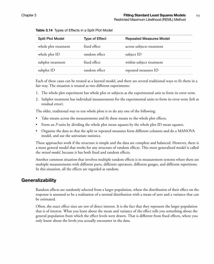
Chapter 3 Fitting Standard Least Squares Models 115Restricted Maximum Likelihood (REML) Method
Each of these cases can be treated as a layered model, and there are several traditional ways to fit them in a fair way. The situation is treated as two different experiments:
1. The whole plot experiment has whole plot or subjects as the experimental unit to form its error term.
2. Subplot treatment has individual measurements for the experimental units to form its error term (left as residual error).
The older, traditional way to test whole plots is to do any one of the following:
• Take means across the measurements and fit these means to the whole plot effects.
• Form an F-ratio by dividing the whole plot mean squares by the whole plot ID mean squares.
• Organize the data so that the split or repeated measures form different columns and do a MANOVA model, and use the univariate statistics.
These approaches work if the structure is simple and the data are complete and balanced. However, there is a more general model that works for any structure of random effects. This more generalized model is called the mixed model, because it has both fixed and random effects.
Another common situation that involves multiple random effects is in measurement systems where there are multiple measurements with different parts, different operators, different gauges, and different repetitions. In this situation, all the effects are regarded as random.
Generalizability
Random effects are randomly selected from a larger population, where the distribution of their effect on the response is assumed to be a realization of a normal distribution with a mean of zero and a variance that can be estimated.
Often, the exact effect sizes are not of direct interest. It is the fact that they represent the larger population that is of interest. What you learn about the mean and variance of the effect tells you something about the general population from which the effect levels were drawn. That is different from fixed effects, where you only know about the levels you actually encounter in the data.
Table 3.14 Types of Effects in a Split Plot Model
Split Plot Model Type of Effect Repeated Measures Model
whole plot treatment fixed effect across subjects treatment
whole plot ID random effect subject ID
subplot treatment fixed effect within subject treatment
subplot ID random effect repeated measures ID
116 Fitting Standard Least Squares Models Chapter 3Restricted Maximum Likelihood (REML) Method
Unrestricted Parameterization for Variance Components in JMP
Note: Read this section only if you are concerned about matching the results of certain textbooks.
There are two different statistical traditions for parameterizing the variance components: the unrestricted and the restricted approaches. JMP and SAS use the unrestricted approach. In this approach, while the estimated effects always sum to zero, the true effects are not assumed to sum to zero over a particular random selection made of the random levels. This is the same assumption as for residual error. The estimates make the residual errors have mean zero, and the true mean is zero. But a random draw of data using the true parameters is some random event that might not have a mean of exactly zero.
You need to know about this assumption because many statistics textbooks use the restricted approach. Both approaches have been widely taught for 50 years. A good source that explains both sides is Cobb (1998, section 13.3).
Negative Variances
Note: Read this section only when you are concerned about negative variance components.
Though variances are always positive, it is possible to have a situation where the unbiased estimate of the variance is negative. This happens in experiments when an effect is very weak, and by chance the resulting data causes the estimate to be negative. This usually happens when there are few levels of a random effect that correspond to a variance component.
JMP can produce negative estimates for both REML and EMS. For REML, there are two check boxes in the model launch window: Unbounded Variance Components and Estimate Only Variance Components. Unchecking the box beside Unbounded Variance Components constrains the estimate to be nonnegative. We recommend that you do not uncheck this if you are interested in fixed effects. Constraining the variance estimates leads to bias in the tests for the fixed effects. If, however, you are interested only in variance components, and you do not want to see negative variance components, then checking the box beside Estimate Only Variance Components is appropriate.
If you remain uncomfortable about negative estimates of variances, please consider that the random effects model is statistically equivalent to the model where the variance components are really covariances across errors within a whole plot. It is not hard to think of situations in which the covariance estimate can be negative, either by random happenstance, or by a real process in which deviations in some observations in one direction would lead to deviations in the other direction in other observations. When random effects are modeled this way, the covariance structure is called compound symmetry.
So, consider negative variance estimates as useful information. If the negative value is small, it can be considered happenstance in the case of a small true variance. If the negative value is larger (the variance ratio can get as big as 0.5), it is a troubleshooting sign that the rows are not as independent as you had assumed, and some process worth investigating is happening within blocks.

Chapter 3 Fitting Standard Least Squares Models 117Restricted Maximum Likelihood (REML) Method
Scripting Note
The JSL option for Unbounded Variance Components is No Bounds( Boolean ). Setting this option to true (1) is equivalent to checking the Unbounded Variance Components option.
Random Effects BLUP Parameters
Random effects have a dual character. In one perspective, they appear like residual error, often the error associated with a whole-plot experimental unit. In another respect, they are like fixed effects with a parameter to associate with each effect category level. As parameters, you have extra information about them—they are derived from a normal distribution with mean zero and the variance estimated by the variance component. The effect of this extra information is that the estimates of the parameters are shrunk toward zero. The parameter estimates associated with random effects are called BLUPs (Best Linear Unbiased Predictors). Some researchers consider these BLUPs as parameters of interest, and others consider them by-products of the method that are not interesting in themselves. In JMP, these estimates are available, but in an initially closed report.
BLUP parameter estimates are used to estimate random-effect least squares means, which are therefore also shrunken toward the grand mean, at least compared to what they would be if the effect were treated as a fixed effect. The degree of shrinkage depends on the variance of the effect and the number of observations per level in the effect. With large variance estimates, there is little shrinkage. If the variance component is small, then more shrinkage takes place. If the variance component is zero, the effect levels are shrunk to exactly zero. It is even possible to obtain highly negative variance components where the shrinkage is reversed. You can consider fixed effects as a special case of random effects where the variance component is very large.
If the number of observations per level is large, the estimate shrinks less. If there are very few observations per level, the estimates shrink more. If there are infinite observations, there is no shrinkage and the answers are the same as fixed effects.
The REML method balances the information about each individual level with the information about the variances across levels.
For example, suppose that you have batting averages for different baseball players. The variance component for the batting performance across player describes how much variation is usual between players in their batting averages. If the player only plays a few times and if the batting average is unusually small or large, then you tend not to trust that estimate, because it is based on only a few at-bats; the estimate has a high standard error. But if you mixed it with the grand mean, that is, shrunk the estimate toward the grand mean, you would trust the estimate more. For players that have a long batting record, you would shrink much less than those with a short record.
You can run this example and see the results for yourself. The example batting average data are in the Baseball.jmp sample data file. To compare the Method of Moments (EMS) and REML, run the model twice. Assign Batting as Y and Player as an effect. Select Player in the Construct Model Effects box, and select Random Effect from the Attributes pop-up menu.
Run the model and select REML (Recommended) from the Method popup menu. The results show the best linear unbiased prediction (BLUP) for each level of random effects.

118 Fitting Standard Least Squares Models Chapter 3Restricted Maximum Likelihood (REML) Method
Run the model again with EMS (Traditional) as Method. The least square mean for fixed affects and each level of random effects and is the same.
Table 3.15 on page 118, summarizes the estimates between Method of Moments and REML across a set of baseball players in this simulated example. Note that Suarez, with only three at-bats, is shrunk more than the others with more at-bats.
REML and Traditional Methods Agree on the Standard Cases
It turns out that in balanced designs, the REML F-test values for fixed effects is the same as with the Method of Moments (Expected Means Squares) approach. The degrees of freedom could differ in some cases. There are a number of methods of obtaining the degrees of freedom for REML F-tests; the one that JMP uses is the smallest degrees of freedom associated with a containing effect.
F-Tests in Mixed Models
Note: This section details the tests produced with REML.
The REML method obtains the variance components and parameter estimates, but there are a few additional steps to obtain tests on fixed effects in the model. The objective is to construct the F statistic and associated degrees of freedom to obtain a p-value for the significance test.
Historically, in simple models using the Method of Moments (EMS), standard tests were derived by construction of quadratic forms that had the right expectation under the null hypothesis. Where a mean square had to be synthesized from a linear combination of mean squares to have the right expectation, Satterthwaite's method could be used to obtain the degrees of freedom to get the p-value. Sometimes these were fractional degrees of freedom, just as you might find in a modern (Aspin-Welch) Student's t-test.
With modern computing power and recent methods, we have much improved techniques to obtain the tests. First, Kackar, and Harville (1984) found a way to estimate a bias-correction term for small samples.
Table 3.15 Comparison of Estimates between Method of Moments and REML
Method of Moments REML N
Variance Component 0.01765 0.019648
Anderson
Jones
Mitchell
Rodriguez
Smith
Suarez
0.29500000
0.20227273
0.32333333
0.55000000
0.35681818
0.55000000
0.29640407
0.20389793
0.32426295
0.54713393
0.35702094
0.54436227
6
11
6
6
11
3
Least Squares Means same as ordinary means shrunken from means

Chapter 3 Fitting Standard Least Squares Models 119Restricted Maximum Likelihood (REML) Method
This was refined by Kenward and Roger (1997) to correct further and obtain the degrees of freedom that gave the closest match of an F-distribution to the distribution of the test statistic. These are not easy calculations. Consequently, they can take some time to perform for larger models.
If you have a simple balanced model, the results from REML-Kenward-Roger agree with the results from the traditional approach, provided that the estimates are not bounded at zero.
• These results do not depend on analyzing the syntactic structure of the model. There are no rules about finding containing effects. The method does not care if your whole plot fixed effects are purely nested in whole plot random effects. It gets the right answer regardless.
• These results do not depend on having categorical factors. It handles continuous (random coefficient) models just as easily.
• These methods produce different (and better) results than older versions of JMP (that is, earlier than JMP 6) that implemented older, less precise, technology to do these tests.
• These methods do not depend on having positive variance components. Negative variance components are not only supported, but need to be allowed in order for the tests to be unbiased.
Our goal in implementing these methods was not just to handle general cases, but to handle cases without the user needing to know very much about the details. Just declare which effects are random, and everything else is automatic. It is particularly important that engineers learn to declare random effects, because they have a history of performing inadvertent split-plot experiments where the structure is not identified.
Specifying Random Effects
Models with Random Effects use the same Fit Model dialog as other models. To specify a random effect, highlight it in the Construct Model Effects list and select Attributes > Random Effect. This appends &Random to the effect name in the model effect list.
Split Plot
The most common type of layered design is a balanced split plot, often in the form of repeated measures across time. One experimental unit for some of the effects is subdivided (sometimes by time period) and other effects are applied to these subunits.
Example of a Split Plot
Consider the data in the Animals.jmp sample data table (the data are fictional). The study collected information about differences in the seasonal hunting habits of foxes and coyotes. Each season for one year, three foxes and three coyotes were marked and observed periodically. The average number of miles that they wandered from their dens during different seasons of the year was recorded (rounded to the nearest mile). The model is defined by the following aspects:
• The continuous response variable called miles
• The species effect with values fox or coyote
• The season effect with values fall, winter, spring, and summer
• An animal identification code called subject, with nominal values 1, 2, and 3 for both foxes and coyotes

120 Fitting Standard Least Squares Models Chapter 3Restricted Maximum Likelihood (REML) Method
There are two layers to the model:
1. The top layer is the between-subject layer, in which the effect of being a fox or coyote (species effect) is tested with respect to the variation from subject to subject. The bottom layer is the within-subject layer, in which the repeated-measures factor for the four seasons (season effect) is tested with respect to the variation from season to season within a subject. The within-subject variability is reflected in the residual error.
2. The season effect can use the residual error for the denominator of its F-statistics. However, the between-subject variability is not measured by residual error and must be captured with the subject within species (subject[species]) effect in the model. The F-statistic for the between-subject effect species uses this nested effect instead of residual error for its F-ratio denominator.
To create the split plot for this data, follow these steps:
1. Open the Animals.jmp sample data table.
2. Select Analyze > Fit Model.
3. Select miles and click Y.
4. Select species and subject and click Add.
5. In the Select Columns list, select species.
6. In the Construct Model Effects list, select subject.
7. Click Nest.
This adds the subject within species (subject[species]) effect to the model.
8. Select the nested effect subject[species].
9. Select Attributes > Random Effect.
This nested effect is now identified as an error term for the species effect and shows as subject[species]&Random.
10. In the Select Columns list, select season and click Add.
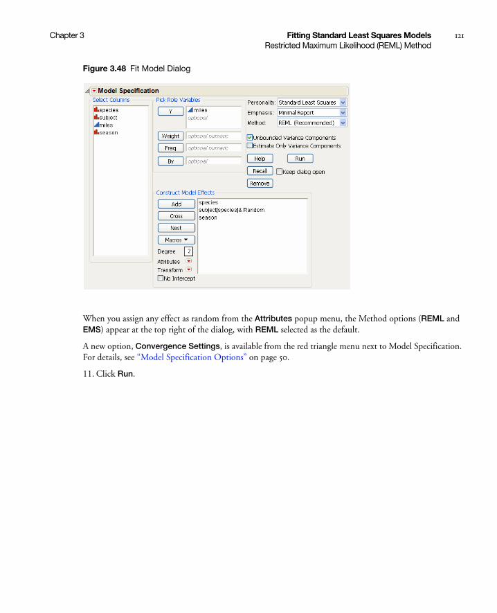
Chapter 3 Fitting Standard Least Squares Models 121Restricted Maximum Likelihood (REML) Method
Figure 3.48 Fit Model Dialog
When you assign any effect as random from the Attributes popup menu, the Method options (REML and EMS) appear at the top right of the dialog, with REML selected as the default.
A new option, Convergence Settings, is available from the red triangle menu next to Model Specification. For details, see “Model Specification Options” on page 50.
11. Click Run.
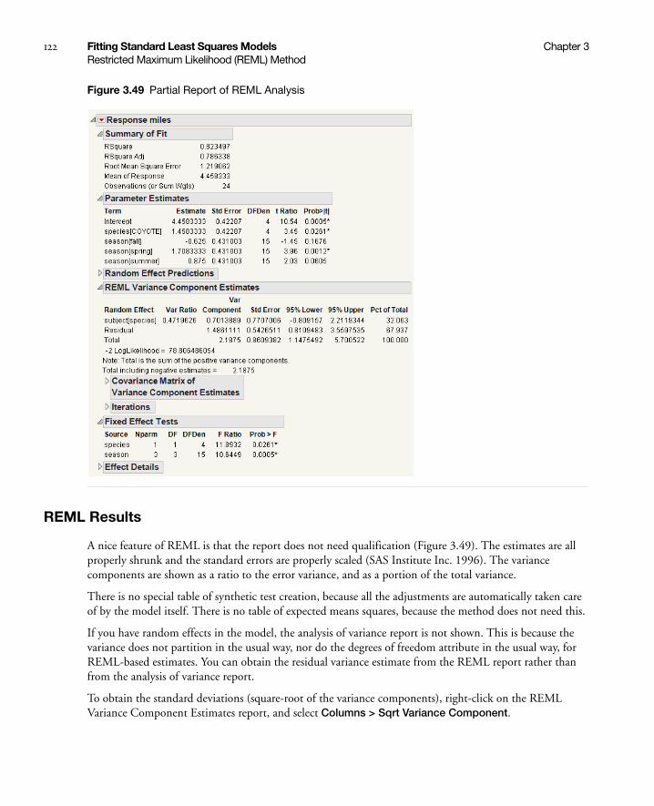
122 Fitting Standard Least Squares Models Chapter 3Restricted Maximum Likelihood (REML) Method
Figure 3.49 Partial Report of REML Analysis
REML Results
A nice feature of REML is that the report does not need qualification (Figure 3.49). The estimates are all properly shrunk and the standard errors are properly scaled (SAS Institute Inc. 1996). The variance components are shown as a ratio to the error variance, and as a portion of the total variance.
There is no special table of synthetic test creation, because all the adjustments are automatically taken care of by the model itself. There is no table of expected means squares, because the method does not need this.
If you have random effects in the model, the analysis of variance report is not shown. This is because the variance does not partition in the usual way, nor do the degrees of freedom attribute in the usual way, for REML-based estimates. You can obtain the residual variance estimate from the REML report rather than from the analysis of variance report.
To obtain the standard deviations (square-root of the variance components), right-click on the REML Variance Component Estimates report, and select Columns > Sqrt Variance Component.

Chapter 3 Fitting Standard Least Squares Models 123Method of Moments Results
The Variance Component Estimates table shows 95% confidence intervals for the variance components using the Satterthwaite (1946) approximation. If the Unbounded Variance Components options is used, the confidence intervals are +/-Wald style. You can right-click on the Variance Components Estimates table to toggle on the Norm KHC (Kackar-Harville correction). This value is an approximation of the magnitude of the increase in the mean squared errors of the estimators for the mixed model. See Kackar and Harville (1984) for a discussion of approximating standard errors in mixed models.
REML Save Columns Options
When you use the REML method, additional options appear in the Save Columns menu. All of these options allow the random effects predicted values to participate in the formulas, rather than using their expected value (zero).
REML Profiler Option
When you use REML method and select Factor Profiling > Profiler, a new option, Conditional Predictions, appears on the red triangle menu next to Prediction Profiler. For details, see “Profiler Options” on page 562.
Method of Moments Results
Note: This section is only of use in matching historical results.
We no longer recommend the Method of Moments, but we understand the need to support it for teaching use, in order to match the results of many textbooks still in use.
You have the option of choosing the EMS (Traditional) approach from the Method popup menu on the Fit Model dialog. This is also called the Method of Moments method.
Results from the steps for the Method of Moments are as follows:
• For each effect, the coefficients of the expected mean squares for that effect are calculated. This is a linear combination of the variance components and fixed effect values that describes the expected value of the mean square for that effect. All effects also have a unit coefficient on the residual variance.
Table 3.16 Description of REML Save Columns Options
Conditional Pred Formula Saves the prediction formula to a new column in the data table.
Conditional Pred Values Saves the predicted values to a new column in the data table.
Conditional Residuals Saves the model residuals to a new column in the data table.
Conditional Mean CI Saves the mean confidence interval.
Conditional Indiv CI Saves the confidence interval for an individual.

124 Fitting Standard Least Squares Models Chapter 3Method of Moments Results
• The coefficients of expected mean squares for all the random effects, including the residual error, are gathered into a matrix, and this is used to solve for variance components for each random effect.
• For each effect to be tested, a denominator for that effect is synthesized using the terms of the linear combination of mean squares in the numerator that do not contain the effect to be tested or other fixed effects. Thus, the expectation is equal for those terms common to the numerator and denominator. The remaining terms in the numerator then constitute the effect test.
• Degrees of freedom for the synthesized denominator are constructed using Satterthwaite’s method.
• The effect tests use the synthetic denominator.
JMP handles random effects like the SAS GLM procedure with a Random statement and the Test option. Figure 3.50, shows example results.
Caution: Standard errors for least squares means and denominators for contrast F-tests also use the synthesized denominators. Contrasts using synthetic denominators might not be appropriate, especially in crossed effects compared at common levels. The leverage plots and custom tests are done with respect to the residual, so they might not be appropriate.
Caution: Crossed and nested relationships must be declared explicitly. For example, if knowing a subject ID also identifies the group that contains the subject (that is, if each subject is in only one group), then subject must be declared as nested within group. In that situation, the nesting must be explicitly declared to define the design structure.
Note: JMP cannot fit a layered design if the effect for a layer’s error term cannot be specified under current effect syntax. An example of this is a design with a Latin Square on whole plots for which the error term would be Row*Column–Treatment. Fitting such special cases with JMP requires constructing your own F-tests using sequential sums of squares from several model runs.
For the Animals example above, the EMS reports are as follows.
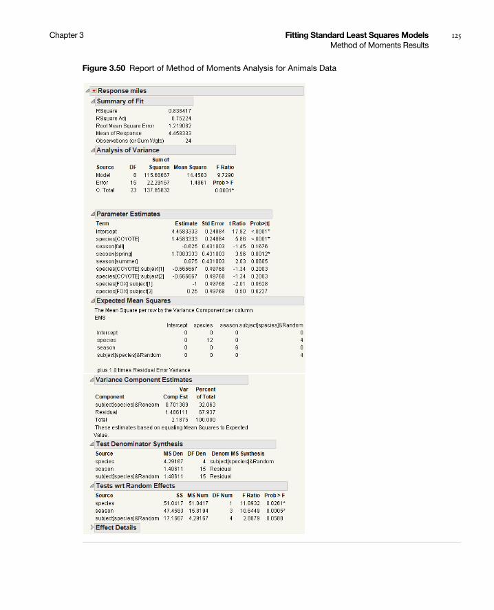
Chapter 3 Fitting Standard Least Squares Models 125Method of Moments Results
Figure 3.50 Report of Method of Moments Analysis for Animals Data
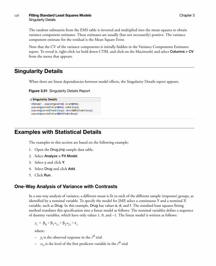
126 Fitting Standard Least Squares Models Chapter 3Singularity Details
The random submatrix from the EMS table is inverted and multiplied into the mean squares to obtain variance component estimates. These estimates are usually (but not necessarily) positive. The variance component estimate for the residual is the Mean Square Error.
Note that the CV of the variance components is initially hidden in the Variance Components Estimates report. To reveal it, right-click (or hold down CTRL and click on the Macintosh) and select Columns > CV from the menu that appears.
Singularity Details
When there are linear dependencies between model effects, the Singularity Details report appears.
Figure 3.51 Singularity Details Report
Examples with Statistical Details
The examples in this section are based on the following example:
1. Open the Drug.jmp sample data table.
2. Select Analyze > Fit Model.
3. Select y and click Y.
4. Select Drug and click Add.
5. Click Run.
One-Way Analysis of Variance with Contrasts
In a one-way analysis of variance, a different mean is fit to each of the different sample (response) groups, as identified by a nominal variable. To specify the model for JMP, select a continuous Y and a nominal X variable, such as Drug. In this example, Drug has values a, d, and f. The standard least squares fitting method translates this specification into a linear model as follows: The nominal variables define a sequence of dummy variables, which have only values 1, 0, and –1. The linear model is written as follows:
where:
– yi is the observed response in the ith trial
– x1i is the level of the first predictor variable in the ith trial
yi β0 β1x1i β2x2i εi+ + +=

Chapter 3 Fitting Standard Least Squares Models 127Examples with Statistical Details
– x2i is the level of the second predictor variable in the ith trial
– β0, β1, and β2 are parameters for the intercept, the first predictor variable, and the second predictor variable, respectively
– ει are the independent and normally distributed error terms in the ith trial
As shown here, the first dummy variable denotes that Drug=a contributes a value 1 and Drug=f contributes a value –1 to the dummy variable:
The second dummy variable is given the following values:
The last level does not need a dummy variable because in this model, its level is found by subtracting all the other parameters. Therefore, the coefficients sum to zero across all the levels.
The estimates of the means for the three levels in terms of this parameterization are as follows:
Solving for βi yields the following:
(the average over levels)
Therefore, if regressor variables are coded as indicators for each level minus the indicator for the last level, then the parameter for a level is interpreted as the difference between that level’s response and the average response across all levels. See the appendix “Statistical Details” on page 651 for additional information about the interpretation of the parameters for nominal factors.
Figure 3.52 shows the Parameter Estimates and the Effect Tests reports from the one-way analysis of the drug data. Figure 3.1, at the beginning of the chapter, shows the Least Squares Means report and LS Means Plot for the Drug effect.
x1i
1 a
0 d
1 f–=
x2i
0 a
1 d
1 f–=
μ1 β0 β1+=
μ2 β0 β2+=
μ3 β0 β1– β2–=
β0
μ1 μ2 μ3+ +( )3
------------------------------------ μ= =
β1 μ1 μ–=
β2 μ2 μ–=
β3 β1 β2– μ3 μ–= =
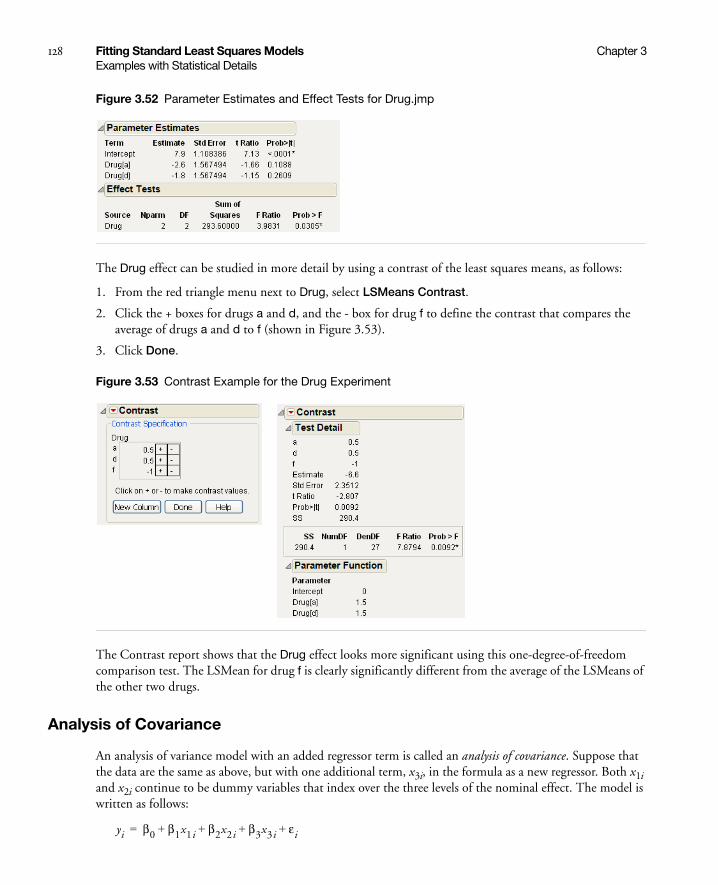
128 Fitting Standard Least Squares Models Chapter 3Examples with Statistical Details
Figure 3.52 Parameter Estimates and Effect Tests for Drug.jmp
The Drug effect can be studied in more detail by using a contrast of the least squares means, as follows:
1. From the red triangle menu next to Drug, select LSMeans Contrast.
2. Click the + boxes for drugs a and d, and the - box for drug f to define the contrast that compares the average of drugs a and d to f (shown in Figure 3.53).
3. Click Done.
Figure 3.53 Contrast Example for the Drug Experiment
The Contrast report shows that the Drug effect looks more significant using this one-degree-of-freedom comparison test. The LSMean for drug f is clearly significantly different from the average of the LSMeans of the other two drugs.
Analysis of Covariance
An analysis of variance model with an added regressor term is called an analysis of covariance. Suppose that the data are the same as above, but with one additional term, x3i, in the formula as a new regressor. Both x1i and x2i continue to be dummy variables that index over the three levels of the nominal effect. The model is written as follows:
yi β0 β1x1i β2x2i β3x3i εi+ + + +=
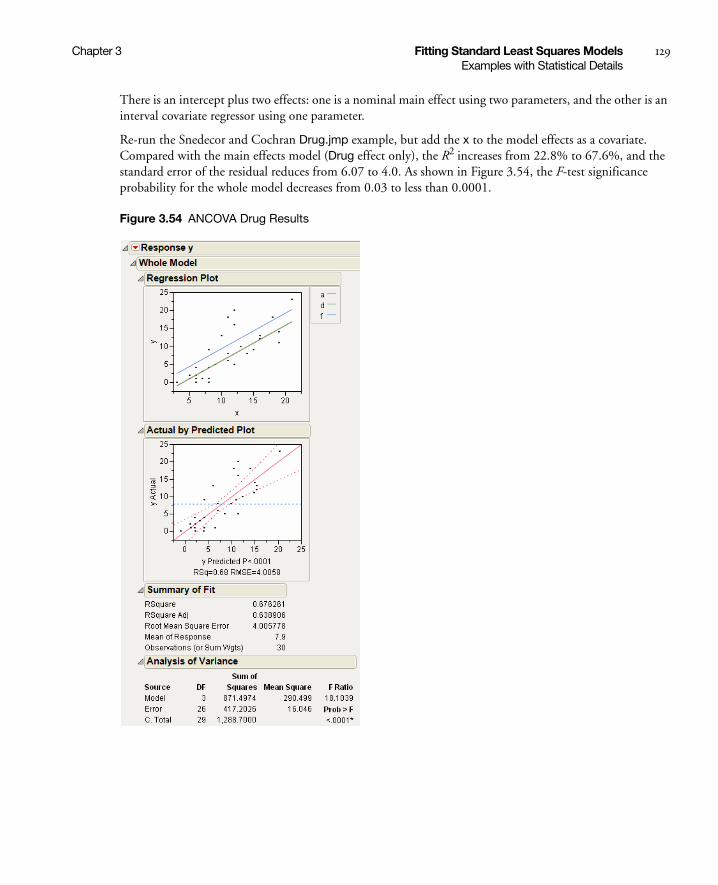
Chapter 3 Fitting Standard Least Squares Models 129Examples with Statistical Details
There is an intercept plus two effects: one is a nominal main effect using two parameters, and the other is an interval covariate regressor using one parameter.
Re-run the Snedecor and Cochran Drug.jmp example, but add the x to the model effects as a covariate. Compared with the main effects model (Drug effect only), the R2 increases from 22.8% to 67.6%, and the standard error of the residual reduces from 6.07 to 4.0. As shown in Figure 3.54, the F-test significance probability for the whole model decreases from 0.03 to less than 0.0001.
Figure 3.54 ANCOVA Drug Results
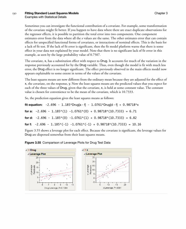
130 Fitting Standard Least Squares Models Chapter 3Examples with Statistical Details
Sometimes you can investigate the functional contribution of a covariate. For example, some transformation of the covariate might fit better. If you happen to have data where there are exact duplicate observations for the regressor effects, it is possible to partition the total error into two components. One component estimates error from the data where all the x values are the same. The other estimates error that can contain effects for unspecified functional forms of covariates, or interactions of nominal effects. This is the basis for a lack of fit test. If the lack of fit error is significant, then the fit model platform warns that there is some effect in your data not explained by your model. Note that there is no significant lack of fit error in this example, as seen by the large probability value of 0.7507.
The covariate, x, has a substitution effect with respect to Drug. It accounts for much of the variation in the response previously accounted for by the Drug variable. Thus, even though the model is fit with much less error, the Drug effect is no longer significant. The effect previously observed in the main effects model now appears explainable to some extent in terms of the values of the covariate.
The least squares means are now different from the ordinary mean because they are adjusted for the effect of x, the covariate, on the response, y. Now the least squares means are the predicted values that you expect for each of the three values of Drug, given that the covariate, x, is held at some constant value. The constant value is chosen for convenience to be the mean of the covariate, which is 10.7333.
So, the prediction equation gives the least squares means as follows:
fit equation: -2.696 - 1.185*Drug[a - f] - 1.0761*Drug[d - f] + 0.98718*x
for a: -2.696 - 1.185*(1) -1.0761*(0) + 0.98718*(10.7333) = 6.71
for d: -2.696 - 1.185*(0) -1.0761*(1) + 0.98718*(10.7333) = 6.82
for f: -2.696 - 1.185*(-1) -1.0761*(-1) + 0.98718*(10.7333) = 10.16
Figure 3.55 shows a leverage plot for each effect. Because the covariate is significant, the leverage values for Drug are dispersed somewhat from their least squares means.
Figure 3.55 Comparison of Leverage Plots for Drug Test Data

Chapter 3 Fitting Standard Least Squares Models 131Examples with Statistical Details
Analysis of Covariance with Separate Slopes
This example is a continuation of the Drug.jmp example presented in the previous section. The example uses data from Snedecor and Cochran (1967, p. 422). A one-way analysis of variance for a variable called Drug, shows a difference in the mean response among the levels a, d, and f, with a significance probability of 0.03.
The lack of fit test for the model with main effect Drug and covariate x is not significant. However, for the sake of illustration, this example includes the main effects and the Drug*x effect. This model tests whether the regression on the covariate has separate slopes for different Drug levels.
This specification adds two columns to the linear model (call them x4i and x5i) that allow the slopes for the covariate to be different for each Drug level. The new variables are formed by multiplying the dummy variables for Drug by the covariate values, giving the following formula:
Table 3.17 on page 131, shows the coding of this Analysis of Covariance with Separate Slopes. (The mean of X is 10.7333.)
A portion of the report is shown in Figure 3.56. The Regression Plot shows fitted lines with different slopes. The Effect Tests report gives a p-value for the interaction of 0.56. This is not significant statistically, indicating the model does not need to have different slopes.
Table 3.17 Coding of Analysis of Covariance with Separate Slopes
Regressor Effect Values
x1 Drug[a] +1 if a, 0 if d, –1 if f
x2 Drug[d] 0 if a, +1 if d, –1 if f
x3 x the values of x
x4 Drug[a]*(x - 10.733) +x – 10.7333 if a, 0 if d, –(x – 10.7333) if f
x5 Drug[d]*(x - 10.733) 0 if a, +x – 10.7333 if d, –(x – 10.7333) if f
yi β0 β1x1i β2x2i β3x3i β4x4i β5x5i εi+ + + + + +=
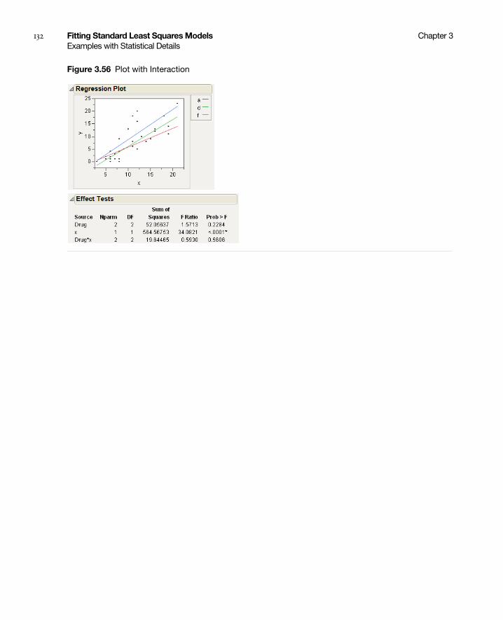
132 Fitting Standard Least Squares Models Chapter 3Examples with Statistical Details
Figure 3.56 Plot with Interaction
Chapter 4Fitting Stepwise Regression Models
Using the Fit Model Platform
Stepwise regression is an approach to selecting a subset of effects for a regression model. Use stepwise regression when there is little theory to guide the selection of terms for a model, and the modeler wants to use whatever seems to provide a good fit. The approach is somewhat controversial. The significance levels on the statistics for selected models violate the standard statistical assumptions because the model has been selected rather than tested within a fixed model. On the positive side, the approach has been helpful for 30 years in reducing the number of terms. The book Subset Selection in Regression, by A. J. Miller (1990), brings statistical sense to model selection statistics.
This chapter uses the term significance probability in a mechanical way to represent that the calculation would be valid in a fixed model, recognizing that the true significance probability could be nowhere near the reported one.
The Stepwise Fit also includes features for looking at all possible models (including heredity factors) and model averaging.

Contents
Overview of Stepwise Regression . . . . . . . . . . . . . . . . . . . . . . . . . . . . . . . . . . . . . . . . . . . . . . . . . . . . . . . 135
Example Using Stepwise Regression. . . . . . . . . . . . . . . . . . . . . . . . . . . . . . . . . . . . . . . . . . . . . . . . . . . . . 135
The Stepwise Report . . . . . . . . . . . . . . . . . . . . . . . . . . . . . . . . . . . . . . . . . . . . . . . . . . . . . . . . . . . . . . . . 137
Stepwise Platform Options . . . . . . . . . . . . . . . . . . . . . . . . . . . . . . . . . . . . . . . . . . . . . . . . . . . . . . . . 137
Stepwise Regression Control Panel . . . . . . . . . . . . . . . . . . . . . . . . . . . . . . . . . . . . . . . . . . . . . . . . . . 138
Current Estimates Report . . . . . . . . . . . . . . . . . . . . . . . . . . . . . . . . . . . . . . . . . . . . . . . . . . . . . . . . . 143
Step History Report. . . . . . . . . . . . . . . . . . . . . . . . . . . . . . . . . . . . . . . . . . . . . . . . . . . . . . . . . . . . . . 144
Models with Crossed, Interaction, or Polynomial Terms . . . . . . . . . . . . . . . . . . . . . . . . . . . . . . . . . . . . . 144
Models with Nominal and Ordinal Terms . . . . . . . . . . . . . . . . . . . . . . . . . . . . . . . . . . . . . . . . . . . . . . . . 146
Using the Make Model Command for Hierarchical Terms . . . . . . . . . . . . . . . . . . . . . . . . . . . . . . . . . . . 147
Performing Logistic Stepwise Regression . . . . . . . . . . . . . . . . . . . . . . . . . . . . . . . . . . . . . . . . . . . . . . . . . 148
The All Possible Models Option . . . . . . . . . . . . . . . . . . . . . . . . . . . . . . . . . . . . . . . . . . . . . . . . . . . . . . . 149
The Model Averaging Option . . . . . . . . . . . . . . . . . . . . . . . . . . . . . . . . . . . . . . . . . . . . . . . . . . . . . . . . . 151
Using Validation . . . . . . . . . . . . . . . . . . . . . . . . . . . . . . . . . . . . . . . . . . . . . . . . . . . . . . . . . . . . . . . . . . . 152
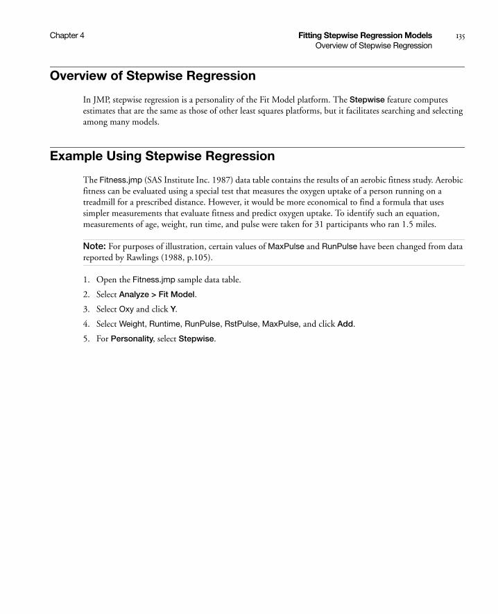
Chapter 4 Fitting Stepwise Regression Models 135Overview of Stepwise Regression
Overview of Stepwise Regression
In JMP, stepwise regression is a personality of the Fit Model platform. The Stepwise feature computes estimates that are the same as those of other least squares platforms, but it facilitates searching and selecting among many models.
Example Using Stepwise Regression
The Fitness.jmp (SAS Institute Inc. 1987) data table contains the results of an aerobic fitness study. Aerobic fitness can be evaluated using a special test that measures the oxygen uptake of a person running on a treadmill for a prescribed distance. However, it would be more economical to find a formula that uses simpler measurements that evaluate fitness and predict oxygen uptake. To identify such an equation, measurements of age, weight, run time, and pulse were taken for 31 participants who ran 1.5 miles.
Note: For purposes of illustration, certain values of MaxPulse and RunPulse have been changed from data reported by Rawlings (1988, p.105).
1. Open the Fitness.jmp sample data table.
2. Select Analyze > Fit Model.
3. Select Oxy and click Y.
4. Select Weight, Runtime, RunPulse, RstPulse, MaxPulse, and click Add.
5. For Personality, select Stepwise.
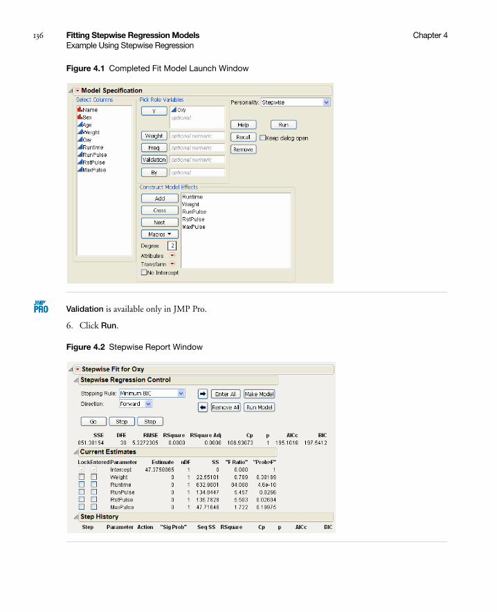
136 Fitting Stepwise Regression Models Chapter 4Example Using Stepwise Regression
Figure 4.1 Completed Fit Model Launch Window
Validation is available only in JMP Pro.
6. Click Run.
Figure 4.2 Stepwise Report Window
Chapter 4 Fitting Stepwise Regression Models 137The Stepwise Report
To find a good oxygen uptake prediction equation, you need to compare many different regression models. Use the options in the Stepwise report window to search through models with combinations of effects and choose the model that you want.
The Stepwise Report
The Stepwise report window contains platform options, a regression control panel, current estimates, and step history.
Stepwise Platform Options
The red triangle menu next to Stepwise Fit contains the following platform options.
Table 4.1 Description of the Stepwise Report Window
Platform options The red triangle menu next to Stepwise Fit contains options that affect all of the variables. See “Stepwise Platform Options” on page 137.
Stepwise Regression Control
Limits regressor effect probabilities, determines the method of selecting effects, starts or stops the selection process, and creates a model. See “Stepwise Regression Control Panel” on page 138.
Current Estimates Enters, removes, and locks in model effects. See “Current Estimates Report” on page 143.
Step History Records the effect of adding a term to the model. See “Step History Report” on page 144.
Table 4.2 Descriptions of Stepwise Platform Options
K-Fold Crossvalidation Performs K-Fold cross validation in the selection process. When selected, this option enables the Max K-Fold RSquare stopping rule (“Stepwise Regression Control Panel” on page 138).
Available only for continuous responses. For more information about validation, see “Using Validation” on page 152.
All Possible Models Enter values for the maximum number of terms to fit in any one model. Also enter values for the maximum number of best model results to show for each number of terms in the model. You can restrict the models to those that imply a parent-child relationship (or heredity). See “The All Possible Models Option” on page 149.
Available only for continuous responses.
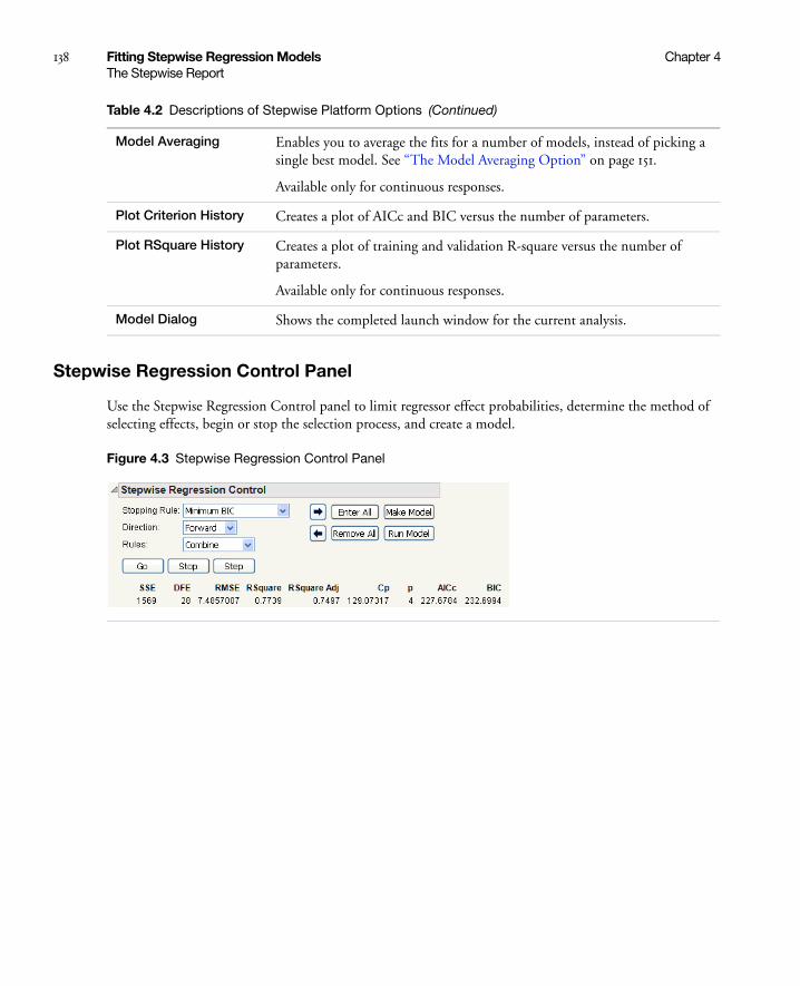
138 Fitting Stepwise Regression Models Chapter 4The Stepwise Report
Stepwise Regression Control Panel
Use the Stepwise Regression Control panel to limit regressor effect probabilities, determine the method of selecting effects, begin or stop the selection process, and create a model.
Figure 4.3 Stepwise Regression Control Panel
Model Averaging Enables you to average the fits for a number of models, instead of picking a single best model. See “The Model Averaging Option” on page 151.
Available only for continuous responses.
Plot Criterion History Creates a plot of AICc and BIC versus the number of parameters.
Plot RSquare History Creates a plot of training and validation R-square versus the number of parameters.
Available only for continuous responses.
Model Dialog Shows the completed launch window for the current analysis.
Table 4.2 Descriptions of Stepwise Platform Options (Continued)

Chapter 4 Fitting Stepwise Regression Models 139The Stepwise Report
Table 4.3 Description of the Stepwise Regression Control Panel
Stopping Rule • P-value Threshold uses p-values (significance levels) to enter and remove effects from the model. Two other options appear when P-value Threshold is chosen: Prob to Enter is the maximum p-value that an effect must have to be entered into the model during a forward step. Prob to Leave is the minimum p-value that an effect must have to be removed from the model during a backward step.
• Minimum AICc uses the minimum corrected Akaike Information Criterion to choose the best model.
• Minimum BIC uses the minimum Bayesian Information Criterion to choose the best model.
• Max Validation RSquare uses the maximum R-square from the validation set to choose the best model. This is available only when a validation column is used, and the validation column has two or three distinct values. For more information about validation, see “Using Validation” on page 152.
• Max K-Fold RSquare uses the maximum R-square from K-fold cross validation to choose the best model. This is available only when K-Fold cross validation is used. For more information about validation, see “Using Validation” on page 152.
Direction Choose how effects enter and leave the model:
• Forward brings in the regressor that most improves the fit, given that term is significant at the level specified by Prob to Enter. See “Forward Selection Example” on page 141.
• Backward removes the regressor that affects the fit the least, given that term is not significant at the level specified in Prob to Leave. See “Backward Selection Example” on page 142.
• Mixed alternates the forward and backward steps. It includes the most significant term that satisfies Prob to Enter and removes the least significant term satisfying Prob to Leave. It continues removing terms until the remaining terms are significant and then it changes to the forward direction.

140 Fitting Stepwise Regression Models Chapter 4The Stepwise Report
Table 4.4 describes the statistics for the current model, which appear below the Stepwise Regression Control panel.
Rules Note: Appears only if your model contains related terms.
Change the rules that are applied when there is a hierarchy of terms in the model. Select one of the following options:
Combine groups a term with its precedent terms and calculates the group’s significance probability for entry as a joint F test. Combine is the default rule.
Restrict restricts the terms that have precedents so that they cannot be entered until their precedents are entered.
No Rules gives the selection routine complete freedom to choose terms, regardless of whether the routine breaks a hierarchy or not.
Whole Effects enters only whole effects, when all terms involving that effect are significant. This rule applies only when categorical variables with more than two levels are entered as possible model effects.
Go Automates the selection process to completion.
Stop Stops the selection process.
Step Increments the selection process one step at a time.
Arrow buttons Step forward and backward one step in the selection process.
Enter All Enters all unlocked terms into the model.
Remove All Removes all terms from the model.
Make Model Creates a model for the Fit Model window from the model currently showing in the Current Estimates table. In cases where there are nominal or ordinal terms, Make Model can create new data table columns to contain terms that are needed for the model.
Run Model Runs the model currently showing in the Current Estimates table.
Table 4.4 Description of Current Model Statistics
SSE Sum of squares for the current model.
DFE Degrees of freedom for the current model.
RMSE Root mean square error (residual) for the current model.
Table 4.3 Description of the Stepwise Regression Control Panel (Continued)

Chapter 4 Fitting Stepwise Regression Models 141The Stepwise Report
Forward Selection Example
In forward selection, terms are entered into the model and most significant terms are added until all of the terms are significant.
1. Complete the steps in “Example Using Stepwise Regression” on page 135.
Notice that the default selection for Direction is Forward.
2. Click Step.
From the top figure in Figure 4.4, you can see that after one step, the most significant term, Runtime, is entered into the model.
RSquare Proportion of the variation in the response that can be attributed to terms in the model rather than to random error.
RSquare Adj Adjusts R2 to make it more comparable over models with different numbers of parameters by using the degrees of freedom in its computation. The adjusted R2 is useful in stepwise procedure because you are looking at many different models and want to adjust for the number of terms in the model.
Cp Mallow’s Cp criterion for selecting a model. It is an alternative measure of total squared error and can be defined as follows:
where s2 is the MSE for the full model and SSEp is the sum-of-squares error for a model with p variables, including the intercept. Note that p is the number of x-variables+1. If Cp is graphed with p, Mallows (1973) recommends choosing the model where Cp first approaches p.
p Number of parameters in the model, including the intercept.
AICc Corrected Akaike’s Information Criterion, defined as follows:
where k is the number of estimated parameters, including intercept and error terms in the model, and n is the number of observations in the data set. Burnham and Anderson (2004) discuss using AICc for model selection. The best model has the smallest value, as discussed in Akaike (1974).
BIC Bayesian Information Criterion defined as
-2loglikelihood + k ln(n)
where k is the number of parameters, and n is the sample size.
Table 4.4 Description of Current Model Statistics (Continued)
CpSSEp
s2
------------
N 2p–( )–=
AICc = -2loglikelihood 2k2k k 1+( )n k– 1–-----------------------+ +
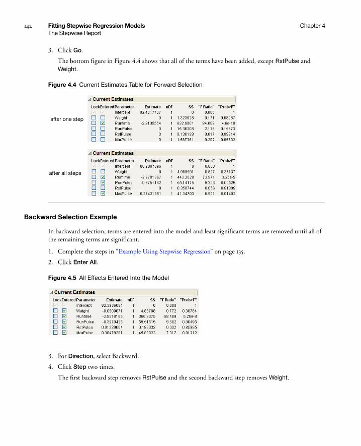
142 Fitting Stepwise Regression Models Chapter 4The Stepwise Report
3. Click Go.
The bottom figure in Figure 4.4 shows that all of the terms have been added, except RstPulse and Weight.
Figure 4.4 Current Estimates Table for Forward Selection
Backward Selection Example
In backward selection, terms are entered into the model and least significant terms are removed until all of the remaining terms are significant.
1. Complete the steps in “Example Using Stepwise Regression” on page 135.
2. Click Enter All.
Figure 4.5 All Effects Entered Into the Model
3. For Direction, select Backward.
4. Click Step two times.
The first backward step removes RstPulse and the second backward step removes Weight.
after one step
after all steps
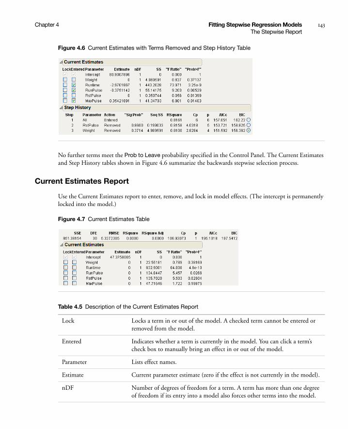
Chapter 4 Fitting Stepwise Regression Models 143The Stepwise Report
Figure 4.6 Current Estimates with Terms Removed and Step History Table
No further terms meet the Prob to Leave probability specified in the Control Panel. The Current Estimates and Step History tables shown in Figure 4.6 summarize the backwards stepwise selection process.
Current Estimates Report
Use the Current Estimates report to enter, remove, and lock in model effects. (The intercept is permanently locked into the model.)
Figure 4.7 Current Estimates Table
Table 4.5 Description of the Current Estimates Report
Lock Locks a term in or out of the model. A checked term cannot be entered or removed from the model.
Entered Indicates whether a term is currently in the model. You can click a term’s check box to manually bring an effect in or out of the model.
Parameter Lists effect names.
Estimate Current parameter estimate (zero if the effect is not currently in the model).
nDF Number of degrees of freedom for a term. A term has more than one degree of freedom if its entry into a model also forces other terms into the model.
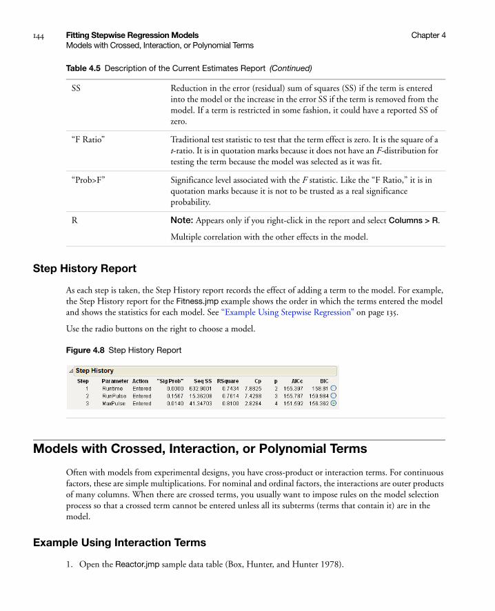
144 Fitting Stepwise Regression Models Chapter 4Models with Crossed, Interaction, or Polynomial Terms
Step History Report
As each step is taken, the Step History report records the effect of adding a term to the model. For example, the Step History report for the Fitness.jmp example shows the order in which the terms entered the model and shows the statistics for each model. See “Example Using Stepwise Regression” on page 135.
Use the radio buttons on the right to choose a model.
Figure 4.8 Step History Report
Models with Crossed, Interaction, or Polynomial Terms
Often with models from experimental designs, you have cross-product or interaction terms. For continuous factors, these are simple multiplications. For nominal and ordinal factors, the interactions are outer products of many columns. When there are crossed terms, you usually want to impose rules on the model selection process so that a crossed term cannot be entered unless all its subterms (terms that contain it) are in the model.
Example Using Interaction Terms
1. Open the Reactor.jmp sample data table (Box, Hunter, and Hunter 1978).
SS Reduction in the error (residual) sum of squares (SS) if the term is entered into the model or the increase in the error SS if the term is removed from the model. If a term is restricted in some fashion, it could have a reported SS of zero.
“F Ratio” Traditional test statistic to test that the term effect is zero. It is the square of a t-ratio. It is in quotation marks because it does not have an F-distribution for testing the term because the model was selected as it was fit.
“Prob>F” Significance level associated with the F statistic. Like the “F Ratio,” it is in quotation marks because it is not to be trusted as a real significance probability.
R Note: Appears only if you right-click in the report and select Columns > R.
Multiple correlation with the other effects in the model.
Table 4.5 Description of the Current Estimates Report (Continued)
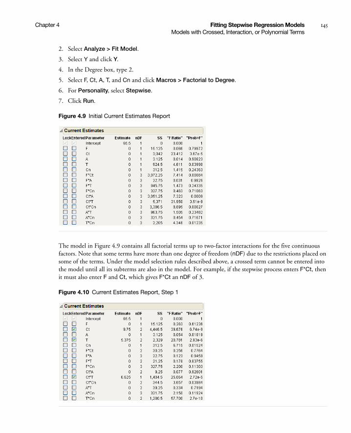
Chapter 4 Fitting Stepwise Regression Models 145Models with Crossed, Interaction, or Polynomial Terms
2. Select Analyze > Fit Model.
3. Select Y and click Y.
4. In the Degree box, type 2.
5. Select F, Ct, A, T, and Cn and click Macros > Factorial to Degree.
6. For Personality, select Stepwise.
7. Click Run.
Figure 4.9 Initial Current Estimates Report
The model in Figure 4.9 contains all factorial terms up to two-factor interactions for the five continuous factors. Note that some terms have more than one degree of freedom (nDF) due to the restrictions placed on some of the terms. Under the model selection rules described above, a crossed term cannot be entered into the model until all its subterms are also in the model. For example, if the stepwise process enters F*Ct, then it must also enter F and Ct, which gives F*Ct an nDF of 3.
Figure 4.10 Current Estimates Report, Step 1

146 Fitting Stepwise Regression Models Chapter 4Models with Nominal and Ordinal Terms
The progress of multiterm inclusion is a balance between numerator degrees of freedom and opportunities to improve the fit. When there are significant interaction terms, often several terms enter at the same step. If the Step button is clicked once, Ct*T is entered along with its two contained effects Ct and T. However, a step back is not symmetric because a crossed term can be removed without removing its two component terms. Note that Ct now has 2 degrees of freedom because if Stepwise removes Ct, it also removes Ct*T.
Models with Nominal and Ordinal Terms
Traditionally, stepwise regression has not addressed the situation when there are categorical terms in the model. When nominal or ordinal terms are in regression models, they are carried as sets of dummy or indicator columns. When there are only two levels, there is no problem because they generate only a single column. However, for more than two levels, multiple columns must be handled. The convention in JMP for nominal variables in standard platforms is to model these terms so that the parameter estimates average out to zero across all the levels.
In the stepwise platform, categorical variables (nominal and ordinal) are coded in a hierarchical fashion, which is different from the other least squares fitting platforms. In hierarchical coding, the levels of the categorical variable are considered in some order and a split is made to make the two groups of levels that most separate the means of the response. Then, each group is further subdivided into its most separated subgroups, and so on, until all the levels are distinguished into k - 1 terms for k levels.
For nominal terms, the order of levels is determined by the means of the Ys. For ordinal terms, the order is fixed.
Example of a Model with a Nominal Term
1. Open the Football.jmp sample data table.
2. Select Analyze > Fit Model.
3. Select Speed and click Y.
4. Select Weight and Position2 and click Add.
Notice that Position2 is a nominal variable with values representing football positions.
5. For Personality, select Stepwise.
6. Click Run.
Figure 4.11 Position Hierarchy

Chapter 4 Fitting Stepwise Regression Models 147Using the Make Model Command for Hierarchical Terms
• The method first splits Position into two groups with the term Position2{wr&db&o&lb&te–ki&l}. One group (the slower group) consists of the wide receivers (wr), defensive backs (db), offensive backs (o), linebackers (lb), and tight ends (te). The other group (the faster group) is the kickers (ki), and linemen (l), which ultimately split as Position2{ki-l}.
• The next split subdivides the slower group into wide receivers (wr), defensive backs (db), and offensive backs(o) versus linebackers (lb) and tight ends (te), shown as Position2{wr&db&o–lb&te}. The linebackers (lb) and tight ends split (te) to form Position2{lb–te}.
• The slower group divides again giving Position2{wr&db-o}, wide receivers (wr) and defensive backs (db) versus offensive backs (o).
• The last subdivision is the wide receivers (wr) and defensive backs (db), Position2{wr–db}.
These terms can be illustrated by the tree hierarchy shown at the top in Figure 4.12.
Figure 4.12 Tree Structure of Terms and Corresponding Current Estimates Table
Using the default Combine rule for terms to enter a model or the Restrict rule, a term cannot enter the model unless all the terms above it in the hierarchy have been entered. Therefore, it is simple to bring in the term Position2{wr&db&o&lb&te-ki&l} because there is nothing above it in the hierarchy. But to enter Position2{lb-te} requires that the two other terms above it in the hierarchy are entered: Position2{wr&db&o-lb&te}, and Position2{wr&db&o&lb&te-ki&l}.
Reasons to choose a hierarchical coding include:
• The hierarchy leads to natural stepping rules.
• The groupings that make the greatest initial separation enter the model early.
Using the Make Model Command for Hierarchical Terms
If you have a model with nominal or ordinal terms, when you click Make Model or Run Model, the Fit Model platform creates a new set of columns in the data table. The model appears in a new Fit Model window for the response variable. The next example uses the Hotdogs2 sample data to illustrate how Stepwise constructs a model with hierarchical effects.
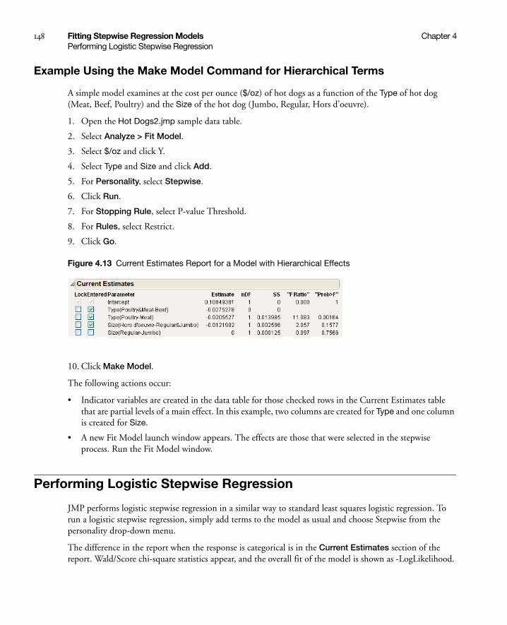
148 Fitting Stepwise Regression Models Chapter 4Performing Logistic Stepwise Regression
Example Using the Make Model Command for Hierarchical Terms
A simple model examines at the cost per ounce ($/oz) of hot dogs as a function of the Type of hot dog (Meat, Beef, Poultry) and the Size of the hot dog (Jumbo, Regular, Hors d’oeuvre).
1. Open the Hot Dogs2.jmp sample data table.
2. Select Analyze > Fit Model.
3. Select $/oz and click Y.
4. Select Type and Size and click Add.
5. For Personality, select Stepwise.
6. Click Run.
7. For Stopping Rule, select P-value Threshold.
8. For Rules, select Restrict.
9. Click Go.
Figure 4.13 Current Estimates Report for a Model with Hierarchical Effects
10. Click Make Model.
The following actions occur:
• Indicator variables are created in the data table for those checked rows in the Current Estimates table that are partial levels of a main effect. In this example, two columns are created for Type and one column is created for Size.
• A new Fit Model launch window appears. The effects are those that were selected in the stepwise process. Run the Fit Model window.
Performing Logistic Stepwise Regression
JMP performs logistic stepwise regression in a similar way to standard least squares logistic regression. To run a logistic stepwise regression, simply add terms to the model as usual and choose Stepwise from the personality drop-down menu.
The difference in the report when the response is categorical is in the Current Estimates section of the report. Wald/Score chi-square statistics appear, and the overall fit of the model is shown as -LogLikelihood.
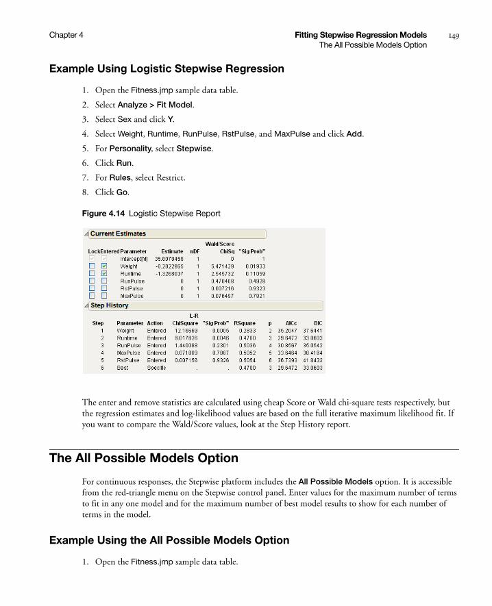
Chapter 4 Fitting Stepwise Regression Models 149The All Possible Models Option
Example Using Logistic Stepwise Regression
1. Open the Fitness.jmp sample data table.
2. Select Analyze > Fit Model.
3. Select Sex and click Y.
4. Select Weight, Runtime, RunPulse, RstPulse, and MaxPulse and click Add.
5. For Personality, select Stepwise.
6. Click Run.
7. For Rules, select Restrict.
8. Click Go.
Figure 4.14 Logistic Stepwise Report
The enter and remove statistics are calculated using cheap Score or Wald chi-square tests respectively, but the regression estimates and log-likelihood values are based on the full iterative maximum likelihood fit. If you want to compare the Wald/Score values, look at the Step History report.
The All Possible Models Option
For continuous responses, the Stepwise platform includes the All Possible Models option. It is accessible from the red-triangle menu on the Stepwise control panel. Enter values for the maximum number of terms to fit in any one model and for the maximum number of best model results to show for each number of terms in the model.
Example Using the All Possible Models Option
1. Open the Fitness.jmp sample data table.
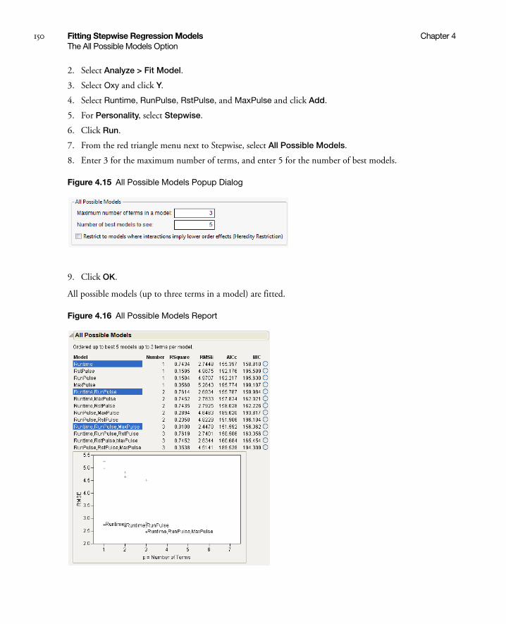
150 Fitting Stepwise Regression Models Chapter 4The All Possible Models Option
2. Select Analyze > Fit Model.
3. Select Oxy and click Y.
4. Select Runtime, RunPulse, RstPulse, and MaxPulse and click Add.
5. For Personality, select Stepwise.
6. Click Run.
7. From the red triangle menu next to Stepwise, select All Possible Models.
8. Enter 3 for the maximum number of terms, and enter 5 for the number of best models.
Figure 4.15 All Possible Models Popup Dialog
9. Click OK.
All possible models (up to three terms in a model) are fitted.
Figure 4.16 All Possible Models Report
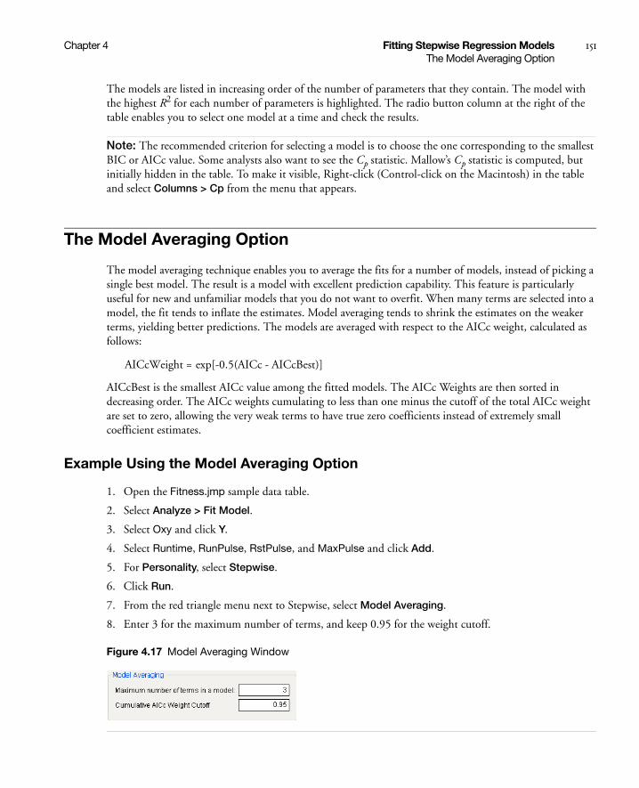
Chapter 4 Fitting Stepwise Regression Models 151The Model Averaging Option
The models are listed in increasing order of the number of parameters that they contain. The model with the highest R2 for each number of parameters is highlighted. The radio button column at the right of the table enables you to select one model at a time and check the results.
Note: The recommended criterion for selecting a model is to choose the one corresponding to the smallest BIC or AICc value. Some analysts also want to see the Cp statistic. Mallow’s Cp statistic is computed, but initially hidden in the table. To make it visible, Right-click (Control-click on the Macintosh) in the table and select Columns > Cp from the menu that appears.
The Model Averaging Option
The model averaging technique enables you to average the fits for a number of models, instead of picking a single best model. The result is a model with excellent prediction capability. This feature is particularly useful for new and unfamiliar models that you do not want to overfit. When many terms are selected into a model, the fit tends to inflate the estimates. Model averaging tends to shrink the estimates on the weaker terms, yielding better predictions. The models are averaged with respect to the AICc weight, calculated as follows:
AICcBest is the smallest AICc value among the fitted models. The AICc Weights are then sorted in decreasing order. The AICc weights cumulating to less than one minus the cutoff of the total AICc weight are set to zero, allowing the very weak terms to have true zero coefficients instead of extremely small coefficient estimates.
Example Using the Model Averaging Option
1. Open the Fitness.jmp sample data table.
2. Select Analyze > Fit Model.
3. Select Oxy and click Y.
4. Select Runtime, RunPulse, RstPulse, and MaxPulse and click Add.
5. For Personality, select Stepwise.
6. Click Run.
7. From the red triangle menu next to Stepwise, select Model Averaging.
8. Enter 3 for the maximum number of terms, and keep 0.95 for the weight cutoff.
Figure 4.17 Model Averaging Window
AICcWeight = exp[-0.5(AICc - AICcBest)]
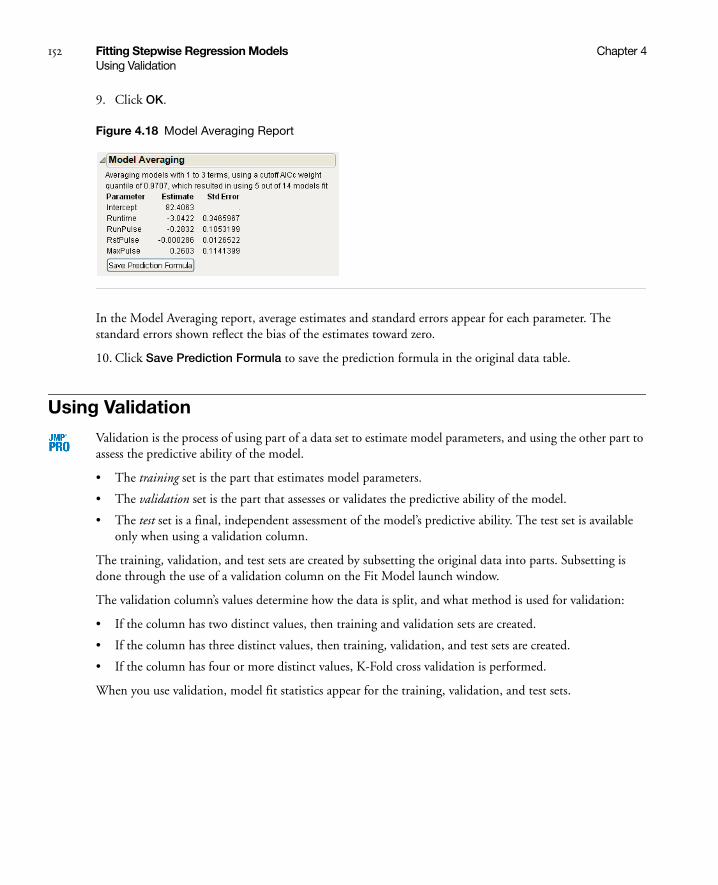
152 Fitting Stepwise Regression Models Chapter 4Using Validation
9. Click OK.
Figure 4.18 Model Averaging Report
In the Model Averaging report, average estimates and standard errors appear for each parameter. The standard errors shown reflect the bias of the estimates toward zero.
10. Click Save Prediction Formula to save the prediction formula in the original data table.
Using Validation
Validation is the process of using part of a data set to estimate model parameters, and using the other part to assess the predictive ability of the model.
• The training set is the part that estimates model parameters.
• The validation set is the part that assesses or validates the predictive ability of the model.
• The test set is a final, independent assessment of the model’s predictive ability. The test set is available only when using a validation column.
The training, validation, and test sets are created by subsetting the original data into parts. Subsetting is done through the use of a validation column on the Fit Model launch window.
The validation column’s values determine how the data is split, and what method is used for validation:
• If the column has two distinct values, then training and validation sets are created.
• If the column has three distinct values, then training, validation, and test sets are created.
• If the column has four or more distinct values, K-Fold cross validation is performed.
When you use validation, model fit statistics appear for the training, validation, and test sets.

Chapter 4 Fitting Stepwise Regression Models 153Using Validation
K-Fold Cross Validation
K-Fold cross validation divides the original data into K subsets. In turn, each of the K sets is used to validate the model fit on the rest of the data, fitting a total of K models. The model giving the best validation statistic is chosen as the final model. This method is best for small data sets, because it makes efficient use of limited amounts of data.
To use K-Fold cross validation, do one of the following:
• Use a validation column with four or more distinct values.
• From the red triangle menu for Stepwise Fit, select K-Fold Crossvalidation.

154 Fitting Stepwise Regression Models Chapter 4Using Validation

Chapter 5Fitting Multiple Response Models
Using the Fit Model Platform
Multivariate models fit several responses (Y variables) to a set of effects. The functions across the Y variables can be tested with appropriate response designs.
In addition to creating standard MANOVA (Multivariate Analysis of Variance) models, you can use the following techniques:
• Repeated measures analysis when repeated measurements are taken on each subject and you want to analyze effects both between subjects and within subjects across the measurements. This multivariate approach is especially important when the correlation structure across the measurements is arbitrary.
• Canonical correlation to find the linear combination of the X and Y variables that has the highest correlation.
• Discriminant analysis to find distance formulas between points and the multivariate means of various groups so that points can be classified into the groups that they are most likely to be in. A more complete implementation of discriminant analysis is in the Discriminant platform.
Multivariate fitting has a different flavor from univariate fitting. The multivariate fit begins with a rudimentary preliminary analysis that shows parameter estimates and least squares means. You can then specify a response design across the Y variables and multivariate tests are performed.

Contents
Example of a Multiple Response Model. . . . . . . . . . . . . . . . . . . . . . . . . . . . . . . . . . . . . . . . . . . . . . . . . . 157
The Manova Report . . . . . . . . . . . . . . . . . . . . . . . . . . . . . . . . . . . . . . . . . . . . . . . . . . . . . . . . . . . . . . . . 159
The Manova Fit Options . . . . . . . . . . . . . . . . . . . . . . . . . . . . . . . . . . . . . . . . . . . . . . . . . . . . . . . . . . . . . 159
Response Specification. . . . . . . . . . . . . . . . . . . . . . . . . . . . . . . . . . . . . . . . . . . . . . . . . . . . . . . . . . . . . . .160
Choose Response Options . . . . . . . . . . . . . . . . . . . . . . . . . . . . . . . . . . . . . . . . . . . . . . . . . . . . . . . . .160
Custom Test Option . . . . . . . . . . . . . . . . . . . . . . . . . . . . . . . . . . . . . . . . . . . . . . . . . . . . . . . . . . . . . 161
Multivariate Tests . . . . . . . . . . . . . . . . . . . . . . . . . . . . . . . . . . . . . . . . . . . . . . . . . . . . . . . . . . . . . . . . . . 165
The Extended Multivariate Report . . . . . . . . . . . . . . . . . . . . . . . . . . . . . . . . . . . . . . . . . . . . . . . . . .166
Comparison of Multivariate Tests . . . . . . . . . . . . . . . . . . . . . . . . . . . . . . . . . . . . . . . . . . . . . . . . . . . 167
Univariate Tests and the Test for Sphericity . . . . . . . . . . . . . . . . . . . . . . . . . . . . . . . . . . . . . . . . . . . . 168
Multivariate Model with Repeated Measures . . . . . . . . . . . . . . . . . . . . . . . . . . . . . . . . . . . . . . . . . . . . . . 169
Example of a Compound Multivariate Model . . . . . . . . . . . . . . . . . . . . . . . . . . . . . . . . . . . . . . . . . . . . . 171
Discriminant Analysis . . . . . . . . . . . . . . . . . . . . . . . . . . . . . . . . . . . . . . . . . . . . . . . . . . . . . . . . . . . . . . . 173
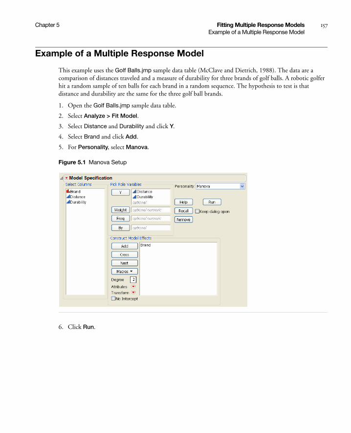
Chapter 5 Fitting Multiple Response Models 157Example of a Multiple Response Model
Example of a Multiple Response Model
This example uses the Golf Balls.jmp sample data table (McClave and Dietrich, 1988). The data are a comparison of distances traveled and a measure of durability for three brands of golf balls. A robotic golfer hit a random sample of ten balls for each brand in a random sequence. The hypothesis to test is that distance and durability are the same for the three golf ball brands.
1. Open the Golf Balls.jmp sample data table.
2. Select Analyze > Fit Model.
3. Select Distance and Durability and click Y.
4. Select Brand and click Add.
5. For Personality, select Manova.
Figure 5.1 Manova Setup
6. Click Run.

158 Fitting Multiple Response Models Chapter 5Example of a Multiple Response Model
Figure 5.2 Manova Report Window
The initial results might not be very interesting in themselves, because no response design has been specified yet. After you specify a response design, the multivariate platform displays tables of multivariate estimates and tests. For details about specifying a response design, see “Response Specification” on page 160.

Chapter 5 Fitting Multiple Response Models 159The Manova Report
The Manova Report
The Manova report window contains the following elements:
The Manova Fit Options
Table 5.2 describes the options in the red triangle menu next to Manova Fit.
Table 5.1 Description of the Manova Report Window
Manova Fit red triangle menu
Contains save options. See “The Manova Fit Options” on page 159.
Response Specification Enables you to specify the response designs for various tests. See “Response Specification” on page 160.
Parameter Estimates Contains the parameter estimates for each response variable (without details like standard errors or t-tests). There is a column for each response variable.
Least Squares Means Reports the overall least squares means of all of the response columns, least squares means of each nominal level, and least squares means plots of the means.
Partial Correlation Shows the covariance matrix and the partial correlation matrix of residuals from the initial fit, adjusted for the X effects.
Overall E&H Matrices Shows the E and H matrices:
• The elements of the E matrix are the cross products of the residuals.
• The H matrices correspond to hypothesis sums of squares and cross products.
There is an H matrix for the whole model and for each effect in the model. Diagonal elements of the E and H matrices correspond to the hypothesis (numerator) and error (denominator) sum of squares for the univariate F tests. New E and H matrices for any given response design are formed from these initial matrices, and the multivariate test statistics are computed from them.
Table 5.2 Description of the Manova Fit Options
Save Discrim Performs a discriminant analysis and saves the results to the data table. For more details, see “Discriminant Analysis” on page 173.
Save Predicted Saves the predicted responses to the data table.
Save Residuals Saves the residuals to the data table.
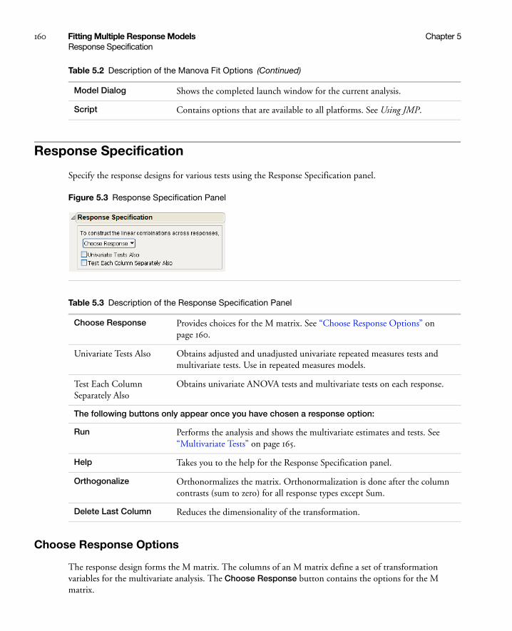
160 Fitting Multiple Response Models Chapter 5Response Specification
Response Specification
Specify the response designs for various tests using the Response Specification panel.
Figure 5.3 Response Specification Panel
Choose Response Options
The response design forms the M matrix. The columns of an M matrix define a set of transformation variables for the multivariate analysis. The Choose Response button contains the options for the M matrix.
Model Dialog Shows the completed launch window for the current analysis.
Script Contains options that are available to all platforms. See Using JMP.
Table 5.2 Description of the Manova Fit Options (Continued)
Table 5.3 Description of the Response Specification Panel
Choose Response Provides choices for the M matrix. See “Choose Response Options” on page 160.
Univariate Tests Also Obtains adjusted and unadjusted univariate repeated measures tests and multivariate tests. Use in repeated measures models.
Test Each Column Separately Also
Obtains univariate ANOVA tests and multivariate tests on each response.
The following buttons only appear once you have chosen a response option:
Run Performs the analysis and shows the multivariate estimates and tests. See “Multivariate Tests” on page 165.
Help Takes you to the help for the Response Specification panel.
Orthogonalize Orthonormalizes the matrix. Orthonormalization is done after the column contrasts (sum to zero) for all response types except Sum.
Delete Last Column Reduces the dimensionality of the transformation.

Chapter 5 Fitting Multiple Response Models 161Response Specification
The most typical response designs are Repeated Measures and Identity for multivariate regression. There is little difference in the tests given by the Contrast, Helmert, Profile, and Mean options, since they span the same space. However, the tests and details in the Least Squares means and Parameter Estimates tables for them show correspondingly different highlights.
The Repeated Measures and the Compound options display dialogs to specify response effect names. They then fit several response functions without waiting for further user input. Otherwise, selections expand the control panel and give you more opportunities to refine the specification.
Custom Test Option
Set up custom tests of effect levels using the Custom Test option.
Note: For instructions on how to create custom tests, see “Custom Test” on page 68 in the “Fitting Standard Least Squares Models” chapter.
The menu icon beside each effect name gives you the commands shown here, to request additional information about the multivariate fit:
Table 5.4 Descriptions of the Choose Response Options
Repeated Measures Constructs and runs both Sum and Contrast responses.
Sum Sum of the responses that gives a single value.
Identity Uses each separate response, the identity matrix.
Contrast Compares each response and the first response.
Polynomial Constructs a matrix of orthogonal polynomials.
Helmert Compares each response with the combined responses listed below it.
Profile Compares each response with the following response.
Mean Compares each response with the mean of the others.
Compound Creates and runs several response functions that are appropriate if the responses are compounded from two effects.
Custom Uses any custom M matrix that you enter.
Table 5.5 Description of the Custom Test Options
Test Details Displays the eigenvalues and eigenvectors of the matrix used to construct multivariate test statistics.
Centroid Plot Plots the centroids (multivariate least squares means) on the first two canonical variables formed from the test space.
E1–H

162 Fitting Multiple Response Models Chapter 5Response Specification
Example of Test Details (Canonical Details)
1. Open the Iris.jmp sample data table.
The Iris data (Mardia, Kent, and Bibby, 1979) have three levels of Species named Virginica, Setosa, and Versicolor. There are four measures (Petal length, Petal width, Sepal length, and Sepal width) taken on each sample.
2. Select Analyze > Fit Model.
3. Select Petal length, Petal width, Sepal length, and Sepal width and click Y.
4. Select Species and click Add.
5. For Personality, select Manova.
6. Click Run.
7. Click on the Choose Response button and select Identity.
8. Click Run.
9. From the red triangle menu next to Species, select Test Details.
The eigenvalues, eigenvectors, and canonical correlations appear. See Figure 5.4.
Save Canonical Scores Saves variables called Canon[1], Canon[2], and so on, as columns in the current data table. These columns have both the values and their formulas.
Contrast Performs the statistical contrasts of treatment levels that you specify in the contrasts dialog.
Note: The Contrast command is the same as for regression with a single response. See the “LSMeans Contrast” on page 110 in the “Fitting Standard Least Squares Models” chapter, for a description and examples of the LSMeans Contrast commands.
Table 5.5 Description of the Custom Test Options (Continued)
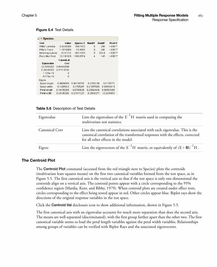
Chapter 5 Fitting Multiple Response Models 163Response Specification
Figure 5.4 Test Details
The Centroid Plot
The Centroid Plot command (accessed from the red triangle next to Species) plots the centroids (multivariate least squares means) on the first two canonical variables formed from the test space, as in Figure 5.5. The first canonical axis is the vertical axis so that if the test space is only one dimensional the centroids align on a vertical axis. The centroid points appear with a circle corresponding to the 95% confidence region (Mardia, Kent, and Bibby, 1979). When centroid plots are created under effect tests, circles corresponding to the effect being tested appear in red. Other circles appear blue. Biplot rays show the directions of the original response variables in the test space.
Click the Centroid Val disclosure icon to show additional information, shown in Figure 5.5.
The first canonical axis with an eigenvalue accounts for much more separation than does the second axis. The means are well separated (discriminated), with the first group farther apart than the other two. The first canonical variable seems to load the petal length variables against the petal width variables. Relationships among groups of variables can be verified with Biplot Rays and the associated eigenvectors.
Table 5.6 Description of Test Details
Eigenvalue Lists the eigenvalues of the matrix used in computing the multivariate test statistics.
Canonical Corr Lists the canonical correlations associated with each eigenvalue. This is the canonical correlation of the transformed responses with the effects, corrected for all other effects in the model.
Eigvec Lists the eigenvectors of the matrix, or equivalently of .
E1–H
E1–H E H+( ) 1–
H

164 Fitting Multiple Response Models Chapter 5Response Specification
Figure 5.5 Centroid Plot and Centroid Values
Save Canonical Scores (Canonical Correlation)
Canonical correlation analysis is not a specific command, but it can be done by a sequence of commands in the multivariate fitting platform, as follows:
1. Follow steps 1-8 in “Example of Test Details (Canonical Details)” on page 162.
2. From the red triangle menu next to Whole Model, select Test Details.
3. From the red triangle menu next to Whole Model, select Save Canonical Scores.
The details list the canonical correlations (Canonical Corr) next to the eigenvalues. The saved variables are called Canon[1], Canon[2], and so on. These columns contain both the values and their formulas.
To obtain the canonical variables for the X side, repeat the same steps, but interchange the X and Y variables. If you already have the columns Canon[n] appended to the data table, the new columns are called Canon[n] 2 (or another number) that makes the name unique.
For another example, proceed as follows:
1. Open the Exercise.jmp sample data table.
2. Select Analyze > Fit Model.
3. Select chins, situps, and jumps and click Y.
4. Select weight, waist, and pulse and click Add.
5. For Personality, select Manova.
6. Click Run.
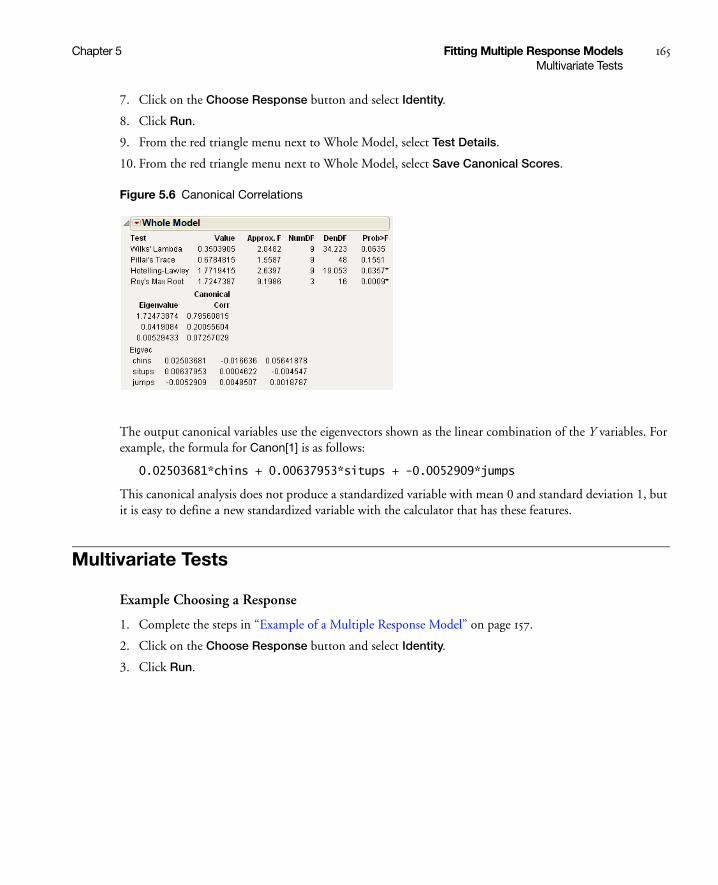
Chapter 5 Fitting Multiple Response Models 165Multivariate Tests
7. Click on the Choose Response button and select Identity.
8. Click Run.
9. From the red triangle menu next to Whole Model, select Test Details.
10. From the red triangle menu next to Whole Model, select Save Canonical Scores.
Figure 5.6 Canonical Correlations
The output canonical variables use the eigenvectors shown as the linear combination of the Y variables. For example, the formula for Canon[1] is as follows:
0.02503681*chins + 0.00637953*situps + -0.0052909*jumps
This canonical analysis does not produce a standardized variable with mean 0 and standard deviation 1, but it is easy to define a new standardized variable with the calculator that has these features.
Multivariate Tests
Example Choosing a Response
1. Complete the steps in “Example of a Multiple Response Model” on page 157.
2. Click on the Choose Response button and select Identity.
3. Click Run.

166 Fitting Multiple Response Models Chapter 5Multivariate Tests
Figure 5.7 Multivariate Test Reports
The M Matrix report gives the response design that you specified. The M-transformed Parameter Estimates report gives the original parameter estimates matrix multiplied by the transpose of the M matrix.
Note: Initially in this chapter, the matrix names E and H refer to the error and hypothesis cross products. After specification of a response design, E and H refer to those matrices transformed by the response design, which are actually M´EM and M´HM.
The Extended Multivariate Report
In multivariate fits, the sums of squares due to hypothesis and error are matrices of squares and cross products instead of single numbers. And there are lots of ways to measure how large a value the matrix for the hypothesis sums of squares and cross products (called H or SSCP) is compared to that matrix for the residual (called E). JMP reports the four multivariate tests that are commonly described in the literature. If you are looking for a test at an exact significance level, you may need to go hunting for tables in reference books. Fortunately, all four tests can be transformed into an approximate F test. If the response design yields a single value, or if the hypothesis is a single degree of freedom, the multivariate tests are equivalent and yield the same exact F test. JMP labels the text Exact F; otherwise, JMP labels it Approx. F.
In the golf balls example, there is only one effect so the Whole Model test and the test for Brand are the same, which show the four multivariate tests with approximate F tests. There is only a single intercept with two DF (one for each response), so the F test for it is exact and is labeled Exact F.
The red triangle menus on the Whole Model, Intercept, and Brand reports contain options to generate additional information, which includes eigenvalues, canonical correlations, a list of centroid values, a centroid plot, and a Save command that lets you save canonical variates.
The effect (Brand in this example) popup menu also includes the option to specify contrasts.

Chapter 5 Fitting Multiple Response Models 167Multivariate Tests
The custom test and contrast features are the same as those for regression with a single response. See the “Fitting Standard Least Squares Models” chapter on page 53.
“Multivariate Details” on page 680 in the appendix “Statistical Details” on page 651, shows formulas for the MANOVA table tests.
Table 5.7 describes each Multivariate report (except the Sphericity Test table; see “Univariate Tests and the Test for Sphericity” on page 168).
Comparison of Multivariate Tests
Although the four standard multivariate tests often give similar results, there are situations where they differ, and one might have advantages over another. Unfortunately, there is no clear winner. In general, here is the order of preference in terms of power:
1. Pillai’s Trace
2. Wilks’ Lambda
3. Hotelling-Lawley Trace
4. Roy’s Maximum Root
When there is a large deviation from the null hypothesis and the eigenvalues differ widely, the order of preference is the reverse (Seber 1984).
Table 5.7 Descriptions of Multivariate Reports
Test Labels each statistical test in the table. If the number of response function values (columns specified in the M matrix) is 1 or if an effect has only one degree of freedom per response function, the exact F test is presented. Otherwise, the standard four multivariate test statistics are given with approximate F tests: Wilks’ Lambda (Λ), Pillai’s Trace, the Hotelling-Lawley Trace, and Roy’s Maximum Root.
Value Value of each multivariate statistical test in the report.
Approx. F (or Exact F) F-values corresponding to the multivariate tests. If the response design yields a single value or if the test is one degree of freedom, this is an exact F test.
NumDF Numerator degrees of freedom.
DenDF Denominator degrees of freedom.
Prob>F Significance probability corresponding to the F-value.

168 Fitting Multiple Response Models Chapter 5Multivariate Tests
Univariate Tests and the Test for Sphericity
There are cases, such as a repeated measures model, that allow transformation of a multivariate problem into a univariate problem (Huynh and Feldt 1970). Using univariate tests in a multivariate context is valid in the following situations:
• If the response design matrix M is orthonormal (M´M = Identity).
• If M yields more than one response the coefficients of each transformation sum to zero.
• If the sphericity condition is met. The sphericity condition means that the M-transformed responses are uncorrelated and have the same variance. M´ΣM is proportional to an identity matrix, where Σ is the covariance of the Ys.
If these conditions hold, the diagonal elements of the E and H test matrices sum to make a univariate sums of squares for the denominator and numerator of an F test. Note that if the above conditions do not hold, then an error message appears. In the case of Golf Balls.jmp, an identity matrix is specified as the M-matrix. Identity matrices cannot be transformed to a full rank matrix after centralization of column vectors and orthonormalization. So the univariate request is ignored.
Example of Univariate and Sphericity Test
1. Open the Dogs.jmp sample data table.
2. Select Analyze > Fit Model.
3. Select LogHist0, LogHist1, LogHist3, and LogHist5 and click Y.
4. Select drug and dep1 and click Add.
5. In the Construct Model Effects panel, select drug. In the Select Columns panel, select dep1. Click Cross.
6. For Personality, select Manova.
7. Click Run.
8. Select the check box next to Univariate Tests Also.
9. In the Choose Response menu, select Repeated Measures.
Time should be entered for YName, and Univariate Tests Also should be selected.
10. Click OK.
Figure 5.8 Sphericity Test
Chapter 5 Fitting Multiple Response Models 169Multivariate Model with Repeated Measures
The sphericity test checks the appropriateness of an unadjusted univariate F test for the within-subject effects using the Mauchly criterion to test the sphericity assumption (Anderson 1958). The sphericity test and the univariate tests are always done using an orthonormalized M matrix. You interpret the sphericity test as follows:
• If the sphericity Chi-square test is not significant, you can use the unadjusted univariate F-tests.
• If the sphericity test is significant, use the multivariate or the adjusted univariate tests.
The univariate F statistic has an approximate F-distribution even without sphericity, but the degrees of freedom for numerator and denominator are reduced by some fraction epsilon (ε). Box (1954), Geisser and Greenhouse (1958), and Huynh-Feldt (1976) offer techniques for estimating the epsilon degrees-of-freedom adjustment. Muller and Barton (1989) recommend the Geisser-Greenhouse version, based on a study of power.
The epsilon adjusted tests in the multivariate report are labeled G-G (Greenhouse-Geisser) or H-F (Huynh-Feldt), with the epsilon adjustment shown in the value column.
Multivariate Model with Repeated Measures
One common use of multivariate fitting is to analyze data with repeated measures, also called longitudinal data. A subject is measured repeatedly across time, and the data are arranged so that each of the time measurements form a variable. Because of correlation between the measurements, data should not be stacked into a single column and analyzed as a univariate model unless the correlations form a pattern termed sphericity. See the previous section, “Univariate Tests and the Test for Sphericity” on page 168, for more details about this topic.
With repeated measures, the analysis is divided into two layers:
• Between-subject (or across-subject) effects are modeled by fitting the sum of the repeated measures columns to the model effects. This corresponds to using the Sum response function, which is an M-matrix that is a single vector of 1s.
• Within-subjects effects (repeated effects, or time effects) are modeled with a response function that fits differences in the repeated measures columns. This analysis can be done using the Contrast response function or any of the other similar differencing functions: Polynomial, Helmert, Profile, or Mean. When you model differences across the repeated measures, think of the differences as being a new within-subjects effect, usually time. When you fit effects in the model, interpret them as the interaction with the within-subjects effect. For example, the effect for Intercept becomes the Time (within-subject) effect, showing overall differences across the repeated measures. If you have an effect A, the within-subjects tests are interpreted to be the tests for the A*Time interaction, which model how the differences across repeated measures vary across the A effect.
Table 5.8 on page 171 shows the relationship between the response function and the model effects compared with what a univariate model specification would be. Using both the Sum (between-subjects) and Contrast (within-subjects) models, you should be able to reconstruct the tests that would have resulted from stacking the responses into a single column and obtaining a standard univariate fit.

170 Fitting Multiple Response Models Chapter 5Multivariate Model with Repeated Measures
There is a direct and an indirect way to perform the repeated measures analyses:
• The direct way is to use the popup menu item Repeated Measures. This prompts you to name the effect that represents the within-subject effect across the repeated measures. Then it fits both the Contrast and the Sum response functions. An advantage of this way is that the effects are labeled appropriately with the within-subjects effect name.
• The indirect way is to specify the two response functions individually. First, do the Sum response function and second, do either Contrast or one of the other functions that model differences. You need to remember to associate the within-subjects effect with the model effects in the contrast fit.
Repeated Measures Example
For example, consider a study by Cole and Grizzle (1966). The results are in the Dogs.jmp table in the sample data folder. Sixteen dogs are assigned to four groups defined by variables drug and dep1, each having two levels. The dependent variable is the blood concentration of histamine at 0, 1, 3, and 5 minutes after injection of the drug. The log of the concentration is used to minimize the correlation between the mean and variance of the data.
1. Open the Dogs.jmp sample data table.
2. Select Analyze > Fit Model.
3. Select LogHist0, LogHist1, LogHist3, and LogHist5 and click Y.
4. Select drug and dep1 and select Full Factorial from the Macros menu.
5. For Personality, select Manova.
6. Click Run.
7. In the Choose Response menu, select Repeated Measures.
Time should be entered for YName. If you check the Univariate Tests Also check box, the report includes univariate tests, which are calculated as if the responses were stacked into a single column.
8. Click OK.
Figure 5.9 Repeated Measures Window

Chapter 5 Fitting Multiple Response Models 171Example of a Compound Multivariate Model
Table 5.8 shows how the multivariate tests for a Sum and Contrast response designs correspond to how univariate tests would be labeled if the data for columns LogHist0, LogHist1, LogHist3, and LogHist5 were stacked into a single Y column, with the new rows identified with a nominal grouping variable, Time.
The between-subjects analysis is produced first. This analysis is the same (except titling) as it would have been if Sum had been selected on the popup menu.
The within-subjects analysis is produced next. This analysis is the same (except titling) as it would have been if Contrast had been selected on the popup menu, though the within-subject effect name (Time) has been added to the effect names in the report. Note that the position formerly occupied by Intercept is Time, because the intercept term is estimating overall differences across the repeated measurements.
Example of a Compound Multivariate Model
JMP can handle data with layers of repeated measures. For example, see the Cholesterol.jmp data table. Groups of five subjects belong to one of four treatment groups called A, B, Control, and Placebo. Cholesterol was measured in the morning and again in the afternoon once a month for three months (the data are fictional). In this example, the response columns are arranged chronologically with time of day within month.
1. Open the Cholesterol.jmp sample data table.
2. Select Analyze > Fit Model.
3. Select April AM, April PM, May AM, May PM, June AM, and June PM and click Y.
4. Select treatment and click Add.
5. Next to Personality, select Manova.
6. Click Run.
Table 5.8 Corresponding Multivariate and Univariate Tests
Sum M-MatrixBetween Subjects
Contrast M-MatrixWithin Subjects
Multivariate Test Univariate Test Multivariate Test Univariate Test
intercept intercept intercept time
drug drug drug time*drug
depl depl depl time*depl
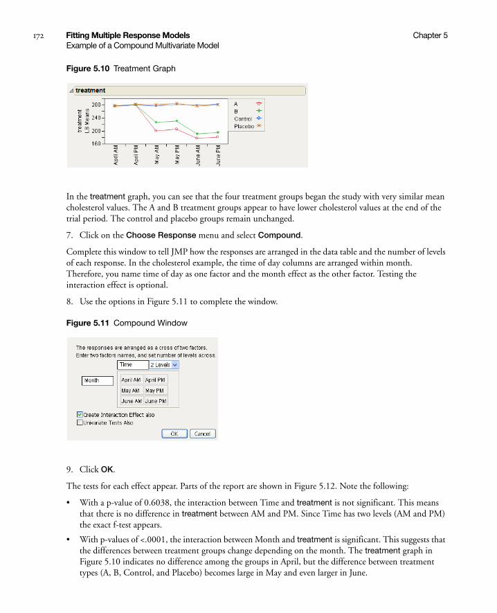
172 Fitting Multiple Response Models Chapter 5Example of a Compound Multivariate Model
Figure 5.10 Treatment Graph
In the treatment graph, you can see that the four treatment groups began the study with very similar mean cholesterol values. The A and B treatment groups appear to have lower cholesterol values at the end of the trial period. The control and placebo groups remain unchanged.
7. Click on the Choose Response menu and select Compound.
Complete this window to tell JMP how the responses are arranged in the data table and the number of levels of each response. In the cholesterol example, the time of day columns are arranged within month. Therefore, you name time of day as one factor and the month effect as the other factor. Testing the interaction effect is optional.
8. Use the options in Figure 5.11 to complete the window.
Figure 5.11 Compound Window
9. Click OK.
The tests for each effect appear. Parts of the report are shown in Figure 5.12. Note the following:
• With a p-value of 0.6038, the interaction between Time and treatment is not significant. This means that there is no difference in treatment between AM and PM. Since Time has two levels (AM and PM) the exact f-test appears.
• With p-values of <.0001, the interaction between Month and treatment is significant. This suggests that the differences between treatment groups change depending on the month. The treatment graph in Figure 5.10 indicates no difference among the groups in April, but the difference between treatment types (A, B, Control, and Placebo) becomes large in May and even larger in June.
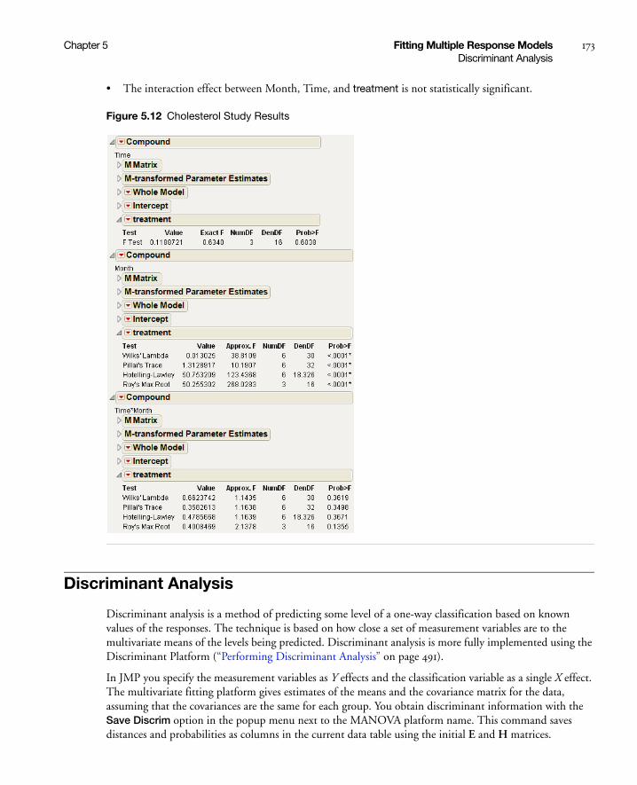
Chapter 5 Fitting Multiple Response Models 173Discriminant Analysis
• The interaction effect between Month, Time, and treatment is not statistically significant.
Figure 5.12 Cholesterol Study Results
Discriminant Analysis
Discriminant analysis is a method of predicting some level of a one-way classification based on known values of the responses. The technique is based on how close a set of measurement variables are to the multivariate means of the levels being predicted. Discriminant analysis is more fully implemented using the Discriminant Platform (“Performing Discriminant Analysis” on page 491).
In JMP you specify the measurement variables as Y effects and the classification variable as a single X effect. The multivariate fitting platform gives estimates of the means and the covariance matrix for the data, assuming that the covariances are the same for each group. You obtain discriminant information with the Save Discrim option in the popup menu next to the MANOVA platform name. This command saves distances and probabilities as columns in the current data table using the initial E and H matrices.

174 Fitting Multiple Response Models Chapter 5Discriminant Analysis
For a classification variable with k levels, JMP adds k distance columns, k classification probability columns, the predicted classification column, and two columns of other computational information to the current data table.
Example of the Save Discrim Option
Examine Fisher’s Iris data as found in Mardia, Kent, and Bibby (1979). There are k = 3 levels of species and four measures on each sample.
1. Open the Iris.jmp sample data table.
2. Select Analyze > Fit Model.
3. Select Sepal length, Sepal width, Petal length, and Petal width and click Y.
4. Select Species and click Add.
5. Next to Personality, select Manova.
6. Click Run.
7. From the red triangle menu next to Manova Fit, select Save Discrim.
The following columns are added to the Iris.jmp sample data table:
Now you can use the new columns in the data table with other JMP platforms to summarize the discriminant analysis with reports and graphs. For example:
1. From the updated Iris.jmp data table (that contains the new columns) select Analyze > Fit Y by X.
2. Select Species and click Y, Response.
3. Select Pred Species and click X, Factor.
4. Click OK.
SqDist[0] Quadratic form needed in the Mahalanobis distance calculations.
SqDist[setosa] Mahalanobis distance of the observation from the Setosa centroid.
SqDist[versicolor] Mahalanobis distance of the observation from the Versicolor centroid.
SqDist[virginica] Mahalanobis distance of the observation from the Virginica centroid.
Prob[0] Sum of the negative exponentials of the Mahalanobis distances, used below.
Prob[setosa] Probability of being in the Setosa category.
Prob[versicolor] Probability of being in the Versicolor category.
Prob[virginica] Probability of being in the Virginica category.
Pred Species Species that is most likely from the probabilities.
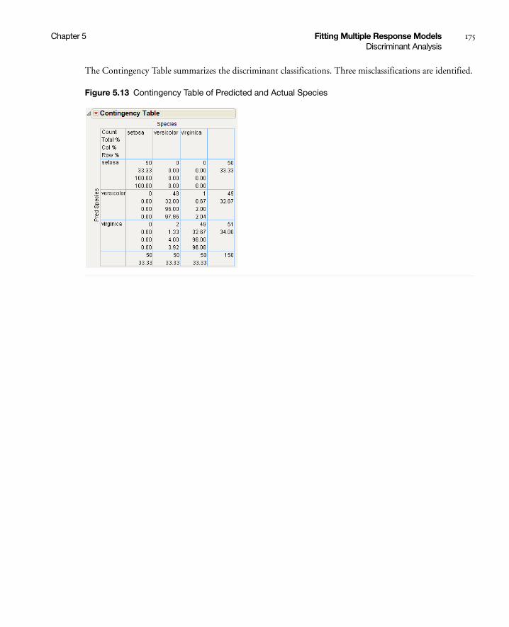
Chapter 5 Fitting Multiple Response Models 175Discriminant Analysis
The Contingency Table summarizes the discriminant classifications. Three misclassifications are identified.
Figure 5.13 Contingency Table of Predicted and Actual Species

176 Fitting Multiple Response Models Chapter 5Discriminant Analysis

Chapter 6Fitting Generalized Linear Models
Using the Fit Model Platform
Generalized Linear Models provide a unified way to fit responses that do not fit the usual requirements of least-squares fits. In particular, frequency counts, which are characterized as having a Poisson distribution indexed by a model, are easily fit by a Generalized Linear Model.
The technique, pioneered by Nelder and Wedderburn (1972), involves a set of iteratively reweighted least-squares fits of a transformed response.
Additional features of JMP’s Generalized Linear Model personality include the following:
• likelihood ratio statistics for user-defined contrasts, that is, linear functions of the parameters, and p-values based on their asymptotic chi-square distributions
• estimated values, standard errors, and confidence limits for user-defined contrasts and least-squares means
• graphical profilers for examining the model
• confidence intervals for model parameters based on the profile likelihood function
• optional bias-corrected maximum likelihood estimator discussed by Firth (1993)

Contents
Overview of Generalized Linear Models . . . . . . . . . . . . . . . . . . . . . . . . . . . . . . . . . . . . . . . . . . . . . . . . . 179
The Generalized Linear Model Personality . . . . . . . . . . . . . . . . . . . . . . . . . . . . . . . . . . . . . . . . . . . . . . . 180
Examples of Generalized Linear Models . . . . . . . . . . . . . . . . . . . . . . . . . . . . . . . . . . . . . . . . . . . . . . . . . 180
Model Selection and Deviance. . . . . . . . . . . . . . . . . . . . . . . . . . . . . . . . . . . . . . . . . . . . . . . . . . . . . . 182
Examples . . . . . . . . . . . . . . . . . . . . . . . . . . . . . . . . . . . . . . . . . . . . . . . . . . . . . . . . . . . . . . . . . . . . . . . . . 183
Poisson Regression. . . . . . . . . . . . . . . . . . . . . . . . . . . . . . . . . . . . . . . . . . . . . . . . . . . . . . . . . . . . . . . 183
Poisson Regression with Offset . . . . . . . . . . . . . . . . . . . . . . . . . . . . . . . . . . . . . . . . . . . . . . . . . . . . . 186
Normal Regression, Log Link . . . . . . . . . . . . . . . . . . . . . . . . . . . . . . . . . . . . . . . . . . . . . . . . . . . . . . 189
Platform Commands . . . . . . . . . . . . . . . . . . . . . . . . . . . . . . . . . . . . . . . . . . . . . . . . . . . . . . . . . . . . . . . . 192

Chapter 6 Fitting Generalized Linear Models 179Overview of Generalized Linear Models
Overview of Generalized Linear Models
While traditional linear models are used extensively in statistical data analysis, there are types of problems for which they are not appropriate.
• It may not be reasonable to assume that data are normally distributed. For example, the normal distribution (which is continuous) may not be adequate for modeling counts or measured proportions.
• If the mean of the data is naturally restricted to a range of values, the traditional linear model may not be appropriate, since the linear predictor can take on any value. For example, the mean of a measured proportion is between 0 and 1, but the linear predictor of the mean in a traditional linear model is not restricted to this range.
• It may not be realistic to assume that the variance of the data is constant for all observations. For example, it is not unusual to observe data where the variance increases with the mean of the data.
A generalized linear model extends the traditional linear model and is, therefore, applicable to a wider range of data analysis problems. See the section “Examples of Generalized Linear Models” on page 180 for the form of a probability distribution from the exponential family of distributions.
As in the case of traditional linear models, fitted generalized linear models can be summarized through statistics such as parameter estimates, their standard errors, and goodness-of-fit statistics. You can also make statistical inference about the parameters using confidence intervals and hypothesis tests. However, specific inference procedures are usually based on asymptotic considerations, since exact distribution theory is not available or is not practical for all generalized linear models.
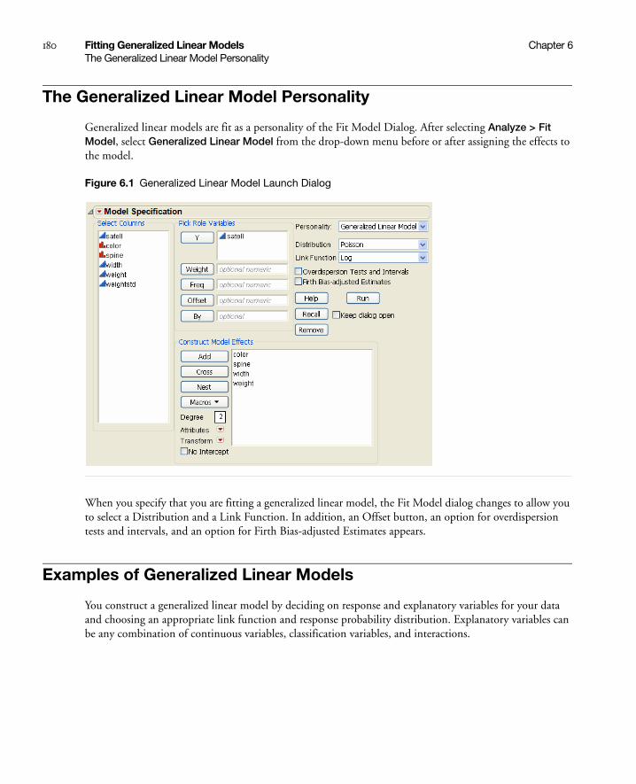
180 Fitting Generalized Linear Models Chapter 6The Generalized Linear Model Personality
The Generalized Linear Model Personality
Generalized linear models are fit as a personality of the Fit Model Dialog. After selecting Analyze > Fit Model, select Generalized Linear Model from the drop-down menu before or after assigning the effects to the model.
Figure 6.1 Generalized Linear Model Launch Dialog
When you specify that you are fitting a generalized linear model, the Fit Model dialog changes to allow you to select a Distribution and a Link Function. In addition, an Offset button, an option for overdispersion tests and intervals, and an option for Firth Bias-adjusted Estimates appears.
Examples of Generalized Linear Models
You construct a generalized linear model by deciding on response and explanatory variables for your data and choosing an appropriate link function and response probability distribution. Explanatory variables can be any combination of continuous variables, classification variables, and interactions.
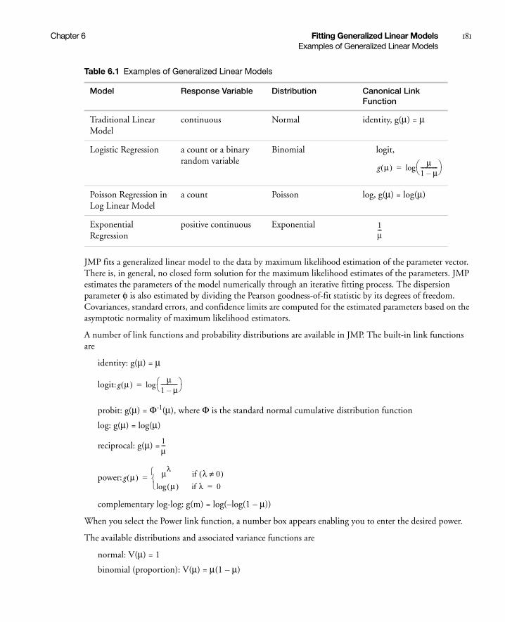
Chapter 6 Fitting Generalized Linear Models 181Examples of Generalized Linear Models
JMP fits a generalized linear model to the data by maximum likelihood estimation of the parameter vector. There is, in general, no closed form solution for the maximum likelihood estimates of the parameters. JMP estimates the parameters of the model numerically through an iterative fitting process. The dispersion parameter φ is also estimated by dividing the Pearson goodness-of-fit statistic by its degrees of freedom. Covariances, standard errors, and confidence limits are computed for the estimated parameters based on the asymptotic normality of maximum likelihood estimators.
A number of link functions and probability distributions are available in JMP. The built-in link functions are
identity: g(μ) = μ
logit:
probit: g(μ) = Φ-1(μ), where Φ is the standard normal cumulative distribution function
log: g(μ) = log(μ)
reciprocal: g(μ) =
power:
complementary log-log: g(m) = log(–log(1 – μ))
When you select the Power link function, a number box appears enabling you to enter the desired power.
The available distributions and associated variance functions are
normal: V(μ) = 1
binomial (proportion): V(μ) = μ(1 – μ)
Table 6.1 Examples of Generalized Linear Models
Model Response Variable Distribution Canonical Link Function
Traditional Linear Model
continuous Normal identity, g(μ) = μ
Logistic Regression a count or a binary random variable
Binomial logit,
Poisson Regression in Log Linear Model
a count Poisson log, g(μ) = log(μ)
Exponential Regression
positive continuous Exponential
g μ( ) μ1 μ–------------ log=
1μ---
g μ( ) μ1 μ–------------ log=
1μ---
g μ( ) μλif λ 0≠( )
μ( )log if λ 0=
=

182 Fitting Generalized Linear Models Chapter 6Examples of Generalized Linear Models
Poisson: V(μ) = μ
Exponential: V(μ) = μ2
When you select Binomial as the distribution, the response variable must be specified in one of the following ways:
• If your data is not summarized as frequencies of events, specify a single binary column as the response. The response column must be nominal. If your data is summarized as frequencies of events, specify a single binary column as the response, along with a frequency variable in the Freq role. The response column must be nominal, and the frequency variable gives the count of each response level.
• If your data is summarized as frequencies of events and trials, specify two continuous columns in this order: a count of the number of successes, and a count of the number of trials. Alternatively, you can specify the number of failures instead of successes.
Model Selection and Deviance
An important aspect of generalized linear modeling is the selection of explanatory variables in the model. Changes in goodness-of-fit statistics are often used to evaluate the contribution of subsets of explanatory variables to a particular model. The deviance, defined to be twice the difference between the maximum attainable log likelihood and the log likelihood at the maximum likelihood estimates of the regression parameters, is often used as a measure of goodness of fit. The maximum attainable log likelihood is achieved with a model that has a parameter for every observation. The following table displays the deviance for each of the probability distributions available in JMP.
Table 6.2 Deviance Functions
Distribution Deviance
normal
Poisson
binomiala
a. In the binomial case, yi = ri /mi, where ri is a binomial count and mi is the binomial number of trialsparameter
exponential
wi yi μi–( )2
i
2 wi yi
yiμi-----
log yi μi–( )–i
2 wimi yi
yiμi-----
log 1 yi–( )1 yi–1 μi–--------------
log+i
2 wi
yiμi-----
log–yi μi–
μi---------------
+i
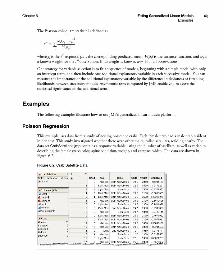
Chapter 6 Fitting Generalized Linear Models 183Examples
The Pearson chi-square statistic is defined as
where yi is the ith response, μi is the corresponding predicted mean, V(μi) is the variance function, and wi is a known weight for the ith observation. If no weight is known, wi = 1 for all observations.
One strategy for variable selection is to fit a sequence of models, beginning with a simple model with only an intercept term, and then include one additional explanatory variable in each successive model. You can measure the importance of the additional explanatory variable by the difference in deviances or fitted log likelihoods between successive models. Asymptotic tests computed by JMP enable you to assess the statistical significance of the additional term.
Examples
The following examples illustrate how to use JMP’s generalized linear models platform.
Poisson Regression
This example uses data from a study of nesting horseshoe crabs. Each female crab had a male crab resident in her nest. This study investigated whether there were other males, called satellites, residing nearby. The data set CrabSatellites.jmp contains a response variable listing the number of satellites, as well as variables describing the female crab’s color, spine condition, weight, and carapace width. The data are shown in Figure 6.2.
Figure 6.2 Crab Satellite Data
X2 wi yi μi–( )2
V μi( )----------------------------
i
=

184 Fitting Generalized Linear Models Chapter 6Examples
To fit the Poisson loglinear model:
• Select Analyze > Fit Model
• Assign satell as Y
• Assign color, spine, width, and weight as Effects
• Choose the Generalized Linear Model Personality
• Choose the Poisson Distribution
The Log Link function should be selected for you automatically.
• Click Run.
The results are shown in Figure 6.3.
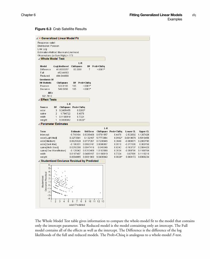
Chapter 6 Fitting Generalized Linear Models 185Examples
Figure 6.3 Crab Satellite Results
The Whole Model Test table gives information to compare the whole-model fit to the model that contains only the intercept parameter. The Reduced model is the model containing only an intercept. The Full model contains all of the effects as well as the intercept. The Difference is the difference of the log likelihoods of the full and reduced models. The Prob>Chisq is analogous to a whole-model F-test.

186 Fitting Generalized Linear Models Chapter 6Examples
Second, goodness-of-fit statistics are presented. Analogous to lack-of-fit tests, they test for adequacy of the model. Low p-values for the ChiSquare goodness-of-fit statistics indicate that you may need to add higher-order terms to the model, add more covariates, change the distribution, or (in Poisson and binomial cases especially) consider adding an overdispersion parameter. AICc is also included and is the corrected Akaike’s Information Criterion, where
and k is the number of estimated parameters in the model and n is the number of observations in the data set. This value may be compared with other models to determine the best-fitting model for the data. The model having the smallest value, as discussed in Akaike (1974), is usually the preferred model.
The Effect Tests table shows joint tests that all the parameters for an individual effect are zero. If an effect has only one parameter, as with simple regressors, then the tests are no different from the tests in the Parameter Estimates table.
The Parameter Estimates table shows the estimates of the parameters in the model and a test for the hypothesis that each parameter is zero. Simple continuous regressors have only one parameter. Models with complex classification effects have a parameter for each anticipated degree of freedom. Confidence limits are also displayed.
Poisson Regression with Offset
The sample data table Ship Damage.JMP is adapted from one found in McCullugh and Nelder (1983). It contains information on a certain type of damage caused by waves to the forward section of the hull. Hull construction engineers are interested in the risk of damage associated with three variables: ship Type, the year the ship was constructed (Yr Made) and the block of years the ship saw service (Yr Used).
In this analysis we use the variable Service, the log of the aggregate months of service, as an offset variable. An offset variable is one that is treated like a regression covariate whose parameter is fixed to be 1.0.
These are most often used to scale the modeling of the mean in Poisson regression situations with log link. In this example, we use log(months of service) since one would expect that the number of repairs be proportional to the number of months in service. To see how this works, assume the linear component of the GLM is called eta. Then with a log link function, the model of the mean with the offset included is:
exp[Log(months of service) + eta] = [(months of service) * exp(eta)].
To run this example, assign
• Generalized Linear Model as the Personality
• Poisson as the Distribution, which automatically selects the Log link function
• N to Y
• Service to Offset
• Type, Yr Made, Yr Used as effects in the model
• Overdispersion Tests and Intervals with a check mark
AICc = -2loglikelihood 2k2k k 1 )+( )n k– 1–--------------------------+ +
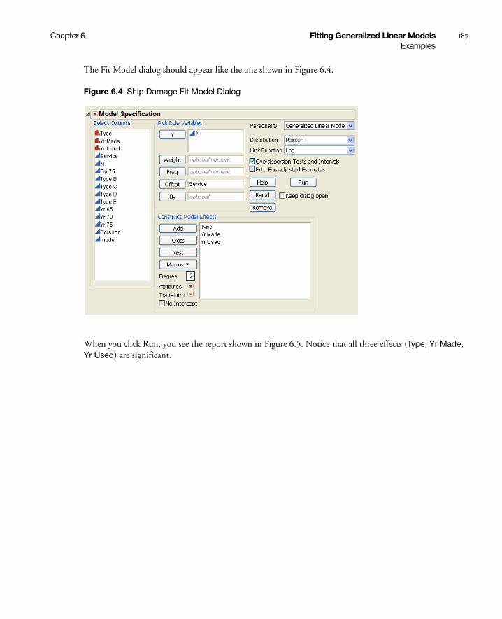
Chapter 6 Fitting Generalized Linear Models 187Examples
The Fit Model dialog should appear like the one shown in Figure 6.4.
Figure 6.4 Ship Damage Fit Model Dialog
When you click Run, you see the report shown in Figure 6.5. Notice that all three effects (Type, Yr Made, Yr Used) are significant.
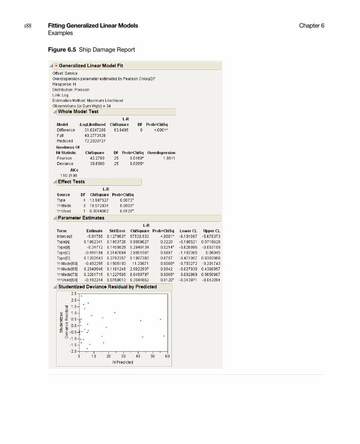
188 Fitting Generalized Linear Models Chapter 6Examples
Figure 6.5 Ship Damage Report

Chapter 6 Fitting Generalized Linear Models 189Examples
Normal Regression, Log Link
Consider the following data set, where x is an explanatory variable and y is the response variable.
Figure 6.6 Nor.jmp data set
Using Fit Y By X, you can easily see that y varies nonlinearly with x and that the variance is approximately constant (see Figure 6.7). A normal distribution with a log link function is chosen to model these data; that is, log(μi) = xi'β so that μi = exp(xi'β). The completed Fit Model dialog is shown in Figure 6.8.
Figure 6.7 Y by X Results for Nor.jmp

190 Fitting Generalized Linear Models Chapter 6Examples
Figure 6.8 Nor Fit Model Dialog
After clicking Run, you get the following report.

Chapter 6 Fitting Generalized Linear Models 191Examples
Figure 6.9 Nor Results
Because the distribution is normal, the Studentized Deviance residuals and the Deviance residuals are the same. To see this, select Diagnostic Plots > Deviance Residuals by Predicted from the platform drop-down menu.
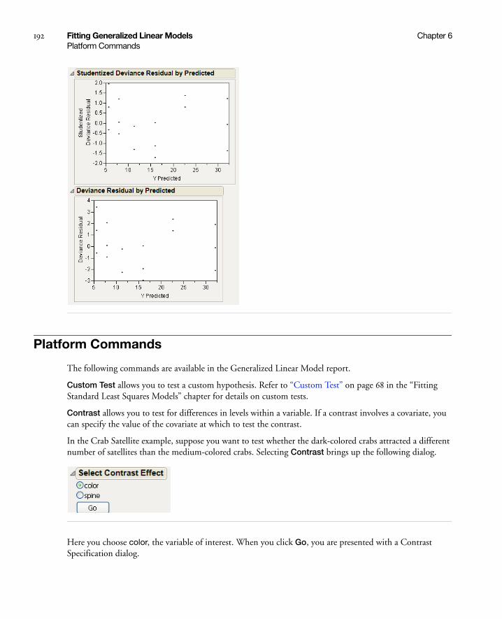
192 Fitting Generalized Linear Models Chapter 6Platform Commands
Platform Commands
The following commands are available in the Generalized Linear Model report.
Custom Test allows you to test a custom hypothesis. Refer to “Custom Test” on page 68 in the “Fitting Standard Least Squares Models” chapter for details on custom tests.
Contrast allows you to test for differences in levels within a variable. If a contrast involves a covariate, you can specify the value of the covariate at which to test the contrast.
In the Crab Satellite example, suppose you want to test whether the dark-colored crabs attracted a different number of satellites than the medium-colored crabs. Selecting Contrast brings up the following dialog.
Here you choose color, the variable of interest. When you click Go, you are presented with a Contrast Specification dialog.

Chapter 6 Fitting Generalized Linear Models 193Platform Commands
To compare the dark-colored to the medium-colored, click the + button beside Dark and Dark Med, and the - button beside Medium and Light Medium.
Click Done to get the Contrast report shown here.

194 Fitting Generalized Linear Models Chapter 6Platform Commands
Since the Prob>Chisq is less than 0.05, we have evidence that there is a difference in satellite attraction based on color.
Inverse Prediction is used to predict an X value, given specific values for Y and the other X variables. This can be used to predict continuous variables only. For more details about Inverse Prediction, see “Inverse Prediction” on page 70 in the “Fitting Standard Least Squares Models” chapter.
Covariance of Estimates produces a covariance matrix for all the effects in a model. The estimated covariance matrix of the parameter estimator is given by
Σ = -H-1
where H is the Hessian (or second derivative) matrix evaluated using the parameter estimates on the last iteration. Note that the dispersion parameter, whether estimated or specified, is incorporated into H. Rows and columns corresponding to aliased parameters are not included in Σ.
Correlation of Estimates produces a correlation matrix for all the effects in a model. The correlation matrix is the normalized covariance matrix. That is, if σij is an element of Σ, then the corresponding element of the correlation matrix is σij/σiσj, where
Profiler brings up the Profiler for examining prediction traces for each X variable. Details on the profiler are found in “The Profiler” on page 93 in the “Fitting Standard Least Squares Models” chapter.
Contour Profiler brings up an interactive contour profiler. Details are found in “Contour Profiler” on page 577 in the “Visualizing, Optimizing, and Simulating Response Surfaces” chapter.
Surface Profiler brings up a 3-D surface profiler. Details of Surface Plots are found in the “Plotting Surfaces” chapter on page 535.
σi σii=

Chapter 6 Fitting Generalized Linear Models 195Platform Commands
Diagnostic Plots is a submenu containing commands that allow you to plot combinations of residuals, predicted values, and actual values to search for outliers and determine the adequacy of your model. Deviance is discussed above in “Model Selection and Deviance” on page 182. The following plots are available:
• Studentized Deviance Residuals by Predicted
• Studentized Pearson Residuals by Predicted
• Deviance Residuals by Predicted
• Pearson Residuals By Predicted
• Actual by Predicted
• Regression Plot is available only when there is one continuous predictor and no more than one categorical predictor.
• Linear Predictor Plot is a plot of responses transformed by the inverse link function. This plot is available only when there is one continuous predictor and no more than one categorical predictor.
Save Columns is a submenu that lets you save certain quantities as new columns in the data table. Formuals for residuals are shown in Table 6.3.
Prediction Formula Saves the formula that predicts the current model.
Predicted Values Saves the values predicted by the current model.
Mean Confidence Interval
Saves the 95% confidence limits for the prediction equation. The confidence limits reflect variation in the parameter estimates.
Save Indiv Confid Limits
Saves the confidence limits for a given individual value. The confidence limits reflect variation in the error and variation in the parameter estimates.
Deviance Residuals Saves the deviance residuals.
Pearson Residuals Saves the Pearson residuals.
Studentized Deviance Residuals
Saves the studentized deviance residuals.
Studentized Pearson Residuals
Saves the studentized Pearson residuals.
(JSL only) Parametric Formula
Saves the parametric formula using JSL:
fit model object <<Parametric Formula( );
See the Object Scripting Index for an example.
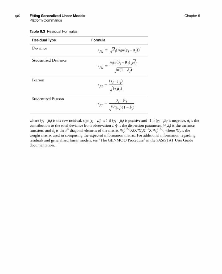
196 Fitting Generalized Linear Models Chapter 6Platform Commands
where (yi – μi) is the raw residual, sign(yi – μi) is 1 if (yi – μi) is positive and -1 if (yi – μi) is negative, di is the contribution to the total deviance from observation i, φ is the dispersion parameter, V(μi) is the variance function, and hi is the ith diagonal element of the matrix We
(1/2)X(X'WeX)-1X'We(1/2), where We is the
weight matrix used in computing the expected information matrix. For additional information regarding residuals and generalized linear models, see “The GENMOD Procedure” in the SAS/STAT User Guide documentation.
Table 6.3 Residual Formulas
Residual Type Formula
Deviance
Studentized Deviance
Pearson
Studentized Pearson
rDi di sign yi μi–( )( )=
rDi
sign yi μi–( ) di
φ 1 hi–( )---------------------------------------=
rPi
yi μi–( )
V μi( )-------------------=
rPi
yi μi–
V μi( ) 1 hi–( )-------------------------------------=

Chapter 7Performing Logistic Regression on Nominal and
Ordinal ResponsesUsing the Fit Model Platform
For nominal response variables, the Fit Model platform fits a linear model to a multi-level logistic response function using maximum likelihood. Likelihood-ratio statistics and Lack of Fit tests are computed for the whole model. Likelihood-ratio tests and Wald tests can be computed for each effect in the model. When the response is binary, odds ratios (with confidence intervals) are available.
For ordinal response variables, the Fit Model platform fits the cumulative response probabilities to the logistic distribution function of a linear model using maximum likelihood. Likelihood-ratio test statistics are provided for the whole model and lack of fit.
For simple main effects, you can use the Fit Y by X platform to see a cumulative logistic probability plot for each effect. See Basic Analysis and Graphing.
Contents
Introduction to Logistic Models . . . . . . . . . . . . . . . . . . . . . . . . . . . . . . . . . . . . . . . . . . . . . . . . . . . . . . . 199
The Logistic Fit Report . . . . . . . . . . . . . . . . . . . . . . . . . . . . . . . . . . . . . . . . . . . . . . . . . . . . . . . . . . . . . 200
Logistic Plot . . . . . . . . . . . . . . . . . . . . . . . . . . . . . . . . . . . . . . . . . . . . . . . . . . . . . . . . . . . . . . . . . . 200
Iteration History . . . . . . . . . . . . . . . . . . . . . . . . . . . . . . . . . . . . . . . . . . . . . . . . . . . . . . . . . . . . . . . .201
Whole Model Test . . . . . . . . . . . . . . . . . . . . . . . . . . . . . . . . . . . . . . . . . . . . . . . . . . . . . . . . . . . . . . .201
Lack of Fit Test (Goodness of Fit) . . . . . . . . . . . . . . . . . . . . . . . . . . . . . . . . . . . . . . . . . . . . . . . . . . .203
Parameter Estimates . . . . . . . . . . . . . . . . . . . . . . . . . . . . . . . . . . . . . . . . . . . . . . . . . . . . . . . . . . . . 204
Likelihood Ratio Tests . . . . . . . . . . . . . . . . . . . . . . . . . . . . . . . . . . . . . . . . . . . . . . . . . . . . . . . . . . . .205
Logistic Fit Platform Options . . . . . . . . . . . . . . . . . . . . . . . . . . . . . . . . . . . . . . . . . . . . . . . . . . . . . . . . 206
Plot Options . . . . . . . . . . . . . . . . . . . . . . . . . . . . . . . . . . . . . . . . . . . . . . . . . . . . . . . . . . . . . . . . . . 206
Likelihood Ratio Tests . . . . . . . . . . . . . . . . . . . . . . . . . . . . . . . . . . . . . . . . . . . . . . . . . . . . . . . . . . . 206
Wald Tests for Effects . . . . . . . . . . . . . . . . . . . . . . . . . . . . . . . . . . . . . . . . . . . . . . . . . . . . . . . . . . . 206
Confidence Intervals . . . . . . . . . . . . . . . . . . . . . . . . . . . . . . . . . . . . . . . . . . . . . . . . . . . . . . . . . . . . 206
Odds Ratios (Nominal Responses Only) . . . . . . . . . . . . . . . . . . . . . . . . . . . . . . . . . . . . . . . . . . . . . 207
Inverse Prediction . . . . . . . . . . . . . . . . . . . . . . . . . . . . . . . . . . . . . . . . . . . . . . . . . . . . . . . . . . . . . . 208
Save Commands . . . . . . . . . . . . . . . . . . . . . . . . . . . . . . . . . . . . . . . . . . . . . . . . . . . . . . . . . . . . . . . . 211
ROC Curve . . . . . . . . . . . . . . . . . . . . . . . . . . . . . . . . . . . . . . . . . . . . . . . . . . . . . . . . . . . . . . . . . . . . 212
Lift Curve . . . . . . . . . . . . . . . . . . . . . . . . . . . . . . . . . . . . . . . . . . . . . . . . . . . . . . . . . . . . . . . . . . . . . 213
Confusion Matrix . . . . . . . . . . . . . . . . . . . . . . . . . . . . . . . . . . . . . . . . . . . . . . . . . . . . . . . . . . . . . . . 214
Profiler . . . . . . . . . . . . . . . . . . . . . . . . . . . . . . . . . . . . . . . . . . . . . . . . . . . . . . . . . . . . . . . . . . . . . . . 214
Validation . . . . . . . . . . . . . . . . . . . . . . . . . . . . . . . . . . . . . . . . . . . . . . . . . . . . . . . . . . . . . . . . . . . . . . . . 214
Example of a Nominal Logistic Model. . . . . . . . . . . . . . . . . . . . . . . . . . . . . . . . . . . . . . . . . . . . . . . . . . . 214
Example of an Ordinal Logistic Model . . . . . . . . . . . . . . . . . . . . . . . . . . . . . . . . . . . . . . . . . . . . . . . . . . 218
Example of a Quadratic Ordinal Logistic Model . . . . . . . . . . . . . . . . . . . . . . . . . . . . . . . . . . . . . . . . . . .224
Stacking Counts in Multiple Columns . . . . . . . . . . . . . . . . . . . . . . . . . . . . . . . . . . . . . . . . . . . . . . . . . .226

Chapter 7 Performing Logistic Regression on Nominal and Ordinal Responses 199Introduction to Logistic Models
Introduction to Logistic Models
Logistic regression fits nominal Y responses to a linear model of X terms. To be more precise, it fits probabilities for the response levels using a logistic function. For two response levels, the function is:
where r1 is the first response
or equivalently:
where r1 and r2 are the two responses
For r nominal responses, where , it fits sets of linear model parameters of the following form:
The fitting principal of maximum likelihood means that the βs are chosen to maximize the joint probability attributed by the model to the responses that did occur. This fitting principal is equivalent to minimizing the negative log-likelihood (–LogLikelihood) as attributed by the model:
For example, consider an experiment that was performed on metal ingots prepared with different heating and soaking times. The ingots were then tested for readiness to roll. See Cox (1970). The Ingots.jmp data table in the Sample Data folder has the experimental results. The categorical variable called ready has values 1 and 0 for readiness and not readiness to roll, respectively.
The Fit Model platform fits the probability of the not readiness (0) response to a logistic cumulative distribution function applied to the linear model with regressors heat and soak:
Probability (not ready to roll) =
The parameters are estimated by minimizing the sum of the negative logs of the probabilities attributed to the observations by the model (maximum likelihood).
To analyze this model, select Analyze > Fit Model. The ready variable is Y, the response, and heat and soak are the model effects. The count column is the Freq variable. When you click Run, iterative calculations take place. When the fitting process converges, the nominal or ordinal regression report appears. The following sections discuss the report layout and statistical tables, and show examples.
P Y r1=( ) 1 eX– b+( )
1–=
P Y r1=( )P Y r2=( )------------------------
log Xb=
r 2> r 1–
P Y j=( )P Y r=( )--------------------- log Xbj=
Loss logLikelihood– Prob ith row has the yjth response( )( )log–i 1=
n
= =
1
1 eβ0 β1heat β2soak+ +( )–
+
----------------------------------------------------------------
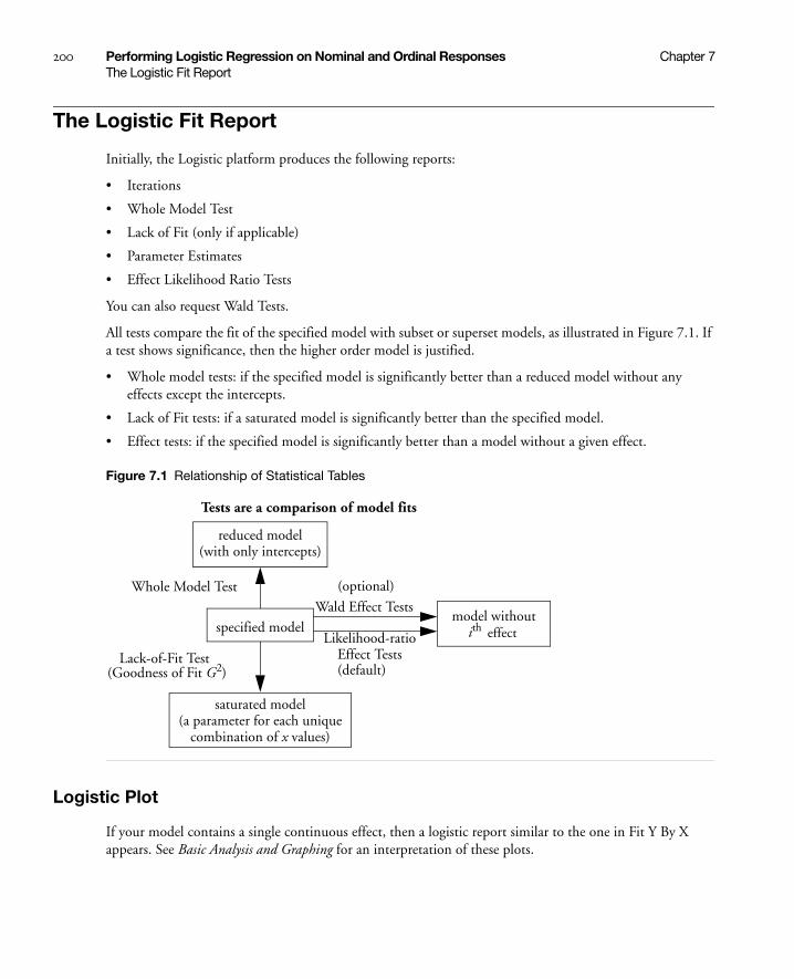
200 Performing Logistic Regression on Nominal and Ordinal Responses Chapter 7The Logistic Fit Report
The Logistic Fit Report
Initially, the Logistic platform produces the following reports:
• Iterations
• Whole Model Test
• Lack of Fit (only if applicable)
• Parameter Estimates
• Effect Likelihood Ratio Tests
You can also request Wald Tests.
All tests compare the fit of the specified model with subset or superset models, as illustrated in Figure 7.1. If a test shows significance, then the higher order model is justified.
• Whole model tests: if the specified model is significantly better than a reduced model without any effects except the intercepts.
• Lack of Fit tests: if a saturated model is significantly better than the specified model.
• Effect tests: if the specified model is significantly better than a model without a given effect.
Figure 7.1 Relationship of Statistical Tables
Logistic Plot
If your model contains a single continuous effect, then a logistic report similar to the one in Fit Y By X appears. See Basic Analysis and Graphing for an interpretation of these plots.
Tests are a comparison of model fits
reduced model(with only intercepts)
specified model
saturated model(a parameter for each unique
combination of x values)
model withoutith effect
Whole Model Test
Lack-of-Fit Test(Goodness of Fit G2)
Wald Effect Tests
Likelihood-ratioEffect Tests
(optional)
(default)

Chapter 7 Performing Logistic Regression on Nominal and Ordinal Responses 201The Logistic Fit Report
Iteration History
After launching Fit Model, an iterative estimation process begins and is reported iteration by iteration. After the fitting process completes, you can open the Iteration report and see the iteration steps.
Figure 7.2 Iteration History
The Iterations history is available only for Nominal Logistic reports.
Whole Model Test
The Whole Model table shows tests that compare the whole-model fit to the model that omits all the regressor effects except the intercept parameters. The test is analogous to the Analysis of Variance table for continuous responses. The negative log-likelihood corresponds to the sums of squares, and the Chi-square test corresponds to the F test.

202 Performing Logistic Regression on Nominal and Ordinal Responses Chapter 7The Logistic Fit Report
Figure 7.3 Whole Model Test
The Whole Model table shows these quantities:
Model lists the model labels called Difference (difference between the Full model and the Reduced model), Full (model that includes the intercepts and all effects), and Reduced (the model that includes only the intercepts).
–LogLikelihood records an associated negative log-likelihood for each of the models.
Difference is the difference between the Reduced and Full models. It measures the significance of the regressors as a whole to the fit.
Full describes the negative log-likelihood for the complete model.
Reduced describes the negative log-likelihood that results from a model with only intercept parameters. For the ingot experiment, the –LogLikelihood for the reduced model that includes only the intercepts is 53.49.
DF records an associated degrees of freedom (DF) for the Difference between the Full and Reduced model. For the ingots experiment, there are two parameters that represent different heating and soaking times, so there are 2 degrees of freedom.
Chi-Square is the Likelihood-ratio Chi-square test for the hypothesis that all regression parameters are zero. It is computed by taking twice the difference in negative log-likelihoods between the fitted model and the reduced model that has only intercepts.

Chapter 7 Performing Logistic Regression on Nominal and Ordinal Responses 203The Logistic Fit Report
Prob>ChiSq is the probability of obtaining a greater Chi-square value by chance alone if the specified model fits no better than the model that includes only intercepts.
RSquare (U) shows the R2, which is the ratio of the Difference to the Reduced negative log-likelihood values. It is sometimes referred to as U, the uncertainty coefficient. RSquare ranges from zero for no improvement to 1 for a perfect fit. A Nominal model rarely has a high Rsquare, and it has a Rsquare of 1 only when all the probabilities of the events that occur are 1.
AICc is the corrected Akaike Information Criterion.
BIC is the Bayesian Information Criterion
Observations (or Sum Wgts) is the total number of observations in the sample.
Measure gives several measures of fit to assess model accuracy.
Entropy RSquare is the same as R-Square (U) explained above.
Generalized RSquare is a generalization of the Rsquare measure that simplifies to the regular Rsquare for continuous normal responses. It is similar to the Entropy RSquare, but instead of using the log-likelihood, it uses the 2/n root of the likelihood.
Mean -Log p is the average of -log(p), where p is the fitted probability associated with the event that occurred.
RMSE is the root mean square error, where the differences are between the response and p (the fitted probability for the event that actually occurred).
Mean Abs Dev is the average of the absolute values of the differences between the response and p (the fitted probability for the event that actually occurred).
Misclassification Rate is the rate for which the response category with the highest fitted probability is not the observed category.
For Entropy RSquare and Generalized RSquare, values closer to 1 indicate a better fit. For Mean -Log p, RMSE, Mean Abs Dev, and Misclassification Rate, smaller values indicate a better fit.
After fitting the full model with two regressors in the ingots example, the –LogLikelihood on the Difference line shows a reduction to 5.82 from the Reduced –LogLikelihood of 53.49. The ratio of Difference to Reduced (the proportion of the uncertainty attributed to the fit) is 10.9% and is reported as the Rsquare (U).
To test that the regressors as a whole are significant (the Whole Model test), a Chi-square statistic is computed by taking twice the difference in negative log-likelihoods between the fitted model and the reduced model that has only intercepts. In the ingots example, this Chi-square value is , and is significant at 0.003.
Lack of Fit Test (Goodness of Fit)
The next questions that JMP addresses are whether there is enough information using the variables in the current model or whether more complex terms need to be added. The Lack of Fit test, sometimes called a Goodness of Fit test, provides this information. It calculates a pure-error negative log-likelihood by constructing categories for every combination of the regressor values in the data (Saturated line in the Lack Of Fit table), and it tests whether this log-likelihood is significantly better than the Fitted model.
2 5.82× 11.64=

204 Performing Logistic Regression on Nominal and Ordinal Responses Chapter 7The Logistic Fit Report
Figure 7.4 Lack of Fit Test
The Saturated degrees of freedom is m–1, where m is the number of unique populations. The Fitted degrees of freedom is the number of parameters not including the intercept. For the Ingots example, these are 18 and 2 DF, respectively. The Lack of Fit DF is the difference between the Saturated and Fitted models, in this case 18–2=16.
The Lack of Fit table lists the negative log-likelihood for error due to Lack of Fit, error in a Saturated model (pure error), and the total error in the Fitted model. Chi-square statistics test for lack of fit.
In this example, the lack of fit Chi-square is not significant (Prob>ChiSq = 0.617) and supports the conclusion that there is little to be gained by introducing additional variables, such as using polynomials or crossed terms.
Parameter Estimates
The Parameter Estimates report gives the parameter estimates, standard errors, and associated hypothesis test. The Covariance of Estimates report gives the variances and covariances of the parameter estimates.

Chapter 7 Performing Logistic Regression on Nominal and Ordinal Responses 205The Logistic Fit Report
Figure 7.5 Parameter Estimates Report
Likelihood Ratio Tests
The Likelihood Ratio Tests command produces a table like the one shown here. The Likelihood-ratio Chi-square tests are calculated as twice the difference of the log-likelihoods between the full model and the model constrained by the hypothesis to be tested (the model without the effect). These tests can take time to do because each test requires a separate set of iterations.
This is the default test if the fit took less than ten seconds to complete.
Figure 7.6 Effect Likelihood Ratio Tests

206 Performing Logistic Regression on Nominal and Ordinal Responses Chapter 7Logistic Fit Platform Options
Logistic Fit Platform Options
The red triangle menu next to the analysis name gives you the additional options that are described next.
Plot Options
These options are described in the Basic Analysis and Graphing book.
Likelihood Ratio Tests
See “Likelihood Ratio Tests” on page 205.
Wald Tests for Effects
One downside to likelihood ratio tests is that they involve refitting the whole model, which uses another series of iterations. Therefore, they could take a long time for big problems. The logistic fitting platform gives an optional test, which is more straightforward, serving the same function. The Wald Chi-square is a quadratic approximation to the likelihood-ratio test, and it is a by-product of the calculations. Though Wald tests are considered less trustworthy, they do provide an adequate significance indicator for screening effects. Each parameter estimate and effect is shown with a Wald test. This is the default test if the fit takes more than ten seconds to complete.
Figure 7.7 Effect Wald Tests
Likelihood-ratio tests are the platform default and are discussed under “Likelihood Ratio Tests” on page 205. It is highly recommended to use this default option.
Confidence Intervals
You can also request profile likelihood confidence intervals for the model parameters. When you select the Confidence Intervals command, a dialog prompts you to enter α to compute the 1 – α confidence intervals, or you can use the default of α = 0.05. Each confidence limit requires a set of iterations in the model fit and can be expensive. Furthermore, the effort does not always succeed in finding limits.
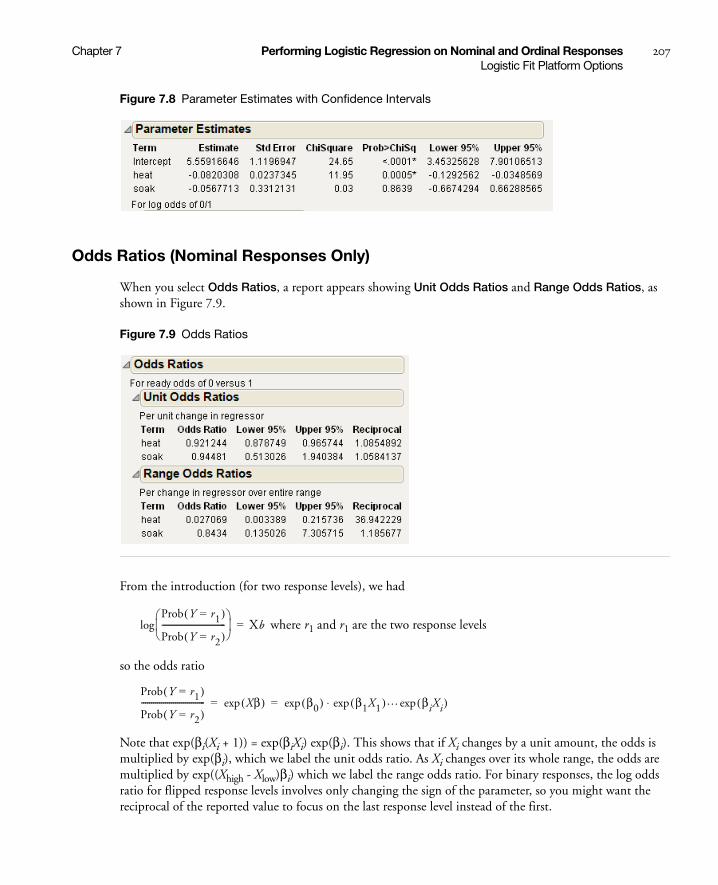
Chapter 7 Performing Logistic Regression on Nominal and Ordinal Responses 207Logistic Fit Platform Options
Figure 7.8 Parameter Estimates with Confidence Intervals
Odds Ratios (Nominal Responses Only)
When you select Odds Ratios, a report appears showing Unit Odds Ratios and Range Odds Ratios, as shown in Figure 7.9.
Figure 7.9 Odds Ratios
From the introduction (for two response levels), we had
where r1 and r1 are the two response levels
so the odds ratio
Note that exp(βi(Xi + 1)) = exp(βiXi) exp(βi). This shows that if Xi changes by a unit amount, the odds is multiplied by exp(βi), which we label the unit odds ratio. As Xi changes over its whole range, the odds are multiplied by exp((Xhigh - Xlow)βi) which we label the range odds ratio. For binary responses, the log odds ratio for flipped response levels involves only changing the sign of the parameter, so you might want the reciprocal of the reported value to focus on the last response level instead of the first.
Prob Y r1=( )
Prob Y r2=( )--------------------------------
log Xb=
Prob Y r1=( )
Prob Y r2=( )-------------------------------- Xβ( )exp β0( )exp β1X1( )exp … βiXi( )exp⋅= =

208 Performing Logistic Regression on Nominal and Ordinal Responses Chapter 7Logistic Fit Platform Options
Two-level nominal effects are coded 1 and -1 for the first and second levels, so range odds ratios or their reciprocals would be of interest.
Dose Response Example
In the Dose Response.jmp sample data table, the dose varies between 1 and 12.
1. Open the Dose Response.jmp sample data table.
2. Select Analyze > Fit Model.
3. Select response and click Y.
4. Select dose and click Add.
5. Click OK.
6. From the red triangle next to Nominal Logistic Fit, select Odds Ratio.
Figure 7.10 Odds Ratios
The unit odds ratio for dose is 1.606 (which is exp(0.474)) and indicates that the odds of getting a Y = 0 rather than Y = 1 improves by a factor of 1.606 for each increase of one unit of dose. The range odds ratio for dose is 183.8 (exp((12-1)*0.474)) and indicates that the odds improve by a factor of 183.8 as dose is varied between 1 and 12.
Inverse Prediction
For a two-level response, the Inverse Prediction command finds the x value that results in a specified probability.
To see an example of inverse prediction:
1. Open the Ingots.jmp sample data table.
2. Select Analyze > Fit Y by X.
3. Select ready and click Y, Response.
4. Select heat and click X, Factor.
5. Select count and click Freq.
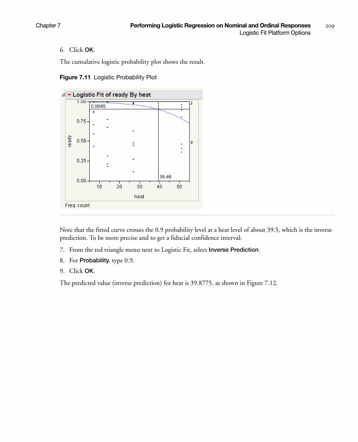
Chapter 7 Performing Logistic Regression on Nominal and Ordinal Responses 209Logistic Fit Platform Options
6. Click OK.
The cumulative logistic probability plot shows the result.
Figure 7.11 Logistic Probability Plot
Note that the fitted curve crosses the 0.9 probability level at a heat level of about 39.5, which is the inverse prediction. To be more precise and to get a fiducial confidence interval:
7. From the red triangle menu next to Logistic Fit, select Inverse Prediction.
8. For Probability, type 0.9.
9. Click OK.
The predicted value (inverse prediction) for heat is 39.8775, as shown in Figure 7.12.

210 Performing Logistic Regression on Nominal and Ordinal Responses Chapter 7Logistic Fit Platform Options
Figure 7.12 Inverse Prediction Plot
However, if you have another regressor variable (Soak), you must use the Fit Model platform, as follows:
1. From the Ingots.jmp sample data table, select Analyze > Fit Model.
2. Select ready and click Y.
3. Select heat and soak and click Add.
4. Select count and click Freq.
5. Click Run.
6. From the red triangle next to Nominal Logistic Fit, select Inverse Prediction.
Then the Inverse Prediction command displays the Inverse Prediction window shown in Figure 7.13, for requesting the probability of obtaining a given value for one independent variable. To complete the dialog, click and type values in the editable X and Probability columns. Enter a value for a single X (heat or soak) and the probabilities that you want for the prediction. Set the remaining independent variable to missing by clicking in its X field and deleting. The missing regressor is the value that it will predict.

Chapter 7 Performing Logistic Regression on Nominal and Ordinal Responses 211Logistic Fit Platform Options
Figure 7.13 The Inverse Prediction Window and Table
See the appendix “Statistical Details” on page 651 for more details about inverse prediction.
Save Commands
If you have ordinal or nominal response models, the Save Probability Formula command creates new data table columns.
If the response is numeric and has the ordinal modeling type, the Save Quantiles and Save Expected Values commands are also available.
The Save commands create the following new columns:
Save Probability Formula creates columns in the current data table that save formulas for linear combinations of the response levels, prediction formulas for the response levels, and a prediction formula giving the most likely response.
For a nominal response model with r levels, JMP creates
• columns called Lin[j] that contain a linear combination of the regressors for response levels j = 1, 2, ... r - 1
• a column called Prob[r], with a formula for the fit to the last level, r
Clear the one to be predicted.

212 Performing Logistic Regression on Nominal and Ordinal Responses Chapter 7Logistic Fit Platform Options
• columns called Prob[j] for j < r with a formula for the fit to level j
• a column called Most Likely responsename that picks the most likely level of each row based on the computed probabilities.
For an ordinal response model with r levels, JMP creates
• a column called Linear that contains the formula for a linear combination of the regressors without an intercept term
• columns called Cum[j], each with a formula for the cumulative probability that the response is less than or equal to level j, for levels j = 1, 2, ... r - 1. There is no Cum[ j = 1, 2, ... r - 1] that is 1 for all rows
• columns called Prob[ j = 1, 2, ... r - 1], for 1 < j < r, each with the formula for the probability that the response is level j. Prob[j] is the difference between Cum[j] and Cum[j –1]. Prob[1] is Cum[1], and Prob[r] is 1–Cum[r –1].
• a column called Most Likely responsename that picks the most likely level of each row based on the computed probabilities.
Save Quantiles creates columns in the current data table named OrdQ.05, OrdQ.50, and OrdQ.95 that fit the quantiles for these three probabilities.
Save Expected Value creates a column in the current data table called Ord Expected that is the linear combination of the response values with the fitted response probabilities for each row and gives the expected value.
ROC Curve
Receiver Operating Characteristic (ROC) curves measure the sorting efficiency of the model’s fitted probabilities to sort the response levels. ROC curves can also aid in setting criterion points in diagnostic tests. The higher the curve from the diagonal, the better the fit. An introduction to ROC curves is found in the Basic Analysis and Graphing book. If the logistic fit has more than two response levels, it produces a generalized ROC curve (identical to the one in the Partition platform). In such a plot, there is a curve for each response level, which is the ROC curve of that level versus all other levels. Details on these ROC curves are found in “Graphs for Goodness of Fit” on page 336 in the “Recursively Partitioning Data” chapter.
Example of an ROC Curve
1. Open the Ingots.jmp sample data table.
2. Select Analyze > Fit Model.
3. Select ready and click Y.
4. Select heat and soak and click Add.
5. Select count and click Freq.
6. Click Run.
7. From the red triangle next to Nominal Logistic Fit, select ROC Curve.
8. Select 1 as the positive level and click OK.

Chapter 7 Performing Logistic Regression on Nominal and Ordinal Responses 213Logistic Fit Platform Options
Figure 7.14 ROC Curve
Lift Curve
Produces a lift curve for the model. A lift curve shows the same information as an ROC curve, but in a way to dramatize the richness of the ordering at the beginning. The Y-axis shows the ratio of how rich that portion of the population is in the chosen response level compared to the rate of that response level as a whole. See “Lift Curves” on page 339 in the “Recursively Partitioning Data” chapter for more details about lift curves.
Figure 7.15 shows the lift curve for the same model specified for the ROC curve (Figure 7.14).
Figure 7.15 Lift Curve
214 Performing Logistic Regression on Nominal and Ordinal Responses Chapter 7Validation
Confusion Matrix
A confusion matrix is a two-way classification of the actual response levels and the predicted response levels. For a good model, predicted response levels should be the same as the actual response levels. The confusion matrix gives a way of assessing how the predicted responses align with the actual responses.
Profiler
Brings up the prediction profiler, showing the fitted values for a specified response probability as the values of the factors in the model are changed. This feature is available for both nominal and ordinal responses. For detailed information about profiling features, refer to the “Visualizing, Optimizing, and Simulating Response Surfaces” chapter on page 553.
Validation
Validation is the process of using part of a data set to estimate model parameters, and using the other part to assess the predictive ability of the model.
• The training set is the part that estimates model parameters.
• The validation set is the part that assesses or validates the predictive ability of the model.
• The test set is a final, independent assessment of the model’s predictive ability. The test set is available only when using a validation column.
The training, validation, and test sets are created by subsetting the original data into parts. This is done through the use of a validation column in the Fit Model launch window.
The validation column’s values determine how the data is split, and what method is used for validation:
• If the column has two distinct values, then training and validation sets are created.
• If the column has three distinct values, then training, validation, and test sets are created.
• If the column has more than three distinct values, or only one, then no validation is performed.
When validation is used, model fit statistics are given for the training, validation, and test sets.
Example of a Nominal Logistic Model
A market research study was undertaken to evaluate preference for a brand of detergent (Ries and Smith 1963). The results are in the Detergent.jmp sample data table. The model is defined by the following:
• the response variable, brand with values m and x
• an effect called softness (water softness) with values soft, medium, and hard
• an effect called previous use with values yes and no
• an effect called temperature with values high and low
• a count variable, count, which gives the frequency counts for each combination of effect categories.

Chapter 7 Performing Logistic Regression on Nominal and Ordinal Responses 215Example of a Nominal Logistic Model
The study begins by specifying the full three-factor factorial model as shown by the Fit Model dialog in Figure 7.16. To specify a factorial model, highlight the three main effects in the column selector list. Then select Full Factorial from the Macros popup menu.
Figure 7.16 A Three-Factor Factorial Model with Nominal Response
Validation is available only in JMP Pro.
The tables in Figure 7.17 show the three-factor model as a whole to be significant (Prob>ChiSq = 0.0006) in the Whole Model table. The Effect Likelihood Ratio Tests table shows that the effects that include softness do not contribute significantly to the model fit.
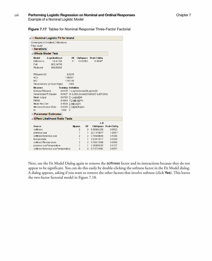
216 Performing Logistic Regression on Nominal and Ordinal Responses Chapter 7Example of a Nominal Logistic Model
Figure 7.17 Tables for Nominal Response Three-Factor Factorial
Next, use the Fit Model Dialog again to remove the softness factor and its interactions because they do not appear to be significant. You can do this easily by double-clicking the softness factor in the Fit Model dialog. A dialog appears, asking if you want to remove the other factors that involve softness (click Yes). This leaves the two-factor factorial model in Figure 7.18.
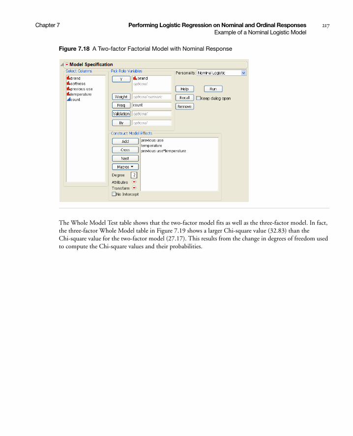
Chapter 7 Performing Logistic Regression on Nominal and Ordinal Responses 217Example of a Nominal Logistic Model
Figure 7.18 A Two-factor Factorial Model with Nominal Response
The Whole Model Test table shows that the two-factor model fits as well as the three-factor model. In fact, the three-factor Whole Model table in Figure 7.19 shows a larger Chi-square value (32.83) than the Chi-square value for the two-factor model (27.17). This results from the change in degrees of freedom used to compute the Chi-square values and their probabilities.
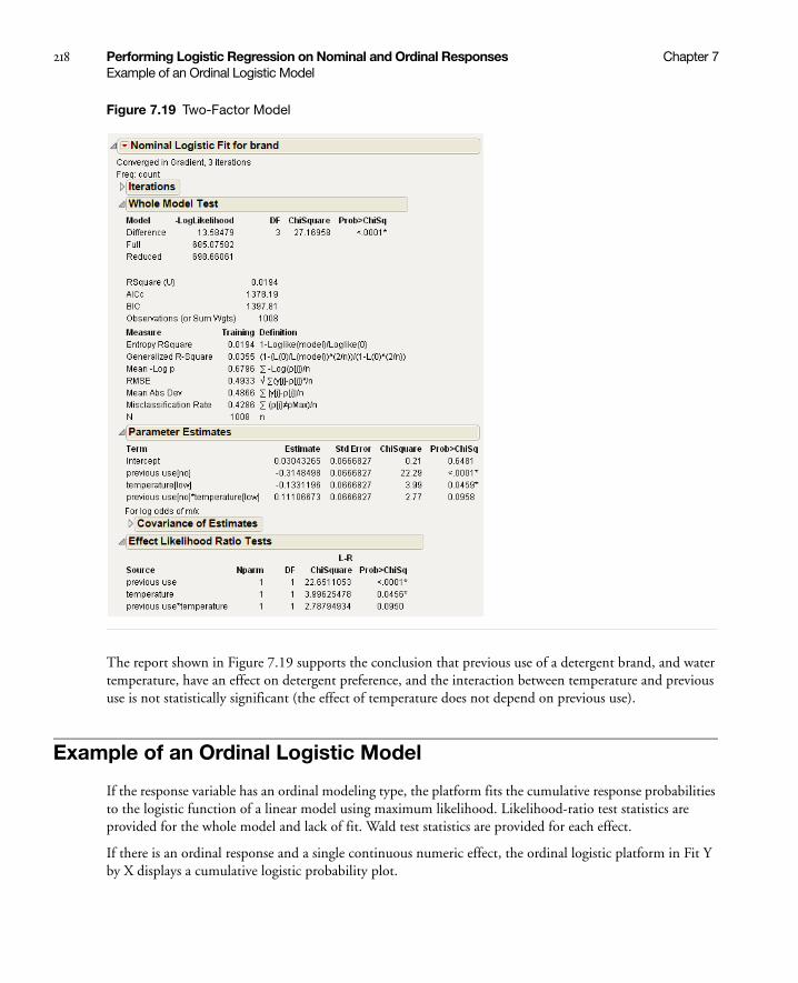
218 Performing Logistic Regression on Nominal and Ordinal Responses Chapter 7Example of an Ordinal Logistic Model
Figure 7.19 Two-Factor Model
The report shown in Figure 7.19 supports the conclusion that previous use of a detergent brand, and water temperature, have an effect on detergent preference, and the interaction between temperature and previous use is not statistically significant (the effect of temperature does not depend on previous use).
Example of an Ordinal Logistic Model
If the response variable has an ordinal modeling type, the platform fits the cumulative response probabilities to the logistic function of a linear model using maximum likelihood. Likelihood-ratio test statistics are provided for the whole model and lack of fit. Wald test statistics are provided for each effect.
If there is an ordinal response and a single continuous numeric effect, the ordinal logistic platform in Fit Y by X displays a cumulative logistic probability plot.

Chapter 7 Performing Logistic Regression on Nominal and Ordinal Responses 219Example of an Ordinal Logistic Model
Details of modeling types are discussed in the Basic Analysis and Graphing book. The details of fitting appear in the appendix “Statistical Details” on page 651. The method is discussed in Walker and Duncan (1967), Nelson (1976), Harrell (1986), and McCullagh and Nelder (1983).
Note: If there are many response levels, the ordinal model is much faster to fit and uses less memory than the nominal model.
As an example of ordinal logistic model fitting, McCullagh and Nelder (1983) report an experiment by Newell to test whether various cheese additives (A to D) had an effect on taste. Taste was measured by a tasting panel and recorded on an ordinal scale from 1 (strong dislike) to 9 (excellent taste). The data are in the Cheese.jmp sample data table.
1. Open the Cheese.jmp sample data table.
2. Select Analyze > Fit Model.
3. Select Response and click Y.
4. Select Cheese and click Add.
5. Select Count and click Freq.
6. Click Run.
7. From the red triangle next to Ordinal Logistic Fit, select Wald Tests.
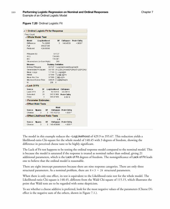
220 Performing Logistic Regression on Nominal and Ordinal Responses Chapter 7Example of an Ordinal Logistic Model
Figure 7.20 Ordinal Logistic Fit
The model in this example reduces the –LogLikelihood of 429.9 to 355.67. This reduction yields a likelihood-ratio Chi-square for the whole model of 148.45 with 3 degrees of freedom, showing the difference in perceived cheese taste to be highly significant.
The Lack of Fit test happens to be testing the ordinal response model compared to the nominal model. This is because the model is saturated if the response is treated as nominal rather than ordinal, giving 21 additional parameters, which is the Lack of Fit degrees of freedom. The nonsignificance of Lack of Fit leads one to believe that the ordinal model is reasonable.
There are eight intercept parameters because there are nine response categories. There are only three structural parameters. As a nominal problem, there are structural parameters.
When there is only one effect, its test is equivalent to the Likelihood-ratio test for the whole model. The Likelihood-ratio Chi-square is 148.45, different from the Wald Chi-square of 115.15, which illustrates the point that Wald tests are to be regarded with some skepticism.
To see whether a cheese additive is preferred, look for the most negative values of the parameters (Cheese D’s effect is the negative sum of the others, shown in Figure 7.1.).
8 3× 24=

Chapter 7 Performing Logistic Regression on Nominal and Ordinal Responses 221Example of an Ordinal Logistic Model
You can also use the Fit Y by X platform for this model, which treats ordinal responses like nominal and shows a contingency table analysis. See Figure 7.21. The Fit Model platform can also be used, but you must change the ordinal response, Response, to nominal. See Figure 7.22. Nominal Fit Model results are shown in Figure 7.22. Note that the negative log-likelihood values (84.381) and the likelihood chi-square values (168.76) are the same.
Figure 7.21 Fit Y by X Platform Results for Cheese.jmp
Table 7.1 Parameter Estimates and Preferences for Cheese Additives in Cheese.jmp
Cheese Estimate Preference
A –0.8622 2nd place
B 2.4896 least liked
C 0.8477 3rd place
D –2.4750 most liked
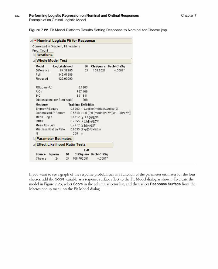
222 Performing Logistic Regression on Nominal and Ordinal Responses Chapter 7Example of an Ordinal Logistic Model
Figure 7.22 Fit Model Platform Results Setting Response to Nominal for Cheese.jmp
If you want to see a graph of the response probabilities as a function of the parameter estimates for the four cheeses, add the Score variable as a response surface effect to the Fit Model dialog as shown. To create the model in Figure 7.23, select Score in the column selector list, and then select Response Surface from the Macros popup menu on the Fit Model dialog.

Chapter 7 Performing Logistic Regression on Nominal and Ordinal Responses 223Example of an Ordinal Logistic Model
Figure 7.23 Model Dialog For Ordinal Logistic Regression
Validation is available only in JMP Pro.
Click Run to see the analysis report and the cumulative logistic probability plot in Figure 7.24. The distance between each curve is the fitted response probability for the levels in the order for the levels on the right axis of the plot.
Figure 7.24 Cumulative Probability Plot for Ordinal Logistic Regression

224 Performing Logistic Regression on Nominal and Ordinal Responses Chapter 7Example of a Quadratic Ordinal Logistic Model
Example of a Quadratic Ordinal Logistic Model
The Ordinal Response Model can fit a quadratic surface to optimize the probabilities of the higher or lower responses. The arithmetic in terms of the structural parameters is the same as that for continuous responses. Up to five factors can be used, but this example has only one factor, for which there is a probability plot.
Consider the case of a microwave popcorn manufacturer who wants to find out how much salt consumers like in their popcorn. To do this, the manufacturer looks for the maximum probability of a favorable response as a function of how much salt is added to the popcorn package. An experiment controls salt amount at 0, 1, 2, and 3 teaspoons, and the respondents rate the taste on a scale of 1=low to 5=high. The optimum amount of salt is the amount that maximizes the probability of more favorable responses. The ten observations for each of the salt levels are shown in Table 7.2.
Use Fit Model with the Salt in Popcorn.jmp sample data to fit the ordinal taste test to the surface effect of salt. Use Taste Test as Y. Highlight Salt in the Select Columns box, and then select Macros > Response Surface.
The report shows how the quadratic model fits the response probabilities. The curves, instead of being shifted logistic curves, become a folded pile of curves where each curve achieves its optimum at the same point. The critical value is at Mean(X)–0.5 *b1/b2 where b1 is the linear coefficient and b2 is the quadratic coefficient. This formula is for centered X. From the Parameter Estimates table, you can compute the optimum as 1.5 - 0.5* (0.5637/1.3499) = 1.29 teaspoons of salt.
Table 7.2 Salt in Popcorn
Salt Amount
Salt Rating Response
no salt 1 3 2 4 2 2 1 4 3 4
1 tsp. 4 5 3 4 5 4 5 5 4 5
2 tsp. 4 3 5 1 4 2 5 4 3 2
3 tsp. 3 1 2 3 1 2 1 2 1 2

Chapter 7 Performing Logistic Regression on Nominal and Ordinal Responses 225Example of a Quadratic Ordinal Logistic Model
Figure 7.25 Ordinal Logistic Fit for Salt in Popcorn.jmp
The distance between each curve measures the probability of each of the five response levels. The probability for the highest response level is the distance from the top curve to the top of the plot rectangle. This distance reaches a maximum when the amount of salt is about 1.3 teaspoons. All curves share the same critical point.
The parameter estimates for Salt and Salt*Salt become the coefficients used to find the critical value. Although it appears as a minimum, it is only a minimum with respect to the probability curves. It is really a maximum in the sense of maximizing the probability of the highest response. The Solution portion of the report is shown under Response Surface in Figure 7.25, where 1.29 is shown under Critical Value.

226 Performing Logistic Regression on Nominal and Ordinal Responses Chapter 7Stacking Counts in Multiple Columns
Stacking Counts in Multiple Columns
Data that are frequencies (counts) listed in several columns of your data table are not the form that you need for logistic regression. For example, the Ingots2.jmp data table in the data folder (see Figure 7.26) has columns Nready and Nnotready that give the number of ready and number of not ready ingots for each combination of Heat and Soak values. To do a logistic regression, you need the data organized like the table in Figure 7.27.
To make a new table, suitable for logistic regression, select the Stack command from the Tables menu. Complete the Stack dialog by choosing Nready and NNotReady as the columns to stack, and then click OK in the Stack dialog. This creates the new table in Figure 7.27. If you use the default column names, Label is the response (Y) column and Data is the frequency column.
The example in the section “Introduction to Logistic Models” on page 199, shows a logistic regression using a sample data table Ingots.jmp. It has a frequency column called count (equivalent to the Data column in the table below) and a response variable called Ready, with values 1 to represent ingots that are ready and 0 for not ready.
Figure 7.26 Original Data Table

Chapter 7 Performing Logistic Regression on Nominal and Ordinal Responses 227Stacking Counts in Multiple Columns
Figure 7.27 Stacked Data Table

228 Performing Logistic Regression on Nominal and Ordinal Responses Chapter 7Stacking Counts in Multiple Columns

Chapter 8Analyzing Screening Designs
Using the Screening Platform
The Screening platform helps you select a model that fits a two-level screening design by indicating which factors have the largest effect on the response.
Figure 8.1 Screening Platform Report

Contents
Overview of the Screening Platform . . . . . . . . . . . . . . . . . . . . . . . . . . . . . . . . . . . . . . . . . . . . . . . . . . . . 231
When to Use the Screening Platform. . . . . . . . . . . . . . . . . . . . . . . . . . . . . . . . . . . . . . . . . . . . . . . . . 231
Comparing Screening and Fit Model. . . . . . . . . . . . . . . . . . . . . . . . . . . . . . . . . . . . . . . . . . . . . . . . . 231
Launch the Screening Platform . . . . . . . . . . . . . . . . . . . . . . . . . . . . . . . . . . . . . . . . . . . . . . . . . . . . . . . .234
The Screening Report . . . . . . . . . . . . . . . . . . . . . . . . . . . . . . . . . . . . . . . . . . . . . . . . . . . . . . . . . . . . . . .234
Contrasts . . . . . . . . . . . . . . . . . . . . . . . . . . . . . . . . . . . . . . . . . . . . . . . . . . . . . . . . . . . . . . . . . . . . . .234
Half Normal Plot . . . . . . . . . . . . . . . . . . . . . . . . . . . . . . . . . . . . . . . . . . . . . . . . . . . . . . . . . . . . . . . 235
Tips on Using the Platform . . . . . . . . . . . . . . . . . . . . . . . . . . . . . . . . . . . . . . . . . . . . . . . . . . . . . . . . . . . 235
Additional Examples . . . . . . . . . . . . . . . . . . . . . . . . . . . . . . . . . . . . . . . . . . . . . . . . . . . . . . . . . . . . . . . . 235
Analyzing a Plackett-Burman Design. . . . . . . . . . . . . . . . . . . . . . . . . . . . . . . . . . . . . . . . . . . . . . . . .236
Analyzing a Supersaturated Design . . . . . . . . . . . . . . . . . . . . . . . . . . . . . . . . . . . . . . . . . . . . . . . . . .237
Statistical Details . . . . . . . . . . . . . . . . . . . . . . . . . . . . . . . . . . . . . . . . . . . . . . . . . . . . . . . . . . . . . . . . . . . 238

Chapter 8 Analyzing Screening Designs 231Overview of the Screening Platform
Overview of the Screening Platform
Screening situations depend on effect sparsity, where most effects are assumed to be inactive. Using this assumption, the smaller estimates can help estimate the error in the model and determine whether the larger effects are real. Basically, if all the effects are inactive, they should vary randomly, with no effect deviating substantially from the other effects.
When to Use the Screening Platform
If your data are all two-level and orthogonal, then all of the statistics in this platform should work well.
If you have categorical terms containing more than two levels, then the Screening platform is not appropriate for the design. JMP treats the level numbers as a continuous regressor. The variation across the factor is scattered across main and polynomial effects for that term.
For highly supersaturated main effect designs, the Screening platform is effective in selecting factors, but is not as effective at estimating the error or the significance. The Monte Carlo simulation to produce p-values uses assumptions that are valid for this case.
If your data are not orthogonal, then the constructed estimates are different from standard regression estimates. JMP can pick out big effects, but it does not effectively test each effect. This is because later effects are artificially orthogonalized, making earlier effects look more significant.
The Screening platform is not appropriate for mixture designs.
Comparing Screening and Fit Model
Consider Reactor Half Fraction.jmp, from the Sample Data folder. The data are derived from a design in Box, Hunter, and Hunter (1978). We are interested in a model with main effects and two-way interactions. This example uses a model with fifteen parameters for a design with sixteen runs.
For this example, all continuous factors, except the response factor, are selected as the screening effects, X. Percent Reacted is selected as the response Y. JMP constructs interactions automatically, unlike Fit Model, where the interactions are added distinctly.
Figure 8.2 shows the result of using the Fit Model platform, where a factorial to degree 2 model is specified. This result illustrates why the Screening platform is needed.

232 Analyzing Screening Designs Chapter 8Overview of the Screening Platform
Figure 8.2 Traditional Saturated Reactor Half Fraction.jmp Design Output
JMP can calculate parameter estimates, but degrees of freedom for error, standard errors, t-ratios, and p-values are all missing. Rather than use Fit Model, it is better to use the Screening platform, which specializes in getting the most information out of these situations, leading to a better model. The output from the Screening platform for the same data is shown in Figure 8.3.

Chapter 8 Analyzing Screening Designs 233Overview of the Screening Platform
Figure 8.3 Reactor Half Fraction.jmp Screening Design Report
Compare the following differences between the Fit Model report and the Screening report.
• Estimates labeled Contrast. Effects whose individual p-value is less than 0.1 are highlighted.
• A t-ratio is calculated using Lenth’s PSE (pseudo-standard error). The PSE is shown below the Half Normal Plot.
• Both individual and simultaneous p-values are shown. Those that are less than 0.05 are shown with an asterisk.
• A Half Normal plot enables you to quickly examine the effects. Effects initially highlighted in the effects list are also labeled in this plot.
• Buttons at the bottom of the report also operate on the highlighted variables. The Make Model button opens the Fit Model window using the current highlighted factors. The Run Model button runs the model immediately.

234 Analyzing Screening Designs Chapter 8Launch the Screening Platform
For this example, Catalyst, Temperature, and Concentration, along with two of their two-factor interactions, are selected.
Launch the Screening Platform
Launch the Screening platform by selecting Analyze > Modeling > Screening.
Figure 8.4 The Screening Launch Window
Note: This window was used to produce the report in Figure 8.3.
For details about the launch window, see the Using JMP book.
The Screening Report
The Screening report window contains the Contrasts report and the Half Normal plot. To see an example of the Screening report, see Figure 8.3.
Contrasts
The following table describes the information in the Contrasts report.
Table 8.1 Description of the Contrasts Report
Term Name of the factor.
Contrast Estimate for the factor. For orthogonal designs, this number is the same as the regression parameter estimate. This is not the case for non-orthogonal designs. An asterisk might appear next to the contrast, indicating a lack of orthogonality.
Chapter 8 Analyzing Screening Designs 235Tips on Using the Platform
Half Normal Plot
The Half Normal Plot shows the absolute value of the contrasts against the normal quantiles for the absolute value normal distribution. Significant effects appear separated from the line towards the upper right of the graph.
The Half Normal Plot is interactive. Select different model effects by dragging a rectangle around the effects of interest, or hold down CTRL and click on an effect name in the report.
Launching a Model
The two buttons below the Half Normal Plot construct a model using the currently selected effects. The Make Model button opens the Fit Model launch window, which will be populated with the selected effects and responses. The Run Model button runs the model immediately, without showing the Fit Model launch window.
Tips on Using the Platform
Higher-Order Effects. Control-click to select more or fewer effects. The effect selection is not constrained by hierarchy. For example, if A*B is selected, check to make sure the lower-order effects (the A and B main effects) are also selected. Control-click to select them if they are not already selected.
Re-running the Analysis. Do not expect the p-values to be exactly the same if the analysis is re-run. The Monte Carlo method should give similar, but not identical, values if the same analysis is repeated.
Additional Examples
This section provides examples of using the Screening platform.
Bar Chart Shows the t-ratios with blue lines marking a critical value at 0.05 significance.
Lenth t-Ratio Lenth’s t-ratio, calculated as , where PSE is Lenth’s Pseudo-Standard Error. See “Lenth’s Pseudo-Standard Error” on page 239 for details.
Individual p-Value Analogous to the standard p-values for a linear model. Small values of this value indicate a significant effect. Refer to “Statistical Details” on page 238 for details.
Simultaneous p-Value Similar to the individual p-value, but multiple-comparison adjusted.
Aliases Appears only if there are exact aliases of later effects to earlier effects.
Table 8.1 Description of the Contrasts Report (Continued)
ContrastPSE
--------------------
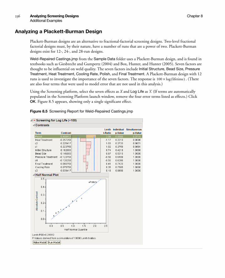
236 Analyzing Screening Designs Chapter 8Additional Examples
Analyzing a Plackett-Burman Design
Plackett-Burman designs are an alternative to fractional-factorial screening designs. Two-level fractional factorial designs must, by their nature, have a number of runs that are a power of two. Plackett-Burman designs exist for 12-, 24-, and 28-run designs.
Weld-Repaired Castings.jmp from the Sample Data folder uses a Plackett-Burman design, and is found in textbooks such as Giesbrecht and Gumpertz (2004) and Box, Hunter, and Hunter (2005). Seven factors are thought to be influential on weld quality. The seven factors include Initial Structure, Bead Size, Pressure Treatment, Heat Treatment, Cooling Rate, Polish, and Final Treatment. A Plackett-Burman design with 12 runs is used to investigate the importance of the seven factors. The response is . (There are also four terms that were used to model error that are not used in this analysis.)
Using the Screening platform, select the seven effects as X and Log Life as Y. (If terms are automatically populated in the Screening Platform launch window, remove the four error terms listed as effects.) Click OK. Figure 8.5 appears, showing only a single significant effect.
Figure 8.5 Screening Report for Weld-Repaired Castings.jmp
100 lifetime( )log×
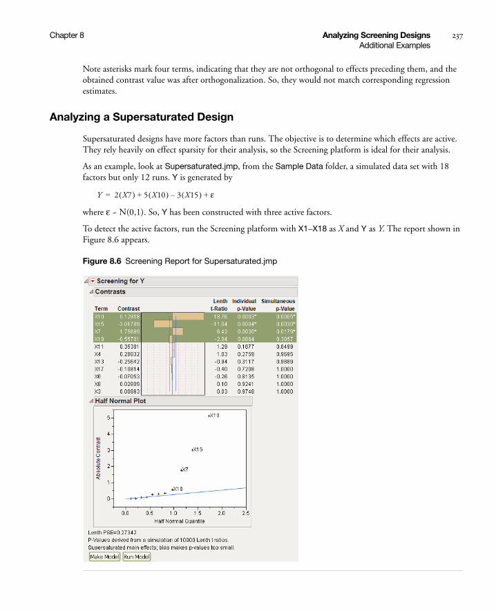
Chapter 8 Analyzing Screening Designs 237Additional Examples
Note asterisks mark four terms, indicating that they are not orthogonal to effects preceding them, and the obtained contrast value was after orthogonalization. So, they would not match corresponding regression estimates.
Analyzing a Supersaturated Design
Supersaturated designs have more factors than runs. The objective is to determine which effects are active. They rely heavily on effect sparsity for their analysis, so the Screening platform is ideal for their analysis.
As an example, look at Supersaturated.jmp, from the Sample Data folder, a simulated data set with 18 factors but only 12 runs. Y is generated by
where ε ~ N(0,1). So, Y has been constructed with three active factors.
To detect the active factors, run the Screening platform with X1–X18 as X and Y as Y. The report shown in Figure 8.6 appears.
Figure 8.6 Screening Report for Supersaturated.jmp
Y 2 X7( ) 5 X10( ) 3 X15( )– ε+ +=

238 Analyzing Screening Designs Chapter 8Statistical Details
Note that the three active factors have been highlighted. One other factor, X18, has also been highlighted. It shows in the Half Normal plot close to the blue line, indicating that it is close to the 0.1 cutoff significance value. The 0.1 critical value is generous in its selection of factors so you don’t miss those that are possibly active.
The contrasts of 5.1, –3, and 1.8 are close to their simulated values (5, –3, 2). However, the similarity of these values can be increased by using a regression model, without the effect of orthogonalization.
The p-values, while useful, are not entirely valid statistically, since they are based on a simulation that assumes orthogonal designs, which is not the case for supersaturated designs.
Statistical Details
Operation
The Screening platform has a carefully defined order of operations.
• First, the main effect terms enter according to the absolute size of their contrast. All effects are orthogonalized to the effects preceding them in the model. The method assures that their order is the same as it would be in a forward stepwise regression. Ordering by main effects also helps in selecting preferred aliased terms later in the process.
• After main effects, all second-order interactions are brought in, followed by third-order interactions, and so on. The second-order interactions cross with all earlier terms before bringing in a new term. For example, with size-ordered main effects A, B, C, and D, B*C enters before A*D. If a factor has more than two levels, square and higher-order polynomial terms are also considered.
• An effect that is an exact alias for an effect already in the model shows in the alias column. Effects that are a linear combination of several previous effects are not displayed. If there is partial aliasing ( a lack of orthogonality) the effects involved are marked with an asterisk.
• The process continues until n effects are obtained, where n is the number of rows in the data table, thus fully saturating the model. If complete saturation is not possible with the factors, JMP generates random orthogonalized effects to absorb the rest of the variation. They are labeled Null n where n is a number. For example, this situation occurs if there are exact replicate rows in the design.
Screening as an Orthogonal Rotation
Mathematically, the Screening platform takes the n values in the response vector and rotates them into n new values. The rotated values are then mapped by the space of the factors and their interactions.
Contrasts = T’ × Responses
where T is an orthonormalized set of values starting with the intercept, main effects of factors, two-way interactions, three-way interactions, and so on, until n values have been obtained. Since the first column of T is an intercept, and all the other columns are orthogonal to it, these other columns are all contrasts, that is, they sum to zero. Since T is orthogonal, it can serve as X in a linear model. It does not need inversion, since T’ is also T-1 and (T’T)T’. The contrasts are the parameters estimated in a linear model.

Chapter 8 Analyzing Screening Designs 239Statistical Details
• If no effect in the model is active after the intercept, the contrasts are just an orthogonal rotation of random independent variates into different random independent variates. These newly orthogonally rotated variates have the same variance as the original random independent variates. To the extent that some effects are active, the inactive effects still represent the same variation as the error in the model. The hope is that the effects and the design are strong enough to separate the active effects from the random error effects.
Lenth’s Pseudo-Standard Error
At this point, Lenth’s method (Lenth, 1989) identifies inactive effects from which it constructs an estimate of the residual standard error, known as the Lenth Pseudo Standard Error (PSE).
The value for Lenth’s PSE is shown at the bottom of the Screening report. From the PSE, t-ratios are obtained. To generate p-values, a Monte Carlo simulation of 10,000 runs of n – 1 purely random values is created and Lenth t-ratios are produced from each set. The p-value is the interpolated fractional position among these values in descending order. The simultaneous p-value is the interpolation along the max(|t|) of the n – 1 values across the runs. This technique is similar to that in Ye and Hamada (2000).
If you want to run more or less than the 10,000 default runs, you must assign a value to a global JSL variable named LenthSimN. As an example, using the sample data Reactor Half Fraction.jmp:
1. Open the sample data, Reactor Half Fraction.jmp.
2. Select Analyze > Modeling > Screening.
3. Select Percent Reacted as the response variable, Y.
4. Select all the other continuous variables as effects, X.
5. Click OK.
6. Select Script > Save Script to Script Window from the red-triangle menu of the report.
7. Add LenthSimN=50000; to the top of the Script Window (above the code).
8. Highlight LenthSimN=50000; and the remaining code.
9. Run the script from the Script Window.
Note that if LenthSimN=0, the standard t-distribution is used (not recommended).

240 Analyzing Screening Designs Chapter 8Statistical Details
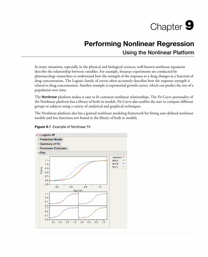
Chapter 9Performing Nonlinear Regression
Using the Nonlinear Platform
In many situations, especially in the physical and biological sciences, well-known nonlinear equations describe the relationship between variables. For example, bioassay experiments are conducted by pharmacology researchers to understand how the strength of the response to a drug changes as a function of drug concentration. The Logistic family of curves often accurately describes how the response strength is related to drug concentration. Another example is exponential growth curves, which can predict the size of a population over time.
The Nonlinear platform makes it easy to fit common nonlinear relationships. The Fit Curve personality of the Nonlinear platform has a library of built-in models. Fit Curve also enables the user to compare different groups or subjects using a variety of analytical and graphical techniques.
The Nonlinear platform also has a general nonlinear modeling framework for fitting user-defined nonlinear models and loss functions not found in the library of built in models.
Figure 9.1 Example of Nonlinear Fit

Contents
Introduction to the Nonlinear Platform . . . . . . . . . . . . . . . . . . . . . . . . . . . . . . . . . . . . . . . . . . . . . . . . .243
Example of Nonlinear Fitting . . . . . . . . . . . . . . . . . . . . . . . . . . . . . . . . . . . . . . . . . . . . . . . . . . . . . . . . .243
Launch the Nonlinear Platform . . . . . . . . . . . . . . . . . . . . . . . . . . . . . . . . . . . . . . . . . . . . . . . . . . . . . . . .245
Nonlinear Fitting with Fit Curve . . . . . . . . . . . . . . . . . . . . . . . . . . . . . . . . . . . . . . . . . . . . . . . . . . . . . . 246
Fit Curve Models and Options . . . . . . . . . . . . . . . . . . . . . . . . . . . . . . . . . . . . . . . . . . . . . . . . . . . . 247
Fit Curve Report . . . . . . . . . . . . . . . . . . . . . . . . . . . . . . . . . . . . . . . . . . . . . . . . . . . . . . . . . . . . . . . . 251
Model Options . . . . . . . . . . . . . . . . . . . . . . . . . . . . . . . . . . . . . . . . . . . . . . . . . . . . . . . . . . . . . . . . . 252
Fit a Custom Model . . . . . . . . . . . . . . . . . . . . . . . . . . . . . . . . . . . . . . . . . . . . . . . . . . . . . . . . . . . . . . . .256
Create a Model Column . . . . . . . . . . . . . . . . . . . . . . . . . . . . . . . . . . . . . . . . . . . . . . . . . . . . . . . . . .257
Nonlinear Fit Report . . . . . . . . . . . . . . . . . . . . . . . . . . . . . . . . . . . . . . . . . . . . . . . . . . . . . . . . . . . . .259
Nonlinear Fit Options . . . . . . . . . . . . . . . . . . . . . . . . . . . . . . . . . . . . . . . . . . . . . . . . . . . . . . . . . . . . 261
Use the Model Library. . . . . . . . . . . . . . . . . . . . . . . . . . . . . . . . . . . . . . . . . . . . . . . . . . . . . . . . . . . 264
Additional Examples . . . . . . . . . . . . . . . . . . . . . . . . . . . . . . . . . . . . . . . . . . . . . . . . . . . . . . . . . . . . . . . .268
Maximum Likelihood: Logistic Regression . . . . . . . . . . . . . . . . . . . . . . . . . . . . . . . . . . . . . . . . . . . .268
Probit Model with Binomial Errors: Numerical Derivatives . . . . . . . . . . . . . . . . . . . . . . . . . . . . . . . 269
Poisson Loss Function . . . . . . . . . . . . . . . . . . . . . . . . . . . . . . . . . . . . . . . . . . . . . . . . . . . . . . . . . . . 270
Statistical Details . . . . . . . . . . . . . . . . . . . . . . . . . . . . . . . . . . . . . . . . . . . . . . . . . . . . . . . . . . . . . . . . . . . 271
Profile Likelihood Confidence Limits . . . . . . . . . . . . . . . . . . . . . . . . . . . . . . . . . . . . . . . . . . . . . . . . 271
How Custom Loss Functions Work. . . . . . . . . . . . . . . . . . . . . . . . . . . . . . . . . . . . . . . . . . . . . . . . . .272
Notes Concerning Derivatives . . . . . . . . . . . . . . . . . . . . . . . . . . . . . . . . . . . . . . . . . . . . . . . . . . . . . .273
Notes on Effective Nonlinear Modeling. . . . . . . . . . . . . . . . . . . . . . . . . . . . . . . . . . . . . . . . . . . . . . .275

Chapter 9 Performing Nonlinear Regression 243Introduction to the Nonlinear Platform
Introduction to the Nonlinear Platform
The Nonlinear platform fits models that are nonlinear in the parameters. The Fit Curve personality of the platform has a variety of predefined models, such as polynomial, logistic, Gompertz, exponential, peak, and pharmacokinetic models.
You can also fit custom nonlinear models by specifying the model formula and parameters to be estimated. The models can be fit using the default least squares loss function or a custom loss function. The platform minimizes the sum of the loss function across the observations.
Specifying a grouping variable lets you estimate separate model parameters for each level of the grouping variable. The fitted models and estimated parameters can be compared across the levels of the grouping variable.
The Nonlinear platform is a good choice for models that are nonlinear in the parameters. Some models are linear in the parameters (for example, a quadratic or other polynomial) or can be transformed to be such (for example, when you use a log transformation of x). The Fit Model or Fit Y by X platforms are more appropriate in these situations. For more information about these platforms, see the Basic Analysis and Graphing book.
Example of Nonlinear Fitting
You have data on toxicity levels of a drug. You want to build a model for toxicity as a function of the concentration of the drug. There are four formulations of the drug to compare. Follow the steps below:
1. Open the Bioassay.jmp sample data table.
2. Select Analyze > Modeling > Nonlinear.
3. Assign Toxicity to the Y, Response role.
4. Assign log Conc to the X, Predictor Formula role.
5. Assign Formulation to the Group role.
6. Click OK.
7. Select Sigmoid Curves > Logistic Curves > Fit Logistic 4P from the Fit Curve red triangle menu.
A portion of the report is shown in Figure 9.2.

244 Performing Nonlinear Regression Chapter 9Example of Nonlinear Fitting
Figure 9.2 Nonlinear Fit Report
The Plot report contains an overlaid plot of the fitted model of each formulation. There is also a separate plot for each formulation. The plot of the fitted curves suggests that formulation B might be different, because the test B curve starts to rise sooner than the others. This rise is a consequence of the inflection point parameter.
8. Select Compare Parameter Estimates from the Logistic 4P red triangle menu.
A portion of the Parameter Comparison report is shown in Figure 9.3.
Figure 9.3 Parameter Comparison Report

Chapter 9 Performing Nonlinear Regression 245Example of Nonlinear Fitting
Notice that the Inflection Point parameter for the test B formulation is significantly lower than the average inflection point. This agrees with what we noticed in the plots of the fitted models.
Launch the Nonlinear Platform
To launch the Nonlinear platform, select Analyze > Modeling > Nonlinear. The launch window is shown in Figure 9.4.
Figure 9.4 Nonlinear Launch Window
Begin fitting a nonlinear model in one of two ways:
• Provide the Y and X variables and fit one of the built-in nonlinear models. This launches the Fit Curve personality of the Nonlinear platform. See “Nonlinear Fitting with Fit Curve” on page 246.
• If you want to fit a model that is not in Fit Curve, you must first create a formula column that defines the model. This formula must include parameters to be estimated and the initial values of the parameters. Any nonlinear model can be fit using this method. For more information about this process, see “Fit a Custom Model” on page 256.
You can also create the formula column using the Model Library. The Model Library creates the formula column and parameters, and helps you choose initial values, but only for models that are in Model Library. See “Use the Model Library” on page 264.

246 Performing Nonlinear Regression Chapter 9Nonlinear Fitting with Fit Curve
The Nonlinear platform launch window has the following features:
Y, Response Select the Y variable.
X, Predictor Formula Select either the X variable or a column containing the model formula with parameters.
Group Specify a grouping variable. The fitted model has separate parameters for each level of the grouping variable.
Weight Specify a variable containing the weights of observations.
Freq Specify a variable representing the frequency of an observation.
Loss Specify a formula column giving a loss function.
By Specify a variable to perform a separate analysis for every level of the variable.
Model Library Launches the Model Library tool. For more details, see “Use the Model Library” on page 264.
The checkboxes at the bottom of the window are only for classic Nonlinear analyses:
Second Derivatives Uses second derivatives as well as first derivatives in the iterative method to find a solution. With second derivatives, the method is called Newton-Raphson rather than Gauss-Newton. This method is useful only if the residuals are unusually large or if you specify a custom loss function and your model is not linear in its parameters. This option is used only when a formula column is provided in the X, Predictor Formula role.
Numeric Derivatives Only Uses only numeric derivatives only. This option is useful when you have a model for which it is too messy to take analytic derivatives. It can also be valuable in obtaining convergence in tough cases. This option is used only when a formula column is provided in the X, Predictor Formula role.
Expand Intermediate Formulas Tells JMP that if an ingredient column to the model is a column that itself has a formula, to substitute the inner formula, as long as it refers to other columns. To prevent an ingredient column from expanding, use the Other column property with a name of “Expand Formula” and a value of 0. This option is used only when a formula column is provided in the X, Predictor Formula role.
Nonlinear Fitting with Fit Curve
The platform provides several types of built-in nonlinear models: polynomials, logistic, Gompertz, exponential growth, peak, and pharmacokinetic. To fit one of the built-in models, follow the steps below:
1. Open your data table and select Analyze > Modeling > Nonlinear.
2. On the Nonlinear launch window, assign the X variable to the X, Predictor Formula role, and the Y variable to the Y, Response role (Figure 9.4).
3. Assign variables to other roles as needed.

Chapter 9 Performing Nonlinear Regression 247Nonlinear Fitting with Fit Curve
4. Click OK.
5. On the Fit Curve red triangle menu, select one of the models. The models are described in “Fit Curve Models and Options” on page 247.
Fit Curve Models and Options
The Fit Curve red triangle menu contains the following models and options. For details about the model formulas, see “Model Formulas” on page 247.
Polynomials Fits first degree to fifth degree polynomials.
Sigmoid Curves Fits Logistic and Gompertz models. These models have both upper and lower asymptotes. The Logistic 2P, 3P, and 4P models are symmetric. The Logistic 5P and both Gompertz models are not symmetric. The Logistic 2P is available only when the response is between 0 and 1.
Exponential Growth and Decay Fits Exponential, Biexponential, and Mechanistic Growth models. The Exponential 2P and 3P are similar, but the 3P model has an asymptote. The Biexponential models assume there are two separate growth or decay processes. The Mechanistic Growth and Exponential 3P models alway increase, but the rate of growth slows so that the model has an asymptote.
Peak Models Fits Gaussian Peak and Lorentzian Peak models. These models increase up to a mode (peak) then decrease. The Gaussian Peak model is a scaled version of the Gaussian probability density function (pdf ). The Lorentzian Peak model is a scaled version of the Cauchy pdf.
Pharmacokinetic Models Fits the One Compartment Oral Dose model, the Two Compartment IV Bolus Dose model, and the Biexponential 4P model. Select this option to model the concentration of the drug in the body.
Fit Michaelis Menten Fits the Michaelis-Menten biochemical kinetics model.
Script Contains options that are available to all platforms. See Using JMP.
Model Formulas
Table 9.1 provides the formulas for the models on the Fit Curve red triangle menu.
Table 9.1 Fit Curve Model Formulas
Model Formula
Polynomials
where k is the order of the polynomial. These models can also be fit using the Fit Model and Fit Y by X platforms.
β0 βixi
i 1=
k+

248 Performing Nonlinear Regression Chapter 9Nonlinear Fitting with Fit Curve
Logistic 2P
a = Growth Rate
b = Inflection Point
Logistic 3P
a = Growth Rate
b = Inflection Point
c = Asymptote
Logistic 4P
a = Growth Rate
b = Inflection Point
c = Lower Asymptote
d = Upper Asymptote
Logistic 5P
a = Growth Rate
b = Inflection Point
c = Asymptote 1
d = Asymptote 2
f = Power
Gompertz 3P
a = Asymptote
b = Growth Rate
c = Inflection Point
Table 9.1 Fit Curve Model Formulas (Continued)
Model Formula
11 Exp a– x b–( )( )+----------------------------------------------
c1 Exp a– x b–( )( )+----------------------------------------------
cd c–
1 Exp a– x b–( )( )+----------------------------------------------+
cd c–
1 Exp a– x b–( )( )+( )f-----------------------------------------------------+
aExp Exp b– x c–( )( )–( )

Chapter 9 Performing Nonlinear Regression 249Nonlinear Fitting with Fit Curve
Gompertz 4P
a = Lower Asymptote
b = Upper Asymptote
c = Growth Rate
d = Inflection Point
Exponential 2P
a = Scale
b = Growth Rate
Exponential 3P
a = Asymptote
b = Scale
c = Growth Rate
Biexponential 4P
a = Scale 1
b = Decay Rate 1
c = Scale 2
d = Decay Rate 2
Biexponential 5P
a = Asymptote
b = Scale 1
c = Decay Rate 1
d = Scale 2
f = Decay Rate 2
Mechanistic Growth
a = Asymptote
b = Scale
c = Growth Rate
Table 9.1 Fit Curve Model Formulas (Continued)
Model Formula
a b a–( )Exp Exp c– x d–( )( )–( )+
aExp bx( )
a bExp cx( )+
aExp bx–( ) cExp dx–( )+
a bExp cx–( ) dExp fx–( )+ +
a 1 bExp c– x( )–( )

250 Performing Nonlinear Regression Chapter 9Nonlinear Fitting with Fit Curve
Gaussian Peak
a = Peak Value
b = Critical Point
c = Growth Rate
Lorentzian Peak
a = Peak Value
b = Growth Rate
c = Critical Point
One Compartment Oral Dose
a = Area Under Curve
b = Elimination Rate
c = Absorption Rate
Two Compartment IV Bolus Dose
α =
β =
a = Initial Concentration
b = Transfer Rate In
c = Transfer Rate Out
d = Elimination Rate
Michaelis Menten
a = Max Reaction Rate
b = Inverse Affinity
Table 9.1 Fit Curve Model Formulas (Continued)
Model Formula
aExp12---– x b–
c----------- 2
ab2
x c–( )2 b2+------------------------------
abcc b–---------- Exp b– x( ) Exp c– x( )–( )
aα β–------------- α b–( )Exp α– x( ) β b–( )Exp β– x( )–( )
12--- b c d b c d+ +( )2 4bd–+ + +( )
12--- b c d b c d+ +( )2 4bd––+ +( )
axb x+-----------

Chapter 9 Performing Nonlinear Regression 251Nonlinear Fitting with Fit Curve
Fit Curve Report
Before fitting a model, the Fit Curve report contains only a plot of Y versus X. After fitting a model, the fitted model is added to the plot (when no grouping variable is specified on the platform launch window). The report contains the following results:
Model Comparison The Model Comparison report shows fit statistics used for comparing multiple models (Figure 9.5). The statistics are AICc, AICc Weight, BIC, SSE, MSE, RMSE, and R-Square. See the “Comparing Model Performance” chapter on page 627 for more information about comparing models.
Figure 9.5 Model Comparison Report
Model Reports A report is created for each fitted model. Each model report has a red triangle menu with additional options. See “Model Options” on page 252.
Prediction Model gives the algebraic form of the prediction formula and the parameters.
Summary of Fit gives the same fit statistics as the Model Comparison report.
Parameter Estimates gives the estimates of the parameters, standard errors, and confidence intervals. The correlations and covariances of the estimates are given also.
Plot gives plots of the data with the fitted model. See Figure 9.6. The plots are shown only when a Grouping variable is specified on the platform launch window.
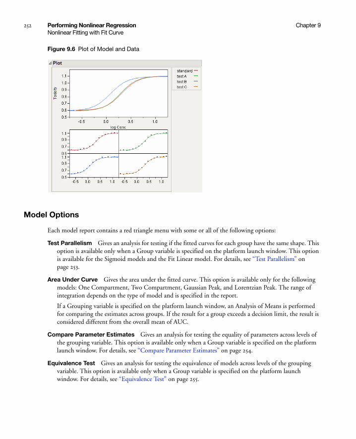
252 Performing Nonlinear Regression Chapter 9Nonlinear Fitting with Fit Curve
Figure 9.6 Plot of Model and Data
Model Options
Each model report contains a red triangle menu with some or all of the following options:
Test Parallelism Gives an analysis for testing if the fitted curves for each group have the same shape. This option is available only when a Group variable is specified on the platform launch window. This option is available for the Sigmoid models and the Fit Linear model. For details, see “Test Parallelism” on page 253.
Area Under Curve Gives the area under the fitted curve. This option is available only for the following models: One Compartment, Two Compartment, Gaussian Peak, and Lorentzian Peak. The range of integration depends on the type of model and is specified in the report.
If a Grouping variable is specified on the platform launch window, an Analysis of Means is performed for comparing the estimates across groups. If the result for a group exceeds a decision limit, the result is considered different from the overall mean of AUC.
Compare Parameter Estimates Gives an analysis for testing the equality of parameters across levels of the grouping variable. This option is available only when a Group variable is specified on the platform launch window. For details, see “Compare Parameter Estimates” on page 254.
Equivalence Test Gives an analysis for testing the equivalence of models across levels of the grouping variable. This option is available only when a Group variable is specified on the platform launch window. For details, see “Equivalence Test” on page 255.

Chapter 9 Performing Nonlinear Regression 253Nonlinear Fitting with Fit Curve
Make Parameter Table Saves the parameter estimates, standard errors, and t-ratios in a data table. This option is available only when a Group variable is specified on the platform launch window. With this data table, you can cluster groups based on parameter estimates.
Profiler Shows or hides a profiler of the fitted prediction function. The derivatives are derivatives of the prediction function with respect to the X variable. For more information about profilers, see the “Visualizing, Optimizing, and Simulating Response Surfaces” chapter on page 553.
Save Formulas Contains options for saving prediction and derivative equations as formula columns in the data table.
Save Prediction Formula saves the prediction equation.
Save Std Error of Predicted saves the standard error of the predicted values.
Save Parametric Prediction Formula saves the prediction equation with parameters. This is helpful if you want to use the fitted model in the full, interactive personality of the Nonlinear platform.
Save First Derivative saves the derivative of the prediction function with respect to the X variable.
Save Std Error of First Derivative saves the equation of the standard error of the first derivative.
Save Inverse Prediction Formula saves the equation for predicting X from Y.
Custom Inverse Prediction Predicts an X value for a specific Y value. For more information about inverse prediction, see “Inverse Prediction with Confidence Limits” on page 686.
Remove Fit Removes the model report, the entry from the Model Comparison report, and the fitted line from the plot.
Test Parallelism
The Test Parallelism option provides an analysis for testing if the fitted models between groups have the same shape. See Figure 9.7.
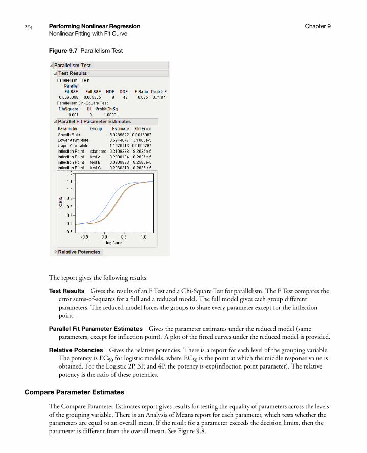
254 Performing Nonlinear Regression Chapter 9Nonlinear Fitting with Fit Curve
Figure 9.7 Parallelism Test
The report gives the following results:
Test Results Gives the results of an F Test and a Chi-Square Test for parallelism. The F Test compares the error sums-of-squares for a full and a reduced model. The full model gives each group different parameters. The reduced model forces the groups to share every parameter except for the inflection point.
Parallel Fit Parameter Estimates Gives the parameter estimates under the reduced model (same parameters, except for inflection point). A plot of the fitted curves under the reduced model is provided.
Relative Potencies Gives the relative potencies. There is a report for each level of the grouping variable. The potency is EC50 for logistic models, where EC50 is the point at which the middle response value is obtained. For the Logistic 2P, 3P, and 4P, the potency is exp(inflection point parameter). The relative potency is the ratio of these potencies.
Compare Parameter Estimates
The Compare Parameter Estimates report gives results for testing the equality of parameters across the levels of the grouping variable. There is an Analysis of Means report for each parameter, which tests whether the parameters are equal to an overall mean. If the result for a parameter exceeds the decision limits, then the parameter is different from the overall mean. See Figure 9.8.
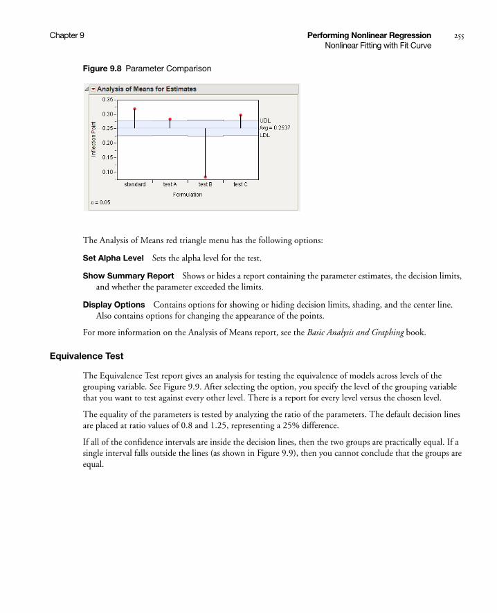
Chapter 9 Performing Nonlinear Regression 255Nonlinear Fitting with Fit Curve
Figure 9.8 Parameter Comparison
The Analysis of Means red triangle menu has the following options:
Set Alpha Level Sets the alpha level for the test.
Show Summary Report Shows or hides a report containing the parameter estimates, the decision limits, and whether the parameter exceeded the limits.
Display Options Contains options for showing or hiding decision limits, shading, and the center line. Also contains options for changing the appearance of the points.
For more information on the Analysis of Means report, see the Basic Analysis and Graphing book.
Equivalence Test
The Equivalence Test report gives an analysis for testing the equivalence of models across levels of the grouping variable. See Figure 9.9. After selecting the option, you specify the level of the grouping variable that you want to test against every other level. There is a report for every level versus the chosen level.
The equality of the parameters is tested by analyzing the ratio of the parameters. The default decision lines are placed at ratio values of 0.8 and 1.25, representing a 25% difference.
If all of the confidence intervals are inside the decision lines, then the two groups are practically equal. If a single interval falls outside the lines (as shown in Figure 9.9), then you cannot conclude that the groups are equal.

256 Performing Nonlinear Regression Chapter 9Fit a Custom Model
Figure 9.9 Equivalence Test
The Equivalence red triangle menu has the following options:
Set Alpha Level Sets the alpha level for the test. The default value is 0.05.
Set Decision Lines Changes the decision limits for the ratio. The default values are set at 0.8 and 1.25, representing a 25% difference.
Show Summary Report Shows or hides a report containing the parameter estimates, the decision limits, and whether the parameter exceeded the limits.
Display Options Contains options for showing or hiding decision limits, shading, and the center line. Also contains options for changing the appearance of the points. For additional formatting options, right-click the graph and select Customize.
Fit a Custom Model
If you want to fit a model that is not in Fit Curve, you must first create a model column with initial parameter estimates. This method does require a few more steps than fitting a built-in model, but it does allow any nonlinear model to be fit. Also, you can provide a custom loss function, and specify several other options for the fitting process.
1. Open your data table.
2. Create the model column. This column contains the formula of the model with parameters, and initial estimates of the parameters. For details about creating a formula with parameters, see “Create a Model Column” on page 257.
3. Select Analyze > Modeling > Nonlinear.
4. Assign the Y variable to the Y, Response role.
5. Assign the model column to the X, Predictor role.
6. Assign other roles as needed.
decision lines
The inflection point is outside the decision limits, so you cannot conclude that the groups are equal.

Chapter 9 Performing Nonlinear Regression 257Fit a Custom Model
7. Click OK.
8. Click Go on the Control Panel to fit the model.
Create a Model Column
Follow the steps below to create a formula column with model parameters and initial values:
1. Create a new column in the data table.
2. Open the Formula Editor for the new column.
3. Select Parameters from the popup menu above the list of columns.
4. Click on New Parameter.
5. Enter the name of the parameter.
6. Enter the initial value of the parameter.
Repeat steps 4 to 6 to create all the parameters in the model.
7. Build the model formula using the data table columns, parameters, and formula editor functions.
8. Click OK.
Parameters for Models with a Grouping Variable
In the formula editor, when you add a parameter, note the check box for Expand Into Categories, selecting column. This option is used to add several parameters (one for each level of a categorical variable for example) at once. When you select this option a dialog appears that enables you to select a column. After selection, a new parameter appears in the Parameters list with the name D_column, where D is the name that you gave the parameter. When you use this parameter in the formula, a Match expression is inserted, containing a separate parameter for each level of the grouping variable.
Example of Creating and Fitting a Formula Column
This section provides an example of creating the formula column for a model, and fitting the model in the Nonlinear platform. The data is in the US Population.jmp data table. The response variable is the population (in millions) of the Unites States and the predictor is the year.
1. Open the US Population.jmp sample data table.
2. Create a new column called Model.
3. Open the Formula Editor for Model.
4. Choose Parameters on the menu above the list of columns.
5. Select New Parameter.
6. Use the default name of b0.
7. Type 4 for Value. This is the initial estimate of the parameter.
8. Click OK.
9. Select New Parameter.
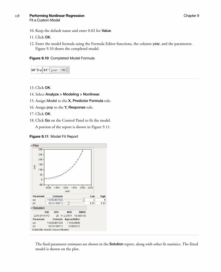
258 Performing Nonlinear Regression Chapter 9Fit a Custom Model
10. Keep the default name and enter 0.02 for Value.
11. Click OK.
12. Enter the model formula using the Formula Editor functions, the column year, and the parameters. Figure 9.10 shows the completed model.
Figure 9.10 Completed Model Formula
13. Click OK.
14. Select Analyze > Modeling > Nonlinear.
15. Assign Model to the X, Predictor Formula role.
16. Assign pop to the Y, Response role.
17. Click OK.
18. Click Go on the Control Panel to fit the model.
A portion of the report is shown in Figure 9.11.
Figure 9.11 Model Fit Report
The final parameter estimates are shown in the Solution report, along with other fit statistics. The fitted model is shown on the plot.

Chapter 9 Performing Nonlinear Regression 259Fit a Custom Model
Nonlinear Fit Report
The initial Nonlinear Fit report includes the following items, shown in Figure 9.12.
Control Panel Provides options for controlling the fitting process.
Go starts the fitting process.
Stop stops the fitting process.
Step proceeds through the fitting process one iteration at a time.
Reset reset the editable values into the formula, reset the iteration values, and calculate the SSE at these new values.
Criterion shows iteration measures from the fitting process and the Current values.
Stop Limit sets limits on the Criterion.
Plot Shows a plot of the X and Y variables for models with only one X variable. The model based on the current values is shown on the plot. To change the current values of the parameters, use the sliders or edit boxes beneath the plot.
Figure 9.12 Initial Nonlinear Fit Report

260 Performing Nonlinear Regression Chapter 9Fit a Custom Model
After you click Go to fit a model, the report includes these additional items, shown in Figure 9.13.
Save Estimates Saves the current parameter values to the parameters in the formula column.
Confidence Limits Computes confidence intervals for all parameters. The intervals are profile-likelihood confidence intervals, and are shown in the Solution report. The confidence limit computations involve a new set of iterations for each limit of each parameter, and the iterations often do not find the limits successfully. The Edit Alpha and Convergence Criterion options are for the confidence interval computations. For details about the Goal SSE for CL, see “Profile Likelihood Confidence Limits” on page 271.
Solution Shows the parameters estimates and other statistics.
SSE shows the residual sum of squares error. SSE is the objective that is to be minimized. If a custom loss function is specified, this is the sum of the loss function.
DFE is the degrees of freedom for error, which is the number of observations used minus the number of parameters fitted.
MSE shows the mean squared error. It is the estimate of the variance of the residual error, which is the SSE divided by the DFE.
RMSE estimates the standard deviation of the residual error, which is square root of the MSE.
Parameter lists the names that you gave the parameters in the fitting formula.
Estimate lists the parameter estimates produced. Keep in mind that with nonlinear regression, there might be problems with this estimate even if everything seems to work.
ApproxStdErr lists the approximate standard error, which is computed analogously to linear regression. It is formed by the product of the RMSE and the square root of the diagonals of the derivative cross-products matrix inverse.
Lower CL and Upper CL are the confidence limits for the parameters. They are missing until you click the Confidence Limits on the Control Panel. For more details about the confidence intervals, see “Profile Likelihood Confidence Limits” on page 271.
Excluded Data is a report showing fit statistics for excluded rows. This is useful for validating the model on observations not used to fit the model. You can use this feature in conjunction with the Remember Solution option to change the exclusions, and get a new report reflecting the different exclusions
Correlation of Estimates Displays the correlations between the parameter estimates.
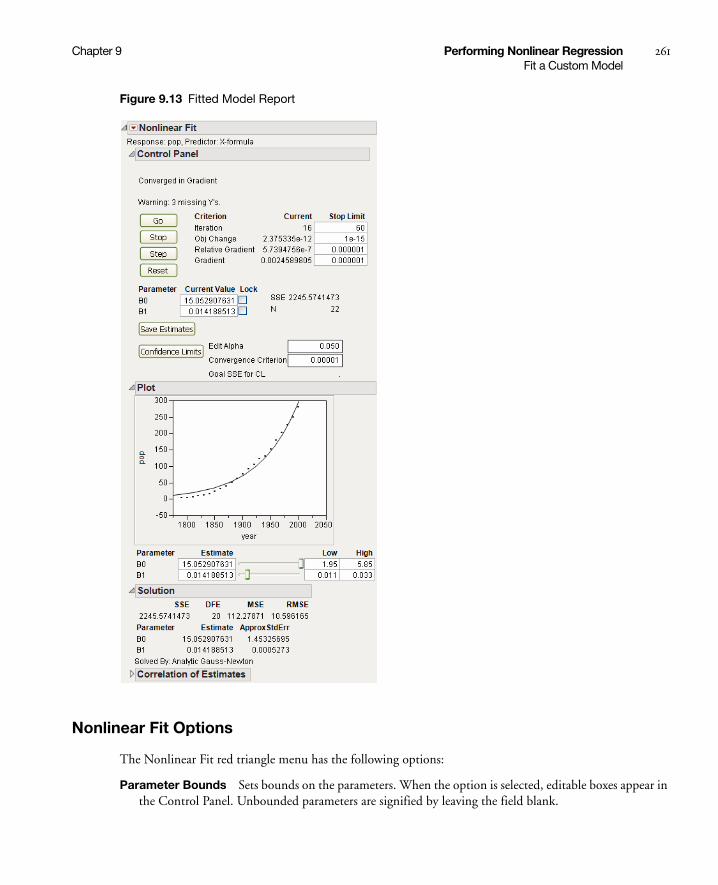
Chapter 9 Performing Nonlinear Regression 261Fit a Custom Model
Figure 9.13 Fitted Model Report
Nonlinear Fit Options
The Nonlinear Fit red triangle menu has the following options:
Parameter Bounds Sets bounds on the parameters. When the option is selected, editable boxes appear in the Control Panel. Unbounded parameters are signified by leaving the field blank.

262 Performing Nonlinear Regression Chapter 9Fit a Custom Model
Plot Shows or hides a plot of the X and Y variables for models with only one X variable. The model shown on the plot is based on the current values of the parameters. To change the current values of the parameters, use the sliders or edit boxes beneath the plot. If you specify a Group variable at launch, then a curve shows for each group.
Iteration Options Specifies options for the fitting algorithm.
Iteration Log records each step of the fitting process in a new window.
Numeric Derivatives Only is useful when you have a model that is too messy to take analytic derivatives for. It can also be valuable in obtaining convergence in tough cases.
Expand Intermediate Formulas tells JMP that if an ingredient column to the formula is a column that itself has a formula, to substitute the inner formula, as long as it refers to other columns. To prevent an ingredient column from expanding, use the Other column property with a name of "Expand Formula" and a value of 0.
Newton chooses whether Gauss-Newton (for regular least squares) or Newton-Raphson (for models with loss functions) is the optimization method.
QuasiNewton SR1 chooses QuasiNewton SR1 as the optimization method.
QuasiNewton BFGS chooses QuasiNewton BFGS as the optimization method.
Accept Current Estimates tells JMP to produce the solution report with the current estimates, even if the estimates did not converge.
Show Derivatives shows the derivatives of the nonlinear formula in the JMP log. See “Notes Concerning Derivatives” on page 273, for technical information about derivatives.
Unthreaded runs the iterations in the main computational thread. In most cases, JMP does the computations in a separate computational thread. This improves the responsiveness of JMP while doing other things during the nonlinear calculations. However, there are some isolated cases (models that have side effects that call display routines, for example) that should be run in the main thread, so this option should be turned on.
Profilers Provides various profilers for viewing response surfaces.
Profiler brings up the Prediction Profiler. The Profiler lets you view vertical slices of the surface across each x-variable in turn, as well as find optimal values of the factors.
Contour Profiler brings up the Contour Profiler. The Contour profiler lets you see two-dimensional contours as well as three dimensional mesh plots.
Surface Profiler creates a three-dimensional surface plot. This option is available only for models with two or more X variables.
Parameter Profiler brings up the Prediction Profiler and profiles the SSE or loss as a function of the parameters.
Parameter Contour Profiler brings up the Contour Profiler and contours the SSE or loss as a function of the parameters.
Parameter Surface Profiler creates a three-dimensional surface plot and profiles the SSE or loss as a function of the parameters. This option is available only for models with two or more parameters.

Chapter 9 Performing Nonlinear Regression 263Fit a Custom Model
SSE Grid Create a grid of values around the solution estimates and compute the error sum of squares for each value. The solution estimates should have the minimum SSE. When the option is selected, the Specify Grid for Output report is shown with these features:
Parameter lists the parameters in the model.
Min displays the minimum parameter values used in the grid calculations. By default, Min is the solution estimate minus 2.5 times the ApproxStdErr.
Max displays the maximum parameter value used in the grid calculations. By default, Max is the solution estimate plus 2.5 times the ApproxStdErr.
Number of Points gives the number of points to create for each parameter. To calculate the total number of points in the new grid table, multiply all the Number of Points values. Initially Number of Points is 11 for the first two parameters and 3 for the rest. If you specify new values, use odd values to ensure that the grid table includes the solution estimates. Setting Number of Points to 0 for any parameter records only the solution estimate in the grid table.
When you click Go, JMP creates the grid of points in a new table. A highlighted row marks the solution estimate row if the solution is in the table.
Revert to Original Parameters Resets the platform to the original parameter values (the values given in the formula column parameters).
Remember Solution Creates a report called Remembered Models, which contains the current parameter estimates and summary statistics. Results of multiple models can be remembered and compared. This is useful if you want to compare models based on different parameter restrictions, or models fit using different options. Click on the radio button for a particular model to display that model in the Plot and the parameter estimates in the Control Panel.
Custom Estimate Gives an estimate of a function of the parameters. You provide an expression involving only parameters. JMP calculates the expression using the current parameter estimates, and also calculates a standard error of the expression using a first-order Taylor series approximation.
Custom Inverse Prediction Estimates the X value for a given Y value. It also calculates a standard error for the estimated X. JMP must be able to invert the model. The standard error is based on the first-order Taylor series approximation using the inverted expression. The confidence interval uses a t-quantile with the standard error, and is a Wald interval.
Save Pred Confid Limits Saves asymptotic confidence limits for the model prediction. This is the confidence interval for the average Y at a given X value.
Save Indiv Confid Limits Saves asymptotic confidence limits for an individual prediction. This is the confidence interval for an individual Y value at a given X value.
Save Formulas Gives options for saving model results to data table columns:
Save Prediction Formula saves the prediction formula with the current parameter estimates.
Save Std Error of Predicted saves the standard error for a model prediction. This is the standard error for predicting the average Y for a given X. The formula is of the form Sqrt(VecQuadratic(matrix1,vector1)). matrix1 is the covariance matrix associated with the parameter estimates, and vector1 is a composition of the partial derivatives of the model with respect to each parameter.

264 Performing Nonlinear Regression Chapter 9Fit a Custom Model
Save Std Error of Individual saves the standard error for an individual prediction. This is the standard error for predicting an individual Y value for a given X value. The formula is of the form Sqrt(VecQuadratic(matrix1,vector1)+mse). matrix1 is the covariance matrix associated with the parameter estimates, vector1 is a composition of the partial derivatives of the model with respect to each parameter, and mse is the estimate of error variance.
Save Residual Formula saves the formula for computing the residuals.
Save Pred Confid Limit Formula saves the formula to calculate the confidence interval for a model prediction. This is a confidence interval for the average Y for a given X.
Save Indiv Confid Limit Formula saves the formula to calculate the confidence interval for an individual prediction. This is a confidence interval for an individual Y for a given X.
Save Inverse Prediction Formula saves formulas for the inverse of the model, the standard error of an inverse prediction, and the standard error of an individual inverse prediction.
Save Specific Solving Formula is equivalent to Save Inverse Prediction Formula in simple cases. However, this command allows the formula to be a function of several variables and allows expressions to be substituted. This feature only works for solving easily invertible operators and functions that occur just once in the formula.
After selecting this command, a dialog appears that enables you to select the variable to solve for. You can also edit the names of the columns in the resulting table. You can also substitute values for the names in the dialog. In these cases, the formula is solved for those values.
Note: The standard errors, confidence intervals, and hypothesis tests are correct only if least squares estimation is done, or if maximum likelihood estimation is used with a proper negative log likelihood.
Show Prediction Expression Shows the prediction model or the loss function at the top of the report.
Use the Model Library
The Model Library can assist you in creating the formula column with parameters and initial values. Click the Model Library button on the Nonlinear launch window to open the library (Figure 9.14).
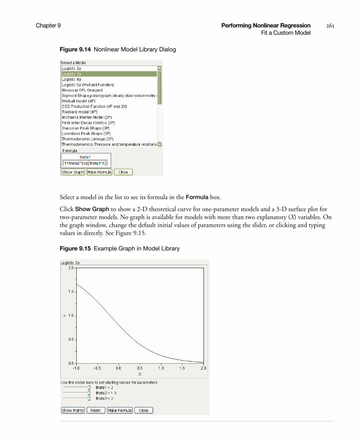
Chapter 9 Performing Nonlinear Regression 265Fit a Custom Model
Figure 9.14 Nonlinear Model Library Dialog
Select a model in the list to see its formula in the Formula box.
Click Show Graph to show a 2-D theoretical curve for one-parameter models and a 3-D surface plot for two-parameter models. No graph is available for models with more than two explanatory (X) variables. On the graph window, change the default initial values of parameters using the slider, or clicking and typing values in directly. See Figure 9.15.
Figure 9.15 Example Graph in Model Library

266 Performing Nonlinear Regression Chapter 9Fit a Custom Model
The Reset button sets the initial values of parameters back to their default values.
Click Show Points to overlay the actual data points to the plot. The dialog in Figure 9.16 opens, asking you to assign columns into X and Y roles, and an optional Group role. The Group role allows for fitting the model to every level of a categorical variable. If you specify a Group role here, also specify the Group column on the platform launch window (Figure 9.16).
Figure 9.16 Roles
For most models, the starting values are constants. Showing points enables you to adjust the parameter values to see how well the model fits for different values of the parameters. For the US population example, the points are shown in Figure 9.17.
Figure 9.17 Show Points

Chapter 9 Performing Nonlinear Regression 267Fit a Custom Model
Clicking Make Formula at this point (after using Show Points) creates a new column in the data table. This column has the formula as a function of the latest parameter starting values.
Note: If you click Make Formula before using the Show Graph or Show Points buttons, you are asked to provide the X and Y roles, and an optional Group role. See Figure 9.16. After that, you are brought back to the plot so you have the opportunity to adjust the parameters starting values if desired. At that point click Make Formula again to create the new column.
Once the formula is created in the data table, continue the analysis by assigning the new column as the X, Predictor Formula in the Nonlinear launch dialog.
Customize the Nonlinear Model Library
The Model Library is created by a built-in script named NonlinLib.jsl, located in the Resources/Builtins folder in the folder that contains JMP (Windows) or in the Application Package (Macintosh). You can customize the nonlinear library script by modifying this script.
To add a model, you must add three lines to the list named Listofmodellist#. These three lines are actually a list themselves, which consists of the following three parts.
• Model name, a quoted string
• Model formula, an expression
• Model scale
For example, suppose you want to add a model called “Simple Exponential Growth” that has the form
Add the following lines to the NonlinLib.jsl script
{//Simple Exponential Growth"Simple Exponential Growth",Expr(Parameter({b1=2, k=0.5}, b1*exp(k * :X))),lowx = -1; highx = 2; lowy = 0; highy = 2},
Some things to note:
• The first line is simply an open bracket (starting the list) and an optional comment. The second line is the string that is displayed in the model library window.
• The values of lowx, highx, lowy, and highy specify the initial window for the theoretical graph.
• There is a comma as the last character in the example above. If this is the final entry in the Listofmodellist# list, the comma can be omitted.
• If the model uses more than two parameters, replace the last line (containing the graph limits) with the quoted string “String Not Available”.
To delete a model, delete the corresponding three-lined list from the Listofmodellist# list.
y b1ekx=
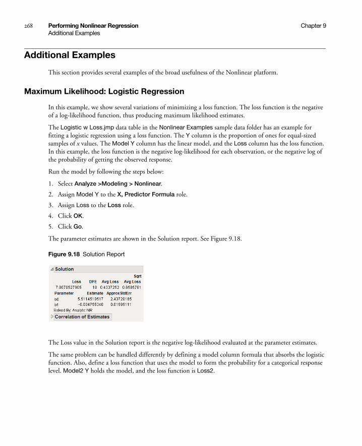
268 Performing Nonlinear Regression Chapter 9Additional Examples
Additional Examples
This section provides several examples of the broad usefulness of the Nonlinear platform.
Maximum Likelihood: Logistic Regression
In this example, we show several variations of minimizing a loss function. The loss function is the negative of a log-likelihood function, thus producing maximum likelihood estimates.
The Logistic w Loss.jmp data table in the Nonlinear Examples sample data folder has an example for fitting a logistic regression using a loss function. The Y column is the proportion of ones for equal-sized samples of x values. The Model Y column has the linear model, and the Loss column has the loss function. In this example, the loss function is the negative log-likelihood for each observation, or the negative log of the probability of getting the observed response.
Run the model by following the steps below:
1. Select Analyze >Modeling > Nonlinear.
2. Assign Model Y to the X, Predictor Formula role.
3. Assign Loss to the Loss role.
4. Click OK.
5. Click Go.
The parameter estimates are shown in the Solution report. See Figure 9.18.
Figure 9.18 Solution Report
The Loss value in the Solution report is the negative log-likelihood evaluated at the parameter estimates.
The same problem can be handled differently by defining a model column formula that absorbs the logistic function. Also, define a loss function that uses the model to form the probability for a categorical response level. Model2 Y holds the model, and the loss function is Loss2.

Chapter 9 Performing Nonlinear Regression 269Additional Examples
The loss function is used in this example, so the second derivative as well as the first one is calculated for the optimization. With least squares, the second derivatives are multiplied by residuals, which are usually near zero. For custom loss functions, second derivatives can play a stronger role. Follow these steps to fit the model:
1. Select Analyze > Modeling > Nonlinear.
2. Assign Model2 Y to the X, Predictor Formula role.
3. Assign Loss2 to the Loss role.
4. Check the Second Derivatives option.
5. Click OK.
6. Type 1000 for the Iteration Stop Limit.
7. Click Go.
The Solution report shows the same Loss and parameter estimates as before.
Probit Model with Binomial Errors: Numerical Derivatives
The Ingots2.jmp file in the Sample Data folder records the numbers of ingots tested for readiness after different treatments of heating and soaking times. The response variable, NReady, is binomial, depending on the number of ingots tested (Ntotal) and the heating and soaking times. Maximum likelihood estimates for parameters from a probit model with binomial errors are obtained using
• numerical derivatives
• the negative log-likelihood as a loss function
• the Newton-Raphson method.
The average number of ingots ready is the product of the number tested and the probability that an ingot is ready for use given the amount of time it was heated and soaked. Using a probit model, the P column contains the model formula:
Normal Distribution[b0+b1*Heat+b2*Soak]
The argument to the Normal Distribution function is a linear model of the treatments.
To specify binomial errors, the loss function, Loss, has the formula
-[Nready*Log[p] + [Ntotal - Nready]*Log[1 - p]]
Follow these steps to fit the model:
1. Select Analyze > Modeling > Nonlinear.
2. Assign P to the X, Predictor Formula role,
3. Assign Loss to the Loss role.
4. Select the Numeric Derivatives Only option.
5. Click OK.
6. Click Go.

270 Performing Nonlinear Regression Chapter 9Additional Examples
The platform used the Quasi-Newton SR1 method to obtain the parameter estimates shown in Figure 9.19.
Figure 9.19 Solution for the Ingots2 Data
Poisson Loss Function
A Poisson distribution is often used to model count data.
, n = 0, 1, 2, …
where μ can be a single parameter, or a linear model with many parameters. Many texts and papers show how the model can be transformed and fit with iteratively reweighted least squares (Nelder and Wedderburn 1972). However, in JMP it is more straightforward to fit the model directly. For example, McCullagh and Nelder (1989) show how to analyze the number of reported damage incidents caused by waves to cargo-carrying vessels.
The data are in the Ship Damage.jmp sample data table. The model formula is in the model column, and the loss function (or –log-likelihood) is in the Poisson column. To fit the model, follow the steps below:
1. Select Analyze > Modeling > Nonlinear.
2. Assign model to the X, Predictor Formula role.
3. Assign Poisson to the Loss role.
4. Click OK.
5. Set the Current Value (initial value) for b0 to 1, and the other parameters to 0.
6. Click Go.
7. Select the Confidence Limits button.
The Solution report is shown in Figure 9.20. The results include the parameter estimates and confidence intervals, and other summary statistics.
P Y n=( ) eμ– μn
n!--------------=

Chapter 9 Performing Nonlinear Regression 271Statistical Details
Figure 9.20 Solution Table for the Poisson Loss Example
Statistical Details
This section provides statistical details and other notes concerning the Nonlinear platform.
Profile Likelihood Confidence Limits
The upper and lower confidence limits for the parameters are based on a search for the value of each parameter after minimizing with respect to the other parameters. The search looks for values that produce an SSE greater by a certain amount than the solution’s minimum SSE. The goal of this difference is based on the F-distribution. The intervals are sometimes called likelihood confidence intervals or profile likelihood confidence intervals (Bates and Watts 1988; Ratkowsky 1990).
Profile confidence limits all start with a goal SSE. This is a sum of squared errors (or sum of loss function) that an F test considers significantly different from the solution SSE at the given alpha level. If the loss function is specified to be a negative log-likelihood, then a Chi-square quantile is used instead of an F quantile. For each parameter’s upper confidence limit, the parameter value is increased until the SSE reaches the goal SSE. As the parameter value is moved up, all the other parameters are adjusted to be least squares estimates subject to the change in the profiled parameter. Conceptually, this is a compounded set of nested iterations. Internally there is a way to do this with one set of iterations developed by Johnston and DeLong. See SAS/STAT 9.1 vol. 3 pp. 1666-1667.
Figure 9.21 shows the contour of the goal SSE or negative likelihood, with the least squares (or least loss) solution inside the shaded region:
• The asymptotic standard errors produce confidence intervals that approximate the region with an ellipsoid and take the parameter values at the extremes (at the horizontal and vertical tangents).
• Profile confidence limits find the parameter values at the extremes of the true region, rather than the approximating ellipsoid.

272 Performing Nonlinear Regression Chapter 9Statistical Details
Figure 9.21 Diagram of Confidence Region
Likelihood confidence intervals are more trustworthy than confidence intervals calculated from approximate standard errors. If a particular limit cannot be found, computations begin for the next limit. When you have difficulty obtaining convergence, try the following:
• use a larger alpha, resulting in a shorter interval, more likely to be better behaved
• use the option for second derivatives
• relax the confidence limit criteria.
How Custom Loss Functions Work
The nonlinear facility can minimize or maximize functions other than the default sum of squares residual. This section shows the mathematics of how it is done.
Suppose that f(β) is the model. Then the Nonlinear platform attempts to minimize the sum of the loss functions written as
The loss function for each row can be a function of other variables in the data table. It must have nonzero first- and second-order derivatives. The default function, squared-residuals, is
To specify a model with a custom loss function, construct a variable in the data table and build the loss function. After launching the Nonlinear platform, select the column containing the loss function as the loss variable.
Confidence Limit for Parameters
approximate 95%confidence ellipse
likelihood 95%confidence region
95% confidenceinterval for b0
95%
con
fiden
cein
terv
al fo
r b1
L ρ f β( )( )i 1=
n
=
ρ •( )ρ •( )
ρ f β( )( ) y f β( )–( )2=

Chapter 9 Performing Nonlinear Regression 273Statistical Details
The nonlinear minimization formula works by taking the first two derivatives of with respect to the model, and forming the gradient and an approximate Hessian as follows:
If is linear in the parameters, the second term in the last equation is zero. If not, you can still hope that its sum is small relative to the first term, and use
The second term is probably small if ρ is the squared residual because the sum of residuals is small. The term is zero if there is an intercept term. For least squares, this is the term that distinguishes Gauss-Newton from Newton-Raphson. In JMP, the second term is calculated only if the Second Derivative option is checked.
Note: The standard errors, confidence intervals, and hypothesis tests are correct only if least squares estimation is done, or if maximum likelihood estimation is used with a proper negative log likelihood.
Notes Concerning Derivatives
The nonlinear platform takes symbolic derivatives for formulas with most common operations. This section shows what type of derivative expressions result.
If you open the Negative Exponential.jmp nonlinear sample data example, the actual formula looks something like this:
Parameter({b0=0.5, b1=0.5,}b0*(1-Exp(-b1*X)))
The Parameter block in the formula is hidden if you use the formula editor. That is how it is stored in the column and how it appears in the Nonlinear Launch dialog. Two parameters named b0 and b1 are given initial values and used in the formula to be fit.
The Nonlinear platform makes a separate copy of the formula, and edits it to extract the parameters from the expression. Then it maps the references to them to the place where they are estimated. Nonlinear takes the analytic derivatives of the prediction formula with respect to the parameters. If you use the Show Derivatives command, you get the resulting formulas listed in the log, like this:
ρ •( )
L ρ f β( )( )i 1=
n
=
L∂βj∂------- ρ f β( )( )∂
f∂--------------------- f∂
βj∂-------
i 1=
n
=
βj βk∂
2
∂∂ L ∂2ρ f β( )( )
∂f( )2--------------------------- f∂
βj∂------- f∂
βk∂-------- ρ f β( )( )∂
f∂----------------------
βk βj∂
2
∂∂ f
+i 1=
n
=
f •( )
βj βk∂
2
∂∂ L ∂2ρ f β( )( )
∂f( )2-------------------------- f∂
βj∂------- f∂
βk∂--------
i 1=
n
≅

274 Performing Nonlinear Regression Chapter 9Statistical Details
Prediction Model:
b0 * First(T#1=1-(T#2=Exp(-b1*X)), T#3=-(-1*T#2*X))
The Derivative of Model with respect to the parameters is:
{T#1, T#3*b0}
The derivative facility works like this:
• In order to avoid calculating subexpressions repeatedly, the prediction model is threaded with assignments to store the values of subexpressions that it needs for derivative calculations. The assignments are made to names like T#1, T#2, and so on.
• When the prediction model needs additional subexpressions evaluated, it uses the First function, which returns the value of the first argument expression, and also evaluates the other arguments. In this case additional assignments are needed for derivatives.
• The derivative table itself is a list of expressions, one expression for each parameter to be fit. For example, the derivative of the model with respect to b0 is T#1; its thread in the prediction model is 1–(Exp(-b1*X)). The derivative with respect to b1 is T#3*b0, which is –(–1*Exp(-b1*X)*X)*b0 if you substitute in the assignments above. Although many optimizations are made, it does not always combine the operations optimally. You can see this by the expression for T#3, which does not remove a double negation.
If you ask for second derivatives, then you get a list of (m(m + 1))/2 second derivative expressions in a list, where m is the number of parameters.
If you specify a loss function, then the formula editor takes derivatives with respect to parameters, if it has any. And it takes first and second derivatives with respect to the model, if there is one.
If the derivative mechanism does not know how to take the analytic derivative of a function, then it takes numerical derivatives, using the NumDeriv function. If this occurs, the platform shows the delta that it used to evaluate the change in the function with respect to a delta change in the arguments. You might need to experiment with different delta settings to obtain good numerical derivatives.
Tips
There are always many ways to represent a given model, and some ways behave much better than other forms. Ratkowsky (1990) covers alternative forms in his text.
If you have repeated subexpressions that occur several places in a formula, then it is better to make an assignment to a temporary variable. Then refer to it later in the formula. For example, one of the model formulas above was this:
If(Y==0, Log(1/(1+Exp(model))), Log(1 - 1/(1 + Exp(model))));
This could be simplified by factoring out an expression and assigning it to a local variable:
temp=1/(1+Exp(model));If(Y==0, Log(temp), Log(1-temp));
The derivative facility can track derivatives across assignments and conditionals.

Chapter 9 Performing Nonlinear Regression 275Statistical Details
Notes on Effective Nonlinear Modeling
We strongly encourage you to center polynomials.
Anywhere you have a complete polynomial term that is linear in the parameters, it is always good to center the polynomials. This improves the condition of the numerical surface for optimization. For example, if you have an expression like
a1 + b1x + c1x2
you should transform it to
The two models are equivalent, apart from a transformation of the parameters, but the second model is far easier to fit if the model is nonlinear.
The transformation of the parameters is easy to solve.
If the number of iterations still goes to the maximum, increase the maximum number of iterations and select Second Deriv Method from the red triangle menu.
There is really no one omnibus optimization method that works well on all problems. JMP has options like Newton, QuasiNewton BFGS, QuasiNewton SR1, Second Deriv Method, and Numeric Derivatives Only to expand the range of problems that are solvable by the Nonlinear Platform.
If the default settings are unable to converge to the solution for a particular problem, using various combinations of these settings to increase the odds of obtaining convergence.
Some models are very sensitive to starting values of the parameters. Working on new starting values is often effective. Edit the starting values and click Reset to see the effect. The plot often helps. Use the sliders to visually modify the curve to fit better. The parameter profilers can help, but might be too slow for anything but small data sets.
a2 b2 x x–( ) c2 x x–( )2
+ +
a1 a2 b2x– c2x+=
b1 b2 2c2x–=
c1 c2=

276 Performing Nonlinear Regression Chapter 9Statistical Details
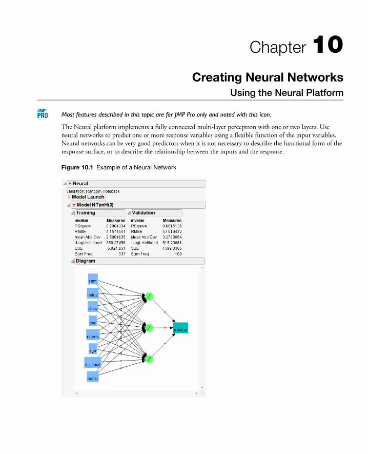
Chapter 10Creating Neural Networks
Using the Neural Platform
Most features described in this topic are for JMP Pro only and noted with this icon.
The Neural platform implements a fully connected multi-layer perceptron with one or two layers. Use neural networks to predict one or more response variables using a flexible function of the input variables. Neural networks can be very good predictors when it is not necessary to describe the functional form of the response surface, or to describe the relationship between the inputs and the response.
Figure 10.1 Example of a Neural Network

Contents
Overview of Neural Networks . . . . . . . . . . . . . . . . . . . . . . . . . . . . . . . . . . . . . . . . . . . . . . . . . . . . . . . . 279
Launch the Neural Platform . . . . . . . . . . . . . . . . . . . . . . . . . . . . . . . . . . . . . . . . . . . . . . . . . . . . . . . . . 279
The Neural Launch Window. . . . . . . . . . . . . . . . . . . . . . . . . . . . . . . . . . . . . . . . . . . . . . . . . . . . . . 280
The Model Launch . . . . . . . . . . . . . . . . . . . . . . . . . . . . . . . . . . . . . . . . . . . . . . . . . . . . . . . . . . . . . . 281
Model Reports. . . . . . . . . . . . . . . . . . . . . . . . . . . . . . . . . . . . . . . . . . . . . . . . . . . . . . . . . . . . . . . . . . . . .286
Training and Validation Measures of Fit . . . . . . . . . . . . . . . . . . . . . . . . . . . . . . . . . . . . . . . . . . . . . .286
Confusion Statistics . . . . . . . . . . . . . . . . . . . . . . . . . . . . . . . . . . . . . . . . . . . . . . . . . . . . . . . . . . . . . .287
Model Options . . . . . . . . . . . . . . . . . . . . . . . . . . . . . . . . . . . . . . . . . . . . . . . . . . . . . . . . . . . . . . . . . . . .287
Example of a Neural Network . . . . . . . . . . . . . . . . . . . . . . . . . . . . . . . . . . . . . . . . . . . . . . . . . . . . . . . . .289

Chapter 10 Creating Neural Networks 279Overview of Neural Networks
Overview of Neural Networks
Think of a neural network as a function of a set of derived inputs, called hidden nodes. The hidden nodes are nonlinear functions of the original inputs. You can specify up to two layers of hidden nodes, with each layer containing as many hidden nodes as you want.
Figure 10.2 shows a two-layer neural network with three X variables and one Y variable. In this example, the first layer has two nodes, and each node is a function of all three nodes in the second layer. The second layer has three nodes, and all nodes are a function of the three X variables. The predicted Y variable is a function of both nodes in the first layer.
Figure 10.2 Neural Network Diagram
The functions applied at the nodes of the hidden layers are called activation functions. The activation function is a transformation of a linear combination of the X variables. For more details about the activation functions, see “Hidden Layer Structure” on page 283.
The function applied at the response is a linear combination (for continuous responses), or a logistic transformation (for nominal or ordinal responses).
The main advantage of a neural network model is that it can efficiently model different response surfaces. Given enough hidden nodes and layers, any surface can be approximated to any accuracy. The main disadvantage of a neural network model is that the results are not easily interpretable, since there are intermediate layers rather than a direct path from the X variables to the Y variables, as in the case of regular regression.
Launch the Neural Platform
To launch the Neural platform, select Analyze > Modeling > Neural.
Launching the Neural platform is a two-step process. First, enter your variables on the Neural launch window. Second, specify your options in the Model Launch.

280 Creating Neural Networks Chapter 10Overview of Neural Networks
The Neural Launch Window
Use the Neural launch window to specify X and Y variables, a validation column, and to enable missing value coding.
Figure 10.3 The Neural Launch Window
Table 10.1 Description of the Neural Launch Window
Y, Response Choose the response variable. When multiple responses are specified, the models for the responses share all parameters in the hidden layers (those parameters not connected to the responses).
X, Factor Choose the input variables.
Freq Choose a frequency variable.
Validation Choose a validation column. For more information, see “Validation Method” on page 282.
By Choose a variable to create separate models for each level of the variable.
Missing Value Coding
Check this box to enable missing value imputation and coding. If this option is not checked, rows with missing values are ignored.
For continuous variables, missing values are replaced by the mean of the variable. Also, a missing value indicator variable is created and included in the model. If a variable is transformed, the imputation occurs after the transformation.
For categorical variables, the missing values are not imputed, but are treated as another level of the variable in the model.

Chapter 10 Creating Neural Networks 281Overview of Neural Networks
The Model Launch
Use the Model Launch dialog to specify the validation method, the structure of the hidden layer, whether to use gradient boosting, and other fitting options.
Figure 10.4 The Model Launch Dialog
Table 10.2 Description of the Model Launch Dialog
Validation Method Select the method that you want to use for model validation. For details, see “Validation Method” on page 282.
Hidden Layer Structure or Hidden Nodes
Note: The standard edition of JMP uses only the TanH activation function, and can fit only neural networks with one hidden layer.
Specify the number of hidden nodes of each type in each layer. For details, see “Hidden Layer Structure” on page 283.
Boosting Specify options for gradient boosting. For details, see “Boosting” on page 284.
Fitting Options Specify options for variable transformation and model fitting. For details, see “Fitting Options” on page 285.
JMP Pro JMP

282 Creating Neural Networks Chapter 10Overview of Neural Networks
After you click Go to fit a model, you can reopen the Model Launch Dialog and change the settings to fit another model.
Validation Method
Neural networks are very flexible models and have a tendency to overfit data. When that happens, the model predicts the fitted data very well, but predicts future observations poorly. To mitigate overfitting, the Neural platform does the following:
• applies a penalty on the model parameters
• uses an independent data set to assess the predictive power of the model
Validation is the process of using part of a data set to estimate model parameters, and using the other part to assess the predictive ability of the model.
• The training set is the part that estimates model parameters.
• The validation set is the part that estimates the optimal value of the penalty, and assesses or validates the predictive ability of the model.
• The test set is a final, independent assessment of the model’s predictive ability. The test set is available only when using a validation column. See Table 10.3.
The training, validation, and test sets are created by subsetting the original data into parts. Table 10.3 describes several methods for subsetting a data set.
Go Fits the neural network model and shows the model reports.
Table 10.2 Description of the Model Launch Dialog (Continued)
Table 10.3 Validation Methods
Excluded Rows Uses row states to subset the data. Rows that are unexcluded are used as the training set, and excluded rows are used as the validation set.
For more information about using row states and how to exclude rows, see Using JMP.
Holdback Randomly divides the original data into the training and validation sets. You can specify the proportion of the original data to use as the validation set (holdback).
KFold Divides the original data into K subsets. In turn, each of the K sets is used to validate the model fit on the rest of the data, fitting a total of K models. The model giving the best validation statistic is chosen as the final model.
This method is best for small data sets, because it makes efficient use of limited amounts of data.

Chapter 10 Creating Neural Networks 283Overview of Neural Networks
Hidden Layer Structure
Note: The standard edition of JMP uses only the TanH activation function, and can fit only neural networks with one hidden layer.
The Neural platform can fit one or two-layer neural networks. Increasing the number of nodes in the first layer, or adding a second layer, makes the neural network more flexible. You can add an unlimited number of nodes to either layer. The second layer nodes are functions of the X variables. The first layer nodes are functions of the second layer nodes. The Y variables are functions of the first layer nodes.
The functions applied at the nodes of the hidden layers are called activation functions. An activation function is a transformation of a linear combination of the X variables. Table 10.4 describes the three types of activation functions.
Validation Column Uses the column’s values to divide the data into parts. The column is assigned using the Validation role on the Neural launch window. See Figure 10.3.
The column’s values determine how the data is split, and what method is used for validation:
• If the column has three unique values, then:
– the smallest value is used for the Training set.
– the middle value is used for the Validation set.
– the largest value is used for the Test set.
• If the column has two unique values, then only Training and Validation sets are used.
• If the column has more than three unique values, then KFold validation is performed.
Table 10.3 Validation Methods (Continued)
Table 10.4 Activation Functions
TanH The hyperbolic tangent function is a sigmoid function. TanH transforms values to be between -1 and 1, and is the centered and scaled version of the logistic function. The hyperbolic tangent function is:
where x is a linear combination of the X variables.
e2x 1–e2x 1+-----------------

284 Creating Neural Networks Chapter 10Overview of Neural Networks
Boosting
Boosting is the process of building a large additive neural network model by fitting a sequence of smaller models. Each of the smaller models is fit on the scaled residuals of the previous model. The models are combined to form the larger final model. The process uses validation to assess how many component models to fit, not exceeding the specified number of models.
Boosting is often faster than fitting a single large model. However, the base model should be a 1 to 2 node single-layer model, or else the benefit of faster fitting can be lost if a large number of models is specified.
Use the Boosting panel in the Model Launch to specify the number of component models and the learning rate. Use the Hidden Layer Structure panel in the Model Launch to specify the structure of the base model.
The learning rate must be 0 < r ≤ 1. Learning rates close to 1 result in faster convergence on a final model, but also have a higher tendency to overfit data. Use learning rates close to 1 when a small Number of Models is specified.
As an example of how boosting works, suppose you specify a base model consisting of one layer and two nodes, with the number of models equal to eight. The first step is to fit a one-layer, two-node model. The predicted values from that model are scaled by the learning rate, then subtracted from the actual values to form a scaled residual. The next step is to fit a different one-layer, two-node model on the scaled residuals of the previous model. This process continues until eight models are fit, or until the addition of another model fails to improve the validation statistic. The component models are combined to form the final, large model. In this example, if six models are fit before stopping, the final model consists of one layer and 2 x 6 = 12 nodes.
Linear The identity function. The linear combination of the X variables is not transformed.
The Linear activation function is most often used in conjunction with one of the non-linear activation functions. In this case, the Linear activation function is placed in the second layer, and the non-linear activation functions are placed in the first layer. This is useful if you want to first reduce the dimensionality of the X variables, and then have a nonlinear model for the Y variables.
For a continuous Y variable, if only Linear activation functions are used, the model for the Y variable reduces to a linear combination of the X variables. For a nominal or ordinal Y variable, the model reduces to a logistic regression.
Gaussian The Gaussian function. Use this option for radial basis function behavior, or when the response surface is Gaussian (normal) in shape. The Gaussian function is:
where x is a linear combination of the X variables.
Table 10.4 Activation Functions (Continued)
e x2–
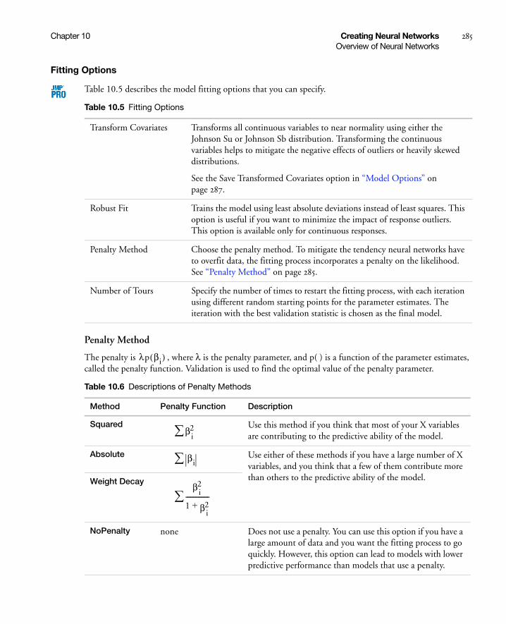
Chapter 10 Creating Neural Networks 285Overview of Neural Networks
Fitting Options
Table 10.5 describes the model fitting options that you can specify.
Penalty Method
The penalty is , where λ is the penalty parameter, and p( ) is a function of the parameter estimates, called the penalty function. Validation is used to find the optimal value of the penalty parameter.
Table 10.5 Fitting Options
Transform Covariates Transforms all continuous variables to near normality using either the Johnson Su or Johnson Sb distribution. Transforming the continuous variables helps to mitigate the negative effects of outliers or heavily skewed distributions.
See the Save Transformed Covariates option in “Model Options” on page 287.
Robust Fit Trains the model using least absolute deviations instead of least squares. This option is useful if you want to minimize the impact of response outliers. This option is available only for continuous responses.
Penalty Method Choose the penalty method. To mitigate the tendency neural networks have to overfit data, the fitting process incorporates a penalty on the likelihood. See “Penalty Method” on page 285.
Number of Tours Specify the number of times to restart the fitting process, with each iteration using different random starting points for the parameter estimates. The iteration with the best validation statistic is chosen as the final model.
Table 10.6 Descriptions of Penalty Methods
Method Penalty Function Description
Squared Use this method if you think that most of your X variables are contributing to the predictive ability of the model.
Absolute Use either of these methods if you have a large number of X variables, and you think that a few of them contribute more than others to the predictive ability of the model.Weight Decay
NoPenalty none Does not use a penalty. You can use this option if you have a large amount of data and you want the fitting process to go quickly. However, this option can lead to models with lower predictive performance than models that use a penalty.
λp βi( )
β i2
βi
β i2
1 β i2+
---------------

286 Creating Neural Networks Chapter 10Model Reports
Model Reports
A model report is created for every neural network model. Measures of fit appear for the training and validation sets. Additionally, confusion statistics appear when the response is nominal or ordinal.
Figure 10.5 Example of a Model Report
Training and Validation Measures of Fit
Measures of fit appear for the training and validation sets. See Figure 10.5.
Table 10.7 Descriptions of the Training and Validation Measures of Fit
Generalized RSquare A generalization of the Rsquare measure that simplifies to the regular Rsquare for continuous responses. Similar to the Entropy RSquare, but instead of using the log-likelihood, the Generalized RSquare uses the 2/n root of the likelihood. It is scaled to have a maximum of 1. The value is 1 for a perfect model, and 0 for a model no better than a constant model.
Entropy RSquare Compares the log-likelihoods from the fitted model and the constant probability model. Appears only when the response is nominal or ordinal.
RSquare Gives the Rsquare for the model.
RMSE Gives the root mean square error. When the response is nominal or ordinal, the differences are between 1 and p (the fitted probability for the response level that actually occurred).

Chapter 10 Creating Neural Networks 287Model Options
If there are multiple responses, fit statistics are given for each response, and an overall Generalized Rsquare and -LogLikelihood is given.
Confusion Statistics
For nominal or ordinal responses, a Confusion Matrix report and Confusion Rates report is given. See Figure 10.5. The Confusion Matrix report shows a two-way classification of the actual response levels and the predicted response levels. For a categorical response, the predicted level is the one with the highest predicted probability. The Confusion Rates report is equal to the Confusion Matrix report, with the numbers divided by the row totals.
Model Options
Each model report has a red triangle menu containing options for producing additional output or saving results. Table 10.8 describes the options in the red triangle menus.
Mean Abs Dev The average of the absolute values of the differences between the response and the predicted response. When the response is nominal or ordinal, the differences are between 1 and p (the fitted probability for the response level that actually occurred).
Misclassification Rate The rate for which the response category with the highest fitted probability is not the observed category. Appears only when the response is nominal or ordinal.
-LogLikelihood Gives the negative of the log likelihood.
SSE Gives the error sums of squares. Available only when the response is continuous.
Sum Freq Gives the number of observations that are used. If you specified a Freq variable in the Neural launch window, Sum Freq gives the sum of the frequency column.
Table 10.7 Descriptions of the Training and Validation Measures of Fit (Continued)
Table 10.8 Model Report Options
Diagram Shows a diagram representing the hidden layer structure.
Show Estimates Shows the parameter estimates in a report.
Profiler Launches the Prediction Profiler. For nominal or ordinal responses, each response level is represented by a separate row in the Prediction Profiler. For details about the options in the red triangle menu, see the “Visualizing, Optimizing, and Simulating Response Surfaces” chapter on page 553.

288 Creating Neural Networks Chapter 10Model Options
Categorical Profiler Launches the Prediction Profiler. Similar to the Profiler option, except that all categorical probabilities are combined into a single profiler row. Available only for nominal or ordinal responses. For details about the options in the red triangle menu, see the “Visualizing, Optimizing, and Simulating Response Surfaces” chapter on page 553.
Contour Profiler Launches the Contour Profiler. This is available only when the model contains more than one continuous factor. For details about the options in the red triangle menu, see the “Visualizing, Optimizing, and Simulating Response Surfaces” chapter on page 553.
Surface Profiler Launches the Surface Profiler. This is available only when the model contains more than one continuous factor. For details about the options in the red triangle menu, see the “Visualizing, Optimizing, and Simulating Response Surfaces” chapter on page 553.
ROC Curve Creates an ROC curve. Available only for nominal or ordinal responses. For details about ROC Curves, see “ROC Curve” on page 337 in the “Recursively Partitioning Data” chapter.
Lift Curve Creates a lift curve. Available only for nominal or ordinal responses. For details about Lift Curves, see “Lift Curves” on page 339 in the “Recursively Partitioning Data” chapter.
Plot Actual by Predicted
Plots the actual versus the predicted response. Available only for continuous responses.
Plot Residual by Predicted
Plots the residuals versus the predicted responses. Available only for continuous responses.
Save Formulas Creates new columns in the data table containing formulas for the predicted response and the hidden layer nodes.
Save Profile Formulas Creates new columns in the data table containing formulas for the predicted response. Formulas for the hidden layer nodes are embedded in this formula. This option produces formulas that can be used by the Flash version of the Profiler.
Save Fast Formulas Creates new columns in the data table containing formulas for the predicted response. Formulas for the hidden layer nodes are embedded in this formula. This option produces formulas that evaluate faster than the other options, but cannot be used in the Flash version of the Profiler.
Make SAS Data Step Creates SAS code that you can use to score a new data set.
Table 10.8 Model Report Options (Continued)

Chapter 10 Creating Neural Networks 289Example of a Neural Network
Example of a Neural Network
This example uses the Boston Housing.jmp data table. Suppose you want to create a model to predict the median home value as a function of several demographic characteristics. Follow the steps below to build the neural network model:
1. Launch the Neural platform by selecting Analyze > Modeling > Neural.
2. Assign mvalue to the Y, Response role.
3. Assign the other columns (crim through lstat) to the X, Factor role.
4. Click OK.
5. Enter 0.2 for the Holdback Proportion.
6. Enter 3 for the number of TanH nodes in the first layer.
7. Check the Transform Covariates option.
8. Click Go.
The report is shown in Figure 10.6.
Note: Results will vary due to the random nature of choosing a validation set.
Figure 10.6 Neural Report
Save Validation Creates a new column in the data table that identifies which rows were used in the training and validation sets. This option is not available when a Validation column is specified on the Neural launch window. See “The Neural Launch Window” on page 280.
Save Transformed Covariates
Creates new columns in the data table showing the transformed covariates. The columns contain formulas that show the transformations. This option is available only when the Transform Covariates option is checked on the Model Launch. See “Fitting Options” on page 285.
Remove Fit Removes the entire model report.
Table 10.8 Model Report Options (Continued)

290 Creating Neural Networks Chapter 10Example of a Neural Network
Results are provided for both the training and validation sets. Use the results of the validation set as a representation of the model’s predictive power on future observations.
The R-Square statistic for the Validation set is 0.838, signifying that the model is predicting well on data not used to train the model. As an additional assessment of model fit, select Plot Actual by Predicted from the Model red-triangle menu. The plot is shown in Figure 10.7.
Figure 10.7 Actual by Predicted Plot
The points fall along the line, signifying that the predicted values are similar to the actual values.
To get a general understanding of how the X variables are impacting the predicted values, select Profiler from the Model red-triangle menu. The profiler is shown in Figure 10.8.
Figure 10.8 Profiler

Chapter 10 Creating Neural Networks 291Example of a Neural Network
Some of the variables have profiles with positive slopes, and some negative. For example, rooms has a positive slope. This indicates that the more rooms a home has, the higher the predicted median value. The variable age is the proportion of owner-occupied units built prior to 1940. This variable has a negative slope, indicating that the more older homes there are in the area, the lower the median value.

292 Creating Neural Networks Chapter 10Example of a Neural Network
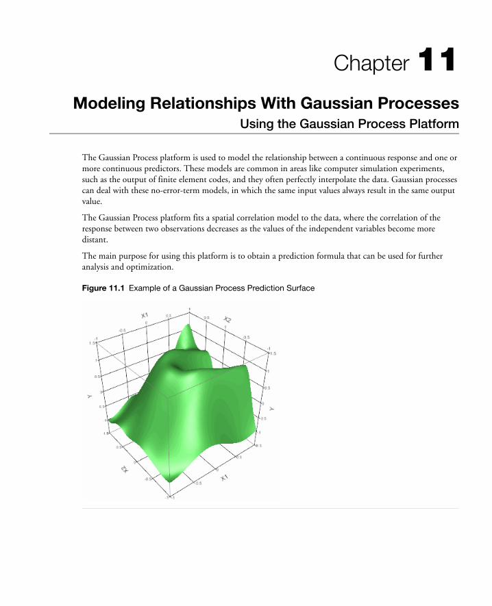
Chapter 11Modeling Relationships With Gaussian Processes
Using the Gaussian Process Platform
The Gaussian Process platform is used to model the relationship between a continuous response and one or more continuous predictors. These models are common in areas like computer simulation experiments, such as the output of finite element codes, and they often perfectly interpolate the data. Gaussian processes can deal with these no-error-term models, in which the same input values always result in the same output value.
The Gaussian Process platform fits a spatial correlation model to the data, where the correlation of the response between two observations decreases as the values of the independent variables become more distant.
The main purpose for using this platform is to obtain a prediction formula that can be used for further analysis and optimization.
Figure 11.1 Example of a Gaussian Process Prediction Surface

Contents
Launching the Platform. . . . . . . . . . . . . . . . . . . . . . . . . . . . . . . . . . . . . . . . . . . . . . . . . . . . . . . . . . . . . .295
The Gaussian Process Report. . . . . . . . . . . . . . . . . . . . . . . . . . . . . . . . . . . . . . . . . . . . . . . . . . . . . . . . . 296
Actual by Predicted Plot . . . . . . . . . . . . . . . . . . . . . . . . . . . . . . . . . . . . . . . . . . . . . . . . . . . . . . . . . 297
Model Report . . . . . . . . . . . . . . . . . . . . . . . . . . . . . . . . . . . . . . . . . . . . . . . . . . . . . . . . . . . . . . . . . 297
Marginal Model Plots . . . . . . . . . . . . . . . . . . . . . . . . . . . . . . . . . . . . . . . . . . . . . . . . . . . . . . . . . . . 299
Platform Options . . . . . . . . . . . . . . . . . . . . . . . . . . . . . . . . . . . . . . . . . . . . . . . . . . . . . . . . . . . . . . . . . 299
Borehole Hypercube Example . . . . . . . . . . . . . . . . . . . . . . . . . . . . . . . . . . . . . . . . . . . . . . . . . . . . . . . . 300

Chapter 11 Modeling Relationships With Gaussian Processes 295Launching the Platform
Launching the Platform
To launch the Gaussian Process platform, choose Analyze > Modeling > Gaussian Process from the main menu bar. Here, we illustrate the platform with 2D Gaussian Process Example.jmp data set, found in the Sample Data folder.
Figure 11.2 Gaussian Process Launch Dialog
The launch dialog has the following options:
Estimate Nugget Parameter introduces a ridge parameter into the estimation procedure. This is useful if there is noise or randomness in the response, and you would like the prediction model to smooth over the noise instead of perfectly interpolating.
Correlation Type lets you choose the correlation structure used in the model. The platform fits a spatial correlation model to the data, where the correlation of the response between two observations decreases as the values of the independent variables become more distant.
Gaussian restricts the correlation between two points to always be non-zero, no matter the distance between the points.
Cubic lets the correlation between two points to be zero for points far enough appart. This method can be considered a generalization of a cubic spline.
Minimum Theta Value lets you set the minimum theta value used in the fitted model. The default is 0. The theta values are analogous to a slope parameter in regular regression models. If a theta value is 0 in the fitted model, then that X variable has no influence on the predicted values.
In this example, we are interested in finding the explanatory power of the two x-variables (X1 and X2) on Y. A plot of X1 and X2 shows their even dispersal in the factor space.

296 Modeling Relationships With Gaussian Processes Chapter 11The Gaussian Process Report
Since this is generated data, we can look at the function that generates the Y values. It is this function that we want to estimate.
The Gaussian Process Report
After clicking OK from the launch dialog, the following report appears.
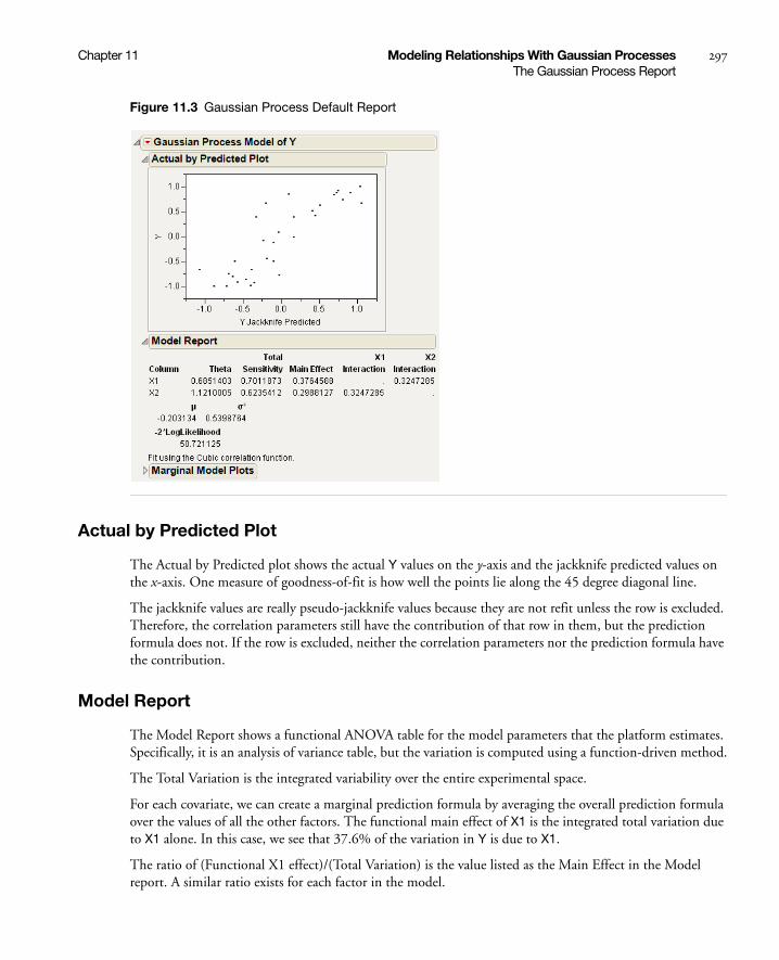
Chapter 11 Modeling Relationships With Gaussian Processes 297The Gaussian Process Report
Figure 11.3 Gaussian Process Default Report
Actual by Predicted Plot
The Actual by Predicted plot shows the actual Y values on the y-axis and the jackknife predicted values on the x-axis. One measure of goodness-of-fit is how well the points lie along the 45 degree diagonal line.
The jackknife values are really pseudo-jackknife values because they are not refit unless the row is excluded. Therefore, the correlation parameters still have the contribution of that row in them, but the prediction formula does not. If the row is excluded, neither the correlation parameters nor the prediction formula have the contribution.
Model Report
The Model Report shows a functional ANOVA table for the model parameters that the platform estimates. Specifically, it is an analysis of variance table, but the variation is computed using a function-driven method.
The Total Variation is the integrated variability over the entire experimental space.
For each covariate, we can create a marginal prediction formula by averaging the overall prediction formula over the values of all the other factors. The functional main effect of X1 is the integrated total variation due to X1 alone. In this case, we see that 37.6% of the variation in Y is due to X1.
The ratio of (Functional X1 effect)/(Total Variation) is the value listed as the Main Effect in the Model report. A similar ratio exists for each factor in the model.

298 Modeling Relationships With Gaussian Processes Chapter 11The Gaussian Process Report
Functional interaction effects, computed in a similar way, are also listed in the Model Report table.
Summing the value for main effect and all interaction terms gives the Total Sensitivity, the amount of influence a factor and all its two-way interactions have on the response variable.
Mu, Theta, and Sigma
The Gaussian correlation structure uses the product exponential correlation function with a power of 2 as the estimated model. This comes with the assumptions that Y is Normally distributed with mean μ and covariance matrix σ2R. The R matrix is composed of elements
In the Model report, μ is the Normal distribution mean, σ2 is the Normal Distribution parameter, and the Theta column corresponds to the values of θk in the definition of R.
These parameters are all fitted via maximum likelihood.
Note: If you see Nugget parameters set to avoid singular variance matrix, JMP has added a ridge parameter to the variance matrix so that it is invertible.
The Cubic correlation structure also assumes that Y is Normally distributed with mean μ and covariance matrix σ2R. The R matrix is composed of elements
d = xik–xjk
where
For more information see Santer (2003). The theta parameter used in the cubic correlation is the reciprocal of the parameter used in the literature. The reason is so that when a parameter (theta) has no effect on the model, then it has a value of zero, instead of infinity.
rij θk xik xjk–( )2
k–
exp=
rij ρk
∏ d θk;( )=
ρ d θ;( )
1 6 dθ( )2– 6 d θ( )3+ d1
2θ------≤,
2 1 d θ–( )3 12θ------ d
1θ---≤<,
01θ--- d<,
=
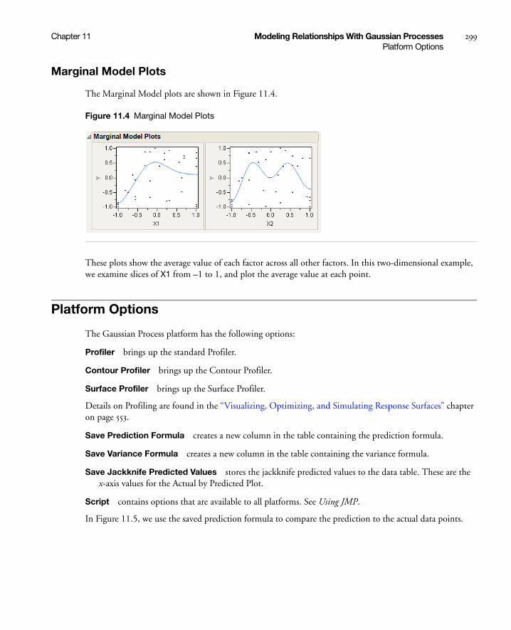
Chapter 11 Modeling Relationships With Gaussian Processes 299Platform Options
Marginal Model Plots
The Marginal Model plots are shown in Figure 11.4.
Figure 11.4 Marginal Model Plots
These plots show the average value of each factor across all other factors. In this two-dimensional example, we examine slices of X1 from –1 to 1, and plot the average value at each point.
Platform Options
The Gaussian Process platform has the following options:
Profiler brings up the standard Profiler.
Contour Profiler brings up the Contour Profiler.
Surface Profiler brings up the Surface Profiler.
Details on Profiling are found in the “Visualizing, Optimizing, and Simulating Response Surfaces” chapter on page 553.
Save Prediction Formula creates a new column in the table containing the prediction formula.
Save Variance Formula creates a new column in the table containing the variance formula.
Save Jackknife Predicted Values stores the jackknife predicted values to the data table. These are the x-axis values for the Actual by Predicted Plot.
Script contains options that are available to all platforms. See Using JMP.
In Figure 11.5, we use the saved prediction formula to compare the prediction to the actual data points.

300 Modeling Relationships With Gaussian Processes Chapter 11Borehole Hypercube Example
Figure 11.5 Two Views of the Prediction Surface and Actual Ys
Borehole Hypercube Example
A more complicated model is seen using Borehole Latin Hypercube.jmp, found in the Design Experiment folder.
To launch the analysis, fill out the Gaussian Process dialog as shown in Figure 11.6.
Figure 11.6 Borehole Latin Hypercube Launch Dialog

Chapter 11 Modeling Relationships With Gaussian Processes 301Borehole Hypercube Example
When you click OK, the following Actual by Predicted plot appears.
Since the points are close to the 45 degree diagonal line, we can be confident that the Gaussian process prediction model is a good approximation to the true function that generated the data.
The Model Report shows us that this is mainly due to one factor, log10 Rw. The main effect explains 87.5% of the variation, with 90.5% explained when all second-order interactions are included.
Factors with a theta value of 0 do not impact the prediction formula at all. It is as if they have been dropped from the model.
The Marginal Model plots confirm that log10 Rw is a highly involved participant in Y’s variation.
Most of the variation is explained by log10Rw
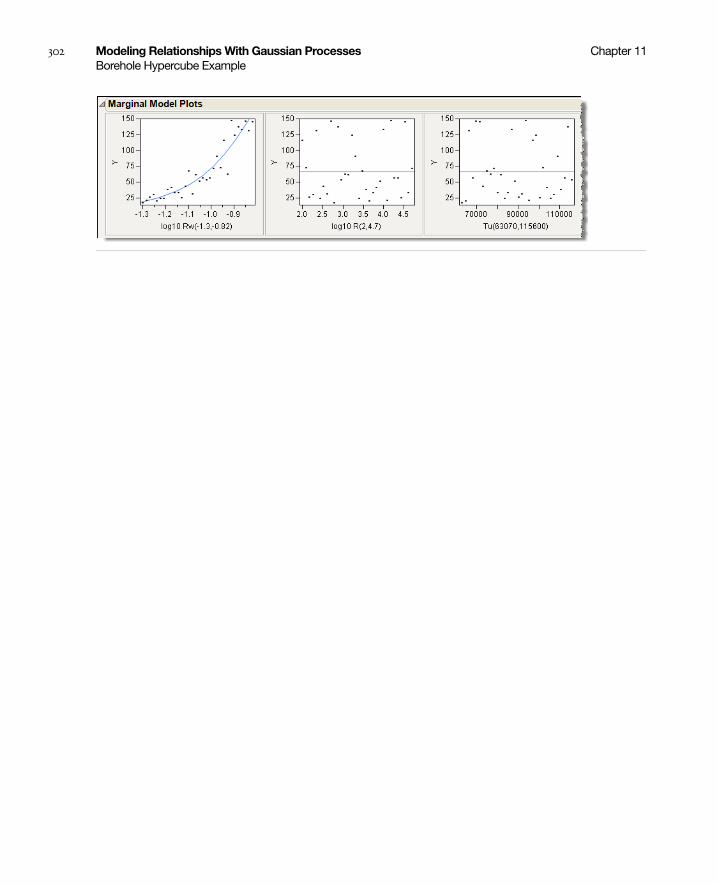
302 Modeling Relationships With Gaussian Processes Chapter 11Borehole Hypercube Example
Chapter 12Fitting Dispersion Effects with the Loglinear
Variance ModelUsing the Fit Model Platform
The Loglinear Variance personality of the Fit Model platform enables you to model both the expected value and the variance of a response using regression models. The log of the variance is fit to one linear model and the expected response is fit to a different linear model simultaneously.
Note: The estimates are demanding in their need for a lot of well-designed, well-fitting data. You need more data to fit variances than you do means.
For many engineers, the goal of an experiment is not to maximize or minimize the response itself, but to aim at a target response and achieve minimum variability. The loglinear variance model provides a very general and effective way to model variances, and can be used for unreplicated data, as well as data with replications.
Modeling dispersion effects is not very widely covered in textbooks, with the exception of the Taguchi framework. In a Taguchi-style experiment, this is handled by taking multiple measurements across settings of an outer array, constructing a new response which measures the variability off-target across this outer array, and then fitting the model to find out the factors that produce minimum variability. This kind of modeling requires a specialized design that is a complete cartesian product of two designs. The method of this chapter models variances in a more flexible, model-based approach. The particular performance statistic that Taguchi recommends for variability modeling is STD = -log(s). In JMP’s methodology, the log(s2) is modeled and combined with a model that has a mean. The two are basically equivalent, since log(s2)=2 log(s).

Contents
Overview of the Loglinear Variance Model . . . . . . . . . . . . . . . . . . . . . . . . . . . . . . . . . . . . . . . . . . . . . . . 305
Model Specification. . . . . . . . . . . . . . . . . . . . . . . . . . . . . . . . . . . . . . . . . . . . . . . . . . . . . . . . . . . . . . 305
Notes. . . . . . . . . . . . . . . . . . . . . . . . . . . . . . . . . . . . . . . . . . . . . . . . . . . . . . . . . . . . . . . . . . . . . . . . . 305
Example Using Loglinear Variance . . . . . . . . . . . . . . . . . . . . . . . . . . . . . . . . . . . . . . . . . . . . . . . . . . . . 306
The Loglinear Report . . . . . . . . . . . . . . . . . . . . . . . . . . . . . . . . . . . . . . . . . . . . . . . . . . . . . . . . . . . . . . .308
Loglinear Platform Options. . . . . . . . . . . . . . . . . . . . . . . . . . . . . . . . . . . . . . . . . . . . . . . . . . . . . . . . . . . 310
Save Columns . . . . . . . . . . . . . . . . . . . . . . . . . . . . . . . . . . . . . . . . . . . . . . . . . . . . . . . . . . . . . . . . . . 310
Row Diagnostics . . . . . . . . . . . . . . . . . . . . . . . . . . . . . . . . . . . . . . . . . . . . . . . . . . . . . . . . . . . . . . . . 311
Examining the Residuals . . . . . . . . . . . . . . . . . . . . . . . . . . . . . . . . . . . . . . . . . . . . . . . . . . . . . . . . . . . . . 311
Profiling the Fitted Model . . . . . . . . . . . . . . . . . . . . . . . . . . . . . . . . . . . . . . . . . . . . . . . . . . . . . . . . . . . . 312
Example of Profiling the Fitted Model. . . . . . . . . . . . . . . . . . . . . . . . . . . . . . . . . . . . . . . . . . . . . . . . 312
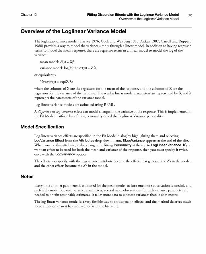
Chapter 12 Fitting Dispersion Effects with the Loglinear Variance Model 305Overview of the Loglinear Variance Model
Overview of the Loglinear Variance Model
The loglinear-variance model (Harvey 1976, Cook and Weisberg 1983, Aitken 1987, Carroll and Ruppert 1988) provides a way to model the variance simply through a linear model. In addition to having regressor terms to model the mean response, there are regressor terms in a linear model to model the log of the variance:
mean model: E(y) = Xβvariance model: log(Variance(y)) = Z λ,
or equivalently
Variance(y) = exp(Z λ)
where the columns of X are the regressors for the mean of the response, and the columns of Z are the regressors for the variance of the response. The regular linear model parameters are represented by β, and λ represents the parameters of the variance model.
Log-linear variance models are estimated using REML.
A dispersion or log-variance effect can model changes in the variance of the response. This is implemented in the Fit Model platform by a fitting personality called the Loglinear Variance personality.
Model Specification
Log-linear variance effects are specified in the Fit Model dialog by highlighting them and selecting LogVariance Effect from the Attributes drop-down menu. &LogVariance appears at the end of the effect. When you use this attribute, it also changes the fitting Personality at the top to LogLinear Variance. If you want an effect to be used for both the mean and variance of the response, then you must specify it twice, once with the LogVariance option.
The effects you specify with the log-variance attribute become the effects that generate the Z’s in the model, and the other effects become the X’s in the model.
Notes
Every time another parameter is estimated for the mean model, at least one more observation is needed, and preferably more. But with variance parameters, several more observations for each variance parameter are needed to obtain reasonable estimates. It takes more data to estimate variances than it does means.
The log-linear variance model is a very flexible way to fit dispersion effects, and the method deserves much more attention than it has received so far in the literature.
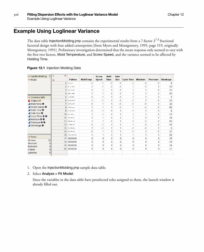
306 Fitting Dispersion Effects with the Loglinear Variance Model Chapter 12Example Using Loglinear Variance
Example Using Loglinear Variance
The data table InjectionMolding.jmp contains the experimental results from a 7-factor 27-3 fractional factorial design with four added centerpoints [from Myers and Montgomery, 1995, page 519, originally Montgomery, 1991]. Preliminary investigation determined that the mean response only seemed to vary with the first two factors, Mold Temperature, and Screw Speed, and the variance seemed to be affected by Holding Time.
Figure 12.1 Injection Molding Data
1. Open the InjectionMolding.jmp sample data table.
2. Select Analyze > Fit Model.
Since the variables in the data table have preselected roles assigned to them, the launch window is already filled out.
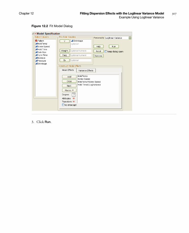
Chapter 12 Fitting Dispersion Effects with the Loglinear Variance Model 307Example Using Loglinear Variance
Figure 12.2 Fit Model Dialog
3. Click Run.
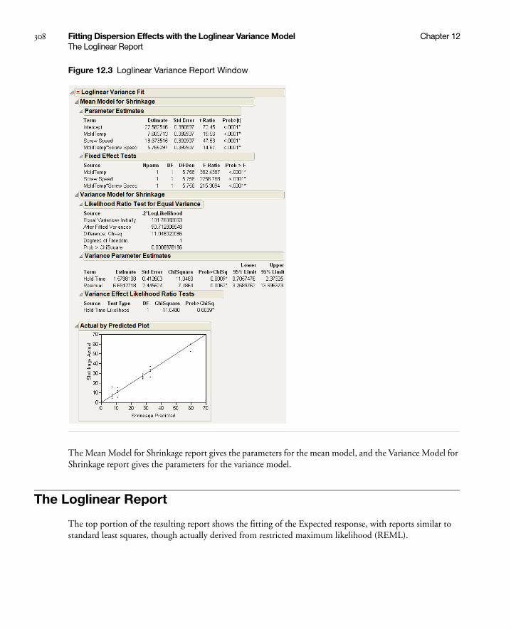
308 Fitting Dispersion Effects with the Loglinear Variance Model Chapter 12The Loglinear Report
Figure 12.3 Loglinear Variance Report Window
The Mean Model for Shrinkage report gives the parameters for the mean model, and the Variance Model for Shrinkage report gives the parameters for the variance model.
The Loglinear Report
The top portion of the resulting report shows the fitting of the Expected response, with reports similar to standard least squares, though actually derived from restricted maximum likelihood (REML).
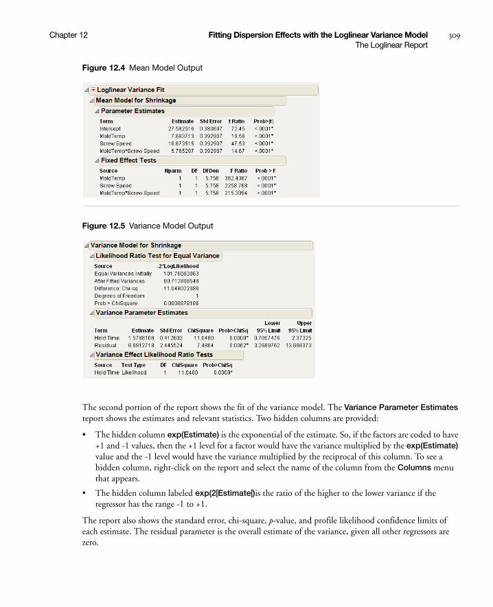
Chapter 12 Fitting Dispersion Effects with the Loglinear Variance Model 309The Loglinear Report
Figure 12.4 Mean Model Output
Figure 12.5 Variance Model Output
The second portion of the report shows the fit of the variance model. The Variance Parameter Estimates report shows the estimates and relevant statistics. Two hidden columns are provided:
• The hidden column exp(Estimate) is the exponential of the estimate. So, if the factors are coded to have +1 and -1 values, then the +1 level for a factor would have the variance multiplied by the exp(Estimate) value and the -1 level would have the variance multiplied by the reciprocal of this column. To see a hidden column, right-click on the report and select the name of the column from the Columns menu that appears.
• The hidden column labeled exp(2|Estimate|)is the ratio of the higher to the lower variance if the regressor has the range -1 to +1.
The report also shows the standard error, chi-square, p-value, and profile likelihood confidence limits of each estimate. The residual parameter is the overall estimate of the variance, given all other regressors are zero.
310 Fitting Dispersion Effects with the Loglinear Variance Model Chapter 12Loglinear Platform Options
Does the variance model fit significantly better than the original model? The likelihood ratio test for this question compares the fitted model with the model where all parameters are zero except the intercept, the model of equal-variance. In this case the p-value is highly significant. Changes in Hold Time change the variance.
The Variance Effect Likelihood Ratio Tests refit the model without each term in turn to create the likelihood ratio tests. These are generally more trusted than Wald tests.
Loglinear Platform Options
The red triangle menu next to Loglinear Variance Fit contains the following options.
Save Columns
Table 12.1 Descriptions of Loglinear Platform Options
Save Columns Creates one or more columns in the data table. See “Save Columns” on page 310.
Row Diagnostics Plots row diagnostics. See “Row Diagnostics” on page 311.
Profilers Opens the Profiler, Contour Profiler, or Surface Profiler. See “Factor Profiling” on page 92 in the “Fitting Standard Least Squares Models” chapter.
Model Dialog Shows the completed launch window for the current analysis.
Script Contains options that are available to all platforms. See Using JMP.
Table 12.2 Descriptions of Save Columns Options
Prediction Formula Creates a new column called Mean. The new column contains the predicted values for the mean, as computed by the specified model.
Variance Formula Creates a new column called Variance. The new column contains the predicted values for the variance, as computed by the specified model.
Std Dev Formula Creates a new column called Std Dev. The new column contains the predicted values for the standard deviation, as computed by the specified model.
Residuals Creates a new column called Residual that contains the residuals, which are the observed response values minus predicted values. See “Examining the Residuals” on page 311.
Studentized Residuals Creates a new column called Studentized Resid. The new column values are the residuals divided by their standard error.
Chapter 12 Fitting Dispersion Effects with the Loglinear Variance Model 311Examining the Residuals
Row Diagnostics
Examining the Residuals
To see the dispersion effect, follow these steps:
1. Open the InjectionMolding.jmp sample data table.
2. Select Analyze > Fit Model.
Since the variables in the data table have preselected roles assigned to them, the launch window is already filled out.
3. Click Run.
4. From the red triangle menu next to Loglinear Variance Fit, select Save Columns > Residuals.
5. In the InjectionMolding.jmp sample data table, right-click on the continuous icon next to Hold Time in the Columns panel, and select Nominal.
6. Select Analyze > Fit Y by X.
7. Select Shrinkage Residual and click Y, Response.
8. Select Hold Time and click X, Factor.
Std Error of Predicted Creates a new column called Std Err Pred. The new column contains the standard errors of the predicted values.
Std Error of Individual Creates a new column called Std Err Indiv. The new column contains the standard errors of the individual predicted values.
Mean Confidence Interval
Creates two new columns, Lower 95% Mean and Upper 95% Mean. The new columns contain the bounds for a confidence interval for the prediction mean.
Indiv Confidence Interval
Creates two new columns, Lower 95% Indiv and Upper 95% Indiv. The new columns contain confidence limits for individual response values.
Table 12.2 Descriptions of Save Columns Options (Continued)
Table 12.3 Descriptions of Row Diagnostics Options
Plot Actual by Predicted Plots the observed values by the predicted values of Y. This is the leverage plot for the whole model.
Plot Studentized Residual by Predicted
Plots the Studentized residuals by the predicted values of Y.
Plot Studentized Residual by Row
Plots the Studentized residuals by row.

312 Fitting Dispersion Effects with the Loglinear Variance Model Chapter 12Profiling the Fitted Model
9. Click OK.
Figure 12.6 Residual by Dispersion Effect
In this plot it is easy to see the variance go up as the Hold Time increases. This is done by treating Hold Time as a nominal factor.
Profiling the Fitted Model
Use the Profiler, Contour Profiler, or Surface Profiler to gain further insight into the fitted model. To select a profiler option, click on the red triangle menu next to Loglinear Variance Fit and select one of the options under the Profilers menu.
Example of Profiling the Fitted Model
For example, suppose that the goal was to find the factor settings that achieved a target of 31 for the response, but at the smallest variance. Fit the models and choose Profiler from the report menu. For example, Figure 12.7 shows the Profiler set up to match a target value for a mean and to minimize variance.
1. Open the InjectionMolding.jmp sample data table.
2. Select Analyze > Fit Model.
Since the variables in the data table have preselected roles assigned to them, the launch window is already filled out.
3. Click Run.
4. From the red triangle menu next to Loglinear Variance Fit, select Profilers > Profiler.
5. From the red triangle menu next to Prediction Profiler, select Prediction Intervals.

Chapter 12 Fitting Dispersion Effects with the Loglinear Variance Model 313Profiling the Fitted Model
Figure 12.7 Prediction Intervals
6. Change the following values:
– MoldTemp to 0.2
– Screw Speed to 0.1
– Hold Time to -1
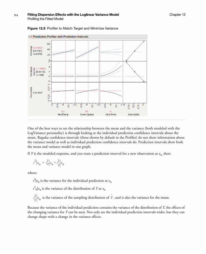
314 Fitting Dispersion Effects with the Loglinear Variance Model Chapter 12Profiling the Fitted Model
Figure 12.8 Profiler to Match Target and Minimize Variance
One of the best ways to see the relationship between the mean and the variance (both modeled with the LogVariance personality) is through looking at the individual prediction confidence intervals about the mean. Regular confidence intervals (those shown by default in the Profiler) do not show information about the variance model as well as individual prediction confidence intervals do. Prediction intervals show both the mean and variance model in one graph.
If Y is the modeled response, and you want a prediction interval for a new observation at xn, then:
where:
s2|xn is the variance for the individual prediction at xn
s2Y|xn is the variance of the distribution of Y at xn
is the variance of the sampling distribution of , and is also the variance for the mean.
Because the variance of the individual prediction contains the variance of the distribution of Y, the effects of the changing variance for Y can be seen. Not only are the individual prediction intervals wider, but they can change shape with a change in the variance effects.
s2
xn sY2
xn sY
2xn+=
sY
2xn Y

Chapter 13Recursively Partitioning Data
Using the Partition Platform
The Partition platform recursively partitions data according to a relationship between the X and Y values, creating a tree of partitions. It finds a set of cuts or groupings of X values that best predict a Y value. It does this by exhaustively searching all possible cuts or groupings. These splits (or partitions) of the data are done recursively forming a tree of decision rules until the desired fit is reached. This is a powerful platform, since it picks the optimum splits from a large number of possible splits.
The platform offers three methods for growing the final predictive tree:
• Decision Tree
• Bootstrap Forest
• Boosted Tree
The Bootstrap Forest and Boosted Tree methods are available only in JMP Pro.
Figure 13.1 Example of Partition

Contents
Introduction to Partitioning . . . . . . . . . . . . . . . . . . . . . . . . . . . . . . . . . . . . . . . . . . . . . . . . . . . . . . . . . . 317
Launching the Partition Platform . . . . . . . . . . . . . . . . . . . . . . . . . . . . . . . . . . . . . . . . . . . . . . . . . . . . . . 317
Partition Method. . . . . . . . . . . . . . . . . . . . . . . . . . . . . . . . . . . . . . . . . . . . . . . . . . . . . . . . . . . . . . . . . . . 318
Decision Tree . . . . . . . . . . . . . . . . . . . . . . . . . . . . . . . . . . . . . . . . . . . . . . . . . . . . . . . . . . . . . . . . . . 318
Bootstrap Forest . . . . . . . . . . . . . . . . . . . . . . . . . . . . . . . . . . . . . . . . . . . . . . . . . . . . . . . . . . . . . . . .329
Boosted Tree . . . . . . . . . . . . . . . . . . . . . . . . . . . . . . . . . . . . . . . . . . . . . . . . . . . . . . . . . . . . . . . . . . . 332
Validation . . . . . . . . . . . . . . . . . . . . . . . . . . . . . . . . . . . . . . . . . . . . . . . . . . . . . . . . . . . . . . . . . . . . . . . . 335
Graphs for Goodness of Fit . . . . . . . . . . . . . . . . . . . . . . . . . . . . . . . . . . . . . . . . . . . . . . . . . . . . . . . . . . . 336
Actual by Predicted Plot . . . . . . . . . . . . . . . . . . . . . . . . . . . . . . . . . . . . . . . . . . . . . . . . . . . . . . . . . . 336
ROC Curve . . . . . . . . . . . . . . . . . . . . . . . . . . . . . . . . . . . . . . . . . . . . . . . . . . . . . . . . . . . . . . . . . . . . 337
Lift Curves . . . . . . . . . . . . . . . . . . . . . . . . . . . . . . . . . . . . . . . . . . . . . . . . . . . . . . . . . . . . . . . . . . . . 339
Missing Values. . . . . . . . . . . . . . . . . . . . . . . . . . . . . . . . . . . . . . . . . . . . . . . . . . . . . . . . . . . . . . . . . . . . .340
Example . . . . . . . . . . . . . . . . . . . . . . . . . . . . . . . . . . . . . . . . . . . . . . . . . . . . . . . . . . . . . . . . . . . . . . . . . 341
Decision Tree . . . . . . . . . . . . . . . . . . . . . . . . . . . . . . . . . . . . . . . . . . . . . . . . . . . . . . . . . . . . . . . . . .342
Bootstrap Forest . . . . . . . . . . . . . . . . . . . . . . . . . . . . . . . . . . . . . . . . . . . . . . . . . . . . . . . . . . . . . . . . 343
Boosted Tree . . . . . . . . . . . . . . . . . . . . . . . . . . . . . . . . . . . . . . . . . . . . . . . . . . . . . . . . . . . . . . . . . . . 345
Compare Methods. . . . . . . . . . . . . . . . . . . . . . . . . . . . . . . . . . . . . . . . . . . . . . . . . . . . . . . . . . . . . . .346
Statistical Details . . . . . . . . . . . . . . . . . . . . . . . . . . . . . . . . . . . . . . . . . . . . . . . . . . . . . . . . . . . . . . . . . . . 348
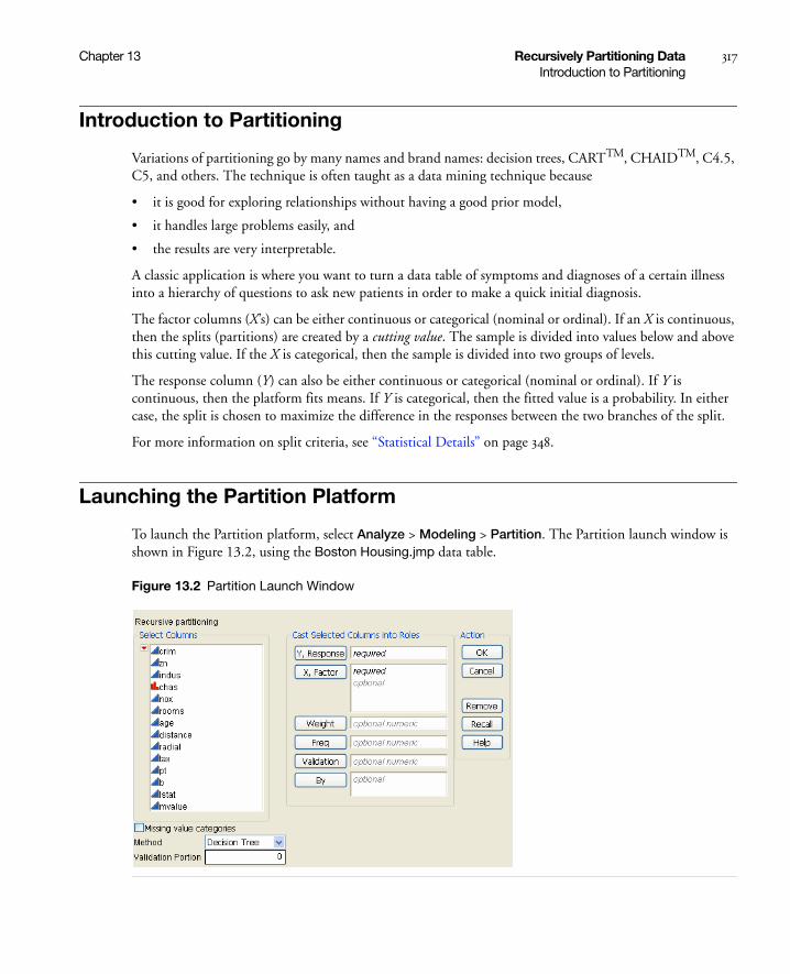
Chapter 13 Recursively Partitioning Data 317Introduction to Partitioning
Introduction to Partitioning
Variations of partitioning go by many names and brand names: decision trees, CARTTM, CHAIDTM, C4.5, C5, and others. The technique is often taught as a data mining technique because
• it is good for exploring relationships without having a good prior model,
• it handles large problems easily, and
• the results are very interpretable.
A classic application is where you want to turn a data table of symptoms and diagnoses of a certain illness into a hierarchy of questions to ask new patients in order to make a quick initial diagnosis.
The factor columns (X’s) can be either continuous or categorical (nominal or ordinal). If an X is continuous, then the splits (partitions) are created by a cutting value. The sample is divided into values below and above this cutting value. If the X is categorical, then the sample is divided into two groups of levels.
The response column (Y) can also be either continuous or categorical (nominal or ordinal). If Y is continuous, then the platform fits means. If Y is categorical, then the fitted value is a probability. In either case, the split is chosen to maximize the difference in the responses between the two branches of the split.
For more information on split criteria, see “Statistical Details” on page 348.
Launching the Partition Platform
To launch the Partition platform, select Analyze > Modeling > Partition. The Partition launch window is shown in Figure 13.2, using the Boston Housing.jmp data table.
Figure 13.2 Partition Launch Window
318 Recursively Partitioning Data Chapter 13Partition Method
Partition Method
The Partition platform provides three methods for producing a final tree:
• For the Decision Tree method, see “Decision Tree” on page 318.
• For the Bootstrap Forest method, see “Bootstrap Forest” on page 329.
• For the Boosted Tree method, see “Boosted Tree” on page 332.
Decision Tree
The Decision Tree method makes a single pass through the data and produces a single tree. You can interactively grow the tree one split at a time, or grow the tree automatically if validation is used.
Table 13.1 Descriptions of Launch Window
Option Description
Y, Response Choose the response variable.
X, Factor Choose the predictor variables.
Validation Enter a validation column here. For more information on validation, see “Validation” on page 335.
Missing Value Categories
Check this box to enable missing value categorization for nominal or ordinal predictors and responses. This option does not impact continuous predictors or responses.
For more details on this option, or for complete details on how the Partition platform handles missing values, see “Missing Values” on page 340.
Method Select the partition method:
• Decision Tree
• Bootstrap Forest
• Boosted Tree
For more information on the methods, see “Partition Method” on page 318.
The Bootstrap Forest and Boosted Tree methods are available only in JMP Pro.
Validation Portion Enter the portion of the data to be used as the validation set. For more information on validation, see “Validation” on page 335.
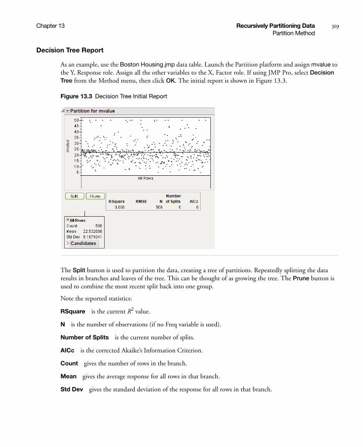
Chapter 13 Recursively Partitioning Data 319Partition Method
Decision Tree Report
As an example, use the Boston Housing.jmp data table. Launch the Partition platform and assign mvalue to the Y, Response role. Assign all the other variables to the X, Factor role. If using JMP Pro, select Decision Tree from the Method menu, then click OK. The initial report is shown in Figure 13.3.
Figure 13.3 Decision Tree Initial Report
The Split button is used to partition the data, creating a tree of partitions. Repeatedly splitting the data results in branches and leaves of the tree. This can be thought of as growing the tree. The Prune button is used to combine the most recent split back into one group.
Note the reported statistics:
RSquare is the current R2 value.
N is the number of observations (if no Freq variable is used).
Number of Splits is the current number of splits.
AICc is the corrected Akaike’s Information Criterion.
Count gives the number of rows in the branch.
Mean gives the average response for all rows in that branch.
Std Dev gives the standard deviation of the response for all rows in that branch.

320 Recursively Partitioning Data Chapter 13Partition Method
Initially, all rows are in one branch. In order to determine the first split, each X column must be considered. The candidate columns are shown in the Candidates report. As shown in Figure 13.4, the rooms column has the largest LogWorth, and is therefore the optimum split to make. See “Statistical Details” on page 348 for more information about LogWorth.
Figure 13.4 Candidates Columns
The optimum split is noted by an asterisk. However, there are cases where the SS is higher for one variable, but the Logworth is higher for a different variable. In this case > and < are used to point in the best direction for each variable. The asterisk corresponds to the condition where they agree. See “Statistical Details” on page 348 for more information about LogWorth and SS.
Click the Split button and notice the first split was made on the column rooms, at a value of 6.943. Open the two new candidate reports. See Figure 13.5.

Chapter 13 Recursively Partitioning Data 321Partition Method
Figure 13.5 First Split
The original 506 observations are now split into two parts:
• A left leaf, corresponding to rooms < 6.943, has 430 observations.
• A right leaf, corresponding to rooms ≥ 6.943, has 76 observations.
For the left leaf, the next split would happen on the column lstat, which has a SS of 7,311.85. For the right leaf, the next split would happen on the column rooms, which has a SS of 3,060.95. Since the SS for the left leaf is higher, using the Split button again will produce a split on the left leaf, on the column lstat.
Click the Split button to make the next split. See Figure 13.6.
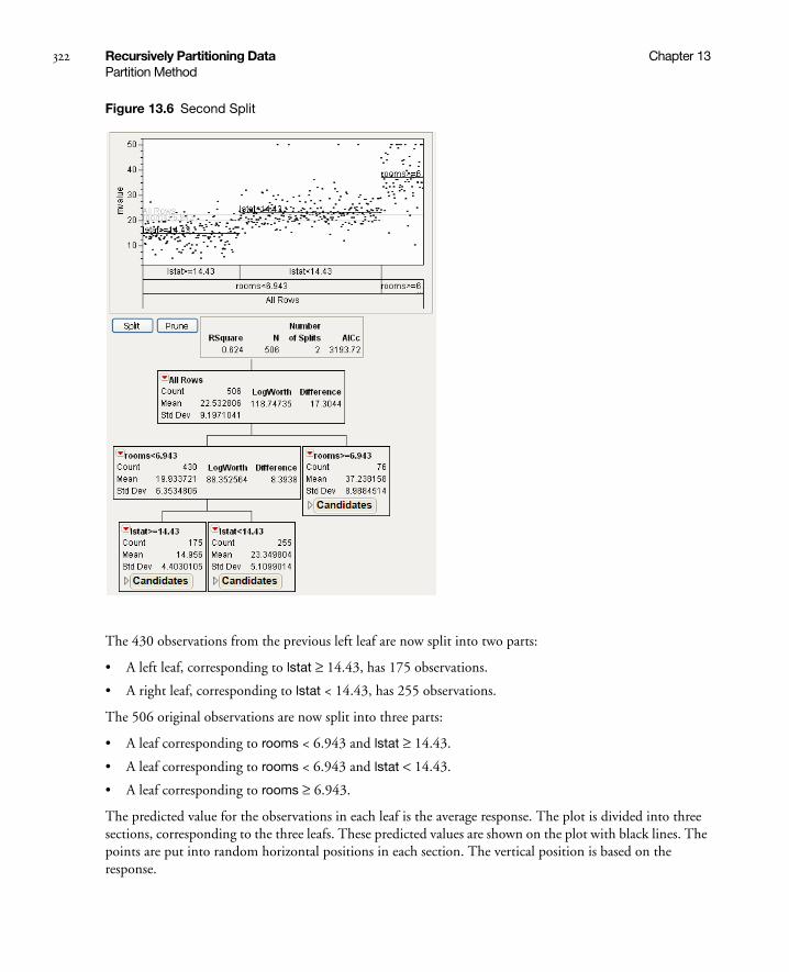
322 Recursively Partitioning Data Chapter 13Partition Method
Figure 13.6 Second Split
The 430 observations from the previous left leaf are now split into two parts:
• A left leaf, corresponding to lstat ≥ 14.43, has 175 observations.
• A right leaf, corresponding to lstat < 14.43, has 255 observations.
The 506 original observations are now split into three parts:
• A leaf corresponding to rooms < 6.943 and lstat ≥ 14.43.
• A leaf corresponding to rooms < 6.943 and lstat < 14.43.
• A leaf corresponding to rooms ≥ 6.943.
The predicted value for the observations in each leaf is the average response. The plot is divided into three sections, corresponding to the three leafs. These predicted values are shown on the plot with black lines. The points are put into random horizontal positions in each section. The vertical position is based on the response.

Chapter 13 Recursively Partitioning Data 323Partition Method
Stopping Rules
If validation is not used, the platform is purely interactive. Keep pushing the Split button until the result is satisfactory. Without cross-validation enabled, Partition is an exploratory platform intended to help you investigate relationships interactively.
When cross-validation is used, the user has the option to perform automatic splitting. This allows for repeated splitting without having to repeatedly click the Split button. See “Automatic Splitting” on page 328 for details on the stopping rule.
Categorical Responses
When the response is categorical, the report differs in several ways (see Figure 13.7). The differences are described here, using the Car Poll.jmp data table:
• The G2 statistic is given instead of the Mean and Std Dev at the top of each leaf, and instead of SS in the Candidates report. See “Statistical Details” on page 348 for more information about G2.
• The Rate statistic gives the proportion of observations in the leaf that are in each response level. The colored bars represent those proportions.
• The Prob statistic is the predicted value (a probability) for each response level. The Y axis of the plot is divided into sections corresponding to the predicted probabilities of the response levels for each leaf. The predicted probabilities always sum to one across the response levels. Random jitter is added to points in the X and Y direction in a leaf. See “Statistical Details” on page 348 for more information about the Prob statistic.
• For the plot, the vertical position is random.
• The Color Points button appears. This colors the points on the plot according to the response levels.
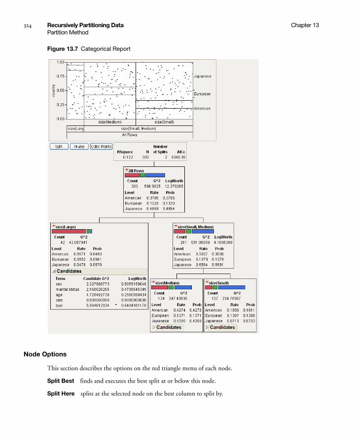
324 Recursively Partitioning Data Chapter 13Partition Method
Figure 13.7 Categorical Report
Node Options
This section describes the options on the red triangle menu of each node.
Split Best finds and executes the best split at or below this node.
Split Here splits at the selected node on the best column to split by.
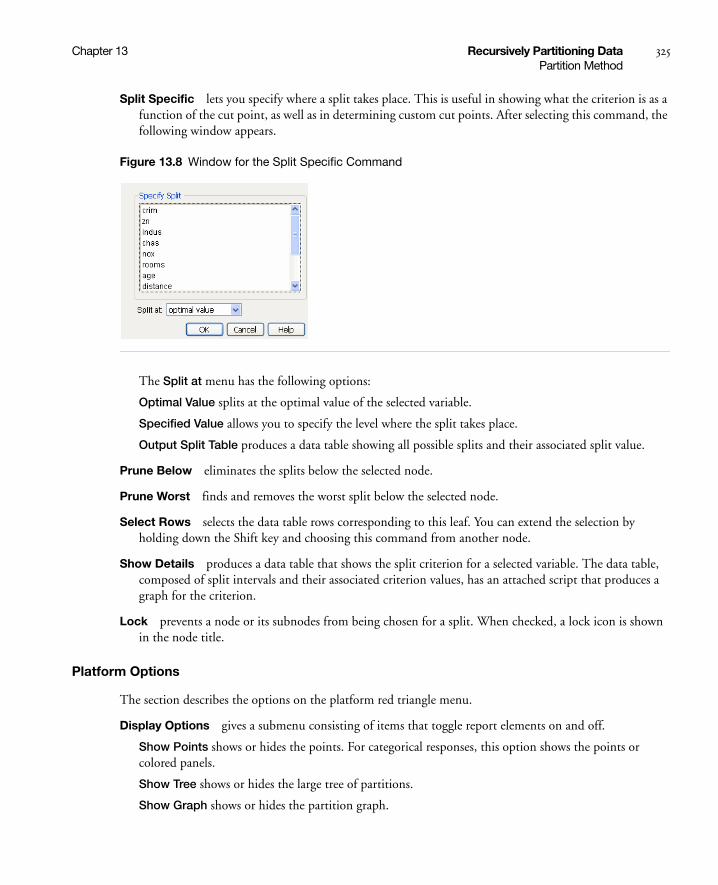
Chapter 13 Recursively Partitioning Data 325Partition Method
Split Specific lets you specify where a split takes place. This is useful in showing what the criterion is as a function of the cut point, as well as in determining custom cut points. After selecting this command, the following window appears.
Figure 13.8 Window for the Split Specific Command
The Split at menu has the following options:
Optimal Value splits at the optimal value of the selected variable.
Specified Value allows you to specify the level where the split takes place.
Output Split Table produces a data table showing all possible splits and their associated split value.
Prune Below eliminates the splits below the selected node.
Prune Worst finds and removes the worst split below the selected node.
Select Rows selects the data table rows corresponding to this leaf. You can extend the selection by holding down the Shift key and choosing this command from another node.
Show Details produces a data table that shows the split criterion for a selected variable. The data table, composed of split intervals and their associated criterion values, has an attached script that produces a graph for the criterion.
Lock prevents a node or its subnodes from being chosen for a split. When checked, a lock icon is shown in the node title.
Platform Options
The section describes the options on the platform red triangle menu.
Display Options gives a submenu consisting of items that toggle report elements on and off.
Show Points shows or hides the points. For categorical responses, this option shows the points or colored panels.
Show Tree shows or hides the large tree of partitions.
Show Graph shows or hides the partition graph.

326 Recursively Partitioning Data Chapter 13Partition Method
Show Split Bar shows or hides the colored bars showing the split proportions in each leaf. This is for categorical responses only.
Show Split Stats shows or hides the split statistics. See “Statistical Details” on page 348 for more information on the categorical split statistic G2.
Show Split Prob shows or hides the Rate and Prob statistics. This is for categorical responses only.
JMP automatically shows the Rate and Prob statistics when you select Show Split Count. See “Statistical Details” on page 348 for more information on Rate and Prob.
Show Split Count shows or hides each frequency level for all nodes in the tree. This is for categorical responses only.
When you select this option, JMP automatically selects Show Split Prob. And when you deselect Show Split Prob, the counts do not appear.
Show Split Candidates shows or hides the Candidates report.
Sort Split Candidates sorts the candidates report by the statistic or the log(worth), whichever is appropriate. This option can be turned on and off. When off, it doesn’t change any reports, but new candidate reports are sorted in the order the X terms are specified, rather than by a statistic.
Split Best splits the tree at the optimal split point. This is the same action as the Split button.
Prune Worst removes the terminal split that has the least discrimination ability. This is equivalent to hitting the Prune Button.
Minimum Size Split presents a dialog box where you enter a number or a fractional portion of the total sample size which becomes the minimum size split allowed. The default is 5. To specify a fraction of the sample size, enter a value less than 1. To specify an actual number, enter a value greater than or equal to 1.
Lock Columns reveals a check box table to allow you to interactively lock columns so that they are not considered for splitting. You can toggle the display without affecting the individual locks.
Plot Actual by Predicted produces a plot of actual values by predicted values. This is for continuous responses only.
Small Tree View displays a smaller version of the partition tree to the right of the scatterplot.
Tree 3D Shows or hides a 3D plot of the tree structure. To access this option, hold down the Shift key and click the red-triangle menu.
Leaf Report gives the mean and count or rates for the bottom-level leaves of the report.
Column Contributions brings up a report showing how each input column contributed to the fit, including how many times it was split and the total G2 or Sum of Squares attributed to that column.
Split History shows a plot of R2 vs. the number of splits. If you use validation, separate curves are drawn for training and validation R2.

Chapter 13 Recursively Partitioning Data 327Partition Method
K Fold Crossvalidation shows a Crossvalidation report, giving fit statistics for both the training and folded sets. For more information on validation, see “Validation” on page 335.
ROC Curve is described in the section “ROC Curve” on page 337. This is for categorical responses only.
Lift Curve is described in the section “Lift Curves” on page 339. This is for categorical responses only.
Show Fit Details shows several measures of fit and a confusion matrix. The confusion matrix is a two-way classification of actual and predicted response. This is for categorical responses only.
Entropy RSquare compares the log-likelihoods from the fitted model and the constant probability model.
Generalized RSquare is a generalization of the Rsquare measure that simplifies to the regular Rsquare for continuous normal responses. It is similar to the Entropy RSquare, but instead of using the log-likelihood, it uses the 2/n root of the likelihood. It is scaled to have a maximum of 1. The value is 1 for a perfect model, and 0 for a model no better than a constant model.
Mean -Log p is the average of -log(p), where p is the fitted probability associated with the event that occurred.
RMSE is the root mean square error, where the differences are between the response and p (the fitted probability for the event that actually occurred).
Mean Abs Dev is the average of the absolute values of the differences between the response and p (the fitted probability for the event that actually occurred).
Misclassification Rate is the rate for which the response category with the highest fitted probability is not the observed category.
For Entropy RSquare and Generalized RSquare, values closer to 1 indicate a better fit. For Mean -Log p, RMSE, Mean Abs Dev, and Misclassification Rate, smaller values indicate a better fit.
Save Columns is a submenu for saving model and tree results, and creating SAS code.
Save Residuals saves the residual values from the model to the data table.
Save Predicteds saves the predicted values from the model to the data table.
Save Leaf Numbers saves the leaf numbers of the tree to a column in the data table.
Save Leaf Labels saves leaf labels of the tree to the data table. The labels document each branch that the row would trace along the tree, with each branch separated by “&”. An example label could be “size(Small,Medium)&size(Small)”. However, JMP does not include redundant information in the form of category labels that are repeated. When a category label for a leaf references an inclusive list of categories in a higher tree node, JMP places a caret (‘^”) where the tree node with redundant labels occurs. Therefore, “size(Small,Medium)&size(Small)” is presented as ^&size(Small).
Save Prediction Formula saves the prediction formula to a column in the data table. The formula is made up of nested conditional clauses that describe the tree structure. The column includes a Response Probability property.
Save Tolerant Prediction Formula saves a formula that predicts even when there are missing values. The column includes a Response Probability property.
Save Leaf Number Formula saves a column containing a formula in the data table that computes the leaf number.

328 Recursively Partitioning Data Chapter 13Partition Method
Save Leaf Label Formula saves a column containing a formula in the data table that computes the leaf label.
Make SAS DATA Step creates SAS code for scoring a new data set.
Make Tolerant SAS DATA Step creates SAS code that can score a data set with missing values.
Color Points colors the points based on their response level. This is for categorical responses only, and does the same thing as the Color Points button (see “Categorical Responses” on page 323).
Script contains options that are available to all platforms. See Using JMP.
Note: JMP 8 had a Partition Preference, and a Partition platform option, called Missing Value Rule. These have both been removed for JMP 9. The new method for handling missing values is described in “Missing Values” on page 340.
Automatic Splitting
The Go button (shown in Figure 13.9) appears when you have validation enabled. For more information on using validation, see “Validation” on page 335.
The Go button provides for repeated splitting without having to repeatedly click the Split button. When you click the Go button, the platform performs repeated splitting until the validation R-Square is better than what the next 10 splits would obtain. This rule may produce complex trees that are not very interpretable, but have good predictive power.
Using the Go button turns on the Split History command. If using the Go button results in a tree with more than 40 nodes, the Show Tree command is turned off.
Figure 13.9 The Go Button
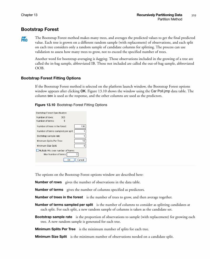
Chapter 13 Recursively Partitioning Data 329Partition Method
Bootstrap Forest
The Bootstrap Forest method makes many trees, and averages the predicted values to get the final predicted value. Each tree is grown on a different random sample (with replacement) of observations, and each split on each tree considers only a random sample of candidate columns for splitting. The process can use validation to assess how many trees to grow, not to exceed the specified number of trees.
Another word for bootstrap-averaging is bagging. Those observations included in the growing of a tree are called the in-bag sample, abbreviated IB. Those not included are called the out-of-bag sample, abbreviated OOB.
Bootstrap Forest Fitting Options
If the Bootstrap Forest method is selected on the platform launch window, the Bootstrap Forest options window appears after clicking OK. Figure 13.10 shows the window using the Car Poll.jmp data table. The column sex is used as the response, and the other columns are used as the predictors.
Figure 13.10 Bootstrap Forest Fitting Options
The options on the Bootstrap Forest options window are described here:
Number of rows gives the number of observations in the data table.
Number of terms gives the number of columns specified as predictors.
Number of trees in the forest is the number of trees to grow, and then average together.
Number of terms sampled per split is the number of columns to consider as splitting candidates at each split. For each split, a new random sample of columns is taken as the candidate set.
Bootstrap sample rate is the proportion of observations to sample (with replacement) for growing each tree. A new random sample is generated for each tree.
Minimum Splits Per Tree is the minimum number of splits for each tree.
Minimum Size Split is the minimum number of observations needed on a candidate split.
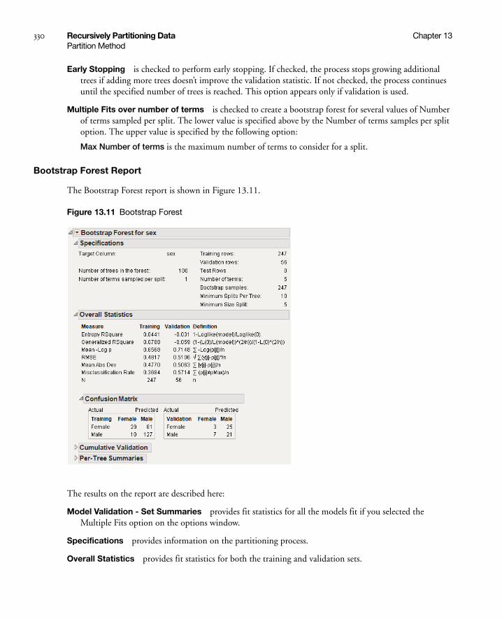
330 Recursively Partitioning Data Chapter 13Partition Method
Early Stopping is checked to perform early stopping. If checked, the process stops growing additional trees if adding more trees doesn’t improve the validation statistic. If not checked, the process continues until the specified number of trees is reached. This option appears only if validation is used.
Multiple Fits over number of terms is checked to create a bootstrap forest for several values of Number of terms sampled per split. The lower value is specified above by the Number of terms samples per split option. The upper value is specified by the following option:
Max Number of terms is the maximum number of terms to consider for a split.
Bootstrap Forest Report
The Bootstrap Forest report is shown in Figure 13.11.
Figure 13.11 Bootstrap Forest
The results on the report are described here:
Model Validation - Set Summaries provides fit statistics for all the models fit if you selected the Multiple Fits option on the options window.
Specifications provides information on the partitioning process.
Overall Statistics provides fit statistics for both the training and validation sets.
Chapter 13 Recursively Partitioning Data 331Partition Method
Confusion Matrix provides two-way classifications of actual and predicted response levels for both the training and validation sets. This is available only with categorical responses.
Cumulative Validation provides a plot of the fit statistics versus the number of trees. The Cumulative Details report below the plot is a tabulation of the data on the plot. This is only available when validation is used.
Per-Tree Summaries gives summary statistics for each tree.
Bootstrap Forest Platform Options
The Bootstrap Forest report red-triangle menu has the following options:
Show Trees is a submenu for displaying the Tree Views report. The report produces a picture of each component tree.
None does not display the Tree Views Report.
Show names displays the trees labeled with the splitting columns.
Show names categories displays the trees labeled with the splitting columns and splitting values.
Show names categories estimates displays the trees labeled with the splitting columns, splitting values, and summary statistics for each node.
Plot Actual by Predicted provides a plot of actual versus predicted values. This is only for continuous responses.
Column Contributions brings up a report showing how each input column contributed to the fit, including how many times it was split and the total G2 or Sum of Squares attributed to that column.
ROC Curve is described in the section “ROC Curve” on page 337. This is for categorical responses only.
Lift Curve is described in the section “Lift Curves” on page 339. This is for categorical responses only.
Save Columns is a submenu for saving model and tree results, and creating SAS code.
Save Predicteds saves the predicted values from the model to the data table.
Save Prediction Formula saves the prediction formula to a column in the data table.
Save Tolerant Prediction Formula saves a formula that predicts even when there are missing values.
Save Residuals saves the residuals to the data table. This is for continuous responses only.
Save Cumulative Details creates a data table containing the fit statistics for each tree.
Make SAS DATA Step creates SAS code for scoring a new data set.
Make Tolerant SAS DATA Step creates SAS code that can score a data set with missing values.
Script contains options that are available to all platforms. See Using JMP.
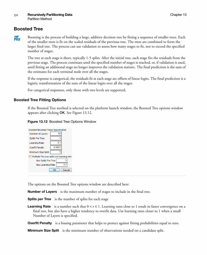
332 Recursively Partitioning Data Chapter 13Partition Method
Boosted Tree
Boosting is the process of building a large, additive decision tree by fitting a sequence of smaller trees. Each of the smaller trees is fit on the scaled residuals of the previous tree. The trees are combined to form the larger final tree. The process can use validation to assess how many stages to fit, not to exceed the specified number of stages.
The tree at each stage is short, typically 1-5 splits. After the initial tree, each stage fits the residuals from the previous stage. The process continues until the specified number of stages is reached, or, if validation is used, until fitting an additional stage no longer improves the validation statistic. The final prediction is the sum of the estimates for each terminal node over all the stages.
If the response is categorical, the residuals fit at each stage are offsets of linear logits. The final prediction is a logistic transformation of the sum of the linear logits over all the stages.
For categorical responses, only those with two levels are supported.
Boosted Tree Fitting Options
If the Boosted Tree method is selected on the platform launch window, the Boosted Tree options window appears after clicking OK. See Figure 13.12.
Figure 13.12 Boosted Tree Options Window
The options on the Boosted Tree options window are described here:
Number of Layers is the maximum number of stages to include in the final tree.
Splits per Tree is the number of splits for each stage
Learning Rate is a number such that 0 < r ≤ 1. Learning rates close to 1 result in faster convergence on a final tree, but also have a higher tendency to overfit data. Use learning rates closer to 1 when a small Number of Layers is specified.
Overfit Penalty is a biasing parameter that helps to protect against fitting probabilities equal to zero.
Minimum Size Split is the minimum number of observations needed on a candidate split.

Chapter 13 Recursively Partitioning Data 333Partition Method
Early Stopping is checked to perform early stopping. If checked, the boosting process stops fitting additional stages if adding more stages doesn’t improve the validation statistic. If not checked, the boosting process continues until the specified number of stages is reached. This option is available only if validation is used.
Multiple Fits over splits and learning rate is checked to create a boosted tree for every combination of Splits per Tree and Learning Rate. The lower ends of the combinations are specified by the Splits per Tree and Learning Rate options. The upper ends of the combinations are specified by the following options:
Max Splits Per Tree is the upper end for Splits per Tree.
Max Learning Rate is the upper end for Learning Rate.
Boosted Tree Report
The Boosted Tree report is shown in Figure 13.13.
Figure 13.13 Boosted Tree Report
The results on the report are described here:
Model Validation - Set Summaries provides fit statistics for all the models fit if you selected the Multiple Splits option on the options window.
Specifications provides information on the partitioning process.
Overall Statistics provides fit statistics for both the training and validation sets.

334 Recursively Partitioning Data Chapter 13Partition Method
Confusion Matrix provides confusion statistics for both the training and validation sets. This is available only with categorical responses.
Cumulative Validation provides a plot of the fit statistics versus the number of stages. The Cumulative Details report below the plot is a tabulation of the data on the plot. This is only available when validation is used.
Boosted Tree Platform Options
The Boosted Tree report red-triangle menu has the following options:
Show Trees is a submenu for displaying the Tree Views report. The report produces a picture of the tree at each stage of the boosting process.
None does not display the Tree Views Report.
Show names displays the trees labeled with the splitting columns.
Show names categories displays the trees labeled with the splitting columns and splitting values.
Show names categories estimates displays the trees labeled with the splitting columns, splitting values, and summary statistics for each node.
Plot Actual by Predicted provides a plot of actual versus predicted values. This is only for continuous responses.
Column Contributions brings up a report showing how each input column contributed to the fit, including how many times it was split and the total G2 or Sum of Squares attributed to that column.
ROC Curve is described in the section “ROC Curve” on page 337. This is for categorical responses only.
Lift Curve is described in the section “Lift Curves” on page 339. This is for categorical responses only.
Save Columns is a submenu for saving model and tree results, and creating SAS code.
Save Predicteds saves the predicted values from the model to the data table.
Save Prediction Formula saves the prediction formula to a column in the data table.
Save Tolerant Prediction Formula saves the prediction formula to a column in the data. This formula can predict even with missing values.
Save Residuals saves the residuals to the data table. This is for continuous responses only.
Save Offset Estimates saves the offsets from the linear logits. This is for categorical responses only.
Save Tree Details creates a data table containing split details and estimates for each stage.
Save Cumulative Details creates a data table containing the fit statistics for each stage.
Make SAS DATA Step creates SAS code for scoring a new data set.
Make Tolerant SAS DATA Step creates SAS code that can score a data set with missing values.
Script contains options that are available to all platforms. See Using JMP.

Chapter 13 Recursively Partitioning Data 335Validation
Validation
If you grow a tree with enough splits, partitioning can overfit data. When this happens, the model predicts the fitted data very well, but predicts future observations poorly. Validation is the process of using part of a data set to estimate model parameters, and using the other part to assess the predictive ability of the model.
• The training set is the part that estimates model parameters.
• The validation set is the part that assesses or validates the predictive ability of the model.
• The test set is a final, independent assessment of the model’s predictive ability. The test set is available only when using a validation column (see Table 13.1).
The training, validation, and test sets are created by subsetting the original data into parts. Table 13.2 describes several methods for subsetting a data set.
Table 13.2 Validation Methods
Excluded Rows Uses row states to subset the data. Rows that are unexcluded are used as the training set, and excluded rows are used as the validation set.
For more information about using row states and how to exclude rows, see Using JMP.
Holdback Randomly divides the original data into the training and validation data sets. The Validation Portion (see Table 13.1) on the platform launch window is used to specify the proportion of the original data to use as the validation data set (holdback).
KFold Divides the original data into K subsets. In turn, each of the K sets is used to validate the model fit on the rest of the data, fitting a total of K models. The model giving the best validation statistic is chosen as the final model.
KFold validation can be used only with the Decision Tree method. To use KFold, select K Fold Crossvalidation from the platform red-triangle menu, see “Platform Options” on page 325.
This method is best for small data sets, because is makes efficient use of limited amounts of data.

336 Recursively Partitioning Data Chapter 13Graphs for Goodness of Fit
Graphs for Goodness of Fit
The graph for goodness of fit depends on which type of response you use. The Actual by Predicted plot is for continuous responses, and the ROC Curve and Lift Curve are for categorical responses.
Actual by Predicted Plot
For continuous responses, the Actual by Predicted plot shows how well the model fits the data. Each leaf is predicted with its mean, so the x-coordinates are these means. The actual values form a scatter of points around each leaf mean. A diagonal line represents the locus of where predicted and actual values are the same. For a perfect fit, all the points would be on this diagonal.
Validation Column Uses a column’s values to divide the data into parts. The column is assigned using the Validation role on the Partition launch window. See Table 13.1.
The column’s values determine how the data is split, and what method is used for validation:
• If the column’s values are 0, 1and 2, then:
– Rows with 0 are assigned to the Training set
– Rows with 1 are assigned to the Validation set
– Rows with 2 are assigned to the Test set
• If the column’s values are 0 and 1, then only Training and Validation sets are used.
Table 13.2 Validation Methods (Continued)
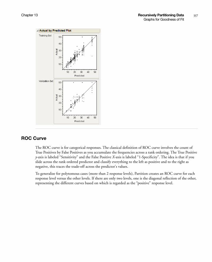
Chapter 13 Recursively Partitioning Data 337Graphs for Goodness of Fit
ROC Curve
The ROC curve is for categorical responses. The classical definition of ROC curve involves the count of True Positives by False Positives as you accumulate the frequencies across a rank ordering. The True Positive y-axis is labeled “Sensitivity” and the False Positive X-axis is labeled “1-Specificity”. The idea is that if you slide across the rank ordered predictor and classify everything to the left as positive and to the right as negative, this traces the trade-off across the predictor's values.
To generalize for polytomous cases (more than 2 response levels), Partition creates an ROC curve for each response level versus the other levels. If there are only two levels, one is the diagonal reflection of the other, representing the different curves based on which is regarded as the “positive” response level.
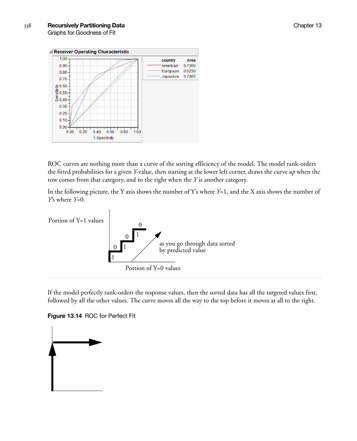
338 Recursively Partitioning Data Chapter 13Graphs for Goodness of Fit
ROC curves are nothing more than a curve of the sorting efficiency of the model. The model rank-orders the fitted probabilities for a given Y-value, then starting at the lower left corner, draws the curve up when the row comes from that category, and to the right when the Y is another category.
In the following picture, the Y axis shows the number of Y’s where Y=1, and the X axis shows the number of Y’s where Y=0.
If the model perfectly rank-orders the response values, then the sorted data has all the targeted values first, followed by all the other values. The curve moves all the way to the top before it moves at all to the right.
Figure 13.14 ROC for Perfect Fit
0
0
0
1
1
1
Portion of Y=1 values
Portion of Y=0 values
as you go through data sortedby predicted value

Chapter 13 Recursively Partitioning Data 339Graphs for Goodness of Fit
If the model does not predict well, it wanders more or less diagonally from the bottom left to top right.
In practice, the curve lifts off the diagonal. The area under the curve is the indicator of the goodness of fit, with 1 being a perfect fit.
If a partition contains a section that is all or almost all one response level, then the curve lifts almost vertically at the left for a while. This means that a sample is almost completely sensitive to detecting that level. If a partition contains none or almost none of a response level, the curve at the top will cross almost horizontally for a while. This means that there is a sample that is almost completely specific to not having that response level.
Because partitions contain clumps of rows with the same (i.e. tied) predicted rates, the curve actually goes slanted, rather than purely up or down.
For polytomous cases, you get to see which response categories lift off the diagonal the most. In the CarPoll example above, the European cars are being identified much less than the other two categories. The American's start out with the most sensitive response (Size(Large)) and the Japanese with the most negative specific (Size(Large)'s small share for Japanese).
Lift Curves
A lift curve shows the same information as an ROC curve, but in a way to dramatize the richness of the ordering at the beginning. The Y-axis shows the ratio of how rich that portion of the population is in the chosen response level compared to the rate of that response level as a whole. For example, if the top-rated 10% of fitted probabilities have a 25% richness of the chosen response compared with 5% richness over the whole population, the lift curve would go through the X-coordinate of 0.10 at a Y-coordinate of 25% / 5%, or 5. All lift curves reach (1,1) at the right, as the population as a whole has the general response rate.
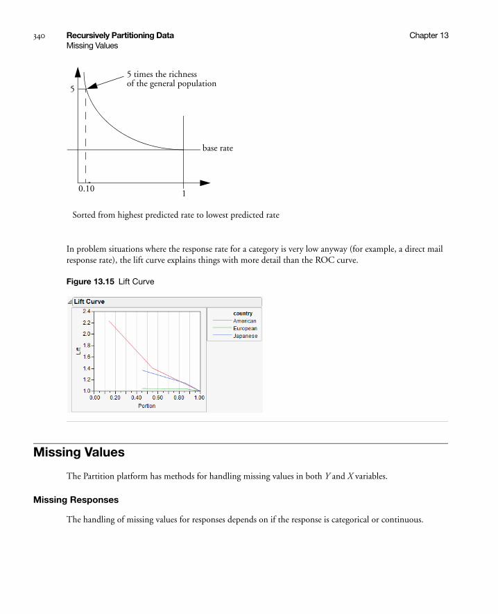
340 Recursively Partitioning Data Chapter 13Missing Values
In problem situations where the response rate for a category is very low anyway (for example, a direct mail response rate), the lift curve explains things with more detail than the ROC curve.
Figure 13.15 Lift Curve
Missing Values
The Partition platform has methods for handling missing values in both Y and X variables.
Missing Responses
The handling of missing values for responses depends on if the response is categorical or continuous.
0.10
5
1
5 times the richnessof the general population
base rate
Sorted from highest predicted rate to lowest predicted rate

Chapter 13 Recursively Partitioning Data 341Example
Categorical
If the Missing Value Categories checkbox (see Figure 13.2) is not selected, missing rows are not included in the analysis. If the Missing Value Categories checkbox is selected, the missing rows are entered into the analysis as another level of the variable.
Continuous
Rows with missing values are not included in the analysis.
Missing Predictors
The handling of missing values for predictors depends on if it is categorical or continuous.
Categorical
If the variable is used as a splitting variable, and if the Missing Value Categories checkbox (see Figure 13.2) is not selected, then each missing row gets randomly assigned to one of the two sides of the split. When this happens using the Decision Tree method, the Imputes message appears showing how many times this has happened. See Figure 13.16.
If the Missing Value Categories checkbox is selected, the missing rows are entered into the analysis as another level of the variable.
Continuous
If the variable is used as a splitting variable, then each missing row gets randomly assigned to one of the two sides of the split. When this happens using the Decision Tree method, the Imputes message appears showing how many times this has happened. See Figure 13.16.
Figure 13.16 Impute Message
Example
The examples in this section use the Boston Housing.jmp data table. Suppose you are interested in creating a model to predict the median home value as a function of several demographic characteristics.
The Partition platform can be used to quickly assess if there is any relationship between the response and the potential predictor variables. Build a tree using all three partitioning methods, and compare the results.
Ten observations were missing and randomly assigned to a split

342 Recursively Partitioning Data Chapter 13Example
Note: Results will vary because the Validation Portion option chooses rows at random to use as the training and validation sets.
Decision Tree
Follow the steps below to grow a tree using the Decision Tree method:
1. Select Analyze > Modeling > Partition.
2. Assign mvalue to the Y, Response role.
3. Assign the other variables (crim through lstat) to the X, Factor role.
4. Select the Decision Tree option from the Method menu. If using JMP, the Decision Tree option is the method that gets used.
5. Enter 0.2 for the Validation Portion.
6. Click OK.
7. On the platform report window, click Go to perform automatic splitting.
8. Select Plot Actual by Predicted from the platform red-triangle menu.
A portion of the report is shown in Figure 13.17.

Chapter 13 Recursively Partitioning Data 343Example
Figure 13.17 Decision Tree Results
Bootstrap Forest
Follow the steps below to grow a tree using the Bootstrap Forest method:
1. Select Analyze > Modeling > Partition.
2. Assign mvalue to the Y, Response role.
3. Assign the other variables (crim through lstat) to the X, Factor role.
4. Select Bootstrap Forest from the Method menu.
5. Enter 0.2 for the Validation Portion.
6. Click OK.
7. Check the Early Stopping option on the Bootstrap Forest options window.

344 Recursively Partitioning Data Chapter 13Example
8. Click OK.
9. Select Plot Actual by Predicted from the red-triangle menu.
The report is shown in Figure 13.18.
Figure 13.18 Bootstrap Forest Report

Chapter 13 Recursively Partitioning Data 345Example
Boosted Tree
Follow the steps below to grow a tree using the Boosted Tree method:
1. Select Analyze > Modeling > Partition.
2. Assign mvalue to the Y, Response role.
3. Assign the other variables (crim through lstat) to the X, Factor role.
4. Select Boosted Tree from the Method menu.
5. Enter 0.2 for the Validation Portion.
6. Click OK.
7. Check the Early Stopping option on the Boosted Tree options window.
8. Click OK.
9. Select Plot Actual by Predicted on the red-triangle menu.
The report is shown in Figure 13.19.
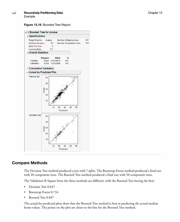
346 Recursively Partitioning Data Chapter 13Example
Figure 13.19 Boosted Tree Report
Compare Methods
The Decision Tree method produced a tree with 7 splits. The Bootstrap Forest method produced a final tree with 20 component trees. The Boosted Tree method produced a final tree with 50 component trees.
The Validation R-Square from the three methods are different, with the Boosted Tree having the best:
• Decision Tree 0.647
• Bootstrap Forest 0.716
• Boosted Tree 0.847
The actual-by-predicted plots show that the Boosted Tree method is best at predicting the actual median home values. The points on the plot are closer to the line for the Boosted Tree method.
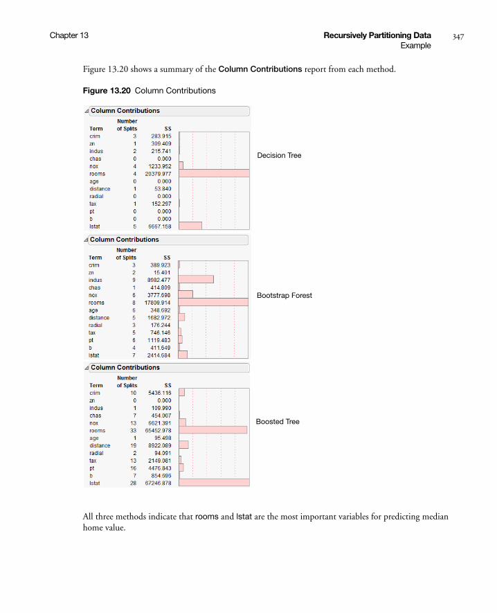
Chapter 13 Recursively Partitioning Data 347Example
Figure 13.20 shows a summary of the Column Contributions report from each method.
Figure 13.20 Column Contributions
All three methods indicate that rooms and lstat are the most important variables for predicting median home value.
Decision Tree
Boosted Tree
Bootstrap Forest

348 Recursively Partitioning Data Chapter 13Statistical Details
Statistical Details
This section provides some quantitative details and other information.
General
The response can be either continuous, or categorical (nominal or ordinal). If Y is categorical, then it is fitting the probabilities estimated for the response levels, minimizing the residual log-likelihood chi-square [2*entropy]. If the response is continuous, then the platform fits means, minimizing the sum of squared errors.
The factors can be either continuous, or categorical (nominal or ordinal). If an X is continuous, then the partition is done according to a splitting “cut” value for X. If X is categorical, then it divides the X categories into two groups of levels and considers all possible groupings into two levels.
Splitting Criterion
Node spliting is based on the LogWorth statistic, which is reported in node Candidate reports. LogWorth is calculated as:
-log10(p-value)
where the adjusted p-value is calculated in a complex manner that takes into account the number of different ways splits can occur. This calculation is very fair compared to the unadjusted p-value, which favors X’s with many levels, and the Bonferroni p-value, which favors X’s with small numbers of levels. Details on the method are discussed in a white paper “Monte Carlo Calibration of Distributions of Partition Statistics” found on the JMP website www.jmp.com.
For continuous responses, the Sum of Squares (SS) is reported in node reports. This is the change in the error sum-of-squares due to the split.
A candidate SS that has been chosen is
SStest = SSparent - (SSright + SSleft) where SS in a node is just s2(n - 1).
Also reported for continuous responses is the Difference statistic. This is the difference between the predicted values for the two child nodes of a parent node.
For categorical responses, the G2 (likelihood-ratio chi-square) is shown in the report. This is actually twice the [natural log] entropy or twice the change in the entropy. Entropy is Σ -log(p) for each observation, where p is the probability attributed to the response that occurred.
A candidate G2 that has been chosen is
G2 test = G2 parent - (G2 left + G2 right).
Partition actually has two rates; one used for training that is the usual ration of count to total, and another that is slightly biased away from zero. By never having attributed probabilities of zero, this allows logs of probabilities to be calculated on validation or excluded sets of data, used in Entropy RSquares.

Chapter 13 Recursively Partitioning Data 349Statistical Details
Predicted Probabilities in Decision Tree and Bootstrap Forest
The predicted probabilities for the Decision Tree and Bootstrap Forest methods are calculated as described below by the Prob statistic.
For categorical responses in Decision Tree, the Show Split Prob command shows the following statistics:
Rate is the proportion of observations at the node for each response level.
Prob is the predicted probability for that node of the tree. The method for calculating Prob for the ith response level at a given node is as follows:
Probi =
where the summation is across all response levels, ni is the number of observations at the node for the ith response level, and priori is the prior probability for the ith response level, calculated as
priori = λpi+ (1-λ)Pi
where pi is the priori from the parent node, Pi is the Probi from the parent node, and λ is a weighting factor currently set at 0.9.
The estimate, Prob, is the same that would be obtained for a Bayesian estimate of a multinomial probability parameter with a conjugate Dirichlet prior.
The method for calculating Prob assures that the predicted probabilities are always non-zero.
ni priori+
ni priori+( )-----------------------------------

350 Recursively Partitioning Data Chapter 13Statistical Details

Chapter 14Performing Time Series Analysis
Using the Time Series Platform
The Time Series platform lets you explore, analyze, and forecast univariate time series. A time series is a set y1, y2, ... ,yN of observations taken over a series of equally-spaced time periods. The analysis begins with a plot of the points in the time series. In addition, the platform displays graphs of the autocorrelations and partial autocorrelations of the series. These indicate how and to what degree each point in the series is correlated with earlier values in the series. You can interactively add:
Variograms a characterization of process disturbances
AR coefficients autoregressive coefficients
Spectral Density Plots versus period and frequency, with white noise tests.
These graphs can be used to identify the type of model appropriate for describing and predicting (forecasting) the evolution of the time series. The model types include:
ARIMA autoregressive integrated moving-average, often called Box-Jenkins models
Seasonal ARIMA ARIMA models with a seasonal component
Smoothing Models several forms of exponential smoothing and Winter’s method
Transfer Function Models for modeling with input series.
Contents
Launch the Platform . . . . . . . . . . . . . . . . . . . . . . . . . . . . . . . . . . . . . . . . . . . . . . . . . . . . . . . . . . . . . . . . 353
Time Series Commands. . . . . . . . . . . . . . . . . . . . . . . . . . . . . . . . . . . . . . . . . . . . . . . . . . . . . . . . . . . . . . 355
Graph . . . . . . . . . . . . . . . . . . . . . . . . . . . . . . . . . . . . . . . . . . . . . . . . . . . . . . . . . . . . . . . . . . . . . . . . 355
Autocorrelation . . . . . . . . . . . . . . . . . . . . . . . . . . . . . . . . . . . . . . . . . . . . . . . . . . . . . . . . . . . . . . . . . 355
Partial Autocorrelation. . . . . . . . . . . . . . . . . . . . . . . . . . . . . . . . . . . . . . . . . . . . . . . . . . . . . . . . . . . . 356
Variogram . . . . . . . . . . . . . . . . . . . . . . . . . . . . . . . . . . . . . . . . . . . . . . . . . . . . . . . . . . . . . . . . . . . . . 356
AR Coefficients . . . . . . . . . . . . . . . . . . . . . . . . . . . . . . . . . . . . . . . . . . . . . . . . . . . . . . . . . . . . . . . . . 357
Spectral Density . . . . . . . . . . . . . . . . . . . . . . . . . . . . . . . . . . . . . . . . . . . . . . . . . . . . . . . . . . . . . . . . 357
Save Spectral Density. . . . . . . . . . . . . . . . . . . . . . . . . . . . . . . . . . . . . . . . . . . . . . . . . . . . . . . . . . . . . 358
Number of Forecast Periods. . . . . . . . . . . . . . . . . . . . . . . . . . . . . . . . . . . . . . . . . . . . . . . . . . . . . . . . 359
Difference . . . . . . . . . . . . . . . . . . . . . . . . . . . . . . . . . . . . . . . . . . . . . . . . . . . . . . . . . . . . . . . . . . . . . 359
Modeling Reports . . . . . . . . . . . . . . . . . . . . . . . . . . . . . . . . . . . . . . . . . . . . . . . . . . . . . . . . . . . . . . . . . 360
Model Comparison Table . . . . . . . . . . . . . . . . . . . . . . . . . . . . . . . . . . . . . . . . . . . . . . . . . . . . . . . . 360
Model Summary Table . . . . . . . . . . . . . . . . . . . . . . . . . . . . . . . . . . . . . . . . . . . . . . . . . . . . . . . . . . . 361
Parameter Estimates Table . . . . . . . . . . . . . . . . . . . . . . . . . . . . . . . . . . . . . . . . . . . . . . . . . . . . . . . . . 363
Forecast Plot . . . . . . . . . . . . . . . . . . . . . . . . . . . . . . . . . . . . . . . . . . . . . . . . . . . . . . . . . . . . . . . . . . .364
Residuals . . . . . . . . . . . . . . . . . . . . . . . . . . . . . . . . . . . . . . . . . . . . . . . . . . . . . . . . . . . . . . . . . . . . . .364
Iteration History . . . . . . . . . . . . . . . . . . . . . . . . . . . . . . . . . . . . . . . . . . . . . . . . . . . . . . . . . . . . . . . . 365
Model Report Options . . . . . . . . . . . . . . . . . . . . . . . . . . . . . . . . . . . . . . . . . . . . . . . . . . . . . . . . . . . 365
ARIMA Model . . . . . . . . . . . . . . . . . . . . . . . . . . . . . . . . . . . . . . . . . . . . . . . . . . . . . . . . . . . . . . . . . . . . 365
Seasonal ARIMA . . . . . . . . . . . . . . . . . . . . . . . . . . . . . . . . . . . . . . . . . . . . . . . . . . . . . . . . . . . . . . . . . . .367
ARIMA Model Group . . . . . . . . . . . . . . . . . . . . . . . . . . . . . . . . . . . . . . . . . . . . . . . . . . . . . . . . . . . . . . .368
Transfer Functions. . . . . . . . . . . . . . . . . . . . . . . . . . . . . . . . . . . . . . . . . . . . . . . . . . . . . . . . . . . . . . . . . .368
Report and Menu Structure. . . . . . . . . . . . . . . . . . . . . . . . . . . . . . . . . . . . . . . . . . . . . . . . . . . . . . . .369
Diagnostics . . . . . . . . . . . . . . . . . . . . . . . . . . . . . . . . . . . . . . . . . . . . . . . . . . . . . . . . . . . . . . . . . . . .370
Model Building . . . . . . . . . . . . . . . . . . . . . . . . . . . . . . . . . . . . . . . . . . . . . . . . . . . . . . . . . . . . . . . . . 371
Transfer Function Model . . . . . . . . . . . . . . . . . . . . . . . . . . . . . . . . . . . . . . . . . . . . . . . . . . . . . . . . . .372
Model Reports. . . . . . . . . . . . . . . . . . . . . . . . . . . . . . . . . . . . . . . . . . . . . . . . . . . . . . . . . . . . . . . . . .374
Model Comparison Table . . . . . . . . . . . . . . . . . . . . . . . . . . . . . . . . . . . . . . . . . . . . . . . . . . . . . . . . .376
Fitting Notes . . . . . . . . . . . . . . . . . . . . . . . . . . . . . . . . . . . . . . . . . . . . . . . . . . . . . . . . . . . . . . . . . . .376
Smoothing Models . . . . . . . . . . . . . . . . . . . . . . . . . . . . . . . . . . . . . . . . . . . . . . . . . . . . . . . . . . . . . . . . .376

Chapter 14 Performing Time Series Analysis 353Launch the Platform
Launch the Platform
To begin a time series analysis, choose the Time Series command from the Analyze > Modeling submenu to display the Time Series Launch dialog (Figure 14.1). This dialog allows you to specify the number of lags to use in computing the autocorrelations and partial autocorrelations. It also lets you specify the number of future periods to forecast using each model fitted to the data. After you select analysis variables and click OK on this dialog, a platform launches with plots and accompanying text reports for each of the time series (Y) variables you specified.
Select Columns into Roles
You assign columns for analysis with the dialog in Figure 14.1. The selector list at the left of the dialog shows all columns in the current table. To cast a column into a role, select one or more columns in the column selector list and click a role button. Or, drag variables from the column selector list to one of the following role boxes:
X, Time ID for the x-axis, one variable used for labeling the time axis
Y, Time Series for the y-axis, one or more time series variables.
If you use a X, Time ID variable, you can specify the time frequency by using the Time Frequency column property. The choices are Annual, Monthly, Weekly, Daily, Hourly, Minute, and Second. This lets JMP take things like leap years and leap days into account. If no frequency is specified, the data is treated as equally spaced numeric data.
To remove an unwanted variable from an assigned role, select it in the role box and click Remove. After assigning roles, click OK to see the analysis for each time series variable versus the time ID.
You set the number of lags for the autocorrelation and partial autocorrelation plots in the Autocorrelation Lags box. This is the maximum number of periods between points used in the computation of the correlations. It must be more than one but less than the number of rows. A commonly used rule of thumb for the maximum number of lags is n/4, where n is the number of observations. The Forecast Periods box allows you to set the number of periods into the future that the fitted models are forecast. By default, JMP uses 25 lags and 25 forecast periods.
The data for the next examples are in the Seriesg.jmp table found in the Time Series sample data folder (Box and Jenkins 1976). The time series variable is Passengers and the Time ID is Time.
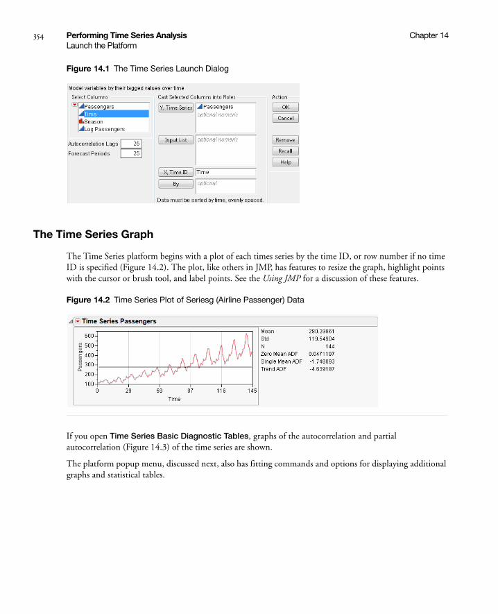
354 Performing Time Series Analysis Chapter 14Launch the Platform
Figure 14.1 The Time Series Launch Dialog
The Time Series Graph
The Time Series platform begins with a plot of each times series by the time ID, or row number if no time ID is specified (Figure 14.2). The plot, like others in JMP, has features to resize the graph, highlight points with the cursor or brush tool, and label points. See the Using JMP for a discussion of these features.
Figure 14.2 Time Series Plot of Seriesg (Airline Passenger) Data
If you open Time Series Basic Diagnostic Tables, graphs of the autocorrelation and partial autocorrelation (Figure 14.3) of the time series are shown.
The platform popup menu, discussed next, also has fitting commands and options for displaying additional graphs and statistical tables.

Chapter 14 Performing Time Series Analysis 355Time Series Commands
Time Series Commands
The platform red triangle menu has the options described in the following sections.
Graph
The Time Series platform begins by showing a time series plot, like the one shown previously in Figure 14.2. The Graph command on the platform popup menu has a submenu of controls for the time series plot with the following commands.
Time Series Graph hides or displays the time series graph.
Show Points hides or displays the points in the time series graph.
Connecting Lines hides or displays the lines connecting the points in the time series graph.
Mean Line hides or displays a horizontal line in the time series graph that depicts the mean of the time series.
Autocorrelation
The Autocorrelation command alternately hides or displays the autocorrelation graph of the sample, often called the sample autocorrelation function. This graph describes the correlation between all the pairs of points in the time series with a given separation in time or lag. The autocorrelation for the kth lag is
where
where is the mean of the N nonmissing points in the time series. The bars graphically depict the autocorrelations.
By definition, the first autocorrelation (lag 0) always has length 1. The curves show twice the large-lag standard error (± 2 standard errors), computed as
The autocorrelation plot for the Seriesg data is shown on the left in Figure 14.3. You can examine the autocorrelation and partial autocorrelations plots to determine whether the time series is stationary (meaning it has a fixed mean and standard deviation over time) and what model might be appropriate to fit the time series.
In addition, the Ljung-Box Q and p-values are shown for each lag. The Q-statistic is used to test whether a group of autocorrelations is significantly different from zero or to test that the residuals from a model can be distinguished from white-noise.
rk
ckc0----= ck
1N---- yt y–( ) yt k– y–( )
t k 1+=
N
=
y
SEk1
N---- 1 2 ri
2
i 1=
k 1–
+
=
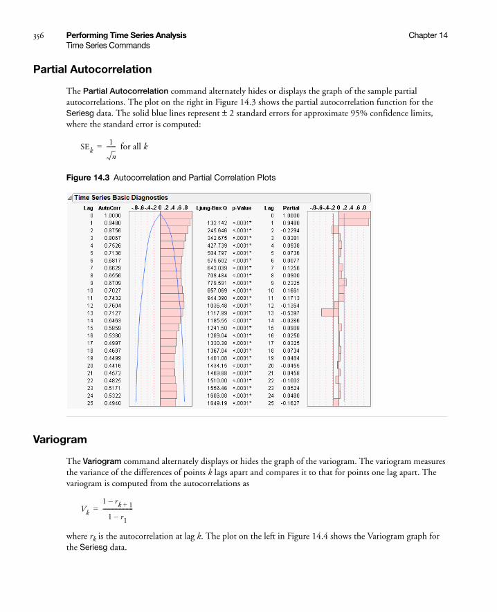
356 Performing Time Series Analysis Chapter 14Time Series Commands
Partial Autocorrelation
The Partial Autocorrelation command alternately hides or displays the graph of the sample partial autocorrelations. The plot on the right in Figure 14.3 shows the partial autocorrelation function for the Seriesg data. The solid blue lines represent ± 2 standard errors for approximate 95% confidence limits, where the standard error is computed:
for all k
Figure 14.3 Autocorrelation and Partial Correlation Plots
Variogram
The Variogram command alternately displays or hides the graph of the variogram. The variogram measures the variance of the differences of points k lags apart and compares it to that for points one lag apart. The variogram is computed from the autocorrelations as
where rk is the autocorrelation at lag k. The plot on the left in Figure 14.4 shows the Variogram graph for the Seriesg data.
SEk1
n-------=
Vk
1 rk 1+–
1 r1–----------------------=

Chapter 14 Performing Time Series Analysis 357Time Series Commands
AR Coefficients
The AR Coefficients command alternately displays or hides the graph of the least squares estimates of the autoregressive (AR) coefficients. The definition of these coefficients is given below. These coefficients approximate those that you would obtain from fitting a high-order, purely autoregressive model. The right-hand graph in Figure 14.4 shows the AR coefficients for the Seriesg data.
Figure 14.4 Variogram Graph (left) and AR Coefficient Graph (right)
Spectral Density
The Spectral Density command alternately displays or hides the graphs of the spectral density as a function of period and frequency (Figure 14.5).
The least squares estimates of the coefficients of the Fourier series
and
at2N---- yt 2πfit( )cos
i 1=
N
=
bt2
N---- yt 2πfit( )sin
i 1=
N
=

358 Performing Time Series Analysis Chapter 14Time Series Commands
where are combined to form the periodogram , which represents the intensity at frequency fi.
The periodogram is smoothed and scaled by 1/(4π) to form the spectral density.
The Fisher’s Kappa statistic tests the null hypothesis that the values in the series are drawn from a normal distribution with variance 1 against the alternative hypothesis that the series has some periodic component. Kappa is the ratio of the maximum value of the periodogram, I(fi), and its average value. The probability of observing a larger Kappa if the null hypothesis is true is given by
where q = N / 2 if N is even, q = (N - 1) / 2 if N is odd, and κ is the observed value of Kappa. The null hypothesis is rejected if this probability is less than the significance level α.
For q - 1 > 100, Bartlett’s Kolmogorov-Smirnov compares the normalized cumulative periodogram to the cumulative distribution function of the uniform distribution on the interval (0, 1). The test statistic equals the maximum absolute difference of the cumulative periodogram and the uniform CDF. If it exceeds
, then reject the hypothesis that the series comes from a normal distribution. The values a = 1.36 and a = 1.63 correspond to significance levels 5% and 1% respectively.
Figure 14.5 Spectral Density Plots
Save Spectral Density
Save Spectral Density creates a new table containing the spectral density and periodogram where the (i+1)th row corresponds to the frequency fi = i / N (that is, the ith harmonic of 1 / N).
The new data table has these columns:
Period is the period of the ith harmonic, 1 / fi.
Frequency is the frequency of the harmonic, fi.
fi i N⁄= I fi( ) N2---- ai
2bi
2+( )=
Pr k κ>( ) 1 1–( )j qj
max 1jkq----– 0,
q 1–
j 0=
q
–=
a q( )⁄

Chapter 14 Performing Time Series Analysis 359Time Series Commands
Angular Frequency is the angular frequency of the harmonic, 2πfi.
Sine is the Fourier sine coefficients, ai.
Cosine is the Fourier cosine coefficients, bi.
Periodogram is the periodogram, I(fi).
Spectral Density is the spectral density, a smoothed version of the periodogram.
Number of Forecast Periods
The Number of Forecast Periods command displays a dialog for you to reset the number of periods into the future that the fitted models will forecast. The initial value is set in the Time Series Launch dialog. All existing and future forecast results will show the new number of periods with this command.
Difference
Many time series do not exhibit a fixed mean. Such nonstationary series are not suitable for description by some time series models such as those with only autoregressive and moving average terms (ARMA models). However, these series can often be made stationary by differencing the values in the series. The differenced series is given by
where t is the time index and B is the backshift operator defined by Byt = yt-1.
The Difference command computes the differenced series and produces graphs of the autocorrelations and partial autocorrelations of the differenced series. These graphs can be used to determine if the differenced series is stationary.
Several of the time series models described in the next sections accommodate a differencing operation (the ARIMA, Seasonal ARIMA models, and some of the smoothing models). The Difference command is useful for determining the order of differencing that should be specified in these models.
The Differencing Specification dialog appears in the report window when you select the Difference command. It allows you to specify the differencing operation you want to apply to the time series. Click Estimate to see the results of the differencing operation. The Specify Differencing dialog allows you to specify the Nonseasonal Differencing Order, d, the Seasonal Differencing Order, D, and the number of Periods Per Season, s. Selecting zero for the value of the differencing order is equivalent to no differencing of that kind.
wt 1 B–( )d1 B
s–( )D
yt=

360 Performing Time Series Analysis Chapter 14Modeling Reports
The red triangle menu on the Difference plot has the following options:
Graph controls the plot of the differenced series and behaves the same as those under the Time Series Graph menu.
Autocorrelation alternately displays or hides the autocorrelation of the differenced series.
Partial Autocorrelation alternately hides or displays the partial autocorrelations of differenced series.
Variogram alternately hides or displays the variogram of the differenced series.
Save appends the differenced series to the original data table. The leading d + sD elements are lost in the differencing process. They are represented as missing values in the saved series.
Modeling Reports
The time series modeling commands are used to fit theoretical models to the series and use the fitted model to predict (forecast) future values of the series. These commands also produce statistics and residuals that allow you to ascertain the adequacy of the model you have elected to use. You can select the modeling commands repeatedly. Each time you select a model, a report of the results of the fit and a forecast is added to the platform results.
The fit of each model begins with a dialog that lets you specify the details of the model being fit as well as how it will be fit. Each general class of models has its own dialog, as discussed in their respective sections. The models are fit by maximizing the likelihood function, using a Kalman filter to compute the likelihood function. The ARIMA, seasonal ARIMA, and smoothing models begin with the following report tables.
Model Comparison Table
Figure 14.6 shows the Model Comparison Report.
Figure 14.6 Model Comparison
The Model Comparison table summarizes the fit statistics for each model. You can use it to compare several models fitted to the same time series. Each row corresponds to a different model. The models are sorted by the AIC statistic. The Model Comparison table shown above summarizes the ARIMA models (1, 0, 0), (0, 0, 1), (1, 0, 1), and (1, 1, 1) respectively. Use the Report checkbox to show or hide the Model Report for a model.
The Model Comparison report has red-triangle menus for each model, with the following options:
Fit New opens a window giving the settings of the model. You can change the settings to fit a different model.
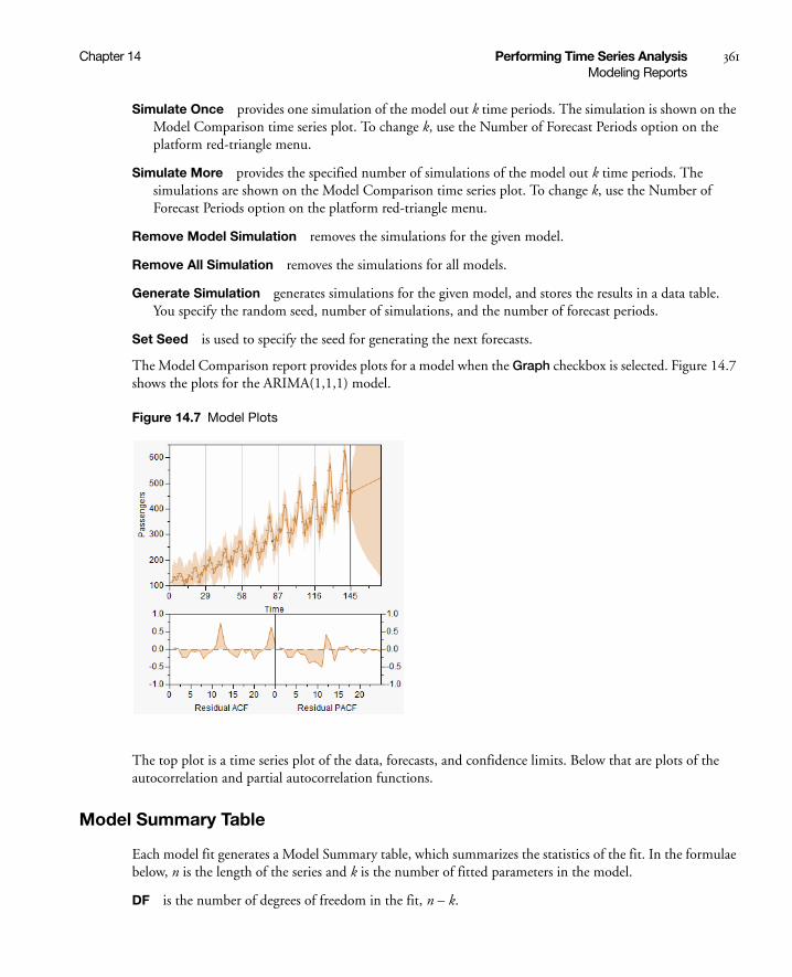
Chapter 14 Performing Time Series Analysis 361Modeling Reports
Simulate Once provides one simulation of the model out k time periods. The simulation is shown on the Model Comparison time series plot. To change k, use the Number of Forecast Periods option on the platform red-triangle menu.
Simulate More provides the specified number of simulations of the model out k time periods. The simulations are shown on the Model Comparison time series plot. To change k, use the Number of Forecast Periods option on the platform red-triangle menu.
Remove Model Simulation removes the simulations for the given model.
Remove All Simulation removes the simulations for all models.
Generate Simulation generates simulations for the given model, and stores the results in a data table. You specify the random seed, number of simulations, and the number of forecast periods.
Set Seed is used to specify the seed for generating the next forecasts.
The Model Comparison report provides plots for a model when the Graph checkbox is selected. Figure 14.7 shows the plots for the ARIMA(1,1,1) model.
Figure 14.7 Model Plots
The top plot is a time series plot of the data, forecasts, and confidence limits. Below that are plots of the autocorrelation and partial autocorrelation functions.
Model Summary Table
Each model fit generates a Model Summary table, which summarizes the statistics of the fit. In the formulae below, n is the length of the series and k is the number of fitted parameters in the model.
DF is the number of degrees of freedom in the fit, n – k.

362 Performing Time Series Analysis Chapter 14Modeling Reports
Sum of Squared Errors is the sum of the squared residuals.
Variance Estimate the unconditional sum of squares (SSE) divided by the number of degrees of freedom, SSE / (n – k). This is the sample estimate of the variance of the random shocks at, described in the section “ARIMA Model” on page 365.
Standard Deviation is the square root of the variance estimate. This is a sample estimate of the standard deviation of at, the random shocks.
Akaike’s Information Criterion [AIC], Schwarz’s Bayesian Criterion [SBC or BIC] Smaller values of these criteria indicate better fit. They are computed:
RSquare RSquare is computed
where and , are the one-step-ahead forecasts, and is
the mean yi.
If the model fits the series badly, the model error sum of squares, SSE might be larger than the total sum of squares, SST and R2 will be negative.
RSquare Adj The adjusted R2 is
MAPE is the Mean Absolute Percentage Error, and is computed
AIC 2loglikelihood– 2k+=
SBC 2loglikelihood– k n( )ln+=
1SSESST---------–
SST yi yi–( )2
i 1=
n
= SSE yi yi–( )2
i 1=
n
= yi yi
1n 1–( )n k–( )---------------- 1 R
2–( )–
100n---------
yi yi–yi
-------------i 1=
n

Chapter 14 Performing Time Series Analysis 363Modeling Reports
MAE is the Mean Absolute Error, and is computed
–2LogLikelihood is minus two times the natural log of the likelihood function evaluated at the best-fit parameter estimates. Smaller values are better fits.
Stable indicates whether the autoregressive operator is stable. That is, whether all the roots of lie outside the unit circle.
Invertible indicates whether the moving average operator is invertible. That is, whether all the roots of
lie outside the unit circle.
Note: The φ and θ operators are defined in the section “ARIMA Model” on page 365.
Parameter Estimates Table
There is a Parameter Estimates table for each selected fit, which gives the estimates for the time series model parameters. Each type of model has its own set of parameters. They are described in the sections on specific time series models. The Parameter Estimates table has these terms:
Term lists the name of the parameter. These are described below for each model type. Some models contain an intercept or mean term. In those models, the related constant estimate is also shown. The definition of the constant estimate is given under the description of ARIMA models.
Factor (Seasonal ARIMA only) lists the factor of the model that contains the parameter. This is only shown for multiplicative models. In the multiplicative seasonal models, Factor 1 is nonseasonal and Factor 2 is seasonal.
Lag (ARIMA and Seasonal ARIMA only) lists the degree of the lag or backshift operator that is applied to the term to which the parameter is multiplied.
Estimate lists the parameter estimates of the time series model.
Std Error lists the estimates of the standard errors of the parameter estimates. They are used in constructing tests and confidence intervals.
1n--- yi yi–
i 1=
n
φ z( ) 0=
θ z( ) 0=
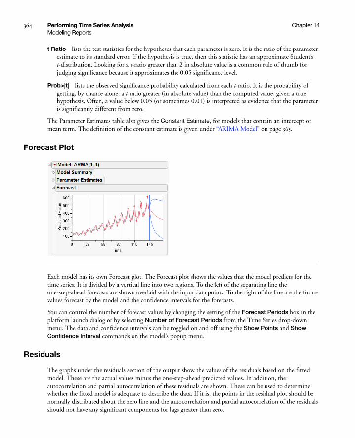
364 Performing Time Series Analysis Chapter 14Modeling Reports
t Ratio lists the test statistics for the hypotheses that each parameter is zero. It is the ratio of the parameter estimate to its standard error. If the hypothesis is true, then this statistic has an approximate Student’s t-distribution. Looking for a t-ratio greater than 2 in absolute value is a common rule of thumb for judging significance because it approximates the 0.05 significance level.
Prob>|t| lists the observed significance probability calculated from each t-ratio. It is the probability of getting, by chance alone, a t-ratio greater (in absolute value) than the computed value, given a true hypothesis. Often, a value below 0.05 (or sometimes 0.01) is interpreted as evidence that the parameter is significantly different from zero.
The Parameter Estimates table also gives the Constant Estimate, for models that contain an intercept or mean term. The definition of the constant estimate is given under “ARIMA Model” on page 365.
Forecast Plot
Each model has its own Forecast plot. The Forecast plot shows the values that the model predicts for the time series. It is divided by a vertical line into two regions. To the left of the separating line the one-step-ahead forecasts are shown overlaid with the input data points. To the right of the line are the future values forecast by the model and the confidence intervals for the forecasts.
You can control the number of forecast values by changing the setting of the Forecast Periods box in the platform launch dialog or by selecting Number of Forecast Periods from the Time Series drop-down menu. The data and confidence intervals can be toggled on and off using the Show Points and Show Confidence Interval commands on the model’s popup menu.
Residuals
The graphs under the residuals section of the output show the values of the residuals based on the fitted model. These are the actual values minus the one-step-ahead predicted values. In addition, the autocorrelation and partial autocorrelation of these residuals are shown. These can be used to determine whether the fitted model is adequate to describe the data. If it is, the points in the residual plot should be normally distributed about the zero line and the autocorrelation and partial autocorrelation of the residuals should not have any significant components for lags greater than zero.

Chapter 14 Performing Time Series Analysis 365ARIMA Model
Iteration History
The model parameter estimation is an iterative procedure by which the log-likelihood is maximized by adjusting the estimates of the parameters. The iteration history for each model you request shows the value of the objective function for each iteration. This can be useful for diagnosing problems with the fitting procedure. Attempting to fit a model which is poorly suited to the data can result in a large number of iterations that fail to converge on an optimum value for the likelihood. The Iteration History table shows the following quantities:
Iter lists the iteration number.
Iteration History lists the objective function value for each step.
Step lists the type of iteration step.
Obj-Criterion lists the norm of the gradient of the objective function.
Model Report Options
The title bar for each model you request has a popup menu, with the following options for that model:
Show Points hides or shows the data points in the forecast graph.
Show Confidence Interval hides or shows the confidence intervals in the forecast graph.
Save Columns creates a new data table with columns representing the results of the model.
Save Prediction Formula saves the data and prediction formula to a new data table.
Create SAS Job creates SAS code that duplicates the model analysis in SAS.
Submit to SAS submits code to SAS that duplicates the model analysis. If you are not connected to a SAS server, prompts guide you through the connection process.
Residual Statistics controls which displays of residual statistics are shown for the model. These displays are described in the section “Time Series Commands” on page 355; however, they are applied to the residual series.
ARIMA Model
An AutoRegressive Integrated Moving Average (ARIMA) model predicts future values of a time series by a linear combination of its past values and a series of errors (also known as random shocks or innovations). The ARIMA command performs a maximum likelihood fit of the specified ARIMA model to the time series.
For a response series , the general form for the ARIMA model is:
where
t is the time index
yi{ }
φ B( ) wt μ–( ) θ B( )at=

366 Performing Time Series Analysis Chapter 14ARIMA Model
B is the backshift operator defined as
is the response series after differencing
μ is the intercept or mean term.
and , respectively, the autoregressive operator and the moving average operator and are written
and
are the sequence of random shocks.
The are assumed to be independent and normally distributed with mean zero and constant variance.
The model can be rewritten as
where the constant estimate δ is given by the relation
.
The ARIMA command displays the Specify ARIMA Model dialog, which allows you to specify the ARIMA model you want to fit. The results appear when you click Estimate.
Use the Specify ARIMA Model dialog for the following three orders that can be specified for an ARIMA model:
1. The Autoregressive Order is the order (p) of the polynomial operator.
2. The Differencing Order is the order (d) of the differencing operator.
3. The Moving Average Order is the order (q) of the differencing operator .
4. An ARIMA model is commonly denoted ARIMA(p,d,q). If any of p,d, or q are zero, the corresponding letters are often dropped. For example, if p and d are zero, then model would be denoted MA(q).
Byt yt 1–=
wt 1 B–( )dyt=
φ B( ) θ B( )
φ B( ) 1 φ1B– φ2B2– …– φpB
p–= θ B( ) 1 θ1B– θ2B2– …– θqB
q–=
at
at
φ B( )wt δ θ B( )at+=
δ φ B( )μ μ φ1μ– φ2μ– …– φpμ–= =
ϕ B( )
θ B( )
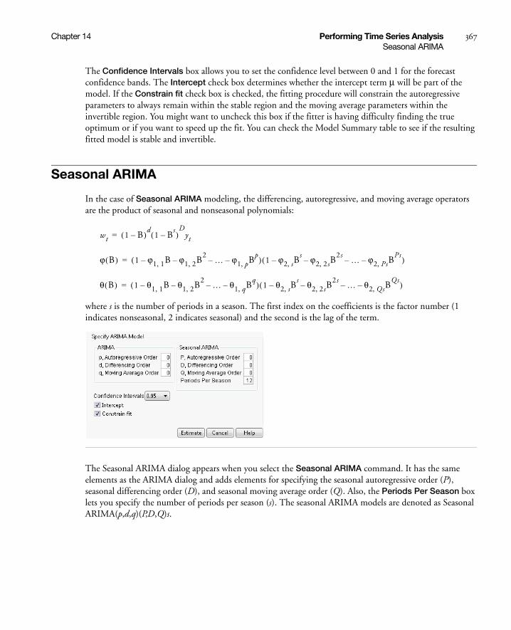
Chapter 14 Performing Time Series Analysis 367Seasonal ARIMA
The Confidence Intervals box allows you to set the confidence level between 0 and 1 for the forecast confidence bands. The Intercept check box determines whether the intercept term μ will be part of the model. If the Constrain fit check box is checked, the fitting procedure will constrain the autoregressive parameters to always remain within the stable region and the moving average parameters within the invertible region. You might want to uncheck this box if the fitter is having difficulty finding the true optimum or if you want to speed up the fit. You can check the Model Summary table to see if the resulting fitted model is stable and invertible.
Seasonal ARIMA
In the case of Seasonal ARIMA modeling, the differencing, autoregressive, and moving average operators are the product of seasonal and nonseasonal polynomials:
where s is the number of periods in a season. The first index on the coefficients is the factor number (1 indicates nonseasonal, 2 indicates seasonal) and the second is the lag of the term.
The Seasonal ARIMA dialog appears when you select the Seasonal ARIMA command. It has the same elements as the ARIMA dialog and adds elements for specifying the seasonal autoregressive order (P), seasonal differencing order (D), and seasonal moving average order (Q). Also, the Periods Per Season box lets you specify the number of periods per season (s). The seasonal ARIMA models are denoted as Seasonal ARIMA(p,d,q)(P,D,Q)s.
wt 1 B–( )d1 B
s–( )D
yt=
ϕ B( ) 1 ϕ1 1, B ϕ1 2, B2–– …– ϕ1 p, B
p–( ) 1 ϕ2 s, Bs ϕ2 2 s, B
2 s–– …– ϕ2 Ps, BPs–( )=
θ B( ) 1 θ1 1, B θ1 2, B2–– …– θ1 q, B
q–( ) 1 θ2 s, Bs θ2 2 s, B
2 s–– …– θ2 Qs, BQs–( )=
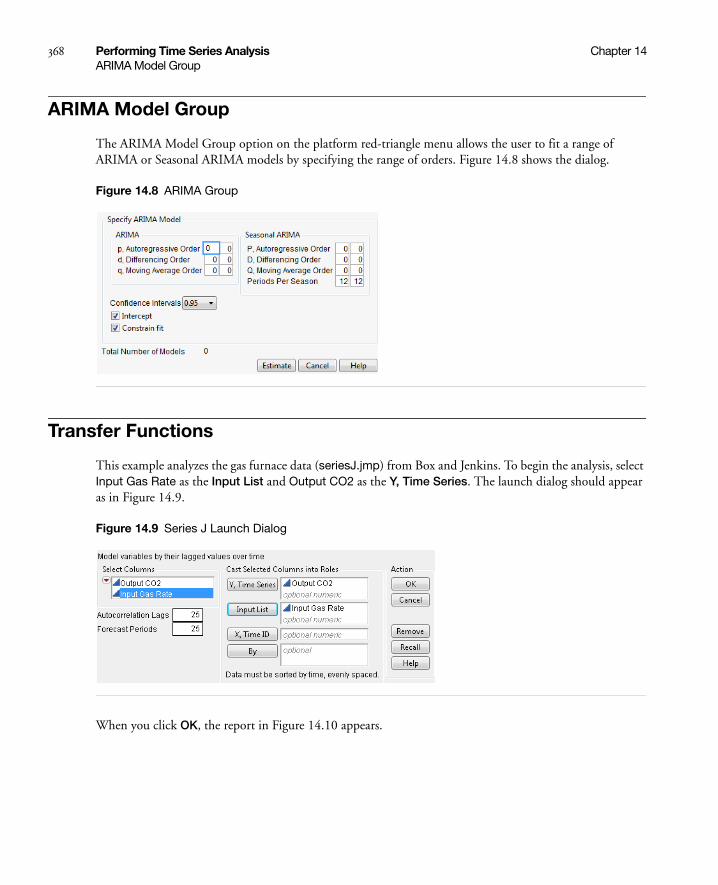
368 Performing Time Series Analysis Chapter 14ARIMA Model Group
ARIMA Model Group
The ARIMA Model Group option on the platform red-triangle menu allows the user to fit a range of ARIMA or Seasonal ARIMA models by specifying the range of orders. Figure 14.8 shows the dialog.
Figure 14.8 ARIMA Group
Transfer Functions
This example analyzes the gas furnace data (seriesJ.jmp) from Box and Jenkins. To begin the analysis, select Input Gas Rate as the Input List and Output CO2 as the Y, Time Series. The launch dialog should appear as in Figure 14.9.
Figure 14.9 Series J Launch Dialog
When you click OK, the report in Figure 14.10 appears.

Chapter 14 Performing Time Series Analysis 369Transfer Functions
Report and Menu Structure
This preliminary report shows diagnostic information and groups the analysis in two main parts. The first part, under Time Series Output CO2, contains analyses of the output series, while the Input Time Series Panel, contains analyses on the input series. The latter may include more than one series.
Figure 14.10 Series J Report
Each report section has its own set of commands. For the output (top) series, the commands are accessible from the red triangle on the outermost outline bar (Transfer Function Analysis). For the input (bottom) series, the red triangle is located on the inner outline bar (Input Series: Input Gas Rate).
Figure 14.11 shows these two command sets. Note their organization. Both start with a Graph command. The next set of commands are for exploration. The third set is for model building. The fourth set includes functions that control the platform.
output seriescommands
input seriescommands

370 Performing Time Series Analysis Chapter 14Transfer Functions
Figure 14.11 Output and Input Series Menus
Diagnostics
Both parts give basic diagnostics, including the sample mean (Mean), sample standard deviation (Std), and series length (N).
In addition, the platform tests for stationarity using Augmented Dickey-Fuller (ADF) tests.
Zero Mean ADF tests against a random walk with zero mean, i.e.
Single Mean ADF tests against a random walk with a non-zero mean, i.e.
Trend ADF tests against a random walk with a non-zero mean and a linear trend, i.e.
Basic diagnostics also include the autocorrelation and partial autocorrelation functions, as well as the Ljung-Box Q-statistic and p-values, found under the Time Series Basic Diagnostics outline node.
The Cross Correlation command adds a cross-correlation plot to the report. The length of the plot is twice that of an autocorrelation plot, or .
xt φxt 1– et+=
xt μ– φ xt 1– μ–( ) et+=
xt μ– βt– φ xt 1– μ– β t 1–( )–[ ] et+=
2 ACF length 1+×
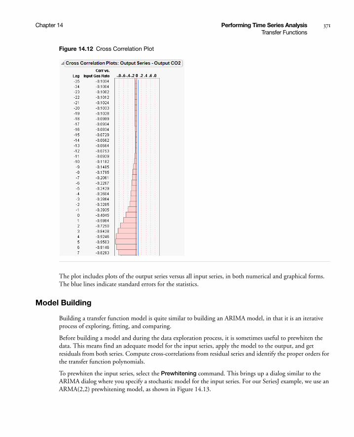
Chapter 14 Performing Time Series Analysis 371Transfer Functions
Figure 14.12 Cross Correlation Plot
The plot includes plots of the output series versus all input series, in both numerical and graphical forms. The blue lines indicate standard errors for the statistics.
Model Building
Building a transfer function model is quite similar to building an ARIMA model, in that it is an iterative process of exploring, fitting, and comparing.
Before building a model and during the data exploration process, it is sometimes useful to prewhiten the data. This means find an adequate model for the input series, apply the model to the output, and get residuals from both series. Compute cross-correlations from residual series and identify the proper orders for the transfer function polynomials.
To prewhiten the input series, select the Prewhitening command. This brings up a dialog similar to the ARIMA dialog where you specify a stochastic model for the input series. For our SeriesJ example, we use an ARMA(2,2) prewhitening model, as shown in Figure 14.13.
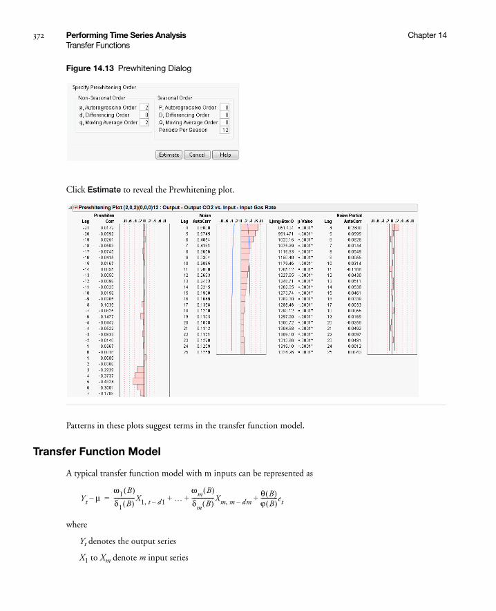
372 Performing Time Series Analysis Chapter 14Transfer Functions
Figure 14.13 Prewhitening Dialog
Click Estimate to reveal the Prewhitening plot.
Patterns in these plots suggest terms in the transfer function model.
Transfer Function Model
A typical transfer function model with m inputs can be represented as
where
Yt denotes the output series
X1 to Xm denote m input series
Yt μ–ω1 B( )δ1 B( )---------------X1 t, d1– …
ωm B( )δm B( )----------------Xm m, dm–
θ B( )ϕ B( )------------et+ + +=
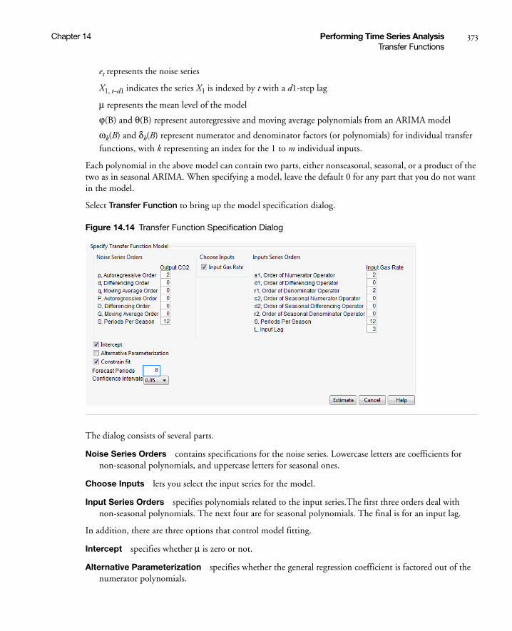
Chapter 14 Performing Time Series Analysis 373Transfer Functions
et represents the noise series
X1, t–d1 indicates the series X1 is indexed by t with a d1-step lag
μ represents the mean level of the model
ϕ(B) and θ(B) represent autoregressive and moving average polynomials from an ARIMA model
ωk(B) and δk(B) represent numerator and denominator factors (or polynomials) for individual transfer functions, with k representing an index for the 1 to m individual inputs.
Each polynomial in the above model can contain two parts, either nonseasonal, seasonal, or a product of the two as in seasonal ARIMA. When specifying a model, leave the default 0 for any part that you do not want in the model.
Select Transfer Function to bring up the model specification dialog.
Figure 14.14 Transfer Function Specification Dialog
The dialog consists of several parts.
Noise Series Orders contains specifications for the noise series. Lowercase letters are coefficients for non-seasonal polynomials, and uppercase letters for seasonal ones.
Choose Inputs lets you select the input series for the model.
Input Series Orders specifies polynomials related to the input series.The first three orders deal with non-seasonal polynomials. The next four are for seasonal polynomials. The final is for an input lag.
In addition, there are three options that control model fitting.
Intercept specifies whether μ is zero or not.
Alternative Parameterization specifies whether the general regression coefficient is factored out of the numerator polynomials.

374 Performing Time Series Analysis Chapter 14Transfer Functions
Constrain Fit toggles constraining of the AR and MA coefficients.
Forecast Periods specifies the number of forecasting periods for forecasting.
Using the information from prewhitening, we specify the model as shown in Figure 14.14.
Model Reports
The analysis report is titled Transfer Function Model and is indexed sequentially. Results for the Series J example are shown in Figure 14.15.
Figure 14.15 Series J Transfer Function Reports
Model Summary gathers information that is useful for comparing models.
Parameter Estimates shows the parameter estimates and is similar to the ARIMA version. In addition, the Variable column shows the correspondence between series names and parameters. The table is followed by the formula of the model. Note the notation B is for the backshift operator.
Residuals, Iteration History are the same as their ARIMA counterparts.
Interactive Forecasting provides a forecasting graph based on a specified confidence interval. The functionality changes based on the number entered in the Forecast Periods box.
If the number of Forecast Periods is less than or equal to the Input Lag, the forecasting box shows the forecast for the number of periods. A confidence interval around the prediction is shown in blue, and this confidence interval can be changed by entering a number in the Confidence Interval box above the graph.

Chapter 14 Performing Time Series Analysis 375Transfer Functions
If the number of forecast periods is larger than the number of lags (say, eight in our example), the presentation is a little different.
Here, you manipulate lagged values of the series by entering values into the edit boxes next to the series, or by manipulating the sliders. As before, the confidence interval can also be changed. The results of your changes are reflected in real time in the Interactive Forecasting graph.
The following commands are available from the report drop-down menu.
Save Columns creates a new data table containing the input and output series, a time column, predicted output with standard errors, residuals, and 95% confidence limits.
Create SAS Job creates PROC ARIMA code that can reproduce this model.
Submit to SAS submits PROC ARIMA code to SAS that reproduces the model.
8 – 3 = 5 recent values of the input series
8 forecast periods with an input lag of 3
Choose the input series (here, there is only one.)
Choose one of the 8 – 3 = 5 recent values
Alter this value by using this slider or entering directly into the boxes above
Changes in the input series are shown interactively in the graph

376 Performing Time Series Analysis Chapter 14Smoothing Models
Model Comparison Table
The model comparison table works like its ARIMA counterpart by accumulating statistics on the models you specify.
Fitting Notes
A regression model with serially correlated errors can be specified by including regressors in the model and not specifying any polynomial orders.
Intervention analysis can also be conducted, but prewhitening is no longer meaningful.
Currently, the transfer function model platform has limited capability of supporting missing values.
Smoothing Models
JMP offers a variety of smoothing techniques.

Chapter 14 Performing Time Series Analysis 377Smoothing Models
Smoothing models represent the evolution of a time series by the model:
where
is the time-varying mean term,
is the time-varying slope term,
is one of the s time-varying seasonal terms,
are the random shocks.
Models without a trend have and nonseasonal models have . The estimators for these time-varying terms are
smoothed level that estimates
is a smoothed trend that estimates
for are the estimates of the .
Each smoothing model defines a set of recursive smoothing equations that describes the evolution of these estimators. The smoothing equations are written in terms of model parameters called smoothing weights. They are
α, the level smoothing weight
γ, the trend smoothing weight
ϕ, the trend damping weight
δ, the seasonal smoothing weight.
While these parameters enter each model in a different way (or not at all), they have the common property that larger weights give more influence to recent data while smaller weights give less influence to recent data.
Each smoothing model has an ARIMA model equivalent. You may not be able to specify the equivalent ARIMA model using the ARIMA command because some smoothing models intrinsically constrain the ARIMA model parameters in ways the ARIMA command will not allow.
Simple Moving Average
A simple moving average model (SMA) produces forecasted values that are equal to the average of consecutive observations in a time window. The forecasts can be uncentered or centered in the time window.
To fit a simple moving average model, select Smoothing > Simple Moving Average. A window appears with the following options:
Enter smoothing window width Enter the width of the smoothing window.
Centered Choose whether to center the forecasted values.
yt μt βtt s t( ) at+ + +=
μt
βt
s t( )
at
βt 0= s t( ) 0=
Lt μt
Tt βt
St j– j 0 1 … s 1–, , ,= s t( )

378 Performing Time Series Analysis Chapter 14Smoothing Models
The Simple Moving Average report shows a time plot of the data and the fitted model. The red triangle menu has the following options:
Add Model Select this option to fit another model. When additional models are fit, the model is added to the time plot of the data.
Save to Data Table Saves the original data, and forecasts of all moving average models.
Show Points Shows or hides the points on the plot.
Connecting Lines Shows or hides the lines on the plot.
Smoothing Model Dialog
The Smoothing Model dialog appears in the report window when you select one of the smoothing model commands.
The Confidence Intervals popup list allows you to set the confidence level for the forecast confidence bands. The dialogs for seasonal smoothing models include a Periods Per Season box for setting the number of periods in a season. The Constraints popup list lets you to specify what type of constraint you want to enforce on the smoothing weights during the fit. The constraints are:
Zero To One keeps the values of the smoothing weights in the range zero to one.
Unconstrained allows the parameters to range freely.
Stable Invertible constrains the parameters such that the equivalent ARIMA model is stable and invertible.
Custom expands the dialog to allow you to set constraints on individual smoothing weights. Each smoothing weight can be Bounded, Fixed, or Unconstrained as determined by the setting of the popup menu next to the weight’s name. When entering values for fixed or bounded weights, the values can be positive or negative real numbers.
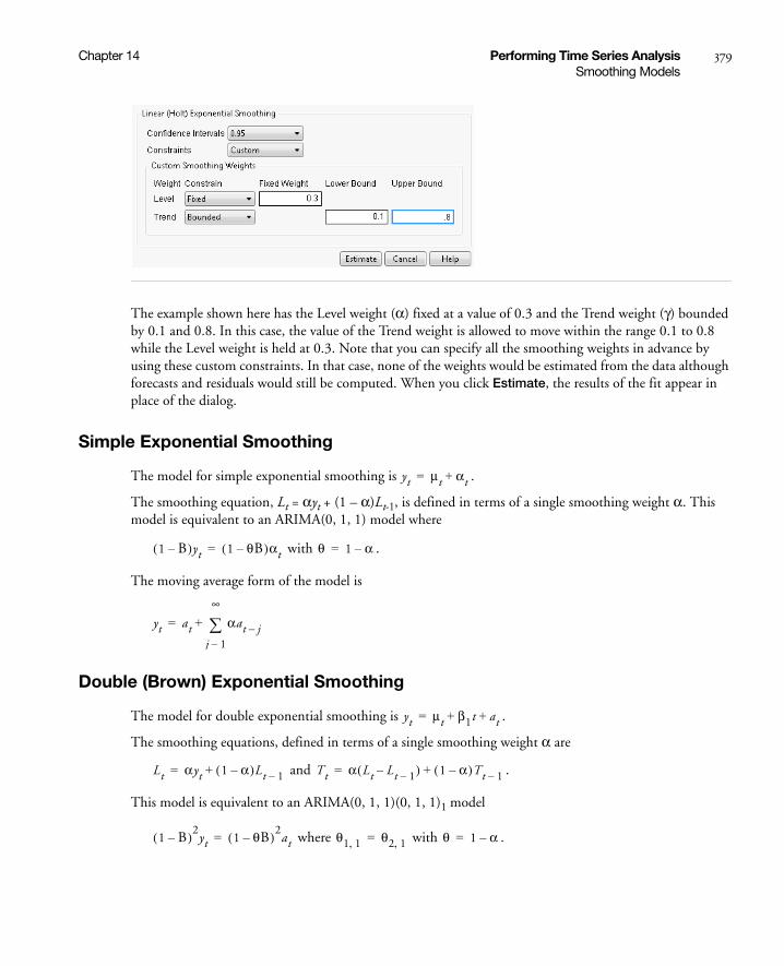
Chapter 14 Performing Time Series Analysis 379Smoothing Models
The example shown here has the Level weight (α) fixed at a value of 0.3 and the Trend weight (γ) bounded by 0.1 and 0.8. In this case, the value of the Trend weight is allowed to move within the range 0.1 to 0.8 while the Level weight is held at 0.3. Note that you can specify all the smoothing weights in advance by using these custom constraints. In that case, none of the weights would be estimated from the data although forecasts and residuals would still be computed. When you click Estimate, the results of the fit appear in place of the dialog.
Simple Exponential Smoothing
The model for simple exponential smoothing is .
The smoothing equation, Lt = αyt + (1 – α)Lt-1, is defined in terms of a single smoothing weight α. This model is equivalent to an ARIMA(0, 1, 1) model where
with .
The moving average form of the model is
Double (Brown) Exponential Smoothing
The model for double exponential smoothing is .
The smoothing equations, defined in terms of a single smoothing weight α are
and .
This model is equivalent to an ARIMA(0, 1, 1)(0, 1, 1)1 model
where with .
yt μt αt+=
1 B–( )yt 1 θB–( )αt= θ 1 α–=
yt at αat j–j 1–
∞
+=
yt μt β1t at+ +=
Lt αyt 1 α–( )Lt 1–+= Tt α Lt Lt 1––( ) 1 α–( )Tt 1–+=
1 B–( )2yt 1 θB–( )2
at= θ1 1, θ2 1,= θ 1 α–=

380 Performing Time Series Analysis Chapter 14Smoothing Models
The moving average form of the model is
Linear (Holt) Exponential Smoothing
The model for linear exponential smoothing is .
The smoothing equations defined in terms of smoothing weights α and γ are
and
This model is equivalent to an ARIMA(0, 2, 2) model where
with and .
The moving average form of the model is
Damped-Trend Linear Exponential Smoothing
The model for damped-trend linear exponential smoothing is .
The smoothing equations in terms of smoothing weights α, γ, and ϕ are
and
This model is equivalent to an ARIMA(1, 1, 2) model where
with and .
The moving average form of the model is
Seasonal Exponential Smoothing
The model for seasonal exponential smoothing is .
The smoothing equations in terms of smoothing weights α and δ are
and
yt at 2α j 1–( )α2+( )at j–j 1=
∞
+=
yt μt βtt at+ +=
Lt αyt 1 α–( ) Lt 1– Tt 1–+( )+= Tt γ Lt Lt 1––( ) 1 γ–( )Tt 1–+=
1 B–( )2yt 1 θB– θ2B
2–( )at= θ 2 α– αγ–= θ2 α 1–=
yt at α jαγ+( )at j–j 1=
∞
+=
yt μt βtt at+ +=
Lt αyt 1 α–( ) Lt 1– ϕTt 1–+( )+= Tt γ Lt Lt 1––( ) 1 γ–( )ϕTt 1–+=
1 ϕB–( ) 1 B–( )yt 1 θ1B– θ2B2–( )at= θ1 1 ϕ α– αγϕ–+= θ2 α 1–( )ϕ=
yt αtα αγϕ ϕj
1–( )+ϕ 1–
----------------------------------------
αt j–j 1=
∞
+=
yt μt s t( ) at+ +=
Lt α yt St s––( ) 1 α–( )Lt 1–+= St δ yt Lt s––( ) 1 δ–( )ϕSt s–+=
Chapter 14 Performing Time Series Analysis 381Smoothing Models
This model is equivalent to a seasonal ARIMA(0, 1, 1)(0, 1, 0)S model where we define
, , and
so
with
, , and .
The moving average form of the model is
where
Winters Method (Additive)
The model for the additive version of the Winters method is .
The smoothing equations in terms of weights α, γ, and δ are
, , and
.
This model is equivalent to a seasonal ARIMA(0, 1, s+1)(0, 1, 0)s model
The moving average form of the model is
where
θ1 θ1 1,= θ2 θ2 s, θ2 s,= = θ3 θ1 1, θ2 s,–=
1 B–( ) 1 Bs–( )yt 1 θ1B– θ2B
2– θ3Bs 1+–( )at=
θ1 1 α–= θ2 δ 1 α–( )= θ3 1 α–( ) δ 1–( )=
yt at ψjat j–j 1=
∞
+= ψα for jmods 0≠
α δ 1 α–( ) forjmods+ 0=
=
yt μt βtt s t( ) at+ + +=
Lt α yt St s––( ) 1 α–( ) Lt 1– Tt 1–+( )+= Tt γ Lt Lt 1––( ) 1 γ–( )Tt 1–+=
St δ yt Lt–( ) 1 δ–( )St s–+=
1 B–( ) 1 B2–( )yt 1 θiB
i
i 1=
s 1+
–
at=
yt at Ψjat j–j 1=
∞
+=
ψα jαγ+ , jmods 0≠α jαγ δ+ 1 α–( ) jmods,+ 0=
=

382 Performing Time Series Analysis Chapter 14Smoothing Models
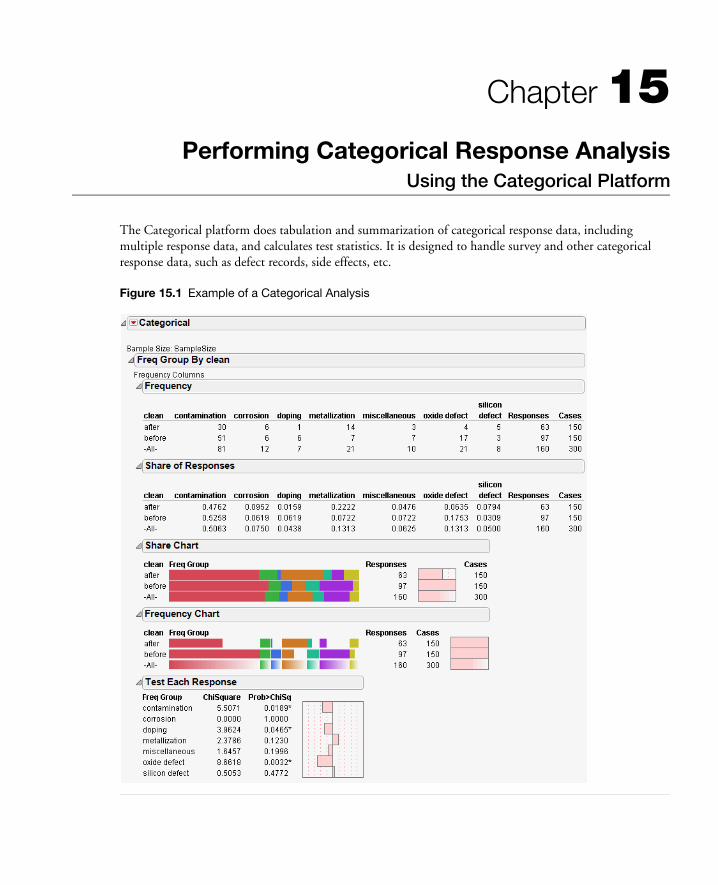
Chapter 15Performing Categorical Response Analysis
Using the Categorical Platform
The Categorical platform does tabulation and summarization of categorical response data, including multiple response data, and calculates test statistics. It is designed to handle survey and other categorical response data, such as defect records, side effects, etc.
Figure 15.1 Example of a Categorical Analysis
Contents
The Categorical Platform . . . . . . . . . . . . . . . . . . . . . . . . . . . . . . . . . . . . . . . . . . . . . . . . . . . . . . . . . . . . 385
Launching the Platform. . . . . . . . . . . . . . . . . . . . . . . . . . . . . . . . . . . . . . . . . . . . . . . . . . . . . . . . . . . . . . 385
Failure Rate Examples . . . . . . . . . . . . . . . . . . . . . . . . . . . . . . . . . . . . . . . . . . . . . . . . . . . . . . . . . . . . . . . 388
Response Frequencies . . . . . . . . . . . . . . . . . . . . . . . . . . . . . . . . . . . . . . . . . . . . . . . . . . . . . . . . . . . . 388
Indicator Group . . . . . . . . . . . . . . . . . . . . . . . . . . . . . . . . . . . . . . . . . . . . . . . . . . . . . . . . . . . . . . . . 389
Multiple Delimited . . . . . . . . . . . . . . . . . . . . . . . . . . . . . . . . . . . . . . . . . . . . . . . . . . . . . . . . . . . . . . 389
Multiple Response By ID . . . . . . . . . . . . . . . . . . . . . . . . . . . . . . . . . . . . . . . . . . . . . . . . . . . . . . . . .390
Multiple Response . . . . . . . . . . . . . . . . . . . . . . . . . . . . . . . . . . . . . . . . . . . . . . . . . . . . . . . . . . . . . . . 391
Categorical Reports . . . . . . . . . . . . . . . . . . . . . . . . . . . . . . . . . . . . . . . . . . . . . . . . . . . . . . . . . . . . . . . . . 391
Report Content . . . . . . . . . . . . . . . . . . . . . . . . . . . . . . . . . . . . . . . . . . . . . . . . . . . . . . . . . . . . . . . . . 391
Report Format. . . . . . . . . . . . . . . . . . . . . . . . . . . . . . . . . . . . . . . . . . . . . . . . . . . . . . . . . . . . . . . . . . 393
Statistical Commands . . . . . . . . . . . . . . . . . . . . . . . . . . . . . . . . . . . . . . . . . . . . . . . . . . . . . . . . . . . . 395
Save Tables . . . . . . . . . . . . . . . . . . . . . . . . . . . . . . . . . . . . . . . . . . . . . . . . . . . . . . . . . . . . . . . . . . . . 398

Chapter 15 Performing Categorical Response Analysis 385The Categorical Platform
The Categorical Platform
The Categorical platform has capabilities similar to other platforms. The choice of platforms depends on your focus, the shape of your data, and the desired level of detail. Table 15.1 shows several of JMP’s analysis platforms, and their strengths.
The strength of the categorical platform is that it can handle responses in a wide variety of formats without needing to reshape the data.
Launching the Platform
Open Failure3Freq.jmp in the Quality Control folder located in the sample data. Click on Analyze > Modeling > Categorical to obtain the launch dialog. The platform has a unique launch dialog. The buttons select groups of columns (as opposed to single columns like other JMP dialogs) for each of the situations.
Table 15.1 Comparing JMP’s Categorical Analyses
Platform Specialty
Distribution Separate, ungrouped categorical responses.
Fit Y By X: Contingency Two-way situations, including chi-square tests, correspondence analysis, agreement.
Pareto Plot Graphical analysis of multiple-response data, especially multiple-response defect data, with more rate tests than Fit Y By X.
Variability Chart: Attribute
Attribute gauge studies, with more detail on rater agreement.
Fit Model Logistic categorical responses and generalized linear models.
Partition, Neural Net Specific categorical response models.
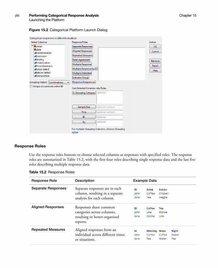
386 Performing Categorical Response Analysis Chapter 15Launching the Platform
Figure 15.2 Categorical Platform Launch Dialog
Response Roles
Use the response roles buttons to choose selected columns as responses with specified roles. The response roles are summarized in Table 15.2, with the first four roles describing single response data and the last five roles describing multiple response data.
Table 15.2 Response Roles
Response Role Description Example Data
Separate Responses Separate responses are in each column, resulting in a separate analysis for each column.
Aligned Responses Responses share common categories across columns, resulting in better-organized reports.
Repeated Measures Aligned responses from an individual across different times or situations.
Chapter 15 Performing Categorical Response Analysis 387Launching the Platform
Other Launch Dialog Options
The Launch dialog has standard JMP options (like By variables) and additionally:
X, Grouping Categories defines sample groups to break the counts into.
Sample Size For multiple response roles with summarized data, defines the number of individual units in the group for which that frequency is applicable to. For example, a Freq column might say there were 50 defects, where the sample size variable would say that they reflect the defects for a batch of 100 units.
Freq is for presummarized data, specifying the column containing frequency counts for each row.
ID is only required and used when Multiple Response by ID is used.
Unique occurences within ID allows duplicate response levels within a subject to be counted only once. An ID variable must be specified.
Rater Agreement Aligned responses from different raters evaluating the same unit, to study agreement across raters.
Multiple Response Aligned responses, where multiple responses are entered across several columns, but treated as one grouped response.
Multiple Response by ID
Multiple responses across rows that have the same ID values.
Multiple Delimited Several responses in a single cell, separated by commas.
Indicator Group Binary responses across columns, like checked or not, yes or no, but all in a related group.
Response Frequencies Columns containing frequency counts for each response level, all in a related group.
Table 15.2 Response Roles (Continued)
Response Role Description Example Data
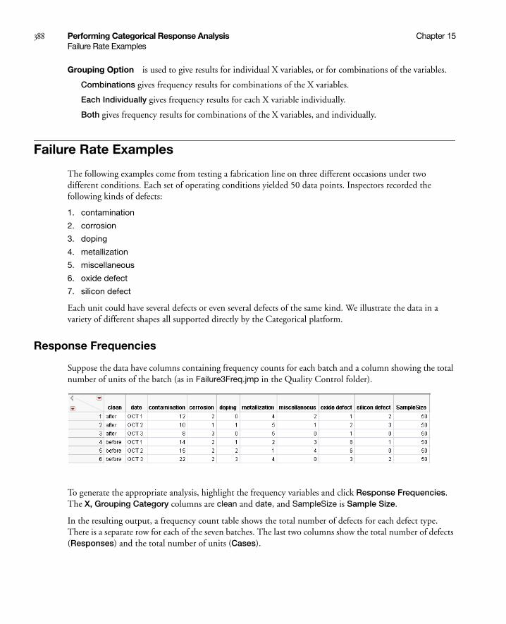
388 Performing Categorical Response Analysis Chapter 15Failure Rate Examples
Grouping Option is used to give results for individual X variables, or for combinations of the variables.
Combinations gives frequency results for combinations of the X variables.
Each Individually gives frequency results for each X variable individually.
Both gives frequency results for combinations of the X variables, and individually.
Failure Rate Examples
The following examples come from testing a fabrication line on three different occasions under two different conditions. Each set of operating conditions yielded 50 data points. Inspectors recorded the following kinds of defects:
1. contamination
2. corrosion
3. doping
4. metallization
5. miscellaneous
6. oxide defect
7. silicon defect
Each unit could have several defects or even several defects of the same kind. We illustrate the data in a variety of different shapes all supported directly by the Categorical platform.
Response Frequencies
Suppose the data have columns containing frequency counts for each batch and a column showing the total number of units of the batch (as in Failure3Freq.jmp in the Quality Control folder).
To generate the appropriate analysis, highlight the frequency variables and click Response Frequencies. The X, Grouping Category columns are clean and date, and SampleSize is Sample Size.
In the resulting output, a frequency count table shows the total number of defects for each defect type. There is a separate row for each of the seven batches. The last two columns show the total number of defects (Responses) and the total number of units (Cases).
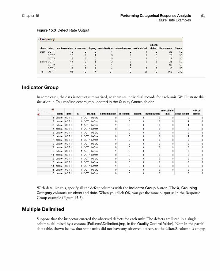
Chapter 15 Performing Categorical Response Analysis 389Failure Rate Examples
Figure 15.3 Defect Rate Output
Indicator Group
In some cases, the data is not yet summarized, so there are individual records for each unit. We illustrate this situation in Failures3Indicators.jmp, located in the Quality Control folder.
With data like this, specify all the defect columns with the Indicator Group button. The X, Grouping Category columns are clean and date. When you click OK, you get the same output as in the Response Group example (Figure 15.3).
Multiple Delimited
Suppose that the inspector entered the observed defects for each unit. The defects are listed in a single column, delimited by a comma (Failures3Delimited.jmp, in the Quality Control folder). Note in the partial data table, shown below, that some units did not have any observed defects, so the failureS column is empty.
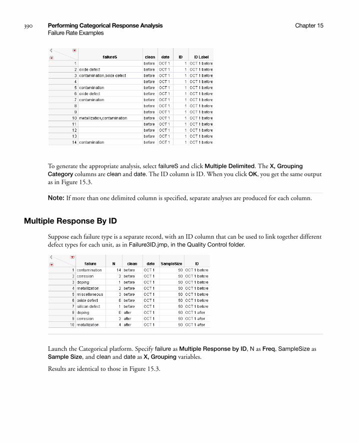
390 Performing Categorical Response Analysis Chapter 15Failure Rate Examples
To generate the appropriate analysis, select failureS and click Multiple Delimited. The X, Grouping Category columns are clean and date. The ID column is ID. When you click OK, you get the same output as in Figure 15.3.
Note: If more than one delimited column is specified, separate analyses are produced for each column.
Multiple Response By ID
Suppose each failure type is a separate record, with an ID column that can be used to link together different defect types for each unit, as in Failure3ID.jmp, in the Quality Control folder.
Launch the Categorical platform. Specify failure as Multiple Response by ID, N as Freq, SampleSize as Sample Size, and clean and date as X, Grouping variables.
Results are identical to those in Figure 15.3.

Chapter 15 Performing Categorical Response Analysis 391Categorical Reports
Multiple Response
Suppose that the defects for each unit are entered via a web page, but since each unit rarely has more than three defect types, the form has three fields to enter any of the defect types for a unit, as in Failure3MultipleField.jmp, in the Quality Control folder.
Select the three columns containing defect types (Failure1, Failure2, and Failure3), and click the Multiple Response button. After specifying clean and date as X, Grouping variables, click OK to see the analysis results. Figure 15.4 lists failure types and counts for each failure type from the Multiple Response analysis.
Figure 15.4 Multiple Response Failures from Failure3MultipleField.jmp
Categorical Reports
Report Content
The Categorical platform produces a report with several tables and charts. Frequency, Share of Responses, Rate Per Case tables, and a Share Chart are included by default. You can also select a Frequency Chart. A Crosstab Format, instead of a Table Format can also be selected. The defect data for Failure3Freq.jmp is illustrated below.
The topmost table is a Frequency count table, showing the frequency counts for each category with the total frequency (Responses) and total units (Cases) on the right. In this example, we have total defects for each defect type by the 7 batches. The last two columns show the total number of defects (Responses) and the total number of units (Cases).
The Share of Responses table is built by dividing each count by the total number of responses.

392 Performing Categorical Response Analysis Chapter 15Categorical Reports
As an example, examine the second row of the table (corresponding to October 2, after cleaning). The 10 contamination defects were (10/23)=43.5% of all defects.
The Rate Per Case table divides each count in the frequency table by the total number of cases.
For example, in the first row of the table (October 1, after cleaning), the 12 contamination defects are from 50 units, making the rate per unit 24%.
The Share Chart presents two bar chart columns. The bar chart on the left shows the Share of Responses as a divided bar chart. The bar length is proportional to the percentage of responses for each type. Since a bar in one sample might reflect a much higher frequency than a bar in another sample, the bar chart on the right shows the number of responses. The bar filled with a gradient means the the number of responses for that bar is more than the width of the bar chart allows.

Chapter 15 Performing Categorical Response Analysis 393Categorical Reports
The Frequency Chart shows response frequencies. The bars in the chart on the left reflect the frequency count on the same scale. The bar chart on the right shows the number of units.
Note again that the gradient-filled bars are used when the number of responses or units is more than the width of the bar chart allows.
The Transposed Freq Chart option produces a transposed version of the Frequency Chart. Marginal totals are given for each response, as opposed to each X variable.
Report Format
The default report format is the Table Format.

394 Performing Categorical Response Analysis Chapter 15Categorical Reports
To gather all three statistics for each sample and response together, use the Crosstab format.
Both Table Format and Crosstab Format have transposed versions (Table Transposed and Crosstab Transposed). These are useful when there are a lot of response categories but not a lot of samples.
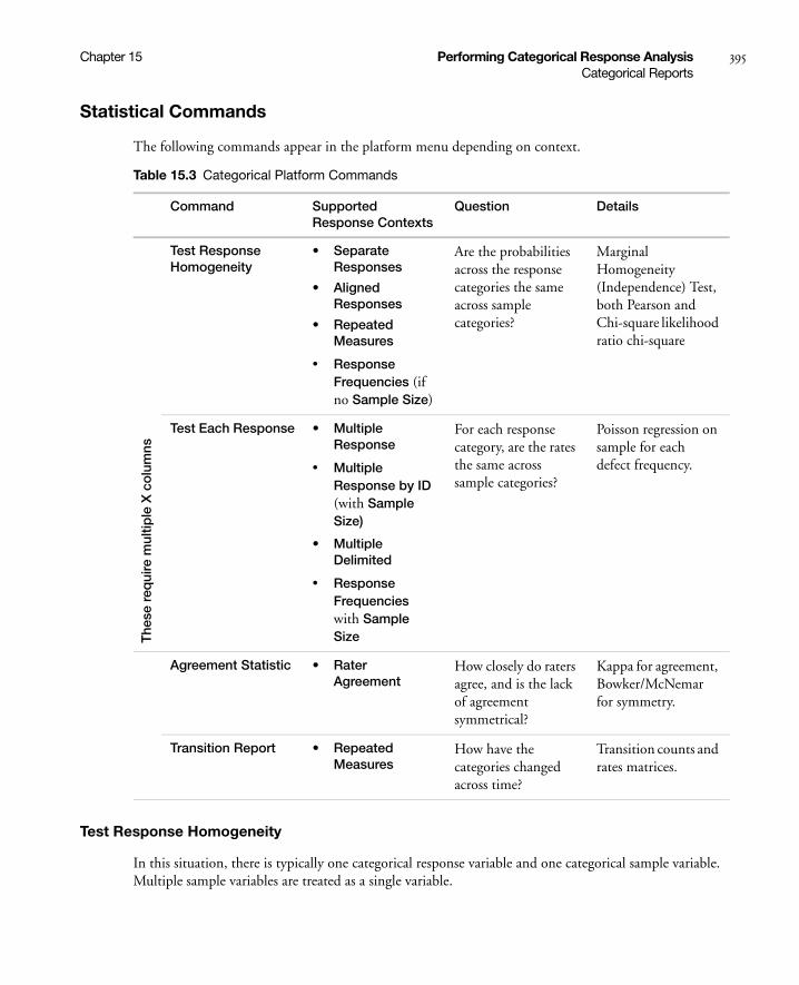
Chapter 15 Performing Categorical Response Analysis 395Categorical Reports
Statistical Commands
The following commands appear in the platform menu depending on context.
Test Response Homogeneity
In this situation, there is typically one categorical response variable and one categorical sample variable. Multiple sample variables are treated as a single variable.
Table 15.3 Categorical Platform Commands
Command Supported Response Contexts
Question Details
The
se r
equi
re m
ultip
le X
co
lum
ns
Test Response Homogeneity
• Separate Responses
• Aligned Responses
• Repeated Measures
• Response Frequencies (if no Sample Size)
Are the probabilities across the response categories the same across sample categories?
Marginal Homogeneity (Independence) Test, both Pearson and Chi-square likelihood ratio chi-square
Test Each Response • Multiple Response
• Multiple Response by ID (with Sample Size)
• Multiple Delimited
• Response Frequencies with Sample Size
For each response category, are the rates the same across sample categories?
Poisson regression on sample for each defect frequency.
Agreement Statistic • Rater Agreement
How closely do raters agree, and is the lack of agreement symmetrical?
Kappa for agreement, Bowker/McNemar for symmetry.
Transition Report • Repeated Measures
How have the categories changed across time?
Transition counts and rates matrices.
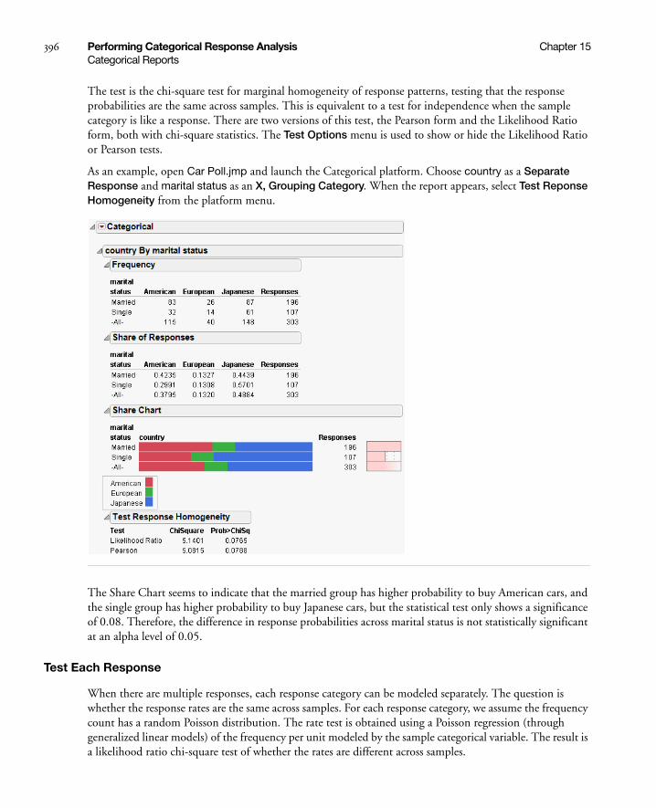
396 Performing Categorical Response Analysis Chapter 15Categorical Reports
The test is the chi-square test for marginal homogeneity of response patterns, testing that the response probabilities are the same across samples. This is equivalent to a test for independence when the sample category is like a response. There are two versions of this test, the Pearson form and the Likelihood Ratio form, both with chi-square statistics. The Test Options menu is used to show or hide the Likelihood Ratio or Pearson tests.
As an example, open Car Poll.jmp and launch the Categorical platform. Choose country as a Separate Response and marital status as an X, Grouping Category. When the report appears, select Test Reponse Homogeneity from the platform menu.
The Share Chart seems to indicate that the married group has higher probability to buy American cars, and the single group has higher probability to buy Japanese cars, but the statistical test only shows a significance of 0.08. Therefore, the difference in response probabilities across marital status is not statistically significant at an alpha level of 0.05.
Test Each Response
When there are multiple responses, each response category can be modeled separately. The question is whether the response rates are the same across samples. For each response category, we assume the frequency count has a random Poisson distribution. The rate test is obtained using a Poisson regression (through generalized linear models) of the frequency per unit modeled by the sample categorical variable. The result is a likelihood ratio chi-square test of whether the rates are different across samples.
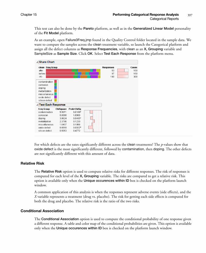
Chapter 15 Performing Categorical Response Analysis 397Categorical Reports
This test can also be done by the Pareto platform, as well as in the Generalized Linear Model personality of the Fit Model platform.
As an example, open Failure3Freq.jmp found in the Quality Control folder located in the sample data. We want to compare the samples across the clean treatment variable, so launch the Categorical platform and assign all the defect columns as Response Frequencies, with clean as an X, Grouping variable and SampleSize as Sample Size. Click OK. Select Test Each Response from the platform menu.
For which defects are the rates significantly different across the clean treatments? The p-values show that oxide defect is the most significantly different, followed by contamination, then doping. The other defects are not significantly different with this amount of data.
Relative Risk
The Relative Risk option is used to compute relative risks for different responses. The risk of responses is computed for each level of the X, Grouping variable. The risks are compared to get a relative risk. This option is available only when the Unique occurences within ID box is checked on the platform launch window.
A common application of this analysis is when the responses represent adverse events (side effects), and the X variable represents a treatment (drug vs. placebo). The risk for getting each side effects is computed for both the drug and placebo. The relative risk is the ratio of the two risks.
Conditional Association
The Conditional Association option is used to compute the conditional probability of one response given a different response. A table and color map of the conditional probabilities are given. This option is available only when the Unique occurences within ID box is checked on the platform launch window.

398 Performing Categorical Response Analysis Chapter 15Categorical Reports
A common application of this analysis is when the responses represent adverse events (side effects) from a drug. The computations represent the conditional probability of one side effect given the presence of another side effect.
Rater Agreement
The Rater Agreement analysis answers the questions of how closely raters agree with one another and if the lack of agreement is symmetrical.
As an example, open Attribute Gauge.jmp. The Attribute Chart script runs the Variability Chart platform, which has a test for agreement among raters.
Launch the Categorical platform and designate the three raters (A, B, and C) as Rater Agreement responses in the launch dialog. In the resulting report, you have a similar test for agreement that is augmented by a symmetry test that the lack of agreement is symmetric.
Save Tables
The Save Tables menu on the platform red-triangle menu has the following options:
Save Frequencies saves the Frequency report to a new data table, without the marginal totals.
Save Share of Responses saves the Share of Responses report to a new data table, without the marginal totals.
Save Rate Per Case saves the Rate Per Case report to a new data table, without the marginal totals.
Save Transposed Frequencies saves the Transposed Freq Chart report to a new data table, without the marginal totals.
Save Transposed Share of Responses saves a transposed version of the Share of Responses report to a new data table
Save Transposed Rate Per Case saves a transposed version of the Rate Per Case report to a new data table.

Chapter 15 Performing Categorical Response Analysis 399Categorical Reports
Save Test Rates saves the results of the Test Each Response option to a new data table.
Save Test Homogeneity saves the results of the Test Response Homogeneity option to a new data table. This option is available only when using Aligned Responses.

400 Performing Categorical Response Analysis Chapter 15Categorical Reports

Chapter 16Performing Choice Modeling
Using the Choice Platform
The Choice platform is designed for use in market research experiments, where the ultimate goal is to discover the preference structure of consumers. Then, this information is used to design products or services that have the attributes most desired by consumers.
Features provided in the Choice platform include:
• ability to use information about consumer traits as well as product attributes.
• integration of data from one, two, or three sources.
• ability to use the integrated profiler to understand, visualize, and optimize the response (utility) surface.
• provides subject-level scores for segmenting or clustering your data.
• uses a special default bias-corrected maximum likelihood estimator described by Firth (1993). This method has been shown to produce better estimates and tests than MLEs without bias correction. In addition, bias-corrected MLEs ameliorate separation problems that tend to occur in logistic-type models. Refer to Heinze and Schemper (2002) for a discussion of the separation problem in logistic regression.
The Choice platform is not appropriate to use for fitting models that involve:
• ranking or scoring.
• nested hierarchical choices. (PROC MDC in SAS/ETS can be used for such analysis.)
Contents
Introduction to Choice Modeling . . . . . . . . . . . . . . . . . . . . . . . . . . . . . . . . . . . . . . . . . . . . . . . . . . . . . .403
Choice Statistical Model . . . . . . . . . . . . . . . . . . . . . . . . . . . . . . . . . . . . . . . . . . . . . . . . . . . . . . . . . .403
Product Design Engineering . . . . . . . . . . . . . . . . . . . . . . . . . . . . . . . . . . . . . . . . . . . . . . . . . . . . . . . . . .403
Data for the Choice Platform . . . . . . . . . . . . . . . . . . . . . . . . . . . . . . . . . . . . . . . . . . . . . . . . . . . . . . . . 404
Example: Pizza Choice . . . . . . . . . . . . . . . . . . . . . . . . . . . . . . . . . . . . . . . . . . . . . . . . . . . . . . . . . . . . . .405
Launch the Choice Platform and Select Data Sets . . . . . . . . . . . . . . . . . . . . . . . . . . . . . . . . . . . . . . . . . 406
Choice Model Output . . . . . . . . . . . . . . . . . . . . . . . . . . . . . . . . . . . . . . . . . . . . . . . . . . . . . . . . . . . 409
Subject Effects . . . . . . . . . . . . . . . . . . . . . . . . . . . . . . . . . . . . . . . . . . . . . . . . . . . . . . . . . . . . . . . . . .410
Utility Grid Optimization . . . . . . . . . . . . . . . . . . . . . . . . . . . . . . . . . . . . . . . . . . . . . . . . . . . . . . . . . 412
Platform Options . . . . . . . . . . . . . . . . . . . . . . . . . . . . . . . . . . . . . . . . . . . . . . . . . . . . . . . . . . . . . . . . . . 414
Example: Valuing Trade-offs . . . . . . . . . . . . . . . . . . . . . . . . . . . . . . . . . . . . . . . . . . . . . . . . . . . . . . . . . . 414
One-Table Analysis . . . . . . . . . . . . . . . . . . . . . . . . . . . . . . . . . . . . . . . . . . . . . . . . . . . . . . . . . . . . . . . . 420
Example: One-Table Pizza Data . . . . . . . . . . . . . . . . . . . . . . . . . . . . . . . . . . . . . . . . . . . . . . . . . . . . 421
Segmentation . . . . . . . . . . . . . . . . . . . . . . . . . . . . . . . . . . . . . . . . . . . . . . . . . . . . . . . . . . . . . . . . . . . . .423
Special Data Rules . . . . . . . . . . . . . . . . . . . . . . . . . . . . . . . . . . . . . . . . . . . . . . . . . . . . . . . . . . . . . . . . . 427
Default choice set . . . . . . . . . . . . . . . . . . . . . . . . . . . . . . . . . . . . . . . . . . . . . . . . . . . . . . . . . . . . . . 427
Subject Data with Response Data . . . . . . . . . . . . . . . . . . . . . . . . . . . . . . . . . . . . . . . . . . . . . . . . . . .428
Logistic Regression . . . . . . . . . . . . . . . . . . . . . . . . . . . . . . . . . . . . . . . . . . . . . . . . . . . . . . . . . . . . . .428
Transforming Data . . . . . . . . . . . . . . . . . . . . . . . . . . . . . . . . . . . . . . . . . . . . . . . . . . . . . . . . . . . . . . . . . 431
Transforming Data to Two Analysis Tables . . . . . . . . . . . . . . . . . . . . . . . . . . . . . . . . . . . . . . . . . . . . 431
Transforming Data to One Analysis Table . . . . . . . . . . . . . . . . . . . . . . . . . . . . . . . . . . . . . . . . . . . . .436
Logistic Regression for Matched Case-Control Studies . . . . . . . . . . . . . . . . . . . . . . . . . . . . . . . . . . . . . .438

Chapter 16 Performing Choice Modeling 403Introduction to Choice Modeling
Introduction to Choice Modeling
Choice modeling, pioneered by McFadden (1974), is a powerful analytic method used to estimate the probability of individuals making a particular choice from presented alternatives. Choice modeling is also called conjoint modeling, discrete choice analysis, and conditional logistic regression.
The Choice Modeling platform uses a form of conditional logistic regression. Unlike simple logistic regression, choice modeling uses a linear model to model choices based on response attributes and not solely upon subject characteristics. For example, in logistic regression, the response might be whether you buy brand A or brand B as a function of ten factors or characteristics that describe you such as your age, gender, income, education, etc. However, in choice modeling, you might be choosing between two cars that are a compound of ten attributes such as price, passenger load, number of cup holders, color, GPS device, gas mileage, anti-theft system, removable-seats, number of safety features, and insurance cost.
Choice Statistical Model
Parameter estimates from the choice model identify consumer utility, or marginal utilities in the case of a linear utility function. Utility is the level of satisfaction consumers receive from products with specific attributes and is determined from the parameter estimates in the model.
The choice statistical model is expressed as follows.
Let X[k] represent a subject attribute design row, with intercept
Let Z[j] represent a choice attribute design row, without intercept
Then, the probability of a given choice for the k'th subject to the j'th choice of m choices is
where
the numerator calculates for the j'th alternative actually chosen, and
the denominator sums over the m choices presented to the subject for that trial.
Product Design Engineering
When engineers design a product, they routinely make hundreds or thousands of small design decisions. Most of these decisions are not tested by prospective customers. Consequently, these products are not optimally designed. However, if customer testing is not too costly and test subjects (prospective customers) are readily available, it is worthwhile to test more of these decisions via consumer choice experiments.
Pi jk[ ] β' X k[ ] Z j[ ]⊗( )( )exp
β' X k[ ] Z l[ ]⊗( )( )exp
l 1=
m
---------------------------------------------------------------=
is the Kronecker row-wise product⊗

404 Performing Choice Modeling Chapter 16Data for the Choice Platform
Modeling costs have recently decreased with improved product and process development techniques and methodologies. Prototyping, including pure digital prototyping, is becoming less expensive, so it is possible to evaluate the attributes and consequences of more alternatives. Another important advancement is the use of the Internet to deliver choice experiments to a wide audience. You can now inform your customers that they can have input into the design of the next product edition by completing a web survey.
Choice modeling can be added to Six Sigma programs to improve consumer products. Six Sigma aims at making products better by improving the manufacturing process and ensuring greater performance and durability. But, Six Sigma programs have not addressed one very important aspect of product improvement—making the products that people actually want. Six Sigma programs often consider the Voice of the Customer and can use customer satisfaction surveys. However, while these surveys can disclose what is wrong with the product, they fail to identify consumer preferences with regard to specific product attributes. Choice experiments provide a tool that enables companies to gain insight for actual customer preferences. Choice modeling analysis can reveal such preferences.
Market research experiments have a long history of success, but performing these experiments has been expensive, and research has previously focused on price elasticity and competitive situations. It is by using these same techniques for product design engineering where choice modeling can have the most impact.
Data for the Choice Platform
The Choice platform is unique because it is designed to use data from one, two or three different data tables.
Profile data describe the attributes associated with each choice. Each choice can comprise many different attributes, and each attribute is listed as a column in the data table. There is a row for each possible choice, and each possible choice contains a unique ID.
Response data contain the experimental results and have the choice set IDs for each trial as well as the actual choice selected by the subject. Each subject usually has several trials, or choice sets, to cover several choice possibilities. There can be more than one row of data for each subject. For example, an experiment might have 100 subjects with each subject making 12 choice decisions, resulting in 1200 rows in this data table. The Response data are linked to the Profile data through the choice set columns and the actual choice response column. Choice set refers to the set of alternatives from which the subject makes a choice. Grouping variables are sometimes used to align choice indices when more than one group is contained within the data.
Subject data are optional, depending on whether subject effects are to be modeled. This source contains one or more attributes or characteristics of each subject and a subject identifier. The Subject data table contains the same number of rows as subjects and has an identifier column that matches a similar column in the Response data table. You can also put Subject data in the Response data table, but it is still specified as a subject table.
If all your data are contained in one table, you can use the Choice platform, but additional effort is necessary. See the section “One-Table Analysis” on page 420.

Chapter 16 Performing Choice Modeling 405Example: Pizza Choice
Example: Pizza Choice
Suppose that you are supplying pizza for an airline. You want to find pizza attributes that are optimal for the flying population. So, you have a group of frequent flyers complete a choice survey. In order to weigh the importance of each attribute and to determine whether there are any interactions between the different attributes, you give them a series of choices that require them to state their preference between each pair of choices. One pair of choices might be between two types of pizza that they like, or between two types of pizza that they do not like. Hence, the choice might not always be easy.
This example examines pizza choices where three attributes, each with two levels, are presented to the subjects:
• crust (thick or thin),
• cheese (mozzarella or Monterey Jack),
• topping (pepperoni or none).
Suppose a subject likes thin crust with mozzarella cheese and no topping, but the choices given to the subject are either a thick crust with mozzarella cheese and pepperoni topping, or a thin crust with Monterey Jack cheese and no topping. Since neither of these pizzas is ideal, the subject has to weigh which of the attributes are more important.
The profile data table lists all the pizza choice combinations that you want to present to the subjects. Each choice combination is given an ID. The profile data table is shown in Figure 16.1.
Figure 16.1 Pizza Profile Data Table
For the actual survey or experiment, each subject is given four trials, where each trial consists of stating his or her preference between two choice profiles (Choice1 and Choice2). The choice profiles given for each trial are referred to as a choice set. One subject’s choice trials can be different from another subject’s trials. Refer to the DOE Choice Design platform for generating optimal choice designs. Twelve runs from the first three subjects are shown in Figure 16.2.

406 Performing Choice Modeling Chapter 16Launch the Choice Platform and Select Data Sets
Figure 16.2 Pizza Response Data Table Segment
Notice that each choice value refers to an ID value in the Profile data table which has the attribute information.
If data about the subject are to be used, a separate Subject data table is needed. This table includes a subject ID column and characteristics of the subject. In the pizza example, the only characteristic or attribute about the Subject is Gender. Subject data for the first four subjects are shown in Figure 16.3. Notice that the response choices and choice sets in the response data table use the ID names given in the profile data set. Similarly, the subject identifications in the response data table match those in the subject data table.
Figure 16.3 Pizza Subject Data Table Segment
Launch the Choice Platform and Select Data Sets
Since the Choice platform can use several data tables, no initial assumption is made about using the current data table—as is the case with other JMP platforms. You must select the data table for each of the three choice data sources. You are prompted to select the profile data set and the response data set. If you want to model subject attributes, then a subject data set must also be selected. You can expand or collapse each section of the Choice dialog box, as needed.
To illustrate the Choice platform, three data sets from the pizza example are used and are found in the sample data directory. The first data set is entered into the Profile Data section of the Choice Dialog Box, as shown in Figure 16.4.
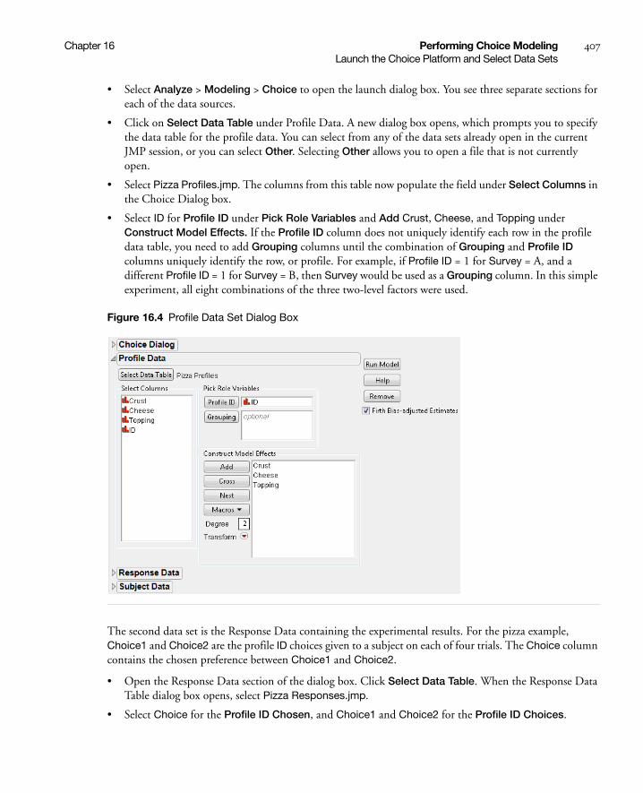
Chapter 16 Performing Choice Modeling 407Launch the Choice Platform and Select Data Sets
• Select Analyze > Modeling > Choice to open the launch dialog box. You see three separate sections for each of the data sources.
• Click on Select Data Table under Profile Data. A new dialog box opens, which prompts you to specify the data table for the profile data. You can select from any of the data sets already open in the current JMP session, or you can select Other. Selecting Other allows you to open a file that is not currently open.
• Select Pizza Profiles.jmp. The columns from this table now populate the field under Select Columns in the Choice Dialog box.
• Select ID for Profile ID under Pick Role Variables and Add Crust, Cheese, and Topping under Construct Model Effects. If the Profile ID column does not uniquely identify each row in the profile data table, you need to add Grouping columns until the combination of Grouping and Profile ID columns uniquely identify the row, or profile. For example, if Profile ID = 1 for Survey = A, and a different Profile ID = 1 for Survey = B, then Survey would be used as a Grouping column. In this simple experiment, all eight combinations of the three two-level factors were used.
Figure 16.4 Profile Data Set Dialog Box
The second data set is the Response Data containing the experimental results. For the pizza example, Choice1 and Choice2 are the profile ID choices given to a subject on each of four trials. The Choice column contains the chosen preference between Choice1 and Choice2.
• Open the Response Data section of the dialog box. Click Select Data Table. When the Response Data Table dialog box opens, select Pizza Responses.jmp.
• Select Choice for the Profile ID Chosen, and Choice1 and Choice2 for the Profile ID Choices.
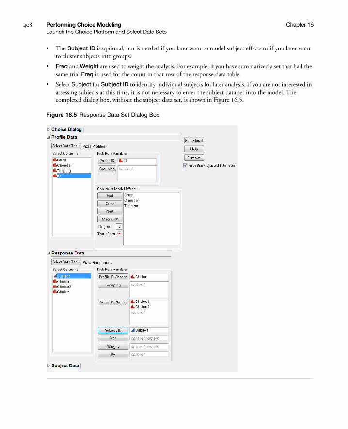
408 Performing Choice Modeling Chapter 16Launch the Choice Platform and Select Data Sets
• The Subject ID is optional, but is needed if you later want to model subject effects or if you later want to cluster subjects into groups.
• Freq and Weight are used to weight the analysis. For example, if you have summarized a set that had the same trial Freq is used for the count in that row of the response data table.
• Select Subject for Subject ID to identify individual subjects for later analysis. If you are not interested in assessing subjects at this time, it is not necessary to enter the subject data set into the model. The completed dialog box, without the subject data set, is shown in Figure 16.5.
Figure 16.5 Response Data Set Dialog Box

Chapter 16 Performing Choice Modeling 409Launch the Choice Platform and Select Data Sets
If you are scripting the Choice platform, you can also set the acceptable criterion for convergence when estimating the parameters by adding this command to the Choice() specification:
Choice( ..., Convergence Criterion( fraction ), ... )
See the Object Scripting Index for an example.
Choice Model Output
Click on Run Model to obtain the results. These results are shown in Figure 16.6.
• The resulting parameter estimates are sometimes referred to as part-worths. Each part-worth is the coefficient of utility associated with that attribute. By default, these estimates are based upon the Firth bias-corrected maximum likelihood estimators, and are, therefore, considered to be more accurate than MLEs without bias correction.
• Comparison criteria are used to help determine the better-fitting model(s) when more than one model is investigated for your data. The model with the lower or lowest criterion value is believed to be the better or best model. Three criteria are shown in the Choice Model output and include AICc (corrected Akaike’s Information Criterion), -2*LogLikelihood, and -2*Firth Loglikelihood. The AICc formula is:
where k is the number of estimated parameters in the model and n is the number of observations in the dataset. Note that the -2*Firth Loglikelihood result is only included in the report when the Firth Bias-adjusted Estimates checkbox is checked in the launch window. (See Figure 16.5.) This option is checked by default. The decision to use or not use the Firth Bias-adjusted Estimates does not affect the AICc score or the -2*LogLikelihood results.
• Likelihood ratio tests appear for each effect in the model. These results are obtained by default if the model is fit quickly (less than five seconds); otherwise, you can click on the Choice Model drop down menu and select Likelihood Ratio Tests.
Figure 16.6 Choice Model Results with No Subject Data for Pizza Example
AICc 2loglikelihood– 2k2k k 1+( )n k– 1–-----------------------+ +=
Part-worths for crust, cheese, and topping

410 Performing Choice Modeling Chapter 16Launch the Choice Platform and Select Data Sets
The profiler option is particularly valuable in understanding the model. It shows the value of the linear model, or the utility, as you change each factor, one at a time.
• You specify the profiler option by selecting Profiler in the platform menu. The Prediction Profiler is shown in Figure 16.7.
• In this example involving only main effects, the factor showing the greatest difference is Cheese, favoring Mozzarella.
• If there were interactions in the model, more exploration of the profiler would be needed in order to understand the response surface.
Figure 16.7 Prediction Profiler with No Subject Data for Pizza Example
Subject Effects
If you want to include subject effects in the model, you need to open the Subject data table section of the Choice dialog box. Suppose you are interested in Gender main effects.
• Open the Subject Data section of the launch dialog box. Click Select Data Table, and when the Subject Data Table opens, select Pizza Subjects.jmp.
• Specify Subject as Subject ID, and add Gender under Construct Model Effects. The Subject data dialog box section for the pizza example is shown in Figure 16.8.
• Click on Run Model.
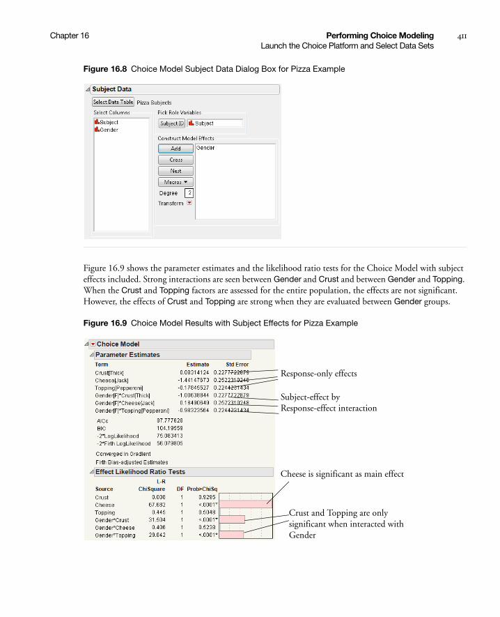
Chapter 16 Performing Choice Modeling 411Launch the Choice Platform and Select Data Sets
Figure 16.8 Choice Model Subject Data Dialog Box for Pizza Example
Figure 16.9 shows the parameter estimates and the likelihood ratio tests for the Choice Model with subject effects included. Strong interactions are seen between Gender and Crust and between Gender and Topping. When the Crust and Topping factors are assessed for the entire population, the effects are not significant. However, the effects of Crust and Topping are strong when they are evaluated between Gender groups.
Figure 16.9 Choice Model Results with Subject Effects for Pizza Example
Crust and Topping are only significant when interacted with Gender
Response-only effects
Subject-effect by Response-effect interaction
Cheese is significant as main effect

412 Performing Choice Modeling Chapter 16Launch the Choice Platform and Select Data Sets
The profiler is used to explore the response surface of the model. Click on the Choice Model drop-down menu and select the Profiler. You can Alt-click on any segment of the Profiler graphics to lock that particular factor level. (F is locked by default in this example.) A solid vertical line appears in place of the dotted line. Other factor settings can then be assessed easily for the locked factor level.
• As shown in Figure 16.10, when the female (F) level of Gender is locked, the Profiler shows that females prefer pizza with thin crust, mozzarella cheese, and no topping. For example, the Utility measure is higher for Crust equals Thin, meaning that females prefer thin crust.
• Now, switch Gender to M to assess male pizza preferences. As shown in Figure 16.11, males prefer thick crust, mozzarella cheese, and pepperoni topping.
Figure 16.10 Prediction Profiler with Subject Data and Female Level Factor Setting
Figure 16.11 Prediction Profiler with Subject Data and Male Level Factor Setting
Utility Grid Optimization
The Prediction Profiler allows you to optimize the utility function over a grid of fixed subject factor settings without having to manually manipulate profiler settings:
• Click on the platform drop-down-menu, select Profiler, and verify that one of the subject factors is locked. If not, Alt-click within the Profiler plot to lock the desired factor level. Set the Utility function to the maximum values for the other factors by sliding the red dotted vertical line.

Chapter 16 Performing Choice Modeling 413Launch the Choice Platform and Select Data Sets
• Click on the red-triangle menu of the Prediction Profiler and select Desirability Functions. A new row is added to the Prediction Profiler, displaying overall desirability traces and measures. Utility and Desirability Functions are shown together in Figure 16.12.
Figure 16.12 Utility and Desirability Functions
• From the red-triangle menu of the Prediction Profiler, select Maximize for each Grid Point. A Remembered Settings table containing the grid settings with the maximum utility and desirability functions, and a table of differences between grids is displayed. See Figure 16.13. As illustrated, this feature can be a very quick and useful tool for selecting the most desirable attribute combinations for a factor.
Figure 16.13 Utility and Desirability Settings
The grid setting for females shows that the greatest utility and desirability values are obtained when the pizza attributes are thin crust, mozzarella cheese, and no topping. For males, the grid setting shows that the highest utility and desirability values are obtained when the pizza attributes are thick crust, mozzarella cheese, and pepperoni topping.

414 Performing Choice Modeling Chapter 16Platform Options
Platform Options
The Choice Modeling platform has many available options. To access these options, click on the platform drop-down menu.
Likelihood Ratio Tests tests the significance of each effect in the model. These are done by default if the estimate of cpu time is less than five seconds.
Joint Factor Tests tests each factor in the model by constructing a likelihood ratio test for all the effects involving that factor.
Confidence Intervals produces a 95% confidence interval for each parameter (by default), using the profile-likelihood method. Shift-click on the platform drop-down menu and select Confidence Intervals to input alpha values other than 0.05.
Correlation of Estimates shows the correlations of the parameter estimates.
Effect Marginals shows the fitted utility values for different levels in the effects, with neutral values used for unrelated factors.
Profiler produces a response surface viewer that takes vertical cross-sections across each factor, one at a time.
Save Utility Formula makes a new column with a formula for the utility, or linear model, that is estimated. This is in the profile data table, except if there are subject effects. In that case, it makes a new data table for the formula. This formula can be used with various profilers with subsequent analyses.
Save Gradients by Subject constructs a new table that has a row for each subject containing the average (Hessian-scaled-gradient) steps on each parameter. This corresponds to using a Lagrangian multiplier test for separating that subject from the remaining subjects. These values can later be clustered, using the built-in-script, to indicate unique market segments represented in the data.
Model Dialog shows the Choice dialog box, which can be used to modify and re-fit the model. You can specify new data sets, new IDs, and new model effects.
Example: Valuing Trade-offs
The Choice Modeling platform is also useful for determining the relative importance of product attributes. Even if the attributes of a particular product that are important to the consumer are known, information about preference trade-offs with regard to these attributes might be unknown. By gaining such information, a market researcher or product designer is able to incorporate product features that represent the optimal trade-off from the perspective of the consumer.
The advantages of this approach to product design can be found in the following example. It is already known that four attributes are important for laptop design--hard-disk size, processor speed, battery life, and selling price. The data gathered for this study are used to determine which of four laptop attributes (Hard Disk, Speed, Battery Life, and Price) are most important. It also assesses whether or not there are Gender or Job differences seen with these attributes.
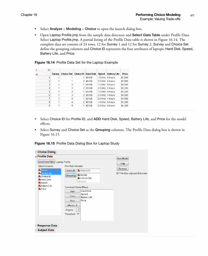
Chapter 16 Performing Choice Modeling 415Example: Valuing Trade-offs
• Select Analyze > Modeling > Choice to open the launch dialog box.
• Open Laptop Profile.jmp from the sample data directory and Select Data Table under Profile Data. Select Laptop Profile.jmp. A partial listing of the Profile Data table is shown in Figure 16.14. The complete data set consists of 24 rows, 12 for Survey 1 and 12 for Survey 2. Survey and Choice Set define the grouping columns and Choice ID represents the four attributes of laptops: Hard Disk, Speed, Battery Life, and Price.
Figure 16.14 Profile Data Set for the Laptop Example
• Select Choice ID for Profile ID, and ADD Hard Disk, Speed, Battery Life, and Price for the model effects.
• Select Survey and Choice Set as the Grouping columns. The Profile Data dialog box is shown in Figure 16.15.
Figure 16.15 Profile Data Dialog Box for Laptop Study
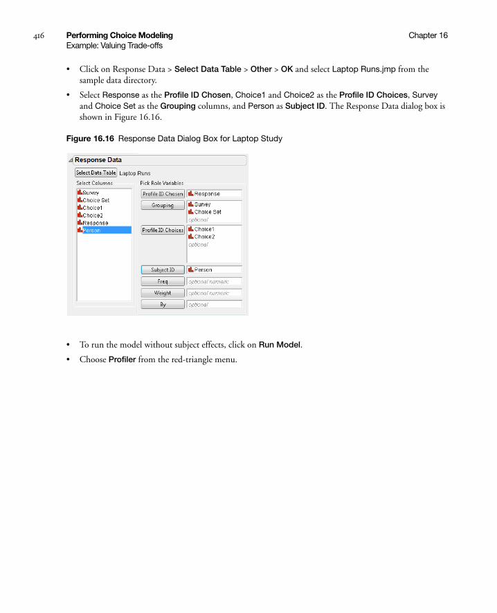
416 Performing Choice Modeling Chapter 16Example: Valuing Trade-offs
• Click on Response Data > Select Data Table > Other > OK and select Laptop Runs.jmp from the sample data directory.
• Select Response as the Profile ID Chosen, Choice1 and Choice2 as the Profile ID Choices, Survey and Choice Set as the Grouping columns, and Person as Subject ID. The Response Data dialog box is shown in Figure 16.16.
Figure 16.16 Response Data Dialog Box for Laptop Study
• To run the model without subject effects, click on Run Model.
• Choose Profiler from the red-triangle menu.
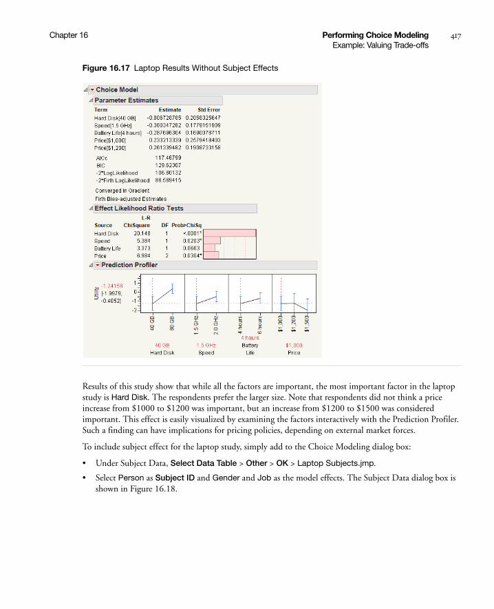
Chapter 16 Performing Choice Modeling 417Example: Valuing Trade-offs
Figure 16.17 Laptop Results Without Subject Effects
Results of this study show that while all the factors are important, the most important factor in the laptop study is Hard Disk. The respondents prefer the larger size. Note that respondents did not think a price increase from $1000 to $1200 was important, but an increase from $1200 to $1500 was considered important. This effect is easily visualized by examining the factors interactively with the Prediction Profiler. Such a finding can have implications for pricing policies, depending on external market forces.
To include subject effect for the laptop study, simply add to the Choice Modeling dialog box:
• Under Subject Data, Select Data Table > Other > OK > Laptop Subjects.jmp.
• Select Person as Subject ID and Gender and Job as the model effects. The Subject Data dialog box is shown in Figure 16.18.
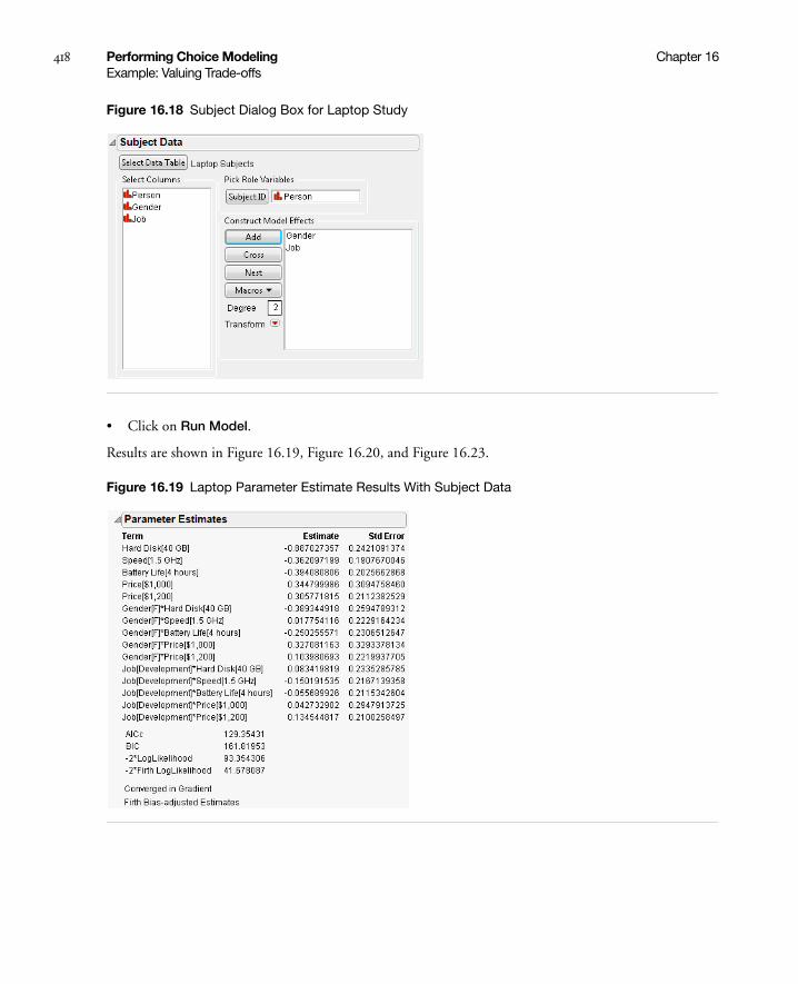
418 Performing Choice Modeling Chapter 16Example: Valuing Trade-offs
Figure 16.18 Subject Dialog Box for Laptop Study
• Click on Run Model.
Results are shown in Figure 16.19, Figure 16.20, and Figure 16.23.
Figure 16.19 Laptop Parameter Estimate Results With Subject Data
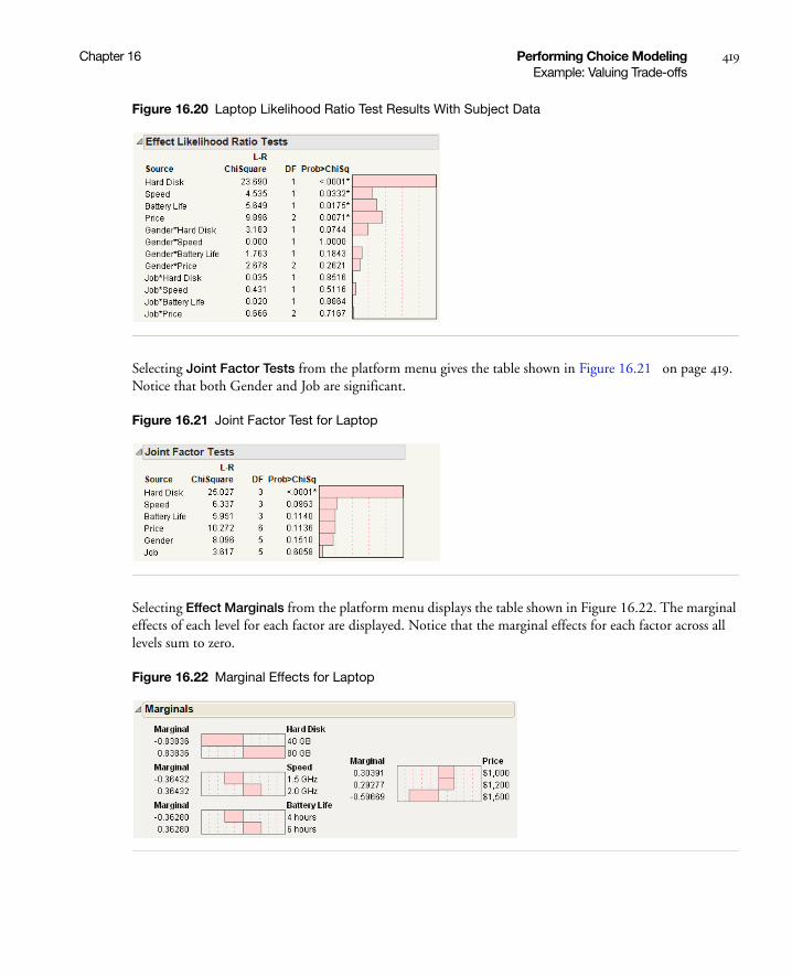
Chapter 16 Performing Choice Modeling 419Example: Valuing Trade-offs
Figure 16.20 Laptop Likelihood Ratio Test Results With Subject Data
Selecting Joint Factor Tests from the platform menu gives the table shown in Figure 16.21 on page 419. Notice that both Gender and Job are significant.
Figure 16.21 Joint Factor Test for Laptop
Selecting Effect Marginals from the platform menu displays the table shown in Figure 16.22. The marginal effects of each level for each factor are displayed. Notice that the marginal effects for each factor across all levels sum to zero.
Figure 16.22 Marginal Effects for Laptop
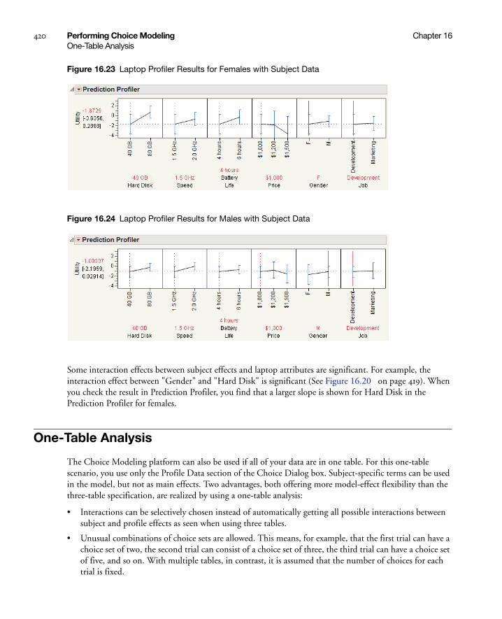
420 Performing Choice Modeling Chapter 16One-Table Analysis
Figure 16.23 Laptop Profiler Results for Females with Subject Data
Figure 16.24 Laptop Profiler Results for Males with Subject Data
Some interaction effects between subject effects and laptop attributes are significant. For example, the interaction effect between "Gender" and "Hard Disk" is significant (See Figure 16.20 on page 419). When you check the result in Prediction Profiler, you find that a larger slope is shown for Hard Disk in the Prediction Profiler for females.
One-Table Analysis
The Choice Modeling platform can also be used if all of your data are in one table. For this one-table scenario, you use only the Profile Data section of the Choice Dialog box. Subject-specific terms can be used in the model, but not as main effects. Two advantages, both offering more model-effect flexibility than the three-table specification, are realized by using a one-table analysis:
• Interactions can be selectively chosen instead of automatically getting all possible interactions between subject and profile effects as seen when using three tables.
• Unusual combinations of choice sets are allowed. This means, for example, that the first trial can have a choice set of two, the second trial can consist of a choice set of three, the third trial can have a choice set of five, and so on. With multiple tables, in contrast, it is assumed that the number of choices for each trial is fixed.

Chapter 16 Performing Choice Modeling 421One-Table Analysis
A choice response consists of a set of rows, uniquely identified by the Grouping columns. An indicator column is specified for Profile ID in the Choice Dialog box. This indicator variable uses the value of 1 for the chosen profile row and 0 elsewhere. There must be exactly one “1” for each Grouping combination.
Example: One-Table Pizza Data
This example illustrates how the pizza data are organized for the one-table situation. Figure 16.25 shows a subset of the combined pizza data. Open Pizza Combined.jmp from the sample data directory to see the complete table. Each subject completes four choice sets, with each choice set or trial consisting of two choices. For this example, each subject has eight rows in the data set. The indicator variable specifies the chosen profile for each choice set. The columns Subject and Trial together identify the choice set, so they are the Grouping columns.
Figure 16.25 Partial Listing of Combined Pizza Data for One-Table Analysis
To analyze the data in this format, open the Profile Data section in the Choice Dialog box, shown in Figure 16.26.
• Specify Pizza Combined.jmp as the data set.
• Specify Indicator as the Profile ID, Subject and Trial as the Grouping variables, and add Crust, Cheese, and Topping as the main effects.
• Click Run Model.
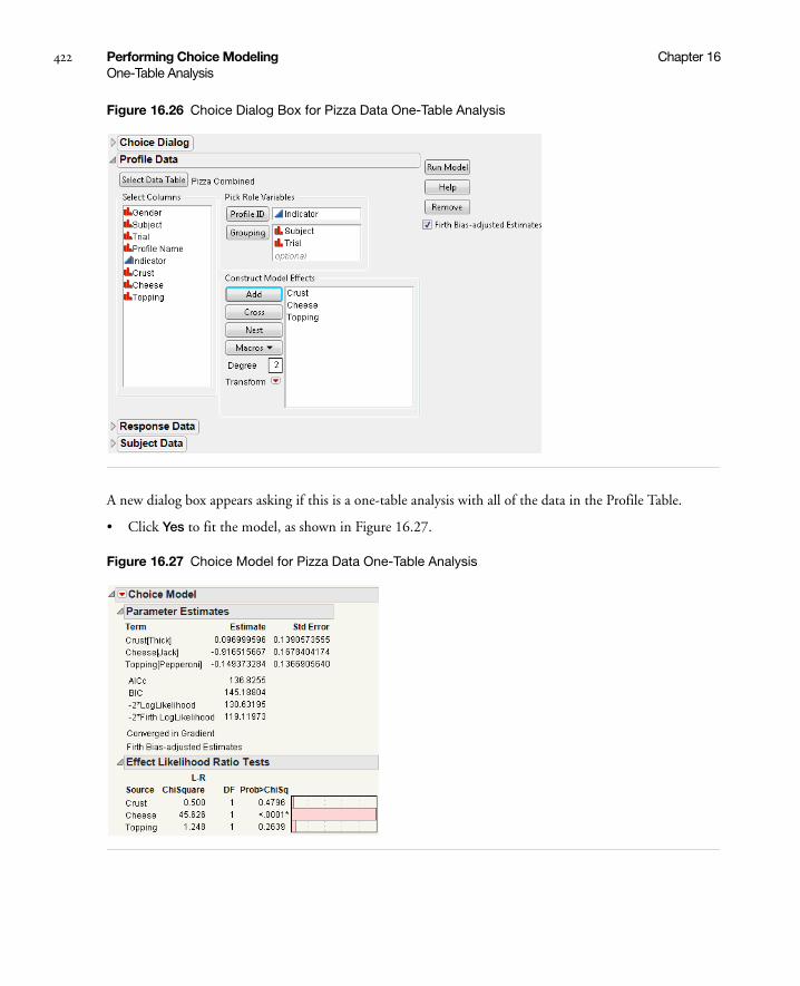
422 Performing Choice Modeling Chapter 16One-Table Analysis
Figure 16.26 Choice Dialog Box for Pizza Data One-Table Analysis
A new dialog box appears asking if this is a one-table analysis with all of the data in the Profile Table.
• Click Yes to fit the model, as shown in Figure 16.27.
Figure 16.27 Choice Model for Pizza Data One-Table Analysis

Chapter 16 Performing Choice Modeling 423Segmentation
• Select Profiler from the drop-down menu to obtain the results shown in Figure 16.28. Notice that the parameter estimates and the likelihood ratio test results are identical to the results obtained for the Choice Model with only two tables, shown in Figure 16.6 and Figure 16.7.
Figure 16.28 Prediction Profiler for Pizza Data One-Table Analysis
Segmentation
Market researchers sometimes want to analyze the preference structure for each subject separately in order to see whether there are groups of subjects that behave differently. However, there are usually not enough data to do this with ordinary estimates. If there are sufficient data, you can specify “By groups” in the Response Data or you could introduce a Subject identifier as a subject-side model term. This approach, however, is costly if the number of subjects is large. Other segmentation techniques discussed in the literature include Bayesian and mixture methods.
You can also use JMP to segment by clustering subjects using response data. For example, after running the model using the Pizza Profiles.jmp, Pizza Responses.jmp, and the optional Pizza Subjects.jmp data sets, click on the drop-down menu for the Choice Model platform and select Save Gradients by Subject. A new data table is created containing the average Hessian-scaled gradient on each parameter, and there is one row for each subject.
Note: This feature is regarded as an experimental method, since, in practice, little research has been conducted on its effectiveness.
These gradient values are the subject-aggregated Newton-Raphson steps from the optimization used to produce the estimates. At the estimates, the total gradient is zero, and
where g is the total gradient of the log-likelihood evaluated at the MLE, and
is the inverse Hessian function or the inverse of the negative of the second partial derivative of the log-likelihood.
Δ H1–
g 0= =
H1–

424 Performing Choice Modeling Chapter 16Segmentation
But, the disaggregation of Δ results in
where i is the subject index, j is the choice response index for each subject,
Δij are the partial Newton-Raphson steps for each run, and
gij is the gradient of the log-likelihood by run.
The mean gradient step for each subject is then calculated as:
where ni is the number of runs per subject.
These are related to the force that subject i is applying to the parameters.
If groups of subjects have truly different preference structures, these forces are strong, and they can be used to cluster the subjects.
The are the gradient forces that are saved.
A partial data table with these subject forces is shown in Figure 16.29.
Figure 16.29 Gradients by Subject for Pizza Data
You can cluster these values by clicking on the drop-down menu of Hierarchical Clustering in the new data table and selecting Run Script. The resulting dendrogram of the clusters is shown in Figure 16.30.
Δ ΣijΔij ΣH1–
gij 0= = =
Δi Σj
Δijni-------=
Δi
Δi

Chapter 16 Performing Choice Modeling 425Segmentation
Figure 16.30 Dendrogram of Subject Clusters for Pizza Data
Now, select the number of clusters desired by moving the diamond indicator at the top or bottom of the dendrogram. Alternatively, you can select Number of Clusters in the platform drop-down menu and enter a number. You can save the cluster IDs by clicking on the drop-down menu of Hierarchical Clustering and selecting Save Clusters. A new column called Cluster is created in the data table containing the gradients. Each subject has been assigned a Cluster value that is associated with other subjects having similar gradient forces. Refer to “Hierarchical Clustering” on page 463 in the “Clustering Data” chapter for a discussion of other available options of Hierarchical Clustering. The gradient columns can be deleted since they were used only to obtain the clusters. Your data table then contains only Subject and Cluster variables.
If you click on Run Script under the Merge Data Back menu, as shown in the partial gradient-by-subject table in Figure 16.31, the cluster information becomes a part of the Subject data table.
426 Performing Choice Modeling Chapter 16Segmentation
Figure 16.31 Merge Clusters Back into Original Table
The columns in the Subject data table are now Subject, Gender, and Cluster, as shown in Figure 16.32.
Figure 16.32 Subject Data with Cluster Column
This table can then be used for further analysis. For example, select Analyze > Fit Y by X. Then, specify Gender as the Y, Response and Cluster as X, Factor. For the pizza example, this analysis is depicted in Figure 16.33.
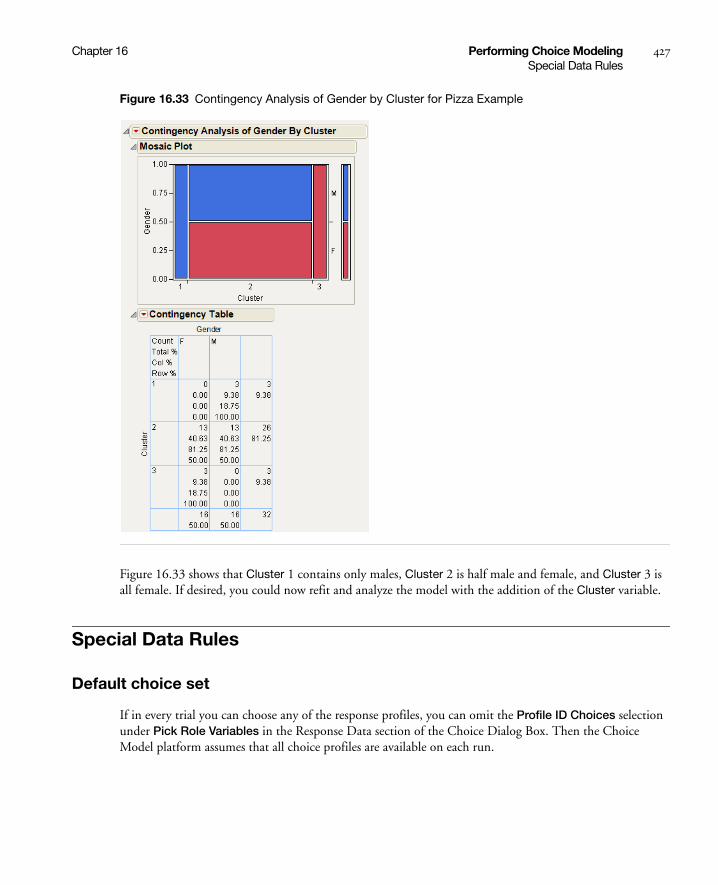
Chapter 16 Performing Choice Modeling 427Special Data Rules
Figure 16.33 Contingency Analysis of Gender by Cluster for Pizza Example
Figure 16.33 shows that Cluster 1 contains only males, Cluster 2 is half male and female, and Cluster 3 is all female. If desired, you could now refit and analyze the model with the addition of the Cluster variable.
Special Data Rules
Default choice set
If in every trial you can choose any of the response profiles, you can omit the Profile ID Choices selection under Pick Role Variables in the Response Data section of the Choice Dialog Box. Then the Choice Model platform assumes that all choice profiles are available on each run.

428 Performing Choice Modeling Chapter 16Special Data Rules
Subject Data with Response Data
If you have subject data in the Response data table, just select this table as the Select Data Table under the Subject Data. In this case, a Subject ID column does not need to be specified. In fact, it is not used. It is generally assumed that the subject data repeats consistently in multiple runs for each subject.
Logistic Regression
Ordinary logistic regression can be done with the Choice Modeling platform.
Note: The Fit Y by X and Fit Model platforms are more convenient to use than the Choice Modeling platform for logistic regression modeling. This section is used only to demonstrate that the Choice Modeling platform can be used for logistic regression, if desired.
If your data are already in the choice-model format, you might want to use the steps given below for logistic regression analysis. However, three steps are needed:
• Create a trivial Profile data table with a row for each response level.
• Put the explanatory variables into the Response data.
• Specify the Response data table, again, for the Subject data table.
An example of using the Choice Modeling platform for logistic regression follows:
1. Select Analyze > Modeling > Choice > Select Data Table > Other > OK.
2. Open the sample data set Lung Cancer Responses.jmp. Notice this data table has only one column (Lung Cancer) with two rows (Cancer and NoCancer).
3. Select Lung Cancer as the Profile ID and Add Lung Cancer as the model effect. The Profile Data dialog box is shown in Figure 16.34.
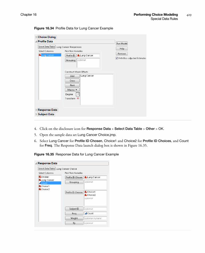
Chapter 16 Performing Choice Modeling 429Special Data Rules
Figure 16.34 Profile Data for Lung Cancer Example
4. Click on the disclosure icon for Response Data > Select Data Table > Other > OK.
5. Open the sample data set Lung Cancer Choice.jmp.
6. Select Lung Cancer for Profile ID Chosen, Choice1 and Choice2 for Profile ID Choices, and Count for Freq. The Response Data launch dialog box is shown in Figure 16.35.
Figure 16.35 Response Data for Lung Cancer Example
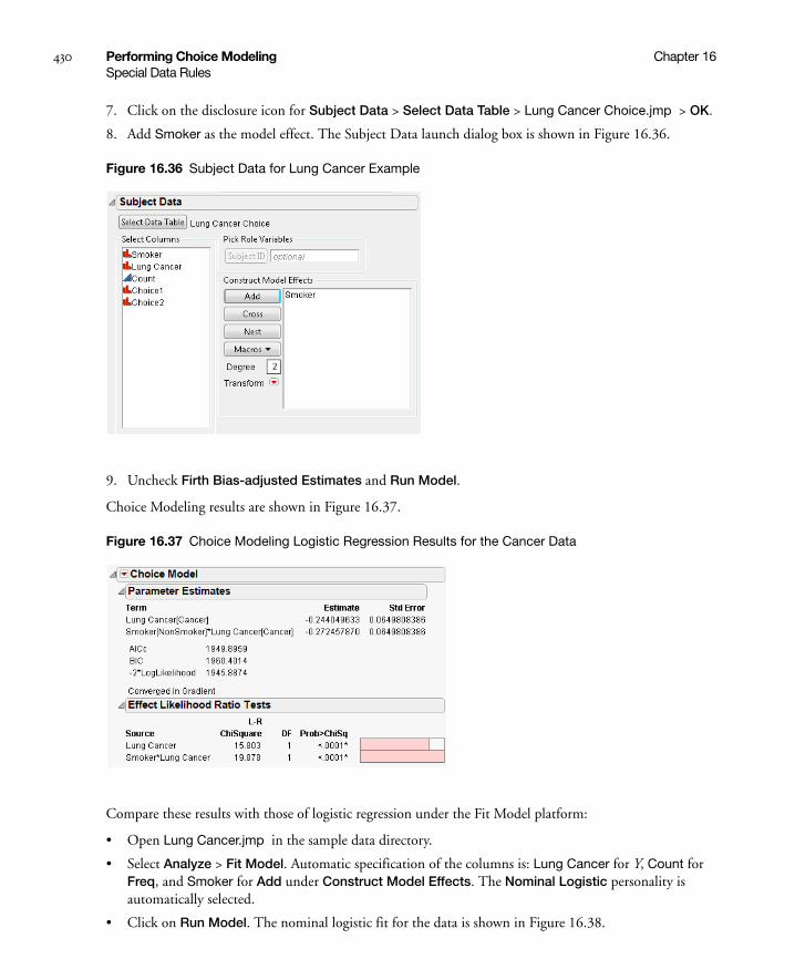
430 Performing Choice Modeling Chapter 16Special Data Rules
7. Click on the disclosure icon for Subject Data > Select Data Table > Lung Cancer Choice.jmp > OK.
8. Add Smoker as the model effect. The Subject Data launch dialog box is shown in Figure 16.36.
Figure 16.36 Subject Data for Lung Cancer Example
9. Uncheck Firth Bias-adjusted Estimates and Run Model.
Choice Modeling results are shown in Figure 16.37.
Figure 16.37 Choice Modeling Logistic Regression Results for the Cancer Data
Compare these results with those of logistic regression under the Fit Model platform:
• Open Lung Cancer.jmp in the sample data directory.
• Select Analyze > Fit Model. Automatic specification of the columns is: Lung Cancer for Y, Count for Freq, and Smoker for Add under Construct Model Effects. The Nominal Logistic personality is automatically selected.
• Click on Run Model. The nominal logistic fit for the data is shown in Figure 16.38.

Chapter 16 Performing Choice Modeling 431Transforming Data
Figure 16.38 Fit Model Nominal Logistic Regression Results for the Cancer Data
Notice that the likelihood ratio chi-square test for Smoker*Lung Cancer in the Choice model matches the likelihood ratio chi-square test for Smoker in the Logistic model. The reports shown in Figure 16.37 and Figure 16.38 support the conclusion that smoking has a strong effect on developing lung cancer. See the “Performing Logistic Regression on Nominal and Ordinal Responses” chapter on page 197 for details.
Transforming Data
Transforming Data to Two Analysis Tables
Although data are often in the Response/Profile/Subject form, the data are sometimes specified in another format that must be manipulated into the normalized form needed for choice analysis. For example, consider the data from Daganzo, found in Daganzo Trip.jmp. This data set contains the travel time for three transportation alternatives and the preferred transportation alternative for each subject. A partial listing of the data set is shown in Figure 16.39.

432 Performing Choice Modeling Chapter 16Transforming Data
Figure 16.39 Partial Daganzo Travel Time Table for Three Alternatives
Each choice number listed must first be converted to one of the travel mode names. This transformation is easily done by using the Choose function in the formula editor, as follows.
• Create a new column labeled Choice Mode. Specify the modeling type as Nominal. Right-click on the Choice Mode column and select Formula.
• Click on Conditional under the Functions (grouped) command, select Choose, and press the comma key twice to obtain additional arguments for the function.
• Click on Choice for the Choose expression (expr), and double click on each clause entry box to enter “Subway”,” Bus”, and “Car” (with the quotation marks) as shown in Figure 16.40.
Figure 16.40 Choose Function for Choice Mode Column of Daganzo Data
The choice response is now in the correct format. Since each row contains a choice made by each subject, another column containing a sequence of numbers should be created to identify the subjects. This can be done by creating a column with the Subject label. Then, enter a 1 in the first row of the column, a 2 in the second row of the column. Finally, highlight the first and second rows of the column, right click, and select Fill > Continue sequence to end of table. A partial listing of the modified table is shown in Figure 16.41.
Figure 16.41 Daganzo Data with New Choice Mode and Subject Columns
In order to construct the Profile data, each alternative needs to be expressed in a separate row.

Chapter 16 Performing Choice Modeling 433Transforming Data
• Use the Stack operation by clicking on Tables > Stack and filling in the entry fields as shown in Figure 16.42. Give this new data table a name, such as Stacked Daganzo.jmp, so that you can use this table for future analyses. Click OK. A partial view of the resulting table is shown in Figure 16.43.
Figure 16.42 Stack Operation for Daganzo Data
Figure 16.43 Partial Stacked Daganzo Table
• Make a subset of the stacked data with just Subject, Mode, and Travel Time by selecting these columns and selecting Tables > Subset. Select Selected Columns and click OK. A partial data table is shown in Figure 16.44.
Figure 16.44 Partial Subset Table of Daganzo Data

434 Performing Choice Modeling Chapter 16Transforming Data
• Make another subset of the original data with just Subject and Choice Mode. Then, add three constant columns for the choice set: Choice1, Choice2, and Choice3, as shown in Figure 16.45.
Figure 16.45 Partial Subset Table of Daganzo Data with Choice Set
• Specify the model, as shown in Figure 16.46.
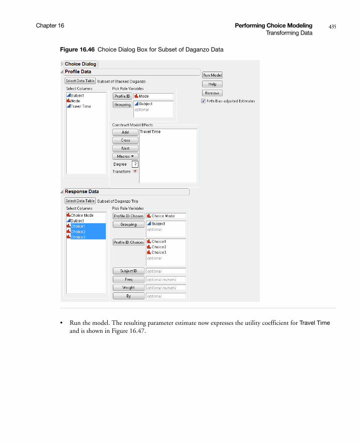
Chapter 16 Performing Choice Modeling 435Transforming Data
Figure 16.46 Choice Dialog Box for Subset of Daganzo Data
• Run the model. The resulting parameter estimate now expresses the utility coefficient for Travel Time and is shown in Figure 16.47.

436 Performing Choice Modeling Chapter 16Transforming Data
Figure 16.47 Parameter Estimate for Travel Time of Daganzo Data
i
The negative coefficient implies that increased travel time has a negative effect on consumer utility or satisfaction. The likelihood ratio test result indicates that the Choice model with the effect of Travel Time is significant.
Transforming Data to One Analysis Table
Rather than creating two or three tables, it can be more practical to transform the data so that only one table is used. For the one-table format, the subject effect is added as above. A response indicator column is added instead of using three different columns for the choice sets (Choice1, Choice2, Choice3). The transformation steps for the one-table scenario include:
• Create or open Stacked Daganzo.jmp from the steps shown in Transforming Data to Two Analysis Tables.
• Add a new column labeled Response and right-click on the column. Select Formula.
• Select Conditional > If from the formula editor and select the column Choice Mode for the expression.
• Type “=” and select Mode.
• Type 1 for the Then Clause and 0 for the Else Clause. Click OK. The completed formula should look like Figure 16.48.
Figure 16.48 Formula for Response Indicator for Stacked Daganzo Data
• Subset the data table by selecting Subject, Travel Time, and Response and then select Tables > Subset. Select Selected Columns and click OK. A partial listing of the new data table is shown in Figure 16.49.
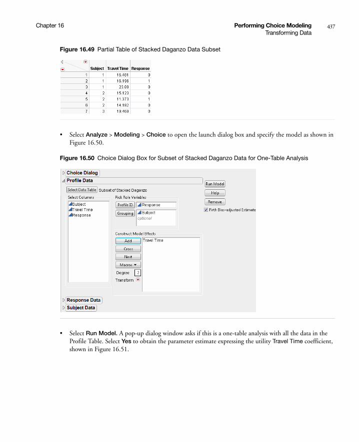
Chapter 16 Performing Choice Modeling 437Transforming Data
Figure 16.49 Partial Table of Stacked Daganzo Data Subset
• Select Analyze > Modeling > Choice to open the launch dialog box and specify the model as shown in Figure 16.50.
Figure 16.50 Choice Dialog Box for Subset of Stacked Daganzo Data for One-Table Analysis
• Select Run Model. A pop-up dialog window asks if this is a one-table analysis with all the data in the Profile Table. Select Yes to obtain the parameter estimate expressing the utility Travel Time coefficient, shown in Figure 16.51.

438 Performing Choice Modeling Chapter 16Logistic Regression for Matched Case-Control Studies
Figure 16.51 Parameter Estimate for Travel Time of Daganzo Data from One-Table Analysis
Notice that the result is identical to that obtained for the two-table model, shown earlier in Figure 16.47.
This chapter illustrates the use of the Choice Modeling platform with simple examples. This platform can also be used for more complex models, such as those involving more complicated transformations and interaction terms.
Logistic Regression for Matched Case-Control Studies
This section provides an example using the Choice platform to perform logistic regression on the results of a 1-1 matched-case control study. The data are from Hosmer and Lemeshow (2000). The purpose of the study is to identify risk factors associated with giving birth to a low birth weight baby (<2500 grams). To perform the analysis, follow the steps below.
1. Open the Low Birth Weight.jmp.
2. Select Analyze > Modeling > Choice.
3. Select the Select Data Table button.
4. Select Low Birth Weight as the profile data table.
5. Assign Low Birth Weight to the Profile ID role.
6. Assign Pair to the Grouping role.
7. Add the following columns as model effects: Weight of Mother, Race, Smoke During Pregnancy, History of Premature Labor, History of Hypertension, Uterine Irritability.
8. Deselect the Firth Bias-Adjusted Estimates checkbox.
9. Select Run Model.
10. When you are asked if this is a one-table analysis, answer Yes.
11. On the Choice Model red-triangle menu, select Profiler.
The report is shown in Figure 16.52.
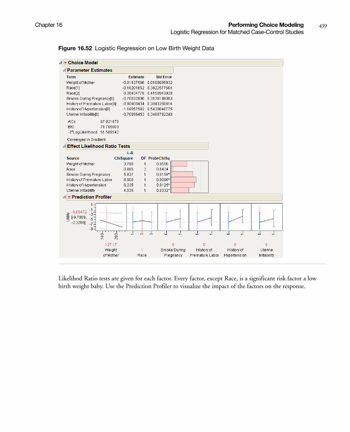
Chapter 16 Performing Choice Modeling 439Logistic Regression for Matched Case-Control Studies
Figure 16.52 Logistic Regression on Low Birth Weight Data
Likelihod Ratio tests are given for each factor. Every factor, except Race, is a significant risk factor a low birth weight baby. Use the Prediction Profiler to visualize the impact of the factors on the response.

440 Performing Choice Modeling Chapter 16Logistic Regression for Matched Case-Control Studies

Chapter 17Correlations and Multivariate Techniques
Using the Multivariate Platform
The Multivariate platform specializes in exploring how many variables relate to each other. The default report shows the standard correlation table and a scatterplot matrix. Additional options and other techniques for looking at multiple variables are available, such as the following:
• a scatterplot matrix with normal density ellipses
• inverse, partial, and pairwise correlations
• a covariance matrix
• nonparametric measures of association
• simple statistics (such as mean and standard deviation)
• an outlier analysis that shows how far a row is from the center, respecting the correlation structure
• a principal components facility with several options for rotated components and a table showing rotated factor patterns and communalities
• imputation of missing data

Contents
Launch the Multivariate Platform . . . . . . . . . . . . . . . . . . . . . . . . . . . . . . . . . . . . . . . . . . . . . . . . . . . . . .443
Estimation Methods . . . . . . . . . . . . . . . . . . . . . . . . . . . . . . . . . . . . . . . . . . . . . . . . . . . . . . . . . . . . .443
The Multivariate Report . . . . . . . . . . . . . . . . . . . . . . . . . . . . . . . . . . . . . . . . . . . . . . . . . . . . . . . . . . . . .445
Multivariate Platform Options . . . . . . . . . . . . . . . . . . . . . . . . . . . . . . . . . . . . . . . . . . . . . . . . . . . . . . . 446
Nonparametric Correlations . . . . . . . . . . . . . . . . . . . . . . . . . . . . . . . . . . . . . . . . . . . . . . . . . . . . . . 449
Scatterplot Matrix . . . . . . . . . . . . . . . . . . . . . . . . . . . . . . . . . . . . . . . . . . . . . . . . . . . . . . . . . . . . . . 449
Outlier Analysis. . . . . . . . . . . . . . . . . . . . . . . . . . . . . . . . . . . . . . . . . . . . . . . . . . . . . . . . . . . . . . . . . 451
Item Reliability . . . . . . . . . . . . . . . . . . . . . . . . . . . . . . . . . . . . . . . . . . . . . . . . . . . . . . . . . . . . . . . . . 453
Impute Missing Data. . . . . . . . . . . . . . . . . . . . . . . . . . . . . . . . . . . . . . . . . . . . . . . . . . . . . . . . . . . . . 453
Examples . . . . . . . . . . . . . . . . . . . . . . . . . . . . . . . . . . . . . . . . . . . . . . . . . . . . . . . . . . . . . . . . . . . . . . . . . 453
Example of Item Reliability . . . . . . . . . . . . . . . . . . . . . . . . . . . . . . . . . . . . . . . . . . . . . . . . . . . . . . . . 453
Computations and Statistical Details . . . . . . . . . . . . . . . . . . . . . . . . . . . . . . . . . . . . . . . . . . . . . . . . . . . .454
Estimation Methods . . . . . . . . . . . . . . . . . . . . . . . . . . . . . . . . . . . . . . . . . . . . . . . . . . . . . . . . . . . . .454
Pearson Product-Moment Correlation . . . . . . . . . . . . . . . . . . . . . . . . . . . . . . . . . . . . . . . . . . . . . . . . 455
Nonparametric Measures of Association . . . . . . . . . . . . . . . . . . . . . . . . . . . . . . . . . . . . . . . . . . . . . . 455
Inverse Correlation Matrix . . . . . . . . . . . . . . . . . . . . . . . . . . . . . . . . . . . . . . . . . . . . . . . . . . . . . . . .457
Distance Measures . . . . . . . . . . . . . . . . . . . . . . . . . . . . . . . . . . . . . . . . . . . . . . . . . . . . . . . . . . . . . . .457
Cronbach’s a . . . . . . . . . . . . . . . . . . . . . . . . . . . . . . . . . . . . . . . . . . . . . . . . . . . . . . . . . . . . . . . . . . . 458
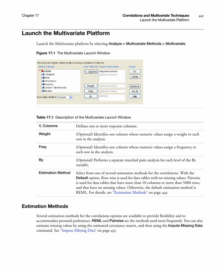
Chapter 17 Correlations and Multivariate Techniques 443Launch the Multivariate Platform
Launch the Multivariate Platform
Launch the Multivariate platform by selecting Analyze > Multivariate Methods > Multivariate.
Figure 17.1 The Multivariate Launch Window
Estimation Methods
Several estimation methods for the correlations options are available to provide flexibility and to accommodate personal preferences. REML and Pairwise are the methods used most frequently. You can also estimate missing values by using the estimated covariance matrix, and then using the Impute Missing Data command. See “Impute Missing Data” on page 453.
Table 17.1 Description of the Multivariate Launch Window
Y, Columns Defines one or more response columns.
Weight (Optional) Identifies one column whose numeric values assign a weight to each row in the analysis.
Freq (Optional) Identifies one column whose numeric values assign a frequency to each row in the analysis.
By (Optional) Performs a separate matched pairs analysis for each level of the By variable.
Estimation Method Select from one of several estimation methods for the correlations. With the Default option, Row-wise is used for data tables with no missing values. Pairwise is used for data tables that have more than 10 columns or more than 5000 rows, and that have no missing values. Otherwise, the default estimation method is REML. For details, see “Estimation Methods” on page 443.

444 Correlations and Multivariate Techniques Chapter 17Launch the Multivariate Platform
Default
The Default option uses either the Row-wise, Pairwise, or REML methods:
• Row-wise is used for data tables with no missing values.
• Pairwise is used for data tables that have more than 10 columns or more than 5000 rows, and that have no missing values.
• REML is used otherwise.
REML
REML (restricted maximum likelihood) estimates are less biased than the ML (maximum likelihood) estimation method. The REML method maximizes marginal likelihoods based upon error contrasts. The REML method is often used for estimating variances and covariances.The REML method in the Multivariate platform is the same as the REML estimation of mixed models for repeated measures data with an unstructured covariance matrix. See the documentation for SAS PROC MIXED about REML estimation of mixed models. REML uses all of your data, even if missing cells are present, and is most useful for smaller datasets. Because of the bias-correction factor, this method is slow if your dataset is large and there are many missing data values. If there are no missing cells in the data, then the REML estimate is equivalent to the sample covariance matrix.
ML
The maximum likelihood estimation method (ML) is useful for large data tables with missing cells. The ML estimates are similar to the REML estimates, but the ML estimates are generated faster. Observations with missing values are not excluded. For small data tables, REML is preferred over ML because REML’s variance and covariance estimates are less biased.
Robust
Robust estimation is useful for data tables that might have outliers. For statistical details, see “Robust” on page 454.
Row-wise
Rowwise estimation does not use observations containing missing cells. This method is useful in the following situations:
• checking compatibility with JMP versions earlier than JMP 8. Rowwise estimation was the only estimation method available before JMP 8.
• excluding any observations that have missing data.
Pairwise
Pairwise estimation performs correlations for all rows for each pair of columns with nonmissing values.
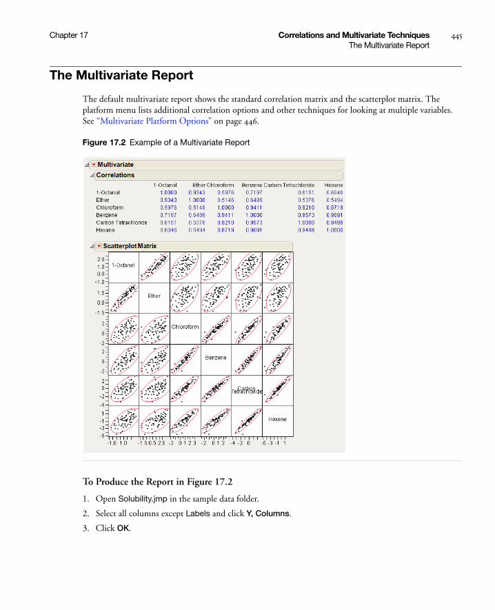
Chapter 17 Correlations and Multivariate Techniques 445The Multivariate Report
The Multivariate Report
The default multivariate report shows the standard correlation matrix and the scatterplot matrix. The platform menu lists additional correlation options and other techniques for looking at multiple variables. See “Multivariate Platform Options” on page 446.
Figure 17.2 Example of a Multivariate Report
To Produce the Report in Figure 17.2
1. Open Solubility.jmp in the sample data folder.
2. Select all columns except Labels and click Y, Columns.
3. Click OK.

446 Correlations and Multivariate Techniques Chapter 17Multivariate Platform Options
About Missing Values
In most of the analysis options, a missing value in an observation does not cause the entire observation to be deleted. However, the Pairwise Correlations option excludes rows that are missing for either of the variables under consideration. The Simple Statistics > Univariate option calculates its statistics column-by-column, without regard to missing values in other columns.
Multivariate Platform Options
Correlations Multivariate Shows or hides the Correlations table, which is a matrix of correlation coefficients that summarizes the strength of the linear relationships between each pair of response (Y) variables. This option is on by default.
This correlation matrix is calculated by the method that you select in the launch window.
CI of Correlation Shows the two-tailed confidence intervals of the correlations. This option is off by default.
The default confidence coefficient is 95%. Use the Set α Level option to change the confidence coefficient.
Inverse Correlations Shows or hides the inverse correlation matrix (Inverse Corr table). This option is off by default.
The diagonal elements of the matrix are a function of how closely the variable is a linear function of the other variables. In the inverse correlation, the diagonal is 1/(1 – R2) for the fit of that variable by all the other variables. If the multiple correlation is zero, the diagonal inverse element is 1. If the multiple correlation is 1, then the inverse element becomes infinite and is reported missing.
For statistical details about inverse correlations, see the “Inverse Correlation Matrix” on page 457.
Partial Correlations Shows or hides the partial correlation table (Partial Corr), which shows the partial correlations of each pair of variables after adjusting for all the other variables. This option is off by default.
This table is the negative of the inverse correlation matrix, scaled to unit diagonal.
Covariance Matrix Shows or hides the covariance matrix for the analysis. This option is off by default.

Chapter 17 Correlations and Multivariate Techniques 447Multivariate Platform Options
Pairwise Correlations Shows or hides the Pairwise Correlations table, which lists the Pearson product-moment correlations for each pair of Y variables. This option is off by default.
The correlations are calculated by the pairwise deletion method. The count values differ if any pair has a missing value for either variable. The Pairwise Correlations report also shows significance probabilities and compares the correlations in a bar chart. All results are based on the pairwise method.
Simple Statistics This menu contains two options that each show or hide simple statistics (mean, standard deviation, and so on) for each column. The univariate and multivariate simple statistics can differ when there are missing values present, or when the Robust method is used.
Univariate Simple Statistics Shows statistics that are calculated on each column, regardless of values in other columns. These values match those produced by the Distribution platform.
Multivariate Simple Statistics Shows statistics that correspond to the estimation method selected in the launch window. If the REML, ML, or Robust method is selected, the mean vector and covariance matrix are estimated by that selected method. If the Row-wise method is selected, all rows with at least one missing value are excluded from the calculation of means and variances. If the Pairwise method is selected, the mean and variance are calculated for each column.
These options are off by default.
Nonparametric Correlations This menu contains three nonparametric measures: Spearman’s Rho, Kendall’s Tau, and Hoeffding’s D. These options are off by default.
For details, see “Nonparametric Correlations” on page 449.
Set α Level You can specify any alpha value for the correlation confidence intervals. The default value of alpha is 0.05.
Four alpha values are listed: 0.01, 0.05, 0.10, and 0.50. Select Other to enter any other value.
Scatterplot Matrix Shows or hides a scatterplot matrix of each pair of response variables. This option is on by default.
For details, see “Scatterplot Matrix” on page 449.

448 Correlations and Multivariate Techniques Chapter 17Multivariate Platform Options
Color Map The Color Map menu contains three types of color maps.
Color Map On Correlations Produces a cell plot that shows the correlations among variables on a scale from red (+1) to blue (-1).
Color Map On p-values Produces a cell plot that shows the significance of the correlations on a scale from p = 0 (red) to p = 1 (blue).
Cluster the Correlations Produces a cell plot that clusters together similar variables. The correlations are the same as for Color Map on Correlations, but the positioning of the variables may be different.
These options are off by default.
Parallel Coord Plot Shows or hides a parallel coordinate plot of the variables. This option is off by default.
Ellipsoid 3D Plot Shows or hides a 95% confidence ellipsoid around three variables that you are asked to specify the three variables. This option is off by default.
Principal Components This menu contains options to show or hide a principal components report. You can select correlations, covariances, or unscaled. Selecting one of these options when another of the reports is shown changes the report to the new option. Select None to remove the report. This option is off by default.
Principal components is a technique to take linear combinations of the original variables. The first principal component has maximum variation, the second principal component has the next most variation, subject to being orthogonal to the first, and so on. For details, see the chapter “Analyzing Principal Components and Reducing Dimensionality” on page 481.
Outlier Analysis This menu contains options that show or hide plots that measure distance in the multivariate sense using one of these methods: the Mahalanobis distance, jackknife distances, and the T2 statistic.
For details, see “Outlier Analysis” on page 451.
Item Reliability This menu contains options that each shows or hides an item reliability report. The reports indicate how consistently a set of instruments measures an overall response, using either Cronbach’s α or standardized α. These options are off by default.
For details, see “Item Reliability” on page 453.

Chapter 17 Correlations and Multivariate Techniques 449Multivariate Platform Options
Nonparametric Correlations
The Nonparametric Correlations menu offers three nonparametric measures:
Spearman’s Rho is a correlation coefficient computed on the ranks of the data values instead of on the values themselves.
Kendall’s Tau is based on the number of concordant and discordant pairs of observations. A pair is concordant if the observation with the larger value of X also has the larger value of Y. A pair is discordant if the observation with the larger value of X has the smaller value of Y. There is a correction for tied pairs (pairs of observations that have equal values of X or equal values of Y).
Hoeffding’s D A statistical scale that ranges from –0.5 to 1, with large positive values indicating dependence. The statistic approximates a weighted sum over observations of chi-square statistics for two-by-two classification tables. The two-by-two tables are made by setting each data value as the threshold. This statistic detects more general departures from independence.
The Nonparametric Measures of Association report also shows significance probabilities for all measures and compares them with a bar chart.
Note: The nonparametric correlations are always calculated by the Pairwise method, even if other methods were selected in the launch window.
For statistical details about these three methods, see the “Nonparametric Measures of Association” on page 455.
Scatterplot Matrix
A scatterplot matrix helps you visualize the correlations between each pair of response variables. The scatterplot matrix is shown by default, and can be hidden or shown by selecting Scatterplot Matrix from the red triangle menu for Multivariate.
Impute Missing Data Produces a new data table that duplicates your data table and replaces all missing values with estimated values. This option is available only if your data table contains missing values.
For details, see “Impute Missing Data” on page 453.

450 Correlations and Multivariate Techniques Chapter 17Multivariate Platform Options
Figure 17.3 Clusters of Correlations
By default, a 95% bivariate normal density ellipse is shown in each scatterplot. Assuming the variables are bivariate normally distributed, this ellipse encloses approximately 95% of the points. The narrowness of the ellipse shows the correlation of the variables. If the ellipse is fairly round and is not diagonally oriented, the variables are uncorrelated. If the ellipse is narrow and diagonally oriented, the variables are correlated.
Working with the Scatterplot Matrix
Re-sizing any cell resizes all the cells.
Drag a label cell to another label cell to reorder the matrix.
When you look for patterns in the scatterplot matrix, you can see the variables cluster into groups based on their correlations. Figure 17.3 shows two clusters of correlations: the first two variables (top, left), and the next four (bottom, right).
Options for Scatterplot Matrix
The red triangle menu for the Scatterplot Matrix lets you tailor the matrix with color and density ellipses and by setting the α-level.
Table 17.2 Options for the Scatterplot Matrix
Show Points Shows or hides the points in the scatterplots.
Density Ellipses Shows or hides the 95% density ellipses in the scatterplots. Use the Ellipse α menu to change the α-level.

Chapter 17 Correlations and Multivariate Techniques 451Multivariate Platform Options
Outlier Analysis
The Outlier Analysis menu contains options that show or hide plots that measure distance in the multivariate sense using one of these methods:
• Mahalanobis distance
• jackknife distances
• T2 statistic
These methods all measure distance in the multivariate sense, with respect to the correlation structure).
In Figure 17.4, Point A is an outlier because it is outside the correlation structure rather than because it is an outlier in any of the coordinate directions.
Shaded Ellipses Colors each ellipse. Use the Ellipses Transparency and Ellipse Color menus to change the transparency and color.
Show Correlations Shows or hides the correlation of each histogram in the upper left corner of each scatterplot.
Show Histogram Shows either horizontal or vertical histograms in the label cells. Once histograms have been added, select Show Counts to label each bar of the histogram with its count. Select Horizontal or Vertical to either change the orientation of the histograms or remove the histograms.
Ellipse α Sets the α-level used for the ellipses. Select one of the standard α-levels in the menu, or select Other to enter a different one. The default value is 0.95.
Ellipses Transparency Sets the transparency of the ellipses if they are colored. Select one of the default levels, or select Other to enter a different one. The default value is 0.2.
Ellipse Color Sets the color of the ellipses if they are colored. Select one of the colors in the palette, or select Other to use another color. The default value is red.
Table 17.2 Options for the Scatterplot Matrix (Continued)

452 Correlations and Multivariate Techniques Chapter 17Multivariate Platform Options
Figure 17.4 Example of an Outlier
Mahalanobis Distance
The Mahalanobis Outlier Distance plot shows the Mahalanobis distance of each point from the multivariate mean (centroid). The standard Mahalanobis distance depends on estimates of the mean, standard deviation, and correlation for the data. The distance is plotted for each observation number. Extreme multivariate outliers can be identified by highlighting the points with the largest distance values. See “Computations and Statistical Details” on page 454, for more information.
Jackknife Distances
The Jackknife Distances plot shows distances that are calculated using a jackknife technique. The distance for each observation is calculated with estimates of the mean, standard deviation, and correlation matrix that do not include the observation itself. The jack-knifed distances are useful when there is an outlier. In this case, the Mahalanobis distance is distorted and tends to disguise the outlier or make other points look more outlying than they are.
T2 Statistic
The T2 plot shows distances that are the square of the Mahalanobis distance. This plot is preferred for multivariate control charts. The plot includes the value of the calculated T2 statistic, as well as its upper control limit. Values that fall outside this limit might be outliers.
Saving Distances and Values
You can save any of the distances to the data table by selecting the Save option from the red triangle menu for the plot.
Note: There is no formula saved with the distance column. This means that the distance is not recomputed if you modify the data table. If you add or delete columns, or change values in the data table, you should select Analyze > Multivariate Methods > Multivariate again to compute new distances.

Chapter 17 Correlations and Multivariate Techniques 453Examples
In addition to saving the distance values for each row, a column property is created that holds one of the following:
• the distance value for Mahalanobis Distance and Jackknife distance
• a list containing the UCL of the T2 statistic
Item Reliability
Item reliability indicates how consistently a set of instruments measures an overall response. Cronbach’s α (Cronbach 1951) is one measure of reliability. Two primary applications for Cronbach’s α are industrial instrument reliability and questionnaire analysis.
Cronbach’s α is based on the average correlation of items in a measurement scale. It is equivalent to computing the average of all split-half correlations in the data table. The Standardized α can be requested if the items have variances that vary widely.
Note: Cronbach’s α is not related to a significance level α. Also, item reliability is unrelated to survival time reliability analysis.
To look at the influence of an individual item, JMP excludes it from the computations and shows the effect of the Cronbach’s α value. If α increases when you exclude a variable (item), that variable is not highly correlated with the other variables. If the α decreases, you can conclude that the variable is correlated with the other items in the scale. Nunnally (1979) suggests a Cronbach’s α of 0.7 as a rule-of-thumb acceptable level of agreement.
See “Computations and Statistical Details” on page 454 for computations for Cronbach’s α.
Impute Missing Data
To impute missing data, select Impute Missing Data from the red triangle menu for Multivariate. A new data table is created that duplicates your data table and replaces all missing values with estimated values.
Imputed values are expectations conditional on the nonmissing values for each row. The mean and covariance matrix, which is estimated by the method chosen in the launch window, is used for the imputation calculation. All multivariate tests and options are then available for the imputed data set.
This option is available only if your data table contains missing values.
Examples
Example of Item Reliability
This example uses the Danger.jmp data in the Sample Data folder. This table lists 30 items having some level of inherent danger. Three groups of people (students, nonstudents, and experts) ranked the items according to perceived level of danger. Note that Nuclear power is rated as very dangerous (1) by both students and nonstudents, but is ranked low (20) by experts. On the other hand, motorcycles are ranked either fifth or sixth by all three judging groups.

454 Correlations and Multivariate Techniques Chapter 17Computations and Statistical Details
You can use Cronbach’s α to evaluate the agreement in the perceived way the groups ranked the items. Note that in this type of example, where the values are the same set of ranks for each group, standardizing the data has no effect.
1. Open Danger.jmp from the Sample Data folder.
2. Select Analyze > Multivariate Methods > Multivariate.
3. Select all the columns except for Activity and click Y, Columns.
4. Click OK.
5. From the red triangle menu for Multivariate, select Item Reliability > Cronbach’s α.
6. (Optional) From the red triangle menu for Multivariate, select Scatterplot Matrix to hide that plot.
Figure 17.5 Cronbach’s α Report
The Cronbach’s α results in Figure 17.5 show an overall α of 0.8666, which indicates a high correlation of the ranked values among the three groups. Further, when you remove the experts from the analysis, the Nonstudents and Students ranked the dangers nearly the same, with Cronbach’s α scores of 0.7785 and 0.7448, respectively.
Computations and Statistical Details
Estimation Methods
Robust
This method essentially ignores any outlying values by substantially down-weighting them. A sequence of iteratively reweighted fits of the data is done using the weight:
wi = 1.0 if Q < K and wi = K/Q otherwise,

Chapter 17 Correlations and Multivariate Techniques 455Computations and Statistical Details
where K is a constant equal to the 0.75 quantile of a chi-square distribution with the degrees of freedom equal to the number of columns in the data table, and
where yi = the response for the ith observation, μ = the current estimate of the mean vector, S2 = current estimate of the covariance matrix, and T = the transpose matrix operation. The final step is a bias reduction of the variance matrix.
The tradeoff of this method is that you can have higher variance estimates when the data do not have many outliers, but can have a much more precise estimate of the variances when the data do have outliers.
Pearson Product-Moment Correlation
The Pearson product-moment correlation coefficient measures the strength of the linear relationship between two variables. For response variables X and Y, it is denoted as r and computed as
If there is an exact linear relationship between two variables, the correlation is 1 or –1, depending on whether the variables are positively or negatively related. If there is no linear relationship, the correlation tends toward zero.
Nonparametric Measures of Association
For the Spearman, Kendall, or Hoeffding correlations, the data are first ranked. Computations are then performed on the ranks of the data values. Average ranks are used in case of ties.
Spearman’s ρ (rho) Coefficients
Spearman’s ρ correlation coefficient is computed on the ranks of the data using the formula for the Pearson’s correlation previously described.
Kendall’s τb Coefficients
Kendall’s τb coefficients are based on the number of concordant and discordant pairs. A pair of rows for two variables is concordant if they agree in which variable is greater. Otherwise they are discordant, or tied.
The formula
Q yi μ–( )TS
2( )1–
yi μ–( )=
rx x–( ) y y–( )
x x–( )2
y y–( )2
----------------------------------------------------------=
τb
xi xj–( )sgn yi yj–( )sgni j<
T0 T1–( ) T0 T2–( )----------------------------------------------------------------=

456 Correlations and Multivariate Techniques Chapter 17Computations and Statistical Details
computes Kendall’s τb where:
Note the following:
• The sgn(z) is equal to 1 if z>0, 0 if z=0, and –1 if z<0.
• The ti (the ui) are the number of tied x (respectively y) values in the ith group of tied x (respectively y) values.
• The n is the number of observations.
• Kendall’s τb ranges from –1 to 1. If a weight variable is specified, it is ignored.
Computations proceed in the following way:
• Observations are ranked in order according to the value of the first variable.
• The observations are then re-ranked according to the values of the second variable.
• The number of interchanges of the first variable is used to compute Kendall’s τb.
Hoeffding’s D Statistic
The formula for Hoeffding’s D (1948) is
where:
Note the following:
• The Ri and Si are ranks of the x and y values.
• The Qi (sometimes called bivariate ranks) are one plus the number of points that have both x and y values less than the ith points.
• A point that is tied on its x value or y value, but not on both, contributes 1/2 to Qi if the other value is less than the corresponding value for the ith point. A point tied on both x and y contributes 1/4 to Qi.
When there are no ties among observations, the D statistic has values between –0.5 and 1, with 1 indicating complete dependence. If a weight variable is specified, it is ignored.
T0 n n 1–( )( ) 2⁄=
T1 ti( ) ti 1–( )( ) 2⁄=
T2 ui( ) ui 1–( )( ) 2⁄=
D 30n 2–( ) n 3–( )D1 D2 2 n 2–( )D3–+
n n 1–( ) n 2–( ) n 3–( ) n 4–( )----------------------------------------------------------------------------------------- =
D1 Σi Qi 1–( ) Qi 2–( )=
D2 Σi Ri 1–( ) Ri 2–( ) Si 1–( ) Si 2–( )=
D3 Σi Ri 2–( ) Si 2–( ) Qi 1–( )=

Chapter 17 Correlations and Multivariate Techniques 457Computations and Statistical Details
Inverse Correlation Matrix
The inverse correlation matrix provides useful multivariate information. The diagonal elements of the inverse correlation matrix, sometimes called the variance inflation factors (VIF), are a function of how closely the variable is a linear function of the other variables. Specifically, if the correlation matrix is denoted R and the inverse correlation matrix is denoted R-1, the diagonal element is denoted and is computed as
where Ri2 is the coefficient of variation from the model regressing the ith explanatory variable on the other
explanatory variables. Thus, a large rii indicates that the ith variable is highly correlated with any number of the other variables.
Distance Measures
The Outlier Distance plot shows the Mahalanobis distance of each point from the multivariate mean (centroid). The Mahalanobis distance takes into account the correlation structure of the data as well as the individual scales. For each value, the distance is denoted di and is computed as
where:
Yi is the data for the ith row
Y is the row of means
S is the estimated covariance matrix for the data
The reference line (Mason and Young, 2002) drawn on the Mahalanobis Distance plot is computed as where A is related to the number of observations and number of variables, nvars is the number
of variables, and the computation for F in formula editor notation is:
F Quantile(0.95, nvars, n–nvars–1, centered at 0).
If a variable is an exact linear combination of other variables, then the correlation matrix is singular and the row and the column for that variable are zeroed out. The generalized inverse that results is still valid for forming the distances.
The T2 distance is just the square of the Mahalanobis distance, so Ti2 = di
2. The upper control limit on the T2 is
where
n = number of observations
rii
rii
VIFi1
1 Ri2–
----------------= =
di Yi Y–( )'S 1–Yi Y–( )=
AxF nvars×
UCLn 1–( )2
n-------------------β
ap2--- n p– 1–
2--------------------;;
=

458 Correlations and Multivariate Techniques Chapter 17Computations and Statistical Details
p = number of variables (columns)
α = αth quantile
β= beta distribution
Multivariate distances are useful for spotting outliers in many dimensions. However, if the variables are highly correlated in a multivariate sense, then a point can be seen as an outlier in multivariate space without looking unusual along any subset of dimensions. In other words, when the values are correlated, it is possible for a point to be unremarkable when seen along one or two axes but still be an outlier by violating the correlation.
Caution: This outlier distance is not robust because outlying points can distort the estimate of the covariances and means so that outliers are disguised. You might want to use the alternate distance command so that distances are computed with a jackknife method. The alternate distance for each observation uses estimates of the mean, standard deviation, and correlation matrix that do not include the observation itself.
Cronbach’s α
Cronbach’s α is defined as
where
k = the number of items in the scale
c = the average covariance between items
v = the average variance between items
If the items are standardized to have a constant variance, the formula becomes
where
r = the average correlation between items
The larger the overall α coefficient, the more confident you can feel that your items contribute to a reliable scale or test. The coefficient can approach 1.0 if you have many highly correlated items.
αk c
v--
1 k 1–( ) cv--+
-----------------------------------=
α k r( )1 k 1–( )r+----------------------------=

Chapter 18Clustering Data
Using the Cluster Platform
Clustering is the technique of grouping rows together that share similar values across a number of variables. It is a wonderful exploratory technique to help you understand the clumping structure of your data. JMP provides three different clustering methods:
• Hierarchical clustering is appropriate for small tables, up to several thousand rows. It combines rows in a hierarchical sequence portrayed as a tree. In JMP, the tree, also called a dendrogram, is a dynamic, responding graph. You can choose the number of clusters that you like after the tree is built.
• K-means clustering is appropriate for larger tables, up to hundreds of thousands of rows. It makes a fairly good guess at cluster seed points. It then starts an iteration of alternately assigning points to clusters and recalculating cluster centers. You have to specify the number of clusters before you start the process.
• Normal mixtures are appropriate when data is assumed to come from a mixture of multivariate normal distributions that overlap. Maximum likelihood is used to estimate the mixture proportions and the means, standard deviations, and correlations jointly. This approach is particularly good at estimating the total counts in each group. However, each point, rather than being classified into one group, is assigned a probability of being in each group. The EM algorithm is used to obtain estimates.
After the clustering process is complete, you can save the cluster assignments to the data table or use them to set colors and markers for the rows.

Contents
Introduction to Clustering Methods . . . . . . . . . . . . . . . . . . . . . . . . . . . . . . . . . . . . . . . . . . . . . . . . . . . .461
The Cluster Launch Dialog . . . . . . . . . . . . . . . . . . . . . . . . . . . . . . . . . . . . . . . . . . . . . . . . . . . . . . . . . . 462
Hierarchical Clustering . . . . . . . . . . . . . . . . . . . . . . . . . . . . . . . . . . . . . . . . . . . . . . . . . . . . . . . . . . . . . .463
Hierarchical Cluster Options. . . . . . . . . . . . . . . . . . . . . . . . . . . . . . . . . . . . . . . . . . . . . . . . . . . . . . 466
Technical Details for Hierarchical Clustering. . . . . . . . . . . . . . . . . . . . . . . . . . . . . . . . . . . . . . . . . . 467
K-Means Clustering . . . . . . . . . . . . . . . . . . . . . . . . . . . . . . . . . . . . . . . . . . . . . . . . . . . . . . . . . . . . . . . 469
K-Means Control Panel . . . . . . . . . . . . . . . . . . . . . . . . . . . . . . . . . . . . . . . . . . . . . . . . . . . . . . . . . . 470
K-Means Report . . . . . . . . . . . . . . . . . . . . . . . . . . . . . . . . . . . . . . . . . . . . . . . . . . . . . . . . . . . . . . . . 471
Normal Mixtures . . . . . . . . . . . . . . . . . . . . . . . . . . . . . . . . . . . . . . . . . . . . . . . . . . . . . . . . . . . . . . . . . . .473
Robust Normal Mixtures . . . . . . . . . . . . . . . . . . . . . . . . . . . . . . . . . . . . . . . . . . . . . . . . . . . . . . . . . .475
Platform Options . . . . . . . . . . . . . . . . . . . . . . . . . . . . . . . . . . . . . . . . . . . . . . . . . . . . . . . . . . . . . . 476
Details of the Estimation Process . . . . . . . . . . . . . . . . . . . . . . . . . . . . . . . . . . . . . . . . . . . . . . . . . . . 476
Self Organizing Maps . . . . . . . . . . . . . . . . . . . . . . . . . . . . . . . . . . . . . . . . . . . . . . . . . . . . . . . . . . . . . . 477

Chapter 18 Clustering Data 461Introduction to Clustering Methods
Introduction to Clustering Methods
Clustering is a multivariate technique of grouping rows together that share similar values. It can use any number of variables. The variables must be numeric variables for which numerical differences make sense. The common situation is that data are not scattered evenly through n-dimensional space, but rather they form clumps, locally dense areas, modes, or clusters. The identification of these clusters goes a long way toward characterizing the distribution of values.
JMP provides two approaches to clustering:
• hierarchical clustering for small tables, up to several thousand rows
• k-means and normal mixtures clustering for large tables, up to hundreds of thousands of rows.
Hierarchical clustering is also called agglomerative clustering because it is a combining process. The method starts with each point (row) as its own cluster. At each step the clustering process calculates the distance between each cluster, and combines the two clusters that are closest together. This combining continues until all the points are in one final cluster. The user then chooses the number of clusters that seems right and cuts the clustering tree at that point. The combining record is portrayed as a tree, called a dendrogram. The single points are leaves, the final single cluster of all points are the trunk, and the intermediate cluster combinations are branches. Since the process starts with n(n + 1)/2 distances for n points, this method becomes too expensive in memory and time when n is large.
Hierarchical clustering also supports character columns. If the column is ordinal, then the data value used for clustering is just the index of the ordered category, treated as if it were continuous data. If the column is nominal, then the categories must match to contribute a distance of zero. They contribute a distance of 1 otherwise.
JMP offers five rules for defining distances between clusters: Average, Centroid, Ward, Single, and Complete. Each rule can generate a different sequence of clusters.
K-means clustering is an iterative follow-the-leader strategy. First, the user must specify the number of clusters, k. Then a search algorithm goes out and finds k points in the data, called seeds, that are not close to each other. Each seed is then treated as a cluster center. The routine goes through the points (rows) and assigns each point to the closest cluster. For each cluster, a new cluster center is formed as the means (centroid) of the points currently in the cluster. This process continues as an alternation between assigning points to clusters and recalculating cluster centers until the clusters become stable.
Normal mixtures clustering, like k-means clustering, begins with a user-defined number of clusters and then selects distance seeds. JMP uses the cluster centers chosen by k-means as seeds. However, each point, rather than being classified into one group, is assigned a probability of being in each group.
SOMs are a variation on k-means where the cluster centers are laid out on a grid. Clusters and points close together on the grid are meant to be close together in the multivariate space. See “Self Organizing Maps” on page 477.
K-means, normal mixtures, and SOM clustering are doubly iterative processes. The clustering process iterates between two steps in a particular implementation of the EM algorithm:
• The expectation step of mixture clustering assigns each observation a probability of belonging to each cluster.

462 Clustering Data Chapter 18The Cluster Launch Dialog
• For each cluster, a new center is formed using every observation with its probability of membership as a weight. This is the maximization step.
This process continues alternating between the expectation and maximization steps until the clusters become stable.
Note: For k-means clustering, you can choose a variable whose values form preset fixed centers for clusters, instead of using the default random seeds for clusters.
The Cluster Launch Dialog
When you choose Cluster from the Analyze > Multivariate Methods submenu, the Hierarchical Cluster Launch dialog shown in Figure 18.1 appears. The data table used is Birth Death Subset.jmp.
Choose KMeans from the Options menu to see the KMeans launch dialog. See “K-Means Clustering” on page 469 for more information about the KMeans method.
Figure 18.1 Hierarchical Cluster Launch Dialog
You can specify as many Y variables as you want by selecting the variables in the column selector list and clicking Y, Columns.
For Hierarchical clustering, select Hierarchical from the Options list and then select one of the clustering distance options: Average, Centroid, Ward, Single, and Complete, and Fast Ward. The clustering methods differ in how the distance between two clusters is computed. These clustering methods are discussed under “Technical Details for Hierarchical Clustering” on page 467.
By default, data are first standardized by the column mean and standard deviation. Uncheck the Standardize Data check box if you do not want the cluster distances computed on standardized values.

Chapter 18 Clustering Data 463Hierarchical Clustering
Select Data is distance matrix if you have a data table of distances instead of raw data. If your raw data consists of n observations, the distance table should have n rows and n columns, with the values being the distances between the observations. The distance table needs to have an additional column giving a unique identifier (such as row number) that matches the column names of the other n columns. The diagonal elements of the table should be zero, since the distance between a point and itself is zero. The table can be square (both upper and lower elements), or it can be upper or lower triangular. If using a square table, the platform gives a warning if the table is not symmetric. For an example of what the distance table should look like, use the option “Save Distance Matrix” on page 467.
To sort clusters by their mean value, specify an Ordering column. One way to use this feature is to complete a Principal Components analysis (using Multivariate) and save the first principal component to use as an Ordering column. The clusters are then sorted by these values.
Use the Missing value imputation option to impute missing values in the data. Missing value imputation is done assuming that there are no clusters, that the data come from a single multivariate normal distribution, and that the missing values are completely at random. These assumptions are usually not reasonable in practice. Thus this feature must be used with caution, but it may produce more informative results than throwing away most of your data.
Using the Pairwise method, a single covariance matrix is formed for all the data. Then each missing value is imputed by a method that is equivalent to regression prediction using all the non-missing variables as predictors. If you have categorical variables, it uses the category indices as dummy variables. If regression prediction fails due to a non-positive-definite covariance for the non-missing values, JMP uses univariate means.
Hierarchical clustering supports character columns as follows. K-Means clustering only supports numeric columns.
• For Ordinal columns, the data value used for clustering is just the index of the ordered category, treated as if it were continuous data. These data values are standardized like continuous columns.
• For Nominal columns, the categories must either match to contribute a distance of zero, or contribute a standardized distance of 1.
Hierarchical Clustering
The Hierarchical option clusters rows that group the points (rows) of a JMP table into clusters whose values are close to each other relative to those of other clusters. Hierarchical clustering is a process that starts with each point in its own cluster. At each step, the two clusters that are closest together are combined into a single cluster. This process continues until there is only one cluster containing all the points. This type of clustering is good for smaller data sets (a few hundred observations).
To see a simple example of hierarchical clustering, select the Birth Death Subset.jmp data table. The data are the 1976 crude birth and death rates per 100,000 people.
When you select the Cluster command, the Cluster Launch dialog (shown previously in Figure 18.1) appears. In this example the birth and death columns are used as cluster variables in the default method, Ward’s minimum variance, for hierarchical clustering.

464 Clustering Data Chapter 18Hierarchical Clustering
In clustering problems, it is especially useful to assign a label variable so that you can determine which observations cluster together. In this example, country is the label variable.
When you click OK, the clustering process proceeds. The Hierarchical Cluster platform report (see Figure 18.2) consists of a Clustering History table, a dendrogram tree diagram, and a plot of the distances between the clusters. If you assigned a variable the label role, its values identify each observation on the dendrogram.
Figure 18.2 Hierarchical Cluster Report
The clustering sequence is easily visualized with the help of the dendrogram, shown in Figure 18.2. A dendrogram is a tree diagram that lists each observation, and shows which cluster it is in and when it entered its cluster.
You can drag the small diamond-shaped handle at either the top or bottom of the dendrogram to identify a given number of clusters. If you click on any cluster stem, all the members of the cluster highlight in the dendrogram and in the data table.

Chapter 18 Clustering Data 465Hierarchical Clustering
The scree plot beneath the dendrogram has a point for each cluster join. The ordinate is the distance that was bridged to join the clusters at each step. Often there is a natural break where the distance jumps up suddenly. These breaks suggest natural cutting points to determine the number of clusters.
Open the Clustering History table to see the results shown in Figure 18.3.
Figure 18.3 Clustering History
The number of clusters begins with 32, which is the number of rows in the data table minus one. You can see that the two closest points, Germany and Italy, are joined to reduce the number of existing clusters to 32. They show as the first Leader and Joiner in the Clustering History table. The next two closest points are Poland and United Kingdom, followed by China and Thailand. When Australia is joined by China in the eighth line, China had already been joined by Thailand, making it the third cluster with three points. The last single point to be joined to others is Afghanistan, which reduces the number of clusters from nine to eight at that join. At the very end, a cluster of two points led by Afghanistan is joined by the rest of the points, led by Algeria. The order of the clusters at each join is unimportant, essentially an accident of the way the data was sorted.

466 Clustering Data Chapter 18Hierarchical Clustering
Hierarchical Cluster Options
Hierarchical clustering has the popup menu with the following commands.
Color Clusters assigns colors to the rows of the data table corresponding to the cluster the row belongs to. Also colors the dendogram according to the clusters. The colors automatically update if you change the number of clusters.
Mark Clusters assigns markers to the rows of the data table corresponding to the cluster the row belongs to. The markers automatically update if you change the number of clusters.
Number of Clusters prompts you to enter a number of clusters and positions the dendrogram slider to that number.
Cluster Criterion gives the Cubic Clustering Criterion for range of number of clusters.
Show Dendogram shows or hides the dendogram.
Dendrogram Scale contains options for scaling the dendrogram. Even Spacing shows the distance between each join point as equal. Geometric Spacing is useful when there are many clusters and you want the clusters near the top of the tree to be more visible than those at the bottom. (This option is the default for more than 256 rows). Distance Scale shows the actual joining distance between each join point, and is the same scale used on the plot produced by the Distance Graph command.
Distance Graph shows or hides the scree plot at the bottom of the histogram.
Show NCluster Handle shows or hides the handles on the dendogram used to manually change the number of clusters.
Zoom to Selected Rows is used to zoom the dendogram to a particular cluster after selecting the cluster on the dendogram. Alternatively, you can double-click on a cluster to zoom in on it.
Release Zoom returns the dendogram to original view after zooming.
Pivot on Selected Cluster reverses the order of the two sub-clusters of the currently selected cluster.
Color Map is an option to add a color map showing the values of all the data colored across its value range. There are several color theme choices in a submenu. Another term for this feature is heat map.
Two way clustering adds clustering by column. A color map is automatically added with the column dendrogram at its base. The columns must be measured on the same scale.
Positioning provides options for changing the positions of dendograms and labels.
Legend shows or hides a legend for the colors used in a color map. This option is available only if a color map is enabled.
More Color Map Columns adds a color map for specified columns.
Save Clusters creates a data table column containing the cluster number.
Save Display Order creates a data table column containing the order the row is presented in the dendogram.

Chapter 18 Clustering Data 467Hierarchical Clustering
Save Cluster Hierarchy saves information needed if you are going to do a custom dendrogram with scripting. For each clustering, it outputs three rows, the joiner, the leader, and the result, with the cluster centers, size, and other information.
Save Distance Matrix makes a new data table containing the distances between the observations.
Parallel Coord Plots creates a parallel coordinate plot for each cluster. For details about the plots, see Basic Analysis and Graphing.
Script contains options that are available to all platforms. See Using JMP.
Technical Details for Hierarchical Clustering
The following description of hierarchical clustering methods gives distance formulas that use the following notation. Lowercase symbols generally pertain to observations and uppercase symbols to clusters.
n is the number of observations
v is the number of variables
xi is the ith observation
CK is the Kth cluster, subset of {1, 2,..., n}
NK is the number of observations in CK
is the sample mean vector
is the mean vector for cluster CK
is the square root of the sum of the squares of the elements of x (the Euclidean length of the vector x)
d(xi, xj) is
Average Linkage In average linkage, the distance between two clusters is the average distance between pairs of observations, or one in each cluster. Average linkage tends to join clusters with small variances and is slightly biased toward producing clusters with the same variance. See Sokal and Michener (1958).
Distance for the average linkage cluster method is
Centroid Method In the centroid method, the distance between two clusters is defined as the squared Euclidean distance between their means. The centroid method is more robust to outliers than most other hierarchical methods but in other respects might not perform as well as Ward’s method or average linkage. See Milligan (1980).
Distance for the centroid method of clustering is
x
xK
x
x2
DKLd xi xj,( )NKNL
-------------------j CL∈
i CK∈=
DKL xK xL–2
=

468 Clustering Data Chapter 18Hierarchical Clustering
Ward’s In Ward’s minimum variance method, the distance between two clusters is the ANOVA sum of squares between the two clusters added up over all the variables. At each generation, the within-cluster sum of squares is minimized over all partitions obtainable by merging two clusters from the previous generation. The sums of squares are easier to interpret when they are divided by the total sum of squares to give the proportions of variance (squared semipartial correlations).
Ward’s method joins clusters to maximize the likelihood at each level of the hierarchy under the assumptions of multivariate normal mixtures, spherical covariance matrices, and equal sampling probabilities.
Ward’s method tends to join clusters with a small number of observations and is strongly biased toward producing clusters with approximately the same number of observations. It is also very sensitive to outliers. See Milligan (1980).
Distance for Ward’s method is
Single Linkage In single linkage the distance between two clusters is the minimum distance between an observation in one cluster and an observation in the other cluster. Single linkage has many desirable theoretical properties. See Jardine and Sibson (1976), Fisher and Van Ness (1971), and Hartigan (1981). Single linkage has, however, fared poorly in Monte Carlo studies. See Milligan (1980). By imposing no constraints on the shape of clusters, single linkage sacrifices performance in the recovery of compact clusters in return for the ability to detect elongated and irregular clusters. Single linkage tends to chop off the tails of distributions before separating the main clusters. See Hartigan (1981). Single linkage was originated by Florek et al. (1951a, 1951b) and later reinvented by McQuitty (1957) and Sneath (1957).
Distance for the single linkage cluster method is
Complete Linkage In complete linkage, the distance between two clusters is the maximum distance between an observation in one cluster and an observation in the other cluster. Complete linkage is strongly biased toward producing clusters with approximately equal diameters and can be severely distorted by moderate outliers. See Milligan (1980).
Distance for the Complete linkage cluster method is
Fast Ward is a way of applying Ward's method more quickly for large numbers of rows. It is used automatically whenever there are more than 2000 rows.
DKL
xK xL–2
1
NK
------- 1
NL
-------+--------------------------=
DKL mini CK∈ minj CL∈ d xi xj,( )=
DKL maxi CK∈ maxj CL∈ d xi xj,( )=
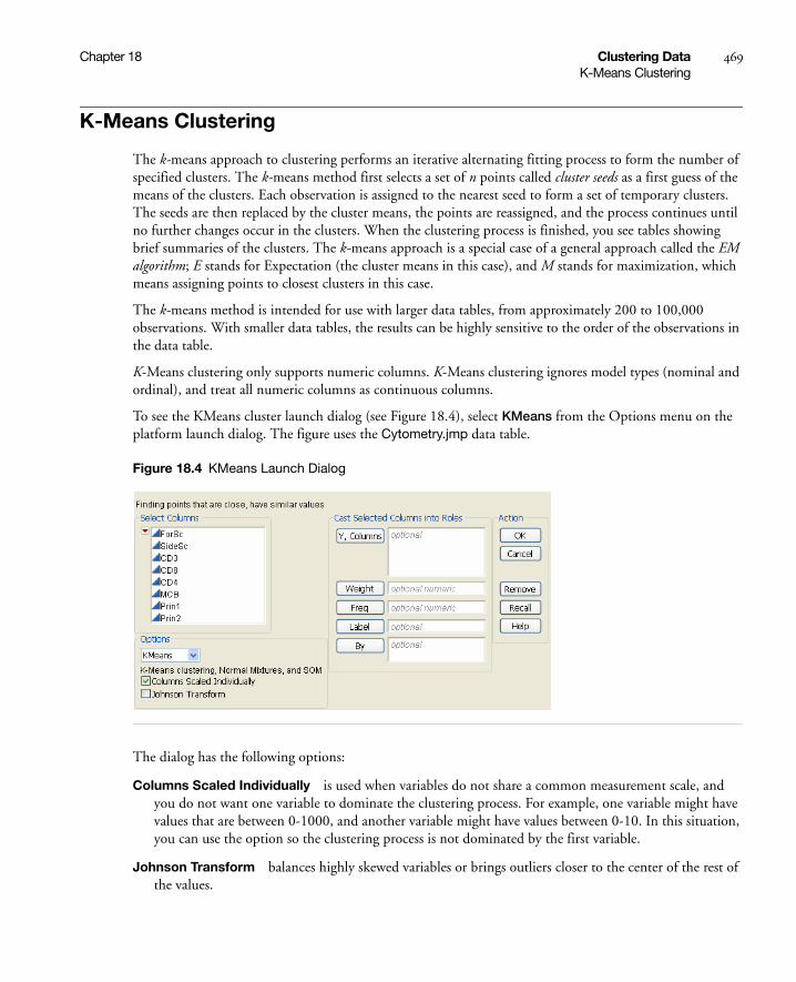
Chapter 18 Clustering Data 469K-Means Clustering
K-Means Clustering
The k-means approach to clustering performs an iterative alternating fitting process to form the number of specified clusters. The k-means method first selects a set of n points called cluster seeds as a first guess of the means of the clusters. Each observation is assigned to the nearest seed to form a set of temporary clusters. The seeds are then replaced by the cluster means, the points are reassigned, and the process continues until no further changes occur in the clusters. When the clustering process is finished, you see tables showing brief summaries of the clusters. The k-means approach is a special case of a general approach called the EM algorithm; E stands for Expectation (the cluster means in this case), and M stands for maximization, which means assigning points to closest clusters in this case.
The k-means method is intended for use with larger data tables, from approximately 200 to 100,000 observations. With smaller data tables, the results can be highly sensitive to the order of the observations in the data table.
K-Means clustering only supports numeric columns. K-Means clustering ignores model types (nominal and ordinal), and treat all numeric columns as continuous columns.
To see the KMeans cluster launch dialog (see Figure 18.4), select KMeans from the Options menu on the platform launch dialog. The figure uses the Cytometry.jmp data table.
Figure 18.4 KMeans Launch Dialog
The dialog has the following options:
Columns Scaled Individually is used when variables do not share a common measurement scale, and you do not want one variable to dominate the clustering process. For example, one variable might have values that are between 0-1000, and another variable might have values between 0-10. In this situation, you can use the option so the clustering process is not dominated by the first variable.
Johnson Transform balances highly skewed variables or brings outliers closer to the center of the rest of the values.

470 Clustering Data Chapter 18K-Means Clustering
K-Means Control Panel
As an example of KMeans clustering, use the Cytometry.jmp sample data table. Add the variables CD3 and CD8 as Y, Columns variables. Select the KMeans option. Click OK. The Control Panel appears, and is shown in Figure 18.5.
Figure 18.5 Iterative Clustering Control Panel
The Iterative Clustering red-triangle menu has the Save Transformed option. This saves the Johnson transformed variables to the data table. This option is available only if the Johnson Transform option is selected on the launch dialog (Figure 18.4).
The Control Panel has these options:
Declutter is used to locate outliers in the multivariate sense. Plots are produced giving distances between each point and that points nearest neighbor, the second nearest neighbor, up to the kth nearest neighbor. You are prompted to enter k. Beneath the plots are options to create a scatterplot matrix, save the distances to the data table, or to not include rows that you have excluded in the clustering procedure. If an outlier is identified, you might want to exclude the row from the clustering process.
Method is used to choose the clustering method. The available methods are:
KMeans Clustering is described in this section.
Normal Mixtures is described in “Normal Mixtures” on page 473.
Robust Normal Mixtures is described in “Normal Mixtures” on page 473.
Self Organizing Map is described in “Self Organizing Maps” on page 477.
Number of Clusters is the number of clusters to form.
Optional range of clusters is an upper bound for the number of clusters to form. If a number is entered here, the platform creates separate analyses for every integer between Number of clusters and this one.

Chapter 18 Clustering Data 471K-Means Clustering
Single Step enables you to step through the clustering process one iteration at a time using a Step button, or automate the process using a Go button.
Use within-cluster std deviations If you do not use this option, all distances are scaled by an overall estimate of the standard deviation of each variable. If you use this option, distances are scaled by the standard deviation estimated for each cluster.
Shift distances using sampling rates assumes that you have a mix of unequally sized clusters, and points should give preference to being assigned to larger clusters because there is a greater prior probability that it is from a larger cluster. This option is an advanced feature. The calculations for this option are implied, but not shown for normal mixtures.
K-Means Report
Clicking Go in the Control Panel in Figure 18.5 produces the K-Means report, shown in Figure 18.6.
Figure 18.6 K-Means Report
The report gives summary statistics for each cluster:
• count of number of observations
• means for each variable
• standard deviations for each variable.
The Cluster Comparison report gives fit statistics to compare different numbers of clusters. For KMeans Clustering and Self Organizing Maps, the fit statistic is CCC (Cubic Clustering Criterion). For Normal Mixtures, the fit statistic is BIC or AICc. Robust Normal Mixtures does not provide a fit statistic.

472 Clustering Data Chapter 18K-Means Clustering
K-Means Platform Options
These options are accessed from the red-triangle menus, and apply to KMeans, Normal Mixtures, Robust Normal Mixtures, and Self-Organizing Map methods.
Biplot shows a plot of the points and clusters in the first two principal components of the data. Circles are drawn around the cluster centers. The size of the circles are proportional to the count inside the cluster. The shaded area is the 90% density contour around the mean, therefore the shaded area indicates where 90% of the observations in that cluster would fall. Below the plot is an option to save the cluster colors to the data table.
Biplot Options contains options for controlling the Biplot.
Show Biplot Rays allows you to show or hide the biplot rays.
Biplot Ray Position allows you to position the biplot ray display. This is viable since biplot rays only signify the directions of the original variables in canonical space, and there is no special significance to where they are placed in the graph.
Mark Clusters assigns markers to the rows of the data table corresponding to the clusters.
Biplot 3D shows a three-dimensional biplot of the data. Three variables are needed to use this option.
Parallel Coord Plots creates a parallel coordinate plot for each cluster. For details about the plots, see Basic Analysis and Graphing. The plot report has options for showing and hiding the data and means.
Scatterplot Matrix creates a scatterplot matrix using all the variables.
Save Colors to Table colors each row with a color corresponding to the cluster it is in.
Save Clusters creates a new column with the cluster number that each row is assigned to. For normal mixtures, this is the cluster that is most likely.
Save Cluster Formula creates a new column with a formula to evaluate which cluster the row belongs to.
Save Mixture Probabilities creates a column for each cluster and saves the probability an observation belongs to that cluster in the column. This is available for Normal Mixtures and Robust Normal Mixtures clustering only.
Save Mixture Formulas creates columns with mixture probabilities, but stores their formulas in the column and needs additional columns to hold intermediate results for the formulas. Use this feature if you want to score probabilities for excluded data, or data you add to the table. This is available for Normal Mixtures and Robust Normal Mixtures clustering only.
Save Density Formula saves the density formula in the data table. This is available for Normal Mixtures clustering only.
Simulate Clusters creates a new data table containing simulated clusters using the mixing probabilities, means, and standard deviations.
Remove removes the clustering report.

Chapter 18 Clustering Data 473Normal Mixtures
Normal Mixtures
Normal mixtures is an iterative technique, but rather than being a clustering method to group rows, it is more of an estimation method to characterize the cluster groups. Rather than classifying each row into a cluster, it estimates the probability that a row is in each cluster. See McLachlan and Krishnan (1997).
The normal mixtures approach to clustering predicts the proportion of responses expected within each cluster. The assumption is that the joint probability distribution of the measurement columns can be approximated using a mixture of multivariate normal distributions, which represent different clusters. The distributions have mean vectors and covariance matrices for each cluster.
Hierarchical and k-means clustering methods work well when clusters are well separated, but when clusters overlap, assigning each point to one cluster is problematic. In the overlap areas, there are points from several clusters sharing the same space. It is especially important to use normal mixtures rather than k-means clustering if you want an accurate estimate of the total population in each group, because it is based on membership probabilities, rather than arbitrary cluster assignments based on borders.
To perform Normal Mixtures, select that option on the Method menu of the Iterative Clustering Control Panel (Figure 18.5). After selecting Normal Mixtures, the control panel looks like Figure 18.7.
Figure 18.7 Normal Mixtures Control Panel
Some of the options on the panel are described in “K-Means Control Panel” on page 470. The other options are described below:
Diagonal Variance is used to constrain the off-diagonal elements of the covariance matrix to zero. In this case, the platform fits multivariate normal distributions that have no correlations between the variables.
This is sometimes necessary in order to avoid getting a singular covariance matrix, when there are fewer observations than columns.

474 Clustering Data Chapter 18Normal Mixtures
Outlier Cluster is used to fit a Uniform cluster to catch any outliers that do not fall into any of the Normal clusters. If this cluster is created, it is designated cluster 0.
Tours is the number of independent restarts of estimation process, each with different starting values. This helps to guard against finding local solutions.
Maximum Iterations is the maximum number of iterations of the convergence stage of the EM algorithm.
Converge Criteria is the difference in the likelihood at which the EM iterations stop.
For an example of Normal Mixtures, open the Iris.jmp sample data table. This data set was first introduced by Fisher (1936), and includes four different measurements: sepal length, sepal width, petal length, and petal width, performed on samples of 50 each for three species of iris.
Note: Your results may not exactly match these results due to the random selection of initial centers.
On the Cluster launch dialog, assign all four variables to the Y, Columns role, select KMeans from Method menu, and click OK. Select Normal Mixtures from the Method menu, specify 3 for the Number of Clusters, and click Go. The report is shown in Figure 18.8.
Figure 18.8 Normal Mixtures Report
The report gives summary statistics for each cluster:
• count of number of observations and proportions
• means for each variable
• standard deviations for each variable.
• correlations between variables

Chapter 18 Clustering Data 475Normal Mixtures
The Cluster Comparison report gives fit statistics to compare different numbers of clusters. For KMeans Clustering and Self Organizing Maps, the fit statistic is CCC (Cubic Clustering Criterion). For Normal Mixtures, the fit statistic is BIC or AICc. Robust Normal Mixtures does not provide a fit statistic.
Robust Normal Mixtures
The Robust Normal Mixtures option is available if you suspect you may have outliers in the multivariate sense. Since regular Normal Mixtures is sensitive to outliers, the Robust Normal Mixtures option uses a more robust method for estimating the parameters. For details, see “Additional Details for Robust Normal Mixtures” on page 476.
To perform Robust Normal Mixtures, select that option on the Method menu of the Iterative Clustering Control Panel (Figure 18.5). After selecting Robust Normal Mixtures, the control panel looks like Figure 18.9.
Figure 18.9 Normal Mixtures Control Panel
Some of the options on the panel are described in “K-Means Control Panel” on page 470. The other options are described below:
Diagonal Variance is used to constrain the off-diagonal elements of the covariance matrix to zero. In this case, the platform fits multivariate normal distributions that have no correlations between the variables.
This is sometimes necessary in order to avoid getting a singular covariance matrix, when there are fewer observations than columns.
Huber Coverage is a number between 0 and 1. Robust Normal Mixtures protects against outliers by down-weighting them. Huber Coverage can be loosely thought of as the proportion of the data that is not considered outliers, and not down-weighted. Values closer to 1 result in a larger proportion of the data not being down-weighted. In other words, values closer to 1 protect only against the most extreme outliers. Values closer to 0 result in a smaller proportion of the data not being down-weighted, and may falsely consider less extreme data points to be outliers.

476 Clustering Data Chapter 18Normal Mixtures
Complete Tours is the number of times to restart the estimation process. This helps to guard against the process finding a local solution.
Initial Guesses is the number of random starts within each tour. Random starting values for the parameters are used for each new start.
Max Iterations is the maximum number of iterations during the convergence stage. The convergence stage starts after all tours are complete. It begins at the optimal result out of all the starts and tours, and from there converges to a final solution.
Platform Options
For details on the red-triangle options for Normal Mixtures and Robust Normal Mixtures, see “K-Means Platform Options” on page 472.
Details of the Estimation Process
Normal Mixtures uses the EM algorithm to do fitting because it is more stable than the Newton-Raphson algorithm. Additionally we're using a Bayesian regularized version of the EM algorithm, which allows us to smoothly handle cases where the covariance matrix is singular. Since the estimates are heavily dependent on initial guesses, the platform will go through a number of tours, each with randomly selected points as initial centers.
Doing multiple tours makes the estimation process somewhat expensive, so considerable patience is required for large problems. Controls allow you to specify the tour and iteration limits.
Additional Details for Robust Normal Mixtures
Because Normal Mixtures is sensitive to outliers, JMP offers an outlier robust alternative called Robust Normal Mixtures. This uses a robust method of estimating the normal parameters. JMP computes the estimates via maximum likelihood with respect to a mixture of Huberized normal distributions (a class of modified normal distributions that was tailor-made to be more outlier resistant than the normal distribution).
The Huberized Gaussian distribution has pdf .Φk x( )
Φk x( ) ρ x( )–( )expck
----------------------------=
ρ x( )
x2
2----- if x k≤
k x k2
2-----– if x k>
=
ck 2π Φ k( ) Φ k–( )–[ ] 2k
2– 2⁄( )expk
-----------------------------+=

Chapter 18 Clustering Data 477Self Organizing Maps
So, in the limit as k becomes arbitrarily large, tends toward the normal PDF. As , tends toward the exponential (Laplace) distribution.
The regularization parameter k is set so that P(Normal(x) < k) = Huber Coverage, where Normal(x) indicates a multivariate normal variate. Huber Coverage is a user field, which defaults to 0.90.
Self Organizing Maps
The Self-Organizing Maps (SOMs) technique was developed by Teuvo Kohonen (1989) and further extended by a number of other neural network enthusiasts and statisticians. The original SOM was cast as a learning process, like the original neural net algorithms, but the version implemented here is done in a much more straightforward way as a simple variation on k-means clustering. In the SOM literature, this would be called a batch algorithm using a locally weighted linear smoother.
The goal of a SOM is to not only form clusters, but form them in a particular layout on a cluster grid, such that points in clusters that are near each other in the SOM grid are also near each other in multivariate space. In classical k-means clustering, the structure of the clusters is arbitrary, but in SOMs the clusters have the grid structure. This grid structure helps to interpret the clusters in two dimensions: clusters that are close are more similar than distant clusters.
To create a Self Organizing Map, select that option on the Method menu of the Iterative Clustering Control Panel (Figure 18.5). After selecting Self Organizing Map, the control panel looks like Figure 18.10.
Figure 18.10 Self Organizing Map Control Panel
Some of the options on the panel are described in “K-Means Control Panel” on page 470. The other options are described below:
N Rows is the number of rows in the cluster grid.
N Columns is the number of columns in the cluster grid.
Φk x( ) k 0→ Φk x( )

478 Clustering Data Chapter 18Self Organizing Maps
Bandwidth determines the effect of neighboring clusters for predicting centroids. A higher bandwidth results in a more detailed fitting of the data.
As an example of a SOM, use the Iris.jmp sample data table to follow the steps below:
1. Select Analyze > Multivariate Methods > Cluster.
2. Assign all four columns as Y, Column variables.
3. Select K Means on the Options menu.
4. Uncheck Columns Scaled Individually.
5. Click OK.
6. Select Self Organizing Map from the Method menu on the Control Panel.
7. Since we know the data consists of three species, set Number of Clusters equal to 3.
8. Set N Rows equal to 1 and N Columns equal to 3.
9. Click Go. The report is shown in Figure 18.11.
Figure 18.11 Self Organizing Map Report
The report gives summary statistics for each cluster:
• count of number of observations
• means for each variable
• standard deviations for each variable.

Chapter 18 Clustering Data 479Self Organizing Maps
The Cluster Comparison report gives fit statistics to compare different numbers of clusters. For KMeans Clustering and Self Organizing Maps, the fit statistic is CCC (Cubic Clustering Criterion). For Normal Mixtures, the fit statistic is BIC or AICc. Robust Normal Mixtures does not provide a fit statistic.
For details on the red-triangle options for Self Organizing Maps, see “K-Means Platform Options” on page 472.
Implementation Technical Details
The SOM implementation in JMP proceeds as follows:
• The first step is to obtain good initial cluster seeds that provide a good coverage of the multidimensional space. JMP uses principal components to determine the two directions which capture the most variation in the data.
• JMP then lays out a grid in this principal component space with its edges 2.5 standard deviations from the middle in each direction. The clusters seeds are formed by translating this grid back into the original space of the variables.
• The cluster assignment proceeds as with k-means, with each point assigned to the cluster closest to it.
• The means are estimated for each cluster as in k-means. JMP then uses these means to set up a weighted regression with each variable as the response in the regression, and the SOM grid coordinates as the regressors. The weighting function uses a ‘kernel’ function that gives large weight to the cluster whose center is being estimated, with smaller weights given to clusters farther away from the cluster in the SOM grid. The new cluster means are the predicted values from this regression.
• These iterations proceed until the process has converged.

480 Clustering Data Chapter 18Self Organizing Maps
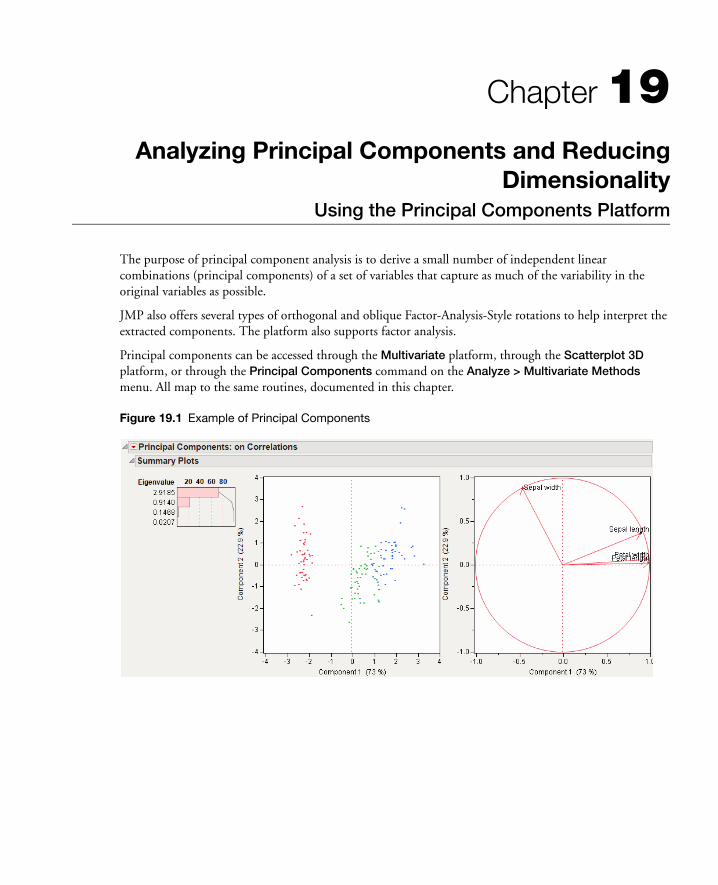
Chapter 19Analyzing Principal Components and Reducing
DimensionalityUsing the Principal Components Platform
The purpose of principal component analysis is to derive a small number of independent linear combinations (principal components) of a set of variables that capture as much of the variability in the original variables as possible.
JMP also offers several types of orthogonal and oblique Factor-Analysis-Style rotations to help interpret the extracted components. The platform also supports factor analysis.
Principal components can be accessed through the Multivariate platform, through the Scatterplot 3D platform, or through the Principal Components command on the Analyze > Multivariate Methods menu. All map to the same routines, documented in this chapter.
Figure 19.1 Example of Principal Components

Contents
Principal Components. . . . . . . . . . . . . . . . . . . . . . . . . . . . . . . . . . . . . . . . . . . . . . . . . . . . . . . . . . . . . . .483
Launch the Platform . . . . . . . . . . . . . . . . . . . . . . . . . . . . . . . . . . . . . . . . . . . . . . . . . . . . . . . . . . . . . . . .483
Report . . . . . . . . . . . . . . . . . . . . . . . . . . . . . . . . . . . . . . . . . . . . . . . . . . . . . . . . . . . . . . . . . . . . . . . . . . .484
Platform Options . . . . . . . . . . . . . . . . . . . . . . . . . . . . . . . . . . . . . . . . . . . . . . . . . . . . . . . . . . . . . . . . . .484
Factor Analysis . . . . . . . . . . . . . . . . . . . . . . . . . . . . . . . . . . . . . . . . . . . . . . . . . . . . . . . . . . . . . . . . .487

Chapter 19 Analyzing Principal Components and Reducing Dimensionality 483Principal Components
Principal Components
If you want to see the arrangement of points across many correlated variables, you can use principal component analysis to show the most prominent directions of the high-dimensional data. Using principal component analysis reduces the dimensionality of a set of data. Principal components is a way to picture the structure of the data as completely as possible by using as few variables as possible.
For n original variables, n principal components are formed as follows:
• The first principal component is the linear combination of the standardized original variables that has the greatest possible variance.
• Each subsequent principal component is the linear combination of the variables that has the greatest possible variance and is uncorrelated with all previously defined components.
Each principal component is calculated by taking a linear combination of an eigenvector of the correlation matrix (or covariance matrix or SSCP matrix) with a variable. The eigenvalues show the variance of each component.
Principal components representation is important in visualizing multivariate data by reducing it to dimensionalities that are graphable.
Launch the Platform
Select Analyze > Multivariate Methods > Principal Components to launch the platform. JMP presents you with a dialog box to specify the variables involved in the analysis. In this example, we use all the continuous variables from the Solubility.jmp data set.
The Estimation Method list provides different methods for calculating the correlations. For details on the methods, see the “Correlations and Multivariate Techniques” chapter on page 441.
Principal components analysis is also available in the Multivariate and Scatterplot 3D platforms.

484 Analyzing Principal Components and Reducing Dimensionality Chapter 19Report
Report
The initial principal components report (Figure 19.2) summarizes the variation of the specified Y variables with principal components. The principal components are derived from an eigenvalue decomposition of the correlation matrix, the covariance matrix, or on the unscaled and uncentered data.
The details in the report show how the principal components absorb the variation in the data. The principal component points are derived from the eigenvector linear combination of the variables.
Figure 19.2 Principal Components/Factor Analysis Report
The report gives the eigenvalues and a bar chart of the percent of the variation accounted for by each principal component. There is a Score plot and a Loadings plot as well.
Platform Options
The platform red-triangle menu has the following options:
Principal Components allows you to choose to create the principal components based on Correlations, Covariances, or Unscaled.
Correlations gives the correlations between the variables.
Covariance Matrix gives the variances and covariances of the variables.
Eigenvalues lists the eigenvalue that corresponds to each principal component in order from largest to smallest. The eigenvalues represent a partition of the total variation in the multivariate sample. They sum to the number of variables when the principal components analysis is done on the correlation matrix. Hypothesis tests are given for each eigenvalue (Jackson, 2003).

Chapter 19 Analyzing Principal Components and Reducing Dimensionality 485Platform Options
Eigenvectors shows columns of values that correspond to the eigenvectors for each of the principal components, in order, from left to right. Using these coefficients to form a linear combination of the original variables produces the principal component variables.
Bartlett Test shows the hypothesis test for each eigenvalue (Jackson, 2003).
Loading Matrix shows columns corresponding to the factor loading for each component.
Summary Plots shows or hides the summary information produced in the initial report. This information in shown in Figure 19.2.
Biplot shows a plot which overlays the Score Plot and the Loading Plot.
Scree Plot shows a scree plot of the eigenvalues vs. the number of components. This plot is useful for visualizing the dimensionality of the data space.
Score Plot shows a matrix of scatterplots of the scores for pairs of principal components.
Loading Plot shows a matrix of two-dimensional representations of factor loadings. The loading plot labels variables if the number of variables is 30 or fewer. If there are more than 30 variables, the labels are off by default.
Score Plot with Imputation imputes any missing values and creates a score plot. This option is available only if there are missing values.
3D Score Plot shows a 3D scatterplot of any principal component scores. When you first invoke the command, the first three principal components are presented.

486 Analyzing Principal Components and Reducing Dimensionality Chapter 19Platform Options
Figure 19.3 3D Score Plot
The variables show as rays in the plot. These rays, called biplot rays, approximate the variables as a function of the principal components on the axes. If there are only two or three variables, the rays represent the variables exactly. The length of the ray corresponds to the eigenvalue or variance of the principal component.
Factor Analysis performs factor-analytic style rotations of the principal components, or factor analysis. For more information, see “Factor Analysis” on page 487.
Cluster Variables performs a cluster analysis on the columns, useful for grouping the columns.
Save Principal Components saves the principal component to the data table, with a formula for computing the components. The formula can not evaluate rows with any missing values.
Save Rotated Components saves the rotated components to the data table, with a formula for computing the components. This option appears after the Factor Analysis option is used. The formula can not evaluate rows with missing values.
Switch amongPrincipal Components,Rotated Components,Data Columns
Select specificaxis contents
Cycle among allaxis content possibilities
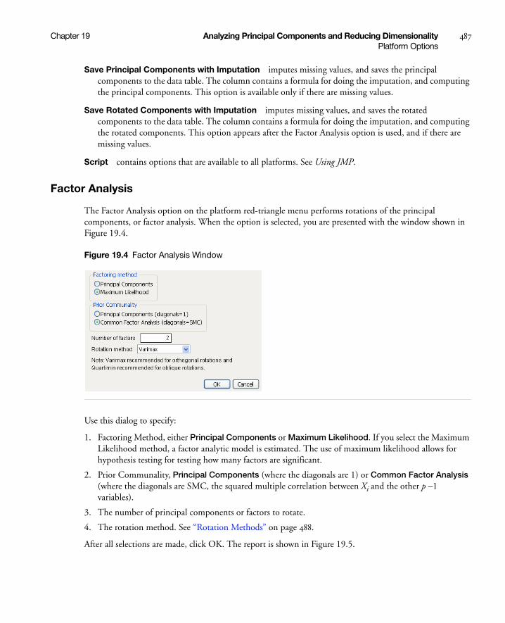
Chapter 19 Analyzing Principal Components and Reducing Dimensionality 487Platform Options
Save Principal Components with Imputation imputes missing values, and saves the principal components to the data table. The column contains a formula for doing the imputation, and computing the principal components. This option is available only if there are missing values.
Save Rotated Components with Imputation imputes missing values, and saves the rotated components to the data table. The column contains a formula for doing the imputation, and computing the rotated components. This option appears after the Factor Analysis option is used, and if there are missing values.
Script contains options that are available to all platforms. See Using JMP.
Factor Analysis
The Factor Analysis option on the platform red-triangle menu performs rotations of the principal components, or factor analysis. When the option is selected, you are presented with the window shown in Figure 19.4.
Figure 19.4 Factor Analysis Window
Use this dialog to specify:
1. Factoring Method, either Principal Components or Maximum Likelihood. If you select the Maximum Likelihood method, a factor analytic model is estimated. The use of maximum likelihood allows for hypothesis testing for testing how many factors are significant.
2. Prior Communality, Principal Components (where the diagonals are 1) or Common Factor Analysis (where the diagonals are SMC, the squared multiple correlation between Xi and the other p –1 variables).
3. The number of principal components or factors to rotate.
4. The rotation method. See “Rotation Methods” on page 488.
After all selections are made, click OK. The report is shown in Figure 19.5.
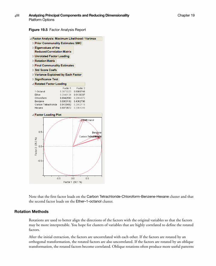
488 Analyzing Principal Components and Reducing Dimensionality Chapter 19Platform Options
Figure 19.5 Factor Analysis Report
Note that the first factor loads on the Carbon Tetrachloride-Chloroform-Benzene-Hexane cluster and that the second factor loads on the Ether–1-octanol cluster.
Rotation Methods
Rotations are used to better align the directions of the factors with the original variables so that the factors may be more interpretable. You hope for clusters of variables that are highly correlated to define the rotated factors.
After the initial extraction, the factors are uncorrelated with each other. If the factors are rotated by an orthogonal transformation, the rotated factors are also uncorrelated. If the factors are rotated by an oblique transformation, the rotated factors become correlated. Oblique rotations often produce more useful patterns

Chapter 19 Analyzing Principal Components and Reducing Dimensionality 489Platform Options
than do orthogonal rotations. However, a consequence of correlated factors is that there is no single unambiguous measure of the importance of a factor in explaining a variable.
Available orthogonal rotation methods are:
Varimax specifies the orthogonal varimax rotation. The corresponding SAS Proc Factor option specification is ROTATE=ORTHOMAX with GAMMA=1.
Biquartimax specifies the orthogonal biquartimax rotation. The corresponding SAS Proc Factor option specification is ROTATE=ORTHOMAX with GAMMA=0.5.
Equamax specifies the orthogonal equamax rotation. The corresponding SAS Proc Factor option specification is ROTATE=ORTHOMAX with GAMMA=number of factors/2.
Factorparsimax specifies the orthogonal factor parsimax rotation. The corresponding SAS Proc Factor option specification is ROTATE=ORTHOMAX with GAMMA=number of variables.
Orthomax specifies the orthogonal orthomax rotation with orthomax weight p. The corresponding SAS Proc Factor option specification is either ROTATE=ORTHOMAX or ROTATE=ORTHOMAX(p), which specifies p as the orthomax weight or the GAMMA=value. The default p value is 1 unless specified otherwise in the GAMMA= option. For additional information on orthomax weight, see the SAS documentation, “Simplicity Functions for Rotations.”
Parsimax specifies the orthogonal parsimax rotation. The corresponding SAS Proc Factor option specification is ROTATE=ORTHOMAX with GAMMA=[(nvar(nfact - 1))/(nvar + nfact - 2)] where nvar is the number of variables, and nfact is the number of factors.
Quartimax specifies the orthogonal quartimax rotation. The corresponding SAS Proc Factor option specification is ROTATE=ORTHOMAX with GAMMA=0.
Available oblique rotation methods are:
Biquartimin specifies the oblique biquartimin rotation. The corresponding SAS Proc Factor option specification is ROTATE=OBLIMIN(.5) or ROTATE=OBLIMIN with TAU=.5.
Covarimin specifies the oblique covarimin rotation. The corresponding SAS Proc Factor option specification is ROTATE=OBLIMIN(1) or ROTATE=OBLIMIN with TAU=1.
Obbiquartimax specifies the oblique biquartimax rotation. The corresponding SAS Proc Factor option specification is ROTATE=OBBIQUARTIMAX.
Obequamax specifies the oblique equamax rotation. The corresponding SAS Proc Factor option specification is ROTATE=OBEQUAMAX.
Obfactorparsimax specifies the oblique factor parsimax rotation. The corresponding SAS Proc Factor option specification is ROTATE=OBFACTORPARSIMAX.
Oblimin specifies the oblique oblimin rotation with oblimin weight p. The corresponding SAS Proc Factor option specification is ROTATE=OBLIMIN, where the default p value is zero, unless specified otherwise in the TAU= option. ROTATE=OBLIMIN(p) specifies p as the oblimin weight or the TAU= value. For additional information on oblimin weight, see the SAS documentation, “Simplicity Functions for Rotations.”

490 Analyzing Principal Components and Reducing Dimensionality Chapter 19Platform Options
Obparsimax specifies the oblique parsimax rotation. The corresponding SAS Proc Factor option specification is ROTATE=OBPARSIMAX.
Obquartimax specifies the oblique quartimax rotation. This is equivalent to the QUARTIMIN method. The corresponding SAS Proc Factor option specification is ROTATE=OBQUARTIMAX.
Obvarimax specifies the oblique varimax rotation. The corresponding SAS Proc Factor option specification is ROTATE=OBVARIMAX.
Quartimin specifies the oblique quartimin rotation. It is equivalent to the oblique quartimax method. The corresponding SAS Proc Factor option specification is ROTATE=OBLIMIN(0) or ROTATE=OBLIMIN with TAU=0.
Promax specifies oblique promax rotation. The corresponding SAS Proc Factor option specification is ROTATE=PROMAX.

Chapter 20Performing Discriminant Analysis
Using the Discriminant Platform
Discriminant Analysis seeks to find a way to predict a classification (X) variable (nominal or ordinal) based on known continuous responses (Y). It can be regarded as inverse prediction from a multivariate analysis of variance (MANOVA). In fact, the Manova personality of Fit Model also provides some discriminant features.
Features include:
• A stepwise selection dialog to help choose variables that discriminate well.
• Choice among Linear, Quadratic, or Regularized-Parameter analyses.
• The discriminant scores, showing which groups each point is near.
• A misclassification summary.
• Plots of the points and means in a canonical space, which is the space that shows the best separation of means.
• Options to save prediction distances and probabilities to the data table.

Contents
Introduction . . . . . . . . . . . . . . . . . . . . . . . . . . . . . . . . . . . . . . . . . . . . . . . . . . . . . . . . . . . . . . . . . . . . . .493
Discriminating Groups . . . . . . . . . . . . . . . . . . . . . . . . . . . . . . . . . . . . . . . . . . . . . . . . . . . . . . . . . . . . . .493
Discriminant Method . . . . . . . . . . . . . . . . . . . . . . . . . . . . . . . . . . . . . . . . . . . . . . . . . . . . . . . . . . . 494
Stepwise Selection . . . . . . . . . . . . . . . . . . . . . . . . . . . . . . . . . . . . . . . . . . . . . . . . . . . . . . . . . . . . . . .495
Canonical Plot. . . . . . . . . . . . . . . . . . . . . . . . . . . . . . . . . . . . . . . . . . . . . . . . . . . . . . . . . . . . . . . . . 497
Discriminant Scores . . . . . . . . . . . . . . . . . . . . . . . . . . . . . . . . . . . . . . . . . . . . . . . . . . . . . . . . . . . . 497
Commands and Options . . . . . . . . . . . . . . . . . . . . . . . . . . . . . . . . . . . . . . . . . . . . . . . . . . . . . . . . . . . . .498
Validation . . . . . . . . . . . . . . . . . . . . . . . . . . . . . . . . . . . . . . . . . . . . . . . . . . . . . . . . . . . . . . . . . . . . . . . . 503

Chapter 20 Performing Discriminant Analysis 493Introduction
Introduction
Discriminant Analysis is an alternative to logistic regression. In logistic regression, the classification variable is random and predicted by the continuous variables, whereas in discriminant analysis the classifications are fixed, and the Y variables are realizations of random variables. However, in both cases, the categorical value is predicted by the continuous.
There are several varieties of discriminant analysis. JMP implements linear and quadratic discriminant analysis, along with a method that blends both types. In linear discriminant analysis, it is assumed that the Y variables are normally distributed with the same variances and covariances, but that there are different means for each group defined by X. In quadratic discriminant analysis, the covariances can be different across groups. Both methods measure the distance from each point in the data set to each group's multivariate mean (often called a centroid) and classify the point to the closest group. The distance measure used is the Mahalanobis distance, which takes into account the variances and covariances between the variables.
Discriminating Groups
Fisher's Iris data set is the classic example of discriminant analysis. Four measurements are taken from a sample consisting of three different species. The goal is to identify the species accurately using the values of the four measurements. Open Iris.jmp, and select Analyze > Multivariate Methods > Discriminant to launch the Discriminant Analysis platform. The launch dialog in Figure 20.1 appears.
Figure 20.1 Discriminant Launch Dialog
If you want to find which variables discriminate well, click the checkbox for Stepwise Variable Selection. Otherwise, the platform uses all the variables you specify. In this example, specify the four continuous variables as Y, Covariates and Species as X, Categories.

494 Performing Discriminant Analysis Chapter 20Discriminating Groups
Discriminant Method
JMP offers three kinds of Discriminant Analysis. All three calculate distances as the Mahalanobis distance from each point to each group’s multivariate mean. The difference in the methods is only in the covariance matrix used in the computations.
Linear Discriminant Analysis uses a common (within-) covariance matrix for all groups.
Quadratic Discriminant Analysis uses a separate covariance matrix for each group.
Quadratic discriminant suffers in small data sets because it does not have enough data to make nicely invertible and stable covariance matrices. Regularized discriminant ameliorates these problems and still allows for differences among groups.
Regularized Discriminant Analysis is a compromise between the linear and quadratic methods, governed by two arguments. When you choose Regularized Discriminant Analysis, a dialog appears allowing specification of these two parameters.
The first parameter (Lambda, Shrinkage to Common Covariance) specifies how to mix the individual and group covariance matrices. For this parameter, 1 corresponds to Linear Discriminant Analysis and 0 corresponds to Quadratic Discriminant Analysis.
The second parameter (Gamma, Shrinkage to Diagonal) specifies whether to deflate the non-diagonal elements, that is, the covariances across variables. If you choose 1, then the covariance matrix is forced to be diagonal.
Therefore, assigning 0,0 to these parameters is identical to requesting quadratic discriminant analysis. Similarly, a 1,0 assignment requests linear discriminant analysis. These cases, along with a Regularized Discriminant Analysis example with l=0.4 and g=0.4 are shown in Figure 20.2.
Use Table 20.1 to help decide on the regularization.
Table 20.1 Regularized Discriminant Analysis
Use lower Lambda (Gamma) when: Use higher Lambda (Gamma) when:
Covariances are different
(Variables are correlated)
Covariances are the same
(Variables are uncorrelated)
lots of data little data
small number of variables many variables
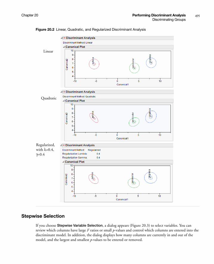
Chapter 20 Performing Discriminant Analysis 495Discriminating Groups
Figure 20.2 Linear, Quadratic, and Regularized Discriminant Analysis
Stepwise Selection
If you choose Stepwise Variable Selection, a dialog appears (Figure 20.3) to select variables. You can review which columns have large F ratios or small p-values and control which columns are entered into the discriminant model. In addition, the dialog displays how many columns are currently in and out of the model, and the largest and smallest p-values to be entered or removed.
Linear
Quadratic
Regularized, with λ=0.4, γ=0.4
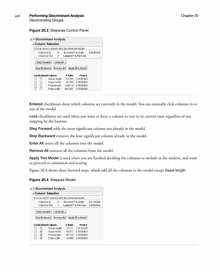
496 Performing Discriminant Analysis Chapter 20Discriminating Groups
Figure 20.3 Stepwise Control Panel
Entered checkboxes show which columns are currently in the model. You can manually click columns in or out of the model.
Lock checkboxes are used when you want to force a column to stay in its current state regardless of any stepping by the buttons.
Step Forward adds the most significant column not already in the model.
Step Backward removes the least significant column already in the model.
Enter All enters all the columns into the model.
Remove All removes all the columns from the model.
Apply This Model is used when you are finished deciding the columns to include in the analysis, and want to proceed to estimation and scoring.
Figure 20.4 shows three forward steps, which add all the columns to the model except Sepal length.
Figure 20.4 Stepped Model
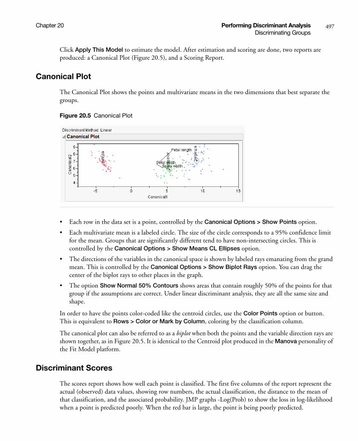
Chapter 20 Performing Discriminant Analysis 497Discriminating Groups
Click Apply This Model to estimate the model. After estimation and scoring are done, two reports are produced: a Canonical Plot (Figure 20.5), and a Scoring Report.
Canonical Plot
The Canonical Plot shows the points and multivariate means in the two dimensions that best separate the groups.
Figure 20.5 Canonical Plot
• Each row in the data set is a point, controlled by the Canonical Options > Show Points option.
• Each multivariate mean is a labeled circle. The size of the circle corresponds to a 95% confidence limit for the mean. Groups that are significantly different tend to have non-intersecting circles. This is controlled by the Canonical Options > Show Means CL Ellipses option.
• The directions of the variables in the canonical space is shown by labeled rays emanating from the grand mean. This is controlled by the Canonical Options > Show Biplot Rays option. You can drag the center of the biplot rays to other places in the graph.
• The option Show Normal 50% Contours shows areas that contain roughly 50% of the points for that group if the assumptions are correct. Under linear discriminant analysis, they are all the same size and shape.
In order to have the points color-coded like the centroid circles, use the Color Points option or button. This is equivalent to Rows > Color or Mark by Column, coloring by the classification column.
The canonical plot can also be referred to as a biplot when both the points and the variable direction rays are shown together, as in Figure 20.5. It is identical to the Centroid plot produced in the Manova personality of the Fit Model platform.
Discriminant Scores
The scores report shows how well each point is classified. The first five columns of the report represent the actual (observed) data values, showing row numbers, the actual classification, the distance to the mean of that classification, and the associated probability. JMP graphs -Log(Prob) to show the loss in log-likelihood when a point is predicted poorly. When the red bar is large, the point is being poorly predicted.
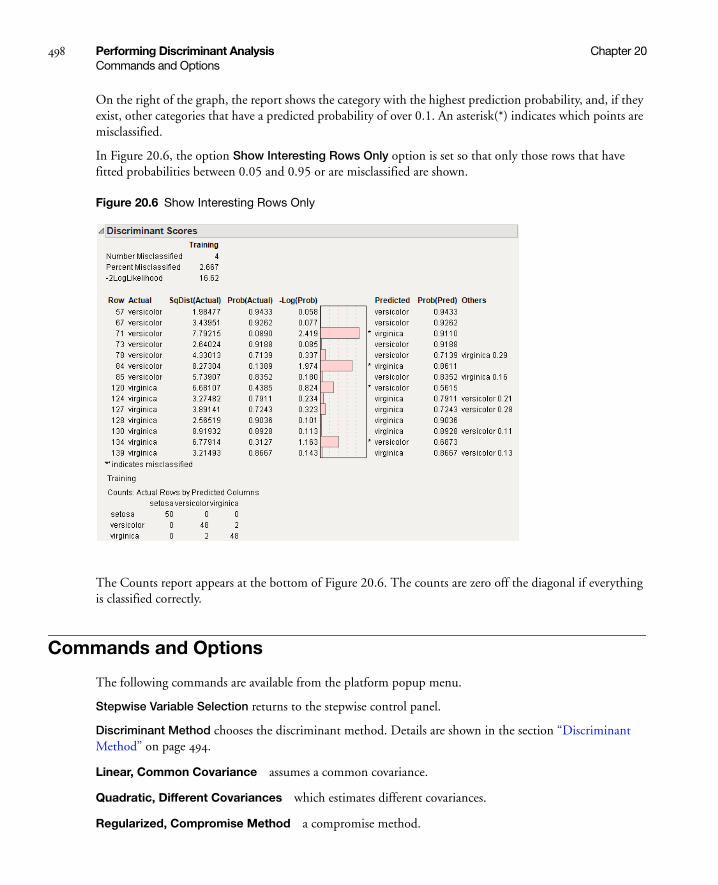
498 Performing Discriminant Analysis Chapter 20Commands and Options
On the right of the graph, the report shows the category with the highest prediction probability, and, if they exist, other categories that have a predicted probability of over 0.1. An asterisk(*) indicates which points are misclassified.
In Figure 20.6, the option Show Interesting Rows Only option is set so that only those rows that have fitted probabilities between 0.05 and 0.95 or are misclassified are shown.
Figure 20.6 Show Interesting Rows Only
The Counts report appears at the bottom of Figure 20.6. The counts are zero off the diagonal if everything is classified correctly.
Commands and Options
The following commands are available from the platform popup menu.
Stepwise Variable Selection returns to the stepwise control panel.
Discriminant Method chooses the discriminant method. Details are shown in the section “Discriminant Method” on page 494.
Linear, Common Covariance assumes a common covariance.
Quadratic, Different Covariances which estimates different covariances.
Regularized, Compromise Method a compromise method.

Chapter 20 Performing Discriminant Analysis 499Commands and Options
Score Data shows or hides the listing of the scores by row in the Discriminant Scores portion of the report.
Score Options deal with the scoring of the observations and includes the following:
Show Interesting Rows Only shows rows that are misclassified and those where p>.05 and p<0.95) for any p, the attributed probability.
Show Classification Counts shows a matrix of actual by predicted counts for each category. When the data are perfectly predicted, the off-diagonal elements are zero. If there are excluded rows, a separate matrix is given for the excluded rows. For more information, see “Validation” on page 503.
Show Distances to each group appends a table to show the squared distance to each group.
Show Probabilities to each group appends a table to show the probabilities to each group.
ROC Curve appends an ROC curve to the report.
Select Misclassified Rows selects the misclassified rows in the original data table.
Select Uncertain Rows selects the rows which have uncertain classifications in the data table. When this option is selected, a dialog box appears so you can specify the difference (0.1 is the default) to be marked as uncertain.
Save Formulas saves formulas to the data table. The distance formulas are Dist[0], needed in the Mahalanobis distance calculations, and a Dist[ ] column for each X-level’s Mahalanobis distance. Probability formulas are Prob[0], the sum of the exponentials of -0.5 times the Mahalanobis distances, and a Prob[ ] column for each X-level’s posterior probability of being in that category. The column includes a Response Probability property. The Pred column holds the most likely level for each row.
Canonical Plot shows or hides the Canonical Plot.
Canonical Options provides commands that affect the Canonical Plot and include the following:
Show Points shows or hides the points in the plot.
Show Means CL Ellipses shows or hides the 95% confidence ellipse of each mean. The ellipses appear as a circle because of scaling. Categories with more observations have smaller circles.
Show Normal 50% Contours shows or hides the normal contours which estimate the region where 50% of the level’s points lie.
Show Biplot Rays shows or hides the biplot rays. These rays indicate the directions of the variables in the canonical space.
Biplot Ray Position allows you to specify the position and radius scaling (default = 1) of the biplot rays in the canonical plot.
Color Points colors the points based on levels of the X variable. This statement is equivalent to selecting Rows > Color or Mark by Column and selecting the X variable.
Show Canonical Details shows or hides the Canonical details. Details for the Iris data set are shown in Figure 20.7. The matrices at the bottom of the report are opened by clicking on the disclosure icon beside their name and closed by clicking on the name of the matrix.

500 Performing Discriminant Analysis Chapter 20Commands and Options
Figure 20.7 Canonical Details
Save Canonical Scores creates columns in the data table holding the canonical score for each observation. The new columns are named Canon[ ].
Save to New Data Table available only through scripting, saves the group means and the biplot rays on the canonical variables, together with the canonical scores to a new data table.
Canonical 3D Plot is available only when there are four or more groups (levels). An example of this plot is shown in Figure 20.8. It shows a three-dimensional version of the Canonical Plot and respects other Canonical Options.

Chapter 20 Performing Discriminant Analysis 501Commands and Options
Figure 20.8 Canonical 3D Plot
The example in Figure 20.8 is displayed by:
1. Open cereal.jmp.
2. Click on Analyze > Multivariate Methods > Discriminant.
3. Specify Calories, Protein, Fat, and Sodium as Y, Covariates.
4. Specify Manufacturer as X, Categories and click OK.
5. Click on the red triangle in the Discriminant Analysis title bar and select Canonical 3D Plot.
6. Click inside the plot and rotate the plot until you see the desired effect.
Specify Priors lets you specify the prior probabilities for each level of the X variable:
Equal Probabilities assigns an equal probability to each level.
Proportional to Occurrence assigns probabilities to each level according to their frequency in the data.
Other brings up a dialog to allow custom specification of the priors, shown in Figure 20.9. By default, each level is assigned equal probabilities.

502 Performing Discriminant Analysis Chapter 20Commands and Options
Figure 20.9 Specify Prior Probabilities Dialog
Consider New Levels is used when you have some points that may not fit any known group, but instead may be from an unscored, new group.
Save Discrim Matrices creates a global list (DiscrimResults) for use in the JMP scripting language. The list contains a list of YNames, a list of XNames, a list of XValues, a matrix of YMeans, and a matrix of YPartialCov (covariances). An example from the iris data DiscrimResults is
{YNames = {"Sepal length", "Sepal width", "Petal length", "Petal Width"}, XName = "Species", XValues = {"setosa", "versicolor", "virginica"}, YMeans = [5.005999999999999 3.428000000000001 1.462 0.2459999999999999, 5.936 2.77 4.26 1.326, 6.587999999999998 2.974 5.552 2.026], YPartialCov = [0.2650081632653061 0.09272108843537413 0.1675142857142858 0.03840136054421769, 0.09272108843537413 0.1153877551020407 0.055243537414966 0.03271020408163266, 0.1675142857142858 0.055243537414966 0.1851877551020409 0.04266530612244898, 0.03840136054421769 0.03271020408163266 0.04266530612244898 0.04188163265306122]}
Get Discrim Matrices, only available through scripting, obtains the same values as Save Discrim Matrices, but returns them to the caller rather than storing them in the data table.
Show Within Covariances shows or hides the Covariance Matrix report. The report for this example is shown in Figure 20.10.
Figure 20.10 Covariance Matrix Report

Chapter 20 Performing Discriminant Analysis 503Validation
Show Group Means shows or hides a table with the means of each variable. Means are shown for each level and for all levels of the X variable. Figure 20.11 shows the Group Means table for this example.
Figure 20.11 Group Means Table
Validation
Validation is the process of using part of a data set to build a model, and using the other part to assess the predictive ability of the model.
• The training set is the part that estimates model parameters.
• The validation set is the part that validates the predictive ability of the model.
Excluded rows are not included in the training set. When the Show Classification Counts option is chosen on the platform red-triangle menu, results are given for both training and validation (excluded) data. This helps you assess if the discriminant function has any predictive ability on data that was not used to build the function.
In the Discriminant Scores report, there is an indicator for excluded rows.

504 Performing Discriminant Analysis Chapter 20Validation
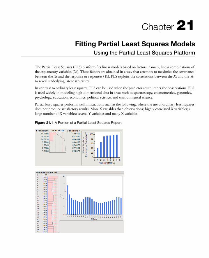
Chapter 21Fitting Partial Least Squares Models
Using the Partial Least Squares Platform
The Partial Least Squares (PLS) platform fits linear models based on factors, namely, linear combinations of the explanatory variables (Xs). These factors are obtained in a way that attempts to maximize the covariance between the Xs and the response or responses (Ys). PLS exploits the correlations between the Xs and the Ys to reveal underlying latent structures.
In contrast to ordinary least squares, PLS can be used when the predictors outnumber the observations. PLS is used widely in modeling high-dimensional data in areas such as spectroscopy, chemometrics, genomics, psychology, education, economics, political science, and environmental science.
Partial least squares performs well in situations such as the following, where the use of ordinary least squares does not produce satisfactory results: More X variables than observations; highly correlated X variables; a large number of X variables; several Y variables and many X variables.
Figure 21.1 A Portion of a Partial Least Squares Report

Contents
Overview of the Partial Least Squares Platform . . . . . . . . . . . . . . . . . . . . . . . . . . . . . . . . . . . . . . . . . . . .507
Example of Partial Least Squares . . . . . . . . . . . . . . . . . . . . . . . . . . . . . . . . . . . . . . . . . . . . . . . . . . . . . . .507
Launch the Partial Least Squares Platform . . . . . . . . . . . . . . . . . . . . . . . . . . . . . . . . . . . . . . . . . . . . . . . . 510
Launch through Multivariate Methods . . . . . . . . . . . . . . . . . . . . . . . . . . . . . . . . . . . . . . . . . . . . . . . 510
Launching through Fit Model . . . . . . . . . . . . . . . . . . . . . . . . . . . . . . . . . . . . . . . . . . . . . . . . . . . . . . 511
Centering and Scaling . . . . . . . . . . . . . . . . . . . . . . . . . . . . . . . . . . . . . . . . . . . . . . . . . . . . . . . . . . . . 511
Impute Missing Data. . . . . . . . . . . . . . . . . . . . . . . . . . . . . . . . . . . . . . . . . . . . . . . . . . . . . . . . . . . . . 511
Model Launch Control Panel . . . . . . . . . . . . . . . . . . . . . . . . . . . . . . . . . . . . . . . . . . . . . . . . . . . . . . . . . 512
The Partial Least Squares Report . . . . . . . . . . . . . . . . . . . . . . . . . . . . . . . . . . . . . . . . . . . . . . . . . . . . . . . 513
Model Fit Options. . . . . . . . . . . . . . . . . . . . . . . . . . . . . . . . . . . . . . . . . . . . . . . . . . . . . . . . . . . . . . . . . . 514
Partial Least Squares Options . . . . . . . . . . . . . . . . . . . . . . . . . . . . . . . . . . . . . . . . . . . . . . . . . . . . . . . . .520
Statistical Details . . . . . . . . . . . . . . . . . . . . . . . . . . . . . . . . . . . . . . . . . . . . . . . . . . . . . . . . . . . . . . . . . . .520
Chapter 21 Fitting Partial Least Squares Models 507Overview of the Partial Least Squares Platform
Overview of the Partial Least Squares Platform
The Partial Least Squares (PLS) platform fits linear models based on linear combinations, called factors, of the explanatory variables (Xs). These factors are obtained in a way that attempts to maximize the covariance between the Xs and the response or responses (Ys). In this way, PLS exploits the correlations between the Xs and the Ys to reveal underlying latent structures.
The PLS approach to model fitting is particularly useful when there are more explanatory variables than observations or when the explanatory variables are highly correlated. You can use PLS to fit a single model to several responses simultaneously. (Wold, 1995; Wold et al, 2001, Eriksson et al, 2006).
Two model fitting algorithms are available: nonlinear iterative partial least squares (NIPALS) and a “statistically inspired modification of PLS” (SIMPLS) (de Jong, 1993; Boulesteix and Strimmer, 2006). The SIMPLS algorithm was developed with the goal of solving a specific optimality problem. For a single response, both methods give the same model. For multiple responses, there are slight differences.
The platform uses the van der Voet T2 test and cross validation to help you choose the optimal number of factors to extract.
• In JMP, the platform uses the leave-one-out method of cross validation.
• In JMP Pro, you can choose KFold or random holdback cross validation, or you can specify a validation column. If you prefer, you can also turn off validation. Note that leave-one-out cross validation can be obtained by setting the number of folds in KFold equal to the number of rows.
In JMP Pro, in addition to fitting main effects, you can also fit polynomial, interaction, and categorical effects by using the Partial Least Squares personality in Fit Model.
Example of Partial Least Squares
We consider an example from spectrometric calibration, and area where partial least squares is very effective. Consider the Baltic.jmp data table. The data are reported in Umetrics (1995); the original source is Lindberg, Persson, and Wold (1983). Suppose that you are researching pollution in the Baltic Sea. You would like to use the spectra of samples of sea water to determine the amounts of three compounds that are present in these samples. The three compounds of interest are: lignin sulfonate (ls), which is pulp industry pollution; humic acid (ha), a natural forest product; and an optical whitener from detergent (dt). The amounts of these compounds in each of the samples are the responses, The predictors are spectral emission intensities measured at a range of wavelengths (v1–v27).
For the purposes of calibrating the model, samples with known compositions are used. The calibration data consist of 16 samples of known concentrations of lignin sulfonate, humic acid, and detergent, with emission intensities recorded at 27 equidistant wavelengths. Use the Partial Least Squares platform to build a model for predicting the amount of the compounds from the spectral emission intensities.
In the following, we describe the steps and show reports for JMP. Because different cross validation options are used in JMP Pro, JMP Pro results for the default Model Launch settings differ from those shown in the figures below. To duplicate the results below in JMP Pro, in the Model Launch window, enter 16 as the
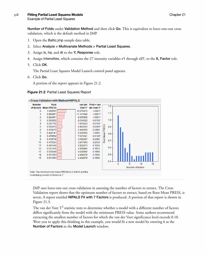
508 Fitting Partial Least Squares Models Chapter 21Example of Partial Least Squares
Number of Folds under Validation Method and then click Go. This is equivalent to leave-one-out cross validation, which is the default method in JMP.
1. Open the Baltic.jmp sample data table.
2. Select Analyze > Multivariate Methods > Partial Least Squares.
3. Assign ls, ha, and dt to the Y, Response role.
4. Assign Intensities, which contains the 27 intensity variables v1 through v27, to the X, Factor role.
5. Click OK.
The Partial Least Squares Model Launch control panel appears.
6. Click Go.
A portion of the report appears in Figure 21.2.
Figure 21.2 Partial Least Squares Report
JMP uses leave-one-out cross validation in assessing the number of factors to extract. The Cross Validation report shows that the optimum number of factors to extract, based on Root Mean PRESS, is seven. A report entitled NIPALS Fit with 7 Factors is produced. A portion of that report is shown in Figure 21.3.
The van der Voet T2 statistic tests to determine whether a model with a different number of factors differs significantly from the model with the minimum PRESS value. Some authors recommend extracting the smallest number of factors for which the van der Voet significance level exceeds 0.10. Were you to apply this thinking in this example, you would fit a new model by entering 6 as the Number of Factors in the Model Launch window.

Chapter 21 Fitting Partial Least Squares Models 509Example of Partial Least Squares
Figure 21.3 Seven Extracted Factors
7. Select Diagnostics Plots from the NIPALS Fit with 7 Factors red triangle menu.
This gives a report showing actual by predicted plots as well as three reports showing various residual plots. The Actual by Predicted Plot, shown in Figure 21.4, shows the degree to which predicted compound amounts agree with actual amounts.
Figure 21.4 Diagnostics Plots

510 Fitting Partial Least Squares Models Chapter 21Example of Partial Least Squares
Launch the Partial Least Squares Platform
There are two ways to launch the Partial Least Squares platform:
• Select Analyze > Multivariate Methods > Partial Least Squares. For details, see “Launch through Multivariate Methods” on page 510
• Select Analyze > Fit Model and select Partial Least Squares from the Personality menu. For details, see “Launching through Fit Model” on page 511.
Launch through Multivariate Methods
To launch Partial Least Squares, select Analyze > Multivariate Methods > Partial Least Squares. Figure 21.5 shows the JMP Pro launch window for Baltic.jmp. The launch window in JMP does not provide the Validation or Impute Missing Data options.
Figure 21.5 Partial Least Squares Launch Window for JMP Pro
The launch window allows the following selections:
Y, Response Enter the response columns.
X, Factor Enter the X columns. Ordinal model effects are treated as nominal.
Validation Allows the option to enter a validation column. If the validation column has more than two levels, then KFold Cross Validation is used. For information about other validation options, see “Validation Method” on page 512.
By Allows the option to enter a column that creates separate reports for each level of the variable.
Centering Subtracts the mean from each column. For more information, see “Centering and Scaling” on page 511.

Chapter 21 Fitting Partial Least Squares Models 511Example of Partial Least Squares
Scaling Divides each column by its standard deviation. For more information, see “Centering and Scaling” on page 511.
Impute Missing Data Imputes values for observations with missing X or Y values. For more information, see “Impute Missing Data” on page 511.
After completing the launch window and clicking OK, the Model Launch control panel appears. See “Model Launch Control Panel” on page 512.
Launching through Fit Model
In JMP Pro, you can launch Partial Least Squares through Fit Model. Select Analyze > Fit Model and select Partial Least Squares from the Personality menu. The options for Centering, Scaling, and Impute Missing Data appear in the Fit Model window, once the personality has been set to Partial Least Squares.
After completing the Fit Model window and clicking Run, the Model Launch control panel appears. See “Model Launch Control Panel” on page 512.
Note the following about using the Partial Least Squares personality of Fit Model:
• If you access Partial Least Squares through Fit Model, you can include categorical, polynomial, and interaction effects in the model.
• In JMP 10, the following Fit Model features are not available for the Partial Least Squares personality: Weight, Freq, Nest, Attributes, Transform, and No Intercept. The following Macros are not available: Mixture Response Surface, Scheffé Cubic, and Radial.
Centering and Scaling
By default, the predictors and responses are centered and scaled to have mean 0 and standard deviation 1. Centering the predictors and the responses ensures that the criterion for choosing successive factors is based on how much variation they explain. Without centering, both the variable’s mean and its variation around that mean are involved in selecting factors.
Scaling places all predictors and responses on an equal footing relative to their variation. Suppose that Time and Temp are two of the predictors. Scaling them indicates that a change of one standard deviation in Time is approximately equivalent to a change of one standard deviation in Temp.
Impute Missing Data
Ordinarily, rows that are missing observations on any X variable are excluded from the analysis and no predictions are computed for these rows. Rows with no missing observations on X variables but with missing observations on Y variables are also excluded from the analysis, but predictions are computed.
However, JMP Pro can compensate for missing observations on any X or Y variable. Select Impute Missing Data on the PLS launch or in the Fit Model window. Missing data for each variable is imputed using the average of the nonmissing values for that variable.

512 Fitting Partial Least Squares Models Chapter 21Model Launch Control Panel
Model Launch Control Panel
After you click OK on the platform launch window (or Run in Fit Model), the Model Launch control panel appears (Figure 21.6). Note that the Validation Method portion of the Model Launch control panel has a different appearance in JMP Pro.
Figure 21.6 Partial Least Squares Model Launch Control Panel
The Model Launch control panel allows the following selections:
Method Specification Select the type of model fitting algorithm. There are two algorithm choices: NIPALS and SIMPLS. The two methods produce the same coefficient estimates when there is only one response variable. See “Statistical Details” on page 520 for differences between the two algorithms.
Validation Method Select the validation method. Validation is used to determine the optimum number of factors to extract. For JMP Pro, if a validation column is specified on the platform launch window, these options do not appear.
Holdback Randomly selects the specified proportion of the data for fitting the model, and uses the other portion of the data to validate model fit.
KFold Partitions the data into K subsets, or folds. In turn, each fold is used to validate the model fit on the rest of the data, fitting a total of K models. This method is best for small data sets, because it makes efficient use of limited amounts of data.
Leave-One-Out Performs leave-one-out cross validation.
Note: In JMP Pro, leave-one-out cross validation can be obtained by setting the number of folds in KFold equal to the number of rows.
None Does not use validation to choose the number of factors to extract. The number of factors is specified in the Factor Search Range.
Factor Search Range Specify how many latent factors to extract if not using validation. If validation is being used, this is the maximum number of factors the platform attempts to fit before choosing the optimum number of factors.

Chapter 21 Fitting Partial Least Squares Models 513The Partial Least Squares Report
The Partial Least Squares Report
The first time you click Go in the Model Launch control panel (Figure 21.6), a new window appears that includes the control panel and three reports. You can fit additional models by specifying the desired numbers of factors in the control panel.
The following reports appear:
Model Comparison Summary Displays summary results for each fitted model (Figure 21.7), where models for 7 and then 6 factors have been fit. The report includes the following summary information:
Method is the analysis method specified in the Model Launch control panel.
Number of rows is the number of observations used in the training set.
Number of factors is the number of extracted factors.
Percent Variation Explained for Cumulative X is the percent of variation in X explained by the model.
Percent Variation Explained for Cumulative Y is the percent of variation in Y explained by the model.
Number of VIP>0.8 is the number of X variables with VIP (variable importance for projection) values greater than 0.8. The VIP score is a measure of a variable’s importance relative to modeling both X and Y (Wold, 1995).
Figure 21.7 Model Comparison Summary
Cross Validation This report only appears when cross validation is selected as a Validation Method in the Model Launch control panel. It shows summary statistics for models fit using from 0 to the maximum number of extracted factors, as specified in the Model Launch control panel (Figure 21.8). An optimum number of factors is identified using the minimum Root Mean PRESS (predicted residual sum of squares) statistic. The van der Voet T2 tests enable you to test whether models with different numbers of extracted factors differ significantly from the optimum model. The null hypothesis for each van der Voet T2 test states that the model based on the corresponding Number of factors does not differ from the optimum model. For more details, see “van der Voet T2” on page 522.
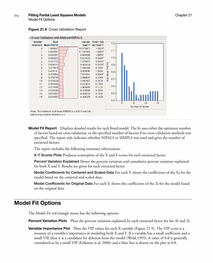
514 Fitting Partial Least Squares Models Chapter 21Model Fit Options
Figure 21.8 Cross Validation Report
Model Fit Report Displays detailed results for each fitted model. The fit uses either the optimum number of factors based on cross validation, or the specified number of factors if no cross validation methods was specified. The report title indicates whether NIPALS or SIMPLS was used and gives the number of extracted factors.
The report includes the following summary information:
X-Y Scores Plots Produces scatterplots of the X and Y scores for each extracted factor.
Percent Variation Explained Shows the percent variation and cumulative percent variation explained for both X and Y. Results are given for each extracted factor.
Model Coefficients for Centered and Scaled Data For each Y, shows the coefficients of the Xs for the model based on the centered and scaled data.
Model Coefficients for Original Data For each Y, shows the coefficients of the Xs for the model based on the original data.
Model Fit Options
The Model Fit red triangle menu has the following options:
Percent Variation Plots Plots the percent variation explained by each extracted factor for the Xs and Ys.
Variable Importance Plot Plots the VIP values for each X variable (Figure 21.9). The VIP score is a measure of a variable’s importance in modeling both X and Y. If a variable has a small coefficient and a small VIP, then it is a candidate for deletion from the model (Wold,1995). A value of 0.8 is generally considered to be a small VIP (Eriksson et al, 2006) and a blue line is drawn on the plot at 0.8.
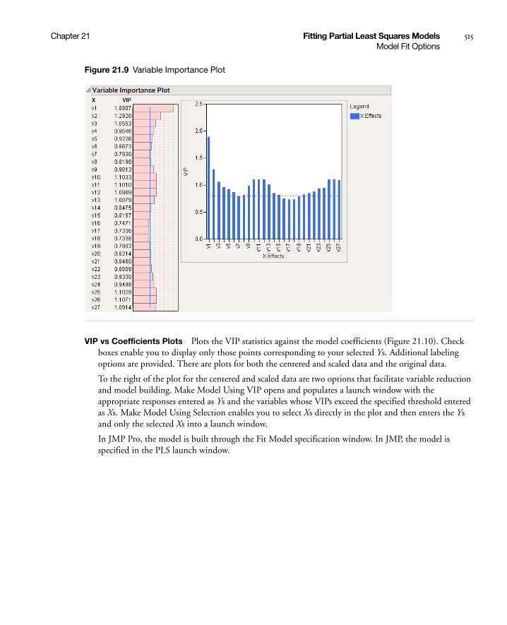
Chapter 21 Fitting Partial Least Squares Models 515Model Fit Options
Figure 21.9 Variable Importance Plot
VIP vs Coefficients Plots Plots the VIP statistics against the model coefficients (Figure 21.10). Check boxes enable you to display only those points corresponding to your selected Ys. Additional labeling options are provided. There are plots for both the centered and scaled data and the original data.
To the right of the plot for the centered and scaled data are two options that facilitate variable reduction and model building. Make Model Using VIP opens and populates a launch window with the appropriate responses entered as Ys and the variables whose VIPs exceed the specified threshold entered as Xs. Make Model Using Selection enables you to select Xs directly in the plot and then enters the Ys and only the selected Xs into a launch window.
In JMP Pro, the model is built through the Fit Model specification window. In JMP, the model is specified in the PLS launch window.
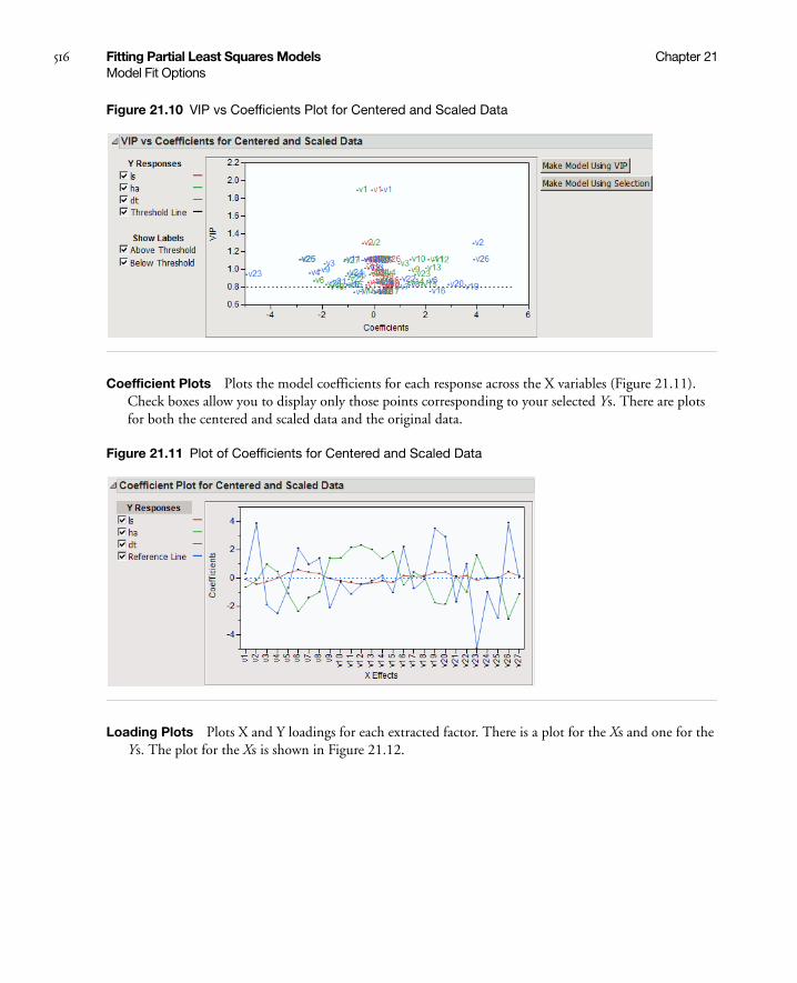
516 Fitting Partial Least Squares Models Chapter 21Model Fit Options
Figure 21.10 VIP vs Coefficients Plot for Centered and Scaled Data
Coefficient Plots Plots the model coefficients for each response across the X variables (Figure 21.11). Check boxes allow you to display only those points corresponding to your selected Ys. There are plots for both the centered and scaled data and the original data.
Figure 21.11 Plot of Coefficients for Centered and Scaled Data
Loading Plots Plots X and Y loadings for each extracted factor. There is a plot for the Xs and one for the Ys. The plot for the Xs is shown in Figure 21.12.

Chapter 21 Fitting Partial Least Squares Models 517Model Fit Options
Figure 21.12 Plot of X Loadings
Loading Scatterplot Matrices Shows a scatterplot matrix of the X loadings and a scatterplot matrix of the Y loadings.
Correlation Loading Plot Shows a scatterplot matrix of the X and Y loadings overlaid on the same plot. Check boxes enable you to control labeling.
X-Y Score Plots Includes the following options:
Fit Line Shows or hides a fitted line through the points on the X-Y Scores Plots.
Show Confidence Band Shows or hides 95% confidence bands for the fitted lines on the X-Y Scores Plots. Note that these should be used only for outlier detection.
Score Scatterplot Matrices Shows a scatterplot matrix of the X scores and a scatterplot matrix of the Y scores. Each scatterplot displays a confidence ellipse. These may be used for outlier detection. For statistical details on the confidence ellipses, see “Confidence Ellipse for Scatter Scores Plots” on page 522.
Distance Plots Shows a plot of the distance from each observation to the X model, the corresponding plot for the Y model, and a scatterplot of distances to both the X and Y models (Figure 21.13). In a good model, both X and Y distances are small, so the points are close to the origin (0,0). Use the plots to look for outliers relative to either X or Y. If a group of points clusters together, then they might have a common feature and could be analyzed separately.
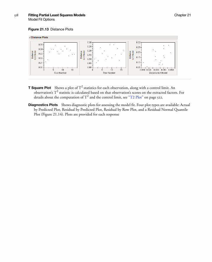
518 Fitting Partial Least Squares Models Chapter 21Model Fit Options
Figure 21.13 Distance Plots
T Square Plot Shows a plot of T2 statistics for each observation, along with a control limit. An observation’s T2 statistic is calculated based on that observation’s scores on the extracted factors. For details about the computation of T2 and the control limit, see “T2 Plot” on page 522.
Diagnostics Plots Shows diagnostic plots for assessing the model fit. Four plot types are available: Actual by Predicted Plot, Residual by Predicted Plot, Residual by Row Plot, and a Residual Normal Quantile Plot (Figure 21.14). Plots are provided for each response

Chapter 21 Fitting Partial Least Squares Models 519Model Fit Options
Figure 21.14 Diagnostics Plots
Profiler shows a profiler for each Y variable.
Spectral Profiler Shows a single profiler in which all the response variables are on the same plot. This is useful for visualizing the effect of changes in the X variables on the Y variables simultaneously.

520 Fitting Partial Least Squares Models Chapter 21Partial Least Squares Options
Save Columns Includes the following options for saving results:
Save Prediction Formula Saves the prediction formulas for the Y variables to columns in the data table.
Save Y Predicted Values Saves the predicted values for the Y variables to columns in the data table.
Save Y Residuals Saves the residual values for the Y variables to columns in the data table.
Save X Predicted Values Saves the predicted values for the X variables to columns in the data table.
Save X Residuals Saves the residual values for the X variables to columns in the data table.
Save Percent Variation Explained For X Effects Saves the percent variation explained for each X variable across all extracted factors to a new table.
Save Percent Variation Explained For Y Responses saves the percent variation explained for each Y variable across all extracted factors to a new table.
Save Scores Saves the X and Y scores for each extracted factor to the data table.
Save Loadings Saves the X and Y loadings to new data tables.
Save T Square Saves the T2 values to the data table. These are the values used in the T Square Plot.
Save Distance Saves the Distance to X Model (DModX) and Distance to Y Model (DModY) values to the data table. These are the values used in the Distance Plots.
Save X Weights Saves the weights for each X variable across all extracted factors to a new data table.
Save Validation Saves a new column to the data table describing how each observation was used in validation. For Holdback validation, the column identifies if a row was used for training or validation. For KFold validation, it identifies the number of the subgroup to which the row was assigned.
Remove Fit Removes the model report from the main platform report.
Partial Least Squares Options
The Partial Least Squares red triangle menu has the following options:
Set Random Seed In JMP Pro only. Sets the seed for the randomization process used for KFold and Holdback validation. This is useful if you want to reproduce an analysis. Set the seed to a positive value, save the script, and the seed is automatically saved in the script. Running the script will always produce the same cross validation analysis. This option does not appear when Validation Method is set to None, or when a validation column is used.
Script Contains automation options that are available to all platforms. See the Using JMP book.
Statistical Details
This section provides details about some of the methods used in the Partial Least Squares platform.

Chapter 21 Fitting Partial Least Squares Models 521Statistical Details
Partial Least Squares
Partial least squares fits linear models based on linear combinations, called factors, of the explanatory variables (Xs). These factors are obtained in a way that attempts to maximize the covariance between the Xs and the response or responses (Ys). In this way, PLS exploits the correlations between the Xs and the Ys to reveal underlying latent structures. The factors address the combined goals of explaining response variation and predictor variation. Partial least squares is particularly useful when you have more X variables than observations or when the X variables are highly correlated.
NIPALS
The NIPALS method works by extracting one factor at a time. Let X = X0 be the centered and scaled matrix of predictors and Y = Y0 the centered and scaled matrix of response values. The PLS method starts with a linear combination t = X0w of the predictors, where t is called a score vector and w is its associated weight vector. The PLS method predicts both X0 and Y0 by regression on t:
= tp´, where p´ = (t´t)-1t´X0
= tc´, where c´ = (t´t)-1t´Y0
The vectors p and c are called the X- and Y-loadings, respectively.
The specific linear combination t = X0w is the one that has maximum covariance t´u with some response linear combination u = Y0q. Another characterization is that the X- and Y-weights, w and q, are proportional to the first left and right singular vectors of the covariance matrix X0´Y0. Or, equivalently, the first eigenvectors of X0´Y0Y0´X0 and Y0´X0X0´Y0 respectively.
This accounts for how the first PLS factor is extracted. The second factor is extracted in the same way by replacing X0 and Y0 with the X- and Y-residuals from the first factor:
X1 = X0 –
Y1 = Y0 –
These residuals are also called the deflated X and Y blocks. The process of extracting a score vector and deflating the data matrices is repeated for as many extracted factors as are desired.
SIMPLS
The SIMPLS algorithm was developed to optimize a statistical criterion: it finds score vectors that maximize the covariance between linear combinations of Xs and Ys, subject to the requirement that the X-scores are orthogonal. Unlike NIPALS, where the matrices X0 and Y0 are deflated, SIMPLS deflates the cross-product matrix, X0´Y0.
In the case of a single Y variable, these two algorithms are equivalent. However, for multivariate Y, the models differ. SIMPLS was suggested by De Jong (1993).
Xˆ
0
Yˆ
0
Xˆ
0
Yˆ
0

522 Fitting Partial Least Squares Models Chapter 21Statistical Details
T2 Plot
The T2 value for the ith observation is computed as follows:
where tij = X score for the ith row and jth extracted factor, p = number of extracted factors, and n = number of observations used to train the model. If validation is not used, n = total number of observations.
The control limit for the T2 Plot is computed as follows:
((n-1)2/n)*BetaQuantile(0.95, p/2, (n-p-1)/2)
where p = number of extracted factors, and n = number of observations used to train the model. If validation is not used, n = total number of observations.
van der Voet T2
The van der Voet T2 test helps determine whether a model with a specified number of extracted factors differs significantly from a proposed optimum model. The test is a randomization test based on the null hypothesis that the squared residuals for both models have the same distribution. Intuitively, one can think of the null hypothesis as stating that both models have the same predictive ability.
The test statistic is
where is the jth predicted residual for response k for the model with i extracted factors, and is the corresponding quantity for the model based on the proposed optimum number of factors, opt. The significance level is obtained by comparing Ci with the distribution of values that results from randomly exchanging and . A Monte Carlo sample of such values is simulated and the significance level is approximated as the proportion of simulated critical values that are greater than Ci.
Confidence Ellipse for Scatter Scores Plots
The Scatter Scores Plots option produces scatterplots with a confidence ellipse. The coordinates of the top, bottom, left, and right extremes of the ellipse are as follows:
For a scatterplot of score i versus score j:
• the top and bottom extremes are +/-sqrt(var(score i)*z)
• the left and right extremes are +/-sqrt(var(score j)*z)
where z = ((n-1)*(n-1)/n)*BetaQuantile(0.95, 1, (n-3)/2).
Ti2 n 1–( ) tij
2 tkj2
k 1=
n⁄
j 1=
p
=
Ci Ri jk,2 Ropt jk,
2–( )jk=
Ri jk, Ropt jk,
Ri jk,2 Ropt jk,
2
Chapter 22Scoring Tests Using Item Response Theory
Using the Item Analysis Platform
Item Response Theory (IRT) is a method of scoring tests. Although classical test theory methods have been widely used for a century, IRT provides a better and more scientifically based scoring procedure. Its advantages include:
• scoring tests at the item level, giving insight into the contributions of each item on the total test score
• producing scores of both the test takers and the test items on the same scale
• fitting nonlinear logistic curves, more representative of actual test performance than classical linear statistics.

Contents
Introduction to Item Response Theory . . . . . . . . . . . . . . . . . . . . . . . . . . . . . . . . . . . . . . . . . . . . . . . . . . 525
Launching the Platform. . . . . . . . . . . . . . . . . . . . . . . . . . . . . . . . . . . . . . . . . . . . . . . . . . . . . . . . . . . . . . 528
Item Analysis Output . . . . . . . . . . . . . . . . . . . . . . . . . . . . . . . . . . . . . . . . . . . . . . . . . . . . . . . . . . . . . . . 530
Characteristic Curves. . . . . . . . . . . . . . . . . . . . . . . . . . . . . . . . . . . . . . . . . . . . . . . . . . . . . . . . . . . . . 530
Information Curves . . . . . . . . . . . . . . . . . . . . . . . . . . . . . . . . . . . . . . . . . . . . . . . . . . . . . . . . . . . . . . 531
Dual Plots . . . . . . . . . . . . . . . . . . . . . . . . . . . . . . . . . . . . . . . . . . . . . . . . . . . . . . . . . . . . . . . . . . . . . 531
Platform Commands . . . . . . . . . . . . . . . . . . . . . . . . . . . . . . . . . . . . . . . . . . . . . . . . . . . . . . . . . . . . . . . . 533
Technical Details . . . . . . . . . . . . . . . . . . . . . . . . . . . . . . . . . . . . . . . . . . . . . . . . . . . . . . . . . . . . . . . . . . . 534

Chapter 22 Scoring Tests Using Item Response Theory 525Introduction to Item Response Theory
Introduction to Item Response Theory
Psychological measurement is the process of assigning quantitative values as representations of characteristics of individuals or objects, so-called psychological constructs. Measurement theories consist of the rules by which those quantitative values are assigned. Item response theory (IRT) is a measurement theory.
IRT uses a mathematical function to relate an individual’s probability of correctly responding to an item to a trait of that individual. Frequently, this trait is not directly measurable and is therefore called a latent trait.
To see how IRT relates traits to probabilities, first examine a test question that follows the Guttman “perfect scale” as shown in Figure 22.1. The horizontal axis represents the amount of the theoretical trait that the examinee has. The vertical axis represents the probability that the examinee will get the item correct. (A missing value for a test question is treated as an incorrect response.) The curve in Figure 22.1 is called an item characteristic curve (ICC).
Figure 22.1 Item characteristic curve of a perfect scale item
This figure shows that a person who has ability less than the value b has a zero percent chance of getting the item correct. A person with trait level higher than b has a 100% chance of getting the item correct.
Of course, this is an unrealistic item, but it is illustrative in showing how a trait and a question probability relate to each other. More typical is a curve that allows probabilities that vary from zero to one. A typical curve found empirically is the S-shaped logistic function with a lower asymptote at zero and upper asymptote at one. It is markedly nonlinear. An example curve is shown in Figure 22.2.
Trait Level
1.0
0.5
b
P(C
orre
ct R
espo
nse)

526 Scoring Tests Using Item Response Theory Chapter 22Introduction to Item Response Theory
Figure 22.2 Example item response curve
The logistic model is the best choice to model this curve, since it has desirable asymptotic properties, yet is easier to deal with computationally than other proposed models (such as the cumulative normal density function). The model itself is
In this model, referred to as a 3PL (three-parameter logistic) model, the variable a represents the steepness of the curve at its inflection point. Curves with varying values of a are shown in Figure 22.3. This parameter can be interpreted as a measure of the discrimination of an item—that is, how much more difficult the item is for people with high levels of the trait than for those with low levels of the trait. Very large values of a make the model practically the step function shown in Figure 22.1. It is generally assumed that an examinee will have a higher probability of getting an item correct as their level of the trait increases. Therefore, a is assumed to be positive and the ICC is monotonically increasing. Some use this positive-increasing property of the curve as a test of the appropriateness of the item. Items whose curves do not have this shape should be considered as candidates to be dropped from the test.
Figure 22.3 Logistic model for several values of a
P θ( ) c 1 c–
1 e a( ) θ b–( )–+
--------------------------------------+=
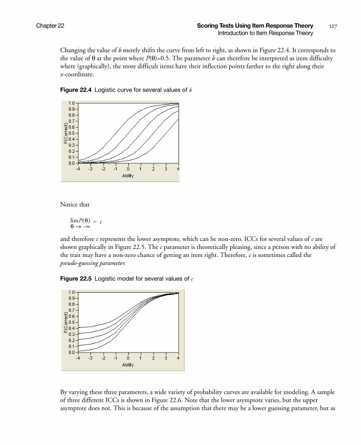
Chapter 22 Scoring Tests Using Item Response Theory 527Introduction to Item Response Theory
Changing the value of b merely shifts the curve from left to right, as shown in Figure 22.4. It corresponds to the value of θ at the point where P(θ)=0.5. The parameter b can therefore be interpreted as item difficulty where (graphically), the more difficult items have their inflection points farther to the right along their x-coordinate.
Figure 22.4 Logistic curve for several values of b
Notice that
and therefore c represents the lower asymptote, which can be non-zero. ICCs for several values of c are shown graphically in Figure 22.5. The c parameter is theoretically pleasing, since a person with no ability of the trait may have a non-zero chance of getting an item right. Therefore, c is sometimes called the pseudo-guessing parameter.
Figure 22.5 Logistic model for several values of c
By varying these three parameters, a wide variety of probability curves are available for modeling. A sample of three different ICCs is shown in Figure 22.6. Note that the lower asymptote varies, but the upper asymptote does not. This is because of the assumption that there may be a lower guessing parameter, but as
limP θ( )θ ∞–→
c=

528 Scoring Tests Using Item Response Theory Chapter 22Launching the Platform
the trait level increases, there is always a theoretical chance of 100% probability of correctly answering the item.
Figure 22.6 Three item characteristic curves
Note, however, that the 3PL model may by unnecessarily complex for many situations. If, for example, the c parameter is restricted to be zero (in practice, a reasonable restriction), there are fewer parameters to predict. This model, where only a and b parameters are estimated, is called the 2PL model.
Another advantage of the 2PL model (aside from its greater stability than the 3PL) is that b can be interpreted as the point where an examinee has a 50 percent chance of getting an item correct. This interpretation is not true for 3PL models.
A further restriction can be imposed on the general model when a researcher can assume that test items have equal discriminating power. In these cases, the parameter a is set equal to 1, leaving a single parameter to be estimated, the b parameter. This 1PL model is frequently called the Rasch model, named after Danish mathematician Georg Rasch, the developer of the model. The Rasch model is quite elegant, and is the least expensive to use computationally.
Caution: You must have a lot of data to produce stable parameter estimates using a 3PL model. 2PL models are frequently sufficient for tests that intuitively deserve a guessing parameter. Therefore, the 2PL model is the default and recommended model.
Launching the Platform
As an example, open the sample data file MathScienceTest.jmp. These data are a subset of the data from the Third International Mathematics and Science Study (TIMMS) conducted in 1996.
To launch the Item Analysis platform, select Analyze > Multivariate Methods > Item Analysis. This shows the dialog in Figure 22.7.
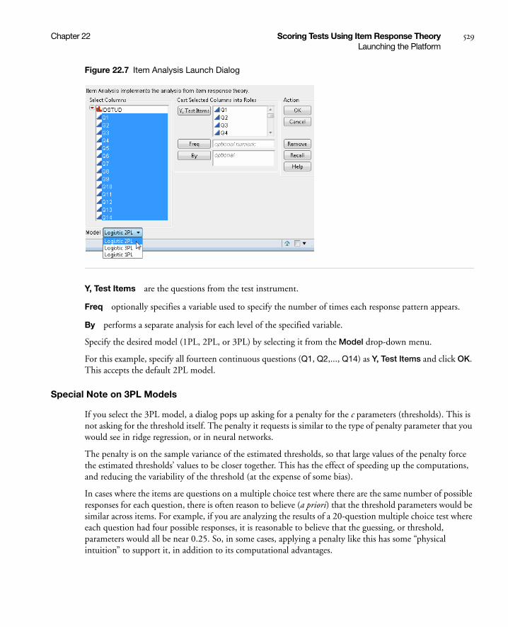
Chapter 22 Scoring Tests Using Item Response Theory 529Launching the Platform
Figure 22.7 Item Analysis Launch Dialog
Y, Test Items are the questions from the test instrument.
Freq optionally specifies a variable used to specify the number of times each response pattern appears.
By performs a separate analysis for each level of the specified variable.
Specify the desired model (1PL, 2PL, or 3PL) by selecting it from the Model drop-down menu.
For this example, specify all fourteen continuous questions (Q1, Q2,..., Q14) as Y, Test Items and click OK. This accepts the default 2PL model.
Special Note on 3PL Models
If you select the 3PL model, a dialog pops up asking for a penalty for the c parameters (thresholds). This is not asking for the threshold itself. The penalty it requests is similar to the type of penalty parameter that you would see in ridge regression, or in neural networks.
The penalty is on the sample variance of the estimated thresholds, so that large values of the penalty force the estimated thresholds’ values to be closer together. This has the effect of speeding up the computations, and reducing the variability of the threshold (at the expense of some bias).
In cases where the items are questions on a multiple choice test where there are the same number of possible responses for each question, there is often reason to believe (a priori) that the threshold parameters would be similar across items. For example, if you are analyzing the results of a 20-question multiple choice test where each question had four possible responses, it is reasonable to believe that the guessing, or threshold, parameters would all be near 0.25. So, in some cases, applying a penalty like this has some “physical intuition” to support it, in addition to its computational advantages.
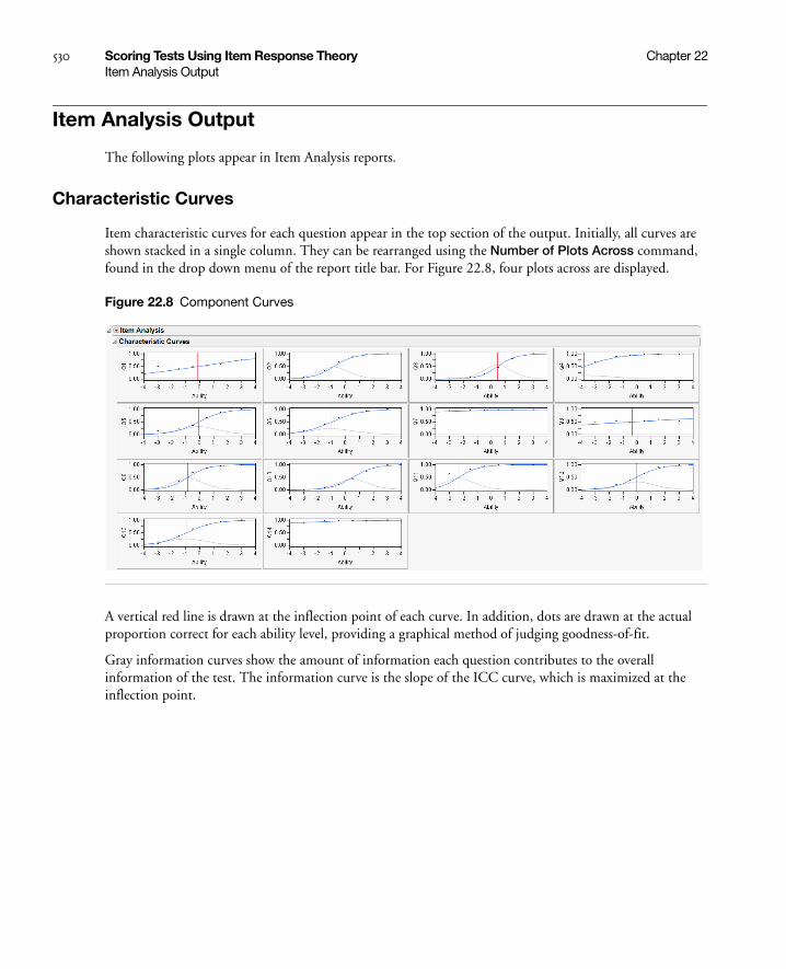
530 Scoring Tests Using Item Response Theory Chapter 22Item Analysis Output
Item Analysis Output
The following plots appear in Item Analysis reports.
Characteristic Curves
Item characteristic curves for each question appear in the top section of the output. Initially, all curves are shown stacked in a single column. They can be rearranged using the Number of Plots Across command, found in the drop down menu of the report title bar. For Figure 22.8, four plots across are displayed.
Figure 22.8 Component Curves
A vertical red line is drawn at the inflection point of each curve. In addition, dots are drawn at the actual proportion correct for each ability level, providing a graphical method of judging goodness-of-fit.
Gray information curves show the amount of information each question contributes to the overall information of the test. The information curve is the slope of the ICC curve, which is maximized at the inflection point.
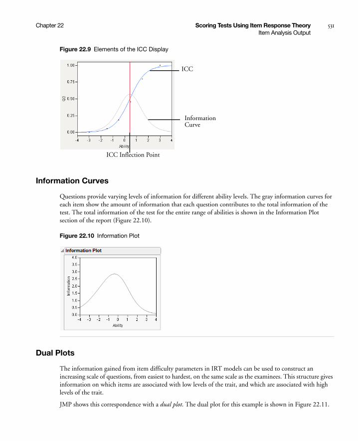
Chapter 22 Scoring Tests Using Item Response Theory 531Item Analysis Output
Figure 22.9 Elements of the ICC Display
Information Curves
Questions provide varying levels of information for different ability levels. The gray information curves for each item show the amount of information that each question contributes to the total information of the test. The total information of the test for the entire range of abilities is shown in the Information Plot section of the report (Figure 22.10).
Figure 22.10 Information Plot
Dual Plots
The information gained from item difficulty parameters in IRT models can be used to construct an increasing scale of questions, from easiest to hardest, on the same scale as the examinees. This structure gives information on which items are associated with low levels of the trait, and which are associated with high levels of the trait.
JMP shows this correspondence with a dual plot. The dual plot for this example is shown in Figure 22.11.
ICC
InformationCurve
ICC Inflection Point
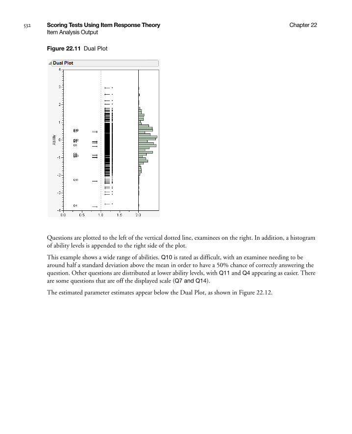
532 Scoring Tests Using Item Response Theory Chapter 22Item Analysis Output
Figure 22.11 Dual Plot
Questions are plotted to the left of the vertical dotted line, examinees on the right. In addition, a histogram of ability levels is appended to the right side of the plot.
This example shows a wide range of abilities. Q10 is rated as difficult, with an examinee needing to be around half a standard deviation above the mean in order to have a 50% chance of correctly answering the question. Other questions are distributed at lower ability levels, with Q11 and Q4 appearing as easier. There are some questions that are off the displayed scale (Q7 and Q14).
The estimated parameter estimates appear below the Dual Plot, as shown in Figure 22.12.
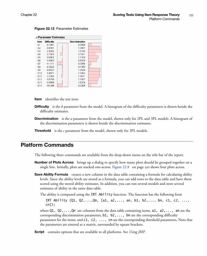
Chapter 22 Scoring Tests Using Item Response Theory 533Platform Commands
Figure 22.12 Parameter Estimates
Item identifies the test item.
Difficulty is the b parameter from the model. A histogram of the difficulty parameters is shown beside the difficulty estimates.
Discrimination is the a parameter from the model, shown only for 2PL and 3PL models. A histogram of the discrimination parameters is shown beside the discrimination estimates.
Threshold is the c parameter from the model, shown only for 3PL models.
Platform Commands
The following three commands are available from the drop-down menu on the title bar of the report.
Number of Plots Across brings up a dialog to specify how many plots should be grouped together on a single line. Initially, plots are stacked one-across. Figure 22.8 on page 530 shows four plots across.
Save Ability Formula creates a new column in the data table containing a formula for calculating ability levels. Since the ability levels are stored as a formula, you can add rows to the data table and have them scored using the stored ability estimates. In addition, you can run several models and store several estimates of ability in the same data table.
The ability is computed using the IRT Ability function. The function has the following form
IRT Ability (Q1, Q2,...,Qn, [a1, a2,..., an, b1, b2,..., bn, c1, c2, ..., cn]);
where Q1, Q2,...,Qn are columns from the data table containing items, a1, a2,..., an are the corresponding discrimination parameters, b1, b2,..., bn are the corresponding difficulty parameters for the items, and c1, c2, ..., cn are the corresponding threshold parameters. Note that the parameters are entered as a matrix, surrounded by square brackets.
Script contains options that are available to all platforms. See Using JMP.

534 Scoring Tests Using Item Response Theory Chapter 22Technical Details
Technical Details
Note that P(θ) does not necessarily represent the probability of a positive response from a particular individual. It is certainly feasible that an examinee might definitely select an incorrect answer, or that an examinee may know an answer for sure, based on the prior experiences and knowledge of the examinee, apart from the trait level. It is more correct to think of P(θ) as the probability of response for a set of individuals with ability level θ. Said another way, if a large group of individuals with equal trait levels answered the item, P(θ) predicts the proportion that would answer the item correctly. This implies that IRT models are item-invariant; theoretically, they would have the same parameters regardless of the group tested.
An assumption of these IRT models is that the underlying trait is unidimensional. That is to say, there is a single underlying trait that the questions measure which can be theoretically measured on a continuum. This continuum is the horizontal axis in the plots of the curves. If there are several traits being measured, each of which have complex interactions with each other, then these unidimensional models are not appropriate.

Chapter 23Plotting Surfaces
Using the Surface Plot Platform
The Surface Plot platform functions both as a separate platform and as an option in model fitting platforms. Up to four dependent surfaces can be displayed in the same plot. The dependent variables section, below the plot, has four rows that correspond to the four surfaces. Depending on what you choose to view (sheets, points, isosurfaces, or density grids) and whether you supply a formula variable, different options appear in the dependent variables section.
Surface Plot is built using the 3-D scene commands from JMP’s scripting language. Complete documentation of the OpenGL-style scene commands is found in the JMP Scripting Guide.
In this platform, you can
• use the mouse to drag the surface to a new position
• Right-click on the surface to change the background color or show the virtual ArcBall (which helps position the surface)
• enable hardware acceleration, which may increase performance if it is supported on your system
• drag lights to different positions, assign them colors, and turn them on and off.
Figure 23.1 Example of a Surface Plot

Contents
Surface Plots . . . . . . . . . . . . . . . . . . . . . . . . . . . . . . . . . . . . . . . . . . . . . . . . . . . . . . . . . . . . . . . . . . . . . . 537
Launching the Platform. . . . . . . . . . . . . . . . . . . . . . . . . . . . . . . . . . . . . . . . . . . . . . . . . . . . . . . . . . . . . . 537
Plotting a Single Mathematical Function. . . . . . . . . . . . . . . . . . . . . . . . . . . . . . . . . . . . . . . . . . . . . . 538
Plotting Points Only . . . . . . . . . . . . . . . . . . . . . . . . . . . . . . . . . . . . . . . . . . . . . . . . . . . . . . . . . . . . . 539
Plotting a Formula from a Column . . . . . . . . . . . . . . . . . . . . . . . . . . . . . . . . . . . . . . . . . . . . . . . . . .540
Isosurfaces . . . . . . . . . . . . . . . . . . . . . . . . . . . . . . . . . . . . . . . . . . . . . . . . . . . . . . . . . . . . . . . . . . . . . 542
The Surface Plot Control Panel . . . . . . . . . . . . . . . . . . . . . . . . . . . . . . . . . . . . . . . . . . . . . . . . . . . . . . . .544
Appearance Controls . . . . . . . . . . . . . . . . . . . . . . . . . . . . . . . . . . . . . . . . . . . . . . . . . . . . . . . . . . . . .544
Independent Variables . . . . . . . . . . . . . . . . . . . . . . . . . . . . . . . . . . . . . . . . . . . . . . . . . . . . . . . . . . . . 545
Dependent Variables . . . . . . . . . . . . . . . . . . . . . . . . . . . . . . . . . . . . . . . . . . . . . . . . . . . . . . . . . . . . .546
Plot Controls and Settings . . . . . . . . . . . . . . . . . . . . . . . . . . . . . . . . . . . . . . . . . . . . . . . . . . . . . . . . . . . .547
Rotate . . . . . . . . . . . . . . . . . . . . . . . . . . . . . . . . . . . . . . . . . . . . . . . . . . . . . . . . . . . . . . . . . . . . . . . .547
Axis Settings . . . . . . . . . . . . . . . . . . . . . . . . . . . . . . . . . . . . . . . . . . . . . . . . . . . . . . . . . . . . . . . . . . . 548
Lights . . . . . . . . . . . . . . . . . . . . . . . . . . . . . . . . . . . . . . . . . . . . . . . . . . . . . . . . . . . . . . . . . . . . . . . .549
Sheet or Surface Properties . . . . . . . . . . . . . . . . . . . . . . . . . . . . . . . . . . . . . . . . . . . . . . . . . . . . . . . .549
Other Properties and Commands . . . . . . . . . . . . . . . . . . . . . . . . . . . . . . . . . . . . . . . . . . . . . . . . . . . 550
Keyboard Shortcuts . . . . . . . . . . . . . . . . . . . . . . . . . . . . . . . . . . . . . . . . . . . . . . . . . . . . . . . . . . . . . . . . . 551
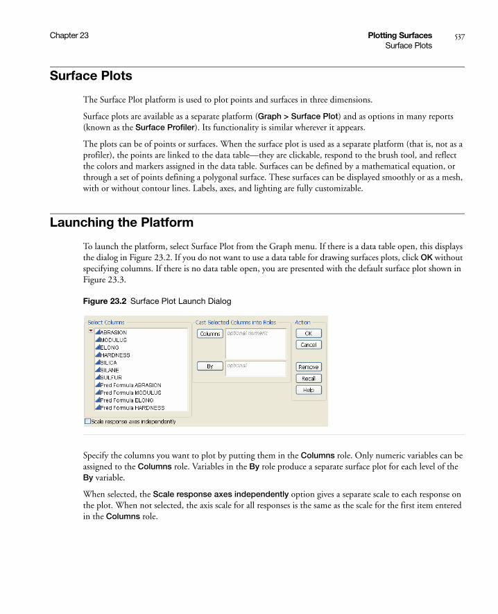
Chapter 23 Plotting Surfaces 537Surface Plots
Surface Plots
The Surface Plot platform is used to plot points and surfaces in three dimensions.
Surface plots are available as a separate platform (Graph > Surface Plot) and as options in many reports (known as the Surface Profiler). Its functionality is similar wherever it appears.
The plots can be of points or surfaces. When the surface plot is used as a separate platform (that is, not as a profiler), the points are linked to the data table—they are clickable, respond to the brush tool, and reflect the colors and markers assigned in the data table. Surfaces can be defined by a mathematical equation, or through a set of points defining a polygonal surface. These surfaces can be displayed smoothly or as a mesh, with or without contour lines. Labels, axes, and lighting are fully customizable.
Launching the Platform
To launch the platform, select Surface Plot from the Graph menu. If there is a data table open, this displays the dialog in Figure 23.2. If you do not want to use a data table for drawing surfaces plots, click OK without specifying columns. If there is no data table open, you are presented with the default surface plot shown in Figure 23.3.
Figure 23.2 Surface Plot Launch Dialog
Specify the columns you want to plot by putting them in the Columns role. Only numeric variables can be assigned to the Columns role. Variables in the By role produce a separate surface plot for each level of the By variable.
When selected, the Scale response axes independently option gives a separate scale to each response on the plot. When not selected, the axis scale for all responses is the same as the scale for the first item entered in the Columns role.

538 Plotting Surfaces Chapter 23Launching the Platform
Plotting a Single Mathematical Function
To produce the graph of a mathematical function without any data points, do not fill in any of the roles on the launch dialog. Simply click OK to get a default plot, as shown in Figure 23.3.
Figure 23.3 Default Surface Plot

Chapter 23 Plotting Surfaces 539Launching the Platform
Select the Show Formula checkbox to show the formula space.
The default function shows in the box. To plot your own function, enter it in this box.
Plotting Points Only
To produce a 3-D scatterplot of points, place the x-, y-, and z-columns in the Columns box. For example, using the Tiretread.jmp data, first select Rows > Clear Row States. Then select Graph > Surface Plot. Assign Silica, Silane, and Sulfur to the Columns role. Click OK.
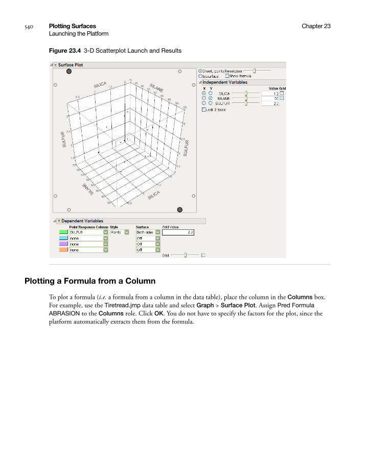
540 Plotting Surfaces Chapter 23Launching the Platform
Figure 23.4 3-D Scatterplot Launch and Results
Plotting a Formula from a Column
To plot a formula (i.e. a formula from a column in the data table), place the column in the Columns box. For example, use the Tiretread.jmp data table and select Graph > Surface Plot. Assign Pred Formula ABRASION to the Columns role. Click OK. You do not have to specify the factors for the plot, since the platform automatically extracts them from the formula.
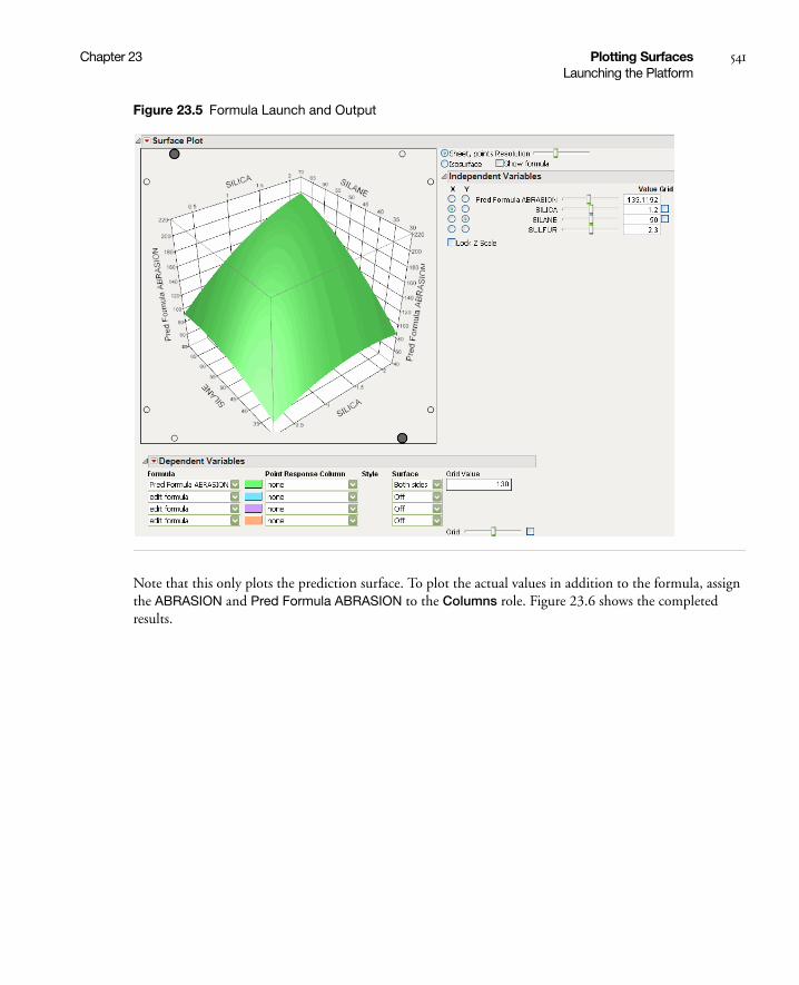
Chapter 23 Plotting Surfaces 541Launching the Platform
Figure 23.5 Formula Launch and Output
Note that this only plots the prediction surface. To plot the actual values in addition to the formula, assign the ABRASION and Pred Formula ABRASION to the Columns role. Figure 23.6 shows the completed results.
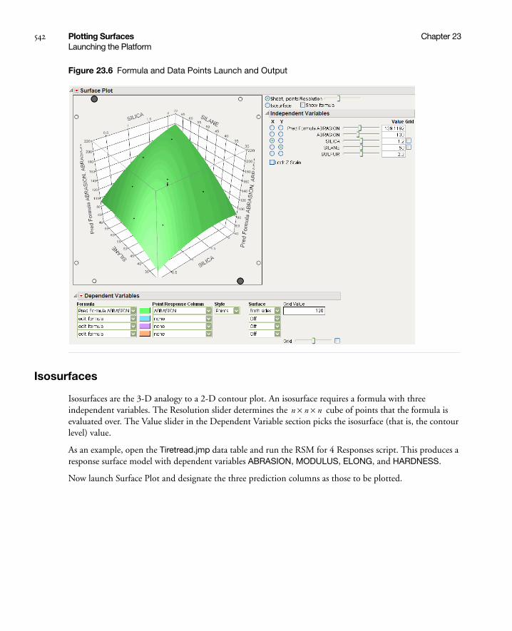
542 Plotting Surfaces Chapter 23Launching the Platform
Figure 23.6 Formula and Data Points Launch and Output
Isosurfaces
Isosurfaces are the 3-D analogy to a 2-D contour plot. An isosurface requires a formula with three independent variables. The Resolution slider determines the cube of points that the formula is evaluated over. The Value slider in the Dependent Variable section picks the isosurface (that is, the contour level) value.
As an example, open the Tiretread.jmp data table and run the RSM for 4 Responses script. This produces a response surface model with dependent variables ABRASION, MODULUS, ELONG, and HARDNESS.
Now launch Surface Plot and designate the three prediction columns as those to be plotted.
n n n××
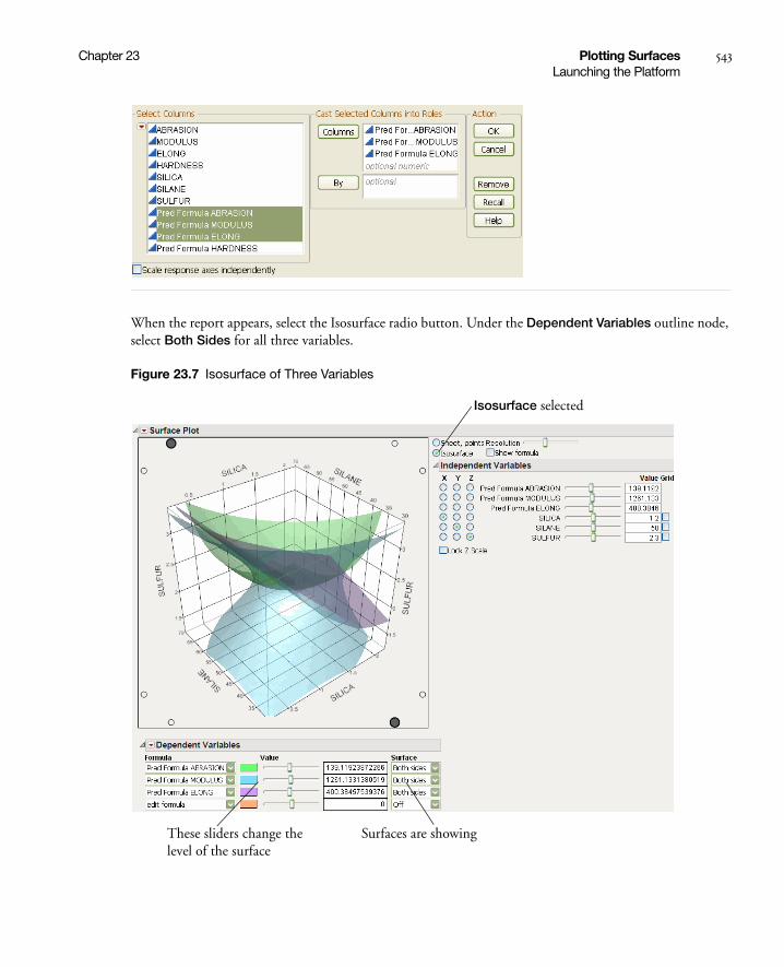
Chapter 23 Plotting Surfaces 543Launching the Platform
When the report appears, select the Isosurface radio button. Under the Dependent Variables outline node, select Both Sides for all three variables.
Figure 23.7 Isosurface of Three Variables
Surfaces are showing
Isosurface selected
These sliders change the level of the surface

544 Plotting Surfaces Chapter 23The Surface Plot Control Panel
For the tire tread data, one might set the hardness at a fixed minimum setting and the elongation at a fixed maximum setting, then use the slider for modulus to see which values of modulus are inside the limits set by the other two surfaces.
The Surface Plot Control Panel
The drop-down menu in the main Surface Plot title bar has three entries.
Control Panel shows or hides the Control Panel.
Scale response axes independently scales response axes independently. See explanation of Figure 23.2 on page 537.
Script contains options that are available to all platforms. See Using JMP.
The Control Panel consists of the following groups of options.
Appearance Controls
The first set of controls allows you to specify the overall appearance of the surface plot.
Sheet, points is the setting for displaying sheets, points, and lines.
Isosurface changes the display to show isosurfaces, described in “Isosurfaces” on page 542.
Show formula shows the formula edit box, allowing you to enter a formula to be plotted.
The Resolution slider affects how many points are evaluated for a formula. Too coarse a resolution means a function with a sharp change might not be represented very well, but setting the resolution high makes evaluating and displaying the surface slower.
Appearance Controls for Other Platforms
If you select the Surface Profiler from the Fit Model, Nonlinear, Gaussian Process, or Neural platforms, there is an additional option in the Appearance controls called data points are. Choose from the following:
Off Turns the data points off.
Surface plus Residual Shows the difference between the predicted value and actual value on the surface.
Actual Shows the actual data points.
Residual Shows the residual values (if they are not off the plot).
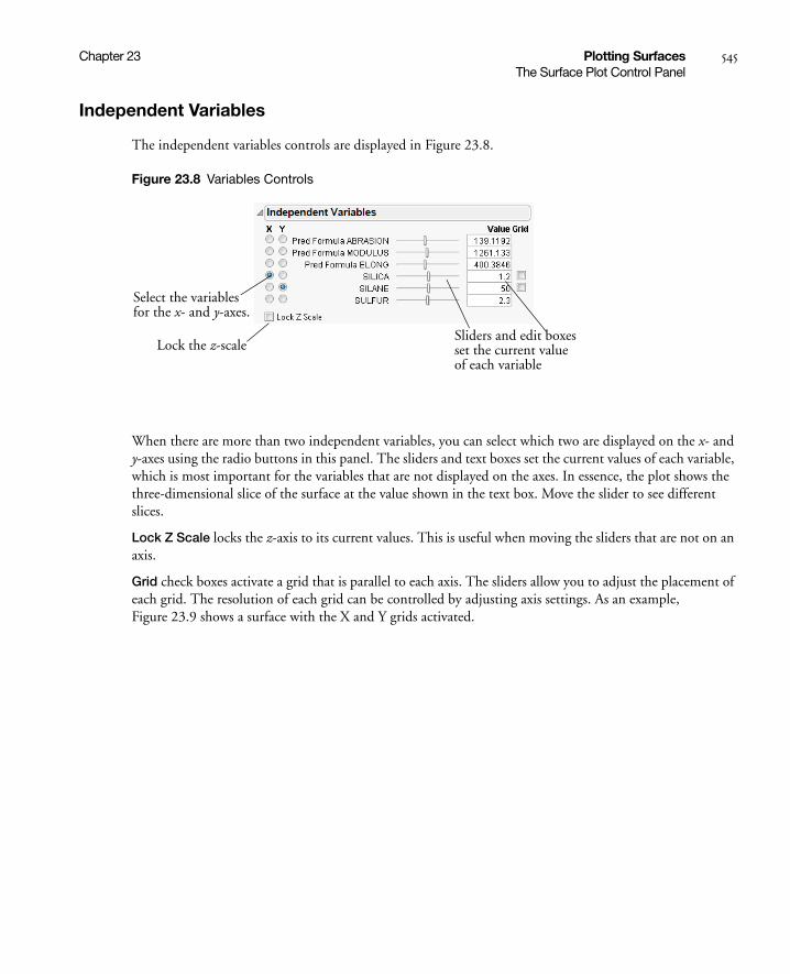
Chapter 23 Plotting Surfaces 545The Surface Plot Control Panel
Independent Variables
The independent variables controls are displayed in Figure 23.8.
Figure 23.8 Variables Controls
When there are more than two independent variables, you can select which two are displayed on the x- and y-axes using the radio buttons in this panel. The sliders and text boxes set the current values of each variable, which is most important for the variables that are not displayed on the axes. In essence, the plot shows the three-dimensional slice of the surface at the value shown in the text box. Move the slider to see different slices.
Lock Z Scale locks the z-axis to its current values. This is useful when moving the sliders that are not on an axis.
Grid check boxes activate a grid that is parallel to each axis. The sliders allow you to adjust the placement of each grid. The resolution of each grid can be controlled by adjusting axis settings. As an example, Figure 23.9 shows a surface with the X and Y grids activated.
Select the variablesfor the x- and y-axes.
Sliders and edit boxesset the current valueof each variable
Lock the z-scale
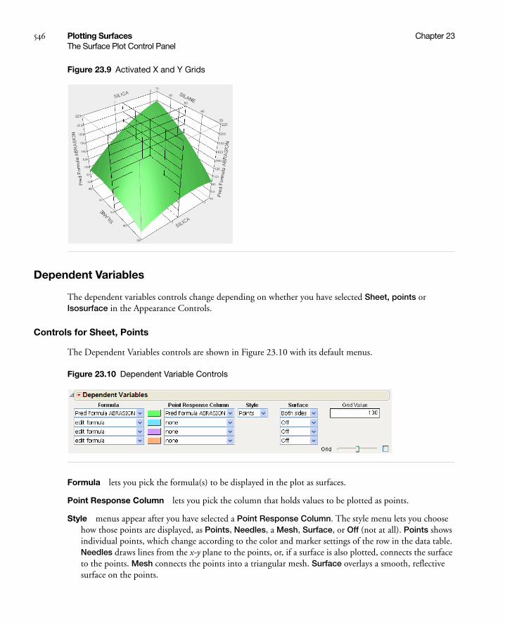
546 Plotting Surfaces Chapter 23The Surface Plot Control Panel
Figure 23.9 Activated X and Y Grids
Dependent Variables
The dependent variables controls change depending on whether you have selected Sheet, points or Isosurface in the Appearance Controls.
Controls for Sheet, Points
The Dependent Variables controls are shown in Figure 23.10 with its default menus.
Figure 23.10 Dependent Variable Controls
Formula lets you pick the formula(s) to be displayed in the plot as surfaces.
Point Response Column lets you pick the column that holds values to be plotted as points.
Style menus appear after you have selected a Point Response Column. The style menu lets you choose how those points are displayed, as Points, Needles, a Mesh, Surface, or Off (not at all). Points shows individual points, which change according to the color and marker settings of the row in the data table. Needles draws lines from the x-y plane to the points, or, if a surface is also plotted, connects the surface to the points. Mesh connects the points into a triangular mesh. Surface overlays a smooth, reflective surface on the points.
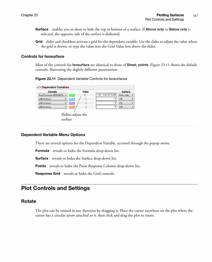
Chapter 23 Plotting Surfaces 547Plot Controls and Settings
Surface enables you to show or hide the top or bottom of a surface. If Above only or Below only is selected, the opposite side of the surface is darkened.
Grid slider and checkbox activate a grid for the dependent variable. Use the slider to adjust the value where the grid is drawn, or type the value into the Grid Value box above the slider.
Controls for Isosurface
Most of the controls for Isosurface are identical to those of Sheet, points. Figure 23.11 shows the default controls, illustrating the slightly different presentation.
Figure 23.11 Dependent Variable Controls for Isosurfaces
Dependent Variable Menu Options
There are several options for the Dependent Variable, accessed through the popup menu.
Formula reveals or hides the Formula drop-down list.
Surface reveals or hides the Surface drop-down list.
Points reveals or hides the Point Response Column drop-down list.
Response Grid reveals or hides the Grid controls.
Plot Controls and Settings
Rotate
The plot can be rotated in any direction by dragging it. Place the cursor anywhere on the plot where the cursor has a circular arrow attached to it, then click and drag the plot to rotate.
Sliders adjust the surface

548 Plotting Surfaces Chapter 23Plot Controls and Settings
Figure 23.12 Example of Cursor Position for Rotating Plot
The Up, Down, Left, and Right arrow keys can also be used to rotate the plot.
Axis Settings
Double-click on an axis to reveal the axis control dialog shown below. The dialog allows you to change the Minimum, Maximum, Increment, and tick mark label Format.
Like other JMP graphs, the axes can adjusted, stretched, and compressed using the grabber tool. Place the cursor over an axis to change it to the grabber.
Figure 23.13 Grabber Tools
Ready to rotate plot when cursor looks like this
Place grabber in the middle of axis to adjust.
Place grabber at the end of axis to stretch or compress.
Notice the orientation of grabber changes from vertical to horizontal

Chapter 23 Plotting Surfaces 549Plot Controls and Settings
Lights
By default, the plot has lights shining on it. There are eight control knobs on the plot for changing the position and color of the lights. This is useful for highlighting different parts of a plot and creating contrast. Four of the eight knobs are show below.
Figure 23.14 Control Knobs for Lights
Right-click on a knob to turn that light on or off. More lights turned on brighten a plot, and fewer lights darken it. Drag a knob to change the position of a light. Change the color of a light by right-clicking on the knob. The default color is white.
Sheet or Surface Properties
If you are plotting a Sheet, points, right-click on the sheet and select Sheet Properties to reveal a dialog for changing the sheet properties.
Figure 23.15 Sheet Properties Dialog
Surface enables you to show or hide the top or bottom of a surface. If Above only or Below only is selected, the opposite side of the surface is darkened.
Fill Type allows you to color the surface using a solid color, or continuous or discrete gradients. If a gradient is chosen, the Show Legend option appears when you right click on the surface.
Mesh allows you to turn on or off a surface mesh, for either the X or Y directions or both. If turned on, the Mesh Color option is revealed allowing you to change the color.
Activated lightLight is off. Right-click on knob to turn on
Right-click in border to Reset lights

550 Plotting Surfaces Chapter 23Plot Controls and Settings
Contour allows you to turn on or off a contour grid, either above, below, or on the surface. If turned on, the Contour Color option is revealed allowing you to change the color.
Limit X and Y to Point Response Column limits the range of the plot to the range of the data in the Point Response Column, if one is activated. If checked, this essentially restricts the plot from extrapolating outside the range of the data in the Point Response Column.
The equivalent JSL command for this option is Clip Sheet( Boolean ). You can send this message to a particular response column by appending the number of the response column. For example, Clip Sheet2( 1 ) limits the range of the plot to the range of the data of the second response column. See the Scripting Index in the JMP Help menu for an example.
If you are plotting a Isosurface, right-click on the surface and select Surface Properties to reveal a similar dialog. You can modify the surface color, opacity, and toggle a mesh.
Other Properties and Commands
Right-click anywhere in the plot area to reveal the following options:
Show Legend shows a legend when the surface is colored using gradients.
Reset resets the plot to the original viewpoint. Changes in wall and background color are not affected.
Settings opens a dialog for changing many plot settings.
Hide Lights Border shows or hides lighting controls.
Wall Color allows you to change the plot wall color.
Background Color allows you to change the plot background color.
Rows allows you to change row colors or markers, and also exclude, hide, and label points. These options only have affect if points are on the plot.
Use Hardware Acceleration provides for faster rendering of the display. For example, if the plot redraws slowly when rotating, this option may help it to redraw faster.

Chapter 23 Plotting Surfaces 551Keyboard Shortcuts
Show ArcBall provides options for using the ArcBall. The ArcBall is a sphere drawn around the plot to help visualize the directions of rotation.
Keyboard Shortcuts
The following keyboard shortcuts can be used to manipulate the surface plot. To get the plot back to the original viewpoint, right-click on the plot and select Reset.
Table 23.1 Surface Plot Keyboard Shortcuts
Key Function
left, right, up, and down arrows spin
Home, End diagonally spin
Enter (Return) toggles ArcBall appearance
Delete roll counterclockwise
Control boost spin speed 10X
Shift allows continual spinning

552 Plotting Surfaces Chapter 23Keyboard Shortcuts
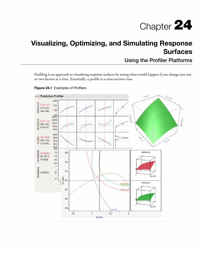
Chapter 24Visualizing, Optimizing, and Simulating Response
SurfacesUsing the Profiler Platforms
Profiling is an approach to visualizing response surfaces by seeing what would happen if you change just one or two factors at a time. Essentially, a profile is a cross-section view.
Figure 24.1 Examples of Profilers

Contents
Introduction to Profiling . . . . . . . . . . . . . . . . . . . . . . . . . . . . . . . . . . . . . . . . . . . . . . . . . . . . . . . . . . . . . 555
The Profiler . . . . . . . . . . . . . . . . . . . . . . . . . . . . . . . . . . . . . . . . . . . . . . . . . . . . . . . . . . . . . . . . . . . . . . . 557
Interpreting the Profiles . . . . . . . . . . . . . . . . . . . . . . . . . . . . . . . . . . . . . . . . . . . . . . . . . . . . . . . . . . . 558
Profiler Options . . . . . . . . . . . . . . . . . . . . . . . . . . . . . . . . . . . . . . . . . . . . . . . . . . . . . . . . . . . . . . . .562
Desirability Profiling and Optimization. . . . . . . . . . . . . . . . . . . . . . . . . . . . . . . . . . . . . . . . . . . . . . .567
Special Profiler Topics . . . . . . . . . . . . . . . . . . . . . . . . . . . . . . . . . . . . . . . . . . . . . . . . . . . . . . . . . . . . . . . 571
Propagation of Error Bars . . . . . . . . . . . . . . . . . . . . . . . . . . . . . . . . . . . . . . . . . . . . . . . . . . . . . . . . . 571
Customized Desirability Functions . . . . . . . . . . . . . . . . . . . . . . . . . . . . . . . . . . . . . . . . . . . . . . . . . . 573
Mixture Designs . . . . . . . . . . . . . . . . . . . . . . . . . . . . . . . . . . . . . . . . . . . . . . . . . . . . . . . . . . . . . . . .574
Expanding Intermediate Formulas . . . . . . . . . . . . . . . . . . . . . . . . . . . . . . . . . . . . . . . . . . . . . . . . . . . 575
Linear Constraints . . . . . . . . . . . . . . . . . . . . . . . . . . . . . . . . . . . . . . . . . . . . . . . . . . . . . . . . . . . . . . . 575
Contour Profiler . . . . . . . . . . . . . . . . . . . . . . . . . . . . . . . . . . . . . . . . . . . . . . . . . . . . . . . . . . . . . . . . . . .577
Mixture Profiler. . . . . . . . . . . . . . . . . . . . . . . . . . . . . . . . . . . . . . . . . . . . . . . . . . . . . . . . . . . . . . . . . . . .579
Surface Profiler . . . . . . . . . . . . . . . . . . . . . . . . . . . . . . . . . . . . . . . . . . . . . . . . . . . . . . . . . . . . . . . . . . . . 591
The Custom Profiler . . . . . . . . . . . . . . . . . . . . . . . . . . . . . . . . . . . . . . . . . . . . . . . . . . . . . . . . . . . . . . . . 591
The Simulator . . . . . . . . . . . . . . . . . . . . . . . . . . . . . . . . . . . . . . . . . . . . . . . . . . . . . . . . . . . . . . . . . . . . . 592
Specifying Factors . . . . . . . . . . . . . . . . . . . . . . . . . . . . . . . . . . . . . . . . . . . . . . . . . . . . . . . . . . . . . . . 593
Specifying the Response. . . . . . . . . . . . . . . . . . . . . . . . . . . . . . . . . . . . . . . . . . . . . . . . . . . . . . . . . . .594
Run the Simulation . . . . . . . . . . . . . . . . . . . . . . . . . . . . . . . . . . . . . . . . . . . . . . . . . . . . . . . . . . . . . . 595
The Simulator Menu . . . . . . . . . . . . . . . . . . . . . . . . . . . . . . . . . . . . . . . . . . . . . . . . . . . . . . . . . . . . . 595
Using Specification Limits . . . . . . . . . . . . . . . . . . . . . . . . . . . . . . . . . . . . . . . . . . . . . . . . . . . . . . . . .596
Simulating General Formulas . . . . . . . . . . . . . . . . . . . . . . . . . . . . . . . . . . . . . . . . . . . . . . . . . . . . . .597
The Defect Profiler . . . . . . . . . . . . . . . . . . . . . . . . . . . . . . . . . . . . . . . . . . . . . . . . . . . . . . . . . . . . . 600
Noise Factors (Robust Engineering). . . . . . . . . . . . . . . . . . . . . . . . . . . . . . . . . . . . . . . . . . . . . . . . . . . . . 615
Profiling Models Stored in Excel . . . . . . . . . . . . . . . . . . . . . . . . . . . . . . . . . . . . . . . . . . . . . . . . . . . . . . .622
Running the JMP Profiler . . . . . . . . . . . . . . . . . . . . . . . . . . . . . . . . . . . . . . . . . . . . . . . . . . . . . . . . .622
Example of an Excel Model . . . . . . . . . . . . . . . . . . . . . . . . . . . . . . . . . . . . . . . . . . . . . . . . . . . . . . . .622
Using the Excel Profiler From JMP . . . . . . . . . . . . . . . . . . . . . . . . . . . . . . . . . . . . . . . . . . . . . . . . . .625
Fit Group . . . . . . . . . . . . . . . . . . . . . . . . . . . . . . . . . . . . . . . . . . . . . . . . . . . . . . . . . . . . . . . . . . . . . . . .625
Statistical Details . . . . . . . . . . . . . . . . . . . . . . . . . . . . . . . . . . . . . . . . . . . . . . . . . . . . . . . . . . . . . . . . . . .625
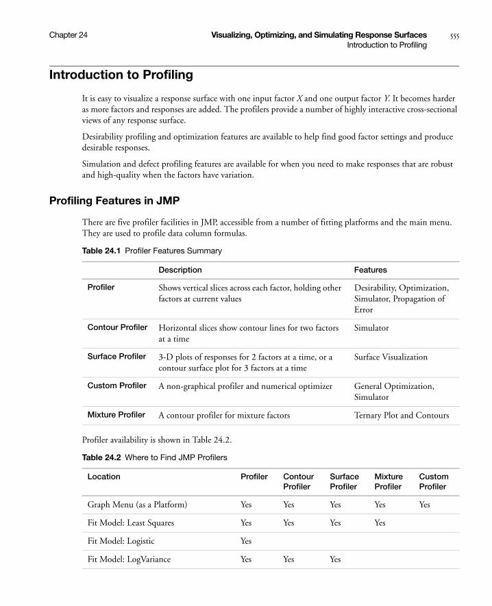
Chapter 24 Visualizing, Optimizing, and Simulating Response Surfaces 555Introduction to Profiling
Introduction to Profiling
It is easy to visualize a response surface with one input factor X and one output factor Y. It becomes harder as more factors and responses are added. The profilers provide a number of highly interactive cross-sectional views of any response surface.
Desirability profiling and optimization features are available to help find good factor settings and produce desirable responses.
Simulation and defect profiling features are available for when you need to make responses that are robust and high-quality when the factors have variation.
Profiling Features in JMP
There are five profiler facilities in JMP, accessible from a number of fitting platforms and the main menu. They are used to profile data column formulas.
Profiler availability is shown in Table 24.2.
Table 24.1 Profiler Features Summary
Description Features
Profiler Shows vertical slices across each factor, holding other factors at current values
Desirability, Optimization, Simulator, Propagation of Error
Contour Profiler Horizontal slices show contour lines for two factors at a time
Simulator
Surface Profiler 3-D plots of responses for 2 factors at a time, or a contour surface plot for 3 factors at a time
Surface Visualization
Custom Profiler A non-graphical profiler and numerical optimizer General Optimization, Simulator
Mixture Profiler A contour profiler for mixture factors Ternary Plot and Contours
Table 24.2 Where to Find JMP Profilers
Location Profiler Contour Profiler
Surface Profiler
Mixture Profiler
Custom Profiler
Graph Menu (as a Platform) Yes Yes Yes Yes Yes
Fit Model: Least Squares Yes Yes Yes Yes
Fit Model: Logistic Yes
Fit Model: LogVariance Yes Yes Yes

556 Visualizing, Optimizing, and Simulating Response Surfaces Chapter 24Introduction to Profiling
When the profiler is invoked as (main menu) a platform, rather than through a fitting platform, you provide columns with formulas as the Y, Prediction Formula columns. These formulas could have been saved from the fitting platforms.
Figure 24.2 Profiler Launch Window
Fit Model: Generalized Linear Yes Yes Yes
Nonlinear: Factors and Response Yes Yes Yes
Nonlinear: Parameters and SSE Yes Yes Yes
Neural Net Yes Yes Yes
Gaussian Process Yes Yes Yes
Custom Design Prediction Variance Yes Yes
Life Distribution Yes
Fit Life by X Yes Yes
Choice Yes
Note: In this chapter, we use the following terms interchangeably:
• factor, input variable, X column, independent variable, setting
• response, output variable, Y column, dependent variable, outcome
The Profiler (with a capital P) is one of several profilers (lowercase p). Sometimes, to distinguish the Profiler from other profilers, we call it the Prediction Profiler.
Table 24.2 Where to Find JMP Profilers (Continued)
Location Profiler Contour Profiler
Surface Profiler
Mixture Profiler
Custom Profiler

Chapter 24 Visualizing, Optimizing, and Simulating Response Surfaces 557The Profiler
The columns referenced in the formulas become the X columns (unless the column is also a Y).
Y, Prediction Formula are the response columns containing formulas.
Noise Factors are only used in special cases for modeling derivatives. Details are in “Noise Factors (Robust Engineering)” on page 615.
Expand Intermediate Formulas tells JMP that if an ingredient column to a formula is a column that itself has a formula, to substitute the inner formula, as long as it refers to other columns. To prevent an ingredient column from expanding, use the Other column property with a name of "Expand Formula" and a value of 0.
The Surface Plot platform is discussed in a separate chapter. The Surface Profiler is very similar to the Surface Plot platform, except Surface Plot has more modes of operation. Neither the Surface Plot platform nor the Surface Profiler have some of the capabilities common to other profilers.
The Profiler
The Profiler displays profile traces (see Figure 24.3) for each X variable. A profile trace is the predicted response as one variable is changed while the others are held constant at the current values. The Profiler recomputes the profiles and predicted responses (in real time) as you vary the value of an X variable.
• The vertical dotted line for each X variable shows its current value or current setting. If the variable is nominal, the x-axis identifies categories. See “Interpreting the Profiles” on page 558, for more details.
For each X variable, the value above the factor name is its current value. You change the current value by clicking in the graph or by dragging the dotted line where you want the new current value to be.
• The horizontal dotted line shows the current predicted value of each Y variable for the current values of the X variables.
• The black lines within the plots show how the predicted value changes when you change the current value of an individual X variable. In fitting platforms, the 95% confidence interval for the predicted values is shown by a dotted blue curve surrounding the prediction trace (for continuous variables) or the context of an error bar (for categorical variables).
The Profiler is a way of changing one variable at a time and looking at the effect on the predicted response.

558 Visualizing, Optimizing, and Simulating Response Surfaces Chapter 24The Profiler
Figure 24.3 Illustration of Traces
The Profiler in some situations computes confidence intervals for each profiled column. If you have saved both a standard error formula and a prediction formula for the same column, the Profiler offers to use the standard errors to produce the confidence intervals rather than profiling them as a separate column.
Interpreting the Profiles
The illustration in Figure 24.4 describes how to use the components of the Profiler. There are several important points to note when interpreting a prediction profile:
• The importance of a factor can be assessed to some extent by the steepness of the prediction trace. If the model has curvature terms (such as squared terms), then the traces may be curved.
• If you change a factor’s value, then its prediction trace is not affected, but the prediction traces of all the other factors can change. The Y response line must cross the intersection points of the prediction traces with their current value lines.
Note: If there are interaction effects or cross-product effects in the model, the prediction traces can shift their slope and curvature as you change current values of other terms. That is what interaction is all about. If there are no interaction effects, the traces only change in height, not slope or shape.
current predicted value of response, changes by dragging a factor value
95% confidence interval on the mean response
current factor values traces, lines, and error bars show predicted values
current value of factor, changes by dragging the dotted line
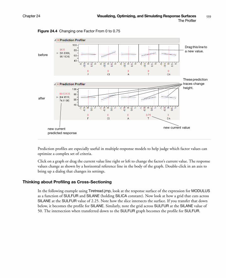
Chapter 24 Visualizing, Optimizing, and Simulating Response Surfaces 559The Profiler
Figure 24.4 Changing one Factor From 0 to 0.75
Prediction profiles are especially useful in multiple-response models to help judge which factor values can optimize a complex set of criteria.
Click on a graph or drag the current value line right or left to change the factor’s current value. The response values change as shown by a horizontal reference line in the body of the graph. Double-click in an axis to bring up a dialog that changes its settings.
Thinking about Profiling as Cross-Sectioning
In the following example using Tiretread.jmp, look at the response surface of the expression for MODULUS as a function of SULFUR and SILANE (holding SILICA constant). Now look at how a grid that cuts across SILANE at the SULFUR value of 2.25. Note how the slice intersects the surface. If you transfer that down below, it becomes the profile for SILANE. Similarly, note the grid across SULFUR at the SILANE value of 50. The intersection when transferred down to the SULFUR graph becomes the profile for SULFUR.
before
after
new current predicted response
new current value
These prediction traces change height.
Drag this line to a new value.

560 Visualizing, Optimizing, and Simulating Response Surfaces Chapter 24The Profiler
Figure 24.5 Profiler as a Cross-Section
Now consider changing the current value of SULFUR from 2.25 down to 1.5.

Chapter 24 Visualizing, Optimizing, and Simulating Response Surfaces 561The Profiler
Figure 24.6 Profiler as a Cross-Section
In the Profiler, note the new value just moves along the same curve for SULFUR, the SULFUR curve itself doesn't change. But the profile for SILANE is now taken at a different cut for SULFUR, and is a little higher and reaches its peak in the different place, closer to the current SILANE value of 50.
Setting or Locking a Factor’s Values
If you Alt-click (Option-click on the Macintosh) in a graph, a dialog prompts you to enter specific settings for the factor.
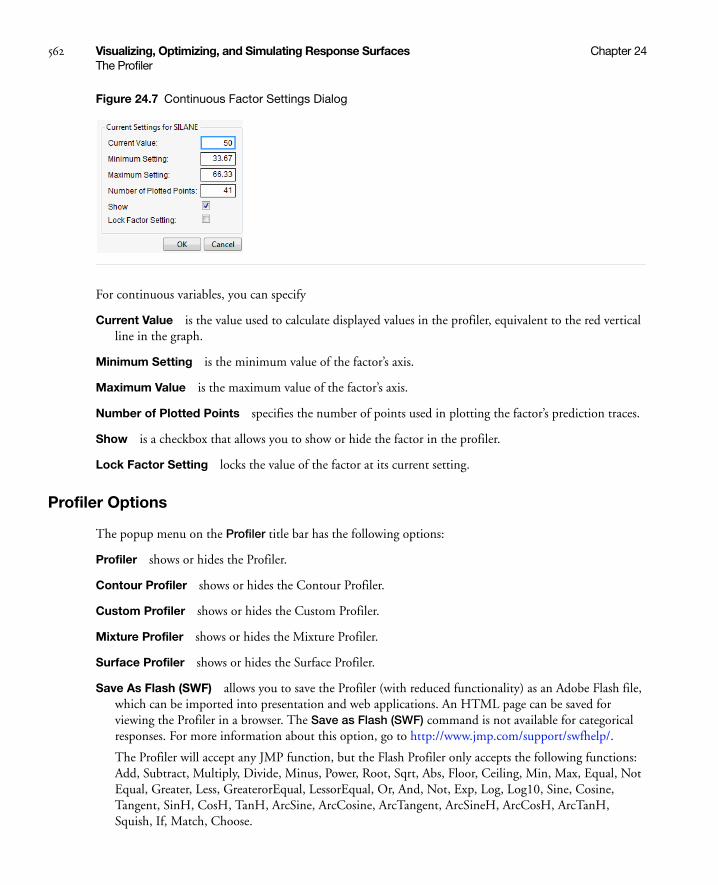
562 Visualizing, Optimizing, and Simulating Response Surfaces Chapter 24The Profiler
Figure 24.7 Continuous Factor Settings Dialog
For continuous variables, you can specify
Current Value is the value used to calculate displayed values in the profiler, equivalent to the red vertical line in the graph.
Minimum Setting is the minimum value of the factor’s axis.
Maximum Value is the maximum value of the factor’s axis.
Number of Plotted Points specifies the number of points used in plotting the factor’s prediction traces.
Show is a checkbox that allows you to show or hide the factor in the profiler.
Lock Factor Setting locks the value of the factor at its current setting.
Profiler Options
The popup menu on the Profiler title bar has the following options:
Profiler shows or hides the Profiler.
Contour Profiler shows or hides the Contour Profiler.
Custom Profiler shows or hides the Custom Profiler.
Mixture Profiler shows or hides the Mixture Profiler.
Surface Profiler shows or hides the Surface Profiler.
Save As Flash (SWF) allows you to save the Profiler (with reduced functionality) as an Adobe Flash file, which can be imported into presentation and web applications. An HTML page can be saved for viewing the Profiler in a browser. The Save as Flash (SWF) command is not available for categorical responses. For more information about this option, go to http://www.jmp.com/support/swfhelp/.
The Profiler will accept any JMP function, but the Flash Profiler only accepts the following functions: Add, Subtract, Multiply, Divide, Minus, Power, Root, Sqrt, Abs, Floor, Ceiling, Min, Max, Equal, Not Equal, Greater, Less, GreaterorEqual, LessorEqual, Or, And, Not, Exp, Log, Log10, Sine, Cosine, Tangent, SinH, CosH, TanH, ArcSine, ArcCosine, ArcTangent, ArcSineH, ArcCosH, ArcTanH, Squish, If, Match, Choose.
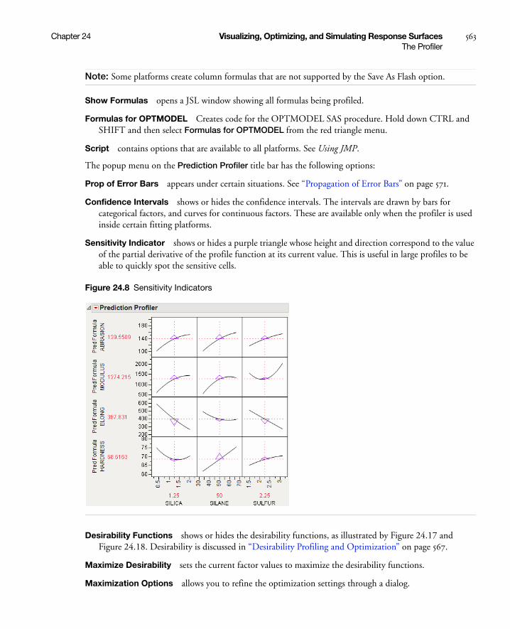
Chapter 24 Visualizing, Optimizing, and Simulating Response Surfaces 563The Profiler
Note: Some platforms create column formulas that are not supported by the Save As Flash option.
Show Formulas opens a JSL window showing all formulas being profiled.
Formulas for OPTMODEL Creates code for the OPTMODEL SAS procedure. Hold down CTRL and SHIFT and then select Formulas for OPTMODEL from the red triangle menu.
Script contains options that are available to all platforms. See Using JMP.
The popup menu on the Prediction Profiler title bar has the following options:
Prop of Error Bars appears under certain situations. See “Propagation of Error Bars” on page 571.
Confidence Intervals shows or hides the confidence intervals. The intervals are drawn by bars for categorical factors, and curves for continuous factors. These are available only when the profiler is used inside certain fitting platforms.
Sensitivity Indicator shows or hides a purple triangle whose height and direction correspond to the value of the partial derivative of the profile function at its current value. This is useful in large profiles to be able to quickly spot the sensitive cells.
Figure 24.8 Sensitivity Indicators
Desirability Functions shows or hides the desirability functions, as illustrated by Figure 24.17 and Figure 24.18. Desirability is discussed in “Desirability Profiling and Optimization” on page 567.
Maximize Desirability sets the current factor values to maximize the desirability functions.
Maximization Options allows you to refine the optimization settings through a dialog.

564 Visualizing, Optimizing, and Simulating Response Surfaces Chapter 24The Profiler
Figure 24.9 Maximization Options Window
Maximize for Each Grid Point can only be used if one or more factors are locked. The ranges of the locked factors are divided into a grid, and the desirability is maximized at each grid point. This is useful if the model you are profiling has categorical factors; then the optimal condition can be found for each combination of the categorical factors.
Save Desirabilities saves the three desirability function settings for each response, and the associated desirability values, as a Response Limits column property in the data table. These correspond to the coordinates of the handles in the desirability plots.
Set Desirabilities brings up a dialog where specific desirability values can be set.
Figure 24.10 Response Grid Window
Save Desirability Formula creates a column in the data table with a formula for Desirability. The formula uses the fitting formula when it can, or the response variables when it can’t access the fitting formula.
Reset Factor Grid displays a dialog for each value allowing you to enter specific values for a factor’s current settings. See the section “Setting or Locking a Factor’s Values” on page 561 for details on these dialog boxes.
Chapter 24 Visualizing, Optimizing, and Simulating Response Surfaces 565The Profiler
Factor Settings is a submenu that consists of the following options:
Remember Settings adds an outline node to the report that accumulates the values of the current settings each time the Remember Settings command is invoked. Each remembered setting is preceded by a radio button that is used to reset to those settings.
Set To Data in Row assigns the values of a data table row to the Profiler.
Copy Settings Script and Paste Settings Script allow you to move the current Profiler’s settings to a Profiler in another report.
Append Settings to Table appends the current profiler’s settings to the end of the data table. This is useful if you have a combination of settings in the Profiler that you want to add to an experiment in order to do another run.
Link Profilers links all the profilers together, so that a change in a factor in one profiler causes that factor to change to that value in all other profilers, including Surface Plot. This is a global option, set or unset for all profilers.
Set Script sets a script that is called each time a factor changes. The set script receives a list of arguments of the form
{factor1 = n1, factor2 = n2, ...}
For example, to write this list to the log, first define a function
ProfileCallbackLog = Function({arg},show(arg));
Then enter ProfileCallbackLog in the Set Script dialog.
Similar functions convert the factor values to global values:
ProfileCallbackAssign = Function({arg},evalList(arg));
Or access the values one at a time:
ProfileCallbackAccess = Function({arg},f1=arg["factor1"];f2=arg["factor2"]);
Output Grid Table produces a new data table with columns for the factors that contain grid values, columns for each of the responses with computed values at each grid point, and the desirability computation at each grid point.
If you have a lot of factors, it is impractical to use the Output Grid Table command, since it produces a large table. In such cases, you should lock some of the factors, which are held at locked, constant values. To get the dialog to specify locked columns, Alt- or Option-click inside the profiler graph to get a dialog that has a Lock Factor Setting checkbox.

566 Visualizing, Optimizing, and Simulating Response Surfaces Chapter 24The Profiler
Figure 24.11 Factor Settings Window
Output Random Table prompts for a number of runs and creates an output table with that many rows, with random factor settings and predicted values over those settings. This is equivalent to (but much simpler than) opening the Simulator, resetting all the factors to a random uniform distribution, then simulating output. This command is similar to Output Grid Table, except it results in a random table rather than a sequenced one.
The prime reason to make uniform random factor tables is to explore the factor space in a multivariate way using graphical queries. This technique is called Filtered Monte Carlo.
Suppose you want to see the locus of all factor settings that produce a given range to desirable response settings. By selecting and hiding the points that don’t qualify (using graphical brushing or the Data Filter), you see the possibilities of what is left: the opportunity space yielding the result you want.
Alter Linear Constraints allows you to add, change, or delete linear constraints. The constraints are incorporated into the operation of Prediction Profiler. See “Linear Constraints” on page 575.
Save Linear Constraints allows you to save existing linear constraints to a Table Property/Script called Constraint. See“Linear Constraints” on page 575.
Default N Levels allows you to set the default number of levels for each continuous factor. This option is useful when the Profiler is especially large. When calculating the traces for the first time, JMP measures how long it takes. If this time is greater than three seconds, you are alerted that decreasing the Default N Levels speeds up the calculations.
Conditional Predictions appears when random effects are included in the model. The random effects predictions are used in formulating the predicted value and profiles.
Simulator launches the Simulator. The Simulator enables you to create Monte Carlo simulations using random noise added to factors and predictions for the model. A typical use is to set fixed factors at their optimal settings, and uncontrolled factors and model noise to random values and find out the rate that the responses are outside the specification limits. For details see “The Simulator” on page 592.
Interaction Profiler brings up interaction plots that are interactive with respect to the profiler values. This option can help visualize third degree interactions by seeing how the plot changes as current values for the terms are changed. The cells that change for a given term are the cells that do not involve that term directly.
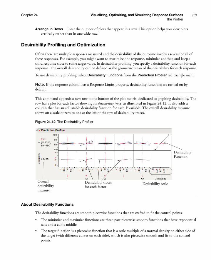
Chapter 24 Visualizing, Optimizing, and Simulating Response Surfaces 567The Profiler
Arrange in Rows Enter the number of plots that appear in a row. This option helps you view plots vertically rather than in one wide row.
Desirability Profiling and Optimization
Often there are multiple responses measured and the desirability of the outcome involves several or all of these responses. For example, you might want to maximize one response, minimize another, and keep a third response close to some target value. In desirability profiling, you specify a desirability function for each response. The overall desirability can be defined as the geometric mean of the desirability for each response.
To use desirability profiling, select Desirability Functions from the Prediction Profiler red triangle menu.
Note: If the response column has a Response Limits property, desirability functions are turned on by default.
This command appends a new row to the bottom of the plot matrix, dedicated to graphing desirability. The row has a plot for each factor showing its desirability trace, as illustrated in Figure 24.12. It also adds a column that has an adjustable desirability function for each Y variable. The overall desirability measure shows on a scale of zero to one at the left of the row of desirability traces.
Figure 24.12 The Desirability Profiler
About Desirability Functions
The desirability functions are smooth piecewise functions that are crafted to fit the control points.
• The minimize and maximize functions are three-part piecewise smooth functions that have exponential tails and a cubic middle.
• The target function is a piecewise function that is a scale multiple of a normal density on either side of the target (with different curves on each side), which is also piecewise smooth and fit to the control points.
Desirability tracesfor each factor
Overalldesirabilitymeasure
DesirabilityFunction
Desirability scale

568 Visualizing, Optimizing, and Simulating Response Surfaces Chapter 24The Profiler
These choices give the functions good behavior as the desirability values switch between the maximize, target, and minimize values. For completeness, we implemented the upside-down target also.
JMP doesn’t use the Derringer and Suich functional forms. Since they are not smooth, they do not always work well with JMP’s optimization algorithm.
The control points are not allowed to reach all the way to zero or one at the tail control points.
Using the Desirability Function
To use a variable’s desirability function, drag the function handles to represent a response value.
As you drag these handles, the changing response value shows in the area labeled Desirability to the left of the plots. The dotted line is the response for the current factor settings. The overall desirability shows to the left of the row of desirability traces. Alternatively, you can select Set Desirabilities to enter specific values for the points.
The next illustration shows steps to create desirability settings.
Maximize The default desirability function setting is maximize (“higher is better”). The top function handle is positioned at the maximum Y value and aligned at the high desirability, close to 1. The bottom function handle is positioned at the minimum Y value and aligned at a low desirability, close to 0.
Figure 24.13 Maximizing Desirability
Target You can designate a target value as “best.” In this example, the middle function handle is positioned at Y = 70 and aligned with the maximum desirability of 1. Y becomes less desirable as its value approaches either 45 or 95. The top and bottom function handles at Y = 45 and Y = 95 are positioned at the minimum desirability close to 0.
Figure 24.14 Defining a Target Desirability
Minimize The minimize (“smaller is better”) desirability function associates high response values with low desirability and low response values with high desirability. The curve is the maximization curve flipped around a horizontal line at the center of plot.
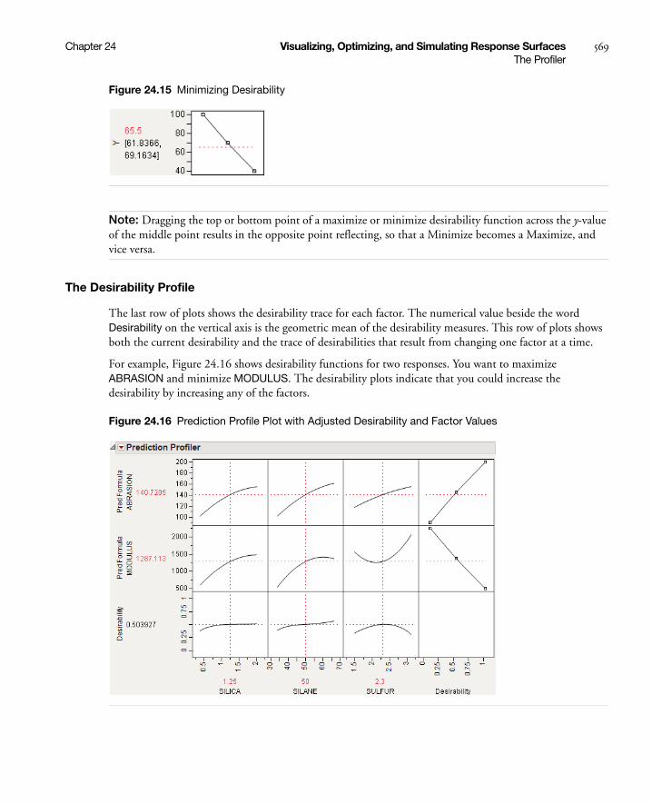
Chapter 24 Visualizing, Optimizing, and Simulating Response Surfaces 569The Profiler
Figure 24.15 Minimizing Desirability
Note: Dragging the top or bottom point of a maximize or minimize desirability function across the y-value of the middle point results in the opposite point reflecting, so that a Minimize becomes a Maximize, and vice versa.
The Desirability Profile
The last row of plots shows the desirability trace for each factor. The numerical value beside the word Desirability on the vertical axis is the geometric mean of the desirability measures. This row of plots shows both the current desirability and the trace of desirabilities that result from changing one factor at a time.
For example, Figure 24.16 shows desirability functions for two responses. You want to maximize ABRASION and minimize MODULUS. The desirability plots indicate that you could increase the desirability by increasing any of the factors.
Figure 24.16 Prediction Profile Plot with Adjusted Desirability and Factor Values
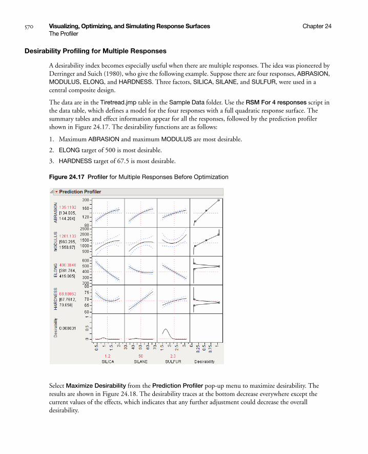
570 Visualizing, Optimizing, and Simulating Response Surfaces Chapter 24The Profiler
Desirability Profiling for Multiple Responses
A desirability index becomes especially useful when there are multiple responses. The idea was pioneered by Derringer and Suich (1980), who give the following example. Suppose there are four responses, ABRASION, MODULUS, ELONG, and HARDNESS. Three factors, SILICA, SILANE, and SULFUR, were used in a central composite design.
The data are in the Tiretread.jmp table in the Sample Data folder. Use the RSM For 4 responses script in the data table, which defines a model for the four responses with a full quadratic response surface. The summary tables and effect information appear for all the responses, followed by the prediction profiler shown in Figure 24.17. The desirability functions are as follows:
1. Maximum ABRASION and maximum MODULUS are most desirable.
2. ELONG target of 500 is most desirable.
3. HARDNESS target of 67.5 is most desirable.
Figure 24.17 Profiler for Multiple Responses Before Optimization
Select Maximize Desirability from the Prediction Profiler pop-up menu to maximize desirability. The results are shown in Figure 24.18. The desirability traces at the bottom decrease everywhere except the current values of the effects, which indicates that any further adjustment could decrease the overall desirability.
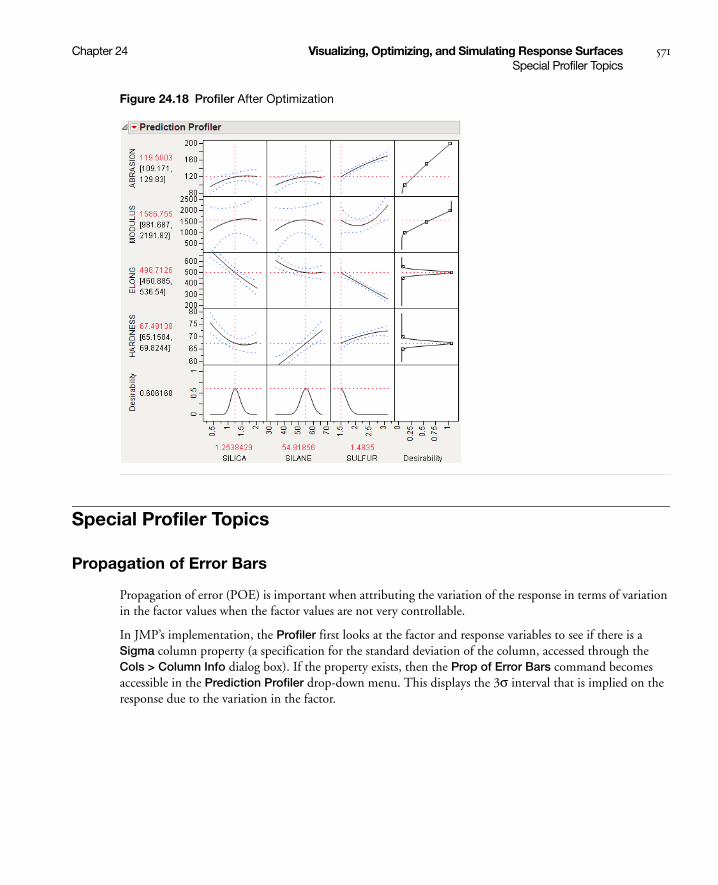
Chapter 24 Visualizing, Optimizing, and Simulating Response Surfaces 571Special Profiler Topics
Figure 24.18 Profiler After Optimization
Special Profiler Topics
Propagation of Error Bars
Propagation of error (POE) is important when attributing the variation of the response in terms of variation in the factor values when the factor values are not very controllable.
In JMP’s implementation, the Profiler first looks at the factor and response variables to see if there is a Sigma column property (a specification for the standard deviation of the column, accessed through the Cols > Column Info dialog box). If the property exists, then the Prop of Error Bars command becomes accessible in the Prediction Profiler drop-down menu. This displays the 3σ interval that is implied on the response due to the variation in the factor.
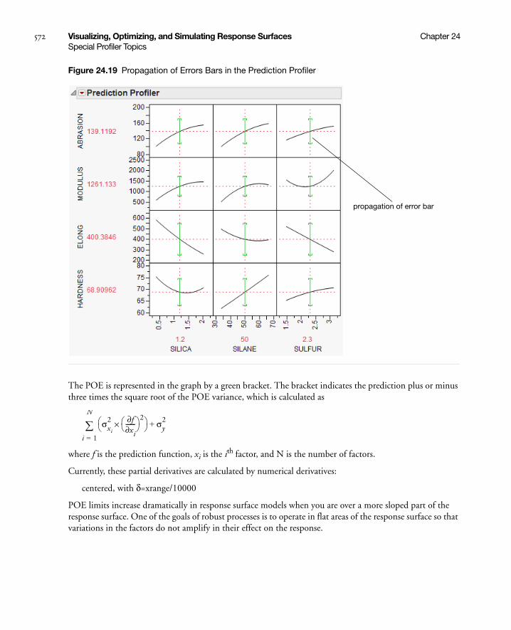
572 Visualizing, Optimizing, and Simulating Response Surfaces Chapter 24Special Profiler Topics
Figure 24.19 Propagation of Errors Bars in the Prediction Profiler
The POE is represented in the graph by a green bracket. The bracket indicates the prediction plus or minus three times the square root of the POE variance, which is calculated as
where f is the prediction function, xi is the ith factor, and N is the number of factors.
Currently, these partial derivatives are calculated by numerical derivatives:
centered, with δ=xrange/10000
POE limits increase dramatically in response surface models when you are over a more sloped part of the response surface. One of the goals of robust processes is to operate in flat areas of the response surface so that variations in the factors do not amplify in their effect on the response.
propagation of error bar
σxi
2 f∂xi∂------- 2
×
i 1=
N
σy2+

Chapter 24 Visualizing, Optimizing, and Simulating Response Surfaces 573Special Profiler Topics
Customized Desirability Functions
It is possible to use a customized desirability function. For example, suppose you want to maximize using the following function.
Figure 24.20 Maximizing Desirability Based on a Function
First, create a column called MyDesire that contains the above formula. Then, launch the Profiler using Graph > Profiler and include all the Pred Formula columns and the MyDesire column. Turn on the desirability functions by selecting Desirability Functions from the red-triangle menu. All the desirability functions for the individual effects must be turned off. To do this, first double-click in a desirability plot window, then select None in the dialog that appears (Figure 24.21). Set the desirability for MyDesire to be maximized.
Figure 24.21 Selecting No Desirability Goal
At this point, selecting Maximize Desirability uses only the custom MyDesire function.
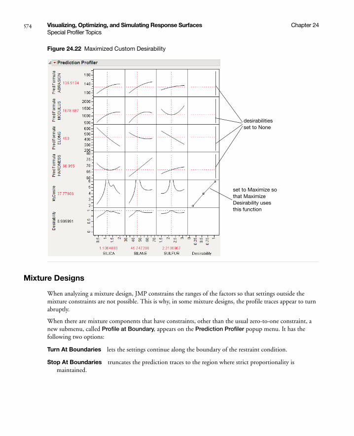
574 Visualizing, Optimizing, and Simulating Response Surfaces Chapter 24Special Profiler Topics
Figure 24.22 Maximized Custom Desirability
Mixture Designs
When analyzing a mixture design, JMP constrains the ranges of the factors so that settings outside the mixture constraints are not possible. This is why, in some mixture designs, the profile traces appear to turn abruptly.
When there are mixture components that have constraints, other than the usual zero-to-one constraint, a new submenu, called Profile at Boundary, appears on the Prediction Profiler popup menu. It has the following two options:
Turn At Boundaries lets the settings continue along the boundary of the restraint condition.
Stop At Boundaries truncates the prediction traces to the region where strict proportionality is maintained.
desirabilities set to None
set to Maximize so that Maximize Desirability uses this function

Chapter 24 Visualizing, Optimizing, and Simulating Response Surfaces 575Special Profiler Topics
Expanding Intermediate Formulas
The Profiler launch dialog has an Expand Intermediate Formulas checkbox. When this is checked, then when the formula is examined for profiling, if it references another column that has a formula containing references to other columns, then it substitutes that formula and profiles with respect to the end references—not the intermediate column references.
For example, when Fit Model fits a logistic regression for two levels (say A and B), the end formulas (Prob[A] and Prob[B]) are functions of the Lin[x] column, which itself is a function of another column x. If Expand Intermediate Formulas is selected, then when Prob[A] is profiled, it is with reference to x, not Lin[x].
In addition, using the Expand Intermediate Formulas checkbox enables the Save Expanded Formulas command in the platform red triangle menu. This creates a new column with a formula, which is the formula being profiled as a function of the end columns, not the intermediate columns.
Linear Constraints
The Prediction Profiler, Custom Profiler and Mixture Profiler can incorporate linear constraints into their operations. Linear constraints can be entered in two ways, described in the following sections.
Pop-up Menu Item
To enter linear constraints via the pop-up menu, select Alter Linear Constraints from either the Prediction Profiler or Custom Profiler pop-up menu.
Choose Add Constraint from the resulting dialog, and enter the coefficients into the appropriate boxes. For example, to enter the constraint p1 + 2*p2 ≤ 0.9, enter the coefficients as shown in Figure 24.23. As shown, if you are profiling factors from a mixture design, the mixture constraint is present by default and cannot be modified.
Figure 24.23 Enter Coefficients
After you click OK, the Profiler updates the profile traces, and the constraint is incorporated into subsequent analyses and optimizations.
If you attempt to add a constraint for which there is no feasible solution, a message is written to the log and the constraint is not added. To delete a constraint, enter zeros for all the coefficients.
Constraints added in one profiler are not accessible by other profilers until saved. For example, if constraints are added under the Prediction Profiler, they are not accessible to the Custom Profiler. To use the constraint, you can either add it under the Custom Profiler pop-up menu, or use the Save Linear Constraints command described in the next section.
Enter coefficients

576 Visualizing, Optimizing, and Simulating Response Surfaces Chapter 24Special Profiler Topics
Constraint Table Property/Script
If you add constraints in one profiler and want to make them accessible by other profilers, use the Save Linear Constraints command, accessible through the platform pop-up menu. For example, if you created constraints in the Prediction Profiler, choose Save Linear Constraints under the Prediction Profiler pop-up menu. The Save Linear Constraints command creates or alters a Table Script called Constraint. An example of the Table Property is shown in Figure 24.24.
Figure 24.24 Constraint Table Script
The Constraint Table Property is a list of the constraints, and is editable. It is accessible to other profilers, and negates the need to enter the constraints in other profilers. To view or edit Constraint, right click on the pop-up menu and select Edit. The contents of the constraint from Figure 24.23 is shown below in Figure 24.25.
Figure 24.25 Example Constraint
The Constraint Table Script can be created manually by choosing New Script from the pop-up menu beside a table name.
Note: When creating the Constraint Table Script manually, the spelling must be exactly “Constraint”. Also, the constraint variables are case sensitive and must match the column name. For example, in Figure 24.25, the constraint variables are p1 and p2, not P1 and P2.
The Constraint Table Script is also created when specifying linear constraints when designing an experiment.
The Alter Linear Constraints and Save Linear Constraints commands are not available in the Mixture Profiler. To incorporate linear constraints into the operations of the Mixture Profiler, the Constraint Table Script must be created by one of the methods discussed in this section.
Constraint script
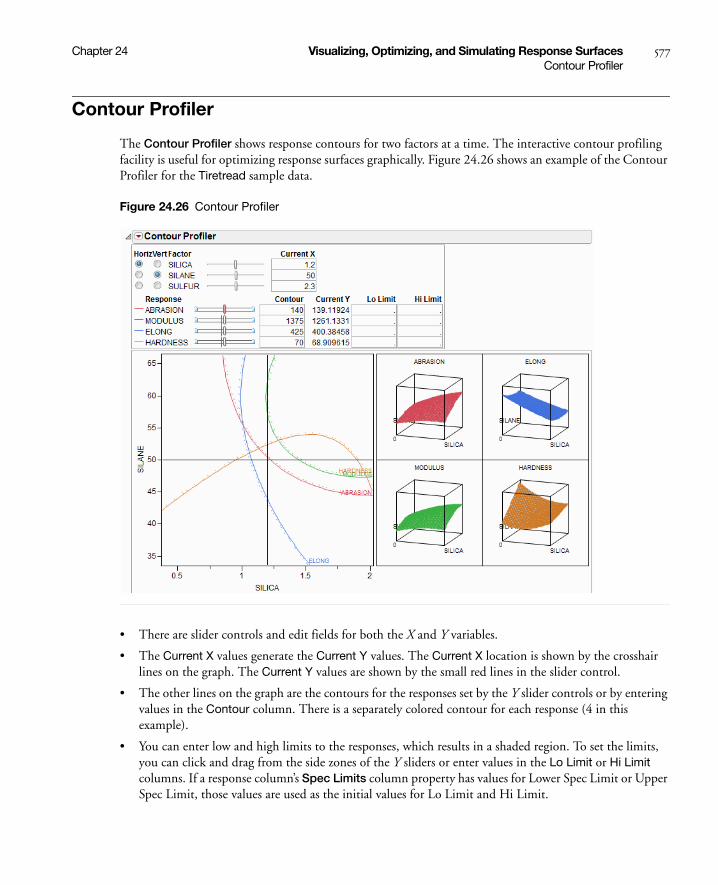
Chapter 24 Visualizing, Optimizing, and Simulating Response Surfaces 577Contour Profiler
Contour Profiler
The Contour Profiler shows response contours for two factors at a time. The interactive contour profiling facility is useful for optimizing response surfaces graphically. Figure 24.26 shows an example of the Contour Profiler for the Tiretread sample data.
Figure 24.26 Contour Profiler
• There are slider controls and edit fields for both the X and Y variables.
• The Current X values generate the Current Y values. The Current X location is shown by the crosshair lines on the graph. The Current Y values are shown by the small red lines in the slider control.
• The other lines on the graph are the contours for the responses set by the Y slider controls or by entering values in the Contour column. There is a separately colored contour for each response (4 in this example).
• You can enter low and high limits to the responses, which results in a shaded region. To set the limits, you can click and drag from the side zones of the Y sliders or enter values in the Lo Limit or Hi Limit columns. If a response column’s Spec Limits column property has values for Lower Spec Limit or Upper Spec Limit, those values are used as the initial values for Lo Limit and Hi Limit.

578 Visualizing, Optimizing, and Simulating Response Surfaces Chapter 24Contour Profiler
• If you have more than two factors, use the radio buttons in the upper left of the report to switch the graph to other factors.
• Right-click on the slider control and select Rescale Slider to change the scale of the slider (and the plot for an active X variable).
• For each contour, there is a dotted line in the direction of higher response values, so that you get a sense of direction.
• Right-click on the color legend for a response (under Response) to change the color for that response.
Contour Profiler Pop-up Menu
Grid Density lets you set the density of the mesh plots (Surface Plots).
Graph Updating gives you the options to update the Contour Profiler Per Mouse Move, which updates continuously, or Per Mouse Up, which waits for the mouse to be released to update. (The difference might not be noticeable on a fast machine.)
Surface Plot hides or shows mesh plots.
Contour Label hides or shows a label for the contour lines. The label colors match the contour colors.
Contour Grid draws contours on the Contour Profiler plot at intervals you specify.
Factor Settings is a submenu of commands that allows you to save and transfer the Contour Profiler’s settings to other parts of JMP. Details are in the section “Factor Settings” on page 565.
Simulator launches the Simulator. See “The Simulator” on page 592.
Up Dots shows or hides dotted lines corresponding to each contour. The dotted lines show the direction of increasing response values, so that you get a sense of direction.
Mixtures
For mixture designs, a Lock column appears in the Contour Profiler (Figure 24.27). This column allows you to lock settings for mixture values so that they are not changed when the mixture needs to be adjusted due to other mixture effects being changed. When locked columns exist, the shaded area for a mixture recognizes the newly restricted area.
Figure 24.27 Boxes to Lock Columns
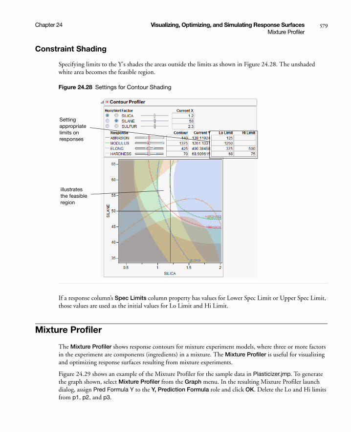
Chapter 24 Visualizing, Optimizing, and Simulating Response Surfaces 579Mixture Profiler
Constraint Shading
Specifying limits to the Y's shades the areas outside the limits as shown in Figure 24.28. The unshaded white area becomes the feasible region.
Figure 24.28 Settings for Contour Shading
If a response column’s Spec Limits column property has values for Lower Spec Limit or Upper Spec Limit, those values are used as the initial values for Lo Limit and Hi Limit.
Mixture Profiler
The Mixture Profiler shows response contours for mixture experiment models, where three or more factors in the experiment are components (ingredients) in a mixture. The Mixture Profiler is useful for visualizing and optimizing response surfaces resulting from mixture experiments.
Figure 24.29 shows an example of the Mixture Profiler for the sample data in Plasticizer.jmp. To generate the graph shown, select Mixture Profiler from the Graph menu. In the resulting Mixture Profiler launch dialog, assign Pred Formula Y to the Y, Prediction Formula role and click OK. Delete the Lo and Hi limits from p1, p2, and p3.
Setting appropriate limits on responses
illustrates the feasible region

580 Visualizing, Optimizing, and Simulating Response Surfaces Chapter 24Mixture Profiler
Many of the features shown are the same as those of the Contour Profiler and are described on “Contour Profiler Pop-up Menu” on page 578. Some of the features unique to the Mixture Profiler include:
• A ternary plot is used instead of a Cartesian plot. A ternary plot enables you to view three mixture factors at a time.
• If you have more than three factors, use the radio buttons at the top left of the Mixture Profiler window to graph other factors. For detailed explanation of radio buttons and plot axes, see “Explanation of Ternary Plot Axes” on page 580
• If the factors have constraints, you can enter their low and high limits in the Lo Limit and Hi Limit columns. This shades non-feasible regions in the profiler. As in Contour Plot, low and high limits can also be set for the responses.
Figure 24.29 Mixture Profiler
Explanation of Ternary Plot Axes
The sum of all mixture factor values in a mixture experiment is a constant, usually, and henceforth assumed to be 1. Each individual factor’s value can range between 0 and 1, and three are represented on the axes of the ternary plot.
For a three factor mixture experiment in which the factors sum to 1, the plot axes run from a vertex (where a factor’s value is 1 and the other two are 0) perpendicular to the other side (where that factor is 0 and the sum of the other two factors is 1). See Figure 24.30.
For example, in Figure 24.30, the proportion of p1 is 1 at the top vertex and 0 along the bottom edge. The tick mark labels are read along the left side of the plot. Similar explanations hold for p2 and p3.
radio buttons to choose plot axes
Setting these shades the area outside limits

Chapter 24 Visualizing, Optimizing, and Simulating Response Surfaces 581Mixture Profiler
For an explanation of ternary plot axes for experiments with more than three mixture factors, see “More than Three Mixture Factors” on page 581.
Figure 24.30 Explanation of p1 Axis.
More than Three Mixture Factors
The ternary plot can only show three factors at a time. If there are more than three factors in the model you are profiling, the total of the three on-axis (displayed) factors is 1 minus the total of the off-axis (non-displayed) factors. Also, the plot axes are scaled such that the maximum value a factor can attain is 1 minus the total for the off-axis factors.
For example Figure 24.31 shows the Mixture Profiler for an experiment with 5 factors. The Five Factor Mixture.jmp data table is being used, with the Y1 Predicted column as the formula. The on-axis factors are x1, x2 and x3, while x4 and x5 are off-axis. The value for x4 is 0.1 and the value for x5 is 0.2, for a total of 0.3. This means the sum of x1, x2 and x3 has to equal 1 – 0.3 = 0.7. In fact, their Current X values add to 0.7. Also, note that the maximum value for a plot axis is now 0.7, not 1.
If you change the value for either x4 or x5, then the values for x1, x2 and x3 change, keeping their relative proportions, to accommodate the constraint that factor values sum to 1.
p1 axis
p1 = 1
p1 = 0
labels for p1 axis
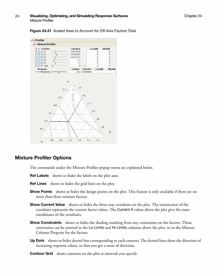
582 Visualizing, Optimizing, and Simulating Response Surfaces Chapter 24Mixture Profiler
Figure 24.31 Scaled Axes to Account for Off-Axis Factors Total
Mixture Profiler Options
The commands under the Mixture Profiler popup menu are explained below.
Ref Labels shows or hides the labels on the plot axes.
Ref Lines shows or hides the grid lines on the plot.
Show Points shows or hides the design points on the plot. This feature is only available if there are no more than three mixture factors.
Show Current Value shows or hides the three-way crosshairs on the plot. The intersection of the crosshairs represents the current factor values. The Current X values above the plot give the exact coordinates of the crosshairs.
Show Constraints shows or hides the shading resulting from any constraints on the factors. Those constraints can be entered in the Lo Limits and Hi Limits columns above the plot, or in the Mixture Column Property for the factors.
Up Dots shows or hides dotted line corresponding to each contour. The dotted lines show the direction of increasing response values, so that you get a sense of direction.
Contour Grid draws contours on the plot at intervals you specify.

Chapter 24 Visualizing, Optimizing, and Simulating Response Surfaces 583Mixture Profiler
Remove Contour Grid removes the contour grid if one is on the plot.
Factor Settings is a submenu of commands that allows you to save and transfer the Mixture Profiler settings to other parts of JMP. Details on this submenu are found in the discussion of the profiler on “Factor Settings” on page 565.
Linear Constraints
The Mixture Profiler can incorporate linear constraints into its operations. To do this, a Constraint Table Script must be part of the data table. See “Linear Constraints” on page 575 for details on creating the Table Script.
When using constraints, unfeasible regions are shaded in the profiler. Figure 24.32 shows an example of a mixture profiler with shaded regions due to four constraints. The unshaded portion is the resulting feasible region. The constraints are below:
• 4*p2 + p3 ≤ 0.8
• p2 + 1.5*p3 ≤ 0.4
• p1 + 2*p2 ≥ 0.8
• p1 + 2*p2 ≤ 0.95
Figure 24.32 Shaded Regions Due to Linear Constraints
Examples
Single Response
This example, adapted from Cornell (1990), comes from an experiment to optimize the texture of fish patties. The data is in Fish Patty.jmp. The columns Mullet, Sheepshead and Croaker represent what proportion of the patty came from that fish type. The column Temperature represents the oven temperature used to bake the patties. The column Rating is the response and is a measure of texture acceptability, where

584 Visualizing, Optimizing, and Simulating Response Surfaces Chapter 24Mixture Profiler
higher is better. A response surface model was fit to the data and the prediction formula was stored in the column Predicted Rating.
To launch the Mixture Profiler, select Graph > Mixture Profiler. Assign Predicted Rating to Y, Prediction Formula and click OK. The output should appear as in Figure 24.33.
Figure 24.33 Initial Output for Mixture Profiler.
The manufacturer wants the rating to be at least 5. Use the slider control for Predicted Rating to move the contour close to 5. Alternatively, you can enter 5 in the Contour edit box to bring the contour to a value of 5. Figure 24.34 shows the resulting contour.
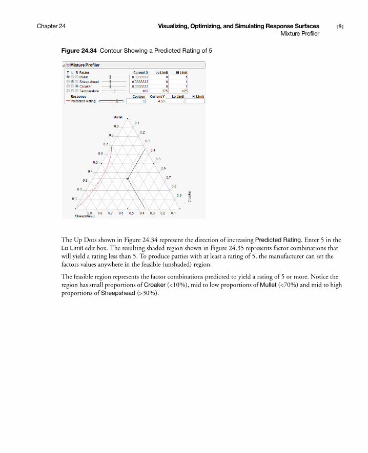
Chapter 24 Visualizing, Optimizing, and Simulating Response Surfaces 585Mixture Profiler
Figure 24.34 Contour Showing a Predicted Rating of 5
The Up Dots shown in Figure 24.34 represent the direction of increasing Predicted Rating. Enter 5 in the Lo Limit edit box. The resulting shaded region shown in Figure 24.35 represents factor combinations that will yield a rating less than 5. To produce patties with at least a rating of 5, the manufacturer can set the factors values anywhere in the feasible (unshaded) region.
The feasible region represents the factor combinations predicted to yield a rating of 5 or more. Notice the region has small proportions of Croaker (<10%), mid to low proportions of Mullet (<70%) and mid to high proportions of Sheepshead (>30%).

586 Visualizing, Optimizing, and Simulating Response Surfaces Chapter 24Mixture Profiler
Figure 24.35 Contour Shading Showing Predicted Rating of 5 or more.
Up to this point the fourth factor, Temperature, has been held at 400 degrees. Move the slide control for Temperature and watch the feasible region change.
Additional analyses may include:
• Optimize the response across all four factors simultaneously. See “The Custom Profiler” on page 591 or “Desirability Profiling and Optimization” on page 567.
• Simulate the response as a function of the random variation in the factors and model noise. See “The Simulator” on page 592.
Multiple Responses
This example uses data from Five Factor Mixture.jmp. There are five continuous factors (x1–x5), one categorical factor (Type), and three responses, Y1, Y2 and Y3. A response surface model is fit to each response and the prediction equations are saved in Y1 Predicted, Y2 Predicted and Y3 Predicted.
Launch the Mixture Profiler and assign the three prediction formula columns to the Y, Prediction Formula role, then click OK. Enter 3 in the Contour edit box for Y3 Predicted so the contour shows on the plot. The output appears in Figure 24.36.

Chapter 24 Visualizing, Optimizing, and Simulating Response Surfaces 587Mixture Profiler
Figure 24.36 Initial Output Window for Five Factor Mixture
A few items to note about the output in Figure 24.36.
• All the factors appear at the top of the window. The mixture factors have low and high limits, which were entered previously as a Column Property. See Using JMP for more information about entering column properties. Alternatively, you can enter the low and high limits directly by entering them in the Lo Limit and Hi Limit boxes.
• Certain regions of the plot are shaded in gray to account for the factor limits.
• The on-axis factors, x1, x2 and x3, have radio buttons selected.
• The categorical factor, Type, has a radio button, but it cannot be assigned to the plot. The current value for Type is L1, which is listed immediately to the right of the Current X box. The Current X box for Type uses a 0 to represent L1.
• All three prediction equations have contours on the plot and are differentiated by color.
A manufacturer desires to hold Y1 less than 1, hold Y2 greater than 8 and hold Y3 between 4 and 5, with a target of 4.5. Furthermore, the low and high limits on the factors need to be respected. The Mixture Profiler can help you investigate the response surface and find optimal factor settings.
Start by entering the response constraints into the Lo Limit and Hi Limit boxes, as shown in Figure 24.37. Colored shading appears on the plot and designates unfeasible regions. The feasible region remains white (unshaded). Use the Response slider controls to position the contours in the feasible region.

588 Visualizing, Optimizing, and Simulating Response Surfaces Chapter 24Mixture Profiler
Figure 24.37 Response Limits and Shading
The feasible region is small. Use the magnifier tool to zoom in on the feasible region shown with a box in Figure 24.37. The enlarged feasible region is shown in Figure 24.38.
Response Limits
Unshaded Feasible Region

Chapter 24 Visualizing, Optimizing, and Simulating Response Surfaces 589Mixture Profiler
Figure 24.38 Feasible Region Enlarged
The manufacturer wants to maximize Y1, minimize Y2 and have Y3 at 4.5.
• Use the slider controls or Contour edit boxes for Y1 Predicted to maximize the red contour within the feasible region. Keep in mind the Up Dots show direction of increasing predicted response.
• Use the slider controls or Contour edit boxes for Y2 Predicted to minimize the green contour within the unshaded region.
• Enter 4.5 in the Contour edit box for Y3 Predicted to bring the blue contour to the target value.
The resulting three contours don’t all intersect at one spot, so you will have to compromise. Position the three-way crosshairs in the middle of the contours to understand the factor levels that produce those response values.

590 Visualizing, Optimizing, and Simulating Response Surfaces Chapter 24Mixture Profiler
Figure 24.39 Factor Settings
As shown in Figure 24.39, the optimal factor settings can be read from the Current X boxes.
The factor values above hold for the current settings of x4, x5 and Type. Select Factor Settings > Remember Settings from the Mixture Profiler pop-up menu to save the current settings. The settings are appended to the bottom of the report window and appear as shown below.
Figure 24.40 Remembered Settings
With the current settings saved, you can now change the values of x4, x5 and Type to see what happens to the feasible region. You can compare the factor settings and response values for each level of Type by referring to the Remembered Settings report.
factor settings
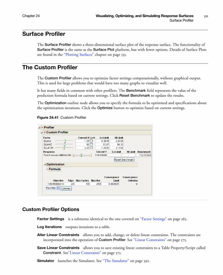
Chapter 24 Visualizing, Optimizing, and Simulating Response Surfaces 591Surface Profiler
Surface Profiler
The Surface Profiler shows a three-dimensional surface plot of the response surface. The functionality of Surface Profiler is the same as the Surface Plot platform, but with fewer options. Details of Surface Plots are found in the “Plotting Surfaces” chapter on page 535.
The Custom Profiler
The Custom Profiler allows you to optimize factor settings computationally, without graphical output. This is used for large problems that would have too many graphs to visualize well.
It has many fields in common with other profilers. The Benchmark field represents the value of the prediction formula based on current settings. Click Reset Benchmark to update the results.
The Optimization outline node allows you to specify the formula to be optimized and specifications about the optimization iterations. Click the Optimize button to optimize based on current settings.
Figure 24.41 Custom Profiler
Custom Profiler Options
Factor Settings is a submenu identical to the one covered on “Factor Settings” on page 565.
Log Iterations outputs iterations to a table.
Alter Linear Constraints allows you to add, change, or delete linear constraints. The constraints are incorporated into the operation of Custom Profiler. See “Linear Constraints” on page 575.
Save Linear Constraints allows you to save existing linear constraints to a Table Property/Script called Constraint. See“Linear Constraints” on page 575.
Simulator launches the Simulator. See “The Simulator” on page 592.
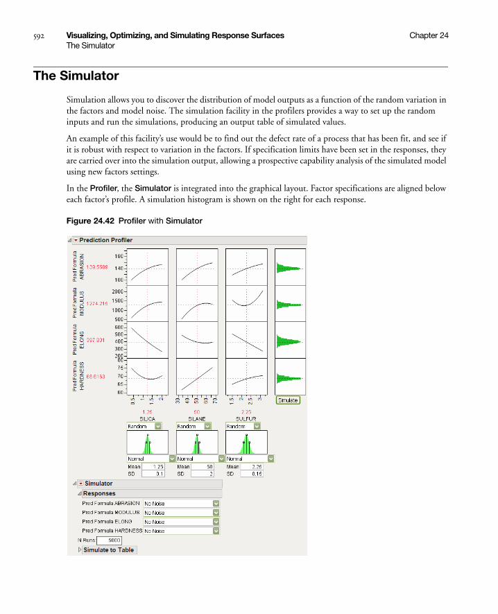
592 Visualizing, Optimizing, and Simulating Response Surfaces Chapter 24The Simulator
The Simulator
Simulation allows you to discover the distribution of model outputs as a function of the random variation in the factors and model noise. The simulation facility in the profilers provides a way to set up the random inputs and run the simulations, producing an output table of simulated values.
An example of this facility’s use would be to find out the defect rate of a process that has been fit, and see if it is robust with respect to variation in the factors. If specification limits have been set in the responses, they are carried over into the simulation output, allowing a prospective capability analysis of the simulated model using new factors settings.
In the Profiler, the Simulator is integrated into the graphical layout. Factor specifications are aligned below each factor’s profile. A simulation histogram is shown on the right for each response.
Figure 24.42 Profiler with Simulator

Chapter 24 Visualizing, Optimizing, and Simulating Response Surfaces 593The Simulator
In the other profilers, the Simulator is less graphical, and kept separate. There are no integrated histograms, and the interface is textual. However, the internals and output tables are the same.
Specifying Factors
Factors (inputs) and responses (outputs) are already given roles by being in the Profiler. Additional specifications for the simulator are on how to give random values to the factors, and add random noise to the responses.
For each factor, the choices of how to give values are as follows:
Fixed fixes the factor at the specified value. The initial value is the current value in the profiler, which may be a value obtained through optimization.
Random gives the factor the specified distribution and distributional parameters.
See the Using JMP book for descriptions of most of these random functions. If the factor is categorical, then the distribution is characterized by probabilities specified for each category, with the values normalized to sum to 1.
Normal weighted is Normally distributed with the given mean and standard deviation, but a special stratified and weighted sampling system is used to simulate very rare events far out into the tails of the distribution. This is a good choice when you want to measure very low defect rates accurately. See “Statistical Details” on page 625.
Normal truncated is a normal distribution limited by lower and upper limits. Any random realization that exceeds these limits is discarded and the next variate within the limits is chosen. This is used to simulate an inspection system where inputs that do not satisfy specification limits are discarded or sent back.
Normal censored is a normal distribution limited by lower and upper limits. Any random realization that exceeds a limit is just set to that limit, putting a density mass on the limits. This is used to simulate a re-work system where inputs that do not satisfy specification limits are reworked until they are at that limit.
Sampled means that JMP picks values at random from that column in the data table.
External means that JMP pickes values at random from a column in another table. You are prompted to choose the table and column.
The Aligned checkbox is used for two or more Sampled or External sources. When checked, the random draws come from the same row of the table. This is useful for maintaining the correlation structure between two columns. If the Aligned option is used to associate two columns in different tables, the columns must have equal number of rows.
In the Profiler, a graphical specification shows the form of the density for the continuous distributions, and provides control points that can be dragged to change the distribution. The drag points for the Normal are the mean and the mean plus or minus one standard deviation. The Normal truncated and censored add points for the lower and upper limits. The Uniform and Triangular have limit control points, and the Triangular adds the mode.
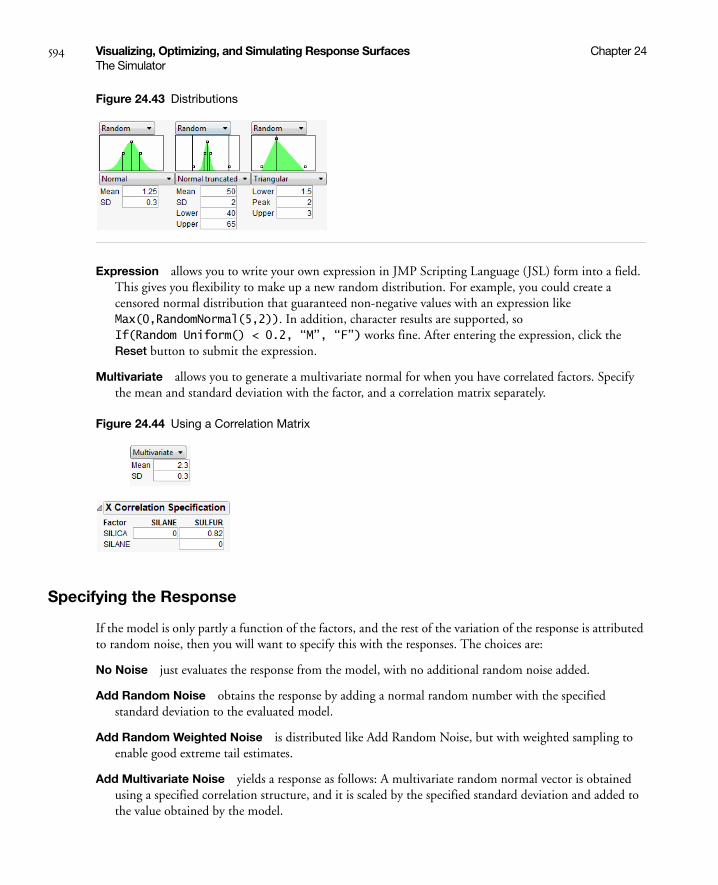
594 Visualizing, Optimizing, and Simulating Response Surfaces Chapter 24The Simulator
Figure 24.43 Distributions
Expression allows you to write your own expression in JMP Scripting Language (JSL) form into a field. This gives you flexibility to make up a new random distribution. For example, you could create a censored normal distribution that guaranteed non-negative values with an expression like Max(0,RandomNormal(5,2)). In addition, character results are supported, so If(Random Uniform() < 0.2, “M”, “F”) works fine. After entering the expression, click the Reset button to submit the expression.
Multivariate allows you to generate a multivariate normal for when you have correlated factors. Specify the mean and standard deviation with the factor, and a correlation matrix separately.
Figure 24.44 Using a Correlation Matrix
Specifying the Response
If the model is only partly a function of the factors, and the rest of the variation of the response is attributed to random noise, then you will want to specify this with the responses. The choices are:
No Noise just evaluates the response from the model, with no additional random noise added.
Add Random Noise obtains the response by adding a normal random number with the specified standard deviation to the evaluated model.
Add Random Weighted Noise is distributed like Add Random Noise, but with weighted sampling to enable good extreme tail estimates.
Add Multivariate Noise yields a response as follows: A multivariate random normal vector is obtained using a specified correlation structure, and it is scaled by the specified standard deviation and added to the value obtained by the model.

Chapter 24 Visualizing, Optimizing, and Simulating Response Surfaces 595The Simulator
Run the Simulation
Specify the number of runs in the simulation by entering it in the N Runs box.
After factor and response distributions are set, click the Simulate button to run the simulation.
Or, use the Make Table button to generate a simulation and output the results to a data table.
The table contains N Runs rows, simulated factor values from the specified distributions, and the corresponding response values. If spec limits are given, the table also contains a column specifying whether a row is in or out of spec.
The Simulator Menu
Automatic Histogram Update toggles histogram update, which sends changes to all histograms shown in the Profiler, so that histograms update with new simulated values when you drag distribution handles.
Defect Profiler shows the defect rate as an isolated function of each factor. This command is enabled when spec limits are available, as described below.
Defect Parametric Profile shows the defect rate as an isolated function of the parameters of each factor’s distribution. It is enabled when the Defect Profiler is launched.
Simulation Experiment is used to run a designed simulation experiment on the locations of the factor distributions. A dialog appears, allowing you to specify the number of design points, the portion of the factor space to be used in the experiment, and which factors to include in the experiment. For factors not included in the experiment, the current value shown in the Profiler is the one used in the experiment.
The experimental design is a Latin Hypercube. The output has one row for each design point. The responses include the defect rate for each response with spec limits, and an overall defect rate. After the experiment, it would be appropriate to fit a Gaussian Process model on the overall defect rate, or a root or a logarithm of it.
A simulation experiment does not sample the factor levels from the specified distributions. As noted above, the design is a Latin Hypercube. At each design point, N Runs random draws are generated with the design point serving as the center of the random draws, and the shape and variability coming from the specified distributions.
Spec Limits shows or edits specification limits.
N Strata is a hidden option accessible by holding down the Shift key before clicking the Simulator popup menu. This option allows you to specify the number of strata in Normal Weighted. For more information also see “Statistical Details” on page 625.
Set Random Seed is a hidden option accessible by holding down the Shift key before clicking the Simulator popup menu. This option allows you to specify a seed for the simulation starting point. This enables the simulation results to be reproducible, unless the seed is set to zero. The seed is set to zero by default. If the seed is non-zero, then the latest simulation results are output if the Make Table button is clicked.

596 Visualizing, Optimizing, and Simulating Response Surfaces Chapter 24The Simulator
Using Specification Limits
The profilers support specification limits on the responses, providing a number of features
• In the Profiler, if you don’t have the Response Limits property set up in the input data table to provide desirability coordinates, JMP looks for a Spec Limits property and constructs desirability functions appropriate to those Spec Limits.
• If you use the Simulator to output simulation tables, JMP copies Spec Limits to the output data tables, making accounting for defect rates and capability indices easy.
• Adding Spec Limits enables a feature called the Defect Profiler.
In the following example, we assume that the following Spec Limits have been specified.
To set these limits in the data table, highlight a column and select Cols > Column Info. Then, click the Column Properties button and select the Spec Limits property.
If you are already in the Simulator in a profiler, another way to enter them is to use the Spec Limits command in the Simulator pop-up menu.
Figure 24.45 Spec Limits
After entering the spec limits, they are incorporated into the profilers. Click the Save button if you want the spec limits saved back to the data table as a column property.
With these specification limits, and the distributions shown in Figure 24.42, click the Simulate button. Notice the spec limit lines in the output histograms.
Table 24.3 Spec Limits for Tiretread.jmp data table
Response LSL USL
Abrasion 110
Modulus 2000
Elong 350 550
Hardness 66 74
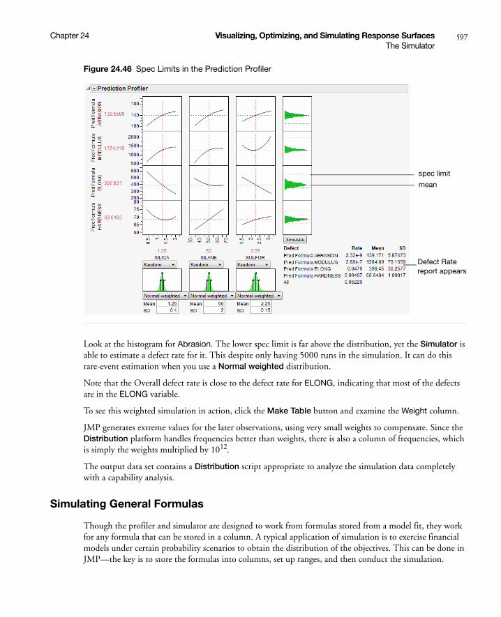
Chapter 24 Visualizing, Optimizing, and Simulating Response Surfaces 597The Simulator
Figure 24.46 Spec Limits in the Prediction Profiler
Look at the histogram for Abrasion. The lower spec limit is far above the distribution, yet the Simulator is able to estimate a defect rate for it. This despite only having 5000 runs in the simulation. It can do this rare-event estimation when you use a Normal weighted distribution.
Note that the Overall defect rate is close to the defect rate for ELONG, indicating that most of the defects are in the ELONG variable.
To see this weighted simulation in action, click the Make Table button and examine the Weight column.
JMP generates extreme values for the later observations, using very small weights to compensate. Since the Distribution platform handles frequencies better than weights, there is also a column of frequencies, which is simply the weights multiplied by 1012.
The output data set contains a Distribution script appropriate to analyze the simulation data completely with a capability analysis.
Simulating General Formulas
Though the profiler and simulator are designed to work from formulas stored from a model fit, they work for any formula that can be stored in a column. A typical application of simulation is to exercise financial models under certain probability scenarios to obtain the distribution of the objectives. This can be done in JMP—the key is to store the formulas into columns, set up ranges, and then conduct the simulation.
mean
Defect Rate report appears
spec limit

598 Visualizing, Optimizing, and Simulating Response Surfaces Chapter 24The Simulator
The following JSL script creates the data table below with some initial scaling data and stores formulas into the output variables. It also launches the Profiler.
dt = newTable("Sales Model");dt<<newColumn("Unit Sales",Values({1000,2000}));dt<<newColumn("Unit Price",Values({2,4}));dt<<newColumn("Unit Cost",Values({2,2.5}));dt<<newColumn("Revenue",Formula(:Unit Sales*:Unit Price));dt<<newColumn("Total Cost",Formula(:Unit Sales*:Unit Cost + 1200));dt<<newColumn("Profit",Formula(:Revenue-:Total Cost), Set Property(“Spec
Limits”,{LSL(0)}));Profiler(Y(:Revenue,:Total Cost,:Profit), Objective Formula(Profit));
Figure 24.47 Data Table Created from Script
Once they are created, select the Simulator from the Prediction Profiler. Use the specifications from Table 24.4 on page 598 to fill in the Simulator.
Table 24.4 Factors and Responses for a Financial SimulationIn
put
s(F
acto
rs)
Unit Sales random uniform between 1000 and 2000
Unit Price fixed
Unit Cost random normal with mean 2.25 and std dev 0.1
Out
put
s(R
esp
ons
es) Revenue formula: Unit Sales*Unit Price
Total Cost formula: Unit Sales*Unit Cost + 1200
Profit formula: Revenue – Total Cost
Unit Sales*Unit Price
Unit Sales*Unit Cost + 1200Revenue - Total Cost

Chapter 24 Visualizing, Optimizing, and Simulating Response Surfaces 599The Simulator
Figure 24.48 Profiler Using the Data Table
Now, run the simulation which produces the following histograms in the Profiler.
Figure 24.49 Simulator
It looks like we are not very likely to be profitable. By putting a lower specification limit of zero on Profit, the defect report would say that the probability of being unprofitable is 62%.
So we raise the Unit Price to $3.25 and rerun the simulation. Now the probability of being unprofitable is down to about 21%.

600 Visualizing, Optimizing, and Simulating Response Surfaces Chapter 24The Simulator
Figure 24.50 Results
If unit price can’t be raised anymore, you should now investigate lowering your cost, or increasing sales, if you want to further decrease the probability of being unprofitable.
The Defect Profiler
The defect profiler shows the probability of an out-of-spec output defect as a function of each factor, while the other factors vary randomly. This is used to help visualize which factor’s distributional changes the process is most sensitive to, in the quest to improve quality and decrease cost.
Specification limits define what is a defect, and random factors provide the variation to produce defects in the simulation. Both need to be present for a Defect Profile to be meaningful.
At least one of the Factors must be declared Random for a defect simulation to be meaningful, otherwise the simulation outputs would be constant. These are specified though the simulator Factor specifications.
Important: If you need to estimate very small defect rates, use Normal weighted instead of just Normal. This allows defect rates of just a few parts per million to be estimated well with only a few thousand simulation runs.
About Tolerance Design
Tolerance Design is the investigation of how defect rates on the outputs can be controlled by controlling variability in the input factors.
The input factors have variation. Specification limits are used to tell the supplier of the input what range of values are acceptable. These input factors then go into a process producing outputs, and the customer of the outputs then judges if these outputs are within an acceptable range.
Sometimes, a Tolerance Design study shows that spec limits on input are unnecessarily tight, and loosening these limits results in cheaper product without a meaningful sacrifice in quality. In these cases, Tolerance Design can save money.
In other cases, a Tolerance Design study may find that either tighter limits or different targets result in higher quality. In all cases, it is valuable to learn which inputs the defect rate in the outputs are most sensitive to.
This graph shows the defect rate as a function of each factor as if it were a constant, but all the other factors varied according to their random specification. If there are multiple outputs with Spec Limits, then there is a defect rate curve color-coded for each output. A black curve shows the overall defect rate—this curve is above all the colored curves.
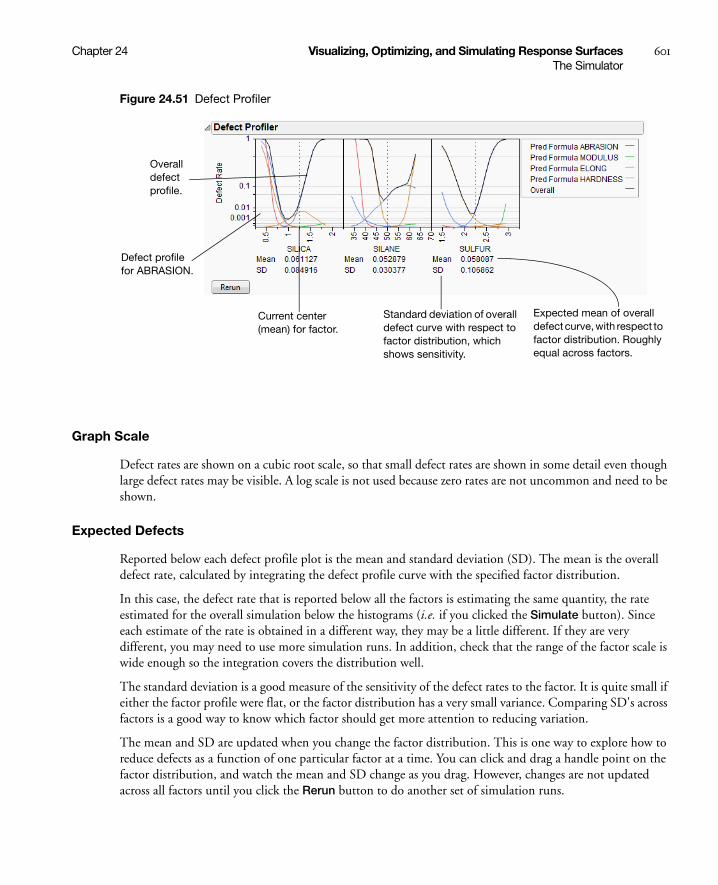
Chapter 24 Visualizing, Optimizing, and Simulating Response Surfaces 601The Simulator
Figure 24.51 Defect Profiler
Graph Scale
Defect rates are shown on a cubic root scale, so that small defect rates are shown in some detail even though large defect rates may be visible. A log scale is not used because zero rates are not uncommon and need to be shown.
Expected Defects
Reported below each defect profile plot is the mean and standard deviation (SD). The mean is the overall defect rate, calculated by integrating the defect profile curve with the specified factor distribution.
In this case, the defect rate that is reported below all the factors is estimating the same quantity, the rate estimated for the overall simulation below the histograms (i.e. if you clicked the Simulate button). Since each estimate of the rate is obtained in a different way, they may be a little different. If they are very different, you may need to use more simulation runs. In addition, check that the range of the factor scale is wide enough so the integration covers the distribution well.
The standard deviation is a good measure of the sensitivity of the defect rates to the factor. It is quite small if either the factor profile were flat, or the factor distribution has a very small variance. Comparing SD's across factors is a good way to know which factor should get more attention to reducing variation.
The mean and SD are updated when you change the factor distribution. This is one way to explore how to reduce defects as a function of one particular factor at a time. You can click and drag a handle point on the factor distribution, and watch the mean and SD change as you drag. However, changes are not updated across all factors until you click the Rerun button to do another set of simulation runs.
Overall defect profile.
Defect profile for ABRASION.
Current center (mean) for factor.
Standard deviation of overall defect curve with respect to factor distribution, which shows sensitivity.
Expected mean of overall defect curve, with respect to factor distribution. Roughly equal across factors.

602 Visualizing, Optimizing, and Simulating Response Surfaces Chapter 24The Simulator
Simulation Method and Details
Assume we want a defect profile for factor X1, in the presence of random variation in X2 and X3. A series of n=N Runs simulation runs is done at each of k points in a grid of equally spaced values of X1. (k is generally set at 17). At each grid point, suppose that there are m defects due to the specification limits. At that grid point, the defect rate is m/n. With normal weighted, these are done in a weighted fashion. These defect rates are connected and plotted as a continuous function of X1.
Notes
Recalculation The profile curve is not recalculated automatically when distributions change, though the expected value is. It is done this way because the simulations could take a while to run.
Limited goals Profiling does not address the general optimization problem, that of optimizing quality against cost, given functions that represent all aspects of the problem. This more general problem would benefit from a surrogate model and space filling design to explore this space and optimize to it.
Jagged Defect Profiles The defect profiles tend to get uneven when they are low. This is due to exaggerating the differences for low values of the cubic scale. If the overall defect curve (black line) is smooth, and the defect rates are somewhat consistent, then you are probably taking enough runs. If the Black line is jagged and not very low, then increase the number of runs. 20,000 runs is often enough to stabilize the curves.
Defect Profiler Example
To show a common workflow with the Defect profiler, we use Tiretread.jmp with the specification limits from Table 24.3. We also give the following random specifications to the three factors.
Figure 24.52 Profiler
Select Defect Profiler to see the defect profiles. The curves, Means, and SDs will change from simulation to simulation, but will be relatively consistent.

Chapter 24 Visualizing, Optimizing, and Simulating Response Surfaces 603The Simulator
Figure 24.53 Defect Profiler
The black curve on each factor shows the defect rate if you could fix that factor at the x-axis value, but leave the other features random.
Look at the curve for SILICA. As its values vary, its defect rate goes from the lowest 0.001 at SILICA=0.95, quickly up to a defect rate of 1 at SILICA=0.4 or 1.8. However, SILICA is itself random. If you imagine integrating the density curve of SILICA with its defect profile curve, you could estimate the average defect rate 0.033, also shown as the Mean for SILICA. This is estimating the overall defect rate shown under the simulation histograms, but by numerically integrating, rather than by the overall simulation. The Means for the other factors are similar. The numbers are not exactly the same. However, we now also get an estimate of the standard deviation of the defect rate with respect to the variation in SILICA. This value (labeled SD) is 0.055. The standard deviation is intimately related to the sensitivity of the defect rate with respect to the distribution of that factor.
Looking at the SDs across the three factors, we see that the SD for SULFUR is higher than the SD for SILICA, which is in turn much higher than the SD for SILANE. This means that to improve the defect rate, improving the distribution in SULFUR should have the greatest effect. A distribution can be improved in three ways: changing its mean, changing its standard deviation, or by chopping off the distribution by rejecting parts that don’t meet certain specification limits.
In order to visualize all these changes, there is another command in the Simulator pop-up menu, Defect Parametric Profile, which shows how single changes in the factor distribution parameters affect the defect rate.

604 Visualizing, Optimizing, and Simulating Response Surfaces Chapter 24The Simulator
Figure 24.54 Defect Parametric Profile
Let’s look closely at the SULFUR situation. You may need to enlarge the graph to see more detail.
First, note that the current defect rate (0.03) is represented in four ways corresponding to each of the four curves.
For the red curve, Mean Shift, the current rate is where the red solid line intersects the vertical red dotted line. The Mean Shift curve represents the change in overall defect rate by changing the mean of SULFUR. One opportunity to reduce the defect rate is to shift the mean slightly to the left. If you use the crosshair tool on this plot, you see that a mean shift reduces the defect rate to about 0.02.
For the blue curve, Std Narrow, the current rate represents where the solid blue line intersects the two dotted blue lines. The Std Narrow curves represent the change in defect rate by changing the standard deviation of the factor. The dotted blue lines represent one standard deviation below and above the current mean. The solid blue lines are drawn symmetrically around the center. At the center, the blue line typically reaches a minimum, representing the defect rate for a standard deviation of zero. That is, if we totally eliminate variation in SULFUR, the defect rate is still around 0.003. This is much better than 0.03. If you look at the other Defect parametric profile curves, you can see that this is better than reducing variation in the other factors, something we suspected by the SD value for SULFUR.
For the green curve, LSL Chop, there are no interesting opportunities in this example, because the green curve is above current defect rates for the whole curve. This means that reducing the variation by rejecting parts with too-small values for SULFUR will not help.

Chapter 24 Visualizing, Optimizing, and Simulating Response Surfaces 605The Simulator
For the orange curve, USL Chop, there are good opportunities. Reading the curve from the right, the curve starts out at the current defect rate (0.03), then as you start rejecting more parts by decreasing the USL for SULFUR, the defect rate improves. However, moving a spec limit to the center is equivalent to throwing away half the parts, which may not be a practical solution.
Looking at all the opportunities over all the factors, it now looks like there are two good options for a first move: change the mean of SILICA to about 1, or reduce the variation in SULFUR. Since it is generally easier in practice to change a process mean than process variation, the best first move is to change the mean of SILICA to 1.
Figure 24.55 Adjusting the Mean of Silica
After changing the mean of SILICA, all the defect curves become invalid and need to be rerun. After clicking Rerun, we get a new perspective on defect rates.
Figure 24.56 Adjusted Defect Rates

606 Visualizing, Optimizing, and Simulating Response Surfaces Chapter 24The Simulator
Now, the defect rate is down to about 0.004, much improved. Further reduction in the defect rate can occur by continued investigation of the parametric profiles, making changes to the distributions, and rerunning the simulations.
As the defect rate is decreased further, the mean defect rates across the factors become relatively less reliable. The accuracy could be improved by reducing the ranges of the factors in the Profiler a little so that it integrates the distributions better.
This level of fine-tuning is probably not practical, because the experiment that estimated the response surface is probably not at this high level of accuracy. Once the ranges have been refined, you may need to conduct another experiment focusing on the area that you know is closer to the optimum.
Stochastic Optimization Example
This example is adapted from Box and Draper (1987) and uses Stochastic Optimization.jmp. A chemical reaction converts chemical “A” into chemical “B”. The resulting amount of chemical “B” is a function of reaction time and reaction temperature. A longer time and hotter temperature result in a greater amount of “B”. But, a longer time and hotter temperature also result in some of chemical “B” getting converted to a third chemical “C”. What reaction time and reaction temperature will maximize the resulting amount of “B” and minimize the amount of “A” and “C”? Should the reaction be fast and hot, or slow and cool?
Figure 24.57 Chemical Reaction
The goal is to maximize the resulting amount of chemical “B”. One approach is to conduct an experiment and fit a response surface model for reaction yield (amount of chemical “B”) as a function of time and temperature. But, due to well known chemical reaction models, based on the Arrhenius laws, the reaction yield can be directly computed. The column Yield contains the formula for yield. The formula is a function of Time (hours) and reaction rates k1 and k2. The reaction rates are a function of reaction Temperature (degrees Kelvin) and known physical constants θ1, θ2, θ3, θ4. Therefore, Yield is a function of Time and Temperature.
Figure 24.58 Formula for Yield
You can use the Profiler to find the maximum Yield. Open Stochastic Optimization.jmp and run the attached script called Profiler. Profiles of the response are generated as follows.

Chapter 24 Visualizing, Optimizing, and Simulating Response Surfaces 607The Simulator
Figure 24.59 Profile of Yield
To maximize Yield use a desirability function. See “Desirability Profiling and Optimization” on page 567. One possible desirability function was incorporated in the script. To view the function choose Desirability Functions from the Prediction Profiler pop-up menu.
Figure 24.60 Prediction Profiler
To maximize Yield, select Maximize Desirability from the Prediction Profiler pop-up menu. The Profiler then maximizes Yield and sets the graphs to the optimum value of Time and Temperature.

608 Visualizing, Optimizing, and Simulating Response Surfaces Chapter 24The Simulator
Figure 24.61 Yield Maximum
The maximum Yield is approximately 0.62 at a Time of 0.116 hours and Temperature of 539.92 degrees Kelvin, or hot and fast. [Your results may differ slightly due to random starting values in the optimization process. Optimization settings can be modified (made more stringent) by selecting Maximization Options from the Prediction Profiler pop-up menu. Decreasing the Covergence Tolerance will enable the solution to be reproducible.]
In a production environment, process inputs can’t always be controlled exactly. What happens to Yield if the inputs (Time and Temperature) have random variation? Furthermore, if Yield has a spec limit, what percent of batches will be out of spec and need to be discarded? The Simulator can help us investigate the variation and defect rate for Yield, given variation in Time and Temperature.
Select Simulator from the Prediction Profiler pop-up menu. As shown in Figure 24.62, fill in the factor parameters so that Temperature is Normal weighted with standard deviation of 1, and Time is Normal weighted with standard deviation of 0.03. The Mean parameters default to the current factor values. Change the number of runs to 15,000. Yield has a lower spec limit of 0.55, set as a column property, and shows on the chart as a red line. If it doesn’t show by default, enter it by selecting Spec Limits on the Simulator pop-up menu.
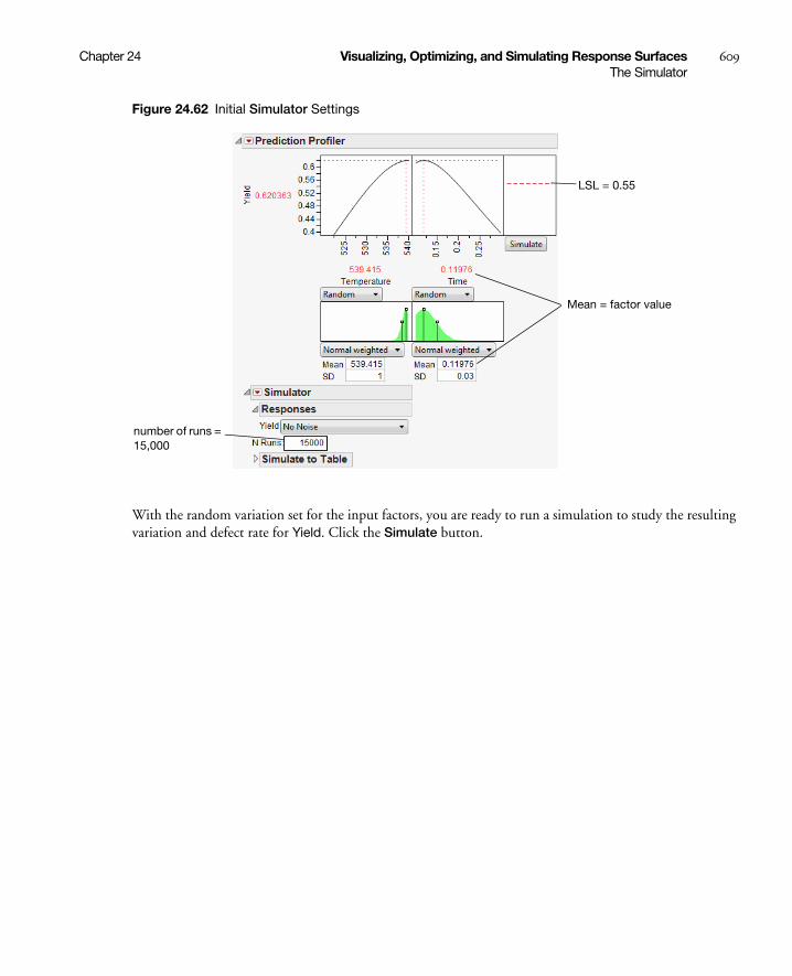
Chapter 24 Visualizing, Optimizing, and Simulating Response Surfaces 609The Simulator
Figure 24.62 Initial Simulator Settings
With the random variation set for the input factors, you are ready to run a simulation to study the resulting variation and defect rate for Yield. Click the Simulate button.
Mean = factor value
LSL = 0.55
number of runs = 15,000
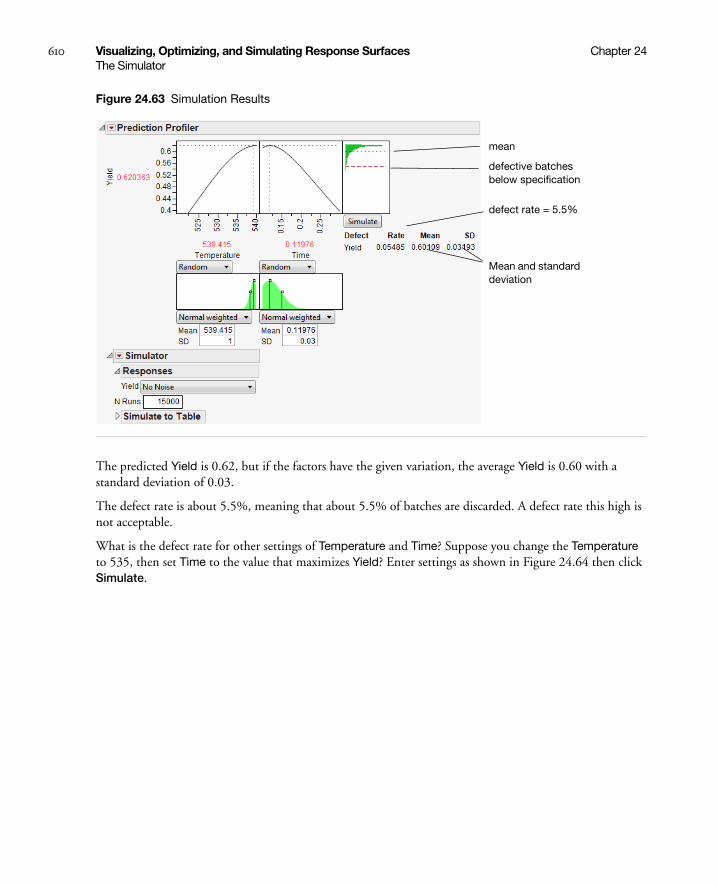
610 Visualizing, Optimizing, and Simulating Response Surfaces Chapter 24The Simulator
Figure 24.63 Simulation Results
The predicted Yield is 0.62, but if the factors have the given variation, the average Yield is 0.60 with a standard deviation of 0.03.
The defect rate is about 5.5%, meaning that about 5.5% of batches are discarded. A defect rate this high is not acceptable.
What is the defect rate for other settings of Temperature and Time? Suppose you change the Temperature to 535, then set Time to the value that maximizes Yield? Enter settings as shown in Figure 24.64 then click Simulate.
defect rate = 5.5%
Mean and standard deviation
mean
defective batches below specification
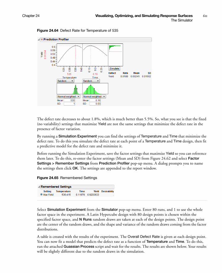
Chapter 24 Visualizing, Optimizing, and Simulating Response Surfaces 611The Simulator
Figure 24.64 Defect Rate for Temperature of 535
The defect rate decreases to about 1.8%, which is much better than 5.5%. So, what you see is that the fixed (no variability) settings that maximize Yield are not the same settings that minimize the defect rate in the presence of factor variation.
By running a Simulation Experiment you can find the settings of Temperature and Time that minimize the defect rate. To do this you simulate the defect rate at each point of a Temperature and Time design, then fit a predictive model for the defect rate and minimize it.
Before running the Simulation Experiment, save the factor settings that maximize Yield so you can reference them later. To do this, re-enter the factor settings (Mean and SD) from Figure 24.62 and select Factor Settings > Remember Settings from Prediction Profiler pop-up menu. A dialog prompts you to name the settings then click OK. The settings are appended to the report window.
Figure 24.65 Remembered Settings
Select Simulation Experiment from the Simulator pop-up menu. Enter 80 runs, and 1 to use the whole factor space in the experiment. A Latin Hypercube design with 80 design points is chosen within the specified factor space, and N Runs random draws are taken at each of the design points. The design point are the center of the random draws, and the shape and variance of the random draws coming from the factor distributions.
A table is created with the results of the experiment. The Overall Defect Rate is given at each design point. You can now fit a model that predicts the defect rate as a function of Temperature and Time. To do this, run the attached Guassian Process script and wait for the results. The results are shown below. Your results will be slightly different due to the random draws in the simulation.
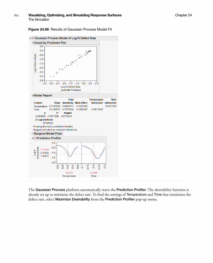
612 Visualizing, Optimizing, and Simulating Response Surfaces Chapter 24The Simulator
Figure 24.66 Results of Gaussian Process Model Fit
The Gaussian Process platform automatically starts the Prediction Profiler. The desirability function is already set up to minimize the defect rate. To find the settings of Temperature and Time that minimizes the defect rate, select Maximize Desirability from the Prediction Profiler pop-up menu.
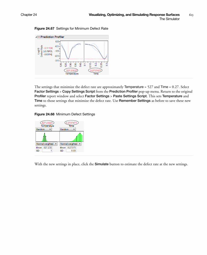
Chapter 24 Visualizing, Optimizing, and Simulating Response Surfaces 613The Simulator
Figure 24.67 Settings for Minimum Defect Rate
The settings that minimize the defect rate are approximately Temperature = 527 and Time = 0.27. Select Factor Settings > Copy Settings Script from the Prediction Profiler pop-up menu. Return to the original Profiler report window and select Factor Settings > Paste Settings Script. This sets Temperature and Time to those settings that minimize the defect rate. Use Remember Settings as before to save these new settings.
Figure 24.68 Minimum Defect Settings
With the new settings in place, click the Simulate button to estimate the defect rate at the new settings.

614 Visualizing, Optimizing, and Simulating Response Surfaces Chapter 24The Simulator
Figure 24.69 Lower Defect Rate
At the new settings the defect rate is 0.066%, much better than the 5.5% for the settings that maximize Yield. That is a reduction of about 100x. Recall the average Yield from the first settings is 0.60 and the new average is 0.59. The decrease in average Yield of 0.01 is very acceptable when the defect rate decreases by 100x.
Because we saved the settings using Remember Settings, we can easily compare the old and new settings. The Differences report summarizes the difference. Click the Remembered Settings radio buttons to view the profiler for each setting.
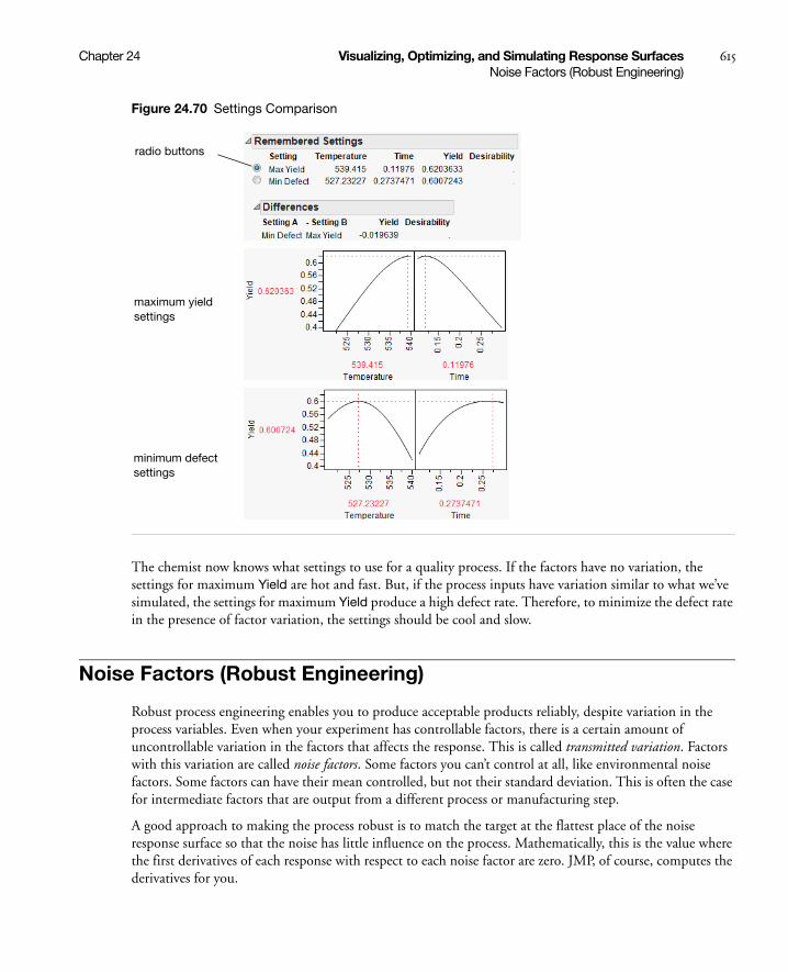
Chapter 24 Visualizing, Optimizing, and Simulating Response Surfaces 615Noise Factors (Robust Engineering)
Figure 24.70 Settings Comparison
The chemist now knows what settings to use for a quality process. If the factors have no variation, the settings for maximum Yield are hot and fast. But, if the process inputs have variation similar to what we’ve simulated, the settings for maximum Yield produce a high defect rate. Therefore, to minimize the defect rate in the presence of factor variation, the settings should be cool and slow.
Noise Factors (Robust Engineering)
Robust process engineering enables you to produce acceptable products reliably, despite variation in the process variables. Even when your experiment has controllable factors, there is a certain amount of uncontrollable variation in the factors that affects the response. This is called transmitted variation. Factors with this variation are called noise factors. Some factors you can’t control at all, like environmental noise factors. Some factors can have their mean controlled, but not their standard deviation. This is often the case for intermediate factors that are output from a different process or manufacturing step.
A good approach to making the process robust is to match the target at the flattest place of the noise response surface so that the noise has little influence on the process. Mathematically, this is the value where the first derivatives of each response with respect to each noise factor are zero. JMP, of course, computes the derivatives for you.
radio buttons
maximum yield settings
minimum defect settings

616 Visualizing, Optimizing, and Simulating Response Surfaces Chapter 24Noise Factors (Robust Engineering)
To analyze a model with noise factors,
• Fit the appropriate model (using, for example, the Fit Model platform).
• Save the model to the data table with the Save > Prediction Formula command.
• Launch the Profiler (from the Graph menu).
• Assign the prediction formula to the Y, Prediction Formula role and the noise factors to the Noise Factor role.
• Click OK.
The resulting profiler shows response functions and their appropriate derivatives with respect to the noise factors, with the derivatives set to have maximum desirability at zero.
• Select Maximize Desirability from the Profiler menu.
This finds the best settings of the factors, balanced with respect to minimizing transmitted variation from the noise factors.
Example
As an example, use the Tiretread.jmp sample data set. This data set shows the results of a tire manufacturer’s experiment whose objective is to match a target value of HARDNESS= 70 based on three factors: SILICA, SILANE, and SULFUR content. Suppose the SILANE and SULFUR content are easily (and precisely) controllable, but SILICA expresses variability that is worth considering.
For comparison, first optimize the factors for hardness without considering variation from the noise factor.
• Select Graph > Profiler to launch the Profiler.
• Assign Pred Formula HARDNESS to the Y, Prediction Formula role. Click OK.
• Select Desirability Functions in the Prediction Profiler menu.
• Double-click in the Desirability plot to open the Response Goal window. Change the pull-down menu to Match Target.
• Select Maximize Desirability to find the optimum factor settings for our target value of HARDNESS.
We get the following Profiler display. Notice that the SILICA factor’s optimum value is on a sloped part of a profile curve. This means that variations in SILICA are transmitted to become variations in the response, HARDNESS.
Note: You may get different results from these because different combinations of factor values can all hit the target.
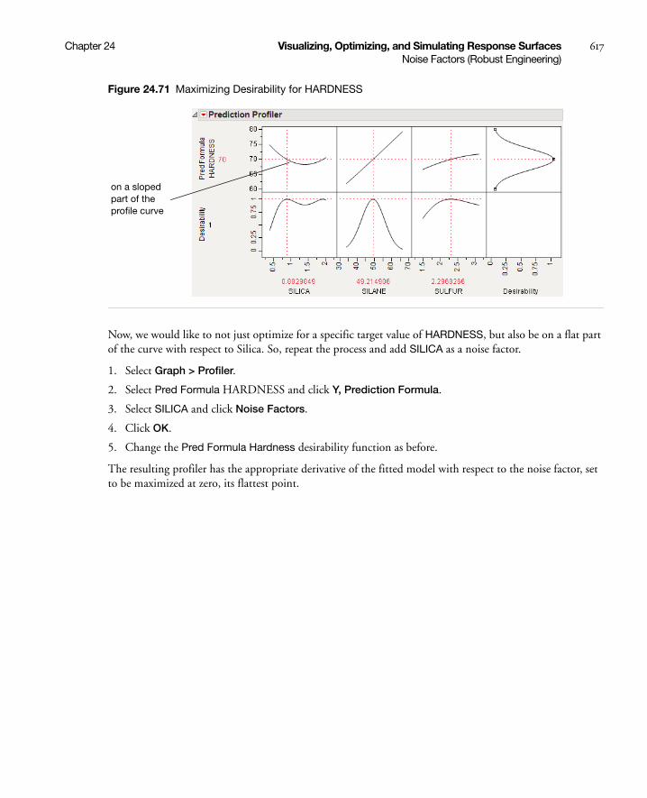
Chapter 24 Visualizing, Optimizing, and Simulating Response Surfaces 617Noise Factors (Robust Engineering)
Figure 24.71 Maximizing Desirability for HARDNESS
Now, we would like to not just optimize for a specific target value of HARDNESS, but also be on a flat part of the curve with respect to Silica. So, repeat the process and add SILICA as a noise factor.
1. Select Graph > Profiler.
2. Select Pred Formula HARDNESS and click Y, Prediction Formula.
3. Select SILICA and click Noise Factors.
4. Click OK.
5. Change the Pred Formula Hardness desirability function as before.
The resulting profiler has the appropriate derivative of the fitted model with respect to the noise factor, set to be maximized at zero, its flattest point.
on a sloped part of the profile curve
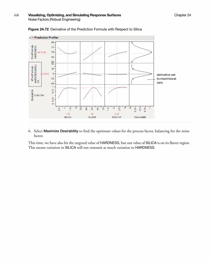
618 Visualizing, Optimizing, and Simulating Response Surfaces Chapter 24Noise Factors (Robust Engineering)
Figure 24.72 Derivative of the Prediction Formula with Respect to Silica
6. Select Maximize Desirability to find the optimum values for the process factor, balancing for the noise factor.
This time, we have also hit the targeted value of HARDNESS, but our value of SILICA is on its flatter region. This means variation in SILICA will not transmit as much variation to HARDNESS.
derivative set to maximize at zero
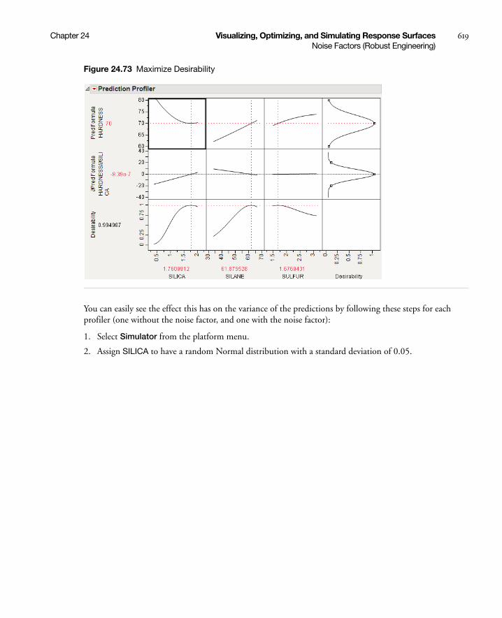
Chapter 24 Visualizing, Optimizing, and Simulating Response Surfaces 619Noise Factors (Robust Engineering)
Figure 24.73 Maximize Desirability
You can easily see the effect this has on the variance of the predictions by following these steps for each profiler (one without the noise factor, and one with the noise factor):
1. Select Simulator from the platform menu.
2. Assign SILICA to have a random Normal distribution with a standard deviation of 0.05.

620 Visualizing, Optimizing, and Simulating Response Surfaces Chapter 24Noise Factors (Robust Engineering)
Figure 24.74 Setting a Random Normal Distribution
3. Click Simulate.
4. Click the Make Table button under the Simulate to Table node.
Doing these steps for both the original and noise-factor-optimal simulations results in two similar data tables, each holding a simulation. In order to make two comparable histograms of the predictions, we need the two prediction columns in a single data table.
5. Copy the Pred Formula HARDNESS column from one of the simulation tables into the other table. They must have different names, like Without Noise Factor and With Noise Factor.
6. Select Analyze > Distribution and assign both prediction columns as Y.
7. When the histograms appear, select Uniform Scaling from the Distribution main title bar.
Random Normal with SD = 0.05

Chapter 24 Visualizing, Optimizing, and Simulating Response Surfaces 621Noise Factors (Robust Engineering)
Figure 24.75 Comparison of Distributions With and Without Noise Factors
The histograms show that there is much more variation in Hardness when the noise factor was not included in the analysis.
It is also interesting to note the shape of the histogram when the noise factor was included. In the comparison histograms above, note that the With Noise Factor distribution only has data trailing off in one direction. The predictions are skewed because Hardness is at a minimum with respect to SILICA, as shown in Figure 24.76. Therefore, variation in SILICA can only make HARDNESS increase. When the non-robust solution is used, the variation could be transmitted either way.
Figure 24.76 Profiler Showing the Minima of HARDNESS by SILICA
Other Platforms
Noise factor optimization is also available in the Contour Profiler, Custom Profiler, and Mixture Profiler.

622 Visualizing, Optimizing, and Simulating Response Surfaces Chapter 24Profiling Models Stored in Excel
Profiling Models Stored in Excel
The JMP Add-In for Excel uses the JMP Profiler to visualize models (or formulas) stored in Excel worksheets. The Excel add-in is automatically installed when you install JMP. Profiling in the Excel Add-In is a two-step process:
1. Click the Create/Edit Model button (Excel 2007 and 2010) or the Profiler Configuration button (Excel 2003) to enter information about the model that JMP needs. This needs to be done only once per model. For more information, refer to the help in the Create/Edit Model window.
2. Click the Run Model button (Excel 2007 and 2010) or the Run Profiler button (Excel 2003) to launch the JMP Profiler and run the Excel model. For more information, see “Running the JMP Profiler” on page 622.
Note: The Preferences, Data Table, Graph Builder, and Distribution buttons are not needed to profile an Excel model. For more information about these features, see Using JMP.
Running the JMP Profiler
Once you create the model using the Excel Add-In, you can run it in the JMP Profiler. From the Excel Add-In, perform the following actions:
1. Click the Run Model button (Excel 2007 and 2010) or the Run Profiler button (Excel 2003).
2. Select the model that you want to run.
3. Click Profile in JMP.
Note: To ensure that your original Excel spreadsheet is not altered, JMP runs a hidden copy of Excel in the background that controls all of the Profiler calculations.
Example of an Excel Model
An Excel model is one or more Excel formulas. Each formula must be a function of one or more other cells. This example uses the Demand.xls file, located within the Import Data folder (normally found at C:\Program Files\SAS\JMP\10\Samples\Data).

Chapter 24 Visualizing, Optimizing, and Simulating Response Surfaces 623Profiling Models Stored in Excel
Figure 24.77 Demand Model in Excel
The formula is in cell B8, and is a calculation of the Overall Cost associated with having different amounts of product in stock. The formula can be seen in the Formula Bar, and is a function of four cells:
• Amount Stocked is the amount of product in stock.
• Demand is the customer demand for the product.
• Air Freight is the cost per unit to ship additional product by air when the demand exceeds the amount in stock.
• Expiration Cost is the cost per unit of disposing of unused product when the demand is less than the amount in stock.
The calculations of the formula are as follows:
• If Amount Stocked is less than Demand, then the company has to ship additional units, at a cost of (Demand-Amount Stocked) x Air Freight. For example, if the demand is 8, but the company has only 6 in stock, then it has to ship 8-6=2 units at a cost of 2x150=300.
• If Amount Stocked is greater than Demand, then the company has to dispose of unused product, at a cost of (Amount Stocked-Demand) x Expiration Cost. For example, if the demand is 5, but the company has 8 in stock, then it has to dispose of 8-5=3 units at a cost of 3x50=150.
• If Amount Stocked is equal to Demand, then there is no shipping cost or disposal cost.
• There is never both a shipping cost and a disposal cost at the same time.
Using the model in Excel, you can get the cost for only a given set of inputs at once. It is difficult to visualize how changing the value of one input affects the output. You can choose a different combination of the inputs to see how the cost is affected, but doing so for many combinations can take a long time.
Use the JMP Profiler to simultaneously see the effect of all inputs on the output. Also, you can quickly simulate a range of input combinations to see the resulting range of output values.

624 Visualizing, Optimizing, and Simulating Response Surfaces Chapter 24Profiling Models Stored in Excel
Figure 24.78 Example of the Profiler Using Excel Models
Using Linear Constraints
Within the JMP Profiler, you can alter the linear constraints in order to restrict the model input values. You are prompted to save the constraints to the Excel workbook. After constraints are saved to the Excel workbook, whenever the model is profiled from the Excel Add-In, the constraints are incorporated.
1. From the red triangle menu next to Prediction Profiler, select Alter Linear Constraints.
2. Click Add Constraint.
3. Type in the constraining values.
4. Click OK.
5. From the red triangle menu next to Prediction Profiler, select Save Linear Constraints.
You are prompted to save the constraints to the Excel workbook.
6. Click Yes.
Note: When you save the .xls file in Excel 2007, you might see a compatibility error. If so, click Continue to save the file.
The workbook opens in Excel. When you run the model, the constraints are reflected in the JMP Profiler. For more information about linear constraints, see “Linear Constraints” on page 575.
Tip: To delete a linear constraint, set all constraint values to zero.
Resolution of Profile Lines
The Default N Levels option on the red triangle menu next to Prediction Profiler affects the resolution of the profile lines. Note the following information:
• This option defaults to 17 when the Profiler runs a model stored in Excel.
• This option defaults to 41 when the model is stored directly in JMP.
If the same model is stored in both Excel and JMP, then the profile lines can appear differently when the models are profiled. Increasing this value causes the Excel Profiler to run slower.
Chapter 24 Visualizing, Optimizing, and Simulating Response Surfaces 625Fit Group
Using the Excel Profiler From JMP
Once an Excel file has the model inputs and outputs defined, you can profile the model from within JMP.
1. Select Graph > Excel Profiler.
2. Locate the Excel file containing the model and then click Open.
3. If the Excel file contains multiple models, you are prompted to select the model that you want to profile.
Note that the Excel Profiler is also scriptable, as follows:
Excel Profiler( "path to workbook", <"model name"> ) ;
If more than one model exists, and no model is specified, a window with the list of available models appears. For more information about scripting the Excel Profiler, see the Scripting Guide.
Fit Group
For the REML and Stepwise personalities of the Fit Model platform, if models are fit to multiple Y’s, the results are combined into a Fit Group report. This enables the different Y’s to be profiled in the same Profiler. The Fit Group red-triangle menu has options for launching the joint Profiler. Profilers for the individual Y’s can still be used in the respective Fit Model reports.
Fit Group reports are also created when a By variable is specified for a Stepwise analysis. This allows for the separate models to be profiled in the same Profiler.
The Fit Group scripting command can be used to fit models in different platforms, and have the individual models profiled in the Profiler. For more details, see the Scripting Guide.
Statistical Details
Normal Weighted Distribution
JMP uses the multivariate radial strata method for each factor that uses the Normal Weighted distribution. This seems to work better than a number of Importance Sampling methods, as a multivariate Normal Integrator accurate in the extreme tails.
First, define strata and calculate corresponding probabilities and weights. For d random factors, the strata are radial intervals as follows.
Table 24.5 Strata Intervals
Strata Number Inside Distance Outside Distance
0 0
1
d
d d 2d+

626 Visualizing, Optimizing, and Simulating Response Surfaces Chapter 24Statistical Details
The default number of strata is 12. To change the number of strata, a hidden command N Strata is available if you hold the Shift key down while clicking on the red triangle next to Simulator.
Figure 24.79 Showing the N Strata Menu Option
Increase the sample size as needed to maintain an even number of strata.
For each simulation run,
1. Select a strata as mod(i – 1, NStrata) for run i.
2. Determine a random n-dimensional direction by scaling multivariate Normal (0,1) deviates to unit norm.
3. Determine a random distance using a chi-square quantile appropriate for the strata of a random uniform argument.
4. Scale the variates so the norm is the random distance.
5. Scale and re-center the variates individually to be as specified for each factor.
The resulting factor distributions are multivariate normal with the appropriate means and standard deviations when estimated with the right weights. Note that you cannot use the Distribution standard deviation with weights, because it does not estimate the desired value. However, multiplying the weight by a large value, like 1012, and using that as a Freq value results in the correct standard deviation.
2
i
NStrata – 1 previous
Table 24.5 Strata Intervals (Continued)
Strata Number Inside Distance Outside Distance
d 2d+ d 2 2d+
d i 1–( ) 2d+ d i 2d+
∞
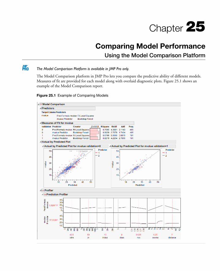
Chapter 25Comparing Model Performance
Using the Model Comparison Platform
The Model Comparison Platform is available in JMP Pro only.
The Model Comparison platform in JMP Pro lets you compare the predictive ability of different models. Measures of fit are provided for each model along with overlaid diagnostic plots. Figure 25.1 shows an example of the Model Comparison report.
Figure 25.1 Example of Comparing Models

Contents
Example of Model Comparison . . . . . . . . . . . . . . . . . . . . . . . . . . . . . . . . . . . . . . . . . . . . . . . . . . . . . . . 629
Launch the Model Comparison Platform . . . . . . . . . . . . . . . . . . . . . . . . . . . . . . . . . . . . . . . . . . . . . . . .632
The Model Comparison Report . . . . . . . . . . . . . . . . . . . . . . . . . . . . . . . . . . . . . . . . . . . . . . . . . . . . . . . 633
Model Comparison Platform Options . . . . . . . . . . . . . . . . . . . . . . . . . . . . . . . . . . . . . . . . . . . . . . . . . . .634
Additional Example of Model Comparison . . . . . . . . . . . . . . . . . . . . . . . . . . . . . . . . . . . . . . . . . . . . . . . 635

Chapter 25 Comparing Model Performance 629Example of Model Comparison
Example of Model Comparison
This section provides an example of using the Model Comparison platform. The example uses demographic data to build a model for median home price. A regression model and a bootstrap forest model are compared.
Begin by opening the Boston Housing.jmp sample data table.
Create a Validation Column
1. Create a column called validation.
2. On the Column Info window, select Random from the Initialize Data list.
3. Select the Random Indicator radio button.
4. Click OK.
The rows assigned a 0 are the training set. The rows assigned a 1 are the validation set.
Create the Regression Model and Save the Prediction Formula to a Column
1. Select Analyze > Fit Model.
2. Select mvalue and click Y.
3. Select the other columns (except validation) and click Add.
4. Select Stepwise in the Personality list.
5. Select validation and click Validation.
6. Click the Run button.
7. Click the Go button.
8. Click the Run Model button.
The Fit Group report appears, a portion of which is shown in Figure 25.2.
9. Save the prediction formula to a column by selecting Save Columns > Prediction Formula on the Response red triangle menu.

630 Comparing Model Performance Chapter 25Example of Model Comparison
Figure 25.2 Fit Model Report
Create the Bootstrap Forest Model and Save the Prediction Formula to a Column
1. Select Analyze > Modeling > Partition.
2. Select mvalue and click Y, Response.
3. Select the other columns (except validation) and click X, Factor.
4. Select validation and click Validation.
5. Select Bootstrap Forest in the Method list.
6. Click OK.
7. Select the Early Stopping check box.
8. Select the Multiple Fits over number of terms check box.
9. Click OK.
The Bootstrap Forest report appears, a portion of which is shown in Figure 25.3.
10. Save the prediction formula to a column by selecting Save Columns > Save Prediction Formula on the Bootstrap Forest red triangle menu.

Chapter 25 Comparing Model Performance 631Example of Model Comparison
Figure 25.3 Bootstrap Forest Model
Compare the Models
1. Select Analyze > Modeling > Model Comparison.
2. Select the two prediction formula columns and click Y, Predictors.
3. Select validation and click Group.
4. Click OK.
The Model Comparison report appears (Figure 25.4).
Note: Your results differ due to the random assignment of training and validation rows.
Figure 25.4 Model Comparison Report
The rows in the training set were used to build the models, so the RSquare statistics for Validation=0 might be artificially inflated. In this case, the statistics are not representative of the models’ future predictive ability. This is especially true for the bootstrap forest model.

632 Comparing Model Performance Chapter 25Example of Model Comparison
Compare the models using the statistics for Validation=1. In this case, the bootstrap forest model predicts better than the regression model.
Related Information
• “Introduction to the Fit Model Platform” on page 31
• “Recursively Partitioning Data” on page 315
Launch the Model Comparison Platform
To launch the Model Comparison platform, select Analyze > Modeling > Model Comparison.
Figure 25.5 The Model Comparison Launch Window
Y, Predictors The columns that contain the predictions for the models that you want to compare. They can be either formula columns or just data columns.
For a categorical response with k levels, the model fitting platform saves k columns to the data table, each predicting the probability for a level. All k columns need to be specified as Y, Predictors.
If you do not specify the Y, Predictors columns in the launch window, JMP finds the prediction formula columns in the data table. Prediction formula columns have either the Predicting or Response Probability column property.
Group The column that separates the data into groups, which are fit separately.
The other role buttons are common among JMP platforms. See the Using JMP book for details.
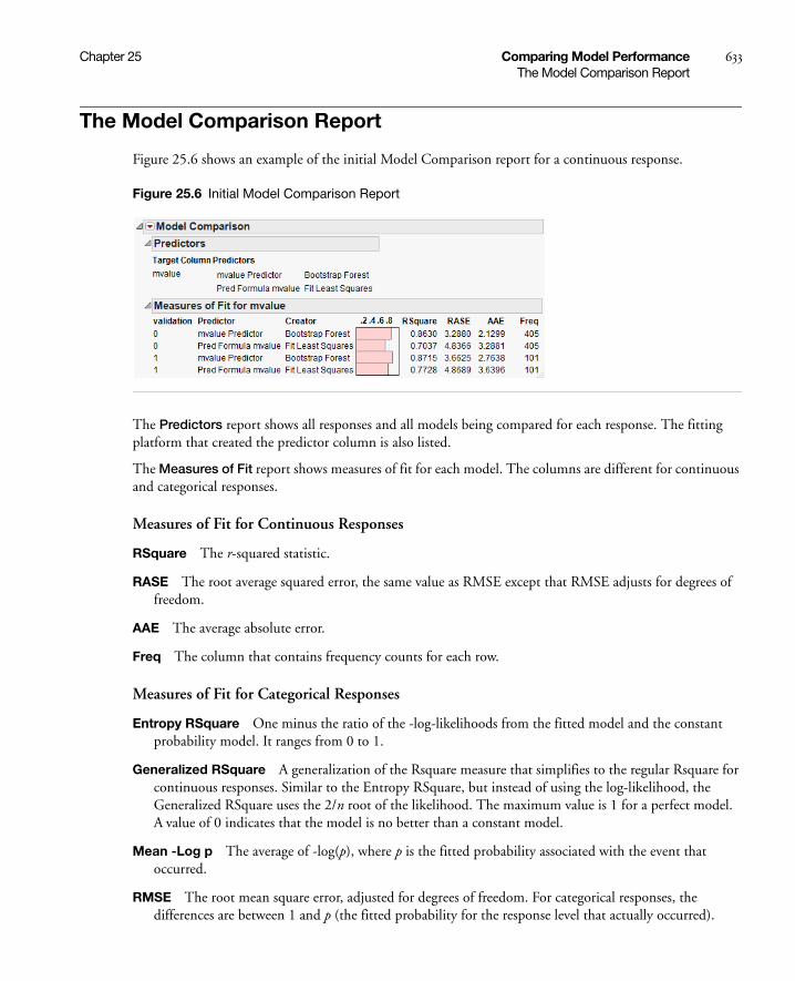
Chapter 25 Comparing Model Performance 633The Model Comparison Report
The Model Comparison Report
Figure 25.6 shows an example of the initial Model Comparison report for a continuous response.
Figure 25.6 Initial Model Comparison Report
The Predictors report shows all responses and all models being compared for each response. The fitting platform that created the predictor column is also listed.
The Measures of Fit report shows measures of fit for each model. The columns are different for continuous and categorical responses.
Measures of Fit for Continuous Responses
RSquare The r-squared statistic.
RASE The root average squared error, the same value as RMSE except that RMSE adjusts for degrees of freedom.
AAE The average absolute error.
Freq The column that contains frequency counts for each row.
Measures of Fit for Categorical Responses
Entropy RSquare One minus the ratio of the -log-likelihoods from the fitted model and the constant probability model. It ranges from 0 to 1.
Generalized RSquare A generalization of the Rsquare measure that simplifies to the regular Rsquare for continuous responses. Similar to the Entropy RSquare, but instead of using the log-likelihood, the Generalized RSquare uses the 2/n root of the likelihood. The maximum value is 1 for a perfect model. A value of 0 indicates that the model is no better than a constant model.
Mean -Log p The average of -log(p), where p is the fitted probability associated with the event that occurred.
RMSE The root mean square error, adjusted for degrees of freedom. For categorical responses, the differences are between 1 and p (the fitted probability for the response level that actually occurred).

634 Comparing Model Performance Chapter 25Model Comparison Platform Options
Mean Abs Dev The average of the absolute values of the differences between the response and the predicted response. For categorical responses, the differences are between 1 and p (the fitted probability for the response level that actually occurred).
Misclassification Rate The rate for which the response category with the highest fitted probability is not the observed category.
N The number of observations.
Related Information
“Training and Validation Measures of Fit” on page 286 in the “Creating Neural Networks” chapter provides more information about measures of fit for categorical responses.
Model Comparison Platform Options
Some options in the Model Comparison red triangle menu depend on your data.
Continuous and Categorical Responses
Model Averaging Makes a new column of the arithmetic mean of the predicted values (for continuous responses) or the predicted.probabilities (for categorical responses).
Continuous Responses
Plot Actual by Predicted Shows a scatterplot of the actual versus the predicted values. The plots for the different models are overlaid.
Plot Residual by Row Shows a plot of the residuals by row number. The plots for the different models are overlaid.
Profiler Shows a profiler for each response based on prediction formula columns in your data. The profilers have a row for each model being compared.
Categorical Responses
ROC Curve Shows ROC curves for each level of the response variable. The curves for the different models are overlaid.
AUC Comparison Provides a comparison of the area under the ROC curve (AUC) from each model. The area under the curve is the indicator of the goodness of fit, with 1 being a perfect fit.
The report includes the following information:
– standard errors and confidence intervals for each AUC
– standard errors, confidence intervals, and hypothesis tests for the difference between each pair of AUCs
– an overall hypothesis test for testing whether all AUCs are equal

Chapter 25 Comparing Model Performance 635Additional Example of Model Comparison
Lift Curve Shows lift curves for each level of the response variable. The curves for the different models are overlaid.
Profiler Shows a profiler for each response based on prediction formula columns in your data. The profilers have a row for each model being compared.
Related Information
• “ROC Curve” on page 337 in the “Recursively Partitioning Data” chapter
• “Lift Curves” on page 339 in the “Recursively Partitioning Data” chapter
Additional Example of Model Comparison
This example uses automobile data to build a model to predict the size of the purchased car. A logistic regression model and a decision tree model are compared.
Begin by opening the Car Physical Data.jmp sample data table.
Create the Logistic Regression Model
1. Select Analyze > Fit Model.
2. Select Type and click Y.
3. Select the following columns and click Add: Country, Weight, Turning Cycle, Displacement, and Horsepower.
4. Click Run.
The Nominal Logistic Fit report appears.
5. Save the prediction formulas to columns by selecting Save Probability Formula from the Nominal Logistic red triangle menu.
Create the Decision Tree Model and Save the Prediction Formula to a Column
1. Select Analyze > Modeling > Partition.
2. Select Type and click Y, Response.
3. Select the Country, Weight, Turning Cycle, Displacement, and Horsepower columns and click X, Factor.
4. Make sure that Decision Tree is selected in the Method list.
5. Click OK.
The Partition report appears.
6. Click Split 10 times.
7. Save the prediction formulas to columns by selecting Save Columns > Save Prediction Formula from the Partition red triangle menu.

636 Comparing Model Performance Chapter 25Additional Example of Model Comparison
Compare the Models
1. Select Analyze > Modeling > Model Comparison.
2. Select all columns that begin with Prob and click Y, Predictors.
3. Click OK.
The Model Comparison report appears (Figure 25.7).
Figure 25.7 Initial Model Comparison Report
The report shows that the Partition model has slightly higher values for Entropy RSquare and Generalized RSquare and a slightly lower value for Misclassification Rate.
4. Select ROC Curve from the Model Comparison red triangle menu.
ROC curves appear for each Type, one of which is shown in Figure 25.8.
Figure 25.8 ROC Curve for Medium
Examining all the ROC curves, you see that the two models are similar in their predictive ability.
5. Select AUC Comparison from the Model Comparison red triangle menu.
AUC Comparison reports appear for each Type, one of which is shown in Figure 25.9.

Chapter 25 Comparing Model Performance 637Additional Example of Model Comparison
Figure 25.9 AUC Comparison for Medium
The report shows results for a hypothesis test for the difference between the AUC values (area under the ROC curve). Examining the results, you see there is no statistical difference between the values for any level of Type.
You conclude that there is no large difference between the predictive abilities of the two models for the following reasons:
• The R Square values and the ROC curves are similar.
• There is no statistically significant difference between AUC values.

638 Comparing Model Performance Chapter 25Additional Example of Model Comparison

References
Abernethy, Robert B. (1996) The New Weibull Handbook. Published by the author: 536 Oyster Road North Palm Beach, Florida 33408.
Agresti, A. (1984), Analysis of Ordinal Categorical Data, New York: John Wiley and Sons, Inc.
Agresti, A. (1990), Categorical Data Analysis, New York: John Wiley and Sons, Inc.
Agresti, A., and Coull, B. (1998), “Approximate is Better Than ‘Exact’ for Interval Estimation of Binomial Proportions,” The American Statistician, 52, 119–126
Aitken, M. (1987) “Modelling Variance Heterogeneity in Normal Regression Using GLIM,” Applied Statistics 36:3, 332–339.
Akaike, H. (1974), “Factor Analysis and AIC,” Pschychometrika, 52, 317–332.
Akaike, H. (1987), “A new Look at the Statistical Identification Model,” IEEE Transactions on Automatic Control, 19, 716–723.
American Society for Quality Statistics Division (2004), Glossary and Tables for Statistical Quality Control, Fourth Edition, Milwaukee: Quality Press.
Anderson, T.W. (1971), The Statistical Analysis of Time Series, New York: John Wiley and Sons.
Anderson, T. W. (1958) An Introduction to Multivariate Statistical Analysis. New York: John Wiley & Sons.
Andrews, D.F. and A. M. Herzberg (1985), Data: A Collection of Problems from Many Fields for the Student and Research Worker. New York: Springer-Verlag.
Ashton, W.D. (1972), “The Logit Transformation,” Griffin’s Statistical Monographs, New York: Hafner Publishing.
Atkinson, A.C. (1985), Plots, Transformations and Regression, Oxford: Clarendon Press.
Barlow, R.E., Bartholomew, D.J., Bremner, J.M., and Brunk, H.D. (1972), Statistical Inference under Order Restrictions, New York: John Wiley and Sons, Inc.
Barrentine (1991), Concepts for R&R Studies, Milwaukee, WI: ASQC Quality Press.
Bartlett, M.S. and D.G. Kendall (1946), “The Statistical Analysis of Variances–Heterogeneity and the Logarithmic Transformation,” JRSS Suppl 8, 128–138.
Bartlett, M.S. (1966), An Introduction to Stochastic Processes, Second Edition, Cambridge: Cambridge University Press.
Bates, D.M. and Watts, D.G. (1988), Nonlinear Regression Analysis & its Applications. New York, John Wiley and Sons.
Beaton, A.E. and Tukey, J.W. (1974), “The Fitting of Power Series, Meaning Polynomials, Illustrated on Band–Spectroscopic Data,” Technometrics 16, 147–180.

640 References
Becker, R.A. and Cleveland, W.S. (1987), “Brushing Scatterplots,” Technometrics, 29, 2.
Berger, R.L., and Hsu, J.C. (1996), “Bioequivalence Trails, Intersection-Union Tests and Equivalence Confidence Sets,” Statistical Science, 11, 283–319.
Belsley, D.A., Kuh, E., and Welsch, R.E. (1980), Regression Diagnostics, New York: John Wiley and Sons.
Ben-Akiva, M. and Lerman, S.R. (1985). Discrete Choice Analysis: Theory and Application to Travel Demand, Cambridge: MIT Press.
Benzecri, J.P. (1973), “L’Analyse des Donnees,” l’analyse des Correspondances, Paris: Dunod.
Bissell, A. F. (1990), “How Reliable is Your Capability Index?”, Applied Statistics, 30, 331-340.
Boulesteix, A.-L., and Strimmer, K. (2006), “Partial Least Squares: A Versatile Tool for the Analytics of High-Dimensional Genomic Data”, Briefings in Bioinformatics, 8:1, 32-44.
Bowman, A. and Foster, P. (1992) “Density Based Exploration of Bivariate Data,” Dept. of Statistics, Univ. of Glasgow, Tech Report No 92–1.
Bowman, A. and Schmee, J. (2004)“Estimating Sensitivity of Process Capability Modeled by a Transfer Function” Journal of Quality Technology, v36, no.2 (April)
Box, G. E. P. (1954). “Some Theorems on Quadratic Forms Applied in the Study of Analysis of Variance Problems, II: Effects of Inequality of Variance and Correlation Between Errors in the Two-Way Classification”. Annals of Mathematical Statistics, 1, 69-82.
Box, G.E.P. (1988), “Signal–to–Noise Ratio, Performance Criteria, and Transformations,” Technometrics 30, 1–40.
Box, G.E.P. and Cox, D.R. (1964), “An Analysis of Transformations,” JRSS B26, 211–243.
Box, G.E.P. and Draper, N.R. (1969), Evolutionary Operation: A Statistical Method for Process Improvement, New York: John Wiley and Sons.
Box, G.E.P. and Draper, N.R. (1987), Empirical Model–Building and Response Surfaces, New York: John Wiley and Sons.
Box, G.E.P. and Meyer, R.D. (1986), “An analysis of Unreplicated Fractional Factorials,” Technometrics 28, 11–18.
Box, G.E.P. and Meyer, R. D. (1993), “Finding the Active Factors in Fractionated Screening Experiments.”, Journal of Quality Technology Vol.25 #2: 94–105.
Box, G.E.P., Hunter,W.G., and Hunter, J.S. (1978), Statistics for Experimenters, New York: John Wiley and Sons, Inc.
Brown, M.B. and Forsythe, A.B. (1974a), “The Small Sample Behavior of Some Statistics Which Test the Equality of Several Means,” Technometrics 16:1, 129–132.
Brown, M.B. and Forsythe, A.B. (1974), “Robust tests for the equality of variances” Journal of the American Statistical Association, 69, 364–367.
Burnham and Anderson. (2004), Model Selection And Multimodel Inference: A Practical Information Theoretic Approach. Springer, New York.
Burnham and Anderson (2004), Multimodel Inference: Understanding AIC and BIC in Model Selection, Sociological Methods and Research, 33: 261-304.

References 641
Byrne, D.M. and Taguchi, G. (1986), ASQC 40th Anniversary Quality Control Congress Transactions, Milwaukee, WI: American Society of Quality Control, 168–177.
Carroll, R.J. and Ruppert, D. (1988), Transformation and Weighting in Regression, New York: Chapman and Hall.
Carroll, R.J., Ruppert, D. and Stefanski, L.A. (1995), Measurement Error in Nonlinear Models, New York: Chapman and Hall.
Cobb, G.W. (1998), Introduction to Design and Analysis of Experiments, Springer-Verlag: New York.
Cohen, J. (1960), “A coefficient of agreement for nominal scales,” Education Psychological Measurement, 20: 37–46.
Cole, J.W.L. and Grizzle, J.E. (1966), “Applications of Multivariate Analysis of Variance to Repeated Measures Experiments,” Biometrics, 22, 810–828.
Cochran, W.G. and Cox, G.M. (1957), Experimental Designs, Second Edition, New York: John Wiley and Sons.
Conover, W. J. (1972). “A Kolmogorov Goodness-of-fit Test for Discontinuous Distributions”. Journal of the American Statistical Association 67: 591–596.
Conover, W.J. (1980), Practical Nonparametric Statistics, New York: John Wiley and Sons, Inc.
Cook, R.D. and Weisberg, S. (1982), Residuals and Influence in Regression, New York: Chapman and Hall.
Cook, R.D. and Weisberg, S. (1983), “Diagnostics for heteroscedasticity in regression” Biometrika 70, 1–10.
Cornell, J.A. (1990), Experiments with Mixtures, Second Edition, New York: John Wiley and Sons.
Cox, D.R. (1970), The Analysis of Binary Data, London: Metheun.
Cox, D.R. (1972), “Regression Models And Life-tables”, Journal Of The Royal Statistical Society Series B-statistical Methodology. 34 (2): 187–220, 1972.
Cronbach, L.J. (1951), “Coefficient Alpha and the Internal Structure of Tests,” Psychometrika, 16, 297–334.
Daniel C. and Wood, F. (1980), Fitting Equations to Data, Revised Edition, New York: John Wiley and Sons, Inc.
Daniel, C. (1959), “Use of Half–normal Plots in Interpreting Factorial Two–level Experiments,” Technometrics, 1, 311–314.
Davis, H.T. (1941), The Analysis of Economic Time Series, Bloomington, IN: Principia Press.
DeLong, E., Delong, D, and Clarke-Pearson, D.L. (1988), “Comparing the Areas Under Two or more Correlated Receiver Operating Characteristic Curves: A Nonparametric Approach,” Biometrics 44, 837–845.
De Jong, S. (1993), “SIMPLS: An Alternative Approach to Partial Least Squares Regression,” Chemometrics and Intelligent Laboratory Systems, 18, 251–263.
Derringer, D. and Suich, R. (1980), “Simultaneous Optimization of Several Response Variables,” Journal of Quality Technology, 12:4, 214–219.
Devore, J. L. (1995), Probability and Statistics for Engineering and the Sciences, Duxbury Press, CA.
Do, K-A, and McLachlan G.J. (1984). Estimation of mixing proportions: a case study. Journal of the Royal Statistical Society, Series C, 33: 134-140.

642 References
Draper, N. and Smith, H. (1981), Applied Regression Analysis, Second Edition, New York: John Wiley and Sons, Inc.
Dunnett, C.W. (1955), “A multiple comparison procedure for comparing several treatments with a control” Journal of the American Statistical Association, 50, 1096–1121.
Dwass, M. (1955), “A Note on Simultaneous Confidence Intervals,” Annals of Mathematical Statistics 26: 146–147.
Eppright, E.S., Fox, H.M., Fryer, B.A., Lamkin, G.H., Vivian, V.M., and Fuller, E.S. (1972), “Nutrition of Infants and Preschool Children in the North Central Region of the United States of America,” World Review of Nutrition and Dietetics, 14.
Eriksson, L., Johansson, E., Kettaneh-Wold, N., Trygg, J., Wikstrom, C., and Wold, S, (2006), Multivariate and Megavariate Data Analysis Basic Principles and Applications (Part I), Chapter 4, Umetrics.
Eubank, R.L. (1999), Nonparametric Regression and Spline Smoothing, Second Edition, Boca Raton, Florida: CRC.
Farebrother, R.W. (1981), “Mechanical Representations of the L1 and L2 Estimation Problems,” Statistical Data Analysis, 2nd Edition, Amsterdam, North Holland: edited by Y. Dodge.
Firth, D. (1993), “Bias Reduction of Maximum Likelihood Estimates,” Biometrika 80:1, 27–38.
Fisher, L. and Van Ness, J.W. (1971), “Admissible Clustering Procedures,” Biometrika, 58, 91–104.
Fisherkeller, M.A., Friedman, J.H., and Tukey, J.W. (1974), “PRIM–9: An Interactive Multidimensional Data Display and Analysis System,” SLAC–PUB–1408, Stanford, California: Stanford Linear Accelerator Center.
Fleis, J.L., Cohen J., and Everitt, B.S. (1969), “Large-sample standard errors of kappa and weighted kappa,” Psychological Bulletin, 72: 323–327.
Fleiss, J. L. (1981). Statistical Methods for Rates and Proportions. New York: John Wiley and Sons.
Florek, K., Lukaszewicz, J., Perkal, J., and Zubrzycki, S. (1951a), “Sur La Liaison et la Division des Points d’un Ensemble Fini,” Colloquium Mathematicae, 2, 282–285.
Foster, D.P., Stine, R.A., and Waterman, R.P. (1997), Business Analysis Using Regression, New York, Springer-Verlag.
Foster, D.P., Stine, R.A., and Waterman, R.P. (1997), Basic Business Statistics, New York, Springer-Verlag.
Friendly, M. (1991), “Mosaic Displays for Multiway Contingency Tables,” New York University Department of Psychology Reports: 195.
Fuller, W.A. (1976), Introduction to Statistical Time Series, New York, John Wiley and Sons.
Fuller, W.A. (1987), Measurement Error Models, New York, John Wiley and Sons.
Gabriel, K.R. (1982), “Biplot,” Encyclopedia of Statistical Sciences, Volume 1, eds. N.L.Johnson and S. Kotz, New York: John Wiley and Sons, Inc., 263–271.
Gallant, A.R. (1987), Nonlinear Statistical Models, New York, John Wiley and Sons.
Giesbrecht, F.G. and Gumpertz, M.L. (2004). Planning, Construction, and Statistical Analysis of Comparative Experiments. New York: John Wiley & Sons.
Goodnight, J.H. (1978), “Tests of Hypotheses in Fixed Effects Linear Models,” SAS Technical Report R–101, Cary: SAS Institute Inc, also in Communications in Statistics (1980), A9 167–180.

References 643
Goodnight, J.H. and W.R. Harvey (1978), “Least Square Means in the Fixed Effect General Linear Model,” SAS Technical Report R–103, Cary NC: SAS Institute Inc.
Greenacre, M.J. (1984), Theory and Applications of Correspondence Analysis, London: Academic Press.
Greenhouse, S. W. and Geiser, S. (1959). “On Methods in the Analysis of Profile Data.” Psychometrika, 32, 95–112.
Gupta, S.S. (1965), On Some Multiple Decision (selection and ranking), Rules., Technometrics 7, 225–245.
Haaland, P.D. (1989), Experimental Design in Biotechnology, New York: Marcel Dekker, Inc.
Hahn, G.J. (1976), “Process Improvement Through Simplex EVOP,” Chemical Technology 6, 243–345.
Hahn, G. J. and Meeker, W. Q. (1991) Statistical Intervals: A Guide for Practitioners. New York: Wiley.
Hajek, J. (1969), A Course in Nonparametric Statistics, San Francisco: Holden–Day.
Harrell, F. (1986), “The Logist Procedure,” SUGI Supplemental Library User’s Guide, Version 5 Edition, Cary, NC: SAS Institute Inc.
Harris, R.J. (1975), A Primer of Multivariate Statistics, New York: Academic Press.
Hartigan, J.A. (1975), Clustering Algorithms, New York, John Wiley and Sons.
Hartigan, J.A. (1981), “Consistence of Single Linkage for High–Density Clusters,” Journal of the American Statistical Association, 76, 388–394.
Hartigan, J.A. and Kleiner, B. (1981), “Mosaics for Contingency Tables,” Proceedings of the 13th Symposium on the Interface between Computer Science and Statistics, Ed. Eddy, W. F., New York: Springer–Verlag, 268–273.
Harvey, A.C. (1976), “Estimating Regression Models with Multiplicative Heteroscedasticity,” Econometrica 44–3 461–465.
Hauck, W.W. and Donner, A. (1977), “Wald’s Test as Applied to Hypotheses in Logit Analysis,” Journal of the American Statistical Association, 72, 851–863.
Hawkins, D.M. (1974), “The Detection of Errors in Multivariate Data Using Principal Components,” Journal of the American Statistical Association, 69.
Hayashi, C. (1950), “On the Quantification of Qualitative Data from the Mathematico–Statistical Point of View,” Annals of the Institute of Statistical Mathematics, 2:1, 35–47.
Hayter, A.J. (1984), “A proof of the conjecture that the Tukey–Kramer multiple comparisons procedure is conservative,” Annals of Mathematical Statistics, 12 61–75.
Heinze, G. and Schemper, M. (2002), “A Solution to the Problem of Separation in Logistic Regression,” Statistics in Medicine 21:16, 2409–2419.
Henderson, C.R. (1984), Applications of Linear Models in Animal Breeding, Univ. of Guelph.
Hocking, R.R. (1985), The Analysis of Linear Models, Monterey: Brooks–Cole.
Hoeffding, W (1948), “A Non-Parametric Test of Independence”, Annals of Mathematical Statistics, 19, 546–557.
Hoffman, Heike (2001). “Generalized Odds Ratios for Visual Modeling,” Journal of Computational and Graphical Statistics, 10:4 pp. 628–640.
Holland, P.W. and Welsch, R.E. (1977), “Robust Regression Using Iteratively Reweighted Least Squares,” Communications Statistics: Theory and Methods, 6, 813–827.

644 References
Hooper, J. H. and Amster, S. J. (1990), “Analysis and Presentation of Reliability Data,” Handbook of Statistical Methods for Engineers and Scientists, Harrison M. Wadsworth, editor. New York: McGraw Hill.
Hosmer, D.W. and Lemeshow, S. (1989), Applied Logistic Regression, New York: John Wiley and Sons.
Hosmer, D.W. and Lemeshow, S. (2000), Applied Logistic Regression, Second Edition, New York: John Wiley and Sons.
“Hot Dogs,” (1986), Consumer Reports (June), 364–367.
Hsu, J. (1981), “Simultaneous confidence intervals for all distances from the ‘best’,” Annals of Statistics, 9, 1026–1034.
Hsu, J. (1984), “Constrained two–sided simultaneous confidence intervals for multiple comparisons with the ‘best’,” Annals of Statistics, 12, 1136–1144.
Hsu, J. (1989), “Multiple Comparison Procedures” ASA Short Course notes, Columbus OH: Ohio State University.
Hsu, J. (1989), Tutorial Notes on Multiple Comparisons, American Statistical Association, Washington, DC.
Hunter, J.S. (1985), “Statistical Design Applied to Product Design,” Journal of Quality Technology, 17, 210–221.
Huynh, H. and Feldt, L. S. (1970). “Conditions under which Mean Square Ratios in Repeated Measurements Designs have Exact F-Distributions.” Journal of the American Statistical Association, 65, 1582–1589.
Huynh, H. and Feldt, L. S. (1976). “Estimation of the Box Correction for Degrees of Freedom from Sample Data in the Randomized Block Split Plot Designs.” Journal of Educational Statistics, 1, 69–82.
Iman, R.L. (1974), “Use of a t-statistic as an Approximation to the Exact Distribution of Wilcoxon Signed Ranks Test Statistic,” Communications in Statistics—Simulation and Computation, 795–806.
Inselberg, A. (1985) “The Plane with Parallel Coordinates.” Visual Computing 1. pp 69–91.
Jackson, J. Edward (2003), A User’s Guide to Principal Components, New Jersey: John Wiley and Sons.
Jardine, N. and Sibson, R. (1971), Mathematical Taxonomy, New York: John Wiley and Sons.
John, P.W.M. (1971), Statistical Design and Analysis of Experiments, New York: Macmillan Publishing Company, Inc.
Johnson, M.E. and Nachtsheim, C.J. (1983), “Some Guidelines for Constructing Exact D–Optimal Designs on Convex Design Spaces,” Technometrics 25, 271–277.
Johnson, N.L. (1949). Biometrika, 36, 149-176.
Judge, G.G., Griffiths,W.E., Hill,R.C., and Lee, Tsoung–Chao (1980), The Theory and Practice of Econometrics, New York: John Wiley and Sons.
Kalbfleisch, J.D. and Prentice, R.L. (1980), The Statistical Analysis of Failure Time Data, New York: John Wiley and Sons.
Kalbfleisch, J.D. and Prentice, R.L. (2002), 2nd Edition, The Statistical Analysis of Failure Time Data, New York: John Wiley and Sons, pp 71-73.
Kackar, R.N. and Harville, D.A. (1984), Approximations for standard errors of estimators of fixed and random effects in mixed linear models, Journal of the American Statistical Association, 79, 853-862.

References 645
Kaiser, H.F. (1958), “The varimax criterion for analytic rotation in factor analysis” Psychometrika, 23, 187–200.
Kenward, M.G. and Roger, J.H. (1997). Small sample inference for fixed effects from restricted maximum likelihood. Biometrics, 53, 983-997.
Khuri, A.I. and Cornell J.A. (1987), Response Surfaces: Design and Analysis, New York: Marcel Dekker.
Koehler, M.G., Grigoras, S., and Dunn, J.D. (1988), “The Relationship Between Chemical Structure and the Logarithm of the Partition Coefficient,” Quantitative Structure Activity Relationships, 7.
Kohonen, Teuvo. (1989) Self-Organization and Associative Memory. Berlin: Springer.
Kramer, C.Y. (1956), “Extension of multiple range tests to group means with unequal numbers of replications,” Biometrics, 12, 309–310.
Lawless, J.F. (1982), Statistical Models and Methods for Lifetime Data, New York: John Wiley and Sons.
Lawless, J.F. (2003), Statistical Models and Methods for Lifetime Data, 2nd Edition, pp. 33–34. New York: John Wiley and Sons.
Lebart, L., Morineau, A., and Tabaard, N. (1977), Techniques de la Description Statistique, Paris: Dunod.
Lee, E.T. (1980), Statistical Methods for Survival Data Analysis, Belmont CA, Lifetime Learning Publications, a Division of Wadsworth, Inc.
Lenth, R.V. (1989), “Quick and Easy Analysis of Unreplicated Fractional Factorials,” Technometrics, 31, 469–473.
Leven, J.R., Serlin, R.C., and Webne-Behrman, L. (1989), “Analysis of Variance Through Simple Correlation,” American Statistician, 43, (1), 32–34.
Levene, H. (1960), “Robust tests for the equality of variances” In I. Olkin (ed), Contributions to probability and statistics, Stanford Univ. Press.
Lindberg, W., Persson, J.-A., and Wold, S. (1983), “Partial Least-Squares Method for Spectrofluorimetric Analysis of Mixtures of Humic Acid and Ligninsulfonate,” Analytical Chemistry, 55, 643–648.
Linnerud: see Rawlings (1988).
Louviere, J.J., Hensher, D.A. and Swait, J.D. (2000), Stated Choice Methods: Analysis and Application, Cambridge: Cambridge University Press.
Lucas, J.M. (1976), “The Design and Use of V–Mask Control Schemes,” Journal of Quality Technology, 8, 1–12.
MacQueen, J.B. (1967) (1967) “Some Methods for Classification and Analysis of Multivariate Observations,” Proceedings of the fifth Berkeley Symposium on Mathematical Statistics and Probability, 1, 281–297.
Mallows, C.L. (1967), “Choosing a Subset Regression,” unpublished report, Bell Telephone Laboratories.
Mallows, C.L. (1973), “Some Comments on Cp,” Technometrics, 15, 661–675.
Mardia, K.V., Kent, J.T., and Bibby J.M. (1979). Multivariate Analysis, New York: Academic Press.
Marsaglia, G. (1996) DIEHARD: A Battery of Tests of Randomness”. http://stat.fsu.edu/~geo.
Mason, R.L. and Young, J.C. (2002), Multivariate Statistical Process Control with Industrial Applications, Philadelphia: ASA-SIAM.

646 References
Matsumoto, M. and Nishimura, T. (1998)”Mersenne Twister: A 623-Dimensionally Equidistributed Uniform Pseudo-Random Number Generator”, ACM Transactions on Modeling and Computer Simulation, Vol. 8, No. 1, January 1998, 3–ƒ30.
McFadden, D. (1974), “Conditional Logit Analysis of Qualitative Choice Behavior,” in P. Zarembka, ed., Frontiers in Econometrics, pp. 105–142.
McLachlan, G.J. and Krishnan, T. (1997), The EM Algorithm and Extensions, New York: John Wiley and Sons.
McCullagh, P. and Nelder, J.A. (1983), Generalized Linear Models, London: Chapman and Hall Ltd.
McCulloch, C.E., Searle, S.R., and Neuhaus, J.M. (2008), Generalized, Linear, and Mixed Models, New York: John Wiley and Sons.
McQuitty, L.L. (1957), “Elementary Linkage Analysis for Isolating Orthogonal and Oblique Types and Typal Relevancies,” Educational and Psychological Measurement, 17, 207–229.
Meeker, W.Q. and Escobar, L.A. (1998), Statistical Methods for Reliability Data, pp. 60–62, New York: John Wiley and Sons.
Myers, R.H. (1976), Response Surface Methodology, Boston: Allyn and Bacon.
Myers, R.H. (1988), Response Surface Methodology, Virginia Polytechnic and State University.
Myers, R.H. (1989), Classical and Modern Regression with Applications, Boston: PWS-KENT.
Meyer, R.D., Steinberg, D.M., and Box, G. (1996), “Follow-up Designs to Resolve Confounding in Multifactor Experiments,” Technometrics, Vol. 38, #4, p307
Miller, A.J. (1990), Subset Selection in Regression, New York: Chapman and Hall.
Milligan, G.W. (1980), “An Examination of the Effect of Six Types of Error Perturbation on Fifteen Clustering Algorithms,” Psychometrika, 45, 325–342.
Milliken, G.A. and Johnson, E.J. (1984), Analysis of Messy Data Volume I: Design of Experiments, New York: Van Nostrand Reinhold Company.
Montgomery, D.C. and Peck, E.A. (1982), Introduction to Linear Regression Analysis, New York: John Wiley and Sons.
Montgomery, D. C. (1991), “Using Fractional Factorial Designs for Robust Process Development,” Quality Engineering, 3, 193–205.
Montgomery, D. C. (1996) Introduction to Statistical Quality Control, 3rd edition. New York: John Wiley.
Montgomery, D.C. (2001), Introduction to Statistical Quality Control, 4th Edition New York: John Wiley and Sons.
Moore, D.S. and McCabe, G. P. (1989), Introduction to the Practice of Statistics, New York and London: W. H. Freeman and Company.
Mosteller, F. and Tukey, J.W. (1977), Data Analysis and Regression, Reading, MA: Addison–Wesley.
Muller, K.E. and Barton, C.N. (1989), “Approximate Power for Repeated–measures ANOVA Lacking Sphericity,” Journal of the American Statistical Association, 84, 549–555.
Myers, R. H. and Montgomery, D. C. (1995), Response Surface Methodology, New York: John Wiley and Sons.

References 647
Nelder, J.A. and Mead, R. (1965), “A Simplex Method for Function Minimization,” The Computer Journal, 7, 308–313.
Nelder, J.A. and Wedderburn, R.W.M. (1983), “Generalized Linear Models,” Journal of the Royal Statistical Society, Series A, 135, 370–384.
Nelson, F. (1976), “On a General Computer Algorithm for the Analysis of Model with Limited Dependent Variables,” Annals of Economic and Social Measurement, 5/4.
Nelson, L. (1984), “The Shewhart Control Chart—Tests for Special Causes,” Journal of Quality Technology, 15, 237–239.
Nelson, L. (1985), “Interpreting Shewhart X Control Charts,” Journal of Quality Technology, 17, 114–116.
Nelson, W.B. (1982), Applied Life Data Analysis, New York: John Wiley and Sons.
Nelson, W.B. (1990), Accelerated Testing: Statistical Models, Test Plans, and Data analysis, New York: John Wiley and Sons.
Nelson, W.B. (2003), Recurrent Events Data Analysis for Product Repairs, Disease Recurrences, and Other Applications, Philadelphia: Society for Industrial Mathematics.
Neter, J., Wasserman, W. and Kutner, M.H. (1990), Applied Linear Statistical Models, Third Edition, Boston: Irwin, Inc.
Nunnaly, J. C. (1978) Psychometric Theory, 2nd Ed., New York: McGraw-Hill.
O’Brien, R.G. (1979), “A general ANOVA method for robust tests of additive models for variances,” Journal of the American Statistical Association, 74, 877–880.
O'Brien, R., and Lohr, V. (1984), “Power Analysis For Linear Models: The Time Has Come,” Proceedings of the Ninth Annual SAS User's Group International Conference, 840–846.
Odeh, R. E. and Owen, D. B. (1980) Tables for Normal Tolerance Limits, Sampling Plans, and Screening. New York: Marcel Dekker, Inc.
Olejnik, S.F. and Algina, J. (1987), “Type I Error Rates and Power Estimates of Selected Parametric and Nonparametric Tests of Scale,” Journal of Educational Statistics 12, 45–61.
Olson, C.L. (1976), “On Choosing a Test Statistic in MANOVA,” Psychological Bulletin 83, 579–586.
Patterson, H. D. and Thompson, R. (1974). Maximum likelihood estimation of components of variance. Proc. Eighth International Biochem. Conf., 197–209.
Piepel, G.F. (1988), “Programs for Generating Extreme Vertices and Centroids of Linearly Constrained Experimental Regions,” Journal of Quality Technology 20:2, 125–139.
Plackett, R.L. and Burman, J.P. (1947), “The Design of Optimum Multifactorial Experiments,” Biometrika, 33, 305–325.
Poduri, S.R.S. Rao (1997), Variance Components: Mixed Models, Methodologies and Applications (Monographs on Statistics and Applied Probability), New York, Chapman & Hall.
Portnoy, Stephen (1971), “Formal Bayes Estimation with Application to a Random Effects Model”, The Annals of Mathematical Statistics, Vol. 42, No. 4, pp. 1379–1402.
Prentice, R.L. (1973), “Exponential survivals with censoring and explanatory variables,” Biometrika, 60:2, 279–288.
Ratkowsky, D.A. (1990), Handbook of Nonlinear Regression Models, New York, Marcel Dekker, Inc.

648 References
Rawlings, J.O. (1988), Applied Regression Analysis: A Research Tool, Pacific Grove CA: Wadsworth and Books/Cole.
Reinsch, C.H. (1967), Smoothing by Spline Functions, Numerische Mathematik, 10, 177–183.
Robertson, T., Wright, F.T., and R.L. Dykstra, R.L (1988), Order Restricted Statistical Inference, New York: John Wiley and Sons, Inc.
Rodriguez, R.N. (1990), “Selected SAS/QC Software Examples, Release 6.06,” SAS Institute Inc., Cary, NC.
Rodriguez, R.N. (1991), “Applications of Computer Graphics to Two Basic Statistical Quality Improvement Methods,” National Computer Graphics Association Proceedings, 17–26.
Rosenbaum, P.R. (1989), “Exploratory Plots for Paired Data,” American Statistician, 108–109.
Rousseuw, P.J. and Leroy, A.M. (1987), Robust Regression and Outlier Detection, New York: John Wiley and Sons.
Royston, J.P. (1982), “An Extension of Shapiro and Wilk’s W Test for Normality to Large Samples,” Applied Statistics 31, 115–124.
Ruppert, Wand, and Carroll (2003), Semiparametric Regression, Cambridge, United Kingdom: Cambridge University Press.
Sahai, Hardeo (1974), “Some Formal Bayes Estimators of Variance Components in the Balanced Three-Stage Nested Random Effects Model”, Communication in Statistics – Simulation and Computation, 3:3, 233–242.
Sall, J.P. (1990), “Leverage Plots for General Linear Hypotheses,” American Statistician, 44, (4), 308–315.
Santer, T., Williams, B., and Notz, W. (2003), The Design and Analysis of Computer Experiments, New York, Springer-Verlag New York, Inc.
SAS Institute Inc. (1995), SAS/QC Software: Usage and References, Version 6, 1st Ed., Vol. 1, SAS Institute Inc., Cary, NC.
SAS Institute Inc. (1986), SAS/QC User’s Guide, Version 5 Edition, SAS Institute Inc., Cary, NC.
SAS Institute Inc. (1987), SAS/STAT Guide for Personal Computers, Version 6 Edition, Cary NC: SAS Institute Inc.
SAS Institute Inc. (1999), SAS/ETS User’s Guide, Version 8, Cary NC: SAS Institute Inc.
SAS Institute Inc. (1989), “SAS/ Technical Report P–188: SAS/QC Software Examples, Version 6 Edition,” SAS Institute Inc., Cary, NC.
SAS Institute Inc. (1999), SAS/STAT User’s Guide, Version 8, Cary, NC: SAS Institute Inc.
SAS Institute Inc. (1996), “SAS/STAT Software, Changes and Enhancements through Version 6.11, The Mixed Procedure, Cary, NC: SAS Institute Inc.
SAS Institute Inc. (2004), SAS/STAT User’s Guide, Version 9.1, Cary, NC: SAS Institute Inc.
Satterthwaite, F.E., (1946), “An approximate distribution of Estimates of Variance Components,” Biometrics Bulletin, 2, 110–114.
Scheffé, H. (1958) “Experiments with Mixtures”, Journal of the Royal Statistical Society B v20, 344–360.
Searle, S. R, Casella, G. and McCulloch, C. E. (1992) Variance Components. New York: John Wiley and Sons.

References 649
Seber, G.A.F. (1984), Multivariate Observations, New York: John Wiley and Sons, 413–416.
Seder, L.A. (1950) “Diagnosis with Diagrams, Part I and Part II, Industrial Quality Control,” 6, 11–19, 7–11 reprinted in Quality Engineering 2, 505–530 (1990).
Shapiro, S.S. and Wilk, M.B. (1965), “An Analysis of Variance Test for Normality (complete samples),” Biometrika 52, 591–611.
Slifker, J. F. and Shapiro, S. S. (1980). Technometrics, 22, 239-246.
Sneath, P.H.A. (1957) “The Application of Computers to Taxonomy,” Journal of General Microbiology,17, 201–226.
Snedecor, G.W. and Cochran, W.G. (1967), Statistical Methods, Ames, Iowa: Iowa State University Press.
Snee, R.D. (1979), “Experimental Designs for Mixture Systems with Multicomponent Constraints,” Commun. Statistics, A8(4), 303–326.
Snee, R.D. and Marquardt, D.W. (1974), “Extreme Vertices Designs for Linear Mixture Models,” Technometrics 16, 391–408.
Snee, R.D. and Marquardt D.W. (1975), “Extreme vertices designs for linear mixture models,” Technometrics 16 399–408.
Sokal, R.R. and Michener, C.D. (1958), “A Statistical Method for Evaluating Systematic Relationships,” University of Kansas Science Bulletin, 38, 1409–1438.
Spendley, W., Hext, G.R., and Minsworth, F.R. (1962), “Sequential Application of Simplex Designs in Optimization and Evolutionary Operation,” Technometrics 4, 441–461.
Stevens, J.P. (1979), “Comment on Olson: Choosing a Test Statistic in Multivariate Analysis of Variance,” Psychological Bulletin, 86, 355–360.
Stevens, J.P. (1986), Applied Multivariate Statistics for the Social Sciences, New Jersey: Laurence Erlbaum Associates.
Stone, C. and Koo, C.Y. (1986). “Additive Splines in Statistics,” In Proceedings of the Statistical Computing Section, 45-48, Amer. Statist. Assoc., Washington, DC.
Sullivan, J.H. and Woodall, W.H. (2000), “Change-point detection of mean vector or covariance matrix shifts using multivariate individual observations,” IIE Transactions, 32, 537-549.
Tan, Charles Y., and Iglewicz, Boris (1999), “Measurement-methods Comparisons and Linear Statistical Relationship,” Technometrics, 41:3, 192–201.
Taguchi, G. (1976), “An Introduction to Quality Control,” Nagoya, Japan: Central Japan Quality Control Association.
Tobin, J. (1958), “Estimation of Relationships for Limited Dependent Variables,” Econometrica, 26 24–36.
Tamhane, A. C. and Dunlop, D. D. (2000) Statistics and Data Analysis. Prentice Hall.
Tobias, P.A. and Trindade, D.C. (1995), Applied Reliability, 2nd Edition. New York: Van Nostrand Reinhold Company.
Train, K.E. (2003), Discrete Choice Methods with Simulation, Cambridge: Cambridge University Press.
Tukey, J. (1953), “A problem of multiple comparisons,” Dittoed manuscript of 396 pages, Princeton University.
Tukey, J. (1991), “The Philosophy of Multiple Comparisons,” Statistical Science, 6, 100–116.

650 References
Umetrics (1995), Multivariate Analysis (3-day course), Winchester, MA.
Wadsworth, H. M., Stephens, K., Godfrey, A.B. (1986) Modern Methods for Quality Control and Improvement. John Wiley & Sons.
Walker, S.H. and Duncan, D.B. (1967), “Estimation of the Probability of an Event as a Function of Several Independent Variables,” Biometrika 54.
Wegman, E. J. (1990) “Hyperdimensional Data Analysis using Parallel Coordinates.” Journal of the American Statistical Association 85, pp. 664–675.
Welch, B.L. (1951), “On the comparison of several mean values: an alternative approach,” Biometrika 38, 330–336.
Western Electric Company (1956), Statistical Quality Control Handbook, currently referred to as the AT&T Statistical Quality Control Handbook.
Westgard, J.O. (2002), Basic QC Practices, 2nd Edition. Madison, Wisconsin: Westgard QC Inc.
Winer, B.J. (1971), Statistical Principals in Experimental Design, Second Edition, New York: McGraw–Hill, Inc.
Wold, S. (1995), “PLS for Multivariate Linear Modeling”, QSAR: Chemometric Methods in Molecular Design. Methods and Principles in Medicinal Chemistry.
Wold, S., Sjostrom, M., Lennart, E. (2001), “PLS-Regression: A Basic Tool of Chemometrics”, Chemometrics and Intelligent Laboratory Systems, 58, 109-130.
Wolfinger, R., Tobias, R., and Sall, J. (1994). Computing Gaussian likelihoods and their derivatives for general linear mixed models. SIAM J. Sci. Comput. 15, 6 (Nov. 1994), 1294-1310.
Wright, S.P. and R.G. O’Brien (1988), “Power Analysis in an Enhanced GLM Procedure: What it Might Look Like,” SUGI 1988, Proceedings of the Thirteenth Annual Conference, 1097–1102, Cary NC: SAS Institute Inc.
Ye, K. and Hamada, M. (2000) “Critical Values of the Lenth Method for Unreplicated Factorial Designs,” Journal of Quality Technology, 32, 57-66.
Ye, K. Q., and Hamada, M.(2001) “A Step-Down Lenth Method for Analyzing Unreplicated Factorial Designs.” Journal of Quality Technology, 33, 140-152.

Appendix AStatistical Details
Models in JMP
This appendix discusses the different types of response models, their factors, their design coding, and parameterization. It also includes many other details of methods described in the main text.
The JMP system fits linear models to three different types of response models that are labeled continuous, ordinal, and nominal. Many details on the factor side are the same between the different response models, but JMP only supports graphics and marginal profiles on continuous responses—not on ordinal and nominal.
Different computer programs use different design-matrix codings, and thus parameterizations, to fit effects and construct hypothesis tests. JMP uses a different coding than the GLM procedure in the SAS system, although in most cases JMP and SAS GLM procedure produce the same results. The following sections describe the details of JMP coding and highlight those cases when it differs from that of the SAS GLM procedure, which is frequently cited as the industry standard.
Contents
The Response Models . . . . . . . . . . . . . . . . . . . . . . . . . . . . . . . . . . . . . . . . . . . . . . . . . . . . . . . . . . . . . . . 653
Continuous Responses. . . . . . . . . . . . . . . . . . . . . . . . . . . . . . . . . . . . . . . . . . . . . . . . . . . . . . . . . . . . 653
Nominal Responses . . . . . . . . . . . . . . . . . . . . . . . . . . . . . . . . . . . . . . . . . . . . . . . . . . . . . . . . . . . . . . 653
Ordinal Responses . . . . . . . . . . . . . . . . . . . . . . . . . . . . . . . . . . . . . . . . . . . . . . . . . . . . . . . . . . . . . . . 655
The Factor Models . . . . . . . . . . . . . . . . . . . . . . . . . . . . . . . . . . . . . . . . . . . . . . . . . . . . . . . . . . . . . . . . .656
Continuous Factors . . . . . . . . . . . . . . . . . . . . . . . . . . . . . . . . . . . . . . . . . . . . . . . . . . . . . . . . . . . . . .656
Nominal Factors . . . . . . . . . . . . . . . . . . . . . . . . . . . . . . . . . . . . . . . . . . . . . . . . . . . . . . . . . . . . . . . .657
Ordinal Factors . . . . . . . . . . . . . . . . . . . . . . . . . . . . . . . . . . . . . . . . . . . . . . . . . . . . . . . . . . . . . . . . 666
The Usual Assumptions. . . . . . . . . . . . . . . . . . . . . . . . . . . . . . . . . . . . . . . . . . . . . . . . . . . . . . . . . . . . . 672
Assumed Model. . . . . . . . . . . . . . . . . . . . . . . . . . . . . . . . . . . . . . . . . . . . . . . . . . . . . . . . . . . . . . . . .673
Relative Significance . . . . . . . . . . . . . . . . . . . . . . . . . . . . . . . . . . . . . . . . . . . . . . . . . . . . . . . . . . . . .673
Multiple Inferences . . . . . . . . . . . . . . . . . . . . . . . . . . . . . . . . . . . . . . . . . . . . . . . . . . . . . . . . . . . . . .673
Validity Assessment . . . . . . . . . . . . . . . . . . . . . . . . . . . . . . . . . . . . . . . . . . . . . . . . . . . . . . . . . . . . . .673
Alternative Methods . . . . . . . . . . . . . . . . . . . . . . . . . . . . . . . . . . . . . . . . . . . . . . . . . . . . . . . . . . . . 674
Key Statistical Concepts . . . . . . . . . . . . . . . . . . . . . . . . . . . . . . . . . . . . . . . . . . . . . . . . . . . . . . . . . . . . 674
Uncertainty, a Unifying Concept . . . . . . . . . . . . . . . . . . . . . . . . . . . . . . . . . . . . . . . . . . . . . . . . . . . 674
The Two Basic Fitting Machines . . . . . . . . . . . . . . . . . . . . . . . . . . . . . . . . . . . . . . . . . . . . . . . . . . . .675
Leverage Plot Details . . . . . . . . . . . . . . . . . . . . . . . . . . . . . . . . . . . . . . . . . . . . . . . . . . . . . . . . . . . . . . . 678
Multivariate Details . . . . . . . . . . . . . . . . . . . . . . . . . . . . . . . . . . . . . . . . . . . . . . . . . . . . . . . . . . . . . . . . 680
Multivariate Tests . . . . . . . . . . . . . . . . . . . . . . . . . . . . . . . . . . . . . . . . . . . . . . . . . . . . . . . . . . . . . . . 681
Approximate F-Test . . . . . . . . . . . . . . . . . . . . . . . . . . . . . . . . . . . . . . . . . . . . . . . . . . . . . . . . . . . . . . 681
Canonical Details . . . . . . . . . . . . . . . . . . . . . . . . . . . . . . . . . . . . . . . . . . . . . . . . . . . . . . . . . . . . . . .682
Discriminant Analysis . . . . . . . . . . . . . . . . . . . . . . . . . . . . . . . . . . . . . . . . . . . . . . . . . . . . . . . . . . . .683
Power Calculations . . . . . . . . . . . . . . . . . . . . . . . . . . . . . . . . . . . . . . . . . . . . . . . . . . . . . . . . . . . . . . . . .683
Computations for the LSV . . . . . . . . . . . . . . . . . . . . . . . . . . . . . . . . . . . . . . . . . . . . . . . . . . . . . . . .683
Computations for the LSN . . . . . . . . . . . . . . . . . . . . . . . . . . . . . . . . . . . . . . . . . . . . . . . . . . . . . . . 684
Computations for the Power . . . . . . . . . . . . . . . . . . . . . . . . . . . . . . . . . . . . . . . . . . . . . . . . . . . . . . .685
Computations for Adjusted Power. . . . . . . . . . . . . . . . . . . . . . . . . . . . . . . . . . . . . . . . . . . . . . . . . . .685
Inverse Prediction with Confidence Limits . . . . . . . . . . . . . . . . . . . . . . . . . . . . . . . . . . . . . . . . . . . . . . 686
Details of Random Effects . . . . . . . . . . . . . . . . . . . . . . . . . . . . . . . . . . . . . . . . . . . . . . . . . . . . . . . . . . . 687

Appendix A Statistical Details 653The Response Models
The Response Models
JMP fits linear models to three different kinds of responses: continuous, nominal, and ordinal. The models and methods available in JMP are practical, are widely used, and suit the need for a general approach in a statistical software tool. As with all statistical software, you are responsible for learning the assumptions of the models you choose to use, and the consequences if the assumptions are not met. For more information see “The Usual Assumptions” on page 672 in this chapter.
Continuous Responses
When the response column (column assigned the Y role) is continuous, JMP fits the value of the response directly. The basic model is that for each observation,
Y = (some function of the X’s and parameters) + error
Statistical tests are based on the assumption that the error term in the model is normally distributed.
Fitting Principle for Continuous Response
The Fitting principle is called least squares. The least squares method estimates the parameters in the model to minimize the sum of squared errors. The errors in the fitted model, called residuals, are the difference between the actual value of each observation and the value predicted by the fitted model.
The least squares method is equivalent to the maximum likelihood method of estimation if the errors have a normal distribution. This means that the analysis estimates the model that gives the most likely residuals. The log-likelihood is a scale multiple of the sum of squared errors for the normal distribution.
Base Model
The simplest model for continuous measurement fits just one value to predict all the response values. This value is the estimate of the mean. The mean is just the arithmetic average of the response values. All other models are compared to this base model.
Nominal Responses
Nominal responses are analyzed with a straightforward extension of the logit model. For a binary (two-level) response, a logit response model is
which can be written
where is the cumulative distribution function of the standard logistic distribution
P y 1=( )P y 2=( )--------------------- log Xβ=
P y 1=( ) F Xβ( )=
F x( )

654 Statistical Details Appendix AThe Response Models
For r response levels, JMP fits the probabilities that the response is one of r different response levels given by the data values. The probability estimates must all be positive. For a given configuration of X’s, the probability estimates must sum to 1 over the response levels. The function that JMP uses to predict probabilities is a composition of a linear model and a multi-response logistic function. This is sometimes called a log-linear model because the logs of ratios of probabilities are linear models. JMP relates each response probability to the rth probability and fit a separate set of design parameters to these models.
for
Fitting Principle For Nominal Response
The fitting principle is called maximum likelihood. It estimates the parameters such that the joint probability for all the responses given by the data is the greatest obtainable by the model. Rather than reporting the joint probability (likelihood) directly, it is more manageable to report the total of the negative logs of the likelihood.
The uncertainty (–log-likelihood) is the sum of the negative logs of the probabilities attributed by the model to the responses that actually occurred in the sample data. For a sample of size n, it is often denoted as H and written
If you attribute a probability of 1 to each event that did occur, then the sum of the negative logs is zero for a perfect fit.
The nominal model can take a lot of time and memory to fit, especially if there are many response levels. JMP tracks the progress of its calculations with an iteration history, which shows the –log-likelihood values becoming smaller as they converge to the estimates.
Base Model
The simplest model for a nominal response is a set of constant response probabilities fitted as the occurrence rates for each response level across the whole data table. In other words, the probability that y is response level j is estimated by dividing the total sample count n into the total of each response level nj, and is written
All other models are compared to this base model. The base model serves the same role for a nominal response as the sample mean does for continuous models.
F x( ) 1
1 ex–+
---------------- ex
1 ex+
-------------= =
r 1–
P y j=( )P y r=( )-------------------- log Xβ j( )= j 1 … r 1–, ,=
H P y yi=( )( )log–i 1=
n
=
pj
njn----=

Appendix A Statistical Details 655The Response Models
The statistic measures the portion of the uncertainty accounted for by the model, which is
However, it is rare in practice to get an R2 near 1 for categorical models.
Ordinal Responses
With an ordinal response (Y), as with nominal responses, JMP fits probabilities that the response is one of r different response levels given by the data.
Ordinal data have an order like continuous data. The order is used in the analysis but the spacing or distance between the ordered levels is not used. If you have a numeric response but want your model to ignore the spacing of the values, you can assign the ordinal level to that response column. If you have a classification variable and the levels are in some natural order such as low, medium, and high, you can use the ordinal modeling type.
Ordinal responses are modeled by fitting a series of parallel logistic curves to the cumulative probabilities. Each curve has the same design parameters but a different intercept and is written
for
where r response levels are present and is the standard logistic cumulative distribution function
Another way to write this is in terms of an unobserved continuous variable, z, that causes the ordinal response to change as it crosses various thresholds
where z is an unobservable function of the linear model and error
and ε has the logistic distribution.
These models are attractive in that they recognize the ordinal character of the response, they need far fewer parameters than nominal models, and the computations are fast even though they involve iterative maximum likelihood calculation.
A different but mathematically equivalent way to envision an ordinal model is to think of a nominal model where, instead of modeling the odds, you model the cumulative probability. Instead of fitting functions for all but the last level, you fit only one function and slide it to fit each cumulative response probability.
R2
1H full model( )H base model( )-----------------------------------–
P y j≤( ) F αj Xβ+( )= j 1 … r 1–, ,=
F x( )
F x( ) 1
1 ex–+
---------------- ex
1 ex+
-------------= =
y
r αr 1– z≤
j αj 1– z αj<≤
1 z α1≤
=
z Xβ ε+=
656 Statistical Details Appendix AThe Factor Models
Fitting Principle For Ordinal Response
The maximum likelihood fitting principle for an ordinal response model is the same as for a nominal response model. It estimates the parameters such that the joint probability for all the responses that occur is the greatest obtainable by the model. It uses an iterative method that is faster and uses less memory than nominal fitting.
Base Model
The simplest model for an ordinal response, like a nominal response, is a set of response probabilities fitted as the occurrence rates of the response in the whole data table.
The Factor Models
The way the x-variables (factors) are modeled to predict an expected value or probability is the subject of the factor side of the model.
The factors enter the prediction equation as a linear combination of x values and the parameters to be estimated. For a continuous response model, where i indexes the observations and j indexes the parameters, the assumed model for a typical observation, , is written
where
is the response
are functions of the data
is an unobservable realization of the random error
are unknown parameters to be estimated.
The way the x’s in the linear model are formed from the factor terms is different for each modeling type. The linear model x’s can also be complex effects such as interactions or nested effects. Complex effects are discussed in detail later.
Continuous Factors
Continuous factors are placed directly into the design matrix as regressors. If a column is a linear function of other columns, then the parameter for this column is marked zeroed or nonestimable. Continuous factors are centered by their mean when they are crossed with other factors (interactions and polynomial terms). Centering is suppressed if the factor has a Column Property of Mixture or Coding, or if the centered polynomials option is turned off when specifying the model. If there is a coding column property, the factor is coded before fitting.
yi
yi β0 β1x1i … βkxki εi+ + + +=
yi
xij
εi
βj
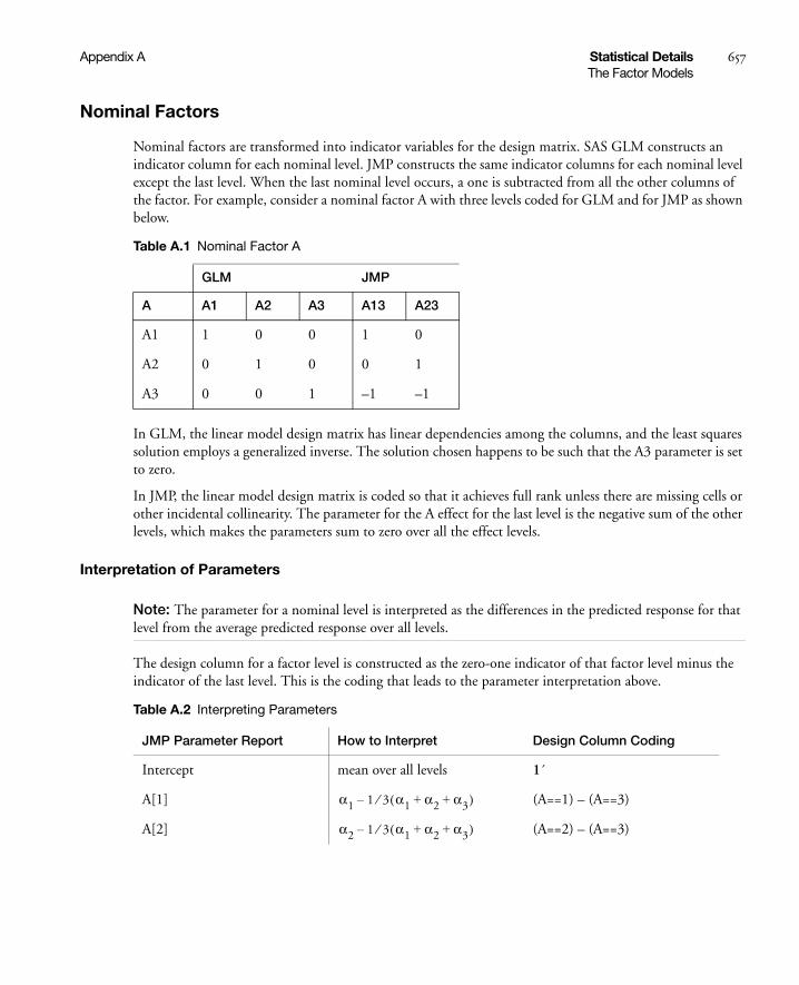
Appendix A Statistical Details 657The Factor Models
Nominal Factors
Nominal factors are transformed into indicator variables for the design matrix. SAS GLM constructs an indicator column for each nominal level. JMP constructs the same indicator columns for each nominal level except the last level. When the last nominal level occurs, a one is subtracted from all the other columns of the factor. For example, consider a nominal factor A with three levels coded for GLM and for JMP as shown below.
In GLM, the linear model design matrix has linear dependencies among the columns, and the least squares solution employs a generalized inverse. The solution chosen happens to be such that the A3 parameter is set to zero.
In JMP, the linear model design matrix is coded so that it achieves full rank unless there are missing cells or other incidental collinearity. The parameter for the A effect for the last level is the negative sum of the other levels, which makes the parameters sum to zero over all the effect levels.
Interpretation of Parameters
Note: The parameter for a nominal level is interpreted as the differences in the predicted response for that level from the average predicted response over all levels.
The design column for a factor level is constructed as the zero-one indicator of that factor level minus the indicator of the last level. This is the coding that leads to the parameter interpretation above.
Table A.1 Nominal Factor A
GLM JMP
A A1 A2 A3 A13 A23
A1 1 0 0 1 0
A2 0 1 0 0 1
A3 0 0 1 –1 –1
Table A.2 Interpreting Parameters
JMP Parameter Report How to Interpret Design Column Coding
Intercept mean over all levels 1´
A[1] (A==1) – (A==3)
A[2] (A==2) – (A==3)
α1 1 3⁄ α1 α2 α3+ +( )–
α2 1 3⁄ α1 α2 α3+ +( )–

658 Statistical Details Appendix AThe Factor Models
Interactions and Crossed Effects
Interaction effects with both GLM and JMP are constructed by taking a direct product over the rows of the design columns of the factors being crossed. For example, the GLM code
PROC GLM;CLASS A B;MODEL A B A*B;
yields this design matrix:
Using the JMP Fit Model command and requesting a factorial model for columns A and B produces the following design matrix. Note that A13 in this matrix is A1–A3 in the previous matrix. However, A13B13 is A13*B13 in the current matrix.
Table A.3 Design Matrix
A B AB
A B 1 2 3 1 2 3 11
12
13
21
22
23
31
32
33
A1 B1 1 0 0 1 0 0 1 0 0 0 0 0 0 0 0
A1 B2 1 0 0 0 1 0 0 1 0 0 0 0 0 0 0
A1 B3 1 0 0 0 0 1 0 0 1 0 0 0 0 0 0
A2 B1 0 1 0 1 0 0 0 0 0 1 0 0 0 0 0
A2 B2 0 1 0 0 1 0 0 0 0 0 1 0 0 0 0
A2 B3 0 1 0 0 0 1 0 0 0 0 0 1 0 0 0
A3 B1 0 0 1 1 0 0 0 0 0 0 0 0 1 0 0
A3 B2 0 0 1 0 1 0 0 0 0 0 0 0 0 1 0
A3 B3 0 0 1 0 0 1 0 0 0 0 0 0 0 0 1

Appendix A Statistical Details 659The Factor Models
The JMP coding saves memory and some computing time for problems with interactions of factors with few levels.
The expected values of the cells in terms of the parameters for a three-by-three crossed model are:
Nested Effects
Nested effects in GLM are coded the same as interaction effects because GLM determines the right test by what isn’t in the model. Any effect not included in the model can have its effect soaked up by a containing interaction (or, equivalently, nested) effect.
Nested effects in JMP are coded differently. JMP uses the terms inside the parentheses as grouping terms for each group. For each combination of levels of the nesting terms, JMP constructs the effect on the outside of the parentheses. The levels of the outside term need not line up across the levels of the nesting terms. Each level of nest is considered separately with regard to the construction of design columns and parameters.
Table A.4 Current Matrix
A B
A B 13 23 13 23 A13 B13 A13 B23 A23 B13 A23 B23
A1 B1 1 0 1 0 1 0 0 0
A1 B2 1 0 0 1 0 1 0 0
A1 B3 1 0 –1 –1 –1 –1 0 0
A2 B1 0 1 1 0 0 0 1 0
A2 B2 0 1 0 1 0 0 0 1
A2 B3 0 1 –1 –1 0 0 –1 –1
A3 B1 –1 –1 1 0 –1 0 –1 0
A3 B2 –1 –1 0 1 0 –1 0 –1
A3 B3 –1 –1 –1 –1 1 1 1 1
Table A.5 Three-by-Three Crossed Model
B1 B2 B3
A1
A2
A3
μ α1 β1 αβ11+ + + μ α1 β2 αβ12+ + + μ α1 β1– β2– αβ11– αβ12–+
μ α2 β1 αβ21+ + + μ α2 β2 αβ22+ + + μ α2 β1– β2– αβ21– αβ22–+
μ α1– α2 β1+–αβ11– αβ21–
μ α1– α2 β2+– αβ12–αβ22–
μ α1– α2– β1– β2– αβ11αβ12 αβ21 αβ22
+ ++ +

660 Statistical Details Appendix AThe Factor Models
Least Squares Means across Nominal Factors
Least squares means are the predicted values corresponding to some combination of levels, after setting all the other factors to some neutral value. The neutral value for direct continuous regressors is defined as the sample mean. The neutral value for an effect with uninvolved nominal factors is defined as the average effect taken over the levels (which happens to result in all zeroes in our coding). Ordinal factors use a different neutral value in “Ordinal Least Squares Means” on page 670. The least squares means might not be estimable, and if not, they are marked nonestimable. JMP’s least squares means agree with GLM’s (Goodnight and Harvey 1978) in all cases except when a weight is used, where JMP uses a weighted mean and GLM uses an unweighted mean for its neutral values.
Effective Hypothesis Tests
Generally, the hypothesis tests produced by JMP agree with the hypothesis tests of most other trusted programs, such as SAS PROC GLM (Hypothesis types III and IV). The following two sections describe where there are differences.
In the SAS GLM procedure, the hypothesis tests for Types III and IV are constructed by looking at the general form of estimable functions and finding functions that involve only the effects of interest and effects contained by the effects of interest (Goodnight 1978).
In JMP, the same tests are constructed, but because there is a different parameterization, an effect can be tested (assuming full rank for now) by doing a joint test on all the parameters for that effect. The tests do not involve containing interaction parameters because the coding has made them uninvolved with the tests on their contained effects.
Table A.6 Nested Effects
B(A)
A1 A1 A2 A2 A3 A3
A B A13 A23 B13 B23 B13 B23 B13 B23
A1 B1 1 0 1 0 0 0 0 0
A1 B2 1 0 0 1 0 0 0 0
A1 B3 1 0 –1 –1 0 0 0 0
A2 B1 0 1 0 0 1 0 0 0
A2 B2 0 1 0 0 0 1 0 0
A2 B3 0 1 0 0 –1 –1 0 0
A3 B1 –1 –1 0 0 0 0 1 0
A3 B2 –1 –1 0 0 0 0 0 1
A3 B3 –1 –1 0 0 0 0 –1 –1

Appendix A Statistical Details 661The Factor Models
If there are missing cells or other singularities, the JMP tests are different than GLM tests. There are several ways to describe them:
• JMP tests are equivalent to testing that the least squares means are different, at least for main effects. If the least squares means are nonestimable, then the test cannot include some comparisons and, therefore, loses degrees of freedom. For interactions, JMP is testing that the least squares means differ by more than just the marginal pattern described by the containing effects in the model.
• JMP tests an effect by comparing the SSE for the model with that effect with the SSE for the model without that effect (at least if there are no nested terms, which complicate the logic slightly). JMP parameterizes so that this method makes sense.
• JMP implements the effective hypothesis tests described by Hocking (1985, 80–89, 163–166), although JMP uses structural rather than cell-means parameterization. Effective hypothesis tests start with the hypothesis desired for the effect and include “as much as possible” of that test. Of course, if there are containing effects with missing cells, then this test will have to drop part of the hypothesis because the complete hypothesis would not be estimable. The effective hypothesis drops as little of the complete hypothesis as possible.
• The differences among hypothesis tests in JMP and GLM (and other programs) that relate to the presence of missing cells are not considered interesting tests anyway. If an interaction is significant, the test for the contained main effects are not interesting. If the interaction is not significant, then it can always be dropped from the model. Some tests are not even unique. If you relabel the levels in a missing cell design, then the GLM Type IV tests can change.
The following section continues this topic in finer detail.
Singularities and Missing Cells in Nominal Effects
Consider the case of linear dependencies among the design columns. With JMP coding, this does not occur unless there is insufficient data to fill out the combinations that need estimating, or unless there is some kind of confounding or collinearity of the effects.
With linear dependencies, a least squares solution for the parameters might not be unique and some tests of hypotheses cannot be tested. The strategy chosen for JMP is to set parameter estimates to zero in sequence as their design columns are found to be linearly dependent on previous effects in the model. A special column in the report shows what parameter estimates are zeroed and which parameter estimates are estimable. A separate singularities report shows what the linear dependencies are.
In cases of singularities the hypotheses tested by JMP can differ from those selected by GLM. Generally, JMP finds fewer degrees of freedom to test than GLM because it holds its tests to a higher standard of marginality. In other words, JMP tests always correspond to tests across least squares means for that effect, but GLM tests do not always have this property.
For example, consider a two-way model with interaction and one missing cell where A has three levels, B has two levels, and the A3B2 cell is missing.
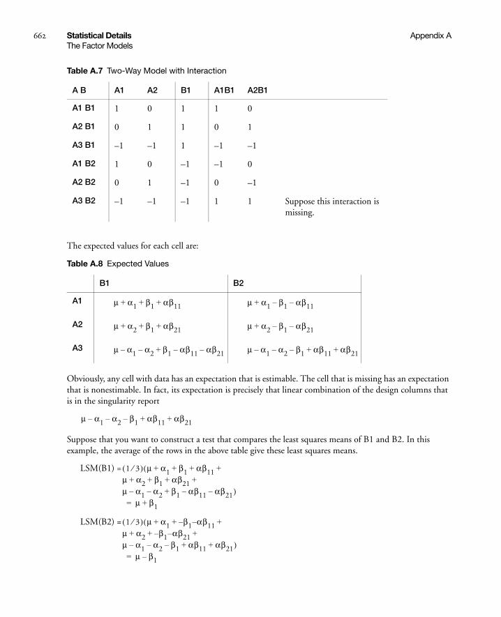
662 Statistical Details Appendix AThe Factor Models
The expected values for each cell are:
Obviously, any cell with data has an expectation that is estimable. The cell that is missing has an expectation that is nonestimable. In fact, its expectation is precisely that linear combination of the design columns that is in the singularity report
Suppose that you want to construct a test that compares the least squares means of B1 and B2. In this example, the average of the rows in the above table give these least squares means.
LSM(B1) =
LSM(B2) =
Table A.7 Two-Way Model with Interaction
A B A1 A2 B1 A1B1 A2B1
A1 B1 1 0 1 1 0
A2 B1 0 1 1 0 1
A3 B1 –1 –1 1 –1 –1
A1 B2 1 0 –1 –1 0
A2 B2 0 1 –1 0 –1
A3 B2 –1 –1 –1 1 1 Suppose this interaction is missing.
Table A.8 Expected Values
B1 B2
A1
A2
A3
μ α1 β1 αβ11+ + + μ α1 β1– αβ11–+
μ α2 β1 αβ21+ + + μ α2 β1– αβ21–+
μ α1– α2 β1+– αβ11– αβ21– μ α1– α2 β1–– αβ11 αβ21+ +
μ α1– α2 β1–– αβ11 αβ21+ +
1 3⁄( ) μ α1 β1 αβ11μ α2 β1 αβ21μ α1– α2– β1 αβ11– αβ21–
+ + + ++ + + +
+
(
)μ β1+=
1 3⁄( ) μ α1 β1– α– β11μ α2 β1– α– β21μ α1– α2– β1– αβ11 αβ21
+ + ++ + +
+ +
(
)μ β1–=

Appendix A Statistical Details 663The Factor Models
LSM(B1) – LSM(B2) =
Note that this shows that a test on the β1 parameter is equivalent to testing that the least squares means are the same. But because β1 is not estimable, the test is not testable, meaning there are no degrees of freedom for it.
Now, construct the test for the least squares means across the A levels.
LSM(A1) =
LSM(A2) =
LSM(A3) =
LSM(A1) – LSM(A3) =
LSM(A2) – LSM(A3) =
Neither of these turn out to be estimable, but there is another comparison that is estimable; namely comparing the two A columns that have no missing cells.
LSM(A1) – LSM(A2) =
This combination is indeed tested by JMP using a test with 1 degree of freedom, although there are two parameters in the effect.
The estimability can be verified by taking its inner product with the singularity combination, and checking that it is zero:
Table A.9 Verification
singularity combination
parameters combination to be tested
m 1 0
a1 –1 1
a2 –1 –1
b1 –1 0
ab11 1 0
ab21 1 0
2β1
1 2⁄( ) μ α1 β1 αβ11 μ α1 β1– αβ11–+ + + + +( )μ α1+=
1 2⁄( ) μ α2 β1 αβ21 μ α2 β1– αβ21–+ + + + +( )μ α2+=
1 2⁄( ) μ α1– α2– β1 αβ11– αβ21–μ α1– α2– β1– αβ11 αβ21
+ ++ +
()
μ α1– α2–=
2α1 α2+
2α2 α1+
α1 α2–

664 Statistical Details Appendix AThe Factor Models
It turns out that the design columns for missing cells for any interaction will always knock out degrees of freedom for the main effect (for nominal factors). Thus, there is a direct relation between the nonestimability of least squares means and the loss of degrees of freedom for testing the effect corresponding to these least squares means.
How does this compare with what GLM does? GLM and JMP do the same test when there are no missing cells. That is, they effectively test that the least squares means are equal. But when GLM encounters singularities, it focuses out these cells in different ways, depending on whether they are Type III or Type IV. For Type IV, it looks for estimable combinations that it can find. These might not be unique, and if you reorder the levels, you might get a different result. For Type III, it does some orthogonalization of the estimable functions to obtain a unique test. But the test might not be very interpretable in terms of the cell means.
The JMP approach has several points in its favor, although at first it might seem distressing that you might lose more degrees of freedom than with GLM:
1. The tests are philosophically linked to LSMs.
2. The tests are easy computationally, using reduction sum of squares for reparameterized models.
3. The tests agree with Hocking’s “Effective Hypothesis Tests”.
4. The tests are whole marginal tests, meaning they always go completely across other effects in interactions.
The last point needs some elaboration: Consider a graph of the expected values of the cell means in the previous example with a missing cell for A3B2.
The graph shows expected cell means with a missing cell. The means of the A1 and A2 cells are profiled across the B levels. The JMP approach says you can’t test the B main effect with a missing A3B2 cell, because the mean of the missing cell could be anything, as allowed by the interaction term. If the mean of the missing cell were the higher value shown, the B effect would likely test significant. If it were the lower, it would likely test nonsignificant. The point is that you don’t know. That is what the least squares means are saying when they are declared nonestimable. That is what the hypotheses for the effects should be saying too—that you don’t know.
If you want to test hypotheses involving margins for subsets of cells, then that is what GLM Type IV does. In JMP you would have to construct these tests yourself by partitioning the effects with a lot of calculations or by using contrasts.
A1 A2 A3
B1
B2
A3B2?
A3B2?
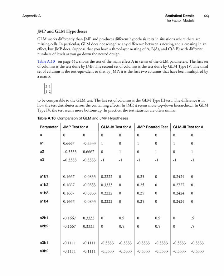
Appendix A Statistical Details 665The Factor Models
JMP and GLM Hypotheses
GLM works differently than JMP and produces different hypothesis tests in situations where there are missing cells. In particular, GLM does not recognize any difference between a nesting and a crossing in an effect, but JMP does. Suppose that you have a three-layer nesting of A, B(A), and C(A B) with different numbers of levels as you go down the nested design.
Table A.10 on page 665, shows the test of the main effect A in terms of the GLM parameters. The first set of columns is the test done by JMP. The second set of columns is the test done by GLM Type IV. The third set of columns is the test equivalent to that by JMP; it is the first two columns that have been multiplied by a matrix
to be comparable to the GLM test. The last set of columns is the GLM Type III test. The difference is in how the test distributes across the containing effects. In JMP, it seems more top-down hierarchical. In GLM Type IV, the test seems more bottom-up. In practice, the test statistics are often similar.
Table A.10 Comparison of GLM and JMP Hypotheses
Parameter JMP Test for A GLM-IV Test for A JMP Rotated Test GLM-III Test for A
u 0 0 0 0 0 0 0 0
a1 0.6667 -0.3333 1 0 1 0 1 0
a2 –0.3333 0.6667 0 1 0 1 0 1
a3 –0.3333 -0.3333 -1 -1 -1 -1 -1 -1
a1b1 0.1667 -0.0833 0.2222 0 0.25 0 0.2424 0
a1b2 0.1667 -0.0833 0.3333 0 0.25 0 0.2727 0
a1b3 0.1667 -0.0833 0.2222 0 0.25 0 0.2424 0
a1b4 0.1667 -0.0833 0.2222 0 0.25 0 0.2424 0
a2b1 -0.1667 0.3333 0 0.5 0 0.5 0 .5
a2b2 -0.1667 0.3333 0 0.5 0 0.5 0 .5
a3b1 -0.1111 -0.1111 -0.3333 -0.3333 -0.3333 -0.3333 -0.3333 -0.3333
a3b2 -0.1111 -0.1111 -0.3333 -0.3333 -0.3333 -0.3333 -0.3333 -0.3333
2 1
1 2
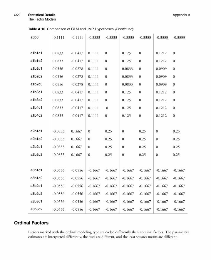
666 Statistical Details Appendix AThe Factor Models
Ordinal Factors
Factors marked with the ordinal modeling type are coded differently than nominal factors. The parameters estimates are interpreted differently, the tests are different, and the least squares means are different.
a3b3 -0.1111 -0.1111 -0.3333 -0.3333 -0.3333 -0.3333 -0.3333 -0.3333
a1b1c1 0.0833 -0.0417 0.1111 0 0.125 0 0.1212 0
a1b1c2 0.0833 -0.0417 0.1111 0 0.125 0 0.1212 0
a1b2c1 0.0556 -0.0278 0.1111 0 0.0833 0 0.0909 0
a1b2c2 0.0556 -0.0278 0.1111 0 0.0833 0 0.0909 0
a1b2c3 0.0556 -0.0278 0.1111 0 0.0833 0 0.0909 0
a1b3c1 0.0833 -0.0417 0.1111 0 0.125 0 0.1212 0
a1b3c2 0.0833 -0.0417 0.1111 0 0.125 0 0.1212 0
a1b4c1 0.0833 -0.0417 0.1111 0 0.125 0 0.1212 0
a1b4c2 0.0833 -0.0417 0.1111 0 0.125 0 0.1212 0
a2b1c1 -0.0833 0.1667 0 0.25 0 0.25 0 0.25
a2b1c2 -0.0833 0.1667 0 0.25 0 0.25 0 0.25
a2b2c1 -0.0833 0.1667 0 0.25 0 0.25 0 0.25
a2b2c2 -0.0833 0.1667 0 0.25 0 0.25 0 0.25
a3b1c1 -0.0556 -0.0556 -0.1667 -0.1667 -0.1667 -0.1667 -0.1667 -0.1667
a3b1c2 -0.0556 -0.0556 -0.1667 -0.1667 -0.1667 -0.1667 -0.1667 -0.1667
a3b2c1 -0.0556 -0.0556 -0.1667 -0.1667 -0.1667 -0.1667 -0.1667 -0.1667
a3b2c2 -0.0556 -0.0556 -0.1667 -0.1667 -0.1667 -0.1667 -0.1667 -0.1667
a3b3c1 -0.0556 -0.0556 -0.1667 -0.1667 -0.1667 -0.1667 -0.1667 -0.1667
a3b3c2 -0.0556 -0.0556 -0.1667 -0.1667 -0.1667 -0.1667 -0.1667 -0.1667
Table A.10 Comparison of GLM and JMP Hypotheses (Continued)

Appendix A Statistical Details 667The Factor Models
The theme for ordinal factors is that the first level of the factor is a control or baseline level, and the parameters measure the effect on the response as the ordinal factor is set to each succeeding level. The coding is appropriate for factors with levels representing various doses, where the first dose is zero:
From the perspective of the JMP parameterization, the tests for A are:
Table A.11 Ordinal Factors
Term Coded Column
A a2 a3
A1 0 0 control level, zero dose
A2 1 0 low dose
A3 1 1 higher dose
Table A.12 Tests for A
parameter GLM–IV test JMP test
m 0 0 0 0
a13 2 1 1 0
a23 1 2 0 1
a1:b14 0 0 0 0
a1:b24 0.11111 0 0 0
a1:b34 0 0 0 0
a2:b12 0 0 0 0
a3:b13 0 0 0 0
a3:b23 0 0 0 0
a1b1:c12 0 0 0 0
a1b2:c13 0 0 0 0
a1b2:c23 0 0 0 0
a1b3:c12 0 0 0 0
a1b4:c12 0 0 0 0
a2b1:c13 0 0 0 0
a2b2:c12 0 0 0 0

668 Statistical Details Appendix AThe Factor Models
So from JMP’s perspective, the GLM test looks a little strange, putting a coefficient on the a1b24 parameter.
The pattern for the design is such that the lower triangle is ones with zeros elsewhere.
For a simple main-effects model, this can be written
noting that μ is the expected response at , is the expected response at , and is the expected response at . Thus, estimates the effect moving from to
and estimates the effect moving from to .
If all the parameters for an ordinal main effect have the same sign, then the response effect is monotonic across the ordinal levels.
Ordinal Interactions
The ordinal interactions, as with nominal effects, are produced with a horizontal direct product of the columns of the factors. Consider an example with two ordinal factors A and B, each with three levels. JMP’s ordinal coding produces the design matrix shown next. The pattern for the interaction is a block lower-triangular matrix of lower-triangular matrices of ones.
a3b1:c12 0 0 0 0
a3b2:c12 0 0 0 0
a3b3:c12 0 0 0 0
Table A.12 Tests for A (Continued)
y μ α2X a 2≤( ) α3X a 3≤( ) ε+ + +=
A 1= μ α2+ A 2=μ α2 α3+ + A 3= α2 A 1=A 2= α3 A 2= A 3=
Table A.13 Ordinal Interactions
A*B
A2 A3
A B A2 A3 B2 B3 B2 B3 B2 B3
A1 B1 0 0 0 0 0 0 0 0
A1 B2 0 0 1 0 0 0 0 0
A1 B3 0 0 1 1 0 0 0 0
A2 B1 1 0 0 0 0 0 0 0
A2 B2 1 0 1 0 1 0 0 0
A2 B3 1 0 1 1 1 1 0 0
A3 B1 1 1 0 0 0 0 0 0
A3 B2 1 1 1 0 1 0 1 0

Appendix A Statistical Details 669The Factor Models
Note: When you test to see if there is no effect, there is not much difference between nominal and ordinal factors for simple models. However, there are major differences when interactions are specified. We recommend that you use nominal rather than ordinal factors for most models.
Hypothesis Tests for Ordinal Crossed Models
To see what the parameters mean, examine this table of the expected cell means in terms of the parameters, where μ is the intercept, α2 is the parameter for level A2, and so forth.
Note that the main effect test for A is really testing the A levels holding B at the first level. Similarly, the main effect test for B is testing across the top row for the various levels of B holding A at the first level. This is the appropriate test for an experiment where the two factors are both doses of different treatments. The main question is the efficacy of each treatment by itself, with fewer points devoted to looking for drug interactions when doses of both drugs are applied. In some cases it may even be dangerous to apply large doses of each drug.
Note that each cell’s expectation can be obtained by adding all the parameters associated with each cell that is to the left and above it, inclusive of the current row and column. The expected value for the last cell is the sum of all the parameters.
Though the hypothesis tests for effects contained by other effects differs with ordinal and nominal codings, the test of effects not contained by other effects is the same. In the crossed design above, the test for the interaction would be the same no matter whether A and B were fit nominally or ordinally.
A3 B3 1 1 1 1 1 1 1 1
Table A.13 Ordinal Interactions (Continued)
A*B
A2 A3
A B A2 A3 B2 B3 B2 B3 B2 B3
Table A.14 Expected Cell Means
B1 B2 B3
A1
A2
A3
μ μ αβ2 αβ12+ + μ β2 β3+ +
μ α2+ μ α2 β2 αβ22+ + + μ α2 β2 β3 αβ22 αβ23+ + + + +
μ α2 α3+ + μ α2 α3 β2 αβ22αβ32 αβ23 αβ32 αβ33
+ + + + ++ + +
μ α2– α3 β2 β3 αβ22αβ23 β32 αβ33
+ + + + ++ +

670 Statistical Details Appendix AThe Factor Models
Ordinal Least Squares Means
As stated previously, least squares means are the predicted values corresponding to some combination of levels, after setting all the other factors to some neutral value. JMP defines the neutral value for an effect with uninvolved ordinal factors as the effect at the first level, meaning the control or baseline level.
This definition of least squares means for ordinal factors maintains the idea that the hypothesis tests for contained effects are equivalent to tests that the least squares means are equal.
Singularities and Missing Cells in Ordinal Effects
With the ordinal coding, you are saying that the first level of the ordinal effect is the baseline. It is thus possible to get good tests on the main effects even when there are missing cells in the interactions—even if you have no data for the interaction.
Example with Missing Cell
The example is the same as above, with two observations per cell except that the A3B2 cell has no data. You can now compare the results when the factors are coded nominally with results when they are coded ordinally. The model as a whole fits the same as seen in tables shown in Figure A.1.
Table A.15 Observations
Y A B
12 1 1
14 1 1
15 1 2
16 1 2
17 2 1
17 2 1
18 2 2
19 2 2
20 3 1
24 3 1

Appendix A Statistical Details 671The Factor Models
Figure A.1 Comparison of Summary Information for Nominal and Ordinal Fits
The parameter estimates are very different because of the different coding. Note that the missing cell affects estimability for some nominal parameters but for none of the ordinal parameters.
Figure A.2 Comparison of Parameter Estimates for Nominal and Ordinal Fits
The singularity details show the linear dependencies (and also identify the missing cell by examining the values).
Figure A.3 Comparison of Singularity Details for Nominal and Ordinal Fits
The effect tests lose degrees of freedom for nominal. In the case of B, there is no test. For ordinal, there is no loss because there is no missing cell for the base first level.
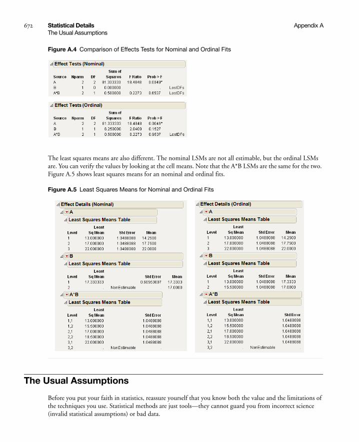
672 Statistical Details Appendix AThe Usual Assumptions
Figure A.4 Comparison of Effects Tests for Nominal and Ordinal Fits
The least squares means are also different. The nominal LSMs are not all estimable, but the ordinal LSMs are. You can verify the values by looking at the cell means. Note that the A*B LSMs are the same for the two. Figure A.5 shows least squares means for an nominal and ordinal fits.
Figure A.5 Least Squares Means for Nominal and Ordinal Fits
The Usual Assumptions
Before you put your faith in statistics, reassure yourself that you know both the value and the limitations of the techniques you use. Statistical methods are just tools—they cannot guard you from incorrect science (invalid statistical assumptions) or bad data.

Appendix A Statistical Details 673The Usual Assumptions
Assumed Model
Most statistics are based on the assumption that the model is correct. To the extent that your model may not be correct, you must attenuate your credibility in the statistical reports that result from the model.
Relative Significance
Many statistical tests do not evaluate the model in an absolute sense. Significant test statistics might only be saying that the model fits better than some reduced model, such as the mean. The model can appear to fit the data but might not describe the underlying physical model well at all.
Multiple Inferences
Often the value of the statistical results is not that you believe in them directly, but rather that they provide a key to some discovery. To confirm the discovery, you may need to conduct further studies. Otherwise, you might just be sifting through the data.
For instance, if you conduct enough analyses you can find 5% significant effects in five percent of your studies by chance alone, even if the factors have no predictive value. Similarly, to the extent that you use your data to shape your model (instead of testing the correct model for the data), you are corrupting the significance levels in your report. The random error then influences your model selection and leads you to believe that your model is better than it really is.
Validity Assessment
Some of the various techniques and patterns to look for in assessing the validity of the model are as follows:
• Model validity can be checked against a saturated version of the factors with Lack of Fit tests. The Fit Model platform presents these tests automatically if you have replicated x data in a nonsaturated model.
• You can check the distribution assumptions for a continuous response by looking at plots of residuals and studentized residuals from the Fit Model platform. Or, use the Save commands in the platform popup menu to save the residuals in data table columns. Then use the Analyze > Distribution on these columns to look at a histogram with its normal curve and the normal quantile plot. The residuals are not quite independent, but you can informally identify severely non-normal distributions.
• The best all-around diagnostic tool for continuous responses is the leverage plot because it shows the influence of each point on each hypothesis test. If you suspect that there is a mistaken value in your data, this plot helps determine if a statistical test is heavily influenced by a single point.
• It is a good idea to scan your data for outlying values and examine them to see if they are valid observations. You can spot univariate outliers in the Distribution platform reports and plots. Bivariate outliers appear in Fit Y by X scatterplots and in the Multivariate scatterplot matrix. You can see trivariate outliers in a three-dimensional plot produced by the Graph > Scatterplot 3D. Higher dimensional outliers can be found with Principal Components or Scatterplot 3D, and with Mahalanobis and jack-knifed distances computed and plotted in the Multivariate platform.

674 Statistical Details Appendix AKey Statistical Concepts
Alternative Methods
The statistical literature describes special nonparametric and robust methods, but JMP implements only a few of them at this time. These methods require fewer distributional assumptions (nonparametric), and then are more resistant to contamination (robust). However, they are less conducive to a general methodological approach, and the small sample probabilities on the test statistics can be time consuming to compute.
If you are interested in linear rank tests and need only normal large sample significance approximations, you can analyze the ranks of your data to perform the equivalent of a Wilcoxon rank-sum or Kruskal-Wallis one-way test.
If you are uncertain that a continuous response adequately meets normal assumptions, you can change the modeling type from continuous to ordinal and then analyze safely, even though this approach sacrifices some richness in the presentations and some statistical power as well.
Key Statistical Concepts
There are two key concepts that unify classical statistics and encapsulate statistical properties and fitting principles into forms you can visualize:
• a unifying concept of uncertainty
• two basic fitting machines.
These two ideas help unlock the understanding of statistics with intuitive concepts that are based on the foundation laid by mathematical statistics.
Statistics is to science what accounting is to business. It is the craft of weighing and balancing observational evidence. Statistical tests are like credibility audits. But statistical tools can do more than that. They are instruments of discovery that can show unexpected things about data and lead to interesting new ideas. Before using these powerful tools, you need to understand a bit about how they work.
Uncertainty, a Unifying Concept
When you do accounting, you total money amounts to get summaries. When you look at scientific observations in the presence of uncertainty or noise, you need some statistical measurement to summarize the data. Just as money is additive, uncertainty is additive if you choose the right measure for it.
The best measure is not the direct probability because to get a joint probability you have to assume that the observations are independent and then multiply probabilities rather than add them. It is easier to take the log of each probability because then you can sum them and the total is the log of the joint probability.
However, the log of a probability is negative because it is the log of a number between 0 and 1. In order to keep the numbers positive, JMP uses the negative log of the probability. As the probability becomes smaller, its negative log becomes larger. This measure is called uncertainty, and it is measured in reverse fashion from probability.
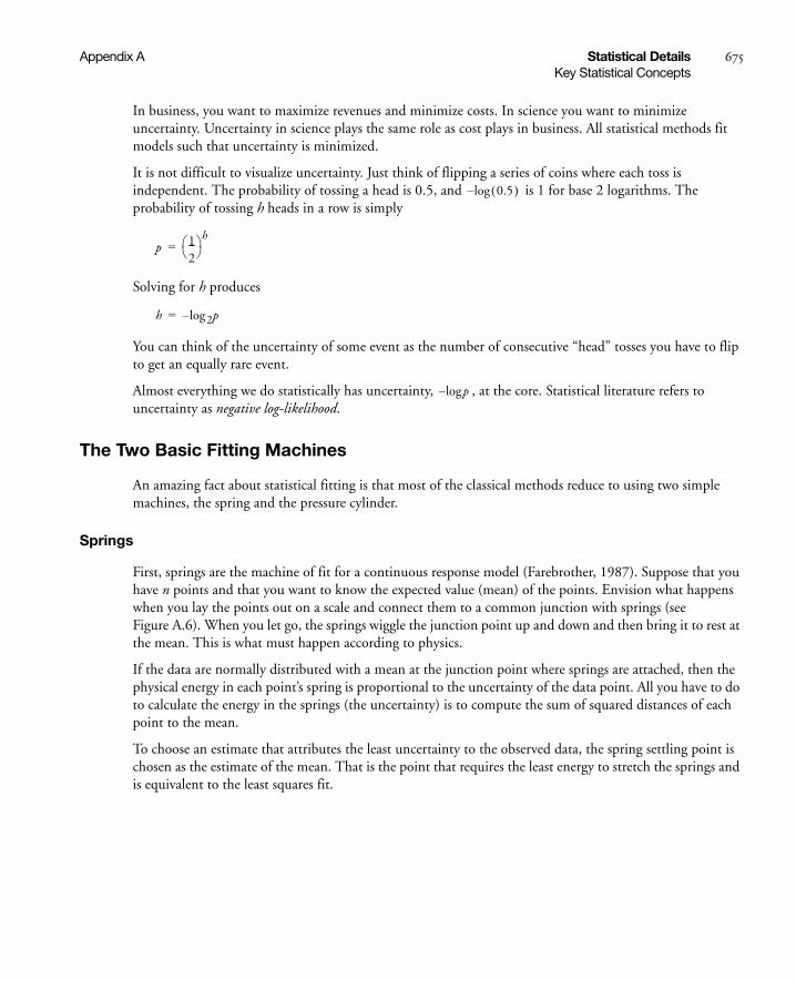
Appendix A Statistical Details 675Key Statistical Concepts
In business, you want to maximize revenues and minimize costs. In science you want to minimize uncertainty. Uncertainty in science plays the same role as cost plays in business. All statistical methods fit models such that uncertainty is minimized.
It is not difficult to visualize uncertainty. Just think of flipping a series of coins where each toss is independent. The probability of tossing a head is 0.5, and is 1 for base 2 logarithms. The probability of tossing h heads in a row is simply
Solving for h produces
You can think of the uncertainty of some event as the number of consecutive “head” tosses you have to flip to get an equally rare event.
Almost everything we do statistically has uncertainty, , at the core. Statistical literature refers to uncertainty as negative log-likelihood.
The Two Basic Fitting Machines
An amazing fact about statistical fitting is that most of the classical methods reduce to using two simple machines, the spring and the pressure cylinder.
Springs
First, springs are the machine of fit for a continuous response model (Farebrother, 1987). Suppose that you have n points and that you want to know the expected value (mean) of the points. Envision what happens when you lay the points out on a scale and connect them to a common junction with springs (see Figure A.6). When you let go, the springs wiggle the junction point up and down and then bring it to rest at the mean. This is what must happen according to physics.
If the data are normally distributed with a mean at the junction point where springs are attached, then the physical energy in each point’s spring is proportional to the uncertainty of the data point. All you have to do to calculate the energy in the springs (the uncertainty) is to compute the sum of squared distances of each point to the mean.
To choose an estimate that attributes the least uncertainty to the observed data, the spring settling point is chosen as the estimate of the mean. That is the point that requires the least energy to stretch the springs and is equivalent to the least squares fit.
0.5( )log–
p 12--- h
=
h p2log–=
plog–

676 Statistical Details Appendix AKey Statistical Concepts
Figure A.6 Connect Springs to Data Points
That is how you fit one mean or fit several means. That is how you fit a line, or a plane, or a hyperplane. That is how you fit almost any model to continuous data. You measure the energy or uncertainty by the sum of squares of the distances you must stretch the springs.
Statisticians put faith in the normal distribution because it is the one that requires the least faith. It is, in a sense, the most random. It has the most non-informative shape for a distribution. It is the one distribution that has the most expected uncertainty for a given variance. It is the distribution whose uncertainty is measured in squared distance. In many cases it is the limiting distribution when you have a mixture of distributions or a sum of independent quantities. It is the distribution that leads to test statistics that can be measured fairly easily.
When the fit is constrained by hypotheses, you test the hypotheses by measuring this same spring energy. Suppose you have responses from four different treatments in an experiment, and you want to test if the means are significantly different. First, envision your data plotted in groups as shown here, but with springs connected to a separate mean for each treatment. Then exert pressure against the spring force to move the individual means to the common mean. Presto! The amount of energy that constrains the means to be the same is the test statistic you need. That energy is the main ingredient in the F-test for the hypothesis that tests whether the means are the same.
data value
junctionpoint, mean

Appendix A Statistical Details 677Key Statistical Concepts
Pressure Cylinders
What if your response is categorical instead of continuous? For example, suppose that the response is the country of origin for a sample of cars. For your sample, there are probabilities for the three response levels, American, European, and Japanese. You can set these probabilities for country of origin to some estimate and then evaluate the uncertainty in your data. This uncertainty is found by summing the negative logs of the probabilities of the responses given by the data. It is written
The idea of springs illustrates how a mean is fit to continuous data. When the response is categorical, statistical methods estimate the response probabilities directly and choose the estimates that minimize the total uncertainty of the data. The probability estimates must be nonnegative and sum to 1. You can picture the response probabilities as the composition along a scale whose total length is 1. For each response observation, load into its response area a gas pressure cylinder, for example, a tire pump. Let the partitions between the response levels vary until an equilibrium of lowest potential energy is reached. The sizes of the partitions that result then estimate the response probabilities.
Figure A.7 shows what the situation looks like for a single category such as the medium size cars (see the mosaic column from Carpoll.jmp labeled medium in Figure A.8). Suppose there are thirteen responses (cars). The first level (American) has six responses, the next has two, and the last has five responses. The response probabilities become 6•13, 2•13, and 5•13, respectively, as the pressure against the response partitions balances out to minimize the total energy.
Figure A.7 Effect of Pressure Cylinders in Partitions
As with springs for continuous data, you can divide your sample by some factor and fit separate sets of partitions. Then test that the response rates are the same across the groups by measuring how much additional energy you need to push the partitions to be equal. Imagine the pressure cylinders for car origin probabilities grouped by the size of the car. The energy required to force the partitions in each group to align horizontally tests whether the variables have the same probabilities. Figure A.8 shows these partitions.
H hy i( ) py i( )log–= =

678 Statistical Details Appendix ALeverage Plot Details
Figure A.8 A Mosaic Plot for Categorical Data
Leverage Plot Details
Leverage plots for general linear hypotheses were introduced by Sall (1980). This section presents the details from that paper. Leverage plots generalize the partial regression residual leverage plots of Belsley, Kuh, and Welsch (1980) to apply to any linear hypothesis. Suppose that the estimable hypothesis of interest is
The leverage plot characterizes this test by plotting points so that the distance of each point to the sloped regression line displays the unconstrained residual, and the distance to the x-axis displays the residual when the fit is constrained by the hypothesis.
Of course the difference between the sums of squares of these two groups of residuals is the sum of squares due to the hypothesis, which becomes the main ingredient of the F-test.
The parameter estimates constrained by the hypothesis can be written
where b is the least squares estimate
and where lambda is the Lagrangian multiplier for the hypothesis constraint, which is calculated
Compare the residuals for the unconstrained and hypothesis-constrained residuals, respectively.
Lβ 0=
b0 b X'X( )1–L'λ–=
b X'X( )1–X'y=
λ L X'X( )1–L'( )
1–Lb )=
r y Xb–=
r0 r X X'X( )1–L'λ+=

Appendix A Statistical Details 679Leverage Plot Details
To get a leverage plot, the x-axis values vx of the points are the differences in the residuals due to the hypothesis, so that the distance from the line of fit (with slope 1) to the x-axis is this difference. The y-axis values vy are just the x-axis values plus the residuals under the full model as illustrated in Figure A.9. Thus, the leverage plot is composed of the points
and
Figure A.9 Construction of Leverage Plot
Superimposing a Test on the Leverage Plot
In simple linear regression, you can plot the confidence limits for the expected value as a smooth function of the regressor variable x
Upper (x) =
Lower (x) =
where x = [1 x] is the 2-vector of regressors.
This hyperbola is a useful significance-measuring instrument because it has the following nice properties:
• If the slope parameter is significantly different from zero, the confidence curve will cross the horizontal line of the response mean (left plot in Figure A.10).
• If the slope parameter is not significantly different from zero, the confidence curve will not cross the horizontal line of the response mean (plot at right in Figure A.10).
• If the t-test for the slope parameter is sitting right on the margin of significance, the confidence curve will have the horizontal line of the response mean as an asymptote (middle plot in Figure A.10).
This property can be verified algebraically or it can be understood by considering what the confidence region has to be when the regressor value goes off to plus or minus infinity.
vx X X'X( )1–L'λ= vy r vx+=
xb tα 2⁄ s x X'X( )1–x'+
xb tα 2⁄ s x X'X( )1–x'–

680 Statistical Details Appendix AMultivariate Details
Figure A.10 Cases of Significant, Borderline, and Nonsignificant Confidence Curves.
Leverage plots make use of the same device by calculating a confidence function with respect to one variable while holding all other variables constant at their sample mean value.
For general hypothesis tests, JMP can display a curve with the same properties: the confidence function shows at the mean value in the middle, with adjusted curvature so that it crosses the horizon if the F-test is significant at some α-level like 0.05.
Consider the functions
Upper(z) =
and
Lower (z) =
where F is the F-statistic for the hypothesis, is the reference value for significance α, and
, where is the regressors at a suitable middle value, such as the mean.
These functions serve the same properties listed above. If the F-statistic is greater than the reference value, the confidence functions cross the x-axis. If the F-statistic is less than the reference value, the confidence functions do not cross. If the F-statistic is equal to the reference value, the confidence functions have the x-axis as an asymptote. And the range between the confidence functions at the middle value is a valid confidence region of the predicted value at the point.
Multivariate Details
The following sections show computations used for multivariate tests and related, exact and approximate F-statistics, canonical details, and discriminant functions. In the following sections, E is the residual cross product matrix and estimates the residual covariance matrix. Diagonal elements of E are the sum of squares for each variable. In discriminant analysis literature, this is often called W, where W stands for within.
Significant Borderline Not Significant
confidence curve crosses horizontal line
confidence curve asymptotic to horizontal line
confidence curve does not cross horizontal line
z s2
tα 2⁄2
hFα
F------z2++
z s2
tα 2⁄2
hFα
F------z2+–
Fα
h x X'X( )1–x'= x
En 1–------------
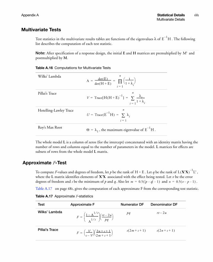
Appendix A Statistical Details 681Multivariate Details
Multivariate Tests
Test statistics in the multivariate results tables are functions of the eigenvalues λ of . The following list describes the computation of each test statistic.
Note: After specification of a response design, the initial E and H matrices are premultiplied by and postmultiplied by M.
The whole model L is a column of zeros (for the intercept) concatenated with an identity matrix having the number of rows and columns equal to the number of parameters in the model. L matrices for effects are subsets of rows from the whole model L matrix.
Approximate F-Test
To compute F-values and degrees of freedom, let p be the rank of . Let q be the rank of , where the L matrix identifies elements of associated with the effect being tested. Let v be the error degrees of freedom and s be the minimum of p and q. Also let and .
Table A.17 on page 681, gives the computation of each approximate F from the corresponding test statistic.
Table A.16 Computations for Multivariate Tests
Wilks’ Lambda
Pillai’s Trace
Hotelling-Lawley Trace
Roy’s Max Root, the maximum eigenvalue of .
E1–H
M'
Λ det E( )det H E+( )---------------------------- 1
1 λi+--------------
i 1=
n
∏= =
V Trace H H E+( ) 1–[ ] λi1 λi+--------------
i 1=
n
= =
U Trace E1–H( ) λi
i 1=
n
= =
Θ λ1= E1–H
Table A.17 Approximate F-statistics
Test Approximate F Numerator DF Denominator DF
Wilks’ Lambda
Pillai’s Trace
H E+ L X'X( ) 1–L'
X'Xm 0.5 p q– 1–( )= n 0.5 v p– 1–( )=
F1 Λ1 t⁄–
Λ1 t⁄--------------------- rt 2u–
pq---------------- =
pq rt 2u–
F Vs V–----------- 2n s 1+ +
2m s 1+ +------------------------- =
s 2m s 1+ +( ) s 2n s 1+ +( )
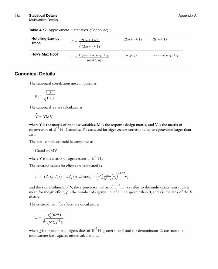
682 Statistical Details Appendix AMultivariate Details
Canonical Details
The canonical correlations are computed as
The canonical Y’s are calculated as
where Y is the matrix of response variables, M is the response design matrix, and V is the matrix of eigenvectors of . Canonical Y’s are saved for eigenvectors corresponding to eigenvalues larger than zero.
The total sample centroid is computed as
Grand =
where V is the matrix of eigenvectors of .
The centroid values for effects are calculated as
where
and the vs are columns of V, the eigenvector matrix of , refers to the multivariate least squares mean for the jth effect, g is the number of eigenvalues of greater than 0, and r is the rank of the X matrix.
The centroid radii for effects are calculated as
where g is the number of eigenvalues of greater than 0 and the denominator L’s are from the multivariate least squares means calculations.
Hotelling-Lawley Trace
Roy’s Max Root
Table A.17 Approximate F-statistics (Continued)
F 2 sn 1+( )U
s2
2m s 1+ +( )----------------------------------=
s 2m s 1+ +( ) 2 sn 1+( )
FΘ v max p q,( ) q+–( )
max p q,( )--------------------------------------------------= max p q,( ) v max p q,( )– q+
ρi
λi1 λi+--------------=
Y YMV=
E1–H
yMV
E1–H
m c'1xj c'2xj … c'gxj, , ,( )= ci v'iE
N r–------------ vi
1 2⁄–
vi=
E1–H xj
E1–H
dχg
20.95( )
L X'X( )1–L'
------------------------------=
E1–H

Appendix A Statistical Details 683Power Calculations
Discriminant Analysis
The distance from an observation to the multivariate mean of the ith group is the Mahalanobis distance, D2, and computed as
where
In saving discriminant columns, N is the number of observations and M is the identity matrix.
The Save Discrim command in the popup menu on the platform title bar saves discriminant scores with their formulas as columns in the current data table. SqDist[0] is a quadratic form needed in all the distance calculations. It is the portion of the Mahalanobis distance formula that does not vary across groups. SqDist[i] is the Mahalanobis distance of an observation from the ith centroid. SqDist[0] and SqDist[i] are calculated as
SqDist[0] =
and
SqDist[i] = SqDist[0] -
Assuming that each group has a multivariate normal distribution, the posterior probability that an observation belongs to the ith group is
Prob[i] =
where
Prob[0] =
Power Calculations
The next sections give formulas for computing LSV, LSN, power, and adjusted power.
Computations for the LSV
For one-degree-freedom tests, the LSV is easy to calculate. The formula for the F-test for the hypothesis is:
D2 y yi–( )'S 1–
y yi–( ) y'S 1–y 2y'S 1–
yi– yi'S1–yi+= =
S EN 1–-------------=
y'S 1–y
2y'S 1–yi yi'S
1–yi+
Dist[i]( )exp
Prob 0[ ]-----------------------------
e0.5Dist[i]–
Lβ 0=
FLb( )' L X'X( )
1–L'( )
1–Lb( ) r⁄
s2
-------------------------------------------------------------------------=
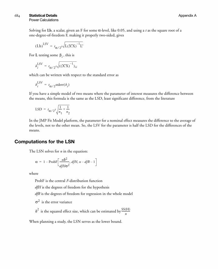
684 Statistical Details Appendix APower Calculations
Solving for Lb, a scalar, given an F for some α-level, like 0.05, and using a t as the square root of a one-degree-of-freedom F, making it properly two-sided, gives
For L testing some , this is
which can be written with respect to the standard error as
If you have a simple model of two means where the parameter of interest measures the difference between the means, this formula is the same as the LSD, least significant difference, from the literature
In the JMP Fit Model platform, the parameter for a nominal effect measures the difference to the average of the levels, not to the other mean. So, the LSV for the parameter is half the LSD for the differences of the means.
Computations for the LSN
The LSN solves for n in the equation:
where
ProbF is the central F-distribution function
dfH is the degrees of freedom for the hypothesis
dfR is the degrees of freedom for regression in the whole model
is the error variance
is the squared effect size, which can be estimated by
When planning a study, the LSN serves as the lower bound.
Lb( )LSVtα 2⁄ s L X'X( )
1–L'=
βi
biLSV
tα 2⁄ s X'X( )1–
( )ii=
biLSV
tα 2⁄ stderr bi( )=
LSD tα 2⁄ s1n1----- 1
n2-----+=
α 1 ProbFnδ2
dfHσ2---------------- dfH n dfR– 1–, ,–=
σ2
δ2 SS(H)n
--------------

Appendix A Statistical Details 685Power Calculations
Computations for the Power
To calculate power, first get the critical value for the central F by solving for FC in the equation
Then obtain the probability of getting this critical value or higher
Power =
The last argument to ProbF is the noncentrality value , which can be estimated as for retrospective power.
Computations for Adjusted Power
The adjusted power is a function a noncentrality estimate that has been adjusted to remove positive bias in the original estimate (Wright and O’Brien 1988). Unfortunately, the adjustment to the noncentrality estimate can lead to negative values. Negative values are handled by letting the adjusted noncentrality estimate be
where N is the actual sample size, dfH is the degrees of freedom for the hypothesis and dfR is the degrees of freedom for regression in the whole model. Fs is a F-value calculated from data. FC is the critical value for the F-test.
The adjusted power is
Poweradj = .
Confidence limits for the noncentrality parameter are constructed according to Dwass (1955) as
Lower CL for λ =
Upper CL for λ =
Power confidence limits are obtained by substituting confidence limits for λ into
Power = 1 - ProbF[FC, dfH, n - dfR - 1, λ]
α 1 ProbF FC dfH n dfR– 1–, ,[ ]–=
1 ProbF FC dfH n dfR– 1– nδ2
σ2---------, , ,–
λ nδ2
σ2---------= SS(H)
σˆ 2
--------------
λadj Max 0λ N dfR– 1– 2–( )
N dfR– 1–--------------------------------------------- dfH–,=
1 ProbF FC dfH n dfR– 1– λadj, , ,[ ]–
dfH Max 0 Fs FC–,[ ]( )2
dfH Fs FC–( )2

686 Statistical Details Appendix AInverse Prediction with Confidence Limits
Inverse Prediction with Confidence Limits
Inverse prediction estimates a value of an independent variable from a response value. In bioassay problems, inverse prediction with confidence limits is especially useful. In JMP, you can request inverse prediction estimates for continuous and binary response models. If the response is continuous, you can request confidence limits for an individual response or an expected response.
The confidence limits are computed using Fieller’s theorem, which is based on the following logic. The goal is predicting the value of a single regressor and its confidence limits given the values of the other regressors and the response.
Let b estimate the parameters β so that we have b distributed as N(β,V).
Let x be the regressor values of interest, with the ith value to be estimated.
Let y be the response value.
We desire a confidence region on the value of x[i] such that with all other values of x given.
The inverse prediction is just
where the parenthesized-subscript “(i)” means that the ith component is omitted. A confidence interval can be formed from the relation:
with specified confidence if . A quadratic equation results of the form
where
It is possible for the quadratic equation to have only imaginary roots, in which case the confidence interval becomes the entire real line. In this situation, Wald intervals are used. If only one side of an interval is imaginary, the Fieller method is still used, but the imaginary side is returned as missing.
Note: The Logistic platform in JMP uses t values when computing the confidence intervals for inverse prediction. PROC PROBIT in SAS/STAT and the Generalized Linear Model platform in JMP use z values, which give slightly different results.
β'x y=
x i[ ]y β' i( )x i( )–
β i[ ]----------------------------=
y b'x–( )2t2x'Vx<
y β'x=
z2g zh f+ + 0=
g b i[ ]2t2V i i,[ ]–=
h 2yb– i[ ] 2b i[ ]b' i( )x i( ) 2t2V i i( ),[ ]'x i( )–+=
f y2
2yb' i( )x i( )– b' i( )x i( )( )2t2x i( )'V i( )x i( )–+=

Appendix A Statistical Details 687Details of Random Effects
Details of Random Effects
The variance matrix of the fixed effects is always modified to include a Kackar-Harville correction. The variance matrix of the BLUPs and the covariances between the BLUPs and the fixed effects are not Kackar-Harville corrected because the corrections for these can be quite computationally intensive and use lots of memory when there are lots of levels of the random effects. In SAS, the Kackar-Harville correction is done for both fixed effects and BLUPs only when the DDFM=KR is set, so the standard errors from PROC MIXED with this option will differ from all the other options.
This implies:
• Standard errors for linear combinations involving only fixed effects parameters will match PROC MIXED DDFM=KR, assuming that one has taken care to transform between the different parameterizations used by PROC MIXED and JMP.
• Standard errors for linear combinations involving only BLUP parameters will match PROC MIXED DDFM=SATTERTH.
• Standard errors for linear combinations involving both fixed effects and BLUPS do not match PROC MIXED for any DDFM option if the data are unbalanced. However, these standard errors are between what you get with the DDFM=SATTERTH and DDFM=KR options. If the data are balanced, JMP matches SAS for balanced data, regardless of the DDFM option, since the Kackar-Harville correction is null.
The degrees of freedom for tests involving only linear combinations of fixed effects parameters are calculated using the Kenward and Roger correction, so JMP's results for these tests match PROC MIXED using the DDFM=KR option. If there are BLUPs in the linear combination, JMP uses a Satterthwaite approximation to get the degrees of freedom. So, the results follow a pattern similar to what is described for standard errors in the preceding paragraph.
For more details of the Kackar-Harville correction and the Kenward-Roger DF approach, see Kenward and Roger(1997). The Satterthwaite method is described in detail in the SAS PROC MIXED documentation.

688 Statistical Details Appendix ADetails of Random Effects
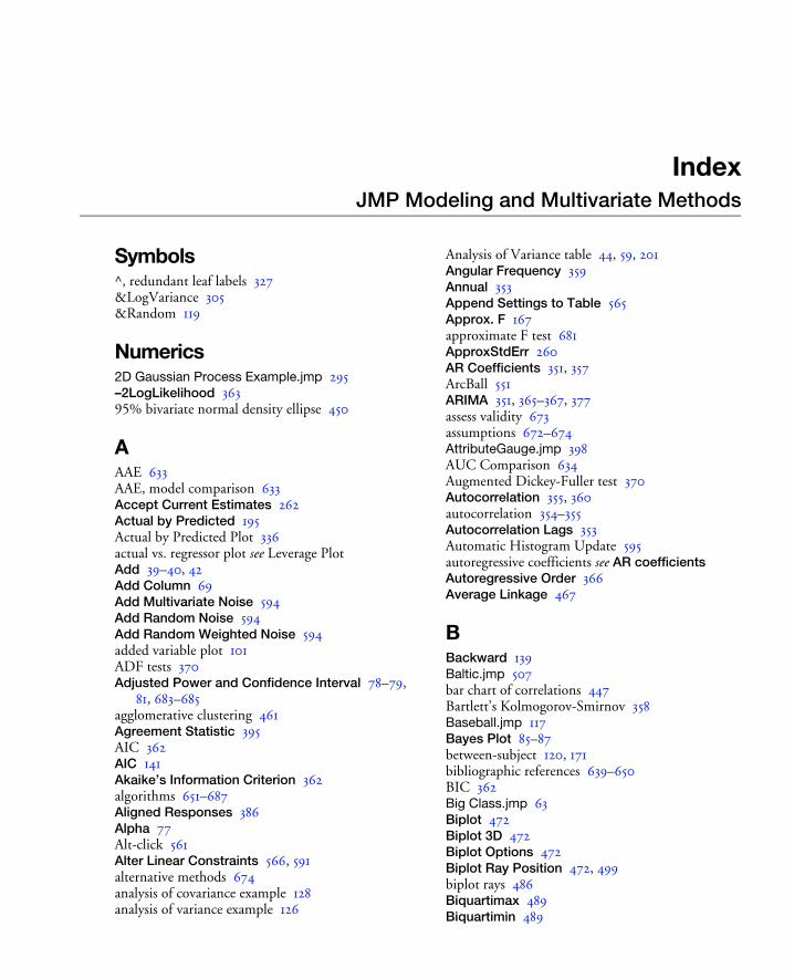
IndexJMP Modeling and Multivariate Methods
Symbols^, redundant leaf labels 327&LogVariance 305&Random 119
Numerics2D Gaussian Process Example.jmp 295–2LogLikelihood 36395% bivariate normal density ellipse 450
AAAE 633AAE, model comparison 633Accept Current Estimates 262Actual by Predicted 195Actual by Predicted Plot 336actual vs. regressor plot see Leverage PlotAdd 39–40, 42Add Column 69Add Multivariate Noise 594Add Random Noise 594Add Random Weighted Noise 594added variable plot 101ADF tests 370Adjusted Power and Confidence Interval 78–79,
81, 683–685agglomerative clustering 461Agreement Statistic 395AIC 362AIC 141Akaike’s Information Criterion 362algorithms 651–687Aligned Responses 386Alpha 77Alt-click 561Alter Linear Constraints 566, 591alternative methods 674analysis of covariance example 128analysis of variance example 126
Analysis of Variance table 44, 59, 201Angular Frequency 359Annual 353Append Settings to Table 565Approx. F 167approximate F test 681ApproxStdErr 260AR Coefficients 351, 357ArcBall 551ARIMA 351, 365–367, 377assess validity 673assumptions 672–674AttributeGauge.jmp 398AUC Comparison 634Augmented Dickey-Fuller test 370Autocorrelation 355, 360autocorrelation 354–355Autocorrelation Lags 353Automatic Histogram Update 595autoregressive coefficients see AR coefficientsAutoregressive Order 366Average Linkage 467
BBackward 139Baltic.jmp 507bar chart of correlations 447Bartlett’s Kolmogorov-Smirnov 358Baseball.jmp 117Bayes Plot 85–87between-subject 120, 171bibliographic references 639–650BIC 362Big Class.jmp 63Biplot 472Biplot 3D 472Biplot Options 472Biplot Ray Position 472, 499biplot rays 486Biquartimax 489Biquartimin 489

690 Index
Birth Death Subset.jmp 463bivariate normal density ellipse 450Borehole Latin Hypercube.jmp 300Boston Housing.jmp 629, 635Bounded 378Box-Jenkins model see ARIMABrown smoothing 379
CC. Total 58–59calculation details 651–687calibration 70–73Candidates report, Partition platform 320Canonical 3D Plot 500canonical axis 163Canonical Corr 163canonical correlation 155, 164–165, 682Canonical Curvature report 44Canonical Options 499canonical variables 161Car Poll.jmp 396Center Polynomials 50, 82centroid 452, 457, 682Centroid Method 467Centroid Plot 161, 163Centroid Val 163Cheese.jmp 219Chi Square 203Chi-Square 202Choice Modeling 401–438Choice Platform
Launch Platform 406Response Data 407Segmentation 423Single Table Analysis 420subject effects 410
Cholesterol.jmp 171citations 639–650classification variable 173Close All Below (Partition Platform) 325closing JMP Starter window 28Cluster platform 459–476
compare methods 461example 463hierarchical 463–468introduction 461–462k-means 469–476launch 462–463normal mixtures 473–477
Cluster the Correlations 448Clustering History table 464–465Coding column property 83collinearity 104Color Clusters and Mark Clusters 466Color Map 466Color Map On Correlations 448Color Map On p-values 448Color Points 328, 499Column Contributions 326Column Info 104column property
Coding 83Combine 140, 147Common Factor Analysis 487Compare Parameter Estimates 254comparing models 633Complete Linkage 468Compound 161compound multivariate example 171–173computational details 651–687Conditional Confidence CI 123Conditional Mean CI 123Conditional Pred Formula 123Conditional Pred Values 123Conditional Predictions 566Conditional Residuals 123Confidence Intervals 206, 367, 378, 414, 563Confidence Limits 260, 270Connecting Lines 355Connecting Lines Report 112constant estimate 363Constrain fit 367Constraints 575contaminating 85Continue 52continuous response model 653Contour Grid 578, 582Contour Label 578Contour Profiler 194, 262, 310, 312, 577–616Contrast 233Contrast 161–162, 169, 171, 192contrast 110contrast M matrix 160, 171, 681Control-click 126Cook’s D Influence 105Copy Settings Script 565correlation matrix 445Correlation of Estimates 81–82, 194, 414Correlation Type 295
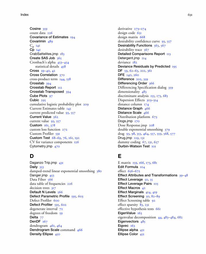
Index 691
Cosine 359count data 226Covariance of Estimates 194Covarimin 489Cp 141Cp 141CrabSattelites.jmp 183Create SAS Job 365Cronbach’s alpha 453–454
statistical details 458Cross 39–40, 42Cross Correlation 370cross-product term 144, 558Crosstab 394Crosstab Report 112Crosstab Transposed 394Cube Plots 97Cubic 295cumulative logistic probability plot 209Current Estimates table 143current predicted value 93, 557Current Value 562current value 93, 557Custom 161, 378custom loss function 272Custom Profiler 591Custom Test 68–69, 76, 161, 192CV for variance components 126Cytometry.jmp 470
DDaganzo Trip.jmp 431Daily 353damped-trend linear exponential smoothing 380Danger.jmp 453Data Filter 566data table of frequencies 226decision trees 317Default N Levels 566Defect Parametric Profile 595, 603Defect Profiler 600Defect Profiler 595, 602degenerate interval 72degrees of freedom 59Delta 77DenDF 167dendrogram 461, 464Dendrogram Scale command 466Density Ellipse 450
derivative 273–274design code 651design matrix 668desirability confidence curve 93, 557Desirability Functions 563, 567desirability trace 567Detailed Comparisons Report 113Detergent.jmp 214deviance 182Deviance Residuals by Predicted 195DF 59, 62–63, 202, 361DFE 140, 260Difference 202, 359Differencing Order 366Differencing Specification dialog 359dimensionality 483discriminant analysis 155, 173, 683Dispersion Effects 303–314distance column 174Distance Graph 466Distance Scale 466Distribution platform 673Dogs.jmp 170Dose Response.jmp 208double exponential smoothing 379drag 93, 98, 353, 464, 557, 559, 568, 577Drug.jmp 129, 131dummy coding 67, 131, 657Durbin-Watson Test 101
EE matrix 159, 166, 173, 681Edit Formula 104effect 656–672Effect Attributes and Transformations 39–48Effect Leverage 50, 55Effect Leverage Pairs 105Effect Macros 42Effect Marginals 414, 419Effect Screening 50, 82–89Effect Screening table 92effect sparsity 83, 231effective hypothesis tests 661EigenValue 163eigenvalue decomposition 44, 483–484, 682Eigenvectors 485Eigvec 163Ellipse alpha 451Ellipse Color 451
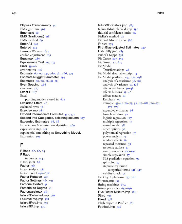
692 Index
Ellipses Transparency 451EM algorithm 469Emphasis 50EMS (Traditional) 118EMS method 69Enter All 140Entered 143Entropy RSquare 633epsilon adjustment 169Equamax 489Equivalence Test 113, 255Error 59–60error matrix 166Estimate 60, 90, 143, 260, 363, 366, 379Estimate Nugget Parameter 295Estimates 68, 70, 76, 81–88Even Spacing 466evolution 377Exact F 167Excel
profiling models stored in 622Excluded Effect 46excluded rows 59Exercise.jmp 164Expand Intermediate Formulas 557, 575Expand Into Categories, selecting column 257Expanded Estimates 66, 68Expectation Maximization algorithm 469expectation step 461exponential smoothing see Smoothing ModelsExpression 594
FF Ratio 60, 62, 64F Ratio
in quotes 144F test, joint 69Factor 363factor analysis 483factor model 656–672Factor Rotation 486Factor Settings 565, 591Factorial Sorted 41Factorial to Degree 41Factorparsimax 489failure3Delimited.jmp 389Failure3Freq.jmp 388failure3Freq.jmp 397failure3ID.jmp 390
failure3Indicators.jmp 389failure3MultipleField.jmp 391fiducial confidence limits 72Fieller’s method 72Filtered Monte Carlo 566First 274Firth Bias-adjusted Estimates 430Fish Patty.jmp 583Fisher’s Kappa 358Fit Curve 247–252Fit Group 52, 625Fit Model
Transformations 48Fit Model data table script 33Fit Model platform 147, 224, 658
analysis of covariance 38, 128analysis of variance 37, 126effects attributes 39–48effects buttons 39–40effects macros 41Emphasis 50example 43–45, 70–73, 93, 117–118, 570–571,
577–579expanded estimates 66launch window 50logistic regression 197multiple regression 37nested model 38other options 50polynomial regression 37power analysis 75random effects 114repeated measures 39response surface 39row diagnostics 100–101simple regression 37SLS prediction equation 92split-plot 39stepwise regression
categorical terms 146–147validity check 52
Fit Y by X platform 197, 221Fitness.jmp 135fitting machines 674fitting principles 653–656Five Factor Mixture.jmp 586Fixed 593Fixed 378Flash object in Profiler 562Football.jmp 146
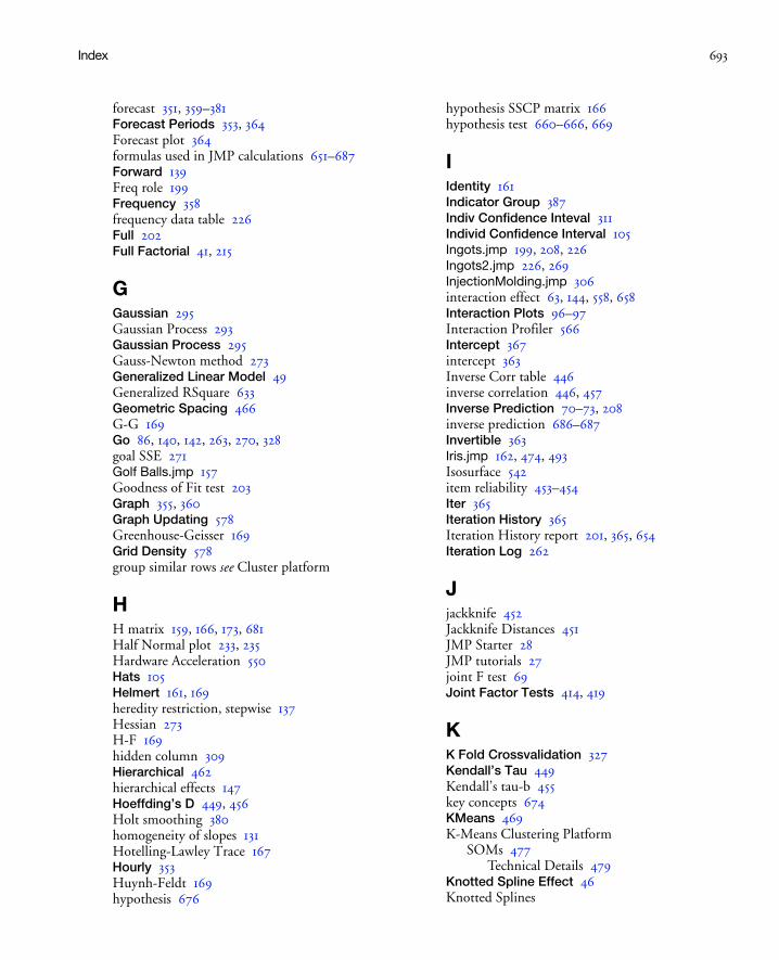
Index 693
forecast 351, 359–381Forecast Periods 353, 364Forecast plot 364formulas used in JMP calculations 651–687Forward 139Freq role 199Frequency 358frequency data table 226Full 202Full Factorial 41, 215
GGaussian 295Gaussian Process 293Gaussian Process 295Gauss-Newton method 273Generalized Linear Model 49Generalized RSquare 633Geometric Spacing 466G-G 169Go 86, 140, 142, 263, 270, 328goal SSE 271Golf Balls.jmp 157Goodness of Fit test 203Graph 355, 360Graph Updating 578Greenhouse-Geisser 169Grid Density 578group similar rows see Cluster platform
HH matrix 159, 166, 173, 681Half Normal plot 233, 235Hardware Acceleration 550Hats 105Helmert 161, 169heredity restriction, stepwise 137Hessian 273H-F 169hidden column 309Hierarchical 462hierarchical effects 147Hoeffding’s D 449, 456Holt smoothing 380homogeneity of slopes 131Hotelling-Lawley Trace 167Hourly 353Huynh-Feldt 169hypothesis 676
hypothesis SSCP matrix 166hypothesis test 660–666, 669
IIdentity 161Indicator Group 387Indiv Confidence Inteval 311Individ Confidence Interval 105Ingots.jmp 199, 208, 226Ingots2.jmp 226, 269InjectionMolding.jmp 306interaction effect 63, 144, 558, 658Interaction Plots 96–97Interaction Profiler 566Intercept 367intercept 363Inverse Corr table 446inverse correlation 446, 457Inverse Prediction 70–73, 208inverse prediction 686–687Invertible 363Iris.jmp 162, 474, 493Isosurface 542item reliability 453–454Iter 365Iteration History 365Iteration History report 201, 365, 654Iteration Log 262
Jjackknife 452Jackknife Distances 451JMP Starter 28JMP tutorials 27joint F test 69Joint Factor Tests 414, 419
KK Fold Crossvalidation 327Kendall’s Tau 449Kendall’s tau-b 455key concepts 674KMeans 469K-Means Clustering Platform
SOMs 477Technical Details 479
Knotted Spline Effect 46Knotted Splines
694 Index
test for curvature 46Kruskal-Wallis 674
LL matrix 681lack of fit error 62, 130Lack of Fit table 62, 203, 220Lag 363Laptop Profile.jmp 415Laptop Runs.jmp 416Laptop Subjects.jmp 417Latin Square design 124layered design 115, 124Leaf Report 326least significant number 75, 80–81, 683–685least significant value 75, 80–81, 683–685Least Sq Mean 108least squares fit
introduction 653prediction equation 92
least squares means 660, 670Least Squares Means table 108Legend 466Lenth’s method 92Lenth’s PSE 233, 239Level 108level smoothing weight 377Leverage Plot 101–104, 130, 678–680
confidence curves 103interpret 103–104
Lift Curve 339, 635Lift Curves 339likelihood confidence intervals 271Likelihood Ratio test 205, 220Likelihood Ratio Tests 409Likelihood Ratio Tests 205, 414limitations of techniques 672–674linear combination 483Linear Constraints 583Linear Constraints 575linear dependence 661–664linear exponential smoothing 380linear rank tests 674Link Profilers 565Load Version 3 Model 51Loading Plot 485Lock 143, 325Lock Columns
Partition platform 326
Lock Factor Setting 562, 565Lock Z Scale 545Log Iterations 591Log Variance Effect 45Logistic platform 197
example 214–225, 268response function 197also see Fit Model platform, Fit Y by X platform
Logistic Stepwise Regression 148Logistic w Loss.jmp 268–LogLikelihood 202Log-Linear Variance 303LogLinear Variance 48Loglinear Variance 305LogLinear Variance Model 303, 305–314log-variance effect 305longitudinal data 169Loss 268–269loss function
custom 272Lost DFs 62Lower CL and Upper CL 260LSL Chop 604LSMeans 109LSMeans Contrast 110, 128LSMeans Plot 109LSN 75, 80–81, 683–685LSV 75, 80–81, 683–685Lung Cancer Responses.jmp 428Lung Cancer.jmp 430
MM matrix 160, 166, 171, 681machines of fit 674Macros 41, 43, 215MAE 363Mahalanobis distance 452, 457
plot 451Make Model 140, 147–148, 233Make Table 595, 597MANOVA 115, 167Manova 48manova 115Manova test tables 167MAPE 362Mauchly criterion 169Max 263Max RSq 64Maximization Options 563

Index 695
maximization step 462Maximize 568Maximize Desirability 563Maximize for Each Grid Point 564Maximize for each Grid Point 413maximum likelihood 199, 654Maximum Value 562Mean 108, 161, 169mean 653Mean Abs Dev 634Mean Confidence Interval 105, 311Mean Line 355Mean -Log p 633mean model 305Mean of Response 59mean shift 604Mean Square 60, 64measurement study 114Measures of Fit report 633menu tips 29Mesh 549Method 117Min 263Minimal Report 50Minimize 568Minimum Setting 562Minimum Size Split 326Minimum Theta Value 295Minute 353Misclassification Rate 634missing cells 661–664, 670
nominal vs. ordinal factor 670–672missing value 446missing values 447missing values (Fit Model) 52Mixed 139mixed model 113, 115Mixture Effect 45Mixture Profiler 579Mixture Response Surface 41Model 59, 202Model Averaging 634Model Comparison 633Model Comparison platform 627
example 629–632, 635–637launch 632options 634report 633
Model Comparison table 360Model Dialog 414
model effects buttons 39–40Model Library 264model significance 101Model Summary table 361, 367Monte Carlo simulation 231Monthly 353Moving Average Order 366MSE 140, 260Multiple Delimited 387multiple inference 673multiple regression example 135Multiple Response 387Multiple Response by ID 387multiple response fitting 559, 570Multivariate 594Multivariate 441, 443multivariate analysis of variance see Fit Model
platformmultivariate least-squares means 161multivariate mean 155, 452, 457multivariate outliers 452Multivariate platform 680–683
example 453principal components 483
NN Runs 595N Strata 595, 626nDF 143Negative Exponential.jmp 273negative log-likelihood 201, 675negative variance components 116Nest 39–40nested effect 120, 124, 659, 665neutral values 107New Column 111Newton 262Newton-Raphson method 273No Noise 594No Rules 140Noise Factors 615–621Noise Factors 557Nominal 203nominal factor 657, 660–664Nominal Logistic 48nominal response model 653–655nonestimable 656nonlinear fit options 261Nonlinear Model Library 264
696 Index
Customizing 267Nonlinear platform 241, 268–270
derivatives 273–274Fit Curve 247–252
Nonparametric Correlations 449Nonparametric Measures of Association table 449nonstationary time series 359Norm KHC 123Normal censored 593normal density ellipse 450normal distribution 115, 676Normal Plot 84Normal Truncated 593Normal Weighted 625Normal weighted 593, 597Nparm 62Nugget parameters 298null hypothesis 75Number 77Number of Clusters 466Number of Forecast Periods 359Number of Plots Across 530Number of Plotted Points 562Number of Points 263NumDeriv 274Numeric Derivatives Only 262, 269
OObbiquartimax 489Obequamax 489Obfactorparsimax 489Obj-Criterion 365Oblimin 489Obparsimax 490Obquartimax 490Observations 59, 203Obvarimax 490Odds Ratio 208Odds Ratio Example 208Odor Control Original.jmp 43Offset 186offset variable 186opening
JMP Starter window 28Optimal Value 325Option-click 561OPTMODEL formulas 563Ordered Differences Report 113ordinal crossed model 669
ordinal factor 670ordinal interaction 668ordinal least squares means 670Ordinal Logistic 48ordinal logistic regression 218ordinal response model 653, 655–656Orthog Coded 90Orthog t-Ratio 85, 90Orthomax 489orthonormal response design matrix 168Other 451Outlier Analysis 451Outlier Distance plot 457Output Grid Table 565–566Output Random Table 566Output Split Table 325outside interval 72
Pp, d, q parameters 366Pairwise Correlations 446Pairwise Correlations table 447Parallel Coord Plots 472Parameter 69, 143, 260, 263Parameter Contour Profiler 262Parameter Estimate Population table 89Parameter Estimates Population table 84Parameter Estimates table 43, 60, 186, 363parameter interpretation 657Parameter Power 75–76Parameter Profiler 262Parameter Surface Profiler 262Parametric Survival 49Pareto Plot 88Parsimax 489Partial Autocorrelation 356, 360partial autocorrelation 354Partial Corr table 446partial correlation 446Partial Least Squares platform
validation 510partial-regression residual leverage plot 101Partition 315Partition Platform 315–323Paste Settings Script 565PCA 483Pearson correlation 447, 455Pearson Residuals By Predicted 195Per Mouse Move 578

Index 697
Per Mouse Up 578Period 358periodicity 367Periodogram 359periodogram 358Periods Per Season 367, 378personality 135Pillai’s Trace 167Pizza Choice Example 405–427Pizza Combined.jmp 421Pizza Profiles.jmp 407, 423Pizza Responses.jmp 407, 423Pizza Subjects.jmp 410, 423Plot Actual by Predicted 634Plot Actual by Predicted 100, 311Plot Actual by Predicted (Partition) 326Plot Effect Leverage 100Plot Residual By Predicted 100Plot Residual By Row 100Plot Residual by Row 634Plot Studentized Residual by Predicted 311Plot Studentized Residual by Row 311PLS 505, 507–522
Statistical Details 520–522Poisson loss function 270–271Polynomial 161, 169Polynomial to Degree 41population of levels 113posterior probability 87power 75, 81Power Analysis 75–88, 683–685Power Plot 79Predicted Values 104prediction equation 92, 130Prediction Formula 44, 104, 310prediction formula 211, 656–669Prediction Profiler 93, 557Predictor role 268–270Predictors report 633Press 100pressure cylinders fitting machine 677Principal Components 487principal components analysis 483prior probability 85Prob to Enter 139Prob to Leave 139Prob>|t| 60, 90, 364Prob>ChiSq 203Prob>F 60, 62, 64, 167Prob>F
in quotes 144probit example 269–270process disturbance 351product-moment correlation 447, 455Profile 161, 169profile confidence limits 271–272Profile data 404profile likelihood confidence intervals 271profile trace 557Profiler
and saved standard error formulas 106Profiler 93, 194, 214, 262, 310, 312, 414, 557Profilers 553–621Prop of Error Bars 563, 571Proportional Hazards 49Proportional Hazards
also see Fit Model platformPrune Below 325Prune Worst 325–326pseudo standard error 92pure error 62
Qquadratic equation 686quadratic ordinal logistic regression 224Quartimax 489Quartimin 490QuasiNewton BFGS 262QuasiNewton SR1 262questionnaire analysis 453–454
RR 144&Random 119Random 593Random Effect 45, 119, 135random effects 69, 114
introduction 114Range Odds Ratios 207RASE 633RASE, model comparison 633Rater Agreement 387Reactor.jmp 144reduce dimensions 483Reduced 202Ref Labels 582Ref Lines 582references 639–650relative significance 673

698 Index
reliability analysis 453–454also see Survival platform
Remember Settings 565, 590Remember Solution 260REML (Recommended) 117REML method 69
results 122–123Remove 353Remove All 140Remove Contour Grid 583Repeated Measures 161, 386repeated measures design 114, 155
example 169, 171–173replicated points 62Reset Factor Grid 564residual 59residual matrix 166Residual Statistics 365residual/restricted maximum likelihood 122–123Residuals 105, 310residuals 114, 364, 653Response data 404Response Frequencies 387Response Limits 596response models 653–656Response Specification dialog 160Response Surface 41–42, 222response surface 42–45Response Surface Effect 45Response Surface table 44Restrict 140, 147restricted vs. unrestricted parameterization 116retrospective power analysis 75rho see loss functionright-click 123, 126RMSE 77, 86, 633RMSE 260RMSE, model comparison 633Robust Engineering 615–621ROC 212ROC Curve 337, 634ROC Curve 337, 499ROC Curves 336Root Mean Square Error 58row diagnostics 100–101Roy’s Maximum Root 167R-Square 633RSquare 58, 141, 362RSquare (U) 203RSquare Adj 58, 141, 362
Rules 140Run Model 71–72, 199, 223, 233
SSalt in Popcorn.jmp 224sample autocorrelation function 355sample of effects 113Sampled 593SAS GLM procedure 651, 653–666saturated 62Save 211, 360, 673Save As Flash (SWF) 562Save Best Transformation 99Save Canonical Scores 162, 500Save Cluster Hierarchy 467Save Clusters 466, 472Save Coding Table 106Save Columns 44, 195, 365Save Density Formula 472Save Desirabilities 564Save Desirability Formula 564Save Discrim 173, 683Save Display Order 466Save Expanded Formulas 575Save Expected Values 211–212Save Gradients by Subject 414, 423Save Inverse Prediction Formula 264Save Leaf Label Formula 328Save Leaf Labels 327Save Leaf Number Formula 327Save Leaf Numbers 327Save Linear Constraints 566, 591Save Mixture Formulas 472Save Mixture Probabilities 472Save Predicted 327, 331, 334Save Predicted Values 104Save Prediction Formula 263, 327, 331, 334Save Probability Formula 211Save Quantiles 211–212Save Residual Formula 264Save Residuals 327, 331, 334Save Specific Solving Formula 264Save Spectral Density 358Save Std Error of Individual 264Save Std Error of Predicted 105, 263Save to Data Table 50Save to Script window 50Save Tolerant Prediction Formula 331Save Utility Formula 414

Index 699
SBC 362Scaled Estimates 82Scatterplot Matrix 449scatterplot matrix 445Schwartz’s Bayesian Criterion 362Score Options 499Score Plot 485Scree Plot 485screening analysis see Fit Model platformscreening design 83Seasonal ARIMA 351Seasonal ARIMA 367seasonal exponential smoothing 380seasonal smoothing weight 377Second 353Second Deriv Method 246Second Deriv. Method 273Select Rows 325select rows 464Sensitivity Indicator 563Separate Response 396Separate Responses 386Sequential Tests 68Seriesg.jmp 353seriesJ.jmp 368Set Desirabilities 564, 568Set Random Seed 595Set Script 565Set To Data in Row 565Shaded Ellipses 451Ship 186Ship Damage.JMP 186Ship Damage.jmp 270Show 562Show Biplot Rays 472, 499Show Canonical Details 499Show Confidence Interval 364–365Show Constraints 582Show Correlations 451Show Current Value 582Show Derivatives 262, 273Show Distances to each group 499Show Formulas 563Show Graph 325Show Histogram 451Show Means CL Ellipses 499Show Normal 50% Contours 499Show Points 266, 325, 355, 364–365, 450, 499, 582Show Prediction Expression 65Show Probabilities to each group 499
Show Split Bar 326Show Split Candidates 326Show Split Count 326Show Split Prob 326Show Split Stats 326Show Tree 325Sigma 571Sigma 77significance of model 101significance probability 447
stepwise regression 133simple exponential smoothing 379Simulate 601Simulation Experiment 595Simulator 566, 592Simulator 566Sine 359Single Linkage 468singularity 661–664, 670SLS fit see Fit Model platformSmall Tree View 326Smoothing Model dialog 378smoothing models 351, 376–381smoothing weight 377Solubility.jmp 483Solution table 44–271Solve for Least Significant Number 77Solve for Least Significant Value 77Solve for Power 77SOM Technical Details 479SOMs 477Sort Spit Candidates 326Source 59, 62–63sources 639–650Spearman’s Rho 455Spearman’s Rho 449Spec Limits 595–596Specified Value 325Spectral Density 357, 359spectral density plots 351sphericity 168–169Split Best 324, 326Split Here 324Split History 326split plot design 114
example 119–122Split Specific 325spring fitting machine 675–676SS 144SSE 99, 140, 260

700 Index
Stable 363Stable Invertible 378Stack 226Stacked Daganzo.jmp 433Standard Deviation 362standard least squares 48, 55
prediction equation 92also see Fit Model platform
Standardize Data 462statistical details 651–687Std Beta 60–61Std Dev Formula 310Std Err Scale 86Std Error 60, 108, 363Std Error of Individual 311Std Error of Predicted 105, 311Std Error of Residual 105Std Narrow 604StdErr Pred Formula 105Step 140, 365stepwise
heredity 137stepwise regression 48, 135, 147
categorical terms 146–147example 135, 142–143, 145Logistic 148
Stochastic Optimization.jmp 606Stop 140Stop At Boundaries 574Studentized Deviance Residuals by
Predicted 195Studentized Pearson Residuals by
Predicted 195Studentized Residuals 105, 310Subject data 404Submit to SAS 51, 365substitution effect 130subunit effect 114Sum 160–161, 169, 171sum M matrix 171Sum of Squared Errors 362Sum of Squares 59, 62–63Sum of Weights 59Sum Wgts 203Summary of Fit table 58Surface Fill 549Surface Plot 535
Constants 551Control Panel 544Dependent Variables 546
Variables 545Surface Plot 578Surface Profiler 591Surface Profiler 194, 262, 310, 312, 537survival regression see Fit Model platformsymbolic derivative 273synthetic denominator, effect 124
Tt Ratio 60, 90, 364T2 Statistic 451Table Format 393Table Transposed 394Taguchi 303Target 568Term 60, 363Test 167Test Details 161–162Test Each Column Separately Also 160Test Each Response 395, 397Test Parallelism 253Test Reponse Homogeneity 396Test Response Homogeneity 395Test Slices 113Time Frequency 353Time ID role 353Time Series Graph 355Time Series platform 351, 353–381
ARIMA 365–367commands 355–360example 353–354launch 353–354modeling report 360–365Seasonal ARIMA 367smoothing models 376–381
Time Series Plot 354Time Series role 353Tiretread.jmp 539–540, 559, 602, 616tiretread.jmp 570tooltips 29Transfer Function 373Transfer Function Models 368Transfer Function Models 351transform covariate 130Transition Report 395transmitted variation 615tree diagram 464trend 377Turn At Boundaries 574

Index 701
tutorial examplesanalysis of covariance 128compound multivariate model 171–173contour profiler 93, 577–579correlation 453desirability profile 570–571hierarchical clustering 463inverse prediction 70–73logistic regression 214–225, 268multiple regression 135one-way Anova 126probit 269–270random effects 117–118repeated measures 169, 171–173response surface 43–45split plot design 119–122stepwise regression 135, 142–143, 145time series 353–354
tutorials 27Two way clustering 466Type 1 sums of squares 68Type I sums of squares 68Types III and IV hypotheses 660
Uuncertainty 674Unconstrained 378Unit Odds Ratios 207Univariate 446Univariate Tests Also 160, 170unrestricted vs. restricted parameterization 116Unthreaded 262Up Dots 578, 582USL Chop 605usual assumptions 672–674
Vvalidity 673Value 167Variability Chart platform 114variance components 114, 116Variance Effect Likelihood Ratio Tests 310Variance Estimate 362Variance Formula 310Variance Parameter Estimates 309Varimax 489Variogram 351, 356, 360VIF 61
W-ZWald test 205, 220Ward’s 468Weekly 353Weld-Repaired Castings.jmp 236Whole Effects 140Whole Model Leverage Plot 101Whole Model table 166, 201Wilcoxon rank-sum 674Wilks’ Lambda 167Winter’s method 381within-subject 120, 169, 171X role 268–270, 353Y role 353, 462Y, Prediction Formula 557zero eigenvalue 44Zero To One 378zeroed 656

702 Index