measuring infrastructure in the bureau of economic
TRANSCRIPT

Measuring Infrastructure in the Bureau of Economic Analysis National Economic Accounts
Authors Jennifer Bennett, Robert Kornfeld, Daniel Sichel and David Wasshausen*
Contact [email protected]
Date December 2020
Abstract Infrastructure provides critical support for economic activity, and assessing its
role requires reliable measures. This paper provides an overview of U.S. infra-
structure data in the National Economic Accounts. After developing definitions
of basic, social, and digital infrastructure, we assess trends in each of these cat-
egories and their components. Results are mixed depending on the category.
Investment in some important types of basic infrastructure has barely or not
kept up with depreciation and population growth in recent decades, while some
other categories look better. We also show that the average age of most types of
infrastructure in the U.S. has been rising, and the remaining service life has been
falling. This paper also presents new prototype estimates of state-level invest-
ment in highways, highlighting the wide variation across states. In addition,
we present new prototype data on maintenance expenditures for highways. In
terms of future research, we believe that deprecation rates warrant additional
attention given that current estimates are based on 40-year old research and
are well below those used in Canada and other countries. We also believe that
additional creative work on price indexes for infrastructure would be valuable.
Finally, all of the data in this paper are downloadable, and we hope that the
analysis in this paper and the availability of data will spur additional research.
Keywords infrastructure, digital infrastructure, social infrastructure, depreciation rates,
service lives, highway, repair and maintenance
JEL Code E22
BEA Working Paper Series, WP2020-12
* Bennett, Kornfeld, and Wasshausen, U. S. Bureau of Economic Analysis (BEA); Sichel, Wellesley College and the National Bureau of Economic Research (NBER). This paper is part of the National Bureau of Economic Research Economics of Infrastructure Project, supported by the Smith Richardson Foundation The views expressed in this paper are solely those of the authors and not necessarily those of BEA, the Department of Commerce, or NBER. For useful comments and discussions, we thank the editors of this volume, Peter Henry, Shane Greenstein, other participants in the NBER’s Economics of Infrastructure Conference in November 2019, and Barbara Fraumeni. We also thank Michael Cusick at BEA for his assistance.

2
1. Introduction
Infrastructure provides critical support to the economy and contributes importantly to living stan-
dards; assessing its role in the economy requires defining and measuring it.1 That latter task, defining
and measuring infrastructure, is the topic of this paper. We focus on the measurement of infrastructure
in the U.S. National Economic Accounts (NEAs) to highlight the availability of these data and to gauge
trends in recent decades. In particular, we ask if investment in infrastructure by the public and private
sectors (and the associated capital stocks) has kept up with key measures, such as population and gross
domestic product (GDP).2 Assessing these trends is particularly valuable given ongoing changes in the
nature of infrastructure as networks, connectivity, alternative-energy infrastructure, and digital and
intangible infrastructure have become increasingly important and the focus of policy debates.
We begin with the challenging question of the definition of infrastructure. Defining the economic
boundaries of “infrastructure” is imprecise and somewhat subjective. We consider three broad cat-
egories of infrastructure that can gauge different aspects of infrastructure from a national accounts
standpoint. “Basic” infrastructure (for example, transportation and utilities) reflects a traditional
definition of infrastructure. From there, we expand that core to include additional economic activ-
ity that would potentially be included in infrastructure, including social and digital infrastructure.3
Chart A below illustrates this idea of basic or core infrastructure surrounded by broader concepts
of infrastructure. Moreover, within each of these types, some infrastructure is owned by the public
sector and some by the private sector.
Chart A. Basic Infrastructure
‘Basic’Infrastructure
SocialInfrastructure(e.g., schoolsand hospitals)
DigitalInfrastructure(e.g., communication‐and cloud-related
1. In a classic paper, Aschauer (1989) argued that government infrastructure was a key determinant of aggregate productivity growth in the United States from 1949 to 1985. While the empirical magnitude of the effect has been a subject of debate (see Fernald 1989), the basic idea stands that infrastructure is an important economic input. Munnell (1992) also highlights the important role of infrastructure.
2. The data developed and discussed in this paper are available in downloadable spreadsheets to enhance opportunities for further research.
3. As noted below, an interesting further extension would include a wide range of intangible infrastructure. Research and development (R&D) and more extensive coverage of software could be contemplated within the current asset boundary of the national accounts, while extensions to a wider set of intangible assets would require expanding the asset boundary in the accounts. For a discussion of public intangibles, see Corrado, Haskel, and Jona-Lasinio (2017).

3
After providing details on this framework for defining infrastructure, we describe the methodol-
ogies and the source data used by the Bureau of Economic Analysis (BEA) to estimate U.S. infra-
structure investment, depreciation, and net stocks.
With definitions in hand, we consider different metrics for gauging levels and trends of U.S. infra-
structure. In addition to measures for overall infrastructure, we will consider infrastructure by
broad category, by detailed type, and by public or private ownership. Our data analysis covers the
following topics, with our main conclusions briefly summarized here as well.
Investment and capital stocks
• In terms of the composition of infrastructure stocks, the share of gross investment in basic
infrastructure out of all infrastructure has fallen since the late 1950s, while the shares of
social and digital infrastructure have increased. For net capital stocks, the share of basic
infrastructure has fallen while the share of social has risen.
• In terms of ownership, the share of the infrastructure capital stock that is publicly owned (both
state and local) has increased since the late 1950s, while the privately- owned share has fallen.
An important contributor to the decline in the private share is the huge drop in the investment
share of privately-owned railroads.
• Gross real investment in infrastructure has trended up for most types of infrastructure,
although patterns are widely mixed across asset types. These data highlight the resources
devoted to different types of infrastructure each year and provide a useful overview of trends.
These data also are closest to the source data before translation into net investment or capital
stock measures (which rely on estimates and assumptions about depreciation).
• Regarding trends in the budget resources devoted to infrastructure, gross real investment per
capita has gently drifted up since the early 1980s. However, depreciation has absorbed a rising
share of that investment and real net investment per capita has barely risen.
• Growth rates of real net capital stocks per capita also provide a metric for assessing how well
infrastructure investment has kept up. This metric is particularly interesting because of its
connection to measures of the contribution of capital to productivity growth. For this metric,
the real net stock of basic infrastructure per capita has been soft for a long time, running
below a 1 percent pace. For social infrastructure, this metric rose at more than a 2 percent pace
during the 2000s, but since the financial crisis its growth rate has been around just 1 percent.
The growth rate of the real net stock of digital infrastructure per capita has been much higher
than that of other types of infrastructure though it has been quite volatile. It is difficult to
draw strong conclusions from these charts, though infrastructure investment certainly has, in
general, not been growing rapidly (with the exception of digital infrastructure, some categories
of electric power, medical equipment, and a few other categories).

4
State-level data. As interesting as national measures of infrastructure are, infrastructure is built in
a specific region and has specific benefits for that region. In addition, the geographic distribution of
infrastructure obviously carries considerable political salience. However, the national accounts do
not, in general, include information on regional breakdowns of infrastructure. To get some visibility
into the geographic distribution of infrastructure, we present new prototype measures on highway
investment by state.4 These estimates show that investment per capita and as a share of GDP has
varied dramatically across states. Interestingly, the state-by-state rankings have tended to be rela-
tively stable since 1992 (when our state-level data begin).
Depreciation rates, service lives, and the age of the infrastructure stock. This paper also reviews
the methodology and estimates used for calculating depreciation rates, service lives, ages, and
remaining service life for infrastructure assets. Regarding depreciation, the rates used in the national
accounts for infrastructure assets were developed about 40 years ago. In addition, even at that time,
the information set used for developing estimates of depreciation was relatively thin. It is an interest-
ing question as to whether depreciation rates have changed over that period, although international
comparisons raise the possibility that new research would generate different estimates.
On the age of the stock and remaining service life, the average age of the publicly-owned basic and
social infrastructure stock in the United States has increased quite noticeably in recent decades
and remaining service life of infrastructure assets has been falling. Moreover, average ages of stocks
in the United States are often above those in Canada and have followed a different trend. While
ages have increased in the United States, the average age of comparable types of infrastructure in
Canada has decreased during the past 10 years.
Maintenance expenditures. Regarding depreciation and maintenance, a host of interesting issues
are raised by the fact that maintenance expenditures and new investment can sustain the service
flow from some types of infrastructure for many years.5 To push forward on issues related to main-
tenance expenditures; we present new prototype data for maintenance expenditures for highways.
These maintenance expenditures have amounted to about 15 percent of gross investment in high-
ways, running a bit below that chart from the late 1990s through about 2011 and above that chart
since then.
Prices. This paper also reviews trends in price deflators and quality change for infrastructure
assets. Prices of infrastructure increased more rapidly than GDP prices in the first part of the sam-
ple (1947–1987), but more slowly than GDP prices since 2000. Since 2010, overall infrastructure
4. We use the term prototype here to denote that neither these estimates, nor the methods used to prepare them, have been approved by BEA for official publication. The same qualification applies to new data on maintenance expenditures described below.
5. See Diewert (2005) for a model in which maintenance expenditures sustain the service flow from an asset.

5
prices have changed little, a pace noticeably below that for GDP prices. The softness in infrastruc-
ture prices since the financial crisis reflects a stepdown in rates of increase for basic and social
infrastructure. Within social infrastructure, prices for health care infrastructure have fallen since
2010, owing largely to declines in quality-adjusted prices for medical equipment.
Our final conclusions focus on methodology and directions for future research. First, as we high-
light below, estimates of depreciation rates warrant a fresh look. Second, price deflators for some
categories of infrastructure are based on cost indexes, which may not fully reflect quality improve-
ments and productivity gains. Third, we note that in some cases, relevant data are not granular
enough to isolate digital infrastructure assets of interest, suggesting that greater granularity would
be valuable. Fourth, we believe that development of additional data on regional estimates and for
maintenance expenditures would be valuable. Finally, we believe much could be gained from addi-
tional international comparisons. The UK Office for National Statistics is actively engaged in inter-
national comparisons of infrastructure across Europe and has issued a series of interesting reports
presenting their results.6 Of course, we are not the first to make these methodological observations,
and the problems are challenging. Some creativity and novel data likely are the key to progress in
these areas.
This paper is organized as follows. Section 2 describes our definitions of basic, social, and digital
infrastructure, and section 3 describes the methodologies and data used by BEA in its estimates of
infrastructure investment, net capital stocks, depreciation rates, and prices. Section 4 turns to anal-
ysis of the data, highlighting both recent and longer-term trends. At the beginning of section 4, we
provide a roadmap of the different metrics we examine and the broad questions our analysis speaks
to. Section 5 concludes and offers our thoughts on directions for future research.
Please note that most of the tables and charts referred to in this document are located in the appendix.
6. These reports prepared by United Kingdom’s Office for National Statistics are available online here: First article, July 2017; Second article, August 2018; Third article, May 2019.

6
2. Defining infrastructure
Defining infrastructure is not a precise science and is prone to subjective analysis. Henry Cisneros,
former Secretary of Housing and Urban Development, defined infrastructure capital as the struc-
tures and equipment that comprise “the basic systems that bridge distance and bring productive
inputs together” (Cisneros 2010). These systems or elements of them often are shared and can have
characteristics of public goods—for example, the interstate highway system—though infrastructure
also can be excludable and rival public goods (for example, a toll road suffering from congestion).
One preliminary issue for implementing any definition of infrastructure is deciding whether to cate-gorize by type of asset or by private industry or by government function. In this paper, we categorize by asset type; for example, we consider specific assets providing transportation rather than the total capital stocks used in various industries providing transportation services. We believe this classifica-tion provides sharper focus for analyzing recent trends in infrastructure by keying in on specific assets that may have grown rapidly or slowly relative to other economic trends. In addition, this asset-type approach lines up more closely with available estimates of depreciation rates and prices in the NEAs.
Turning to our specific definitions, our ‘basic’ measure of infrastructure is largely consistent with Cisneros’ concept. In particular, we define “basic” infrastructure to include those asset- types, both structures and equipment, related to power, transportation, water supply, sewage and waste dis-posal, and conservation and development (dams, levees, sea walls, and related assets). Expanding our definition from basic (or core) infrastructure, we consider social infrastructure, including assets such as public safety facilities, schools, and hospitals. Our final expansion from basic infra-structure brings in digital infrastructure, assets that enable the storage and exchange of data through a centralized communication system.
Digital infrastructure is particularly challenging to define, both because much of it represents new and evolving technologies and because, in some cases, the national account data are not sufficiently granular to separately identify assets of interest. Moreover, deciding what portion of specific assets to allocate to digital infrastructure raises challenging issues. For example, the equipment and soft-ware providing wireline and wireless access to the internet could, in principle, be counted as part of cloud computing infrastructure and therefore included in a measure of digital infrastructure. However, these assets are also used for other purposes. Perfectly dividing these assets and sorting out these issues may be impossible.
Despite these difficulties, we forge ahead and propose a definition of digital infrastructure, with the understanding that it likely will evolve as additional research and data work allow further refinement. Our definition includes pieces that are identifiable in the national accounts and that we believe would unambiguously be considered infrastructure. In particular, we include all

7
private communication structures—for example, cell towers—as well as computers, communica-tions equipment, and software owned by the broadcast and telecommunications industries (North American Industry Classification System (NAICS) 515 and 517) and by the data processing, internet publishing, and information services industries (NAICS 518 and 519).7 This latter category should include the equipment and software within data centers.
The assets described in the last paragraph cover an important part, but by no means all, of what would be thought of as the infrastructure supporting the internet and cloud computing. One important category that is missing is the structures component of data centers. (As described above, we believe we are capturing the equipment and software within data centers.) As strange as this may sound, these structures likely fall within the “office” category of commercial con-struction but are not currently broken out as a separate line item so cannot be directly quantified. Nevertheless, collateral evidence points to extremely rapid growth in these types of structures. As shown in the chart below, office construction for establishments classified in NAICS 518 and 519 (data processing, hosting, and related services and other information services) surged dramatically after 2012, timing that is roughly consistent with a boom in data center construction. While this category includes office structures unrelated to data centers and that we would not want to include in our definition, the surge strongly suggests that data centers are a big growth category. With some further work, it may be possible to isolate the data center piece of this category and include it in a definition of digital infrastructure.
Chart B. Office Buildings Construction, Owned by NAICS 518 and 519
7. Our definition of digital infrastructure explicitly excludes servers owned by private firms outside of NAICS 518 and 519. If such a firm in the auto industry, for example, transitioned most of its computing from private servers to Amazon Web Services, then the private server that is being transitioned away from (and not replaced) would be out of scope in our definition while the server run by Amazon would, in principle, be in scope in our definition. The logic of this outcome is that the firm is transitioning from utilizing a privately used asset to a shared digital “infrastructure” asset.

8
Returning to the big picture, note that one category of infrastructure that we largely omit is intan-
gible infrastructure (except for selected software). Within the framework of the national accounts,
we did not develop a methodology for splitting R&D into infrastructure and noninfrastructure
components. In principle, this split could be done. Moreover, if the asset boundary in the national
accounts were expanded to include a wider set of intangible assets, then it would be possible to
include a wider set of intangible infrastructure in a definition.8
To provide some quick intuition for the size of our defined categories, the right three columns of
table 1 report net capital stock shares for types of basic, social, and digital infrastructure (and com-
ponents) out of total infrastructure for 1957, 1987, and 2017.9 These shares demonstrate the declin-
ing role of basic infrastructure and the greater role of social and digital infrastructure over the past
60 years. Table 2 provides detailed examples for the components of infrastructure.
8. See Corrado, Haskel, and Jona-Lasinio (2017) for an examination of public intangibles.
9. We report shares starting in 1957 even though our data reach back earlier. We begin in 1957 to avoid volatility related to the aftermath of the second World War.

9
3. Source data and methodology used for estimating investment, net capital stocks, and depreciation
The data for this paper are from BEA’s capital accounts, also known as the fixed assets accounts
(FAAs).10 BEA produces the U.S. National Income and Product Accounts (the NIPAs, or national
accounts) and is perhaps best known for the estimates of current production income—gross domestic
product (GDP) and gross domestic income (GDI).11 As part of its work to produce GDP and GDI, BEA
also produces the FAAs, which provide estimates of depreciation and capital stocks for many types of
private and government fixed assets used in production. These data exist from 1925 to the present.
More specifically, private and government gross investment (also known as capital investment or
gross fixed capital formation) in the NIPAs and FAAs refers to additions and replacements to the
stock of fixed assets without deduction of depreciation.12 Fixed assets are produced assets that are
used repeatedly in production for more than one year. Fixed assets include structures (buildings
and other generally immobile assets such as cables, pipelines, and roads), equipment (such as com-
puters and communications, industrial, and transportation equipment), and intellectual property
(software, research and development, and entertainment originals). The FAAs report investment
(as a component of GDP) as well as economic depreciation or consumption of fixed capital (as com-
ponents of GDP and GDI). Economic depreciation is defined as the decline in the value of stock of
these fixed assets due to normal physical deterioration and obsolescence. The FAAs also report net
capital stocks of fixed assets, reflecting the accumulation of previous investment less accumulated
depreciation. These statistics are reported in nominal and in inflation-adjusted (real, or chain) dol-
lars for over 100 types of government and private fixed assets, for the entire economy, for about
70 industries, and for several “legal forms of organization,” such as corporations, partnerships, sole
proprietorships, and nonprofits.
The FAAs’ comprehensive national statistics on investment, depreciation, and capital stocks are
widely cited and have several purposes. Net investment—investment less depreciation—is a useful
measure of the extent to which investment adds to the capital stock rather than merely replacing
stock lost to depreciation.
10. BEA’s main webpage is www.bea.gov. For the FAAs, see https://apps.bea.gov/iTable/index_FA.cfm
11. GDP, a measure of current period production, is the sum of personal consumption expenditures (spending by households and nonprofits), gross private domestic investment, the change in private inventories, net exports of goods and services, and government consumption expenditures and gross investment. GDI, which is theoretically equal to GDP but can differ because of measurement challenges, equals the sum of employee compensation, corporate profits, the income of sole proprietors and partnerships, net interest and some other income sources from current production. For more information see the NIPA handbook.
12. Estimates of fixed investment in the FAAs and in GDP are very similar; minor differences are presented at https://apps.bea.gov/iTable/index_FA.cfm, see “Relation of the NIPAs to the Corresponding Items in the FAAs.”

10
The FAAs are used in several ways. In the Integrated Macroeconomic Accounts (IMAs), produced
jointly by BEA and the Federal Reserve Board (FRB), the value of stocks of fixed assets are entries in
the balance sheets of major sectors of the U.S. economy, such as households, government, and non-
financial corporations. Rates of return of capital investment and q ratios presented by BEA and oth-
ers are based on BEA’s estimates of net stocks.13 The FAAs also are used for the estimates of multifac-
tor productivity (MFP) produced by the Bureau of Labor Statistics (BLS) and BEA’s industry-level
production account.14 Finally, and most germane to this paper, because a subset of the assets in the
FAAs are within our definition of infrastructure, these data can be used to gauge investment and
capital stocks of different types of infrastructure and to examine their long-term trends.
3.1 Methodology
In the FAAs, inflation-adjusted (real) net stocks and depreciation of fixed assets, including infra-
structure, are calculated for each type of asset using the perpetual inventory method (PIM). Under
the PIM, the real net stock of each asset type in a year equals last year’s real net stock plus the cumu-
lative value of real fixed investment through that year, less the cumulative value of real depreciation
through that year, less “other changes in the volume of assets” (mainly damage from major disas-
ters). Real economic depreciation (consumption of fixed capital (CFC)) for most assets is estimated
as a fixed percentage of the net stock (geometric depreciation).15 The PIM can be expressed as:
Kjt = Kj(t-1) (1 – δj) + Ijt (1 – δj / 2) – Ojt
where:
Kjt = real net stock for year t for asset type j
δj = annual depreciation rate for asset type j
Ijt = real investment for year t for asset type j
Ojt = other changes in volume of assets for year t for type j (often small or zero)
13. See the NIPA handbook for more information on the uses of CFC in the NIPAs. For a description of the IMAs, see Yamashita (2013). The IMAs can be found here. Rates of return may be calculated as net operating surplus (a measure of business income net of depreciation) as a share of the stock of fixed assets. q ratios are calculated as the ratio of financial-market valuation of corporate assets to the current-cost value of fixed assets. BEA produces an annual article on rates of return of fixed investment and q ratios; see Osborne and Retus (2018) here.
14. For estimates of and background on the BLS MFP estimates, see here. Note that these estimates rely on BEA’s investment data but BLS estimates its own measures of capital stocks, which are generally similar to BEA’s FAAs but use slightly different depreciation rates. For the BEA industry-level production account, see here.
15. Investment in the current year is depreciated using half the annual depreciation rates, under the assumption that investment occurs throughout the year. Price indexes used for investment and depreciation reflect the average price of the asset over the investment period, whereas price indexes used for stocks reflect the price of the asset at the end of the period. BEA constructs end of period prices using moving averages of the average period prices.

11
The PIM can be rewritten as
Kjt = Kj(t-1) + Ijt – Ojt – Mjt
where:
Mjt = Kj(t-1) δj + Ijt δj / 2
= real depreciation for year t for asset type j
(also known as CFC)
Real estimates of fixed investment are, for almost all assets, obtained by dividing estimates of nom-
inal investment by a price index. The prices used for the FAAs are generally the same prices used
for estimates of fixed investment in GDP. Once the real net stocks are estimated using the PIM, cur-
rent-cost net stocks are estimated by multiplying real net stocks by corresponding end-of-year price
indexes (we refer to this as “reflating”). For example, the current-cost estimate of the net stock for
2018 is an estimate of the replacement cost or market value of the stock at the end of 2018. Similarly,
current-cost depreciation or CFC is estimated by reflating real CFC with corresponding average
year price indexes. At the end of 2018, the estimated current-cost value of total private and govern-
ment net stocks of fixed assets was about $63 trillion, and depreciation was about $3.3 trillion.
The accuracy of these estimates depends, as the equation implies, on the accuracy of estimates of
investment, depreciation, and prices. The FAAs may, for example, overstate net stocks if the NIPAs
overstate fixed investment or understate depreciation. For many types of structures, annual depre-
ciation rates can be well below 5 percent, so that the current stock includes slices of investment
from decades earlier and errors in depreciation rates can result in significant biases in the amount
of older assets included in the net stock.
Regarding the role of prices, estimates of both real and current-cost net stocks of assets in any year
are sensitive to changes in these prices and to any errors in price measurement. For example, if
price indexes fail to accurately capture quality change and are biased, then real investment would
be misstated and therefore estimates of real stocks built up from these investment flows would be
biased. In addition, given the reflation procedure used to estimate current-cost net stocks, mismea-
surement of prices also will bias estimates of the current-cost stocks.16
16. The effects of price mismeasurement on real investment and current-cost stock reflation generally will not be exactly offsetting. The effect on real net stocks via real investment reflects mismeasurement of prices in past years, while the effect on current-cost stocks via reflation reflects mismeasurement of prices in the single year of prices used for reflation.

12
Despite these challenges, the FAAs provide perhaps the best available comprehensive estimates
of investment and stocks of U.S. infrastructure-related assets. The rest of this section of the paper
describes the methodology for estimating fixed investment, depreciation rates, and prices in
greater detail.
3.2 Data sources for investment
In BEA’s FAAs, the current-dollar fixed investment statistics that serve as the foundation for the
net stock estimates are generally the same as the fixed investment statistics that are part of BEA’s
estimates of GDP. These estimates rely on a wide and comprehensive range of source data. Most
infrastructure assets in this paper are classified as structures. For structures, current-dollar
investment in private and federal government nonresidential fixed investment is primarily based
on detailed value-put-in-place (VIP) data from the Census Bureau’s monthly survey of construc-
tion spending.17 Investment in state and local government structures is largely based on the 5-year
Census of Governments (COG) and the annual Surveys of State and Local Government Finances
(GF), with the Census VIP data used to extrapolate estimates for the months and years before the
next round of GF data are available.18
In these surveys of investment in structures, the value of construction put in place is defined as the
value of construction installed at the construction site during a given period, regardless of when the
overall project was started or completed, when the structure was sold or delivered, or when payment
for the structure was made. For an individual project, construction costs include materials installed
or erected, labor (both by contractors and in-house), a proportionate share of the cost of construc-
tion equipment rental, the contractor’s profit, architectural and engineering services, miscellaneous
overhead and office costs chargeable to the project on the owner’s books, and interest and taxes paid
during construction. This “sum of costs” estimate of investment does not reflect the eventual selling
price of the asset, which may be above cost in a strong market or below cost in a weak market.
The category “construction” includes the following items:
• New buildings and structures;
• Additions, alterations, conversions, expansions, reconstruction, renovations, rehabilitations,
and major replacements (such as the complete replacement of a roof or heating system);
• Mechanical and electrical installations, such as plumbing, heating, elevators, and central air
conditioning equipment; and
• Site preparation and outside construction of fixed structures or facilities.
17. For more information on the Census Bureau’s construction statistics, see https://www.census.gov/construction/c30/definitions.html.
18. For more information on NIPA measures of fixed investment, see the “NIPA Handbook of Concepts and Methods of the U.S. National Income and Product Accounts” chapters 6 and 9.

13
Construction costs and BEA’s estimates of fixed investment in structures exclude the cost of land
and the cost of routine maintenance and repairs. Investment reflects only the construction of new
assets and excludes the purchase of already existing assets.19
Our definitions of infrastructure also include some equipment and software categories. For private
equipment, such as computers and communications, medical, and electrical transmission and dis-
tribution equipment, BEA’s estimates are prepared using the commodity-flow method. This method
begins with a value of domestic output (manufacturers’ shipments) based on data from the quin-
quennial Economic Census and the Annual Surveys of Manufacturers. Next, the domestic supply of
each commodity—the amount available for domestic consumption—is estimated by adding imports
and subtracting exports, both based on the Census Bureau’s international trade data. The domestic
supply is then allocated among domestic purchasers—business, government, and consumers—based
on Economic Census data. Investment in equipment by state and local governments is also based
on the commodity-flow method, relying on these same data sources and the COG and GF data.
Investment in equipment by the federal government is based on data from federal agencies.
Estimates of investment in private purchased software are based on industry receipts data from
the Economic Census and Census Bureau’s Service Annual Survey. The estimates for own-ac-
count software are measured as the sum of production costs, including the value of capital services
(which includes depreciation). The estimates are based on BLS data on occupational employment
and wages, on Economic Census data, and on BEA-derived measures of capital services. For the
estimates of infrastructure for the digital economy, the share of investment allocated to the relevant
subset of industries we identified above is based on industry shares of purchases of fixed invest-
ment reported by the Census Bureau’s Annual Capital Expenditures Survey and the Information
and Communication Technology Survey.
3.3 Capital improvements versus maintenance and repairs
One of the challenges of measuring fixed investment is distinguishing between capital improve-
ments (which are part of investment) and maintenance and repairs (which are not). The 2008
System of National Accounts (2008 SNA)20 defines fixed assets as produced assets that are used
repeatedly or continuously in production processes for more than one year. Moreover, fixed
19. One complication to the exclusion of sales and purchases of existing assets is the transfer of assets between the private-sector and the government. For example, if the government sells a building to a private business, that transaction would count as an addition to the private-sector capital stock and a subtraction from the government’s capital stock. BEA estimates the net value of these purchases/sales using data from other government sources.
20. The 2008 SNA refers to an agreed upon set of international standards for the NEAs. For more information on the 2008 System of National Accounts, see https://unstats.un.org/unsd/nationalaccount/sna2008.asp.

14
investment (gross fixed capital formation in the 2008 SNA) may take the form of improvements to
existing fixed assets that increase their productive capacity, extend their service lives, or both.
Distinguishing between capital improvements and maintenance and repairs can be particularly dif-
ficult in practice, and the 2008 SNA (Para. 10.45, 200) acknowledges that “the distinction between
ordinary maintenance and repairs that constitute intermediate consumption and those that are
treated as capital formation is not clear cut.” Quoting the 2008 SNA further, ordinary maintenance
and repairs are distinguished by two features:
• They are activities that must be undertaken regularly in order to maintain a fixed asset in
working order over its expected service life. The owner or user of the asset has no choice about
whether to undertake ordinary maintenance and repairs if the asset in question is to continue
to be used in production.
• Ordinary maintenance and repairs do not change the fixed asset’s performance, productive
capacity, or expected service life. They simply maintain it in good working order by replacing
defective parts with new parts of the same kind.
On the other hand, improvements to existing fixed assets that constitute fixed investment must go
well beyond the requirements of ordinary maintenance and repairs. They must bring about signif-
icant changes in the characteristics of existing assets and may be distinguished by the following
features:
• The decision to renovate, reconstruct, or enlarge a fixed asset is a deliberate investment
decision that may be taken at any time, even when the good in question is in good working
order and not in need of repair. Major renovations of ships, buildings, or other structures are
frequently undertaken well before the end of their normal service lives.
• Major renovations, reconstructions, or enlargements increase the performance or productive
capacity of existing fixed assets or significantly extend their previously expected service lives,
or both. Enlarging or extending an existing building or structure constitutes a major change in
this sense, as does the refitting or restructuring of the interior of a building or ship or a major
extension to or enhancement of an existing software system.
The definitions of fixed investment in new construction, improvements, and maintenance and
repairs from BEA and the Census Bureau are generally consistent with the definitions prescribed
in the 2008 SNA and, as best as possible, classify capital improvements as investment and main-
tenance and repairs as current spending. As noted, these criteria are sometimes difficult to imple-
ment in practice. Currently, the Census Bureau’s nonresidential construction statistics do not
separately report spending for new construction or for improvements, complicating efforts to

15
separately track these expenditures. Nevertheless, we develop estimates of maintenance and repair
expenditures for highways, and these are discussed below.
3.4 Price measures
As noted, BEA’s estimates of real infrastructure investment (quantities) are derived by deflating
nominal investments with corresponding price indexes. BEA’s price indexes are chosen to be as
consistent as possible with the categories of current-dollar investment, reflecting prices of new
investment and improvements and excluding prices of maintenance and repairs and land.
Given the heterogenous nature of many of the infrastructure-related structures (for example,
bridges, tunnels, power plants, and hospitals), constructing accurate, constant- quality price
indexes for these types of assets presents challenges. Where possible, BEA uses producer price
indexes (PPI) published by BLS. However, for many of the infrastructure asset-types, PPIs do not
exist and BEA instead uses combinations of input-cost measures and output-cost measures from
trade sources and government agencies in an effort to capture productivity and quality changes.21
Naturally, cost indexes are a second-best approach for estimating prices as they potentially exclude
changes in productivity and margins. For infrastructure-related structures, key source data for
price indexes are as follows:
• Electric power structures: Weighted average of Handy-Whitman construction cost indexes for
electric light and power plants and for utility buildings;
• Other power structures: Handy-Whitman gas index of public utility construction costs;
• Communications structures: AUS Consultants Incorporated telephone plant cost index;
• Highways: Federal Highway Administration composite index for highway construction costs;
• Water transportation: Handy-Whitman water index of public utility construction costs;
• Health care structures: PPI for healthcare building construction;
• Educational and vocational structures: PPI for new school construction;
• Land transportation structures, railroad: Weighted average of (1) BLS employment cost index
for the construction industry, (2) Bureau of Reclamation construction cost trends for bridges
and for power plants, (3) PPI for material and supply inputs to construction industries, and (4)
PPI for communications equipment; and
• Air transportation, land transportation other than rail, all other structures: Unweighted
average of Census Bureau price index for new one-family houses under construction and the
unweighted average of the Turner Construction Co. building-cost index.
21. For more information, see Lally (2009).

16
For most equipment categories that we include in infrastructure, BEA relies on detailed PPIs and
import price indexes (IPIs) from BLS. These measures control for quality change just as in the
noninfrastructure parts of the NEAs. Note that for our purposes of capturing digital infrastructure,
the prices for computers, communications equipment, and medical equipment are quality adjusted
based on recent research. The price for communications equipment uses the FRB quality-adjusted
price indexes for data networking equipment, voice network equipment, data transport equip-
ment, and a weighted composite of wireless networking equipment and cellular phone equipment,
in addition to several PPIs and IPIs. The price for medical equipment and instruments uses BEA’s
own quality-adjusted price indexes for medical imaging equipment and for medical diagnostic
equipment, along with several PPIs and IPIs.
The price measures for software also reflect recent research on quality adjustment. The price index
for prepackaged software is based on the PPI for software publishing except games, and quality
adjustments by BEA. The price index for custom and own account software is a weighted average
of the prepackaged software price and of a BEA input-cost index. The input cost index is based
on BLS data on wage rates for computer programmers and systems analysts and on intermediate
input costs associated with the production of software. This input cost index also reflects a modest
adjustment for changes in productivity based on BEA judgment.
3.5 Depreciation rates and service lives
Intuitively, depreciation is an easy to understand concept, capturing the loss in value as a tangible
(or intangible) asset ages. In practice, the measurement of depreciation can be complicated by differ-
ences in concepts, terminology, and implementation, as reflected in active debates over the years.22
The basic underlying idea is that, over time, an asset’s value typically will decline reflecting depre-
ciation and revaluation. Depreciation is the loss in value arising from aging, and revaluation is the
change in value arising from all factors other than aging. Fraumeni (1997) nicely illustrates the dis-
tinction with an example of the price over time of a used car. Differences in the price for a 1-year-
old car of a specific make and model in 2018 and of the same make and model car in 2019, when the
vehicle is now 2 years old, reflects depreciation. Differences in the price of a 1-year-old car of a spe-
cific make and model in 2018 and the same make and model of 1-year-old car 2019 reflect revaluation.
(Perhaps gas prices changed making a vehicle more or less attractive to buyers.)
For the NEAs, BEA conceptualizes depreciation as the consumption of fixed capital or a cost of
production. Specifically, BEA defines depreciation as “the decline in value due to wear and tear,
22. See Fraumeni (1997) and Diewert (2005) for an introduction to, and discussion of, the issues.

17
obsolescence, accidental damage, and aging.”23 Assets withdrawn from service (retirements) also
count within BEA’s definition of depreciation. This definition draws in the pure concept of depre-
ciation described in the prior paragraph as well as a part of revaluation (specifically, obsolescence
related to factors other than age).
Prior to 1997, depreciation in the NEAs was calculated on a straight-line basis. Starting in that year,
BEA adopted geometric depreciation rates for most assets, including most infrastructure assets.
This choice and the estimates adopted were influenced heavily by the work of Hulten and Wykoff
(1981a and 1981b) and their analysis of age-price profiles. Their work pointed to geometric depreci-
ation for most assets and provided estimates of depreciation rates.24
3.6 Alternative ways to prepare capital measures
While BEA’s measures of capital for infrastructure-related assets are high quality and largely follow
international guidelines, there are alternative methods that would likely yield different results. As
described in section 3.1 above, BEA uses the perpetual inventory method to derive net stocks. For
this method to yield high quality, accurate measures, the price indexes, nominal investment esti-
mates, and depreciation profiles must all be high quality. An alternative to the perpetual inventory
method that is also used by BEA for selected assets is the physical inventory method. The physical
inventory method applies independently estimated prices to a direct count of the number of physi-
cal units of each type of asset. The physical inventory method is a more direct approach, but it does
require robust, detailed statistics on prices and number of units of new and used assets in the stock
of each vintage available. Preparing measures of net stock using this method typically is extremely
costly and time consuming. BEA currently uses this method only for automobiles and light trucks,
using detailed data on motor vehicle prices and units purchased from private vendors.
Some other alternative measures of capital stock and the services that it provides are estimated by
other government agencies. BLS estimates a capital services index, and a corresponding productive
capital stock, that is used as a measure of capital input in the estimation of multifactor productiv-
ity.25 The BLS measure of capital services is designed to measure the flow of services provided by
capital assets in the production process, similar to the flow of labor hours. BLS estimates the cap-
ital service flow using data on investment, rates of deterioration and depreciation of capital, and
data on the income of firms utilizing capital.
23. Katz and Herman (1997).
24. BEA deviates from geometric depreciation for assets for which empirical studies have provided evidence of nongeometric depreciation.
25. See BLS Handbook of Methods, Chapter 11 Industry Productivity Measures. https://www.bls.gov/opub/hom/inp/home.htm

18
Although BLS uses formulas for deterioration that are not strictly consistent with formulas used
by BEA for depreciation, the investment, income, and service-life data used by BLS are similar to
the estimates presented by BEA, resulting in depreciation rates that are generally consistent with
BEA’s estimates. Exploring alternative measures of capital services provided by infrastructure-re-
lated assets and their effect on multifactor productivity, rates of return, and q ratios is a rich field
for future research.26
Additional alternative methods exist specifically with respect to how to depreciate these assets.
Several models of depreciation are available, including geometric depreciation, straight-line depre-
ciation, and one-hoss shay.27 As noted above, BEA primarily uses geometric depreciation rates
although alternative methods are used for selected assets.
26. See Diewert (2005) for a discussion of some alternatives.
27. For information on differing measures of depreciation under alternative assumptions, see Diewert (2005).

19
4. Data trends and analysis
In this section, we highlight broad trends in the data and discuss underlying details and method-
ological questions that are particularly interesting for infrastructure assets. For our main catego-
ries of infrastructure—basic, social, and digital—many metrics are available, including gross and net
investment in both real and nominal terms, net capital stocks in real and nominal terms, and mea-
sures of depreciation. Each of these variables can also be scaled by population, GDP, or some other
variable. These different metrics are useful for answering different questions. We are particularly
interested in several broad questions and these guide our choice of metrics to present in the paper.
Because we consider several metrics, the following roadmap highlights the subsections that discuss
different metrics and focus on different broad questions.
• Section 4.1. What are recent and long-term trends in investment for different types of
infrastructure?
• Sections 4.1 and 4.2. Has the infrastructure stock kept up with growth in the U.S. population?
• Section 4.3. What do we know about infrastructure investment by state? The short answer is
not so much; to begin to fill this lacuna, we provide new prototype measures of investment in
highways by state for 1992, 2002, 2012, and 2017.
• Section 4.4. How do U.S. estimates of depreciation rates and service lives compare with those
in other countries? This analysis provides one way of gauging whether U.S. estimates of
depreciation and service lives of infrastructure would benefit from additional research.
• Section 4.5. What is the age profile of infrastructure?
• Section 4.6. What do we know about the interplay between stocks of infrastructure and
maintenance and repair expenditures? This is a difficult question to answer. To provide some
basic insights, we present new prototype estimates of maintenance and repair expenditures for
highways.
• Section 4.7. What has happened to prices of infrastructure?
4.1 Investment in infrastructure
Investment
We begin by focusing on trends in real investment. Gross investment highlights the resources (in
inflation-adjusted dollars) set aside each year for infrastructure. Net investment indicates how
much actually is being added to capital stock each year after accounting for depreciation. We begin
with investment measures because these charts represent the raw data that feed into estimates of

20
net investment and capital stocks; accordingly, these estimates provide a broad overview of the
national accounts infrastructure data. (For a broad overview of the data from another perspective,
the first three columns of table 1 report real net capital stocks for basic, social, and digital infra-
structure and their components for 1957, 1987, and 2017.)
As shown in chart 1 in the appendix, on a ratio scale, real gross investment in total infrastructure
rose to about $340 billion in 1968, declined somewhat afterward, and then began to rise again in
the mid-1980s, to nearly $800 billion in 2017.28 Real investment generally dipped or flattened out
during recessions. The overall pattern exhibited by total infrastructure investment is roughly mir-
rored for real investment in many (but not all) other broad categories of infrastructure.
Real investment in basic infrastructure exhibited a similar pattern to the pattern seen for the total
category as shown in chart 1. It peaked in the late 1960s, at about $230 billion, and fell in the 1970s
and early 1980s. It did not rise appreciably above its late-1960s level until the early 2000s and it has
remained fairly flat since then.
Real investment in social infrastructure investment also peaked in the late 1960s at about $100
billion. It fell afterward, resumed rising in the 1980s to about $240 billion in 2008, then fell with
the crisis but rose to pre-crisis levels by 2017. Real investment in digital infrastructure displayed a
different pattern. It has increased more rapidly than the other categories, with the faster growth
particularly notable from the mid-1990s to the present.
To illustrate these broad trends another way, chart 2 shows nominal gross investment shares for
basic, social, and digital infrastructure for 1957, 1987, and 2017. Gross investment has shifted away
from basic since 1957 towards social infrastructure and more recently, towards digital. Despite this
shift in investment shares, chart 3 shows that the shift in nominal net capital stocks has been some-
what less dramatic, with a much smaller rise in the net stock share of digital infrastructure than is
evident in investment shares. This pattern reflects the fact that while gross investment has risen
dramatically for digital infrastructure, depreciation for these assets is high and thus, stock accumu-
lation has not been as noticeable.
We now turn to a more detailed analysis of trends in real investment in infrastructure.
Basic infrastructure
Trends in the basic category are mainly determined by trends in transportation and power (chart
4). Investment in transportation infrastructure, and in highways and streets (by far the biggest part
28. Fair (2019) also examined trends in infrastructure, highlighting a slowdown after the early 1970s.

21
of transportation investment) show similar patterns (chart 5). Investment in highways and streets
have mostly risen since the end of World War II, reaching $94 billion in 1968, and then fell after-
ward to about $52 billion in 1982 (except for a brief increase in the late 1970s). Investment in high-
ways then generally rose through 2001, declined through 2013, and since then has risen slightly.
Chart 6 provides detail on investment in other components of transportation infrastructure.
Investment in all forms of power-related infrastructure (chart 4) rose to $84 billion in 1973, fluc-
tuated over the next 25 years, and then began rising more noticeably in the late 1990s. Electric
power is the largest category, with its details plotted in chart 7. Overall investment in electric power
peaked at about $67 billion in 1973, fluctuated unevenly through the late 1990s, and rose very
unevenly again, reaching a level of $124 billion by 2016. Investment in electric power structures
(other than wind and solar) displays similar trends. The increase in electric power investment
since 2000 comes partly from investment in wind and solar electric power structures, which rose
sharply since the early 2000s, though its pace of increase has slowed more recently.
Investment in petroleum and natural gas structures and its components (chart 8) are considerably
smaller than investment in electric power. Investment in private petroleum pipelines exhibited a
sharp peak in the mid-1970s with the energy crisis, and then rose in the mid-2000s as the use of
fracking took off. Investment in private natural gas pipelines has been volatile but the underlying
trend has been relatively flat since the 1960s.
Water, sewer, and conservation and development (dams, levees, sea walls, and related assets) make
up a relatively small share of basic infrastructure. Conservation and development (chart 9) peaked
in 1966, then declined, and has remained quite modest in recent years. This will be an interesting
category to watch as efforts to mitigate climate change gain traction. Water treatment rose rapidly
through the late 1960s, fell back, rose by fits and starts through the early 2000s, and has moved
lower since then. Sewer investment rose unevenly through the early 1990s, fell until 2000, and
bounced around since then, ending at a level about equal to where it was in the early 1970s. The flat
trends during the past two decades in water and sewer seem broadly consistent with the narrative
of decaying systems in many municipalities.
These different trends in investment have led to shifts in the composition of capital stocks of basic
infrastructure over time (table 1). Generally, net stocks of most types of infrastructure have risen
over time because, even with periods of flat and declining investment, stocks tend to increase
because depreciation rates for these assets (mostly structures) are low. One notable exception is
railroad transportation; the United States had substantial stocks of rail assets at the end of World
War II but has had limited additional investment since then as the nation turned to roads, air-
planes, and other forms of transportation. As a result, net stocks of railroad assets decreased

22
markedly over these decades. Over time, the largest increases in real net stocks of basic infrastruc-
ture were in highways and streets, electric power structures and equipment, and water and sewer.
These changes in the composition of basic infrastructure also imply changes in the public- private
mix of ownership. Trends in the ownership mix depend on trends in total stocks by asset type and on
ownership patterns for each type of asset. For many assets, the ownership mix is stable. Highways,
water, and sewer assets are mostly or entirely owned by state and local governments. Air and water
transportation assets are also mostly owned by state and local governments, and the private share has
declined over time. The conservation and development share is mostly federal, although the state and
local share grew over time. Power and railroad assets are, on the other hand, mostly or entirely owned
by private companies.
Putting these pieces together, the state and local government share has risen over time while the
private share has declined, as reported in table 3. The biggest change in ownership occurs for tran-
sit investment, with the state and local government share rising over time, and the private share
falling. This pattern reflects the decline in stocks of private railroad assets, the shift in transit from
private to state and local governments, and the growth in mostly-public air transportation infra-
structure. All told, in 2017, state and local governments owned 62 percent of basic infrastructure,
while the federal government owned 4 percent and private companies owned 34 percent.
Social infrastructure
Trends in social infrastructure are mainly determined by trends in health, education, and public
safety (chart 10). Health related infrastructure investment rose steadily over time, with occasional
pauses in recessions; after the financial crisis, investment continued to rise, reaching about $152
billion in 2017. Most of the rise in health investment resulted from increases in investment in
equipment, as shown in chart 11, although increases in investment in hospitals and other structures
also played a role. The increases in real equipment spending partly reflect BEA’s quality adjusted,
declining prices for medical equipment.
Investment in education-related infrastructure (chart 12) has followed long up and down waves,
rising through the late 1960s, falling back through the early 1980s, rising again through the early
2000s, and then generally drifting lower. The trends mainly result from trends in investment in
K-12 school structures by state and local governments, and presumably reflect demographic and
budgetary trends. State and local government investment in higher education peaked in 1973, fell
afterward, resumed rising in the early 1980s, but has flattened out since then. Private education
investment (all grades) reached $11 billion in 1968, then fell and resumed rising in the late 1970s,
but began moving lower, on balance, in the early 2000s.

23
Public safety, a much smaller part of social infrastructure, rose through the 1990s to $11 billion
in 1998, but then declined afterward (chart 13). This decline resulted mostly because of declines
in investment in correctional facilities by state, local, and federal governments, and by private
companies.
Real net stocks of social infrastructure rose substantially over these years, and most of the increase
occurred because of increases in education (especially K-12) and health-related stocks (equipment
and structures, table 1).
For social infrastructure, the share of privately owned net stock grew over time while the share of
state and local government owned stock fell (table 3). The main driver of this shift is the growth of
the stock of health infrastructure, which is mostly owned by the private sector.
Digital infrastructure
Investment in digital infrastructure rose from about $25 billion annually in the 1980s to almost
$250 billion in 2017 (chart 14). The sharp increase in digital infrastructure since the 1990s arose
because of increases in investment in private communications equipment in NAICS 513 and
514 as well as investment in software and computers in these industries. These increases in real
investment partly reflect work by BEA and others to quality-adjust the prices of these assets.
Interestingly, the pattern of investment in communications structures since the 1990s has been
more mixed. This category—which accounted for a modest share of digital investment—includes
cell towers but also includes old-fashioned telephone switching structures. Over these decades,
the equipment and intellectual property shares of digital infrastructure have increased, while the
structures share has fallen.
While the net stocks of these digital assets have increased substantially over time, as one would
expect (table 1), the increase in the net stocks and the net stock shares of equipment, software, and
computers is perhaps not as rapid as one might expect because depreciation rates for these assets
are far higher than the rates for structures. Note that the assets we have classified as digital infra-
structure have always been entirely private (table 3).
Net investment per capita
Gross investment gauges the resources devoted to infrastructure in a particular year. However, in
terms of how much this investment is augmenting the stock of infrastructure, we must account
for depreciation; a sizable slice of infrastructure investment is just covering depreciation. (Recall
that to count as investment rather than as maintenance and repair, spending must be for signifi-
cant improvements rather than just for routine maintenance, which counts as a current expense

24
rather than investment.) Moreover, as the population increases, demands on infrastructure would,
all else equal, likely increase. Accordingly, we pivot to examine real net infrastructure investment
per capita.
For total infrastructure, depreciation is sizable and, on a per capita basis, the gap between gross
and net investment on a per capita basis in overall infrastructure has widened during the past
20 years, as reported in chart 15. This gap had been growing slowly in earlier decades, but more
recently, the divergence opened up more noticeably. Thus, despite gradual increases in real budget
resources being allocated to infrastructure (as measured by real gross investment in infrastruc-
ture), actual additions to the real capital stock per capita have been considerably weaker.
In terms of the components of total infrastructure, for basic infrastructure (chart 16), real net
investment per capita has drifted downward since the financial crisis and stands at its lowest level
since the series hit bottom in 1983. For social infrastructure (chart 17), real net investment per
capita trended up from the mid-1980s through 2007, but then dropped back considerably after the
financial crisis (though with a slight pickup in recent years). For digital infrastructure (chart 18),
real net investment per capita trended up noticeably, on balance, since the 1950s, with a pickup in
the second half of the 1990s (initial development of the internet), a drop back after 2000, and very
rapid growth since then.
4.2 Real net capital stocks per capita
Overview
Another metric for assessing infrastructure is the growth rate of real net capital stocks per cap-
ita. Like net investment, this metric focuses on growth of infrastructure that is being used. This
metric also can be linked to productivity outcomes. Such growth rates would feed directly into a
growth accounting analysis that assessed contributions of infrastructure capital to productiv-
ity growth (perhaps adjusted by hours, rather than population, depending on the question being
asked). And, of course, a simple one-sector Solow growth model would imply that capital per per-
son should, at least in steady state, grow roughly in line with the growth rate of labor augmenting
total factor productivity (TFP). (Multisector Solow models would have differential trends in capital
stocks depending on trends in relative prices of different types of capital.) Thus, comparisons of
the growth rates of real capital stocks per capita provide a very rough metric for thinking about
whether infrastructure is growing rapidly or slowly relative to other economic trends, though such
comparisons say nothing about the optimality of a particular growth rate of infrastructure.

25
Focusing on this metric, the growth rates of real net capital stocks by category are reported in Table
A below over selected periods and in chart 19, with growth rates of TFP and real GDP per capita
also shown in the table (from the BLS Multifactor Productivity Database29).
Table A. Real Net Capital Stock, by Type of Infrastructure(annual percent change)
1997–2007 2007–2017
Total 1.2 1.0
Basic 0.6 0.6
Social 2.2 1.2
Digital 3.7 4.5
Memo:
TFP growth, private business 1.5 0.4
Real GDP per capita 2.1 0.7
The growth rate of basic infrastructure has been steady at a sluggish rate, below that of TFP from
1997–2007 and just barely above the very slow rate of TFP growth that has prevailed since 2007.
The growth rate of social infrastructure stepped down considerably since the financial crisis,
though with growth rates well above TFP in both periods. Digital infrastructure continues to grow
rapidly, even faster in the last 10 years than in the prior 10 years. (In chart 19, note the separate
scale on right for digital infrastructure.) We do not draw powerful inferences from these compar-
isons with TFP growth rates, but it does appear that capital stocks of basic infrastructure have
grown slowly over the past 20 years relative to other trends in the economy.
All told, these metrics seem consistent with underinvestment in some key types of infrastructure.
While we have not developed a model of optimal infrastructure, we note that Allen and Arkolakis
(2019) compare the benefits of additional highway construction to the costs and find large but het-
erogeneous welfare gains from additional highway construction.
Details for basic, social, and digital
Among the components of basic infrastructure (chart 20), growth rates of the real net capital stock
per capita have been quite weak in the past 10 years, except for the power category. Growth rates
for water and sewer have been moving lower since 1970; over the last 10 years, they have dropped to
about 0, after running at a bit less than 1 percent since the late 1990s. Transportation growth rates
have also dropped to about 0, after running at less than 1 percent since the late 1980s; additionally,
conservation and development stocks have been falling since about 2000. In these categories, gross
investment just has not been enough to keep up with depreciation and population growth.
29. BLS, “Multifactor Productivity Trends 2018,” March 20, 2019.

26
Power infrastructure is the only category that has seen stronger growth since the financial crisis. It
is now rising at about a 1.5 percent pace, well above its rather sluggish rate of growth during the
1990s and mid-2000s. Within power infrastructure (chart 21), growth rates of real net capital stocks
per capita for electric power have picked up in recent years, reaching 1 to 2 percent, comparable to
rates in the 1980s. Recent growth rates come on the heels of a period of essentially no growth from
1990 to 2000. Growth rates prior to the 1980s were in general more rapid, in the 2 to 3 percent range.
Growth rates for natural gas and petroleum follow a broadly similar pattern to those for electric
power, although the growth rates for natural gas and petroleum are, with just a couple of exceptions,
uniformly lower.
Within electric power (chart 22), growth rates of real net capital stocks per capita for wind and solar
power structures have been striking (separate scale on the right for this category). (The nominal
capital stock of this category was 8.3 percent of the nominal stock of electric power capital in 2017.)
These growth rates have been quite volatile, reaching as high as 45 percent over a 3-year period in
the late 2000s. Most recently, these rates have come down to about 5 percent. Elsewhere in electric
power, electric power structures and electrical transmission equipment have remained quite slug-
gish in recent decades. Growth rates for turbines and steam engines (equipment used within electric
power plants to generate electricity) have risen to about a 3 percent pace in recent years, though
growth has been more volatile than those for power structures and transmission equipment.
Within transportation (chart 23), the growth rate of the net capital stock per capita for highways
and streets has moved down to about zero percent years after rising at about a 1 percent pace from
the late 1980s through the early 2000s.30 Air transportation had been growing quite robustly from
the late 1980s through the early 2000s, but its growth rate also has dropped back more recently to
just above zero. Transit has been growing quite slowly since the time of the financial crisis. Real net
capital stock per capita of the other category (including water, rail, and some other very small cat-
egories) has been falling over the entire period since 1950, dragged down by rail with only a small
offset from growth in water transportation infrastructure. Overall, these patterns are consistent with
narratives of aging transportation infrastructure that is not keeping up with demographic trends.
Growth rates of the real net stock per capita of social infrastructure are reported in chart 24.
Education, the largest category, has been growing very slowly in recent years following a surge in
the early 2000s. Perhaps this is not surprising, given actual and projected declines in the school-
age population. Within education (chart 25), growth rates for all the major categories (state and
local K-12, state and local higher education, and private K-12 and higher education institutions) have
30. For additional analysis of public spending on transportation and water infrastructure see CBO (2018). In addition, Barbara Fraumeni has done extensive work on highway infrastructure. See Fraumeni (1999 and 2007).

27
followed similar patterns, driven in part by the size of the school-age population. Growth rates for
these categories currently range from less than 1 percent to about 1.5 percent.
Health has been growing about 2 percent a year since the mid-2000s, a rather slow pace relative
to historical growth rates for this category of infrastructure (chart 24). Within health, growth rates
of real net stocks of capital per capita have slowed for most major categories over the past 10 years
(chart 26). Growth rates for private hospitals and state and local hospitals have slowed to below 1
percent, as has the growth rate of other health structures (doctors’ offices and other nonhospital
medical facilities). One exception to this pattern of relatively sluggish growth is in medical equip-
ment (note the separate scale on the right-hand side of the chart). The growth rates for this category
have dropped back following a very strong pace in the 2000s, but they remain around 5 percent.
Nominal capital stock shares have moved quite noticeably within the health category, as shown in
chart 27. The share of private hospitals has risen considerably since 1957, while the share of state and
local hospitals has dropped back. The other big shift is for the share of medical equipment, which
now accounts for about one-quarter of the stock of health infrastructure.
Public safety is a small share of social infrastructure, but perhaps one that looms large in the public’s
perception of state and local governments (the share of nominal capital stock within social infra-
structure was 2 percent in 2017). The net capital stock for this category has fallen on a per capita
basis since the mid-2000s (chart 24).
Turning to digital infrastructure, real net capital stocks per capita for most components of digital
have grown very rapidly, as reported in chart 28. (Recall that our definition of digital infrastructure
includes private, but not public, assets.) The one exception to rapid growth is private communica-
tions structures. After rising at 2 to 4 percent growth rates through the 1990s, growth rates have
drifted down and have been near zero in recent years (see left scale of chart 28). (Again, recall that
this category includes both newer cell towers as well as structures that once housed now-outdated
telephone switching equipment.) Other categories within this graph capture infrastructure used
for broadcast and telecom services and for cloud computing. Broadcast and telecommunications is
identified by BEA’s industry code 513. Isolating cloud computing in the accounts is difficult because
of the lack of complete granularity for key categories, but we focus on the BEA industry of data pro-
cessing, internet publishing, and information services (industry code 514). Hence, to capture digi-
tal infrastructure we focus on computers, communications equipment, and software assets in these
two industry groups.31 Computers and software have grown extremely rapidly in recent decades
31. As noted, we ideally would include the structures containing data centers as well as the equipment and software in the data centers. Data centers are likely classified as office structures; however, the data are not granular enough to isolate data centers. Office construction within industries acquiring digital infrastructure jumped after 2012 and has been robust recently, perhaps reflecting, in part, a surge in data center construction. These observations suggest that greater granularity to isolate data centers in the national accounts would be valuable.

28
(note the right-hand scale in chart 28) and each have been rising about 15 percent a year recently.
Infrastructure for communications equipment within industry codes 513 and 514 also has increased
quite rapidly in recent decades, increasing at a 10 to 12 percent pace in recent years.
Within digital infrastructure, shares of the nominal net capital stock have shifted notably during
past decades, as reported in chart 29. In 1957, communications structures made up close to
three-quarters of the category, with private communications equipment in 513 and 514 making up
the rest. By 1987, the share of private communications equipment in 513 and 514 had grown to nearly
half, with the share of communications structures dropping back to about half. And, by 2017, the
explosion in computers and software in industry groups 513 and 514 is evident, with the share of
equipment identified specifically as communications equipment in these industries dropping back.
4.3 New prototype measures of highway investment by state
BEA does not currently estimate fixed assets by state or region; however, for this paper, we have
developed new prototype estimates of highway and street gross investment (nominal and real) for
each state for 1992 through 2017. Highways are a natural place to start developing regional data
given that it is the single largest category within infrastructure in the United States, and we believe
this effort could be a first step in developing additional regional data on infrastructure.
State shares were derived from state and local outlays of highway capital published in Government
Finances Survey by the Census Bureau for various years.32 These shares were interpolated over
missing years and then shares for each year-state pair were applied to current- dollar highway (reg-
ular and toll combined) gross investment to estimate investment for each state for each year. The
price deflator for each state was set equal to the national deflator and chained-dollar real quantities
were developed.
We summarize the estimates in state-by-state heat maps, with chart 30 reporting real investment per
capita by state for 1992, 2002, 2012, and 2017, and chart 31 showing nominal investment as a share of
nominal GDP by state for the same years. We draw the following conclusions from these data.
• The upper Midwest and North Central states (including Iowa, Minnesota, Nebraska, North
Dakota, South Dakota, and Wyoming) consistently ranked in the highest quintile for real gross
investment per capita for all time periods shown; the same is true for nominal investment as a
share of GDP. Perhaps not surprisingly, Allen and Arkolakis (2019) find relatively low welfare
benefits from additional highway construction in these states.
32. Due to measurement and timing issues, Census’ highway capital outlays do not equal BEA’s state and local highways investment. Highway capital outlays from Census were obtained for fiscal years 1993, 1996, 2002, 2009, 2013, and 2016.

29
• In contrast, many of the states in the western section of the United States—Arizona, California,
Colorado, Oregon, and Utah—ranked in the lower quintiles for per capita investment in 2017,
although this is a new development for some of these states (for example. Colorado and Utah).
Allen and Arkolakis (2019) find large welfare benefits from additional highway construction in
California. (They also find very large benefits for additional construction in the greater New
York City area.)
• While nominal investment as a share of GDP peaked in the early 2000s for most states, this
metric continued to increase from 1992 to 2017 in three states—North Dakota, Pennsylvania,
and Vermont.
• For most states, the ranking of real investment per capita by state and nominal investment per
GDP by state are very similar; however, this was not the case for New York in 2017. Real highway
investment per capita for New York exceeded the national average in 2017 based on a small
decrease in population for the state compared to its highway investment; in contrast, nominal
investment in these assets as a share of GDP fell below the national average for the year.
4.4 Depreciation rates and service lives
Depreciation rates developed in Fraumeni (1997) largely were adopted by BEA at that time. Table 4
reports the depreciation rates and asset service lives from Fraumeni along with the latest updated
estimates from BEA. Rates for infrastructure assets have been updated from Fraumeni only for two
asset categories: highways and streets and solar and wind electric generation equipment (which
was not included in the 1997 estimates). As can be seen scanning down the table, depreciation rates
for basic and social infrastructure assets are quite low, accompanied by long service lives. Typical
depreciation rates are in the neighborhood of 2 percent or so a year, with service lives ranging from
40 to 60 years.
As noted, Fraumeni’s estimates drew heavily on the work of Hulten and Wykoff. Their work
was done in the late 1970s and early 1980s, and these estimates largely are still in use today.
Accordingly, the information underlying depreciation rates for most infrastructure assets dates
back almost 40 years. While it is possible that infrastructure assets depreciate at similar rates
today compared with 40 years ago, this time lapse also points to the desirability of revisiting esti-
mates of depreciation rates.
Moreover, Hulten and Wykoff’s estimates of depreciation rates for most infrastructure assets
were based on a relatively thin information set. Hulten and Wykoff assigned assets to three cat-
egories depending on how much information they had about age-price profiles for each asset
type. For Type A assets, Hulten and Wykoff had extensive data available for estimating geometric

30
depreciation rates. For Type B assets, Hulten and Wykoff had more limited data and so relied on a
variety of other studies to estimate depreciation rates. For Type C assets, Hulten and Wykoff had
no data available, and they obtained depreciation rates by using information from Type A or Type B
assets for which they had more information.
Except for privately-owned hospitals, all infrastructure assets listed in table 4 are Type C assets.
Accordingly, these estimates are pieced together based on a variety of estimates for other asset
types. Put another way, depreciation rates for infrastructure assets reflect very little direct infor-
mation about depreciation patterns for these asset types. On reflection, this observation is perhaps
not so surprising given that publicly-owned infrastructure or privately-owned infrastructure-like
assets trade infrequently, so obtaining prices/valuations of these assets as they age is extremely dif-
ficult. Moreover, many of these assets have unique characteristics thereby also making valuation
over time difficult.
Cross-country comparisons of depreciation rates
We can gain further perspective on U.S. depreciation rates by comparing them to those in other
countries for comparable assets. Table 5 compares U.S. depreciation rates for three types of infra-
structure assets (hospitals, schools, and roads) to those for six other countries that also use geo-
metric depreciation rates. These comparisons are based on a study (Eurostat, OECD 2016), and the
choice of categories reflects the coverage in that study. For all three asset types, U.S. depreciation
rates are at the lower end of the range. Indeed, other than Sweden (where rates match those in
the United States), all other countries report higher depreciation rates. Depreciation rates in some
countries are more than twice as high as those in the United States.
Specifically, for hospitals and schools, Canada, Japan, and Norway use rates that are more than
twice as high as those in the United States. For roads, all other countries (except Sweden) have
higher rates than the United States, with Canada’s rate being nearly five times higher than the
depreciation rate in the United States.
A more detailed comparison with Canada highlights other assets in which Canada uses higher
depreciation rates for infrastructure assets. Table 6 reports depreciation rates and service lives for
a range of infrastructure assets for the United States and Canada. For both privately-owned and
publicly-owned assets, the Canadian rates are uniformly higher. Again, for the assets listed in the
table, the Canadian rates are at least more than double those used by the United States.
As noted above, the long amount of time that has passed since U.S. estimates of depreciation
rates for infrastructure assets were developed, the relatively thin information set on which these

31
estimates were based, and the differences between estimated rates in the United States and other
countries all point to the desirability of revisiting estimates of depreciation rates for infrastructure
assets in the United States.
4.5 Age of the infrastructure capital stock
Another way to assess trends in infrastructure is by reviewing the age of the infrastructure stock.
Government infrastructure has aged very dramatically in recent decades, based on the average age
of infrastructure as reported in charts 32 to 34 on a current-cost basis.33 Charts 32 and 33 highlight
categories of basic infrastructure, with notable increases for highways and streets, power, and con-
servation and development. Chart 34 reports social infrastructure ages, showing the rise in average
ages of health care and educational infrastructure.34 For comparison, the black dashed line in those
charts plots the average age of private nonresidential structures. These assets have seen a gradual
increase in age since about 1990, but to a lesser extent than the stock of government infrastructure.
Interpreting the increase in age for basic and social infrastructure is difficult without a model of
optimal age, but the changes certainly are consistent with public narratives of aging infrastruc-
ture and investment not keeping up with growing needs as the population grows. To shed further
light on these issues, we turn to a metric introduced by Statistics Canada in 2017, a new measure
referred to as “remaining useful life ratios.” The remaining useful life of a given asset is the dif-
ference between the average age and the expected service life. The remaining useful life ratio is
simply the remaining useful life divided by the expected service life. The resultant ratio indicates
the percentage of the asset class that remains. The closer to zero, the older the asset is relative to
its expected service life.35 We present this new metric for U.S. data as another tool for assessing the
overall state of infrastructure. Chart 35 presents remaining useful life ratios beginning with 1950
for basic infrastructure owned by state and local governments. The long-term trend shows that the
remaining useful service lives for these asset types have all decreased.
Moreover, while average ages of U.S. infrastructure generally have moved higher in recent decades,
average ages of Canadian infrastructure have tended to move lower in the past 10 years. Charts 36
to 38 present comparisons for selected categories for which comparable categories and data were
available on an historical-cost basis. As shown for highways and communications structures, the
33. Current-cost age is calculated by tracking for each dollar of each type of capital the amount remaining in the stock each year. With these charts, an average age for each type of capital can be calculated for each year. These ages are then combined for each year to get an overall average age using the current cost for each type of capital in that year.
34. Private digital infrastructure has a short average age (about two years recently for our definition). The average age moved lower from 1990 to 2000, moved back up by 2010, and has been mixed since then (with the age of computers rising and the age of software edging down).
35. For information on Statistics Canada’s remaining useful life ratios, see https://www150.statcan.gc.ca/n1/pub/13- 604-m/13-604-m2017085-eng.htm.

32
average age of Canadian infrastructure has moved lower while the average age of U.S. infrastruc-
ture in these categories has moved higher. In contrast, the average age of electric power structures
is lower in the United States than in Canada and has moved lower since the mid-2000s.
These graphs of average ages must be interpreted cautiously because data limitations make only
a partial comparison to Canada feasible. The relevant Canadian data are available only since 2009
and only for select categories for which clean comparisons were possible. In addition, the Canadian
data on average age are presented on a historical cost basis, rather than the current-cost basis
typically used for U.S. data and that were reported in charts 32 to 34. Ages tend to be lower on an
historical cost basis because older assets still in service are aggregated up using long-ago purchase
prices which are lower than current prices for many assets.
4.6 Estimates of maintenance and repair
Trends in expenditures for maintenance and repair of infrastructure, while not part of infrastruc-
ture investment, may add useful detail to our portrait of infrastructure spending. Although esti-
mates unique to specific infrastructure asset types generally are not available, estimates for state
and local expenditures on maintenance and repair on highways and streets can be estimated from
BEA’s detailed benchmark supply-use tables. Chart C below compares experimental estimates of
maintenance and repair expenditures to total gross fixed investment for state and local highways
and streets. The green line in the chart is the ratio. This ratio declined from about 13 percent in
1997 to a little less than 10 percent in 2007; since then it has risen to a bit above 15 percent. In
future work, we plan to explore the possibility of developing additional estimates of maintenance
and repair for other types of infrastructure assets.
Chart C. State and Local Highways and Streets Maintenance and Repair (M&R) Versus Investment

33
Estimates of maintenance and repair expenditures could be especially useful for developing richer
models of depreciation. For example, Diewert (2005) develops a model in which maintenance
expenditures can sustain the service flow from an asset. In his model, retirement decisions become
endogenous (rather than a physical feature of an asset) and depend on how long an owner is willing
to continue paying maintenance expenditures. Interestingly, Diewert’s model still yields a geomet-
ric pattern of depreciation though what lies behind that pattern would be more nuanced than in
the standard application of geometric depreciation rates.
4.7 Prices
In this section, and in table 7 and charts 39 and 40, we highlight price trends for major categories
of infrastructure. Additional charts show trends in some of the more interesting subcategories of
infrastructure.
Overall, prices for infrastructure assets have trended more or less in line with GDP prices (chart
39) although infrastructure prices have risen somewhat faster. For the full period analyzed,
1947–2017, infrastructure prices increased 3.6 percent at an average annual rate while GDP prices
increased 3.1 percent. Prices of infrastructure increased noticeably more rapidly than GDP prices
in the first part of the sample (1947–87), but about in line with GDP prices in the latter part of the
sample. However, since 2010 overall infrastructure prices have changed little, a pace substantially
below that for GDP prices.
The softness in infrastructure prices since the financial crisis reflects a stepdown in rates of
increase for basic and social infrastructure. Within social infrastructure, prices for health care have
fallen since 2010, owing to quality adjusted price declines for medical equipment.
Table 7 and chart 40 disaggregate prices of total infrastructure into its basic, social, and digital
components. Basic infrastructure accounts for most of total infrastructure, and its prices track
overall infrastructure prices reasonably closely, especially in the first half of the period analyzed. In
the latter part of the sample (especially since about 2000), prices of basic infrastructure have risen
more rapidly than the overall price index. Because basic infrastructure consists mostly of struc-
tures, these price trends largely track trends in prices for construction.
• Within basic infrastructure, transportation accounts for the largest share and these prices grow
steadily over all four periods analyzed (chart 41). Within transportation, highways and streets
are by far the largest component and these prices become volatile and show notable increases
beginning in 1970 and continuing into the early 1980s, with an average annual price increase of
about 10 percent from 1970 to 1982 (chart 43). Prices are generally more stable from the early

34
1980s until the latter half of the 2000s, where they begin to increase notably again. Swings
in overall construction costs and the price of petroleum byproducts, which are inputs to the
construction of highways and streets, could explain some of the variation in prices over time.
These relatively rapid price increases for highways and streets generally line up with those
estimated by Brooks and Liscow (2019) for the cost per mile of interstate highway construction.
They report that the cost per mile in real terms in 1990 was about three times higher than it
was in the 1960s (from about $8 million per mile during most of the 1960s to $25 million per
mile in 1990). Although Brooks and Liscow report moving averages over spans of years, if their
time periods are converted to span, for example, 1968 to 1990, their implied annual rate of
increase is 5.3 percent. Over the same period, the price index in the national accounts for high-
ways and streets exhibits an annual rate increase of 6 percent.
• The second largest component within basic infrastructure is power, which primarily consists of
private electric power plants and machinery (chart 42). Prices for electric power infrastructure
are relatively flat from 1947 until the early 1970s but since then have grown quite a bit more rapidly.
• Within the power category, prices for electric power plants show relatively stable increases
throughout, although we do observe a slowdown in price increases during the last few years.
Electric power machinery consists of turbines used to generate electricity as well as the
equipment used for transmission and distribution. We observe relatively rapid increases
in prices for this machinery from the early 1970s through the early 1990s. We also see an
interesting trend in prices tied to increasing shares of imported machinery. In 1992, nearly
90 percent of this machinery was produced domestically, but by 2007 that had dropped to
60 percent, where it remains today. Over this period, prices for imported electric power
machinery are consistently lower than the prices of competing domestic machinery, result-
ing in relatively modest price increases over this period.
Trends in prices for social infrastructure—mostly education and health care—are broadly consis-
tent with trends in prices for all infrastructure prices (charts 40 and 44). Prices for health care
infrastructure show a notable slowdown in the latter half of the period falling from 4.6 percent
average annual growth for the period 1947–1987 to 1.3 percent for the period 1987–2017; prices
decline from 2010–2017 (chart 45). This slowdown and later downturn largely reflect declines in
BEAs estimates of quality-adjusted prices for components of electro-medical equipment, including
magnetic resonance imaging equipment, ultrasound scanning devices, and CT-scan machinery.36
36. For more information, see Chute, McCulla, and Smith (2018).

35
Trends in prices for digital infrastructure—which consist of communications structures, equipment,
and software, and computers—are roughly consistent with trends in prices for all infrastructure until
about the early 1990s, when prices for digital infrastructure began to fall markedly while prices for
all infrastructure prices continued to increase (chart 46). In the 1947–1987 period, annual growth
for digital infrastructure prices was 4.2 percent, primarily reflecting communications structures and
equipment prices. From 1987 through 2017, prices declined at an annual rate of 1.3 percent. During
this period, prices of all asset types of digital infrastructure experienced slowdowns, with communi-
cations equipment (–5.4 percent) and computers (–10.4 percent) exhibiting the largest declines.

36
5. Conclusion
This paper provides a broad overview of data on U.S. infrastructure from the NEAs. We begin by
offering a definition of infrastructure, starting with traditional “basic” infrastructure and then
extending that to social and digital infrastructure. With that definition in hand, we review the
methodology underlying infrastructure data in the national accounts, provide an overview of avail-
able data, and assess the degree to which infrastructure investment has kept up with depreciation
and a growing population. This paper also presents new prototype data on investment in highways
and streets by state and on maintenance and repair expenditures for highways. In terms of our
analysis of trends, different stories and conclusions are appropriate for different categories of infra-
structure. For important types of basic infrastructure, the trends in real net investment per capita
and growth rates of real net stocks are consistent with narratives of infrastructure investment that
has not kept up, or only barely kept up, with depreciation and population growth. Social and digital
infrastructure generally look better on these metrics, with variation across categories.
Our state-level data highlight considerable variation in highway spending per capita (or as a share of
GDP) across states. In addition, state-by-state rankings have tended to be relatively stable since 1992.
Another view of how well infrastructure investment is keeping up is to consider the average age of
infrastructure. Our estimates highlight that for many important assets, the average age has risen in
recent decades and the remaining service life of these assets has fallen. These statistics are consistent
with widespread narratives about aging and sometimes decrepit infrastructure in the United States.
Our review of trends in prices of infrastructure highlights rapid increases in prices for some types
of infrastructure for some periods (such as highways).
In terms of measurement methodology, we highlight that depreciation rates used in the accounts
are based on estimates developed roughly 40 years ago and that these estimates are, for many cat-
egories, well below those used in some other countries. In addition, price indexes for infrastruc-
ture warrant additional attention given that some are based on input cost indexes rather than
actual asset prices. Finally, for digital infrastructure, data classifications are sometimes not granular
enough to identify relevant assets. Some additional work here also likely would pay dividends.
All the data reported in this paper are downloadable in a spreadsheet, and we hope that the review
in this paper and the availability of the data will spur further research on infrastructure.

37
References
Allen, Treb and Costas Arkolakis. 2019. “The Welfare Effects of Transportation Infrastructure
Improvements,” National Bureau of Economic Research Working Paper Series no. 25487
(Cambridge, MA: NBER January).
Aschauer, David. 1989. “Is Public Expenditure Productive?” Journal of Monetary Economics 23, no.
2 (March):177–200.
Baldwin, John, Huju Liu, and Marc Tanguay. 2015. “An Update on Depreciation Rates for the
Canadian Productivity Accounts,” Statistics Canada, January.
Brooks, Leah and Zachary Liscow. 2019. “Infrastructure Costs,” paper presented at the Summer
Institute, July.
Bureau of Economic Analysis. 2003. Methodology, Fixed Assets and Consumer Durable Goods in the
United States, 1925-1997, (Washington, D.C.: U.S. Government Printing Office, September)
Bureau of Economic Analysis. 2019. NIPA Handbook of Concepts and Methods, (Washington, D.C.:
BEA December).
Bureau of Labor Statistics. Multifactor Productivity Trends 2018, Economic News Release, March
20, 2019.
Chute, Jason W., Stephanie H. McCulla, and Shelly Smith. “Preview of the 2018 Comprehensive
Update of the National Income and Product Accounts: Changes in Methods, Definitions, and
Presentations,” Survey of Current Business 98 (April 2018).
Cisneros, Henry. 2010. “America’s Essential Infrastructure: A Key to Competitiveness,” in The
Handbook of Infrastructure Investing, ed. by Michael Underhill, (Hoboken, NJ: Wiley & Sons).
Congressional Budget Office. 2018. “Public Spending on Transportation and Water Infrastructure,
1956 to 2017,” Report, (Washington, D.C.: CBO October).
Corrado, Carol, Jonathan Haskel, and Cecilia Jona-Lasinio. 2017. “Public Intangibles: The Public
Sector and Economic Growth in the SNA,” Review of Income and Wealth 63, supp. 2, (December):
S355–S380.
Diewert, Erwin. 2004. “Measuring Capital,” University of British Columbia, Department of
Economics, Discussion Paper No.: 04-10, (Vancouver, British Columbia: UBC April). www.econ.ubc.ca

38
Diewert, Erwin. 2005. “Issues in the Measurement of Capital Services, Depreciation, Asset Price
Changes, and Interest Rates,” in Measuring Capital in the New Economy, ed. by Carol Corrado, John
Haltiwanger, and Daniel Sichel, (Boston, MA: NBER and Chicago, IL: University of Chicago Press,
August).
European Commission, International Monetary Fund, Organisation for Economic Co-operation
and Development, United Nations, and World Bank. System of National Accounts 2008 (New York:
2009).
Eurostat/OECD. 2015. Eurostat-OECD Compilation Guide on Land Estimation, (especially Chapter
6.5, “The Importance of Service Lives and Depreciation.”)
Fair, Ray. 2019. “U.S. Infrastructure: 1929–2017,” mimeo, Yale University.
Fernald, John. (1999), “Roads to Prosperity? Assessing the Link between Public Capital and
Productivity,” American Economic Review 89 no. 3 (March):619–638.
Fraumeni, Barbara. 1997. “The Measurement of Depreciation in the U.S. National Income and
Product Accounts,” Survey of Current Business 77, (July):7–23.
Fraumeni, Barbara. 1999. “Productive Highway Capital Stock Measures,” Federal Highway
Administration, Department of Transportation report under subcontract to Battelle Memorial
Institute, Contract DTFH61-97-C-00010.
Fraumeni, Barbara. 2007. “Productivity Highway Capital Stocks and the Contribution of Highways
to Growth in GDP: Volume 1,” Federal Highway Administration Department of Transportation
report under subcontract to Battelle Memorial Institute, Subcontract No. 208937 to Work Order
Bat-03-21.
Giandrea, Michael D., Robert Kornfeld, Peter B. Meyer, and Susan G. Powers. 2018. “Incorporating
Canadian Capital Asset Depreciation Rates into U.S. Capital and Multifactor Productivity
Measures,” Fifth World KLEMS Conference, Cambridge, MA.
Hulten, Charles R. and Frank C. Wykoff. 1981a. “The Estimation of Economic Depreciation Using
Vintage Asset Prices.” Journal of Econometrics 15 (April): 367–396.
Hulten, Charles R., and Frank C. Wykoff. 1981b. “The Measurement of Economic Depreciation.”
in Depreciation, Inflation, and the Taxation of Income from Capital, ed. Charles R. Hulten.
(Washington, DC: The Urban Institute Press): 81–125.

39
Hulten, Charles R., and Frank C. Wykoff. 1996. “Issues in the Measurement of Economic
Depreciation: Introductory Remarks.” Economic Inquiry 24 (January):10–23.
Katz, Arnold J. and Shelby W. Herman. 1997. “Improved Estimates of Fixed Reproducible Tangible
Wealth, 1929–95.” Survey of Current Business 77 (May): 69–92.
Lally, Paul R. 2009. “BEA Briefing: How BEA Accounts for Investment in Private Structures,”
Survey of Current Business 89 (February):11.
Munnell, Alicia H. 1992. “Policy Watch: Infrastructure Investment and Economic Growth.” Journal
of Economic Perspectives 6, no. 4 (Fall): 189–198.
Statistics Canada (Baldwin, John, Huju Liu and Marc Tanguay). 2015. “An Update on Depreciation
Rates for the Canadian Productivity Accounts,” The Canadian Productivity Review, Catalogue no.
15-206-X, January 26, 2015. http://www.statcan.gc.ca/pub/15-206-x/15-206- x2015039-eng.htm

40
Appendix
Table 1. Real Net Stocks and Nominal Net Stock Shares of Infrastructure
Real net stocks (millions of 2012 dollars)
Nominal net stock shares (percent)
1957 1987 2017 1957 1987 2017
Total 3,603,208 8,456,642 15,359,512 100.0 100.0 100.0
Basic 2,785,755 5,876,110 9,208,860 77.0 65.4 60.9
Water 130,776 316,322 576,355 3.8 3.7 4.0
Sewer 160,315 473,080 759,160 4.5 5.5 5.2
Conservation and development 196,343 352,276 433,687 5.2 4.2 2.8
Power 780,243 1,821,224 2,937,757 23.3 21.6 19.1
Electric 521,995 1,377,501 2,349,967 16.3 17.5 15.5
Wind and solar structures 0 0 205,699 0.0 0.0 1.3
Other structures 428,040 1,079,038 1,500,997 11.1 12.5 10.3
Equipment 65,784 238,263 514,875 4.2 4.1 3.1
Turbines/steam engines 28,171 60,200 128,396 1.1 0.8 0.7
Petroleum 84,184 103,073 162,524 2.3 1.0 1.0
Natural gas 174,064 340,650 425,266 4.7 3.2 2.7
Transportation 1,518,077 2,913,208 4,501,901 40.2 30.4 29.8
Highways and streets 900,093 2,178,097 3,311,203 19.5 20.9 21.8
Air transportation 31,182 121,449 327,523 0.7 1.2 2.2
Rail transportation 504,227 399,894 369,996 17.5 5.9 2.5
Transit 54,001 135,363 366,522 1.8 1.5 2.5
Water transportation 16,065 51,983 89,113 0.4 0.5 0.6
Other transportation 12,509 26,421 12,787 0.3 0.3 0.1
Social 728,874 2,211,426 4,786,118 18.0 26.7 32.0
Public Safety 29,608 140,062 254,038 0.8 1.9 1.9
Education 532,071 1,323,417 2,774,969 12.0 14.1 18.9
Health care 167,194 747,947 1,757,111 5.1 10.8 11.2
Structures 163,227 685,446 1,265,156 4.8 9.2 8.5
Equipment 3,967 62,501 491,956 0.3 1.6 2.7
Digital 88,579 369,106 1,364,534 5.0 7.9 7.1
Structures 84,682 327,975 639,499 3.5 4.0 3.9
Equipment and software in NAICS 513 and 514
3,897 41,131 725,035 1.5 3.9 3.1

41
Table 2. Infrastructure Component Examples
Basic
Water Plant, wells, water transmission pipelines, tunnels and water lines, pump stations, reservoirs, tanks, and towers.
Sewer Solid waste disposals (incinerator or burial), sewage treatment plants, sewage disposal plants, wastewater disposal plants, recycling facilities, sanitary sewers, sewage pipeline, interceptors and lift/pump stations, water collection systems (nonpotable water), and storm drains.
Conservation and development Dam/levees—includes non-power dams, dikes, levees, locks and lock gates; breakwater/jetty—includes breakwaters, bulkheads, tide-gates, jetties, erosion control, retaining walls, and sea walls; dredging.
Power
Electric
Structures Power plants (nuclear, oil, gas, coal, wood), nuclear reactors, hydroelectric plants, dry-waste generation, thermal energy facilities, electric distribution systems, electrical substations, switch houses, transformers, and transmission lines.
Equipment Power, distribution, and specialty transformers; electricity and signal testing instruments.
Gas Buildings and structures for the distribution, transmission, gathering, and storage of natural gas.
Transportation
Highways and streets Pavement, lighting, retaining walls, tunnels, bridges and overhead crossings (vehicular or pedestrian), toll/weigh stations, maintenance buildings, and rest facilities.
Air transportation Passenger terminals, runways, as well as pavement and lighting, hangars, air freight terminals, space facilities, air traffic towers, aircraft storage, and maintenance buildings.
Water transportation Includes docks, piers, wharves, and marinas, boatels, and maritime freight terminals.
Rail transportation
Transit Maintenance facilities, passenger/freight terminals for buses & trucks.
Social
Public safety Detention centers, jails, penitentiaries, prisons, police stations, sheriffs’ offices, fire stations, rescue squads, and dispatch and emergency centers.
Education In addition to all types of schools, includes zoos, arboreta, botanical gardens, planetariums, observatories, galleries, museums, libraries, and archives.
Health care
Structures Hospitals, mental hospitals, medical buildings, and infirmaries.
Equipment Electromedical machinery and medical instruments.
Digital
Structures Telephone, television, and radio, distribution and maintenance buildings and structures. Includes fiber optic cable.
Equipment Internet switches, routers and hubs; cloud computing hardware and software.

42
Table 3. Private and Public Ownership Shares of Nominal Net Stocks
Private(percent)
Federal government(percent)
State and local government
(percent)
1957 1987 2017 1957 1987 2017 1957 1987 2017
Total 51.9 44.9 40.5 6.4 5.2 3.5 41.7 49.8 56.0
Basic 54.3 40.4 33.8 6.9 5.4 3.7 38.8 54.1 62.4
Water 9.7 12.2 9.2 0.0 0.0 0.0 90.3 87.8 90.8
Sewer 8.3 8.5 6.6 0.0 0.0 0.0 91.7 91.5 93.4
Conservation and development 4.4 6.9 7.4 85.2 71.3 61.9 10.3 21.8 30.7
Power 92.5 86.5 87.5 0.2 0.2 0.6 7.3 13.3 11.9
Electric 89.7 83.8 85.3 0.2 0.2 0.8 10.1 16.0 13.9
Petroleum/natural gas 99.0 97.6 96.7 0.0 0.0 0.0 1.0 2.4 3.3
Transportation 48.1 21.6 9.8 2.0 1.7 1.4 49.9 76.7 88.8
Highways and streets 0.0 0.0 0.0 3.0 1.6 1.1 97.0 98.4 98.9
Air transportation 20.9 19.8 11.9 0.0 0.0 0.0 79.1 80.2 88.1
Rail transportation 100.0 100.0 100.0 0.0 0.0 0.0 0.0 0.0 0.0
Transit 87.7 20.4 2.8 0.0 0.0 0.0 12.3 79.6 97.2
Water transportation 9.3 7.0 6.4 0.0 0.0 0.0 90.7 93.0 93.6
Social 27.8 39.6 40.1 6.3 6.4 3.7 65.8 54.0 56.2
Public Safety 23.4 9.2 8.0 18.7 36.7 24.2 57.8 54.1 67.7
Education 17.5 15.7 18.1 4.2 3.2 1.5 78.2 81.0 80.4
Health care 52.7 76.0 82.8 9.3 5.2 3.7 38.0 18.7 13.4
Digital 100.0 100.0 100.0 0.0 0.0 0.0 0.0 0.0 0.0

43
Table 4. BEA Depreciation Rates and Service Lives
Depreciation rates Service lives
Fraumeni (1997)
BEA (current)
Fraumeni (1997)
BEA (current)
Government (federal, state, and local)
Buildings
Industrial .0285 .0285 32 32
Educational .0182 .0182 50 50
Hospital .0182 .0182 50 50
Other .0182 .0182 50 50
Non-buildings
Highways and streets .0152 .0202 60 45
Conservation and development .0152 .0152 60 60
Sewer systems .0152 .0152 60 60
Water systems .0152 .0152 60 60
Other .0152 .0152 60 60
Private structures
Educational .0188 .0188 48 48
Hospitals (B) .0188 .0188 48 48
Railroad replacement track .0249 .0249 38 38
Railroad other structures .0176 .0176 54 54
Communications .0237 .0237 40 40
Electric light and power .0237 .0211 45 45
Gas .0237 .0237 40 40
Petroleum pipelines .0237 .0237 40 40
Wind & solar .0303 30
Local transit .0237 .0237 38 38
Source: Fraumeni (1997) and BEA current estimates: https://apps.bea.gov/national/pdf/BEA_depreciation_rates.pdf
Table 5. Official Depreciation Rates for Selected Assets (for countries using geometric depreciation rates)
Hospitals Schools Roads
USA 0.0188 0.0182 0.0202
Austria 0.0210 0.0200 0.0300
Canada 0.0610 0.0550 0.1060
Iceland 0.0250 0.0250 0.0300
Japan 0.0590 0.0590 0.0330
Norway 0.0400 0.0400 0.0330
Sweden 0.0188 0.0182 0.0202
Source: Eurostat/OECD, 2016, p. 12.

44
Table 6. U.S./Canada Comparisons of Depreciation Rates and Service Lives for Selected Infrastructure Assets
Depreciation rates (percent)
Service lives (years)
USA Canadaa USA Canadaa
Private structures
Educational .0188 .055b 48 40b
Hospitals .0188 .061b 48 36b
Railroad replacement track .0249 .053b 38 27b
Railroad other structures .0176 .056b 54 37b
Communications .0237 .128b 40 20b
Electric light and power .0211 .058b 45 38b
Gas .0237 .066b 40 34b
Petroleum pipelines .0237 .078b 40 29b
Water supply .0225 .057 40 39b
Sewer and waste disposal .0225 .078b 40 29b
Wind and solar .0303 .065 30 34
Local transit .0237 .075b 38 29b
Government (federal, state, and local)
Buildings
Industrial .0285 .072b 32 25b
Educational .0182 .055b 50 40b
Hospital .0182 .061b 50 36b
Other .0182 50
Non-buildings
Highways and streets .0202 .106b 45 29b
Conservation and development .0152 .076b 60 29b
Water systems .0152 .057 60 39b
Sewer systems .0152 .078b 60 29b
Other .0152 60
a The charts for Canada reported for government infrastructure are for the corresponding category of private buildings and nonbuildings. Estimates for Canada are from Giandrea, Kornfeld, Meyer and Powers (2018) unless noted otherwise.
b Estimates from Statistics Canada (2015).
Source: For Canada, Giandrea, Kornfeld, Meyer, and Powers (2018), table 1 and Statistics Canada (2015), Appendix C. For U.S., Fraumeni (1997) and BEA, “BEA Depreciation Estimates,” available at https://apps.bea.gov/national/pdf/BEA_depreciation_rates.pdf

45
Table 7. Infrastructure Price Indexes, Average Annual Growth Rates (Percent)
1947– 2017
1947– 1987
1987– 2017
2000– 2017
2000– 2010
2010– 2017
Gross Domestic Product 3.1 3.9 2.1 1.8 2.1 1.4
Infrastructure 3.6 4.8 2.1 1.2 2.2 0.0
Basic 4.0 4.6 3.1 3.4 4.6 1.9
Water 4.1 4.8 3.1 3.4 4.3 2.3
Sewer 4.1 5.0 3.1 3.4 4.3 2.3
Conservation and development 3.7 4.4 2.9 3.0 3.9 1.9
Power 3.8 4.8 2.6 2.5 3.3 1.6
Electric power 3.7 4.7 2.5 2.3 3.0 1.5
Petroleum/natural gas 4.1 4.6 3.6 4.0 5.4 2.3
Transportation 4.1 4.5 3.5 4.1 5.6 2.1
Highways and streets 4.0 4.2 3.7 4.3 6.1 2.1
Air transportation 4.0 4.2 3.6 3.8 4.8 2.6
Water transportation 4.0 4.2 3.7 3.9 5.3 2.3
Rail transportation 3.8 5.0 2.4 2.0 2.4 1.4
Transit ... ... 2.8 3.4 4.5 2.0
Social 3.7 4.8 2.2 1.9 3.2 0.2
Public safety 3.9 4.5 3.1 3.0 3.0 3.1
Education 4.1 4.7 3.4 3.6 4.9 2.0
Health care 3.2 4.6 1.3 0.1 1.0 –1.1
Digital 1.8 4.2 –1.2 –3.7 –3.9 –3.5
Communications structures 3.1 3.4 2.6 2.9 4.3 1.1
Communications equipment* –1.1 2.3 –5.3 –7.6 –8.3 –6.8
Communications software* ... ... –2.0 –1.6 –2.3 –0.7
Computers* ... ... –10.4 –6.3 –10.2 –1.1
* Includes Communications equipment, software and computers used in the provision of digital services.

46
Chart 1. Real Infrastructure Investment[Millions of chained (2012) dollars]
Chart 2. Infrastructure Shares by Type: Investment

47
Chart 3. Infrastructure Shares by Type: Net Stocks
Chart 4. Real Basic Infrastructure Investment[Millions of chained (2012) dollars]

48
Chart 5. Real Basic Infrastructure Investment: Transportation[Millions of chained (2012) dollars]

49
Chart 6. Real Basic Infrastructure Investment: All Other Transportation[Millions of chained (2012) dollars]

50
Chart 7. Real Basic Infrastructure Investment: Electric Power[Millions of chained (2012) dollars]

51
Chart 8. Real Basic Infrastructure Investment: Petroleum and Natural Gas[Millions of chained (2012) dollars]

52
Chart 9. Real Basic Infrastructure Investment: Water Supply, Sewer and Waste, Conservation and Development
[Millions of chained (2012) dollars]
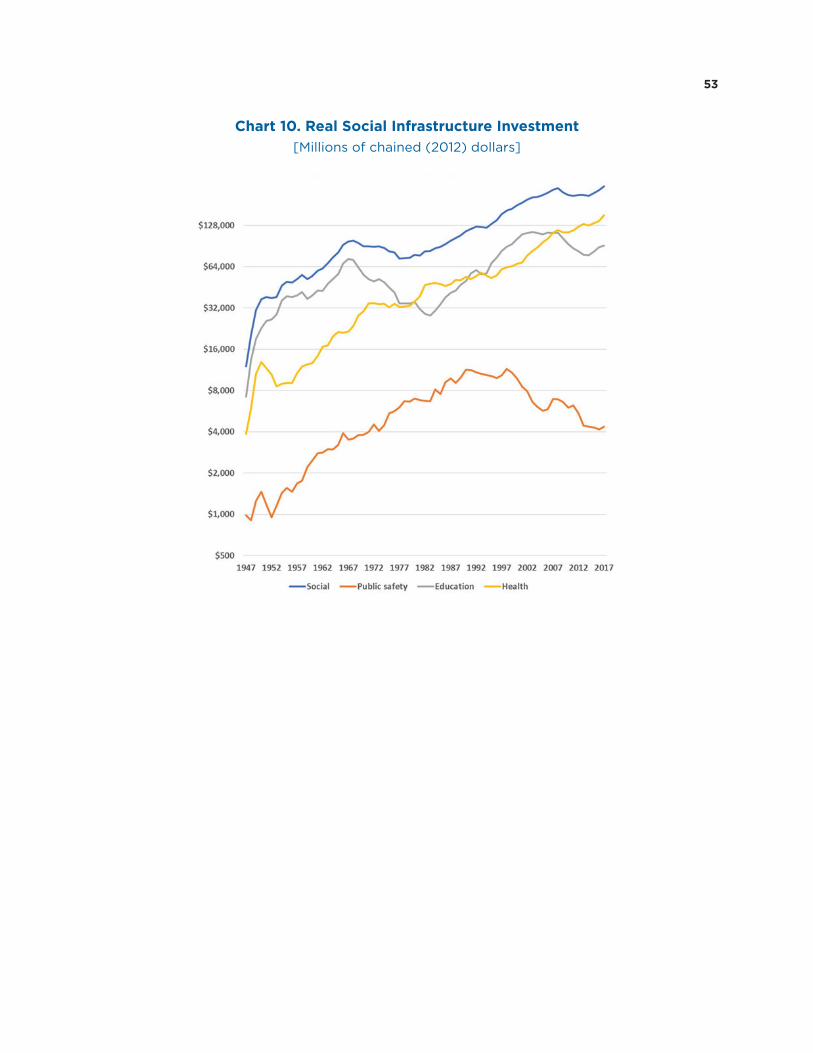
53
Chart 10. Real Social Infrastructure Investment [Millions of chained (2012) dollars]

54
Chart 11. Real Social Infrastructure Investment: Health [Millions of chained (2012) dollars]

55
Chart 12. Real Social Infrastructure Investment: Education [Millions of chained (2012) dollars]

56
Chart 13. Real Social Infrastructure Investment: Public Safety [Millions of chained (2012) dollars]

57
Chart 14. Real Digital Infrastructure Investment [Millions of chained (2012) dollars]

58
Chart 15. Real Total Infrastructure Investment per Capita Gross and Net, Ratio Scale
Chart 16. Real Basic Infrastructure Investment per Capita Gross and Net, Ratio Scale

59
Chart 17. Real Social Infrastructure Investment per Capita Gross and Net, Ratio Scale
Chart 18. Real Digital Infrastructure Investment per Capita Gross and Net, Ratio Scale
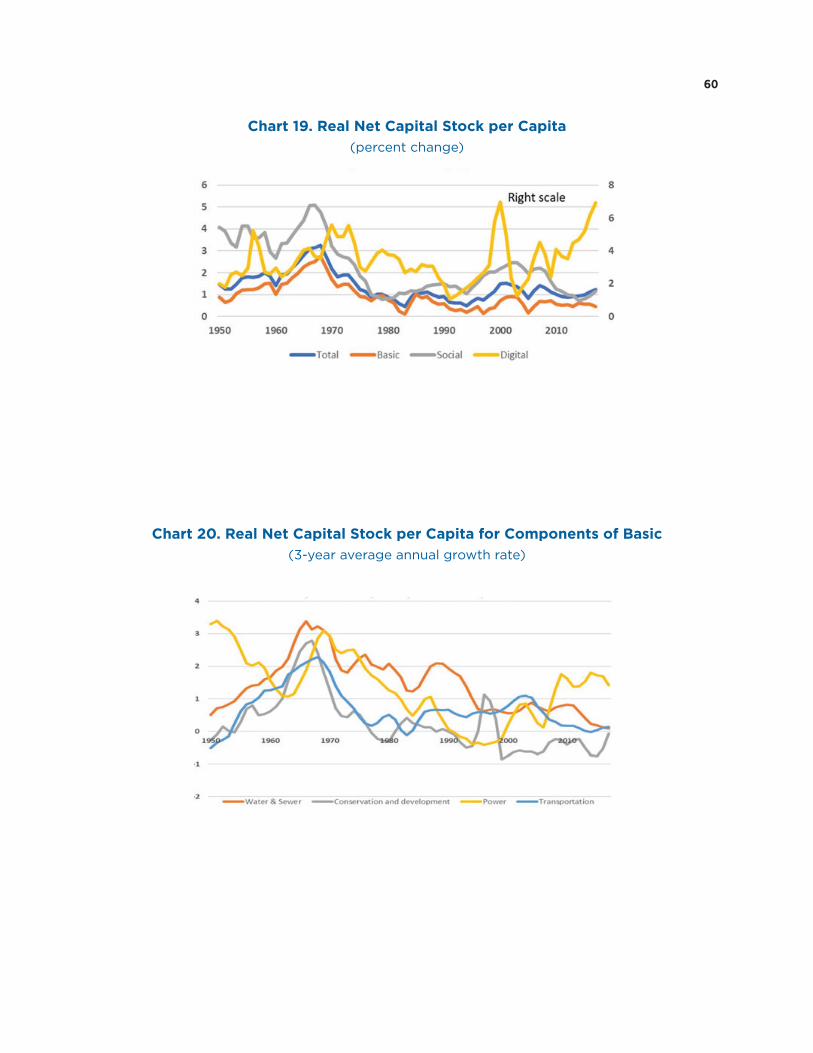
60
Chart 19. Real Net Capital Stock per Capita(percent change)
Chart 20. Real Net Capital Stock per Capita for Components of Basic(3-year average annual growth rate)

61
Chart 21. Real Net Capital Stock per Capita for Components of Power(3-year average annual growth rate)
Chart 22. Real Net Capital Stock per Capita for Components of Electric Power(3-year average annual growth rate)

62
Chart 23. Real Net Capital Stock per Capita for Components of Transportation(3-year average annual growth rate)
Chart 24. Real Net Capital Stock per Capita for Components of Social(3-year average annual growth rate)

63
Chart 25. Real Net Capital Stock per Capita for Selected Components of Education(3-year average annual growth rate)
Chart 26. Real Net Capital Stock per Capita for Selected Components of Health(3-year average annual growth rate)

64
Chart 27.
Nominal Net Capital Stock Shares, 1957
Nominal Net Capital Stock Shares, 1987
Nominal Net Capital Stock Shares, 2017

65
Chart 28. Real Net Capital Stock per Capita for Components of Digital (3-year average annual growth rate)

66
Chart 29.
Nominal Net Capital Stock Shares, Digital, 1957
Nominal Net Capital Stock Shares, Digital, 1987
Nominal Net Capital Stock Shares, Digital, 2017

67
Chart 30. Gross Highway Real (chained) Investment per Capita by State: 1992, 2002, 2012, 2017

68
Chart 31. Gross Highway Investment as a Share of GDP by State: 1992, 2002, 2012, 2017

69
Chart 32. Average Age of Basic Government Infrastructure,Current-Cost Basis in Years
Chart 33. Average Age of Basic Government Infrastructure,Current-Cost Basis in Years

70
Chart 34. Average Age of Social Government Infrastructure,Current-Cost Basis in Years
Chart 35. Remaining Useful Life to Total Service Life: State and Local Government Infrastructure

71
Chart 36. Average Age: Highways and Streets
Chart 37. Average Age: Communications Structures

72
Chart 38. Average Age: Electric Power Structures
Chart 39. GDP and Infrastructure(Price Indexes, 2012 = 100.0)

73
Chart 40. Total Infrastructure, by Type(Price Indexes, 2012 = 100.0)
Chart 41. Basic Infrastructure(Price Indexes, 2012 = 100.0)

74
Chart 42. Electric Power Plants and Machinery(Price Indexes, 2012 = 100.0)
Chart 43. Transportation Infrastructure(Price Indexes, 2012 = 100.0)

75
Chart 44. Social Infrastructure(Price Indexes, 2012 = 100.0)
Chart 45. Health Care Infrastructure(Price Indexes, 2012 = 100.0)

76
Chart 46. Digital Infrastructure(Price Indexes, 2012 = 100.0)
* Includes Communications equipment, software and computers used in the provision of digital services.