markets, methods & models - lyryx.com · pdf filemarkets, methods & models ... 6.2...
TRANSCRIPT

with Open Texts
MicroeconomicsMarkets, Methods & Models
an Open Textby Douglas Curtis and Ian Irvine
BASE TEXTBOOK
VERSION 2017 – REVISION A
ADAPTABLE | ACCESSIBLE | AFFORDABLE
Creative Commons License (CC BY-NC-SA)


a d v a n c i n g l e a r n i n g
Champions of Access to Knowledge
OPEN TEXT ONLINEASSESSMENT
All digital forms of access to our high-
quality open texts are entirely FREE! All
content is reviewed for excellence and is
wholly adaptable; custom editions are pro-
duced by Lyryx for those adopting Lyryx as-
sessment. Access to the original source files
is also open to anyone!
We have been developing superior on-
line formative assessment for more than
15 years. Our questions are continuously
adapted with the content and reviewed for
quality and sound pedagogy. To enhance
learning, students receive immediate per-
sonalized feedback. Student grade reports
and performance statistics are also provided.
SUPPORTINSTRUCTORSUPPLEMENTS
Access to our in-house support team is avail-
able 7 days/week to provide prompt resolu-
tion to both student and instructor inquiries.
In addition, we work one-on-one with in-
structors to provide a comprehensive sys-
tem, customized for their course. This can
include adapting the text, managing multi-
ple sections, and more!
Additional instructor resources are also
freely accessible. Product dependent, these
supplements include: full sets of adaptable
slides and lecture notes, solutions manuals,
and multiple choice question banks with an
exam building tool.
Contact Lyryx [email protected]

a d v a n c i n g l e a r n i n g
Microeconomicsan Open Text by Douglas Curtis and Ian Irvine
Version 2017 — Revision A
Version 2017 – Revision A: Updates include new cover and back pages, new front matter.
Version 2015 – Revision A: The content in this version has been revised in several respects. The
content has been updated to include discussion about the role Uber has played in undermining taxi
cartels in numerous cities. A new section regarding wealth inequality, and based on the best selling
book of Thomas Piketty published in 2014.
BE A CHAMPION OF OER!
Contribute suggestions for improvements, new content, or errata:
A new topic
A new example
An interesting new question
Any other suggestions to improve the material
Contact Lyryx at [email protected] with your ideas.
Lyryx Learning Team
Bruce Bauslaugh
Peter Chow
Nathan Friess
Stephanie Keyowski
Claude Laflamme
Martha Laflamme
Jennifer MacKenzie
Tamsyn Murnaghan
Bogdan Sava
Larissa Stone
Ryan Yee
Ehsun Zahedi
LICENSE
Creative Commons License (CC BY-NC-SA): This text, including the art and illustrations, are
available under the Creative Commons license (CC BY-NC-SA), allowing anyone to reuse, revise,
remix and redistribute the text.
To view a copy of this license, visit http://creativecommons.org/licenses/by-nc-sa/3.0/


Table of Contents
Table of Contents iii
Part One: The Building Blocks 3
1 Introduction to key ideas 5
1.1 What’s it all about? . . . . . . . . . . . . . . . . . . . . . . . . . . . . . . . . . . 5
1.2 Understanding through the use of models . . . . . . . . . . . . . . . . . . . . . . 9
1.3 Opportunity cost and the market . . . . . . . . . . . . . . . . . . . . . . . . . . . 11
1.4 A model of exchange and specialization . . . . . . . . . . . . . . . . . . . . . . . 12
1.5 Economy-wide production possibilities . . . . . . . . . . . . . . . . . . . . . . . 15
1.6 Aggregate output, growth and business cycles . . . . . . . . . . . . . . . . . . . . 17
Key terms . . . . . . . . . . . . . . . . . . . . . . . . . . . . . . . . . . . . . . . . . . 23
End of chapter exercises . . . . . . . . . . . . . . . . . . . . . . . . . . . . . . . . . . 24
2 Theories, models and data 27
2.1 Observations, theories and models . . . . . . . . . . . . . . . . . . . . . . . . . . 27
2.2 Variables, data and index numbers . . . . . . . . . . . . . . . . . . . . . . . . . . 29
2.3 Testing economic models & analysis . . . . . . . . . . . . . . . . . . . . . . . . . 39
2.4 Diagrams and economic analysis . . . . . . . . . . . . . . . . . . . . . . . . . . . 42
iii
iv Table of Contents
2.5 Ethics, efficiency and beliefs . . . . . . . . . . . . . . . . . . . . . . . . . . . . . 45
Key terms . . . . . . . . . . . . . . . . . . . . . . . . . . . . . . . . . . . . . . . . . . 50
End of chapter exercises . . . . . . . . . . . . . . . . . . . . . . . . . . . . . . . . . . 51
3 The classical marketplace – demand and supply 57
3.1 Trading . . . . . . . . . . . . . . . . . . . . . . . . . . . . . . . . . . . . . . . . 57
3.2 The market’s building blocks . . . . . . . . . . . . . . . . . . . . . . . . . . . . . 58
3.3 Demand and supply curves . . . . . . . . . . . . . . . . . . . . . . . . . . . . . . 62
3.4 Other influences on demand . . . . . . . . . . . . . . . . . . . . . . . . . . . . . 65
3.5 Other influences on supply . . . . . . . . . . . . . . . . . . . . . . . . . . . . . . 70
3.6 Simultaneous supply and demand impacts . . . . . . . . . . . . . . . . . . . . . . 73
3.7 Market interventions . . . . . . . . . . . . . . . . . . . . . . . . . . . . . . . . . 75
3.8 Individual and market functions . . . . . . . . . . . . . . . . . . . . . . . . . . . 79
Key terms . . . . . . . . . . . . . . . . . . . . . . . . . . . . . . . . . . . . . . . . . . 81
End of chapter exercises . . . . . . . . . . . . . . . . . . . . . . . . . . . . . . . . . . 82
Part Two: Responsiveness and the Value of Markets 87
4 Measures of response: elasticities 89
4.1 Price responsiveness of demand . . . . . . . . . . . . . . . . . . . . . . . . . . . 89
4.2 Price elasticity and expenditure . . . . . . . . . . . . . . . . . . . . . . . . . . . . 98
4.3 The time horizon and inflation . . . . . . . . . . . . . . . . . . . . . . . . . . . . 101
4.4 Cross-price elasticities . . . . . . . . . . . . . . . . . . . . . . . . . . . . . . . . 101
4.5 The income elasticity of demand . . . . . . . . . . . . . . . . . . . . . . . . . . . 102

Table of Contents v
4.6 Elasticity of supply . . . . . . . . . . . . . . . . . . . . . . . . . . . . . . . . . . 104
4.7 Elasticities and tax incidence . . . . . . . . . . . . . . . . . . . . . . . . . . . . . 105
4.8 Identifying demand and supply elasticities . . . . . . . . . . . . . . . . . . . . . . 108
Key terms . . . . . . . . . . . . . . . . . . . . . . . . . . . . . . . . . . . . . . . . . . 110
End of chapter exercises . . . . . . . . . . . . . . . . . . . . . . . . . . . . . . . . . . 110
5 Welfare economics and externalities 117
5.1 Equity and efficiency . . . . . . . . . . . . . . . . . . . . . . . . . . . . . . . . . 117
5.2 Consumer and producer surplus . . . . . . . . . . . . . . . . . . . . . . . . . . . 118
5.3 Efficient market outcomes . . . . . . . . . . . . . . . . . . . . . . . . . . . . . . 123
5.4 Taxation, surplus and efficiency . . . . . . . . . . . . . . . . . . . . . . . . . . . 124
5.5 Market failures – externalities . . . . . . . . . . . . . . . . . . . . . . . . . . . . 128
5.6 Other market failures . . . . . . . . . . . . . . . . . . . . . . . . . . . . . . . . . 132
5.7 Environmental policy and climate change . . . . . . . . . . . . . . . . . . . . . . 132
5.8 Equity, justice, and efficiency . . . . . . . . . . . . . . . . . . . . . . . . . . . . . 140
Key terms . . . . . . . . . . . . . . . . . . . . . . . . . . . . . . . . . . . . . . . . . . 144
End of chapter exercises . . . . . . . . . . . . . . . . . . . . . . . . . . . . . . . . . . 145
Part Three: Decision Making by Consumer and Producers 151
6 Individual choice 153
6.1 Rationality . . . . . . . . . . . . . . . . . . . . . . . . . . . . . . . . . . . . . . . 153
6.2 Choice with measurable utility . . . . . . . . . . . . . . . . . . . . . . . . . . . . 155
6.3 Choice with ordinal utility . . . . . . . . . . . . . . . . . . . . . . . . . . . . . . 162

vi Table of Contents
6.4 Applications of indifference analysis . . . . . . . . . . . . . . . . . . . . . . . . . 172
Key terms . . . . . . . . . . . . . . . . . . . . . . . . . . . . . . . . . . . . . . . . . . 179
End of chapter exercises . . . . . . . . . . . . . . . . . . . . . . . . . . . . . . . . . . 180
7 Firms, investors and capital markets 185
7.1 Business organization . . . . . . . . . . . . . . . . . . . . . . . . . . . . . . . . . 185
7.2 Profit, ownership and corporate goals . . . . . . . . . . . . . . . . . . . . . . . . . 189
7.3 Risk and the investor . . . . . . . . . . . . . . . . . . . . . . . . . . . . . . . . . 190
7.4 Diminishing marginal utility and risk . . . . . . . . . . . . . . . . . . . . . . . . . 193
7.5 Real returns to investment . . . . . . . . . . . . . . . . . . . . . . . . . . . . . . 196
7.6 Financing the risky firm: diversification . . . . . . . . . . . . . . . . . . . . . . . 198
Key terms . . . . . . . . . . . . . . . . . . . . . . . . . . . . . . . . . . . . . . . . . . 202
End of chapter exercises . . . . . . . . . . . . . . . . . . . . . . . . . . . . . . . . . . 203
8 Production and cost 207
8.1 Efficient production . . . . . . . . . . . . . . . . . . . . . . . . . . . . . . . . . . 207
8.2 The time frame . . . . . . . . . . . . . . . . . . . . . . . . . . . . . . . . . . . . 209
8.3 Production in the short run . . . . . . . . . . . . . . . . . . . . . . . . . . . . . . 209
8.4 Costs in the short run . . . . . . . . . . . . . . . . . . . . . . . . . . . . . . . . . 214
8.5 Fixed costs and sunk costs . . . . . . . . . . . . . . . . . . . . . . . . . . . . . . 219
8.6 Long run production and costs . . . . . . . . . . . . . . . . . . . . . . . . . . . . 220
8.7 Technological change and globalization . . . . . . . . . . . . . . . . . . . . . . . 225
8.8 Clusters, learning by doing, scope economies . . . . . . . . . . . . . . . . . . . . 227
Key terms . . . . . . . . . . . . . . . . . . . . . . . . . . . . . . . . . . . . . . . . . . 229
Table of Contents vii
End of chapter exercises . . . . . . . . . . . . . . . . . . . . . . . . . . . . . . . . . . 230
Part Four: Market Structures 235
9 Perfect competition 237
9.1 The perfect competition paradigm . . . . . . . . . . . . . . . . . . . . . . . . . . 237
9.2 Market characteristics . . . . . . . . . . . . . . . . . . . . . . . . . . . . . . . . . 238
9.3 The firm’s supply decision . . . . . . . . . . . . . . . . . . . . . . . . . . . . . . 240
9.4 Dynamics: entry and exit . . . . . . . . . . . . . . . . . . . . . . . . . . . . . . . 246
9.5 Long run industry supply . . . . . . . . . . . . . . . . . . . . . . . . . . . . . . . 249
9.6 Globalization and technological change . . . . . . . . . . . . . . . . . . . . . . . 252
9.7 Efficient resource allocation . . . . . . . . . . . . . . . . . . . . . . . . . . . . . 253
Key terms . . . . . . . . . . . . . . . . . . . . . . . . . . . . . . . . . . . . . . . . . . 254
End of chapter exercises . . . . . . . . . . . . . . . . . . . . . . . . . . . . . . . . . . 255
10 Monopoly 261
10.1 Monopolies . . . . . . . . . . . . . . . . . . . . . . . . . . . . . . . . . . . . . . 261
10.2 Profit maximizing behaviour . . . . . . . . . . . . . . . . . . . . . . . . . . . . . 265
10.3 Long run choices . . . . . . . . . . . . . . . . . . . . . . . . . . . . . . . . . . . 271
10.4 Output inefficiency . . . . . . . . . . . . . . . . . . . . . . . . . . . . . . . . . . 273
10.5 Price discrimination . . . . . . . . . . . . . . . . . . . . . . . . . . . . . . . . . . 275
10.6 Cartels: acting like a monopolist . . . . . . . . . . . . . . . . . . . . . . . . . . . 280
10.7 Rent-seeking . . . . . . . . . . . . . . . . . . . . . . . . . . . . . . . . . . . . . 283
10.8 Technology and innovation . . . . . . . . . . . . . . . . . . . . . . . . . . . . . . 284

viii Table of Contents
Key terms . . . . . . . . . . . . . . . . . . . . . . . . . . . . . . . . . . . . . . . . . . 286
End of chapter exercises . . . . . . . . . . . . . . . . . . . . . . . . . . . . . . . . . . 286
11 Imperfect competition 291
11.1 Imperfect competitors . . . . . . . . . . . . . . . . . . . . . . . . . . . . . . . . . 291
11.2 Performance-based measures of structure – market power . . . . . . . . . . . . . . 295
11.3 Monopolistic competition . . . . . . . . . . . . . . . . . . . . . . . . . . . . . . . 296
11.4 Oligopoly and games . . . . . . . . . . . . . . . . . . . . . . . . . . . . . . . . . 298
11.5 Duopoly and Cournot games . . . . . . . . . . . . . . . . . . . . . . . . . . . . . 303
11.6 Comparing market structures . . . . . . . . . . . . . . . . . . . . . . . . . . . . . 307
11.7 Entry, exit & potential competition . . . . . . . . . . . . . . . . . . . . . . . . . . 308
Key terms . . . . . . . . . . . . . . . . . . . . . . . . . . . . . . . . . . . . . . . . . . 312
End of chapter exercises . . . . . . . . . . . . . . . . . . . . . . . . . . . . . . . . . . 313
Part Five: The Factors of Production 319
12 Labour and capital 321
12.1 Labour – a derived demand . . . . . . . . . . . . . . . . . . . . . . . . . . . . . . 321
12.2 Firm versus industry demand . . . . . . . . . . . . . . . . . . . . . . . . . . . . . 326
12.3 The supply side of the market . . . . . . . . . . . . . . . . . . . . . . . . . . . . . 327
12.4 Labour-market equilibrium and mobility . . . . . . . . . . . . . . . . . . . . . . . 329
12.5 The market for capital . . . . . . . . . . . . . . . . . . . . . . . . . . . . . . . . . 334
12.6 Capital services . . . . . . . . . . . . . . . . . . . . . . . . . . . . . . . . . . . . 337
12.7 Land . . . . . . . . . . . . . . . . . . . . . . . . . . . . . . . . . . . . . . . . . . 341

Table of Contents ix
Key terms . . . . . . . . . . . . . . . . . . . . . . . . . . . . . . . . . . . . . . . . . . 343
End of chapter exercises . . . . . . . . . . . . . . . . . . . . . . . . . . . . . . . . . . 344
13 Human capital and the income distribution 349
13.1 Human capital . . . . . . . . . . . . . . . . . . . . . . . . . . . . . . . . . . . . . 349
13.2 Productivity and education . . . . . . . . . . . . . . . . . . . . . . . . . . . . . . 350
13.3 On-the-job training . . . . . . . . . . . . . . . . . . . . . . . . . . . . . . . . . . 354
13.4 Education as signalling . . . . . . . . . . . . . . . . . . . . . . . . . . . . . . . . 355
13.5 Education returns and quality . . . . . . . . . . . . . . . . . . . . . . . . . . . . . 356
13.6 Discrimination . . . . . . . . . . . . . . . . . . . . . . . . . . . . . . . . . . . . 357
13.7 The income distribution . . . . . . . . . . . . . . . . . . . . . . . . . . . . . . . . 358
13.8 Wealth and capitalism . . . . . . . . . . . . . . . . . . . . . . . . . . . . . . . . . 363
Key terms . . . . . . . . . . . . . . . . . . . . . . . . . . . . . . . . . . . . . . . . . . 366
End of chapter exercises . . . . . . . . . . . . . . . . . . . . . . . . . . . . . . . . . . 366
Part Six: Government and Trade 371
14 Government 373
14.1 Market failure . . . . . . . . . . . . . . . . . . . . . . . . . . . . . . . . . . . . . 374
14.2 Fiscal federalism: taxing and spending . . . . . . . . . . . . . . . . . . . . . . . . 379
14.3 Federal-provincial fiscal relations . . . . . . . . . . . . . . . . . . . . . . . . . . . 381
14.4 Government-to-individual transfers . . . . . . . . . . . . . . . . . . . . . . . . . . 383
14.5 Regulation and competition policy . . . . . . . . . . . . . . . . . . . . . . . . . . 385
Key terms . . . . . . . . . . . . . . . . . . . . . . . . . . . . . . . . . . . . . . . . . . 392

x Table of Contents
End of chapter exercises . . . . . . . . . . . . . . . . . . . . . . . . . . . . . . . . . . 392
15 International trade 395
15.1 Trade in our daily lives . . . . . . . . . . . . . . . . . . . . . . . . . . . . . . . . 395
15.2 Canada in the world economy . . . . . . . . . . . . . . . . . . . . . . . . . . . . 396
15.3 Comparative advantage: the gains from trade . . . . . . . . . . . . . . . . . . . . 398
15.4 Returns to scale . . . . . . . . . . . . . . . . . . . . . . . . . . . . . . . . . . . . 404
15.5 Trade barriers: tariffs, subsidies and quotas . . . . . . . . . . . . . . . . . . . . . 405
15.6 The politics of protection . . . . . . . . . . . . . . . . . . . . . . . . . . . . . . . 411
15.7 Institutions governing trade . . . . . . . . . . . . . . . . . . . . . . . . . . . . . . 414
Key terms . . . . . . . . . . . . . . . . . . . . . . . . . . . . . . . . . . . . . . . . . . 416
End of chapter exercises . . . . . . . . . . . . . . . . . . . . . . . . . . . . . . . . . . 416
Glossary 421

About the Authors 1
ABOUT THE AUTHORS
Doug Curtis is a specialist in macroeconomics. He is the author of twenty research papers on
fiscal policy, monetary policy, and economic growth and structural change. He has also prepared
research reports for Canadian industry and government agencies and authored numerous working
papers. He completed his PhD at McGill University, and has held visiting appointments at the
University of Cambridge and the University of York in the United Kingdom. His current research
interests are monetary and fiscal policy rules, and the relationship between economic growth and
structural change. He is Professor Emeritus of Economics at Trent University in Peterborough,
Ontario, and Sessional Adjunct Professor at Queen’s University in Kingston, Ontario.
Ian Irvine is a specialist in microeconomics, public economics, economic inequality and health
economics. He is the author of some thirty research papers in these fields. He completed his PhD
at the University of Western Ontario, has been a visitor at the London School of Economics, the
University of Sydney, the University of Colorado, University College Dublin and the Economic
and Social Research Institute. His current research interests are in tobacco use and taxation, and
Canada’s Employment Insurance and Welfare systems. He has done numerous studies for the
Government of Canada, and is currently a Professor of Economics at Concordia University in
Montreal.
OUR PHILOSOPHY
Microeconomics: Markets, Methods & Models focuses upon the material that students need to
cover in a first introductory course. It is slightly more compact than the majority of principles
books in the Canadian marketplace. Decades of teaching experience and textbook writing has led
the authors to avoid the encyclopedic approach that characterizes the recent trends in textbooks.
Consistent with this approach, there are no appendices or ‘afterthought’ chapters. If important
material is challenging then it is still included in the main body of the text; it is not relegated
elsewhere for a limited audience; the text makes choices on what issues and topics are important in
an introductory course. This philosophy has resulted in a Micro book of just 15 chapters, of which
Chapters 1 through 3 plus Chapter 15 are common to both Micro and Macro.
Examples are domestic and international in their subject matter and are of the modern era – con-
sumers buy iPods, snowboards and jazz, not so much coffee and hamburgers. Globalization is a
recurring theme.
The title is intended to be informative. Students are introduced to the concepts of models early,
and the working of such models is illustrated in every chapter. Calculus is avoided; but students
learn to master and solve linear models. Hence straight line equations.

2 Structure of the Text
STRUCTURE OF THE TEXT
Microeconomics: Markets, Methods & Models provides a concise, yet complete, coverage of in-
troductory microeconomic theory, application and policy in a Canadian and global environment.
Our beginning is orthodox: We explain and develop the standard tools of analysis in the discipline.
Economic policy is about the well-being of the economy’s participants, and economic theory
should inform economic policy. So we investigate the meaning of ‘well-being’ in the context
of an efficient use of the economy’s resources early in the text.
We next develop an understanding of individual optimizing behaviour. This behaviour in turn is
used to link household decisions on savings with firms’ decisions on production, expansion and
investment. A natural progression is to explain production and cost structures.
From the individual level of household and firm decision making, the text then explores behaviour
in a variety of different market structures.
Markets for the inputs in the productive process – capital and labour – are a natural component of
firm-level decisions. But education and human capital are omnipresent concepts and concerns in
the modern economy, so we devote a complete chapter to them.
The book then examines the role of a major and important non-market player in the economy –
the government, and progresses to develop the key elements in the modern theory of international
trade.
Opportunity cost, a global economy and behavioural responses to incentives are the dominant
themes.

Part OneThe Building Blocks
1. Introduction to key ideas
2. Theories, models and data
3. The classical marketplace – demand and supply
Economics is a social science; it analyzes human interactions in a scientific manner. We begin
by defining the central aspects of this social science – trading, the marketplace, opportunity cost
and resources. We explore how producers and consumers interact in society. Trade is central to
improving the living standards of individuals. This material forms the subject matter of Chapter 1.
Methods of analysis are central to any science. Consequently we explore how data can be displayed
and analyzed in order to better understand the economy around us in Chapter 2. Understanding the
world is facilitated by the development of theories and models and then testing such theories with
the use of data-driven models.
Trade is critical to individual well-being, whether domestically or internationally. To understand
this trading process we analyze the behaviour of suppliers and buyers in the marketplace. Markets
are formed by suppliers and demanders coming together for the purpose of trading. Thus, demand
and supply are examined in Chapter 3 in tabular, graphical and mathematical form.


Chapter 1
Introduction to key ideas
In this chapter we will explore:
1.1 The big issues in economics
1.2 Understanding through the use of models
1.3 Opportunity cost and the market
1.4 A model of exchange and specialization
1.5 Production possibilities for the economy
1.6 Aggregate output, growth and cycles
1.1 What’s it all about?
The big issues
Economics is the study of human behaviour. Since it uses scientific methods it is called a social
science. We study human behaviour to better understand and improve our world. During his
acceptance speech, a recent Nobel Laureate in Economics suggested:
Economics, at its best, is a set of ideas and methods for the improvement of society. It
is not, as so often seems the case today, a set of ideological rules for asserting why we
cannot face the challenges of stagnation, job loss and widening inequality.
Christopher Sims, Nobel Laureate in Economics 2011
This is an elegant definition of economics and serves as a timely caution about the perils of ide-
ology. Economics evolves continuously as current observations and experience provide new evi-
dence about economic behaviour and relationships. Inference and policy recommendations based
on earlier theories, observations and institutional structures require constant analysis and updating
if they are to furnish valuable responses to changing conditions and problems.
5

6 Introduction to key ideas
Much of today’s developed world faces severe challenges as a result of the financial crisis that
began in 2008. Unemployment rates among young people are at historically high levels in several
economies, government balance sheets are in disarray, and inequality is on the rise. In addition
to the challenges posed by this severe economic cycle, the world simultaneously faces structural
upheaval: overpopulation, climate change, political instability and globalization challenge us to
understand and modify our behaviour.
These challenges do not imply that our world is deteriorating. Literacy rates have been rising
dramatically in the developing world for decades; child mortality has plummeted; family size is a
fraction of what it was 50 years ago; prosperity is on the rise in much of Asia; life expectancy is
increasing universally and deaths through wars are in a state of long term decline.
These developments, good and bad, have a universal character and affect billions of individuals.
They involve an understanding of economies as large organisms with interactive components. The
study of economies as large interactive systems is called macroeconomics. Technically, macroe-
conomics approaches the economy as a complete system with feedback effects among sectors that
determine national economic performance. Feedbacks within the system mean we cannot aggre-
gate from observations on one household or business to the economy as a whole. Application
Box 1.1 gives an example.
Macroeconomics: the study of the economy as system in which feedbacks among sectors deter-
mine national output, employment and prices.
Individual behaviours
Individual behaviour underlies much of our social and economic interactions. Some individual
behaviours are motivated by self-interest, others are socially motivated. The Arab Spring of 2011
was sparked by individual actions in North Africa that subsequently became mass movements.
These movements were aimed at improving society at large. Globalization, with its search for
ever less costly production sources in Asia and elsewhere, is in part the result of cost-reducing and
profit-maximizing behaviour on the part of developed-world entrepreneurs, and in part attributable
to governments opening their economies up to the forces of competition, in the hope that living
standards will improve across the board. The increasing income share that accrues to the top one
percent of our population in North America and elsewhere is primarily the result of individual
self-interest.
At the level of the person or organization, economic actions form the subject matter of microeco-
nomics. Formally, microeconomics is the study of individual behaviour in the context of scarcity.

1.1. What’s it all about? 7
Microeconomics: the study of individual behaviour in the context of scarcity.
Individual economic decisions need not be world-changing events, or motivated by a search for
profit. For example, economics is also about how we choose to spend our time and money. There
are quite a few options to choose from: sleep, work, study, food, shelter, transportation, entertain-
ment, recreation and so forth. Because both time and income are limited we cannot do all things
all the time. Many choices are routine or are driven by necessity. You have to eat and you need
a place to live. If you have a job you have committed some of your time to work, or if you are
a student some of your time is committed to lectures and study. There is more flexibility in other
choices. Critically, microeconomics seeks to understand and explain how we make choices and
how those choices affect our behaviour in the workplace and society.
A critical element in making choices is that there exists a scarcity of time, or income or productive
resources. Decisions are invariably subject to limits or constraints, and it is these constraints that
make decisions both challenging and scientific.
Microeconomics also concerns business choices. How does a business use its funds and manage-
ment skill to produce goods and services? The individual business operator or firm has to decide
what to produce, how to produce it, how to sell it and in many cases, how to price it. To make and
sell pizza, for example, the pizza parlour needs, in addition to a source of pizza ingredients, a store
location (land), a pizza oven (capital), a cook and a sales person (labour). Payments for the use of
these inputs generate income to those supplying them. If revenue from the sale of pizzas is greater
than the costs of production, the business earns a profit for the owner. A business fails if it cannot
cover its costs.
In these micro-level behaviours the decision makers have a common goal: to do as well as he or
she can, given the constraints imposed by the operating environment. The individual wants to mix
work and leisure in a way that makes her as happy or contented as possible. The entrepreneur
aims at making a profit. These actors, or agents as we sometimes call them, are maximizing. Such
maximizing behaviour is a central theme in this book and in economics at large.
8 Introduction to key ideas
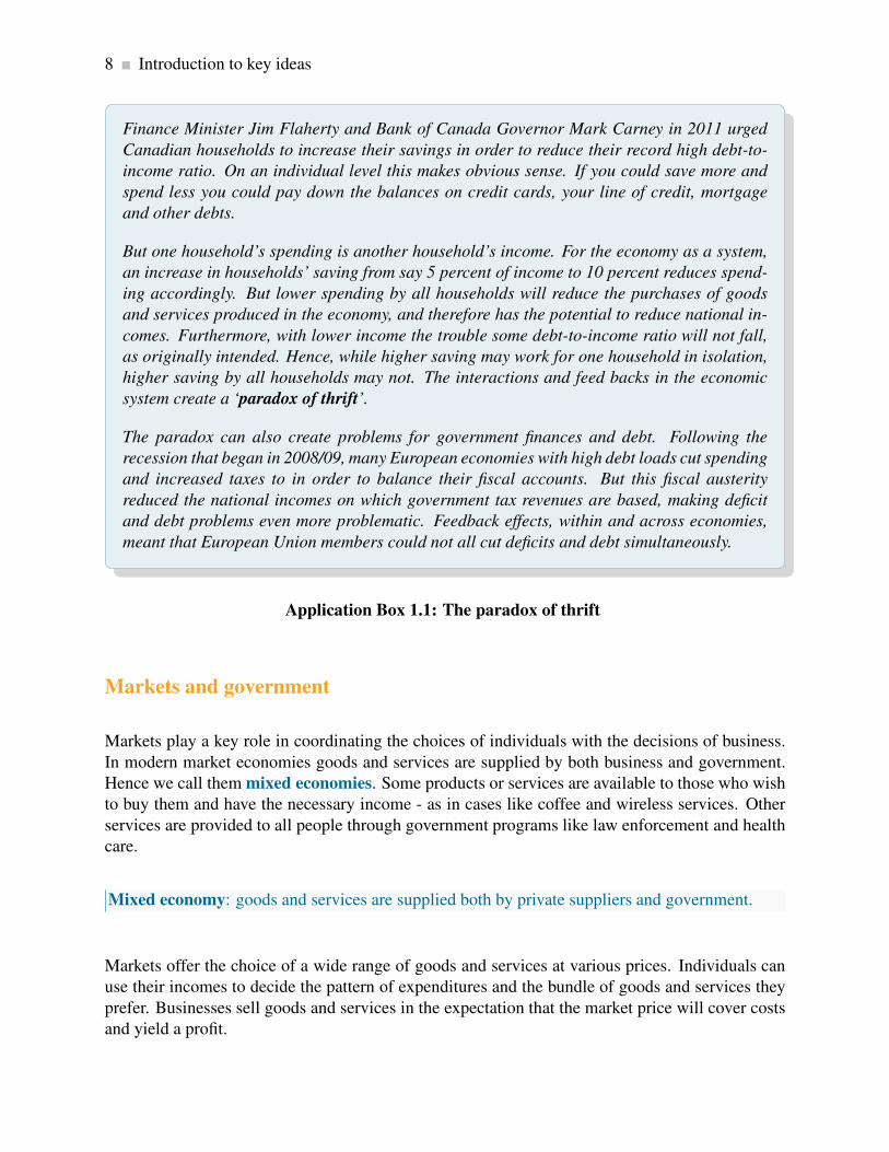
Finance Minister Jim Flaherty and Bank of Canada Governor Mark Carney in 2011 urged
Canadian households to increase their savings in order to reduce their record high debt-to-
income ratio. On an individual level this makes obvious sense. If you could save more and
spend less you could pay down the balances on credit cards, your line of credit, mortgage
and other debts.
But one household’s spending is another household’s income. For the economy as a system,
an increase in households’ saving from say 5 percent of income to 10 percent reduces spend-
ing accordingly. But lower spending by all households will reduce the purchases of goods
and services produced in the economy, and therefore has the potential to reduce national in-
comes. Furthermore, with lower income the trouble some debt-to-income ratio will not fall,
as originally intended. Hence, while higher saving may work for one household in isolation,
higher saving by all households may not. The interactions and feed backs in the economic
system create a ‘paradox of thrift’.
The paradox can also create problems for government finances and debt. Following the
recession that began in 2008/09, many European economies with high debt loads cut spending
and increased taxes to in order to balance their fiscal accounts. But this fiscal austerity
reduced the national incomes on which government tax revenues are based, making deficit
and debt problems even more problematic. Feedback effects, within and across economies,
meant that European Union members could not all cut deficits and debt simultaneously.
Application Box 1.1: The paradox of thrift
Markets and government
Markets play a key role in coordinating the choices of individuals with the decisions of business.
In modern market economies goods and services are supplied by both business and government.
Hence we call them mixed economies. Some products or services are available to those who wish
to buy them and have the necessary income - as in cases like coffee and wireless services. Other
services are provided to all people through government programs like law enforcement and health
care.
Mixed economy: goods and services are supplied both by private suppliers and government.
Markets offer the choice of a wide range of goods and services at various prices. Individuals can
use their incomes to decide the pattern of expenditures and the bundle of goods and services they
prefer. Businesses sell goods and services in the expectation that the market price will cover costs
and yield a profit.

1.2. Understanding through the use of models 9
The market also allows for specialization and separation between production and use. Rather than
each individual growing her own food, for example, she can sell her time or labour to employers in
return for income. That income can then support her desired purchases. If businesses can produce
food more cheaply than individuals the individual obviously gains from using the market – by both
having the food to consume, and additional income with which to buy other goods and services.
Economics seeks to explain how markets and specialization might yield such gains for individuals
and society.
We will represent individuals and firms by envisaging that they have explicit objectives – to max-
imize their happiness or profit. However, this does not imply that individuals and firms are con-
cerned only with such objectives. On the contrary, much of microeconomics and macroeconomics
focuses upon the role of government: how it manages the economy through fiscal and monetary
policy, how it redistributes through the tax-transfer system, how it supplies information to buyers
and sets safety standards for products.
Since governments perform all of these socially-enhancing functions, in large measure govern-
ments reflect the social ethos of voters. So, while these voters may be maximizing at the individual
level in their everyday lives, and our models of human behaviour in microeconomics certainly em-
phasize this optimization, economics does not see individuals and corporations as being devoid of
civic virtue or compassion, nor does it assume that only market-based activity is important. Gov-
ernments play a central role in modern economies, to the point where they account for more than
one third of all economic activity in the modern mixed economy.
While governments supply goods and services in many spheres, governments are fundamental to
the just and efficient functioning of society and the economy at large. The provision of law and
order, through our legal system broadly defined, must be seen as more than simply accounting for
some percentage our national economic activity. Such provision supports the whole private sector
of the economy. Without a legal system that enforces contracts and respects property rights the
private sector of the economy would diminish dramatically as a result of corruption, uncertainty
and insecurity. It is the lack of such a secure environment in many of the world’s economies that
inhibits their growth and prosperity.
Let us consider now the methods of economics, methods that are common to science-based disci-
plines.
1.2 Understanding through the use of models
Most students have seen an image of Ptolemy’s concept of our Universe. Planet Earth forms the
centre, with the other planets and our sun revolving around it. The ancients’ anthropocentric view
of the universe necessarily placed their planet at the centre. Despite being false, this view of our
world worked reasonably well – in the sense that the ancients could predict celestial motions, lunar
patterns and the seasons quite accurately.

10 Introduction to key ideas
More than one Greek astronomer believed that it was more natural for smaller objects such as the
earth to revolve around larger objects such as the sun, and they knew that the sun had to be larger
as a result of having studied eclipses of the moon and sun. Nonetheless, the Ptolemaic description
of the universe persisted until Copernicus wrote his treatise “On the Revolutions of the Celestial
Spheres” in the early sixteenth century. And it was another hundred years before the Church
accepted that our corner of the universe is heliocentric. During this time evidence accumulated as
a result of the work of Brahe, Kepler and Galileo. The time had come for the Ptolemaic model of
the universe to be supplanted with a better model.
All disciplines progress and develop and explain themselves using models of reality. A model is
a formalization of theory that facilitates scientific inquiry. Any history or philosophy of science
book will describe the essential features of a model. First, it is a stripped down, or reduced, version
of the phenomenon that is under study. It incorporates the key elements while disregarding what
are considered to be secondary elements. Second, it should accord with reality. Third, it should be
able to make meaningful predictions. Ptolemy’s model of the known universe met these criteria: it
was not excessively complicated (for example distant stars were considered as secondary elements
in the universe and were excluded); it corresponded to the known reality of the day, and made
pretty good predictions. Evidently not all models are correct and this was the case here.
Model: a formalization of theory that facilitates scientific inquiry.
In short, models are frameworks we use to organize how we think about a problem. Economists
sometimes interchange the terms theories and models, though they are conceptually distinct. A
theory is a logical view of how things work, and is frequently formulated on the basis of observa-
tion. A model is a formalization of the essential elements of a theory, and has the characteristics
we described above. As an example of an economic model, suppose we theorize that a household’s
expenditure depends on its key characteristics: such a model might specify that wealth, income,
and household size determine its expenditures, while it might ignore other, less important, traits
such as the household’s neighbourhood or its religious beliefs. The model reduces and simpli-
fies the theory to manageable dimensions. From such a reduced picture of reality we develop an
analysis of how an economy and its components work.
Theory: a logical view of how things work, and is frequently formulated on the basis of observa-
tion.
An economist uses a model as a tourist uses a map. Any city map misses out some detail—traffic
lights and speed bumps, for example. But with careful study you can get a good idea of the best
route to take. Economists are not alone in this approach; astronomers, meteorologists, physicists,
and genetic scientists operate similarly. Meteorologists disregard weather conditions in South
Africa when predicting tomorrow’s conditions in Winnipeg. Genetic scientists concentrate on the
interactions of limited subsets of genes that they believe are the most important for their purpose.

1.3. Opportunity cost and the market 11
Even with huge computers, all of these scientists build models that concentrate on the essentials.
1.3 Opportunity cost and the market
Individuals face choices at every turn: In deciding to go to the hockey game tonight, you may have
to forgo a concert; or you will have to forgo some leisure time this week order to earn additional
income for the hockey game ticket. Indeed, there is no such thing as a free lunch, a free hockey
game or a free concert. In economics we say that these limits or constraints reflect opportunity
cost. The opportunity cost of a choice is what must be sacrificed when a choice is made. That
cost may be financial; it may be measured in time, or simply the alternative foregone.
Opportunity cost: what must be sacrificed when a choice is made.
Opportunity costs play a determining role in markets. It is precisely because individuals and or-
ganizations have different opportunity costs that they enter into exchange agreements. If you are
a skilled plumber and an unskilled gardener, while your neighbour is a skilled gardener and an
unskilled plumber, then you and your neighbour not only have different capabilities, you also have
different opportunity costs, and you could gain by trading your skills. Here’s why. Fixing a leak-
ing pipe has a low opportunity cost for you in terms of time: you can do it quickly. But pruning
your apple trees will be costly because you must first learn how to avoid killing them and this
may require many hours. Your neighbour has exactly the same problem, with the tasks in reverse
positions. In a sensible world you would fix your own pipes and your neighbour’s pipes, and she
would ensure the health of the apple trees in both backyards.
If you reflect upon this ‘sensible’ solution—one that involves each of you achieving your objectives
while minimizing the time input—you will quickly realize that it resembles the solution provided
by the marketplace. You may not have a gardener as a neighbour, so you buy the services of a
gardener in the marketplace. Likewise, your immediate neighbour may not need a leaking pipe
repaired, but many others in your neighbourhood do, so you sell your service to them. You each
specialize in the performance of specific tasks as a result of having different opportunity costs
or different efficiencies. Let us now develop a model of exchange to illustrate the advantages
of specialization and trade, and hence the markets that facilitate these activities. This model is
developed with the help of some two-dimensional graphics.
12 Introduction to key ideas
1.4 A model of exchange and specialization
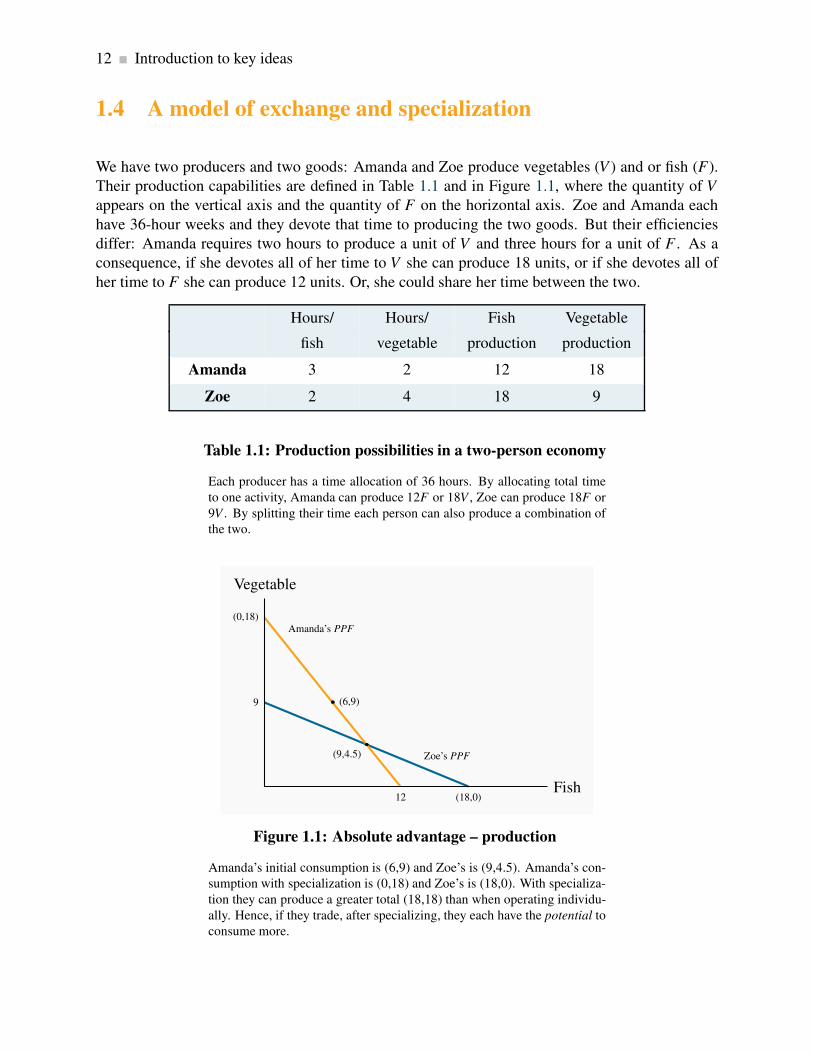
We have two producers and two goods: Amanda and Zoe produce vegetables (V ) and or fish (F).
Their production capabilities are defined in Table 1.1 and in Figure 1.1, where the quantity of V
appears on the vertical axis and the quantity of F on the horizontal axis. Zoe and Amanda each
have 36-hour weeks and they devote that time to producing the two goods. But their efficiencies
differ: Amanda requires two hours to produce a unit of V and three hours for a unit of F . As a
consequence, if she devotes all of her time to V she can produce 18 units, or if she devotes all of
her time to F she can produce 12 units. Or, she could share her time between the two.
Hours/ Hours/ Fish Vegetable
fish vegetable production production
Amanda 3 2 12 18
Zoe 2 4 18 9
Table 1.1: Production possibilities in a two-person economy
Each producer has a time allocation of 36 hours. By allocating total time
to one activity, Amanda can produce 12F or 18V , Zoe can produce 18F or
9V . By splitting their time each person can also produce a combination of
the two.
9
Zoe’s PPF
(18,0)
(0,18)Amanda’s PPF
(6,9)
12
Vegetable
Fish
(9,4.5)
Figure 1.1: Absolute advantage – production
Amanda’s initial consumption is (6,9) and Zoe’s is (9,4.5). Amanda’s con-
sumption with specialization is (0,18) and Zoe’s is (18,0). With specializa-
tion they can produce a greater total (18,18) than when operating individu-
ally. Hence, if they trade, after specializing, they each have the potential to
consume more.

1.4. A model of exchange and specialization 13
In Figure 1.1 Amanda’s capacity is represented by the line that meets the vertical axis at 18 and the
horizontal axis at 12. The vertical point indicates that she can produce 18 units of V if she produces
zero units of F – keep in mind that where V has a value of 18, Amanda has no time left for fish
production. Likewise, if she devotes all of her time to fish she can produce 12 units, since each unit
requires 3 of her 36 hours. The point F = 12 is thus another possibility for her. In addition to these
two possibilities, which we can term ‘specialization’, she could allocate her time to producing
some of each good. For example, by dividing her 36 hours equally she could produce 6 units of F
and 9 units of V . A little computation will quickly convince us that different allocations of her time
will lead to combinations of the two goods that lie along a straight line joining the specialization
points. We will call this straight line Amanda’s production possibility frontier (PPF): it is the
combination of goods she can produce while using all of her resources – time. She could not
produce combinations of goods represented by points beyond this line (to the top right). She could
indeed produce combinations below it (lower left) – for example a combination of 4 units of V
and 4 units of F; but such points would not require all of her time. The (4,4) combination would
require just 20 hours. In sum, points beyond this line are not feasible, and points within it do not
require all of her time resources.
Production possibility frontier (PPF): the combination of goods that can be produced using all
of the resources available.
Having developed Amanda’s PPF , it is straightforward to develop a corresponding set of possibil-
ities for Zoe. If she requires 4 hours to produce a unit of V and 2 hours to produce a unit of F , then
her 36 hours will enable her to specialize in 9 units of V or 18 units of F; or she could produce a
combination represented by the straight line that joins these two specialty extremes.
Consider now what we term the opportunity costs for each person. If Amanda, from a starting
point of 18 V and zero F , wishes to produce some F , and less V she must sacrifice 1.5 units of V
for each unit of F she decides to produce. This is because F requires 50% more hours than V . Her
trade-off is 1.5:1.0, or equivalently 3:2. In the graphic, for every 3 units of V she does not produce
she can produce 2 units of F , reflecting the hours she must devote to each. Yet another way to
see this is to recognize that if she stopped producing the 18 units of V entirely, she could produce
12 units of F; and the ratio 18:12 is again 3:2. This then is her opportunity cost: the cost of an
additional two units of F is that 3 units of V must be ‘sacrificed’.
Zoe’s opportunity cost, by the same reasoning, is 1:2 — 1 unit of V for 2 units of F .
So we have established two things about Amanda and Zoe’s production possibilities. First, if
Amanda specializes in V she can produce more than Zoe, just as Zoe can produce more than
Amanda if Zoe specializes in F . Second, their opportunity costs are different: Amanda must
sacrifice more V than Zoe in producing one more unit of F .
To illustrate the gains from specialization and trade, let us initially suppose that Amanda and Zoe
are completely self-sufficient (they consume exactly what they produce), and they each divide their

14 Introduction to key ideas
production time equally between the two goods. Hence, Amanda produces and consumes 6F and
9V , whereas Zoe’s combination is 9F and 4.5V . These combinations must lie on their respective
PPFs and are illustrated in Figure 1.1.
Upon realizing that they are not equally efficient in producing the two goods, they decide to special-
ize completely in producing just the single good where they are most efficient. Amanda specializes
in V and Zoe in F . Right away we notice that this allocation of time will realize 18V and 18F ,
which is more than the combined amounts they produce and consume when not specializing –
15F and 13.5V . Logic dictates that each should be able to consume more following specialization.
What they must do however, is negotiate a rate at which to exchange V for F . Since Amanda’s
opportunity cost is 3:2 and Zoe’s is 1:2, perhaps they agree to exchange V for F at an intermediate
rate of 2:2 (or 1:1, which is the same). With Amanda specializing in V and Zoe in F they now
trade one unit of V for one unit of F . Consider Figure 1.2.
(18,0)
(8,10) – Amanda’s final consumption
(10,8) – Zoe’s final consumption
(0,18)
Vegetable
Fish
Figure 1.2: Absolute advantage – consumption
With specialization and trade they consume along the line joining the spe-
cialization points. Amanda’s initial consumption is (6,9) and Zoe’s is
(9,4.5). Amanda’s consumption with specialization is (0,18) and Zoe’s is
(18,0). If Amanda trades 8V to Zoe in return for 8F , Amanda moves to the
point (8,10) and Zoe to (10,8). Both consume more after specialization.
If Amanda can trade at a rate of 1:1 her consumption opportunities have improved dramatically: if
she were to trade away all of her 18V , she would get 18 fish in return, whereas when consuming
what she produced, she was limited to 12 fish. Suppose she wants to consume both V and F and
she offers Zoe 8V . Clearly she will get 8F in return, and she will consume (8F +10V ) – more than
she consumed prior to specializing.
By the same reasoning, after specializing in producing 18 fish, Zoe trades away 8F and receives
8V from Amanda in return. Therefore Zoe consumes (10F +8V ). The result is that they are now

1.5. Economy-wide production possibilities 15
each consuming more than in the initial allocation. Specialization and trade have increased their
consumption.1
1.5 Economy-wide production possibilities
The PPFs in Figure 1.1 define the amounts of the goods that each individual can produce while
using all of their productive capacity—time in this instance. The national, or economy-wide, PPF
for this two-person economy reflects these individual possibilities combined. Such a frontier can
be constructed using the individual frontiers as the component blocks.
First let us define this economy-wide frontier precisely. The economy-wide PPF is the set of goods
combinations that can be produced in the economy when all available productive resources are in
use. Figure 1.3 contains both of the individual frontiers plus the aggregate of these, represented by
the kinked line ace. The point on the V axis, a=27, represents the total amount of V that could be
produced if both individuals devoted all of their time to it. The point e=30 on the horizontal axis
is the corresponding total for fish.
Economy-wide PPF: the set of goods combinations that can be produced in the economy when
all available productive resources are in use.
To understand the point c, imagine initially that all resources are devoted to V . From such a point,
a, we consider a reduction in V and an increase in F . The most efficient way of increasing F
production at the point a is to use the individual whose opportunity cost of F is least – Zoe. She
can produce one unit of F by sacrificing just 1/2 unit of V . Amanda on the other hand must sacrifice
1.5 units of V to produce 1 unit of F . Hence, at this stage Amanda should stick to V and Zoe should
devote some time to fish. In fact as long as we want to produce more fish Zoe should be the one
to do it, until she has exhausted her time, which occurs after she has produced 18F and has ceased
producing V . At this point the economy will be producing 18V and 18F – the point c.
1In the situation we describe above one individual is absolutely more efficient in producing one of the goods and
absolutely less efficient in the other. We will return to this model in Chapter 15 and illustrate that consumption gains
of the type that arise here can also result if one of the individuals is absolutely more efficient in produce both goods,
but that the degree of such advantage differs across goods.

16 Introduction to key ideas
9
Zoe’s PPF
18
18
Amanda’s PPF
12
a (0,27)
PPF for whole economy
c (18,18)
e (30,0)
Vegetable
Fish
Figure 1.3: Economy-wide PPF
From a, to produce Fish it is more efficient to use Zoe because her opportu-
nity cost is less (segment ac). When Zoe is completely specialized, Amanda
produces (ce). With complete specialization this economy can produce 27V
or 30F.
From this combination, if the economy wishes to produce more fish Amanda must become in-
volved. Since her opportunity cost is 1.5 units of V for each unit of F , the next segment of the
economy-wide PPF must see a reduction of 1.5 units of V for each additional unit of F . This
is reflected in the segment ce. When both producers allocate all of their time to F the economy
can produce 30 units. Hence the economy’s PPF is the two-segment line ace. Since this has an
outward kink, we call it concave (rather than convex).
As a final step consider what this PPF would resemble if the economy were composed of many
persons with differing degrees of comparative advantage. A little imagination suggests (correctly)
that it will have a segment for each individual and continue to have its outward concave form.
Hence, a four-person economy in which each person had a different opportunity cost could be
represented by the segmented line abcde, in Figure 1.4. Furthermore, we could represent the PPF
of an economy with a very large number of such individuals by a somewhat smooth PPF that
accompanies the 4-person PPF . The logic for its shape continues to be the same: as we produce
less V and more F we progressively bring into play resources, or individuals, whose opportunity
cost, in terms of reduced V is higher.

1.6. Aggregate output, growth and business cycles 17
ab
c
d
e
Vegetable
Fish
Figure 1.4: A multi-person PPF
The PPF for the whole economy, abcde, is obtained by allocatinig produc-
tive resources most efficiently. With many individuals we can think of the
PPF as the concave envelope of the individual capabilities.
The outputs V and F in our economic model require just one input – time. But the argument for
a concave PPF where the economy uses machines, labour, land etc. to produce different products
is the same. Furthermore, we generally interpret the PPF to define the output possibilities when it
is running at its normal capacity. In this example, we consider a work week of 36 hours to be the
‘norm’. Yet it is still possible that the economy’s producers might work some additional time in
exceptional circumstances, and this would increase total production possibilities. This event would
be represented by an outward movement of the PPF .
1.6 Aggregate output, growth and business cycles
The PPF can also be used to illustrate three aspects of macroeconomics: the level of a nation’s
output, the growth of national and per capita output over time, and short run business-cycle fluctu-
ations in national output and employment.
Aggregate output
An economy’s capacity to produce goods and services depends on its endowment of resources and
the productivity of those resources. The two-person, two-product examples in the previous section
reflect this.

18 Introduction to key ideas
The productivity of labour, defined as output per worker or per hour, depends on:
• Skill, knowledge and experience of the labour force;
• Capital stock: buildings, machinery, and equipment, and software the labour force has to
work with; and
• Current technological trends in the labour force and the capital stock.
The productivity of labour is the output of goods and services per worker.
An economy’s capital stock is the buildings, machinery, equipment and software used in produc-
ing goods and services.
The economy’s output, which we define by Y , can be defined as the output per worker times the
number of workers; hence, we can write:
Y = (number of workers employed)× (output per worker).
When the employment of labour corresponds to ‘full employment’ in the sense that everyone will-
ing to work at current wage rates and normal hours of work is working, the economy’s actual
output is also its capacity output Yc. We also term this capacity output as full employment output:
Full employment output Yc = (number of workers at full employment)× (output per worker).
Suppose the economy is operating with full employment of resources producing outputs of two
types: goods and services. In Figure 1.5, PPF0 shows the different combinations of goods and
services that the economy could produce in a particular year using all its labour, capital and the
best technology available at the time.
An aggregate economy produces a large variety of outputs in two broad categories. Goods are the
products of the agriculture, forestry, mining, manufacturing and construction industries. Services
are provided by the wholesale and retail trade, transportation, hospitality, finance, health care,
legal and other service sectors. As in the two-product examples used earlier, the shape of the PPF
illustrates the opportunity cost of increasing the output of either product type.
Point X0 on PPF0 shows one possible structure of capacity output. This combination may reflect
the pattern of demand and hence expenditures in this economy. Output structures differ among
economies with different income levels. High-income economies spend more on services than

1.6. Aggregate output, growth and business cycles 19
goods and produce higher ratios of services to goods. Middle income countries produce lower
ratios of services to goods, and low income countries much lower ratios of services to goods.
Different countries also have different PPFs and different output structures, depending on their
labour forces, labour productivity and expenditure patterns.
Economic growth
Three things contribute to growth in the economy. The labour supply grows as the population ex-
pands; the stock of capital grows as spending by business on new offices, factories, machinery and
equipment expands; and labour-force productivity grows as a result of experience, the develop-
ment of scientific knowledge combined with product and process innovations, and advances in the
technology of production. Combined, these developments expand capacity output. In Figure 1.5
economic growth shifts the PPF out from PPF0 to PPF1.
aSmax
b
Gmax
AS′max
B
G′max
Services
Goods
S0X0
G0
S1
X1
G1
PPF0
PPF1
Figure 1.5: Growth and the PPF
Economic growth or an increase in the available resources can be envisioned
as an outward shift in the PPF from PPF0 to PPF1. With PPF1 the economy
can produce more in both sectors than with PPF0.
This basic description of economic growth covers the key sources of growth in total output.
Economies differ in their rates of overall economic growth as a result of different rates of growth
in labour force, in capital stock, and improvements in the technology. But improvements in stan-
dards of living require more than growth in total output. Increases in output per worker and per
person are necessary. Sustained increases in living standards require sustained growth in labour
productivity based on advances in the technologies used in production.

20 Introduction to key ideas
Recessions and booms
The objective of economic policy is to ensure that the economy operates on or near the PPF – it
would use its resources to capacity and have minimal unemployment. However, economic condi-
tions are seldom tranquil for long periods of time. Unpredictable changes in business expectations
of future profits, in consumer confidence, in financial markets, in commodity and energy prices, in
output and incomes in major trading partners, in government policy and many other events disrupt
patterns of expenditure and output. Some of these changes disturb the level of total expenditure
and thus the demand for total output. Others disturb the conditions of production and thus the
economy’s production capacity. Whatever the exact cause, the economy may be pushed off its cur-
rent PPF . If expenditures on goods and services decline the economy may experience a recession.
Output would fall short of capacity output and unemployment would rise. Alternatively, times of
rapidly growing expenditure and output may result in an economic boom: output and employment
expand beyond capacity levels.
An economic recession occurs when output falls below the economy’s capacity output.
A boom is a period of high growth that raises output above normal capacity output.
Recent history provides examples. Following the U.S financial crisis in 2008-09 many industrial
countries were pushed into recessions. Expenditure on new residential construction collapsed for
lack of income and secure financing, as did business investment, spending and exports. Lower
expenditures reduced producers’ revenues, forcing cuts in output and employment and reducing
household incomes. Lower incomes led to further cutbacks in spending. In Canada in 2009 aggre-
gate output declined by 2.9 percent, employment declined by 1.6 percent and the unemployment
rate rose from 6.1 percent in 2008 to 8.3 percent. Although economic growth recovered, that
growth had not been strong enough to restore the economy to capacity output at the end of 2011.
The unemployment rate fell to 7.4 but did not return to its pre-recession value.
An economy in a recession is operating inside its PPF . The fall in output from X to Z in Figure 1.6
illustrates the effect of a recession. Expenditures on goods and services have declined. Output is
less than capacity output, unemployment is up and some plant capacity is idle. Labour income and
business profits are lower. More people would like to work and business would like to produce
and sell more output but it takes time for interdependent product, labour and financial markets
in the economy to adjust and increase employment and output. Monetary and fiscal policy may
be needed to stimulate demand, increase output and employment and move the economy back to
capacity output and full employment. The development and implementation of such policies form
the core of macroeconomics.
Alternatively, an unexpected increase in demand for exports would increase output and employ-
ment. Higher employment and output would increase incomes and expenditure, and in the process
spread the effects of higher output sales to other sectors of the economy. The economy would
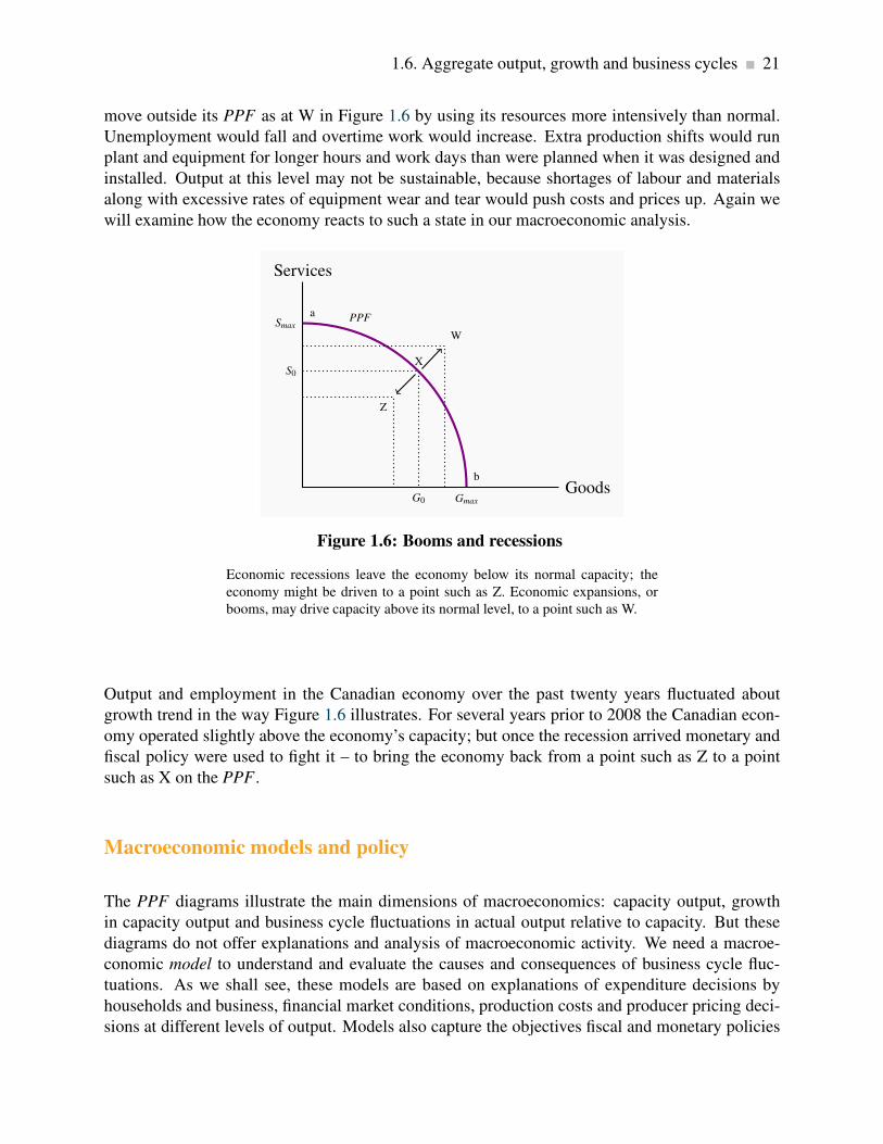
1.6. Aggregate output, growth and business cycles 21
move outside its PPF as at W in Figure 1.6 by using its resources more intensively than normal.
Unemployment would fall and overtime work would increase. Extra production shifts would run
plant and equipment for longer hours and work days than were planned when it was designed and
installed. Output at this level may not be sustainable, because shortages of labour and materials
along with excessive rates of equipment wear and tear would push costs and prices up. Again we
will examine how the economy reacts to such a state in our macroeconomic analysis.
Smax
a PPF
Gmax
b
Services
Goods
S0
X
G0
Z
W
Figure 1.6: Booms and recessions
Economic recessions leave the economy below its normal capacity; the
economy might be driven to a point such as Z. Economic expansions, or
booms, may drive capacity above its normal level, to a point such as W.
Output and employment in the Canadian economy over the past twenty years fluctuated about
growth trend in the way Figure 1.6 illustrates. For several years prior to 2008 the Canadian econ-
omy operated slightly above the economy’s capacity; but once the recession arrived monetary and
fiscal policy were used to fight it – to bring the economy back from a point such as Z to a point
such as X on the PPF .
Macroeconomic models and policy
The PPF diagrams illustrate the main dimensions of macroeconomics: capacity output, growth
in capacity output and business cycle fluctuations in actual output relative to capacity. But these
diagrams do not offer explanations and analysis of macroeconomic activity. We need a macroe-
conomic model to understand and evaluate the causes and consequences of business cycle fluc-
tuations. As we shall see, these models are based on explanations of expenditure decisions by
households and business, financial market conditions, production costs and producer pricing deci-
sions at different levels of output. Models also capture the objectives fiscal and monetary policies

22 Conclusion
and provide a framework for policy evaluation. A full macroeconomic model integrates differ-
ent sector behaviours and the feedback across sectors that can moderate or amplify the effects of
changes in one sector on national output and employment.
Similarly, an economic growth model provides explanations of the sources and patterns of eco-
nomic growth. Demographics, labour market structures and institutions, household expenditure
and saving decisions, business decisions to spend on new plant and equipment and on research
and development, government policies in support of education, research, patent protection, com-
petition and international trade conditions interact in the growth process. They drive the growth in
the size and productivity of the labour force, the growth in the capital stock, and the advances in
technology that are the keys to growth in aggregate output and output per person.
CONCLUSION
We have covered a lot of ground in this introductory chapter. It is intended to open up the vista
of economics to the new student in the discipline. Economics is powerful and challenging, and
the ideas we have developed here will serve as conceptual foundations for our exploration of the
subject. Our next chapter deals with methods and models in greater detail.

Key Terms 23
KEY TERMS
Macroeconomics studies the economy as system in which feedback among sectors determine
national output, employment and prices.
Microeconomics is the study of individual behaviour in the context of scarcity.
Mixed economy: goods and services are supplied both by private suppliers and government.
Model is a formalization of theory that facilitates scientific inquiry.
Theory is a logical view of how things work, and is frequently formulated on the basis of
observation.
Opportunity cost of a choice is what must be sacrificed when a choice is made.
Production possibility frontier (PPF) defines the combination of goods that can be produced
using all of the resources available.
Economy-wide PPF is the set of goods combinations that can be produced in the economy
when all available productive resources are in use.
Productivity of labour is the output of goods and services per worker.
Capital stock: the buildings, machinery, equipment and software used in producing goods
and services.
Full employment output Yc = (number of workers at full employment) ×(output per worker).
Recession: when output falls below the economy’s capacity output.
Boom: a period of high growth that raises output above normal capacity output.
24 Exercises for Chapter 1
EXERCISES FOR CHAPTER 1
Exercise 1.1 An economy has 100 workers. Each one can produce four cakes or three shirts,
regardless of the number of other individuals producing each good. Assuming all workers are em-
ployed, draw the PPF for this economy, with cakes on the vertical axis and shirts on the horizontal
axis.
(a) How many cakes can be produced in this economy when all the workers are cooking?
(b) How many shirts can be produced in this economy when all the workers are sewing?
(c) Join these points with a straight line; this is the PPF .
(d) Label the inefficient and unattainable regions on the diagram.
Exercise 1.2 In the table below are listed a series of points that define an economy’s production
possibility frontier for goods Y and X .
Y 1000 900 800 700 600 500 400 300 200 100 0
X 0 1600 2500 3300 4000 4600 5100 5500 5750 5900 6000
(a) Plot these points to scale, on graph paper, or with the help of a spreadsheet.
(b) Given the shape of this PPF is the economy made up of individuals who are similar or
different in their production capabilities?
(c) What is the opportunity cost of producing 100 more Y at the combination (X = 5500,Y =300).
(d) Suppose next there is technological change so that at every output level of good Y the econ-
omy can produce 20 percent more X . Compute the co-ordinates for the new economy and
plot the new PPF .
Exercise 1.3 Using the PPF that you have graphed using the data in Exercise 1.2, determine if the
following combinations are attainable or not: (X = 3000,Y = 720), (X = 4800,Y = 480).
Exercise 1.4 You and your partner are highly efficient people. You can earn $50 per hour in the
workplace; your partner can earn $60 per hour.

Exercises for Chapter 1 25
(a) What is the opportunity cost of one hour of leisure for you?
(b) What is the opportunity cost of one hour of leisure for your partner?
(c) Now draw the PPF for yourself where hours of leisure is on the horizontal axis and income
in dollars is on the vertical axis. You can assume that you have 12 hours of time each day to
allocate to work (income generation) or leisure.
(d) Draw the PPF for your partner.
(e) If there is no domestic cleaning service in your area, which of you should do the housework,
assuming that you are equally efficient at housework?
Exercise 1.5 Louis and Carrie Anne are students who have set up a summer business in their
neighbourhood. They cut lawns and clean cars. Louis is particularly efficient at cutting the grass
– he requires one hour to cut a typical lawn, while Carrie Anne needs one and one half hours. In
contrast, Carrie Anne can wash a car in a half hour, while Louis requires three quarters of an hour.
(a) If they decide to specialize in the tasks, who should cut the grass and who should wash cars?
(b) If they each work a twelve hour day, how many lawns can they cut and how many cars can
they wash if they specialize in performing the work?
Exercise 1.6 In Exercise 1.5, illustrate the PPF for each individual where lawns are on the hori-
zontal axis and car washes on the vertical axis. Carefully label the intercepts. Then construct the
economy-wide PPF using this information.
Exercise 1.7 Continuing with the same data set, suppose Carrie Anne’s productivity improves so
that she can now cut grass as efficiently as Louis; that is, she can cut grass in one hour, and can
still wash a car in one half of an hour.
(a) In a new diagram draw the PPF for each individual.
(b) In this case does specialization matter if they are to be as productive as possible as a team?
(c) Draw the new PPF for the whole economy, labelling the intercepts and kink point coordi-
nates.
Exercise 1.8 Using the economy-wide PPF you have constructed in Exercise 1.7, consider the
impact of technological change in the economy. The tools used by Louis and Carrie Anne to

26 Exercises for Chapter 1
cut grass and wash cars increase the efficiency of each worker by a whopping 25%. Illustrate
graphically how this impacts the aggregate PPF and compute the three new sets of coordinates.
Exercise 1.9 Going back to the simple PPF plotted for Exercise 1.1 where each of 100 workers
can produce either four cakes or three shirts, suppose a recession reduces demand for the outputs
to 220 cakes and 129 shirts.
(a) Plot this combination of outputs in the diagram that also shows the PPF .
(b) How many workers are needed to produce this output of cakes and shirts?
(c) What percentage of the 100 worker labour force is unemployed?

Chapter 2
Theories, models and data
In this chapter we will explore:
2.1 Economic theories and models
2.2 Variables, data & index numbers
2.3 Testing, accepting, and rejecting models
2.4 Diagrams and economic analysis
2.5 Ethics, efficiency and beliefs
Economists, like other scientists and social scientists are interested observers of behaviour and
events. Economists are concerned primarily with the economic causes and consequences of what
they observe. They want to understand the economics of an extensive range of human experience
including: money, government finances, industrial production, household consumption, inequality
in income distribution, war, monopoly power, professional and amateur sports, pollution, marriage,
music, art and much more.
Economists approach these issues using economic theories and models. To present, explain, illus-
trate and evaluate their theories and models they have developed a set of techniques or tools. These
involve verbal descriptions and explanations, diagrams, algebraic equations, data tables and charts
and statistical tests of economic relationships.
This chapter covers these basic techniques of economic analysis.
2.1 Observations, theories and models
In recent years the prices of residential housing have been rising at the same time as conventional
mortgage interest rates have been low and falling relative to earlier time periods. These changes
might be unrelated, each arising from some other conditions, or they might be related with rising
housing prices pushing interest rates down, or perhaps low and falling mortgage rates push housing
prices up. Each is a possible hypothesis or theory about the relationship between house prices and
interest rates.
27

28 Theories, models and data
An economist would choose the third explanation based on economic logic. Mortgage rates deter-
mine the cost of financing the purchase of a house. A lower mortgage rate means lower monthly
payments per dollar of financing. As a result buyers can purchase higher priced houses for any
given monthly payment. Low and falling mortgage rates allow potential buyers to offer higher
prices and potential sellers to expect higher prices. Lower mortgage rates may be an important
cause of higher house prices. The reverse argument follows, namely that rising mortgage rates
would cause lower house prices. In general terms, house prices are inversely related to mortgage
interest rates.
A two dimensional diagram such as Figure 2.1 is an effective way to illustrate this basic model.
Mortgage interest rates are measured on the vertical axis. Average house prices are measured on
the horizontal axis. The downward sloping line in the diagram illustrates the inverse relationship
between a change in mortgage rates and house prices predicted by the model. In the diagram, a
fall in mortgage rates from 6.0 percent to 5.0 percent raises average house prices from P1 to P2.
Price-mortgagerelationship
Mortgagerate %
Average houseprice
6.0
P1
5.0
P2
Figure 2.1: House prices and mortgage prices
Of course this model is very simple and naive. It formalizes an essential economic element of the
theory. House prices may also depend on other things such as population growth and urbanization,
new house construction, rental rates, family incomes and wealth, confidence in future employment
and economic growth and so forth. By concentrating on interest rates and house prices the model
argues that this relationship is the key explanation of short term changes in house prices. Other
factors may be important but they evolve and change more slowly than mortgage rates.
A model reduces and simplifies. Its focus is on the relationship the economist sees as the most
important. In this example it assumes that things other than the mortgage rate that might affect
house prices are constant. A change in one or more of the conditions assumed constant might

2.2. Variables, data and index numbers 29
change house prices at every interest rate. That would mean a change the position of the mortgage
rate-house price line but not the basic mortgage rate-house price relationship.
The mortgage rate-house price model can also be illustrated using simple algebra. Equation 2.1
describes average house price PH in terms of a constant PH0and the mortgage rate MR.
PH = PH0−bMR (2.1)
The negative sign in the equation defines the inverse relationship between house prices and mort-
gage rates suggested by the model. A fall in the mortgage rate MR would cause an increase in the
average house price PH .
The size of the change in the average house price caused by a change in the mortgage rate is
measured by the parameter b in the equation. We argue that the sign attached to b is negative and
of that b is significantly large, but that argument needs to be tested. A model is only useful if the
economic relationship it defines is supported by actual observations. Observations generate the
facts or data needed for the conception and testing of a model.
2.2 Variables, data and index numbers
Economic theories and models are concerned with economic variables. Variables are measures
that can take on different sizes. The interest rate on a student loan, for example, is a variable with
a certain value at a point in time but perhaps a different value at an earlier or later date. Economic
theories and models explain the causal relationships between variables.
Variables: measures that can take on different values.
Data are the recorded values of variables. Sets of data provide specific values for the variables
we want to study and analyze. Knowing that the Don Valley Parkway is congested does not tell
us how slow our trip to downtown Toronto will be. To choose the best route downtown we need
to ascertain the degree of congestion—the data on traffic density and flow on alternative routes. A
model is useful because it defines the variables that are most important and to the analysis of travel
time and the data that are required for that analysis.
Data: recorded values of variables.
Sets of data also help us to test our models or theories, but first we need to pay attention to the

30 Theories, models and data
economic logic involved in observations and modelling. For example, if sunspots or baggy pants
were found to be correlated with economic expansion, would we consider these events a coinci-
dence or a key to understanding economic growth? The observation is based on facts or data but it
need not have any economic content. The economist’s task is to distinguish between coincidence
and economic causation.
While the more frequent wearing of loose clothing in the past may have been associated with
economic growth because they both occurred at the same time (correlation), one could not argue
on a logical basis that this behaviour causes good economic times. Therefore, the past association
of these variables should be considered as no more than a coincidence.
Once specified on the basis of economic logic, a model must be tested to determine its usefulness
in explaining observed economic events. The earlier example of a model of house prices and
mortgage rates was based on the economics of the effect of financing cost on expenditure and
prices. But we did not test that model by confronting it with the data. It may be that effects of
mortgages rates are insignificant compared to other influences on house prices.
Time-series data
Data come in several forms. One form is time-series, which reflects a set of measurements made
in sequence at different points in time. Table 2.1 reports the annual time series values for several
price series. Such information may also be presented in charts or graphs. Figure 2.1 plots the
data from column 2, and each point represents the data observed for a specific time period. The
horizontal axis reflects time in years, the vertical axis price in dollars.
Time-series: a set of measurements made sequentially at different points in time.

2.2. Variables, data and index numbers 31
1 2 3 4 5
Date Price of detached House price CPI Real house pricebungalows index index
N. Vancouver
1999Q1 330,000 100.0 100.00 100.00
2000Q1 345,000 104.55 101.29 103.21
2001Q1 350,000 106.06 104.63 101.37
2002Q1 360,000 109.09 105.49 103.41
2003Q1 395,000 119.70 108.61 110.21
2004Q1 434,000 131.52 110.01 119.55
2005Q1 477,000 144.55 112.81 128.13
2006Q1 580,000 175.76 114.32 153.75
2007Q1 630,000 190.91 117.33 162.71
2008Q1 710,000 215.15 118.62 181.38
2009Q1 605,000 183.33 120.56 152.07
2010Q1 740,000 224.24 125.40 178.96
2011Q1 800,000 242.42 129.06 187.83
2012Q1 870,000 263.33 131.00 210.02
Table 2.1: House prices and price indexes
Source: Prices for North Vancouver houses come from Royal Le Page; CPI
from Statistics Canada, CANSIM II, V41692930 and author’s calculations.
Annual data report one observation per year. We could, alternatively, have presented them in
quarterly, monthly, or even weekly form. The frequency we use depends on the purpose: If we
are interested in the longer-term trend in house prices, then the annual form suffices. In contrast,
financial economists, who study the behaviour of stock prices, might not be content with daily or
even hourly prices; they may need prices minute-by-minute. Such data are called high-frequency
data, whereas annual data are low-frequency data.
High (low) frequency data: series with short (long) intervals between observations.
When data are presented in charts or when using diagrams the scales on the axes have important
visual effects. Different scales on either or both axes alter the perception of patterns in the data.
To illustrate this, the data from columns 1 and 2 of Table 2.1 are plotted in Figures 2.2 and 2.3, but

32 Theories, models and data
with a change in the scale of the vertical axis.
19
98
20
00
20
02
20
04
20
06
20
08
20
10
20
12
300000
400000
500000
600000
700000
800000
900000
Year
Ho
use
pri
ce
Figure 2.2: House prices in dollars North Vancouver 1999-2012
19
98
20
00
20
02
20
04
20
06
20
08
20
10
20
12
0
500000
1000000
1500000
250000
750000
1250000
Year
Ho
use
pri
ce
Figure 2.3: House prices in dollars North Vancouver 1999-2012
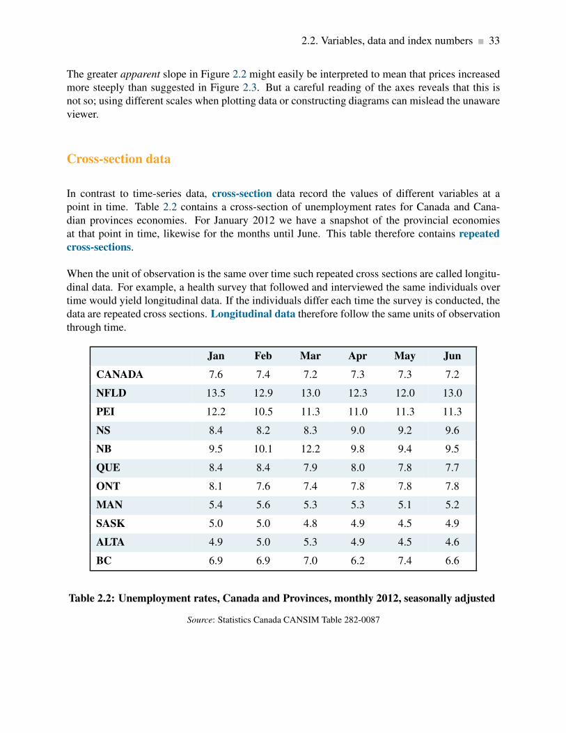
2.2. Variables, data and index numbers 33
The greater apparent slope in Figure 2.2 might easily be interpreted to mean that prices increased
more steeply than suggested in Figure 2.3. But a careful reading of the axes reveals that this is
not so; using different scales when plotting data or constructing diagrams can mislead the unaware
viewer.
Cross-section data
In contrast to time-series data, cross-section data record the values of different variables at a
point in time. Table 2.2 contains a cross-section of unemployment rates for Canada and Cana-
dian provinces economies. For January 2012 we have a snapshot of the provincial economies
at that point in time, likewise for the months until June. This table therefore contains repeated
cross-sections.
When the unit of observation is the same over time such repeated cross sections are called longitu-
dinal data. For example, a health survey that followed and interviewed the same individuals over
time would yield longitudinal data. If the individuals differ each time the survey is conducted, the
data are repeated cross sections. Longitudinal data therefore follow the same units of observation
through time.
Jan Feb Mar Apr May Jun
CANADA 7.6 7.4 7.2 7.3 7.3 7.2
NFLD 13.5 12.9 13.0 12.3 12.0 13.0
PEI 12.2 10.5 11.3 11.0 11.3 11.3
NS 8.4 8.2 8.3 9.0 9.2 9.6
NB 9.5 10.1 12.2 9.8 9.4 9.5
QUE 8.4 8.4 7.9 8.0 7.8 7.7
ONT 8.1 7.6 7.4 7.8 7.8 7.8
MAN 5.4 5.6 5.3 5.3 5.1 5.2
SASK 5.0 5.0 4.8 4.9 4.5 4.9
ALTA 4.9 5.0 5.3 4.9 4.5 4.6
BC 6.9 6.9 7.0 6.2 7.4 6.6
Table 2.2: Unemployment rates, Canada and Provinces, monthly 2012, seasonally adjusted
Source: Statistics Canada CANSIM Table 282-0087
34 Theories, models and data
Cross-section data: values for different variables recorded at a point in time.
Repeated cross-section data: cross-section data recorded at regular or irregular intervals.
Longitudinal data: follow the same units of observation through time.
Index numbers
It is important in economic analysis to discuss and interpret data in a meaningful manner. Index
numbers help us greatly in doing this. They are values of a given variable, or an average of a set
of variables expressed relative to a base value. The key characteristics of indexes are that they are
not dependent upon the units of measurement of the data in question, and they are interpretable
easily with reference to a given base value. To illustrate, let us change the price data in column 2
of Table 2.1 into index number form.
Index number: value for a variable, or an average of a set of variables, expressed relative to a
given base value.
The first step is to choose a base year as a reference point. This could be any one of the periods.
We will simply take the first period as the year and set the price index value equal to 100 in that
year. The value of 100 is usually chosen in order to make comparisons simple, but in some cases a
base year value of 1.0 is used. If the base year value of 100 is used, the value of index in any year
t is:
Value of index =Absolute value in year t
Absolute value in base year×100 (2.2)
Suppose we choose 1999 as the base year for constructing an index of the house prices given in
Table 2.1 House prices in that year were $330,000. Then the index for the base year has a value:
Index in 1999 =$330,000
$330,000×100 = 100
Applying the method to each value in column 2 yields column 3, which is now in index number
form. For example, the January 2003 value is:
Index in 2003 =$395,000
$330,000×100 = 119.7

2.2. Variables, data and index numbers 35
Each value in the index is interpreted relative to the value of 100, the base price in January 1999.
The beauty of this column lies first in its ease of interpretation. For example, by 2003 the price
increased to 119.7 points relative to a value of 100. This yields an immediate interpretation: The
index has increased by 19.7 points per hundred or percent. While it is particularly easy to compute
a percentage change in a data series when the base value is 100, it is not necessary that the reference
point have a value of 100. By definition, a percentage change is given by the change in values
relative to the initial value, multiplied by 100. For example, the percentage change in the price
from 2006 to 2007, using the price index is: (190.91−175.76)/175.76×100= 8.6 percent.
Percentage change = (change in values)/original value×100.
Furthermore, index numbers enable us to make comparisons with the price patterns for other goods
much more easily. If we had constructed a price index for wireless phones, which also had a base
value of 100 in 1999, we could make immediate comparisons without having to compare one set
of numbers defined in dollars with another defined in tens of thousands of dollars. In short, index
numbers simplify the interpretation of data.
Composite index numbers
Index numbers have even wider uses than those we have just described. Suppose you are interested
in the price trends for all fuels as a group in Canada during the last decade. You know that this
group includes coal, natural gas, and oil, but you suspect that these components have not all been
rising in price at the same rate. You also know that, while these fuels are critical to the economy,
some play a bigger role than others, and therefore should be given more importance, or weight,
in a general fuel price index. In fact, the official price index for these fuels is a weighted average
of the component price indexes. The fuels that are more important get a heavier weighting in the
overall index. For example, if oil accounts for 60 percent of fuel use, natural gas for 25 percent,
and coal for 15 percent, the price index for fuel could be computed as follows:
Fuel price index = (oil index×0.6)+(natural gas index×0.25)+(coal index×0.15) (2.3)
To illustrate this, Figure 2.4 presents the price trends for these three fuels. The data come from
Statistics Canada’s CANSIM database. In addition, the overall fuel price index is plotted. It
is frequently the case that components do not display similar patterns, and in this instance the
composite index follows oil most closely, reflecting the fact that oil has the largest weight.

36 Theories, models and data
2000
2002
2004
2006
2008
2010
2012
0
50
100
150
200
250
300
350
Year
Inde
xva
lue
All fuelsCoalOilGas
Figure 2.4: Composite fuel price index
Source: Statistics Canada. Table 330-0007 – Raw materials price indexes,
monthly (index, 2002=100), CANSIM.
Other composite price indexes
The fuels price index is just one of many indexes constructed to measure a composite group of eco-
nomic variables. There are also published indexes of commodity prices, including and excluding
fuels, agricultural prices, average hourly earnings, industrial production, unit labour costs, Cana-
dian dollar effective exchange rate (CERI), the S&P/TSX stock market prices and consumer prices
to list just a few. All these indexes are designed to reduce the complexity of the data on key sectors
of the economy and important economic conditions.
The consumer price index (CPI) is the most widely quoted price index in the economy. It mea-
sures the average price level in the economy and changes in the CPI provide measures of the rate
at which consumer goods and services change in price—inflation if prices increase, deflation if
prices decline.
The CPI is constructed in two stages. First, a consumer expenditure survey is use to establish the
importance or weight of each of eight categories in a ‘basket’ of goods and services. Then the cost
of this basket of services in a particular year is compared to its cost in the chosen base year. With
this base year cost of the basket set at 100 the ratio of the cost of the same basket in any other year

2.2. Variables, data and index numbers 37
to its cost in the base year multiplied my 100 gives the CPI for that year. The CPI for any given
year is:
CPIt =Cost of basket in year t
Cost of basket in base year×100 (2.4)
Consumer price index: the average price level for consumer goods and services
Inflation rate: the annual percentage increase in the consumer price index
Deflation rate: the annual percentage decrease in the consumer price index
Using price indexes
The CPI is useful both as an indicator of how much prices change in the aggregate, and also as an
indicator of relative price changes. Column 4 of Table 2.1 provides the Vancouver CPI with the
same base year as the North Vancouver house price index. Note how the two indexes move very
differently over time. The price of housing has increased considerably relative to the overall level
of prices in the local economy, as measured by the CPI: Housing has experienced a relative price
increase, or a real price index. This real increase is to be distinguished from the nominal price
index, which is measured without reference to overall prices. The real price index for housing (or
any other specific product) is obtained by dividing its specific price index by the CPI.
Real house price index =nominal house price index
CPI×100
Real price index: a nominal price index divided by the consumer price index, scaled by 100.
Nominal price index: the current dollar price of a good or service.
The resulting index is given in column 5 of Table 2.1. This index has a simple interpretation: It
tells us by how much the price of Vancouver houses has changed relative to the general level of
prices for goods and services. For example, between 1999 and 2004 the number 119.55 in column
5 for the year 2004 indicates that housing increased in price by 19.55 percent relative to prices in
general.
Here is a further simple example. Table 2.3 reports recent annual data on indexes of nominal

38 Theories, models and data
earnings, measured in current dollars, both average weekly and hourly rates, over the 2003-2011
time period. The table also reports the consumer price index for the same time period. To simplify
the illustration all indexes have been re-based to 2003=100 by dividing the reported value of the
index in each year by its value in 2003 and multiplying by 100.
The table shows the difference between changes in nominal and real earnings. Real earnings are
measured in constant dollars adjusted for changes in the general price level. The adjustment is
made by dividing the indexes of nominal earnings in each year by the consumer price index in that
year and multiplying by 100.
Nominal earnings: earnings measured in current dollars.
Real earnings: earnings measure in constant dollars to adjust for changes in the general price
level.
As measured by the nominal weekly and hourly indexes, nominal earnings increased by 26 to 27
percent over the eight year period 2003-2011. However, the general price level as measured by the
consumer price index (CPI) increased by close to 17 percent over the same period. As a result, real
earnings, measured in terms of the purchasing power of nominal earnings increased by only about
9 percent, notable less than in 26 percent increase in nominal earnings.
Nominal earnings Real earnings
Year Average Average CPI Average Averageweekly hourly weekly hourly
earnings earnings earnings earnings
2003 100.0 100.0 100.0 100.0 100.0
2004 102.7 102.7 101.8 100.8 100.9
2005 106.7 106.2 104.2 102.4 101.9
2006 109.4 108.8 106.1 103.0 102.5
2007 114.1 113.8 108.5 105.2 104.9
2008 117.4 117.7 111.0 105.7 106.1
2009 119.2 121.3 111.3 107.1 109.0
2010 123.5 125.0 113.3 109.0 110.3
2011 126.6 127.5 116.6 108.6 109.4
Table 2.3: Nominal and real earnings in Canada 2003-2011
Source: Statistics Canada, CANSIM Series V1558664, V1606080 and
V41690914 and author’s calculations

2.3. Testing economic models & analysis 39
These observations illustrate two important points. First the distinction between real and nominal
values is very important. If the general price level is changing, changes in real values will differ
from changes in nominal values. Real values change by either less or more than changes in nominal
values. Second, in addition to tracking change over time, index numbers used in combination
simplify the adjustment from nominal to real values, as shown in both Table 2.1 and 2.3.
However, a word of caution is necessary. Index numbers can be used to track both nominal and
real values over time but they do not automatically adjust for change in the quality of products
and services or the changing patterns of output and use in the cases of composite indexes. Index
number bases and weights need constant adjustment to deal with these issues.
2.3 Testing economic models & analysis
Let us now investigate the interplay between models and data by means of a couple of examples.
The first simple economic model we proposed related house prices and mortgage rates. That
model argued that an important cause of the recently observed rise in house prices was the decline
in mortgage interest rates. Figure 2.1 illustrated that relationship with a diagram and Equation 2.1
put the model in terms of basic algebra.
The logic of the model is based on the effects of the costs of financing on prices and specifically
on house prices. Lower mortgage rates make financing house purchases more affordable and lower
the income criteria that mortgage lenders apply to mortgage approvals. Potential buyers can afford
higher priced houses and potential sellers may expect to get more for their properties. As a result,
our model argues that lower mortgage rates push up house prices.
There is also an important policy issue here. On several occasions the federal government minister
of finance has expresses concerns about low mortgage rates and long mortgage terms as a potential
cause of a house price ‘bubble’. Experience with house price increases in other countries leading
up to the financial crisis of 2008 provides a solid basis for this concern. As a result starting in
2008 and as recently as 2012 the federal government has taken action to discourage competitive
reductions in mortgage rates, to limit the terms and amortization periods and to increase down
payment requirements for new mortgage. The underlying rationale for these actions is the belief
that higher mortgage rates, shorter terms and higher down payments will relieve upward pressure
on house prices.
Let us now formalize the above ideas into an economic model of house prices. Several factors
influence house prices and mortgage rates are one; another is the income of the potential buyers;
a third is the number of houses or condominiums that come on the market – either new or not; a
fourth could be the growth in population in the area where we are exploring house prices. If we
think these are the main determinants of house prices then we could formalize this theory in the
following model:

40 Theories, models and data
House prices = f (mortgage rate, incomes, supply of housing
offered on the market, population growth, . . .)
The notation f (. . .) means that the variable on the left-hand side of the equation is a function of
the variables inside the parentheses. This equation is, therefore, an economic model that links
behaviour to its main determinants.
Evidence
To support or reject the above models, we need to confront them with data. Unlike natural sciences,
economics is a social science; therefore we rarely have data that come from laboratory experiments.
Most of our research uses data collected over periods of time during which many relevant factors
change simultaneously. A basic challenge in testing is how to disentangle the separate influences
of these changing factors.
Table 2.4 contains data on the 5-year conventional mortgage interest rate and an index of resale-
housing prices, quarterly for the period from the first quarter of 2007 to the fourth quarter of 2011.
The house price index has a base value of 100 in the last quarter of 2006, and reflects a weighted
average of detached bungalows, executive and detached two-story houses. Figure 2.5 is a scatter
diagram of the data in Table 2.4.
A Scatter diagram plots pairs of values simultaneously observed for two variables.
A clear negative relationship between the two variables is evident in Figure 2.5. A higher mortgage
rate is associated with lower house prices.
Fitting lines through the scatter plot
A line through the scatter of points in Figure 2.5 shows the average relationship between mortgage
rates and house prices. A challenge is to define the line that most accurately characterizes the
relationship. This task is the job of econometricians, who practice econometrics. Econometrics
is the science of examining and quantifying relationships between economic variables. It attempts
to determine the separate influences of each variable, in an environment where many things move
simultaneously.

2.3. Testing economic models & analysis 41
Econometrics is the science of examining and quantifying relationships between economic vari-
ables.
Econometricians are individuals who study econometrics.
In two dimensions, the line drawn through the scatter is chosen to minimize the sum of distances
(or distances squared) between the line and the various points. It is called a regression line or a
trend line if the data are in time-series form. Computer algorithms that do this are plentiful, and
fortunately computers can work in many dimensions in order to capture the influences of all the
variables simultaneously1.
Regression line: representation of the average relationship between two variables in a scatter
diagram.
10
0
12
0
14
0
16
0
18
0
20
0
22
0
24
0
26
0
28
0
30
0
32
0
4
5
6
7
8
9
House price index
Mo
rtg
age
rate
Figure 2.5: House prices and the mortgage rate
1Note in Figure 2.5 that the vertical axis begins at the value of 4, and the horizontal axis begins at a value of 100.
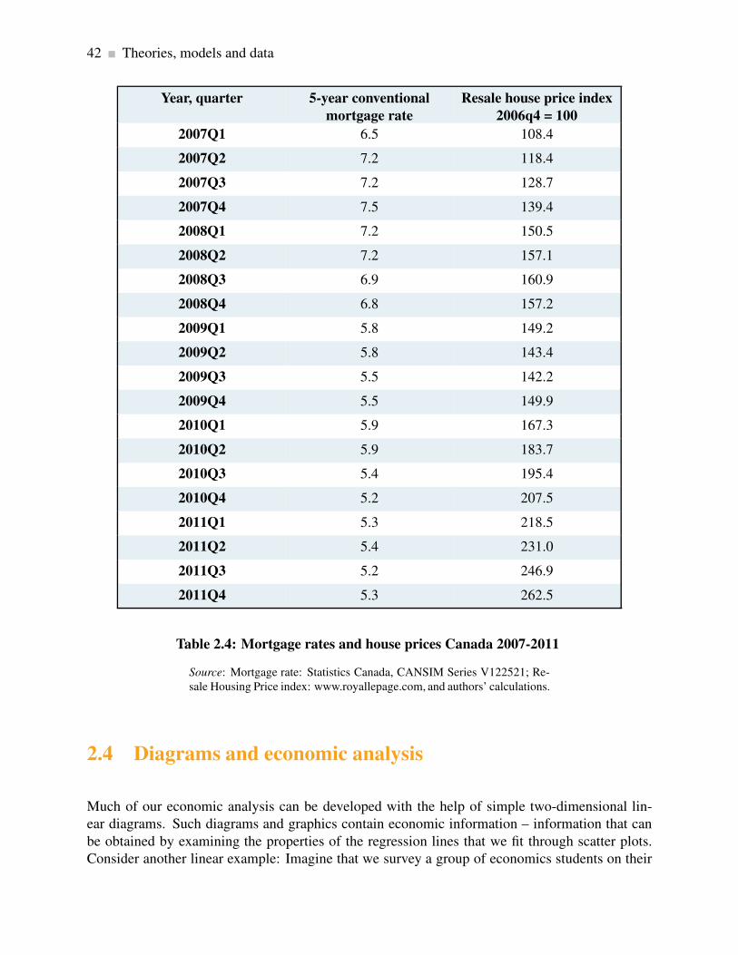
42 Theories, models and data
Year, quarter 5-year conventional
mortgage rate
Resale house price index
2006q4 = 100
2007Q1 6.5 108.4
2007Q2 7.2 118.4
2007Q3 7.2 128.7
2007Q4 7.5 139.4
2008Q1 7.2 150.5
2008Q2 7.2 157.1
2008Q3 6.9 160.9
2008Q4 6.8 157.2
2009Q1 5.8 149.2
2009Q2 5.8 143.4
2009Q3 5.5 142.2
2009Q4 5.5 149.9
2010Q1 5.9 167.3
2010Q2 5.9 183.7
2010Q3 5.4 195.4
2010Q4 5.2 207.5
2011Q1 5.3 218.5
2011Q2 5.4 231.0
2011Q3 5.2 246.9
2011Q4 5.3 262.5
Table 2.4: Mortgage rates and house prices Canada 2007-2011
Source: Mortgage rate: Statistics Canada, CANSIM Series V122521; Re-
sale Housing Price index: www.royallepage.com, and authors’ calculations.
2.4 Diagrams and economic analysis
Much of our economic analysis can be developed with the help of simple two-dimensional lin-
ear diagrams. Such diagrams and graphics contain economic information – information that can
be obtained by examining the properties of the regression lines that we fit through scatter plots.
Consider another linear example: Imagine that we survey a group of economics students on their
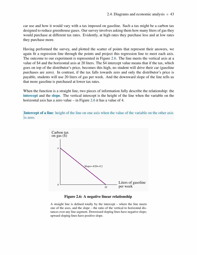
2.4. Diagrams and economic analysis 43
car use and how it would vary with a tax imposed on gasoline. Such a tax might be a carbon tax
designed to reduce greenhouse gases. Our survey involves asking them how many liters of gas they
would purchase at different tax rates. Evidently, at high rates they purchase less and at low rates
they purchase more.
Having performed the survey, and plotted the scatter of points that represent their answers, we
again fit a regression line through the points and project this regression line to meet each axis.
The outcome to our experiment is represented in Figure 2.6. The line meets the vertical axis at a
value of $4 and the horizontal axis at 20 liters. The $4 intercept value means that if the tax, which
goes on top of the distributor’s price, becomes this high, no student will drive their car (gasoline
purchases are zero). In contrast, if the tax falls towards zero and only the distributor’s price is
payable, students will use 20 liters of gas per week. And the downward slope of the line tells us
that more gasoline is purchased at lower tax rates.
When the function is a straight line, two pieces of information fully describe the relationship: the
intercept and the slope. The vertical intercept is the height of the line when the variable on the
horizontal axis has a zero value – in Figure 2.6 it has a value of 4.
Intercept of a line: height of the line on one axis when the value of the variable on the other axis
is zero.
4
20
Slope=-4/20=-0.2
Carbon taxon gas ($)
0Liters of gasolineper week
Figure 2.6: A negative linear relationship
A straight line is defined totally by the intercept – where the line meets
one of the axes, and the slope – the ratio of the vertical to horizontal dis-
tances over any line segment. Downward sloping lines have negative slope;
upward sloping lines have positive slope.
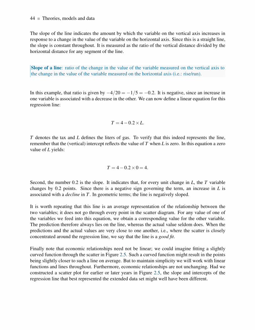
44 Theories, models and data
The slope of the line indicates the amount by which the variable on the vertical axis increases in
response to a change in the value of the variable on the horizontal axis. Since this is a straight line,
the slope is constant throughout. It is measured as the ratio of the vertical distance divided by the
horizontal distance for any segment of the line.
Slope of a line: ratio of the change in the value of the variable measured on the vertical axis to
the change in the value of the variable measured on the horizontal axis (i.e.: rise/run).
In this example, that ratio is given by −4/20 = −1/5 = −0.2. It is negative, since an increase in
one variable is associated with a decrease in the other. We can now define a linear equation for this
regression line:
T = 4−0.2×L.
T denotes the tax and L defines the liters of gas. To verify that this indeed represents the line,
remember that the (vertical) intercept reflects the value of T when L is zero. In this equation a zero
value of L yields:
T = 4−0.2×0 = 4.
Second, the number 0.2 is the slope. It indicates that, for every unit change in L, the T variable
changes by 0.2 points. Since there is a negative sign governing the term, an increase in L is
associated with a decline in T . In geometric terms; the line is negatively sloped.
It is worth repeating that this line is an average representation of the relationship between the
two variables; it does not go through every point in the scatter diagram. For any value of one of
the variables we feed into this equation, we obtain a corresponding value for the other variable.
The prediction therefore always lies on the line, whereas the actual value seldom does. When the
predictions and the actual values are very close to one another, i.e., where the scatter is closely
concentrated around the regression line, we say that the line is a good fit.
Finally note that economic relationships need not be linear; we could imagine fitting a slightly
curved function through the scatter in Figure 2.5. Such a curved function might result in the points
being slightly closer to such a line on average. But to maintain simplicity we will work with linear
functions and lines throughout. Furthermore, economic relationships are not unchanging. Had we
constructed a scatter plot for earlier or later years in Figure 2.5, the slope and intercepts of the
regression line that best represented the extended data set might well have been different.

2.5. Ethics, efficiency and beliefs 45
2.5 Ethics, efficiency and beliefs
Positive economics studies objective or scientific explanations of how the economy functions. Its
aim is to understand and generate predictions about how the economy may respond to changes
and policy initiatives. In this effort economists strive to act as detached scientists, regardless of
political sympathies or ethical code. Personal judgments and preferences are (ideally) kept apart.
In this particular sense, economics is similar to the natural sciences such as physics or biology.
In contrast, normative economics offers recommendations based partly on value judgments. While
economists of different political persuasions can agree that raising the income tax rate would lead
to a general reduction in the number of hours worked, they may yet differ in their views on the
advisability of such a rise. One may believe that the additional revenue that may come in to gov-
ernment coffers is not worth the disincentives to work; another may think that, if such monies can
be redistributed to benefit the needy or provide valuable infrastructure, the negative impact on the
workers paying the income tax is worth it.
Positive economics studies objective or scientific explanations of how the economy functions.
Normative economics offers recommendations that incorporate value judgments.
Scientific research can frequently resolve differences that arise in positive economics—not so in
normative economics. For example, if we claim that “the elderly have high medical bills, and the
government should cover all of the bills”, we are making both a positive and a normative state-
ment. The first part is positive, and its truth is easily established. The latter part is normative, and
individuals of different beliefs may reasonably differ. Some people may believe that the money
would be better spent on the environment and have the aged cover at least part of their own medical
costs. Economics cannot be used to show that one of these views is correct and the other false.
They are based on value judgments, and are motivated by a concern for equity. Equity is a vital
guiding principle in the formation of policy and is frequently, though not always, seen as being in
competition with the drive for economic growth. Equity is driven primarily by normative consid-
erations. Few economists would disagree with the assertion that a government should implement
policies that improve the lot of the poor and dispossessed—but to what degree?
Economic equity is concerned with the distribution of well-being among members of the econ-
omy.
Most economists hold normative views, sometimes very strongly. They frequently see their role
as not just to analyze economic issues from a positive perspective, but also to champion their
normative cause in addition. Conservative economists see a smaller role for government than
left-leaning economists. A scrupulous economist will distinguish her positive from her normative

46 Theories, models and data
analysis.
Many economists see a conflict between equity and the efficiency considerations that we developed
in Chapter 1. For example, high taxes may provide disincentives to work in the marketplace and
therefore reduce the efficiency of the economy: plumbers and gardeners may decide to do their own
gardening and their own plumbing because, by staying out of the marketplace where monetary
transactions are taxed, they can avoid the taxes. And avoiding the taxes may turn out to be as
valuable as the efficiency gains they forgo.
In other areas the equity efficiency trade-off is not so obvious: if taxes (that may have disincentive
effects) are used to educate individuals who otherwise would not develop the skills that follow
education, then economic growth may be higher as a result of the intervention.
Data are an integral part of policy making in the public domain. A good example of this
is in the area of road safety. Road fatalities have fallen dramatically in recent decades in
Canada, in large measure due to the introduction of safety measures such as speed limits,
blood-alcohol limits, seat belt laws, child-restraint devices and so forth. Safety policies are
directed particularly strongly towards youth: they have a lower blood-alcohol limit, a smaller
number of permitted demerit points before losing their license, a required period of learning
(driver permit) and so forth. While fatalities among youth have fallen in line with fatalities
across the age spectrum, they are still higher than for other age groups. Figure 2.7 presents
data on fatalities per licensed driver by age group in Canada relative to the youngest age
group. Note the strong non-linear pattern to the data – fatalities decline quickly, then level
off and again increase for the oldest age group.
In keeping with these data, drivers are now required to pass a driving test in most provinces
once they attain a certain age – usually 80, because the data indicate that fatalities increase
when drivers age.
See:
CANADIAN MOTOR VEHICLE TRAFFIC COLLISION STATISTICS 2009,Transport Canada.
Application Box 2.1: Statistics for policy makers

2.5. Ethics, efficiency and beliefs 47
16-1
9
20-2
4
25-3
4
35-4
4
45-5
4
55-6
465
+
0
10
20
3029.61
9.77
4.432.7 2.42 1.93
2.88
Age
Fat
alit
ies
per
10
0,0
00
dri
ver
s
Figure 2.7: Non-linearity: Driver fatality rates Canada, 2009
Fatality rates vary non-linearly with age: at first they decline, then increase
again, relative to the youngest age group.
Revisiting the definition of economics
This is an appropriate point at which to return to the definition of economics in Chapter 1 that we
borrowed from Nobel Laureate Christopher Sims: economics is a set of ideas and methods for the
betterment of society.
If economics is concerned about the betterment of society, clearly there are ethical as well as effi-
ciency considerations at play. And given the philosophical differences among scientists (including
economists), can we define an approach to economics that is shared by most of the economics
profession? Most economists would answer that the profession shares a set of beliefs, and that
differences refer to the extent to which one consideration may collide with another.
First of all we believe that markets are critical because they facilitate exchange and therefore
encourage efficiency. Before the arrival of Man Friday, Robinson Crusoe had to hunt, cook, make
fire, and sustain shelter. The arrival of Man Friday enabled Crusoe to specialize in the tasks where
he was relatively more productive. More generally, trade creates benefits for the trading parties.
For example, Canada has not the appropriate climate for growing coffee beans, and Colombia has
not the terrain for wheat. If Canada had to be self-sufficient, we might have to grow coffee beans
in green-houses—a costly proposition. But with trade we can simply exchange some of our wheat
for Colombian coffee. Similar benefits arise for the Colombians.

48 Theories, models and data
A frequent complaint against globalization is that it does not benefit the poor. For example, workers
in the Philippines may earn only a few dollars per day manufacturing clothing for Western markets.
What these voices are really trying to say is that, in their opinion, most of the gains from trade go
to the Western consumers, and a lesser part to the Asian worker.
A corollary of the centrality of markets is that incentives matter. If the price of business class seats
on your favourite airline is reduced, you may consider upgrading. Economists believe strongly that
the price mechanism influences behaviour, and therefore favour the use of price incentives in the
marketplace and public policy more generally. Environmental economists, for example, frequently
advocate the use of tradable pollution permits—a type of permission slip that can be traded (at a
price) between users, or carbon taxes on the emission of greenhouse gases such as carbon dioxide.
We will develop such ideas in Microeconomics Chapter 5 more fully.
In saying that economists believe in incentives, we are not proposing that human beings are purely
mercenary. People have many motivations: a sense of public duty, kindness, noblesse oblige, etc.
Acting out of a sense of self-interest does not imply that people are morally empty or have no sense
of altruism. It is just recognition of one important motivating factor in an individual’s life.
Whether conservative or liberal, economists believe universally in the importance of the rule of
law, and a set of legal institutions that govern contracts. If goods and services are to be supplied
in a market economy, the suppliers must be guaranteed that they will be remunerated. And this
requires a developed legal structure with penalties imposed on individuals or groups who violate
contracts. Markets alone will not function efficiently.
The development of markets in less developed economies was viewed as essential by many devel-
opment economists in the nineteen eighties. The focus on ‘freeing up’ productive resources from
the hand of the state was a central idea in what became known as the ‘Washington Consensus’.
This emphasis represented a turning point in development philosophy – away from believing in
the efficacy of the mega project, protectionism and state-led development. While the latter ap-
proach rarely produced the desired result on account of the missing incentives, the Washington
Consensus did not produce the hoped-for results either. This was because the supposed ‘free mar-
kets’ were not always accompanied by property rights, or enforceable contracts – markets and
contracts do not work well in a legal vacuum. Oxford economist Marcel Fafchamps has described
these supposed ‘free markets’ as ‘flea markets’.
Not surprisingly, economists have found a high correlation between economic growth and national
wealth on the one hand and the rule of law on the other. The consequence on the world stage is
fascinating: numerous ‘economic’ development projects now focus upon training jurists, police
officers and bureaucrats in the rule of law!
Finally economists believe in the importance of government policy. Governments can solve a
number of problems that arise in market economies that cannot be addressed by the private mar-
ket place. For example, governments can best address the potential abuses of monopoly power.
Monopoly power, as we shall see in Microeconomics Chapter 10, not only has equity impacts
it may also reduce economic efficiency. Governments are best positioned to deal with what

2.5. Ethics, efficiency and beliefs 49
economists term externalities – the impact of economic activity on sectors of the economy that
re not directly involved in the activity under consideration. A good example is environmental pol-
icy. Governments may also wish to impose standards on products – consumers might not know if
a bicycle helmet is effective unless safety standards are put in place.
In summary, governments have a variety of roles to play in the economy. These roles apply not
only to making the economy a more equitable place (which governments achieve by their tax and
redistribution policies), governments can also make the marketplace more efficient.

50 KEY TERMS
KEY TERMS
Variables: measures that can take on different sizes.
Data: recorded values of variables.
Time series data: a set of measurements made sequentially at different points in time.
High (low) frequency data series have short (long) intervals between observations.
Cross-section data: values for different variables recorded at a point in time.
Longitudinal data follow the same units of observation through time.
Index number: value for a variable, or an average of a set of variables, expressed relative to a
given base value.
Value of index =Absolute value in year t
Absolute value in base year×100.
Percentage change=(change in values)
original value×100.
Consumer price index: the average price level for consumer goods and services.
Inflation rate: the annual percentage increase in the consumer price index.
Deflation rate: the annual percentage decrease in the consumer price index.
Real price index: a nominal price index divided by the consumer price index, scaled by 100.
Nominal price index: the current dollar price of a good or service.
Nominal earnings: earnings measured in current dollars.
Real earnings: earnings measure in constant dollars to adjust for changes in the general price
level.
Scatter diagram plots pairs of values simultaneously observed for two variables.

KEY TERMS 51
Econometrics is the science of examining and quantifying relationships between economic
variables.
Regression line represents the average relationship between two variables in a scatter diagram.
Positive economics studies objective or scientific explanations of how the economy functions.
Normative economics offers recommendations that incorporate value judgments.
Economic equity is concerned with the distribution of well-being among members of the
economy.

52 Exercises for Chapter 2
EXERCISES FOR CHAPTER 2
Exercise 2.1 An examination of a country’s recent international trade flows yields the data in the
table below.
Year National Income
($b)
Imports ($b)
2011 1,500 550
2012 1,575 573
2013 1,701 610
2014 1,531 560
2015 1,638 591
(a) Based on an examination of these data do you think the national income and imports are not
related, positively related, or negatively related?
(b) Draw a simple two dimensional line diagram to illustrate your view of the import/income
relationship. Measure income on the horizontal axis and imports on the vertical axis.
Exercise 2.2 The average price of a medium coffee at Wakeup Coffee Shop in each of the past ten
years is given in the table below.
2005 2006 2007 2008 2009 2010 2011 2012 2013 2014
$1.05 $1.10 $1.14 $1.20 $1.25 $1.25 $1.33 $1.35 $1.45 $1.49
(a) Construct an annual ‘coffee price index’ for the 2005 time period using 2006 as the base
year.
(b) Based on your price index, what was the percentage change in the price of a medium coffee
from 2006 to 2013?
(c) Based on your index, what was the average annual percentage change in the price of coffee
from 2010 to 2013?
Exercise 2.3 The table below gives unemployment rates for big cities and the rest of the country.
Two-thirds of the population lives in the big cities, and one-third in other areas. Construct a national
unemployment index, using the year 2000 as the base.
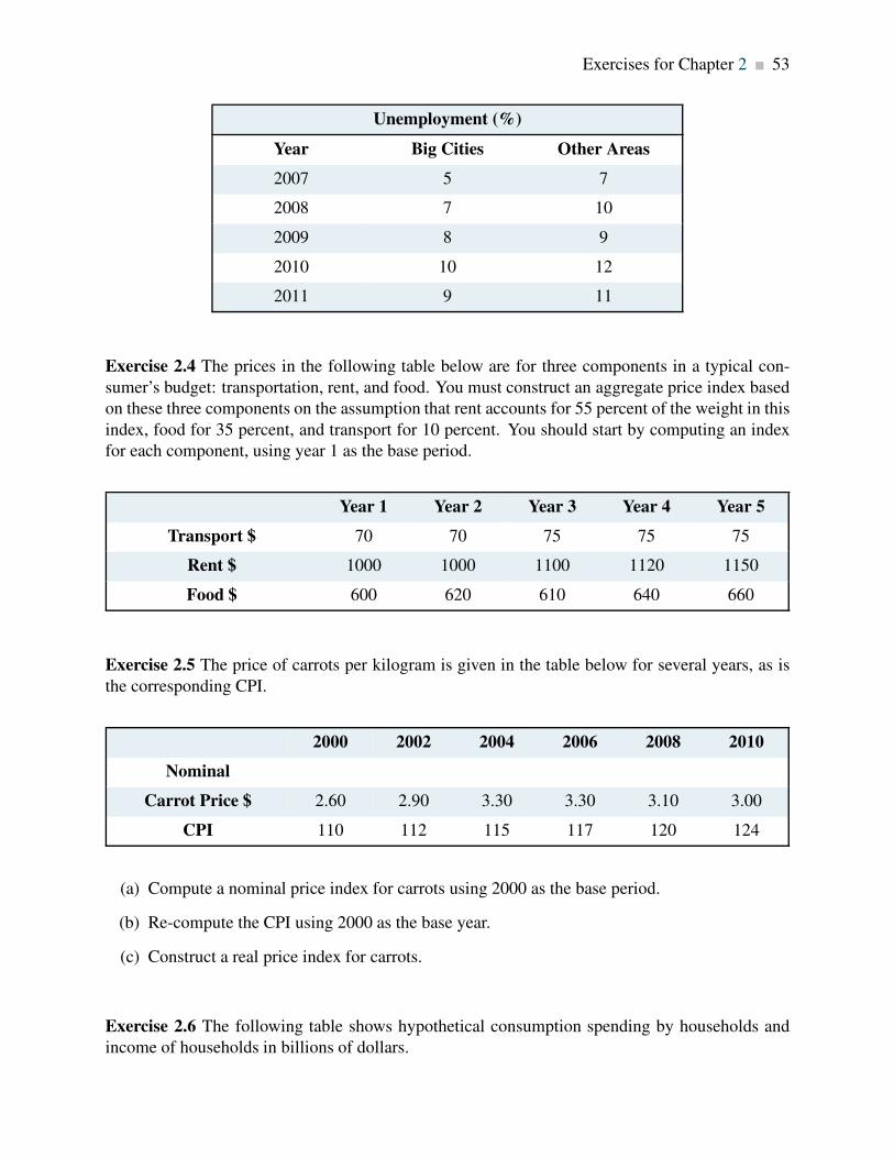
Exercises for Chapter 2 53
Unemployment (%)
Year Big Cities Other Areas
2007 5 7
2008 7 10
2009 8 9
2010 10 12
2011 9 11
Exercise 2.4 The prices in the following table below are for three components in a typical con-
sumer’s budget: transportation, rent, and food. You must construct an aggregate price index based
on these three components on the assumption that rent accounts for 55 percent of the weight in this
index, food for 35 percent, and transport for 10 percent. You should start by computing an index
for each component, using year 1 as the base period.
Year 1 Year 2 Year 3 Year 4 Year 5
Transport $ 70 70 75 75 75
Rent $ 1000 1000 1100 1120 1150
Food $ 600 620 610 640 660
Exercise 2.5 The price of carrots per kilogram is given in the table below for several years, as is
the corresponding CPI.
2000 2002 2004 2006 2008 2010
Nominal
Carrot Price $ 2.60 2.90 3.30 3.30 3.10 3.00
CPI 110 112 115 117 120 124
(a) Compute a nominal price index for carrots using 2000 as the base period.
(b) Re-compute the CPI using 2000 as the base year.
(c) Construct a real price index for carrots.
Exercise 2.6 The following table shows hypothetical consumption spending by households and
income of households in billions of dollars.

54 Exercises for Chapter 2
Year Income Consumption
2006 476 434
2007 482 447
2008 495 454
2009 505 471
2010 525 489
2011 539 509
2012 550 530
2013 567 548
(a) Plot the scatter diagram with consumption on the vertical axis and income on the horizontal
axis.
(b) Fit a line through these points.
(c) Does the line indicate that these two variables are related to each other?
(d) How would you describe the causal relationship between income and consumption?
Exercise 2.7 Using the data from Exercise 2.6, compute the percentage change in consumption
and the percentage change in income for each pair of adjoining years between 2006 and 2013.
Exercise 2.8 You are told that the relationship between two variables, X and Y , has the form
Y = 10+ 2X . By trying different values for X you can obtain the corresponding predicted value
for Y (e.g., if X = 3, then Y = 10+2×3 = 16). For values of X between 0 and 12, compute the
matching value of Y and plot the scatter diagram.
Exercise 2.9 Perform the same exercise as in Exercise 2.8, but use the formula Y = 10− 0.5X .
What do you notice about the slope of the relationship?
Exercise 2.10 For the data below, plot a scatter diagram with variable Y on the vertical axis and
variable X on the horizontal axis.
Y 40 33 29 56 81 19 20
X 5 7 9 3 1 11 10
Exercises for Chapter 2 55
(a) Is the relationship between the variables positive or negative?
(b) Do you think that a linear or non-linear line better describes the relationship?


Chapter 3
The classical marketplace – demand and supply
In this chapter we will explore:
3.1 The role of the marketplace – trading
3.2 The market’s building blocks
3.3 Demand curves and supply curves
3.4 Demand curves shifts
3.5 Supply curve shifts
3.6 Simultaneous demand and supply move-
ments
3.7 Free and managed markets – interventions
3.8 From individuals to markets
3.1 Trading
The marketplace in today’s economy has evolved from earlier times. It no longer has a unique
form – one where buyers and sellers physically come together for the purpose of exchange. In-
deed, supermarkets require individuals to be physically present to make their purchases. But when
purchasing an airline ticket, individuals simply go on line and interact with perhaps a number of
different airlines (suppliers) simultaneously. Or again, individuals may simply give an instruction
to their broker, who will execute a purchase on their behalf – the broker performs the role of a mid-
dleman, who may additionally give advice to the purchaser. Or a marketing agency may decide to
subcontract work to a translator or graphic artist who resides in Mumbai. In pure auctions (where
a single work of art or a single residence is offered for sale) buyers compete one against the other
for the single item supplied. These institutions are all different types of markets; they serve the
purpose of facilitating exchange and trade.
We should also keep in mind that not all goods and services in the modern economy are obtained
through the marketplace. Schooling and health care are allocated in Canada primarily by gov-
57
58 The classical marketplace – demand and supply
ernment decree. In some instances the market plays a supporting role: Universities and colleges
may levy fees, and most individuals must pay for their pharmaceuticals. In contrast, broadcasting
services may carry a price of zero – as with the Canadian Broadcasting Corporation.
The importance of the marketplace springs from its role as an allocating mechanism. Elevated
prices effectively send a signal to suppliers that the buyers in the market place a high value on the
product being traded; conversely when prices are low. Accordingly, suppliers may decide to cease
supplying markets where prices do not remunerate them sufficiently, and redirect their energies and
the productive resources under their control to other markets – markets where the product being
traded is more highly valued, and where the buyer is willing to pay more.
Whatever their form, the marketplace is central to the economy we live in. Not only does it
facilitate trade, it also provides a means of earning a livelihood. Suppliers must hire resources
– human and non-human in order to bring their supplies to market and these resources must be
paid a return – income is generated.
In this chapter we will examine the process of price formation – how the prices that we observe in
the marketplace come to be what they are. We will illustrate that the price for a good is inevitably
linked to the quantity of a good; price and quantity are different sides of the same coin and cannot
generally be analyzed separately. To understand this process more fully, we need to model a typical
market. The essentials are demand and supply.
3.2 The market’s building blocks
In economics we use the terminology that describes trade in a particular manner. Non-economists
frequently describe microeconomics by saying “it’s all about supply and demand”. While this
is largely true we need to define exactly what we mean by these two central words. Let’s start
with demand. Demand is the quantity of a good or service that buyers wish to purchase at each
conceivable price, with all other influences on demand remaining unchanged. It reflects a multitude
of values, not a single value. It is not a single or unique quantity such as two cell phones, but rather
a full description of the quantity of a good or service that buyers would purchase at various prices.
Demand is the quantity of a good or service that buyers wish to purchase at each possible price,
with all other influences on demand remaining unchanged.
As an example, the first column of Table 3.1 shows the price of natural gas per cubic foot. The
second column shows the quantity that would be purchased in a given time period at each price. It
is therefore a schedule of prices.
Supply is interpreted in a similar manner. It is not a single value; it is a schedule of the quantity

3.2. The market’s building blocks 59
that sellers would want to sell at each price. Hence we say that supply is the quantity of a good
or service that sellers are willing to sell at each possible price, with all other influences on supply
remaining unchanged. Such a supply schedule is defined in the third column of the table. It is
assumed that no supplier can make a profit (on account of their costs) unless the price is at least
$2 per unit, and therefore a zero quantity is supplied below that price. The higher price is more
profitable, and therefore induces a greater quantity supplied, perhaps by attracting more suppliers.
Price ($) Demand (thousands Supply (thousands Excessof cu feet) of cu feet)
10 0 18
Excess Supply
9 1 16
8 2 14
7 3 12
6 4 10
5 5 8
4 6 6 Equilibrium
3 7 4
Excess Demand2 8 2
1 9 0
0 10 0
Table 3.1: Demand and supply for natural gas
Supply is the quantity of a good or service that sellers are willing to sell at each possible price,
with all other influences on supply remaining unchanged.
We can now identify a key difference in terminology – between the words demand and quantity
demanded, and between supply and quantity supplied. While the words demand and supply refer
to the complete schedules of demand and supply, the terms quantity demanded and quantity
supplied each define a single value of demand or supply at a particular price.
Quantity demanded defines the amount purchased at a particular price.
Quantity supplied refers to the amount supplied at a particular price.

60 The classical marketplace – demand and supply
Thus while the non-economist may say that when some fans did not get tickets to the Stanley
Cup it was a case of demand exceeding supply, as economists we say that the quantity demanded
exceeded the quantity supplied at the going price of tickets. In this instance, had every ticket been
offered at a sufficiently high price, the market could have generated an excess supply rather than an
excess demand. A higher ticket price would reduce the quantity demanded; yet would not change
demand, because demand refers to the whole schedule of possible quantities demanded at different
prices.
Other things equal – ceteris paribus
The demand and supply schedules rest on the assumption that all other influences on supply and
demand remain the same as we move up and down the possible price values. We use the expression
other things being equal, or its Latin counterpart ceteris paribus, to describe this constancy of other
influences. For example, we assume on the demand side that the prices of other goods remain
constant, that tastes and incomes are unchanging, that the size of the market is given, and so forth.
On the supply side we assume, for example, that there is no technological change in production
methods.
Market equilibrium
Let us now bring the demand and supply schedules together in an attempt to analyze what the
market place will produce – will a single price emerge that will equate supply and demand? We
will keep other things constant for the moment, and explore what materializes at different prices. At
low prices, the data in Table 3.1 indicate that the quantity demanded exceeds the quantity supplied –
for example, verify what happens when the price is $3 per unit. The opposite occurs when the price
is high – what would happen if the price were $8? Evidently, there exists an intermediate price,
where the quantity demanded equals the quantity supplied. At this point we say that the market is
in equilibrium. The equilibrium price equates demand and supply – it clears the market.
The equilibrium price equilibrates the market. It is the price at which quantity demanded equals
the quantity supplied.
In Table 3.1 the equilibrium price is $4, and the equilibrium quantity is 6 thousand cubic feet of
gas (we will use the notation ‘k’ to denote thousands). At higher prices there is an excess supply—
suppliers wish to sell more than buyers wish to buy. Conversely, at lower prices there is an excess
demand. Only at the equilibrium price is the quantity supplied equal to the quantity
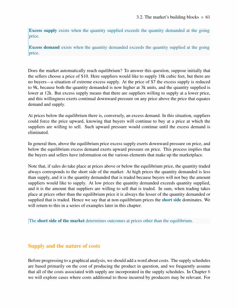
3.2. The market’s building blocks 61
Excess supply exists when the quantity supplied exceeds the quantity demanded at the going
price.
Excess demand exists when the quantity demanded exceeds the quantity supplied at the going
price.
Does the market automatically reach equilibrium? To answer this question, suppose initially that
the sellers choose a price of $10. Here suppliers would like to supply 18k cubic feet, but there are
no buyers—a situation of extreme excess supply. At the price of $7 the excess supply is reduced
to 9k, because both the quantity demanded is now higher at 3k units, and the quantity supplied is
lower at 12k. But excess supply means that there are suppliers willing to supply at a lower price,
and this willingness exerts continual downward pressure on any price above the price that equates
demand and supply.
At prices below the equilibrium there is, conversely, an excess demand. In this situation, suppliers
could force the price upward, knowing that buyers will continue to buy at a price at which the
suppliers are willing to sell. Such upward pressure would continue until the excess demand is
eliminated.
In general then, above the equilibrium price excess supply exerts downward pressure on price, and
below the equilibrium excess demand exerts upward pressure on price. This process implies that
the buyers and sellers have information on the various elements that make up the marketplace.
Note that, if sales do take place at prices above or below the equilibrium price, the quantity traded
always corresponds to the short side of the market: At high prices the quantity demanded is less
than supply, and it is the quantity demanded that is traded because buyers will not buy the amount
suppliers would like to supply. At low prices the quantity demanded exceeds quantity supplied,
and it is the amount that suppliers are willing to sell that is traded. In sum, when trading takes
place at prices other than the equilibrium price it is always the lesser of the quantity demanded or
supplied that is traded. Hence we say that at non equilibrium prices the short side dominates. We
will return to this in a series of examples later in this chapter.
The short side of the market determines outcomes at prices other than the equilibrium.
Supply and the nature of costs
Before progressing to a graphical analysis, we should add a word about costs. The supply schedules
are based primarily on the cost of producing the product in question, and we frequently assume
that all of the costs associated with supply are incorporated in the supply schedules. In Chapter 6
we will explore cases where costs additional to those incurred by producers may be relevant. For

62 The classical marketplace – demand and supply
example, coal burning power plants emit pollutants into the atmosphere; but the individual supplier
may not take account of these pollutants, which are costs to society at large, in deciding how
much to supply at different prices. Stated another way, the private costs of production would not
reflect the total, or full social costs of production. For the moment the assumption is that no such
additional costs are associated with the markets we analyze.
3.3 Demand and supply curves
The demand curve is a graphical expression of the relationship between price and quantity de-
manded, holding other things constant. Figure 3.1 measures price on the vertical axis and quantity
on the horizontal axis. The curve D represents the data from the first two columns of Table 3.1.
Each combination of price and quantity demanded lies on the curve. In this case the curve is lin-
ear—it is a straight line. The demand curve slopes downward (technically we say that its slope is
negative), reflecting the fact that buyers wish to purchase more when the price is less.
The demand curve is a graphical expression of the relationship between price and quantity de-
manded, with other influences remaining unchanged.
The supply curve is a graphical representation shows the relation between price and quantity
supplied, holding other things constant. The supply curve S in Figure 3.1 is based on the data from
columns 1 and 3 in Table 3.1. It, too, is linear, but has a positive slope indicating that suppliers
wish to supply more at higher prices.
The supply curve is a graphical expression of the relationship between price and quantity sup-
plied, with other influences remaining unchanged.
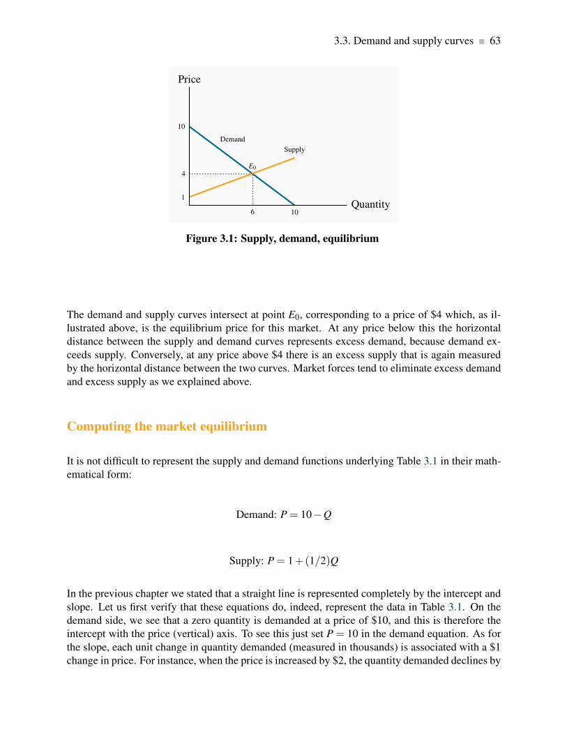
3.3. Demand and supply curves 63
10
Demand
10
1
Supply
Price
Quantity
4E0
6
Figure 3.1: Supply, demand, equilibrium
The demand and supply curves intersect at point E0, corresponding to a price of $4 which, as il-
lustrated above, is the equilibrium price for this market. At any price below this the horizontal
distance between the supply and demand curves represents excess demand, because demand ex-
ceeds supply. Conversely, at any price above $4 there is an excess supply that is again measured
by the horizontal distance between the two curves. Market forces tend to eliminate excess demand
and excess supply as we explained above.
Computing the market equilibrium
It is not difficult to represent the supply and demand functions underlying Table 3.1 in their math-
ematical form:
Demand: P = 10−Q
Supply: P = 1+(1/2)Q
In the previous chapter we stated that a straight line is represented completely by the intercept and
slope. Let us first verify that these equations do, indeed, represent the data in Table 3.1. On the
demand side, we see that a zero quantity is demanded at a price of $10, and this is therefore the
intercept with the price (vertical) axis. To see this just set P = 10 in the demand equation. As for
the slope, each unit change in quantity demanded (measured in thousands) is associated with a $1
change in price. For instance, when the price is increased by $2, the quantity demanded declines by

64 The classical marketplace – demand and supply
2 units. In reverse, if the price is lowered by $2, the quantity demanded increases by 2 units. Since
the price is on the vertical axis, it follows that the slope is given by −$1/1 = −1. It is negative
because an increase in quantity demanded is associated with a decrease in price.
On the supply side, column 3 in Table 3.1 indicates that at a quantity of zero the price is $1.
Therefore, $1 is the price intercept. As for the slope, each 2-unit change in quantity is associated
with a change in price of $1. Consequently, the slope is given by $1/2= 1/2. In this case the slope
is positive, since both the price and quantity move in the same direction.
We have now obtained the two defining characteristics of the demand and supply curves, which
enable us to write them as above. Next we must find where they intersect – the market equilib-
rium. Since, at their intersection point, the price on the demand curve equals the price on the
supply curve, and the quantity demanded equals the quantity supplied, this unique price-quantity
combination is obtained by equating the two curves:
D = S ⇒ 10−Q = 1+(1/2)Q ⇒ 10−1 = Q+(1/2)Q ⇒ 9 = 1.5Q1
Therefore,
Q = 9/1.5 = 6
The equilibrium solution for Q is therefore 6 units. What about an equilibrium price? It is obtained
by inserting the equilibrium Q value into either the supply or the demand function. Either function
can be used because, where Q = 6, the supply and demand functions intersect – they have equal P
values:
Demand price at Q=6: P = 10−1×6 = 10−6 = 4
Supply price at Q=6: P = 1+1/2×6 = 1+3 = 4
We have just solved a mathematical model of a particular market! It was not so difficult, but the
method is very powerful and we will use it many times in the text.
In the demand and supply equations above the price appeared on the left hand side and quantity
on the right. Normally this format implies a causation running from the right to the left hand side
variable, while in economic markets we normally think of the quantity demanded and supplied
depending upon the price in the market place. But the supply and demand equations can be rear-
ranged so that quantity appears on the left and price on the right. For example the demand equation
can be rewritten as follows:
1The ⇒ symbol is used in mathematics to denote “implication”. For example, A ⇒ B translates to “If A, then B.”
3.4. Other influences on demand 65
P = 10−Q ⇒ Q = 10−P,
or: Q = 10−P ⇒ Q = 10−P.
Writing the demand curve this way illustrates that the quantity intercept is 10 – the quantity de-
manded when the price becomes zero. The supply curve can be rearranged similarly.
3.4 Other influences on demand
We have emphasized several times the importance of the ceteris paribus assumption when explor-
ing the impact of different prices on the quantity demanded: we assume all other influences on the
purchase decision are unchanged (at least momentarily). These other influences fall into several
broad categories: the prices of related goods; the incomes of buyers; buyer tastes; and expecta-
tions about the future. Before proceeding, note that we are dealing with market demand rather
than demand by one individual (the precise relationship between the two is developed later in this
chapter).
The prices of related goods
We expect that the price of other forms of energy would impact the price of natural gas. For ex-
ample, if electricity, oil or coal becomes less expensive we would expect some buyers to switch
to these other products. Alternatively, if gas-burning furnaces experience a technological break-
through that makes them more efficient and cheaper we would expect some users of other fuels to
move to gas. Among these examples, it is clear that oil and electricity are substitute fuels for gas; in
contrast the efficient new gas furnace complements the use of gas. We use these terms, substitutes
and complements, to describe products that influence the demand for the primary good.
Substitute goods: when a price reduction (rise) for a related product reduces (increases) the
demand for a primary product, it is a substitute for the primary product.
Complementary goods: when a price reduction (rise) for a related product increases (reduces)
the demand for a primary product, it is a complement for the primary product.
Clearly electricity is a substitute for gas whereas the gas furnace is a complement for gas as a fuel.
The words substitutes and complements immediately suggest the nature of the relationships. Every
product has complements and substitutes. As another example: electronic readers are substitutes
for paper-form books; a rise in the price of paper books should increase the demand for electronic

66 The classical marketplace – demand and supply
readers at any price for electronic readers. In graphical terms, the demand curve shifts in response
to changes in the prices of other goods – an increase in the price of paper-form books will shift the
demand for electronic readers outward, because more electronic readers will be demanded at any
price.
Buyer incomes
The demand for most goods increases in response to income increases. Given this, the demand
curve for gas will shift outward if household incomes in the economy increase. Household incomes
may increase either because there are more households in the economy or because the incomes of
the existing households grow.
Most goods are demanded in greater quantity in response to higher incomes at any given price. But
there are exceptions. For example, public transit demand may decline at any price when household
incomes rise, because some individuals move to cars. Or the demand for laundromats may decline
in response to higher incomes, as households purchase more of their own consumer durables –
washers and driers. We use the term inferior good to define these cases: An inferior good is one
whose demand declines in response to increasing incomes, whereas a normal good experiences
an increase in demand in response to rising incomes.
An inferior good is one whose demand falls in response to higher incomes.
A normal good is one whose demand increases in response to higher incomes.
There is a further sense in which consumer incomes influence demand, and this relates to how the
incomes are distributed in the economy. In our discussion above we stated that higher total incomes
shift demand curves outwards when goods are normal. But think of the difference in the demand
for electronic readers between Portugal and Saudi Arabia. These economies have roughly the same
average per-person income, but incomes are distributed more unequally in Saudi Arabia. It does
not have a large middle class that can afford electronic readers or iPads, despite the huge wealth
held by the elite. In contrast, Portugal has a relatively larger middle class that can afford such
goods. Consequently, the distribution of income can be an important determinant of the demand
for many commodities and services.
Tastes and networks
While demand functions are drawn on the assumption that tastes are constant, in an evolving world
they are not. We are all subject to peer pressure, the fashion industry, marketing, and a desire
to maintain our image. If the fashion industry dictates that lapels or long skirts are de rigueur

3.4. Other influences on demand 67
for the coming season, some fashion-conscious individuals will discard a large segment of their
wardrobe, even though the clothes may be in perfectly good condition: Their demand is influenced
by the dictates of current fashion.
Correspondingly, the items that other individuals buy or use frequently determine our own pur-
chases. Businesses frequently decide that all of their employees will have the same type of com-
puter and software on account of network economies: It is easier to communicate if equipment is
compatible, and it is less costly to maintain infrastructure where the variety is less.
Expectations
In our natural gas example, if households expected that the price of natural gas was going to stay
low for many years – perhaps on account of the discovery of large deposits – then they would be
tempted to purchase a gas burning furnace rather than an oil burning furnace, particularly if they
anticipated that the price of oil would increase. In this example, it is more than the current price
that determines choices; the prices that are expected to prevail in the future also determine current
demand.
Expectations are particularly important in stock markets. When investors anticipate that corpora-
tions will earn high rewards in the future they will buy a stock today. If enough people believe
this, the price of the stock will be driven upward on the market, even before profitable earnings are
registered.
Shifts in demand
The demand curve in Figure 3.1 is drawn for a given level of other prices, incomes, tastes, and ex-
pectations. Movements along the demand curve reflect solely the impact of different prices for the
good in question, holding other influences constant. But changes in any of these other factors will
change the position of the demand curve. Figure 3.2 illustrates a shift in the demand curve. This
shift could result from a rise in household incomes that increase the quantity demanded at every
price. This is illustrated by an outward shift in the demand curve. With supply conditions un-
changed, there is a new equilibrium at E1, indicating a greater quantity of purchases accompanied
by a higher price. The new demand curve reflects a change in the quantity demanded.
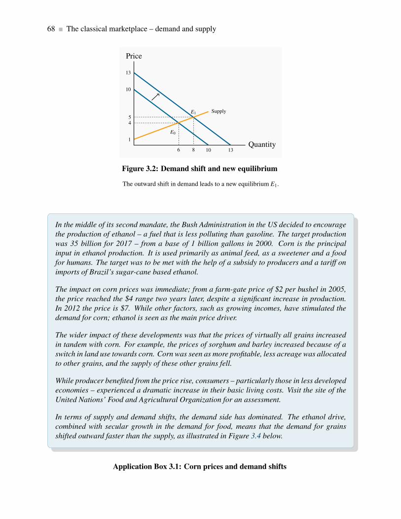
68 The classical marketplace – demand and supply
10
10
13
13
1
Supply
Price
Quantity
4
E0
6
5E1
8
Figure 3.2: Demand shift and new equilibrium
The outward shift in demand leads to a new equilibrium E1.
In the middle of its second mandate, the Bush Administration in the US decided to encourage
the production of ethanol – a fuel that is less polluting than gasoline. The target production
was 35 billion for 2017 – from a base of 1 billion gallons in 2000. Corn is the principal
input in ethanol production. It is used primarily as animal feed, as a sweetener and a food
for humans. The target was to be met with the help of a subsidy to producers and a tariff on
imports of Brazil’s sugar-cane based ethanol.
The impact on corn prices was immediate; from a farm-gate price of $2 per bushel in 2005,
the price reached the $4 range two years later, despite a significant increase in production.
In 2012 the price is $7. While other factors, such as growing incomes, have stimulated the
demand for corn; ethanol is seen as the main price driver.
The wider impact of these developments was that the prices of virtually all grains increased
in tandem with corn. For example, the prices of sorghum and barley increased because of a
switch in land use towards corn. Corn was seen as more profitable, less acreage was allocated
to other grains, and the supply of these other grains fell.
While producer benefited from the price rise, consumers – particularly those in less developed
economies – experienced a dramatic increase in their basic living costs. Visit the site of the
United Nations’ Food and Agricultural Organization for an assessment.
In terms of supply and demand shifts, the demand side has dominated. The ethanol drive,
combined with secular growth in the demand for food, means that the demand for grains
shifted outward faster than the supply, as illustrated in Figure 3.4 below.
Application Box 3.1: Corn prices and demand shifts

3.4. Other influences on demand 69
Modelling other influences
How are such changes reflected in our economic model? Let us say that market research quantifies
the degree to which the demand curve shifts: Market analysis indicates that the new demand curve
is given by P = 13−Q. Note that the intercept is greater while the slope is unchanged, so the
demand curve in this instance shifts outward while maintaining the same slope; it is parallel to the
original demand curve.
The new market equilibrium can be established by solving for the intersection of the new demand
curve with the existing supply curve. Let us do it.
Demand: P = 13−Q
Supply: P = 1+(1/2)Q
Equating the two yields:
13−Q = 1+(1/2)Q ⇒ 13−1 = Q+(1/2)Q ⇒ 12 = 1.5Q
Therefore,
Q = 12/1.5 = 8
Eight units of gas are now traded, rather than 6. The new equilibrium price is obtained as before,
by estimating the price at which 8 units of gas will be supplied or demanded. Inserting Q = 8
in either the supply or (new) demand function yields a value of $5. As a result of the demand
increase, therefore, both the equilibrium quantity traded and the equilibrium price in the market
increase (see Figure 3.2).
We may well ask why so much emphasis in our diagrams and analysis is placed on the relationship
between price and quantity, rather than on the relationship between quantity and its other deter-
minants. The answer is that we could indeed draw diagrams with quantity on the horizontal axis
and a measure of one of these other influences on the vertical axis. But the price mechanism plays
a very important role. Variations in price are what equilibrate the market. By focusing primarily
upon the price, we see the self-correcting mechanism by which the market reacts to excess supply
or excess demand.
In addition, this analysis illustrates the method of comparative statics—examining the impact of
changing one of the other things that are assumed constant in the supply and demand diagrams.

70 The classical marketplace – demand and supply
Comparative static analysis compares an initial equilibrium with a new equilibrium, where the
difference is due to a change in one of the other things that lie behind the demand curve or the
supply curve.
Comparative obviously denotes the idea of a comparison, and static means that we are not in a state
of motion. Hence we use these words in conjunction to indicate that we compare one outcome with
another, without being concerned too much about the transition from an initial equilibrium to a final
equilibrium. The transition would be concerned with dynamics rather than statics. In Figure 3.2
we explain the difference between the points E0 and E1 by indicating that there has been a change
in incomes or in the price of a substitute good. We do not attempt to analyze the details of this
move or the exact path from E0 to E1.
3.5 Other influences on supply
To date we have drawn supply curves with an upward slope. Is this a reasonable representation of
supply in view of what is frequently observed in markets? We suggested earlier that the various
producers of a particular good or service may have different levels of efficiency. If so, only the
more efficient producers can make a profit at a low price, whereas at higher prices more producers
or suppliers enter the market – producers who may not be as lean and efficient as those who can
survive in a lower-price environment. This view of the world yields an upward-sloping supply
curve, although there are other perspectives on the supply curve’s slope.
Frequently producers simply choose a price and let buyers purchase as much as they want at that
price. This is the practice of most retailers. For example, the price of Samsung’s Galaxy is typically
fixed, no matter how many are purchased – and tens of millions are sometimes sold at a fixed price
when a new model is launched. Apple sets a price, and buyers purchase as many as they desire at
that price.
In yet other situations supply is fixed. This happens in auctions, and bidders at the auction simply
determine the price to be paid. At a real estate auction a fixed number of homes are put on the
market and prices are determined by the bidding process.
Regardless of the type of market we encounter, however, it is safe to assume that supply curves
do not slope downward. So, for the moment, we adopt the stance that supply curves are generally
upward sloping – somewhere between the extremes of being vertical or horizontal – as we have
drawn them to this point.
Next, we examine those other influences that underlie supply curves. Technology, input costs, the
prices of competing goods, expectations and the number of suppliers are the most important.

3.5. Other influences on supply 71
Technology
A technological advance may involve an idea that allows more output to be produced with the same
inputs, or an equal output with fewer inputs. A good example is just-in-time technology. Before the
modern era, auto manufacturers kept large stocks of components in their production facilities, but
developments in communications and computers at that time made it possible for manufacturers to
link directly with their input suppliers. Nowadays assembly plants place their order for, say, seat
delivery to their local seat supplier well ahead of time. The seats swing into the assembly area
hours or minutes before assembly—just in time. The result is that the assembler reduces his seat
inventory (an input) and thereby reduces production cost.
Such a technology-induced cost saving is represented by moving the supply curve downward or
outward: The supplier is willing to supply the same quantity at a lower price because of the tech-
nological innovation. Or, saying the same thing slightly differently, suppliers will supply more
at a given price than before. This is but one example of how “supply chains” are evolving in the
modern globalized world. Computer assemblers are prime examples of the same developments.
Input costs
Input costs can vary independently of technology. For example, a wage negotiation that grants
workers an increase above the general inflation rate will increase the cost of production. This is
reflected in a leftward, or upward, supply shift: Any quantity is now priced higher; alternatively,
suppliers are willing to supply less at the going price.
As a further example, suppose the government decrees that power-generating companies must
provide a certain percentage of their power using ‘green’ sources – from solar power or windmills.
Since such sources are not yet as cost efficient as more conventional power sources, the electricity
they generate comes at a higher cost.
Competing products
If competing products improve in quality or fall in price, a supplier may be forced to follow suit.
For example, Hewlett-Packard and Dell are constantly watching each other’s pricing policies. If
Dell brings out a new generation of computers at a lower price, Hewlett-Packard will likely lower
its prices in turn—which is to say that Hewlett-Packard’s supply curve will shift downward. Like-
wise, Samsung and Apple each responds to the other’s pricing and technology behaviours.
These are some of the many factors that influence the position of the supply curve in a given
market.

72 The classical marketplace – demand and supply
Technological developments have had a staggering impact on many price declines. Professor
William Nordhaus of Yale University is an expert on measuring technological change. He
has examined the trend in the real price of lighting. Originally, light was provided by whale
oil and gas lamps and these sources of lumens (the scientific measure of the amount of light
produced) were costly. In his research, Professor Nordhaus pieced together evidence on the
actual historic cost of light produced at various times, going all the way back to 1800. He
found that light in 1800 cost about 100 times more than in 1900, and light in the year 2000
was a fraction of its cost in 1900. A rough calculation suggests that light was five hundred
times more expensive at the start of this 200-year period than at the end.
In terms of supply and demand analysis, light has been subject to very substantial downward
supply shifts. Despite the long-term growth in demand, the technologically-induced supply
changes have been the dominant factor in its price determination.
For further information, visit Professor Nordhaus’s website in the Department of Economics
at Yale University.
Application Box 3.2: The price of light
Shifts in supply
Whenever technology changes, or the costs of production change, or the prices of competing prod-
ucts adjust, then one of our ceteris paribus assumptions is violated. Such changes are generally
reflected by shifting the supply curve. Figure 3.3 illustrates the impact of the arrival of just-in-time
technology. The supply curve shifts, reflecting the ability of suppliers to supply the same output at
a reduced price. The resulting new equilibrium price is lower, since production costs have fallen.
At this reduced price more gas is traded at a lower price.

3.6. Simultaneous supply and demand impacts 73
10
10
1
Supply
New supply
Price
Quantity
4E0
6
E1
Figure 3.3: Supply shift and new equilibrium
The supply curve shifts due to lower production costs. A new equilibrium
E1 is attained in the market at a lower price.
3.6 Simultaneous supply and demand impacts
In the real world, demand and supply frequently shift at the same time. We present two very real
such cases in Figures 3.4 and 3.5.
Figure 3.4 is a development of the gas market already discussed. In 2003/04 the price of oil sat at
about $30 US per barrel. By the end of the decade it had climbed to $100 per barrel. During the
same period the price of natural gas dropped from the $8 per unit range to $3 per unit. A major
factor in generating this decline was the development of new ‘fracking’ technologies – the retrieval
of gas from shale formations. These technologies are not widespread in Canada due to concerns
about their environmental impact, but have been adopted on a large scale in the US. Cheaper
production has led to a substantial shift in supply, at the same time as users were demanding more
gas due to the rising price of oil. Figure 3.4 illustrates a simultaneous shift in both functions, with
the dominant impact coming from the supply side.
Our second example comes from data on a small Montreal municipality. Vertical curves define the
supply side of the market. Such vertical curves mean that a fixed number of homeowners decide
to put their homes on the market, and these suppliers just take whatever price results in the market.
In this example, fewer houses were offered for sale in 2002 (less than 50) than in 1997 (more than
70).
During this time period household incomes increased substantially and, also, mortgage rates fell.
Both of these developments shifted the demand curve upward/outward: buyers were willing to pay
more for housing in 2002 than in 1997. The higher price in 2002 was therefore due to both demand

74 The classical marketplace – demand and supply
and supply side shifts in the marketplace.
Price
Quantity
P0
E0
Q0
P1
E1
Q1
Figure 3.4: Simultaneous demand and supply shifts
The outward shift in supply dominates the outward shift in demand, leading
to a new equilibrium E1 at a lower price and higher quantity.
D2002
D1997
S2002 S1997
Price in$000
Quantity
E2002
E1997
25 50 75
100
200
300
Figure 3.5: A model of the housing market with shifts in demand and supply
The vertical supply denotes a fixed number of houses supplied each year.
Demand was stronger in 2002 than in 1997 both on account of higher in-
comes and lower mortgage rates. Thus the higher price in 2002 is due to
both a reduction in supply and an increase in demand.

3.7. Market interventions 75
3.7 Market interventions
The freely functioning markets that we have developed certainly do not describe all markets. For
example, minimum wages characterize the labour market, most agricultural markets have supply
restrictions, apartments are subject to rent controls, and blood is not a freely traded market com-
modity in Canada. In short, price controls and quotas characterize many markets. Price controls
are government rules or laws that inhibit the formation of market-determined prices. Quotas are
physical restrictions on output.
Price controls are government rules or laws that inhibit the formation of market-determined
prices.
Quotas are physical restrictions on output.
Price controls come in the form of either floors or ceilings.
Price ceilings
Ceilings mean that suppliers cannot legally charge more than a specific price. Limits on apartment
rents are one form of ceiling. In times of emergency – such as flooding or famine, price controls
are frequently imposed on foodstuffs, in conjunction with rationing, to ensure that access is not de-
termined by who has the most income. The problem with price ceilings, however, is that they leave
demand unsatisfied, and therefore they must be accompanied by some other allocation mechanism.
Consider an environment where, for some reason – perhaps a sudden and unanticipated growth in
population – rents increase. Let the resulting equilibrium be defined by the point E0 in Figure 3.6.
If the government were to decide that this is an unfair price because it places hardships on low- and
middle-income households, it might impose a price limit, or ceiling, of Pc. The problem with such
a limit is that excess demand results: Individuals want to rent more apartments than are available in
the city. In a free market the price would adjust upward to eliminate the excess demand, but in this
controlled environment it cannot. So some other way of allocating the available supply between
demanders must evolve.
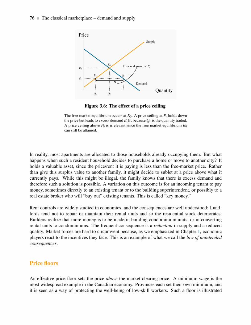
76 The classical marketplace – demand and supply
Demand
Supply
Price
Quantity
P0
E0
Q0
Pc
Ec
Qc
B
Excess demand at Pc
Figure 3.6: The effect of a price ceiling
The free market equilibrium occurs at E0. A price ceiling at Pc holds down
the price but leads to excess demand EcB, because Qc is the quantity traded.
A price ceiling above P0 is irrelevant since the free market equilibrium E0
can still be attained.
In reality, most apartments are allocated to those households already occupying them. But what
happens when such a resident household decides to purchase a home or move to another city? It
holds a valuable asset, since the price/rent it is paying is less than the free-market price. Rather
than give this surplus value to another family, it might decide to sublet at a price above what it
currently pays. While this might be illegal, the family knows that there is excess demand and
therefore such a solution is possible. A variation on this outcome is for an incoming tenant to pay
money, sometimes directly to an existing tenant or to the building superintendent, or possibly to a
real estate broker who will “buy out” existing tenants. This is called “key money.”
Rent controls are widely studied in economics, and the consequences are well understood: Land-
lords tend not to repair or maintain their rental units and so the residential stock deteriorates.
Builders realize that more money is to be made in building condominium units, or in converting
rental units to condominiums. The frequent consequence is a reduction in supply and a reduced
quality. Market forces are hard to circumvent because, as we emphasized in Chapter 1, economic
players react to the incentives they face. This is an example of what we call the law of unintended
consequences.
Price floors
An effective price floor sets the price above the market-clearing price. A minimum wage is the
most widespread example in the Canadian economy. Provinces each set their own minimum, and
it is seen as a way of protecting the well-being of low-skill workers. Such a floor is illustrated

3.7. Market interventions 77
in Figure 3.7. The free-market equilibrium is again E0, but the effective market outcome is the
combination of price and quantity corresponding to the point E f at the price floor, Pf . In this
instance, there is excess supply equal to the amount E f C.
Demand
Supply
Price=wage
Quantity oflabour=hours
P0
E0
Q0
P1
E f
Q f
C
Excess supply
Figure 3.7: Price floor - minimum wage
In a free market the equilibrium is E0. A minimum wage of Pf raises the
hourly wage, but reduces the hours demanded to Q f . Thus E f C is the excess
supply.
Note that there is a similarity between the outcomes defined in the floor and ceiling cases: The
quantity actually traded is the lesser of the supply quantity and demand quantity at the going
price: the short side dominates.
Quotas
A quota represents the right to supply a specified quantity of a good to the market. It is a means of
keeping prices higher than the free-market equilibrium price. As an alternative to imposing a price
floor, the government can generate a high price by restricting supply.
Agricultural markets abound with examples. In these markets, farmers can supply only what they
are permitted by the quota they hold, and there is usually a market for these quotas. For example, in
several Canadian provinces it currently costs in the region of $30,000 to purchase a quota granting
the right to sell the milk of one cow. The cost of purchasing quotas can thus easily outstrip the
cost of a farm and herd. Canadian cheese importers must pay for the right to import cheese from
abroad. Restrictions also apply to poultry. The impact of all of these restrictions is to raise the
domestic price above the free market price.
In Figure 3.8, the free-market equilibrium is at E0. In order to raise the price above P0, the govern-

78 The classical marketplace – demand and supply
ment restricts supply to Qq by granting quotas, which permit producers to supply a limited amount
of the good in question. This supply is purchased at the price equal to Pq.
Demand
Sq=supplywith quota Supply
Price
Quantity
P0
E0
Q0
Pq
Eq C
Figure 3.8: The effect of a quota
The government decides that the equilibrium price P0 is too low. It decides
to boost price by reducing supply from Q0 to Qq. It achieves this by re-
quiring producers to have a production quota. This is equivalent to fixing
supply at Sq.
Modelling market interventions
To illustrate the impact of these interventions on our numerical market model for natural gas, let
us suppose that the government imposes a minimum price of $6 – above the equilibrium price
obviously. We can easily determine the quantity supplied and demanded at such a price. On the
supply side:
P = 1+(1/2)Q.
Hence at P = 6 it follows that 6 = 1+(1/2)Q; that is 5 = (1/2)Q. Thus Q must take a value of
10, which is to say that suppliers would like to supply 10 units at this price.
Correspondingly on the demand side:
P = 10−Q,
At P = 6, it follows that 6 = 10−Q; that is Q = 4. So buyers would like to buy 4 units at that price:

3.8. Individual and market functions 79
there is excess supply. But we know that the short side of the market will win out, and so the actual
amount traded at this restricted price will be 4 units.
3.8 Individual and market functions
Markets are made up of many individual participants on the demand and supply side. The sup-
ply and demand functions that we have worked with in this chapter are those for the total of all
participants on each side of the market. But how do we arrive at such market functions when the
economy is composed of individuals? We can illustrate how, with the help of Figure 3.9.
Dmarket =sum of A & B demands
Price
Quantity
P1
Q1QB1 QA1
P2
Q2QB2 QA2
Individual B’s demand
Individual A’s demand
Figure 3.9: Summing individual demands
At P1 individual A purchases QA1 and B purchases QB1. The total demand
is the sum of these individual demands at this price (Q1). At P2 individual
demands are summed to Q2. Since the points Q1 and Q2 define the demands
of the market participants it follows that market demand is the horizontal
sum of these curves.
To concentrate on the essentials, imagine that there are just two buyers of gasoline in the economy.
A has a bigger car than B, so his demand is greater. To simplify, let the two demands have the
same intercept on the vertical axis. The curves DA and DB indicate how much gasoline A and B,
respectively, will buy at each price. The market demand indicates how much they buy together
at any price. Accordingly, at P1, A and B purchase the quantities QA1 and QB1 respectively. At a
price P2, they purchase QA2 and QB2. The market demand is therefore the horizontal sum of the
individual demands at these prices. In the figure this is defined by Dmarket .
80 The classical marketplace – demand and supply
Market demand: the horizontal sum of individual demands.
Conclusion
We have covered a lot of ground in this chapter. It is intended to open up the vista of economics to
the new student in the discipline. Economics is powerful and challenging, and the ideas we have
developed here will serve as conceptual foundations for our exploration of the subject. Our next
chapter deals with measurement and responsiveness.

Key Terms 81
KEY TERMS
Demand is the quantity of a good or service that buyers wish to purchase at each possible
price, with all other influences on demand remaining unchanged.
Supply is the quantity of a good or service that sellers are willing to sell at each possible price,
with all other influences on supply remaining unchanged.
Quantity demanded defines the amount purchased at a particular price.
Quantity supplied refers to the amount supplied at a particular price.
Equilibrium price: equilibrates the market. It is the price at which quantity demanded equals
the quantity supplied.
Excess supply exists when the quantity supplied exceeds the quantity demanded at the going
price.
Excess demand exists when the quantity demanded exceeds quantity supplied at the going
price.
Short side of the market determines outcomes at prices other than the equilibrium.
Demand curve is a graphical expression of the relationship between price and quantity de-
manded, with other influences remaining unchanged.
Supply curve is a graphical expression of the relationship between price and quantity supplied,
with other influences remaining unchanged.
Substitute goods: when a price reduction (rise) for a related product reduces (increases) the
demand for a primary product, it is a substitute for the primary product.
Complementary goods: when a price reduction (rise) for a related product increases (reduces)
the demand for a primary product, it is a complement for the primary product.
Inferior good is one whose demand falls in response to higher incomes.
Normal good is one whose demand increases in response to higher incomes.
Comparative static analysis compares an initial equilibrium with a new equilibrium, where
the difference is due to a change in one of the other things that lie behind the demand curve or

82 KEY TERMS
the supply curve.
Price controls are government rules or laws that inhibit the formation of market-determined
prices.
Quotas are physical restrictions on output.
Market demand: the horizontal sum of individual demands.

Exercises for Chapter 3 83
EXERCISES FOR CHAPTER 3
Exercise 3.1 Supply and demand data for concerts are shown below.
Price $20 $24 $28 $32 $36 $40
Quantity demanded 10 9 8 7 6 5
Quantity supplied 1 3 5 7 9 11
(a) Plot the supply and demand curves to scale and establish the equilibrium price and quantity.
(b) What is the excess supply or demand when price is $24? When price is $36?
(c) Describe the market adjustments in price induced by these two prices.
(d) The functions underlying the example in the table are linear and can be presented as P =18+ 2Q (supply) and P = 60− 4Q (demand). Solve the two equations for the equilibrium
price and quantity values.
Exercise 3.2 Illustrate in a supply/demand diagram, by shifting the demand curve appropriately,
the effect on the demand for flights between Calgary and Winnipeg as a result of:
(a) Increasing the annual government subsidy to Via Rail.
(b) Improving the Trans-Canada highway between the two cities.
(c) The arrival of a new budget airline on the scene.
Exercise 3.3 A new trend in U.S. high schools is the widespread use of chewing tobacco. A
recent survey indicates that 15 percent of males in upper grades now use it – a figure not far
below the use rate for cigarettes. Apparently this development came about in response to the
widespread implementation by schools of regulations that forbade cigarette smoking on and around
school property. Draw a supply-demand equilibrium for each of the cigarette and chewing tobacco
markets before and after the introduction of the regulations.
Exercise 3.4 In Exercise 3.1, suppose there is a simultaneous shift in supply and demand caused
by an improvement in technology and a growth in incomes. The technological improvement is
represented by a lower supply curve: P = 10+ 2Q. The higher incomes boost demand to P =76−4Q.

84 Exercises for Chapter 3
(a) Draw the new supply and demand curves on a diagram and compare them with the pre-
change curves.
(b) Equate the new supply and demand functions and solve for the new equilibrium price and
quantity.
Exercise 3.5 The market for labour can be described by two linear equations. Demand is given by
P = 170− (1/6)Q, and supply is given by P = 50+(1/3)Q, where Q is the quantity of labour and
P is the price of labour – the wage rate.
(a) Graph the functions and find the equilibrium price and quantity by equating demand and
supply.
(b) Suppose a price ceiling is established by the government at a price of $120. This price is
below the equilibrium price that you have obtained in part a. Calculate the amount that
would be demanded and supplied and then calculate the excess demand.
Exercise 3.6 In Exercise 3.5, suppose that the supply and demand describe an agricultural market
rather than a labour market, and the government implements a price floor of $140. This is greater
than the equilibrium price.
(a) Estimate the quantity supplied and the quantity demanded at this price, and calculate the
excess supply.
(b) Suppose the government instead chose to maintain a price of $140 by implementing a system
of quotas. What quantity of quotas should the government make available to the suppliers?
Exercise 3.7 In Exercise 3.6, suppose that, at the minimum price, the government buys up all of
the supply that is not demanded, and exports it at a price of $80 per unit. Compute the cost to the
government of this operation.
Exercise 3.8 Let us sum two demand curves to obtain a ‘market’ demand curve. We will suppose
there are just two buyers in the market. The two demands are defined by: P = 42− (1/3)Q and
P = 42− (1/2)Q.
(a) Draw the demands (approximately to scale) and label the intercepts on both the price and
quantity axes.
(b) Determine how much would be purchased at prices $10, $20, and $30.

Exercises for Chapter 3 85
Exercise 3.9 In Exercise 3.8 the demand curves had the same price intercept. Suppose instead that
the first demand curve is given by P = 36− (1/3)Q and the second is unchanged. Graph these
curves and illustrate the market demand curve.
Exercise 3.10 Here is an example of a demand curve that is not linear: P = 5−0.2√
Q. The final
term here is the square root of Q.
(a) Draw this function on a graph and label the intercepts. You will see that the price intercept
is easily obtained. Can you obtain the quantity intercept where P = 0?
(b) To verify that the shape of your function is correct you can plot this demand curve in a
spreadsheet.
(c) If the supply curve in this market is given simply by P = 2, what is the equilibrium quantity
traded?
Exercise 3.11 The football stadium of the University of the North West Territories has 30 seats.
The demand for tickets is given by P = 36− (1/2)Q, where Q is the number of ticket-buying fans.
(a) At the equilibrium admission price how much revenue comes in from ticket sales for each
game?
(b) A local fan is offering to install 6 more seats at no cost to the University. Compute the price
that would be charged with this new supply and compute the revenue that would accrue each
game. Should the University accept the offer to install the seats?
(c) Redo part (b) of this question, assuming that the initial number of seats is 40, and the Uni-
versity has the option to increase capacity to 46 at no cost to itself. Should the University
accept the offer in this case?
Exercise 3.12 Suppose farm workers in Mexico are successful in obtaining a substantial wage
increase. Illustrate the effect of this on the price of lettuce in the Canadian winter.


Part TwoResponsiveness and the Value of Markets
4. Elasticities
5. Welfare economics, externalities and non-classical markets
The degree to which individuals or firms, or any economic agent, responds to incentives is impor-
tant to ascertain for pricing and policy purposes: if prices change, to what degree will consumers
respond in their purchases? How will markets respond to taxes? Chapter 4 explores and develops
the concept of elasticity, which is the word economists use to define responsiveness. A mean-
ingful metric that is applicable to virtually any market or incentive means that behaviours can be
compared in different environments.
In Chapter 5 we explore how markets allocate resources and how the well-being of society’s mem-
bers is impacted by uncontrolled and controlled markets. A central development of this chapter is
that markets are very useful environments, but may need to be controlled in many circumstances.


Chapter 4
Measures of response: elasticities
In this chapter we will explore:
4.1 Responsiveness as elasticities
4.2 Demand elasticities and expenditure
4.3 The short run, the long run and inflation
4.4 Cross-price and income elasticities
4.5 Income elasticity of demand
4.6 Supply side responses
4.7 Tax incidence
4.8 Identifying the elasticity
4.1 Price responsiveness of demand
Put yourself in the position of an entrepreneur. One of your many challenges is to price your
product appropriately. You may be Michael Dell choosing a price for your latest computer, or
the local restaurant owner pricing your table d’hôte, or you may be pricing your part-time snow-
shoveling service. A key component of the pricing decision is to know how responsive your market
is to variations in your pricing. How we measure responsiveness is the subject matter of this
chapter.
We begin by analyzing the responsiveness of consumers to price changes. For example, consumers
tend not to buy much more or much less food in response to changes in the general price level of
food. This is because food is a pretty basic item for our existence. In contrast, if the price of
textbooks becomes higher, students may decide to search for a second-hand copy, or make do with
lecture notes from their friends or downloads from the course web site. In the latter case students
have ready alternatives to the new text book, and so their expenditure patterns can be expected to
reflect these options, whereas it is hard to find alternatives to food. In the case of food consumers
are not very responsive to price changes; in the case of textbooks they are. The word ‘elasticity’
89

90 Measures of response: elasticities
that appears in this chapter title is just another term for this concept of responsiveness. Elasticity
has many different uses and interpretations, and indeed more than one way of being measured in
any given situation. Let us start by developing a suitable numerical measure.
The slope of the demand curve suggests itself as one measure of responsiveness: If we lowered
the price of a good by $1, for example, how many more units would we sell? The difficulty with
this measure is that it does not serve us well when comparing different products. One dollar may
be a substantial part of the price of your morning coffee and croissant, but not very important if
buying a computer or tablet. Accordingly, when goods and services are measured in different units
(croissants versus tablets), or when their prices are very different, it is often best to use a percentage
change measure, which is unit-free.
The price elasticity of demand is measured as the percentage change in quantity demanded, di-
vided by the percentage change in price. Although we introduce several other elasticity measures
later, when economists speak of the demand elasticity they invariably mean the price elasticity of
demand defined in this way.
The price elasticity of demand is measured as the percentage change in quantity demanded,
divided by the percentage change in price.
The price elasticity of demand can be written in different forms. We will use the Greek letter
epsilon, ε , as a shorthand symbol, with a subscript d to denote demand, and the capital delta, ∆, to
denote a change. Therefore, we can write
Price elasticity of demand =Percentage change in quantity demanded
Percentage change in price
εd =%∆Q
%∆P(4.1a)
=∆Q/Q
∆P/P(4.1b)
=∆Q
∆P×
P
Q(4.1c)
Calculating the value of the elasticity is not difficult. If we are told that a 10 percent price increase
reduces the quantity demanded by 20 percent, then the elasticity value is
εd =%∆Q
%∆P=
−20%
10%=−2
The negative sign denotes that price and quantity move in opposite directions, but for brevity the

4.1. Price responsiveness of demand 91
negative sign is often omitted.
Consider now the data in Table 4.1 and the accompanying Figure 4.1. This data reflect the demand
equation for natural gas that we introduced in Chapter 3: P= 10−Q. Note first that, when the price
and quantity change, we must decide what reference price and quantity to use in the percentage
change calculation in Equation 4.1. We could use the initial or final price-quantity combination, or
an average of the two. Each choice will yield a slightly different numerical value for the elasticity.
The best convention is to use the midpoint of the price values and the corresponding midpoint of
the quantity values. This ensures that the elasticity value is the same regardless of whether we start
at the higher price or the lower price. Using the subscript 1 to denote the initial value and 2 the
final value:
Average quantity = (Q1 +Q2)/2
Average price = (P1 +P2)/2
Price ($) Quantity Price elasticity Price elasticity Totaldemanded (arc) (point) revenue ($)(thousands
of cu ft.)
10.00 0 -9.0 −∞
8.00 2 -2.33 -4 16
6.00 4 -1.22 -1.5 24
5.00 5 -0.82 -1 25
4.00 6 -0.43 -0.67 24
2.00 8 -0.11 -0.25 16
0.00 10 0 0
Table 4.1: The demand for natural gas: elasticities and revenue

92 Measures of response: elasticities
P0 = 10 ε =−9
High elasticity range (elastic)
Low elasticity range (inelastic)
ε =−0.11
Q0=10
Price
Quantity
8
5
5
2
Mid point of D: ε =−1
Figure 4.1: Elasticity variation with linear demand
In the high-price region of the demand curve the elasticity takes on a high
value. At the mid-point of a linear demand curve the elasticity takes on a
value of one, and at lower prices the elasticity value continues to fall.
Using this rule, consider now the value of εd when price drops from $10.00 to $8.00. The change
in price is $2.00 and the average price is therefore $9.00 [= ($10.00 + $8.00)/2]. On the quantity
side, demand goes from zero to 2 units (measured in thousands of cubic feet), and the average
quantity demanded is therefore (0 + 2)/2 = 1. Putting these numbers into the formula yields:
εd =%∆Q
%∆P=
−(2/1)
(2/9)=−9
Note that the price has declined in this instance and thus ∆P is negative. Continuing down the table
in this fashion yields the full set of elasticity values in the third column.
The demand elasticity is said to be high if it is a large negative number; the large number denotes
a high degree of sensitivity. Conversely, the elasticity is low if it is a small negative number. High
and low refer to the size of the number, ignoring the negative sign. The term arc elasticity is also
used to define what we have just measured, indicating that it defines consumer responsiveness over
a segment or arc of the demand curve.
The arc elasticity of demand defines consumer responsiveness over a segment or arc of the
demand curve.
It is helpful to analyze this numerical example by means of the corresponding demand curve that
is plotted in Figure 4.1. It is a straight-line demand curve; but, despite this, the elasticity is not
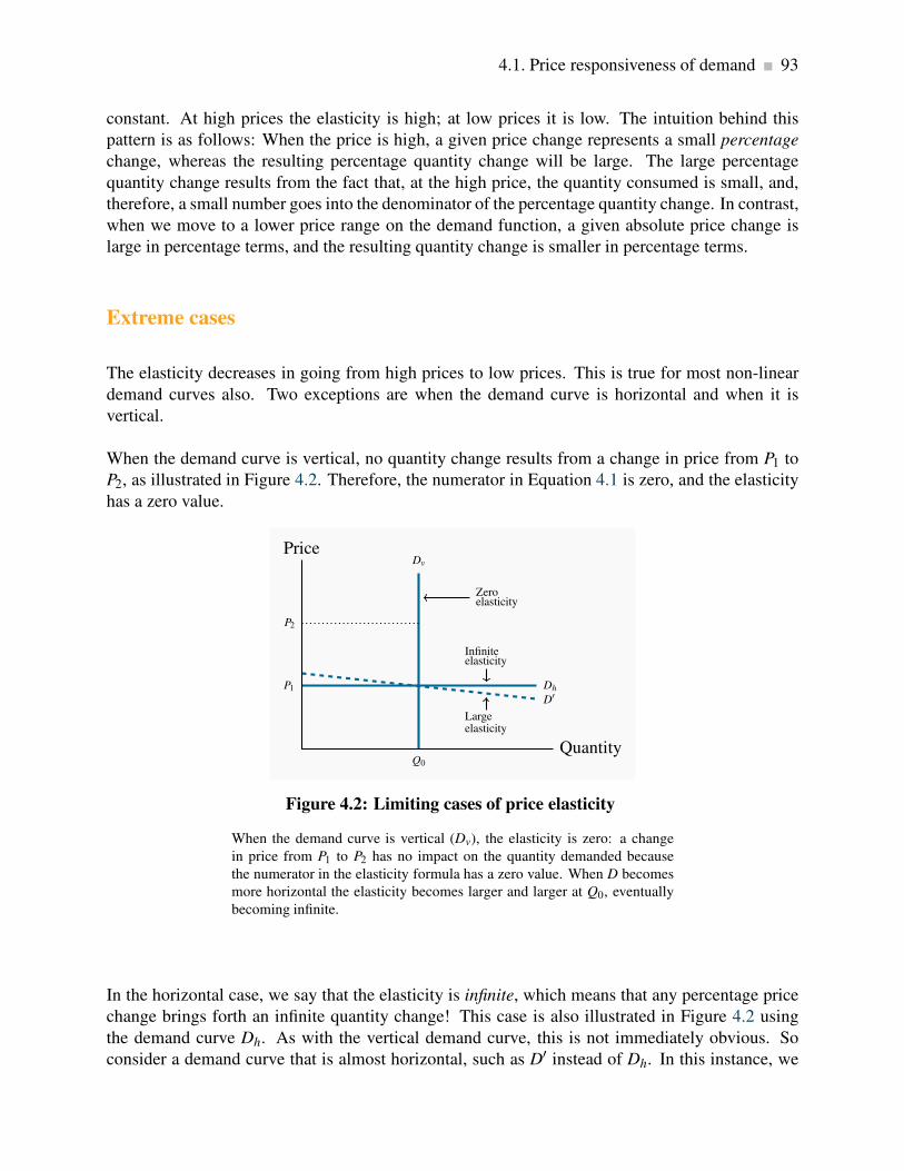
4.1. Price responsiveness of demand 93
constant. At high prices the elasticity is high; at low prices it is low. The intuition behind this
pattern is as follows: When the price is high, a given price change represents a small percentage
change, whereas the resulting percentage quantity change will be large. The large percentage
quantity change results from the fact that, at the high price, the quantity consumed is small, and,
therefore, a small number goes into the denominator of the percentage quantity change. In contrast,
when we move to a lower price range on the demand function, a given absolute price change is
large in percentage terms, and the resulting quantity change is smaller in percentage terms.
Extreme cases
The elasticity decreases in going from high prices to low prices. This is true for most non-linear
demand curves also. Two exceptions are when the demand curve is horizontal and when it is
vertical.
When the demand curve is vertical, no quantity change results from a change in price from P1 to
P2, as illustrated in Figure 4.2. Therefore, the numerator in Equation 4.1 is zero, and the elasticity
has a zero value.
Q0
Dv
P1 Dh
D′
Price
Quantity
P2
Infiniteelasticity
Largeelasticity
Zeroelasticity
Figure 4.2: Limiting cases of price elasticity
When the demand curve is vertical (Dv), the elasticity is zero: a change
in price from P1 to P2 has no impact on the quantity demanded because
the numerator in the elasticity formula has a zero value. When D becomes
more horizontal the elasticity becomes larger and larger at Q0, eventually
becoming infinite.
In the horizontal case, we say that the elasticity is infinite, which means that any percentage price
change brings forth an infinite quantity change! This case is also illustrated in Figure 4.2 using
the demand curve Dh. As with the vertical demand curve, this is not immediately obvious. So
consider a demand curve that is almost horizontal, such as D′ instead of Dh. In this instance, we
94 Measures of response: elasticities
can achieve large changes in quantity demanded by implementing very small price changes. In
terms of Equation 4.1, the numerator is large and the denominator small, giving rise to a large
elasticity. Now imagine that this demand curve becomes ever more elastic (horizontal). The same
quantity response can be obtained with a smaller price change, and hence the elasticity is larger.
Pursuing this idea, we can say that, as the demand curve becomes ever more elastic, the elasticity
value tends towards infinity.
Using information on the slope of the demand curve
The elasticity formula, Equation 4.1 part (c), indicates that we could also compute the elasticity
values using information on the slope of the demand curve, ∆Q/∆P, multiplied by the appropriate
price-quantity ratio. (Note that, even though we put price on the vertical axis, the slope of the
demand curve is ∆Q/∆P, as explained in Chapter 3; ∆P/∆Q is the inverse of this slope, or the
slope of the inverse demand function.) Consider the price change from $10.00 to $8.00 again.
Columns 1 and 2 indicate that ∆Q/∆P = -2/$2.00, or by simply looking at the equation for the
demand curve we can see that its slope is -1. Choosing again the midpoint values for price and
quantity yields P/Q = $9.00/1. Therefore the elasticity is
εd = (∆Q/∆P)× (P/Q) =−1× (9.00/1.00) =−9
Knowing the slope of the demand curve can be very useful in establishing elasticity values when
the demand curve is not linear, or when price changes are miniscule, or when the curve intersects
the axes. Let us consider each of these cases in turn.
A non-linear demand curve is illustrated in Figure 4.3. If price increases from P0 to P1, then over
that range we can approximate the slope by the ratio (P1 −P0)/(Q1 −Q0). This is, essentially, an
average slope over the range in question that can be used in the formula, in conjunction with an
average price and quantity of these values.

4.1. Price responsiveness of demand 95
Price
Quantity
P2
C
Q2
P0
A
Q0
P1
B
Q1
Figure 4.3: Non-linear demand curves
When the demand curve is non-linear the slope changes with the price.
Hence, equal price changes do not lead to equal quantity changes: The
quantity change associated with a change in price from P0 to P1 is smaller
than the change in quantity associated with the same change in price from
P0 to P2.
When a price change is infinitesimally small the resulting estimate is called a point elasticity
of demand. This differs slightly from the elasticity in column 3 of Table 4.1. In that case, we
computed the elasticity along different segments or arcs of the demand function. In Table 4.1, the
point elasticity at the point P = $8.00 is
εd = (∆Q/∆P)× (P/Q) =−1× (8.00/2.00) =−4
The first term in this expression states that quantity changes by 1 unit for each $1 change in price,
and the second term states that the elasticity is being evaluated at the price-quantity combination
P = $8 and Q = 2. The value of the point elasticity at each price value listed in Table 4.1 is given
in column 4. The arc elasticity values in column 3 span a price range, whereas the point elasticities
correspond exactly to each price value.
The point elasticity of demand is the elasticity computed at a particular point on the demand
curve.
This point elasticity formula can also be applied to the non-linear demand curve in Figure 4.3.
If we wished to compute this elasticity exactly at P2, we could draw a tangent to the function at
C and evaluate its slope. This slope could then be used in conjunction with the price-quantity
combination (P2,Q2) to evaluate εd at that point.

96 Measures of response: elasticities
Next, note that when a demand curve intersects the horizontal axis the elasticity value is zero,
regardless of the slope. Using Figure 4.1, we can see that this is because the price in the P/Q
component of the elasticity formula equals zero at the intersection point Q0. Hence P/Q = 0 and
the elasticity is therefore zero. Likewise, when approaching an intersection with the vertical axis,
defined by the point P0 in Figure 4.1, the denominator in the P/Q component becomes very small,
making the P/Q ratio very large. As we get ever closer to the vertical axis, this ratio becomes
correspondingly larger, and therefore we say that the elasticity approaches infinity.
Elastic and inelastic demands
While the elasticity value falls as we move down the demand curve, an important dividing line
occurs at the value of -1. This is illustrated in Table 4.1, and is a property of all straight-line
demand curves. Disregarding the negative sign, demand is said to be elastic if the price elasticity
is greater than unity, and inelastic if the value lies between unity and 0. It is unit elastic if the
value is exactly one.
Demand is elastic if the price elasticity is greater than unity. It is inelastic if the value lies between
unity and 0. It is unit elastic if the value is exactly one.
Economists frequently talk of goods as having a “high” or “low” demand elasticity. What does this
mean, given that the elasticity varies throughout the length of a demand curve? It signifies that, at
the price usually charged, the elasticity has a high or low value. For example, your weekly demand
for coffee at Starbucks might be unresponsive to variations in price around the value of $2.00, but
if the price were $4, you might be more responsive to price variations. Likewise, when we stated
at the beginning of this chapter that the demand for food tends to be inelastic, we really mean that
at the price we customarily face for food, demand is inelastic.
Determinants of price elasticity
Why is it that the price elasticities for some goods and services are high and for others low? One
answer lies in tastes: If a good or service is a basic necessity in one’s life, then price variations
have minimal effect and these products have a relatively inelastic demand.
A second answer lies in the ease with which we can substitute alternative goods or services for
the product in question. The local music school may find that the demand for its instruction is
responsive to the price charged for lessons if there are many independent music teachers who can
be hired directly by the parents of aspiring musicians. If Apple had no serious competition, it could
price the products higher than in the presence of Samsung, Google etc. The ease with which we
can substitute other goods or services is a key determinant. It follows that a critical role for the

4.1. Price responsiveness of demand 97
marketing department in a firm is to convince buyers of the uniqueness of the firm’s product.
Where product groups are concerned, the price elasticity of demand for one product is necessarily
higher than for the group as a whole: Suppose the price of one tablet brand alone falls. Buyers
would be expected to substitute towards this product in large numbers – its manufacturer would
find demand to be highly responsive. But if all brands are reduced in price, the increase in demand
for any one will be more muted. In essence, the one tablet whose price falls has several close
substitutes, but tablets in the aggregate do not.
Finally, there is a time dimension to responsiveness, and this is explored in Section 4.3.
Using price elasticities
Knowledge of elasticity values is useful in calculating the price change required to eliminate a
shortage or surplus. For example, shifts in the supply of agricultural products can create surpluses
and shortages. Because of variations in weather conditions, crop yields cannot be forecast accu-
rately. In addition, on account of the low elasticity of demand for such products, low crop yields
can increase prices radically, and bumper harvests can have the opposite impact.
Consider Figure 4.4. Econometricians tell us that the demand for foodstuffs is inelastic, so let
us operate in the lower (inelastic) part of this demand, D. A change in supply conditions (e.g. a
shortage of rain and a poorer harvest) shifts the supply from S1 to S2 with the consequence that the
price increases from P1 to P2. In this illustration the price increase is substantial. In contrast, with
a relatively flat, or elastic, demand, D′, through the initial point A, the shift in the supply curve
has a more moderate impact on the price (from P1 to P3), but a relatively larger impact on quantity
traded.

98 Measures of response: elasticities
D
D′
S2 S1
Price
Quantity
P1
A
Q1
P2
Q2
P3
Q3
Figure 4.4: The impact of elasticity on quantity fluctuations
In the lower part of the demand curve D, where demand is inelastic, e.g.
point A, a shift in supply from S1 to S2 induces a large percentage increase
in price, and a small percentage decrease in quantity demanded. In contrast,
for the demand curve D′ that goes through the original equilibrium, the
region A is now an elastic region, and the impact of the supply shift is
contrary: the %∆P is smaller and the %∆Q is larger.
4.2 Price elasticity and expenditure
In Figure 4.5, we examine the expenditure or revenue impact of a price reduction in two ranges
of a linear demand curve. Expenditure, or revenue, is the product of price times quantity. It is,
therefore, the area of a rectangle in a price/quantity diagram. From position A, a price reduction
from PA to PB has two impacts. It reduces the revenue that accrues from those QA units already
being sold; the negative sign between PA and PB marks this reduction. But it increases revenue
through additional sales from QA to QB. The area marked with a positive sign between QA and QB
denotes this increase. Will the extra revenue caused by the quantity increase outweigh the loss in
revenue associated with each unit sold before the price was reduced? It turns out that at high prices
the positive impact outweighs the negative impact. The intuitive reason is that the existing sales
are small and, therefore, we lose a revenue margin on a very limited quantity. The net impact on
total expenditure of the price reduction is positive.
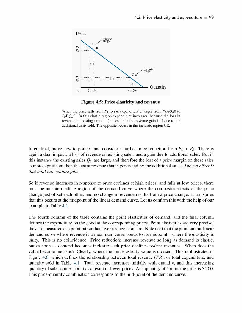
4.2. Price elasticity and expenditure 99
Price
0Quantity
PE
E
QE
PC
C
QC
PB
B
QB
PA
A
QA
Elasticrange
Inelasticrange
(−)
(+)
(−)
(+)
Figure 4.5: Price elasticity and revenue
When the price falls from PA to PB, expenditure changes from PAAQA0 to
PBBQB0. In this elastic region expenditure increases, because the loss in
revenue on existing units (−) is less than the revenue gain (+) due to the
additional units sold. The opposite occurs in the inelastic region CE.
In contrast, move now to point C and consider a further price reduction from PC to PE . There is
again a dual impact: a loss of revenue on existing sales, and a gain due to additional sales. But in
this instance the existing sales QC are large, and therefore the loss of a price margin on these sales
is more significant than the extra revenue that is generated by the additional sales. The net effect is
that total expenditure falls.
So if revenue increases in response to price declines at high prices, and falls at low prices, there
must be an intermediate region of the demand curve where the composite effects of the price
change just offset each other, and no change in revenue results from a price change. It transpires
that this occurs at the midpoint of the linear demand curve. Let us confirm this with the help of our
example in Table 4.1.
The fourth column of the table contains the point elasticities of demand, and the final column
defines the expenditure on the good at the corresponding prices. Point elasticities are very precise;
they are measured at a point rather than over a range or an arc. Note next that the point on this linear
demand curve where revenue is a maximum corresponds to its midpoint—where the elasticity is
unity. This is no coincidence. Price reductions increase revenue so long as demand is elastic,
but as soon as demand becomes inelastic such price declines reduce revenues. When does the
value become inelastic? Clearly, where the unit elasticity value is crossed. This is illustrated in
Figure 4.6, which defines the relationship between total revenue (T R), or total expenditure, and
quantity sold in Table 4.1. Total revenue increases initially with quantity, and this increasing
quantity of sales comes about as a result of lower prices. At a quantity of 5 units the price is $5.00.
This price-quantity combination corresponds to the mid-point of the demand curve.

100 Measures of response: elasticities
Revenue
Quantity
Rev= $16
8
Rev= $25
5
Revenue a maximumwhere elasticity is unity
Figure 4.6: Total revenue and elasticity
Based upon the data in Table 4.1, revenue increases with quantity sold up to
sales of 5 units. Beyond this output, the decline in price that must accom-
pany additional sales causes revenue to decline.
We now have a general conclusion: In order to maximize the possible revenue from the sale of a
good or service, it should be priced where the demand elasticity is unity.
Does this conclusion mean that every entrepreneur tries to find this magic region of the demand
curve in pricing her product? Not necessarily: Most businesses seek to maximize their profit rather
than their revenue, and so they have to focus on cost in addition to sales. We will examine this
interaction in later chapters. Secondly, not every firm has control over the price they charge; the
price corresponding to the unit elasticity may be too high relative to their competitors’ choices of
price. Nonetheless, many firms, especially in the early phase of their life-cycle, focus on revenue
growth rather than profit, and so, if they have any power over their price, the choice of the unit-
elastic price may be appropriate.
Elasticity values are sometimes more informative than diagrams and figures. To see why, consider
Figure 4.4 again. Since the demand curve, D, has a “vertical” profile, we tend to think of such a
demand as being less elastic than one with a more “horizontal” profile, D′. But that demand curve
could be redrawn with the scale of one or both of the axes changed. By using bigger spacing for
quantity units (or smaller spacing for the pricing units), a demand curve with a vertical profile could
be transformed into one with a horizontal profile! But elasticity calculations do not deceive. The
numerical values are always independent of how we mark off units in a diagram. Consequently,
when we see a demand curve with a vertical profile, we can indeed say that it is less elastic than
a “flatter” demand curve in the same region of the figure. But we cannot form such a conclusion
when comparing demand curves for different goods with different units and scales. The beauty of
elasticity lies in its honesty!

4.3. The time horizon and inflation 101
4.3 The time horizon and inflation
The price elasticity of demand is frequently lower in the short run than in the long run. For example,
a rise in the price of home heating oil may ultimately induce consumers to switch to natural gas or
electricity, but such a transition may require a considerable amount of time. Time is required for
decision-making and investment in new heating equipment. A further example is the elasticity of
demand for tobacco. Some adults who smoke may be seriously dependent and find quitting almost
impossible. But if young smokers, who are not yet addicted, decide to quit on account of the higher
price, then over a long period of time the percentage of the population that smokes will decline.
The full impact may take decades! So when we talk of the short run and the long run, there is no
simple rule for defining how long the long run actually is in terms of months or years. In some
cases, adjustment may be complete in weeks, in other cases years.
In Chapter 2 we distinguished between real and nominal variables. The former adjust for inflation;
the latter do not. Suppose all nominal variables double in value: Every good and service costs
twice as much, wage rates double, dividends and rent double, etc. This implies that whatever
bundle of goods was previously affordable is still affordable. Nothing has really changed. Demand
behaviour is unaltered by this doubling of all prices and all incomes.
How do we reconcile this with the idea that own-price elasticities measure changes in quantity
demanded as prices change? Keep in mind that elasticities measure the impact of changing one
variable alone, holding constant all of the others. But when all variables are changing simultane-
ously, it is incorrect to think that the impact on quantity of one price or income change is a true
measure of responsiveness or elasticity. The price changes that go into measuring elasticities are
therefore changes in relative prices.
4.4 Cross-price elasticities
The price elasticity of demand tells us about consumer responses to price changes in different
regions of the demand curve, holding constant all other influences. One of those influences is the
price of other goods and services. A cross-price elasticity indicates how demand is influenced by
changes in the prices of other products.
The cross-price elasticity of demand is the percentage change in the quantity demanded of a
product divided by the percentage change in the price of another.
In mathematical form we write the cross price elasticity of the demand for x due to a change in the
price of y as

102 Measures of response: elasticities
εd(x,y) =%∆Qx
%∆Py.
For example, if the price of cable-supply TV services declines, by how much will the demand for
satellite-supply TV services change? The cross-price elasticity may be positive or negative. When
the price of movie theatre tickets rises, the demand for Home Box Office movies rises, and vice
versa. In this example, we are measuring the cross-price elasticity of demand for HBO movies with
respect to the price of theatre tickets. These goods are clearly substitutable, and this is reflected in
a positive value of this cross-price elasticity: The percentage change in video rentals is positive in
response to the increase in movie theatre prices. The numerator and denominator in the equation
above have the same sign.
Suppose that, in addition to going to fewer movies, we also eat less frequently in the restaurant
beside the movie theatre. In this case, the cross-price elasticity relating the demand for restaurant
meals to the price of movies is negative—an increase in movie prices reduces the demand for
meals. The numerator and denominator in the cross-price elasticity equation are opposite in sign.
In this instance, the goods are complements.
4.5 The income elasticity of demand
In Chapter 3 we stated that higher incomes tend to increase the quantity demanded at any price. To
measure the responsiveness of demand to income changes, a unit-free measure exists: the income
elasticity of demand. The income elasticity of demand is the percentage change in quantity
demanded divided by a percentage change in income.
The income elasticity of demand is the percentage change in quantity demanded divided by a
percentage change in income.
Let us use the Greek letter eta, η , to define the income elasticity of demand and I to denote income.
Then,
ηd =%∆Q
%∆I
As an example, if monthly income increases by 10 percent, and the quantity of magazines pur-
chased increases by 15 percent, then the income elasticity of demand for magazines is 1.5 in value
(= 15%/10%). The income elasticity is generally positive, but not always – let us see why.

4.5. The income elasticity of demand 103
Normal, inferior, necessary, and luxury goods
The income elasticity of demand, in diagrammatic terms, is a percentage measure of how far the
demand curve shifts in response to a change in income. Figure 4.7 shows two possible shifts.
Suppose the demand curve is initially the one defined by D, and then income increases. If the
demand curve shifts to D1 as a result, the change in quantity demanded at the existing price is
(Q1−Q0). However, if instead the demand curve shifts to D2, that shift denotes a larger change in
quantity (Q2 −Q0). Since the shift in demand denoted by D2 exceeds the shift to D1, the D2 shift
is more responsive to income, and therefore implies a higher income elasticity.
P0
D D1 D2
Price
Quantity
A
Q0
B
Q1
C
Q2
Figure 4.7: Income elasticity and shifts in demand
At the price P0, the income elasticity measures the percentage horizontal
shift in demand caused by some percentage income increase. A shift from
A to B reflects a lower income elasticity than a shift to C. A leftward shift
in the demand curve in response to an income increase would denote a neg-
ative income elasticity – an inferior good.
In this example, the good is a normal good, as defined in Chapter 3, because the demand for it
increases in response to income increases. If the demand curve were to shift back to the left in
response to an increase in income, then the income elasticity would be negative. In such cases the
goods or services are inferior, as defined in Chapter 3.
Finally, we need to distinguish between luxuries, necessities, and inferior goods. A luxury good or
service is one whose income elasticity equals or exceeds unity. A necessity is one whose income
elasticity is greater than zero but less than unity. These elasticities can be understood with the
help of Equation 4.1 part (a). If quantity demanded is so responsive to an income increase that
the percentage increase in quantity demanded exceeds the percentage increase in income, then the
value is in excess of 1, and the good or service is called a luxury. In contrast, if the percentage
change in quantity demanded is less than the percentage increase in income, the value is less than
unity, and we call the good or service a necessity.
104 Measures of response: elasticities
A luxury good or service is one whose income elasticity equals or exceeds unity.
A necessity is one whose income elasticity is greater than zero and less than unity.
Luxuries and necessities can also be defined in terms of their share of a typical budget. An income
elasticity greater than unity means that the share of an individual’s budget being allocated to the
product is increasing. In contrast, if the elasticity is less than unity, the budget share is falling.
This makes intuitive sense—luxury cars are luxury goods by this definition because they take up a
larger share of the incomes of the rich than of the poor.
Inferior goods are those for which there exist higher-quality, more expensive, substitutes. For
example, lower-income households tend to satisfy their travel needs by using public transit. As
income rises, households normally reduce their reliance on public transit in favour of automobile
use. Inferior goods, therefore, have a negative income elasticity: in the income elasticity equation
definition, the numerator has a sign opposite to that of the denominator. As an example: in the
recession of 2008/09 McDonalds continued to remain profitable and increased its customer base –
in contrast to the more up-market Starbucks. This is a case where expenditure increased following
a decline in income, yielding a negative income elasticity of demand.
Inferior goods have negative income elasticity.
Lastly, note that while inferior products may be considered a special type of necessity, inferior
goods technically have a negative income elasticity, whereas necessities have positive elasticity
values.
Empirical research indicates that goods like food and fuel have income elasticities less than 1;
durable goods and services have elasticities slightly greater than 1; leisure goods and foreign holi-
days have elasticities very much greater than 1.
Income elasticities are useful in forecasting the demand for particular services and goods in a
growing economy. Suppose real income is forecast to grow by 15 percent over the next five years. If
we know that the income elasticity of demand for iPhones is 2.0, we could estimate the anticipated
growth in demand by using the income elasticity formula: since in this case η = 2.0 and %∆I = 15
it follows that 2.0 = %∆Q/15%. Therefore the predicted demand change must be 30%.
4.6 Elasticity of supply
Now that we have developed the various dimensions of elasticity on the demand side, the anal-
ysis of elasticities on the supply side is straightforward. The elasticity of supply measures the

4.7. Elasticities and tax incidence 105
responsiveness of the quantity supplied to a change in the price.
The elasticity of supply measures the responsiveness of quantity supplied to a change in the
price.
εs =%∆Q
%∆P
The subscript s denotes supply. This is exactly the same formula as for the demand curve, except
that the quantities now come from a supply curve. Furthermore, and in contrast to the demand
elasticity, the supply elasticity is generally a positive value because of the positive relationship
between price and quantity supplied. The more elastic, or the more responsive, is supply to a
given price change, the larger will be the elasticity value. In diagrammatic terms, this means
that “flatter” supply curves have a greater elasticity than more “vertical” curves at a given price
and quantity combination. Numerically the flatter curve has a larger value than the more vertical
supply – try drawing a supply diagram similar to Figure 4.2. Technically, a completely vertical
supply curve has a zero elasticity and a horizontal supply curve has an infinite elasticity – just as
in the demand cases.
As always we keep in mind the danger of interpreting too much about the value of this elasticity
from looking at the visual profiles of supply curves.
4.7 Elasticities and tax incidence
Elasticity values are critical in determining the impact of a government’s taxation policies. The
spending and taxing activities of the government influence the use of the economy’s resources. By
taxing cigarettes, alcohol and fuel, the government can restrict their use; by taxing income, the
government influences the amount of time people choose to work. Taxes have a major impact on
almost every sector of the Canadian economy.
To illustrate the role played by demand and supply elasticities in tax analysis, we take the example
of a sales tax. These can be of the specific or ad valorem type. A specific tax involves a fixed dollar
levy per unit of a good sold (e.g., $10 per airport departure). An ad valorem tax is a percentage
levy, such as Canada’s Goods and Services tax (e.g., 5 percent on top of the retail price of goods
and services). The impact of each type of tax is similar, and we will use the specific tax in our
example below.
A layperson’s view of a sales tax is that the tax is borne by the consumer. That is to say, if no sales
tax were imposed on the good or service in question, the price paid by the consumer would be the

106 Measures of response: elasticities
same net of tax price as exists when the tax is in place. Interestingly, this is not always the case.
The study of the incidence of taxes is the study of who really bears the tax burden, and this in turn
depends upon supply and demand elasticities.
Tax Incidence describes how the burden of a tax is shared between buyer and seller.
Consider Figures 4.8 and 4.9, which define an imaginary market for inexpensive wine. Let us
suppose that, without a tax, the equilibrium price of a bottle of wine is $5, and Q0 is the equilibrium
quantity traded. The pre-tax equilibrium is at the point A. The government now imposes a specific
tax of $4 per bottle. The impact of the tax is represented by an upward shift in supply of $4:
Regardless of the price that the consumer pays, $4 of that price must be remitted to the government.
As a consequence, the price paid to the supplier must be $4 less than the consumer price, and this is
represented by twin supply curves: one defines the price at which the supplier is willing to supply,
and the other is the tax-inclusive supply curve that the consumer faces.
D St
S
Price
Quantity
Pt = 8B
Qt
P0 = 5A
Q0
Pts = 4C
$4=tax
Figure 4.8: Tax incidence with elastic supply
The imposition of a specific tax of $4 shifts the supply curve vertically by
$4. The final price at B (Pt) increases by $3 over the equilibrium price at
A. At the new quantity traded, Qt , the supplier gets $4 per unit (Pts), the
government gets $4 also and the consumer pays $8. The greater part of
the incidence is upon the buyer, on account of the relatively elastic supply
curve: his price increases by $3 of the $4 tax.
The introduction of the tax in Figure 4.8 means that consumers now face the supply curve St . The
new equilibrium is at point B. Note that the price has increased by less than the full amount of the
tax—in this example it has increased by $3. This is because the reduced quantity at B is provided
at a lower supply price: The supplier is willing to supply the quantity Qt at a price defined by C
($4), which is lower than A ($5).

4.7. Elasticities and tax incidence 107
So what is the incidence of the $4 tax? Since the market price has increased from $5 to $8, and the
price obtained by the supplier has fallen by $1, we say that the incidence of the tax falls mainly
on the consumer: the price to the consumer has risen by three dollars and the price received by the
supplier has fallen by just one dollar.
Consider now Figure 4.9, where the supply curve is less elastic, and the demand curve is un-
changed. Again the supply curve must shift upward with the imposition of the $4 specific tax.
But here the price received by the supplier is lower than in Figure 4.8, and the price paid by the
consumer does not rise as much – the incidence is different. The consumer faces a price increase
that is one-quarter, rather than three-quarters, of the tax value. The supplier faces a lower supply
price, and bears a higher share of the tax.
D
St SPrice
Quantity
P0 = 5A
Q0
Pt = 6B
Qt
Pts = 2C
$4=tax
Figure 4.9: Tax incidence with inelastic supply
The imposition of a specific tax of $4 shifts the supply curve vertically by
$4. The final price at B (Pt) increases by $1 over the no-tax price at A. At the
new quantity traded, Qt , the supplier gets $2 per unit (Pts), the government
gets $4 also and the consumer pays $6. The greater part of the incidence is
upon the supplier, on account of the relatively inelastic supply.
We can conclude from this example that, for any given demand, the more elastic is supply, the
greater is the price increase in response to a given tax. Furthermore, a more elastic supply curve
means that the incidence falls more on the consumer; while a less elastic supply curve means the
incidence falls more on the supplier. This conclusion can be verified by drawing a third version
of Figure 4.8 and 4.9, in which the supply curve is horizontal – perfectly elastic. When the tax is
imposed the price to the consumer increases by the full value of the tax, and the full incidence falls
on the buyer. While this case corresponds to the layperson’s intuition of the incidence of a tax,
economists recognize it as a special case of the more general outcome, where the incidence falls
on both the supply side and the demand side.
These are key results in the theory of taxation. It is equally the case that the incidence of the
tax depends upon the demand elasticity. In Figure 4.8 and 4.9 we used the same demand curve.

108 Measures of response: elasticities
However, it is not difficult to see that, if we were to redo the exercise with a demand curve of a
different elasticity, the incidence would not be identical. At the same time, the general result on
supply elasticities still holds. We will return to this material in Chapter 5.
Statutory incidence
In the above example the tax is analyzed by means of shifting the supply curve. This implies
that the supplier is obliged to charge the consumer a tax and then return this tax revenue to the
government. But suppose the supplier did not bear the obligation to collect the revenue; instead
the buyer is required to send the tax revenue to the government. If this were the case we could
analyze the impact of the tax by reducing the market demand curve by the $4. This is because
the demand curve reflects what consumers are willing to pay, and when suppliers are paid in the
presence of the tax they will be paid the buyers’ demand price minus the tax that the buyers must
pay. It is not difficult to show that whether we move the supply curve upward (to reflect the
responsibility of the supplier to pay the government) or move the demand curve downward, the
outcome is the same – in the sense that the same price and quantity will be traded in each case.
Furthermore the incidence of the tax, measured by how the price change is apportioned between
the buyers and sellers is also unchanged.
Tax revenues and tax rates
It is useful to relate elasticity values to the policy question of the impact of higher or lower taxes on
government tax revenue. Consider a situation in which a tax is already in place and the government
considers increasing the rate of tax. Can an understanding of elasticities inform us on the likely
outcome? The answer is yes. Suppose that at the initial tax inclusive price demand is inelastic. We
know immediately that a tax rate increase that increases the price must increase total expenditure.
Hence the outcome is that the government will get a higher share of an increased total expenditure.
In contrast, if demand is elastic at the initial tax-inclusive price a tax rate increase that leads to a
higher price will decrease total expenditure. In this case the government will get a larger share of
a smaller pie – not as valuable from a tax revenue standpoint as a larger share of a larger pie.
4.8 Identifying demand and supply elasticities
Elasticities are very useful pieces of evidence on economic behaviour. But we need to take care in
making inferences from what we observe in market data. Upon observing price and expenditure
changes in a given market, it is tempting to infer that we can immediately calculate a demand
elasticity. But should we be thinking about supply elasticities? Let us look at the information
needed before rushing into calculations.

4.8. Identifying demand and supply elasticities 109
In order to identify a demand elasticity we need to be sure that we have price and quantity values
that lie on the same demand curve. And if we do indeed observe several price and quantity pairs
that reflect a market equilibrium on a demand curve, then it must be the case that those combi-
nations are caused by a shifting supply curve. Consider Figure 4.10. Suppose that we observe a
series of prices and accompanying quantities traded in three consecutive months, and we plot these
combinations to yield points A, B, C in panel (a) of the figure. If these points are market equilibria,
and if they lie on the same demand curve, it must be the case that the supply curve has shifted. That
is, if we can draw a single demand curve through these points, as in panel (b), the only way that
they each reflect demand conditions is for the supply curve to have shifted to create these points as
equilibria in the market.
Sa Sb
Sc
D
Price
Quantity
Price
Quantity(a) (b)
A A
B B
C C
Figure 4.10: Identifying elasticities
In order to establish that points such as A, B and C in Panel (a) lie on the
same demand curve, we must know that the supply curve alone has shifted
in such a way as to result in these equilibrium price-quantity combinations,
as illustrated in Panel (b).
Exactly the same logic holds if we can infer that market equilibrium points all lie on the same
supply curve. In that case the demand curve must have shifted in order to be able to identify the
points as belonging to the supply curve.
This challenge is what we call the identification problem in econometrics. Frequently new combi-
nations of price and quantity reflect shifts in both the supply curve and demand curve, and we need
to call upon the econometricians to tell us what shifts are taking place in the market.

110 KEY TERMS
KEY TERMS
Price elasticity of demand is measured as the percentage change in quantity demanded, di-
vided by the percentage change in price.
Arc elasticity of demand defines consumer responsiveness over a segment or arc of the de-
mand curve.
Point elasticity of demand is the elasticity computed at a particular point on the demand
curve.
Demand is elastic if the price elasticity is greater than unity. It is inelastic if the value lies
between unity and 0. It is unit elastic if the value is exactly one.
Cross-price elasticity of demand is the percentage change in the quantity demanded of a
product divided by the percentage change in the price of another.
Income elasticity of demand is the percentage change in quantity demanded divided by a
percentage change in income.
Luxury good or service is one whose income elasticity equals or exceeds unity.
Necessity is one whose income elasticity is greater than zero and is less than unity.
Inferior goods have a negative income elasticity.
Elasticity of supply is defined as the percentage change in quantity supplied divided by the
percentage change in price.
Tax Incidence describes how the burden of a tax is shared between buyer and seller.
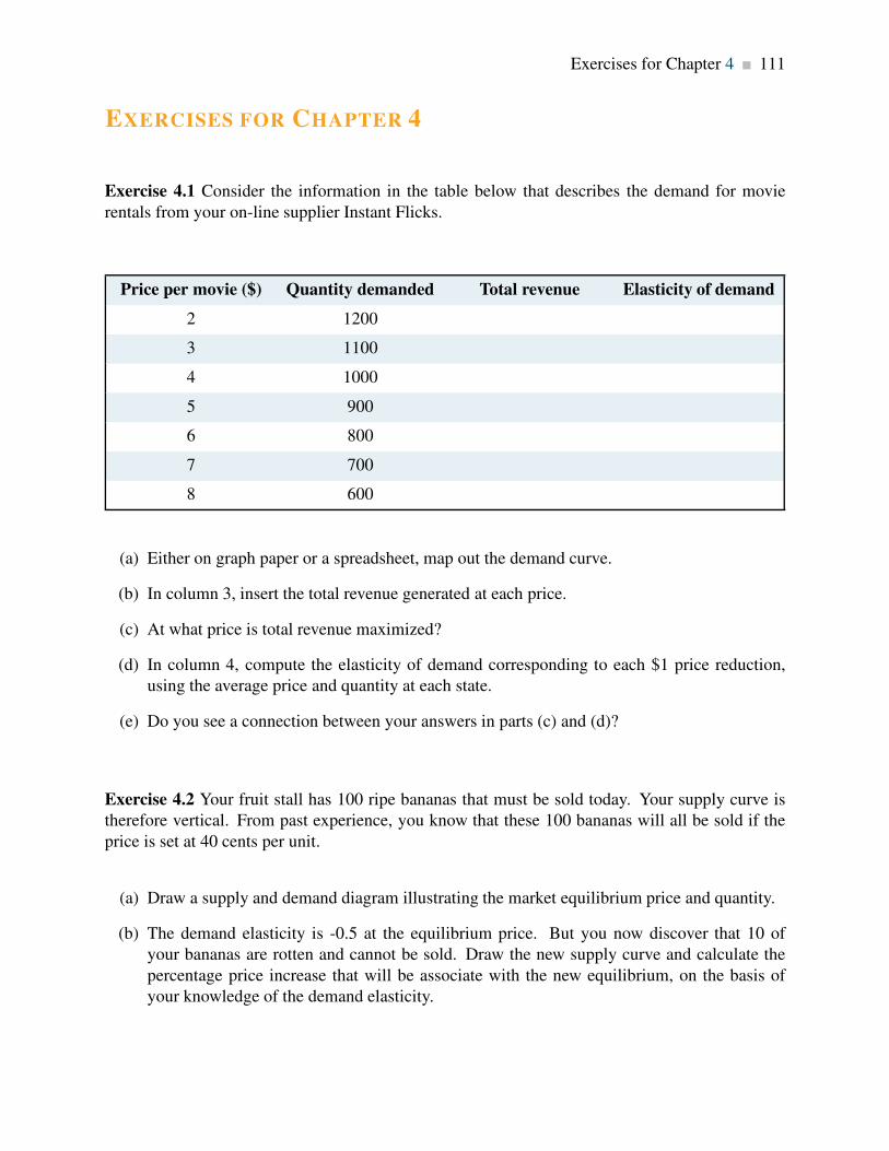
Exercises for Chapter 4 111
EXERCISES FOR CHAPTER 4
Exercise 4.1 Consider the information in the table below that describes the demand for movie
rentals from your on-line supplier Instant Flicks.
Price per movie ($) Quantity demanded Total revenue Elasticity of demand
2 1200
3 1100
4 1000
5 900
6 800
7 700
8 600
(a) Either on graph paper or a spreadsheet, map out the demand curve.
(b) In column 3, insert the total revenue generated at each price.
(c) At what price is total revenue maximized?
(d) In column 4, compute the elasticity of demand corresponding to each $1 price reduction,
using the average price and quantity at each state.
(e) Do you see a connection between your answers in parts (c) and (d)?
Exercise 4.2 Your fruit stall has 100 ripe bananas that must be sold today. Your supply curve is
therefore vertical. From past experience, you know that these 100 bananas will all be sold if the
price is set at 40 cents per unit.
(a) Draw a supply and demand diagram illustrating the market equilibrium price and quantity.
(b) The demand elasticity is -0.5 at the equilibrium price. But you now discover that 10 of
your bananas are rotten and cannot be sold. Draw the new supply curve and calculate the
percentage price increase that will be associate with the new equilibrium, on the basis of
your knowledge of the demand elasticity.

112 Exercises for Chapter 4
Exercise 4.3 University fees in the State of Nirvana have been frozen in real terms for 10 years.
During this period enrolments increased by 20 percent.
(a) Draw a supply curve and two demand curves to represent the two equilibria described.
(b) Can you estimate a price elasticity of demand for university education in this market?
(c) In contrast, during the same time period fees in a neighbouring state increased by 60 percent
and enrolments increased by 15 percent. Illustrate this situation in a diagram.
Exercise 4.4 Consider the demand curve defined by the information in the table below.
Price of movies Quantity demanded Total revenue Elasticity of demand
2 200
3 150
4 120
5 100
(a) Plot the demand curve to scale and note that it is non-linear.
(b) Compute the total revenue at each price.
(c) Compute the arc elasticity of demand for each price segment.
Exercise 4.5 The demand curve for seats at the Drive-in Delight Theatre is given by P= 48−0.2Q.
The supply of seats is given by Q = 40.
(a) Plot the supply and demand curves to scale, and estimate the equilibrium price.
(b) At this equilibrium point, calculate the elasticities of demand and supply.
(c) The owner has additional space in his theatre, and is considering the installation of more
seats. He then remembers from his days as an economics student that this addition might not
necessarily increase his total revenue. If he hired you as a consultant, would you recommend
to him that he install additional seats or that he take out some of the existing seats and install
a popcorn concession instead? [Hint: You can use your knowledge of the elasticities just
estimated to answer this question.]
(d) For this demand curve, over what range of prices is demand inelastic?
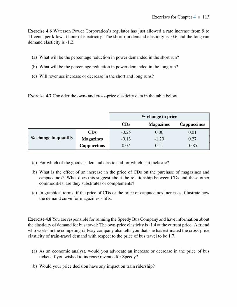
Exercises for Chapter 4 113
Exercise 4.6 Waterson Power Corporation’s regulator has just allowed a rate increase from 9 to
11 cents per kilowatt hour of electricity. The short run demand elasticity is -0.6 and the long run
demand elasticity is -1.2.
(a) What will be the percentage reduction in power demanded in the short run?
(b) What will be the percentage reduction in power demanded in the long run?
(c) Will revenues increase or decrease in the short and long runs?
Exercise 4.7 Consider the own- and cross-price elasticity data in the table below.
% change in price
CDs Magazines Cappuccinos
CDs -0.25 0.06 0.01
Magazines -0.13 -1.20 0.27% change in quantity
Cappuccinos 0.07 0.41 -0.85
(a) For which of the goods is demand elastic and for which is it inelastic?
(b) What is the effect of an increase in the price of CDs on the purchase of magazines and
cappuccinos? What does this suggest about the relationship between CDs and these other
commodities; are they substitutes or complements?
(c) In graphical terms, if the price of CDs or the price of cappuccinos increases, illustrate how
the demand curve for magazines shifts.
Exercise 4.8 You are responsible for running the Speedy Bus Company and have information about
the elasticity of demand for bus travel: The own-price elasticity is -1.4 at the current price. A friend
who works in the competing railway company also tells you that she has estimated the cross-price
elasticity of train-travel demand with respect to the price of bus travel to be 1.7.
(a) As an economic analyst, would you advocate an increase or decrease in the price of bus
tickets if you wished to increase revenue for Speedy?
(b) Would your price decision have any impact on train ridership?

114 Exercises for Chapter 4
Exercise 4.9 A household’s income and restaurant visits are observed at different points in time.
The table below describes the pattern.
Income ($) Restaurant visits Income elasticity of demand
16,000 10
24,000 15
32,000 18
40,000 20
48,000 22
56,000 23
64,000 24
(a) Construct a scatter diagram showing quantity on the vertical axis and income on the hori-
zontal axis.
(b) Is there a positive or negative relationship between these variables?
(c) Compute the income elasticity for each income increase, using midpoint values.
(d) Are restaurant meals a normal or inferior good?
Exercise 4.10 Consider the following three supply curves: P = 2.25Q; P = 2+2Q; P = 6+1.5Q.
(a) Draw each of these supply curves to scale, and check that, at P = $18, the quantity supplied
in each case is the same.
(b) Calculate the (point) supply elasticity for each curve at this price.
(c) Now calculate the same elasticities at P = $12.
(d) One elasticity value should be unchanged. Which one?
Exercise 4.11 The demand for bags of candy is given by P = 48−0.2Q, and the supply by P = Q.
(a) Illustrate the resulting market equilibrium in a diagram.
(b) If the government now puts a $12 tax on all such candy bags, illustrate on a diagram how the
supply curve will change.

Exercises for Chapter 4 115
(c) Compute the new market equilibrium.
(d) Instead of the specific tax imposed in part (b), a percentage tax (ad valorem) equal to 30
percent is imposed. Illustrate how the supply curve would change.
(e) Compute the new equilibrium.
Exercise 4.12 Consider the demand curve P = 100−2Q. The supply curve is given by P = 30.
(a) Draw the supply and demand curves to scale and compute the equilibrium price and quantity
in this market.
(b) If the government imposes a tax of $10 per unit, draw the new equilibrium and compute the
new quantity traded and the amount of tax revenue generated.
(c) Is demand elastic or inelastic in this price range?
Exercise 4.13 In Exercise 4.12: As an alternative to shifting the supply curve, try shifting the
demand curve to reflect the $10 tax being imposed on the consumer.
(a) Solve again for the price that the consumer pays, the price that the supplier receives and the
tax revenue generated.
(b) Compare your answers with the previous question; they should be the same.
Exercise 4.14 The supply of Henry’s hamburgers is given by P = 2+ 0.5Q; demand is given by
Q = 20.
(a) Illustrate and compute the market equilibrium.
(b) A specific tax of $3 per unit is subsequently imposed and that shifts the supply curve to
P = 5+0.5Q. Solve for the equilibrium price and quantity after the tax.
(c) Who bears the burden of the tax in parts (a) and (b)?


Chapter 5
Welfare economics and externalities
In this chapter we will explore:
5.1 Equity and efficiency
5.2 Consumer and producer surplus
5.3 Efficient market outcomes
5.4 Taxation surplus and efficiency
5.5 Market failures – externalities
5.6 Other market failures
5.7 Environment and climate change
5.8 Equity, justice and efficiency
5.1 Equity and efficiency
In modern mixed economies, markets and governments together determine the output produced
and also who benefits from that output. In this chapter we explore a very broad question that
forms the core of welfare economics: Are markets a good way to allocate scarce resources in
view of the fact that they not only give rise to inequality and poverty, but also fail to capture
the impacts of productive activity on non-market participants? Mining impacts the environment,
traffic results in road fatalities, alcohol and tobacco cause premature deaths and prescription pills
are abused. These products all generate secondary impacts beyond their stated objective. We
frequently call these external effects. The analysis of markets in this larger sense involves not
just positive economics; appropriate policy is additionally a normative issue because policies can
impact the various participants in different ways and to different degrees. Welfare economics,
therefore, deals with both normative and positive issues.
Welfare economics assesses how well the economy allocates its scarce resources in accordance
with the goals of efficiency and equity.
117

118 Welfare economics and externalities
Political parties on the left and right disagree on how well a market economy works. Canada’s
New Democratic Party emphasizes the market’s failings and the need for government interven-
tion, while the Progressive Conservative Party believes, broadly, that the market fosters choice,
incentives, and efficiency. What lies behind this disagreement? The two principal factors are ef-
ficiency and equity. Efficiency addresses the question of how well the economy’s resources are
used and allocated. In contrast, equity deals with how society’s goods and rewards are, and should
be, distributed among its different members, and how the associated costs should be apportioned.
Equity deals with how society’s goods and rewards are, and should be, distributed among its
different members, and how the associated costs should be apportioned.
Efficiency addresses the question of how well the economy’s resources are used and allocated.
Equity is also concerned with how different generations share an economy’s productive capabili-
ties: more investment today makes for a more productive economy tomorrow, but more greenhouse
gases today will reduce environmental quality tomorrow. These are inter-generational questions.
Climate change caused by global warming forms one of the biggest challenges for humankind at
the present time. As we shall see in this chapter, economics has much to say about appropriate
policies to combat warming. Whether pollution-abatement policies should be implemented today
or twenty years from now involves considerations of equity between generations. Our first task is
to develop an analytical tool which will prove vital in assessing and computing welfare benefits
and costs – economic surplus.
5.2 Consumer and producer surplus
An understanding of economic efficiency is greatly facilitated as a result of understanding two
related measures: consumer surplus and producer surplus. Consumer surplus relates to the demand
side of the market, producer surplus to the supply side. Producer surplus is also termed supplier
surplus. These measures can be understood with the help of a standard example, the market for
city apartments.
Table 5.1 and Figure 5.1 describe the hypothetical data. We imagine first a series of city-based
students who are in the market for a standardized downtown apartment. These individuals are not
identical; they value the apartment differently. For example, Alex enjoys comfort and therefore
places a higher value on a unit than Brian. Brian, in turn, values it more highly than Cathy or Don.
Evan and Frank would prefer to spend their money on entertainment, and so on. These valuations
are represented in the middle column of Table 5.1, and also in Figure 5.1 with the highest valuations
closest to the origin. The valuations reflect the willingness to pay of each consumer.

5.2. Consumer and producer surplus 119
Demand
Individual Demand valuation Surplus
Alex 900 400
Brian 800 300
Cathy 700 200
Don 600 100
Evan 500 0
Frank 400 0
Supply
Individual Reservation value Surplus
Gladys 300 200
Heward 350 150
Ian 400 100
Jeff 450 50
Kirin 500 0
Lynn 550 0
Table 5.1: Consumer and supplier surpluses

120 Welfare economics and externalities
$900Alex
Brian
Cathy
Don
Frank
$300Gladys
HewardIan
Jeff
LynnEvan
Kirin
Rent
Quantity
Equilibriumprice=$500.
Figure 5.1: The apartment market
Demanders and suppliers are ranked in order of the value they place on an
apartment. The market equilibrium is where the marginal demand value of
Evan equals the marginal supply value of Kirin at $500. Five apartments
are rented in equilibrium.
On the supply side we imagine the market as being made up of different individuals or owners,
who are willing to put their apartments on the market for different prices. Gladys will accept less
rent than Heward, who in turn will accept less than Ian. The minimum prices that the suppliers are
willing to accept are called reservation prices or values, and these are given in the lower part of
Table 5.1. Unless the market price is greater than their reservation price, suppliers will hold back.
By definition, as stated in Chapter 3, the demand curve is made up of the valuations placed on the
good by the various demanders. Likewise, the reservation values of the suppliers form the supply
curve. If Alex is willing to pay $900, then that is his demand price; if Heward is willing to put his
apartment on the market for $350, he is by definition willing to supply it for that price. Figure 5.1
therefore describes the demand and supply curves in this market. The steps reflect the willingness
to pay of the buyers and the reservation valuations or prices of the suppliers.
In this example, the equilibrium price for apartments will be $500. Let us see why. At that
price the value placed on the marginal unit supplied by Kirin equals Evan’s willingness to pay.
Five apartments will be rented. A sixth apartment will not be rented because Lynne will let her
apartment only if the price reaches $550. But the sixth potential demander is willing to pay only
$400. Note that, as usual, there is just a single price in the market. Each renter pays $500, and
therefore each supplier also receives $500.
The consumer and supplier surpluses can now be computed. Note that, while Don is willing to
pay $600, he actually pays $500. His consumer surplus is therefore $100. In Figure 5.1, we can
see that each consumer’s surplus is the distance between the market price and the individual’s
valuation. These values are given in the final column of the top half of Table 5.1.

5.2. Consumer and producer surplus 121
Consumer surplus is the excess of consumer willingness to pay over the market price.
Using the same reasoning, we can compute each supplier’s surplus, which is the excess of the
amount obtained for the rented apartment over the reservation price. For example, Heward obtains
a surplus on the supply side of $150, while Jeff gets $50. Heward is willing to put his apartment on
the market for $350, but gets the equilibrium price/rent of $500 for it. Hence his surplus is $150.
Supplier or producer surplus is the excess of market price over the reservation price of the
supplier.
It should now be clear why these measures are called surpluses. The suppliers and demanders are
all willing to participate in this market because they earn this surplus. It is a measure of their gain
from being involved in the trading.
Computing the surpluses
The sum of each participant’s surplus in the final column of Table 5.1 defines the total surplus in
the market. Hence, on the demand side a total surplus arises of $1000 and on the supply side a
value of $500.
However, we do not always think of demand and supply functions in terms of the steps illustrated in
Figure 5.1. Usually there are so many participants in the market that the differences in reservation
prices on the supply side and willingness to pay on the demand side are exceedingly small, and so
the demand and supply curves are drawn as continuous lines. So let us see how to compute the
surpluses where the forms of the demand and supply curves are known. Let the equations for the
curves be given by
Demand: P = 1000−100Q
Supply: P = 250+50Q
To find the market equilibrium, the two functions are equated and solved:
1000−100Q = 250+50Q ⇒ 1000−250 = 50Q+100Q ⇒ 750 = 150Q
Therefore,

122 Welfare economics and externalities
Q = 750/150 = 5.
At a quantity traded of five units, we can find the corresponding price by substituting it into the
demand or supply function; the resulting equilibrium price is $500. In this example we have
deliberately used two functions that yield the same equilibrium as the apartment example, and
these functions are illustrated in Figure 5.2.
$900
A$1000
Demand$300$250
C
Supply
Rent
Quantity
$500B E
Equilibriumprice=$500.
Figure 5.2: Measuring surplus
With the linear demand and supply curves that assume the good is divisible
the consumer surplus is AEB and the supplier surplus is BEC. This exceeds
the surplus computed as the sum of rectangular areas beneath the bars and
above the price. The same reasoning carries over to producer surplus.
The consumer surplus (CS) is the difference between the demand curve and the equilibrium price
(ABE), and is computed by using the standard formula for the area of a triangle—half the base
multiplied by the perpendicular height, and this yields a value of $1250.
CS = (Demand value−price) = area ABE
= (1/2)×5×$500 = $1250
The suppliers’ surplus is the area BEC. This is computed as:
PS = (price− reservation value) = area BEC
= (1/2)×5×$250 = $625

5.3. Efficient market outcomes 123
Before progressing it is useful to note that the numerical values we obtain here differ slightly from
the values in Table 5.1. The reason is straightforward to see: the area under the demand curve
is slightly greater than the sum of the several rectangular areas, each associated with one market
participant. This is equally true on the supply side.
The total surplus that arises in the market is the sum of producer and consumer surpluses.
5.3 Efficient market outcomes
The definition of the surplus measures is straightforward: Once we have the demand and supply
curves, the area between each one and the equilibrium price can be calculated. With straight-line
functions, these areas involve triangles. But where does the notion of market efficiency enter? Let
us pursue the example.
In addition to these city apartments, there are many others in the suburbs that do not have the
desirable “proximity to downtown” characteristic. There are also many more demanders in the
market for living space than the number who rented at $500 in the city. Who are these other
individuals? Clearly they place a lower value on city apartments than the individuals who are
willing to pay at least $500.
The equilibrium price of $500 in Figure 5.1 has two implications. First, individuals who place a
lower value on a city apartment must seek accommodation elsewhere. Second, suppliers who have
a reservation price above the equilibrium price will not participate. This implies that an efficient
market maximizes the sum of producer and consumer surpluses. Here is why.
An efficient market maximizes the sum of producer and consumer surpluses.
Instead of a freely functioning market, imagine that the city government rents all apartments from
suppliers at the price of $500 per unit, but decides to allocate the apartments to tenants in a lottery
(we can imagine the government getting the money to pay for the apartments from tax revenue).
By doing this, many demanders who place a low value on a city apartment would end up living in
one, and other individuals, who were not so fortunate in the lottery, would not obtain an apartment,
even if they valued one highly. Suppose, then, that Frank gets an apartment in the lottery and Cathy
does not. This outcome would not be efficient, because there are further gains in surplus to be had.
Frank and Cathy can now strike a private deal so that both gain.
If Frank agrees to sublet to Cathy at a price between their respective valuations of $400 and $700—
say $600—he will gain $200 and she will gain $100. This is because Frank values the apartment
only at $400, but now obtains $600. Cathy values it at $700 but pays only $600. The random
allocation of apartments, therefore, is not efficient, because further gains from trade are possible.

124 Welfare economics and externalities
In contrast, the market mechanism, in which suppliers and demanders freely trade, leaves no scope
for additional trades that would improve the well-being of participants.
It is frequently useful to characterize market equilibrium in terms of the behaviour of marginal
participants—the very last buyer and the very last supplier, or the very last unit supplied and
demanded. In addition, we will continue with the assumption that the supply curve represents the
full cost of each unit of production. It follows that, at the equilibrium, the value placed on the last
unit purchased (as reflected in the demand curve) equals the cost of supplying that unit. If one
more unit were traded, we can see from Figure 5.2 that the value placed on that additional unit (as
represented by the demand curve) would be less than its cost of production. This would be a poor
use of society’s resources. Phrased another way, resources would not be used efficiently unless the
cost of the last unit equaled the value placed on it.
Before applying the concept of efficiency, and the surpluses it embodies, students should note
that we have invoked some assumptions. For example, if individual incomes change, the corre-
sponding market demand curve changes, and any market equilibrium will then depend on the new
distribution of incomes.
5.4 Taxation, surplus and efficiency
Despite enormous public interest in taxation and its impact on the economy, it is one of the least
understood areas of public policy. In this section we will show how an understanding of two
fundamental tools of analysis—elasticities and economic surplus—provides powerful insights into
the field of taxation.
We begin with the simplest of cases, the federal government’s goods and services tax (GST) or
the provincial governments’ sales taxes (PST). These taxes combined vary by province, but we
suppose that a typical rate is 13 percent. Note that this is a percentage, or ad valorem, tax, not a
specific tax of so many dollars per unit traded. Figure 5.3 illustrates the supply and demand curves
for some commodity. In the absence of taxes, the equilibrium E0 is defined by the combination
(P0,Q0).
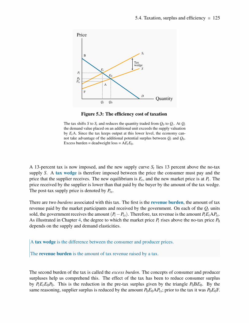
5.4. Taxation, surplus and efficiency 125
F
S
StB
D
Price
Quantity
P0
E0
Q0
Pt
Et
Qt
PtsA
Taxwedge
Figure 5.3: The efficiency cost of taxation
The tax shifts S to St and reduces the quantity traded from Q0 to Qt . At Qt
the demand value placed on an additional unit exceeds the supply valuation
by EtA. Since the tax keeps output at this lower level, the economy can-
not take advantage of the additional potential surplus between Qt and Q0.
Excess burden = deadweight loss = AEtE0.
A 13-percent tax is now imposed, and the new supply curve St lies 13 percent above the no-tax
supply S. A tax wedge is therefore imposed between the price the consumer must pay and the
price that the supplier receives. The new equilibrium is Et , and the new market price is at Pt . The
price received by the supplier is lower than that paid by the buyer by the amount of the tax wedge.
The post-tax supply price is denoted by Pts.
There are two burdens associated with this tax. The first is the revenue burden, the amount of tax
revenue paid by the market participants and received by the government. On each of the Qt units
sold, the government receives the amount (Pt −Pts). Therefore, tax revenue is the amount PtEtAPts.
As illustrated in Chapter 4, the degree to which the market price Pt rises above the no-tax price P0
depends on the supply and demand elasticities.
A tax wedge is the difference between the consumer and producer prices.
The revenue burden is the amount of tax revenue raised by a tax.
The second burden of the tax is called the excess burden. The concepts of consumer and producer
surpluses help us comprehend this. The effect of the tax has been to reduce consumer surplus
by PtEtE0P0. This is the reduction in the pre-tax surplus given by the triangle P0BE0. By the
same reasoning, supplier surplus is reduced by the amount P0E0APts; prior to the tax it was P0E0F.

126 Welfare economics and externalities
Consumers and suppliers have therefore seen a reduction in their well-being that is measured by
these dollar amounts. Nonetheless, the government has additional revenues amounting to PtEtAPts,
and this tax imposition therefore represents a transfer from the consumers and suppliers in the
marketplace to the government. Ultimately, the citizens should benefit from this revenue when it
is used by the government, and it is therefore not considered to be a net loss of surplus.
However, there remains a part of the surplus loss that is not transferred, the triangular area EtE0A.
This component is called the excess burden, for the reason that it represents the component of the
economic surplus that is not transferred to the government in the form of tax revenue. It is also
called the deadweight loss, DWL.
The excess burden, or deadweight loss, of a tax is the component of consumer and producer
surpluses forming a net loss to the whole economy.
The intuition behind this concept is not difficult. At the output Qt , the value placed by consumers
on the last unit supplied is Pt (=Et), while the production cost of that last unit is Pts (= A). But
the potential surplus (Pt −Pts) associated with producing an additional unit cannot be realized,
because the tax dictates that the production equilibrium is at Qt rather than any higher output.
Thus, if output could be increased from Qt to Q0, a surplus of value over cost would be realized
on every additional unit equal to the vertical distance between the demand and supply functions D
and S. Therefore, the loss associated with the tax is the area EtE0A.
In public policy debates, this excess burden is rarely discussed. The reason is that notions of
consumer and producer surpluses are not well understood by non-economists, despite the fact that
the value of lost surpluses can be very large. Numerous studies have attempted to estimate the
excess burden associated with raising an additional dollar from the tax system. They rarely find
that the excess burden is less than 25 percent. This is a sobering finding. It tells us that if the
government wished to implement a new program by raising additional tax revenue, the benefits of
the new program should be 25 percent greater than the amount expended on it!
The impact of taxes and other influences that result in an inefficient use of the economy’s resources
are frequently called distortions. The examples we have developed in this chapter indicate that
distortions can describe either an inefficient output being produced, as in the taxation example, or
an inefficient allocation of a given output, as in the case of apartments being allocated by lottery.
A distortion in resource allocation means that production is not at an efficient output, or a given
output is not efficiently allocated.

5.4. Taxation, surplus and efficiency 127
Elasticities and the excess burden
We suggested above that elasticities are important in determining the size of the deadweight loss
of a tax. Going back to Figure 5.3, suppose that the demand curve through E0 were more elastic
(with the same supply curve, for simplicity). The post-tax equilibrium Et would now yield a lower
Qt value and a price between Pt and P0. The resulting tax revenue raised and the magnitude of the
excess burden would differ because of the new elasticity.
A wage tax
A final example will illustrate how the concerns of economists over the magnitude of the DWL are
distinct from the concerns expressed in much of the public debate over taxes. Figure 5.4 illustrates
the demand and supply for a certain type of labour. On the demand side, the analysis is simplified
by assuming that the demand for labour is horizontal, indicating that the gross wage rate is fixed,
regardless of the employment level. On the supply side, the upward slope indicates that individuals
supply more labour if the wage is higher. The equilibrium E0 reflects that L0 units of labour are
supplied at the gross, that is, pre-tax wage W0.
S
Wt Dt
W0 D
Wage
Labour
E0
L0
B
Et
Lt
Wage tax
Excess burden= deadweight loss= BE0Et
Figure 5.4: Taxation and labour supply
The demand for labour is horizontal at W0. A tax on labour reduces the
wage paid to Wt . The loss in supplier surplus is the area W0E0EtWt . The
government takes W0BEtWt in tax revenue, leaving BE0Et as the DWL of
the wage tax.
An income tax is now imposed. If this is, say, 20 percent, then the net wage falls to 80 percent
of the gross wage in this example, given the horizontal demand curve. The new equilibrium Et is
defined by the combination (Wt ,Lt). Less labour is supplied because the net wage is lower. The

128 Welfare economics and externalities
government generates tax revenue of (W0−Wt ) on each of the Lt units of labour now supplied, and
this is the area W0BEtWt . The loss in surplus to the suppliers is W0E0EtWt , and therefore the DWL
is the triangle BE0Et . Clearly the magnitude of the DWL depends upon the supply elasticity.
Whereas the DWL consequence of the wage tax is important for economists, public debate is more
often focused on the reduction in labour supply and production. Of course, these two issues are
not independent. A larger reduction in labour supply is generally accompanied by a bigger excess
burden.
5.5 Market failures – externalities
The consumer and producer surplus concepts we have developed are extremely powerful tools of
analysis, but the world is not always quite as straightforward as simple models indicate. For ex-
ample, many suppliers generate pollutants that adversely affect the health of the population, or
damage the environment, or both. The term externality is used to denote such impacts. External-
ities impact individuals who are not participants in the market in question, and the effects of the
externalities may not be captured in the market price. For example, electricity-generating plants
that use coal reduce air quality, which, in turn, adversely impacts individuals who suffer from
asthma or other lung ailments. While this is an example of a negative externality, externalities can
also be positive.
An externality is a benefit or cost falling on people other than those involved in the activity’s
market. It can create a difference between private costs or values and social costs or values.
We will now show why markets characterized by externalities are not efficient, and also show how
these externalities might be corrected or reduced. The essence of an externality is that it creates a
divergence between private costs/benefits and social costs/benefits. If a steel producer pollutes the
air, and the steel buyer pays only the costs incurred by the producer, then the buyer is not paying
the full “social” cost of the product. The problem is illustrated in Figure 5.5.

5.5. Market failures – externalities 129
R
S (Private supply cost)
K
S f (Full social supply cost)U
D
Price
Quantity ofelectricity
P0
E0
Q0
P∗E∗
A
V
Q∗
Figure 5.5: Negative externalities and inefficiency
A negative externality is associated with this good. S measures private costs,
whereas S f measures the full social cost. The socially optimal output is Q∗,
not the market outcome Q0. Beyond Q∗ the real cost exceeds the demand
value; therefore Q0 is not an efficient output. A tax that increases P to P∗
and reduces output is one solution to the externality.
Negative externalities
In Figure 5.5, the supply curve S represents the cost to the supplier, whereas S f (the full cost)
reflects, in addition, the cost of bad air to the population. Of course, we are assuming that this
external cost is ascertainable, in order to be able to characterize S f accurately. Note also that this
illustration assumes that, as power output increases, the external cost per unit rises, because the
difference between the two supply curves increases with output. This implies that low levels of
pollution do less damage: Perhaps the population has a natural tolerance for low levels, but higher
levels cannot be tolerated easily and so the cost is greater.
Despite the externality, an efficient level of production can still be defined. It is given by Q∗, not
Q0. To see why, consider the impact of reducing output by one unit from Q0. At Q0 the willingness
of buyers to pay for the marginal unit supplied is E0. The (private) supply cost is also E0. But from
a societal standpoint there is a pollution/health cost of AE0 associated with that unit of production.
The full cost, as represented by S f , exceeds the buyer’s valuation. Accordingly, if the last unit of
output produced is cut, society gains by the amount AE0, because the cut in output reduces the
excess of true cost over value.
Applying this logic to each unit of output between Q0 and Q∗, it is evident that society can increase
its well-being by the dollar amount equal to the area E∗AE0, as a result of reducing production.

130 Welfare economics and externalities
Next, consider the consequences of reducing output further from Q∗. Note that pollution is being
created here, and environmentalists frequently advocate that pollution should be reduced to zero.
However, an efficient outcome may not involve a zero level of pollution! If the production of power
were reduced below Q∗, the loss in value to buyers, as a result of not being able to purchase the
good, would exceed the full cost of its production.
If the government decreed that, instead of producing Q∗, no pollution would be tolerated, then soci-
ety would forgo the possibility of earning the total real surplus equal to the area UE∗K. Economists
do not advocate such a zero-pollution policy; rather, we advocate a policy that permits a “tolera-
ble” pollution level – one that still results in net benefits to society. In this particular example, the
total cost of the tolerated pollution equals the area between the private and full supply functions,
KE∗VR.
As a matter of policy, how is this market influenced to produce the amount Q∗ rather than Q0?
One option would be for the government to intervene directly with production quotas for each
firm. An alternative would be to impose a corrective tax on the good whose production causes the
externality: With an appropriate increase in the price, consumers will demand a reduced quantity.
In Figure 5.5 a tax equal to the dollar value VE∗ would shift the supply curve upward by that
amount and result in the quantity Q∗ being traded.
A corrective tax seeks to direct the market towards a more efficient output.
We are now venturing into the field of environmental policy, and this is explored in the following
section. The key conclusion of the foregoing analysis is that an efficient working of the market
continues to have meaning in the presence of externalities. An efficient output level still maximizes
economic surplus where surplus is correctly defined.
Positive externalities
Externalities of the positive kind enable individuals or producers to get a type of ‘free ride’ on
the efforts of others. Real world examples abound: When a large segment of the population is
inoculated against disease, the remaining individuals benefit on account of the reduced probability
of transmission.
A less well recognized example is the benefit derived by many Canadian firms from research and
development (R&D) undertaken in the United States. Professor Dan Treffler of the University of
Toronto has documented the positive spillover effects in detail. Canadian firms, and firms in many
other economies, learn from the research efforts of U.S. firms that invest heavily in R&D. In the
same vein, universities and research institutes open up new fields of knowledge, with the result
that society at large, and sometimes the corporate sector, gain from this enhanced understanding
of science, the environment, or social behaviours.

5.5. Market failures – externalities 131
The free market may not cope any better with these positive externalities than it does with nega-
tive externalities, and government intervention may be beneficial. For example, firms that invest
heavily in research and development would not undertake such investment if competitors could
have a complete free ride and appropriate the fruits. This is why patent laws exist, as we shall see
later in discussing Canada’s competition policy. These laws prevent competitors from copying the
product development of firms that invest in R&D. If such protection were not in place, firms would
not allocate sufficient resources to R&D, which is a real engine of economic growth. In essence,
the economy’s research-directed resources would not be appropriately rewarded, and thus too little
research would take place.
While patent protection is one form of corrective action, subsidies are another. We illustrated
above that an appropriately formulated tax on a good that creates negative externalities can reduce
demand for that good, and thereby reduce pollution. A subsidy can be thought of as a negative tax.
Consider the example in Figure 5.6.
S
D (Private value)
D f (Full social value)
Price
Quantity
P0
Q0 Q∗
P∗
Figure 5.6: Positive externalities - the market for flu shots
The value to society of vaccinations exceeds the value to individuals: the
greater the number of individuals vaccinated, the lower is the probability of
others contracting the virus. D f reflects this additional value. Consequently,
the social optimum is Q∗ which exceeds Q0.
Individuals have a demand for flu shots given by D. This reflects their private valuation – their
personal willingness to pay. But the social value of flu shots is greater. When a given number
of individuals are inoculated, the probability that others will be infected falls. Additionally, with
higher rates of inoculation, the health system will incur fewer costs in treating the infected. There-
fore, the value to society of any quantity of flu shots is greater than the sum of the values that
individuals place on them.
Let D f reflects the full social value of any quantity of flu shots. If S is the supply curve, the socially

132 Welfare economics and externalities
optimal, efficient, market outcome is Q∗. How can we influence the market to move from Q0 to
Q∗? One solution is a subsidy that would reduce the price from P0 to P∗. Rather than shifting the
supply curve upwards, as a tax does, the subsidy would shift the supply downward, sufficiently
to intersect D at the output Q∗. In some real world examples, the value of the positive externality
is so great that the government may decide to drive the price to zero, and thereby provide the
inoculation at a zero price. For example, children typically get their MMR shots (measles, mumps,
and rubella) free of charge.
5.6 Other market failures
There are other ways in which markets can fail to reflect accurately the social value or social cost
of economic activity. Profit seeking monopolies, which restrict output in order to increase profits,
create inefficient markets, and we will see why in the chapter on monopoly. Or the market may
not deal very well with what are called public goods. These are goods, like radio and television
service, national defence, or health information: with such goods and services many individuals
can be supplied with the same good at the same total cost as one individual. We will address this
problem in our chapter on government. And, of course, there are international externalities that
cannot be corrected by national governments because the interests of adjoining states may differ:
One economy may wish to see cheap coal-based electricity being supplied to its consumers, even
if this means acid rain or reduced air quality in a neighbouring state. Markets may fail to supply
an “efficient” amount of a good or service in all of these situations. Global warming is perhaps the
best, and most extreme, example of international externalities and market failure.
5.7 Environmental policy and climate change
The 2007 recipients for the Nobel Peace Prize were the United Nation’s Intergovernmental Panel
on Climate Change (IPCC), and Al Gore, former vice president of the United States. The Nobel
committee cited the winners “for their efforts to build up and disseminate greater knowledge about
man-made climate change, and to lay the foundations for the measures that are needed to counteract
such change.” While Al Gore is best known for his efforts to bring awareness of climate change to
the world, through his book and associated movie (An Inconvenient Truth), the IPCC is composed
of a large, international group of scientists that has worked for many years in developing a greater
understanding of the role of human activity in global warming. Reports on the extent and causes
of the externality that we call global warming are now plentiful. The IPCC has produced several
reports at this point; a major study was undertaken in the UK under the leadership of former World
Bank Chief Economist Sir Nicholas Stern. Countless scientific papers have been published on the
subject.

5.7. Environmental policy and climate change 133
Greenhouse gases
The emission of greenhouse gases (GHGs) is associated with a wide variety of economic activities
such as coal-based power generation, oil-burning motors, wood-burning stoves, etc. The most
common GHG is carbon dioxide. The gases, upon emission, circulate in the earth’s atmosphere
and, if their build-up is excessive, prevent sufficient radiant heat from escaping. The result is a slow
warming of the earth’s surface and air temperatures. It is envisaged that such temperature increases
will, in the long term, increase water temperatures, possibly cause glacial melting, with the result
that water levels worldwide may rise. In addition to the possibility of higher water levels (which
the IPCC estimates will be about one foot by the end of the 21st century), oceans may become
more acidic, weather patterns may change and weather events may become more variable and
severe. The changes will be latitude-specific and vary by economy and continent, and ultimately
will impact the agricultural production abilities of certain economies.
Greenhouse gases that accumulate excessively in the earth’s atmosphere prevent heat from es-
caping and lead to global warming.
While most scientific findings and predictions are subject to a degree of uncertainty, there is little
disagreement in the scientific community on the very long-term impact of increasing GHGs in the
atmosphere. There is some skepticism as to whether the generally higher temperatures experienced
in recent decades are completely attributable to anthropogenic activity since the industrial revolu-
tion, or whether they also reflect a natural cycle in the earth’s temperature. But scientists agree
that a continuance of the recent rate of GHG emissions will ultimately lead to serious climatic
problems. And since GHG emissions are strongly correlated with economic growth, the very high
rate of economic growth in many large-population economies such as China and India mean that
GHGs could accumulate at a faster rate than considered likely in the 1990s.
This is an area where economic, atmospheric and environmental models are used to make predic-
tions. We have just one earth and humankind has never witnessed current GHG emission patterns
and trends. Consequently the methodology of this science is strongly model based. Scientists at-
tempt to infer something about the relationship between temperature and climate on the one hand
and carbon dioxide concentrations in the atmosphere on the other, using historical data. Data values
are inferred by examining ice cores and tree rings from eons past. Accordingly, there is a degree
of uncertainty regarding the precise impact of GHG concentrations on water levels, temperatures,
and extreme weather events.
The consensus is that, in the presence of such uncertainty, a wise strategy would involve controls
on the further buildup of gases, unless the cost of such a policy was prohibitive.
134 Welfare economics and externalities
GHGs as a common property
A critical characteristic of GHGs is that they are what we call in economics a ‘common property’:
every citizen in the world ‘owns’ them, every citizen has equal access to them, and it matters little
where these GHGs originate. Consequently, if economy A reduces its GHG emissions, economy
B may simply increase their emissions rather than incur the cost of reducing its emissions also.
Hence, economy A’s behaviour goes unrewarded. This is the crux of international agreements – or
disagreements. Since GHGs are a common property, in order for A to have the incentive to reduce
emissions, it needs to know that B will act correspondingly.
The Kyoto Protocol
The world’s first major response to climate concerns came in the form of the United Nations–
sponsored Earth Summit in Rio de Janeiro in 1992. This was followed by the signing of the
Kyoto Protocol in 1997, in which a group of countries committed themselves to reducing their
GHG emissions relative to their 1990 emissions levels by the year 2012. Canada’s Parliament
subsequently ratified the Kyoto Protocol, and thereby agreed to meet Canada’s target of a 6 percent
reduction in GHGs relative to the amount emitted in 1990.
On a per-capita basis, Canada is one of the world’s largest contributors to global warming, even
though Canada’s percentage of the total is just 2 percent. Many of the world’s major economies
refrained from signing the Protocol—most notably China, the United States, and India. Canada’s
emissions in 1990 amounted to approximately 600 giga tonnes (Gt) of carbon dioxide; but by the
time we ratified the treaty in 2002, emissions were about 25% above that level. Hence the signing
was somewhat meaningless, in that Canada had virtually a zero possibility of attaining its target.
The target date of 2012 has come and gone; and the leaders of the world economy, at their meeting
in Copenhagen failed to come up with a new agreement that would have greater force. In 2012 the
Rio+20 summit was held – in Rio once again, with the objective of devising a means of reducing
GHG emissions.
The central challenge in this area is that developed economies are those primarily responsible for
the buildup of GHGs in the post industrial revolution era. Developing economies, however, do not
accept that the developed economies should be free to continue to emit GHGs at current levels,
while the developing economies should be required to limit theirs at a much lower level.
To compound difficulties, there exists strong skepticism in some economies regarding the urgency
to implement limits on the growth in emissions.

5.7. Environmental policy and climate change 135
Canada’s GHG emissions
An excellent summary source of data on Canada’s emissions and performance during the period
1990-2010 is available on Environment Canada’s web site. See:
Environment Canada – National Inventory Report – GHG sources and sinks in Canada 1990-2010.
Canada, like many economies, has become more efficient in its use of energy (the main source of
GHGs) in recent decades—its use of energy per unit of total output has declined steadily. On a per
capita basis Canada’s emissions amounted to 23.5 tonnes in 2005, and dropped to 20.3 by 2010.
This improvement in efficiency means that Canada’s GDP is now less energy intensive. The quest
for increased efficiency is endless, if economic growth is to continue at rates that will satisfy the
world’s citizens and more broadly the impoverished world. The critical challenge is to produce
more output while using not just less energy per unit of output, but to use less energy in total
While Canada’s energy intensity (GHGs per unit of output) has dropped by a very substantial
amount – 27% between 1990 and 2010 – overall emissions increased by almost 20%. Further-
more, while developed economies have increased their efficiency, it is the world’s efficiency that
is ultimately critical. By outsourcing much our its manufacturing sector to China, Canada and
the West have offloaded some of their most GHG-intensive activities. But GHGs are a common
property resource.
Canada’s GHG emissions also have a regional aspect: the production of oil and gas, which has
created considerable wealth for all Canadians (and contributed to the appreciation of the Cana-
dian dollar in the last decade), is both energy intensive and concentrated in a limited number of
provinces (Alberta, Saskatchewan and more recently Newfoundland and Labrador).
GHG Measurement
GHG atmospheric concentrations are measured in parts per million (ppm). Current levels in the
atmosphere are below 400 ppm, and long-term levels above 500 could lead to serious economic
and social disruption. In the immediate pre-industrial revolution era concentrations were in the
250 ppm range. Hence 500 ppm represents the ‘doubling’ factor that is so frequently discussed in
the media.
GHGs are augmented by the annual additions to the stock already in the atmosphere, and at the
same time they decay—though very slowly. GHG-reduction strategies that propose an immediate
reduction in emissions are more costly than those aimed at a more gradual reduction. For example,
a slower investment strategy would permit in-place production and transportation equipment to
reach the end of its economic life rather than be scrapped and replaced ‘prematurely’. Policies that
focus upon longer term replacement are therefore less costly.

136 Welfare economics and externalities
While not all economists and policy makers agree on the time scale for attacking the problem, most
agree that, the longer major GHG reduction is postponed, the greater the efforts will have to be in
the long term—because GHGs will build up more rapidly in the near term.
A critical question in controlling GHG emissions relates to the cost of their control: how much of
annual growth might need to be sacrificed in order to get emissions onto a sustainable path? Again
estimates vary. The Stern Review proposed that, with an increase in technological capabilities, a
strategy that focuses on the relative near-term implementation of GHG reduction measures might
cost “only” a few percentage points of the value of world output. If correct, this may not be an
inordinate price to pay for risk avoidance in the longer term.
Nonetheless, such a reduction will require particular economic policies, and specific sectors will
be impacted more than others.
Economic policies for climate change
There are three main ways in which polluters can be controlled. One involves issuing direct con-
trols; the other two involve incentives—in the form of pollution taxes, or on tradable “permits” to
pollute.
To see how these different policies operate, consider first Figure 5.7. It is a standard diagram
in environmental economics, and is somewhat similar to our supply and demand curves. On the
horizontal axis is measured the quantity of environmental damage or pollution, and on the vertical
axis its dollar value or cost. The upward-sloping damage curve represents the cost to society of
each additional unit of pollution or gas, and it is therefore called a marginal damage curve. It
is positively sloped to reflect the reality that, at low levels of emissions, the damage of one more
unit is less than at higher levels. In terms of our earlier discussion, this means that an increase in
GHGs of 10 ppm when concentrations are at 300 ppm may be less damaging than a corresponding
increase when concentrations are at 500 ppm.

5.7. Environmental policy and climate change 137
Marginaldamage
Marginalabatement cost
Pollutioncost
PollutionquantityQ∗
Figure 5.7: The optimal quantity of pollution
Q∗ represents the optimal amount of pollution. More than this would in-
volve additional social costs because damages exceed abatement costs. Co-
versely, less than Q∗ would require an abatement cost that exceeds the re-
duction in damage.
The marginal damage curve reflects the cost to society of an additional unit of pollution.
The second curve is the abatement curve. It reflects the cost of reducing emissions by one unit,
and is therefore called a marginal abatement curve. This curve has a negative slope indicating
that, as we reduce the total quantity of pollution produced, the cost of further unit reductions rises.
This shape corresponds to reality. For example, halving the emissions of pollutants and gases from
automobiles may be achieved by adding a catalytic converter and reducing the amount of lead in
gasoline. But reducing those emissions all the way to zero requires the development of major new
technologies such as electric cars—an enormously more costly undertaking.
The marginal abatement curve reflects the cost to society of reducing the quantity of pollution
by one unit.
If producers are unconstrained in the amount of pollution they produce, they may produce more
than what we will show is the optimal amount – corresponding to Q∗. This amount is optimal in
the sense that at levels greater than Q∗ the damage exceeds the cost of reducing the emissions.
However, reducing emissions by one unit below Q∗ would mean incurring a cost per unit reduction
that exceeds the benefit of that reduction. Another way of illustrating this is to observe that at a
level of pollution above Q∗ the cost of reducing it is less than the damage it inflicts, and therefore

138 Welfare economics and externalities
a net gain accrues to society as a result of the reduction. But to reduce pollution below Q∗ would
involve an abatement cost greater than the reduction in pollution damage and therefore no net gain
to society. This constitutes a first rule in optimal pollution policy.
An optimal quantity of pollution occurs when the marginal cost of abatement equals the marginal
damage.
A second guiding principle emerges by considering a situation in which some firms are relative
‘clean’ and others are ‘dirty’. More specifically, a clean firm A may have already invested in new
equipment that uses less energy per unit of output produced, or emits fewer pollutants per unit
of output. In contrast the dirty firm B uses older dirtier technology. Suppose furthermore that
these two firms form a particular sector of the economy and that the government sets a limit on
total pollution from this sector, and that this limit is less than what the two firms are currently
producing. What is the least costly method to meet the target?
The intuitive answer to this question goes as follows: in order to reduce pollution at least cost to
the sector, calculate what it would cost each firm to reduce pollution from its present level. Then
implement a system so that the firm with the least cost of reduction is the first to act. In this case
the ‘dirty’ firm will likely have a lower cost of abatement since it has not yet upgraded its physical
plant. This leads to a second rule in pollution policy:
With many polluters, the least cost policy to society requires producers with the lowest abatement
costs to act first.
This principle implies that policies which impose the same emission limits on firms may not be
the least costly manner of achieving a target level of pollution. Let us now consider the use of
tradable permits and corrective/carbon taxes as policy instruments. These are market-based
systems aimed at reducing GHGs.
Tradable permits and corrective/carbon taxes are market-based systems aimed at reducing
GHGs.
Incentive mechanism I: tradable permits
A system of tradable permits is frequently called a ‘cap and trade’ system, because it limits or caps
the total permissible emissions, while at the same time allows a market to develop in permits. For
illustrative purposes, consider the hypothetical two-firm sector we developed above, composed of
firms A and B. Firm A has invested in clean technology, firm B has not. Thus it is less costly for
B to reduce emissions than A if further reductions are required. Next suppose that each firm is
allocated by the government a specific number of ‘GHG emission permits’; and that the total of
such permits is less than the amount of emissions at present, and that each firm is emitting more
5.7. Environmental policy and climate change 139
than its permits allow. How can these firms achieve the target set for this sector of the economy?
The answer is that they should be able to engage in mutually beneficial trade: If firm B has a lower
cost of reducing emissions than A, then it may be in A’s interest to pay B to reduce B’s emissions
heavily. This would free up some of B’s emission permits. A in essence is thus buying B’s emission
permits from B.
This solution may be efficient from a resource use perspective: having A reduce emissions might
involve a heavy investment cost for A. But having B reduce emissions might involve a more modest
cost – one that he can more than afford by selling his emission permits to A.
The largest system of tradable permits currently operates in the European Union. It covers more
than 10,000 large energy-using installations. Trading began in 2005. A detailed description of its
operation is contained in Wikipedia. California introduced a similar scheme in November 2012.
See: Wikipedia – European Union Emission Trading Scheme
Incentive mechanism II: taxes
Corrective taxes are frequently called Pigovian taxes, after the economist Arthur Pigou. He advo-
cated taxing activities that cause negative externalities. These taxes have been examined above in
Section 5.4. Corrective taxes of this type can be implemented as part of a tax package reform. For
example, taxpayers are frequently reluctant to see governments take ‘yet more’ of their money, in
the form of new taxes. Such concerns can be addressed by reducing taxes in other sectors of the
economy, in such a way that the package of tax changes maintains a ‘revenue neutral’ impact.
Policy in practice – international
In an ideal world, permits would be traded internationally, and such a system might be of benefit to
developing economies: if the cost of reducing pollution is relatively low in developing economies
because they have few controls in place, then developed economies, for whom the cost of GHG
reduction is high could induce firms in the developing world to undertake cost reductions. Such a
trade would be mutually beneficial. For example, if a developed-economy firm must expend $30 to
reduce GHGs by one tonne, and this can be achieved at a cost of $10 in the developing economy,
then the firm in the developed world could pay up to $20 to the firm in the developing world to
reduce GHGs by one tonne. Both would obviously gain from such an arrangement. This gain
arises because of the common property nature of the gases – it matters not where they originate.
This process is evidently just an extension of the domestic cap-and-trade system described above
under ‘incentive mechanism I’ to the international market. The advantage of internationalizing the
system is that the differences in the cost of reducing emissions may be very large internationally,

140 Welfare economics and externalities
and the scope for gains correspondingly larger.
Policy in practice – domestic large final emitters
Governments frequently focus upon quantities emitted by individual firms, sometimes because
governments are reluctant to introduce carbon taxes or a system of tradable permits. Specifically
the focus is upon firms called large final emitters (LFEs). Frequently, a relatively small number of
producers are responsible for a disproportionate amount of an economy’s total pollution, and limits
are placed on those firms in the belief that significant economy-wide reductions can be achieved
in this manner. A further reason for concentrating on these LFEs is that the monitoring costs are
relatively small compared to the costs associated with monitoring all firms in the economy. It
must be kept in mind that pollution permits may be a legal requirement in some jurisdictions, but
monitoring is still required, because firms could choose to risk polluting without owning a permit.
Revenues from taxes and permits
Taxes and tradable permits differ in that taxes generate revenue for the government from polluting
producers, whereas permits may not generate revenue, or may generate less revenue. If the gov-
ernment simply allocates permits initially to all polluters, free of charge, and allows a market to
develop, such a process generates no revenue to the government. While economists may advocate
an auction of permits in the start-up phase of a tradable permits market, such a mechanism may
run into political objections.
Setting taxes at the appropriate level requires knowledge of the cost and damage functions associ-
ated with GHGs.
Despite the monitoring costs and the incomplete information that governments typically have about
pollution activities, there exist a number of fruitful tools for reducing pollutants and GHGs. Permits
and taxes are market based and are efficient when sufficient information is available. In contrast,
direct controls may be fruitful in specific instances. In formulating pollution policy it must be kept
in mind that governments rarely have every bit of the information they require; pollution policy is
no exception.
5.8 Equity, justice, and efficiency
Our discussion of environmental challenges in the modern era illustrates starkly the tradeoffs that
we face inter-generationally: disregarding the impacts of today’s behaviour can impact future
generations. Clearly there is a question here of equity.

5.8. Equity, justice, and efficiency 141
Economists use several separate notions of equity in formulating policy: horizontal equity, ver-
tical equity, and inter-generational equity. Horizontal equity dictates, for example, that people
who have the same income should pay the same tax, while the principle of vertical equity dic-
tates that people with more income should pay more tax, and perhaps a higher rate of tax. Inter-
generational equity requires that the interests of different cohorts of individuals—both those alive
today and those not yet born—should be balanced by ethical principles.
Horizontal equity is the equal treatment of similar individuals.
Vertical equity is the different treatment of different people in order to reduce the consequences
of these innate differences.
Intergenerational equity requires a balancing of the interests and well-being of different gener-
ations and cohorts.
Horizontal equity rules out discrimination between people whose economic characteristics and
performance are similar. Vertical equity is more strongly normative. Most people agree that hor-
izontal equity is a good thing. In contrast, the extent to which resources should be redistributed
from the “haves” to the “have-nots” to increase vertical equity is an issue on which it would be
difficult to find a high degree of agreement.
People have different innate abilities, different capacities, and different wealth. These differences
mean people earn different incomes in a market economy. They also affect the pattern of consumer
demand. Brazil, with a very unequal distribution of income and wealth, has a high demand for
luxuries such as domestic help. In more egalitarian Denmark, few can afford servants. Different
endowments of ability, capital, and wealth thus imply different demand curves and determine dif-
ferent equilibrium prices and quantities. In principle, by varying the distribution of earnings, we
could influence the outcomes in many of the economy’s markets.
This is an important observation, because it means that we can have many different efficient out-
comes in each of the economy’s markets when considered in isolation. The position of a demand
curve in any market may depend upon how incomes and resources are distributed in the economy.
Accordingly, when it is proposed that the demand curve represents the “value” placed on a good or
service, we should really think of this value as a measure of willingness to pay, given the current
distribution of income.
For example, the demand curve for luxury autos would shift downward if a higher tax rate were
imposed on those individuals at the top end of the income distribution. Yet the auto market could
be efficient with either a low or high set of income taxes. Let us pursue this example further in
order to understand more fully that the implementation of a degree of redistribution from rich to
poor involves an equity–efficiency trade-off.

142 Welfare economics and externalities
John Rawls, a Harvard philosopher who died recently, has been one of the most influential
proponents of redistribution in modern times. He argued that much of the income difference
we observe between individuals arises on account of their inherited abilities, social status, or
good fortune. Only secondarily, he proposes, are income differences due to similar individu-
als making different work choices.
If this view is accurate, he challenges us to think today of a set of societal rules we would
adopt, not knowing our economic status or ability in a world that would begin tomorrow! He
proposes that, in such an experiment, we could collectively adopt a set of rules favouring the
less fortunate, in particular those at the very bottom of the income heap.
Application Box 5.1: Equity, ability, luck, and taxes
Equity versus efficiency
Figure 5.8 describes the market for high-skill labour. With no income taxes, the equilibrium labour
supply and wage rate are given by (L0,W0). If a tax is now imposed that reduces the gross wage
W0 to Wt1, the consequence is that less labour is supplied and there is a net loss in surplus equal to
the dollar amount E0E1A. This is the efficiency loss associated with raising government revenue
equal to W0AE1Wt1. Depending on how this money is spent, society may be willing to trade off
some efficiency losses in return for redistributive gains.
Wt2 Dt2
Wt1 Dt1
W0 D0
S
Wage
Labour
E2
L2
E1
L1
E0
L0
ABInitial wage tax
Finalwagetax
Figure 5.8: Equity versus efficiency in the labour market
Doubling the wage tax on labour from (W0 −Wt1) to (W0 −Wt2) increases
the DWL from AE0E1 to BE0E2. The DWL more than doubles – in this
case it quadruples when the tax doubles.

5.8. Equity, justice, and efficiency 143
Let us continue with the illustration: suppose the tax is increased further so as to reduce the net
wage to Wt2. The DWL is now BE0E2, much larger than before. Whether we should take this
extra step in sacrificing more efficiency for redistributive gains is an ethical or normative issue.
The citizens of some economies, most notably in Scandinavia, appear more willing than the citi-
zens of the United States to make efficiency sacrifices in return for other objectives. Canada lies
between these extremes, and our major political parties can be placed clearly on a spectrum of
willingness to trade equity and efficiency. A vital role for the economist, therefore, is to clarify the
nature and extent of the trade-offs. The field of public economics views this as a centrepiece in its
investigations.

144 KEY TERMS
KEY TERMS
Efficiency addresses the question of how well the economy’s resources are used and allocated.
Equity deals with how society’s goods and rewards are, and should be, distributed among its
different members, and how the associated costs should be apportioned.
Consumer surplus is the excess of consumer willingness to pay over the market price.
Supplier or producer surplus is the excess of market price over the reservation price of the
supplier.
Efficient market: maximizes the sum of producer and consumer surpluses.
Tax wedge is the difference between the consumer and producer prices.
Revenue burden is the amount of tax revenue raised by a tax.
Excess burden of a tax is the component of consumer and producer surpluses forming a net
loss to the whole economy.
Deadweight loss of a tax is the component of consumer and producer surpluses forming a net
loss to the whole economy.
Distortion in resource allocation means that production is not at an efficient output, or a given
output is not efficiently allocated.
Externality is a benefit or cost falling on people other than those involved in the activity’s
market. It can create a difference between private costs or values and social costs or values.
Corrective tax seeks to direct the market towards a more efficient output.
Greenhouse gases that accumulate excessively in the earth’s atmosphere prevent heat from
escaping and lead to global warming.
Marginal damage curve reflects the cost to society of an additional unit of pollution.
Marginal abatement curve reflects the cost to society of reducing the quantity of pollution
by one unit.
Tradable permits and corrective/carbon taxes are market-based systems aimed at reducing
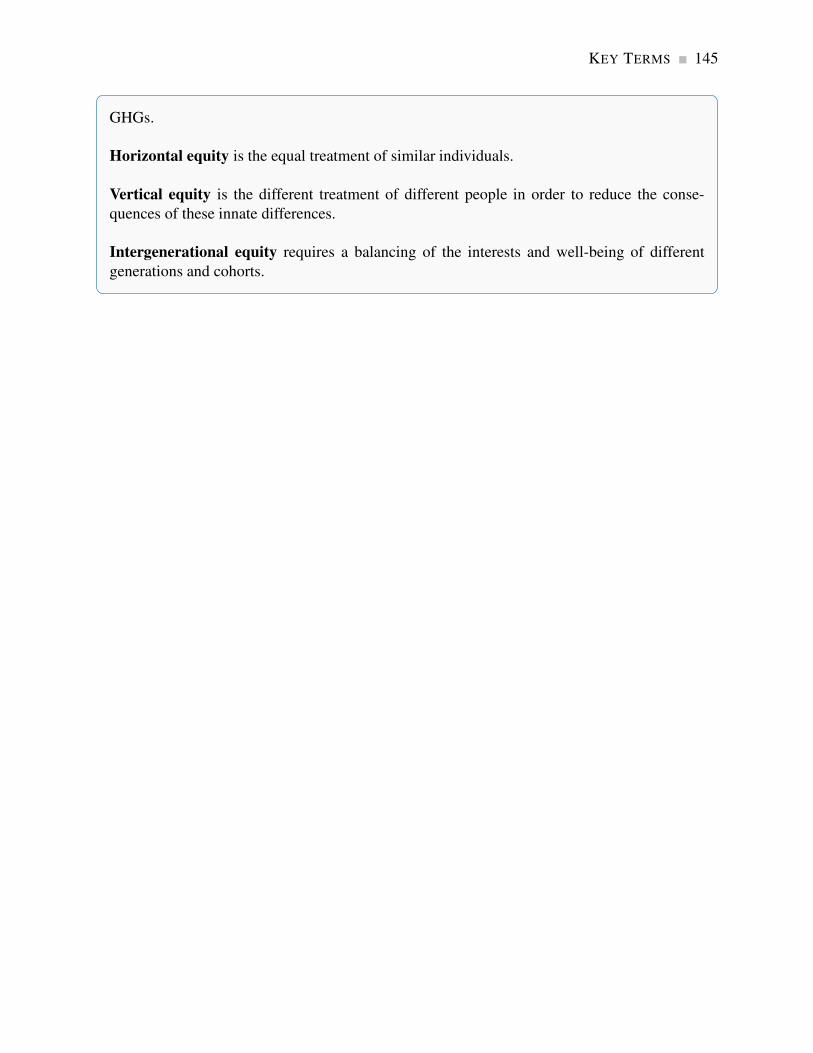
KEY TERMS 145
GHGs.
Horizontal equity is the equal treatment of similar individuals.
Vertical equity is the different treatment of different people in order to reduce the conse-
quences of these innate differences.
Intergenerational equity requires a balancing of the interests and well-being of different
generations and cohorts.

146 Exercises for Chapter 5
EXERCISES FOR CHAPTER 5
Exercise 5.1 Four teenagers live on your street. Each is willing to shovel snow from one driveway
each day. Their “willingness to shovel” valuations (supply) are: Jean, $10; Kevin, $9; Liam,
$7; Margaret, $5. Several households are interested in having their driveways shoveled, and their
willingness to pay values (demand) are: Jones, $8; Kirpinsky, $4; Lafleur, $7.50; Murray, $6.
(a) Draw the implied supply and demand curves as step functions.
(b) How many driveways will be shoveled in equilibrium?
(c) Compute the maximum possible sum for the consumer and supplier surpluses.
(d) If a new (wealthy) family arrives on the block, that is willing to pay $12 to have their drive-
way cleared, recompute the answers to parts (a), (b), and (c).
Exercise 5.2 Consider a market where supply and demand are given by P = 10 and P = 34−Q
respectively.
(a) Illustrate the market geometrically, and compute the equilibrium quantity.
(b) Impose a tax of $2 per unit on the good so that the supply curve is now P = 12. Calculate
the new equilibrium quantity, and illustrate it in your diagram.
(c) Calculate the tax revenue generated, and also the deadweight loss.
Exercise 5.3 Redo Exercise 5.2 with the demand curve replaced by P = 26− (2/3)Q.
(a) Is this new demand curve more or less elastic than the original at the equilibrium?
(b) What do you note about the relative magnitudes of the DWL and tax revenue estimates here,
relative to the previous question?
Exercise 5.4 Next, consider an example of DWL in the labour market. Suppose the demand for
labour is given by the fixed gross wage W = $16. The supply is given by W = 0.8L.
(a) Illustrate the market geometrically.
(b) Calculate the equilibrium amount of labour supplied, and the supplier surplus.

Exercises for Chapter 5 147
(c) Suppose a wage tax that reduces the wage to W = $12 is imposed. By how much is the
supplier’s surplus reduced at the new equilibrium?
Exercise 5.5 Governments are in the business of providing information to potential buyers. The
first serious provision of information on the health consequences of tobacco use appeared in the
United States Report of the Surgeon General in 1964.
(a) How would you represent this intervention in a supply and demand for tobacco diagram?
(b) Did this intervention “correct” the existing market demand?
Exercise 5.6 In deciding to drive a car in the rush hour, you think about the cost of gas and the
time of the trip.
(a) Do you slow down other people by driving?
(b) Is this an externality, given that you yourself are suffering from slow traffic?
Exercise 5.7 Suppose that our local power station burns coal to generate electricity. The demand
and supply functions for electricity are given by P = 12− 0.5Q and P = 2+ 0.5Q, respectively.
However, for each unit of electricity generated, there is an externality. When we factor this into the
supply side of the market, the real social cost is increased, and the supply curve is P = 3+0.5Q.
(a) Find the free market equilibrium and illustrate it geometrically.
(b) Calculate the efficient (i.e. socially optimal) level of production.
Exercise 5.8 Evan rides his mountain bike down Whistler each summer weekend. The utility value
he places on each kilometre ridden is given by P= 4−0.02Q, where Q is the number of kilometres.
He incurs a cost of $2 per kilometre in lift fees and bike depreciation.
(a) How many kilometres will he ride each weekend? [Hint: Think of this “value” equation as
demand, and this “cost” equation as a (horizontal) supply.]
(b) But Evan frequently ends up in the local hospital with pulled muscles and broken bones. On
average, this cost to the Canadian taxpayer is $0.50 per kilometre ridden. From a societal
viewpoint, what is the efficient number of kilometres that Evan should ride each weekend?

148 Exercises for Chapter 5
Exercise 5.9 Your local dry cleaner, Bleached Brite, is willing to launder shirts at its cost of $1.00
per shirt. The neighbourhood demand for this service is P = 5−0.005Q.
(a) Illustrate and compute the market equilibrium.
(b) Suppose that, for each shirt, Bleached Brite emits chemicals into the local environment that
cause $0.25 damage per shirt. This means the full cost of each shirt is $1.25. Calculate the
socially optimal number of shirts to be cleaned.
Exercise 5.10 The supply curve for agricultural labour is given by W = 6+0.1L, where W is the
wage (price per unit) and L the quantity traded. Employers are willing to pay a wage of $12 to all
workers who are willing to work at that wage; hence the demand curve is W = 12.
(a) Illustrate the market equilibrium, and compute the equilibrium wage (price) and quantity of
labour employed.
(b) Compute the supplier surplus at this equilibrium.
Exercise 5.11 The demand for ice cream is given by P = 24−Q and the supply curve by P = 4.
(a) Illustrate the market equilibrium, and compute the equilibrium price and quantity.
(b) Calculate the consumer surplus at the equilibrium.
(c) As a result of higher milk prices to dairy farmers the supply conditions change to P = 6.
Compute the new quantity traded, and calculate the loss in consumer surplus.
Exercise 5.12 Two firms A and B, making up a sector of the economy, emit pollution (pol) and
have marginal abatement costs: MAA = 24− pol and MAB = 24−(1/2)pol. So the total abatement
curve for this sector is given by MA = 24− (1/3)pol. The marginal damage function is constant
at a value of $12 per unit of pollution emitted: MD = $12.
(a) Draw the MD and market-level MA curves and establish the efficient level of pollution for
this economy.
Exercise 5.13 In Exercise 5.12, if each firm is permitted to emit half of the efficient level of
pollution, illustrate your answer in a diagram which contains the MAA and MAB curves.
Exercises for Chapter 5 149
(a) With each firm producing this amount of pollution, how much would it cost each one to
reduce pollution by one unit?
(b) If these two firms can freely trade the right to pollute, how many units will they (profitably)
trade?
Exercise 5.14 Once again, in Exercise 5.13, suppose that the government’s policy is to allow firms
to pollute provided that they purchase a permit valued at $10 per unit emitted (rather than allocating
a pollution quota to each firm).
(a) How many units of pollution rights would be purchased and by the two participants in this
market?
Exercise 5.15 The market demand for vaccine XYZ is given by P = 36−Q and the supply con-
ditions are P = 20. There is a positive externality associated with being vaccinated, and the real
societal value is known and given by P = 36− (1/2)Q.
(a) What is the market solution to this supply and demand problem?
(b) What is the socially optimal number of vaccinations?
(c) If we decide to give the supplier a given dollar amount per vaccination supplied in order to
reduce price and therefore increase the number of vaccinations to the social optimum, what
would be the dollar value of that per-unit subsidy?
Exercise 5.16 In Exercise 5.15, suppose that we give buyers the subsidy instead of giving it to the
suppliers. By how much would the demand curve have to shift upward in order that the socially
optimal quantity is realized?
Exercise 5.17 The demand and supply curves in a regular market (no externalities) are given by
P = 42−Q and P = 0.2Q.
(a) Solve for the equilibrium price and quantity.
(b) A percentage tax of 100% is now levied on each unit supplied. Hence the form of the new
supply curve P = 0.4Q. Find the new market price and quantity.
(c) How much per unit is the supplier paid?
(d) Compute the producer and consumer surpluses after the imposition of the tax and also the
DWL.


Part ThreeDecision Making by Consumer and Producers
6. Individual choice
7. Firms, investors and capital markets
8. Producer choice
Individuals and producers make choices when they interact with one another. We begin by suppos-
ing that individuals act in a manner that is at least in their self-interest – they transact in markets
because they derive satisfaction or utility from doing so. Individuals may also be altruistic. But in
each case we suppose they plan their actions in a way that is consistent with a goal. Utility may
be measurable or only comparable, and we derive the tools of choice optimization using these two
alternative notions of utility in Chapter 6.
Chapter 7 furnishes a link between buyers and sellers, between savers and investors, between
households and firms.
Like individual buyers, sellers and producers also act with a plan to reach a goal. They are inter-
ested in making a profit from their enterprise and produce goods and services at the least cost that
is consistent with available production technologies. Cost minimization and profit maximization
in the short run and the long run are explored in Chapter 8.

Chapter 6
Individual choice
In this chapter we will explore:
6.1 Rationality
6.2 Consumer choice with measurable utility
6.3 Consumer choice with ordinal utility
6.4 Applications of indifference analysis
6.1 Rationality
A critical behavioural assumption in economics is that agents operate in a way that is oriented
towards achieving a goal. This can be interpreted to mean that individuals and firms maximize
their personal well-being and/or their profits. These players may have other goals in addition:
philanthropy and the well-being of others are consistent with individual optimization.
If individuals are to achieve their goals then they must act in a manner that will get them to their
objective; broadly, they must act in a rational manner. The theory of individual maximization that
we will develop in this chapter is based on that premise or assumption. In assuming individuals are
rational we need not assume that they have every piece of information available to them that might
be relevant for a specific decision or choice. Nor need we assume that they have super computers
in their brain when they evaluate alternative possible strategies.
What we do need to assume, however, is that individuals act in a manner that is consistent with
obtaining a given objective. The modern theory of behavioural economics and behavioural psy-
chology examines decision making in a wide range of circumstances and has uncovered many
fascinating behaviours – some of which are developed in Application Box 6.1 below.
153
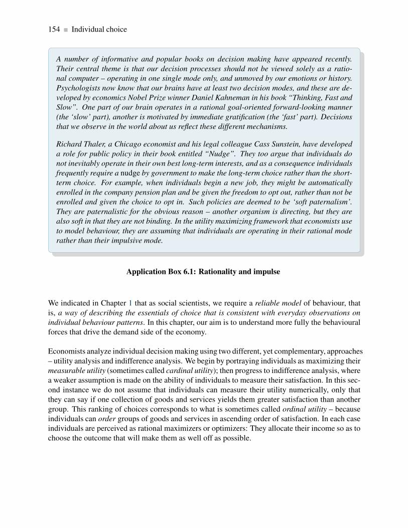
154 Individual choice
A number of informative and popular books on decision making have appeared recently.
Their central theme is that our decision processes should not be viewed solely as a ratio-
nal computer – operating in one single mode only, and unmoved by our emotions or history.
Psychologists now know that our brains have at least two decision modes, and these are de-
veloped by economics Nobel Prize winner Daniel Kahneman in his book “Thinking, Fast and
Slow”. One part of our brain operates in a rational goal-oriented forward-looking manner
(the ‘slow’ part), another is motivated by immediate gratification (the ‘fast’ part). Decisions
that we observe in the world about us reflect these different mechanisms.
Richard Thaler, a Chicago economist and his legal colleague Cass Sunstein, have developed
a role for public policy in their book entitled “Nudge”. They too argue that individuals do
not inevitably operate in their own best long-term interests, and as a consequence individuals
frequently require a nudge by government to make the long-term choice rather than the short-
term choice. For example, when individuals begin a new job, they might be automatically
enrolled in the company pension plan and be given the freedom to opt out, rather than not be
enrolled and given the choice to opt in. Such policies are deemed to be ‘soft paternalism’.
They are paternalistic for the obvious reason – another organism is directing, but they are
also soft in that they are not binding. In the utility maximizing framework that economists use
to model behaviour, they are assuming that individuals are operating in their rational mode
rather than their impulsive mode.
Application Box 6.1: Rationality and impulse
We indicated in Chapter 1 that as social scientists, we require a reliable model of behaviour, that
is, a way of describing the essentials of choice that is consistent with everyday observations on
individual behaviour patterns. In this chapter, our aim is to understand more fully the behavioural
forces that drive the demand side of the economy.
Economists analyze individual decision making using two different, yet complementary, approaches
– utility analysis and indifference analysis. We begin by portraying individuals as maximizing their
measurable utility (sometimes called cardinal utility); then progress to indifference analysis, where
a weaker assumption is made on the ability of individuals to measure their satisfaction. In this sec-
ond instance we do not assume that individuals can measure their utility numerically, only that
they can say if one collection of goods and services yields them greater satisfaction than another
group. This ranking of choices corresponds to what is sometimes called ordinal utility – because
individuals can order groups of goods and services in ascending order of satisfaction. In each case
individuals are perceived as rational maximizers or optimizers: They allocate their income so as to
choose the outcome that will make them as well off as possible.
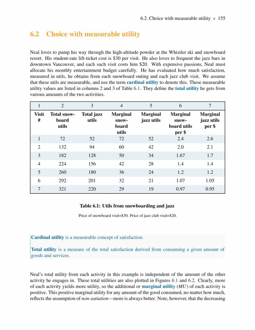
6.2. Choice with measurable utility 155
6.2 Choice with measurable utility
Neal loves to pump his way through the high-altitude powder at the Whistler ski and snowboard
resort. His student-rate lift-ticket cost is $30 per visit. He also loves to frequent the jazz bars in
downtown Vancouver, and each such visit costs him $20. With expensive passions, Neal must
allocate his monthly entertainment budget carefully. He has evaluated how much satisfaction,
measured in utils, he obtains from each snowboard outing and each jazz club visit. We assume
that these utils are measurable, and use the term cardinal utility to denote this. These measurable
utility values are listed in columns 2 and 3 of Table 6.1. They define the total utility he gets from
various amounts of the two activities.
1 2 3 4 5 6 7
Visit
#
Total snow-
board
utils
Total jazz
utils
Marginal
snow-
board
utils
Marginal
jazz utils
Marginal
snow-
board utils
per $
Marginal
jazz utils
per $
1 72 52 72 52 2.4 2.6
2 132 94 60 42 2.0 2.1
3 182 128 50 34 1.67 1.7
4 224 156 42 28 1.4 1.4
5 260 180 36 24 1.2 1.2
6 292 201 32 21 1.07 1.05
7 321 220 29 19 0.97 0.95
Table 6.1: Utils from snowboarding and jazz
Price of snowboard visit=$30. Price of jazz club visit=$20.
Cardinal utility is a measurable concept of satisfaction.
Total utility is a measure of the total satisfaction derived from consuming a given amount of
goods and services.
Neal’s total utility from each activity in this example is independent of the amount of the other
activity he engages in. These total utilities are also plotted in Figures 6.1 and 6.2. Clearly, more
of each activity yields more utility, so the additional or marginal utility (MU ) of each activity is
positive. This positive marginal utility for any amount of the good consumed, no matter how much,
reflects the assumption of non-satiation—more is always better. Note, however, that the decreasing
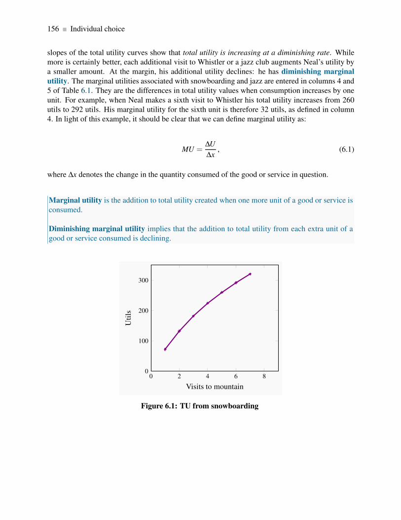
156 Individual choice
slopes of the total utility curves show that total utility is increasing at a diminishing rate. While
more is certainly better, each additional visit to Whistler or a jazz club augments Neal’s utility by
a smaller amount. At the margin, his additional utility declines: he has diminishing marginal
utility. The marginal utilities associated with snowboarding and jazz are entered in columns 4 and
5 of Table 6.1. They are the differences in total utility values when consumption increases by one
unit. For example, when Neal makes a sixth visit to Whistler his total utility increases from 260
utils to 292 utils. His marginal utility for the sixth unit is therefore 32 utils, as defined in column
4. In light of this example, it should be clear that we can define marginal utility as:
MU =∆U
∆x, (6.1)
where ∆x denotes the change in the quantity consumed of the good or service in question.
Marginal utility is the addition to total utility created when one more unit of a good or service is
consumed.
Diminishing marginal utility implies that the addition to total utility from each extra unit of a
good or service consumed is declining.
0 2 4 6 80
100
200
300
Visits to mountain
Uti
ls
Figure 6.1: TU from snowboarding

6.2. Choice with measurable utility 157
0 2 4 6 80
50
100
150
200
250
Jazz club visits
Uti
ls
Figure 6.2: TU from jazz
The marginal utilities associated with consuming different amounts of the two goods are plotted
in Figures 6.3 and 6.4, using the data from columns 4 and 5 in Table 6.1. These functions are
declining, as indicated by their negative slope. It should also be clear that the MU curves can be
derived from the TU curves because, from Equation 6.1, the MU is the slope of the TU curve. For
example, when visits to the mountain increase from three to four, TU increases from 182 to 224.
Hence MU = (224−182)/1 = 42, which is the value of the fourth visit plotted in Figure 6.3.

158 Individual choice
0 2 4 6 80
20
40
60
80
Visits to mountain
Uti
ls
Figure 6.3: MU from snowboarding
0 2 4 6 80
20
40
60
Jazz club visits
Uti
ls
Figure 6.4: MU from jazz
Now that Neal has defined his utility schedules, he must consider the price of each activity. Ul-
timately, when deciding how to allocate his monthly entertainment budget, he must evaluate how
much utility he gets from each dollar spent on snowboarding and jazz: What “bang for his buck”
does he get? Let us see how he might go about allocating his budget. When he has fully spent his

6.2. Choice with measurable utility 159
budget in the manner that will yield him greatest utility, we say that he has attained equilibrium,
because he will have no incentive to change his expenditure patterns.
If he boards once, at a cost of $30, he gets 72 utils of satisfaction, which is 2.4 utils per dollar
spent (= 72/30). One visit to a jazz club would yield him 2.6 utils per dollar (= 52/20). Initially,
therefore, his dollars give him more utility per dollar when spent on jazz. His MU per dollar
spent on each activity is given in the final two columns of the table. These values are obtained by
dividing the MU associated with each additional unit by the good’s price.
We will assume that Neal has a budget of $200. He realizes that his initial expenditure should be
on a jazz club visit, because he gets more utility per dollar spent there. Having made one such
expenditure, he sees that a second outing would yield him 2.1 utils per dollar expended, while a
first visit to Whistler would yield him 2.4 utils per dollar. Accordingly, his second activity is a
snowboard outing.
Having made one jazz and one snowboarding visit, he then decides upon a second jazz club visit
for the same reason as before—utility value for his money. He continues to allocate his budget in
this way until his budget is exhausted. In our example, this occurs when he spends $120 on four
snowboarding outings and $80 on four jazz club visits. At this consumer equilibrium, he gets
the same utility value per dollar for the last unit of each activity consumed. This is a necessary
condition for him to be maximizing his utility, that is, to be in equilibrium.
Consumer equilibrium occurs when marginal utility per dollar spent on the last unit of each
good is equal.
To be absolutely convinced of this, imagine that Neal had chosen instead to board twice and to visit
the jazz clubs seven times; this combination would also exhaust his $200 budget exactly. With such
an allocation, he would get 2.0 utils per dollar spent on his marginal (second) snowboard outing,
but just 0.95 utils per dollar spent on his marginal (seventh) jazz club visit.1 If, instead, he were
to reallocate his budget in favour of snowboarding, he would get 1.67 utils per dollar spent on
a third visit to the hills. By reducing the number of jazz visits by one, he would lose 0.95 utils
per dollar reallocated. Consequently, the utility gain from a reallocation of his budget towards
snowboarding would outweigh the utility loss from allocating fewer dollars to jazz. His initial
allocation, therefore, was not an optimum, or equilibrium.
Only when the utility per dollar expended on each activity is equal at the margin will Neal be
optimizing. When that condition holds, a reallocation would be of no benefit to him, because the
gains from one more dollar on boarding would be exactly offset by the loss from one dollar less
spent on jazz. Therefore, we can write the equilibrium condition as
1Note that, with two snowboard outings and seven jazz club visits, total utility is 352 (=132+220), while the optimal
combination of four of each yields a total utility of 380 (=224+156).

160 Individual choice
MUs
Ps=
MU j
Pj. (6.2)
While this example has just two goods, in the more general case of many goods, this same condition
must hold for all pairs of goods on which the consumer allocates his or her budget.
From utility to demand
Utility theory is a useful way of analyzing how a consumer makes choices. But in the real world
we do not observe a consumer’s utility, either total or marginal. Instead, his or her behaviour in the
marketplace is observed through the demand curve. How are utility and demand related?
Demand functions relate the quantity of a good consumed to the price of that good, other things
being equal. So let us trace out the effects of a price change on demand, with the help of this
utility framework. We will introduce a simplification here: goods are divisible, or that they come
in small packages relative to income. Think, for example, of kilometres driven per year, or liters
of gasoline purchased. Conceptualizing things in this way enables us to imagine more easily
experiments in which small amounts of a budget are allocated one dollar at a time. In contrast,
in the snowboard/jazz example, we had to reallocate the budget in lumps of $30 or $20 at a time
because we could not “fractionalize” these goods.
The effects of a price change on a consumer’s demand can be seen through the condition that
describes his or her equilibrium. If income is allocated to, say, three goods {a, b, c}, such that
MUa/Pa = MUb/Pb = MUc/Pc, and the price of, say, good b falls, the consumer must reallocate
the budget so that once again the MUs per dollar spent are all equated. How does he do this?
Clearly, if he purchases more or less of any one good, the MU changes. If the price of good b
falls, then the consumer initially gets more utility from good b for the last dollar he spends on it
(the denominator in the expression MUb/Pb falls, and consequently the value of the ratio rises to a
value greater than the values for goods a and c).
The consumer responds to this, in the first instance, by buying more of the cheaper good. He
obtains more total utility as a consequence, and in the process will get less utility at the margin
from that good. In essence, the numerator in the expression then falls, in order to realign it with
the lower price. This equality also provides an underpinning for what is called the law of demand:
More of a good is demanded at a lower price. If the price of any good falls, then, in order for the
equilibrium condition to be re-established, the MU of that good must be driven down also. Since
MU declines when more is purchased, this establishes that demand curves must slope downwards.
The law of demand states that, other things being equal, more of a good is demanded the lower
is its price.

6.2. Choice with measurable utility 161
However, the effects of a price decline are normally more widespread than this, because the quan-
tities of other goods consumed will also change. As explained in earlier chapters, the decline in the
price of good b will lead the consumer to purchase more units of complementary goods and fewer
units of goods that are substitutes. So the whole budget allocation process must be redetermined
in response to any price change. But at the end of the day, a new equilibrium must be one where
the marginal utility per dollar spent on each good is equal.
Applying the theory
The demand curves developed in Chapter 3 can be related to the foregoing utility analysis. In our
example, Neal purchased four lift tickets at Whistler when the price was $30. We can think of this
combination as one point on his demand curve, where the “other things kept constant” are the price
of jazz, his income, his tastes, etc.
Suppose now that the price of a lift ticket increased to $40. How could we find another point on his
demand curve corresponding to this price, using the information in Table 6.1? The marginal utility
per dollar associated with each visit to Whistler could be recomputed by dividing the values in
column 4 by 40 rather than 30, yielding a new column 6. We would then determine a new allocation
of his budget between the two goods that would maximize utility. After such a calculation we
would find that he makes three visits to Whistler and four jazz-club visits. Thus, the combination
(Ps = $40,Qs = 3) is another point on his demand curve. Note that this allocation exactly exhausts
his $200 budget.
By setting the price equal to $20, this exercise could be performed again, and the outcome will be a
quantity demanded of lift tickets equal to seven (plus three jazz club visits). Thus, the combination
(Ps = $20,Qs = 7) is another point on his demand curve. Figure 6.5 plots a demand curve going
through these three points.

162 Individual choice
Demand
Price
Quantity
20
7
30
4
40
3
Figure 6.5: Utility to demand
When P = $30, the consumer finds the quantity such that MU/P is equal
for all purchases. The corresponding quantity purchased is 4 tickets. At
prices of $40 and $20 the equilibrium condition implies quantities of 3 and
7 respectively.
By repeating this exercise for many different prices, the demand curve is established. We have now
linked the demand curve to utility theory.
6.3 Choice with ordinal utility
In the preceding section, we assumed that utility is measurable in order to better understand how
consumers allocate their budgets, and how this process is reflected in the market demands that
are observed. The belief that utility might be measurable is not too extreme in the modern era.
Neuroscientists are mapping more and more of the human brain and understanding how it responds
to positive stimuli. At the same time, numerous sociological surveys throughout the world ask
individuals to rank their happiness on a scale of one to ten, or something similar, with a view to
making comparisons between individual level and group level happiness. Nonetheless, not every
scientist may be convinced that we should formulate behavioural rules on this basis. Accordingly
we now examine the economics of consumer behaviour without this strong assumption. We assume
instead that individuals are able to identify (a) different combinations of goods and services that
yield equal satisfaction, and (b) combinations of goods and services that yield more satisfaction
than other combinations. In contrast to measurable (or cardinal) utility, this concept is called
ordinal utility, because it assumes only that consumers can order utility bundles rather than quantify
the utility.

6.3. Choice with ordinal utility 163
Ordinal utility assumes that individuals can rank commodity bundles in accordance with the
level of satisfaction associated with each bundle.
We may ask why it is necessary to develop further analytical tools. The answer is that differ-
ent approaches provide different and extended insights into behaviour, and therefore increase our
understanding of the marketplace.
The budget constraint
Neal’s monthly expenditure limit, or budget constraint, is $200. In addition, he faces a price of
$30 for lift tickets and $20 per visit to jazz clubs. Therefore, using S to denote the number of
snowboard outings and J the number of jazz club visits, if he spends his entire budget it must be
true that the sum of expenditures on each activity exhausts his budget or income (I):
$30S+$20J = $200
or, more generally, that the budget constraint is defined by
PsS+PjJ = I, (6.3)
whatever the income and prices may be. Since many different combinations of the two goods are
affordable, it follows that the budget constraint defines all bundles of goods that the consumer can
afford with a given budget.
The budget constraint defines all bundles of goods that the consumer can afford with a given
budget.
The budget constraint, then, is just what it claims to be—a limit on behaviour. Neal’s budget
constraint is illustrated in Figure 6.6, where the amount of each good consumed is given on the
axes. If he spends all of his $200 income on jazz, he can make exactly ten jazz club visits ($200/$20
= 10). The calculation also applies to visits to Whistler. The intercept value is always obtained by
dividing income by the price of the good or activity in question.

164 Individual choice
Snowboarding
0Jazz
F= I/Ps
C= I/Pj
2
Affordableregion = 0FC
K
7
4A
4
Non-affordableregion
Figure 6.6: The budget line
FC is the budget constraint and defines the affordable combinations of
snowboarding and jazz. F represents all income spent on snowboarding.
Thus F= I/Ps. Similarly C= I/Pj. Points above FC are not attainable. The
slope = F/C = (I/Ps)/(I/Pj) = Pj/Ps = 20/30= 2/3. The affordable set is
0FC.
In addition to these affordable extremes, Neal can also afford many other bundles, e.g., (S = 2,J =7), or (S = 4,J = 4), or (S = 6,J = 1). The set of feasible, or affordable, combinations is bounded
by the budget line, and this is illustrated in Figure 6.6.
The affordable set of goods and services for the consumer is bounded by the budget line from
above; the non-affordable set lies strictly above the budget line.
The slope of the budget line is informative. It indicates how many snowboard visits must be
sacrificed for one additional jazz visit; it defines the consumer’s trade-offs. To illustrate: Suppose
Neal is initially at point A (J = 4,S = 4), and moves to point K (J = 7,S = 2). Clearly, both
points are affordable. In making the move, he trades two snowboard outings in order to get three
additional jazz club visits, a trade-off of 2/3. This trade-off is the slope of the budget line, which,
in Figure 6.6, is AB/BK = -2/3, where the negative sign reflects the downward slope.
Could it be that this ratio reflects the two prices ($20/$30)? The answer is yes: If each unit of the
good on the vertical axis is more expensive than the good on the horizontal axis, it makes sense
that fewer units of the former must be sacrificed to get one unit of the latter. This result is derived
by noting that the slope of the budget line is given by the vertical distance divided by the horizontal
distance, OF/OC. The points F and C were obtained by dividing income by the respective price—
remember that the jazz intercept is $200/$20 = 10. Formally, that is I/Pj. The intercept on the
snowboard axis is likewise I/Ps. We can write the condition that the slope of the budget constraint
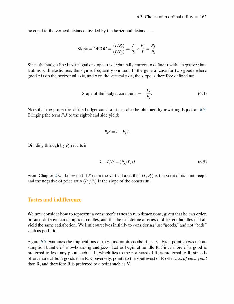
6.3. Choice with ordinal utility 165
be equal to the vertical distance divided by the horizontal distance as
Slope = OF/OC =(I/Ps)
(I/Pj)=
I
Ps×
Pj
I=
Pj
Ps.
Since the budget line has a negative slope, it is technically correct to define it with a negative sign.
But, as with elasticities, the sign is frequently omitted. In the general case for two goods where
good x is on the horizontal axis, and y on the vertical axis, the slope is therefore defined as:
Slope of the budget constraint =−Px
Py. (6.4)
Note that the properties of the budget constraint can also be obtained by rewriting Equation 6.3.
Bringing the term PjJ to the right-hand side yields
PsS = I −PjJ.
Dividing through by Ps results in
S = I/Ps− (Pj/Ps)J (6.5)
From Chapter 2 we know that if S is on the vertical axis then (I/Ps) is the vertical axis intercept,
and the negative of price ratio (Pj/Ps) is the slope of the constraint.
Tastes and indifference
We now consider how to represent a consumer’s tastes in two dimensions, given that he can order,
or rank, different consumption bundles, and that he can define a series of different bundles that all
yield the same satisfaction. We limit ourselves initially to considering just “goods,” and not “bads”
such as pollution.
Figure 6.7 examines the implications of these assumptions about tastes. Each point shows a con-
sumption bundle of snowboarding and jazz. Let us begin at bundle R. Since more of a good is
preferred to less, any point such as L, which lies to the northeast of R, is preferred to R, since L
offers more of both goods than R. Conversely, points to the southwest of R offer less of each good
than R, and therefore R is preferred to a point such as V.

166 Individual choice
Snowboarding
Jazz
R
W
V T
L
Region preferred to R
Figure 6.7: Ranking consumption bundles
L is preferred to R since more of each good is consumed at L, while points
such as V are less preferred than R. Points W and T contain more of one
good and less of the other than R. Consequently, we cannot say if they are
preferred to R without knowing how the consumer trades the goods off –
that is, his preferences.
Without knowing the consumer’s tastes, we cannot be sure at this stage how points in the northwest
and southeast regions compare with R. At W or T, the consumer has more of one good and less of
the other than at R. Someone who really likes snowboarding might prefer W to R, but a jazz buff
might prefer T to R.
Let us now ask Neal to disclose his tastes, by asking him to define several combinations of snow-
boarding and jazz that yield him exactly the same degree of satisfaction as the combination at R.
Suppose further, for reasons we shall understand shortly, that his answers define a series of points
that lie on the beautifully smooth contour UR in Figure 6.8. Since he is indifferent between all
points on UR by construction, this contour is an indifference curve.

6.3. Choice with ordinal utility 167
V
UV
UR
L
UL
Snowboarding
Jazz
M
C R N
F H
Figure 6.8: Indifference curves
An indifference curve defines a series of consumption bundles, all of which
yield the same satisfaction. The slope of an indifference curve is the
marginal rate of substitution (MRS) and defines the number of units of the
good on the vertical axis that the individual will trade for one unit of the
good on the horizontal axis. The MRS declines as we move south-easterly,
because the consumer values the good more highly when he has less of it.
An indifference curve defines combinations of goods and services that yield the same level of
satisfaction to the consumer.
Pursuing this experiment, we could take other points in Figure 6.8, such as L and V, and ask the
consumer to define bundles that would yield the same level of satisfaction, or indifference. These
combinations would yield additional contours, such as UL and UV in Figure 6.8. This process
yields a series of indifference curves that together form an indifference map.
An indifference map is a set of indifference curves, where curves further from the origin denote
a higher level of satisfaction.
Let us now explore the properties of this map, and thereby understand why the contours have
their smooth convex shape. They have four properties. The first three follow from our preceding
discussion, and the fourth requires investigation.
1. Indifference curves further from the origin reflect higher levels of satisfaction.
2. Indifference curves are negatively sloped. This reflects the fact that if a consumer gets more

168 Individual choice
of one good she should have less of the other in order to remain indifferent between the two
combinations.
3. Indifference curves cannot intersect. If two curves were to intersect at a given point, then we
would have two different levels of satisfaction being associated with the same commodity
bundle—an impossibility.
4. Indifference curves are convex when viewed from the origin, reflecting a diminishing marginal
rate of substitution.
The convex shape reflects an important characteristic of preferences: When consumers have a lot
of some good, they value a marginal unit of it less than when they have a small amount of that
good. More formally, they have a higher marginal valuation at low consumption levels—that first
cup of coffee in the morning provides greater satisfaction than the second or third cup.
Consider the various points on UR, starting at M in Figure 6.8. At M Neal snowboards a lot; at N
he boards much less. The convex shape of his indifference map shows that he values a marginal
snowboard trip more at N than at M. To see this, consider what happens as he moves along his
indifference curve, starting at M. We have chosen the coordinates on UR so that, in moving from
M to R, and again from N to H, the additional amount of jazz is the same: CR = FH. From M, if
Neal moves to R, he consumes an additional amount of jazz, CR. By definition of the indifference
curve, he is willing to give up MC snowboard outings. The ratio MC/CR defines his willingness
to substitute one good for the other. This ratio, being a vertical distance divided by a horizontal
distance, is the slope of the indifference curve and is called the marginal rate of substitution,
MRS.
The marginal rate of substitution is the slope of the indifference curve. It defines the amount
of one good the consumer is willing to sacrifice in order to obtain a given increment of the other,
while maintaining utility unchanged.
At N, the consumer is willing to sacrifice the amount NF of boarding to get the same additional
amount of jazz. Note that, when he boards less, as at N, he is willing to give up less boarding than
when he has a lot of it, as at M, in order to get the same additional amount of jazz. His willingness
to substitute diminishes as he moves from M to N: The quantity NF is less than the quantity MC.
In order to reflect this taste characteristic, the indifference curve has a diminishing marginal rate
of substitution: a flatter slope as we move down along its surface.
A diminishing marginal rate of substitution reflects a higher marginal value being associated
with smaller quantities of any good consumed.
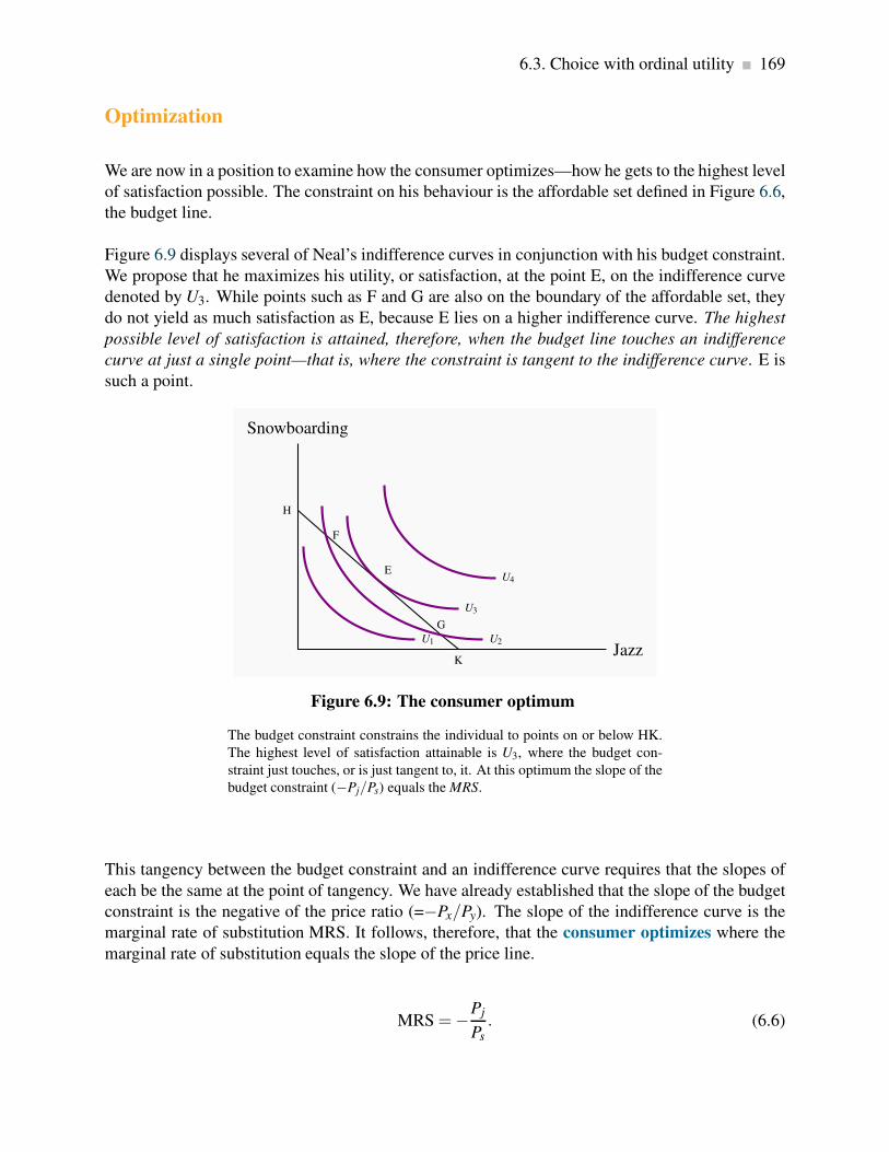
6.3. Choice with ordinal utility 169
Optimization
We are now in a position to examine how the consumer optimizes—how he gets to the highest level
of satisfaction possible. The constraint on his behaviour is the affordable set defined in Figure 6.6,
the budget line.
Figure 6.9 displays several of Neal’s indifference curves in conjunction with his budget constraint.
We propose that he maximizes his utility, or satisfaction, at the point E, on the indifference curve
denoted by U3. While points such as F and G are also on the boundary of the affordable set, they
do not yield as much satisfaction as E, because E lies on a higher indifference curve. The highest
possible level of satisfaction is attained, therefore, when the budget line touches an indifference
curve at just a single point—that is, where the constraint is tangent to the indifference curve. E is
such a point.
H
F
E
G
K
U1 U2
U3
U4
Snowboarding
Jazz
Figure 6.9: The consumer optimum
The budget constraint constrains the individual to points on or below HK.
The highest level of satisfaction attainable is U3, where the budget con-
straint just touches, or is just tangent to, it. At this optimum the slope of the
budget constraint (−Pj/Ps) equals the MRS.
This tangency between the budget constraint and an indifference curve requires that the slopes of
each be the same at the point of tangency. We have already established that the slope of the budget
constraint is the negative of the price ratio (=−Px/Py). The slope of the indifference curve is the
marginal rate of substitution MRS. It follows, therefore, that the consumer optimizes where the
marginal rate of substitution equals the slope of the price line.
MRS =−Pj
Ps. (6.6)

170 Individual choice
A consumer optimum occurs where the chosen consumption bundle is a point such that the price
ratio equals the marginal rate of substitution.
Notice the resemblance between this condition and the one derived in the first section as Equa-
tion 6.2. There we argued that equilibrium requires the marginal utility per dollar expended to be
equal for each good:
MU j
Pj=
MUs
Ps⇒
MU j
MUs=
Pj
Ps. (6.7)
In fact, with a little mathematics it can be shown that the MRS is indeed the same as the (negative of
the) ratio of the marginal utilities: MRS=−MU j/MUs. Therefore the two conditions are in essence
the same! However, it was not necessary to assume that an individual can actually measure his
utility in obtaining the result that the MRS should equal the price ratio in equilibrium. The concept
of ordinal utility is sufficient.
Adjusting to income changes
Suppose now that Neal’s income changes from $200 to $300. How will this affect his consump-
tion decisions? In Figure 6.10, this change is reflected in a parallel outward shift of the budget
constraint. Since no price change occurs, the slope remains constant. By recomputing the ratio
of income to price for each activity, we find that the new snowboard and jazz intercepts are 10
(=$300/$30) and 15 (=$300/$20), respectively. Clearly, the consumer can attain a higher level
of satisfaction—at a new tangency to a higher indifference curve—as a result of the size of the
affordable set being expanded. In Figure 6.10, the new equilibrium is at E1.

6.3. Choice with ordinal utility 171
H
I0I2 I1
Snowboarding
Jazz
S0
E0
J0
S1
E1
J1
S2
E2
J2
Figure 6.10: Income and price adjustments
An income increase shifts the budget constraint from I0 to I1. This enables
the consumer to attain a higher indifference curve. A price rise in jazz
tickets rotates the budget line I0 inwards around the snowboard intercept to
I2. The price rise reflects a lower real value of income and results in a lower
equilibrium level of satisfaction.
Adjusting to price changes
Next, consider the impact of a price change from the initial equilibrium E0 in Figure 6.10. Suppose
that jazz now costs more—say $25. This reduces the purchasing power of the given budget of $200.
The new jazz intercept is reduced from 10 to 8 (= $200/$25)—the number of visits possible if Neal
spends all his income on jazz. The budget constraint becomes steeper and rotates around the
snowboard intercept H, which is unchanged because its price is constant. The new equilibrium is
at E2, which reflects a lower level of satisfaction because the affordable set has been reduced by the
price increase. As explained in Section 6.2, E0 and E2 define points on the demand curve for jazz
(J0 and J2): They reflect the consumer response to a change in the price of jazz with all other things
held constant. In contrast, the price increase for jazz shifts the demand curve for snowboarding:
As far as the demand curve for snowboarding is concerned, a change in the price of jazz is one of
those things other than own-price that determine its position.
Philanthropy
Individuals in the foregoing analysis aim to maximize their utility, given that they have a fixed
budget. Note that this behavioural assumption does not rule out the possibility that these same
individuals may be philanthropic – that is they get utility from the act of giving to their favourite

172 Individual choice
charity or the United Way or Centre-aide. To see this suppose that donations give utility to the
individual in question – she gets a ‘warm glow’ feeling as a result of giving, which is to say she
gets utility from the activity. There is no reason why we cannot put charitable donations on one
axis and some other good or combination of goods on the remaining axis.
Of course, not everyone may get utility from giving, and those individuals who do derive utility
may find that their marginal utility from increased donations declines quickly – while giving may
generate utility it also competes with the utility obtainable from own consumption, and these util-
ities both come from the same budget. In equilibrium it must be the case that the marginal utility
from each good or activity divided by its price must be equal. Hence, if charitable donations were
a third ‘good’ to generate utility, Equation 6.2 would be rewritten as
MUs
Ps=
MU j
Pj=
MUcd
Pcd,
where the subscript ‘cd’ denotes charitable donations. Evidently the price of a dollar of donations
is one dollar and so the denominator in the final term must equal 1.
6.4 Applications of indifference analysis
Price impacts: complements and substitutes
The nature of complements and substitutes, defined in Chapter 4, can be further understood with
the help of Figure 6.10. The new equilibrium E2 has been drawn so that the increase in the price
of jazz results in more snowboarding—the quantity of S increases to S2 from S0. These goods are
substitutes in this picture, because snowboarding increases in response to an increase in the price
of jazz. If the new equilibrium E2 were at a point yielding a lower level of S than S0, we would
conclude that they were complements.
Cross-price elasticities
Continuing with the same price increase in jazz, we could compute the percentage change in
the quantity of snowboarding demanded as a result of the percentage change in the jazz price.
In this example, the result would be a positive elasticity value, because the quantity change in
snowboarding and the price change in jazz are both in the same direction, each being positive.

6.4. Applications of indifference analysis 173
Income impacts: normal and inferior goods
We know from Chapter 4 that the quantity demanded of a normal good increases in response to
an income increase, whereas the quantity demanded of an inferior good declines. Clearly, both
jazz and boarding are normal goods, as illustrated in Figure 6.10, because more of each one is
demanded in response to the income increase from I0 to I1. It would challenge the imagination to
think that either of these goods might be inferior. But if J were to denote junky (inferior) goods,
and S super goods, we could envisage an equilibrium E1 to the northwest of E0 in response to an
income increase, along the constraint I1; less J and more S would be consumed in response to the
income increase.
Income and substitution effects
It is very useful, as we shall see presently, to decompose a price change, which moves the con-
sumer along his demand curve, into two components—an income effect and a substitution effect.
Figure 6.11 illustrates the impact of an increase in the price of jazz: The equilibrium moves from
E1 to E2 as a result of the budget constraint’s changing from I1 to I2. This price increase reduces
the demand for jazz in two ways. First, jazz becomes relatively more expensive compared with
other goods, and this is reflected in the steeper price line. Second, the price increase reduces the
real purchasing power of the consumer’s income.
I1
I2 I′
U2
U1
Snowboarding
Jazz
E1
J1
E2
J2
E ′
J′
Figure 6.11: Income and substitution effects
The equilibrium E1 is disturbed by an increase in Pj that rotates I1 to I2. The
new equilibrium is E2. The substitution effect is from E1 to E ′ – to a point
on the initial indifference curve where the slope is the same as the slope of
I2. From E ′ to E2 is the income effect; it is equivalent to a parallel shift in
the budget constraint I′ to I2.

174 Individual choice
Consider an experiment in which we could give the consumer just enough income, at the new price,
to attain the same level of utility as was originally attained, U1. The budget line that permits this
is parallel to the constraint I2—the post price-change line—and tangent to U1. Call this imaginary
budget line I′, and let it result in a tangency at E ′. The reduction in jazz that is due solely to the
change in the relative prices, and that could keep the consumer at the indifference level U1, is
called the substitution effect of the price change. This is defined in the figure as the distance from
J1 to J′.
The substitution effect of a price change is the response of demand to a relative price change that
maintains the consumer on the initial indifference curve.
The remaining impact of the price change on the demand for jazz—the move from J′ to J2—is the
income effect. The reason is that this move is associated with a parallel inward shift of the budget
constraint. It is therefore an income effect.
The income effect of a price change is the response of demand to the change in real income that
moves the individual from the initial level to a new level of utility.
Income and substitution effects are frequently thought of as being obscure. But this is not so. They
are also very useful in understanding policy issues, such as subsidies and taxation. Let us turn to
an application.
Policy: income transfers and price subsidies
Government policies that improve the purchasing power of low-income households come in two
main forms: pure income transfers and price subsidies. Social Assistance payments (“welfare”)
or Employment Insurance benefits, for example, provide an increase in income to the needy. Sub-
sidies, on the other hand, enable individuals to purchase particular goods or services at a lower
price—for example, rent or daycare subsidies.
In contrast to taxes, which reduce the purchasing power of the consumer, subsidies and income
transfers increase purchasing power. The impact of an income transfer, compared with a pure
price subsidy, can be analyzed using Figure 6.12 and 6.13.

6.4. Applications of indifference analysis 175
I1 I2
U1
U2
Other goods
Daycare
E1
E2
Figure 6.12: Income transfer
An increase in income due to a government transfer shifts the budget con-
straint from I1 to I2. This parallel shift increases the quantity consumed of
the target good (daycare) and other goods, unless one is inferior.
I2
I1
U1
U2
Other goods
Daycare
E1
E2
Figure 6.13: Price subsidy
A subsidy to the targeted good, by reducing its price, rotates the budget
constraint from I1 to I2. This induces the consumer to direct expenditure
more towards daycare and less towards other goods than an income transfer
that does not change the relative prices.
In Figure 6.12, an income transfer increases income from I1 to I2. The new equilibrium at E2
reflects an increase in utility, and an increase in the consumption of both daycare and other goods.
Suppose now that a government program administrator decides that, while helping this individual

176 Individual choice
to purchase more daycare accords with the intent of the transfer, she does not intend that govern-
ment money should be used to purchase other goods. She therefore decides that a daycare subsidy
program might better meet this objective than a pure income transfer.
A daycare subsidy reduces the price of daycare and therefore rotates the budget constraint out-
wards around the intercept on the vertical axis. At the equilibrium in Figure 6.13, purchases of
other goods change very little, and therefore most of the additional purchasing power is allocated
to daycare.
The different program outcomes can be understood in terms of income and substitution effects.
The pure income transfer policy described in Figure 6.12 contains only income effects, whereas
the policy in Figure 6.13 has a substitution effect in addition. Since the relative prices have been
altered, the subsidy policy necessarily induces a substitution towards the good whose price has
fallen. In this example, where there is a minimal change in “other good” consumption following
the daycare subsidy, the substitution effect towards more daycare almost offsets the income effect
that increases these other purchases.
Let us take the example one stage further. From the initial equilibrium E1 in Figure 6.13, suppose
that, instead of a subsidy that took the individual to E2, we gave an income transfer that enabled
the consumer to purchase the combination E2. Such a transfer is represented in Figure 6.14 by
a parallel outward shift of the budget constraint from I1 to I′1, going through the point E2. This
budget constraint is very close to the one we used in establishing the substitution effect earlier.
We now have a subsidy policy and an alternative income transfer policy, each permitting the same
consumption bundle (E2). The interesting aspect of this pair of possibilities is that the income
transfer will enable the consumer to attain a higher level of satisfaction—for example, at point
E ′—and will also induce her to consume more of the good on the vertical axis.

6.4. Applications of indifference analysis 177
I′1
I2
I1
U1
U2U3
Other goods
Daycare
E1
E2
E ′
Figure 6.14: Subsidy-transfer comparison
A price subsidy to the targeted good induces the individual to move from
E1 to E2, facing a budget constraint I2. An income transfer that permits him
to consume E2 is given by I′1; but it also permits him to attain a higher level
of satisfaction, denoted by E ′ on the indifference curve U3.
The Quebec provincial government subsidizes daycare very heavily. In the network of day-
cares that are part of the government-sponsored “Centres de la petite enfance”, parents can
place their children in daycare for less than $10 per day. This policy of providing daycare
at a fraction of the actual cost was originally intended to enable parents on lower incomes
to work in the marketplace, without having to spend too large a share of their earnings on
daycare. However, the system was not limited to those households on low income. This policy
is exactly the one described in Figure 6.14.
The consequences of such subsidization were predictable: extreme excess demand, to such
an extent that children are frequently placed on waiting lists for daycare places not long
after they are born. Annual subsidy costs amount to almost $2 billion per year. Universality
means that many low-income parents are not able to obtain subsidized daycare places for
their children, because middle- and higher-income families get many of the limited number of
such spaces. The Quebec government, like many others, also subsidizes the cost of daycare
for families using the private daycare sector, through income tax credits.
Application Box 6.2: Daycare subsidies in Quebec

178 Individual choice
The price of giving
Imagine now that the good on the horizontal axis is charitable donations, rather than daycare,
and the government decides that for every dollar given the individual will see a reduction in their
income tax of 50 cents. This is equivalent to cutting the ‘price’ of donations in half, because
a donation of one dollar now costs the individual half of that amount. Graphically the budget
constraint rotates outward with the vertical intercept unchanged. Since donations now cost less
the individual has increased spending power as a result of the price reduction for donations. The
price reduction is designed to increase the attractiveness of donations to the utility maximizing
consumer.

Key Terms 179
KEY TERMS
Cardinal utility is a measurable concept of satisfaction.
Total utility is a measure of the total satisfaction derived from consuming a given amount of
goods and services.
Marginal utility is the addition to total utility created when one more unit of a good or service
is consumed.
Diminishing marginal utility implies that the addition to total utility from each extra unit of
a good or service consumed is declining.
Consumer equilibrium occurs when marginal utility per dollar spent on the last unit of each
good is equal.
Law of demand states that, other things being equal, more of a good is demanded the lower
is its price.
Ordinal utility assumes that individuals can rank commodity bundles in accordance with the
level of satisfaction associated with each bundle.
Budget constraint defines all bundles of goods that the consumer can afford with a given
budget.
Affordable set of goods and services for the consumer is bounded by the budget line from
above; the non-affordable set lies strictly above the budget line.
Indifference curve defines combinations of goods and services that yield the same level of
satisfaction to the consumer.
Indifference map is a set of indifference curves, where curves further from the origin denote
a higher level of satisfaction.
Marginal rate of substitution is the slope of the indifference curve. It defines the amount of
one good the consumer is willing to sacrifice in order to obtain a given increment of the other,
while maintaining utility unchanged.
Diminishing marginal rate of substitution reflects a higher marginal value being associated
with smaller quantities of any good consumed.

180 KEY TERMS
Consumer optimum occurs where the chosen consumption bundle is a point such that the
price ratio equals the marginal rate of substitution.
Substitution effect of a price change is the adjustment of demand to a relative price change
alone, and maintains the consumer on the initial indifference curve.
Income effect of a price change is the adjustment of demand to the change in real income
alone.

Exercises for Chapter 6 181
EXERCISES FOR CHAPTER 6
Exercise 6.1 In the example given in Table 6.1, suppose Neal experiences a small increase in
income. Will he allocate it to snowboarding or jazz? [Hint: At the existing equilibrium, which
activity will yield the higher MU for an additional dollar spent on it?]
Exercise 6.2 Suppose that utility depends on the square root of the amount of good X consumed:
U =√
X .
(a) In a spreadsheet enter the values 1. . . 25 in the X column, and in the adjoining column com-
pute the value of utility corresponding to each quantity of X .
(b) In the third column enter the marginal utility (MU ) associated with each value of X – the
change in utility in going from one value of X to the next.
(c) Use the ‘graph’ tool to map the relationship between U and X .
(d) Use the graph tool to map the relationship between MU and X .
Exercise 6.3 Cappuccinos, C, cost $3 each, and music downloads of your favourite artist, M, cost
$1 each from your iTunes store. Income is $24.
(a) Draw the budget line to scale, with cappuccinos on the vertical axis, and compute its slope.
(b) If the price of cappuccinos rises to $4, compute the new slope.
(c) At the initial set of prices, are the following combinations of goods in the affordable set: (4C
and 9M), (6C and 2M), (3C and 15M)?
(d) Which combination(s) in part (c) lie inside the affordable set, and which lie on the boundary?
Exercise 6.4 George spends his income on gasoline and “other goods.”
(a) First, draw a budget constraint, with gasoline on the horizontal axis. Then, illustrate by how
much the intercept on the gasoline axis changes in response to a doubling of the price of
gasoline.
(b) Suppose that, in addition to a higher price, the government imposes a ration on George that
limits his purchase of gasoline to less than some amount within his affordable set. Draw the
new effective budget constraint.

182 Exercises for Chapter 6
Exercise 6.5 Instead of the ration in Exercise 6.4, suppose that the government increases taxes on
gasoline, in addition to the market price increase. Illustrate this budget constraint.
Exercise 6.6 The price of cappuccinos is $3, the price of a theatre ticket is $12, and consumer
income is $72.
(a) In a graph with theatre tickets on the vertical axis and cappuccinos on the horizontal axis,
draw the budget constraint to scale, marking the intercepts.
(b) Suppose the consumer chooses the combination of 4 theatre tickets and 8 cappuccinos. Draw
such a point on the budget constraint and mark the affordable and non-affordable regions.
(c) Is the combination of 3 tickets and 24 cappuccinos affordable?
(d) Is the combination in part (c) preferred to, or less preferred than, the chosen point in part
(b)?
(e) If the price of cappuccinos falls to $2 per cup, is the combination of 24 cappuccinos and 3
tickets affordable?
Exercise 6.7 Suppose that you are told that the indifference curves defining the trade-off for two
goods took the form of straight lines. Which of the four properties outlines in Section 6.3 would
such indifference curves violate?
Exercise 6.8 A student’s income is $50. Lunch at the cafeteria costs $5, and movies at the Student
Union cost $2 each.
(a) Draw the budget line to scale, with lunch on the vertical axis; insert some regular-shaped
smooth convex indifference curves, and choose the tangency equilibrium, denoted by E0.
(b) If the price of lunch falls to $2.50, draw the new budget line. What can be said about the
new equilibrium relative to E0 if both goods are normal?
(c) If the price of movies also falls to $1, draw the new budget line and illustrate a new equilib-
rium.
(d) How does the equilibrium in part (c) differ from the equilibrium in part (b)?
Exercise 6.9 Lionel likes to eat a nice piece of Brie cheese while having a glass of wine. He has
a monthly gourmet budget of $120. In a diagram with wine on the vertical axis and cheese on the
horizontal axis, suppose that the intercepts are 10 bottles on the wine axis and 4 kilos on the cheese
axis. He is observed to purchase 5 bottles of wine and 2 kilos of cheese.

Exercises for Chapter 6 183
(a) What are the prices of wine and cheese?
(b) Suppose that the price of wine increases to $20 per bottle, but that Lionel’s income simulta-
neously increases by $60. Draw the new budget constraint and mark the intercepts.
(c) Is Lionel better off in the new or old situation? [Hint: ask if he can now afford the bundle he
purchased with a lower income and lower wine price.]
Exercise 6.10 An indifference curve is a relationship between two goods, X and Y , such that utility
is constant. Consider the following indifference curve: Y = 12/X . Since this can also be written
as 12 = XY then we can think of the value 12 as representing the utility level.
(a) In a spreadsheet enter the values 1. . . 24 in the X column, and in the adjoining Y column
compute the value of Y corresponding to each value of X .
(b) Use the graph function to map this indifference curve.
(c) Compute the MRS where X increases from 3 to 4, and again where it increases from 15 to
16. [Hint: Since the MRS is the change in the amount of Y that compensates for a change in
the amount of X , you need simply calculate the changes in Y corresponding to each of these
changes in X .]
Exercise 6.11 Draw an indifference map with several indifference curves and several budget con-
straints corresponding to different possible levels of income. Note that these budget constraints
should all be parallel because only income changes, not prices. Now find some optimizing (tan-
gency) points. Join all of these points. You have just constructed what is called an income-
consumption curve. Can you understand why it is called an income-consumption curve?
Exercise 6.12 Draw an indifference map again, in conjunction with a set of budget constraints.
This time the budget constraints should each have a different price of good X and the same price
for good Y .
(a) Draw in the resulting equilibria or tangencies and join up all of these points. You have just
constructed a price-consumption curve for good X . Can you understand why the curve is so
called?
(b) Now repeat part (a), but keep the price of X constant and permit the price of Y to vary. The
resulting set of equilibrium points will form a price consumption curve for good Y .
Exercise 6.13 From the equilibrium based on the data in Table 6.1, let us compute some elasticities,
using the midpoint formula that we developed in Chapter 4. Suppose that the price of jazz falls to
$16 per outing, from the initial price of $20. Income remains at $200.

184 Exercises for Chapter 6
(a) First compute Neal’s new equilibrium – by computing a new MU/P schedule for jazz and
reallocating his budget in a utility-maximizing fashion.
(b) What is his price elasticity of demand for jazz at this set of prices? [Hint: Once you compute
the new quantity of jazz purchased you can compute the percentage change in quantity de-
manded. You also know the percentage change in the price of jazz, so you can now compute
the ratio of these two numbers.]
(c) What is the cross-price elasticity of demand for snowboarding, with respect to the price of
jazz, at this set of prices? [Hint: Calculate the percentage change in the number of snowboard
visits to Whistler, relative to the percentage change in the price of jazz.]
Exercise 6.14 Suppose that movies are a normal good, but public transport is inferior. Draw an
indifference map with a budget constraint and initial equilibrium. Now let income increase and
draw a plausible new equilibrium, noting that one of the goods is inferior.
Exercise 6.15 Consider the set of choices facing the consumer in Figures 6.12, 6.13, and 6.14. The
parent chooses between other goods and daycare.
(a) First, replicate this figure with one budget constraint and one indifference curve that together
define a tangency (equilibrium) solution.
(b) Suppose now that daycare is subsidized through a price reduction. Draw two possible equi-
libria, one where “other goods” purchased increase, and the second where they decrease. In
which case are daycare and other goods substitutes? In which case are they complements?

Chapter 7
Firms, investors and capital markets
In this chapter we will explore:
7.1 The several forms of business organizations
7.2 Corporate goals
7.3 Risk and the investor
7.4 Utility and risk reduction
7.5 Investment and real returns
7.6 Financing the risky firm through diversifica-
tion
7.1 Business organization
Many different types of suppliers provide goods and services to the marketplace. Some are small;
some are large. But, whatever their size, suppliers choose an organizational form that is appropriate
for their business: Aircraft and Oil rigs are produced by large corporations; dental services are
provided by individual professionals or private partnerships.
The initial sections of this chapter are devoted to the study of organizational forms and their opera-
tion. We then examine why individuals choose to invest in firms, and propose that such investment
provides individual investors with a means both to earning a return on their savings and to manag-
ing the risk associated with investing.
Understanding the way firms and capital markets function is crucial to seeing not simply how
our microeconomic models operate, but to understanding our economic history and how different
forms of social and economic institutions interact. For example, seventeenth century Amsterdam
had a thriving bourgeoisie, well-developed financial markets, and investors with savings. This
environment facilitated the channeling of investors’ funds to firms specializing in trade and nautical
conquest. The tiny Dutch state was then the source of the world’s leading explorers and traders,
and had colonies stretching to Indonesia. The result was economic growth and prosperity.
185
186 Firms, investors and capital markets
In contrast, for much of the twentieth century, the Soviet Union dominated a huge territory cov-
ering much of Asia and Europe. But capital markets were non-existent, independent firms were
stifled, and economic decline ultimately ensued. Much of the enormous difference in the respective
patterns of economic development can be explained by the fact that one state fostered firms and
capital markets, while the other did not. In terms of our production possibility frontier: One set of
institutional arrangements was conducive to expanding the possibilities; the other was not.
Businesses, or firms, have several different forms. At the smallest scale, a business takes the form
of a sole proprietor or sole trader who is the exclusive owner. A sole trader gets all of the revenues
from the firm and incurs all of the costs. Hence he may make profits or be personally liable for the
losses. In the latter case his business or even personal assets may be confiscated to cover debts.
Personal bankruptcy may result.
Sole proprietor is the single owner of a business.
If a business is to grow, partners may be required. Such partners can inject money in exchange for
a share of future profits. Firms where trust is involved, such as legal or accounting firms, typically
adopt this structure. A firm is given credibility when customers see that partners invest their own
wealth in it.
Partnership: a business owned jointly by two or more individuals, who share in the profits and
are jointly responsible for losses.
If a business is to grow to a significant size it will generally need cash and thus partners. Firms
that provide legal services or dental services rely primarily on human expertise, and therefore they
need relatively little physical capital. Hence their cash start-up needs tend to be modest. But firms
that produce aircraft need vast amounts of money to construct assembly facilities, and undertake
research and development. Such businesses form corporations – also known as companies.
Large organizations have several inherent advantages over small organizations when a high out-
put level is required. Specialization in particular tasks leads to increased efficiency for production
workers. At the same time, non-production workers can perform a multitude of different tasks. If
a large corporation decided to contract out every task involved in bringing its product to market,
the costs of such agreements could be prohibitively high. In addition, synergies can arise from
teamwork. New ideas and better work flow are more likely to materialize when individuals work
in close proximity than when working as isolated units, no matter how efficient they may be indi-
vidually. A key aspect of such large organizations is that they have a legal identity separate from
the managers and owners.

7.1. Business organization 187
Corporation or company is an organization with a legal identity separate from its owners that
produces and trades.
The owners of a corporation are known as its shareholders, and their object is usually to make
profits. There also exist non- profit corporations whose objective may be philanthropic. Since
our focus is upon markets, we will generally assume that profits form the objective of a typical
corporation. The profits that accrue to a corporation may be paid to the shareholders in the form
of a dividend, or retained in the corporation for future use. When large profits (or losses) accrue
the value of the corporation increases (or decreases), and this is reflected in the value of each share
of the company. If the value of each share in the company increases (decreases) there is a capital
gain (loss) to the owners of the shares – the shareholders.
Shareholders invest in corporations and therefore are the owners. They have limited liability
personally if the firm incurs losses.
Dividends are payments made from after-tax profits to company shareholders.
Capital gains (losses) arise from the ownership of a corporation when an individual sells a share
at a price higher (lower) than when the share was purchased.
A key difference between a company and a partnership is that a company involves limited liability,
whereas a partnership does not. Limited liability means that the liability of the company is limited
to the value of the company’s assets. Shareholders cannot be further liable for any wrongdoing on
the part of the company. Accordingly, partnerships and sole traders frequently insure themselves
and their operations. For example, all specialist doctors carry malpractice insurance.
Limited liability means that the liability of the company is limited to the value of the company’s
assets.

188 Firms, investors and capital markets
Net income (after tax) from operations $ 1,978 m
Preferred dividends $ 73 m
Income available to shareholders $ 1,905 m
Number of common stocks $ 502 m
Earnings per common share $ 3.79
Dividends per common share $ 2.80
Market capitalization (June 2008) $ 23.7b
Stock price (June 2008) $ 48.0
Table 7.1: Bank of Montreal income statement, 2008
The objective of most suppliers or producers is to make profit. This is done by using capital,
labour, and human expertise to produce a good, to supply a service, or to act as an intermediary.
Corporations are required to produce an annual income statement that accurately describes the
operation of the firm. An example is given in Table 7.1.
“Net income from operations” represents after-tax profits. Of this amount, $73 million was paid to
holders of a special class of shares, and $1.905 million was available for either reinvesting in the
company or payment of dividends. There were 502 million shares outstanding in the company at
the end of 2008. This means that if the $1,905 million were allocated over all such shares, $3.79
could go to each one. But corporations normally retain a substantial part of such earnings in order
to finance investment for coming years. This component is called the retained earnings. The
remainder is distributed to the owners/shareholders in the form of dividends. In this case, of the
$3.79 earnings per share, $2.80 was distributed to shareholders and the remainder was retained
inside the company. The final two entries in the table indicate the total value of the company’s
stock was $23.7 billion, and each unit of stock was valued at approximately $48 in June 2008.
Such information is publicly available for a vast number of corporations at the ‘finance’ section of
major search engines such as Google or Yahoo.
Retained earnings are the profits retained by a company for reinvestment and not distributed as
dividends.
In Canada, the corporate sector as a whole tends to hold on to more than half of after-tax profits
in the form of retained earnings. However there exists considerable variety in the Behaviour of
corporations, and each firm tends to have a known and established pattern of how it allocates it
profits between dividends and retained earnings. In the Table 7.1 example, three quarters of profits

7.2. Profit, ownership and corporate goals 189
were distributed; yet some corporations have a no-dividend policy. In these latter cases the benefit
to investing in a firm must come in the form of capital gain to the owners of the shares.
7.2 Profit, ownership and corporate goals
As economists, we believe that profit maximization accurately describes a typical firm’s objec-
tive. However, since large firms are not run by their owners but by their executives or agents, it
is frequently hard for the shareholders to know exactly what happens within a company. Even the
board of directors—the guiding managerial group—may not be fully aware of the decisions, strate-
gies, and practices of their executives and managers. Occasionally things go wrong, and managers
decide to follow their own interests rather than the interests of the company. In technical terms,
the interests of the corporation and its shareholders might not be aligned with the interests of its
managers. For example managers might have a short horizon and take steps to increase their own
income in the short term, knowing that they will move job before the long-term impacts of their
decisions impact the firm.
At the same time, the marketplace for the ownership of corporations exerts a certain discipline: If
firms are not as productive or profitable as possible, they may become subject to takeover by other
firms. Fear of such takeover can induce executives and boards to maximize profits.
The shareholder-manager relationship is sometimes called a principal-agent relationship, and it
can give rise to a principal-agent problem. If it is costly or difficult to monitor the behaviour of an
agent because the agent has additional information about his own performance, the principal may
not know if the agent is working to achieve the firm’s goals. This is the principal-agent problem.
Principal or owner: delegates decisions to an agent, or manager.
Agent: usually a manager who works in a corporation and is directed to follow the corporation’s
interests.
Principal-agent problem: arises when the principal cannot easily monitor the actions of the
agent, who therefore may not act in the best interests of the principal.
In an effort to deal with such a challenge, corporate executives frequently get bonuses or stock
options that are related to the overall profitability of their firm. Stock options usually take the form
of an executive being allowed to purchase the company’s stock in the future – but at a price that
is predetermined. If the company’s profits do increase, then the price of the company’s stock will
reflect this and increase likewise. Hence the executive has an incentive to work with the objective
of increasing profits because that will enable him to buy the company stock in the future at a lower
price than it will be worth.

190 Firms, investors and capital markets
Stock option: an option to buy the stock of the company at a future date for a fixed, predetermined
price.
The threat of takeover and the structure of rewards, together, imply that the assumption of profit
maximization is a reasonably robust one.
7.3 Risk and the investor
Firms cannot grow without investors. A successful firm’s founder always arrives at a point where
more investment is required if her enterprise is to expand. Frequently, she will not be able to secure
a sufficiently large loan for such growth, and therefore must induce outsiders to buy shares in her
firm. She may also realize that expansion carries risk, and she may want others to share in this
risk. Risk plays a central role in the life of the firm and the investor. Most investors prefer to avoid
risk, but are prepared to assume a limited amount of it if the anticipated rewards are sufficiently
attractive. Let us define precisely what we mean by risk in the field of financial analysis.
Consider a gamble with a 50% chance of making $10 and a 50% chance of losing $10; on average
you break even. This is what we call a ‘fair’ gamble. In contrast, a 60% chance of winning
and a 40% chance of losing, or a 20% chance of winning plus an 80% chance of losing are not
‘fair’ gambles, because on average the gambler would not break even if he took the same gamble
repeatedly.
Fair gamble: one where the gain or loss will be zero if played a large number of times.
Next, let us suppose that the stakes are higher in the fair game. Instead of $10, a gain or loss of $20
is at stake, with the probabilities remaining at 50/50. This is still a fair game, but it carries more
risk, because the range of possible outcomes is greater. We also say that the dispersion or spread
in the possible outcomes is greater. In Section 7.6 we will introduce a statistical measure of the
possible spreads in outcomes. But for the moment let’s think about how investors view risk.
Individuals can be classified in accordance with their attitude towards risk. A risk-averse person
prefers to avoid risk, but may choose to bet or gamble if the odds are sufficiently in their favour,
despite their inherent dislike of risk. A risk-neutral person is interested only in whether the odds
yield a profit on average, and ignores the dispersion in possible outcomes.
The risk associated with an investment can be measured by the dispersion in possible outcomes.
A greater dispersion in outcomes implies more risk.

7.3. Risk and the investor 191
A risk-averse person will refuse a fair gamble, regardless of the dispersion in outcomes.
A risk-neutral person is interested only in whether the odds yield a profit on average, and ignores
the dispersion in possible outcomes.
For completeness we note that there also exist individuals who are risk lovers – people who ac-
tually prefer more risk to less. While such individuals certainly exist (in the form of gambling
addicts), they are relatively rare and are considered frequently to exhibit pathological behaviour.
Accordingly, we focus on the much more frequently-encountered risk-averse group.
We observe that individuals tend to buy insurance where significant losses might be incurred.
Insurance is the opposite of gambling. Most people who own a house that has even a small prob-
ability of burning, or being burgled, purchase insurance. By doing so they are avoiding risk. But
how much are they willing to pay for such insurance? If the house is worth $250,000 and the
probability of its burning down is 1 percent, what can we say about someone who is willing to
pay more than 1 percent in an insurance premium? If the premium is 1.5 percent, it is not ‘fair’,
but a risk-averse person may be willing to pay this amount in order to avoid the risk. What utility
behaviour underlies the risk-averse person’s decision?
192 Firms, investors and capital markets
With a decline in interest and mortgage rates in the early part of the twenty first century,
many individuals believed they could afford to buy a house because the borrowing costs were
lower than before. Employees and managers of lending companies believed likewise, and
they structured loans in such a way as to provide an incentive to low-income individuals to
borrow. These mortgage loans frequently enabled purchasers to buy a house with only a 5%
down payment, in some cases even less, coupled with a repayment schedule that saw low
repayments initially but higher repayments subsequently. The initial interest cost was so low
in many of these mortgages that it was even lower than the ‘prime’ rate – the rate banks
charge to their most prized customers.
The crisis that resulted became known as the ‘sub-prime’ mortgage crisis. In many cases
lenders got bonuses based on the total value of loans they oversaw, regardless of the quality
or risk associated with the loan. The consequence was that they had the incentive to make
loans to customers to whom they would not have lent, had these employees and managers
been lending their own money, or had they been remunerated differently. The outcomes were
disastrous for numerous lending institutions. When interest rates climbed, borrowers could
not repay their loans. The construction industry produced a flood of houses that, combined
with the sale of houses that buyers could no longer afford, sent housing prices through the
floor. This in turn meant that recent house purchasers were left with negative value in their
homes – the value of their property was less than what they paid for it. Many such ‘own-
ers’ simply returned the keys to their bank, declared bankruptcy and walked away. Some
lenders went bankrupt; some were bailed out by the government, others bought by surviving
firms. This is a perfect example of the principal agent problem – the managers of the lending
institutions did not have the incentive to act in the interest of the owners of those institutions.
The broader consequence of this lending practice was a financial collapse greater than any
since the Depression of the nineteen thirties. Assets of the world’s commercial and investment
banks plummeted in value. Their assets included massive loans and investments both directly
and indirectly to the real estate market, and when real estate values fell, so inevitably did the
value of the assets based on this sector. Governments around the world had to buy up bad
financial assets from financial institutions, or invest massive amounts of taxpayer money in
these same institutions. Otherwise the world’s financial system might have collapsed, with
unknowable consequences.
Taxpayers and shareholders together bore the burden of this disastrous investment policy.
Shareholders in many banks saw their shares drop in value to just a few percent of what they
had been worth a year or two prior to the collapse.
Application Box 7.1: The ‘Sub-Prime’ mortgage crisis: a principal-agent problem

7.4. Diminishing marginal utility and risk 193
7.4 Diminishing marginal utility and risk
We proposed in Chapter 6 that people have diminishing marginal utility: Successive equal in-
crements in consumption yield progressively less additional utility. This concept is central to
understanding behaviour towards risk.
Suppose you have a specific sum of money and you are offered a fair gamble in the sense we
described above – you have an equal chance of winning or losing a fixed amount – suppose $1,000.
While this game is by definition fair in the probabilistic sense it might not be fair in the utility sense.
Diminishing marginal utility means that the additional utility associated with the gain of $1,000
is less than the utility change associated with losing $1,000: The more money we have, the less
is the utility value placed on it at the margin; the less we have, the greater is the value placed on
an additional unit. In consequence, risk-averse individuals devote resources to reducing risk; this
is why insurance forms such a sizable sector in the economy. Furthermore, those who take on
risk (insurers) have to be rewarded for doing so, and many economic activities consist of the more
risk-averse individuals paying insurers to bear risk.
Insurance companies always insure a multitude of individuals or households. Hence, while these
companies pay out claims to many customers each year the companies have so many customers
that it is rare that they encounter a year when the insurance claims and the insurance premiums
paid to the company do not balance out. We sometimes call this the law of large numbers.
Risk pooling
Consider the following personal relationship that has a strong economic component: an infor-
mation technology (IT) consultant and his partner, a musician, have risky incomes1. Each earns
$5,000 in a good month and nothing in a bad month. But their risks are independent: Whether the
musician has a good or bad month has no bearing on the IT consultant’s income. Individually, their
incomes are quite risky, but together they are less so. Let us examine Table 7.2 to see why.
1This example is motivated by a somewhat similar example in the economics text book "Economics" by David
Begg, Stanley Fischer and Rudiger Dornbusch, 2003, Mc Graw Hill UK.

194 Firms, investors and capital markets
IT Consultant
TogetherAlone
Good Bad
Together
Good $5,000;
p=0.5
$2,500;
p=0.5
$5,000; p=0.5
Bad $2,500;
p=0.5
$0; p=0.5 $0; p=0.5Musician
Alone $5,000;
p=0.5
$0; p=0.5
Table 7.2: Pooling risky incomes
When the two individuals pool and subsequently split their incomes, the outcome is given in the
shaded region of the table. A good month for each yields $5,000 each as before. But a good month
for one, coupled with a bad month for the other, now yields $2,500 each rather than zero or $5,000.
A bad month for each still yields a zero income to each.
Together, their income is more stable than when alone. To confirm this, look at the lowest row
in the table. When the incomes are shared, each partner will get $5,000 one-quarter of the time
(denoted by the probability p equaling 0.25), zero one-quarter of the time, and $2,500 half of the
time. In contrast, when alone, they each get $5,000 and zero half of the time. The latter outcomes
are more dispersed, because they are more extreme than when income is shared; the probability of
extreme outcomes is greater. Another way of saying this is that the variance is greater.
As a consequence of less dispersion, the shared outcome yields more utility on average. This
is because of diminishing marginal utility. In particular, if, each time one of the individuals got
$2,500, they were presented with the option of getting zero half of the time and $5,000 half of the
time, this latter option would make them worse off—for the simple reason that the gain in utility
in going from $2,500 to $5,000 is less than the loss in utility in going to zero from $2,500. This is
the consequence of diminishing MU . In general, the more stable income stream is preferred and,
since the sharing option gets them closer to a more stable income stream, it yields more utility on
average.
Figure 7.1 develops this argument in graphical form. It relates total utility (TU ) to income. In the
risky scenario, the individual gets either zero dollars or $5,000 with equal probability, and therefore
gets utility of zero or OB with equal probability. Therefore, the average utility is OC (which is one
half of OB, and sometimes called the ‘expected’ utility). In contrast, where no risk is involved, and
the individual always gets the average payout of $2,500, utility is OA, which is greater than OC.
In summary, where diminishing marginal utility exists, the average or expected utility of the event
is less than the utility associated with the average or expected dollar outcome.

7.4. Diminishing marginal utility and risk 195
A
$2,500
B
$5,000
TU
Totalutility
O $
C=1/2(OB)
A
$2,500
B
$5,000
Figure 7.1: Utility from extremes and averages
If an individual gets $0 half of the time and $5,000 half the time, her average
utility is OC – an average of zero and OB. But if she gets $2,500 every time
then her utility is OA, which is greater than OC.
In this example, individuals pool their risk. But while pooling independent risks is the key to
insurance, such pooling does not work when all individuals face the same risk: If the IT consultant
always had a good month whenever the musician had a good month, and conversely in bad months,
no change in outcomes would result from their deciding to pool their incomes.
Risk pooling: a means of reducing risk and increasing utility by aggregating or pooling multiple
independent risks.
Risk spreading
Risk spreading is a different form of risk management. Imagine that an oil supertanker has to be
insured and the owner approaches one insurer. In the event of the tanker being ship- wrecked the
damage caused by the resulting oil spill would be catastrophic – both to the environment and the
insurance company, which would have to pay for the damage. In this instance the insurance com-
pany does not benefit from the law of large numbers – it is not insuring thousands of such tankers
and therefore would find it difficult to balance the potential claims with the annual insurance pre-
miums. As a consequence such insurers generally spread the potential cost among other insurers,
and this is what is called risk spreading.

196 Firms, investors and capital markets
Risk spreading: spreads the risk of a venture among multiple sub insurers.
The logic is similar to participating in an office Super-Bowl lottery. Most people are willing to risk
the loss of $5 or $10, but very few would participate if the required bet were $100. The world’s
major insurers – such as Lloyd’s of London has hundreds of syndicates who each take on a small
proportion of a big risk. These syndicates may again choose to subdivide their share among others,
until the big risk becomes widely spread. In this way it is possible to insure against almost any
eventuality, no matter how large.
Risk, the firm and the investor
Let us return to our starting point: individuals like to get a high return on their investment, but
dislike an excess of risk – that is to say they prefer as little variation in their return as possible,
other things equal.
Evidently, a firm is a risky operation, and consequently investing in a firm bears risks. Risk man-
agement of the type we have just explored is critical to inducing risk-averse individuals to invest
in corporations whose returns are uncertain. Let us see how.
7.5 Real returns to investment
When an individual investor considers investing in a firm, he will examine the returns normally
obtained from the available alternatives—cash, government bonds, gold, housing, etc. To under-
stand how he makes a choice, let us focus on just two of these possibilities: stocks and government
bonds. A bond results from borrowing. Suppose an individual lends $100 to the government; this
loan is accompanied by a promise from the government to make an annual payment of $4 and pay
back the loan in 5 years. The agreement is essentially a bond - a promise to pay. Bonds are also
issued by private corporations. The annual return on this bond is 4%, because it yields $4 per $100
lent. The $4 payment is also called the ‘coupon’. This 4% is the nominal return on the bond. But
if the inflation rate in the economy is 1.5% then the real return is just 2.5% – the nominal return
minus the inflation rate. These concepts were developed in Chapter 2.
Real return: the nominal return minus the rate of inflation.
Since we typically have a pretty good idea of the likely rate of inflation for short horizons, short-
term bonds carry very little risk. In contrast to such low-risk bonds, an individual can invest in a
risky company. Over the course of a year, the individual may get a dividend from the firm, and

7.5. Real returns to investment 197
may find that his investment has appreciated (or depreciated) to yield a capital gain (or loss). So
the return to investing in a corporation stock or share is the sum of the dividend and the capital
gain. The real return is this nominal return, adjusted for inflation.
Real return on corporate stock: the sum of dividend plus capital gain, adjusted for inflation.
In addition to being riskier than government bonds, company shares tend to yield a higher return
on average over long time periods. If stocks are more risky individuals would not invest in them
unless they were compensated for the higher risk. This long-term higher real return to stocks than
bonds is a pattern that economists have observed in virtually all economies for which there are
sufficiently long data series available on corporate returns.
The major risk component of corporate stocks comes in the capital-value variation in the stocks.
While dividend changes are usually relatively small, capital gains and losses can be enormous.
Start-up firms can go from zero value to high value in a short period of time. Likewise established
firms can collapse quickly. Thus, it is very difficult to predict the real return from investing in
a company (rather than safe bonds) and so individuals need to be compensated in the form of a
higher expected return from such investment if they are to undertake it.
The modern economy has thousands of highly-trained financial advisors. The successful ones
earn huge salaries. But there is a puzzle: Why do such advisors exist? Can they predict the
behaviour of the market any better than an uninformed advisor? Two insights help us answer
the question.
First, Burton Malkiel wrote a best seller called A Random Walk down Wall Street. He provided
ample evidence that a portfolio chosen on the basis of a monkey throwing darts at a list of
stocks would do just as well as the average portfolio constructed by your friendly financial
advisor.
Second, there are costs of transacting: An investor who builds a portfolio must devote time to
the undertaking, and incur the associated financial trading cost. In recognizing this, investors
may choose to invest in what they call mutual funds – a diversified collection of stocks –
or may choose to employ a financial advisor who will essentially perform the same task of
building a diversified portfolio. But, on average, financial advisors cannot beat the market,
even though many individual investors would like to believe otherwise.
The principal service supplied by financial advisors is one of management: advisors develop
an investment strategy and prevent investors from chasing a dream, or putting all of their eggs
in one basket. Sensible strategies rather than picking winners are the key services provided.
Application Box 7.2: The value of a financial advisor
198 Firms, investors and capital markets
7.6 Financing the risky firm: diversification
Firms carrying very high risk do succeed in attracting investment through the capital market in the
modern economy. In Silicon Valley ‘angel’ investors pour billions of dollars into startup companies
that not only have no cash flow, but may also have no product! These start-ups frequently have no
more than a good idea and are in need of financing in order to turn the idea into a product, and then
bring the product to market.
Capital market: a set of financial institutions that funnels financing from investors into bonds
and stocks.
How can we reconcile the fact that, while these firms carry extraordinary uncertainty, investors are
still willing to part with large sums of money to fund development? And the investors are not only
billionaires with a good sense of the marketplace; private individuals who save for their retirement
also invest in risky firms. These firms might not be start-ups, but every firm that has publicly-traded
stocks is subject to major variations in its valuation.
The answer is that most individuals hold a portfolio of investments, which is a combination of
different stocks and bonds. By investing in different stocks and bonds rather than concentrating in
a narrow range of investments, an individual diversifies her portfolio. A rigourous theory underlies
this “don’t put all of your eggs in the one basket” philosophy.
Portfolio: a combination of assets that is designed to secure an income from investing and to
reduce risk.
We envisage investors as being risk-averse utility maximizers: An investor prefers higher average
returns on his portfolio, but dislikes higher risk. To take on more risk, he needs to think he will get
a higher average return. By “risk” here we mean the variability in the whole portfolio of assets.
To highlight the essentials, let us keep things simple: He can invest his given amount of wealth in
a safe and/or a risky asset. The higher the fraction in the risky asset, the greater is the average or
expected return, but the greater the risk also.
The greater the risk associated with a given asset, the less of her money will a risk-averse individual
invest in it. In general, she will switch more of her portfolio to the risky assets if these assets yield
a higher return, or if their risk is lower.
Table 7.3 presents an example that is akin to the risk sharing undertaken by the IT consultant and
his partner the musician. There are two risky shares here, Natural Gas (NG) and tech stocks (Tech).
Each share is priced at $100 and each yields a $10 return in good times and $0 in bad times. The
investor has $200 to invest, and each sector has a 50 percent probability (p=0.5) of good or bad

7.6. Financing the risky firm: diversification 199
times.
Strategy Expected returns with probabilities Variance
$200 in NG 220 (p=0.5) 200 (p=0.5) 100
$200 in Tech 220 (p=0.5) 200 (p=0.5) 100
$100 in each 220 (p=0.25) 210 (p=0.5) 200 (p=0.25) 50
Table 7.3: Investment strategies with risky assets
The outcomes from three different investment strategies are illustrated in Table 7.3. By investing
all of her $200 in either NG or Tech, she will obtain $220 half of the time and $200 half of the
time, as indicated in the first two outcome rows. But by diversifying through buying one of each
stock, as illustrated in the final row, she reduces the variability of her portfolio. To see why, note
that, since the performance of each stock is independent, there is now only a one chance in four
that both stocks do well, and therefore there is a 25 percent probability of earning $220. By the
same reasoning, there is a 25 percent probability of earning $200. But there is a 50 percent chance
that one stock will perform well and the other poorly. When that happens, she gets a return of
$210. In contrast to the outcomes defined in rows 1 and 2, the diversification strategy in row 3
yields fewer extreme outcomes and more outcomes that lie between the extremes.
Diversification reduces the total risk of a portfolio by pooling risks across several different assets
whose individual returns behave independently.
One way to measure the dispersion in outcomes is to calculate the variance associated with each
strategy, and this is given in the final column. The variance is the weighted sum of the deviations
between possible outcomes and the mean, squared.
Variance is the weighted sum of the deviations between all possible outcomes and the mean,
squared.
Mathematically:
Variance = ∑i
pi(xi −µ)2,
where pi denotes the probability or weight associate with each outcome i, µ is the mean, or average,
of the outcomes xi, and the capital sigma denotes the sum of such terms.

200 Firms, investors and capital markets
Consider now the variance in the example: The mean outcome is 210 with each strategy, it is a
weighted average of each possible outcome. Since the values 220 and 200 each have a probability
of one half, then the weighted average is clearly 210. Hence with strategy 1 the variance is
V1 = 0.5× (220−210)2+0.5× (200−210)2 = 100.
Strategy 2 yields the same value for the variance. But strategy 3 reduces the variance:
V3 = 0.25× (220−210)2+0.5× (210−210)2+0.25× (200−210)2.
Hence V3 = 50.
By diversifying her portfolio, the investor can reduce variability without necessarily reducing the
average return! As we saw in Figure 7.1 less variability for the same average dollar return yields
more utility on average. So diversification can increase utility on average.
Let us now push our example further in two very realistic ways. First, consider more extreme
outcomes; second, consider the impact of having the option to invest in many firms rather than just
two.
Rather than each share being valued at $110 or $100 at the end of the period, suppose the alter-
natives were $120 or $90. Note that the average return is unchanged. Despite the more extreme
outcomes, on average the portfolio still attains a value of $210 at the end of the investment period.
In this case, the rewards for diversifying are even greater than before. Repeating the calculations
for the variance yields V1 = 900, V2 = 900, and V3 = 450. In reality stocks frequently double or
triple in value in a short period of time, and firms go bankrupt, or almost, with equal ease. In such
a world the variance increases dramatically. Nonetheless there is a solution to the problem of high
variance in the value of the portfolio – diversify further by adding more stocks.
If we had four rather than just two equally risky stocks yielding the same average return, and the
returns on each stock were independent of the returns on the others, then, by investing one-quarter
of the available investment funds into each, the volatility of the portfolio, as measured by the
variance, would be reduced. In this case we would invest $50 in each of four stocks rather than
$100 in each of two. We need not proceed with the calculations.
Now, imagine that we had eight stocks, or 16, or 32, or 64. . . the “magic” of diversification is
that the same average return can be attained, yet variability can be reduced. If it can be reduced
sufficiently by adding ever more stocks to the portfolio, then even a very risk-averse individual can
build a portfolio that is compatible with buying into risky firms. In essence, this is what mutual
funds achieve.
At this point we may reasonably ask why individuals choose to invest any of their funds in the
7.6. Financing the risky firm: diversification 201
“safe” asset perhaps cash or government bonds. After all, if their return to bonds is significantly
lower on average than the return to stocks, and they can diversify away much of the risk associated
with stocks, why not get the higher average returns associated with stocks and put little nothing
in the safer asset? The reason is that it is impossible to fully diversify. When a recession hits, for
example, the whole stock market may take a dive, because profits fall across the whole economy.
Because of this possibility, we cannot ever arrive at a portfolio where the returns to the different
stocks are completely independent. As a consequence, the rational investor will decide to put some
funds in bonds in order to reduce this systematic risk component that is associated with the whole
market.
To see how the whole market can change dramatically students can go to any publicly accessible
financial data site – such as Yahoo Finance and attempt to plot the TSX for the period 2005 –
present, or the NASDAQ index from the mid-nineties to the present.
Conclusion
We have now come full circle. We started this chapter by describing the key role in economic
development and growth played by firms and capital markets. Capital markets channel the funds
of individual investors to risk-taking firms. Such firms—whether they are Dutch spice importers in
the seventeenth century, the Hudson’s Bay Company in nineteenth-century Canada, companies in
Alberta’s tar sands today or high tech start-ups in Silicon Valley—are engines of growth and play
a pivotal role in an economy’s development. Capital markets are what make it possible for these
firms to attract the savings of risk-averse individuals. By enabling individuals to diversify their
portfolios, capital markets form the link between individuals and firms.
We next turn to examine decision making within the firm. Firms must make the right decisions
if they are to grow and provide investors with a satisfactory return. These producers bringing a
product to market are the survivors of the uncertainty surrounding product development.

202 KEY TERMS
KEY TERMS
Sole proprietor is the single owner of a business and is responsible for all profits and losses.
Partnership: a business owned jointly by two or more individuals, who share in the profits
and are jointly responsible for losses.
Corporation or company is an organization with a legal identity separate from its owners
that produces and trades.
Shareholders invest in corporations and therefore are the owners. They have limited liability
personally if the firm incurs losses.
Dividends are payments made from after-tax profits to company shareholders.
Capital gains (losses) arise from the ownership of a corporation when an individual sells a
share at a price higher (lower) than when the share was purchased.
Limited liability means that the liability of the company is limited to the value of the com-
pany’s assets.
Retained earnings are the profits retained by a company for reinvestment and not distributed
as dividends.
Principal or owner: delegates decisions to an agent, or manager.
Agent: usually a manager who works in a corporation and is directed to follow the corpora-
tion’s interests.
Principal-agent problem: arises when the principal cannot easily monitor the actions of the
agent, who therefore may not act in the best interests of the principal.
Stock option: an option to buy the stock of the company at a future date for a fixed, predeter-
mined price.
Fair gamble: one where the gain or loss will be zero if played a large number of times.
Risk: the risk associated with an investment can be measured by the dispersion in possible
outcomes. A greater dispersion in outcomes implies more risk.
Risk-averse person will refuse a fair gamble, regardless of the dispersion in outcomes.
KEY TERMS 203
Risk-neutral person is interested only in whether the odds yield a profit on average, and
ignores the dispersion in possible outcomes.
Risk pooling: a means of reducing risk and increasing utility by aggregating or pooling mul-
tiple independent risks.
Risk spreading: spreads the risk of a venture among multiple sub insurers.
Real return: the nominal return minus the rate of inflation.
Real return on corporate stock: the sum of dividend plus capital gain, adjusted for inflation.
Capital market: a set of financial institutions that funnels financing from investors into bonds
and stocks.
Portfolio: a combination of assets that is designed to secure an income from investing and to
reduce risk.
Diversification reduces the total risk of a portfolio by pooling risks across several different
assets whose individual returns behave independently.
Variance is the weighted sum of the deviations between all possible outcomes and the mean,
squared.

204 Exercises for Chapter 7
EXERCISES FOR CHAPTER 7
Exercise 7.1 Estimate the average dollar outcome of each of the following games. Each dollar
outcome has a probability of one-quarter. Then compute the average utility associated with each
game, given the utility values that are associated with each dollar outcome.
(a) $12,000,U = 109.5;$11,000,U = 104.9;$9,000,U = 94.9;$8,000,U = 89.4.
(b) $32,000,U = 178.9;$31,000,U = 176.1;$29,000,U = 170.3;$28,000,U = 167.3.
(c) $24,000,U = 154.9;$22,000,U = 148.3;$18,000,U = 134.2;$16,000,U = 126.5.
Exercise 7.2 You see an advertisement for life insurance for everyone 50 years of age and older.
No medical examination is required. If you are a healthy 52-year old, do you think you will get a
good deal from this company?
Exercise 7.3 In which of the following are risks being pooled, and in which would risks likely be
spread by insurance companies?
(a) Insurance against Alberta’s Bow River Valley flooding.
(b) Life insurance.
(c) Insurance for the voice of Avril Lavigne or Celine Dion.
(d) Insuring the voices of the lead vocalists in Metallica, Black Eyed Peas, Incubus, Evanes-
cence, Green Day, and Jurassic Five.
Exercise 7.4
(a) Plot the following three utility functions that relate utility U to wealth W , for values of wealth
in the range 1. . . 50, using a spreadsheet tool such as Excel: UA = 2W −0.01W 2; UB = 2W ;
UC = 2W +0.02W 2.
(b) State whether each utility function displays risk neutrality, risk aversion or risk love.
(c) Judging from the shapes of the functions you have plotted, do they display increasing, con-
stant or diminishing marginal utility?

Exercises for Chapter 7 205
Exercise 7.5 Use the data in Table 7.2 to compute the average utility that each participant gets
from his or her income in the different situations under the following assumption about utility:
with no pooling of risk, the utilities are either from obtaining $5000 or from obtaining zero. But,
with risk pooling, there is also the possibility of getting the utility associated with an income of
$2500. Suppose that the utility from getting a zero income is zero, the utility from $2500 is 50,
and the utility from $5000 is 70.7.
(a) How much more utility will each individual get, on average, when sharing his or her income
with their partner relative to when not sharing?
Exercise 7.6 In the example developed in Table 7.3, suppose there are four identical firms with the
same return pattern, and the investor again has $200 to invest.
(a) Compute the portfolio variance associated with a strategy of investing $50 in each stock. To
do this you can use a property of the variance of a portfolio: when the stock prices move
independently, the variance of the portfolio of stocks is the sum of the variance of each stock.
So compute the variance of each stock, where $50 is invested in each, and the variance of
the portfolio will be four times this amount.
Exercise 7.7 A worker has a utility of income function defined by U =√
Y .
(a) Plot this utility function for values of income in the range 1. . . 36.
(b) Suppose the individual this time period has Y = 16, and he has a 50% chance of seeing his
income increase or decrease. If it decreases we know it will fall to $1. If it increases, by
how much would income have to increase to leave his expected utility equal to the level he
attains when he gets an income of $16 with certainty?
Exercise 7.8 Once again consider a worker who has a utility function U =√
Y . In a good week
he earns $25 and in a bad week he earns nothing. Good and bad weeks each have probabilities of
50%.
(a) What is his average or expected utility in numerical terms?
(b) Suppose the government enters the picture and requires him to contribute to an unemploy-
ment insurance scheme. He must pay $9 every time he has a good week. In return the
government pays him $9 whenever he has a bad week. Compute his average or expected
utility with the new insurance scheme in place.

206 Exercises for Chapter 7
Exercise 7.9 Consider the individual in Exercise 7.8 once again. He earns either zero or $25 with
equal probability in every time period. There is no employment insurance scheme.
(a) If this individual thinks about the fact that he may be unemployed in any time period, how
much should he save every (good) time period in order to have the maximum average or
expected utility over time?
Exercise 7.10 Suppose an individual has utility that increases with the log of his wealth: U =ln(W), where W is a number that denotes wealth. Compute the value of U for values of W running
from 1. . . 20 (not including zero). Then plot the graph of the function and determine if it displays
increasing, constant or decreasing marginal utility.

Chapter 8
Production and cost
In this chapter we will explore:
8.1 Economically and technologically efficient
production
8.2 Time frames: the short run and the long run
8.3 Production in the short run
8.4 Costs in the short run
8.5 Fixed costs and sunk costs
8.6 Production and costs in the long run
8.7 Technological change and globalization
8.8 Clusters, externalities, learning by doing,
and scope economies
8.1 Efficient production
In Chapter 7, we proposed that the firm is an organizational structure which is appropriate for
producing those goods and services that the entrepreneur believes will yield her a profit. Efficient
production is critical in any budget-driven organization. Just like private companies, public insti-
tutions are, and should be, concerned with costs and efficiency. We begin this chapter by exploring
the concept of production efficiency, and progress to see how it translates into cost management.
The entrepreneur must employ factors of production in order to transform raw materials and other
inputs into goods or services. She employs capital and Labour to attain this intermediate goal. The
relationship between output and the inputs used in the production process is called a production
function. It specifies how much output can be produced with given combinations of inputs. A
production function is not restricted to profit-driven organizations. Municipal road repairs are
carried out with labour and capital. Students are educated with teachers, classrooms, computers,
and books. Each of these is a production process.
207

208 Production and cost
Production function: a technological relationship that specifies how much output can be pro-
duced with specific amounts of inputs.
Producers strive to be efficient in their operations. Economists distinguish between two concepts
of efficiency: One is technological efficiency; the other is economic efficiency. To illustrate the
difference, consider the case of auto assembly in Oshawa Megamobile Inc., an auto manufacturer.
Megamobile could assemble its vehicles either by using a large number of assembly workers and a
plant that has a relatively small amount of machinery, or it could use fewer workers accompanied
by more machinery in the form of robots. Each of these processes could be deemed technologically
efficient, provided that there is no waste. If the workers without robots are combined with their
capital to produce as much as possible, then that production process is technologically efficient.
Likewise, in the scenario with robots, if the workers and capital are producing as much as possible,
then that process too is efficient in the technological sense.
Technological efficiency means that the maximum output is produced with the given set of in-
puts.
Economic efficiency is concerned with more than just technological efficiency. Since the en-
trepreneur’s goal is to make profit, she must consider which technologically efficient process best
achieves that objective. More broadly, any budget-driven process should focus on being economi-
cally efficient, whether in the public or private sector. An economically efficient production struc-
ture is the one that produces output at least cost.
Economic efficiency defines a production structure that produces output at least cost.
Auto-assembly plants the world over have moved to using robots during the last two decades.
Why? The reason is not that robots were invented 20 years ago; they were invented long before
that. The real reason is that, until recently, this technology was not economically efficient. Robots
were too expensive; they were not capable of high-precision assembly. But once their cost declined
and their accuracy increased they became economically efficient.
The development of robots represented technological progress. When this progress reached a
critical point, entrepreneurs embraced it.
To illustrate the point further, consider the case of garment assembly. There is no doubt that our
engineers could make robots capable of joining the pieces of fabric that form garments. This is not
beyond our technological abilities. Why, then, do we not have such capital-intensive production
processes alongside Oshawa Megamobile? The answer is that, while such a concept could be
technologically efficient, it would not be economically efficient. It is more profitable to use large
amounts of labour and relatively traditional machines to assemble garments, particularly when

8.2. The time frame 209
labour in Asia is cheap and the garments can be shipped back to Canada inexpensively (in contrast
to automobiles).
Efficiency in production is not limited to the manufacturing sector. Farmers must choose the opti-
mal combination of labour, capital and fertilizer to use. In the health and education sectors, efficient
supply involves choices on how many high- and low-skill workers to employ, how much traditional
physical capital to use, how much information technology to use, based upon the productivity and
cost of each.
8.2 The time frame
We distinguish initially between the short run and the long run. When discussing technological
change, we use the term very long run. These concepts have little to do with clocks or calen-
dars. Rather, they are defined by the degree of flexibility an entrepreneur or manager has in his
production process. A key decision variable is capital.
A customary assumption is that a producer can hire more labour immediately, if necessary, either
by taking on new workers (since there are usually some who are unemployed and looking for
work), or by getting the existing workers to work longer hours. But getting new capital is more
time consuming: the entrepreneur may have to place an order for new machinery, which will
involve a production and delivery time lag. Or he may have to move to a more spacious location in
order to accommodate the added capital. Whether this calendar time is one week, one month, or
one year is of no concern to us. We define the long run as a period of sufficient length to enable the
entrepreneur to adjust his capital stock, whereas in the short run at least one factor of production is
fixed.
Short run: a period during which at least one factor of production is fixed. If capital is fixed, then
more output is produced by using additional labour.
Long run: a period of time that is sufficient to enable all factors of production to be adjusted.
Very long run: a period sufficiently long for new technology to develop.
8.3 Production in the short run
Black Diamond Snowboards (BDS) is a start-up snowboard producing enterprise. Its founder has
invented a new lamination process that gives extra strength to his boards. He has set up a production
line in his garage that has four workstations: laminating, attaching the steel edge, waxing, and

210 Production and cost
packing.
With this process in place, he must examine how productive his firm can be. After extensive
testing, he has determined exactly how his productivity depends upon the number of workers. If he
employs only one worker, then that worker must perform several tasks, and will encounter ‘down
time’ between workstations. Extra workers would therefore not only increase the total output; they
could, in addition, increase output per worker. He also realizes that once he has employed a critical
number of workers, additional workers may not be so productive: Because they will have to share
the fixed amount of machinery in his garage, they may have to wait for another worker to finish
using a machine. At such a point, the productivity of his plant will begin to fall off, and he may
want to consider capital expansion. But for the moment he is constrained to using this particular
assembly plant. Testing leads him to formulate the relationship between workers and output that is
described in Table 8.1.
1 2 3 4 5
Workers Output Marginal Average Stages of
(T P) product product production
(MPL) (APL)
0 0
MPL increasing
1 15 15 15
2 40 25 20
3 70 30 23.3
4 110 40 27.5
5 145 35 29
6 175 30 29.2
7 200 25 28.6
8 220 20 27.5
9 235 15 26.1
10 240 5 24.0
MPL positive and declining
11 235 -5 21.4 MPL negative
Table 8.1: Snowboard production and productivity
By increasing the number of workers in the plant, BDS produces more boards. The relationship
between these two variables in columns 1 and 2 in the table is plotted in Figure 8.1. This is called
the total product function (T P), and it defines the output produced with different amounts of
labour in a plant of fixed size.

8.3. Production in the short run 211
0 2 4 6 8 10 120
100
200
300
Labour
Ou
tpu
t
Figure 8.1: Total product curve
Output increases with the amount of labour used. Initially the increase in
output due to using more labour is high, subsequently it is lower. The initial
phase characterizes increasing productivity, the later phase defines declin-
ing productivity.
Total product is the relationship between total output produced and the number of workers em-
ployed, for a given amount of capital.
This relationship is positive, indicating that more workers produce more boards. But the curve has
an interesting pattern. In the initial expansion of employment it becomes progressively steeper –
its curvature is slightly convex; following this phase the function’s increase becomes progressively
less steep – its curvature is concave. These different stages in the T P curve tell us a great deal
about productivity in BDS. To see this, consider the additional number of boards produced by each
worker. The first worker produces 15. When a second worker is hired, the total product rises to
40, so the additional product attributable to the second worker is 25. A third worker increases
output by 30 units, and so on. We refer to this additional output as the marginal product (MP) of
an additional worker, because it defines the incremental, or marginal, contribution of the worker.
These values are entered in column 3.
More generally the MP of labour is defined as the change in output divided by the change in the
number of units of labour employed. Using the Greek capital delta (∆) to denote a change, we can
define
MPL =∆Q
∆L.

212 Production and cost
In this example the change in labour is one unit at each stage and hence the marginal product of
labour is simply the corresponding change in output. It is also the case that the MPL is the slope
of the T P curve – the change in the value on the vertical axis due to a change in the value of the
variable on the horizontal axis.
Marginal product of labour is the addition to output produced by each additional worker. It is
also the slope of the total product curve.
During the initial stage of production expansion, the marginal product of each worker is increasing.
It increases from 15 to 40 as BDS moves from having one employee to four employees. We can
think of this increasing MP as being made possible by the fact that each worker is able to spend
more time at his workstation, and less time moving between tasks. But, at a certain point in the
employment expansion, the MP reaches a maximum and then begins to tail off. At this stage –
in the concave region of the T P curve – additional workers continue to produce additional output,
but at a diminishing rate. For example, while the fourth worker adds 40 units to output, the fifth
worker adds 35, the sixth worker 30, and so on. This declining MP is due to the constraint of a
fixed number of machines: All workers must share the same capital. The MP function is plotted in
Figure 8.2.
0 2 4 6 8 10 120
10
20
30
40
Averageproductof labour
Marginalproductof labour
Labour
Ou
tpu
t
Figure 8.2: Average and marginal product curves
The productivity curves initially rise and then decline, reflecting increasing
and decreasing productivity. The MPL curves must intersect the APL curve at
the maximum of the APL: the average must increase if the marginal exceeds
the average and must decline if the marginal is less than the average.
The phenomenon we have just described has the status of a law in economics: The law of dimin-
ishing returns states that, in the face of a fixed amount of capital, the contribution of additional
8.3. Production in the short run 213
units of a variable factor must eventually decline.
Law of diminishing returns: when increments of a variable factor (labour) are added to a fixed
amount of another factor (capital), the marginal product of the variable factor must eventually
decline.
The relationship between Figures 8.1 and 8.2 should be noted. First, the MPL reaches a maximum
at an output of 4 units – where the slope of the T P curve is greatest. The MPL curve remains
positive beyond this output, but declines: The T P curve reaches a maximum when the tenth unit
of labour is employed. An eleventh unit actually reduces total output; therefore, the MP of this
eleventh worker is negative! In Figure 8.2, the MP curve becomes negative at this point. The
garage is now so crowded with workers that they are beginning to obstruct the operation of the
production process. Thus the producer would never employ an eleventh unit of labour.
Next, consider the information in the fourth column of the table. It defines the average product
of labour (APL)—the amount of output produced, on average, by workers at different employment
levels:
APL =Q
L.
This function is also plotted in Figure 8.2. Referring to the table: the AP column indicates, for
example, that when two units of labour are employed and forty units of output are produced, the
average production level of each worker is 20 units (=40/2). When three workers produce 70 units,
their average production is 23.3 (=70/3), and so forth. Like the MP function, this one also increases
and subsequently decreases, reflecting exactly the same productivity forces that are at work on the
MP curve.
Average product of labour is the number of units of output produced per unit of labour at differ-
ent levels of employment.
The AP and MP functions intersect at the point where the AP is at its peak. This is no accident,
and has a simple explanation. Imagine a baseball player who is batting .280 coming into today’s
game—he has been hitting his way onto base 28 percent of the time when he goes up to bat, so far
this season. This is his average product, AP.

214 Production and cost
Workers Output Capital
Cost
Fixed
Labour
Cost
Vari-
able
Total
Costs
Average
Fixed
Cost
Average
Vari-
able
Cost
Average
Total
Cost
Marginal
Cost
0 0 3,000 0 3,000
1 15 3,000 1,000 4,000 200.0 66.7 266.7 66.7
2 40 3,000 2,000 5,000 75.0 50.0 125.0 40.0
3 70 3,000 3,000 6,000 42.9 42.9 85.7 33.3
4 110 3,000 4,000 7,000 27.3 36.4 63.6 25.0
5 145 3,000 5,000 8,000 20.7 34.5 55.2 28.6
6 175 3,000 6,000 9,000 17.1 34.3 51.4 33.3
7 200 3,000 7,000 10,000 15.0 35.0 50.0 40.0
8 220 3,000 8,000 11,000 13.6 36.4 50.0 50.0
9 235 3,000 9,000 12,000 12.8 38.3 51.1 66.7
10 240 3,000 10,000 13,000 12.5 41.7 54.2 200.0
Table 8.2: Snowboard production costs
In today’s game, if he bats .500 (he hits his way to base on half of his at-bats), then he will improve
his average. Today’s batting (his MP) at .500 therefore pulls up his season’s AP. Accordingly,
whenever the MP exceeds the AP, the AP is pulled up. By the same reasoning, if his MP is less
than his season average, his average will be pulled down. It follows that the two functions must
intersect at the peak of the AP curve. Noting that the inequality sign always points to the smaller
value, we can make the following summary statement:
If MP > AP, then AP increases; if MP < AP, then AP declines.
While the owner of BDS may understand his productivity relations, his ultimate goal is to make
profit, and for this he must figure out how productivity translates into cost.
8.4 Costs in the short run
The cost structure for the production of snowboards at Black Diamond is illustrated in Table 8.2.
Employees are skilled and are paid a weekly wage of $1000. The cost of capital is $3000 and it

8.4. Costs in the short run 215
is fixed, which means that it does not vary with output. As in Table 8.1, the number of employees
and the output are given in the first two columns. The following three columns define the capital
costs, the Labour costs, and the sum of these in producing different levels of output. We use the
terms fixed, variable, and total costs to define the cost structure of a firm. Fixed costs do not vary
with output, whereas variable costs do, and total costs are the sum of fixed and variable costs.
Fixed costs are costs that are independent of the level of output.
Variable costs are related to the output produced.
Total cost is the sum of fixed cost and variable cost.
Total costs are illustrated in Figure 8.3 as the vertical sum of variable and fixed costs. For example,
Table 8.2 indicates that the total cost of producing 220 units of output is the sum of $3000 in fixed
costs plus $8000 in variable costs. Therefore, at the output level 220 on the horizontal axis in
Figure 8.3, the sum of the cost components yields a value of $11,000 that forms one point on the
total cost curve. Performing a similar calculation for every possible output yields a series of points
that together form the complete total cost curve.
0 50 100 150 200 250 3000
5000
10000
Total cost
Variable cost
Fixed cost (FC)
Output
Co
st($
)
Figure 8.3: Total cost curves
Total cost is the vertical sum of the variable and fixed costs.
Average costs are given in the next three columns of Table 8.2. Average cost is the cost per unit
of output, and we can define an average cost corresponding to each of the fixed, variable, and total
costs defined above. Average fixed cost (AFC) is the total fixed cost divided by output; average
variable cost (AVC) is the total variable cost divided by output; and average total cost (ATC) is
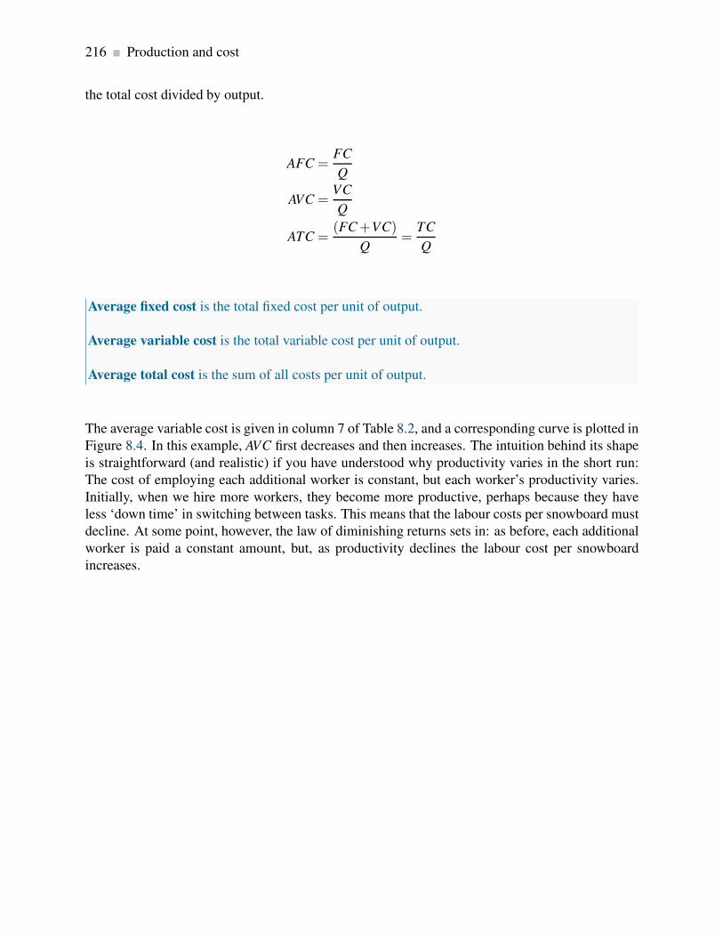
216 Production and cost
the total cost divided by output.
AFC =FC
Q
AVC =VC
Q
ATC =(FC+VC)
Q=
TC
Q
Average fixed cost is the total fixed cost per unit of output.
Average variable cost is the total variable cost per unit of output.
Average total cost is the sum of all costs per unit of output.
The average variable cost is given in column 7 of Table 8.2, and a corresponding curve is plotted in
Figure 8.4. In this example, AVC first decreases and then increases. The intuition behind its shape
is straightforward (and realistic) if you have understood why productivity varies in the short run:
The cost of employing each additional worker is constant, but each worker’s productivity varies.
Initially, when we hire more workers, they become more productive, perhaps because they have
less ‘down time’ in switching between tasks. This means that the labour costs per snowboard must
decline. At some point, however, the law of diminishing returns sets in: as before, each additional
worker is paid a constant amount, but, as productivity declines the labour cost per snowboard
increases.
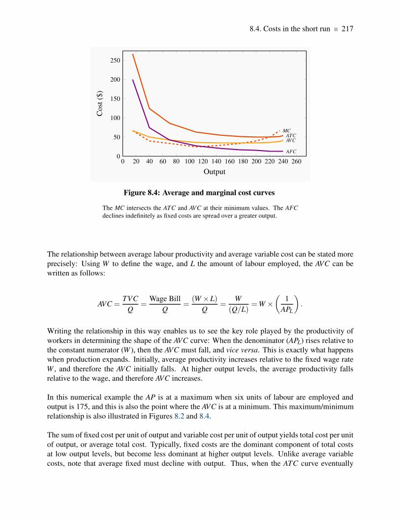
8.4. Costs in the short run 217
0 20 40 60 80 100 120 140 160 180 200 220 240 2600
50
100
150
200
250
ATCMC
AVC
AFC
Output
Co
st($
)
Figure 8.4: Average and marginal cost curves
The MC intersects the ATC and AVC at their minimum values. The AFC
declines indefinitely as fixed costs are spread over a greater output.
The relationship between average labour productivity and average variable cost can be stated more
precisely: Using W to define the wage, and L the amount of labour employed, the AVC can be
written as follows:
AVC =TVC
Q=
Wage Bill
Q=
(W ×L)
Q=
W
(Q/L)=W ×
(
1
APL
)
.
Writing the relationship in this way enables us to see the key role played by the productivity of
workers in determining the shape of the AVC curve: When the denominator (APL) rises relative to
the constant numerator (W ), then the AVC must fall, and vice versa. This is exactly what happens
when production expands. Initially, average productivity increases relative to the fixed wage rate
W , and therefore the AVC initially falls. At higher output levels, the average productivity falls
relative to the wage, and therefore AVC increases.
In this numerical example the AP is at a maximum when six units of labour are employed and
output is 175, and this is also the point where the AVC is at a minimum. This maximum/minimum
relationship is also illustrated in Figures 8.2 and 8.4.
The sum of fixed cost per unit of output and variable cost per unit of output yields total cost per unit
of output, or average total cost. Typically, fixed costs are the dominant component of total costs
at low output levels, but become less dominant at higher output levels. Unlike average variable
costs, note that average fixed must decline with output. Thus, when the ATC curve eventually

218 Production and cost
increases, it is because the increasing variable cost component eventually dominates the declining
AFC component. In our example, this occurs when output increases from of 220 units (8 workers)
to 235 (9 workers).
The marginal cost (MC) defines the cost of producing one more unit of output. In Table 8.2, the
marginal cost of output is given in the final column. It is the additional cost of production divided
by the additional number of units produced. For example, in going from 15 units of output to 40,
total costs increase from $4000 to $5000. The MC is therefore $1000/25 = $40. We could also
calculate the MC as the addition to variable costs rather than the addition to total costs, because
the addition to each is the same—fixed costs are fixed. Hence:
MC =∆TC
∆Q=
∆TVC
∆Q.
Marginal cost of production is the cost of producing each additional unit of output.
Just as the behaviour of the AVC curve is determined by the AP curve, so too the behaviour of the
MC is determined by the MP curve. When the MP of an additional worker exceeds the MP of
the previous worker, this implies that the cost of the additional output produced by the last worker
hired must be declining. The change in total cost of production that is associated with one more
worker (∆L) is the cost of that worker—his wage; and the change in output that this additional
worker produces, ∆Q, is his marginal product. Therefore:
MC =(W ×∆L)
∆Q=
W
MPL.
Consequently, with a constant wage, when the MPL of workers increases, the MC of output must
decline, and vice versa; That is, the MC curve falls whenever the MP curve rises, and rises when
the MP falls.
In our example, the MPL reaches a maximum when the fourth unit of labour is employed (or 110
units of output are produced), and this also is where the MC is at a minimum. It follows that the
marginal cost reaches a minimum at the output level where the MP reaches a maximum.
Finally, observe the interrelationship between the MC curve on the one hand and the ATC and AVC
on the other. Note from Figure 8.4 that the MC cuts the AVC and the ATC at the minimum point of
each of the latter. The logic behind this pattern is analogous to the logic of the relationship between
marginal and average product curves: When the cost of an additional unit of output is less than the
average, this reduces the average cost; whereas, if the cost of an additional unit of output is above
the average, this raises the average cost. This must hold true regardless of whether we relate the
MC to the ATC or the AVC.

8.5. Fixed costs and sunk costs 219
Notation: throughout this text we use two abbreviations for average total cost: ATC and AC denote
average total cost. The term ‘average cost’ is understood in economics to include both fixed and
variable costs.
8.5 Fixed costs and sunk costs
The distinction between fixed and variable costs is important for producers who encounter diffi-
culty in making a profit. If a producer has committed himself to setting up a plant, then he has
made a decision to incur a fixed cost. Having done this, he must now decide on a production
strategy that will maximize profit. However, the price that consumers are willing to pay may be
sufficient to yield a profit. So, if Black Diamond Snowboards cannot make a profit, should it shut
down? The answer is that if it can cover its variable costs, having already incurred its fixed costs,
it should stay in production. By covering the variable cost of its operation, Black Diamond is at
least earning some return. A sunk cost is a fixed cost that has already been incurred and cannot
be recovered. But if the pressures of the marketplace are so great that the total costs cannot be
covered in the longer run, then this is not a profitable business and the firm should close its doors.
Is a fixed cost always a sunk cost? Any production that involves capital will incur a fixed cost –
one not varying with the amount produced. Such capital can be financed in several ways however:
it might be financed on a very short term lease basis, or it might have been purchased by the
entrepreneur. If it is leased on a month to month basis, an entrepreneur who can only cover variable
costs can exit the industry quickly – by not renewing the lease on the capital. But an individual
who has actually purchased equipment that cannot readily be resold has essentially sunk money
into the fixed cost component of their production. This entrepreneur should continue to produce as
long as she can cover variable costs.
Sunk cost is a fixed cost that has already been incurred and cannot be recovered, even by produc-
ing a zero output.
In facing a possible shut down, we must also keep in mind the opportunity costs of running the
business. The owner pays himself a salary, and ultimately he must recognize that the survival of
the business should not depend upon his drawing a salary that is less than his opportunity cost. If
he underpays himself in order to avoid shutting down, he might be better off in the long run to
close the business and earn his opportunity cost elsewhere in the marketplace.

220 Production and cost
R & D as a sunk cost
Sunk costs in the modern era are frequently in the form of research and development costs, not the
cost of building a plant or purchasing machinery. The prototypical example is the pharmaceutical
industry, where it is becoming progressively more challenging to make new drug breakthroughs
– both because the ‘easier’ breakthroughs have already been made, and because it is necessary to
meet tighter safety conditions attached to new drugs. Research frequently leads to drugs that are
not sufficiently effective to meet their goal. As a consequence, the pharmaceutical sector regularly
writes off hundreds of millions of dollars of lost sunk costs – research and development that did
not yield sufficient fruit. This is a perfect example of a branch of a large firm essentially ‘closing
down’: anticipated revenues are not sufficient to cover total costs.
8.6 Long run production and costs
The snowboard manufacturer we portray produces a relatively low level of output; in reality, mil-
lions of snowboards are produced each year in the global market. Black Diamond Snowboards
may have hoped to get a start by going after a local market—the “free-ride” teenagers at Mont
Sainte Anne in Quebec or at Fernie in British Columbia. If this business takes off, the owner must
increase production, take the business out of his garage and set up a larger-scale operation. But
how will this affect his cost structure? Will he be able to produce boards at a lower cost than when
he was producing a very limited number of boards each season? Real-world experience would
indicate yes.
Production costs almost always decline when the scale of the operation initially increases. We
refer to this phenomenon simply as economies of scale. There are several reasons why scale
economies are encountered. One is that production flows can be organized in a more efficient
manner when more is being produced. Another is that the opportunity to make greater use of task
specialization presents itself; for example, Black Diamond Snowboards may be able to subdivide
tasks within the laminating and packaging stations. If scale economies do define the real world,
then a bigger plant—one that is geared to produce a higher level of output—should have an average
total cost curve that is “lower” than the cost curve corresponding to the smaller scale of operation
we considered in the example above.
Average costs in the long run
Figure 8.5 illustrates a possible relationship between the ATC curves for three different scales
of operation. ATC1 is the average total cost curve associated with a small-sized plant. ATC2 is
associated with a somewhat larger plant, and so forth. Obviously, the cost curves to the right
correspond to larger production facilities, given that output is measured on the horizontal axis. If

8.6. Long run production and costs 221
there are economies associated with a larger scale of operation, then the average costs associated
with producing larger outputs in a larger plant should be lower than the average costs associated
with lower outputs in a smaller plant, assuming that the plants are producing the output levels they
were designed to produce. For this reason, the cost curve ATC2 has a segment that is lower than
the lowest segment on ATC1. However, in Figure 8.5 the cost curve ATC3 has moved upwards.
What behaviours are implied here?
LATC
ATC1
ATC2
ATC3
Cost ($)
Quantity
Minimum efficientscale (MES)
Region of IRS Region of DRS
Figure 8.5: Long run and short run average costs
The long-run ATC curve, LATC, is the lower envelope of all short-run ATC
curves. It defines the least cost per unit of output when all inputs are vari-
able. Minimum efficient scale is that output level at which the LATC is a
minimum, indicating that further increases in the scale of production will
not reduce unit costs.
We propose that, beyond some large scale of operation, it becomes increasingly difficult to reap
further cost reductions from specialization, organizational economies, or marketing economies.
At such a point, the scale economies are effectively exhausted, and larger plant sizes no longer
give rise to lower ATC curves. Figure 8.5 implies that once we get to a production output that
plant size 2 is geared to produce, there are few further scale economies available. And, once we
move to producing a very high output (which requires a plant size corresponding to ATC3), we
are actually encountering diseconomies of scale. We stated above that scale economies reduce
unit costs. Correspondingly, diseconomies of scale imply that unit costs increase as a result of the
firm’s becoming too large: Perhaps co-ordination difficulties have set in at the very high output
levels, or quality-control monitoring costs have risen.
The terms increasing, constant, and decreasing returns to scale underlie the concepts of scale
economies and diseconomies: Increasing returns to scale (IRS) implies that, when all inputs are
increased by a given proportion, output increases more than proportionately. Constant returns to
scale (CRS) implies that output increases in direct proportion to an equal proportionate increase
in all inputs. Decreasing returns to scale (DRS) implies that an equal proportionate increase in all

222 Production and cost
inputs leads to a less than proportionate increase in output.
Increasing returns to scale implies that, when all inputs are increased by a given proportion,
output increases more than proportionately.
Constant returns to scale implies that output increases in direct proportion to an equal propor-
tionate increase in all inputs.
Decreasing returns to scale implies that an equal proportionate increase in all inputs leads to a
less than proportionate increase in output.
These are pure production function relationships, but, if the prices of inputs are fixed for producers,
they translate directly into the various cost structures illustrated in Figure 8.5. For example, if a
doubling of capital and Labour in BDS allows for better production flows than when in the smaller
plant, and therefore yields more than double the output, this implies that the cost per snowboard
produced must fall in the new plant. In contrast, if a doubling of inputs leads to less than a doubling
of outputs then the cost per snowboard must rise. Between these extremes, there is a range of
relatively constant unit costs, corresponding to where the production relation is subject to constant
returns to scale. In Figure 8.5, the falling unit costs output region has increasing returns to scale,
the region that has relatively constant unit costs has constant returns to scale, and the increasing
cost region has decreasing returns to scale.
Sectors with increasing returns
Increasing returns to scale characterize businesses with large initial costs and relatively low costs
of producing each unit of output. Computer chip manufacturers, pharmaceutical manufacturers,
even brewers all appear to benefit from scale economies. In the beer market, brewing, bottling
and shipping are all low cost operations relative to the capital cost of setting up a brewery. Con-
sequently we observe surprisingly few breweries in any given producer, even in large land mass
economies such as Canada or the US.
Large firms frequently encounter decreasing returns to scale. Figure 8.5 contains a curve that forms
an envelope around the bottom of the various short-run average cost curves. This envelope is the
long run average total cost (LATC) curve, because it defines average cost as we move from one
plant size to another. Remember that in the long run both labour and capital are variable, and, as we
move from one short-run average cost curve to another, that is exactly what happens—all factors
of production are variable. Hence, the collection of short-run cost curves in Figure 8.5 provides
the ingredients for a long-run average total cost curve1.
1Note that the long-run average total cost is not the collection of minimum points from each short-run average cost
curve. The envelope of the short-run curves will pick up mainly points that are not at the minimum, as you will see
if you try to draw the outcome. The intuition behind the definition is this: With increasing returns to scale, it may be
8.6. Long run production and costs 223
The CEO of Hewlett Packard announced in October 2012 that the company would reduce its
labour force by 29,000 workers (out of a total of 350,000). The problem was that communi-
cations within the company were so bad as to increase costs. In addition the company was
producing an excessive product variety – 2,100 variants of laser printer.
Application Box 8.1: Decreasing returns to scale
LATC =LTC
Q
Long-run average total cost is the lower envelope of all the short-run ATC curves.
The particular range of output on the LATC where it begins to flatten out is called the range of
minimum efficient scale. This is an important concept in industrial policy, as we shall see in later
chapters. At such an output level, the producer has expanded sufficiently to take advantage of
virtually all the scale economies available.
Minimum efficient scale defines a threshold size of operation such that scale economies are
almost exhausted.
Marginal costs in the long run
Just as there is a relationship between the marginal and average cost curves in the short run, there
is a complementary relationship between the two in the long run also. In the long run all costs are
variable. Hence, the long run marginal cost (LMC) is defined as the increment in cost associated
with producing one more unit of output when all inputs are adjusted in a cost minimizing manner.
LMC =∆LTC
∆Q
better to build a plant size that operates with some spare capacity than to build one that is geared to producing a smaller
output level. In building the larger plant, we can take greater advantage of the scale economies, and it may prove less
costly to produce in such a plant than to produce with a smaller plant that has less unused capacity and does not exploit
the underlying scale economies. Conversely, in the presence of decreasing returns to scale, it may be less costly to
produce output in a plant that is used “overtime” than to use a larger plant that suffers from scale diseconomies.

224 Production and cost
Long run marginal cost is the increment in cost associated with producing one more unit of
output when all inputs are adjusted in a cost minimizing manner.
Figure 8.6 illustrates a LMC curve where there are initially declining marginal costs, then constant
marginal costs and finally increasing marginal costs. The associated data are presented in Table 8.3.
This example has been constructed with three linear segments to the LMC curve in order to show
the relationship between returns to scale and long run marginal costs: the LATC still has a smooth
U shape, and intersects the LMC at the minimum of the LATC. The logic for this occurrence is
precisely as in the short run case: whenever the marginal cost is less than the average cost the latter
must fall, and conversely when the marginal cost is greater than the average cost.
0 200 400 600 800 1000 1200 1400 1600 1800 2000 22000
20
40
60
80 Long runmarginal
Long runaverage
Output
Co
st($
)
Figure 8.6: LMC and LAC with returns to scale
The LMC cuts the LAC at the minimum of the LAC.

8.7. Technological change and globalization 225
Output LMC LAC Scale
0 80 80.00
Increasing
returns to scale
100 72 76.00
200 64 72.00
300 56 68.00
400 48 64.00
500 40 60.00
600 40 56.67
700 40 54.29
800 40 52.50
900 40 51.11
1000 40 50.00
1100 44 49.27
1200 48 49.00
1300 52 49.08
1400 56 49.43
1500 60 50.00
1600 64 50.75
1700 68 51.65
1800 72 52.67
1900 76 53.79
2000 80 55.00
Decreasing
returns to scale
Table 8.3: Long run costs and returns to scale
8.7 Technological change and globalization
Technological change represents innovation that can reduce the cost of production or bring new
products on line. As stated earlier, the very long run is a period that is sufficiently long for new
technology to evolve and be implemented.

226 Production and cost
Technological change represents innovation that can reduce the cost of production or bring new
products on line.
Technological change has had an enormous impact on economic life for several centuries. It is
not something that is defined in terms of the recent telecommunications revolution. The industrial
revolution began in eighteenth century Britain. It was accompanied by a less well-recognized,
but equally important, agricultural revolution. The improvement in cultivation technology, and
ensuing higher yields, freed up enough labour to populate the factories that were the core of the
industrial revolution2. The development and spread of mechanical power dominated the nineteenth
century, and the mass production line of Henry Ford heralded in the twentieth century. The modern
communications revolution has reduced costs, just like its predecessors. But it has also greatly sped
up globalization, the increasing integration of national markets.
Globalization is the tendency for international markets to be ever more integrated.
Globalization has several drivers, the most important of which are lower transportation and com-
munication costs, reduced barriers to trade and capital mobility, and the spread of new technologies
that facilitate cost and quality control. New technology and better communications have been criti-
cal in both increasing the minimum efficient scale of operation and reducing diseconomies of scale;
they facilitate the efficient management of large companies.
The continued reduction in trade barriers in the post-World War II era has also meant that the
effective marketplace has become the globe rather than the national economy for many prod-
ucts. Companies like Apple, Microsoft, Nokia, and Dell are visible worldwide. Globalization
has been accompanied by the collapse of the Soviet Union, the adoption of an outward looking
philosophy on the part of China, and an increasing role for the market place in India. These devel-
opments together have facilitated the outsourcing of much of the West’s manufacturing to lower
wage economies.
But new technology not only helps existing companies grow large; it also enables new ones to
start up. It is now cheaper for small producers to manage their inventories and maintain contact
with their own suppliers. Contrary to what is often claimed, new technology has not led to a
greater concentration of the economy’s output in the hands of a small number of big producers; the
competitive forces that the new technology has unleashed are too strong.
2Two English farmers changed the lives of millions in the 18th century through their technological genius. The first
was Charles Townsend, who introduced the concept of crop rotation. He realized that continual use of soil for a single
purpose drained the land of key nutrients. This led him ultimately to propose a five-year rotation that included tillage,
vegetables, and sheep. This rotation reduced the time during which land would lie fallow, and therefore increased the
productivity of land. A second game-changing technological innovation saw the introduction of the seed plough, a
tool that facilitated seed sowing in rows, rather than scattering it randomly. This line sowing meant that weeds could
be controlled more easily—weeds that would otherwise smother much of the crop. The genius here was a gentleman
by the name of Jethro Tull.

8.8. Clusters, learning by doing, scope economies 227
The impact of technology on our cost curves is illustrated in Figure 8.7. It both reduces the whole
cost structure of production, and at the same time increases the minimum efficient scale.
LACpre-technologicalchange
LACpost-technologicalchange
Cost ($)
Output
MES increases
Figure 8.7: Technological change and LAC
Technological change reduces the unit production cost for any output pro-
duced and may also increase the minimum efficient scale (MES) threshold
8.8 Clusters, learning by doing, scope economies
Clusters
The phenomenon of a grouping of firms that specialize in producing related products is called a
cluster. For example, Ottawa has more than its share of software development firms; Montreal has
a disproportionate share of Canada’s pharmaceutical producers and electronic game developers;
Calgary has its ‘oil patch’; Hollywood has movies; Toronto is Canada’s financial capital. Provincial
capitals have most of their province’s bureaucracy. Clusters give rise to externalities, frequently in
the form of ideas that flow between firms, which in turn result in cost reductions and new products.
Cluster: a group of firms producing similar products, or engaged in similar research.
The most famous example of clustering is Silicone Valley in California, the original high-tech
cluster. The presence of a large group of firms with a common focus serves as a signal to workers
with the complementary skill set that they are in demand in such a region. Furthermore, if these
clusters are research oriented, as they frequently are, then knowledge spillovers benefit virtually
all of the contiguous firms; when workers change employers, they bring their previously-learned

228 Production and cost
skills with them; on social occasions, friends may chat about their work and interests and share
ideas. This is a positive externality.
Learning by doing
Learning from production-related experiences frequently reduces costs: The accumulation of knowl-
edge that is associated with having produced a large volume of output over a considerable time
period enables managers to implement more efficient production methods and avoid errors. We
give the term learning by doing to this accumulation of knowledge.
Examples abound, but the best known may be the continual improvement in the capacity of com-
puter chips, whose efficiency has doubled about every eighteen months for several decades – a
phenomenon known as Moore’s Law. Past experience is key: learning can be a facilitator in eco-
nomic growth on a national scale. Japan, Korea and Taiwan learned from the West in the seventies
and eighties. The phenomenal economic growth of China and India today is made possible by
existing knowledge.
Learning by doing can reduce costs. A longer history of production enables firms to accumulate
knowledge and thereby implement more efficient production processes.
Economies of scope
Economies of scope refers to the possibility that it may be less expensive to produce and sell a line
of related goods than to produce just one product from such a line. Scope economies, therefore,
define the returns or cost reductions associated with broadening a firm’s product range.
Corporations like Proctor and Gamble do not produce a single product in their health line; rather,
they produce first aid, dental care, and baby care products. Cable companies offer their customers
TV, high-speed Internet, and voice-over telephone services either individually or packaged.
Economies of scope occur if the unit cost of producing particular products is less when combined
with the production of other products than when produced alone.

Key Terms 229
KEY TERMS
Production function: a technological relationship that specifies how much output can be
produced with specific amounts of inputs.
Technological efficiency means that the maximum output is produced with the given set of
inputs.
Economic efficiency defines a production structure that produces output at least cost.
Short run: a period during which at least one factor of production is fixed. If capital is fixed,
then more output is produced by using additional labour.
Long run: a period of time that is sufficient to enable all factors of production to be adjusted.
Very long run: a period sufficiently long for new technology to develop.
Total product is the relationship between total output produced and the number of workers
employed, for a given amount of capital.
Marginal product of labour is the addition to output produced by each additional worker. It
is also the slope of the total product curve.
Law of diminishing returns: when increments of a variable factor (labour) are added to
a fixed amount of another factor (capital), the marginal product of the variable factor must
eventually decline.
Average product of labour is the number of units of output produced per unit of labour at
different levels of employment.
Fixed costs are costs that are independent of the level of output.
Variable costs are related to the output produced.
Total cost is the sum of fixed cost and variable cost.
Average fixed cost is the total fixed cost per unit of output.
Average variable cost is the total variable cost per unit of output.
Average total cost is the sum of all costs per unit of output.
230 KEY TERMS
Marginal cost of production is the cost of producing each additional unit of output.
Sunk cost is a fixed cost that has already been incurred and cannot be recovered, even by
producing a zero output.
Increasing returns to scale implies that, when all inputs are increased by a given proportion,
output increases more than proportionately.
Constant returns to scale implies that output increases in direct proportion to an equal pro-
portionate increase in all inputs.
Decreasing returns to scale implies that an equal proportionate increase in all inputs leads to
a less than proportionate increase in output.
Long-run average total cost is the lower envelope of all the short-run ATC curves.
Minimum efficient scale defines a threshold size of operation such that scale economies are
almost exhausted.
Long run marginal cost is the increment in cost associated with producing one more unit of
output when all inputs are adjusted in a cost minimizing manner.
Technological change represents innovation that can reduce the cost of production or bring
new products on line.
Globalization is the tendency for international markets to be ever more integrated.
Cluster: a group of firms producing similar products, or engaged in similar research.
Learning by doing can reduce costs. A longer history of production enables firms to accumu-
late knowledge and thereby implement more efficient production processes.
Economies of scope occur if the unit cost of producing particular products is less when com-
bined with the production of other products than when produced alone.
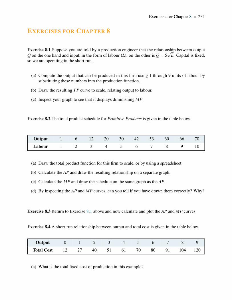
Exercises for Chapter 8 231
EXERCISES FOR CHAPTER 8
Exercise 8.1 Suppose you are told by a production engineer that the relationship between output
Q on the one hand and input, in the form of labour (L), on the other is Q = 5√
L. Capital is fixed,
so we are operating in the short run.
(a) Compute the output that can be produced in this firm using 1 through 9 units of labour by
substituting these numbers into the production function.
(b) Draw the resulting T P curve to scale, relating output to labour.
(c) Inspect your graph to see that it displays diminishing MP.
Exercise 8.2 The total product schedule for Primitive Products is given in the table below.
Output 1 6 12 20 30 42 53 60 66 70
Labour 1 2 3 4 5 6 7 8 9 10
(a) Draw the total product function for this firm to scale, or by using a spreadsheet.
(b) Calculate the AP and draw the resulting relationship on a separate graph.
(c) Calculate the MP and draw the schedule on the same graph as the AP.
(d) By inspecting the AP and MP curves, can you tell if you have drawn them correctly? Why?
Exercise 8.3 Return to Exercise 8.1 above and now calculate and plot the AP and MP curves.
Exercise 8.4 A short-run relationship between output and total cost is given in the table below.
Output 0 1 2 3 4 5 6 7 8 9
Total Cost 12 27 40 51 61 70 80 91 104 120
(a) What is the total fixed cost of production in this example?
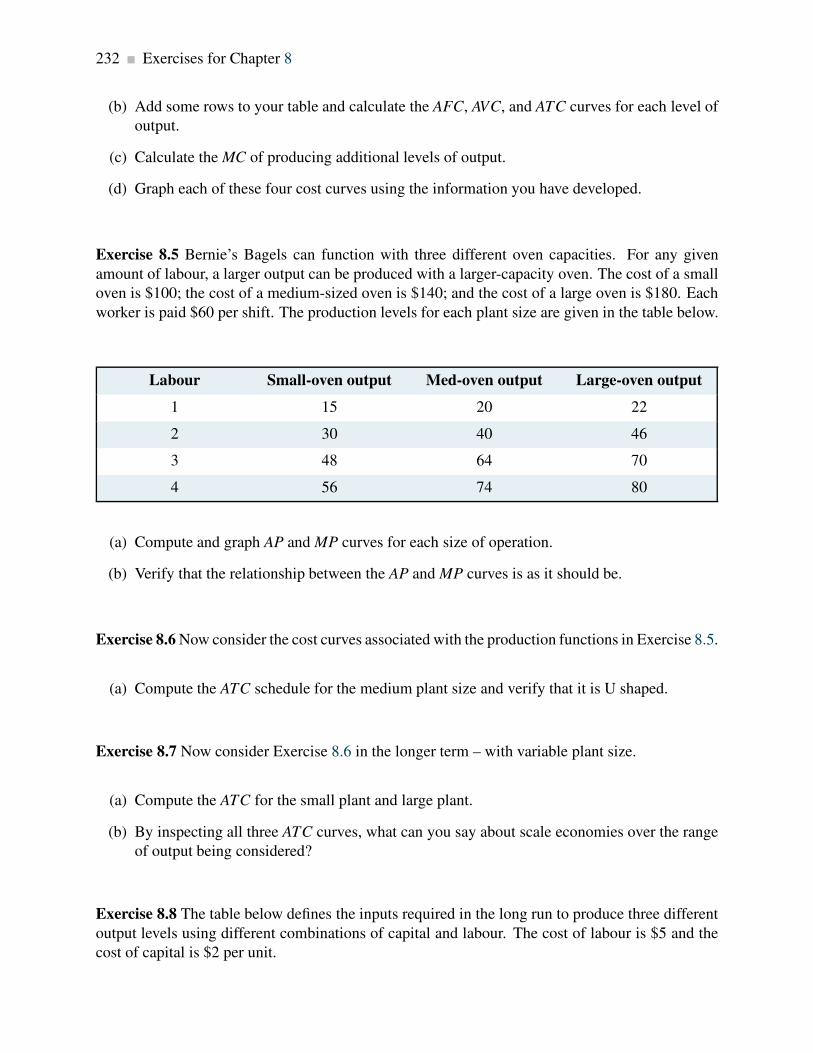
232 Exercises for Chapter 8
(b) Add some rows to your table and calculate the AFC, AVC, and ATC curves for each level of
output.
(c) Calculate the MC of producing additional levels of output.
(d) Graph each of these four cost curves using the information you have developed.
Exercise 8.5 Bernie’s Bagels can function with three different oven capacities. For any given
amount of labour, a larger output can be produced with a larger-capacity oven. The cost of a small
oven is $100; the cost of a medium-sized oven is $140; and the cost of a large oven is $180. Each
worker is paid $60 per shift. The production levels for each plant size are given in the table below.
Labour Small-oven output Med-oven output Large-oven output
1 15 20 22
2 30 40 46
3 48 64 70
4 56 74 80
(a) Compute and graph AP and MP curves for each size of operation.
(b) Verify that the relationship between the AP and MP curves is as it should be.
Exercise 8.6 Now consider the cost curves associated with the production functions in Exercise 8.5.
(a) Compute the ATC schedule for the medium plant size and verify that it is U shaped.
Exercise 8.7 Now consider Exercise 8.6 in the longer term – with variable plant size.
(a) Compute the ATC for the small plant and large plant.
(b) By inspecting all three ATC curves, what can you say about scale economies over the range
of output being considered?
Exercise 8.8 The table below defines the inputs required in the long run to produce three different
output levels using different combinations of capital and labour. The cost of labour is $5 and the
cost of capital is $2 per unit.

Exercises for Chapter 8 233
Capital used 4 2 7 4 11 8
Labour used 5 6 10 12 15 16
Output 4 4 8 8 12 12
(a) Calculate the least-cost method of producing each of the three levels of output defined in the
bottom row.
(b) On a graph with cost on the vertical axis and output on the horizontal axis, plot the relation-
ship you have calculated in (a) between cost per unit and output. You have now plotted the
long-run average cost.
Exercise 8.9 Suppose now that the cost of capital in Exercise 8.8 rises to $3 per unit. Graph the
new long-run average cost curve, and compare its position with the curve in that question.
Exercise 8.10 Consider the long-run total cost structure for the following two firms.
Output 1 2 3 4 5 6 7
Firm A $40 $52 $65 $80 $97 $119 $144
Firm B $30 $40 $50 $60 $70 $80 $90
(a) Compute the long-run ATC curve for each firm.
(b) Plot these curves and examine the type of scale economies each firm experiences at different
output levels.
Exercise 8.11 Use the data in Exercise 8.10 to establish the LMC for each of these two firms.
(a) Check that these LMC curves intersect with the LAC curves appropriately.
Exercise 8.12 Consider a firm whose ATC (in the short run) is given by: ATC = 2/q+1+q/8.
(a) Using a spreadsheet plot this curve for values of output in the range 1. . . 20. You should first
compute the cost values in a table.
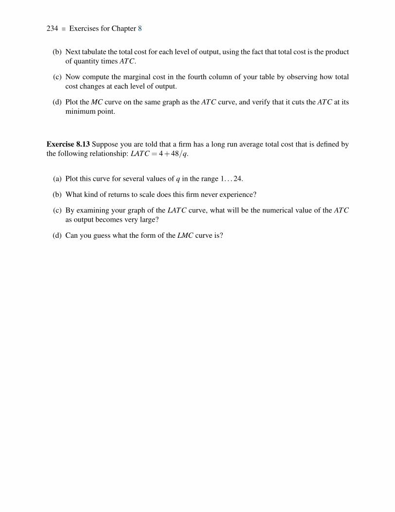
234 Exercises for Chapter 8
(b) Next tabulate the total cost for each level of output, using the fact that total cost is the product
of quantity times ATC.
(c) Now compute the marginal cost in the fourth column of your table by observing how total
cost changes at each level of output.
(d) Plot the MC curve on the same graph as the ATC curve, and verify that it cuts the ATC at its
minimum point.
Exercise 8.13 Suppose you are told that a firm has a long run average total cost that is defined by
the following relationship: LATC = 4+48/q.
(a) Plot this curve for several values of q in the range 1. . . 24.
(b) What kind of returns to scale does this firm never experience?
(c) By examining your graph of the LATC curve, what will be the numerical value of the ATC
as output becomes very large?
(d) Can you guess what the form of the LMC curve is?

Part FourMarket Structures
9. Perfect competition
10. Monopoly
11. Imperfect competition
Markets are all around us and they come in many forms. Some are on-line, others are physical.
Some involves goods such as food and vehicles; others involve health provision or financial advice.
Markets differ also by the degree of competition associated with each. For example the wholesale
egg market is very homogeneous in that the product has minimal variation. The restaurant market
offers food, but product variation is high – restaurants specialize in foods with specific ethnic or
geographic origins for example. So an Italian restaurant differs from a Thai restaurant even though
they both serve food.
In contrast to the egg and restaurant market, which tend to have very many suppliers and furnish
products that are strongly related, many other markets are characterized by just a few suppliers or
in some cases just one. For example, passenger train services may have just a single supplier, and
this supplier is therefore a monopolist. Pharmaceuticals tend to be supplied by a limited number
of large international corporations plus a group of generic drug manufacturers. Passenger aircraft
used by international airlines are all produced by just a handful of builders.
In this part we examine the reasons why markets take on different forms and display a variety of
patterns of behaviour. We delve into the working of each market structure to understand why these
markets retain their structure.


Chapter 9
Perfect competition
In this chapter we will explore:
9.1 The competitive marketplace
9.2 Market characteristics
9.3 Supply in the short run
9.4 Dynamics: entry and exit
9.5 Industry supply in the long run
9.6 Globalization and technological change
9.7 Perfect competition and market efficiency
9.1 The perfect competition paradigm
The essence of a competitive market is that it permits competition on the part of a large number of
suppliers. Each supplier produces an output that forms a small part of the total market, and the sum
of all of these individual outputs represents the production of that sector of the economy. Right
off we might think of florists, barber shops or corner stores as enterprises that live in a competitive
environment.
At the other extreme, a market that has just a single supplier is a monopolist. For example, Via Rail
is the only supplier of passenger rail services between Windsor, Ontario and the city of Quebec.
We have used the word ‘paradigm’ in the title to this section, and for good reason: we will develop
once again a model of supply behaviour for a market in which there are many small suppliers,
producing essentially the same product, competing with one-another to meet the demands of con-
sumers.
The structures that we call perfect competition and monopoly are extremes in the market place.
Most sectors of the economy lie somewhere between these limiting cases. For example, the market
for internet services usually contains several providers in any area – some provide using a fibre
237

238 Perfect competition
cable, others by satellite. The market for smart-phones is dominated by two major players –
Apple and Samsung. Hence, while these markets that have a limited number of suppliers are
competitive in that they freely and fiercely compete for the buyer’s expenditure, these are not
perfectly competitive markets, because they do not have a very large number of suppliers.
A perfectly competitive industry is one in which many suppliers, producing an identical product,
face many buyers, and no one participant can influence the market.
In all of the models we develop in this chapter we will assume that the objective of firms is to
maximize profit – the difference between revenues and costs.
Profit maximization is the goal of competitive suppliers – they seek to maximize the difference
between revenues and costs.
The presence of so many sellers in perfect competition means that each firm recognizes its own
small size in relation to the total market, and that its actions have no perceptible impact on the
market price for the good or service being traded. Each firm is therefore a price taker—in contrast
to a monopolist, who is a price setter.
The same “smallness” characteristic was assumed when we examined the demands of individuals
earlier. Each buyer takes the price as given. He or she is not big enough to be able to influence
the price. So while customers do not engage in bargaining when they go to the corner store to
buy bread or milk, Emirate Airlines engages in price negotiations when purchasing aircraft from
Airbus. The model underlying these types of transactions is examined in Chapter 11.
So when we describe a market as being perfectly competitive we do not mean that other forms
of market are not competitive. All market structure are competitive in the sense that the suppliers
wish to make profit and they produce as efficiently as possible in order to meet that goal.
9.2 Market characteristics
The key attributes of a perfectly competitive market are the following:
1. There must be many firms, each one small and powerless relative to the entire industry.
2. The product must be standardized. Barber shops offer a standard product, but a Lexus differs
from a Ford. Barbers tend to be price takers, but Lexus does not charge the same price as
Ford, and is a price setter.
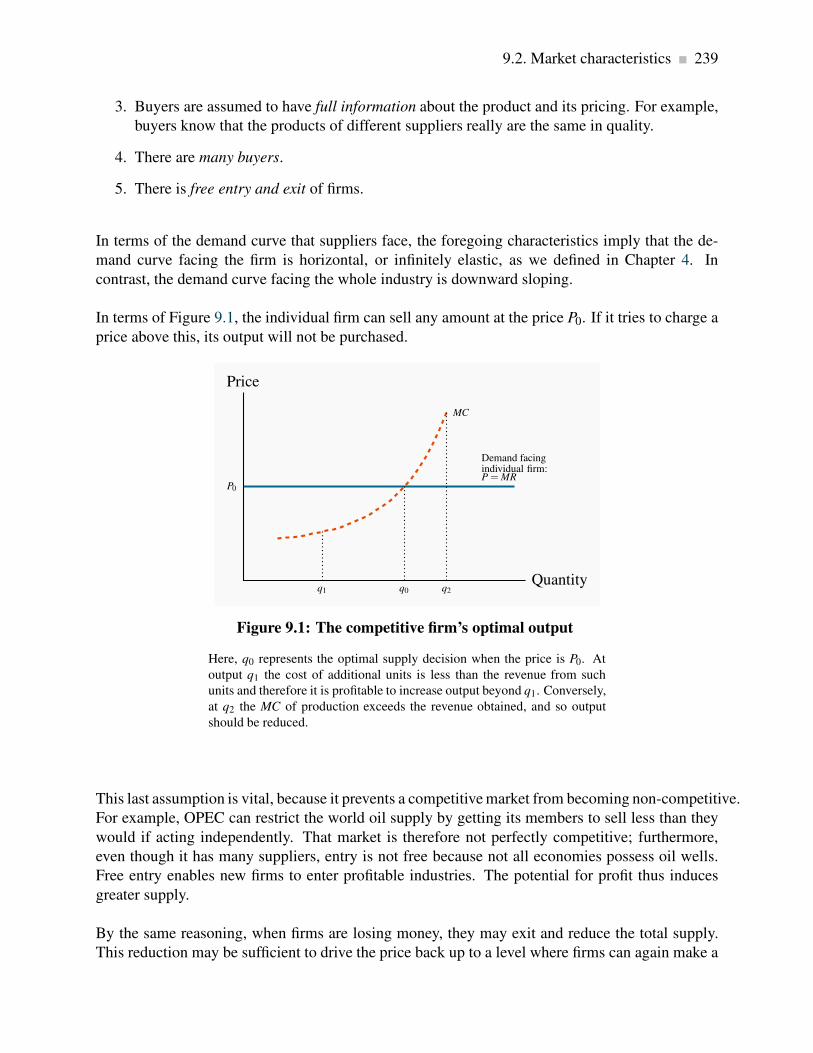
9.2. Market characteristics 239
3. Buyers are assumed to have full information about the product and its pricing. For example,
buyers know that the products of different suppliers really are the same in quality.
4. There are many buyers.
5. There is free entry and exit of firms.
In terms of the demand curve that suppliers face, the foregoing characteristics imply that the de-
mand curve facing the firm is horizontal, or infinitely elastic, as we defined in Chapter 4. In
contrast, the demand curve facing the whole industry is downward sloping.
In terms of Figure 9.1, the individual firm can sell any amount at the price P0. If it tries to charge a
price above this, its output will not be purchased.
MC
P0
Demand facingindividual firm:P = MR
Price
Quantityq0q1 q2
Figure 9.1: The competitive firm’s optimal output
Here, q0 represents the optimal supply decision when the price is P0. At
output q1 the cost of additional units is less than the revenue from such
units and therefore it is profitable to increase output beyond q1. Conversely,
at q2 the MC of production exceeds the revenue obtained, and so output
should be reduced.
This last assumption is vital, because it prevents a competitive market from becoming non-competitive.
For example, OPEC can restrict the world oil supply by getting its members to sell less than they
would if acting independently. That market is therefore not perfectly competitive; furthermore,
even though it has many suppliers, entry is not free because not all economies possess oil wells.
Free entry enables new firms to enter profitable industries. The potential for profit thus induces
greater supply.
By the same reasoning, when firms are losing money, they may exit and reduce the total supply.
This reduction may be sufficient to drive the price back up to a level where firms can again make a

240 Perfect competition
profit that is sufficient to induce them to continue producing. Entry and exit are thus essential parts
of the dynamic in perfect competition.
9.3 The firm’s supply decision
The concept of marginal revenue is key to analyzing the supply decision of an individual firm. We
have used marginal analysis at several points to date. In consumer theory, we saw how consumers
balance the utility per dollar at the margin in allocating their budget. Marginal revenue is the
additional revenue accruing to the firm from the sale of one more unit of output.
Marginal revenue is the additional revenue accruing to the firm resulting from the sale of one
more unit of output.
In perfect competition, a firm’s marginal revenue (MR) is the price of the good. Since the price
is constant for the individual supplier, each additional unit sold at the price P brings in the same
additional revenue. Therefore, P = MR. This equality holds in no other market structure, as we
shall see in the following chapters.
Supply in the short run
Each firm’s plant size is fixed in the short run, so too is the number of firms in an industry. In the
long run, each individual firm can change its scale of operation, and at the same time new firms
can enter or existing firms can leave the industry.
The short run is a period during which the number of firms and their plant sizes are fixed.
The long run is a sufficiently long period of time to permit entry and exit and for firms to change
their plant size.
Perfectly competitive suppliers face the choice of how much to produce at the going market price:
that is, the amount that will maximize their profit. We abstract for the moment on how the price
in the marketplace is determined. We shall see later in this chapter that it emerges as the value
corresponding to the intersection of the supply and demand curves for the whole market – much as
described in Chapter 3.
The firm’s MC curve is critical in defining the optimal amount to supply at any price. In Figure 9.1,
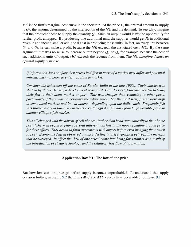
9.3. The firm’s supply decision 241
MC is the firm’s marginal cost curve in the short run. At the price P0 the optimal amount to supply
is Q0, the amount determined by the intersection of the MC and the demand. To see why, imagine
that the producer chose to supply the quantity Q1. Such an output would leave the opportunity for
further profit untapped. By producing one additional unit, the supplier would get P0 in additional
revenue and incur a smaller additional cost in producing those units. In fact, on every unit between
Q1 and Q0 he can make a profit, because the MR exceeds the associated cost, MC. By the same
argument, it makes no sense to increase output beyond Q0, to Q2 for example, because the cost of
such additional units of output, MC, exceeds the revenue from them. The MC therefore defines an
optimal supply response.
If information does not flow then prices in different parts of a market may differ and potential
entrants may not know to enter a profitable market.
Consider the fishermen off the coast of Kerala, India in the late 1990s. Their market was
studied by Robert Jensen, a development economist. Prior to 1997, fishermen tended to bring
their fish to their home market or port. This was cheaper than venturing to other ports,
particularly if there was no certainty regarding price. For the most part, prices were high
in some local markets and low in others – depending upon the daily catch. Frequently fish
was thrown away in low-price markets even though it might have found a favourable price in
another village’s fish market.
This all changed with the advent of cell phones. Rather than head automatically to their home
port, fishermen began to phone several different markets in the hope of finding a good price
for their efforts. They began to form agreements with buyers before even bringing their catch
to port. Economist Jensen observed a major decline in price variation between the markets
that he surveyed. In effect the ‘law of one price’ came into being for sardines as a result of
the introduction of cheap technology and the relatively free flow of information.
Application Box 9.1: The law of one price
But how low can the price go before supply becomes unprofitable? To understand the supply
decision further, in Figure 9.2 the firm’s AVC and ATC curves have been added to Figure 9.1.
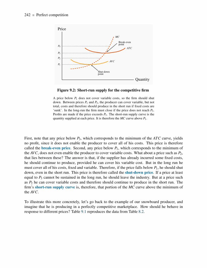
242 Perfect competition
MC
AVC
ATC
Price
Quantity
P1
P3
P2
P4
Shut-downpoint
Break-evenpoint
Figure 9.2: Short-run supply for the competitive firm
A price below P1 does not cover variable costs, so the firm should shut
down. Between prices P1 and P3, the producer can cover variable, but not
total, costs and therefore should produce in the short run if fixed costs are
‘sunk’. In the long-run the firm must close if the price does not reach P3.
Profits are made if the price exceeds P3. The short-run supply curve is the
quantity supplied at each price. It is therefore the MC curve above P1.
First, note that any price below P3, which corresponds to the minimum of the ATC curve, yields
no profit, since it does not enable the producer to cover all of his costs. This price is therefore
called the break-even price. Second, any price below P1, which corresponds to the minimum of
the AVC, does not even enable the producer to cover variable costs. What about a price such as P2,
that lies between these? The answer is that, if the supplier has already incurred some fixed costs,
he should continue to produce, provided he can cover his variable cost. But in the long run he
must cover all of his costs, fixed and variable. Therefore, if the price falls below P1, he should shut
down, even in the short run. This price is therefore called the shut-down price. If a price at least
equal to P3 cannot be sustained in the long run, he should leave the industry. But at a price such
as P2 he can cover variable costs and therefore should continue to produce in the short run. The
firm’s short-run supply curve is, therefore, that portion of the MC curve above the minimum of
the AVC.
To illustrate this more concretely, let’s go back to the example of our snowboard producer, and
imagine that he is producing in a perfectly competitive marketplace. How should he behave in
response to different prices? Table 9.1 reproduces the data from Table 8.2.

9.3. The firm’s supply decision 243
Labour Output Total Average Average Marginal Total Production
Revenue $ Variable Total Cost Cost $ Cost $ Decision
Cost $
L Q TR AVC ATC MC TC
0 0
No production where P
< min AVC
1 15 1,050 66.7 266.7 266.7 4,000
2 40 2,800 50.0 125.0 40.0 5,000
3 70 4,900 42.9 85.7 33.3 6,000
4 110 7,700 36.4 63.6 25.0 7,000
5 145 10,150 34.5 55.2 28.6 8,000
6 175 12,250 34.3 51.4 33.3 9,000 Min AVC
7 200 14,000 35.0 50.0 40.0 10,000 Price covers AVC, not
ATC
8 220 15,400 36.4 50.0 50.0 11,000
9 235 16,450 38.3 51.1 66.7 12,000
10 240 16,800 41.7 54.2 200.0 13,000
Profit where P > min
ATC, and supply where
P = MC
Table 9.1: Profit maximization in the short run
Output Price=$70; Wage=$1,000; Fixed Cost=$3,000
The shut-down price corresponds to the minimum value of the AVC curve.
The break-even price corresponds to the minimum of the ATC curve.
The firm’s short-run supply curve is that portion of the MC curve above the minimum of the
AVC.
Suppose that the price is $70. How many boards should he produce? The answer is defined by the
behaviour of the MC curve. For any output less than or equal to 235, the MC is less than the price.
For example, at L = 9 and Q = 235, the MC is $66.7. At this output level, he makes a profit on the
marginal unit produced, because the MC is less than the revenue he gets from selling it.
But, at outputs above this, he registers a loss on the marginal units because the MC exceeds the
revenue. For example, at L = 10 and Q = 240, the MC is $200. Clearly, 235 snowboards is the
optimum. To produce more would generate a loss on each additional unit, because the additional
cost would exceed the additional revenue. Furthermore, to produce fewer snowboards would mean
not availing of the potential for profit on additional boards.
244 Perfect competition
His profit is based on the difference between revenue per unit and cost per unit at this output:
(P−ATC). Since the ATC for the 235 units produced by the nine workers is $51.1, his profit
margin is $70 - $51.1 = $18.9 per board, and total profit is therefore 235 × $18.9 = $4441.5.
Let us establish two other key outputs and prices for the producer. First, the shut-down point is
the minimum of his AVC curve. Table 9.1 tells us that the price must be at least $34.3 for him to
be willing to supply any output, since that is the value of the AVC at its minimum. Second, the
minimum of his ATC is at $50. Accordingly, provided the price exceeds $50, he will cover both
variable and fixed costs and make a maximum profit when he chooses an output where P = MC,
above P = $50. Finally we can specify the short run supply curve for Black Diamond Snowboards:
it is the segment of the MC curve in Figure 8.4 above the AVC curve.
Given that we have developed the individual firm’s supply curve, the next task is to develop the
industry supply curve.
Industry supply in the short run
In Chapter 3 it was demonstrated that individual demands can be aggregated into an industry
demand by summing them horizontally. The industry supply is obtained in exactly the same
manner—by summing the firms’ supply quantities across all firms in the industry.
To illustrate, imagine we have many firms, possibly operating at different scales of output and
therefore having different short-run MC curves. The MC curves of two of these firms are illustrated
in Figure 9.3. The MC of A is below the MC of B; therefore, B likely has a smaller scale of plant
than A. Consider first the supply decisions in the price range P1 to P2. At any price between these
limits, only firm A will supply output – firm B does not cover its AVC in this price range. Therefore,
the joint contribution to industry supply of firms A and B is given by the MC curve of firm A. But
once a price of P2 is attained, firm B is now willing to supply. The Ssum schedule is the horizontal
addition of their supply quantities. Adding the supplies of every firm in the industry in this way
yields the industry supply.

9.3. The firm’s supply decision 245
P1
P2Ssum = SA +SB=market supply
S B=
MCB
S A=
MCA
Price
Quantity
Figure 9.3: Deriving industry supply
At any price below P1 production is unprofitable and supply is therefore zero
for both firms. At prices between P1 and P2 firm A is willing to supply, but
not firm B. Consequently the market supply comes only from A. At prices
above P2 both firms are willing to supply. Therefore the market supply is
the horizontal sum of each firm’s supply.
Industry supply (short run) in perfect competition is the horizontal sum of all firms’ supply
curves.
Short run equilibrium in perfect competition occurs when each firm maximizes profit by pro-
ducing a quantity where P = MC.
Industry equilibrium
Consider next the industry equilibrium. Since the industry supply is the sum of the individual
supplies, and the industry demand curve is the sum of individual demands, an equilibrium price and
quantity (PE ,QE) are defined by the intersection of these industry-level curves, as in Figure 9.4.
Here, each firm takes PE as given (it is so small that it cannot influence the going price), and
supplies an amount determined by the intersection of this price with its MC curve. The sum of
such quantities is therefore QE .

246 Perfect competition
S=Sum of firmMC curves
D=Sum ofindividual demands
Price
Quantity
PE
QE
Figure 9.4: Market equilibrium
The market supply curve S is the sum of each firm’s supply or MC curve
above the shut-down price. D is the sum of individual demands. The market
equilibrium price and quantity are defined by PE and QE .
9.4 Dynamics: entry and exit
We have now described the market and firm-level equilibrium in the short run. However, this
equilibrium may be only temporary; whether it can be sustained or not depends upon whether
profits (or losses) are being incurred, or whether all participant firms are making what are termed
normal profits. Such profits are considered an essential part of a firm’s operation. They reflect
the opportunity cost of the resources used in production. Firms do not operate if they cannot
make a minimal, or normal, profit level. Above such profits are economic profits (also called
supernormal profits), and these are what entice entry into the industry.
Economists and accountants measure profits differently. Accounting profits are the difference
between revenues and costs incurred. But an economist is interested additionally in the opportunity
cost of the resources used in production. To illustrate: suppose the owner of BDS is paying himself
a salary of thirty thousand dollars a year. This is an explicit cost that enters the firm’s books, and
is the cost that an accountant will use to reflect the cost of management services to the firm. But
if the owner could earn seventy thousand dollars a year as a ski and snowboard resort manager,
then by staying in his manufacturing business he is giving up the opportunity to earn his real value
in the marketplace. Obviously he would be unwise to continue in the low paying job indefinitely,
even though he may be willing to take a lower salary in order to get his firm established.
The critical point in this distinction between accounting and economic cost is that the decision
to enter or leave a market in the longer term is based on what the inputs in the firm can earn

9.4. Dynamics: entry and exit 247
in the market place. That is, economic profits rather than accounting profits will determine the
equilibrium number of firms in the long term.
Normal profits are required to induce suppliers to supply their goods and services. They reflect
opportunity costs and can therefore be considered as a type of cost component.
Economic (supernormal) profits are those profits above normal profits that induce firms to enter
an industry. Economic profits are based on the opportunity cost of the resources used in produc-
tion.
Accounting profits are the difference between revenues and actual costs incurred.
Let us begin by supposing that the market equilibrium described in Figure 9.4 results in profits
being made by some firms. Such an outcome is described in Figure 9.5, where the price is more
than sufficient to cover ATC. At the price PE , a profit-making firm supplies the quantity QE , as
determined by its MC curve. On average, the cost of producing each unit of output, QE , is defined
by the point on the ATC at that output level, point k. Profit per unit is thus given by the value mk –
the difference between revenue per unit and cost per unit. Total (economic) profit is therefore the
area PEmkh, which is quantity times profit per unit.
MC
AVC
ATC
Price
0 Quantity
PE
m
QE
hk
Figure 9.5: Short-run profits for the firm
At the price PE , determined by the intersection of market demand and mar-
ket supply, an individual firm produces the amount QE . The ATC of this
output is k and therefore profit per unit is mk. Total profit is therefore
PEmkh= 0QE×mk= T R−TC.
While QE represents an equilibrium for the firm, it is only a short-run or temporary equilibrium for
the industry. The assumption of free entry and exit implies that the presence of economic profits

248 Perfect competition
will induce new entrepreneurs to set up shop and start producing. The impact of this dynamic
is illustrated in Figure 9.6. An increased number of firms shifts supply rightwards to become S′,
thereby increasing the amount supplied at any price. The impact on price of this supply shift is
evident: With an unchanged demand, the equilibrium price must fall.
S=Sum of existingfirms’ MC curves
S′=Sum of new and existingfirms’ MC curves
D
Price
Quantity
PE
QE
P′
Q′
Figure 9.6: Entry of firms due to economic profits
If economic profits result from the price PE new firms enter the industry.
This entry increases the market supply to S′ and the equilibrium price falls
to P′. Entry continues as long as economic profits are present. Eventually
the price is driven to a level where only normal profits are made, and entry
ceases.
How far will the price fall, and how many new firms will enter this profitable industry? As long
as economic profits exist new firms will enter and the resulting increase in supply will continue to
drive the price downwards. But, once the price has been driven down to the minimum of the ATC
of a representative firm, there is no longer an incentive for new entrepreneurs to enter. Therefore,
the long-run industry equilibrium is where the market price equals the minimum point of a firm’s
ATC curve. This generates normal profits, and there is no incentive for firms to enter or exit.
A long-run equilibrium in a competitive industry requires a price equal to the minimum point of
a firm’s ATC. At this point, only normal profits exist, and there is no incentive for firms to enter
or exit.
In developing this dynamic, we began with a situation in which economic profits were present.
However, we could have equally started from a position of losses. With a market price between the
minimum of the AVC and the minimum of the ATC in Figure 9.5, revenues per unit would exceed
costs per unit. When firms cannot cover their ATC in the long run, they will cease production. Such
closures must reduce aggregate supply; consequently the market supply curve contracts, rather than

9.5. Long run industry supply 249
expands as it did in Figure 9.6. The reduced supply drives up the price of the good. This process
continues as long as firms are making losses. Final industry equilibrium is attained only when
price reaches a level where firms can make a normal profit. Again, this will be at the minimum of
the typical firm’s ATC.
Accordingly, the long-run equilibrium is the same, regardless of whether we begin from a position
in which firms are incurring losses, or where they are making profits.
9.5 Long run industry supply
When aggregating the firm-level supply curves, as illustrated in Figure 9.3, we did not assume that
all firms were identical. In that example, firm A has a cost structure with a lower AVC curve, since
its supply curve starts at a lower dollar value. This indicates that firm A may have a larger plant
size than firm B – one that puts A closer to the minimum efficient scale region of its long-run ATC
curve.
Can firm B survive with his current scale of operation in the long run? Our industry dynamics
indicate that it cannot. The reason is that, provided some firms are making economic profits, new
entrepreneurs will enter the industry and drive the price down to the minimum of the ATC curve of
those firms who are operating with the lowest cost plant size. B-type firms will therefore be forced
either to leave the industry or to adjust to the least-cost plant size—corresponding to the lowest
point on its long-run ATC curve. Remember that the same technology is available to all firms; they
each have the same long-run ATC curve, and may choose different scales of operation in the short
run, as illustrated in Figure 9.7. But in the long run they must all produce using the minimum-cost
plant size, or else they will be driven from the market.

250 Perfect competition
SACB SACA
LAC
Cost
Quantity
Figure 9.7: Firms with different plant sizes
Firm B cannot compete with Firm A in the long run given that B has a less
efficient plant size than firm A. The equilibrium long-run price equals the
minimum of the LAC. At this price firm B must move to a more efficient
plant size or make losses.
This behaviour enables us to define a long-run industry supply. The long run involves the entry
and exit of firms, and leads to a price corresponding to the minimum of the long-run ATC curve.
Therefore, if the long-run equilibrium price corresponds to this minimum, the long-run supply
curve of the industry is defined by a particular price value—it is horizontal at that price. More
or less output is produced as a result of firms entering or leaving the industry, with those present
always producing at the same unit cost in a long-run equilibrium.
Industry supply in the long-run in perfect competition is horizontal at a price corresponding
to the minimum of the representative firm’s long-run ATC curve.
This industry’s long-run supply curve, SL, and a particular short-run supply are illustrated in Fig-
ure 9.8. Different points on SL are attained when demand shifts. Suppose that, from an initial
equilibrium Q1, defined by the intersection of D1 and S1, demand increases from D1 to D2 be-
cause of a growth in income. With a fixed number of firms, the additional demand can be met
only at a higher price, where each existing firm produces more using their existing plant size. The
economic profits that result induce new operators to produce. This addition to the industry’s pro-
duction capacity shifts the short-run supply outwards and price declines until normal profits are
once again being made. The new long-run equilibrium is at Q2, with more firms each producing at
the minimum of their long-run ATC curve, PE .
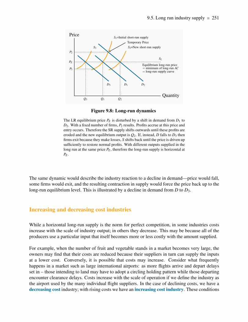
9.5. Long run industry supply 251
S3
S1=Initial short-run supply
S2=New short-run supply
D3 D1 D2
Price
Quantity
PE
SL
Equilibrium long-run price= minimum of long-run AC= long-run supply curve
Q1
P2
Q2Q3
P3
Temporary Price
Figure 9.8: Long-run dynamics
The LR equilibrium price PE is disturbed by a shift in demand from D1 to
D2. With a fixed number of firms, P2 results. Profits accrue at this price and
entry occurs. Therefore the SR supply shifts outwards until these profits are
eroded and the new equilibrium output is Q2. If, instead, D falls to D3 then
firms exit because they make losses, S shifts back until the price is driven up
sufficiently to restore normal profits. With different outputs supplied in the
long run at the same price PE , therefore the long-run supply is horizontal at
PE .
The same dynamic would describe the industry reaction to a decline in demand—price would fall,
some firms would exit, and the resulting contraction in supply would force the price back up to the
long-run equilibrium level. This is illustrated by a decline in demand from D to D3.
Increasing and decreasing cost industries
While a horizontal long-run supply is the norm for perfect competition, in some industries costs
increase with the scale of industry output; in others they decrease. This may be because all of the
producers use a particular input that itself becomes more or less costly with the amount supplied.
For example, when the number of fruit and vegetable stands in a market becomes very large, the
owners may find that their costs are reduced because their suppliers in turn can supply the inputs
at a lower cost. Conversely, it is possible that costs may increase. Consider what frequently
happens in a market such as large international airports: as more flights arrive and depart delays
set in – those intending to land may have to adopt a circling holding pattern while those departing
encounter clearance delays. Costs increase with the scale of operation if we define the industry as
the airport used by the many individual flight suppliers. In the case of declining costs, we have a
decreasing cost industry; with rising costs we have an increasing cost industry. These conditions

252 Perfect competition
are reflected in the long-run industry supply curve by a downward-sloping segment or an upward
sloping segment, as illustrated in Figure 9.9.
Increasing cost LRindustry supply curve
Constant cost LRindustry supply curve
Decreasing cost LRindustry supply curve
$
Industry Output
Figure 9.9: Increasing and decreasing cost industries
When individual-supplier costs rise as the output of the industry increases
we have an increasing cost supply curve for the industry in the long run.
Conversely when the costs of individual suppliers fall with the scale of the
industry, we have a decreasing cost industry.
Increasing (decreasing) cost industry is one where costs rise (fall) for each firm because of the
scale of industry operation.
9.6 Globalization and technological change
Globalization and technological change have had a profound impact on the way goods and services
are produced and brought to market in the modern world. The cost structure of many firms has
been reduced by outsourcing to lower-wage economies. Furthermore, the advent of the communi-
cations revolution has effectively increased the minimum efficient scale for many industries, as we
illustrated in Chapter 8 (Figure 8.7). Larger firms are less difficult to manage nowadays, and the
LAC curve may not slope upwards until very high output levels are attained. The consequence is
that some industries may not have sufficient “production space” to sustain a large number of firms.
In order to reap the advantages of scale economies, firms become so large that they can supply a
significant part of the market. They are no longer so small as to have no impact on the price.
Outsourcing and easier communications have in many cases simply eliminated many industries in
the developed world. Garment making is an example. Some decades ago Quebec was Canada’s

9.7. Efficient resource allocation 253
main garment maker: brokers dealt with cottage-type sewers and assemblers outside Montreal and
Quebec City. But ultimately the availability of cheaper labour in the developing world combined
with efficient communications undercut the local manufacture. Most of Canada’s garments are
now imported. Other North American and European industries have been impacted in similar
ways. Displaced labour has been required to retool, move to the service sector of the economy or
retire.
Globalization has had a third impact on the domestic economy, in so far as it reduces the cost of
components. Even industries that continue to operate within national boundaries see a reduction
in their cost structure on account of globalization’s impact on input costs. This is particularly
in evidence in the computing industry, where components are produced in numerous low-wage
economies, imported to North America and assembled into computers domestically. Such compo-
nents are termed intermediate goods.
9.7 Efficient resource allocation
Economists have a particular liking for competitive markets. The reason is not, as is frequently
thought, that we love competitive battles; it really concerns resource allocation in the economy at
large. In Chapter 5 we explained why markets are an excellent vehicle for transporting the econ-
omy’s resources to where they are most valued: a perfectly competitive marketplace in which there
are no externalities results in resources being used up to the point where the demand and supply
prices are equal. If demand is a measure of marginal benefit and supply is a measure of marginal
cost, then a perfectly competitive market insures that this condition will hold in equilibrium. Per-
fect competition, therefore, results in resources being used efficiently.
Our initial reaction to this perspective may be: If market equilibrium is such that the quantity
supplied always equals the quantity demanded, is not every market efficient? The answer is no.
As we shall see in the next chapter on monopoly, the monopolist’s supply decision does not reflect
the marginal cost of resources used in production, and therefore does not result in an efficient
allocation in the economy.
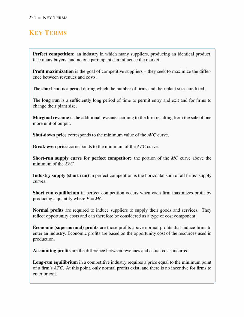
254 KEY TERMS
KEY TERMS
Perfect competition: an industry in which many suppliers, producing an identical product,
face many buyers, and no one participant can influence the market.
Profit maximization is the goal of competitive suppliers – they seek to maximize the differ-
ence between revenues and costs.
The short run is a period during which the number of firms and their plant sizes are fixed.
The long run is a sufficiently long period of time to permit entry and exit and for firms to
change their plant size.
Marginal revenue is the additional revenue accruing to the firm resulting from the sale of one
more unit of output.
Shut-down price corresponds to the minimum value of the AVC curve.
Break-even price corresponds to the minimum of the ATC curve.
Short-run supply curve for perfect competitor: the portion of the MC curve above the
minimum of the AVC.
Industry supply (short run) in perfect competition is the horizontal sum of all firms’ supply
curves.
Short run equilibrium in perfect competition occurs when each firm maximizes profit by
producing a quantity where P = MC.
Normal profits are required to induce suppliers to supply their goods and services. They
reflect opportunity costs and can therefore be considered as a type of cost component.
Economic (supernormal) profits are those profits above normal profits that induce firms to
enter an industry. Economic profits are based on the opportunity cost of the resources used in
production.
Accounting profits are the difference between revenues and actual costs incurred.
Long-run equilibrium in a competitive industry requires a price equal to the minimum point
of a firm’s ATC. At this point, only normal profits exist, and there is no incentive for firms to
enter or exit.

KEY TERMS 255
Industry supply in the long-run in perfect competition is horizontal at a price corresponding
to the minimum of the representative firm’s long-run ATC curve.
Increasing (decreasing) cost industry is one where costs rise (fall) for each firm because of
the scale of industry operation.

256 Exercises for Chapter 9
EXERCISES FOR CHAPTER 9
Exercise 9.1 Wendy’s Window Cleaning is a small local operation. Winnie presently cleans the
outside windows in her neighbours’ houses for $36 per house. She does ten houses per day. She is
incurring total costs of $420, and of this amount $100 is fixed. The cost per house is constant.
(a) What is the marginal cost associated with cleaning the windows of one house – we know it
is constant?
(b) At a price of $36, what is her break-even level of output (number of houses)?
(c) If the fixed cost is ‘sunk’ and she cannot increase her output in the short run, should she shut
down?
Exercise 9.2 A manufacturer of vacuum cleaners incurs a constant variable cost of production
equal to $80. She can sell the appliances to a wholesaler for $130. Her annual fixed costs are
$200,000. How many vacuums must she sell in order to cover her total costs?
Exercise 9.3 For the vacuum cleaner producer in Exercise 9.2:
(a) Draw the MC curve.
(b) Next, draw her AFC and her AVC curves.
(c) Finally, draw her ATC curve.
(d) In order for this cost structure to be compatible with a perfectly competitive industry, what
must happen to her MC curve at some output level?
Exercise 9.4 Consider the supply curves of two firms in a competitive industry: P = qA and P =2qB.
(a) On a diagram, draw these two supply curves, marking their intercepts and slopes numerically
(remember that they are really MC curves).
(b) Now draw a supply curve that represents the combined supply of these two firms.

Exercises for Chapter 9 257
Exercise 9.5 Amanda’s Apple Orchard Productions Limited produces 10,000 kilograms of apples
per month. Her total production costs at this output level are $8,000. Two of her many competitors
have larger-scale operations and produce 12,000 and 15,000 kilos at total costs of $9,500 and
$11,000 respectively. If this industry is competitive, on what segment of the LAC curve are these
producers producing?
Exercise 9.6 Consider the data in the table below. TC is total cost, T R is total revenue, and Q is
output.
Q 0 1 2 3 4 5 6 7 8 9 10
TC 10 18 24 31 39 48 58 69 82 100 120
TR 0 11 22 33 44 55 66 77 88 99 110
(a) Add some extra rows to the table below and for each level of output calculate the MR, the
MC and total profit.
(b) Next, compute AFC, AVC, and ATC for each output level, and draw these three cost curves
on a diagram.
(c) What is the profit-maximizing output?
(d) How can you tell that this firm is in a competitive industry?
Exercise 9.7 The market demand and supply curves in a perfectly competitive industry are given
by: Qd = 30,000−600P and Qs = 200P−2000.
(a) Draw these functions on a diagram, and calculate the equilibrium price of output in this
industry.
(b) Now assume that an additional firm is considering entering. This firm has a short-run MC
curve defined by MC = 10+0.5q, where q is the firm’s output. If this firm enters the industry
and it knows the equilibrium price in the industry, what output should it produce?
Exercise 9.8 Consider Exercise 9.7 again.
(a) Suppose all of the existing firms have the same cost structure as the new entrant, how many
firms are there in the industry?

258 Exercises for Chapter 9
(b) Each firm in the industry has a total cost curve of the form TC = 400+10q+(1/4)q2. There
is no distinction between the long run and short run – there is only one possible size of firm.
Derive the ATC by dividing each term in the TC curve by q, and calculate the cost per unit
at the output being produced by each firm at the existing equilibrium price.
(c) Since you now know the price and cost per unit, calculate the profit that each firm is making.
(d) Is the ATC sloping up or down at the current equilibrium? [Hint: is the MC above or below
the ATC at the chosen output?]
Exercise 9.9 Consider the long-run for the industry described in Exercise 9.8.
(a) What will happen to the number of firms in this industry in the long run?
(b) The minimum of the ATC curve for this firm occurs at a value of $30. Given that you know
this, what output will be produced in the industry in the long run?
(c) Once you know the output produced in the industry, and the minimum of the ATC curve,
calculate the number of firms that will produce in the long run ‘normal profit’ equilibrium.
Exercise 9.10 Now consider what will happen in this industry in the very long run – with tech-
nological change. The total cost curve becomes TC = 225+ 10q+ (1/4)q2. The MC remains
unchanged, and the minimum of the ATC now occurs at a value of $25.
(a) What is the price in the market in this new long run, and what quantity is traded?
(b) What quantity will each firm produce at this price?
(c) How many firms will there be in the industry?
Exercise 9.11 Consider two firms in a perfectly competitive industry. They have the same MC
curves and differ only in having higher and lower fixed costs. Suppose the ATC curves are of
the form: 400/q+ 10+ (1/4)q and 225/q+ 10+ (1/4)q. The MC for each is a straight line:
MC = 10+(1/2)q.
(a) Each ATC curve is U shaped and has a minimum at the quantities 40 and 30 respectively.
Draw two ATC curve on the same diagram as the MC curve that reflect this information.
(b) Compute the break-even price for each firm.
(c) Explain why both of these firms cannot continue to produce in the long run in a perfectly
competitive market.

Exercises for Chapter 9 259
(d) Could you derive an expression for the total variable cost curve for these firms, given the
total cost curves are: 400+10q+(1/4)q2, and 225+10q+(1/4)q2?


Chapter 10
Monopoly
In this chapter we will explore:
10.1 Why monopolies exist
10.2 How monopolists maximize profits
10.3 Long run behaviour
10.4 Monopoly and market efficiency
10.5 Price discrimination
10.6 Cartels
10.7 Rent-seeking behaviour
10.8 Technology and innovation
10.1 Monopolies
In analyzing perfect competition we emphasized the difference between the industry and the indi-
vidual supplier. The individual supplier is an atomistic unit with no market power. In contrast, a
monopolist has a great deal of market power, for the simple reason that a monopolist is the sole
supplier of a particular product and so really is the industry. The word monopoly, comes from the
Greek words monos, meanings one, and polein meaning to sell. When there is just a single seller,
our analysis need not distinguish between the industry and the individual firm. They are the same
on the supply side.
Furthermore, the distinction between long run and short run is blurred, because a monopoly that
continues to survive as a monopoly obviously sees no entry or exit. This is not to pretend that
monopolized sectors of the economy do not ‘die’ and reincarnate themselves in some other more
competitive form; they do. But if a monopoly continues to exist, by definition there is no entry or
exit in the industry.
261

262 Monopoly
A monopolist is the sole supplier of an industry’s output, and therefore the industry and the firm
are one and the same.
Economists’ thinking on monopoly has evolved considerably in recent decades. In part this is due
to the impact of the opening up of national borders, in part due to the impact of technological
change. The world is now more open and more subject to change, and so too are the circum-
stances governing monopolies. There are three main reasons for the existence and continuance of
monopolies: scale economies, national policy and successful prevention of entry.
Natural monopolies
Traditionally monopolies were viewed as being ‘natural’ in some sectors of the economy. This
means that scale economies define some industries’ production and cost structures up to very high
output levels, and that the whole market might be supplied at least cost by a single firm.
Consider the situation depicted in Figure 10.1. The long run ATC curve declines indefinitely. There
is no output level where average costs begin to increase. Imagine now having several firms, each
producing with a plant size corresponding to the short run average cost curve ATC1. In contrast,
one larger firm, having a plant size corresponding to ATC2 can produce several times the output
at a lower unit cost – and supply the complete market in the process. Such a scenario is termed a
natural monopoly.
LATC
MC1
MC2
Cost ($)
Quantity
ATC1
ATC2
Figure 10.1: A ‘natural’ monopolist
When LR average costs continue to decline at very high output, one firm
may be able to supply the industry at a lower unit cost than several firms.
With a plant size corresponding to ATC2, is a supplier can supply the whole
market, several smaller firms, each with plan size corresponding to ATC1,
cannot compete with the larger firm on account of differential unit costs.

10.1. Monopolies 263
Natural monopoly: one where the ATC of producing any output declines with the scale of oper-
ation.
We used to think of Bell Canada as a natural monopoly – before the days of cell phones and ‘voice
over internet protocol’. Many nations thought of their national passenger railway as a natural
monopoly – before the advent of Greyhound and the airplane. Canada Post might have had the
same beliefs about itself before the advent of FEDEX, UPS and other couriers. Thus there is no
guarantee that even a self-perceived natural monopoly can continue to hold that status. Entry and
new developments can compete it away.
In reality there are very few pure monopolies. Facebook and Google may be extraordinarily dom-
inant in their markets – as social media or search engines. But ultimately these firms are in the
advertising business; their objective is to attract regular clients in order to push advertising. And
the on-line or internet advertising business is so large that even these dominant companies get but
a modest share of all such business.
National Policy
A second reason for monopolies is national policy. Some governments are, or once were, proud
to have a ‘national carrier’ in the airline industry. The mail service is frequently a symbol of
nationhood, and this has certainly been true of both Canada and the US. Canada Post and the
US Postal system are national emblems that have historic significance. They were vehicles for
integrating the provinces or states at various points in the federal lives of these countries.
The down side of such nationalist policies is that they can be costly to the taxpayer. Industries
that are not subject to competition can become fat and uncompetitive: managers have insufficient
incentives to curtail costs; unions realize the government is committed to sustain the monopoly
and push for higher wages than under a more competitive structure. The result is that many
government-sponsored monopolies must ‘go to the government trough’ frequently to obtain fi-
nancial life support.
Maintaining barriers to entry
A third reason that monopolistic companies continue to survive is that they are successful in pre-
venting the entry of new firms and products. Patents and copyrights are one vehicle for preserving
the sole-supplier role, and are certainly necessary to encourage firms to undertake the research and
development (R&D) for new products.
While copyright protection is legal, predatory pricing is an illegal form of entry barrier, and we
explore it more fully in Chapter 14. An example would be where an existing firm that sells nation-

264 Monopoly
ally may deliberately undercut the price of a would-be local entrant to the industry. Airlines with a
national scope are frequently accused of posting low fares on flights in regional markets that a new
carrier is trying to enter.
Political lobbying is another means of maintaining monopolistic power. For example, the Canadian
Wheat Board had fought successfully for decades to prevent independent farmers from marketing
wheat. This Board lost it’s monopoly status in August 2012, when the government of the day
decided it was not beneficial to consumers or farmers in general.
Critical networks also form a type of barrier, though not always a monopoly. The compression
software WinZip benefits from the fact that it is used almost universally. There are many free
compression programs available on the internet. But WinZip can charge for its product because
virtually everybody uses it. Free network products that no one uses are worth very little, even if
they come at zero cost.
Many large corporations produce products that require a large up-front investment; this might be
in the form of research and development, or the construction of costly production facilities. For
example, Boeing or Airbus incurs billions of dollars in developing their planes; pharmaceuticals
may have to invest a billion dollars to develop a new drug. However, once such an investment
is complete, the cost of producing each unit of output may be constant. Such a phenomenon is
displayed in Figure 10.2. In this case the average cost for a small number of units produced is
high, but once the fixed cost is spread over an ever larger output, the average cost declines, and in
the limit approaches the marginal cost. These production structures are common in today’s global
economy, and they give rise to markets characterized either by a single supplier or a small number
of suppliers.
1
F
LATC
Constant MC
Cost ($)
Quantity
Figure 10.2: Fixed cost and constant marginal cost
With a fixed cost of producing the first unit of output equal to F and a
constant marginal cost thereafter, the long run average total cost, LATC,
declines indefinitely and becomes asymptotic to the marginal cost curve.
10.2. Profit maximizing behaviour 265
This figure is also useful in understanding the role of patents. Suppose that Pharma A spends one
billion dollars in developing a new drug and has constant unit production costs thereafter, while
Pharma B avoids research and development and simply imitates Pharma A’s product. Clearly
Pharma B would have a LATC equal to its LMC, and would be able to undercut the initial developer
of the drug. Such an outcome would discourage investment in new products and the economy at
large would suffer as a consequence.
10.2 Profit maximizing behaviour
We established in the previous chapter that, in deciding upon a profit-maximizing output, any firm
should produce up to the point where the additional cost equals the additional revenue from a unit
of output. What distinguishes the supply decision for a monopolist from the supply decision of the
perfect competitor is that the monopolist faces a downward sloping demand. A monopolist is the
sole supplier and therefore must meet the full market demand. This means that if more output is
produced, the price must fall. What are the pricing and output implications of this? Let us use an
example to illustrate.
Marginal revenue
Table 10.1 tabulates the price and quantity values for a demand curve in columns 1 and 2. Column
three contains the sales revenue generated at each output. It is the product of price and quantity.
Since the price denotes the revenue per unit, it is sometimes referred to as average revenue. The
total revenue (T R) is plotted in Figure 10.3. It reaches a maximum at $32, where 4 units of output
are produced. A greater output necessitates a lower price on every unit sold, and in this case
revenue falls if the fifth unit is brought to the market. Even though the fifth unit sells for a positive
price, the price on the other 4 units is now lower and the net effect is to reduce revenue. The pattern
in Figure 10.3 corresponds exactly to what we examined in Chapter 4: as price is lowered from the
highest possible value of $14 (where 1 unit is demanded) and the corresponding quantity increases,
revenue rises, peaks, and ultimately falls as output increases. In Chapter 4 we explained that this
maximum revenue point occurs where the price elasticity is unity (-1), at the mid-point of a linear
demand curve.

266 Monopoly
Quantity
(Q)
Price (P) Total
Revenue
(T R)
Marginal
Revenue
(MR)
Marginal
Cost (MC)
Total Cost
(TC)
Profit
0 16
1 14 14 14 2 2 12
2 12 24 10 3 5 19
3 10 30 6 4 9 21
4 8 32 2 5 14 18
5 6 30 -2 6 20 10
6 4 24 -6 7 27 -3
7 2 14 -10 8 35 -21
Table 10.1: A profit maximizing monopolist
8
Revenue
Quantity
24
2
32
4
TR is a maximum, MR = 0
Figure 10.3: Total revenue and marginal revenue
When the quantity sold increases total revenue/expenditure initially in-
creases also. At a certain point, further sales require a price that not only
increases quantity, but reduces revenue on units already being sold to such
a degree that TR declines – where the demand elasticity equals −1 (the mid
point of a linear demand curve). Here the mid point occurs at Q = 4. Where
the T R is a maximum the MR = 0.
Related to the total revenue function is the marginal revenue function. It is the addition to total
revenue due to the sale of one more unit of the commodity.

10.2. Profit maximizing behaviour 267
Marginal revenue is the change in total revenue due to selling one more unit of the good.
Average revenue is the price per unit sold.
The MR in this example is defined in the fourth column of Table 10.1. When the quantity sold
increases from 1 unit to 2 units total revenue increases from $14 to $24. Therefore the marginal
revenue associated with the second unit of output is $10. When a third unit is sold T R increases
to $30 and therefore the MR of the third unit is $6. As output increases the MR declines and
eventually becomes negative – at the point where the T R is a maximum: if T R begins to decline
then the additional revenue is by definition negative.
The MR function is plotted in Figure 10.4. It becomes negative when output increases from 4 to 5
units.
MC function
MR function
$
Quantity0
-2
2
4
6
8
10
12
14
1 3 5 7
Figure 10.4: Monopolist’s profit maximizing output
It is optimal for the monopolist to increase output as long as MR exceeds
MC. In this case MR>MC for units 1, 2 and 3. But for the fourth unit MC >MR and therefore the monopolist would reduce total profit by producing it.
He should produce only 3 units of output.
The optimal output
This producer has a marginal cost structure given in the fifth column of the table, and this too
is plotted in Figure 10.4. Our profit maximizing rule from Chapter 8 states that it is optimal to
produce a greater output as long as the additional revenue exceeds the additional cost of production
on the next unit of output. In perfectly competitive markets the additional revenue is given by the
fixed price for the individual producer, whereas for the monopolist the additional revenue is the

268 Monopoly
marginal revenue. Consequently as long as MR exceeds MC for the next unit a greater output is
profitable, but once MC exceeds MR the production of additional units should cease.
From Table 10.1 and Figure 10.4 it is clear that the optimal output is at 3 units. The third unit itself
yields a profit of 2$, the difference between MR ($6) and MC ($4). A fourth unit however would
reduce profit by $3, because the MR ($2) is less than the MC ($5). What price should the producer
charge? The price, as always, is given by the demand function. At a quantity sold of 3 units, the
corresponding price is $10, yielding total revenue of $30.
Profit is the difference between total revenue and total cost. In Chapter 8 we computed total cost
as the average cost times the number of units produced. It can also be computed as the sum of
costs associated with each unit produced: the first unit costs $2, the second $3 and the third $4.
The total cost of producing 3 units is the sum of these dollar values: $9 = $2 + $3 + $4. The
profit-maximizing output therefore yields a profit of $21 ($30−$9).
When illustrating market behaviour it is convenient to describe behaviour by simple linear equa-
tions that give rise to straight line curves. So rather than using the step functions as above, let us
confront the situation where the demand and cost functions can be represented by straight lines.
Instead of dealing with whole units we can think of the good in question as being divisible: the
product can be sold in fractions of units.
Alternatively we can think of quantities as being measured in thousands or millions. In this case
the step curves in our figures effectively become straight lines, as we illustrated in Chapter 5. So
consider the following demand and marginal cost functions; they reflect the values in the above
table.
Demand: P = 16−2Q ;
Marginal cost: MC = 1+1Q .
With these two linear equations, which are displayed in Figure 10.5, we can illustrate the monopo-
list’s optimal choice. It is straightforward to substitute values for Q into each of these equations to
arrive at the price and MC values in Table 10.1. Of course a MR curve is required to compute the
profit maximizing output, and we draw upon our knowledge of elasticities developed in Chapter 4
for this purpose.
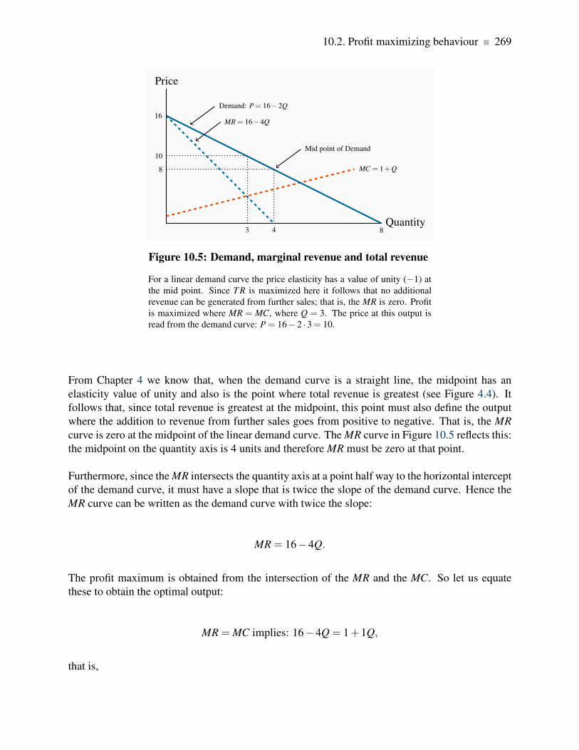
10.2. Profit maximizing behaviour 269
MC = 1+Q
16
8
Price
Quantity3
8
4
10
MR = 16−4Q
Demand: P = 16−2Q
Mid point of Demand
Figure 10.5: Demand, marginal revenue and total revenue
For a linear demand curve the price elasticity has a value of unity (−1) at
the mid point. Since TR is maximized here it follows that no additional
revenue can be generated from further sales; that is, the MR is zero. Profit
is maximized where MR = MC, where Q = 3. The price at this output is
read from the demand curve: P = 16− 2 ·3= 10.
From Chapter 4 we know that, when the demand curve is a straight line, the midpoint has an
elasticity value of unity and also is the point where total revenue is greatest (see Figure 4.4). It
follows that, since total revenue is greatest at the midpoint, this point must also define the output
where the addition to revenue from further sales goes from positive to negative. That is, the MR
curve is zero at the midpoint of the linear demand curve. The MR curve in Figure 10.5 reflects this:
the midpoint on the quantity axis is 4 units and therefore MR must be zero at that point.
Furthermore, since the MR intersects the quantity axis at a point half way to the horizontal intercept
of the demand curve, it must have a slope that is twice the slope of the demand curve. Hence the
MR curve can be written as the demand curve with twice the slope:
MR = 16−4Q.
The profit maximum is obtained from the intersection of the MR and the MC. So let us equate
these to obtain the optimal output:
MR = MC implies: 16−4Q = 1+1Q,
that is,

270 Monopoly
16−1 = 1Q+4Q ⇒ 15 = 5Q ⇒ Q = 3.
We have found the profit maximizing output. What price will the monopolist choose? This is
obtained from the demand curve. The optimal, or profit maximizing, price is:
P = 16−2×3 ⇒ P = 16−6 ⇒ P = $10.
Total revenue is therefore $30 (3 × $10). Total cost can be obtained from the average cost curve,
which in this case is ATC = 1+Q/2. At Q = 3, average cost is $2.5 (1 + 3/2). Thus total cost
is $7.5 and profit is $22.5. Note that this value differs slightly from the value in Table 10.1 and
derived from Figure 10.4, as we would expect, because we use straight line functions rather than
step functions and they are not identical1.
Demand elasticity and marginal revenue
We have shown above that the MR curve cuts the horizontal axis at a quantity where the elasticity
of demand is unity. We know from Chapter 4 that demand is elastic at points on the demand
curve above this unit-elastic point. Furthermore, since the intersection of MR and MC must be at
a positive dollar value (MC cannot be negative), then it must be the case that the profit maximizing
price for a monopolist always lies on the elastic segment of the demand curve.
A general graphical representation
In Figure 10.6 we generalize the graphical representation of the monopoly profit maximizing out-
put by allowing the MC curve to be nonlinear, and by introducing the ATC curve. The optimal
output is at QE , where MR = MC, and the price PE sustains that output. With the average cost
known, profit per unit is AB, and therefore total profit is this margin multiplied by the number of
units sold, QE .
Total profit is therefore PEABCE .
Note that the monopolist may not always make a profit. Losses could result in Figure 10.6 if aver-
age costs were to rise with no change in demand conditions2. For example, if the ATC curve shifted
upwards so that it lay everywhere above the demand curve, and the MC remained unchanged, then
the output where MC = MR is again QE . In this case losses would result. In the longer term the
1Total revenue and total cost can also be obtained by taking the areas under the MR and MC curves in Figure 10.5
at an output of three units.2This could occur with an increase in fixed costs and no change in variable costs.

10.3. Long run choices 271
monopolist would have to either reduce costs or perhaps stimulate demand through advertising if
she wanted to continue in operation.
MC
ATC
MR D
$
QuantityQE
PEA
CEB
Mid point of DemandDemand elasticity= −1
Figure 10.6: The monopoly equilibrium
The profit maximizing output is QE , where MC = MR. This output can be
sold at a price PE . The cost per unit of QE is read from the ATC curve, and
equals B. Per unit profit is therefore AB and total profit is PEABCE .
10.3 Long run choices
Consider next the impact of a shift in demand upon the profit maximizing choice of this firm. A
rightward shift in demand in Figure 10.6 also yields a new MR curve. The firm therefore chooses
a new level of output, using the same profit maximizing rule: set MC = MR. This output will
be greater than the previous output, but again the price must be on an elastic portion of the new
demand curve. If operating with the same plant size, the MC and ATC curves do not change and
the new profit per unit is again read from the ATC curve. The new equilibrium is again defined by
where MR = MC.
By this stage the curious student will have asked: “what happens to plant size in the long run?” For
example, is the monopolist in Figure 10.6 using the most appropriate plant size in the first place?
Even if she is, should the monopolist consider adopting an expanded plant size in response to the
shift in demand?
The answer is: in the long run the monopolist is free to choose whatever plant size is best. Her
initial plant size might have been optimal for the demand she faced, but if it was, it is unlikely to
be optimal for the larger scale of production associated with the demand shift. Accordingly, with
the new demand curve, she must consider how much profit she could make using different plant

272 Monopoly
sizes.
To illustrate one possibility, we will think of this firm as having constant returns to scale at all
output ranges, as displayed in Figure 10.7. The key characteristic of constant returns to scale is
that a doubling of inputs leads to a doubling of output. Therefore, if the per-unit cost of inputs is
fixed, a doubling of inputs (and therefore output) leads exactly to a doubling of costs. This implies
that, when the firm varies its plant size and its labour use, the cost of producing each additional
unit must be constant. The long run marginal cost LMC is therefore constant and equals the ATC
in the long run.
MC1 MC2
AC1 AC2
LAC = LMC
$
Quantity
Figure 10.7: The monopolist’s choice of plant size
With constant returns to scale and constant prices per unit of labour and
capital, a doubling of output involves exactly a doubling of costs. Thus, per
unit costs, or average costs, are constant in the LR. Hence LAC = LMC, and
each is constant.
Figure 10.8 describes the market for this good. The optimal output and price are determined in
the usual manner: set MC = MR. If the monopolist has plant size corresponding to ATC1, the
optimal output is Q1 and should be sold at the price P1.The key issue now is: given the demand
conditions, could the monopolist make more profit by choosing a plant size that differs from the
one corresponding to ATC1?

10.4. Output inefficiency 273
MC1 MC2
ATC1 ATC2
LAC = LMC
D
MR
$
QuantityQ1 Q2
P1
P2
Figure 10.8: Plant size in the long run
With demand conditions defined by D and MR, the optimal plant size is one
corresponding to the point where MR = MC in the long run. Therefore Q2
is the optimal output and the optimal plant size corresponds to ATC2. If the
current plant is defined by ATC1, then optimal SR production is Q1.
In this instance the answer is a clear ‘yes’. Her LMC curve is horizontal and so, by increasing
output from Q1 to Q2 she earns a profit on each additional unit in that range, because the MR curve
lies above the LMC curve. In order to produce the output level Q2 at least cost she must choose a
plant size corresponding to AC2.
10.4 Output inefficiency
A characteristic of perfect competition is that it secures an efficient allocation of resources when
there are no externalities in the market: resources are used up to the point where their marginal
cost equals their marginal value – as measured by the price that consumers are willing to pay. But
a monopoly structure does not yield this output. Consider Figure 10.9.

274 Monopoly
MC
ATC
PPC
LMC
D
MR
$
QuantityQM
PM
A
B
Q∗
F
Figure 10.9: Monopoly output inefficiency
A monopolist maximizes profit at QM. Here the value of marginal output
exceeds cost. If output expands to Q∗ a gain arises equal to the area ABF.
This is the deadweight loss associated with the output QM rather than Q∗.
If the monopolist’s long-run MC is equivalent to a competitive industry’s
supply curve, then the deadweight loss is the cost of having a monopoly
rather than a perfectly competitive market.
The monopolist’s profit-maximizing output QM is where MC equals MR. This output is inefficient
for the reason that we developed in Chapter 5: if output is increased beyond QM the additional
benefit exceeds the additional cost of producing it. The additional benefit is measured by the
willingness of buyers to pay – the market demand curve. The additional cost in that figure is the
horizontal MC curve under the assumption of constant returns to scale. Using the terminology from
Chapter 5, there is a deadweight loss equal to the area ABF. This is termed allocative inefficiency.
Allocative inefficiency arises when resources are not appropriately allocated and result in dead-
weight losses .
Perfect competition versus monopoly
The area ABF can also be considered as the efficiency loss associated with having a monopoly
rather than a perfectly competitive market structure. In perfect competition the supply curve is
horizontal. This is achieved by having firms enter and exit when more or less must be produced.

10.5. Price discrimination 275
Accordingly, if the perfectly competitive industry’s supply curve approximates the monopolist’s
long run marginal cost curve3, we can say that if the monopoly were turned into a competitive
industry, output would increase from QM to QPC. The deadweight loss is one measure of the su-
periority of the perfectly competitive structure over the monopoly structure. With a linear demand
and a horizontal MC curve, the monopoly output is exactly one half of the competitive output. We
will return to this in the next chapter.
Note that this critique of monopoly is not initially focused upon profit. While monopoly profits are
what frequently irk the public, we have focused upon resource allocation inefficiencies. But in a
real sense the two are related: monopoly inefficiencies arise through output being restricted, and it
is this output reduction – achieved by maintaining a higher than competitive price – that gives rise
to those profits. Nonetheless, there is more than just a shift in purchasing power from the buyer
to the seller. Deadweight losses arise because output is at a level lower than the point where the
MC equals the value placed on the good; thus the economy is sacrificing the possibility of creating
additional surplus.
Given that monopoly has this undesirable inefficiency, what measures should be taken, if any, to
counter the inefficiency? We will see what Canada’s Competition Act has to say in Chapter 14 and
also examine what other measures are available to control monopolies.
10.5 Price discrimination
A common characteristic in the pricing of many goods is that different individuals pay different
prices for goods or services that are essentially the same. Examples abound: Seniors get a re-
duced rate for coffee in Burger King; hair salons charge women more than they charge men; bank
charges are frequently waived for juniors. Price discrimination involves charging different prices
to different consumers in order to increase profit.
Price discrimination involves charging different prices to different consumers in order to increase
profit.
A strict definition of discrimination involves different prices for identical products. We all know of
a school friend who has been willing to take the midnight flight to make it home at school break at
a price he can afford. In contrast, the business executive prefers the seven a.m. flight to arrive for a
nine a.m. business meeting in the same city at several times the price. These are very mild forms of
price discrimination, since a midnight flight (or a mid-day flight) is not a perfect substitute for an
early morning flight. Price discrimination is practiced because buyers are willing to pay different
3We could think of such a transformation coming from a single supplier taking over a number of small suppliers,
and the monopolist would thus be a multi-plant firm. This nonetheless is quite an extreme possibility. A frequently
cited reason for takeovers in the corporate world is that economies may materialize when firms are merged.

276 Monopoly
amounts for a good or service, and the supplier may have a means of profiting from this. Consider
the following example.
Family Flicks is the local movie theatre. It has two distinct groups of customers – those of prime
age form one group; youth and seniors form the other. Family Flicks has done its market research
and determined that each group accounts for 50 percent of the total market of 100 potential viewers
per screening. It has also established that the prime-age group members are willing to pay $12 to
see a movie, while the seniors and youth are willing to pay just $5. How should the tickets be
priced?
Family Flicks has no variable costs, only fixed costs. It must pay a $100 royalty to the movie maker
each time it shows the current movie, and must pay a cashier and usher $20 each. Total costs are
therefore $140, regardless of how many people show up – short-run MC is zero. On the pricing
front, as illustrated in Table 10.2 below, if Family Flicks charges $12 per ticket it will attract 50
viewers, generate $600 in revenue and therefore make a profit of $460.
P=$5 P=$12 Twin
price
No. of customers 100 50
Total revenue $500 $600 $850
Total costs $140 $140 $140
Profit $360 $460 $710
Table 10.2: Price discrimination
In contrast, if it charges $5 it can fill the theatre, because each of the prime-age individuals is
willing to pay more than $5, but the seniors and youth are now offered a price they too are willing
to pay. However, the total revenue is now only $500 (100×$5 = $500), and profits are reduced to
$360. It therefore decides to charge the high price and leave the theatre half-empty, because this
strategy maximizes its profit.
Suppose finally that the theatre is able to segregate its customers. It can ask the young and senior
customers for identification upon entry, and in this way charge them a lower price, while still
maintaining the higher price to the prime-age customers. If it can execute such a plan Family
Flicks can now generate $850 in revenue – $600 from the prime-age group and $250 from the
youth and seniors groups. Profit soars to $710.
There are two important conditions for this scheme to work:
1. The seller must be able to segregate the market at a reasonable cost. In the movie case this
is achieved by asking for identification.

10.5. Price discrimination 277
2. The second condition is that resale must be impossible or impractical. For example, we
rule out the opportunity for young buyers to resell their tickets to the prime-age individuals.
Sellers have many ways of achieving this – they can require immediate entry to the movie
theatre upon ticket purchase, they can stamp the customer’s hand, they can demand the
showing of ID with the ticket when entering the theatre area.
Frequently we think of sellers who offer price reductions to specific groups as being generous. For
example, hotels may levy only a nominal fee for the presence of a child, once the parents have paid
a suitable rate for the room or suite in which a family stays. The hotel knows that if it charges too
much for the child, it may lose the whole family as a paying unit. The coffee shop offering cheap
coffee to seniors is interested in getting a price that will cover its variable cost and so contribute
to its profit. It is unlikely to be motivated by philanthropy, or to be concerned with the financial
circumstances of seniors.
Price discrimination has a further interesting feature that is illustrated in Figure 10.10: it frequently
reduces the deadweight loss associated with a monopoly seller!
50
D
12Demand curve
A B
100
C
$
Quantity
MC5
Figure 10.10: Price discrimination at the movies
At P = 12, 50 prime-age individuals demand movie tickets. At P = 5, 50
more seniors and youths demand tickets. Since the MC is zero the efficient
output is where the demand curve takes a zero value – where all 100 cus-
tomers purchase tickets. Thus, any scheme that results in all 100 individuals
buying ticket is efficient. Efficient output is at point C.
In our Family Flicks example, the profit maximizing monopolist that did not, or could not, price
discriminate left 50 customers unsupplied who were willing to pay $5 for a good that had a zero
MC. This is a deadweight loss of $250 because 50 seniors and youth valued a commodity at $5
that had a zero MC. Their demand was not met because, in the absence of an ability to discrim-
inate between consumer groups, Family Flicks made more profit by satisfying the demand of the
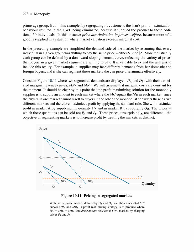
278 Monopoly
prime-age group. But in this example, by segregating its customers, the firm’s profit maximization
behaviour resulted in the DWL being eliminated, because it supplied the product to those addi-
tional 50 individuals. In this instance price discrimination improves welfare, because more of a
good is supplied in a situation where market valuation exceeds marginal cost.
In the preceding example we simplified the demand side of the market by assuming that every
individual in a given group was willing to pay the same price – either $12 or $5. More realistically
each group can be defined by a downward-sloping demand curve, reflecting the variety of prices
that buyers in a given market segment are willing to pay. It is valuable to extend the analysis to
include this reality. For example, a supplier may face different demands from her domestic and
foreign buyers, and if she can segment these markets she can price discriminate effectively.
Consider Figure 10.11 where two segmented demands are displayed, DA and DB, with their associ-
ated marginal revenue curves, MRA and MRB. We will assume that marginal costs are constant for
the moment. It should be clear by this point that the profit maximizing solution for the monopoly
supplier is to supply an amount to each market where the MC equals the MR in each market: since
the buyers in one market cannot resell to buyers in the other, the monopolist considers these as two
different markets and therefore maximizes profit by applying the standard rule. She will maximize
profit in market A by supplying the quantity QA and in market B by supplying QB. The prices at
which these quantities can be sold are PA and PB. These prices, unsurprisingly, are different – the
objective of segmenting markets is to increase profit by treating the markets as distinct.
DA
DB
MRAMRB
MC
Price
QuantityQA
PA
QB
PB
Figure 10.11: Pricing in segregated markets
With two separate markets defined by DA and DB, and their associated MR
curves MRA and MRB, a profit maximizing strategy is to produce where
MC = MRA = MRB, and discriminate between the two markets by charging
prices PA and PB.
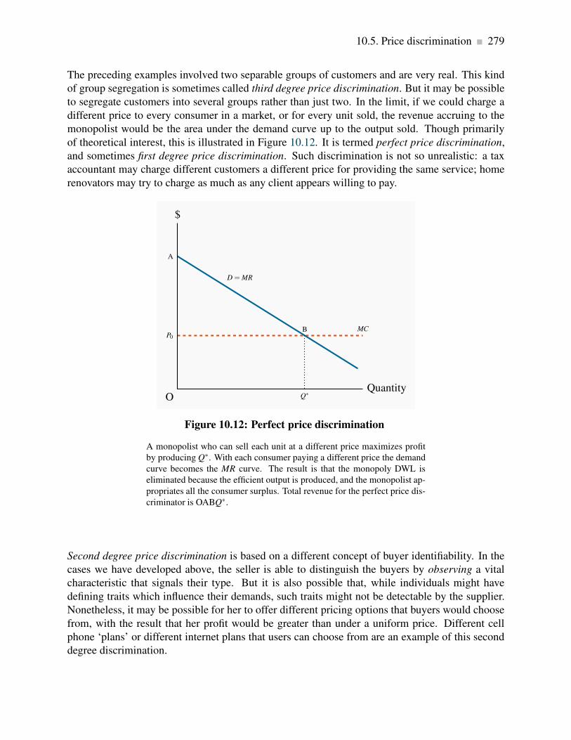
10.5. Price discrimination 279
The preceding examples involved two separable groups of customers and are very real. This kind
of group segregation is sometimes called third degree price discrimination. But it may be possible
to segregate customers into several groups rather than just two. In the limit, if we could charge a
different price to every consumer in a market, or for every unit sold, the revenue accruing to the
monopolist would be the area under the demand curve up to the output sold. Though primarily
of theoretical interest, this is illustrated in Figure 10.12. It is termed perfect price discrimination,
and sometimes first degree price discrimination. Such discrimination is not so unrealistic: a tax
accountant may charge different customers a different price for providing the same service; home
renovators may try to charge as much as any client appears willing to pay.
P0
MC
A
D = MR
$
OQuantity
B
Q∗
Figure 10.12: Perfect price discrimination
A monopolist who can sell each unit at a different price maximizes profit
by producing Q∗. With each consumer paying a different price the demand
curve becomes the MR curve. The result is that the monopoly DWL is
eliminated because the efficient output is produced, and the monopolist ap-
propriates all the consumer surplus. Total revenue for the perfect price dis-
criminator is OABQ∗.
Second degree price discrimination is based on a different concept of buyer identifiability. In the
cases we have developed above, the seller is able to distinguish the buyers by observing a vital
characteristic that signals their type. But it is also possible that, while individuals might have
defining traits which influence their demands, such traits might not be detectable by the supplier.
Nonetheless, it may be possible for her to offer different pricing options that buyers would choose
from, with the result that her profit would be greater than under a uniform price. Different cell
phone ‘plans’ or different internet plans that users can choose from are an example of this second
degree discrimination.
280 Monopoly
10.6 Cartels: acting like a monopolist
A cartel is a group of suppliers that colludes to operate like a monopolist. The most famous
cartel in modern times is certainly the oil cartel formed by the members of the Organization of Oil
Exporting Countries (OPEC). This cartel first flexed its muscles seriously in 1973, by increasing
the world price of oil from $3 per barrel to $10 per barrel. The result was to transfer billions of
dollars from the energy-importing nations in Europe and the US (and partly North America) to
OPEC members – the demand for oil is relatively inelastic, hence an increase in price increases
total expenditures.
A cartel is a group of suppliers that colludes to operate like a monopolist.
A second renowned cartel is managed by De Beers, which controls a large part of the world’s
diamond supply. A third is Major League Baseball in the US, which is excluded from competition
law. Lesser-known cartels, but in some cases very effective, are those formed by the holders of taxi
licenses in many cities throughout the world: entry is extremely costly. By limiting the right to
enter the taxi industry, the incumbents can charge a higher price than if entry to the industry were
free.
Some cartels are sustained through violence, and frequently wars break out between competing
cartels or groups who want to sustain their market power. Drug gangs in large urban areas fre-
quently fight for hegemony over distribution. And the recent drug wars in Mexico between rival
cartels had seen tens of thousands on individuals killed as of 2012.
Some cartels are successful and stable, others not so, in the sense that individual members of the
cartel may decide to ‘cheat’ – by undercutting the agreed price. To understand the dynamics of
cartels consider Figure 10.13. Several producers, with given production capacities, come together
and agree to restrict output with a view to increasing price and therefore profit. Each firm has a MC
curve, and the industry supply is defined as the sum of these marginal cost curves, as illustrated
in Figure 9.3. We could think of the resulting cartel as one in which there is a single supplier
with many different plants – a multi-plant monopolist. To maximize profits this organization will
choose an output level Qm where the MR equals the MC. In contrast, if these firms act competitively
the output chosen will be Qc. The competitive output yields no supernormal profit, whereas the
monopoly/cartel output does.

10.6. Cartels: acting like a monopolist 281
MC = S
MR D
$
Quantity
Pc
B
Qc
F
Qm
Pm
A
Figure 10.13: Cartelizing a competitive industry
A cartel is formed when individual suppliers come together and act like a
monopolist in order to increase profit. If MC is the joint supply curve of
the cartel, profits are maximized at the output Qm, where MC = MR. In
contrast, if these firms operate competitively output increases to Qc.
The cartel results in a deadweight loss equal to the area ABF, just as in the standard monopoly
model.
Cartel instability
However, cartels tend to be unstable, and the degree of instability depends on the authority that the
governing body of the cartel can exercise over its members, and also the degree of information it
has on the operations of its members. The reason for instability lies in the fact that each individual
member of the cartel has an incentive to increase its output, because the monopoly price that the
cartel attempts to sustain exceeds the cost of producing a marginal unit of output. In Figure 10.13
each firm has a MC of output equal to $F when the group collectively produces the output Qm. Yet
any firm that brings its output to market at the price Pm will make a profit of AF on an additional
unit of output – provided the other members of the cartel agree to restrict their output. Since each
firm faces the same incentive to increase output, it is difficult to restrain all members from doing
so.
Individual members are more likely to abide by the cartel rules if the organization can sanction
them for breaking the supply-restriction agreement. Alternatively, if the actions of individual
members are not observable by the organization, then the incentive to break ranks may be too
strong for the cartel to sustain its monopoly power.

282 Monopoly
Cartels within individual economies are almost universally illegal. Yet at the international level
there exists no governing authority to limit such behaviour. In practice, governments are unwilling
to see their own citizens and consumers being ‘gouged’, but are relatively unconcerned if their
national or multinational corporations are willing and successful in gouging the consumers of
other economies! We will see in Chapter 14 that Canada’s Competition Act forbids the formation
of cartels, as it forbids many other anti-competitive practices.
While we tend to think of cartels as small groups of suppliers, in fact they often contain thou-
sands of members and are maintained by legal entry barriers. City taxis are an example of
such a formation: Entry is limited by the city or province or state, and fares are maintained
at a higher level as a consequence of the resulting lower supply. A secondary market then de-
velops for licenses – medallions, in which the city may offer new medallions through auction,
or existing owners may exit and sell their medallions. Restricted entry characterizes most
of Canada’s major cities, with the result that new medallions frequently generate in excess
of $100,000 from the buyer. New York and Boston medallions traded at close to one million
dollars in 2012.
But a recent start-up company is aiming to change all of that: Uber arrived on the inter-
national scene. This company developed a smart-phone app that links demanders for taxis
with drivers who are not part of the traditional taxi companies. Uber set up operations in
many of the world’s major cities and has succeeded in taking a small part of the taxi business
away from the traditional operators. One result is that the price of taxi medallions on the
open market in large US cities has fallen by about 20%. Not surprisingly, the traditional taxi
companies are charging that Uber operators are violating the accepted rules governing the
taxi business, and have launched legal suits against Uber.
Uber is part of what is called the ‘sharing economy’. Participants operate with very little
traditional capital. For example, suppliers may use an online site to rent a spare bedroom in
their house to visitors to their city (Airbnb), and thus compete with hotels. The main capital
in this business is in the form of the information technology that links potential buyers to
potential sellers.
See www.fcpp.org for Canada, and for New York:
www.nyc.gov/html/tlc/downloads/pdf/press_release_medallion_auction.pdf
Application Box 10.1: The taxi cartel

10.7. Rent-seeking 283
10.7 Rent-seeking
Citizens are usually appalled when they read of the lobbying and ‘bribing’ of politicians. These
practices are not limited to less developed economies; every capital city in the world has an army
of lobbyists, seeking to influence legislators and regulators. Such individuals are in the business
of rent seeking, which uses the economy’s productive resources to redistribute profit or surplus
to particular groups, rather than produce additional output and create new profit or surplus. For
example, Canadian media owners seek to reduce competition from their US-based competition
by requesting the CRTC (the Canadian Radio-Television and Telecommunications Commission)
to restrict the inflow of signals from US suppliers. In Virginia and Kentucky we find that state
taxes on cigarettes are the lowest in the US – because the tobacco leaf is grown in these states,
and the tobacco industry makes major contributions to the campaigns of some political represen-
tatives. Pharmaceutical companies in Washington propose that drugs imported from their northern
neighbour may be unsafe for the American consumer. Influence peddling is a business the world
over.
Economists argue that the possible corruption of the political process is not the only damage done
by this type of behaviour. They emphasize that it also has a resource cost: imagine that we could
outlaw the lobbying business and put these lobbyists to work producing goods and services in the
economy, instead of spending their time in the greasing of palms and making not-so-erudite pre-
sentations to government bodies. Their purpose is to maintain as much market or quasi-monopoly
power in the hands of their clients as possible, and to ensure that the fruits of this effort go to
those same clients. If this practice could be curtailed then the time and resources involved could
be redirected to other productive ends.
Rent seeking is an activity that uses productive resources to redistribute rather than create output
and value.
Who pays for rent seeking?
Industries in which rent seeking is most prevalent tend to be those in which the potential for eco-
nomic profits is greatest – monopolies or near-monopolies. These, therefore, are the industries
that allocate resources to the preservation of their protected status. We do not observe laundromat
owners or shoe-repair businesses lobbying in Ottawa.
Rent seeking is an additional cost that must be borne by the producer and increases her total costs.
Such lobbying is therefore costly both to the monopolist and society at large – not only does
the existence of a monopoly cause resource inefficiencies, but in addition resources are used to
preserve this inefficient market structure.

284 Monopoly
10.8 Technology and innovation
Invention and innovation are critical aspects of the modern economy. Firms that cannot invent or
innovate are liable to die. Invention is a genuine discovery, whereas innovation is the introduction
of a new product or process.
Invention is the discovery of a new product or process through research.
Product innovation refers to new or better products or services.
Process innovation refers to new or better production or supply.
To this point we have said little that is good about monopolies: they cause a DWL and encourage
wasteful rent-seeking behaviour. However, the economist Joseph Schumpeter (1883-1950) argued
that, while monopoly leads to resource misallocation in the economy, this cost might be offset by
the greater tendency for monopoly firms to invent and innovate. This is because such firms have
more profit and therefore more resources with which to fund R&D and may therefore be more
innovative than competitive firms. If this were true then, taking a long-run dynamic view of the
marketplace, monopolies could have lower costs and more advanced products than competitive
firms and thus benefit the consumer.
While this argument has some logical appeal, it falls short on several counts. First, even if large
firms carry out more research than competitive firms, there is no guarantee that the ensuing benefits
carry over to the consumer. Second, the results of such research may be used to prevent entry into
the industry in question. Firms may register their inventions and gain use protection before a
competitor can come up with the same or a similar invention. Apple and Samsung each own tens
of thousands of patents. Third, the empirical evidence on the location of most R&D is inconclusive:
a sector with several large firms, rather than one with a single or very many firms, may be best.
For example, if Apple did not have Samsung as a competitor, or vice versa, would the pace of
innovation be as strong? These companies invent and innovate at a fantastic rate.
Fourth, much research has a ‘public good’ aspect to it. Research carried out at universities and
government-funded laboratories is sometimes referred to as basic research. This research explores
the principles underlying chemistry, social relations, engineering forces, microbiology, etc. and has
multiple applications in the commercial world. If disseminated, this research is like a public good
– its fruits can be used in many different applications, and its use in one area does not preclude
its use in others. Consequently, rather than protecting monopolies on the promise of more R&D,
a superior government policy might be to invest directly in research and make the fruits of the
research publicly available.
Modern economies have patent laws, which grant inventors a legal monopoly on use for a fixed
period of time – perhaps fifteen years. By preventing imitation, patent laws raise the incentive

10.8. Technology and innovation 285
to conduct R&D but do not establish a monopoly in the long run. Over the life of a patent the
inventor charges a higher price than would exist if his invention were not protected; this both
yields greater profits and provides the research incentive. When the patent expires, competition
from other producers leads to higher output and lower prices for the product. Generic drugs are a
good example of this phenomenon.
Patent laws grant inventors a legal monopoly on use for a fixed period of time.
The power of globalization once again is very relevant in patents. Not all countries have patent laws
that are as strong as those in North America and Europe. The BRIC economies (Brazil, Russia,
India and China) form an emerging power block. But their legal systems and enforcement systems
are less well-developed than in Europe or North America. The absence of a strong and transparent
legal structure inhibits research and development, because their fruits may be appropriated by
competitors.
At the same time, not every idea or new product can be registered for a patent. Evidently an idea
for a TV show does not count. For example, Mark Burnett got the idea for the Survivor TV series
from a similar product in Europe in the year 2000. This marked the start of reality TV in North
America. From this followed his Apprentice series, and imitators produced others: The Amazing
Race, American Idol, So You Think You Can Dance, Dancing with the Stars, The Bachelor, The
Biggest Loser, the X Factor, and so on. Furthermore, consider what might have happened if all
North American TV watchers were subject to a monopoly content provider: we might have been
denied all but a couple of such wonderful programs.
Conclusion
We have now examined two extreme types of market structure – perfect competition and monopoly.
While many sectors of the economy operate in a way that is close to the competitive paradigm, very
few are pure monopolies in that they have no close substitute products. Even firms like Microsoft,
or De Beers, that supply a huge percentage of the world market for their product would deny that
they are monopolies and would argue that they are subject to strong competitive pressures from
smaller or ‘fringe’ producers. As a result we must look upon the monopoly paradigm as a useful
way of analyzing markets, rather than being an exact description of the world. Accordingly, our
next task is to examine how sectors with a few, several or multiple suppliers act when pursuing the
objective of profit maximization. Many different market structures define the real economy, and
we will concentrate on a limited number of the more important structures in the next chapter.

286 KEY TERMS
KEY TERMS
Monopolist: is the sole supplier of an industry’s output, and therefore the industry and the
firm are one and the same.
Natural monopoly: one where the ATC of producing any output declines with the scale of
operation.
Marginal revenue is the change in total revenue due to selling one more unit of the good.
Average revenue is the price per unit sold.
Allocative inefficiency arises when resources are not appropriately allocated and result in
deadweight losses.
Price discrimination involves charging different prices to different consumers in order to
increase profit.
A cartel is a group of suppliers that colludes to operate like a monopolist.
Rent seeking is an activity that uses productive resources to redistribute rather than create
output and value.
Invention is the discovery of a new product or process through research.
Product innovation refers to new or better products or services.
Process innovation refers to new or better production or supply.
Patent laws grant inventors a legal monopoly on use for a fixed period of time.

Exercises for Chapter 10 287
EXERCISES FOR CHAPTER 10
Exercise 10.1 Consider a monopolist with demand curve defined by P = 100−2Q. The MR curve
is MR = 100−4Q and the marginal cost is MC = 10+Q.
(a) Develop a diagram that illustrates this market.
(b) Compute the profit-maximizing price and output combination.
Exercise 10.2 Imagine we have a monopolist who wants to maximize revenue rather than profit.
She has the demand curve P = 72−Q, with marginal revenue MR = 72−2Q, and MC = 12.
(a) Graph the three functions.
(b) Calculate the price she should charge in order to maximize revenue. [Hint: where the MR =0.]
(c) Compare her total revenue with the revenue obtained under profit maximization.
(d) How much profit will she make when maximizing total revenue?
Exercise 10.3 In this question you will see why we never consider a supply curve for a monopolist
– in the way that is done in perfect competition. So suppose the monopolist faces a demand curve
P = 72−Q and a MR curve MR = 72−2Q. The Marginal cost is MC = Q.
(a) Find the profit maximizing output and price.
(b) Now suppose that the demand curve shifts to become P = 60 − (1/3)Q and thus MR =60− (2/3)Q. The MC remains the same. Establish that the profit maximizing price is the
same for this demand curve as the one in part (a). You have now shown that there is not a
unique relationship between cost and demand for the monopolist because the same price in
this example is consistent with profit maximization with two different demand curves.
Exercise 10.4 Suppose that the monopoly in Exercise 10.2 has a large number of plants. Consider
what could happen if each of these plants became a separate firm, and acted competitively. In
this perfectly competitive world you can assume that the MC curve of the monopolist becomes the
industry supply curve.
(a) What output would be produced in the industry?

288 Exercises for Chapter 10
(b) What price would be charged in the marketplace?
(c) Compute the gain to the economy in dollar terms as a result of the DWL being eliminated
[Hint: it resembles the area ABF in Figure 10.13].
Exercise 10.5 A monopolist faces a demand curve P = 64−2Q and MR = 64−4Q. His marginal
cost is MC = 16.
(a) Graph the three functions and compute the profit maximizing output and price.
(b) Compute the efficient level of output (where MC=demand), and compute the DWL associ-
ated with producing the profit maximizing output rather than the efficient output.
(c) Suppose the government gave the monopolist a subsidy of $4 per unit produced. The MC
would be reduced accordingly to $12 from $16. Compute the profit maximizing output level
and the deadweight loss associated with this new output. Explain intuitively why the DWL
has changed.
Exercise 10.6 In the text example in Table 10.1, compute the profit that the monopolist would
make if he were able to discriminate between every buyer and charge each buyer their reservation
price.
Exercise 10.7 A monopolist is able to discriminate perfectly among his consumers – by charging
a different price to each one. The market demand curve facing him is given by P = 72−Q. His
marginal cost is given by MC = 24 and marginal revenue is MR = 72−2Q.
(a) In a diagram, illustrate the profit-maximizing equilibrium, where discrimination is not prac-
ticed.
(b) Calculate the equilibrium output if he discriminates perfectly.
(c) If he has no fixed cost beyond the marginal production cost of $24 per unit, calculate his
profit in each pricing scenario.
Exercise 10.8 A monopolist faces two distinct markets A and B for her product, and she is able
to insure that resale is not possible. The demand curves in these markets are given by P = 20−(1/4)QA and P = 14− (1/4)QB. The marginal cost is constant: MC = 4. There are no fixed costs.
(a) Calculate the profit maximizing price and quantity in each market.
Exercises for Chapter 10 289
(b) Compute the total profit made as a result of this discriminatory pricing.
Exercise 10.9 A monopolist with a demand curve given by P = 240−2Q has a cost structure made
up of a fixed cost of $500 and a marginal production cost of MC = 40.
(a) When maximizing profit, how much profit will she make?
(b) Suppose now that she can outsource some of her assembly work to a plant in Indonesia, and
this reduces her marginal production cost to $32 per unit, but also increases her fixed cost to
$750. Should she outsource?
Exercise 10.10 In Exercise 10.9, prior to being able to outsource, imagine that the supplier is
concerned about entry, and must spend $2,000 in lobbying to maintain her position as a monopolist.
(a) Can the firm still make a profit?
(b) What is the maximum amount the firm could afford to spend on lobbying with the objective
of maintaining the monopoly position?
Exercise 10.11 A concert organizer is preparing for the arrival of the Grateful Living band in his
small town. He knows he has two types of concert goers: one group of 40 people, each willing
to spend $60 on the concert, and another group of 70 people, each willing to spend $40. His total
costs are purely fixed at $3,500.
(a) Draw the market demand curve faced by this monopolist.
(b) Draw the MR and MC curves.
(c) With two-price discrimination what will be the monopolist’s profit?
(d) If he must charge a single price for all tickets can he make a profit?


Chapter 11
Imperfect competition
In this chapter we will explore:
11.1 The nature of the imperfect competitor
11.2 Market power
11.3 Monopolistic competition
11.4 Oligopoly, games and interdependence
11.5 Duopoly and Cournot competition
11.6 Comparing market structures
11.7 Potential competition, entry and exit
11.1 Imperfect competitors
The preceding chapters have explored extreme forms of supply. The monopolist is the sole supplier
and possesses as much market power as possible. In contrast the perfect competitor is insignificant
in the marketplace and has no market power whatsoever. He simply accepts the price for his
product that is determined in the market by the forces of supply and demand. These are very useful
paradigms to explore, but the real world for the most part lies between these extremes. We observe
that there are a handful of dominant brewers in Canada who supply more than three quarters of the
market, and they are accompanied by numerous micro brewers that form the fringe of the brewing
business. Likewise we have a small number of air carriers and one of them controls half of the
national market.
In this chapter we will explore the relationship between firm behaviour and the size of the firm
relative to the whole sector.
Rather than defining imperfect competitors in terms of the number of firms in the sector, or the
share of total sales going to a small number of suppliers, we can differentiate imperfect competition
from perfect competition by the characteristics of the demand curves they all face. We know that
a perfect competitor faces a perfectly elastic demand at the existing market price; this is the only
291

292 Imperfect competition
market structure to have this characteristic. In all other market structures suppliers effectively
face a downward-sloping demand. This means that they have some influence on the price of the
good, and also that if they change the price they charge, they can expect demand to reflect this
in a predictable manner. So we will lump all other market structures, including the extreme of
monopoly, under the title of imperfect competition, and firms in such markets face downward
sloping demands.
Imperfectly competitive firms face a downward-sloping demand curve, and their output price
reflects the quantity sold.
The demand curve for the firm and industry coincide for the monopolist, but not for other im-
perfectly competitive firms. It is convenient to categorize the producing sectors of the economy
as either having a relatively small number of participants, or having a large number. The former
market structures are called oligopolistic, and the latter are called monopolistically competitive.
The word oligopoly comes from the Greek word oligos meaning few, and polein meaning to sell.
Oligopoly defines an industry with a small number of suppliers.
Monopolistic competition defines a market with many sellers of products that have similar char-
acteristics. Monopolistically competitive firms can exert only a small influence on the whole
market.
The home appliance industry is an oligopoly. The prices of KitchenAid appliances depend not only
on its own output and sales, but also on the prices of Whirlpool, Maytag and Bosch. If a firm has just
two main producers it is called a duopoly. Canadian National and Canadian Pacific are the only
two major rail freight carriers in Canada. In contrast, the local Italian restaurant is a monopolistic
competitor. Its output is a package of distinctive menu choices, personal service, and convenience
for local customers. It can charge a slightly higher price than the out-of-neighbourhood restaurant.
But if its prices are too high local shoppers will travel elsewhere. Many markets are defined
by producers who supply similar but not identical products. Canada’s universities all provide
degrees, but the institutions differ one from another in their programs, their balance of in-class
and on-line courses, their student activities, whether they are science based or liberal arts based,
whether they have cooperative programs or not, and so forth. While universities are not in the
business of making profit, they certainly wish to attract students, and one way of doing this is to
differentiate themselves from other institutions. The profit-oriented world of commerce likewise
seeks to increase its market share by distinguishing its product line.
Duopoly defines a market or sector with just two firms.
11.1. Imperfect competitors 293
These distinctions are not completely airtight. For example, if a sole domestic producer is subject
to international competition it cannot act in the way we described in the previous chapter – it has
potential or actual competition. Bombardier may be Canada’s sole aircraft manufacturer, but it
is not a monopolist, even in Canada. It could best be described as being part of an international
oligopoly in mid-sized aircraft. Likewise, it is frequently difficult to delineate the boundary of
a given market. For example, is Canada Post a monopoly in mail delivery, or an oligopolist in
hard-copy communication? We can never fully remove these ambiguities.
The role of cost structures
A critical determinant of market structure is the way in which demand and cost interact to deter-
mine the likely number of market participants in a given sector or market. Structure also evolves
over the long run: Time is required for entry and exit.
Figure 11.1 shows the demand curve D for the output of an industry in the long run. Suppose,
initially, that all firms and potential entrants face the long-run average cost curve LATC1. At
the price P1, free entry and exit means that each firm produces q1. With the demand curve D,
industry output is Q1. The number of firms in the industry is N1 (=Q1/q1). If q1, the minimum
average cost output on LATC1, is small relative to D, then N1 is large. This outcome might be
perfect competition – N virtually infinite – or monopolistic competition – N large with slightly
differentiated products produced by each firm.
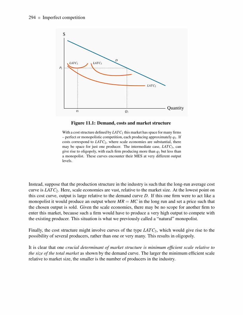
294 Imperfect competition
DLATC1
LATC2
LATC3
$
Quantityq1
P1
Q1
Figure 11.1: Demand, costs and market structure
With a cost structure defined by LATC1 this market has space for many firms
– perfect or monopolistic competition, each producing approximately q1. If
costs correspond to LATC2, where scale economies are substantial, there
may be space for just one producer. The intermediate case, LATC3, can
give rise to oligopoly, with each firm producing more than q1 but less than
a monopolist. These curves encounter their MES at very different output
levels.
Instead, suppose that the production structure in the industry is such that the long-run average cost
curve is LATC2. Here, scale economies are vast, relative to the market size. At the lowest point on
this cost curve, output is large relative to the demand curve D. If this one firm were to act like a
monopolist it would produce an output where MR = MC in the long run and set a price such that
the chosen output is sold. Given the scale economies, there may be no scope for another firm to
enter this market, because such a firm would have to produce a very high output to compete with
the existing producer. This situation is what we previously called a “natural” monopolist.
Finally, the cost structure might involve curves of the type LATC3, which would give rise to the
possibility of several producers, rather than one or very many. This results in oligopoly.
It is clear that one crucial determinant of market structure is minimum efficient scale relative to
the size of the total market as shown by the demand curve. The larger the minimum efficient scale
relative to market size, the smaller is the number of producers in the industry.
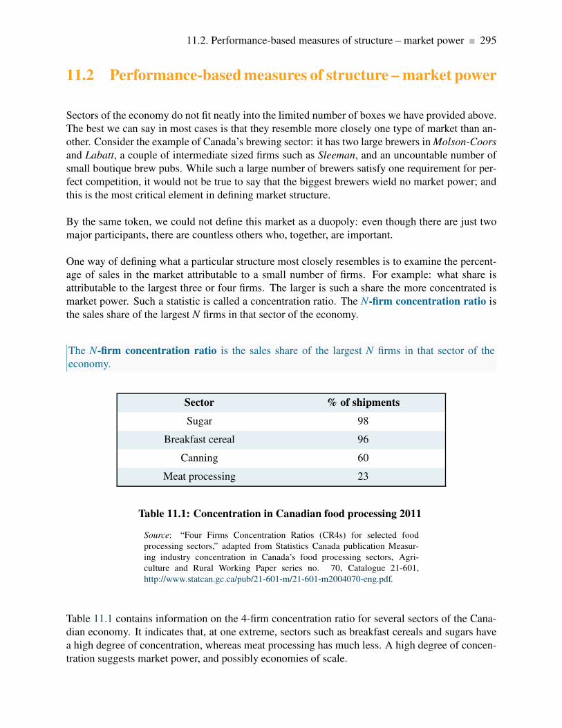
11.2. Performance-based measures of structure – market power 295
11.2 Performance-based measures of structure – market power
Sectors of the economy do not fit neatly into the limited number of boxes we have provided above.
The best we can say in most cases is that they resemble more closely one type of market than an-
other. Consider the example of Canada’s brewing sector: it has two large brewers in Molson-Coors
and Labatt, a couple of intermediate sized firms such as Sleeman, and an uncountable number of
small boutique brew pubs. While such a large number of brewers satisfy one requirement for per-
fect competition, it would not be true to say that the biggest brewers wield no market power; and
this is the most critical element in defining market structure.
By the same token, we could not define this market as a duopoly: even though there are just two
major participants, there are countless others who, together, are important.
One way of defining what a particular structure most closely resembles is to examine the percent-
age of sales in the market attributable to a small number of firms. For example: what share is
attributable to the largest three or four firms. The larger is such a share the more concentrated is
market power. Such a statistic is called a concentration ratio. The N-firm concentration ratio is
the sales share of the largest N firms in that sector of the economy.
The N-firm concentration ratio is the sales share of the largest N firms in that sector of the
economy.
Sector % of shipments
Sugar 98
Breakfast cereal 96
Canning 60
Meat processing 23
Table 11.1: Concentration in Canadian food processing 2011
Source: “Four Firms Concentration Ratios (CR4s) for selected food
processing sectors,” adapted from Statistics Canada publication Measur-
ing industry concentration in Canada’s food processing sectors, Agri-
culture and Rural Working Paper series no. 70, Catalogue 21-601,
http://www.statcan.gc.ca/pub/21-601-m/21-601-m2004070-eng.pdf.
Table 11.1 contains information on the 4-firm concentration ratio for several sectors of the Cana-
dian economy. It indicates that, at one extreme, sectors such as breakfast cereals and sugars have
a high degree of concentration, whereas meat processing has much less. A high degree of concen-
tration suggests market power, and possibly economies of scale.

296 Imperfect competition
11.3 Monopolistic competition
Monopolistic competition presumes a large number of quite small producers or suppliers, each of
whom may have a slightly differentiated product. The competition element of this name signifies
that there are many participants, while the monopoly component signifies that each supplier faces
a downward sloping demand. In concrete terms, your local coffee shop that serves “fair trade”
coffee has a product that differs slightly from that of neighbouring shops that sell the traditional
product. They coexist in the same sector, and probably charge different prices: The fair trade
supplier likely charges a higher price, but knows nonetheless that too large a difference between
her price and the prices of her competitors will see some of her clientele migrate to those lower-
priced establishments. That is to say, she faces a downward-sloping demand curve.
The competition part of the name also indicates that there is free entry and exit. There are no
barriers to entry. As a consequence, we know at the outset that only normal profits will exist in a
long-run equilibrium. Economic profits will be competed away by entry, just as losses will erode
due to exit.
As a general rule then, each firm can influence its market share to some extent by changing its price.
Its demand curve is not horizontal because different firms’ products are only limited substitutes. A
lower price level may draw some new customers away from competitors, but convenience or taste
will prevent most patrons from deserting their local businesses. In concrete terms: a pasta special
at the local Italian restaurant that reduces the price below the corresponding price at the competing
local Thai restaurant will indeed draw clients away from the latter, but the foods are sufficiently
different that not all customers will leave the Thai restaurant. The differentiated menus mean that
many customers will continue to pay the higher price.
A differentiated product is one that differs slightly from other products in the same market.
Given that there are very many firms, the theory also envisages limits to scale economies. Firms are
small and, with many competitors, individual firms do not compete strategically with particular
rivals. Because the various products offered are slightly differentiated, we avoid graphics with a
market demand, because this would imply that a uniform product is being considered. At the same
time the market is a well-defined concept—it might be composed of all those restaurants within a
reasonable distance, for example, even though each restaurant is slightly different from the others.
The market share of each firm depends on the price that it charges and on the number of competing
firms. For a given number of suppliers, a shift in industry demand also shifts the demand facing
each firm. Likewise, the presence of more firms in the industry reduces the demand facing each
one.
The market equilibrium is illustrated in Figure 11.2. Here D0 is the initial demand facing a repre-
sentative firm, and MR0 is the corresponding marginal revenue curve. Profit is maximized where
MC = MR, and the price P0 is obtained from the demand curve corresponding to the output q0.

11.3. Monopolistic competition 297
Total profit is the product of output times the difference between price and average cost, which
equals q0 × (P0−AC0).
D0D MR0MR
AC
MC
$
QuantityqE
PE
q0
P0
AC0
Figure 11.2: Equilibrium for a monopolistic competitor
Profits exist at the initial equilibrium (q0,P0). Hence, new firms enter and
reduce the share of the total market faced by each firm, thereby shifting
back their demand curve. A final equilibrium is reached where economic
profits are eliminated: at AC = PE and MR = MC.
With free entry, such profits attract new firms. The increased number of firms reduces the share of
the market that any one firm can claim. That is, the firm’s demand curve shifts inwards when entry
occurs. As long as (economic) profits exist, this process continues. For entry to cease, average
costs must equal price. A final equilibrium is illustrated by the combination (PE ,qE), where the
demand has shifted inward to D.
At this long-run equilibrium, two conditions must hold: First, the optimal pricing rule must be
satisfied—that is MC = MR; second it must be the case that only normal profits are made at the
final equilibrium. Economic profits are competed away as a result of free entry. And these two
conditions must exist at the optimal output. Graphically this implies that ATC must equal price
at the output where MC = MR. In turn this implies that the ATC is tangent to the demand curve
where P = ATC. While this could be proven mathematically, it is easy to intuit why this tangency
must exist: If ATC merely intersected the demand curve at the output where MC = MR, we could
find some other output where the demand price would be above ATC, suggesting that profits could
be made at such an output. Clearly that could not represent an equilibrium.

298 Imperfect competition
The monopolistically competitive equilibrium in the long run requires the firm’s demand curve
to be tangent to the ATC curve at the output where MR = MC.
11.4 Oligopoly and games
Under perfect competition or monopolistic competition, there are so many firms in the industry that
each one can ignore the immediate effect of its own actions on particular rivals. However, in an
oligopolistic industry each firm must consider how its actions affect the decisions of its relatively
few competitors. Each firm must guess how its rivals will react. Before discussing what constitutes
an intelligent guess, we investigate whether they are likely to collude or compete. Collusion is a
means of reducing competition with a view to increasing profit.
Collusion is an explicit or implicit agreement to avoid competition with a view to increasing
profit.
A particular form of collusion occurs when firms co-operate to form a cartel, as we saw in the last
chapter. Collusion is more difficult if there are many firms in the industry, if the product is not
standardized, or if demand and cost conditions are changing rapidly. In the absence of collusion,
each firm’s demand curve depends upon how competitors react: If Air Canada contemplates of-
fering customers a seat sale on a particular route, how will West Jet react? Will it, too, make the
same offer to buyers? If Air Canada thinks about West Jet’s likely reaction, will it go ahead with
the contemplated offer? A conjecture is a belief that one firm forms about the strategic reaction of
another competing firm.
A conjecture is a belief that one firm forms about the strategic reaction of another competing
firm.
Good poker players will attempt to anticipate their opponents’ moves or reactions. Oligopolists
are like poker players, in that they try to anticipate their rivals’ moves. To study interdependent
decision making, we use game theory. A game is a situation in which contestants plan strategically
to maximize their profits, taking account of rivals’ behaviour.
A game is a situation in which contestants plan strategically to maximize their profits, taking
account of rivals’ behaviour.
The players in the game try to maximize their own payoffs. In an oligopoly, the firms are the

11.4. Oligopoly and games 299
players and their payoffs are their profits. Each player must choose a strategy, which is a plan
describing how a player moves or acts in different situations
A strategy is a game plan describing how a player acts, or moves, in each possible situation.
How do we arrive at an equilibrium in these games? Let us begin by defining a commonly used
concept of equilibrium. A Nash equilibrium is one in which each player chooses the best strategy,
given the strategies chosen by the other players and there is no incentive to move or change choice.
A Nash equilibrium is one in which each player chooses the best strategy, given the strategies
chosen by the other player, and there is no incentive for any player to move.
In such an equilibrium, no player wants to change strategy, since the other players’ strategies were
already figured into determining each player’s own best strategy. This concept and theory are
attributable to the Princeton mathematician John Nash, who was popularized by the Hollywood
movie version of his life A Beautiful Mind.
In most games, each player’s best strategy depends on the strategies chosen by their opponents.
Sometimes, though not always, a player’s best strategy is independent of those chosen by rivals.
Such a strategy is called a dominant strategy
A dominant strategy is a player’s best strategy, whatever the strategies adopted by rivals.
We now illustrate these concepts with the help of two different games. These games differ in
their outcomes and strategies. Table 11.2 contains the domestic happiness game1. Will and Kate
are attempting to live in harmony, and their happiness depends upon each of them carrying out
domestic chores such as shopping, cleaning and cooking. If both contribute to domestic life they
each receive a happiness or utility level of 5 units. If one contributes and the other does not the
happiness levels are 2 for the contributor and 6 for the free-rider. If neither contributes happiness
levels are 3 each. When each follows the same strategy the payoffs are on the diagonal, when
they follow different strategies the payoffs are on the off-diagonal. Since the elements of the table
define the payoffs resulting from various choices, this type of matrix is called a payoff matrix.
A payoff matrix defines the rewards to each player resulting from particular choices.
So how is the game likely to unfold? In response to Will’s choice of a contribute strategy, Kate’s
1This presentation is inspired by a similar problem in Ted Bergstrom and Hal Varian’s book “Workouts”.

300 Imperfect competition
utility maximizing choice involves lazing: she gets 6 units by not contributing as opposed to 5 by
contributing. Instead, if Will decides to be lazy what is in Kate’s best interest? Clearly it is to be
lazy also because that strategy yields 3 units of happiness compared to 2 units if she contributes.
In sum, Kate’s best strategy is to be lazy, regardless of Will’s behaviour. So the strategy of not
contributing is a dominant strategy.
Will also has a dominant strategy – identical to Kate’s. This is not surprising since the payoffs are
symmetric in the table. Hence, since each has a dominant strategy of not contributing the Nash
equilibrium is in the bottom right cell, where each receives a payoff of 3 units. Interestingly this
equilibrium is not the one that yields maximum combined happiness.
Kate’s choice
Contribute Laze
Contribute 5,5 2,6Will’s choice
Laze 6,2 3,3
Table 11.2: A game with dominant strategies
The first element in each cell denotes the payoff or utility to Will; the second
element the utility to Kate.
The reason that the equilibrium yields less utility for each player in this game is that the game is
competitive: each player tends to their own interest and seeks the best outcome conditional on the
choice of the other player. This is evident from the (5, 5) combination. From this position Kate
would do better to defect to the Laze strategy, because her utility would increase2.
To summarize: this game has a unique equilibrium and each player has a dominant strategy. But
let us change the payoffs just slightly to the values in Table 11.3. The off-diagonal elements have
changed. The contributor now gets no utility as a result of his or her contributions: even though
the household is a better place, he or she may be so annoyed with the other person that no utility
flows to the contributor.
2This game is sometimes called the “prisoners’ dilemma” game because it can be constructed to reflect a scenario
in which two prisoners, under isolated questioning, each confess to a crime and each ends up worse off than if neither
confessed.
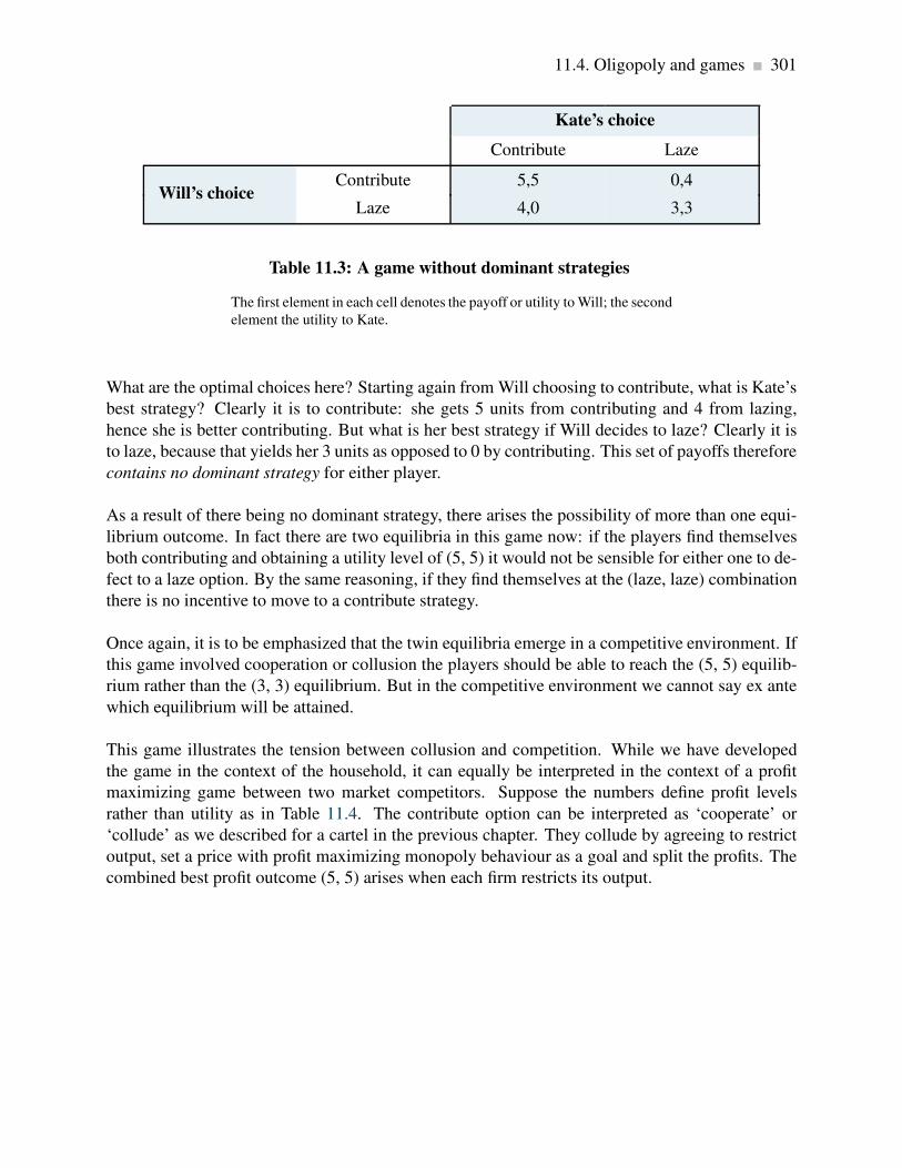
11.4. Oligopoly and games 301
Kate’s choice
Contribute Laze
Contribute 5,5 0,4Will’s choice
Laze 4,0 3,3
Table 11.3: A game without dominant strategies
The first element in each cell denotes the payoff or utility to Will; the second
element the utility to Kate.
What are the optimal choices here? Starting again from Will choosing to contribute, what is Kate’s
best strategy? Clearly it is to contribute: she gets 5 units from contributing and 4 from lazing,
hence she is better contributing. But what is her best strategy if Will decides to laze? Clearly it is
to laze, because that yields her 3 units as opposed to 0 by contributing. This set of payoffs therefore
contains no dominant strategy for either player.
As a result of there being no dominant strategy, there arises the possibility of more than one equi-
librium outcome. In fact there are two equilibria in this game now: if the players find themselves
both contributing and obtaining a utility level of (5, 5) it would not be sensible for either one to de-
fect to a laze option. By the same reasoning, if they find themselves at the (laze, laze) combination
there is no incentive to move to a contribute strategy.
Once again, it is to be emphasized that the twin equilibria emerge in a competitive environment. If
this game involved cooperation or collusion the players should be able to reach the (5, 5) equilib-
rium rather than the (3, 3) equilibrium. But in the competitive environment we cannot say ex ante
which equilibrium will be attained.
This game illustrates the tension between collusion and competition. While we have developed
the game in the context of the household, it can equally be interpreted in the context of a profit
maximizing game between two market competitors. Suppose the numbers define profit levels
rather than utility as in Table 11.4. The contribute option can be interpreted as ‘cooperate’ or
‘collude’ as we described for a cartel in the previous chapter. They collude by agreeing to restrict
output, set a price with profit maximizing monopoly behaviour as a goal and split the profits. The
combined best profit outcome (5, 5) arises when each firm restricts its output.

302 Imperfect competition
Firm K’s profit
Low output High output
Low output 5,5 2,6Firm W’s profit
High output 6,2 3,3
Table 11.4: Collusion possibilities
The first element in each cell denotes the profit to Firm W; the second ele-
ment the profit to Firm K.
But again there arises an incentive to defect: if Firm W agrees to maintain a high price and restrict
output, then Firm K has an incentive to renege and increase output, hoping to improve its profit
through the willingness of Firm W to restrict output. Since the game is symmetric, each firm has
an incentive to renege.
Obviously there arises the question of whether these firms can find an operating mechanism that
would ensure they each generate a profit of 5 units rather than 3 units, while remaining purely
self-interested. This question brings us to the realm of games that are repeated many times. Such
games are beyond our scope, but here is a flavour of how they work.
One way is that a binding commitment be put in place, which restricts future actions. If both play-
ers in this game were to sign an enforceable agreement to produce a low output, then each could
earn a profit of five units rather than the three units earned in the non-collusive or ‘competitive’
equilibrium. A binding commitment gets both players to produce a low output and gain thereby.
Although this commitment concept is powerful, its application to oligopoly requires care: cartels
within a country are usually illegal.
A binding commitment is an agreement, entered into voluntarily, that restricts future actions.
Is there a less formal way to avoid “cheating” in the cartel solution? In some situations there may
be. The key ingredient for such a possibility is that the punishment that will be inflicted upon the
firm violating the agreement must be in the interest of the firm that inflicts the punishment. Such a
situation gives credibility to the punishment.
A credible threat is one that, after the fact, is still optimal to carry out.
We now examine a particular type of game involving two firms – a duopoly.

11.5. Duopoly and Cournot games 303
11.5 Duopoly and Cournot games
The duopoly model that we frequently use in economics to analyze competition between a small
number of competitors is fashioned after the ideas of French economist Augustin Cournot. Conse-
quently it has come to be known as the Cournot duopoly model. While the maximizing behaviour
that is incorporated in this model can apply to a situation with several firms rather than two, we
will develop the model with two firms. This model that we now explore differs somewhat from
what we developed in the preceding section, where each firm has simply a choice between a high
or low output. In addition that game had a dominant strategy for each participant, an infrequent
event in most markets.
The critical element of the Cournot approach is that the firms each determine their optimal strategy
– one that maximizes profit – by reacting optimally to their opponent’s strategy, which in this case
is also their choice of output.
Cournot behaviour involves each firm reacting optimally in their choice of output to their com-
petitors’ output decisions.
A central element here is the reaction function of each firm, which defines the optimal output
choice conditional upon their opponent’s choice.
Reaction functions define the optimal choice of output conditional upon a rival’s output choice.
We can develop an optimal strategy with the help of Figure 11.3. D is the market demand, and
two firms supply this market. If B supplies a zero output, then A would face the whole demand,
and would maximize profit where MC = MR. Let this output be defined by qA0. We transfer this
output combination to Figure 11.4, where the output of each firm is on one of the axes—A on the
vertical axis and B on the horizontal. This particular combination of zero output for B and qA0 for
A is represented on the vertical axis as the point qA0.

304 Imperfect competition
D (market demand)
DAr
MRMRAr
MCA
Price
QuantityqA1
P1
P0
qB1
Figure 11.3: Duopoly behaviour
When one firm, B, chooses a specific output, e.g. qB1, then A’s residual
demand DAr is the difference between the market demand and qB1. A’s
profit is maximized at qA1 – where MC = MRAr . This is an optimal reaction
by A to B’s choice. For all possible choices by B, A can form a similar
optimal response. The combination of these responses forms A’s reaction
function.
Instead, suppose that B produces a quantity qB1 in Figure 11.3. This reduces the demand curve
facing A correspondingly from D to DAr , which we call A’s residual demand. When subject to
such a choice by B, firm A maximizes profit by producing where MRAr = MC, where MRAr is the
marginal revenue corresponding to the residual demand DAr . The optimum for A is now qA1, and
this pair of outputs is represented by the combination (qA1,qB1) in Figure 11.4.

11.5. Duopoly and Cournot games 305
qA0
RA
RB
A’s output
qB0B’s output
qAEE
qBE
qA1
qB1
Figure 11.4: Reaction functions and equilibrium
The reaction function for A (RA) defines the optimal output response for A
to any output choice by B. The reaction function for B is defined similarly.
The equilibrium occurs at the intersection of RA and RB. Any other combi-
nation will induce one firm to change its output, and therefore could not be
an equilibrium.
We can imagine A forming a similar optimal response for every possible output level that B could
choose.
The reaction function illustrated for A in Figure 11.4 is thus the locus of all optimal response
outputs on the part of A. The downward-sloping function makes sense: The more B produces, the
smaller is the residual market for A, and therefore the less A will produce.
But A is just one of the players in the game. If B acts in the same optimizing fashion, B too can
formulate a series of optimal reactions to A’s output choices. The combination of such choices
would yield a reaction function for B. This is plotted as RB in Figure 11.4.
An equilibrium is defined by the intersection of the two reaction functions, in this case by the point
E. At this output level each firm is making an optimal decision, conditional upon the choice of
its opponent. Consequently, neither firm has an incentive to change its output; therefore it can be
called the Nash equilibrium, as we defined earlier.
Any other combination of outputs on either reaction function would lead one of the players to
change its output choice, and therefore could not constitute an equilibrium. To see this, suppose
that B produces an output greater than qBE ; how will A react? A’s reaction function indicates that it
should choose a quantity to supply less than qAE . If so, how will B respond in turn to that optimal

306 Imperfect competition
choice? It responds with a quantity read from its reaction function, and this will be less than the
amount chosen at the previous stage. By tracing out such a sequence of reactions it is clear that the
output of each firm will move to the equilibrium qE .
In this particular example, we assume each firm has the same cost structure. In addition they face
the same market demand. Consequently their reaction functions are symmetric. To see how this
model works numerically, consider the following example.
Let the marginal cost of each firm be constant at $6; thus MC = 6. Fixed costs are zero, and market
demand will be given by
P = 24−Q, that is P = 24− (QA+QB).
The total amount traded, Q, is the sum of what each firm produces: Q = QA +QB. It follows that
the residual demand facing A is
P = (24−QB)−QA,
where the bar denotes a given amount on the part of B, and the MR curve is of similar form with
twice the slope:
MR = (24−QB)−2QA.
Profit is maximized where MC = MR, hence the choice of output for A is given as follows:
MC = MR implies 6 = (24−QB)−2QA.
Rearranging yields A’s reaction function:
2QA = 24−6−QB ⇒ QA =(18−QB)
2.
This is A’s reaction function. The reaction function for firm B can be obtained in exactly the same
manner, and since the firms are assumed to have an identical cost structure in this example, B’s
reaction function must be a mirror image of A’s:
QB =(18−QA)
2.

11.6. Comparing market structures 307
Solving the two reaction functions for their intersection point (E in Figure 11.4), yields the Nash
equilibrium solution QA = 6 and QB = 6.
Finally, since the total output produced by the two suppliers is 12 units, the market demand curve
indicates that this output must be sold at a price of $12 (P = 24−12). With a constant cost per unit
of output, the profit of each firm is $36.
This example is particular in that it is symmetric – each firm has the same cost structure. But this
need not be the case, and an interesting aspect of the Cournot model is that firms with different
cost structures can survive side by side in the market. If we were to rework the above example with
one of the firms having a higher marginal cost than the other we would find, not surprisingly, that
the low-cost firm would obtain a greater market share than the high-cost producer. But the high
cost producer here is not driven out of the market place. In contrast to perfect competition, where
the presence of a large number of firms drives the price to a point where there are zero economic
profits, the duopoly framework is a game played by just two competitors, and consequently each
has market power.
Why do we observe so many industries on the national, and even international, stages with
only a handful of firms? For example, Intel produces more than half of the world’s computer
chips, and AMD produces a significant part of the remainder. Why are there only two major
commercial aircraft producers in world aviation-Boeing and Airbus? Why are there only a
handful of major pharmaceutical manufacturers in North America?
The answer to these questions lies partly in the nature of modern product development. Prod-
uct development (fixed) costs, coupled with a relatively small marginal cost of production,
leads to markets where there is enough space for only a few players. The development cost
for a new cell phone, or a new aircraft, or a new operating system may run into billions,
while the cost of producing each unit may in fact be constant. The enormous development
cost associated with many products explains not only why there may be a small number of
firms in the domestic market for the product, but also why the number of firms in some sectors
is small worldwide.
Application Box 11.1: Cournot: fixed costs and brand
11.6 Comparing market structures
We are now in a position to make a general statement about the relative output levels that will
be produced in several different market structures when marginal costs are constant. For ease
of exposition we use the foregoing numerical example, where the market demand is given by
P = 24−Q, and MC = 6.
308 Imperfect competition
In the duopoly case we saw that the output for each firm i (assumed identical) was Qi = 6.
With monopoly, profit is maximized where MC = MR. Since MR = 24−2Q, the monopoly output
is obtained from the equation 6 = 24−2Q; that is Q = 9.
If these two firms acted in the same way as perfect competitors (we cannot call this perfect compe-
tition because there are just two firms), we know from Chapter 9 that the market solution is where
P = MC. Consequently, if we equate the demand and MC functions the solution for the market
outcome is Q = 18 (equating 24−Q = 6 yields Q = 18).
In this case of constant marginal costs, the above solutions indicate that we can formulate a general
rule regarding the output of firms that depends on the number of firms N.
Individual firm output =market output under competitive behaviour
(N+1).
For example, in the duopoly case, substituting N = 2 and competitive output of 18 yields a firm
output of 6. In the monopoly case N = 1 and hence output is 9.
11.7 Entry, exit & potential competition
At this point we inquire about the potential impact of new firms – firms who might enter the
industry if conditions were sufficiently enticing – meaning high profits. Indeed we could ask if
firms will necessarily enter a market such as the one described in the duopoly game above, if there
is ‘freedom to enter and exit’.
A simple way to illustrate the possibilities is to change that illustration very slightly: in addition
to the constant marginal cost of producing the good, suppose there is a fixed cost associated with
setting up production. This might comprise the research and development costs necessary to launch
production, and such costs are incurred by each firm that participates in the market.
In the foregoing example each of the two firms that competed for profit using Cournot behaviour
earned a profit of $36. Obviously then, if the fixed costs are less than this number, each firm
continues to make a profit net of fixed costs, but if fixed costs are greater than $36 both firms
cannot be profitable. So let us assume fixed costs are low enough such that each firm is profitable
after all costs are considered. In addition there are no legal constraints preventing entry. Will new
firms enter and compete for the market? The answer is ‘not necessarily’, even if the potential new
firm has the same marginal and fixed costs: by entering, the market will now be split three ways
and that may squeeze the profit margins of all three suppliers to such an extent that the operating
margins are no longer sufficient to cover the fixed costs. If, at the time of entry, profit margins are
low (fixed costs are almost large enough to swallow the operating margin of $36) the addition of a

11.7. Entry, exit & potential competition 309
third firm may put every firm into a state of negative profit. Hence no entry will occur, because the
potential new entrant recognizes she cannot make a profit.
To complete the discussion, let’s ask what would happen if fixed costs were greater than the operat-
ing profit of the two incumbents in the example as developed above. For example the government
decided to levy a charge on firms that sell tobacco (as was done in the US in 2009). This charge
effectively increases fixed costs. What are the dynamics of this situation? The answer here is that
it may still be profitable for one firm to make a profit if the other exits. This is because the exit of
one firm will result in a monopoly. Not only would the single producer produce more than each
duopolist (and thereby reduce average costs as a result of scale economies), he may also be able to
charge a higher price in the absence of a competitor.
The economic reasoning behind the foregoing results is that there are returns to scale in this in-
dustry. As illustrated in Chapter 10, if the fixed costs are large relative to marginal costs, then the
average cost continually declines, and it may be necessary to produce a large output in order to re-
duce average costs sufficiently to be competitive. The problem with having a third firm considering
entry to a profitable duopoly is that each firm would be constrained to produce a reduced output,
and such an output may be too small to enable them make a profit given the demand conditions.
Clearly then, there is a scale economies reason for entry not materializing; the incumbent firms
need not take any preemptive measures to prevent entry.
Deterring entry
In contrast to this case consider now a monopolist who actively pursues a strategy of entry deter-
rence. This means that an already-operating supplier adopts a strategy that will deter new entrants.
What follows is a non-technical description of how a monopolist might strategically erect a barrier
to entry.
Devil’s Glen is the sole ski resort accessible to the residents of local Angel’s Valley. The resort
is profitable, but the owners fear that an adjoining hill, owned by a potential competitor, may be
developed. Such a development would reduce Devil’s Glen’s profits radically. In the face of this
threat, can Devil’s Glen develop a strategy to protect its profit, or at least a large part of its profit?
One such strategy is for Devil’s Glen to pre-commit itself to a specific course of action that is
additionally costly to itself. In particular, it could invest in a new ski lift that would generate
excess capacity, or that it might not even use. Such a strategy would indeed be costly, but it would
undoubtedly send a signal to its potential competitor that Devil’s Glen could bring on this spare
capacity, reduce lineup times, and thereby make it very difficult for a new resort operator to make
a profit.
A key component of this strategy is that the incumbent invests ahead of time - and inflicts a cost on
itself. The incumbent does not simply say “I will build another lift if you enter the business.” Such
a policy does not carry the same degree of credibility as actually incurring the cost of construction
310 Imperfect competition
ahead of time.
This capacity commitment is an example of strategic entry deterrence. Of course, there is no
guarantee that such a move will always work; it might be just too costly to pre-empt entry by
putting spare capacity in place. An alternative strategy might be to permit entry and share the
market.
Spare capacity is not the only pre-commitment available to incumbents. Anything with the charac-
ter of a sunk cost may work. Advertising to build brand loyalty is a further example. So is product
proliferation. Suppose one cereal manufacturer has a strong grip on the market. A potential com-
petitor is contemplating entry. So the incumbent decides to introduce a new line of cereals in order
to prevent the entry. The incumbent thereby commits himself to an additional cost in the form of
product development. And this development cost is sunk. The incumbent reduces his profit today
in order to prevent entry, and maintain his profit tomorrow.
The threats associated with the incumbent’s behaviour become more credible since the incumbent
incurs costs up front. To be completely credible the potential competitor must be convinced that
the incumbent will actually follow through with the implication of building the additional capacity.
Hence in the case of the ski hill owner who has added capacity, the potential competitor would have
to be convinced that the incumbent would actually use that additional capacity if the competitor
were to enter.
Conclusion
Monopoly and perfect competition are interesting paradigms; but few markets resemble them in
the real world. In this chapter we addressed some of the complexities that define the world around
us: it is characterized by strategic planning, entry deterrence, differentiated products and so forth.
Entry and exit are critical to competitive markets. Frequently entry is blocked because of scale
economies – an example of a natural or unintended entry barrier. In addition, incumbents can
formulate strategies to limit entry, for example by investing in additional capacity or in the devel-
opment of new products. Such strategies, where effective, are called credible threats.
We also stress that firms act strategically – particularly whenever there are just a few participants
present. Before taking any action, these firms make conjectures about how their competitors will
react, and incorporate such reactions into their planning. Competition between suppliers can fre-
quently be defined in terms of a game, and such games usually have an equilibrium outcome.
The Cournot duopoly model that we developed is a game between two competitors in which an
equilibrium market output is determined from a pair of reaction functions.
Scale economies are critical. Large development costs or set up costs mean that the market will
generally support just a limited number of producers. In turn this implies that potential new (small-
scale) firms cannot benefit from the scale economies and will not survive competition from large-

11.7. Entry, exit & potential competition 311
scale suppliers.
Finally, product differentiation is critical. If small differences exist between products produced in
markets where there is free entry we get a monopolistically competitive market. In these markets
long run profits are ‘normal’ and firms operate with some excess capacity. It is not possible to act
strategically in this kind of market.

312 KEY TERMS
KEY TERMS
Imperfectly competitive firms face a downward-sloping demand curve, and their output price
reflects the quantity sold.
Oligopoly defines an industry with a small number of suppliers.
Monopolistic competition defines a market with many sellers of products that have similar
characteristics. Monopolistically competitive firms can exert only a small influence on the
whole market.
Duopoly defines a market or sector with just two firms.
Concentration ratio: N-firm concentration ratio is the sales share of the largest N firms in
that sector of the economy.
Differentiated product is one that differs slightly from other products in the same market.
The monopolistically competitive equilibrium in the long run requires the firm’s demand
curve to be tangent to the ATC curve at the output where MR = MC.
Collusion is an explicit or implicit agreement to avoid competition with a view to increasing
profit.
Conjecture: a belief that one firm forms about the strategic reaction of another competing
firm.
Game: a situation in which contestants plan strategically to maximize their profits, taking
account of rivals’ behaviour.
Strategy: a game plan describing how a player acts, or moves, in each possible situation.
Nash equilibrium: one in which each player chooses the best strategy, given the strategies
chosen by the other player, and there is no incentive for any player to move.
Dominant strategy: a player’s best strategy, whatever the strategies adopted by rivals.
Payoff matrix: defines the rewards to each player resulting from particular choices.
Binding commitment: an agreement, entered into voluntarily, that restricts future actions.

KEY TERMS 313
Credible threat: one that, after the fact, is still optimal to implement.
Cournot behaviour involves each firm reacting optimally in their choice of output to their
competitors’ decisions.
Reaction functions define the optimal choice of output conditional upon a rival’s output
choice.
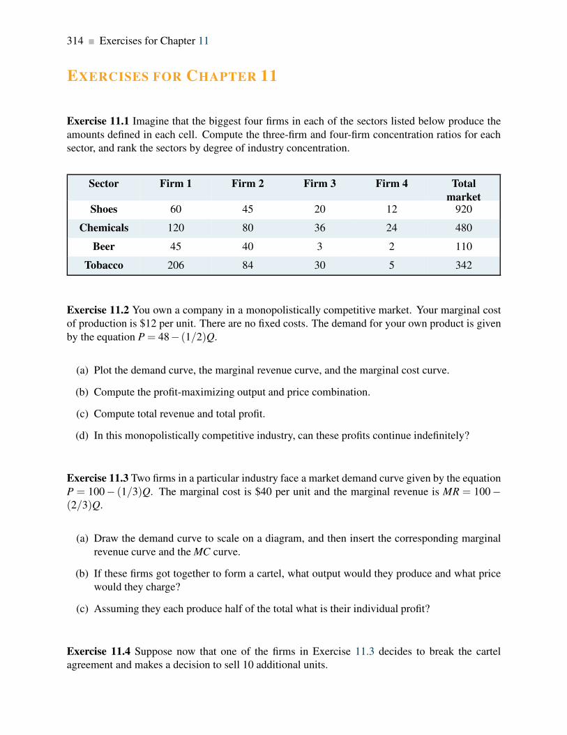
314 Exercises for Chapter 11
EXERCISES FOR CHAPTER 11
Exercise 11.1 Imagine that the biggest four firms in each of the sectors listed below produce the
amounts defined in each cell. Compute the three-firm and four-firm concentration ratios for each
sector, and rank the sectors by degree of industry concentration.
Sector Firm 1 Firm 2 Firm 3 Firm 4 Total
marketShoes 60 45 20 12 920
Chemicals 120 80 36 24 480
Beer 45 40 3 2 110
Tobacco 206 84 30 5 342
Exercise 11.2 You own a company in a monopolistically competitive market. Your marginal cost
of production is $12 per unit. There are no fixed costs. The demand for your own product is given
by the equation P = 48− (1/2)Q.
(a) Plot the demand curve, the marginal revenue curve, and the marginal cost curve.
(b) Compute the profit-maximizing output and price combination.
(c) Compute total revenue and total profit.
(d) In this monopolistically competitive industry, can these profits continue indefinitely?
Exercise 11.3 Two firms in a particular industry face a market demand curve given by the equation
P = 100− (1/3)Q. The marginal cost is $40 per unit and the marginal revenue is MR = 100−(2/3)Q.
(a) Draw the demand curve to scale on a diagram, and then insert the corresponding marginal
revenue curve and the MC curve.
(b) If these firms got together to form a cartel, what output would they produce and what price
would they charge?
(c) Assuming they each produce half of the total what is their individual profit?
Exercise 11.4 Suppose now that one of the firms in Exercise 11.3 decides to break the cartel
agreement and makes a decision to sell 10 additional units.

Exercises for Chapter 11 315
(a) How many units does he intend to sell?
(b) If the other supplier maintains her output at the cartel level, at what price will the new total
output be sold?
(c) What profit will each make in this new situation?
(d) Is the combined profit here greater or less than in the cartel situation?
(e) How is the firm that previously maintained the cartel output level likely to react here?
Exercise 11.5 The classic game theory problem is the “prisoners’ dilemma.” In this game, two
criminals are apprehended, but the police have only got circumstantial evidence to prosecute them
for a small crime, without having the evidence to prosecute them for the major crime of which they
are suspected. The interrogators then pose incentives to the crooks-incentives to talk. The crooks
are put in separate jail cells and have the option to confess or deny. Their payoff depends upon
what course of action each adopts. The payoff matrix is given below. The first element in each box
is the payoff (years in jail) to the player in the left column, and the second element is the payoff to
the player in the top row.
B’s strategy
Confess Deny
Confess 6,6 0,10A’s strategy
Deny 10,0 1,1
(a) Does a “dominant strategy” present itself for each or both of the crooks?
(b) What is the Nash equilibrium to this game?
(c) Is the Nash equilibrium unique?
(d) Was it important for the police to place the crooks in separate cells?
Exercise 11.6 Taylormade and Titlelist are considering a production strategy for their new golf
drivers. If they each produce a small output, they can price the product higher and make more
profit than if they each produce a large output. Their payoff/profit matrix is given below.
Taylormade strategy
Low output High output
Low output 50,50 20,70Titleist strategy
High output 70,20 40,40

316 Exercises for Chapter 11
(a) Does either player have a dominant strategy here?
(b) What is the Nash equilibrium to the game?
(c) Do you think that a cartel arrangement would be sustainable?
Exercise 11.7 The reaction functions for two firms A and B in a duopoly are given by: QA =104−2QB and QB = 80−4QA.
(a) Plot the reaction functions to scale on a graph.
(b) Solve the two reaction functions for the equilibrium output produced by each.
(c) Do you think that these firms have the same cost structure? Explain.
Exercise 11.8 Consider the example developed in Section 11.5 of the text, assuming this time that
firm A has a MC of $4 per unit, and B has a MC of $6.
(a) Compute the level of output each will produce
(b) Compute the total output produced by both firms.
(c) Compute the profit made by each firm.
(d) Comparing their combined output with the output when the MC of each firm is $6, explain
why the totals differ.
Exercise 11.9 Consider the market demand curve for appliances: P = 3,200− (1/4)Q. There are
no fixed production costs, and the marginal cost of each appliance is MC = $400.
(a) Determine the output that will be produced in a ‘perfectly competitive’ market structure
where no profits accrue in equilibrium.
(b) If this market is supplied by a monopolist what is the profit maximizing output?
(c) What will be the total output produced in the Cournot duopoly game? [Hint: you can either
derive the reaction functions and solve them, or use the formula from Section 10.6 of the
chapter.]
Exercise 11.10 Consider the outputs you have obtained in Exercise 11.9.

Exercises for Chapter 11 317
(a) Compute the profit levels under each of the three market structures.
(b) Can you figure out how many firms would produce at the perfectly competitive output? If
not, can you think of a reason?
Exercise 11.11 Ronnie’s Wraps is the only supplier of sandwich food and makes a healthy profit. It
currently charges a high price and makes a profit of six units. However, Flash Salads is considering
entering the same market. The payoff matrix below defines the profit outcomes for different possi-
bilities. The first entry in each cell is the payoff/profit to Flash Salads and the second to Ronnie’s
Wraps.
Ronnie’s Wraps
High price Low price
Enter the market 2,3 -1,1Flash Salads
Stay out of market 0,6 0,4
(a) If Ronnie’s Wraps threatens to lower its price in response to the entry of a new competitor,
should Flash Salads stay away or enter?
(b) Explain the importance of threat credibility here.
Exercise 11.12 A monopolistically competitive firm has an average total cost curve given by
ATC = 2/Q+ 1+Q/8. The slope of this curve is given by 1/8− 2/Q2. The marginal cost is
MC = 1+Q/4. Her demand curve is given by P = 3− (3/8)Q, and so the marginal revenue curve
is given by MR = 3− (3/4)Q. We know that the equilibrium for this firm (see Figure 11.2) is
where the demand curve is tangent to the ATC curve – where the slopes are equal.
(a) What is the equilibrium output for this firm [Hint: find where the slope of the demand curve
equals the slope of the ATC curve]?
(b) At what price will the producer sell this output?
(c) Solve for where MC = MR, this is the profit maximizing condition – does it correspond to
where the slope of the demand curve equals the slope of the ATC?
(d) Since the MC always intersects the ATC at the minimum of the ATC, solve for the output
level that defines this ATC minimum.


Part FiveThe Factors of Production
12. Labour and capital
13. Human capital, education and the distribution of income
Output is produced by the factors of production – land, labour and capital. In Chapter 12 we
explore how the markets for these factors, or productive inputs, operate. We focus primarily on
labour and capital.
Chapter 13 deals with human capital – a broader concept than labour. The human capital embodied
in a person depends upon her skills, education and experience, and this combination determines
the rewards, or return, she obtains when employed.


Chapter 12
Labour and capital
In this chapter we will explore:
12.1 The demand for labour
12.2 Industry and firm level behaviour
12.3 Labour supply
12.4 Market equilibrium and labour mobility
12.5 The capital market
12.6 Capital services and capital goods
12.7 Land
12.1 Labour – a derived demand
Labour markets differ somewhat from goods and services markets: goods and services are pur-
chased and consumed directly by the buyers. In contrast, labour and capital are used as inputs in
producing those goods and services. Prices in product markets reflect the value consumers place
upon them and the supply conditions governing them. The wage is the price that equilibrates the
supply and demand for a given type of labour; it reflects the value of the product that emerges from
the use of capital and labour. The demand for labour (and capital) is thus a derived demand – the
value of labour to the employer derives from the value of the end product in the marketplace for
goods and services. It is not a final demand.
Demand for labour: a derived demand, reflecting the demand for the output of final goods and
services.
We must distinguish between the long run and the short run in our analysis of factor markets. On
the supply side certain factors of production are fixed in the short run. For example, the supply
of radiologists can be increased only over a period of years. While one hospital may be able to
321

322 Labour and capital
attract radiologists from another hospital to meet a shortage, this does not increase the supply in
the economy as a whole.
On the demand side there is the conventional difference between the short and long run: in the short
run some of a firm’s factors of production, such as capital, are fixed and therefore the demand for
labour differs from when all factors are variable – the long run.
Demand in the short run
Table 12.1 contains information from the example developed in Chapter 8. It can be used to illus-
trate how a firm reacts in the short run to a change in an input price. Such a response constitutes a
demand function – a schedule relating the quantity demanded for an input to different input prices.
The output produced by the various numbers of workers yields a marginal product curve, whose
values are stated in column 3. The marginal product of labour, MPL, as developed in Chapter 8,
is the additional output resulting from one more worker being employed, while holding constant
the other (fixed) factors. But what is the dollar value to the firm of an additional worker? It is the
additional value of output resulting from the additional employee – the price of the output times
the worker’s marginal contribution to output, his MP. We term this the value of the marginal
product.
Workers Output MPL V MPL = MPL ×P Marginal profit =
(VMPL−wage)
(1) (2) (3) (4) (5)
0 0
1 15 15 1050 150
2 40 25 1750 750
3 70 30 2100 1100
4 110 40 2800 1800
5 145 35 2450 1450
6 175 30 2100 1100
7 200 25 1750 750
8 220 20 1400 400
9 235 15 1050 50
10 240 5 350 negative
Table 12.1: Short-run production and labour demand
Each unit of labour costs $1000; output sells at a fixed price of $70 per unit.

12.1. Labour – a derived demand 323
The value of the marginal product is the marginal product multiplied by the price of the good
produced.
In this example the MPL first rises and then falls. With each unit of output selling for $70 the value
of the marginal product of labour (V MPL) is given in column 4. The first worker produces 15 units
each week, and since each unit sells for a price of $70, then his net value to the firm is $1,500. A
second worker produces 25 units, so his weekly value to the firm is $1,750, and so forth. If the
weekly wage of each worker is $1,000 then the firm can estimate its marginal profit from hiring
each additional worker. This is given in the final column.
It is profitable to hire more workers as long as the cost of an extra worker is less than the V MPL.
The equilibrium amount of labour to employ is therefore 9 units in this example. If the firm were
to hire one more worker the contribution of that worker to its profit would be negative, and if it
hired one worker less it would forego the opportunity to make an additional profit of $50 on the
9th unit.
Profit maximizing hiring rule:
• If the VMPL of next worker > wage, hire more labour.
• If the VMPL < wage, hire less labour.
To this point we have determined the profit maximizing amount of labour to employ when the
output price and the wage are given. However, a demand function for labour reflects the demand
for labour at many different wage rates. Accordingly, suppose the wage rate is $1,500 per week
rather than $1,000. The optimal amount of labour to employ in this case is determined in exactly
the same manner: employ the amount of labour where its contribution is marginally profitable.
Clearly the optimal amount to employ is 7 units: the value of the seventh worker to the firm is
$1,750 and the value of the eighth worker is $1,400. Hence it would not be profitable to employ
the eighth, because his marginal contribution to profit would be negative. Following the same
procedure we could determine the optimal labour to employ at any wage. It is evident that the
V MPL function is the demand for labour function because it determines the most profitable amount
of labour to employ at any wage.
The optimal amount of labour to hire is illustrated in Figure 12.1. The wage and V MPL curves
come from Table 12.1. The VMPL curve has an upward sloping segment, reflecting increasing
productivity, and then a regular downward slope as developed in Chapter 8. At employment levels
where the V MPL is greater than the wage additional labour should be employed. But when the
V MPL falls below the wage rate employment should stop. If labour is divisible into very small
units, the optimal employment decision is where the MPL function intersects the wage line.

324 Labour and capital
0 1 2 3 4 5 6 7 8 9 10 110
1000
2000
3000
V MPL at P = $70
V MPL at P = $50
Labour
Wag
e($
)
Figure 12.1: The demand for labour
The optimal hiring decision is defined by the condition that the value of the
MPL is greater than or equal to the wage paid.
Figure 12.1 also illustrates what happens to hiring when the output price changes. Consider a
reduction in its price to $50 from $70. The profit impact of such a change is negative because the
value of each worker’s output has declined. Accordingly the demand curve must reflect this by
shifting inward, as in the figure. At various wage rates, less labour is now demanded.
In this example the firm is a perfect competitor in the output market – the price of the good being
produced is fixed. Where the firm is not a perfect competitor it faces a declining MR function. In
this case the value of the MPL is the product of MR and MPL rather than P and MPL. To distinguish
the different output markets we use the term marginal revenue product of labour (MRPL) when
the demand for the output slopes downward. But the optimizing principle remains the same: the
firm should calculate the value of each additional unit of labour, and hire up to the point where the
additional revenue produced by the worker exceeds or equals the additional cost of that worker.
The marginal revenue product of labour is the additional revenue generated by hiring one more
unit of labour where the marginal revenue declines.
Demand in the Long Run
In Chapter 8 we proposed that firms choose their factors of production in accordance with cost-
minimizing principles. In producing a specific output, firms will choose the least-cost combina-

12.1. Labour – a derived demand 325
tion of labour and plant size. But how is this choice affected when the price of labour or capital
changes? Adjusting to such changes may require a long period of time, because such changes will
usually require an adjustment in the optimal amount of capital to use. If one factor becomes more
expensive, the firm will likely change the mix of capital and labour away from that factor.
This behaviour is to be seen everywhere, and explains why we have fundamental differences in
production techniques in different economies. For example, Canadian farmers face high wages
relative to the rental on a harvester, while in South Asia labour is cheap and abundant relative to
capital. Consequently harvesting in Canada is capital intensive whereas in Asia it is done with lots
of sickle-wielding labour.
In the short run a higher wage increases costs, but the firm is constrained in its choice of inputs by a
fixed plant size. In the long run, a wage increase will induce the firm to use relatively more capital
than when labour was less expensive in producing a given output. But despite the new choice of
inputs, a rise in the cost of any input must increase the total cost of producing any output. This
higher cost of production must be reflected in a shift in the supply curve and therefore be reflected
in a change in the price of the final good being produced.
Thus a change in the price of any factor has two impacts on firms: in the first place they will
substitute away from the factor whose price increases; second, since the cost structure for the
whole industry increases, the supply curve in the market for the good must decline – less will be
supplied at any output price. With a downward sloping demand, this shift in supply must increase
the price of the good and reduce the amount sold. This second effect can be called an output effect.
To conclude: the adjustment responses of firms to changes in input prices are twofold: Firms adjust
their combinations of labour and capital in accordance with the prices of each. But increases in
input prices result in higher prices for final goods, and these higher prices reduce the demand in
the marketplace for the good being produced. Such changes in turn reduce the demand for inputs.
Monopsony
Some firms may have to pay a higher wage in order to employ more workers. Think of Hydro
Quebec building a dam in Northern Quebec. Not every hydraulic engineer would be equally happy
working there as in Montreal. Some engineers may demand only a small wage premium to work
in the North, but others will demand a high premium. If so, Hydro Quebec must pay a higher wage
to attract more workers - it faces an upward sloping supply of labour curve. Hydro Quebec is the
sole buyer in this particular market and is called a monopsonist – a single buyer. But our general
optimizing principle still holds, even if we have different names for the various functions: hire any
factor of production up to the point where the cost of an additional unit equals the value generated
for the firm by that extra worker. The essential difference here is that when a firm faces an upward
sloping labour supply it will have to pay more to attract additional workers and also pay more to
its existing workers. This will impact the firm’s willingness to hire additional workers.

326 Labour and capital
A monopsonist is the sole buyer of a good or service and faces an upward-sloping supply curve.
12.2 Firm versus industry demand
The demand for labour within an industry is obtained from the sum of the demands by each indi-
vidual firm. It is analogous to the goods market, but there is a subtle and crucial difference.
In Figure 12.2 we plot the price of labour – the wage rate – against the amount of employment.
Each individual firm has a downward sloping labour demand – the V MPL curve, indicating that a
firm purchases more labour at a lower wage rate. For example, if the wage falls from W0 to W1 the
demand by an individual firm increases from e0 to e1. If all N firms in this industry are similar the
total industry-wide demand increases correspondingly. However, the ultimate demand increase is
not quite N times the individual increase. This is because if all firms wish to supply more in the
marketplace, consumers will purchase more only if the price is reduced somewhat.
Demand for labourby one firm= MPL
Sum ofindividual demands
Industry demand
WageRate
Employment
W0
E0
W1
e1 E1 E1
Figure 12.2: The industry demand for labour
The industry demand for labour is an adjusted sum of individual firm de-
mands. A fall in the wage induces more employment and therefore more
output. At the industry level this additional output can be sold only if the
price falls, which in turn reduces the value of the MPL. This moderates the
increase in the amount of labour employed, from E1 to E1.
How does such a decline in the output price impact each firm? Clearly it reduces the value of

12.3. The supply side of the market 327
the MPL, because additional units of output must be sold at a reduced price. This second-round
impact of the fall in price for the good being produced therefore moderates the amount of labour
demanded by each firm. In geometric terms this means that if we were to sum all of the firm-level
labour demands horizontally, the amount of labour corresponding to the lower wage rate overstates
the true ultimate increase in labour demanded. This is illustrated in Figure 12.2 by contrasting the
actual total labour demand with the horizontal sum of the individual labour demands.
12.3 The supply side of the market
Most prime-age individuals work, but some do not. The decision to join the labour force is called
the participation decision. Of those who do participate in the labour force, some individuals work
full time, others work part time, and yet others cannot find a job. The unemployment rate is the
fraction of the labour force actively seeking employment that is not employed.
The participation rate for the economy is the fraction of the population in the working age group
that joins the labour force.
The labour force is that part of the population either employed or seeking employment.
The unemployment rate is the fraction of the labour force actively seeking employment that is
not employed.
The individual participation rate is higher for men than for women in most economies. But the
trends in their participation in Canada have been very distinct in recent decades: the participation
rate for women has increased steadily, while the participation rate for men has fallen. The former
trend reflects changes in social customs and changes in household productivity. Women today are
more highly educated, and their role in society and the economy is viewed very differently than in
the nineteen fifties and sixties. Family planning enables women to better plan their careers over the
life cycle. Female participation has also increased on account of the rise in household productivity
and the development of service industries designed to support home life. Almost every home
now has an array of appliances that greatly economize on time in the running of a household. In
addition, the economy has seen the development of a market for daycare and the development of
home cleaning and maintenance services.
In contrast, male participation rates have been declining on account of an increasing fraction of the
male labour force retiring before the traditional age of 65.
What determines the participation decision of individuals? First, the wage rate that an individual
can earn in the market is crucial. If that wage is low, then the individual may be more efficient
in producing home services directly, rather than going into the labour market, earning a modest

328 Labour and capital
income and having to pay for home services. Second, there are fixed costs associated with working.
A decision to work means that the individual must have work clothing, must undertake the costs
of travel to work, and pay for daycare if there are children in the family. Third the participation
decision depends upon non-labour income. Does the individual in question have a partner who
earns a substantial amount? Does she have investment income?
Let us now turn to the supply decision for an individual who has decided to work. We propose that
the supply curve is positively sloped, indicating that as the wage increases, the individual wishes to
supply more labour. From the point e0 on the supply function in Figure 12.3, let the wage increase
from W0 to W1.
S
WageRate
Hours
W0
e0
H0
W1
e1
H1
Figure 12.3: Individual labour supply
A wage increase from W0 to W1 induces the individual to substitute away
from leisure, which is now more expensive, and work more. But the higher
wage also means the individual can work fewer hours for a given standard
of living; therefore the income effect induces fewer hours. On balance the
substitution effect tends to dominate and the supply curve therefore slopes
upward.
The individual offers more labour, H1, at the higher wage. What is the economic intuition behind
the higher labour supply? Like much of choice theory there are two impacts associated with
the higher wage. First the higher wage makes leisure more expensive relative to working. That
midweek game of golf has become more expensive in terms of what the individual could earn. So
the individual should substitute away from the more expensive ’good’, leisure, towards labour. But
at the same time, in order to purchase a given bundle of goods, the individual can work fewer hours
at the higher wage. This is a type of income effect and induces the individual to work less. The fact
that we draw the labour supply curve with a positive slope means that we believe the substitution

12.4. Labour-market equilibrium and mobility 329
effect is the more important of the two.
Elasticity of the supply of labour
Suppose an industry is small relative to the whole economy and employs workers with common
skills. These industries tend to pay the ‘going wage’. For example, a very large number of students
are willing to work at the going rate for telemarketing firms. This means that the supply curve of
such labour is in effect horizontal from the standpoint of the telemarketing industry.
But some industries may not be small relative to the pool of labour they employ. And in order to
get more labour to work for them they may have to offer higher wages to induce workers away
from other sectors of the economy. Consider the behaviour of two related sectors in housing – new
construction and home restoration. New home builders may have to offer higher wages to employ
more plumbers and carpenters, because these workers will move from the renovation sector only
if wages are higher. In this case the new housing industry’s labour supply curve slopes upwards.
In the long run, the industry’s supply curve is more elastic than in the short run. When a sectoral
expansion bids up the wages of information technology (IT) workers, more school leavers are likely
to develop IT skills. In the longer run the resulting increased supply will moderate the short-run
wage increases.
Governments can have a significant influence on the amount of labour supplied in the market
place. The wage rate that the individual actually faces is the net-of-income-tax wage. Since
the government can alter the income tax rate, it can therefore impact the amount of labour
supplied. The elasticity of the labour supply is critical in determining the extent to which
labour will react to a change in its wage rate.
Application Box 12.1: Labour supply policy and economic incentives
12.4 Labour-market equilibrium and mobility
The fact that labour is a derived demand is what distinguishes the labour market’s dynamics from
the goods-market dynamics. Let us investigate these dynamics with the help of Figure 12.4; it
contains supply and demand functions for one particular industry – the cement industry let us
assume.

330 Labour and capital
D1 D0
S0
S1
WageRate
Labour
W0
E0
L0
W1
E1
L1
W2
E2
L2
Figure 12.4: Equilibrium in an industry labour market
A fall in the price of the good produced in a particular industry reduces the
value of the MPL. Demand for labour thus falls from D0 to D1 and a new
equilibrium E1 results.
Alternatively, from E0, an increase in wages in another sector of the econ-
omy induces some labour to move to that sector. This is represented by the
shift of S0 to S1 and the new equilibrium E2.
In Figure 12.1 we illustrated the impact on the demand for labour of a decline in the price of the
output produced. In the current example, suppose that the demand for cement declines as a result
of a slowdown in the construction sector, which in turn results in a fall in the cement price. The
impact of this price fall is to reduce the output value of each worker in the cement producing
industry, because their output now yields a lower price. This decline in the V MPL is represented in
Figure 12.4 as a shift from D0 to D1. The new VMPL curve (D1) results in the new equilibrium E1.
As a second example: suppose the demand for labour in some other sectors of the economy in-
creases and its wage in those sectors rises correspondingly, this is reflected in the cement sector as
a backward shift in the supply of labour (some other price has changed and results in a shift in the
labour supply curve). In Figure 12.4 supply shifts from S0 to S1 and the equilibrium goes from E0
to E2.
How large are these impacts likely to be? That will depend upon how mobile labour is between
sectors: spillover effects will be smaller if labour is less mobile. This brings us naturally to the
concepts of transfer earnings and rent.
Consider the case of a performing violinist whose wage is $80,000. If, as a best alternative, she

12.4. Labour-market equilibrium and mobility 331
can earn $60,000 as a music teacher then her rent is $20,000 and her transfer earnings $60,000:
her rent is the excess she currently earns above the best alternative. Another violinist in the same
orchestra, earning the same amount, who could earn $65,000 as a teacher has rent of $15,000. The
alternative is called the reservation wage. The violinists should not work in the orchestra unless
they earn at least what they can earn in the next best alternative.
Transfer earnings are the amount that an individual can earn in the next highest paying alternative
job.
Rent is the excess remuneration an individual currently receives above the next best alternative.
This alternative is the reservation wage.
These concepts are illustrated in Figure 12.5 for a large number of individuals. In this illustration,
different individuals are willing to work for different amounts, but all are paid the same wage W0.
The market labour supply curve by definition defines the wage for which each individual is willing
to work. Thus the rent earned by labour in this market is the sum of the excess of the wage over
each individual’s transfer earnings – the area W0E0A. This area is also what we called producer or
supplier surplus in Chapter 5.
DA
S
WageRate
OLabour
W0
Rent
E0
Transferearnings
L0
Figure 12.5: Transfer earnings and rent
Rent is the excess of earnings over reservation wages. Each individual earns
W0 and is willing to work for the amount defined by the labour supply curve.
Hence rent is W0E0A and transfer earnings OAE0L0. Rent is thus the term
for supplier surplus in this market.

332 Labour and capital
Free labour markets?
Real-world labour markets are characterized by trade unions, minimum wage laws, benefit regula-
tions, severance packages, parental leave, sick-day allowances and so forth. So can we really claim
that markets work in the way we have described them – essentially as involving individual agents
demanding and supplying labour? But labour markets are not completely ’free’ in the conventional
sense. The issue is whether these interventions, that are largely designed to protect workers, have
a large or small impact on the market. It is often claimed that the reason why unemployment rates
are generally higher in European economies than in Canada and the US is that labour markets are
less subject to controls in the latter economies than the former.
It is often said that the agents of professional players are killing their sport by demanding
unreasonable salaries. Frequently the major leagues are threatened with strikes, even though
players are paid millions each year. In fact, wages are high because the derived demand is
high. Fans are willing to pay high ticket prices, and television rights generate huge revenues.
Combined, these revenues not only make ownership profitable, but increase the demand for
the top players.
If this is so why do some teams incur financial losses? In fact very few teams make losses:
cries of poverty on the part of owners are more frequently part of the bargaining process.
Occasionally teams are located in the wrong city and they should therefore either exit the
industry or move the franchise to another market.
Application Box 12.2: Are high salaries killing professional sports?
The impact of these measures on wages and employment levels can be determined with the help
of the analysis that we have developed in this chapter. Let us see how in the case of unions.
In Figure 12.6 the equilibrium in a given labour market is at E0, assuming that the workers are
not unionized. If unionization increases the wage paid above W0 to W1 then fewer workers will
be employed. But how big will this reduction be? Clearly it depends on the elasticity of demand.
If demand is inelastic the impact will be small and conversely if demand is elastic. If the mini-
mum wage is substantially higher than the equilibrium wage, an inelastic demand will ensure that
employment effects are small while cost increases could be large. In Chapter 4 we saw that the
dollar value of expenditure on a good increases when the price rises if the demand is inelastic. In
the current example the ‘good’ is labour. Hence the less elastic is labour the more employers will
pay in response to a rise in the wage rate. A case which has stirred great interest is described in
Application Box 12.3.

12.4. Labour-market equilibrium and mobility 333
D
S
WageRate
Labour
W0
E0
L0
W1
L1
E1 F
Figure 12.6: Market interventions
E0 is the equilibrium in the absence of a union. If the presence of a union
forces the wage to W1 fewer workers are employed. The magnitude of the
decline from L0 to L1 depends on the elasticity of demand for labour. The
excess supply at the wage W1 is (F-E1).
David Card is a famous Canadian-born labour economist who has worked at Princeton and
Berkeley. He is a winner of the prestigious Clark medal, an award made annually to an
outstanding economist under the age of forty. Among his many contributions to the discipline,
is a study of the impact of minimum wage laws on the employment of fast-food workers.
With Alan Krueger as his co-researcher, Card examined the impact of the 1992 increase in
the minimum wage in New Jersey and contrasted the impact on employment changes with
neighbouring Pennsylvania, which did not experience an increase. They found virtually no
difference in employment patterns between the two states. This research generated so much
interest that it led to a special conference. Most economists now believe that modest changes
in the level of the minimum wage have a small impact on employment levels.
Application Box 12.3: David Card on minimum wage

334 Labour and capital
12.5 The market for capital
The stock of physical capital includes assembly-line machinery, rail lines, dwellings, consumer
durables, school buildings and so forth. It is the stock of produced goods used as inputs to the
production of other goods and services.
Physical capital is the stock of produced goods that are inputs to the production of other goods
and services.
Physical capital is distinct from land in that the former is produced, whereas land is not. These in
turn differ from financial wealth, which is not an input to production. We add to the capital stock
by undertaking investment. But, because capital depreciates, investment in new capital goods is
required merely to stand still. Depreciation accounts for the difference between gross and net
investment.
Gross investment is the production of new capital goods and the improvement of existing capital
goods.
Net investment is gross investment minus depreciation of the existing capital stock.
Depreciation is the annual change in the value of a physical asset.
Since capital is a stock of productive assets we must distinguish between the value of services that
flow from capital and the value of capital assets themselves.
A stock is the quantity of an asset at a point in time.
A flow is the stream of services an asset provides during a period of time.
When a car is rented it provides the driver with a service; the car is the asset, or stock of capital,
and the driving, or ability to move from place to place, is the service that flows from the use of the
asset. When a photocopier is leased it provides a stream of services to a printing company. The
copier is the asset; it represents a stock of physical capital. The printed products result from the
service the copier provides per unit of time.
The price of an asset is what a purchaser pays for the asset. The owner then obtains the future
stream of capital services it provides. Buying a car for $30,000 entitles the owner to a stream of
future transport services. We use the term rental rate to define the cost of the services from capital,

12.5. The market for capital 335
to distinguish this cost from the cost of purchasing the asset – which is its price. The cost of using
capital services is the rental rate for capital. The price of an asset is the financial amount for which
the asset can be purchased.
Capital services are the production inputs generated by capital assets.
The rental rate is the cost of using capital services.
The price of an asset is the financial sum for which the asset can be purchased.
But what determines the price of a productive asset? The price must reflect the value of future
services that the capital provides. But we cannot simply add up these future values, because a
dollar today is more valuable than a dollar several years from now. The key to valuing an asset lies
in understanding how to compute the present value of a future income stream.
Present values and discounting
Rentals are paid on an annual or per period basis. In order to relate rentals to the price of an asset
it is necessary to determine the value in one period of the stream of rentals that an asset will earn
over its life. In other words we need to find the present value of the stream of rental payments.
This is done through discounting.
Imagine that you are promised the sum of $105 exactly one year from now. How would you value
this today? The value today of $105 received a year from now is less than $105, because if you had
this amount today you could invest it at the going rate of interest and end up with more than $105.
For example, if the rate of interest is 5% (= 0.05), then $105 next year is equivalent to $100 today,
because by investing the $100 today we would obtain an additional $5 at the end of the year. The
amount returned to the investor is thus (one times) the original amount plus the interest rate times
the amount. So, to obtain the next period value of a sum of money that we have today, we multiply
this sum by one plus the rate of interest:
Value next period = value this period× (1+ interest rate)
By the same reasoning, to obtain the ‘today’ value of a sum obtained one year from now, that
sum must be divided by one plus the interest rate. Dividing both sides of the above relation by
(1+ interest rate), and using the letter i to denote the interest rate:
Value next period
(1+ i)= value this period

336 Labour and capital
To push the example further: suppose you have $100 today and you want to find its value two years
from now. In this case, the value of the $100 one year from now could be reinvested in total (the
$100 plus the $5) to yield that sum multiplied by one plus the interest rate again:
Value in two years = value today× (1+ i)× (1+ i)
= value today× (1+ i)2.
Correspondingly, the value today of a sum received in two years’ time is that sum divided by
(1+ i)2. More generally the value today of any sum received t periods into the future is that sum
divided by (1+ i)t .
Value today =(value in year t)
(1+ i)t.
Note two features of this relationship. First, if the interest rate is high, the value today of future
sums is smaller than if the interest rate is low. Second, sums received far in the future are worth
much less than sums received in the near future: the denominator increases the larger is t.
Consider the example in Table 12.2 below: a machine earns $8,000 for each of two years. At the
end of the second period the machine is almost ’dead’ and has a scrap value of $2,000. The interest
rate is 10%. The present value of each year’s income stream is given in the final column. The first
payment is received in one year’s time, and therefore its value today is $8,000/(1.10)= $7,272.70.
The value of the second year’s income is $8,000/(1.10)2 = $6,611.58. Finally the scrap value is
$2,000/(1.10)2 = $1,652.90. The present value of this future income stream is simply the sum of
these amounts is $15,537.18.
Year Annual earnings of
machine $
Scrap value $ Discounted value $
1 8,000 7,272.70
2 8,000 2,000 6,611.58 + 1,652.90
Asset value in initial
year
15,537.18
Interest rate = 10%
Table 12.2: Present value of an asset in dollars

12.6. Capital services 337
The present value of a stream of future earnings is the sum of each year’s earnings divided by
one plus the interest rate raised to the appropriate power.
The value today of the services this machine offers should determine the price a buyer is willing
to pay for the machine. If a potential buyer can purchase the machine for less than the present
discounted value of the machine’s future earnings a potential buyer should purchase it. Conversely
if the asking price for the machine exceeds the present value of the earnings, the potential buyer
should avoid the purchase.
12.6 Capital services
Demand
The analysis of the demand for the services of capital parallels closely that of labour demand: the
rental rate for capital replaces the wage rate and capital services replace the hours of labour. It
is important to keep in mind the distinction we drew above between capital services on the one
hand and the amount of capital on the other. Capital services are produced by capital assets, just as
work is produced by humans. Terms that are analogous to the marginal product of labour emerge
naturally: the marginal product of capital (MPK) is the output produced by one additional unit
of capital services, with other inputs held constant. The value of this marginal product (VMPK)
is its value in the market place. It is the MPK multiplied by the price of output.
The MPK must eventually decline with a fixed amount of other factors of production. So, if the
price of output is fixed for the firm, it follows that the VMPK must also decline. We could pursue
an analysis of the short run demand for capital services, assuming labour was fixed, that would
completely mirror the short run demand for labour that we have already developed. But this would
not add any new insights, so we move on to the supply side.
The marginal product of capital is the output produced by one additional unit of capital services,
with all other inputs being held constant.
The value of the marginal product of capital is the marginal product of capital multiplied by
the price of the output it produces.

338 Labour and capital
Supply
We can grasp the key features of the market for capital by recognizing that the flow of capital
services is determined by the capital stock: more capital means more services. The analysis of
supply is complex because we must distinguish between the long run and the short run, and also
between the supply to an industry and the supply in the whole economy.
In the short run the total supply of capital assets, and therefore services, is fixed to the economy,
since new production capacity cannot come on stream overnight: the short run supply of services
is therefore vertical. In contrast, a particular industry in the short run faces a positively sloped
supply: by offering a higher rental rate for trucks, one industry can bid them away from others.
The long run is a period of sufficient length to permit an addition to the capital stock. A supplier
of capital, or capital services, must estimate the likely return he will get on the equipment he is
contemplating having built. To illustrate, suppose an earthmover costs $100,000, and the annual
maintenance and depreciation costs are $10,000. In addition the interest rate is 5%, and therefore
the cost of borrowing the money to invest in this machinery is $5,000 per annum. It follows that
the annual cost of owning such a machine is $15,000. If this entrepreneur is to undertake the
investment he must therefore earn at least this amount annually, and this is what is termed the
required rental. We can think of it as the opportunity cost of ownership.
The required rental covers the sum of maintenance, depreciation and interest costs.
In the long run, capital services in any sector of the economy must earn the required rental. If they
earn more, entrepreneurs will be induced to build or purchase additional capital goods; if they earn
less, owners of capital will allow machines to depreciate, or move the machines to other sectors of
the economy. Figure 12.7 depicts the long run supply of capital to the economy, S0. It is upward
sloping, reflecting the fact that higher returns to capital (rentals) induce a greater supply. In this
figure the rental rate in the economy is given by the value R0. This can be thought of as the typical
return on capital in the whole economy.

12.6. Capital services 339
S0 (Long-run supply)
Fixed short-run supply
RentalRate
CapitalServices
R0
Figure 12.7: The supply of capital services to the economy
In the short run the stock of capital, and therefore the supply of capital
services, is fixed. In the long run a higher return will induce suppliers to
produce more capital goods, or capital goods may enter the economy from
other economies. R0 is the current return to capital in the economy – given
by where the demand for capital (or its services) intersects the given supply
curve in the short run.
What are the mechanics of an upward-sloping supply of capital in the economy? If the return to
capital is high capital might enter the economy from abroad. Alternatively, keeping in mind that
capital goods ultimately must be produced, entrepreneurs in the economy may decide that it is
more profitable to produce capital goods than consumer goods if the returns warrant it.
The point R0 is the current return to capital in the economy – given by where the demand for capital
(or its services) intersects the given supply curve in the short run.
Dynamics in the capital market
Figure 12.8 illustrates the market for capital services for a particular industry. The long-run equi-
librium is at E0 where the supply intersects the industry demand D0. Demand is derived from the
firms’ V MPK schedules, and we have assumed that the supply to this particular industry is infinitely
elastic. K0 units of capital services are traded at the rental rate R0. This rate must correspond to the
rate of return obtained in the economy at large in equilibrium: if returns in this sector were lower
than the returns available elsewhere we would expect capital to migrate to those sectors where the
return is higher; conversely if returns were higher.
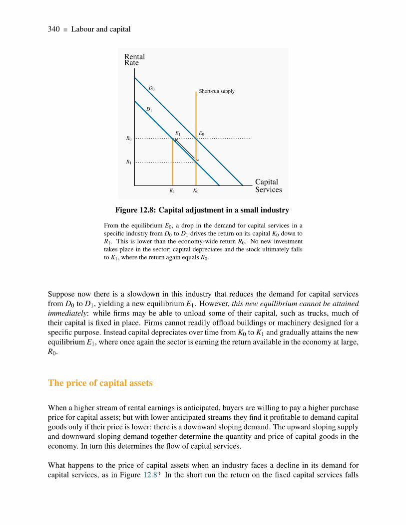
340 Labour and capital
K1 K0
Short-run supplyD0
D1
RentalRate
CapitalServices
R0
E1 E0
R1
Figure 12.8: Capital adjustment in a small industry
From the equilibrium E0, a drop in the demand for capital services in a
specific industry from D0 to D1 drives the return on its capital K0 down to
R1. This is lower than the economy-wide return R0. No new investment
takes place in the sector; capital depreciates and the stock ultimately falls
to K1, where the return again equals R0.
Suppose now there is a slowdown in this industry that reduces the demand for capital services
from D0 to D1, yielding a new equilibrium E1. However, this new equilibrium cannot be attained
immediately: while firms may be able to unload some of their capital, such as trucks, much of
their capital is fixed in place. Firms cannot readily offload buildings or machinery designed for a
specific purpose. Instead capital depreciates over time from K0 to K1 and gradually attains the new
equilibrium E1, where once again the sector is earning the return available in the economy at large,
R0.
The price of capital assets
When a higher stream of rental earnings is anticipated, buyers are willing to pay a higher purchase
price for capital assets; but with lower anticipated streams they find it profitable to demand capital
goods only if their price is lower: there is a downward sloping demand. The upward sloping supply
and downward sloping demand together determine the quantity and price of capital goods in the
economy. In turn this determines the flow of capital services.
What happens to the price of capital assets when an industry faces a decline in its demand for
capital services, as in Figure 12.8? In the short run the return on the fixed capital services falls

12.7. Land 341
to R1. The capital that is in use in this sector of the economy is now less valuable on account
of the lower return it is generating. If capital elsewhere in the economy can still earn a return of
R0, then capital in this one sector will be allowed to depreciate. This depreciation continues until
capital services in the industry become sufficiently scarce that the rental rate returns to its original
level. At this point the present value of future rentals matches the price of capital goods in the
whole economy, and the industry begins to replace its depreciating capital once again. A new LR
equilibrium in the industry is attained at K1.
12.7 Land
Land is an input used in production, though is not a capital good in the way we defined capital
goods earlier – production inputs that are themselves produced in the economy. Land is relatively
fixed in supply to the economy, even in the long run. While this may not be literally true – the
Netherlands reclaimed from the sea a great quantity of low-lying farmland, and fertilizers can turn
marginal land into fertile land – it is a good approximation to reality. Figure 12.9 shows the derived
demand D0 for land services. With a fixed supply S, the equilibrium rental is R0.
D0D1
S
RentalRate
Servicesof Land
R0
R1
Figure 12.9: The market for land services
The supply of land is relatively fixed, and therefore the return to land is
primarily demand determined. Shifts in demand give rise to differences in
returns.
In contrast to this economy-wide perspective, consider now a retailer who rents space in a com-
mercial mall. The area around the mall experiences a surge in development and more people are

342 Labour and capital
shopping and doing business there. The retailer finds that she sells more, but at the same time
higher rents make it difficult for her to increase her profit. The reason why her profit may not
increase greatly is that the demand for retail space is a derived demand: with growth in the sur-
rounding area many more retailers would like to rent space at the previous rent. Accordingly, the
market demand curve for rental space shifts upwards, and this in turn leads to an increase in the
price of rental space.
Of course, land has many uses and the returns to land must reflect this. Land in downtown Vancou-
ver is priced higher than land in rural Saskatchewan. Land cannot be moved from the latter to the
former location however, and therefore the rent differences represent an equilibrium. In contrast,
land in downtown Winnipeg that is used for a parking lot may not be able to compete with the use
of that land for office development. Therefore, for it to remain as a parking lot, the rental must
reflect its high opportunity cost. This explains why parking fees in big US cities such as Boston
or New York may run to $40 per day. If the parking owners could not obtain this fee, they could
profitable sell the land to a developer. Ultimately it is the value in its most productive use that
determines the price of land.

Key Terms 343
KEY TERMS
Demand for labour: a derived demand, reflecting the demand for the output of final goods
and services.
Value of the marginal product is the marginal product multiplied by the price of the good
produced.
Marginal revenue product of labour is the additional revenue generated by hiring one more
unit of labour where the marginal revenue declines.
Monopsonist is the sole buyer of a good or service and faces an upward-sloping supply curve.
Participation rate: the fraction of the population in the working age group that joins the
labour force.
The labour force is that part of the population either employed or seeking employment.
Unemployment rate: the fraction of the labour force actively seeking employment that is not
employed.
Transfer earnings are the amount that an individual can earn in the next highest paying alter-
native job.
Rent is the excess remuneration an individual currently receives above the next best alterna-
tive. This alternative is the reservation wage.
Gross investment is the production of new capital goods and the improvement of existing
capital goods.
Net investment is gross investment minus depreciation of the existing capital stock.
Depreciation is the annual change in the value of a physical asset.
Stock is the quantity of an asset at a point in time.
Flow is the stream of services an asset provides during a period of time.
Capital services are the production inputs generated by capital assets.
Rental rate: the cost of using capital services.

344 KEY TERMS
Asset price: the financial sum for which the asset can be purchased.
Present value of a stream of future earnings: the sum of each year’s earnings divided by
one plus the interest rate raised to the appropriate power.

Exercises for Chapter 12 345
EXERCISES FOR CHAPTER 12
Exercise 12.1 Aerodynamics is a company specializing in the production of bicycle shirts. It has
a fixed capital stock, and sells its shirts for $20 each. It pays a weekly wage of $400 per worker.
Aerodynamics must maximize its profits by determining the optimal number of employees to hire.
The marginal product of each worker can be inferred from the table below. Determine the optimal
number of employees. [Hint: you must determine the VMPL schedule, having first computed the
MPL.]
Employment 0 1 2 3 4 5 6
Total output 0 20 50 75 95 110 120
MPL
VMPL
Exercise 12.2 Mini Mine is a small mining firm in Northern Alberta. The going wage rate in the
region is $300 per week. The productivity of the workers in the firm, which has a fixed capital
stock, is given below.
Workers 0 1 2 3 4 5 6 7 8 9 10
Output 0 100 190 270 340 400 450 490 520 540 550
MPL
VMPL
(a) If the price of ore is $10 per ton determine the optimal employment level for this firm.
(b) Instead of there being many potential workers, suppose that there are only 6 workers who
can be hired in the neighbourhood. If the price of output is still fixed at $300, and the
productivity of workers is still defined by the data in the second row, draw the VMPL curve,
insert the supply limit and determine the equilibrium wage.
Exercise 12.3 Suppose that, in Exercise 12.1 above, wages are not fixed. Instead the firm must
pay $50 more to employ each individual worker: the first worker is willing to work for $250, the
second for $300, the third for $350, etc. But once employed, each worker actually earns the same
wage. Determine the optimal number of workers to be employed. [Hint: you must recognize that
each worker earns the same wage; so when one additional worker is hired, the wage must increase
to all workers employed.]

346 Exercises for Chapter 12
Exercise 12.4 Consider the following supply and demand equations for berry pickers. Demand:
W = 22−0.4L; supply: W = 10+0.2L.
(a) Plot these functions and calculate the equilibrium wage and employment level.
(b) Illustrate in the diagram the areas defining transfer earnings and rent.
(c) Compute the transfer earnings and rent components of the total wage bill.
Exercise 12.5 The industry demand in for plumbers is given by the equation W = 50−0.08L, and
there is a fixed supply of 300 qualified plumbers.
(a) Draw a diagram illustrating the supply, demand and equilibrium.
(b) Solve the supply and demand equations for the equilibrium wage, W .
(c) If the plumbers now form a union, and supply their labour at a wage of $30 per hour, illustrate
the new equilibrium on your diagram and calculate the new level of employment.
Exercise 12.6 The following table describes the income stream for different capital investments.
The income flows accrue at the end of years 1 through 4. The interest rate is given in the first
column, and the cost in the final column.
Interest rate Year 1 Year 2 Year 3 Year 4 Cost
8% 8,000 9,000 12,000 12,000 37,000
6% 0 1,000 1,000 1,000 2,750
10% 4,000 5,000 6,000 0 12,000
(a) For each investment calculate the present value of the stream of services.
(b) Decide upon whether the investment should be undertaken or not.
Exercise 12.7 Nihilist Nicotine is a small tobacco farm in south-western Ontario. It has three plots
of land, each with a different productivity. The output from each plot is given in the table below.
Each plot is the same size and requires 3 workers and one machine to harvest the leaves. The cost
of these inputs is $10,000. If the price of each kilogram of leaves is $4, how many fields should be
planted?
Exercises for Chapter 12 347
Land plot Leaf yield in kilograms
One 3,000
Two 2,500
Three 2,000
Exercise 12.8 The timing of wine sales is a frequent problem encountered by vintners. This is
because many red wines improve with age. Let us suppose you own a particular vintage and you
envisage that each bottle should increase in value by 10% the first year, 9% the second year, 8%
the third year, etc.
(a) Suppose the interest rate is 5%, for how many years would you hold the wine if there is no
storage cost?
(b) If in addition to interest rate costs, there is a cost of storing the wine that equals 2% of the
wine’s value each year, for how many years would you hold the wine before selling?
Exercise 12.9 A monopolist faces a demand curve given by P = 100−2Q. Labour is his only cost,
and the wage rate is fixed at $8 per worker. Each worker has a constant marginal product MPL = 2,
meaning that each additional worker produces two units of output.
(a) The MC of each unit of output will be constant here, what is it?
(b) Since you now know the MC of production, what is the profit maximizing output level for
the monopolist?
(c) What price will the monopolist charge for his output?
(d) How many units of labour will be employed?
Exercise 12.10 Suppose that instead of a monopolist in Exercise 12.9 the market was perfectly
competitive. Production conditions are the same.
(a) How much output would be produced and sold?
(b) How many units of labour would be employed?


Chapter 13
Human capital and the income distribution
In this chapter we will explore:
13.1 The concept of human capital
13.2 Productivity and education
13.3 On-the-job training
13.4 Education as signalling
13.5 Returns to education and education quality
13.6 Discrimination
13.7 The income and earnings distribution in
Canada
13.8 Wealth and capitalism
Individuals with different characteristics usually earn different amounts because their productivity
levels differ. While it is convenient to work with a single marginal productivity of labour function
to illustrate the functioning of the labour market, as we did in Chapter 12, for the most part wages
and earnings vary by education level and experience, and sometimes by ethnicity and gender. In
this chapter we develop an understanding of the sources of these differentials.
13.1 Human capital
Human capital, HK, is the stock of expertise or ability accumulated by a worker that determines
future productivity and earnings. It depends on many different attributes - education, experience,
intelligence, interpersonal skills etc. While individuals look upon human capital as a determinant
of their own earnings, it also impacts strongly upon the productivity of the economy at large,
and is therefore a vital force in determining long-run growth. Canada’s productivity growth has
lagged behind that of the US and several other developed economies since the first oil shock in the
seventies. At the same time Canada has been investing heavily in human capital in recent decades,
and this suggests that future productivity and earnings will benefit accordingly.
349

350 Human capital and the income distribution
Human capital is the stock of expertise accumulated by a worker that determines future produc-
tivity and earning.
Three features of Canada’s recent human capital accumulation are noteworthy. First, Canada’s
enrolment rate in post-secondary education now exceeds the US rate, and that of virtually every
economy in the world. Second is the fact that the number of women in third-level institutions far
exceeds the number of men. Almost 60% of university students are women. Third, international
testing of high-school students sees Canadian students perform well, which indicates that the qual-
ity of the Canadian educational system appears to be high. These are remarkably positive aspects
of a system that frequently comes under criticism.
Let us now try to understand individuals’ motivation for embarking on the accumulation of human
capital, and in the process see why different groups earn different amounts. We start by analyzing
the role of education and then turn to on-the-job training.
13.2 Productivity and education
Human capital is the result of past investment that raises future incomes. A critical choice for
individuals is to decide upon exactly how much additional human capital to accumulate. The cost
of investing in another year of school is the direct cost, such as school fees, plus the indirect, or
opportunity, cost, which can be measured by the foregone earnings during that extra year. The
benefit of the additional investment is that the future flow of earnings is augmented. Consequently,
wage differentials should reflect different degrees of education-dependent productivity.
Age-earnings profiles
Figure 13.1 illustrates two typical age-earnings profiles for individuals with different levels of
education. These profiles define the typical pattern of earnings over time, and are usually derived
by examining averages across individuals in surveys. Two aspects are clear: people with more ed-
ucation not only earn more, but the spread tends to grow with time. Less educated, healthy young
individuals who work hard may earn a living wage but, unlike their more educated counterparts,
they cannot look forward to a wage that rises substantially over time. More highly-educated indi-
viduals go into jobs and occupations that take a longer time to master: lawyers, doctors and most
professionals not only undertake more schooling than truck drivers, they also spend many years
learning on the job, building up a clientele and accumulating expertise.
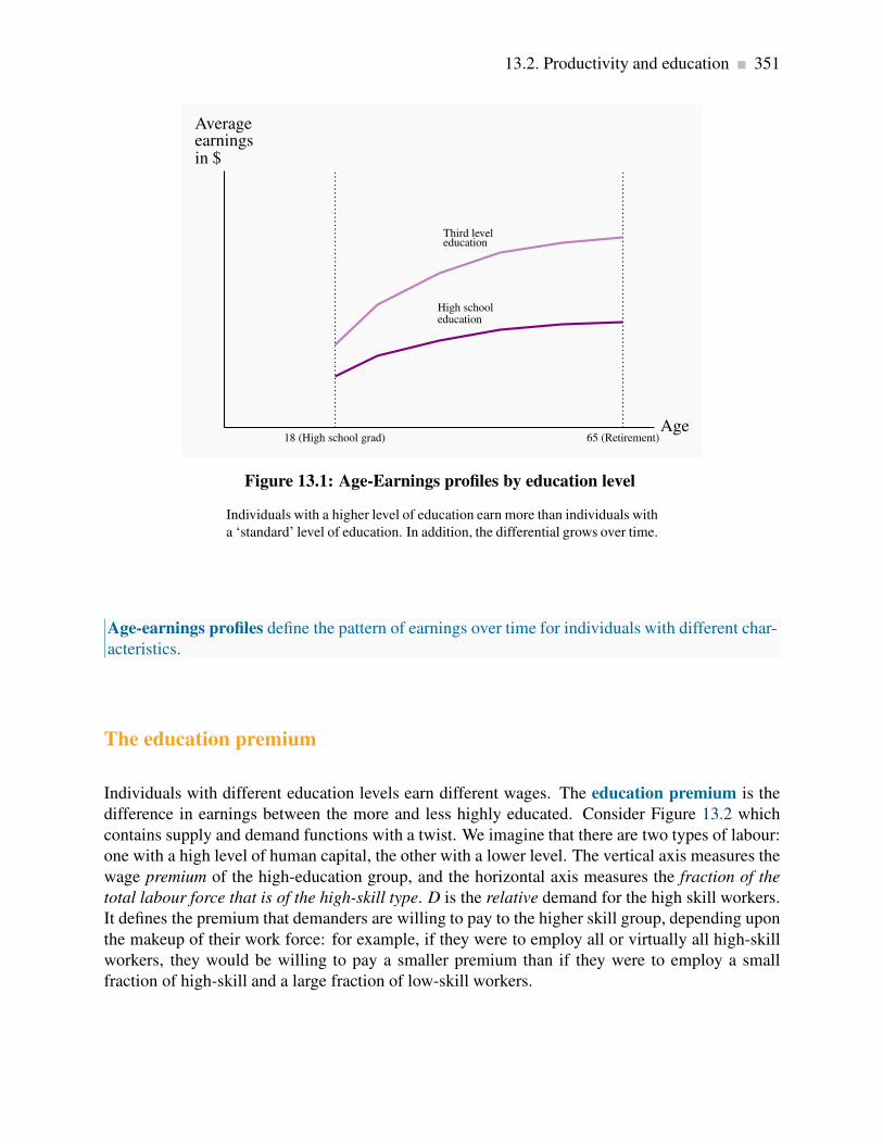
13.2. Productivity and education 351
18 (High school grad) 65 (Retirement)
High schooleducation
Third leveleducation
Averageearningsin $
Age
Figure 13.1: Age-Earnings profiles by education level
Individuals with a higher level of education earn more than individuals with
a ‘standard’ level of education. In addition, the differential grows over time.
Age-earnings profiles define the pattern of earnings over time for individuals with different char-
acteristics.
The education premium
Individuals with different education levels earn different wages. The education premium is the
difference in earnings between the more and less highly educated. Consider Figure 13.2 which
contains supply and demand functions with a twist. We imagine that there are two types of labour:
one with a high level of human capital, the other with a lower level. The vertical axis measures the
wage premium of the high-education group, and the horizontal axis measures the fraction of the
total labour force that is of the high-skill type. D is the relative demand for the high skill workers.
It defines the premium that demanders are willing to pay to the higher skill group, depending upon
the makeup of their work force: for example, if they were to employ all or virtually all high-skill
workers, they would be willing to pay a smaller premium than if they were to employ a small
fraction of high-skill and a large fraction of low-skill workers.
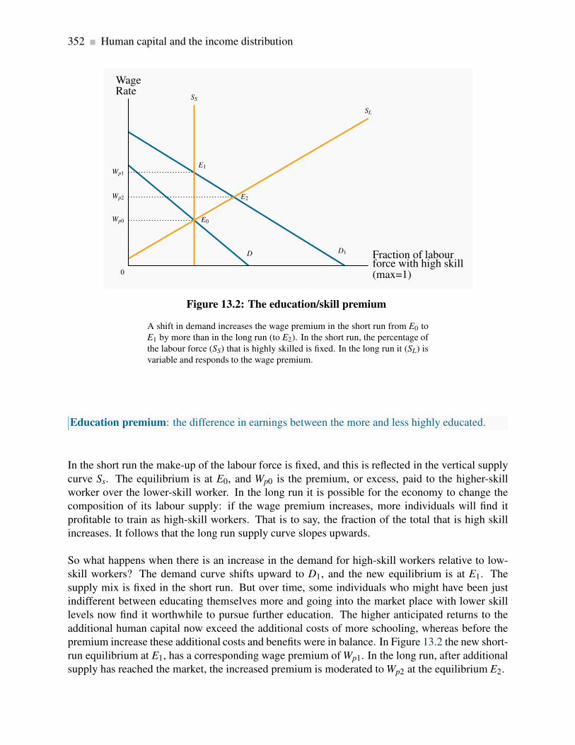
352 Human capital and the income distribution
D D1
SS
SL
WageRate
0
Fraction of labourforce with high skill(max=1)
Wp0 E0
Wp1
E1
Wp2 E2
Figure 13.2: The education/skill premium
A shift in demand increases the wage premium in the short run from E0 to
E1 by more than in the long run (to E2). In the short run, the percentage of
the labour force (SS) that is highly skilled is fixed. In the long run it (SL) is
variable and responds to the wage premium.
Education premium: the difference in earnings between the more and less highly educated.
In the short run the make-up of the labour force is fixed, and this is reflected in the vertical supply
curve Ss. The equilibrium is at E0, and Wp0 is the premium, or excess, paid to the higher-skill
worker over the lower-skill worker. In the long run it is possible for the economy to change the
composition of its labour supply: if the wage premium increases, more individuals will find it
profitable to train as high-skill workers. That is to say, the fraction of the total that is high skill
increases. It follows that the long run supply curve slopes upwards.
So what happens when there is an increase in the demand for high-skill workers relative to low-
skill workers? The demand curve shifts upward to D1, and the new equilibrium is at E1. The
supply mix is fixed in the short run. But over time, some individuals who might have been just
indifferent between educating themselves more and going into the market place with lower skill
levels now find it worthwhile to pursue further education. The higher anticipated returns to the
additional human capital now exceed the additional costs of more schooling, whereas before the
premium increase these additional costs and benefits were in balance. In Figure 13.2 the new short-
run equilibrium at E1, has a corresponding wage premium of Wp1. In the long run, after additional
supply has reached the market, the increased premium is moderated to Wp2 at the equilibrium E2.
13.2. Productivity and education 353
Many studies have attempted to compute the earnings value of additional education in
Canada beyond a completed high-school diploma. A typical finding is that a completed uni-
versity bachelorâAZs degree generates an additional 40% in earnings for men on average in
the modern era and perhaps even more for women. Individuals who do not complete high
school earn at least 10% less than high school graduates. The picture in the US economy
is broadly similar; the education premium has been rising there for several decades. The
education premium also appears to have grown in recent decades.
Most economists believe the reason for a growing premium is that the technological change
experienced in the post-war period is complementary to high education and high skills in
general. Furthermore, the premium has increased despite an enormous increase in the rela-
tive supply of highly skilled workers. In essence the growth in supply has not kept up with the
growth in demand.
Application Box 13.1: How big is the education premium?
Are students credit-constrained or culture-constrained?
The foregoing analysis assumes that students and potential students make rational decisions on
the costs and benefits of further education and act accordingly. It also assumes implicitly that
individuals can borrow the funds necessary to build their human capital: if the additional returns
to further education are worthwhile, individuals should borrow the money to make the investment,
just as entrepreneurs do with physical capital.
However, there is a key difference in the credit markets. If an entrepreneur fails in her business
venture the lender will have a claim on the physical capital. But a bank cannot repossess a human
being who drops out of school without having accumulated the intended human capital. Accord-
ingly, the traditional lending institutions are frequently reluctant to lend the amount that students
might like to borrow - students are credit constrained. The sons and daughters of affluent families
therefore find it easier to attend university, because they are more likely to have a supply of funds
domestically. Governments customarily step into the breach and supply loans and bursaries to
students who have limited resources. While funding frequently presents an obstacle to attending
a third-level institution, a stronger determinant of attendance is the education of the parents, as
detailed in Application Box 13.2.

354 Human capital and the income distribution
The biggest single determinant of university attendance in the modern era is parental educa-
tion. A recent study* of who goes to university examined the level of parental education of
young people ‘in transition’ – at the end of their high school – for the years 1991 and 2000.
For the year 2000 they found that, if a parent had not completed high school, there was just
a 12% chance that their son would attend university and an 18% chance that a daughter
would attend. In contrast, for parents who themselves had completed a university degree, the
probability that a son would also attend university was 53% and for a daughter 62%. Hence,
the probability of a child attending university was roughly four times higher if the parent
came from the top educational category rather the bottom category! Furthermore the authors
found that this probability gap opened wider between 1991 and 2000.
*Finnie, R., C. Laporte and E. Lascelles. “Family Background and Access to Post-Secondary
Education: What Happened in the Nineties?” Statistics Canada Research Paper, Catalogue
number 11F0019MIE-226, 2004
Application Box 13.2: Parental education and university attendance in Canada
13.3 On-the-job training
As is clear from Figure 13.1, earnings are raised both by education and experience. Learning
on the job is central to the age-earnings profiles of the better educated, and is less important for
those with lower levels of education. On-the-job training improves human capital through work
experience. If on-the-job training increases worker productivity, who should pay for this learning
- firms or workers? To understand who should pay, we distinguish between two kinds of skills:
firm-specific skills that raise a worker’s productivity in a particular firm, and general skills that
enhance productivity in many jobs or firms.
Firm-specific HK could involve knowing how particular components of a somewhat unique pro-
duction structure functions, whereas general human capital might involve an understanding of
engineering or architectural principles that can be applied universally. As for who should pay
for the accumulation of skills: an employer should be willing to undertake most of the cost of
firm-specific skills, because they are of less value to the worker should she go elsewhere. Firms
offering general or transferable training try to pass the cost on to the workers, perhaps by offering
a wage-earnings profile that starts very low, but that rises over time. Low-wage apprenticeships are
examples. Hence, whether an employee is a medical doctor in residence, a plumber in an appren-
ticeship or a young lawyer in a law partnership, she ‘pays’ for the accumulation of her portable HK
by facing a low wage when young. Workers are willing to accept such an earnings profile because
their projected future earnings will compensate for lower initial earning.

13.4. Education as signalling 355
On-the-job training improves human capital through work experience.
Firm-specific skills raise a worker’s productivity in a particular firm.
General skills enhance productivity in many jobs or firms.
13.4 Education as signalling
An alternative view of education springs from the theory of signalling. This is a provocative theory
that proposes education may be worthwhile, even if it generates little additional skills! The theory
recognizes that people possess different abilities. However, firms cannot easily recognize the more
productive workers without actually hiring them and finding out ex-post – sometimes a costly
process. Signalling theory says that, in pursuing more education, people who know they are more
capable send a signal to potential employers that they are the more capable workers. Education
therefore screens out the high-productivity workers. Firms pay more to the educated workers,
because firms know that the high-ability workers are those with the additional education.
Signalling is the decision to undertake an action in order to reveal information.
Screening is the process of obtaining information by observing differences in behaviour.
To be effective, the process must separate the lower-ability individuals from the higher-ability
individuals. Why don’t lower-ability workers go to university and pretend they are of the high-
ability type? Primarily because that strategy could backfire: such individuals are less likely to
succeed at school and there are costs associated with school in the form of school fees, books
and foregone earnings. While they may have lower innate skills, they are likely smart enough to
recognize a bad bet!
On balance economists believe that further education does indeed add to productivity, although
there may be element of screening present: an engineering degree (we should hope) increases an
individual’s understanding of mechanical forces in addition to telling a potential employer that the
student is smart.
Finally, it should be evident that if education raises productivity, it is also good for society and the
economy at large.

356 Human capital and the income distribution
13.5 Education returns and quality
How can we be sure that further education really does generate the returns, in the form of higher
future incomes, to justify the investment? For many years econometricians proposed that an extra
year of schooling might offer a return in the region of 10% – quite a favourable return in compar-
ison with what is frequently earned on physical capital. Doubters then asked if the econometric
estimation might be subject to bias - what if the additional earnings of those with more education
are simply attributable to the fact that it is the smarter, or innately more capable, individuals who
both earn more and who have more schooling? And since we cannot observe who has more innate
ability, how can we be sure that it is the education itself, rather than just differences in ability, that
generate the extra income?
This is a classical problem in inference: does correlation imply causation? The short answer to this
question is that education economists are convinced that the time invested in additional schooling
does indeed produce additional rewards, even if it is equally true that individuals who are innately
smarter who choose to invest in that way. Furthermore, it appears that the returns to graduate
education are higher than the returns to undergraduate education.
What can be said of the quality of different educational systems? Are educational institutions in
different countries equally good at producing knowledgeable students? Or, viewed another way:
has a grade nine student in Canada the same skill set as a grade nine student in France or Hong
Kong? An answer to this question is presented in Table 13.1, which contains two sets of results
from the Program for International Student Assessment (PISA) – an international survey of 15-
year old student abilities in mathematics, science and literacy. This particular table presents the
results on science and reading skills for 30 economies. The results indicate that Canadian students
perform near the top of the international skill ladder in both dimensions.

13.6. Discrimination 357
Science Reading Science Reading
Australia 527 513 Korea 522 556
Austria 511 490 Luxembourg 486 479
Belgium 510 501 Mexico 410 410
Canada 534 527 Netherlands 525 507
Czech Rep 513 483 New Zealand 530 521
Denmark 496 494 Norway 487 484
Finland 563 547 Poland 498 508
France 495 488 Portugal 474 472
Germany 516 495 Slovak Rep. 488 466
Greece 473 460 Spain 488 461
Hungary 504 482 Sweden 503 507
Iceland 491 484 Switzerland 512 499
Ireland 508 517 Turkey 424 447
Italy 475 469 US 489 N/A
Japan 531 498 UK 515 495
Table 13.1: Mean score in science and reading scales
“Science Competencies for Tomorrow’s World”, Volume 1, PISA 2006,
OECD 2007, pages 58 & 298.
An interesting paradox arises at this point: If productivity growth in Canada has been relatively
low in recent decades, why is this so if Canada produces many well-educated high-skill workers?
The answer may be that there is a considerable time lag before high participation rates in third-
level education and high quality make themselves felt on the national stage in the form of elevated
productivity. While past productivity performance may be somewhat disappointing, the evidence
suggests a better future.
13.6 Discrimination
Wage differences are a natural response to differences in human capital. But we frequently observe
wage differences that might be discriminatory. For example, women on average earn less than men
with similar qualifications, the old may be paid less than those in their prime years, immigrants
may be paid less than native-born Canadians, and ethnic minorities may be paid less than traditional

358 Human capital and the income distribution
white workers. The term discrimination describes an earnings differential that is attributable to a
trait other than human capital.
If a man and a woman have the same HK, in the broadest sense of having the same capability to
perform a particular task, then a wage premium paid to the male represents discrimination. Cor-
rectly measured then, the discrimination premium between individuals from these various groups
is the differential in earnings after correcting for HK differences. Thousands of studies have been
undertaken on discrimination, and most conclude that discrimination abounds. Women, particu-
larly those who have children, are paid less than men, and frequently face a ‘glass ceiling’ – a limit
on their promotion possibilities within organizations.
Discrimination implies an earnings differential that is attributable to a trait other than human
capital.
In contrast, women no longer face discrimination in university and college admissions, and form
a much higher percentage of the student population than men in many of the higher paying pro-
fessions such as medicine and law. Immigrants to Canada also suffer from a wage deficit. This is
especially true for the most recent cohorts of working migrants who now come predominantly, not
from Europe, as was once the case, but from China, South Asia, Africa and the Caribbean. For
similar measured HK as Canadian-born individuals, these migrants frequently have an initial wage
deficit of 30%, and require a period of more than twenty years to catch-up. DefBox
13.7 The income distribution
How does all of our preceding discussion play out when it comes to the income distribution? That
is, when we examine the incomes of all individuals or households in the economy, how equally or
unequally are they distributed?
The study of inequality is a critical part of economic analysis. It recognizes that income differences
that are in some sense ’too large’ are not good for society. Inordinately large differences can reflect
poverty and foster social exclusion and crime. Economic growth that is concentrated in the hands of
the few can increase social tensions, and these can have economic as well as social or psychological
costs. Crime is one reflection of the divide between ‘haves’ and ‘have-nots’. It is economically
costly; but so too is child poverty. Impoverished children rarely achieve their social or economic
potential and this is a loss to the individual and the economy at large.
In this section we will first describe a subset of the basic statistical tools that economists use
to measure inequality. Second, we will examine how income inequality has evolved in recent
decades. We shall see that, while the picture is complex, market income inequality has indeed
increased in Canada. Third, we shall investigate some of the proposed reasons for the observed

13.7. The income distribution 359
increase in inequality and examine if the government is capable of doing much about it.
It is to be emphasized that income inequality is just one proximate measure of the distribution
of wellbeing. The extent of poverty is another such measure. Income is not synonymous with
happiness but, that being said, income inequality can be computed reliably, and it provides a good
measure of households’ control over economic resources.
Theory and measurement
Let us start by looking at the data. Suppose we rank the market incomes of all households in the
economy from poor to rich, and categorize this ordering into different quantiles or groups. With
five such quantiles the shares are called quintiles. The richest group forms the highest quintile
while the poorest group forms the lowest quintile. Such a representation is given in Table 13.2.
The first numerical column displays the income in each quintile as a percentage of total income. If
we wanted a finer breakdown, we could opt for decile (ten), or even vintile (twenty) shares, rather
than quintile shares. These data can be graphed in a variety of ways. Since the data are in share, or
percentage, form, we can compare in a meaningful manner distributions from economies that have
different average income levels.
Quintile share of total
income
Cumulative share
First quintile 4.1 4.1
Second quintile 9.7 13.8
Third quintile 15.6 29.4
Fourth quintile 23.7 53.1
Fifth quintile 46.8 100.0
Total 100
Table 13.2: Quintile shares of total family income in Canada, 2006
Source: Statistics Canada, CANSIM Matrix 2020405.
An interesting way of presenting these data graphically is to plot the cumulative share of income
against the cumulative share of the population. This is given in the final column, and also presented
graphically in Figure 13.3. The bottom quintile has 4.1% of total income. The bottom two quintiles
together have 13.8% (4.1% + 9.7%), and so forth. By joining the coordinates of the resulting figure
a Lorenz curve is obtained. Relative to the diagonal line it is a measure of how unequally incomes
are distributed: if everyone had the same income, each 20% of the population would have 20%
of total income and by joining the points for such a distribution we would get a straight diagonal

360 Human capital and the income distribution
line joining the corners of the box. In consequence, if the Lorenz curve is further from the line of
equality the distribution is less equal than if the Lorenz curve is close in.
0 % 10 % 20 % 30 % 40 % 50 % 60 % 70 % 80 % 90 % 100 %0 %
20 %
40 %
60 %
80 %
100 %
Line ofabsoluteequality
Lorenzcurve
B
A
Cumulative share of population
Cu
mu
lati
ve
shar
eo
fto
tal
inco
me
Figure 13.3: Gini index and Lorenz curve
The more equal are the income shares, the closer is the Lorenz curve to the
diagonal line of equality. The Gini index is the ratio of the area A to the area
(A+B). The Lorenz curve plots the cumulative percentage of total income
against the cumulative percentage of the population.
Lorenz curve describes the cumulative percentage of the income distribution going to different
quantiles of the population.
This suggests that the area A relative to the area (A + B) forms a measure of inequality in the
income distribution. This fraction obviously lies between zero and one, and it is called the Gini
index. A larger value of the Gini index indicates that inequality is greater. We will not delve into
the mathematical formula underlying the Gini. But for this set of numbers its value is 0.4.
Gini index: a measure of how far the Lorenz curve lies from the line of equality. Its maximum
value is one; its minimum value is zero.
The Gini index is what is termed summary index of inequality – it encompasses a lot of information
in one number. There exist very many other such summary statistics.
It is important to recognize that very different Gini index values emerge for a given economy by

13.7. The income distribution 361
using different income definitions of the variable going into the calculations. For example, the
quintile shares of the earnings of individuals rather than the incomes of households could be very
different. Similarly, the shares of income post tax and post transfers will differ from their shares
on a pre-tax, pre-transfer basis.
Figure 13.4 contains Gini index values for two different definitions of income from 1976 to 2010.
Two messages emerge from this graphic: the first is that the distribution of market incomes displays
more inequality than the distribution of incomes after the government has intervened. In the latter
case incomes are more equally distributed than in the former. The second message to emerge is
that inequality has increased over time – the Gini values are larger in the later years than in the
earlier years.
19
75
19
80
19
85
19
90
19
95
20
00
20
05
20
10
0
0.1
0.2
0.3
0.4
0.5
Year
Gin
iIn
dex
Market incomePost-tax disposable income
Figure 13.4: Gini index Canada 1976-2010
Data source: Statistics Canada, CANSIM Table 202-0709
This is a very brief description of recent events. It is also possible to analyze inequality among
women and men, for example, as well as among individuals and households. But the essential
message remains clear: definitions are important; in particular the distinction between incomes
generated in the market place and incomes after the government has intervened through its tax and
transfer policies.

362 Human capital and the income distribution
McMaster Professor Michael Veall and his colleague Emmanuel Saez, from Berkeley, have
examined the evolution of the top fractiles of the Canadian earnings distribution in the twen-
tieth century. A fractile is a fraction of a percent. Using individual earnings from a database
built upon tax returns, they show how the share of the top one tenth of the top one percent
declined in the nineteen thirties and forties, remained fairly stable in the decades following
World War II, and then increased from the eighties to the present time. The share increased
from 2.3% to 5.2% of the total in the period 1984 to 2000. Larger changes emerge if we
use 1974 as a base, or look at a fraction of the top one percent. Furthermore, these results
are driven by changes in basic earnings, not on stock options awarded to high-level corpo-
rate employees. The authors conclude that the change in this region of the distribution is
attributable to changes in social norms. Whereas, in the nineteen eighties, it was expected
that a top executive would earn perhaps a half million dollars, the ‘norm’ has become sev-
eral million dollars in the present day. Such high remuneration became a focal point of public
discussion after so many banks in the United States in 2008 and 2009 required government
loans and support in order to avoid collapse. It also motivated the many ‘occupy’ movements
of 2011 and 2012.
Saez, E. and M. Veall. “The evolution of high incomes in Canada, 1920-2000.” Department
of Economics research paper, McMaster University, March 2003.
Application Box 13.3: The very rich
Economic forces
The increase in inequality of earnings in the market place in Canada has been reflected in many
other developed economies – to a greater degree in the US and to a lesser extent in some European
economies. Economists have devoted much energy to studying why, and as a result there are
several accepted reasons.
Younger workers and those with lower skill levels have fared poorly in the last three decades. It
has been proposed that globalization and out-sourcing have been responsible for this. In effect the
workers in the lower tail of the distribution are increasingly competing with workers from low-
wage less-developed economies. While this is a plausible causation, the critics of the perspective
point out that wages at the bottom have fallen not only for those workers who compete with over-
seas workers in manufacturing, but also in the domestic services sector right across the economy.
Obviously the workers at McDonalds have not the same competition from low-wage economies as
workers who assemble toys.
A competing perspective is that it is technological change that has enabled some workers to do
better than others. In explaining why high wage workers in many economies have seen their
wages increase, whereas low-wage workers have seen a relative decline, the technological change

13.8. Wealth and capitalism 363
hypothesis proposes that the form of recent technological change is critical: change has been such
as to require other complementary skills and education in order to benefit from it. For example,
the introduction of computer-aided design technology is a benefit to workers who are already
skilled and earning a high wage: existing high skills and technological change are complementary.
Such technological change is therefore different from the type underlying the production line.
Automation in the early twentieth century in Henry Ford’s plants improved the wages of lower
skilled workers. But in the modern economy it is the highly skilled rather than the low skilled that
benefit most from innovation.
A third perspective is that key institutional changes manifested themselves in the eighties and
nineties, and these had independent impacts on the distribution. In particular, changes in the extent
of unionization and changes in the minimum wage have significant impacts on earnings in the
middle and bottom of the distribution: If unionization declines or the minimum wage fails to keep
up with inflation, these workers will suffer. An alternative ‘institutional’ player is the government:
in Canada the federal government became less supportive or generous with its array of programs
that form Canada’s social safety net in the nineteen nineties. This tightening goes some way to
explaining the increasing inequality in the post-tax income distribution in Figure 13.3 at this time.
We conclude this overview of distributional issues by pointing out that we have not touched upon
the distribution of wealth. Wealth too represents purchasing power, and it is wealth rather than
income flows that primarily distinguishes Warren Buffet, Mark Zuckerberg and Bill Gates from
the rest of us mortals.
13.8 Wealth and capitalism
In an immensely insightful and popular study of capital accumulation, from both a historical and
contemporary perspective, Thomas Piketty draws our attention to the enormous inequality in the
distribution of wealth and explores what the future may hold in his book Capital in the Twenty-First
Century.
The distribution of wealth is universally more unequal than the distribution of incomes or earnings.
Gini coefficients in the neighbourhood of 0.8 are commonplace in developed economies. In terms
of shares of the wealth pie, such a magnitude may imply that the top 1% of wealth holders own
one third of all of an economy’s wealth, that the top decile may own two-thirds of all wealth, and
that the remaining one third is held by the ‘bottom 90%’. And within this bottom 90%, virtually
all of the remaining wealth is held by the 40% of the population below the top decile, leaving only
a few percent of all wealth to the bottom 50% of the population.

364 Human capital and the income distribution
18
20
18
40
18
60
18
80
19
00
19
20
19
40
19
60
19
80
20
00
0 %
20 %
40 %
60 %
80 %
100 %
10 %
30 %
50 %
70 %
90 %
Year
Sh
are
of
top
dec
ile
or
per
cen
tile
into
tal
wea
lth
Top 10% wealth share: Europe
Top 10% wealth share: United States
Top 1% wealth share: Europe
Top 1% wealth share: United States
Figure 13.5: Wealth inequality in Europe and the US, 1810-2010
Source: http://piketty.pse.ens.fr/fr/capital21c
While such an unequal holding pattern may appear shockingly unjust, Piketty informs us that
current wealth inequality is not as great in most economies as it was about 1900. Figure 13.5
(Piketty 10.6) above is borrowed from his book. Wealth was more unequally distributed in Old
World Europe than New World America a century ago, but this relativity has since been reversed.
A great transformation in the wealth holding pattern of societies in the twentieth century took
the form of the emergence of a ‘patrimonial middle class’, by which he means the emergence of
substantial wealth holdings on the part of that 40% of the population below the top decile. This
development is noteworthy, but Piketty warns that the top percentiles of the wealth distribution
may be on their way to controlling a share of all wealth close to their share in the early years of the
twentieth century. He illustrates that two elements are critical to this prediction; first is the rate of
growth in the economy relative to the return on capital, the second is inheritances.
To illustrate the importance of the rate of economic growth, imagine an economy with very low
growth, and where the owners of capital obtain an annual return of say 5%. If the owners merely
maintain their capital intact and consume the remainder of this 5%, then the pattern of wealth
holding will continue to be stable. However, if the holders of wealth can reinvest from their return
an amount more than is necessary to replace depreciation then their wealth will grow. And if labour
income in this economy is static then wealth holders will secure a larger share of the economic pie.
In contrast, if economic growth is significant, then labour income may grow in line with income

13.8. Wealth and capitalism 365
from capital and inequality may remain stable. This summarizes Piketty’s famous (r− g) law –
inequality depends upon the difference between the return on wealth and the growth rate of the
economy. This potential for an ever-expanding degree of inequality is magnified when the stock of
capital in the economy is large.
A second element in his theory concerns inheritances. That is to say, do individuals leave large or
small inheritances when they die, and how concentrated are such inheritances? If individual wealth
accumulation patterns are generated by a desire to save for retirement and old age – during which
time they decumulate by spending their assets, such motivation should result in small bequests
being left to following generations. In contrast, if individuals who are in a position to do so save
and accumulate, not just for their old age, but because they have dynastic preferences, of if they
take pleasure simply from the ownership of wealth, or even if they are very cautious about running
down their wealth in their old age, then we will see substantial inheritances passed on to the sons
and daughters of these individuals, thereby exacerbating the inequality of wealth holding in the
economy.
Piketty shows that in fact individuals who save substantial amounts tend to leave large bequests;
that is they do not save purely for life-cycle motives. In modern economies the annual amount
of bequests and gifts from parents to children amounts to as much as 15% of annual GDP. This
may grow in future decades, and since wealth is highly concentrated, these bequests in turn are
concentrated among a small number of the following generation – inequality is transmitted from
one generation to the next.
As a final observation, if we consider the distribution of income and wealth together, particularly
at the very top end, we can see readily that a growing concentration of income among the top 1%
must translate itself into greater wealth inequality through the savings on their part, particularly if
the individuals among the top 1% of earners are also those with substantial amounts of wealth. To
compound matters, if individuals who inherit wealth also tend to inherit more human capital from
their parents than others, the concentration of income and wealth may become yet stronger.
The study of distributional issues in economics has probably received too little attention in the
modern era. Yet it is vitally important both in terms of the well-being of the individuals who
constitute an economy and in terms of adherence to social norms. Given that utility declines with
additions to income and wealth, transfers from those at the top to those at the bottom have the
potential to increase total utility in the economy. Furthermore, an economy in which justice is seen
to prevail—in the form of avoiding excessive inequality—is more likely to achieve a higher degree
of social coherence than one where inequality is large.

366 KEY TERMS
KEY TERMS
Human capital is the stock of expertise accumulated by a worker that determines future pro-
ductivity and earnings.
Age-earnings profiles define the pattern of earnings over time for individuals with different
characteristics.
Education premium: the difference in earnings between the more and less highly educated.
On-the-job training improves human capital through work experience.
Firm-specific skills raise a worker’s productivity in a particular firm.
General skills enhance productivity in many jobs or firms.
Signalling is the decision to undertake an action in order to reveal information.
Screening is the process of obtaining information by observing differences in behaviour.
Discrimination implies an earnings differential that is attributable to a trait other than human
capital.
Lorenz curve describes the cumulative percentage of the income distribution going to differ-
ent quantiles of the population.
Gini index: a measure of how far the Lorenz curve lies from the line of equality. Its maximum
value is one; its minimum value is zero.
Exercises for Chapter 13 367
EXERCISES FOR CHAPTER 13
Exercise 13.1 In the short run one half of the labour force has high skills and one half low skills
(in terms of Figure 13.2 this means that the short-run supply curve is vertical at 0.5). The relative
demand for the high-skill workers is given by W = 100× 0.4× (1− f ), where W is the wage
premium and f is the fraction that is skilled. The premium is measured in percent.
(a) Illustrate the supply and demand curves graphically, and compute the skill premium going
to the high-skill workers in the short run by solving the two equations.
(b) If demand increases to W = 100× 0.6× (1− f ) what is the new premium? Illustrate your
answer graphically.
Exercise 13.2 Consider the foregoing problem in a long run context, when the fraction of the
labour force that is high-skilled is more elastic with respect to the premium. Let this long-run
relative supply function be W = 100×0.4× f .
(a) Verify that this long run function goes through the same equilibrium as in Exercise 13.1.
(b) Illustrate the long run and short run on the same diagram.
(c) What is the numerical value of the premium in the long run after the increase in demand?
Illustrate graphically.
Exercise 13.3 Consider a world in which there are two types of workers – high skill and low skill.
Low skill workers are willing to work for $10 per hour and high skill workers for $18 per hour.
Any firm that demands both types of worker has a demand curve (value of the MPL) for each type.
Suppose that the demand for high skill workers lies everywhere above the demand for low skill
workers. Illustrate on a diagram the supply and demand functions for each type of labour, and the
equilibrium for each type of worker.
Exercise 13.4 Georgina is contemplating entering the job market after graduating from high school.
Her future lifespan is divided into three periods. If she goes to university for the first, and earns an
income for the following two periods her lifetime balance sheet will be: (i) -$20,000; (ii) $40,000;
(iii) $50,000. The negative value implies that she will incur costs in educating herself in the first
period. In contrast, if she decides to work for all three periods she will earn $20,000 in each
period. The answer here involves discounting, and you should assume that the first period is today,
the second period amount must be discounted back one period, and the final amount discounted
back two periods.

368 Exercises for Chapter 13
(a) If the interest rate is 10% should she go to university or enter the job market immediately?
(b) If the interest rate is 2% what should she do?
(c) Can you find some value for the interest rate that will change her decision?
Exercise 13.5 Laurence has decided that he will definitely go to university rather than go into the
workforce directly after high school. He is trying to decide between Law and Economics. Like
Georgina, his life can be divided into three parts. He will incur education costs in the first period
and earn in the remaining two periods. His income profile is given in the table below. (Discounting
need not be applied to the first number, but the following numbers must be discounted back one
period and two periods respectively.)
Profession Period 1 Period 2 Period 3
Economics -15,000 50,000 60,000
Law -25,000 40,000 90,000
(a) If the interest rate is 2%, which profession should he choose?
(b) If the interest rate is 30% which profession should he choose?
Exercise 13.6 Imagine that you have the following data on the income distribution for two economies.
The first set of quintile shares is as in Table 13.2, and the second set is: 3.0, 9.0, 17.0, 29.0, and
42.0.
Quintile share of total income
First quintile 4.1 3.0
Second quintile 9.7 9.0
Third quintile 15.6 17.0
Fourth quintile 23.7 29.0
Fifth quintile 46.8 42.0
Total 100 100
(a) On graph paper, or in a spreadsheet program, plot the Lorenz curves corresponding to the
two sets of quintile shares.
(b) Can you say, from a visual analysis, which distribution is more equal?

Exercises for Chapter 13 369
Exercise 13.7 The distribution of income in the economy is given in the table below. The first
numerical column represents the dollars earned by each quintile. Since the numbers add to 100
you can equally think of the dollar values as shares of the total pie. In this economy the government
changes the distribution by levying taxes and distributing benefits.
Quintile Gross income $m Taxes $m Benefits $m
First 4 0 9
Second 11 1 6
Third 19 3 5
Fourth 26 7 3
Fifth 40 15 3
Total 100 26 26
(a) Plot the Lorenz curve for gross income to scale.
(b) Plot the Lorenz curve for income after taxes have been levied. Note that the total income
will now be less than 100 and so you will have to compute the quintile shares using a new
total.
(c) Finally, add in the benefits so that the total post-tax and post-benefit incomes sum to $100m
again, and plot the Lorenz curve based on this final set of numbers.
Exercise 13.8 Here is a question on earnings profiles. Consider two individuals, each facing a 45
year horizon at the age of 20. Ivan decides to work immediately and his earnings path takes the
following form: earnings = 20,000+ 1,000t − 10t2, where the t is time, and it takes on values
from 1 to 25, reflecting the working lifespan.
(a) In a spreadsheet enter values 1. . . 25 in the first column and then compute the value of earn-
ings in each of the 45 years in the second column using the earnings equation.
(b) John decides to study some more and only earns a part-time salary in his first few years. He
hopes that the additional earnings in future years will compensate for that. His function is
given by 10,000+2,000t−12t2. Compute his earnings for his lifespan.
(c) Plot the two earnings functions you have computed. During what year does John pass Ivan?


Part SixGovernment and Trade
14. Government and government activity in the Canadian economy
15. International trade
Governments play a major role in virtually every economy. They account for one third or more of
national product. In addition to providing a legal and constitutional framework and implementing
the law, governments can moderate and influence the operation or markets, provide public goods
and furnish missing information. Governments distribute and redistribute widely and supply major
services such as health and education. Modern economies could not function without a substantial
role for their governments. These roles are explored and developed in Chapter 14.
The final chapter looks outwards. Canada is an open economy, with a high percentage of its
production imported and exported. We explore the theory of absolute and comparative advantage
and illustrate the potential for consumer gains that trade brings. We analyze barriers to trade such
as tariffs and quotas and end with an overview of the World’s major trading groups and institution.


Chapter 14
Government
In this chapter we will explore:
14.1 Market failure and the role of government
14.2 Fiscal federalism in Canada
14.3 Federal-provincial relations and powers
14.4 Redistribution to individuals
14.5 Regulatory activity and competition policy
Governments have a profound impact on economies. The economies of Scandinavia are very
different from those in North America. North and South Korea are night and day, even though they
were identical several decades ago. Canada and Argentina were very similar in the early decades of
the twentieth century. Both had abundant space, natural resources and migrants. Today Canada is
one of the most prosperous economies in the world, while Argentina struggles as a middle-income
economy.
Governments, therefore, are not peripheral to the marketplace. They can facilitate or hinder the op-
eration of markets. They can ignore poverty or implement policies to support those on low income
and those who are incapacitated. Governments can treat the economy as their fiefdoms, as has been
the case for decades in many underdeveloped economies. By assuming the role of warlords, local
governors inhibit economic development, because the fruits of investment and labour are subject
to capture by the ruling power elite.
In Canada we take for granted the existence of a generally benign government that serves the
economy, rather than one which expects the economy to serve it. The separation of powers, the
existence of a constitution, property rights, a police force, and a free press are all crucial ingredients
in the mix that ferments economic development and a healthy society.
The analysis of government is worthy not just of a full course, but a full program of study. Accord-
ingly, our objective in this chapter must be limited. We begin by describing the various ways in
which markets are inadequate and what government can do to remedy these deficiencies. Next we
describe the size and scope of government in Canada, and define the sources of government rev-
enues. On the expenditure side, we emphasize the redistributive and transfer roles that are played
by Canadian governments. Tax revenues, particularly at the federal level, go predominantly to
373

374 Government
transfers rather than the provision of goods and services. Finally we examine how governments
seek to control, limit and generally influence the marketplace: How do governments foster the op-
eration of markets in Canada? How do they attempt to limit monopolies and cartels? How do they
attempt to encourage the entry of new producers and generally promote a market structure that is
conducive to competition, economic growth and consumer well-being?
14.1 Market failure
Markets are fine institutions when all of the conditions for their efficient operation are in place.
In Chapter 5 we explored the meaning of efficient resource allocation, by developing the concepts
of consumer and producer surpluses. But, while we have emphasized the benefits of efficient re-
source allocation in a market economy, there are many situations where markets deliver inefficient
outcomes. Several problems beset the operation of markets. The principal sources of market fail-
ure are: externalities, public goods, asymmetric information, and the concentration of power. In
addition markets may produce outcomes that are unfavourable to certain groups – perhaps those
on low incomes. The circumstances described here lead to what is termed market failure.
Market failure defines outcomes in which the allocation of resources is not efficient.
Externalities
A negative externality is one resulting, perhaps, from the polluting activity of a producer, or the
emission of greenhouse gases into the atmosphere. A positive externality is one where the activity
of one individual confers a benefit on others. An example here is where individuals choose to
get immunized against a particular illness. As more people become immune, the lower is the
probability that the illness can propagate itself through hosts and therefore the greater the benefits
to those not immunized.
Solutions to these market failures come in several forms: government taxes and subsidies, or quota
systems that place limits on the production of products generating externalities. Such solutions
were explored in Chapter 5. Taxes on gasoline discourage its use and therefore reduce the emission
of poisons into the atmosphere. Taxes on cigarettes and alcohol lower the consumption of goods
that may place an additional demand on our publicly-funded health system. The provision of free,
or low-cost, immunization against specific diseases to children benefits the whole population.
These measures attempt to compensate for the absence of a market in certain activities. Producers
may have no great desire to pay for the right to emit pollutants, and consequently if the government
steps in to counter such an externality, the government is effectively implementing a solution to
the missing market.

14.1. Market failure 375
Public goods
Public goods are sometimes called collective consumption goods, on account of their non-rivalrous
and non-excludability characteristics. For example, if the government meteorological office pro-
vides daily forecasts over the nation’s airwaves, it is no more expensive to supply that information
to one million than to one hundred individuals in the same region. Its provision to one is not
rivalrous with its provision to others – in contrast to private goods that cannot be ‘consumed’
simultaneously by more than one individual. In addition, it may be difficult to exclude certain
individuals from receiving the information.
Public goods are non-rivalrous, in that they can be consumed simultaneously by more than one
individual; additionally they may have a non-excludability characteristic.
Examples of such goods and services abound: highways (up to their congestion point), street
lighting, information on trans-fats and tobacco, or public defence provision. Such goods pose
a problem for private markets: if it is difficult to exclude individuals from their consumption,
then potential private suppliers will likely be deterred from supplying them because the suppliers
cannot generate revenue from free-riders. Governments therefore normally supply such goods and
services. But how much should governments supply? An answer is provided with the help of
Figure 14.1.

376 Government
D
DA
DB
MC
$
0Quantity
Q∗
Figure 14.1: Optimal provision of a public good
The total demand for the public good D is the vertical sum of the individual
demands DA and DB. The optimal provision is where the MC equals the
aggregate marginal valuation, as defined by the demand curve D. At the
optimum Q∗, each individual is supplied the same amount of the public
good.
This is a supply-demand diagram with a difference. The supply side is conventional, with the
MC of production representing the supply curve. An efficient use of the economy’s resources, we
already know, dictates that an amount should be produced so that the cost at the margin equals the
benefit to consumers at the margin. In contrast to the total market demand for private goods, which
is obtained by summing individual demands horizontally, the demand for public goods is obtained
by summing individual demands vertically.
Figure 14.1 depicts an economy with just two individuals whose demands for street lighting are
given by DA and DB. These demands reveal the value each individual places on the various output
levels of the public good, measured on the x-axis. However, since each individual can consume
the public good simultaneously, the aggregate value of any output produced is the sum of each
individual valuation. The valuation in the market of any quantity produced is therefore the vertical
sum of the individual demands. D is the vertical sum of DA and DB, and the optimal output is Q∗.
At this equilibrium each individual consumes the same quantity of street lighting, and the MC of
the last unit supplied equals the value placed upon it by society – both individuals. Note that this
‘optimal’ supply depends upon the income distribution, as we have stated several times to date.
A different distribution of income may give rise to different demands DA and DB, and therefore a
different ‘optimal’ output.

14.1. Market failure 377
Efficient supply of public goods is where the marginal cost equals the sum of individual marginal
valuations, and each individual consumes the same quantity.
A challenge in providing the optimal amount of government-supplied public goods is to know the
value that users may place upon them – how can the demand curves DA and DB, be ascertained, for
example, in Figure 14.1? In contrast to markets for private goods, where consumer demands are
essentially revealed through the process of purchase, the demands for public goods may have to be
uncovered by means of surveys that are designed so as to elicit the true valuations that users place
upon different amounts of a public good. A second challenge relates to the pricing and funding of
public goods: for example, should highway lighting be funded from general tax revenue, or should
drivers pay for it? These are complexities that are beyond our scope of our current inquiry.
Wikipedia is one of the largest on-line sources of free information in the world. It is an
encyclopedia that functions in multiple languages and that furnishes information on millions
of topics. It is freely accessible, and is maintained and expanded by its users. Google is the
most frequently used search engine on the World Wide Web. It provides information to millions
of users simultaneously on every subject imaginable, free of charge. Are these services public
goods in the sense we have described?
Very few goods and services are pure public goods. In that context both Google and Wikipedia
are public goods. Wikipedia is funded by philanthropic contributions, and its users expand
its range by posting information on its servers. Google is funded from advertising revenue.
Technically, a pure public good is available to additional users at zero marginal cost. This
condition is essentially met by these services since their server capacity rarely reaches its
limit. Nonetheless, they are constantly adding server capacity, and in that sense cannot fur-
nish their services to an unlimited number of additional users at no additional cost.
Knowledge is perhaps the ultimate public good; Wikipedia and Google both disseminate
knowledge, knowledge which has been developed through the millennia by philosophers, sci-
entists, artists, teachers, research laboratories and universities.
Application Box 14.1: Are Wikipedia and Google public goods?
Asymmetric information
Markets for information abound in the modern economy. Governments frequently supply infor-
mation on account of its public good characteristics. But the problem of asymmetric information
poses additional challenges. Asymmetric information is where at least one party in an economic
relationship has less than full information. This situation characterizes many interactions: bosses

378 Government
do not always know how hard their subordinates work; life-insurance companies do not have per-
fect information on the lifestyle and health of their clients.
Asymmetric information is where at least one party in an economic relationship has less than
full information and has a different amount of information from another party.
Asymmetric information can lead to two kinds of problems. The first is adverse selection. For
example, can the life-insurance company be sure that it is not insuring only the lives of people
who are high risk and likely to die young? If primarily high-risk people buy such insurance then
the insurance company must set its premiums accordingly. In effect the company is getting an
adverse selection rather than a random selection of clients. Frequently governments decide to
run compulsory-membership insurance plans (auto or health are examples in Canada) precisely
because they may not wish to charge higher rates to higher-risk individuals.
Adverse selection occurs when incomplete or asymmetric information describes an economic
relationship.
The second type of problem is moral hazard. If an individual does not face the full consequences
of his actions, his behaviour may be influenced: If the boss cannot observe the worker’s effort
level, the worker may shirk. Or, if a homeowner has a fully insured home he may be less security
conscious than an owner who does not.
In Chapter 7 we described how US mortgage providers lent large sums to borrowers with uncertain
incomes in the early years of the new millennium. The lenders were being rewarded on the basis
of the amount lent, not the safety of the loan. Nor were the lenders responsible for loans that were
not repaid. This ‘sub-prime mortgage crisis’ was certainly a case of moral hazard.
Moral hazard may characterize behaviour where the costs of certain activities are not incurred
by those undertaking them.
Solutions to these problems do not always involve the government, but in critical situations do. For
example, the government requires most professional societies and orders to ensure that their mem-
bers are trained, accredited and capable. Whether for a medical doctor, a plumber or an engineer,
a license or certificate of competence is a signal that the work and advice of these professionals is
bona fide. Equally, the government sets standards so that individuals do not have to incur the cost
of ascertaining the quality of their purchases – bicycle helmets must satisfy specific crash norms.
These situations differ from those where solutions to the information problem may be implemented
in the market place: life insurance companies can establish the past medical history of its clients,
14.2. Fiscal federalism: taxing and spending 379
and employers may be able to provide incentives to its employees to work hard.
Concentration of power
In examining monopoly and imperfect competition we repeatedly stressed how such market struc-
tures can give rise to inefficient outcomes, in the sense that the value placed on the last unit of
output does not equal the cost at the margin. In monopoly structures this arises because the sup-
plier uses his market power in order to maximize profits.
What can governments do about such power concentrations? Every developed economy has a body
similar to Canada’s Competition Bureau. Such regulatory bodies are charged with seeing that the
interests of the consumer, and the economy more broadly, are represented in the market place.
Interventions, regulatory procedures and efforts to prevent the abuse of market power come in a
variety of forms. These measures are examined in Section 14.5.
Unfavourable market outcomes
Even if governments successfully address the problems posed by the market failures described
above, there is nothing to guarantee that market-driven outcomes will be ‘fair’, or accord with the
notions of justice or equity that we discussed in Chapter 5. The marketplace generates many low-
paying jobs, unemployment and poverty. Governments address these outcomes through a variety
of social programmes and transfers that are discussed in Section 14.4.
14.2 Fiscal federalism: taxing and spending
Canada is a federal state, in which the federal, provincial and municipal governments exercise
different powers and responsibilities. In contrast, most European states are unitary and power is
not devolved to their regions to the same degree as in Canada or the US or Australia. Federalism
confers several advantages over a unitary form of government where an economy is geographically
extensive, or where identifiable differences distinguish one region from another: regions can adopt
different policies in response to the expression of different preferences by their respective voters;
smaller governments may be better at experimentation and the introduction of new policies than
large governments; political representatives are ‘closer’ to their constituents.
Despite these advantages, the existence of an additional level of government creates a tension be-
tween these levels. Such tension is evident in every federation, and federal and provincial govern-
ments argue over the appropriate division of taxation powers and revenue-raising power in general:
for example, how should the royalties and taxes from oil and gas deposits off Newfoundland and
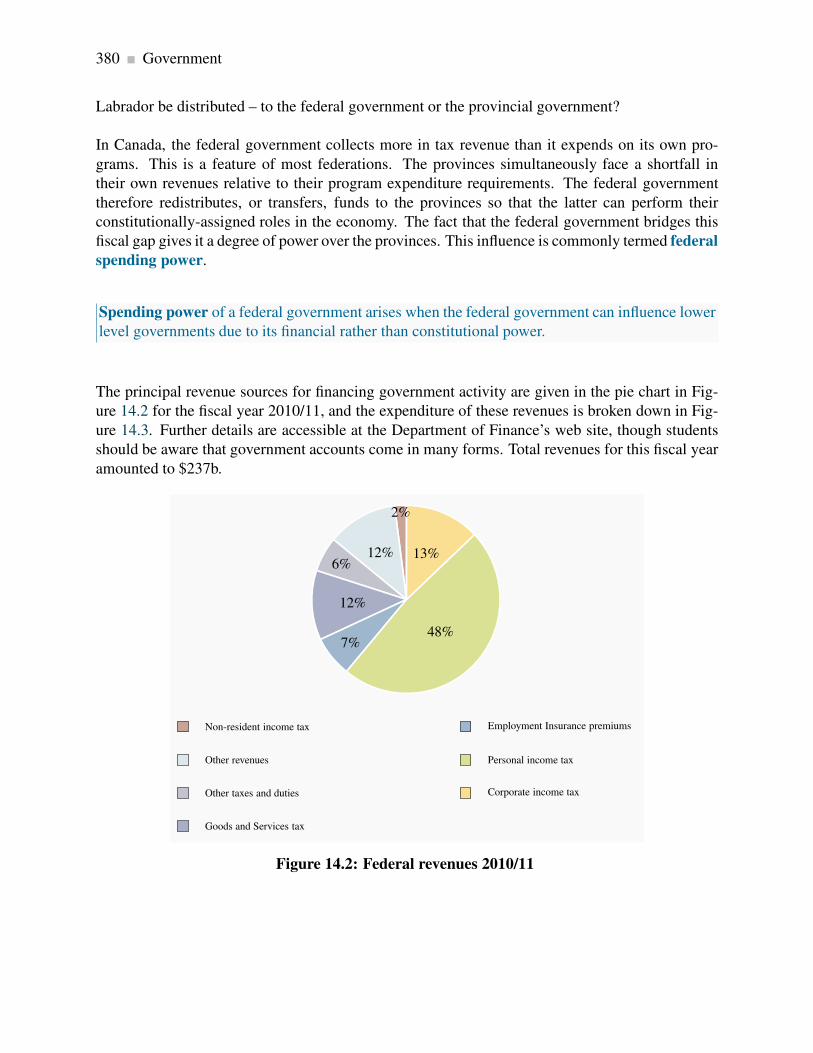
380 Government
Labrador be distributed – to the federal government or the provincial government?
In Canada, the federal government collects more in tax revenue than it expends on its own pro-
grams. This is a feature of most federations. The provinces simultaneously face a shortfall in
their own revenues relative to their program expenditure requirements. The federal government
therefore redistributes, or transfers, funds to the provinces so that the latter can perform their
constitutionally-assigned roles in the economy. The fact that the federal government bridges this
fiscal gap gives it a degree of power over the provinces. This influence is commonly termed federal
spending power.
Spending power of a federal government arises when the federal government can influence lower
level governments due to its financial rather than constitutional power.
The principal revenue sources for financing government activity are given in the pie chart in Fig-
ure 14.2 for the fiscal year 2010/11, and the expenditure of these revenues is broken down in Fig-
ure 14.3. Further details are accessible at the Department of Finance’s web site, though students
should be aware that government accounts come in many forms. Total revenues for this fiscal year
amounted to $237b.
Non-resident income tax
Other revenues
Other taxes and duties
Goods and Services tax
Employment Insurance premiums
Personal income tax
Corporate income tax
2%
12%6%
12%
7%48%
13%
Figure 14.2: Federal revenues 2010/11

14.3. Federal-provincial fiscal relations 381
Transfers to governments
Other transfers
Crown corporations
Departments and agencies
National Defence
Debt servicing
Transfers to persons
20%
14%
4% 18%8%
11%
25%
Figure 14.3: Federal expenditures 2010/11
The federal and provincial governments each transfer these revenues to individuals and other levels
of government, supply goods and services directly, and also pay interest on accumulated borrow-
ings – the national debt or provincial debt.
Provincial and local governments supply more goods and services than the federal government
- health, drug insurance, education and welfare are the responsibility of provincial and munici-
pal governments. In contrast, national defence, the provision of main traffic arteries, Corrections
Canada and a variety of transfer programs to individuals – such as Employment Insurance, Old
Age Security and the Canada Pension Plan - are federally funded. The greater part of federal rev-
enues goes towards transfers to individuals and provincial governments, as opposed to the supply
of goods and services.
14.3 Federal-provincial fiscal relations
The federal government transfers revenue to the provinces using three main programs: Equaliza-
tion, the Canada Social Transfer and the Canada Health Transfer. Each of these has a different
objective. Equalization aims to reduce fiscal disparities among the provinces; The Canada So-
cial Transfer (CST) is for educational and Social Assistance (‘welfare’) expenditures; The Canada
Health Transfer (CHT) performs the same function for health.

382 Government
Equalization
“Parliament and the Government of Canada are committed to the principle of making
equalization payments to ensure that provincial governments have sufficient revenues
to provide reasonably comparable levels of public service at reasonably comparable
levels of taxation”.
This statement, from Section 36(2) of the Constitution Act of 1982, defines the purpose of Equal-
ization. Equalization payments are unconditional – receiving provinces are free to spend the funds
on public services according to their own priorities, or even use the revenue to reduce their provin-
cial taxes. Payments are calculated according to a formula that ensures those provinces with
revenue-raising ability, or fiscal capacity, below a threshold or ‘standard’ receive payments from
the federal government to bring their capacity up to that standard.
Equalization has gone through very many changes in the several decades of its existence. Its current
status reflects the 2006 recommendations of an Expert Panel set up by the federal government. The
fiscal capacity of a province is measured by its ability to raise revenues from five major sources:
personal and business income taxes, sales taxes, property taxes, and natural resources. This ability
is then compared to the ability of all of the provinces combined to raise revenue; if a difference or
shortfall exists, the federal government transfers revenue accordingly, with the amount determined
by both the population of the province and the magnitude of its per-person shortfall.
The program currently transfers about $14b per annum. The recipiency status of some provinces
varies from year to year. Variation in energy prices and energy-based government revenues are the
principal cause of this. British Columbia, Alberta, Saskatchewan and Ontario tend to receive little
or zero. Manitoba, Quebec and the Atlantic Provinces have been the major recipient provinces.
Quebec receives the largest single amount – more than half the total allocation, on account of its
population size. Details are available at the Federal government’s department of Finance web site.
The Canada Social Transfer and the Canada Health Transfer
The CST is a block transfer to provinces in support of post-secondary education, Social Assistance
and social services more generally. The CST came into effect in 2004. Prior to that date it was
integrated with the health component of federal transfers in a program entitled the Canada Health
and Social Transfer (CHST). The objective of the separation was to increase the transparency
and accountability of federal support for health while continuing to provide funding for other
objectives. The CHT is the other part of the unbundled CHST: it provides funding to the provinces
for their health expenditures.
The CST and CHT funding comes in two parts: a cash transfer and tax transfer. A tax transfer
essentially provides the same support as a cash transfer of equal value; it just comes in a different
form. In 1977 the federal government agreed with provincial and territorial governments to reduce

14.4. Government-to-individual transfers 383
federal personal and corporate tax rates in order to permit the provincial governments to increase
the corresponding provincial rates. The net effect was that the federal government got less tax
revenue and the provinces got more. And to this day, the federal and provincial governments keep
a record of the implied tax transfers that arise from this thirty-five-year-old agreement. This is the
tax transfer component of the CST and the CHT.
The CST support is allocated to provinces and territories on an equal per-capita basis to ensure
equal support for all Canadians regardless of their place of residence. The CHT is distributed
likewise, and it requires the provinces to abide by the federally-legislated Canada Health Act,
which demands that provincial health coverage be comprehensive, universal, portable, accessible
and publicly administered.
Approximately $40b is currently transferred under the CHT and $20b under the CST. Health care
and health expenditures are a core issue of policy at all levels of government on account of the
envisaged growth in these expenditures that will inevitably accompany the aging of the baby-
boomers.
14.4 Government-to-individual transfers
Many Canadians take pride in Canada’s extensive ‘social safety net’ that aims to protect individuals
from misfortune and the reduction of income in old age. Others believe it is too generous. While it
is more supportive that the safety net in the US, the Canadian safety net is no more protective than
the nets of the developed economies of the European Union. The extent of such support depends
in large measure upon the degree to which governments are willing to impose, and individuals are
willing to pay, higher or lower tax rates. The major elements of this umbrella of programs are the
following.
The Canada and Quebec Pension Plans (C/QPP) are funded from the contributions of workers
and their employers. Contributions form 9.9% of an individual’s earnings up to a maximum of
approximately $50,000. The Canada and Quebec components of the plan operate very similarly,
but are managed separately. Contributions to the plans from workers and their employers are, for
the most part, paid immediately to retired workers. Part of the contributions is invested in a fund.
The objective of the plans is to ensure that some income is saved for retirement. Many individuals
are not very good at planning – they constantly postpone the decision to save, so the state steps in
and requires them to save. An individual contributing throughout a full-time working lifecycle can
expect an annual pension of about $12,000. The objective of the plan is to provide a minimum level
of retirement income, not an income that will see individuals live in great comfort. Nonetheless,
the C/QPP plans have contributed greatly to the reduction of poverty among the elderly since their
introduction in the mid-sixties.
The aging of the baby-boom generation – that very large cohort born in the late forties through to

384 Government
the early sixties – means that the percentage of the population in the post-65 age group will increase
radically, beginning about 2015. To meet this changing demographic, the federal and provincial
governments reshaped the plans in the late nineties – primarily by increasing contributions, in order
to build up a fund that will support the aged in the following decades.
Old Age Security (OAS), the Guaranteed Income Supplement (GIS) and the Spousal Al-
lowance (SPA) together form the second support leg for the retired. OAS is a payment made
automatically to individuals once they attain the age of 65. The GIS is an additional payment made
only to those on very low incomes – for example, individuals who have little income from their
C/QPP or private pension plans. The SPA, which is payable to the spouse or survivor of an OAS
recipient, accounts for a small part of the sums disbursed.
The payments for these plans come from the general tax revenues of the federal government.
Unlike the C/QPP, the benefits received are not related to the contributions that an individual makes
over the working lifecycle. This program has also had a substantial impact on poverty reduction
among the elderly.
Employment Insurance (EI) and Social Assistance (SA) are designed to support, respectively,
the unemployed and those with no other source of income. Welfare is the common term used to
describe SA. Expenditures on EI and SA are strongly cyclical. At the trough of an economic cycle
the real value of expenditures on these programmes greatly exceeds expenditures at the peak of the
cycle. Unemployment in Canada rose above 8% in 2009, and payments to the unemployed and
those on welfare reflected this dire state. The strongly cyclical pattern of the cost of these programs
reflects the importance of a healthy job market: macro-economic conditions have a major impact
on social programme expenditures.
EI is funded by contributions from employees and their employers. As of 2012 employees pay
1.8% of their earnings and their employer pays 2.5%. EI is called an insurance programme, but in
reality it is much more than that. Certain groups systematically use the program more than others
– those in seasonal jobs, those in rural areas and those in the Atlantic Provinces, for example.
Accordingly, using the terminology of Chapter 7, it is not a universally ‘fair’ insurance programme.
Benefits payable to unemployed individuals may also depend on their family size, in addition
to their work history. While most payments go in the form of ‘regular’ benefits to unemployed
individuals, the EI program also sponsors employee retraining, family benefits that cover maternity
and paternity leave, and some other specific target programs for the unemployed.
Social Assistance is provided to individuals who are in serious need of financial support – having no
income and few assts. Provincial governments administer SA, although the cost of the programme
is partly covered by federal transfers through the Canada Social Transfer. The nineteen nineties
witnessed a substantial tightening of regulations virtually across the whole of Canada. Access to
SA benefits is now more difficult, and benefits have fallen in real terms since the late nineteen
eighties.
Welfare dependence peaked in Canada in 1994, when 3.1 million individuals were dependent upon
support. As of 2012 the total is a little more than one half of this, on account of more stringent

14.5. Regulation and competition policy 385
access conditions, reduced benefit levels and an improved job market. Some groups in Canada,
particularly the National Council of Welfare, believe that benefits should be higher. Other groups
believe that making welfare too generous provides young individuals with the wrong incentives in
life, and may lead them to neglect schooling and skill development.
Workers Compensation supports workers injured on the job. Worker/employer contributions and
general tax revenue form the sources of program revenue, and the mix varies from province-to-
province. In contrast to the swings in expenditures that characterize SA and EI since the early
nineties, expenditures on Worker’s Compensation have remained relatively constant.
The major remaining pillar in Canada’s social safety net is the Canada Child Tax Benefit (CCTB).
In contrast to the other programmes, this is a tax credit, and payments are designed so that they
reach families with children who have low to middle incomes. The program has evolved and been
enriched over the last two decades, partly with the objective of reducing poverty among households
with children, and partly with a view to helping parents receiving SA to transit back to the labour
market. The program currently distributes in excess of $10 billion in benefits.
Canada’s expenditure and tax policies in the nineteen seventies and eighties led to the accu-
mulation of large government debts, as a result of running fiscal deficits most of those years.
By the mid-nineties the combined federal and provincial debt reached 100% of GDP, with the
federal debt accounting for two thirds of this amount. This ratio was perilously high: interest
payments absorbed a large fraction of annual revenues, which in turn limited the ability of
the government to embark on new programs or enrich existing ones. Canada’s debt rating on
international financial markets declined. In 1995, Finance Minister Paul Martin addressed
this problem, and over the following years program spending was pared back. Ultimately, the
economy expanded and by the end of the decade the annual deficits at the federal level were
eliminated.
As of 2011 the ratio of combined federal and provincial debts stands at just below 70% of
GDP. This ratio would have been lower had Canada not encountered the same economic
downturn as the rest of the world in 2008.
Application Box 14.2: Government debts, deficits and transfer
14.5 Regulation and competition policy

386 Government
Goals and objectives
The goals of competition policy are relatively uniform across developed economies: the promotion
of domestic competition; the development of new ideas, new products and new enterprises; the
promotion of efficiency in the resource-allocation sense; the development of manufacturing and
service industries that can compete internationally.
In addition to these economic objectives, governments dislike monopolies or monopoly practices
if they lead to an undue concentration of political power. Such power can lead to a concentration
of wealth and influence in the hands of an elite.
Canada’s regulatory body is the Competition Bureau, whose activity is governed primarily by the
Competition Act of 1986. This act replaced the Combines Investigation Act. The Competition
Tribunal acts as an adjudication body, and is composed of judges and non- judicial members. This
tribunal can issue orders on the maintenance of competition in the marketplace. Canada has had
anti-combines legislation since 1889, and the act of 1986 is the most recent form of such legislation
and policy. The Competition Act does not forbid monopolies, but it does rule as unlawful the abuse
of monopoly. Canada’s competition legislation is aimed at anti-competitive practices, and a full
description of its activities is to be found on its website at www.competitionbureau.gc.ca. Let us
examine some of these proscribed policies.
Anti-competitive practices
Mergers may turn competitive firms into a single organization with excessive market power. The
customary justification for mergers is that they permit the merged firms to achieve scale economies
that would otherwise be impossible. Such scale economies may in turn result in lower prices in
the domestic or international market to the benefit of the consumer, but may alternatively reduce
competition and result in higher prices. Equally important in this era of global competition is the
impact of a merger on a firm’s ability to compete internationally
Mergers can be of the horizontal type (e.g. two manufacturers of pre-mixed concrete merge) or
vertical type (a concrete manufacturer merges with a cement manufacturer). While mergers have
indeed the potential to reduce domestic competition, this is less true today than in the past, when
international trade was more restricted.
Cartels aim to restrict output and thereby increase profits. These formations are almost universally
illegal in individual national economies. At the same time governments are rarely worried if their
own national firms participate in international cartels.
While cartels are one means of increasing prices, price discrimination is another. For example,
if a concrete manufacturer makes her product available to large builders at a lower price than to
small-scale builders – perhaps because the large builder has more bargaining power, then the small
14.5. Regulation and competition policy 387
builder is at a competitive disadvantage in the construction business. If the small firm is forced out
of the construction business as a consequence, then competition in this sector is reduced.
Predatory pricing is a practice that is aimed at driving out competition by artificially reducing
the price of one product sold by a supplier. For example, a dominant nationwide transporter could
reduce price on a particular route where competition comes from a strictly local competitor. By
‘subsidizing’ this route from profits on other routes, the dominant firm could undercut the local
firm and drive it out of the market.
Predatory pricing is a practice that is aimed at driving out competition by artificially reducing
the price of one product sold by a supplier.
Suppliers may also refuse to deal. If the local supplier of pre-mixed concrete refuses to sell the
product to a local construction firm, then the ability of such a downstream firm to operate and
compete may be compromised. This practice is similar to that of exclusive sales and tied sales.
An exclusive sale might involve a large vegetable wholesaler forcing her retail clients to buy only
from this supplier. Such a practice might hurt the local grower of aubergines or zucchini, and
also may prevent the retailer from obtaining some of her vegetables at a lower price or at a higher
quality elsewhere. A tied sale is one where the purchaser must agree to purchase a bundle of goods
from the one supplier.
Refusal to deal: an illegal practice where a supplier refuses to sell to a purchaser.
Exclusive sale: where a retailer is obliged (perhaps illegally) to purchase all wholesale products
from a single supplier only.
Tied sale: one where the purchaser must agree to purchase a bundle of goods from the one
supplier.
Resale price maintenance involves the producer requiring a retailer to sell a product at a specified
price. This practice can hurt consumers since they cannot ‘shop around’. In Canada, we frequently
encounter a ‘manufacturer’s suggested retail price’ for autos and durable goods. But since these
prices are not required, the practice conforms to the law.
Resale price maintenance is an illegal practice wherein a producer requires sellers to maintain a
specified price.
Bid rigging is an illegal practice in which normally competitive bidders conspire to fix the award-
ing of contracts or sales. For example, two builders, who consider bidding on construction projects,
388 Government
may decide that one will bid seriously for project X and the other will bid seriously on project Y.
In this way they conspire to reduce competition in order to make more profit.
Bid rigging is an illegal practice in which bidders (buyers) conspire to set prices in their own
interest.
Deception and dishonesty in promoting products can either short-change the consumer or give
one supplier an unfair advantage over other suppliers.
Enforcement
The Competition Act is enforced through the Competition Bureau in a variety of ways. Decisions
on acceptable business practices are frequently reached through study and letters of agreement
between the Bureau and businesses. In some cases, where laws appear to have been violated,
criminal proceedings may follow.
Regulation, deregulation and privatization
The last two decades have seen a discernible trend towards privatization and deregulation in
Canada, most notably in the transportation and energy sectors. Modern deregulation in the US
began with the passage of the Airline deregulation Act of 1978, and was pursued with great energy
under the Reagan administration in the eighties. The Economic Council of Canada produced an in-
fluential report in 1981, entitled “Reforming Regulation”, on the impact of regulation and possible
deregulation of specific sectors.
Telecommunications provision, in the era when the telephone was the main form of such com-
munication, was traditionally viewed as a natural monopoly. The Canadian Radio and Telecom-
munications Commission (CRTC) regulated its rates. The industry has developed dramatically
in the last decade with the introduction of satellite-facilitated communication, the internet, multi-
purpose cable networks, cell phones and service integration. With such rapid development in new
technologies and modes of delivery the CRTC has been playing catch-up to these new realities.
Transportation, in virtually all forms, has been deregulated in Canada since the nineteen eighties.
Railways were originally required to subsidize the transportation of grain under the Crow’s Nest
Pass rate structure. But the subsidization of particular markets requires an excessive rate elsewhere,
and if the latter markets become subject to competition then a competitive system cannot function.
This structure, along with many other anomalies, was changed with the passage of the Canada
Transportation Act in 1996.
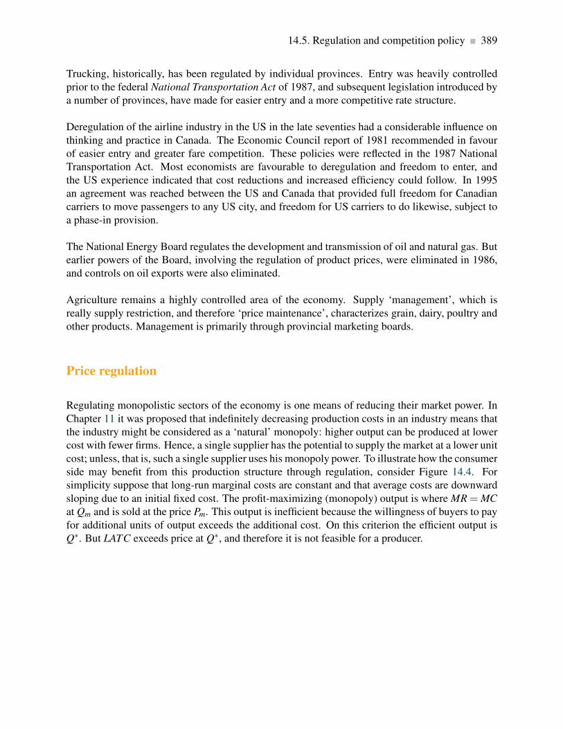
14.5. Regulation and competition policy 389
Trucking, historically, has been regulated by individual provinces. Entry was heavily controlled
prior to the federal National Transportation Act of 1987, and subsequent legislation introduced by
a number of provinces, have made for easier entry and a more competitive rate structure.
Deregulation of the airline industry in the US in the late seventies had a considerable influence on
thinking and practice in Canada. The Economic Council report of 1981 recommended in favour
of easier entry and greater fare competition. These policies were reflected in the 1987 National
Transportation Act. Most economists are favourable to deregulation and freedom to enter, and
the US experience indicated that cost reductions and increased efficiency could follow. In 1995
an agreement was reached between the US and Canada that provided full freedom for Canadian
carriers to move passengers to any US city, and freedom for US carriers to do likewise, subject to
a phase-in provision.
The National Energy Board regulates the development and transmission of oil and natural gas. But
earlier powers of the Board, involving the regulation of product prices, were eliminated in 1986,
and controls on oil exports were also eliminated.
Agriculture remains a highly controlled area of the economy. Supply ‘management’, which is
really supply restriction, and therefore ‘price maintenance’, characterizes grain, dairy, poultry and
other products. Management is primarily through provincial marketing boards.
Price regulation
Regulating monopolistic sectors of the economy is one means of reducing their market power. In
Chapter 11 it was proposed that indefinitely decreasing production costs in an industry means that
the industry might be considered as a ‘natural’ monopoly: higher output can be produced at lower
cost with fewer firms. Hence, a single supplier has the potential to supply the market at a lower unit
cost; unless, that is, such a single supplier uses his monopoly power. To illustrate how the consumer
side may benefit from this production structure through regulation, consider Figure 14.4. For
simplicity suppose that long-run marginal costs are constant and that average costs are downward
sloping due to an initial fixed cost. The profit-maximizing (monopoly) output is where MR = MC
at Qm and is sold at the price Pm. This output is inefficient because the willingness of buyers to pay
for additional units of output exceeds the additional cost. On this criterion the efficient output is
Q∗. But LATC exceeds price at Q∗, and therefore it is not feasible for a producer.

390 Government
DMR
P∗ MC
LATC
$
0Quantity
Qm
Pm
Pr
Qr Q∗
c
Figure 14.4: Regulating a decreasing-cost supplier
The profit-maximizing output is Qm, where MR = MC and price is Pm. This
output is inefficient because marginal benefit is greater than MC. Q∗ is the
efficient output, but results in losses because LATC > P at that output. A
regulated price that covers costs is where LATC = D. This is closer to the
efficient output Q∗ than the monopoly output Qm.
One solution is for the regulating body to set a price-quantity combination of Pr, and Qr, where
price equals average cost and therefore generates a normal rate of profit. This output level is still
lower than the efficient output level Q∗, but is more efficient than the profit-maximizing output
Qm. It is more efficient in the sense that it is closer to the efficient output Q∗. A problem with such
a strategy is that it may induce lax management or overpayment to the factors of production: if
producers are allowed to charge an average cost price, then there is a reduced incentive for them to
keep strict control of their costs in the absence of competition in the marketplace.
A second solution to the declining average cost phenomenon is to implement what is called a two-
part tariff. This means that customers pay an ‘entry fee’ in order to be able to purchase the good.
For example, telephone subscribers may pay a fixed charge per month for their phone and then may
pay an additional charge that varies with use. In this way it is possible for the supplier to charge a
price per unit of output that is closer to marginal cost and still make a profit, than under an average
cost pricing formula. In terms of Figure 14.4, the total value of entry fees, or fixed components of
the pricing, would have to cover the difference between MC and LATC times the output supplied.
In Figure 14.4 this implies that if the efficient output Q∗ is purchased at a price equal to the MC
the producer loses the amount (c-MC) on each unit sold. The access fees would therefore have to
cover at least this value.
Such a solution is appropriate when fixed costs are high and marginal costs are low. This situation

14.5. Regulation and competition policy 391
is particularly relevant in the modern market for telecommunications: the cost to suppliers of
marginal access to their networks, whether it be for internet, phone or TV, is negligible compared
to the cost of maintaining the network and installing capacity.
Two-part tariff: involves an access fee and a per unit of quantity fee.
Finally, a word of caution: Nobel Laureate George Stigler has argued that there is a danger of
regulators becoming too close to the regulated, and that the relationship can evolve to a point where
the regulator may protect the regulated firms. A likely such case was Canada’s airline industry in
the seventies.
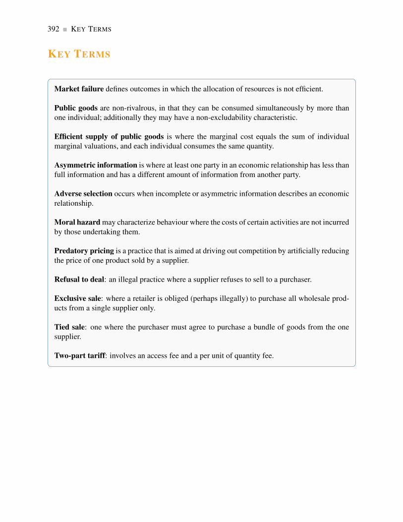
392 KEY TERMS
KEY TERMS
Market failure defines outcomes in which the allocation of resources is not efficient.
Public goods are non-rivalrous, in that they can be consumed simultaneously by more than
one individual; additionally they may have a non-excludability characteristic.
Efficient supply of public goods is where the marginal cost equals the sum of individual
marginal valuations, and each individual consumes the same quantity.
Asymmetric information is where at least one party in an economic relationship has less than
full information and has a different amount of information from another party.
Adverse selection occurs when incomplete or asymmetric information describes an economic
relationship.
Moral hazard may characterize behaviour where the costs of certain activities are not incurred
by those undertaking them.
Predatory pricing is a practice that is aimed at driving out competition by artificially reducing
the price of one product sold by a supplier.
Refusal to deal: an illegal practice where a supplier refuses to sell to a purchaser.
Exclusive sale: where a retailer is obliged (perhaps illegally) to purchase all wholesale prod-
ucts from a single supplier only.
Tied sale: one where the purchaser must agree to purchase a bundle of goods from the one
supplier.
Two-part tariff: involves an access fee and a per unit of quantity fee.

Exercises for Chapter 14 393
EXERCISES FOR CHAPTER 14
Exercise 14.1 An economy is composed of two individuals, whose demands for a public good –
street lighting – are given by P = 12− (1/2)Q and P = 8− (1/3)Q.
(a) Graph these demands on a diagram.
(b) Derive the total demand for this public good by summing the demands vertically, and write
down a resulting equation for this demand curve.
(c) Let the marginal cost of providing the good be $5 per unit. Find the efficient supply of the
public good in this economy – where the marginal cost equals the total value of a marginal
unit.
Exercise 14.2 In Exercise 14.1, suppose a new citizen joins the economy, and her demand for the
public good is given by P = 10− (5/12)Q.
(a) Derive the new demand for the public good on the part of the whole economy and compute
the new optimal level of supply, given that the MC remains unchanged.
(b) Calculate the total value to the consumers of the amount supplied at this efficient output
level.
(c) Compute the net value to society of that choice – the total value minus the total cost.
Exercise 14.3 An industry that is characterized by a decreasing cost structure has a demand curve
given by P = 100−Q and the marginal revenue curve by MR = 100− 2Q. The marginal cost is
MC = 4, and average cost is AC = 4+188/Q.
(a) Graph this cost and demand structure.
(b) Calculate the efficient output and the monopoly output for the industry.
(c) What price would the monopolist charge if he were unregulated, and what would be his profit
per unit?
Exercise 14.4 Instead of having a monopoly the government decides to regulate this supplier in
the interests of the consumer.

394 Exercises for Chapter 14
(a) What price and output would emerge if the supplier were regulated so that his allowable
price equalled average cost?
(b) Compute the value of the deadweight loss associated with having an unregulated monopoly
relative to having a regulated monopoly where a price is permitted that covers ATC.
Exercise 14.5 As an alternative to regulating the supplier such that price covers average total cost,
suppose that a two part tariff were used to generate revenue. This scheme involves charging the
MC for each unit that is purchased and in addition charging each buyer in the market a fixed cost
that is independent of the amount he purchases. If an efficient output is supplied in the market,
estimate the total revenue to be obtained from the component covering a price per unit of the good
supplied, and the component covering fixed cost.

Chapter 15
International trade
In this chapter we will explore:
15.1 Trade in our daily lives
15.2 Canada in the world economy
15.3 Comparative advantage: the gains from
trade
15.4 Returns to scale
15.5 Trade barriers: tariffs, subsidies and quo-
tas
15.6 The politics of protection
15.7 Institutions governing trade
15.1 Trade in our daily lives
Virtually every economy in the modern world trades with other economies – they are what we call
‘open’ economies. Evidence of such openness is everywhere evident in our daily life. The world
eats Canadian wheat; China exports manufactured goods to virtually anywhere we can think of;
and Canadians take their holidays in Florida.
As consumers we value the choice and variety of products that trade offers. We benefit from lower
prices than would prevail in a world of protectionism. At the same time there is a constant chorus
of voices calling for protection from international competition: Manufacturers are threatened by
production in Asia; dairy farmers cry out against the imports of poultry, beef, and dairy products;
even the service sector is concerned about offshore competition from call centres and designers. In
this world of competing views it is vital to understand how trade has the potential to improve the
well-being of economies.
This chapter examines the theory of international trade, trade flows, and trade policy: who trades
with whom, in what commodities, and why. In general, countries trade with one another because
395
396 International trade
they can buy foreign products at a lower price than it costs to make them at home. International
trade reflects specialization and exchange, which in turn improve living standards. It is cost differ-
ences between countries rather than technological differences that drive trade: In principle, Canada
could supply Toronto with olives and oranges grown in Nunavut greenhouses. But it makes more
sense to import them from Greece, Florida or Mexico
Trade between Canada and other countries differs from trade between provinces. By definition,
international trade involves jumping a border, whereas most trade within Canada does not. Internal
borders are present in some instances – for example when it comes to recognizing professional
qualifications acquired out of province. In the second instance, international trade may involve
different currencies. When Canadians trade with Europeans the trade is accompanied by financial
transactions involving Canadian dollars and Euros. A Canadian buyer of French wine pays in
Canadian dollars, but the French vineyard worker is paid in euros. Exchange rates are one factor in
determining national competitiveness in international markets. Evidently, not every international
trade requires currency trades at the same time – members of the European Union all use the Euro.
Indeed a common currency was seen as a means of facilitating trade between member nations of
the EU, and thus a means of integrating the constituent economies more effectively.
15.2 Canada in the world economy
World trade has grown rapidly since the end of World War II, indicating that trade has become ever
more important to national economies. Canada has been no exception. Canada signed the Free
Trade Agreement with the US in 1989, and this agreement was expanded in 1994 when Mexico
was included under the North America Free Trade Agreement (NAFTA). Imports and exports rose
dramatically, from approximately one quarter to forty percent of GDP. Canada is now what is
termed a very ‘open’ economy – one where trade forms a large fraction of total production.
Smaller economies are typically more open than large economies—Belgium and the Netherlands
depend upon trade more than the United States. This is because large economies have a sufficient
variety of resources to supply much of an individual country’s needs. The European Union is
similar, in population terms, to the United States, but it is composed of many distinct economies.
Some European economies are similar in size to individual American states. But trade between
California and New York is not international, whereas trade between Italy and the Denmark is.
Because our economy is increasingly open to international trade, events in other countries affect
our daily lives much more than they did some decades ago. The conditions in international markets
for basic commodities and energy affect all nations, both importers and exporters. For example,
the prices of primary commodities on world markets increased dramatically in the latter part of the
2000s. Higher prices for grains, oil, and fertilizers on world markets brought enormous benefits
to Canada, particular the Western provinces, which produce these commodities. If these primary
commodity prices fall to where they were at the turn of the millennium, Canada will lose consid-
erably.

15.2. Canada in the world economy 397
The service sector accounts for more of our GDP than the manufacturing sector. As incomes grow,
the demand for health, education, leisure, financial services, tourism etc. dominates the demand
for physical products. Technically the income elasticity demand for the former group exceeds
the income elasticity of demand for the latter. Internationally, while trade in services is growing
rapidly, it still forms a relatively small part of total world trade. Trade in goods—merchandise
trade—remains dominant, partly because many countries import goods, add some value, and re-
export them. Even though the value added from such import–export activity may make just a
small contribution to GDP, the gross flows of imports and exports can still be large relative to
GDP. The transition from agriculture to manufacturing and then to services has been underway in
developed economies for over a century. This transition has been facilitated in recent decades by
the communications revolution and globalization. Globalization has seen a rapid shift in production
from the developed to the developing world.
Table 15.1 shows the patterns of Canadian merchandise trade in 2008. The United States was
and still is Canada’s major trading partner, buying over 75 percent of exports and supplying more
than 50 percent of Canadian imports. Table 15.2 details exports by type. Although exports of
resource-based products account for only about 40 percent of total exports, Canada is now viewed
as a resource-based economy. This is in part because manufactured products account for almost 80
percent of U.S. and European exports but only about 60 percent of Canadian exports. Nevertheless,
Canada has important export strength in machinery, equipment, and automotive products.
Exports by destination Imports by source
United States 76.9 54.2
Japan 2.2 3.8
United Kingdom 3.1 2.8
Other EU economies 5.2 9.3
Other OECD economies1 4.3 9.1
Others2 8.4 20.8
Total 100.0 100.0
Table 15.1: Canada’s merchandise trade patterns 2008
1. OECD, excluding United States, Japan, United Kingdom, and other EU
economies.
2. Economies not included in the EU or the OECD.
Source: Adapted from Statistics Canada CANSIM Database,
http://cansim2.statcan.gc.ca, Tables 228-0001 and 228-0002.

398 International trade
Sector Percentage of total
Agriculture and fishing 9.0
Energy 24.5
Forestry 4.9
Industrial goods and materials 25.5
Machinery and equipment 17.6
Automotive products 12.9
Other consumer goods 3.6
Total 100.0
Table 15.2: Canadian goods exports 2012
Source: Adapted from Statistics Canada CANSIM Database,
http://cansim2.statcan.gc.ca, Table 376-0007.
15.3 Comparative advantage: the gains from trade
In the opening chapter of this text we emphasized the importance of opportunity cost and differing
efficiencies in the production process as a means of generating benefits to individuals through
trade in the marketplace. The simple example we developed illustrated that, where individuals
differ in their efficiency levels, benefits can accrue to each individual as a result of specializing and
trading. In that example it was assumed that individual A had an absolute advantage in producing
one product and that individual Z had an absolute advantage in producing the second good. This
set-up could equally well be applied to two economies that have different efficiencies and are
considering trade, with the objective of increasing their consumption possibilities. Technically, we
could replace Amanda and Zoe with Argentina and Zambia, and nothing in our analysis would
have to change in order to illustrate that consumption gains could be attained by both Argentina
and Zambia as a result of specialization and trade.
Remember: The opportunity cost of a good is the quantity of another good or service given up in
order to have one more unit of the good in question.
So, let us now consider two economies with differing production capabilities, as illustrated in Fig-
ures 15.1 and 15.2. In this instance we will assume that one economy has an absolute advantage
in both goods, but the degree of that advantage is greater in one good than the other. In interna-
tional trade language, there exists a comparative advantage as well as an absolute advantage. It
is frequently a surprise to students that this situation has the capacity to yield consumption ad-
vantages to both economies if they engage in trade, even though one is absolutely more efficient

15.3. Comparative advantage: the gains from trade 399
in producing both of the goods. This is what is called the principle of comparative advantage,
and it states that even if one country has an absolute advantage in producing both goods, gains
to specialization and trade still materialize, provided the opportunity cost of producing the goods
differs between economies. This is a remarkable result, and much less intuitive than the principle
of absolute advantage. We explore it with the help of the example developed in Figures 15.1 and
15.2.
Principle of comparative advantage states that even if one country has an absolute advantage in
producing both goods, gains to specialization and trade still materialize, provided the opportunity
cost of producing the goods differs between economies.
The two economies considered are the US and Canada. Their production possibilities are defined
by the PPFs in Figure 15.1. Canada can produce 5 units of V or 35 units of F , or any combination
defined by the line joining these points. The US can produce 8V or 40F, or any combination
defined by its PPF1. Let Canada initially consume 3V and 14F , and the US consume 5V and
15F . These combinations lie on their respective PPFs. The opportunity cost of a unit of V in
Canada is 7F (the slope of Canada’s PPF is 5/35 = 1/7). In the US the opportunity cost of one
unit of V is 5F (slope is 8/40 = 1/5). In this set-up the US is more efficient in producing V
than F relative to Canada, as reflected by the opportunity costs. Hence we say that the US has
a comparative advantage in the production of V and that Canada has therefore a comparative
advantage in producing F .
1Note that we are considering the PPFs to be straight lines rather than concave shapes. The result we illustrate
here carries over to that case also, but it is simpler to illustrate with the linear PPFs.

400 International trade
(0,5)
Canada PPF
(35,0)Canadaspecializes
(0,8) USspecializes
US PPF
(40,0)
(15,5) initialconsumption
(14,3) initialconsumption
Vegetable
0Fish
Figure 15.1: Comparative advantage – production
Canada specializes completely in Fish at (35,0), where it has a comparative
advantage. Similarly, the US specializes in Vegetable at (0,8). They trade
at a rate of 1:6. The US trades 3V to Canada in return for 18F .
Prior to trade each economy is producing all of the goods it consumes. This no-trade state is termed
autarky.
Autarky denotes the no-trade situation.
The gains from trade
We now permit each economy to specialize in producing where it has a comparative advantage.
So Canada specializes completely by producing 35F and the US produces 8V . Having done this
the economies must now agree on the terms of trade. The terms of trade define the rate at which
the two goods will trade post-specialization. Let us suppose that a bargaining process leads to
agreement that one unit of V will trade for six units of F . Such a trading rate, one that lies between
the opportunity costs of each economy, benefits both economies. By specializing in F , Canada can
now obtain an additional unit of V by sacrificing six units of F , whereas pre trade it had to sacrifice
seven units of F for a unit of V . Technically, by specializing in F and trading at a rate of 1:6
Canada’s consumption possibilities have expanded and are given by the consumption possibility
frontier (CPF) illustrated in Figure 15.2. The consumption possibility frontier defines what an
economy can consume after production specialization and trade.
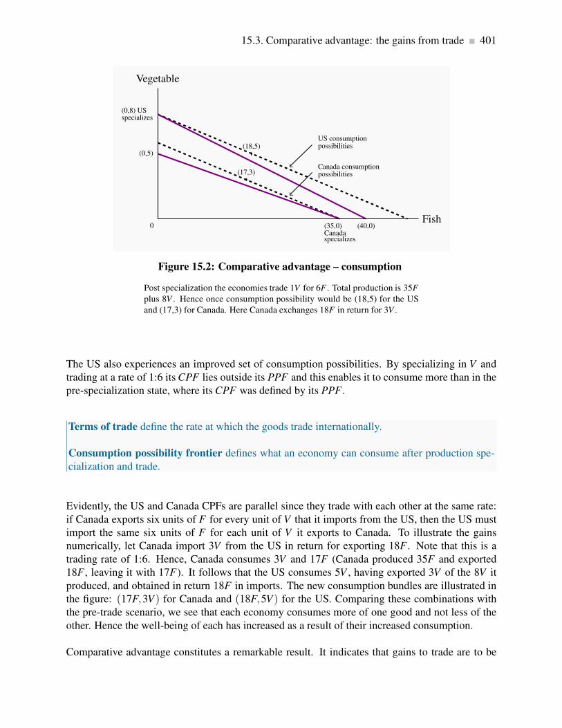
15.3. Comparative advantage: the gains from trade 401
(0,5)
(35,0)Canadaspecializes
(0,8) USspecializes
(40,0)
(18,5)
(17,3)
Vegetable
0Fish
Canada consumptionpossibilities
US consumptionpossibilities
Figure 15.2: Comparative advantage – consumption
Post specialization the economies trade 1V for 6F . Total production is 35F
plus 8V . Hence once consumption possibility would be (18,5) for the US
and (17,3) for Canada. Here Canada exchanges 18F in return for 3V .
The US also experiences an improved set of consumption possibilities. By specializing in V and
trading at a rate of 1:6 its CPF lies outside its PPF and this enables it to consume more than in the
pre-specialization state, where its CPF was defined by its PPF .
Terms of trade define the rate at which the goods trade internationally.
Consumption possibility frontier defines what an economy can consume after production spe-
cialization and trade.
Evidently, the US and Canada CPFs are parallel since they trade with each other at the same rate:
if Canada exports six units of F for every unit of V that it imports from the US, then the US must
import the same six units of F for each unit of V it exports to Canada. To illustrate the gains
numerically, let Canada import 3V from the US in return for exporting 18F . Note that this is a
trading rate of 1:6. Hence, Canada consumes 3V and 17F (Canada produced 35F and exported
18F , leaving it with 17F). It follows that the US consumes 5V , having exported 3V of the 8V it
produced, and obtained in return 18F in imports. The new consumption bundles are illustrated in
the figure: (17F,3V) for Canada and (18F,5V) for the US. Comparing these combinations with
the pre-trade scenario, we see that each economy consumes more of one good and not less of the
other. Hence the well-being of each has increased as a result of their increased consumption.
Comparative advantage constitutes a remarkable result. It indicates that gains to trade are to be

402 International trade
reaped by an efficient economy, by trading with an economy that may be less efficient in producing
each good.
Comparative advantage and factor endowments
A traditional statement of why comparative advantage arises is that economies have different en-
dowments of the factors of production – land, capital and labour endowments differ. A land en-
dowment that facilitates the harvesting of grain (Saskatchewan) or the growing of fruit (California)
may be innate to an economy. We say that wheat production is land intensive, that aluminum pro-
duction is power intensive, that research and development is skill intensive, that auto manufacture
is capital intensive. Consequently, if a country is well endowed with some particular factors of
production, it is to be expected that it will specialize in producing goods that use those inputs. A
relatively abundant supply or endowment of one factor of production tends to make the cost of
using that factor relatively cheap: it is relatively less expensive to produce clothing in Hong Kong
and wheat in Canada than the other way around. This explains why Canada’s Prairies produce
wheat, why Quebec produces aluminum, why Asia produces apparel. But endowments can evolve.
How can we explain why Switzerland specializes in watches, precision instruments, and medical
equipment, while Vietnam specializes in rice and tourism? Evidently, Switzerland made a decision
to educate its population and invest in the capital required to produce these goods. It was not natu-
rally endowed with these skills, in the same way that Greece is endowed with sun or Saskatchewan
is endowed with fertile flat land.
While we have demonstrated the principle of comparative advantage using a two-good example
(since we are constrained by the geometry of two dimensions), the conclusions carry over to the
case of many goods. Finally it is to be noted that the benefits to specialization that we proposed in
Chapter 1 carry over to our everyday lives in the presence of comparative advantage: If one person
in the household is more efficient at doing all household chores than another, there are still gains
to specialization provided the efficiency differences are not all identical. This is the principle of
comparative advantage at work in a microcosm.

15.3. Comparative advantage: the gains from trade 403
In 2005 two young British Columbians embarked on what has famously become known as
the âAIJone hundred mile dietâAI—a challenge to eat and drink only products grown within
this distance of their home. They succeeded in doing this for a whole year, wrote a book
on their experience and went on to produce a TV series. They were convinced that such a
project is good for humanity, partly because they wrapped up ideas on organic farming and
environmentally friendly practices in the same message.
Reflect now on the implications of this superficially attractive program: If North Americans
were to espouse this diet, it would effectively result in the closing down of the mid-west of the
Continent. From Saskatchewan to Kansas, we are endowed with grain-producing land that is
the envy of the planet. But since most of this terrain is not within 100 miles of any big cities,
these deluded advocates are proposing that we close up the production of grains and cereals
exactly in those locations where such production is extraordinarily efficient. Should we sacri-
fice grains and cereals completely in this hemisphere, or just cultivate them on a hillside close
to home, even if the resulting cultivation were to be more labour and fuel intensive? Should
we produce olives in greenhouses in Edmonton rather than importing them from the Mediter-
ranean, or simply stop eating them? Should we sacrifice wine and beer in North Battleford
because insufficient grapes and hops are grown locally?
Would production in temperate climates really save more energy than the current practice of
shipping vegetables and fruits from a distance—particularly when there are returns to scale
associated with their distribution? The one hundred mile diet is based on precepts that are
contrary to the norms of the gains from trade. In its extreme the philosophy proposes that
food exports be halted and that the world’s great natural endowments of land, water, and sun
be allowed to lie fallow. Where would that leave a hungry world?
Application Box 15.1: The one hundred mile diet
The role of exchange rates
What we have shown in the foregoing examples is that there exists a potential for gain, in the
presence of comparative advantage, not that gains are actually realized. Such gains depend upon
markets, not economic planners, and countries usually trade with each other using different cur-
rencies which themselves have a market. The rate at which one currency trades for another is the
exchange rate. Citizens of Canada buy U.S. goods if these goods sell more cheaply in Canada
than Canadian-produced goods, not because some economist has told them about the principle of
comparative advantage! In recent years the Canadian dollar has traded more or less at parity with
the US dollar: one Canadian dollar could buy one US dollar. But in the late nineteen nineties a
Canadian dollar could only purchase seventy US cents – it was more costly for Canadians to buy
American products with their Canadian dollars. When it is more costly for Canadians to purchase
foreign products we buy less of them. Hence the actual trade flow between economies depends

404 International trade
upon both the efficiency with which goods are produced in the different economies and also the
exchange rate between the economies.
15.4 Returns to scale
One of the reasons Canada signed the North America Free trade Agreement (NAFTA) was that
economists convinced the Canadian government that a larger market would enable Canadian pro-
ducers to be even more efficient than in the presence of trade barriers. This then is a slightly
different justification for encouraging trade: rather than opening up trade in order to take advan-
tage of existing comparative advantage, it was proposed that efficiencies would actually increase
with market size. So this argument is easily understood if we go back to our description of increas-
ing returns to scale that we developed in Chapter 8. Economists told the government that there
were several sectors of the economy that were operating on the downward sloping section of their
long-run average cost curve.
Increasing returns are evident in the world market place as well as the domestic marketplace.
Witness the small number of aircraft manufacturers—Airbus and Boeing are the world’s two ma-
jor manufacturers of large aircraft. Enormous fixed costs—in the form of research, design, and
development—or capital outlays frequently result in decreasing unit costs, and the world market-
place can be supplied at a lower cost if some specialization can take place. What insights does
comparative advantage offer here? In fact it is not at all surprising that these corporations, formed
several decades ago, emerged in North America and Europe. The development of the end product
requires enormous intellectual resources, and in the earlier days of these corporations Europe and
North America certainly had a comparative advantage in scientific research.
The theories of absolute and comparative advantage explain why economies specialize in produc-
ing some products rather than others. But actual trade patterns are more subtle than this. In North
America, we observe that Canadian auto plants produce different models than their counterparts
in the U.S. Canada exports some models of a given manufacturer to the United States and imports
other models. This is the phenomenon of intra-industry trade and intra-firm trade. How can we
explain these patterns?
Intra-industry trade is two-way international trade in products produced within the same indus-
try.
Intra-firm trade is two-way trade in international products produced within the same firm.
In the first instance, intra-industry trade reflects the preference of consumers for a choice of brands;
consumers do not all want the same car, or the same software, or the same furnishings. The second
element to intra-industry trade is that increasing returns to scale characterize many production

15.5. Trade barriers: tariffs, subsidies and quotas 405
processes. Let us see if we can transform the returns to scale ideas developed in earlier chapters
into a production possibility framework.
Consider the example presented in Figure 15.3. Hunda Motor Corporation (HMC) currently has a
large assembly plant in each of Canada and the US. Restrictions on trade in automobiles between
the two countries make it too costly to ship models across the border. Hence Hunda produces both
sedans and SUVs in each plant. But for several reasons, switching between models is costly and
results in reduced output. Hunda can produce 40,000 vehicles of each type per annum in its plants,
but could produce 100,000 of a single model in each plant. This is a situation of increasing returns
to scale, and in this instance these scale economies are what determine the trade outcome rather
than any innate comparative advantage between the economies.
40,000
Z
40,000
A=100,000
B=100,000
Post-tradeoutputs
Sedans
SUVs
Figure 15.3: Intra industry trade
Hunda can produce either 100,000 of each vehicle or 40,000 of both in each
plant. Hence production possibilities are given by the points A, Z, and B.
Pre-trade it produces at Z in each economy due to trade barriers. Post-trade
it produces at A in one economy and B in the other, and ships the vehicles
internationally. Total production increases from 160,000 to 200,000 using
the same resources.
15.5 Trade barriers: tariffs, subsidies and quotas
A tariff is a tax on an imported product that is designed to limit trade in addition to generating
tax revenue. It is a barrier to trade. There also exist quotas, which are quantitative restrictions on
imports; other non-tariff barriers, such as product content requirements; and subsidies. By rais-
ing the domestic price of imports, a tariff helps domestic producers but hurts domestic consumers.

406 International trade
Quotas and other non-tariff barriers have similar impacts.
A tariff is a tax on an imported product that is designed to limit trade in addition to generating
tax revenue. It is a barrier to trade.
A quota is a quantitative limit on an imported product.
A trade subsidy to a domestic manufacturer reduces the domestic cost and limits imports.
Non-tariff barriers, such as product content requirements, limit the gains from trade.
In Canada, tariffs were the main source of government revenues, both before and after Con-
federation in 1867 and up to World War I. They provided âAIJincidental protectionâAI for
domestic manufacturing. After the 1878 federal election, tariffs were an important part of the
National Policy introduced by the government of Sir John A. MacDonald. The broad objective
was to create a Canadian nation based on east-west trade and growth.
This National Policy had several dimensions. Initially, to support domestic manufacturing,
it increased tariff protection on foreign manufactured goods, but lowered tariffs on raw ma-
terials and intermediate goods used in local manufacturing activity. The profitability of do-
mestic manufacturing improved. But on a broader scale, tariff protection, railway promo-
tion Western settlement, harbour development, and transport subsidies to support the export
of Canadian products were intended to support national economic development. Although
âAIJreciprocity agreementsâAI with the United States removed duties on commodities for a
time, tariff protection for manufactures was maintained until the GATT negotiations of the
post-World War II era.
Application Box 15.2: Tariffs – the national policy of J.A. MacDonald
Tariffs
Figure 15.4 describes how tariffs operate. We can think of this as the Canadian wine market—a
market that is heavily taxed in Canada. The world price of Cabernet Sauvignon is $10 per bottle,
and this is shown by the horizontal world supply curve at that price. It is horizontal because
our domestic market accounts for only a small part of the world demand for wine. International
producers can supply us with any amount we wish to buy at the world price. The Canadian demand
for this wine is given by the demand curve D, and Canadian suppliers have a supply curve given
by S (Canadian Cabernet is assumed to be of the same quality as the imported variety in this
example). At a price of $10, Canadian consumers wish to buy QD litres, and domestic producers

15.5. Trade barriers: tariffs, subsidies and quotas 407
wish to supply QS litres. The gap between domestic supply QS and domestic demand QD is filled
by imports. This is the free trade equilibrium.
Domesticsupply
Domesticdemand
P=$10J
World supplycurve
P=$12L
World supply curveincluding tariff
Price
Quantity
C
Qs
E
I
Q′s
F
H
Q′0
G
Q0
A
B
Figure 15.4: Tariffs and trade
At a world price of $10 the domestic quantity demanded is Q0. Of this
amount Qs is supplied by domestic producers and the remainder by foreign
producers. A tariff increases the world price to $12. This reduces demand
to Q′0; the domestic component of supply increases to Q′
s. Of the total loss
in consumer surplus (LFGJ), tariff revenue equals EFHI, increased surplus
for domestic suppliers equals LECJ, and the deadweight loss is therefore
the sum of the triangular areas A and B.
If the government now imposes a 20 percent tariff on imported wines, foreign wine sells for $12 a
bottle, inclusive of the tariff. The tariff raises the domestic ‘tariff-inclusive’ price above the world
price, and this shifts the supply of this wine upwards. By raising wine prices in the domestic mar-
ket, the tariff protects domestic producers by raising the domestic price at which imports become
competitive. Those domestic suppliers who were previously not quite competitive at a global price
of $10 are now competitive. The total quantity demanded falls from QD to Q′
D at the new equi-
librium F. Domestic producers supply the amount Q′
S and imports fall to the amount (Q′
D −Q′
S).Reduced imports are partly displaced by domestic producers who can supply at prices between $10
and $12. Hence, imports fall both because total consumption falls and because domestic suppliers
can displace some imports under the protective tariff.
Since the tariff is a type of tax, its impact in the market depends upon the elasticities of supply and
demand, as illustrated Chapters 4 and 5. The more elastic is the demand curve, the more a given
tariff reduces imports. In contrast, if it is inelastic the quantity of imports declines less.

408 International trade
Costs and benefits of a tariff
The costs of a tariff come from the higher price to consumers, but this is partly offset by the tariff
revenue that goes to the government. This tariff revenue is a benefit and can be redistributed to
consumers or spent on goods from which consumers derive a benefit. But there are also efficiency
costs associated with tariffs—deadweight losses, as we call them. These are the real costs of the
tariff, and they arise because the marginal cost of production does not equal the marginal benefit
to the consumer. Let us see how these concepts apply with the help of Figure 15.4.
Consumer surplus is the area under the demand curve and above the equilibrium market price. It
represents the total amount consumers would have been willing to pay for the product but did not
have to pay at the equilibrium price. It is a measure of consumer welfare. The tariff raises the
market price and reduces this consumer surplus by the amount LFGJ. This area measures by how
much domestic consumers are worse off as a result of the price increase caused by the tariff. But
this is not the net loss for the whole domestic economy, because the government obtains some tax
revenue and domestic producers get more revenue and profit.
Government revenue accrues from the domestic sales of imports. On imports of (Q′
D −Q′
S), tax
revenue is EFHI. Then, domestic producers obtain an additional profit of LECJ—the excess of
additional revenue over their cost per additional bottle. If we are not concerned about who gains
and who loses, it is clear that there is a net loss to the domestic economy equal to the areas A and
B.
The area B is the standard measure of deadweight loss. At the quantity Q′
D, the cost of an additional
bottle is less than the value placed on it by consumers; and, by not having those additional bottles
supplied, consumers forgo a potential gain. The area A tells us that when supply by domestic
higher-cost producers is increased, and supply of lower-cost foreign producers is reduced, the
corresponding resources are not being used efficiently. The sum of the areas A and B is therefore
the total deadweight loss of the tariff.
Production subsidies
Figure 15.5 illustrates the effect of a subsidy to a domestic supplier. As in Figure 15.4, the amount
QD is demanded in the free trade equilibrium and, of this, QS is supplied domestically. With
a subsidy per unit of output sold, the government can reduce the supply cost of the domestic
supplier, thereby shifting the supply curve downward from S to S′. In this illustration, the total
quantity demanded remains at QD, but the domestic share increases to Q′
S.

15.5. Trade barriers: tariffs, subsidies and quotas 409
S – domestic supply
S′ – domestic supplywith subsidy
P World supplycurve
D – domesticdemand
Price
QuantityQs Q′
sQ0
Figure 15.5: Subsidies and trade
With a world supply price of P, a domestic supply curve S, and a domestic
demand D, the amount Q0 is purchased. Of this, Qs is supplied domesti-
cally and (Q0 −Qs) by foreign suppliers. A per-unit subsidy to domestic
suppliers shifts their supply curve to S′, and increases their market share to
Q′s.
The new equilibrium represents a misallocation of resources. When domestic output increases
from QS to Q′
S, a low-cost international producer is being replaced by a higher cost domestic
supplier; the domestic supply curve S lies above the international supply curve P in this range of
output.
Note that this example deals with a subsidy to domestic suppliers who are selling in the domestic
market. It is not a subsidy to domestic producers who are selling in the international market – an
export subsidy.
Quotas
A quota is a limit placed upon the amount of a good that can be imported. Consider Figure 15.6,
where again there is a domestic supply curve coupled with a world price of P. Rather than imposing
a tariff, the government imposes a quota that restricts imports to a physical amount denoted by
the distance quota on the quantity axis. The supply curve facing domestic consumers then has
several segments to it. First it has the segment RC, reflecting the fact that domestic suppliers
are competitive with world suppliers up to the amount C. Beyond this output, world suppliers
can supply at a price of P, whereas domestic suppliers cannot compete at this price. Therefore

410 International trade
the supply curve becomes horizontal, but only up to the amount permitted under the quota—the
quantity CU corresponding to quota. Beyond this amount, international supply is not permitted
and therefore additional amounts are supplied by the (higher cost) domestic suppliers. Hence the
supply curve to domestic buyers becomes the supply curve from the domestic suppliers once again.
R
C U
Supply curve to domesticmarket under quota=RCUV
V
P World supplycurve
D – domesticdemand
Price
Quantity
W YPdom
T
Q′D
G
QD
quota
Figure 15.6: Quotas and trade
At the world price P, plus a quota, the supply curve becomes RCUV. This
has three segments: (i) domestic suppliers who can supply below P; (ii)
quota; and (iii) domestic suppliers who can only supply at a price above P.
The quota equilibrium is at T, with price Pdom and quantity Q′D; the free-
trade equilibrium is at G. Of the amount Q′D, quota is supplied by foreign
suppliers and the remainder by domestic suppliers. The quota increases the
price in the domestic market.
The resulting supply curve yields an equilibrium quantity Q′
D. There are several features to note
about this equilibrium. First, the quota pushes the domestic price above the world price because
low-cost international suppliers are partially supplanted by higher-cost domestic suppliers. Second,
if the quota is chosen ‘appropriately’, the same domestic market price could exist under the quota
as under the tariff in Figure 15.4. Third, in contrast to the tariff case, the government obtains no
tax revenue from the quotas. Fourth, there are inefficiencies associated with the equilibrium at Q′
D:
consumers lose the amount PGTPdom in surplus. Against this, suppliers gain PUTPdom (domestic
suppliers gain the amount PCWPdom +UYT, which represents the excess of market price over
their “willingness to supply” price. Importers are limited by the quota but can still buy CU at price
P, sell at Pdom, and therefore gain a surplus equal to CUYW). Therefore the deadweight loss of
the quota is the area UTG—the difference between the loss in consumer surplus and the gain in
supplier surplus.

15.6. The politics of protection 411
In 1978 the federal government set a cheese import quota for Canada at just over 20,000
tonnes. This quota was implemented initially to protect the interests of domestic suppliers.
Despite a strong growth in population and income in the intervening decades, the import
quota has remained unchanged. The result is a price for cheese that is considerably higher
than it would otherwise be. The quotas are owned by individuals and companies who have
the right to import cheese. The quotas are also traded among importers, at a price. Importers
wishing to import cheese beyond their available quota pay a tariff of about 250 percent. So,
while the consumer is the undoubted loser in this game, who gains?
First the suppliers gain, as illustrated in Figure 15.5. Canadian consumers are required to
pay high-cost domestic producers who displace lower-cost producers from overseas. Second,
the holders of the quotas gain. With the increase in demand for cheese that comes with higher
incomes, the domestic price increases over time and this in turn makes an individual quota
more valuable.
Application Box 15.3: Cheese quota in Canada
15.6 The politics of protection
Objections to imports are frequent and come from many different sectors of the economy. In the
face of the gains from trade which we have illustrated in this chapter, why do we observe such
strong rejections to imported goods and services?
Structural change and technology
In a nutshell the answer is that while consumers in the aggregate gain from the reduction of trade
barriers, and there is a net gain to the economy at large, some individual sectors of the economy
lose out. Not surprisingly the sectors that will be adversely affected are vociferous in lodging their
objections. Sectors of the economy that cannot compete with overseas suppliers generally see a
reduction in jobs. This has been the case in the manufacturing sector of the Canadian and US
economies in the most recent two decades, as manufacturing and assembly has flown off-shore to
Asia and Mexico where labour costs are lower. Domestic job losses are painful, and frequently
workers who have spent decades in a particular job find reemployment difficult, and rarely get as
high a wage as in their displaced job.
Such job losses are reflected in calls for tariffs on imports from China in order to ‘level the playing
field’ – that is, to counter the impact of lower wages in China. Of course it is precisely because of
lower labour costs in China that the Canadian consumer benefits.

412 International trade
In Canada we deal with such dislocation first by providing ‘unemployment’ payments to workers
and second by furnishing retraining allowances from Canada’s Employment Insurance program.
Of course, such support does not guarantee an equally good alternative job. But structural changes
in the economy, due to both internal and external developments, must be confronted. For example,
the information technology revolution made tens of thousands of ‘data entry’ workers redundant.
Should producers have shunned the technological developments which increased their productivity
dramatically? If they did, would they be able to compete in world markets?
While job losses feature heavily in protests against technological development and freer trade,
most modern economies continue to grow and create more jobs in the service sector than are lost
in the manufacturing sector. Developed economies now have many more workers in service than
manufacture. Service jobs are not just composed of low-wage jobs in fast food establishments –
‘Mcjobs’, they are high paying jobs in the health, education, legal, financial and communications
sectors of the economy.
Successful lobbying and concentration
While efforts to protect manufacture have not resulted in significant barriers to imports of manu-
factures, objections in some specific sectors of the economy seem to be effective worldwide. One
sector that stands out is agriculture. Not only does Canada have very steep barriers to imports
of dairy products such as milk and cheese, the US and the European Union have policies that
limit imports and subsidize their domestic producers. Europe has had its ‘wine lakes’ and ‘but-
ter mountains’ due to excessive government intervention in these sectors; the US has subsidies to
sugar producers and Canada has a system of quotas on the domestic supply of dairy products and
corresponding limits on imports.
Evidently, in the case of agriculture, political conditions are conducive to the continuance of pro-
tection and what is called ‘supply management’ – domestic production quotas. The reason for
‘successful’ supply limitation appears to rest in the geographic concentration of potential benefi-
ciaries of such protection and the scattered beneficiaries of freer trade on the one hand, and the
costs and benefits of political organization on the other: Farmers tend to be concentrated in a
limited number of rural electoral ridings and hence they can collectively have a major impact on
electoral outcomes. Second, the benefits that accrue to trade restriction are heavily concentrated
in the economy – keep in mind that about three percent of the population lives on farms, or relies
on farming for its income. By contrast the costs on a per person scale are small, and are spread
over the whole population. Thus, in terms of the costs of political organization, the incentives for
consumers are small, but the incentives for producers are high.
In addition to the differing patterns of costs and benefits, rural communities tend to be more suc-
cessful in pushing trade restrictions based on a ‘way of life’ argument. By permitting imports that
might displace local supply, lobbyists are frequently successful in convincing politicians that long-
standing way-of-life traditions would be endangered, even if such ‘traditions’ are accompanied by
monopoly purchase – as was the case under the Canadian Wheat Board until 2012, or tariffs as

15.6. The politics of protection 413
high as 250% – as is the case on cheese above a specific import quota.
Valid trade barriers: infant industries and dumping?
An argument that carries both intellectual and emotional appeal to voters is the ‘infant industry’
argument. The argument goes as follows: new ventures and sectors of the economy may require
time before that can compete internationally: scale economies may be involved for example, and
time may be required for producers to expand their scale of operation, at which time costs will
have fallen to international (i.e. competitive) levels. In addition learning by doing may be critical
in more high-tech sectors, and once again, with the passage of time costs should decline for this
reason also.
There are two problems with this stance: first, is that these infants would have insufficient incentive
to grow up and become competitive; the second is why the private sector cannot invest sufficiently
in promising young sectors. A protection measure that is initially intended to be temporary can
become permanent because of the potential job losses associated with a cessation of the protection
to an industry that fails to become internationally competitive. Furthermore, employees and man-
agers in protected sectors have insufficient incentive to make their production competitive if they
realize that their government will always be there to protect them. As for the need for protection
rather than private sector investment: if the industry is such a good idea in the long run, society
should begin by asking why private firms cannot borrow the money to see them through the early
period when they are losing out to more efficient foreign firms. If private lenders are not prepared
to invest or lend, should the government be willing to step in? Does the government know more
than the private sector about long-term investment returns?
In contrast to the infant industry argument, economists are more favourable to restrictions that are
aimed to prevent ‘dumping’. Dumping is a predatory practice, based on artificial costs aimed at
driving out domestic producers.
Dumping is a predatory practice, based on artificial costs aimed at driving out domestic produc-
ers.
Dumping may occur either because foreign suppliers choose to sell at artificially low prices (prices
below their marginal cost for example), or because of surpluses in foreign markets resulting from
oversupply. For example, if, as a result of price support in its own market, a foreign government
induced oversupply in butter and it chose to sell such butter on world markets at a price well below
the going (‘competitive’) world supply price, such a sale would be a case of dumping. Alterna-
tively, an established foreign supplier might choose to enter our domestic market by selling its
products at artificially low prices, with a view to driving domestic competition out of the domestic
market. Having driven out the domestic competition it would then be in a position to raise prices.
Such behaviour differs from a permanently lower price on the part of foreign suppliers. This latter

414 International trade
may be welcomed as a gain from trade, whereas the former may generate no gains and serve only
to displace domestic labour and capital.
15.7 Institutions governing trade
In the nineteenth century, world trade grew rapidly, in part because the leading trading nation at
the time—the United Kingdom—pursued a vigorous policy of free trade. In contrast, US tariffs
averaged about 50 percent, although they had fallen to around 30 percent by the early 1920s. As
the industrial economies went into the Great Depression of the late 1920s and 1930s, there was
pressure to protect domestic jobs by keeping out imports. Tariffs in the United States returned
to around 50 percent, and the United Kingdom abandoned the policy of free trade that had been
pursued for nearly a century. The combination of world recession and increasing tariffs led to a
disastrous slump in the volume of world trade, further exacerbated by World War II.
The WTO and GATT
After World War II, there was a collective determination to see world trade restored. Bodies such
as the International Monetary Fund and the World Bank were set up, and many countries signed
the General Agreement on Tariffs and Trade (GATT), a commitment to reduce tariffs successively
and dismantle trade restrictions.
Under successive rounds of GATT, tariffs fell steadily. By 1960, United States tariffs were only
one-fifth their level at the outbreak of the War. In the United Kingdom, the system of wartime
quotas on imports had been dismantled by the mid-1950s, after which tariffs were reduced by
nearly half in the ensuing 25 years. Europe as a whole moved toward an enlarged European Union
in which tariffs between member countries have been abolished. By the late 1980s, Canada’s tariffs
had been reduced to about one-quarter of their immediate post-World War II level.
The GATT Secretariat, now called the World Trade Organization (WTO), aims both to dismantle
existing protection that reduces efficiency and to extend trade liberalization to more and more
countries. Tariff levels throughout the world are now as low as they have ever been, and trade
liberalization has been an engine of growth for many economies. The consequence has been a
substantial growth in world trade.
NAFTA and the EU
In North America, recent trade policy has led to a free trade area that covers the flow of trade
between Canada, the United States, and Mexico. The Canada/United States free trade agreement
15.7. Institutions governing trade 415
(FTA) of 1989 expanded in 1994 to include Mexico in the North American Free Trade Agreement
(NAFTA). The objective in both cases was to institute free trade between these countries in most
goods and services. This meant the elimination of tariffs over a period of years and the reduction
or removal of non-tariff barriers to trade, with a few exceptions in specific products and cultural
industries. Evidence of the success of these agreements is reflected in the fact that Canadian
exports have grown to more than 30 percent of GDP, and trade with the United States accounts for
the lion’s share of Canadian trade flows.
The European Union was formed after World War II, with the prime objective of bringing about a
greater degree of political integration in Europe. Two world wars had laid waste to their economies
and social fabric. Closer economic ties and greater trade were seen as the means of achieving this
integration. The Union was called the “Common Market” for much of its existence. The Union
originally had six member states, but as of 2009 the number is 27, with several other candidate
countries in the process of application, most notably Turkey. The European Union (EU) has a
secretariat and parliament in Bruxelles. You can find more about the EU at http://europa.eu.

416 KEY TERMS
KEY TERMS
Autarky denotes the no-trade situation.
Principle of comparative advantage states that even if one country has an absolute advan-
tage in producing both goods, gains to specialization and trade still materialize, provided the
opportunity cost of producing the goods differs between economies.
Terms of trade define the rate at which goods trade internationally.
Consumption possibility frontier defines what an economy can consume after production
specialization and trade.
Intra-industry trade is two-way international trade in products produced within the same
industry.
Intra-firm trade is two-way trade in international products produced within the same firm.
Tariff is a tax on an imported product that is designed to limit trade in addition to generating
tax revenue. It is a barrier to trade.
Quota is a quantitative limit on an imported product.
Trade subsidy to a domestic manufacturer reduces the domestic cost and limits imports.
Non-tariff barriers, such as product content requirements, limits the gains from trade.
Dumping is a predatory practice, based on artificial costs aimed at driving out domestic pro-
ducers.

Exercises for Chapter 15 417
EXERCISES FOR CHAPTER 15
Exercise 15.1 The following table shows the labour input requirements to produce a bushel of
wheat and a litre of wine in two countries, Northland and Southland, on the assumption of constant
cost production technology – meaning that the production possibility curves in each are straight
lines.
Labour requirements per unit produced
Northland Southland
Per bushel of wheat 1 3
Per litre of wine 2 4
(a) Which country has an absolute advantage in the production of both wheat and wine?
(b) What is the opportunity cost of wheat in each economy? Of wine?
(c) What is the pattern of comparative advantage here?
(d) Suppose the country with a comparative advantage in wine reduces wheat production by one
bushel and reallocates the labour involved to wine production. How much additional wine
does it produce?
(e) Which country, if either, gains from this change in production and trade, and what is the
gain?
(f) If the country with the comparative advantage in wheat reduced wine production enough
to increase wheat production by one bushel, how much wine could it get by selling the
additional bushel of wheat to the other country at that economy’s opportunity cost?
Exercise 15.2 Canada and the United States can produce two goods, xylophones and yogourt. Each
good can be produced with labour alone. Canada requires 60 hours to produce a ton of yogourt
and 6 hours to produce a xylophone. The United States requires 40 hours to produce the ton of
yogourt and 5 hours to produce a xylophone.
(a) Describe the state of absolute advantage between these economies in producing goods.
(b) In which good does Canada have a comparative advantage? Does this mean the United States
has a comparative advantage in the other good?
(c) Draw the production possibility frontier for each economy to scale on a diagram, assuming
that each economy has an endowment of 240 hours of labour.
418 Exercises for Chapter 15
(d) On the same diagram, draw Canada’s consumption possibility frontier on the assumption
that it can trade with the United States at the United States rate of transformation.
(e) Draw the US consumption possibility frontier under the assumption that it can trade at
Canada’s rate of transformation.
Exercise 15.3 The domestic demand for bicycles is given by P = 36−0.3Q. The foreign supply is
given by P = 18 and domestic supply by P = 16+0.4Q.
(a) Illustrate the market equilibrium on a diagram, and compute the amounts supplied by do-
mestic and foreign suppliers.
(b) If the government now imposes a tariff of $6 per unit on the foreign good, illustrate the
impact geometrically, and compute the new quantities supplied by domestic and foreign
producers.
(c) In the diagram, illustrate the area representing tariff revenue and compute its value.
Exercise 15.4 In Exercise 15.3, illustrate the deadweight losses associated with the imposition of
the tariff, and compute the amounts.
(a) Compute the additional amount of profit made by the domestic producer as a result of the
tariff. [Hint: refer to Figure 15.4 in the text.]
Exercise 15.5 The domestic demand for office printers is given by P = 40−0.2Q. The supply of
domestic producers is given by P = 12+0.1Q, and international supply by P = 20.
(a) Illustrate this market geometrically.
(b) Compute total demand and the amounts supplied by domestic and foreign suppliers.
(c) If the government gives a production subsidy of $2 per unit to domestic suppliers in order to
increase their competitiveness, calculate the new amounts supplied by domestic and foreign
producers. [Hint: The domestic supply curve becomes P = 10+0.1Q].
(d) Compute the cost to the government of this scheme.
Exercise 15.6 The domestic demand for turnips is given by P = 128−(1/2)Q. The market supply
of domestic suppliers is given by P = 12+(1/4)Q, and the world price is $32 per bushel.

Exercises for Chapter 15 419
(a) First graph this market and then solve for the equilibrium quantity purchased.
(b) How much of the quantity traded will be produced domestically and how much will be
imported?
(c) Assume now that a quota of 76 units is put in place. Illustrate the resulting market equilib-
rium graphically.
(d) Compute the domestic price of turnips and the associated quantity traded with the quota in
place. [Hint: you could shrink the demand curve in towards the origin by the amount of the
quota and equate the result with the domestic supply curve].
Exercise 15.7 The domestic market for cheese is given by P= 108−2Q and P= 16+1/4Q. These
are the demand and supply conditions. The good can be supplied internationally at a constant price
P = 20.
(a) Illustrate the domestic market in the absence of trade and solve for the equilibrium price and
quantity.
(b) With free trade illustrate the market graphically and compute the total amount purchased,
and the amounts supplied by domestic and international suppliers.
(c) Suppose now that the government implements a price floor in the domestic market equal to
$28. Illustrate the market outcome graphically.
(d) For the outcome with a price floor, compute the quantity supplied by domestic and interna-
tional suppliers respectively.
Exercise 15.8 The following are hypothetical production possibilities tables for Canada and the
United States. For each line required, plot any two or more points on the line.
Canada United States
A B C D A B C D
Peaches 0 5 10 15 Peaches 0 10 20 30
Apples 30 20 10 0 Apples 15 10 5 0
(a) Plot Canada’s production possibilities curve by plotting at least 2 points on the curve.
(b) Plot the United States’ production possibilities curve by plotting at least 2 points on the curve
on the graph above.

420 Exercises for Chapter 15
(c) What is each country’s cost ratio of producing Peaches and Apples?
(d) Which economy should specialize in which product?
(e) Plot the United States’ trading possibilities curve (by plotting at least 2 points on the curve)
if the actual terms of the trade are 1 apple for 1 peach.
(f) Plot the Canada’ trading possibilities curve (by plotting at least 2 points on the curve) if the
actual terms of the trade are 1 apple for 1 peach.
(g) Suppose that the optimum product mixes before specialization and trade were B in the United
States and C in Canada. What are the gains from specialization and trade?

Glossary
Accounting profits are the difference between revenues and actual costs incurred. (9.4)
Adverse selection occurs when incomplete or asymmetric information describes an economic
relationship. (14.1)
Affordable set of goods and services for the consumer is bounded by the budget line from above;
the non-affordable set lies strictly above the budget line. (6.3)
Age-earnings profiles define the pattern of earnings over time for individuals with different char-
acteristics. (13.2)
Agent: usually a manager who works in a corporation and is directed to follow the corporation’s
interests. (7.2)
Allocative inefficiency arises when resources are not appropriately allocated and result in dead-
weight losses. (10.4)
Arc elasticity of demand defines consumer responsiveness over a segment or arc of the demand
curve. (4.1)
Asset price: the financial sum for which the asset can be purchased. (12.5)
Asymmetric information is where at least one party in an economic relationship has less than full
information and has a different amount of information from another party. (14.1)
Autarky denotes the no-trade situation. (15.3)
Average fixed cost is the total fixed cost per unit of output. (8.4)
Average product of labour is the number of units of output produced per unit of labour at different
levels of employment. (8.3)
Average revenue is the price per unit sold. (10.2)
Average total cost (ATC) is the sum of all costs per unit of output. (8.4)
Average variable cost (AVC) is the total variable cost per unit of output. (8.4)
421

422 Glossary
Binding commitment: an agreement, entered into voluntarily, that restricts future actions. (11.4)
Boom: a period of high growth that raises output above normal capacity output. (1.6)
Break-even price corresponds to the minimum of the ATC curve. (9.3)
Budget constraint defines all bundles of goods that the consumer can afford with a given budget.
(6.3)
Capital gains (losses) arise from the ownership of a corporation when an individual sells a share
at a price higher (lower) than when the share was purchased. (7.1)
Capital market: a set of financial institutions that funnels financing from investors into bonds and
stocks. (7.6)
Capital services are the production inputs generated by capital assets. (1.5)
Capital stock: the buildings, machinery, equipment and software used in producing goods and
services. (1.6)
Cardinal utility is a measurable concept of satisfaction. (6.2)
Cluster: a group of firms producing similar products, or engaged in similar research. (8.8)
Collusion is an explicit or implicit agreement to avoid competition with a view to increasing profit.
(11.4)
Comparative static analysis compares an initial equilibrium with a new equilibrium, where the
difference is due to a change in one of the other things that lie behind the demand curve or the
supply curve. (3.4)
Complementary goods: when a price reduction (rise) for a related product increases (reduces) the
demand for a primary product, it is a complement for the primary product. (3.4)
Concentration ratio: N-firm concentration ratio is the sales share of the largest N firms in that
sector of the economy. (11.2)
Conjecture: a belief that one firm forms about the strategic reaction of another competing firm.
(11.4)
Consumer equilibrium occurs when marginal utility per dollar spent on the last unit of each good
is equal. (6.2)
Consumer optimum occurs where the chosen consumption bundle is a point such that the price
ratio equals the marginal rate of substitution. (6.3)

Glossary 423
Consumer price index: the average price level for consumer goods and services. (2.2)
Consumer surplus is the excess of consumer willingness to pay over the market price. (5.2)
Consumption possibility frontier defines what an economy can consume after production spe-
cialization and trade. (15.3)
Corporation or company is an organization with a legal identity separate from its owners that
produces and trades. (7.1)
Corrective tax seeks to direct the market towards a more efficient output. (5.5)
Cournot behaviour involves each firm reacting optimally in their choice of output to their com-
petitors’ decisions. (11.5)
Credible threat: one that, after the fact, is still optimal to implement. (11.4)
Cross-price elasticity of demand is the percentage change in the quantity demanded of a product
divided by the percentage change in the price of another. (4.4)
Cross-section data: values for different variables recorded at a point in time. (2.2)
Data: recorded values of variables. (2.2)
Deadweight loss of a tax is the component of consumer and producer surpluses forming a net loss
to the whole economy. (5.4)
Decreasing returns to scale implies that an equal proportionate increase in all inputs leads to a
less than proportionate increase in output. (8.6)
Deflation rate: the annual percentage decrease in the consumer price index. (2.2)
Demand curve is a graphical expression of the relationship between price and quantity demanded,
with other influences remaining unchanged. (3.3)
Demand for labour: a derived demand, reflecting the demand for the output of final goods and
services. (12.1)
Demand is elastic if the price elasticity is greater than unity. It is inelastic if the value lies between
unity and 0. It is unit elastic if the value is exactly one. (4.1)
Demand is the quantity of a good or service that buyers wish to purchase at each possible price,
with all other influences on demand remaining unchanged. (3.2)
Depreciation is the annual change in the value of a physical asset. (12.5)

424 Glossary
Differentiated product is one that differs slightly from other products in the same market. (11.3)
Diminishing marginal rate of substitution reflects a higher marginal value being associated with
smaller quantities of any good consumed. (6.3)
Diminishing marginal utility implies that the addition to total utility from each extra unit of a
good or service consumed is declining. (6.2)
Discrimination implies an earnings differential that is attributable to a trait other than human
capital. (13.6)
Distortion in resource allocation means that production is not at an efficient output, or a given
output is not efficiently allocated. (5.4)
Diversification reduces the total risk of a portfolio by pooling risks across several different assets
whose individual returns behave independently. (7.6)
Dividends are payments made from after-tax profits to company shareholders. (7.1)
Dominant strategy: a player’s best strategy, whatever the strategies adopted by rivals. (11.4)
Dumping is a predatory practice, based on artificial costs aimed at driving out domestic producers.
(15.6)
Duopoly defines a market or sector with just two firms. (11.1)
Econometrics is the science of examining and quantifying relationships between economic vari-
ables. (2.3)
Economic (supernormal) profits are those profits above normal profits that induce firms to enter
an industry. Economic profits are based on the opportunity cost of the resources used in production.
(9.4)
Economic efficiency defines a production structures that produces output at least cost. (8.1)
Economic equity is concerned with the distribution of well-being among members of the economy.
(2.4)
Economies of scope occur if the unit cost of producing particular products is less when combined
with the production of other products than when produced alone. (8.8)
Economy-wide PPF is the set of goods combinations that can be produced in the economy when
all available productive resources are in use. (1.5)
Education premium: the difference in earnings between the more and less highly educated. (13.2)

Glossary 425
Efficiency addresses the question of how well the economy’s resources are used and allocated.
(5.1)
Efficient market is one which maximizes the sum of producer and consumer surpluses. (5.3)
Efficient supply of public goods is where the marginal cost equals the sum of individual marginal
valuations, and each individual consumes the same quantity. (14.1)
Elasticity of supply is defined as the percentage change in quantity supplied divided by the per-
centage change in price. (4.6)
Equilibrium price is the price at which quantity demanded equals the quantity supplied; it equili-
brates the market. (3.2)
Equity deals with how society’s goods and rewards are, and should be, distributed among its
different members, and how the associated costs should be apportioned. (5.1)
Excess burden of a tax is the component of consumer and producer surpluses forming a net loss
to the whole economy. (5.4)
Excess demand exists when the quantity demanded exceeds quantity supplied at the going price.
(3.2)
Excess supply exists when the quantity supplied exceeds the quantity demanded at the going price.
(3.2)
Exclusive sale: where a retailer is obliged (perhaps illegally) to purchase all wholesale products
from a single supplier only. (14.5)
Externality is a benefit or cost falling on people other than those involved in the activity’s market.
It can create a difference between private costs or values and social costs or values. (5.5)
Fair gamble: one where the gain or loss will be zero if played a large number of times. (7.3)
Firm-specific skills raise a worker’s productivity in a particular firm. (13.3)
Fixed costs are costs that are independent of the level of output. (8.4)
Flow is the stream of services an asset provides during a period of time. (12.5)
Full employment output Yc =(number of workers at full employment)×(output per worker). (1.6)
Game: a situation in which contestants plan strategically to maximize their profits, taking account
of rivals’ behaviour. (11.4)
426 Glossary
General skills enhance productivity in many jobs or firms. (13.3)
Gini index: a measure of how far the Lorenz curve lies from the line of equality. Its maximum
value is one; its minimum value is zero. (13.7)
Globalization is the tendency for international markets to be ever more integrated. (8.7)
Greenhouse gases that accumulate excessively in the earth’s atmosphere prevent heat from escap-
ing and lead to global warming. (5.7)
Gross investment is the production of new capital goods and the improvement of existing capital
goods. (12.5)
High (low) frequency data series have short (long) intervals between observations. (2.2)
Horizontal equity is the equal treatment of similar individuals. (5.8)
Human capital is the stock of expertise accumulated by a worker that determines future produc-
tivity and earnings. (13.1)
Imperfectly competitive firms face a downward-sloping demand curve, and their output price
reflects the quantity sold. (11.1)
Income effect of a price change is the adjustment of demand to the change in real income alone.
(6.4)
Income elasticity of demand is the percentage change in quantity demanded divided by a per-
centage change in income. (4.5)
Increasing (decreasing) cost industry is one where costs rise (fall) for each firm because of the
scale of industry operation. (9.5)
Increasing returns to scale implies that, when all inputs are increased by a given proportion,
output increases more than proportionately. (8.6)
Index number: value for a variable, or an average of a set of variables, expressed relative to a
given base value. (2.2)
Indifference curve defines combinations of goods and services that yield the same level of satis-
faction to the consumer. (6.3)
Indifference map is a set of indifference curves, where curves further from the origin denote a
higher level of satisfaction. (6.3)
Industry supply (short run) in perfect competition is the horizontal sum of all firms’ supply

Glossary 427
curves. (9.3)
Industry supply in the long-run in perfect competition is horizontal at a price corresponding to
the minimum of the representative firm’s long-run ATC curve. (9.5)
Inferior good is one whose demand falls in response to higher incomes. (3.4)
Inferior goods have a negative income elasticity. (4.5)
Inflation rate: the annual percentage increase in the consumer price index. (2.2)
Intergenerational equity requires a balancing of the interests and well-being of different genera-
tions and cohorts. (5.8)
Intra-firm trade is two-way trade in international products produced within the same firm. (15.4)
Intra-industry trade is two-way international trade in products produced within the same indus-
try. (15.4)
Invention is the discovery of a new product or process through research. (10.8)
Labour force is that part of the population either employed or seeking employment. (12.3)
Law of demand states that, other things being equal, more of a good is demanded the lower is its
price. (6.2)
Law of diminishing returns: when increments of a variable factor (labour) are added to a fixed
amount of another factor (capital), the marginal product of the variable factor must eventually
decline. (8.3)
Learning by doing can reduce costs. A longer history of production enables firms to accumulate
knowledge and thereby implement more efficient production processes. (8.8)
Limited liability means that the liability of the company is limited to the value of the company’s
assets. (7.1)
Long run marginal cost is the increment in cost associated with producing one more unit of
output when all inputs are adjusted in a cost minimizing manner. (8.6)
Long run: a period of time that is sufficient to enable all factors of production to be adjusted. (8.2)
Longitudinal data follow the same units of observation through time. (2.2)
Long-run average total cost is the lower envelope of all the short-run ATC curves. (8.6)

428 Glossary
Long-run equilibrium in a competitive industry requires a price equal to the minimum point of a
firm’s ATC. At this point, only normal profits exist, and there is no incentive for firms to enter or
exit. (9.4)
Lorenz curve describes the cumulative percentage of the income distribution going to different
quantiles of the population. (13.7)
Luxury good or service is one whose income elasticity exceeds unity. (4.5)
Macroeconomics studies the economy as system in which feedbacks among sectors determine
national output, employment and prices. (1.1)
Marginal abatement curve reflects the cost to society of reducing the quantity of pollution by
one unit. (5.7)
Marginal cost of production is the cost of producing each additional unit of output. (8.5)
Marginal damage curve reflects the cost to society of an additional unit of pollution. (5.7)
Marginal product of labour is the addition to output produced by each additional worker. It is
also the slope of the total product curve. (8.3)
Marginal rate of substitution is the slope of the indifference curve. It defines the amount of one
good the consumer is willing to sacrifice in order to obtain a given increment of the other, while
maintaining utility unchanged. (6.3)
Marginal revenue is the change in total revenue due to selling one more unit of the good. (10.2)
Marginal revenue product of labour is the additional revenue generated by hiring one more unit
of labour where the marginal revenue declines. (12.1)
Marginal revenue is the additional revenue accruing to the firm resulting from the sale of one
more unit of output. (9.3)
Marginal utility is the addition to total utility created when one more unit of a good or service is
consumed. (6.2)
Market demand: the horizontal sum of individual demands. (3.8)
Market failure defines outcomes in which the allocation of resources is not efficient. (14.1)
Microeconomics is the study of individual behaviour in the context of scarcity. (1.1)
Minimum efficient scale defines a threshold size of operation such that scale economies are almost
exhausted. (8.6)

Glossary 429
Mixed economy is one where goods and services are supplied both by private suppliers and gov-
ernment. (1.1)
Model is a formalization of theory that facilitates scientific inquiry. (1.2)
Monopolist: the sole supplier of an industry’s output, and therefore the industry and the firm are
one and the same. (10.1)
Monopolistic competition defines a market with many sellers of products that have similar charac-
teristics. Monopolistically competitive firms can exert only a small influence on the whole market.
(11.1)
Monopsonist is the sole buyer of a good or service and faces an upward-sloping supply curve.
(12.1)
Moral hazard may characterize behaviour where the costs of certain activities are not incurred by
those undertaking them. (14.1)
Nash equilibrium: one in which each player chooses the best strategy, given the strategies chosen
by the other player, and there is no incentive for any player to move. (11.4)
Natural monopoly: one where the ATC of producing any output declines with the scale of opera-
tion. (10.1)
Necessity is one whose income elasticity is less than unity. (4.5)
Net investment is gross investment minus depreciation of the existing capital stock. (12.5)
Nominal earnings: earnings measured in current dollars. (2.2)
Nominal price index: the current dollar price of a good or service. (2.2)
Non-tariff barriers, such as product content requirements, limit the gains from trade. (15.5)
Normal good is one whose demand increases in response to higher incomes. (3.4)
Normal profits are required to induce suppliers to supply their goods and services. They reflect
opportunity costs and can therefore be considered as a type of cost component. (9.4)
Normative economics offers recommendations that incorporate value judgments. (2.4)
Oligopoly defines an industry with a small number of suppliers. (11.1)
On-the-job training improves human capital through work experience. (13.3)

430 Glossary
Opportunity cost of a choice is what must be sacrificed when a choice is made. (1.3)
Ordinal utility assumes that individuals can rank commodity bundles in accordance with the level
of satisfaction associated with each bundle. (6.3)
Participation rate: the fraction of the population in the working age group that joins the labour
force. (12.3)
Partnership: a business owned jointly by two or more individuals, who share in the profits and
are jointly responsible for losses. (7.1)
Patent laws grant inventors a legal monopoly on use for a fixed period of time. (10.8)
Payoff matrix defines the rewards to each player resulting from particular choices. (11.4)
Percentage change: (change in values)/original value×100. (2.2)
Perfect competition: an industry in which many suppliers, producing an identical product, face
many buyers, and no one participant can influence the market. (9.1)
Point elasticity of demand is the elasticity computed at a particular point on the demand curve.
(4.1)
Portfolio: a combination of assets that is designed to secure an income from investing and to
reduce risk. (7.6)
Positive economics studies objective or scientific explanations of how the economy functions.
(2.4)
Predatory pricing is a practice that is aimed at driving out competition by artificially reducing the
price of one product sold by a supplier. (14.5)
Present value of a stream of future earnings: the sum of each year’s earnings divided by one
plus the interest rate raised to the appropriate power. (12.5)
Price controls are government rules or laws that inhibit the formation of market-determined prices.
(3.7)
Price discrimination involves charging different prices to different consumers in order to increase
profit. (10.5)
Price elasticity of demand is measured as the percentage change in quantity demanded, divided
by the percentage change in price. (4.1)
Principal or owner: delegates decisions to an agent, or manager. (7.2)

Glossary 431
Principal-agent problem: arises when the principal cannot easily monitor the actions of the agent,
who therefore may not act in the best interests of the principal. (7.2)
Principle of comparative advantage states that even if one country has an absolute advantage in
producing both goods, gains to specialization and trade still materialize, provided the opportunity
cost of producing the goods differs between economies. (15.3)
Process innovation refers to new or better production or supply. (10.8)
Product innovation refers to new or better products or services. (10.8)
Production function: a technological relationship that specifies how much output can be produced
with specific amounts of inputs economics. (8.1)
Production possibility frontier (PPF) defines the combination of goods that can be produced
using all of the resources available. (1.4)
Productivity of labour is the output of goods and services per worker. (1.6)
Profit maximization is the goal of competitive suppliers – they seek to maximize the difference
between revenues and costs. (9.1)
Public goods are non-rivalrous, in that they can be consumed simultaneously by more than one
individual; additionally they may have a non-excludability characteristic. (14.1)
Quantity demanded defines the amount purchased at a particular price. (3.2)
Quantity supplied refers to the amount supplied at a particular price. (3.2)
Quota in international trade is a quantitative limit on an imported product. (15.5)
Quotas are restrictions on output or sales. (3.7)
Reaction functions define the optimal choice of output conditional upon a rival’s output choice.
(11.5)
Real earnings: earnings measure in constant dollars to adjust for changes in the general price
level. (2.2)
Real price index: a nominal price index divided by the consumer price index, scaled by 100. (2.2)
Real return on corporate stock: the sum of dividend plus capital gain, adjusted for inflation.
(7.5)
Real return: the nominal return minus the rate of inflation. (7.5)
432 Glossary
Recession: when output falls below the economy’s capacity output. (1.6)
Refusal to deal: an illegal practice where a supplier refuses to sell to a purchaser. (14.5)
Regression line represents the average relationship between two variables in a scatter diagram.
(2.3)
Rent is the excess remuneration an individual currently receives above the next best alternative.
This alternative is the reservation wage. (12.4)
Rent seeking is an activity that uses productive resources to redistribute rather than create output
and value. (10.7)
Rental rate: the cost of using capital services. (12.5)
Retained earnings are the profits retained by a company for reinvestment and not distributed as
dividends. (7.1)
Revenue burden is the amount of tax revenue raised by a tax. (5.4)
Risk pooling: a means of reducing risk and increasing utility by aggregating or pooling multiple
independent risks. (7.4)
Risk spreading: spreads the risk of a venture among multiple sub insurers. (7.4)
Risk: the risk associated with an investment can be measured by the dispersion in possible out-
comes. A greater dispersion in outcomes implies more risk. (7.3)
Risk-averse person will refuse a fair gamble, regardless of the dispersion in outcomes. (7.3)
Risk-neutral person is interested only in whether the odds yield a profit on average, and ignores
the dispersion in possible outcomes. (7.3)
Scatter diagram plots pairs of values simultaneously observed for two variables. (2.3)
Screening is the process of obtaining information by observing differences in behaviour. (13.4)
Shareholders invest in corporations and therefore are the owners. They have limited liability
personally if the firm incurs losses. (7.1)
Short run equilibrium in perfect competition occurs when each firm maximizes profit by produc-
ing a quantity where P = MC. (9.3)
Short run: a period during which at least one factor of production is fixed. If capital is fixed, then
more output is produced by using additional labour. (8.2)

Glossary 433
Short side of the market determines outcomes at prices other than the equilibrium. (3.2)
Short-run supply curve for perfect competitor: the portion of the MC curve above the minimum
of the AVC. (9.3)
Shut-down price corresponds to the minimum value of the AVC curve. (9.3)
Signalling is the decision to undertake an action in order to reveal information. (13.4)
Sole proprietor is the single owner of a business and is responsible for all profits and losses. (7.1)
Stock is the quantity of an asset at a point in time. (12.5)
Stock option: an option to buy the stock of the company at a future date for a fixed, predetermined
price. (7.2)
Strategy: a game plan describing how a player acts, or moves, in each possible situation. (11.4)
Substitute goods: when a price reduction (rise) for a related product reduces (increases) the de-
mand for a primary product, it is a substitute for the primary product. (3.4)
Substitution effect of a price change is the adjustment of demand to a relative price change alone,
and maintains the consumer on the initial indifference curve. (6.4)
Sunk cost is a fixed cost that has already been incurred and cannot be recovered, even by producing
a zero output. (8.5)
Supplier or producer surplus is the excess of market price over the reservation price of the
supplier. (5.2)
Supply curve is a graphical expression of the relationship between price and quantity supplied,
with other influences remaining unchanged. (3.3)
Supply is the quantity of a good or service that sellers are willing to sell at each possible price,
with all other influences on supply remaining unchanged. (3.2)
Tariff is a tax on an imported product that is designed to limit trade in addition to generating tax
revenue. It is a barrier to trade. (15.5)
Tax Incidence describes how the burden of a tax is shared between buyer and seller. (4.7)
Tax wedge is the difference between the consumer and producer prices. (5.4)
Technological change represents innovation that can reduce the cost of production or bring new
products. (8.7)

434 Glossary
Technological efficiency means that the maximum output is produced with the given set of inputs.
(8.1)
Terms of trade define the rate at which goods trade internationally. (15.3)
Theory is a logical view of how things work, and is frequently formulated on the basis of obser-
vation. (1.2)
Tied sale: one where the purchaser must agree to purchase a bundle of goods from the one supplier.
(14.5)
Time series data: a set of measurements made sequentially at different points in time. (2.2)
Total cost is the sum of fixed cost and variable cost. (8.4)
Total product is the relationship between total output produced and the number of workers em-
ployed, for a given amount of capital. (8.3)
Total utility is a measure of the total satisfaction derived from consuming a given amount of goods
and services. (6.2)
Tradable permits and corrective/carbon taxes are market-based systems aimed at reducing GHGs.
(5.7)
Trade subsidy to a domestic manufacturer reduces the domestic cost and limits imports. (15.5)
Transfer earnings are the amount that an individual can earn in the next highest paying alternative
job. (12.4)
Two-part tariff: involves an access fee and a per unit of quantity fee. (14.5)
Unemployment rate: the fraction of the labour force actively seeking employment that is not
employed. (12.3)
Value of the marginal product is the marginal product multiplied by the price of the good pro-
duced. (12.1)
Variable costs are related to the output produced. (8.4)
Variables: measures that can take on different sizes. (2.2)
Variance is the weighted sum of the deviations between all possible outcomes and the mean,
squared. (7.6)
Vertical equity is the different treatment of different people in order to reduce the consequences

Glossary 435
of these innate differences. (5.8)
Very long run: a period sufficiently long for new technology to develop. (8.2)

a d v a n c i n g l e a r n i n g
LYRYX.COM
ADAPTED
OPEN TEXT
FORMATIVE ONLINE
ASSESSMENT
COURSE
SUPPLEMENTS
COURSE LOGISTICS
& SUPPORT
CHAMPIONS OFACCESSTO KNOWLEDGE