location ideas & analysis
TRANSCRIPT

Location Ideas &Analysis.

Popular locations.
As pop magazines are colourful and filled with images, it is uncommon to see extravagant settings. They tend to stick to a plain background such as a white screen. This is because there is enough colour and interest from the use of font, costume and pose. This highlights how effective the presentation of pop magazines are, as the use of an unusual/exciting location is not needed, enough attention is on the artist and the fonts, compared to the target audience being interested in the location. Furthermore, due to the already existing colours, a vibrant location may make the magazine seem messy and take away the professional look.
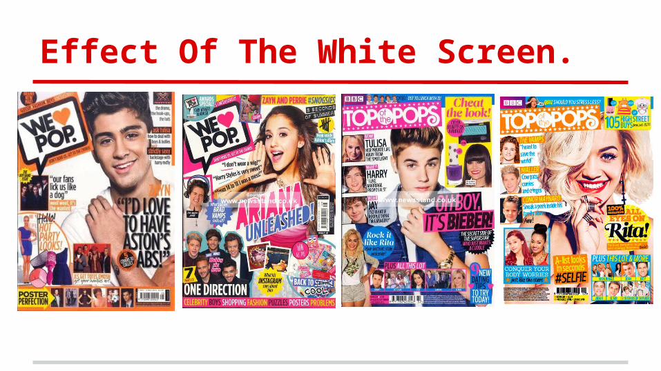
Effect Of The White Screen.

Why It Is Effective?
A white screen allows the main artist more eye catching and attention grabbing, as it allows the colours of their costume to stand out and appear loud, highlighting the brand identity of the magazine. It also makes the frame appear neat, tidy and professional. In addition to this, it allows the font to appear more striking too, allowing the font to be any colour as there is no worry that it will compete with the loudness of the background location. Outdoor locations are not usually a convention of the pop genre, this tends to be associated with the indie rock genre. It would not fit the brand identity of a pop magazine.

Other Popular Locations.

Coloured Backgrounds.
As I researched further into common locations, I found that if a white screen is not used, it was common to see another coloured screen behind the chosen artist. This colour was plain and is usually, light pink, blue or purple. These colours tend to reflect the star image of the artist featured and also supported the girly and fun brand identity of the magazine, as pop is a high energy, bright and bubbly genre.
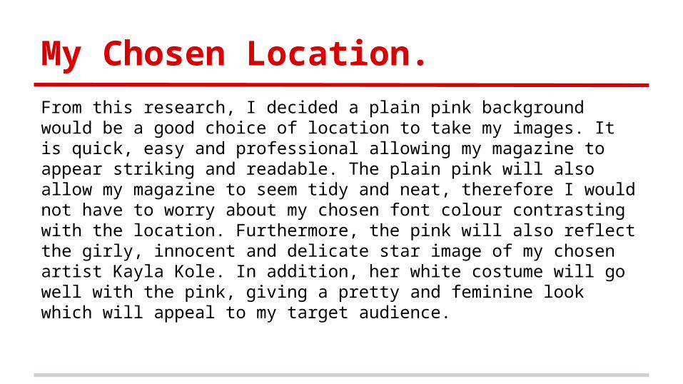
My Chosen Location.
From this research, I decided a plain pink background would be a good choice of location to take my images. It is quick, easy and professional allowing my magazine to appear striking and readable. The plain pink will also allow my magazine to seem tidy and neat, therefore I would not have to worry about my chosen font colour contrasting with the location. Furthermore, the pink will also reflect the girly, innocent and delicate star image of my chosen artist Kayla Kole. In addition, her white costume will go well with the pink, giving a pretty and feminine look which will appeal to my target audience.
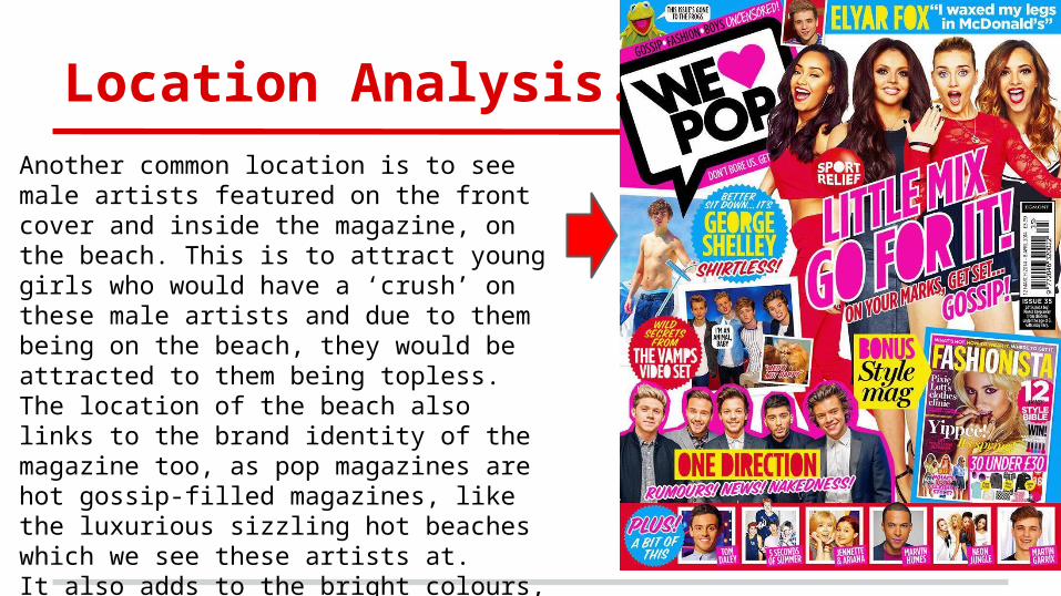
Location Analysis.Another common location is to see male artists featured on the front cover and inside the magazine, on the beach. This is to attract young girls who would have a ‘crush’ on these male artists and due to them being on the beach, they would be attracted to them being topless. The location of the beach also links to the brand identity of the magazine too, as pop magazines are hot gossip-filled magazines, like the luxurious sizzling hot beaches which we see these artists at.It also adds to the bright colours, due to the ambient lighting from the sun.