lily zhou
DESCRIPTION
the snake that cannot shed its skin perishes i change myself, i change the world isolation vs. solitude thoughts on the shadows of our feelings the beautiful vs the sublime regret moral culpability vs free willTRANSCRIPT
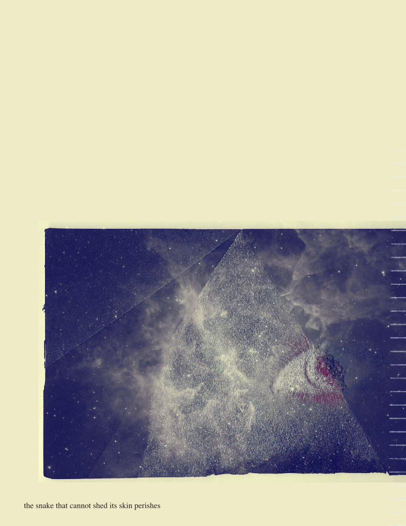
the snake that cannot shed its skin perishes

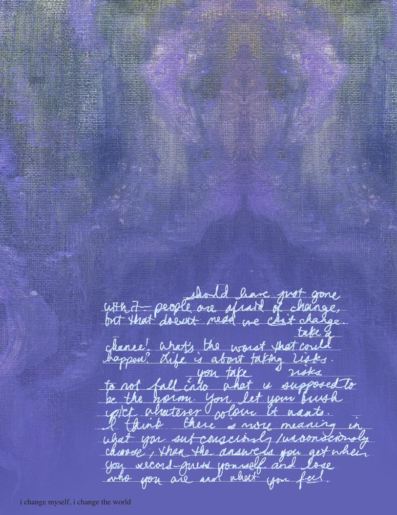
i change myself, i change the world

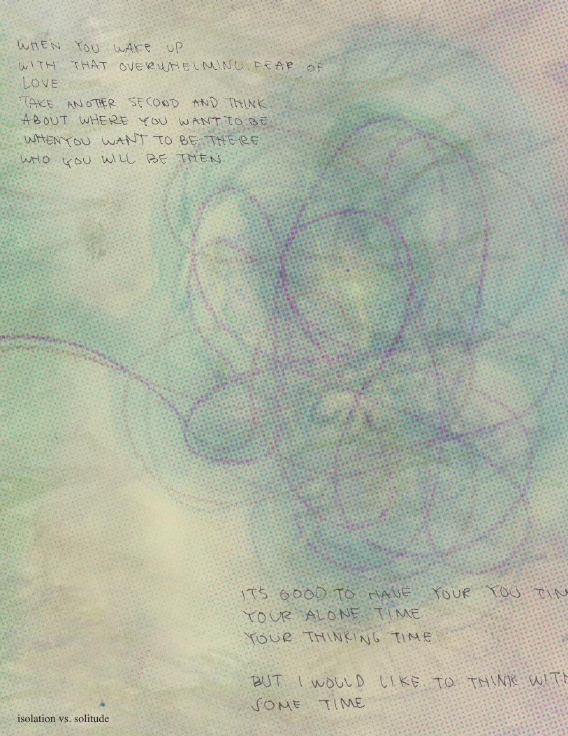
isolation vs. solitude


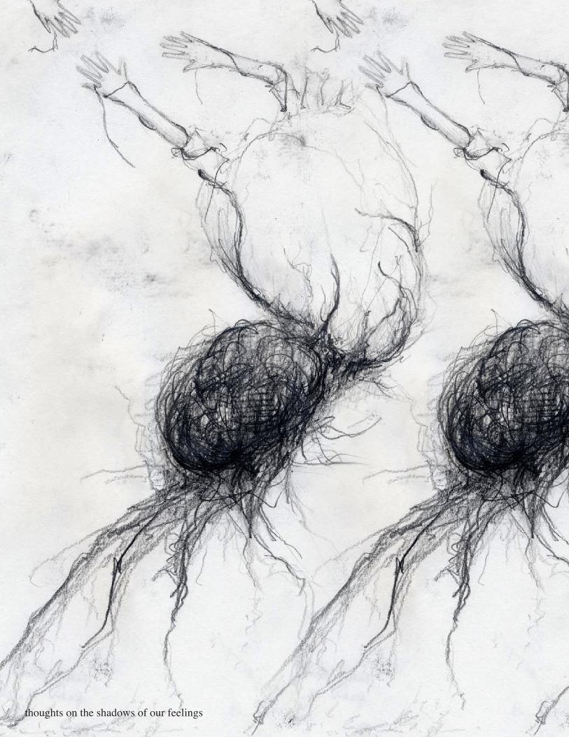
thoughts on the shadows of our feelings

the beautiful vs the sublime
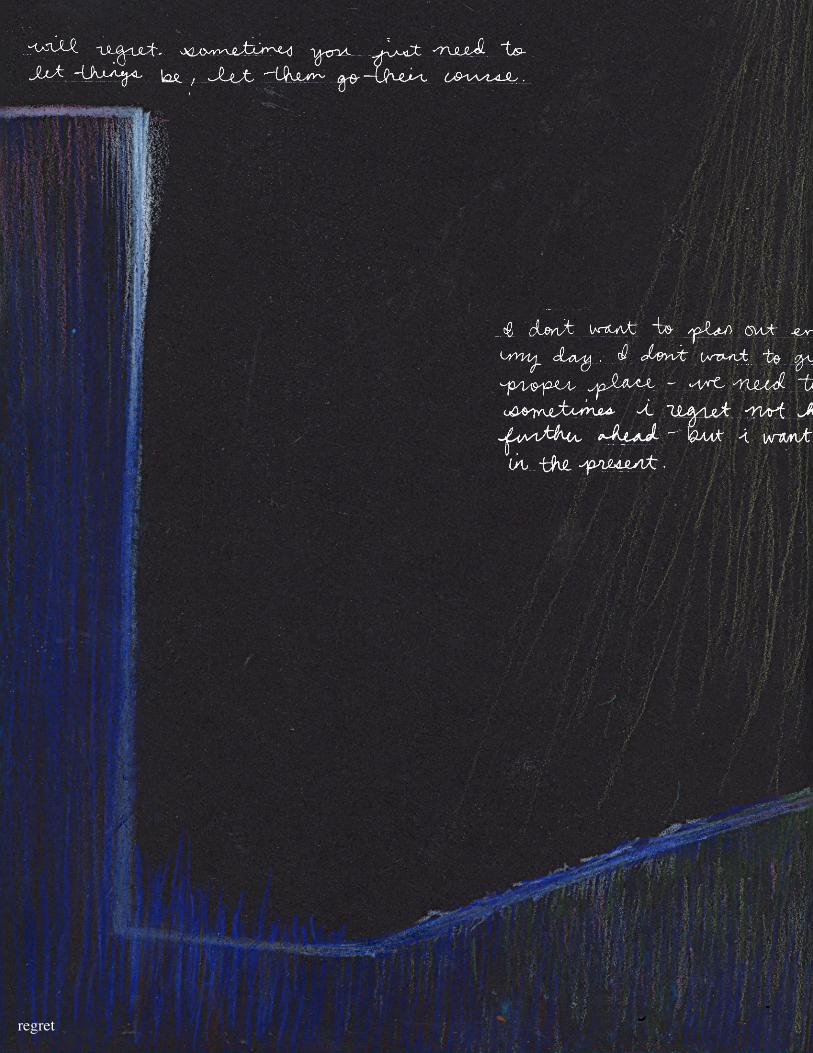
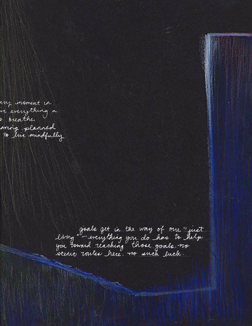
regret

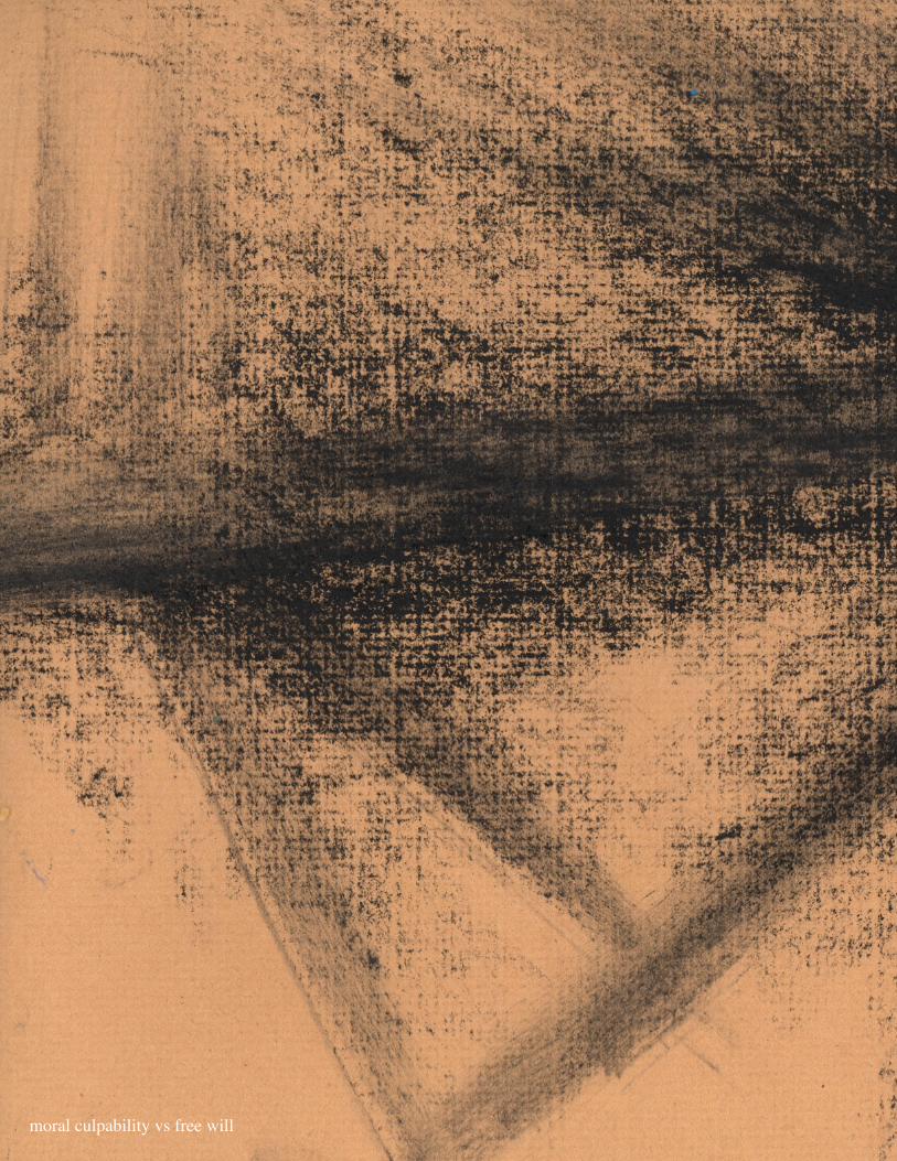
moral culpability vs free will

I
found that I responded to most of the
prompts in an abstract way. I tried to convey the prompts through abstract
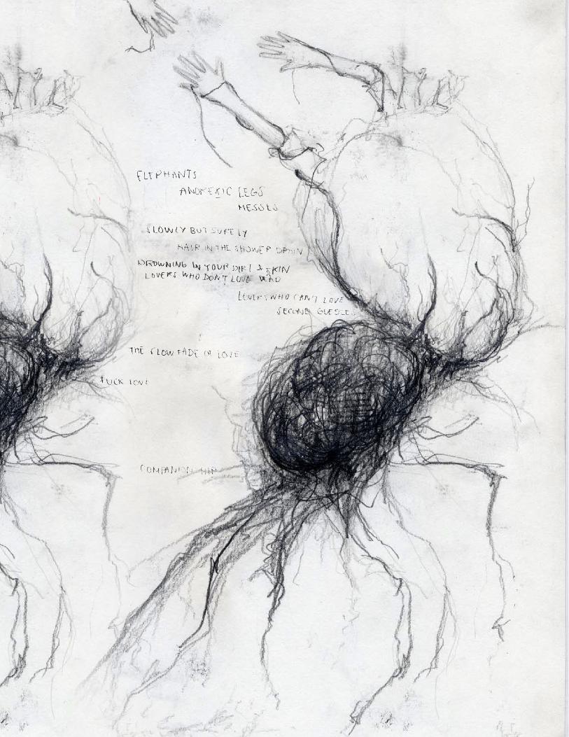
shapes, forms, and colors. The times I strayed from abstraction, I still stayed somewhat surreal, as seen in the graph-
ite drawing with the prompt “Thoughts on the Shadows of our Feelings.”
My favorite prompt was “Thoughts on the Shadows of our Feelings.” It was the most interesting prompt to me; just trying to imagine feelings, then their shadows,
and then their thoughts - my mind was overwhelmed. This prompt gave me the most “concrete” im-age in my mind, which may be why I liked the visual I came up with the most - I like the abstract, but it’s what
I “do” - I don’t often stray to more concrete images. The change was welcome. My writing was different with this prompt, too. The images of brains with elephant-like legs reminded me of Dalí and Surrealism, and my quickwrite began with the word “DADA.” I wrote a stream-of-consciousness list; my Surrealist-looking drawing reflected on the automatic writing I did after.
My favorite material was the foamcore. I’ve grown up with traditional media like charcoal, graphite, paints, etc., but I don’t work with 3D materials as much. While I didn’t create a real 3D structure with my foamcore, I had fun carving into it and revealing its underlying layers. It was nice to be able to create something without drawing it.
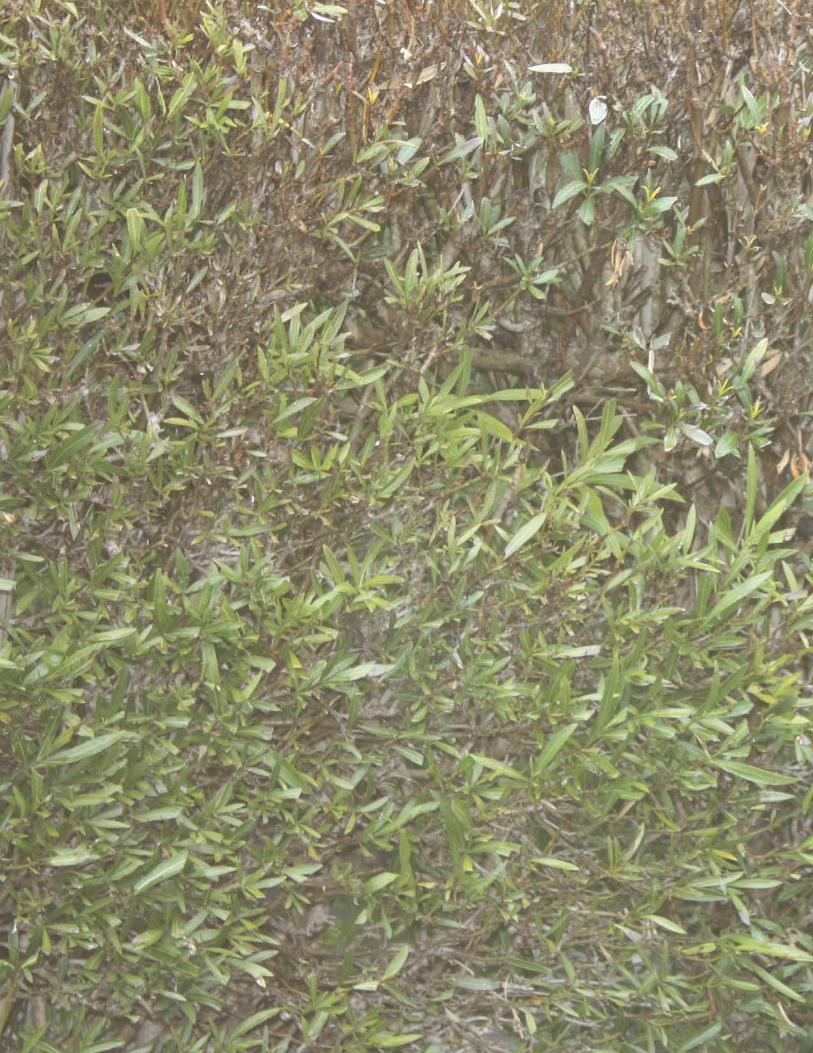
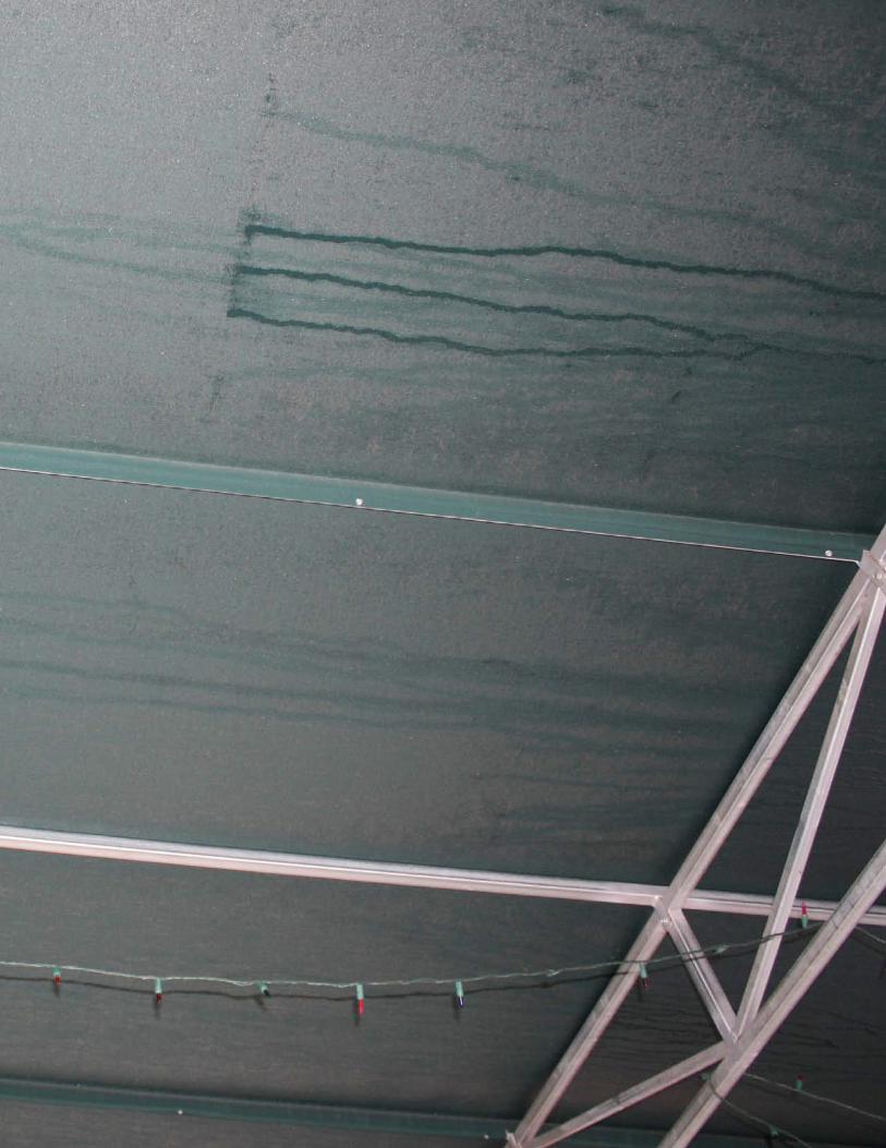
The riskiest pieces I did were also my favorites. My photograph that looks like diptych, with one side beige and light green and the other side the underside of a dark-green canopy, seems a little too plain at first glance. One side is very light and the other very dark; one side has many lines going different directions and the other side has fewer. However, I think I was able to balance them out through the way I positioned and colored my quick-write; the words follow the lines already present in the photograph, but also line up with each other. In addition, the text on the light side of the photograph is dark, and the text is light on the dark side, bringing more balance. My riskiest art project was my colored pencil on black paper drawing, with the prompt “Regret.” Originally it, too, seemed very unbalanced; it is also very abstract. One side is very “strong,” with sharp lines and ninety degree angles; the other, softer, sloping lines and lighter colors. I tried to compensate for this imbalance by mirroring the image on the two-page spread, giving more balance.
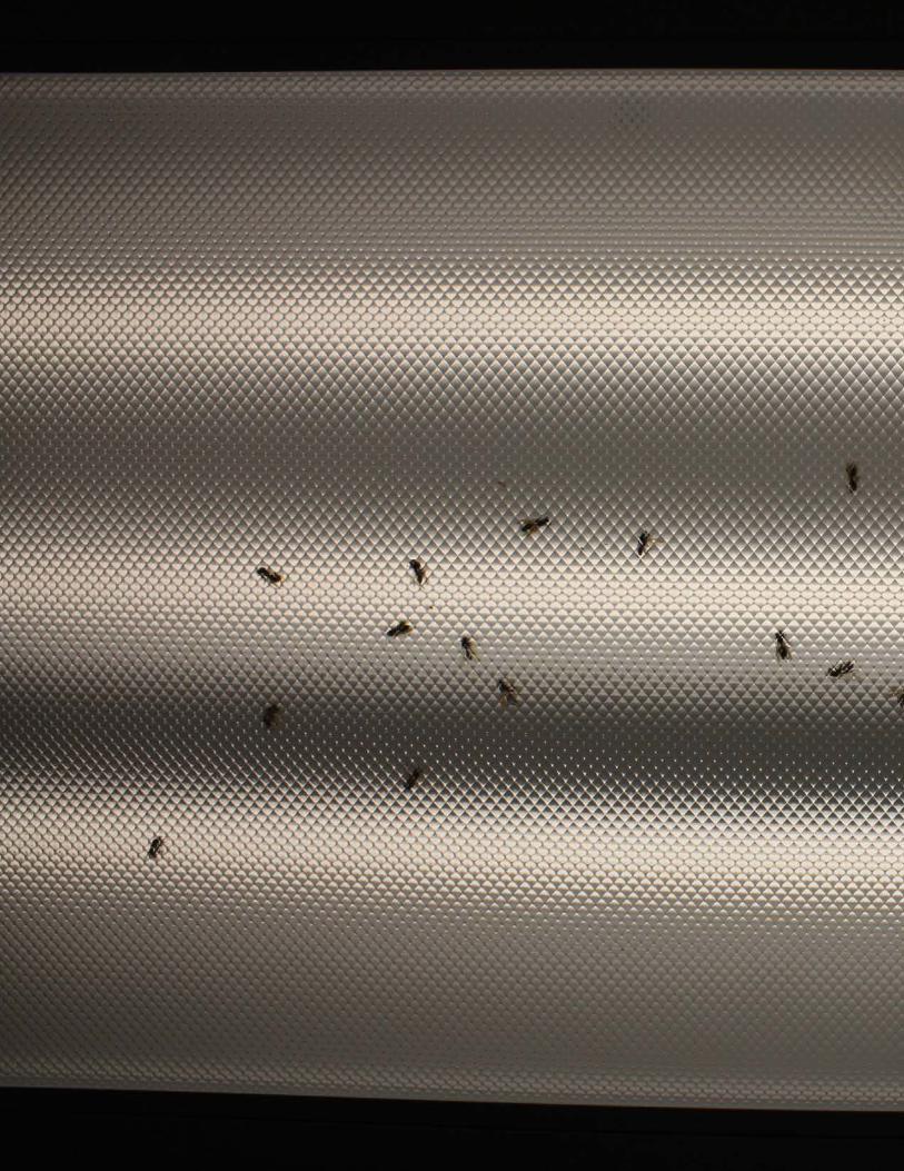
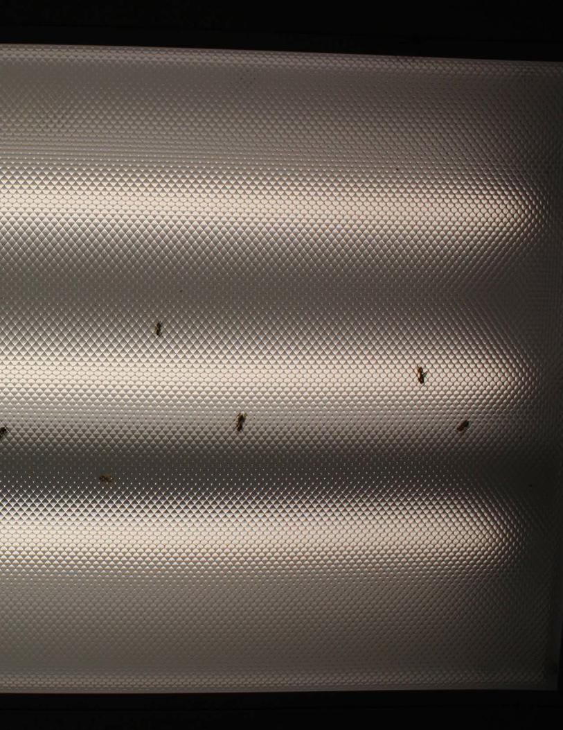
I noticed that I like the use of lines: in my charcoal piece, my photographs of the green canopy, my colored pencil on black paper piece, my marker on black paper piece, even my photograph of the dead bees and flies in the fluorescent lights. I don’t let myself “flow” very much; my pieces are relatively structured - compartmentalized into different shapes of different sizes, as seen easily in the photograph of the green canopy, the spread after the “Regret” colored pencil on black paper piece. The white metal frame cuts up the canopy, along with the water lines and Christmas lights. I am a relatively structured person; at least, if I seem like a mess, I’m still trying to organize myself.
My pieces all seem to have a bit of a dark side; I rarely use bright colors or “happy” shapes - instead I use a lot of darker colors, neutral colors, and abstract forms. My charcoal piece is a mess of black on brown, with strong lines shooting out. My wa-tercolor and crayon piece uses blues, purples, and greens, staying in a neutral, muted color scheme. These are all relatively con-sistent with the way I am as a person; I’m not a terribly excitable, loud, outgoing person, and I even dress in neutral colors, too.
