learning reportbuilder - digital-metaphors.com · both the novice and the seasoned report-builder....
TRANSCRIPT

Learning ReportBuilder
The End-User’s Guide to Building Reports

Copyright © by Digital Metaphors Corporation

i
CONTENTS
INTRODUCTION Design ...................................................................... 1Preview .................................................................... 1Data .......................................................................... 1About this book ........................................................ 2
A QUICK TEST SPIN Overview .................................................................. 3Getting Started ......................................................... 3Query Wizard ........................................................... 3Design Workspace ................................................... 4Preview .................................................................... 7Fixes ......................................................................... 7
CALISTHENICS Overview .................................................................. 9Component Creation ................................................ 9Band Adjustment .................................................... 10Basic Component Selection ................................... 10Docking Toolbars ................................................... 11Sizing, Aligning, and Positioning Components ....... 13Front-to-Back Order ............................................... 16Advanced Component Selection ............................ 18Advanced Sizing 1 .................................................... 8Speed Menu........................................................... 19Data Tree ............................................................... 22
SUMMARY TUTORIAL Overview ................................................................ 29Query Wizard ......................................................... 29Design Workspace ................................................. 30Preview .................................................................. 32Fixes....................................................................... 32

ii
COVER PAGE Overview ................................................................ 33Design Workspace ................................................. 33Preview .................................................................. 35
SIMPLE TABLE LISTING Overview ................................................................ 37Query Wizard ......................................................... 37Design Workspace ................................................. 38
INVOICE Overview ................................................................ 41Establish the Basic Design..................................... 41Fit and Finish .......................................................... 47
ORDER SUMMARY Overview ................................................................ 51Define a Master-Detail Relationship ....................... 51Modify the Basic Report Layout ............................. 56
DETAILED ORDER SUMMARY Overview ................................................................ 59Report Layout......................................................... 59
MAILING LABEL Overview ................................................................ 65The Label Template Wizard ................................... 65Prepare a Template Manually ................................ 69
FISH PHOTO ALBUM Overview ................................................................ 73Build the Report Layout .......................................... 73Fit and Finish .......................................................... 76

iii
SALES STATISTICS Overview ................................................................ 79Establish the Basic Layout ..................................... 79Modify the Basic Report Layout ............................. 81Fit and Finish .......................................................... 84
FORM LETTER Overview ................................................................ 87Build the Report ..................................................... 88
FISH REFERENCE BOOKLET Overview ................................................................ 93Build the Report Layout.......................................... 93Fit and Finish .......................................................... 99
CROSSTAB Overview .............................................................. 105Extend the Crosstab Design ................................ 108Understanding Crosstab Layouts ......................... 110
APPENDIX A: TOOLBARS Overview .............................................................. 113Nudge Toolbar ..................................................... 114Size Toolbar ......................................................... 115Draw Toolbar ........................................................ 116Align or Space Toolbar ......................................... 117Standard Component Palette ............................... 118Data Component Palette...................................... 119Advanced Component Palette ............................. 120Report Tree .......................................................... 121Data Tree ............................................................. 122Standard Toolbar ................................................. 123Format Toolbar ..................................................... 126Edit Toolbar.......................................................... 125Glossary ............................................................... 127

iv
GLOSSARY A-Z ................................................................ 127-136
INDEX A-Z ................................................................. 137-139

1Introduction
INTRODUCTION
Welcome to Learning ReportBuilder, a series of tutorials developed to teach you how to create stun-ning reports. The tutorials begin with the basics, such as how to use the Report Designer, and end with advanced reporting techniques like crosstab creation. This guide should therefore be helpful to both the novice and the seasoned report-builder.
DESIGN
The Report Designer, pictured above, is the appli-cation you will use to build reports. It contains three workspaces: Data, Design, and Preview. When first displayed, the Report Designer defaults to the design workspace because this is where you will spend the majority of your report-building time. The design workspace is divided into two areas: the workbench and the canvas. The work-bench is comprised of toolbars, component pal-ettes, rulers, and other tools that can be used to
manipulate the canvas. The canvas is the area that contains the report layout. This is where we place the bands and components that will ultimately con-trol the content of each page of the report.
PREVIEW
The preview tab plays an integral role in the report-creation process because it allows you to see how the report will look when printed. As you work through the tutorials, you'll notice that this work-space is frequently accessed so that we can see how the report is shaping up. We will make many changes and corrections based on what we see in this workspace. The tools in this space allow you to view each page of the report or zoom in to get a better look at a specific page. You can also print the report from the preview workspace.
DATA
The data workspace is often the key to successful report creation because it allows us to select and manipulate the data needed for a given report. These tasks are accomplished via two visual tools: the Query Wizard and the Query Designer. These tools greatly simplify the often-difficult task of data selection by giving us the ability to select data without requiring an in-depth knowledge of data-bases.

2 Introduction
Once the data is selected, we can begin laying out the report. The primary purpose of a report is to transform raw data into information. Our task as report-builders is essentially to make data mean-ingful. The following tutorials will show you how to do just that.
ABOUT THIS BOOK
As you work through this guide, it is important to keep in mind that the tutorials build on one another, moving from basic concepts to complex reports. Therefore, it may be difficult to complete an advanced tutorial without having first com-pleted earlier tutorials. Each tutorial produces some kind of report and brings to light important aspects of ReportBuilder.
A Quick Test Spin gives you a glimpse of the Report Designer's report-building potential.
Calisthenics offers a series of exercises that pre-pare you for the tutorials. You will be a nimble user when you complete the calisthenics.
The Summary Tutorial concentrates all that you learned in Calisthenics into a report. Like the tuto-rials that follow, it gives you an opportunity to use all the tricks you learned in Calisthenics.
The Cover Page tutorial illustrates the ease with which you can design a cover page so that the report looks clean and professional.
The Simple Table Listing tutorial shows you how to build a report using the Report Wizard and intro-duces some ways to handle repeating data.
The Invoice tutorial illustrates how to export saved data so that you can use it for a new report and pre-sents the concept of groups.
The Mailing Label tutorial introduces the Label Template tool, which allows you to create labels with ease.
The Fish Photo Album shows you how to create a colorful report using the DBImage component and introduces some concepts in relation to compo-nents and the way they work.
The Sales Statistics tutorial teaches the difference between data and information and further develops the concept of groups.
The Form Letter tutorial shows you how to set up a letter for mass mailing.
The Fish Reference Booklet illustrates how to cre-ate a report with side-by-side memos and intro-duces regions.
The Crosstab tutorial offers a report in the form of a spreadsheet, which is useful when a large amount of data needs to be analyzed.
Appendix A describes the toolbars and their con-tents in detail.
The glossary provides definitions for terms you'll encounter as you work through the tutorials.
3A Quick Test Spin
A QUICK TEST SPIN
OVERVIEW
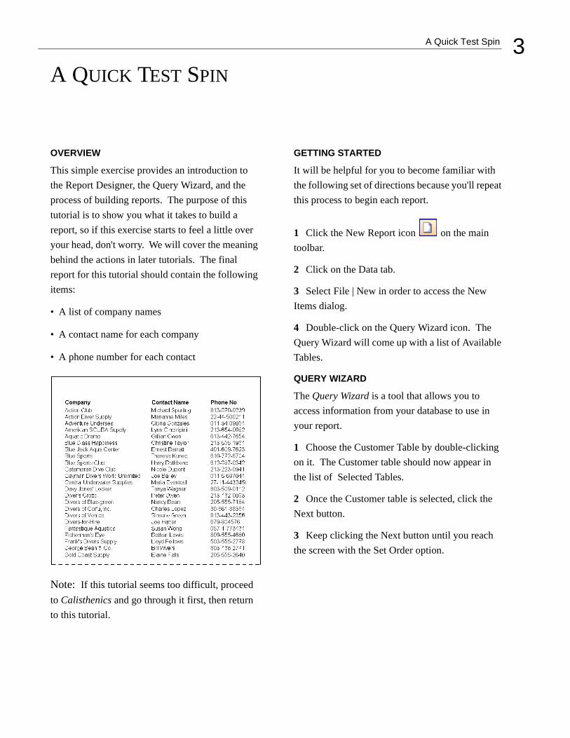
This simple exercise provides an introduction to the Report Designer, the Query Wizard, and the process of building reports. The purpose of this tutorial is to show you what it takes to build a report, so if this exercise starts to feel a little over your head, don't worry. We will cover the meaning behind the actions in later tutorials. The final report for this tutorial should contain the following items:
• A list of company names
• A contact name for each company
• A phone number for each contact
Note: If this tutorial seems too difficult, proceed to Calisthenics and go through it first, then return to this tutorial.
GETTING STARTED
It will be helpful for you to become familiar with the following set of directions because you'll repeat this process to begin each report.
1 Click the New Report icon on the main toolbar.
2 Click on the Data tab.
3 Select File | New in order to access the New Items dialog.
4 Double-click on the Query Wizard icon. The Query Wizard will come up with a list of Available Tables.
QUERY WIZARD
The Query Wizard is a tool that allows you to access information from your database to use in your report.
1 Choose the Customer Table by double-clicking on it. The Customer table should now appear in the list of Selected Tables.
2 Once the Customer table is selected, click the Next button.
3 Keep clicking the Next button until you reach the screen with the Set Order option.

4 A Quick Test Spin
4 Click on the Set Order button.
5 Double-click on Customer.Company so it appears in the list of Selected Fields.
6 Click Finish.
7 You've officially completed your first query via the Query Wizard. You'll notice a new window in the upper left-hand corner of the data workspace. This is a dataview. It represents the data, which is selected from the database each time the report is generated.
8 Click on the Design tab in order to begin laying out your report.
DESIGN WORKSPACE
The design workspace is the environment in which you will build reports. Whatever you put in the header band (the white space above the word 'Header') will appear at the top of each page of the report; whatever you put in the detail band will be the body of the report, and whatever you put in the footer band will appear at the bottom of each page of the report.
Task 1Place and Name Labels
1 Locate the label icon on the toolbar.
2 Click on the icon.
3 Click in the white space of the header band in order to create a label.
4 Create two more labels in the header band.
5 Select 'Label1'.
6 Locate the edit toolbar (below the label compo-nent icon on the toolbar). It should contain the text 'Label1', which is the caption of the currently selected label.
7 Highlight the text in the edit toolbar and type Company.
8 Select Label2 and type Contact Name into the edit toolbar.
9 Select Label3 and type Phone No. into the edit toolbar.
Task 2Save the Report
1 Press Ctrl + S to save your work.
2 A dialog box will appear that looks like this:

5A Quick Test Spin
3 Expand the drop-down list at the top of this dia-
log by clicking on the arrow icon. Select 'All Folders' from the list. This will allow us to save the report in this folder.
4 At the bottom of the dialog you should see an edit box that contains the report name. The default name is 'New Report.' Select the text and change the name to 'Quick Test'. Click the Save button.
5 Close the Report Designer. Notice that your new report is listed in 'All Folders'.
6 Double-click on Quick Test to return to the design workspace.
Task 3Bold the Text in the Labels
1 Select the Company label.
2 Hold down the Shift key and then click on the other two labels. All three labels should now be selected. You can tell that they are selected by the small gray boxes surrounding each label.
These boxes are called selection handles.
3 Click the bold icon . All three label cap-tions should turn bold.
Task 4Create and Choose Data for DBText Components
1 Locate the DBText icon on the toolbar.
2 Place a DBText component in the detail band.
3 Change the text from bold to regular by clicking on the bold icon.
4 Place two more DBText components in the detail band.
5 Select DBText1.
6 Notice that there are two drop-down list boxes in the upper left-hand corner of the Report Designer. The drop-down list box on the left con-tains the dataset from the dataview. The drop-down on the right contains the fields.
7 Select 'Company' from the drop-down list box containing the fields. The first company name ('Action Club') in the dataset should appear as the caption of the DBText1 component.
8 Select DBText2.
9 Choose 'Contact' from the drop-down list. The first name ('Michael Spurling') in the dataset should appear in the DBText2 component.
10 Select DBText3.

6 A Quick Test Spin
11 Choose 'Phone' from the drop-down list box. The first phone number ('813-870-0239') in the dataset should appear in DBText 3.
Task 5Adjust the Label Components
1 Right-click over the 'Company' label and select the Position… menu option.
2 Set the left to 0.1.
3 Right-click over the Contact Name label and set the left to 2.3.
4 Set the Phone No. label left to 3.8.
5 Set the Company label top to 0.3.
6 Select the 'Company' label.
7 Hold down the Shift key and click on the other 2 labels. All three labels should now be selected.
8 Launch the Align or Space toolbar by selecting View | Toolbars and clicking on Align or Space. The toolbar should appear under the drop-down list boxes.
9 Click the Align Top icon . The Contact Name and Phone No. labels should align with the Company label.
Task 6Adjust the DBText Components
1 Right-click over the Company DBText.
2 Set the width to 2.1.
3 Set the 'Contact Name' DBText width to 1.3.
4 Set the Phone No. DBText width to 0.9.
5 Select the Company DBText and set the top to 0.0.
6 Shift-click the other DBTexts so that they are all selected.
7 Click the Align Top icon on the Align or Space toolbar.
Note: The DBText components may overlap. That's fine. The next task will correct the overlap.
Task 7Align the Components
1 Select the Company label and shift-click the Company DBText.
2 Click the Left Align icon . The DBText component should be positioned directly beneath the label and both components should be aligned left.
3 Left align the Contact Name label and the Con-tact Name DBText.
4 Left align the Phone No. label and the Phone No. DBText.
5 Press Ctrl + S to save your work.

7A Quick Test Spin
PREVIEW
The preview window in the Report Designer envi-ronment works the same way as the preview capa-bility in other Windows applications: it shows you how your report will look when it is printed.
1 Click on the Preview tab and look at your report. Make sure that the columns are spaced evenly with plenty of room for long names.
2 Everything should look good except for the rows, which are double-spaced. That spacing takes up too much room and will waste paper when the report is printed.
FIXES
When you preview a report, you'll undoubtedly find something that can be improved. Let's fix the spacing.
1 Return to the design workspace by clicking on the Design tab.
2 Place your cursor over the gray bar labeled Detail. Your cursor will change to an up/down arrow , indicating that you can drag the sec-
tion divider up and down.
3 Drag the divider up until it meets the bottom of the components in the detail band.
4 Preview the report once more. It should look like this:
5 Close the Report Designer window by clicking
the button at the upper right corner of the win-dow.
6 A dialog box asking you to 'Save Changes' will appear. Click Yes.
7 Congratulations! You've completed your first ReportBuilder report.


9Calisthenics
CALISTHENICS
OVERVIEW
These exercises will get you oriented in the Report Designer environment and teach you to use some basic tools. It's a good idea to study this section because each task is extremely detailed, whereas the other exercises will assume that you are famil-iar with the basics and therefore be less explicit.
COMPONENT CREATION
The first thing you need to know in order to write a report is the significance of the canvas. The canvas is divided into sections called bands. A band is labeled in the section divider immediately below it; thus, the first band is called the 'header', the second is called the 'detail', and the third is called the 'footer'. When the report generates, the bands are printed on different parts of the page. There are many different band types for different occasions, but for now we'll just use the header, detail, and footer bands.
Let's create some components and put them in the bands. A component is an element used to control how the report looks. Each component has a unique purpose.
1 Click the New Report icon on the main toolbar. The Report Designer will appear with the design workspace active.
2 Click the Label icon.
3 Click in the white space of the header band. You've just created a label component.
4 Create two more labels in the header band.
5 Locate the shape icon on the toolbar.
6 Click the icon.
7 Click in the white space of the header band in order to create a shape.
8 Press Ctrl + S to save your work. Name the report Cal1. Save at the end of each task.
Note: You can use the process of clicking the icon, then clicking in a band to create any type of component.

10 Calisthenics
BAND ADJUSTMENT
Notice that the shape doesn't quite fit in the header band. We can remedy this by increasing the height of the band.
1 Locate the ruler on the left side of the work-space.
2 Place your cursor over the divider labeled 'Header'. Your cursor will change to an up/down
arrow , indicating that you can drag the divider up and down.
3 Hold down the left mouse button and drag the divider up and down. Notice the two little lines that appear on the vertical ruler to the left of the divider. These lines are called guides because they represent the new position of the divider.
4 Increase the height of the header band by drag-ging the divider until the guide reaches the one inch mark on the vertical ruler. In order to do this you must first drag the divider until the band height is greater than one inch. Then release and drag the divider up until the top guide hits the one inch mark.
Note: This method of changing the size of the header band works for all bands.
BASIC COMPONENT SELECTION
Once components are created, the real work begins, for each component needs to be carefully positioned in order to create a high-quality report.
1 Select the Label1 component by clicking on it. The selected label should look like this:
2 Select the remaining components: hold down the Shift key and then click on the other two labels and the shape. All of the components should now be selected. You can tell that they are selected by the small gray boxes surrounding each component. These boxes are called selection handles.
3 Click on the white space of the header band. Notice that the components are deselected.

11Calisthenics
4 Click on the white space to the left of the first label, hold down the left mouse button, and begin dragging the mouse down. A bounding box will appear. It should look like the rectangular box below.
5 Drag the mouse across the components until the bounding box encompasses all of the components.
6 Release the mouse button. All of the compo-nents will be selected.
7 Place your cursor over one of the components and drag in any direction. Notice how all of the components move in unison. This is called a com-ponent selection.
Note: These are the two methods you can use to select multiple components: the shift-click method (hold down the Shift key and click the compo-nents) and the bounding box method (hold down the mouse button and outline the components).
DOCKING TOOLBARS
Toolbars are used to set the properties of a compo-nent. Here are a few examples of the kinds of properties a component may have: font size, color, and font style. Before we can use the toolbars effectively, we must first learn how to position them within the Report Designer.
1 Launch the Draw toolbar by selecting View | Toolbars and clicking on Draw. The toolbar should appear in the upper left-hand corner of the Report Designer, above the horizontal ruler.
2 Locate the handle on the far left side of the
toolbar.
3 Place the cursor over the handle and hold down the left mouse button.
4 Drag the mouse down until the cursor is over the top corner of the header band. A rectangle repre-senting the new toolbar location will be drawn.

12 Calisthenics
5 Drag the mouse to the left until the rectangle pivots and appears as follows:
Notice how the border changes from a thick line to a thin line to indicate that the toolbar will success-fully dock.
6 Release the mouse button. The toolbar is now docked vertically.
7 Drag the toolbar over the upper left corner of the header band. The rectangle, which represents the new position of the toolbar, will look like this:
8 Release the handle. The toolbar is now a float-ing window. The area at the top of the toolbar (labeled 'Draw') is called the title bar. You can move the window by placing your cursor over the title bar and dragging.
9 Click on the close button in the title bar. The toolbar will be closed.
10 Select View | Toolbars from the main menu of the Report Designer and click on Draw menu item. Notice that the toolbar returns to the same place it was before you closed it.
Note: When the toolbar is a floating window, you can close the toolbar by clicking the close button. You can always redisplay a toolbar by accessing View | Toolbars from the main menu.

13Calisthenics
11 Drag the toolbar to the upper right corner of the design workspace so that it looks like this:
12 Release the handle. The toolbar is now docked horizontally.
Note: All toolbars have the same docking ability as the Draw toolbar.
SIZING, ALIGNING, AND POSITIONING COMPONENTS
In order to get all of the components lined up neatly or sized correctly, you must know how to size and align with dexterity.
Sizing1 Deselect all components by clicking on the white space of the header band.
2 Select the shape component in the header band.
3 Place your cursor over the little black box on the right side of the shape and wait until the cursor changes to a left/right arrow. The little black boxes that surround the shape are called sizing handles.
4 Drag the cursor to the right and notice how the shape gets wider.
5 Place your cursor over the sizing handle on the bottom of the shape and wait for the cursor to change to an up/down arrow.

14 Calisthenics
6 Drag the cursor down and notice how the label gets taller.
7 Place your cursor over the sizing handle on the right-hand corner of the shape and wait for the cur-sor to change to a diagonal arrow.
8 Drag the cursor. The shape gets both wider and taller.
9 Drag the shape to the left corner of the header band.
10 Move the shape up and down in the header band. Notice the guides on the vertical and hori-zontal rulers. Whenever you are dragging or siz-ing, the guides show you the position and size of the selection.
11 Use the guides to set the shape to 1/2 inch by 1/2 inch. The guides should match up with the 1/2 inch mark on both the horizontal and vertical rulers.
Note: You can also adjust the size of a component by selecting the component, then holding down the Shift key and pressing the arrow keys. You can use this method to size single and multiple component selections.

15Calisthenics
Aligning1 If the Align or Space toolbar is not already visi-ble, launch it by selecting View | Toolbars and clicking on Align or Space. The toolbar should appear above the horizontal ruler.
2 Dock the Align or Space toolbar on the left side of the Report Designer.
3 Select the shape component in the header band.
4 Hold down the Shift key and then click on the three labels. All four components should now be selected.
5 Click the Align Top icon of the Align or Space toolbar. The labels should align with the shape.
6 Move Label3 to the bottom of the header band
7 Select Label3 and Shift-click the other compo-nents in order to add them to the selection.
8 Click the Align Bottom icon of the Align or Space toolbar. The components should align with Label3.
Note: The first component selected in a multi-select is the one to which the others align.
Positioning1 Deselect the components by clicking in the white space of the header band.
2 Select the shape.
3 Hold down the Ctrl key and press the up arrow several times to move the shape.
4 As you move the shape using this method, look at the status bar in the lower right-hand corner of the Report Designer. The Top measurement should track with the component's location

16 Calisthenics
5 Use the right arrow key to move the shape to the right. The Left measurement should track with the component's location.
6 Position the shape so that the Left is 0 and the Top is 0.0625
7 Deselect the shape.
8 Use the shift-click method to select the labels.
9 Using the arrow keys, position the selection at Left of 1.3021 and a Top of 0.3854.
FRONT-TO-BACK ORDER
This section illustrates how a component can be used as a background for other components.
Task 1Create and Color Shapes
1 Create two more shapes near the first shape in the header band.
2 Select the first shape.
3 Locate the Fill Color icon on the Draw toolbar.
4 Click the down arrow button to the right of the icon. The Fill Color palette will be displayed.
5 Select yellow.
6 Select the second shape.
7 Set the color to aqua.
8 Select the third shape.
9 Set the color to violet.
Task 2Overlap Shapes and Establish their Order
1 Position the purple shape so that its corner over-laps the corner of the yellow shape.
2 Position the purple shape so that its corner over-laps the corner of the aqua shape. The three shapes should look like this:

17Calisthenics
3 Select the Preview tab. Notice that the shapes retain their front-to-back ordering.
4 Return to the design workspace and right-click over the purple shape.
5 Select the Send to Back menu option. Notice how the purple shape is now behind the aqua shape.
6 Right-click over the purple shape.
7 Select the Bring to Front menu option. The pur-ple shape is once again in front of the aqua shape.
8 Right-click over the yellow shape.
9 Select the Bring to Front menu option. The yel-low shape is now in front of the other two shapes.
10 Restore the original order of the shapes by deciding which shape needs to be sent to the back or brought to the front. (Answer: Send the yellow shape to the back.)
Task 3Use a Shape as a Background
1 Right-click over the yellow shape.
2 Select the ParentHeight menu option. The shape's height increases to match the band's height.
3 Select ParentWidth. The shape's width increases to match the band's width. The other components appear in front of the shape because of the front-to-back order.
4 Right-click over the yellow shape.
5 Select the Bring to Front menu option. Notice how all of the components disappear from view.
6 Make the components reappear by right-click-ing over the yellow shape and selecting the Send to Back menu option.
Note: Whenever you appear to have lost a compo-nent, try using the Send to Back method in order to find it: it may be behind another component.

18 Calisthenics
ADVANCED COMPONENT SELECTION
This section explains how to select components in the foreground when you have a larger component in the background.
1 Try to select all of the components in the header band by clicking to the left of the first component, holding down the left mouse button, and dragging the mouse (i.e. the bounding box method).
Notice how the components cannot be selected. This is because the yellow shape is selected and no bounding box can be drawn.
2 Hold down the Ctrl key and try to select the components using the bounding-box method again. When the Ctrl key is held down, you will see a bounding box.
3 Expand the bounding box to encompass all of the components and release the mouse button. All of the components, including the yellow shape, should be selected.
4 Try to move the selected components. Notice how they appear to be locked in place. The selec-tion cannot be moved because the yellow shape fills the band and has no where to go.
5 Hold down the Shift key and click the yellow shape.
Note: You can use the shift-click method to dese-lect any component that is part of a multi-selection.
6 Move the selected components. The compo-nents can be moved now because the yellow shape is deselected.
7 Try to deselect the components by clicking on Label1. Nothing happens. That's because you must select an unselected component or click in the white space of a band in order to clear the current selection.
8 Deselect the components by clicking on the yel-low shape.
ADVANCED SIZING
When you have a shape stretched using Parent-Width and ParentHeight, you cannot change the size via the sizing handles. This exercise shows you how to resize such a shape.

19Calisthenics
1 Place your cursor over the sizing handle on the left side of the yellow shape. The left/right arrow will be displayed.
2 Try to reduce the size of the shape by dragging the cursor toward the center of the header band. The shape can't be modified because it is set to ParentWidth.
3 Right-click over the shape.
4 Select ParentWidth. The ParentWidth menu option is deselected. Now the shape's width can be modified using the sizing handle.
5 Select ParentHeight. The ParentHeight menu option is deselected. Now the shape's height can be modified using the sizing handles.
6 Use the sizing handles to modify the yellow shape so that it is about the same size as the other shapes.
Note: You may not be able to resize the shape so that it is exactly the same size as the others. The next section will address this issue by showing you a more precise way to resize shapes.
SPEED MENU
The speed menu appears when you right-click over a component. It offers different options for altering the overall look of your component via changes in shape, size, and visibility. Here is the speed menu for a shape:
By now you know about the following menu options: Bring to Front, Send to Back, ParentHeight, and ParentWidth. Next, we'll learn about the Position option, which will allow you to control the size and position of components more precisely.

20 Calisthenics
Task 1Set shape sizes
1 Select the labels and move them to the left until they reach a left of 3.7396 as indicated by the sta-tus bar.
2 Access the speed menu by right-clicking over the yellow shape.
3 Select Position. . . . A dialog box like the one below will be displayed; however, the numbers may be slightly different from these. That's fine.
4 Set the Left to 2.0.
5 Set the Top to 0.2.
6 Set the Width to 0.5.
7 Set the Height to 0.5.
Task 2Resize the Aqua Shape
1 Right-click over the aqua shape to access the speed menu.
2 Select Position. . . .
3 Set the Left to 3.0.
4 Set the Top to 0.2.
5 Set the Width to 0.5.
6 Set the Height to 0.5. The aqua shape should now be the same size as the yellow shape.
7 Set the Left of the purple shape to 1.
8 Set the Top to 0.3.
The layout should look like this:
Note: The speed menu applies only to the compo-nent over which you have right clicked, regardless of the selection. Task 3 will illustrate this aspect of the Report Designer.
layo
ut c
heck

21Calisthenics
Task 3Explore Component Properties and the Right-Click Option
1 Select the aqua shape.
2 Shift-click the other two shapes in order to add them to the selection.
3 Right-click over the aqua shape.
4 Access the Position . . . dialog.
5 Set the Top to 0.1. Notice that even though the other shapes are selected, the aqua shape is the only component that moves. That's because the aqua shape was the one over which we right-clicked.
6 Right-click over the purple shape.
7 Access the Position. . . dialog and set the Top to 0.2.
8 Right-click over the yellow shape.
9 Access the Position. . . dialog and set the Top to 0.3. The shapes should now look like this:
10 Right-click once again over the aqua shape and set the top to 0.0.
11 Click the Align Top icon on the Align or Space toolbar. All shapes should align with the top of the aqua shape because it was selected first.
Note: You can use this method whenever you need to set the size or position of several compo-nents to the same value.

22 Calisthenics
Task 4Save Your Work
1 Select File | Save from the main menu.
2 Close the Report Designer.
DATA TREE
The Data Tree allows you to build a report based on data you have selected from the database. In order to use the Data Tree, you must first select data by creating a dataview.
Task 1Create a New Report
1 Click the New Report icon on the main toolbar.
2 Click on the Data tab.
3 Select File | New to access the New Items dia-log.
4 Double-click on the Query Wizard icon.
Task 2Create a Dataview Via the Query Wizard
1 The Query Wizard will come up with a list of Available Tables. Choose the Clients table by dou-ble-clicking on it. The Clients table should now appear in the list of Selected Tables.
2 Once the Clients table is selected, click the Finish button.
3 You'll notice a new window in the upper left-hand corner of the data workspace. This is the dat-aview. It represents the data that will be selected from the database each time the report is generated. In a later exercise, we will show you how to make modifications to a dataview. For now, let's move on to building the report.
4 Click on the Design tab in order to begin laying out your report.

23Calisthenics
Task 3Dock the Data Tree
1 Maximize the Report Designer window.
2 Hide the Align or Space toolbar.
3 Select View | Toolbars | Data Tree from the main menu.
4 Place your cursor over the bottom of the Data Tree until the cursor becomes an up/down
arrow .
5 Hold down your left mouse button and drag the mouse down until you can see all of the field names listed in the bottom part of the Data Tree.
6 Click on the title bar of the Data Tree and drag it to the left, making sure that the toolbar is below the horizontal ruler. Continue dragging until the posi-tion rectangle appears as shown below. This rect-angle indicates how the Data Tree will be docked. The screen should look like this just before the Data Tree docks:
7 Release the mouse button. The Data Tree should dock on the right of the workspace like this:

24 Calisthenics
Task 4Create a Vertical Report
1 Click on the Layout tab at the bottom of the Data Tree.
2 Select the vertical style.
3 Click on the Data tab at the bottom of the Data Tree.
4 Click the 'Last Name' field.
5 Hold down the Ctrl key and click the 'Tele-phone' field. Your selection should look like this:
6 Locate the divider labeled 'Detail' on the canvas of the design workspace.
7 Place your cursor over the divider. Your cursor
should change to an up/down arrow , indicat-
ing that you can drag the divider up and down.
8 Increase the height of the detail band by drag-ging the divider until the guide reaches the one inch mark on the vertical ruler.

25Calisthenics
9 Position your cursor over the 'Last Name' field in the Data Tree and drag the selection into the detail band.
10 Release the mouse button. The components necessary to display the 'Last Name' and 'Tele-phone' fields in the report are created.
11 Click on the Preview tab. Notice how the labels repeat for each row of the data. This is called a vertical report because the components are laid out in a top-to-bottom fashion.
Task 5Create a Tabular Report
1 Return to the design workspace.
2 Select all of the components and press the delete key.
3 Click on the Layout tab at the bottom of the Data Tree.
4 Select the tabular style.
5 Click on the Font icon for Labels.

26 Calisthenics
6 A dialog box like this will appear:
7 Make the font style bold. Now any label created via the Data Tree will be bold.
8 Click the OK button on the Font dialog. Notice how the diagram at the top of the Data Tree reflects the change by bolding the word 'Company'.
9 Click on the Data tab at the bottom of the Data Tree.
10 Position your cursor over the 'Last Name' field in the Data Tree and drag the selection into the lower left corner of the header band.

27Calisthenics
11 Release the mouse button. The components necessary to display the 'Last Name' and 'Tele-phone' fields are created. The labels are in the header band and the data is in the detail band.
12 Click on the Preview tab. Notice how the labels appear only once at the top of the page. This report is 'tabular' because the data is laid out in a left-to-right fashion.
Task 6Create a Tabular Report with a Grid
1 Return to the design workspace and delete all of the components.
2 Click on the Layout tab at the bottom of the Data Tree.
3 Click the Grid check box for both Labels and Fields.
4 Click on the Data tab at the bottom of the Data Tree.
5 Position your cursor over the 'Last Name' field in the Data Tree and drag the selection into the lower left corner of the header band.
6 Release the mouse button. Notice the boxes around the components. These shapes will give us the effect of a grid.
7 Use the bounding box method to select all of the components in the header band.
8 Remove the labels from the selection by holding down the Shift key and clicking on each label. Only the shapes should now be selected.
9 Locate the Fill color icon on the Draw
toolbar and select light gray.

28 Calisthenics
10 Drag the divider labeled 'Detail' up until it meets the bottom of the components in the detail band.
11 Click on the Preview tab. Notice the grid effect.
12 Save the report as Cal2 and close the Report Designer.

29Summary Tutorial
SUMMARY TUTORIAL
OVERVIEW
This tutorial will solidify all of the report-building techniques you learned in Calisthenics. The final report should contain the following items:
• A list of customer numbers
• A list of company names
• A contact for each company
• A phone number for each contact
QUERY WIZARD
1 Click the New Report icon on the main toolbar.
2 Click on the Data tab.
3 Select File | New in order to access the New Items dialog.
4 Double-click on the Query Wizard icon. The Query Wizard will come up with a list of Available Tables.
5 Choose the Customer table by double-clicking on it. The customer table should now appear in the list of Selected Tables.
6 Click Finish.
7 Access the design workspace.

30 Summary Tutorial
DESIGN WORKSPACE
Task 1Launch the Data Tree and Set Properties
1 If it is not already visible, launch the Data Tree toolbar.
2 Dock it on the left side of the workspace.
3 Click the layout tab of the Data Tree.
4 Set the Style to Tabular.
5 Deselect the Grid boxes if they are checked.
6 Click the font icon for Labels.
7 Set the Label font to Arial, Bold, 10.
8 Set the Field font to Arial, Regular, 10.
9 Click on the data tab of the Data Tree.
10 Press Ctrl + S to save your work. Save the report as Summary Tutorial. Save at the end of each task.
Task 2Lay Out Components in the Detail Band
1 Place your cursor over the 'Detail' divider. Your
cursor will change to an up/down arrow , indi-
cating that you can drag the control up and down.
2 Increase the height of the detail band by drag-ging the divider down until the guide reaches the one inch mark on the vertical ruler.
3 Place a shape component in the detail band.
4 Set the shape's fill color and line color to yel-low.
5 Right-click over the shape and select Paren-tHeight and ParentWidth.
6 Hold down the Ctrl key while you select the 'Custno', 'Company', 'Contact', and 'Phone' fields in the Data Tree.
7 Drag the selection from the Data Tree into the lower left corner of the header band and release the mouse button. Labels should be created in the header band and DBTexts should be created in the detail band.
Task 3Position the Components
1 Position the selection so that the labels line up with the bottom of the header band.
2 Deselect the components by clicking on the white space of the footer band.
3 Select all of the components in the detail band.
4 Shift-click the yellow shape to remove it from the selection.

31Summary Tutorial
5 Drag the selection up so that the components line up with the top of the detail band. The layout should look like this:
6 Deselect the components.
Task 4Size the Components
1 Select the Company DBText component in the detail band.
2 Use the sizing handle to make the component narrower. Size the component so that the guide lines up with the three inch mark on the horizontal ruler.
3 Shift-click the Company label in the header band.
4 Launch the Size toolbar.
5 Locate the Shrink Width to Smallest
icon and click on it. The label's width should shrink to match that of the DBText.
Task 5Align the Components and Adjust the Detail Band
1 Select the Contact and Phone labels.
2 Shift-click the corresponding DBText compo-nents in the detail band.
3 Drag the selection until it reaches the 3 1/8 inch mark on the horizontal ruler.
4 Left justify the DBText Custno component in the detail band.
5 Drag the detail band divider up until it meets the bottom of the components.
Task 6Lay Out the Footer Band
1 Click the System Variable icon .
2 Click the lower left side of the footer band.
3 Select PrintDateTime from the drop-down list box in the upper left corner of the workspace. The date and time should appear in the component.
4 Place another system variable component in the lower right side of the footer band.
layo
ut c
heck

32 Summary Tutorial
5 Select PageNoDesc (Page Number Description) from the drop-down list box. The page number should appear in the component.
6 Right justify the system variable by clicking the
right-justify icon .
7 Align the tops of the system variables.
8 Press Ctrl + S to save your work.
PREVIEW
1 Click on the Preview tab and look at your report.
2 The data is solid yellow. Let's put white spaces between the data in order to differentiate the rows.
FIXES
1 Click the Design tab to return to the design workspace.
2 Right-click over the yellow shape.
3 Select ParentHeight.
4 Drag the detail band divider down until you can see a little white space below the shape. The lay-out should look like this:
5 Preview the report once again. It should look this:
6 Close the Report Designer, saving the changes to the report.
layo
ut c
heck

33Cover Page
COVER PAGE
OVERVIEW
This tutorial shows you how to create a cover page for a report. The final product will contain the fol-lowing items:
• The title of the report
• A description of the contents of the report
DESIGN WORKSPACE
Task 1Create and Adjust the Title Band
1 Open the Summary Tutorial report.
2 Select File | Save As from the main menu of the Report Designer.
3 Name the report Cover Page and click Save. The name at the top of the Report Designer should change to Cover Page.
4 Hide the Data Tree if it is visible.
5 Select Report | Title. A title band will appear at the top of the canvas.
6 Increase the height of the title band by dragging the divider down until the guide reaches the 9.5 inch mark on the vertical ruler.
7 Right click over the white space and select New Page.
Task 2Create a Shape and a Label
1 Place a shape in the upper left corner of the title band.
2 Set the position of the shape:
Left 2.0Top 2.5Width 4.0Height 1
34 Cover Page
3 Set the fill and line color of the shape to light gray.
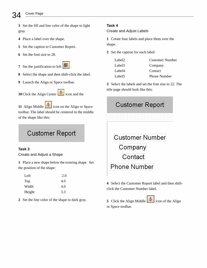
4 Place a label over the shape.
5 Set the caption to Customer Report.
6 Set the font size to 28.
7 Set the justification to left .
8 Select the shape and then shift-click the label.
9 Launch the Align or Space toolbar.
10 Click the Align Center icon and the
11 Align Middle icon on the Align or Space toolbar. The label should be centered in the middle of the shape like this:
Task 3Create and Adjust a Shape
1 Place a new shape below the existing shape. Set the position of the shape:
Left 2.0Top 4.0Width 4.0Height 3.3
2 Set the line color of the shape to dark gray.
Task 4Create and Adjust Labels
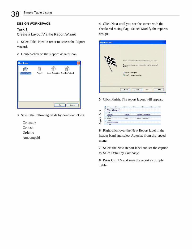
1 Create four labels and place them over the shape.
2 Set the caption for each label:
Label2 Customer Number Label3 Company Label4 Contact Label5 Phone Number
3 Select the labels and set the font size to 22. The title page should look like this:
4 Select the Customer Report label and then shift-click the Customer Number label.
5 Click the Align Middle icon of the Align or Space toolbar.

35Cover Page
6 Set the top of the Customer Number label to 4.75.
7 Set the top of the Phone Number label to 6.5.
8 Select the Customer Number label and then shift-click the three labels below it.
9 Click the Left Align icon and the Space
Vertically icon. The selection should now look like this
PREVIEW
1 Click the Preview tab. The title page should look like this:
2 Click the Next Page button. The rest of the Summary Report should appear.
3 Close the Report Designer and save the changes.


37Simple Table Listing
SIMPLE TABLE LISTING
OVERVIEW
This tutorial illustrates how to create a table-style report. The final product will include the follow-ing items:
• A list of company names
• A contact for each company
• A list of orders for each company
• The amount paid for each order
QUERY WIZARD
Task 1Access the Query Wizard and Select Fields
1 Create a new report.
2 Access the data workspace.
3 Select File | New.
4 Double-click on the Query Wizard icon.
5 Double-click on the Customer table in order to select it.
6 Double-click on the Orders table.
7 Click Next until you reach the screen with the Set Order option.
8 Click Set Order and select Customer.Company, Customer.Contact, and Orders.Orderno.
9 Click Finish. The completed database will appear.
10 Access the design workspace.
38 Simple Table Listing
DESIGN WORKSPACE
Task 1Create a Layout Via the Report Wizard
1 Select File | New in order to access the Report Wizard.
2 Double-click on the Report Wizard Icon.
3 Select the following fields by double-clicking:
CompanyContactOrdernoAmountpaid
4 Click Next until you see the screen with the checkered racing flag. Select 'Modify the report's design'.
5 Click Finish. The report layout will appear:
6 Right-click over the New Report label in the header band and select Autosize from the speed menu.
7 Select the New Report label and set the caption to 'Sales Detail by Company'.
8 Press Ctrl + S and save the report as Simple Table.
layo
ut c
heck

39Simple Table Listing
9 Click the Preview tab. Notice the repetition of the company and contact names: this repetition inhibits readability. Let's make the report more readable by showing these values only once.
Task 2Select SuppressRepeatedValues
1 Return to the design workspace.
2 Right-click over the Company DBText compo-nent in the detail band and select SuppressRepeat-edValues from the speed menu.
3 Right-click over the Contact DBText compo-nent in the detail band and select SuppressRepeat-edValues.
4 Click the Preview tab. The company and contact names no longer repeat.
5 Scroll down to the bottom of the preview page. Notice that the last company name is Blue Sports Club.
6 Click the Next Page icon . Notice that 'Blue Sports Club' does not appear at the top of this page. Because the company and contact names do not repeat, the top of the next page has no company name; it is therefore difficult to tell what company placed these orders.
Let's modify the report so that the company and contact names reprint at the top of new pages.
Task 3Select ReprintOnSubsequent
1 Return to the design workspace.
2 Right-click over the Company DBText
component and select ReprintOnSubsequent.
3 Right-click over the Contact DBText compo-nent and select ReprintOnSubsequent.
4 Click the Preview tab.
5 Go to the second page. Notice that 'Blue Sports Club' is now at the top of the page, providing clari-fication.
Task 4 Create a Line Guide
You may have noticed that the ReprintOnSubse-quent option creates a lot of white space in this report, which makes it difficult to correlate com-pany names with their orders as you read from left to right. We can add a line guide in order to improve this situation.

40 Simple Table Listing
1 Return to the design workspace.
2 Click on the line icon on the Standard component palette.
3 Click in the detail band to create the line compo-nent.
4 Right-click over the line and select ParentWidth from the speed menu. The line will stretch to match the width of the band.
5 Set the Top of the line to 0.15.
6 Press Ctrl + S to save your work.
7 Access the preview screen. The completed report should look like this:
8 Close the Report Designer.

41Invoice
INVOICE
OVERVIEW
This tutorial shows you how to create an invoice. The goal of this exercise is to illustrate groups and their function. The final product will present a set of invoices. Each invoice will contain the follow-ing items:
• A company name
• A contact for each company
• The orders for each company
• The amount paid for each order
• The total amount paid for each company
ESTABLISH THE BASIC DESIGN
Task 1Use the Dataview from the Simple Table Report
1 Open the Simple Table report.
2 Access the data workspace.
3 Select File | Export. A save dialog box will appear.
4 Create a folder named Data and open it.
5 Name the data 'Customer Orders' and click save.
6 Close the Report Designer.
7 Click on the New Report icon.
8 Access the data workspace.
9 Select File | Import.
10 Double-click on Customer Orders. You should now see the Customer Orders dataview in the data workspace.
Note: All of the dataviews in the data workspace are stored in what is called a data module. You can use the export feature to save a data module outside of a report.

42 Invoice
When you find yourself using the same dataviews over and over again, it is often useful to save them in a data module outside of the report so that you can use them (via the import feature) when creating new reports.
Task 2Generate the Layout Via the Report Wizard
1 Access the design workspace.
2 Select File | New and double-click on the Report Wizard icon.
3 Select the following fields:
CompanyContactOrdernoAmountpaid
4 Click Next until you reach the screen with the checkered racing flag. Select 'Modify the report's design'.
5 Click Finish. The report layout will appear:
6 Select the New Report label and set the caption to Invoice.
7 Press Ctrl + S and select 'All Folders' from the drop-down list. Set the name of the report to Invoice and click on the save button.
8 Preview the report. Notice how the company and contact names repeat. In the previous tutorial, we learned how to handle repeated values via the SuppressRepeatedValues property. However, we can handle these values another way.
Task 3Create a Group
1 Return to the design workspace and select Report | Groups from the main menu. A dialog box will appear.
2 Choose Customer.Company from the drop-down list box:
layo
ut c
heck

43Invoice
3 Click Add, then click OK. A group header band and a group footer band will appear on the canvas.
4 Place your cursor over the gray area labeled Group Header and drag down. White space for the group header band will be created.
5 Right-click over the white space and set the height of the band to 0.3.
6 Right-click over the group footer band and set the height to 0.3.
Task 4Lay Out the Group Bands
1 Place a shape in the group header band.
2 Set the shape to ParentHeight and ParentWidth.
3 Set the shape's color to aqua.
4 Place a shape in the group footer band.
5 Set the shape to ParentHeight and ParentWidth.
6 Set the shape's color to teal (the color above aqua on the fill color palette):
7 Preview the report. The aqua shapes show where the group header band is printing; the teal shapes show where the group footer band is print-ing.
Everything you see that begins with an aqua shape and ends with a teal shape is a group. A group, then, includes the following bands: the group header, detail, and group footer. Here is an exam-ple of how a single group looks on the preview page:
Task 5Move the Repeating Data into the Group Header
As you preview, notice that the company and con-tact fields still repeat. This is because they are in the detail band. We can fix this by moving these fields into the group header band.

44 Invoice
1 Return to the design workspace.
2 Select the DBText components for the Com-pany and Contact fields in the detail band.
3 Drag the selection into the group header band.
4 Right-click over the shape and select Send to Back. The DBText components should now appear in front of the shape.
5 Select the shape and then shift-click the DBText
components. Click the Align Center icon on the Align or Space toolbar. The components will be centered vertically in the shape.
6 Preview the report. The company and contact names should now appear in the group header, printing only once for each company.
Task 6Total the Amount Paid for Each
Company
1 Return to the design workspace.
2 Select the Orderno DBText component in the detail band. This initializes the font style and size for the DBCalc component we are about to create.
3 Click the DBCalc icon , then click in the group footer band. A DBCalc component will be created.
4 Change the font color to white.
5 Click the right justify icon .
6 Select the 'Amountpaid' field from the edit tool-bar:
This tells the DBCalc component to sum the amount paid for each company.
7 Right-click over the DBCalc component and select AutoSize.
45Invoice
8 Right-click and select DisplayFormat. Click on the first format that begins with a dollar sign:
9 Click OK.
10 Adjust the DBCalc component so that it aligns with the bottom of the group footer band.
11 Click the OrderNo DBText in the detail band, then shift-click the DBCalc component. Click the
Align Right icon on the Align or Space tool-bar.
12 Preview the report. Notice that we now have a total in the group footer band.
Task 7Control the Pagination of the Groups
1 Return to the design workspace.
2 Select Report | Groups and uncheck 'Keep group together'.
3 Scroll to the bottom of the first preview page. Notice how there is no total for the 'Blue Jack Aqua Center'. You must go to the next page in order to see the remaining detail lines and total for this group. Let's modify the report so that groups will not break across pages.
4 Return to the design workspace.
5 Select Report | Groups from the main menu.
6 Click the 'Keep group together' option:
7 Click OK.

46 Invoice
8 Preview the report. The group for 'Blue Jack Aqua Center' now starts on page two. The 'Keep group together' option allows the header, detail, and footer of a group to print on the same page, when possible.
Task 8Begin Each Group on a New Page
Even though 'Keep group together' improves the report's pagination, we need invoices that can be sent to each individual company. This means that information from multiple companies cannot appear on the same page. Let's modify the report to handle this requirement.
1 Return to the design workspace.
2 Select Report | Groups. Click 'Start new page':
Notice that the 'Keep group together' option is dis-abled. This option is no longer necessary because each group will begin on its own page; thus, each group has the maximum space to print.
3 Click OK.
4 Return to the preview screen and confirm that each group starts on its own page.
5 Select Ctrl + S to save your work.

47Invoice
Task 9Number the Pages by Company
As you preview, notice how the pages are num-bered. Each company will receive only one or two pages of the report. Therefore, it would not be acceptable to send out an invoice that says 'Page 37' at the bottom. We can fix this problem by using the Reset Page Number feature of groups.
1 Return to the design workspace.
2 Select the Page 1 System Variable in the footer band.
3 Select PageSetDesc (Page Set Description) from the edit toolbar:
4 Select Report | Groups.
5 Check the Reset page number option:
6 Click OK.
7 Preview the report. The page numbers should reset for each company. Each invoice is one page, so the page number displays 1 of 1.
FIT AND FINISH
At this point, the report is functioning well. We just need to give it a professional look and feel.
Task 1Adjust the Line Component in the Header Band
1 Return to the design workspace.
2 Select the line in the header band and select bot-tom from the list in the edit toolbar.

48 Invoice
3 Extend the header band to 11/8 inch.
4 Right-click over the line and set it to Parent-Width.
5 Drag the line to the bottom of the header band.
Task 2 Adjust the Label Components in the Header Band
1 Right-click over the Contact label and set the top to 0.9.
2 Align the tops of all the labels in the detail band with the Contact label.
3 Set the following left positions for the labels:
Company 0.0Contact 2.0Orderno 4.2Amountpaid 5.3
4 Change the captions of the labels as follows:
Orderno Order No.Amountpaid Amount Paid
5 Set each of the labels to AutoSize.
Task 3Align the Components
1 Select the Amount Paid label.
2 Shift-click the corresponding DBText and DBCalc components in the detail and group footer bands.
3 Use the Align or Space toolbar to right-align the selection.
4 Right-align the Order No. DBText component in the detail band with the Order No. label in the header band.
5 Set the top of both DBText components in the detail band to 0.05.
Task 4Modify the Label in the Title Band
1 Drag the label in the title band into the header band.
2 Set the left and top of the label to 0.
3 Select Report | Title from the main menu. The title band will be removed from the canvas.

49Invoice
4 Right-click over the label and select AutoSize. The layout should look like this:
5 Press Ctrl + S to save your work.
6 Preview the report.
Task 5 Change the Color of the Navy Components
Everything looks great except the components in the title, header, and footer bands, which are navy. Let's change them to match the rest of the report.
1 Return to the design workspace.
2 Use the shift-click method to select all navy components.
3 Change the font color to teal using the Fill Color palette.
4 Change the color of the line in the header band to teal using the Line Color palette.
5 Preview the report. The first page should look like this:
6 Close the Report Designer and save the changes.
layo
ut c
heck


51Order Summary
ORDER SUMMARY
OVERVIEW
This tutorial demonstrates how to create an order summary. The goal of this exercise is to demon-strate how to link dataviews to create a master-detail relationship; and to illustrate the use of a subreport to create a master-detail report. The final product will present an order summary for multiple companies and their multiple orders. Each sum-mary will include the following items:
• A company name
• A customer number
• An order number for each individual order
• The total amount owed per order
• The total amount owed per company
DEFINE A MASTER-DETAIL RELATIONSHIP
Task 1Create the Dataviews
1 Create a new report.
2 Access the Query Wizard.
3 Select the Customer table.
4 Click Finish.
5 Select the Sort icon on the Customer dataview.
6 Double-click the Company field. The Company field is moved from Available Fields to Sort Fields.
7 Click OK.
8 Repeat steps 1-4 to create a dataview for the Orders table.
Note: Notice the link between the dataviews. This is an AutoLink; it expresses a master- detail rela-tionship. Master-detail relationships are one-to-many associations between the rows of the two datasets. See the sidebar for more on this.

52 Order Summary
Task 3Create a Group
1 Go to the design workspace.
2 Select Report | Groups from the main menu. A dialog box will appear.
3 Choose Customer.Company from the drop-down menu.
4 Click the Add button. A group based on the company field will appear in the list box.
Joining Tables
In creating a master-detail report, we are taking advantage of a fundamental piece of database technology: the join. In order to understand a join you first have to understand that the data of a database is stored in tables. Tables are simply a collection of data organized as rows and columns. A typical table is shown below:
Notice the names at the top of each column. These names are not part of the data, rather, they describe the data which appears below them. In the database world, each column is called a field (the name at the top of column is the field name) and each row is called a record. Let’s add another table to our example:
Our first table is a list of customers, the second table is a list of orders placed by those customers. Given these two tables, let’s try to answer this question: On what dates did each customer place an order? We can answer this question using the following steps:
1. Get the name of the first customer from thecustomer table.2. Scan the orders table, looking for this customer name.3. When an order is found, add the customer name to a list, and put the order date below it.4. Continue scanning the orders table, looking for the next date this customer ordered.5. Repeat steps 3 and 4 until we have scanned the entire orders table.6. Get the name of the next customer.7. Repeat steps 2 through 5 until all customers have been completed.

53Order Summary
5 Check Start New Page.
6 Click OK.
You have created a group which includes the fol-lowing bands: group header, detail, and group footer. This group will track the value of the com-pany field and start a new page each time the value of that field changes.
7 Select Report from the main menu and deselect the header band. The header band will be removed from the layout.
8 Press Ctrl + S and save the report under the name Order Summary.
Task 4Lay Out the Group Header Band
1 Place a DBText component in the group header band and select Company from the drop-down list box.
2 Set the Company DBText component proper-ties:
AutoSize TrueLeft 0.0Top 0.0Font Name ArialFont Size 16 pt.Font Style Bold and Italic
Joining Tables continued
In this process, we are relating customers to orders using the name field. At first glance, this process seems simple enough, but it is only simple because the data has been very carefully organized.
First, each customer only appears once in the cus-tomer table. That is, the value of the name field is always unique, never appearing in more than one row of the table. Imagine how difficult it would be to locate the orders for a customer if the same name appeared twice; every order for that customer would correlate to two customers and we wouldn’t know which was the correct one. When a column contains a unique value for each row in a table it is called a key. The concept of a key is fundamental to databases because it allows us to relate one table to another.
The second big organizational detail that allows our process to succeed is that the customer name appears in the order table. While it seems only natu-ral that the customer name appear with the order, this special database technique is known as a foreign key.Whenever the key field of one table is placed in another table, it is a foreign key in that table.
Foreign keys allow us to relate multiple rows of one table to a single row of another. Such a relationship has several valid descriptions, they are: one-to-many - where the customer is the ‘one’ and the orders are the ‘many.’ This description is based on the fact that there are many orders for one customer. parent-child - where the customer is the ‘par-ent’ and the ‘order’ is the child.
master-detail - where the customer is the ‘mas-ter’ and the order is the ‘detail’.
Whenever we relate two tables in a database, we do so by comparing the value in one field with the value in another. To understand the nature of the relationship, we must know which table is the mas-ter and which is the detail, we must know what is the key and what is the foreign key. Once we know this, we can join the table, to create a third, more useful table. Here is the result table that we can cre-ate from customer and orders:

54 Order Summary
3 Place another DBText component in the group header band and select CustNo from the drop-down list box.
4 Set the CustNo DBText component properties:
Left 0.0Top 0.3Font Name ArialFont Size 16 pt.Font Style Bold and Italic
5 Drag the group header band up until it meets the bottom of the CustNo DBtext component.
6 Click the Preview tab.
As you step through the pages, notice how each company starts on a new page. This is due to the Start New Page option of the group.
Linking Dataviews
In the previous sidebar, we talked about joining. Joining tables is something you can do inside the Query Wizard and Query Designer. In fact, the Learning ReportBuilder application has been spe-cially configured to make joining tables very easy. When you select a table, all tables which cannot be validly joined are disabled and cannot be selected; whereas valid tables are selectable. This capability is called AutoJoin, and it works based on informa-tion supplied by the developer that created the reporting application (in this case, Digital Meta-phors.) Essentially AutoJoin requires that the valid relationships between the tables be defined by the developer. Once defined, ReportBuilder will only allow joins between the tables specified. This makes it much easier to perform joins, because you don’t have to know which tables relate to which other tables or on what fields those tables relate.
This tutorial shows another way that AutoJoin information is used – automatic linking. Autolink-ing occurs when you create two separate dataviews, and the second dataview is automatically linked to the first. When we added the orders dataview in this tutorial, a link was automatically established from orders to customers. A link is different from a join in that it does not force the creation of a third result
table (i.e. the dataview data.)
Instead, a link allows the dataviews to remain sepa-rate, and because each dataview creates a usable result table, this opens the door for a very powerful ReportBuilder feature: subreports.
Before we take a look at how linked dataviews can be used with subreports, let’s get our minds around a simpler case: unlinked dataviews. For this case, let’s imagine that we have created two dataviews, one on the orders table and one on the items table. No link exists between these dataviews. Next we go to the design workspace and place a DBText component in the detail band. We assign the com-ponent to the Order No. field. When we preview the report we see that all of the Order Nos. are dis-played, but no item information is displayed.

55Order Summary
Task 5 Lay Out the Footer Band
1 Click the design tab to return to the design workspace.
2 Place a system variable in the upper-left corner of the footer band.
3 Select PrintDateTime from the drop-down list box.
4 Place another system variable in the upper-right corner of the footer band.
5 Select PageNoDesc from the drop-down list box.
6 Right justify the system variable.
7 Select both system variables.
8 Set the font:
Name ArialSize 10 pt.Style Bold
Linking Dataviews continued
Next we return to the design workspace and add a subreport to the detail band (below the Order No. DBText component.) We click the tab at the bottom of the workspace to access the layout for the subre-port. In the detail band we place a DBText compo-nent, assign it to the Item No. field and set its color to yellow. We then preview, noting the appearance of the yellow item numbers. We notice that every item in the entire item table is shown for each order.
When a sub-report is placed within the detail band of a parent report, we have an ideal way to traverse all of the records of a one-to-many relationship. However, unless there is a relationship defined between the dataviews, the ‘many’ or child dataview will not return the correct records. In our imaginary case we we can fix this by accessing the data workspace and
dragging the Order No. field from the Items data-view to the Order No. field in the Orders dataview. This establishes a master-detail link between the dataviews with the Items dataview as the detail and the Orders dataview as the master. When we pre-view, we get the correct items listed for each order:
This little exercise should give you some insight into the dif-ference between joins and links. Joins are estab-lished between the tables inside a dataview, causing the tables to be combined into a single result table which the dataview then provides to the outside world. Links are established between dataviews, and allow related tables to remain independent of one another, safely nested inside their own little dataview. This is a perfect setup for subreports, each of which can be assigned to a separate data-view, allowing us to traverse multiple levels of data.

56 Order Summary
9 Click the Align Top icon to give both variables the same top.
10 Place a line component in the footer band.
11 Set the Line component properties:
ParentWidth TrueTop 0.2
12 Drag the footer band up until it meets the bottom of the line component.
MODIFY THE BASIC REPORT LAYOUT
Task 1Create a Subreport
1 Place a subreport component in the detail band.
2 Select the Orders dataview from the drop-down list box.
3 Right-click the subreport and select Position.
4 Set the top to 0.5.
5 Drag the detail band up to meet the bottom of the subreport.
6 Select the tab titled ‘SubReport1 : Orders’ at the bottom of the data workspace.
Task 2Create a Group in the SubReport
1 Select Report | Groups.
2 Choose Orders : CustNo from the drop-down menu.
3 Click Add.
4 Click OK.
5 Select Report from the main menu and deselect the title and summary bands.
Task 3Use the Data Tree to Create Components in the SubReport
1 Launch the Data Tree. If it does not appear docked on the left side of the Report Designer, dock it there.
2 Select the Layout tab in the Data Tree.
3 Set the style to Tabular.
4 Select the Data tab and Ctrl-click the following fields:
OrderNoItemsTotal
5 Drag the selection to the bottom left corner of the group header band. Components should be cre-ated in the group header and detail bands.
6 Change the caption of the ItemsTotal label to ‘Amount Due’.
7 Set the properties of both labels:
Top 0.0Font Color Navy Blue
8 Set the OrderNo label to Autosize.
9 Set the DBText components properties:
Top 0.25Font Name Times New RomanFont Size 11 pt.Font Style Bold and ItalicFont Color Green
layo
ut c
heck
layo
ut c
heck

57Order Summary
10 Set the Amount Due label and the ItemsTotal DBText components properties:
Left 2.0Alignment Right Justify
11 Drag the group header band up to meet the bot-tom of the labels.
12 Drag the detail band up to meet the bottom of the DBText components.
Task 4Calculate the Total Amount Due
1 Place a label component in the group footer band and set the properties:
Caption Total Amount DueLeft 0.0Top 0.25Font Name ArialFont Size 11 pt.Font Style Bold and ItalicFont Color Navy Blue
2 Place a DBCalc component in the group footer band. Select ItemsTotal from the drop-down list box.
3 Right-click the DBCalc component and select Calculations.
4 Select the Calc type Sum and click OK.
5 Right align the Amount Due Label in the group header band and the DBCalc component in the group footer band.
6 Set the DBCalc properties:
Autosize TrueAlignment Right Justify
7 Right-click the DBCalc component and select Display Format. Choose the first format with a dol-lar sign.
8 Align the tops of the Total Amount Due label and the DBCalc component by shift-clicking both components and using the Align Top icon.
9 Set the height of the group footer band to 0.75.
Task 5Preview and Finish
1 Click the Preview tab.
2 As you preview, notice how the total amount due is the sum of the orders for each company.
3 Close the Report Designer, saving the changes.
You have created an order summary with a master-detail relationship between dataviews with a subre-port showing the detail data

.

59Detailed Order Summary
DETAILED ORDER SUMMARY
OVERVIEW
In this tutorial we will learn how to create a master-detail relationship using the AutoLink feature; how to create a join between two tables within a data-view; and how to create a report containing multi-ple SubReports. The final product will include the following items:
• a company name
• an order number for each order
• an item number for each item
• the quantity of each item
• the price of each item
• the total amount for each item
BUILDING ONTO THE REPORT LAYOUT
Task 1Adding More Detailed Data
1 Open the Order Summary Report.
2 Select File | Save As from the main menu of the Report Designer.
3 Name the report Detailed Order Summary and click Save. The name at the top of the Report Designer should be updated.
4 Access the Data tab.
5 Access the Query Wizard.
6 Select the Items table .
7 Click Finish.
8 Drag from OrderNo in the Items dataview to OrderNo in the Orders dataview. This is an example of creating a link to form a master-detail relationship.
9 Select the Tables icon on the Items data-view.
10 Double-click on the Parts table. Notice that Parts moves from the Available Tables box to the Selected Tables box.
11 Select the Fields tab.
12 Check the All Fields box.
13 Click OK.

60 Detailed Order Summary
Task 2Change the Group
1 Return to the Design tab.
2 Select the tab titled ‘SubReport1: Orders’ at the bottom of the data workspace.
3 Select Report | Groups.
4 Select Groups and set field to Orders.OrderNo.
5 Click OK.
Task 3Layout of the Group Header and Footer Bands
1 Delete the Amount Due label in the group header band.
2 Create a DBText component in the group header band and select OrderNo from the drop-down list.
3 Set the DBText component properties:
Autosize TrueLeft 0.6Top 0.2Font Name ArialFont Size 11Font Style Bold and Italic
4 Shift-click the Order label and align the top with the OrderNo DBText component.
5 Create a line component in the group header band
6 Set the line component properties:
Left 0Top 0.2Height 0.2083Font Color Navy BlueLine Thickness 2 ¼ pt.Line Position Left
7 Drag the group header band up to meet the bot-tom of the components.
8 Delete everything in the group footer band.
9 Drag the group footer band up to meet the detail band so that none of the white space is showing.
Task 5Create a SubReport
1 Delete the OrderNo and ItemsTotal DBText components in the detail band.
2 In the detail band create a SubReport and select Items from the drop-down list.
layo
ut c
heck

61Detailed Order Summary
3 Set the properties of the SubReport:
Left 0.5Top 0Width 6.3
4 In the detail band create a line component.
5 Set the line component properties:
Left 0Top 0Height 0.1667Line Color Navy BlueLine Thickness 2 ¼ pt.Line Position Left
6 Drag the detail band up to meet the bottom of the SubReport.
Task 6Layout the Title Band
1 Select the ‘SubReport2: Items' tab at the bottom of the screen.
2 Create a label in the title band.
3 Set the label properties:
Top 0.0417Font Name Times New RomanFont Size 11Font Style Bold and ItalicFont Color Green
4 Create 5 more labels in the title band.
5 Shift-click all the labels and align them to the top of the first label by clicking the align top icon.
6 Deselect the components and individually set the label properties from left to right:
Caption Left Alignment
ItemNo 0.2 Right PartNo 0.95 Center Description 1.75 Left Qty 4.02 Center Price 4.7 Right Item Total 5.3 Right
7 Shift-click the following labels:
DescriptionPriceItem Total
8 Set these labels to Autosize True.
9 Create a line component in the title band.
10 Set the line component properties:
Left 0Top 0.2396Width 6.25Line Color GreenLine Thickness 1 ½ pt.
11 Drag the title band up to meet the bottom of the line component.
layo
ut c
heck
layo
ut c
heck

62 Detailed Order Summary
Task 7 Creating a Calculation
1 Select the Data tab.
2 In the Items dataview click the Calcs icon.
3 Double-click the Qty field. It will move from the Available Fields list to the Calculations list.
4 Under Function type:
Qty * ListPrice
5 Under Field Alias type:
Extended Total
6 Click OK.
7 Select the Design tab.
Task 8Layout the Detail Band
1 Create a DBText component in the detail band.
2 Set the DBText properties:
Top 0.0208Font Name ArialFont Size 8Font Style BoldFont Color Green
3 Create 5 more DBText components.
4 Shift-click all the components and align them to the top of the first component by clicking the align top icon.
5 Deselect all the DBText components and indi-vidually set the properties from left to right:
Datafield Left Alignment
ItemNo 0.052 RightPartNo 0.8646 CenterDescription 1.77 LeftQty 3.82 CenterListPrice 4.32 RightExtended Total 5.1875 Right
6 Select the Description DBText component.
7 Set the properties:
Autosize TrueWidth 0.979
8 Select the Extended Total DBText component.
9 Set the properties:
Autosize TrueWidth 0.8125
10 Right-click the Extended Total DBText compo-nent and select Display Format.
11 Choose the first format with a dollar sign.
Task 9Creating a Shape
1 Place a shape in the detail band.
2 Set the shape properties:
Left 0Top 0Height 0.2396Width 6.25
layo
ut c
heck

63Detailed Order Summary
3 Select the shape component and click the Fill Color icon.
4 Choose More Fill Colors.
5 Click Define Custom Colors.
6 Select a custom color by entering Red, Green, and Blue values:
Red 202Green 255Blue 202
7 Drag the detail band up to meet the bottom of the shape component.
8 Right-click the shape and select Send To Back.
9 Click the Preview tab.
10 As you preview, notice how the orders for each company start on a new page, and the items for each order are listed.
11 Close the Report Designer, saving the changes.
You have created a report showing data from three dataviews; a master and two details


65Mailing Label
MAILING LABEL
OVERVIEW
The first section of this tutorial demonstrates how to print mailing labels via the Label Template Wiz-ard, which is a tool that creates report layouts suit-able for printing on label sheets. The second section of this tutorial steps you through the pro-cess of creating a mailing label template manually. We will use Avery 5160 labels as the model for these exercises. Each label will include the fol-lowing items:
• A contact name
• The company name for each contact
• The mailing address for each contact
THE LABEL TEMPLATE WIZARD
Task 1 Select Data
1 Create a new report.
2 Access the data workspace.
3 Select File | New from the main menu.
4 Double-click on the Query Designer icon:
5 Maximize the Query Designer by clicking the Maximize icon in the title bar:
6 Double-click the Customer table.
7 Click the Fields tab.

66 Mailing Label
8 Click the All Fields check box:
Task 2Create a Calculated Field
1 Click the Calcs tab.
2 Double-click the City field. It will move from the Available Fields list to the Calculations list:
3 Under Function type:
city + ', ' + state + ' ' + zip
Each element of this expression has the following meaning:
city + ', ' + state + ' ' + zip
A Gets the value of the City field
B Places a comma and a space between the city and state
C Gets the value of the State field
D Places a space between the state and the zip
E Gets the value of the Zip field
The + symbol represents the concatenation opera-tor. Concatenation is a process by which values are combined into one result. A typical result for this expression would be 'Columbia, MO 65203'.
A B C D E

67Mailing Label
7 Rename the City(2) field alias by clicking once on City(2), then waiting a second. This will put the field alias in 'edit' mode. Type CityStateZip in the edit box. The Calculation field should look like this:
Task 3 Sort the Data
1 Click the Sort tab.
2 Double-click on Zip.
3 Click OK. A dataview will appear. Click the preview icon on the dataview:
4 Scroll to the right until you see the Zip field. Notice that the data is ordered by ZIP Code (the companies with no ZIP Code appear first.). The last column should contain the combination of the city, state, and ZIP Code, as specified in the calcu-lated field we created.
5 Click OK.
Task 4Configure the Report Layout
1 Access the design workspace.
2 Select File | New from the main menu.
3 Double-click on the Label Templates icon:
4 Make the following selections:
Printer information Laser and ink jet
Paper Tray Manual Feed (Tray 1)
Products Avery Standard
5160 – Address

68 Mailing Label
The Label Template dialog box should look like this:
5 Select OK. The report layout should look like this:
Task 5Lay Out the Detail Band
1 Place a shape in the detail band.
2 Set the shape to ParentHeight and ParentWidth.
3 Preview the report. The shape indicates where the detail band is printing. Notice how the detail band prints in a columnar pattern and is positioned just like the labels on the sheet.
4 Place four DBText components in the detail band:
5 Set the following positions for the DBText com-ponents:
DBText1 Left 0.08Top 0.06
DBText 4 Left 0.08Top 0.77
6 Select DBText1, then shift-click the other com-ponents.
7 Align the components left and space them verti-cally.
8 Right-click over each component and set it to AutoSize.
9 Assign the components to the following fields:
DBText1 ContactDBText2 CompanyDBText3 Addr1DBText4 CityStateZip
layo
ut c
heck

69Mailing Label
10 Right-click over the shape and click Visible. This will keep the shape from printing in the report.
Note: We don't want the shape to print on the label sheet; we just want the address information. The shape was just a guide to confirm that the detail band is printing in the correct locations.
11 Press Ctrl + S and save the report under the name Mailing Label.
12 Preview the report. The first page should look like this:
13 Close the Report Designer.
PREPARE A TEMPLATE MANUALLY
This section of the tutorial illustrates how you can create a template manually when a predefined one does not exist. You will need to know how to per-form this task when you have to print labels with-out the aid of the Label Template Wizard. This exercise requires a ruler and a sheet of Avery 5160 labels.
Task 1Import the Data From the Mailing Label Report
1 Open the Mailing Label report.
2 Access the data workspace.
3 Select File | Export.
4 Open the Data folder.
5 Save the data under the name CustomersByZip.
6 Close the Report Designer.
7 Click on the New Report icon.
8 Access the data workspace.
9 Select Import from the main menu.
10 Double-click on CustomersByZip. You should now see the Customer dataview in the data work-space.

70 Mailing Label
Task 2Set the Margins
Before you set positions or sizes in the Report Designer, it is important to first establish the paper size and margins. This is because the Report Designer will reject any settings that do not fit within the available page space.
1 Use a ruler to measure the distance from the top of the label sheet to the top of the first label. The distance is 1/2 inch.
2 Access the design workspace.
3 Select File | Page Setup from the main menu. A dialog box will appear:
4 Click the Margins tab.
5 Set the top margin to 0.5.
6 Set the bottom, left, and right margins to 0.
There is no need to set the bottom margin to 1/2 inch because the detail band will naturally stack to the bottom of the usable page space. Also, there is a risk that the last detail band on the page will slightly overlap the bottom margin, and thus not print at all. It is therefore best to set the bottom margin to 0.
Task 3Determine the Column Settings
1 Measure the distance from the left edge of the label sheet to the left edge of the first label. It's about 3/16, or 0.1875.
2 Measure the distance from the left edge of the paper to the left edge of the second label. It's about 2 7/8, or 2.875.
3 Measure the distance from the left edge of the paper to the left edge of the third label. It's about 5 3/4, or 5.75.
4 Measure the height and width of an individual label. Avery 5160 labels are 2 5/8 inches wide and 1 inch tall.
5 Click the Layout tab on the Page Setup dialog box.
6 Configure as follows:
Columns 3Column Width 2.625Column1 0.1875Column2 2.875Column3 5.75

71Mailing Label
The Layout page should look like this:
7 Click OK.
Task 4Modify the Bands
Notice that the canvas now contains a column header band and a column footer band. These bands print at the top and bottom of each column. We won't need them for this template, but they can-not be removed, so just leave them set to a height of zero. The header and footer bands are also not needed. These, however, can be removed:
1 Select Report from the main menu.
2 Click Header and Footer to remove the bands from the canvas. The layout should now look like this:
If you check the horizontal ruler, you'll notice that the detail band is already set to the width of the label (2.675). This is the result of the column width setting. The height, however, still needs to be set. The height of an Avery 5160 label is 1 inch.
3 Right-click over the detail band and set the height to 1.
4 Place a shape in the detail band.
5 Set the shape to ParentHeight and ParentWidth.
6 Preview the report.
Task 5Correct the Measurements
The preview screen offers some idea of how the labels will look when printed, but the best way to determine if the settings will work is to print out the current page and compare it to the label sheet.
1 Click the print icon on the preview screen.
2 Select Current Page on the print dialog box.
3 Place the printed report page behind the label sheet.
4 Carefully line up the edges of the pages and then hold the pages up to a light source so that the shapes on the printed page show through the label sheet.
layo
ut c
heck

72 Mailing Label
5 Check to see how closely the shapes match up with the edges of the labels. The first column should match, but the other two columns are slightly off. It is difficult to be exact when making manual measurements. Let's take about 1/16 of an inch off of the second and third columns.
6 Return to the design workspace and select File | Page Setup and click the Layout tab.
7 Set the column positions to:
Column2 2.9375Column3 5.6875
8 Preview the report and print the current page again.
9 Check the printed page against the sheet of labels. The shapes should now match up with the labels.
10 Save the report in the 'All Folders' folder under the name Avery 5160 and close the Report Designer.

73Fish Photo Album
FISH PHOTO ALBUM
OVERVIEW
This tutorial introduces you to the handling of images and text. The final report will contain the following items:
• A picture of a fish
• A description of the fish, which is a few para-graphs in length
• Additional information about the fish (length, species, and category)
BUILD THE REPORT LAYOUT
Task 1Select Data via the Query Wizard
1 Create a new report.
2 Access the Query Wizard.
3 Select the Biolife table.
4 Click Next until you reach the screen with the Set Order option.
5 Choose Select Group.
6 Choose Set Order option.
7 Click Finish.
Task 2 Lay Out the Detail Band
1 Access the design workspace.
2 Extend the detail band to two inches.
3 Place a shape in the detail band.
4 Set the fill color of the shape to red.
5 Set the size and position:
Left 0.45Top 0Width 2.7Height 1.1

74 Fish Photo Album
6 Place a DBText component over the shape.
7 Set the size and position:
Left 0.5Top 0.1Width 2.6
8 Assign the Common Name field to the DBText component by selecting 'Common Name' from the drop-down list box at the upper left corner of the Report Designer.
9 Set the font size to 20 pt.
10 Set the font color to white.
Task 3Create a Graphic
1 Place a DBImage component over the shape, just below the DBText component.
2 Set the position to:
Left 0.5Top 0.5
3 Assign the 'Graphic' field to the DBImage com-ponent. Notice that the image is cropped because it is too big for the component.
4 Right-click and select Stretch. The entire image of the fish should now be visible. This image is slightly distorted because it natively has a rectan-gular shape and the Stretch property is scaling it to fit into a square.
5 Right-click and select MaintainAspectRatio. The image should be readjust so that it is no longer distorted. While the image no longer fills the entire DBImage component, it looks better because the height and width of the original image have been scaled by the same amount. Aspect ratio is the ratio of the height to the width. Maintaining the aspect ratio is simply scaling the height and the width by the same percentage.
Task 4Use the Data Tree to Create Components
1 Create another shape and place it below the red shape in the detail band.
2 Set the size and position:
Left 0.45Top 1.0Width 2.7Height 0.8

75Fish Photo Album
3 Launch the Data Tree. If it does not appear docked on the left side of the Report Designer, dock it there.
4 Select the Layout tab at the bottom of the Data Tree and set the Style to Vertical.
5 Select the Data tab at the bottom of the Data Tree and Ctrl-click the following fields:
CategoryLength InSpecies Name
6 Drag the selection to the upper left corner of the new shape and release the mouse button. The can-vas should look like this:
7 While all of the components are still selected, change the font size to 8 pt.
8 Autosize the labels (the components on the left).
9 Set the left of each label to 0.6.
10 Set the size and position of the DBText compo-nents:
Left 1.5Width 1.6
11 Select the labels and DBText components. Hold down the Ctrl key and use the arrow keys to move the selection up and down. Notice the Top value in the status bar at the bottom right of the Report Designer. This value is updated each time you move the selection. Use the arrow keys to move the selection to 1.1042. The layout should look like this:
Task 5Generate a Framing Shape and Text
1 Create another shape and place it to the right of the red shape.
2 Set the size and position:
Left 3.17Top 0.01Width 4.15Height 1.8
3 Place a DBMemo component over the shape.
4 Set the size and position:
Left 3.25Top 0.08Width 4Height 1.65

76 Fish Photo Album
5 Assign the DBMemo component to the 'Notes' field.
6 Set the DBMemo font:
Color redSize 12 ptStyle bold
7 Press Ctrl + S and save the report under the name Fish Photo.
8 Preview the report.
FIT AND FINISH
Task 1Adjust the Text and Shape
As you preview, notice that the description for the 'Atlantic Spadefish' is not shown completely. Let's fix this first.
1 Return to the design workspace.
2 Right-click over the DBMemo and select Stretch.
Handling Stretchables
The DBMemo is a special class of component called a stretchable. As the report prints, stretchable components increase or decrease in height based on their content. This differs from static components, which always print with the same height. When a band contains both static and stretchable components, it is difficult to get the printed pages of a report to look exactly right because stretchable components print at a height that is different from the one given in the report layout. The following properties can help you keep your reports looking good when stretchables are used.
StretchApplies to stretchables only, and indicates whether or not the stretchable will adjust its height based on content. A stretchable component with Stretch set to False behaves just like a static component, print-ing at the height defined in the report layout and cropping any content which extends beyond that height. When set to True, Stretch causes the com-ponent to adjust its height based on the content.
StretchWithParentApplies only to shapes and lines and can be used to create a border or background for a stretchable component. The 'Parent' in StretchWithParent refers to the band, since the band contains the com-ponents.
AnchorsUse Anchors to maintain position relative to an edge of a parent control (i.e. Band/Region). When the parent is resized, the component will hold its position relative to the edges to which it is anchored. For example, let's say you have a descrip-tion of a car, followed by the price.
The price should appear below the description. To do this, place a DBText component below the memo and configure the DBText to be anchored to the bottom of the band.
OverFlowWhenever a stretchable is printing on additional pages, it is said to be overflowing. When a condi-tion of OverFlow exists, other components in the band may print again in order to clarify the content of the stretchable.
ReprintOnOverFlowThis property applies to static components only. Stretchable components often have a set of static components that put the content of the stretchable into context. For example, a memo describing the features of a car might be preceded by the name of the model. If this memo happened to overflow onto additional pages, it might be helpful to print the name of the model again so that the reader is reminded of the model to which the description per-tains. In order to do this, you would set Reprint-OnOverFlow to True for the model name.

77Fish Photo Album
3 Preview. Now the entire description appears,but the shape bordering it does not stretch properly:
4 Return to the design workspace and right-click over the shape behind the DBMemo
5 Select StretchWithParent.
6 Preview. The shape now functions as a frame around the description.
7 Scroll to the bottom of page one. Notice that the last description does not print completely on this page. Go to the next page and scroll to the top. The description finishes printing at the top of this page, but there is no framing shape.
Example Strechable
The following figures break down the various components and their properties, showing you how a stretchable is typically handled.
A Shape and DBText components appear above the memo. ReprintOnOverFlow is set to True so that these will reprint if the memo overflows.
B Memo set to Stretch so that it will expand to accommodate content.
C Shape behind memo with the StretchWithParent property set to True. This will create the effect of a border around the memo.
D Shape and DBText components are set to Anchor Bottom so that they maintain position rela-tive to the bottom of the band (and thus print after the memo).
Layout Preview
A
B
D
C

78 Fish Photo Album
8 Return to the design workspace and right-click over the shape.
9 Select ReprintOnOverflow. Preview and advance to page two. The shape now appears on this page as well.
Next, we want to extend the shape with the DBText components so that it matches the height of the framing shape.
10 Return to the design workspace.
11 Right-click over the shape with the DBText components and select StretchWithParent, then Preview. Now we have a great-looking page.
Task 2Improve the Pagination
Although we have modified this layout to look as professional as possible when the description over-flows onto an additional page, our preference is to keep the memo from breaking across pages in the first place. We can achieve this by using a group to hold the detail band together.
1 Return to the design workspace.
2 Select Report | Groups.
3 Select Biolife.CommonName.
4 Click the Add button. A group is created on the Common Name field. Notice that the 'Keep group together' box is checked.
5 Click OK.
6 Preview. Advance to page two. The California Moray entry is now printed completely on this page. Page two of the final report should look like this:
Note: Here we created a group that breaks for every record in the report. The group has the Keep Together option set to True, which means that if the group header, detail, and group footer bands cannot fit on the current page, then the group will break to the next page. Thus, when the description in the detail band didn't fit on page one, the group moved it to page two.
7 Close the Report Designer, saving the changes.

79Sales Statistics
SALES STATISTICS
OVERVIEW
In this tutorial we are going to build a report that answers some managerial questions by summariz-ing data from a database. The database contains sales information for an equipment wholesaler. The questions are:
• How many orders has each customer placed?
• How much product was moved with each order?
• What were the total sales per order and per cus-tomer?
We will answer these questions by selecting data at the most detailed level, and then using the report to summarize the data. The report will contain the following items:
• The customer number and name
• The orders for each customer
• The quantity and total amount for each order
ESTABLISH THE BASIC LAYOUT
Task 1Create the Dataview
1 Create a new report.
2 Access the data workspace.
3 Select File | New.
4 Double-click on the Query Designer icon.
5 Select the Customer, Orders, Items, and Parts tables.
6 Click the Fields tab.
7 Click the All Fields check box.

80 Sales Statistics
Task 3 Calculate the Total for Each Line Item
1 Click the Calcs tab.
2 Maximize the Query Designer.
3 Double-click on the Company field.
4 Select Expression from the drop-down list box in the Function column.
5 Enter the following calculation into the Expres-sion edit box:
Listprice * Qty
6 Change the name of the Field Alias to Total.
7 Click on the Sort tab.
8 Select Custno, then Orderno.
9 Click OK. It may take a second or two before you see the dataview.
Task 4Generate the Report via the Report Wizard
1 Access the design workspace.
2 Hide the Data Tree if it is visible.
3 Select File | New.
4 Double-click the Report Wizard icon.
5 Select the following fields in order:
CustnoCompanyOrdernoItemnoDescriptionListpriceQtyTotal
6 Click Next until you reach the screen with the checkered racing flag.
7 Select 'Modify the report's design'.
8 Click Finish. The layout should look like this:
9 Press Ctrl + S and save the report under the name Sales Statistics.
10 Preview the report. This report contains data in its raw form. The data doesn't really answer the proposed questions, but it does give us something we can transform into answers. Notice the data in the Total column. We can use this total to compute the total per order and per company.
layo
ut c
heck

81Sales Statistics
MODIFY THE BASIC REPORT LAYOUT
Task 1Calculate Totals for Each Company
1 Return to the design workspace.
2 Select Report | Groups.
3 Click Add.
4 Assign the group to the CustNo field by expand-ing the drop-down list box and selecting 'CustNo'.
5 Click OK. A group header and group footer band will appear on the canvas. Notice the descriptions on these bands. The number shows which group the band belongs to and the word 'Custno' shows the field to which the group is assigned.
6 Extend the group footer band to the second tick on the vertical ruler:
7 Select a DBText component in the detail band. This establishes the font size and style for the DBCalc we are about to create.
8 Place a DBCalc component in the group footer band.
9 Assign it to the 'Total' field.
10 Right-align the DBCalc component with the Total DBText component in the detail band.
11 Set the top of the DBCalc component to 0.09.
Task 2Calculate the Total Quantity Per Company
1 Place another DBCalc component in the group footer band.
2 Assign it to the 'Qty' field.
3 Right-align the DBCalc with the Qty DBText component in the detail band.
4 Align the top of the Qty DBCalc with the Total DBCalc.
5 Right justify the text of the DBCalcs.
6 Place a shape in the group footer band and set it to ParentWidth and ParentHeight.
7 Send the shape to the back.
8 Set the shape's color to yellow. The layout should look like this:
layo
ut c
heck

82 Sales Statistics
9 Preview. The yellow shapes show where the group footer is printing. The group footer band contains the grand total for both the quantity of items sold and the sales revenue. Now let's calcu-late the total for each order.
Task 3Calculate Totals for Each Order
1 Return to the design workspace.
2 Select Report | Groups
3 Click the Add button, then select Cus-tomer.Orderno from the drop-down list box.
4 Click OK. New group header and group footer bands are created for the Orderno group. The lay-out should look like this:
layo
ut c
heck
Data Traversal & Groups
Data TraversalA report is generated based on a database table. A database table is a collection of data organized into columns and rows. The following diagram shows the contents of a typical database table:
A report document (the pages you see in the print preview window) is created when the report gener-ates a detail band for each row in the database table. The act of moving from one row in the table to the next is called data traversal. Data traversal can a have a dramatic impact on how the report document is generated. This is especially true in the case of groups.
GroupsReport groups are represented in the layout by a matched pair of bands: the group header and group footer. The group header prints when the group begins; the group footer prints when the group has ended. For example, let's say you wanted to see the orders received by a business, organized by each month of the year. You would first create a data selection that was sorted by month, then you would create a group based on the 'month' field. The report might look something like this:
The shaded rectangle containing the month name is the group header. A line has been placed in the group footer to indicate the end of the group, and the detail band contains the company name, order number, and the total amount per order.

83Sales Statistics
5 Extend the Orderno group footer to the second tick on the vertical ruler.
6 Copy and paste the DBCalc components in the Custno group footer band.
7 Drag the selection into the Orderno group footer band.
8 Set the top of the components to 0.09
9 Right-align the DBCalc components with the corresponding DBText components in the detail band.
Task 4Create a Shape for the Orderno Group Footer Band
1 Place a shape in the band and set it to Paren-tHeight and ParentWidth.
2 Send the shape to the back.
Groups & Sorting Data
GroupsWhen groups are created, they are assigned to a field. As the report generates, the group tracks the value of the assigned field. If the field value changes when the report moves from one row of the database table to the next, then the current group will finish (the group footer will print) and the next group will begin (the group header will print). It is important to note that group headers always print at the beginning of the report - in order to start the first group - and group footers always print at the end of the report - in order to finish the last group.
Sorting DataGroups allow the report document to be organized into sets of rows that share a common value. How-ever, groups can only function if the field to which they are assigned has been used to sort the data. If you associate a group with a field, but do not sort the data by that field, then the group will still func-tion. That is, the group will generate a group footer and group header each time the field value changes, but because the data is not sorted properly, the group will appear to generate at random. Whenever you see a group generating too many times, check to make sure the data is sorted properly.
Here is an example of a report that contains a group which is generating from unsorted data.
Notice that August and June appear twice, whereas a correct report would have only one section for August and June. This random sequence occurs because the data is not sorted by month.

84 Sales Statistics
3 Set the shape's color to aqua. The layout should look like this:
4 Preview. The aqua shapes show where the group footer is printing for each order. Notice that the customer number, company name, and order number in the detail band contain repeating values.
Task 5Fix the Repeating Fields
1 Return to the design workspace.
2 Extend the Custno group header band to the sec-ond tick on the vertical ruler.
3 Select the Custno and Company DBText com-ponents in the detail band and move them into the Custno group header band.
4 Extend the Orderno group header to the second tick on the vertical ruler.
5 Move the Orderno DBText from the detail band into the group header band.
6 Preview the report. Now the customer and order information appears only once at the top of the corresponding group.
FIT AND FINISH
Task 1Modify the Bands
The data in the detail band is not needed to answer the questions we posed at the beginning of the tuto-rial. In fact, it adds unnecessary 'noise' to the report and makes it difficult to see the answers cal-culated in the group footer bands. We can resolve this issue by hiding the detail band.
1 Return to the design workspace.
2 Right-click over the white space of the detail band.
3 Select Visible, which will set this option to False.
4 Preview. Now only the totals are shown. How-ever, the Orderno appears on a separate blank line. It would be easier to read the report if we placed the Orderno with the total.
5 Return to the design workspace.
6 Move the Orderno DBText from the Orderno group header band to the Orderno group footer band.
7 Right-align the DBText with the Orderno label in the header band.
8 Align the top of the DBText with the Qty DBCalc.
9 Set the height of the Orderno group header band to 0.
layo
ut c
heck

85Sales Statistics
10 Delete the shapes from the Orderno and Custno group footer bands. The layout should look like this:
Note: The shapes were used to help us quickly identify where the group footer bands were print-ing. Now that we have hidden the detail band, they are no longer necessary.
Task 2Set the Format of the DBCalcs
1 Right-click over the Total DBCalc in the Custno group footer band and select Display Format.
2 Select the first menu option with a dollar sign.
3 Right-click over the Total DBCalc in the Orderno group footer band and select Display For-mat.
4 Select the first menu option with a dollar sign.
Task 3Complete the Custno Group Footer Band
1 Select the DBCalc components in the Custno group footer band and set the font to bold.
2 Place a shape in the Custno group footer band.
3 Set the following positions for the shape:
Left 0.05Top 0.06Width 7.95Height 0.18
4 Send the shape to the back.
5 Set the color of the shape to light gray. The layout should look like this:
layo
ut c
heck
layo
ut c
heck

86 Sales Statistics
Task 4Put the Finishing Touches on the Report
1 Select the Custno and Company DBTexts in the Custno group header band and the Orderno DBText in the Orderno group footer band.
2 Set the font color to navy.
3 Set the font to bold.
4 Set the Visible speed menu option to False for the following labels:
ItemnoDescriptionListprice
5 Change the text for these labels accordingly:
New Report Sales StatisticsCustno Cust No.Orderno Order No.
6 Autosize these three labels. The final layout should look like this:
7 Preview. The final report should look like this:
8 Close the Report Designer, saving the changes.
layo
ut c
heck

87Form Letter
FORM LETTER
OVERVIEW
This tutorial illustrates how to create a form letter. The report will include these items:
• A letter for each customer in the data-base
• The name and return address of the recipient within each letter
Task 1Create a Brief Letter
The first thing you'll need to do is compose a 2-3 line letter in WordPad. We'll use this letter to illus-trate the process of opening a document via the RichText component and changing it into a Form Letter.
1 Select Start | Programs | Accessories | WordPad.
2 Compose a 2-3 line letter addressed to:
Earl Gray1000 Pocahontas DriveBurlington, KY 45001
3 Select File | Save from the WordPad main menu.
4 Select Rich Text Format from the 'Save as Type' drop-down list box.
5 Locate the directory containing your Report-Builder application. (The directory should be C:\Program Files\Learn ReportBuilder.)
6 Save the file under the name My Letter.
7 Shut down WordPad.

88 Form Letter
BUILD THE REPORT
Task 1Select Data
1 Return to ReportBuilder.
2 Create a new report.
3 Access the Query Wizard.
4 Select the Clients table.
5 Click Finish
Task 2Lay Out the Detail Band
1 Access the design workspace.
2 Select the Report menu option and remove the header and footer bands.
3 Expand the detail band to one inch.
4 Place a RichText component in the detail band.
5 Align the left edge of the component with the one inch mark on the horizontal ruler.
6 Right-click over the component and select MailMerge.
7 Right-click and select Edit. A new window will open:
8 Select File | Open. Locate your letter and click Open.
9 Your letter should appear. Maximize the win-dow.

89Form Letter
Task 3Make My Letter into a Form Letter
1 Double-click over the recipient's first name.
2 Select Edit | Insert Field. A dialog box will appear with a list of fields:
3 Double-click on FIRST_NAME. The name Earl should be replaced with the First Name field.
4 Double-click over the recipient’s last name.
5 Select Edit | Insert Field.
6 Double-click on LAST_NAME. Gray should now be replaced with the Last Name field.
7 Close the window and click Yes when the save prompt appears.
Task 4Experiment with MailMerge
1 Preview. The letter is now addressed to the people whose names are in the database.
2 Return to the design workspace.
3 Right-click over the RichText component and click MailMerge to deselect it.
4 Right-click and select Edit.
5 Select the Edit menu. The Insert Field option is not available. The MailMerge option allows you to insert fields, changing static text into form let-ters; therefore, if MailMerge is not selected, you cannot insert fields into a letter.
6 Close the window.
Task 5Create a Form Letter
1 Return to the design workspace.
2 Right-click over the Rich Text component and select the MailMerge option.
3 Right-click and select Edit.

90 Form Letter
4 Open 'Form Letter.rtf' in the directory contain-ing your ReportBuilder application. This is a mock form letter. We want to be able to send it to all the people in the client table; therefore, we're going to need to replace the current name and return address with fields that contain data for each person.
5 Double-click the name Jane in the return address at the upper left corner of the screen.
6 Insert the First Name field. The name Jane should be replaced with the First Name field.
7 Repeat the process for the following fields:
last nameaddresscitystatezip
8 Replace Jane and Plain in the first line of the let-ter with the first and last name fields.
9 Replace Jane in line nine with the first name field.
10 Close the window and save. The layout should look like this:
11 Press Ctrl + S and save the report under the name Form Letter.
12 Preview. The name and return address for the each person in the database appear, but the letter does not. In order for the letter to print, we must change some settings on the Rich Text component.
Task 6Modify the Component
1 Return to the design workspace.
2 Right-click the component and select Stretch.
3 Preview. A portion of the letter prints, but the text is truncated on the right due to the width of the component.
4 Return to the design workspace.
5 Select the component and widen it by dragging the right side to the 6.5 mark on the horizontal ruler.
6 Preview. The first letter is addressed to Jennifer Davis. Scroll down. Notice that the second letter (addressed to Arthur Jones) prints at the bottom of this page. We want each letter to print on a sepa-rate page.
Task 7Create a Group
1 Return to the design workspace.
2 Select Report | Groups.layo
ut c
heck

91Form Letter
3 Click Add and select Clients.Acct.Nbr from the drop-down list box.
4 Check Start New Page.
5 Click OK. The layout should look like this:
6 Preview. Now when there is a new account number, a new group begins; therefore, the prob-lem of a letter printing immediately after an exist-ing one is resolved. Here is what the final preview screen should look like:
7 Close the Report Designer and save the changes.
layo
ut c
heck


93Fish Reference booklet
FISH REFERENCE BOOKLET
OVERVIEW
In this tutorial we will learn how to handle multiple stretching components within a band (i.e. two memo components that must print side-by-side).
The report will include the following items:
• Notes about different fish
• Statistics relating to each fish
BUILD THE REPORT LAYOUT
Task 1Select Data via the Query Wizard
1 Create a new report.
2 Access the Query Wizard.
3 Select the Biolife table.
4 Click Next until you reach the last screen.
5 Click Finish.
Task 2Create the Yellow DBMemo
1 Access the design workspace.
2 Extend the detail band to 3.5 inches.
3 Place a DBMemo in the detail band. Set the position:
Left 0.13Top 0.06Width 7.67Height 0.92
4 Assign it to the Notes field.
5 Set the font to Arial 12 regular and the align-ment to left justified. Set the font color to black.

94 Fish Reference booklet
6 Set the highlight color to yellow.
7 Right-click over the component and select Stretch.
8 Launch the Report Tree by selecting View | Toolbars.
9 Right-click over DBMemo1 in the Report Tree and select Rename.
10 Set the name of the DBMemo to Yellow and hit the Enter key to save the change.
Task 3Create a Shape
1 Place a shape in the detail band. Set the posi-tion:
Left 0.07Top 0.03Width 7.8Height 3.4
2 Select Send to Back
3 Right-click and select StretchWithParent.
4 Preview. The text prints with the shape func-tioning as a background.
Task 4Create the Aqua DBMemo
1 Return to the design workspace.
2 Place a new DBMemo below Yellow.
3 Assign it to the Notes Field.
4 Left-align it with Yellow. Click in the header or footer band in order to deselect the two compo-nents. (It is much easier to clear the selection this way since the background shape fills the entire detail band, providing no white space on which to click.)
5 Set the highlight color to aqua.
6 Use the Report Tree to set the name to Aqua.
7 Press Ctrl + S and save the report under the name Fish Reference.
8 Preview. Notice that Aqua prints in front of Yellow.
Task 5Shift Aqua relative to Yellow
1 Return to the design workspace.
2 Right-click over Aqua and select ShiftRela-tiveTo. A dialog box will be displayed:
3 Select Yellow from the drop-down list.
4 Preview. Now Aqua prints after Yellow.

95Fish Reference booklet
Task 6Create the Fuchsia Memo
1 Return to the design workspace.
2 Locate the Memo icon on the Standard Compo-nent Palette.
3 Place a new memo beside Aqua.
4 Right-align it with Yellow.
5 Align its top with Aqua.
6 Set the color to fuchsia. The layout should look like this:
7 Right-click and select ShiftRelativeTo.
8 Select Yellow.
9 Set the name of the new memo to Fuchsia.
10 Preview. Both Aqua and Fuchsia print after Yellow. Let's put some text in Fuchsia.
Task 7Load Text into the Memo
1 Right-click over Fuchsia and select Lines. The Memo Editor will be displayed:
2 Click the Load option.
3 Select 'MemoLines.txt' from the directory that contains your ReportBuilder application. You should see the following text:
4 Click OK.
layo
ut c
heck

96 Fish Reference booklet
5 Preview. The report should look like this:
Notice that the text for Aqua and Fuchsia does not print entirely.
6 Return to the design workspace.
7 Select Stretch for Aqaua and Fuschia.
8 Preview. Now all of the text prints. Next, we need to print additional information that relates to each memo.
Task 8 Create DBText Components
1 Return to the design workspace.
2 Place a DBText component below Aqua.
3 Assign it to the Common Name field.
4 Select ShiftWithParent.
5 Select Autosize.
6 Copy and paste the DBText component and drag it below Fuchsia. The layout should look like this:
7 Preview. Notice that the text for the memos is so long that the DBText components print on the next page. These DBText components are orphaned.
8 Return to the design workspace and set the width of both memos to 3. Right-align Fuchsia with Yellow.
9 Preview once again. Now the DBText compo-nents print on the same page. However, they both print at the same position at the end of the band. We want each DBText to print immediately after the memo that precedes it. In order to achieve this, we'll need to use regions.
layo
ut c
heck

97Fish Reference booklet
Task 9Create a Region
1 Return to the design workspace.
2 Click the Region icon and then click beneath Aqua.
3 Use the Line Color palette to select No Line.
4 Use the Fill Color palette to select light gray.
5 Drag the DBText inside the region. Select the region and drag it up, then down. Notice how the DBText component moves when the region moves. This is because the DBText is contained within the region.
6 Set the width of the region to 3 and left-align it with Aqua.
Stretching Memo
Layout
Preview
When you are creating a report that must contain multiple memos in a single band, it may be necessary to use some rather advanced techniques in order to keep the memo content and any related informational components looking good in the resulting report. When a single memo is placed in a band and the Stretch property is set to True, the memo will modify its height each time it is generated in order to accommodate its content. We call this change in height stretching. When the components within a band stretch, the band stretches as well. Thus, it is possible for us to print a memo with informational components below it by using the Anchors property of the informational components to specify a Bottom anchor. When the memo prints, the band stretches and the infor-mational components shift based on the amount of stretching. A picture of a report that contains a stretching memo with shifting informational components is shown below:

98 Fish Reference booklet
Task 10 Create Region 2
1 Create another region and place it beneath Fuch-sia.
2 Use the Line Color palette to select No Line.
3 Use the Fill Color palette to select dark gray
4 Drag the DBText inside the region. Move the region up and down to make sure it contains the DBText component.
5 Set the width of the region to 3 and right-align the region with Fuchsia. The layout should look like this:
layo
ut c
heck
Side-By-Side Stretching Memos
Anchors work well when you have a single stretch-ing component in the band. But what if you have two side-by-side stretching components and infor-mational components need to follow each one? The layout below shows two memos in a band. Each memo needs to be followed by its own informa-tional components.
Layout
If we use a Bottom Anchor for each of the informa-tional components, then the components will shift based on whichever memo is longer, as this pre-view shows.
Preview

99Fish Reference booklet
6 Preview. The regions print in front of the memos. Let's fix this.
Task 11Modify the Regions
1 Right-click over the light gray region and select ShiftRelativeTo.
2 Select Aqua from the drop-down list box.
3 Right-click over the dark gray region and select ShiftRelativeTo
4 Select Fuchsia.
5 Preview. Now each region prints below the cor-responding memo. Let's put more complete infor-mation inside the regions.
FIT AND FINISH
Task 1Add Information to the Regions
1 Return to the design workspace and delete the DBText components in the regions.
2 Launch the Data Tree.
.
Regions
In order to associate a set of informational compo-nents with a single stretching component in a band, we will need to use a region. A region is a special type of component that has the ability to contain other components. You place other components in a region by dragging them into it. The layout below has been modified so that the informational compo-nents are contained in regions. Logically grouping the components in regions is the first step to solving this layout problem. The last step requires us to set the ShiftRelativeTo property of each region.
Layout
The ShiftRelativeTo property allows us to associate stretching components that should print as a logical unit. In this case we would assign the ShiftRela-tiveTo of the region on the left to the memo directly above it, and the ShiftRelativeTo of the region on the right to the memo directly above it. Now when we preview the report, we will get this effect:
Preview
It is important to know that when layouts contain multiple stretching components (such as memos), and other related component are not printing in the correct positions, you can often remedy the situation by using regions to logically group components, and then assign the ShiftRelativeTo property to associate regions with the appropri-ate stretching component.

100 Fish Reference booklet
3 Click the Layout tab and set the alignment to Vertical.
4 Set the Label properties:
Arial Bold10 pt.
5 Set the Field properties:
ArialRegular10 pt.
6 Click the Data tab.
7 Select the Category and Common Name fields.
8 Drag the selection into the upper left corner of the light gray region.
9 Select the Species Name and Length In fields.
10 Drag the selection into upper left corner of the dark gray region.
Task 2Adjust the Region Components
1 Select all of the components in the light gray region.
2 Drag them to the left until the labels are flush with the left edge of the region. Notice that the DBText components extend outside of the region.
3 Deselect the components, then select the Com-mon Name DBText.
4 Use the sizing handles to narrow the DBText component until it fits inside the region:
5 Select the Category DBText and narrow it until it fits inside the region.
6 Autosize the labels.
7 Select all of the components in the dark gray region. Drag them until the labels are flush with the left edge of the region. Notice that you cannot see all of the sizing handles for the Species Name DBText component. This is because it extends into the workspace.
8 Right-click over the Species Name DBText and select Autosize. Now the edge of the component is in the region. However, this DBText component shouldn't be autosized because the text may print over the edge of the region.
9 Deselect AutoSize and extend the width of the DBText to the edge of the region. The layout should look like this:
layo
ut c
heck

101Fish Reference booklet
10 Preview. Notice that there is no white space between any of the memos. We can fix this with a position setting.
Task 3 Create White Space and Separate Pages
1 Return to the design workspace and right-click over the yellow DBMemo.
2 Select Position. . . and set the Bottom Offset to 0.1.
3 Set the Bottom Offset to 0.1 for Aqua and Fuch-sia.
4 Preview. There is now space between the memos. We need to create a group so that each fish description prints on a separate page.
5 Return to the design workspace.
6 Create a group on the Common Name field.
7 Select Start New Page for the group.
8 Select all of the memos and set the highlight color to none.
9 Select both regions and set the fill color to none.
10 Preview. Everything looks great, but it's diffi-cult to distinguish between the memos. They need headers.
Task 4Readjust the Layout
1 Extend the detail band to the four inch mark on the vertical ruler.
2 Extend the background shape to the bottom of the band.
3 Select both regions.
4 Drag the regions down until the top guide hits the three inch mark.
5 Deselect the regions and select the Aqua and Fuchsia memos.
6 Drag the memos down until the top guide hits the 1 3/4 three inch mark.
7 Select Yellow and drag it down to the 3/8 inch mark.
Task 5Create Headers
1 Create a label above Yellow.
2 Left-align the label with Yellow.
3 Set the label text to Overview.
4 Set the font to 14 bold.
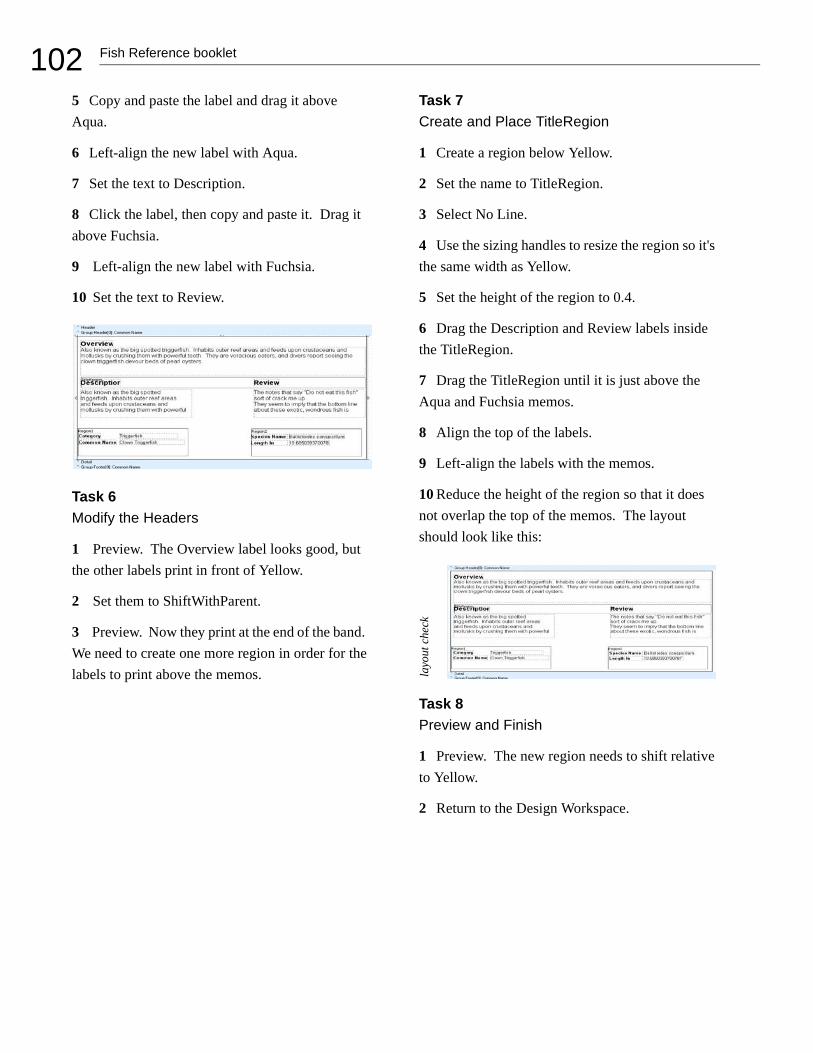
102 Fish Reference booklet
5 Copy and paste the label and drag it above Aqua.
6 Left-align the new label with Aqua.
7 Set the text to Description.
8 Click the label, then copy and paste it. Drag it above Fuchsia.
9 Left-align the new label with Fuchsia.
10 Set the text to Review.
Task 6 Modify the Headers
1 Preview. The Overview label looks good, but the other labels print in front of Yellow.
2 Set them to ShiftWithParent.
3 Preview. Now they print at the end of the band. We need to create one more region in order for the labels to print above the memos.
Task 7Create and Place TitleRegion
1 Create a region below Yellow.
2 Set the name to TitleRegion.
3 Select No Line.
4 Use the sizing handles to resize the region so it's the same width as Yellow.
5 Set the height of the region to 0.4.
6 Drag the Description and Review labels inside the TitleRegion.
7 Drag the TitleRegion until it is just above the Aqua and Fuchsia memos.
8 Align the top of the labels.
9 Left-align the labels with the memos.
10 Reduce the height of the region so that it does not overlap the top of the memos. The layout should look like this:
Task 8 Preview and Finish
1 Preview. The new region needs to shift relative to Yellow.
2 Return to the Design Workspace.
layo
ut c
heck

103Fish Reference booklet
3 Select ShiftRelativeTo and select Yellow.
4 Preview. Now Aqua and Fuchsia need to shift relative to TitleRegion.
5 Select ShiftRelativeTo and select TitleRegion.
6 Preview. The final report should look like this:
7 Close the Report Designer and save the changes.


105Crosstab
CROSSTAB
OVERVIEW
This tutorial shows how to create a report using the Crosstab tool. In order to fully understand the con-cept of crosstabs, we need to create physical print-outs and look at them in different ways; therefore, you'll need access to a printer, some scissors, tape, and a stapler for this tutorial. By the end of this tutorial we will have created the following prod-ucts:
• A poster-style crosstab using 'down then across' pagination
• A poster-style crosstab using 'across then down' pagination
• A document-style crosstab using the standard style
• A document-style crosstab using the repeated captions style
Task 1Select Data
1 Create a new report.
2 Hide the Data Tree and the Report Tree if they are visible.
3 Access the Query Designer.
4 Select the Customer and Orders tables.
5 Click the Fields tab and select All Fields.
6 Scroll down to the Amount Paid field and select it, wait a second, then click again.
7 Change the name to Sale Amount.
8 Click the Calcs tab and double-click on the Company field.
9 Maximize the Query Designer, then choose Expression from the Function drop-down list and enter the following expression:
Extract (Month from SaleDate)
Note: This expression takes the month from the sale date, allowing us to compute totals on a monthly basis.
10 Change the Field Alias to SaleMonth.
11 Click OK.

106 Crosstab
Task 2Create a Crosstab
1 Access the design workspace.
2 Select Report | Data. Select None for both Pipe-lines. Click OK.
3 Place a crosstab component in the detail band.
4 Use the Edit toolbar to assign the crosstab to the Customer pipeline
5 Select File | Page Setup. Access the Paper Size tab and set the orientation to Landscape. Click OK.
6 Right-click over the crosstab and select Config-ure. The Crosstab Designer will be displayed:
Crosstab
The spreadsheet was one of the first applications that made the PC so successful. Spreadsheets present calculations in a grid format - that is, with column headers, row labels, and calculations in the cells. A typical spreadsheet is pictured below:
There are many different formats a spreadsheet may take. The crosstab format is one of the most popu-lar. Crosstab stands for cross tabulation, a process by which totals and other calculations are per-formed based on common values found in a set of data.
For example, let's assume you have a set of data that describes the sales for a company. Each sale is represented by a row of data. Each row of data con-tains a customer name, city, state, sale date, and sale amount. Now, assume you want to know the
total sales for each month by state. Here is one way you could present the data:
State: AL Year: 1999 Total Sales: $2577
State: CA Year: 2000 Total Sales: $3548
This format is OK, but it makes a state-to- state comparison difficult. Another format is as follows:
This format is easier to read and more compact. We're putting more information into less space. It is easy to make state-to-state comparisons. This for-mat is a crosstab. The month and state values are called dimensions because they orient the data

107Crosstab
7 Read the instructions at the top of the Crosstab Designer.
8 Select the SaleMonth field (at the bottom of the list) and drag it over the new row cell. Look for the black, triangular indicators that show where the dimension will be created:
9 When the indicators appear to the left of the new row element, drop the field into the diagram. The diagram should look like this:
10 Click OK.
11 Press Ctrl + S and save the report under the name Crosstab.
Crosstabs continued
in rows and columns. The values in the cells are the calculations created when the sales data is summa-rized.
The simple crosstab we've outlined here can be taken a step further. What if we wanted to know the sales by city (within state) as well as the total num-ber of sales per city. We can present this informa-tion by adding another dimension to the columns (i.e. city) and another calculation to the values (i.e. count of sales). The resulting crosstab would look like this:
Notice the new subtotal columns after each state. This crosstab shows all of the information of the initial crosstab, plus more detailed information by city. You can see that crosstabs can express a lot of information in a very small amount of space.
ReportBuilder has a built-in facility for creating crosstabs. The crosstab component is designed to handle the most common crosstab requirements with minimal effort on your part. For example, let's assume you wanted to create the crosstab we just described. You would take the following steps:
1 Select the sale data from the database
2 Create a crosstab component in the report layout.
3 Select the state, city, and month as dimen-sions.
4 Select count and sum as values.
5 Preview the report. It would look something like this:

108 Crosstab
12 Preview. A blank page is displayed because no values have been assigned to the crosstab.
Task 3Design the Crosstab
1 Return to the design workspace, right-click over the crosstab, and select Configure.
2 Drag the Sale Amount field over the new value cell. When the indicators appear, drop the field into the diagram. The diagram should look like this:
Note: The number 1000 represents the format of the calculated value. The Grand Total indicates that the last row of the crosstab will show the total sale amount for all months.
3 Select SaleMonth and use the highlight color palette to set the color to green. Notice that the element turns fuchsia instead of green. This is because the cell is selected. Deselect it by clicking another element and it should turn green.
4 Select Grand Total and set the color to yellow.
5 Select Sum of Sale Amount and set the color to fuchsia.
6 Select the 1000 under Sum of Sale Amount and set the color to red.
7 Select the 1000 to the right of the grand total and set the color to gray.
8 Close the Crosstab Designer.
9 Preview. The colors allow you to see where each element prints. The values in red represent the sale amount per month. The value in gray is the grand total for the year. The numbers in green represent the months. The yellow and fuchsia sec-tions show where the headings, or captions, print. Now let's add some more values. Right now we have the sum of sales. Next we'll add the average and number of sales per month (count) to the crosstab.
EXTEND THE CROSSTAB DESIGN
Task 1Add Values to the Crosstab
1 Access the Crosstab Designer.
2 Select all colored sections and set the color to none.
3 Drag the Sale Amount field over the new value cell and release it.
4 Select the second Sum of Sale Amount (after the new value cell).
5 Locate the drop-down list box on the toolbar.
6 Select Average from the drop-down list.

109Crosstab
7 Once again, drag the Sale Amount field over to the new value cell and release it.
8 Select the second Sum of Sale Amount (the one below the average).
9 Select Count from the drop-down list. The dia-gram should look like this:
10 Click OK.
11 Preview. The crosstab includes new values. Advance to the second page. The grand totals are on this page. The report tells us the sum, average, and count for the sale amount per month.
Task 2Set the Format of the Values
1 Access the Crosstab Designer.
2 Select the 1000 under Sum of Sale Amount.
3 Right-click and select Display Format. Select the first menu option with a dollar sign.
4 Select the 1000 under Average Sale Amount.
5 Right-click and select Display Format. Select the first menu option with a dollar sign.
Task 3Calculate Totals by State
1 Drag the SaleMonth cell over the new column cell and release.
2 Drag the State field over the new row cell and release. The diagram should look like this:
3 Click OK.
4 Preview. Select Whole Page on the preview toolbar. The crosstab is reformatted. Notice that the months go across the top of the report instead of down the side. This is because we made SaleM-onth a column. The crosstab shows us the sum, average, and count for the sale amount per month for each state. Unfortunately, the preview screen doesn't give us a complete view of the entire crosstab. After we lay out the header band, we'll print out and assemble a complete view of the crosstab.

110 Crosstab
Task 4Lay Out the Header Band
1 Return to the design workspace and place a label in the upper left corner of the header band.
2 Set the caption to Annual Sales.
3 Set the font to 12 bold.
4 Place a System Variable component in the lower left corner of the header band.
5 Set it to PrintDateTime.
6 Place another System Variable in the lower right corner of the header band.
7 Set it to PageSetDesc.
8 Align the tops of the system variables.
9 Select Ctrl + S to save the report.
10 Preview. Notice that the page number prints on each page.
UNDERSTANDING CROSSTAB LAYOUTS
Task 1Control Pagination: Down then Across
1 From the Preview screen, print out all four pages of the crosstab.
2 Return to the design workspace and right click over the crosstab.
3 Select Pagination. Notice that the pagination defaults to Down then Across. This setting refers to the order in which the pages print.
4 Retrieve your printed pages and lay them out like this:
5 Cut off the 1/2 inch bottom margin of pages one and three. Cut off the 1/4 inch left margin of pages three and four.
6 Tape the pages together, using the crosstab grid to align them properly:
7 Label this crosstab 'Down then Across'.
Task 2Control Pagination: Across then Down
1 Right-click over the crosstab component and select Pagination.
2 Click on Across then Down.
3 Preview.
4 Print all four pages of the crosstab.
5 Retrieve your printed pages and lay them out like this:
1 3
42
1 3
42
1 2
43

111Crosstab
6 Cut off the 1/2 inch bottom margin of pages one and two. Cut off the 1/4 inch left margin of pages two and four.
7 Tape the pages together, using the crosstab grid to align them properly:
8 Label this crosstab 'Across then Down.'
Note: As you can see, pagination controls the order in which the pages print when the crosstab cannot fit on a single page.
Task 3Use Repeated Captions
1 Click the Design tab.
2 Right-click over the crosstab component.
3 Expand the Style menu option. Notice that the default setting is Standard. This means that the captions do not repeat. Both of the crosstabs we put together are set to Standard because we did not want to see the captions on every page. However, if we print the crosstab as a document, we may want the captions to repeat for clarity.
4 Select Repeated Captions.
5 Preview and print all four pages of the crosstab.
6 Put them in order by page number and staple the pages together.
7 Flip through them. Notice that the captions for the state and the month appear on each page.
8 Right-click over the crosstab and set the Style to Standard.
9 Preview and print.
10 Staple the pages together.
11 Flip through them. Notice that the captions from page one do not repeat on page two. When we print a crosstab as a document, we can use repeated captions to keep track of values that appear on subsequent pages.
12 Close the Report Designer and save the changes. Congratulations, you've completed all of the tutorials.
1 2
43


113Appendix A: Toolbars
APPENDIX A: TOOLBARS
OVERVIEW
This section describes the toolbars and their basic functions. For information on the usage of a particular tool-bar, locate it in the index and then go through the tutorial that features the toolbar. You can view a list of all toolbars in ReportBuilder by accessing the View | Toolbars option from the Report Designer main menu or by right-clicking over the gray area of the workbench (i.e. the toolbars and component palettes).

114 Appendix A: Toolbars
THE NUDGE TOOLBAR
This toolbar is useful when you want to move a component or selection of components with extreme precision. Each icon represents the direction the selection will move. Selections will move one pixel each time you press an arrow key.
A Nudge up: Moves all selected components up one pixel.
B Nudge down: Moves all selected components down one pixel.
C Nudge left: Moves all selected components one pixel to the left.
D Nudge Right: Moves all selected components one pixel to the right.
BA C D

115Appendix A: Toolbars
THE SIZE TOOLBAR
You can use the size toolbar to set all of the components within a selection to a uniform height or width.
A Shrink Width: Determines the minimum width of all the selected components, and then sets the width of the components to that value.
B Grow Width: Determines the maximum width of all the selected components, and then sets the width of the components to that value.
C Shrink Height: Determines the minimum height of all the selected components, and then sets the height of the components to that value.
D Grow Height: Determines the maximum height of all the selected components, and then sets the height of the components to that value.
BA C D

116 Appendix A: Toolbars
THE DRAW TOOLBAR
This toolbar is used to set the color and style used by shape, line, and region components.
A Fill Color: Sets the color for a shape or region.
B Line Color: Sets the color of the border for shapes and regions. Sets the color for a line.
C Line Thickness: Determines the thickness of a line. Applies to line components only.
D Line Style: Sets the style of a line.
CBA D

117Appendix A: Toolbars
THE ALIGN OR SPACE TOOLBAR
The Align or Space toolbar is useful when components need to be positioned uniformly. For example, it can align several components so that the tops are all even or it can space components so that they have an equal amount of space between them. The first component selected determines the position to which the others will align.
A Align Left Edges: Aligns a group of compo-nents with the leftmost position of the component that was first selected.
B Align Horizontal Centers: Centers a group of components based on the horizontal center of the first-selected component.
C Align Right Edges: Aligns a group of compo-nents with the rightmost position of the first-selected component.
D Align Top Edges: Aligns a group of compo-nents with the topmost position of the first-selected component.
E Align Vertical Centers: Aligns a group of com-ponents based on the vertical center of the first-selected component.
F Align Bottom Edges: Aligns a group of compo-nents with the bottommost position of the first-selected component.
G Space Horizontally: Spaces a set of components based on the leftmost position of the first-selected component and the rightmost position of the last-selected component.
H Space Vertically: Spaces a set of components based on the topmost position of the first compo-nent selected and the bottommost position of the last component selected.
I Center Horizontally in Band: Centers a compo-nent horizontally within a band.
J Center Vertically in Band: Centers a compo-nent vertically within a band.
EBA C D F G H JI

118 Appendix A: Toolbars
THE STANDARD COMPONENT PALETTE
The icons on the Standard component palette represent components that are frequently used to build reports. To create a component, click on an icon and then click in a band.
A Selection tool: Selects one or more components within the layout. Also clears any selection (by clicking in the white space of a band).
B Label: Displays text. Use the edit toolbar to set the caption of a label.
C Memo: Prints multiple lines of plain text in a report.
D RichText: Prints formatted text.
E System Variable: Displays common report information such as page number, page count, print date and time, and current date and time.
F Variable: Performs calculations.
G Image: Displays graphics such as bitmaps, GIFs, and JPEGs.
H Shape: Displays various shapes, such as squares, rectangles, circles, and ellipses. Use the edit toolbar to set the shape type.
I Line: Displays a line. Use the edit toolbar to set the line orientation.
J BarCode: Renders barcodes. Use the Edit tool-bar to set the data to be encoded. Right-click and access Configure to select bar code types.
K 2DBarCode: Renders 2D BarCodes. The string value assigned to the Data property is encoded based on the BarCodetype. The following symbol-ogies are supported: PDF417, Maxicode.
BA C D FE G H JI K

119Appendix A: Toolbars
THE DATA COMPONENT PALETTE
This palette offers several components that are identical to ones in the standard palette, except for one thing: they are data-aware. Data-aware components have the ability to read the value of a field from a database table, and then display that value in the report. This is different from the standard components, which display the content assigned when you lay out a report. You associate a data-aware component with a given database table and field by selecting the data pipeline and the data field from drop-down lists in the edit toolbar.
A DBText: Displays data from most types of data-base fields. Cannot handle images or Richtext.
B DBMemo: Prints plain text from a memo field of a database table. It will automatically word-wrap the text.
C DBRichText: Prints formatted text from a memo field. It will automatically word-wrap the text.
D DBCalc: Performs simple database calculations (Sum, Min, Max, Average, Count).
E DBImage: Prints graphics (Bitmaps, GIFs, JPEGs) that are stored in a database field.
F DBBarCode: Converts the data from a database field to a barcode symbol.
G DB2dBarCode: Converts the data from a data-base field to a barcode symbol.
BA C D FE G

120 Appendix A: Toolbars
THE ADVANCED COMPONENT PALETTE
The Advanced component palette contains components that can help you tackle complex reporting require-ments.
A Region: Logically groups components together.
B SubReport: Handles multiple master details, creates side-by-side reporting effects, and hooks reports together as one.
C Pagebreak: Forces a new page during report generation.
D Crosstab: Allows you to generate a set of calcu-lations that summarize the data from a database table. It displays the calculations in a grid format.
BA C D

121Appendix A: Toolbars
THE REPORT TREE
The Report Tree can be used to view the components within each band. Components selected in the Report Tree become the selection in the report layout. You can select multiple components by holding down the Ctrl key and clicking on each name. You can rename components by right-clicking over the name, selecting Rename, and then typing in a new name. Make sure to hit the Enter key after renaming to ensure that the new name is assigned. This tool window is dockable only on the left and right sides of the design workspace.
The Object Inspector appears in the bottom pane of the Report Tree tool window. Use the Object Inspector to view and modify properties of the currently selected object. When multiple objects are selected, the Object Inspector filters the property list to show the properties that are common to all selected objects. Modify the a property value will update all selected objects.

122 Appendix A: Toolbars
THE DATA TREE
The Data Tree can be used to create data-aware components within a band. Simply select a set of fields and drag the selection into the band. A set of corresponding data-aware components will be created. This tool win-dow is dockable only on the left and right sides of the design workspace

123Appendix A: Toolbars
THE STANDARD TOOLBAR
The Standard toolbar allows you to perform basic functions such as opening, saving, and printing reports, as well as cutting and pasting selections.
A New Report: Creates a blank report.
B Open Report: Displays the Open dialog, allow-ing you to open an existing report.
C Save Report: Saves a report to file.
D Page Setup: Displays the Page Setup dialog, allowing you to set the paper size and configure the layout for the report.
E Print: Displays the Print dialog before sending the report to the printer.
F Print Preview: Displays the Print Preview win-dow.
G Cut: Places the currently selected components in the clipboard and removes them from the report layout.
H Copy: Copies the currently selected compo-nents into the clipboard.
I Paste: Pastes the components in the clipboard into the report layout.
BA C D FE G H I

124 Appendix A: Toolbars
THE FORMAT TOOLBAR
Use the Format toolbar to set the font and colors of text-based components. You can also control the layering of components with this toolbar.
A Font Name: Shows the name of the font chosen for the selected component.
B Font Size: Shows the size of the font chosen for the selected component.
C Bold: Sets text to bold.
D Italic: Sets text to italic.
E Underline: Underlines text.
F Left Justify: Left justifies text.
G Center: Centers text.
H Right Justify: Right justifies text.
I Full Justify:
J Font Color: Sets the text color.
K Highlight Color: Sets the background color.
L Anchors: Specifies how a report component is anchored to its parent.
M Border: Specifies which of the outside border lines of a report component are rendered.
N Bring to Front: Brings a component to the front of other components.
O Send to Back: Sends a component to the back of the other components. Use the Report Tree to see the exact layering of the components within the band.
A B C D E F G H J K L MI N O

125Appendix A: Toolbars
THE EDIT TOOLBAR
The Edit toolbar is unique in that it changes based on the selected component. It is used with the following components: data-aware components (1), labels (2), shapes (3), and lines (4).
1 Edit Toolbar with data-aware component
This configuration allows the data pipeline and data field for the component to be set. The drop-down list on the left shows the data pipelines. The drop-down list on the right shows the field names.
2 Edit Toolbar with a label component
This configuration allows you to type the text for a label.

126 Appendix A: Toolbars
3 Edit Toolbar with a shape component
The Edit toolbar allows you to choose from several shapes when a shape component is selected.
4 Edit Toolbar with a line component
This configuration allows you to move the line to the top, bottom, left, or right within a line compo-nent.

127Glossary
GLOSSARY
AAdvanced Component Palette A toolbar that contains advanced components. See page 106 for a complete description of this toolbar.
align The act of setting components' positions so they line up with one another.
Align or Space Toolbar A toolbar that allows you to align or space components so that they have a uniform appearance. Select View | Toolbars | Align or Space to launch this toolbar. See page 103 for a complete description of this toolbar.
AutoSize A speed menu option available for text components. When AutoSize is set to true, the component adjusts its width so that all of the text is displayed.
Bband A section of canvas that describes how part of the report will look. A band is labeled in the section divider immediately below it; thus, the first band is called the 'header', the second is called the 'detail', and the third is called the 'footer'.
barcode A component in the Standard compo-nent palette that renders barcodes. Use the Edit toolbar to set the data to be encoded. Right-click and access Configure to select bar code types.
bounding box (1) A method of component selection by which you right-click your mouse and drag it so it encompasses the components to be selected. (2) The box that appears around the com-ponents to be selected as you drag your mouse.
Bring to Front A speed menu option that allows you to move an object in front of other objects. Use this option to control the appearance of over-lapping objects.
CCalcs tab A notebook tab in the Query Designer from which you can create a calculation based on the data in the database.
Calcs page A page in the Query Wizard that allows you to make a calculation based on the data in the database.

128 Glossary
calculation An option in the Query Wizard / Query Designer that allows you to derive new data from existing database fields.
canvas The area in the design workspace that contains the reports layouts. The canvas is divided into rectangular areas called bands.
component An element used to control how the report looks. Each component has a unique pur-pose. In order to place a component in the design workspace, click the icon on the component pal-ette, then click on the white space of the band in which you want the component to appear. When a component is selected, an edit or drop-down list may appear in the upper left hand corner of the design workspace. This area provides different options depending upon the selected component.
Configure A speed menu option for the Crosstab component. It allows you to access the Crosstab Designer.
CrossTab A component that presents summa-rized data in a grid format. Crosstabs are designed by right-clicking over the component and access-ing the Configure option.
Crosstab Designer The dialog displayed when the Configure option on the speed menu for the crosstab component is selected. A crosstab layout is created via this designer.
CrossTab Wizard A tool in the design work-space that generates a report based upon the choices you make in the wizard. Access this tool by selecting File | New, then clicking the CrossTab Wizard icon.
Ddata Specific facts (addresses, names, employee numbers, hire dates) that are entered into a data-base. Data can be accessed via queries. Data, which is not very meaningful in its raw form, can be transformed into useful information through a report.
data-aware components Components to which you can assign data fields. In the Report Designer, these components are prefixed by DB, meaning database.
Data Component Palette The palette from which you create data-aware components. Click on the icon and click on the canvas to create a data-aware component. See page 105 for a complete description of this palette.
data module A behind-the-scenes container for dataviews. When you want to copy data from one report to another, export the data module from the first report and import the data module into the sec-ond.
data pipeline A special kind of component that supplies data to a report and controls which rows of data are used to generate the report. It represents a database table or SQL query and provides data in the form of fields and records.

129Glossary
data traversal The act of moving through the rows of a database table or data selection.
Data Tree A toolbar used in the design work-space to access the data selected in the data work-space. Select View | Toolbars | Data Tree to launch this toolbar. See page 108 for a complete descrip-tion.
data workspace The notebook page you access to select data.
database A place where data is stored in an organized fashion.
database table A structure that facilitates the storage and retrieval of organized data.
dataview The visual representation of a query displayed in the data workspace. It contains the data selected in the Query Wizard or Query Designer. Dataviews allow you to make changes to a query via the Query Designer, which can be accessed by clicking the icons in the dataview tool-bar.
DBComponents Data-aware components that can retrieve data from a query. The DB prefix stands for database. Use the edit toolbar to choose data for a DBComponent. See page 105 for a complete description of these components.
design workspace The notebook page where you create your report layout.
Detail Band A band that prints once for every row of data.
Display Format A speed menu option available for textual components. This option allows you to display a value in a certain format (decimals with a dollar sign, for example). Right-click over a tex-tual component to access the Display Format.
dock The act of dragging a toolbar to one side of the workspace and dropping it such that it 'sticks' to that side. A docked toolbar moves when you move or resize the Report Designer.
Draw Toolbar A toolbar used to fill a compo-nent with color or to colorize the border around a component. See page 102 for a complete descrip-tion of this toolbar.
EEdit A speed menu option for a Rich Text com-ponent that opens an application which allows you to open a file and format text.
Edit Toolbar A toolbar that allows you to set the most important property of a component. This toolbar changes to select database fields for data-aware components, adjust lines for the line compo-nent, select shapes for the shape component, and type text for the label component. See pages 111-112 for a complete description of this toolbar.

130 Glossary
expression Used when creating a calculation. It allows you to create other fields based on the data from existing fields.
Ffloating window A toolbar detached from the edge of the Report Designer and released so that it 'floats' in front of the Report Designer.
Footer Band A band that prints (usually the page number, date, time) at the bottom of each page of the report.
Format Toolbar This toolbar gives you the abil-ity to modify text-based components in a number of ways. You can change the font style and font size. You can bold, italicize, or underline the text. You can justify a word or sentence to the left of the margin, or you can center or right-justify text. You can also change the color of the text. See page 110 for a complete description of this toolbar.
Ggroup (1) A section of a report that contains a group header, detail, and group footer band. Groups are assigned to a database field. Select Report | Groups to access the groups dialog. (2) A behind-the-scenes component that allows a report to be organized into separate sections, based on the value of a field.
Group Header Band A band that contains the header for a group. The components in a group header band appear at the beginning of a group.
Group Footer Band A band that contains the footer for a group. The components in a group footer band appear at the end of a group.
guides The lines on the horizontal and vertical ruler that move as you move the cursor over the canvas.
HHeader Band A band that prints at the top of each page of the report.
highlight To select text for editing. You high-light text by holding down the mouse button and dragging the cursor over text or by holding down the Shift key and pressing an arrow key.
IImage A component on the Standard component palette that displays graphics (such as bitmaps, GIFs, and JPEGs).
K Keep group together An option in the groups dialog that sets the group so that the bands of the group will print on the same page.

131Glossary
LLabel A component useful for titles and head-ings. Use the Edit toolbar to set the text for a label.
Label Template Wizard A tool that allows you to create mailing label reports by selecting printer information and choosing a label type.
Line A component in the Standard component palette that displays a line. Use the Edit toolbar to set the line orientation.
Lines A speed menu option for a memo that allows you to access the Memo Editor, from which you can open text only files.
MMailMerge An option that appears when you right-click over a Rich Text component. It allows you to import field values into the Rich Text com-ponent.
MaintainAspectRatio A speed menu option available for images. It scales an image so that the height and width are adjusted based on the original image size.
Memo A special kind of component that allows you to load text into it. Right-click over the memo and select Lines in order to load text.
Memo Editor An dialog accessed via the memo component (right-click over the component and select Lines) that allows you to load and save text files.
NNudge Toolbar This toolbar allows you to move a component or a group of selected components one pixel at a time. See page 100 for a complete description of this toolbar.
Oorphan (1) A component(s) that prints on a dif-ferent page than the components within the same band or region. For example, if a DBText that's supposed to follow a DBMemo prints at the top of the next page rather than with the DBMemo, it is orphaned. (2) A group footer band that prints at the top of a page with no preceding detail bands.
overflow Occurs when a stretchable component prints on additional pages.
PPagination A speed menu option for a crosstab component that allows you to choose Across then Down or Down then Across printing for the crosstab report.
ParentHeight A speed menu option that allows you to set the size of an object so that it matches the height of a band. Right-click over a component to select ParentHeight.
ParentWidth A speed menu option that allows you to set the size of an object so that it matches the width of a band. Right-click over a component to select ParentWidth.

132 Glossary
Position. . . dialog A speed menu option that allows you to change the size and position of an object. Right-click over a component to access the Position... dialog.
Preview A workspace where you can preview the generated report to see how it will look when printed.
properties Settings for components such as font style, size, and color.
QQuery A request for data using a language spe-cific to databases called SQL. The Query Designer and Query Wizard create SQL queries as we choose the data we want for a report.
Query Wizard A tool that allows you to select data for a report.
Query Designer A tool that allows you to make changes in the data selection.
RRegion A special kind of component that can contain other components.
report Data in the form of information: a pol-ished product that contains useful data.
Report Designer A report-building environ-ment. It includes the design workspace, the data workspace, and the preview workspace.
Report Tree A toolbar that displays all of the components in a report. It is particularly helpful in organizing components within bands. See page 107 for a complete description of the report tree.
Report Wizard A tool that allows you to create a report by answering a few simple questions.
ReprintOnOverFlow A speed menu option that sets a component so that it will reprint. For exam-ple, a memo has an accompanying label. If the label is set to ReprintOnOverFlow, it will reprint on each page of the memo's text. Right-click over a component to select ReprintOnOverFlow.
Rich Text A component that allows you to print formatted text.
Rich Text Editor A dialog box accessible via the Rich Text component that allows you to replace text with database fields.
rulers The design workspace has two rulers: the horizontal ruler and the vertical ruler. As you move a component in the workspace, you'll see a guide that tells you the location of the component on the rulers.
Sselect To click on an object. See 'highlight' as a contrasting term.
selection A group of selected components.

133Glossary
selection handles When multiple components are selected, little gray boxes appear around the components. These selection handles indicate the objects that are selected.
Selection tool A tool used to select one or more components within the layout. It can also be used to clear any selection (by clicking in the white space of a band).
Send to Back A speed menu option frequently used with shapes that allows components to be moved to the background. If you want to use a shape as a background, use the Send to Back func-tion.
shift-click A method of component selection where you hold down the Shift key and then click on components. You can also remove a component from a selection using this method.
ShiftRelativeTo A speed menu option that allows you to associate components so that they print one after the other. This option is especially useful when you want one component (a memo, for example) to appear below another.
ShiftWithParent A speed menu option that allows a static component to print after a stretch-able component. Right-click over a component to select ShiftWithParent.
Size Toolbar A toolbar that allows you to set all of the components in a selection to the same width or height. See page 101 for a complete description of this toolbar.
sizing The act of altering the size of a component via the sizing handles or the Position menu.
Sizing handles The little black boxes that appear when an object is selected. If you drag your cursor over one of the sizing handles, the cursor will change to a double-sided arrow. You can then resize the component by holding down the mouse button and dragging.
speed menu The menu that appears when you right-click over a component. The menu options vary depending upon the component.
SQL Structured Query Language. The language used to retrieve data from a database in an ordered form so that it can be used to create reports. See page 104 for a complete description of this toolbar.
Standard Component Palette A toolbar that includes the most frequently used components for report building. See page 104 for a complete description of this toolbar.
Standard Toolbar A toolbar that contains stan-dard functions, such as saving, opening, and print-ing reports. See page 109 for a complete description of the toolbar.

134 Glossary
Start new page An option in the groups dialog that allows you to force a group onto a new page each time the group field changes value.
Static components Components that print just as they appear in the layout.
status bar The bar at the bottom of the design workspace that tracks the movement of selected components. It's useful for component placement and alignment in that it allows you to position com-ponents based on an exact measurement. It also displays the name of the selected component.
Stretch A speed menu option that applies only to stretchable components. When set to true, the component will change size depending upon the amount of text it contains. Right-click over a com-ponent to select Stretch.
stretchable components Components that change size according to the amount of text they contain. A DBMemo is a stretchable component. Right-click over a component to set Stretch to true.
StretchWithParent A speed menu option that allows the selected component to change height according to the change in height of the band in which it resides. Right-click over a component to select StretchWithParent.
Style A speed menu option for the crosstab com-ponent that allows you to choose between Repeated Captions or Standard printing.
Subreport A component that allows you to cre-ate a report within a report in order to show more levels of detail or to print several reports as one.
Summary Band A band that prints once at the end of a report. The band is typically used to sum-marize data. Select Report | Summary to create this band.
SuppressRepeatedValues A speed menu option that prevents repeated values from printing.
System Variable A component that allows you to display the page number, time, date, and other useful information.
Ttabular A setting in the Data Tree layout tab that configures the drag and drop behavior to create labels across the top of the page and data flowing down the page. The opposite of vertical.
Title Band A band that prints once at the begin-ning of the report. Select Report | Title to create this band.
title bar The area at the top of a window that contains the window title and can be used to drag the window to a new position.

135Glossary
toolbars Tools that allow you to modify a report layout. Select View | Toolbars to see a list of all toolbars.
Vvertical A setting in the Data Tree layout tab that configures the drag and drop behavior to create labels down the page and data across the page. The opposite of tabular.
Visible A speed menu option that determines the visibility of an object. Right-click over a compo-nent to select Visible. If the Visible option is set to false, the component will not appear in the report.
Wworkbench The area in the design workspace that surrounds the canvas and contains tools used to modify the report layout.


137Index
INDEX
AAbout 51Advanced Component Palette
description of 120Align or Space Toolbar
description of 117usage of 15, 34, 44
Autosizeusage of 38, 75, 86, 96
Bbands
detail 4footer 4group footer 43, 81group header 43, 81header 4title 33
bounding box 11Ccalcs
usage of 66, 80components
about properties 11advanced selection of 18advanced sizing 18aligning 15Barcode 118basic selection of 10creation 9Crosstab 105Data-Aware 119DBBarCode 119DBCalc 44, 119DBImage 74, 119DBMemo 75, 76, 119DBRichText 119DBText 74, 119exploring properties 21Image 118Label 118Line 116, 118Memo 118orphaned 96Region 97, 120RichText 87, 118Shape 94, 118sizing 13static 76stretchable 76
SubReport 120System Variable 31, 118Variable 118
configureusage of 106, 108
Cover Page 33Crosstab Component
about 106usage of 106
DData Component Palette
description of 119data module 41Data Pipelines
description of 122data traversal 82Data Tree
about 22description of 122how to dock 23usage of 30, 75
data workspaceabout 1
data-aware components 119database table 82DataView
about 4, 22usage of 41
DBCalc Componentdescription of 119usage of 44, 81
DBImage Componentdescription of 119usage of 74
DBMemo Componentabout 76description of 119usage of 76
DBText Componentdescription of 119usage of 5
design workspaceabout 4
detail bandabout 4
display formatusage of 85
Draw Toolbardescription of 116usage of 11, 16

138 Index
EEdit
usage of 89Edit Toolbar
description of 125usage of 4, 44, 47
expressionabout 66usage of 66, 80
FFill Color Palette 16floating window 12Footer Band
about 4form letter 87Format Toolbar
description of 124Front-to-Back Order
about 16Ggroup
about 82usage of 42, 78, 101
Group Footer Bandusage of 43, 81
Group Header Bandusage of 43, 81, 84
guides 10HHeader Band
about 4Iinvoice 41KKeep group together
about 78usage of 45, 78
LLabel Component
description of 118usage of 4, 34
letterSee form letter
Line Componentcolor 116description of 118guide 39style 116thickness 116usage of 95
MMailMerge
about 89usage of 88
MaintainAspectRatiousage of 74
Memo Componentdescription of 118usage of 95
Memo Editorusage of 95
NNudge Toolbar
description of 114Oorphaned components 96Overflow
about 76PPagination
usage of 110Position
about 20usage of 21, 101
Previewhow to 7
preview workspaceabout 1
propertiesabout 11exploring 21
QQuery Designer
usage of 65, 79Query Wizard
about 3usage of 29, 37, 73
RRegion Component
about 99usage of 97
Report Treedescription of 121usage of 94
Report Wizardusage of 38, 42, 80
ReprintOnOverflowabout 76
Richtext Componentdescription of 118usage of 88
RichText Editorusage of 88

139Index
Sselection handles 10Shape Component
description of 118usage of 9, 33, 83, 94
shift-click 11ShiftRelativeTo
about 99usage of 94
Size Toolbardescription of 115usage of 31
sizing handles 13speed menu 19Standard Component Palette
description of 118usage of 40
Standard Toolbardescription of 123
Start new pageusage of 46, 101
static componentsabout 76
stretchabout 76
stretchable componentsabout 76
StretchWithParentabout 76
Styleusage of 111
SuppressRepeatedValuesusage of 39
System Variable Componentdescription of 118usage of 31
TTabular Report 25Title Band 33title bar 12title page
See cover pagetoolbars
Advanced Component Palette 120Align or Space 117Data Component Palette 119Data Tree 22, 23, 122docking 11Draw 11, 116Edit 125Format 124Report Tree 121Size 115Standard 123Standard Component Palette 118
VVertical Report 24Visible
usage of 69, 84, 86