jozef goetz contribution, 2012 1 2011-13 pearson education, inc. all rights reserved. 2002...
TRANSCRIPT
Jozef Goetz contribution, 2012
1
2011-13 Pearson Education, Inc. All rights reserved.
2002 Prentice Hall. All rights reserved.
Jozef Goetz contribution, 2012
2
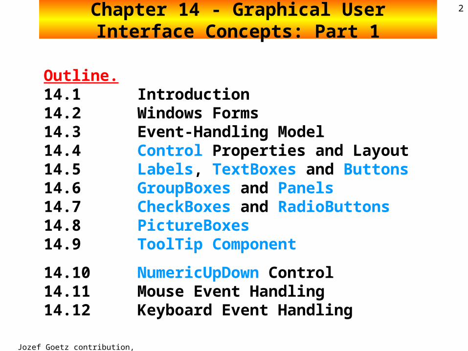
Outline.14.1 Introduction14.2 Windows Forms14.3 Event-Handling Model14.4 Control Properties and Layout14.5 Labels, TextBoxes and Buttons14.6 GroupBoxes and Panels14.7 CheckBoxes and RadioButtons14.8 PictureBoxes14.9 ToolTip Component
14.10 NumericUpDown Control14.11 Mouse Event Handling14.12 Keyboard Event Handling
Chapter 14 - Graphical User Interface Concepts: Part 1
Jozef Goetz contribution, 2012
3
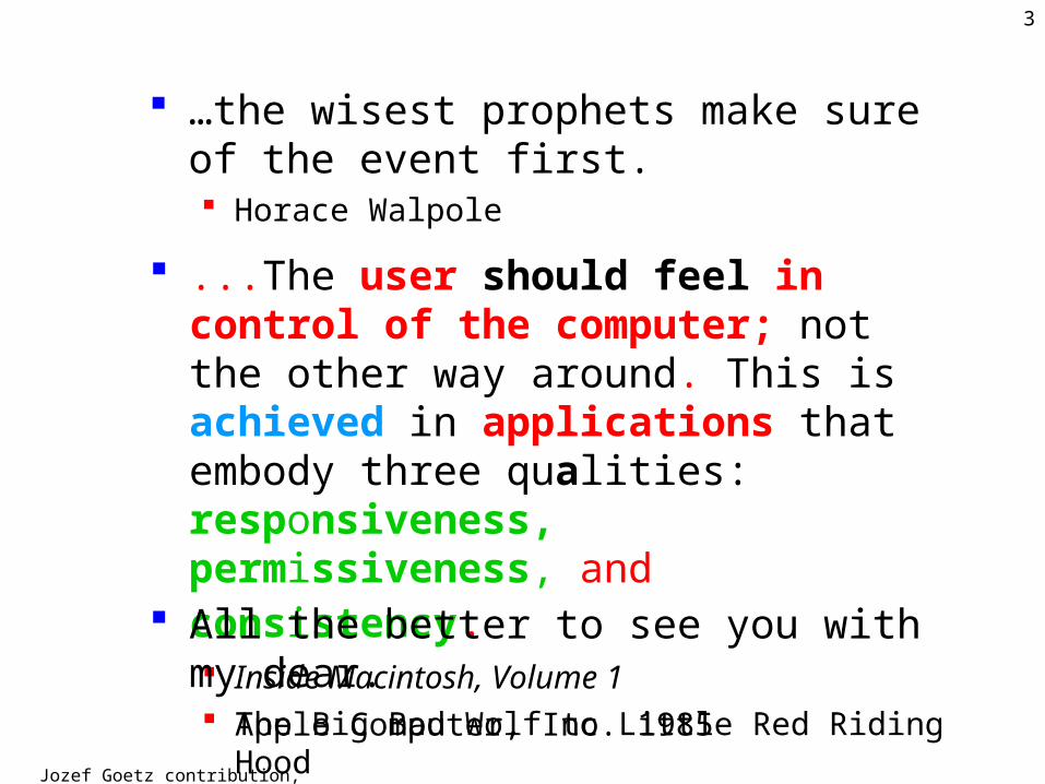
…the wisest prophets make sure of the event first. Horace Walpole
...The user should feel in control of the computer; not the other way around. This is achieved in applications that embody three qualities: responsiveness, permissiveness, and consistency. Inside Macintosh, Volume 1
Apple Computer, Inc. 1985 All the better to see you with my dear.
The Big Bad Wolf to Little Red Riding Hood
Jozef Goetz contribution, 2012
4Chapter 14: Graphical User Interface Concepts:
Part 1Objectives
To understand the design principles of graphical user interfaces GUI.
To understand, use and create events. To be able to create GUIs. How to process events that are generated by user
interactions with GUI controls. To understand the namespaces containing GUI
components and event-handling classes and interfaces. To be able to create and manipulate buttons, labels,
lists, textboxes, ToolTips, NumericUpDow and panels. To be able to use mouse and keyboard events.

Jozef Goetz contribution, 2012
©1992-2011 by Pearson Education, Inc. All Rights Reserved.
Jozef Goetz contribution, 2012
614.1 Introduction
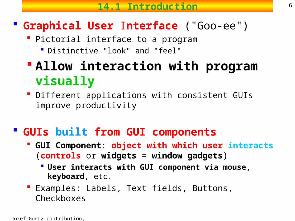
Graphical User Interface ("Goo-ee") Pictorial interface to a program
Distinctive "look" and "feel"
Allow interaction with program visually Different applications with consistent GUIs improve productivity
GUIs built from GUI components GUI Component: object with which user interacts (controls or
widgets = window gadgets) User interacts with GUI component via mouse, keyboard, etc.
Examples: Labels, Text fields, Buttons, Checkboxes
Jozef Goetz contribution, 2012
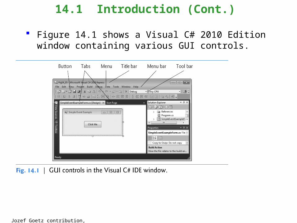
Figure 14.1 shows a Visual C# 2010 Edition window containing various GUI controls.
14.1 Introduction (Cont.)
Jozef Goetz contribution, 2012
8
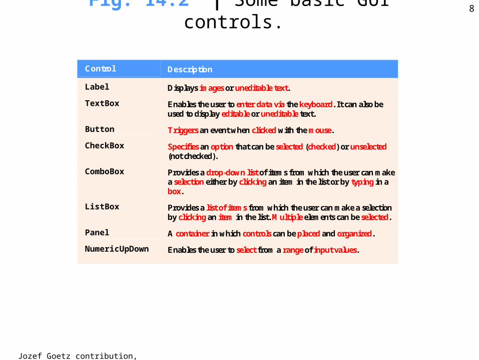
Control Description
Label Displays images or uneditable text.
TextBox Enables the user to enter data via the keyboard. It can also be used to display editable or uneditable text.
Button Triggers an event when clicked with the mouse.
CheckBox Specifies an option that can be selected (checked) or unselected (not checked).
ComboBox Provides a drop-down list of items from which the user can make a selection either by clicking an item in the list or by typing in a box.
ListBox Provides a list of items from which the user can make a selection by clicking an item in the list. Multiple elements can be selected.
Panel A container in which controls can be placed and organized.
NumericUpDown Enables the user to select from a range of input values.
Fig. 14.2 | Some basic GUI controls.
Jozef Goetz contribution, 2012
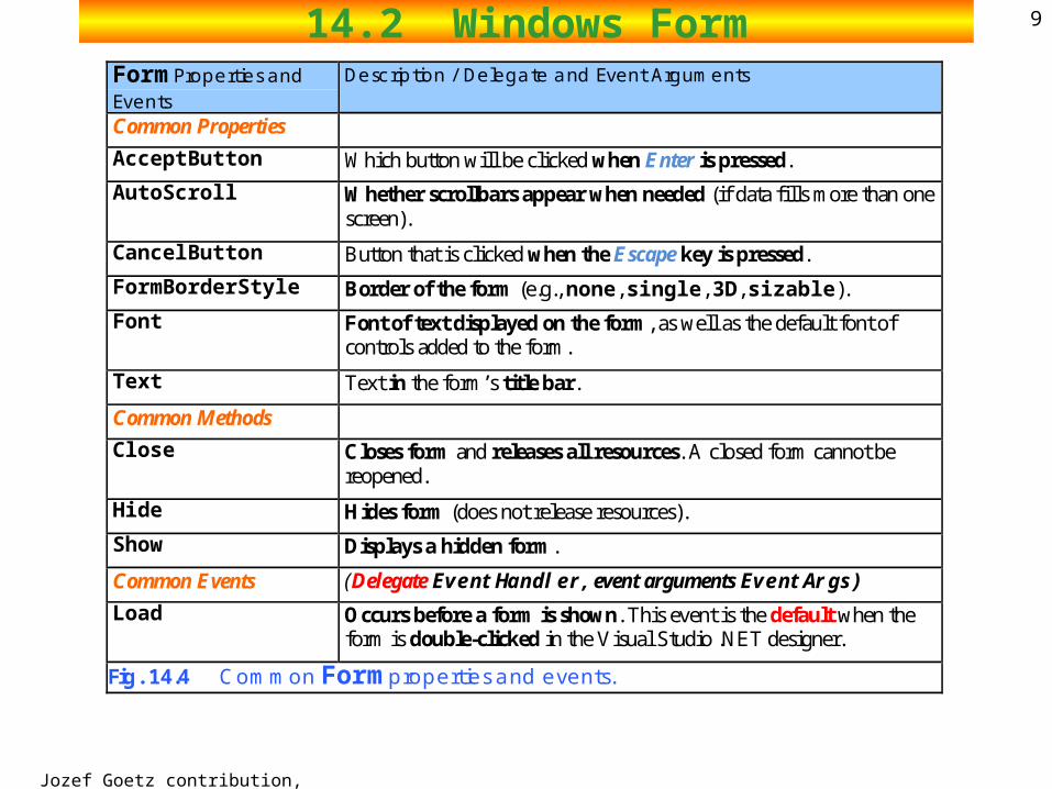
914.2 Windows FormForm Properties and Events
Description / Delegate and Event Arguments
Common Properties
AcceptButton Which button will be clicked when Enter is pressed.
AutoScroll Whether scrollbars appear when needed (if data fills more than one screen).
CancelButton Button that is clicked when the Escape key is pressed.
FormBorderStyle Border of the form (e.g., none, single, 3D, sizable).
Font Font of text displayed on the form, as well as the default font of controls added to the form.
Text Text in the form’s title bar.
Common Methods
Close Closes form and releases all resources. A closed form cannot be reopened.
Hide Hides form (does not release resources).
Show Displays a hidden form.
Common Events (Delegate EventHandler, event arguments EventArgs)
Load Occurs before a form is shown. This event is the default when the form is double-clicked in the Visual Studio .NET designer.
Fig. 14.4 Common Form properties and events.
Jozef Goetz contribution, 2012
1014.2 Windows Forms
Windows Forms (WinForms) Create GUIs for programs The form is a graphical element that appears
on the desktop
Jozef Goetz contribution, 2012
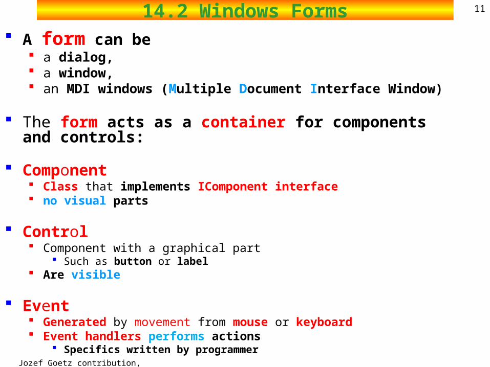
1114.2 Windows Forms A form can be
a dialog, a window, an MDI windows (Multiple Document Interface Window)
The form acts as a container for components and controls:
Component Class that implements IComponent interface no visual parts
Control Component with a graphical part
Such as button or label Are visible
Event Generated by movement from mouse or keyboard Event handlers performs actions
Specifics written by programmer

Jozef Goetz contribution, 2012
12Fig. 14.3 | Components and controls for Windows Forms.
Display all controls and components
Categories that organize controls and components by functionality

Jozef Goetz contribution, 2012
1314.2 Windows Forms
Each .NET Framework class Form
System.Windows.Forms.Form component control
e.g. class Button: System.Windows.Forms.Buttonis in the System.Windows.Forms namespaceSystem.Object
System.MarshalByRefObject System.ComponentModel.Component System.Windows.Forms.Control
Jozef Goetz contribution, 2012
1414.2 Windows Forms
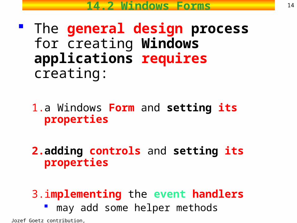
The general design process for creating Windows applications requires creating:
1. a Windows Form and setting its properties
2. adding controls and setting its properties
3. implementing the event handlers may add some helper methods
2002 Prentice Hall.All rights reserved.
Outline15
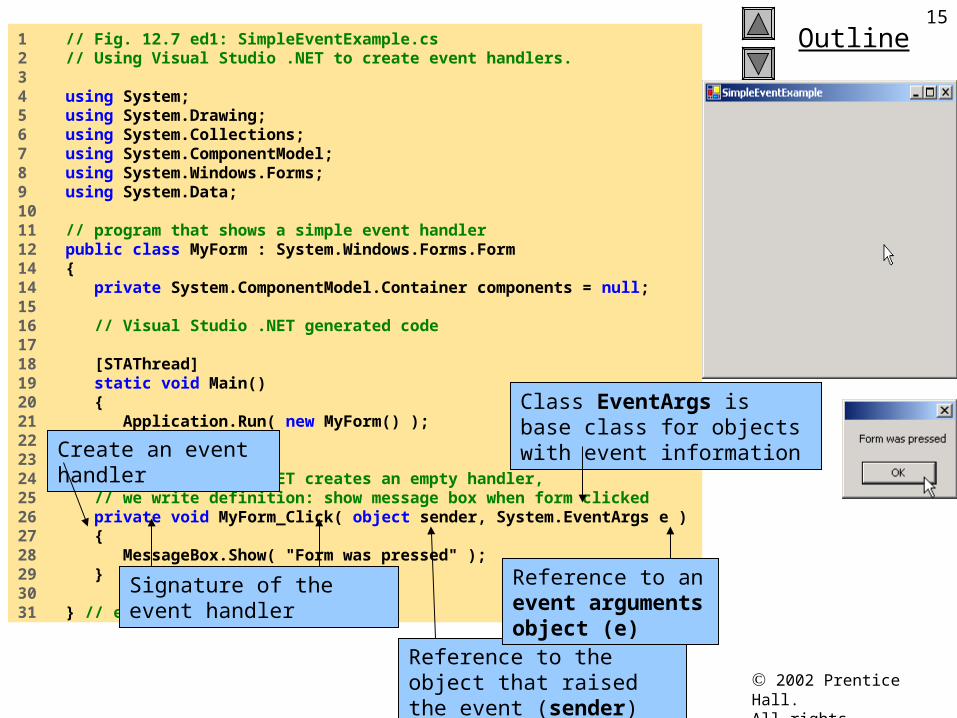
SimpleEventExample.cs
1 // Fig. 12.7 ed1: SimpleEventExample.cs2 // Using Visual Studio .NET to create event handlers.3 4 using System;5 using System.Drawing;6 using System.Collections;7 using System.ComponentModel;8 using System.Windows.Forms;9 using System.Data;10 11 // program that shows a simple event handler12 public class MyForm : System.Windows.Forms.Form14 {14 private System.ComponentModel.Container components = null;15 16 // Visual Studio .NET generated code17 18 [STAThread]19 static void Main() 20 {21 Application.Run( new MyForm() );22 }23 24 // Visual Studio .NET creates an empty handler, 25 // we write definition: show message box when form clicked26 private void MyForm_Click( object sender, System.EventArgs e )27 {28 MessageBox.Show( "Form was pressed" );29 }30 31 } // end class MyForm
Create an event handler
Signature of the event handler
Reference to the object that raised the event (sender)
Reference to an event arguments object (e)
Class EventArgs is base class for objects with event information
Jozef Goetz contribution, 2012
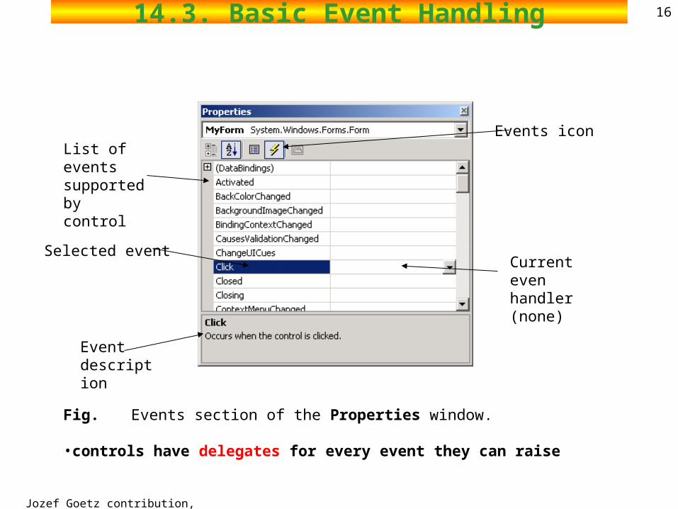
1614.3. Basic Event Handling
Fig. Events section of the Properties window.
•controls have delegates for every event they can raise
Current even handler (none)
Selected event
Event description
List of events supported by control
Events icon
Jozef Goetz contribution, 2012
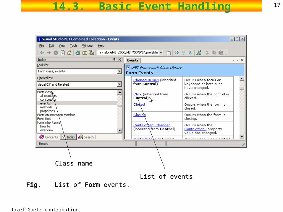
1714.3. Basic Event Handling
Fig. List of Form events.
Class name
List of events
Jozef Goetz contribution, 2012
1814.3 Event-Handling Model
An event is a message sent by an object to signal the occurrence of an action.
The action could be caused by user interaction, such as a mouse click, or it could be triggered by some other program logic.
The object that raises (triggers) the event is called the event sender.
The object that captures the event and responds to it is called the event receiver.
In event communication, the event sender class does not know which object or method will receive (handle) the events it raises.
What is needed is an intermediary (or pointer-like mechanism) between the source and the receiver. The .NET Framework defines a special type (Delegate) that
provides the functionality of a function pointer.
Jozef Goetz contribution, 2012
1914.3 Event-Handling Model
GUIs are event driven they generate events when user interacts with GUI
e.g., moving mouse, pressing button, typing in text field, etc.
Event handlers Methods that process events and perform tasks.
Each control that can generate events has an
associated delegate
Jozef Goetz contribution, 2012
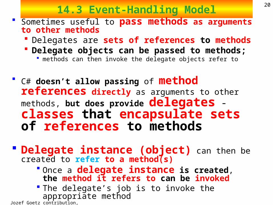
2014.3 Event-Handling Model
Sometimes useful to pass methods as arguments to other methods Delegates are sets of references to methods Delegate objects can be passed to methods;
methods can then invoke the delegate objects refer to
C# doesn’t allow passing of method references directly as arguments to other methods, but does provide delegates - classes that encapsulate sets of references to methods
Delegate instance (object) can then be created to refer to a method(s)
Once a delegate instance is created, the method it refers to can be invoked
The delegate’s job is to invoke the appropriate method
Jozef Goetz contribution, 2012
2114.3 Event-Handling Model
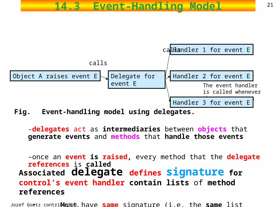
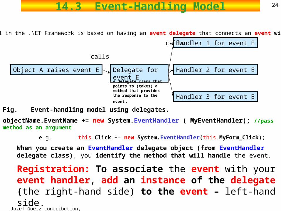
Fig. Event-handling model using delegates.
–delegates act as intermediaries between objects that generate events and methods that handle those events
–once an event is raised, every method that the delegate references is called
Associated delegate defines signature for control’s event handler contain lists of method references
• Must have same signature (i.e. the same list of parameters)
The event handler is called whenever the event occurs
Object A raises event E Delegate for event E
Handler 1 for event E
Handler 3 for event E
Handler 2 for event E
calls
calls
Jozef Goetz contribution, 2012
2214.3 Event-Handling Model
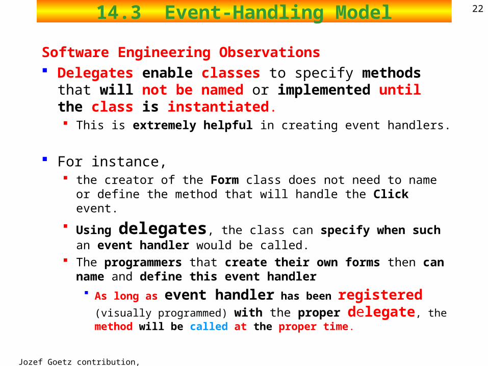
Software Engineering Observations Delegates enable classes to specify methods that will not
be named or implemented until the class is instantiated. This is extremely helpful in creating event handlers.
For instance, the creator of the Form class does not need to name or define the
method that will handle the Click event.
Using delegates, the class can specify when such an event handler would be called.
The programmers that create their own forms then can name and define this event handler
As long as event handler has been registered (visually
programmed) with the proper delegate, the method will be called at the proper time.
Jozef Goetz contribution, 2012
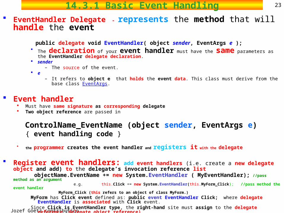
2314.3.1 Basic Event Handling EventHandler Delegate - represents the method that will handle the event
public delegate void EventHandler( object sender, EventArgs e ); The declaration of your event handler must have the same parameters as the EventHandler delegate
declaration. sender
– The source of the event. e
– It refers to object e that holds the event data. This class must derive from the base class EventArgs.
Event handler Must have same signature as corresponding delegate Two object reference are passed in
ControlName_EventName (object sender, EventArgs e) { event handling code }
the programmer creates the event handler and registers it with the delegate
Register event handlers: add event handlers (i.e. create a new delegate object and add) to the delegate’s invocation reference list
objectName.EventName += new System.EventHandler ( MyEventHandler); //pass method as an argument e.g. this.Click += new System.EventHandler(this.MyForm_Click); //pass method the event handler
MyForm_Click (this refers to an object of class MyForm.)MyForm has Click event defined as: public event EventHandler Click; where delegate EventHandler is associated with Click
event. Since Click is EventHandler type, the right-hand site must assign to the delegate reference (delegate object reference)
Jozef Goetz contribution, 2012
2414.3 Event-Handling Model
Fig. Event-handling model using delegates.
objectName.EventName += new System.EventHandler ( MyEventHandler); //pass method as an argument
e.g. this.Click += new System.EventHandler(this.MyForm_Click);
When you create an EventHandler delegate object (from EventHandler delegate class), you identify the method that will handle the event.
Registration: To associate the event with your event handler, add an instance of the delegate (the right-hand side) to the event – left-hand side. •we must create (visually programmed) a new delegate object for each event handler by writing
new System.EventHandler ( MyEventHandler);
Object A raises event E Delegate for event E
Handler 1 for event E
Handler 3 for event E
Handler 2 for event E
calls
calls
The event model in the .NET Framework is based on having an event delegate that connects an event with its handler.
A delegate class that points to (takes) a method that provides
the response to the event.
Jozef Goetz contribution, 2012
2514.3 Event-Handling Model
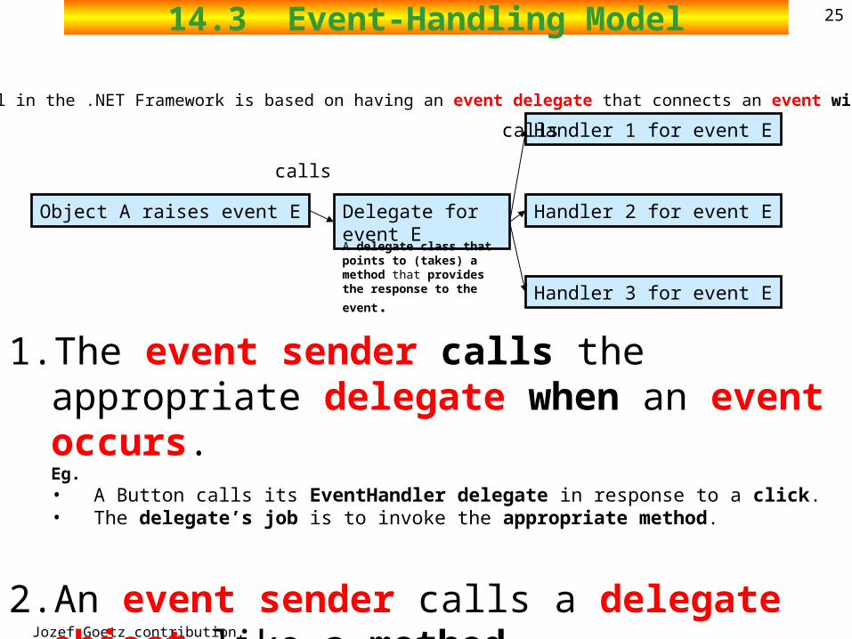
1. The event sender calls the appropriate delegate when an event occurs.
Eg. • A Button calls its EventHandler delegate in response to a click. • The delegate’s job is to invoke the appropriate method.
2. An event sender calls a delegate object like a method.
Object A raises event E Delegate for event E
Handler 1 for event E
Handler 3 for event E
Handler 2 for event E
calls
calls
The event model in the .NET Framework is based on having an event delegate that connects an event with its handler.
A delegate class that points to (takes) a method that provides
the response to the event.
Jozef Goetz contribution, 2012
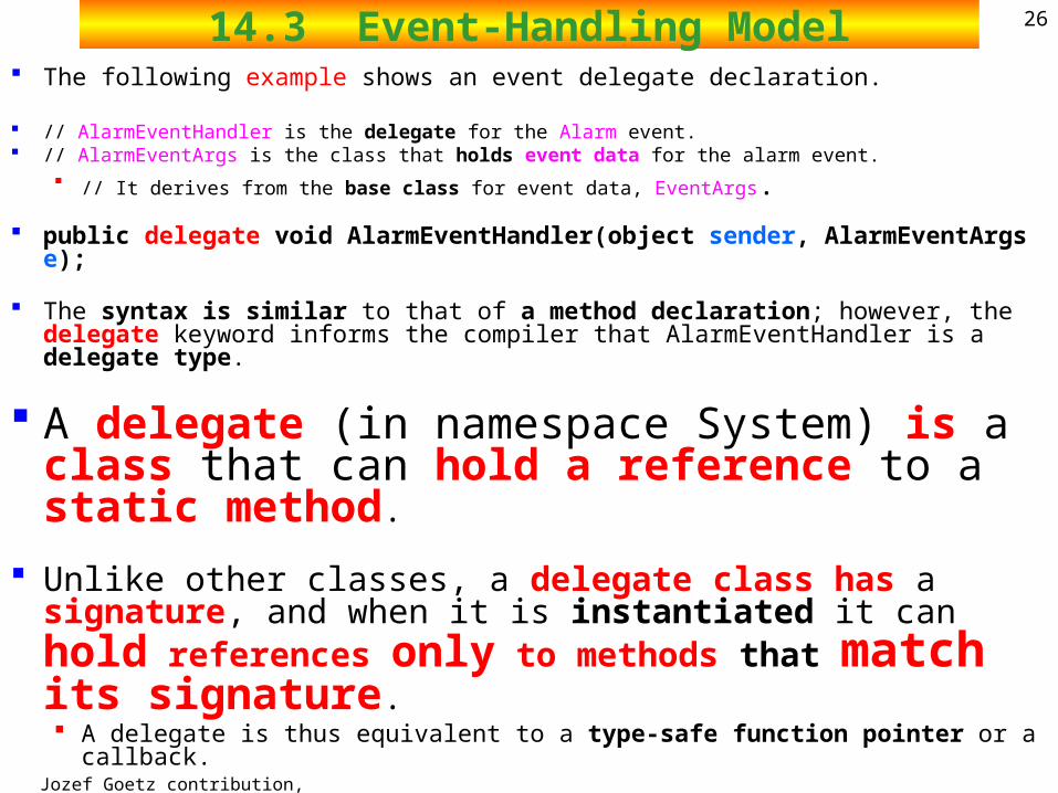
2614.3 Event-Handling Model The following example shows an event delegate declaration.
// AlarmEventHandler is the delegate for the Alarm event. // AlarmEventArgs is the class that holds event data for the alarm event.
// It derives from the base class for event data, EventArgs.
public delegate void AlarmEventHandler(object sender, AlarmEventArgs e);
The syntax is similar to that of a method declaration; however, the delegate keyword informs the compiler that AlarmEventHandler is a delegate type.
A delegate (in namespace System) is a class that can hold a reference to a static method.
Unlike other classes, a delegate class has a signature, and when it is instantiated it can hold references only to methods that match its signature. A delegate is thus equivalent to a type-safe function pointer or a callback.
Jozef Goetz contribution, 2012
2714.3.1 Basic Event Handling (Summary) Events are declared using delegates.
MyForm has Click event defined as: public event EventHandler Click; where delegate EventHandler is associated with Click event modifier.
controls have delegates for every event they can raise
A delegate object encapsulates a method reference so that it can be called anonymously.
When the event occurs, the delegate(s) given to it by its clients are invoked An event is a way for a class to allow clients to give it delegates to methods
that should be called when the event occurs.
Jozef Goetz contribution, 2012
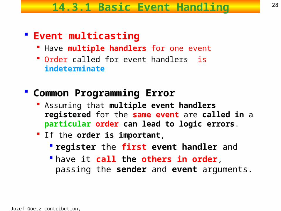
2814.3.1 Basic Event Handling
Event multicasting Have multiple handlers for one event Order called for event handlers is indeterminate
Common Programming Error Assuming that multiple event handlers registered for the
same event are called in a particular order can lead to logic errors.
If the order is important,
register the first event handler and have it call the others in order, passing the sender
and event arguments.
Jozef Goetz contribution, 2012
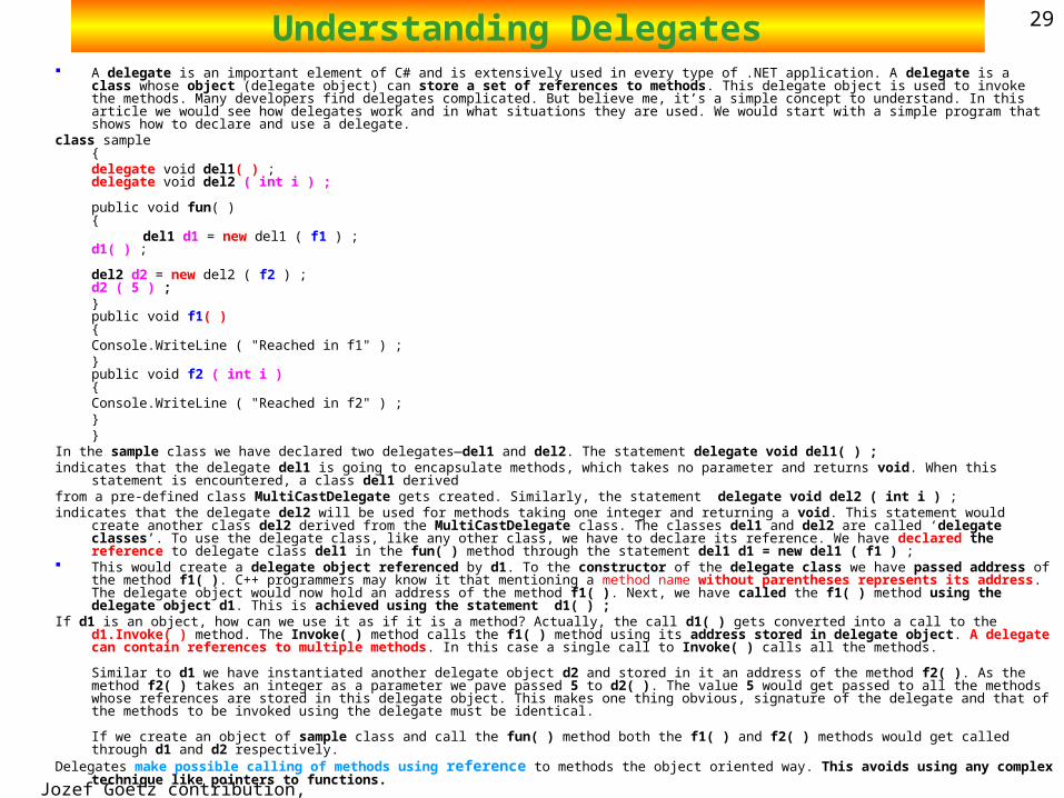
29Understanding Delegates A delegate is an important element of C# and is extensively used in every type of .NET application. A delegate is a class whose object (delegate object) can
store a set of references to methods. This delegate object is used to invoke the methods. Many developers find delegates complicated. But believe me, it’s a simple concept to understand. In this article we would see how delegates work and in what situations they are used. We would start with a simple program that shows how to declare and use a delegate.
class sample{ delegate void del1( ) ;delegate void del2 ( int i ) ;
public void fun( ){
del1 d1 = new del1 ( f1 ) ;d1( ) ;
del2 d2 = new del2 ( f2 ) ;d2 ( 5 ) ; }public void f1( )
{ Console.WriteLine ( "Reached in f1" ) ; }
public void f2 ( int i ){ Console.WriteLine ( "Reached in f2" ) ; }
} In the sample class we have declared two delegates—del1 and del2. The statement delegate void del1( ) ; indicates that the delegate del1 is going to encapsulate methods, which takes no parameter and returns void. When this statement is encountered, a class del1 derivedfrom a pre-defined class MultiCastDelegate gets created. Similarly, the statement delegate void del2 ( int i ) ; indicates that the delegate del2 will be used for methods taking one integer and returning a void. This statement would create another class del2 derived from the
MultiCastDelegate class. The classes del1 and del2 are called ‘delegate classes’. To use the delegate class, like any other class, we have to declare its reference. We have declared the reference to delegate class del1 in the fun( ) method through the statement del1 d1 = new del1 ( f1 ) ;
This would create a delegate object referenced by d1. To the constructor of the delegate class we have passed address of the method f1( ). C++ programmers may know it that mentioning a method name without parentheses represents its address. The delegate object would now hold an address of the method f1( ). Next, we have called the f1( ) method using the delegate object d1. This is achieved using the statement d1( ) ;
If d1 is an object, how can we use it as if it is a method? Actually, the call d1( ) gets converted into a call to the d1.Invoke( ) method. The Invoke( ) method calls the f1( ) method using its address stored in delegate object. A delegate can contain references to multiple methods. In this case a single call to Invoke( ) calls all the methods.
Similar to d1 we have instantiated another delegate object d2 and stored in it an address of the method f2( ). As the method f2( ) takes an integer as a parameter we pave passed 5 to d2( ). The value 5 would get passed to all the methods whose references are stored in this delegate object. This makes one thing obvious, signature of the delegate and that of the methods to be invoked using the delegate must be identical.
If we create an object of sample class and call the fun( ) method both the f1( ) and f2( ) methods would get called through d1 and d2 respectively. Delegates make possible calling of methods using reference to methods the object oriented way. This avoids using any complex technique like pointers to
functions.
Jozef Goetz contribution, 2012
30Notation
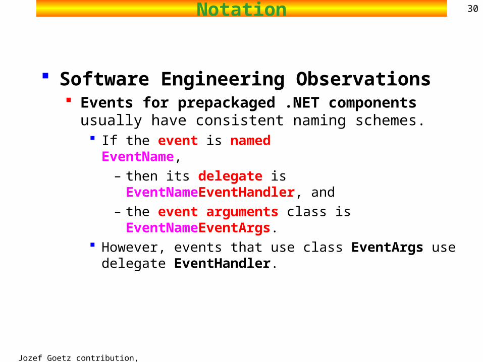
Software Engineering Observations Events for prepackaged .NET components usually have
consistent naming schemes. If the event is named EventName,
– then its delegate is EventNameEventHandler, and
– the event arguments class is EventNameEventArgs. However, events that use class EventArgs use delegate
EventHandler.
Jozef Goetz contribution, 2012
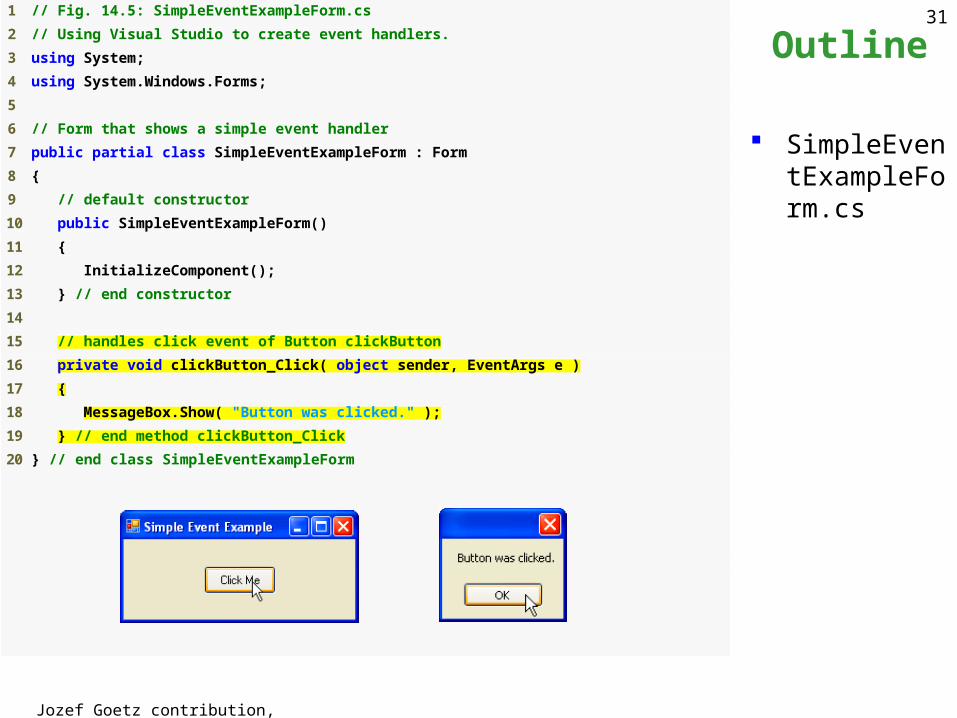
31 1 // Fig. 14.5: SimpleEventExampleForm.cs
2 // Using Visual Studio to create event handlers.
3 using System;
4 using System.Windows.Forms;
5
6 // Form that shows a simple event handler
7 public partial class SimpleEventExampleForm : Form
8 {
9 // default constructor
10 public SimpleEventExampleForm()
11 {
12 InitializeComponent();
13 } // end constructor
14
15 // handles click event of Button clickButton
16 private void clickButton_Click( object sender, EventArgs e )
17 {
18 MessageBox.Show( "Button was clicked." );
19 } // end method clickButton_Click
20 } // end class SimpleEventExampleForm
Outline
SimpleEventExampleForm.cs
Jozef Goetz contribution, 2012
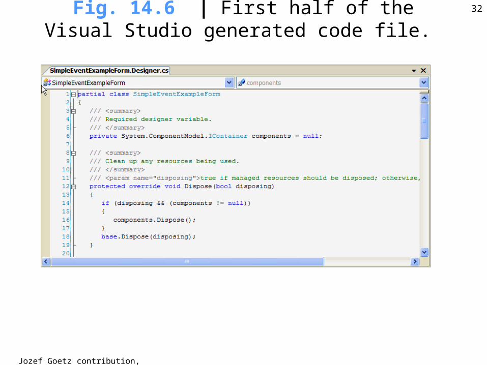
32Fig. 14.6 | First half of the Visual Studio generated code file.
Jozef Goetz contribution, 2012
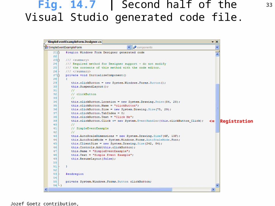
33Fig. 14.7 | Second half of the Visual Studio generated code file.
<= Registration
Jozef Goetz contribution, 2012
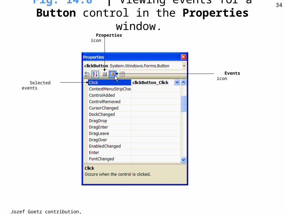
34Fig. 14.8 | Viewing events for a Button control in the Properties window.
Properties icon
Events icon
Selected events
Jozef Goetz contribution, 2012
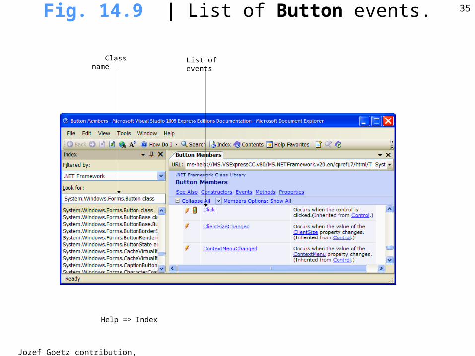
35Fig. 14.9 | List of Button events.
Class name List of events
Help => Index
Jozef Goetz contribution, 2012
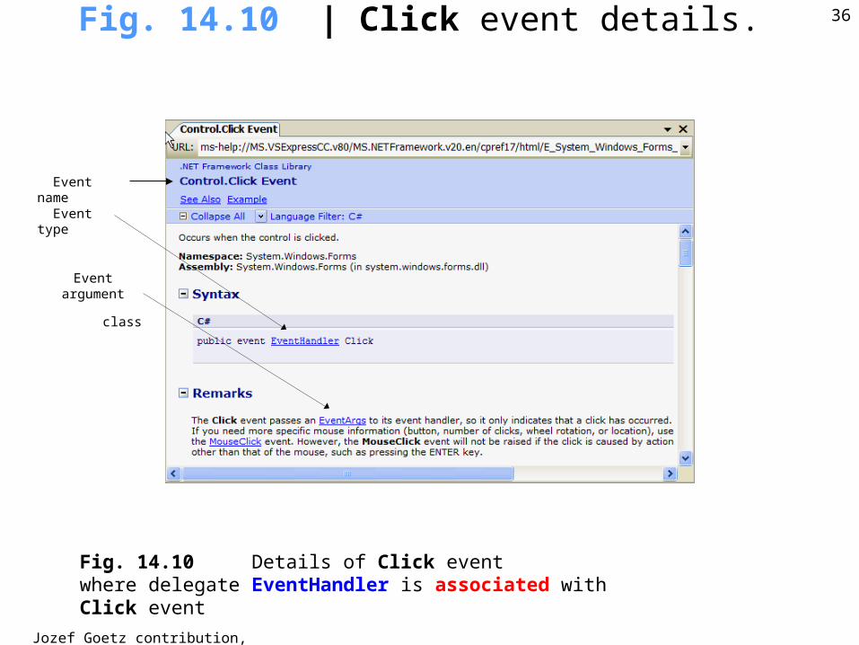
36Fig. 14.10 | Click event details.
Event name
Event type
Event argument
class
Fig. 14.10 Details of Click eventwhere delegate EventHandler is associated with Click event
Jozef Goetz contribution, 2012
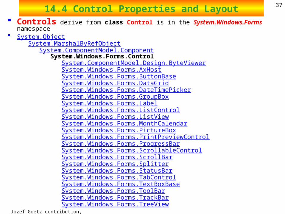
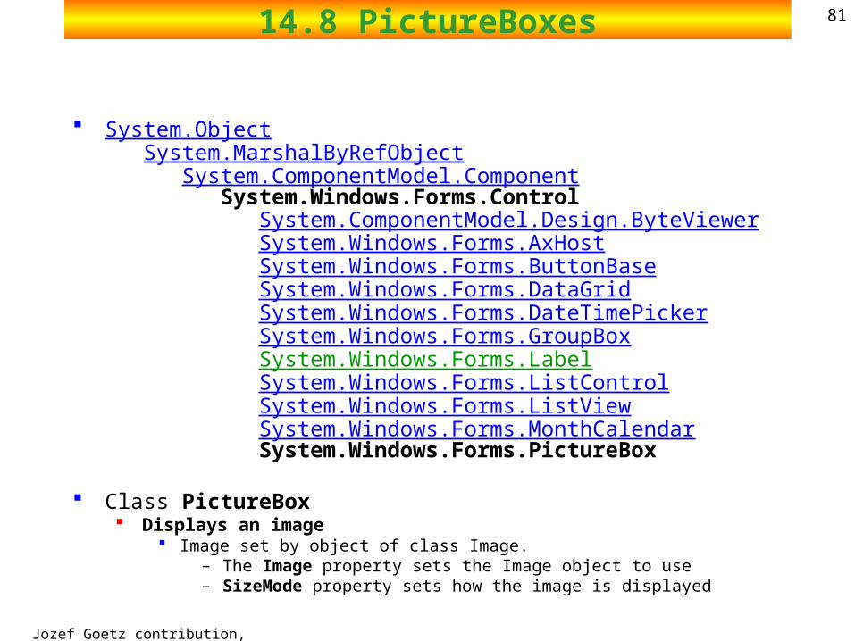
3714.4 Control Properties and Layout Controls derive from class Control is in the System.Windows.Forms namespace System.Object
System.MarshalByRefObject System.ComponentModel.Component System.Windows.Forms.Control System.ComponentModel.Design.ByteViewer System.Windows.Forms.AxHost System.Windows.Forms.ButtonBase System.Windows.Forms.DataGrid System.Windows.Forms.DateTimePicker System.Windows.Forms.GroupBox System.Windows.Forms.Label System.Windows.Forms.ListControl System.Windows.Forms.ListView System.Windows.Forms.MonthCalendar System.Windows.Forms.PictureBox System.Windows.Forms.PrintPreviewControl System.Windows.Forms.ProgressBar System.Windows.Forms.ScrollableControl System.Windows.Forms.ScrollBar System.Windows.Forms.Splitter System.Windows.Forms.StatusBar System.Windows.Forms.TabControl System.Windows.Forms.TextBoxBase System.Windows.Forms.ToolBar System.Windows.Forms.TrackBar System.Windows.Forms.TreeView
Jozef Goetz contribution, 2012
3814.4 Control Properties and Layout
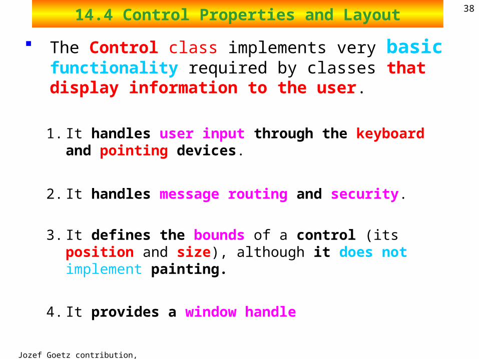
The Control class implements very basic functionality required by classes that display information to the user.
1. It handles user input through the keyboard and pointing devices.
2. It handles message routing and security.
3. It defines the bounds of a control (its position and size), although it does not implement painting.
4. It provides a window handle
Jozef Goetz contribution, 2012
3914.4 Control Properties and Layout
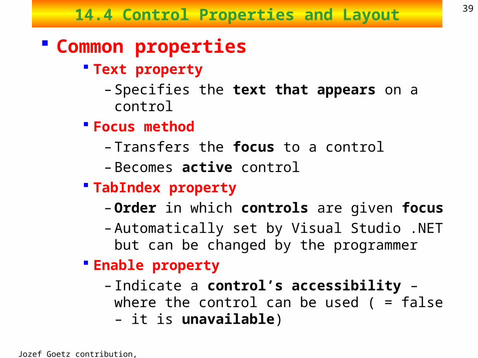
Common properties Text property
– Specifies the text that appears on a control Focus method
– Transfers the focus to a control
– Becomes active control TabIndex property
– Order in which controls are given focus
– Automatically set by Visual Studio .NET but can be changed by the programmer
Enable property
– Indicate a control’s accessibility – where the control can be used ( = false – it is unavailable)
Jozef Goetz contribution, 2012
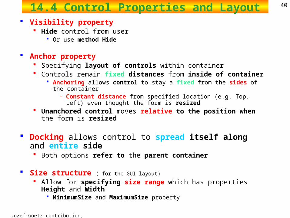
4014.4 Control Properties and Layout Visibility property
Hide control from user Or use method Hide
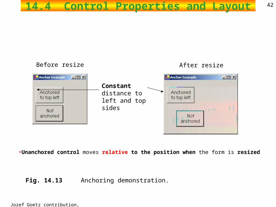
Anchor property Specifying layout of controls within container Controls remain fixed distances from inside of container
Anchoring allows control to stay a fixed from the sides of the container – Constant distance from specified location (e.g. Top, Left) even thought
the form is resized Unanchored control moves relative to the position when the form is
resized
Docking allows control to spread itself along and entire side Both options refer to the parent container
Size structure ( for the GUI layout)
Allow for specifying size range which has properties Height and Width MinimumSize and MaximumSize property
Jozef Goetz contribution, 2012
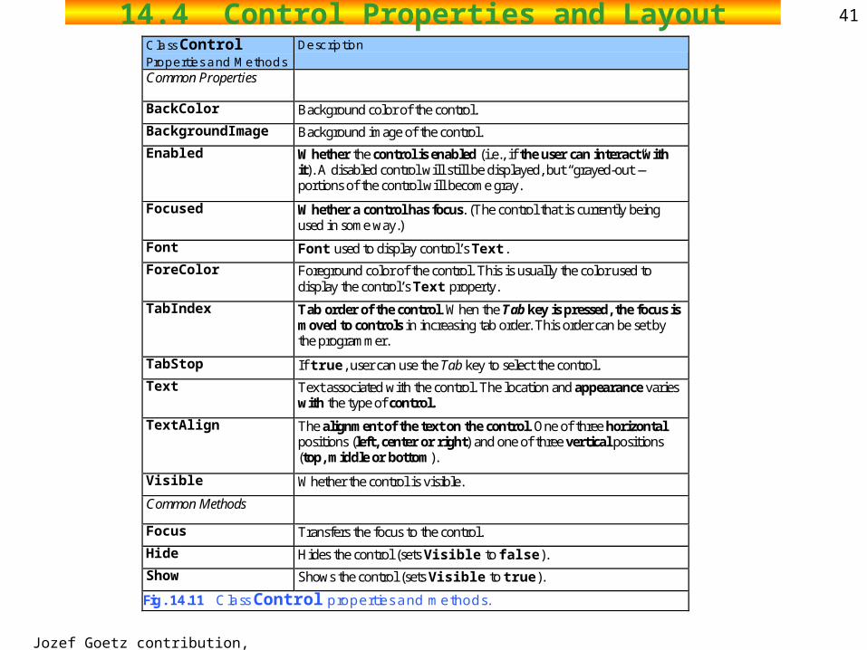
4114.4 Control Properties and LayoutClass Control Properties and Methods
Description
Common Properties
BackColor Background color of the control.
BackgroundImage Background image of the control.
Enabled Whether the control is enabled (i.e., if the user can interact with it). A disabled control will still be displayed, but “grayed-out”—portions of the control will become gray.
Focused Whether a control has focus. (The control that is currently being used in some way.)
Font Font used to display control’s Text.
ForeColor Foreground color of the control. This is usually the color used to display the control’s Text property.
TabIndex Tab order of the control. When the Tab key is pressed, the focus is moved to controls in increasing tab order. This order can be set by the programmer.
TabStop If true, user can use the Tab key to select the control.
Text Text associated with the control. The location and appearance varies with the type of control.
TextAlign The alignment of the text on the control. One of three horizontal positions (left, center or right) and one of three vertical positions (top, middle or bottom).
Visible Whether the control is visible.
Common Methods
Focus Transfers the focus to the control.
Hide Hides the control (sets Visible to false).
Show Shows the control (sets Visible to true).
Fig. 14.11 Class Control properties and methods.
Jozef Goetz contribution, 2012
4214.4 Control Properties and Layout
Fig. 14.13 Anchoring demonstration.
Constant distance to left and top sides
Before resize After resize
•Unanchored control moves relative to the position when the form is resized
Jozef Goetz contribution, 2012
4314.4 Control Properties and Layout
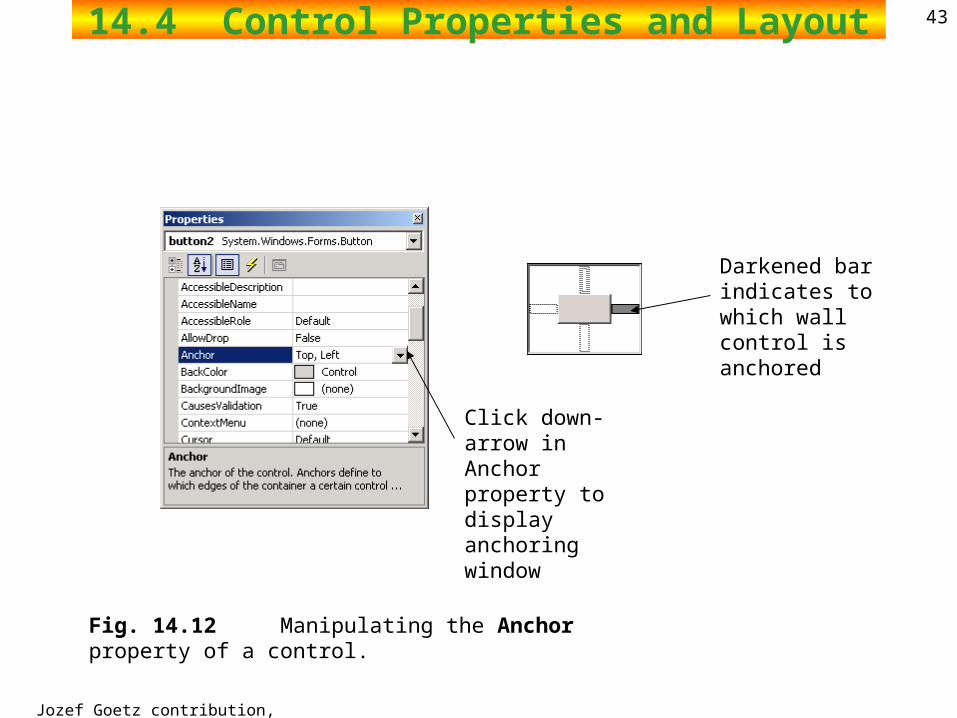
Fig. 14.12 Manipulating the Anchor property of a control.
Darkened bar indicates to which wall control is anchored
Click down-arrow in Anchor property to display anchoring window
Jozef Goetz contribution, 2012
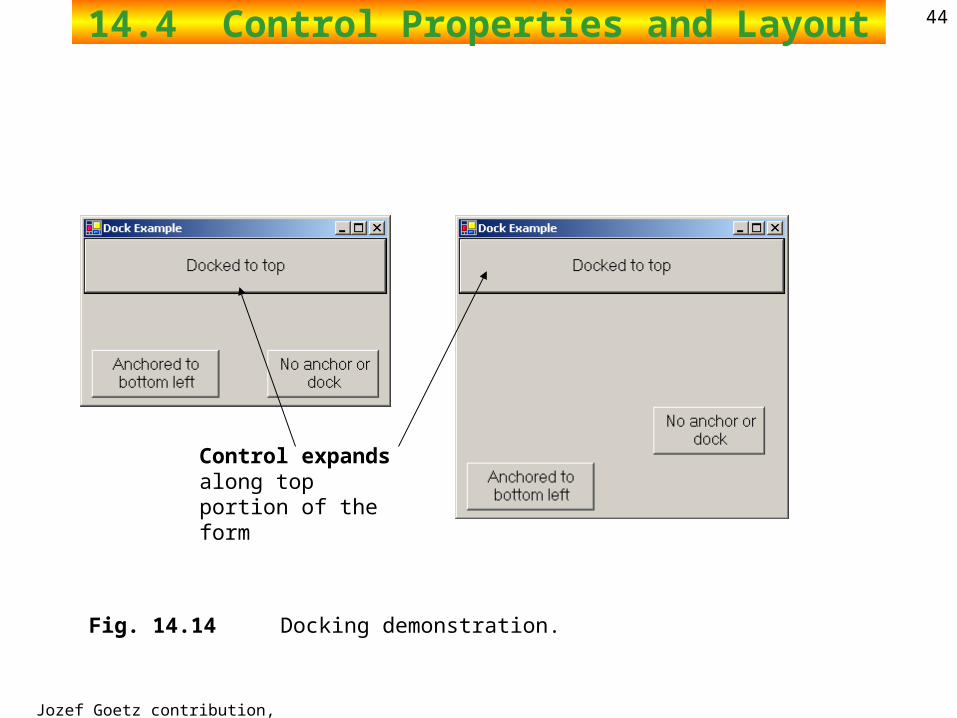
4414.4 Control Properties and Layout
Fig. 14.14 Docking demonstration.
Control expands along top portion of the form
Jozef Goetz contribution, 2012
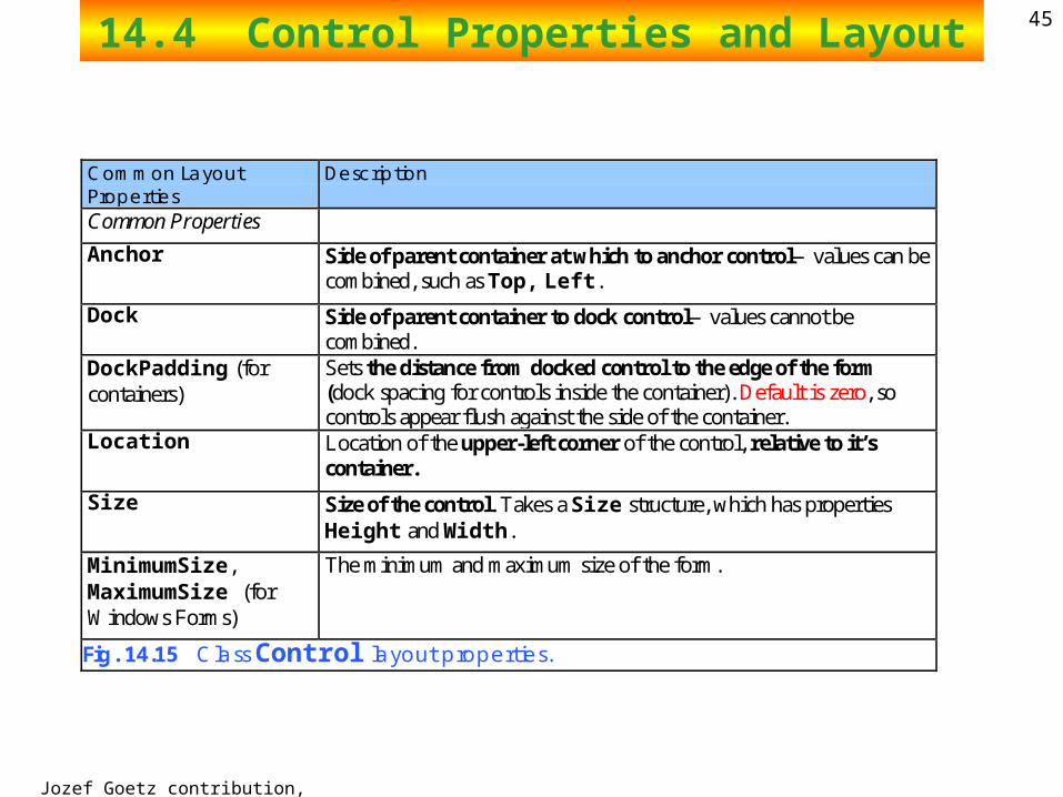
4514.4 Control Properties and Layout
Common Layout Properties
Description
Common Properties
Anchor Side of parent container at which to anchor control—values can be combined, such as Top, Left.
Dock Side of parent container to dock control—values cannot be combined.
DockPadding (for containers)
Sets the distance from docked control to the edge of the form (dock spacing for controls inside the container). Default is zero, so controls appear flush against the side of the container.
Location Location of the upper-left corner of the control, relative to it’s container.
Size Size of the control. Takes a Size structure, which has properties Height and Width.
MinimumSize, MaximumSize (for Windows Forms)
The minimum and maximum size of the form.
Fig. 14.15 Class Control layout properties.
Jozef Goetz contribution, 2012
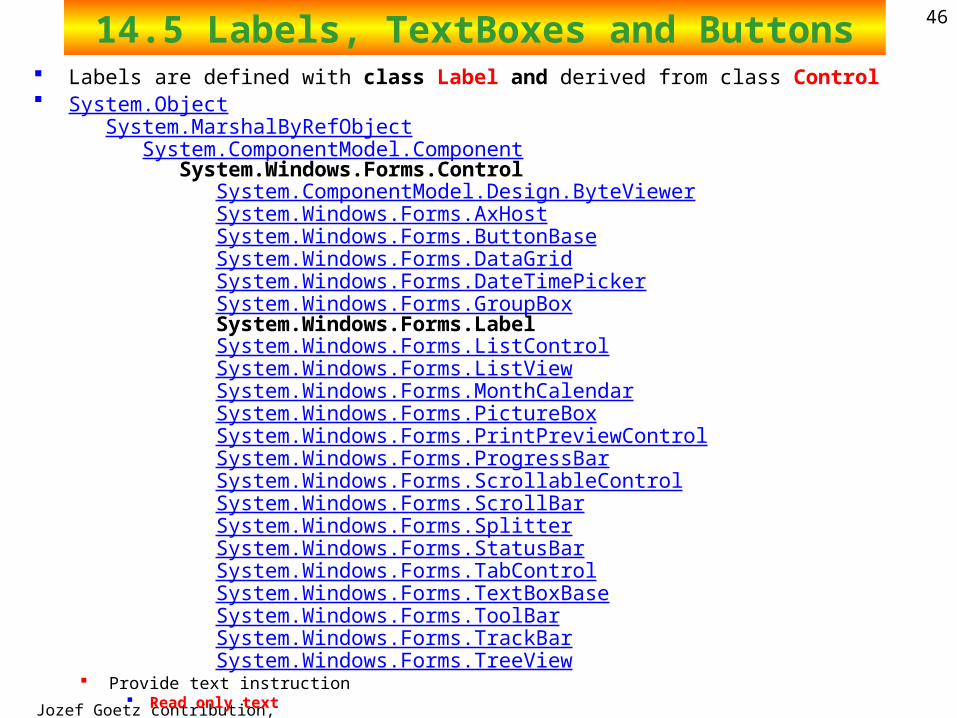
4614.5 Labels, TextBoxes and Buttons Labels are defined with class Label and derived from class Control System.Object
System.MarshalByRefObject System.ComponentModel.Component System.Windows.Forms.Control System.ComponentModel.Design.ByteViewer System.Windows.Forms.AxHost System.Windows.Forms.ButtonBase System.Windows.Forms.DataGrid System.Windows.Forms.DateTimePicker System.Windows.Forms.GroupBox System.Windows.Forms.Label System.Windows.Forms.ListControl System.Windows.Forms.ListView System.Windows.Forms.MonthCalendar System.Windows.Forms.PictureBox System.Windows.Forms.PrintPreviewControl System.Windows.Forms.ProgressBar System.Windows.Forms.ScrollableControl System.Windows.Forms.ScrollBar System.Windows.Forms.Splitter System.Windows.Forms.StatusBar System.Windows.Forms.TabControl System.Windows.Forms.TextBoxBase System.Windows.Forms.ToolBar System.Windows.Forms.TrackBar System.Windows.Forms.TreeView Provide text instruction
Read only text
Jozef Goetz contribution, 2012
4714.5 Labels, TextBoxes and Buttons
Textbox where text can be either input by the user from the keyboard or displayed Class TextBox System.Object
System.MarshalByRefObject System.ComponentModel.Component System.Windows.Forms.Control System.Windows.Forms.TextBoxBase System.Windows.Forms.RichTextBox System.Windows.Forms.TextBox
Area for text input Password textbox
Button Control to trigger a specific action
Checkboxes or radio buttons Derived from System.Windows.Forms.ButtonBase
Jozef Goetz contribution, 2012
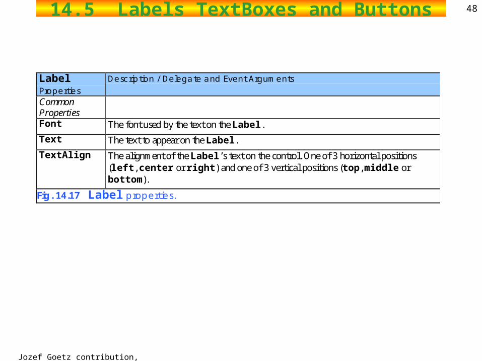
4814.5 Labels TextBoxes and Buttons
Label Properties
Description / Delegate and Event Arguments
Common Properties
Font The font used by the text on the Label.
Text The text to appear on the Label.
TextAlign The alignment of the Label’s text on the control. One of 3 horizontal positions (left, center or right) and one of 3 vertical positions (top, middle or bottom).
Fig. 14.17 Label properties.
Jozef Goetz contribution, 2012
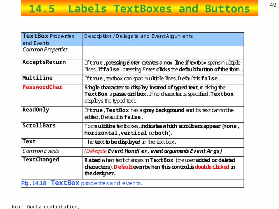
4914.5 Labels TextBoxes and Buttons
TextBox Properties and Events
Description / Delegate and Event Arguments
Common Properties
AcceptsReturn If true, pressing Enter creates a new line if textbox spans multiple lines. If false, pressing Enter clicks the default button of the form.
Multiline If true, textbox can span multiple lines. Default is false.
PasswordChar Single character to display instead of typed text, making the TextBox a password box. If no character is specified, Textbox displays the typed text.
ReadOnly If true, TextBox has a gray background and its text cannot be edited. Default is false.
ScrollBars For multiline textboxes, indicates which scrollbars appear (none, horizontal, vertical or both).
Text The text to be displayed in the text box.
Common Events (Delegate EventHandler, event arguments EventArgs)
TextChanged Raised when text changes in TextBox (the user added or deleted characters). Default event when this control is double clicked in the designer.
Fig. 14.18 TextBox properties and events.
Jozef Goetz contribution, 2012
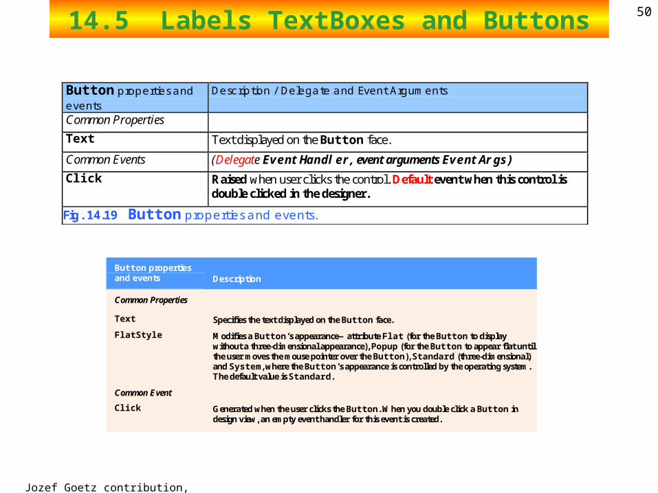
5014.5 Labels TextBoxes and Buttons
Button properties and events
Description / Delegate and Event Arguments
Common Properties
Text Text displayed on the Button face.
Common Events (Delegate EventHandler, event arguments EventArgs)
Click Raised when user clicks the control. Default event when this control is double clicked in the designer.
Fig. 14.19 Button properties and events.
Button properties and events Description
Common Properties
Text Specifies the text displayed on the Button face.
FlatStyle Modifies a Button’s appearance—attribute Flat (for the Button to display without a three-dimensional appearance), Popup (for the Button to appear flat until the user moves the mouse pointer over the Button), Standard (three-dimensional) and System, where the Button’s appearance is controlled by the operating system. The default value is Standard.
Common Event
Click Generated when the user clicks the Button. When you double click a Button in design view, an empty event handler for this event is created.
2002 Prentice Hall.All rights reserved.
Outline51
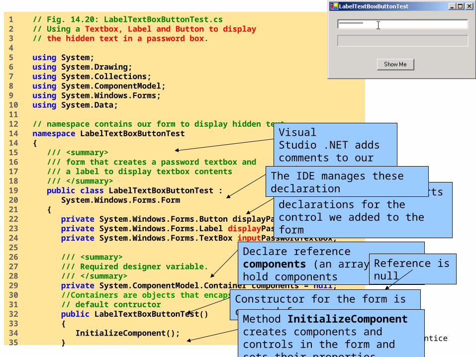
LabelTextBoxButtonTest.cs
1 // Fig. 14.20: LabelTextBoxButtonTest.cs2 // Using a Textbox, Label and Button to display3 // the hidden text in a password box. 4 5 using System;6 using System.Drawing;7 using System.Collections;8 using System.ComponentModel;9 using System.Windows.Forms;10 using System.Data;11 12 // namespace contains our form to display hidden text14 namespace LabelTextBoxButtonTest14 {15 /// <summary>16 /// form that creates a password textbox and17 /// a label to display textbox contents18 /// </summary>19 public class LabelTextBoxButtonTest : 20 System.Windows.Forms.Form21 {22 private System.Windows.Forms.Button displayPasswordButton;23 private System.Windows.Forms.Label displayPasswordLabel;24 private System.Windows.Forms.TextBox inputPasswordTextBox;25 26 /// <summary>27 /// Required designer variable.28 /// </summary>29 private System.ComponentModel.Container components = null;30 //Containers are objects that encapsulate and track components 31 // default contructor32 public LabelTextBoxButtonTest()33 {34 InitializeComponent();35 }
Visual Studio .NET adds comments to our code
Visual Studio .NET inserts declarations for the control we added to the form
The IDE manages these declaration
Declare reference components (an array)- to hold components Reference is null
Constructor for the form is created for us
Method InitializeComponent creates components and controls in the form and sets their properties

2002 Prentice Hall.All rights reserved.
Outline52
LabelTextBoxButtonTest.cs
36 37 /// <summary>38 /// Clean up any resources being used.39 /// </summary>40 protected override void Dispose( bool disposing )41 {42 if ( disposing )43 {44 if ( components != null ) 45 {46 components.Dispose(); //Releases all resources used by the Container. 47 }48 }49 50 base.Dispose( disposing );51 }52 53 #region Windows Form Designer generated code54 /// <summary>55 /// Required method for Designer support - do not modify56 /// the contents of this method with the code editor.57 /// </summary>58 private void InitializeComponent()59 {60 this.displayPasswordButton = 61 new System.Windows.Forms.Button();62 this.inputPasswordTextBox = 63 new System.Windows.Forms.TextBox();64 this.displayPasswordLabel = 65 new System.Windows.Forms.Label();66 this.SuspendLayout();67
Method Dispose cleans up allocated resources
#region preprocessor directives allow collapsible code in Visual Studio .NET
Create new objects for the control we added
2002 Prentice Hall.All rights reserved.
Outline53
LabelTextBoxButtonTest.cs
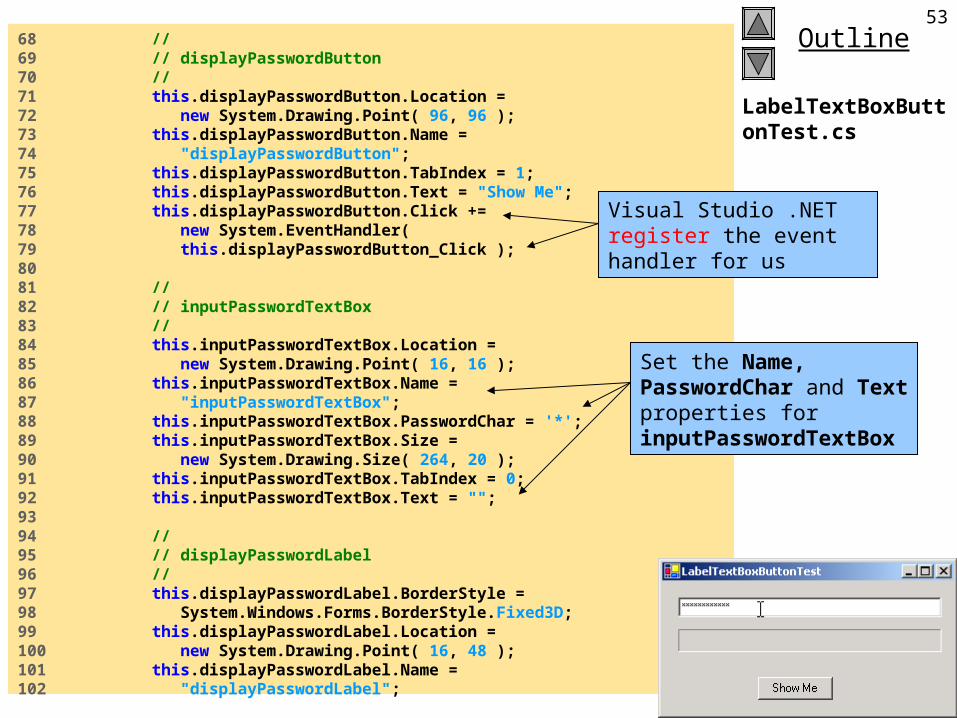
68 // 69 // displayPasswordButton70 // 71 this.displayPasswordButton.Location = 72 new System.Drawing.Point( 96, 96 );73 this.displayPasswordButton.Name = 74 "displayPasswordButton";75 this.displayPasswordButton.TabIndex = 1;76 this.displayPasswordButton.Text = "Show Me";77 this.displayPasswordButton.Click += 78 new System.EventHandler( 79 this.displayPasswordButton_Click );80 81 // 82 // inputPasswordTextBox83 // 84 this.inputPasswordTextBox.Location = 85 new System.Drawing.Point( 16, 16 );86 this.inputPasswordTextBox.Name = 87 "inputPasswordTextBox";88 this.inputPasswordTextBox.PasswordChar = '*';89 this.inputPasswordTextBox.Size = 90 new System.Drawing.Size( 264, 20 );91 this.inputPasswordTextBox.TabIndex = 0;92 this.inputPasswordTextBox.Text = "";93 94 // 95 // displayPasswordLabel96 // 97 this.displayPasswordLabel.BorderStyle = 98 System.Windows.Forms.BorderStyle.Fixed3D;99 this.displayPasswordLabel.Location = 100 new System.Drawing.Point( 16, 48 );101 this.displayPasswordLabel.Name = 102 "displayPasswordLabel";
Set the Name, PasswordChar and Text properties for inputPasswordTextBox
Visual Studio .NET register the event handler for us
2002 Prentice Hall.All rights reserved.
Outline54
LabelTextBoxButtonTest.cs
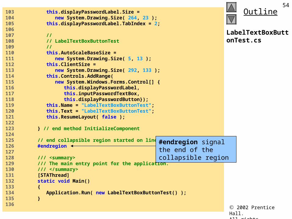
103 this.displayPasswordLabel.Size = 104 new System.Drawing.Size( 264, 23 );105 this.displayPasswordLabel.TabIndex = 2;106 107 // 108 // LabelTextBoxButtonTest109 // 110 this.AutoScaleBaseSize = 111 new System.Drawing.Size( 5, 13 );112 this.ClientSize = 113 new System.Drawing.Size( 292, 133 );114 this.Controls.AddRange(115 new System.Windows.Forms.Control[] {116 this.displayPasswordLabel,117 this.inputPasswordTextBox,118 this.displayPasswordButton});119 this.Name = "LabelTextBoxButtonTest";120 this.Text = "LabelTextBoxButtonTest";121 this.ResumeLayout( false );122 123 } // end method InitializeComponent124 125 // end collapsible region started on line 53126 #endregion127 128 /// <summary>129 /// The main entry point for the application.130 /// </summary>131 [STAThread]132 static void Main() 133 {134 Application.Run( new LabelTextBoxButtonTest() );135 }136
#endregion signal the end of the collapsible region
2002 Prentice Hall.All rights reserved.
Outline55
LabelTextBoxButtonTest.cs
Program Output
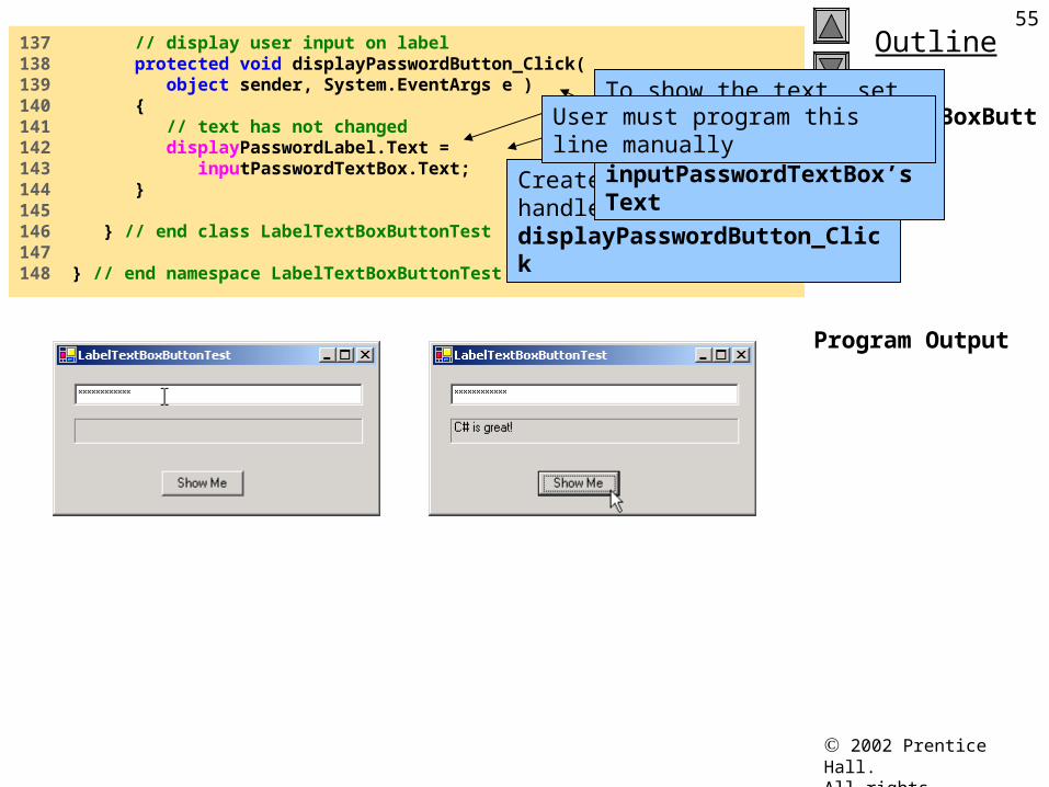
137 // display user input on label138 protected void displayPasswordButton_Click( 139 object sender, System.EventArgs e )140 {141 // text has not changed142 displayPasswordLabel.Text = 143 inputPasswordTextBox.Text;144 }145 146 } // end class LabelTextBoxButtonTest147 148 } // end namespace LabelTextBoxButtonTest
Create an empty event handler named displayPasswordButton_Click
To show the text, set displayPasswordLabel’s Text to inputPasswordTextBox’s Text
User must program this line manually
Jozef Goetz contribution, 2012
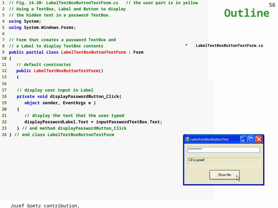
56 1 // Fig. 14.20: LabelTextBoxButtonTestForm.cs // the user part is in yellow
2 // Using a TextBox, Label and Button to display
3 // the hidden text in a password TextBox.
4 using System;
5 using System.Windows.Forms;
6
7 // Form that creates a password TextBox and
8 // a Label to display TextBox contents
9 public partial class LabelTextBoxButtonTestForm : Form
10 {
11 // default constructor
12 public LabelTextBoxButtonTestForm()
13 {
14 InitializeComponent();
15 } // end constructor
Outline
LabelTextBoxButtonTestForm.cs
16
17 // display user input in Label
18 private void displayPasswordButton_Click(
19 object sender, EventArgs e )
20 {
21 // display the text that the user typed
22 displayPasswordLabel.Text = inputPasswordTextBox.Text;
23 } // end method displayPasswordButton_Click
24 } // end class LabelTextBoxButtonTestForm
Jozef Goetz contribution, 2012
5714.6 GroupBoxes and Panels
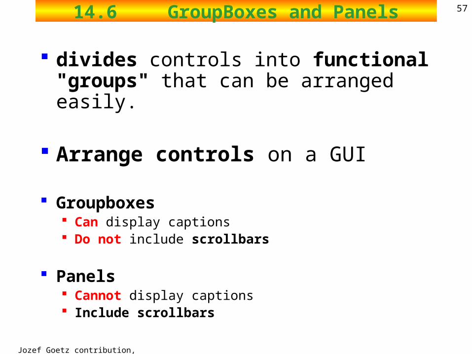
divides controls into functional "groups" that can be arranged easily.
Arrange controls on a GUI
Groupboxes Can display captions Do not include scrollbars
Panels Cannot display captions Include scrollbars
Jozef Goetz contribution, 2012
5814.6 GroupBoxes and Panels
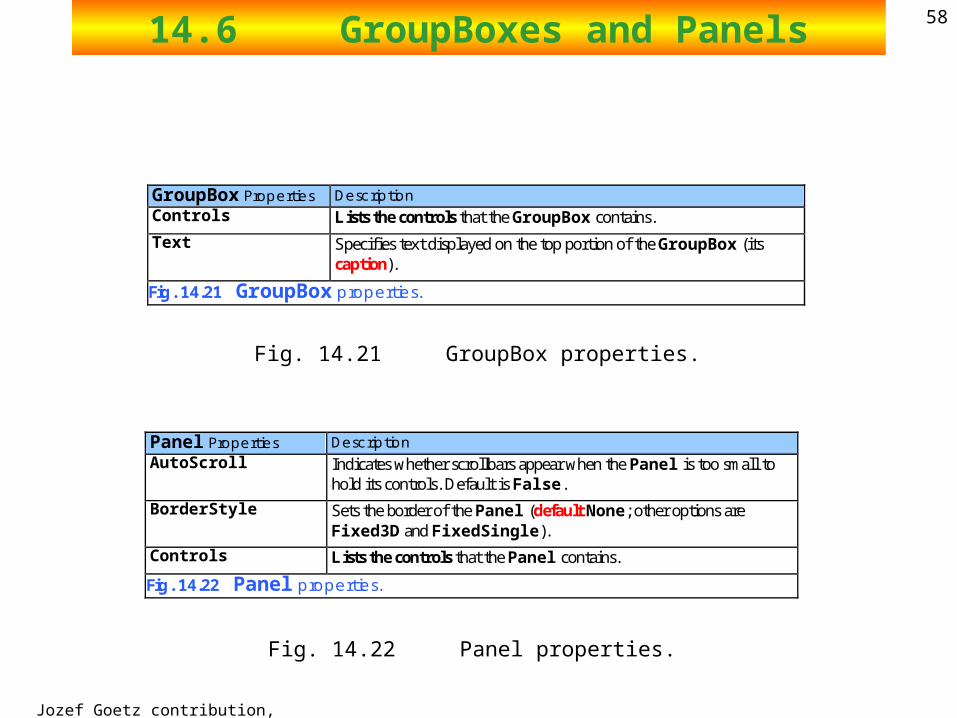
GroupBox Properties Description Controls Lists the controls that the GroupBox contains.
Text Specifies text displayed on the top portion of the GroupBox (its caption).
Fig. 14.21 GroupBox properties.
Panel Properties Description AutoScroll Indicates whether scrollbars appear when the Panel is too small to
hold its controls. Default is False.
BorderStyle Sets the border of the Panel (default None; other options are Fixed3D and FixedSingle).
Controls Lists the controls that the Panel contains.
Fig. 14.22 Panel properties.
Fig. 14.21 GroupBox properties.
Fig. 14.22 Panel properties.
Jozef Goetz contribution, 2012
5914.6 GroupBoxes and Panels
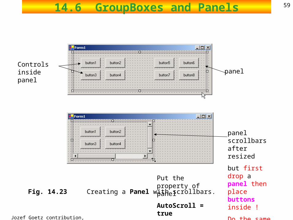
Fig. 14.23 Creating a Panel with scrollbars.
Controls inside panel panel
panel scrollbars after resized
but first drop a panel then place buttons inside !
Do the same for GroupBoxes.
Put the property of panel
AutoScroll = true
Jozef Goetz contribution, 2012
6014.6 GroupBoxes and Panels
Arrange components on a GUI GroupBoxes can display a caption
Text property determines its caption have thin borders by default
Panels can have scrollbars View additional controls inside the Panel can be set to have borders by changing their BorderStyle property
Panels and GroupBoxes can contain other Panels and GroupBoxes.
Organize the GUI by anchoring and docking controls (of similar function) inside a GroupBox or Panel.
The GroupBox or Panel then can be anchored or docked inside a form. This divides controls into functional "groups" that can be arranged
easily.
Jozef Goetz contribution, 2012
6114.6 GroupBoxes and Panels
Forms, GroupBoxes, and Panels can act as logical groups for radio buttons.
The radio buttons within each group will be mutually exclusive to each other, but not to radio buttons in different groups.
2002 Prentice Hall.All rights reserved.
Outline62
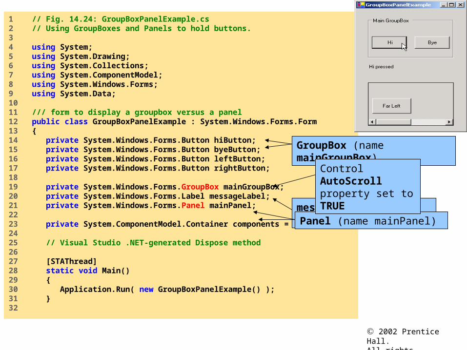
GroupBoxPanelExample.cs
1 // Fig. 14.24: GroupBoxPanelExample.cs 2 // Using GroupBoxes and Panels to hold buttons.3 4 using System;5 using System.Drawing;6 using System.Collections;7 using System.ComponentModel;8 using System.Windows.Forms;9 using System.Data;10 11 /// form to display a groupbox versus a panel12 public class GroupBoxPanelExample : System.Windows.Forms.Form13 {14 private System.Windows.Forms.Button hiButton;15 private System.Windows.Forms.Button byeButton;16 private System.Windows.Forms.Button leftButton;17 private System.Windows.Forms.Button rightButton;18 19 private System.Windows.Forms.GroupBox mainGroupBox;20 private System.Windows.Forms.Label messageLabel;21 private System.Windows.Forms.Panel mainPanel;22 23 private System.ComponentModel.Container components = null;24 25 // Visual Studio .NET-generated Dispose method26 27 [STAThread]28 static void Main() 29 {30 Application.Run( new GroupBoxPanelExample() );31 }32
messageLabel is initially blank
GroupBox (name mainGroupBox)
Panel (name mainPanel)
Control AutoScroll property set to TRUE
2002 Prentice Hall.All rights reserved.
Outline63
GroupBoxPanelExample.cs
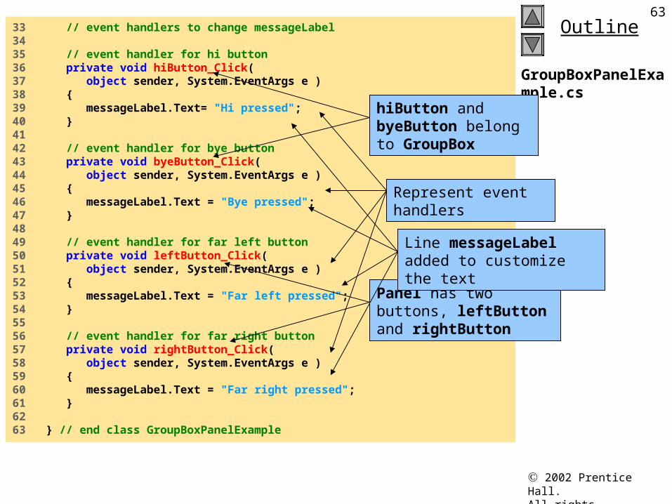
33 // event handlers to change messageLabel34 35 // event handler for hi button36 private void hiButton_Click( 37 object sender, System.EventArgs e )38 {39 messageLabel.Text= "Hi pressed";40 }41 42 // event handler for bye button43 private void byeButton_Click( 44 object sender, System.EventArgs e )45 {46 messageLabel.Text = "Bye pressed";47 }48 49 // event handler for far left button50 private void leftButton_Click( 51 object sender, System.EventArgs e )52 {53 messageLabel.Text = "Far left pressed";54 }55 56 // event handler for far right button57 private void rightButton_Click( 58 object sender, System.EventArgs e )59 {60 messageLabel.Text = "Far right pressed";61 }62 63 } // end class GroupBoxPanelExample
Represent event handlers
hiButton and byeButton belong to GroupBox
Panel has two buttons, leftButton and rightButton
Line messageLabel added to customize the text
2002 Prentice Hall.All rights reserved.
Outline64
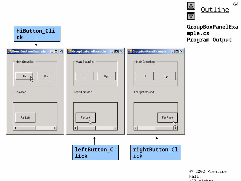
GroupBoxPanelExample.csProgram Output
hiButton_Click
leftButton_Click rightButton_Click
Jozef Goetz contribution, 2012
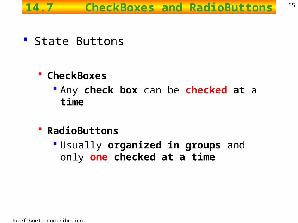
6514.7 CheckBoxes and RadioButtons
State Buttons
CheckBoxes Any check box can be checked at a time
RadioButtons Usually organized in groups and only one checked
at a time
Jozef Goetz contribution, 2012
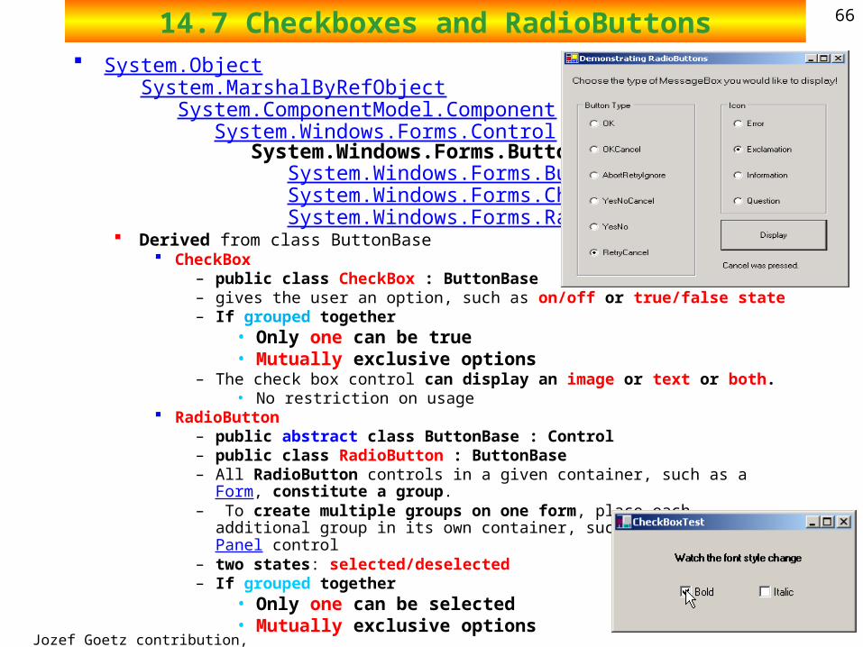
6614.7 Checkboxes and RadioButtons System.Object
System.MarshalByRefObject System.ComponentModel.Component System.Windows.Forms.Control System.Windows.Forms.ButtonBase System.Windows.Forms.Button System.Windows.Forms.CheckBox System.Windows.Forms.RadioButton Derived from class ButtonBase
CheckBox– public class CheckBox : ButtonBase – gives the user an option, such as on/off or true/false state– If grouped together
• Only one can be true• Mutually exclusive options
– The check box control can display an image or text or both. • No restriction on usage
RadioButton– public abstract class ButtonBase : Control – public class RadioButton : ButtonBase – All RadioButton controls in a given container, such as a Form, constitute a
group.– To create multiple groups on one form, place each additional group in its own
container, such as a GroupBox or Panel control– two states: selected/deselected– If grouped together
• Only one can be selected• Mutually exclusive options
Jozef Goetz contribution, 2012
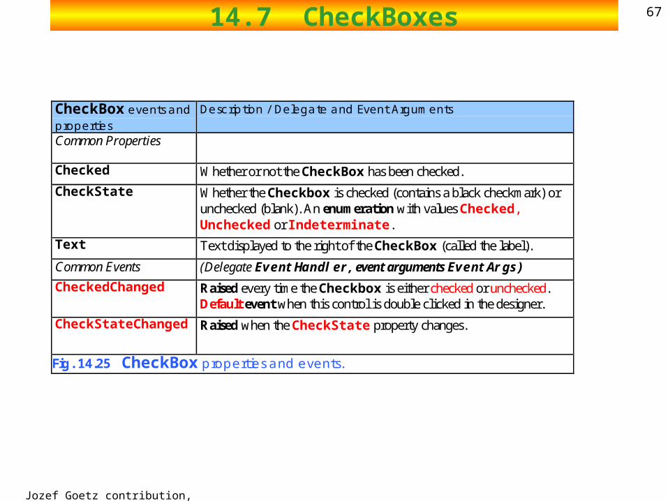
6714.7 CheckBoxes
CheckBox events and properties
Description / Delegate and Event Arguments
Common Properties
Checked Whether or not the CheckBox has been checked.
CheckState Whether the Checkbox is checked (contains a black checkmark) or unchecked (blank). An enumeration with values Checked, Unchecked or Indeterminate.
Text Text displayed to the right of the CheckBox (called the label).
Common Events (Delegate EventHandler, event arguments EventArgs)
CheckedChanged Raised every time the Checkbox is either checked or unchecked. Default event when this control is double clicked in the designer.
CheckStateChanged Raised when the CheckState property changes.
Fig. 14.25 CheckBox properties and events.
2002 Prentice Hall.All rights reserved.
Outline68
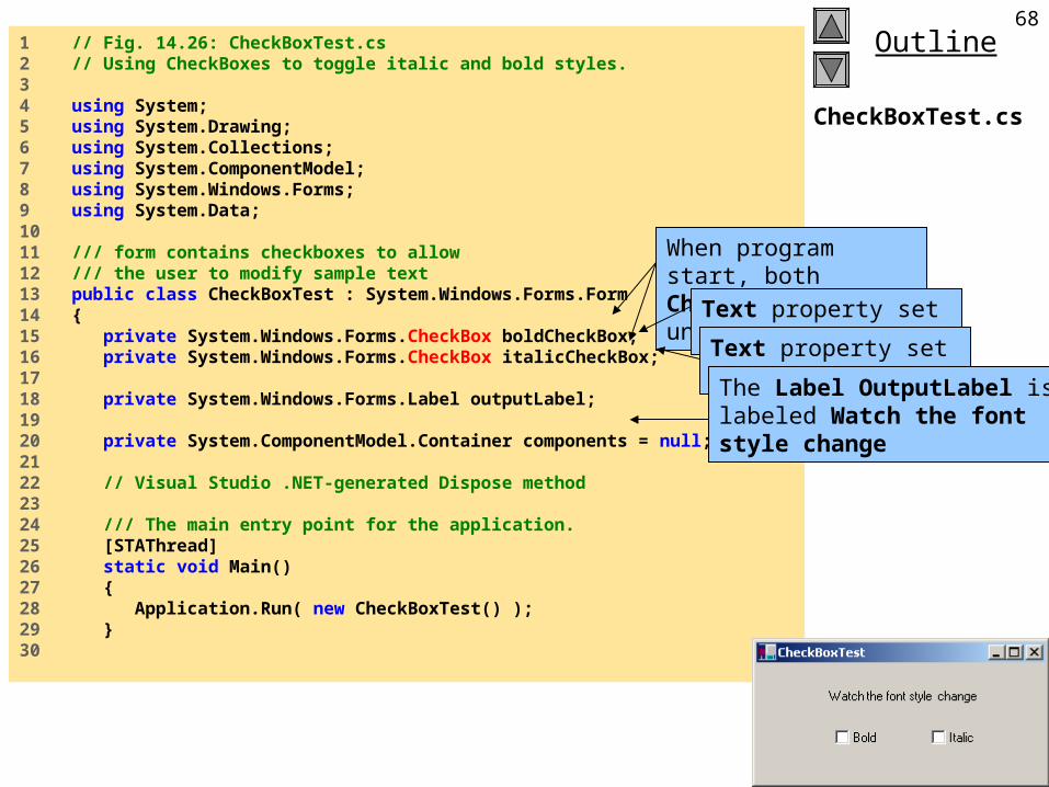
CheckBoxTest.cs
1 // Fig. 14.26: CheckBoxTest.cs2 // Using CheckBoxes to toggle italic and bold styles.3 4 using System;5 using System.Drawing;6 using System.Collections;7 using System.ComponentModel;8 using System.Windows.Forms;9 using System.Data;10 11 /// form contains checkboxes to allow12 /// the user to modify sample text13 public class CheckBoxTest : System.Windows.Forms.Form14 {15 private System.Windows.Forms.CheckBox boldCheckBox;16 private System.Windows.Forms.CheckBox italicCheckBox;17 18 private System.Windows.Forms.Label outputLabel;19 20 private System.ComponentModel.Container components = null;21 22 // Visual Studio .NET-generated Dispose method23 24 /// The main entry point for the application.25 [STAThread]26 static void Main() 27 {28 Application.Run( new CheckBoxTest() );29 }30
When program start, both Checkbox is unchecked
Text property set to Bold
Text property set to Italic
The Label OutputLabel is labeled Watch the font style change
2002 Prentice Hall.All rights reserved.
Outline69
CheckBoxTest.cs
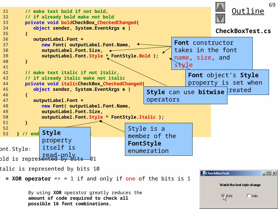
31 // make text bold if not bold, 32 // if already bold make not bold33 private void boldCheckBox_CheckedChanged( 34 object sender, System.EventArgs e )35 {36 outputLabel.Font = 37 new Font( outputLabel.Font.Name,38 outputLabel.Font.Size,39 outputLabel.Font.Style ^ FontStyle.Bold );40 }41 42 // make text italic if not italic, 43 // if already italic make not italic44 private void italicCheckBox_CheckedChanged( 45 object sender, System.EventArgs e )46 {47 outputLabel.Font = 48 new Font( outputLabel.Font.Name,49 outputLabel.Font.Size,50 outputLabel.Font.Style ^ FontStyle.Italic );51 }52 53 } // end class CheckBoxTest
Font constructor takes in the font name, size, and style
Style is a member of the FontStyle enumerationStyle property
itself is read-only
Font object’s Style property is set when object is created
Style can use bitwise operators
Font.Style:
Bold is represented by bits 01
Italic is represented by bits 10
^ = XOR operator => = 1 if and only if one of the bits is 1
By using XOR operator greatly reduces the amount of code required to check all possible 16 font combinations.
2002 Prentice Hall.All rights reserved.
Outline70
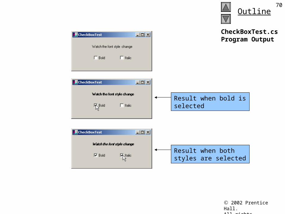
CheckBoxTest.csProgram Output
Result when bold is selected
Result when both styles are selected
Jozef Goetz contribution, 2012
7114.7 RadioButtons
RadioButton properties and events
Description / Delegate and Event Arguments
Common Properties
Checked Whether the RadioButton is checked.
Text Text displayed to the right of the RadioButton (called the label).
Common Events (Delegate EventHandler, event arguments EventArgs)
Click Raised when user clicks the control.
CheckedChanged Raised every time the RadioButton is checked or unchecked. Default event when this control is double clicked in the designer.
Fig. 14.27 RadioButton properties and events.
Jozef Goetz contribution, 2012
72MessageBoxIcon public enum MessageBoxIcon
This enumeration is used by the MessageBox class: System.Object
System.Windows.Forms.MessageBox
Asterisk: The message box contains a symbol consisting of a lowercase letter i in a circle.
Error: The message box contains a symbol consisting of white X in a circle with a red background.
Exclamation: The message box contains a symbol consisting of an exclamation point in a triangle with a yellow background.
Hand: The message box contains a symbol consisting of a white X in a circle with a red background.
Information: The message box contains a symbol consisting of a lowercase letter i in a circle.
None: The message box contain no symbols. Question: The message box contains a symbol consisting of a question
mark in a circle. Stop: The message box contains a symbol consisting of white X in a circle
with a red background. Warning: The message box contains a symbol consisting of an
exclamation-point in a triangle with a yellow background.
Jozef Goetz contribution, 2012
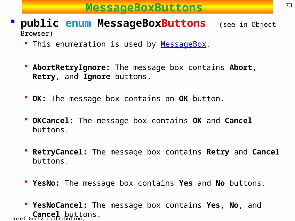
73MessageBoxButtons public enum MessageBoxButtons (see in Object Browser)
This enumeration is used by MessageBox.
AbortRetryIgnore: The message box contains Abort, Retry, and Ignore buttons.
OK: The message box contains an OK button.
OKCancel: The message box contains OK and Cancel buttons.
RetryCancel: The message box contains Retry and Cancel buttons.
YesNo: The message box contains Yes and No buttons.
YesNoCancel: The message box contains Yes, No, and Cancel buttons.
2002 Prentice Hall.All rights reserved.
Outline74
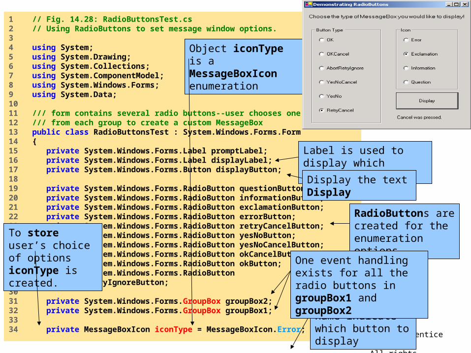
RadioButtonsTest.cs
1 // Fig. 14.28: RadioButtonsTest.cs2 // Using RadioButtons to set message window options.3 4 using System;5 using System.Drawing;6 using System.Collections;7 using System.ComponentModel;8 using System.Windows.Forms;9 using System.Data;10 11 /// form contains several radio buttons--user chooses one12 /// from each group to create a custom MessageBox13 public class RadioButtonsTest : System.Windows.Forms.Form14 {15 private System.Windows.Forms.Label promptLabel;16 private System.Windows.Forms.Label displayLabel;17 private System.Windows.Forms.Button displayButton;18 19 private System.Windows.Forms.RadioButton questionButton;20 private System.Windows.Forms.RadioButton informationButton;21 private System.Windows.Forms.RadioButton exclamationButton;22 private System.Windows.Forms.RadioButton errorButton;23 private System.Windows.Forms.RadioButton retryCancelButton;24 private System.Windows.Forms.RadioButton yesNoButton;25 private System.Windows.Forms.RadioButton yesNoCancelButton;26 private System.Windows.Forms.RadioButton okCancelButton;27 private System.Windows.Forms.RadioButton okButton;28 private System.Windows.Forms.RadioButton29 abortRetryIgnoreButton;30 31 private System.Windows.Forms.GroupBox groupBox2;32 private System.Windows.Forms.GroupBox groupBox1;33 34 private MessageBoxIcon iconType = MessageBoxIcon.Error;
To store user’s choice of options iconType is created.
Object iconType is a MessageBoxIcon enumeration
The enumeration name indicate which button to display
Label is used to display which button was pressed
Display the text Display
RadioButtons are created for the enumeration options
One event handling exists for all the radio buttons in groupBox1 and groupBox2
2002 Prentice Hall.All rights reserved.
Outline75
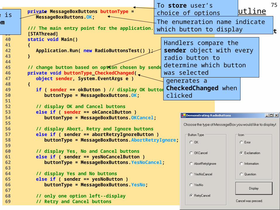
RadioButtonsTest.cs
35 private MessageBoxButtons buttonType = 36 MessageBoxButtons.OK;37 38 /// The main entry point for the application.39 [STAThread]40 static void Main() 41 {42 Application.Run( new RadioButtonsTest() );43 }44 45 // change button based on option chosen by sender46 private void buttonType_CheckedChanged(47 object sender, System.EventArgs e )48 {49 if ( sender == okButton ) // display OK button50 buttonType = MessageBoxButtons.OK;51 52 // display OK and Cancel buttons53 else if ( sender == okCancelButton )54 buttonType = MessageBoxButtons.OKCancel;55 56 // display Abort, Retry and Ignore buttons57 else if ( sender == abortRetryIgnoreButton )58 buttonType = MessageBoxButtons.AbortRetryIgnore;59 60 // display Yes, No and Cancel buttons61 else if ( sender == yesNoCancelButton )62 buttonType = MessageBoxButtons.YesNoCancel;63 64 // display Yes and No buttons65 else if ( sender == yesNoButton )66 buttonType = MessageBoxButtons.YesNo;67 68 // only one option left--display 69 // Retry and Cancel buttons
To store user’s choice of options buttonType is createdObject buttonType is a
MessageBoxButtom enumeration
The enumeration name indicate which button to display
Each radio button generates a CheckedChanged when clicked
Handlers compare the sender object with every radio button to determine which button was selected
2002 Prentice Hall.All rights reserved.
Outline76
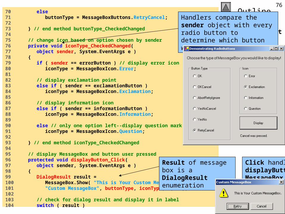
RadioButtonsTest.cs
70 else71 buttonType = MessageBoxButtons.RetryCancel;72 73 } // end method buttonType_CheckedChanged74 75 // change icon based on option chosen by sender76 private void iconType_CheckedChanged(77 object sender, System.EventArgs e )78 {79 if ( sender == errorButton ) // display error icon80 iconType = MessageBoxIcon.Error;81 82 // display exclamation point83 else if ( sender == exclamationButton )84 iconType = MessageBoxIcon.Exclamation;85 86 // display information icon87 else if ( sender == informationButton ) 88 iconType = MessageBoxIcon.Information;89 90 else // only one option left--display question mark91 iconType = MessageBoxIcon.Question;92 93 } // end method iconType_CheckedChanged94 95 // display MessageBox and button user pressed96 protected void displayButton_Click( 97 object sender, System.EventArgs e )98 {99 DialogResult result = 100 MessageBox.Show( "This is Your Custom MessageBox.", 101 "Custom MessageBox", buttonType, iconType, 0, 0 );102 103 // check for dialog result and display it in label104 switch ( result )
Handlers compare the sender object with every radio button to determine which button was selected
Click handler for displayButton creates a MessageBox
Result of message box is a DialogResult enumeration
2002 Prentice Hall.All rights reserved.
Outline77
RadioButtonsTest.cs
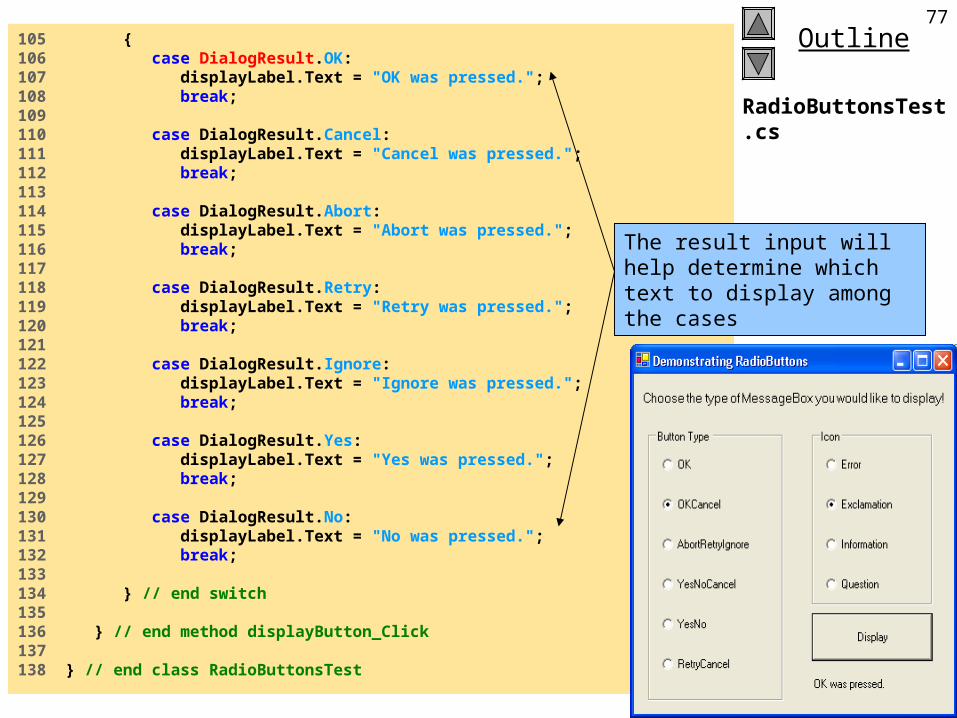
105 {106 case DialogResult.OK: 107 displayLabel.Text = "OK was pressed."; 108 break;109 110 case DialogResult.Cancel: 111 displayLabel.Text = "Cancel was pressed."; 112 break;113 114 case DialogResult.Abort: 115 displayLabel.Text = "Abort was pressed."; 116 break;117 118 case DialogResult.Retry: 119 displayLabel.Text = "Retry was pressed."; 120 break;121 122 case DialogResult.Ignore: 123 displayLabel.Text = "Ignore was pressed."; 124 break;125 126 case DialogResult.Yes: 127 displayLabel.Text = "Yes was pressed."; 128 break;129 130 case DialogResult.No: 131 displayLabel.Text = "No was pressed."; 132 break;133 134 } // end switch135 136 } // end method displayButton_Click137 138 } // end class RadioButtonsTest
The result input will help determine which text to display among the cases
2002 Prentice Hall.All rights reserved.
Outline78
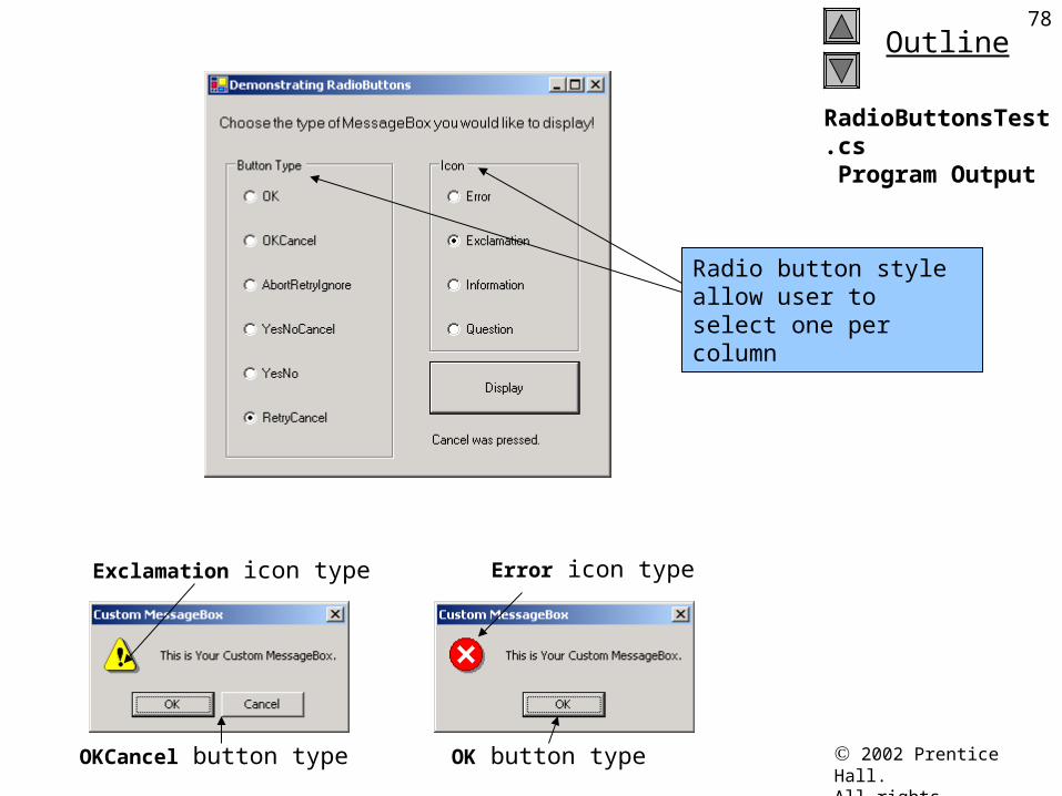
RadioButtonsTest.cs Program Output
Exclamation icon type Error icon type
OKCancel button type OK button type
Radio button style allow user to select one per column
2002 Prentice Hall.All rights reserved.
Outline79
RadioButtonsTest.cs Program Output
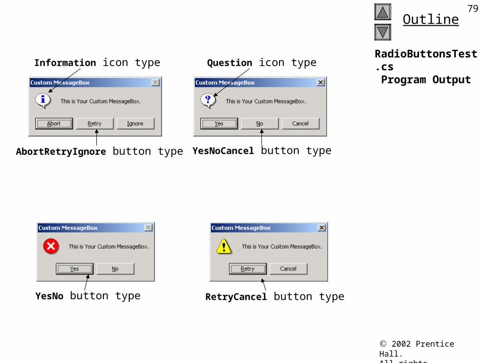
AbortRetryIgnore button type
RetryCancel button type
Information icon type Question icon type
YesNoCancel button type
YesNo button type
Jozef Goetz contribution, 2012
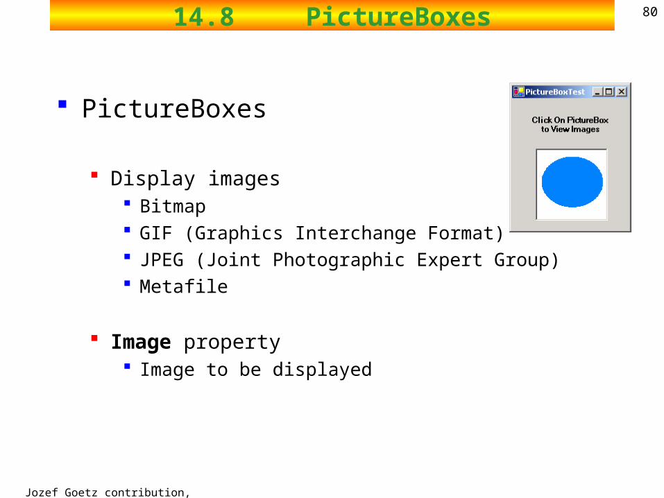
8014.8 PictureBoxes
PictureBoxes
Display images Bitmap GIF (Graphics Interchange Format) JPEG (Joint Photographic Expert Group) Metafile
Image property Image to be displayed
Jozef Goetz contribution, 2012
8114.8 PictureBoxes
System.Object System.MarshalByRefObject System.ComponentModel.Component System.Windows.Forms.Control System.ComponentModel.Design.ByteViewer System.Windows.Forms.AxHost System.Windows.Forms.ButtonBase System.Windows.Forms.DataGrid System.Windows.Forms.DateTimePicker System.Windows.Forms.GroupBox System.Windows.Forms.Label System.Windows.Forms.ListControl System.Windows.Forms.ListView System.Windows.Forms.MonthCalendar System.Windows.Forms.PictureBox
Class PictureBox Displays an image
Image set by object of class Image.– The Image property sets the Image object to use– SizeMode property sets how the image is displayed
Jozef Goetz contribution, 2012
8214.8 PictureBoxes
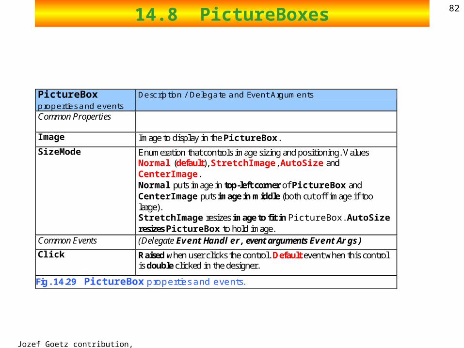
PictureBox properties and events
Description / Delegate and Event Arguments
Common Properties
Image Image to display in the PictureBox.
SizeMode Enumeration that controls image sizing and positioning. Values Normal (default), StretchImage, AutoSize and CenterImage. Normal puts image in top-left corner of PictureBox and CenterImage puts image in middle (both cut off image if too large). StretchImage resizes image to fit in PictureBox. AutoSize resizes PictureBox to hold image.
Common Events (Delegate EventHandler, event arguments EventArgs)
Click Raised when user clicks the control. Default event when this control is double clicked in the designer.
Fig. 14.29 PictureBox properties and events.
2002 Prentice Hall.All rights reserved.
Outline83
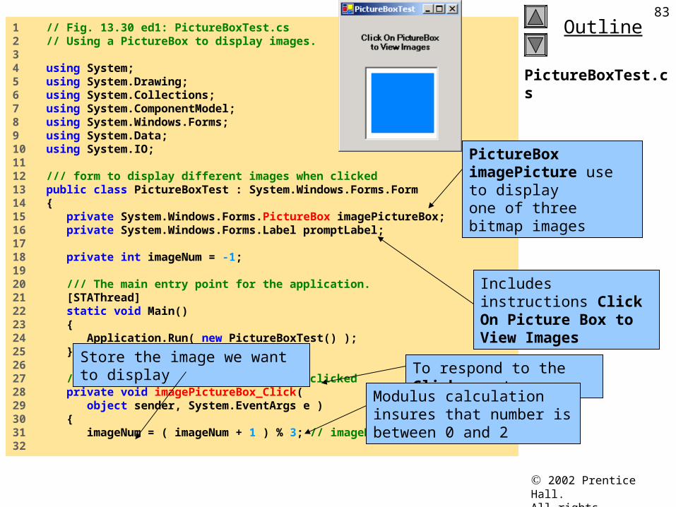
PictureBoxTest.cs
1 // Fig. 13.30 ed1: PictureBoxTest.cs2 // Using a PictureBox to display images.3 4 using System;5 using System.Drawing;6 using System.Collections;7 using System.ComponentModel;8 using System.Windows.Forms;9 using System.Data;10 using System.IO;11 12 /// form to display different images when clicked13 public class PictureBoxTest : System.Windows.Forms.Form14 {15 private System.Windows.Forms.PictureBox imagePictureBox;16 private System.Windows.Forms.Label promptLabel;17 18 private int imageNum = -1;19 20 /// The main entry point for the application.21 [STAThread]22 static void Main() 23 {24 Application.Run( new PictureBoxTest() );25 }26 27 // change image whenever PictureBox clicked28 private void imagePictureBox_Click( 29 object sender, System.EventArgs e )30 {31 imageNum = ( imageNum + 1 ) % 3; // imageNum from 0 to 232
PictureBox imagePicture use to display one of three bitmap images
Includes instructions Click On Picture Box to View Images
To respond to the Click eventStore the image we want to display
Modulus calculation insures that number is between 0 and 2
2002 Prentice Hall.All rights reserved.
Outline84
PictureBoxTest.cs
Program Output
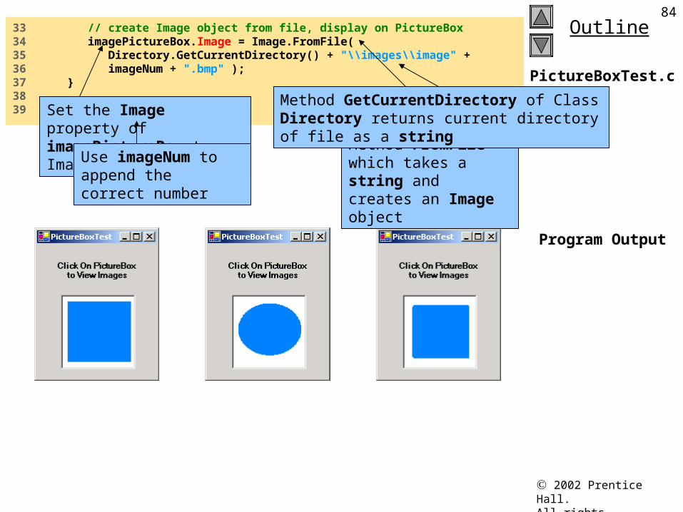
33 // create Image object from file, display on PictureBox34 imagePictureBox.Image = Image.FromFile( 35 Directory.GetCurrentDirectory() + "\\images\\image" + 36 imageNum + ".bmp" );37 }38 39 } // end class PictureBoxTestSet the Image property of
imagePictureBox to an ImageMethod FromFile which takes a string and creates an Image object
Method GetCurrentDirectory of Class Directory returns current directory of file as a string
Use imageNum to append the correct number
Jozef Goetz contribution, 2012
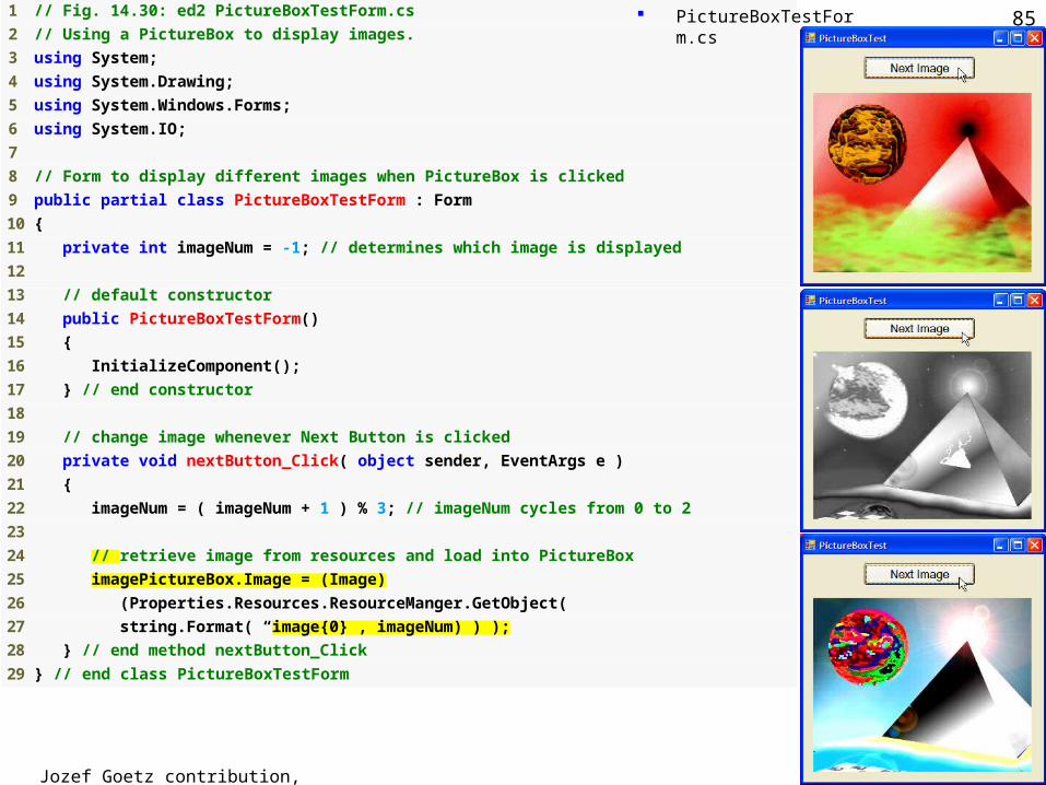
85 1 // Fig. 14.30: ed2 PictureBoxTestForm.cs
2 // Using a PictureBox to display images.
3 using System;
4 using System.Drawing;
5 using System.Windows.Forms;
6 using System.IO;
7
8 // Form to display different images when PictureBox is clicked
9 public partial class PictureBoxTestForm : Form
10 {
11 private int imageNum = -1; // determines which image is displayed
12
13 // default constructor
14 public PictureBoxTestForm()
15 {
16 InitializeComponent();
17 } // end constructor
18
19 // change image whenever Next Button is clicked
20 private void nextButton_Click( object sender, EventArgs e )
21 {
22 imageNum = ( imageNum + 1 ) % 3; // imageNum cycles from 0 to 2
23
24 // retrieve image from resources and load into PictureBox
25 imagePictureBox.Image = (Image)
26 (Properties.Resources.ResourceManger.GetObject(
27 string.Format( “image{0}”, imageNum) ) );
28 } // end method nextButton_Click
29 } // end class PictureBoxTestForm
Outline PictureBoxTestForm.cs
Jozef Goetz contribution, 2012
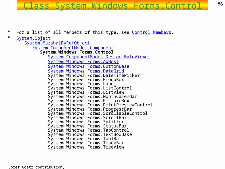
86Class System.Windows.Forms.Control
For a list of all members of this type, see Control Members. System.Object
System.MarshalByRefObject System.ComponentModel.Component System.Windows.Forms.Control System.ComponentModel.Design.ByteViewer System.Windows.Forms.AxHost System.Windows.Forms.ButtonBase System.Windows.Forms.DataGrid System.Windows.Forms.DateTimePicker System.Windows.Forms.GroupBox System.Windows.Forms.Label System.Windows.Forms.ListControl System.Windows.Forms.ListView System.Windows.Forms.MonthCalendar System.Windows.Forms.PictureBox System.Windows.Forms.PrintPreviewControl System.Windows.Forms.ProgressBar System.Windows.Forms.ScrollableControl System.Windows.Forms.ScrollBar System.Windows.Forms.Splitter System.Windows.Forms.StatusBar System.Windows.Forms.TabControl System.Windows.Forms.TextBoxBase System.Windows.Forms.ToolBar System.Windows.Forms.TrackBar System.Windows.Forms.TreeView
Jozef Goetz contribution, 2012
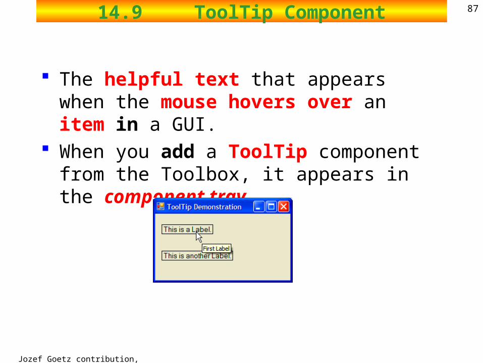
8714.9 ToolTip Component
The helpful text that appears when the mouse hovers over an item in a GUI.
When you add a ToolTip component from the Toolbox, it appears in the component tray.
Jozef Goetz contribution, 2012
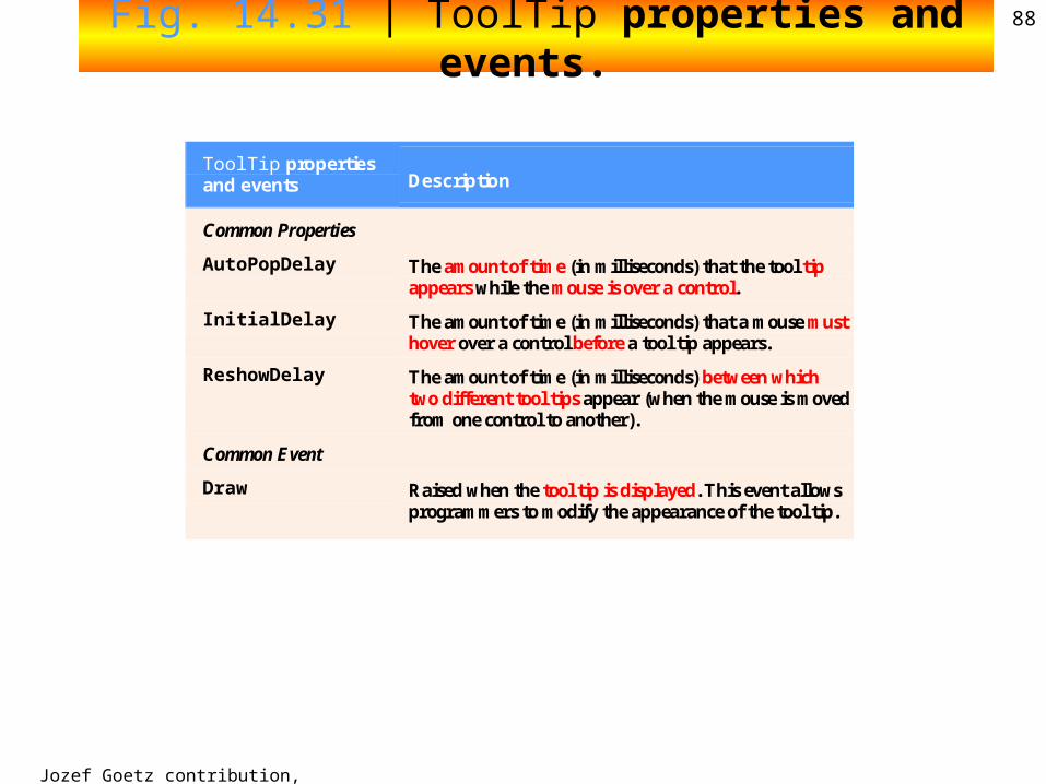
88Fig. 14.31 | ToolTip properties and events.
ToolTip properties and events Description
Common Properties
AutoPopDelay The amount of time (in milliseconds) that the tool tip appears while the mouse is over a control.
InitialDelay The amount of time (in milliseconds) that a mouse must hover over a control before a tool tip appears.
ReshowDelay The amount of time (in milliseconds) between which two different tool tips appear (when the mouse is moved from one control to another).
Common Event
Draw Raised when the tool tip is displayed. This event allows programmers to modify the appearance of the tool tip.
Jozef Goetz contribution, 2012
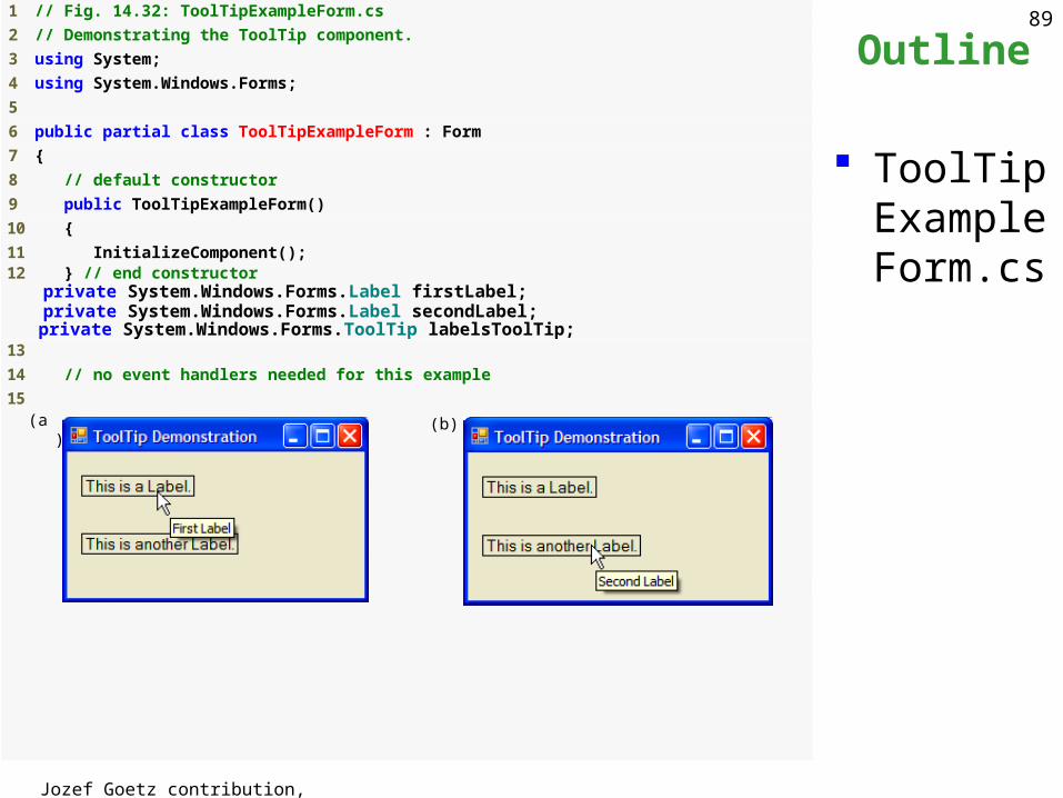
89 1 // Fig. 14.32: ToolTipExampleForm.cs
2 // Demonstrating the ToolTip component.
3 using System;
4 using System.Windows.Forms;
5
6 public partial class ToolTipExampleForm : Form
7 {
8 // default constructor
9 public ToolTipExampleForm()
10 {
11 InitializeComponent(); 12 } // end constructor private System.Windows.Forms.Label firstLabel; private System.Windows.Forms.Label secondLabel; private System.Windows.Forms.ToolTip labelsToolTip; 13
14 // no event handlers needed for this example
15
Outline
ToolTipExampleForm.cs
(a) (b)
Jozef Goetz contribution, 2012
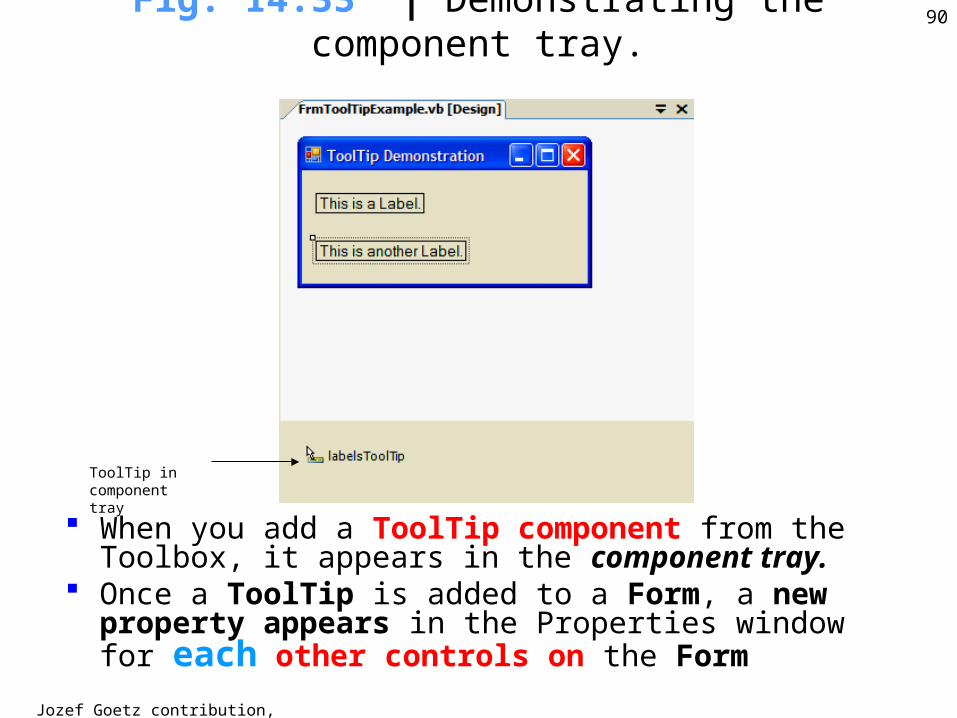
90Fig. 14.33 | Demonstrating the
component tray.
ToolTip in component tray
When you add a ToolTip component from the Toolbox, it appears in the component tray.
Once a ToolTip is added to a Form, a new property appears in the Properties window for each other controls on the Form
Jozef Goetz contribution, 2012
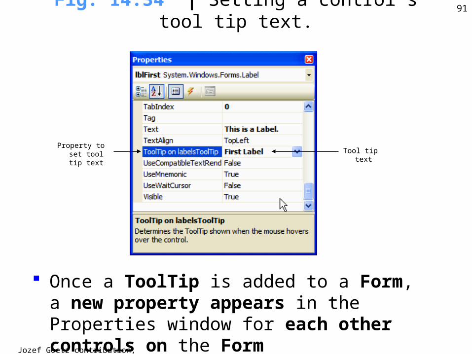
91Fig. 14.34 | Setting a control’s tool tip
text.
Property to set tool tip text Tool tip text
Once a ToolTip is added to a Form, a new property appears in the Properties window for each other controls on the Form
Jozef Goetz contribution, 2012
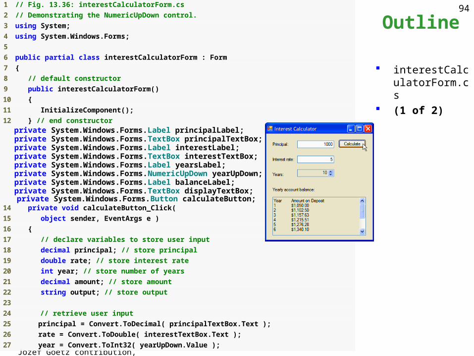
9214.10 NumericUpDown Control
Restrict the user’s input choices to a specific range of numeric values (Minimum, Maximum).
This control appears as a TextBox with 2 small Buttons on the right side – one with up arrow, and one with a down arrow
Jozef Goetz contribution, 2012
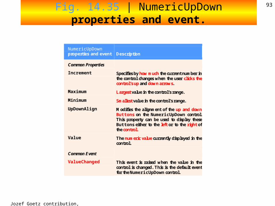
93Fig. 14.35 | NumericUpDown properties and event.
NumericUpDown properties and event Description
Common Properties
Increment Specifies by how much the current number in the control changes when the user clicks the control’s up and down arrows.
Maximum Largest value in the control’s range.
Minimum Smallest value in the control’s range.
UpDownAlign Modifies the alignment of the up and down Buttons on the NumericUpDown control. This property can be used to display these Buttons either to the left or to the right of the control.
Value The numeric value currently displayed in the control.
Common Event
ValueChanged This event is raised when the value in the control is changed. This is the default event for the NumericUpDown control.
Jozef Goetz contribution, 2012
94 1 // Fig. 13.36: interestCalculatorForm.cs
2 // Demonstrating the NumericUpDown control.
3 using System;
4 using System.Windows.Forms;
5
6 public partial class interestCalculatorForm : Form
7 {
8 // default constructor
9 public interestCalculatorForm()
10 {
11 InitializeComponent();
12 } // end constructor private System.Windows.Forms.Label principalLabel; private System.Windows.Forms.TextBox principalTextBox; private System.Windows.Forms.Label interestLabel; private System.Windows.Forms.TextBox interestTextBox; private System.Windows.Forms.Label yearsLabel; private System.Windows.Forms.NumericUpDown yearUpDown; private System.Windows.Forms.Label balanceLabel; private System.Windows.Forms.TextBox displayTextBox; private System.Windows.Forms.Button calculateButton; 14 private void calculateButton_Click(
15 object sender, EventArgs e )
16 {
17 // declare variables to store user input
18 decimal principal; // store principal
19 double rate; // store interest rate
20 int year; // store number of years
21 decimal amount; // store amount
22 string output; // store output
23
24 // retrieve user input
25 principal = Convert.ToDecimal( principalTextBox.Text );
26 rate = Convert.ToDouble( interestTextBox.Text );
27 year = Convert.ToInt32( yearUpDown.Value );
Outline
interestCalculatorForm.cs
(1 of 2)
Jozef Goetz contribution, 2012
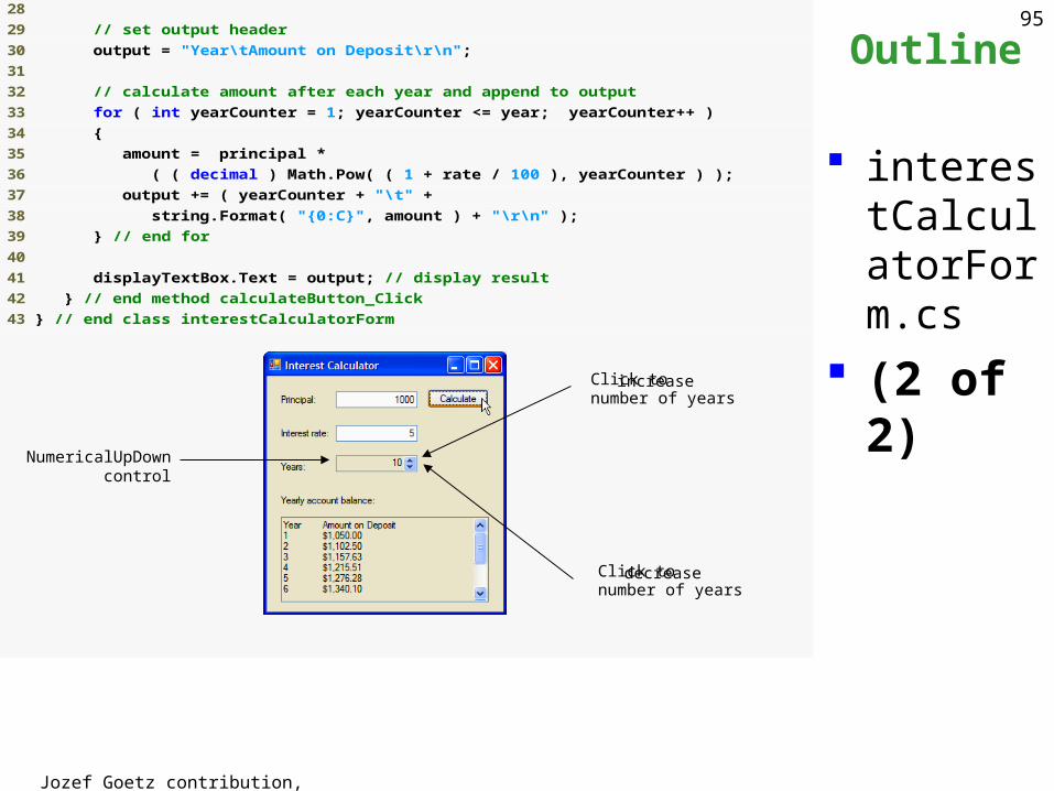
9528
29 // set output header
30 output = "Year\tAmount on Deposit\r\n";
31
32 // calculate amount after each year and append to output
33 for ( int yearCounter = 1; yearCounter <= year; yearCounter++ )
34 {
35 amount = principal *
36 ( ( decimal ) Math.Pow( ( 1 + rate / 100 ), yearCounter ) );
37 output += ( yearCounter + "\t" +
38 string.Format( "{0:C}", amount ) + "\r\n" );
39 } // end for
40
41 displayTextBox.Text = output; // display result
42 } // end method calculateButton_Click
43 } // end class interestCalculatorForm
Outline
interestCalculatorForm.cs
(2 of 2)Click to increase number of years
Click to decreasenumber of years
NumericalUpDown control
Jozef Goetz contribution, 2012
96
Outline
interestCalculatorForm.cs
(2 of 2)Click to increase number of years
Click to decreasenumber of years
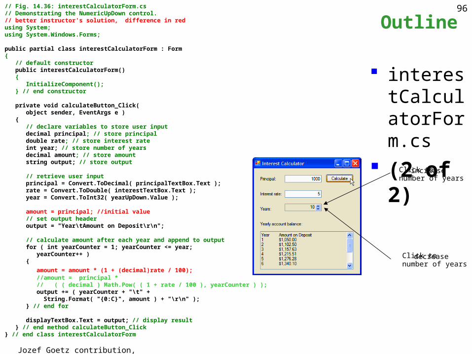
// Fig. 14.36: interestCalculatorForm.cs// Demonstrating the NumericUpDown control.// better instructor's solution, difference in redusing System;using System.Windows.Forms;
public partial class interestCalculatorForm : Form{ // default constructor public interestCalculatorForm() { InitializeComponent(); } // end constructor
private void calculateButton_Click( object sender, EventArgs e ) { // declare variables to store user input decimal principal; // store principal double rate; // store interest rate int year; // store number of years decimal amount; // store amount string output; // store output // retrieve user input principal = Convert.ToDecimal( principalTextBox.Text ); rate = Convert.ToDouble( interestTextBox.Text ); year = Convert.ToInt32( yearUpDown.Value );
amount = principal; //initial value // set output header output = "Year\tAmount on Deposit\r\n";
// calculate amount after each year and append to output for ( int yearCounter = 1; yearCounter <= year; yearCounter++ ) {
amount = amount * (1 + (decimal)rate / 100); //amount = principal * // ( ( decimal ) Math.Pow( ( 1 + rate / 100 ), yearCounter ) ); output += ( yearCounter + "\t" + String.Format( "{0:C}", amount ) + "\r\n" ); } // end for
displayTextBox.Text = output; // display result } // end method calculateButton_Click } // end class interestCalculatorForm
Jozef Goetz contribution, 2012
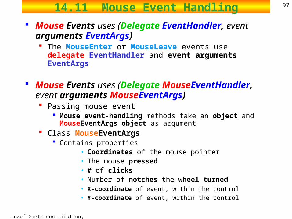
9714.11 Mouse Event Handling
Mouse Events uses (Delegate EventHandler, event arguments EventArgs) The MouseEnter or MouseLeave events use delegate
EventHandler and event arguments EventArgs
Mouse Events uses (Delegate MouseEventHandler, event arguments MouseEventArgs) Passing mouse event
Mouse event-handling methods take an object and MouseEventArgs object as argument
Class MouseEventArgs Contains properties
• Coordinates of the mouse pointer• The mouse pressed• # of clicks• Number of notches the wheel turned• X-coordinate of event, within the control
• Y-coordinate of event, within the control
Jozef Goetz contribution, 2012
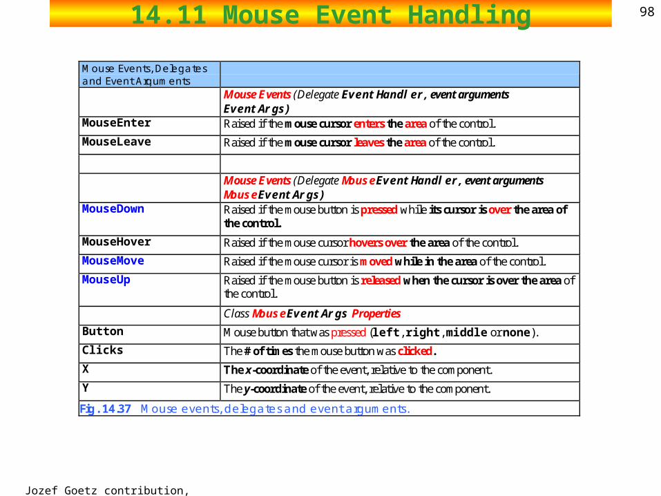
9814.11 Mouse Event Handling
Mouse Events, Delegates and Event Arguments
Mouse Events (Delegate EventHandler, event arguments EventArgs)
MouseEnter Raised if the mouse cursor enters the area of the control.
MouseLeave Raised if the mouse cursor leaves the area of the control.
Mouse Events (Delegate MouseEventHandler, event arguments MouseEventArgs)
MouseDown Raised if the mouse button is pressed while its cursor is over the area of the control.
MouseHover Raised if the mouse cursor hovers over the area of the control.
MouseMove Raised if the mouse cursor is moved while in the area of the control.
MouseUp Raised if the mouse button is released when the cursor is over the area of the control.
Class MouseEventArgs Properties
Button Mouse button that was pressed (left, right, middle or none).
Clicks The # of times the mouse button was clicked.
X The x-coordinate of the event, relative to the component.
Y The y-coordinate of the event, relative to the component.
Fig. 14.37 Mouse events, delegates and event arguments.
2002 Prentice Hall.All rights reserved.
Outline99
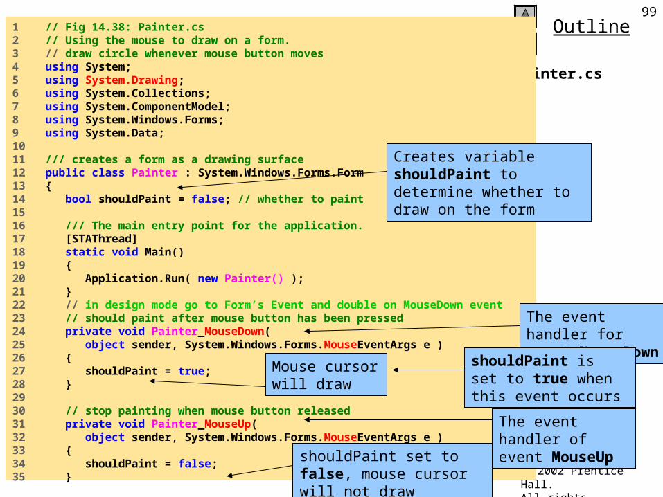
Painter.cs
1 // Fig 14.38: Painter.cs2 // Using the mouse to draw on a form.3 // draw circle whenever mouse button moves 4 using System;5 using System.Drawing;6 using System.Collections;7 using System.ComponentModel;8 using System.Windows.Forms;9 using System.Data;10 11 /// creates a form as a drawing surface12 public class Painter : System.Windows.Forms.Form13 {14 bool shouldPaint = false; // whether to paint15 16 /// The main entry point for the application.17 [STAThread]18 static void Main() 19 {20 Application.Run( new Painter() );21 }22 // in design mode go to Form’s Event and double on MouseDown event23 // should paint after mouse button has been pressed24 private void Painter_MouseDown( 25 object sender, System.Windows.Forms.MouseEventArgs e )26 {27 shouldPaint = true;28 }29 30 // stop painting when mouse button released31 private void Painter_MouseUp( 32 object sender, System.Windows.Forms.MouseEventArgs e )33 {34 shouldPaint = false;35 }
Creates variable shouldPaint to determine whether to draw on the form
The event handler for event MouseDown
shouldPaint is set to true when this event occurs
Mouse cursor will draw
The event handler of event MouseUp
shouldPaint set to false, mouse cursor will not draw
2002 Prentice Hall.All rights reserved.
Outline100
Painter.cs
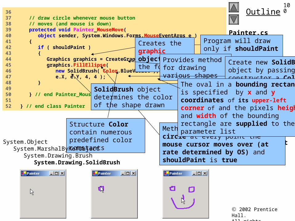
Program Output
36 37 // draw circle whenever mouse button 38 // moves (and mouse is down)39 protected void Painter_MouseMove( 40 object sender, System.Windows.Forms.MouseEventArgs e )41 {42 if ( shouldPaint )43 {44 Graphics graphics = CreateGraphics();45 graphics.FillEllipse( 46 new SolidBrush( Color.BlueViolet ), 47 e.X, e.Y, 4, 4 );48 }49 50 } // end Painter_MouseMove51 52 } // end class Painter
Program will draw only if shouldPaint is true
Creates the graphic object for the form
Provides method for drawing various shapes
Method FillEllipse draws a circle at every point the mouse cursor moves over (at rate determined by OS) and shouldPaint is true
SolidBrush object determines the color of the shape drawn
Create new SolidBrush object by passing the constructor a Color value
Structure Color contain numerous predefined color constants
The oval in a bounding rectangle is specified by x and y coordinates of its upper-left corner of and the pixels height and width of the bounding rectangle are supplied to the parameter list
System.Object System.MarshalByRefObject System.Drawing.Brush System.Drawing.SolidBrush
Jozef Goetz contribution, 2012
101
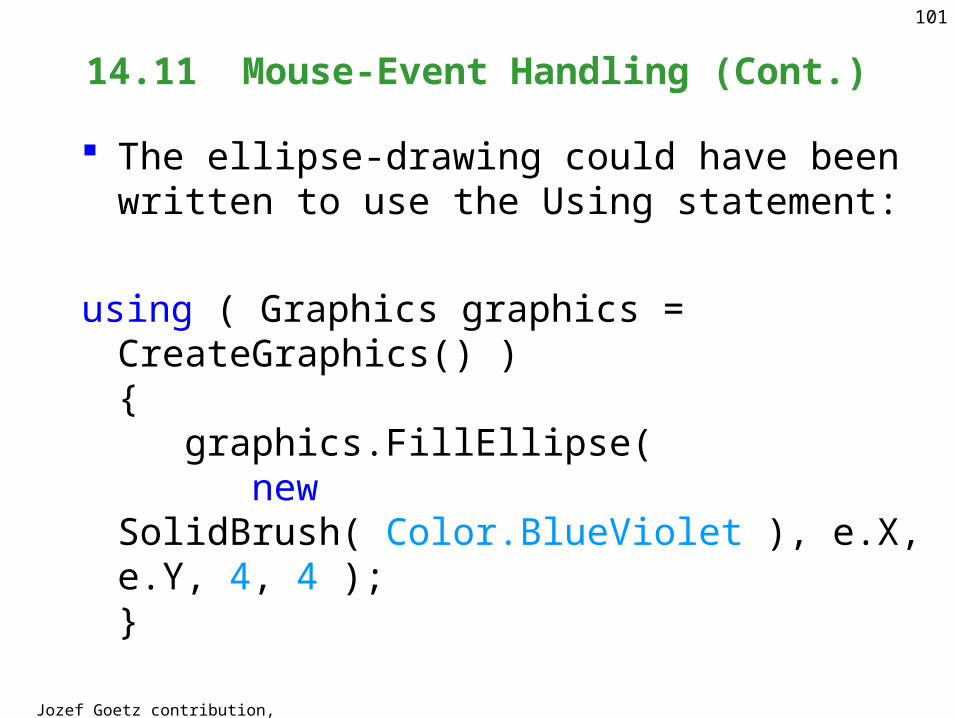
14.11 Mouse-Event Handling (Cont.)
The ellipse-drawing could have been written to use the Using statement:
using ( Graphics graphics = CreateGraphics() ){ graphics.FillEllipse( new SolidBrush( Color.BlueViolet ), e.X, e.Y, 4, 4 );}
Jozef Goetz contribution, 2012
10214.12 Keyboard-Event Handling
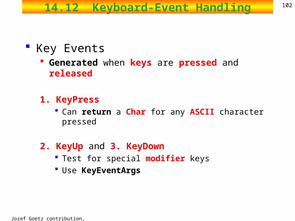
Key Events Generated when keys are pressed and released
1. KeyPress Can return a Char for any ASCII character pressed
2. KeyUp and 3. KeyDown Test for special modifier keys Use KeyEventArgs
Jozef Goetz contribution, 2012
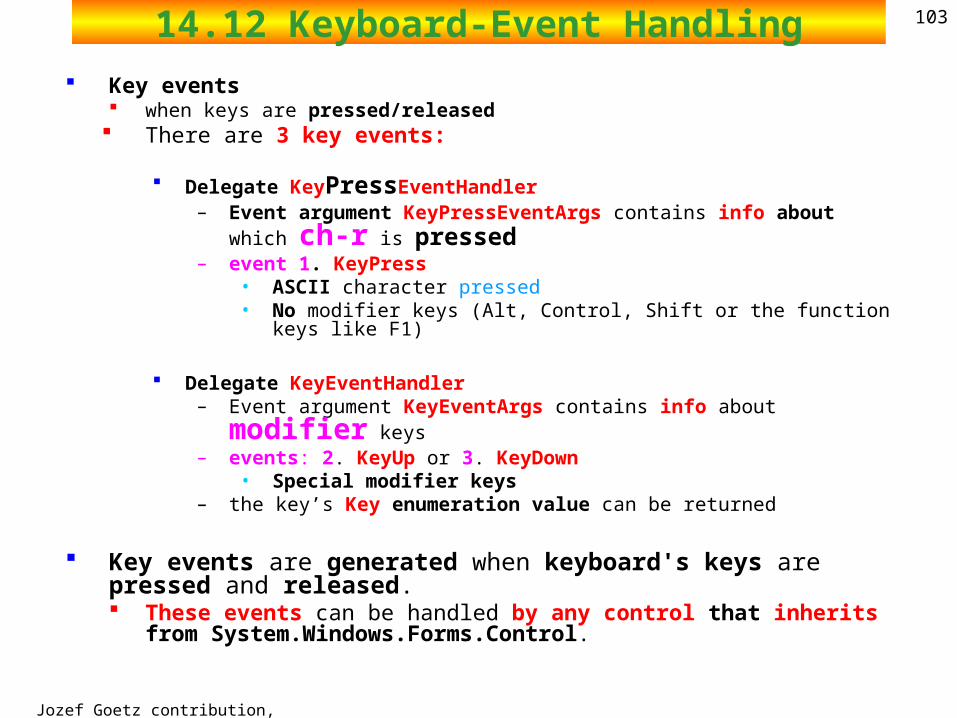
10314.12 Keyboard-Event Handling Key events
when keys are pressed/released There are 3 key events:
Delegate KeyPressEventHandler
– Event argument KeyPressEventArgs contains info about which ch-r is pressed
– event 1. KeyPress • ASCII character pressed• No modifier keys (Alt, Control, Shift or the function keys like F1)
Delegate KeyEventHandler– Event argument KeyEventArgs contains info about modifier keys– events: 2. KeyUp or 3. KeyDown
• Special modifier keys– the key’s Key enumeration value can be returned
Key events are generated when keyboard's keys are pressed and released. These events can be handled by any control that inherits from
System.Windows.Forms.Control.
Jozef Goetz contribution, 2012
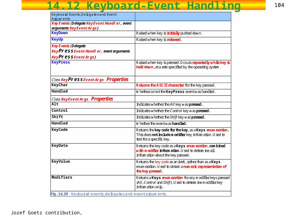
10414.12 Keyboard-Event HandlingKeyboard Events, Delegates and Event Arguments
Key Events (Delegate KeyEventHandler, event arguments KeyEventArgs)
KeyDown Raised when key is initially pushed down.
KeyUp Raised when key is released.
Key Events (Delegate KeyPressEventHandler, event arguments
KeyPressEventArgs)
KeyPress Raised when key is pressed. Occurs repeatedly while key is held down, at a rate specified by the operating system.
Class KeyPressEventArgs Properties
KeyChar Returns the ASCII character for the key pressed.
Handled Whether or not the KeyPress event was handled.
Class KeyEventArgs Properties
Alt Indicates whether the Alt key was pressed.
Control Indicates whether the Control key was pressed.
Shift Indicates whether the Shift key was pressed.
Handled Whether the event was handled.
KeyCode Returns the key code for the key, as a Keys enumeration. This does not include modifier key information. Used to test for a specific key.
KeyData Returns the key code as a Keys enumeration, combined with modifier information. Used to determine all information about the key pressed.
KeyValue Returns the key code as an int, rather than as a Keys enumeration. Used to obtain a numeric representation of the key pressed.
Modifiers Returns a Keys enumeration for any modifier keys pressed (Alt, Control and Shift). Used to determine modifier key information only.
Fig. 14.39 Keyboard events, delegates and event arguments.
2002 Prentice Hall.All rights reserved.
Outline105
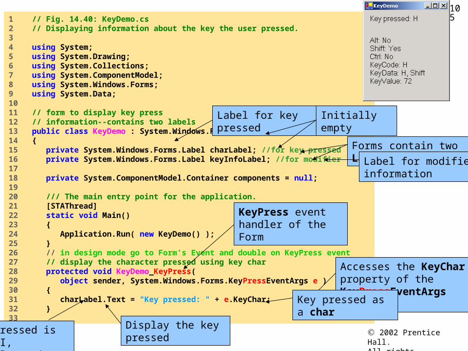
KeyDemo.cs
1 // Fig. 14.40: KeyDemo.cs2 // Displaying information about the key the user pressed.3 4 using System;5 using System.Drawing;6 using System.Collections;7 using System.ComponentModel;8 using System.Windows.Forms;9 using System.Data;10 11 // form to display key press 12 // information--contains two labels13 public class KeyDemo : System.Windows.Forms.Form14 {15 private System.Windows.Forms.Label charLabel; //for key pressed16 private System.Windows.Forms.Label keyInfoLabel; //for modifier17 18 private System.ComponentModel.Container components = null;19 20 /// The main entry point for the application.21 [STAThread]22 static void Main() 23 {24 Application.Run( new KeyDemo() );25 }26 // in design mode go to Form’s Event and double on KeyPress event27 // display the character pressed using key char28 protected void KeyDemo_KeyPress( 29 object sender, System.Windows.Forms.KeyPressEventArgs e )30 { 31 charLabel.Text = "Key pressed: " + e.KeyChar;32 }33
Forms contain two Labels
Label for key pressed
Label for modifier information
Initially empty
KeyPress event handler of the Form
Accesses the KeyChar property of the KeyPressEventArgs object
Key pressed as a char
Display the key pressedIf key pressed is not ASCII, charLabel remains empty
2002 Prentice Hall.All rights reserved.
Outline106
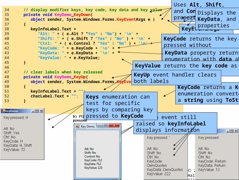
KeyDemo.cs
34 // display modifier keys, key code, key data and key value35 private void KeyDemo_KeyDown( 36 object sender, System.Windows.Forms.KeyEventArgs e )37 {38 keyInfoLabel.Text = 39 "Alt: " + ( e.Alt ? "Yes" : "No") + '\n' +40 "Shift: " + ( e.Shift ? "Yes" : "No" ) + '\n' +41 "Ctrl: " + ( e.Control ? "Yes" : "No" ) + '\n' + 42 "KeyCode: " + e.KeyCode + '\n' +43 "KeyData: " + e.KeyData + '\n' +44 "KeyValue: " + e.KeyValue;45 }46 47 // clear labels when key released48 private void KeyDemo_KeyUp( 49 object sender, System.Windows.Forms.KeyEventArgs e )50 {51 keyInfoLabel.Text = "";52 charLabel.Text = "";53 }
KeyEventArgs object
This block test for special keys, return bool if matched
Uses Alt, Shift, and Control properties Displays the KeyCode, KeyData, and
KeyValue properties
KeyCode returns a Keys enumeration converted into a string using ToString
KeyCode returns the key pressed without modifier keys information
KeyData property returns a Keys enumeration with data about modifier keys
KeyValue returns the key code as an integer
KeyUp event handler clears both labels
KeyDown event still raised so keyInfoLabel displays information
Keys enumeration can test for specific keys by comparing key pressed to KeyCode
b) F12 pressed