introduction structure is everything - cqg.com
TRANSCRIPT

Introduction
Structure is everything
“Without this structure I cannot trade”. This is the reason that the vast majority of traders
never make it past the first year. They have no structure, and eventually the markets simply
wear them out.
My path through 33 years in the markets reached its nadir in 2004 when I realised that from
being a trader who couldn’t analyse for the first 10 years, I’d somehow morphed into an
analyst who couldn’t trade. I was scared. The reality is that, as time progresses, natural
ability is no longer enough, as it gets blown off course by experience and experiences.
As the trader’s powers wane, there is always a boogieman. Today it’s the HFQ’s (High
Frequency Traders). These all conquering automated programmes can trade at the speed of
light, jump to the front of the queue, can cancel a bid or ask after seeing your market order
(I’ve no idea how), run all the stops in a blink of an eye, and take their profit before you
even realised you’ve been stopped out.
Before that it was the legendary “Flipper”. This was (I think) a mythical character based in
Switzerland who had so much power and money that he could push the Stirs market anyway
he wanted and take out all the scalpers and day traders. I was often asked whether he was a
CQG customer. My thought was that the only “Flipper” I knew was a dolphin in a 1960’s
children’s television. That dolphin was damn clever and would knock spots off Skippy the
Bush Kangaroo and eat Lassie for breakfast, but I doubt he traded Short Sterling.
The reality is if you set yourself up to fail, then that’s what you will achieve. Ed Seykota’s
excellent book “The Trading Tribe” has a startling observation on the inside cover.
In a nutshell, it confirms that without a clear desire and structure, you will feel that you
have won by losing.
The sentence was so profound to me I try to remind myself every day that I sit at my desk.
For many, the concept of the Trading Tribe is a step too far as it involves accepting the
feelings you are unwilling to experience. They're rational to get around this problem is to
remove themselves from the process of trading altogether. That or embarking on an endless
voyage of creating fully automated systems. It seems that the adage, “If you can’t beat
them, then join them” has never been more poignant. I’m often asked why I don’t use
trading systems. To me this insinuates that if I know as much as I’m supposed to regarding
Technical Analysis I must have hundreds of systems or methods. Well I used to, but now I
only have one, and it’s a grey box. Part of what I do is automatic and has fixed rules, but I
retain an element of discretion. This revolves primarily around volume and the correct
timeframe to reference, whilst covering a broad spectrum of markets, so that I am aware for
what is the easiest trade. With so many years of experience it is impossible for me to throw
that all away in favour of mathematics.
My own voyage of discovery reached an impasse in 2004. I had become the ultimate
Candlestick pattern. I knew so much I had the answer to everything and a solution to
nothing. I wasn’t losing, but I wasn’t making either. The frustration became unbearable. My
own solution was to do the Van Tharp home study course. It took a month, but the
revelations it revealed were invaluable. My problem was that money and power were not
an important motivation. This was hardly surprising as my wife had a serious road accident 5
years previously. Everyone knows that health is far more important than money. From 1999
to 2002 she had no fewer than 5 major operations on her neck and spine, was forever
having scans and seeing consultants, living in constant pain. Even now whenever I have to
say “Hospital” I come out with”Hotel”. Rest assured, the Burj al Arab is cheaper per night
than a hospital bed. I had to find the money to pay effectively for months at the Burj. I have
never traded so spectacularly in all my life. To be fair, I was fortunate that 2000 to 2001 saw
some major trends, but the truth is, I was so focused I would have made money whatever
the conditions. That focus had been there when trading was my job. Trade badly and I’d be
out of one and that was all the motivation I needed. Once that need had gone so did my
trading ability.
One of the established golden rules of trading is that you shouldn’t trade if you are
desperate to make money. My problem was the opposite. I only made money when I
desperately needed it. The rest of the time it was simply an Intellectual game. The second
problem was also the opposite of what most caused traders to lose. Whereas a trader’s
change of perspective in life and getting older and wiser creates responsibilities to others
and a burden, I regarded being responsible for others as an inspiration.
Never being a person who does things by half’s I threw myself into Van Tharp’s
psychological voyage of discovery through meditation and chanting. My wife would
comment to my daughters (who found it hilarious) “yes, your father is a lunatic”, after I’d
just bellowed “I’m a great trader” and made them all jump out of their skin.
Out of this, my initial solution was to throw away at least 90% of what I knew about trading
and Technical Analysis (having concluded what was the important 10% for me). The second
conclusion was to write my first book that crystallised that 10%, and to supplement that by
writing daily and weekly technical commentaries. If someone were paying me to write, it
didn’t matter where I was in the world, or how busy I was, I was obligated to do it. I had
created a disciplined structure. Throughout the 6 years I did this, it soon became apparent
that actually, I was writing the commentaries for my own benefit. One subscriber would

have been enough. Through time, I began directly teaching and mentoring traders on a
consultancy basis, and I then realised that when I mentored, I traded better myself. I
abandoned the commentaries as I had found a new disciplined structure that had created a
personal connection that increased my sense of responsibility. Over time, it honed down
my skills to a relatively simple process that meant I could analyse any market in less than a
minute. This is defined as follows:
• True measures of support and resistance
• True measures of Overbought and Oversold
• True measurement of the Daily charts behaviour
• How is the crowd positioned?
• The correct timeframe chart to reference intraday
• The time of the day it is
• Risk and Expectation
• The correct volume to execute
• Relative performance between markets and asset classes
• Buy the strongest, Sell the weakest
• If time permits, Micro Analysis of the Depth of Market and volume
• Position management and movement through timeframes if a trade develops
• Chart of the day and week
• What is the easiest trade?
This may seem a huge amount to achieve in a minute, but with structure, and its consistent
application it is possible. It also means that I look for an opportunity across over 90 markets,
and don’t try and force a trade or make a market bend to my will. I don’t care what the
name at the top of the chart says, and it has reached the point that, without this structure, I
cannot trade.
I want you to think about that last sentence. “Without this structure I cannot trade”.
This is the reason that the vast majority of traders never make it past 5 years. They have no
structure, and eventually the markets simply wear them out.

Preface
Who is this book for?
In contrast to my previous book, which was complex, and a heavy read, this book is aimed at
a more general audience. Whilst it assumes a rudimentary knowledge of markets, it is
suitable for beginners who wish to have a starting point and template to trade. It also is
suitable to those who have hit a roadblock in their trading and wish to see a fresh
perspective. Finally, for the experienced trader there is insight and food for thought, placing
ideas in a new light about how they may look at technical analysis. To a larger degree I have
used examples that were as up to date as possible, often from just a few days previously.
The book was written over a six-week period of May and June 2012 and then September
2012. There are natural spaces within the book so that for the most part you do not have to
turn a page in order to reference a chart to the text.
How can I help you once you have read the book?
Unfortunately, books by nature are inanimate objects, but I have included all the settings
and variables of the studies. Some aspects of the book (largely at the beginning and end)
refer to software or studies that are only available in CQG and I have shown exactly how
navigate the relevant parts of the software. They offer trials of their software so you can
cross-reference in real-time. I can be contacted at [email protected] and
[email protected] , and I am more than happy to help with any
supplementary questions you have. For those who wish to go on a deeper journey I also
mentor and coach full time since I left CQG.

Contents
Introduction
Preface
Part 1
Basic Chart Types
Advanced Chart Types
Entry Signal Evaluator
Part 2
Crowd Following Techniques
Momentum Indicators
Trend Lines and Fibonacci
Patterns
Fundamental Analysis
Part 3
Putting it all Together
Redefining Data
Alerts
Quote Formats
Appendix
Trading Time

Part 1
Basic Chart Types
Constant volume bars
Constant Volume bars have many advantages over traditional chart types, in that they build
data based on activity. This can be either set as the number of trades (ticks), or an absolute
volume setting. I prefer the latter. The problem with Tick based volume is the ever-
increasing number of ticks from HFT’s (high frequency trading). This means that the
goalposts continue to shift. The principle advantage of volume-based bars is that many of
the traditional momentum indicators are skewed on normal timeframe based charts by
periods of relative inactivity, or the extended hours that most markets are now open. This
means that momentum tends to flat line and requires a structured approach to ether
redefine data, or have a method for adjusting to the correct timeframe chart for your
analysis. Most traders do this instinctively. However, it is equally important to have a
method for what volume setting you should use. Here, is the method I employ.
Taking the E-mini as an example, I first compute what my typical risk is via Volatility Time
Bands, as they compute risk based on the time of the day it actually is. I know from
experience that it is usually around four big figures. However, you can use a 1 period
Average True Range. Adjust your chart timeframe until that figure is 20% above what you
view as acceptable risk. In my case, this means an Average True Range of five big figures.
The 10-minute chart shows that five is often a limit of range with occasional spikes on
economic numbers.

Next, place the volume study on the chart and modify it so it is showing the bid / ask
volume. This also tells you whether buyers or sellers are in charge or if there are spikes in
activity.
Take the normalised volume that misses the opening and closing and gauge where the
normal limits of volume are. On this market, it is typically between twenty and twenty five
thousand.
This is now the volume range that you can use on the Constant Volume chart. The difference
between that and a 10 minute chart may initially seems superficial, but analysis of the in the
number of bars built in a day is considerable, with nearly twice as many Constant Volume
Bars in the original pit hours. The morning session will build less and help prevent
momentum flat lining.
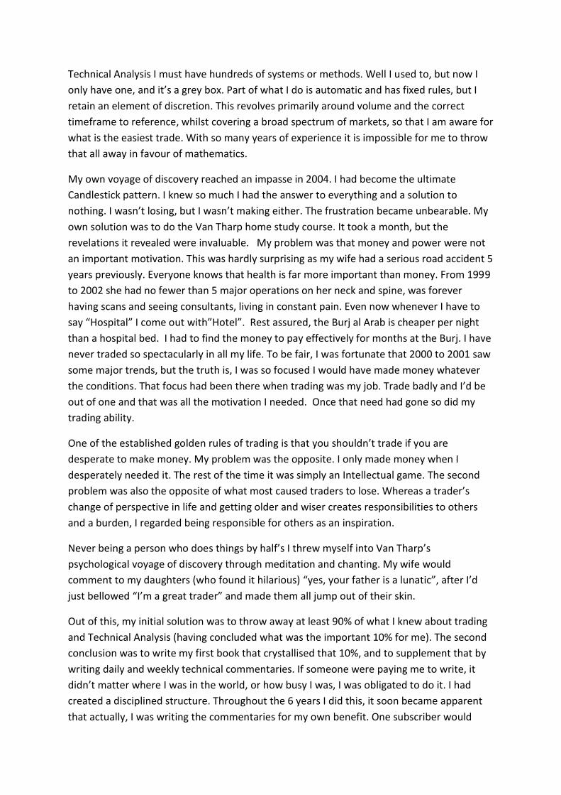
The 10-minute chart and the 25,000 Constant Volume

Advanced Chart Types
Market Profile
Market profile remains the most popular enablement that traders subscribe to, and is useful
as a crowd following tool, if you understand the basic patterns and theories. These are
covered in Chapter 2 of my previous book.
The understandings in what are true measures of support and resistance cannot be
underestimated.
The basis of successful trading is all about timing. Therefore, knowing when price is at
support and resistance (basis Profile)is a key building block. All your other momentum
analysis or tools of choice should be framed around where support and resistance is.
This study originated in the grain pits at the CBOT in the early 1980s. Peter Steidlmayer, an
exchange local, found that for much of the time price simply ebbed and flowed with the pit
traders. He noted that it was orders coming into the pit that dictated when price trended.
He came to the conclusion that he needed to find a way to distinguish between the short,
medium, and long-term trader, and thus Market Profile® was born.
Market Profile® remains my first port of call, whatever asset class or instrument I’m trading.
The theories now extend to methods of scalping, day trading, structured plays, providing
targets, placement of stops, the strength of the trend and optimum points for where
corrections should begin and trends should end. Once the structure has been understood,
the trader can switch their focus to the other studies used in their technical framework. It
can often be the case that, by the time the main strategic trade concludes, the short-term
trades working the core position have made more than if the actual strategic position were
simply left alone from entry to eventual exit. Understanding the short-term bias when it’s in
the opposite direction to the core trade allows the overall entry point to change to a more
advantageous position. For the aggressive, it can highlight moments when the existing core
trade can be pyramid for a day trade, via Market Profile® or you existing methodologies.
Whilst the ability, to shift between short and long-term focus requires practice, discipline
and skill, once mastered it provides the structure to manage positions.
Linking price, time and volume
Market Profile® has a unique property which helps us to understand price action. It links
price, time, and volume. No other study does this so concisely and in one picture. The vast
majority of existing analysis concentrates on the bar or candle pattern or the level of a
momentum indicator based on the closing price. Volume has been the most neglected
aspect of all and attempts to create meaningful studies have been thwarted, simply because
there are so many internal factors that distort the actual volume. The beauty of Market

Profile® is that linking price, time and volume provides a clearer picture of the state of the
market. This can then be used to quantify the traditional methods of patterns and
momentum and place them in a context of the importance.
The first concept to understand is:
Price + Time = Market Acceptance
Every time a market trades there is a buyer and a seller. They have made a bargain and
exchanged contracts. At the time of the trade, it is impossible to know the circumstances of
the transaction, but the aftermath can be analysed and conclusions drawn.
This leads us to:
Market Acceptance = Volume
Every time there is a trade the volume associated with market acceptance potentially
provides clues to the future direction, although at the moment that it occurs, it often
provides little insight. It is only the subsequent price movement that dictates interpretation.
That is unless the volume can be linked to other indicators, allowing immediate conclusions
to be drawn. This is a key component in analysing the market, and is the reason that from a
Market Profile® standpoint, there is no such thing as overbought or oversold. From a Market
Profile® perspective, we only know that the price displayed that characteristic afterwards.
With no concept of overbought and oversold until after it has been proven, this leads us to
the final building block in theory.
Volume = Market (fair) value
Every time price trades it is fair. This is an important psychological aid. A key component to
Market Profile® is that it is long-term players who dictate and end trends.
There are two established theories about how the end is formed:
1. When trending upwards sellers suddenly match buyers in high volume and prevent
further progress.
2. There is no volume as there is simply no one left to buy, as the final capitulation of losing
shorts has completed its painful exit. At that point, the supply side strengthens, demand
drops, and price reverses swiftly back to a point where buyers and sellers feel value is fair,
and volume goes back up. The reality is that from a Market Profile® standpoint, both
reasons are valid. Therefore, while it’s impossible to know whether a high or low is being
made at that instant, once a reaction has occurred, any subsequent move back to that area
is highly significant. This re-enforces the theory that we have no idea of the importance of
any trade at any price, unless we can link it to previous price action or other types of
analysis. Chart types such as TFlow and its associated volume and depth-based studies are
useful in qualifying such times.

Types of activity
The behaviour of long-term players is split into two areas:
1. Initiative activity
Long-term players dictate trends and when the volume they wish to trade cannot be
satisfied at one price, their perception of fair value shifts, and price trends.
2. Responsive activity
Long-term traders dictate the end of the trend by withdrawing initiative activity, taking
profits, or establishing countertrend positions. They also dictate when the reaction to a
trend has been completed. Long-term traders are often identified by a single letter print
within a day. These single prints start trends and end them at extremes and at rejections of
value.
The Market Profile® display
Basic philosophies
It is primarily used as a day trading tool for the vast majority of participants
However, for the experienced user, it can be used for all time horizons and has particular use in managing strategic positions, and subsequent day trading within that core view. This often involves the merging of more than one day’s activity in order to gain a clearer understanding of support and resistance.
Often it is possible to eliminate one side of the market
This is a huge plus when day trading, as it often dictates which side you can play from and removes one third of the problem. Buy, sell, or do nothing. For example, the market has a bullish set up, so I can only buy, and then sell partial amounts, before looking to re-establish the entire long position.
Initial Analysis goes back five days
This is because the short-term trader can’t remember more than five days back. In fact, often the long-term trader can’t either. Can you remember the open/high/low/close in a market you traded eight days ago? The reference of the past five days often provides very precise support and resistance levels, and it highlights correct levels for the placement of stops and profit taking opportunities.
Manipulation and Merging
Profiles can be merged by holding down your left mouse in the scale at the bottom of the
chart and dragging to the left. It will allow you to merge one day at a time. Whilst the
software defaults to 30-minute timeframe for each letter, it is possible to build a profile on
any timeframe.
Type : ,5c
This will produce six letters per 30-minute period and provides a greater degree of clarity of
market movements.
This concept can be taken the other way to build much larger timeframe profiles, merge
days and then bring it back to the default.
Type : ,DC
On a futures market, this will now produce a daily continuation. Each letter now represents
a day’s range. There are three ways that data can be merged.

On this setting, the study will simply show the fixed Value Area High and Low, plus the
Control Point based on the last data point, or for the close of previous days. They can be
used for support and resistance.
TPO Profile and Volume are defaulted not to show, but is an extremely useful indication of
both volume based supports and resistances and in creating a link between time (TPO’s) and
actual volume. It also usually provides an area of support and resistance that reflects the
high volume point and the Control Point.
Making the change to Dynamic mode shifts how the Value Area and Control are visualised.
Normally it will default to using 5-minute data and will show how these references changed
throughout the trading day. This is extremely useful in understanding the dynamic of trend
days, as the trend is confirmed by Value moving with that trend. Dynamic conditions can
also be built in the Formula Toolbox, which is useful in overcoming the fact that the study
can look somewhat confusing.


TFlow and Pre Trade Analytics
TFlow is a chart type unique to CQG. Developed and tested In-house, its primary aim is to
redefine data and create graphical ways of interpreting bias in the way that bids are hit or
offers are taken. PreTrade Analytics was developed to complement TFlow and provide ways
of interpreting the Depth of Market either side of the current Bid / Ask. I spent a month in
2007 recording sessions of data in order to gain an understanding of some if its dynamics
and how this can be used to help analysis and trade location.
What is TFlow?
Launched via the Add Chart button, the Set Up window can be accessed by right clicking on
a TFlow bar or via the Set Up button, Chart Preferences and the Main Tab.
TFlow is split into three charts types.
Bars
These are created, based on the Aggregation Level and represent a change in the Bid or Ask.
An aggregation level of 13 means that one bar will be built and completed once there have
been thirteen changes. The maximum aggregation allowed is twenty. The bars are coloured
in two ways.
The amount that was traded by hitting the bid and the amount that traded by taking the
ask. This relationship is shown by default as red (hitting the bid) and green (taking the ask).
The brightness and width of the bars is dictated by the amount of volume that was traded.
This Vol Threshold has four different outputs.

Percent of Average values represent percents of average volume. It is calculated as the
arithmetic mean of total volume of all bars in the same session from the previous trading
day.
Percent of Rank indicates where the bar falls relative to look back period.
If the previous day's average is not available, then actual volume values will be displayed.
No Normalization changes the bar colour to black and removes weighted volume. Range of
the bid and ask is displayed.
Volume Threshold (TFlow Vol): This chooses how the bars should look relative to volume.
For example, if the percentage of volume is greater than 90, then the bid bar is bright red
and asks is bright green. If the actual volume is greater than 10, but less than 50, the bid bar
is dark red and the ask is dark green.
In my analysis, I kept the Vol Threshold type as the default, set the Aggregation at 13 and
displayed the Volume study underneath the TFlow chart. If no volume appears, modify it
and select Bid Ask. The Vol Threshold here is different to TFlow. Any number set above
zero, will show, within the histogram of volume, if there are any big chunks of volume.

This is how my TFlow is first displayed. It is on the E-Mini and has the volume threshold set
at 1000.

Range
As the name suggests, these are built based on range. Traditional TFlow bars can be
intensive to watch for extended periods and as the speed of High Frequency Trading
escalates, it has become a greater issue. Range bars slow the speed of activity down and
have advantages in the analysis of both volume and absolute movement. This has particular
application on the fastest markets such as the Dax and Crude Oil. However, there are also
advantages in markets that are more sedate, but are also distorted by HFT’s, such as 10 year
Notes and Bobl’s. The maximum aggregation is also 20, which represents 20 ticks. When
setting the range to be used, I use the same calculation as utilised on Constant Volume
Bars. This is based on risk, so the E- Mini uses a maximum range of 16 ticks or 4 big figures.
This can only be reduced, not widened.
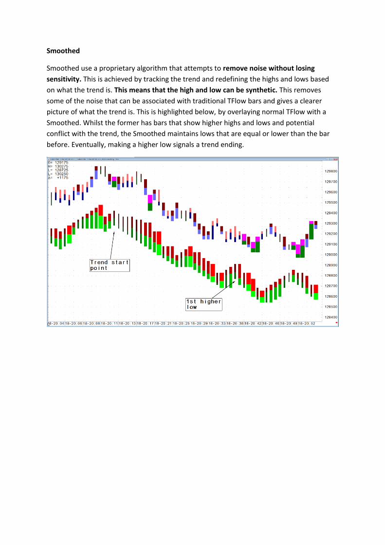
Smoothed
Smoothed use a proprietary algorithm that attempts to remove noise without losing
sensitivity. This is achieved by tracking the trend and redefining the highs and lows based
on what the trend is. This means that the high and low can be synthetic. This removes
some of the noise that can be associated with traditional TFlow bars and gives a clearer
picture of what the trend is. This is highlighted below, by overlaying normal TFlow with a
Smoothed. Whilst the former has bars that show higher highs and lows and potential
conflict with the trend, the Smoothed maintains lows that are equal or lower than the bar
before. Eventually, making a higher low signals a trend ending.

Pre-Trade Analytics
Pre-Trade Analytics is a group of studies tracking the actions by traders in the exchange’s
order book. These studies measure the orders above and below the current bid / ask being
placed or canceled by traders as the TFlow bar builds.
They are split into four studies
DOMTracker
DOMTracker Oscillator
DOMActivity
Older Orders Ratio
I am going to concentrate on DOMTracker as it provides the best insight.
DOMTracker
The DOMTracker study plots two lines: a weighted sum of the offers (red line) and the
weighted sum of the bids (green line).
DOMTracker theory
Key points to remember
• In a downtrend, we expect the bid volume (green line) to be above the ask volume
• In an uptrend, we expect the ask volume (red line) to be above the bid
• Increases in one side or the other in a sideways market indicate that a trend is
due.
• Collapses in the trend volume indicate exhaustion
• Crossovers between lines show that the market has finished the trend
The next chart is of the E-Mini and highlights how the DOMTracker can be used to track
trends and signal when the trend is over. Due to the fact that it uses an average that is the
same as your aggregation (thirteen), it is prudent to wait for that number to build in the Pit
session. The study falls in value ahead of the economic release, and the volume is low in the
minute after it comes out. The TFlow bars then pick up volume and the DOMTracker
confirms the trend as the red line is above the green. Note how the Volume study below the
DOMTracker has a premature exit. At the highs, the DOMTracker switches direction and
rides the trend back down (green above red) until the close of business.

This example highlights once more how DOMTracker outperforms the volume study. There
is one premature exit, but the low is only shortly before the next crossover. It then does a
far better job of tracking the uptrend that develops into the close.

Entry Signal Evaluator
Why it is an essential tool in your education and understanding of Technical Analysis
It is difficult for me to explain fully, how important and useful this tool is without sounding
somewhat evangelical. Both new and experienced traders normally embark on a voyage of
discovery, dictated by what they have either read (normally Murphy’s guide to technical
analysis), seminars they have attended, or exams they have taken. Whilst the official
courses run by Technical Analysis societies around the globe are useful in providing a
backdrop and framework to traditional methods, they are essentially reference guides. In
many ways, the core values of Technical Analysis and what is perceived to be important and
useful to the trader haven’t changed in thirty years. Do you think that the markets haven’t
changed in thirty years? Of course, they have, and in recent years dramatically so.
It is prudent and wise to take any established mantra or any technical idea you have and do
three things.
1. Test its basic accuracy
2. Visualise data and the study’s outputs
3. Decide whether this fits in with your event horizon (how long does a trade last)
and the type of trader you think you can be a success at.
This process is time consuming, but that’s all it costs you: TIME. Blindly accepting the
established clichés and mantra’s and applying this to real money is usually a ruinous
process. The markets and the methods you employ that have not been fully understood will
lead to the result that markets and the methods employed can remain irrational far longer
than you can remain solvent. Either that, or you abandon the method and start the voyage
of discovery once more, without having any idea that the sequence of losses where entirely
within the normal variation of what that method was.

What does Entry Signal Evaluator do?
Entry Signal Evaluator takes any technically based conditions and plots their performance
against one market or a portfolio up to sixty bars after the entry point. There is no money
management, so in effect, it is giving you a best and worst case scenario. (You wouldn’t be
able to exit at the perfect point, and you wouldn’t hold a losing position forever). This
measurement of raw performance provides a quick and easy to visualise analysis of whether
your original idea has any statistical bias.
How do you use it?
It has a wizard that will guide through the process, which is accessed by hitting the NEW
button.
It asks you to select a Portfolio. This can be from a predefined one, or you can click on
Select , and it will show the Portfolio menu, from which you can create your own. You only
need to stipulate the contract without the month, and you can also use the Question Mark
feature to access back months.

Part 2
Crowd following Techniques.
It is critical to understand and be aware of what is popular.
It is often said of political circles, that if you repeat a lie or mantra often enough, eventually
the public will believe it. For humans, perception is everything and first impressions count.
We subconsciously collate and make assumptions almost immediately after we are
introduced to new information, whether it is forming opinions on people or almost anything
for that matter. It is no accident that subliminal advertising is banned. Trading and Technical
Analysis is a world drowning in assumptions and mantras, many of them contradictory or
simply incorrect. To both the beginner and the struggling professional, it can soon feel like
what I call Cloud Driving. I once found myself, riding a motorbike in clouds, on the hellish
mountain roads of Sicily. Navigating in fog at night is bad enough, but navigating in clouds
at night, means it’s foggy, its chucking it down with rain, your head is up in the air, and your
eyes are closed.
It is essential that you are aware of both crowd following techniques and employ a healthy
scepticism towards lazy clichés.

Momentum Indicators
The vast majority of technical based indicators analyse momentum in a multitude of ways.
Whilst it makes sense to have a measurement of momentum, how many ways do you need
to visualise the same thing? I often see traders with three or four indicators plotting
momentum and sometimes many more than this. They are then placed on many
timeframes, which can lead to conflicting information as momentum rarely synchs up. The
more timeframes you look at the greater the conflict is likely to be. This can lead to paralysis
when you have no position or emotional decision-making when you have. There will be
many times when one timeframes momentum is down, and another is up. Unless you have
a structure for understanding what is the dominant timeframe in relationship to your
trading objectives (how long does a trade last) and concept of risk and volume, then the
common behaviour is to simply fish around different timeframe charts and indicators until
one tells you what you already wanted it to. This random procedure is fine for the great
trader, but ruinous for the rest of us. Chapter three of my previous book creates a structure
for understanding what the dominant timeframe is and I grade each bar via my Range
Deviation Pivots. I then use Market Profile to confirm what the trend is and where the
supports and resistances are. However, in the absence of using those methods, there are
also some simple rules that you can follow.
1. What is the trend on the daily chart?
If day trading or having a very short trade time horizon, it is easy to forget what the bigger
picture actually is. I always reference the daily chart and look at the previous day’s
relationship of the open/high/low/close. Without placing any momentum indicators on the
chart at all, I simply visualise what the trend is. It’s usually obvious, and I connect that with
the previous day’s pattern.
- Was it confirming the trend?
- Was it a reversal against the trend?
- Was it a neutral day?

2. What is the Average True Range on the chart you are analysing?
For me, risk and its relationship to volume is one the critical relationships that have to be
placed in a consistent framework. A key element in achieving this is to clarify the timeframe
chart and the Average True Range that it is currently displaying. A common mistake is to
reference an intraday chart that has a range that is far higher than your concept of risk in
terms of ticks. Picture yourself as a trend follower. Your predefined risk on any trade is
never more than ten ticks, but you are analysing off a 60-minute chart that has a range of
fifty ticks. At what point can you truly clarify that your trade is wrong based on a bar that
can move five times more than risk?
When visiting traders, one of the first questions I ask them, are what timeframe charts do
you use? The answer is always a variation of “oh I use a thirty, sixty, plus the daily and
sometimes go down to the five or two minute”. No one has ever said, “I use the timeframe
chart that fits with my concept of risk and volatility”. If you do this, then you have created a
fluid framework that rides the waves of volatility in a consistent manner, and provides a
structure for which your momentum indicators of choice can be utilised. The basic rules are
as follows.
- If the Average True Range is below your concept of risk in ticks then the timeframe
chart is too low, and the information is irrelevant.
- If the Average True Range is more than double your concept of risk, in terms of
ticks then the timeframe chart is too high.
To put this in some sort of context, during the craziness of 2011, there were times when the
timeframe I was referencing on crude oil was down to a one-minute chart. In contrast,
during the moribund period in early 2012, this had risen to a ten minutes at its lowest, and
rose to as high as a sixty minute.


Slow Stochastics
Slow Stochastics represent the most popular study in the technical universe and the
established mantras represent a critical threat to your wellbeing. Designed by George Lane,
they take the relationship between the high and low to the close (K line). Then a smoothing
is added to create the (D) line. The default setting is shown below. It is rare to see trader’s
going beyond changing the variable of 14. A typical change is to 10.
This connection between the close and the extreme of the bar means that if this
relationship shifts against the dominant trend the effect on the study is disproportionate.
This is exasperated if the studies value is near its limit of range, which can oscillate between
zero and one hundred. It is the clearest example of the problems of putting a linear
calculation and a data set that is non- linear.
However, once the studies characteristics are understood, it is possible to build strategies
around it and more importantly, take advantage of the ill-informed. It’s a cold fact that if
you are to make money consistently, you’re going to have to take it off someone who loses
consistently.
There are two basic interpretations:
• The market is overbought when above 80 and oversold below 20.
• Signals are taken when the lines cross in these zones or have crossed and then
move out of the extreme zones.
• Additional use is as a divergence indicator. The market makes a new high, but the
Stochastic fails to breach its previous high and crosses down. This is also referred
to as a Failure Swing. Execution can come either when the lines cross or come out
of the extremes.

And with those interpretations comes many misconceptions:
• The crossover theory in profitable.
Tests reveal that a crossover in an extreme zone is at best random and worst ruinous. The
power of Stochastics lies in the data you are going to apply it to, or the revised strategy you
are going to employ. Stochastics are far better suited in their original interpretation on
markets that are mean reverting. This applies to spreads or pairs trading on stocks that are
usually correlated. There are also some primary markets that are also prone to mean
reversion. Dollar Canada (Looney) is one that a standard crossover from overbought or
oversold will have more relevance. The chart below is a half-day one with the crossovers
marked.

This chart is half day of the Eurodollar twelve-month calendar spread.
Signal Evaluation tests reveal the extent of the problem on primary markets. Whilst the
stock portfolio does show a small profit eventually, the accuracy hovers just below 50%. The
futures and FX portfolio are worse with large losses and accuracy in the low 40’s. In fact, it’s
sufficiently poor that work can be done on taking advantage of this, which we will go
through later in this section.
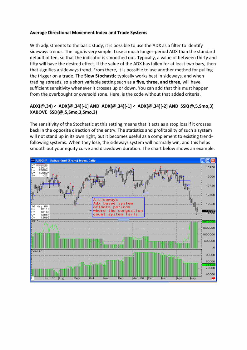
Average Directional Movement Index and Trade Systems
With adjustments to the basic study, it is possible to use the ADX as a filter to identify sideways trends. The logic is very simple. I use a much longer-period ADX than the standard default of ten, so that the indicator is smoothed out. Typically, a value of between thirty and fifty will have the desired effect. If the value of the ADX has fallen for at least two bars, then that signifies a sideways trend. From there, it is possible to use another method for pulling the trigger on a trade. The Slow Stochastic typically works best in sideways, and when trading spreads, so a short variable setting such as a five, three, and three, will have sufficient sensitivity whenever it crosses up or down. You can add that this must happen from the overbought or oversold zone. Here, is the code without that added criteria.
ADX(@,34) < ADX(@,34)[-1] AND ADX(@,34)[-1] < ADX(@,34)[-2] AND SSK(@,5,Smo,3) XABOVE SSD(@,5,Smo,3,Smo,3)
The sensitivity of the Stochastic at this setting means that it acts as a stop loss if it crosses back in the opposite direction of the entry. The statistics and profitability of such a system will not stand up in its own right, but it becomes useful as a complement to existing trend-following systems. When they lose, the sideways system will normally win, and this helps smooth out your equity curve and drawdown duration. The chart below shows an example.

Trend Lines and Fibonacci
The need to create a framework around where your draw trend lines and what significance
you place on them is a crucial part of your trading armoury. Even with the rules that I am
going to give you, I personally only draw trend lines on historical data. There are many
reasons for doing this, such as the pitfalls set out below.
• It is easy to get attached to trend lines and start drawing support and resistance
lines based on what you want to happen, or more dangerously, to justify your
current position.
• Trend lines represent the maximum point in uncertainty. Will the line hold or fail?
• Just because you think a trend line is important does not mean the market does.
• If you find yourself redrawing lines that are shallower in angle you are probably
emotionally attached to your position and losing money, or have a pre-defined
view of where the market should go.
Therefore, to avoid these mistakes it is necessary to create some rules so that good habits
are established.
• Begin with drawing lines on Daily’s and Weekly’s only.
• Trend lines have little value on charts below 30 minutes.
• Trend lines can only be broken on a closing basis, and you can wait for a two bar
close if you so wish.
• Resistance lines can only be drawn down (unless a channel line).
• Support lines can only be drawn up (unless a channel line).
I cannot overemphasise how important those last two points are. If the trend is down, I
want to find points where the reaction to that trend is over. This means I can only draw a
line that is in accordance with the trend.
• Beware or drawing lines that are steep. It is highly likely they will be broken.
• If a resistance line is broken, it can later become support and vice versa.

This leads us into the exact rules of how to build trend lines. The principle aim is to draw
lines that others in the market are drawing as well. Crowd following trend lines can be very
powerful.
• Trend lines can only be connected by two 5 bar Peak points.
• Ideally no piece of data can come between them.
• Initially only connect the most recent Peak points and then move further back.
• Channel lines have the same rules.
This set of rules means that the number of trend lines you can actually draw is limited. In
some cases, there may only be one line. This method is also very useful in identifying a
sideways trend. If you can draw supports and resistances from the most recent Peak points,
the market is in a sideways pattern. This will often be true long before Momentum
indicators are signalling so.
The acid test on whether a line is subject to crowd following is its performance the first time
it visits it. Price must respect the line by holding it perfection or by emphatically reacting
quickly on a break of the line.

Patterns
In many ways, patterns are far easier to interpret than the myriad forms of momentum, in
respect that the pattern remains constant. Only its range, where the pattern is within the
larger scope of the chart and volume associated with it are variables. I typically reference
the state of momentum in relationship to a pattern. However, the perennial problem with
patterns is the sheer volume of them and how do you work out which ones are important?
Without a sound filter check, you will be continually seeing patterns and being forced to
make decisions. It is no accident, that in my own trading armoury, there are just three
traditional patterns I care about. Candlesticks patterns can be the worst. From what I can
make out there is a pattern for every permutation of price action. This means that there is
an answer to everything but a solution to nothing.
We will look at those three patterns later, but first we will look at a few popular patterns,
and you can decide their relevance.

Island Reversals
Island Reversals used to represent one of the most powerful patterns. There frequency has
fallen, but the redefinition of data (for those that make the effort) means that this pattern
must be respected. The golden rule is never to trade against an Island Reversal.
• It is at least a 3 bar pattern. In an uptrend, the second bar has a low that is above
the high of the previous and the third bar has a high that is below the low of the
second. Effectively you can draw a circle around the pattern. The more bars within
the formation, the more powerful the signal.
Islands are rare in Financials, but more prevalent in commodities. This Bund Island back in
2005 was a classic and all-time high for some years.

FX is an area where no one looks for Islands, but that does not mean they are not incredibly
powerful. The day is redefined to 6.a.m to 11 p.m. so ignores Asia. The chart below shows
the Eurodollar. Price mutates from a bullish Island that fails to develop, before forming a
bearish Island as a continuation pattern that sparked a major collapse.
2011’s high in Soybeans redefined as 7 a.m. to 7.15p.m. set off a steep downtrend.

Care must be taken, if using Islands on the Pit Only symbol for the S&P, as they are
becoming more common. A rare Double Island formed the low, and the first correction
worked as well. The final bullish Island failed miserably before the top was formed by a
pattern that covered eight days. The large square uses the Profile Area tool with the blue
line representing the Point of Control for the entire trend. The Island closes below what is
the point of the most time in the trend, which means that the trend is down. This confirms
that the market is top-heavy and qualifies the pattern. Finally, an Island yesterday has
signalled a bottom may be in place.

DOJI’S
This the only Candlestick pattern apart from Evening and Morning Stars that I reference.
This is due to extensive testing of many Candlestick patterns that revealed that Doji’s were
the only one that had an independent bias without having to build elaborate ways and
means of qualification. Doji’s take many forms but ultimately always act as a warning sign.
The longer the timeframe the more significant, but Doji’s have more power than many
patterns when applied to very short timeframes, especially, when linked to volume.
Traditionally they are regarded as a reversal pattern, but I place equal weight on them being
a continuation pattern on historical charts. This means that all historical Doji’s must be
confirmed by the subsequent price action
Doji’s are quantified by the Open and Close being identical or close together. Whilst they
have little significance in a sideways trend, they do provide a bias within that pattern.
However, it is in a trend that their true power emerges. Doji’s represent a tug of war
between bulls and bears. The greater the range, the greater the war, (Long Legged Doji),
although it is important to look at the days price action, in order to determine whether
there was a sign of exhaustion there, as well. The daily crude chart shows a Long Legged
Doji after a swift two-day collapse. Logic suggests that after such a collapse, a period of
short covering, or bottom picking, can create a bounce. However, the intraday chart shows
that the entire moves to the lows occurred at midnight in thin volume. The rest of the day
was a slow, steady grind higher. The Doji was created by a false move at the wrong time of
day, and effectively the real volume for the day saw price simply tread water.

Price collapses once again until we have another series of four Doji’s with no range and low
volume. Stochastic divergence from an oversold position encourages people to look for a
bottom. As I said earlier, I prefer Doji’s as a continuation as they traditionally suck players in
against the trend. If new closing lows are made they are forced to exit. Large trend days are
caused by both short and long term, players being on the same side. When a historical
trend ending formation fails, short term traders are encouraged to press this break, long
term players can add to trend positions, and there is long term stop loss selling from those
who tried to pick the end of the trend.
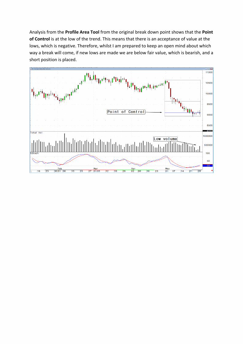
Analysis from the Profile Area Tool from the original break down point shows that the Point
of Control is at the low of the trend. This means that there is an acceptance of value at the
lows, which is negative. Therefore, whilst I am prepared to keep an open mind about which
way a break will come, if new lows are made we are below fair value, which is bearish, and a
short position is placed.

It is important to understand the significance of the Point of Control being at the top or
bottom of a trend. The Island example on the S&P showed control at the top. Price broke
below it, which is a bearish signal. This example has control at the bottom. Price broke lower
which was bearish, as well. The selling intensified as the Stochastic crossed back down
forcing those players out.
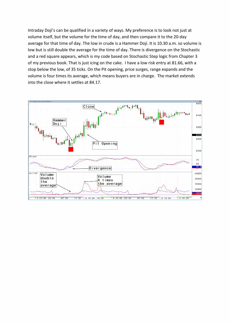
Intraday Doji’s can be qualified in a variety of ways. My preference is to look not just at
volume itself, but the volume for the time of day, and then compare it to the 20-day
average for that time of day. The low in crude is a Hammer Doji. It is 10.30 a.m. so volume is
low but is still double the average for the time of day. There is divergence on the Stochastic
and a red square appears, which is my code based on Stochastic Step logic from Chapter 3
of my previous book. That is just icing on the cake. I have a low risk entry at 81.66, with a
stop below the low, of 35 ticks. On the Pit opening, price surges, range expands and the
volume is four times its average, which means buyers are in charge. The market extends
into the close where it settles at 84.17.
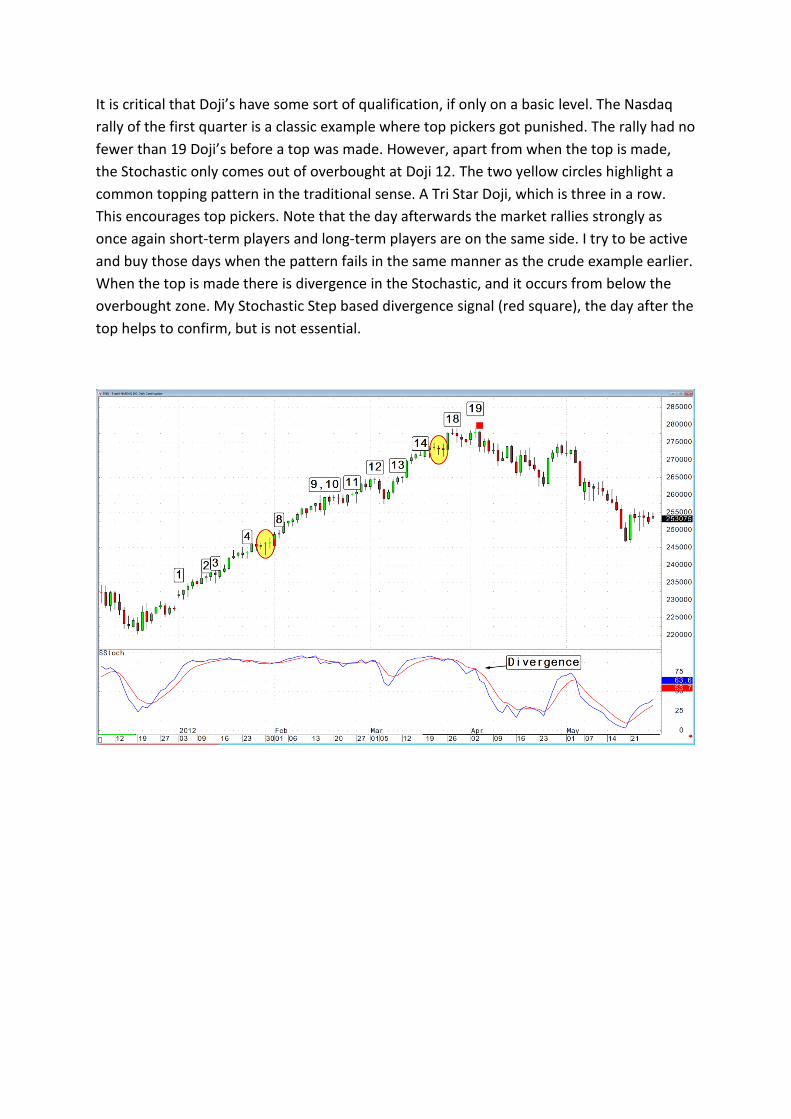
It is critical that Doji’s have some sort of qualification, if only on a basic level. The Nasdaq
rally of the first quarter is a classic example where top pickers got punished. The rally had no
fewer than 19 Doji’s before a top was made. However, apart from when the top is made,
the Stochastic only comes out of overbought at Doji 12. The two yellow circles highlight a
common topping pattern in the traditional sense. A Tri Star Doji, which is three in a row.
This encourages top pickers. Note that the day afterwards the market rallies strongly as
once again short-term players and long-term players are on the same side. I try to be active
and buy those days when the pattern fails in the same manner as the crude example earlier.
When the top is made there is divergence in the Stochastic, and it occurs from below the
overbought zone. My Stochastic Step based divergence signal (red square), the day after the
top helps to confirm, but is not essential.

The top itself was a Shooting Star Doji on the highest intraday timeframe chart I reference
(120-minute) for day trading, (apart from FX) and the volume was twice the average for the
time of day.

Gaps
For me, Gaps were one of the first areas of concentration when I began trading. Before the
advent of computers I used to receive a weekly printed chart book that I would fill as time
progressed. It was impossible to add mathematical calculations to the data, which meant
pure price action and Gaps were an obvious phenomena to analyse. Today, with the advent
of almost 24 hour markets, much of the established theories have been lost, due in a large
part to trader’s laziness. This means that patterns can be found that many market
participants are unaware of. On many markets, the opening is largely superfluous as it is not
a product or an auctioning process, due to that lack of depth in activity. Therefore, it makes
sense to redefine data to the point in time where depth increases. This is 7 a.m. for futures
and 6 a.m. for FX.
There is plenty of nonsense written about different types of Gaps. This can be Breakout,
Continuation, or Exhaustion Gaps. Breakout Gaps are the only ones that can be qualified
instantly, as they must occur after a sideways pattern. The others need the subsequent
price action to prove their accuracy.
A common error, when looking back through data, is to only see the gaps that work. The
reality is that most gaps are filled on the same day and are therefore not visible. It is critical
that you analyse the history of the market you are concerned with, in order to understand
the frequency of Gaps. The questions to ask are
• How many opening gaps?
• How many are filled the same day?
• How many are filled within five days?
• How many are filled within two hours of the gap appearing?

Fundamental Analysis.
How to interpret News.
A common mantra for a technical analyst is that the news is indeed already in the price. This
seems a little too simplistic. Whilst there are times when price instantly adjusts to new
information, this normally occurs when the market is fully aware of relevant economic or
statistical information being released. The sheer volume of statistics in recent years can be
debilitating and lead to paralysis for anyone who wants to hold positions over days and
weeks. It is no easier for day traders. The risk is that you can be buffeted around by short-
term volatility, and be negatively influenced by data that have just been released.
Of course, this is without the constant stream of news and comment regarding the Euro
crisis. The second half of 2011 saw this reach a crescendo as markets moved on just about
any comment from almost anybody. At one point in just two days, in early November, there
were no fewer than 140 comments from politicians and central banks (I read them all, took
pictures of the stories and then looked at the market’s reaction on 1-minute charts). When
markets moved on comments from the Brazilian finance minister on the Euro bailout fund, I
knew we really were in the silly season.
Squawks are very popular as they remove the need to track the news yourself, but it takes
discipline not to be influenced unduly by comments starting with “rumoured” or “sources”. I
subscribe to Graham Turners GFC Economics (www.gfceconomics.com and author of the
Credit Crunch). He provides a succinct daily commentary and a weekly chart book that
reanalyses and places in prospective the relevant economic statistics of the past seven days
from around the globe. I find this invaluable in staying close enough to the pertinent
economics without getting so close that I lose perspective on what is important.

Part 3
Putting it all together.
Creating your structure.
In trading, time and timing are critical to the success. The common plan of attack, especially
on timing, is usually concentrated on creating combinations of momentum with patterns.
This involves crossovers of indicators that have special, magical settings. Many of the
examples I have used have simply been the CQG defaults. It seems to have escaped many
that no matter much work and testing is done, the chances are that the combination that is
derived and its subsequent success are more to do with good money management,
emotional stability or just plain great trading. It’s a cliché, but true based on the feedback I
receive that you can give a great commentary or set of technical set-ups to a poor trader
and they’ll lose. Give a poor commentary and set up to a great trader and they won’t lose
much.
Therefore, to make technical analysis work you must structure the analysis in order that you
find it easy to use. There is no benefit developing a form of analysis that utilizes 1-minute
bars if you don’t like spending hours in front of a screen. Choose correctly, and the technical
analysis that you develop will support your trading. Remember that
Technical Analysis is a Support Structure for good traders and an excuse for poor ones.
In addition, you must overcome the hurdle of believing the support structure you have
developed. It is easy to have a few bad trades and begin to think the structure is flawed. I
feel very fortunate that I have experienced two sides to trading over long periods
throughout my career. The first period was when I worked in the market using just
fundamentals, touch, an understanding of pure price action and some guesswork. The
second period began when I stumbled into a job that theoretically gave me the brief, time
and resources to embark on a 15 year voyage of discovery into what is a bottomless
“Pandora’s box” of theory and experimentation.
It is no accident that it was when I was forced myself to analyse week in, week out via the
commentaries that trading and technical analysis switched from being a random support
structure to an actual live fluid methodology. The result is a lack of frustration at missing
trades, whilst all the excuses, disciplinary problems and laziness have evaporated. Structure
is everything.
