ielts writing task 1 questions with examples
DESCRIPTION
writing task 1 questionsTRANSCRIPT

IELTS WRITING TASK 1 Examples
IELTS Writing Task 1 Sample 2
You should spend about 20 minutes on this task.The pie chart shows the amount of money that a children's charity located in the USA spent and received in one year.
Summarize the information by selecting and reporting the main features and make comparisons where relevant.
Write at least 150 words.
Revenue Sources and Expenditures of a USA Charity in one year.
Model Answer
The pie charts show the amount of revenue and expenditures over a year of a children’s charity in the USA. Overall, it can be seen that donated food accounted for the majority of the income, while program services accounted for the most expenditure. Total revenue sources just exceeded outgoings.
In detail, donated food provided most of the revenue for the charity, at 86%. Similarly, with regard to expenditures, one category, program services, accounted for nearly all of the outgoings, at 95.8%.

The other categories were much smaller. Community contributions, which were the second largest revenue source, brought in 10.4% of overall income, and this was followed by program revenue, at 2.2%. Investment income, government grants, and other income were very small sources of revenue, accounting for only 0.8% combined.
There were only two other expenditure items, fundraising and management and general, accounting for 2.6% and 1.6% respectively. The total amount of income was $53,561,580, which was just enough to cover the expenditures of $53,224,896.
Words 164

You should spend about 20 minutes on this task.The table shows the Proportions of Pupils Attending Four Secondary School Types Between Between 2000 and 2009
Summarize the information by selecting and reporting the main features and make comparisons where relevant.
Write at least 150 words.
The Proportions of Pupils Attending Four Secondary School Types Between 2000 and 2009.
2000 2005 2009
Specialist Schools 12% 11% 10%
Grammar Schools 24% 19% 12%
Voluntary-controlled Schools
52% 38% 20%
Community Schools 12% 32% 58%
Model Answer
The table illustrates the percentage of school children attending four different types of secondary school from 2000 to 2009. It is evident that the specialist, grammar and voluntary-controlled schools experienced declines in numbers of pupils, whereas the community schools became the most important providers of secondary school education during the same period.
To begin, the proportion in voluntary-controlled schools fell from just over half to only 20% or one fifth from 2000 to 2009. Similarly, the relative number of children in grammar schools -- just under one quarter -- dropped by half in the same period. As for the specialist schools, the relatively small percentage of pupils attending this type of school (12%) also fell, although not significantly.
However, while the other three types of school declined in importance, the opposite was true in the case of community schools. In fact, while only a small minority of 12% were

educated in these schools in 2000, this figure increased to well over half of all pupils during the following nine years.
You should spend about 20 minutes on this task.

Below is a map of the city of Brandfield. City planners have decided to build a new shopping mall for the area, and two sites, S1 and S2 have been proposed.
Summarize the information by selecting and reporting the main features and make comparisons where relevant.
Write at least 150 words.
Map of Brandfield with two proposed sites for a shopping mall
Model Answer
The map illustrates plans for two possible sites for a shopping mall in the city of Brandfield. It can be seen that the two sites under consideration are in the north and the south east of the town.
The first possible site for the shopping mall, S1, is just north of the city centre, above the railway line, which runs from the south east of the city to the north west. If it is build

here, it will be next to a large housing estate, thus providing easy access for those living on the estate and in the city centre.
The site in the south east, S2, is again just by the railway line and fairly close to the city centre, but it is near to an industrial estate rather than housing.
There is a main road that runs through the city and is close to both sites, thus providing good road access to either location. A large golf course and park in the west of the town prevents this area from being available as a site.
IELTS Process Writing Task 1 - Example 5

You should spend about 20 minutes on this task.The diagram illustrates the process that is used to manufacture bricks for the building industry.
Summarize the information by selecting and reporting the main features and make comparisons where relevant.
Write at least 150 words.
The Brick Manufacturing Process
IELTS Process Model Answer
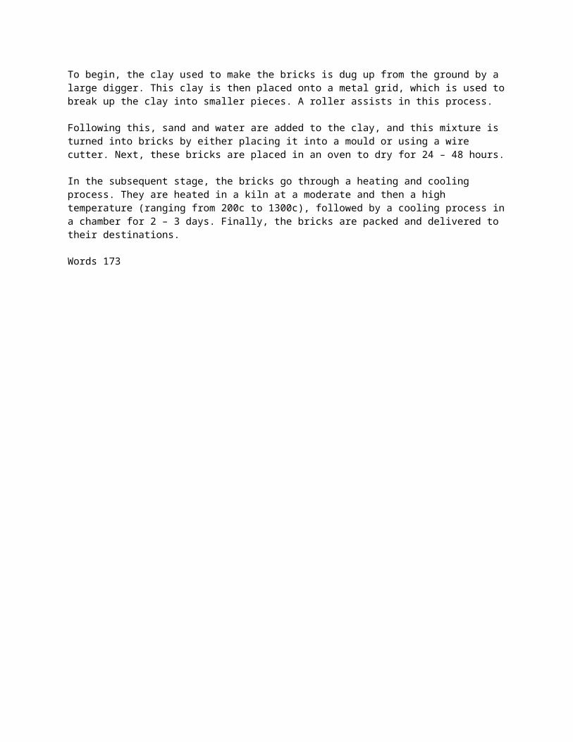
The diagram explains the way in which bricks are made for the building industry. Overall, there are seven stages in the process, beginning with the digging up of clay and culminating in delivery.

To begin, the clay used to make the bricks is dug up from the ground by a large digger. This clay is then placed onto a metal grid, which is used to break up the clay into smaller pieces. A roller assists in this process.
Following this, sand and water are added to the clay, and this mixture is turned into bricks by either placing it into a mould or using a wire cutter. Next, these bricks are placed in an oven to dry for 24 – 48 hours.
In the subsequent stage, the bricks go through a heating and cooling process. They are heated in a kiln at a moderate and then a high temperature (ranging from 200c to 1300c), followed by a cooling process in a chamber for 2 – 3 days. Finally, the bricks are packed and delivered to their destinations.
Words 173
You should spend about 20 minutes on this task.The chart shows components of GDP in the UK from 1992 to
2000.
Summarize the information by selecting and reporting the main features and make comparisons where relevant.
Write at least 150 words.
Gross Domestic Product in the UK
Bar Chart Model Answer
The bar chart illustrates the gross domestic product generated from the IT and Service Industry in the UK from 1992 to 2000. It is measured in percentages. Overall, it can be seen that both increased as a percentage of GDP, but IT remained at a higher rate throughout this time.
At the beginning of the period, in 1992, the Service Industry accounted for 4 per cent of GDP, whereas IT exceeded this, at just over 6 per cent. Over the next four years, the levels became more similar, with both components standing between 6 and just over 8 per cent. IT was still higher overall, though it dropped slightly from 1994 to 1996.

However, over the following four years, the patterns of the two components were noticeably different. The percentage of GDP from IT increased quite sharply to 12 in 1998 and then nearly 15 in 2000 , while the Service Industry stayed nearly the same, increasing to only 8 per cent.
At the end of the period, the percentage of GDP from IT was almost twice that of the Service Industry.
Words 182
You should spend about 20 minutes on this task.The pie charts show the electricity generated in Germany and France from all sources and renewables in the year 2009.
Summarize the information by selecting and reporting the

main features and make comparisons where relevant.
Write at least 150 words.
Sample Pie Chart - Model Answer
The four pie charts compare the electricity generated between Germany and France during 2009, and it is measured in billions kWh. Overall, it can be seen that conventional thermal was the main source of electricity in Germany, whereas nuclear was the main source in France.
The bulk of electricity in Germany, whose total output was 560 billion kWh, came from conventional thermal, at 59.6%. In France, the total output was lower, at 510 billion kWh, and in contrast to Germany, conventional thermal accounted for just 10.3%, with

most electricity coming from nuclear power (76%). In Germany, the proportion of nuclear power generated electricity was only one fifth of the total.
Moving on to renewables, this accounted for quite similar proportions for both countries, at approximately 15% of the total electricity generated. In detail, in Germany, most of the renewables consisted of wind and biomass, totaling around 75%, which was far higher than for hydroelectric (17.7%) and solar (6.1%). The situation was very different in France, where hydroelectric made up 80.5% of renewable electricity, with biomass, wind and solar making up the remaining 20%.
(Words 183)
You should spend about 20 minutes on this task.
The chart shows British Emigration to selected destinations

between 2004 and 2007.
Summarize the information by selecting and reporting the main features and make comparisons where relevant.
Write at least 150 words.
IELTS Bar Chart Model Answer
The bar chart shows the number of British people who emigrated to five destinations over the period 2004 to 2007. It is evident from the chart that throughout the period, the most popular place to move to was Australia.
Emigration to Australia stood at just over 40,000 people in 2004, which was approximately 6,000 higher than for Spain, and twice as high as the other three countries. Apart from a jump to around 52,000 in 2006, it remained around this level throughout the period.
The next most popular country for Britons to move to was Spain, though its popularity declined over the time frame to finish at below 30,000 in 2007. Despite this, the figure was still higher than for the remaining three countries. Approximately 20,000 people emigrated to New Zealand each year, while the USA fluctuated between 20-25,000 people over the period.

Although the number of visitors to France spiked to nearly 35,000 in 2005, it was the country that was the least popular to emigrate to at the end of the period, at just under 20,000 people.
(Words 179)
You should spend about 20 minutes on this task.
The line graph shows visits to and from the UK from 1979 to 1999, and the bar graph shows the most popular countries visited by UK residents in 1999.
Summarize the information by selecting and reporting the main features and make comparisons where relevant.
Write at least 150 words.

IELTS Line and Bar Chart - Model Answer
The line graph illustrates the number of visitors in millions from the UK who went abroad and those that came to the UK between 1979 and 1999, while the bar chart shows which countries were the most popular for UK residents to visit in 1999. Overall, it can be seen that visits to and from the UK increased, and that France was the most popular country to go to.
To begin, the number of visits abroad by UK residents was higher than for those that came to the UK, and this remained so throughout the period. The figures started at a similar amount, around 10 million, but visits abroad increased significantly to over 50 million, whereas the number of overseas residents rose steadily to reach just under 30 million.

By far the most popular countries to visit in 1999 were France at approximately 11 million visitors, followed by Spain at 9 million. The USA, Greece, and Turkey were far less popular at around 4, 3 and 2 million visitors respectively.
(Words 171)

You should spend about 20 minutes on this task.The line graph shows thefts per thousand vehicles in four European countries between 1990 and 1999.
Summarize the information by selecting and reporting the main features and make comparisons where relevant.
Write at least 150 words.
IELTS Line Graph Examples - Model Answer
The line graph compares the number of car thefts per thousand of the population in four countries from 1990 to 1999. Overall, it can be seen that car thefts were far higher in Great Britain than in the other three counties throughout the whole time frame.
To begin, car thefts in Sweden, France and Canada followed a fairly similar pattern over the first five years, all remaining at between 5 and 10 per thousand. The general trend

though for France and Canada was a decline in the number of vehicles stolen over the period, with both at around 6 in 1999. In contrast, Sweden experienced an upward trend, starting the period at just over 5, and finishing at just under 15.
Interestingly, car thefts in Great Britain started at 18 per thousand, which far exceeded that of the other countries. It then fluctuated over the next nine years, reaching a peak of 20 thefts per 1000 in 1996, and ending the period slightly lower than where it began, at approximately 17 per thousand.
(Words 173)

You should spend about 20 minutes on this task.
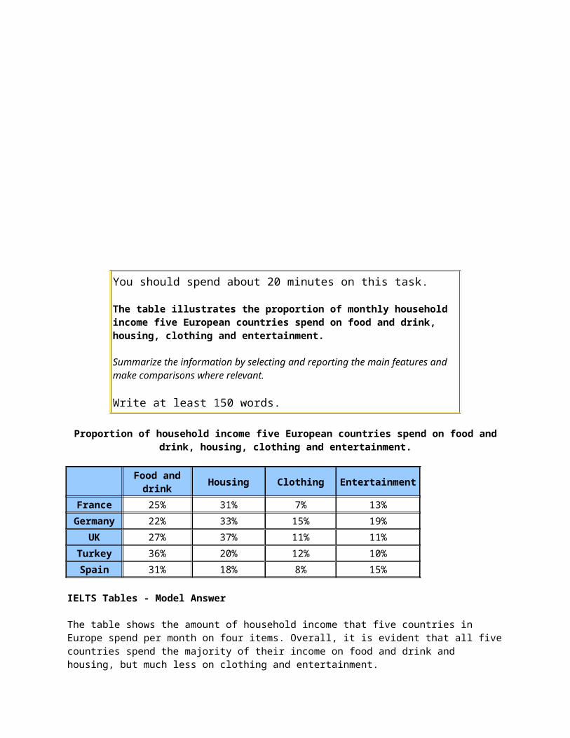
The table illustrates the proportion of monthly household income five European countries spend on food and drink, housing, clothing and entertainment.
Summarize the information by selecting and reporting the main features and make comparisons where relevant.
Write at least 150 words.
Proportion of household income five European countries spend on food and drink, housing, clothing and entertainment.
Food and drink
Housing Clothing Entertainment
France 25% 31% 7% 13%
Germany 22% 33% 15% 19%
UK 27% 37% 11% 11%
Turkey 36% 20% 12% 10%
Spain 31% 18% 8% 15%
IELTS Tables - Model Answer
The table shows the amount of household income that five countries in Europe spend per month on four items. Overall, it is evident that all five countries spend the majority of their income on food and drink and housing, but much less on clothing and entertainment.
Housing is the largest expenditure item for France, Germany and the UK, with all of them spending around one third of their income on this, at 30%, 33% and 37%, respectively. In contrast, they spend around a quarter on food and drink. However, this pattern is reversed for Turkey and Spain, who spend around a fifth of their income on housing, but approximately one third on food and drink.
All five countries spend much less on the remaining two items. France and Spain spend the least, at less than 10%, while the other three countries spend around the same amount, ranging between 13% and 15%. At 19%, Germany spends the most on entertainment, whereas UK and Turkey spend approximately half this amount, with France and Spain between the two.
(175 Words)
ou should spend about 20 minutes on this task.
The illustrations show how chocolate is produced.
Summarize the information by selecting and reporting the main features and make comparisons where relevant.
Write at least 150 words.
IELTS Task 1 Process - Model Answer
The diagram explains the process for the making of chocolate. There are a total of ten stages in the process, beginning with the growing of the pods on the cacao trees and culminating in the production of the chocolate.
To begin, the cocoa comes from the cacao tree, which is grown in the South American and African continents and the country of Indonesia. Once the pods are ripe and red, they are harvested and the white cocoa beans are removed. Following a period of

fermentation, they are then laid out on a large tray so they can dry under the sun. Next, they are placed into large sacks and delivered to the factory. They are then roasted at a temperature of 350 degrees, after which the beans are crushed and separated from their outer shell. In the final stage, this inner part that is left is pressed and the chocolate is produced.
(152 Words)