how to read your episode report - medicaid.ohio.gov · an individual episode. it is expected that...
TRANSCRIPT

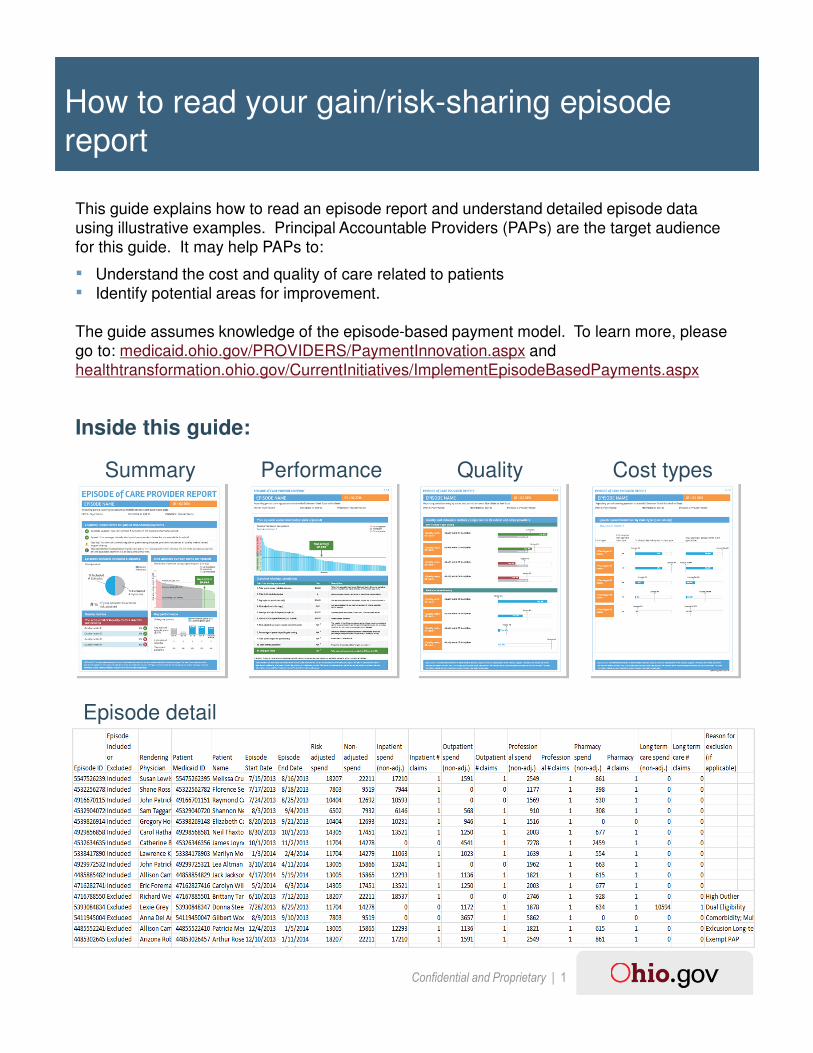
How to read your episode report
Confidential and Proprietary | 1
How to read your gain/risk-sharing episode
report
This guide explains how to read an episode report and understand detailed episode data
using illustrative examples. Principal Accountable Providers (PAPs) are the target audience
for this guide. It may help PAPs to:
▪ Understand the cost and quality of care related to patients
▪ Identify potential areas for improvement.
The guide assumes knowledge of the episode-based payment model. To learn more, please
go to: medicaid.ohio.gov/PROVIDERS/PaymentInnovation.aspx and
healthtransformation.ohio.gov/CurrentInitiatives/ImplementEpisodeBasedPayments.aspx
Inside this guide:
Summary Performance Quality Cost types
Episode detail

Confidential and Proprietary | 2
Summary
1
2
5
43
6

Confidential and Proprietary | 3
The text in the top left corner of the box indicates the number of episodes for which you were the PAP. The pie chart represents the proportion of these that were included (blue) and excluded (grey) from your performance results. Note: throughout the report, unless otherwise indicated, all results are based on included episodes.▪ An episode could be excluded for various clinical or
business reasons (e.g., left against medical advice, inconsistent enrollment).
▪ For a general understanding of exclusion criteria, see: http://healthtransformation.ohio.gov/LinkClick.aspx?fileticket=effiGhaJYNQ%3d&tabid=226
▪ For a detailed list of exclusion criteria for a specific episode of care, go to medicaid.ohio.gov/PROVIDERS/PaymentInnovation.aspxand download the Code Table Excel spreadsheet for the episode of care you are interested in. Open the Code Sheet tab and filter on the “06 - Excluded Episodes” Design Dimension.
3
3a
The report refers to episodes that ended during this time period. ▪ A three month claims run out period is included for claim
submission. In this example, July 1st – September 30th, 2016 is the run out period.
▪ The provider name denotes the billing provider; the report may therefore include episodes for multiple individual physicians where more than one physician is associated with the same provider billing ID
1
This section shows where you stand on the three requirements for eligibility for a positive / negative incentive. ▪ Episode volume – indicates whether you have met the
eligibility requirement of at least 5 valid episodes in the performance period.
▪ Spend – indicates whether your average risk-adjusted spend is commendable (required for positive incentive), acceptable, or above acceptable (incur a negative incentive payment).
▪ Quality – indicates whether all quality metrics required for a positive incentive have been met or not.
The last box will contain the positive or negative incentive payment (if applicable) during the final report of the performance period.
2

Confidential and Proprietary | 4
The quality metrics section shows the percentage of included episodes that met each quality metric criterion and whether the overall threshold was met. The threshold for each quality metric listed here must be met for a PAP to be eligible for a positive incentive payment▪ The green check and red X indicate whether each metric
met the threshold. See page 3 of the report for a more detailed view.
▪ Additional quality metrics not linked to the positive incentive payment are listed on page 3 of the report
5
The graph shows the risk-adjusted average spend per included episode, by PAP, for PAPS with 1 or more included episode(s). Each PAP is represented by a vertical bar. ▪ Acceptable and commendable spend thresholds are
displayed as horizontal lines. The limit for a positive incentive payment is displayed as a dotted horizontal line – any gap in spend below this figure is not figured into the calculation of the positive incentive payment.
▪ Red bars represent PAPs with average spend above the acceptable threshold. Grey bars represent PAPs with average spend less than or equal to the acceptable threshold and greater than or equal to the commendable threshold. Green bars represent PAPs with average spend less than the commendable threshold.
You can use this to understand how your spend per episode compares to that of other PAPs in Ohio, as well as how your performance compares to thresholds set to determine incentive payments.
4
6 The key performance section shows a rolling four quarters of spend performance and the weighted averages for the performance period. ▪ The spend shown in grey is for informational purposes
only, as those quarters do not fall in the current performance period.
▪ Spend percentile indicates the percent of PAPs whose spend is lower than your spend
The bottom portion of this section shows the percentage of your included episodes that were risk adjusted, i.e., that had costs adjusted downward, based on the presence of defined risk factors identified in the episode claims data. Risk adjustment enables comparison of doctors’ performance relative to others’ in a way that takes patient health risk factors and other health complications into consideration.▪ For a detailed description of a base risk adjustment
methodology, see medicaid.ohio.gov/Portals/0/Providers/PaymentInnovation/Episode-Risk-Adjustment.pdf.
3b
3

Confidential and Proprietary | 5
Performance
1
2

Confidential and Proprietary | 6
This graph shows the spend for each of your included episodes, after risk adjustment. Each
vertical bar represents one episode.
You can determine:
– The average spend across your episodes as illustrated by the horizontal line. This
line represents the same figure as the “You are here” vertical bar in chart 4 on page
1, where average spend per episode is compared to that for other PAPs.
– How many episodes fall into the three spend categories: not acceptable, acceptable
and commendable. (Note: the categories apply to the average spend, not spend on
an individual episode. It is expected that some individual episodes would have costs
above the acceptable range.)
– The range of spend for your episodes.
This table lays out the components and methodology underlying gain or risk sharing
calculations, whichever is applicable to your performance. Rows 7-11 will show as “N/A” for
the Q1, Q2, and Q3 report and will be populated for the Q4 report containing actual
payments.
2
1

Confidential and Proprietary | 7
Quality
1
2

Confidential and Proprietary | 8
In this section you can assess your performance on quality metrics relative to the thresholds
required for positive incentive payments and to other providers. PAPs must pass the
threshold for each quality metric listed above to be eligible for a positive incentive payment.
▪ The green or red bar indicates your performance. The bar is green if you pass the
threshold for eligibility and red if you do not pass.
▪ The grey bar indicates the threshold required to receive a positive incentive if you are
eligible based on spend. This allows you to compare your performance to the threshold.
▪ The median number is the median performance for included episodes, across all Ohio
PAPs receiving reports for this episode type (payer specific).
Your performance on these quality metrics is presented for your information only, and is not
linked to payment. This analysis may help you to evaluate how you practice.
▪ The blue bar indicates your performance on the metric
▪ The vertical bar indicates the median performance of Ohio PAPs receiving reports of this
type.
2
1

Confidential and Proprietary | 9
Cost types

Confidential and Proprietary | 10
This page provides a detailed look at your episode spend and the average spend for all
PAPs. Each claim type is a component of the overall spending on this episode type; only
the claim types that represent large portions of spend on are shown here.
▪ The number of episodes refers to the absolute number of your included episodes that
had spend of this claim type.
▪ The percent of episodes with spend in a claim type indicates the frequency with which
types of spend occurred for your episodes, relative to the average across PAPs. This
may be helpful to identify areas where variations in care patterns occur.
▪ The average spend per claim type is the average for included episodes across all Ohio
PAPs for this episode type (payer specific). This shows how your episode spend by
claim type compares to that of other PAPs. Differences may indicate areas with
opportunities to learn from other providers and to share best practices.

Confidential and Proprietary | 11
Episode detail
▪ Which episodes were included and which were excluded, with reasons for exclusions.
▪ Rendering physician (or attending physician for inpatient episodes) for the episode trigger event.
▪ Risk adjusted and non-risk adjusted episode spend per episode.
▪ Non-adjusted cost breakdown, i.e., inpatient, outpatient, professional and pharmacy claims, for each episode.
▪ The number of claims for each claim type, i.e., volume breakdown for each episode.
▪ Performance on each quality metric for each episode
1a 2 1b
3 4 5
1a 1b
2
3
4
5
Each summary report is accompanied by a CSV file that contains information for each episode. You can use this to determine:
6
6

Confidential and Proprietary | 12
Contacts
Further information is available at:
http://www.medicaid.ohio.gov/
For questions and feedback, please contact
our Medicaid provider hotline at:
(800) 686-1516.