how to make a line graph with phase lines in excel 2007 aids/linegraphfor2007.jobaid.pdf · how to...
TRANSCRIPT

How to make a line graph with phase lines in Excel 2007 1 Performance Aid
How to Make a Line Graph with Phase Lines in Excel 2007 Performance Aid
Purpose
The purpose of this document is to provide you with instructions to reference as you create a line graph in Excel
2007. It will provide you with step-by-step directions that will take you through entering your data, making a
graph, adding phase lines, making your graph look professional, and inserting it into a document.
Entering your data
1. Use three columns
a. The first column is for your horizontal x-axis
i. Write in dates or sessions here
1. A “session” is just a fancy name for an observation period
b. The second column is your collected data
i. Place in this column your
1. frequency count
2. time (for duration and latency)
3. level measurement (make sure to give each level a number)
a. These can be either totals or averages per session
c. Finally, the third column is for phase changes
i. You won’t need to know this for this current assignment, but after you implement your
intervention, this will come in handy. So remember it!
ii. When entering in a phase change – make sure that the two cells to the left are empty
iii. Also, make sure that the number that is entered in for a phase change is equal to the highest
score that you would like on your vertical y-axis
Enter your dates or
sessions here
Enter your data in
frequency, time, or
levels here
If you need a phase change, make
sure that the left two cells are
empty, and that the value entered
in this column is equal to the
highest score that you would like
to view on your vertical y-axis

How to make a line graph with phase lines in Excel 2007 2 Performance Aid
Graphing the data
1. To graph your data – highlight the right two columns by:
a. Clicking in the top-left cell,
b. Pressing and holding the Shift key on your keyboard, and
c. Clicking in the bottom-right cell
2. Now that you have your data selected, click on the Insert tab at the top of the Ribbon
3. Then click on Line
4. Then click on the first 2-D line graph button that appears underneath that
5. Presto! You have a graph
1
2
3
4
How to make a line graph with phase lines in Excel 2007 3 Performance Aid
Modifying your graph
Now that you have your graph, you’ll have to modify it a little…
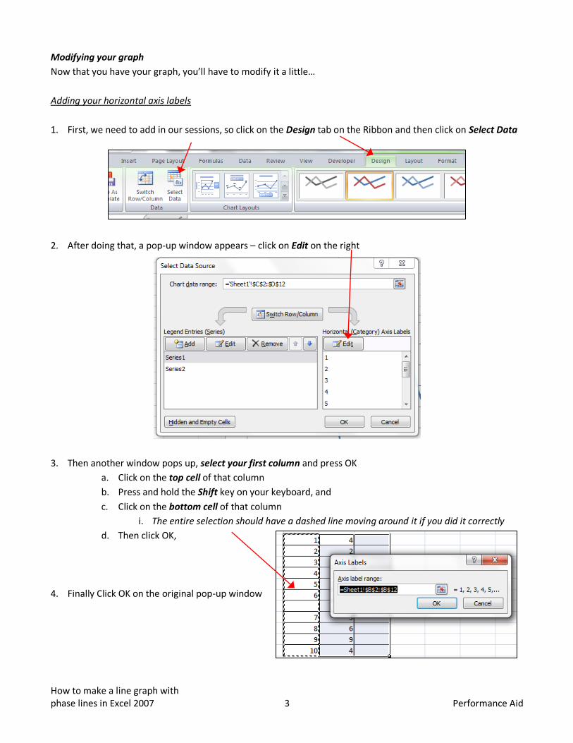
Adding your horizontal axis labels
1. First, we need to add in our sessions, so click on the Design tab on the Ribbon and then click on Select Data
2. After doing that, a pop-up window appears – click on Edit on the right
3. Then another window pops up, select your first column and press OK
a. Click on the top cell of that column
b. Press and hold the Shift key on your keyboard, and
c. Click on the bottom cell of that column
i. The entire selection should have a dashed line moving around it if you did it correctly
d. Then click OK,
4. Finally Click OK on the original pop-up window
How to make a line graph with phase lines in Excel 2007 4 Performance Aid
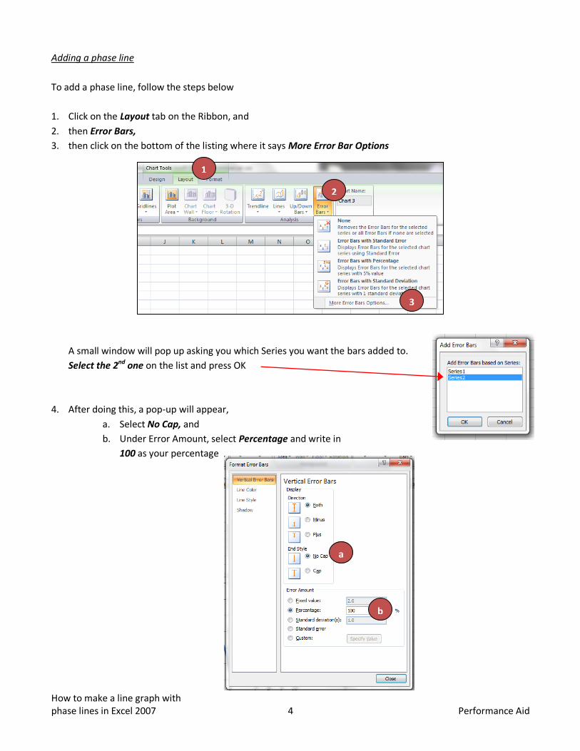
Adding a phase line
To add a phase line, follow the steps below
1. Click on the Layout tab on the Ribbon, and
2. then Error Bars,
3. then click on the bottom of the listing where it says More Error Bar Options
A small window will pop up asking you which Series you want the bars added to.
Select the 2nd one on the list and press OK
4. After doing this, a pop-up will appear,
a. Select No Cap, and
b. Under Error Amount, select Percentage and write in
100 as your percentage
1
2
3
a
b

How to make a line graph with phase lines in Excel 2007 5 Performance Aid
5. Then go to the left of this pop-up, and click on Line Style
a. Select the fourth option down under dash type
6. Click Close at the bottom right of the pop-up window, and
Viola! You now have error bars!
Adjusting your vertical axis
Now that you’ve made your error bars, you may need to adjust your Y-axis so that it isn’t too large for the graph
1. To do this, click on the Layout tab on the Ribbon again,
2. then Axes,
3. then Primary Vertical Axis,
4. then More Primary Vertical Axis Options
5. A pop-up window will appear
a. Locate where it says Maximum ,
b. select Fixed, and
c. enter in the number that you would like to be the top score on your vertical Y-axis
i. This should match the number that you entered for each phase change in your phase
change column
1
2
3
4

How to make a line graph with phase lines in Excel 2007 6 Performance Aid
Finishing Touches
Now that you have your graph basically the way that you want it, there are a few touched that need to be done
to make this graph spectacular (and more aligned with ABA practice)
Gridlines
1. First, get rid of your gridlines by selecting Layout in the Ribbon,
2. then Gridlines,
3. then Primary Horizontal Gridlines,
4. then None
Legend
1. Then get rid of your legend by selecting Layout in the Ribbon,
2. then Legend
3. then None
Chart Title
1. Finally, add a chart title by selecting Layout in the Ribbon,
2. then Chart Title
3. then Above Chart
4. then type in your desired title in the box that appeared in the graph
Inserting the graph into a document
1. To insert the graph into a document, simply right-click,
2. select Copy, and
3. then Paste into your document