historical research report
TRANSCRIPT

HISTORICAL RESEARCH REPORTResearch Report TM/88/03
1988
Ergonomic guidelines for control room software used with automated vertical guidance of shearers. Final report on CEC Contract 7249/11/007 Talbot CF, Collier SG, Graveling RA


Copyright © 2006 Institute of Occupational Medicine. INSTITUTE OF OCCUPATIONAL MEDICINE No part of this publication may be reproduced, stored Research Avenue North, Riccarton, Edinburgh, EH14 4AP or transmitted in any form or by any means without Tel: +44 (0)870 850 5131 Fax: +44 (0)870 850 5132 written permission from the IOM e-mail [email protected]
Ergonomic guidelines for control room software used with automated vertical guidance of shearers. Final
report on CEC Contract 7249/11/007
Talbot CF, Collier SG, Graveling RA This document is a facsimile of an original copy of the report, which has been scanned as an image, with searchable text. Because the quality of this scanned image is determined by the clarity of the original text pages, there may be variations in the overall appearance of pages within the report. The scanning of this and the other historical reports in the Research Reports series was funded by a grant from the Wellcome Trust. The IOM’s research reports are freely available for download as PDF files from our web site: http://www.iom-world.org/research/libraryentry.php
HISTORICAL RESEARCH REPORTResearch Report TM/88/03
1988

ii Research Report TM/88/03

TM/88/03UDC 331.041:681.3:622.23
FINAL REPORT ON CECCONTRACT 7249/11/007
ERGONOMIC GUIDELINES FORCONTROL ROOM SOFTWARE USEDWITH AUTOMATED VERTICALGUIDANCE OF SHEARERS
C.F. TalbotS.G. CollierR.A. Graveling
January, 1988
-nj
vjf *u."**. " •'->J! u"
2 4 MAY 1988
This report is one of a series of technical memoranda (TM) published bythe Institute of Occupational Medicine. Current and earlier lists ofthese reports, and of other Institute publications, are available fromthe Librarian at the address overleaf.
For further information about the Institute's facilities for research,consultancy and teaching on occupational health and hygiene pleaseconsult the Director.
This report is made primarily from the point of view of ergonomics. Theauthors are not in a position to be able to take full account of non-ergonomic requirements and it may not, therefore, be practicable tofully implement ergonomic requirements.
Report on TM/88/03CEC Contract 7249/11/007
INSTITUTE OF OCCUPATIONAL MEDICINE
ERGONOMIC GUIDELINES FOR CONTROL ROOM SOFTWARE USEDWITH AUTOMATED VERTICAL GUIDANCE OF SHEARERS
by
C.F. TalbotS.G. CollierR.A. Graveling
FINAL REPORT ON CEC RESEARCH CONTRACT 7249/11/007
Duration of project : January 1986 to December 1987
Research work carried out with financial aid from the
Commission of the European Communities and British Coal
Institute of Occupational MedicineRoxburgh PlaceEDINBURGHEH8 9SU
Telephone 031-667-5131 January, 1988

I N S T I T U T E O F O C C U P A T I O N A L M E D I C I N E
ERGONOMIC GUIDELINES FOR CONTROL ROOM SOFTWARE USEDWITH AUTOMATED VERTICAL GUIDANCE OF SHEARERS
by
C.F. TalbotS.G. CollierR.A. Graveling
CONTENTS
SUMMARY
1. INTRODUCTION » 1
1.1 Ergonomic Design Philosophy and Principles 31.2 Approach to Project N 7
2. ERGONOMIC ISSUES IN THE DESIGN OF COMPUTER INFORMATION SYSTEMS 9
2.1 Introduction 92.2 Description of the MIDAS Surface Software System 9
2.2.1 Hardware 92.2.2 Basic software system 102.2.3 Information displays 13
2.3 Ergonomic Issues Identified from an Initial Evaluation 14of MSS
3. DERIVATION OF GUIDELINES FOR THE DESIGN OF COMPUTER INFORMATION 17SYSTEMS
3.1 Introduction 173.2 Dialogue Design 17
3.2.1 Introduction 173.2.2 Dialogue quality 183.2.3 Consistency 193.2.4 Dependency on operator experience 203.2.5 Error correction 203.2.6 System response time 21
3.3 Colour . 24
3.3.1 Introduction 243.3.2 Colour-coding 253.3.3 Aesthetic appeal 263.3.4 Selection of colours 27
3.4 Menus 29
3.4.1 Introduction 293.4.2 Advantages of menus 303.4.3 Disadvantages of menus 30
4.
3.5
3.6
3.7
3.8
3.9
3.4.4 Categorizing and naming3.4.5 Navigation3.4.6 Number of menu items per page3.4.7 Grouping of menu items3.4.8 Positional constancy
Graphs and Charts
3.5.1 Introduction3.5.2 Simple graphs3.5.3 Multiple-line graphs and multiple graphs on a page3.5.4 Bar charts and pie charts3.5.5 Scales3.5.6 Coding in graphs and bar charts
Tables
3.6.1 Introduction3.6.2 Principles for the design of tables
Text on VDUs
3.7.1 Introduction3.7.2 The reading process and legibility3.7.3 Line length and spacing3.7.4 Spatial grouping of text parts3.7.5 General aspects of the legibility of coloured text3.7.6 Specific relations between reading and colour3.7.7 Typographic effects3.7.8 Controlling text viewed
Printed Text
3.8.1 Introduction3.8.2 Titles, summaries, headings and advance organizers3.8.3 Indexing systems3.8.4 Prose structure3.8.5 Readability
Abbreviations
3.9.1 Introduction3.9.2 Construction of abbreviations3.9.3 Ambigity
SURVEY OF MSS USERS
4.14.24.34.4
IntroductionAimsMethodResults and Discussion
4.4.1 Face managemen t
4.4.1.1 Face profile4.4.1.2 Machine travel4.4.1.3 Time statistics pie4.4.1.4 Tonnage pie4.4.1.5 Delays
3232333434
35
353636373939
40
4041
44
4444454646474849
50
5050515253
54
545556
59
59596062
63
6568707274
4.4.2 Monitoring current machine performance 764.4.3 Checking steering performance 804.4.4 Engineering fault diagnosis/monitoring 844.4.5 Overall ratings 884.4.6 User experience 90
4.5 Other issues arising 904.6 Conclusions 100
5. ERGONOMIC ASSESSMENT OF MIDAS SURFACE SOFTWARE 103
5.1 Introduction 1035.2 User Interface and Dialogue Techniques 1035.3 Layout and Structure of the Menu System 1045.4 System Response Time 1075.5 Operator's Updated Display 1085.6 Management Information 1095.7 Steering Performance and Engineering Displays 1105.8 User Documentation 1125.9 Overall System Considerations 112
6. CONCLUSIONS 115
7. REFERENCES 117
8. ACKNOWLEDGEMENTS 129
APPENDIX A: Ergonomic Design Guidelines 131
APPENDIX B: MIDAS Job Description Questionnaire 163

I N S T I T U T E O F O C C U P A T I O N A L M E D I C I N E
ERGONOMIC GUIDELINES FOR CONTROL ROOM SOFTWARE USEDWITH AUTOMATED VERTICAL GUIDANCE OF SHEARERS
by
C.F. TalbotS.G. CollierR.A. Graveling
SUMMARY
Technological changes have brought about a considerable growth in
automated systems in coal mining. Amongst these has been the advent of
the auto-steering (vertical guidance) of shearers. Such systems have
improved working conditions on the face for both men and machinery
resulting in greater safety and improved efficiency.
As an adjunct to this, known in its production version as MIDAS (Machine
Information Display and Automation System), a surface monitoring
function has been developed which extends the information display
element to the surface. The MIDAS system continuously transmits
steering data and information from other sensors to the surface
permitting the remote monitoring of the status and progress of the
machine on the coal face.
The human element of any man-machine system is capable of responding to
a wide variety of demands. However, this adaptability frequently masks
the ergonomic inadequacies of technically-sufficient systems. To ensure
the efficient and effective operation of a man-machine system such as
that formed by the MIDAS surface information displays and their intended
users it is necessary to pay attention to a wide range of ergonomics
issues. This project was concerned with providing ergonomic guidelines
for the design of software for this surface monitoring facility. In
particular, it addressed factors such as the interactive dialogue and
the design of the displays used by the system.

Following an examination of the existing MIDAS surface display system to
determine those elements of software design which were relevant to the
system and its planned development, the literature on ergonomic factors
associated with computer systems was surveyed in order to derive general
guidelines. These were formulated to assist in and encourage the use of
ergonomic principles in the design and development of computer-based
information systems.
These guidelines provided general aid in shaping the software systems
and a number of issues raised by them were successfully implemented in
software revisions. However, the guidance provided was at a
level where it could be applied to many different software systems
virtually independently of the planned users of any such system. In
order to tailor the needs of the system more effectively, it was
necessary to determine the specific needs of the users. This was
achieved through a series of structured interviews with a variety of HQ,
Area and Colliery staff. The survey identified a number of principle
tasks for which the MIDAS system was used in a consistent manner,
including monitoring current shearer performance and face management.
However, there was a much less consistent utilisation of the system for
other tasks such as fault diagnosis and engineering monitoring.
This information was then used in conjunction with the design guidelines
to identify problems and to produce specific ergonomic recommendations
for their"solution.

I N S T I T U T E O F O C C U P A T I O N A L M E D I C I N E
ERGONOMIC GUIDELINES FOR CONTROL ROOM SOFTWARE USEDWITH AUTOMATED VERTICAL GUIDANCE OF SHEARERS
by
C.F. TalbotS.G. CollierR.A. Graveling
1. INTRODUCTION
Progress of a longwall face must be controlled accurately. If the face
line is not kept straight and at the correct angle, both in advance and
to the gate roads at either end, difficulties will arise in the
alignment of face supports and also for coal clearance systems. One of
the key elements in controlling face progress is in the steering of the
coal cutting machine. The type of coal cutting machine most
frequently-used by British Coal is a ranging drum shearer. Steering of
a ranging drum shearer is achieved by ranging the machine boom on a
fixed underframe. The operator must determine the optimum position of
the boom in order to leave the correct thickness of roof coal, often
without the aid of any visible marker bands in the coal seam. At the
same time he must take into consideration the angle of the machine
relative to face advance, and also remember that excessive steps in the
roof can cause problems when advancing powered roof supports. If the
cutting drum is allowed to stray too far upwards then the quality of
coal can be spoilt by rock being cut. Conversely not cutting close
enough to the roof or the floor means lost production and hence reduced
efficiency. Steering is also made more complex by seam irregularities
such as variations in thickness and geological faults.
Technological changes in the early 1980s have encouraged the
exploitation of automation systems on underground mobile plant within
British Coal. One of the major areas of development in this move
towards automated systems has been in the vertical guidance of shearers.
The Headquarters Technical Department (HQTD) of British Coal has been
working on the automatic guidance of coal-winning machines for a number
2.
of years. Shearers guided by such systems have been shown to cut coal
more efficiently and with less waste than shearers steered manually.
Roof control is improved and the coal cut is cleaner. In addition to
improved productivity, better roof control also enhances safety and
helps improve working conditions on the coal face. Hunter (1983)
describes some of the monetary and other benefits. At one pit trial,
the system cut a coal panel in 70% of the usual time. Materials costs
were 25% lower and face delays were significantly reduced. Hence, great
emphasis is being placed on the rapid exploitation of this development.
Experience has shown that the successful exploitation is very much
dependent on surface°-based monitoring of the health and performance of
such systems. This is particularly true during installation,
commissioning and the trouble-shooting of systems failures.
In close liaison with machine manufacturers, British Coal HQTD have
developed a production vertical guidance and machine condition
monitoring system known as 'MIDAS' (Machine Information Display and
Automation System). In addition to its machine control function the
MIDAS system also continuously transmits steering data and information
from other sensors to the surface. A computer system using this
information can then be used to assess the performance of the automatic
steering, to indicate the condition of the machine and to provide data
regarding the status and progress of the machine on the coal face.
Software for the surface monitoring of this information is currently
being developed and is based on a configurable supervisory monitoring
system known as "SUMMIT" (Supervisory Machine Monitoring and Information
Terminal). Current development work will allow SUMMIT to interface to
any transmission system conforming to the draft communications standards
of British Coal. Hence it can potentially be used for the surface
monitoring of:
Vertical and horizontal guidance systems for shearers.
Coal heading machines such as the In-seam Miner (ISM).
Roadheader and circular tunnelling systems.
Coal face alignment systems.

3.
The surface software used with MIDAS is an implementation of SUMMIT
configured to match the mining method and machine type at each
installation. Further software is then added to meet requirements
specific to MIDAS and the monitoring of the automated shearer.
The fundamental objective of a computer information system is to act as
a decision support aid. Ideally, such an aid should provide the user
with all of the information necessary to make the required decisions.
The operation of such a system and the interpretation of the displayed
data should be as simple or natural as possible to the user so as not to
interfere with the decision-making task. In most industrial or
commercial situations it is impractical to fully achieve such ideal
objectives. The economics of the situation usually demand that such
systems are used by a wide range of users and aid in a wide range of
decision-making tasks which may have conflicting 'ideal' requirements.
However, careful consideration of the human factors involved in both the
operation of such systems and the associated decision-making tasks can
greatly enhance their usability and utility and hence the overall
benefits to be gained.
The primary aim of this project was to produce ergonomic guidelines and
specific software design solutions for implementation within information
systems for the surface monitoring and control of automated shearer
vertical guidance systems. In order to maximize the potential value of
the project, the MIDAS surface software system was treated as a case
study to provide results and techniques that were applicable across the
whole range of possible SUMMIT-based information systems.
1.1 Ergonomic Design Philosophy and Principles
With the introduction of computer-based monitoring and control systems
there has evolved an increasing awareness of the need to consider a wide
range of ergonomic issues. Factors associated with the classic
man-machine system diagram (Figure 1) such as the legibility of displays
and the physical dimensions of controls still have a major role to play
in the design, selection and layout of appropriate system hardware.

4.
ENVIRONMENT
HARDWARE INTERFACE
Display Sensors
Control Effectors
Processing
MACHINE NAN
FIGURE 1. Man-machine System Diagram
However, this diagram does not encompass all of the factors which will
effect the quality and efficency of operator decision-making and hence
the overall reliablity of the system. An expanded diagram originally
proposed by Simpson and Mason (1984) and further discussed in Best et al
(1985) illustrates the much wider range of issues involved (see Figure
2). The expanded diagram shows a schematic representation of the
man-machine system surrounded by five "shells of influence". These
shells represent the generic areas into which the specific factors that
can reduce reliable performance may fall.
The human element of the man-machine system is capable of responding to
a wide variety of data display formats presented via a range of
different media. However, this adaptability frequently masks the
ergonomic inadequacies of technically sufficient systems. To ensure the
efficient and effective operation of a man-machine system such as
described by Figure 2, it is necessary to pay attention to ergonomic
issues in all the areas described. Factors within the personal and
organisational levels relate more to the implementation of completed
systems and, although important, are to a large extent outside the
intended scope of this project. Such issues are normally best dealt
with at the "green field site" stage of system development. For

example, questions related to user expectations and concerns should be
addressed by the effective use of training and the dissemination of
information prior to system implementation.
PERSONAL
ORGANISATIONAL
SOFTWARE
ENVIRONMENT
HARDWARE INTERFACE
Display
MACHINEi
Control
Sensors
MAN
Effectors
Processing
FIGURE 2. Man-machine System Diagram
This leaves the following, more immediate, issues:
(a) The environment the user is working in,
(b) The hardware the user is to interact with,
(c) The way'the user communicates with the system (dialogue),
(d) The information required by the user.
The areas covering basic hardware design and the physical environment in
relation to computer-based monitoring and control systems have been
extensively discussed. Design guidelines are widely available both
generally (see, for example, Cakir et al (1979) and Grandjean and
Vigliani (1980)) and specifically in the mining industry (Simpson et al,
1982 and Mason et al, 1983).

6.
In addition to the direct constraints covered by these guidelines, the
physical environment within which the user is working also comes within
the scope of the software design process. Factors such as heat, light,
noise and workspace layout may well influence the willingness or even
the ability of the user to perform the task required. For example,
where adverse environmental factors are known to exist and are
unavoidable the user interface needs to be designed with this in mind.
The use of a keyboard bell signal to flag a warning or alarm message may
be perfectly acceptable in an office environment, but it would be of
little use in a high background noise environment such as a coal
preparation plant.
Similarly, the hardware configuration of a system can have a large
effect on the way in which a user interacts with a system. However, the
hardware to be used is often predetermined by other system
considerations that are to a large extent outside the scope of this
document.
Most of the issues addressed by the project are therefore concerned with
software factors such as dialogue and display design although, as stated
above, there are obviously some areas of overlap and interaction at both
the workspace layout and organisational levels.
The type and style of dialogue between a user and a computer system have
a large effect on the user's attitude towards it. This in turn affects
the efficiency of the total system. The type and style of dialogue best
suited to a given application is determined mainly by the user's
experience and expectations. If a user is inexperienced and does not
know quite what to expect from a computer system, a great deal of time
and effort may be needed to cope with an inappropriate interface.
Conversely, an experienced user may feel frustrated and held back if
expected to use a dialogue designed for a less experienced group of
users. Consequently, it is important to consider the expected frequency
of use and the range of experience of the target user groups. If the
dialogue causes excessive difficulty or frustration for a user group,
then they may feel the effort required to use the system outweighs its
usefulness or the additional effort involved can interfere with the
quality of the actual tasks to be performed.
The range of data available on a computer information system is usually
far in excess of that required by a user to perform a given task. The
information required for a given task may be spread across many displays
and in differing formats. From the user's point of view, however, a
good system is one that contains all the information required for a
single task on a minimum number of screens and in a format that most
closely suits the way the data are used. To achieve this objective, ito
is necessary to consider in detail the tasks the user is expected to
perform, the frequency with which they are performed, and the importance
of, or the consequences associated with, task performance. The success
of any user-computer interaction is largely a direct function of the
designer's knowledge of the user's tasks and requirements.
1.2 Approach to the Project
At the start of the project, discussions with SUMMIT software
development personnel and MIDAS development and commissioning engineers
revealed the following major points:
SUMMIT provides a basic set of software procedures to handle
functions such as the presentation of menus and the plotting
of graphs etc..
Functions and displays that are specific to the requirements
of the MIDAS system are programmed by MIDAS development
personnel using the software procedures provided by SUMMIT.
The SUMMIT system was at an advanced stage of development. It
was expected that the final major software revisions would be
completed in a matter of months.
The practice of using standardised software procedures to perform
frequently-used functions is common to most software development
processes. Although those procedures that are used to drive the

8.
user-interface can never hope to be optimal for the total range of tasks
that they may be associated with, they can at least incorporate some of
the more general ergonomic principles. From an ergonomic viewpoint,
these procedures should also provide sufficient flexibility to enable
them to be tailored to the expected user characteristics and information
requirements for the specific application.
As SUMMIT software development was already well advanced, the project's
first priority was therefore to produce a set of basic software
ergonomic guidelines before the costs of making major changes to the
software outweighed the perceived ergonomic benefits. For example, a
major alteration such as a change in the dialogue method between human
and computer from a menu structure to a command language would entail a
major revision of the software which would be more difficult to justify
at a later stage of software development. It was envisaged that,
following the production of this basic guidance, further guidance could
be provided to MIDAS development engineers which would take into account
the specific requirements of MIDAS user groups. In addition, during the
later stages of the project, assistance could be given in implementing
this specific guidance into new MIDAS applications.

2. ERGONOMIC ISSUES IN THE DESIGN OF COMPUTER INFORMATION SYSTEMS
2.1 Introduction
The wide range of possible hardware configurations, environments and
dialogue styles imply a vast number of potential issues to be
considered. As the aim of the project was primarily to provide guidance
and design solutions for implementation within the MIDAS surface
software system, only those issues that were potentially relevant to the
further development and improvement of the current system were to be
studied in depth. To enable the identification of these issues, an
insight into the current system and the expected operations to be
performed with the surface software was necessary before even
preliminary basic guidelines could be produced.
In order to identify those software display issues relevant to the MIDAS
system, a software development system was obtained which permitted the
simulation of the system which was currently supplied to collieries. In
addition, there were two MIDAS systems installed and operational at
collieries. Visits were made to these sites to observe the displays and
interfaces forming the MIDAS surface system within the context in which
they were normally used.
2.2 Description of the MIDAS Surface Software System
2.2.1 Hardware
The basic hardware used by SUMMIT and hence also by MSS comprises:
A PDF 11/73 computer with 1 Mbyte of memory and 30 Mbyte of
hard disc storage.
A colour graphics terminal with a conventional 'QWERTY' keyboard.
A colour graphics printer.
An interface to the underground transmission system.
The standard display terminal used is a Microcolour M2250 which offers a
selection of up to 16 colours at a resolution of 640 x 480 pixels. For

10.
hard copy output, an eight colour ink-jet printer manufactured by
Integrex is normally used as it is inexpensive and reasonably accurate.
However, faster, more accurate and more expensive printers offering more
colours can also be used.
2.2.2 Basic software system
»
Data is received from the underground transmission system and stored in
files on the hard disc. These files are updated such that, when the
files are full, the oldest stored data is discarded. Because of this,
the time period covered by the data on file depends upon the rate at
which new data is received and can vary from a few weeks to several
months.
When first accessing the system, or at other times when an activity is
completed, the user is presented with a list of options known as a menu
from which to select the desired function. This the main or first level
menu is shown in Figure 3.
Surface MIDAS operator's menu facility.
Type <BackSpace> to Backup to previous level, <Escape> to exit menus altogether
Plot of data along face1. Examine filed alarms2. Examine current data3. Operators Updated Display4. Examine immediate data5. Examine filed data
Enter 1 option :-
7. Plot of face profile8. Plot of McPos Vs Time for a shift9. Plot of data against time
FIGURE 3. Main Menu Display Screen

11,
Selection of any of the main menu items except for item 3 (the
operator's updated display) results in the display of further nrenu pages
which guide the user to the data required. Selection of the operator's
updated display results in a continually updated display of a selection
of data items used for monitoring the current machine status and
position.
The further menu pages can be categorised into four basic types used for
the selection of:
(a) Data groups.
(b) Data items.
(c) Data access key.
(d) Start time of data.
The data received by the system is classified into one of three possible
groups. The first group is data received from the underground
transducers on the coal cutting machine (Transducer data). The second
is data entered manually undergound on the MIDAS system (Personality
data) and the third is data entered manually via the surface system
(Configured data). The personality and configured data groups are used
mainly during the installation and commissioning periods to provide a
record of the changes made to the basic system. It is the data in the
transducer group that is of interest to the majority of the system
users.
Selection of specific data items from the transducer group is made from
the data items available menu page. An example from one system is shown
in Figure 4. The data items included depend upon the configuration of
the installation and the total number of individual items will therefore
vary. The names used to describe the items can be varied and are
normally selected during the installation and commissioning phase to
suit local usage.

12.
Data Items available on Plant Item S 14's Face, type = Serd
Select Data Items from :
1.2.3.4.5.6.7.8.9.10.11.12.13.14.15.16.17.
Boom Oil flowBoom Oil flow stsBoom Oil tempBoom Oil temp stsBoom Range pressureBoom Range press stsHaulage Oil flowHaul. Oil flow stsHaulage Oil tempHaul. Oil temp stsHaulage pressureHaulage press stsMotor Coolant c
Motot Coolant statusRoof foil, pressureRoof foil, pres stsA/D status
18.19.20.21.22.23.24.25.26.27.28.29.30.31.32.33.34.
Machine angle (C)Machine angle (M)Coal reading sensorCurrent extractionExtractn. differenceHaulage directionMode switchMachine positionPredicted coalMachine speedStored extractionBoom height RHCoal at drum RHDesired Boom ht.RHRoof step RHSteering demand RHSteering error RH
35.36.37.38.39.40.41.42.43.44.45.46.47.48.49.
Control Avail. RHCoal type in use RHControl Used RHSignature countRaw Along Face tiltRaw Boom height RHRaw Coal at sensorRaw EOF ResetMidas 5V SupplyRaw Haul, directionRaw M/c angle (C)Raw M/c angle (M)Raw M/c positionRaw Roof foil. RHMidas 10V Supply
Enter up to 11 options : —
FIGURE 4. Data Items Available Menu Page
The range over which historical data is to be examined can be defined by
the use of one of four possible categories known as keys. Data can be
accessed by day, by shift, by pass or by shear. Use of the day or shift
option allows the selection of a block of data recorded over a given day
or working shift. The pass or shear option allows the selection of data
based on the physical progress of the machine. A pass is the movement
of the shearer from one end of the coal face to the other. A shear is
the movement required to cut a complete section or web of coal from the
coal face.
Finally, the particular block of data required for display is selected
from a menu page which displays the starting time of the available data
blocks. The format and number of options on this type of menu page
varies depending upon the access key selected. For access by day, the
available dates are displayed. Selection of data classified by shift is
made from a menu which presents the dates and shift names of the data
available (e.g. mornings, afternoons or nights). For access by pass or
shear, the date and start time (in hours and minutes) for each pass or
shear stored in the files is displayed.

13.
2.2.3 Information displays
The data can be displayed in textual form or in one of several different
graphics formats. The display system is based upon a standard graphics
package which can allow up to 100 different plant items to be displayed
simultaneously.
The selected transducer data can be displayed on the terminal screen in
a numerical format. In its alphanumeric display mode, the terminal is
capable of displaying 24 lines of text in 80 or 132 columns. In this
manner, data from up to 11 transducer items can be displayed at any oneT*.-
time. Numerical information is listed in columns on the screen with the
first column being used to display the time at which the data was
recorded. If more than six items are requested then the display screen
would be used in its 132 column mode to enable all the selected items to
be listed at the same time.
Graphical displays of the transducer data are produced by selecting
options 6 through 9 from the main menu. Options 6 and 9 would produce a
plot of any of the selected data items against either the machine
position on the coal face or against time. Up to four data items can be
selected for display at any one time. If the data from the selected
items was measured in the same basic units, for example if they were all
measures of temperature, the user could have all of the selected items
plotted on a single graph. Otherwise, up to four separate graphs can be
displayed on the screen at once.
When graphs are to be plotted a series of supplementary questions are
asked to determine the layout and scaling to be used in the production
of the display. For example, when data is to be plotted against the
machine position on the face (option 6 on the main menu), the following
questions would be asked in turn, to determine the scaling of the X
axis:

14.
Autoscaling on along face axis ? [Y/N] (Default [No]):-
Enter start point for plot - [0.0 to 350.0] (Default [0.0]):-
Enter end point for plot - [0.0 to 350.0] (Default [350.0]):-
If autoscaling is requested, the subsequent questions would not be
asked. All supplementary questions have the same basic format as those
shown above. Thus, following the basic text of each question, an
indication of the range of acceptable replies is given in square
brackets. For example, "[Y/N]" in the first question above indicates
that a Yes or No answer is required and the user may respond by entering
a letter "Y" or a le°tter "N". In the other questions, the range
indicator "[0.0 to 350.0]" shows that a numerical value in the range 0
to 350 should be entered. Following the range indicator, a default
value is normally shown. This is the value that would be automatically
entered by the system if the user simply pressed the enter key.
2.3 Ergonomic Issues Identified from an Initial Evaluation of MSS
From examining the system described above, it was possible to identify
those ergonomic issues in software design which were relevant to the MSS
system. Consequently, the literature in the following topics areas was
reviewed to provide the basic information for the production of software
design guidelines for use by the MSS development staff.
Dialogue Design
The Use of Colour on Displays
The Layout and Structure of Menu Systems
The Use of Graphs and Charts
The Use of Numerical Tables
Text on Visual Display Terminals
The Use and Construction of Abbreviations
Equally importantly, it was possible to exclude aspects of software
design within these topic areas which were not expected to form a part
of any current or future MSS system. For example, considerable current
interest has been expressed in the use of icons and other symbol-based

15.
menus for accessing parts of a system and such 'user-friendly'
approaches have been widely adopted within the computer industry.
However, development of an icon-based menu system on the type of
hardware currently employed to run the MSS system, would be impractical.
Changes to the MSS system that resulted from the introduction and use of
the resulting guidelines are reported in section 5.

16.
17.
3. DERIVATION OF GUIDELINES FOR THE DESIGN OFCOMPUTER INFORMATION SYSTEMS
3.1 Introduction
Having identified those topics where guidelines for MIDAS software
design were required, the next stage was to generate the basic
principles which would be used in formulating the guidance eventually
provided. Principles relating to many elements were already available,
either in established good custom and practice or in existing guideline
documents. However, there were a number of issues either where
principles or guidelines had not been established or where there was an
element of diversity or conflict amongst differing sources. In these
cases, it was necessary to examine the underlying experimental
literature in order to develop suitable principles and guidance. This
section contains an overview of the literature on the relevant ergonomic
factors associated with computer systems and humanrmachine interaction.
The information obtained from this was then used, in conjunction with
the established sources referred to above, to formulate a set of general
purpose guidelines to assist in and encourage the use of ergonomic
principles in the design and development of computer-based information
systems. The resultant guidelines are given in Appendix A. As stated
earlier, both this overview and the ensuing guidelines were only
intended to cover those design aspects relevant to the current and
anticipated characteristics and hardware of the MIDAS surface system.
Thus, for example, the use of a QWERTY'keyboard and an 80 column by 24
line visual display unit was assumed throughout, as this was the
hardware used on the MSS system.
3.2 Dialogue Design
3.2.1 Introduction
A user needs to feel that the computer is there as a tool to be used.
This feeling is determined in part by the tone and sequencing of the
discourse between the user and the computer. Users of an interactive
system quickly build up a feeling of style and quality of the system.
The term 'dialogue' in this context denotes a set of input and output

18.
procedures with which a user communicates with a computer system, and
vice-versa.
3.2.2 Dialogue quality
Actual knowledge (as opposed to opinion) about user-perceived quality is
scarce. A first step towards measuring this elusive construct is to
identify relevant system properties and user abilities (Embley and Nagy,
1981). One approach to this is by direct observations of users on
existing systems. Kennedy (1975) observed a large sample of clerical
and secretarial staff learning to use an interactive system. Initially
this began as a controlled experiment to investigate factors affecting
learning, such as attitude towards computers, availability of manuals,
self-learning from the system, and verbal assistance from an instructor.
None of these factors was statistically significant, but observations
did lead to system improvements and more effective training. Kennedy
claimed, at least for the system he observed:
(a) self-teaching through trial-and-error with machine feedback seemed
to be the most effective;
(b) subtle distinctions in technical terminology were inadequately
explained;
(c) anxiety decreased learning, particularly in the subject's first
session with the computer.
Obviously, designing a tightly controlled experiment to run in the
field, or taking advantage of a "natural" experiment, raises special
problems for the experimenter. But the observations do yield new
hypotheses that can be tested.
A classical approach to the problem of identifying system properties
relevant to dialogue quality was taken by Dzida et al (1977 and 1978),
who used a combination of questionnaires and factor analysis to arrive
empirically at the 'dimensions' of user-perceived quality. Seven
factors were associated with 44% of the variation in the data. These
19.
were labelled, in descending order of importance:
(a) Self-descriptiveness: e.g. providing help and guidance to explain
the actions required next.
(b) User control: e.g. allowing the interruption or cancelling of
commands.
(c) Ease of learning: e.g. not assuming a high level of prior knowledge
of computing.o
(d) Task-adequate usability: e.g. not making tasks unnecessarily
complicated by requiring the user to undertake system management
functions,
(e) Correspondence with user expectations: e.g. responding
consistently.
(f) Flexibility with task handling: e.g. not imposing excessive
structural or control limitations in relation to the task being
executed.
(g) Fault tolerance: e.g. explaining errors rather than responding with
an obscure error number or message.
The importance of some factors varied widely depending on specific user
groups. For instance, infrequent users felt that ease of learning was
much more important than did regular users. (The importance of
designing for operator experience is discussed further in section 3.2.A
below.) These results indicated that this is a promising approach
towards developing an objective measure of user-perceived quality
although, in view of the unexplained variance and dependence upon type
of user in this study, much more research is needed.
3.2.3 Consistency
There is a considerable body of psychological evidence that people can

20.
learn with little conscious awareness (see, for example, Thorndike and
Rock, 1934). One implication of results like these is that Users will
infer underlying principles of operation even if they are unaware of
doing so (Singer, 1977). One of the strategies adopted by users
initially getting to grips with a system is to extrapolate from early
examples to new situations. So if the inferences the user makes about
the system are true sometimes but not always, then learning is impeded
and the amount of errors and frustration increased. The principle of
consistency applies to many factors, such as the division of a VDU
screen into dedicated areas and the use of coding conventions (e.g.
colour, symbols).
3.2.4 Dependency on operator experience
Duration, frequency of use of the system and training influence the
appropriateness of different dialogue methods. It is intuitively
obvious, for example, that a menu structure is better for naive or
infrequent users than a command language structure, since a reminder of
what can be done is shown on the screen. At one extreme, if users are
not at all familiar with a keyboard and use the system infrequently,
then the interaction needs to be tightly constrained and the acceptable
'language' or response always made explicit. For casual or infrequent
users, ease of learning is more important than for experienced users
(Dzida, op cit). A user working with a computer several hours a day can
build up a full language for interaction; full instructions at every
step in the dialogue are not therefore necessary. If the target user
group is likely to cover a range of experience levels it may be
desirable to allow a choice of dialogue methods (e.g. menus,
form-filling, command languages). Cuff (1980) noted that, for casual
users, a fixed menu organization, in which the user selects in a simple
manner one item from a short list, avoids many of the sources of error
inherent in a formal language interface.
3.2.5 Error correction
When entering data or giving instructions an operator inevitably makes
some mistakes. Good design reduces but does not eliminate their

21.
likelihood. Hence, users should always be given the opportunity to
correct an error or modify an input.
Errors of misremembering occur much more frequently with casual users
than with dedicated users. Katter and McCarn, reported by Martin (1973)
described inexperienced users as coming to a retrieval system afraid
that they will do something wrong, but expecting the system to catch
them when they stumble. They need to feel that "they will never be left
in limbo" (Gaines and Facey, 1975).
Maguire (1982) pointed out that if an incorrect dialogue path is taken,
it is necessary for this to be spotted by the user as early as possible
before many subsequent inputs have been made. Gaines and Facey (1975)
discussed this problem and stated that if the computer's responses are
designed to identify the activity taking place, then the ability of the
user to recognise errors is strengthened. Appropriate action can then
be taken to exit from the activity.
The need for well-designed error messages is also widely recognised.
Schneiderman (1979) suggested that they should be understandable,
non-threatening and low-key. Maguire (1982) gave an example. The
message:
ERROR 435-NUMBERS ARE ILLEGAL
v ,
would be better replaced by the simple response:
MONTHS ARE ENTERED BT NAME
which tells the user what is needed to put things right.
3.2.6 System response time
A potential source of frustration is the computer's response time to
commands. In general, a delay in the computer's response is acceptable
only if it is in proportion to the perceived difficulty of the requested
task. An immediate response is not always required. Most reported work
concerning the psychological reaction to computer response time stems
from the work of Miller (1968). Unfortunately, Miller's suggestions

22.
were not supported by any experimental evidence. Although, in
retrospect, the authors' opinions were affected by the slower speed of
computers at that time, the statements still seem valid in principle.
Essentially, Miller saw two factors at work: firstly, users expect
certain response speeds, and secondly, humans seem to have a sense of
task "closure" - a temporary sense of completion after a clump of
activities. During a clump of activity, information is held in short
term memory. Any interruptions or delays in achieving closure disrupt
short term memory and hence cause frustration. The pressure for closure
means that users, especially novices, may prefer multiple small
operations to a single large operation. Not only can they monitor
progress and ensure that all is going well, but they can release the
details of coping with early portions of the task (Shneiderman, 1979).
Miller categorized a large number of human tasks into seventeen types.
The appropriate response times were established on the basis of the most
probable cognitive processes involved and on the assumption that the
user is operating interactively with the system. The response time was
loosely defined as the elapsed time between a user request and a reply
that enables continuity of thought. Thus, the time to complete a reply
to the user was included in the response times recommended. Delays
longer than five seconds reduce performance by increasing frustration
and the possibility of distraction or error and, as response time
extends to ten or fifteen seconds, continuity of thought becomes
difficult to maintain.
Newman (1969, quoted in Umbers, 1976) investigated the effect of
delaying the arrival of information on an interactive graphics display
system. Delays were introduced when an enlargement of a graph or a
return to the original display was required. It was found that delay
times of greater than two seconds caused a disproportionate increase in
task completion time. In Miller's terms, this delay came before task
closure, hence presumably the disproportionate effect.
When a user asks for complex calculations (and there is an awareness of
this) then there is more tolerance for a delay between request and

23.
response. But consideration of the delay times alone is often not
sufficient. For example, a predictable but slightly longer delay is
usually preferable to a shorter but highly variable delay. Carbonell et
al (1969) were the first to point out that it is the variability of
delays and not their duration that most frequently distresses people.
Experiment has confirmed (Miller, 1977) that increasing the variability
of response time gives poorer performance and lower user satisfaction.
Holding responses to minimise response time variance may actually
improve user performance and satisfaction. Martin (op cit) suggested
that, as a rule of thumb for delays of up to 15 seconds, the Standard
Deviation of the response time should be no more than about half the
Mean.
Shneiderman (1979) suggested that for response times over about 15
seconds the computer should inform the user of the time required.
Preferably the display should give some dynamic indication that
processing is continuing such as a count-down clock arranged to reach
zero on completion (suggested by Spence, 1976), or some other display of
time to completion. Even if the response is ready earlier the system
should continue to count down to zero'. A static message may mislead the
user into thinking the task is continuing when in fact the system has
crashed and is at least unnecessarily unnerving.
If response delays of more than 15 seconds are necessary, then the task
should be designed to free the user from activity (ie no interaction for
the delay period, no necessity to remember where in the task the user
had got to) so that the user can do other work and return to the display
when it is convenient. If users know that a delay period is necessary
then, according to Grossberg et al (1976), they alter their strategy -to
make use of the time (e.g. mental preparation for the next step) so that
increased mean response time need not necessarily have a direct effect
on time to complete a task.
Since performance is adversely affected by delays, the display designer
might be tempted to use high density information displays, "particularly
if unanticipated contingencies are prevalent" (Umbers, 1976). However,
Baker and Goldstein (1966) found that displaying information that has
24.
only potential relevance to a problem-solving task is ineffective and
degrades performance. The authors suggested that, instead of cluttering
displays with useless information, one should place emphasis on
developing techniques for more rapid retrieval of information.
3.3 Colour
3.3.1 Introduction
The addition of colour to screens can add a new dimension to utility.
As a formatting aid,0 colour can assist a person in understanding the
logical structure of the data on the screen. As a coding aid, it can
help establish the meaning of the data or information displayed. Only
ergonomic factors are discussed here. Other factors such as display
technology, system costs and commercial appeal of colour are largely
disregarded. Sections 3.5, 3.6.2 and 3.7.6 also contain some discussion
of the use of colour in specific situations.
Little research that gives concrete guidelines on the use of colour in
VDU displays is currently available. The most thorough review of
research on the effects of colour in displays is that of Christ (1975),
although it includes little concerning VDU-generated displays. DeMars
(1975) also reviewed the area and drew a few practical guidelines.
Robertson (1979) provided more discussion of some practical guidelines
based on experience using colour displays. Galitz (1981) drew these and
other sources together. While these references are short on
experimental validation, they do provide some useful guidance on how
colour can be used in screens, and form the basis of the discussion
following.
The use of colour in interactive displays can be considered in three
different ways:
(a) as a supplementary coding method to others, such as spatial
location, labelling, shape and size etc.;
(b) as the sole or unsupported method of coding display information,

25.
e.g. colour changes to show change of status,
(c) to increase the aesthetic appeal of the display, without
necessarily enhancing the function of the display.
When colour is used with another 'code' such as text labels, symbols,
etc, then colour is considered to be supplementary, as it is not the
only means by which the information is being conveyed. For example, if
a status label changes from 'stopped' to 'running' and also from red to
green, then colour is being used as a supplementary code to the text
label. Supplementary coding is a very effective way of increasing the
efficiency of display usage, provided the use of colour has been planned
with respect to other methods of obtaining information used in the
display.
When colour is the only form of coding this means that the display does
not use any method other than colour to convey information contained in
the display. For instance, if the status of an item of equipment on a
display is shown by its colour (e.g. green is running, red is stopped)
and the display shows this information in no other way, then colour is
the only form of coding for its status on that display. Unsupported
colour coding is a very effective method of obtaining information
related to some tasks, provided the colour codes are known, relevant and
limited in number.
3.3.2 Colour-coding
Colour can be used as a visual code to identify:
- kinds of data
- .sources of data
- status of data
- order of operations
The colour-coding scheme must be relevant and known (Galitz, 1981). A
colour code can show what category the data being displayed falls into.
To do this it needs to have a meaning for the screen's user. A properly

26.
selected colour-coding scheme allows a person to identify a relevant
category quickly without having to read all the data. Passavant (1970)
suggests that colour permits focussing of attention on the category
while the remaining data are excluded from attention. DeMars (1975)
calls this class coding. For instance, Passavant made an unreferenced
claim that by encoding displayed data in five colours, counting time for
all items in a given class can be reduced by 50 to 70% below the
corresponding time for a single colour display. Counting errors are
also reduced by a factor of approximately 75% (Passavant, 1970).
o
Unfortunately, the number of colour-coded categories cannot be increased
indefinitely. Even though people with normal colour vision are able to
discriminate a great many colours, only a limited number of colours can
be recognised consistently when colours are presented singly without any
reference. DeMars (1975) put this figure at 10 for ideal conditions.
Under practical conditions, Demars (1975) stated that probably no more
than five colours should be used if reliable colour identification is
required. Teichner (1979) set the practical limit at between four and
six, though this was purely an opinion, partially based on technological
limitations at the time. Bailey (1982), in an unreferenced
recommendation, suggested that no more than eight colours should be used
for colour-coding. This statement was probably based on the work of
Jones (1962), who reviewed a decade of research on colour-coding, and
recommended the same maximum figure.
3.3.3 Aesthetic appeal
It is generally accepted that the use of colour may increase the
interest and the commercial appeal of a display. On very simple
displays, its use for aesthetic reasons is unlikely to have any adverse
effects on task performance (although it will not improve performance
either). However, as display complexity increases, so does the
potential for the inappropriate use of colour to affect performance
adversely. This is mainly because colour is such a powerful coding
medium that it tends to be processed at the expense of other coding
methods. The eye and brain combination recognises colours at a glance,
while recognition of other codes demands a more detailed examination of

27,
the data (DeMars, 1975).
Some of the possible adverse effects on task performance are summarized
in Krebs (1978), though no experimental evidence for these points is
offered:
(a) Colours can have specific meanings for the user which were not
intended by the designer. For instance, the colour of a symbol is
noted whether or not the colour has any task-related meaning.
(b) Display items shown in the same colour may be visually grouped in a
way that is unrelated to the task or is in conflict with another
task-related group of items.
(c) Indiscriminate or unwise use of colour in one display may interfere
with the attention-gaining powers of colour in another display.
Dooley and Harkins (1970) have shown experimentally that where colour is
used purely decoratively or aesthetically on displays such as graphs, it
can have a motivational or attention-getting effect. This effect may be
desirable in situations where the screen presentation may otherwise be
ignored. Weak functional use (coloured bars) did not have any strong
effect on understanding, or learning from, the presented material.
3.3.4 Selection of colours
Important considerations in colour selection were summarized by Galitz
(1981):
- Terminal colour capabilities
Consistency
Compatibility with expectancies
- Discriminability
- Frequency of use and importance
- Relevance and confusion
From a practical standpoint the colours used on most displays are

28.
variations on red, green and blue, plus white. Colours selected from
other portions of the spectrum provide greater opportunities for
between-terminal differences. Some terminals add turquoise, yellow and
pink to these, for example. These have been described as being
adequately discriminable although confusions can occur between blue and
turquoise, and white and pink (Robertson, 1979).
Galitz, (1981) recommended that consistency should exist within a
screen, an application, and a set of applications used by a person.
Colours used as codes are expected to have some meaning which should beo
compatible with experiences. Broad definitions of colour meaning
provide less opportunity for confusion (such as red indicates there is a
problem). Compatibility with expectancies means using colour
associations that already exist in a person's job or that exist in the
world at large (Galitz, 1981). Colour codes using different meanings
will be more difficult to use, as colour meanings which are ingrained
are difficult to unlearn.
A number of other uses for coloured displays can also be identified.
For good colour discriminability, colours should be selected that are
widely spaced along the visual spectrum. For emphasis and separation,
contrasting combinations are available, such as red + green, or blue +
yellow. Alternatively, if the application requires it, warm and cool
colours may be used to create a depth effect with warm colours (reds,
oranges) tending to advance in space whilst cool colours (blues, greens)
tend to recede in space (Tedford et al, 1977). Even when a single
colour is used different saturation or intensity of colour can be used
to create contrast or depth (Truckenbrod, 1981). Different colours are
compatible with different sizes of display area. For example, colours
with a low comparative luminance such as blue are acceptable for large
areas but in small areas, e.g. symbols, may be difficult to discern
(Galitz, 1981). It follows from this that, when different colours are
used either in close proximity or crossing each other, care should be
taken to ensure that bright colours do not mask others.
Finally, eight percent of the male population have defective colour
vision. Rather less (under one percent) of the female population also
29.
have this problem. For example, people with a red and green colour
deficiency (the most common) have problems distinguishing yellow-reds
from yellow-greens and brownish reds from brownish greens, although some
combinations are distinguishable by luminance. However, DeMars (1975)
claims that the factor is not significant enough to influence the
decision whether to use colour in an information display system.
Screening procedures to identify users with serious colour vision
defects would only eliminate three to fi.ye percent of the total
screened. DeMars therefore recommended that the colours used should be
chosen to accommodate mildly afflicted colour-deficient people, and that
other forms of coding should be used to supplement colour if confusion
is likely or the application is critical. A full explanation of the
varieties and degrees of colour vision deficiency is given in DeMars,
1975).
3.4 Menus
3.4.1 Introduction
Two common applications of the use of menu systems on computers can be
identified: searching information retrieval systems, and issuing
commands or defining options either for display of information or for
processing. Others are discussed in Card (1984). In the first of
these, the user's task is a form of semantic matching: the goal is
known, and the task is to match the closest semantic labels offered on
successive menus, working from a general to a near-exact match. In the
second, the user is usually more familiar with a restricted range of
commands, options or selections and has only to choose one (or more) to
reach the desired goal.
For the sake of simplicity these two types are referred to as
information retrieval menus and command menus in the discussion below,
although it is recognised that this is to some extent an artificial
dichotomy: sometimes the 'pure' information retrieval and command types
are combined. For instance, in the course of searching for information
to display, a user might be required to define or select the manner in
which the target information is displayed.
30.
Giroux and Belleau (1986) made this distinction, crediting it originally
to Card (1984) who studied only command menus. In the case of command
menus, due to the limited number of commands and the frequency of use of
the menus, the menu items are usually known to the user and the task
comes down to a simple locating process. In the second case, given that
the menu items are categories of information, the selection process
should depend on factors such as familiarity and semantic distance,
factors known to play a role in other categorisation tasks (Lachman et
al, 1979).
It might be expected that these two types would require different design
rules. For instance, Giroux and Belleau (1986) speculated that semantic
clustering may be better for information retrieval menus than alphabetic
ordering. On the other hand, Card (1984) found that command menus were
searched faster when arranged alphabetically than when arranged
categorically or randomly, although differences decreased with practice
and were no longer reliable at the 4th block of 43 trials.
3.4.2 Advantages of menus
Among the purported advantages of menu-based retrieval systems is that
they structure the user's task in several ways (Allen, 1982). First,
lists of currently available options are always displayed, so even naive
us«rs are not at a complete loss for what to do. Furthermore, tree
organizations provide an efficient and sufficient way to move through
the database and a possible way to convey relationships between
categories of objects.
A menu selection system requires little user training and has the
advantage that the actual process of working through the menus lets the
user know of other available options and information (Shneiderman,
1978).
3.4.3 Disadvantages of menus
Dumais and Landauer (1984) outlined some of the problems of menus: they
31.
can be tedious for experienced users, not all kinds of information are
suited to hierarchical presentation, and the search and access routes
depend on a rigid, partly arbitrary, organization imposed by system
designers. Furthermore, the initial process of learning how the
information is organized may put considerable strain on the memory
capacity of new system users, especially when goal items are as many as
five levels deep in the menu structure (Engel and Granda, 1975; Miller,
1981).
Even though information retrieval menus are supposedly easy to use for
novice users, their performance characteristics can easily fall
considerably short of what one might wish. For example, Lee et al
(1984), examining information retrieval menus, found that:
(a) users failed to achieve their goal on 23% of occasions;
(b) users had a 23% chance of going off on the wrong path at each
decision point in the menu structure;
(c) more menu page accesses than necessary were made to reach the goal;
(d) search times for each page were several seconds, so that total
search time for a deep menu structure may be prohibitively long;
(e) with practice, users find a menu system increasingly tiresome and
tedious.
These problems were caused mainly by errors on the top level menu page
and the opportunity for getting lost or making errors in the menu
hierarchy under it (Lee et al, 1986a). For large information retrieval
systems (i.e. hundreds of pages) it may be better to allow the top level
menu to be bypassed by using a keyword system (Lee et al, 1986b). At
least comments from naive users should be sought before implementing a
new menu system (Lee et al, 1984).
32.
3.4.4 Categorizing and naming
Dumais and Landauer (1984) believed that there are two main classes of
problem in the design of menu-based retrieval systems:
(1) Inaccurate category names:s
(a) Category names not always descriptive
vague (e.g. "other")
- hard to name categories.o
(b) Mismatch between system designer's and user's interpretation
of category names.
(2) Classification:
(a) Overlapping and fuzzy categories. o
(b) Classification on the basis of one or a few dimensions or
aspects.
Lee et al (1984) found that the addition of descriptive phrases to the
options on the top level menu significantly improved performance.
Similarly, Schwartz and Norman (1986) found that a revised top level
menu in which options were rephrased to increase item distinctiveness
resulted in improved performance in terms of time taken and efficiency.
3.4.5 Navigation
Although a hierarchical menu structure has several advantages for novice
or infrequent users, there is great potential for confusion and
disorientation when menu structures are large and complex. New or
infrequent users lare likely to find themselves lost in the structure of
the hierarchy (Billingsley, 1982). This can produce several negative
results, including frustration with themselves and the system, loss of
time, and possibly a disinclination to continue to use the system. If
the actual organization of the information does not match the user's
33.
mental model of it, or one has not yet been built up, then efficient
information retrieval is even more difficult (Cuff, 1980).
One way to help overcome this problem is to assist in the generation of
an accurate mental model from the start by giving the user a
representation of the menu structure, either on-line or contained within
documentation. McGee (1976) introduced the concept of "picturability"
in a discussion of user criteria for data model evaluation. He
suggested that the display of structures in pictorial form would be
particularly helpful for the initial learning of data models.
Billingsley (1982) tested this empirically. It was found that exposure
to a pictorial representation of the structure of a menu system helped
subjects to develop a workable mental model of the way data elements
interrelated. It also aided subjects in remembering how to find target
data for a considerable time after the map was no longer available.
3.4.6 Number of menu items per page
In an empirical test of information retrieval menus, MacGregor et al
(1986) showed that the optimal number of items per page was four to five
for novice users. These numbers resulted in the shortest search times,
the highest success rates and the highest preference rankings. This was
consistent with previous estimates, which suggested optimal values of
between four and eight for a wide range of videotex operating conditions
(Lee and MacGregor, 1985). However, in their mathematical model for
optimizing menu size on the basis of search time (Lee and MacGregor,
1985) computer response time is included. Hence it might be defensible
to have larger menus if a system is slow between pages although, of
course, this delay is not in itself desirable (see section 3.2.6). An
increase in computer response time to four seconds between menus
increased the optimum in terms of search time to seven items. The
authors stressed that their findings applied to the use of large
videotex systems and that they were unlikely to apply, for instance, to
daily use of a computer command menu.
For command menus, there are empirical grounds for believing that the
optimum menu breadth may be much more. Snowberry et al (1983) compared

34.
menus with 2,4, 8 and 64 alternatives to access a database of 64 items.
They found the 64 condition resulted in the shortest search times (with
success rates equivalent to the 8 condition). On the evidence so far, a
minimum of eight options per page is optimal, with some indication that
the optimum could be considerably greater than eight. Their database
was small (64 items), subjects received a high degree of exposure to all
menus, and the tasks frequently involved simple visual search, rather
than category judgement. These factors are more typical of command
menus than information retrieval menus.
3.4.7 Grouping of menu items
Paap and Roske-Hofstrand (1986) suggested another circumstance in which
the optimal breadth may become much larger than the four to eight range.
This occurs if items are grouped into categories, so that users can
first locate the relevant category and then the relevant item within the
category. They suggested that the optimum lay between 16 and 78 with
grouping, with four to nine items in each group. Parkinson et al (1985)
provided some interesting results on the organization of grouped menus.
In menus where words belonging to the same category were grouped
together on the display, search time was significantly faster when
grouping was by column, rather than by row. Spacing between groups also
produced an improvement. No advantage was found for alphabetical
ordering as opposed to categorical ordering within groups, given
categorized menus. Menus in which the entire array was arranged in
alphabetical order were searched with rates similar to those for
categorized menus with spacing and faster than categorized menus without
spacing.
3.4.8 Positional constancy
One of the most cited screen design guidelines is positional constancy.
This guideline prescribes that usability is enhanced if the physical
screen location of a particular piece of information remains constant
for all screens that belong to the particular application. Teitelbaum
and Granda (1983) investigated this assertion experimentally on a
menu-driven information retrieval system. Each display screen contained
35.
five standardised pieces of information: a title, a page number, a topic
heading, an instruction line, and an entry area. Results showed a
saving in time to respond to questions about this standard information
when its position was held constant, and an improvement with
repetitions.
3.5 Graphs and Charts
3.5.1 Introduction
Graphs and charts are generally regarded as most appropriate for showing
qualitative aspects of data although they are not suitable if the prime
purpose is to show exact numerical or quantitative data. Displaying
qualitative aspects of the data in this way, allows the user to grasp
the meaning or significance of the data in some particular context. The
presentation of exact data must at most be of secondary importance.
Usually the user is expected to make comparisons and appreciate patterns
in the data but not to perform exact calculations. For example, graphs
and charts are good for:
(a) showing trends;
(b) making comparisons;
(c) spotting deviations from the normal;
(d) showing the division of a whole into parts.
No one graphic format can be considered to be universally superior.
But, although some formats can be interchanged, there are limits. Each
format has its domain of application, which may overlap the domain of
other formats.
Hartley and Burnhill, (1977a) identified a number of factors which are
said to inhibit the general legibility of graphical aids:
(a) Reverse video lettering.
(b) Words set at an angle to the horizontal.
(c) Haphazardly arranged lines connecting labels to reference points.
(d) Unprincipled variety of typestyles and sizes.
36.
(e) Functionless use of colour.
3.5.2 Simple graphs
The simplest form of graph shows values of one variable against another.
A normal time-history graph is an example, where the values of a
variable are plotted on the Y .axis against time on the X axis. A simple
line graph is usually the best way to display data when the user's task
is to compare data. For example, Schutz (1961a) has shown that the
simple line graph is superior to other types, such as the bar chart when
the user's task is to extrapolate, interpolate, compare or classify
trends in time and not to read off exact amounts. The only exception is
when there are few time periods with large changes from one period to
the next, in which case it has been suggested that a bar chart may be
effective (Anon, 1981).
Cleveland et al (1983), suggested that scatterplots are generally only
suited to a scientific audience. Their purpose is generally to
illustrate the relationship between two variables, often to show the
degree of linear association. As even statistically sophisticated
users' perceptions are affected by irrelevant factors, such as colour
and choice of scale, Cleveland et al recommended that scatterplots
should not be shown without numerical values of association. Also, if
several scatterplots are to be compared, the scales should be arranged
to make the point-cloud sizes similar. It has been suggested (Anon,
1981) that one should not use a scatter-plot to try to show that a
relationship does not exist, since most viewers will find a pattern
whether there is one or not.
3.5.3 Multiple-line graphs and multiple graphs on a page
It is possible to show several lines on one graph or to have multiple
graphs on one page or screen. Schutz (1961b) studied the sources of
confusion when several trend lines were presented on the same graph.
The author varied the number of lines, the coding of the lines, and the
graph-reading task. Firstly, twenty-five kinds of black-and-white line
codes were devised and the results presented as a 25 x 25 confusion

37.
matrix. On the basis of this, the recommendation was made that line
codes for graphs should be chosen so as to minimise confusion!
Following this, four codes were selected, no one of which was ever
confused with the other three. The main set of experiments then
examined these variables: multiple line or multiple graph, two, three or
four lines, low or high confusion (extent of line crossovers),
point-reading or comparison tasks, and colour or black-and-white lines.
The subjects' task was to read or compare the highest value on the
vertical axis for specified positions on the horizontal axis. Time
taken to complete the task was the main measure of performance, with ten
subjects who were professional engineers.
Analysis of variance yielded the following results:
(a) For reading points, multiple lines and multiple graphs are equally
good, but for comparison tasks the multiple line is always
superior, although, as Umbers (1976) pointed out, a similar result
might not have been obtained if subjects had been required to read
intermediate values rather than the highest.
(b) Colour-coding generally improved performance, especially for
multiple line graphs, but this effect was not of prime importance.
The number of lines on a graph was also a significant factor which
interacted with the other variables studied. For practical reasons
there has to be a limit on the number of lines shown on one graph.
According to Szlichcinski (1981) this limit could be as low as three if
they cross frequently.
3.5.4 Bar charts and pie charts
I
The bar chart is generally suited when the user's task is to compare the
relative quantities of a number of different categories of items or to
read the approximate numerical value of each. Much of the research
leading to this conclusion was reviewed by MacDonald-Ross (1977). Since
the turn of the century, many authors have given their opinion that bar
charts are superior to pie charts for comparing quantities in categories
38.
because the eye makes comparisons of length more easily than area or
volume. Several- authors have tested this opinion empirically, but the
first whose research was not experimentally flawed (according to
MacDonald-Ross) were Croxton and Stein (1932). Their main conclusions
were:
(a) Comparisons based on bar charts were more accurate than those based
on circles or squares.
(b) Comparisons based on circles or squares were more accurate than
those based upon cubes.
It has been suggested, that if a range-graded scale or key is used,
showing every step in the scale of circle sizes (as found in some
atlases) then this removes or reduces the accuracy advantage of bar
charts and allows the practical size advantage of pie charts over bars
to be exploited (Meihoefer, 1973).
Apart from the bar-circle controversy, there are very few published
comparisons of bars with other forms of presentation. Culbertson and
Powers (1959) found that:
(a) Bar graphs are much easier to read numerical values from than line
graphs.
(b) Grouped bars (each element originating from the base line) are
easier to read than segmented bars (where a single bar is
subdivided) which are very difficult.
(c) The elements of bars or graphs should be labelled directly, rather
than indirectly by key or grid. Horizontal bars give room for
labels and numbers on or near their ends.
This last conclusion was supported by more recent opinion (Anon, 1981).

39.
3.5.5 Scales
In some cases, choosing the scaling (or allowing autoscaling) to make
the plotted line fill the graph exaggerates variations in the data by
increasing the slope of the line between points. An interesting study
by Simcox (1984) studied the relationship between the slope of plotted
lines and subjects' assignation of the line to the semantic categories
"slightly increasing" and "sharply increasing". The crossover point
from one category to the other was at about 30° of line slope. Perhaps
surprisingly, the 952 confidence limits for this crossover were less
than ±2°.
The normal practical implication of this work is that one should try to
arrange the graph so that normal variations in the data (not sharp or
abnormal changes) are represented by line slopes of no more than about
30°. Above this angle, users are more likely to perceive the line as
sharply changing, when the data do not warrant this interpretation.
However, as Simcox points out, in a setting such as process control
where a parameter may have to be held at a very tight tolerance and its
measurement presented graphically, changing this aspect ratio to
emphasise small changes could be desirable.
If there is a large amount of point-to-point variation that has no
particular significance for the user, then in most cases it may be
worthwhile considering smoothing the data or plotting an interpolated
line to show hidden trends or patterns. However, Anyakora and Lees
(1972) have shown that in some applications, for instance again in
process control, an operator may learn a considerable amount from
variations in the data; for example, instrument malfunctions may be
detected early. These last two points emphasise the importance in the
design process of examining the way in which the display is to be used.
3.5.6 Coding in graphs and bar charts
The term coding refers to the use of a visual cue such as colour or
shading to indicate different categories of areas, lines or bars on a
chart. Section 3.3 gives details the use of colour for coding. The

40.
related subject - using different symbols to represent different
categories of points in line graphs -'was covered in section 3.5.3.
Shading or hatching is an obvious choice for coding information at a
nominal level of measurement, either to show areas on a graph or to
distinguish categories of bars. There is no objection based upon
research to the use of pattern as a code, but it has been recommended
(Anon, 1981) that the patterns chosen are not too garish. In addition,
some VDUs or graphics systems may not reproduce some patterns well.
Patterning can also be used to represent different levels of an ordinal
variable. It has been suggested that if there is a logical order to the
shades then the darkest pattern should be used for the highest extreme
and the lightest for the lowest extreme of the order (Anon, 1981).
However, this guideline was given with reference to graphs presented on
paper, not VDUs. It seems reasonable to assume that "darkest" would
translate to "most dense" when applied to presentation on a VDU which
would avoid ambiguity when a graph is shown on a VDU with a black
background, although this suggestion has not actually been demonstrated
by research.
3.6 Tables
3.6.1 Introduction
The work reviewed here relates primarily to those tables defined as
static collections of numerical data organized and classified into
columns and rows. No research reports relating to the design of
specialised forms of table, such as dynamically changing lists,
spreadsheets, etc, could be found. However, it appears likely that most
of the findings discussed here are relevant to such kinds of table. In
section 3.5, it was noted that graphs were not well suited to the exact
presentation of numerical data. Tables are one of the most compact ways
to present such data. Their only serious weakness is their abstract
nature. MacDonald-Ross (1977) claimed that even quite sophisticated
people need time to get the main points from a table and less educated
people often cannot read tables at all. The choice of table involves a
complex trade-off between compactness, exactness, and ease of use. The
best way to present a table depends upon the purpose it is to fulfil.

41,
Tabled data can be needed for several different purposes. For instance,
a table may be required:
(a) for exact numerical comparisons;
(b) for rapid look-up of one or a few figures;
(c) 'for the record'.
The layout and design of the table should therefore reflect its intended
purpose. For example, if the purpose of providing a table is to allow a
quantitative comparison then a good table should show the patterns anda
exceptions in it. Similarly, if a table is needed to allow a quick
look-up of a value then the organization of the rows and columns should
facilitate this. In general, as the number of conditions presented in a
table increases, the table becomes harder to understand and use.
Sometimes it is better to simplify presentation by creating two or more
smaller tables.
3.6.2 Principles for the design of tables
Work by Ehrenberg (e.g. 1977) has clarified ideas for the design of
tables whose purpose it is to summarize or present numerical data.
Bailey (1982) also reviewed some guidelines from human factors
literature for the design of tables which largely echoed those of
Ehrenbergs'. Ehrenberg argued that the design of tables can be markedly
improved by a few simple principles each of which are discussed below.
The rules were supported by informal trials and some formal tests, by
examples and by discussion of the objections raised by fellow
scientists.
Ehrenberg's first rule was that data should be presented rounded to two
significant or effective digits, where "significant" or "effective"
means digits that vary in that kind of data. It was argued that one of
the main points of giving data in tables was to allow quantitative
comparison and that as most people can only do mental arithmetic
efficiently with one or two digits it is only obstructing the user to
report figures to more than two significant figures. If a table of
exact data is needed as a record then this should be given separately.
42.
The same table should not be expected both to give an immediate
understanding of the data and also to form an exact record. If
different categories of data within the table have greatly different
numerical ranges or sizes, then it was recommended that they should be
rounded to two significant figures in their own context. This avoids
over-rounding when different groups of figures vary greatly in size.
In defence of these apparently drastic views on rounding the author made
several points:
n
(a) Instead of asking "Is it possible to round these data to two
significant figures" one should ask if there is some specific
reason why one should not do so.
(b) No information need be completely lost by rounding. Basic data
records can be kept unrounded.
(c) Rounding errors are trivial in the context of the size of the
remaining data. Hoping to explain variation to the third digit
(less than 1%) is absurd.
Ehrenberg included a number of principles relating to the structure of
tables. It was suggested that some form of summary of the data, such as
an average or a total, should be placed at the ends of rows and columns.
Such an approach can help the user to see patterns in the table more
quickly. More assistance can be provided by placing the important
elements into the columns as figures are easier to compare in columns
than rows, especially for a large number of items. The improvement is a
perceptual one in that people tend to notice minor variations and
sub-patterns more in columns. Patterns can also be accentuated by
ordering the rows and columns of a table by some measure of the sizes of
the figures (e.g. their averages). Ehrenberg reported that this can help
to reveal the patterns in the data. It means using the structure of the
table to reveal the structure of the data rather than merely to
reflect the structure of the row and column labels (which is usually
already well known). Ehrenberg claimed that it probably does not matter
in which direction the figures are ordered for columns. But for the
43.
rows of a table, showing the larger numbers above the smaller helps
because people are more used to doing mental subtraction that way.
Sometimes, there are different possible orders of tables, depending on
the measures of size chosen. However, some visible ordering is better
than none. A problem can arise when there are many different tables
with the same basic format where application of the rule would lead to
different orders for different tables. Ehrenberg suggested that, in
such cases, the same order should be used in every table. As another
means of improving the readability of a table, Ehrenberg recommended
that figures that are meant to be compared should be placed closei
together. Single spacing is particularly effective in making the eye
read down columns. There should however be occasional gaps between rows
to help guide the eye across the table. Ehrenberg suggests between
every five or so rows. It would also be reasonable to separate rows
into meaningful groups, such as quarters in monthly figures. Ruled
vertical and horizontal lines are useful around the borders of tables
and to separate captions and labels from figures. However, lines
between columns and rows of data do not bring particular benefits so
long as the spacing is sensible. Colour can also be used to
differentiate column and row labels from cell entries. Ehrenberg also
recommended the common practice of aligning figures so that the same
units lie on a vertical line (e.g. thousands, or the decimal point).
Finally, tabular formats which involve the user in remembering the
outcome of one decision or search while carrying out a subsequent
decision are difficult for some members of the general public to use
(Wright and Fox, 1972). The most common way to structure a look-up
table is to use two or more dimensions (sides to the table) as a way of
cross-classifying the data. However, this is rtot the best way to
structure such a table. Memory factors are important when using a rows' x
columns table. The outcome of searching for the appropriate column must
be remembered while searching for the appropriate row. One way of
reducing such problems is to arrange the headings so they are all along
the same spatial dimension (e.g. all vertically arranged as column
headings). Obviously this is not a practicable solution for all tables.
Nevertheless people have been shown to make fewer errors when looking
up items on tables arranged this way (Wright, 1977).
44.
When table headings are arranged on one dimension they become analogous
to a logic tree format, with the questions being implicit rather than
explicit. Wright and Reid (1973) have shown that the decision structure
imposed by such algorithms is advantageous when people are solving
problems that have irrelevant information in addition to the necessary
details.
3.7 Text on VDUs
3.7.1 IntroductionCt
A useful review of this subject is available in van Nes (1986), which
also contains a number of guidelines supported by research. The aspects
examined here apply mostly to multicolour text displays and, to a
certain extent, may also be generalised to the use of graphics.
3.7.2 The reading process and legibility
Bouma (1980) distinguished two processes in reading: searching for the
desired information and perceiving (i.e. reading) the information. In
print, sufficient attraction to headlines, etc. may already be provided
by different type faces or italics. Such means are not usually
available on current VDUs. Techniques such as displaying the relevant
parts of a text in a different colour may be too conspicuous. Stewart
(1976) and many others have observed that flashing, highlighted sections
on a VDU can be used to draw attention to particularly urgent or
important information (typically 2 to 4 Hz on-off cycle). Stewart
pointed out that this is extremely "attention-attracting" and can
therefore be too obtrusive and disruptive to the user. The reader's
attention may be involuntarily and continuously distracted towards these
areas. Reading itself may consequently be disturbed. Stewart further
claimed (without reference to any documented evidence) that the flashing
or blinking of complete screens can lead to complaints of headache,
especially at frequencies of 5 to 15 Hz. Ramsey and Atwood (1979)
speculated that the optimum blink rate is 3 to 4 Hz but could find no
research on the optimal on-off cycle.

45.
During normal reading of text, letter recognition and word contour both
contribute to word recognition (Bouwhuis, 1979). For this reason, text
is less legible in upper case than lower case: the ascenders and
descenders in lower case contribute a characteristic shape to many words
(van Nes, 1986).
Legibility is also affected by other parameters such as luminous
contrast and line spacing. While reading, the eye makes a series of
movements (saccades) to fixation points along the text line. The most
frequent backward saccade is from the end of a text line to the
beginning of the next one, but they also occur within a line. The
saccade to the beginning of a line may be slightly misdirected if the
required angle between this saccade and the text lines is small, with
the result that a wrong line may be subsequently read. According to
Bouma (1980) the minimum ratio between line distance (d) and line length
(L) should be 1:30 or 0.033, corresponding to an eye movement back-jump
angle of 2°.
3.7.3 Line length and spacing
Reading from one text page to another on a VDU is usually more
complicated and slower than turning real pages of paper, which makes it
more difficult for the reader to integrate information from two or more
successive pages (van Nes, 1986). Also the text-carrying capacity of
VDU screens is often comparatively rather limited. These two reasons
may induce a writer to fill a VDU screen as much as possible to make use
of the available space. However, the usual spacing of text lines is
rather small, leading to inter-line interference effects and, in
combination with the relatively long text lines, to small eye back-jump
angles. For example, a typical VDU, single spaced, gives a d:L ratio of
0.035, which is very close to the minimum recommended by Bouma (1980).
Another problem arises when the word spacing comes close to the line-
spacing: the inter-word spaces, especially when preceded by a
punctuation mark, tend to join to more or less vertical 'rivers' of
space between the seemingly scattered words of the text. This makes it

46.
more difficult for the eyes to follow the lines. Double line-spacing
gives higher legibility by inreasing the back-jump angle but makes less
use of available space. An alternative suggested by van Nes (1986) is
to present the text in more than one column, thus increasing the
back-jump angle without the space penalty of double-line spacing.
3.7.4 Spatial grouping of text parts
With text printed on paper, pages with plenty of open spaces around and
between the text are judged as 'easier' and 'more interesting' to read
than pages wholly fi'lled with text (Smith and McCombs, 1971). This
subjective impression may be the result of objectively reduced
legibility on a densely packed page. VDUs often have restricted
legibility due to lack of sharpness of characters, reduced luminance
contrast, veiling reflections, etc. so the insertion of space on a page
is probably even more important as a means of increasing people's
willingness to read it (van Nes, 1986).
3.7.5 General aspects of the legibility of coloured text
Colour contrast; The ease of reading a coloured text depends mainly
on the luminous contrast between the letters and the background. Colour
contrast plays a very subordinate part (Bruce and Foster, 1982). For a
monochrome display, the colour of the phosphor has little if any effect
on legibility, if the luminances of the phosphors being compared are held
constant (Radl, 1980).
This has important consequences for systems that do not compensate for
the differences in luminous efficiency between red, blue and green
phosphors. On such systems the luminosity and brightness order from high
to low is: white, yellow, cyan, green, magenta, red, blue. Van Nes
(1986) recommended that, with a 'black' background, the first four
colours are best suited for rendering text. On a light (bright)
background, e.g. white, yellow or cyan, the letter colour should be
dark, e.g. black, blue, red or magenta in order to provide sufficient
luminance contrast.

47.
Dark text on a light background is generally more legible. However, on
displays with a 50 or 60 Hz refresh rate, high luminance backgrounds
sometimes show an annoying flicker effect, especially when large areas
are involved. This is because the fusion frequency (the frequency at
which a flashing stimulus appears to become continuous) rises with
increasing stimulus area (Weale, 1978). More recently, one author,
without quoting experimental evidence, has recommended a refresh rate of
at least 70 Hz if a light background is to be used (van Nes, 1986).
Colours to avoid; It is important to provide sufficient luminance
contrast to allow for those people with defective colour vision. Doing
this will ensure that, when combinations of colours are selected that
such people find hard to distinguish, such as red letters on a green
background, the luminance contrast will still allow the text to be
differentiated from the background.
Magenta should generally be avoided, since it is composed of colours at
opposite ends of the spectrum, which cannot be focussed simultaneously
because of the wavelength separation. Van Nes (1986) points out that
this may be worse for wearers of spectacles because of the additional
chromatic aberration of the glass.
Red letters on blue or blue letters on red can give a subjective
impression of depth called colour stereoscopy. This effect may be used
to attract attention on displays and advertising but it is not
recommended for ordinary text (van Nes, 1986). Some combinations of red
and green may also produce this effect in certain circumstances
(Walraven, 1985).
3..7.6 Specific relations between reading and colour
People have a strong tendency to interpret identically coloured parts of
a text or figure as belonging together. This association mechanism only
works well when not more than three or four colours are presented on a
page (Reynolds, 1979). This effect may cause confusion if in fact there
is no relation between texts of the same colour.
48.
Parts of text or figures that are coloured differently from their
surroundings have objectively measurable increased conspicuity (Engel,
1980), the degree of which depends partly on the colour combination. A
coloured part will involuntarily attract the eye when it scans the page.
Colour differences can therefore be used as efficient search aids.
The colour of text may be used to attach meaning that is not necessarily
conveyed by its content. To a certain extent the attachment of meaning
to colours will have already been acquired from previous experience.
Colour-coding can only be fully effective when the meanings are used
consistently throughout the whole of the application. Subjective
effects on the viewer of single or multiple colour displays, such as
whether those colours are considered aesthetically pleasing or not,
probably do not directly influence performance (van Nes, 1986).
3.7.7 Typographic effects
Typographic coding in print is used mainly for two purposes: to indicate
headings, and to accentuate. On VDUs, several typographic means are
commonly available, such as the use of double height characters,
capitals and graphics characters.
The use of capitals in running text is discouraged for two reasons:
(a) The contours of capitalised words are less instantly recognisable,
which impairs word recognition (Bouwhuis, 1979), even in headlines
(Poulton, 1967).
(b) The space between two text lines in capitals is relatively small,
which leads to blocks of text that look dense and uninviting to
read.
On the other hand, capitals can be used to distinguish parts of a page
and are also useful for indicating new paragraphs (van Nes, 1986).
Double height characters are also useful to add emphasis and aid readers
with reduced visual acuity. Graphics character fonts are attention-
gaining because of their size and unusual shape, but are usually less

49.
legible than normal fonts. Therefore their acceptability and
discriminability need to be investigated before use (Bouma and Leopold,
1969).
3.7.8 Controlling text viewed
Scrolling vs vindoving; When the portion of text is larger than that
which fits on the screen at one time, it is necessary to have some form
of scrolling or windowing function that allows the user to control the
movement backwards and forwards within the text. One way of
conceptualising scrolling is to visualise the text as if it moves or
"scrolls" behind the stationary screen. A scroll down would reveal
information beyond the upper limit of the screen. Alternatively, one
could visualise the display screen as a movable window through which the
stationary text is viewed. In this case, to display text beyond the
upper limit of the screen one would use a "window up" command or up
arrow key.
Experimental work (Bury et al, 1982) has shown that treating the screen
as a window is the most natural for users, and produces fewer selection
errors. The same principle should be applied if there is a need to move
left or right over the text.
Paging vs. scrolling; A further choice concerns whether it is better
to divide text into pages, akin to a book, or to scroll over the text,
whatever its size. With scrolling, the information moves either
continuously or line-by-line up the screen. With paging, the presented
information changes all at once. It is usually assumed that scrolling
is better suited to pieces of information lying relatively close
together and that paging is superior for pieces of information lying far
apart. However, the limited evidence available does not support this
assumption. Schwarz et al (1983) compared scrolling and paging on three
tasks: word reading, line searching and sorting. There was no clear
advantage for either method in any of the tasks, using 20 naive
subjects, in terms of completion time or errors although the statistical
analysis of the experiment was seriously flawed. However, the
experiment did reliably show that paging was preferred for reading of

50.
continuous text. On the basis of the evidence available, then, paging
is the method preferred by users, even though it may not actually
improve task performance, at least for reading such as error logs or
text files.
3.8 Printed Text
3.8.1 Introduction
In addition to text on screens, printed text in the form of user manuals
etc. are an inseparable part of many systems. Consequently, it was
considered desirable to include guidance on printed text as part of the
ergonomic guidelines. This section concentrates on work from
psychological, linguistic and ergonomic literature that has a clear
message for the design of text. These different perspectives may not
yet be able to provide precise prescriptions for structuring text, but
they do identify several important factors. It does not include a
review of standard works on the use of English.
As a general principle, text should be laid out to facilitate the
acquisition of new information by drawing attention to important areas
and limiting demands on the reader (Jonassen, 1982). First of all, a
writer should try to develop a clear conception of the audience for
which the text is intended. Hirsch (1977), in particular, emphasised
the importance of tailoring writing to the requirements of a particular
audience. This effort, Jonassen (1982) suggested, should provide a
picture of the audience's prior experience with similar texts and thus
what their expectations are likely to be. Also it gives insight into
the amount of knowledge readers already possess about the topic of the
text. This guides decisions on what to omit and include, and how to
structure the text so that excessive processing demands are not made.
3.8.2 Titles, summaries, headings and advance organizers
There are a number of ways of asking readers to do things before they
start to read which help their understanding of what is to follow.
Titles, summaries, headings and advance organizers are examples of such

51.
strategies (Hartley and Burnhill, 1977a). A clear concise title at the
beginning of an article orientates the reader and helps with subsequent •
recall (Dooling and Lachman, 1971). Similarly, Hartley (1980) claimed
that summaries are useful both before and after the text. Summaries
before the text inform the users about the content - so they can decide
whether to read it and find out what the text is about. Summaries after
the text help recall and understanding of the text by presenting the
main points and conclusions. Within the text, headings can be used to
label parts of the text so that users know where they are and where they
are going. They help with scanning, selection and retrieval as well as
comprehension. Headings and subheadings, together with the systematic
use of space, convey more readily the structure of complex text (Hartley
and Burnhill, 1976). Such headings can either be placed in the margin
or with the text. Headings in the margin may help more with scanning
and searching. There is also some evidence (Robinson, 1961) that
headings written in the form of questions may help the understanding of
a young or less able reader (if the text answers the questions).
One alternative approach is that of advance organizers. These indicate
ways in which new material is the same as, or different from, what the
user has already read. They give material immediately before a text
passage that is introductory, more general and more abstract than the
following text. The concept of advance organizers was developed in
educational research in the sixties and seventies. Their definition and
use is described extensively in Jonassen (1982). They perform a similar
function to headings, but they may contain more text (usually 10 to 15%
of the text passage) and they can be shown in a different way
typographically, for instance, by using a large margin devoted solely to
advance organizers. They provide a conceptual framework that helps
clarify the task ahead, and improve the memory and attitudes of the
reader.
3.8.3 Indexing systems ,
For ordinary running prose, page numbers and chapters are adequate
(Hartley, 1980). However, for reference purposes numbering or indexing
systems are especially valuable. Where it is necessary for text to be

52.
rapidly accessed, tables of contents, indices and tabs can be used
(Bailey (1982). A British Standards document (BSI, 1976) gives probably
the clearest specification available for the overall design of indices.
Work by Burnhill et al (1977) has confirmed experimentally that the BSI
recommended layout is at least as good as some other common methods.
3.8.4 Prose structure
Hartley and Burnhill (1977b) advised the use of short, familiar words
rather than technical terms that mean the same thing. Wright and
Barnard (1975) cited examples of words used in government forms such as
'gainful occupation' and 'mixed hereditaments'.
Long sentences are usually accepted to be more difficult to understand
(e.g. Hartley and Burnhill, 1977b, Davies, 1972), partly because of the
extra memory load they place on the reader. The greater the number of
subordinate pieces they contain^ the more difficult they are to
understand (Miller, 1964, Wright and Barnard, 1975). Hartley and
Burnhill (1977b) suggested that few should have more than one
subordinate clause. Hartley (1980) advised that, as a rule of thumb,
sentences less than 20 words long are usually fine. Sentences 20 to 30
words long are probably satisfactory, 30 to 40 words is suspect and
sentences containing over 40 words benefit from rewriting.
There is a distinction between 'given and 'new' information in the
course of reading text. 'Given' information has already been mentioned
in a preceding portion of the text, while other ideas in a sentence are
new since they are being introduced without prior mention. Generally,
the subject of the sentence (usually the first thing mentioned) should
reflect given information. When it does, it serves the function of
tying the ideas in a passage across sentence boundaries.
As a general rule, a simple affirmative sentence is easiest to
understand. Introducing the passive form or negatives creates problems,
either slowing the reader down or causing errors (Broadbent, 1977). It
may also cause memory faults: a sentence in the negative or passive
form may be remembered in the active form, even though this may change

53.
the meaning (Harris, 1976). Exceptionally, if the reader is likely to
make an assumption, then one may sometimes use a negative construction
to deny it (Broadbent, 1977).
Many sentences can turn out to be ambiguous, often because the writer's
implicit understanding has not been conveyed to the reader, thus
allowing an interpretation that the writer had been prevented from
seeing because of implicit extra knowledge. Many authors advise testing
the material on the target audience to trap this sort of error.
Ambiguities and difficulties can also arise from the use of
abbreviations and acronyms. Obviously, their meaning should be
explained to the reader, at least on their first occurrence.
One author (Bailey, 1982) suggested that paragraphs should contain 70 to
200 words and should deal with a single logically presented idea, since
shorter paragraphs tend to facilitate comprehension. The theme of each
paragraph or section should be stated clearly at the beginning in order
to focus the reader's attention on the main point being developed. The
overall organization of paragraphs within longer stretches of text
should reflect judgements about the relative importance of ideas being
presented with major concepts not being buried in a mass of detail.
Finally, both .Hartley (1980) and Poulton (1970) strongly advised against
the use of footnotes in text. As well as being a nuisance to type and
print, footnotes are an irresistible interruption to the reader. They
break concentration and the flow of information from one sentence to the
next. Both authors suggested that excess material should be placed in
an Appendix - although it may not then be read.
3.8.5 Readability
There are many readability formulae that attempt to quantify and predict
the difficulty of reading text. These are generally formulated to give
an American reading grade level (1 - 12) or an index from 0 to 100. A
comprehensive review of these indices is given in Klare (1974). Some of
these formulae can provide reasonable indices of difficulty but they do
not indicate causes of difficulty or say how to write readably. Often

54.
there are inconsistencies between different formulae on the same text,
but one that has had limited validation on technical material is calledi
the Automated Readability Index (Smith and Kincaid, 1970):
ARI = (w/s) + 9(l/w)
where:
ARI = Automated Readability Index
w/s = words per sentence
1/w = letters per word
This gives a scale of approximately 0 (easy) to 100 (hard).
Such formulae are obviously not an infallible guide to the readability
of text: some short sentences are difficult to understand and some long
words are easy to read because of their familiarity. Nonetheless, Smith
and Kincaid showed advantages for more readable text for several types
of document, including textbooks, scientific papers and job aids.
3.9 Abbreviations
3.9.1 Introduction
Several ways have been suggested to construct good abbreviations for use
with computer systems. A recent review of experimental data on the use
of abbreviations with computer systems was given in Ehrenreich (1985).
Ehrenreich (1985) considered that abbreviations in this context can
serve two purposes. One is to speed data or command entry. By encoding
messages, that is, by translating words into abbreviations, the amount
of time spent in keyboard entry can be reduced. Conversely,
abbreviations may be used to reduce the space needed to display
messages, options or captions to data. This requires^ the user to
decode, that is, translate the abbreviations back into words.

55.
3.9.2 Construction of abbreviations
The most frequently used abbreviations are ones that are produced
without recourse to a rule. Usually, a system's designers rely on
intuition to create abbreviations. An investigation of people's natural
abbreviation behaviour was undertaken by Hodge and Pennington (1973),
who asked participants to generate what they thought were good
abbreviations. The experimenters also tested how well people could
decode abbreviations produced by others.
Their study supported the following conclusions:
(a) People favour contraction when abbreviating short, uncommon words,
and they favour truncation when abbreviating long, common words.
(b) There is little consistency between individuals in the
abbreviations they create for a word.
(c) People are fairly good at decoding a naturally produced
abbreviation if it is the most common choice for encoding.
Streeter et al (1983) assumed that naturally produced abbreviations were
a product of a natural cognitive strategy, and attempted to discover the
characteristics of this strategy. On average, the most common
abbreviation for a term was produced by only 37% of the subjects. From
these most common abbreviations, Streeter distilled the following
abbreviation rules which are also consistent with the findings of Hodge
and Pennington (1973):
(a) For monosyllabic rules, delete vowels.
(b) For polysyllabic rules, retain the first few letters (truncation).
(c) For multi-word terms, retain the first letter of each word.
The researchers then studied how easy it was to remember naturally
produced abbreviations compared with rule-generated abbreviations.
Participants working with rule-generated abbreviations correctly
produced the full meaning of 70% of the abbreviations, whereas

56.
participants working wi.th naturally produced abreviations recalled only
54%. The factor of internal consistency (i.e. rule-governed structure)
seemed to play a more important role than naturalness.
Ehrenreich (1985) reviewed a number of alternatives for formal
abbreviation rules that have been studied empirically. He concluded
that:
(a) Naturally produced abbreviations are generally inferior to
rule-based abbreviations for encodingo
(b) In all encoding tests using truncation, these abbreviations have
been found to be at least as good as or better than other
abbreviations
(c) Encoding performance on rule-generated abbreviations can be
enhanced by using a simple rule and teaching that rule to the user.
No similar advantage has been found for decoding performance.
Of the available rules, truncation is the simplest. It is obvious in
every case how to apply the rule, once the user knows it. Even if the
user is not explicitly taught the rule, but learns it through repeated
use of the system, a truncation rule is more quickly learnt.
3,9.3 Ambiguity
The truncation rule used on its own may occasionally produce the same
abbreviation for more than one word. This raises the question as to
whether the truncation rule, despite its documented ease of use, is
practical.
Ehrenreich estimated experimentally that non-unique abbreviations would
be produced about 10% of the time with four-letter abbreviations. He
argued that this does not undermine the usefulness of the technique if
the following points are taken into account:
(a) If two commands have an identical abbreviation but can never occur
57.
in the same context, then context is sufficient to remove the
ambiguity. There is no reason to believe that users will have
difficulty with such abbreviations.
(b) Another possibility is to interrogate the user when an ambiguous
command is entered. This is not the optimal solution because it
increases command entry time and may be impractical in some
situations.
(c) One of the words being abbreviated may be changed if point (a) is
not sufficient.
(d) If none of the above points work then it may be necessary to
generate abbreviations that violate the truncation rule (Noses and
Ehrenreich, 1981). However, given the literature on the improved
recall of a single distinctive item embedded in a serial list (the
von Restorff effect) one might expect a small number of such
deviant abbreviations to be remembered because of their uniqueness.
Streeter et al suggested that the lengths of the truncated abbreviations
should be the minimum to achieve uniqueness. The user should be told
the minimum number of letters to distinguish all command names, and also
told that fewer letters will often suffice.

58.
59.
4. SURVEY OF MSS USERS
4.1 Introduction
The previous section provided a review of the ergonomic literature
relating to the design of information systems, with special reference to
those aspects relevant to MSS (MIDAS Surface Software). From this
literature review a set of general applied guidelines was produced
(Appendix A). However, it was felt that not enough was known about the
information requirements of actual users at collieries. Without this
contextual information, it was not possible to follow the goals of the
prescribed guidelines completely, namely to' adapt the presentation of
information to the task requirements of the users. Therefore a
structured interview pro-forma was developed to provide this
information.
4.2 Aims
The main aims of the interviews were:
(a) to analyse the task and information requirements of MSS users;
(b) to determine the most frequent and important tasks performed with
the MSS to obtain the required information.
Additional objectives were:
(a) to give an indication of the level and type of experience of the
user groups;
(b) to identify the potential benefits from improved task performance
with MSS;
(c) to gather opinion and comment on the usability and provision of
information by MSS;

60.
(d) to examine the match between design objectives (and beliefs about
the system's usefulness) with actual use.
In general, the intention was to provide the information whereby the
information presentation and selection methods could be adapted to the
requirements of users. To support this general aim, interviews were
conducted with Headquarters development staff and Area support staff as
well as colliery users.
A further objective was to gather opinions and ratings of usefulness of
the MSS system, both from current users at collieries and from
development and support staff. This was to allow expected and actual
use of the system to be compared.
4.3 Method
For task and information requirements analysis, a questionnaire was
developed (Appendix B). This was designed to identify the general
information-providing tasks performed with the MSS system and to
break down the tasks carried out from general descriptions to detailed
specifications of the task information requirements and associated
displays. Alongside the delineation of the task structure for each
interviewee, comments, opinions and reported problems with the current
MSS system were collected.
Interviews were conducted with HQTD software development and field
support staff (four interviewees), systems support staff in one Area
(two interviewees), and at six collieries in two Areas (21
interviewees). Abbreviated names for locations are used for ease of
reference in subsequent analysis and comment, as shown below.
DEV software development and field support staff
at HQTD
SUP Area Systems Support Engineers
A to F Collieries
61.
Colliery interviewees were selected on the basis that they were actual
users of the MSS system. At colliery level, it was the intention to
interview a control room operator, and representatives of the electrical
engineering, mechanical engineering and management functions. However,
if any of these functions at a colliery did not make significant use
directly or indirectly of the MSS system then an interview was not
conducted. Due to time constraints, it was not possible to interview
every person who had at any time made use of MSS at every colliery.
Nevertheless, a particular effort was made to interview all the major
users at each colliery studied. Where this was not possible it is noted
in the presentation of results (section 4.4) below.
Following a task description and interview, interviewees were asked to
rate the importance of the MSS system and its contribution in a number
of areas. The full questionnaire and rating scales are shown in
Appendix B.
Ratings were collected for the MSS system as a whole, and for each
reported task individually. For both, the respondent was asked to rate
on separate scales the usefulness of MSS in five areas: safety,
production, industrial relations (e.g. use of data to determine bonuses
or effects on incentive schemes), maintenance and long term planning.
For the overall assessment, a seven-point scale was used. For the
assessment of individual tasks responses were coded in five categories.
Analysis of ratings of the overall MSS system are given in section
4.4.5. Ratings for individual tasks are given under their respective
headings (sections 4.4.1 to 4.4.4).
Respondents were requested to rate the usefulness of the MSS system
independently of the perceived or actual benefits of MIDAS-controlled
steering. Nevertheless it was difficult for interviewees in practice to
isolate their attitudes to the two systems. It is likely that some of
the ratings are influenced by the undoubted benefits of MIDAS steering.
It should be noted that the ratings were not devised as any kind of
psychological instrument, but only to give a practical indication of the
impact of MSS and its benefits as perceived by HQTD and colliery staff.

62.
4.4 Results and Discussion
In general there was a high degree of commonality in the main or core
tasks performed and the displays used to support them as reported by
colliery staff. (Comparisons with development and support staff are
discussed in section 4.4.5.) The most central tasks were monitoring
current shearer performance and face management. Other tasks were
performed more irregularly or infrequently, and not consistently by the
same personnel across collieries. These included monitoring steering
performance, checking for transducer or data transmission errors, fault
diagnosis and engineering monitoring. The results and discussion for
each main task are shown in the subsections following.
Some, but not all, of the interview material related closely to the task
structure being discussed. Many comments or discussions outside the
formal structure of the interview were recorded. Since these are often a
rich source of information, representative examples are given in the
analysis and discussion below. Some comments compare the present system
with its experimental predecessor, "System 70,000".
Ratings were collected from 15 interviewees. Four of the respondents
were from HQTD, the remainder from Area and collieries. Ratings were
not collected, on two occasions at one colliery (B) because MSS and MIDAS
had been removed several months before.
It has not been possible to do a straightforward compilation of ratings
for one task (engineering fault diagnosis/monitoring), because of the
freedom allowed the interviewees in describing their tasks. The
contents and means of achieving this task varied greatly, because of
personal idiosyncracies, degrees of familiarity with the system, and
varying stages of development of the software at successive interviews.
It would not be accurate or fair to the system developers to present
ratings of usefulness of the system for achieving the same task by
widely divergent means. Instead, the text tries to convey the
advantages and disadvantages of the varying methods used to support this
task at each colliery (section 4.4.4). It has been possible to compile
63.
ratings for tasks which had similar characteristics and contents across
all collieries: face management, monitoring current shearer performance
and checking steering performance.
4.4.1 Face management
Description; The task of face management was supported by the
routine production of information at the end of every shift (also some
for each shear) in the form of plots or listings. (Unless otherwise
stated, plots and listings should be assumed to be produced on paper.)
These were used by management to monitor the coal production quality and
quantity from the MIDAS face and to monitor face conditions for
production and safety purposes. Table 1 shows the information
components of the face management task. The task was one of
retrospective analysis. Results from each shift, and some details
related to each shear, were examined on a regular periodic basis,
usually daily, by the management and other key personnel, such as the
electrical engineer. Nearly all the plots related to data collected for
a complete shift. The face profile was typically plotted for each strip
within the shift. A discussion of each of the displays associated with
this task are given in sections 4.4.1.1 to 4.4.1.5 below.
TABLE 1. Task Information Components of Face Management
Task
face management
Associated Displays
face profile
machine travel
time statistics pie
tonnage pie
delays
Abstracted information
Mean roof coal leftRoof control qualityFloor pass quality
% time in autoNumber of shears
X time in autoDelays above criterionDelays below criterion
Total tonnage cutCoal left
Major delays and" reasons

64.
The data for this task were usually taken from the MSS system by the
control room operator, although other personnel such as an electrical
engineer or shift charge engineer would occasionally extract the data if
the CRO (control room operator) was occupied with other tasks.
This overall task of face management was performed in some form at all
collieries studied. Some collieries had a version of the software that
included the capability to plot chosen graphs automatically at the end
of every shift. Where the software only allowed manual plots, the
control room operator sometimes did the face profile plots and
engineering plots of sensor readings vs face position at the end of
every strip to avoid a backlog building up. (Face profiles were plotted
for each strip.) The use that was made of the task information
components at each colliery visited is shown in Table 2.
TABLE 2. Use of Face Management Task Information Components atCollieries1
Information Component
Face Profile plot
Machine Travel chart
Time Statistics pie chart
Tonnage analysis pie chart
Delays listing
Pit
A B C D E F
Y Y Y Y N Y
Y Y Y Y Y Y
Y Y Y2
Y Y N
Y Y N N Y N
'At Colliery D, plots were produced automatically at the end of eachshift. At other collieries they were initiated on operatorinstruction.
2At Colliery F, the time statistics pie chart was produced solely to beposted on a noticeboard to provide face staff with feedback on theirperformance.
Key: Y = Yes, N = No, - = Not available
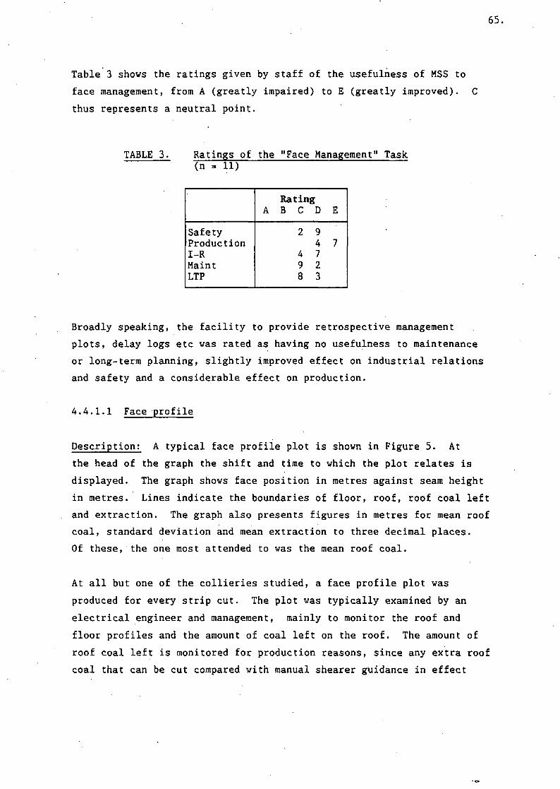
65.
Table 3 shows the ratings given by staff of. the usefulness of MSS to
face management, from A (greatly impaired) to E (greatly improved). C
thus represents a neutral point.
TABLE 3. Ratings of the "Face Management" Task(n = 11)
SafetyProductionI-RMaintLTP
RatingA B C D
2 94
4 79 28 3
E
7
Broadly speaking, the facility to provide retrospective management
plots, delay logs etc was rated as having no usefulness to maintenance
or long-term planning, slightly improved effect on industrial relations
and safety and a considerable effect on production.
4.4.1.1 Face profile
Description! A typical face profile plot is shown in Figure 5. At
the head of the graph the shift and time to which the plot relates is
displayed. The graph shows face position in metres against seam height
in metres. Lines indicate the boundaries of floor, roof, roof coal left
and extraction. The graph also presents figures in metres for mean roof
coal, standard deviation and mean extraction to three decimal places.
Of these, the one most attended to was the mean roof coal.
At all but one of the collieries studied, a face profile plot was
produced for every strip cut. The plot was typically examined by an
electrical engineer and management, mainly to monitor the roof and
floor profiles and the amount of coal left on the roof. The amount of
roof coal left is monitored for production reasons, since any extra roof
coal that can be cut compared with manual shearer guidance in effect

Face P r o f i l e of 24's Face 05-Dec-1985 08:32
n
ru
c0
1 .1
s0
in 1 .5"
Mean Roof Cool = 9.971Mstandard Deviation = 0 .0 3 3 MMean EH t r a c t i o n = 1.373MDesired E x t r a c t i o n = 1.909M
>»> Roof pass« « F loor passO — —
2 - i W T
53' 100' 153' 200'filong face p o s i t i o n CMD
250'
-M Q n u Q I O p e r a t i o n-D e q r Q d e d R u i O A Q t i c- f lu to tot ic O p e r a t i o n
- S t o n e / C o a l 0 . 0 0 M a n d 1 . 8 3 MR o o f R e f e r e n c e 8 . 0 3 MF l o o r R e f e r e n c e 1 . 9 3 M
FIGURE 5. Typical Face Profile Plot

67.
means increased coal production on the same yardage cut. It is also
monitored so that potential problem regions along the face can be
highlighted, and because an uneven roof can lead to an undesirable
increase in requirements for timbering and possibly impaired safety. A
small and consistent thickness of coal left on the roof leads to more
stable roof conditions.
Comment: The mean extraction logically contains the same information
as the mean roof coal left, which perhaps explains why it was not
notably attended to. The standard deviation appeared to mean little or
nothing to most interviewees. All of the figures are presented to more
accuracy than is required, and in fact at least an order of magnitude
more precisely than the system is capable of actually resolving.
Given the relative height to length of a coalface it is inevitable that
the scale of the abscissa (X axis), showing the face length, is
compressed much more than that of the ordinate, which shows seam
thickness. An Area support engineer claimed that some users of the
graph said this could be misleading to inexperienced eyes, because it
has the effect of exaggerating any deviations from a flat floor and roof
and smooth shearing.
One colliery (E) did not use the plot because attempts to produce it
resulted in a software error. On being shown- a copy of a typical face
profile for the first time, the CRO and electrical engineer could not
see a need for it because essentially the same information was available
from engineering plots which they routinely produced.
Typical comments from collieries: " The time given at the head of the
face profile does not always clearly relate to the machine travel chart
(section 4.4.1.2). In fact the time given is the first data point of
the shear requested. It takes experience and time for people to be able
to relate face profile plots from several shears to one shift's machine
travel chart. Giving the start time of the plot on the face profile is
not enough - it ought to say what shift it is related to, especially if
a shear had been started in a previous shift but largely completed in
the next. The old system (System 70,000) gave both the shift name and

68.
the cut number, which helped to make identification more certain. (A)
If a large amount of data is lost in transmission then the figures for
mean roof coal extracted can appear obviously incorrect, presumably
because the software has available only a small amount of data. Perhaps
the figure should not be calculated in such circumstances, to avoid
potentially misleading results. (F)
Colliery users need a facility to adjust the definitions of automatic
control limits within the software because if it is set too far out
during software configuration it can spuriously affect the percent auto
and manual figures (F).
4.4.1.2 Machine travel
Description; At all the collieries studied, a machine travel graph
was produced by the MSS system at the end of every shift for management
use. This chart is traditionally produced manually in most British Coal
collieries. A typical machine travel graph produced by MSS is shown in
Figure 6. The position of the shearer is plotted on a graph of face
position vs time. The graph shows the number of strips cut, the times
spent in auto, manual and degraded auto steering (a form of auto
steering when certain transducers are not functioning correctly),
machine run-time, percent in auto steering, the times of commencement of
the strips (by interpolation of the scale) and a visual indication of
the time taken to do them by the slope of the plotted line. The ends of
each plotted line also reveal the activities at the face end.
The main actual use of this graph was to see the number of strips cut
for that shift by counting the number of zig-zag lines representing the
machine's travel along the face. This information has no more concise
representation on the MSS system. The graph also gives other
information that can be taken from other plotted output, such as an
indication of the delays during each shift. This information is
available in detail from the delays print-out.

Machine Movement for 24's Face 04-Dec flfter's sh i f t
20 l O t f .
19 :00
13 :00i17 :00~
15 :00~
1 C . fiS iHT"5 : 0W
14 :0li>_
=^=:
j±
r-—— -
-i—
_ —.
-j;
; — — — -
50
— -!
~*~ — ° - ••• in
_ _ ' —
— — -^_
; — — -, :
100
flio
.-..
'
— —
>...—„...•........ ...-.. ^
150ng f a c e p o s i
—
— " ~~—^
200t i o n C M )
„
tn*r _ MfMHr«^ , — •• ' ~>
' .
250
..._.
- ._.„..
Machine run t i m e =Percent auto =
34 :02 :4692 .072
f l u t o c o n t r o l l i m i t sMachine a v a i l a b l e L i m i t sManual-Degraded fl u t o mi a t i c- F u l l A u t o m a t i c
FIGURE 6. Typical Machine Travel Graph
70.
Comment: The digital information on shearer run-time and percent auto
is given to more accuracy than is necessary. An overall picture only is
needed. There is an apparent discrepancy between, on the one hand the
lengths of the plotted red and green lines to indicate auto or manual,
and on the other, the percentages given digitally. This causes disputes
over the accuracy of the data, which weakens the faith put in the
machine utilisation pie chart.
One colliery engineering user (F) commented on the visual
distinctiveness of the plotted lines representing automatic (green)
versus manual (red) control of the shearer. The prominence of red was
useful when leafing through a number of machine travel charts to spot
occasions when the amount of manual steering was unduly high. He felt
that this offered an improvement over the predecessor to MIDAS and MSS
(System 70,000) on which colour was not used.
4.4.1.3 Time statistics pie
Description; The time statistics pie chart provides a breakdown of
shearer activity per shift. A typical example is given in Figure 7.
Each slice represents the number of minutes the MIDAS shearer's activity
fell into a particular category. The categories are: steering in
manual, steering in auto, steering in degraded auto, travel time (a
pre-set constant), total duration of delays under a pre-set interval,
and total duration of delays lasting longer than the pre-set interval.
The total duration of the shift and the number of delays in each
category are also printed.
Half of the sample of collieries (A, B, and C in Table 2) with earlier
software versions did not have this option available. The remainder
routinely produced the plot at the end of every shift. One colliery did
not require this plot for management purposes, but produced it for
display on a colliery noticeboard, as an incentive to maximise
productive time (and therefore wages).
Collieries also collect delays information from several other sources,
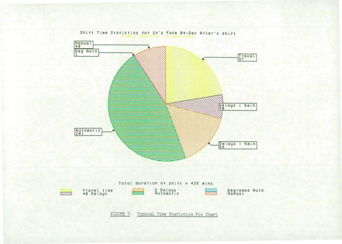
S h i f t T i m e S t a t i s t i c s f o r 24 ' s Face 0 4 - D e c f l f t e r ' s s h i f t
D e l a y s < 6 r r i i n30
D e l a y s > 6 ai i n66
T r a v e I t i m e4 0 D e l a y s
T o t a l d u r a t i o n o f s h i f t = 4 3 5 m i n sk\\\\\{ 2 De I ays
flutoraaticDegraded f l u toManual
FIGURE 7. Typical Time Statistics Pie Chart
72.
such as deputies and written control room logs. The time pie chart does
not have any reasons for delays so it does not improve on the
information already available. Hence some managers felt it was not
particularly useful. Some managers commented that they would prefer the
pie without travel time since this is known and is taken as a constant.
Comment; Difficulties arise when there are overlapping shifts. The
MSS system does not allow a new shift to be defined as beginning whilst
the defined end of a previous shift has not been reached. In practice,
men for a shift may be travelling to a face whilst the men from the
previous shift are returning to the surface. Since the MSS system
defines travel time as part of the machine available time, it will not,
in effect, allow the shearer to be defined as available to two shifts
simultaneously. The tactic adopted by Area engineers in such cases is
to set the travel time to zero in the system configuration. This
circumvents the problem rather than cures it.
There are also difficulties in producing the time statistics pie chart
if there is a delay in progress as the shift comes to an end. The chart
cannot be produced until the delay has finished. Experienced control
room operators produce all the other required hardcopy first so that a
backlog whilst waiting to be able to plot the time statistics pie is
avoided. Since turning off the shearer near the end of the shift counts
as a delay, sometimes the chart cannot be produced until the shearer is
turned on by the face men on the next shift. (This does not apply to
any of the other plots.) At one colliery visited, this unfortunate
"delay" caused by the shearer being turned off at the end of a shift
occurred over a bank holiday weekend, so the time statistics pie chart
could not be produced until the next week and the operator's updated
display showed a current delay of over 8000 minutes!
A.4.1.4 Tonnage pie
Description; The tonnage analysis pie chart is presented in similar
format to the time statistics pie chart. A typical example is shown in
Figure 8. Each segment represents the tonnage produced in that category
for the chosen shift. The categories are: floor dirt, coal, inseam

E s t i m a t e d Tonnage analysis for 2 4 ' s Face 0 4 - D e c fl f t e r ' s
2 7 01 Inseam D i r t
55t Coal left
129t Floor D i r t
1079t C o a l
E s t i i n a t e d t o t a l t o n n a g e c u t = 1473 T o n n e s
FIGURE 8. Typical Tonnage Analysis Pie Chart

74.
dirt, and coal left on the roof. The estimated total tonnage cut for
the shift is also printed. As with the time statistics pie chart, the
tonnage pie chart was not available to three collieries. Of the
remaining three, two routinely printed it at the end of every shift.
Comment: Earlier versions of the software did not point out that the
tonnage analyses were estimates. The software does not know many of the
elements it would need to calculate (as opposed to estimate) the tonnage
produced. For instance, there are no transducers for the amount the
shearer has advanced into the coal panel for each strip cut. Neither is
the amount and thickness of dirt in the seam available to the software,
except by a pre-set estimate.
Later versions point out on every tonnage pie chart printed that the
figures are estimates. Nevertheless, managers lose faith in the chart
when the estimates are widely different to calculations based on face
surveys and regular measurements of advance. One engineer commented
that if the results of face surveys and measurements of advance by
deputies could be incorporated into the calculation, the results would
be much more accurate.
4.4.1.5 Delays
Description; One of the common task information components of the
face management task for control room operators was a listing of the
delays during each shift. The task of actually producing this listing
usually fell to the CRO. It was usually examined by management in
relation to reasons for delays from other sources, such as deputies'
reports, control room operator's log book etc. In some cases the delays
listing was produced in addition to the time statistics pie chart. An
example of the first page of a delays listing taken from a later version
of the software is given in Figure 9.

75.
Delay summary for Day's Shift 21-May-1987 for 24's Face Page 1
Shift start time 06:00:00. Shift end time 13:15:00.M/C available start time 06:45:00. M/C available end time 12:30:00.
Number of long and short delaysMachine position at end of shift
Number of delays greater then 10 minutesTotal time of long delays including official breaks
4025.25 Metre.
lHr.32Mns.33Scs.
Note: Delay summary only includes long delays within machine available limits.This includes any official breaks.
Press <Back Space> for shift menu or <ESC> to exit :-
FIGURE 9. Example of delays summary
At F, the control room operator discontinued the production of a delays
listing on his own initiative, without any complaints from management.
He kept a separate record of delays in a log book, as was the system
before MSS was introduced. This was sufficient for routine reporting
and to answer telephone queries. At A, only the delays print-out was
used. At C the delays list was not routinely produced. The system did
not have the facility for producing pie charts.
Comment; A source of dissatisfaction was the fact that System 70,000
produced a delays print-out with a summary at the end, whereas early
versions of MSS did not produce a summary, just a raw delays log. This
was corrected in later versions.
The most frequent comment concerned the lack of reasons for delays on
the MSS system. The system was compared with another face monitoring
computer system (FIDO), where the reasons for delays were said to be
entered on the computer by the control room operator. There was some
debate as to whether it should be the function of MSS to provide such
reasons, or whether another computer system (CIS, Colliery Information
System) should in future provide this function. Whatever the system
boundaries, this illustrates the need for the implementation of new
technology to be considered in relation to colliery information
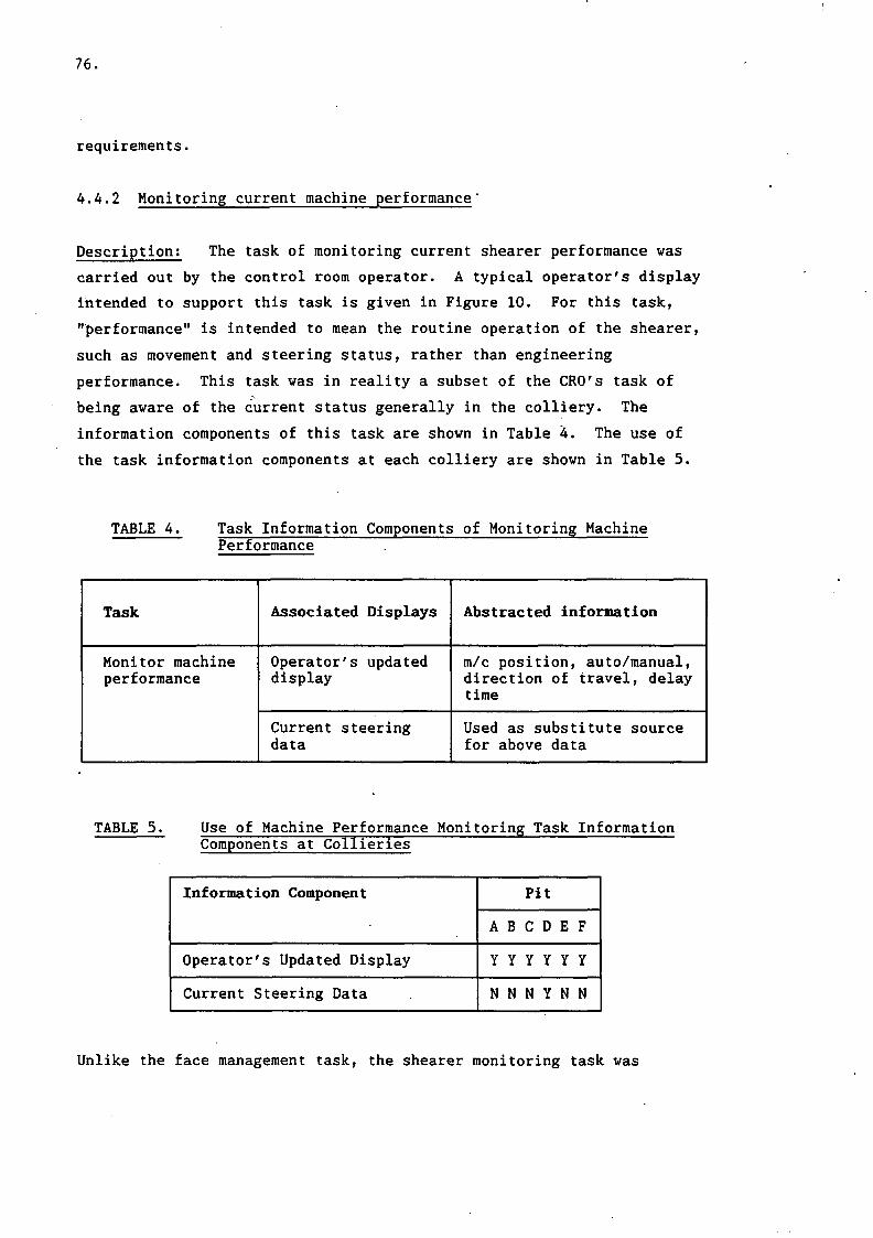
76.
requirements.
4.4.2 Monitoring current machine performance"
Description; The task of monitoring current shearer performance was
carried out by the control room operator. A typical operator's display
intended to support this task is given in Figure 10. For this task,
"performance" is intended to mean the routine operation of the shearer,
such as movement and steering status, rather than engineering
performance. This task was in reality a subset of the CRO's task of
being aware of the current status generally in the colliery. The
information components of this task are shown in Table 4. The use of
the task information components at each colliery are shown in Table 5.
TABLE 4. Task Information Components of Monitoring MachinePerformance
Task
Monitor machineperformance
Associated Displays
Operator's updateddisplay
Current steeringdata
Abstracted information
m/c position, auto/manual,direction of travel, delaytime
Used as substitute sourcefor above data
TABLE 5. Use of Machine Performance Monitoring Task InformationComponents at Collieries
Information Component
Operator's Updated Display
Current Steering Data
Pit
A B C D E F
Y Y Y Y Y Y
N N N Y N N
Unlike the face management task, the shearer monitoring task was
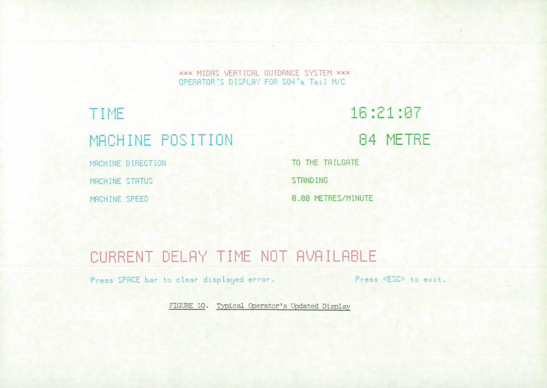
xxx MI DPS VERTICHL GUIDflNCE SYSTEM ***OPERflTOR'S DISPLRV FOR SQ4's Tail M/C
TI ME 16:21:07
MflCHINE POSITION 84 METRE!_MflCHINE DIRECTION
MflCHINE STflTU'
MflCHINE SPEED
TO THE TRILGRTE
STfiNDIMG
8.09 METRES/MINUTE
CURRENT DELflY TIME NOT flVfllLRBLEPress SF'flCE bar to clear displayed error. Press <ESC> to ex i t
FIGURE 10. Typical Operator's Updated Disolav
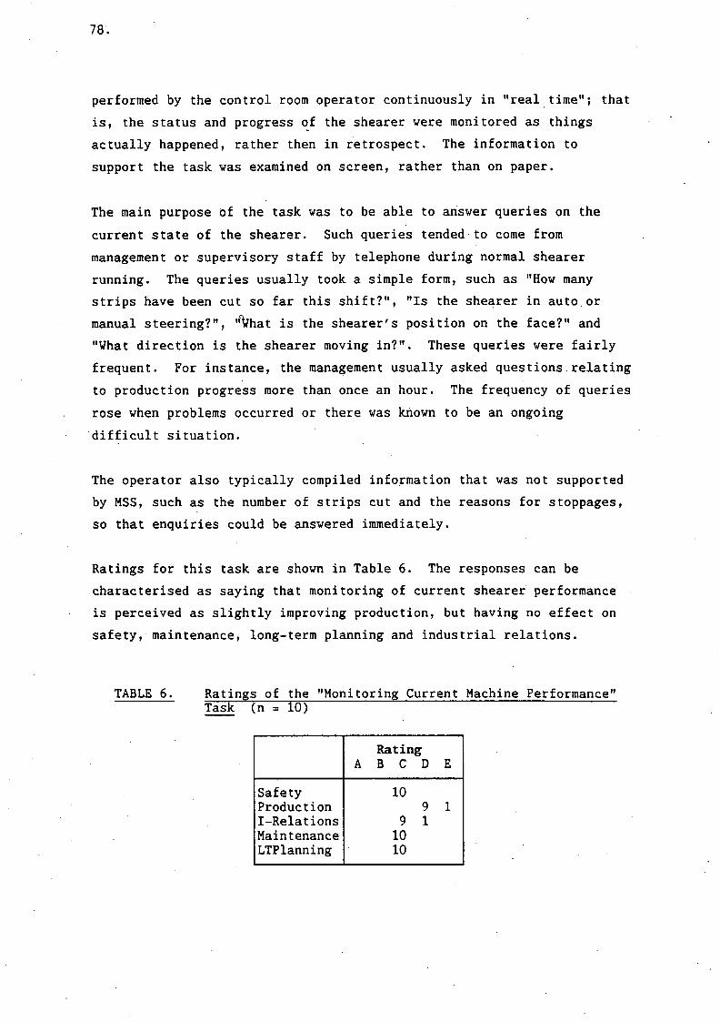
78.
performed by the control room operator continuously in "real time"; that
is, the status and progress of the shearer were monitored as things
actually happened, rather then in retrospect. The information to
support the task was examined on screen, rather than on paper.
The main purpose of the task was to be able to answer queries on the
current state of the shearer. Such queries tended to come from
management or supervisory staff by telephone during normal shearer
running. The queries usually took a simple form, such as "How many
strips have been cut so far this shift?", "Is the shearer in auto. or
manual steering?", 'fyhat is the shearer's position on the face?" and
"What direction is the shearer moving in?". These queries were fairly
frequent. For instance, the management usually asked questions relating
to production progress more than once an hour. The frequency of queries
rose when problems occurred or there was known to be an ongoing
difficult situation.
The operator also typically compiled information that was not supported
by MSS, such as the number of strips cut and the reasons for stoppages,
so that enquiries could be answered immediately.
Ratings for this task are shown in Table 6. The responses can be
characterised as saying that monitoring of current shearer performance
is perceived as slightly improving production, but having no effect on
safety, maintenance, long-term planning and industrial relations.
TABLE 6. Ratings of the "Monitoring Current Machine Performance"Task (n = 10)
SafetyProductionI-RelationsMaintenanceLTPlanning
RatingA B C D
109
9 11010
E
1

79.
Comment; Because of the need to support queries occurring at
unpredictable times but with largely predictable content it is important
that the operator's on-line display provides all the necessary
information immediately. For this reason, the usual display on the MSS
VDU, in the absence of other requirements or tasks, was the "Operator's
Updated Display".
In addition to the information abstracted from displays the operator
keeps a record of the number of strips cut on the MIDAS and other faces.
None of the current displays directly provide this information.
Potentially, this information could be abstracted from the machine
movement graph by counting the number of passes. This was not observed
to happen, presumably because of the unacceptably long time needed to
collect this information in response to a telephone enquiry. Instead,
operators kept their own record with pencil and paper so that queries
could be serviced without delay.
At some collieries, the digital display of face position on the
operator's updated display was not in the units used at the colliery
(i.e. position can be shown in metres or by chock number). Sometimes,
the size of the chocks allowed an easy mental conversion into the units
preferred by a telephone enquirer. At one colliery a conversion chart
had been drawn up by the operator and fixed next to the MSS display.
Some personnel expressed the opinion that MSS should display the
position in both metres and chock number, since personnel making
telephone queries could have differing preferences for units.
An operator at one colliery (D) sometimes used the current steering data
tabular display to display essentially the same information as the
operator's updated display. This option was sometimes chosen when
returning from displaying other information or initiating a plot of
data. The operator felt that the time required for the display to
appear was shorter for the steering data option than for the operator's
updated display. It should be noted that this colliery's MIDAS system
supported two MIDAS shearers and two displays with one computer.
Therefore the response delays were significantly longer than at other
collieries.

80.
The hardware controlling the system "handshake" was usually placed
alongside the operator's display. This is a small unit which provides
the interface between the communication lines from the underground MIDAS
system and the surface computer. The "handshake healthy" light
functions as a display telling the operator quickly that the steering
system is running. Sometimes the handshake is lost for a few seconds or
longer. When this happens, the operator's updated display does not
retain the status of the shearer as last known. It was suggested that
it would be helpful if it were to do so, with a message indicating the
problem. One CRO (at E) said that if the handshake is temporarily lost
he thinks that the machine has stopped, so he telephones the face, only
to find that the shearer is running normally. He thought there was a
delay of perhaps 20 seconds before a restored handshake registered on
the MSS display.
4.4.3 Checking steering performance
Description; The information components of this task are shown in
Table 7. This task divides into retrospective analysis of steering
performance by shift, using plots, and real-time examination of steering
performance using the "current data" option (on older software) or
"steering data options" (on newer versions). The use of these
information components at collieries is shown in Tables 8 and 9.
Checking steering performance is a third main category of task. This
classification refers to the routine examination of steering
performance data. Examination of steering data on specific occasions
when it is known there is a fault are treated under a different heading
(section 4.4.4 below).
In producing steering performance plots for retrospective examination,
the tendency was for the operator to produce them along with management
plots (or include them in the automatic end of shift plots if the
software supported this). Where plots were manually requested, the
engineering plots would sometimes be produced by the electrical engineer
if the CRO was busy.

81.
TABLE 7. Task Information Components of Checking SteeringPerformance
Task
Checking steeringperformance(retrospectiveplot of data r
on paper)
checking steeringperformance(current data onscreen)
Associated Displays
steering demand vsface position plot
steering error vsface position plot
m/c angle vs faceposition plot
m/c speed vs faceposition plot
coal reading vsface position plot
predicted coal vsface position plot
roof step vs faceposition plot
m/c angle data
steering demand data
steering error data
coal thickness data
delayed coal " "
roof step data
actual boom height
desired boom height
Abstracted information
Large demands
Large errors
Deviating angle
All the above relativeto speed
Deviations
Deviations
Large steps
Deviating angle
Large demand
Large error
Deviations
Deviations
Large step
Boom position
comparison with actual

82.
TABLE 8. Use of Checking Steering Performance Task InformationComponents Using Retrospective Plots at Collieries
Information Component
Steering demand v face position
Steering error v face position
m/c angle vs face position
m/c speed vs face position
coal reading vs face position
predicted coal v face position
Roof step vs face position
Pit
A B C D E F
Y N N N N Y
Y N N N N N
Y N N N Y Y
Y N N N Y N
N N N N Y Y
N N N N Y N
N N N N Y Y
TABLE 9. Use of Checking Steering Performance Task InformationComponents Using Current Data on Screen at Collieries
Information Component
Machine angle data
Steering demand data
Steering error data
Coal thickness data
Delayed coal thickness data
Roof step data
Actual boom position data
Desired boom position data
Pit
A B C D E F
Y N N N N N
Y N Y N N N
Y N N N N N
Y N Y N N N
N N Y N N N
N N Y N N N
N N Y N N N
N N Y N N N

83.
The choice of current data or retrospective plots appeared to depend on
the electrical engineer's personal preference. Some would prefer to
study plots at their leisure in their own office each day. Others
preferred periodically to interrogate the current data during a shift,i
perhaps when they were nearby by chance. How frequently this routine
monitoring task was done varied with the frequency of steering problems
or difficult face conditions, as one would expect.
At A, both retrospective plots and on-line current data were used,
primarily by the elctrical engineer. At B, the MIDAS equipment had been
removed some months earlier. At C, only on-line current data were
routinely examined by the electrical foreman interviewed. However, both
plots and on-line data of steering performance were examined if a
problem arose. At D, in spite of the up-to date facility to examine
"steering data options" on the top level menu, it was little used to
examine current (or past) data. Plots of steering performance were
routinely produced, however, for examination primarily by the electrical
engineer. At F, plots to diagnose steering performance were routinely
produced for examination primarily by a deputy electrical engineer.
On-line current data was rarely used, except by a shift charge engineer
delegated to monitor steering performance.
Ratings for the task of monitoring steering performance by use of
retrospective plots are shown in Table 10. Ratings for the task of
monitoring steering performance by use of current steering data are
shown in Table 11.
TABLE 10. Ratings of the "Monitoring Steering Performance By Useof Retrospective Plots" sub-task(n = 6)
SafetyProductionI-RelationsMaintenanceLTPlanning
RatingA B C D
4 25
3 32 43 3
E
1
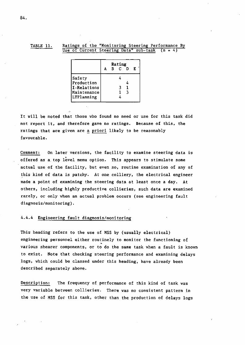
84.
TABLE 11. Ratings of the "Monitoring Steering Performance ByUse of Current Steering Data" sub-task (n = 4)
SafetyProductionI-RelationsMaintenanceLTPlanning
RatingA B C D
44
3 11 34
E '
It will be noted that those who found no need or use for this task did
not report it, and therefore gave no ratings. Because of this, the
ratings that are given are a priori likely to be reasonably
favourable.
Comment; On later versions, the facility to examine steering data is
offered as a top level menu option. This appears to stimulate some
actual use of the facility, but even so, routine examination of any of
this kind of data is patchy. At one colliery, the electrical engineer
made a point of examining the steering data at least once a day. At
others, including highly productive collieries, such data are examined
rarely, or only when an actual problem occurs (see engineering fault
diagnosis/monitoring).
4.4.4 Engineering fault diagnosis/monitoring
This heading refers to the use of MSS by (usually electrical)
engineering personnel either routinely to monitor the functioning of
various shearer components, or to do the same task when a fault is known
to exist. Note that checking steering performance and examining delays
logs, which could be classed under this heading, have already been
described separately above.
Description: The frequency of performance of this kind of task was
very variable between collieries. There was no consistent pattern in
the use of MSS for this task, other than the production of delays logs

85.
described in section 4.4.1.5 and engineering plots relating to steering
described in section 4.4.3. Therefore it is more appropriate to present
a brief description of this function at each colliery, rather than
present a potentially spurious overall picture. For similar reasons, it
is inappropriate to present the task ratings that were obtained, since
at best they would be misleading.
The frequency and regularity of this task appeared to be related to the
past frequency of problems with MIDAS.
At A, MSS was used for fault diagnosis only when a problem arose. In
such cases, the electrical engineer usually operated the system himself
and examined real-time data tables, most commonly machine angle,
steering demand, steering error and coal thickness. For instance, these
parameters were monitored during the period when the shearer drum
revolutions were changed from 25 to 38 rpm because drum reaction caused
excessive steering demand.
At colliery (B), where a combination of problems led to the eventual
removal of MIDAS, MSS was used more frequently to help with fault
diagnosis because of the frequency of faults. Tables and plots of
current and past data were used when a fault was known or suspected.
The mechanical and electrical engineers made the most use of the system
in these circumstances. Both real-time and past data were used.
Usually, data tables were viewed initially, then plots were produced of
transducers vs time when the problem data had been found.
At C the MSS system tended only to be used for examining faults
when one had been reported or was suspected for other reasons.
Sometimes the routine plots indicated the possibility of a fault, or a
report from the face initiated a search for a fault.
At D there was a similar pattern to C. The "engineering options" were
used by the electrical engineer if a fitter underground needed to know
transducer readings or other information whilst effecting repairs.
MIDAS steering errors were usually checked daily. The electrical
engineer described the use made of all the options within the top level
86.
menu engineering option. The options below refer to the choices on this
menu:
OPTION 1 (tabular display of all current data) used very rarely, but a
representative of the shearer manufacturer present at the time said
that he found it useful.
OPTION 2 (tabular display of selected current data) used quite a lot to
help fault diagnosis or just to check everything is going normally. The
data columns are scanned to look for big changes.
OPTION 3 (table of past data) used quite a lot for same reasons as
option 2.
OPTION 4 list of MIDAS faults. Every day he uses this to scan all
alarms. Many of these arise normally from the way the shearer is being
steered, e.g. on the change from manual to auto. He has to eliminate
the spurious messages by relating them to normal reasons for the fault.
Hence this page should also show say where the shearer was and its
status at the fault log time to aid this process.
OPTION 5 (along face plot of selected data) is used sometimes, not a
lot. It has its uses for seeing the pattern of things, but data table
is used to get digital values.
OPTION 6 graph of selected data against selected time range. Very
rarely used. He cannot see the point of it. Normally one looks at
things against machine movement or machine position.
There is also an option here for a scattergram. He could not see a use
for them.
The seventh and eighth options, past transmission errors and
transmission test were not intended for use by people at the colliery.
At colliery (E) there had been a trouble-free history with
MIDAS-equipped shearers. Hence MSS had not been used to help diagnose
87.
problems, or to routinely monitor for them, since none' had yet occurred.
Initially, the electrical engineer examined the log of MIDAS faults
occasionally but then stopped because this served no useful purpose
while the system functioned satisfactorily.
At F, one person, a shift charge engineer, was delegated to monitor all
aspects connected with MIDAS steering and breakdowns. Hence he kept a
manual record of delays and their reasons, and problems occurring for
engineers. To support this reponsibility, he made occasional use of the
MSS system for examining current and past data tables. Unfortunately,
he was not available for interview at the time of the study. He also
occasionally requested a plot. Usually this was done by the control
room operator, but sometimes by himself. Sometimes an oil pressure plot
was requested by the mechanical engineer. Other than these uses, MSS was
not systematically exploited for fault diagnosis or monitoring at F.
Comment; The electrical engineer at A commented that the system gave
no help with fault diagnosis, and had no support for long term health
monitoring. For him the most recurrent problem was caused by the roof
follower transducer, which frequently needed recalibration after
striking roof supports.
The electrical engineer at B commented that the system was very useful for
monitoring transducers etc, but the sheer quantity of information could
tend to panic people. It was useful in one sense, in that examining past
data could be used to break down manufacturers excuses, e.g. to
demonstrate that, in fact, there had been a rising temperature when the
manufacturers said not.
The mechanical engineer at B said that the use of MSS had enabled three
faults to be noticed before they otherwise would have been.
Nevertheless, there was little tendency for the system to be used to
help diagnose the cause of a fault once it had been noticed. This was
because the engineers lacked confidence in the accuracy of surface
readings and preferred to use gauges attached to the shearer
underground. He expressed the opinion that, in spite of the sheer
quantity of information available, he liked the system for its

88.
transducer .monitoring capabilities.
The people at colliery C responsible for routine condition monitoring
had shown interest in the idea of oil debris monitoring but were still
awaiting the fitting of one to the shearer. An electrical engineer
commented that the health monitoring transducers were used on the face
but the mechanical engineers never used MSS to look at them except for
one short period. This was when the roof follower was repeatedly
damaged through collision with the roof supports so the pressure on it
was checked.o
4.4.5 Overall ratings
Interviewees were asked to rate the usefulness of their MSS system as an
aid to production, safety, long term planning, industrial relations and
maintenance, on a scale from 1 (not at all) to 7 (tremendous help).
Table 12 shows the results for the overall ratings in the five areas of
interest. Ratings for HQTD and colliery staff are presented separately
for comparison.
TABLE 12. Comparison of Overall Ratings of Usefulness of MSS ByColliery and HQTD staff
HQTD (n=4)
Rating
PROD
I R
MAINT
SAFETY
LTP1
1 2 3 4 5
1 1
.1 2
1 1
3 1
1 1
6
2
1
2
1
7 Mean
5
1
5
1
4
.3
.3
.3
.8
.3
COLLIERIES (n=11)
Rating
Mean
6.3
5.4
3.5
3.3
1.6
1 2
2
3
6 3
3
4
4
2
4
2
3
2
5
2
3
2
2
6
4
6
7
5
I0ne HQTD interviewee could not answer, as it would "depend on themanager". Another had had no feedback on this.
PROD = ProductionI R = Industrial RelationsMAINT = MaintenanceSAFETY = SafetyLTP = Long term planning

89.
Production; In the main, it was clear from the users' comments,
despite instructions to the contrary, that their ratings were influenced
by the acknowledged benefits of the MIDAS system as distinct from MSS.
Many respondents who had a number of criticisms during interview
nevertheless rated MSS highly on usefulness to production. HQTD staff
also rated MSS quite highly on its usefulness to production.
Industrial relations; There was an inconsistent view of the effect of
MSS on industrial relations between colliery and HQTD staff.
Respondents at HQTD tended to think that MSS itself should have little
effect. Colliery staff felt it to be quite strongly beneficial to
industrial relations. Once again, the ratings were contaminated by the
effect of MIDAS on relations - improved production was seen as improving
relations because of its effect on bonuses. This is not necessarily
related to MSS.
Maintenance; HQTD staff seemed to rate usefulness of MSS to
maintenance as an important function. Colliery staff, on the other
hand, rated it somewhat lower. Probably the potential is high, but the
limited actual use of MSS by mechanical engineers in collieries is
reflected in the lower ratings. Also the lack of training or
documentation on potential uses of the system for fault diagnosis may
adversely affect the ratings given. The fact that two of the HQTD
interviewees were commissioning engineers may also help explain the
higher ratings given.
Safety; HQTD staff saw no direct connexion between MSS per se
and safety. Colliery personnel similarly tended to rate MSS as
having little impact on safety. A few reasoned that regular plots might
enable roof conditions to be better controlled and so increased their
ratings a little. Such ratings were based on a conjectured connexion
and on knowledge of facts such as reduced timbering required and better
visual appearance of the face, rather than actual knowledge of improved
safety, which had not been systematically examined.
Long term planning; Opinions at HQTD on the value of MSS for

90.
planning varied somewhat. Colliery staff were more united in giving
MSS little or no relevance to planning. This may reflect actual
working practice in collieries, and also the lack of MSS support for
the gathering of long term trends.
4.4.6 User experience
In general there was no clear connection between the users' experience
with other British Coal computer systems and the use they made of the
MSS system. Users at all the collieries visited had had some
experience with the MINOS coal clearance system. However, this system
used a mimic diagram system with a command language and a customised key
board, so experience on this system would not be expected to carry over
to MSS, except in the most general terms. In one or two cases, the
control room operator reported an interest in computers at home as well
as work. In such cases the user provides his own motivation to explore
and become familiar with the MSS system, almost regardless of how
"friendly" (or otherwise) the system is.
Several of the colliery users had had prior experience with MSS's
predecessor, System 70,000. This may have helped initial learning and
understanding with MSS, but at the time of conducting the interviews,
this period can be assumed to have passed, and thus such users showed no
clear advantage of proficiency in the use of MSS because of their
prior experience with System 70,000.
4.5 Other Issues Arising
During the course of the many interviews conducted, a number of common
topics emerged independently from the discussion erf the task structure
of the users. These issues are developed in detail in section 5 but are
reported here since they were raised during the user survey. Where they
help to illustrate the point, the users' comments relating to these
topics are presented, not verbatim, but in similar language to that used
by the interviewees.
91.
Dialogue and System Response Time
Comments on the method and style of interaction with MSS concerned the
use of the menu-driven command approach and the system response time
between dialogue steps and at the end of a dialogue path. In general,
it was felt that the use of menus was an appropriate choice, but some
users, particularly with older versions of the software, had difficulty
remembering where in the dialogue certain information (perhaps under less
frequently requested options) could be found. The delay between
dialogue steps often reached 10 seconds. Delays when gathering data at
the end of a dialogue path could run into several minutes. These delays
were more pronounced when one surface computer was receiving data from
two MIDAS faces.
Representative Comments
From Area Engineers: It is tedious to get through the menus. You have
to know where your target is to use them effectively. Once a request
has initiated processing of data it takes a long time. The delays are
even worse if there is more than 1 terminal. (SUP)
From Collieries: Delays on menus are slightly annoying, of course, but
the benefits of the system make up for them. At least the system as a
whole saves the operator telephoning the face repeatedly to find out
what is happening. MSS queries are even made by deputies on a district
to see how their face is going. This saves time and effort as well. (D)
The name on menu options is not always the same as the name on the
actual plot. This can sometimes cause uncertainty or hesitancy when
going through the menus for someone who is not totally familiar with the
system. (D)
The system is difficult to use especially for a first-time user. (D)
Ploughing through all the menus is tedious. (B)

92.
Producing Hardcopy; By far the most frequent complaint regarding the
MSS system as a whole concerned the producton of plots and.printouts.
In all installations visited the same make of colour plotter was used.
Earlier software did not automatically produce plots at the end of every
shift. This added to the operator's time consumed and sense of slowness
of the plotter.
The problems commented on fall into two main categories: problems due to
the plotter chosen, and problems related to the use of colour plots.
Problems in each of these categories are listed below.o
Problems due to plotter:
(a) The production of plots is frustratingly slow. This is due in part
to the inherent lack of speed of the ink jet plotter used, and
partly to the time needed by the computer software to generate the
plot. This latter part of the problem is discussed further in
section 4.5.3.
(b) The ink jets frequently block up, especially in periods of non-use
(e.g. the time between routine plots), requiring the spoilt plots
to be redone, again consuming time. This again is caused by the
choice of technology for the plotter. Experienced users tend to
put the plotter through its self-test routine either before a plot
run or before each plot individually, though this is irritating and
wastes time.
(c) The paper used does not seem to conform to any standard size,
making it awkward to file.
(d) The paper used is not perforated or folded but comes from a roll,
making it difficult to handle.
(e) The plotter was unreliable, requiring servicing and perhaps a
complete change, at some collieries, even after only a few months use.
93.
Problem due to the use of colour:
(a) The fact that the plots are in colour means that one plot run
cannot be photocopied for distribution, necessitating a plot run
for each copy required. Alternatively, as at one colliery, one
copy of each plot is kept centrally.
It was pointed out by many users that these problems were not created by
MSS's predecessor, System 70,000. This system used a standard computer
hardcopy terminal (no colour). As a result, output could be printed
more quickly, and photocopied if necessary. The fan-fold paper could be
handled more easily, and filed more conveniently. However, its output
was not so visually attractive as MSS.
The following comments were recorded at interviews, and can be regarded
as typical:
From Area Systems Support: Management routine reporting takes the form
of plots done at the end of every shift. Plots are automatically plotted
from instructions held in a command file in the latest software versions
but it previously took up to 3 hours every shift to get them all out.
(SUP)
From Collieries: The computer allows a series of plot requests to be
issued. These requests are placed on a "queue" held internally by the
computer so that the user should not have to wait for one to finish
before issuing the next plot request. However, the facility to find out
what is waiting in the queue is a menu.option only available under
system options [This colliery had a recent version of the software, in
which the print queue could be displayed.] If the printer develops a
fault or is unavailable for some reason (perhaps it has been turned off)
the queue remains, perhaps not to be discovered until the next day. (D)
At this colliery the control room operator is required to produce three
copies of everything. It takes about 18 minutes, for example, just to
plot three of each of the four engineering plots. He has to do these

94.
plots as each shear finishes, otherwise he would not be able to keep up
with the quantity of plots on top of his other tasks. There are 5 to 6
strips per shift to plot. He used to plot the delays log but has stopped
bothering. The deputy manager has not complained. (F)
Routine plots are put in a filing cabinet, where they are ostensibly
available for management. They are done manually at the end of every
shear, because of the time taken to catch up with a load of plots if you
get behind.
The ink jet set up/test facility had constantly to be used because of
frequent blocking. The plotter was replaced 3 or 4 times. (C)
It takes a long time to produce plots and they are not buffered
properly - plotting stops the operator from seeing what's happening. It
takes perhaps 40 minutes to get all routine plots, whereas the old
system (System 70,000) took about ten minutes using an ordinary
hard-copy terminal. (A)
The plotter colours often stop working. It is best to do the standard
test before each graph. (A)
Automatic Plotting; Later versions of the software had a facility
for defining items to be routinely plotted automatically at the end of
every shift. MSS without this facility required the operator to specify
each plot manually every time the plot was required. This resulted in a
much greater load on the operator, especially when multiple copies were
required. In one case the operator had a memory aid pinned to the wall
to ensure the plots were specified correctly.
Collieries with the auto-plotting facility found it a great improvement
over the earlier version, and in general it is much to be preferred.
However, the standard plot options can only be altered by personnel
(usually from Area) with sufficient password access (see section 4.5.5
for more details). This sometimes resulted in unnecessary plots being
produced every shift. It was not thought a sufficient reason to call
95.
out an Area engineer merely to alter the standard plots.
Training and Documentation; There is no standard training applied to
the use of MSS specifically. Each colliery seems to make some effort,
usually at Area level, to train key personnel in the functioning of
MIDAS, and this sometimes includes the control room operator. However,
these training periods only incidentally include information on the use
of MSS. This can lead to a lack of understanding of the potential of
the information system.
Allied to the problem of non-specific training is the lack of provision
of any documentation. Control room operators have to pick up their
operational knowledge of MSS by trial and error. Their eventual
familiarity with MSS depends entirely on their individual motivation
and interest. Other personnel have less time and a less superficially
obvious requirement to understand MSS so tend not to acquire the
necessary skills.
The following comments are typical of those gathered relating to
training and documentation:
From Area Engineers: There is no documentation, either for Area
troubleshooting people or for colliery users. Documentation would help
to give colliery personnel an understanding of MSS and MIDAS which at
present is rare. (SUP)
From Collieries: Nobody at all in the colliery has been on a training
course. They have picked up all they know by experimenting with the
system using trial and error when they have time. 'Days' is a busy
shift so the main control room operator is not that familiar yet with
the system. (D)
No training for the surface facility was given. For MIDAS itself, the
craftsmen, m/c operators and officials went on a course this lasted 2
days, 1 week for maintenance men. Those who were interested could ask
and be shown about MSS but no special effort was made to teach it.

96.
Generally the training was based underground, with just a quick look at
MSS. (F)
Configuration, Set-up of Defaults and New Software Versions: Several
examples were seen of the desirability of allowing configuration changes
at a local level. For instance, at one colliery, the auto control
limits had been erroneously set outside the bounds of the face. The
people interviewed did not seem to be aware that this could be classed
as an error. It had the effect that the percent auto and manual figures
gave spurious results. Normally the face ends fall outside the autoo
control limits, so that the normal practice of handing over control to
the shearer driver for turn-round can take place. Having the face ends
within the control limits spuriously lowers the percent auto figure,
and, since the actual operations and speed at the face end are affected
by factors outside the control of the shearer operator, the percent auto
figure is made more variable. This makes it harder to see underlying
trends in the percent auto figure. At another colliery, some of the
hardcopy output produced at the end of every shift was not required, but
the CRO was not allowed sufficient access by the software to change the
standard hardcopy output.
Some collieries did not have the latest version of the MSS software
installed, even though it was installed in other collieries in the same
Area. This caused some annoyance, since some personnel had heard of
improvements made, such as auto-plotting, but were not able to use them.
Comments from Area Support Staff: Configuring of the system presently
has to be done by Area because it requires using the computer's program
editor under the operating system outside the MSS. MINOS allowed
configuration from within the software. It keeps Area people in a job
but its a nuisance (SUP).
If there were documentation then it might be possible to configure at
pit level (SUP).
From Colliery Staff: Software seems to be upgraded very often.

97.
Somebody seems to come round almost every day (D).
Long-term data compilation All versions of MSS seen during these
interviews had very little support for the gathering of data over a time
period longer than one shift. Many of the users felt this to be a
shortcoming, and felt that it would be useful if MSS could compile a
report over a timescale such as a week. In fact, at three of the
collieries visited, trends and weekly figures were compiled on paper, in
several forms. This undoubtedly takes place in some form at other
collieries (with or without MIDAS and MSS) but questions on this issue
were not directly asked in early interviews since it is not an actual
use of the MSS system.
According to the manager at E, the Area has formed a working party to
define standard information flow and requirements for all pits in the
Area. Presumably this will eventually define standard summarising
sheets which could then be built into MIDAS. Having defined what is
required on a summary, at the time of study data had been collected in
the standard form for weekly reports for ten weeks.
At E, all routine end-of-shift reports and plots are kept in a folder
in the deputy manager's office. The electrical engineer puts them there
each morning. At the end of every week he completes an "analysis of
cutting" sheet. This contains metres cut, strips cut, percent auto and
manual for every shift and day of the week. At the end of the week,
totals are calculated for meters cut and strips cut and averages for
percent auto and manual. These figures are then made available for
management to comment on at meetings. The electrical engineer and
management would appreciate it if this were done by MIDAS.
At F a similar task to that at E is performed by a deputy electrical
engineer, but in more detail and for a slightly different emphasis of
purpose. Two record sheets are kept. The "auto steering" sheet records
the average percent auto, average percent steering available, number of
strips cut, and comments for each week. Comments record reasons for
loss of auto steering availability, such as "2 days lost roof follower

98.
damage". The second sheet is oriented to the numer of strips cut per
day, without explicit reference to shifts. For each strip completed,
the following are recorded: percent auto, average coal thickness left on
roof and standard deviation, the cutting direction, the time of starting
a new strip, and any comments. Comments explained reasons for loss of
production, e.g. "MMADD count [signal from Machine Movement and
Direction Detector] not working".
At D the control room operator records for each shift the percent auto
and estimated production and saleable output in comparison to the
current target.
The overall purpose of the collection of these data at collieries is
clearly to help maintain and improve performance. Any figures that
clarify performance figures in furtherance of this goal are obviously
desirable. For non-MIDAS faces these are collected and calculated
manually but there is no reason why MSS could not provide the
required information for MIDAS faces. Some of the required data relate
specifically to the performance of the MIDAS shearer. The percent auto
and manual figures are monitored because it is usually the case that the
higher the percent auto figure, the better the face production and roof
conditions.
Figures such as number of strips cut and number of cubic metres cut are
in any case compiled and calculated for purposes such as bonus payment
and reporting to Area for comparison with similar figures for other
collieries and Areas. An extra purpose met by the compilation of these
figures by staff such as the electrical engineer is to get a "feel" for
the performance trend. For this purpose, exact figures are not
required. The data would more easily be assimilated for this purpose if
presented in a graphical form.
Quantity of information Some users, particularly managers, whilst
being generally in favour of MIDAS and MSS, found the quantity of
information too large. Features like graphs were felt to contain
broadly the right information, but it was felt that the information

99.
contained in them could be presented in a more compact form. The
evolution of paper-based summaries of MSS information in some collieries
(see section 4.5.6) also argues for a computerised short-form report.
One manager (E) suggested that the system should produce summary
reports in text form on no more than one side of A4 for all interested
parties, e.g. face conditions, metres cut, delays etc for managers and
transducer and steering function for engineers. Graphs and pie charts
look impressive, but they are unnecessarily time-consuming, both to
digest and to produce.
Comments from Collieries: The quantity of data should be reduced down
to give a management summary. Lots of pretty graphs might be impressive
but what do they tell you? (E)
The management used the plots to keep an eye on percent auto, number of
shears and roof and floor profiles. For these purposes, a graph is more
than is necessary. (B)
The whole system only adds to the paperwork burden. Condensed
information is needed. If the information is provided for occasional
detailed requests then fine, but digesting the mass of information daily
is in itself a job for a computer. The presentation of graphs was
itself good, but it could easily become labour-intensive to interpret
them all, especially if more than one face were equipped with MIDAS.
(B)
The bulk of information is too great and not digested enough. One is
interested as a manager only in things that are under one's control to
alter, for example, the floor cut, roof cut. (B)
Operator's Updated Display The operator's status display is the most
commonly used MSS option. CROs generally were happy with the display,
but several requested additional information to be shown. It was felt
that the machine position along the face should be shown both by
distance (metres or yards along the face) and by roof support number.

100.
Also, CROs would like the display to show the number of strips completed
so far in the current shift, and perhaps the total distance cut. These
extra items of information were requested to improve the information
available for telephone requests.
Comments from Collieries: The machine position must be given in pit
units, e.g. chock number. The number of passes so far would also be
useful. (A)
The operator chalks the number of strips cut for each face on a board
because the operator's updated display does not show this. He is asked
about 20 times per hour. He needs to know m/c position, time, length of
current delay, whether in auto or manual. (C)
The operator and his foreman gave the opinion that the display should
show both the chock number and the odometer position (i.e. position in
metres) because people may be used to hearing it expressed one way or
the other. (C)
Error messages on this display are irrelevant to the operator. He reads
them but does not act on them. (C)
For on-line status the operator usually uses the status page but may
choose the steering data display page if flipping from another task,
e.g. a plot because this seems to be presented a lot quicker. (D)
4.6 Conclusions
In general there was a high degree of commonality in the main or core
tasks performed and the displays used to support them as reported by
colliery staff. The most central tasks were monitoring current shearer
performance and face management. Other tasks were performed more
irregularly or infrequently. These included monitoring steering
performance, checking for transducer or data transmission errors, fault
diagnosis and engineering monitoring.

101.
The main users of information provided by the SUMMIT system were found
to be the control room operators and management staff. The system was
under-used for other purposes such as engineering fault diagnosis,
checking steering performance and engineering monitoring, compared with
the expectations of HQTD development staff.

102.

103.
5. ERGONOMIC ASSESSMENT OF MIDAS SURFACE SOFTWARE
5.1 Introduction
With the contextual information provided by the user surveys, it was
possible to carry out a detailed ergonomic assessment of the MSS system.
This information, together with additional factors which had been
identified during the previous examination of the system (section 2),
was used in conjunction with the design guidelines to identify problems
and to produce specific ergonomic recommendations for their solution.
During the life of the project, the MSS system was continually being
revised and developed and a considerable number of changes were
introduced which resolved many of the identified problems. In several
cases, such changes were incorporated into newly distributed software at
some of the collieries where interviews were carried out. This changing
nature of the MSS system was reflected in some of the differing comments
received.
5.2 User Interface and Dialogue Techniques
From an ergonomics viewpoint, one of the most immediately striking
features of the MSS system is the way in which a range of colours are
employed to display text on most of the non-graphical displays.
Alphabetic characters are shown in yellow, numbers are displayed in green
and punctuation and other special characters are displayed in magenta,
cyan or red. Use of colour in this way certainly does not assist the user
in any way and will detract from any potential benefits to be gained from
the use of colour on subsequent displays. In addition, the differing
brightness of the colours used could result in undesired highlighting of
particular aspects of a display. However, this selection of colours on
text-based screens is not made directly by the software but is a
"built-in" feature of the terminal used. The terminal can be configured
to display all of the text in any one of a wide range of colours, but it
also has an option to use a "smart colour mode". This was selected as
the default option to be used by the terminal and produced the observed
effect. Although it was possible for this option to be changed by users

104.
to suit their own individual requirements or preferences this fact was not
widely known and no instructions on how to reconfigure the terminal were
made available.
To select a required option from the menus or to reply to supplementary
questions the user was always required to terminate an entry by pressing
the; return or enter keys. The only exception to this protocol was in
the use of two special keys, the escape and backspace keys. Pressing
the backspace key would cause the system to abandon the current menu or
question and return the user to the menu page that immediately preceded
it. Pressing the escape key would also abandon the current operation
but would the return the user to the top level menu page. In the
earlier software versions there were a few exceptions to this
convention. The most disturbing example of these occurred during the
periods in which the system was retrieving data from file. This type of
operation could take several minutes and could not be interrupted by
"either key. Consequently the user would have to wait for the data
collection to be completed before any inappropriate actions could be
abandoned or corrected. Such a situation would tend to cause the user
to feel that he was no longer in control and could lead to feeling of
frustration and dissatisfaction with the system. Later software
versions of the system were modified to correct this potential problem.
5.3 Layout and Structure of the Menu System
At the start of the project, the top level menu (see Figure 3, section
2.2) was more closely related to the individual software components of
the system rather than to the functional requirements of the users. The
number of options on this menu was in excess of the recommended number
and obviously any further additions to the system facilities would tend
to exacerbate the problem. In addition to this, the wording of the menu
options was felt to be potentially confusing especially for the novice
user. For example, the difference between options 2 and 4, "examine
current data" and "examine immediate data" would not be readily
obvious to any but the most experienced of users. Following feedback
from colliery users the menu structure was changed to match more closely
their reported requirements. The top level menu (Figure 11) now

105.
displays the four main task categories that were identified in the user
survey plus a fifth option "system options" to enable experienced
personnel to access and change some of the basic system parameters.
Surface MIDAS V2.2 operator's menu facility.
Enter the option you require, then press RETURN
1. OPERATOR'S DISPLAY2. PRODUCTION OPTIONS3. ENGINEERING OPTIONS
Enter 1 option :-
4. STEERING DATA OPTIONS5. SYSTEM OPTIONS
FIGURE 11. Revised Version of Top Level Menu Page
The second level menu pages contained a list of the options used under
each of the general task descriptions. For example, selection of item
2, "production options" from the top level menu would lead to the menu
page shown in Figure 12. At the time these changes were implemented, it
was impractical to use colour or spacing to further subdivide menu
options on each of the pages as this would require changes to be made to
all of the software routines that accessed the menu system. In an
attempt to achieve a comparable effect, each option description at this
level was preceded by a keyword that identifed the basic function of its
associated option. For example all of the options that produced pie
chart displays were preceded with the keyword "pie".
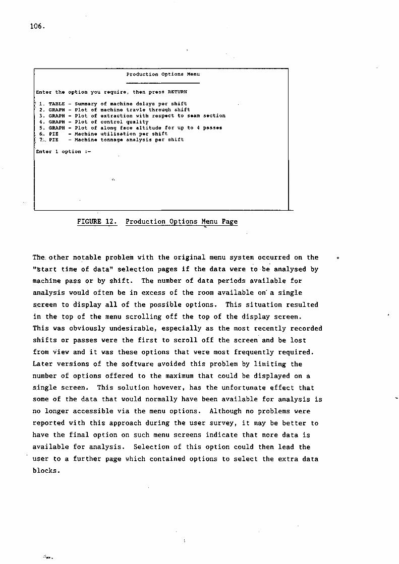
106.
Production Options Menu
Enter the option you require, then press RETURN
' 1. TABLE - Summary of machine delays per shift: 2. GRAPH - Plot of machine travle through shift3. GRAPH - Plot of extraction with respect to seam section4. GRAPH - Plot of control quality5. GRAPH - Plot of along face altitude for up to 4 passes
. 6. PIE - Machine utilisation per shift! 7;., PIE — Machine tonnage analysis per shift
Enter 1 option :-
FIGURE 12. Production Options Menu Page
The: other notable problem with the original menu system occurred on the
"start time of data" selection pages if the data were to be analysed by
machine pass or by shift. The number of data periods available for
analysis would often be in excess of the room available on' a single
screen to display all of the possible options. This situation resulted
in the top of the menu scrolling off the top of the display screen.
This was obviously undesirable, especially as the most recently recorded
shifts or passes were the first to scroll off the screen and be lost
from view and it was these options that were most frequently required.
Later versions of the software avoided this problem by limiting the
number of options offered to the maximum that could be displayed on a
single screen. This solution however, has the unfortunate effect that
some of the data that would normally have been available for analysis is
no longer accessible via the menu options. Although no problems were
reported with this approach during the user survey, it may be better to
have the final option on such menu screens indicate that more data is
available for analysis. Selection of this option could then lead the
user to a further page which contained options to select the extra data
blocks.
107.
5.4 System Response Time
In general the system response times were within those recommended in
the guidelines. The most notable exception occurred whilst the system
was retrieving data from file. As mentioned earlier this could take
several minutes and, in the original version of the software, the screen
would be blank during this process. Because of the nature of the system
this length of delay is unavoidable but to leave the screen blank and
not inform the user what is currently happening may lead to the user
feeling frustration or anxiety. In such situations reducing the
variability of the delay and providing a countdown clock to indicate the
duration of the delay and the time remaining to completion of the
operation would normally be recommended. However, in this case, to
extend an already excessive delay would undoubtably detract from the
overall usability of the system. To avoid this situation, later
versions of the software displayed a message such as: "- data collection
in progress -" and then for each block of 200 data points that was
retrieved from file a further status line was added to the display.
Typical status lines would take the following format:
Data point collected = 200 Data created 21-0ct-1987 08:32.
Data point collected = 400 Data created 21-0ct-1987 08:43.
Data point collected = 600 Data created 21-0ct-1987 08:51.
Data point collected = 800 Data created 21-0ct-1987 09:03.
Although novice users would still not be aware of how long the data
collection process was going to take they would at least be assured that
the system was still active and collecting the data they had requested.
Delays were also especially pronounced on one of the observed systems
that had one computer supporting two MIDAS shearers and two terminals.
Delays whilst gathering data could run up to ten minutes. Obviously,
delays of this duration strongly discourage any casual use of the system
for monitoring or speculative fault finding. 'They are also incredibly
frustrating if one finds that the information pathway through the menus
was incorrectly specified and the selection process has to be started
again.

108.
5.5 Operator's Updated Display
As reported in the results from the user survey the operator's updated
display (see Figure 10, section 4.4.2) is the option most frequently in
use during the normal running of the system. This display provides the
following information:
Current time of day.
Machine position: chock number or metres.
Direction of machine movement.
Steering status of machine (i.e. auto, degraded auto, manual).
Machine speed.
Report of system errors.
Duration of current delay.
From the results of the user survey, the perceived usefulness of this
display would be enhanced if it also provided the following information:
Reason for delay.
Number of passes so far in the shift.
Total yards or metres cut so far in the shift.
All of the data on the current display was reported as being required
for the operator's task of monitoring current machine performance with
the exception of "system error reports". These reports normally
indicate some problem with the data transmission system or errors on
which the operator is not required to act. Although it may be useful
for the operator to be aware of such errors, as the currently displayed
data may possibly be erroneous, there would seem to be little need to
require such messages to be acknowledged by needing the space bar of the
terminal to be pressed to clear the message. Any such superfluous
requirements may in fact cause excessive annoyance and discourage
further use of the display.
«The control room operator is not permanently seated in front of the MSS
display. Hence, the display needs to be readable from a distance of up

109.
to 3 or 4 metres. This requirement is well accommodated by the use of
the large (double height, double width) characters currently employed on
the display. As there is insufficient room on the display to show all
of the required data in this manner, the best practical solution is to
use the large characters to display information that is used most
frquently or changes most rapidly.
5.6 Management Information
The major source of comment and dissatisfaction reported in connection
with the management information tasks during the user survey were
related to the slowness of the plotting system and the reliability of
the plotter employed. Together, these problems are likely to reduce the
effectiveness and total use made of the MSS system: they make it less
probable that information is distributed or available to potentially
interested parties and they discourage the use of the system for any but
the minimum number of routine plots.
The introduction of automatic end of shift plots will help relieve the
problems associated with the slow nature of the plotting software but
will undoubtedly make reliable plotter operation more important. In
fact if the plotter requires constant attention, the usefulness of the
automated plotting system is almost completely negated. As these graphs
are seen as potentially useful in terms of increasing production, the
extra capital investment required to supply a reliable plotter would
probably be minimal in comparison to the advantages to be gained, not to
mention the amount of operator's time that could be saved.
The provision of management information was not one of the major
objectives of MSS. However, ever since the installation of the first
MSS system, such uses have evolved. Whether or not the system should
attempt to further support this role is a decision that is beyond the
scope of this project. However, there is little doubt that provision of
such information will help to enhance management opinion of the system
and improve general attitude and willingness of colliery staff to use
it.

110.
5.7 Steering Performance and Engineering Displays
As described in section 4 many different elements of the available data
are used in many different ways at the various collieries to assist
engineers to carry out their jobs. Even a single-ended shearer has
approximately 50 transducers or other signals that are monitored by MSS.
Because of this, it is clearly impractical to examine each combination
of data presentation systematically. However, whatever combination of
data items is to be examined the display option can be classified as
plots of historical data, list of historical data, or tables of
real-time data.
The format of the plots used for the graphical display of engineering
data conform to most of the general guidelines presented in Appendix A.
As these graphs are used to perform such a wide variety of tasks, there
is no real advantage to be gained by tailoring the format of such
displays to suit specific tasks.
Displays of real-time data are displays which are updated to show the
latest value of the selected data items as they are received from the
underground system. Such displays are most frequently-used during the
commissioning of new MIDAS installations. One notable exception to this
is the display typically selected for the monitoring of steering
performance. Where this type of display is used to determine the
current absolute value of a data item the format employed is generaly
acceptable. However, these displays are the only means available for
the monitoring of most data items in real-time. As some of the
engineering task components require the identification of trends and
deviation from a norm, it would be preferable to enable the system to
plot graphs of real-time data. -Without such a facility, these
information components can only be reliably identified by using the plot
of historical data, that is data from, at best, the previous machine
pass.
Lists of historical data were reported as being used by a few users to
help fault diagnosis or just to check everything was going normally.
For example, the data columns were scanned to look for big changes.

111.
These lists or data tables were also reported as being used to determine
the absolute values for parameters that have been plotted. Data values
are typically collected every 2 to 3 seconds for most items. Hence the
lists, even for a single machine pass, will be very lengthy and require
many display pages to examine an entire,list. The paging of these
displays was controlled by the operator entering the start time of the
data values that were to be displayed on the next page or simply
pressing the return key to examine the following page. The utility and
usability of such displays could be enhanced by allowing the amount of
data for a given time period to be further reduced by, for example, only
displaying data that was outside a specified range or displaying mean
values for the data.
The large variation in the reported frequency of use of MSS by
engineering staff tends to indicate that the use of the system is to a
large extent dependent on the individual motivation and foresight of the
personnel involved in addition to being dependent on local colliery
practise and the frequency of occurrence of problems with the MIDAS
system. One of the major potential benefits to be gained from the use
of MSS is an improvement in diagnostic and fault finding information
available to engineering staff in both a current and predictive sense.
However, if the staff are not aware of this potential, or of the manner
in which such information can be used, such benefits will not be fully
realised. A further indication of the existence of this problem is in
the difference between HQTD staff and colliery personnel in the
perceived utility of the system for maintenance uses. This problem can
be avoided and an overall improvement in system utility realised by the
instruction or training of potential users. The optimum form of
training or instruction employed would be to a large extent dependent on
the previous experience of the users. However, the provision of
documentation in the form of a user manual, with examples of how the
system could be employed td aid in the diagnosis of faults etc., would
go a long way towards raising the user awareness of the system
potential.

112.
5.8 User Documentation
At the time of the survey no documentation or other form of instruction
was available for the users of the system. This was possibly because
the system was still being developed. However, several of the users
interviewed commented that even simple documentation, such as
descriptions or maps of the menu structure and the information content
therein would be a great help.
The user not only had no support for his learning of the system, he was
faced with a moving "target. The software, especially in its early days,
was frequently updated. Menu contents, their labels and their
organisation were changed over time. Sometimes a new version would be
installed with, for instance, new graph plots available, but no
explanation given as to what they were intended for or what they meant.
Consequently many of these later additions were not used. One possible
solution to such problems would be to provide on-line help or news of
new features in each of the software issues released.
5.9 Overall System Considerations
As shown in Figure 2, there are several outer shells to the man-machine
system. The MSS system should not therefore be considered in isolation
from the many other potential factors. For example, many computer
systems are being introduced into collieries and, in particular, into
the colliery control room. As a result, .users of these systems may be
exposed to a variety of differing interfaces and dialogue techniques
employed on a range of different computer systems. Such a situation
would be potentially confusing and possibly even frustrating to the
users, thus reducing the overall effectiveness of all the systems
involved.
o
One of the most frequently made recommendations in guidelines for the
design of human computer dialogue is that of consistency. For example,
the consistent use of colour, screen location, coding conventions and
abbreviations have all be shown to improve performance. By the same
token, the performance of the overall colliery control and information

113.
system could also be improved by the use of consistent-user interface
and dialogue conventions on all of the computer systems likely to be
present.
The continued use of a menu based dialogue technique for use with MSS
was recommended because the need to accommodate inexperienced and
infrequent users was still the predominant requirement. However, as
users of the system become more familiar with its operation and gain an
increased level of experience, frustration caused by the relatively long
and tedius use of a menu system is likely to increase.C)
There are several potential solutions to this problem. One of the
simplest is to allow the dialogue to be conducted either via the menu
system or by a command language interface. The users could then select
the technique which they found to be most convenient and suited to their
level of experience or expertise. However, the major disadvantage of
such an approach from an ergonomics perspective is that there is no
simple learning path between the two distinct levels of dialogue. That
is, the transition between the two techniques is extremely abrupt. A
user attempting to change from the menu system, which at this stage he
probably knows very well, will again find himself faced with a dialogue
technique that is totally unfamiliar and the learning process must start
from scratch.
A more elegant solution is to have the command language key words
highlighted and used in the menu item descriptions. Selection of menu
options could then be made in the usual way or by typing in the keyword.
This would lead to the user gradually building up a knowledge of the key
words used in the command language. As experience increased the user
would be able to recall the keyword sequences for commonly used dialogue
paths. When such sequences were entered the intermediate menu pages
would not need to be displayed. Eventually the user would become
capable of entering the commands as if a command language interface was
being used. However, if at any stage he is unsure of the input
required, the menu system is still available.
Unfortunately, the additional software development costs that would be

114.
involved in the production of such user interfaces would probable
outweigh the benefits to be gained on a single system such as 'MSS.
However, given that the core software routine for such an interface
could be developed for use on most of the different systems that are
likely to be introduced into collieries within British Coal, the
development of such an interface could become a viable proposition.
Apart from the benefits that would result from having an interface that
was suited to a wider range of users such an approach would also
encourage consistency across the range of systems. The total cost of
such an interface development would also be reduced by reducing the
programming effort involved if producing seperate interface routine for
each system.
115.
6. CONCLUSIONS
A number of design features of the MIDAS surface software display system
were identified as potentially problematic. These influenced both the
ease of use and the acceptability of the surface display element of a
successful automated shearer guidance system.
Some of these features were not task specific and, following the
distribution of general design guidelines, were readily corrected in
subsequent software versions.
In addition to providing direct guidance on ergonomic software display
design, these guidelines also served to create an increased awareness
amongst system developers of the need to consider the capabilities and
requirements of the eventual users.
Some of the design features required contextual information relating to
the specific needs of such users and, following the collection of such
information in a series of interviews with current users, it was
possible to tailor the computer system more directly to cater for these
needs.
The actual uses to which the system was put at the collieries
differed from those originally envisaged. Some applications, such as
its use as a management information system, were not anticipated or
therefore designed for in the original system concept. Others, such as
its use for preventive or diagnostic maintenance, have apparently not
achieved their expected prominence.
A number of aspects of the system contributed to this latter 'shortfall'
in expectations. The poor 'user-friendliness' of the early versions of
the system, combined with the lack of documentation on its use and
capabilities, militated against its ready use on an experimental basis
by, for example, colliery engineering staff.

116.
Some changes to the software were produced during the life of the
project and have already been distributed to the collieries. It was
apparent from reports during field studies that these had been well
received and were widely regarded as a considerable improvement over
earlier versions.
Finally, the MIDAS surface software system must be viewed in the wider
context of colliery computer systems. Disparate design strategies can
lead to confusion when colliery staff are expected to attend to a number
of such systems. A cohesive overall design strategy would prevent this
and would enhance the overall acceptability and ease of implementation
of any additional systems.

117,
7. REFERENCES
ALLEN RB. (1982) Cognitive factors in human interaction with
computers. Behaviour and Information Technology; 1: 257-278.
ANON (1981) Choosing the Right Chart. A comprehensive guide for
Computer Graphics Users. San Diego, California: Integrated Software
Systems Corporation.
ANON (1984) Producing quality technical information. Santa Teresa:
IBM System Information, Santa Teresa Laboratory.
ANYAKORA SN, LEES FP. (1972) Detection of Instrument Malfunction by
the Process Control Operator. Chemical Engineer; 72: 304-309.
BAILEY RW. (1982) Printed instructions. In: Bailey RW, ed. Human
performance engineering. New York: Prentice-Hall: Ch t9.
BAKER JD, GOLDSTEIN I. (1966) Batch vs sequential displays: Effects on
human problem-solving. Human Factors; 8: 225-235.
BEST CF, FERGUSON CA, MARTIN R, MASON S, SIMPSON GC, TALBOT CF. (1985)
The human aspects of computer-based monitoring and control of mining
operations. Final Report on CEC Contract 7206/00/8/01. Edinburgh:
Institute of Occupational Medicine (IOM Report TM/85/6).
BILLINGSLEY PA. (1982) Navigation through hierarchical menu structures:
Does it help to have a map? Proceedings of the Human Factors Society,
26th Annual Meeting. Santa Monica CA: Human Factors Society: 103-107."
BOUWHUIS DG. (1979) Visual recognition of words. Ph.D dissertation,
Catholic University of Nijmegen.
BOUMA H. (1980) Visual reading processes and the quality of text
displays. In: Grandjean E, Vigliani E, eds. Ergonomic aspects of
visual display terminals. London: Taylor and Francis: 101-114.
118.
BOUMA H, LEOPOLD FF. (1969) A set of matrix characters in a special 7x8
array. IPO Annual Progress Report; 4: 115-119.
BRITISH STANDARDS INSTITUTE (1976) Recommendations for the preparation
of indexes for books, periodicals and other publications. London:
British Standards Institute (BS 3700).
BROADBENT DE. (1977) Language and ergonomics. Applied Ergonomics; 8:
15-18.
BRUCE M, FOSTER JJ. " (1982) The visibility of colored characters on
colored backgrounds in viewdata displays. Visible Language; 16:
382-390.
BURNHILL P, HARTLEY J, DAVIES P. (1977) Typographic decision making:
The layout of indexes. Applied Ergonomics; 8: 35-39.
BURY KF, BOYLE JM, EVEY RJ, NEAL AS. (1982) Windowing versus scrolling
on a visual display terminal. Human Factors; 24: 385-394.
CARBONELL JR, ELKIND JI, NICKERSON RS. (1969) On the psychological
importance of time in a time-sharing system. Human Factors; 10:
135-142.
CARD SK. (1984) Visual search of computer command menus. In: Bouma H,
Bouwhuis D, eds. Attention and Performance X, Hillsdale, NJ: Lawrence
Erlbaum Associates: 97-108.
CHRIST RE. (1975) Review and analysis of colour coding research for
visual displays. Human Factors; 17: 542-570.
CLEVELAND WS, HARRIS CS, McGILL R. (1983) Experiments on quantitative
judgements of graphs and maps. Bell System Technical Journal; 62:
1659-1674.
119.
CUFF RN. (1980) On casual users. International Journal of Man-Machine
Studies; 12: 163-187.
CULBERTSON HM, POWERS RD. (1959) A study of graph comprehension
difficulties. Audio-Visual Communication Review; 7: 97-100.
DAVIES IK. (1972) Presentation strategies. In: Hartley J, ed.
Strategies for programmed instruction. London: Butterworths.
DeMARS SA. (1975) Human factors considerations for the use of colour in
display systems. 'NASA: John F Kennedy Space Center (NASA-TH-X-72196).
DOOLEY RP, HARKINS LE. (1970) Functional and attention-getting effects
of colour on graphic communications. Perceptual and Motor Skills; 31:
851-854.
DOOLING DJ, LACHMAN R. (1971) Effects of comprehension on the retention
of prose. Journal of Experimental Psychology; 88: 216-222.
DUMAIS ST, LANDAUER TK. (1984) Describing categories of objects for
menu retrieval systems. Behaviour Research Methods, Instruments and
Computers; 16: 242-248.
DZIDA W, HERDA S, ITZFELDT WD. (1978) User-perceived quality of
interactive systems. IEEE Transactions on Software Engineering; 4:
270-276.
DZIDA W, HERDA S, ITZFELDT WD, SCHUBERT H. (1977) Zur
Benutzerfreundlichkeit von Dialogsystemen, Ergebnisse einer Umfrage.
Bericht 35 des 1ST, Selbstverlag GMD, D-5205 St. Augustin 1
EHRENBERG ASC. (1977) Rudiments of numeracy. Journal of the Royal
Statistical Society A; 140: 277-297.
EHRENREICH SL. (1985) Computer abbreviations: Evidence and synthesis.
Human Factors; 27: 143-155.

120.
EMBLEY DW, NAGY G. (1981) Behavioral aspects of text editors. Computing
Surveys; 13: 33-70.
ENGEL FL. (1980) Information selection from visual display units. In:
Grandjean E, Vigliani E, eds. Ergonomic aspects of visual display
terminals. London: Taylor and Francis; 121-125.
ENGEL SE, GRANDA RE. (1975) Guidelines for man/display interfaces.
Poughkeepsie, (NY): IBM (TR 00.2720).
cGAINES BR, FACEY PV. (1975) Some experience in interactive system
development and application. Proceedings of the Institute of Electrical
and Electronic Engineers; 63: 462-471.
GALITZ WO. (1981) Handbook of screen format design. Wellesley, (MA):
QED Information Sciences.
GIROUX L, BELLEAU R. (1986) What's on the menu? The influence of menu
content on the selection process. Behaviour and Information Technology;
5: 169-172.
GOULD JD. (1968) Visual factors in the design of computer-controlled
CRT displays. Human Factors; 10: 359-376.
GROSSBERG M, WIESEN RA, YNTEMA DB. (1976) An experiment on problem
solving with delayed computer responses. IEEE Transactions on Systems,
Machines and Cybernetics; 6: 219-222.
HAMMER JM, ROUSE WB. (1979) Analysis and modelling of freeform text
editing behavior. Denver (Colorado): Proceedings of the 1979
International Conference on Science and Society.
HARTLEY J. (1980) Space and structure in instructional text. Chapter
26. In: Kolers PA, Wrolstad ME, Bouma H, eds. Processing of visible
language 2. New York: Plenum Press in association with NATA
Scientific Affairs Division.
121.
HARTLEY J, BURNHILL P. (1976) Explorations in space. Bulletin of the
British Psychological Society; 29: 97-107.
HARTLEY J, BURNHILL P. (1977a) Understanding instructional text:
typography, layout an design. In: Howe MJA, ed. Adult learning.
London: Wiley: 223-247.
HARTLEY J, BURNHILL P. (1977b) Fifty guidelines for improving
instructional text. . Programmed Learning and Educational Technology; 14:
65-73.
HIRSCH ED. (1977) The philosophy of composition. Chicago: University
of Chicago Press.
JONASSEN DH. (1982) The technology of text. Principles for structuring,
designing and displaying text. Englewood Cliffs, New Jersey:
Educational Technology Publications.
JONES MR. (1962) Color coding. Human Factors: 355-365.
KENNEDY TCS (1975) Some behavioral factors affecting the training of
naive users of an interactive computer system. International Journal
of Man-Machine Studies; 7: 817-834.
KLARE GR. (1974) Assessing readability. Reading Research Quarterly; 10:
62-102.
KREBS MJ. (1978) Design principles for the use of color in displays.
SID 78 International Symposium Digest. Los Angeles, CA: Society for
Information Display: 28-29.
LACHMAN R, LACHMAN JL, BUTTERFIELD EC. (1979) Cognitive psychology
and information processing: An introduction. Hillsdale, NJ: Erlbaum.
LEE E, MACGREGOR JN. (1985) Minimising user search time in menu
retrieval systems'. Human Factors; 27: 157-162.
122.
LEE E, WHALEN T, McEWEN S, LATREMOUILLE S. (1984) Optimizing the
design of menu pages for information retrieval. Ergonomics; 27:
1051-1069.
LEE E, MACGREGOR J, LAM N, CHAO G. (1986a) Effects of experience in
keyword menu retrieval. In: Oborne DJ, ed. Contemporary Ergonomics
1986. London: Taylor and Francis: 310-314.
LEE E, MACGREGOR J, LAM N. (1986b) Keyword menu retrieval: An effective
alternative to menu indexes. Ergonomics; 29: 115-130.o
MACDONALD-ROSS M. (1977) How numbers are shown. Audio Visual
Communications Review; 25: 359-409.
MacGREGOR J, LEE E, LAM N. (1986) Optimizing the structure of menu
indexes: A decision model of menu search. In: Oborne DJ, ed.
Contemporary Ergonomics 1986. London: Taylor and Francis: 315-319.
MAGUIRE M. (1982) An evaluation of published recommendations on the
design of man-computer dialogues. International Journal of Man-Machine
Studies; 16: 237-261.
MARTIN J. (1973) Design of man-computer dialogues. Englewood Cliffs,
New Jersey: Prentice-Hall.
McGEE WC. (1976) On user criteria for data model evaluation. ACM
Transactions on Database Systems: 370-381.
MEIHOEFER HJ (1973) The visual perception of the circle in thematic
maps: experimental results. Canadian Cartographer; 10 :63-84.
MILLER GA. (1964) The psycholinguists. Encounter; 23: 29-37.
MILLER RB. (1968) Response time in man-computer conversational
transactions. AFIPS Conference Proceedings; 33: 267-277.
123.
MILLER LH. (1977) A study in man-machine interaction. AFIPS Conference
Proceedings; 46: 409-421. Washington, DC: Thompson Book Co.
MILLER DP. (1981) The depth/breadth trade-off in hierarchical computer
menus. Proceedings of the 25th Annual Meeting of the Human Factors
Society. Santa Monica, (CA): Human Factors Society, 296-300.
MOSES FL, EHRENREICH SL. (1981) Abbreviations for automated systems. In:
Proceedings of the Human Factors Society 25th Annual Meeting. Santa
Monica, CA: Human Factors Society, 132-135.o
van NES FL. (1984) Limits of visual perception in the technology of
visual display terminals. Behaviour and Information Technology; 3:
371-377.
van NES FL. (1986) Space, colour and typography on visual display
terminals. Behaviour and Information Technology; 5: 99-108.
NEWMAN WM. (1969) Interactive graphical response and its effect on
display system performance. In: "Adaptive man-machine systems display
design", IEEE Conference Record no. 69058-MMS. Quoted in Umbers,
(1976) (qv).
PAAP KR, ROSKE-HOFSTRAND RJ. (1986) The optimum number of menu options
per panel. Human Factors; 28: 377-385.
PARKINSON SR, SISSON N, SNOWBERRY K. (1985) Organization of broad
computer menu displays. International Journal of Man-Machine Studies;
23: 689-697.
PASSAVANT FC. (1970) Multicolour cathode ray tube displays. Computer
Design; January.
POULTON EC. (1967) Searching for newspaper headlines, printed in
capitals or lower case letters. Journal of Applied Psychology; 51:
417-425.

124.
POULTON EC. (1970) Ergonomics in journal design. Applied Ergonomics;
1: 207-209.
RADL GW. (1980) Experimental investigations for optimal presentation
mode and colours of symbols on the CRT screen. In: Grandjean E,
Vigliani E, eds. Ergonomic aspects of visual display terminals.
London: Taylor and Francis: 127-135.
RAMSEY HR, ATWOOD ME. (1979) Human factors in computer systems: A
review of the literature. Englewood, (CO): Science Applications Inc
(Technical Report cSAI-79-lll-DEN)
REYNOLDS L. (1979) Teletext and viewdata - a new challenge for the
designer. Information Design Journal; 1: 2-14.
ROBERTSON PJ. (1979) A guide to using colour on alphanumeric displays.
IBM Technical Report (TR-12-183).
ROBINSON F. (1961) Effective study. New York: Harper & Row
SCHUTZ HG. (1961a) An evaluation of formats for graphic trend displays
- Experiment II. Human Factors; 3: 99-107.
SCHUTZ HG. (1961b) An evaluation of methods for presentation of graphic
multiple trends - Experiment III. Human Factors; 3: 108-119.
SHNEIDERMAN B. (1978) Improving the human factors aspects of database
interaction. ACM Transactions on Database Systems; 3: 417-439.
SCHUTZ HG. (1961b) An evaluation of methods for presentation of graphic
multiple trends. Human Factors; 3: 108-119.
SCHWARTZ JP, NORMAN K. (1986) The importance of item distinctiveness
on performance using a menu selection system. Behaviour and Information
Technology; 5: 173-182.
125.
SCHWARZ E, BELDIE IP, PASTOOR S. (1983) A comparison of paging and
scrolling for changing screen contents by 'inexperienced users. Human
Factors; 25: 279-282.
SHNEIDERMAN B. (1979) Human factors experiments in designing interactive
systems. Computer; 12: 9-19.
SIMCOX WA. (1984) A method for pragmatic communication in graphic
displays. Human Factors; 26: 483-487.
SIMPSON GC, MASON S.° (1984) Human reliability in perspective. In:
Proceedings of Safety and Reliability Society Symposium, Safety
Assurance in Hazardous Industries. Southport: Safety and Reliability
Society.
SINGER A, LEDGARD H, HEURAS J. (1977) The annotated assistant: A step
towards human engineering. Amherst: University of Massachusetts,
Department of Computer and Information Science (Technical Report).
SMITH EA, KINCAID P. (1970) Derivation and validation of the automated
readability index for use with technical materials. Human Factors; 12:
457-464
SMITH SL, McCOMBS ME. (1971) The graphics of prose. Journalism
Quarterly; 48: 134-136.
SNOWBERRY K, PARKINSON SR, SISSON N. (1983) Computer display menus.
Ergonomics; 26: 699-712.
SPENCE R. (1976) Human factors in interactive graphics. Computer-Aided
Design; 8: 49-53.
STEWART TFM. (1976) Displays and the software interface. Applied
Ergonomics; 7: 137-146.

126.
SZLICHCINSKI KP. (1981) The design of instructions and other printed
sources of information. Martlesham Heath: British Telecom (Research
Department Report RDR 873).
TEDFORD WH, BERQUIST SL, FLYNN WE. (1979) The size-colour illusion.
Journal of General Psychology; 39: 444-446.
TEICHNER WH. (1979) Colour and visual information processing.
Proceedings of the Society for Information Display; 20: 3-9.
TEITELBAUM RC, GRANDMA RE. (1983) The effects of positional constancy on
searching menus for information. Human Factors in Computer Systems:
Proceedings. Washington: Institute for Computer Sciences and
Technology: 150-153.
THORNDIKE EL, ROCK RT. (1934) Learning without awareness of what is
being learned or intent to learn it. Journal of Experimental
Psychology; 17: 39-45.
TRUCKENBROD JR. (1981) Effective use of colour in computer graphics.
Computer Graphics; 15: 83-90.
UMBERS IG. (1976) CRT/TV displays in the control of process plant: A
review of applications and human factors design criteria. Stevenage:
Warren Spring Laboratory (LR 242(CON)).
WALRAVEN J. (1985) The colours are not on the display: A survey of
non-veridical perceptions that may turn up on a colour display.
Displays; Jan: 35-42.
WEALE RA. (1978) Visual factors II. In: Reading V, ed. Visual aspects
and ergonomics of VDUs. London: University of London Institute of
Ophthalmology: 32-43.
WRIGHT P, FOX K. (1972) Explicit and implicit tabulation formats.
Ergonomics; 15: 175-187.

127.
WRIGHT P, REID F. '(1973) Written information: some alternatives to
prose for expressing the outcomes of complex contingencies. Journal of
Applied Psychology; 57: 160-166.
WRIGHT P, BARNARD P. (1975) Just fill in this form: a review for
designers. Applied Ergonomics; A: 213-220.
WRIGHT P. (1977) Decision making as a factor in the ease of using
numerical tables. Ergonomics; 20:91-96.

128.

129.
8. ACKNOWLEDGEMENTS
The Ergonomics Branch of the Institute of Occupational Medicine wish tothank the British Coal Corporation and the European Coal and SteelCommunity for their provision of support and funds for this project.
Thanks are also due to the management and staff of British Coal HQTD,together with South Yorkshire and Western Areas and collieries for accessto the system and its users.

130.

131.
APPENDIX A:
ERGONOMIC DESIGN GUIDELINES
1. INTRODUCTION
When producing software the input and output requirements of theassociated system must always be considered. For example, to producea disc filing system the hardware performance of the disc drive and itsassociated interface requirements must be considered to ensure the fast,reliable and efficient operation of the overall system. By the sametoken, where the software is to communicate with a user the performanceand interface requirements of the user should also be considered.
For a given piece of hardware the performance and data requirements canbe specified precisely and must be adhered to for the system to work.The human element of the system, however, is capable of responding to awide variety of data formats presented via a range of different media.Although the user is capable of adapting to and processing this range ofinformation and hence meeting the system objectives, this does not implya good system. To ensure the efficient and effective operation of sucha man-machine system it is necessary to consider the following factors:
* The environment the user is working in.* The hardware the user is to interact with.* The way the user communicates with the system (dialogue).* The information required by the user.
1.1 The User's Environment
The physical environment within which the user is working must beconsidered, since factors such as heat, light, noise and workspacelayout may well influence the willingness or even the ability of theuser to perform the task required, both to interface with the system andto use the software to its full potential. Where adverse environmentalfactors are known to exist and are unavoidable the user interface shouldbe designed with this in mind. For example, the use of a keyboard bellsignal to flag a warning or alarm message might be perfectly acceptablein an office environment but might be of little use in a high noiseenvironment such as a coal preparation plant.
1.2 Hardware
The hardware configuration of a system can also have a large effect onthe way in which a user interacts with a system. However the hardwareto be used is often predetermined by other system considerations thatare to a large extent outside the scope of this document. The requiredcharacteristics and suitability of some of the more common devices usedfor user input/output are discussed in Appendix A.
Throughout the remainder of this document we assume the use of a QWERTYkeyboard and an 80 column by 24 line visual display unit unlessotherwise stated.
132.
1.3 Dialogue
The type and style of dialogue between a user and a computer system hasa large effect on the user's attitude towards it. This in turn affectsthe efficiency of the total system. The type and style of dialogue bestsuited to a given application is determined mainly by the user'sexperience and expectations. If a user is inexperienced and does notknow quite what to expect from a computer system a great deal of timeand effort may be required to cope with an inappropriate interface.Conversely an experienced user may feel frustrated and held back ifexpected to use a dialogue designed for a less experienced group ofusers. Consequently it is important to consider the expected frequencyof use and the range of experience of the target user group. If thedialogue causes excessive difficulty or frustration for a given usergroup, the situation can arise where they feel the effort required torun the system outweighs the usefulness of it.
1.4 Information Requirements
The range of data available on a computer information system is usuallyfar in excess of that required by a user to perform a given task. If anattempt is made to display this range of data, the situation can arisewhere the information required by a user is spread across many displaysand in differing formats. From the user's point of view however, a goodsystem is one that contains all the information required for a singletask on a minimum number of screens and in a format that most closelysuits the way the data are used. To achieve this objective, it isnecessary to consider in detail the task the user is expected toperform. The success of any user-computer interaction is largely adirect function of the designer's knowledge of the user's tasks andrequirements.
The following guidelines have been produced without a specific task inmind, they can therefore only indicate the general approach to beadopted based upon broad task characteristics. However, adherence tothese guidelines will reduce the risk of at least the gross problemswhich may otherwise arise.
2. DIALOGUE DESIGN
2.1 Introduction
This section describes the general features of dialogue that make for agood, friendly and easy-to-use environment for a user interacting with acomputer information and monitoring system.
The term 'dialogue' in this context denotes a set of input and outputprocedures by which a user communicates with a computer system, andvice-versa. A user needs to feel that the computer is there as a toolto be used and this feeling is determined in part by the tone andsequencing of the discourse between the user and the computer.
Users of an interactive"system quickly build up a feeling of style andquality of the system. The main factors that have been shown to makethe difference between good and bad systems in terms of user-perceivedquality are:

133.
Self-descriptiveness. This allows the user to learn the system throughtrial and error with machine feedback. The computer should always tellthe user what is going on to help build an understanding of normal andabnormal running. For instance, if the user has just asked to edit atext file that does not exist, the system should say so, and say what itis doing instead (e.g. creating a new file for editing).
User control and flexibility. It should be easy to interrupt, abandonor change tasks. For example, if the user has asked for an operationthat needs extensive file-searching which may take several minutes butthen decides the operation was specified incorrectly, then it should beeasy and apparent how to abandon the task. The system should alwaysgive the feeling that the user is controlling the interaction and whatis happening. Anxiety decreases learning, particularly for novice users.
Ease of learning. Make sure that subtle details of terminology andsyntax are adequately explained. This factor is much more important for.casual users than regular users.
Task-adequate usability. Minimise the details that the user must knowand deal with for each task, and avoid giving details not needed for thetasks. For instance, a user does not need to know (and would beconfused by) the intricacies of disc filing in order to save aword-processing file.
Correspondence with user expectations. The system should behave in waysthat the user has learnt to expect. For example, if in one circumstancethe user has found that the backspace key takes the system back to theprevious menu page then it should have a similar effect in othercircumstances.
Fault tolerance. The user should easily be able to rectify mistakencommands or responses.
2.2 Consistency
It is important that different points within the user dialogue areconsistent with each other in style and logic. One of the strategiesadopted by users initially getting to grips with a system is toextrapolate from early examples to new situations. So if the inferencesthe user makes about the system are true sometimes but not always, thenlearning is impeded and the amount of errors and frustration increased.This general principle should always be applied but leads to a number ofexplicit recommendations:
Use consistent areas of the screen for shoving prompts, user'sresponses, normal and abnormal system responses.
The screen can be divided into windows, either notionally or visually,with different types of interaction in different areas. The user soonlearns where to look for needed information as familiarity with thesystem increases.
Use coding conventions consistently.

134.
It confuses and disrupts a user's previous learning if codingconventions are used in different ways throughout a system. Forinstance, if red text is used for a warning message in one context thendo not use it elsewhere for messages that are not warnings.
2.3 Dependency on Operator Experience
Duration, frequency of use of the system and training influence theappropriateness of different dialogue methods. The dialogue styleshould be matched to the training, familiarity, frequency-of-use andtasks of the users.
At one extreme, if users are not at all familiar with a keyboard and usethe system infrequently, then the interaction needs to be tightlyconstrained and the acceptable 'language' or response always madeexplicit. For casual or infrequent users, ease of learning is moreimportant than for experienced users. With a highly experienced userworking with a computer several hours a day, a full language forinteraction can be built up and full instructions at every step in thedialogue are not necessary. If the target user group is likely to covera range of experience levels it may be desirable to allow a choice ofdialogue methods (e.g. menus, form-filling, command languages). If thisis impracticable, the dialogue should be suited to the least experiencedof the users. A training programme may be appropriate, to ensure thatthe users reach a minimum level of competence with a new system.
2.4 Error Correction
When entering data or giving instructions an operator inevitably makessome mistakes. Good design reduces but does not eliminate theirlikelihood.
Users should alvays be given the opportunity to correct an error ormodify an input.
The system should always permit the interruption of its currentoperations to allow the user to correct mistaken input. In ordinaryconversation, it is extremely annoying to have to wait several minutesto get a word in edgeways to correct the wrong impression that was madeby something one said. Likewise with a computer. It can be veryfrustrating to have to wait until a command has been fully processedbefore being given the opportunity to say that actually you did not want .to do that. The frustration stems from the computer taking control ofwhat is happening from the user.
2.5 System Response Time
Another potential source of frustration is the computer's response time tocommands. In general a delay in the computer's response is acceptableonly if it is in proportion to the perceived difficulty of the requestedtask. An immediate response is not always required. The figures shownin Table Al are an approximate guide to acceptable system delays fortypical tasks.
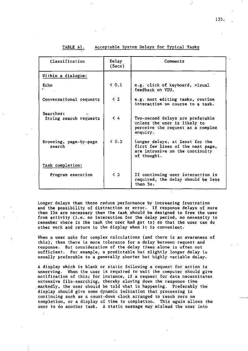
135.
TABLE Al. Acceptable System Delays for Typical Tasks
Classification Delay(Sees)
Comments
Within a dialogue:
Echo
Conversational requests
Searches: *String search requests
Browsing, page-by-pagesearch
Task completion;
Program execution
< 0.1
< 2
< 4
< 0.5
< 5
e.g. click of keyboard, visualfeedback on VDU.
e.g. most editing tasks, routineinteraction on course to a task.
Two-second delays are preferableunless the user is likely toperceive the request as a complexenquiry.
Longer delays, at least for thefirst few lines of the next page,are intrusive on the continuityof thought.
If continuing user interaction isrequired, the delay should be lessthan 5s.
Longer delays than these reduce performance by increasing frustrationand the possibility of distraction or error. If response delays of morethan 15s are necessary then the task should be designed to free the userfrom activity (i.e. no interaction for the delay period, no necessity toremember where in the task the user had got to) so that the user can doother work and return to the display when it is convenient.
When a user asks for complex calculations (and there is an awareness ofthis), then there is more tolerance for a delay between request andresponse. But consideration of the delay times alone is often notsufficient. For example, a predictable but slightly longer delay isusually preferable to a generally shorter but highly variable delay.
A display which is blank or static following a request for action isunnerving. When the user is required to wait the computer should givenotification of this; for instance, if a request for data necessitatesextensive file-searching, thereby slowing down the response timemarkedly, the user should be told what is happening. Preferably thedisplay should give some dynamic indication that processing iscontinuing such as a count-down clock arranged to reach zero oncompletion, or a display of time to completion. This again allows theuser to do another task. A static message may mislead the user into
136.
thinking the task is continuing when in fact the system has crashed;just one occurrence of the system leaving a 'normal running' message onthe screen when it has crashed shakes the user's future confidencein such messages.
3. COLOUR
3.1 Introduction
There are three ways of using colour in the construction of displays:
(i) As a supplementary coding method to others, such as spatiallocation, labelling, shape and size, etc.
(ii) As the sole qr unsupported method of coding display information,e.g. colour changes to show change of status.
(iii) To increase the aesthetic appeal of the display, withoutnecessarily enhancing the function of the display.
3.2 Supplementary or Non-Essential Coding
Supplementary coding is a very effective way of increasing theefficiency of display usage, provided the use of colour has been plannedwith respect to other methods of obtaining information used in thedisplay.
When colour is used with another 'code' such as text labels, symbols,etc, then colour is considered to be supplementary, as it is not theonly means by which the information is being conveyed. For example, ifa status label changes from 'stopped' to 'running' and also from red togreen, then colour is being used as a supplementary code to the textlabel.
As a supplementary code, colour has been found to be very effective insearch tasks, i.e. those in which the user knows the target and hasmerely to locate it. For instance, when searching through a large menu,if items of the same type (pressures, temperatures, flow-rates etc) weregrouped together and colour-coded this would reduce the number of itemswhich had to be scanned every time the menu was used. The use of colourcoding in this way has been found to reduce the time required to searchfor information in a display by up to 70%. Of course, this presupposesthat the grouping of the menu items corresponds to groups of informationrequired by the user.
Used as an supplementary code colour can be used to improve performanceof a number of search and locate tasks by:
* Relating or tying fields into groups.* Differentiating groups from each other.* Relating data that are spatially separated.* Calling attention to important data fields.
When colour is used as supplementary or non-essential coding up to fivecolours may be used.

137.
3.3 Colour Unsupported by Other Coding
Unsupported colour coding is a very effective method of obtaininginformation related to some tasks, provided the colour codes are known,relevant and limited in number.
When colour is the only form of coding this means that the display doesnot use any method other than colour to convey information contained inthe display. For instance, if the status of an item of equipment on adisplay is shown by its colour (e.g. green is running, red is stopped)and the display shows this information in no other way, then colour isthe only form of coding for its status on that display.
If the code is not related to the user's expectations or experiencethere will be more difficulty in remembering it, especially at timeswhen a quick response is needed. Because the colours in the display arethe only means of obtaining information their meaning must be known fromthe start. Conversely, with supplementary coding one can allow themeaning to be learnt through experience.
The main uses of colour as the only method of obtaining information froma display are:
* To identify kinds of data.* To identify sources of data.* To identify status of data.* To show order of operations.
Do not use more than three colours if consistent and accuraterecognition of the code is important.
Beyond this number one hundred percent accuracy becomes increasinglydifficult. It is therefore important to know the consequences ofinaccurate monitoring (e.g. in terms of effects on quality of product oron safety).
3.4 Aesthetic Appeal
It is accepted that the use of colour may increase the general interestand the commercial appeal of a display. On very simple displays its usefor aesthetic reasons is unlikely to have any adverse effects on taskperformance (although it will not improve performance either). However,as display complexity increases so does the potential for theinappropriate use of colour to affect performance adversely. This ismainly because colour is such a powerful coding medium that it tends tobe processed at the expense of other coding methods. Therefore, it isgenerally recommended that:
Colour should not be used to increase the aesthetic appeal of a displaywithout considering the possible adverse effects on user performance.
Some of the possible adverse effects on task performance are:
* Colours can have specific meanings for the user which were notintended by the designer.

138.
* Display items shown in the same colour may be visually groupedin a way that is unrelated to the task to be performed or is inconflict with another task-related group of items.
* The inappropriate use of colour in one display may interferewith its attention-gaining powers in further displays.
3.5 Selection of Colours
If poor colour combinations are chosen, they may be mistaken for orconfused with other colours. The extent to which this occurs depends onthe application. For instance, there is a greater chance of coloursbeing mistaken for each other in graphs where the areas of colour aresmall and may run close together or overlap.
oEight percent of the male population have defective colour vision.Rather less (approximately one percent) of the female population alsohave this problem. For example, people with a red and green colourdeficiency (the most common) have problems distinguishing yellow-redsfrom yellow-greens and brownish reds from brownish greens, although somecombinations are distinguishable by luminance. Therefore such colourcombinations should not be used as an unsupported method of coding whereoperators have not been screened for defective colour vision. However,the use of pure reds and greens is acceptable as such combinations aredistinguishable by luminance as well as colour.
Use colours which are as far apart in the visual spectrum as possible.
Typical good combinations of colours are:
* red - green - blue* black - yellow* green - white* red - white* blue - white* yellow - blue
Typical undesirable combinations of colours are:
* orange with red or yellow* yellow with green* violet with blue
When selecting colours, it should be remembered that the appearance of aspecific colour may differ according to features such as the brand ofcolour monitor, dust on the screen, the spectral content of the overheadlighting, the preferred level of the setting of brightness controls bydifferent operators, etc. Therefore, although the colour combinationsreferred to above have been found to be advantageous experimentallytheir effectiveness should not be assumed without considering theirappearance in combination with the expected equipment and environment.
Remember that dark backgrounds make colours appear lighter than theyreally are and vice versa for light backgrounds. Colours shouldtherefore be chosen according to screen background colour so that they
139.
are discriminable but are not uncomfortably bright with the possibilityof masking other colours.
Different colours are compatible with different sizes of display area.For example, blue is useful for large areas but in small areas, e.g.symbols, it may be difficult to discern. This is due to its lowluminance compared with other pure colours, which work much betterfor small areas.
When different colours are used in close proximity or cross each other,e.g. coloured lines as used in process control displays, care should betaken that bright colours do not mask others.
Some colour codes may already be in use by particular population groups.If this is the case, and these codes do not conflict with other systemconventions, use them. This avoids the users having to learn new andpossibly conflicting conventions.
4. MENUS
Menus are recommended for occasional and novice users as they reducethe amount of information the user needs to remember. The majordisadvantage of menus is that for more experienced users they may beungainly.and long-winded. The possible areas of application for menusrange from the use of a single page menu for the selection of two orthree possible program options to the use of multiple page menu systemsfor the selection of data in a large data base.
4.1 Structure of Menu Systems
Given a fixed number of options or possible goals, a menu system can bearranged with many items on each page and a minimum number of pages(broad), with few items on each page and many pages (deep), or anywherebetween these two extremes. On each menu page the user's task is to scanthe options available and to select the most appropriate one. The formatand layout of menu systems should be arranged so as to assist the user inthese basic tasks.
In general, broad options are considered to be superior as they reducethe number of pages and options to be selected and hence the potentialfor errors to be made. However, there are limits to the number ofoptions a user can easily deal with on each menu page.
Menus should be structured in a hierarchical or "tree" manner.
A series of menu screens should be structured in a hierarchical or"tree" manner with the primary or basic choices on a main screen andlower-level choices on lower-level screens. This type of menu structureis recommended as it is the simplest logical structure for the userto remember and to work with. It helps the users to remember where theyare in a menu system and to find their way through it.
4.2 Number of Options Per Menu Page
Menu options can be considered as being one of two possible types. Theycan be descriptors of a general nature such that they describe a subset
140.
of possible options, features or data sets. Or they can be descriptorsof specific options, features or data. When the options on the menu areof a general nature, naive users need to consider all of the optionsavailable in order to determine which one is the best description or"match" to the desired operation. When the options are of a specificnature, users do not need to consider all of the options; they simplyhave to perform a search and locate task, terminating on location of theappropriate option.
For general options use no more than 6 to 8 options per page.
When the options are of the general type a maximum of six to eight perpage is recommended. However, if the options can be divided intodistinct subsets, and the order and layout of the page is structured toshow this, it is acceptable to have up to 16 options per page.
For specific options use no more than 50 to 60 options per page.
Where the options are of the specific type the limiting value for thenumber of options per page is normally determined by the space availableon a single screen but should not exceed 50 to 60 items. Care should betaken to ensure that the list of options do not become too crowded orcluttered. Abbreviations should not be used purely to force the optionsonto a single screen.
4.3 Wording of Menu Items
Menu item captions should provide a clear, concise, fully spelled outdescription of the alternatives and choices available.
Abbreviations should only be used where they are consistently used andgenerally recognised by all of the users. Words to describe the optionsshould be consistent with those used both throughout the system and inthe user's working environment.
4.4 Routing Information
Each menu frame should uniquely identify itself and indicate the actionrequired from the user.
This information should be given in a consistent spatial location andshould be visually distinct from the rest of the menu text. The use ofa unique colour and/or reverse video is effective in this context.
4.5 Layout of Options
Menu items should be left-justified and aligned into columns.
For ease of scanning, menu items should be left-justified and alignedinto columns. Position the groups of aligned items around the centre ofthe screen and do not use extra spacing to right justify the text. Donot spread out the options merely to fill space on the screen.
4.6 Ordering of Items on a Menu Page
The best order is dependent upon the number of items to be included and

141.
their usage characteristics.
For eight or less items:
Where the pattern of usage is known, order them by frequency of use. Ifno obvious frequency or pattern is known use alphabetic order.
For nine or more items:
Use an alphabetic order whether or not the usage pattern is known.
When alphabetic ordering is to be employed, sort the options based on theunderlying keyword within the option description. In such situations, itis preferable to have the descriptions start with the keyword. However,if this is impracticable, highlight the keyword within the descriptor.
Grouping:
When an appropriate logical grouping of data items into subsets ispossible group the items and use alphabetical ordering within eachgroup.
Each group should be spatially separated, preferably in a separatecolumn. Avoid splitting groups, for example, do not start a group partway down one column and continue at the top of the next. The use ofcolour coding to highlight the different groups is recommended. Wheresufficient space is available, it can be useful to label the differentgroups with headings. This assists the user in identifying the functionof the groups.
4.7 Selection of Options
There are many ways in which the user can be allowed to identify andselect the options required. The optimum technique to use is determinedby:
* The type of hardware in use.* The layout and complexity of the menu system.* The user's experience and expectations.* The number of options to be selected from each menu.
All of these factors should be considered when selecting the techniqueto be used. If the menu complexity is to vary throughout the systemselect the technique that best meets the requirements of the mostcomplex menu.
Do not use different selection techniques for different menus.
The instructions to the user should explicitly state the input format oraction required to select an option. Where multiple selections may bemade from a single menu, it is helpful to identify those items that havealready been selected. For example, this may be achieved by using achange in colour or the use of a flag next to the item such as a pointeror asterisk.
Several different approaches to identifying the menu elements to be
142.
selected are available:
Ordinal Identification. Items are simply numbered according to theircolumn position and the user is requested to enter the number of theoption required. Ordinal identification and selection may be used onsimple menus where the user is not expected to remember or to use theidentification numbers on other screens. Always place a full stop afteran item number, separate by at least one space from the captions and usenumbers starting with one, not zero.
Mnemonic Identification. Each menu item is associated with amnemonic code or abbreviation. The user is required to enter therelevant mnemonic to select the item. The mnemonic may be placedalongside the option caption but it is better to highlight the mnemonicwithin the caption if possible. Colour or increased brightness is thebest way to achieve this. Mnemonic identification and selectiontechniques are useful for more complex menus, as the user is likely tolearn the codes through experience. This can lead to a rapid increasein performance especially when the user is permitted to enter optionsbefore or without the menu being displayed. However, in order toachieve this, the mnemonics or abbreviations must be chosen verycarefully.
Cursor Selection. The menu item captions are displayed without anyfurther form of coding or indentification, the cursor or some otherdisplayed pointer is then positioned next to the required option and afunction key used to indicate its selection. Where manipulation of thecursor or pointer is performed using discrete keys such as the cursorcontrol keys this technique should only be used for menus with a smallnumber of items. If however a device such as a mouse or tracker ball isavailable, it is reasonable to employ the technique with larger menus.
5. GRAPHS AND CHARTS
5.1 Introduction
This section describes design guidelines for the graphical presentationof data. For the specialised application of monitoring several processcontrol parameters simultaneously, this section should not be used.Some guidance is given in Appendix B, though it may be advisable tocontact the Ergonomics Branch for further advice on specialist displays.
The first few subheadings describe the use and design features ofseveral kinds of graph and chart. The remaining subheadings describedesign features common to these graph types, such as labelling,divisions on coordinate axes, use of colour.
Use graphs and charts for shoving qualitative aspects of data. Do notuse them if the prime purpose is to show exact numerical orquantitative data.
Displaying qualitative aspects of the data allows the user to grasp themeaning or significance of the data in some particular context. Thepresentation of exact data must at most be of secondary importance.Usually the user is expected to make comparisons and appreciate patternsin the data but not to perform exact calculations with the displayed

143.
data. For example, graphs and charts are good for:
* Showing trends.* Making comparisons.* Spotting deviations from the normal.
„ * Showing the division of a whole into parts.
No one graphic format is universally superior. But though some formatscan be interchanged, there are limits. Each format has its domain ofapplication, which may overlap the domain of other formats.
5.2 Simple One-Line Graphs
Use a simple plot of one line on an L-shaped graph if you want to showthe relationship between tvo variables.
A line graph is suitable if, for instance, you want to illustrate thatoil pressure decreases with temperature.
Where the user has to extrapolate, interpolate, compare or classifytrends in time and does not have to read off exact amounts, line graphsare superior to bar charts or tables. An exception is when thereare few time periods with large changes from one period to the next, inwhich case a bar chart is equally effective.
5.3 Multiple-Line Graphs and Multiple Graphs on a Page
It is possible to show several lines on one graph or to have multiplegraphs on one page or screen. For reading approximate values of points,either multiple-line graphs or several graphs on a page are equallygood. But for comparison tasks the multiple-line graph is superior. Ingeneral, colour-coding improves the performance when added to othercoding, especially for multiple-line graphs.
On multiple-line graphs, the line codes (e.g. symbols) should be chosento have minimal confusion. There should not be too many lines on onegraph - the limit could be as low as three if they cross frequently. Onmultiple-line graphs, axes should preferably be repeated at the top andthe right-hand edges of the graph for easier reading of extreme values,unless this results in an unduly cluttered or cramped display.
5.4 Bar Charts
Use a bar chart for comparing relative quantities of items orcategories of a variable, or for taking approximate numerical readings.
If the user's task is to compare the relative quantities of a number ofdifferent categories or items and see the approximate amount of each,then a bar chart is generally the best choice. A pie chart may seemsuitable, but comparisons of the linear height of bars are made moreaccurately than comparisons between segments of a pie, where thejudgement is of angle.
Bar graphs are also the best format for taking an approximate numericalreading, e.g. to see whether a variable has reached a remembered upperlimit. It is much easier to make mistakes using a line graph. If the

144.
user is likely to be interested in the exact numerical value of a bar aswell as compare values, then the values can be shown on the chart at theend of each bar.
If bars are broken to fit them on the screen the user is no longer ableto judge the relative lengths of the broken and unbroken bars though, itis still possible to judge the order of the lengths.
Make bars wider than the space between them and do not allow grid linesto pass through bars.
Extra spacing and grid lines through bars disrupt comparison of bar height.
There is no particular preference for a horizontal or vertical barpresentation, except that labels can usually be more easily accommodatedon a horizontal chart.
If you want to reflect large changes from period to period but have verymany periods, then a bar chart with no separations between bars can beused, to avoid the appearance of a picket fence.
5.5 Pie Charts
Use a pie chart if it is particularly important to convey the conceptof a whole divided into parts but fine relative judgements of quantityin each slice are not so important.
Usually, bar charts are better if the user is to make relativecomparisons of quantity of items, or categories of a variable.
Limit pie charts to five or fewer segments.
Comparisons between many thin slices are inaccurate and difficult to do.
5.6 Labelling
The elements of charts and graphs should be labelled directly ratherthan indirectly by key.
Horizontal bars give room for labels and figures on or near theelements. This is the chief reason for preferring them to verticalbars. Multiple lines on one graph should be labelled on the graph ifthere is room, even if supplementary coding such as colour is used. Ifspace is restricted, abbreviations may be used to reduce the spaceneeded to display captions. Guidelines for constructing these are givenin a later section.
Write axis labels horizontally.
It is better to label the ordinate horizontally at the top left-handedge of the axis than to label it sideways. Take care not to confusethe label with anything which might be in the heading area.
5.7 Scales
Make the axis numbers large enough to read easily.

145.
Do not display numbers on a scale smaller than the character size on an80 column text display. If -the guidelines for numbering of scales arefollowed, there is likely to be room to make them somewhat larger thanthis.
Use scales that make interpolation easy.
Tick marks should be placed at each number on the scales. Grid linesshould be added only if they are essential to aid interpolation.Remember that a graph should not have been chosen if the user needs toknow an exact reading, so a fine grid of lines as on graph paper is notnecessary or desirable. If the task is to spot when a line has leftacceptable bounds, lines should be used to indicate normal limits oralarm levels.
Examples of preferred scales are:
IT ^ i 3 r 4, J, ....5, 10, 15, 20, 25,10, 20, 30, 40, 50,
Examples of acceptable scales are:
2, 4, 6, 8, 10,20, 40, 60, 80, 100,
Avoid using scales like:
3, 6, 9, 12, 15,4, 8, 12, 16,0, 2.5, 5, 7.5,
Graphs should never have more than one scale on one axis.
Use linear scales unless all the users are familiar with anothertype.
Unless users are familiar with alternative types of scales, such aslogs, they have difficulty in interpreting them.
Generally the scales should be arranged to exceed slightly the maximumand minimum ranges of the data, so that patterns in the data are notdisguised by compression of the scale. Autoscaling may be desirable asan option for graph plots on VDUs, but it may make it more difficult tocompare graphs. If the ranges of the data are known in advance, it maybe better to have a fixed scale for each different type of data.
In some cases, choosing the scaling (or allowing autoscaling) to makethe plotted line fill the graph changes the perceived variations in thedata by altering the slope of the line between points. Try to arrangethe graph so that normal variations in the data (not sharp or abnormalchanges) are represented by line slopes of no more than about 30degrees. Above this angle, users are more likely to perceive the lineas sharply changing, when the data do not warrant this interpretation.

146.
If there is a large amount of point-to-point variation which has noparticular significance for the user, then consider smoothing the dataor plotting an interpolated line to show hidden trends or patterns.
5.8 Coding in Graphs and Bar Charts
Colour-coding is more effective than other coding such as shape whenused on its own. But use of colour as a supplement to other forms ofcoding is best.
The Colour section gives more details of this form of coding. Shadingor hatching can be used on bars but take care that the patterns are nottoo garish. If there is a logical order to the shades then use thedarkest pattern for the highest extreme and the lightest for the lowestextreme of the orders
Make curves visually distinct from each other and from the grid.
Use symbols, colour or line pattern to indicate different lines on amultiple-line graph. In some cases it may be better to reserve dashedlines and patterning generally for the grid or for line projections orextensions.
6. TABLESQ
6.1 Introduction
The guidelines in this section are primarily for application to staticcollections of numerical.data organized and classified into columns androws. They do not advise on specialised forms of table, such asdynamically changing lists, spreadsheets, etc, though most of theguidelines given here are relevant.
If the purpose of using a table is to allow visual quantitativecomparison then a good table should show the patterns and exceptions init. If a table is needed to allow a quick look-up of a figure then 'theorganization of the rows and columns should facilitate this. You shouldensure that row and column information is complete and that all relevantlevels of categories are displayed in a terminology familiar to theuser. Wherever possible, avoid making the user interpolate or drawinferences to find the needed information.
In general, as the number of conditions presented in a table increases,the table gets harder to understand and use. Sometimes it is better tosimplify by creating two or more smaller tables.
6.2 When to Use
Use tables if the user wants to make quantitative comparisons or look upexact numerical information.
Otherwise, graphs and charts are more appropriate.
6.3 Rounding
Show numbers only to the accuracy that the user needs.

147.
One of the points of giving data in tables is to allow quantitativecomparison. Most of us can do mental arithmetic efficiently with onlyone or two digits so it makes a comparison task more difficult to reportnumbers to more than two significant figures. Often, numbers arereported well in excess of the true accuracy of the data. If a table ofexact data is needed as a record then this should be given separately.The same table should not be expected to give an immediate understandingof the data and also form an exact record.
In the example shown in Table A2, two tables are combined into one toillustrate the importance or rounding. The prime figures for visualcomparison are presented in columns. In the left-hand half of theexample, notice how the rounding of the number of deployments and thechange on the previous year makes it easy for the eye to make comparisonslooking down the columns. The figures affected by an industrial disputestand out and the deployments in July and August drop as men takeholidays. The 'change on last year' column quickly shows the overallimprovement in attendance after the industrial dispute compared with theprevious year. As a comparison, look at the right-hand half of theexample, where the same data are not rounded and the presentation is 'forthe record'. It is much harder to see the trends and exceptions in thedata.
6.4 Row and Column Summaries
Where appropriate, give summary figures to rows and columns.
Often, marginal figures giving totals or averages of the rows andcolumns help the user see patterns in the table more quickly. In theexample above, the 'change on last year' column fulfils this function ina way. If the table columns had shown a breakdown of reasons fornon-deployments (e.g. holidays, disputes, official business, sickness,accidents) then a useful row summary would have been 'Total non-deployments', with perhaps 'Yearly average' summarising the columns.
6.5 Arrangement in Columns
If the user's task is to compare figures, then put them in columns, notrows.
Figures are easier to read following down a column than across a row,especially for a large number of items, so use columns for the mostimportant comparisons. Minor variations and sub-patterns are morenoticeable in columns, especially if the figures are well rounded.
Look at the left-hand half of the example above. The most importantcomparison one would expect the reader to make is the seasonalvariations in the figures. That is why months are arranged down theside of the table so as to make the seasonal variations fall intocolumns.
6.6 Ordering of Rows and Columns
Rovs and columns should be ordered by the numerical size of each

148.
TABLE A2. Illustration of the Use of Rounding
*Rounding to facilitatevisual comparison
*Exact figures given'for the record'
DEPLOYMENTS PER MAN
Month
1985January+February+March
AprilMayJune
JulyAugustSeptember
OctoberNovemberDecember
Possible
20 «2025
202025
202025
202025
Actual
6817
141517
141319
161718
Changeon LastYear
-6-93
101210
10913
111111
Possible
202025
202025
202025
202025
Actual
6.177.6217.46
14.3815.0317.46
13.7013.0618.83
16.4216.6917.51
Changeon LastYear
-5.67-8.572.94
9.6610.4112.48
9.719.1413.16
11.3911.1311.02
* Source: Number of deployments per man, national trends monthlyfor year to January 1986. NCB Statistics Dept, KF7(STM 1/11).
+ Attendance affected by industrial dispute.
figure, not by the structure of the row and column labels, if it isappropriate to the purpose of presenting the data to do so.
In Table A3, we suppose that one of the purposes of showing the data isto draw attention to the actual deployments of men that are highest,rather than just to present the data in monthly order for the record.
With the highest deployments at the top of the table one immediatelysees which are the months with highest attendance. The figures affectedby the industrial dispute (when attendance was less) fall to the bottomof the table. If the purpose of the table were to show up the effectsof the dispute then the table would be better the other way round withthe lowest actual deployments at the top.
Ordering rows or columns by some measure of the size of the data (e.g.average) allows one to see the structure to the data, rather than thestructure to the column and row labels (which is usually well known).
149.
TABLE A3. Ordering Rows to Facilitate Visual Comparison
DEPLOYMENTS PER MAN*
Month
SeptemberDecemberMarchJuneNovemberOctoberMayAprilJulyAugus tFebruary*January*
Possible
252525
- 252020202020202020
Actual
1918171717161514141386
* Source: Number of deployments per man, nationaltrends monthly for year to January 1986. NCBStatistics Dept, KF7(STM 1/11).
+ Attendance affected by industrial dispute.
6.7 Spacing and Layout
Use spacing and layout to facilitate the eyes' travel down columns andalong rows.
Do not spread tables out merely to fill space. Conversely, do not usean excessively small typeface just to accommodate a very broad table.Instead, divide the table into two or more smaller ones.
Figures that are meant to be compared should be placed close together,so single spacing is effective in letting the eye read down columns.There is also a need for the occasional gap between rows to guide theeye across the table. Where possible use gaps to help identifysubgroups within the data. For example, gaps have been used to helpshow the quarters on the first two tables. Otherwise gaps should beleft every five rows or so.
Ruled vertical and horizontal lines are useful around the borders oftables and to separate captions and labels from figures. Lines betweencolumns and rows of data do not bring particular benefits so long as thespacing is sensible. On an 80 column display, provide at least twocharacter's space between columns that are not separated by verticalrules. Colour can also be used to differentiate column and row labelsfrom cell entries.
Columns of figures should be aligned so that the same units lie on avertical line (e.g. thousands, or the decimal point). If all thefigures contain a number of trailing zeroes then chop them off for thesake of clarity and explain the size of the numbers in the title (e.g.
150.
'"OOOs".)
6.8 Labelling
Label tables, saying what they contain.
You should give a short explanation of the contents of a table at itshead. If longer explanation is necessary you can give this in afootnote. Usually column and row labels should be given in full, butabbreviations can be used if you are sure that they are well known tothe user. Where applicable, units should be given. Again, footnotescan be used if necessary. Column labels should be placed at the headsof the columns; row labels should be shown at the left of the rows.Make sure it is clear to which column or row they refer.
6.9 Look-Up Tables °
Try to arrange the table so that the user can look up a desired figureusing one dimension rather than tvo.
A user is performing a look-up task with a table if the objective is tofind the figure in one of the cells by using the categorizationstructure of the table. The most common way to structure a look-uptable is to use two or more dimensions (sides to the table) as a way ofcross-classifying the data. For example, in the tables shown above, therows giving the month of the year form one dimension and the columnsgiving deployment figures the second dimension. If it is practicablewithin the space available on the screen or page it is preferable to putboth the dimensions along the vertical axis as shown below. This makesthe user's task quicker and easier and reduces the chances of error.
151.
TABLE A4. An Example of a One-Dimensional Table*
MANSHIFTTYPE
Development
Production
AREA
SCTNBANYKSYKNDYNTS
SCTNBANYKSYKNDYNTS
% OF TOTALMANSHIFTSWORKED
18% 3021201715
221619223028
* The table is laid out on the assumption that the user wants to lookup manshift figures broken down by area. The abbreviations used forthe Area are industry standard and would be well known to users ofthis type of data.
Source: Distribution of labour, 4 weeks ended 22nd February 1986.British Coal Statistics Department KF 11 (STM 1/13)
7. TEXT ON VDUs
7.1 Introduction
This s.ection deals with writing and laying out ordinary text on VDUscreens. Appendix C deals with other recommendations on writing andlaying out text which are appropriate for consideration on VDU displaysbut are based exclusively on studies of paper-based text.
7.2 Structure and Paging
Remember that screens are not made of paper. Having the whole text onpaper is itself a 'navigation aid' so readers at all times know wherethey are in the document or can refer to the Contents or Index. It iseasy to lose this when manipulating text on screen. Looking backward orforward in a sequence of pages on screen can be made unintentionallydifficult: even short system delays can be sufficient for readers toforget information that links what has just been read to the nextselected text.
The structure and chunking of the text is more important on a VDU thanwith paper. The text and layout need to be designed for the medium.Plentiful use of organizing headings and concise prose should ensure

152.
that each screen page can contain one main chunk of information that hasreduced .dependency on other screen pages for its understanding. Thisreduces the memory burden on the reader between pages and increasescomprehension.
Each screen page should be uniquely identified and should indicate tothe reader the action required to change pages. This information shouldbe given in consistent screen locations (e.g. top and bottom lines) andshould be visually distinct from the text, for instance by colourcoding. Menus are recommended for interactive text where the reader hasto select from a number of options. Design each screen to give anuncluttered display which makes full use of the screen and is balancedhorizontally and vertically.
7.3 Visual Enhancement
Screens offer facilities not available on paper that can be used forstructuring and organizing the text, such as colour, reverse video andflashing, though these can distract attention from the meaning of thetext if overused.
* Flashing should be used for vital warnings only. Your intentionmust definitely be to interrupt normal reading.
* Reverse video also captures attention and draws it away fromother areas so it should be used sparingly, for instance, forrouting information.
* Brightness variation of text characters is not generally advised,though two intensities are acceptable to show bold and ordinarytext.
* Text colour is a useful cue or way to structure the text, but donot use more than three text colours per screen, and keepconsistency of colour meanings between screens. Backgroundcolour should be used sparingly. Use colour-on-colourcombinations that have a high text-to-ground brightness contrast.
Lists of options or points of information should be differentiated fromthe text by layout or typographical cues, such as indentation, bulletsand blank lines. Do not fill lines out artificially.
7.4 Controlling Text Viewed
When the portion of text is larger than that which fits on the screen atone time, it is necessary to have some form of scrolling or windowingfunction that allows the user to control the movement backwards andforwards within the text. It is important that the user feels incomplete control of the scrolling action. Avoid such things as rapidscrolling where the user has to respond quickly to catch the requiredsection of text.
One way of conceptualising scrolling is to visualise the text as if itmoves or "scrolls" behind the stationary screen. A scroll down wouldreveal information beyond the upper limit of the screen. Alternatively,one can visualise the display screen as a movable window through which

153.
the stationary text is viewed. In this case, to display text beyond theupper limit of the screen one would use a "window up" command or uparrow key.
Treating the screen as a window is the most natural for users, andproduces fewer selection errors. The same principle should be appliedif there is a need to move left or right over the text.
7.5 Warnings and Error Messages
Message quality is a critical factor in influencing user acceptance of aprogram product. Good error messages can reduce the time and cost tocreate and maintain software, as well as help users learn about theproduct. The wording of messages can affect user performance andattitudes towards the system. Whether the source of the error orwarning is user input or arising from the computer (i.e. unacceptabledata from transducers), the first rule of good message design is to besure that additional confusion is not created as a result of themessage.
A common problem with error messages is that they tell the user whaterror has occurred, but not what to do about it. Messages are alsooften written from the point of view of the system's internal workings,and not from the user's viewpoint. Some error messages containunnecessary jargon, are cryptic, unfriendly, or misleading. Forexample:
IECU1IM 031-4,DESOLVER,BRIDGE,SHARE1, INPUT(,100A,1,PROJECTA.DATA)
Messages need to be brief but informative, telling the user what erroror condition has been detected and what action to take. The messageshould be appropriate to the user's level of knowledge, place no faulton the user, not use patronising language, and not be humourous.Diagnostic messages should be specific, offering constructive guidance,with user-centred phrasing, in a suitable physical format, and avoidingvague terminology.
The goal of providing the message should be identified. To bemeaningful, the message should not just be readable, they should berelevant, specific, timely and helpful.
8. ABBREVIATIONS
8.1 Introduction
This section describes ways to construct good abbreviations for use withcomputer systems. They serve two purposes. One is to speed data orcommand entry. By encoding messages, that is, by translating words intoabbreviations, the amount of time spent in keyboard entry can bereduced. Conversely, abbreviations may be used to reduce the spaceneeded to display messages, options or captions to data. This requiresthe user to decode, that is, translate the abbreviations back intowords.

154.
8.2 Construction of Abbreviations
The most frequently used abbreviations are ones that are producedwithout recourse to a rule. Usually, system designers rely onintuition to .create abbreviations. But there is little consistency inhow people choose to abbreviate a word: even if users are asked toconstruct natural abbreviations, the most popular choice is usuallyless than a majority, so "naturally" produced abbreviations are verylargely idiosyncratic. Internal consistency (i.e. a rule-governedstructure) is more important than simulated naturalness, so use a rulefor constructing abbreviations, rather than what seems natural.
Construct abbreviations by truncating.
The most effective way for constructing abbreviations is to retain justthe first few letters of the key word. Other rules, such as voweldeletion, are less effective. This is probably because it is obvious inevery case how to apply the rule, once the ,user knows it. Even if theuser is not explicitly taught the rule, but learns it through repeateduse of the system, a truncation rule is more quickly learnt. Anabbreviation rule brings advantages in terms of learning, errors andnaturalness to the largest number of users. The abbreviation should notinclude any punctuation.
The length of the truncated abbreviation should be the minimum toachieve uniqueness of the keyword (see the subsection on uniquenessbelow) and should be the same for all abbreviations. If the lengthvaries, users may type in more than necessary to be sure of uniquelydefining the keyword, thus losing some of the advantage of abbreviation.
8.3 Stereotypes
In some cases, there may already exist a set of abbreviations which arewell-known to the user population. In these cases, the existingabbreviations can be used in preference to constructing a new set to belearnt, because the memory of the learnt set would interfere with thelearning and error-free use of the new set.
8.4 Uniqueness
Occasionally, truncation to a fixed number of letters producesnon-unique abbreviations. If there are only a few words whoseabbreviations cannot be be unambiguously defined, it is acceptable tocreate abbreviations that violate the truncation rule. As long as thereare very few of these exceptions, preferably used with infrequently usedkeywords, then there may even be an improved memory of them because oftheir uniqueness.
8.5 Multi-Word Terms
If an operation or label cannot be described in one word, then adifferent rule for abbreviating the phrase should be used: retain thefirst letter of each word, for instance, Radio Frequency - RF, or GP forGraphic Print. A multiple word command line can have the truncationrule applied to separate options within it, e.g. "PRI SAL FOR A to Z "stands for "PRINT SALARY FOR [employees' names] A TO Z".
155.
Al. INPUT/OUTPUT DEVICES
Al.1 Introduction
Devices that are used for interacting with the computer should bematched to the user's tasks.
Some tasks are best performed with certain types of input or outputdevices, e.g. keyboards, joysticks, VDUs and printers. To decide whichdevices a computer system should have, one should first think of thetasks that the user is expected to do. This section describes thedevices that are suited to some common tasks. These are:
* Choosing options.* Positioning a cursor.r* Numeric entry of data.* Small amounts of text entry.* Large amounts of text entry.* Generating a drawing.* Entering an existing drawing.
A1.2 Device Characteristics
The mouse is good for choosing options from menus and positioning anobject on screen. It is pushed along a flat surface near the display.It can have integral keys making it a self-contained device for input insome applications.
The directions of its movement should produce a corresponding movementin the same direction on the screen. The necessity for a smooth flatsurface and the presence of a trailing cable may be a disadvantage,building a joystick into the keyboard removes this problem. Ajoystick is also effective for choosing and positioning tasks. Trackerballs or rolling balls are also effective in this context, though,like joysticks, they can easily be spoilt by poor mechanical design.
The lightpen and touchscreen both suffer from the fact that the bestposition for viewing a display is further away than the comfortableposition for pointing. Neither can give high resolution and they can beaffected by dirt on the screen. They may be suited when a keyboard isundesirable or when the environment is hostile but not dusty.
Soft keys are unmarked keys placed around the display screen whosefunctions are indicated on the screen. Thus their function can changeaccording to context. Care should be taken to ensure that they do notrequire the user to keep changing position to reach the screen.
Graphics tablets. Direct graphical input devices improve productivityby reducing the number of transactions the user must perform. Keyboardsuually prove less optimal for choosing and positioning tasks, buttablets may not be good unless the drawing surface is immediately infront of the display. The tablet surface must not be gouged easily byputting the pen on it. The surface should be matte or as non-reflectiveas possible.

156.
Alphanumeric keyboards:
Alphanumeric keyboards should conform to the standard QWERTYarrangement.
Additional function keys on an alphanumeric keyboard should be groupedaround this standard arrangement. They should be used judiciously tominimise typing in dialogues and should have clear functional labels(rather than arbitrary ones, such as 'fl').
A repeat function should be built into individual keys, rather thanprovided with a separate key.
A1.3 Positioning
In order of preference, use a mouse, joystick or tracker ball, lightpen or touchscreen, cursor keys.
Positioning means specifying or changing the position of a displayedobject, often a cursor. The mouse is quickest in terms of total taskexecution time, that is, the time taken for the hand to leave the normalkeyboard, execute the pointing task and return to the keyboard.
A1.4 Numeric Entry
In order of preference, use a numeric keyboard, alphanumeric keyboard,tablet.
If the user has to enter a large number of numeric data, then a numerickeyboard is better than the standard arrangement of numbers on analphanumeric keyboard.
A1.5 Text Entry
Use an alphanumeric keyboard.
A standard QWERTY keyboard is always be better than one with a differentarrangement of keys unless considerable training is given to all users.Even completely novice users are no quicker or more accurate usinganother keyboard layout, such as an alphabetical arrangement. A tabletis acceptable for small amounts of text entry.
A1.6 Generating a New Drawing
In order of preference, use a tablet, mouse, lightpen.
A tablet and mouse give more control and resolution than a lightpen. Atablet is better than a mouse because the user can see the exactposition of the stylus on the tablet.
A1.7 Entering an Existing Drawing
Use a graphics tablet.
This is sometimes known as digitising. A tablet is better than otherdevices because it allows the user to trace the exact outline of an

157.
existing drawing with a stylus.
Bl. BAR CHARTS FOR MONITORING AND CONTROL
Bl.l Introduction
Bar charts are effective in some industrial supervision and monitoringtasks to represent the status of several variables on one screen. Theymay be easier for some operators to use because of their similarity totraditional analogue instruments.
B1.2 Monitoring for Deviations
With many variables represented on one screen it is appropriate to havesome form of group scaling, so long as it is not essential that theoperator knows exact values. This can be done with respect to maximumand minimum values (perhaps with a percentage scale), setpoints or highand low alarm limits.
Use some form of coding to indicate alarms, such as colour.
Scanning time and error rate rises with the number of variablesdisplayed. A dozen or so variables can be scanned in a few seconds butdouble this time is needed for sixty variables. Even for a fewvariables (e.g. 12) a significant number of detection of deviationerrors are made. Hence, if detection of deviations is essential to theuser's task, some form of back-up coding is needed, such as colourcoding, or even an alarm message.
Use a stroke-type display in preference to bars.
A stroke format allows the eye easily to look along the states of eachvariable and detect those outside displayed bounds.
Put strokes in a row, as opposed to a column.
The bar format is worse in terms of both search times and errors, buthas the advantage that it is easier to look along a bar to find the nameof a variable that is deviating. With strokes it may be better to showthe outline of a bar faintly leading down to the axis from each stroke,so that the user can more easily find the name of the variable.
B1.3 Check-Reading
Analogue representation is better in terms of speed than anumeric one because numbers involve mental subtraction. Users alsoprefer it.
Scale markings to high accuracy on each variable (e.g. 5%) actuallyinterfere with this type of task compared with coarser markings (e.g. toan accuracy of 20-25%.) For a checking and comparing readings (e.g.picking the variable with the highest measured value) it is better interms of speed to orient the bars or strokes vertically and to use some—form of supplementary colour-coding to allow the eye to avoidinformation irrelevant to this particular task. Again users preferthese.
158.
Generally, a layout which uses both rows and columns for positioning thebars is superior to a one-dimensional layout (e.g. where the bars areall in a row or a column) because this allows an experienced user toadopt a strategy of knowing where a particular bar is and looking to itdirectly.
Cl. TEXT
Cl.l Introduction
This appendix gives guidance on writing and laying out ordinary text,primarily for presentation of user documentation, whether printed or onscreen. Issues specific to the presentation of text on VDUs are givenunder a separate heading in the main body of the report.
A writer should develop a clear, conception of the audience for which thetext is intended, their past experience and expectations. This givesinsight on what information to include, and how to structure the text.It avoids placing excessive demands on the reader. Words are clearer inmeaning than pictures and are essential in the representation ofabstract concepts.
C1.2 Titles
Use a title as a succinct expression of the contents of the text.
It should contain the fewest words possible, and works better if itis highly memorable. It helps focus attention and expectations.
C1.3 Summaries
Use summaries before and after the text.
Summaries before the text inform the users about the content - so theycan decide whether to read it and find out what the text is about.Summaries after the text help recall and understanding of the text bypresenting the main points and conclusions.
C1.4 Headings
Use headings in the text to help comprehension, scanning and searching.
Headings label parts of the text so that users know where they are andwhere they are going. They help with scanning, selection and retrievalas well as comprehension.
Try to anticipate how readers will look for information, if they arelikely to treat the text as a reference. Will they want to accessinformation alphabetically, chronologically, procedurally or bycategories? Tell, or show, the reader what the arrangement is.
Headings can be placed in the margin or with the text. Headings in themargin may help more with scanning and searching. If headings arewritten in the form of questions they may help the understanding of ayoung or less able reader (if the text answers the question) but

159.
headings in statement form are always acceptable.
Provide at least two or three meaningful headings per A4 page or itsequivalent, and try to reflect the user's tasks and structure of thedocument in their wording. Bear in mind how the Contents page will lookwhen choosing the wordings: some headings which make sense in the textmay not make sense when presented out of context in the Contentspages.
C1.5 Advance Organizers
Use these to help give a conceptual structure to the text.
Advance organizers indicate ways in which new material is the same as,or different from, what the user has already read. They give materialimmediately before a text passage that is introductory, more general andmore abstract than the following text. They perform a similar functionto headings, but they may contain more text (usually 10 to 15% of thetext passage) and they can be shown in a different way typographically,for instance, by using a large margin devoted solely to advanceorganizers. They provide a conceptual framework that helps clarify thetask ahead, and improve the memory and attitudes of the reader.
Advance organizers are written to:o
* Provide an advance 'scaffolding' to hold up new ideas as they aregiven in the text.
* Mark the-introduction of new ideas or concepts.
* Bridge the gap between what is known and what is to be learnt.
Good organizers are:
* concrete models* analogies* examples* sets of higher order rules* discussions of main themes in general terms
Organizers should not be used for:
* factual presentations* summaries* outlines* directions to attend to specific portions of text
Cl.6 Paragraphs
The theme of each paragraph or section should be stated clearly at thebeginning in order to focus the reader's attention on the main pointbeing developed. The overall organization of paragraphs within longerstretches of text should reflect judgements about the relativeimportance of ideas being presented. Major concepts should not beburied in a mass of detail.
160.
C1.7 Sequencing
If the events reported in the text have a time sequence then thesequence should match the order in which events occur. This isparticularly obvious in the case of written instructions, where thereader performs an action to match each instruction. Compare "Removecover-plates only after isolating the machine" with "Isolate the machinebefore removing cover-plates."
Users prefer text that has lists and sequences of instructions separatedand spaced out, rather than given in running text. Compare "The mainuses of colour in graphic displays are: "
* for aesthetic and commercial appeal;* as ca supplementary form of coding;* as the only form of coding".
with "The main uses of colour in graphic displays are for aesthetic andcommercial appeal, as a supplementary form of coding and as the onlyform of coding."
C1.8 Numbering Systems
Use numbers mainly for reference.
Sequencing can be aided by the use of numbering systems. There are manydifferent ways, e.g. 1, 2, 3 or 1.1, 1.2, 1.3, etc. They are especiallyvaluable for reference purposes. Page numbers and chapters are adequatefor ordinary running prose.
C1.9 Footnotes
Avoid using footnotes in plain text.
As well as being a nuisance to type and print, footnotes are anirresistible interruption to the reader. They break concentration andthe flow of information from one sentence to the next. Excess materialcan be placed in an Appendix - though it may not then be read.
C1.10 Words and Sentences
Use short, familiar words rather than technical terms that mean thesame thing.
Use short sentences. Split up long sentences.
Try to use words you think your reader will understand. Avoid synonymsfor the sake of elegant variation, they may well confuse your reader.By the same token, use one meaning per term and do not introduceunnecessary new terms.
Long sentences are more difficult to understand, partly because of theextra memory load they place on the reader. They contain a number ofsubordinate pieces, such as used here, which, because of theirparenthetical nature, make it difficult for the reader to bear all of

161.
their points in mind and, as a result, make it more difficult forreaders to remember the first part of the sentence when they are readingthe last part. (See what we mean).
There is a distinction between 'given and 'new' information in thecourse of reading text. 'Given' information has already been mentioned ina preceding portion of the text, while other ideas in a sentence are newsince they are being introduced without prior mention. Generally, thesubject of the sentence (usually the first thing mentioned) shouldreflect given information. When it does, it serves the function oftying the ideas in a passage across sentence boundaries. For example,"Shearers can now be steered under computer control. One such system iscalled 'MIDAS' ".
As a rule of thumb, sentences less than 20 words long are usually fine.Sentences 20 to 30 words long are probably satisfactory, 30 to 40 wordsis suspect and sentences containing over 40 words benefit fromrewriting.
Few sentences should contain more than tvo subordinate clauses.
Subordinate clauses are modifying statements tagged on to the mainsentence. The more there are, the more difficult it is to understandthe sentence. For example, "The consequences of ever increasing levelsof automation and computerisation, from both the system ergonomic andthe socio-psychological part, have shown that, according to currentpatterns, conditions tend to be rather worse for man".
Active sentences are generally easier to understand than passive ones.
Use positive terms, rather than negative ones.
Usually it is best to avoid negatives, especially double or trebleones, e.g. "It is not unlikely that this document will not be used bynon-NCB staff". Exceptionally, if the reader is likely to make anassumption, then you may sometimes use a negative construction to denyit.
As a general rule, a simple affirmative sentence is easiest tounderstand. Introducing the passive form or negatives creates problems,either slowing the reader down or causing errors. It may also causememory faults: a sentence in the negative or passive form may beremembered in the active form, even though this may change the meaning.
Try to anticipate the way the reader's mind works:
* General to specific.* Simple to complex.* Known to unknown.* Cause to effect.* Problem to solution.
When other people read what you write, do not make excuses if theycannot easily understand it.

162.
Cl.ll Ambiguities
Many sentences can turn out to be ambiguous, often because the writer'simplicit understanding has not been conveyed to the reader, thusallowing an interpretation that the writer had been prevented fromseeing because of implicit extra knowledge. This may be more importantfor instructional or procedural text. It helps to test the material onthe target audience to trap this sort of error.
Ambiguities and difficulties can arise from the use of abbreviations andacronyms. Their meaning should be explained to the reader, at least ontheir first occurrence.
C1.12 Difficulty
There are many readability formulae that quantify and predict thedifficulty of reading text. These generally give an American readinggrade level (1 - 12) or an index from 0 to 100. Often there areinconsistencies between different formulae on the same text, but onethat has had limited validation on technical material is called theAutomated Readability Index. This version of the formula gives scoresfrom 0 (easy) to approximately 100 (hard):
ARI = (w/s) + 9(l/w)
where:
ARI = Automated Readability Indexw/s = words per sentence1/w = letters per word
This formula should not be used on text much shorter than 10 pages, 5 atthe very minimum - otherwise the reliability of the index fallsunacceptably.
Such formulae are obviously not an infallible guide to the readabilityof text; some short sentences are difficult to understand and some longwords are easy to read because of their familiarity. Nonetheless, therehave been shown to be advantages for more readable text for severaltypes of document, including textbooks, scientific papers and job aids.
C1.13 Alternatives to Prose
Some types of document are difficult to understand when presented inpure running text form. Flow charts, sentences written in the form oflinked statements, and even decision tables may be more appropriate tocertain material. The optimal format depends upon the topic andconditions of use.

163.
APPENDIX B; .MIDAS JOB DESCRIPTION QUESTIONNAIRE
This appendix shows the job description questionnaire which was producedto provide the basis for the structured interviews of MIDAS users. Italso includes an introductory preamble which was produced to providethose conducting the interviews with background information andinstructions on the use of the questionnaire.
164.
MIDAS JOB DESCRIPTION QUESTIONNAIRE
INTRODUCTION
The large number of data items available to the MIDAS Surface Software(MSS) system means that the resultant information is potentially usefulto a vide range of users. In order to meet the needs of as vide a rangeof users as possible and also to ensure that all of the information isavailable the softvare has been written to allov the maximum amount offlexibility. For example, it will allow the plotting of line graphs,scatter graphs and pie charts etc. for almost any combinations of theavailable data.
Although this approach ensures that all the possible combinations ofdata are available to the users, it also has the effect of increasingthe the amount of interaction that is required and hence theopportunities for the user to make mistakes. It also makes it verylikely that the situation will arise where the information required by asingle user is spread across many displays and in differing formats.
From the user's point of view however, a good system is one thatcontains all the information required for a single task on a minimumnumber of screens and in a format that most closely suits the way thedata are used. To achieve this objective, it is necessary to considerin detail the tasks the user is expected to perform in conjuntion withthe system.
In order to obtain a detailed description of the tasks, the user isexpected to perform with the aid of the system the followingquestionnaire has been developed.
In addition to providing a detailed task description, the questionnairewill also provide information on the frequency of task performance, thepossible benefits to be gained by improving task performance and thepossible consequences of poor task performance.
This questionnaire is to be filled in by an ergonomist who will use itas a framework to conduct a structured interview.
It is proposed to interview:
(a) The project and software design personnel
(b) The installation and commissioning teams.
(c) Area and pit based personnel who:
(i) currently use or have access to MSS data;(ii) are soon to have MSS installed;(iii) have enquired about potential further uses.

165.
GUIDE FOR APPLICATION OF QUESTIONNAIRE
For any individual being interviewed it is intended to complete aquestionnaire set for each surface 'job' that he may do which uses orcould use information from MIDAS sensors. In the case of non-collierypersonnel (e.g. software design or commissioning team) this relates tojobs which they feel could or should be done using MSS.
The job of a CRO may be to pass the information on to a third party,while the manager may be compiling a report on the viability of the faceetc..
The first page of the questionnaire deals with personal details of the'subject' together with an indication of their use of the MSS system.
Page two requires a listing of each of the jobs which the subjectcarries out (or is aware of as a potential job) which come under thedescription above. This list should be referred to subsequently toensure that all jobs are covered. In the case of programmers orcommissioning team members, please ask them to indicate who would beexpected to do the job described.
The next page is the first detailed page. It requires a description ofthe job, working through all the stages associated with the acquisitionand use of MSS information. It has been presented as an unstructuredsheet to allow as much flexibility as possible. The interviewer shouldcomplete this in note form during the interview, rewriting it ifnecessary for clarity as soon as possible after the interview. Duringthis stage of the interview, the interviewer should 'flag' in his noteseach information item as it arises, numbering them for reference.
After the job description is completed the interviewer should completean information description sheet, numbering each item for crossreference with the job description text.
After completing this for each information item the interviewer shouldobtain ratings of the job on a job assessment profile form before movingto the next job.
Finally, the interviewer should ask the subject to complete a MSS SystemRating Form.
On the first visit to each pit please complete a MIDAS installationinformation sheet.
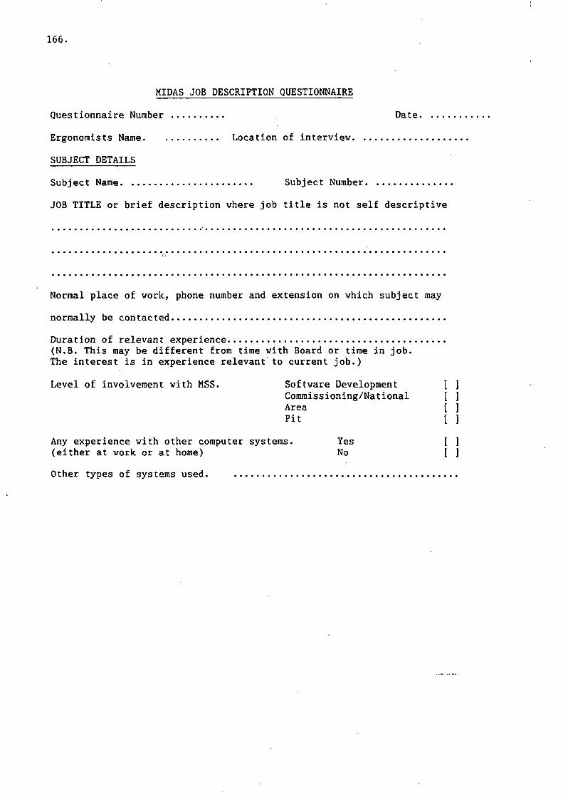
166.
MIDAS JOB DESCRIPTION QUESTIONNAIRE
Questionnaire Number Date.
Ergonomists Name Location of interview
SUBJECT DETAILS
Subject Name Subject Number
JOB TITLE or brief description where job title is not self descriptive
Normal place of work, phone number and extension on which subject may
normally be contacted
Duration of relevant experience(N.B. This may be different from time with Board or time in job.The interest is in experience relevant to current job.)
Level of involvement with MSS. Software Development [Commissioning/National [Area [Pit [
Any experience with other computer systems. Yes [(either at work or at home) No [
Other types of systems used.
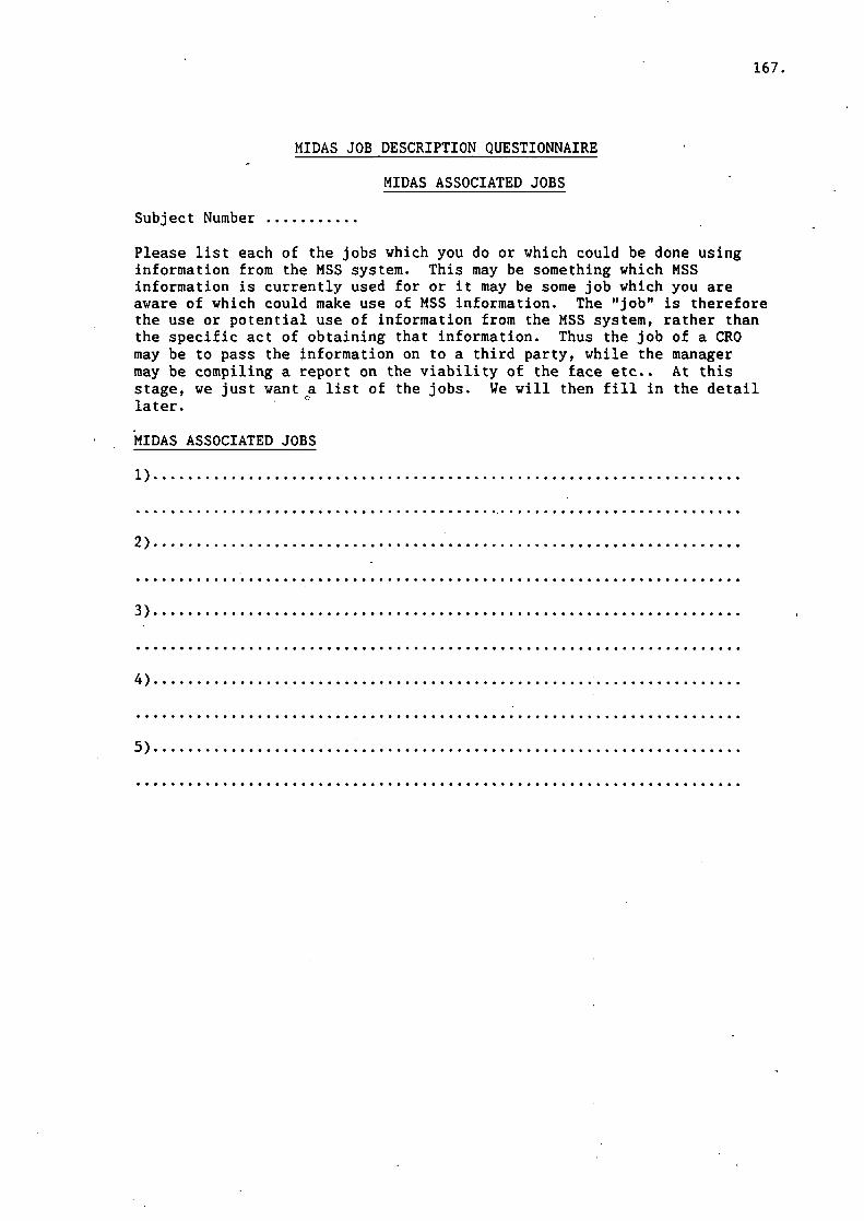
167.
MIDAS JOB DESCRIPTION QUESTIONNAIRE
MIDAS ASSOCIATED JOBS
Subject Number
Please list each of the jobs which you do or which could be done usinginformation from the MSS system. This may be something which MSSinformation is currently used for or it may be some job which you areaware of which could make use of MSS information. The "job" is thereforethe use or potential use of information from the MSS system, rather thanthe specific act of obtaining that information. Thus the job of a CROmay be to pass the information on to a third party, while the managermay be compiling a report on the viability of the face etc.. At thisstage, we just want a list of the jobs. We will then fill in the detaillater.
MIDAS ASSOCIATED JOBS
1)..
2),
3),
5)

168.
MIDAS JOB DESCRIPTION QUESTIONNAIRE
MIDAS ASSOCIATED JOB DESCRIPTIONS
Subject Number
Job Number [ ] Page 1
MIDAS ASSOCIATED JOB DESCRIPTION
Job classification. Current Potential Desirable.
How often is (or would) this job Every day [ ]be carried out. Weekly [ ]
Monthly [ ]Annually [ ]Other [ ]
Please specify e.g. occasional job at irregular intervals.
Please describe the tasks which have to be carried out in order to do thisjob detailing all individual items of information which have to be obtained.Care should be taken to ensare that these are single items not clusters ofinformation such as several aspects from one feature (e.g. machinespeed, machine speed over last shift etc.). Information items should belabelled and an information requirements sheet completed for each one.Please indicate if any of these information requirements depend uponthe value/status etc. of previous information.

169.
MIDAS JOB DESCRIPTION QUESTIONNAIRE
MIDAS ASSOCIATED JOB DESCRIPTIONS
Subject Number
Job Number [ ] Page [ ]
MIDAS ASSOCIATED JOB DESCRIPTION, CONTINUATION SHEET

170.
MIDAS JOB DESCRIPTION QUESTIONNAIRE
DESCRIPTIONS OF INFORMATION REQUIREMENTS
Subject Number
Job Number [....]
Item Number [....]
If it becomes apparent that more than one item has been included here thenplease number as N.1,N.2 etc. and complete separate sheets for each item.
Description
Checklist on type or nature of information
Please indicate the descriptor which best describes this item of information
Status i.e. on/off [ ]Level vis-a-vis a limit [ ]Trend data [ ]Change in comparison to previous value [ ]Actual numerical value [ 1Other (please specify) [ j
Where is this information from?
MSS Screen [ ] Parameter name [ ]
Other (please specify)
If MSS is used please give themost frequent method adopted for Getting it yourself [ ]obtaining this information from Others get it for you [ ]the MSS system. Routine Printout [ ]
None [ ]
If this information is obtained for you by another individual pleasegive details where he may be contacted

171,
MIDAS JOB DESCRIPTION QUESTIONNAIRE
DESCRIPTIONS OF INFORMATION REQUIREMENTS SHEET 2
To what accuracy is this information normally given.
How accurate is it actually required to be.
How reliable do you consider it to be.
Does it need to be more reliable YES / NO
If NO, could this job be done withlessreliable information. YES / NO
Is this information provided in a directly useable form YES / NO
If NO what additional calculations have to be performed.

172.
MIDAS JOB DESCRIPTION QUESTIONNAIRE
Subject Number
ASSESSMENT PROFILE RECORD SHEET
Please rank the extent to which the following aspects of mining would beaffected by changes in system performance factors such as accuracy or speedof information production for each job.
1. 2.JOB NUMBER3. 4. 5. 6. 7. 8.
SAFETY
PRODUCTION
INDUSTRIAL RELATIONS
MAINTENANCE
LONG TERM PLANNING
OTHERS (Please specify)
Please give details of any 'others', together with any information whichyou may consider relevant as to why you have given any particular rating

173.
MIDAS JOB DESCRIPTION QUESTIONNAIRE
RATING OF USEFULNESS OF CURRENT MSS SYSTEM
Subject Number
Job Number [....]
Please rate the Midas Surface Software not the whole Midas system bymaking a mark on the rating lines from 1-7 as shown.
J . * * * « * ^ * « » * « . j * » « « * H * * « « * D * * * « * O * * * « « /
How useful would you consider the current MSS system to be as an aid to:
1. Production
Not at all 1 2 3 4 5.....6 7 Tremendous help
2. Safety
Not at all 1 2 3 4 5 6 7 Tremendous help
3. Long term planning
Not at all 1 2 3 4 5 6 7 Tremendous help
4. Industrial relations (bonuses etc.)
Not at all 1 2 3 4 5 6 7 Tremendous help
5. Maintenance
Not at all 1 2 3 4 5 6.....7 Tremendous help
Comments.
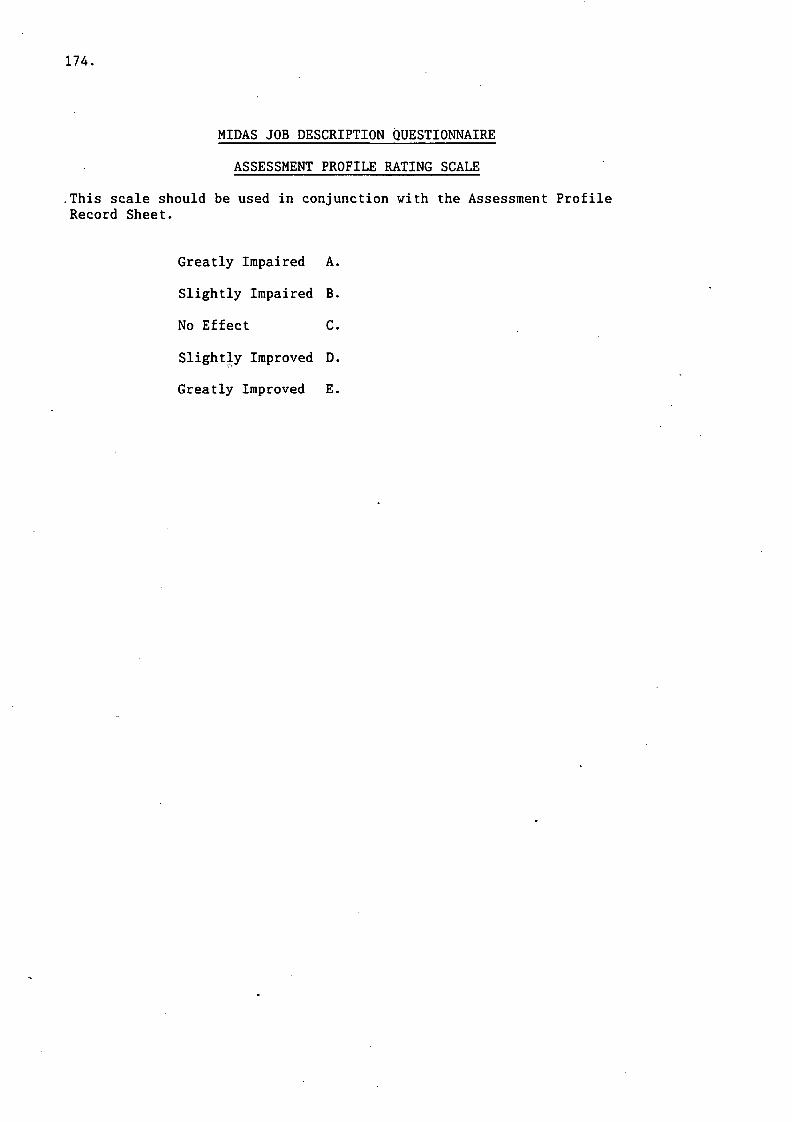
174.
MIDAS JOB DESCRIPTION QUESTIONNAIRE
ASSESSMENT PROFILE RATING SCALE
.This scale should be used in conjunction with the Assessment ProfileRecord Sheet.
Greatly Impaired A.
Slightly Impaired B.
No Effect C.
Slightly Improved D.
Greatly Improved E.

175.
MIDAS INSTALLATION INFORMATION SHEET
How long has a MIDAS or similar installation been in your pit
Has the software (MSS) been available all this time YES / NO
If not, for how long has it been available

HEAD OFFICE:
Research Avenue North,Riccarton,Edinburgh, EH14 4AP, United KingdomTelephone: +44 (0)870 850 5131Facsimile: +44 (0)870 850 5132
Email: [email protected]
Tapton Park Innovation Centre,Brimington Road, Tapton,Chesterfield, Derbyshire, S41 0TZ, United KingdomTelephone: +44 (0)1246 557866Facsimile: +44 (0)1246 551212
Research House Business Centre,Fraser Road, Perivale, Middlesex, UB6 7AQ,United KingdomTelephone: +44 (0)208 537 3491/2Facsimile: +44 (0)208 537 3493
Brookside Business Park, Cold Meece, Stone, Staffs, ST15 0RZ,United KingdomTelephone: +44 (0)1785 764810Facsimile: +44 (0)1785 764811
(A20115) IOM (R) ReportCov art 3/15/06 12:32 PM Page 2