fonts - ics.uci.eduddenenbe/131/typography.pdfit seems simple •something as apparently basic as...
TRANSCRIPT

FONTSFONTS
FONTSFONTS
FONTSFONTS
FONTSFONTS

FONTSFONTS
FONTSFONTS
FONTSFONTS

FONTSFONTS
FONTSFONTS

FONTSFONTS

FONTSFONTS

FONTS

FONTSFONTS

FONTSFONTS

FONTSFONTS
FONTSFONTS

FONTSFONTS

FONTSFONTS

FONTSFONTS
FONTSFONTS
OK,
SERIOUSLY
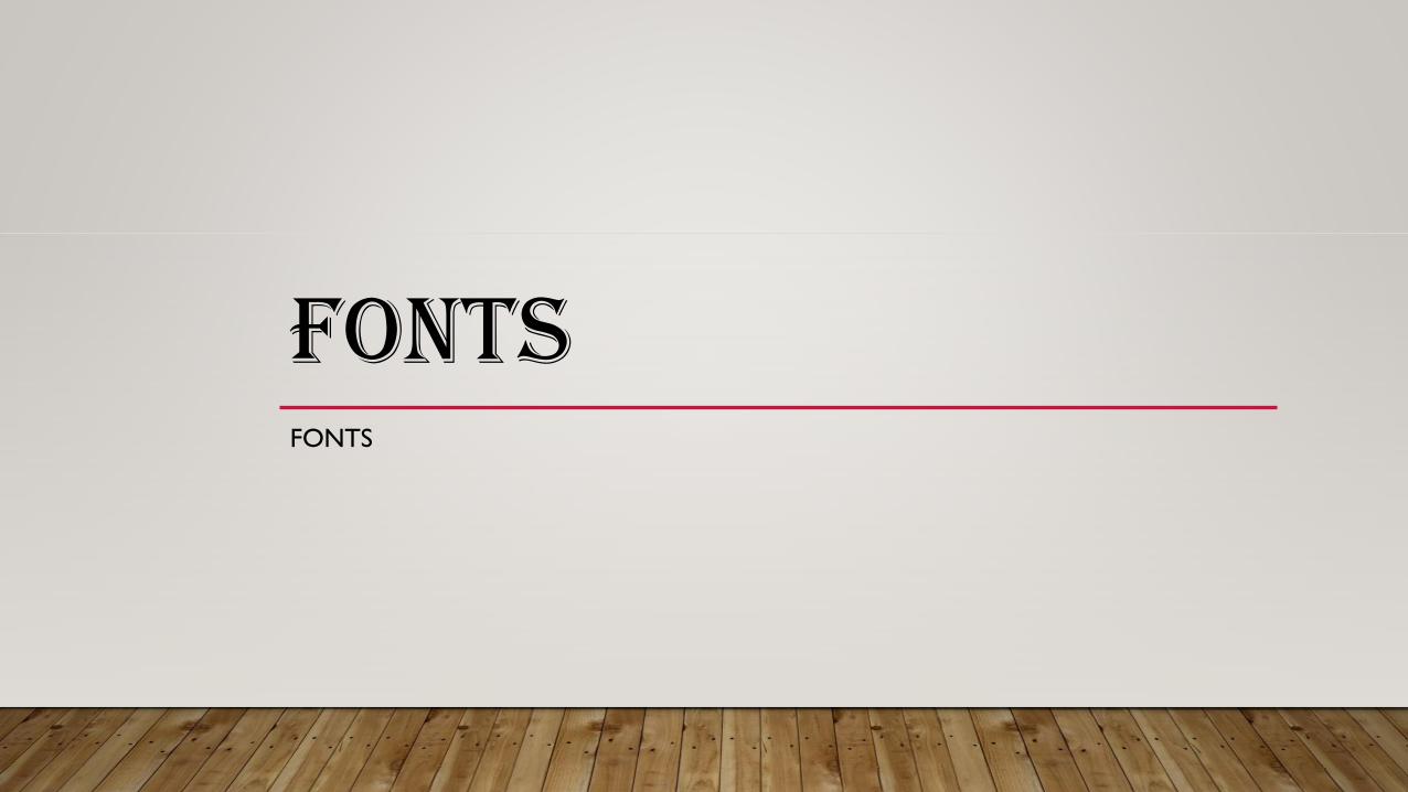
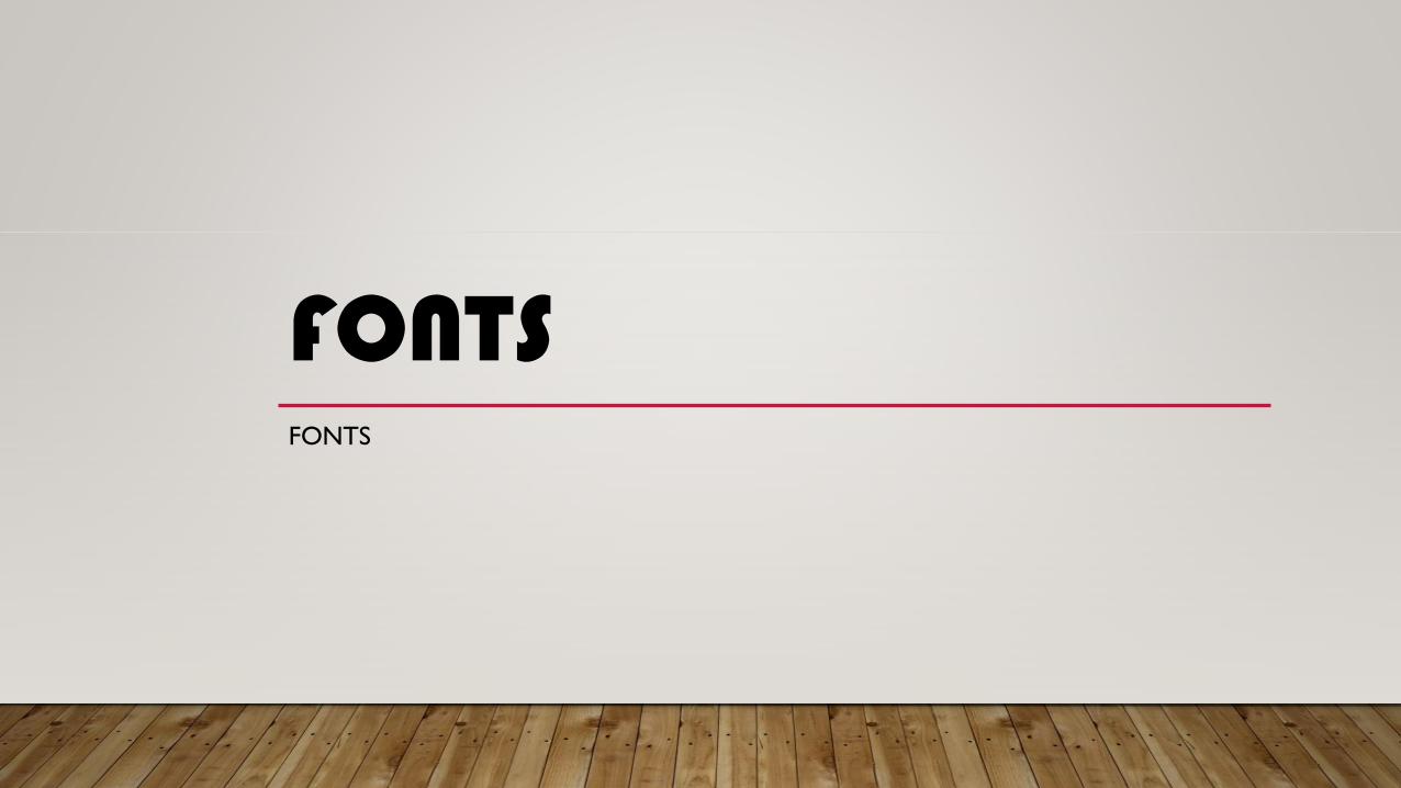
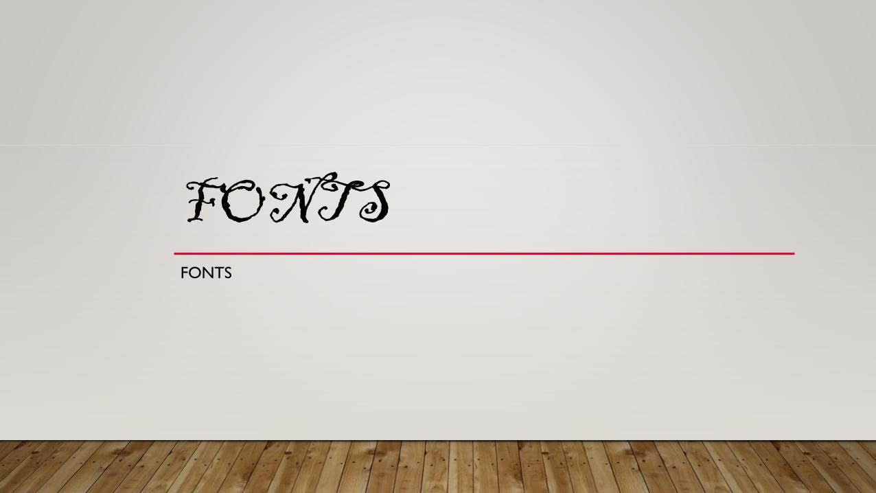
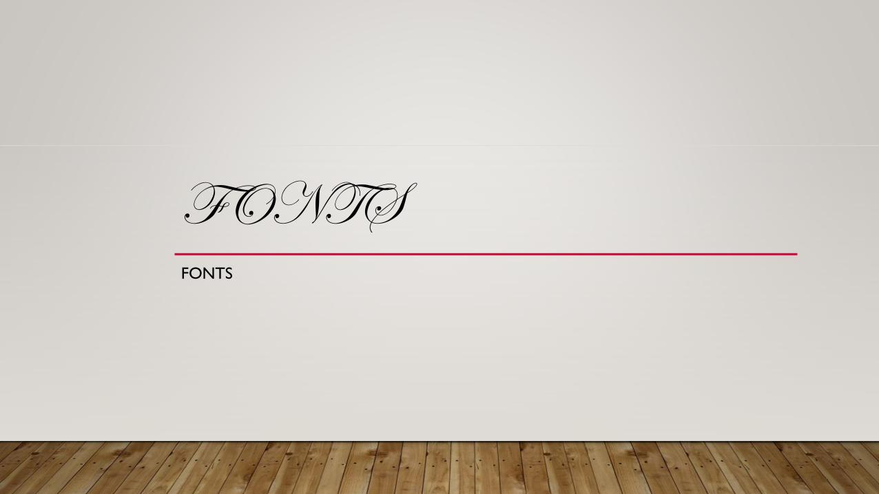
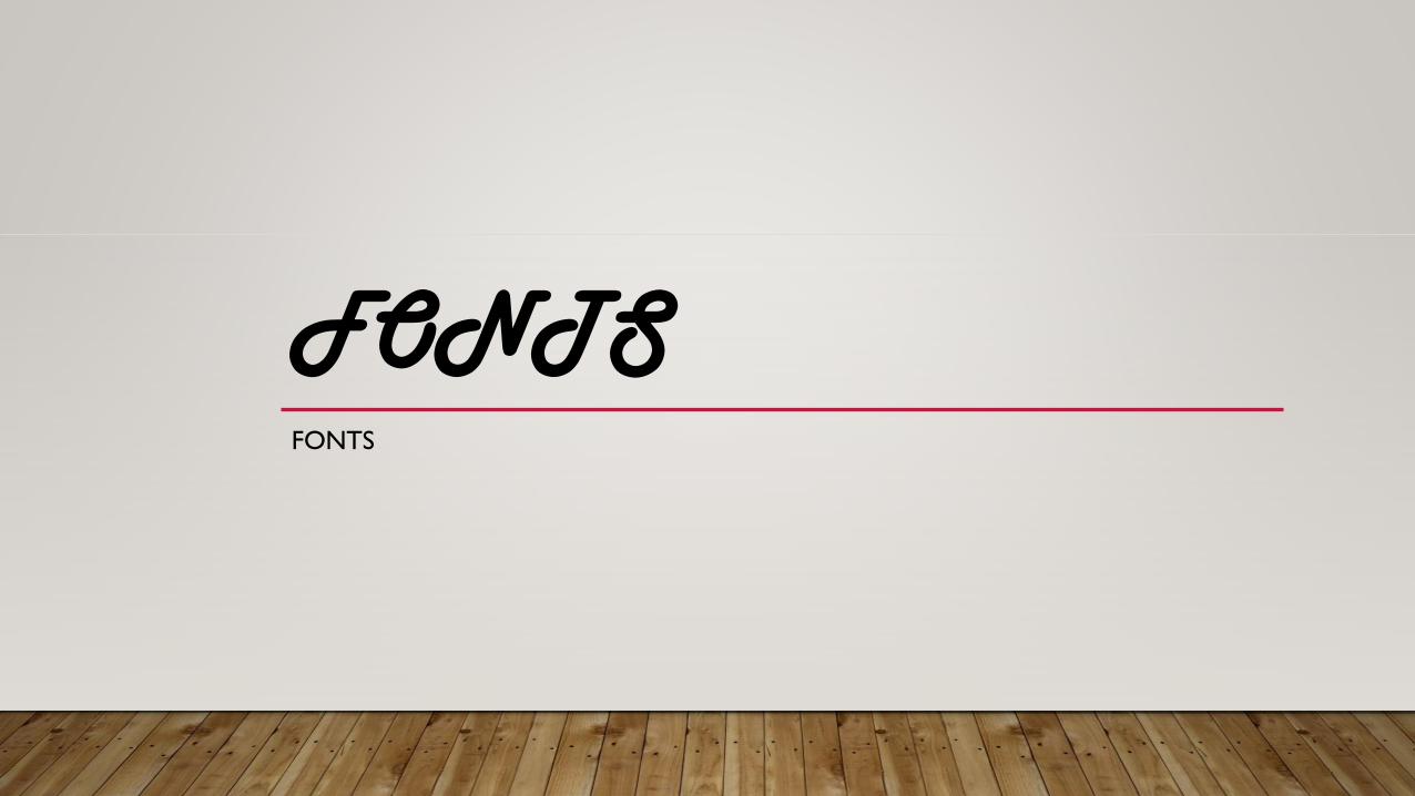
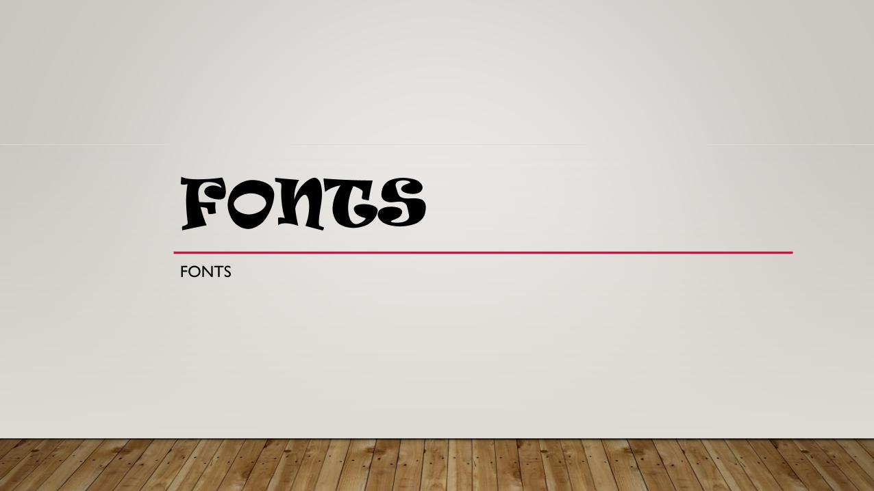
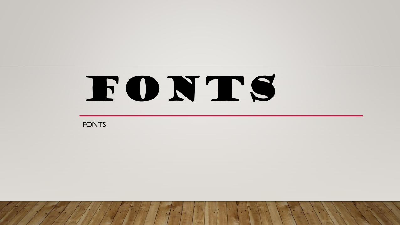
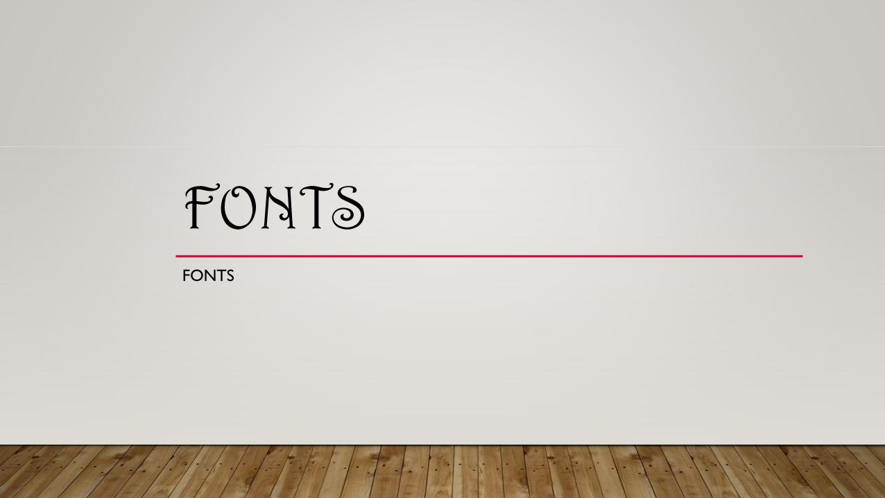
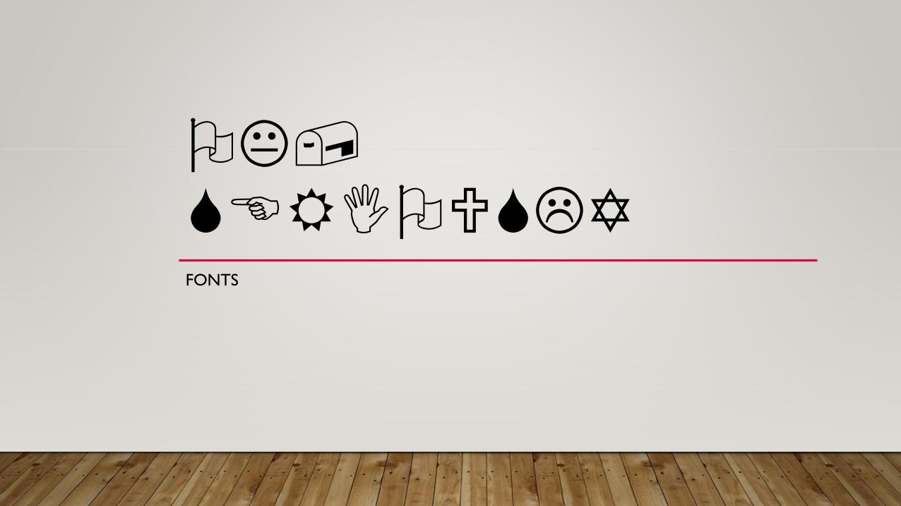
FONTS

FONTS
• Arial
• Times New Roman
• Sans Serif (Century Gothic)
• Georgia
• Franklin Gothic
• Verdana

IT SEEMS SIMPLE
• Something as apparently basic as font choice requires consideration
• Alignment
• Contrast
• Spacing
• Serif (or not)
• Lean
• Bold / Underline / Italic / Ligature / Non-breaking space
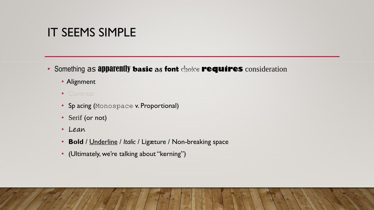
IT SEEMS SIMPLE
• Something as apparently basic as font choice requires consideration
• Alignment
• Contrast
• Sp acing (Monospace v. Proportional)
• Serif (or not)
• Lean
• Bold / Underline / Italic / Ligæture / Non-breaking space
• (Ultimately, we’re talking about “kerning”)
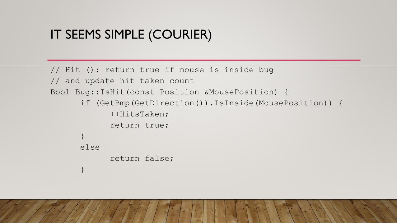
IT SEEMS SIMPLE (COURIER)
// Hit (): return true if mouse is inside bug
// and update hit taken count
Bool Bug::IsHit(const Position &MousePosition) {
if (GetBmp(GetDirection()).IsInside(MousePosition)) {
++HitsTaken;
return true;
}
else
return false;
}
IT SEEMS SIMPLE (COURIER)
// Hit (): return true if mouse is inside bug// and update hit taken countBool Bug::IsHit(const Position &MousePosition) {
if (GetBmp(GetDirection()).IsInside(MousePosition)) {++HitsTaken;return true;
}else
return false;}

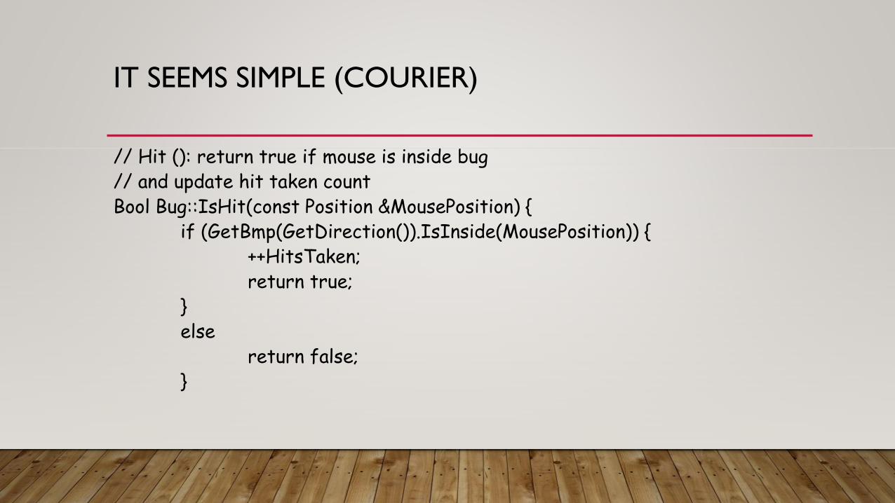
IT SEEMS SIMPLE (TIMES NEW ROMAN)
// Hit (): return true if mouse is inside bug// and update hit taken countBool Bug::IsHit(const Position &MousePosition) {
if (GetBmp(GetDirection()).IsInside(MousePosition)) {++HitsTaken;return true;
}else
return false;}
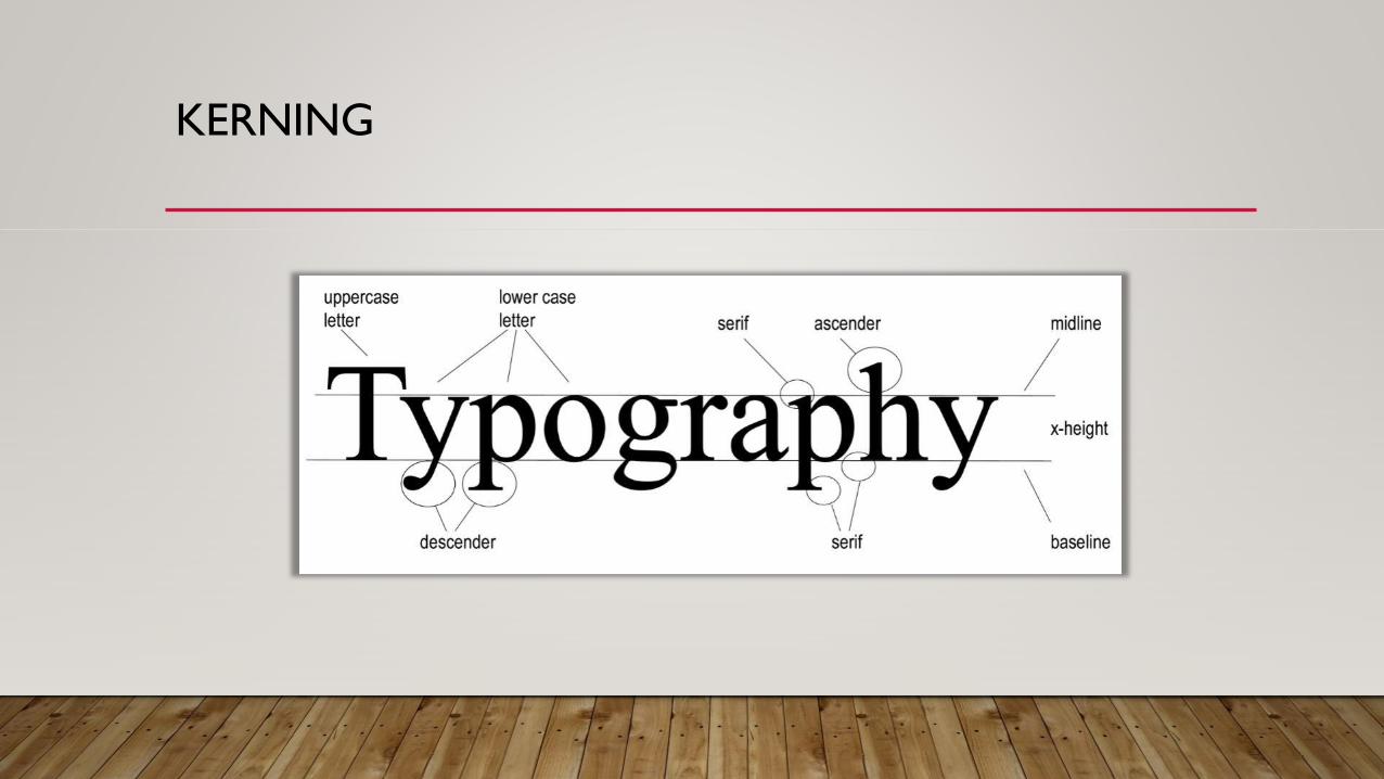
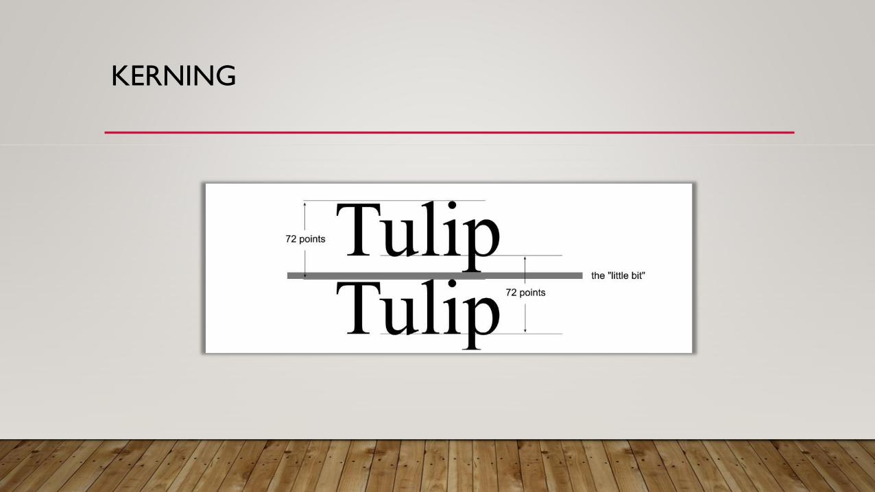
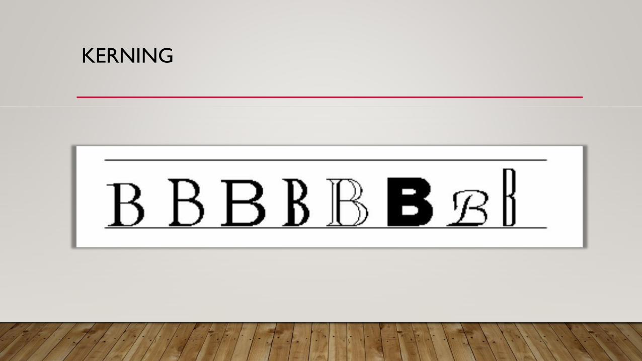
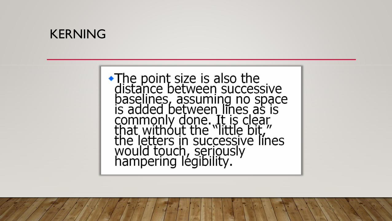
KERNING
KERNING
KERNING
KERNING
KERNING
KERNING

KERNING
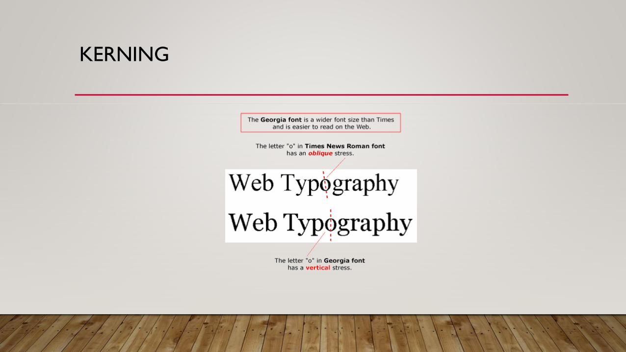
• This is 12 point Times New Roman. By looking at the font and reading these words, you can see the structure and characters of the font and how they
impact legibility. While the differences may be subtle, it is those differences that often make the difference between a legible and illegible, or at least
difficult-to-read, typeface.
• This is 12 point Georgia. By looking at the font and reading these words, you can see the structure and characters of the font and how
they impact legibility. While the differences may be subtle, it is those differences that often make the difference between a legible and
illegible, or at least difficult-to-read, typeface.

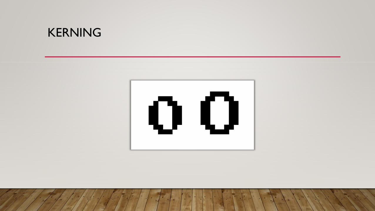
KERNING
• Again, it seems simple, but when kerning goes wrong, it goes very, very wrong.
• Let’s watch!