financial modeling - welcome to iare · lecture notes on financial modeling mba iv semester...
TRANSCRIPT

LECTURE NOTES
ON
FINANCIAL MODELING
MBA IV semester (IARE-R16)
Ms. P.BINDU MADHAVI
Assistant Professor
DEPARTMENT OF MASTER OF BUSINESS ADMINISTRATION
INSTITUTE OF AERONAUTICAL ENGINEERING (Autonomous)
DUNDIGAL, HYDERABAD - 500 043

FINANCIAL MODELLING SYLLABUS
UNIT-I UNDERSTANDING THE BASIC FEATURES OF EXCEL
Hours: 09
Introduction to modeling, introduction to excel, understanding advanced features of excel
database functions in excel, creating charts using forms and control toolbox, understanding
finance functions present in excel, creating dynamic models.
UNIT-II SENSITIVITY ANALYSIS USING EXCEL
Hours: 09
Scenario manager, other sensitivity analysis features, simulation using excel different statistical
distributions used in simulation generating random numbers that follow a particular distribution,
building models in finance using simulation.
UNIT-III EXCEL IN ACCOUNTING
Hours: 09 Preparing common size statements directly from trial balance, forecasting financial statements
using excel, analyzing financial statements by using spreadsheet model, excel in project
appraisal, determining project viability.
Risk analysis in project appraisal, simulation in project appraisal, excel in valuation,
determination of value drivers, discontinued cash flow valuation, risk analysis in valuation.
UNIT-IV EXCEL IN PORTFOLIO THEORY
Hours: 09
Determining efficient portfolio, creating dynamic portfolios, portfolio insurance, fixed income
portfolio management using excel, excel in derivatives black and schools model in excel, Greeks
in excel, real options valuation, building a mega model.
UNIT-V UNDERSTANDING SUBROUTINES AND FUNCTIONS AND BUILDING
SIMPLE FINANCIAL MODELS USING SUBROUTINES AND FUNCTION
Hours: 09
Recording and editing macros, subroutines and functions, decision rules, message box and input box, debugging, designing advanced financial models using visual basic application user forms,
other advanced features, actual model building.

UNIT-1
UNDERSTANDING THE BASIC FEATURES OF EXCEL
Introduction to modeling, introduction to excel, understanding advanced features of excel
database functions in excel, creating charts using forms and control toolbox, understanding
finance functions present in excel, creating dynamic models.
INTRODUCTION TO MODELING:
Financial modeling is the construction of spreadsheet models that illustrate a company's
likely financial results in quantitative terms. Financial models can simulate the effect of specific
variables so that the company can plan a course of action should they occur.
Financial modelling is the process by which a firm constructs a financial representation of some, or all, aspects of the firm or given security. The model is usually characterized by
performing calculations and makes recommendations based on that information. The model may
also summarize particular events for the end user such as investment management returns or
the Sortino ratio, or it may help estimate market direction, such as the Fed model.
A financial model is a mathematical representation of the financial operations and financial
statements of a company. It is used to forecast future financial performance of the company
by making relevant assumptions of how the company would fair in the coming financial
years.
It is also a risk management tool for analyzing various financial and economic
scenarios and also provided valuations of assets. These models involve calculations, analyzing them and then provide recommendations based on the information gathered. A
financial model generally includes projecting the financial statements such as the income
statement, balance sheet and cash flow statement with the help of building schedules such as
the depreciation schedule, amortization schedule, working capital management, debt
schedule etc. It encompasses the company’s policies and restrictions imposed by lenders
that would impact the financial position.
DEFINITION:
“The process by which a firm constructs a financial representation of some, or all,
aspects of the firm or given security. The model is usually characterized by performing
calculations, and makes recommendations based on that information. The model may also
summarize particular events for the end user and provide direction regarding possible actions or alternatives.”
TYPES OF FINANCIAL MODEL:
There are various kinds of financial models that are used according to the purpose
and need of doing it. Different financial models solve different problems. While majority of

the financial models concentrate on valuation, some are created to calculate and predict risk,
performance of portfolio, or economic trends within an industry or a region. The following
are the different types of financial models:
DISCOUNTED CASH FLOW MODEL:
Among different types of Financial model, DCF Model is the most important. It is based upon the theory that the value of a business is the sum of its expected future free cash
flows, discounted at an appropriate rate. In simple words this is a valuation method uses
projected free cash flow and discounts them to arrive at a present value which helps in
evaluating the potential of an investment. Investors particularly use this method in order to
estimate the absolute value of a company.
COMPARATIVE COMPANY ANALYSIS MODEL:
Also referred to as the “Comparable” or “Comps”, it is the one of the major company
valuation analyses that is used in the investment banking industry. In this method we
undertake a peer group analysis under which we compare the financial metrics of a company
against similar firms in industry. It is based on an assumption that similar companies would
have similar valuations multiples, such as EV/EBITDA. The process would involve
selecting the peer group of companies, compiling statistics on the company under review,
calculation of valuation multiples and then comparing them with the peer group.
SUM-OF-THE-PARTS MODEL:
It is also referred to as the break-up analysis. This modeling involves valuation of a
company by determining the value of its divisions if they were broken down and spun off or
they were acquired by another company.
LEVERAGED BUY OUT (LBO) MODEL:
It involves acquiring another company using a significant amount of borrowed funds
to meet the acquisition cost. This kind of model is being used majorly in leveraged finance
at bulge-bracket investment banks and sponsors like the Private Equity firms who want to
acquire companies with an objective of selling them in the future at a profit. Hence it helps
in determining if the sponsor can afford to shell out the huge chunk of money and still get
back an adequate return on its investment.
MERGER & ACQUISITION (M&A) MODEL:
Merger & Acquisitions type of financial Model includes the accretion and dilution
analysis. The entire objective of merger modeling is to show clients the impact of an
acquisition to the acquirer’s EPS and how the new EPS compares with the status quo. In
simple words we could say that in the scenario of the new EPS being higher, the transaction
will be called “accretive” while the opposite would be called “dilutive.”
OPTION PRICING MODEL:
On, to buy or sell the underlying instrument at a specified price on or before a
specified future date”. Option traders tend to utilize different option price models to set a
current theoretical value. Option Price Models use certain fixed knowns in the present
(factors such as underlying price, strike and days till expiration) and also forecasts (or
assumptions) for factors like implied volatility, to compute the theoretical value for a
specific option at a certain point in time. Variables will fluctuate over the life of the option,
and the option position’s theoretical value will adapt to reflect these changes.
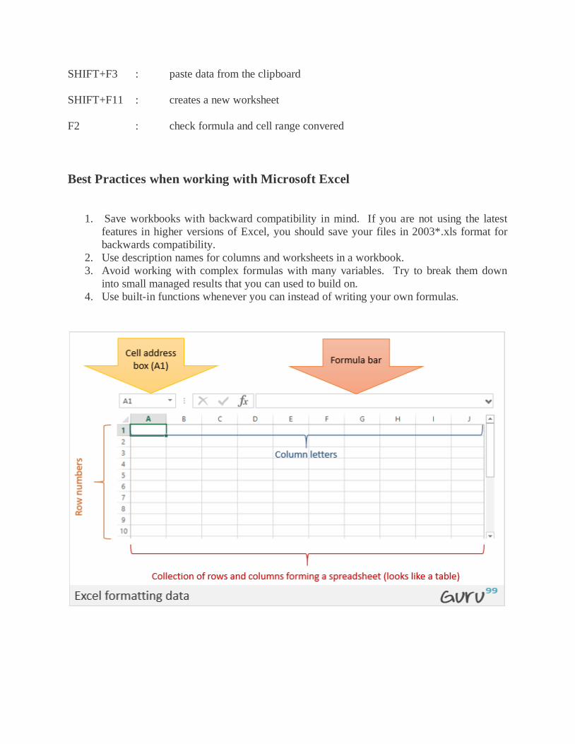
INTRODUCTION TO EXCEL:
Excel is a spreadsheet program that is used to record and analyze numerical data. Think
of a spreadsheet as a collection of columns and rows that form a table. Alphabetical letters are
usually assigned to columns and numbers are usually assigned to rows. The point where a
column and a row meet is called a cell. The address of a cell is given by the letter representing the column and the number representing a row. Let's illustrate this using the following image.
We all deal with numbers in one way or the other. We all have daily expenses which we
pay for from the monthly income that we earn. For one to spend wisely, they will need to know
their income vs. expenditure. Microsoft Excel comes in handy when we want to record, analyze
and store such numeric data.
Running Excel is not different from running any other Windows program. If you are running
Windows with a GUI like (Windows XP, Vista, and 7) follow the following steps.
Click on start menu
Point to all programs
Point to Microsoft Excel
Click on Microsoft Excel
Alternatively, you can also open it from the start menu if it has been added there. You can
also open it from the desktop shortcut if you have created one.
For this tutorial, we will be working with Windows 8.1 and Microsoft Excel 2013. Follow
the following steps to run Excel on Windows versions
Click on start menu
Search for Excel N.B. even before you even typing, all programs starting with what you
have typed will be listed.
Click on Microsoft Excel
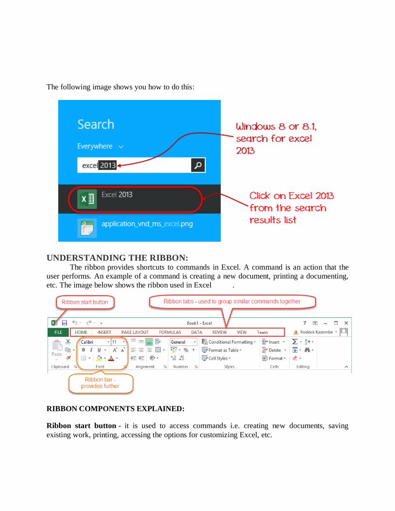
The following image shows you how to do this:
UNDERSTANDING THE RIBBON: The ribbon provides shortcuts to commands in Excel. A command is an action that the
user performs. An example of a command is creating a new document, printing a documenting,
etc. The image below shows the ribbon used in Excel .
RIBBON COMPONENTS EXPLAINED:
Ribbon start button - it is used to access commands i.e. creating new documents, saving
existing work, printing, accessing the options for customizing Excel, etc.
Ribbon tabs – the tabs are used to group similar commands together. The home tab is used for
basic commands such as formatting the data to make it more presentable, sorting and finding
specific data within the spreadsheet.
Ribbon bar – the bars are used to group similar commands together. As an example, the
Alignment ribbon bar is used to group all the commands that are used to align data together.
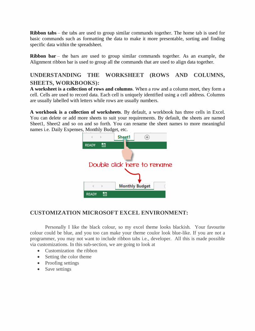
UNDERSTANDING THE WORKSHEET (ROWS AND COLUMNS,
SHEETS, WORKBOOKS): A worksheet is a collection of rows and columns. When a row and a column meet, they form a
cell. Cells are used to record data. Each cell is uniquely identified using a cell address. Columns
are usually labelled with letters while rows are usually numbers.
A workbook is a collection of worksheets. By default, a workbook has three cells in Excel.
You can delete or add more sheets to suit your requirements. By default, the sheets are named
Sheet1, Sheet2 and so on and so forth. You can rename the sheet names to more meaningful
names i.e. Daily Expenses, Monthly Budget, etc.
CUSTOMIZATION MICROSOFT EXCEL ENVIRONMENT:
Personally I like the black colour, so my excel theme looks blackish. Your favourite
colour could be blue, and you too can make your theme coulor look blue-like. If you are not a
programmer, you may not want to include ribbon tabs i.e., developer. All this is made possible
via customizations. In this sub-section, we are going to look at
Customization the ribbon
Setting the color theme
Proofing settings
Save settings
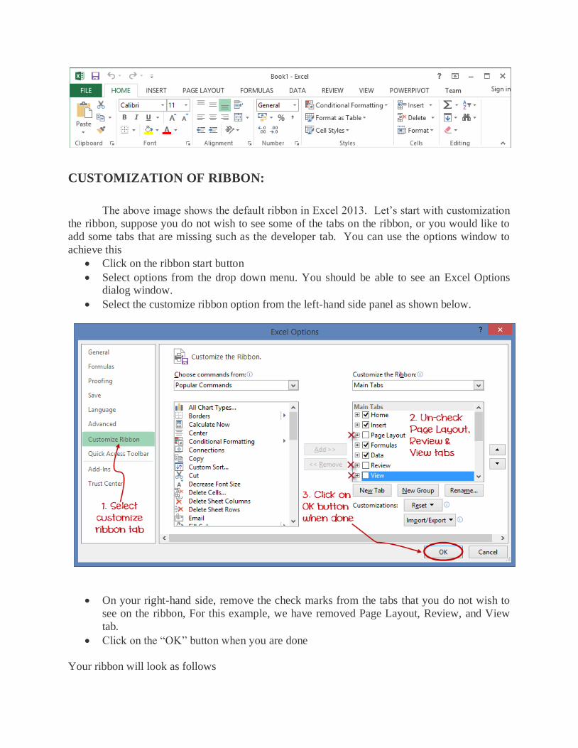
CUSTOMIZATION OF RIBBON:
The above image shows the default ribbon in Excel 2013. Let’s start with customization
the ribbon, suppose you do not wish to see some of the tabs on the ribbon, or you would like to
add some tabs that are missing such as the developer tab. You can use the options window to
achieve this
Click on the ribbon start button
Select options from the drop down menu. You should be able to see an Excel Options dialog window.
Select the customize ribbon option from the left-hand side panel as shown below.
On your right-hand side, remove the check marks from the tabs that you do not wish to
see on the ribbon, For this example, we have removed Page Layout, Review, and View
tab.
Click on the “OK” button when you are done
Your ribbon will look as follows

ADDING CUSTOM TABS TO THE RIBBON
You can also add your own tab, give it a custom name and assign commands to it. Let’s add a tab to the ribbon with the text Guru99
1. Right click on the ribbon and select Customize the Ribbon. The dialogue window show
above will appear.
2. Click on new tab button as illustrated in the animated image below
3. Select the newly created tab
4. Click on Rename button 5. Give it a name of Guru99
6. Select the New Group (Custom) under Guru99 tab as shown in the image below
7. Click on Rename button and give it a name of My Commands
8. Let’s now add commands to my ribbon bar
9. Select all chart types command and click on Add button
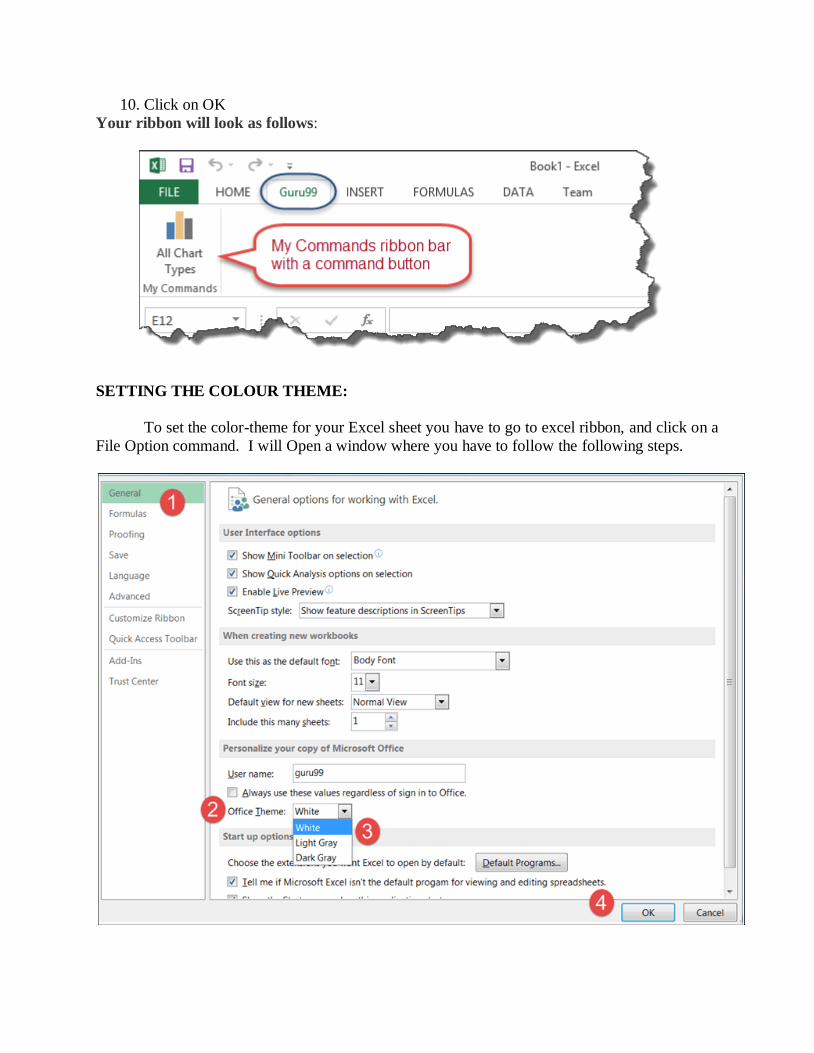
10. Click on OK
Your ribbon will look as follows:
SETTING THE COLOUR THEME:
To set the color-theme for your Excel sheet you have to go to excel ribbon, and click on a
File Option command. I will Open a window where you have to follow the following steps.
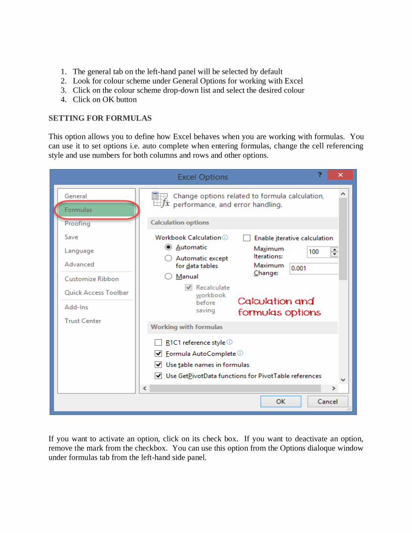
1. The general tab on the left-hand panel will be selected by default
2. Look for colour scheme under General Options for working with Excel
3. Click on the colour scheme drop-down list and select the desired colour
4. Click on OK button
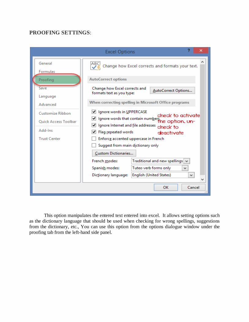
SETTING FOR FORMULAS
This option allows you to define how Excel behaves when you are working with formulas. You
can use it to set options i.e. auto complete when entering formulas, change the cell referencing
style and use numbers for both columns and rows and other options.
If you want to activate an option, click on its check box. If you want to deactivate an option,
remove the mark from the checkbox. You can use this option from the Options dialoque window
under formulas tab from the left-hand side panel.
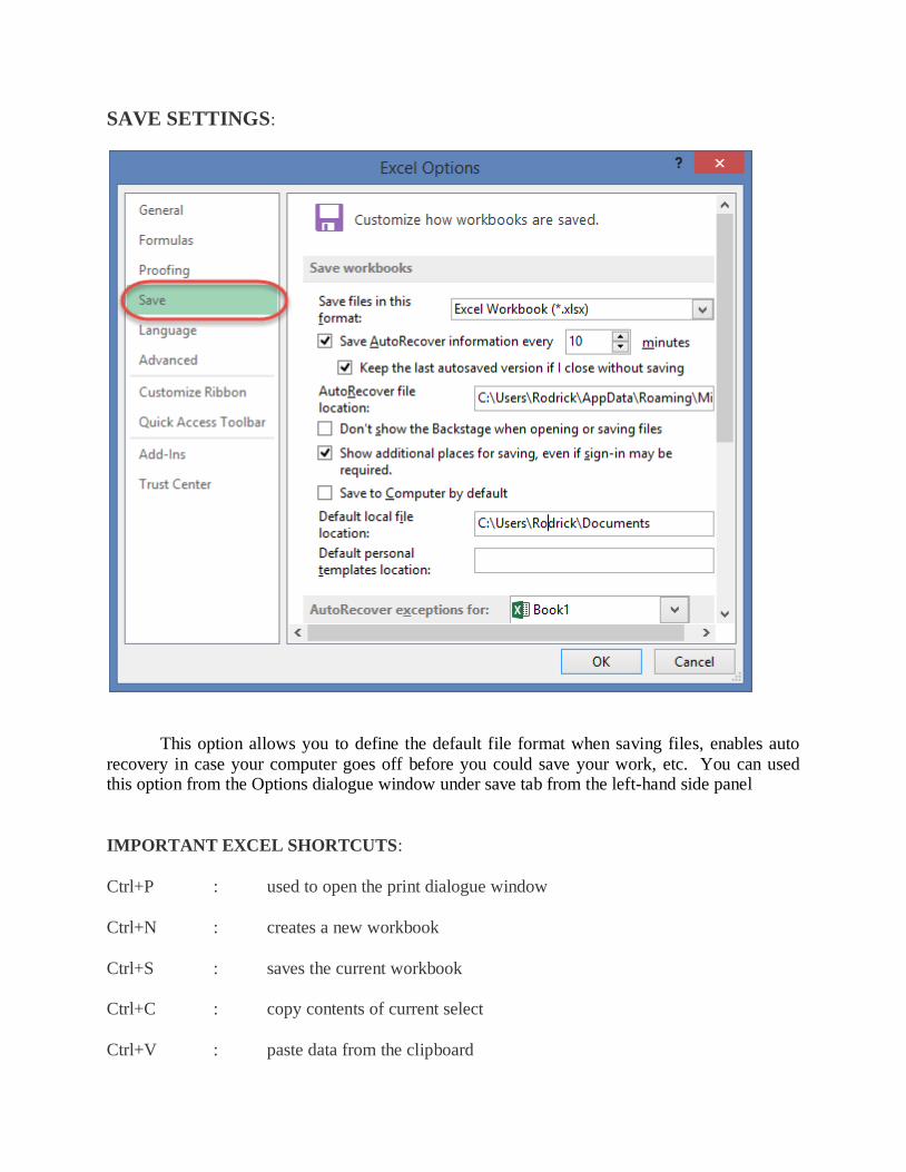
PROOFING SETTINGS:
This option manipulates the entered text entered into excel. It allows setting options such
as the dictionary language that should be used when checking for wrong spellings, suggestions
from the dictionary, etc., You can use this option from the options dialogue window under the
proofing tab from the left-hand side panel.
SAVE SETTINGS:
This option allows you to define the default file format when saving files, enables auto
recovery in case your computer goes off before you could save your work, etc. You can used this option from the Options dialogue window under save tab from the left-hand side panel
IMPORTANT EXCEL SHORTCUTS:
Ctrl+P : used to open the print dialogue window
Ctrl+N : creates a new workbook
Ctrl+S : saves the current workbook
Ctrl+C : copy contents of current select
Ctrl+V : paste data from the clipboard
SHIFT+F3 : paste data from the clipboard
SHIFT+F11 : creates a new worksheet
F2 : check formula and cell range convered
Best Practices when working with Microsoft Excel
1. Save workbooks with backward compatibility in mind. If you are not using the latest
features in higher versions of Excel, you should save your files in 2003*.xls format for
backwards compatibility.
2. Use description names for columns and worksheets in a workbook.
3. Avoid working with complex formulas with many variables. Try to break them down
into small managed results that you can used to build on.
4. Use built-in functions whenever you can instead of writing your own formulas.
UNDERSTANDING ADVANCED FEATURES OF EXCEL DATABASE
FUNCTIONS IN EXCEL
Excel provides an enormous number of established formulas and assistance in auditing and
calculating your data. The primary groupings are financial, logical, text, date and time, lookup
and reference, math and trigonometry, statistical, engineering, cube, and file-related information.
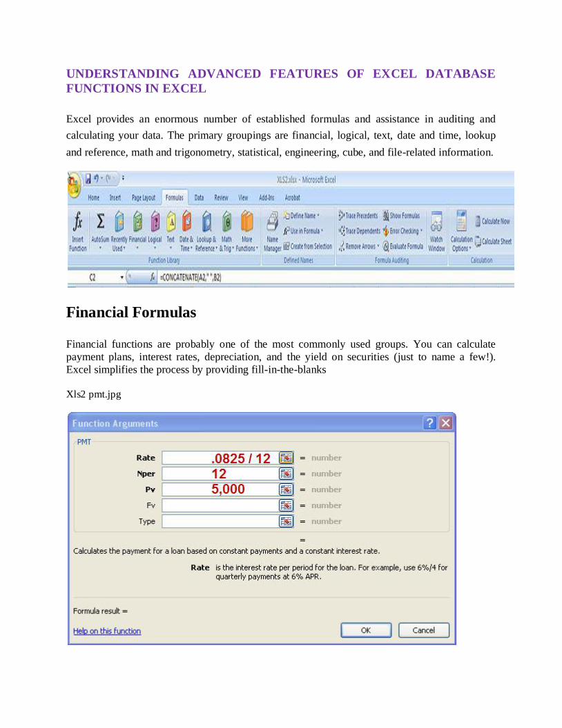
Financial Formulas Financial functions are probably one of the most commonly used groups. You can calculate
payment plans, interest rates, depreciation, and the yield on securities (just to name a few!).
Excel simplifies the process by providing fill-in-the-blanks
Xls2 pmt.jpg
No higher resolution available.
Xls2_pmt.jpg (565 × 338 pixel, file size: 51 KB, MIME type: image/jpeg)
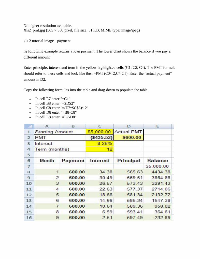
xls 2 tutorial image - payment
he following example returns a loan payment. The lower chart shows the balance if you pay a
different amount.
Enter principle, interest and term in the yellow highlighted cells (C1, C3, C4). The PMT formula
should refer to these cells and look like this: =PMT(C3/12,C4,C1). Enter the “actual payment”
amount in D2.
Copy the following formulas into the table and drag down to populate the table.
In cell E7 enter "=C1"
In cell B8 enter "=$D$2"
In cell C8 enter "=(E7*$C$3)/12"
In cell D8 enter "=B8-C8"
In cdll E8 enter "=E7-D8"

Text Functions
Concatenate:
The concatenate function strings together the contents of a series of cells (text1, text2). The order that
you select the cells is the order that they are combined into the resulting cell.
Syntax: CONCATENATE (text1,text2,...)
Shortcut: The symbol “&” can also be used instead of the concatenate function (=A2&B2).
Example The following examples combines fields to create FullName and Address fields.
Cell Formula C2 = CONCATENATE(A2," ",B2) note that [text2] is [quote space quote] G2 =
CONCATENATE(E2,”, TX”,F2) note that [text2] is [quote comma space TX space quote]
Left, Right
LEFT and RIGHT are useful if you wish to remove extra characters from a cell AND if you are able
to specify how many characters to remove from the left or right. The formula requires the cell
reference (text) and the number of characters to return (num_chars).
MID performs a similar task of returning reduced characters. This function contains 3 qualifiers: cell
reference (text), the position of the character where you wish the text to begin (start_num), and the
number of characters to return (num_chars).
Syntax: =LEFT(text,num_chars) or RIGHT(text,num_chars) =MID(text,start_num,num_chars)
Example Cell B2: =LEFT(A2,5) Cell E2: =MID(A2,1,5)
Conditional Functions
Conditional functions, like conditional formatting, are great features to help you highlight or
manipulate select information based on specified criteria. Excel evaluates the source against the
criteria, and returns a value if the logical test is “true” and a different value for “false”. In the same
way, Excel will perform a function, like adding or counting, based on the logical test.
The elements “value_if_true” and “value_if_false” may be a static value or another formula.
Up to 7 functions may be nested to create some very elaborate tests.
If, Countif, and Sumif perform the logical test using single criteria.
Countifs, and Sumifs perform the logical test on a range of cells that meet multiple criteria.
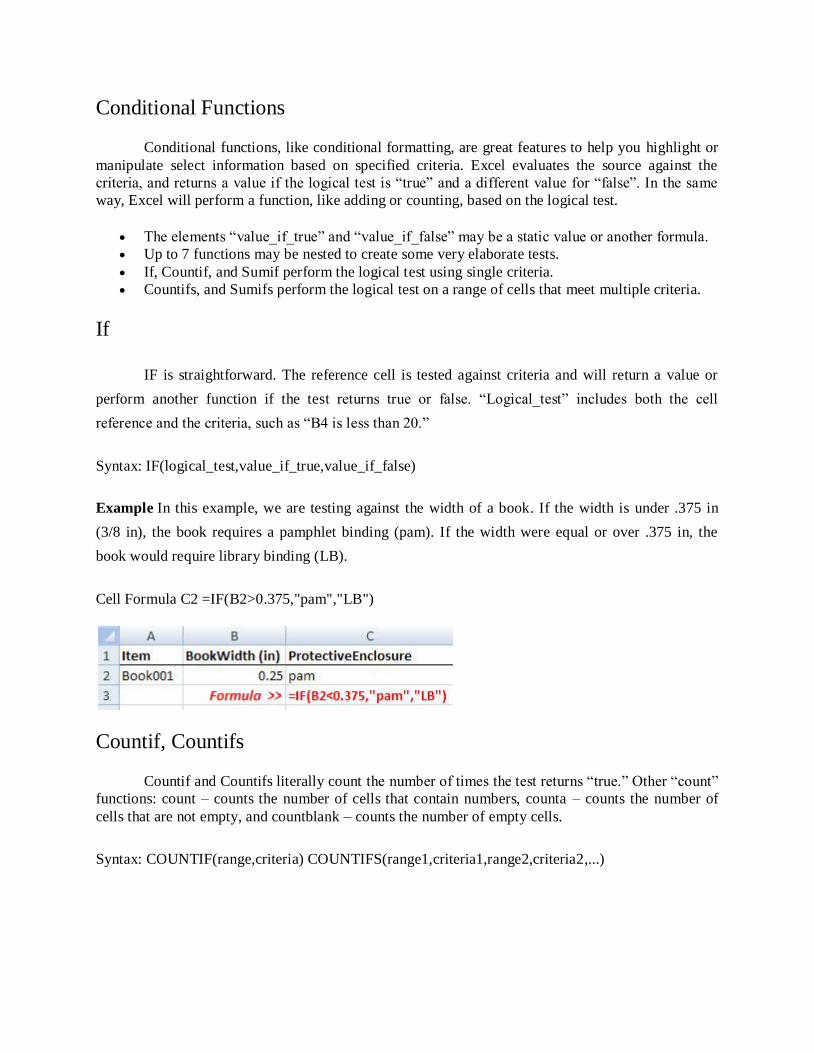
If
IF is straightforward. The reference cell is tested against criteria and will return a value or
perform another function if the test returns true or false. “Logical_test” includes both the cell
reference and the criteria, such as “B4 is less than 20.”
Syntax: IF(logical_test,value_if_true,value_if_false)
Example In this example, we are testing against the width of a book. If the width is under .375 in
(3/8 in), the book requires a pamphlet binding (pam). If the width were equal or over .375 in, the
book would require library binding (LB).
Cell Formula C2 =IF(B2>0.375,"pam","LB")
Countif, Countifs
Countif and Countifs literally count the number of times the test returns “true.” Other “count”
functions: count – counts the number of cells that contain numbers, counta – counts the number of
cells that are not empty, and countblank – counts the number of empty cells.
Syntax: COUNTIF(range,criteria) COUNTIFS(range1,criteria1,range2,criteria2,...)
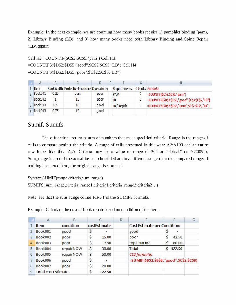
Example: In the next example, we are counting how many books require 1) pamphlet binding (pam),
2) Library Binding (LB), and 3) how many books need both Library Binding and Spine Repair
(LB/Repair).
Cell H2 =COUNTIF($C$2:$C$5,"pam") Cell H3
=COUNTIFS($D$2:$D$5,"good",$C$2:$C$5,"LB") Cell H4
=COUNTIFS($D$2:$D$5,"poor",$C$2:$C$5,"LB")
Sumif, Sumifs
These functions return a sum of numbers that meet specified criteria. Range is the range of
cells to compare against the criteria. A range of cells presented in this way: A2:A100 and an entire
row looks like this: A:A. Criteria may be a value or range (“=30” or “=black” or “<2009”).
Sum_range is used if the actual items to be added are in a different range than the compared range. If
nothing is entered here, the original range is summed.
Syntax: SUMIF(range,criteria,sum_range)
SUMIFS(sum_range,criteria_range1,criteria1,criteria_range2,criteria2…)
Note: see that the sum_range comes FIRST in the SUMIFS formula.
Example: Calculate the cost of book repair based on condition of the item.

More Functions
There are many extremely useful functions - following are just a few more examples. Search the
Excel Help for “functions” and you’ll find the “List of all functions by category” for a full list of
statistical, database, math, financial, and many, many, many more function types.
Len
Syntax: =LEN(text)
Returns the number of characters in a text string – spaces count as characters. Suggestion:
use to determine lengths of each line of address on a label. The US Post office only
allows 46 characters per line for mass mailings (as of 2008). Another use is to determine
number of characters in a text block for web or print content.
Proper
Syntax: =PROPER(text)
Capitalizes the first letter of every word (as in “Rebecca Holte”).
Trim
Syntax: =TRIM(text)
Removes extra spaces from text strings – leaves a single space between words (“Rebecca
Holte” = “Rebecca Holte”).
Rounding
Adding/multiplying numbers obtained from formula sums, you may see different values than
expected, due to the how many decimal points are used and when rounding occurs. You
may wish to use a rounding or even/odd function. For “number” you can enter an actual
number or cell reference, and “num_digits” indicates how many decimal places you
require.
Roundup and Rounddown Syntax: = ROUNDUP(number,num_digits)
Even and Odd Syntax: =EVEN(number)
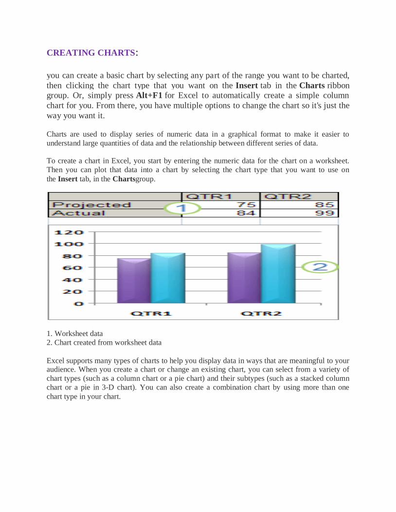
CREATING CHARTS:
you can create a basic chart by selecting any part of the range you want to be charted,
then clicking the chart type that you want on the Insert tab in the Charts ribbon group. Or, simply press Alt+F1 for Excel to automatically create a simple column
chart for you. From there, you have multiple options to change the chart so it's just the
way you want it.
Charts are used to display series of numeric data in a graphical format to make it easier to
understand large quantities of data and the relationship between different series of data.
To create a chart in Excel, you start by entering the numeric data for the chart on a worksheet.
Then you can plot that data into a chart by selecting the chart type that you want to use on
the Insert tab, in the Chartsgroup.
1. Worksheet data
2. Chart created from worksheet data
Excel supports many types of charts to help you display data in ways that are meaningful to your audience. When you create a chart or change an existing chart, you can select from a variety of
chart types (such as a column chart or a pie chart) and their subtypes (such as a stacked column
chart or a pie in 3-D chart). You can also create a combination chart by using more than one
chart type in your chart.
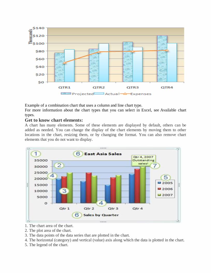
Example of a combination chart that uses a column and line chart type.
For more information about the chart types that you can select in Excel, see Available chart
types.
Get to know chart elements: A chart has many elements. Some of these elements are displayed by default, others can be
added as needed. You can change the display of the chart elements by moving them to other
locations in the chart, resizing them, or by changing the format. You can also remove chart
elements that you do not want to display.
1. The chart area of the chart.
2. The plot area of the chart.
3. The data points of the data series that are plotted in the chart.
4. The horizontal (category) and vertical (value) axis along which the data is plotted in the chart.
5. The legend of the chart.
6. A chart and axis title that you can use in the chart.
7. A data label that you can use to identify the details of a data point in a data series.
Modify a basic chart to meet your needs
After you create a chart, you can modify any one of its elements. For example, you might want
to change the way that axes are displayed, add a chart title, move or hide the legend, or display
additional chart elements.
To modify a chart, you can do one or more of the following:
Change the display of chart axes You can specify the scale of axes and adjust the interval
between the values or categories that are displayed. To make your chart easier to read, you can
also add tick marks to an axis, and specify the interval at which they will appear.
Add titles and data labels to a chart To help clarify the information that appears in your
chart, you can add a chart title, axis titles, and data labels.
Add a legend or data table You can show or hide a legend, change its location, or modify the
legend entries. In some charts, you can also show a data table that displays the legend keys and
the values that are presented in the chart.
Apply special options for each chart type Special lines (such as high-low lines and trendlines), bars (such as up-down bars and error bars), data markers, and other options are
available for different chart types.
Top of Page
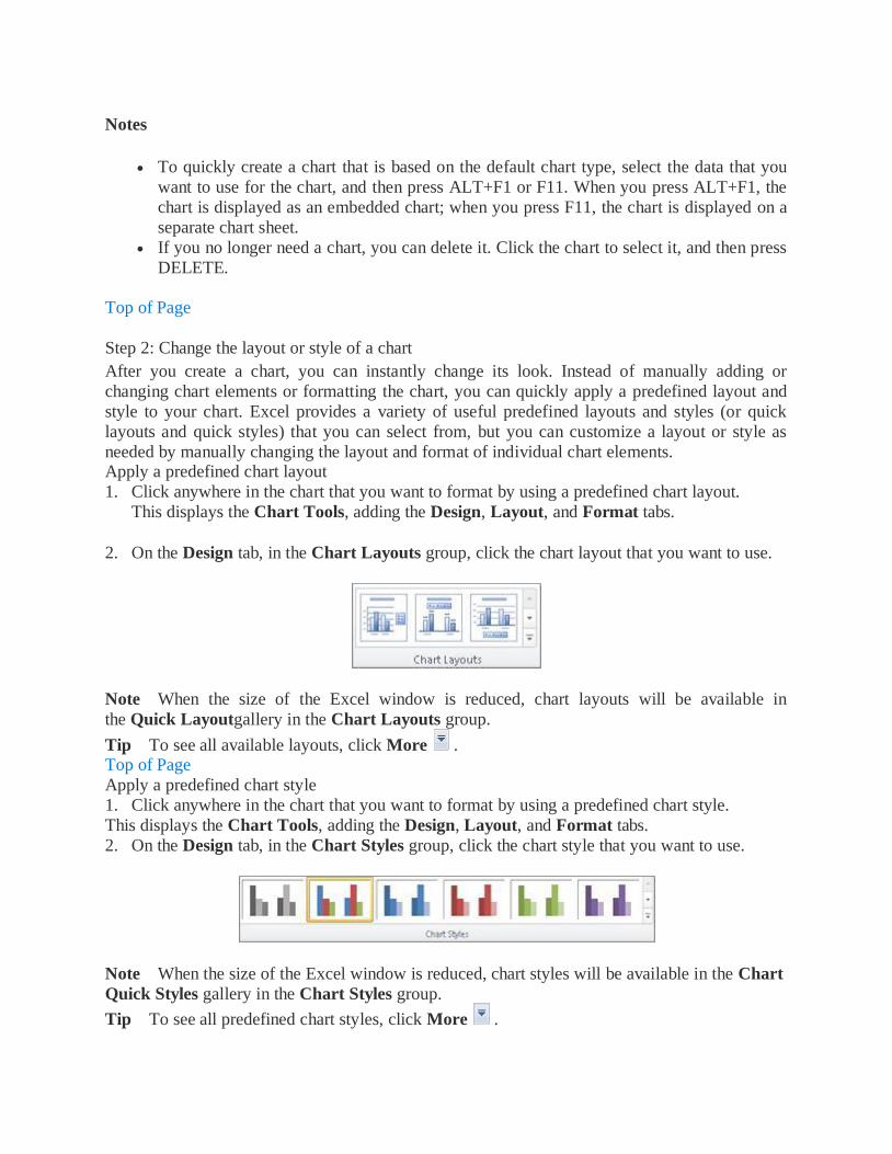
Apply a predefined chart layout and style for a professional look
Instead of manually adding or changing chart elements or formatting the chart, you can quickly apply a predefined chart layout and chart style to your chart. Excel provides a variety of useful
predefined layouts and styles. However, you can fine-tune a layout or style as needed by making
manual changes to the layout and format of individual chart elements, such as the chart area, plot
area, data series, or legend of the chart.
When you apply a predefined chart layout, a specific set of chart elements (such as titles, a legend, a data table, or data labels) are displayed in a specific arrangement in your chart. You can
select from a variety of layouts that are provided for each chart type.
When you apply a predefined chart style, the chart is formatted based on the document theme
that you have applied, so that your chart matches your organization's or your own theme colors
(a set of colors), theme fonts (a set of heading and body text fonts), and theme effects (a set of lines and fill effects).
You cannot create your own chart layouts or styles, but you can create chart templates that
include the chart layout and formatting that you want.
Top of Page
Add eye-catching formatting to a chart
In addition to applying a predefined chart style, you can easily apply formatting to individual
chart elements such as data markers, the chart area, the plot area, and the numbers and text in
titles and labels to give your chart a custom, eye-catching look. You can apply specific shape
styles and WordArt styles, and you can also format the shapes and text of chart elements
manually.
To add formatting, you can use one or more of the following:
Fill chart elements You can use colors, textures, pictures, and gradient fills to help draw
attention to specific chart elements. Change the outline of chart elements You can use colors, line styles, and line weights to
emphasize chart elements.
Add special effects to chart elements You can apply special effects, such as shadow,
reflection, glow, soft edges, bevel, and 3-D rotation to chart element shapes, which gives your
chart a finished look.
Format text and numbers You can format text and numbers in titles, labels, and text boxes on
a chart as you would text and numbers on a worksheet. To make text and numbers stand out, you
can even apply WordArt styles.
Top of Page
Reuse charts by creating chart templates
If you want to reuse a chart that you customized to meet your needs, you can save that chart as a chart template (*.crtx) in the chart templates folder. When you create a chart, you can then apply
the chart template just as you would any other built-in chart type. In fact, chart templates are
custom chart types — you can also use them to change the chart type of an existing chart. If you
use a specific chart template frequently, you can save it as the default chart type.
Top of Page
Step 1: Create a basic chart
For most charts, such as column and bar charts, you can plot the data that you arrange in rows or
columns on a worksheet into a chart. However, some chart types (such as pie and bubble charts)
require a specific data arrangement.
1. On the worksheet, arrange the data that you want to plot in a chart.
The data can be arranged in rows or columns — Excel automatically determines the best way to
plot the data in the chart. Some chart types (such as pie and bubble charts) require a specific data
arrangement.
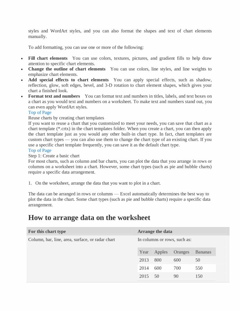
How to arrange data on the worksheet
For this chart type Arrange the data
Column, bar, line, area, surface, or radar chart In columns or rows, such as:
Year Apples Oranges Bananas
2013 800 600 50
2014 600 700 550
2015 50 90 150
For this chart type Arrange the data
Or:
Fruit 2013 2014 2015
Apples 800 600 50
Oranges 600 700 90
Bananas 50 90 150
Pie or doughnut chart For one data series, in one column or row of
data and
one column or row of data labels, such as:
A 1
B 2
C 3
Or:
A B C
1 2 3
For multiple data series, in multiple columns or
rows of data and one column or row of data
labels,
such as:
A 1 2
B 3 4
C 5 6
Or:
A B C
1 2 3
4 5 6
XY (scatter) or bubble chart In columns, placing x values in the first
column and
corresponding y values and bubble size values
in adjacent columns, such as:
X Y Bubble size
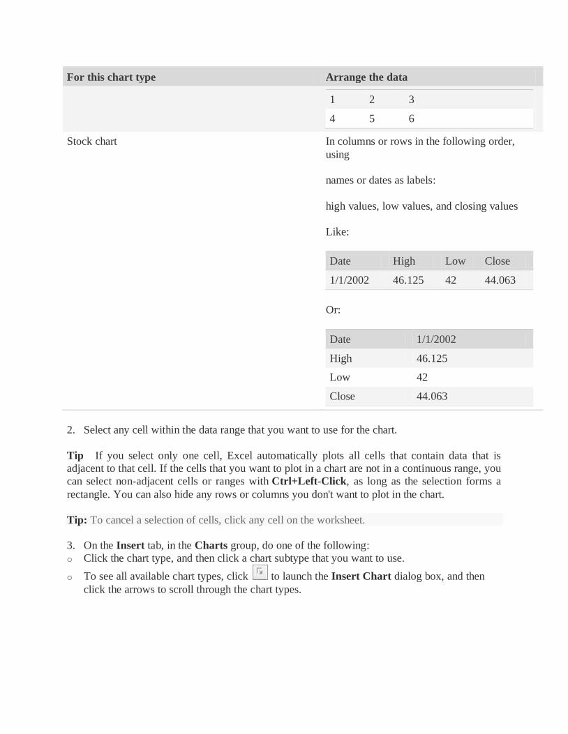
For this chart type Arrange the data
1 2 3
4 5 6
Stock chart In columns or rows in the following order,
using
names or dates as labels:
high values, low values, and closing values
Like:
Date High Low Close
1/1/2002 46.125 42 44.063
Or:
Date 1/1/2002
High 46.125
Low 42
Close 44.063
2. Select any cell within the data range that you want to use for the chart.
Tip If you select only one cell, Excel automatically plots all cells that contain data that is
adjacent to that cell. If the cells that you want to plot in a chart are not in a continuous range, you
can select non-adjacent cells or ranges with Ctrl+Left-Click, as long as the selection forms a
rectangle. You can also hide any rows or columns you don't want to plot in the chart.
Tip: To cancel a selection of cells, click any cell on the worksheet.
3. On the Insert tab, in the Charts group, do one of the following:
o Click the chart type, and then click a chart subtype that you want to use.
o To see all available chart types, click to launch the Insert Chart dialog box, and then
click the arrows to scroll through the chart types.
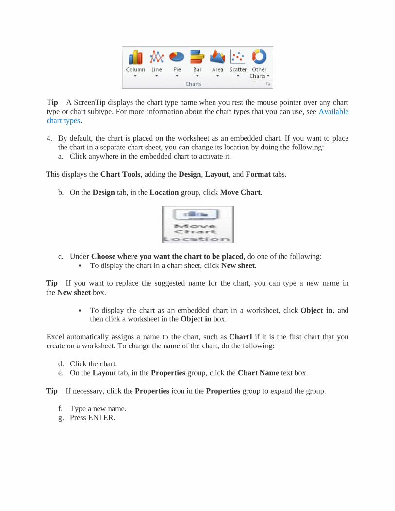
Tip A ScreenTip displays the chart type name when you rest the mouse pointer over any chart
type or chart subtype. For more information about the chart types that you can use, see Available
chart types.
4. By default, the chart is placed on the worksheet as an embedded chart. If you want to place
the chart in a separate chart sheet, you can change its location by doing the following:
a. Click anywhere in the embedded chart to activate it.
This displays the Chart Tools, adding the Design, Layout, and Format tabs.
b. On the Design tab, in the Location group, click Move Chart.
c. Under Choose where you want the chart to be placed, do one of the following:
To display the chart in a chart sheet, click New sheet.
Tip If you want to replace the suggested name for the chart, you can type a new name in
the New sheet box.
To display the chart as an embedded chart in a worksheet, click Object in, and then click a worksheet in the Object in box.
Excel automatically assigns a name to the chart, such as Chart1 if it is the first chart that you
create on a worksheet. To change the name of the chart, do the following:
d. Click the chart.
e. On the Layout tab, in the Properties group, click the Chart Name text box.
Tip If necessary, click the Properties icon in the Properties group to expand the group.
f. Type a new name.
g. Press ENTER.
Notes
To quickly create a chart that is based on the default chart type, select the data that you
want to use for the chart, and then press ALT+F1 or F11. When you press ALT+F1, the
chart is displayed as an embedded chart; when you press F11, the chart is displayed on a
separate chart sheet.
If you no longer need a chart, you can delete it. Click the chart to select it, and then press
DELETE.
Top of Page
Step 2: Change the layout or style of a chart
After you create a chart, you can instantly change its look. Instead of manually adding or
changing chart elements or formatting the chart, you can quickly apply a predefined layout and
style to your chart. Excel provides a variety of useful predefined layouts and styles (or quick
layouts and quick styles) that you can select from, but you can customize a layout or style as
needed by manually changing the layout and format of individual chart elements. Apply a predefined chart layout
1. Click anywhere in the chart that you want to format by using a predefined chart layout.
This displays the Chart Tools, adding the Design, Layout, and Format tabs.
2. On the Design tab, in the Chart Layouts group, click the chart layout that you want to use.
Note When the size of the Excel window is reduced, chart layouts will be available in
the Quick Layoutgallery in the Chart Layouts group.
Tip To see all available layouts, click More . Top of Page
Apply a predefined chart style
1. Click anywhere in the chart that you want to format by using a predefined chart style.
This displays the Chart Tools, adding the Design, Layout, and Format tabs.
2. On the Design tab, in the Chart Styles group, click the chart style that you want to use.
Note When the size of the Excel window is reduced, chart styles will be available in the Chart
Quick Styles gallery in the Chart Styles group.
Tip To see all predefined chart styles, click More .
Top of Page
Change the layout of chart elements manually
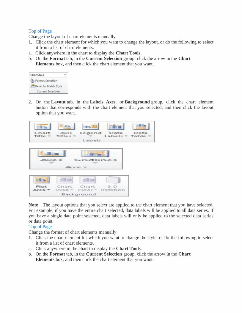
1. Click the chart element for which you want to change the layout, or do the following to select
it from a list of chart elements.
a. Click anywhere in the chart to display the Chart Tools.
b. On the Format tab, in the Current Selection group, click the arrow in the Chart
Elements box, and then click the chart element that you want.
2. On the Layout tab, in the Labels, Axes, or Background group, click the chart element
button that corresponds with the chart element that you selected, and then click the layout
option that you want.
Note The layout options that you select are applied to the chart element that you have selected.
For example, if you have the entire chart selected, data labels will be applied to all data series. If
you have a single data point selected, data labels will only be applied to the selected data series or data point.
Top of Page
Change the format of chart elements manually
1. Click the chart element for which you want to change the style, or do the following to select
it from a list of chart elements.
a. Click anywhere in the chart to display the Chart Tools.
b. On the Format tab, in the Current Selection group, click the arrow in the Chart
Elements box, and then click the chart element that you want.
2. On the Format tab, do one or more of the following:
a. To format any selected chart element, in the Current Selection group, click Format
Selection, and then select the formatting options that you want.
b. To format the shape of a selected chart element, in the Shape Styles group, click the style that you want, or click Shape Fill, Shape Outline, or Shape Effects, and then select the
formatting options that you want.
c. To format the text in a selected chart element by using WordArt, in the WordArt
Styles group, click a style. You can also click Text Fill, Text Outline, or Text Effects, and
then select the formatting options that you want.
Note After you apply a WordArt style, you cannot remove the WordArt format. If you do not
want the WordArt style that you applied, you can select another WordArt style, or you can
click Undo on theQuick Access Toolbar to return to the previous text format.
Tip To use regular text formatting to format the text in chart elements, you can right-click or
select the text, and then click the formatting options that you want on the Mini toolbar. You can
also use the formatting buttons on the ribbon (Home tab, Font group).
Top of Page
Step 3: Add or remove titles or data labels
To make a chart easier to understand, you can add titles, such as a chart title and axis titles. Axis
titles are typically available for all axes that can be displayed in a chart, including depth (series)
axes in 3-D charts. Some chart types (such as radar charts) have axes, but they cannot display
axis titles. Chart types that do not have axes (such as pie and doughnut charts) cannot display
axis titles either. You can also link chart and axis titles to corresponding text in worksheet cells by creating a
reference to those cells. Linked titles are automatically updated in the chart when you change the
corresponding text on the worksheet.
To quickly identify a data series in a chart, you can add data labels to the data points of the chart.
By default, the data labels are linked to values on the worksheet, and they update automatically
when changes are made to these values.
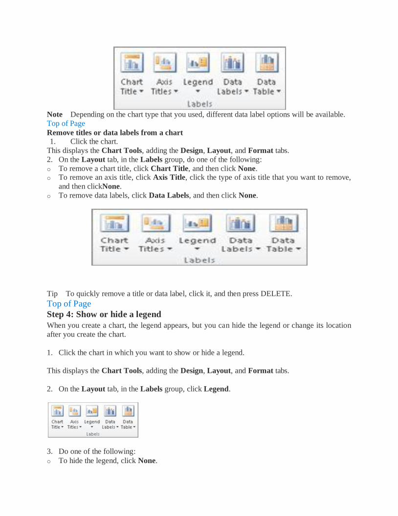
Add a chart title
1. Click anywhere in the chart to which you want to add a title.
This displays the Chart Tools, adding the Design, Layout, and Format tabs.
2. On the Layout tab, in the Labels group, click Chart Title.

3. Click Centered Overlay Title or Above Chart.
4. In the Chart Title text box that appears in the chart, type the text that you want.
Tip To insert a line break, click to place the pointer where you want to break the line, and then
press ENTER.
5. To format the text, select it, and then click the formatting options that you want on the Mini
toolbar.
Tip You can also use the formatting buttons on the ribbon (Home tab, Font group). To format
the whole title, you can right-click it, click Format Chart Title, and then select the formatting
options that you want. Top of Page
Add axis titles
1. Click anywhere in the chart to which you want to add axis titles.
This displays the Chart Tools, adding the Design, Layout, and Format tabs.
2. On the Layout tab, in the Labels group, click Axis Titles.
3. Do one or more of the following:
o To add a title to a primary horizontal (category) axis, click Primary Horizontal Axis Title,
and then click the option that you want.
Tip If the chart has a secondary horizontal axis, you can also click Secondary Horizontal
Axis Title.
o To add a title to primary vertical (value) axis, click Primary Vertical Axis Title, and then
click the option that you want.
Tip If the chart has a secondary vertical axis, you can also click Secondary Vertical Axis
Title.
o To add a title to a depth (series) axis, click Depth Axis Title, and then click the option that
you want.

Note This option is only available when the selected chart is a true 3-D chart, such as a 3-D
column chart.
4. In the Axis Title text box that appears in the chart, type the text that you want.
Tip To insert a line break, click to place the pointer where you want to break the line, and then
press ENTER.
5. To format the text, select it, and then click the formatting options that you want on the Mini
toolbar.
Tip You can also use the formatting buttons on the ribbon (Home tab, Font group). To format
the whole title, you can right-click it, click Format Axis Title , and then select the formatting
options that you want.
Notes
If you switch to another chart type that does not support axis titles (such as a pie chart),
the axis titles will no longer be displayed. The titles will be displayed again when you switch
back to a chart type that does support axis titles.
Axis titles that are displayed for secondary axes will be lost when you switch to a chart type
that does not display secondary axes.
Top of Page
Link a title to a worksheet cell 1. On a chart, click the chart or axis title that you want to link to a worksheet cell.
2. On the worksheet, click in the formula bar, and then type an equal sign (=).
3. Select the worksheet cell that contains the data or text that you want to display in your chart.
Tip You can also type the reference to the worksheet cell in the formula bar. Include an equal sign, the sheet name, followed by an exclamation point; for example, =Sheet1!F2
4. Press ENTER.
Top of Page
Add data labels 1. On a chart, do one of the following:
o To add a data label to all data points of all data series, click the chart area.
o To add a data label to all data points of a data series, click anywhere in the data series that
you want to label.
o To add a data label to a single data point in a data series, click the data series that contains
the data point that you want to label, and then click the data point that you want to label.
This displays the Chart Tools, adding the Design, Layout, and Format tabs.
2. On the Layout tab, in the Labels group, click Data Labels, and then click the display option
that you want.
Note Depending on the chart type that you used, different data label options will be available.
Top of Page
Remove titles or data labels from a chart
1. Click the chart.
This displays the Chart Tools, adding the Design, Layout, and Format tabs.
2. On the Layout tab, in the Labels group, do one of the following:
o To remove a chart title, click Chart Title, and then click None. o To remove an axis title, click Axis Title, click the type of axis title that you want to remove,
and then clickNone.
o To remove data labels, click Data Labels, and then click None.
Tip To quickly remove a title or data label, click it, and then press DELETE.
Top of Page
Step 4: Show or hide a legend
When you create a chart, the legend appears, but you can hide the legend or change its location
after you create the chart.
1. Click the chart in which you want to show or hide a legend.
This displays the Chart Tools, adding the Design, Layout, and Format tabs.
2. On the Layout tab, in the Labels group, click Legend.
3. Do one of the following:
o To hide the legend, click None.
Tip To quickly remove a legend or a legend entry from a chart, you can select it, and then
press DELETE. You can also right-click the legend or a legend entry, and then click Delete.
o To display a legend, click the display option that you want.
Note When you click one of the display options, the legend moves, and the plot area
automatically adjusts to make room for it. If you move and size the legend by using the mouse,
the plot area does not automatically adjust.
o For additional options, click More Legend Options, and then select the display option that
you want.
Tip By default, a legend does not overlap the chart. If you have space constraints, you might
be able to reduce the size of the chart by clearing the Show the legend without overlapping the
chart check box.
Tip When a chart has a legend displayed, you can modify the individual legend entries by
editing the corresponding data on the worksheet. For additional editing options, or to modify
legend entries without affecting the worksheet data, you can change the legend entries in
the Select Data Source dialog box (Designtab, Data group, Select Data button).
Top of Page
Step 5: Display or hide chart axes or gridlines
When you create a chart, primary axes are displayed for most chart types. You can turn them on
or off as needed. When you add axes, you can specify the level of detail that you want the axes to
display. A depth axis is displayed when you create a 3-D chart.
When the values in a chart vary widely from data series to data series, or when you have mixed types of data (for example, price and volume), you can plot one or more data series on a
secondary vertical (value) axis. The scale of the secondary vertical axis reflects the values for the
associated data series. After you add a secondary vertical axis to a chart, you can also add a
secondary horizontal (category) axis, which might be useful in an xy (scatter) chart or bubble
chart.
To make a chart easier to read, you can display or hide the horizontal and vertical chart gridlines
that extend from any horizontal and vertical axes across the plot area of the chart.
Display or hide primary axes
1. Click the chart for which you want to display or hide axes.
This displays the Chart Tools, adding the Design, Layout, and Format tabs.
2. On the Layout tab, in the Axes group, click Axes, and then do one of the following:
o To display an axis, click Primary Horizontal Axis, Primary Vertical Axis, or Depth Axis (on a 3-D chart), and then click the axis display option that you want.
o To hide an axis, click Primary Horizontal Axis, Primary Vertical Axis,
or Depth Axis (on a 3-D chart), and then click None.

o To specify detailed axis display and scaling options, click Primary Horizontal
Axis, Primary Vertical Axis, or Depth Axis (on a 3-D chart), and then click More
Primary Horizontal Axis Options, More Primary Vertical Axis Options, or More
Depth Axis Options.
Top of Page
Display or hide secondary axes
1. In a chart, click the data series that you want to plot along a secondary vertical axis, or do the following to select the data series from a list of chart elements:
a. Click the chart.
This displays the Chart Tools, adding the Design, Layout, and Format tabs.
b. On the Format tab, in the Current Selection group, click the arrow in the Chart
Elements box, and then click the data series that you want to plot along a secondary vertical
axis.
2. On the Format tab, in the Current Selection group, click Format Selection. 3. Click Series Options if it is not selected, and then under Plot Series On,
4. Click Secondary Axis and then click Close.
5. On the Layout tab, in the Axes group, click Axes.
6. Do one of the following:

o To display a secondary vertical axis, click Secondary Vertical Axis, and then click the
display option that you want.
Tip To help distinguish the secondary vertical axis, you can change the chart type for just one
data series. For example, you can change one data series to a line chart.
To display a secondary horizontal axis, click Secondary Horizontal Axis, and then click
the display option that you want.
Note This option is available only after you display a secondary vertical axis.
To hide a secondary axis, click Secondary Vertical Axis or Secondary Horizontal
Axis, and then clickNone.
Tip You can also click the secondary axis that you want to delete, and then press DELETE.
Top of Page
1. .
2. Do the following:
o To add horizontal gridlines to the chart, point to Primary Horizontal Gridlines, and then
click the option that you want. If the chart has a secondary horizontal axis, you can also click Secondary Horizontal Gridlines.
o To add vertical gridlines to the chart, point to Primary Vertical Gridlines, and then click
the option that you want. If the chart has a secondary vertical axis, you can also click Secondary
Vertical Gridlines.
o To add depth gridlines to a 3-D chart, point to Depth Gridlines, and then click the option
that you want. This option is only available when the selected chart is a true 3-D chart, such as a
3-D column chart.
o To hide chart gridlines, point to Primary Horizontal Gridlines, Primary Vertical
Gridlines, or Depth Gridlines (on a 3-D chart), and then click None. If the chart has a
secondary axes, you can also click Secondary Horizontal Gridlines or Secondary Vertical
Gridlines, and then click None.
o To quickly remove chart gridlines, select them, and then press DELETE.
Top of Page
Step 6: Move or resize a chart You can move a chart to any location on a worksheet or to a new or existing worksheet. You can
also change the size of the chart for a better fit.
Move a chart To move a chart, drag it to the location that you want.
Top of Page
Resize a chart
To resize a chart, do one of the following:
Click the chart, and then drag the sizing handles to the size that you want.
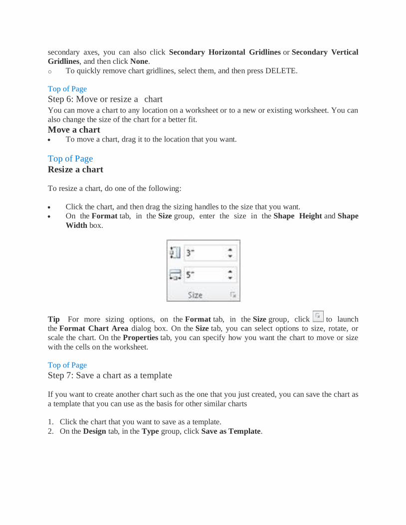
On the Format tab, in the Size group, enter the size in the Shape Height and Shape
Width box.
Tip For more sizing options, on the Format tab, in the Size group, click to launch
the Format Chart Area dialog box. On the Size tab, you can select options to size, rotate, or
scale the chart. On the Properties tab, you can specify how you want the chart to move or size
with the cells on the worksheet.
Top of Page
Step 7: Save a chart as a template
If you want to create another chart such as the one that you just created, you can save the chart as
a template that you can use as the basis for other similar charts
1. Click the chart that you want to save as a template.
2. On the Design tab, in the Type group, click Save as Template.

3. In the File name box, type a name for the template.
Tip Unless you specify a different folder, the template file (.crtx) will be saved in
the Charts folder, and the template becomes available under Templates in both the Insert
Chart dialog box (Insert tab, Charts group, Dialog Box Launcher ) and the Change
Chart Type dialog box (Design tab, Type group, Change Chart Type).
Note A chart template contains chart formatting and stores the colors that are in use when you
save the chart as a template. When you use a chart template to create a chart in another
workbook, the new chart uses the colors of the chart template — not the colors of the document
theme that is currently applied to the workbook. To use the document theme colors instead of the
chart template colors, right-click the chart area, and then click Reset to Match Style.
Two ways to build dynamic charts in Excel
Users will appreciate a chart that updates right before their eyes. In Excel 2007 and 2010 it's as
easy as creating a table. In earlier versions, you'll need the formula method.
If you want to advance beyond your ordinary spreadsheet skills, creating dynamic charts is a
good place to begin that journey. The key is to define the chart's source data as a dynamic range.
By doing so, the chart will automatically reflect changes and additions to the source data.
Fortunately, the process is easy to implement in Excel 2007 and 2010 if you're willing to use the
table feature. If not, there's a more complex method. We'll explore both.
The table method
First, we'll use the table feature, available in Excel 2007 and 2010-you'll be amazed at how
simple it is. The first step is to create the table. To do so, simply select the data range and do the
following:
1. Click the Insert tab.
2. In the Tables group, click Table.
3. Excel will display the selected range, which you can change. If the table does not have headers, be sure to uncheck the My Table Has Headers option.
4. Click OK and Excel will format the data range as a table.

Any chart you build on the table will be dynamic. To illustrate, create a quick column chart as
follows:
1. Select the table.
2. Click the Insert tab.
3. In the Charts group, choose the first 2-D column chart in the Chart dropdown.
Now, update the chart by adding values for March and watch the chart update automatically.
The dynamic formula method
You won't always want to turn your data range into a table. Furthermore, this feature isn't
available in pre-ribbon versions of Office. When either is the case, there's a more complex
formula method. It relies on dynamic ranges that update automatically, similar to the way the
table does, but only with a little help from you.
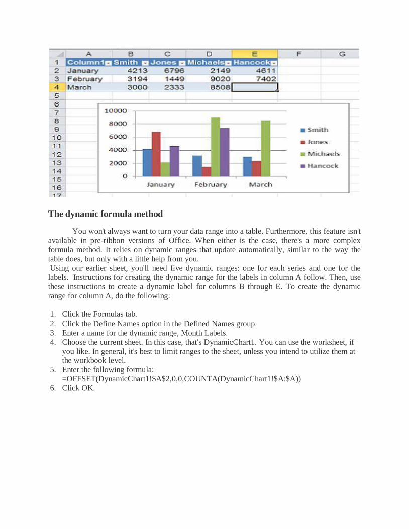
Using our earlier sheet, you'll need five dynamic ranges: one for each series and one for the
labels. Instructions for creating the dynamic range for the labels in column A follow. Then, use
these instructions to create a dynamic label for columns B through E. To create the dynamic
range for column A, do the following:
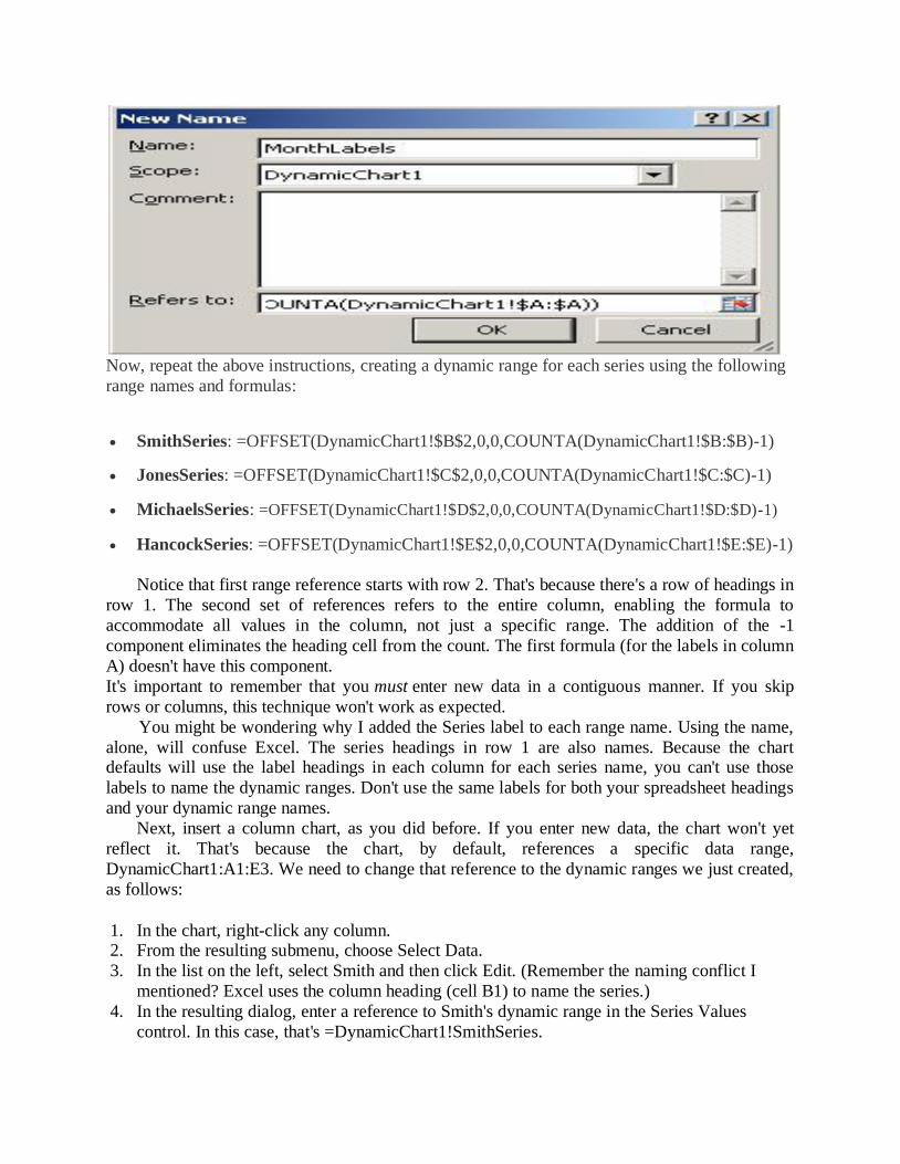
1. Click the Formulas tab.
2. Click the Define Names option in the Defined Names group.
3. Enter a name for the dynamic range, Month Labels.
4. Choose the current sheet. In this case, that's DynamicChart1. You can use the worksheet, if
you like. In general, it's best to limit ranges to the sheet, unless you intend to utilize them at the workbook level.
5. Enter the following formula:
=OFFSET(DynamicChart1!$A$2,0,0,COUNTA(DynamicChart1!$A:$A))
6. Click OK.
Now, repeat the above instructions, creating a dynamic range for each series using the following
range names and formulas:
SmithSeries: =OFFSET(DynamicChart1!$B$2,0,0,COUNTA(DynamicChart1!$B:$B)-1)
JonesSeries: =OFFSET(DynamicChart1!$C$2,0,0,COUNTA(DynamicChart1!$C:$C)-1)
MichaelsSeries: =OFFSET(DynamicChart1!$D$2,0,0,COUNTA(DynamicChart1!$D:$D)-1)
HancockSeries: =OFFSET(DynamicChart1!$E$2,0,0,COUNTA(DynamicChart1!$E:$E)-1)
Notice that first range reference starts with row 2. That's because there's a row of headings in
row 1. The second set of references refers to the entire column, enabling the formula to
accommodate all values in the column, not just a specific range. The addition of the -1
component eliminates the heading cell from the count. The first formula (for the labels in column
A) doesn't have this component.
It's important to remember that you must enter new data in a contiguous manner. If you skip
rows or columns, this technique won't work as expected.
You might be wondering why I added the Series label to each range name. Using the name,
alone, will confuse Excel. The series headings in row 1 are also names. Because the chart defaults will use the label headings in each column for each series name, you can't use those
labels to name the dynamic ranges. Don't use the same labels for both your spreadsheet headings
and your dynamic range names.
Next, insert a column chart, as you did before. If you enter new data, the chart won't yet
reflect it. That's because the chart, by default, references a specific data range,
DynamicChart1:A1:E3. We need to change that reference to the dynamic ranges we just created,
as follows:
1. In the chart, right-click any column. 2. From the resulting submenu, choose Select Data.
3. In the list on the left, select Smith and then click Edit. (Remember the naming conflict I
mentioned? Excel uses the column heading (cell B1) to name the series.)
4. In the resulting dialog, enter a reference to Smith's dynamic range in the Series Values
control. In this case, that's =DynamicChart1!SmithSeries.

5. Click OK.
Repeat the above process to update the remaining series to reflect their dynamic ranges: DynamicChart1!JonesSeries;DynamicChart1!MichaelsSeries;and
DynamicChart1!HancockSeries.
Next, update the chart's axis labels (column A), as follows:
1. In the Select Data Source dialog, click January (in the list to the right).
2. Then, click Edit. 3. In the resulting dialog, reference the axis label's dynamic range, DynamicChart1!Month
Labels.
4. Click OK.
You don't have to update February; Excel does that for you. Now, start entering data for
March and watch the chart automatically update! Just remember, you must enter data
contiguously; you can't skip rows or columns.
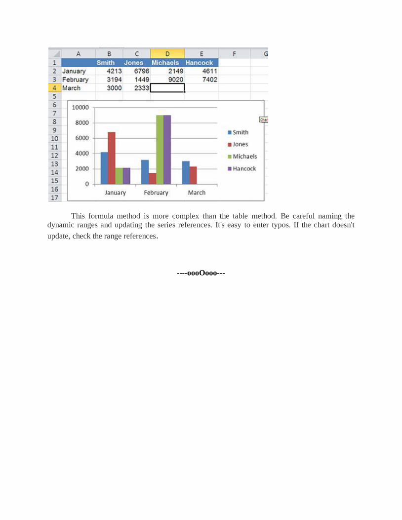
This formula method is more complex than the table method. Be careful naming the dynamic ranges and updating the series references. It's easy to enter typos. If the chart doesn't
update, check the range references.
----oooOooo---
UNIT-II
SENSITIVITY ANALYSIS USING EXCEL
Scenario manager, other sensitivity analysis features, simulation using excel different statistical distributions used in simulation generating random numbers that follow a particular distribution,
building models in finance using simulation.
SENSITIVITY ANALYSIS USING EXCEL:
The main goal of sensitivity analysis is to gain insight into which assumptions are critical,
i.e., which assumptions affect choice. The process involves various ways of changing input
values of the model to see the effect on the output value. In some decision situations you can use
a single model to investigate several alternatives. In other cases, you may use a separate
spreadsheet model for each alternative.
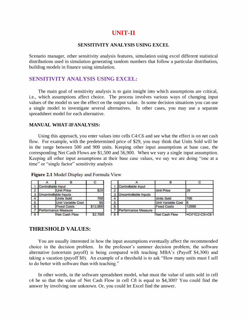
MANUAL WHAT-IFANALYSIS:
Using this approach, you enter values into cells C4:C6 and see what the effect is on net cash
flow. For example, with the predetermined price of $29, you may think that Units Sold will be
in the range between 500 and 900 units. Keeping other input assumptions at base case, the
corresponding Net Cash Flows are $1,500 and 56,900. When we vary a single input assumption.
Keeping all other input assumptions at their base case values, we say we are doing “one at a
time” or “single factor” sensitivity analysis
THRESHOLD VALUES:
You are usually interested in how the input assumptions eventually affect the recommended
choice in the decision problem. In the professor’s summer decision problem, the software
alternative (uncertain payoff) is being compared with teaching MBA’s (Payoff $4,300) and
taking a vacation (payoff $0). An example of a threshold is to ask “How many units must I sell
to do better with software than with teaching.”
In other words, in the software spreadsheet model, what must the value of units sold in cell
c4 be so that the value of Net Cash Flow in cell C8 is equal to $4,300? You could find the
answer by involving one unknown. Or, you could let Excel find the answer.
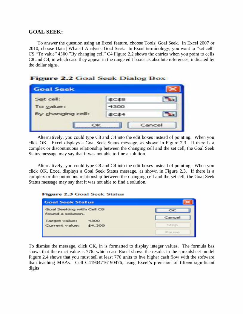
GOAL SEEK:
To answer the question using an Excel feature, choose Tools| Goal Seek. In Excel 2007 or
2010, choose Data | What-if Analysis| Goal Seek. In Excel terminology, you want to “set cell”
CS “To value” 4300 ”By changing cell” C4 Figure 2.2 shows the entries when you point to cells
C8 and C4, in which case they appear in the range edit boxes as absolute references, indicated by
the dollar signs.
Alternatively, you could type C8 and C4 into the edit boxes instead of pointing. When you
click OK. Excel displays a Goal Seek Status message, as shown in Figure 2.3. If there is a
complex or discontinuous relationship between the changing cell and the set cell, the Goal Seek
Status message may say that it was not able to fine a solution.
Alternatively, you could type C8 and C4 into the edit boxes instead of pointing. When you
click OK, Excel displays a Goal Seek Status message, as shown in Figure 2.3. If there is a
complex or discontinuous relationship between the changing cell and the set cell, the Goal Seek
Status message may say that it was not able to find a solution.
To dismiss the message, click OK, in is formatted to display integer values. The formula bas
shows that the exact value is 776. which case Excel shows the results in the spreadsheet model
Figure 2.4 shows that you must sell at least 776 units to hve higher cash flow with the software
than teaching MBAs. Cell C41904716190476, using Excel’s precision of fifteen significant
digits
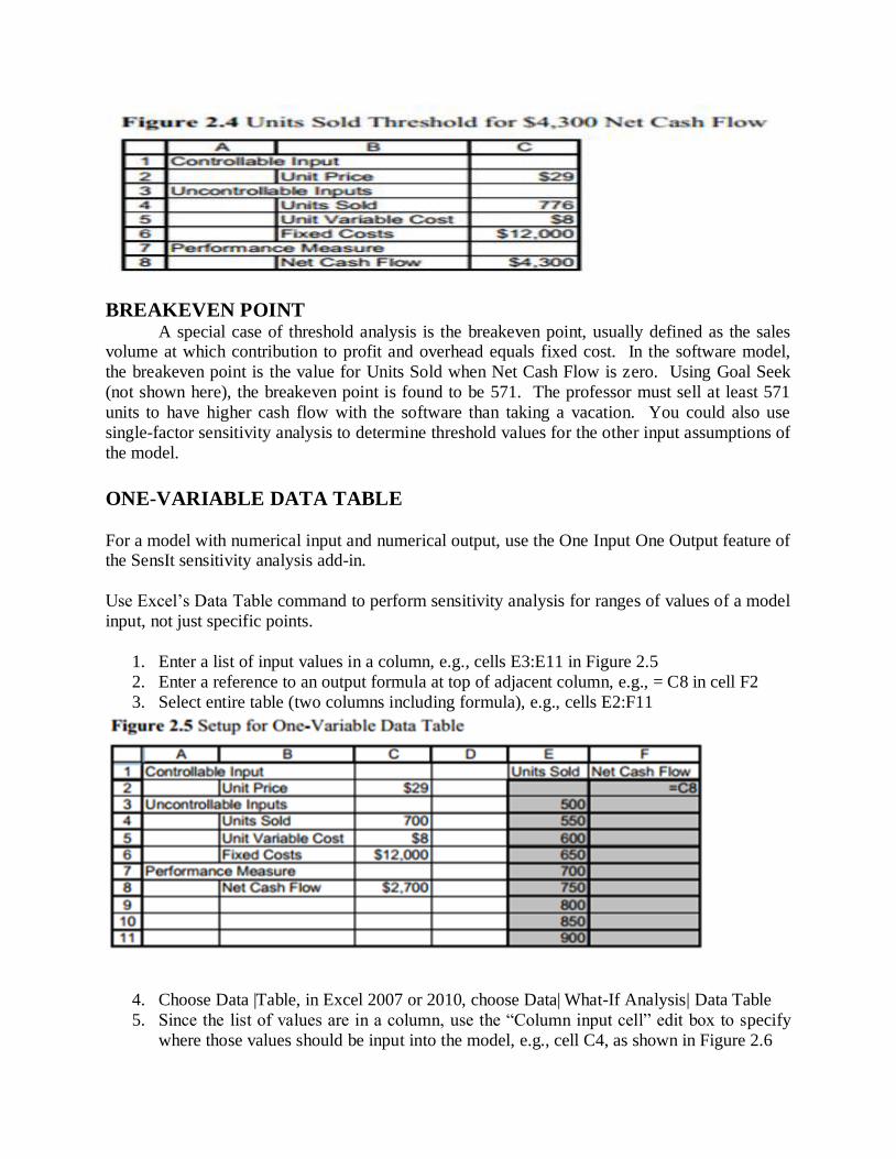
BREAKEVEN POINT A special case of threshold analysis is the breakeven point, usually defined as the sales volume at which contribution to profit and overhead equals fixed cost. In the software model,
the breakeven point is the value for Units Sold when Net Cash Flow is zero. Using Goal Seek
(not shown here), the breakeven point is found to be 571. The professor must sell at least 571
units to have higher cash flow with the software than taking a vacation. You could also use
single-factor sensitivity analysis to determine threshold values for the other input assumptions of
the model.
ONE-VARIABLE DATA TABLE
For a model with numerical input and numerical output, use the One Input One Output feature of the SensIt sensitivity analysis add-in.
Use Excel’s Data Table command to perform sensitivity analysis for ranges of values of a model
input, not just specific points.
1. Enter a list of input values in a column, e.g., cells E3:E11 in Figure 2.5
2. Enter a reference to an output formula at top of adjacent column, e.g., = C8 in cell F2
3. Select entire table (two columns including formula), e.g., cells E2:F11
4. Choose Data |Table, in Excel 2007 or 2010, choose Data| What-If Analysis| Data Table
5. Since the list of values are in a column, use the “Column input cell” edit box to specify
where those values should be input into the model, e.g., cell C4, as shown in Figure 2.6
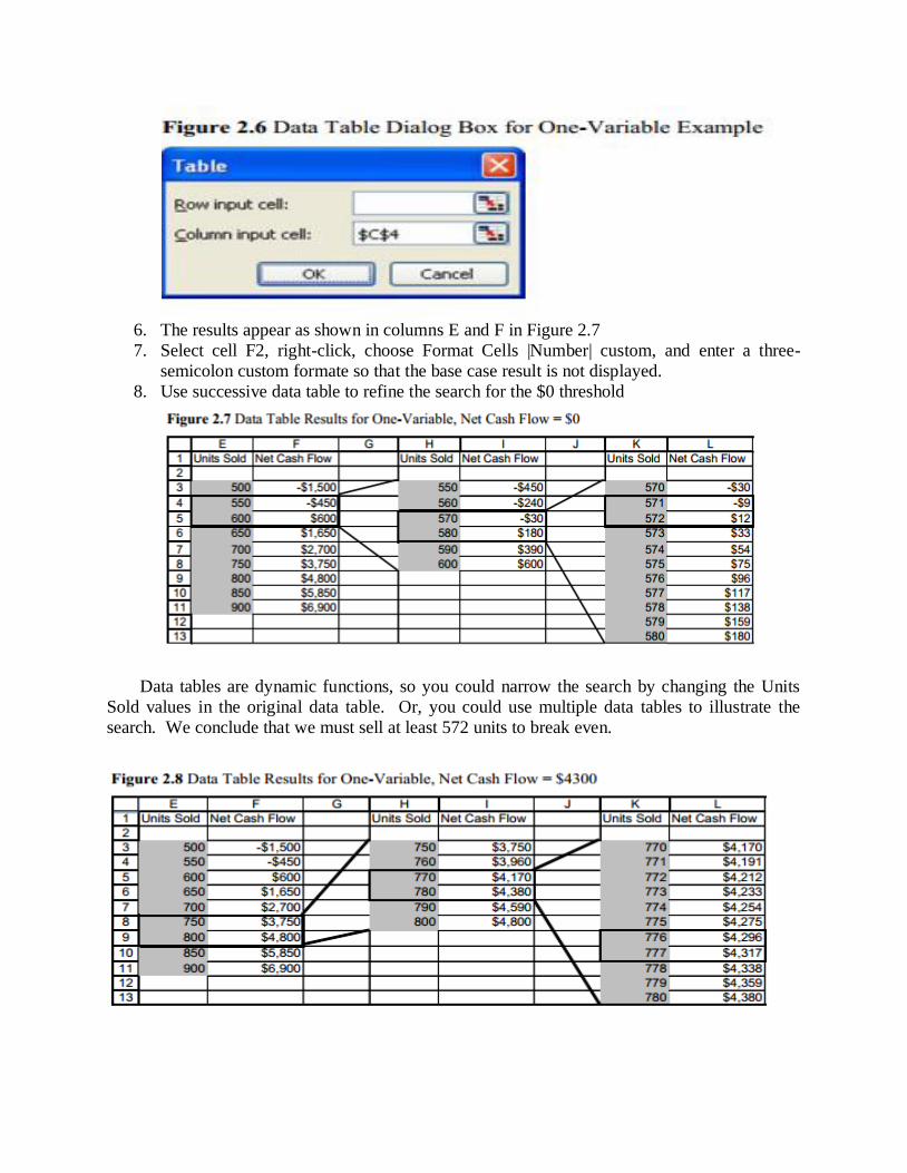
6. The results appear as shown in columns E and F in Figure 2.7
7. Select cell F2, right-click, choose Format Cells |Number| custom, and enter a three-
semicolon custom formate so that the base case result is not displayed.
8. Use successive data table to refine the search for the $0 threshold
Data tables are dynamic functions, so you could narrow the search by changing the Units
Sold values in the original data table. Or, you could use multiple data tables to illustrate the
search. We conclude that we must sell at least 572 units to break even.
You can use the same approach to find the threshold value of units sold (777) for net cash flow
of $4,300, as shown in Figure 2.8.
LINE CHART OR XY (SCATTER) CHART:
The results of the Data table command may be displayed using either a Line chart type or an
XY (Scatter) chart type; both types have a continuous numerical vertical axis. However, the
Line chart has a categorical horizontal axis, which means that the worksheet data is displayed as
equally spaced text values. Only the XY (Scatter) chart has a numerical horizontal axis. Since
the input values to a data table are usually equally-spaced, you can use either chart type to
display the results. When the data for the horizontal axis are not equally-spaced, it is important to use the XY (Scatter) chart type.
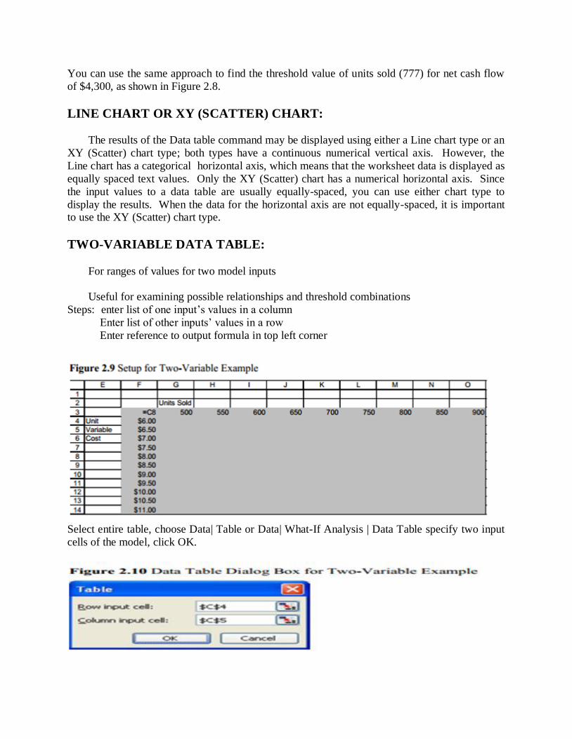
TWO-VARIABLE DATA TABLE:
For ranges of values for two model inputs
Useful for examining possible relationships and threshold combinations
Steps: enter list of one input’s values in a column
Enter list of other inputs’ values in a row
Enter reference to output formula in top left corner
Select entire table, choose Data| Table or Data| What-If Analysis | Data Table specify two input
cells of the model, click OK.
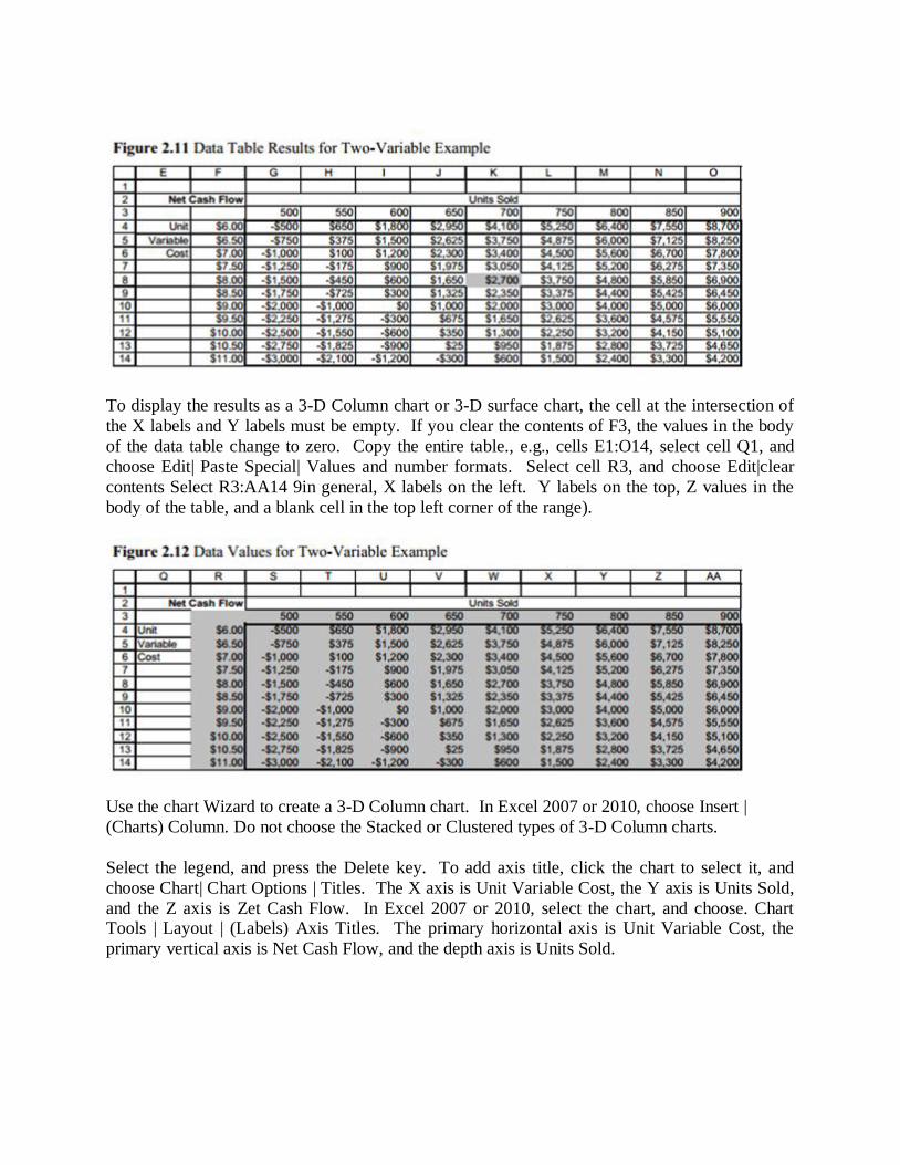
To display the results as a 3-D Column chart or 3-D surface chart, the cell at the intersection of
the X labels and Y labels must be empty. If you clear the contents of F3, the values in the body
of the data table change to zero. Copy the entire table., e.g., cells E1:O14, select cell Q1, and
choose Edit| Paste Special| Values and number formats. Select cell R3, and choose Edit|clear
contents Select R3:AA14 9in general, X labels on the left. Y labels on the top, Z values in the
body of the table, and a blank cell in the top left corner of the range).
Use the chart Wizard to create a 3-D Column chart. In Excel 2007 or 2010, choose Insert |
(Charts) Column. Do not choose the Stacked or Clustered types of 3-D Column charts.
Select the legend, and press the Delete key. To add axis title, click the chart to select it, and
choose Chart| Chart Options | Titles. The X axis is Unit Variable Cost, the Y axis is Units Sold,
and the Z axis is Zet Cash Flow. In Excel 2007 or 2010, select the chart, and choose. Chart Tools | Layout | (Labels) Axis Titles. The primary horizontal axis is Unit Variable Cost, the
primary vertical axis is Net Cash Flow, and the depth axis is Units Sold.
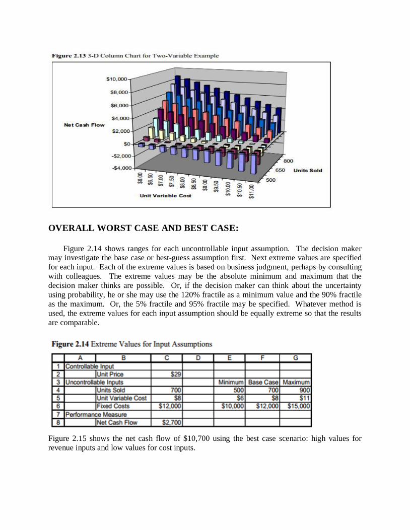
OVERALL WORST CASE AND BEST CASE:
Figure 2.14 shows ranges for each uncontrollable input assumption. The decision maker may investigate the base case or best-guess assumption first. Next extreme values are specified
for each input. Each of the extreme values is based on business judgment, perhaps by consulting
with colleagues. The extreme values may be the absolute minimum and maximum that the
decision maker thinks are possible. Or, if the decision maker can think about the uncertainty
using probability, he or she may use the 120% fractile as a minimum value and the 90% fractile
as the maximum. Or, the 5% fractile and 95% fractile may be specified. Whatever method is
used, the extreme values for each input assumption should be equally extreme so that the results
are comparable.
Figure 2.15 shows the net cash flow of $10,700 using the best case scenario: high values for
revenue inputs and low values for cost inputs.
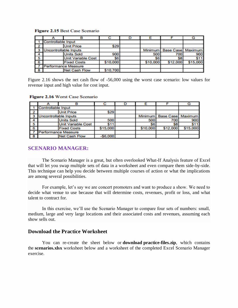
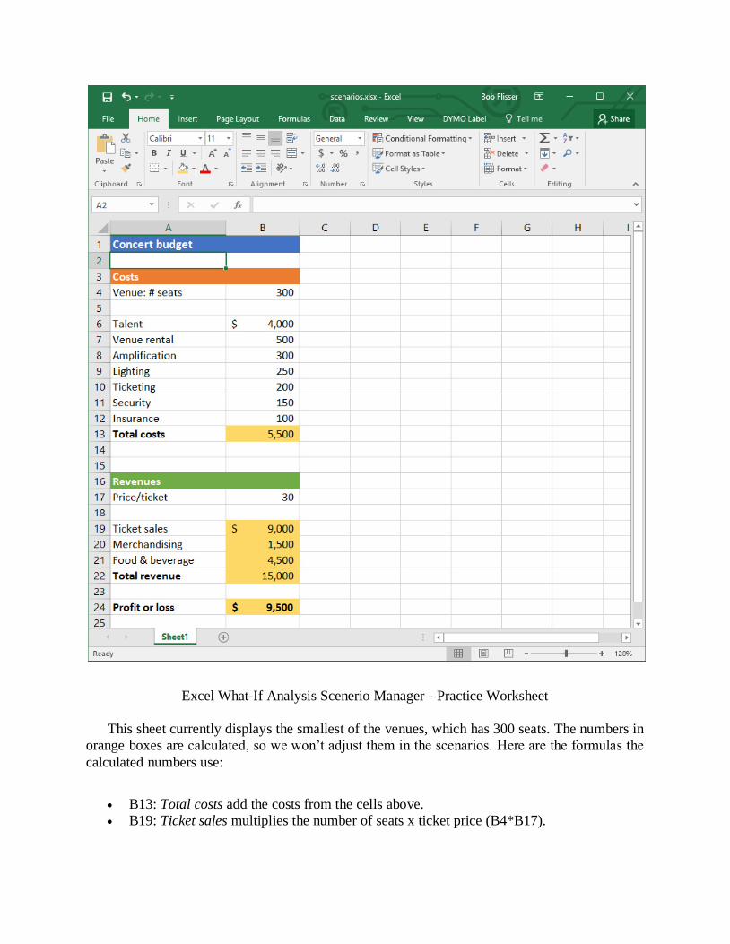
Figure 2.16 shows the net cash flow of -56,000 using the worst case scenario: low values for
revenue input and high value for cost input.
SCENARIO MANAGER:
The Scenario Manager is a great, but often overlooked What-If Analysis feature of Excel
that will let you swap multiple sets of data in a worksheet and even compare them side-by-side.
This technique can help you decide between multiple courses of action or what the implications
are among several possibilities.
For example, let’s say we are concert promoters and want to produce a show. We need to
decide what venue to use because that will determine costs, revenues, profit or loss, and what
talent to contract for.
In this exercise, we’ll use the Scenario Manager to compare four sets of numbers: small,
medium, large and very large locations and their associated costs and revenues, assuming each
show sells out.
Download the Practice Worksheet
You can re-create the sheet below or download practice-files.zip, which contains
the scenarios.xlsx worksheet below and a worksheet of the completed Excel Scenario Manager
exercise.
Excel What-If Analysis Scenerio Manager - Practice Worksheet
This sheet currently displays the smallest of the venues, which has 300 seats. The numbers in
orange boxes are calculated, so we won’t adjust them in the scenarios. Here are the formulas the
calculated numbers use:
B13: Total costs add the costs from the cells above.
B19: Ticket sales multiplies the number of seats x ticket price (B4*B17).
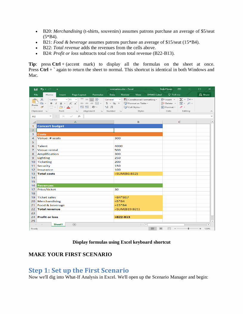
B20: Merchandising (t-shirts, souvenirs) assumes patrons purchase an average of $5/seat
(5*B4).
B21: Food & beverage assumes patrons purchase an average of $15/seat (15*B4).
B22: Total revenue adds the revenues from the cells above.
B24: Profit or loss subtracts total cost from total revenue (B22-B13).
Tip: press Ctrl + (accent mark) to display all the formulas on the sheet at once.
Press Ctrl + ` again to return the sheet to normal. This shortcut is identical in both Windows and
Mac.
Display formulas using Excel keyboard shortcut
MAKE YOUR FIRST SCENARIO
Step 1: Set up the First Scenario Now we'll dig into What-If Analysis in Excel. We'll open up the Scenario Manager and begin:
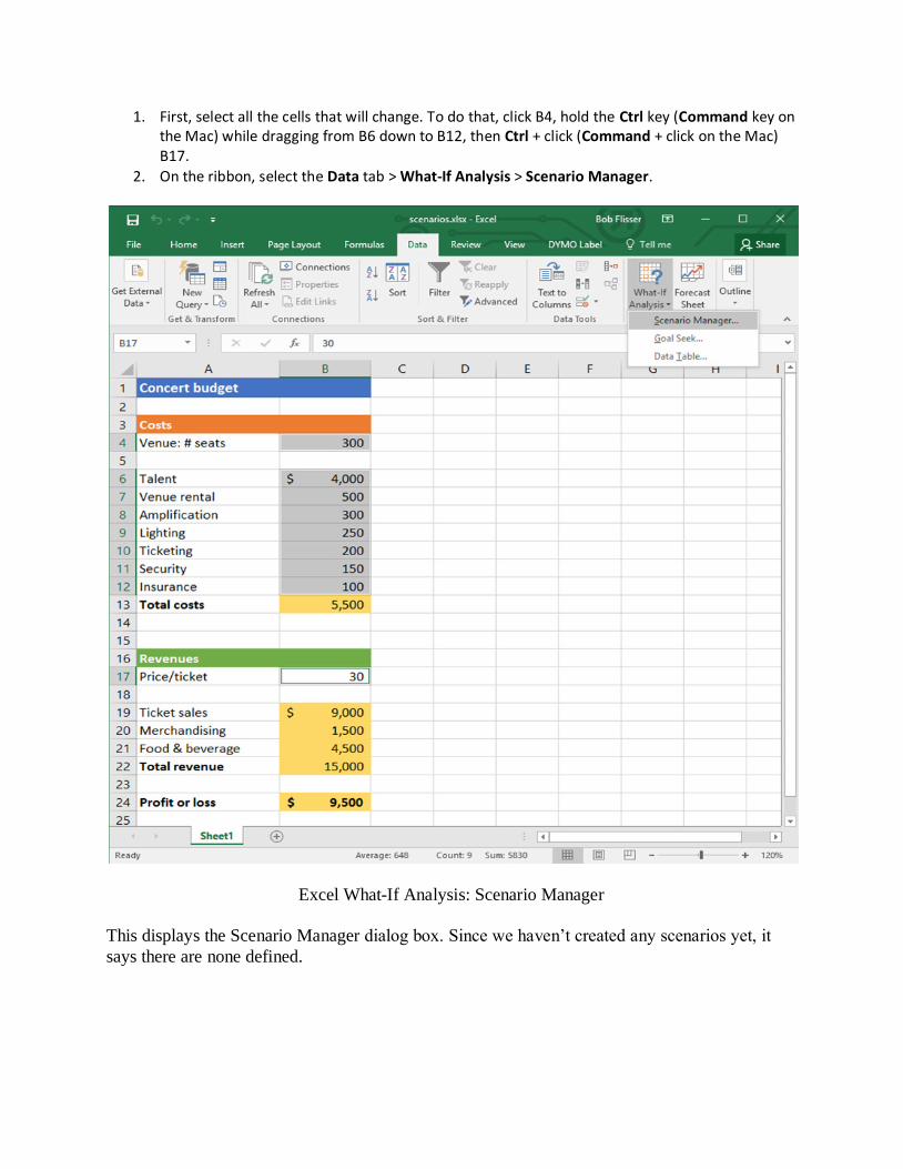
1. First, select all the cells that will change. To do that, click B4, hold the Ctrl key (Command key on the Mac) while dragging from B6 down to B12, then Ctrl + click (Command + click on the Mac) B17.
2. On the ribbon, select the Data tab > What-If Analysis > Scenario Manager.
Excel What-If Analysis: Scenario Manager
This displays the Scenario Manager dialog box. Since we haven’t created any scenarios yet, it
says there are none defined.
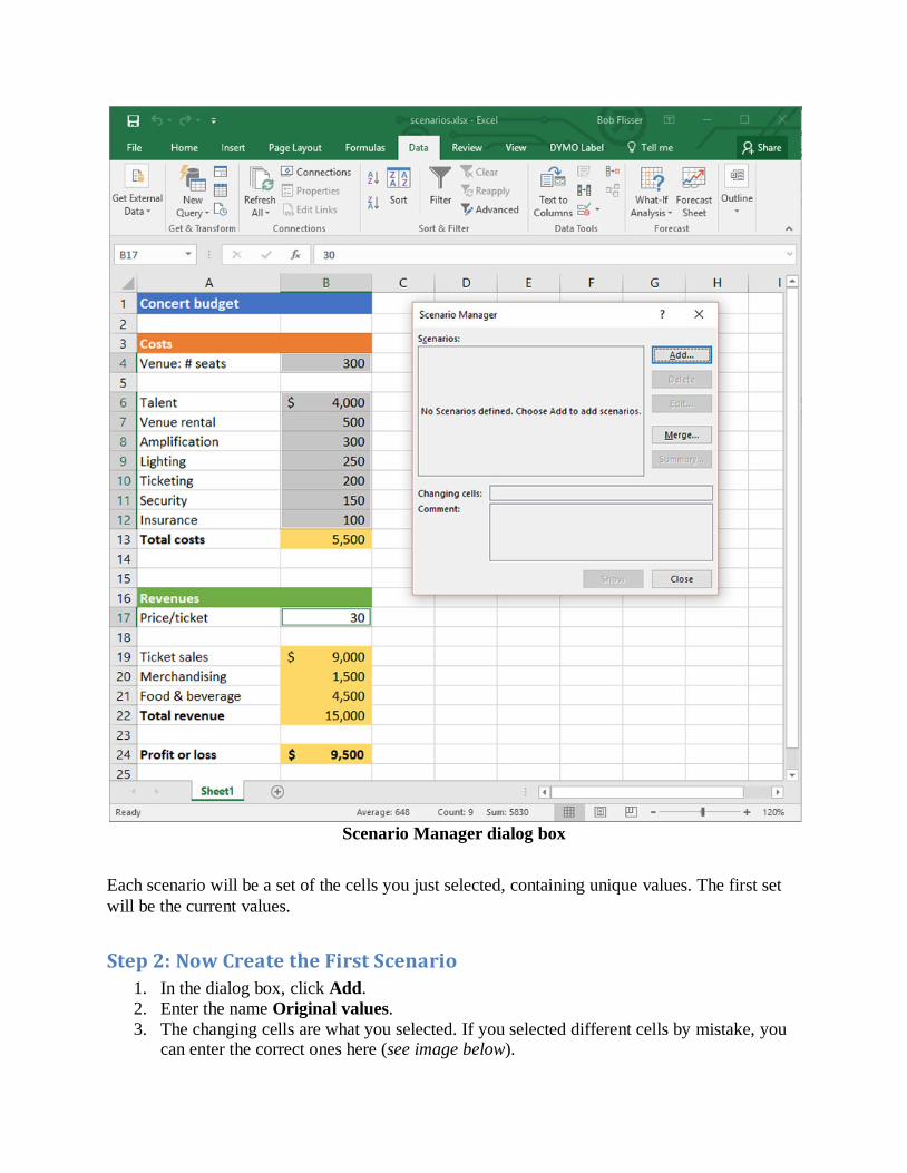
Scenario Manager dialog box
Each scenario will be a set of the cells you just selected, containing unique values. The first set
will be the current values.
Step 2: Now Create the First Scenario
1. In the dialog box, click Add.
2. Enter the name Original values.
3. The changing cells are what you selected. If you selected different cells by mistake, you can enter the correct ones here (see image below).

4. Enter a comment if you want. This is optional.
5. The checkboxes for Protection are only if you want to protect the sheet from changes.
We won’t do that in this exercise, so ignore these choices.
Scenario Protections options
Click OK. The Scenario Values dialog box shows you a list of all the cells in the scenario and
what their current values are. Note that you can’t resize this box, so use its scrollbar to see all of
them.
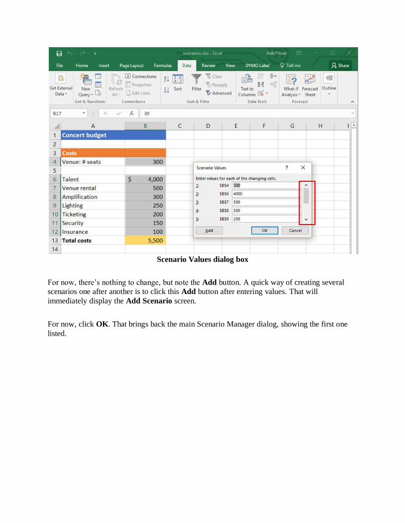
Scenario Values dialog box
For now, there’s nothing to change, but note the Add button. A quick way of creating several
scenarios one after another is to click this Add button after entering values. That will
immediately display the Add Scenario screen.
For now, click OK. That brings back the main Scenario Manager dialog, showing the first one
listed.
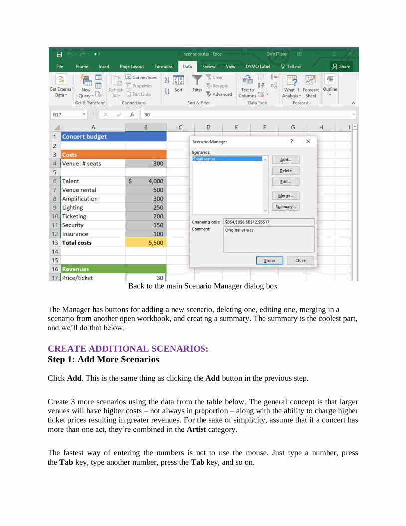
Back to the main Scenario Manager dialog box
The Manager has buttons for adding a new scenario, deleting one, editing one, merging in a scenario from another open workbook, and creating a summary. The summary is the coolest part,
and we’ll do that below.
CREATE ADDITIONAL SCENARIOS:
Step 1: Add More Scenarios
Click Add. This is the same thing as clicking the Add button in the previous step.
Create 3 more scenarios using the data from the table below. The general concept is that larger venues will have higher costs – not always in proportion – along with the ability to charge higher
ticket prices resulting in greater revenues. For the sake of simplicity, assume that if a concert has
more than one act, they’re combined in the Artist category.
The fastest way of entering the numbers is not to use the mouse. Just type a number, press
the Tab key, type another number, press the Tab key, and so on.
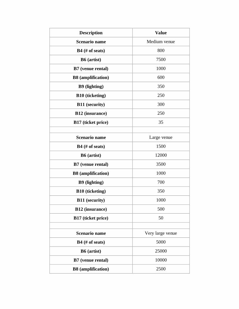
Description Value
Scenario name Medium venue
B4 (# of seats) 800
B6 (artist) 7500
B7 (venue rental) 1000
B8 (amplification) 600
B9 (lighting) 350
B10 (ticketing) 250
B11 (security) 300
B12 (insurance) 250
B17 (ticket price) 35
Scenario name Large venue
B4 (# of seats) 1500
B6 (artist) 12000
B7 (venue rental) 3500
B8 (amplification) 1000
B9 (lighting) 700
B10 (ticketing) 350
B11 (security) 1000
B12 (insurance) 500
B17 (ticket price) 50
Scenario name Very large venue
B4 (# of seats) 5000
B6 (artist) 25000
B7 (venue rental) 10000
B8 (amplification) 2500
B9 (lighting) 2000
B10 (ticketing) 500
B11 (security) 2500
B12 (insurance) 2500
B17 (ticket price) 50
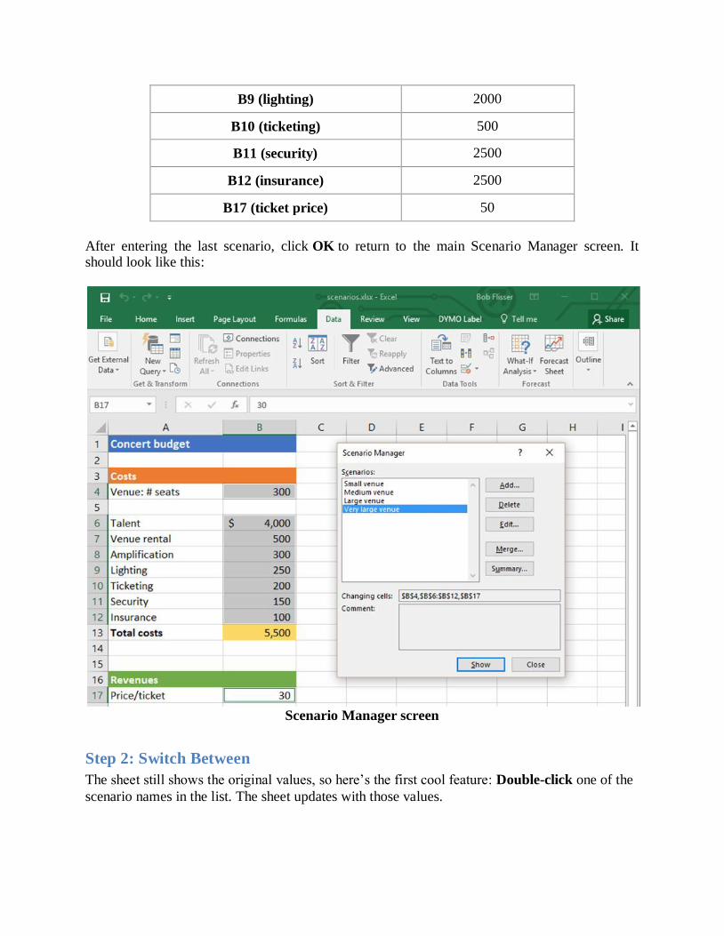
After entering the last scenario, click OK to return to the main Scenario Manager screen. It should look like this:
Scenario Manager screen
Step 2: Switch Between
The sheet still shows the original values, so here’s the first cool feature: Double-click one of the
scenario names in the list. The sheet updates with those values.
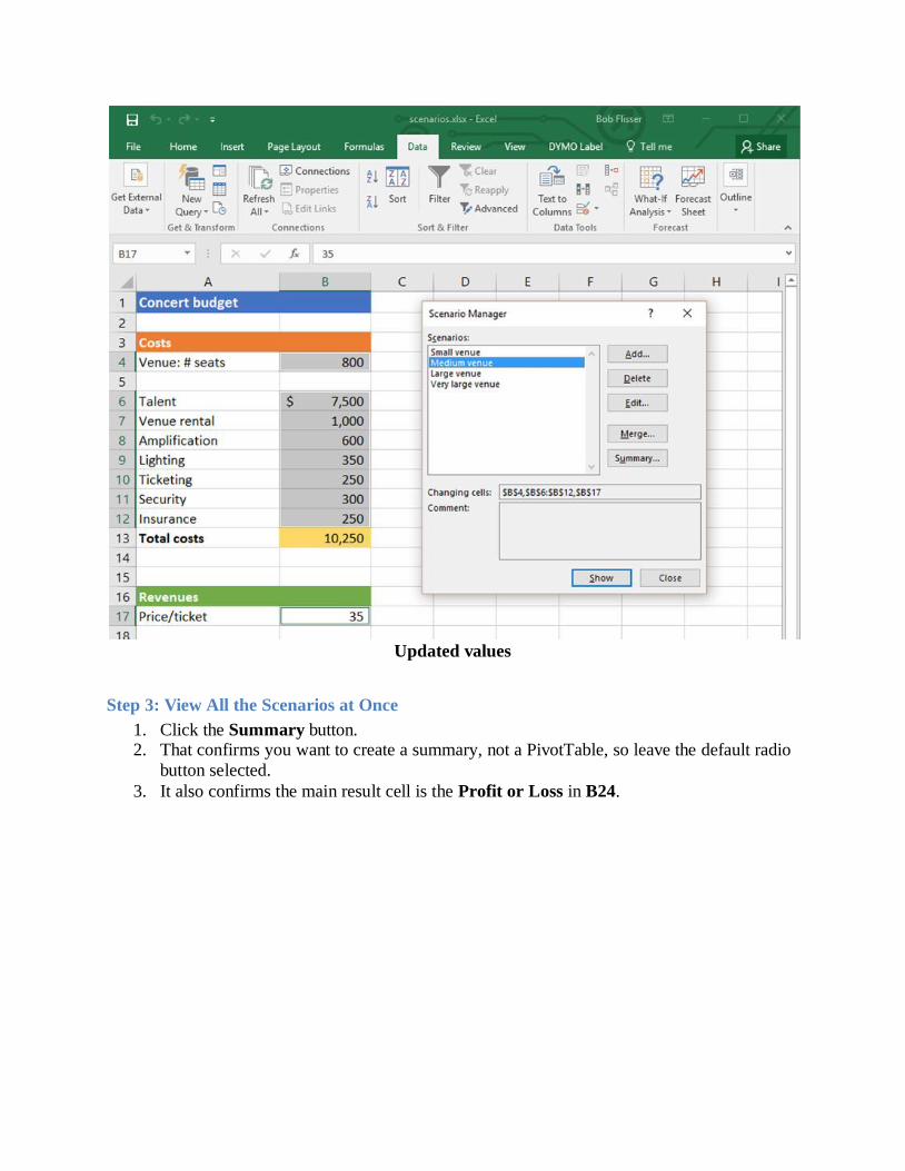
Updated values
Step 3: View All the Scenarios at Once
1. Click the Summary button. 2. That confirms you want to create a summary, not a PivotTable, so leave the default radio
button selected.
3. It also confirms the main result cell is the Profit or Loss in B24.
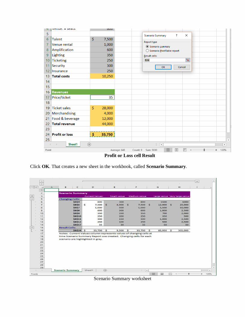
Profit or Loss cell Result
Click OK. That creates a new sheet in the workbook, called Scenario Summary.
Scenario Summary worksheet
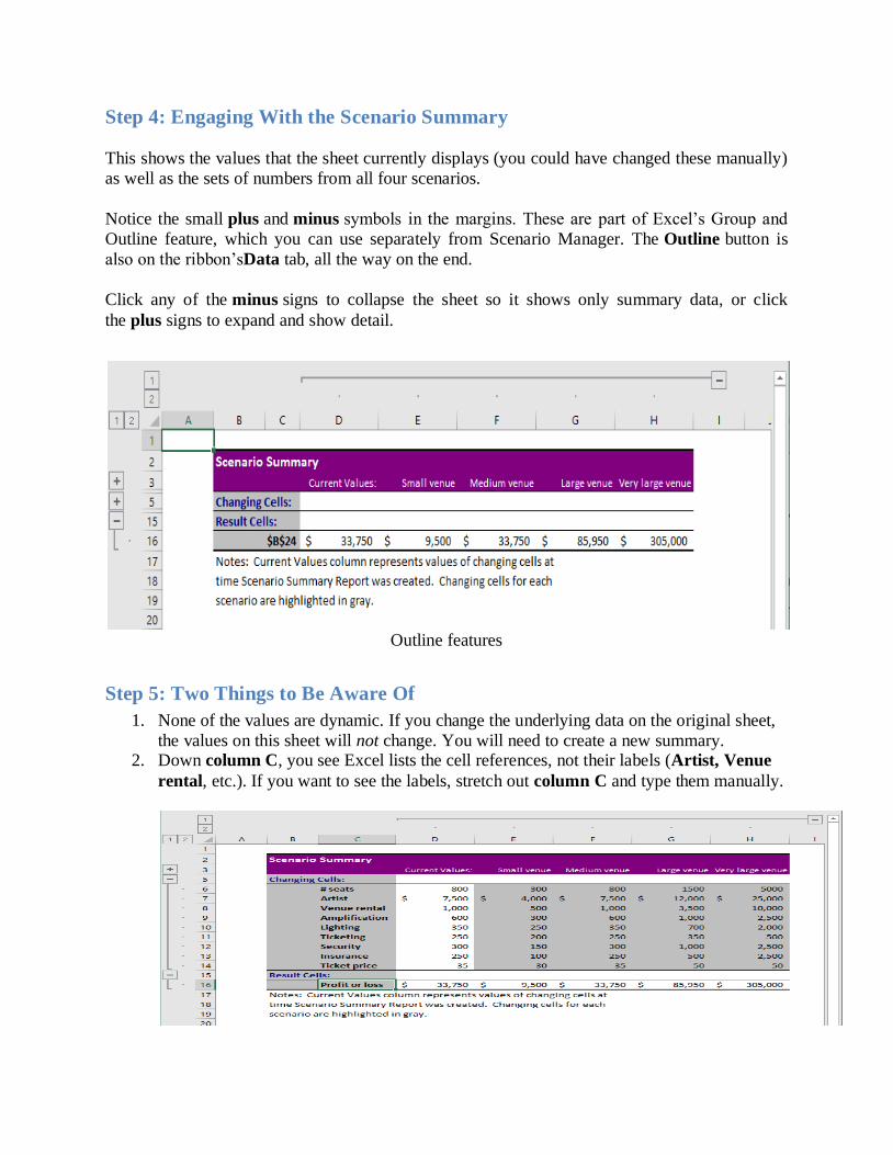
Step 4: Engaging With the Scenario Summary
This shows the values that the sheet currently displays (you could have changed these manually)
as well as the sets of numbers from all four scenarios.
Notice the small plus and minus symbols in the margins. These are part of Excel’s Group and
Outline feature, which you can use separately from Scenario Manager. The Outline button is
also on the ribbon’sData tab, all the way on the end.
Click any of the minus signs to collapse the sheet so it shows only summary data, or click
the plus signs to expand and show detail.
Outline features
Step 5: Two Things to Be Aware Of
1. None of the values are dynamic. If you change the underlying data on the original sheet,
the values on this sheet will not change. You will need to create a new summary. 2. Down column C, you see Excel lists the cell references, not their labels (Artist, Venue
rental, etc.). If you want to see the labels, stretch out column C and type them manually.
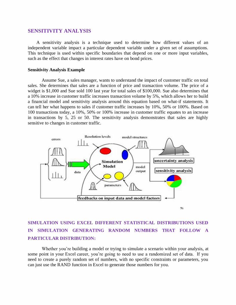
SENSITIVITY ANALYSIS A sensitivity analysis is a technique used to determine how different values of an
independent variable impact a particular dependent variable under a given set of assumptions.
This technique is used within specific boundaries that depend on one or more input variables,
such as the effect that changes in interest rates have on bond prices.
Sensitivity Analysis Example
Assume Sue, a sales manager, wants to understand the impact of customer traffic on total
sales. She determines that sales are a function of price and transaction volume. The price of a
widget is $1,000 and Sue sold 100 last year for total sales of $100,000. Sue also determines that
a 10% increase in customer traffic increases transaction volume by 5%, which allows her to build
a financial model and sensitivity analysis around this equation based on what-if statements. It
can tell her what happens to sales if customer traffic increases by 10%, 50% or 100%. Based on
100 transactions today, a 10%, 50% or 100% increase in customer traffic equates to an increase
in transactions by 5, 25 or 50. The sensitivity analysis demonstrates that sales are highly
sensitive to changes in customer traffic.
SIMULATION USING EXCEL DIFFERENT STATISTICAL DISTRIBUTIONS USED
IN SIMULATION GENERATING RANDOM NUMBERS THAT FOLLOW A
PARTICULAR DISTRIBUTION:
Whether you’re building a model or trying to simulate a scenario within your analysis, at
some point in your Excel career, you’re going to need to use a randomized set of data. If you
need to create a purely random set of numbers, with no specific constraints or parameters, you
can just use the RAND function in Excel to generate those numbers for you.
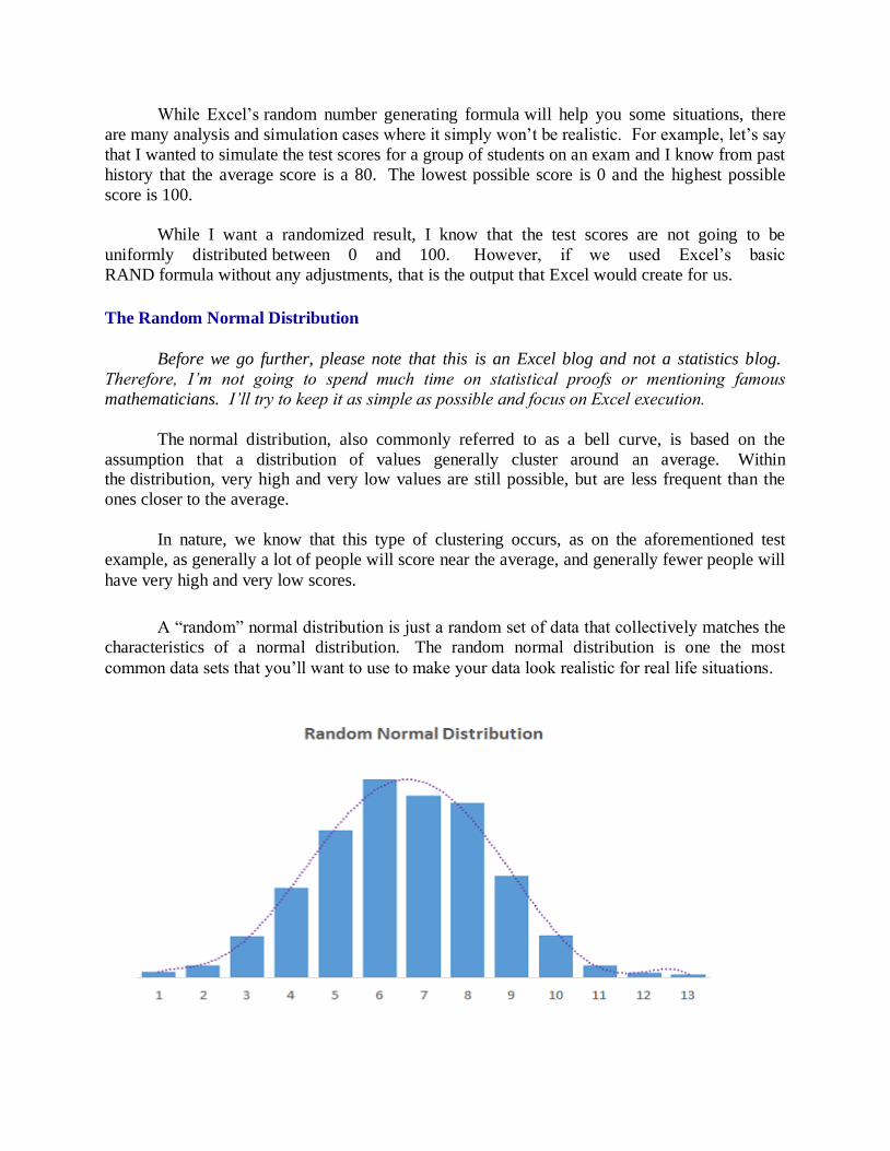
While Excel’s random number generating formula will help you some situations, there
are many analysis and simulation cases where it simply won’t be realistic. For example, let’s say
that I wanted to simulate the test scores for a group of students on an exam and I know from past
history that the average score is a 80. The lowest possible score is 0 and the highest possible
score is 100.
While I want a randomized result, I know that the test scores are not going to be
uniformly distributed between 0 and 100. However, if we used Excel’s basic
RAND formula without any adjustments, that is the output that Excel would create for us.
The Random Normal Distribution
Before we go further, please note that this is an Excel blog and not a statistics blog.
Therefore, I’m not going to spend much time on statistical proofs or mentioning famous
mathematicians. I’ll try to keep it as simple as possible and focus on Excel execution.
The normal distribution, also commonly referred to as a bell curve, is based on the
assumption that a distribution of values generally cluster around an average. Within the distribution, very high and very low values are still possible, but are less frequent than the
ones closer to the average.
In nature, we know that this type of clustering occurs, as on the aforementioned test
example, as generally a lot of people will score near the average, and generally fewer people will
have very high and very low scores.
A “random” normal distribution is just a random set of data that collectively matches the
characteristics of a normal distribution. The random normal distribution is one the most
common data sets that you’ll want to use to make your data look realistic for real life situations.

The two key parameters you need to know about the normal distribution / bell curve are:
The mean – what the average of the normal distribution will be, and simplifying greatly,
where roughly the middle of your chart top of that bell curve is
The standard deviation – again, simplifying greatly, how wide the bell curve will be; the
higher this number, the wider the bell curve will be
How it Works
To create a normally distributed set of random numbers in Excel, we’ll use the NORMINV
formula. The NORMINV formula is what is capable of providing us a random set of numbers in
a normally distributed fashion. The syntax for the formula is below:
= NORMINV ( Probability , Mean , Standard Deviation )
The key to creating a random normal distribution is nesting the RAND formula inside of
the NORMINV formula for the probability input
Let’s go through the inputs to explain how it works:
Probability – for the probability input, you just want to input the RAND function. If you
look at the uniform graph to the left this is what the RAND function would produce by itself
– an output where all values have the same probability of occurring. What the NORMINV
function does is convert this uniform distribution into a normal one, by making values
closer to the mean more likely and values further from the mean less likely. It does so
using the next set of inputs as context.
Mean – as mentioned before, this is the average that your random values will cluster
around. Because you’re using a random set of numbers to generate your distribution, this
most likely won’t end up being your actual average or the actual apex of your bell curve.

Standard Deviation – the standard deviation will determine you wide your distribution is.
The higher the number, the wider your distribution of values.
Based on the syntax, what Excel creates a normally distributed set of data based on the mean and
standard deviation you provided. The probability input of the syntax is what determines the
actual data value that is returned. For the probability input, Excel is expecting a number between
0 and 1 which is exactly what the RAND provides.
To summarize, what Excel does is take the value from our RAND function, which by itself
provides a random set of numbers uniformly distributed between 0 and 1, and forces it to instead
to create a normally distributed set of numbers based on a mean and standard deviation we
provide.
Process Walkthrough
We’ve gone through the theory, so let’s go through the test example we’ve referenced to put the
NORMINV formula into practice:
Step 1: Determine how many numbers you’ll need in your sample
For our example, we’ll assume we only need 15 values.
Step 2: Input the mean and standard deviation you want
You can put these directly in the formula, but generally it’s better to have them in a separate cell,
as it makes it easier to do mass updates to large sets of random numbers.
Using our previous example, we’ll assume that the average of our sample should be 80 and the
standard deviation should be 10.
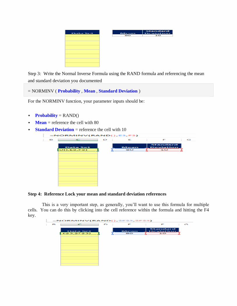
Step 3: Write the Normal Inverse Formula using the RAND formula and referencing the mean
and standard deviation you documented
= NORMINV ( Probability , Mean , Standard Deviation )
For the NORMINV function, your parameter inputs should be:
Probability = RAND()
Mean = reference the cell with 80
Standard Deviation = reference the cell with 10
Step 4: Reference Lock your mean and standard deviation references
This is a very important step, as generally, you’ll want to use this formula for multiple
cells. You can do this by clicking into the cell reference within the formula and hitting the F4
key.
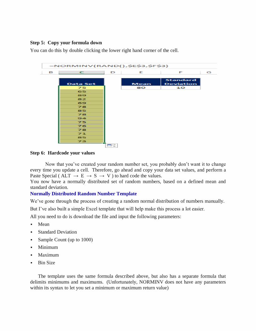
Step 5: Copy your formula down
You can do this by double clicking the lower right hand corner of the cell.
Step 6: Hardcode your values
Now that you’ve created your random number set, you probably don’t want it to change
every time you update a cell. Therefore, go ahead and copy your data set values, and perform a
Paste Special ( ALT → E → S → V ) to hard code the values.
You now have a normally distributed set of random numbers, based on a defined mean and
standard deviation.
Normally Distributed Random Number Template
We’ve gone through the process of creating a random normal distribution of numbers manually.
But I’ve also built a simple Excel template that will help make this process a lot easier.
All you need to do is download the file and input the following parameters:
Mean
Standard Deviation
Sample Count (up to 1000)
Minimum
Maximum
Bin Size
The template uses the same formula described above, but also has a separate formula that
delimits minimums and maximums. (Unfortunately, NORMINV does not have any parameters
within its syntax to let you set a minimum or maximum return value)

Once you’ve set your values, one of the key features of the template is providing you a quick
of the distribution of the random data you’ve created. This is done with the “Count” cells to the
right, which are conditionally formatted with data bars. This basically provides you a histogram
on its side. I didn’t want to go through the trouble of creating a graph because this is supposed to
be a flexible, quick and dirty view of your data. It would defeat the purpose if you had to mess
around with chart formatting as you were playing with your inputs.
Excel Template Settings & Notes To adjust the “histogram”‘view, you should change the minimum and bin size to get the right
view of your data. I’ve included 20 bins for you to work with, but this can be increased by
appending bin numbers and copying the two other formulas down.
I’ve nested the NORMINV formula inside the ROUND function so that the random values
returned are always integers. You can remove this or change the number of decimal places
returned by adjusting the formula.
For the Minimum and Maximum limitations, I’ve made the assumption that if the
NORMINV formula comes up with a value either less than the minimum or greater than the
maximum, it’ll simply return the minimum or maximum respectfully. If this is not desired, you can simply change the logic in the “Accounting for Min and Max Limits” field.
If you need to add more numbers to your random sample (more than 1,000 values), you can
simply insert rows into the data portion of the template and copy down the formulas.
Note that any time you recalculate you save or add new values, your data set will change
because the RAND function will recalculate.
To save your values, all you need to do is copy from the green cells and do a Paste
Special → Values to hardcode the numbers. I chose not to build in a macro to do this since
this is intended to be a relatively simple template.
BUILDING MODELS IN FINANCE USING SIMULATION:
The projection model we will be developing is one that you might find as the starting point in many forms of analysis. The model will have these key features:
1. It will have historical and forecast numbers for modeling an industrial type of company or business. Forecast numbers can be entered as ‘‘hard-coded’’ numbers (e.g., sales will be 1053 this year and 1106 next year, etc.) or as assumptions (e.g., sales growth next year will be 5 percent, etc.).
2. The income statement, balance sheet, and a cash flow statement follow GAAP.
3. The balance sheet balances: the total assets must equal the total liabilities and net worth. This balancing is done through the use of ‘‘plug’’ numbers (see Chapter 7). With the accounting interrelationships correctly in place, the cash flow numbers will also ‘‘foot’’ (see Chapter 11), i.e., the changes in cash flow must equal the change in the cash on the balance sheet.
----ooOoo----

UNIT-III
EXCEL IN ACCOUNTING
Preparing common size statements directly from trial balance, forecasting financial
statements using excel, analyzing financial statements by using spreadsheet model, excel in
project appraisal, determining project viability.
Risk analysis in project appraisal, simulation in project appraisal, excel in valuation,
determination of value drivers, discontinued cash flow valuation, risk analysis in valuation.
EXCEL IN ACCOUNTING:
Microsoft Office Excel was designed to support accounting functions such as budgeting,
preparing financial statements and creating balance sheets. It comes with basic spreadsheet
functionality and many functions for performing complex mathematical calculations. It also
supports many add-ons for activities such as modeling and financial forecasting, and seamlessly
integrates with external data to allow you to import and export banking information and financial
data to and from other accounting software platforms.
Budgeting and Statements
Microsoft Office Excel ships with templates for creating budgets, cash-flow statements
and profit-and-loss statements, which are some of the most basic documents used in accounting.
In addition, you can download more complex budgeting and statement templates from the Office
website, or purchase specialized templates from third-party vendors and install these in the
application. If you need to create complex or custom budgets or financial statements, you can
either customize an existing template and re-use its elements, or create one from scratch using
the functionality built into Excel.
Spreadsheets
Performing line calculations is a basic accounting task, and Excel spreadsheets are
designed to contain data in a tabular format that supports both in-line and summation
calculations, replacing the need for ticker tape and special accounting calculators. The data in the
spreadsheet is reusable and storable, making Excel more flexible than an accounting calculator
for performing simple calculations and summations. Additionally, you can create charts and
graphs from the spreadsheet data, creating a media-rich user experience and different views of
the same data. You can also use add-ons to mine the data and create models and financial
forecasts.
External Data
You can import data from many different data sources into Excel. This is especially
useful for accounting as you can pull sales data, banking data and invoices from many sources

into one central workbook to support your accounting activities. The data can be stored in
different databases and file formats prior to importing, allowing you to access data from many
different areas of your business without having to do additional data entry
Integration
Excel integrates with many popular accounting software applications. For example, you
can use the wizards that ship with your preferred accounting software package to map Excel
spreadsheets to your accounting data so you can perform push and pull data operations from both
Excel and your accounting package on demand.
PREPARING COMMON SIZE STATEMENTS DIRECTLY FROM TRIAL
BALANCE:
What the Common-Size Reveals?
The biggest benefit of a common-size analysis is that it can let an investor identify large
or drastic changes in a firm’s financials. Rapid increases or decreases will be readily observable,
such as a rapid drop in reported profits during one quarter or year.
In IBM's case, its results overall have been relatively steady. One item of note is the Treasury stock in the balance sheet, which has grown to more than a negative 100% of total
assets. But rather than alarm investors, it indicates the company has been hugely successful in
generating cash to buy back shares, which far exceeds what it has retained on its balance sheet.
A common-size analysis can also give insight into the different strategies that companies
pursue. For instance, one company may be willing to sacrifice margins for market share, which
would tend to make overall sales larger at the expense of gross, operating or net profit margins.
Ideally the company that pursues lower margins will grow faster. While we looked at IBM on a
stand-alone basis, like the R&D analysis, IBM should also be analyzed by comparing it to key
rivals.
Common size statements directly from trial balance:
A common-size financial statement is displays line items as a percentage of one selected
or common figure. Creating common-size financial statements makes it easier to analyze a
company over time and compare it with its peers. Using common-size financial statements helps
investors spot trends that a raw financial statement may not uncover.
All three of the primary financial statements can be put into a common-size format.
Financial statements in dollar amounts can easily be converted to common-size statements using
a spreadsheet, or they can be obtained from online resources like Mergent Online. Below is an
overview of each statement and a more detailed summary of the benefits, as well as drawbacks,
that such an analysis can provide investors.
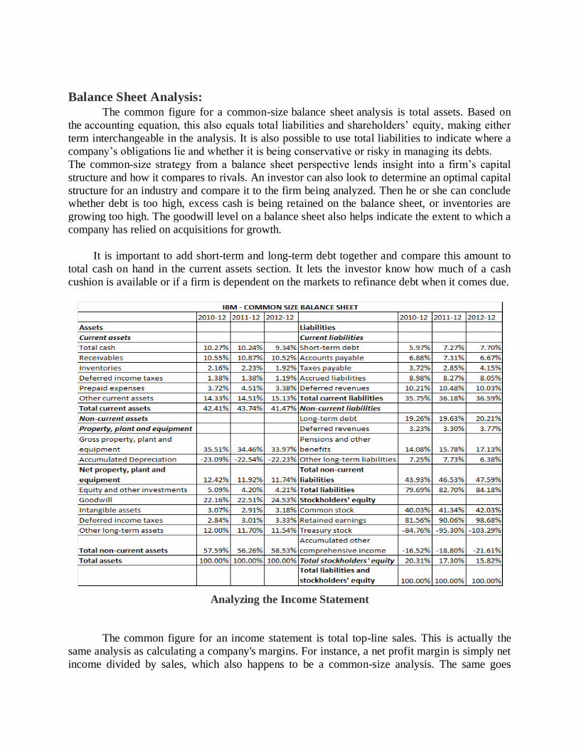
Balance Sheet Analysis:
The common figure for a common-size balance sheet analysis is total assets. Based on
the accounting equation, this also equals total liabilities and shareholders’ equity, making either
term interchangeable in the analysis. It is also possible to use total liabilities to indicate where a
company’s obligations lie and whether it is being conservative or risky in managing its debts.
The common-size strategy from a balance sheet perspective lends insight into a firm’s capital
structure and how it compares to rivals. An investor can also look to determine an optimal capital
structure for an industry and compare it to the firm being analyzed. Then he or she can conclude whether debt is too high, excess cash is being retained on the balance sheet, or inventories are
growing too high. The goodwill level on a balance sheet also helps indicate the extent to which a
company has relied on acquisitions for growth.
It is important to add short-term and long-term debt together and compare this amount to
total cash on hand in the current assets section. It lets the investor know how much of a cash
cushion is available or if a firm is dependent on the markets to refinance debt when it comes due.
Analyzing the Income Statement
The common figure for an income statement is total top-line sales. This is actually the
same analysis as calculating a company's margins. For instance, a net profit margin is simply net
income divided by sales, which also happens to be a common-size analysis. The same goes
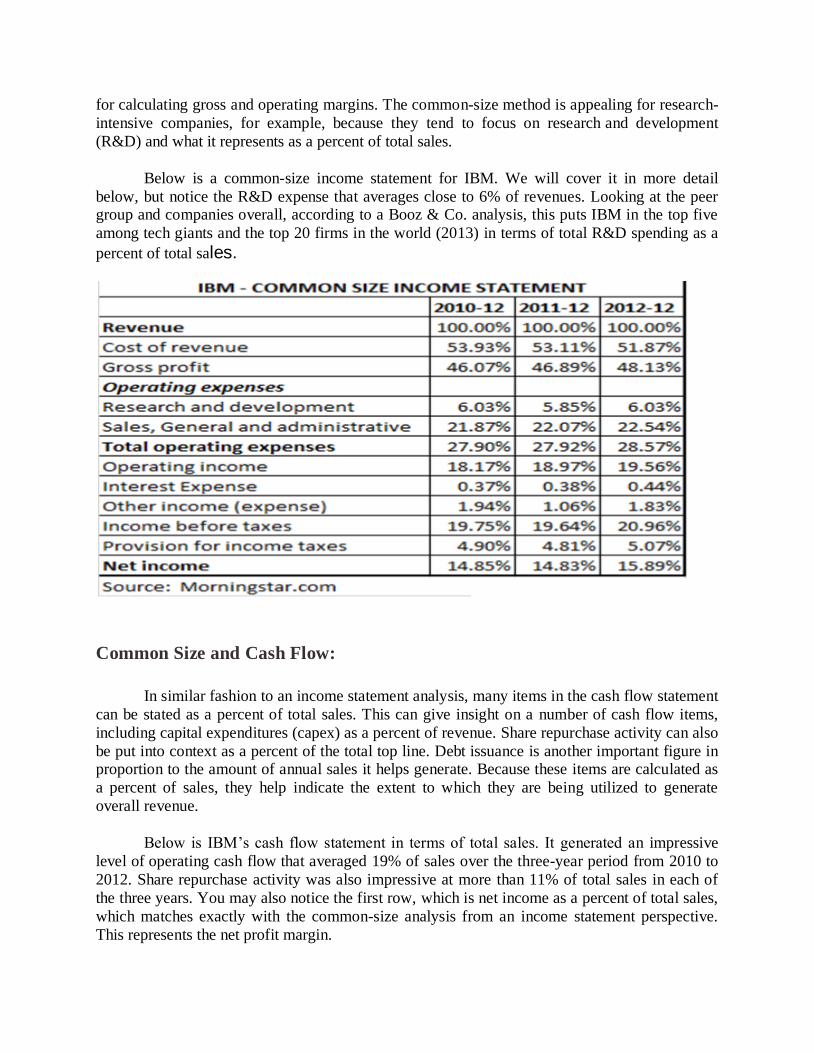
for calculating gross and operating margins. The common-size method is appealing for research-
intensive companies, for example, because they tend to focus on research and development
(R&D) and what it represents as a percent of total sales.
Below is a common-size income statement for IBM. We will cover it in more detail
below, but notice the R&D expense that averages close to 6% of revenues. Looking at the peer group and companies overall, according to a Booz & Co. analysis, this puts IBM in the top five
among tech giants and the top 20 firms in the world (2013) in terms of total R&D spending as a
percent of total sales.
Common Size and Cash Flow:
In similar fashion to an income statement analysis, many items in the cash flow statement
can be stated as a percent of total sales. This can give insight on a number of cash flow items,
including capital expenditures (capex) as a percent of revenue. Share repurchase activity can also
be put into context as a percent of the total top line. Debt issuance is another important figure in proportion to the amount of annual sales it helps generate. Because these items are calculated as
a percent of sales, they help indicate the extent to which they are being utilized to generate
overall revenue.
Below is IBM’s cash flow statement in terms of total sales. It generated an impressive
level of operating cash flow that averaged 19% of sales over the three-year period from 2010 to
2012. Share repurchase activity was also impressive at more than 11% of total sales in each of
the three years. You may also notice the first row, which is net income as a percent of total sales,
which matches exactly with the common-size analysis from an income statement perspective.
This represents the net profit margin.
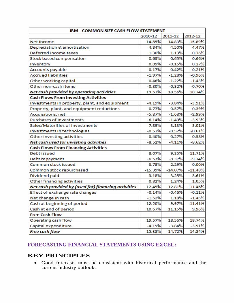
FORECASTING FINANCIAL STATEMENTS USING EXCEL:
KEY PRINCIPLES
Good forecasts must be consistent with historical performance and the current industry outlook.
Look at historical numbers in relationship to others and use these ratios, particularly the operating ratios, to make your projections.
All forecasts are estimates and approximations. Spend the time thinking and developing your ideas about the big picture, not the third decimal place.
If the forecast looks too good to be true, it probably is.
Re-examine your assumptions.
INCOME STATEMENT ACCOUNTS
Revenues
For industrial/manufacturing types of companies, revenues drive the other numbers in the model. Here are things to think about as you make your forecast:
Revenues are the result of three main components: price, industry growth, and market share. Isolating the price growth from inflation will give you the measure for volume growth. Understand that in the context of the economic cycle, and then concentrate on what the drivers for future industry growth and market share might be.
Add back the inflation component (typically very low at 1–2 percent in the United States) to get the full estimate of future revenues growth.
Unless you are looking at new industries (new drugs, new telecommunications), most businesses are mature and should grow at around the growth of the economy. Gross domestic product (GDP) growth rates would be a good proxy. Your particular company’s sales growth will also be affected at different points of the product cycle by new entrants and competing new technologies. Remember also that fast-growing businesses have very dramatic price and volume falls as the demand reaches a certain point. If your company does not have a position of advantage, it will lose market share, and your volume estimates must reflect that.
If your company has product lines that have very different characteristics, it would be worthwhile to forecast the individual product lines. Where they are similar enough, it is better to think in broad aggregate terms and forecast only one revenue line. There is no need to get super precise price and volume numbers for the forecast years.
Take into account the characteristics of the industry your company is in. Some industries have price controls or restrictions, which would limit your own forecasts.
Margin Assumptions
Analyze the trends in the historical accounts, such as cost of goods sold as percentage of sales, SG&A (sales, general & administrative) as percentage of sales, etc. Your forecasts should be consistent with these trends, while taking into account what you know of any improvements or changes in the company’s operating systems.
If there have been striking changes in the margins, you should try to understand the reason.
Look at the trends in the context of the economic and product cycles.
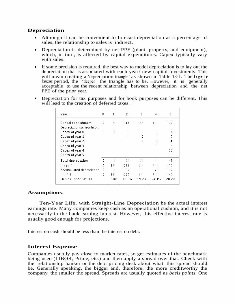
Depreciation
Although it can be convenient to forecast depreciation as a percentage of sales, the relationship to sales is indirect.
Depreciation is determined by net PPE (plant, property, and equipment), which, in turn, is affected by capital expenditures. Capex typically vary with sales.
If some precision is required, the best way to model depreciation is to lay out the depreciation that is associated with each year ’s new capital investments. This will mean creating a ‘‘depreciation triangle’’ as shown in Table 13-1. The longer the forecast period, the ‘‘deeper ’’ the triangle has to be. However, it is generally acceptable to use the recent relationship between depreciation and the net PPE of the prior year.
Depreciation for tax purposes and for book purposes can be different. This will lead to the creation of deferred taxes.
Year
0
1
2
3
4
5
Assumptions:
Ten-Year Life, with Straight-Line Depreciation be the actual interest
earnings rate. Many companies keep cash as an operational cushion, and it is not
necessarily in the bank earning interest. However, this effective interest rate is
usually good enough for projections.
Interest on cash should be less than the interest on debt.
Interest Expense
Companies usually pay close to market rates, so get estimates of the benchmark being used (LIBOR, Prime, etc.) and then apply a spread over that. Check with the relationship banker or the debt pricing desk about what this spread should be. Generally speaking, the bigger and, therefore, the more creditworthy the company, the smaller the spread. Spreads are usually quoted as basis points. One

basis point is one one-hundredth of a percent. So 100 basis points is equivalent to 1 percent.
Check also the historical effective interest rates that the company has been paying. (Remember to do so by dividing the interest expense by the average of the beginning and ending total debt.) If these rates seem very high, they may be due to seasonal borrowings. The company draws down on its line of credit during the year and, therefore, pays interest, but pays off the debt before the reporting date. The result is that there is a record of the interest expense in the income statement, but no record on the balance sheet of the debt that produced it. This is normal operating procedure, by the way, and there is nothing sneaky about it.
Taxes
Taxes should be taxed at statutory rates, and they should also reflect local rules in effect for the company. If there are any deviations from these rates, you should try to find out the reasons why, and if they are sustainable.
Deferred taxes occur when the provision for taxes in the book basis is different from the actual taxes paid on the tax basis. These occur usually because of different book-basis and tax-basis depreciation schedules that the company has adopted, or from net operating losses. Their complexity puts them beyond the scope of this chapter.
Extraordinary Items:
This is a tricky line since, by its very nature, items here are not easily forecast. If you have specific information about these items from the company, by all means include it. Otherwise, it may be best not to try to do any forecasts.
Dividends:
The best way to forecast dividends is by multiplying the num- ber of shares by a historic dividends per share number grown at a reasonable rate. You should watch out for the following, though:
Use the correct number of shares, which is the weighted average shares outstanding. The plain shares outstanding refers to the number at the reporting date, but this does not take into account that there may have been changes in the shares outstanding over the year. It is also important t o reflect the timing of the changes, which is why the weighted average number is used. Typically, this information is available in the annual reports. If you do not have this number, a proxy is to take the average of the shares outstanding at the beginning and the end of the reporting period.
Compute the historic dividends per share numbers yourself. If they reconcile with the historic figures, then you have a good basis for using them as the basis for calculations of future dividends, plus a growth rate that roughly equals the growth of the economy and/or the industry. If they do not reconcile, it may be because of stock splits or rights issues. Companies’ dividends usually grow at a steady rate, but the growth can stop if earnings go into a dip.

BALANCE SHEET
Cash
There are two kinds of cash account in the model. One is the cash that the
company needs to have on hand to handle day-to-day expenses. We can think of
this as ‘‘minimum cash.’’ You can attach an interest rate to this, but more likely than
not, this cash is not kept in the bank and so it is not earning interest. Because this
cash also reflects operational needs, it makes sense to forecast this as a
percentage of sales.
The other is the cash that is automatically produced by the model when
liabilities and equity exceed assets—the Surplus funds row. You do not forecast
this account directly. Rather, is a result of the forecast assumptions you make for other parts of the balance sheet and indeed the income statement, too. (It may be
that your assumptions will create a need for additional debt, in which case you
would not see the Surplus funds line.) To the extent that you will have Surplus
funds, make sure that you enter an interest rate.
Short-Term Investments
If your company has this account, you may want to forecast the same level going
forward, without any growth. By holding it steady, you will be able to see more
clearly the rate of buildup in Surplus funds or Necessary to finance.
Operating Assets and Liabilities
A large part of the balance sheet is there to support sales. As sales grow, these operating assets and operating liabilities must also grow by a more-or-less proportionate rate. As a result, you can forecast them based on a relationship to revenues in the income statement.
o The operating assets are:
o Accounts receivable
o Inventory
o Other current assets
o Net PPE
Other assets. You should check if these are related to operations or investments; if the latter, they should be forecast at some growth rate, not as a percentage of sales.
The operating liabilities are:
Accounts payable
Other current liabilities
You can project these items on the basis of the last historical year, but you should take into account any variations from trends that are booming or reversing. Any unusual or extreme change is a call for delving further into the information to find out what the reasons may be.
The net PPE number is a tricky one to forecast, and the forecast numbers are determined by two main flows: capital expenditures (which add to the gross PPE number) and deprecia- tion (which flows into accumulated depreciation and reduces the gross PPE number). The production base to support sales is a function of many things, including the product being produced, the technology in place, and the scale of production. These—and other factors—represent a ‘‘habit’’ of the production systems in the company. The net result is a net PPE number that should have some discernible and steady relationship to sales. Thus, a good way to forecast net PPE is first to determine the net PPE to sales ratio and then to use that as the basis of forecasting net PPE. If we have a depreciation schedule, then, in fact, the capital expenditures number becomes the ‘‘plug’’ number in the calculation of net PPE.
Some pointers:
u If the latest net PPE to sales ratio is high, this probably reflects recent investments to modernize the plant. We can let this ratio trend down to the historical rates, and, as a result, future capex will also show a downward trend until the ratio meets the historical levels.
u If the ratio is low, this probably means that there will be a need for heavy investments soon.
u This measure of net assets to sales should be relatively steady over the forecast period. The logical test is to extend the projection period into perpetuity. If this ratio is trending upward, then we will have a company that will be extremely asset intensive. Likewise, if it is trending downward, we will have a company that will generate huge revenues on a sliver of a PPE base.
ANALYZING FINANCIAL STATEMENTS BY USING SPREADSHEET
MODEL:
Spreadsheets provide a roadmap of analysis. The maps present the big picture and delineate the “territories,” i.e., the major components of analysis. These maps help users keep the
big picture in mind as they work through the details. The spreadsheets provide a template that
can be filled in with real data for hands-on illustrations. The power of spreadsheets becomes
apparent when one compares them to the traditional sequence of text narratives, algebraic
derivations, numerical examples, and computations of metrics for real cases. Spreadsheets
condense this teaching material by an order of magnitude and enable what-if analyses. In
addition to condensing the material and presenting it using spreadsheets, our materials also clean
up the terminology and provide a logical sequence of otherwise disparate topics. They show how
valuation drives FSA.
As to the use of the materials for actual investment analysis, these spreadsheets have
three distinct uses. First, they provide three new metrics namely long-run return on book equity
(ROBE), adjusted cash earnings (ACE), and excess implied return (EIR). Second, they
summarize otherwise detailed models. Investment managers often face models that are too
detailed and overwhelming. By bolting our summary spreadsheets and metrics as “dashboards”
on top of these detailed models, the investment managers can internalize the key drivers of these

models. Third, the spreadsheets show the equivalence of various valuation approaches used in
practice. This helps investment managers reconcile apparent differences between various
approaches.
There are four spreadsheets on FSA and four on valuation. They are arranged in the
increasing level of sophistication. The spreadsheets are accompanied by text narratives, which total about 60 pages. We elaborate upon the materials below:
Objective 1: Illustrate the concepts as well as their practical application
Much effort has been put into condensing the material. Key features are:
Each spreadsheet lays out the conceptual map by delineating the (i) inputs required from
financial statements, (ii) the building blocks of analysis and valuation, and (iii) the
equations and the steps required to produce key analytical outputs.
The spreadsheets are parsimonious. Multiple variations of a key ratio are omitted because
they slow down an understanding of the relevant concepts. The spreadsheets require few
inputs that can be easily extracted from financial statements. This speeds up real case
analysis.
Spreadsheets enable “what if” analyses, which are hard to do using a traditional approach.
The technology and design of spreadsheets reduce the need for extensive textual narratives.
Accordingly, the narratives are an order of magnitude shorter than a typical textbook.
The materialsomit accounting and finance details. A rigorous prior course in financial accounting and another in finance should suffice. The spreadsheets highlight “advanced”
sections that may be skipped.
Objective 2: Provide a coherent framework and terminology
The logical flow of spreadsheets provides an organizing framework for FSA and
valuation. The flow underscores how valuation motivates FSA and how FSA supports valuation.
The framework lists specific steps for conducting “hands on” FSA and valuation. Core concepts
are highlighted and reinforced repeatedly.
The spreadsheets use consistent terminology that ties in to valuation precepts. They clean
up and standardize the somewhat inconsistent and diverse terminology used in practice.
Specifically, we do not use the term “operating” because of its ambiguous usage in GAAP and in
practice. We categorize all line items in the financial statements into enterprise versus financial
items.
Objective 3: Provide new metrics based on latest research
The spreadsheets incorporate the latest research ideas in accounting-based valuation. They
also develop new concepts that have not yet been discussed in research and practice.
Organization and brief description of the spreadsheets
The spreadsheets comprise two sets – FSA and valuation. The table below summarizes their
brief headings:

FSA Valuation
FSA1: Enterprise vs. financial activities VAL1: Forecasting and valuation of cash
flows
FSA2: Extracting recurring enterprise
income
VAL2: Dividends, book values, and earnings
FSA3: Long-run historical ROE and IRR VAL3: Adjusted analyst forecasts
FSA4: Adjusted Cash Earnings (ACE) VAL4: Excess Implied Return (EIR)
[No one-to-one correspondence between FSA and valuation spreadsheets is implied.]
FSA and valuation are intertwined.Valuation requires projecting future performance. One
of the ingredients of such projections is analysis of the past performance gleaned from FSA.
Thegoal that FSA shouldsupport valuation helps narrow the scope of the FSA spreadsheets; we
leave out analyses from the perspective of regulators, lenders, and consumers, etc.
The foundation: FSA1 and VAL1
FSA1 and VAL1 explain the core concepts necessary to understand the remaining
spreadsheets.FSA1 provides the historical metrics necessary for projecting the key inputs in
VAL1, and thus the relevance of FSA1becomes apparent when one studies VAL1. Conversely,
VAL1 relies on terminology and derivations explained in FSA1. Therefore, one should refer back
and forth between FSA1 and VAL1 to understand both.
FSA1: Enterprise vs. financial activities
This spreadsheet is the foundation for FSA. It does the following:
Categorizes all items in the balance sheet and income statement into enterprise versus
financial items.
Derives enterprise cash flows as enterprise profits after tax minuschange in net enterprise
assets.
Showshow enterprise cash flows have been financed if they are negative, or how they have been disbursed if they are positive.
Computes key enterprise performance metrics such asenterprise profit margin after tax, net
enterprise assets needed to generate sales, and return on invested capital. These enterprise
performance metricsare used as inputs inforecasting future enterprise cash flows in VAL1.
Shows how return on equity depends on return on invested capital and leverage.
VAL1: Equity valuation using the discounted cash flows model
The spreadsheet provides the framework for making the decision to invest in a stock. The
first part of the spreadsheet computes intrinsic value using the DCF valuation model and the
second step develops net income forecasts, which can be compared with analyst forecasts and are
used to compute the forward PE ratio.The spreadsheet does the following:
Part 1: The DCF model
Forecasts enterprise cash flows by projecting the drivers of enterprise cash flows identified
in FSA1. These drivers are – sales, enterprise profit margin after tax, and net enterprise
assets needed.
Enterprise cash flows = enterprise profit after tax – change in net enterprise assets
Sales = sales * (1 + forecasted sales growth)
Enterprise profit after tax = sales * forecasted enterprise profit margin after tax
Net enterprise assets = sales * forecasted ratio of net enterprise assets to sales
Discounts the enterprise cash flows at the enterprise cost of capital (wacc) to arrive at
enterprise value
Derives equity value by subtracting net financial liabilities from enterprise value
Part 2: Forecasting of net income and dividends for relative valuation
Net financial liabilities = net enterprise assets * forecasted ratio of net financial liabilities
to net enterprise assets
Net financial expense = net financial liabilities * forecasted net financial expense rate
Net income = enterprise profit after tax - net financial expense after tax. These forecasts of
net income can be compared to net income forecasts provided by analysts.
Computes three key valuation metrics for relative valuation: forward PE ratio, forward
dividends to price ratio, and the price to book ratio
The three remaining FSA spreadsheets
These remaining FSA spreadsheets are self-contained once the reader is familiar with FSA1 and
VAL1.
FSA2: Extracting data needed to forecast enterprise cash flows
FSA1 and VAL1 highlight that margins, growth, and net enterprise asset intensity drive
enterprise cash flows. This spreadsheet computes these drivers for historical financial statements.
Historical values are a starting point for forecasting these drivers going forward.
This spreadsheet does the following:
Separatesrecurring items from non-recurring items and primary activities from secondary
activities.
Computes the primary and secondary enterprise profit margin, and their related tax rates.
These margins and tax rates are key inputsin the forecasting of enterprise profit after tax.
Computes the net enterprise assets needed relative to salesfrom primary activities. The
ratio of enterprise profits after tax to net enterprise assets yields RNEA or ROIC.
Computes the growth rate in sales and compares it to the growth rate in enterprise profits.

FSA3: Historical Long-run Return on Equity and IRR
Short-term metrics such as ROE are sensitive to accounting idiosyncrasies, which
diminishes their usefulness as performance benchmarks. This spreadsheet develops long-run
ROE and ROIC measures to remedy these problems. Specifically, this spreadsheet does the
following:
Shows how to compute historical ROE over multiple periods. This multi-period ROE is less
sensitive to accounting idiosyncrasies compared to annual ROE, and thus is a better
predictor of future ROE.
Compares this multi-period historical ROE to historical IRR, which is a market-value based
measure of historical performance over multiple periods.
A separate spreadsheet shifts the analysis to the enterprise level and shows how to compute
historical multi-period ROIC and unleveraged internal rate of return.
FSA4: Adjusted Cash Earnings (ACE)
This spreadsheet develops a new measure of earnings, which we call Adjusted Cash
Earnings (ACE). The difference between reported earnings and ACE measures the potential bias in reported earnings. A positive biaspredictsa decline in future profit margin, and vice versa.
Specifically, the spreadsheet does the following:
Defines hard assets and hard liabilities. Some assets and liabilities are “hard” in the sense
that they are objectively measurable, while others are “soft” in the sense that their valuation
requires judgments. Examples of hard items are cash and marketable securities, and short-
duration accounts receivables and payables. Examples of soft items are inventories, PP&E,
intangible assets, deferred taxes, reserves and allowances, and deferred revenues.
The susceptibility of accounting income to the measurement errors in these “soft” items has
led some to ignore ALL accounting accruals and focus just on cash. They define cash earnings as change in cash minus net dividends. This view is too narrow and misses the
reality that many items on the balance sheet are as hard as cash.
Derive hard earnings: We define “hard” equity as “hard” assets minus “hard” liabilities. We
define hard earnings as change in hard equity minus net dividends.
Derive adjusted hard earnings, which we call Adjusted Cash Earnings: Considering changes
in only the hard equity is too narrow especially for growth firms. The soft equity, which is
difference between reported equity and hard equity, grows with sales.We therefore define
adjusted hard earnings as hard earnings plus growth in soft equity in proportion to sales growth. We call these adjusted hard earnings as Adjusted Cash Earnings to connect with the
use of the term Cash Earnings in the real world.
The three remaining valuation spreadsheets
Following VAL1 (and FSA1), the remaining valuation spreadsheets (2-4) are essentially
self-contained. However, we recommend that they be read in order.

VAL2: Valuation anchored on dividends, book values, and earnings
Many valuation approaches are often used in practice. This spreadsheet shows the
conceptual equivalence of these approaches. It then explains why different equivalent approaches
are still useful by showing how each approach connects with a popular valuation metrics such as the dividend yield, market to book ratio, and the P/E ratio. Specifically, this spreadsheet does the
following:
Describes the three transformations of the dividend discount model (DDM). These three
transformations are the dividend growth model, book value growth model (aka RIV), and
earnings growth model (aka AEG).
Demonstrates the equivalence of these three transformations for equity valuation.
Explains how these transformations explain the drivers of the three valuation metrics used
in practice – dividend yield, price to book ratio, and price to earnings ratio.
A separate spreadsheet provides an enterprise-level version of VAL2.
Transformation of
DDM
Valuation metric used by
practitioners
Anchor: Starting point in
valuation
Dividend growth model Dividend yield Forthcoming dividend/cost of
equity
Book value growth
model
Price to book ratio Current book value
Earnings growth model Price to forthcoming earnings
ratio
Forthcoming earnings/cost of
equity
VAL3: Adjusted analyst forecasts
Analyst forecasts can be optimistic. This spreadsheet shows how the analyst forecasts can
be adjusted to correct for some of the common biases. Specifically, this spreadsheet does the
following:
Adjusts analyst forecasts by removing expectations of margin expansion. Such adjustments
are useful if one considers margin expansion to be optimistic.
Adjusts earnings growth for earnings foregone on dividends paid. This adjustment facilitates the comparison of earnings growth across firms.
VAL4: Excess Implied Return (EIR)
This spreadsheet develops a screen to identify stocks that appear mispriced considering their risk. It does the following:
Infer the implied return from the current stock price and earnings forecasts. The
implied return is the discount rate that makes the present value of expected future
financial outcomes equal to the current stock price. Thus, the implied return is an IRR
that measures expected return. Our approach differs from the traditional one in the
following ways:
We work directly with analyst earnings forecasts and dividend payout forecasts instead
of developing a DCF model as in VAL1.
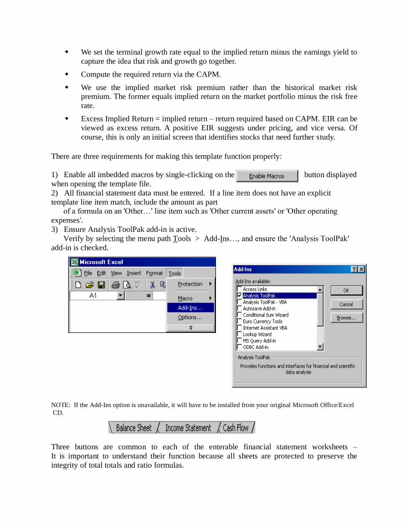
We set the terminal growth rate equal to the implied return minus the earnings yield to
capture the idea that risk and growth go together.
Compute the required return via the CAPM.
We use the implied market risk premium rather than the historical market risk premium. The former equals implied return on the market portfolio minus the risk free
rate.
Excess Implied Return = implied return – return required based on CAPM. EIR can be
viewed as excess return. A positive EIR suggests under pricing, and vice versa. Of
course, this is only an initial screen that identifies stocks that need further study.
There are three requirements for making this template function properly:
1) Enable all imbedded macros by single-clicking on the button displayed
when opening the template file.
2) All financial statement data must be entered. If a line item does not have an explicit
template line item match, include the amount as part of a formula on an 'Other…' line item such as 'Other current assets' or 'Other operating
expenses'.
3) Ensure Analysis ToolPak add-in is active.
Verify by selecting the menu path Tools > Add-Ins…, and ensure the 'Analysis ToolPak'
add-in is checked.
NOTE: If the Add-Ins option is unavailable, it will have to be installed from your original Microsoft Office/Excel
CD.
Three buttons are common to each of the enterable financial statement worksheets –
It is important to understand their function because all sheets are protected to preserve the
integrity of total totals and ratio formulas.
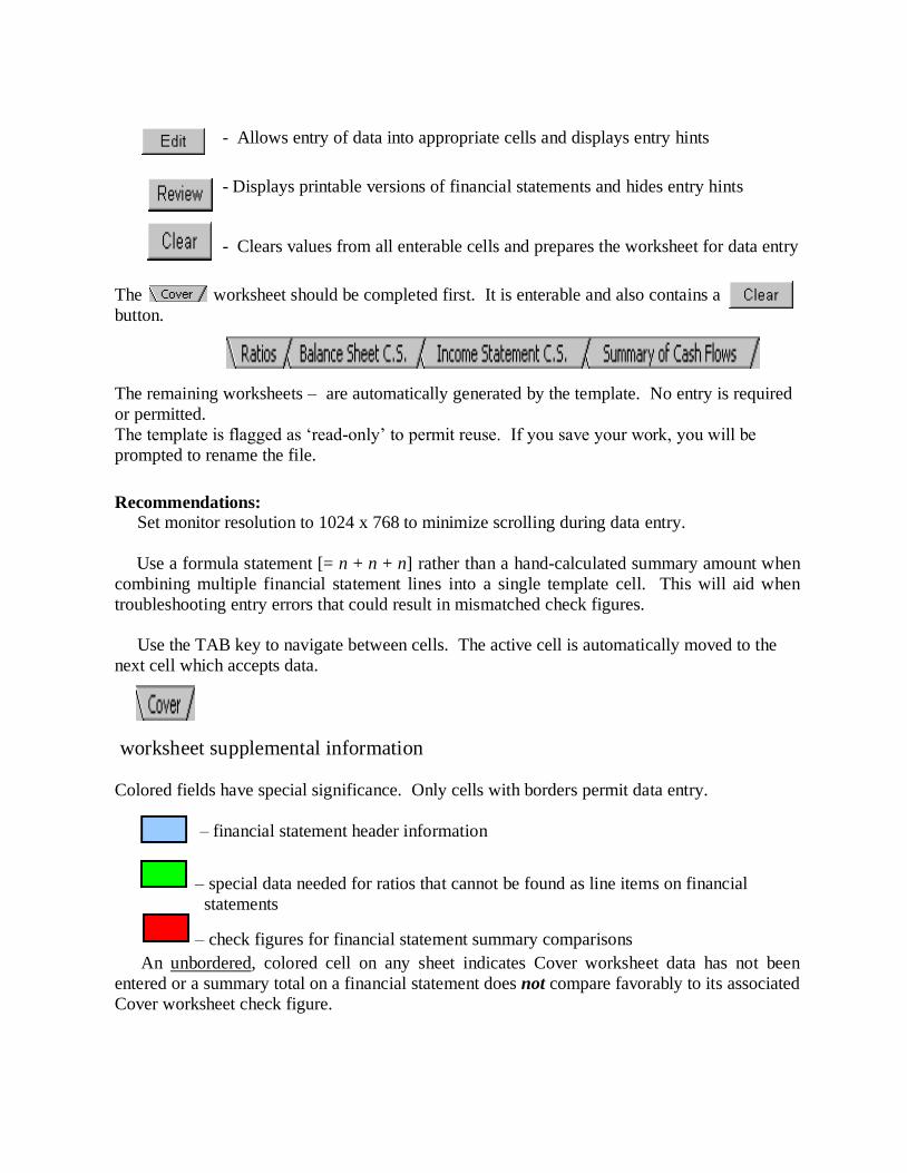
- Allows entry of data into appropriate cells and displays entry hints
- Displays printable versions of financial statements and hides entry hints
- Clears values from all enterable cells and prepares the worksheet for data entry
The worksheet should be completed first. It is enterable and also contains a
button.
The remaining worksheets – are automatically generated by the template. No entry is required
or permitted.
The template is flagged as ‘read-only’ to permit reuse. If you save your work, you will be
prompted to rename the file.
Recommendations:
Set monitor resolution to 1024 x 768 to minimize scrolling during data entry.
Use a formula statement [= n + n + n] rather than a hand-calculated summary amount when
combining multiple financial statement lines into a single template cell. This will aid when
troubleshooting entry errors that could result in mismatched check figures.
Use the TAB key to navigate between cells. The active cell is automatically moved to the
next cell which accepts data.
worksheet supplemental information
Colored fields have special significance. Only cells with borders permit data entry.
– financial statement header information
– special data needed for ratios that cannot be found as line items on financial
statements
– check figures for financial statement summary comparisons
An unbordered, colored cell on any sheet indicates Cover worksheet data has not been
entered or a summary total on a financial statement does not compare favorably to its associated
Cover worksheet check figure.
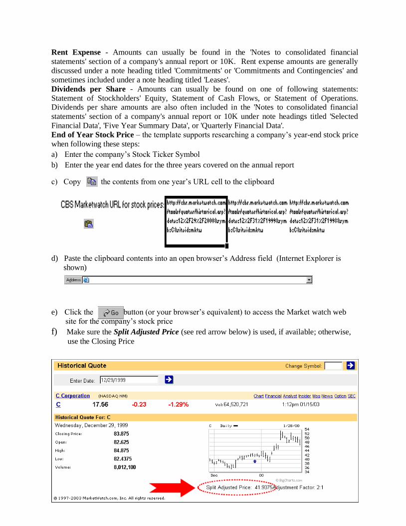
Rent Expense - Amounts can usually be found in the 'Notes to consolidated financial
statements' section of a company's annual report or 10K. Rent expense amounts are generally
discussed under a note heading titled 'Commitments' or 'Commitments and Contingencies' and
sometimes included under a note heading titled 'Leases'.
Dividends per Share - Amounts can usually be found on one of following statements:
Statement of Stockholders' Equity, Statement of Cash Flows, or Statement of Operations. Dividends per share amounts are also often included in the 'Notes to consolidated financial
statements' section of a company's annual report or 10K under note headings titled 'Selected
Financial Data', 'Five Year Summary Data', or 'Quarterly Financial Data'.
End of Year Stock Price – the template supports researching a company’s year-end stock price
when following these steps:
a) Enter the company’s Stock Ticker Symbol
b) Enter the year end dates for the three years covered on the annual report
c) Copy the contents from one year’s URL cell to the clipboard
d) Paste the clipboard contents into an open browser’s Address field (Internet Explorer is
shown)
e) Click the button (or your browser’s equivalent) to access the Market watch web
site for the company’s stock price
f) Make sure the Split Adjusted Price (see red arrow below) is used, if available; otherwise,
use the Closing Price
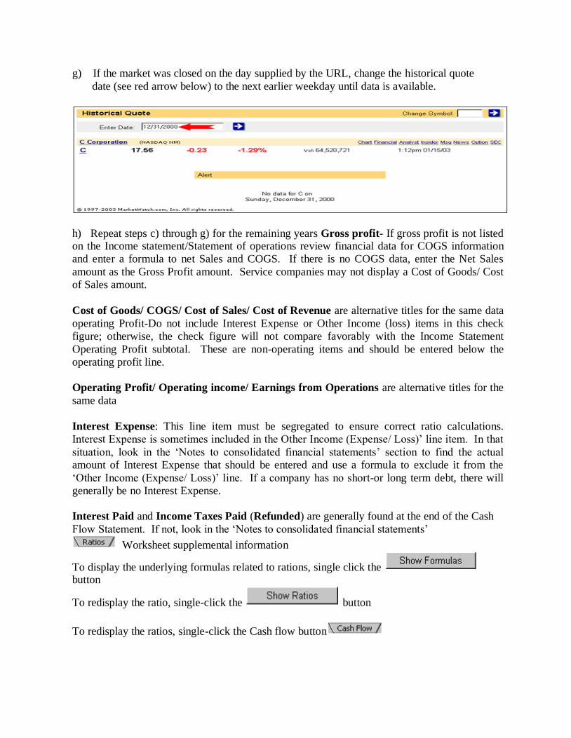
g) If the market was closed on the day supplied by the URL, change the historical quote
date (see red arrow below) to the next earlier weekday until data is available.
h) Repeat steps c) through g) for the remaining years Gross profit- If gross profit is not listed on the Income statement/Statement of operations review financial data for COGS information
and enter a formula to net Sales and COGS. If there is no COGS data, enter the Net Sales
amount as the Gross Profit amount. Service companies may not display a Cost of Goods/ Cost
of Sales amount.
Cost of Goods/ COGS/ Cost of Sales/ Cost of Revenue are alternative titles for the same data
operating Profit-Do not include Interest Expense or Other Income (loss) items in this check
figure; otherwise, the check figure will not compare favorably with the Income Statement
Operating Profit subtotal. These are non-operating items and should be entered below the
operating profit line.
Operating Profit/ Operating income/ Earnings from Operations are alternative titles for the
same data
Interest Expense: This line item must be segregated to ensure correct ratio calculations.
Interest Expense is sometimes included in the Other Income (Expense/ Loss)’ line item. In that
situation, look in the ‘Notes to consolidated financial statements’ section to find the actual
amount of Interest Expense that should be entered and use a formula to exclude it from the
‘Other Income (Expense/ Loss)’ line. If a company has no short-or long term debt, there will
generally be no Interest Expense.
Interest Paid and Income Taxes Paid (Refunded) are generally found at the end of the Cash
Flow Statement. If not, look in the ‘Notes to consolidated financial statements’
Worksheet supplemental information
To display the underlying formulas related to rations, single click the button
To redisplay the ratio, single-click the button
To redisplay the ratios, single-click the Cash flow button

EXCEL IN PROJECT APPRAISAL:
Once you have some understanding of how a spreadsheet works, insert the diskette for
Module 3 obtained from the instructor and navigate around a bit:
(1) The elements needed to compute IRR's at private and social prices have been arranged as
tables along the diagonal (Figure 3.1). This technique of organizing spreadsheet calculations
is sometimes referred to as the "diamondback" method. Its virtue is its flexibility. Once the
template has been completed, additional outputs and inputs can be added simply
by inserting and deleting rows and columns. For example, when the command Format, Insert is used
to create space in the spreadsheet, the computer adjusts all of the cells in the template
accordingly. A new activity can then be added. Only the values for the formulas in the newly
created cells need to be entered. This can done by copying (Edit, Copy) the formulas from
adjacent cells. Other functions performed over a range, e.g., =SUM(), are unaffected and will
include the new cell values without further modification.
(2) The tables are arranged on the spreadsheet in the order they have been discussed in class. The
initial tables contain the physical input-output information relevant to the project (WITH_I-O
and W/O_I-O). Then come tables that contain the calculations on private import and export
parity prices. Following them are tables that calculate the with and without budgets, the
investment costs and ultimately, an IRR. Again, once the template is completed, it can be
modified for any other project simply by changing the labels and by inserting and deleting rows
with the appropriate spreadsheet commands.
(3) To find specific tables, on the diagonal, use the Formula, GoTo command. It calls up a table of all
the named ranges that have been created to identify tables (Formula, Define Name). Moving the cursor to
a table name and clicking the mouse or pressing "Enter" causes the cursor to move directly to
the named cell. With this arrangement, tables are easy to find no matter where they have been
placed on the spreadsheet. The result is a system in which the spreadsheet template can be
made increasingly complicated as new considerations are added without having to redo the
worksheet from scratch.
(4) Cells containing formulas have been protected. This is done by enabling protection for the
entire worksheet and then "unprotecting" the data cells. If you want to change formulas or
insert and delete rows, you will need to disable protection. Because accidents can happen
when cells are unprotected, i.e., formulas can be overwritten, it is a good idea to make a copy
of the spreadsheet you have received before you attempt extensive modifications.
Preparing for Homework Exercise 3
The project to be appraised is the project that was designed in Module 2. Without the project, agriculture consists of growing subsistence grains. Assume that the project will (1)
improve yields, (2) increase cropping intensities, and (3) introduce a more profitable crop mix by
adding a high valued crop (cotton) to the cropping pattern. All agricultural projects derive their
benefits from some combination of these three sources. (Positive incremental net revenues can
also be generated, of course, by cost saving innovations such as labor saving mechanization.)
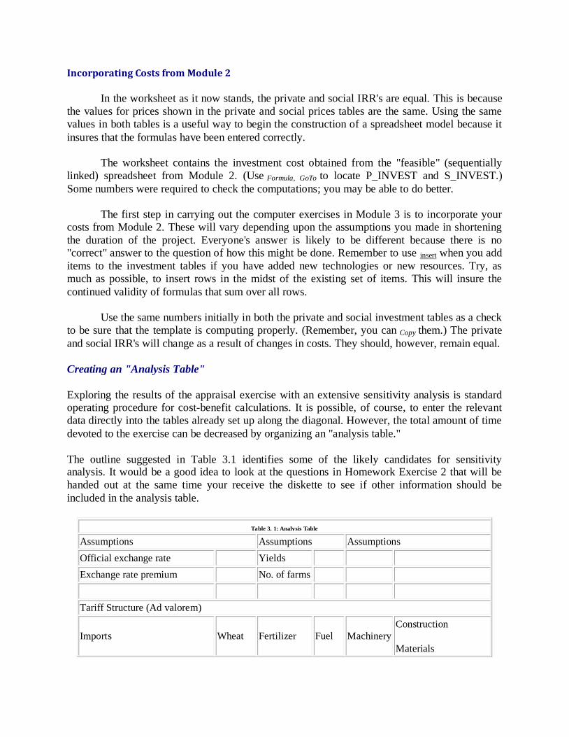
Incorporating Costs from Module 2
In the worksheet as it now stands, the private and social IRR's are equal. This is because
the values for prices shown in the private and social prices tables are the same. Using the same
values in both tables is a useful way to begin the construction of a spreadsheet model because it
insures that the formulas have been entered correctly.
The worksheet contains the investment cost obtained from the "feasible" (sequentially
linked) spreadsheet from Module 2. (Use Formula, GoTo to locate P_INVEST and S_INVEST.)
Some numbers were required to check the computations; you may be able to do better.
The first step in carrying out the computer exercises in Module 3 is to incorporate your
costs from Module 2. These will vary depending upon the assumptions you made in shortening
the duration of the project. Everyone's answer is likely to be different because there is no
"correct" answer to the question of how this might be done. Remember to use insert when you add
items to the investment tables if you have added new technologies or new resources. Try, as
much as possible, to insert rows in the midst of the existing set of items. This will insure the
continued validity of formulas that sum over all rows.
Use the same numbers initially in both the private and social investment tables as a check
to be sure that the template is computing properly. (Remember, you can Copy them.) The private
and social IRR's will change as a result of changes in costs. They should, however, remain equal.
Creating an "Analysis Table"
Exploring the results of the appraisal exercise with an extensive sensitivity analysis is standard operating procedure for cost-benefit calculations. It is possible, of course, to enter the relevant
data directly into the tables already set up along the diagonal. However, the total amount of time
devoted to the exercise can be decreased by organizing an "analysis table."
The outline suggested in Table 3.1 identifies some of the likely candidates for sensitivity analysis. It would be a good idea to look at the questions in Homework Exercise 2 that will be
handed out at the same time your receive the diskette to see if other information should be
included in the analysis table.
Table 3. 1: Analysis Table
Assumptions Assumptions Assumptions
Official exchange rate Yields
Exchange rate premium No. of farms
Tariff Structure (Ad valorem)
Imports Wheat Fertilizer Fuel Machinery
Construction
Materials
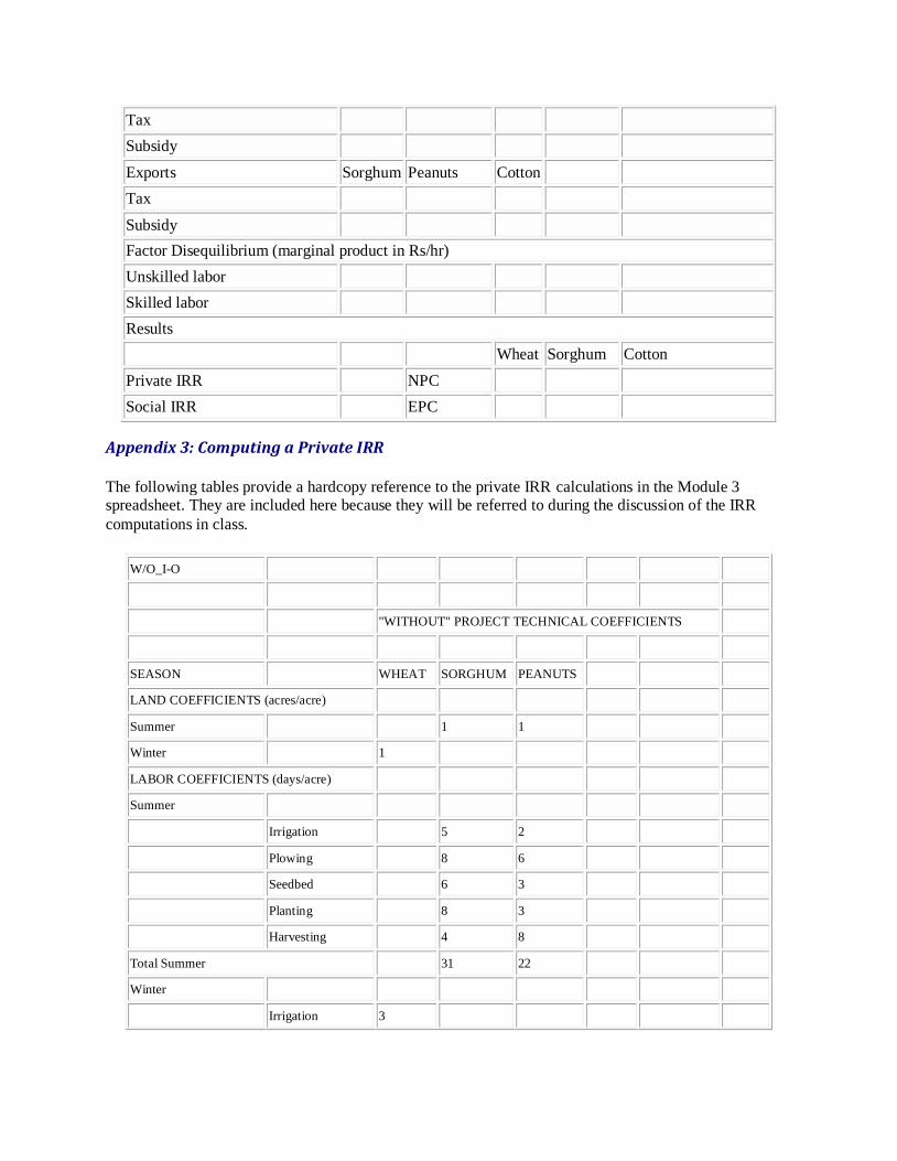
Tax
Subsidy
Exports Sorghum Peanuts Cotton
Tax
Subsidy
Factor Disequilibrium (marginal product in Rs/hr)
Unskilled labor
Skilled labor
Results
Wheat Sorghum Cotton
Private IRR NPC
Social IRR EPC
Appendix 3: Computing a Private IRR
The following tables provide a hardcopy reference to the private IRR calculations in the Module 3 spreadsheet. They are included here because they will be referred to during the discussion of the IRR
computations in class.
W/O_I-O
"WITHOUT" PROJECT TECHNICAL COEFFICIENTS
SEASON WHEAT SORGHUM PEANUTS
LAND COEFFICIENTS (acres/acre)
Summer 1 1
Winter 1
LABOR COEFFICIENTS (days/acre)
Summer
Irrigation
5 2
Plowing
8 6
Seedbed
6 3
Planting
8 3
Harvesting
4 8
Total Summer 31 22
Winter
Irrigation 3
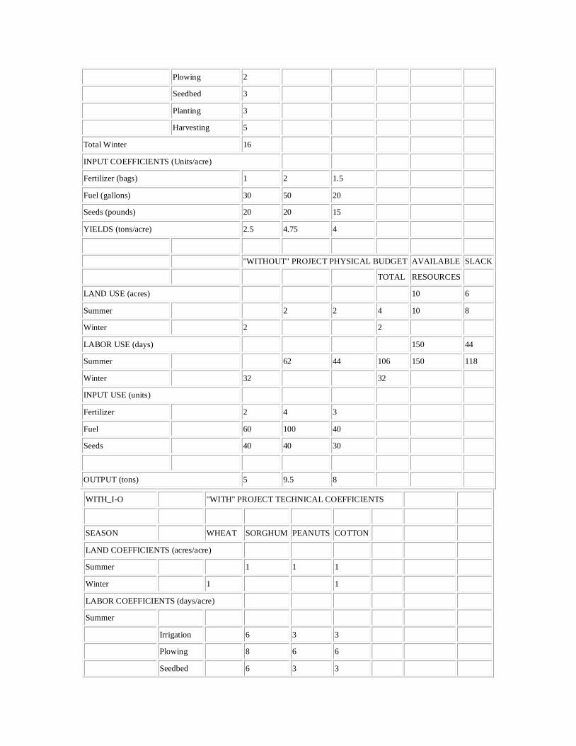
Plowing 2
Seedbed 3
Planting 3
Harvesting 5
Total Winter 16
INPUT COEFFICIENTS (Units/acre)
Fertilizer (bags) 1 2 1.5
Fuel (gallons) 30 50 20
Seeds (pounds) 20 20 15
YIELDS (tons/acre) 2.5 4.75 4
"WITHOUT" PROJECT PHYSICAL BUDGET AVAILABLE SLACK
TOTAL RESOURCES
LAND USE (acres) 10 6
Summer
2 2 4 10 8
Winter 2 2
LABOR USE (days)
150 44
Summer 62 44 106 150 118
Winter 32 32
INPUT USE (units)
Fertilizer 2 4 3
Fuel 60 100 40
Seeds 40 40 30
OUTPUT (tons) 5 9.5 8
WITH_I-O "WITH" PROJECT TECHNICAL COEFFICIENTS
SEASON WHEAT SORGHUM PEANUTS COTTON
LAND COEFFICIENTS (acres/acre)
Summer 1 1 1
Winter 1 1
LABOR COEFFICIENTS (days/acre)
Summer
Irrigation
6 3 3
Plowing
8 6 6
Seedbed
6 3 3

Planting
8 3 5
Harvesting
6 10 20
Total Summer 34 25 37
Winter
Irrigation 4
12
Plowing 2
Seedbed 3
Planting 3
Harvesting 8
Total Winter 20 12
INPUT COEFFICIENTS (Units/acre)
Fertilizer (bags) 3 3 2.5 4
Fuel (gallons) 30 50 20 60
Seeds (pounds) 30 30 15 10
YIELDS (tons/acre) 3 5.2 4.3 2.5
"WITH" PROJECT PHYSICAL BUDGET
WHEAT SORGHUM PEANUTS COTTON TOTAL AVAILABLE SLACK
RESOURCES
LAND USE (acres)
Summer
2 2 3 7 10 3
Winter 2 3 5 10 5
LABOR USE (days)
Summer 68 50 111 229 150 -79
Winter 40 36 76 150 74
INPUT USE (units)
Fertilizer (bags) 6 6 5 12
Fuel (gallons) 60 100 40 180
Seeds (pounds) 60 60 30 30
OUTPUT (tons) 6 10.4 8.6 7.5
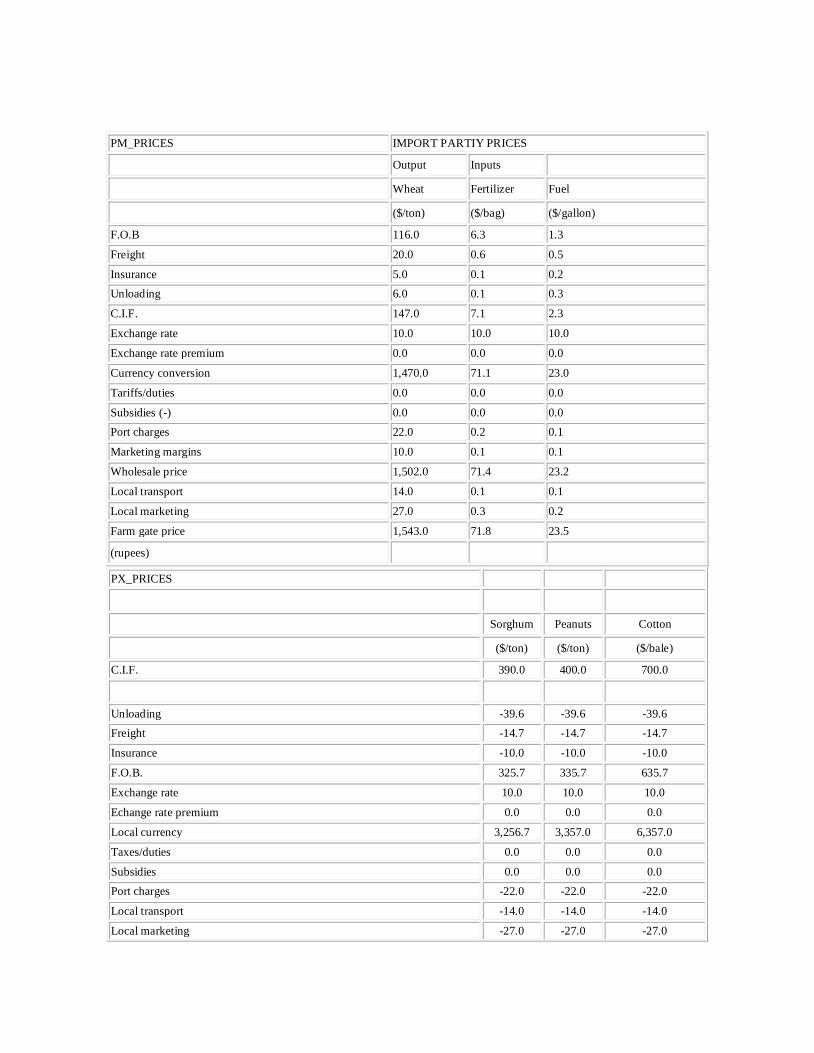
PM_PRICES IMPORT PARTIY PRICES
Output Inputs
Wheat Fertilizer Fuel
($/ton) ($/bag) ($/gallon)
F.O.B 116.0 6.3 1.3
Freight 20.0 0.6 0.5
Insurance 5.0 0.1 0.2
Unloading 6.0 0.1 0.3
C.I.F. 147.0 7.1 2.3
Exchange rate 10.0 10.0 10.0
Exchange rate premium 0.0 0.0 0.0
Currency conversion 1,470.0 71.1 23.0
Tariffs/duties 0.0 0.0 0.0
Subsidies (-) 0.0 0.0 0.0
Port charges 22.0 0.2 0.1
Marketing margins 10.0 0.1 0.1
Wholesale price 1,502.0 71.4 23.2
Local transport 14.0 0.1 0.1
Local marketing 27.0 0.3 0.2
Farm gate price 1,543.0 71.8 23.5
(rupees)
PX_PRICES
Sorghum Peanuts Cotton
($/ton) ($/ton) ($/bale)
C.I.F. 390.0 400.0 700.0
Unloading -39.6 -39.6 -39.6
Freight -14.7 -14.7 -14.7
Insurance -10.0 -10.0 -10.0
F.O.B. 325.7 335.7 635.7
Exchange rate 10.0 10.0 10.0
Echange rate premium 0.0 0.0 0.0
Local currency 3,256.7 3,357.0 6,357.0
Taxes/duties 0.0 0.0 0.0
Subsidies 0.0 0.0 0.0
Port charges -22.0 -22.0 -22.0
Local transport -14.0 -14.0 -14.0
Local marketing -27.0 -27.0 -27.0
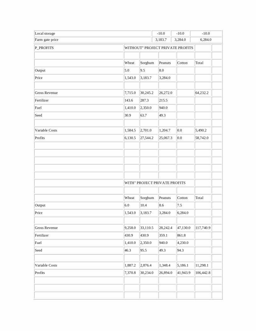
Local storage -10.0 -10.0 -10.0
Farm gate price 3,183.7 3,284.0 6,284.0
P_PROFITS WITHOUT" PROJECT PRIVATE PROFITS
Wheat Sorghum Peanuts Cotton Total
Output 5.0 9.5 8.0
Price 1,543.0 3,183.7 3,284.0
Gross Revenue 7,715.0 30,245.2 26,272.0
64,232.2
Fertilizer 143.6 287.3 215.5
Fuel 1,410.0 2,350.0 940.0
Seed 30.9 63.7 49.3
Variable Costs 1,584.5 2,701.0 1,204.7 0.0 5,490.2
Profits 6,130.5 27,544.2 25,067.3 0.0 58,742.0
WITH" PROJECT PRIVATE PROFITS
Wheat Sorghum Peanuts Cotton Total
Output 6.0 10.4 8.6 7.5
Price 1,543.0 3,183.7 3,284.0 6,284.0
Gross Revenue 9,258.0 33,110.5 28,242.4 47,130.0 117,740.9
Fertilizer 430.9 430.9 359.1 861.8
Fuel 1,410.0 2,350.0 940.0 4,230.0
Seed 46.3 95.5 49.3 94.3
Variable Costs 1,887.2 2,876.4 1,348.4 5,186.1 11,298.1
Profits 7,370.8 30,234.0 26,894.0 41,943.9 106,442.8

DETERMINING PROJECT VIABILITY:
The best way to find out whether your project is feasible is to complete a Feasibility
Study. This process helps you gain confidence that the solution you need to build can be
implemented on time and under budget. So here’s how to do it in 5 simple steps…
Completing a Feasibility Study
A Feasibility Study needs to be completed as early in the Project Life Cycle as possible.
The best time to complete it is when you have identified a range of different alternative solutions
and you need to know which solution is the most feasible to implement. Here’s how to do it…
Step 1: Research the Business Drivers
In most cases, your project is being driven by a problem in the business. These problems are
called “business drivers” and you need to have a clear understanding of what they are, as part of
your Feasibility Study.
For instance, the business driver might be that an IT system is outdated and is causing customer
complaints, or that two businesses need to merge because of an acquisition. Regardless of the
business driver, you need to get to the bottom of it so you fully understand the reasons why the
project has been kicked off.
Find out why the business driver is important to the business, and why it’s critical that the project
delivers a solution to it within a specified timeframe. Then find out what the impact will be to the
business, if the project slips.
Step 2: Confirm the Alternative Solutions
Now you have a clear understanding of the business problem that the project addresses, you need
to understand the alternative solutions available.
If it’s an IT system that is outdated, then your alternative solutions might include redeveloping
the existing system, replacing it or merging it with another system.
Only with a clear understanding of the alternative solutions to the business problem, can you
progress with the Feasibility Study.
Step 3: Determine the Feasibility
You now need to identify the feasibility of each solution. The question to ask of each alternative
solution is “can we deliver it on time and under budget?” To answer this question, you need to use a variety of methods to assess the feasibility of each
solution. Here are some examples of ways you can assess feasibility:
Research: Perform online research to see if other companies have implemented the same
solutions and how they got on.
Prototyping: Identify the part of the solution that has the highest risk, and then build a
sample of it to see if it’s possible to create.
Time-boxing: Complete some of the tasks in your project plan and measure how long it
took vs. planned. If you delivered it on time, then you know that your planning is quite
accurate.
Step 4: Choose a Preferred Solution
With the feasibility of each alternative solution known, the next step is to select a preferred solution to be delivered by your project. Choose the solution that; is most feasible to implement,
has the lowest risk, and you have the highest confidence of delivering.
You’ve now chosen a solution to a known business problem, and you have a high degree of
confidence that you can deliver that solution on time and under budget, as part of the project.
Step 5: Reassess at a lower level
It’s now time to take your chosen solution and reassess its feasibility at a lower level. List all of
the tasks that are needed to complete the solution. Then run those tasks by your team to see how
long they think it will take to complete them. Add all of the tasks and timeframes to a project
plan to see if you can do it all within the project deadline. Then ask your team to identify the
highest risk tasks and get them to investigate them further to check that they are achievable. Use the techniques in Step 3 to give you a very high degree of confidence that it’s practically
achievable. Then document all of the results in a Feasibility Study report.
After completing these 5 steps, get your Feasibility Study approved by your manager so that
everyone in the project team has a high degree of confidence that the project can deliver
successfully.
[contentbox width=”630″ borderwidth=”1″ borderstyle=”dashed” bordercolor=”336699″
dropshadow=”0″ backgroundcolor=”F5F5F5″ radius=”0″]About the Author
Jason Westland has been in the project management industry for the past 16 years managing
projects of up to 2 billion dollars. If you would like to find out more about Jason or about his
new online project management software visit projectmanager.com.[/contentbox] If you are starting a business, planning an investment, or embarking on a project, it
is necessary that you determine whether it is viable or even just feasible for that matter. Knowing
the feasibility and viability of an endeavor or business venture will help evaluate its
sustainability and the success of the project or business.
What is ‘feasibility,’ and what does it entail to get a feasibility study of a project? Likewise, what
is ‘viability,’ and how can one determine if a project is viable or not? Let us define what these
words mean and how they can be done.
Feasibility’ is a study that aims at uncovering the strengths and weaknesses of an existing
business or a proposed business venture. It takes into consideration the opportunities offered by
the environment, its resources, and the subsequent success of the venture. It should include the description of the product or service, its historical background, operational details,
financial data and accounting statements, legal and tax requirements, and its policies
on management and marketing research.
‘Viability,’ on the other hand, is the study or an investigation of the existing business or
proposed venture’s sustainability. It determines whether the proposal should be approved or not.
It involves dealing with strategies on how to make the business grow and last. Business growth is
an important aspect of viability. How long a business will last is determined by its viability, and
it can be seen in the profits that the business has made for a certain period. Good profit means a
better chance at success for the business.
There are several types of feasibility:
Economic feasibility, which uses economic analysis or cost/benefit analysis wherein the benefits are compared with the cost.
Legal feasibility, which deals with the legal requirements.
Operational feasibility, which deals with how to solve problems and take advantage of opportunities.
Schedule feasibility, which deals with the duration of the development and completion of the system and if the schedule or deadline is desirable.

Market and real estate feasibility, which involves testing of the geographical location of the project.
Resource feasibility, which involves the amount of time set for the project and the type
and amount of resources needed.
Cultural feasibility, which studies the project’s impact on the local culture.
Financial feasibility, which includes the total cost of the project, its cash flow, and profitability.
Summary:
1. ‘Feasibility’ is the study of the profitability, strengths, and weaknesses of an existing business
or proposed venture while ‘viability’ is the study of the existing or proposed business’s
profitability. 2. ‘Feasibility’ deals with environmental opportunities, historical backgrounds, operational
details, legal and tax requirements, financial and accounting statements, managerial and market
research policies. ‘Viability’ deals with strategies on how to make the business grow and
succeed.
3. There are many types and aspects of a feasibility study which include financial and cultural
feasibility, legal and operational feasibility, and resource feasibility while business growth and
sustainability are the main aspects of viability.
RISK ANALYSIS IN PROJECT APPRAISAL:
Analyzing the time to complete a project using project planning tools nearly always
underestimates the time to completion. It is not the fault of the software or of the analysts, but of
the use of 'best guess' values for task durations, etc. in the project plan. Risk analysis will allow
you to avoid systematically underestimating project costs and durations.
The project risk analysis course is designed to help those who wish to apply quantitative
risk analysis modeling to project planning problems.
A project is defined as any set of tasks involving resources (human, machine, time,
financial) with well-defined goals. Project risk analysis aims at identifying the risks and
uncertainties that threaten the achievement of those goals or the efficiency with which the project
can be carried out. The techniques are very general and intuitive and require little mathematical
knowledge, but reward the project manager with a clear understanding of the risks being faced
and efficient ways of managing those risks.
SIMULATION IN PROJECT APPRAISAL:
Risk simulation forms an important part of investment appraisal, not least because it
offers a means of examining the impact of uncertainty. Nor is this necessarily confined to
managerial economics, many leading texts on strategic management (Johnson and Scholes,
1999) incorporate risk analysis into the evaluation of new or different strategies.
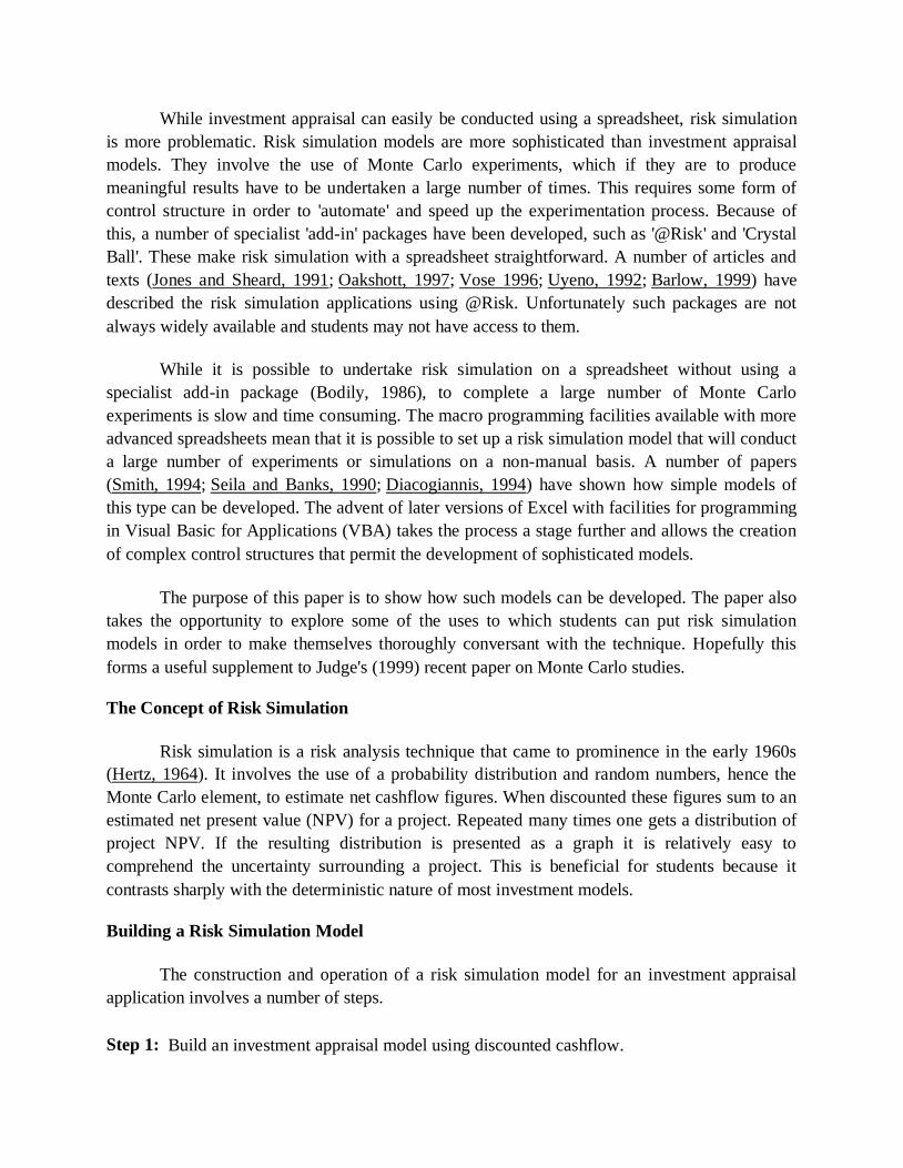
While investment appraisal can easily be conducted using a spreadsheet, risk simulation
is more problematic. Risk simulation models are more sophisticated than investment appraisal
models. They involve the use of Monte Carlo experiments, which if they are to produce
meaningful results have to be undertaken a large number of times. This requires some form of
control structure in order to 'automate' and speed up the experimentation process. Because of
this, a number of specialist 'add-in' packages have been developed, such as '@Risk' and 'Crystal
Ball'. These make risk simulation with a spreadsheet straightforward. A number of articles and
texts (Jones and Sheard, 1991; Oakshott, 1997; Vose 1996; Uyeno, 1992; Barlow, 1999) have
described the risk simulation applications using @Risk. Unfortunately such packages are not
always widely available and students may not have access to them.
While it is possible to undertake risk simulation on a spreadsheet without using a
specialist add-in package (Bodily, 1986), to complete a large number of Monte Carlo
experiments is slow and time consuming. The macro programming facilities available with more
advanced spreadsheets mean that it is possible to set up a risk simulation model that will conduct
a large number of experiments or simulations on a non-manual basis. A number of papers
(Smith, 1994; Seila and Banks, 1990; Diacogiannis, 1994) have shown how simple models of
this type can be developed. The advent of later versions of Excel with facilities for programming
in Visual Basic for Applications (VBA) takes the process a stage further and allows the creation
of complex control structures that permit the development of sophisticated models.
The purpose of this paper is to show how such models can be developed. The paper also
takes the opportunity to explore some of the uses to which students can put risk simulation
models in order to make themselves thoroughly conversant with the technique. Hopefully this
forms a useful supplement to Judge's (1999) recent paper on Monte Carlo studies.
The Concept of Risk Simulation
Risk simulation is a risk analysis technique that came to prominence in the early 1960s
(Hertz, 1964). It involves the use of a probability distribution and random numbers, hence the
Monte Carlo element, to estimate net cashflow figures. When discounted these figures sum to an
estimated net present value (NPV) for a project. Repeated many times one gets a distribution of
project NPV. If the resulting distribution is presented as a graph it is relatively easy to
comprehend the uncertainty surrounding a project. This is beneficial for students because it
contrasts sharply with the deterministic nature of most investment models.
Building a Risk Simulation Model
The construction and operation of a risk simulation model for an investment appraisal
application involves a number of steps.
Step 1: Build an investment appraisal model using discounted cashflow.

Step 2: For each year's net cashflow create a probability distribution and link it to a random
number generator.
Step 3:
Carry out a simulation by drawing a value from each probability distribution using the
random number generator and sum the resulting estimates to provide an overall estimate
for project NPV.
Step 4: Repeat the simulation many times (i.e. 500 or more) to provide an estimated distribution
for NPV for the project.
Step 5: Decide whether the probability that the project NPV may be negative is, or is not an
acceptable risk and proceed accordingly.
Year Discount Factor Net Cashflow Present value
0 1 -85000 -85000
1 0.9091 25000 22727
2 0.8264 25000 20661
3 0.7513 25000 18783
4 0.6830 25000 17075
5 0.6209 25000 15523
NPV 9770
Table 1: Simple Model
Table 1 shows a simple DCF investment appraisal model that can form the basis of a risk
simulation. It utilises cells B2:E11 on the spreadsheet. It is an entirely conventional DCF model.
In column one are the years that the project is operational (B4:B9). The third column shows the
estimates of net cashflow for each year together with the initial cost of the project (D4:D9). In
this instance the initial cost of the project (i.e. purchase of machinery) is �85,000 and the net
cashflow is �25,000 each year for five years. In the second column (C4:C9) is the discounting
factor. For year 0 the value of the discounting factor is one, because it represents the present
time. Thereafter the discounting factor is based on the formula:
PV = 1/(1 = r) n
where PV is present value, r is the discount rate and n is the year. In this instance a discount rate
of 10% is used and the project has a life of 10 years. The discount rate is located in cell C28.
This forms part of the Summary section located in cells B27:E32. Implementing the discounting
formula for cell C5 gives the formula:
+1/(1 + $C$28)^B5

This formula can be copied into cells C6:C9. Column four (E4:E9) shows the present value of
the cashflows, being the result of applying the relevant discount factor to the relevant net
cashflow. In cell E11 is the overall NPV for the project represented by the formula:
+Sum(E4:E9).
In order to implement a risk simulation the following additional capabilities are required of a
spreadsheet:
a) a random number generator such as the function RAND () in Excel which generates a
random variate every time the spreadsheet is recalculated.
b) a macro capability to enable the creation of a sub-routine or procedure that will
automatically implement the simulation a large number of times.
c) a statistical function such as FREQUENCY() in Excel which will enable the
simulation results to be sorted into a frequency distribution.
All of these capabilities are to be found in most modern spreadsheets, but Excel has the
advantage that Visual Basic for Applications provides greater flexibility in creating sub-routines.
To undertake Step 2 the estimated cashflow figures in column two of Table 1 are
replaced by a random variate sampled from an appropriate distribution that represents the range
and frequency of likely values for this entity. In this instance a normal distribution is used. New
values will be generated every time the spreadsheet is recalculated. The probability distribution
is represented by a mean value and associated standard deviation. To be consistent with the
simple model a mean of �25,000 is used and a standard deviation of �10,000. Identical values
are used for every one of the five years of the project. It is the standard deviation that reflects the
level of uncertainty. A high value for the standard deviation, as in this case, means a high level
of uncertainty and thus a high level of risk. One would expect this to be reflected in the resulting
distribution for project NPV.
The probability distribution and random number generator are combined by using the
formula: a + b* (RAND() + RAND()...RAND() - 6) where a is the mean (25,000) and b is the
standard deviation (10,000) and there are twelve calls to the RAND() function. This is the
formula for generating a normally distributed random variate (Seila and Banks, 1990). It is
entered into each of the cells representing net cashflows in the model. These are the only changes
compared to the simple model. Step 2 is now complete and the model can be used to carry out
risk simulations.
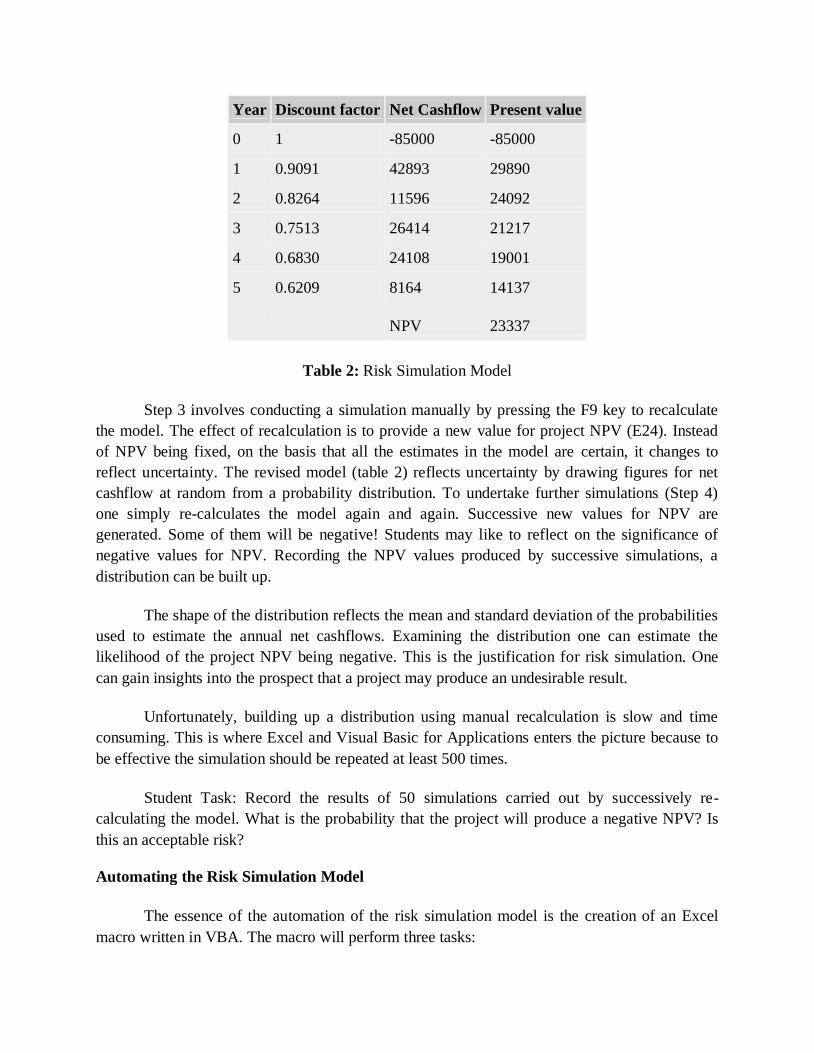
Year Discount factor Net Cashflow Present value
0 1 -85000 -85000
1 0.9091 42893 29890
2 0.8264 11596 24092
3 0.7513 26414 21217
4 0.6830 24108 19001
5 0.6209 8164 14137
NPV 23337
Table 2: Risk Simulation Model
Step 3 involves conducting a simulation manually by pressing the F9 key to recalculate
the model. The effect of recalculation is to provide a new value for project NPV (E24). Instead
of NPV being fixed, on the basis that all the estimates in the model are certain, it changes to
reflect uncertainty. The revised model (table 2) reflects uncertainty by drawing figures for net
cashflow at random from a probability distribution. To undertake further simulations (Step 4)
one simply re-calculates the model again and again. Successive new values for NPV are
generated. Some of them will be negative! Students may like to reflect on the significance of
negative values for NPV. Recording the NPV values produced by successive simulations, a
distribution can be built up.
The shape of the distribution reflects the mean and standard deviation of the probabilities
used to estimate the annual net cashflows. Examining the distribution one can estimate the
likelihood of the project NPV being negative. This is the justification for risk simulation. One
can gain insights into the prospect that a project may produce an undesirable result.
Unfortunately, building up a distribution using manual recalculation is slow and time
consuming. This is where Excel and Visual Basic for Applications enters the picture because to
be effective the simulation should be repeated at least 500 times.
Student Task: Record the results of 50 simulations carried out by successively re-
calculating the model. What is the probability that the project will produce a negative NPV? Is
this an acceptable risk?
Automating the Risk Simulation Model
The essence of the automation of the risk simulation model is the creation of an Excel
macro written in VBA. The macro will perform three tasks:
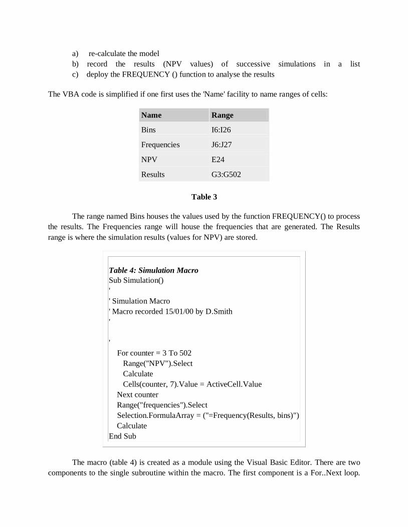
a) re-calculate the model
b) record the results (NPV values) of successive simulations in a list
c) deploy the FREQUENCY () function to analyse the results
The VBA code is simplified if one first uses the 'Name' facility to name ranges of cells:
Name Range
Bins I6:I26
Frequencies J6:J27
NPV E24
Results G3:G502
Table 3
The range named Bins houses the values used by the function FREQUENCY() to process
the results. The Frequencies range will house the frequencies that are generated. The Results
range is where the simulation results (values for NPV) are stored.
Table 4: Simulation Macro
Sub Simulation()
'
' Simulation Macro
' Macro recorded 15/01/00 by D.Smith
'
'
For counter = 3 To 502
Range("NPV").Select
Calculate
Cells(counter, 7).Value = ActiveCell.Value
Next counter
Range("frequencies").Select
Selection.FormulaArray = ("=Frequency(Results, bins)")
Calculate
End Sub
The macro (table 4) is created as a module using the Visual Basic Editor. There are two
components to the single subroutine within the macro. The first component is a For..Next loop.

This selects the cell named NPV (E24), recalculates the model and places the resulting value in
the NPV cell at the top of the range named Results. On the next circuit of the loop the model is
again recalculated and because the counter has been incremented the new value for NPV goes
into the next cell in the Results range. This continues until the counter gets to the last cell in the
Results range, which in this instance is G502. The counter can be set with different values to
undertake more or less simulations.
Results
Bins Frequency Cumulative
Frequency Relative Frequency Cumulative Relative Frequency
-40000 1 1 0.002 0.002
-35000 3 4 0.006 0.008
-30000 3 7 0.006 0.014
-25000 4 11 0.008 0.022
-20000 9 20 0.018 0.040
-15000 22 42 0.044 0.084
-10000 32 74 0.064 0.148
-5000 40 114 0.080 0.228
0 46 160 0.092 0.320
5000 52 212 0.104 0.424
10000 57 269 0.114 0.538
15000 52 321 0.104 0.642
20000 46 367 0.092 0.734
25000 46 413 0.092 0.826
30000 33 446 0.066 0.892
35000 17 463 0.034 0.926
40000 17 480 0.034 0.960
45000 8 488 0.016 0.976
50000 6 494 0.012 0.988
55000 5 499 0.010 0.998
60000 1 500 0.002 1.000

0 500 0.000 1.000
Total 500
1.000
Table 5: Results Table
The second part of the macro involves the use of Excel's FREQUENCY() function. To
enable this function to sort the simulation results effectively, the values stored in the Results
range have to be placed in the cells designated as 'Bins' (I6:I26). This range of cells will form the
right hand column (table 5) of the Results Table (I2:M29). To sort the results likely to be
obtained with the investment model specified, the values range from + 60,000 to - 40,000 with
intervals of 5,000. The frequency produced by executing the FREQUENCY() function appears in
the second column of the Results Table (J6:J27). To produce appropriate graphs of the risk
simulation results, three further columns need to be designated at this stage for Cumulative
Frequency (K6:K27), Relative Frequency (L6:L27) and Cumulative Relative Frequency
(M6:M27). For each of these ranges of cells a formula is required. Cumulative Frequency
requires the formula +J6 in the first cell followed by +K6+J7 in the next cell down. This formula
can then be copied into the remaining cells in the column. The fourth and fifth columns in the
Results Table require the number of simulation results as a denominator. This is obtained by
placing the formula +SUM (Frequencies) in cell J28. The formula for the relative frequency
column is +K6/$J$28. In both instances the formula can be copied down into the remaining cells
in the column. As a check to ensure that all the results have been processed cell L28 contains the
formula +SUM(L6:L27).
Having set up the Results Table, graphs can be specified based on the figures in the
results table. A bar chart will produce a graph of the relative frequency. With probability on the
Y axis and the values shown in the Bins range on the X axis, it will show the distribution of
project NPVs. A line graph based on the cumulative relative frequency with similar axes will
show the cumulative distribution of project NPVs.
The final step is to complete the summary section (B27:E32) on the spreadsheet (Table
6). Using the COUNT() function in C29 will maintain a tally of the number of simulations . The
use of MAX(Results) in E28 and MIN(Results) in E29 will capture the highest and lowest
observations for project NPV. The function AVERAGE() and STDEV() in E30 and E31 will
provide the mean and standard deviation.
Having set up the spreadsheet in this way, lines six to eight of the macro select the range
of cells containing the frequencies generated by successive executions of the simulation loop and
apply the FREQUENCY() function using the Results and Bins ranges as arguments. Finally the
macro recalculates the Results Table in order to generate the relative frequency and cumulative
relative frequency figures.

Using the Risk Simulation Model
To run the risk simulation model one simply selects the SIMULATION macro via the
TOOLS bar. One of the benefits of the model is that values in the NPV cell (E24) change as the
simulations are executed. The simulation results are recorded in the Results range. This facility
can be particularly useful if it is necessary to de-bug the model. Upon completion the simulation
results are summarised in the Results Table. Selecting the graph tabs should produce figures 1
and 2. Finally the Summary section will provide an overview of results.
Figure 1
Figure 2

Model Development
Important though it is to get students using the risk simulation model and analysing the results,
this is really only the beginning. One of the biggest benefits to be gained from using a risk
simulation model without the aid of add-in packages like @Risk is the scope for further model
development.
Modifications to the model could take the form of modifications to both the macro and
the spreadsheet model. Changes to the macro that could be explored include aspects such as
increasing the number of simulations carried out. 500 simulations were used in this instance but
it is a simple matter to increase this to 2,000 or 5,000.
Changes to the model could include the incorporation of some of the following:
an uncertain discount rate
distributions other than the normal one used in this case (note: Seila and Banks
(1990)provide examples of spreadsheet implementations of these and other distributions)
net cashflows being non-independent as poor sales in one year link to the next. This sort
of correlation could be achieved if the mean of the distribution in years two to five was
the value sampled in the previous year
model each year's net cashflows in terms of revenues and costs where each is drawn from
its own probability distribution.
EXCEL IN VALUATION:
There is not a specific function to run a full discounted cash flow model in Excel, but
there are a number of tools to make the exercise much more straightforward. As touched upon in the PV and FV functions on a previous page, it is first necessary to estimate either the present or
future value of a security, and then also estimate its future cash flows. Discounting these cash
flows back by an estimated discount rate will provide a future value. Conversely, starting with a
present value and cash flows can allow the user to back into the estimated future value.
In addition to the above two functions, Microsoft has an IRR function that lets you back
into the discount rate, or specifically the internal rate of return, for a series of cash flows. Excel
points out that this is very closely related to the PV function, meaning the same inputs are
needed, such as an initial present value followed by a string of cash flows.
The below details a specific cash flow stream for an investment, starting with an initial investment of $70.
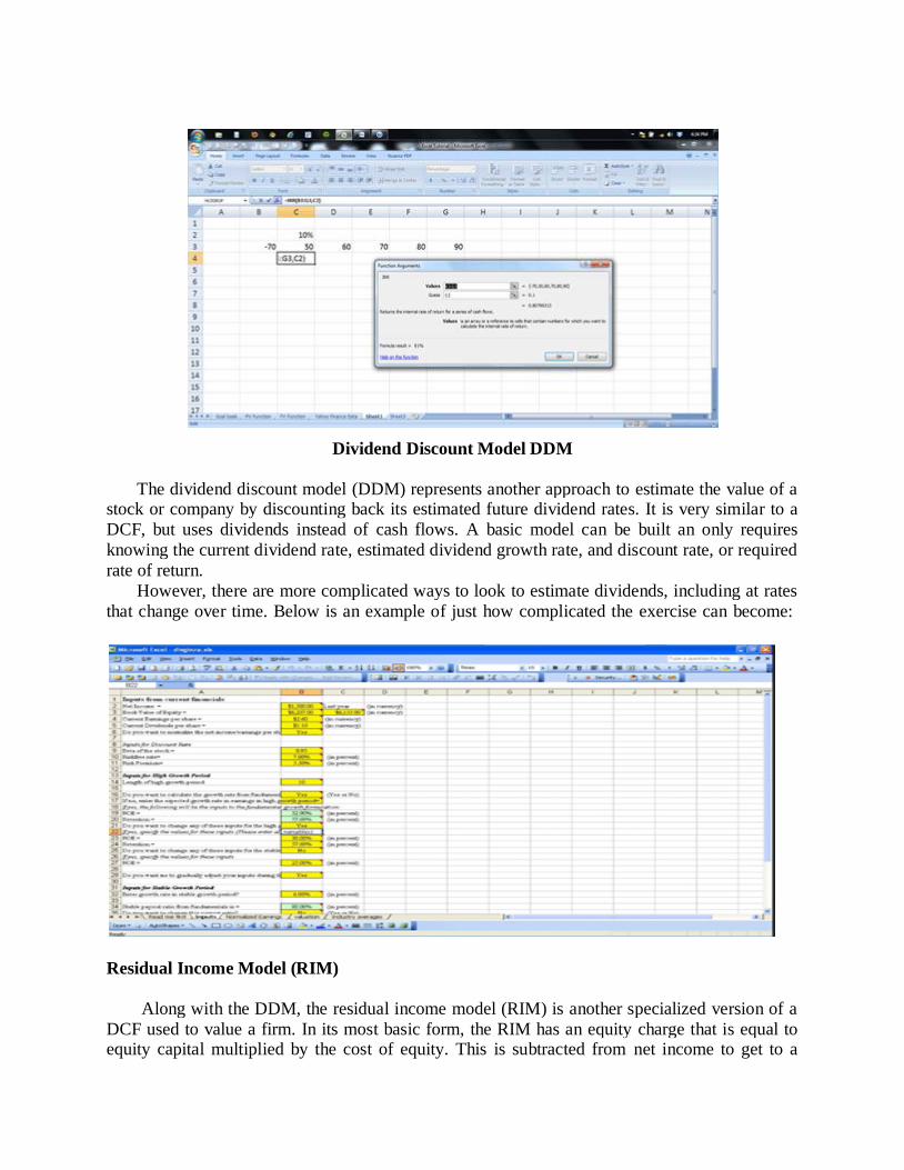
Dividend Discount Model DDM
The dividend discount model (DDM) represents another approach to estimate the value of a stock or company by discounting back its estimated future dividend rates. It is very similar to a
DCF, but uses dividends instead of cash flows. A basic model can be built an only requires
knowing the current dividend rate, estimated dividend growth rate, and discount rate, or required
rate of return.
However, there are more complicated ways to look to estimate dividends, including at rates
that change over time. Below is an example of just how complicated the exercise can become:
Residual Income Model (RIM)
Along with the DDM, the residual income model (RIM) is another specialized version of a
DCF used to value a firm. In its most basic form, the RIM has an equity charge that is equal to equity capital multiplied by the cost of equity. This is subtracted from net income to get to a
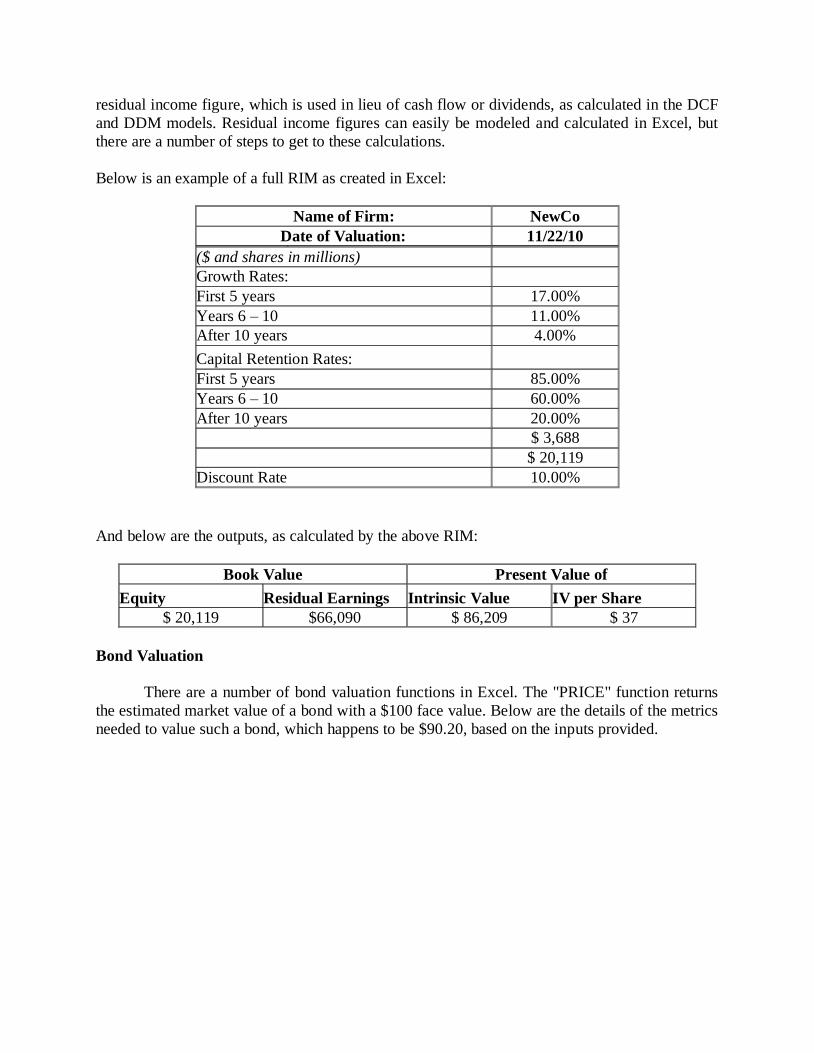
residual income figure, which is used in lieu of cash flow or dividends, as calculated in the DCF
and DDM models. Residual income figures can easily be modeled and calculated in Excel, but
there are a number of steps to get to these calculations.
Below is an example of a full RIM as created in Excel:
Name of Firm: NewCo
Date of Valuation: 11/22/10
($ and shares in millions) Growth Rates:
First 5 years 17.00%
Years 6 – 10 11.00%
After 10 years 4.00%
Capital Retention Rates:
First 5 years 85.00%
Years 6 – 10 60.00%
After 10 years 20.00%
$ 3,688
$ 20,119
Discount Rate 10.00%
And below are the outputs, as calculated by the above RIM:
Book Value Present Value of
Equity Residual Earnings Intrinsic Value IV per Share
$ 20,119 $66,090 $ 86,209 $ 37
Bond Valuation
There are a number of bond valuation functions in Excel. The "PRICE" function returns
the estimated market value of a bond with a $100 face value. Below are the details of the metrics
needed to value such a bond, which happens to be $90.20, based on the inputs provided.

Other bond functions include the ability to calculate a bond's duration, modified duration, yield
to maturity, yield, and discount rate Basically, there is the ability to solve for any variable when valuing a bond.
DETERMINATION OF VALUE DRIVERS:
A value driver is an activity or capability that adds worth to a product, service or brand.
More specifically, a value driver refers to those activities or capabilities that add profitability,
reduce risk, and promote growth in accordance with strategic goals. Such goals can include
increasing shareholder value, competitive edge and customer appeal.
Value drivers are the factors that are likely to have the greatest impact on a company's
success, and they are specific to different industries and companies.
For example, the value drivers motivating a healthcare company to move certain business
processes from on-premises to cloud-based systems would be different than those motivating a
manufacturing company seeking to implement digital manufacturing technology and link
different data silos and processes of the manufacturing lifecycle. Determining a true value driver
requires thinking of long-term gains, and not getting swayed by trendy processes or technologies
that don't add tangible value or are only a short-term win.
There are different categories of value drivers, whether types, such as growth drivers,
operational drivers or financial drivers, or levels, such as generic or business-unit specific.
When action is required to realize a particular value driver -- for example,
managing inventory turns or variables that affect working capital -- the value driver must be
defined at an explicit and commensurate level where action can be taken towards its realization.
For example, a C-level executive has overarching insight and high-level responsibilities that are
very different than that of a front-line manager, yet each can carry out important value-driving
actions.
DISCONTINUED CASH FLOW VALUATION:
The discounted cash flow (DCF) formula is equal to the sum of the cash flow in each
period divided by one plus the discount rate Weighted Average Cost of Capital (WACC) raised
to the power of the period number.
Here is the DCF formula:
DCF = (CF/(1+r)^1) + (CF/(1+r)^2) + (CF/(1+r)^3) + … + (CF/(1+r)^n)
Where:
CF = Cash Flow in the Period
i = the interest rate or discount rate
n = the period number
Steps in the DCF Analysis
The following steps are required to arrive at a DCF valuation:
Project unlevered FCFs (UFCFs)
Choose a discount rate
Calculate the TV
Calculate the enterprise value (EV) by discounting the projected UFCFs and TV to net
present value
Calculate the equity value by subtracting net debt from EV
Review the results

What is the DCF formula used for?
The DCF formula is used to determine the value of a business or a security. It represents the
value an investor would be willing to pay for an investment, given a required rate of return on
their investment (the discount rate).
Examples of uses for the discounted cash flow formula:
To value an entire business
To value a project or investment within a company
To value a bond
To value shares in a company
To value an income producing property
To value the benefit of a cost saving initiative at a company
To value anything that produces (or has an impact on) cash flow
What does the discounted cash flow formula tell you?
When assessing a potential investment, it’s important to take into account the time value of
money, or the required rate of return that you expect to receive.
The DCF formula takes into account how much return you expect to earn, and the resulting value
is how much you would be willing to pay for something, to receive exactly that rate of return.
If you pay less than the DCF value, your rate of return will be higher than the discount
rate.
If you pay more than the DCF value, your rate of return will be lower than the discount.
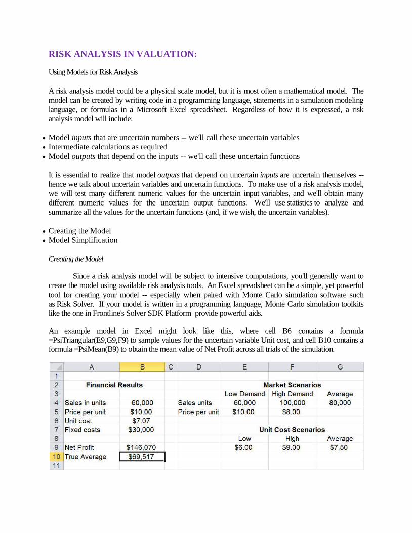
RISK ANALYSIS IN VALUATION:
Using Models for Risk Analysis
A risk analysis model could be a physical scale model, but it is most often a mathematical model. The
model can be created by writing code in a programming language, statements in a simulation modeling
language, or formulas in a Microsoft Excel spreadsheet. Regardless of how it is expressed, a risk
analysis model will include:
Model inputs that are uncertain numbers -- we'll call these uncertain variables
Intermediate calculations as required
Model outputs that depend on the inputs -- we'll call these uncertain functions
It is essential to realize that model outputs that depend on uncertain inputs are uncertain themselves --
hence we talk about uncertain variables and uncertain functions. To make use of a risk analysis model,
we will test many different numeric values for the uncertain input variables, and we'll obtain many
different numeric values for the uncertain output functions. We'll use statistics to analyze and
summarize all the values for the uncertain functions (and, if we wish, the uncertain variables).
Creating the Model
Model Simplification
Creating the Model
Since a risk analysis model will be subject to intensive computations, you'll generally want to
create the model using available risk analysis tools. An Excel spreadsheet can be a simple, yet powerful
tool for creating your model -- especially when paired with Monte Carlo simulation software such
as Risk Solver. If your model is written in a programming language, Monte Carlo simulation toolkits
like the one in Frontline's Solver SDK Platform provide powerful aids.
An example model in Excel might look like this, where cell B6 contains a formula
=PsiTriangular(E9,G9,F9) to sample values for the uncertain variable Unit cost, and cell B10 contains a formula =PsiMean(B9) to obtain the mean value of Net Profit across all trials of the simulation.

A portion of an example model in the C# programming language might look like this, where the array
Var[ ] receives sample values for the two uncertain variables X and Y, and the uncertain function values
are computed and assigned to the Problem's FcnUncertain object Value property:
Model Simplification
Like all models, a risk analysis model is a simplification and approximation of reality. The art of
modeling involves choices of what essential factors must be included, and what factors may be ignored or safely excluded from the model. As Albert Einstein suggested, a model should be "as simple as
possible, but no simpler."
We must also choose what sample values to test for the uncertain variables. Simulation software such
as Risk Solver lets us draw sample values from scores of different probability distributions. While we
should do our best to choose the right sample values, we derive a great benefit simply by moving
from fixed values to almost any reasonable sample of values for an uncertain quantity.
Dr. Sam Savage likes to use the analogy of shaking a ladder before you use it to climb up on a roof. When you do this, you subject the ladder to a random set of forces, to see how it behaves. Even though
the forces when you are shaking are not distributed in the same way as the forces when you are
climbing, shaking a ladder is still a good “stress test” in advance.
----ooOoo----
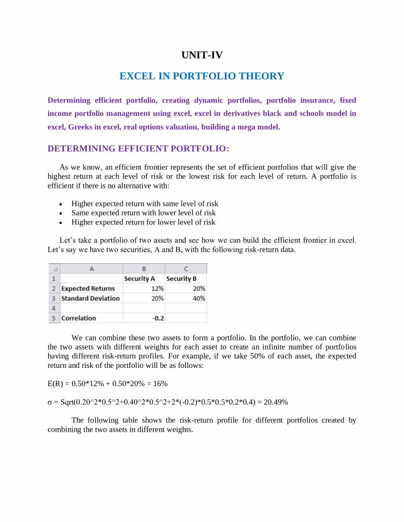
UNIT-IV
EXCEL IN PORTFOLIO THEORY
Determining efficient portfolio, creating dynamic portfolios, portfolio insurance, fixed
income portfolio management using excel, excel in derivatives black and schools model in
excel, Greeks in excel, real options valuation, building a mega model.
DETERMINING EFFICIENT PORTFOLIO:
As we know, an efficient frontier represents the set of efficient portfolios that will give the
highest return at each level of risk or the lowest risk for each level of return. A portfolio is
efficient if there is no alternative with:
Higher expected return with same level of risk
Same expected return with lower level of risk
Higher expected return for lower level of risk
Let’s take a portfolio of two assets and see how we can build the efficient frontier in excel.
Let’s say we have two securities, A and B, with the following risk-return data.
We can combine these two assets to form a portfolio. In the portfolio, we can combine
the two assets with different weights for each asset to create an infinite number of portfolios
having different risk-return profiles. For example, if we take 50% of each asset, the expected
return and risk of the portfolio will be as follows:
E(R) = 0.50*12% + 0.50*20% = 16%
σ = Sqrt(0.20^2*0.5^2+0.40^2*0.5^2+2*(-0.2)*0.5*0.5*0.2*0.4) = 20.49%
The following table shows the risk-return profile for different portfolios created by
combining the two assets in different weights.
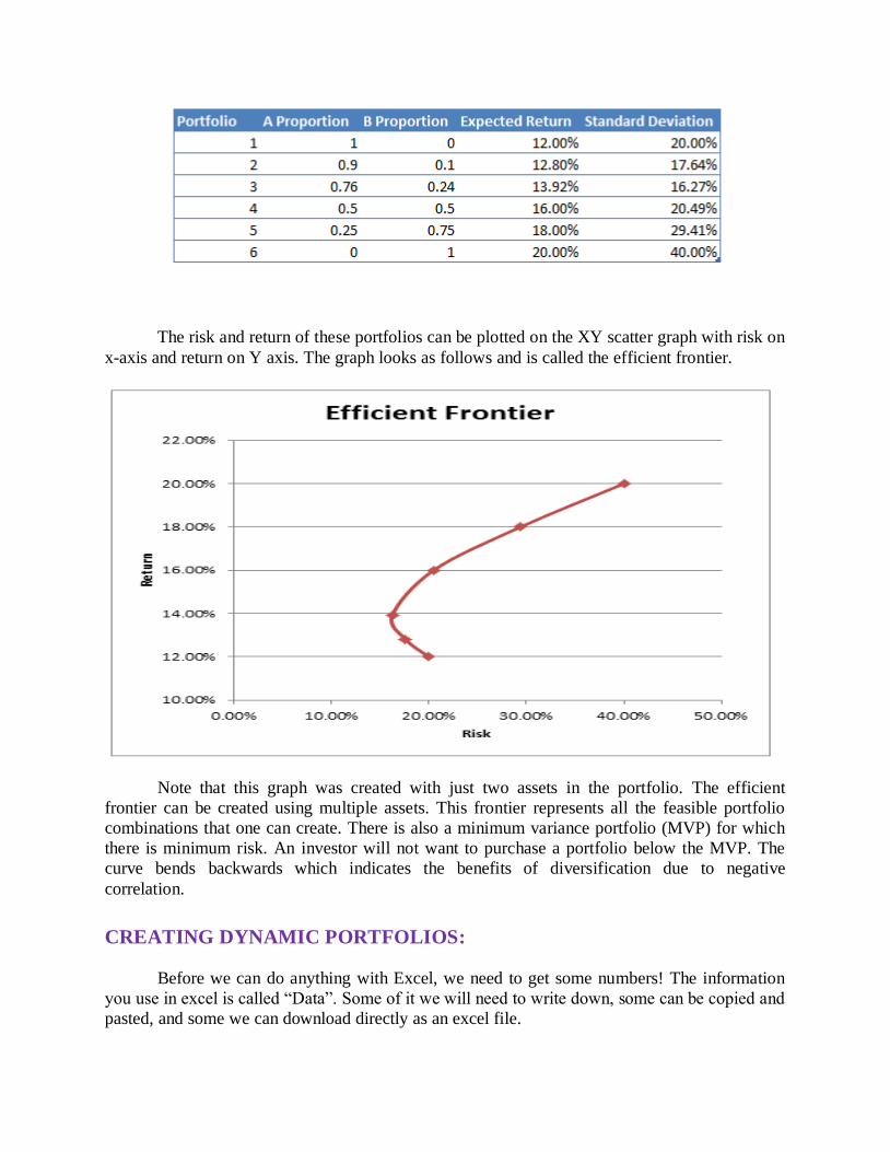
The risk and return of these portfolios can be plotted on the XY scatter graph with risk on
x-axis and return on Y axis. The graph looks as follows and is called the efficient frontier.
Note that this graph was created with just two assets in the portfolio. The efficient
frontier can be created using multiple assets. This frontier represents all the feasible portfolio
combinations that one can create. There is also a minimum variance portfolio (MVP) for which
there is minimum risk. An investor will not want to purchase a portfolio below the MVP. The
curve bends backwards which indicates the benefits of diversification due to negative
correlation.
CREATING DYNAMIC PORTFOLIOS:
Before we can do anything with Excel, we need to get some numbers! The information
you use in excel is called “Data”. Some of it we will need to write down, some can be copied and
pasted, and some we can download directly as an excel file.
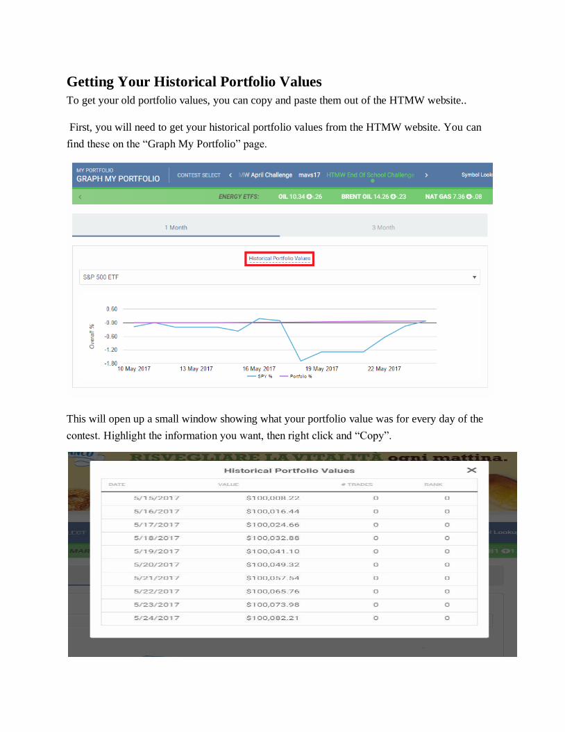
Getting Your Historical Portfolio Values
To get your old portfolio values, you can copy and paste them out of the HTMW website..
First, you will need to get your historical portfolio values from the HTMW website. You can
find these on the “Graph My Portfolio” page.
This will open up a small window showing what your portfolio value was for every day of the
contest. Highlight the information you want, then right click and “Copy”.
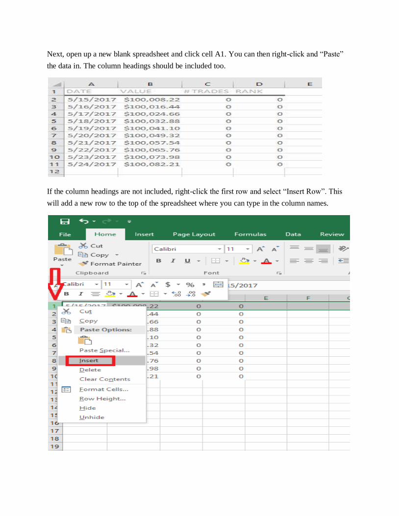
Next, open up a new blank spreadsheet and click cell A1. You can then right-click and “Paste”
the data in. The column headings should be included too.
If the column headings are not included, right-click the first row and select “Insert Row”. This
will add a new row to the top of the spreadsheet where you can type in the column names.
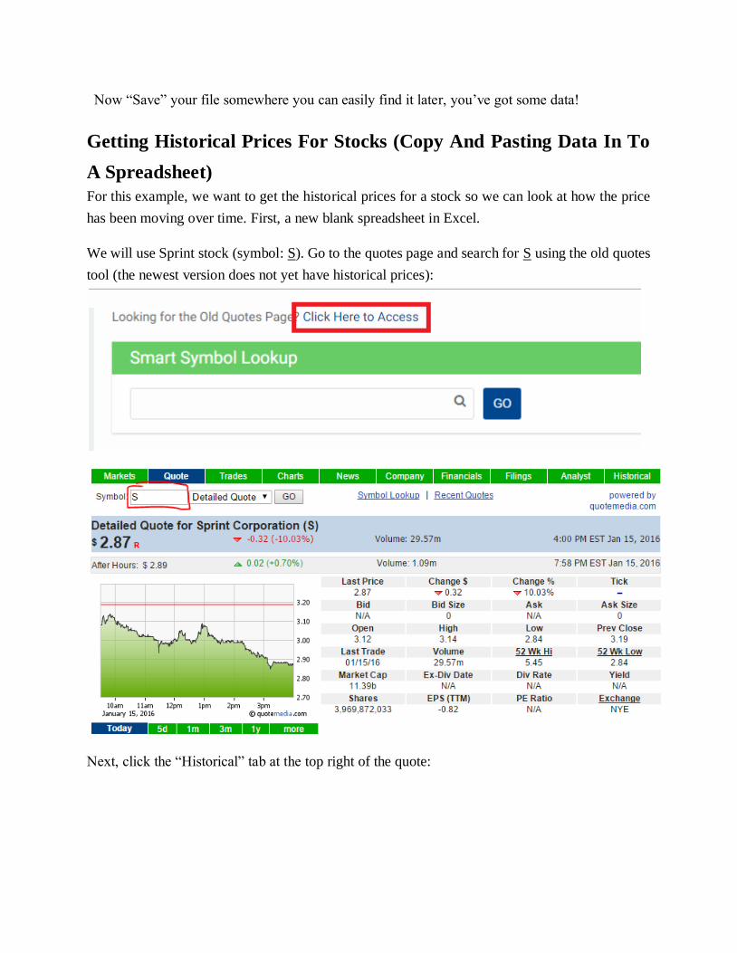
Now “Save” your file somewhere you can easily find it later, you’ve got some data!
Getting Historical Prices For Stocks (Copy And Pasting Data In To
A Spreadsheet)
For this example, we want to get the historical prices for a stock so we can look at how the price
has been moving over time. First, a new blank spreadsheet in Excel.
We will use Sprint stock (symbol: S). Go to the quotes page and search for S using the old quotes
tool (the newest version does not yet have historical prices):
Next, click the “Historical” tab at the top right of the quote:
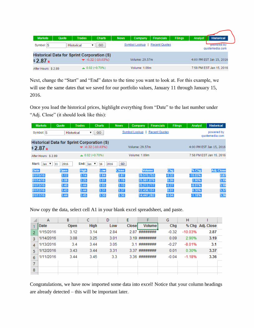
Next, change the “Start” and “End” dates to the time you want to look at. For this example, we
will use the same dates that we saved for our portfolio values, January 11 through January 15,
2016.
Once you load the historical prices, highlight everything from “Date” to the last number under
“Adj. Close” (it should look like this):
Now copy the data, select cell A1 in your blank excel spreadsheet, and paste.
Congratulations, we have now imported some data into excel! Notice that your column headings
are already detected – this will be important later.
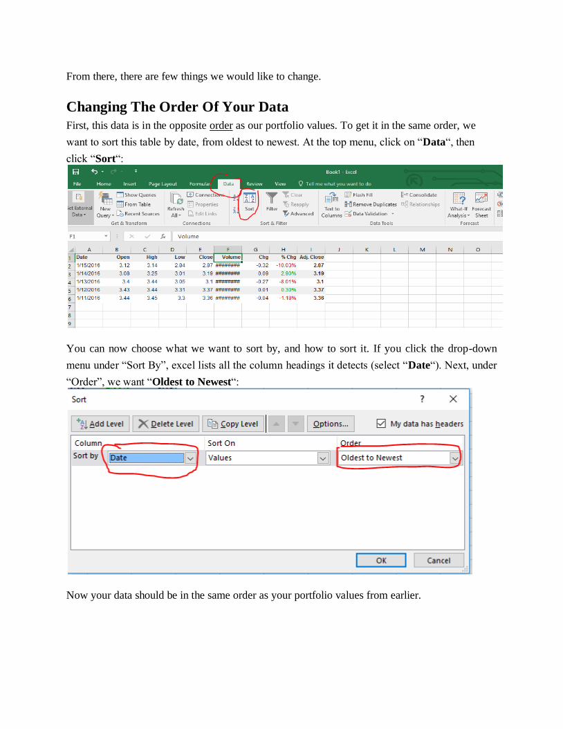
From there, there are few things we would like to change.
Changing The Order Of Your Data
First, this data is in the opposite order as our portfolio values. To get it in the same order, we
want to sort this table by date, from oldest to newest. At the top menu, click on “Data“, then
click “Sort“:
You can now choose what we want to sort by, and how to sort it. If you click the drop-down
menu under “Sort By”, excel lists all the column headings it detects (select “Date“). Next, under
“Order”, we want “Oldest to Newest“:
Now your data should be in the same order as your portfolio values from earlier.
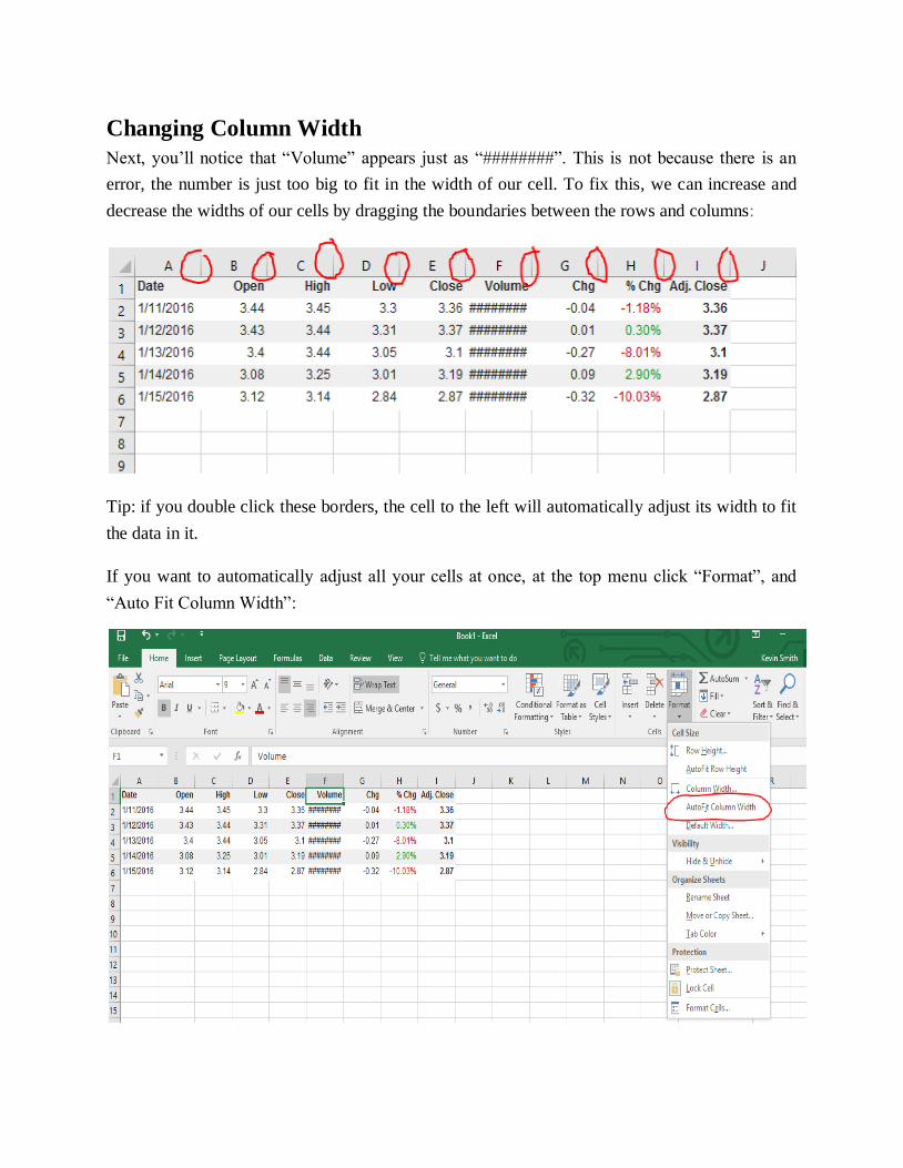
Changing Column Width
Next, you’ll notice that “Volume” appears just as “########”. This is not because there is an
error, the number is just too big to fit in the width of our cell. To fix this, we can increase and
decrease the widths of our cells by dragging the boundaries between the rows and columns:
Tip: if you double click these borders, the cell to the left will automatically adjust its width to fit
the data in it.
If you want to automatically adjust all your cells at once, at the top menu click “Format”, and
“Auto Fit Column Width”:
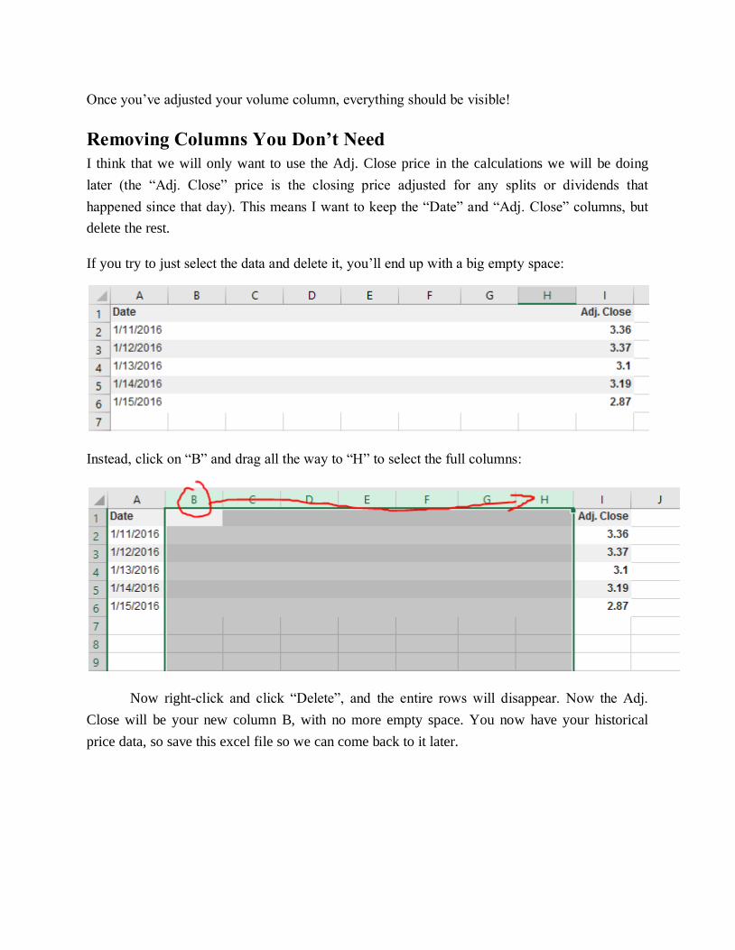
Once you’ve adjusted your volume column, everything should be visible!
Removing Columns You Don’t Need
I think that we will only want to use the Adj. Close price in the calculations we will be doing
later (the “Adj. Close” price is the closing price adjusted for any splits or dividends that
happened since that day). This means I want to keep the “Date” and “Adj. Close” columns, but
delete the rest.
If you try to just select the data and delete it, you’ll end up with a big empty space:
Instead, click on “B” and drag all the way to “H” to select the full columns:
Now right-click and click “Delete”, and the entire rows will disappear. Now the Adj.
Close will be your new column B, with no more empty space. You now have your historical
price data, so save this excel file so we can come back to it later.

Getting Your Transaction History And Open Positions (Copying data from another
spreadsheet)
If you want a copy of your open positions or transaction history in Excel, you can download it
directly from How The Market Works.
First, go to your Contests page and find the contest you want the information for. Then
click “Download Details”.
This will download a spreadsheet showing your transaction history, open positions, and
your current cash balance with portfolio value. You might get a warning when opening the file,
this is normal.
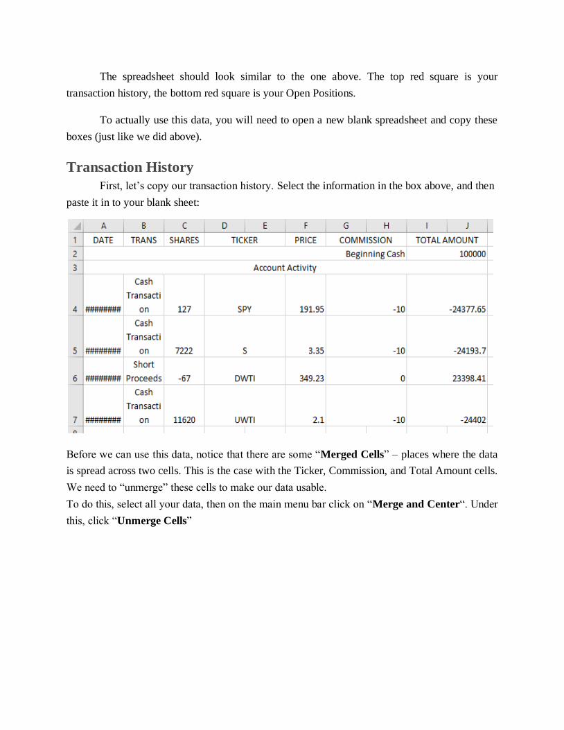
The spreadsheet should look similar to the one above. The top red square is your
transaction history, the bottom red square is your Open Positions.
To actually use this data, you will need to open a new blank spreadsheet and copy these
boxes (just like we did above).
Transaction History
First, let’s copy our transaction history. Select the information in the box above, and then
paste it in to your blank sheet:
Before we can use this data, notice that there are some “Merged Cells” – places where the data
is spread across two cells. This is the case with the Ticker, Commission, and Total Amount cells.
We need to “unmerge” these cells to make our data usable.
To do this, select all your data, then on the main menu bar click on “Merge and Center“. Under
this, click “Unmerge Cells”
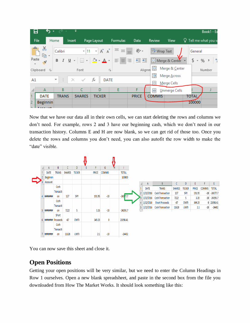
Now that we have our data all in their own cells, we can start deleting the rows and columns we
don’t need. For example, rows 2 and 3 have our beginning cash, which we don’t need in our
transaction history. Columns E and H are now blank, so we can get rid of those too. Once you
delete the rows and columns you don’t need, you can also autofit the row width to make the
“date” visible.
You can now save this sheet and close it.
Open Positions
Getting your open positions will be very similar, but we need to enter the Column Headings in
Row 1 ourselves. Open a new blank spreadsheet, and paste in the second box from the file you
downloaded from How The Market Works. It should look something like this:
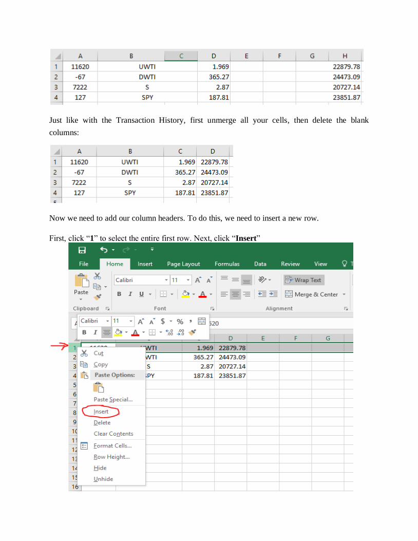
Just like with the Transaction History, first unmerge all your cells, then delete the blank
columns:
Now we need to add our column headers. To do this, we need to insert a new row.
First, click “1” to select the entire first row. Next, click “Insert”
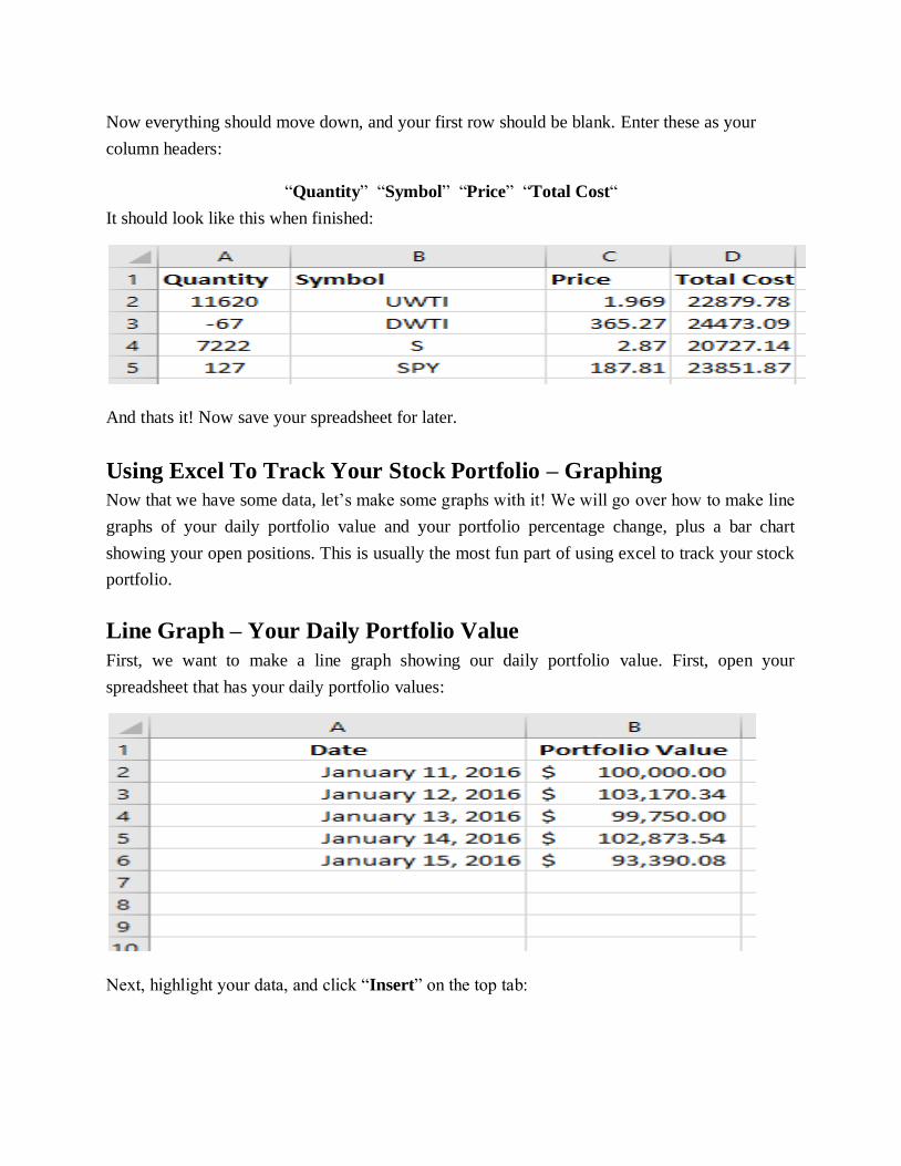
Now everything should move down, and your first row should be blank. Enter these as your
column headers:
“Quantity” “Symbol” “Price” “Total Cost“
It should look like this when finished:
And thats it! Now save your spreadsheet for later.
Using Excel To Track Your Stock Portfolio – Graphing
Now that we have some data, let’s make some graphs with it! We will go over how to make line
graphs of your daily portfolio value and your portfolio percentage change, plus a bar chart
showing your open positions. This is usually the most fun part of using excel to track your stock
portfolio.
Line Graph – Your Daily Portfolio Value
First, we want to make a line graph showing our daily portfolio value. First, open your
spreadsheet that has your daily portfolio values:
Next, highlight your data, and click “Insert” on the top tab:
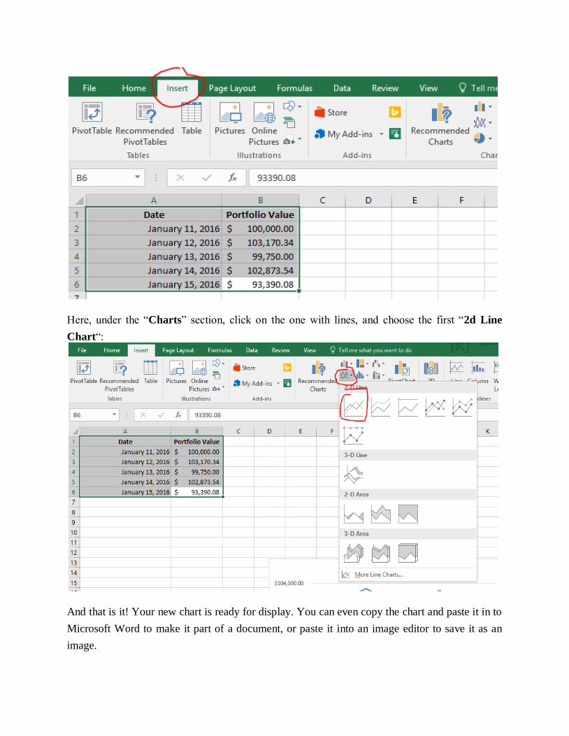
Here, under the “Charts” section, click on the one with lines, and choose the first “2d Line
Chart“:
And that is it! Your new chart is ready for display. You can even copy the chart and paste it in to
Microsoft Word to make it part of a document, or paste it into an image editor to save it as an
image.
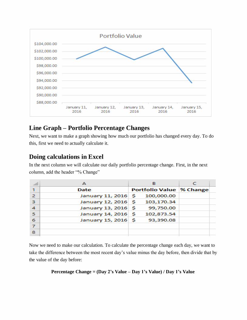
Line Graph – Portfolio Percentage Changes
Next, we want to make a graph showing how much our portfolio has changed every day. To do
this, first we need to actually calculate it.
Doing calculations in Excel
In the next column we will calculate our daily portfolio percentage change. First, in the next
column, add the header “% Change”
Now we need to make our calculation. To calculate the percentage change each day, we want to
take the difference between the most recent day’s value minus the day before, then divide that by
the value of the day before:
Percentage Change = (Day 2’s Value – Day 1’s Value) / Day 1’s Value
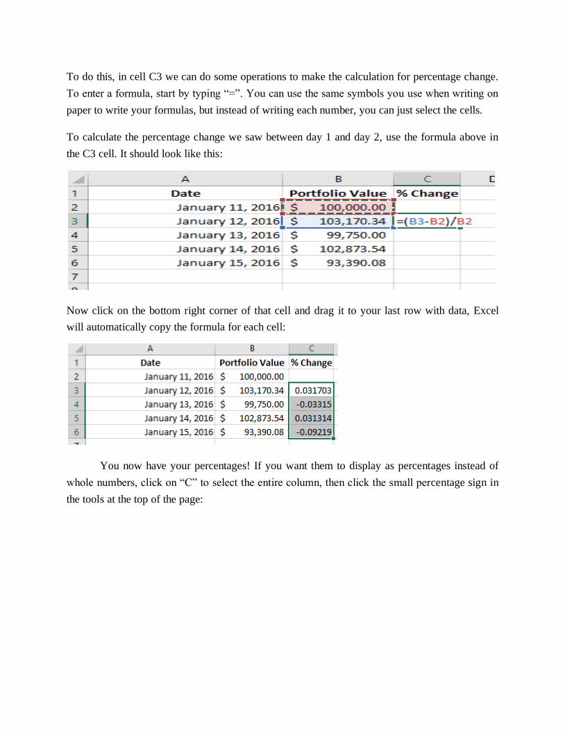
To do this, in cell C3 we can do some operations to make the calculation for percentage change.
To enter a formula, start by typing “=”. You can use the same symbols you use when writing on
paper to write your formulas, but instead of writing each number, you can just select the cells.
To calculate the percentage change we saw between day 1 and day 2, use the formula above in
the C3 cell. It should look like this:
Now click on the bottom right corner of that cell and drag it to your last row with data, Excel
will automatically copy the formula for each cell:
You now have your percentages! If you want them to display as percentages instead of
whole numbers, click on “C” to select the entire column, then click the small percentage sign in
the tools at the top of the page:
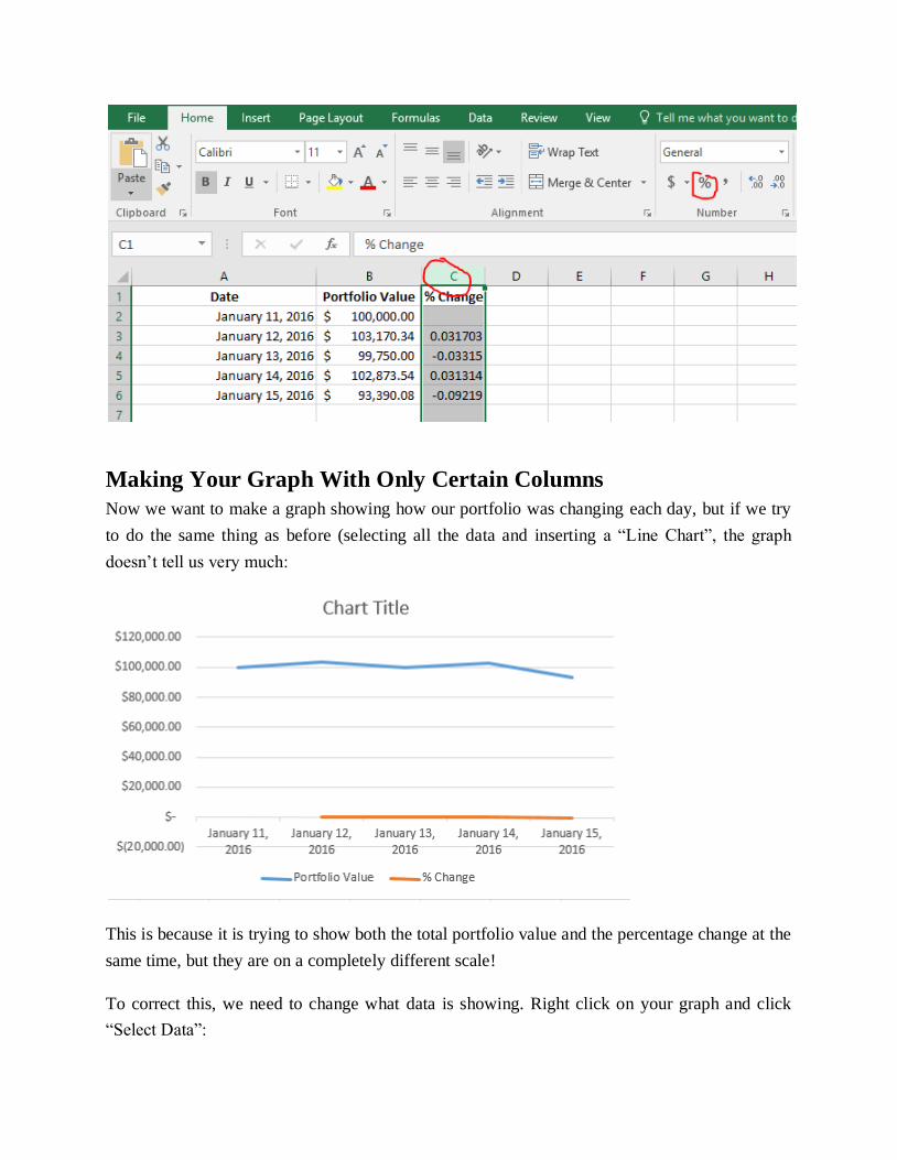
Making Your Graph With Only Certain Columns
Now we want to make a graph showing how our portfolio was changing each day, but if we try
to do the same thing as before (selecting all the data and inserting a “Line Chart”, the graph
doesn’t tell us very much:
This is because it is trying to show both the total portfolio value and the percentage change at the
same time, but they are on a completely different scale!
To correct this, we need to change what data is showing. Right click on your graph and click
“Select Data”:

This is how we decide what data is showing in the graph. Items on the left side will make our
lines, items on the right will make up the items that appear on the X axis (in this case, our Dates).
Uncheck “Portfolio Value”, then click OK to update your graph:
Tip: Since we don’t
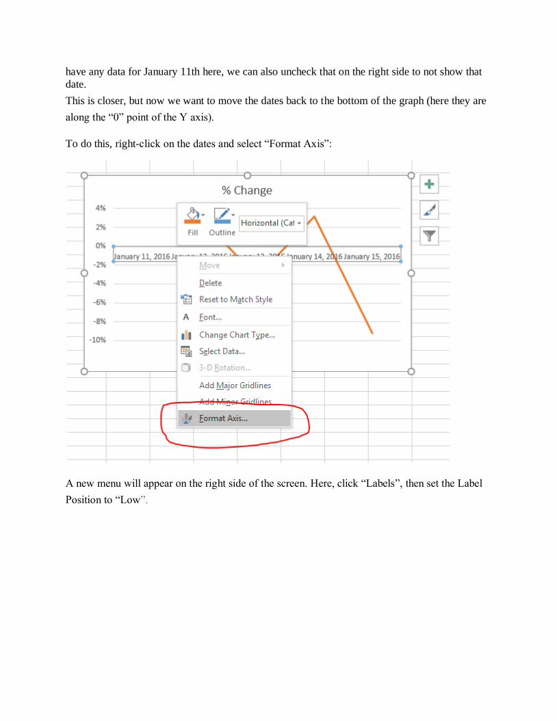
have any data for January 11th here, we can also uncheck that on the right side to not show that
date.
This is closer, but now we want to move the dates back to the bottom of the graph (here they are
along the “0” point of the Y axis).
To do this, right-click on the dates and select “Format Axis”:
A new menu will appear on the right side of the screen. Here, click “Labels”, then set the Label
Position to “Low”.
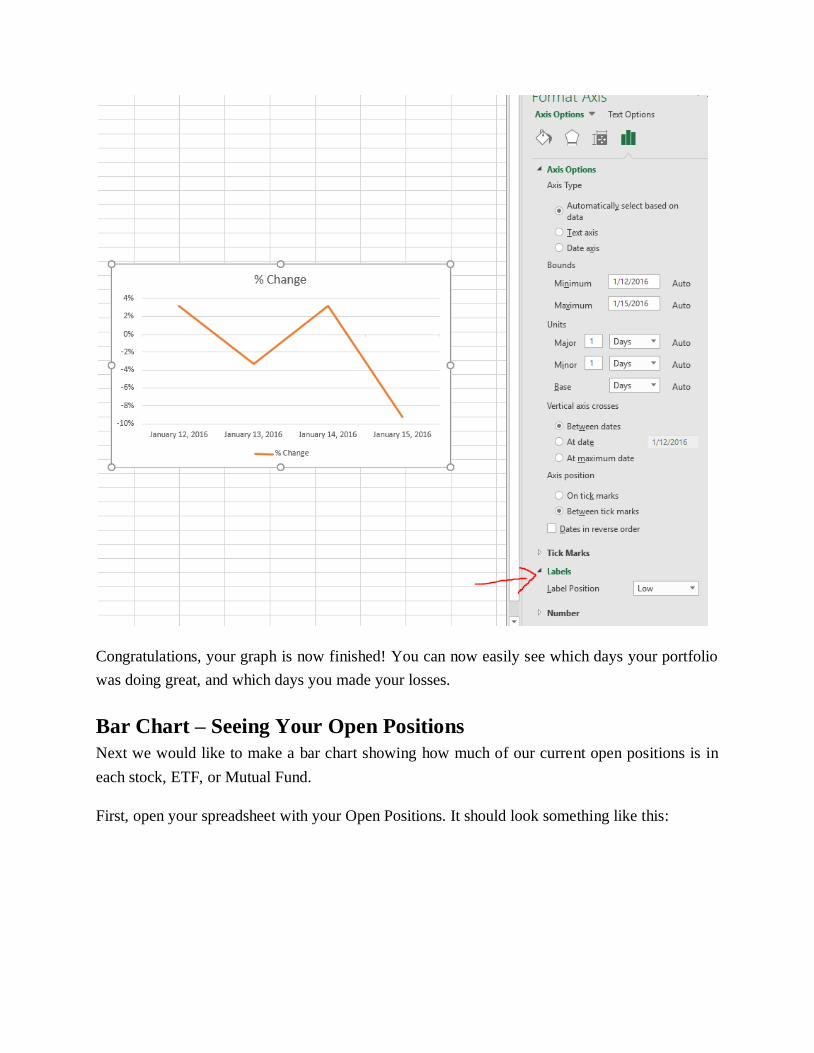
Congratulations, your graph is now finished! You can now easily see which days your portfolio
was doing great, and which days you made your losses.
Bar Chart – Seeing Your Open Positions
Next we would like to make a bar chart showing how much of our current open positions is in
each stock, ETF, or Mutual Fund.
First, open your spreadsheet with your Open Positions. It should look something like this:

Since we want to make a bar chart, we can only have two columns of data. We want one column
showing the symbol, and a second column showing how much it is worth. The “Total Cost”
column is the current market value of these stocks, so that is the one we want to keep. However,
we don’t want to delete the quantity and price, since we might want it later. Instead, select the
columns you don’t want, and right-click their letter (A and C in this case). Then, select “Hide”:
Now the columns that we don’t want in our chart are hidden. We can always get them back later
by going to “Format” -> “Visiblity” -> “Unhide Columns”. Now select your data and insert a
“Bar Chart” instead of a “Line Chart”:
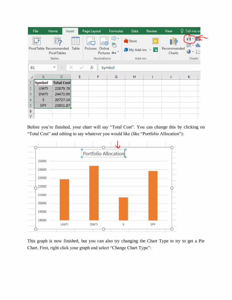
Before you’re finished, your chart will say “Total Cost”. You can change this by clicking on
“Total Cost” and editing to say whatever you would like (like “Portfolio Allocation”):
This graph is now finished, but you can also try changing the Chart Type to try to get a Pie
Chart. First, right click your graph and select “Change Chart Type”:
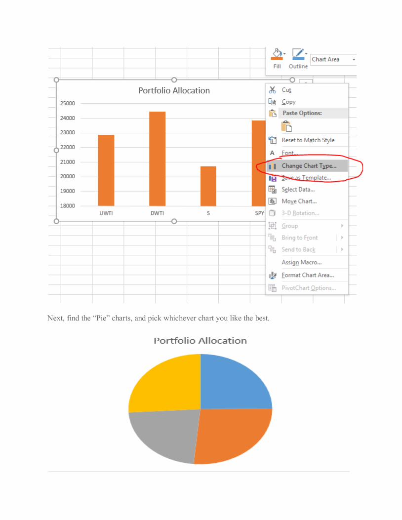
Next, find the “Pie” charts, and pick whichever chart you like the best.
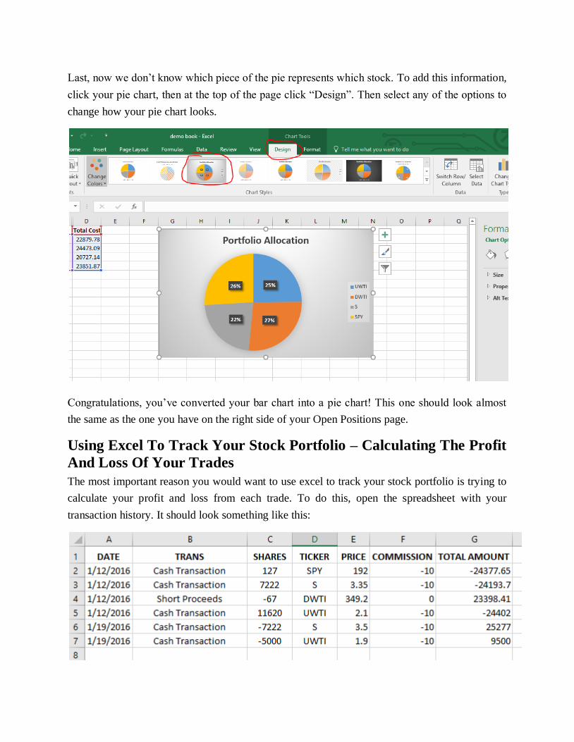
Last, now we don’t know which piece of the pie represents which stock. To add this information,
click your pie chart, then at the top of the page click “Design”. Then select any of the options to
change how your pie chart looks.
Congratulations, you’ve converted your bar chart into a pie chart! This one should look almost
the same as the one you have on the right side of your Open Positions page.
Using Excel To Track Your Stock Portfolio – Calculating The Profit
And Loss Of Your Trades
The most important reason you would want to use excel to track your stock portfolio is trying to
calculate your profit and loss from each trade. To do this, open the spreadsheet with your
transaction history. It should look something like this:
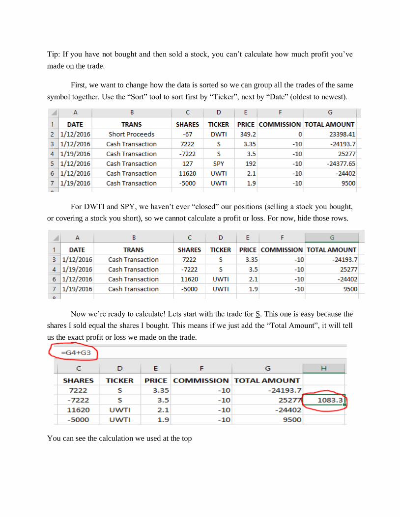
Tip: If you have not bought and then sold a stock, you can’t calculate how much profit you’ve
made on the trade.
First, we want to change how the data is sorted so we can group all the trades of the same
symbol together. Use the “Sort” tool to sort first by “Ticker”, next by “Date” (oldest to newest).
For DWTI and SPY, we haven’t ever “closed” our positions (selling a stock you bought,
or covering a stock you short), so we cannot calculate a profit or loss. For now, hide those rows.
Now we’re ready to calculate! Lets start with the trade for S. This one is easy because the
shares I sold equal the shares I bought. This means if we just add the “Total Amount”, it will tell
us the exact profit or loss we made on the trade.
You can see the calculation we used at the top
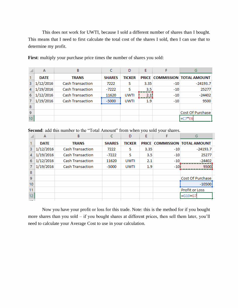
This does not work for UWTI, because I sold a different number of shares than I bought.
This means that I need to first calculate the total cost of the shares I sold, then I can use that to
determine my profit.
First: multiply your purchase price times the number of shares you sold:
Second: add this number to the “Total Amount” from when you sold your shares.
Now you have your profit or loss for this trade. Note: this is the method for if you bought
more shares than you sold – if you bought shares at different prices, then sell them later, you’ll
need to calculate your Average Cost to use in your calculation.
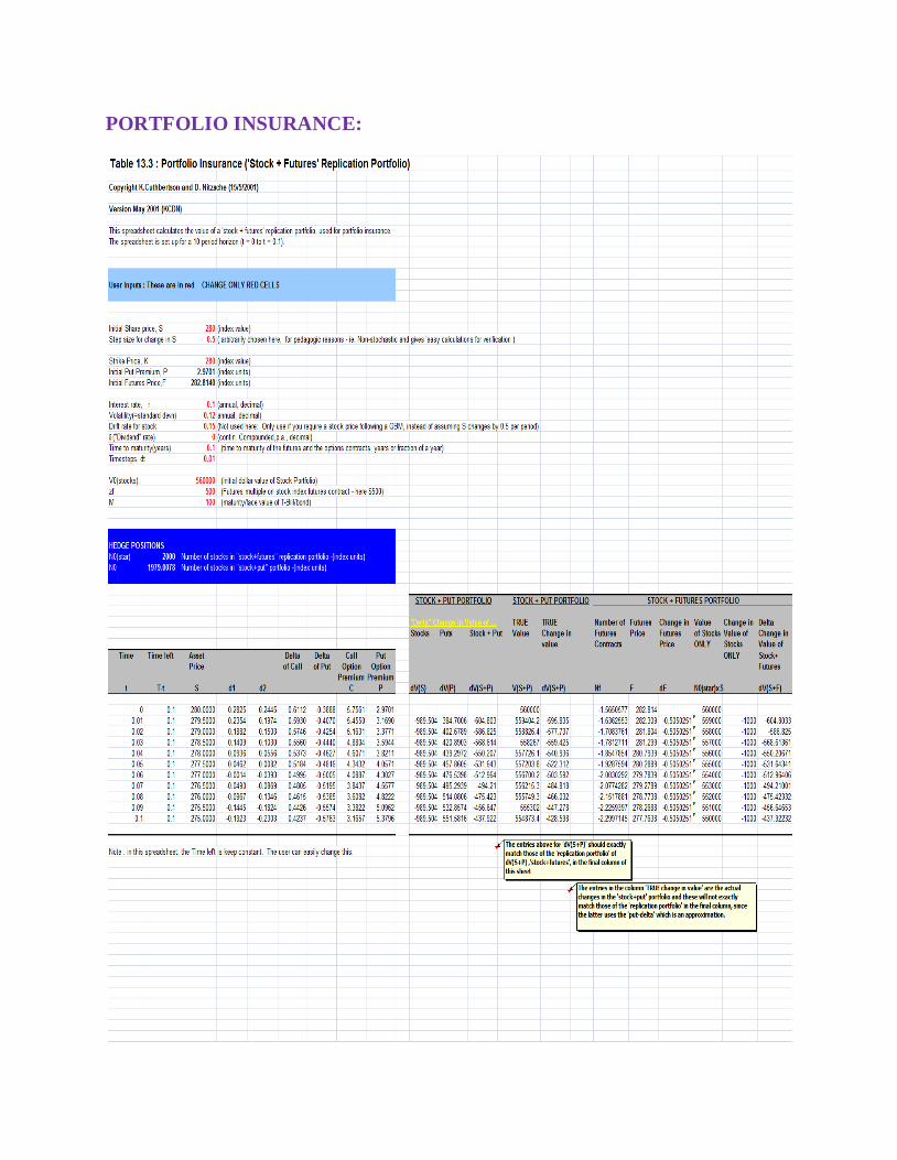
PORTFOLIO INSURANCE:
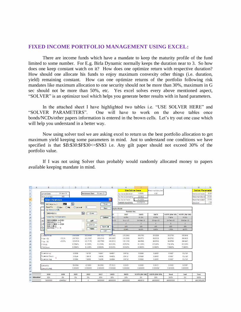
FIXED INCOME PORTFOLIO MANAGEMENT USING EXCEL:
There are income funds which have a mandate to keep the maturity profile of the fund
limited to some number. For E.g. Birla Dynamic normally keeps the duration near to 3. So how
does one keep constant watch on it? How does one optimize return with respective duration?
How should one allocate his funds to enjoy maximum convexity other things (i.e. duration,
yield) remaining constant. How can one optimize returns of the portfolio following risk
mandates like maximum allocation to one security should not be more than 30%, maximum in G
sec should not be more than 50%, etc. Yes excel solves every above mentioned aspect,
“SOLVER” is an optimizer tool which helps you generate better results with in hand parameters.
In the attached sheet I have highlighted two tables i.e. “USE SOLVER HERE” and
“SOLVER PARAMETERS”. One will have to work on the above tables once
bonds/NCDs/other papers information is entered in the brown cells. Let’s try out one case which
will help you understand in a better way.
Now using solver tool we are asking excel to return us the best portfolio allocation to get
maximum yield keeping some parameters in mind. Just to understand one conditions we have
specified is that $B:$30:$F$30<=$N$3 i.e. Any gilt paper should not exceed 30% of the
portfolio value.
If I was not using Solver than probably would randomly allocated money to papers
available keeping mandate in mind.
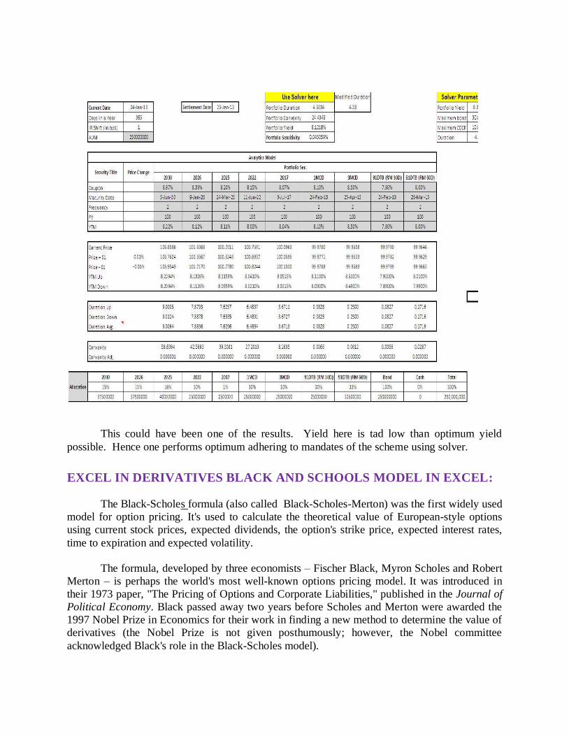
This could have been one of the results. Yield here is tad low than optimum yield
possible. Hence one performs optimum adhering to mandates of the scheme using solver.
EXCEL IN DERIVATIVES BLACK AND SCHOOLS MODEL IN EXCEL:
The Black-Scholes formula (also called Black-Scholes-Merton) was the first widely used
model for option pricing. It's used to calculate the theoretical value of European-style options
using current stock prices, expected dividends, the option's strike price, expected interest rates,
time to expiration and expected volatility.
The formula, developed by three economists – Fischer Black, Myron Scholes and Robert
Merton – is perhaps the world's most well-known options pricing model. It was introduced in
their 1973 paper, "The Pricing of Options and Corporate Liabilities," published in the Journal of
Political Economy. Black passed away two years before Scholes and Merton were awarded the
1997 Nobel Prize in Economics for their work in finding a new method to determine the value of
derivatives (the Nobel Prize is not given posthumously; however, the Nobel committee
acknowledged Black's role in the Black-Scholes model).

The Black-Scholes model makes certain assumptions:
The option is European and can only be exercised at expiration.
No dividends are paid out during the life of the option.
Markets are efficient (i.e., market movements cannot be predicted).
There are no transaction costs in buying the option.
The risk-free rate and volatility of the underlying are known and constant.
The returns on the underlying are normally distributed.
Note: While the original Black-Scholes model didn't consider the effects of dividends paid
during the life of the option, the model is frequently adapted to account for dividends by
determining the ex-dividend date value of the underlying stock.
Black-Scholes Formula
The formula, shown in Figure 4, takes the following variables into consideration:
current underlying price
options strike price
time until expiration, expressed as a percent of a year
implied volatility
risk-free interest rates
Figure 4: The Black-Scholes pricing formula for call options.
The model is essentially divided into two parts: the first part, SN(d1), multiplies the price
by the change in the call premium in relation to a change in the underlying price. This part of the
formula shows the expected benefit of purchasing the underlying outright. The second part, N(d2)Ke
-rt, provides the current value of paying the exercise price upon expiration
(remember, the Black-Scholes model applies to European options that can be exercised only on
expiration day). The value of the option is calculated by taking the difference between the two
parts, as shown in the equation.
The mathematics involved in the formula are complicated and can be intimidating.
Fortunately, you don't need to know or even understand the math to use Black-Scholes modeling

in your own strategies. As mentioned previously, options traders have access to a variety of
online options calculators, and many of today's trading platforms boast robust options analysis
tools, including indicators and spreadsheets that perform the calculations and output the options
pricing values. An example of an online Black-Scholes calculator is shown in Figure 5. The user
inputs all five variables (strike price, stock price, time (days), volatility and risk free interest rate)
and clicks "get quote" to display results.
Figure 5: An online Black-Scholes calculator can be used to get values for both calls and puts.
Users enter the required fields and the calculator does the rest. Calculator courtesy
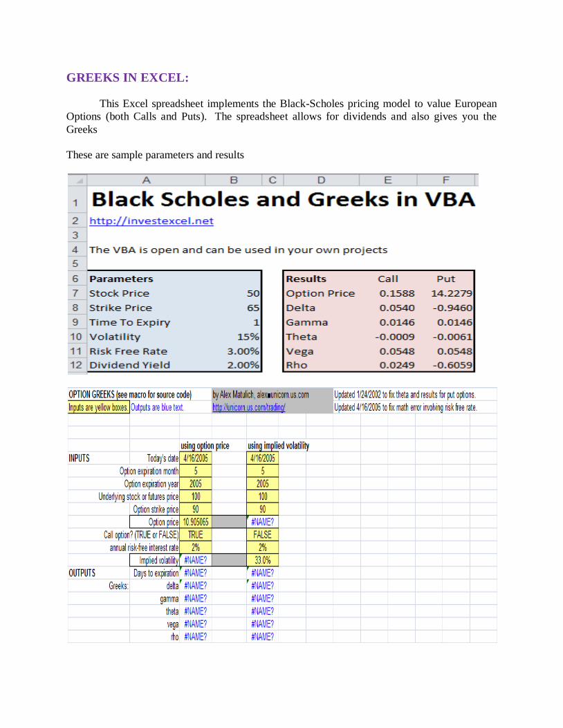
GREEKS IN EXCEL:
This Excel spreadsheet implements the Black-Scholes pricing model to value European
Options (both Calls and Puts). The spreadsheet allows for dividends and also gives you the
Greeks
These are sample parameters and results
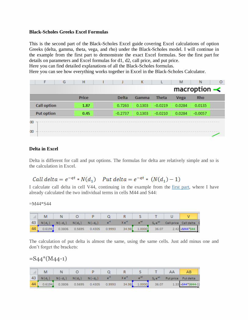
Black-Scholes Greeks Excel Formulas
This is the second part of the Black-Scholes Excel guide covering Excel calculations of option
Greeks (delta, gamma, theta, vega, and rho) under the Black-Scholes model. I will continue in
the example from the first part to demonstrate the exact Excel formulas. See the first part for
details on parameters and Excel formulas for d1, d2, call price, and put price. Here you can find detailed explanations of all the Black-Scholes formulas.
Here you can see how everything works together in Excel in the Black-Scholes Calculator.
Delta in Excel
Delta is different for call and put options. The formulas for delta are relatively simple and so is
the calculation in Excel.
I calculate call delta in cell V44, continuing in the example from the first part, where I have
already calculated the two individual terms in cells M44 and S44:
=M44*S44
The calculation of put delta is almost the same, using the same cells. Just add minus one and
don’t forget the brackets:
=S44*(M44-1)

Gamma in Excel
The formula for gamma is the same for calls and puts. It is slightly more complicated than the
delta formulas above:
Notice especially the second part of the formula:
You will find this term in the calculation of theta and vega too. It is the standard normal
probability density function for -d1. In Excel the formula looks like this:
=EXP(-1*POWER(K44,2)/2)/SQRT(2*PI())
… where K44 is the cell where you have calculated d1 (see first part).
Alternatively, you can use the NORM.DIST Excel function, which I have also explained in the
first part. The only difference from the first part is that the last parameter (cumulative) is now
FALSE. Don’t forget the minus sign before K44:
=NORM.DIST(-K44,0,1,FALSE)
These two formulas must return the same result.
In the example from the Black-Scholes Calculator I use the first formula. The whole formula for
gamma (same for calls and puts) is:
=EXP(-1*POWER(K44,2)/2)/SQRT(2*PI())*S44/(A44*J44)
Theta in Excel
Theta has the longest formulas of all the five most common option Greeks. It is different for calls
and puts, but the differences are again just a few minus signs here and there and you must be

very careful. Theta is very small for many options, which makes it often hard to detect a possible
error in your calculations.
Although it looks complicated, all the symbols and terms in the formulas should be already
familiar from the calculations of option prices and delta and gamma above. One exception is the
T at the beginning of the formulas.
T is the number of days per year. You can choose either calendar days (T=365 or 365.25) or
trading days (T=252 or something similar, depending on where you trade). Based on your
selection, the interpretation of theta will then be either option price change in one calendar day or
option price change in one trading day.
Call Option Theta
The whole formula for call theta in our example is in cell X44. It is long and uses several (10) other cells, but there is no high mathematics:
=(-(A44*EXP(-1*POWER(K44,2)/2)/SQRT(2*PI())*C44*S44/
(2*SQRT(G44)))-(D44*R44*O44)+(E44*A44*M44*S44))/
IF($C$20=2,’Time Units’!$D$4,’Time Units’!$D$3)
The last line of the formula in the screenshot above is the T. Cell C20 in the calculator contains a
combo where users select calendar days or trading days. Cells D3 and D4 in the sheet Time Units

contain the number of calendar and trading days per year. If you want to keep it simple, you can
replace the whole last line of the formula with a fixed number, such as 365.
You can again find the explanation of all the individual cells in the first part or see all these
Excel calculations directly in the calculator.
Put Option Theta
Analogically to call theta, the formula for put theta in cell AD44 is:
=(-(A44*EXP(-1*POWER(K44,2)/2)/SQRT(2*PI())*C44*S44/
(2*SQRT(G44)))+(D44*R44*P44)-(E44*A44*N44*S44))/ IF($C$20=2,’Time Units’!$D$4,’Time Units’!$D$3)
Vega in Excel
The formula for vega is the same for calls and puts:
There is nothing new. You can again see the familiar term at the end.
In the calculator example I calculate vega in cell Y44:
=EXP(-1*POWER(K44,2)/2)/SQRT(2*PI())*S44*A44*SQRT(G44)/100
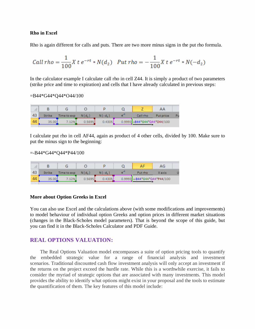
Rho in Excel
Rho is again different for calls and puts. There are two more minus signs in the put rho formula.
In the calculator example I calculate call rho in cell Z44. It is simply a product of two parameters
(strike price and time to expiration) and cells that I have already calculated in previous steps:
=B44*G44*Q44*O44/100
I calculate put rho in cell AF44, again as product of 4 other cells, divided by 100. Make sure to
put the minus sign to the beginning:
=-B44*G44*Q44*P44/100
More about Option Greeks in Excel
You can also use Excel and the calculations above (with some modifications and improvements)
to model behaviour of individual option Greeks and option prices in different market situations
(changes in the Black-Scholes model parameters). That is beyond the scope of this guide, but
you can find it in the Black-Scholes Calculator and PDF Guide.
REAL OPTIONS VALUATION:
The Real Options Valuation model encompasses a suite of option pricing tools to quantify
the embedded strategic value for a range of financial analysis and investment
scenarios. Traditional discounted cash flow investment analysis will only accept an investment if
the returns on the project exceed the hurdle rate. While this is a worthwhile exercise, it fails to
consider the myriad of strategic options that are associated with many investments. This model
provides the ability to identify what options might exist in your proposal and the tools to estimate
the quantification of them. The key features of this model include:
Ease and flexibility of input, with embedded help prompts.
Informative 'Quick Start' menu for choosing the correct tool for the situation.
Modified Black Scholes options model to value the options to delay, expand, or abandon
investments.
Automatic binomial 'tree' builder model to evaluate complex strategic options with multiple
stages. Nash equilibrium Game Theory model to evaluate market entry strategies in a competitive
environment.
Ability to predefine historical investment and/or industry risk profiles to utilize across real
options models.
Compatible with all versions of Excel for Windows as well as Excel for Mac as a cross
platform analytical business solution.
The Excel Real Options Valuation Template brings together a collection of option
valuation tools geared to quantify strategic value from uncertainty and risks in investment timing
and economic environment dynamics. Real options valuation differs from the traditional discounted cash flow approach to valuation by quantifying assumptions based on the volatility of
underlying cash flows of an investment or business. The Excel Real Options Valuation template
provides analytical tools based on modified option pricing theory to evaluate investment
strategy alternatives and estimate the value of undertaking them.
Key features of the Excel Real Options Valuation template include:
Input flow is assisted with information on each Real Options Valuation theory and detailed
explanations for ease of interpretation.
The 'Quick Start' menu provides information for choosing the correct Real Options
Valuation tool for the investment decision and associated opportunity to be analyzed and
quantified. The modified Black Scholes option pricing model is available to value the options to delay,
expand, or abandon investment projects. Modifications to the traditional Black Scholes
model include the accounting of dividends or cash flows from the underlying asset and the
ability to exercise the option before the time in which the opportunity is expected to expire.
The Binomial tree option valuation model allows the creation of unlimited binomial option
branches to evaluate complex strategic options with multiple critical decision stages. New
binomial branch values flow back through the entire to the starting node.
The Game Theory model based on the Nash equilibrium theory is provided to determine the
optimal strategy as a leader, follower or entering the market simultaneously in a competitive
environment. Game theory analysis is suitable for evaluating market entry timing for new products or businesses.
Categorized investment and/or industry risk profiles are provided and can be modified to
utilize across Real Options Valuation models as a proxy for risk assumptions. Applying
standardized risk assumptions across multiple option valuations not only accelerates the
analytical process but also provides a common benchmark for comparing business
strategies.
BUILDING A MEGA MODEL:
When it comes to building Excel models, there really are no widely accepted guidelines
that Excel users follow. Because of this, Excel model building is more of an art than a science.
Every single model you encounter tends to have its own nuances and quirks. Even if they come
from the same user, as no standard processes exist, Excel models often show a lack consistency.
The reason this problem exists is pretty apparent: most Excel users just don’t invest time
in thinking about how they should structure their models. When designing a new model, we get so focused on building calculations and writing formulas that the context and structure of the
model rarely prioritized. In other situations, we start building an Excel model and underestimate
how often we’ll need use it. Over time, as we add more and more components to the model
without regard to structure, it soon becomes unwieldy.
During my tenure as a management consultant, I worked with many different clients on
several quantitative projects. Having built and worked on so many models before, I’ve seen this
potential improvement area countless times. The concept of model building is still a gray,
ambiguous subject matter. The purpose of this post is to document what I’ve learned in my
experience and begin to establish a standard Excel model building framework.
To review the essential skills of Excel model building, I will review key principles,
propose a basic tab structure, and walk through specific steps that should be taken. I will use an
attached dummy model to illustrate the principles I’ve recommended. Obviously my opinion is
just one of several Excel experts, so I expect that this post will evolve as I receive feedback.
Key Principles
The secret to building good Excel models is all about having a user focus. For every
model that you build:
Assume that someone else will need to use your model in the future.
People always underestimate how many different users an Excel model will pass
through. Having a user focus is important even if you know you’ll be the only one using it.
Take the example of a financial model used to prepare for monthly close. Every single month,
either you or whoever owns that role will have to repeat the process with new data. There have
been several times in my career where I’ve had to go back to a model that I hadn’t touched in
several months and stressed out trying to figure out my original thinking.
Please keep in mind that there is a difference between a calculation and a model. We’ve
all opened up Excel before just to perform some quick math that would’ve been difficult without
a calculator. In these situations, the principles of model building principles are probably not a
priority. However, if you’re building something that’s complex enough to be considered a

model, there’s a very high likelihood that the process will either need to be repeated or, at the
very least, explained to someone else in the future.
Taking a user perspective prepares you for this inevitable transition. It encourages you to
provide documentation, remove extraneous elements, and not take shortcuts that might cause
confusion. Every time you build a new Excel model, there are three key principles you should focus on:
Logic
As you are finalizing the model you build, you should always try to take the perspective of
someone who is completely new to the model you’re building. This is where stepping away
from the model for a few hours would be helpful, assuming you have the leeway to do so. When
building a model, it’s easy to focus on the specific outputs you need to produce and forget the
big picture of what the model is supposed to do. Key questions you should ask yourself include:
Would your model make sense to a new user?
Have the most obvious issues been either built into the model or addressed in
documentation?
Have you made any non-intuitive assumptions?
Is the end purpose of your model apparent and understandable?
Efficiency
Over the course of building a model, new information and requirements will often change
how the model is structured. When this happens, we rarely go back and rebuild the entire model
in a more efficient fashion. Because of this, models can become fragmented and inefficient. The
key here is to think about your Excel model holistically: with everything you’ve added thus far,
think about the most efficient way to get to the answer. Based on the time you have left, you
should then make adjustments to the model to reflect this ideal. Key questions include:
Do you get to your final outputs in the most efficient manner? Are there any tabs or data points you are no longer using?
Have you used your space efficiently?
Are your tabs formatted consistently in terms of structure and arrangement?
Transparency
Over the course of my career, I’ve rarely come across an Excel model with adequate
documentation. People are either too busy or too lazy to invest time in this important
characteristic. There are two key things you should realize about adding transparency to your
Excel model. First, documentation doesn’t have to be a 20 page document that explains your
file; it can literally be comments on cells, additional tabs with notes, or even small descriptions
within formulas. Secondly, any bit of documentation you add is beneficial; even if you don’t have time to provide context for your entire file, add notes and comments where they would be
most helpful to the user. Key questions for transparency are:
Is there adequate documentation?
Are each of the tabs and their purpose in the model apparent?
Is it obvious where the inputs and outputs of the model are?
Did you hide any tabs or cells?
Index Tab
For every complex model I build, I always try to include and an index which is a tab that
describes all the other tabs and provides the user the full scope of functionality within the
model. Once you’ve completed building the model, it’s useful to add links from the index tab to
every tab you’ve described, to facilitate ease of navigation. Ideally, the Index tab will not have
any complex model calculations; it should mainly provide documentation and increase the
transparency of your model.
Input Tabs
It’s extremely important to keep all of your inputs in as few tabs and cells as possible. Working with Excel files where user inputs are expected in several different tabs is one of the
most cumbersome issues we deal with. You should keep all of your input tabs in one section of
the workbook and highlight them to signal inputs are required. Also keep in mind that you
should never have a single input being entered in two different locations – if you need the
variable in two different locations just link both locations to the same cell.
Drivers Drivers are the input variables within your model that you expect to adjust. Having
drivers is what allows you to perform sensitivity and scenario analysis. The way you setup your
driver inputs will be key to how you perform scenario analysis.
Static Inputs
Your static assumptions are the variables that you don’t expect to changeand don’t need to perform sensitivity or scenario analysis on. Having a separate tab just for static inputs isn’t
always a necessity, as some people just incorporate them with other inputs. The main reason for
doing so is just to keep them separate from the true drivers of your model.
Data Tables
Your data tables essentially represent the database of your model. Any form of data
that’s complex enough to have rows and columns should be put in a table. When creating your
tables, be sure to follow proper database theory. For large tables, it’s best to have only one table
per tab.
Calculation Tabs The calculation tabs are the engine of your model. They should take your drivers, static
assumptions, and data tables and perform all the calculations necessary to turn them into outputs
values. Traditionally, this is where the majority of the work in model building will occur, in
terms of formula writing. Do your best not to mix calculation tabs with either inputs or outputs.

Output Tabs
The output tabs are what you plan to present externally to the end customer of the
model. For example, if you’re building a financial model, you’ll likely have a balance sheet, income statement, and statement of cash flows as output tabs. Keep these tabs clean of any
inputs or calculations and use the Page Setup menu in Excel to format these for printing.
Documentation Tabs
Assuming you’ve already created an Index tab, having additional documentation tabs
may not be necessary. However, if this additional information does not fit will in any of the
other categories above, it’s best to create these tabs to ensure transparency for the user.
Now that we’ve learned the key principles of model building, as well as a general tab
structure, this final part of the Excel model building tutorial will review a step by step example
of building a model from the ground up. The direction is still somewhat high level, but I’ve
included a sample model that follows the prescribed guidelines. The model has already been
built to completion, but it can be used to help you follow along and provide context for the high
level steps referenced.
Step 1: Build Output Tabs Shell – Understand Your Requirements
Most people who’ve implemented software will tell you that the majority of errors occur
during the requirements gathering phase of the project. (For those of you who haven’t done an implementation, this is the phase of the project where you figure out what your software actually
needs to do) Excel model building faces the exact same issue. Before you start building, you
should figure out what outputs your model needs to generate. These requirements will greatly
influence every subsequent step you take. For example, if you need to build multiple scenarios,
you may need to leave space to input different scenario assumptions. If you need to conduct
sensitivity analysis, then you may need to use Excel Data Table or build a sensitivity tornado
chart.
Understanding your exact requirements first is not always possible, but you should
always try to be as definitive as you can. The worst case scenario is investing several hours into
building a model that can’t generate the type of outputs you actually need.
In this adjusted snapshot of the sample model, you can see here that the requirements are
to build a five your P&L forecast. In the model download, you’ll note that I’ve also included a
“Sales Revenue by City” report as an additional requirement.
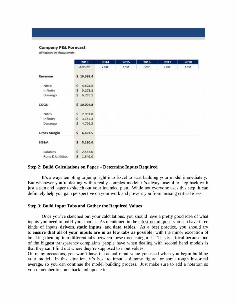
Step 2: Build Calculations on Paper – Determine Inputs Required
It’s always tempting to jump right into Excel to start building your model immediately.
But whenever you’re dealing with a really complex model, it’s always useful to step back with just a pen and paper to sketch out your intended plan. While not everyone uses this step, it can
definitely help you gain perspective on your work and prevent you from missing critical ideas.
Step 3: Build Input Tabs and Gather the Required Values
Once you’ve sketched out your calculations, you should have a pretty good idea of what
inputs you need to build your model. As mentioned in the tab structure post, you can have three
kinds of inputs: drivers, static inputs, and data tables. As a best practice, you should try
to ensure that all of your inputs are in as few tabs as possible, with the minor exception of
breaking them up into different tabs between these three categories. This is critical because one
of the biggest transparency complaints people have when dealing with second hand models is
that they can’t find out where they’re supposed to input values.
On many occasions, you won’t have the actual input value you need when you begin building your model. In this situation, it’s best to input a dummy figure, or some rough historical
average, so you can continue the model building process. Just make sure to add a notation so
you remember to come back and update it.
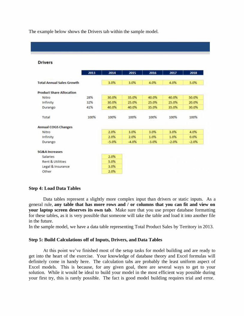
The example below shows the Drivers tab within the sample model.
Step 4: Load Data Tables
Data tables represent a slightly more complex input than drivers or static inputs. As a general rule, any table that has more rows and / or columns that you can fit and view on
your laptop screen deserves its own tab. Make sure that you use proper database formatting
for these tables, as it is very possible that someone will take the table and load it into another file
in the future.
In the sample model, we have a data table representing Total Product Sales by Territory in 2013.
Step 5: Build Calculations off of Inputs, Drivers, and Data Tables
At this point we’ve finished most of the setup tasks for model building and are ready to
get into the heart of the exercise. Your knowledge of database theory and Excel formulas will
definitely come in handy here. The calculation tabs are probably the least uniform aspect of
Excel models. This is because, for any given goal, there are several ways to get to your solution. While it would be ideal to build your model in the most efficient way possible during
your first try, this is rarely possible. The fact is good model building requires trial and error.
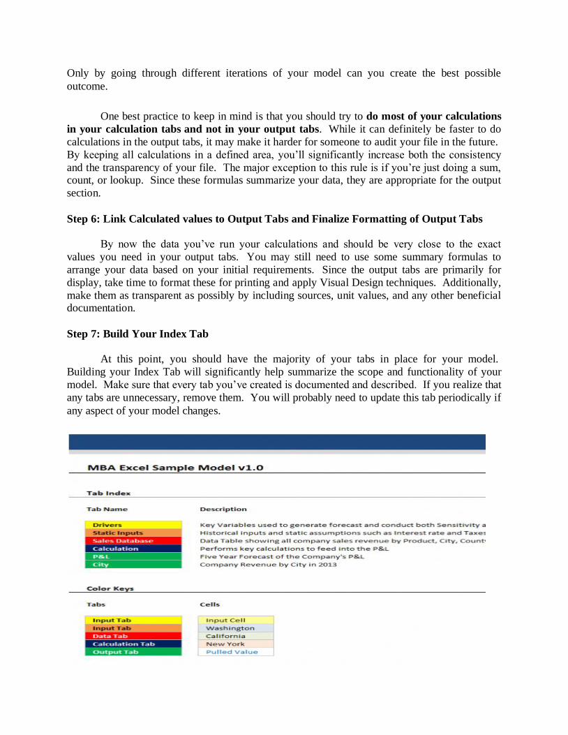
Only by going through different iterations of your model can you create the best possible
outcome.
One best practice to keep in mind is that you should try to do most of your calculations
in your calculation tabs and not in your output tabs. While it can definitely be faster to do
calculations in the output tabs, it may make it harder for someone to audit your file in the future.
By keeping all calculations in a defined area, you’ll significantly increase both the consistency
and the transparency of your file. The major exception to this rule is if you’re just doing a sum, count, or lookup. Since these formulas summarize your data, they are appropriate for the output
section.
Step 6: Link Calculated values to Output Tabs and Finalize Formatting of Output Tabs
By now the data you’ve run your calculations and should be very close to the exact
values you need in your output tabs. You may still need to use some summary formulas to
arrange your data based on your initial requirements. Since the output tabs are primarily for
display, take time to format these for printing and apply Visual Design techniques. Additionally,
make them as transparent as possibly by including sources, unit values, and any other beneficial documentation.
Step 7: Build Your Index Tab
At this point, you should have the majority of your tabs in place for your model.
Building your Index Tab will significantly help summarize the scope and functionality of your
model. Make sure that every tab you’ve created is documented and described. If you realize that
any tabs are unnecessary, remove them. You will probably need to update this tab periodically if
any aspect of your model changes.

Step 8: Link Key Output Values to Drivers Tab to Perform Scenario and Sensitivity
Analysis
As you get towards the end of the model building process, it’s very likely that you’ll want
to conduct some form of scenario or sensitivity analysis. To prepare for this step, you should
determine what output values are the most important to your analysis and link them back to your drivers tab. The process for doing so is relatively simple and shouldn’t take much more than
using the equals sign to write a simple linking formula.
Additionally, you’ll obviously need to understand which of your drivers are most likely
to change and have a reasonable range of possible values for these variables. These factors will
be completely dependent on the specific type of model you are building.
Another potential option for sensitivity analysis is to use Excel’s Watch Window feature. While
this is a great tool for sensitivity specifically, linking your output values to the drivers tab is the
best way to create defined scenarios.
Step 9: Create Documentation and Finish Index Tab
Excel models ever have adequate documentation. This additional step adds to your
workload and no one really enjoys doing it. However, having documentation can make a huge
difference to whomever you might hand your off work to. I like to think of documentation as an
insurance policy; put in a little work now, and you’ll significantly reduce the need to answer
questions in the future. You’ll also be much less likely to forget your own methodology if you
ever need to come back to your file.
Documentation doesn’t have to be a long winded user guide that takes several hours to
write. It can take the form of comment boxes in cells, notes in formulas, or just a separate tab in
the Excel document explaining your assumptions. All of these things further the transparency of
your model and should be included if possible.

Step 10: Add Cell & Workbook Protection Where Appropriate
This last step is important if you plan to either widely distribute your file or solicit inputs
from your colleagues. This is especially important in the latter scenario because before you save
a new version of your file, you want cell protection in areas that should not be adjusted as well as a clear understanding of what sections your colleagues had the ability to change. The process of
protecting your file is fairly simple: you just need to choose which cells will be editable by other
users and then assign a password to your workbook.
You’ll notice in the sample model, I’ve protected the Index Tab where the link to the
documentation exists. That way, it reduces the likelihood that this sample model will be sent out
without the accompanying documentation.
----oooOooo---
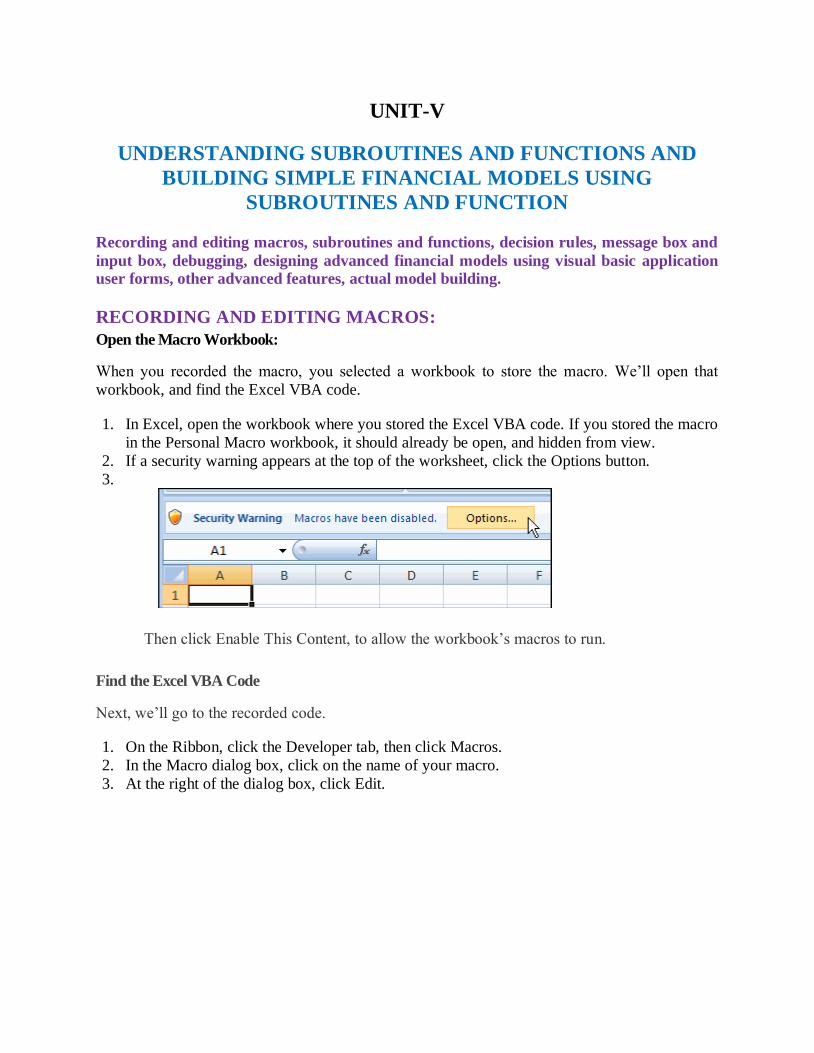
UNIT-V
UNDERSTANDING SUBROUTINES AND FUNCTIONS AND
BUILDING SIMPLE FINANCIAL MODELS USING
SUBROUTINES AND FUNCTION
Recording and editing macros, subroutines and functions, decision rules, message box and
input box, debugging, designing advanced financial models using visual basic application
user forms, other advanced features, actual model building.
RECORDING AND EDITING MACROS:
Open the Macro Workbook:
When you recorded the macro, you selected a workbook to store the macro. We’ll open that
workbook, and find the Excel VBA code.
1. In Excel, open the workbook where you stored the Excel VBA code. If you stored the macro
in the Personal Macro workbook, it should already be open, and hidden from view.
2. If a security warning appears at the top of the worksheet, click the Options button.
3.
Then click Enable This Content, to allow the workbook’s macros to run.
Find the Excel VBA Code
Next, we’ll go to the recorded code.
1. On the Ribbon, click the Developer tab, then click Macros.
2. In the Macro dialog box, click on the name of your macro.
3. At the right of the dialog box, click Edit.
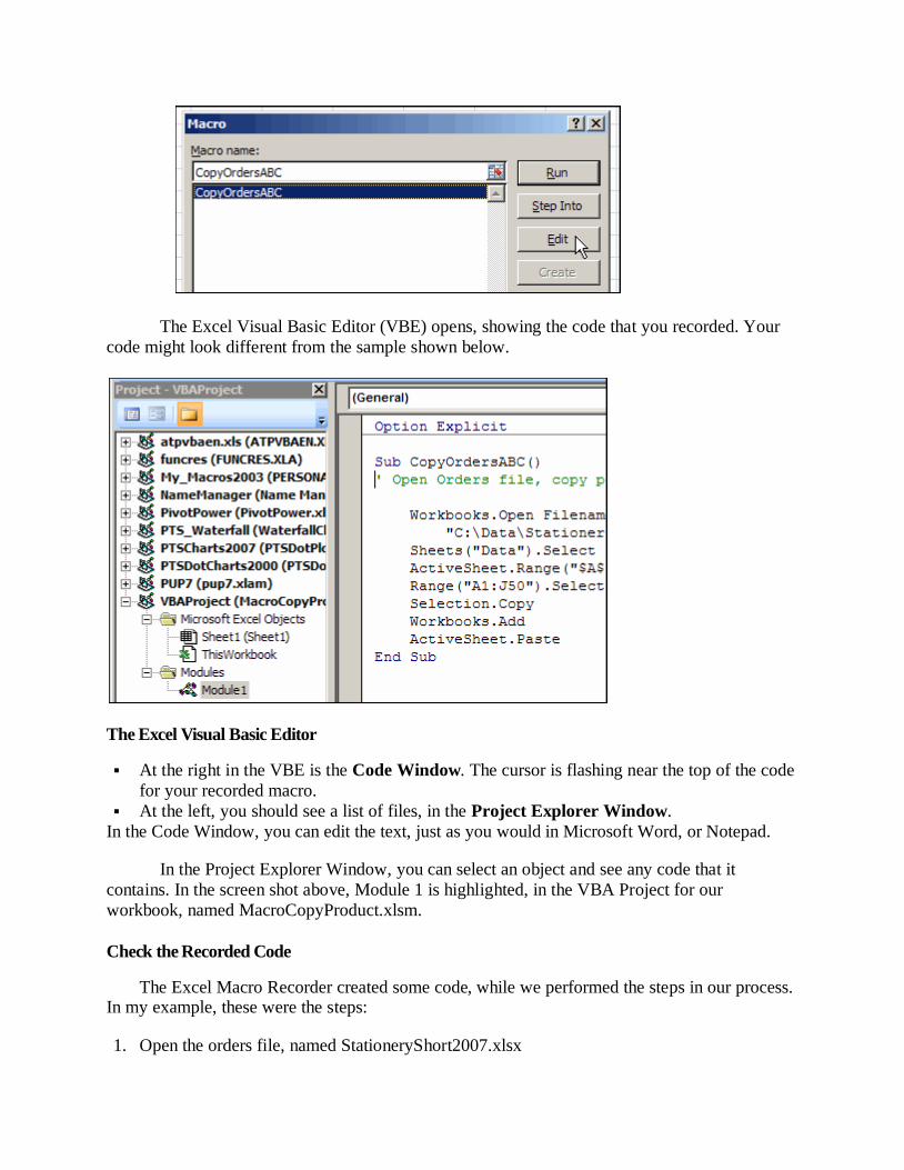
The Excel Visual Basic Editor (VBE) opens, showing the code that you recorded. Your
code might look different from the sample shown below.
The Excel Visual Basic Editor
At the right in the VBE is the Code Window. The cursor is flashing near the top of the code
for your recorded macro.
At the left, you should see a list of files, in the Project Explorer Window.
In the Code Window, you can edit the text, just as you would in Microsoft Word, or Notepad.
In the Project Explorer Window, you can select an object and see any code that it
contains. In the screen shot above, Module 1 is highlighted, in the VBA Project for our
workbook, named MacroCopyProduct.xlsm.
Check the Recorded Code
The Excel Macro Recorder created some code, while we performed the steps in our process. In my example, these were the steps:
1. Open the orders file, named StationeryShort2007.xlsx
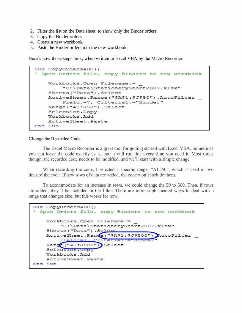
2. Filter the list on the Data sheet, to show only the Binder orders
3. Copy the Binder orders
4. Create a new workbook
5. Paste the Binder orders into the new workbook.
Here’s how those steps look, when written in Excel VBA by the Macro Recorder.
Change the Recorded Code
The Excel Macro Recorder is a great tool for getting started with Excel VBA. Sometimes
you can leave the code exactly as is, and it will run fine every time you need it. Most times though, the recorded code needs to be modified, and we’ll start with a simple change.
When recording the code, I selected a specific range, “A1:J50”, which is used in two
lines of the code. If new rows of data are added, the code won’t include them.
To accommodate for an increase in rows, we could change the 50 to 500. Then, if rows
are added, they’ll be included in the filter. There are more sophisticated ways to deal with a
range that changes size, but this works for now.
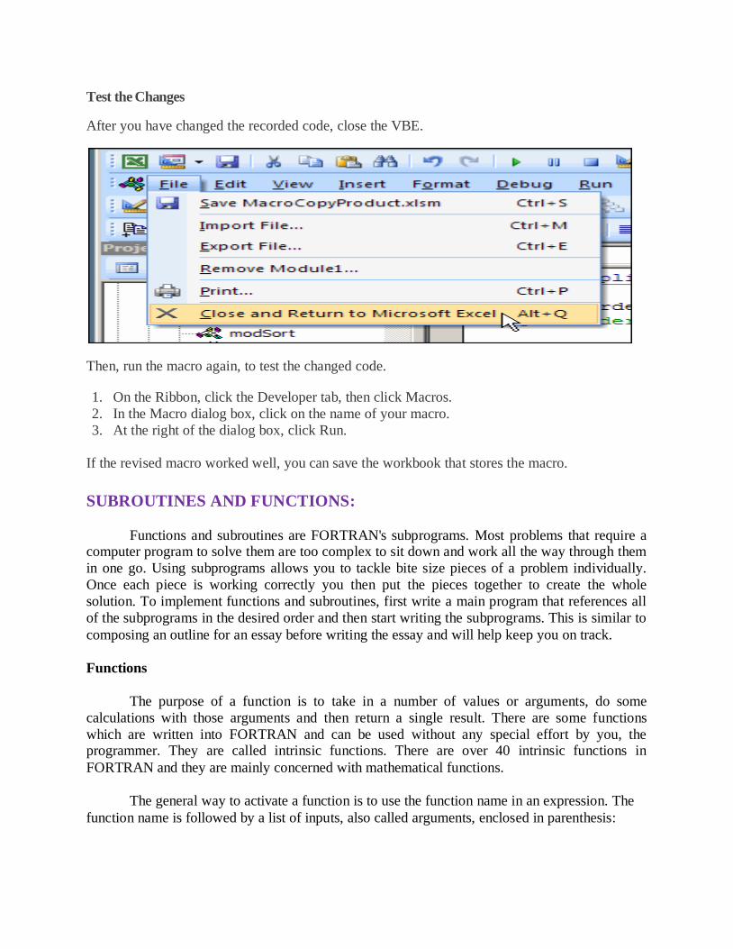
Test the Changes
After you have changed the recorded code, close the VBE.
Then, run the macro again, to test the changed code.
1. On the Ribbon, click the Developer tab, then click Macros.
2. In the Macro dialog box, click on the name of your macro.
3. At the right of the dialog box, click Run.
If the revised macro worked well, you can save the workbook that stores the macro.
SUBROUTINES AND FUNCTIONS:
Functions and subroutines are FORTRAN's subprograms. Most problems that require a computer program to solve them are too complex to sit down and work all the way through them
in one go. Using subprograms allows you to tackle bite size pieces of a problem individually.
Once each piece is working correctly you then put the pieces together to create the whole
solution. To implement functions and subroutines, first write a main program that references all
of the subprograms in the desired order and then start writing the subprograms. This is similar to
composing an outline for an essay before writing the essay and will help keep you on track.
Functions
The purpose of a function is to take in a number of values or arguments, do some
calculations with those arguments and then return a single result. There are some functions
which are written into FORTRAN and can be used without any special effort by you, the programmer. They are called intrinsic functions. There are over 40 intrinsic functions in
FORTRAN and they are mainly concerned with mathematical functions.
The general way to activate a function is to use the function name in an expression. The
function name is followed by a list of inputs, also called arguments, enclosed in parenthesis:
answer = functionname (argumentl, argument2, . . .
Example
PRINT*, ABS (T) The compiler evaluates the absolute value of T and
prints it out
Y = SIN (X) + 45 The compiler calculates the value of sin x, adds 45 then
puts the result into the variable Y, where x is in radians.
M=MAX(a,b,c,d)
The compiler puts the maximum value of a, b, c and d
into the variable M. If a=2, b=4, c=1 and d=7, then M
would have a value of 7.
C=SQRT ( a* * 2
+b* * 2 )
The compiler evaluates the expression, a**2+b**2,
sends that value to the SQRT function, and places the
answer in the variable
As shown by the MAX function example above, a function may have one or more arguments but
will only give one result. Also, as shown by the SQRT function example above, the argument for
a function does not have to be a variable. It can be an expression or even a constant if you want
to reference it again. One last item to remember, you must use result of a function call in an
assignment statement or a PRINT statement, as shown in the examples above.
External Functions
The intrinsic functions in FORTRAN are useful but there will be a time when there is no intrinsic function to meet your needs. When this occurs you may write your own function
subprogram.
You have to do one thing in the main program to use an external function. You need to
declare the function name in the variable declaration section. Function names follow the same
rules as for variable names: less than six letters or numbers and beginning with a letter. Because
of this, function names should not be used as variable names. Once that is done and the function
is written, activating it is just like activating an intrinsic function.
Now you are ready to write your function. There are a few rules for writing external
functions:
Function subprograms and any other subprograms are placed after the END statement of
the main program.
They are started with a line that includes the type of value the function will return, the function name, and the list of arguments the function takes as inputs.
Any variables the function uses, including the arguments, must be declared in the
function right after the first line. The function name is not declared within the function.
You must use the function name in an assignment statement within the function. This is
how the compiler knows which value to pass back to the main program.
A function must finish with RETURN and END statements.
The example program below shows how to write an external function which calculates the
average of three numbers. Note the argument list in the main program does not use the same
variable names as the argument list in the function. This is not a problem because a function is a
self contained entity whose only tie with the main program is the order of the values in the
argument list. So in the first reference to the function, the value in A (5.0) gets transferred to x,
the value in B (2.0) to Y and the value in c (3.0) to z. However, in the third reference to the
function, it is the squared values (25.0, 4.0, 9.0) that are transferred to x, Y and z respectively in
the function. Note also that the variable SUM is used only in the function and therefore is
declared only in the function.
Example Program
PROGRAM FUNDEM
C Declarations for main program
REAL A,B,C
REAL AV, AVSQ1, AVSQ2
REAL AVRAGE
C Enter the data DATA A,B,C/5.0,2.0,3.0/
C Calculate the average of the numbers
AV = AVRAGE(A,B,C)
AVSQ1 = AVRAGE(A,B,C) **2
AVSQ2 = AVRAGE(A**2,B**2,C**2)
PRINT *,'Statistical Analysis'
PRINT *,'The average of the numbers is:',AV
PRINT *,'The average squared of the numbers: ',AVSQl
PRINT *,'The average of the squares is: ', AVSQ2 END
REAL FUNCTION AVRAGE(X,Y,Z)
REAL X,Y,Z,SUM
SUM = X + Y + Z
AVRAGE = SUM /3.0
RETURN
END
Subroutines
You will want to use a function if you need to do a complicated calculation that has only one result which you may or may not want to subsequently use in an expression. Recall the
external function example program where the average was called and then squared in one line.

Subroutines, on the other hand, can return several results. However, calls to subroutines cannot
be placed in an expression.
In the main program, a subroutine is activated by using a CALL statement which include
the subroutine name followed by the list of inputs to and outputs from the subroutine surrounded
by parenthesis. The inputs and outputs are collectively called the arguments.
A subroutine name follows the same rules as for function names and variable names: less
than six letters and numbers and beginning with a letter. Because of this, subroutine names
should be different than those used for variables or functions.
As with functions, there are some rules for using subroutines. Keep these in mind when writing
your subroutines:
You do not need to declare the subroutine name in the main program as you do with a
function name.
They begin with a line that includes the word SUBROUTINE, the name of the
subroutine, and the arguments for the subroutine.
One way of indicating which variables are inputs and which are outputs is to put the inputs
on the first line, use a continuation marker and put the outputs on the second line. See the
example program for an application of this programming style.
All variables used by the subroutine, includJing the arguments, must be declared in the
subroutine. The subroutine name is not declared anywhere in the program.
A subroutine is finished off with a RETURN and an END statement.
Exercise 4: Subroutines
In larger programs it is good programming style to include after the FUNCTION or SUBROUTINE statements comments explaining the meanings of the arguments and what the
subprogram does.
A hint when you are debugging your programs: When extraordinary, incorrect numbers
start appearing from nowhere as your program runs, you probably have not got your subroutine
arguments in the right order in either the main program or in the subroutine. The same trick
applies to functions. Example Program
PROGRAM SUBDEM
REAL A,B,C,SUM,SUMSQ
CALL INPUT( + A,B,C)
CALL CALC(A,B,C,SUM,SUMSQ) CALL OUTPUT(SUM,SUMSQ)
END
SUBROUTINE INPUT(X, Y, Z)

REAL X,Y,Z
PRINT *,'ENTER THREE NUMBERS => '
READ *,X,Y,Z
RETURN END
SUBROUTINE CALC(A,B,C, SUM,SUMSQ)
REAL A,B,C,SUM,SUMSQ
SUM = A + B + C
SUMSQ = SUM **2
RETURN
END
SUBROUTINE OUTPUT(SUM,SUMSQ) REAL SUM, SUMSQ
PRINT *,'The sum of the numbers you entered are: ',SUM
PRINT *,'And the square of the sum is:',SUMSQ
RETURN
END
Now go to the exercises and work your way through the subprograms and functions.
TYPES OF FUNCTIONS AND SUBPROGRAMS Functions and subprograms can be grouped into several categories;
Intrinsic or "built-in" functions
Statement or "one-line" functions (Note: This link is optional)
Function subprograms
Subroutines
INTRINSIC FUNCTIONS
The intrinsic functions are the set of "built-in" or library functions that all versions of
FORTRAN provide. These are such things as SIN, COS, EXP,...
The user of these functions "passes" one or more arguments to the function.
e.g., Y = COS(0.0) ABMX = MAX (A,B)
0.0, A and B are called "arguments"
FUNCTION SUBPROGRAMS
A FUNCTION subprogram is a "mini-program", that is, a collection of program statements which make it look like a program.
Functions, being separate entities, perform separate, specific tasks.
Functions are defined outside of the main program. They can either be written after the
END of the main program or in another file altogether. Since they are separate from the main
program they can be used again by other programs by simply attaching them to the other
program or putting them in a library.
The general form of a FUNCTION looks like;
FUNCTION name (arguments)
declarations
subprogram statements
RETURN
END
The function name must follow the same rules as the names for PROGRAM statements. (<=6 char's, 1st is a letter)
The arguments that appear in the function definition are called "dummy" or "formal"
arguments. These can be thought of as "place holders" for the actual arguments which
will be "passed" to it when the function is referenced. Arguments are separated by
commas and enclosed by parentheses.
Actual arguments are the values of the real arguments used when the function is
referenced in an executable statement.
It is important to remember that their names may be different, yet they must agree in total
number and type.
Just like in a main program, the variables in the argument list must be TYPED, this
includes the FUNCTION NAME. Normal default naming conventions apply for
integers/reals.
Somewhere in the collection of executable statements, the FUNCTION NAME MUST BE GIVEN A VALUE.
Just like intrinsic functions, a user-written FUNCTION returns a single value.
The subprogram is terminated with an END statement. It is common practice to use a
RETURN statement just before the END, but it is not required. A RETURN could also be
placed elsewhere in the function which will cause the function to exit back to the calling
program.
FUNCTIONS contain:
o Opening documentation
o Comments scattered liberally throughout
o Any executable FORTRAN statement o Even references to other functions/subroutines
An example: a function that calculates the factorial of the input number, N.
FUNCTION FACTRL (N)
C This function computes n!, i.e. n*(n-1)*(n-2)*...*1
INTEGER FACTRL, N, I
FACTRL = 1
IF ( N .GT. 1 ) THEN
DO 10 I = 2, N
FACTRL = FACTRL * I
10 CONTINUE
END IF
END
This function could immediately follow the main program which references it. A reference to
this function in the main program might look like; :
TERMA = FACTRL (4) (24 will be stored for TERMA)
:
Note that 4 is the ACTUAL ARGUMENT in this case. An INTEGER VARIABLE could also
have been used.
IMPORTANT: ARGUMENTS MUST AGREE IN NUMBER AND TYPE.
SUBROUTINES: Subroutines are very much like FUNCTIONS in that they are independent program units
or modules, but they differ from functions in several important ways.
1. Functions return a single value to the program that references them whereas
SUBROUTINES may return more than one value, or none at all.
2. Functions return values via the function name; subroutines return values via arguments.
3. A functions is referenced by using its name in an expression, whereas a subroutine is
referenced by a CALL statement.
The general form of a SUBROUTINE is similar to that of a FUNCTION (and thus other program
units);
SUBROUTINE name (arguments)
declarations
subprogram statements
RETURN
END
NAME is the name given to the subroutine and must follow the same rules as variables.
However, NAME can not have a type. . The subroutines has a list of arguments which are optional (the parens are omitted if there
are no arguments).
In a subroutine, values are returned via the arguments. This means that if an argument is
changed in the subroutine then the corresponding ACTUAL argument is changed in the
CALLing program.
Subroutines are more versatile than functions because they can modify arguments, use
them without modification, or require no arguments at all.
As in functions it is a general practice, but not required, to use a RETURN statement
before the END. A RETURN statement elsewhere in the subroutine will return control
back to the calling program.
The subroutine is "called" as follows:
CALL name (arguments)
* IMPORTANT: The number and type of the arguments in the CALLing statement must
agree with the number and type of the arguments in the SUBROUTINE.
Some subroutine examples;
With no arguments With input/output arguments
SUBROUTINE MESSAG SUBROUTINE CONVER (R, TH, X, Y)
REAL R, TH, X, Y
PRINT*,'THIS MESSAGE'
RETURN X = R * COS(TH)
END Y = R * SIN(TH)
RETURN
END
The subroutine on the left has no arguments and simply prints out a message when it is called.
The subroutine on the right uses the values for R, TH in polar coords and converts these into
rectangular coords using the output variables X, Y.
Separate sets of INPUT and OUTPUT variables are used quite often in subroutines.
Typically, the INPUT values are listed first, and the OUTPUT arguments are last.
PASSING ARGUMENTS
Actual arguments are "passed" to the subprograms and used in place of the formal arguments. As previously stated, the actual arguments may have different names than the formal arguments
BUT they must agree in NUMBER and TYPE.
Simple variables are the easiest to pass, but there are several implications to consider.
* Note that you can use an expression as an actual argument. The expression will be evaluated
before passing and the type must agree with the formal argument.
Arrays are passed by using the array's name. There are a few notes to consider.
* The corresponding array argument in the subroutine must be dimensioned no larger than the
actual array in the main program.
* Note that an array element is handled the same as a simple variable. i.e, ALPHA(4) refers to
one simple variable.
* Arrays may have "adjustable" dimensions, that is you may dimension an array in a subroutine
based on the value of one of the arguments.
SUBROUTINE STUFF (AX, BX, N)
REAL AX(N), BX(N)
:
Here's how the main program might look in this case: C PROGRAM COMPUTE
REAL X(100), Y(100)
C read in some data. Check to make sure n is less than or equal to 100.
open(1,file='xy.data')
READ(1,*) NPTS
IF (N .GT. 100) THEN
write(6,*) ' N too large for program. Make dimensions bigger and try
again'
stop
ELSE
DO 100 I=1,NPTS
READ(1,*) X(I), Y(I)
100 CONTINUE
END IF
C
C CAll subroutine STUFF to do some "stuff":
CALL STUFF(X,Y,NPTS)
.
.
.
END
SUBROUTINE STUFF(AX,BX,N)
REAL AX(N), BX(N)
:
C Subroutine STUFF starts directly after the END statement of the main
program.
C
Your subprograms can either directly follow your main program in one file, or may be
exist as separate files and be compiled separately and then linked.
DECISION RULES:
A decision rule is a set of conditions that classify records. The rule predicts an outcome
in the target field.
Viewing the decision rules helps you determine which conditions are likely to result in a
specific outcome. For example, consider some hypothetical decision rules that could predict
churn. These rules might identify classifications based on the ranges for customer age and
number of previous claims. From these rules, you might observe that customer who have no or 1
claim and are older than 50 are more likely to churn. The decision rule corresponds to a branch
in a decision tree.

MESSAGE BOX AND INPUT BOX
Input Box and Message Box are two useful functions. Each opens a dialog window, which closes
when the user responds. The Input Box is used to get input from the user and Message Box is
used for output. These illustrated in this simple message program. The following is its listing:
Private Sub Button1_Click (ByVal sender As System.Object, ByVal e As System.EventArgs)
Handles Button 1.Click
Dim strName As String
strName = InputBox("What is your name?")
MsgBox("Thanks, " & strName & ". I have been waiting weeks for someone to do that.")
End Sub
In this example, the Input Box function has one argument, a string that is used to prompt the user. The function returns whatever the user enters. (If the user clicks on the cancel button, a
string of length zero is returned).
The Message Box function also has one argument in this example. It is a string to be displayed in
the message box.
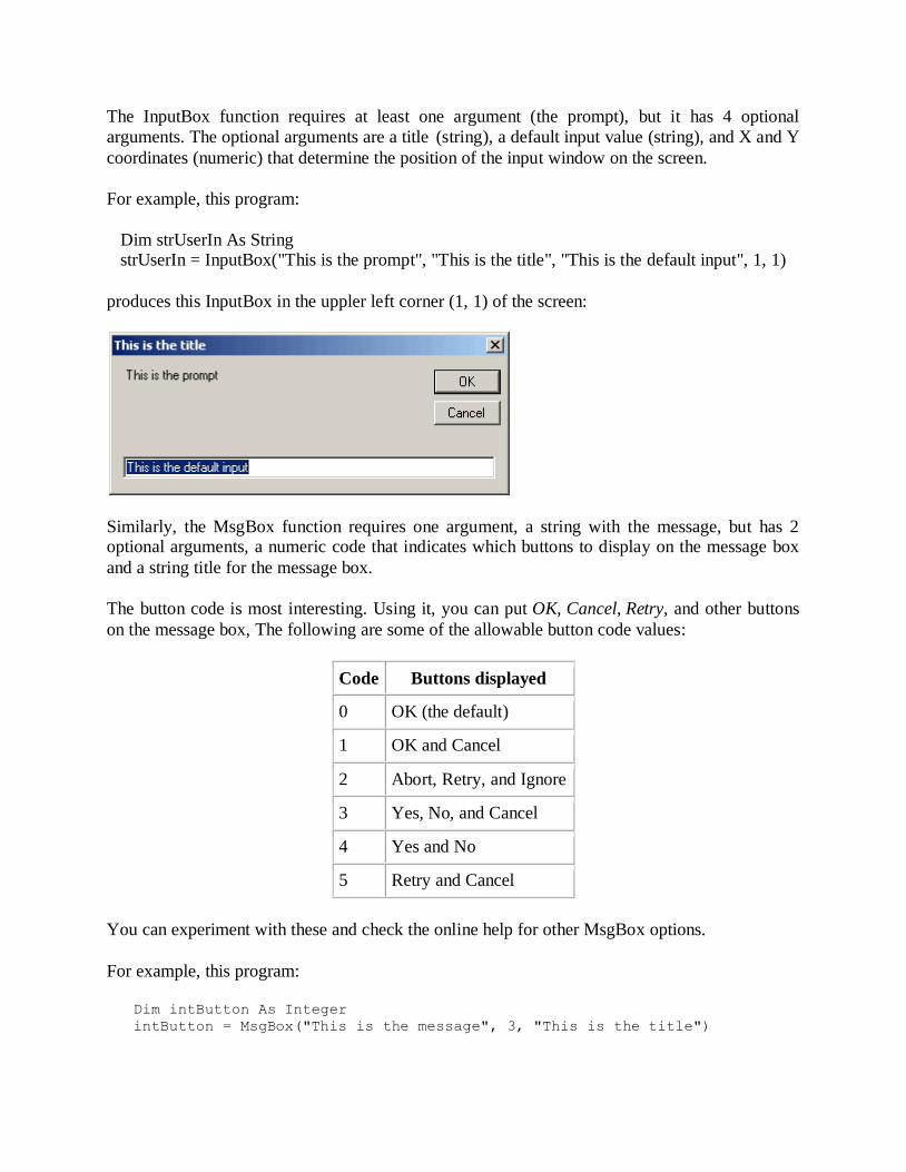
The InputBox function requires at least one argument (the prompt), but it has 4 optional
arguments. The optional arguments are a title (string), a default input value (string), and X and Y
coordinates (numeric) that determine the position of the input window on the screen.
For example, this program:
Dim strUserIn As String strUserIn = InputBox("This is the prompt", "This is the title", "This is the default input", 1, 1)
produces this InputBox in the uppler left corner (1, 1) of the screen:
Similarly, the MsgBox function requires one argument, a string with the message, but has 2 optional arguments, a numeric code that indicates which buttons to display on the message box
and a string title for the message box.
The button code is most interesting. Using it, you can put OK, Cancel, Retry, and other buttons
on the message box, The following are some of the allowable button code values:
Code Buttons displayed
0 OK (the default)
1 OK and Cancel
2 Abort, Retry, and Ignore
3 Yes, No, and Cancel
4 Yes and No
5 Retry and Cancel
You can experiment with these and check the online help for other MsgBox options.
For example, this program:
Dim intButton As Integer
intButton = MsgBox("This is the message", 3, "This is the title")
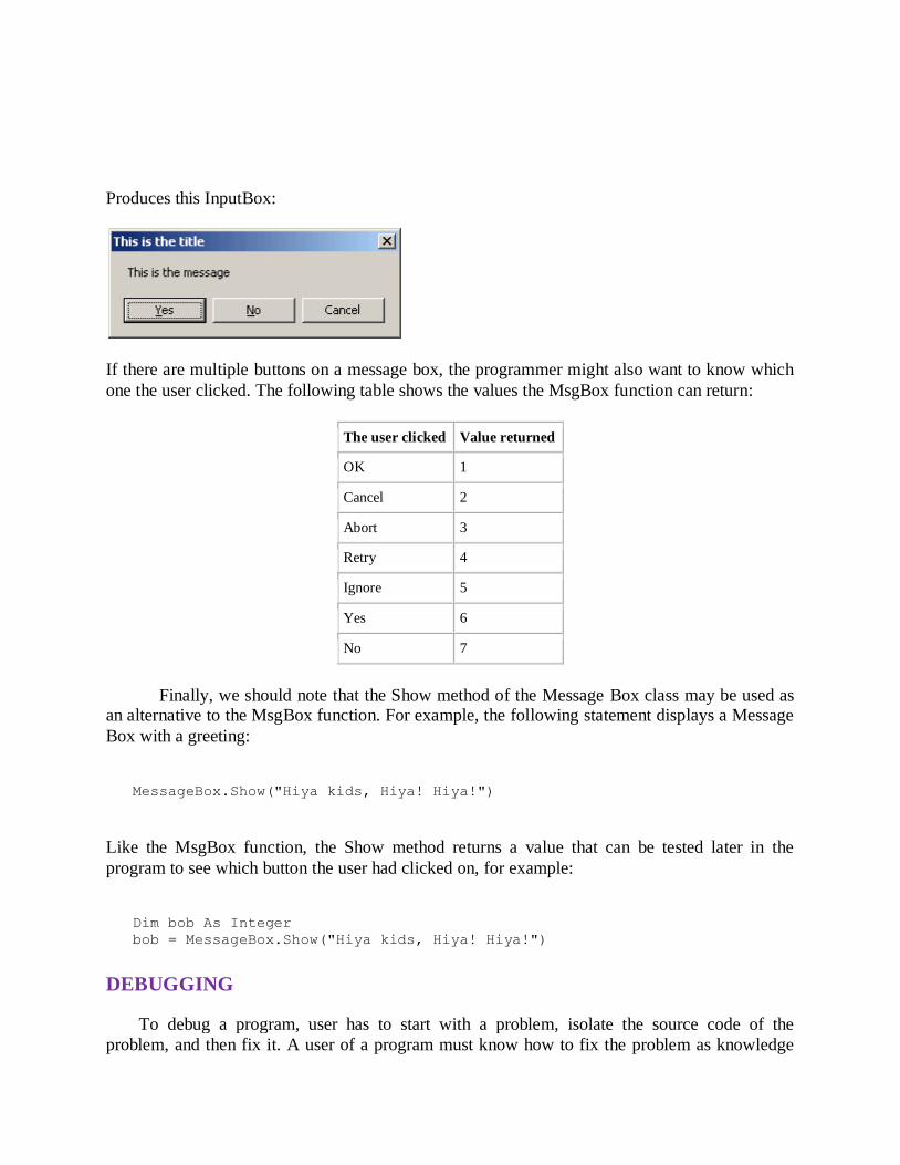
Produces this InputBox:
If there are multiple buttons on a message box, the programmer might also want to know which
one the user clicked. The following table shows the values the MsgBox function can return:
The user clicked Value returned
OK 1
Cancel 2
Abort 3
Retry 4
Ignore 5
Yes 6
No 7
Finally, we should note that the Show method of the Message Box class may be used as an alternative to the MsgBox function. For example, the following statement displays a Message
Box with a greeting:
MessageBox.Show("Hiya kids, Hiya! Hiya!")
Like the MsgBox function, the Show method returns a value that can be tested later in the
program to see which button the user had clicked on, for example:
Dim bob As Integer
bob = MessageBox.Show("Hiya kids, Hiya! Hiya!")
DEBUGGING
To debug a program, user has to start with a problem, isolate the source code of the
problem, and then fix it. A user of a program must know how to fix the problem as knowledge
about problem analysis is expected. When the bug is fixed, then the software is ready to use.
Debugging tools (called debuggers) are used to identify coding errors at various development
stages. They are used to reproduce the conditions in which error has occurred, then examine the
program state at that time and locate the cause. Programmers can trace the program execution
step-by-step by evaluating the value of variables and stop the execution wherever required to get
the value of variables or reset the program variables. Some programming language packages provide a debugger for checking the code for errors while it is being written at run time.
Here's the debugging process:
1. Reproduce the problem.
2. Describe the bug. Try to get as much input from the user to get the exact reason.
3. Capture the program snapshot when the bug appears. Try to get all the variable values and
states of the program at that time.
4. Analyse the snapshot based on the state and action. Based on that try to find the cause of the
bug. 5. Fix the existing bug, but also check that any new bug does not occur.
DESIGNING ADVANCED FINANCIAL MODELS USING VISUAL BASIC
APPLICATION USER FORMS
Automation is the buzz word in today’s corporate world. Whether it is manufacturing
industry or the service industry, all businesses are aiming to reduce the human element for
critical processes and tasks to improve efficiency and output. As a finance aspirant, you will see
this trend in finance companies as well. Calculators are replaced by laptops, ledgers are replaced
by spreadsheets and hard bound documented financial models are replaced by dashboards. If
you want to pursue a career in finance, it is of utmost important for you to know the latest trends
in your domain, and more importantly how to use automation in your day to day activities as a
finance professional. In this article, I will tell you about financial modeling using advanced
functions like VBA (Visual Basic Application) in excel.
Advantages of Financial Modeling using VBA
1. Excellent output with minimum input
You must have used Excel at some point in your student life. But how much do you
actually know about the power of Excel? Excel comes with the most astonishing tools when it
comes to financial modeling. Explore the options in order to fully utilize the potential offering in
excel. There are so many commands and functions which, not many people know, but are
embedded in Excel and can yield excellent results if utilized properly.
2. Speedy operations
One of the biggest advantages of using excel and VBA in financial modeling is the speed
at which your data set is processed. Once the logic is defined and variables are set, all you have

to do is feed in the required data in the variables’ cells and with the click of a button you can
arrive at data points which otherwise are very time consuming to arrive at.
3. Accuracy
If you input the correct data, and maintain a sound logic in designing your algorithms,
there is no way on earth you can get wrong analysis output. Humans are bound to make
mistakes, but Excel doesn’t have that flaw. And accuracy is of utmost importance while
analyzing large sets of data, especially when the numbers (input or output) represent a huge sum
of money.
4. Ease of comprehension
Excel enables you to represent your data in a visually appealing as well as easy to
understand way. There are many chart options that help you in representing analysis in a very
simplified manner. Features like trend lines, bubble charts, pie-in-pie charts and 3D charts are
very useful and save a lot of comprehension time on the part of stakeholders and decision
makers.
How to Create a Financial Model Using Excel and VBA?
According to me, the key to creating a good financial model is having a systematic
approach. Before even starting on creating a model, take a minute out and systematically design
a broad structure of your model on a piece of paper. It will immensely help you in the actual
creation of your model. Following are the seven steps you should follow while creating a
financial model using excel and VBA:
1. Define the problem
The first step here should be establishing the need behind creating a financial model. Try
to ask yourself this question – “what problem statement does this model aim to address?’’.
Depending on the answer, you will be able to determine what all insights you need from the
model. I sincerely suggest that please discuss this with as many stake holders of the model as
possible. It will give you clarity and the third person perspective.
2. Structure the logic
You should know that VBA is nothing but a programming language that enables logic
and a defined outcome using a string of characters. This is the most time consuming part of
creating a financial model using VBA in excel. Please be very careful while structuring the logic
and syntax, as even a small error on your part can lead to huge discrepancies in the model. You
need not be an expert in VBA to do so, just stick to the basics and try to simplify the logic as
much as possible.
3. Identify the input variables
This is one of the trickiest parts of financial modeling using Excel. There are variables –
independent and dependent. Independent variables are usually the scattered numbers that you
feed in without using any formulae. Their value or function doesn’t change unless you manually
change those numbers. While on the other hand dependent variables will vary depending on the
independent variables. To give you a very simple example – if you want to calculate service tax
of 10% that you pay in a restaurant, you will need a bill amount. That bill amount becomes the
independent variable, whereas the tax that you would end up paying becomes the dependent
variable as it depends on the bill amount. Make sure that the input variables are correctly entered
into the spreadsheet and correct function is applied to arrive at the output.
4. Define the output
The output is the reason why you are making this model in the first place. Make sure that
it gets calculated in the right manner and format the output cells appropriately. For example – if
your output that you want is in percentage terms, and if the output cell is not formatted in the right manner, there is high probability that you might get misleading numbers. Let’s say the
output value is 10%, but if the cell is not formatted in percentage it might show the figure as 0.1.
5. Pilot run
After you have done the above mentioned things, try out the model with some dummy
numbers. I suggest, use simple and smaller numbers to do this. Use multiples of hundreds or
thousands for independent variables since it becomes easier for you to manually check the desired output. Another thing that you should keep in mind here is that do not use large sets of
data initially. Start by using small data sets, which makes identifying bugs and errors easier when
compared to large sets of data. If your model is very big, or in other words has a lot of formulae
and algorithms, you can test run at every step and at regular intervals before running the pilot at
the end of completion.
6. Record/document the model
Once you have done the pilot test of you model, the next step is to record all your logic,
syntax, functions and formulae, preferably in a word document or notepad. Even better if you
spend a little more time and prepare a process document with screen shots. It has two
advantages – one – it would be easier for you or someone else to replicate a few common
functions at a later stage for the same model or some other model that you might work on. And
two, if there are any changes that are to be made at a later stage; you would exactly know where
to do the edits. It would save a lot of time for you if you have it readily documented at some
place rather than playing around with the model worksheet.
7. Monitor and update
Your work doesn’t end with the completion of the model… You should ideally go back
to the model every once in a while to look for bugs, redundancies and errors. It is highly
unlikely that you would be able to come up with an excellent model at the first go. Keep on
trying to simplify it and monitor the output at regular intervals. Here are a few things that you
should keep in mind while you are working on a model in Excel. Apart from the functions and
formulae that you will use, the following things will help you in smooth operations and
ultimately a better and faster output:
1. Use of short cuts
Since we have established that speed carries a lot of importance, using keyboard short
cuts will enable faster work and improved efficiency. There are short cuts right from opening up
tool bars to creating formulae to running an entire macro. Please start using these short cuts at a
very early stage, because with a little bit of practice you will know how much time and effort is
saved by using those.
2. Using Excel Help
You cannot possibly know everything about Excel whatever your level of expertise is.
Please do not shy away from using the inbuilt Help option in your excel. Everything you need to
know about functions and formulae will be there. If the language and explanation there isn’t
enough for you, then you can always go online and look up for help. The point is, please make
sure that you use this option, it will save up a lot of your time.
3. Conditional formatting
Use of various colors, fonts, sizes and signs can give a whole new look and feel to the
dashboard of your financial model. It has been proved very helpful to the modelers around the
globe to make their models user-friendly and efficient.
4. Nomenclature
Naming you columns and rows appropriately carries a lot of weight in financial
modeling. Avoid using ambiguous titles. Be precise. It would be helpful for other people who
might use this model without your presence.
OTHER ADVANCED FEATURES
We all know that Excel is packed with tons of powerful features, libraries of formulas
and galleries of interesting charts, making it one of the most useful tools for business analysts. I
believe that, among the great secrets of Excel, there are several that are easy to use and quickly
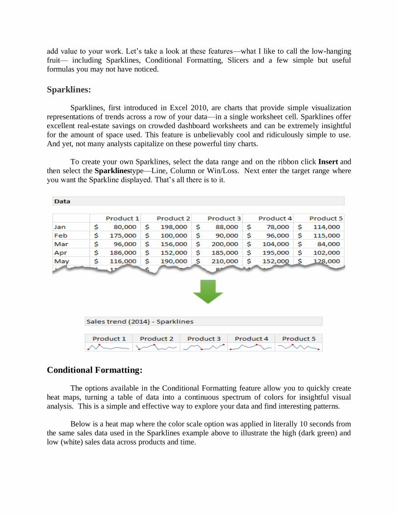
add value to your work. Let’s take a look at these features—what I like to call the low-hanging
fruit— including Sparklines, Conditional Formatting, Slicers and a few simple but useful
formulas you may not have noticed.
Sparklines:
Sparklines, first introduced in Excel 2010, are charts that provide simple visualization
representations of trends across a row of your data—in a single worksheet cell. Sparklines offer
excellent real-estate savings on crowded dashboard worksheets and can be extremely insightful
for the amount of space used. This feature is unbelievably cool and ridiculously simple to use.
And yet, not many analysts capitalize on these powerful tiny charts.
To create your own Sparklines, select the data range and on the ribbon click Insert and
then select the Sparklinestype—Line, Column or Win/Loss. Next enter the target range where
you want the Sparkline displayed. That’s all there is to it.
Conditional Formatting:
The options available in the Conditional Formatting feature allow you to quickly create
heat maps, turning a table of data into a continuous spectrum of colors for insightful visual
analysis. This is a simple and effective way to explore your data and find interesting patterns.
Below is a heat map where the color scale option was applied in literally 10 seconds from
the same sales data used in the Sparklines example above to illustrate the high (dark green) and
low (white) sales data across products and time.
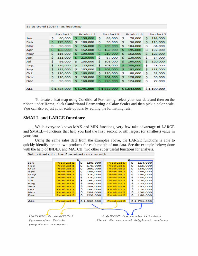
To create a heat map using Conditional Formatting, select your raw data and then on the ribbon under Home, click Conditional Formatting > Color Scales and then pick a color scale.
You can also adjust color scale options by editing the formatting rule.
SMALL and LARGE functions:
While everyone knows MAX and MIN functions, very few take advantage of LARGE
and SMALL—functions that help you find the first, second or nth largest (or smallest) value in
your data.
Using the same sales data from the examples above, the LARGE functions is able to
quickly identify the top two products for each month of our data. See the example below; done
with the help of INDEX and MATCH, two other super useful functions for analysis.
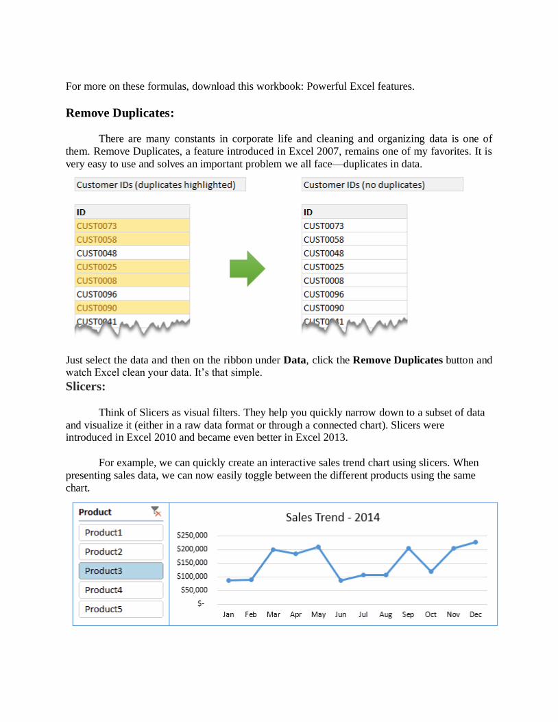
For more on these formulas, download this workbook: Powerful Excel features.
Remove Duplicates:
There are many constants in corporate life and cleaning and organizing data is one of
them. Remove Duplicates, a feature introduced in Excel 2007, remains one of my favorites. It is
very easy to use and solves an important problem we all face—duplicates in data.
Just select the data and then on the ribbon under Data, click the Remove Duplicates button and watch Excel clean your data. It’s that simple.
Slicers:
Think of Slicers as visual filters. They help you quickly narrow down to a subset of data
and visualize it (either in a raw data format or through a connected chart). Slicers were introduced in Excel 2010 and became even better in Excel 2013.
For example, we can quickly create an interactive sales trend chart using slicers. When
presenting sales data, we can now easily toggle between the different products using the same
chart.
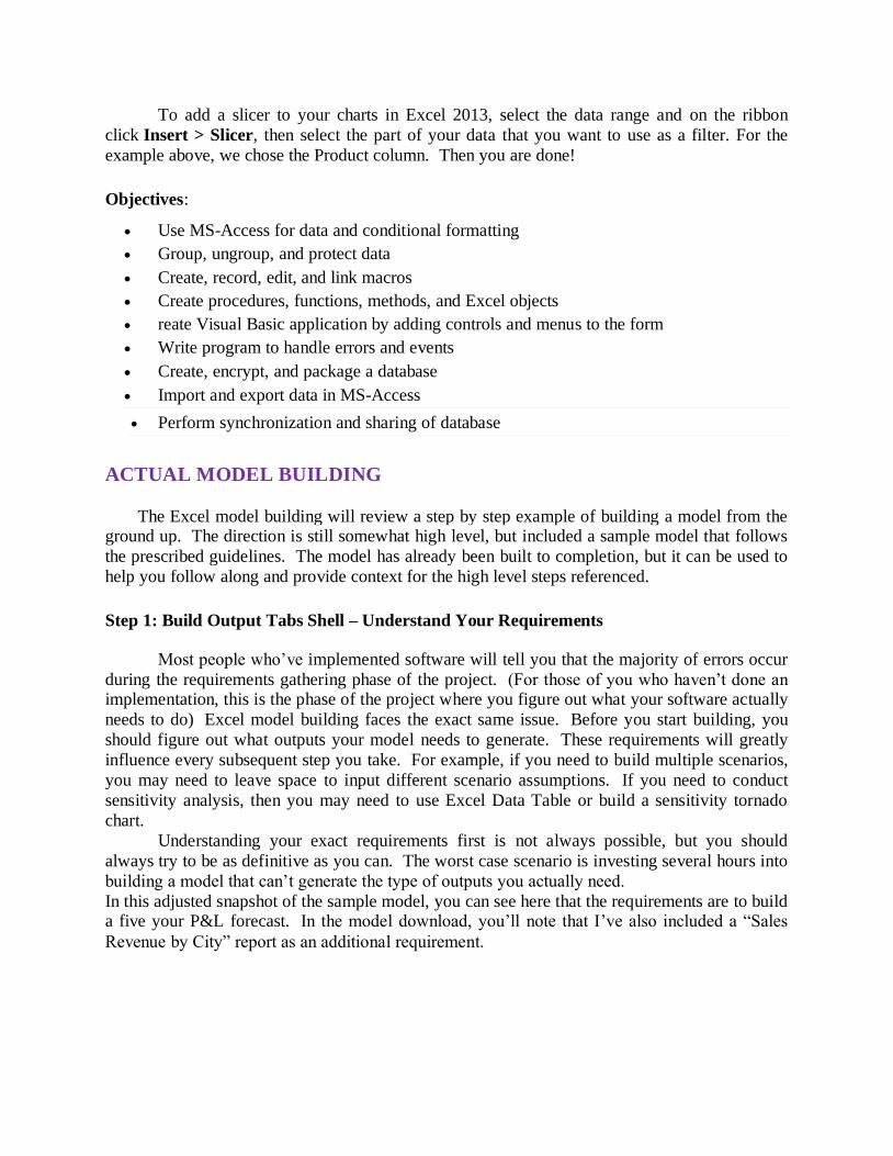
To add a slicer to your charts in Excel 2013, select the data range and on the ribbon
click Insert > Slicer, then select the part of your data that you want to use as a filter. For the
example above, we chose the Product column. Then you are done!
Objectives:
Use MS-Access for data and conditional formatting
Group, ungroup, and protect data
Create, record, edit, and link macros
Create procedures, functions, methods, and Excel objects
reate Visual Basic application by adding controls and menus to the form
Write program to handle errors and events
Create, encrypt, and package a database
Import and export data in MS-Access
Perform synchronization and sharing of database
ACTUAL MODEL BUILDING
The Excel model building will review a step by step example of building a model from the ground up. The direction is still somewhat high level, but included a sample model that follows
the prescribed guidelines. The model has already been built to completion, but it can be used to
help you follow along and provide context for the high level steps referenced.
Step 1: Build Output Tabs Shell – Understand Your Requirements
Most people who’ve implemented software will tell you that the majority of errors occur
during the requirements gathering phase of the project. (For those of you who haven’t done an implementation, this is the phase of the project where you figure out what your software actually
needs to do) Excel model building faces the exact same issue. Before you start building, you
should figure out what outputs your model needs to generate. These requirements will greatly
influence every subsequent step you take. For example, if you need to build multiple scenarios,
you may need to leave space to input different scenario assumptions. If you need to conduct
sensitivity analysis, then you may need to use Excel Data Table or build a sensitivity tornado
chart.
Understanding your exact requirements first is not always possible, but you should
always try to be as definitive as you can. The worst case scenario is investing several hours into
building a model that can’t generate the type of outputs you actually need.
In this adjusted snapshot of the sample model, you can see here that the requirements are to build a five your P&L forecast. In the model download, you’ll note that I’ve also included a “Sales
Revenue by City” report as an additional requirement.
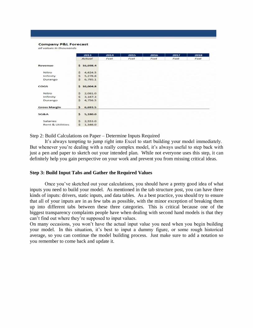
Step 2: Build Calculations on Paper – Determine Inputs Required It’s always tempting to jump right into Excel to start building your model immediately.
But whenever you’re dealing with a really complex model, it’s always useful to step back with
just a pen and paper to sketch out your intended plan. While not everyone uses this step, it can
definitely help you gain perspective on your work and prevent you from missing critical ideas.
Step 3: Build Input Tabs and Gather the Required Values
Once you’ve sketched out your calculations, you should have a pretty good idea of what
inputs you need to build your model. As mentioned in the tab structure post, you can have three
kinds of inputs: drivers, static inputs, and data tables. As a best practice, you should try to ensure
that all of your inputs are in as few tabs as possible, with the minor exception of breaking them
up into different tabs between these three categories. This is critical because one of the
biggest transparency complaints people have when dealing with second hand models is that they
can’t find out where they’re supposed to input values.
On many occasions, you won’t have the actual input value you need when you begin building your model. In this situation, it’s best to input a dummy figure, or some rough historical
average, so you can continue the model building process. Just make sure to add a notation so
you remember to come back and update it.
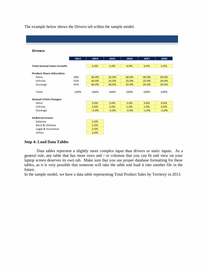
The example below shows the Drivers tab within the sample model.
Step 4: Load Data Tables
Data tables represent a slightly more complex input than drivers or static inputs. As a
general rule, any table that has more rows and / or columns that you can fit and view on your
laptop screen deserves its own tab. Make sure that you use proper database formatting for these
tables, as it is very possible that someone will take the table and load it into another file in the
future.
In the sample model, we have a data table representing Total Product Sales by Territory in 2013.
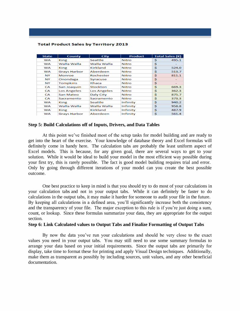
Step 5: Build Calculations off of Inputs, Drivers, and Data Tables
At this point we’ve finished most of the setup tasks for model building and are ready to
get into the heart of the exercise. Your knowledge of database theory and Excel formulas will
definitely come in handy here. The calculation tabs are probably the least uniform aspect of
Excel models. This is because, for any given goal, there are several ways to get to your
solution. While it would be ideal to build your model in the most efficient way possible during
your first try, this is rarely possible. The fact is good model building requires trial and error.
Only by going through different iterations of your model can you create the best possible
outcome.
One best practice to keep in mind is that you should try to do most of your calculations in
your calculation tabs and not in your output tabs. While it can definitely be faster to do
calculations in the output tabs, it may make it harder for someone to audit your file in the future.
By keeping all calculations in a defined area, you’ll significantly increase both the consistency
and the transparency of your file. The major exception to this rule is if you’re just doing a sum, count, or lookup. Since these formulas summarize your data, they are appropriate for the output
section.
Step 6: Link Calculated values to Output Tabs and Finalize Formatting of Output Tabs
By now the data you’ve run your calculations and should be very close to the exact
values you need in your output tabs. You may still need to use some summary formulas to
arrange your data based on your initial requirements. Since the output tabs are primarily for
display, take time to format these for printing and apply Visual Design techniques. Additionally,
make them as transparent as possibly by including sources, unit values, and any other beneficial
documentation.

Step 7: Build Your Index Tab
At this point, you should have the majority of your tabs in place for your model.
Building your Index Tab will significantly help summarize the scope and functionality of your model. Make sure that every tab you’ve created is documented and described. If you realize that
any tabs are unnecessary, remove them. You will probably need to update this tab periodically if
any aspect of your model changes.
An example below of the Index Tab for the sample model.
Step 8: Link Key Output Values to Drivers Tab to Perform Scenario and Sensitivity
Analysis
As you get towards the end of the model building process, it’s very likely that you’ll want
to conduct some form of scenario or sensitivity analysis. To prepare for this step, you should
determine what output values are the most important to your analysis and link them back to your
drivers tab. The process for doing so is relatively simple and shouldn’t take much more than
using the equals sign to write a simple linking formula. Additionally, you’ll obviously need to
understand which of your drivers are most likely to change and have a reasonable range of
possible values for these variables. These factors will be completely dependent on the specific
type of model you are building. Another potential option for sensitivity analysis is to use Excel’s
Watch Window feature. While this is a great tool for sensitivity specifically, linking your output
values to the drivers tab is the best way to create defined scenarios.

Step 9: Create Documentation and Finish Index Tab
As mentioned before, few Excel models ever have adequate documentation. This
additional step adds to your workload and no one really enjoys doing it. However, having documentation can make a huge difference to whomever you might hand your off work to. I like
to think of documentation as an insurance policy; put in a little work now, and you’ll
significantly reduce the need to answer questions in the future. You’ll also be much less likely to
forget your own methodology if you ever need to come back to your file.
Documentation doesn’t have to be a long winded user guide that takes several hours to write. It
can take the form of comment boxes in cells, notes in formulas, or just a separate tab in the Excel
document explaining your assumptions. All of these things further the transparency of your
model and should be included if possible.
For the sample model, included the documentation as a linked web page, in case it needs
to be updated in the future.
Step 10: Add Cell & Workbook Protection Where Appropriate
This last step is important if you plan to either widely distribute your file or solicit inputs
from your colleagues. This is especially important in the latter scenario because before you save a new version of your file, you want cell protection in areas that should not be adjusted as well as
a clear understanding of what sections your colleagues had the ability to change. The process of
protecting your file is fairly simple: you just need to choose which cells will be editable by other
users and then assign a password to your workbook.
You’ll notice in the sample model, I’ve protected the Index Tab where the link to the
documentation exists. That way, it reduces the likelihood that this sample model will be sent out
without the accompanying documentation.
----oooOooo---