finance and economics discussion series divisions of
TRANSCRIPT
Finance and Economics Discussion SeriesDivisions of Research & Statistics and Monetary Affairs
Federal Reserve Board, Washington, D.C.
Stress Testing Household Debt
Neil Bhutta, Jesse Bricker, Lisa Dettling, Jimmy Kelliher, andSteven Laufer
2019-008
Please cite this paper as:Bhutta, Neil, Jesse Bricker, Lisa Dettling, Jimmy Kelliher, and Steven Laufer(2019). “Stress Testing Household Debt,” Finance and Economics Discussion Se-ries 2019-008. Washington: Board of Governors of the Federal Reserve System,https://doi.org/10.17016/FEDS.2019.008.
NOTE: Staff working papers in the Finance and Economics Discussion Series (FEDS) are preliminarymaterials circulated to stimulate discussion and critical comment. The analysis and conclusions set forthare those of the authors and do not indicate concurrence by other members of the research staff or theBoard of Governors. References in publications to the Finance and Economics Discussion Series (other thanacknowledgement) should be cleared with the author(s) to protect the tentative character of these papers.

Stress Testing Household Debt ∗
Neil Bhutta Jesse Bricker Lisa DettlingJimmy Kelliher Steven Laufer
Federal Reserve Board
January 11, 2019
Abstract
We estimate a county-level model of household delinquency and use it to conduct“stress tests” of household debt. Applying house price and unemployment rate shocksfrom Comprehensive Capital Analysis Review (CCAR) stress tests, we find that fore-casted delinquency rates for the recent stock of debt are moderately lower than for thestock of debt before the 2007-09 financial crisis, given the same set of shocks. Thisdecline in expected delinquency rates under stress reflects an improvement in debt-to-income ratios and an increase in the share of debt held by borrowers with relativelyhigh credit scores. Under an alternative scenario where the size of house price shocksdepends on housing valuations, we forecast a much lower delinquency rate than oc-curred during the crisis, reflecting more reasonable housing valuations than pre-crisis.Stress tests using other scenarios for the path of house prices and unemployment alsosupport the conclusion that household debt currently poses a lower risk to financialstability than before the financial crisis.
JEL Codes: D14, E37, G01
Keywords: loan default, stress test, household debt, delinquency
∗[email protected], [email protected], [email protected], [email protected],[email protected]. The analysis and conclusions set forth are those of the authors and do notindicate concurrence by other members of the research staff or the Board of Governors. We would like tothank Kathy Bi for excellent research assistance, and thank Raven Molloy, Kevin Moore, Michael Palumbo,Shane Sherlund, Robert Sarama, John Sabelhaus and audiences at the Federal Reserve Board and theFederal Reserve Bank of Philadelphia for helpful comments and discussions.
1

1 Introduction
From 2000 to 2008, nominal debt owed by U.S. households doubled from about $7 trillion to
more than $14 trillion, driven primarily by an increase in mortgage borrowing. This increase
in household indebtedness and subsequent mortgage defaults are thought by many observers
to have played an important role in creating the 2007-09 financial crisis and economic re-
cession in the U.S. (e.g. Mian and Sufi [2010, 2014]). Indeed, past crises in the U.S. and
elsewhere have often been preceded by a rapid rise in household debt [Jorda et al., 2011].
Because of the potential link between household debt and financial crises, it is important
to closely monitor the current levels of risk and susceptibility to economic shocks in the
outstanding stock of household debt.
In this paper, we assess risks to the financial system posed by household borrowing.
Our “household stress test” is analogous to the stress testing of bank balance sheets, which,
since the financial crisis, has become a useful tool for identifying potential vulnerabilities
for individual financial institutions. Our stress test yields a summary measure of risk by
forecasting serious delinquency rates for outstanding household debt under various economic
scenarios. This exercise suggests that the outstanding stock of household debt is somewhat
less vulnerable to shocks than in the past. Nonetheless, a large shock to both unemployment
and house prices—similar to what occurred during the financial crisis—would still lead to
significantly elevated delinquency rates.
Our stress test is based on a straightforward model where the rate of serious delinquency
on household debt—defined here as 60 days or more late—is a function of shocks to liquidity
and wealth (in practice, unemployment rates and house prices), and the interaction of these
shocks with household credit quality and household leverage. To estimate such a model, we
draw on a panel dataset of consumer credit records with quarterly observations extending
back to 1999. While these data allow us to observe debt, credit scores and delinquency at
the individual level, data for many of the other components of the delinquency model we
2

have in mind are available only at the county level. Consequently, we aggregate the credit
record data, constructing county-by-quarter estimates of delinquency rates and county-by-
credit-score-by-quarter estimates of outstanding debt, and then merge in county-by-quarter
data on wages, unemployment, and house prices. Despite this aggregation, our county-level
panel dataset provides us with a substantial amount of identifying variation.1
Similar to the suggested methodology in Sufi [2014], we focus on credit scores as a measure
of credit quality, and the ratio of total county debt (disaggregated by borrower credit quality)
to total county wage income (DTI) as a measure of leverage. Our model does not include
another important measure of leverage, the ratio of mortgage loan balances to home values
(LTV). It is well-established that having little or negative home equity (i.e. LTV close to
or above 100 percent) is an important driver of mortgage default, particularly when coupled
with a liquidity shock (the so-called “double-trigger” theory of mortgage default).2 Although
we do not directly include negative equity in our delinquency model, we do include house
price changes, which determine changes in homeowner equity. Therefore, variation in the
extent of negative equity across counties is likely to be captured in our model by cross-county
varation in house price changes. In particular, counties that experienced the biggest house
price declines during the housing bust are likely to have the highest incidence of negative-
equity homeowners by 2009.3
Our estimated model indicates that delinquency rates respond more strongly to changes
in house prices and unemployment when DTI ratios are higher and as more of the debt is
held by lower credit score borrowers. Moreover, we find results consistent with the double
trigger theory of mortgage default: delinquency rates are especially sensitive to house price
1Hale et al. [2015] find that county-level models of consumer delinquency generate better out-of-samplepredictions than individual-level models when some of the predictors, such as the unemployment rate, aremeasured at the county level.
2Several recent papers help establish the importance of the interaction between liquidity and negativeequity, such as Bhutta et al. [2017], Bricker and Bucks [2016], Campbell and Cocco [2015], Ganong and Noel[2018], Gerardi et al. [2018], and Hsu et al. [2018].
3See Fuster et al. [2018] for descriptive evidence on the evolution of negative equity across regions from2006 through 2017.
3

shocks when coupled with unemployment shocks.
Using our estimated model, we forecast delinquency rates under various stress scenarios.
First, we apply the house price and unemployment rate shocks used in the Federal Reserve
Comprehensive Capital Analysis Review (CCAR) stress tests.4 We find that the current
stock of household debt in the U.S. is somewhat less vulnerable to a given set of shocks
than the stocks at various points in time prior to the 2007-09 financial crisis. That said, the
“severely adverse” CCAR scenario would still be expected to sharply push up delinquency
rates on household debt. Quantitatively, we estimate that the same unemployment and
house price shocks that caused delinquency rates to rise to about 9 percent (from about
2.5 percent) between 2006Q4 and 2008Q4 would result in an increase to about 7.5 percent
(also from about 2.5 percent) in the two years after 2017Q4. We trace this decline in risk to
somewhat lower DTI ratios and a smaller share of total debt held by subprime borrowers.
Next, we consider “housing correction” scenarios where house price shocks are determined
by the degree of housing overvaluation at a given point in time, defined as the deviation of the
price-rent ratio from its long-term trend. By this measure, housing valuations are consider-
ably more reasonable today than they were at the peak of the housing boom. Consequently,
the housing shock in these scenarios is milder than in the severely adverse CCAR scenario
and thus generates a smaller increase in delinquency rates. We find that if house prices fully
corrected during the two years after 2017Q4 and unemployment rates went up as they do
under the severely adverse CCAR scenario, the delinquency rate on household debt would
go up to about 5 percent. This expected delinquency rate is about half the peak delinquency
rate reached by the end of 2009.
Finally, we consider two alternative stress scenarios based on different ways of assigning
county-level shocks. First, following Fuster et al. [2018], we consider a house price correction
scenario where the house price path in each county reverts back to the level of two or four
4We distribute the published national shocks to the county level using a simple methodology, which wedescribe in 6.1.1.
4

years earlier. Under the two-year reversion house price scenario, coupled with a severely
adverse unemployment shock, we find that delinquency rates rise to about 6.25 percent —
right between our forecast under the severely adverse CCAR scenario and our first price
correction scenario. Second, we consider a “worst-case” scenario where the most leveraged
counties receive the largest house price and unemployment shocks. In this scenario, we find
the delinquency rates rise to about 8.25 percent, higher than our forecast for the severely
adverse CCAR scenario, but still below the delinquency rates reached during the crisis.
Our paper makes several contributions to the literature. Conceptually, our paper re-
sembles Mian and Sufi [2010] along a few dimensions, in particular by modeling household
default as a function of household leverage, and by using county-level credit record data.
However, a key difference is that we allow defaults to respond to changes in house prices
and changes in unemployment, along with the interaction of these changes with leverage.
Our model therefore permits us to conduct out-of-sample “stress-testing”—the aim of our
paper—and project delinquency rates under various house price and unemployment scenar-
ios, given current levels of leverage.
This stress testing component of our paper builds upon recent work by Fuster et al.
[2018], who use a stress testing exercise with U.S. data and focus only on house price shocks
and mortgage defaults. We add to this nascent literature by incorporating both house price
and unemployment shocks, and by considering defaults on all types of household debt.5
One caveat about our model is that it does not fully capture all of the important time-
varying features of consumer credit markets. For example, our analysis does not directly
account for the decreased share of “exotic mortgages” or the more stringent income docu-
mentation requirements on mortgages imposed since the financial crisis. These developments
have likely led to the stock of debt in recent years becoming less risky than our model would
suggest. On the other hand, because of data limitations, our baseline debt and delinquency
5Household stress testing exercises have also been evaluated using household survey and administrativedata in Australia (Bilston et al. [2015]), Sweden (Finansinspektionen [2015]), Austria (Albacete and Fessler[2010]), and the U.K. (Anderson et al. [2014]), among others.
5
measures do not include student loans, which have more than tripled in volume since the
early 2000s and could make the stock of debt somewhat more risky than our model suggests.
That said, aggregate student loan balances were only about 10 percent of total household
balances by the end of 2017 (Federal Reserve Bank of New York [2018]), and virtually all
student loan debt is federally guaranteed, limiting the exposure of the financial system to
student loan risk. We discuss the student loan data in more detail in the appendix, and
provide suggestive evidence that our main results are little changed by the inclusion of the
available data on student loan debt.
While our stress testing exercise helps quantify the vulnerability of household debt to
major shocks, the ultimate impact of household delinquencies on the stability of the financial
system depends on the extent to which financial intermediaries are exposed to the credit
risk. For example, at the peak of housing boom, the largest private financial firms were
heavily exposed to mortgage credit risk, including high-risk subprime mortgages [Foote et al.,
2012]. Since the financial crisis, most new mortgages have been either insured by the Federal
Housing Administration, guaranteed by the Department of Veterans Affairs, or purchased
and guaranteed by the government-sponsored enterprises Fannie Mae and Freddie Mac.6
Shifts in mortgage credit risk away from the private sector and toward the government can
help shield the financial system from losses due to mortgage defaults.
The rest of the paper is organized as follows. In the next section, we discuss trends
in household debt and default, and triggers of household default. After presenting some
background material in section 2, we describe our data sources in section 3. We present our
model in section 4 and the results of our stress-testing exercise in sections 5 and 6. Section
7 concludes the paper.
6For example, 66 percent of mortgages originated in the first half of 2018 fell into these categories [UrbanInstitute, 2018]. Since 2013, some of the risk on loans owned by Fannie Mae and Freddie Mac has beentransferred to private investors through their credit risk transfer programs.
6
2 Background on Household Debt and Delinquency in
the U.S.
By the end of 2017, total household debt stood at just over $13 trillion according to the
Federal Reserve Bank of New York [Federal Reserve Bank of New York, 2018]. As a fraction
of aggregate personal income, aggregate household debt has declined from a peak of over 1.2
in 2007 to just under one in 2017 [Ahn et al., 2018]. Just over 70 percent of household debt
is housing related, including debt owed on home equity lines of credit. Student loans ($1.4
trillion), auto loans ($1.2 trillion) and credit cards ($0.8 trillion) make up most of the other
30 percent of debt.7
During the recent financial crisis of 2007-09, the delinquency rate on household debt
—that is, the fraction of dollars outstanding on consumer and mortgage loans that were at
least 60 days past due— jumped to about 9 percent after fluctuating modestly around 2 to 3
percent from 1999 through 2005. The delinquency rate increased for all forms of household
debt during the crisis, but the increase in mortgage delinquency was the most pronounced
and the rate of serious delinquency for closed-end mortgage loans jumped roughly 10-fold.8
While mortgages sold and packaged into nonprime securities experienced catastrophic default
rates by the peak of the crisis [Mayer et al., 2009], loan performance deteriorated sharply
across many types of loans and borrowers [Adelino et al., 2016].
A key trigger of household default is that debt payments can become too burdensome
relative to a household’s available resources. Households who have taken on a large amount
of debt relative to their income are especially vulnerable to income or expense shocks: even
relatively small shocks can tip the scales towards default. Along the same lines, borrowers
with lower credit scores have repayment histories that suggest they are susceptible to shocks.
7Statistics are from Federal Reserve Bank of New York [2018], based on consumer credit record data fromEquifax, which are also used in this paper.
8See Federal Reserve Bank of New York [2018] for trends in serious delinquency rates since 2003 by loantype.
7

Correspondingly, in our empirical work we allow for both overall indebtedness (relative to
income) and the share of debt held by lower-score households to influence delinquency rates.
Mortgage borrowers facing a liquidity shock may be able to avoid default by selling their
home to repay the loan.9 But when borrowers have “negative home equity” (e.g. homes
worth less than the current mortgage balance), selling may not be viable and default becomes
the best or only option. A combination of liquidity shocks and negative equity leading to
mortgage default is typically referred to in the housing literature as the “double-trigger”
theory of mortgage default. Recent research suggests that most defaults during the recent
crisis were likely due to the combination of liquidity shocks and negative equity (e.g. Bhutta
et al. [2017]; Gerardi et al. [2018]).
Negative equity alone, if severe enough, can itself generate mortgage defaults. When
house prices plummet and push home values far enough below mortgage balances, borrowers
may have a financial incentive to “strategically default” even if they can afford to continue
making payments [Vandell, 1995, Deng et al., 2000]. This is especially true in non-recourse
states like California [Ghent and Kudlyak, 2011].
In sum, this section highlights the importance of leverage, credit scores, liquidity shocks,
and house price shocks for explaining household defaults. Our discussion here emphasizes
that these factors can interact with each other, amplifying their effects on default. As such,
a key feature of our empirical model, which we discuss below, will be the full interaction of
these variables to help better explain patterns of household default.
3 Data
Our analysis of household debt uses a wide array of data sources, including debt and delin-
quency data from the Federal Reserve Bank of New York Consumer Credit Panel/Equifax
(CCP); wage data from the Bureau of Labor Statistics’ (BLS) Quarterly Census of Employ-
9Similarly, car loan borrowers facing a shock may be able to sell their car to repay the loan.
8

ment and Wages (QCEW); house price data from Zillow; and unemployment data from the
BLS Local Area Unemployment (LAU) Statistics. From these data sources we construct a
county-quarter panel dataset from 1999 through 2017 and covering over 1,500 of the largest
counties in the U.S and containing roughly 90 percent of the U.S. population. This section
introduces these data sources and presents summary statistics of the key variables of our
study.
3.1 FRBNY Consumer Credit Panel (CCP)
Our measure of household debt and delinquency rates comes from the Federal Reserve Bank
of New York’s Consumer Credit Panel (CCP). The CCP draws a 5-percent random sample
of U.S. consumers with valid credit histories and Social Security Numbers (about 11 million
individuals in recent quarters) on a quarterly basis.10 The CCP includes extensive credit
history data (debt holdings and repayment history) maintained by Equifax, as well as a credit
risk score and location information for each member of the panel. We aggregate this data to
construct county-level aggregates of total debt holdings among borrowers of different credit
quality (prime, near prime, or subprime), as measured by their current credit risk score.11
Importantly, because these credit scores are calculated based on updated credit records, they
represent Equifax’s estimate of borrowers’ current credit quality rather than an assessment
of the borrower’s credit quality at the time any particular loan was originated. Our total
debt measure includes mortgages, home equity loans and lines of credit, auto loans and
leases, credit card and retail card debt, and other debts, but excludes student loan debt.12
We also use repayment information from the CCP to construct a measure of county-
10The CCP sampling design generates a longitudinal dataset that is also nationally representative eachquarter. See Lee and der Klaauw [2010] for more details. To make the data more manageable, we use a 10percent sample of the CCP (i.e. a 0.5 percent sample of adults).
11The credit score available in the CCP is the Equifax 3.0 score. Similar to the FICO R© Score, it rangesfrom 280-850 with higher scores implying lower risk. We define prime as 720 or above, near prime as 620-719,and subprime as 619 or below.
12We exclude student loan debt because complete student loan information is not available for our entiresample period, and delinquency reporting has changed over time. Please see the appendix for an analysis ofstudent loans in our model.
9
level delinquency rates, defined as the share of dollar balances of our total debt measure
in a county that are 60 days or more past due.13 In our baseline model, we use the eight-
quarter-ahead delinquency rate on all loan balances as the dependent variable. In addition,
we estimate separate models for mortgage and non-mortgage debt. As shown in Table 1, the
share of debt in delinquency (two years out) was 3.3 percent in the average (large) county in
the early 2000s, and then increased to 9.4 percent by the middle of the sample before falling
back to the levels observed in the early 2000s. Notably, Table 1 highlights significant cross-
sectional variation in delinquency rates. For example, in 2007 the 10th and 90th percentile
counties had delinquency rates of 4.1 percent and 17.0 percent, respectively.
3.2 BLS Quarterly Census of Employment and Wages (QCEW)
While the CCP provides a measure of household debt, in order to use DTI ratios as a
measure of leverage also requires data on household income. Though the CCP lacks data on
consumers’ income, our approach of aggregating debt balances to the county level allows us
to use county-level income data to calculate DTI ratios. In particular, we merge in quarterly
data on total county wage earnings from the Bureau of Labor Statistic’s Quarterly Census
of Employment and Wages, and measure DTI ratios at the county level as total debt to total
wage income. Table 1 shows how average DTI ratio evolved over the sample period. In the
4th quarter of 2000, the average DTI ratio across counties was 1.35, then rose to about 2.2 by
the end of 2007, and receded by 2014 to about 1.7. Again, the table highlights considerable
cross-sectional variation. For example, in 2000 the 10th percentile DTI ratio was 0.74 and
the 90th percentile was 2.18.
We note that our measure of income focuses on wage income, based on administrative
state unemployment insurance program (UI) records. Thus it excludes some components
of personal income such as transfer income (e.g. Social Security), interest and dividend in-
13We account for joint balances in both our debt measurement and delinquency measurement by a standardprocedure of subtracting half of the joint balance.
10

come, and small business income. According to data available from the Bureau of Economic
Analysis, employee compensation (including pension contributions) accounted for less than
two-thirds of total personal income in 2017.14 However, wage income is likely the most rele-
vant source of income for our purposes, since other forms of income are concentrated among
high-wealth and older households who tend to have little debt relative to their income.15
Because differences in credit scores are expected to affect delinquency rates even among
similarly leveraged borrowers, we construct separate DTI ratios for the prime, near-prime and
subprime populations. Ideally, we would separately observe the income of the prime, near-
prime, and subprime populations for whom we measure debt balances and would calculate a
separate DTI ratio for each. In practice, however, we observe only total wages. Thus, total
wages are used as the denominator for all three credit score groups’ DTI ratio. For example,
the subprime DTI ratio in a given county at time t would be measured as total debt at t
among borrowers with a credit score at t under 620, divided by total wage income in the
county at t.
3.3 BLS county unemployment rate
As discussed previously in section 2, our model considers two types of economic shocks:
liquidity shocks and house price shocks. We measure county-level liquidity shocks as the
eight-quarter-ahead change in the local unemployment rate, which the BLS estimates using a
combination of household survey data and administrative UI records. We use unemployment
rates to proxy for liquidity shocks rather than, for example, total income for two reasons.
First, unemployment rates isolate unexpected disturbances in income, whereas, changes in
total income combine expected income changes (e.g. retirement) and unexpected changes
(e.g, job loss). Second, changes in total income will be dominated by those at the top of the
14See NIPA Table 2.1 ([Bureau of Economic Analysis, 2018])15For example, in 2016, families in the top three quartiles of the DTI distribution derived between 60 and
70 percent of their total income from wages. In contrast, families in the first quartile of the DTI distributionderived just 37 percent of their income from wages (authors’ calculation based on 2016 Survey of ConsumerFinances).
11

income distribution, and can mask changes occurring elsewhere in the distribution. This will
be particularly problematic if lower-income borrowers are more vulnerable to defaulting.
Table 1 reveals considerable variation in unemployment rate changes, both across counties
and over time. Unemployment rates increased modestly in the early period from 2000-2002,
tended to rise sharply in the middle period, and tended to improve in the latter period. In
the middle (Great Recession) period, nearly all counties saw at least a 3 percentage point
increase in their unemployment rate, and some counties experienced increases of over 7
percentage points.
3.4 Zillow house price data
Our measure of house price shocks relies on publicly-available data from Zillow. In particular,
we use the county-level Zillow Home Value Index (ZVHI) for all single-family homes, which
reflects Zillow’s estimate of the potential sales price of the median home in a given county
in a given month. Zillow’s coverage has increased over time, which is why the number of
counties in our dataset rises over our sample period (see Table 1).
Table 1 presents two-year-ahead growth rates in home prices. From 2000-2002, county
median home prices grew by 14 percent, on average, with considerable variation between the
10th and 90th percentiles. From 2007-2009, home prices fell sharply—in excess of 40 percent
for some counties. Finally, in the most recent two-year period, home prices were growing
once again but, again, with considerable variation.
4 Model
Our econometric model is designed to measure the expected delinquency rate after a macroe-
conomic shock for a given level and composition of household debt. As described above, our
measures of county-level DTI ratios capture both the amount of leverage held by households
and also how this borrowing is distributed among borrowers of different credit quality. The
12

two economic shocks considered in the model are changes in house prices and changes in the
unemployment rate.
Our model is designed to be used in conjunction with the Federal Reserve Board’s Com-
prehensive Capital Analysis and Review (CCAR) exercise, which we describe more fully in
section 6. In this exercise, shocks build and then begin to recede over approximately two
years. Therefore, the outcome variable in our model is the delinquency rate eight quarters
in the future, the point at which the shocks in each scenario have reached their maximum
values.
The explanatory variables include measures of household borrowing that are observable
today—such as delinquency rates and DTI ratios described above—and also include the
realization of the two economic shocks over the next eight quarters. As noted earlier, we
disaggregate DTI ratios within a county into prime, near prime, and subprime DTI ratios.
Rather than make functional form assumptions about how these DTI ratios affect defaults,
we compute dummy variables indicating which quartile each DTI ratio falls into within
its historical distribution. For example, consider the evolution of the dummy variables
describing the subprime DTI ratio. In 2007, 31 percent of counties had subprime DTI ratios
in the highest quartile of the historical distribution, whereas in 2016, only 16 percent of
counties did. (Over the entire sample, of course, 25 percent of counties will fall into the
highest quartile.)
A second key feature of the model is interactions between the credit score-group DTI
ratios and the macroeconomic shocks, which captures the additional rise in delinquency
rates that occurs when the shocks occur in periods when households are more leveraged. In
addition to including the income and house price shocks separately, we also include an inter-
action between the two shocks to capture the intuition of the “double-trigger” hypothesis,
discussed earlier, that defaults may be particularly high when counties face a combination
of liquidity and house price shocks.
13

Our full baseline model is then specified as follows:
Dc,t+8 = β0 + β1Dc,t + β2∆Uc,t + β3∆ log(HPIc,t) + β4∆Uc,t × ∆ log(HPIc,t)
+∑j,k
(βj,k
5 + βj,k6 ∆Uc,t + βj,k
7 ∆ log(HPIc,t) + βj,k8 ∆Uc,t × ∆ log(HPIc,t)
)×DTIj,kc,t
where c indexes the county, t indexes the quarter, Dc,t is the share of debt that is 60 or
more days delinquent, Uc,t is the unemployment rate, HPIc,t the house price index, and ∆
denotes the change in a variable over the next eight quarters (e.g. ∆Uc,t = Uc,t+8 − Uc,t).
Finally, DTIj,kc,t for j = subprime, near, prime is a dummy variable indicating that the ratio
of the debt of borrowers of type j to total county wage income falls into the kth quartile of
its historical distribution, where k = 2, 3, 4 and k = 1 is the omitted category. All regressions
are weighted by the total number of borrowers observed in each county c and quarter t.
5 Results
5.1 Model fit
Table 2 presents the results of estimating equation 1 using the data described in section 3.
Because our model incorporates many interaction terms, one must be careful in interpreting
the coefficients. For example, the coefficient on the main house price growth term measures
the expected rise in the delinquency rate from house price growth when all three DTIs are
in the first quartile and the unemployment rate does not change.
For exposition, table 3 provides a more parsimonious interpretation of the coefficients.
Here we estimate the change in delinquency rates under several illustrative examples, which
are designed to represent the effects of relatively small and large unemployment and house
price shocks on delinquency rates. The results are shown separately for counties in the lowest
and highest DTI quartiles to demonstrate a key feature of the model: that delinquency rates
associated with unemployment and house price shocks are larger in counties with higher DTI
14
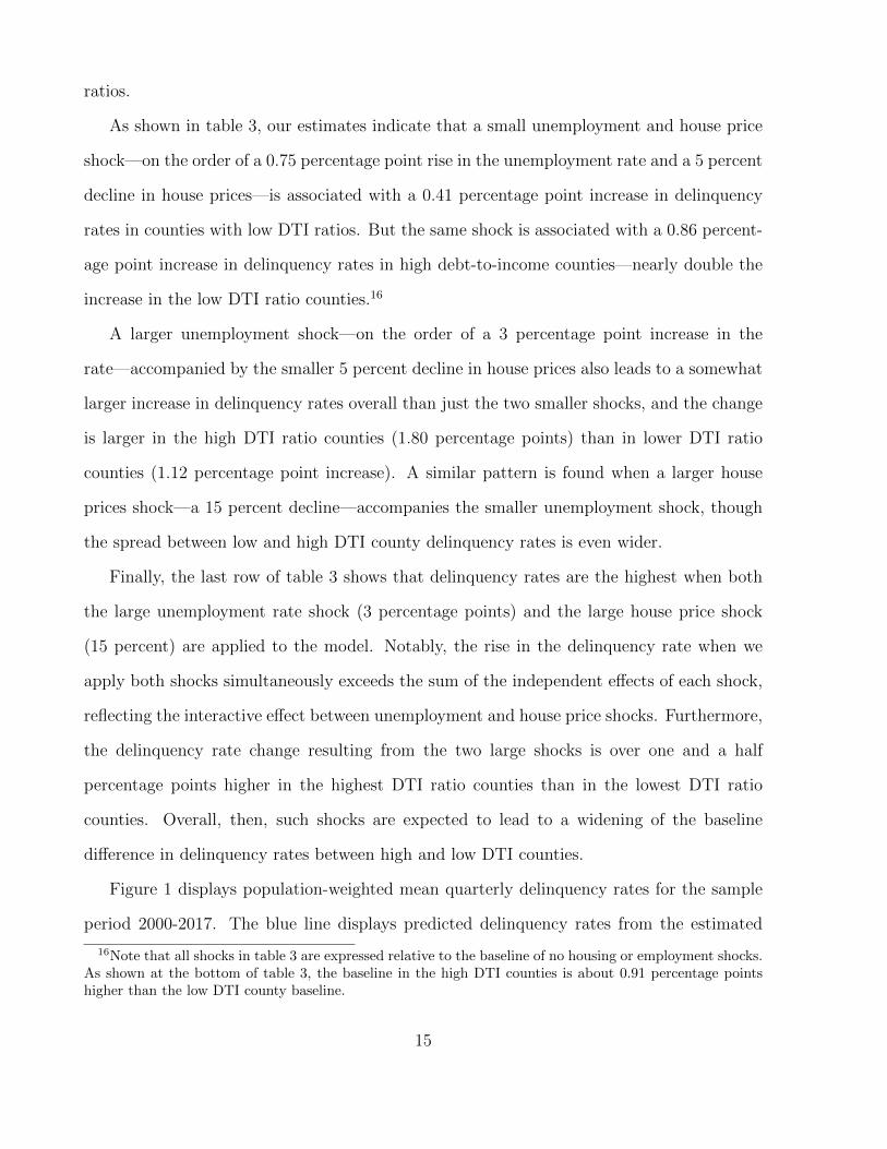
ratios.
As shown in table 3, our estimates indicate that a small unemployment and house price
shock—on the order of a 0.75 percentage point rise in the unemployment rate and a 5 percent
decline in house prices—is associated with a 0.41 percentage point increase in delinquency
rates in counties with low DTI ratios. But the same shock is associated with a 0.86 percent-
age point increase in delinquency rates in high debt-to-income counties—nearly double the
increase in the low DTI ratio counties.16
A larger unemployment shock—on the order of a 3 percentage point increase in the
rate—accompanied by the smaller 5 percent decline in house prices also leads to a somewhat
larger increase in delinquency rates overall than just the two smaller shocks, and the change
is larger in the high DTI ratio counties (1.80 percentage points) than in lower DTI ratio
counties (1.12 percentage point increase). A similar pattern is found when a larger house
prices shock—a 15 percent decline—accompanies the smaller unemployment shock, though
the spread between low and high DTI county delinquency rates is even wider.
Finally, the last row of table 3 shows that delinquency rates are the highest when both
the large unemployment rate shock (3 percentage points) and the large house price shock
(15 percent) are applied to the model. Notably, the rise in the delinquency rate when we
apply both shocks simultaneously exceeds the sum of the independent effects of each shock,
reflecting the interactive effect between unemployment and house price shocks. Furthermore,
the delinquency rate change resulting from the two large shocks is over one and a half
percentage points higher in the highest DTI ratio counties than in the lowest DTI ratio
counties. Overall, then, such shocks are expected to lead to a widening of the baseline
difference in delinquency rates between high and low DTI counties.
Figure 1 displays population-weighted mean quarterly delinquency rates for the sample
period 2000-2017. The blue line displays predicted delinquency rates from the estimated
16Note that all shocks in table 3 are expressed relative to the baseline of no housing or employment shocks.As shown at the bottom of table 3, the baseline in the high DTI counties is about 0.91 percentage pointshigher than the low DTI county baseline.
15

model, and the black line displays actual delinquency rates observed in the data. The pat-
terns in the two time series are extremely similar and display the same pattern: delinquency
rates hovering around 2 percent in the early 2000s, a steep rise in delinquency rates in the
2006-2010 period, followed by a more gradual decline until the present.17 The close rela-
tionship in both trends and levels in the two series provides prima facie evidence that our
model should be able to accurately predict delinquency rates under the various stress-test
scenarios discussed below.
5.2 Predicted delinquency rates by type of debt
To help understand how different types of debt are contributing to our estimates thus far,
we disaggregate household debt and estimate two variations of equation 1. First we examine
delinquency rates only for mortgage debt, and then we study delinquency rates only for
non-mortgage debt.18 For exposition, in lieu of presenting regression tables we again present
illustrative examples, as in table 3.
The first column of table 4 shows the expected increase in delinquency rates on mortgage
debt under relatively small and large shocks. These results show a similar pattern to those
in table 3, whereby a larger unemployment or house price shock increases the delinquency
rate on mortgages. Moving from a smaller unemployment shock (in the first row) to a larger
one (in the second row) is associated with a 74 basis point larger increase the mortgage
delinquency rate. The effect is similar when moving from a smaller to a larger house price
shock. Again, consistent with the double trigger theory of mortgage default, the effect of
simultaneously applying both of the larger shocks exceeds the sum of the two independent
effects. In that scenario, mortgage delinquency rates increase by 2.46 percentage points.
17According to the model, one reason default rates have come down so much since the crisis is the declinein the subprime DTI ratios in particular. An alternative version of the model where we don’t separate outthe prime, near-prime and subprime DTI ratios has trouble reproducing this large decline in delinquencyrates.
18In these models, we also use separate mortgage and non-mortgage DTI ratios (and their interactionswith the macroeconomic shocks) as explanatory variables.
16

The second column of table 4 repeats this exercise for non-mortgage delinquency rates.
Like with mortgage delinquency, moving from the smaller unemployment rate shock to a
larger one increases is associated with a 82 basis point larger increase the non-mortgage
delinquency rate. However, unlike mortgage delinquency, moving from a smaller house price
shock to a larger one has only a small effect on the non-mortgage delinquency. This difference
reflects the fact that we would not expect house price changes to have a direct effect on the
incentives to default on non-mortgage debt. In addition, many non-mortgage debt holders
may not have mortgage debt.
6 Stress-testing household debt
Having established that our model is able to predict the levels and trends in observed house-
hold delinquency rates during our sample period, we next use the model to make out-of-
sample predictions for household delinquency rates under various possible scenarios.
6.1 The scenarios
We use the Federal Reserve Board’s (FRB) 2018 Comprehensive Capital Analysis and Re-
view (CCAR) stress scenarios as our baseline stress test for the path of house prices and
unemployment rates. The CCAR stress scenarios are used for annual stress tests of the
largest U.S.-based bank holding companies, and is required as part of the Federal Reserve
Board’s supervisory function.19 The CCAR guidelines specify three hypothetical scenarios—
the baseline, adverse, and severely adverse scenarios—and are designed to assess a bank’s
resilience to adverse economic conditions.20
19See Federal Reserve Board [2018] or https://www.federalreserve.gov/supervisionreg/files/
bcreg20180201a1.pdf for more details. The test is required by the Dodd-Frank Wall Street Reform andConsumer Protection Act and is used to help determine the required level of bank capital reserves.
20The scenarios are not forecasts of the Federal Reserve. The scenarios provide 28 measures of the forwardpath of economic activity and prices, of which we will use two as inputs in our model: the path of houseprices and the path of unemployment rates.
17

The baseline scenario in 2018 is based on a moderate economic expansion of real eco-
nomic activity, as projected in the Blue Chip Economic Indicators, a survey of professional
forecasters.21 In these projections, the unemployment rate remains near 4 percent through
our 8 quarter scenario period and nominal house price growth averages about 2.5 percent
annually.
The adverse scenario describes a moderate recession that begins in the first quarter of
2018. In this scenario, the unemployment rate increases sharply from less than 4 percent
in the 4th quarter of 2017 to 7 percent by the 3rd quarter of 2019, and house prices fall 12
percent over the 8 quarters.
The severely adverse scenario describes a severe recession, along the lines of the 2007-09
recession. The unemployment rate increases to 10 percent in by the 3rd quarter of 2019 and
house prices fall 30 percent by the 3rd quarter of 2019. Figure 2 displays three year trends
in the forward-looking CCAR paths for house prices and unemployment. In each panel, the
red line displays the severely adverse scenario, the yellow line displays the adverse scenario,
and the green line displays the baseline scenario.
6.1.1 Construction of county-level scenarios
While the published CCAR scenarios describe economic variables at the national level, we
would expect that these shocks would have heterogeneous effects in different areas of the
country. This heterogeneity is important for our purposes because household borrowing
poses a greater risk if there are higher degrees of leverage in counties that are likely to
experience larger economic shocks. In order to capture the heterogeneous nature of these
shocks, we calculate county-level scenarios for each of the three national scenarios based on
historical relationships between national changes in unemployment rates or house prices and
county-level changes in unemployment rates or house prices. Specifically, for each county c,
21Note that the details of the CCAR scenario change slightly year-to-year.
18

we estimate parameters αc and βc from the regression
∆yc,t = αc + βc∆yt + εc,t (1)
where ∆yc,t is the one-quarter change in either log house prices or unemployment for county
c in quarter t and ∆yt is the change in that variable at the national level.22 We estimate
these models using data for 1999Q1 to 2017Q4. Then, we use the estimated parameters to
distribute the national changes in the CCAR scenarios across counties for 2018Q1 to 2019Q4.
This process allows us to recover county-level estimates of the path of unemployment rates
and home prices under the national CCAR scenarios, which we use as inputs in our models
to estimate the path of delinquency rates.
6.2 Predicted delinquency rates under CCAR scenarios
In our first prediction exercise, we begin with measures of household borrowing as of the
fourth quarter of 2017 and use our estimated model to predict the rise in delinquency rates
under our county-level version of each of the three CCAR scenarios described above. The
results of this exercise are presented in figure 3.
When we assume that unemployment and house prices evolve as in the baseline scenario,
our model predicts that the fraction of household debt in delinquency would remain around
2.5 percent through the fourth quarter of 2019 (green line). If unemployment and house
prices evolve as in the adverse scenario, the model predicts that delinquency rates would
steadily increase and peak at about 4.5 percent in late 2019 (yellow line). Finally, if house
prices and unemployment evolve as in the severely adverse scenario, our model predicts that
delinquency rates would increase sharply, peaking at about 7.6 percent in late 2019 (red
line).
22Note that we use county-level Zillow median home prices, whereas the published CCAR scenarios arebased on the national CoreLogic price index for owner-occupied real estate. Thus our model relates howchanges in the national CoreLogic index translates into changes in each counties’ Zillow median home price.
19
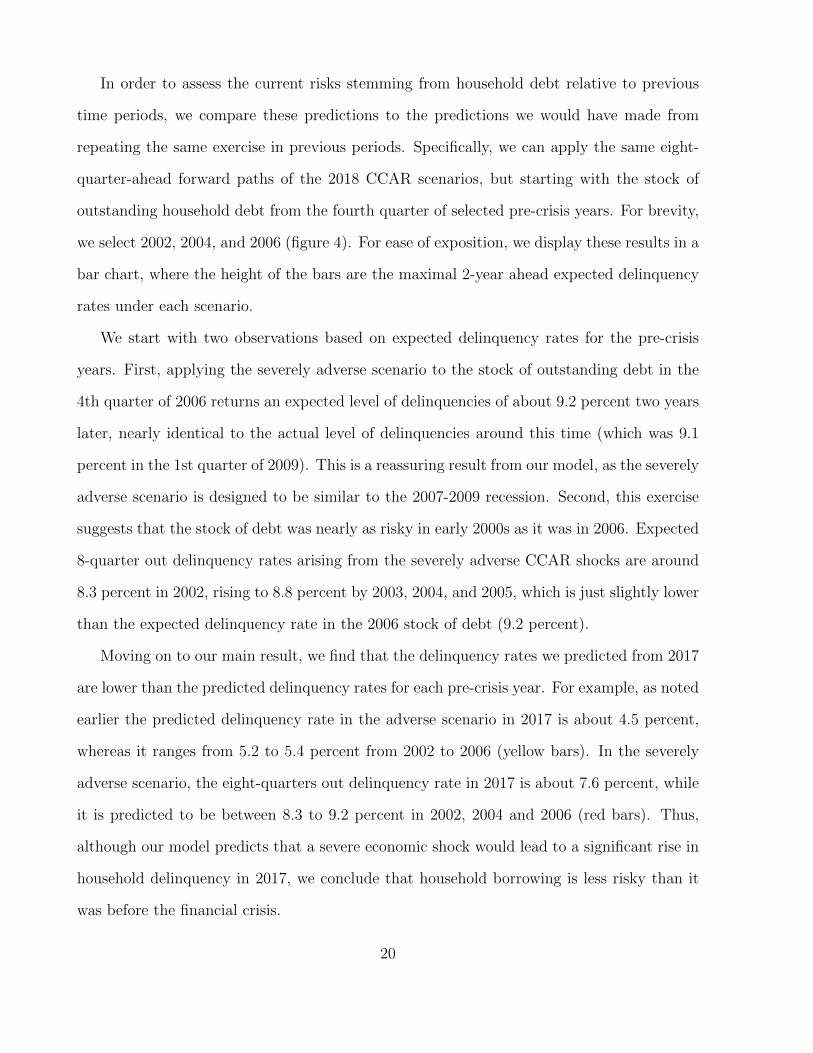
In order to assess the current risks stemming from household debt relative to previous
time periods, we compare these predictions to the predictions we would have made from
repeating the same exercise in previous periods. Specifically, we can apply the same eight-
quarter-ahead forward paths of the 2018 CCAR scenarios, but starting with the stock of
outstanding household debt from the fourth quarter of selected pre-crisis years. For brevity,
we select 2002, 2004, and 2006 (figure 4). For ease of exposition, we display these results in a
bar chart, where the height of the bars are the maximal 2-year ahead expected delinquency
rates under each scenario.
We start with two observations based on expected delinquency rates for the pre-crisis
years. First, applying the severely adverse scenario to the stock of outstanding debt in the
4th quarter of 2006 returns an expected level of delinquencies of about 9.2 percent two years
later, nearly identical to the actual level of delinquencies around this time (which was 9.1
percent in the 1st quarter of 2009). This is a reassuring result from our model, as the severely
adverse scenario is designed to be similar to the 2007-2009 recession. Second, this exercise
suggests that the stock of debt was nearly as risky in early 2000s as it was in 2006. Expected
8-quarter out delinquency rates arising from the severely adverse CCAR shocks are around
8.3 percent in 2002, rising to 8.8 percent by 2003, 2004, and 2005, which is just slightly lower
than the expected delinquency rate in the 2006 stock of debt (9.2 percent).
Moving on to our main result, we find that the delinquency rates we predicted from 2017
are lower than the predicted delinquency rates for each pre-crisis year. For example, as noted
earlier the predicted delinquency rate in the adverse scenario in 2017 is about 4.5 percent,
whereas it ranges from 5.2 to 5.4 percent from 2002 to 2006 (yellow bars). In the severely
adverse scenario, the eight-quarters out delinquency rate in 2017 is about 7.6 percent, while
it is predicted to be between 8.3 to 9.2 percent in 2002, 2004 and 2006 (red bars). Thus,
although our model predicts that a severe economic shock would lead to a significant rise in
household delinquency in 2017, we conclude that household borrowing is less risky than it
was before the financial crisis.
20

Why might household debt now be more resilient to a given set of macro-economic shocks?
While DTI ratios have moderated since 2010, on average they have remained near 2004 levels
for much of the post-2012 period (figure 5). Thus, the post-crisis decline in aggregate debt
relative to income cannot explain why household debt is less risky now than in the early
2000s. Instead, a more important reason for the decline in risk is that a larger portion of
outstanding household debt is now held by higher credit score borrowers (figure 6). This
pattern reflects the material shift toward borrowing by relatively low-risk households that
has taken place since the Financial Crisis, in particular due to tightened credit standards for
mortgages [Anenberg et al., 2017, Bhutta, 2015, Laufer and Paciorek, 2016].
6.3 Predicted delinquency rates under alternative house price shocks
In the exercises discussed above, we considered how changes in the composition of household
debt over time affects household default risk. However, we have not allowed for the possibility
that the risk of a particular economic shock might itself change over time. For example, one
important source of risk during the mid-2000s was the extreme overvaluation—by some
measures—of residential real estate, which precipitated the collapse in house prices that led
to the rise in mortgage defaults during the crisis.
Our next exercise attempts to capture changes over time in the risk of house price shocks
by considering “housing correction” scenarios where house price shocks at each point in time
are determined by the degree of housing overvaluation at that time. The degree of housing
overvaluation in these scenarios is measured as the amount of deviation of the price-rent ratio
from its long-term trend. Figure 7 plots the ratio of house prices (from CoreLogic) to rents
(as measured by BLS) over time, together with an estimate of the long-run trend in this ratio.
By this measure, house values were approximately 45 percent overvalued in 2006, whereas
in the fourth quarter of 2017, they were overvalued by just five percent. To implement
these “housing correction” scenarios, we consider the effects of a house price shock that
21

brings the price-rent ratio back to its long-run trend over the eight-quarter forecast period.
Because this exercise provides no guidance for how unemployment rates should evolve, we
consider paths for the unemployment rate taken from each of the three CCAR scenarios. As
in the previous exercises, we distribute these national shocks across the counties using the
methodology described in Section 6.1.1.
The results of our “housing correction” exercise (shown in figure 8) confirm the intuition
presented above—household debt looks less risky than before the crisis because housing does
not appear as overvalued at the present. For example, the red bars show the delinquency rates
that would be predicted by a housing correction together with a shock to the unemployment
rate taken from the severely adverse CCAR scenario. As household valuations climbed
through the early 2000’s, our model predicts that a price correction at any point in time
would have led to an increasingly higher rate of delinquency rates, with predicted delinquency
rates rising from about 6.5 percent in 2002 to almost 10 percent in 2006. In contrast, the
much lower valuations at the end of 2017 imply that the much smaller correction necessary
to erase this overvaluation would only the drive delinquency rate up to about 5 percent.23
6.3.1 House price reversion
Thus far our house price scenarios have all been derived from external national scenarios—
either from CCAR or based on a model of national overvaluation. In this section, we instead
consider an alternative house price scenarios based on recent house price experiences in each
particular county. In particular, we consider shocks by which house prices in each county
revert to their levels from either 2 or 4 years earlier.24 The intuition behind this exercise
uses the experience of the 2000-2012 housing boom and bust cycle, where the areas with
the largest price growth from 2000 to 2006 were also those that had the largest house price
declines in the 2006-2011 housing bust. As in the previous exercise, we consider paths for
23If house price declines are positively correlated with increases in unemployment rates, this would onlyfurther reduce current period risk relative to the past.
24These scenarios are inspired by those considered in Fuster et al. [2018].
22

the unemployment rate from each of the three CCAR scenarios.
Under the scenario where local house prices revert to levels from two years prior and
unemployment shocks follow the severely adverse CCAR scenario (the red bars in figure 9) we
find that the delinquency rate rises to about 6.25 percent. For comparison, the magnitude of
the expected delinquency rate under this scenario is larger than in the housing overvaluation
scenario considered earlier, but smaller than the set of severely adverse CCAR shocks initially
considered. Again, as in the CCAR and overvaluation exercises, the expected delinquency
rates based on the current state of household debt in this scenario are substantively lower
than predicted for the pre-crisis years.
In a more severe version of this exercise, we allow local house prices to revert back to the
level from 4 years earlier. In 2017, for example, this scenario essentially means erasing all of
the post-crisis increase in house prices. When coupled with a severe unemployment shock,
the expected delinquency rate reaches nearly 8 percent (the red bars in figure 10), which is a
bit higher than the severely adverse CCAR shock scenario. However, as before, the expected
delinquency rate based on the current state of household debt under this scenario is still
lower than predicted for the pre-crisis years.25
6.3.2 Worst Case Scenario: largest shocks in most highly leveraged counties
Our final set of stress scenarios explores the risk that some adverse event may cause shocks
that are particularly severe in areas where households are more indebted. For example,
Mian and Sufi [2014] point out that in the recent housing crisis, areas that had amassed
the largest amount of mortgage debt also suffered the largest house price declines during
the bust. To explore the risks from shocks that could follow such patterns, we implement
a “worst-case” scenario for unemployment rates and house prices. Rather than distributing
the national scenarios to counties using historical relationships, we instead distribute the
25Note we cannot include 2002 in the model because our data only go back to 1999 and therefore wecannot construct a four-year reversion scenario for 2002.
23
largest shocks to the most indebted counties. To implement these scenarios, we take the set
of county-level shocks from our county-level version of the CCAR scenarios and rearrange
those shocks quarterly so that the highest DTI counties in 2017Q4 receive the largest house
price and unemployment shocks.26
Figure 11 shows that this “worst case” scenario would lead to slightly more elevated
delinquency rates than in the original scenarios (as shown in figure 3). For example, in the
severely adverse “worst case” scenario (the red line), the model predicts that the delinquency
rate would peak at just over 8 percent, while in the original severely adverse scenario, the
delinquency rate peaks at around 7.6 percent. This relatively small difference partially
reflects the fact that more indebted counties already tended to receive larger shocks in the
original scenario.27
7 Conclusion
Since the financial crisis, stress testing bank balances sheets has become a useful tool for
identifying potential vulnerabilities in the financial sector. In this paper, we propose a sim-
ilar approach to assess risks to the economy posed by household borrowing. We estimate
a county-level model where household delinquency rates are a function of shocks to unem-
ployment rates and house prices, and the interaction of these shocks with household credit
quality and household leverage. We then use this model to predict the forward path of
household delinquencies under the well-known CCAR stress scenarios.
Our analysis indicates that household debt is less risky than it was before the financial
crisis. In particular, the decline in leverage and a shift in debt holding towards higher
credit score borrowers appear to have made household borrowing notably safer over the past
several years. That said, a severe economic shock—similar to the experience of the financial
26 Re-arranging the shocks in this way affects the population-weighted mean and standard deviation of theshock distribution. To allow for direct comparison with the original results in 3, we re-scale the distributionof shocks so that the population-weighted mean and standard deviation match the original scenarios.
27The correlation between the original scenario shocks and the “worst case” scenario shocks is about 0.2.
24

crisis—would still lead to a significant rise in household delinquency.
When using the CCAR stress scenarios, our analysis measures the expected consequences
if a negative macroeconomic shock occurs, but says nothing about the likelihood of such a
shock. Thus, we extend our analysis to include a time-varying house price shock based on a
measure of national house price “overvaluation” at particular point in time. If house prices
were to “correct” today (coupled with a severe unemployment shock), our model predicts
that delinquency rates would increase to about 5 percent over the following eight quarters.
In contrast, before the crisis, such a house price correction would have led to a 6.5 to 10
percentage point increase. Further extensions to our results show that our main conclusions
are robust to alternate assumptions about the geographic distribution of shocks and a house
price correction that erases recent growth. Overall, we conclude that the risks to financial
stability from household borrowing are lower today than in the pre-crisis period.
There are several important caveats to our analysis and conclusions. First, the impact
of household delinquencies on the stability of the financial system depends on the extent
to which banks and other financial intermediaries are exposed to the credit risk. Recent
mortgage credit trends have seemingly shifted mortgage credit risk away from the private
sector towards the government, which could help shield the financial system from losses
due to mortgage defaults. Second, changes in mortgage underwriting standards in recent
years have led to a decline in new mortgages that lack full income documentation or contain
“exotic features.” These changes have likely led to the stock of mortgage debt becoming less
risky than our model would suggest.
References
Manuel Adelino, Antoinette Schoar, and Felipe Severino. Loan originations and defaults in
the mortgage crisis: The role of the middle class. The Review of Financial Studies, 29(7):
1635–1670, 2016.
25

Michael Ahn, Michael Batty, and Ralf Meisenzahl. Household debt-to-income ratios in the
enhanced financial accounts. FEDS Notes, 2018.
Nicholas Albacete and Pirmin Fessler. Stress testing austrian households. Financial Stability
Report, 2010.
Gareth Anderson, Phillip Bunn, Alice Pugh, and Arzu Uluc. The potential impact of higher
interest rates on the household sector: Evidence from the 2014 nmg consulting survey.
Quarterly Bulletin, 2014.
Elliot Anenberg, Aurel Hizmo, Edward Kung, and Raven Molloy. Measuring mortgage
credit availability: A frontier estimation approach. Finance and Economics Discussion
Series 2017-101, 2017.
Neil Bhutta. The ins and outs of mortgage debt during the housing boom and bust. Journal
of Monetary Economics, 76:4–20, November 2015.
Neil Bhutta, Jane Dokko, and Hui Shan. Consumer ruthlessness and mortgage default during
the 2007 to 2009 housing bust. The Journal of Finance, 72(6):2433–2466, 2017.
Tom Bilston, Robert Johnson, and Matthew Read. Stress testing the australian household
sector using the hilda survey. Research Discussion Paper 2015-01, 2015.
Jesse Bricker and Brian Bucks. Negative home equity, economic insecurity, and household
mobility over the great recession. Journal of Urban Economics, 91:1–12, 2016.
Bureau of Economic Analysis. Table 2.1. accessed December 2018, 2018.
John Y. Campbell and Joao F. Cocco. A model of mortgage default. Journal of Finance,
70(4):1495–1554, 2015.
Yongheng Deng, John M. Quigley, and Robert Van Order. Mortgage termination, hetero-
geneity and the exercise of mortgage options. Econometrica, 68(2):275–307, 2000.
26

Janice Eberly, Gene Amromin, and John Mondragon. The housing crisis and the rise in
student loans. 2017 Meeting Papers, 369, 2017.
Federal Reserve Bank of New York. Quarterly report on household debt and credit. Novem-
ber, 2018.
Federal Reserve Board. 2018 supervisory scenarios for annual stress tests required under the
dodd-frank act stress testing rules and the capital plan rule, February 2018.
Laura Feiveson, Alvaro Mezza, and Kamilla Sommer. Student loan debt and aggregate
consumption growth. FEDS Notes, February 2018.
Finansinspektionen. The swedish mortgage market 2015. Ref. 14-8731, 2015.
Christopher Foote, Kristopher S. Gerardi, and Paul Willen. Why did so many people make
so many ex post bad decisions? the causes of the foreclosure crisis. Federal Reserve Bank
of Boston Research Department Public Policy Discussion Papers No. 12-2, 2012.
Andreas Fuster, Benedict Guttman-Kenney, and Andrew Haughwout. Tracking and stress-
testing u.s. household leverage. Economic Policy Review, 24(1):35–63, 2018.
Peter Ganong and Pascal Noel. Liquidity vs. wealth in household debt obligations: Evidence
from housing policy in the great recession. No. w24964. National Bureau of Economic
Research, 2018.
Kristopher Gerardi, Kyle F. Herkenhoff, Lee E. Ohanian, and Paul Willen. Can’t pay or
won’t pay? unemployment, negative equity and strategic default. The Review of Financial
Studies, 31(3):1098–1131, 2018.
Andra C. Ghent and Marianna Kudlyak. Recourse and residential mortgage default: Evi-
dence from us states. Review of Financial Studies, 24(6):3139–3186, 2011.
27

Galina Hale, John Krainer, and Erin McCarthy. Aggregation level in stress testing models.
Federal Reserve Bank of San Francisco, 2015.
Joanne W. Hsu, David A. Matsa, and Brian T. Melzer. Unemployment insurance as a
housing market stabilizer. American Economic Review, 108(1):49–81, 2018.
Oscar Jorda, Moritz Schulariak, and Alan M. Tayor. Financial crises, credit booms and
external imbalances: 140 years of lessons. IMF Economic Review, 59(2):340–378, 2011.
Steven Laufer and Andrew Paciorek. The effects of mortgage credit availability: Evidence
from minimum credit score lending rules. Finance and Economics Discussion Series 2016-
098, 2016.
Donghoon Lee and Wilbert Van der Klaauw. An introduction to the frbny consumer credit
panel. Federal Reserve Bank of New York Staff Report No. 479, 2010.
Christopher Mayer, Karen Pence, and Shane M. Sherlund. The rise in mortgage defaults.
Journal of Economic Perspectives, 23(1):27–50, 2009.
Atif Mian and Amir Sufi. Household leverage and the recession of 200709. IMF Economic
Review, 58(1):74–117, 2010.
Atif Mian and Amir Sufi. House of Debt: How They (And You) Caused the Great Recession
and How We Can Prevent it from Happening Again. University of Chicago Press, 2014.
Amir Sufi. Detecting “bad” leverage. In Markus Brunnermeier and Arvind Krishnamurthy,
editors, Risk Topography: Systemic Risk and Macro Modeling, pages 205–212. NBER,
2014.
Urban Institute. Housing finance at a glance: A monthly chartbook, november 2018, Novem-
ber 2018.
28

Kerry D. Vandell. How ruthless is mortgage default? a review and synthesis of the evidence.
Journal of Housing Research, pages 245–264, 1995.
29

Table 1: Sample Summary Statistics
Table displays means and distributions of key summary variables, where the 10th and 90th percentiles of each variable is shown
in brackets below the mean. Data sources are: CCP/Equifax, BLS LAU and QCEW and Zillow.
2000 (4th Qtr) 2007 (4th Qtr) 2014 (4th Qtr)
DTI (total debt to total wages) 1.35 2.20 1.71[0.74, 2.18] [1.01, 3.66] [0.83, 2.75]
House price growth, next 2 years 0.14 -0.18 0.12[0.03, 0.28] [-0.42, -0.02] [0.04, 0.22]
Change in unemp rate, next 2 years 1.84 4.72 -1.32[0.85, 2.92] [2.84, 6.88] [-2.27, -0.40]
Share debt 60 days late, 2 years later 0.033 0.094 0.031[0.015, 0.054] [0.041, 0.17] [0.012, 0.052]
Number of counties 1421 1478 1649
30
Table 2: Model Estimates
Table displays the results of estimating equation 1. Standard errors in parentheses. * p < .05, ** p < .01, *** p < .001. Data
sources are: CCP/Equifax, BLS LAU and QCEW and Zillow.Table 1: Model of delinquency rates
β SE(β)Share of Borrowers 60+ DPD 0.513** (0.049)∆ Unemployment 0.003** (0.000)∆ log(HPI) –0.036** (0.007)∆ Unemployment × ∆ log(HPI) -0.012** (0.002)Subprime DTI
DTI Quartile 2 0.005** (0.001)DTI Quartile 3 0.007** (0.001)DTI Quartile 4 0.011** (0.001)
∆ Unemployment × Subprime DTIDTI Quartile 2 0.000 (0.000)DTI Quartile 3 -0.000 (0.000)DTI Quartile 4 -0.001 (0.001)
∆ log(HPI) × Subprime DTIDTI Quartile 2 -0.008 (0.005)DTI Quartile 3 -0.017** (0.007)DTI Quartile 4 -0.035* (0.019)
∆ Unemployment × ∆ log(HPI) × Subprime DTIDTI Quartile 2 0.002 (0.002)DTI Quartile 3 0.008** (0.002)DTI Quartile 4 0.010** (0.003)
Near Prime DTIDTI Quartile 2 0.001* (0.001)DTI Quartile 3 0.005** (0.002)DTI Quartile 4 0.007** (0.003)
∆ Unemployment × Near Prime DTIDTI Quartile 2 0.000 (0.000)DTI Quartile 3 0.001 (0.000)DTI Quartile 4 0.000 (0.000)
∆ log(HPI) × Near Prime DTIDTI Quartile 2 0.008 (0.006)DTI Quartile 3 0.001 (0.008)DTI Quartile 4 -0.002 (0.010)
∆ Unemployment × ∆ log(HPI) × Near Prime DTIDTI Quartile 2 0.003 (0.002)DTI Quartile 3 -0.008** (0.002)DTI Quartile 4 -0.012** (0.004)
Prime DTIDTI Quartile 2 –0.004** (0.001)DTI Quartile 3 -0.005** (0.001)DTI Quartile 4 -0.009** (0.002)
∆ Unemployment × Prime DTIDTI Quartile 2 -0.000 (0.000)DTI Quartile 3 0.001 (0.000)DTI Quartile 4 0.001* (0.001)
∆ log(HPI) × Prime DTIDTI Quartile 2 -0.009 (0.006)DTI Quartile 3 -0.031** (0.010)DTI Quartile 4 -0.037** (0.007)
∆ Unemployment × ∆ log(HPI) × Prime DTIDTI Quartile 2 0.002 (0.002)DTI Quartile 3 -0.007** (0.003)DTI Quartile 4 -0.004 (0.003)
Constant 0.021** (0.002)R-squared 0.761N 101399
1
31
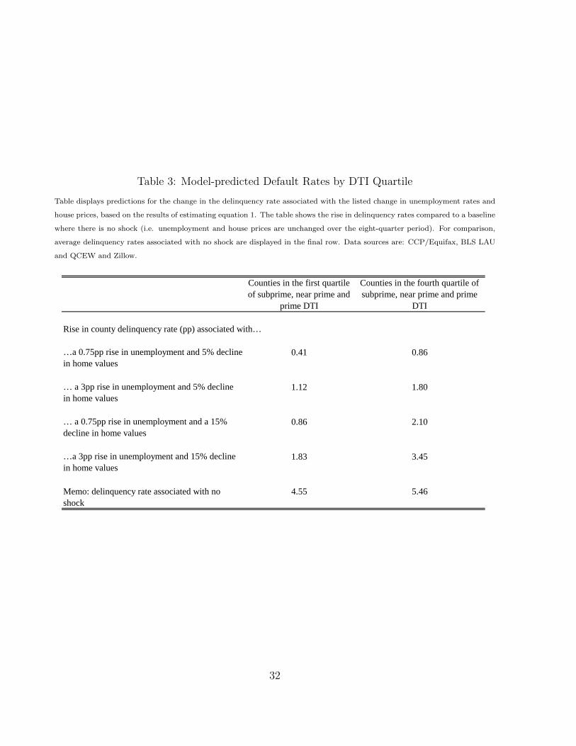
Table 3: Model-predicted Default Rates by DTI Quartile
Table displays predictions for the change in the delinquency rate associated with the listed change in unemployment rates and
house prices, based on the results of estimating equation 1. The table shows the rise in delinquency rates compared to a baseline
where there is no shock (i.e. unemployment and house prices are unchanged over the eight-quarter period). For comparison,
average delinquency rates associated with no shock are displayed in the final row. Data sources are: CCP/Equifax, BLS LAU
and QCEW and Zillow.
Counties in the first quartile of subprime, near prime and
prime DTI
Counties in the fourth quartile of subprime, near prime and prime
DTI
Rise in county delinquency rate (pp) associated with…
…a 0.75pp rise in unemployment and 5% decline in home values
0.41 0.86
… a 3pp rise in unemployment and 5% decline in home values
1.12 1.80
… a 0.75pp rise in unemployment and a 15% decline in home values
0.86 2.10
…a 3pp rise in unemployment and 15% decline in home values
1.83 3.45
Memo: delinquency rate associated with no shock
4.55 5.46
32
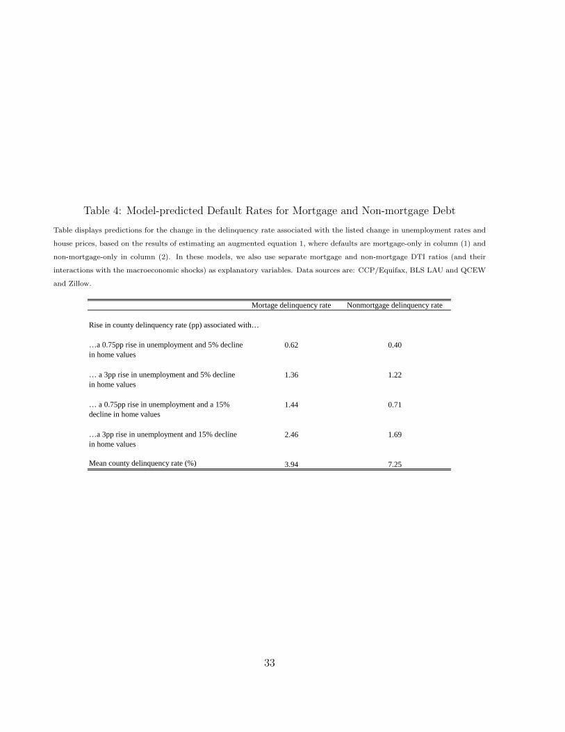
Table 4: Model-predicted Default Rates for Mortgage and Non-mortgage Debt
Table displays predictions for the change in the delinquency rate associated with the listed change in unemployment rates and
house prices, based on the results of estimating an augmented equation 1, where defaults are mortgage-only in column (1) and
non-mortgage-only in column (2). In these models, we also use separate mortgage and non-mortgage DTI ratios (and their
interactions with the macroeconomic shocks) as explanatory variables. Data sources are: CCP/Equifax, BLS LAU and QCEW
and Zillow.
Mortage delinquency rate Nonmortgage delinquency rate
Rise in county delinquency rate (pp) associated with…
…a 0.75pp rise in unemployment and 5% decline in home values
0.62 0.40
… a 3pp rise in unemployment and 5% decline in home values
1.36 1.22
… a 0.75pp rise in unemployment and a 15% decline in home values
1.44 0.71
…a 3pp rise in unemployment and 15% decline in home values
2.46 1.69
Mean county delinquency rate (%) 3.94 7.25
33

Figure 1: Model Fit
Figure displays the 60+ day delinquency rate in the black line and the model-predicted 60+ day delinquency rate in the blue
line, where the blue line is based on estimating equation 1. Data sources are: CCP/Equifax, BLS LAU and QCEW and Zillow.
ObservedModel
02
46
810
Per
cent
2000 2005 2010 2015 2020
34
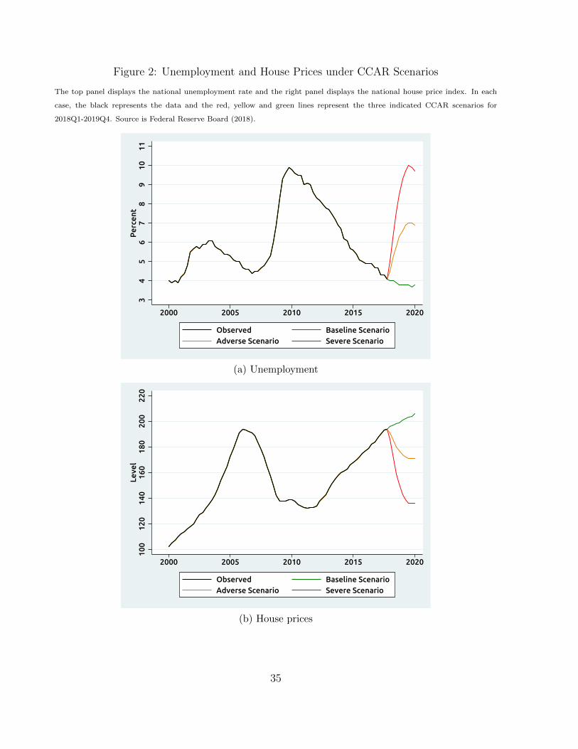
Figure 2: Unemployment and House Prices under CCAR Scenarios
The top panel displays the national unemployment rate and the right panel displays the national house price index. In each
case, the black represents the data and the red, yellow and green lines represent the three indicated CCAR scenarios for
2018Q1-2019Q4. Source is Federal Reserve Board (2018).
34
56
78
910
11P
erce
nt
2000 2005 2010 2015 2020
Observed Baseline ScenarioAdverse Scenario Severe Scenario
(a) Unemployment
100
120
140
160
180
200
220
Leve
l
2000 2005 2010 2015 2020
Observed Baseline ScenarioAdverse Scenario Severe Scenario
(b) House prices
35

Figure 3: Predicted Delinquency Under CCAR Scenarios
Figure displays the model-predicted 60+ day delinquency rate for 2001Q1-2017Q4 in the blue line, and the model-predicted
60+ day delinquency rate under the indicated CCAR scenario for 2018Q1-2019Q4 in the red yellow and green line, where the
blue, red, yellow and green lines are based on estimating equation 1. The black line shows the observed 60+ dat delinquency
rate for 1999Q1-2017Q4. Data sources are: CCP/Equifax, BLS LAU and QCEW, Zillow and CCAR.
ObservedModel
02
46
810
Per
cent
2000 2005 2010 2015 2020
Baseline Scenario Adverse ScenarioSevere Scenario
Predictions under:
36

Figure 4: Comparing CCAR Stress Test Results Two Years Out Across Time
Figure displays the results of applying the eight-quarter path of the indicated CCAR scenario from the fourth quarter of the
year listed, where estimates are based on estimating equation 1 for the entire sample period. Data sources are: CCP/Equifax,
BLS LAU and QCEW, Zillow and CCAR.
02
46
810
Per
cent
2002 2004 2006 2017
Baseline AdverseSevere
37

Figure 5: Mean County Debt-to-Income Ratios
Figure displays the mean of the county-level DTI ratios over time. Data sources are CCP/Equifax and BLS QCEW.
01
23
4To
tal D
TI
2000 2005 2010 2015 2020
38

Figure 6: Share of Debt Held by Credit Score Groups
Figure displays the share of total debt held by the indicated credit score group. “Prime” is defined as 720 or above, “Near
prime” as 620-719, and “subprime” as 619 or below. All scores refer to the Equifax 3.0 score. Data sources is CCP/Equifax.
Prime
Near
Sub
020
4060
80P
erce
nt
2000 2005 2010 2015 2020
39

Figure 7: Price-Rent Ratio as a House Price Overvaluation Measure
Figure displays the log of the house price-to-rent ratio. The red line shows an estimate of its long-term trend, which is estimated
using data from 1978-2001, and the shaded area shows a 95-percent confidence interval for this trend. Data sources are CoreLogic
for prices and BLS for rents.
40

Figure 8: Delinquency Rates from a Housing Correction
Figure displays the results of applying the housing correction scenario for house prices and the indicated CCAR scenario for
unemployment rates from the fourth quarter of the year listed, where estimates are based on estimating equation 1 for the
entire sample period. The housing correction scenario moves the price-to-rent ratio to its long-term trend in 8 quarters. Data
sources are: CCP/Equifax, BLS LAU and QCEW, Zillow, CCAR, CoreLogic and BLS.
02
46
810
Per
cent
2002 2004 2006 2017
Baseline AdverseSevere
41
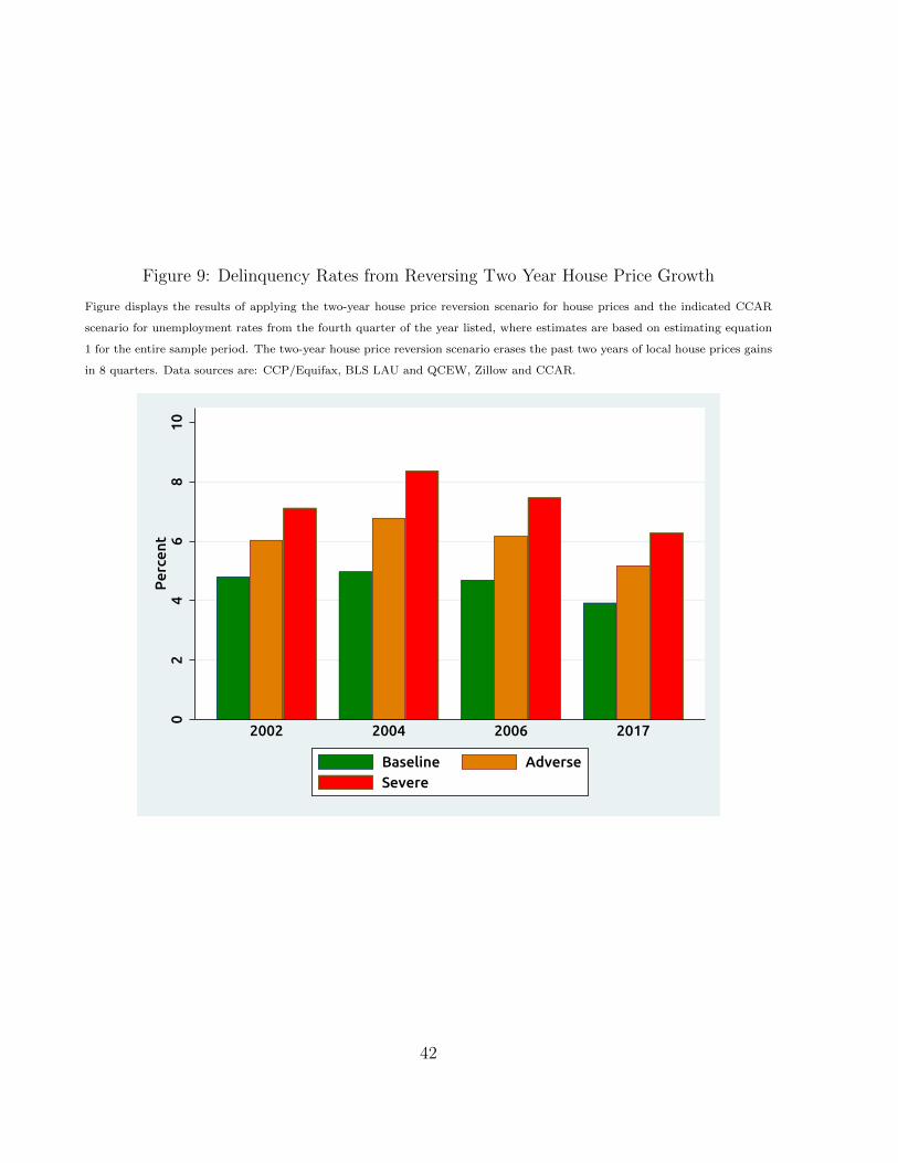
Figure 9: Delinquency Rates from Reversing Two Year House Price Growth
Figure displays the results of applying the two-year house price reversion scenario for house prices and the indicated CCAR
scenario for unemployment rates from the fourth quarter of the year listed, where estimates are based on estimating equation
1 for the entire sample period. The two-year house price reversion scenario erases the past two years of local house prices gains
in 8 quarters. Data sources are: CCP/Equifax, BLS LAU and QCEW, Zillow and CCAR.
02
46
810
Per
cent
2002 2004 2006 2017
Baseline AdverseSevere
42

Figure 10: Delinquency Rates from Reversing Four Year House Price Growth
Figure displays the results of applying the four-year house price reversion scenario for house prices and the indicated CCAR
scenario for unemployment rates from the fourth quarter of the year listed, where estimates are based on estimating equation 1
for the entire sample period. The four-year house price reversion scenario erases the past four years of local house prices gains
in 8 quarters. Data sources are: CCP/Equifax, BLS LAU and QCEW, Zillow and CCAR.
02
46
810
12P
erce
nt
2004 2006 2017
Baseline AdverseSevere
43

Figure 11: Delinquency Rates when the Most Leveraged Counties Receive the Largest Shocks
Figure displays the model-predicted 60+ day delinquency rate for 2001Q1-2017Q4 in the blue line, and the model-predicted
60+ day delinquency rate under the worst case scenarios for 2018Q1-2019Q4 in the red yellow and green line, where the blue,
red, yellow and green lines are based on estimating equation 1. The black line shows the observed 60+ day delinquency rate
for 1999Q1-2017Q4. The worst case scenarios assign the largest shocks obtained from CCAR scenario to the most leveraged
counties. Data sources are: CCP/Equifax, BLS LAU and QCEW, Zillow and CCAR.
ObservedModel
02
46
810
Per
cent
2000 2005 2010 2015 2020
Baseline Scenario Adverse ScenarioSevere Scenario
Predictions under:
44

8 Appendix
As noted in the main text, our baseline debt and delinquency measures do not include student
loan debt. Student loan debt has more than tripled since the early 2000s and could make
the stock of debt more risky than our model suggests. We chose to omit student loan debt
primarily because of data limitations, but the direct effect of student loan debt delinquency
on the financial system may also be somewhat limited because the vast majority of student
loans are guaranteed by the federal government. Still, if higher student loan debt causes
borrowers to default on other types of debt, then these additional defaults would not be
captured in our model predictions.28.
The measurement of student loan delinquencies is very different from other forms of
debt for a number of reasons. Rather than entering deliqnuency after an economic shock,
a borrower may choose to suspend their student debt repayment through the deferment or
forbearance process, or enter into an alternative payment plan like income-based repayment.
Further, the reporting of student loan delinquency to credit bureaus is different than other
forms of debt. For instance, servicers typically do not report Federal student loans as in
delinquency until the borrower misses more than 90 days of payments, making it hard to
construct the same 60 day delinquency rate we do on other forms of debt.29. Furthermore,
due to widespread changes in loan servicers’ reporting, there are structural changes in the
time series of loan balances in 2004, and in the time series of delinquencies in 2012. These
differences make it difficult to construct measures of student loan debt and deliquency for
the entire time series that are exactly comparable to the measures we use for other forms of
debt.
However, as a check on the potential importance of student loan debt in our model, we
include student debt in the DTI calculation (on the right hand side of the model) and also
28However, recent evidence suggests this type of indirect exposure to risk may be limited [Feiveson et al.,2018]. And recent research indicates that, at least to some extent since the crisis, families have substitutedstudent loans for home equity loans [Eberly et al., 2017]
29See www.studentaid.ed.gov/repay-loans/default
45
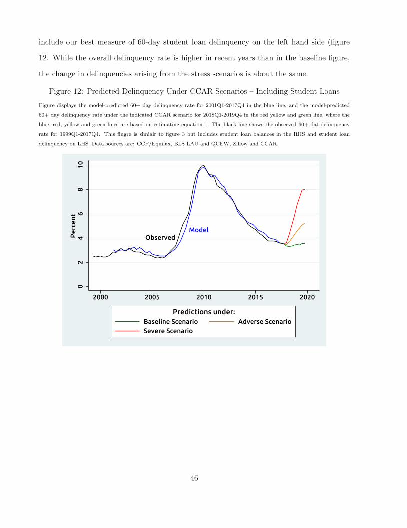
include our best measure of 60-day student loan delinquency on the left hand side (figure
12. While the overall delinquency rate is higher in recent years than in the baseline figure,
the change in delinquencies arising from the stress scenarios is about the same.
Figure 12: Predicted Delinquency Under CCAR Scenarios – Including Student Loans
Figure displays the model-predicted 60+ day delinquency rate for 2001Q1-2017Q4 in the blue line, and the model-predicted
60+ day delinquency rate under the indicated CCAR scenario for 2018Q1-2019Q4 in the red yellow and green line, where the
blue, red, yellow and green lines are based on estimating equation 1. The black line shows the observed 60+ dat delinquency
rate for 1999Q1-2017Q4. This fiugre is simialr to figure 3 but includes student loan balances in the RHS and student loan
delinquency on LHS. Data sources are: CCP/Equifax, BLS LAU and QCEW, Zillow and CCAR.
ObservedModel
02
46
810
Per
cent
2000 2005 2010 2015 2020
Baseline Scenario Adverse ScenarioSevere Scenario
Predictions under:
46