evaluation - question 5
TRANSCRIPT

QUESTION 5
How did you attract/address your
audience?

HOW DOES THE FRONT COVER ATTRACT/ADDRESS THE AUDIENCE?
‘I think the image is really good because it grasps the audience and gets their attention. It suits the design too.’
‘The colour scheme is subtle and not too over-bearing. The colours compliment each other really well and don’t repel the reader.’
‘I like the cover lines because they don’t block the model’s face which is good. I also like the varying font styles and sizes.’
‘I think the background is a bit boring and might not stand out enough.’
AVERAGE OVERALL RATING 8/10

HOW DOES THE CONTENTS PAGE ATTRACT/ADDRESS THE AUDIENCE?
‘The main image is slightly dominant and a little bit ‘in-your-face’.’
‘I really like the design, especially the issue number circle and the grey lines that shape the text.’
‘The MANIA Review section is a nice touch. I like the second image too.’
‘The feature articles are relevant and it’s good that there is a high quantity of content.’
AVERAGE OVERALL RATING 7/10

HOW DOES THE DOUBLE PAGE SPREAD ATTRACT/ADDRESS THE AUDIENCE?
‘The photo is amazing – it creates a really nice atmosphere.’
‘I’m not sure about the Superstar Rising bit because it doesn’t quite fit the genre…’
‘The article itself is really good and sounds like a real music magazine. It’s current and relevant to modern life. I also like the red lines just because they make it look professional.’
‘I’m not sure about the model’s shadow, you don’t normally see that in a real magazine.’
AVERAGE OVERALL RATING 8/10
ANALYSIS
I decided to ask open questions in order to promote and provoke a detailed, unlimited response.
The focus group were rather helpful in allowing me to identify the main issues and concerns with MANIA, as well as receiving useful feedback.
I think the response was mainly positive, which was to be expected.
The people questioned were aged between 18 and 27 (MANIA’s target age range is 18 – 30) which meant that their response would be highly representative of the target audience.

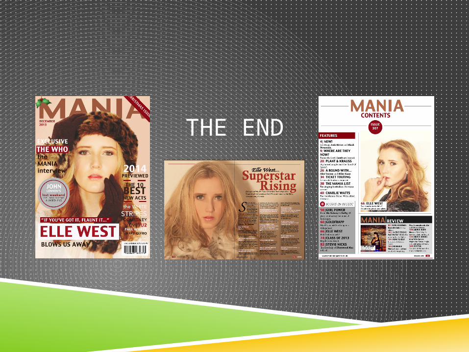
FRONT COVER The majority of the people in my focus group liked the
image and thought it ‘grasps the audience and gets their attention’. This is certainly a priority for MANIA and can only be seen as positive feedback.
The colour scheme also received high praise, in fact, it was said that they ‘compliment each other really well and don’t repel the reader’.
Many people outside of this focus group have complimented the masthead choice and the font sizes of the cover lines. It is very important that they ‘don’t block the model’s face’.
Overall, I feel the front cover attracts the reader rather well, which I ultimately its purpose. By failing to do so, MANIA would not be successful.
CONTENTS PAGE
Some people thought that the main image was ‘slightly dominant’. However, having studied various contents pages as part of my research and planning, I feel that less is very much more in terms of imagery.
The design received many compliments, especially the unique features like the ‘issue number circle’ and ‘grey lines’.
An important factor when making this page was the actual content. I have included an excessive amount of text in order to thoroughly communicate the quantity of pages and articles.

DOUBLE PAGE SPREAD
Many people were fans of the photograph as it creates a ‘really nice atmosphere’. However, a comment was made regarding the visible shadow. Despite this being utterly deliberate, I can see why people may not agree.
Once again, the design of the page received many good reviews due to the lines, columns and page numbers.
The article itself was said to be ‘current and relevant to modern life’ which is exactly what I set out to achieve.
THE END