evaluation 2 a2 media music video coursework
TRANSCRIPT
Evaluations 2
How effective is the combination of your media product and ancillary
texts?
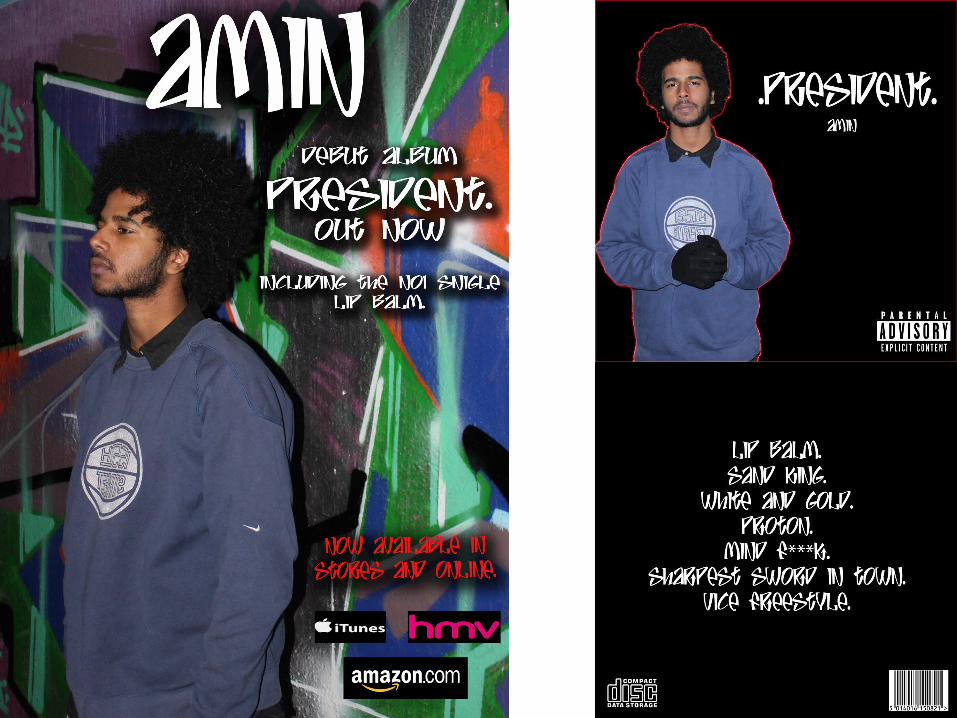
My ancillary texts go well with my main media product as they follow the same themes and conventions. My music video is set in a very urban place, this is similar to my magazine advert, the graffiti in the background gives it a very urban feel, and due to my song being a rap song, I thought they fitted very well together as graffiti is a connotation of rap. I made the text white so that it stood out especially on the black front and back covers. On the magazine ad, I had to put a shaded border around the white text to bring it out away from the graffiti, so that this made it easier to see and read. I looked at other rap albums and saw a common position that the artist is placed in them, this is why I have taken these photos and arranged them like this, so that they follow the same themes as other rap albums, I feel this makes it look more professional. Even though I chose white and black as main colours for my album covers, I chose to leave my artist in colour, this is the same with the magazine ad, I chose to leave it in colour, as my music video is in colour too, this means that they are similar and is more effective when combined.