estimating total miles walked and biked by...
TRANSCRIPT

E S T I M A T I N G T O T A L M I L E S W A L K E D A N D B I K E D B Y C E N S U S T R A C T I N C A L I F O R N I A
PREPARED FOR: STATE OF CALIFORNIA DEPARTMENT OF TRANSPORTATION
PREPARED BY: DEBORAH SALON, PHD AND SUSAN HANDY, PHD INSTITUTE OF TRANSPORTATION STUDIES UNIVERSITY OF CALIFORNIA, DAVIS
NOTICE: Caltrans commissioned this report in the interest of information exchange. The State of California assumes no liability for use of the information contained in this document. This report does not constitute a standard, specification or regulation.
1. INTRODUCTION
Vehicle activity is an output of travel models, but detailed estimates of bicycle and pedestrian activity are often not available. Good estimates of the total amount of cyclist and pedestrian activity on our roads are needed for two main purposes. First, knowing how much cyclists and pedestrians are using roadways can inform where investments in bicycle and pedestrian infrastructure are needed. Second, estimates of total cyclist and pedestrian activity can serve as the denominator for calculation of cyclist and pedestrian accident rates, which, in turn, help to identify locations for road safety investment.
This report presents a new method to estimate cyclist and pedestrian activity at the census tract level of geography based on a combination of travel survey, census, and land use data. Two sets of activity estimates are calculated based on two different travel surveys that were recently conducted in California: the 2009 National Household Travel Survey (NHTS) and the 2010-2012 California Household Travel Survey (CHTS). The final activity estimates by census tract will soon be made publicly available on the UC Davis Urban Land Use and Transportation Center (ULTRANS) website.
Estimation of total bicycle and pedestrian activity is hampered by a basic lack of data. The main sources of bicycle and pedestrian data are travel surveys, which lack full data coverage for the state. For example, at the geographic resolution of the census tract, there are more than 2500 tracts that are not sampled at all by the NHTS, and only 15 of the sampled tracts include more than 30 household observations. The CHTS has impressive coverage of the state’s census tracts, with zero observations in only 550 out of 8057 total tracts in the state. However, even this very large sample only includes 52 tracts in which the number of household observations is 30 or greater.
Due to this lack of sufficient data at detailed geographic resolution, most studies in the travel safety literature aggregate pedestrian and cyclist activity by metropolitan area (McAndrews 2011), state (McAndrews et al. 2013, Teschke et al. 2013), or, depending on the purpose, even the national level (Beck et al. 2007, Mindell et al. 2012, Dhondt et al. 2013). The focus of these studies is to estimate the relative safety of different modes of travel for by gender, age, and ethnicity. They compare the safety results obtained using different measures of travel activity (e.g. population, number of trips, distance traveled, and time spent traveling). Zhu et al. (2008) is the only exception to this that we identified in the existing literature. These authors use the 2001 NHTS data to estimate pedestrian activity in four types of built environments in New York State. However, the built environment types in Zhu et al. (2008) are identified at the geographic scale of the Metropolitan Statistical Area (MSA), while the present analysis identifies neighborhood types at the census tract level.
There have been a few studies that estimate pedestrian activity at the level of the intersection, based on original pedestrian count data collection and extrapolated to other intersections using elements of the local built environment (e.g. Pulugurtha and Repake 2008, Miranda-Moreno et al. 2011). These use simple counts at the particular intersections as measures of activity, rather than total exposure measures such as distance traveled or time spent traveling.
In the general planning literature, some previous attempts have been made to estimate the census tract-level spatial patterns of total pedestrian and cyclist activity (e.g. Turner et al. 1998). These efforts are similar to that presented in this report in that they use sparse data to estimate activity rates and use census data to extrapolate these rates to tracts. However, previous efforts we have

found use only sociodemographic information to estimate walking and bicycling rates, rather than sociodemographic information together with neighborhood typologies.
2. DATA AND METHOD
The specific research question we answer here is: What are the total miles walked by pedestrians and total miles biked by cyclists living in each census tract in California? Note that the method described here produces estimates of walking and biking that are tied to the census tracts where pedestrians and cyclists live, rather than estimates of miles walked and biked within the geographic area of each tract.1
The data used to answer this question come from multiple sources, and most of the work is in the data preparation and assembly. These data sources include two travel surveys (NHTS and CHTS), the 2010 Decennial Census, the 2011 5-year American Community Survey (ACS) estimates from the US Census Bureau, the 2010 Longitudinal Employer Household Dynamics (LEHD) data from the US Census Bureau, the ESRI map of Detailed Streets of North America, and Point Of Interest restaurant location data accessed using MapQuest’s API.
The method used requires the following steps. First, we use cluster analysis to assign census tracts to neighborhood types based on built environment characteristics, and we calculate miles biked and miles walked for each travel survey respondent. All survey respondents are included, and those who do not report cycling or walking are assumed to walk and bike zero miles. We then assign each survey respondent to a category based on their age, gender, and home neighborhood type. Finally, we calculate average miles biked and miles walked for each category, and use census data to expand these average distances walked and biked to represent population totals.
CLASSIFYING CENSUS TRACTS INTO NEIGHBORHOOD TYPES
To classify census tracts into neighborhood types, k-means cluster analysis is used. This method takes multiple pieces of information about each census tract as the input, and organizes the tracts into groups that are similar to each other. The analyst chooses how many groups to create and which variables to use as the input data, and these choices are informed by the analyst’s judgment and by a process of testing a variety of input variable forms and numbers of groups.
Here, ten variables representing different aspects of the built environment in each census tract in California are used as inputs, and four neighborhood type clusters emerge. The ten variables and their data sources are listed in Figure 1 through Figure 3 depict the spatial distribution of the neighborhood type clusters for three major metropolitan regions of the state: Sacramento, San Francisco Bay Area, and Los Angeles. As the maps illustrate, the neighborhood types cluster spatially and largely appear as expected. Downtown census tracts are classified as Central City, tracts in relatively dense areas of the city are classified as Urban, tracts in less dense parts of the metropolitan areas are classified as Suburb, and the far outskirts of the areas are classified as Rural.
1 This is due to limitations of the data. We expect, though, that because most walk and bike trips are short and begin or end at home, the estimates derived from the method presented here should be highly correlated with actual miles walked and biked within the geographic area of each tract.

The tracts that are gray in the San Francisco Bay Area and Los Angeles area maps are those tracts that could not be classified due to missing census data.
Table 1, along with the means of standardized versions of each of these variables for each neighborhood type cluster. The total N listed in the header row of the table corresponds to the number of census tracts in the state that are in that cluster.2 Standardized variables have means of zero and standard deviations of one for the full sample, so looking at means of these variables for each cluster provides information about how that neighborhood type’s census tracts are different from the average for the whole state. For instance, looking at the first row of Figure 1 through Figure 3 depict the spatial distribution of the neighborhood type clusters for three major metropolitan regions of the state: Sacramento, San Francisco Bay Area, and Los Angeles. As the maps illustrate, the neighborhood types cluster spatially and largely appear as expected. Downtown census tracts are classified as Central City, tracts in relatively dense areas of the city are classified as Urban, tracts in less dense parts of the metropolitan areas are classified as Suburb, and the far outskirts of the areas are classified as Rural. The tracts that are gray in the San Francisco Bay Area and Los Angeles area maps are those tracts that could not be classified due to missing census data.
Table 1, we see that Suburb tracts are slightly less dense than the state average, Urban tracts are substantially more dense than the state average, Rural tracts are substantially less dense than the state average, and Central City tracts are much, much more dense than the state average.
Figure 1 through Figure 3 depict the spatial distribution of the neighborhood type clusters for three major metropolitan regions of the state: Sacramento, San Francisco Bay Area, and Los Angeles. As the maps illustrate, the neighborhood types cluster spatially and largely appear as expected. Downtown census tracts are classified as Central City, tracts in relatively dense areas of the city are classified as Urban, tracts in less dense parts of the metropolitan areas are classified as Suburb, and the far outskirts of the areas are classified as Rural. The tracts that are gray in the San Francisco Bay Area and Los Angeles area maps are those tracts that could not be classified due to missing census data.
2 The total number of 2010 census tracts in California is 8039, but the cluster analysis here classifies only 7976 of them. This is because the 2011 5-year ACS did not include some of the housing-related data for the remaining census tracts.

TABLE 1: MEAN VALUES OF STANDARDIZED VARIABLES WITHIN EACH NEIGHBORHOOD TYPE
Data Source
Rural (N=2042)
Suburb (N=3776)
Urban (N=1978)
Central City (N=180)
Population Density
2010 Decennial Census
-0.69 -0.18 0.76 3.41
Road Density ESRI N.A. Detailed Streets
-1.13 0.11 0.88 1.09
Local Job Access
2010 LEHD -0.69 -0.23 0.81 3.83
Regional Job Access
2010 LEHD -0.88 -0.06 0.99 0.41
Restaurants Within 10 Minute Walk
MapQuest Point Of Interest
-0.29 -0.18 0.25 4.41
Pct. Walk/Bike Commuters
2011 5-year ACS -0.17 -0.18 0.24 2.57
Pct. Single Family Detached
2011 5-year ACS 0.53 0.16 -0.67 -1.98
Pct. Old Housing
2011 5-year ACS -0.45 -0.40 1.09 1.43
Pct. New Housing
2011 5-year ACS 0.99 -0.34 -0.37 -0.06
Median House Value
2011 5-year ACS -0.39 0.03 0.21 0.73

FIGURE 1: NEIGHBORHOOD TYPE MAP OF THE SACRAMENTO AREA

FIGURE 2: NEIGHBORHOOD TYPE MAP OF THE SAN FRANCISCO AREA

FIGURE 3: NEIGHBORHOOD TYPE MAP OF THE LOS ANGELES AREA
3. DATA PREPARATION: NHTS
The full NHTS California sample includes information from nearly 45,000 respondents over 4 years of age. The dataset is derived from a full household travel survey, in which every person over 4 years of age in surveyed households provided the full details of their travel and activities for a single 24-hour period during an assigned day in 2009. The results here focus on those individuals who were surveyed on a weekday, provided sufficient information for analysis, and were not outliers in their walking or bicycling distances3 – nearly 32,000 individuals total.
To proceed with this analysis, the first task was to calculate miles walked and miles biked for each NHTS respondent on the travel diary day. The NHTS dataset does include self-reported distances for each reported trip, but many analysts consider this type of self-reported information to be unreliable; it is expected that there will be at least significant rounding error in these self-reports.
3 Outliers were identified as any person who reported walking more than 9 miles in one day, and any person who reported bicycling more than 30 miles in one day. These two distance thresholds are roughly equivalent to spending 3 hours traveling by these modes. Dropping these outliers removed over 200 observations from the analysis due to walk distance outlier status, and over 21 observations due to bicycle distance outlier status.

Further, Salon (2014) has shown that the self-reported trip distances in the NHTS are systematically and substantially longer than the shortest-in-time route distances calculated using MapQuest.
This analysis uses MapQuest-calculated trip distances for all trips for which respondents provided exact origin and destination information (either address or nearest intersection) and the origin was not the same as the destination.4 For trips without exact origin and destination information, or trips that begin and end in the same place, the alternatives were to discard the observation or to use the self-reported distance information. In these cases, self-reported distance information was used. If neither location information nor self-reported distances were given, but travel time was reported, these data were used to estimate trip distances.5 Survey respondents were dropped from the analysis if they made a walk or bike trip and did not provide exact origin and destination information, a self-reported trip distance, or a self-reported travel time. Table 2 provides a breakdown of the number of walk and bike trip distances that were calculated using each of these methods. Approximately 90% of both walk and bike trip distances were calculated using MapQuest.
TABLE 2: BREAKDOWN OF TRIP DISTANCE DATA USED
Data Used to Calculate Trip Distances Walk Trips Bicycle Trips Geocoded Origins and Destinations 15,946 1,634 Self-Reported Distances – due to same origin and destination 1,868 72 Self-Reported Distances – due to missing location information 378 45 Self-Reported Times 42 4 No Distance Estimated and Person Dropped from Analysis 11 3 Total Trips Analyzed 18,245 1,758
Table 3 provides summary statistics for the portion of the 2009 NHTS data that was used in this analysis. The first thing to notice here is that both walking and bicycling are not undertaken at all by most NHTS respondents. Less than 20% of people reported any walking, and less than 2% of people reported any biking. The walking percentages are similar for men and women, while biking is 3 times more likely among men than among women respondents to the survey. Among those who do walk or bike, however, the average distances traveled are only slightly lower for women than for men. The patterns across age groups are similar for the percent of respondents who walked and biked, with children being most likely to walk or bike, and the likelihood of walking or biking declining with age.
Turning to differences between walking and biking between respondents living in different types of neighborhoods, the patterns are roughly as we expected they would be. People living in dense urban neighborhood types are more likely to walk than those in less dense neighborhood types. As for biking, central city dwellers are less likely to bike than “Urban” neighborhood residents, but both groups are more likely to bike than residents of “Suburb” and “Rural” neighborhoods. Among those who walked at all, walking distances do not vary substantially across neighborhood types –
4 This second qualification may appear unnecessary at first, but in fact a large number of walk and bike trips actually begin and end at home. These are likely recreational trips for pleasure and/or exercise, which are often not included in travel behavior studies. However, for estimating the extent of walking and cycling on our roads and sidewalks, these trips are relevant. 5 This was done assuming an average walking speed of 3 miles per hour and an average biking speed of 10 miles per hour.
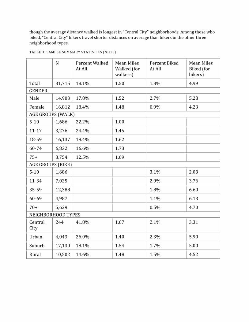
though the average distance walked is longest in “Central City” neighborhoods. Among those who biked, “Central City” bikers travel shorter distances on average than bikers in the other three neighborhood types.
TABLE 3: SAMPLE SUMMARY STATISTICS (NHTS)
N Percent Walked At All
Mean Miles Walked (for walkers)
Percent Biked At All
Mean Miles Biked (for bikers)
Total 31,715 18.1% 1.50 1.8% 4.99 GENDER Male 14,903 17.8% 1.52 2.7% 5.28
Female 16,812 18.4% 1.48 0.9% 4.23 AGE GROUPS (WALK) 5-10 1,686 22.2% 1.00
11-17 3,276 24.4% 1.45
18-59 16,137 18.4% 1.62
60-74 6,832 16.6% 1.73
75+ 3,754 12.5% 1.69 AGE GROUPS (BIKE) 5-10 1,686 3.1% 2.03
11-34 7,025 2.9% 3.76
35-59 12,388 1.8% 6.60
60-69 4,987 1.1% 6.13
70+ 5,629 0.5% 4.70 NEIGHBORHOOD TYPES Central City
244 41.8% 1.67 2.1% 3.31
Urban 4,043 26.0% 1.40 2.3% 5.90
Suburb 17,130 18.1% 1.54 1.7% 5.00
Rural 10,502 14.6% 1.48 1.5% 4.52

FIGURE 4: DISTRIBUTIONS OF DISTANCES WALKED AND BIKED (EXCLUDING NON-WALKERS AND NON-BIKERS)
Figure 4 illustrates the distributions of distances walked and biked for those who reported at least one walk or one bike trip. These histograms clearly show that the lion’s share of pedestrians and cyclists actually don’t walk or cycle very far. Approximately half of all pedestrian respondents to the survey walked less than 1 mile on the travel diary day, and over a third of cyclists biked less than 2 miles on that day.
The next step in the analysis is to assign each survey respondent to a category, calculate the average miles walked and biked for survey respondents in each category, and these averages from the survey sample are used to estimate distances walked and biked for every person in the State of California. The following equation was used.
𝑻𝑻𝑻𝑻𝑻𝑻𝑻𝑻𝑻𝑻𝑻𝑻𝑻𝑻𝑻𝑻𝑻𝑻𝑻𝑻𝑻𝑻𝒕𝒕𝑻𝑻𝒕𝒕𝑻𝑻 = �𝑺𝑺𝑺𝑺𝒕𝒕𝑺𝑺𝑻𝑻𝑺𝑺𝑺𝑺𝑺𝑺𝑺𝑺𝑻𝑻𝑻𝑻𝑻𝑻𝑻𝑻𝑻𝑻𝑻𝑻 ∗ 𝟐𝟐𝟐𝟐𝟐𝟐𝟐𝟐𝟐𝟐𝑻𝑻𝟐𝟐𝑻𝑻𝑺𝑺𝑻𝑻𝑻𝑻𝒕𝒕𝑻𝑻𝒕𝒕𝑻𝑻𝟐𝟐𝑻𝑻𝟐𝟐𝑺𝑺𝑻𝑻𝑻𝑻𝑻𝑻𝑻𝑻𝑻𝑻𝟐𝟐𝑻𝑻
𝟐𝟐𝟐𝟐
𝑻𝑻=𝟐𝟐
where i indexes gender-age group categories, and each tract is classified as a neighborhood type.
For this estimation strategy to be successful, it is necessary to be able to classify both NHTS respondents and the entire State’s population into the same set of categories. The choice was made to base these categories on a combination of respondent age, gender, and home neighborhood type.6 As discussed in the previous section of this report, four home neighborhood types were identified. Five age categories for walking and five for biking were chosen by looking at the distributions in the survey data of distances biked and walked by age.
The final estimation was then done with 10 age-gender categories in each census tract, and census tracts were divided into four neighborhood types. This means that from the NHTS respondent data,
6 The additional variables of household income and individual educational attainment were considered as well, since information on both of these factors is available in both the NHTS dataset and from the Census. However, the Census provides household income and educational attainment information through the American Community Survey (ACS) rather than the Decennial Census. The information in the ACS data is based not on a full population census; it is based on a sample of the population. As such, there are large margins of error at the smaller geographic scales such as the census tract. For this reason, we chose to restrict our classification variables to those that were available in the full population census.
010
2030
Perc
ent
0 2 4 6 8Miles Walked Per Pedestrian
05
1015
Perc
ent
0 5 10 15Miles Biked Per Cyclist

averages of miles walked and miles biked were calculated for 40 gender-age-neighborhood type categories. The question arises of how many individual survey respondents were in each of these categories. All categories in the neighborhood types “Urban”, “Suburb”, and “Rural” contained a large number of individual observations. The smallest N in one age-gender category within these neighborhood types was 94 and the largest N was 4,591.
In the “Central City” neighborhood type, the number of individual survey respondents in each age-gender category was much smaller. This called into question whether average distances walked and biked for these individuals was likely to be a robust estimate for the population. For this reason, a decision was made to reduce the number of categories in the “Central City” neighborhood type to only 3 for walking (ages 5-17, 18-74, and over 74), categorized by age only. Similarly for cycling, the number of categories was reduced to 2, but in this case the split was by gender. These decisions were made by examining the actual distributions in the data, and pooling the original set of categories together where their average values were similar.
4. RESULTS: NHTS
The analysis steps detailed in the previous section yield estimates of the number of miles walked and miles biked per weekday in each census tract in the State. These estimates range from a low of 5 miles walked and 1.5 miles biked (in the same census tract with only 20 residents) to a high of more than 7,000 miles walked (in a tract with 11,500 residents) and just over 4,000 miles biked (in a tract with over 37,000 residents). As should now be evident, these totals are not particularly illuminating because they are extremely dependent on the population of the tract, which is highly variable.
To enable comparison across tracts, the total miles estimates need to be evaluated with respect to another “normalizing” variable. The results section is divided into two subsections based on the normalization variable. The first of these uses walkable (meaning non-highway) road miles as the normalization variable, which is useful to help prioritize non-motorized infrastructure needs. The second uses pedestrian and cyclist accident data by census tract to calculate a ratio of accidents per mile walked and biked, which will shed light on which parts of the state are particularly safe and especially dangerous for these activities.
USING THESE RESULTS TO PRIORITIZE INFRASTRUCTURE INVESTMENTS - NHTS
To prioritize bicycle and pedestrian infrastructure needs in different census tracts, it is useful to know where the roads are most heavily used by pedestrians and cyclists. By taking the ratio of our estimates of total miles walked and biked and the total miles of non-highway roads in each tract, we obtain an indicator for pedestrian and cyclist intensity of road use in each tract. Figure 5 provides the distributions of the walking intensity of use measure for the four neighborhood types that are used in this study. Note that although the distributional shapes are similar for three of the neighborhood types (Suburb, Urban, and Central City) the horizontal scales are not the same in each of these histograms. Figure 6 illustrates the distributions of the indicator for bicycling intensity of use. In the case of biking, it was possible to make the horizontal scales are the same so you can more clearly see the differences in the distributions.

FIGURE 5: DISTRIBUTIONS OF WEEKDAY MILES WALKED PER NON-HIGHWAY ROAD MILE IN FOUR NEIGHBORHOOD TYPES, NHTS
05
1015
20Pe
rcen
t
0 50 100 150Miles Walked Per Road Mile
Rural
02
46
810
Perc
ent
0 50 100 150 200Miles Walked Per Road Mile
Suburb0
24
68
10Pe
rcen
t
0 200 400 600Miles Walked Per Road Mile
Urban
02
46
810
Perc
ent
0 500 1000 1500 2000Miles Walked Per Road Mile
Central City

FIGURE 6: DISTRIBUTIONS OF WEEKDAY MILES BIKED PER NON-HIGHWAY ROAD MILE IN FOUR NEIGHBORHOOD TYPES
Figure 7 and Figure 8 are maps that illustrate the spatial pattern of the weekday miles walked and miles biked per non-highway roadway mile for the San Francisco Bay Area. The categories in all of these maps are quintiles of the full indicator distribution for the State. As expected, the intensity of both pedestrian and cyclist use of roadways is much higher in more urban areas. To be able to use this information to prioritize infrastructure investments, it would be necessary to put it together with information about the existing pedestrian and cyclist infrastructure, such as sidewalks and bicycle lanes.
010
2030
010
2030
0 50 100 0 50 100
Suburb Urban
Rural Central City
Per
cent
Weekday Miles Biked Per Road Mile

FIGURE 7: MAP OF MILES WALKED PER NON-HIGHWAY ROAD MILE, SAN FRANCISCO BAY AREA, NHTS

FIGURE 8: MAP OF MILES BIKED PER NON-HIGHWAY ROAD MILE, SAN FRANCISCO BAY AREA, NHTS
USING THESE RESULTS TO ANALYZE SAFETY - NHTS
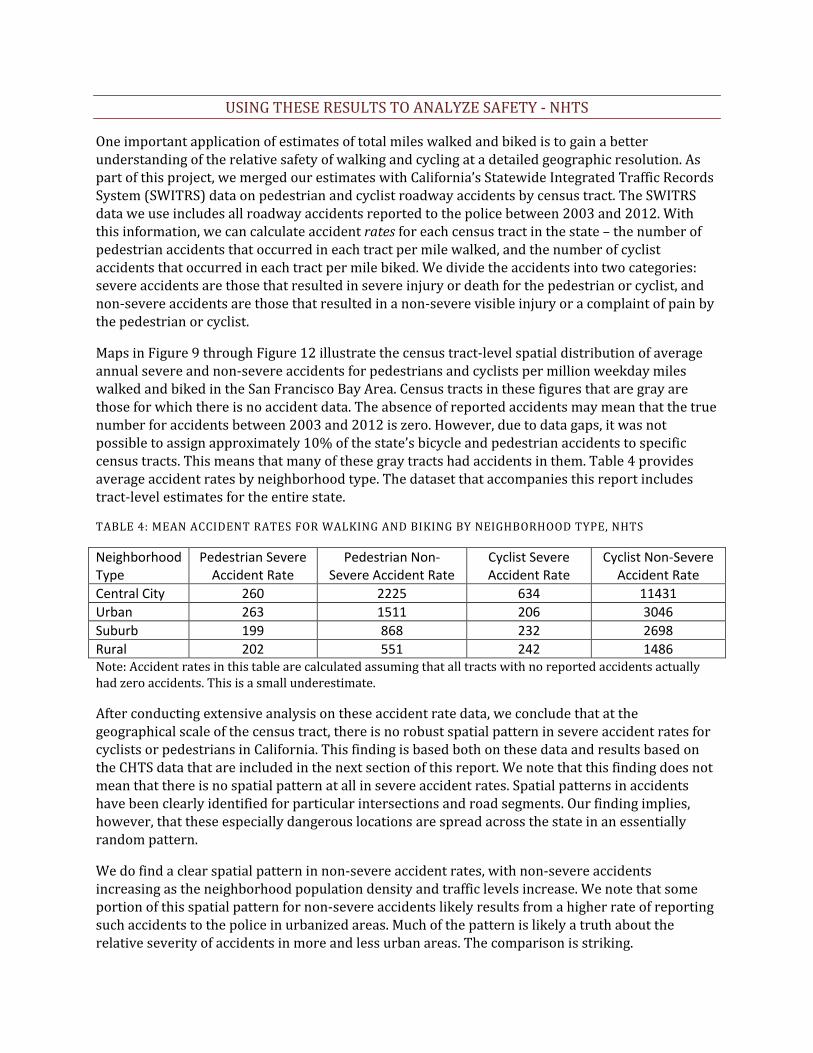
One important application of estimates of total miles walked and biked is to gain a better understanding of the relative safety of walking and cycling at a detailed geographic resolution. As part of this project, we merged our estimates with California’s Statewide Integrated Traffic Records System (SWITRS) data on pedestrian and cyclist roadway accidents by census tract. The SWITRS data we use includes all roadway accidents reported to the police between 2003 and 2012. With this information, we can calculate accident rates for each census tract in the state – the number of pedestrian accidents that occurred in each tract per mile walked, and the number of cyclist accidents that occurred in each tract per mile biked. We divide the accidents into two categories: severe accidents are those that resulted in severe injury or death for the pedestrian or cyclist, and non-severe accidents are those that resulted in a non-severe visible injury or a complaint of pain by the pedestrian or cyclist.
Maps in Figure 9 through Figure 12 illustrate the census tract-level spatial distribution of average annual severe and non-severe accidents for pedestrians and cyclists per million weekday miles walked and biked in the San Francisco Bay Area. Census tracts in these figures that are gray are those for which there is no accident data. The absence of reported accidents may mean that the true number for accidents between 2003 and 2012 is zero. However, due to data gaps, it was not possible to assign approximately 10% of the state’s bicycle and pedestrian accidents to specific census tracts. This means that many of these gray tracts had accidents in them. Table 4 provides average accident rates by neighborhood type. The dataset that accompanies this report includes tract-level estimates for the entire state.
TABLE 4: MEAN ACCIDENT RATES FOR WALKING AND BIKING BY NEIGHBORHOOD TYPE, NHTS
Neighborhood Type
Pedestrian Severe Accident Rate
Pedestrian Non-Severe Accident Rate
Cyclist Severe Accident Rate
Cyclist Non-Severe Accident Rate
Central City 260 2225 634 11431 Urban 263 1511 206 3046 Suburb 199 868 232 2698 Rural 202 551 242 1486 Note: Accident rates in this table are calculated assuming that all tracts with no reported accidents actually had zero accidents. This is a small underestimate.
After conducting extensive analysis on these accident rate data, we conclude that at the geographical scale of the census tract, there is no robust spatial pattern in severe accident rates for cyclists or pedestrians in California. This finding is based both on these data and results based on the CHTS data that are included in the next section of this report. We note that this finding does not mean that there is no spatial pattern at all in severe accident rates. Spatial patterns in accidents have been clearly identified for particular intersections and road segments. Our finding implies, however, that these especially dangerous locations are spread across the state in an essentially random pattern.
We do find a clear spatial pattern in non-severe accident rates, with non-severe accidents increasing as the neighborhood population density and traffic levels increase. We note that some portion of this spatial pattern for non-severe accidents likely results from a higher rate of reporting such accidents to the police in urbanized areas. Much of the pattern is likely a truth about the relative severity of accidents in more and less urban areas. The comparison is striking.

Approximately 40% of reported pedestrian accidents in Rural areas were classified as severe, while this figure in Central City neighborhoods is just above 10%.
At first glance, the lack of a spatial pattern in severe accident rates might appear counterintuitive, since the more urban areas have much more vehicle traffic in them. However, urban areas also have many more miles walked by pedestrians and miles cycled by bicyclists. In addition and likely critical for our findings, the average speed of vehicles in the different neighborhood types is different; vehicles travel faster in less dense areas, making it more likely that those accidents that do occur will be severe.

FIGURE 9: MAP OF ANNUAL SEVERE PEDESTRIAN ACCIDENTS PER MILLION MILES WALKED ON A WEEKDAY, SAN FRANCISCO AREA, NHTS
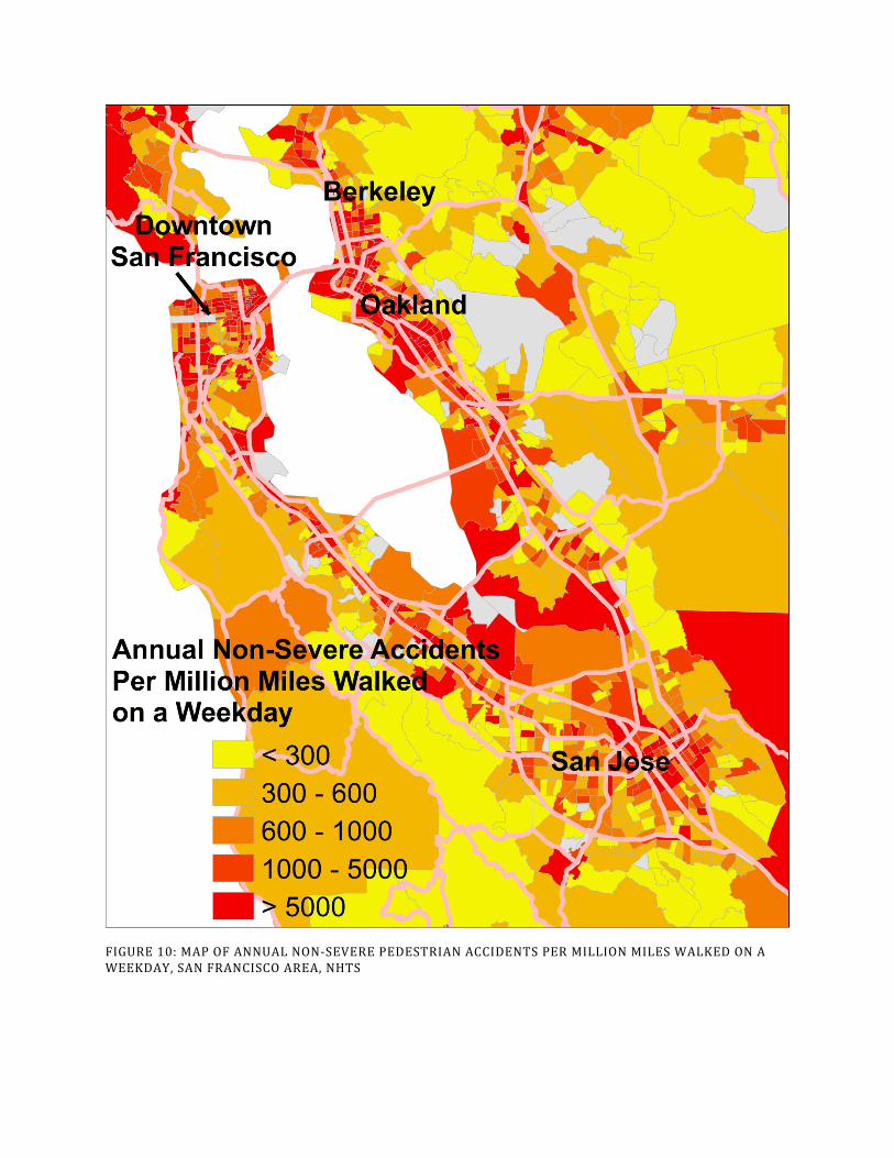
FIGURE 10: MAP OF ANNUAL NON-SEVERE PEDESTRIAN ACCIDENTS PER MILLION MILES WALKED ON A WEEKDAY, SAN FRANCISCO AREA, NHTS

FIGURE 11: MAP OF ANNUAL CYCLIST ACCIDENTS PER MILLION MILES BIKED ON A WEEKDAY, SAN FRANCISCO AREA, NHTS
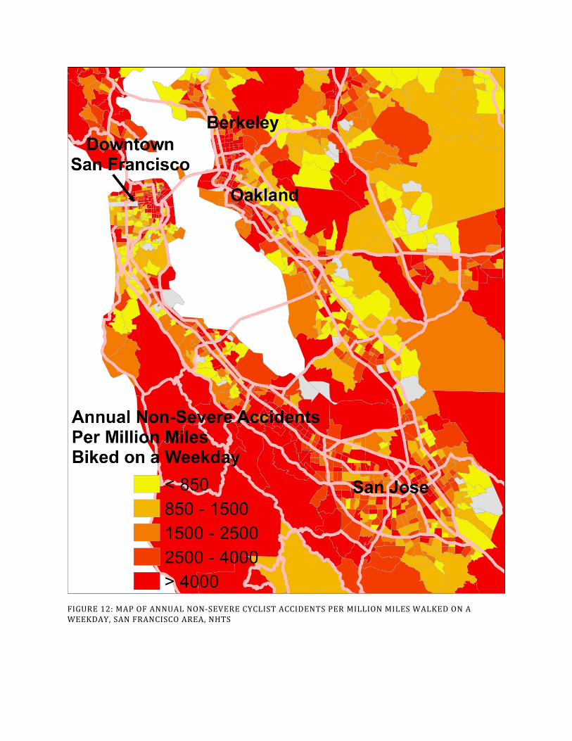
FIGURE 12: MAP OF ANNUAL NON-SEVERE CYCLIST ACCIDENTS PER MILLION MILES WALKED ON A WEEKDAY, SAN FRANCISCO AREA, NHTS
5. RESULTS: CHTS
Both to provide a point of comparison and to check the robustness of the results, we did this analysis separately using the California Household Travel Survey dataset. Similar to the NHTS, the CHTS is a full household travel survey with a 24-hour travel diary. The full 2010-2012 CHTS sample is larger than that of the 2009 NHTS, including information from a total of nearly 105,000 respondents over 4 years of age. As in our NHTS analysis, the results here focus on those individuals who were surveyed on a weekday, provided sufficient information for analysis, and were not outliers in their walking or bicycling distances7 – nearly 68,000 individuals total. This is more than double our analysis sample size from the NHTS.
One important difference between the two surveys is the overall response rate. Survey response rates can be calculated in a number of ways. It turns out that the official survey response rates of 21.1% for the NHTS (USDOT 2011) and 3.3% for the CHTS (NuStats 2013) were not calculated in the same way. Unfortunately, the survey documentation does not allow us to calculate comparable response rates to these official rates. The comparison we can report is that between simple response rates (total household respondents/total number of “households” attempted to be contacted), which were approximately 6.6% for the NHTS and 2.0% for the CHTS. These simple response rates are underestimates of the actual response rate because the denominator of this simple response rate includes a large number of “households” that are actually not residential addresses/phone numbers. The statement that we can make is that it appears clear that the response rate for the NHTS was substantially higher than that for the CHTS. We note that this response rate difference does not necessarily mean that the results of the two surveys have different levels of reliability, but all else equal, higher response rates are preferable.
Another difference of note between the surveys is in the percentage of respondents who reported making zero trips on the travel diary day. Overall, this percentage was 12.19% among weekday respondents to the NHTS, and 20.79% among weekday respondents to the CHTS. Evidence suggests that the lower percentage of “immobiles” in the NHTS is likely to be closer to the actual immobile rate in the population. Appendix A presents this evidence and provides a more complete discussion of this issue. To address this discrepancy and make the results comparable across the surveys, the CHTS results presented here are adjusted such that the percent of immobiles in each gender-age category is equal to the percent of immobiles for that category in the subset of the CHTS respondent sample that used a wearable GPS device.8 Accordingly, the total number of respondents is specified as the “adjusted” N in this section’s tables.
7 Consistent with our NHTS analysis, outliers were identified as any person who reported walking more than 9 miles in one day, and any person who reported bicycling more than 30 miles in one day. Dropping these outliers removed approximately 100 observations from the analysis due to walk distance outlier status, and 12 observations due to bicycle distance outlier status. 8 These immobile rates are calculated separately for the Rural neighborhood type and all other neighborhood types.

TABLE 5: SAMPLE SUMMARY STATISTICS (CHTS)
The spatial coverage of the two surveys by California county is largely similar. Table 6 indicates the percent of household observations in each county for the two surveys. Note that San Diego County is excluded from this comparison because San Diego was heavily oversampled by the NHTS effort. In the remaining counties, the CHTS includes slightly higher percentages of respondents from rural counties than does the NHTS.
N (Adjusted)
Percent Walked At All
Mean Miles Walked (for walkers)
Percent Biked At All
Mean Miles Biked (for bikers)
Total 67,910 16.5% 1.36 2.5% 5.15 GENDER Male 32,984 16.1% 1.36 3.5% 5.58
Female 34,926 16.8% 1.35 1.5% 4.18 AGE GROUPS (WALK) 5-10 4,281 24.3% 0.88
11-17 7,917 26.9% 1.22
18-59 36,829 15.5% 1.48
60-74 14,810 13.5% 1.41
75+ 4,073 7.5% 1.35 AGE GROUPS (BIKE) 5-10 4,284 2.5% 2.15
11-34 17,557 3.4% 3.94
35-59 27,271 2.6% 6.24
60-69 11,902 1.8% 6.46
70+ 7,016 1.0% 5.28 NEIGHBORHOOD TYPES Central City
1,108 57.8% 1.66 5.5% 4.51
Urban 11,405 28.9% 1.42 3.6% 5.31
Suburb 29,904 15.1% 1.34 2.6% 5.22
Rural 25,493 10.7% 1.24 1.7% 4.94

TABLE 6: SPATIAL COVERAGE OF NHTS AND CHTS, BY COUNTY
COUNTY Percent NHTS HH
Percent CHTS HH
COUNTY Percent NHTS HH
Percent CHTS HH
Alameda 5.08 4.17 Orange 8.58 5.89 Alpine 0.01 0.05 Placer 1.79 1.18 Amador 0.20 0.45 Plumas 0.11 0.37 Butte 1.20 0.88 Riverside 5.29 4.18 Calaveras 0.36 0.43 Sacramento 4.74 2.02 Colusa 0.06 0.26 San Benito 0.11 0.66 Contra Costa 4.10 3.41 San Bernardino 5.05 4.18 Del Norte 0.15 0.46 San Francisco 2.14 2.64 El Dorado 0.79 1.01 San Joaquin 1.98 1.55 Fresno 2.48 2.74 San Luis Obispo 1.14 2.08 Glenn 0.11 0.45 San Mateo 2.41 2.80 Humboldt 0.64 0.79 Santa Barbara 1.32 1.07 Imperial 0.31 1.18 Santa Clara 5.69 5.24 Inyo 0.08 0.46 Santa Cruz 1.14 1.65 Kern 2.03 3.79 Shasta 1.15 0.61 Kings 0.41 0.72 Sierra 0.02 0.14 Lake 0.34 0.45 Siskiyou 0.31 0.52 Lassen 0.07 0.37 Solano 1.32 1.54 Los Angeles 22.01 20.17 Sonoma 2.52 2.14 Madera 0.43 0.76 Stanislaus 1.74 1.35 Marin 1.23 1.13 Sutter 0.25 0.41 Mariposa 0.07 0.36 Tehama 0.40 0.43 Mendocino 0.55 0.43 Trinity 0.09 0.43 Merced 0.60 1.16 Tulare 1.16 1.96 Modoc 0.02 0.27 Tuolumne 0.39 0.47 Mono 0.07 0.26 Ventura 2.52 2.97 Monterey 1.13 2.51 Yolo 0.76 0.60 Napa 0.56 0.78 Yuba 0.30 0.50 Nevada 0.54 0.46 Note: San Diego County was heavily oversampled in the NHTS, and the percentages in this table are therefore exclusive of San Diego. San Diego households comprised 28% of the total sample for the NHTS and 4% for the CHTS.
Table 5 provides summary statistics for the portion of the CHTS data that was used in this analysis. Similar to the NHTS, the first thing to notice here is that both walking and bicycling are not undertaken at all by most respondents. Only 16% of people reported any walking (slightly lower than the NHTS), and 2.5% of people reported any biking (slightly higher than the NHTS). The walking percentages are similar for men and women, while biking is more than twice as likely among men than among women. Among those who do walk or bike, however, the average distances traveled are only slightly lower for women than for men, and extremely similar across surveys. The patterns across age groups are similar for the percent of respondents who walked and biked, with younger people being more likely to walk and bike than older people.

Turning to differences between walking and biking between respondents living in different types of neighborhoods, the patterns are roughly as we expected they would be. People living in dense urban neighborhood types are more likely to walk and bike than those in less dense neighborhood types. Different from the NHTS summary statistics, central city dwellers are the most likely to bike in this sample. Among those who walked at all, walking distances do not vary substantially across neighborhood types, and the patterns we see here are the same as those in the NHTS summary statistics. The average distance walked is longest in “Central City” neighborhoods, and “Central City” bikers travel shorter distances on average than bikers in the other three neighborhood types.
To provide a detailed comparison between the NHTS and the CHTS results, Table 7 and Table 8 report the raw estimates of the number of total respondents, the number of respondents who walked/biked, and the average miles walked/biked for each gender-age-neighborhood type category from the two datasets. Note that unlike the reported miles walked and biked in Table 5, these are averages across all respondents, including those who did not walk or bike. This is why the averages are much lower in Table 7 and Table 8 than in Table 5. The category labels in the first column of the table are coded with the neighborhood type as the first letter, where S=Suburb, U=Urban, R=Rural, and C=Central City. The second letter indicates gender, where M=Male and F=Female. The number ranges indicate age group.
Two major points emerge from these tables. First, while there are certainly differences, the results are encouragingly consistent across the two surveys for most categories. The mileage estimates are often within one-tenth of a mile, and there is not a clear pattern of one survey’s estimate being systematically higher than the other’s. Second, as is explained in the description of the NHTS analysis, there are very few respondents within the age-gender subcategories of the Central City neighborhood type. To extrapolate these results to the Central City census tracts, we group some of these age-gender subcategories together so that our results are based on a defensible number of observations. For the CHTS pedestrian estimates, we group Central City respondents into three age groups – Under 18, 18-74, and Over 75 – and we do not separate the genders. For the CHTS cyclist estimates, we simply group Central City respondents by gender and not by age group.

TABLE 7: PEDESTRIAN RESULTS COMPARISON FOR TWO TRAVEL SURVEYS
NHTS CHTS Category N N walker Mean Miles
Walked N (Adjusted)
N walker (Adjusted)
Mean Miles Walked
SM 5-10 430 92 0.22 889 199 0.17 SM 11-17 924 253 0.43 1868 475 0.32 SM 18-59 4006 682 0.27 7749 992 0.19 SM 60-74 1697 305 0.31 3165 408 0.19 SM 75+ 886 122 0.21 851 54 0.09 SF 5-10 454 102 0.26 873 199 0.19 SF 11-17 837 188 0.35 1699 449 0.32 SF 18-59 4591 876 0.30 8482 1267 0.21 SF 60-74 2001 335 0.25 3313 417 0.18 SF 75+ 1219 124 0.11 1015 50 0.07 UM 5-10 94 33 0.26 352 138 0.36 UM 11-17 200 77 0.48 658 271 0.51 UM 18-59 1035 267 0.36 3220 793 0.38 UM 60-74 368 82 0.32 1086 272 0.37 UM 75+ 205 32 0.27 263 56 0.26 UF 5-10 97 28 0.29 340 132 0.41 UF 11-17 183 61 0.51 617 272 0.57 UF 18-59 1102 322 0.43 3353 1026 0.48 UF 60-74 436 97 0.29 1182 295 0.32 UF 75+ 289 44 0.24 334 43 0.17 RM 5-10 286 59 0.20 902 198 0.20 RM 11-17 2467 311 0.19 1510 334 0.27 RM 18-59 571 95 0.22 6356 501 0.11 RM 60-74 1084 136 0.25 2816 236 0.11 RM 75+ 536 68 0.19 694 33 0.05 RF 5-10 309 56 0.17 872 150 0.14 RF 11-17 540 122 0.35 1506 302 0.22 RF 18-59 2807 441 0.24 6953 695 0.14 RF 60-74 1236 166 0.18 3005 238 0.10 RF 75+ 586 68 0.16 879 52 0.09 CM 5-10 10 3 0.18 29 9 0.48 CM 11-17 9 2 0.18 31 11 0.48 CM 18-59 66 29 0.69 398 243 1.02 CM 60-74 17 6 0.69 129 72 1.02 CM 75+ 12 4 0.34 18 9 0.74 CF 5-10 6 2 0.18 24 15 0.48 CF 11-17 12 3 0.18 28 14 0.48 CF 18-59 63 34 0.69 318 194 1.02 CF 60-74 23 10 0.69 114 66 1.02 CF 75+ 21 7 0.34 19 7 0.74

TABLE 8: CYCLIST RESULTS COMPARISON FOR TWO TRAVEL SURVEYS
NHTS CHTS Category N N cyclist Mean Miles
Biked N (Adjusted)
N cyclist (Adjusted)
Mean Miles Biked
SM 5-10 430 17 0.08 890 26 0.08 SM 11-17 1886 96 0.17 3960 212 0.22 SM 18-59 3044 71 0.18 5678 208 0.27 SM 60-74 1235 25 0.16 2576 74 0.20 SM 75+ 1348 9 0.04 1442 21 0.09 SF 5-10 454 11 0.03 875 26 0.07 SF 11-17 1855 23 0.04 3806 96 0.09 SF 18-59 3573 37 0.06 6393 100 0.08 SF 60-74 1438 4 0.00 2661 20 0.04 SF 75+ 1782 4 0.01 1670 7 0.02 UM 5-10 94 2 0.02 352 10 0.05 UM 11-17 461 19 0.21 1519 89 0.29 UM 18-59 774 35 0.33 2363 133 0.35 UM 60-74 272 8 0.21 883 41 0.33 UM 75+ 301 4 0.12 461 16 0.17 UF 5-10 97 2 0.05 340 9 0.04 UF 11-17 428 8 0.06 1556 42 0.09 UF 18-59 857 11 0.06 2427 66 0.16 UF 60-74 318 3 0.04 981 9 0.03 UF 75+ 407 0 0.00 533 2 0.01 RM 5-10 286 14 0.14 902 21 0.05 RM 11-17 1151 43 0.13 3273 114 0.13 RM 18-59 1887 37 0.13 4598 104 0.15 RM 60-74 801 14 0.07 2190 45 0.16 RM 75+ 819 7 0.03 1351 16 0.07 RF 5-10 309 6 0.04 872 17 0.03 RF 11-17 1187 13 0.07 3237 38 0.04 RF 18-59 2160 24 0.05 5242 51 0.06 RF 60-74 897 2 0.01 2420 19 0.03 RF 75+ 925 1 0.00 1469 4 0.01 CM 5-10 10 0 0.10 29 0 0.32 CM 11-17 26 1 0.10 102 11 0.32 CM 18-59 49 1 0.10 325 22 0.32 CM 60-74 12 0 0.10 103 5 0.32 CM 75+ 17 2 0.10 44 1 0.32 CF 5-10 6 0 0.04 24 0 0.17 CF 11-17 31 0 0.04 104 5 0.17 CF 18-59 44 1 0.04 245 14 0.17 CF 60-74 14 0 0.04 88 2 0.17 CF 75+ 30 0 0.04 46 1 0.17

USING THESE RESULTS TO PRIORITIZE INFRASTRUCTURE INVESTMENTS - CHTS
As explained earlier in this report, one major use of the results of this study is to help prioritize infrastructure investments by identifying tracts that have especially high pedestrian and cyclist use of infrastructure. To do this, we normalize our estimates of total miles walked and biked in each tract by the total number of non-highway road miles that are in the tract. Here, we focus on comparing the CHTS results to those obtained using the NHTS data.
Comparing the NHTS and CHTS distributions of weekday miles walked per non-highway road mile in each neighborhood type (Figure 5 and Figure 11), we see that the overall patterns are similar. Differences include: NHTS distributions in both Rural and Suburb areas indicate more miles walked than CHTS distributions (skewed more to right for NHTS), and the opposite is true in Urban and Central City areas (skewed more to right for CHTS).
In terms of cyclist intensity of infrastructure use, a comparison of Figure 6 and Figure 12 shows that the CHTS results indicate a wider distributional spread than NHTS results for the Suburb neighborhood type, and an “Urban” distribution that is skewed toward more intense use.
FIGURE 13: DISTRIBUTIONS OF WEEKDAY MILES WALKED PER NON-HIGHWAY ROAD MILE IN FOUR NEIGHBORHOOD TYPES, CHTS
05
1015
2025
Perc
ent
0 50 100 150Miles Walked Per Road Mile
Rural0
510
15Pe
rcen
t
0 50 100 150 200Miles Walked Per Road Mile
Suburb
05
1015
Perc
ent
0 200 400 600Miles Walked Per Road Mile
Urban
05
1015
Perc
ent
0 500 1000 1500 2000Miles Walked Per Road Mile
Central City

FIGURE 14: DISTRIBUTIONS OF WEEKDAY MILES BIKED PER NON-HIGHWAY ROAD MILE IN FOUR NEIGHBORHOOD TYPES, CHTS
Maps of the CHTS results regarding the spatial variation in the intensity of pedestrian and cyclist use of infrastructure in the Bay Area are given in Figure 13 and Figure 14. The overall spatial patterns are consistent across the survey results. The main differences are that pedestrian intensity of road use is estimated to be somewhat higher using the NHTS data, and cyclist intensity of road use is estimated to be somewhat higher using the CHTS data.
010
2030
010
2030
0 50 100 0 50 100
Suburb Urban
Rural Central City
Per
cent
Weekday Miles Biked Per Road Mile

FIGURE 15: MAP OF MILES WALKED PER NON-HIGHWAY ROAD MILE, SAN FRANCISCO BAY AREA, CHTS

FIGURE 16: MAP OF MILES BIKED PER NON-HIGHWAY ROAD MILE, SAN FRANCISCO BAY AREA, CHTS

USING THESE RESULTS TO ANALYZE SAFETY - CHTS
The second major use of the tract-level estimates of pedestrian and cyclist activity is to put them together with accident data to conduct safety analysis. Comparison of the NHTS-based safety maps in Figure 9 through Figure 12 with the CHTS-based safety maps in Figure 15 through Figure 19 indicates that the basic spatial patterns are similar. Table 9 provides CHTS-based results regarding the average accident rates by neighborhood type.
TABLE 9: MEAN ACCIDENT RATES FOR WALKING AND BIKING BY NEIGHBORHOOD TYPE, CHTS
Neighborhood Type
Pedestrian Severe Accident Rate
Pedestrian Non-Severe Accident Rate
Cyclist Severe Accident Rate
Cyclist Non-Severe Accident Rate
Central City 171 1459 191 3449 Urban 240 1377 153 2248 Suburb 281 1227 162 1879 Rural 322 877 250 1533
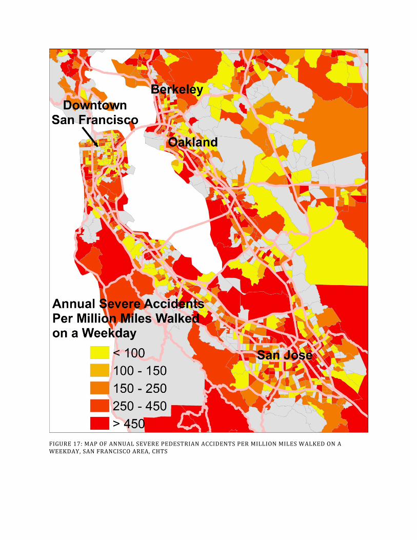
FIGURE 17: MAP OF ANNUAL SEVERE PEDESTRIAN ACCIDENTS PER MILLION MILES WALKED ON A WEEKDAY, SAN FRANCISCO AREA, CHTS

FIGURE 18: MAP OF ANNUAL NON-SEVERE PEDESTRIAN ACCIDENTS PER MILLION MILES WALKED ON A WEEKDAY, SAN FRANCISCO AREA, CHTS

FIGURE 19: MAP OF ANNUAL SEVERE CYCLIST ACCIDENTS PER MILLION MILES BIKED ON A WEEKDAY, SAN FRANCISCO AREA, CHTS

FIGURE 20: MAP OF ANNUAL NON-SEVERE CYCLIST ACCIDENTS PER MILLION MILES BIKED ON A WEEKDAY, SAN FRANCISCO AREA, CHTS

6. CONCLUSION
This report has documented a new method of estimating pedestrian and cyclist activity levels at a fine geographic scale. The method was implemented to estimate activity levels for all census tracts within the State of California using two separate travel survey datasets. Analysis of data from two travel surveys provides a robustness check on the results reported here. After adjusting for differences in survey response, most of the activity estimates are broadly consistent across the surveys. The resulting activity level estimates were normalized by two key indicator variables to yield key policy-relevant results about both the intensity of infrastructure use by pedestrians and cyclists and accident rates. What have we learned?
TABLE 10: OVERALL MEAN RESULTS BY NEIGHBORHOOD TYPE FOR TWO TRAVEL SURVEYS
Neighborhood Type
Mean Miles Walked Per Road Mile Mean Miles Biked Per Road Mile
NHTS CHTS NHTS CHTS Central City 597 911 73 241 Urban 167 183 63 86 Suburb 76 54 27 39 Rural 9 5 4 3 Mean Annual Severe Accidents Per
Million Miles Walked on a Weekday Mean Annual Severe Accidents Per Million Miles Biked on a Weekday
NHTS CHTS NHTS CHTS Central City 260 171 634 191 Urban 263 240 206 153 Suburb 199 281 232 162 Rural 202 322 242 250 Mean Annual Non-Severe Accidents Per
Million Miles Walked on a Weekday Mean Annual Non-Severe Accidents
Per Million Miles Biked on a Weekday NHTS CHTS NHTS CHTS Central City 2225 1459 11431 3449 Urban 1511 1377 3046 2248 Suburb 868 1227 2698 1879 Rural 551 877 1486 1533
Table 10 summarizes our results by neighborhood type. In terms of intensity of infrastructure use, we find that roads, bike paths, and sidewalks are most heavily used by pedestrians and cyclists in the most densely-populated neighborhoods of the state. This overall pattern is expected, but the particulars of the estimated rates of use are informative. Specifically, we find that roads in “Urban” neighborhoods are used approximately twice as heavily by pedestrians and cyclists as roads in “Suburban” neighborhoods. Rural roads are used at an extremely low level by pedestrians and cyclists.
In terms of severe accident rates by neighborhood type, we find no obvious patterns that are consistent across our two estimates of weekday miles walked or cycled from the two travel surveys. We expect that particular intersections and road segments are more dangerous than others for pedestrians and cyclists. However, we find that when accident rates are calculated at the geographic scale of the census tract, it does not appear that these especially dangerous spots exhibit

strong spatial patterns – they appear to be essentially randomly distributed both within cities, between cities, and across neighborhood types.
The story is different for non-severe accident rates. These accidents display a clear spatial pattern, with substantially higher rates of non-severe accidents in more urban areas. A striking finding is the difference between neighborhood types in the percent of pedestrian accidents that are classified as severe. Approximately 40% of reported pedestrian accidents in “Rural” areas were classified as severe, while this figure in “Central City” neighborhoods is approximately 10%. A likely explanation for this finding is the difference in vehicle speeds between urban areas and rural areas.
7. REFERENCES
Beck, L. F., Dellinger, A. M., & O'Neil, M. E. (2007). Motor vehicle crash injury rates by mode of travel, United States: using exposure-based methods to quantify differences. American Journal of Epidemiology, 166(2), 212-218.
California Department of Transportation. 2013. 2010-2012 California Household Travel Survey Final Report, Version 1.0. Prepared by NuStats Research Solutions, LLC. Available at dot.ca.gov.
Dhondt, S., Macharis, C., Terryn, N., Van Malderen, F., & Putman, K. (2013). Health burden of road traffic accidents, an analysis of clinical data on disability and mortality exposure rates in Flanders and Brussels. Accident Analysis & Prevention, 50, 659-666.
Marmor, M. (2007). RE:“Motor vehicle crash injury rates by mode of travel, United States: Using exposure-based methods to quantify differences”. American Journal of Epidemiology, 166(11), 1356-1356.
McAndrews, C. (2011). Traffic risks by travel mode in the metropolitan regions of Stockholm and San Francisco: a comparison of safety indicators. Injury Prevention, 17(3), 204-207.
McAndrews, C., Beyer, K., Guse, C. E., & Layde, P. (2013). Revisiting exposure: Fatal and non-fatal traffic injury risk across different populations of travelers in Wisconsin, 2001–2009. Accident Analysis & Prevention, 60, 103-112.
Mindell, J. S., Leslie, D., & Wardlaw, M. (2012). Exposure-Based,‘Like-for-Like’Assessment of Road Safety by Travel Mode Using Routine Health Data. PloS One, 7(12), e50606.
Miranda-Moreno, L. F., Morency, P., & El-Geneidy, A. M. (2011). The link between built environment, pedestrian activity and pedestrian–vehicle collision occurrence at signalized intersections. Accident Analysis & Prevention, 43(5), 1624-1634.
Pulugurtha, S. S., & Repaka, S. R. (2008). Assessment of models to measure pedestrian activity at signalized intersections. Transportation Research Record: Journal of the Transportation Research Board, 2073(1), 39-48.
Salon, D. (2014). Comparison of self-reported to network-calculated trip distances for the California add-on to the 2009 National Household Travel Survey. Paper included in the 2014 Transportation Research Board Annual Meeting Compendium of Papers.

Teschke, K., Harris, M. A., Reynolds, C. C., Shen, H., Cripton, P. A., & Winters, M. (2013). Exposure-based Traffic Crash Injury Rates by Mode of Travel in British Columbia. Canadian Journal of Public Health, 104(1).
Turner, S. M., Shunk, G., & Hottenstein, A. (1998). Development of a methodology to estimate bicycle and pedestrian travel demand (No. FHWA/TX-99/1723-S). Texas Transportation Institute, Texas A & M University System.
US Department of Transportation, Federal Highway Administration. 2011. 2009 National Household Travel Survey User’s Guide, Version 2. Available at nhts.ornl.gov.
Zhu, M., Cummings, P., Chu, H., & Xiang, H. (2008). Urban and rural variation in walking patterns and pedestrian crashes. Injury Prevention, 14(6), 377-380.
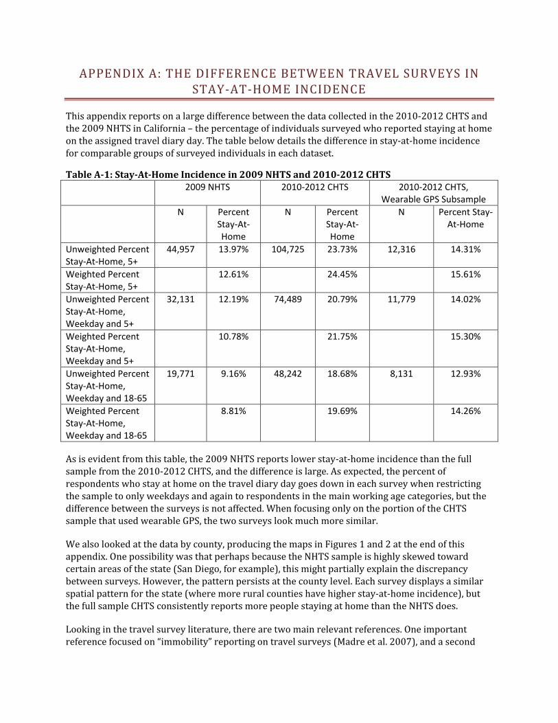
APPENDIX A: THE DIFFERENCE BETWEEN TRAVEL SURVEYS IN STAY-AT-HOME INCIDENCE
This appendix reports on a large difference between the data collected in the 2010-2012 CHTS and the 2009 NHTS in California – the percentage of individuals surveyed who reported staying at home on the assigned travel diary day. The table below details the difference in stay-at-home incidence for comparable groups of surveyed individuals in each dataset.
Table A-1: Stay-At-Home Incidence in 2009 NHTS and 2010-2012 CHTS 2009 NHTS 2010-2012 CHTS 2010-2012 CHTS,
Wearable GPS Subsample N Percent
Stay-At-Home
N Percent Stay-At-Home
N Percent Stay-At-Home
Unweighted Percent Stay-At-Home, 5+
44,957 13.97% 104,725 23.73% 12,316 14.31%
Weighted Percent Stay-At-Home, 5+
12.61% 24.45% 15.61%
Unweighted Percent Stay-At-Home, Weekday and 5+
32,131 12.19% 74,489 20.79% 11,779 14.02%
Weighted Percent Stay-At-Home, Weekday and 5+
10.78% 21.75% 15.30%
Unweighted Percent Stay-At-Home, Weekday and 18-65
19,771 9.16% 48,242 18.68% 8,131 12.93%
Weighted Percent Stay-At-Home, Weekday and 18-65
8.81% 19.69% 14.26%
As is evident from this table, the 2009 NHTS reports lower stay-at-home incidence than the full sample from the 2010-2012 CHTS, and the difference is large. As expected, the percent of respondents who stay at home on the travel diary day goes down in each survey when restricting the sample to only weekdays and again to respondents in the main working age categories, but the difference between the surveys is not affected. When focusing only on the portion of the CHTS sample that used wearable GPS, the two surveys look much more similar.
We also looked at the data by county, producing the maps in Figures 1 and 2 at the end of this appendix. One possibility was that perhaps because the NHTS sample is highly skewed toward certain areas of the state (San Diego, for example), this might partially explain the discrepancy between surveys. However, the pattern persists at the county level. Each survey displays a similar spatial pattern for the state (where more rural counties have higher stay-at-home incidence), but the full sample CHTS consistently reports more people staying at home than the NHTS does.
Looking in the travel survey literature, there are two main relevant references. One important reference focused on “immobility” reporting on travel surveys (Madre et al. 2007), and a second

article aimed to explain high variation across years in stay-at-home incidence in the ongoing Danish National Travel Survey (Christensen 2005).
Madre et al. (2007) find that stay-at-home incidence in travel surveys is highly variable, and only partly explained by characteristics of the respondents. The range of stay-at-home incidence across surveys included in this study is from 4% to 30%, but based on what the authors deem to be the “best” studies, they estimate that the true rate should be in the range of 8-12% for a weekday. To explain the high reported stay-at-home incidence for many surveys, they suggest that many individuals who report no travel are actually not telling the truth; they are simply reporting zero travel to end the survey more quickly. They call these troublesome respondents “soft refusers”, and suggest that additional survey prompts and interviewer training should be employed to reduce the numbers of these respondents.
Christensen (2005) examines data from the ongoing Danish National Travel Survey that includes high variation in stay-at-home incidence across years. She finds that high stay-at-home incidence in that survey was likely caused by interviewer fatigue – 10 out of 70 individual interviewers had a significantly higher share of stay-at-home respondents than the balance of the interviewers. After the interviewers were alerted about the high stay-at-home incidence and instructed to be more careful to register all trips, the stay-at-home incidence fell from approximately 25% to approximately 14%.
Taken together, evidence from the surveys and from the literature clearly suggests that the true stay-at-home rate is probably closer to that reported in the NHTS and CHTS GPS subsample than in the CHTS full sample. It would be useful to examine what was done differently in the NHTS and the CHTS non-GPS sample so that future surveys can benefit from this learning.
In terms of the implications of the likely overestimate of stay-at-home incidence in the full sample CHTS data, Madre et al. (2007) write, “… an overestimated share of immobiles … directly biases the average number of trips and therefore the estimated number of movements in an area, which are the key estimates derived from a travel diary … If … underreporting decisions are made at random by the respondents and are unrelated to the number of trips or activities they actually should report, then modelling results are unbiased …, although the constants will always be biased downwards… [However], the problem remains that they will be applied to too few trips.” (p 109)
This means that for multivariate analyses of individual travel observations, the likely overestimate of stay-at-home incidence may not present a large problem. However, for presentation of summary statistics that include stay-at-home observations or for estimates of average per capita or total travel, the likely overestimate of stay-at-home incidence will introduce significant bias. This information – after further study and verification of these findings by others – should be shared with any and all potential users of the CHTS data.
APPENDIX REFERENCES
Christensen, L. (2005). Data collection biases in a transport survey. Proceedings of European Transport Conference 2005, Strasbourg, France 18-20 September 2005. Research to Inform Decision-Making in Transport: Applied Methods in Transport Planning-Data Surveys.

Madre, J. L., Axhausen, K. W., & Brög, W. (2007). Immobility in travel diary surveys. Transportation, 34(1), 107-128.
Figure A-1: 2010-2012 CHTS Full Sample Stay-At-Home Percent Quintiles
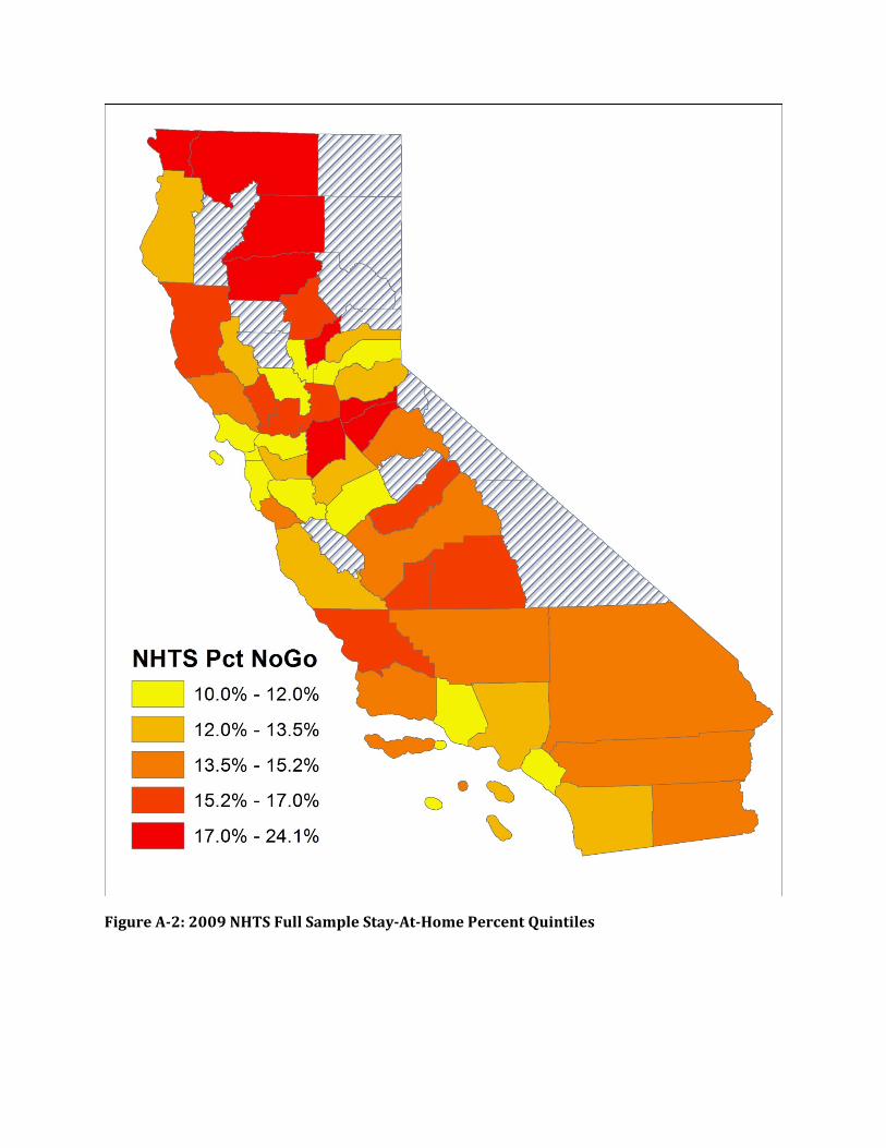
Figure A-2: 2009 NHTS Full Sample Stay-At-Home Percent Quintiles