e-builder: business intelligence user guideinfo.e-builder.net/rs/859-sbq-780/images/bi user...
TRANSCRIPT

Business Intelligence User Guide
09/15/2016 1
e-Builder: Business Intelligence User Guide

Business Intelligence User Guide
09/15/2016 2
Introduction ................................................................................................................................................. 5
Setup ........................................................................................................................................................... 6
Accessing Business Intelligence Reports and Dashboards ......................................................................... 7
Types of Reports ......................................................................................................................................... 7
e-Builder’s Data Structure .......................................................................................................................... 8
Creating Express Reports ............................................................................................................................ 8
Sub-Totals and Grand Totals ........................................................................................................ 11
Data Headers ................................................................................................................................. 11
Page Header .................................................................................................................................. 12
Footers........................................................................................................................................... 13
Styling Express Reports ................................................................................................................ 14
Layout Options.............................................................................................................................. 14
Express Report Themes ................................................................................................................ 15
Options Tab ....................................................................................................................................... 15
Saving Reports .............................................................................................................................. 16
Save As New Report ..................................................................................................................... 17
Deleting Reports ........................................................................................................................... 18
Creating Standard Reports ........................................................................................................................ 19
The Design Grid Toolbar .............................................................................................................. 19
Sections ............................................................................................................................................. 19
Using Sections .............................................................................................................................. 21
Columns and Rows ........................................................................................................................... 22
Columns ........................................................................................................................................ 22
Sorting by Columns on HTML ..................................................................................................... 23
Rows ............................................................................................................................................. 24
Cells .................................................................................................................................................. 24
Using Page Breaks ............................................................................................................................ 25
Charts ............................................................................................................................................ 25
Appearance ................................................................................................................................... 26
Data ............................................................................................................................................... 27
Labels ............................................................................................................................................ 28
Single-Series Example .................................................................................................................. 29
Multi-Series Example ................................................................................................................... 32
Maps .............................................................................................................................................. 35
Type .............................................................................................................................................. 36

Business Intelligence User Guide
09/15/2016 3
Locations ....................................................................................................................................... 36
Data ............................................................................................................................................... 37
Example ........................................................................................................................................ 38
Drilldowns..................................................................................................................................... 40
Gauges............................................................................................................................................... 41
Appearance ................................................................................................................................... 41
Data ............................................................................................................................................... 42
Matrix Wizard ................................................................................................................................... 43
Row Headers ................................................................................................................................. 44
Column Headers............................................................................................................................ 45
Tabulation Data ............................................................................................................................. 47
Matrix Themes .............................................................................................................................. 48
Matrix Options .............................................................................................................................. 49
Add Map Chart Type .................................................................................................................... 50
Creating Matrix Reports ........................................................................................................................... 51
Creating Chained Reports ......................................................................................................................... 53
Creating and Editing a Dashboard ............................................................................................................ 55
Dashboard Items ............................................................................................................................... 57
Adding Reports ............................................................................................................................. 57
Adding Data Visualizations .......................................................................................................... 60
Adding Text .................................................................................................................................. 61
Adding Images .............................................................................................................................. 61
Adding Web Pages ........................................................................................................................ 62
Adding Interactive Filters ............................................................................................................. 62
Toolbar .............................................................................................................................................. 64
Saving Dashboards........................................................................................................................ 64
Undo/Redo .................................................................................................................................... 64
Borders .......................................................................................................................................... 64
Formatting Dashboard Text .......................................................................................................... 65
Saving Dashboards............................................................................................................................ 65
Using Formulas ..................................................................................................................................... 67
Formula Editor .................................................................................................................................. 67
Manual Formulas .............................................................................................................................. 67
Description of Parameters ..................................................................................................................... 68
Appendix 1 - Aggregate Functions ................................................................................................... 69

Business Intelligence User Guide
09/15/2016 4
Appendix 2 – Data Types and Relationships .................................................................................... 69
Appendix 3 – Additional Report Examples ...................................................................................... 69

Business Intelligence User Guide
09/15/2016 5
Introduction
e-Builder Business Intelligence (BI) empowers your organization to create powerful reports and dashboards that help drive better business decisions. This guide will help you create and format reports, add drilldowns, and create and format dashboards that include interactive filter controls. Use BI Reports and Dashboards to “tell the story” of your organizations construction projects by bringing Key Performance Indicators to life with dashboards and reports. The advanced visualizations (charts, graphs, maps) and formatting available in the tool can take your reporting to the next level. Note that these new features peacefully coexist with the base reports and reporting features you already enjoy in e-Builder. Benefits include:
For Executives:
Insightful program performance and forecasts Graphically assess complex data quickly Interactive, real-time answers about project & program status
For Admins:
Report across multiple e-Builder modules Easily create dashboard reports with drag & drop fields Combine graphical reports with tabular reports in one view
For Project Managers
Automated report production gets more time back in your day Visually analyze data in an easy-to-read manner Create compelling project status reports everyone can trust

Business Intelligence User Guide
09/15/2016 6
Setup
Business Intelligence is part of e-Builder’s core product, there are no additional settings required to enable this feature in your account. There are two permissions associated with BI Reports that enable your organization to distinguish between those who may view reports and those who may both create and view reports and Dashboards.
Types of BI Reports Users
Report Viewer A typical report viewer is a business user that runs reports to track progress and analyze key performance indicators
Report Designer A typical report designer is an administrator, power user or more technical resource that has a sense of the underlying data structure and understanding of the fundamentals of reporting such as sorting, filtering and formula creation.
To set these permissions by Role, click SetupUsersManage Permissions and click the BI Reports tab.
To set these permissions by Role, click SetupUsersPermissions by User and click the Business Intelligence tab.
A note on permissions
Report Designers with Add/Edit rights may only add data that they are permissioned to access to reports. For example, if they do not have access to e-Builder’s Planning module they will not be able to add and view Planning data in reports, values for Planning will be blank.

Business Intelligence User Guide
09/15/2016 7
Accessing Business Intelligence Reports and Dashboards
BI Reports are accessed from the e-Builder Reports module. To create a new BI Report, click “Add BI Report Report” from the Reports page and select a Business Intelligence report type: Express, Standard, Matrix, Dashboard, or Chained Report.
Types of Reports
Advanced Reporting includes five separate report designers which can be accessed by clicking the Add Advanced Report button.
1. Express Report designer–Enables you to quickly build tabular reports with basic layouts and calculations.
2. Standard Report designer–Uses an Excel-like grid to layout data and labels. Standard reports provide more complex sections to group data and make specialized calculations. Charts, Maps and Drilldowns are created in the Regular Report designer.
3. Matrix Report designer–Simplifies the process of creating a report Designer that expands both horizontally and vertically based on the data returned.
4. Dashboard designer– An HTML canvas to combine and display reports, images, text, web pages and interactive filter controls.

Business Intelligence User Guide
09/15/2016 8
e-Builder’s Data Structure
The key to creating meaningful reports and dashboards is understanding the story you want to tell and including the data that tells that story. Below are a few guidelines on how the data available in Advanced Reporting is organized.
Your organization’s data is stored in a relational database
The data is made available to you in Advanced Reporting as categories of data (e.g. Invoices)
Some categories are “joined” together and some are not. Joins are links between two data categories that enable you to pull data from both onto one report.
There is a category that joins project, cost, schedule and process together for reporting on overall project status
Note: for more information about the data types and relationships between data elements in BI Reports see Appendix 2 at the end of this document.
Creating Express Reports
When should I use express reports?
Express reports are a good fit for business users to quickly view data that require only simple calculations and summaries (e.g. total invoice amount per project)
1. Click the Add BI Report Button and select the Express Report button from the dropdown. This will
launch the New Report Wizard. The New Report Wizard has five sub tabs. Only the Categories tabs are required.

Business Intelligence User Guide
09/15/2016 9
2. Categories: Categories are data objects that contain the fields you can use on your report. To see which fields are contained in a category, select and click the Info button located at the bottom of the Categories pane. To add a Data Category to your report, either drag and drop it to the ‘Category Name’ Column, or use the ‘Add’ button or double-click it.
Note: Linked process reports are also category options. To learn more, see Add Custom Report Types in the e-Builder Online Help.
3. Sorts: (optional) Select the Data Fields you want to sort by.
To sort by a Data Field, drag and drop it to the ‘Sort By’ Column, use the ‘Add’ button or double-click it.
Use the up and down arrows to indicate the sort priority.
You can sort each Data Field in ascending (A- Z) or descending (Z-A) order.
4. Filters: (optional) In the Filters Tab create statements that will be used to filter the data when you run the report.
Business Intelligence User Guide
09/15/2016 10
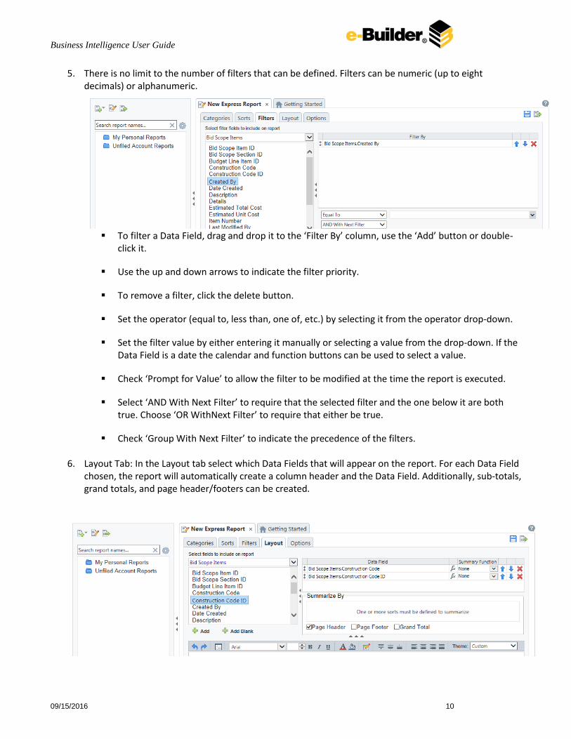
5. There is no limit to the number of filters that can be defined. Filters can be numeric (up to eight decimals) or alphanumeric.
To filter a Data Field, drag and drop it to the ‘Filter By’ column, use the ‘Add’ button or double-
click it.
Use the up and down arrows to indicate the filter priority.
To remove a filter, click the delete button.
Set the operator (equal to, less than, one of, etc.) by selecting it from the operator drop-down.
Set the filter value by either entering it manually or selecting a value from the drop-down. If the Data Field is a date the calendar and function buttons can be used to select a value.
Check ‘Prompt for Value’ to allow the filter to be modified at the time the report is executed.
Select ‘AND With Next Filter’ to require that the selected filter and the one below it are both true. Choose ‘OR WithNext Filter’ to require that either be true.
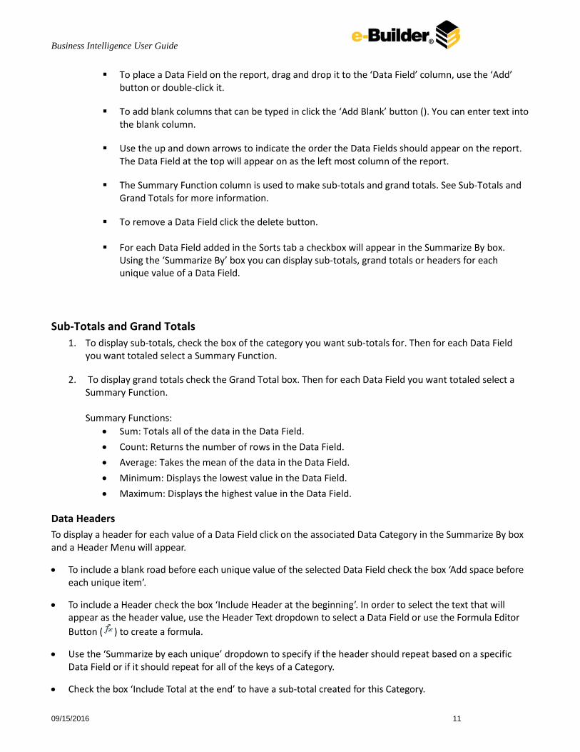
Check ‘Group With Next Filter’ to indicate the precedence of the filters. 6. Layout Tab: In the Layout tab select which Data Fields that will appear on the report. For each Data Field
chosen, the report will automatically create a column header and the Data Field. Additionally, sub-totals, grand totals, and page header/footers can be created.
Business Intelligence User Guide
09/15/2016 11
To place a Data Field on the report, drag and drop it to the ‘Data Field’ column, use the ‘Add’ button or double-click it.
To add blank columns that can be typed in click the ‘Add Blank’ button (). You can enter text into the blank column.
Use the up and down arrows to indicate the order the Data Fields should appear on the report. The Data Field at the top will appear on as the left most column of the report.
The Summary Function column is used to make sub-totals and grand totals. See Sub-Totals and Grand Totals for more information.
To remove a Data Field click the delete button.
For each Data Field added in the Sorts tab a checkbox will appear in the Summarize By box. Using the ‘Summarize By’ box you can display sub-totals, grand totals or headers for each unique value of a Data Field.
Sub-Totals and Grand Totals
1. To display sub-totals, check the box of the category you want sub-totals for. Then for each Data Field you want totaled select a Summary Function.
2. To display grand totals check the Grand Total box. Then for each Data Field you want totaled select a Summary Function. Summary Functions:
Sum: Totals all of the data in the Data Field.
Count: Returns the number of rows in the Data Field.
Average: Takes the mean of the data in the Data Field.
Minimum: Displays the lowest value in the Data Field.
Maximum: Displays the highest value in the Data Field.
Data Headers
To display a header for each value of a Data Field click on the associated Data Category in the Summarize By box and a Header Menu will appear.
To include a blank road before each unique value of the selected Data Field check the box ‘Add space before each unique item’.
To include a Header check the box ‘Include Header at the beginning’. In order to select the text that will appear as the header value, use the Header Text dropdown to select a Data Field or use the Formula Editor
Button ( ) to create a formula.
Use the ‘Summarize by each unique’ dropdown to specify if the header should repeat based on a specific Data Field or if it should repeat for all of the keys of a Category.
Check the box ‘Include Total at the end’ to have a sub-total created for this Category.

Business Intelligence User Guide
09/15/2016 12
Page Header
To display information on the top of each page, click ‘Page Header’ below the ‘Summarize By’ box. A Page Header Menu will appear.
Check the box ‘Include Title at the top of every page’ to display the name of the report on each page. If an image is also included, use the position dropdown to set where the title should appear and the number of columns it should span.
Use the ‘Change Image’ button to upload an image to display at the top of each page. If a title is also included, use the position dropdown to set where the image should appear and the number of columns it should span.

Business Intelligence User Guide
09/15/2016 13
Footers
To display information on the bottom of each page, click ‘Page Footer’ below the ‘Summarize By’ box. A Page Footer Menu will appear.
Check the box ‘Include page number at the bottom of every page’ to display the page number on each page. If an image is also included, use the position dropdown to set where the page number should appear and the number of columns it should span.
Use the Change Image button to upload an image to display at the bottom of each page. If the page number is also included, use the position dropdown to set where the image should appear and the number of columns it should span.
Business Intelligence User Guide
09/15/2016 14
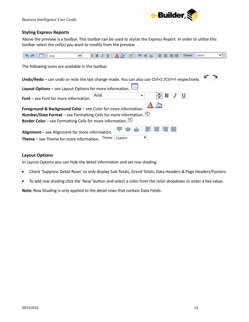
Styling Express Reports
Above the preview is a toolbar. This toolbar can be used to stylize the Express Report. In order to utilize this toolbar select the cell(s) you want to modify from the preview.
The following icons are available in the toolbar:
Undo/Redo – can undo or redo the last change made. You can also use Ctrl+Z /Ctrl+Y respectively.
Layout Options – see Layout Options for more information.
Font – see Font for more information.
Foreground & Background Color – see Color for more information.
Number/Date Format – see Formatting Cells for more information.
Border Color – see Formatting Cells for more information.
Alignment – see Alignment for more information.
Theme – see Theme for more information.
Layout Options
In Layout Options you can hide the detail information and set row shading.
Check ‘Suppress Detail Rows’ to only display Sub-Totals, Grand Totals, Data Headers & Page Headers/Footers.
To add row shading click the ‘New’ button and select a color from the color dropdown or enter a hex value.
Note: Row Shading is only applied to the detail rows that contain Data Fields.

Business Intelligence User Guide
09/15/2016 15
Express Report Themes
The Theme dropdown can be used to quickly style the report using one of the pre-defined themes. After selecting a Theme styling can still be modified.
Options Tab The Options tab allows you to control various report option settings.
General Options
From the ‘Include Setup’ menu select Top or Bottom to display the data categories, sorts and filters at either the beginning or end of the report.
Select which type of Filter menu to display when executing a report that have prompt for value filters.
o Default – Display the default type of filter execution window.
o Standard – Display the standard filter execution window.
o Simple with Operator – Display a simplified filter execution window that only allows the operator and value to be changed.
o Simple without Operator – Display a simplified filter window that only allows the filter value to be changed.
Check ‘Always Show Filter on Execution’ to show the filter menu and allow changes to be made each time the report is run.
Business Intelligence User Guide
09/15/2016 16
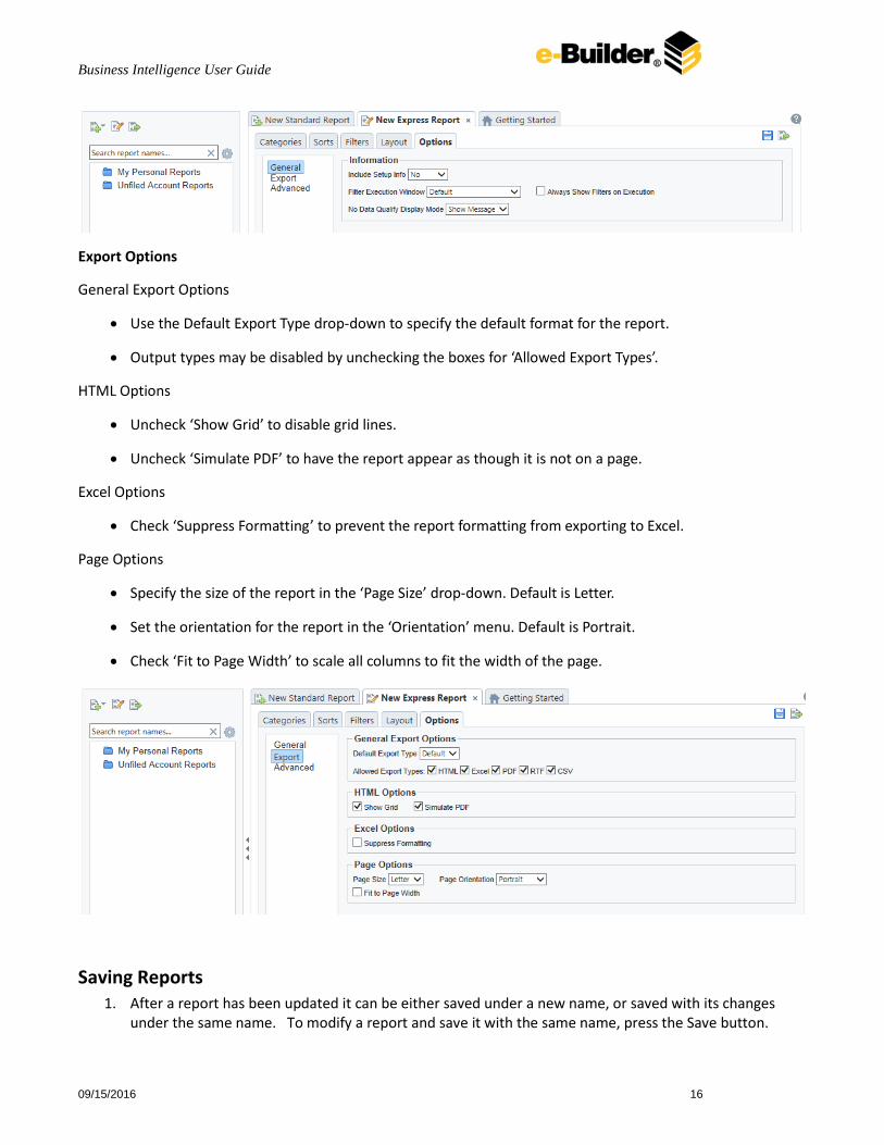
Export Options
General Export Options
Use the Default Export Type drop-down to specify the default format for the report.
Output types may be disabled by unchecking the boxes for ‘Allowed Export Types’.
HTML Options
Uncheck ‘Show Grid’ to disable grid lines.
Uncheck ‘Simulate PDF’ to have the report appear as though it is not on a page.
Excel Options
Check ‘Suppress Formatting’ to prevent the report formatting from exporting to Excel.
Page Options
Specify the size of the report in the ‘Page Size’ drop-down. Default is Letter.
Set the orientation for the report in the ‘Orientation’ menu. Default is Portrait.
Check ‘Fit to Page Width’ to scale all columns to fit the width of the page.
Saving Reports 1. After a report has been updated it can be either saved under a new name, or saved with its changes
under the same name. To modify a report and save it with the same name, press the Save button.
Business Intelligence User Guide
09/15/2016 17
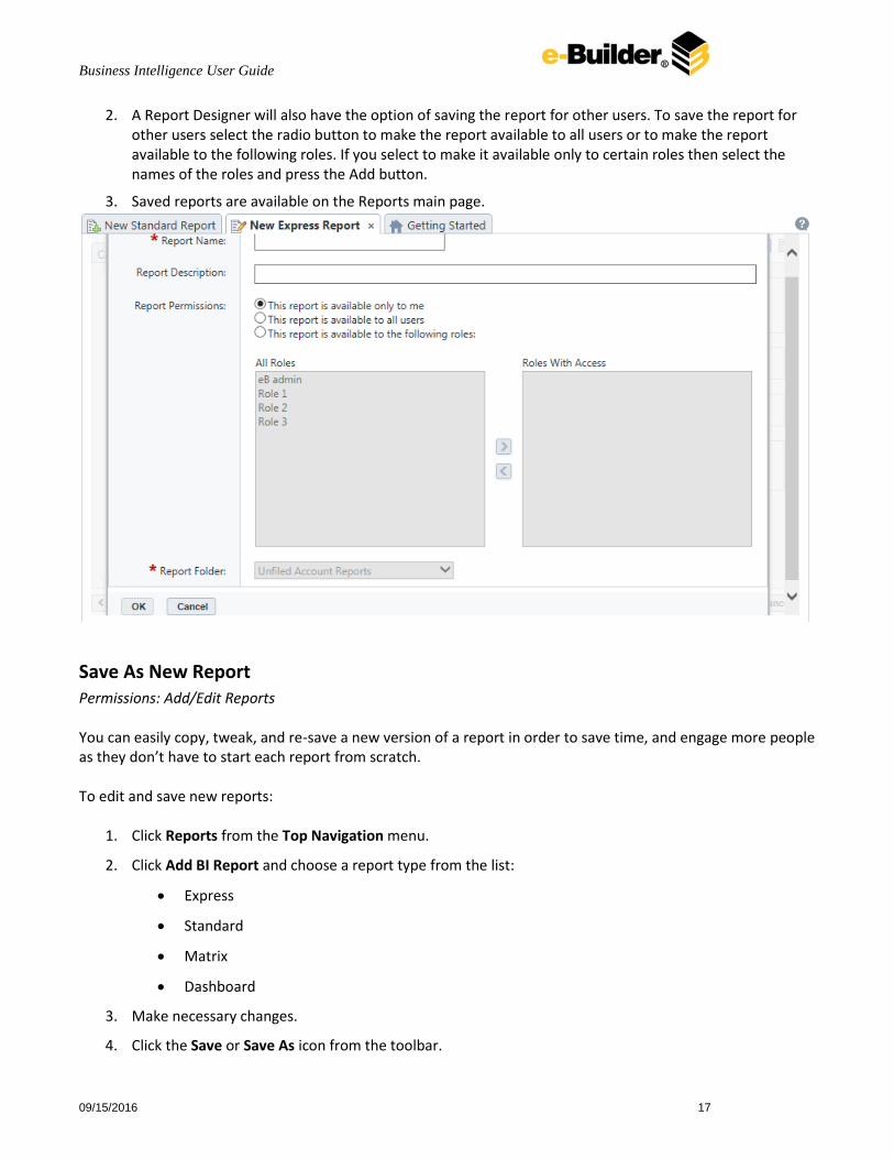
2. A Report Designer will also have the option of saving the report for other users. To save the report for other users select the radio button to make the report available to all users or to make the report available to the following roles. If you select to make it available only to certain roles then select the names of the roles and press the Add button.
3. Saved reports are available on the Reports main page.
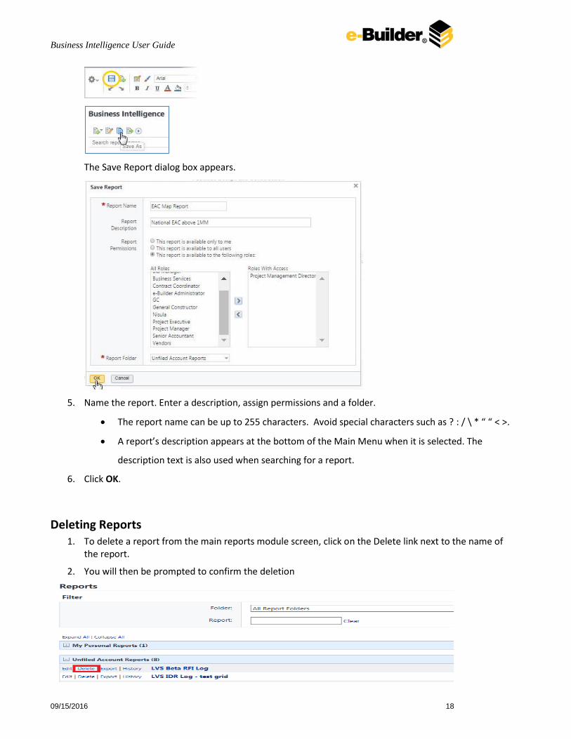
Save As New Report Permissions: Add/Edit Reports You can easily copy, tweak, and re-save a new version of a report in order to save time, and engage more people as they don’t have to start each report from scratch. To edit and save new reports:
1. Click Reports from the Top Navigation menu.
2. Click Add BI Report and choose a report type from the list:
Express
Standard
Matrix
Dashboard
3. Make necessary changes.
4. Click the Save or Save As icon from the toolbar.
Business Intelligence User Guide
09/15/2016 18
The Save Report dialog box appears.
5. Name the report. Enter a description, assign permissions and a folder.
The report name can be up to 255 characters. Avoid special characters such as ? : / \ * “ “ < >.
A report’s description appears at the bottom of the Main Menu when it is selected. The
description text is also used when searching for a report.
6. Click OK.
Deleting Reports 1. To delete a report from the main reports module screen, click on the Delete link next to the name of
the report.
2. You will then be prompted to confirm the deletion

Business Intelligence User Guide
09/15/2016 19
Creating Standard Reports The Standard Report design wizard begins with the same steps as the Express Report Wizard, but clicking Finish in the Layout tab will open the Design Grid where you can add charts, formulas, sorts, filters and many other features to your report. In the design grid you can:
Add charts, maps and formulas
Add and delete rows, columns and sections
Enter data fields, text and formulas
Drag and drop fields into different sections, rows or columns
Add Sections that dictate how the data appears in a report. There are five types of sections: page, report, details, group and repeating group. To add a section click in the Section column, hover your mouse over Add Section, and select the type of Section you would like to add.
The Design Grid Toolbar
The toolbar contains the buttons and menus used to modify the report. Modifications can include aesthetic formatting, inserting formulas and images, linking reports and much more. The toolbar begins with a drop-down menu. This menu controls changes that affect the entire report such as renaming or filtering. All other buttons on the toolbar require a cell (or cells) in the design grid be selected. Design Grid In the design grid you can:
Add and delete rows, columns and sections.
Enter data fields, text and formulas.
Drag and drop fields into different sections, rows or columns.
Sections Sections dictate how the data appears in a report. There are five types of sections: page, report, details, group and repeating group.
Page Header & Page Footer – The rows in the Page Header section appear at the top of every page of a report. Typically, the Page Header section is used to designate column headers for a report. The rows in the Page Footer section appear at the bottom of every page of a report. Typically, the Page Footer sections are used to display the page number, or confidentiality notices for a report.
Note: Formulas and calculations should not be made in the Page Footer section.
Note: If you are printing a report remember that Excel output does not have pages. Page Headers will appear only once at the beginning of the report. Reports executed as HTML will display Page Headers similarly unless ‘Simulate PDF’ is checked in the Options menu.

Business Intelligence User Guide
09/15/2016 20
Report Header & Report Footer – The rows in the Report Header appear at the beginning of a report. Typically, these rows display the title of a report. The rows in the Report Footer appear at the end of a report. Typically, the Report Footer displays grand totals and summary information for the report.
Detail – The Detail section is the main section of most reports. When the report is run the Details Section creates a row for each element in the Data Categories. For example if the Detail section contains the Data Field Orders.OrderId, the report will display each Order Id on a separate row.
Group Header & Group Footer – Group Headers/Footer sections require a sort on a Data Field. The rows in a Group Header section will appear above the Detail section for each unique value of the sorted Data Field. Typically, Group Header sections are used to display data as labels. For example a report may contain a Group Header on Orders.OrderDate and display Orders.OrderId in the Detail section. The output would display each date with orders that occurred on that date below them.
The rows in a Group Footer section will appear below the Detail section for each unique value of the sorted Data Field. Typically, Group Footer sections are used to calculate subtotals. For example a report may contain a Group Footer on Orders.OrderDate which displays the number of orders made on each date.
Note: Group Header/Footer sections can also be set to display rows for each value of a formula instead of a Data Field. (Ex. The report may be sorted on the Data Field Orders.OrderDate but the report should show subtotals for each month. A Group Footer on the formula ‘=Month({Orders.OrderDate})’ will display rows containing subtotals for each month.)
Repeating Groups – Repeating Groups require a sort on a Data Field. Repeating Groups have their own header, details and footer subsections. Repeating Groups should only be used when the data has multiple one-to-many relationships and each should be rendered completely before the other. (Ex. Each Professor can teach multiple classes and advise multiple students. For each professor you want to see all the classes they teach and then all the students they advise.)

Business Intelligence User Guide
09/15/2016 21
Using Sections
Sections can be added, deleted, modified, moved, and assigned shading.
Adding Sections 1. Click anywhere in the Section Column. 2. Hover your mouse over ‘Add Section,’ then select the type of section you would like to add.
Deleting Sections 1. In the Section Column click on the section you want to delete. 2. Click ‘Delete Section’.
Modify Sections (Group Header/Footers and Repeating Groups only) 1. In the Section Column click on the section you want to modify. 2. Click ‘Modify Section’. This will bring up a ‘Modify Group Section’ Menu. 3. Select from the drop-down the desired Data Field for the group to use. 4. Click okay.
Section Shading 1. In the Section Column click on the section that you want to Shade. 2. Click ‘Section Shading’. This will bring up a menu. 3. Click ‘New’ to add a color to the shading. 4. Click the color box to select a color or enter a hex value. 5. Click okay.

Business Intelligence User Guide
09/15/2016 22
Columns and Rows Columns and rows of cells can be added, modified or removed as described below.
Columns
• To select a group of columns, hold the SHIFT key and then click the beginning and ending column.
• Non-contiguous columns can be selected by holding the CTRL key and clicking the desired columns.
• A column can be resized by dragging its right edge horizontally.
• Clicking on a column (or selected group) will display a menu where you can:
o Insert a new column.
o Delete the selected column.
o Set its width to be identical with the other selected columns.
o Hide the selected column.
o Set Column Info to make the label the column and/or make it sortable on HTML reports.
Business Intelligence User Guide
09/15/2016 23
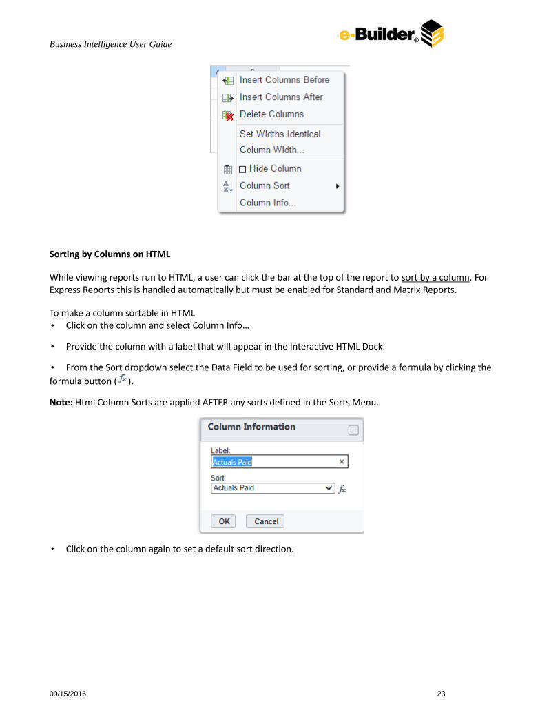
Sorting by Columns on HTML
While viewing reports run to HTML, a user can click the bar at the top of the report to sort by a column. For Express Reports this is handled automatically but must be enabled for Standard and Matrix Reports.
To make a column sortable in HTML • Click on the column and select Column Info…
• Provide the column with a label that will appear in the Interactive HTML Dock.
• From the Sort dropdown select the Data Field to be used for sorting, or provide a formula by clicking the
formula button ( ).
Note: Html Column Sorts are applied AFTER any sorts defined in the Sorts Menu.
• Click on the column again to set a default sort direction.

Business Intelligence User Guide
09/15/2016 24
Rows
• To select a group of rows, hold the SHIFT key then click the top and bottom row.
• Non-contiguous rows can be selected by holding the CTRL key and clicking the desired rows.
• A row can be resized by dragging its bottom edge vertically.
• Clicking on a row (or selected group) will display a menu where you can:
o Insert a new row.
o Delete the selected row.
o Set its height to be automatically controlled.
o Suppress the row from appearing on the report
o Insert a page break. Note: Please see Using Page Breaks
Cells Cells are the containers for all the information in a report. Cells may contain text, images, charts, or links to other reports.

Business Intelligence User Guide
09/15/2016 25
• To enter text into a cell, double-click and a text field will appear.
• To select cells by either click or use the arrow keys.
• Groups of cells can be selected by holding the SHIFT key and clicking on another cell. All the cells in between the two will be selected.
• Non-contiguous cells can be selected by holding the CTRL key and clicking the desired cells.
• A cell can be copied by holding the CTRL key while you dragging and drop it over a new cell.
• Adjacent cells can be merged and unmerged using the Merge/Split Cell buttons in the Toolbar.
Using Page Breaks For a Page Break to occur at the beginning of each element of a Data Field, place a page break on the top row of Group Header Section for that Data Field. See Sections for more detail on Group Headers Sections.
Charts
A chart can be displayed in a report to give a visual interpretation of the data. Select a cell and then click the
Insert Chart button ( ), to add chart to your report. The Chart Wizard will appear. The Chart Wizard has three tabs; Appearance, Data and Labels.
Note: Charts should only be placed into a Group Header, Group Footer, Report Header or Report Footer sections.

Business Intelligence User Guide
09/15/2016 26
Appearance
In the Appearance tab select the type of chart, its size, its colors and where to display the legend.
Select the chart type by clicking the icon that represents it. Check the ‘Use 3D Style’ box to make the chart three dimensional.
There are three ways to the size of the chart.
o Enter the height and width in the dimension boxes.
o Resize the chart by dragging the lower right corner in the preview.
o Check the box ‘Fit to Cell’.
In the color drop-down either select a color theme or specify a linear range of colors.
Note: There are two types of charts; single series and multi-series.
Single Series
Pie, Doughnut, Funnel, Pareto and Pyramid charts utilize a single Data Field to visually compare each element to the whole. (Ex. Each section of a pie chart may represent a region and the size of the section indicates how many people live in that region).
Business Intelligence User Guide
09/15/2016 27
Pareto charts are a special type of single series chart generally used to highlight the most important element amongst a group. The bars of a Pareto chart will display in descending order while a line show the cumulative percentage of the total. You can read more about Pareto Charts here.
Multi-Series
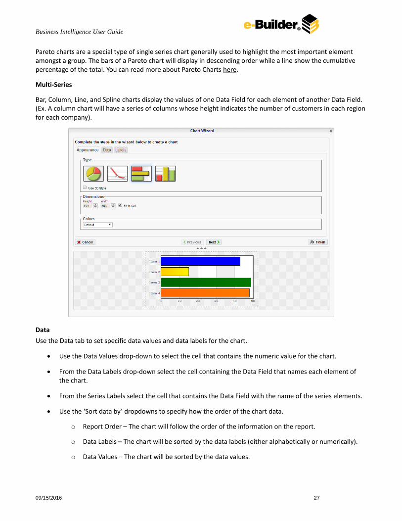
Bar, Column, Line, and Spline charts display the values of one Data Field for each element of another Data Field. (Ex. A column chart will have a series of columns whose height indicates the number of customers in each region for each company).
Data
Use the Data tab to set specific data values and data labels for the chart.
Use the Data Values drop-down to select the cell that contains the numeric value for the chart.
From the Data Labels drop-down select the cell containing the Data Field that names each element of the chart.
From the Series Labels select the cell that contains the Data Field with the name of the series elements.
Use the ‘Sort data by’ dropdowns to specify how the order of the chart data.
o Report Order – The chart will follow the order of the information on the report.
o Data Labels – The chart will be sorted by the data labels (either alphabetically or numerically).
o Data Values – The chart will be sorted by the data values.

Business Intelligence User Guide
09/15/2016 28
To ignore values that are too large or too small, enter a value into ‘Exclude values less/greater than/’ boxes.
To manually set the axis values enter a value into the ‘Data Axis Minimum/Maximum Value’ boxes.
Check the ‘Align Data Labels Across Series’ if you have multi-series data with common data labels among series.
Note: For example, consider charting house values as a function of location and building type. We choose location as the series labels and building type as data labels. Since each location uses the same building types, we check the 'Align Data Labels Across Series' box to align like data labels in the chart. On the other hand, if we want to chart city populations where we use country name as the series labels and city name as the data labels, we leave the box unchecked. This is because the data labels (city name) used for one series (country name) have no relation to those used in others.
Labels
In the Labels tab set the visual options of the Chart.
Chart Title: Enter the text you want to appear in at the top of the chart.
X-Axis Title: Enter the text you want to appear on the bottom of the chart.
Y-Axis Title: Enter the text you want to appear on the left of the chart.
Point Labels: Use the dropdown to display the values of each element of the chart.
Legend Position: Use the dropdown to specify where to show the legend on the chart.
Business Intelligence User Guide
09/15/2016 29
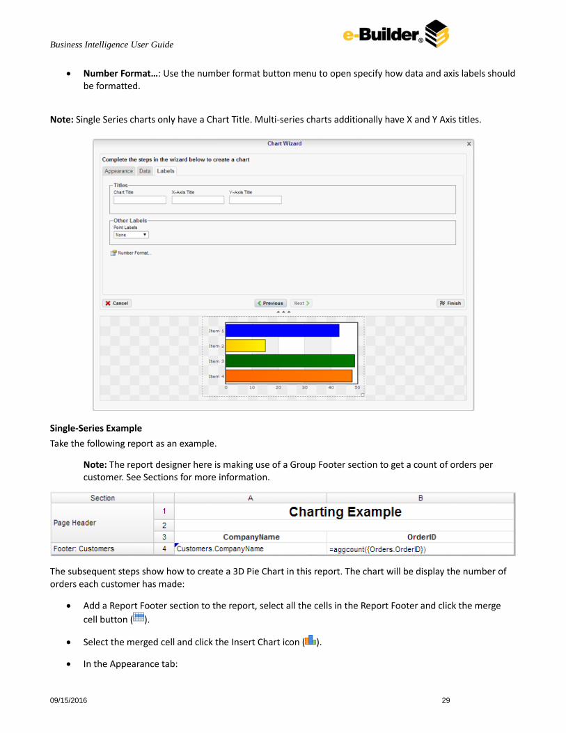
Number Format…: Use the number format button menu to open specify how data and axis labels should be formatted.
Note: Single Series charts only have a Chart Title. Multi-series charts additionally have X and Y Axis titles.
Single-Series Example
Take the following report as an example.
Note: The report designer here is making use of a Group Footer section to get a count of orders per customer. See Sections for more information.
The subsequent steps show how to create a 3D Pie Chart in this report. The chart will be display the number of orders each customer has made:
Add a Report Footer section to the report, select all the cells in the Report Footer and click the merge
cell button ( ).
Select the merged cell and click the Insert Chart icon ( ).
In the Appearance tab:

Business Intelligence User Guide
09/15/2016 30
o Set the type, size, and color.
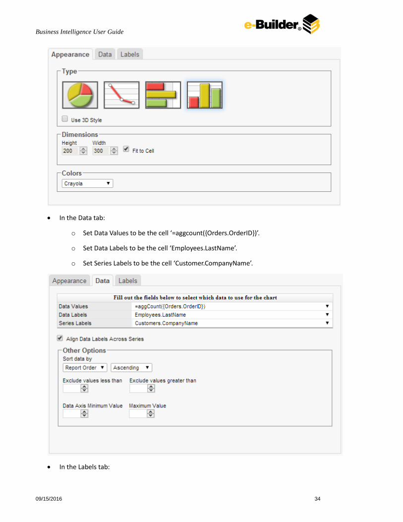
In the Data tab:
o Set Data Values to be the cell ‘=aggcount({Orders.OrderID})’.
o Set Data Labels to be the cell ‘Customer.CompanyName’.
In the Labels tab, enter the text ‘Number of Orders by Customer’ in the Chart Title. Also set the point Labels to ‘Data Values’ and the Legend Position to ‘Right’.

Business Intelligence User Guide
09/15/2016 31
Click Finish and execute the report as HTML.
Report Designer:
Chart on HTML Export:

Business Intelligence User Guide
09/15/2016 32
Multi-Series Example
Multi-series charts allow you to compare multiple values across various projects such as Budgets and Actuals for a programmatic view. Multi-series charts can be added to the Header or Footer row (you may have to add this section to the report if there isn’t already one there).
To add a multi-series chart:
1. Open the report you’d like to add the multi-series chart to. This element can be added in both Express and Standard reports.
2. Click into a cell in the Group Header or Group Footer section and then click the Chart icon. (For instructions on creating sections, see Sections.) The Chart Wizard appears and the Type tab is in view.
3. Choose a chart type from the Type tab, and then click the Data tab.

Business Intelligence User Guide
09/15/2016 33
4. Click Add Series and enter series values in the new drop-down menu.
5. Click Save & Close.
Take the following report as an example.
Note: The report designer here is making use of a Group Footer section and two sorts to get a count of orders by customer per employee. See Sections for more information.
The subsequent steps show how to create a Column Chart in this report. The chart will display the number of orders made by each customer and which employee took the order:
Add a Report Footer section to the report, select all the cells in the Report Footer and click the merge
cell button ( ).
Select the merged cell and click the Insert Chart icon ( ).
In the Type tab:
o Set the type, size and color.
Business Intelligence User Guide
09/15/2016 34
In the Data tab:
o Set Data Values to be the cell ‘=aggcount({Orders.OrderID})’.
o Set Data Labels to be the cell ‘Employees.LastName’.
o Set Series Labels to be the cell ‘Customer.CompanyName’.
In the Labels tab:

Business Intelligence User Guide
09/15/2016 35
o Set the Chart title to ‘Number of Orders by Customer’
o Set the X-Axis Title to Labels to ‘Employee’.
o Set the Y-Axis Title to ‘Num. Orders’.
o Set the point Labels to ‘Data Values’ and the Legend Position to ‘Right’.
Click Finish and execute the report as HTML.
Report Designer:
Maps
A Map can be displayed in a report to give a visual representation of geographic data. Select a cell and click the
Insert Map button ( ), to add a map to your report. The Map Wizard will appear. The Map Wizard has three tabs: Type, Locations and Data.
Note: Maps should only be placed into a Group Header, Group Footer, Report Header or a Report Footer section.

Business Intelligence User Guide
09/15/2016 36
Type
In the Type tab select the initial view, size, colors and where to display the legend.
Use the Initial View drop-down to select the location that initially displays on the Map. You may either select the world, a continent, or a country.
There are three ways to the size of the Map.
o Enter the height and width in the dimension boxes.
o Resize the chart by dragging the lower right corner in the preview.
o Check the box ‘Fit to Cell’.
In the Color drop-down either select a color theme or specify a linear range of colors.
Check the ‘Show Legend’ box to display the legend.
Locations
In the Locations tab specify which geographic locations should display on the Map.
Use the Location Values drop-downs to select the cells that contain the geographic information for the Map. To utilize Region information, such as states/provinces, Country information must be provided. Similarly, City information requires Region and Country information.
The ‘Show last Location type as’ drop-down specifies how to display the lowest level of information. You can either select circular markers (see image in Data tab) or shaded geographic regions (see image below).
Business Intelligence User Guide
09/15/2016 37
Data
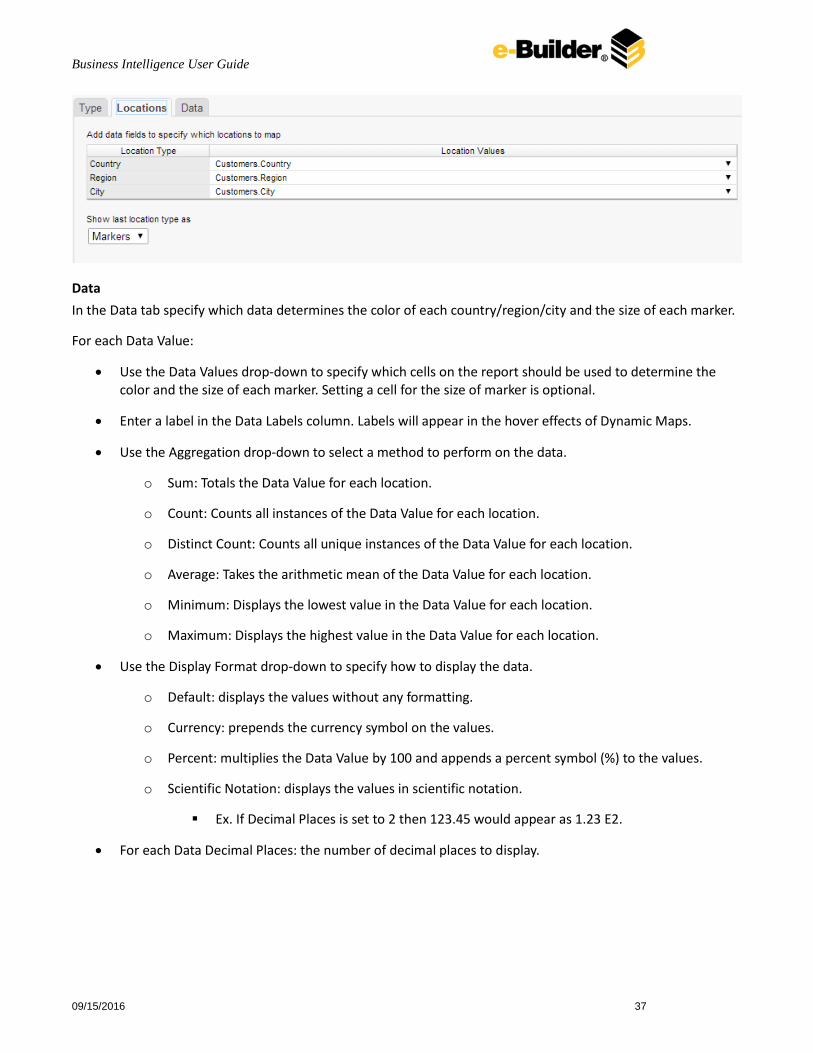
In the Data tab specify which data determines the color of each country/region/city and the size of each marker.
For each Data Value:
Use the Data Values drop-down to specify which cells on the report should be used to determine the color and the size of each marker. Setting a cell for the size of marker is optional.
Enter a label in the Data Labels column. Labels will appear in the hover effects of Dynamic Maps.
Use the Aggregation drop-down to select a method to perform on the data.
o Sum: Totals the Data Value for each location.
o Count: Counts all instances of the Data Value for each location.
o Distinct Count: Counts all unique instances of the Data Value for each location.
o Average: Takes the arithmetic mean of the Data Value for each location.
o Minimum: Displays the lowest value in the Data Value for each location.
o Maximum: Displays the highest value in the Data Value for each location.
Use the Display Format drop-down to specify how to display the data.
o Default: displays the values without any formatting.
o Currency: prepends the currency symbol on the values.
o Percent: multiplies the Data Value by 100 and appends a percent symbol (%) to the values.
o Scientific Notation: displays the values in scientific notation.
Ex. If Decimal Places is set to 2 then 123.45 would appear as 1.23 E2.
For each Data Decimal Places: the number of decimal places to display.
Business Intelligence User Guide
09/15/2016 38
Example
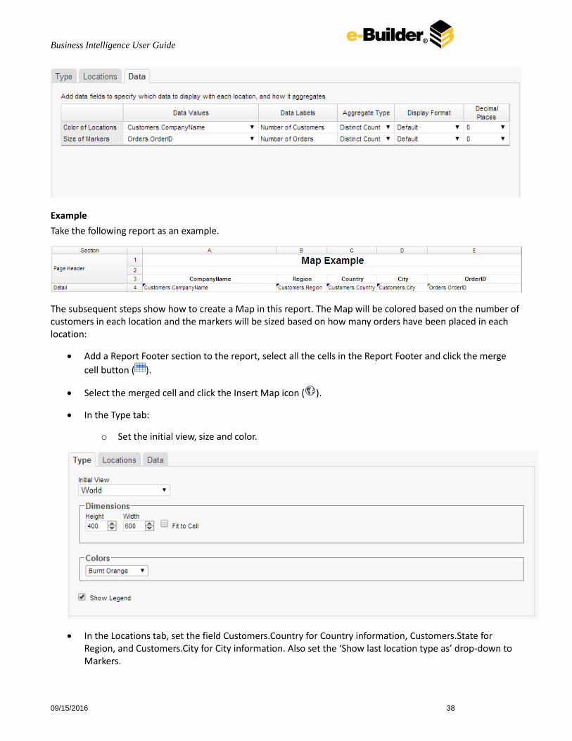
Take the following report as an example.
The subsequent steps show how to create a Map in this report. The Map will be colored based on the number of customers in each location and the markers will be sized based on how many orders have been placed in each location:
Add a Report Footer section to the report, select all the cells in the Report Footer and click the merge
cell button ( ).
Select the merged cell and click the Insert Map icon ( ).
In the Type tab:
o Set the initial view, size and color.
In the Locations tab, set the field Customers.Country for Country information, Customers.State for Region, and Customers.City for City information. Also set the ‘Show last location type as’ drop-down to Markers.

Business Intelligence User Guide
09/15/2016 39
In the Data tab:
o Set the field Customers.CompanyName for Color of Locations. Provide a label such as ‘Num. of Customers’ and set the Aggregate Type to Distinct Count.
o Set the field Orders.OrderId for the Size of Markers. Provide a label such as ‘Num. of Orders’ and set the Aggregate Type to Count.
Click Finish and execute the report as HTML.
Report Designer:
Note: In the report designer the map is always represented by the same image regardless of the size, color or world view of the map that will be generated on the report.
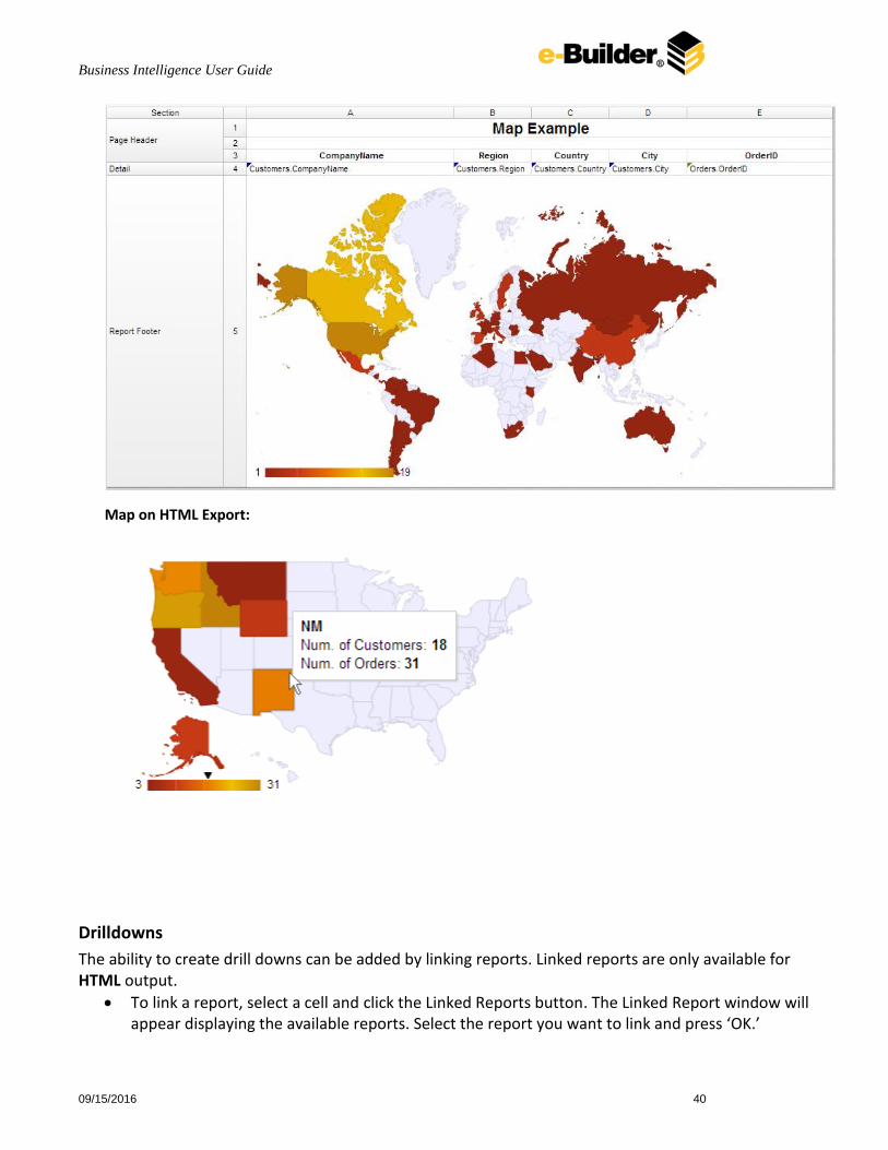
Business Intelligence User Guide
09/15/2016 40
Map on HTML Export:
Drilldowns
The ability to create drill downs can be added by linking reports. Linked reports are only available for HTML output.
To link a report, select a cell and click the Linked Reports button. The Linked Report window will appear displaying the available reports. Select the report you want to link and press ‘OK.’

Business Intelligence User Guide
09/15/2016 41
To unlink a report select the cell and open the Linked Report window. Click the ‘Remove Link’ button.
Figure : Linked Report
When a link is set on a cell, the unique key of the information being displayed is used to automatically filter the linked report. In the example below the linked report is filtered for information where Category equals ‘Meat/Poultry’ because that was the Category clicked on. Chart drilldowns can also be created by using the linked reports menu. Chart drilldowns are only available for HTML output. To create a chart drilldown, select a cell that contains a chart and click the Linked Reports button. The Linked Report window will appear displaying the available reports. Select the report you want to link and press ‘OK.’
Gauges A Gauge can be displayed in a report to give a visual representation for the scale of a value Select a cell and click
the Insert Gauge button ( ), to add a Gauge to your report. The Gauge Wizard will appear. The Gauge Wizard has two tabs: Appearance and Data.
Note: Gauges can be placed in any section of the report.
Appearance
In the Appearance tab select the Type and Dimension of the Gauge.
Type – Select the icon representing the type of gauge. Available types include: Angular, Linear, Bulb and Thermometer.
There are three ways to the size of the Gauge. o Enter the height and width in the dimension boxes.
o Resize the gauge by dragging the lower right corner in the preview.
o Check the box ‘Fit to Cell’.

Business Intelligence User Guide
09/15/2016 42
Data
In the Data tab select the Data Values and Color Ranges for the Gauge.
Use the Data Values drop-down to select the cell that contains the numeric value for the Gauge.
Use the ‘Provide range as’ buttons to specify if the Min and Max values for the Gauge should be static numbers or come from cells on the report.
In the Color Ranges, use the ‘Color By’ buttons to specify if colors ranges should be percentages of the Max value, static numbers or come from cells on the report.
Note: Percent Color Ranges must be in ascending numeric order.
Use the Add ( ) and Remove ( ) buttons to create additional colors.
Note: Thermometer Gauges can only have one color.
To change a color either select use the drop-down ( ) or enter a Hex value.
Business Intelligence User Guide
09/15/2016 43
Matrix Wizard
The matrix wizard enables the report to expand both horizontally and vertically based on data values and
displays summary information where each column and row meets. A Matrix consists of three parts; Row
Headers, Column Headers and Tabulation Data. Additional settings for Matrix can be found in the Matrix Options
Menu.
Note: For the section a Matrix is in, all the cells below and to the right of a Matrix must be empty.

Business Intelligence User Guide
09/15/2016 44
Row Headers
Row Headers expand a Matrix vertically. A Matrix has a row for each unique value of a Row Header. For example
if you were using sales data you may have the Row Headers Category.CategoryName and Products.ProductName
to provide rows for each product grouped by category (see image below).
To add a Row Header either drag and drop it to the ‘Row Header Source’ panel or use the ‘Add Row Header’
button ( ).
Click the Formula Editor Button ( ) to insert a formula into the Row Header.
Click the Edit Header button ( ) to open the Deader Options Menu. In the Header Options Menu you can:
o Set a Label for the Row Header. This label will appear at the top of the CrossTab.
o Select a Sorting Method and direction.
None- Does not sort the Row Headers
Header Value (Text) – Sorts the Row Header by its values as though they are text.
Header Value (Number) – Sorts the Row Header by its values as though they are
numbers.
Tabular Totals – Sorts the Row Header by the totals of the Tabulation Data.
Note: If there is more than one Row Header the Header Options Menu for the top most Row Header will
have Options for sub-totals of Tabulation Data.
o Select where to display subtotals by using the Placement dropdown.
None –Subtotals will not display.
Top – Displays subtotals above the Tabulation Data for each Row Header value.
Bottom – Display subtotals below the Tabulation Data for each Row Header value.
o Set a label for the subtotals.
Use the up and down arrows to rearrange the order of the Row Headers.
To remove a Row Header click the delete button ( ).

Business Intelligence User Guide
09/15/2016 45
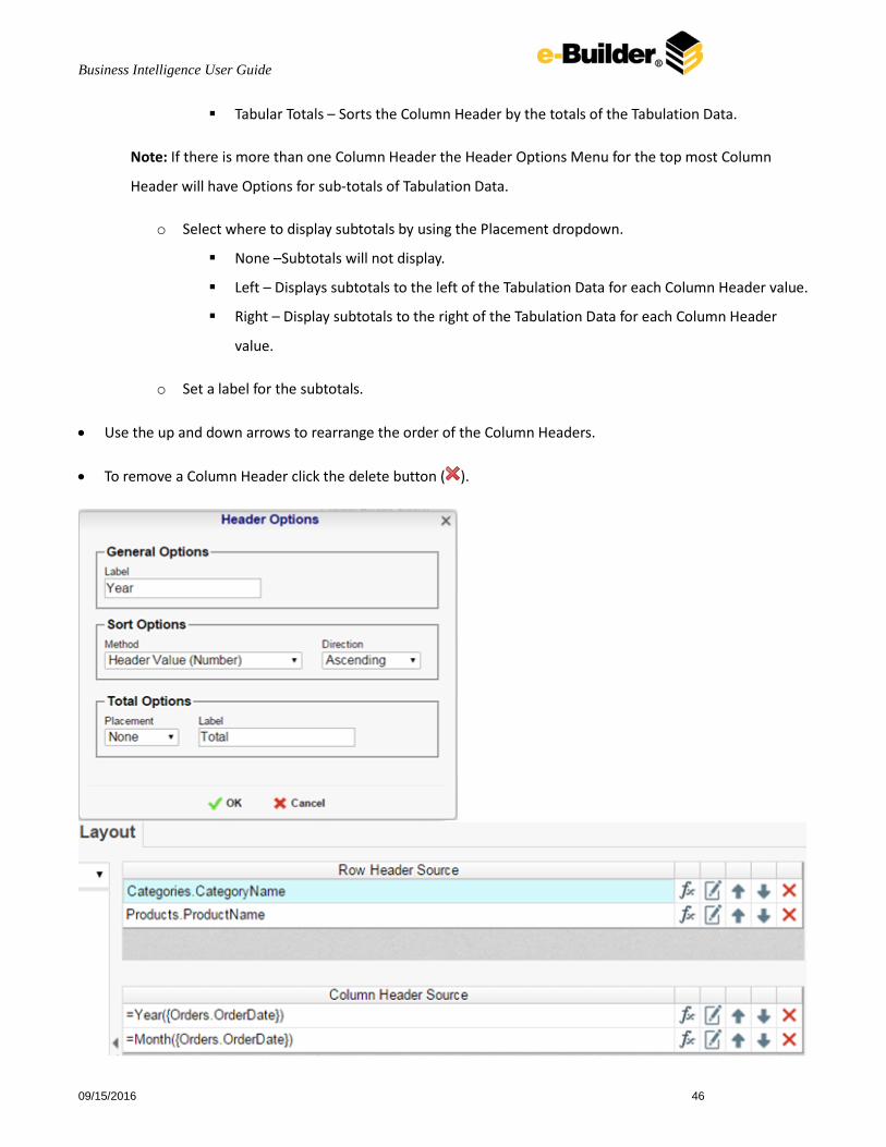
Column Headers
Column Headers expand a Matrix data horizontally. A Matrix report has a column for each unique value of a
Column Header. For example if you were using sales data you may have the Column Headers
‘Year({Order.OrderDate})’ and ‘Month({Orders.OrderDate})’ to provide columns for each month grouped by year
(see image below).
To add a Column Header either drag and drop it to the ‘Column Header Source’ panel or use the ‘Add
Column Header’ button ( ).
Click the Formula EditorButton ( ) to insert a formula into the Column Header.
Click the Edit Header button ( ) to open the Header Options Menu. In the Header Options Menu you can:
o Set a Label for the Column Header to appear at the top of the CrossTab.
o Select a Sorting Method and direction.
None- Does not sort the Column Headers
Header Value (Text) – Sorts the Column Header by its values as though they are text.
Header Value (Number) – Sorts the Column Header by its values as though they are
numbers.
Business Intelligence User Guide
09/15/2016 46
Tabular Totals – Sorts the Column Header by the totals of the Tabulation Data.
Note: If there is more than one Column Header the Header Options Menu for the top most Column
Header will have Options for sub-totals of Tabulation Data.
o Select where to display subtotals by using the Placement dropdown.
None –Subtotals will not display.
Left – Displays subtotals to the left of the Tabulation Data for each Column Header value.
Right – Display subtotals to the right of the Tabulation Data for each Column Header
value.
o Set a label for the subtotals.
Use the up and down arrows to rearrange the order of the Column Headers.
To remove a Column Header click the delete button ( ).

Business Intelligence User Guide
09/15/2016 47
Tabulation Data
Tabulation Data provides information when data exists for the Column Header and Row Header values. For
example if you have a Row Header on products and a Column Header on the month, then Tabulation Data of
Orders.OrderID may use the Count function to display how many orders contained each product each month.
To add a Tabulation Data either drag and drop it to the ‘Tabulation Data’ panel or use the ‘Add Tabulation
Data’ button ( ).
Click the Formula Editor Button ( ) to insert a formula into the Tabulation Data.
Click the Edit Tabulation button ( ) to open the Tabulation Options menu. In the Tabulation Options Menu
you can:
o Set a Label for the Tabulation Row to appear at the beginning of each row.
o Use the Method dropdown to select the summary function to be applied to the Tabulation Data.
Sum: Totals the Tabulation Data.
Count: Counts the Tabulation Data.
Average: Take the mean of the Tabulation Data.
Minimum: Displays the lowest value in the Tabulation Data.
Maximum: Displays the highest value in the Tabulation Data.
None: Displays the value of the Tabulation Data without applying any formula.
o Use the Value dropdown to select how the Tabulation Data should be displayed.
Aggregate: Display the result of the selected Method.
Percent of Row: Display the result of the selected method as a percentage of the row
total.
Percent of Colum: Display the result of the selected method as a percentage of the
column total.
Use the up and down arrows to move the Tabulation Data order.
To remove a Tabulation Data click the delete button ( ).

Business Intelligence User Guide
09/15/2016 48
Matrix Themes
The Theme dropdown can be used to quickly style the Matrix report using one of the pre-defined themes.
Further styling can be done to the cells of the Matrix report in the Report Designer.

Business Intelligence User Guide
09/15/2016 49
Matrix Options
Settings that affect the entire Matrix report are controlled in the Matrix Options Menu. Open the Matrix Options
Menu by clicking the Options button ( ). Using this menu you can adjust the following settings:
General
Use the Row Headers Placement dropdown to determine how the Row Headers are displayed.
o Columns – Display the Row Headers in columns from left to right in their order in the Row
Header Source panel.
o Hierarchical – Display Row Headers in a hierarchical structure using indentation to display their
order.
Check ‘Repeat Matrix Header every new page’ to repeat Row Header labels and Column Headers on
each new page.
Grand Total Row
To get a total for each column, select ‘Top’ or ‘Bottom’ from the Placement dropdown in the Grand Total
Row section and provide a label in the Label text box.
Grand Total Column
To get a total for each row, select ‘Top’ or ‘Bottom’ from the Placement dropdown in the Grand Total
Column section and provide a label in the Label text box.

Business Intelligence User Guide
09/15/2016 50
Add Map Chart Type Maps can be added to Standard and Matrix reports. A map chart allows you to visually represent geographical
data, providing versatility in the way you present and view data. This function can be especially useful for
organizations that have a regional or multinational presence. For example, you might use a map to show
Estimate at Completion above a threshold across regions of your business. To add a map chart:
1. Click Reports from the Top Navigation menu.
2. Click Add BI Report and choose either Standard or Matrix.
Note: Maps can only be added in a header or footer.
3. Click into a header or footer cell, and then click the map icon.
The Map Wizard displays the following options:
Type: World, Continent, Country
Location: Location data appears. Choose the location data to include.
Data: Specify which data determines the color of each country/region/city and the size of each
marker.
4. Click Save & Close on the Map Wizard window.

Business Intelligence User Guide
09/15/2016 51
Creating Matrix Reports
When should I use matrix reports?
Matrix reports are a good fit for business users to view data that expands both horizontally and vertically based on the data returned.
To create a Matrix report:
1. Click the Add BI Report Button and select the Matrix Report button from the dropdown. This will launch
the New Report Wizard.
The New Report Wizard has five sub tabs: Categories, Sorts, Filters, Layout and Options.
2. Categories: Categories are data objects that contain the fields you can use in your report. To see which
fields are contained in a category, select and click the Info button located at the bottom of the
Categories pane. To add a Data Category to your report, either drag and drop it to the ‘Category Name’
Column, or use the ‘Add’ button or double-click it.

Business Intelligence User Guide
09/15/2016 52
3. Filters: In the Filters Tab create statements that will be used to filter the data when you run the report.
There is no limit to the number of filters that can be defined. Filters can be numeric (up to eight
decimals) or alphanumeric.
To filter a Data Field either drag and drop it to the ‘Filter By’ column, use the ‘Add’ button or
double-click it.
Use the up and down arrows to indicate the filter priority.
To remove a filter click the delete button ( ).
Set the operator (equal to, less than, one of, etc.) by selecting it from the operator drop-down.
Set the filter value by either entering it manually or selecting a value from the drop-down. If the
Data Field is a date the calendar and function buttons can be used to select a value.
Check ‘Prompt for Value’ to allow the filter to be modified at the time the report is executed.
Select ‘AND With Next Filter’ to require that the selected filter and the one below it are both
true. Choose ‘OR With Next Filter’ to require that either be true.
Check ‘Group With Next Filter’ to specify the precedence of the filters. Filters can be nested
indefinitely by using the following keyboard shortcuts while a filter is selected:
o Ctrl + [ adds an open-parenthesis before the selected filter.
o Ctrl + ] adds a close-parenthesis after the selected filter.
o Ctrl + Shift + [ removes an open-parenthesis from before the selected filter.
o Ctrl + Shift + ] removes a close-parenthesis from after the selected filter.

Business Intelligence User Guide
09/15/2016 53
4. Layout Tab: In the Layout tab design the Matrix report by moving Data Fields into the Row Header,
Column Header and Tabulation Data panels.
Creating Chained Reports
Chained reports give you the ability to save multiple reports in one output file (PDF, Excel, RTF, or CSV). This
reduces the time it takes to prepare reports for senior staff and is especially helpful when you need to print
reports or dashboards. To create a chained report:
1. Click Reports from the Top Navigation menu.
2. Click Add BI Report and choose a report type from the list:
Express
Standard
Matrix
Dashboard
3. From the toolbar, click the Create New Report icon and select Chained Report.

Business Intelligence User Guide
09/15/2016 54
4. The New Chained Report tab opens for you to choose the reports to combine.
To add a report either drag and drop it to the ‘Report Name’ Column, use the ‘Add’ button or
double-click it.
To search for a specific report, enter the terms that you want to search for in the search box. To
see all the reports click the Clear button ( ).
If a report has Prompt for Value filters or parameters, click the ‘Edit Report Options’ button ( )
to access the Report Properties menu, where you can specify how to prompt for these filter
values:
Common Prompt – When the Chained Report executes, you will be prompted for a
value that is used by all of the reports on the Chained Report that have filter prompts on
this Data Field.
Report Prompt – When the Chained Report executes you will be prompted for a value
to filter this specific report.
Assign Value – Assign the filter a specific value. This filter will not prompt when the
Chained Report executes.
5. Click the Options tab to review a list of general options such as default and available output types.

Business Intelligence User Guide
09/15/2016 55
General Options
Use the ‘Default Export Type’ menu to specify the default format for the report.
Output types may be disabled by unchecking the boxes for ‘Allowed Export Types’.
Use the ‘No Data Qualified Action’ menu to select what to display if no data qualifies for a
report.
Skip Report – Display the next qualified report.
Show Placeholder – Show a placeholder message in place of the report.
6. Click the Export Report icon and choose the output type: Excel, PDF, RTF, CSV.
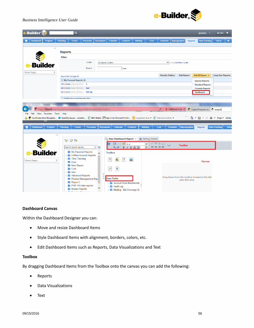
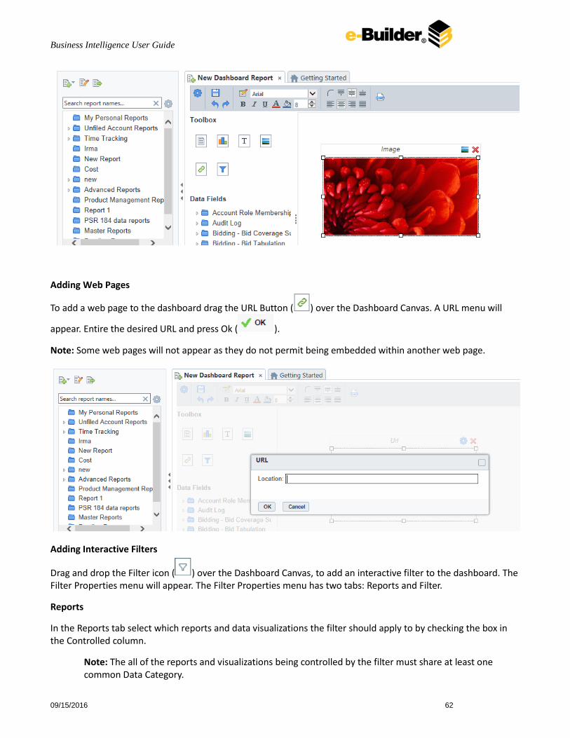
Creating and Editing a Dashboard Dashboards provide an HTML canvas that can display reports, images, text and web pages. To create a new dashboard, click the New Dashboard icon from the Add BI Reports button on the reports main page. The Dashboard Designer will appear in a new tab. The Dashboard Designer can be used to add reports, text, images and web pages to a dashboard.
The Dashboard Designer has four components; the Design Canvas, Tool Box, Data Fields and the Toolbar.
Business Intelligence User Guide
09/15/2016 56
Dashboard Canvas
Within the Dashboard Designer you can:
Move and resize Dashboard Items
Style Dashboard Items with alignment, borders, colors, etc.
Edit Dashboard Items such as Reports, Data Visualizations and Text
Toolbox
By dragging Dashboard Items from the Toolbox onto the canvas you can add the following:
Reports
Data Visualizations
Text
Business Intelligence User Guide
09/15/2016 57
Images
Web Pages
Interactive Filters
Data Fields
After dragging a Data Visualization from the Toolbox on to the Canvas you can add Data Fields by dragging them over the Data Visualization.
Toolbar
Using the toolbar you are able to:
Rename the Dashboard and modify its description.
Set the Dashboard to automatically run when entering this tool.
Change the background color of the canvas.
Format the font, font size, alignment, color and borders of text.
Save the dashboard.
Execute the dashboard as HTML.
Dashboard Items By dragging Dashboard Items onto the canvas you can add the following items to the dashboard:
Reports
Dashboard Visualizations
Text
Images
Web Pages
Interactive Filters
Adding Reports
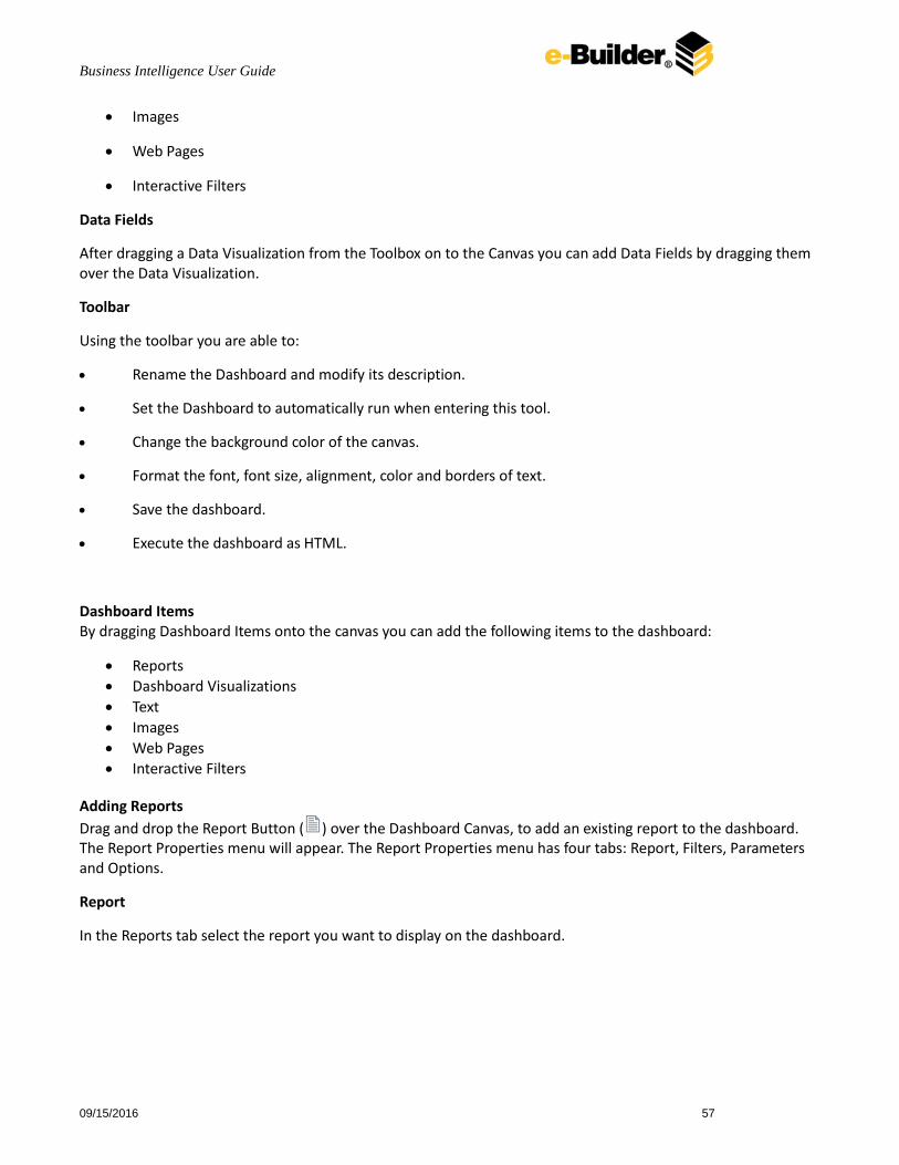
Drag and drop the Report Button ( ) over the Dashboard Canvas, to add an existing report to the dashboard. The Report Properties menu will appear. The Report Properties menu has four tabs: Report, Filters, Parameters and Options.
Report
In the Reports tab select the report you want to display on the dashboard.
Business Intelligence User Guide
09/15/2016 58
Filters
If the selected report has any Prompt for Value Filters, those filters will appear in the Filters tab. In this tab you can specify how to prompt for these filter values.
For each Filter:
Use the Action dropdown to select how the filter should prompt.
o Dashboard Prompt – When the dashboard executes, you will be prompted for a value that is used by all of the reports on the dashboard that filter using this Data Field.
o Report Prompt – When the dashboard executes you will be prompted for a value to filter this specific report.
o Assign Value – Assign the filter a specific value. This filter will not prompt when the dashboard executes.
In the ‘Data (Prompt Text or Value)’ column enter a value if the Action is Assign Value; if the Action is Dashboard or Report Prompt, enter text to use for the prompt.
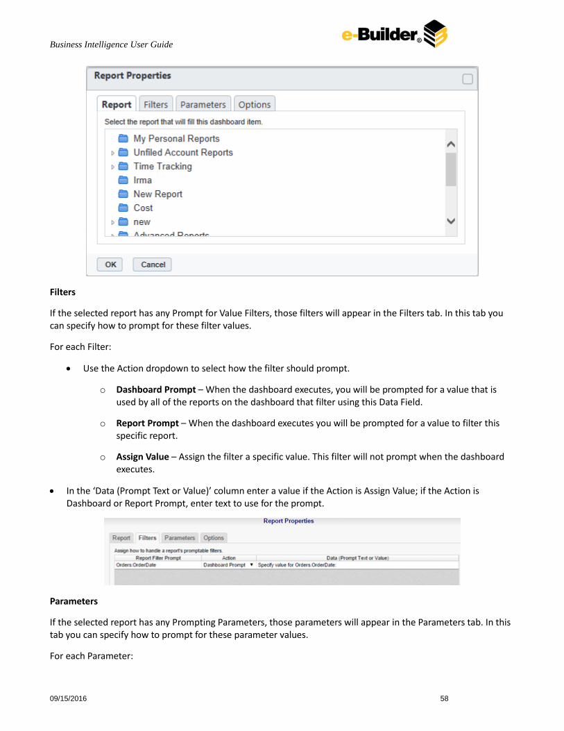
Parameters
If the selected report has any Prompting Parameters, those parameters will appear in the Parameters tab. In this tab you can specify how to prompt for these parameter values.
For each Parameter:
Business Intelligence User Guide
09/15/2016 59
Use the Action dropdown to select how the parameter should prompt.
o Dashboard Prompt – When the dashboard executes, you will be prompted for a value that is used by all of the reports on the dashboard that parameter.
o Report Prompt – When the dashboard executes you will be prompted for a value that is used by this specific report.
o Assign Value – Assign the parameter a specific value and do not prompt when the dashboard executes.
In the ‘Data (Prompt Text or Value)’ column enter a value if the Action is Assign Value; if the Action is Dashboard or Report Prompt, enter text to use for the prompt.
Options
In the Options tab specify settings for how the report displays on the dashboard.
Execute
In the Title Text box, provide a title for the report. This title will be displayed in on the canvas when editing the dashboard.
Check ‘Allow scrolling’ to allow scrolling on the dashboard if the report is larger than the designated size on the canvas.
Set the number of seconds at which to re-execute the report. Set to 0 to only execute the report when the dashboard is first run.
Design
Check the ‘Only execute report in design screen when report is manually refreshed’ to prevent the report from being executed while editing the dashboard.

Business Intelligence User Guide
09/15/2016 60
Adding Data Visualizations
Drag and drop the Data Visualization icon ( ) onto the Dashboard Canvas, to create a new Visualization on the dashboard. A Data Visualization item will appear.
With the Data Visualization item you can:
Drag Data Fields onto the item to create a chart or a tabular report.
Use the Options Menu ( ) to filter, name or modify other settings of the Visualization.
Modify how the Data Fields are grouped and summarized, by opening the Data Model Menu ( ).

Business Intelligence User Guide
09/15/2016 61
Save the Data Visualization as a new Standard Report ( ).
Note: Subsequent changes in the Standard Report Designer will not be reflected on the Data Visualization. To have those changes appear on the dashboard add the new report to the dashboard.
Convert from a chart to tabular report (or vice versa) by selecting ‘Convert to Chart’ in the right-click menu.
Note: A Data Visualization must have at least two Data fields in order to display a chart, one of which must be numeric.
Adding Text
Drag and drop the Text icon ( ) over the Dashboard Canvas, to add text to the dashboard. A text box will appear. Type the desired text in this box. Use the Toolbar to format the text.
Adding Images
Drag and drop the Image icon ( ) over the Dashboard Canvas, to add an image to the dashboard. An image
box will appear. Click the insert image button ( ) and select the image to upload.
Business Intelligence User Guide
09/15/2016 62
Adding Web Pages
To add a web page to the dashboard drag the URL Button ( ) over the Dashboard Canvas. A URL menu will
appear. Entire the desired URL and press Ok ( ).
Note: Some web pages will not appear as they do not permit being embedded within another web page.
Adding Interactive Filters
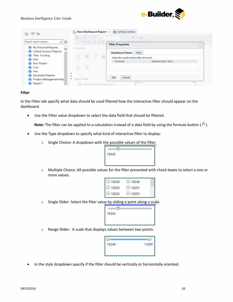
Drag and drop the Filter icon ( ) over the Dashboard Canvas, to add an interactive filter to the dashboard. The Filter Properties menu will appear. The Filter Properties menu has two tabs: Reports and Filter.
Reports
In the Reports tab select which reports and data visualizations the filter should apply to by checking the box in the Controlled column.
Note: The all of the reports and visualizations being controlled by the filter must share at least one common Data Category.
Business Intelligence User Guide
09/15/2016 63
Filter
In the Filter tab specify what data should be used filtered how the interactive filter should appear on the dashboard.
Use the Filter value dropdown to select the data field that should be filtered.
Note: The filter can be applied to a calculation instead of a data field by using the formula button ( ).
Use the Type dropdown to specify what kind of interactive filter to display:
o Single Choice: A dropdown with the possible values of the filter.
o Multiple Choice: All possible values for the filter presented with check boxes to select a one or
more values.
o Single Slider: Select the filter value by sliding a point along a scale.
o Range Slider: A scale that displays values between two points.
In the style dropdown specify if the filter should be vertically or horizontally oriented.

Business Intelligence User Guide
09/15/2016 64
In the Value Sort Direction specify if the filter values should appear from least to greatest (ascending) or vice versa (descending).
Click the Format button ( ) to open the format menu and specify how the filter values should be displayed.
Toolbar The toolbar contains the buttons and menus used to modify the dashboard.
Saving Dashboards
The dashboard can be saved by clicking the save button ( ).
Undo/Redo
Any action on a dashboard can be undone by clicking ( ) or pressing CTRL + Z. Undone actions can be redone by
clicking ( ) or pressing CTRL + Y.
Borders
To create borders around a dashboard item, select it and click the Format icon ( ).
• Uncheck ‘Make Borders Uniform’ to modify specific edges.
• To widen the borders either key in a value or use the arrows in the width box.
• To change the color either select a color from the drop-down or enter a hex value.

Business Intelligence User Guide
09/15/2016 65
Borders can be rounded by clicking the ‘Rounded Edges’ button ( ) in the toolbar.
Formatting Dashboard Text
Text items can be formatted using buttons in the toolbar. A text item must be selected for these changes to be applied.
Font
• To change the font use the font drop-down ( ). The font names appear in the style that they represent.
• The B, I and U icons make the font bold, italicized and underlined, respectively.
• Text size can be controlled using the up and down arrows on font size menu ( ).
Color
• To change the text color, click the Foreground Color button ( ) and then select a color or enter a hex value into the Foreground box. Click the clear button to revert to the default color ( ).
• To change the background color, click the Background Color button ( ) and then select a color or enter a hex value into the Background box. Click the clear button to revert to the default color ( ).
Alignment
• Text can be aligned to the top, center, or bottom of a cell using the vertical alignment buttons.
• Text can be centered, justified or aligned to the left or right of a cell using the horizontal alignment buttons.
Saving Dashboards
Business Intelligence User Guide
09/15/2016 66
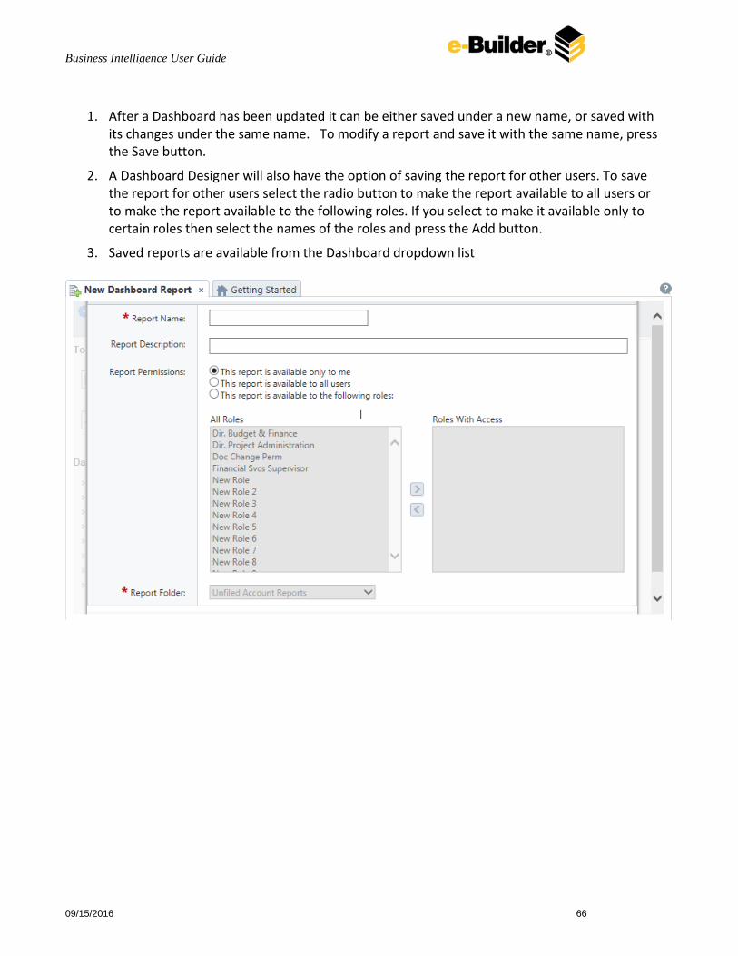
1. After a Dashboard has been updated it can be either saved under a new name, or saved with its changes under the same name. To modify a report and save it with the same name, press the Save button.
2. A Dashboard Designer will also have the option of saving the report for other users. To save the report for other users select the radio button to make the report available to all users or to make the report available to the following roles. If you select to make it available only to certain roles then select the names of the roles and press the Add button.
3. Saved reports are available from the Dashboard dropdown list

Business Intelligence User Guide
09/15/2016 67
Using Formulas Formulas can either be entered in the Formula Editor or by manually written into cells.
Formula Editor 1. Navigate to the Report Designer.
2. Click in the cell you want the formula to be in.
3. Click the Formula Editor Button ( ).
4. Create the desired formula by selecting the desired functions and clicking add or drag and dropping into the Summary box.
Note When embedding functions begin with the outermost function and add them moving inward. (ex. To get =TRUNCATE(SQRT(162)), first add Truncate then the square root function.)
5. Click Ok.
Manual Formulas To manually add formulas:
1. Navigate to the Report Designer.
2. Double click in the desired cell.
3. Enter the formula.
4. Save the report.

Business Intelligence User Guide
09/15/2016 68
Description of Parameters pageNumber:
Description Returns the number of the current page.
Remark For RTF output, pageNumber cannot be used with other formulas.
Example =@pageNumber@ will display the current page number for all output types.
=‘Pg. ‘ & @pageNumber@ will display ‘pg.’ followed by the page number for HTML and PDF output.
reportName:
Description Returns the name of the report.
reportFullName:
Description Returns the file path of the report.
Example For a report named Transcripts in a Folder named Student Documents @reportFullName@ would return Student Documents/Transcripts.
Business Intelligence User Guide
09/15/2016 69
Appendix 1 - Aggregate Functions
A full description of the aggregate functions that may be utilized in building formulas is included in the attached document.
Appendix Aggregate Functions.pdf
Appendix 2 – Data Types and Relationships
Data Types - a listing of the data types (e.g. string, decimal, guid) for the data available in BI Reports is available on the first tab of the attached spreadsheet. Relationships – insight into the relationships (joins) between data elements in BI Reports is provided in the second tab of the attached spreadsheet.
Data Types and Relationships.xls
Appendix 3 – Additional Report Examples More detailed examples of specific report scenarios
Conditional Formatting
Scatter Chart
Repeating Groups
Guage
Additional Report Examples.docx